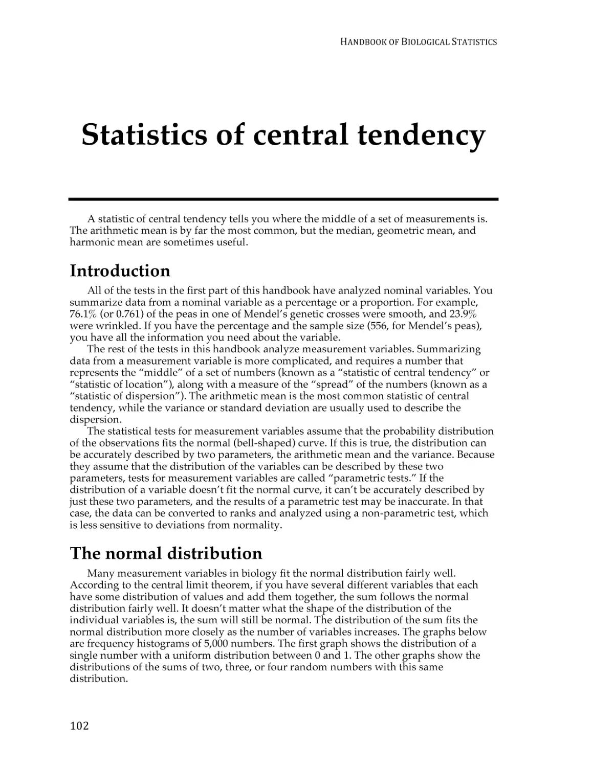
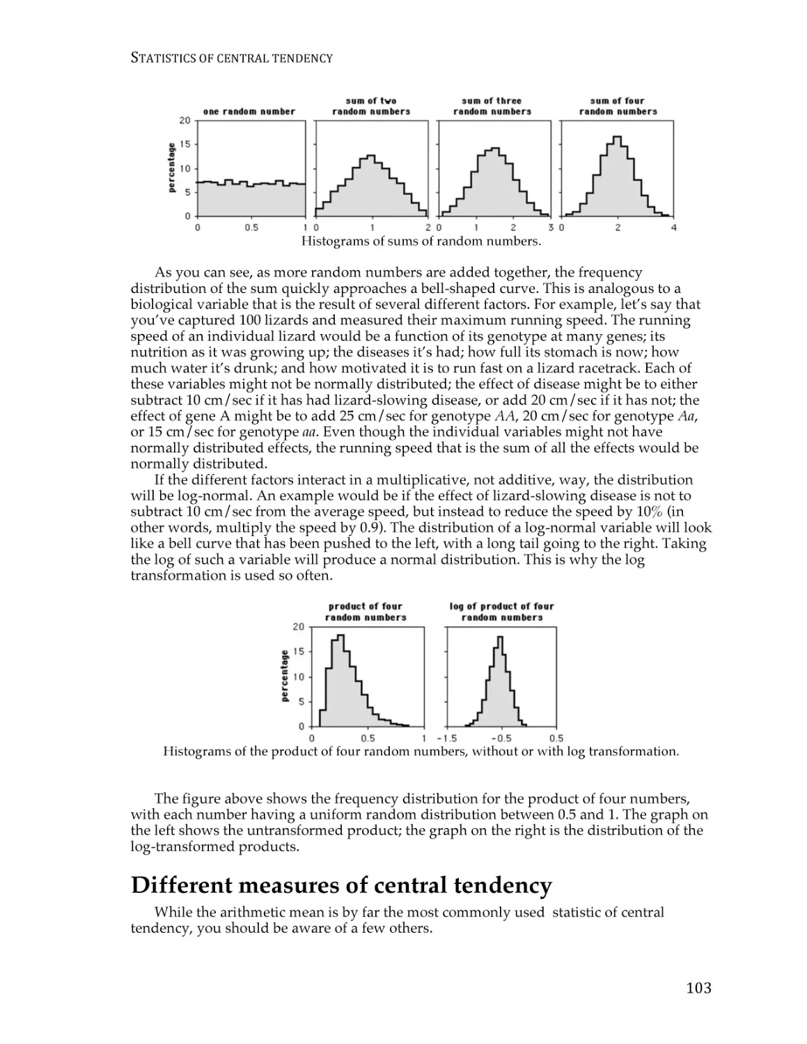
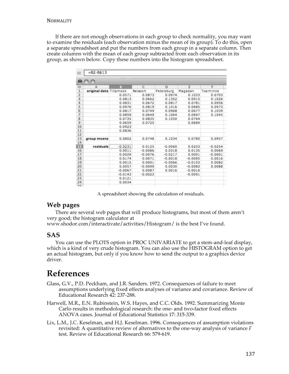
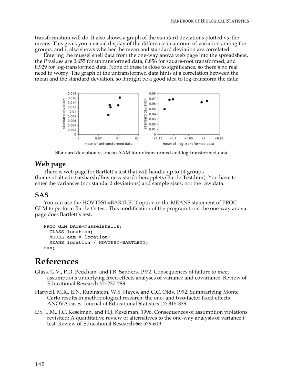
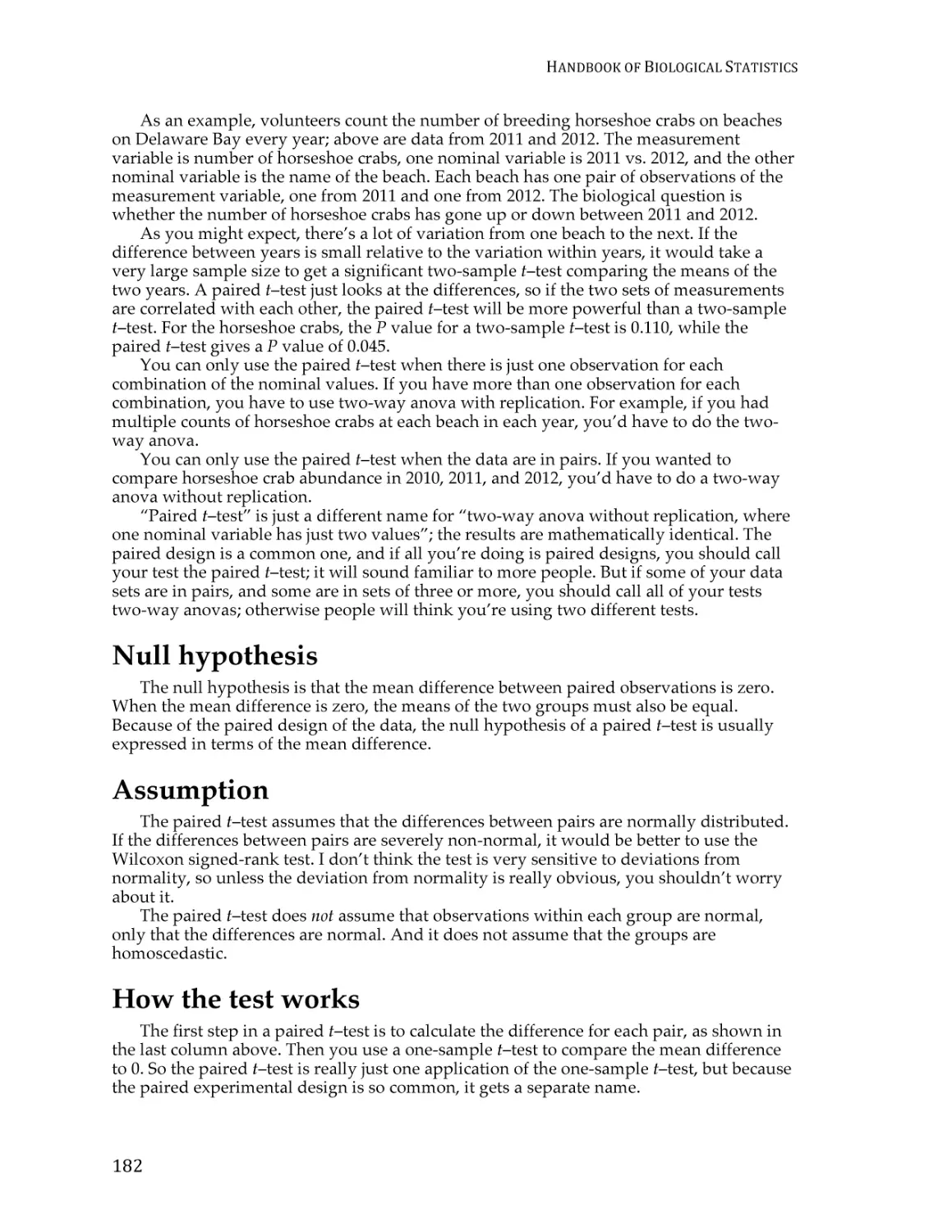
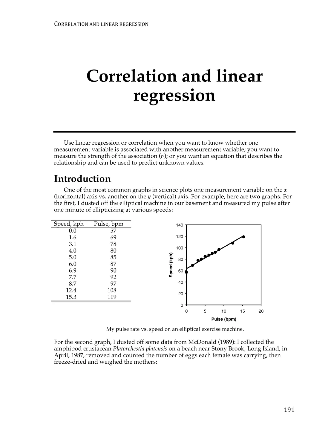
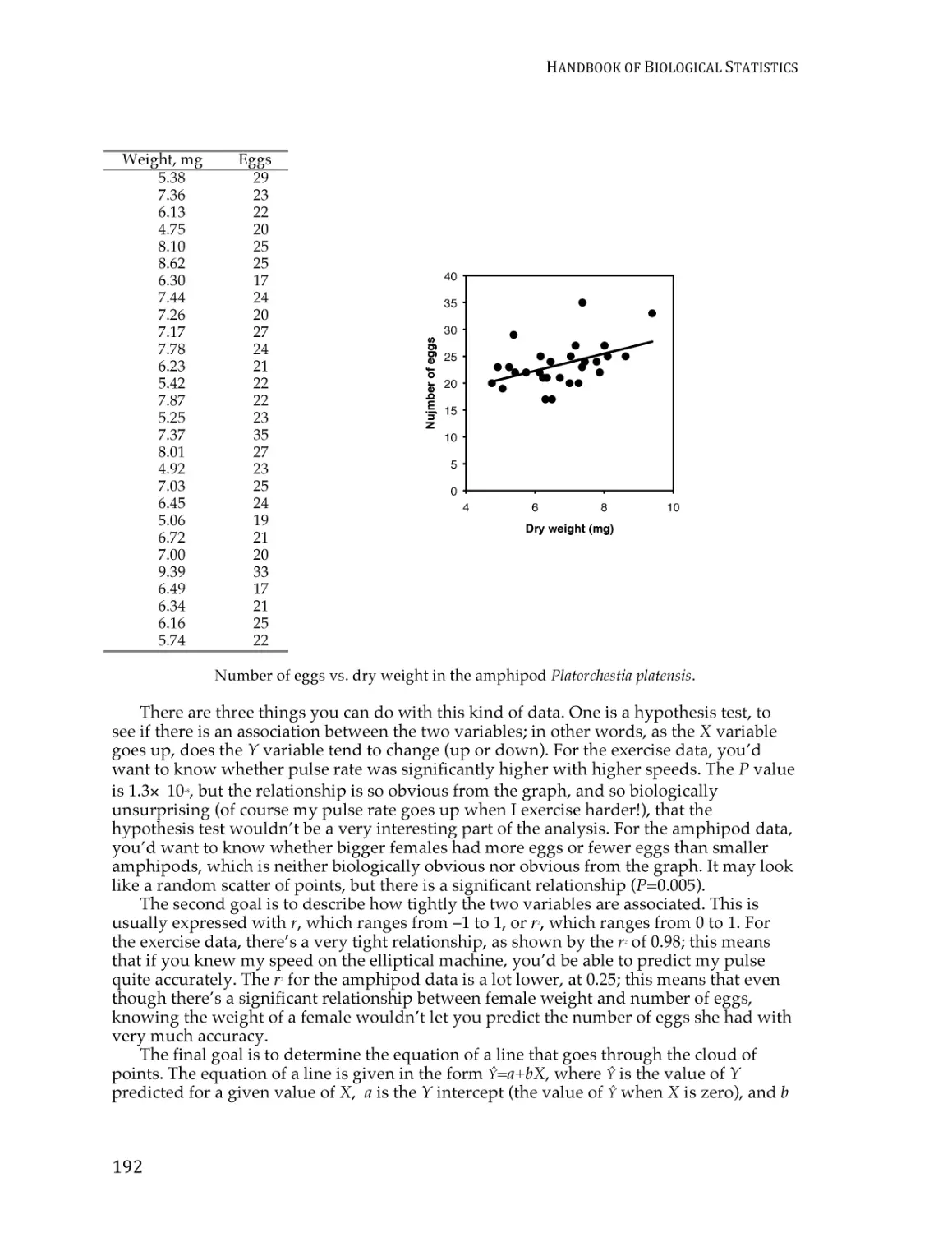
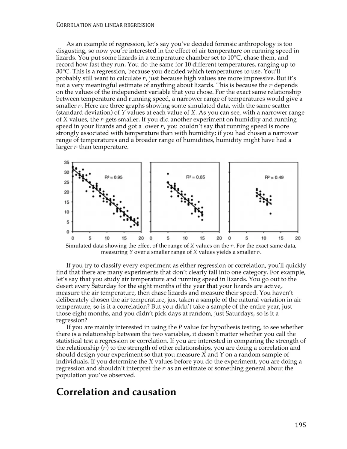
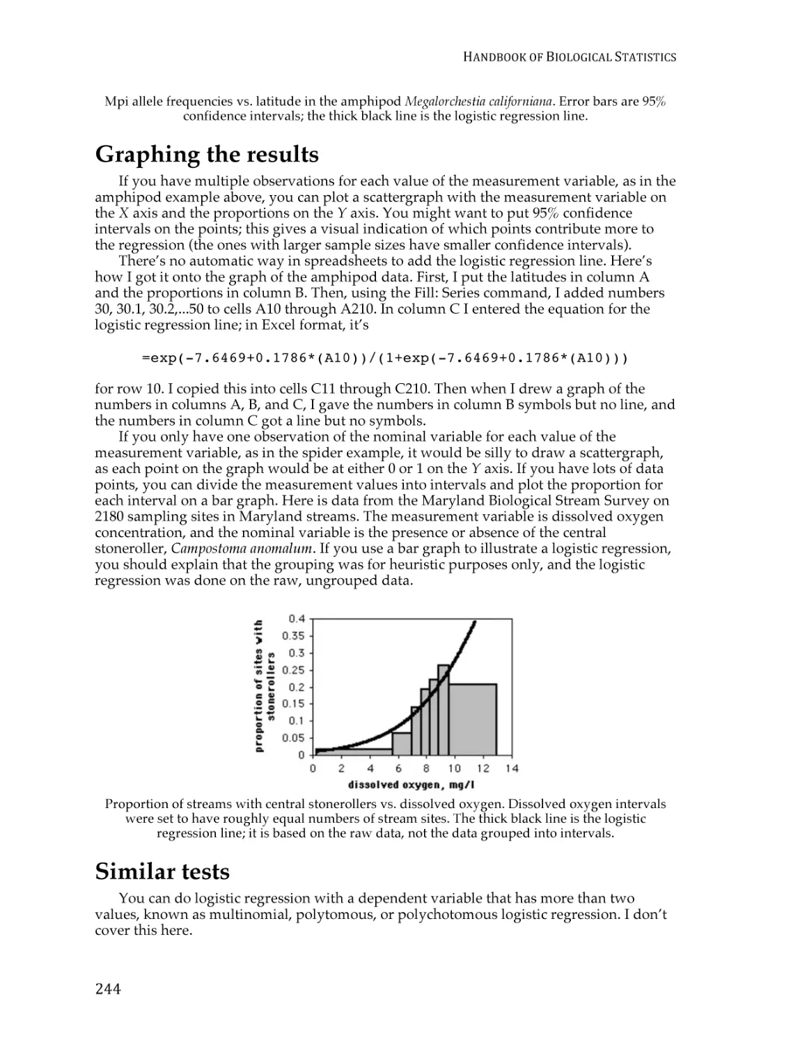
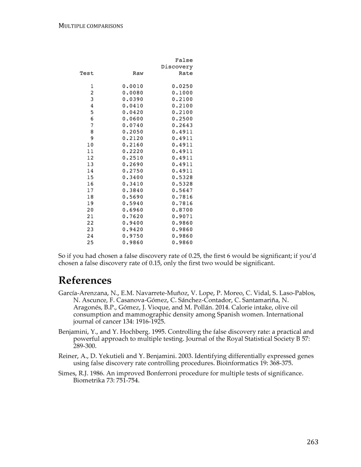
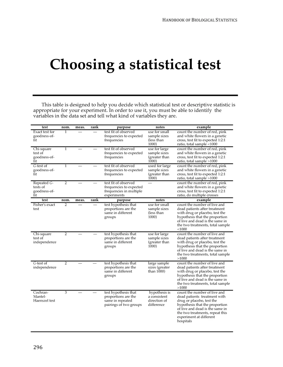
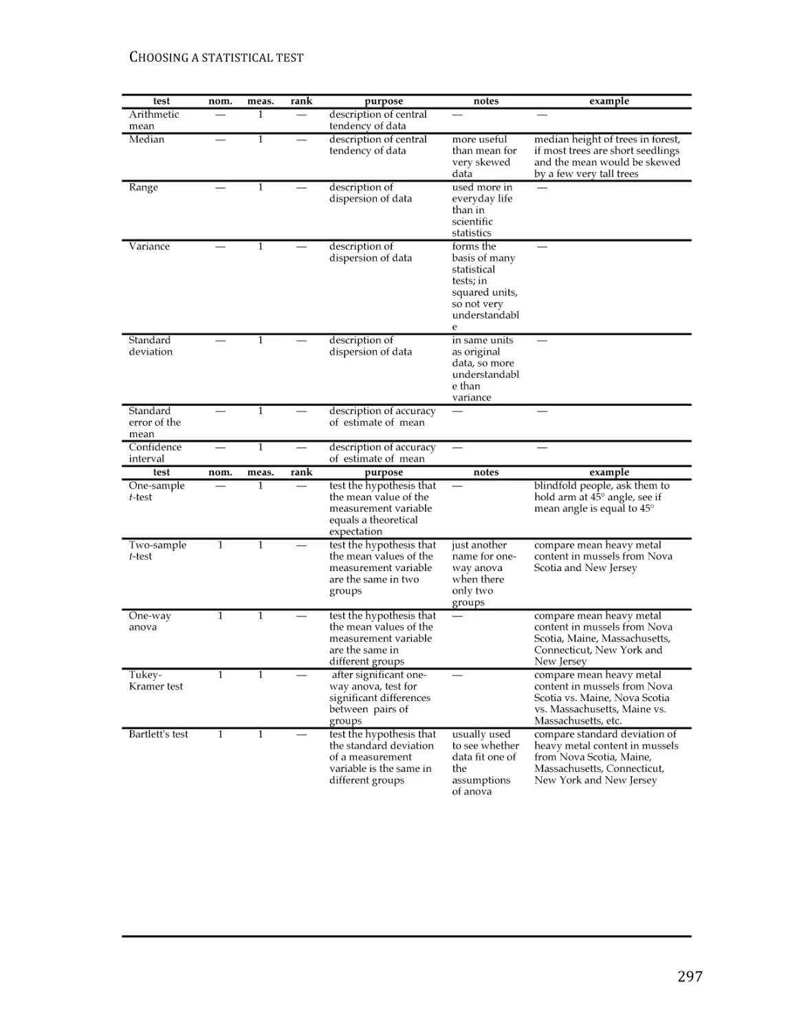
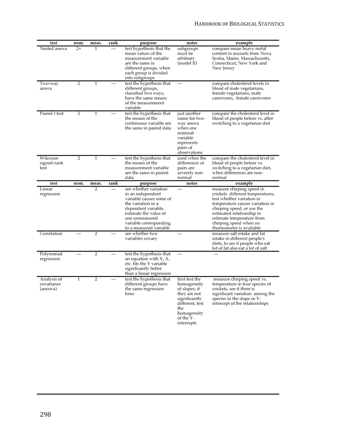
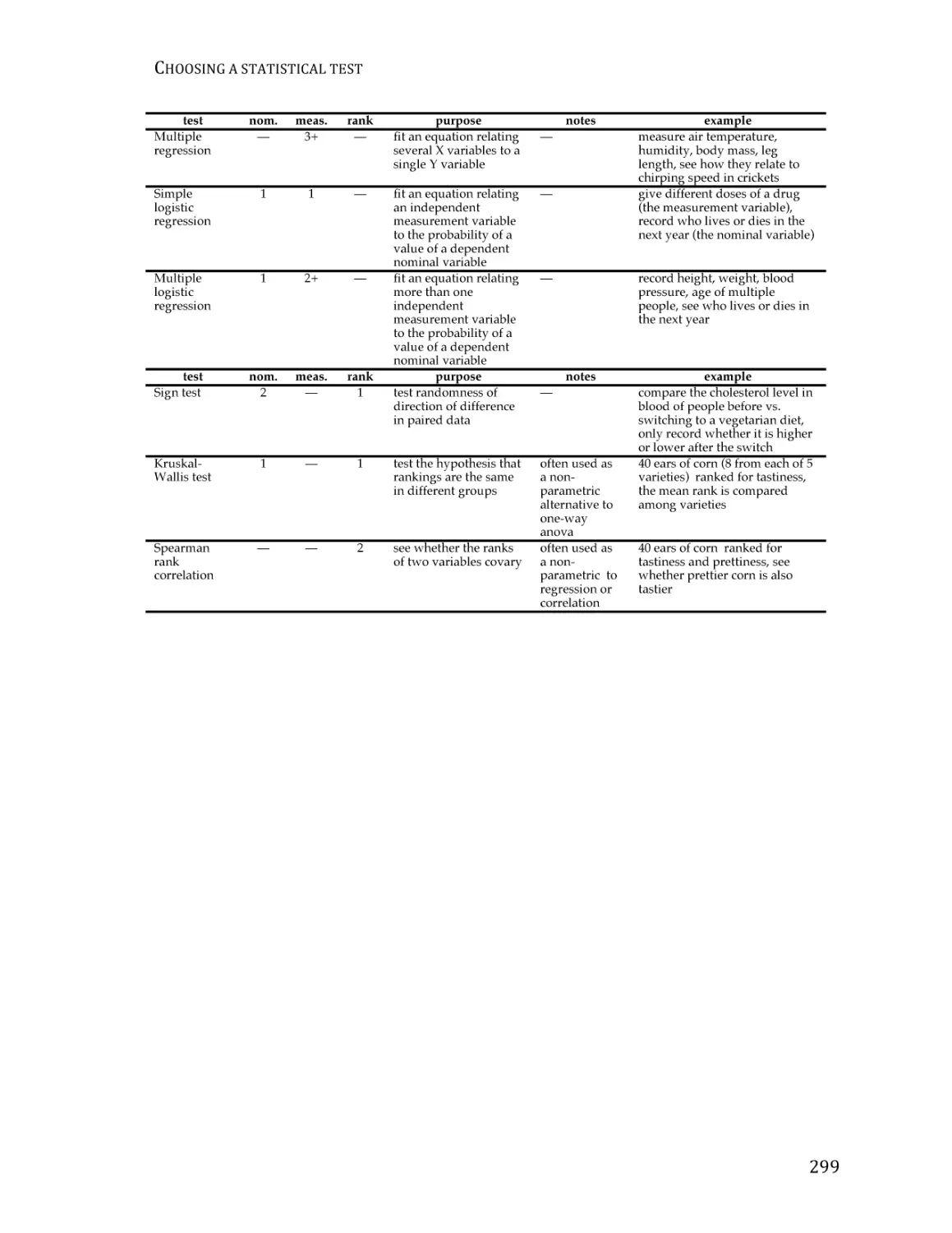
/


Text
HANDBOOK OF
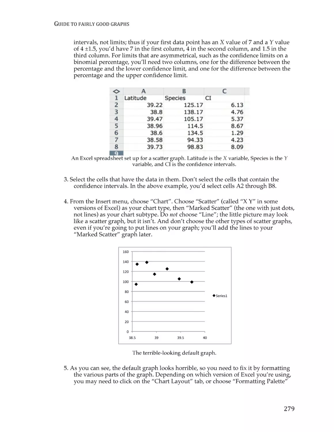
BI O L O G I C A L
STATISTICS
T H I R D
E D I T I O N
JOHN H. MCDONALD
University of Delaware
SPARKY HOUSE PUBLISHING
Baltimore, Maryland, U.S.A.
©2014 by John H. McDonald
Non-commercial reproduction of this content, with attribution, is permitted;
for-profit reproduction without permission is prohibited.
See http://www.biostathandbook.com/permissions.html for details.
CONTENTS
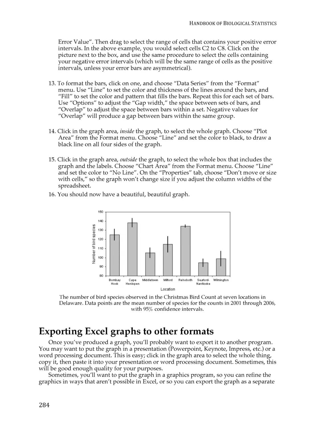
Contents
Basics
Introduction ............................................................................................................................ 1
Step-by-step analysis of biological data ............................................................................. 3
Types of biological variables ................................................................................................ 6
Probability............................................................................................................................. 14
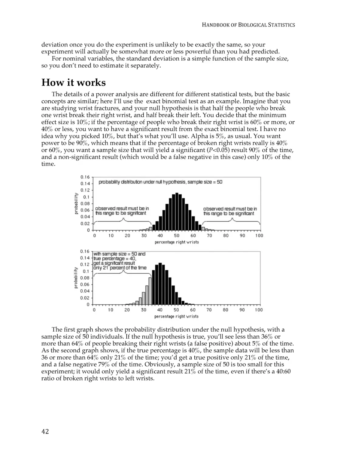
Basic concepts of hypothesis testing ................................................................................. 16
Confounding variables ....................................................................................................... 24
Tests for nominal variables
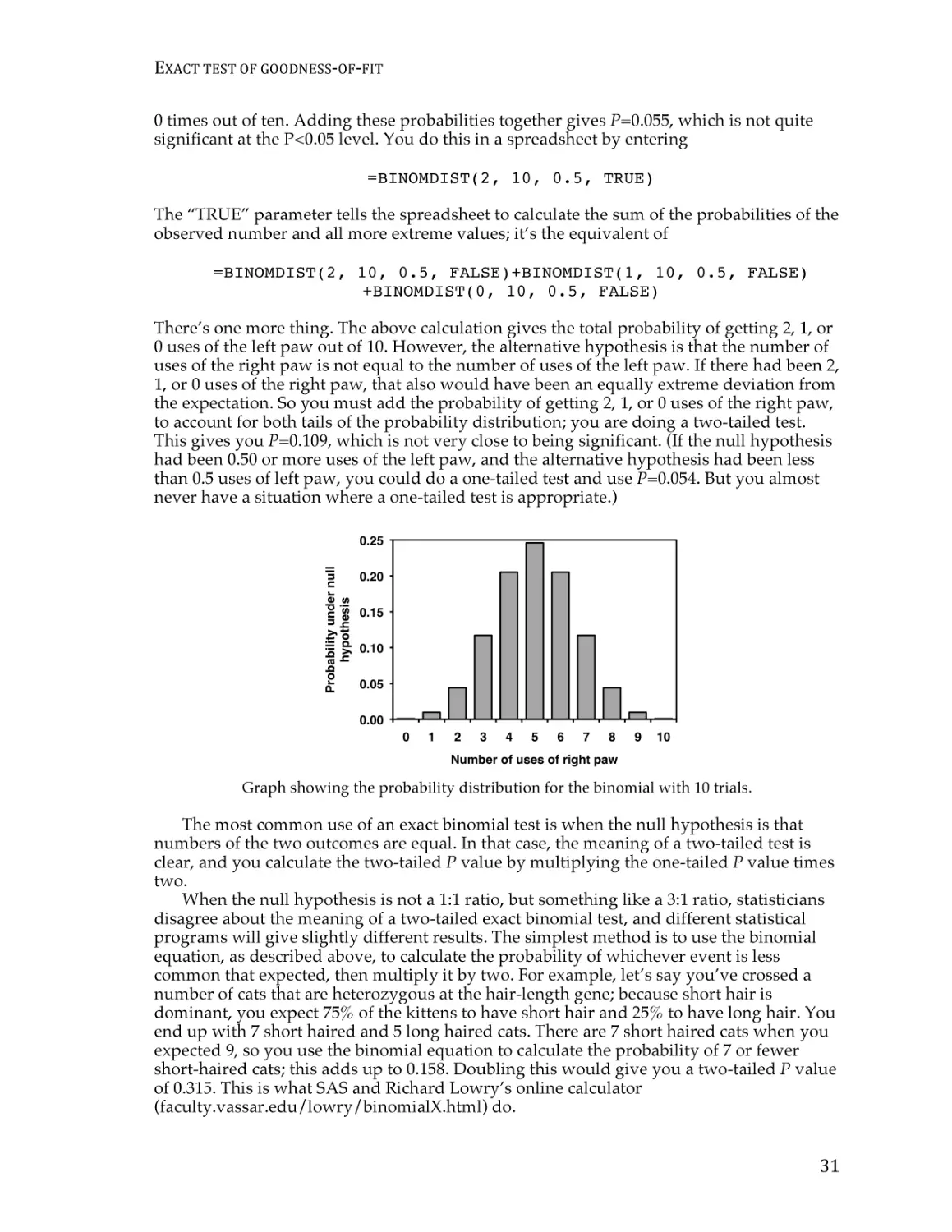
Exact test of goodness-of-fit ............................................................................................... 29
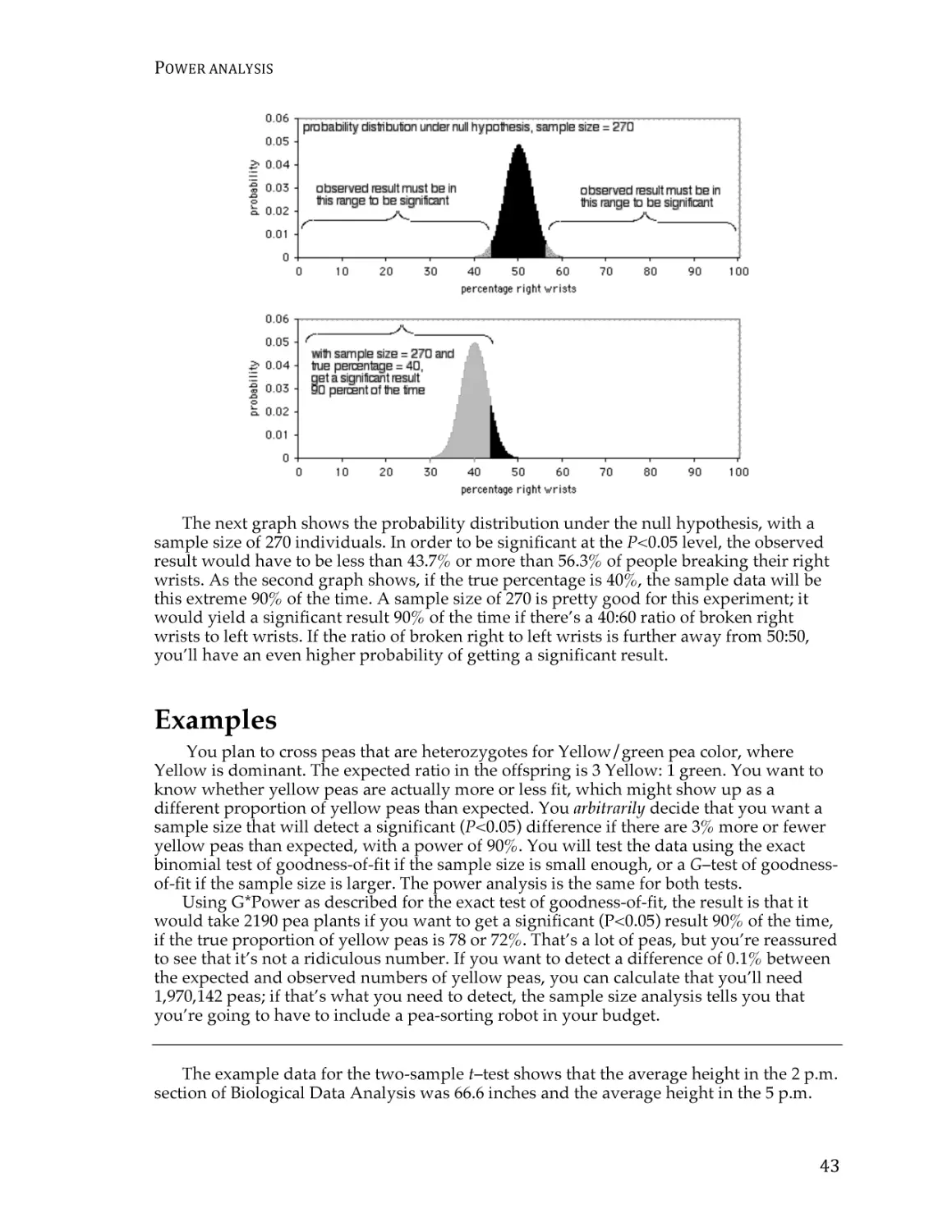
Power analysis ..................................................................................................................... 40
Chi-square test of goodness-of-fit ..................................................................................... 45
G–test of goodness-of-fit ..................................................................................................... 53
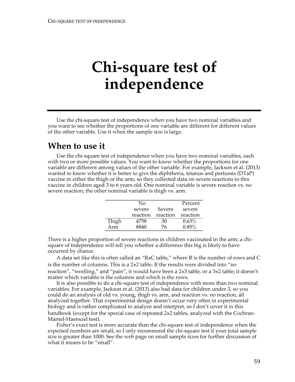
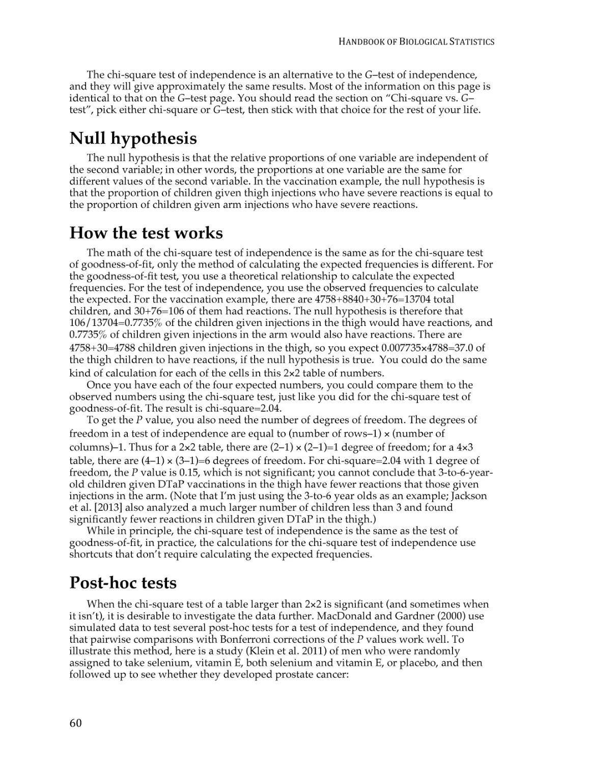
Chi-square test of independence ....................................................................................... 59
G–test of independence ...................................................................................................... 68
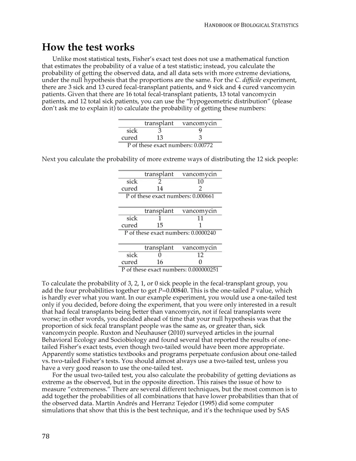
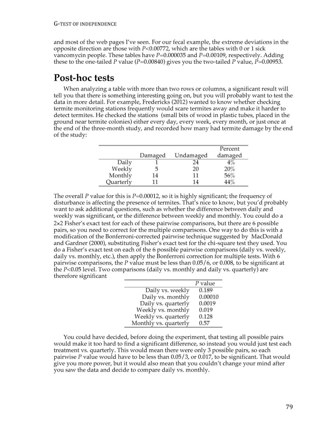
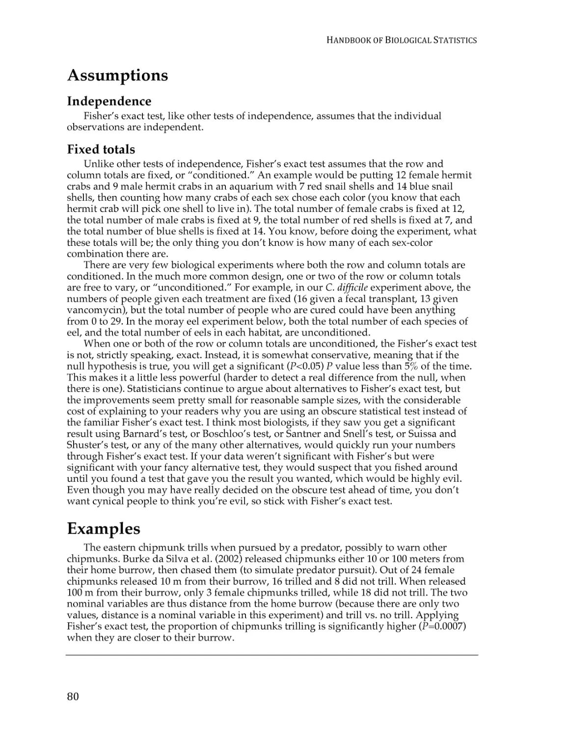
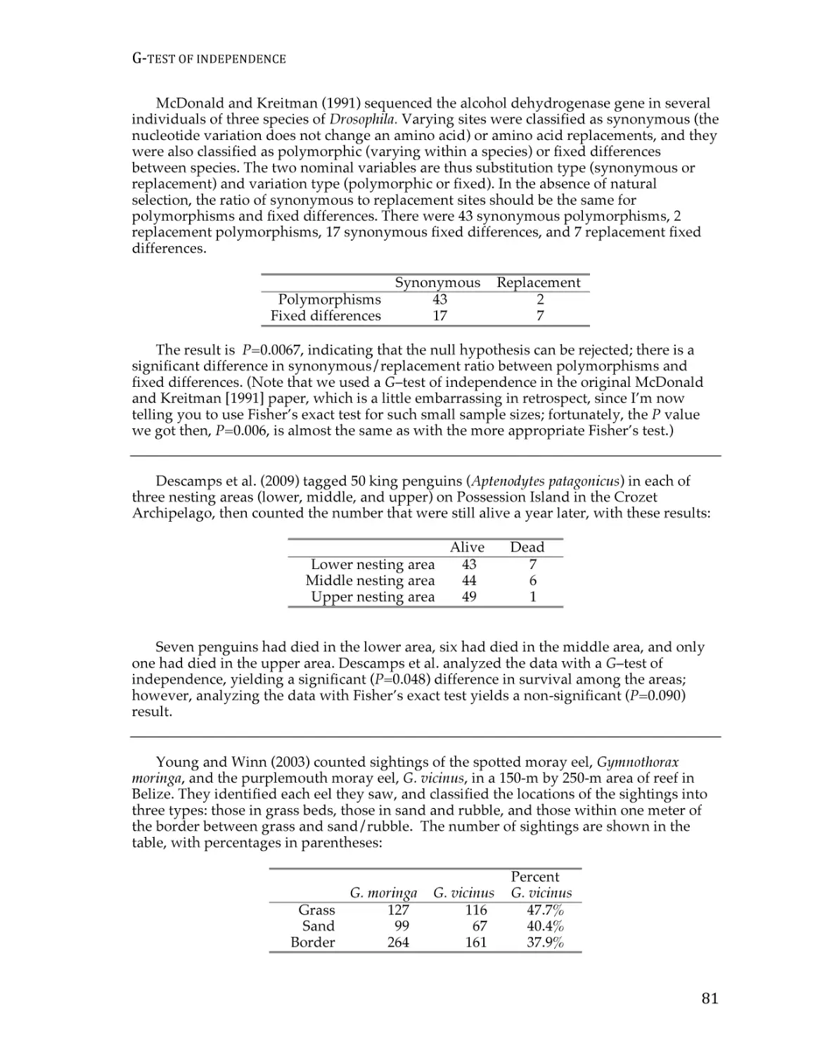
Fisher’s exact test of independence ................................................................................... 77
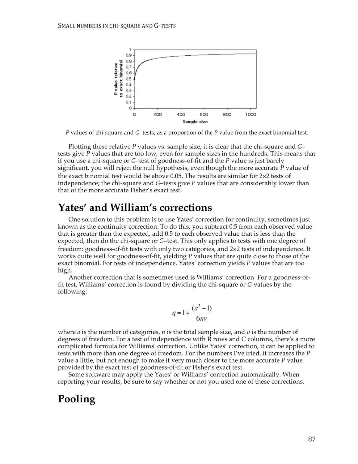
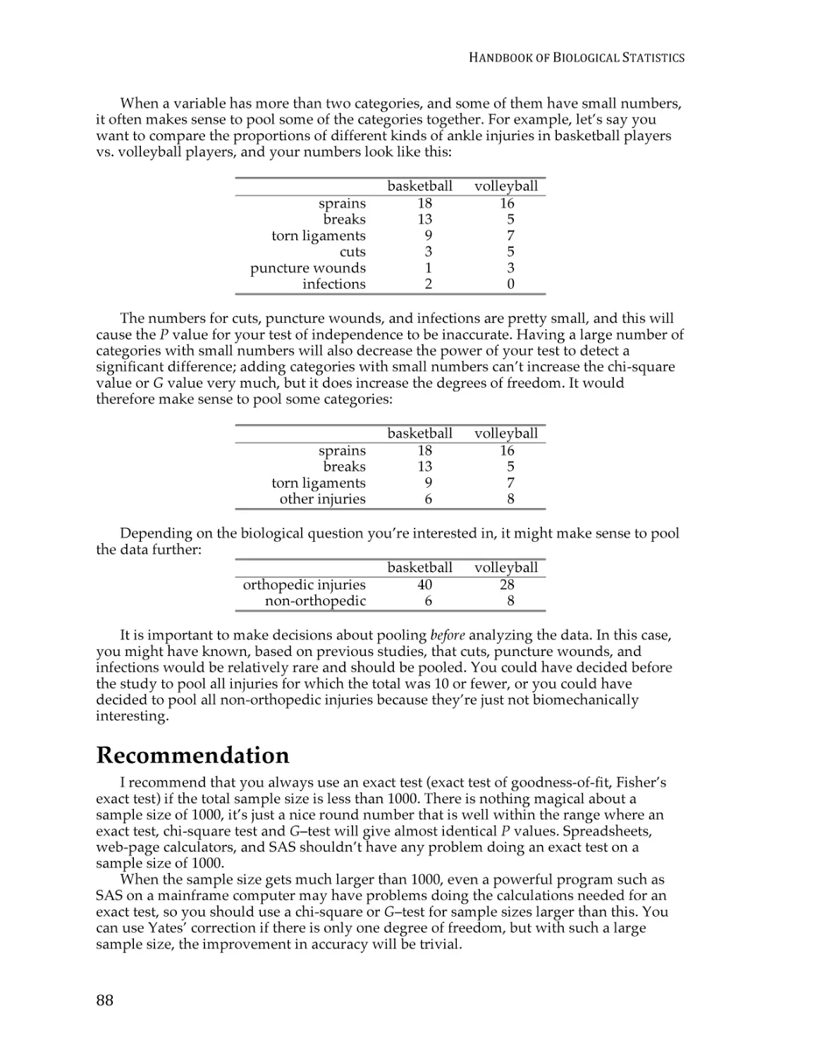
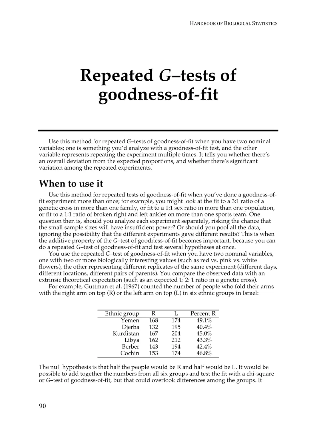
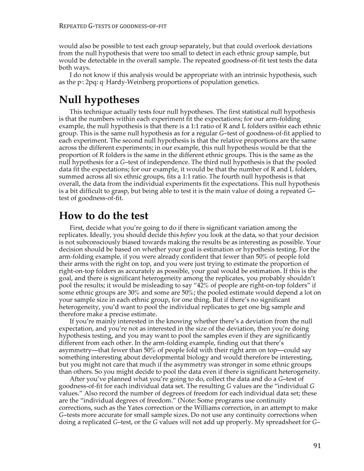
Small numbers in chi-square and G–tests ........................................................................ 86
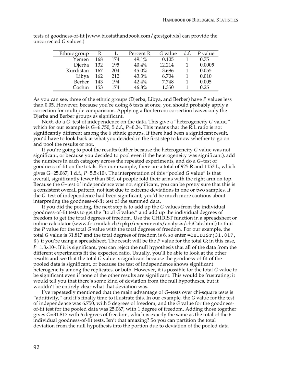
Repeated G–tests of goodness-of-fit ................................................................................. 90
Cochran–Mantel–Haenszel test for repeated tests of independence ........................... 94
Descriptive statistics
Statistics of central tendency ............................................................................................ 101
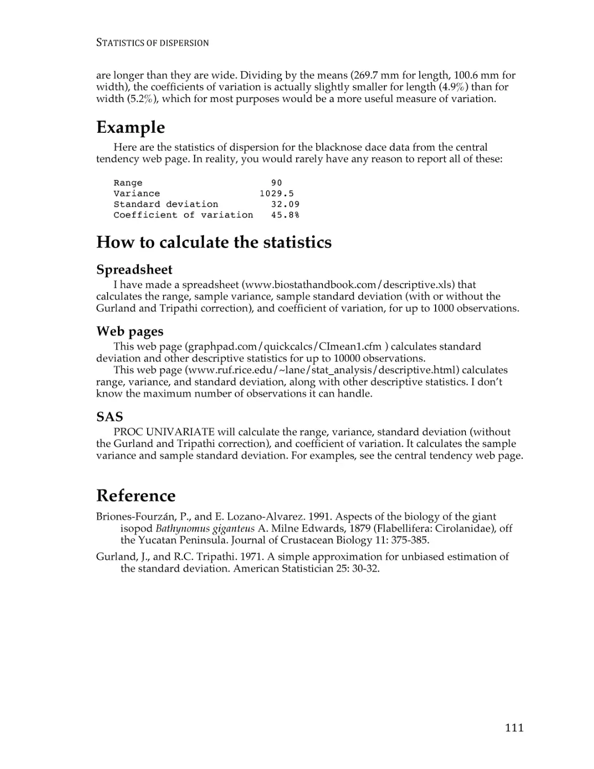
Statistics of dispersion....................................................................................................... 107
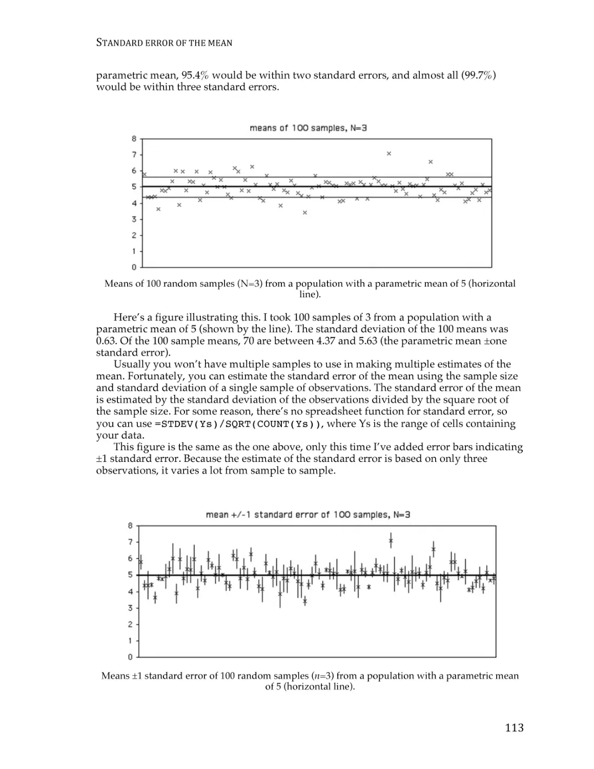
Standard error of the mean .............................................................................................. 111
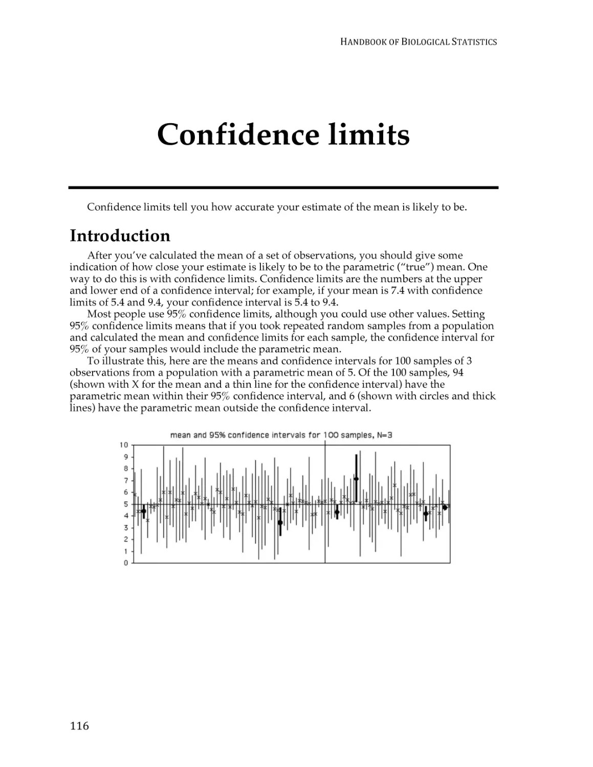
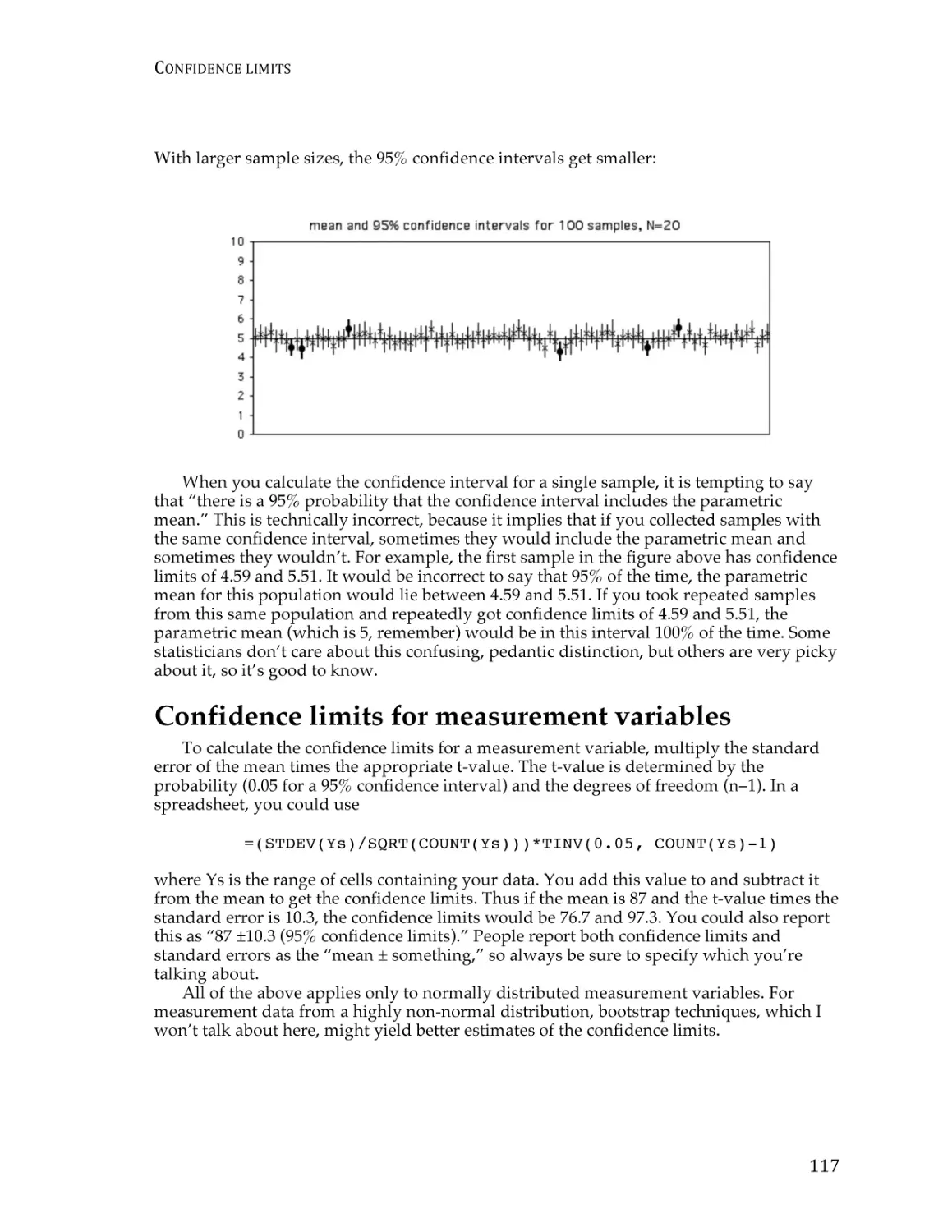
Confidence limits ............................................................................................................... 115
Tests for one measurement variable
Student’s t–test for one sample ........................................................................................ 121
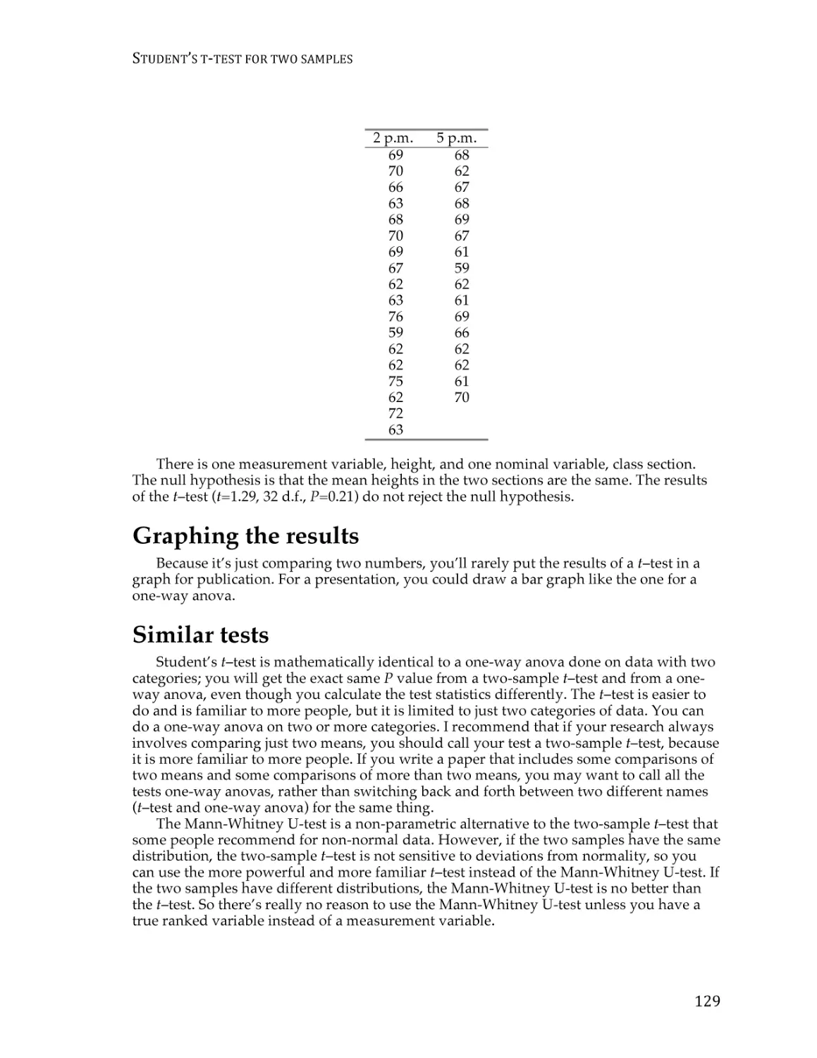
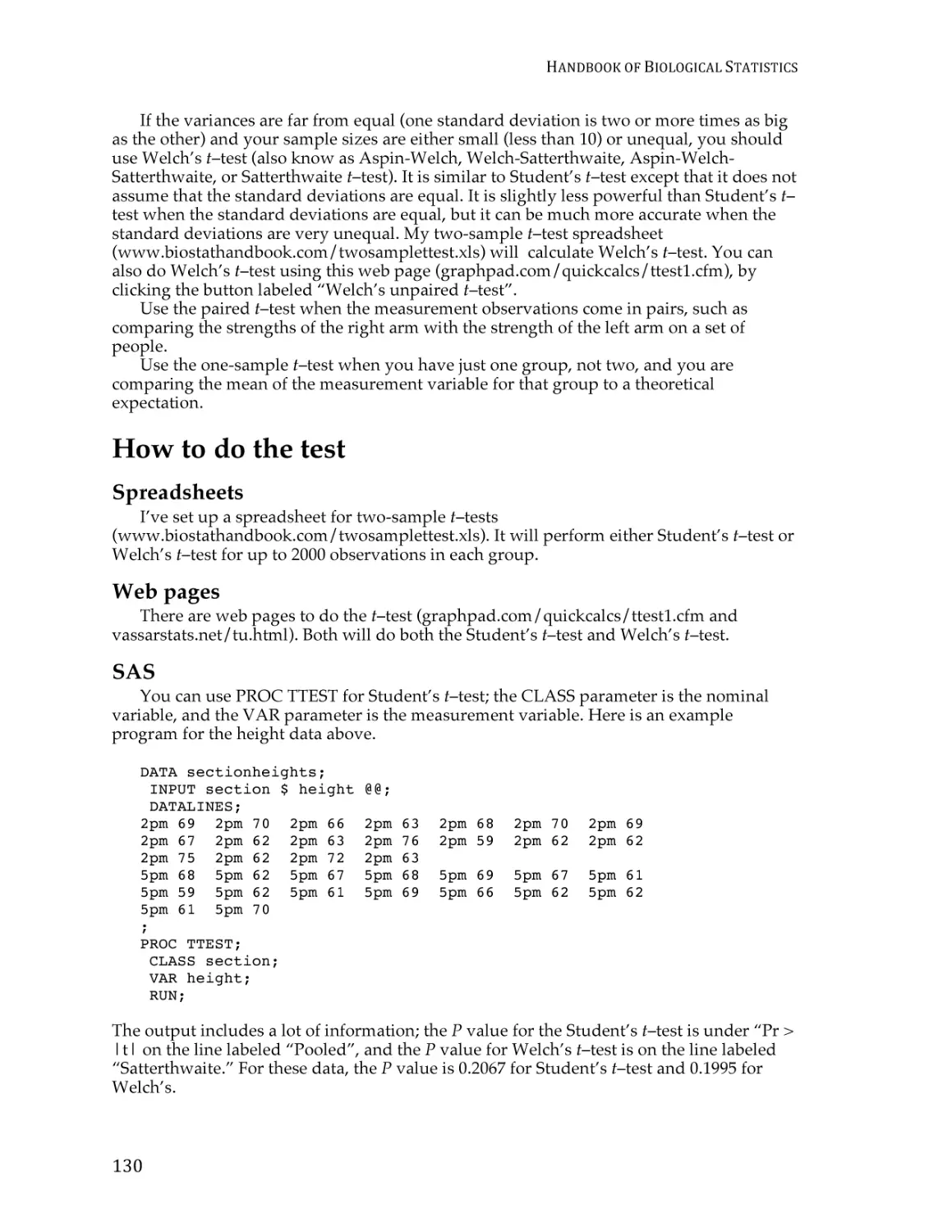
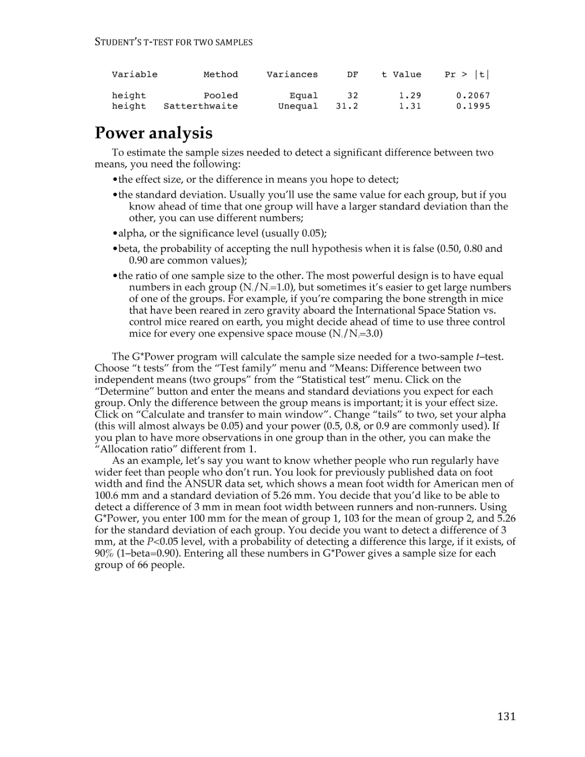
Student’s t–test for two samples ...................................................................................... 126
Independence ..................................................................................................................... 131
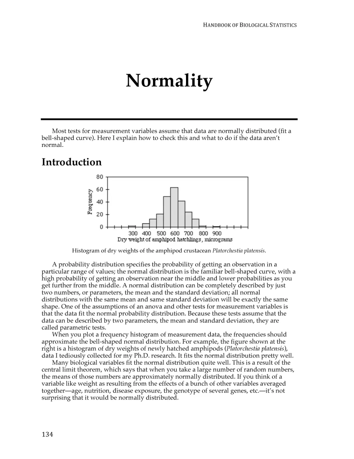
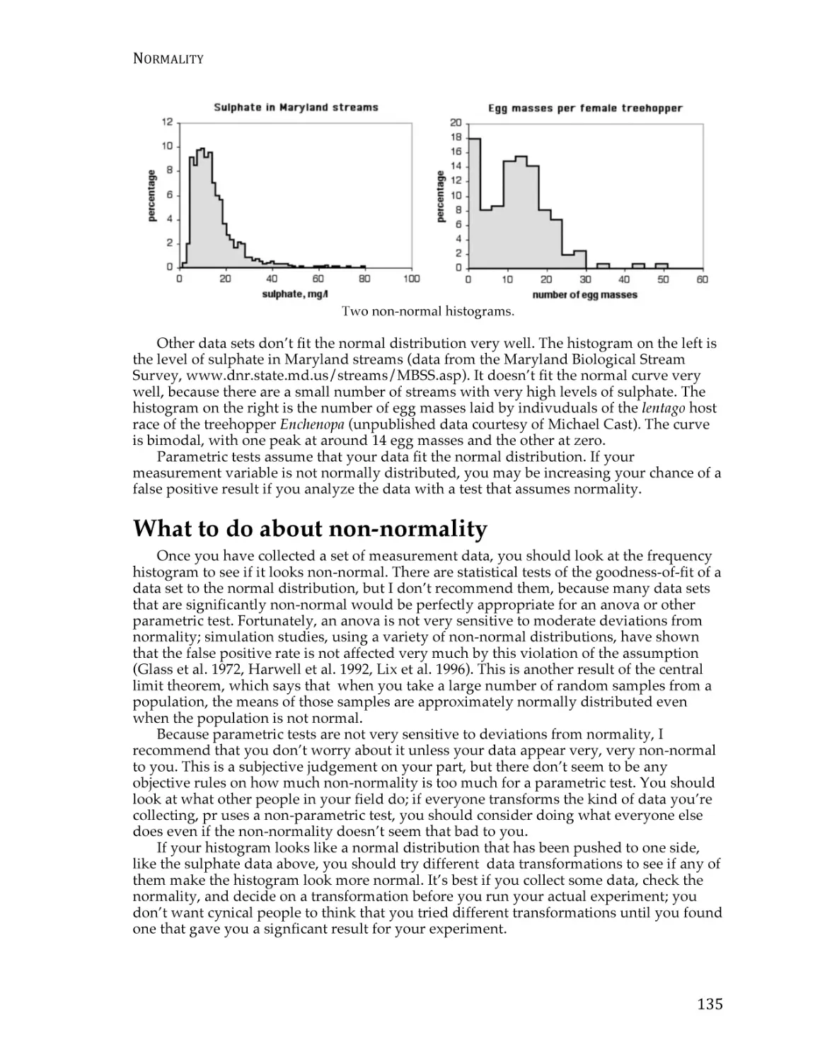
Normality ............................................................................................................................ 133
Homoscedasticity and heteroscedasticity ...................................................................... 137
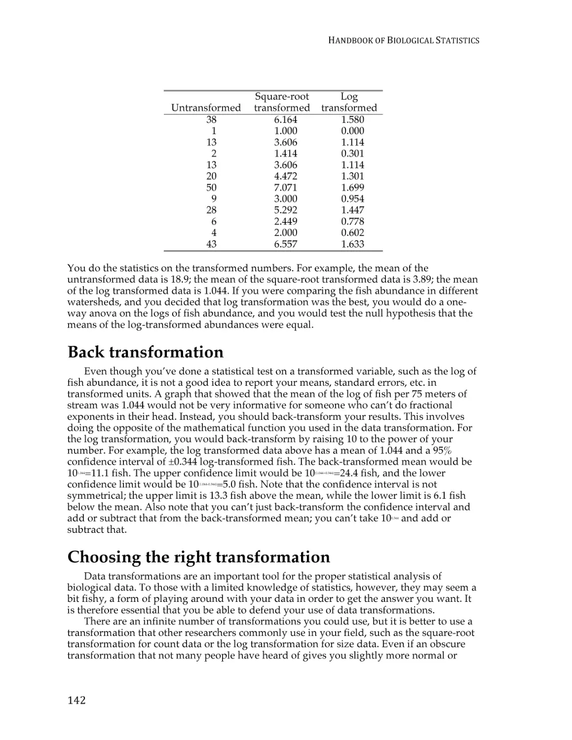
Data transformations......................................................................................................... 140
One-way anova .................................................................................................................. 145
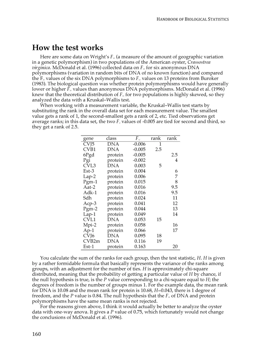
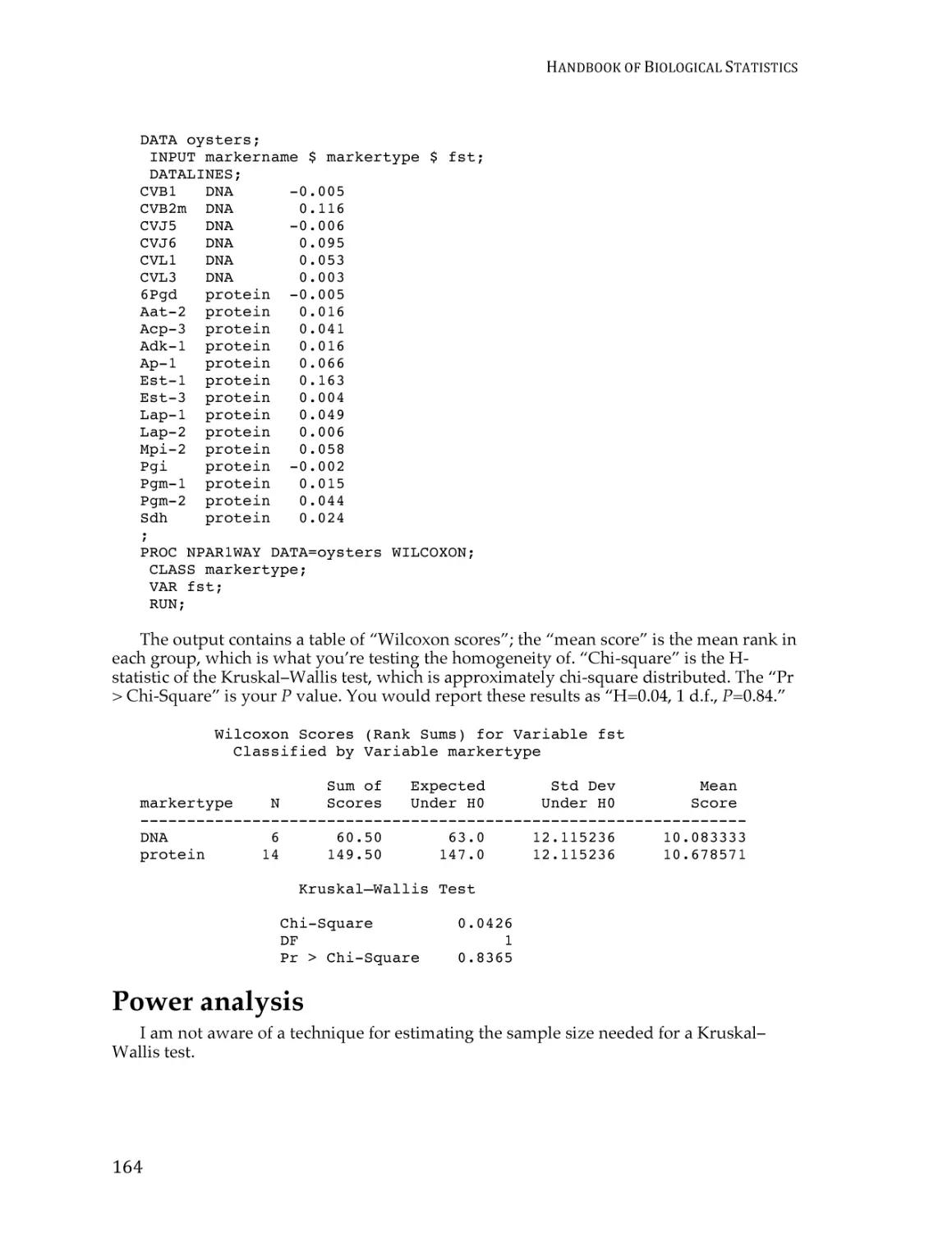
Kruskal–Wallis test ............................................................................................................ 157
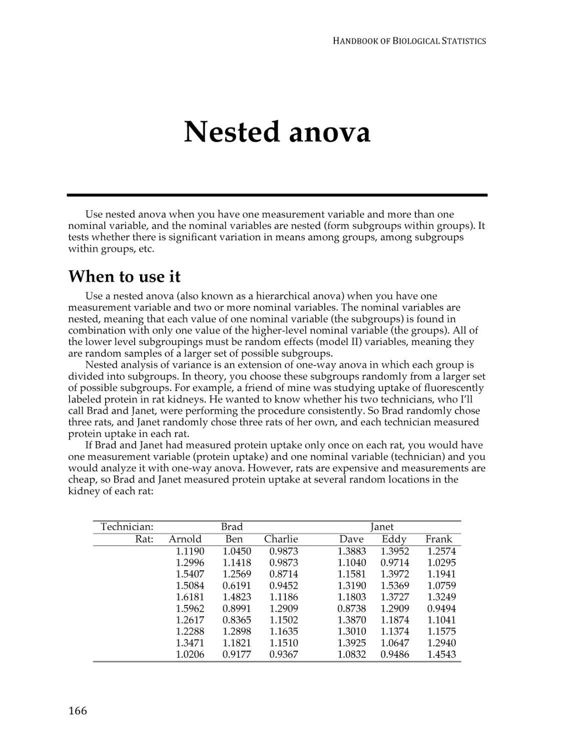
Nested anova ...................................................................................................................... 165
Two-way anova.................................................................................................................. 173
Paired t–test ........................................................................................................................ 180
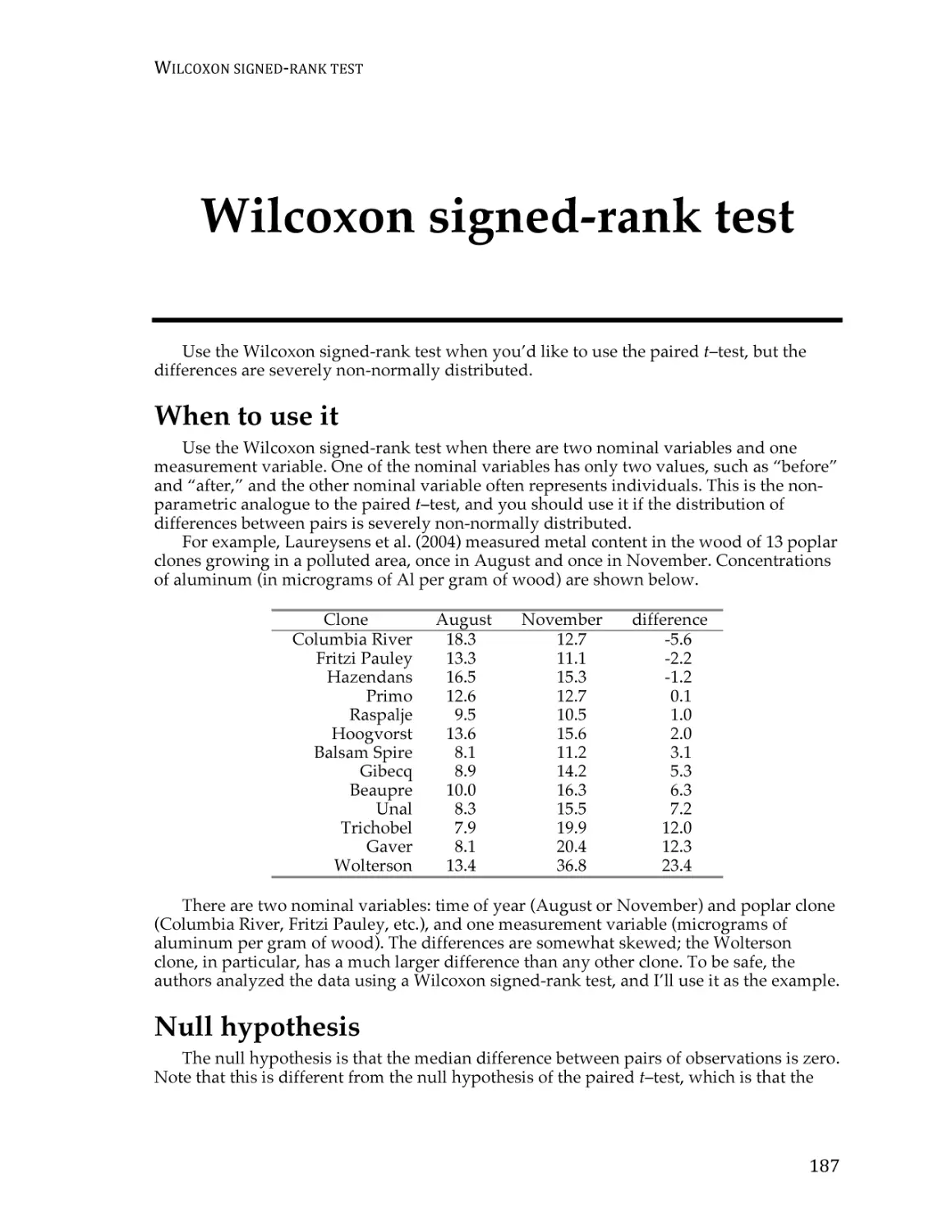
Wilcoxon signed-rank test ................................................................................................ 186
i
HANDBOOK
OF
BIOLOGICAL
STATISTICS
Regressions
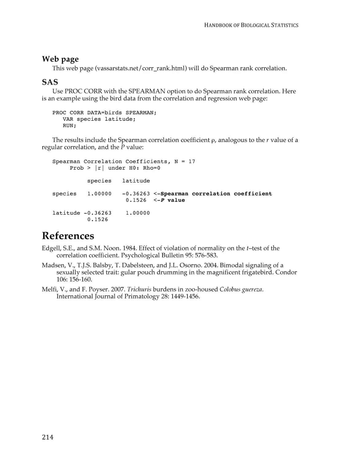
Correlation and linear regression.................................................................................... 190
Spearman rank correlation ............................................................................................... 209
Curvilinear regression ...................................................................................................... 213
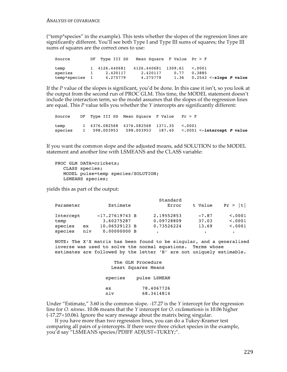
Analysis of covariance ...................................................................................................... 220
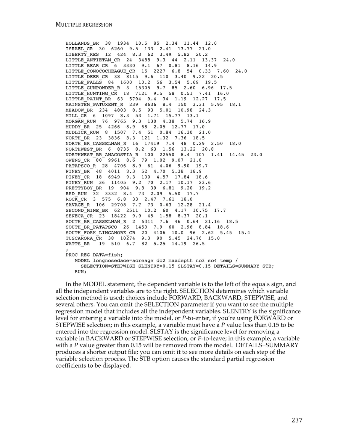
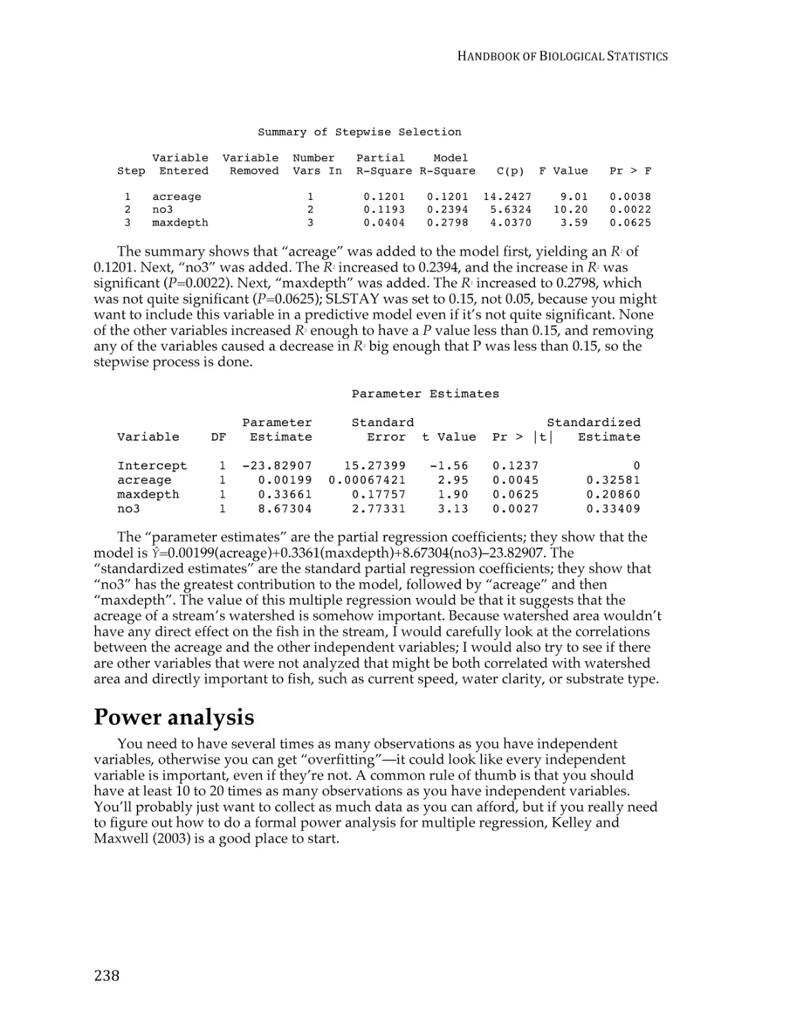
Multiple regression ........................................................................................................... 229
Simple logistic regression ................................................................................................. 238
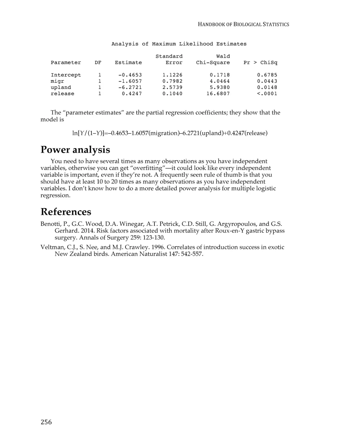
Multiple logistic regression .............................................................................................. 247
Multiple tests
Multiple comparisons ....................................................................................................... 254
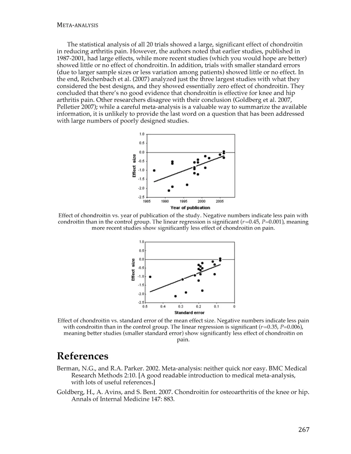
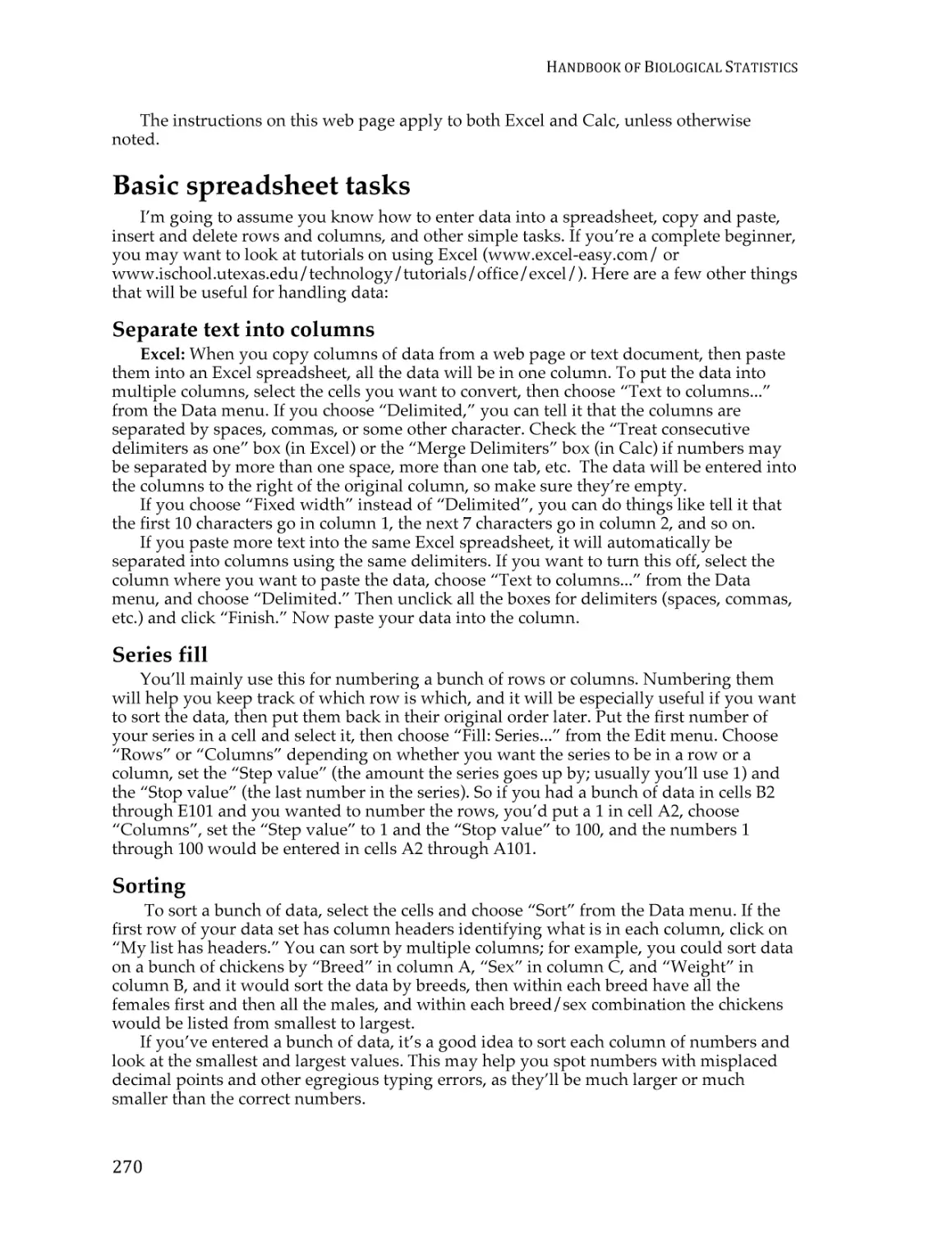
Meta-analysis ..................................................................................................................... 261
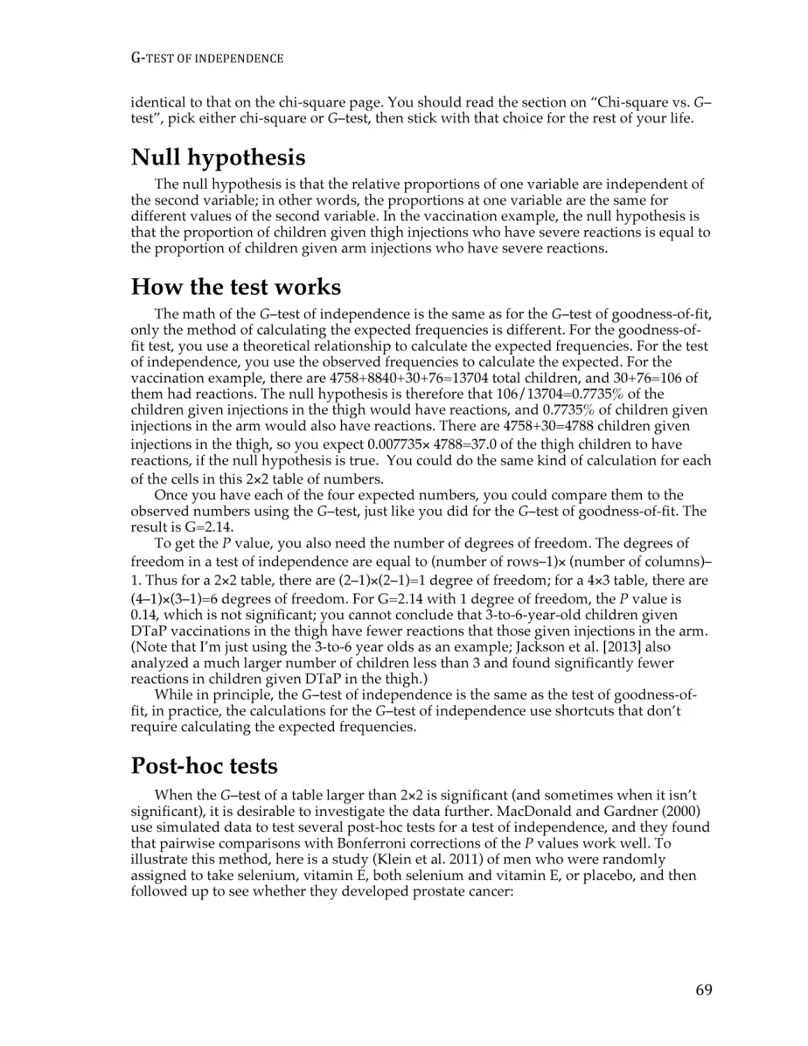
Miscellany
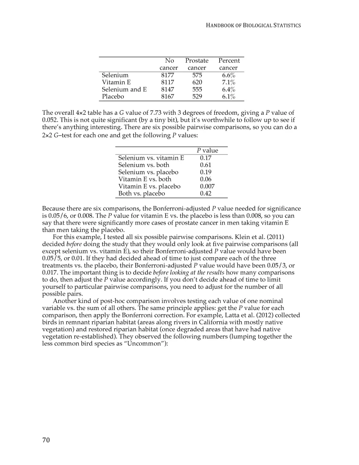
Using spreadsheets for statistics ..................................................................................... 266
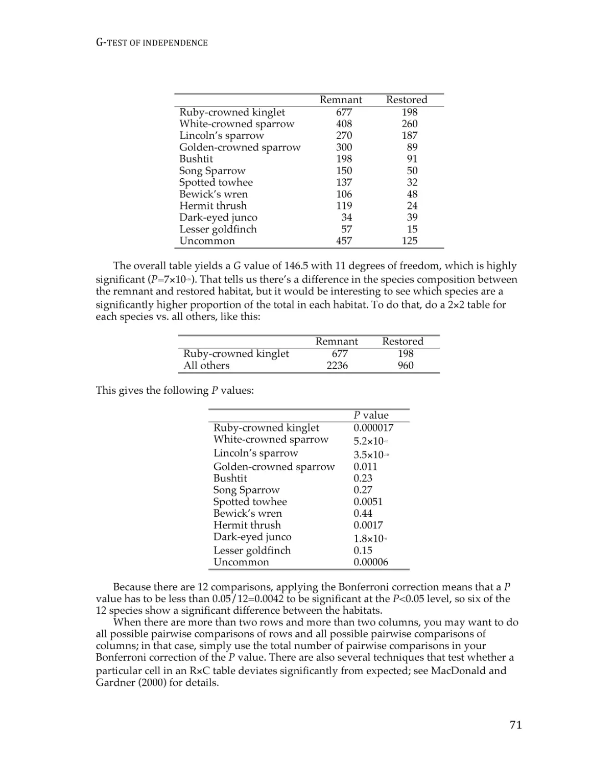
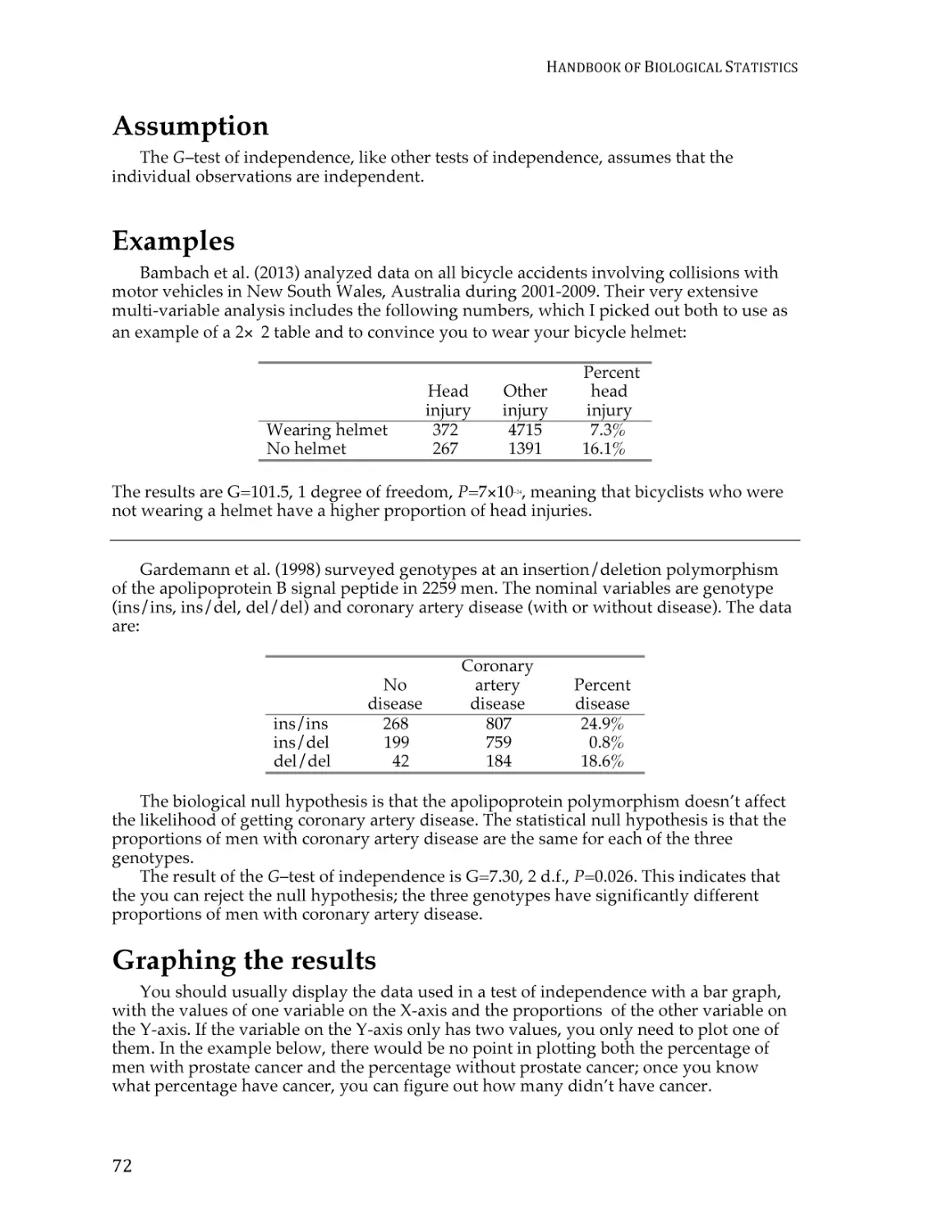
Guide to fairly good graphs ............................................................................................. 274
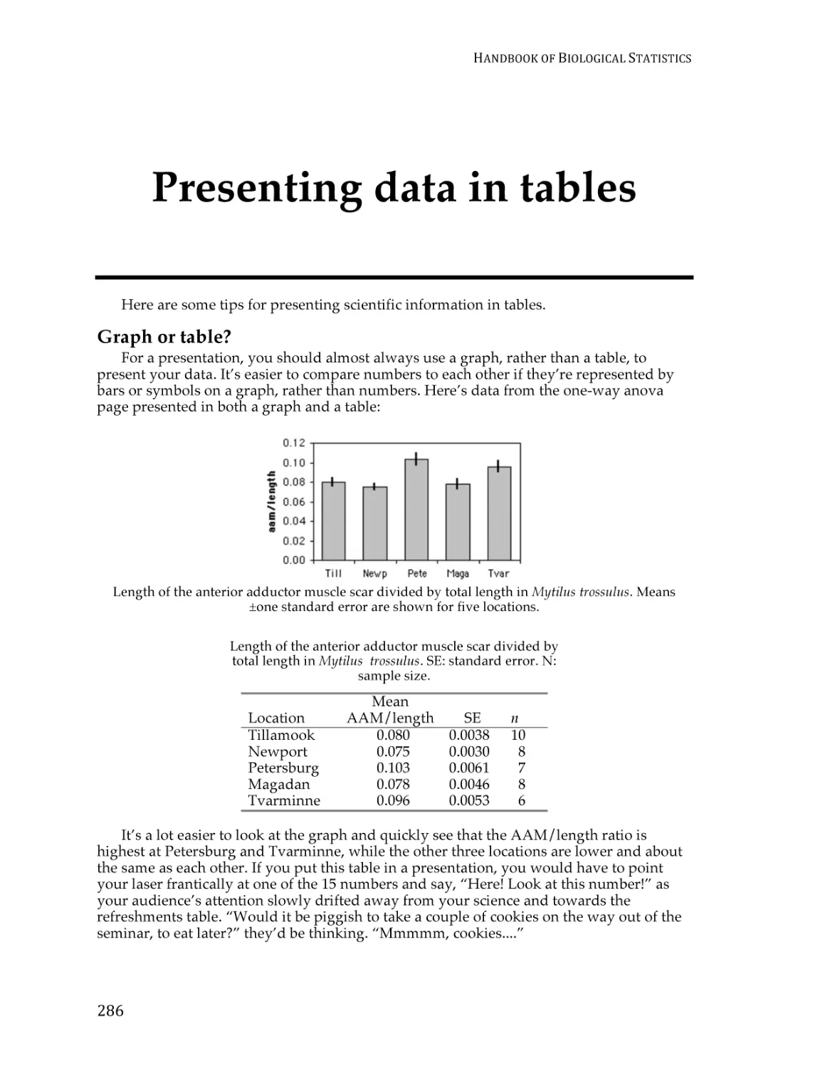
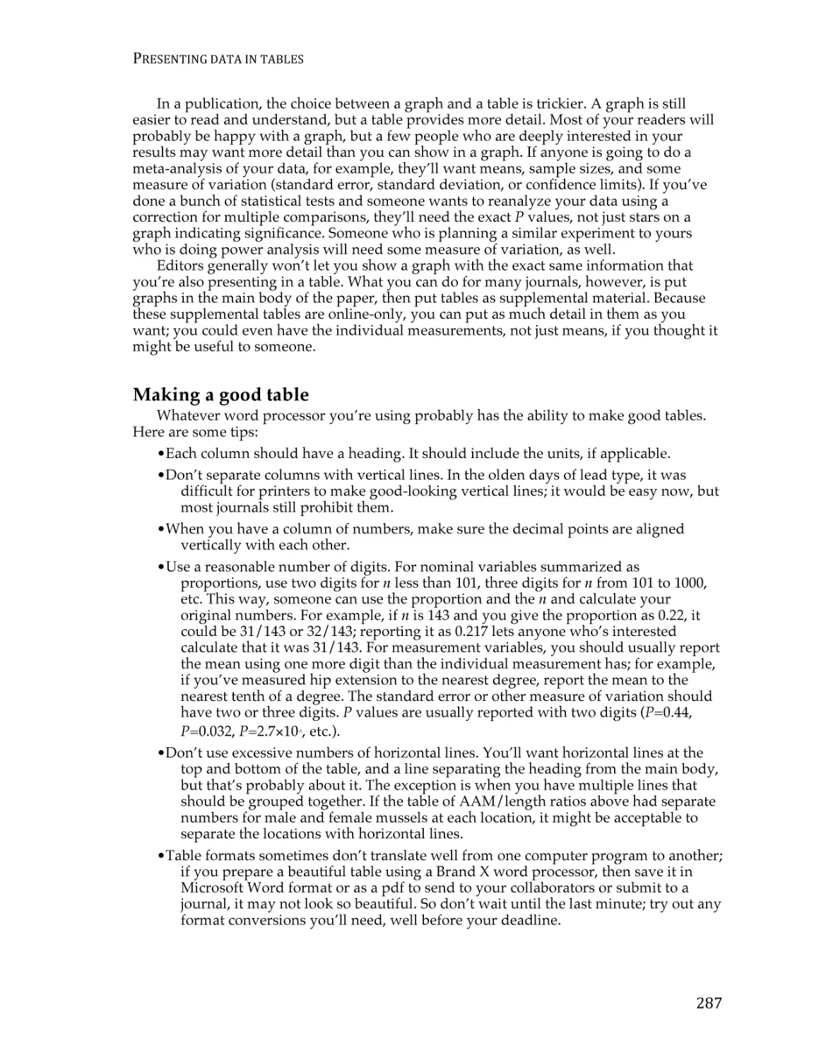
Presenting data in tables ................................................................................................... 283
Getting started with SAS .................................................................................................. 285
Choosing a statistical test ................................................................................................. 293
ii
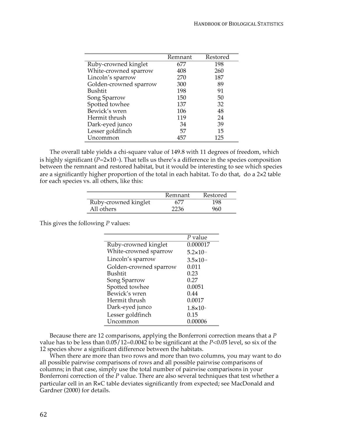
INTRODUCTION
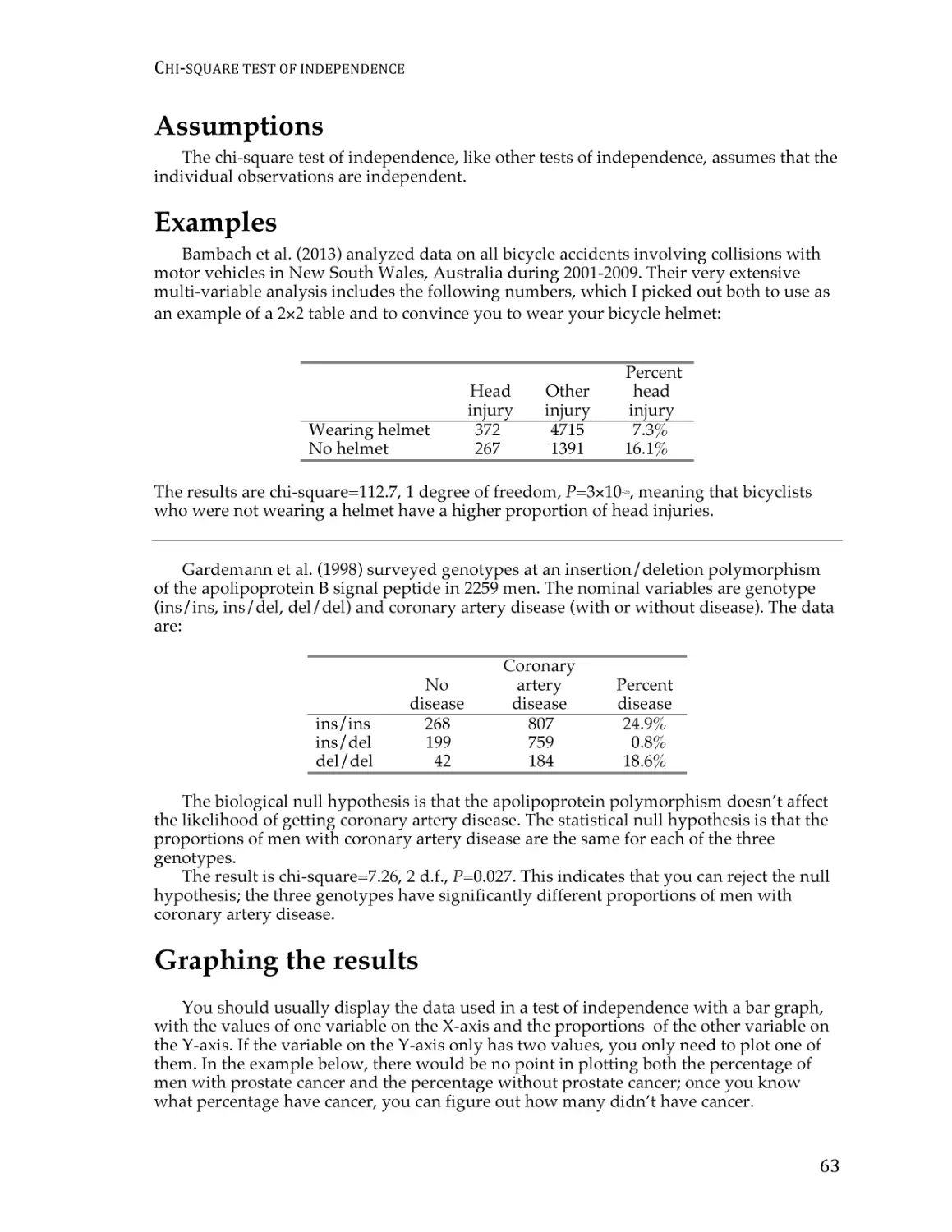
Introduction
Welcome to the Third Edition of the Handbook of Biological Statistics! This textbook
evolved from a set of notes for my Biological Data Analysis class at the University of
Delaware. My main goal in that class is to teach biology students how to choose the
appropriate statistical test for a particular experiment, then apply that test and interpret
the results. In my class and in this textbook, I spend relatively little time on the
mathematical basis of the tests; for most biologists, statistics is just a useful tool, like a
microscope, and knowing the detailed mathematical basis of a statistical test is as
unimportant to most biologists as knowing which kinds of glass were used to make a
microscope lens. Biologists in very statistics-intensive fields, such as ecology,
epidemiology, and systematics, may find this handbook to be a bit superficial for their
needs, just as a biologist using the latest techniques in 4-D, 3-photon confocal microscopy
needs to know more about their microscope than someone who’s just counting the hairs
on a fly’s back. But I hope that biologists in many fields will find this to be a useful
introduction to statistics.
I have provided a spreadsheet to perform many of the statistical tests. Each comes
with sample data already entered; just download the spreadsheet, replace the sample data
with your data, and you’ll have your answer. The spreadsheets were written for Excel, but
they should also work using the free program Calc, part of the OpenOffice.org suite of
programs. If you’re using OpenOffice.org, some of the graphs may need re-formatting,
and you may need to re-set the number of decimal places for some numbers. Let me know
if you have a problem using one of the spreadsheets, and I’ll try to fix it.
I’ve also linked to a web page for each test wherever possible. I found most of these
web pages using John Pezzullo’s excellent list of Interactive Statistical Calculation Pages
(www.statpages.org), which is a good place to look for information about tests that are
not discussed in this handbook.
There are instructions for performing each statistical test in SAS, as well. It’s not as
easy to use as the spreadsheets or web pages, but if you’re going to be doing a lot of
advanced statistics, you’re going to have to learn SAS or a similar program sooner or later.
Printed version
While this handbook is primarily designed for online use
(www.biostathandbook.com), you can also buy a spiral-bound, printed copy of the whole
handbook for $18 plus shipping at
www.lulu.com/content/paperback-book/handbook-of-biological-statistics/3862228
I’ve used this print-on-demand service as a convenience to you, not as a money-making
scheme, so please don’t feel obligated to buy one. You can also download a free pdf of the
whole book from www.biostathandbook.com/HandbookBioStatThird.pdf, in case you’d
like to print it yourself or view it on an e-reader.
1
HANDBOOK
OF
BIOLOGICAL
STATISTICS
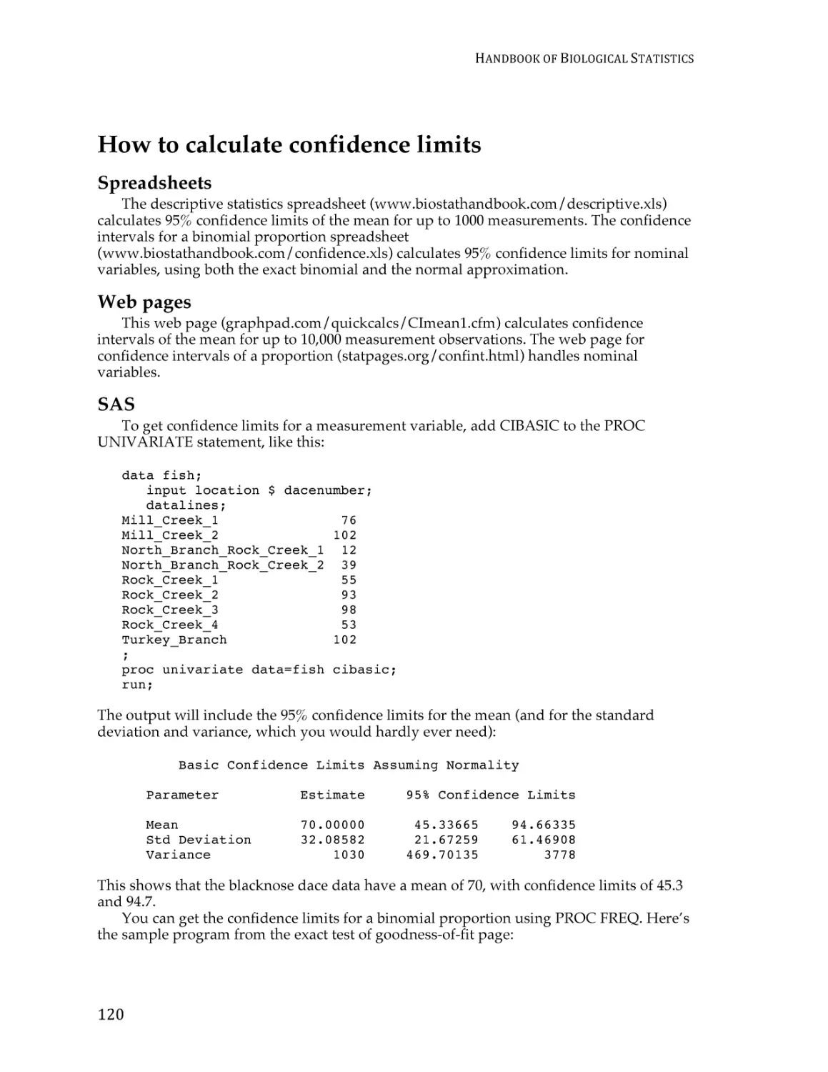
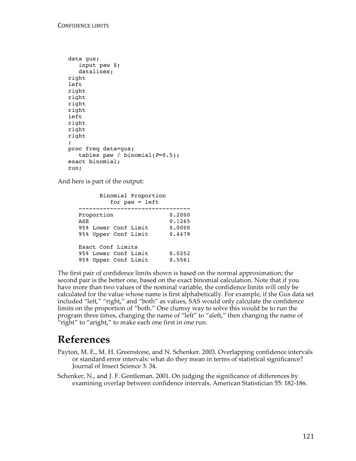
If you use this handbook and want to cite it in a publication, please cite it as:
McDonald, J.H. 2014. Handbook of Biological Statistics, 3rd ed. Sparky House Publishing,
Baltimore, Maryland.
It’s better to cite the print version, rather than the web pages, so that people of the future
can see exactly what were citing. If you just cite a web page, it might be quite different by
the time someone looks at it a few years from now. If you need to see what someone has
cited from an earlier edition, you can download pdfs of the first edition
(www.biostathandbook.com/HandbookBioStatFirst.pdf) or the second edition
(www.biostathandbook.com/HandbookBioStatSecond.pdf).
I am constantly trying to improve this textbook. If you find errors, broken links, typos,
or have other suggestions for improvement, please e-mail me at mcdonald@udel.edu. If
you have statistical questions about your research, I’ll be glad to try to answer them.
However, I must warn you that I’m not an expert in all areas of statistics, so if you’re
asking about something that goes far beyond what’s in this textbook, I may not be able to
help you. And please don’t ask me for help with your statistics homework (unless you’re
in my class, of course!).
Acknowledgments
Preparation of this handbook has been supported in part by a grant to the University
of Delaware from the Howard Hughes Medical Institute Undergraduate Science
Education Program.
Thanks to the students in my Biological Data Analysis class for helping me learn how
to explain statistical concepts to biologists; to the many people from around the world
who have e-mailed me with questions, comments and corrections about the previous
editions of the Handbook; to my patient wife, Beverly Wolpert, for being so patient while I
obsessed over writing this; and to my dad, Howard McDonald, for inspiring me to get
away from the computer and go outside once in a while.
2
STEP-‐BY-‐STEP
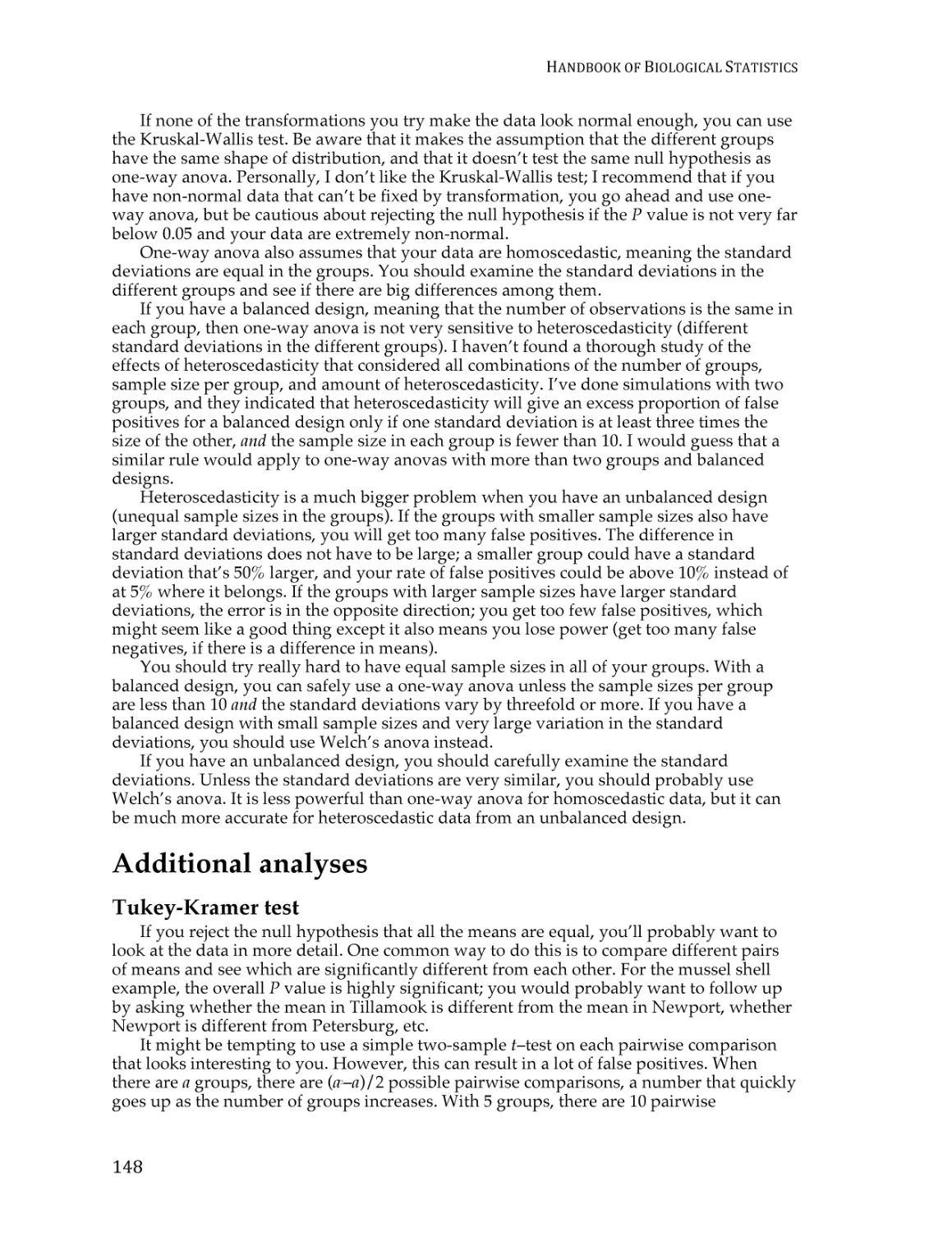
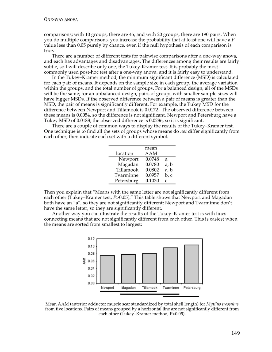
ANALYSIS
OF
BIOLOGICAL
DATA
Step-by-step analysis of
biological data
Here I describe how you should determine the best way to analyze your biological
experiment.
How to determine the appropriate statistical test
I find that a systematic, step-by-step approach is the best way to decide how to analyze
biological data. I recommend that you follow these steps:
1. Specify the biological question you are asking.
2. Put the question in the form of a biological null hypothesis and alternate hypothesis.
3. Put the question in the form of a statistical null hypothesis and alternate hypothesis.
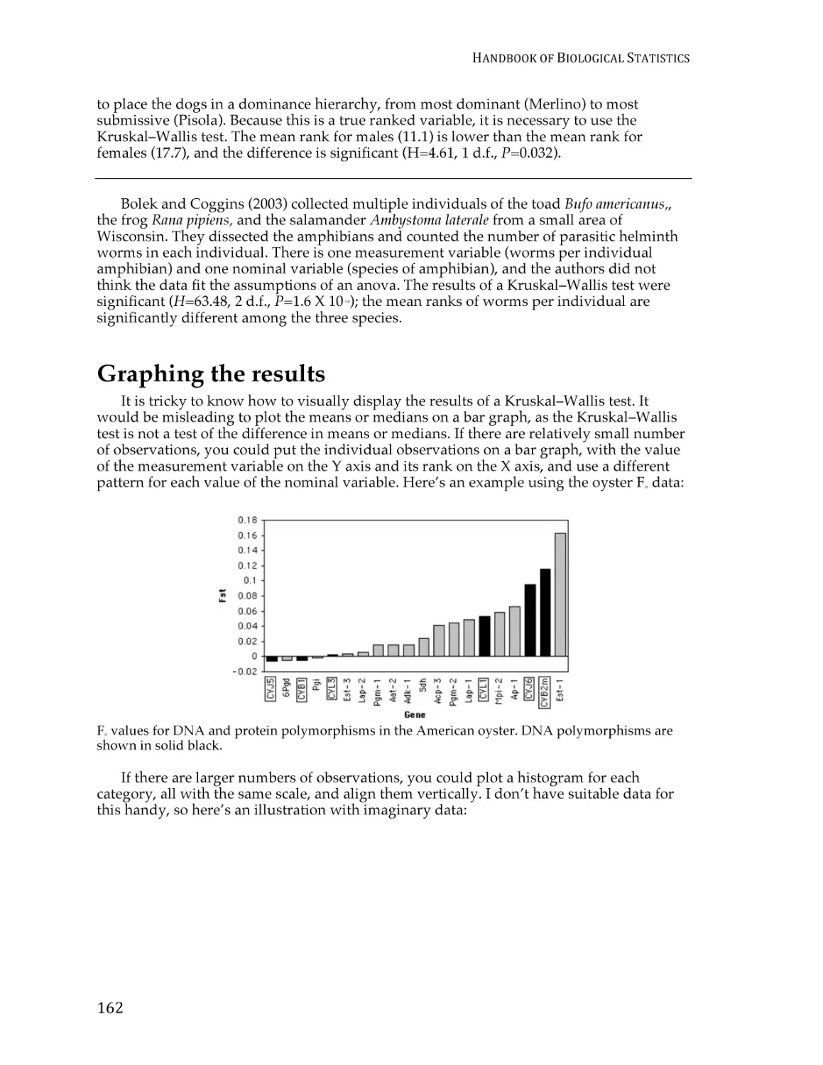
4. Determine which variables are relevant to the question.
5. Determine what kind of variable each one is.
6. Design an experiment that controls or randomizes the confounding variables.
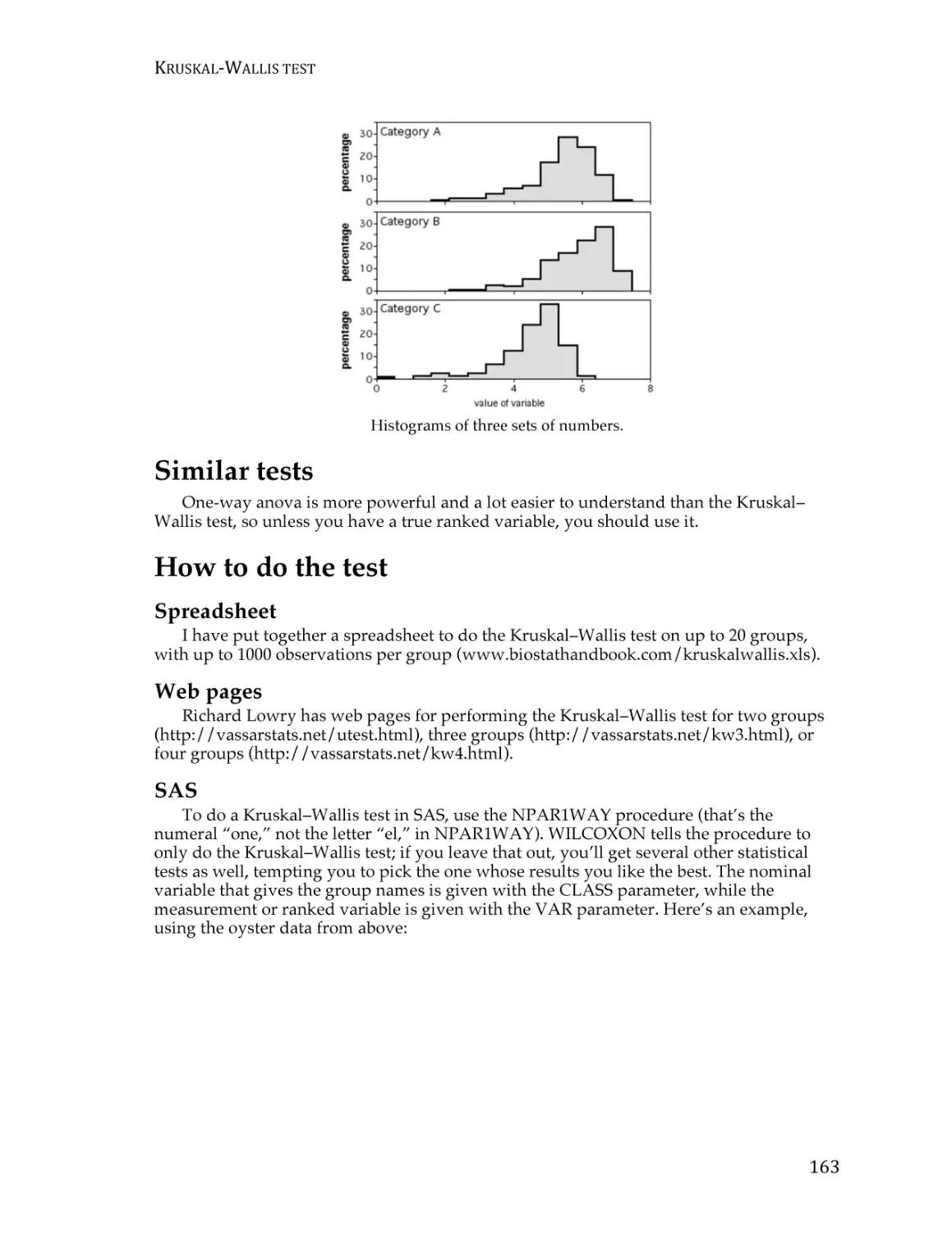
7. Based on the number of variables, the kinds of variables, the expected fit to the
parametric assumptions, and the hypothesis to be tested, choose the best statistical
test to use.
8. If possible, do a power analysis to determine a good sample size for the experiment.
9. Do the experiment.
10. Examine the data to see if it meets the assumptions of the statistical test you chose
(primarily normality and homoscedasticity for tests of measurement variables). If it
doesn’t, choose a more appropriate test.
11. Apply the statistical test you chose, and interpret the results.
12. Communicate your results effectively, usually with a graph or table.
As you work your way through this textbook, you’ll learn about the different parts of
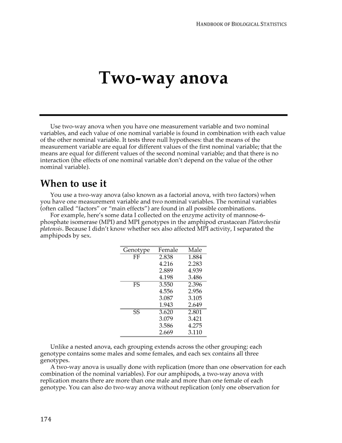
this process. One important point for you to remember: “do the experiment” is step 9, not
step 1. You should do a lot of thinking, planning, and decision-making before you do an
experiment. If you do this, you’ll have an experiment that is easy to understand, easy to
analyze and interpret, answers the questions you’re trying to answer, and is neither too
big nor too small. If you just slap together an experiment without thinking about how
you’re going to do the statistics, you may end up needing more complicated and obscure
statistical tests, getting results that are difficult to interpret and explain to others, and
3
HANDBOOK
OF
BIOLOGICAL
STATISTICS
maybe using too many subjects (thus wasting your resources) or too few subjects (thus
wasting the whole experiment).
Here’s an example of how the procedure works. Verrelli and Eanes (2001) measured
glycogen content in Drosophila melanogaster individuals. The flies were polymorphic at the
genetic locus that codes for the enzyme phosphoglucomutase (PGM). At site 52 in the
PGM protein sequence, flies had either a valine or an alanine. At site 484, they had either a
valine or a leucine. All four combinations of amino acids (V-V, V-L, A-V, A-L) were
present.
1. One biological question is “Do the amino acid polymorphisms at the Pgm locus have
an effect on glycogen content?” The biological question is usually something about
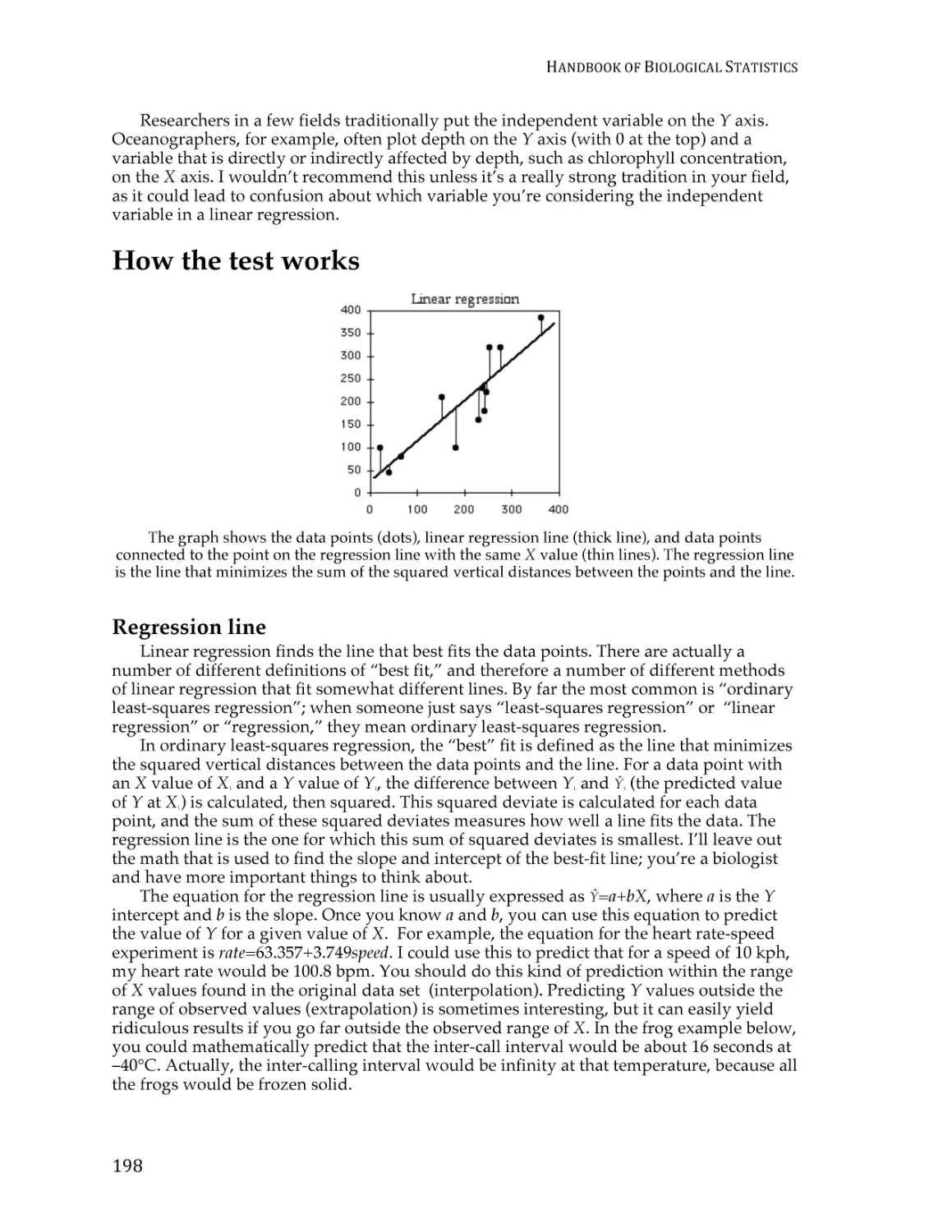
biological processes, often in the form “Does changing X cause a change in Y?”
You might want to know whether a drug changes blood pressure; whether soil pH
affects the growth of blueberry bushes; or whether protein Rab10 mediates
membrane transport to cilia.
2. The biological null hypothesis is “Different amino acid sequences do not affect the
biochemical properties of PGM, so glycogen content is not affected by PGM
sequence.” The biological alternative hypothesis is “Different amino acid
sequences do affect the biochemical properties of PGM, so glycogen content is
affected by PGM sequence.” By thinking about the biological null and alternative
hypotheses, you are making sure that your experiment will give different results
for different answers to your biological question.
3. The statistical null hypothesis is “Flies with different sequences of the PGM enzyme
have the same average glycogen content.” The alternate hypothesis is “Flies with
different sequences of PGM have different average glycogen contents.” While the
biological null and alternative hypotheses are about biological processes, the
statistical null and alternative hypotheses are all about the numbers; in this case,
the glycogen contents are either the same or different. Testing your statistical null
hypothesis is the main subject of this handbook, and it should give you a clear
answer; you will either reject or accept that statistical null. Whether rejecting a
statistical null hypothesis is enough evidence to answer your biological question
can be a more difficult, more subjective decision; there may be other possible
explanations for your results, and you as an expert in your specialized area of
biology will have to consider how plausible they are.
4. The two relevant variables in the Verrelli and Eanes experiment are glycogen
content and PGM sequence.
5. Glycogen content is a measurement variable, something that you record as a
number that could have many possible values. The sequence of PGM that a fly has
(V-V, V-L, A-V or A-L) is a nominal variable, something with a small number of
possible values (four, in this case) that you usually record as a word.
6. Other variables that might be important, such as age and where in a vial the fly
pupated, were either controlled (flies of all the same age were used) or randomized
(flies were taken randomly from the vials without regard to where they pupated).
It also would have been possible to observe the confounding variables; for
example, Verrelli and Eanes could have used flies of different ages, and then used
a statistical technique that adjusted for the age. This would have made the analysis
more complicated to perform and more difficult to explain, and while it might
have turned up something interesting about age and glycogen content, it would
not have helped address the main biological question about PGM genotype and
glycogen content.
7. Because the goal is to compare the means of one measurement variable among
groups classified by one nominal variable, and there are more than two categories,
4
STEP-‐BY-‐STEP
ANALYSIS
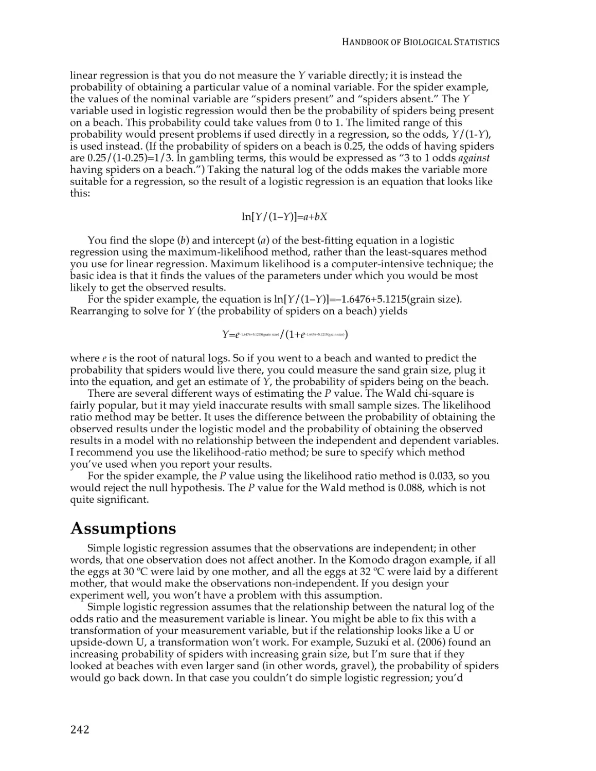
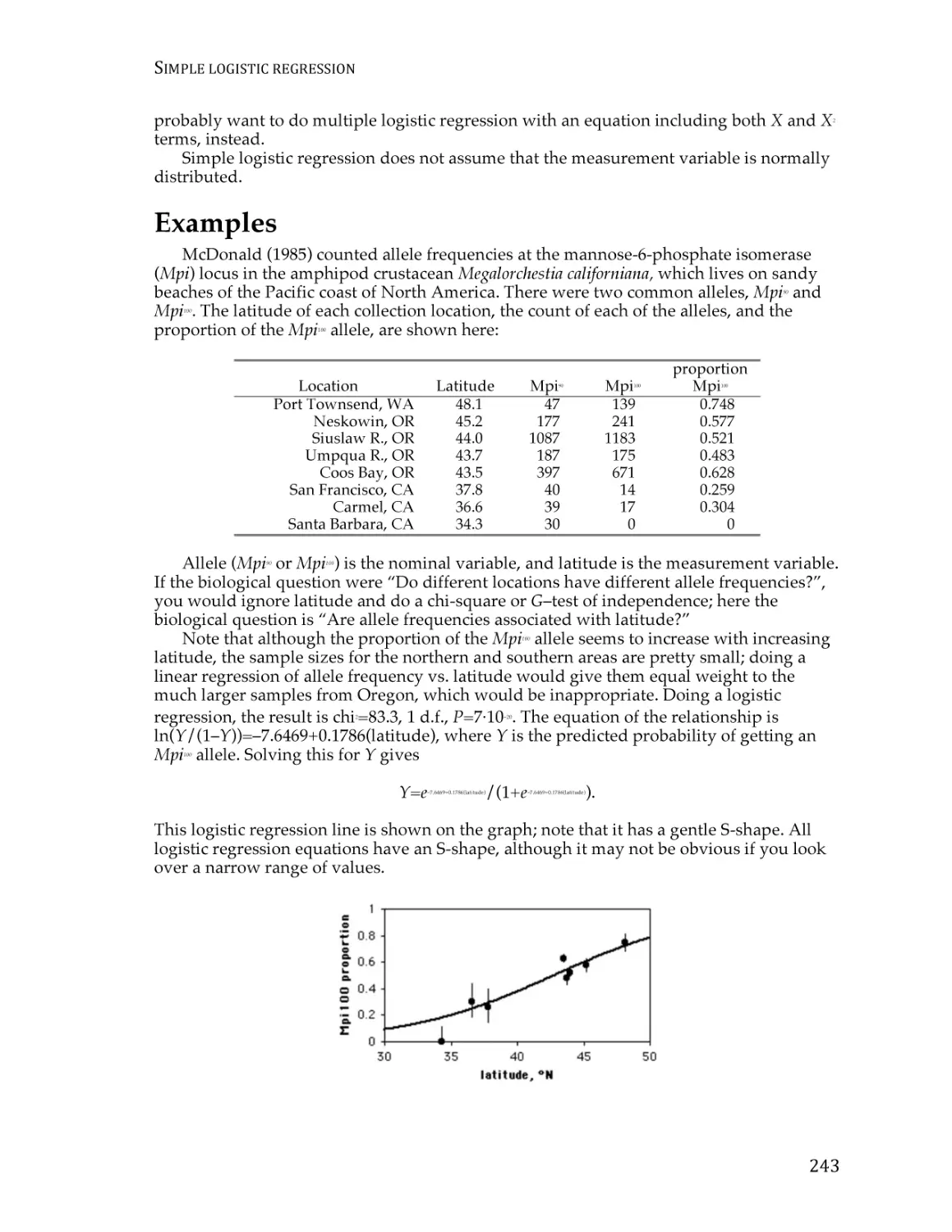
OF
BIOLOGICAL
DATA
the appropriate statistical test is a one-way anova. Once you know what variables
you’re analyzing and what type they are, the number of possible statistical tests is
usually limited to one or two (at least for tests I present in this handbook).
8. A power analysis would have required an estimate of the standard deviation of
glycogen content, which probably could have been found in the published
literature, and a number for the effect size (the variation in glycogen content
among genotypes that the experimenters wanted to detect). In this experiment, any
difference in glycogen content among genotypes would be interesting, so the
experimenters just used as many flies as was practical in the time available.
9. The experiment was done: glycogen content was measured in flies with different
PGM sequences.
10. The anova assumes that the measurement variable, glycogen content, is normal
(the distribution fits the bell-shaped normal curve) and homoscedastic (the
variances in glycogen content of the different PGM sequences are equal), and
inspecting histograms of the data shows that the data fit these assumptions. If the
data hadn’t met the assumptions of anova, the Kruskal–Wallis test or Welch’s test
might have been better.
11. The one-way anova was done, using a spreadsheet, web page, or computer
program, and the result of the anova is a P value less than 0.05. The interpretation
is that flies with some PGM sequences have different average glycogen content
than flies with other sequences of PGM.
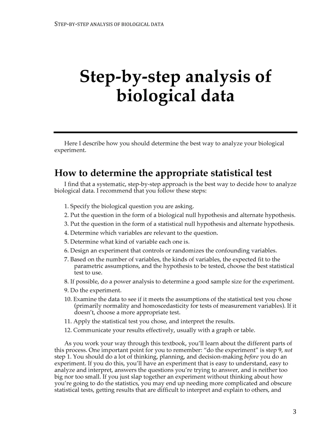
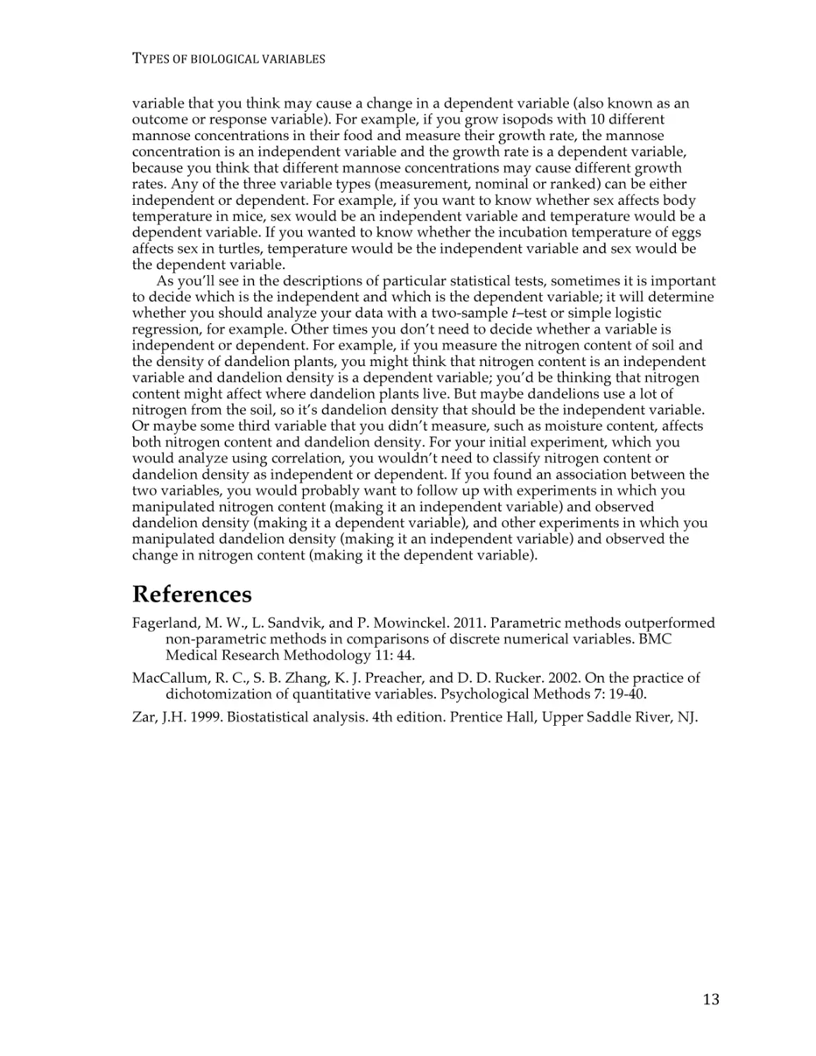
12. The results could be summarized in a table, but a more effective way to
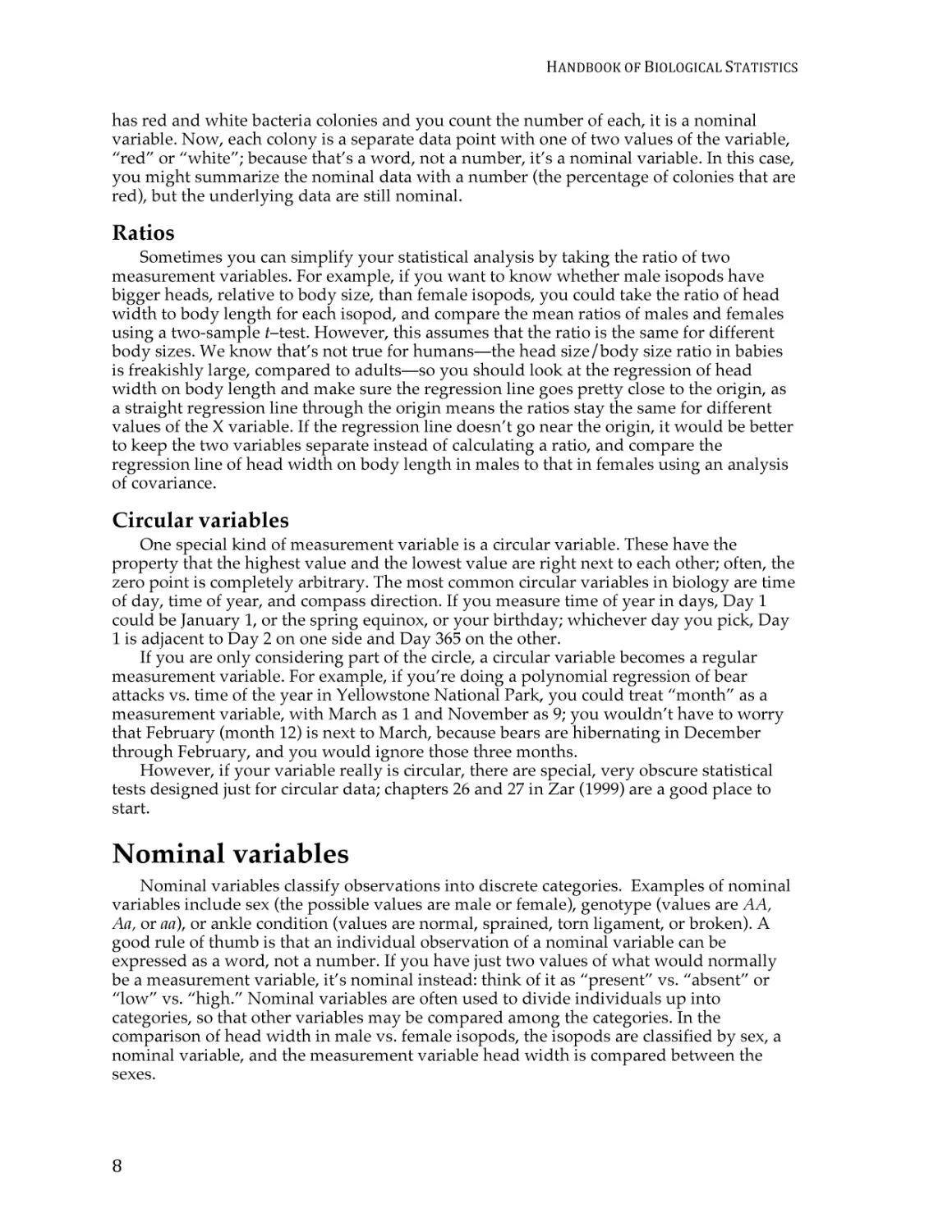
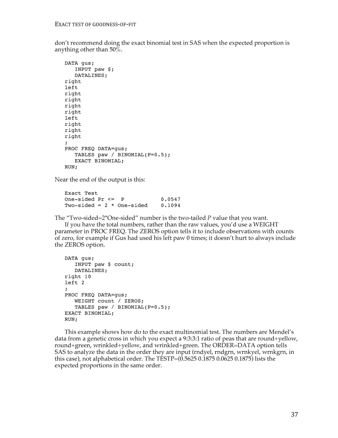
communicate them is with a graph:
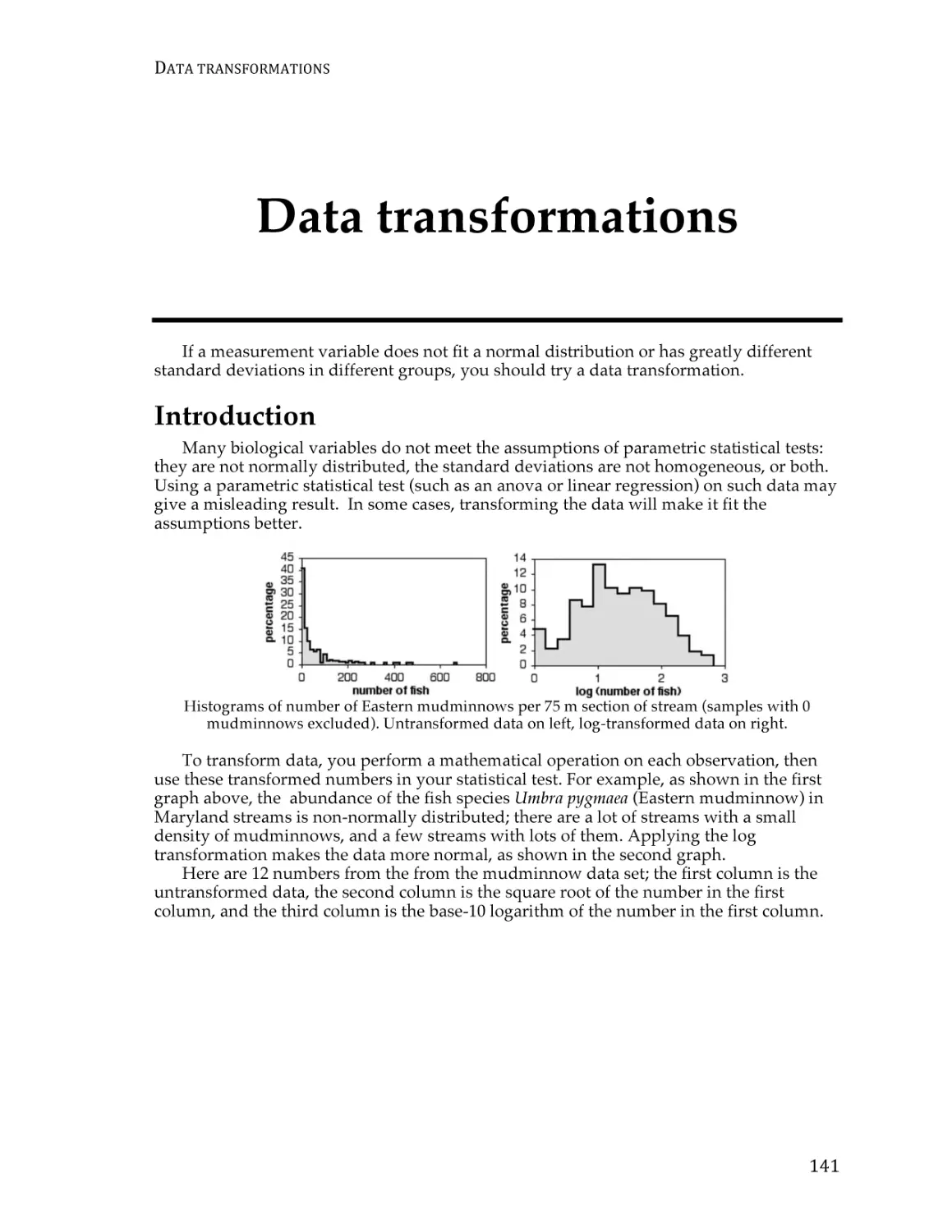
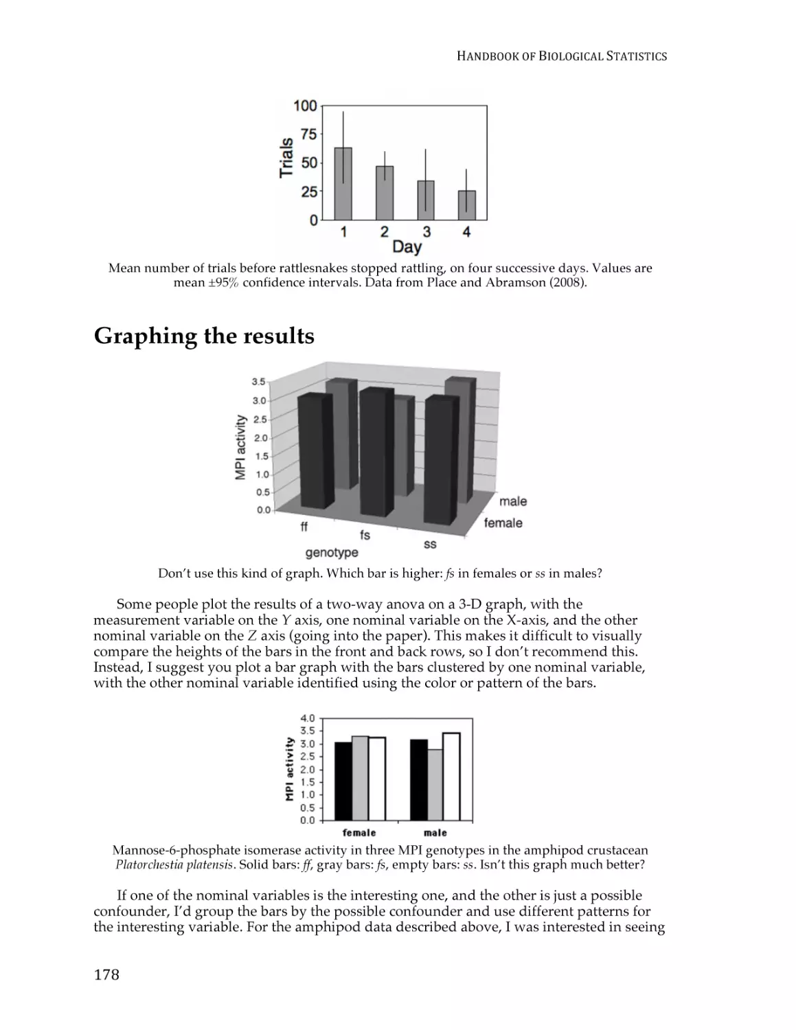
Glycogen content in Drosophila melanogaster. Each bar represents the mean glycogen content (in
micrograms per fly) of 12 flies with the indicated PGM haplotype. Narrow bars represent 95%
confidence intervals.
Reference
Verrelli, B.C., and W.F. Eanes. 2001. The functional impact of PGM amino acid
polymorphism on glycogen content in Drosophila melanogaster. Genetics 159: 201-210.
(Note that for the purposes of this web page, I’ve used a different statistical test than
Verrelli and Eanes did. They were interested in interactions among the individual
amino acid polymorphisms, so they used a two-way anova.)
5
HANDBOOK
OF
BIOLOGICAL
STATISTICS
Types of biological variables
There are three main types of variables: measurement variables, which are expressed
as numbers (such as 3.7 mm); nominal variables, which are expressed as names (such as
“female”); and ranked variables, which are expressed as positions (such as “third”). You
need to identify the types of variables in an experiment in order to choose the correct
method of analysis.
Introduction
One of the first steps in deciding which statistical test to use is determining what kinds
of variables you have. When you know what the relevant variables are, what kind of
variables they are, and what your null and alternative hypotheses are, it’s usually pretty
easy to figure out which test you should use. I classify variables into three types:
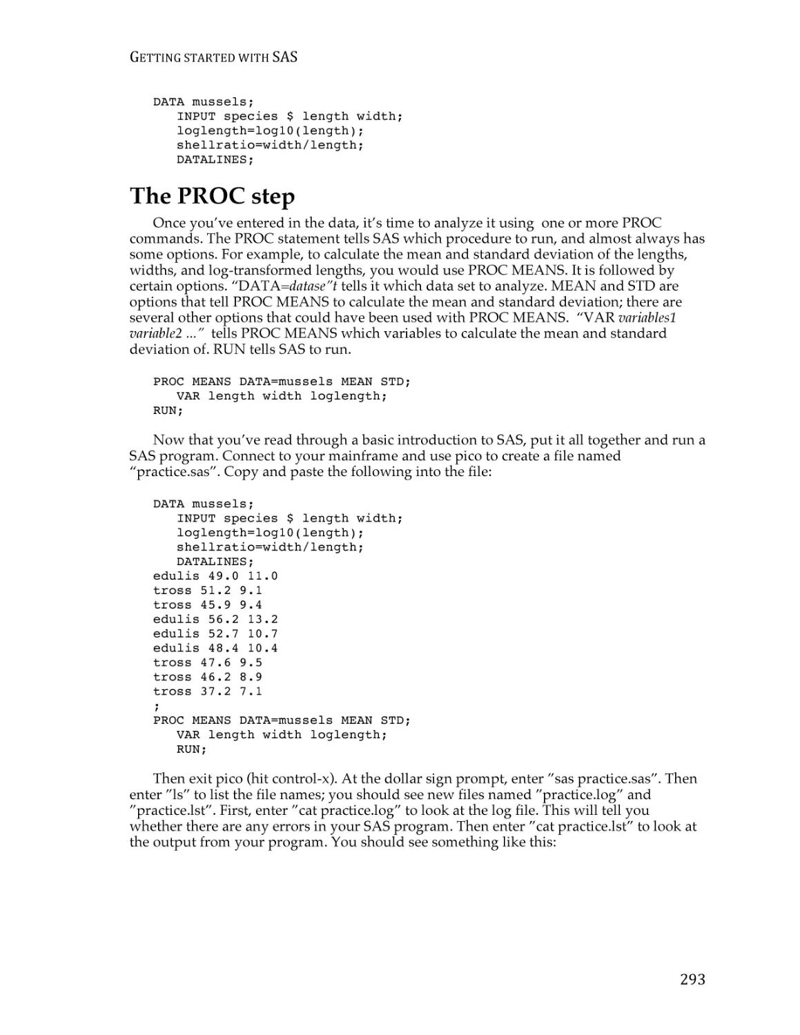
measurement variables, nominal variables, and ranked variables. You’ll see other names
for these variable types and other ways of classifying variables in other statistics
references, so try not to get confused.
You’ll analyze similar experiments, with similar null and alternative hypotheses,
completely differently depending on which of these three variable types are involved. For
example, let’s say you’ve measured variable X in a sample of 56 male and 67 female
isopods (Armadillidium vulgare, commonly known as pillbugs or roly-polies), and your null
hypothesis is “Male and female A. vulgare have the same values of variable X.” If variable
X is width of the head in millimeters, it’s a measurement variable, and you’d compare
head width in males and females with a two-sample t–test or a one-way analysis of
variance (anova). If variable X is a genotype (such as AA, Aa, or aa), it’s a nominal variable,
and you’d compare the genotype frequencies in males and females with a Fisher’s exact
test. If you shake the isopods until they roll up into little balls, then record which is the
first isopod to unroll, the second to unroll, etc., it’s a ranked variable and you’d compare
unrolling time in males and females with a Kruskal–Wallis test.
Measurement variables
Measurement variables are, as the name implies, things you can measure. An
individual observation of a measurement variable is always a number. Examples include
length, weight, pH, and bone density. Other names for them include “numeric” or
“quantitative” variables.
Some authors divide measurement variables into two types. One type is continuous
variables, such as length of an isopod’s antenna, which in theory have an infinite number
of possible values. The other is discrete (or meristic) variables, which only have whole
number values; these are things you count, such as the number of spines on an isopod’s
antenna. The mathematical theories underlying statistical tests involving measurement
variables assume that the variables are continuous. Luckily, these statistical tests work
well on discrete measurement variables, so you usually don’t need to worry about the
6
TYPES
OF
BIOLOGICAL
VARIABLES
difference between continuous and discrete measurement variables. The only exception
would be if you have a very small number of possible values of a discrete variable, in
which case you might want to treat it as a nominal variable instead.
When you have a measurement variable with a small number of values, it may not be
clear whether it should be considered a measurement or a nominal variable. For example,
let’s say your isopods have 20 to 55 spines on their left antenna, and you want to know
whether the average number of spines on the left antenna is different between males and
females. You should consider spine number to be a measurement variable and analyze
the data using a two-sample t–test or a one-way anova. If there are only two different
spine numbers—some isopods have 32 spines, and some have 33—you should treat spine
number as a nominal variable, with the values “32” and “33,” and compare the
proportions of isopods with 32 or 33 spines in males and females using a Fisher’s exact
test of independence (or chi-square or G–test of independence, if your sample size is really
big). The same is true for laboratory experiments; if you give your isopods food with 15
different mannose concentrations and then measure their growth rate, mannose
concentration would be a measurement variable; if you give some isopods food with 5
mM mannose, and the rest of the isopods get 25 mM mannose, then mannose
concentration would be a nominal variable.
But what if you design an experiment with three concentrations of mannose, or five, or
seven? There is no rigid rule, and how you treat the variable will depend in part on your
null and alternative hypotheses. If your alternative hypothesis is “different values of
mannose have different rates of isopod growth,” you could treat mannose concentration
as a nominal variable. Even if there’s some weird pattern of high growth on zero mannose,
low growth on small amounts, high growth on intermediate amounts, and low growth on
high amounts of mannose, a one-way anova could give a significant result. If your
alternative hypothesis is “isopods grow faster with more mannose,” it would be better to
treat mannose concentration as a measurement variable, so you can do a regression. In my
class, we use the following rule of thumb:
—a measurement variable with only two values should be treated as a nominal
variable;
—a measurement variable with six or more values should be treated as a measurement
variable;
—a measurement variable with three, four or five values does not exist.
Of course, in the real world there are experiments with three, four or five values of a
measurement variable. Simulation studies show that analyzing such dependent variables
with the methods used for measurement variables works well (Fagerland et al. 2011). I am
not aware of any research on the effect of treating independent variables with small
numbers of values as measurement or nominal. Your decision about how to treat your
variable will depend in part on your biological question. You may be able to avoid the
ambiguity when you design the experiment—if you want to know whether a dependent
variable is related to an independent variable that could be measurement, it’s a good idea
to have at least six values of the independent variable.
Something that could be measured is a measurement variable, even when you set the
values. For example, if you grow isopods with one batch of food containing 10 mM
mannose, another batch of food with 20 mM mannose, another batch with 30 mM
mannose, etc. up to 100 mM mannose, the different mannose concentrations are a
measurement variable, even though you made the food and set the mannose
concentration yourself.
Be careful when you count something, as it is sometimes a nominal variable and
sometimes a measurement variable. For example, the number of bacteria colonies on a
plate is a measurement variable; you count the number of colonies, and there are 87
colonies on one plate, 92 on another plate, etc. Each plate would have one data point, the
number of colonies; that’s a number, so it’s a measurement variable. However, if the plate
7
HANDBOOK
OF
BIOLOGICAL
STATISTICS
has red and white bacteria colonies and you count the number of each, it is a nominal
variable. Now, each colony is a separate data point with one of two values of the variable,
“red” or “white”; because that’s a word, not a number, it’s a nominal variable. In this case,
you might summarize the nominal data with a number (the percentage of colonies that are
red), but the underlying data are still nominal.
Ratios
Sometimes you can simplify your statistical analysis by taking the ratio of two
measurement variables. For example, if you want to know whether male isopods have
bigger heads, relative to body size, than female isopods, you could take the ratio of head
width to body length for each isopod, and compare the mean ratios of males and females
using a two-sample t–test. However, this assumes that the ratio is the same for different
body sizes. We know that’s not true for humans—the head size/body size ratio in babies
is freakishly large, compared to adults—so you should look at the regression of head
width on body length and make sure the regression line goes pretty close to the origin, as
a straight regression line through the origin means the ratios stay the same for different
values of the X variable. If the regression line doesn’t go near the origin, it would be better
to keep the two variables separate instead of calculating a ratio, and compare the
regression line of head width on body length in males to that in females using an analysis
of covariance.
Circular variables
One special kind of measurement variable is a circular variable. These have the
property that the highest value and the lowest value are right next to each other; often, the
zero point is completely arbitrary. The most common circular variables in biology are time
of day, time of year, and compass direction. If you measure time of year in days, Day 1
could be January 1, or the spring equinox, or your birthday; whichever day you pick, Day
1 is adjacent to Day 2 on one side and Day 365 on the other.
If you are only considering part of the circle, a circular variable becomes a regular
measurement variable. For example, if you’re doing a polynomial regression of bear
attacks vs. time of the year in Yellowstone National Park, you could treat “month” as a
measurement variable, with March as 1 and November as 9; you wouldn’t have to worry
that February (month 12) is next to March, because bears are hibernating in December
through February, and you would ignore those three months.
However, if your variable really is circular, there are special, very obscure statistical
tests designed just for circular data; chapters 26 and 27 in Zar (1999) are a good place to
start.
Nominal variables
Nominal variables classify observations into discrete categories. Examples of nominal
variables include sex (the possible values are male or female), genotype (values are AA,
Aa, or aa), or ankle condition (values are normal, sprained, torn ligament, or broken). A
good rule of thumb is that an individual observation of a nominal variable can be
expressed as a word, not a number. If you have just two values of what would normally
be a measurement variable, it’s nominal instead: think of it as “present” vs. “absent” or
“low” vs. “high.” Nominal variables are often used to divide individuals up into
categories, so that other variables may be compared among the categories. In the
comparison of head width in male vs. female isopods, the isopods are classified by sex, a
nominal variable, and the measurement variable head width is compared between the
sexes.
8
TYPES
OF
BIOLOGICAL
VARIABLES
Nominal variables are also called categorical, discrete, qualitative, or attribute
variables. “Categorical” is a more common name than “nominal,” but some authors use
“categorical” to include both what I’m calling “nominal” and what I’m calling “ranked,”
while other authors use “categorical” just for what I’m calling nominal variables. I’ll stick
with “nominal” to avoid this ambiguity.
Nominal variables are often summarized as proportions or percentages. For example,
if you count the number of male and female A. vulgare in a sample from Newark and a
sample from Baltimore, you might say that 52.3% of the isopods in Newark and 62.1% of
the isopods in Baltimore are female. These percentages may look like a measurement
variable, but they really represent a nominal variable, sex. You determined the value of
the nominal variable (male or female) on 65 isopods from Newark, of which 34 were
female and 31 were male. You might plot 52.3% on a graph as a simple way of
summarizing the data, but you should use the 34 female and 31 male numbers in all
statistical tests.
It may help to understand the difference between measurement and nominal variables
if you imagine recording each observation in a lab notebook. If you are measuring head
widths of isopods, an individual observation might be “3.41 mm.” That is clearly a
measurement variable. An individual observation of sex might be “female,” which clearly
is a nominal variable. Even if you don’t record the sex of each isopod individually, but just
counted the number of males and females and wrote those two numbers down, the
underlying variable is a series of observations of “male” and “female.”
Ranked variables
Ranked variables, also called ordinal variables, are those for which the individual
observations can be put in order from smallest to largest, even though the exact values are
unknown. If you shake a bunch of A. vulgare up, they roll into balls, then after a little while
start to unroll and walk around. If you wanted to know whether males and females
unrolled at the same time, but your stopwatch was broken, you could pick up the first
isopod to unroll and put it in a vial marked “first,” pick up the second to unroll and put it
in a vial marked “second,” and so on, then sex the isopods after they’ve all unrolled. You
wouldn’t have the exact time that each isopod stayed rolled up (that would be a
measurement variable), but you would have the isopods in order from first to unroll to
last to unroll, which is a ranked variable. While a nominal variable is recorded as a word
(such as “male”) and a measurement variable is recorded as a number (such as “4.53”), a
ranked variable can be recorded as a rank (such as “seventh”).
You could do a lifetime of biology and never use a true ranked variable. When I write
an exam question involving ranked variables, it’s usually some ridiculous scenario like
“Imagine you’re on a desert island with no ruler, and you want to do statistics on the size
of coconuts. You line them up from smallest to largest....” For a homework assignment, I
ask students to pick a paper from their favorite biological journal and identify all the
variables, and anyone who finds a ranked variable gets a donut; I’ve had to buy four
donuts in 13 years. The only common biological ranked variables I can think of are
dominance hierarchies in behavioral biology (see the dog example on the Kruskal-Wallis
page) and developmental stages, such as the different instars that molting insects pass
through.
The main reason that ranked variables are important is that the statistical tests
designed for ranked variables (called “non-parametric tests”) make fewer assumptions
about the data than the statistical tests designed for measurement variables. Thus the most
common use of ranked variables involves converting a measurement variable to ranks,
then analyzing it using a non-parametric test. For example, let’s say you recorded the time
that each isopod stayed rolled up, and that most of them unrolled after one or two
minutes. Two isopods, who happened to be male, stayed rolled up for 30 minutes. If you
9
HANDBOOK
OF
BIOLOGICAL
STATISTICS
analyzed the data using a test designed for a measurement variable, those two sleepy
isopods would cause the average time for males to be much greater than for females, and
the difference might look statistically significant. When converted to ranks and analyzed
using a non-parametric test, the last and next-to-last isopods would have much less
influence on the overall result, and you would be less likely to get a misleadingly
“significant” result if there really isn’t a difference between males and females.
Some variables are impossible to measure objectively with instruments, so people are
asked to give a subjective rating. For example, pain is often measured by asking a person
to put a mark on a 10-cm scale, where 0 cm is “no pain” and 10 cm is “worst possible
pain.” This is not a ranked variable; it is a measurement variable, even though the
“measuring” is done by the person’s brain. For the purpose of statistics, the important
thing is that it is measured on an “interval scale”; ideally, the difference between pain
rated 2 and 3 is the same as the difference between pain rated 7 and 8. Pain would be a
ranked variable if the pains at different times were compared with each other; for
example, if someone kept a pain diary and then at the end of the week said “Tuesday was
the worst pain, Thursday was second worst, Wednesday was third, etc....” These rankings
are not an interval scale; the difference between Tuesday and Thursday may be much
bigger, or much smaller, than the difference between Thursday and Wednesday.
Just like with measurement variables, if there are a very small number of possible
values for a ranked variable, it would be better to treat it as a nominal variable. For
example, if you make a honeybee sting people on one arm and a yellowjacket sting people
on the other arm, then ask them “Was the honeybee sting the most painful or the second
most painful?”, you are asking them for the rank of each sting. But you should treat the
data as a nominal variable, one which has three values (“honeybee is worse” or
“yellowjacket is worse” or “subject is so mad at your stupid, painful experiment that they
refuse to answer”).
Categorizing
It is possible to convert a measurement variable to a nominal variable, dividing
individuals up into a two or more classes based on ranges of the variable. For example, if
you are studying the relationship between levels of HDL (the “good cholesterol”) and
blood pressure, you could measure the HDL level, then divide people into two groups,
“low HDL” (less than 40 mg/dl) and “normal HDL” (40 or more mg/dl) and compare the
mean blood pressures of the two groups, using a nice simple two-sample t–test.
Converting measurement variables to nominal variables (“dichotomizing” if you split
into two groups, “categorizing” in general) is common in epidemiology, psychology, and
some other fields. However, there are several problems with categorizing measurement
variables (MacCallum et al. 2002). One problem is that you’d be discarding a lot of
information; in our blood pressure example, you’d be lumping together everyone with
HDL from 0 to 39 mg/dl into one group. This reduces your statistical power, decreasing
your chances of finding a relationship between the two variables if there really is one.
Another problem is that it would be easy to consciously or subconsciously choose the
dividing line (“cutpoint”) between low and normal HDL that gave an “interesting” result.
For example, if you did the experiment thinking that low HDL caused high blood
pressure, and a couple of people with HDL between 40 and 45 happened to have high
blood pressure, you might put the dividing line between low and normal at 45 mg/dl.
This would be cheating, because it would increase the chance of getting a “significant”
difference if there really isn’t one.
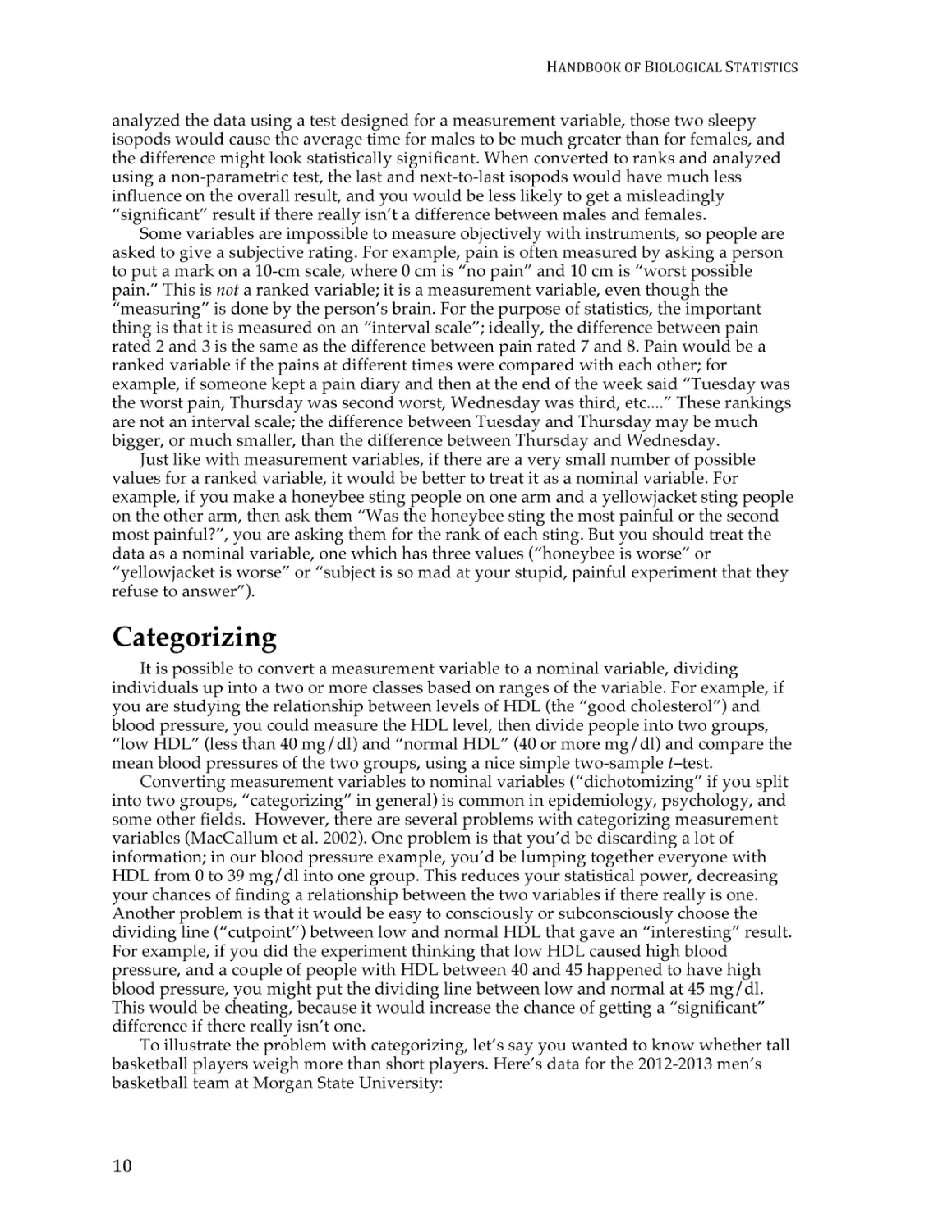
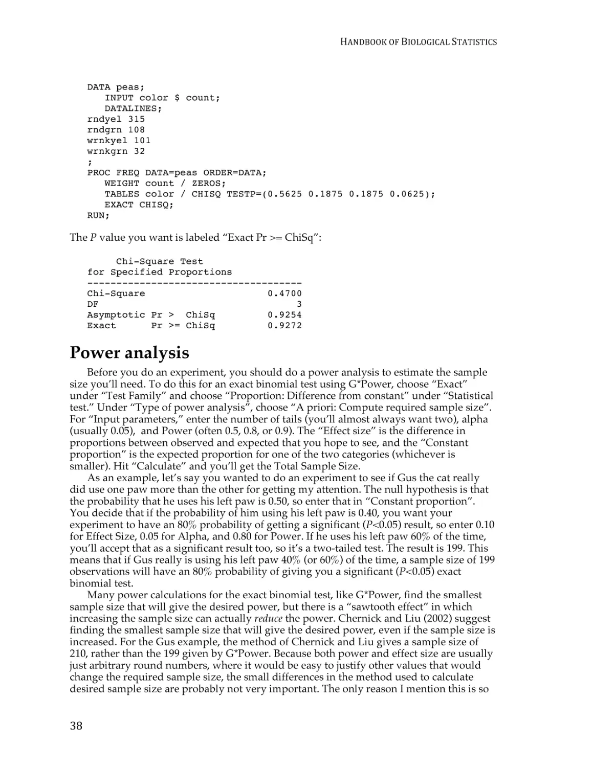
To illustrate the problem with categorizing, let’s say you wanted to know whether tall
basketball players weigh more than short players. Here’s data for the 2012-2013 men’s
basketball team at Morgan State University:
10
TYPES
OF
BIOLOGICAL
VARIABLES
Height
(inches)
69
72
74
74
74
76
77
77
78
78
80
81
81
86
Weight
(pounds)
180
185
170
190
220
200
190
225
215
225
210
208
220
270
Height and weight of the Morgan State University men’s basketball players.
If you keep both variables as measurement variables and analyze using linear regression,
you get a P value of 0.0007; the relationship is highly significant. Tall basketball players
really are heavier, as is obvious from the graph. However, if you divide the heights into
two categories, “short” (77 inches or less) and “tall” (more than 77 inches) and compare
the mean weights of the two groups using a two-sample t–test, the P value is 0.043, which
is barely significant at the usual P<0.05 level. And if you also divide the weights into two
categories, “light” (210 pounds and less) and “heavy” (greater than 210 pounds), you get 6
who are short and light, 2 who are short and heavy, 2 who are tall and light, and 4 who
are tall and heavy. The proportion of short people who are heavy is not significantly
different from the proportion of tall people who are heavy, when analyzed using Fisher’s
exact test (P=0.28). So by categorizing both measurement variables, you have made an
obvious, highly significant relationship between height and weight become completely
non-significant. This is not a good thing. I think it’s better for most biological experiments
if you don’t categorize.
Likert items
Social scientists like to use Likert items: they’ll present a statement like “It’s important
for all biologists to learn statistics” and ask people to choose 1=Strongly Disagree,
2=Disagree, 3=Neither Agree nor Disagree, 4=Agree, or 5=Strongly Agree. Sometimes
they use seven values instead of five, by adding “Very Strongly Disagree” and “Very
Strongly Agree”; and sometimes people are asked to rate their strength of agreement on a
9 or 11-point scale. Similar questions may have answers such as 1=Never, 2=Rarely,
3=Sometimes, 4=Often, 5=Always.
Strictly speaking, a Likert scale is the result of adding together the scores on several
Likert items. Often, however, a single Likert item is called a Likert scale.
There is a lot of controversy about how to analyze a Likert item. One option is to treat
it as a nominal variable with five (or seven, or however many) items. The data would then
be summarized by the proportion of people giving each answer, and analyzed using chisquare or G–tests. However, this ignores the fact that the values go in order from least
11
HANDBOOK
OF
BIOLOGICAL
STATISTICS
agreement to most, which is pretty important information. The other options are to treat it
as a ranked variable or a measurement variable.
Treating a Likert item as a measurement variable lets you summarize the data using a
mean and standard deviation, and analyze the data using the familiar parametric tests
such as anova and regression. One argument against treating a Likert item as a
measurement variable is that the data have a small number of values that are unlikely to
be normally distributed, but the statistical tests used on measurement variables are not
very sensitive to deviations from normality, and simulations have shown that tests for
measurement variables work well even with small numbers of values (Fagerland et al.
2011).
A bigger issue is that the answers on a Likert item are just crude subdivisions of some
underlying measure of feeling, and the difference between “Strongly Disagree” and
“Disagree” may not be the same size as the difference between “Disagree” and “Neither
Agree nor Disagree”; in other words, the responses are not a true “interval” variable. As
an analogy, imagine you asked a bunch of college students how much TV they watch in a
typical week, and you give them the choices of 0=None, 1=A Little, 2=A Moderate
Amount, 3=A Lot, and 4=Too Much. If the people who said “A Little” watch one or two
hours a week, the people who said “A Moderate Amount” watch three to nine hours a
week, and the people who said “A Lot” watch 10 to 20 hours a week, then the difference
between “None” and “A Little” is a lot smaller than the difference between “A Moderate
Amount” and “A Lot.” That would make your 0-4 point scale not be an interval variable.
If your data actually were in hours, then the difference between 0 hours and 1 hour is the
same size as the difference between 19 hours and 20 hours; “hours” would be an interval
variable.
Personally, I don’t see how treating values of a Likert item as a measurement variable
will cause any statistical problems. It is, in essence, a data transformation: applying a
mathematical function to one variable to come up with a new variable. In chemistry, pH is
the base-10 log of the reciprocal of the hydrogen activity, so the difference in hydrogen
activity between a ph 5 and ph 6 solution is much bigger than the difference between ph 8
and ph 9. But I don’t think anyone would object to treating pH as a measurement variable.
Converting 25-44 on some underlying “agreeicity index” to “2” and converting 45-54 to
“3” doesn’t seem much different from converting hydrogen activity to pH, or
micropascals of sound to decibels, or squaring a person’s height to calculate body mass
index.
The impression I get, from briefly glancing at the literature, is that many of the people
who use Likert items in their research treat them as measurement variables, while most
statisticians think this is outrageously incorrect. I think treating them as measurement
variables has several advantages, but you should carefully consider the practice in your
particular field; it’s always better if you’re speaking the same statistical language as your
peers. Because there is disagreement, you should include the number of people giving
each response in your publications; this will provide all the information that other
researchers need to analyze your data using the technique they prefer.
All of the above applies to statistics done on a single Likert item. The usual practice is
to add together a bunch of Likert items into a Likert scale; a political scientist might add
the scores on Likert questions about abortion, gun control, taxes, the environment, etc. and
come up with a 100-point liberal vs. conservative scale. Once a number of Likert items are
added together to make a Likert scale, there seems to be less objection to treating the sum
as a measurement variable; even some statisticians are okay with that.
Independent and dependent variables
Another way to classify variables is as independent or dependent variables. An
independent variable (also known as a predictor, explanatory, or exposure variable) is a
12
TYPES
OF
BIOLOGICAL
VARIABLES
variable that you think may cause a change in a dependent variable (also known as an
outcome or response variable). For example, if you grow isopods with 10 different
mannose concentrations in their food and measure their growth rate, the mannose
concentration is an independent variable and the growth rate is a dependent variable,
because you think that different mannose concentrations may cause different growth
rates. Any of the three variable types (measurement, nominal or ranked) can be either
independent or dependent. For example, if you want to know whether sex affects body
temperature in mice, sex would be an independent variable and temperature would be a
dependent variable. If you wanted to know whether the incubation temperature of eggs
affects sex in turtles, temperature would be the independent variable and sex would be
the dependent variable.
As you’ll see in the descriptions of particular statistical tests, sometimes it is important
to decide which is the independent and which is the dependent variable; it will determine
whether you should analyze your data with a two-sample t–test or simple logistic
regression, for example. Other times you don’t need to decide whether a variable is
independent or dependent. For example, if you measure the nitrogen content of soil and
the density of dandelion plants, you might think that nitrogen content is an independent
variable and dandelion density is a dependent variable; you’d be thinking that nitrogen
content might affect where dandelion plants live. But maybe dandelions use a lot of
nitrogen from the soil, so it’s dandelion density that should be the independent variable.
Or maybe some third variable that you didn’t measure, such as moisture content, affects
both nitrogen content and dandelion density. For your initial experiment, which you
would analyze using correlation, you wouldn’t need to classify nitrogen content or
dandelion density as independent or dependent. If you found an association between the
two variables, you would probably want to follow up with experiments in which you
manipulated nitrogen content (making it an independent variable) and observed
dandelion density (making it a dependent variable), and other experiments in which you
manipulated dandelion density (making it an independent variable) and observed the
change in nitrogen content (making it the dependent variable).
References
Fagerland, M. W., L. Sandvik, and P. Mowinckel. 2011. Parametric methods outperformed
non-parametric methods in comparisons of discrete numerical variables. BMC
Medical Research Methodology 11: 44.
MacCallum, R. C., S. B. Zhang, K. J. Preacher, and D. D. Rucker. 2002. On the practice of
dichotomization of quantitative variables. Psychological Methods 7: 19-40.
Zar, J.H. 1999. Biostatistical analysis. 4th edition. Prentice Hall, Upper Saddle River, NJ.
13
HANDBOOK
OF
BIOLOGICAL
STATISTICS
Probability
Although estimating probabilities is a fundamental part of statistics, you will rarely
have to do the calculations yourself. It’s worth knowing a couple of simple rules about
adding and multiplying probabilities.
Introduction
The basic idea of a statistical test is to identify a null hypothesis, collect some data,
then estimate the probability of getting the observed data if the null hypothesis were true.
If the probability of getting a result like the observed one is low under the null hypothesis,
you conclude that the null hypothesis is probably not true. It is therefore useful to know a
little about probability.
One way to think about probability is as the proportion of individuals in a population
that have a particular characteristic. The probability of sampling a particular kind of
individual is equal to the proportion of that kind of individual in the population. For
example, in fall 2013 there were 22,166 students at the University of Delaware, and 3,679
of them were graduate students. If you sampled a single student at random, the
probability that they would be a grad student would be 3,679 / 22,166, or 0.166. In other
words, 16.6% of students were grad students, so if you’d picked one student at random,
the probability that they were a grad student would have been 16.6%.
When dealing with probabilities in biology, you are often working with theoretical
expectations, not population samples. For example, in a genetic cross of two individual
Drosophila melanogaster that are heterozygous at the vestigial locus, Mendel’s theory
predicts that the probability of an offspring individual being a recessive homozygote
(having teeny-tiny wings) is one-fourth, or 0.25. This is equivalent to saying that onefourth of a population of offspring will have tiny wings.
Multiplying probabilities
You could take a semester-long course on mathematical probability, but most
biologists just need to know a few basic principles. You calculate the probability that an
individual has one value of a nominal variable and another value of a second nominal
variable by multiplying the probabilities of each value together. For example, if the
probability that a Drosophila in a cross has vestigial wings is one-fourth, and the
probability that it has legs where its antennae should be is three-fourths, the probability
that it has vestigial wings and leg-antennae is one-fourth times three-fourths, or 0.25 × 0.75,
or 0.1875. This estimate assumes that the two values are independent, meaning that the
probability of one value is not affected by the other value. In this case, independence
would require that the two genetic loci were on different chromosomes, among other
things.
14
PROBABILITY
Adding probabilities
The probability that an individual has one value or another, mutually exclusive, value is
found by adding the probabilities of each value together. “Mutually exclusive” means that
one individual could not have both values. For example, if the probability that a flower in
a genetic cross is red is one-fourth, the probability that it is pink is one-half, and the
probability that it is white is one-fourth, then the probability that it is red or pink is onefourth plus one-half, or three-fourths.
More complicated situations
When calculating the probability that an individual has one value or another, and the
two values are not mutually exclusive, it is important to break things down into
combinations that are mutually exclusive. For example, let’s say you wanted to estimate
the probability that a fly from the cross above had vestigial wings or leg-antennae. You
could calculate the probability for each of the four kinds of flies: normal wings/normal
antennae (0.75 × 0.25 = 0.1875), normal wings/leg-antennae (0.75 × 0.75 = 0.5625), vestigial
wings/normal antennae (0.25 × 0.25 = 0.0625), and vestigial wings/leg-antennae (0.25 ×
0.75 = 0.1875). Then, since the last three kinds of flies are the ones with vestigial wings or
leg-antennae, you’d add those probabilities up (0.5625 + 0.0625 + 0.1875 = 0.8125).
When to calculate probabilities
While there are some kind of probability calculations underlying all statistical tests, it
is rare that you’ll have to use the rules listed above. About the only time you’ll actually
calculate probabilities by adding and multiplying is when figuring out the expected
values for a goodness-of-fit test.
15
HANDBOOK
OF
BIOLOGICAL
STATISTICS
Basic concepts of hypothesis
testing
One of the main goals of statistical hypothesis testing is to estimate the P value, which
is the probability of obtaining the observed results, or something more extreme, if the null
hypothesis were true. If the observed results are unlikely under the null hypothesis, your
reject the null hypothesis. Alternatives to this “frequentist” approach to statistics include
Bayesian statistics and estimation of effect sizes and confidence intervals.
Introduction
There are different ways of doing statistics. The technique used by the vast majority of
biologists, and the technique that most of this handbook describes, is sometimes called
“frequentist” or “classical” statistics. It involves testing a null hypothesis by comparing
the data you observe in your experiment with the predictions of a null hypothesis. You
estimate what the probability would be of obtaining the observed results, or something
more extreme, if the null hypothesis were true. If this estimated probability (the P value) is
small enough (below the significance value), then you conclude that it is unlikely that the
null hypothesis is true; you reject the null hypothesis and accept an alternative hypothesis.
Many statisticians harshly criticize frequentist statistics, but their criticisms haven’t
had much effect on the way most biologists do statistics. Here I will outline some of the
key concepts used in frequentist statistics, then briefly describe some of the alternatives.
Null hypothesis
The null hypothesis is a statement that you want to test. In general, the null hypothesis
is that things are the same as each other, or the same as a theoretical expectation. For
example, if you measure the size of the feet of male and female chickens, the null
hypothesis could be that the average foot size in male chickens is the same as the average
foot size in female chickens. If you count the number of male and female chickens born to
a set of hens, the null hypothesis could be that the ratio of males to females is equal to a
theoretical expectation of a 1:1 ratio.
The alternative hypothesis is that things are different from each other, or different
from a theoretical expectation. For example, one alternative hypothesis would be that
male chickens have a different average foot size than female chickens; another would be
that the sex ratio is different from 1:1.
Usually, the null hypothesis is boring and the alternative hypothesis is interesting. For
example, let’s say you feed chocolate to a bunch of chickens, then look at the sex ratio in
their offspring. If you get more females than males, it would be a tremendously exciting
discovery: it would be a fundamental discovery about the mechanism of sex
determination, female chickens are more valuable than male chickens in egg-laying
16
BASIC
CONCEPTS
OF
HYPOTHESIS
TESTING
breeds, and you’d be able to publish your result in Science or Nature. Lots of people have
spent a lot of time and money trying to change the sex ratio in chickens, and if you’re
successful, you’ll be rich and famous. But if the chocolate doesn’t change the sex ratio, it
would be an extremely boring result, and you’d have a hard time getting it published in
the Eastern Delaware Journal of Chickenology. It’s therefore tempting to look for patterns in
your data that support the exciting alternative hypothesis. For example, you might look at
48 offspring of chocolate-fed chickens and see 31 females and only 17 males. This looks
promising, but before you get all happy and start buying formal wear for the Nobel Prize
ceremony, you need to ask “What’s the probability of getting a deviation from the null
expectation that large, just by chance, if the boring null hypothesis is really true?” Only
when that probability is low can you reject the null hypothesis. The goal of statistical
hypothesis testing is to estimate the probability of getting your observed results under the
null hypothesis.
Biological vs. statistical null hypotheses
It is important to distinguish between biological null and alternative hypotheses and
statistical null and alternative hypotheses. “Sexual selection by females has caused male
chickens to evolve bigger feet than females” is a biological alternative hypothesis; it says
something about biological processes, in this case sexual selection. “Male chickens have a
different average foot size than females” is a statistical alternative hypothesis; it says
something about the numbers, but nothing about what caused those numbers to be
different. The biological null and alternative hypotheses are the first that you should think
of, as they describe something interesting about biology; they are two possible answers to
the biological question you are interested in (“What affects foot size in chickens?”). The
statistical null and alternative hypotheses are statements about the data that should follow
from the biological hypotheses: if sexual selection favors bigger feet in male chickens (a
biological hypothesis), then the average foot size in male chickens should be larger than
the average in females (a statistical hypothesis). If you reject the statistical null hypothesis,
you then have to decide whether that’s enough evidence that you can reject your
biological null hypothesis. For example, if you don’t find a significant difference in foot
size between male and female chickens, you could conclude “There is no significant
evidence that sexual selection has caused male chickens to have bigger feet.” If you do
find a statistically significant difference in foot size, that might not be enough for you to
conclude that sexual selection caused the bigger feet; it might be that males eat more, or
that the bigger feet are a developmental byproduct of the roosters’ combs, or that males
run around more and the exercise makes their feet bigger. When there are multiple
biological interpretations of a statistical result, you need to think of additional experiments
to test the different possibilities.
Testing the null hypothesis
The primary goal of a statistical test is to determine whether an observed data set is so
different from what you would expect under the null hypothesis that you should reject the
null hypothesis. For example, let’s say you are studying sex determination in chickens. For
breeds of chickens that are bred to lay lots of eggs, female chicks are more valuable than
male chicks, so if you could figure out a way to manipulate the sex ratio, you could make
a lot of chicken farmers very happy. You’ve fed chocolate to a bunch of female chickens
(in birds, unlike mammals, the female parent determines the sex of the offspring), and you
get 25 female chicks and 23 male chicks. Anyone would look at those numbers and see
that they could easily result from chance; there would be no reason to reject the null
hypothesis of a 1:1 ratio of females to males. If you got 47 females and 1 male, most people
would look at those numbers and see that they would be extremely unlikely to happen
17
HANDBOOK
OF
BIOLOGICAL
STATISTICS
due to luck, if the null hypothesis were true; you would reject the null hypothesis and
conclude that chocolate really changed the sex ratio. However, what if you had 31 females
and 17 males? That’s definitely more females than males, but is it really so unlikely to
occur due to chance that you can reject the null hypothesis? To answer that, you need
more than common sense, you need to calculate the probability of getting a deviation that
large due to chance.
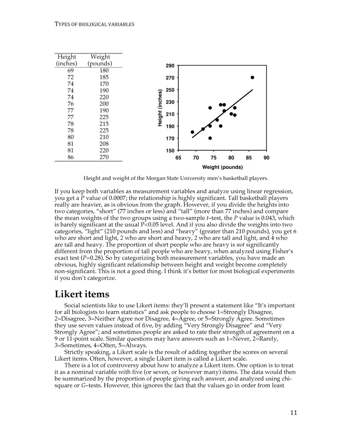
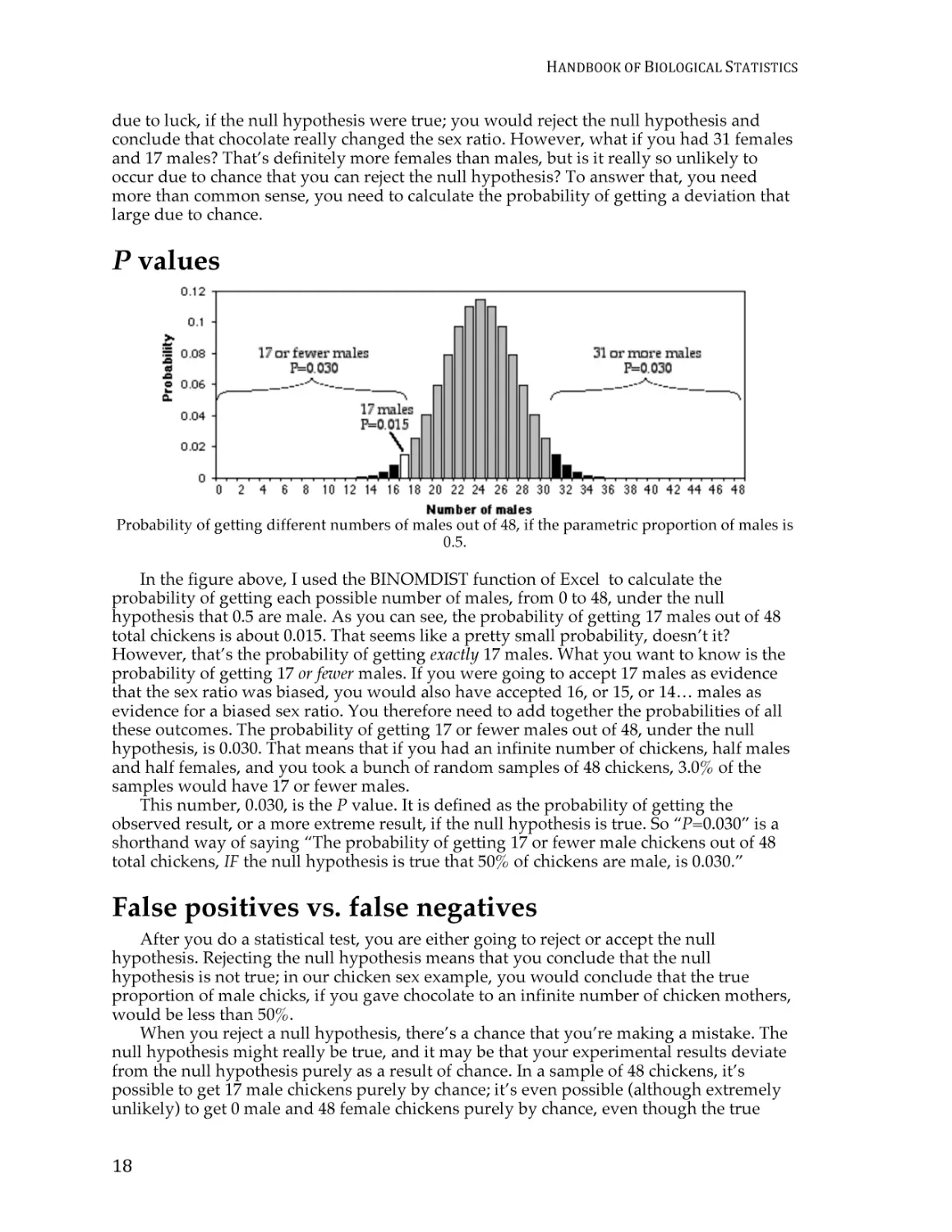
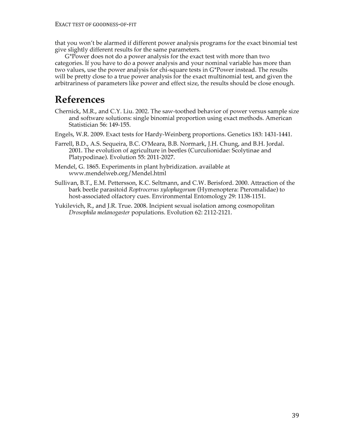
P values
Probability of getting different numbers of males out of 48, if the parametric proportion of males is
0.5.
In the figure above, I used the BINOMDIST function of Excel to calculate the
probability of getting each possible number of males, from 0 to 48, under the null
hypothesis that 0.5 are male. As you can see, the probability of getting 17 males out of 48
total chickens is about 0.015. That seems like a pretty small probability, doesn’t it?
However, that’s the probability of getting exactly 17 males. What you want to know is the
probability of getting 17 or fewer males. If you were going to accept 17 males as evidence
that the sex ratio was biased, you would also have accepted 16, or 15, or 14… males as
evidence for a biased sex ratio. You therefore need to add together the probabilities of all
these outcomes. The probability of getting 17 or fewer males out of 48, under the null
hypothesis, is 0.030. That means that if you had an infinite number of chickens, half males
and half females, and you took a bunch of random samples of 48 chickens, 3.0% of the
samples would have 17 or fewer males.
This number, 0.030, is the P value. It is defined as the probability of getting the
observed result, or a more extreme result, if the null hypothesis is true. So “P=0.030” is a
shorthand way of saying “The probability of getting 17 or fewer male chickens out of 48
total chickens, IF the null hypothesis is true that 50% of chickens are male, is 0.030.”
False positives vs. false negatives
After you do a statistical test, you are either going to reject or accept the null
hypothesis. Rejecting the null hypothesis means that you conclude that the null
hypothesis is not true; in our chicken sex example, you would conclude that the true
proportion of male chicks, if you gave chocolate to an infinite number of chicken mothers,
would be less than 50%.
When you reject a null hypothesis, there’s a chance that you’re making a mistake. The
null hypothesis might really be true, and it may be that your experimental results deviate
from the null hypothesis purely as a result of chance. In a sample of 48 chickens, it’s
possible to get 17 male chickens purely by chance; it’s even possible (although extremely
unlikely) to get 0 male and 48 female chickens purely by chance, even though the true
18
BASIC
CONCEPTS
OF
HYPOTHESIS
TESTING
proportion is 50% males. This is why we never say we “prove” something in science;
there’s always a chance, however miniscule, that our data are fooling us and deviate from
the null hypothesis purely due to chance. When your data fool you into rejecting the null
hypothesis even though it’s true, it’s called a “false positive,” or a “Type I error.” So
another way of defining the P value is the probability of getting a false positive like the
one you’ve observed, if the null hypothesis is true.
Another way your data can fool you is when you don’t reject the null hypothesis, even
though it’s not true. If the true proportion of female chicks is 51%, the null hypothesis of a
50% proportion is not true, but you’re unlikely to get a significant difference from the null
hypothesis unless you have a huge sample size. Failing to reject the null hypothesis, even
though it’s not true, is a “false negative” or “Type II error.” This is why we never say that
our data shows the null hypothesis to be true; all we can say is that we haven’t rejected the
null hypothesis.
Significance levels
Does a probability of 0.030 mean that you should reject the null hypothesis, and
conclude that chocolate really caused a change in the sex ratio? The convention in most
biological research is to use a significance level of 0.05. This means that if the P value is
less than 0.05, you reject the null hypothesis; if P is greater than or equal to 0.05, you don’t
reject the null hypothesis. There is nothing mathematically magic about 0.05, it was chosen
rather arbitrarily during the early days of statistics; people could have agreed upon 0.04,
or 0.025, or 0.071 as the conventional significance level.
The significance level (also known as the “critical value” or “alpha”) you should use
depends on the costs of different kinds of errors. With a significance level of 0.05, you
have a 5% chance of rejecting the null hypothesis, even if it is true. If you try 100 different
treatments on your chickens, and none of them really change the sex ratio, 5% of your
experiments will give you data that are significantly different from a 1:1 sex ratio, just by
chance. In other words, 5% of your experiments will give you a false positive. If you use a
higher significance level than the conventional 0.05, such as 0.10, you will increase your
chance of a false positive to 0.10 (therefore increasing your chance of an embarrassingly
wrong conclusion), but you will also decrease your chance of a false negative (increasing
your chance of detecting a subtle effect). If you use a lower significance level than the
conventional 0.05, such as 0.01, you decrease your chance of an embarrassing false
positive, but you also make it less likely that you’ll detect a real deviation from the null
hypothesis if there is one.
The relative costs of false positives and false negatives, and thus the best P value to
use, will be different for different experiments. If you are screening a bunch of potential
sex-ratio-changing treatments and get a false positive, it wouldn’t be a big deal; you’d just
run a few more tests on that treatment until you were convinced the initial result was a
false positive. The cost of a false negative, however, would be that you would miss out on
a tremendously valuable discovery. You might therefore set your significance value to 0.10
or more for your initial tests. On the other hand, once your sex-ratio-changing treatment is
undergoing final trials before being sold to farmers, a false positive could be very
expensive; you’d want to be very confident that it really worked. Otherwise, if you sell the
chicken farmers a sex-ratio treatment that turns out to not really work (it was a false
positive), they’ll sue the pants off of you. Therefore, you might want to set your
significance level to 0.01, or even lower, for your final tests.
The significance level you choose should also depend on how likely you think it is that
your alternative hypothesis will be true, a prediction that you make before you do the
experiment. This is the foundation of Bayesian statistics, as explained below.
You must choose your significance level before you collect the data, of course. If you
choose to use a different significance level than the conventional 0.05, people will be
19
HANDBOOK
OF
BIOLOGICAL
STATISTICS
skeptical; you must be able to justify your choice. Throughout this handbook, I will
always use P<0.05 as the significance level. If you are doing an experiment where the
cost of a false positive is a lot greater or smaller than the cost of a false negative, or an
experiment where you think it is unlikely that the alternative hypothesis will be true, you
should consider using a different significance level.
One-tailed vs. two-tailed probabilities
The probability that was calculated above, 0.030, is the probability of getting 17 or
fewer males out of 48. It would be significant, using the conventional P<0.05 criterion.
However, what about the probability of getting 17 or fewer females? If your null
hypothesis is “The proportion of males is 0.5 or more” and your alternative hypothesis is
“The proportion of males is less than 0.5,” then you would use the P=0.03 value found by
adding the probabilities of getting 17 or fewer males. This is called a one-tailed
probability, because you are adding the probabilities in only one tail of the distribution
shown in the figure. However, if your null hypothesis is “The proportion of males is 0.5”,
then your alternative hypothesis is “The proportion of males is different from 0.5.” In that
case, you should add the probability of getting 17 or fewer females to the probability of
getting 17 or fewer males. This is called a two-tailed probability. If you do that with the
chicken result, you get P=0.06, which is not quite significant.
You should decide whether to use the one-tailed or two-tailed probability before you
collect your data, of course. A one-tailed probability is more powerful, in the sense of
having a lower chance of false negatives, but you should only use a one-tailed probability
if you really, truly have a firm prediction about which direction of deviation you would
consider interesting. In the chicken example, you might be tempted to use a one-tailed
probability, because you’re only looking for treatments that decrease the proportion of
worthless male chickens. But if you accidentally found a treatment that produced 87%
male chickens, would you really publish the result as “The treatment did not cause a
significant decrease in the proportion of male chickens”? I hope not. You’d realize that this
unexpected result, even though it wasn’t what you and your farmer friends wanted,
would be very interesting to other people; by leading to discoveries about the
fundamental biology of sex-determination in chickens, in might even help you produce
more female chickens someday. Any time a deviation in either direction would be
interesting, you should use the two-tailed probability. In addition, people are skeptical of
one-tailed probabilities, especially if a one-tailed probability is significant and a two-tailed
probability would not be significant (as in our chocolate-eating chicken example). Unless
you provide a very convincing explanation, people may think you decided to use the onetailed probability after you saw that the two-tailed probability wasn’t quite significant,
which would be cheating. It may be easier to always use two-tailed probabilities. For this
handbook, I will always use two-tailed probabilities, unless I make it very clear that
only one direction of deviation from the null hypothesis would be interesting.
Reporting your results
In the olden days, when people looked up P values in printed tables, they would
report the results of a statistical test as “P<0.05”, “P<0.01”, “P>0.10”, etc. Nowadays,
almost all computer statistics programs give the exact P value resulting from a statistical
test, such as P=0.029, and that’s what you should report in your publications. You will
conclude that the results are either significant or they’re not significant; they either reject
the null hypothesis (if P is below your pre-determined significance level) or don’t reject
the null hypothesis (if P is above your significance level). But other people will want to
know if your results are “strongly” significant (P much less than 0.05), which will give
them more confidence in your results than if they were “barely” significant (P=0.043, for
20
BASIC
CONCEPTS
OF
HYPOTHESIS
TESTING
example). In addition, other researchers will need the exact P value if they want to
combine your results with others into a meta-analysis.
Computer statistics programs can give somewhat inaccurate P values when they are
very small. Once your P values get very small, you can just say “P<0.00001” or some other
impressively small number. You should also give either your raw data, or the test statistic
and degrees of freedom, in case anyone wants to calculate your exact P value.
Effect sizes and confidence intervals
A fairly common criticism of the hypothesis-testing approach to statistics is that the
null hypothesis will always be false, if you have a big enough sample size. In the chickenfeet example, critics would argue that if you had an infinite sample size, it is impossible
that male chickens would have exactly the same average foot size as female chickens.
Therefore, since you know before doing the experiment that the null hypothesis is false,
there’s no point in testing it.
This criticism only applies to two-tailed tests, where the null hypothesis is “Things are
exactly the same” and the alternative is “Things are different.” Presumably these critics
think it would be okay to do a one-tailed test with a null hypothesis like “Foot length of
male chickens is the same as, or less than, that of females,” because the null hypothesis
that male chickens have smaller feet than females could be true. So if you’re worried about
this issue, you could think of a two-tailed test, where the null hypothesis is that things are
the same, as shorthand for doing two one-tailed tests. A significant rejection of the null
hypothesis in a two-tailed test would then be the equivalent of rejecting one of the two
one-tailed null hypotheses.
A related criticism is that a significant rejection of a null hypothesis might not be
biologically meaningful, if the difference is too small to matter. For example, in the
chicken-sex experiment, having a treatment that produced 49.9% male chicks might be
significantly different from 50%, but it wouldn’t be enough to make farmers want to buy
your treatment. These critics say you should estimate the effect size and put a confidence
interval on it, not estimate a P value. So the goal of your chicken-sex experiment should
not be to say “Chocolate gives a proportion of males that is significantly less than 50%
(P=0.015)” but to say “Chocolate produced 36.1% males with a 95% confidence interval of
25.9 to 47.4%.” For the chicken-feet experiment, you would say something like “The
difference between males and females in mean foot size is 2.45 mm, with a confidence
interval on the difference of ±1.98 mm.”
Estimating effect sizes and confidence intervals is a useful way to summarize your
results, and it should usually be part of your data analysis; you’ll often want to include
confidence intervals in a graph. However, there are a lot of experiments where the goal is
to decide a yes/no question, not estimate a number. In the initial tests of chocolate on
chicken sex ratio, the goal would be to decide between “It changed the sex ratio” and “It
didn’t seem to change the sex ratio.” Any change in sex ratio that is large enough that you
could detect it would be interesting and worth follow-up experiments. While it’s true that
the difference between 49.9% and 50% might not be worth pursuing, you wouldn’t do an
experiment on enough chickens to detect a difference that small.
Often, the people who claim to avoid hypothesis testing will say something like “the
95% confidence interval of 25.9 to 47.4% does not include 50%, so we the plant extract
significantly changed the sex ratio.” This is a clumsy and roundabout form of hypothesis
testing, and they might as well admit it and report the P value.
Bayesian statistics
Another alternative to frequentist statistics is Bayesian statistics. A key difference is
that Bayesian statistics requires specifying your best guess of the probability of each
21
HANDBOOK
OF
BIOLOGICAL
STATISTICS
possible value of the parameter to be estimated, before the experiment is done. This is
known as the “prior probability.” So for your chicken-sex experiment, you’re trying to
estimate the “true” proportion of male chickens that would be born, if you had an infinite
number of chickens. You would have to specify how likely you thought it was that the
true proportion of male chickens was 50%, or 51%, or 52%, or 47.3%, etc. You would then
look at the results of your experiment and use the information to calculate new
probabilities that the true proportion of male chickens was 50%, or 51%, or 52%, or 47.3%,
etc. (the posterior distribution).
I’ll confess that I don’t really understand Bayesian statistics, and I apologize for not
explaining it well. In particular, I don’t understand how people are supposed to come up
with a prior distribution for the kinds of experiments that most biologists do. With the
exception of systematics, where Bayesian estimation of phylogenies is quite popular and
seems to make sense, I haven’t seen many research biologists using Bayesian statistics for
routine data analysis of simple laboratory experiments. This means that even if the cultlike adherents of Bayesian statistics convinced you that they were right, you would have a
difficult time explaining your results to your biologist peers. Statistics is a method of
conveying information, and if you’re speaking a different language than the people you’re
talking to, you won’t convey much information. So I’ll stick with traditional frequentist
statistics for this handbook.
Having said that, there’s one key concept from Bayesian statistics that is important for
all users of statistics to understand. To illustrate it, imagine that you are testing extracts
from 1000 different tropical plants, trying to find something that will kill beetle larvae. The
reality (which you don’t know) is that 500 of the extracts kill beetle larvae, and 500 don’t.
You do the 1000 experiments and do the 1000 frequentist statistical tests, and you use the
traditional significance level of P<0.05. The 500 plant extracts that really work all give you
P<0.05; these are the true positives. Of the 500 extracts that don’t work, 5% of them give
you P<0.05 by chance (this is the meaning of the P value, after all), so you have 25 false
negatives. So you end up with 525 plant extracts that gave you a P value less than 0.05.
You’ll have to do further experiments to figure out which are the 25 false positives and
which are the 500 true positives, but that’s not so bad, since you know that most of them
will turn out to be true positives.
Now imagine that you are testing those extracts from 1000 different tropical plants to
try to find one that will make hair grow. The reality (which you don’t know) is that one of
the extracts makes hair grow, and the other 999 don’t. You do the 1000 experiments and
do the 1000 frequentist statistical tests, and you use the traditional significance level of
P<0.05. The one plant extract that really works gives you P<0.05; this is the true positive.
But of the 999 extracts that don’t work, 5% of them give you P<0.05 by chance, so you
have about 50 false negatives. You end up with 51 P values less than 0.05, but almost all of
them are false positives.
Now instead of testing 1000 plant extracts, imagine that you are testing just one. If you
are testing it to see if it kills beetle larvae, you know (based on everything you know about
plant and beetle biology) there’s a pretty good chance it will work, so you can be pretty
sure that a P value less than 0.05 is a true positive. But if you are testing that one plant
extract to see if it grows hair, which you know is very unlikely (based on everything you
know about plants and hair), a P value less than 0.05 is almost certainly a false positive. In
other words, if you expect that the null hypothesis is probably true, a statistically
significant result is probably a false positive. This is sad; the most exciting, amazing,
unexpected results in your experiments are probably just your data trying to make you
jump to ridiculous conclusions. You should require a much lower P value to reject a null
hypothesis that you think is probably true.
A Bayesian would insist that you put in numbers just how likely you think the null
hypothesis and various values of the alternative hypothesis are, before you do the
experiment, and I’m not sure how that is supposed to work in practice for most
22
BASIC
CONCEPTS
OF
HYPOTHESIS
TESTING
experimental biology. But the general concept is a valuable one: as Carl Sagan
summarized it, “Extraordinary claims require extraordinary evidence.”
Recommendations
Here are three experiments to illustrate when the different approaches to statistics are
appropriate. In the first experiment, you are testing a plant extract on rabbits to see if it
will lower their blood pressure. You already know that the plant extract is a diuretic
(makes the rabbits pee more) and you already know that diuretics tend to lower blood
pressure, so you think there’s a good chance it will work. If it does work, you’ll do more
low-cost animal tests on it before you do expensive, potentially risky human trials. Your
prior expectation is that the null hypothesis (that the plant extract has no effect) has a
good chance of being false, and the cost of a false positive is fairly low. So you should do
frequentist hypothesis testing, with a significance level of 0.05.
In the second experiment, you are going to put human volunteers with high blood
pressure on a strict low-salt diet and see how much their blood pressure goes down.
Everyone will be confined to a hospital for a month and fed either a normal diet, or the
same foods with half as much salt. For this experiment, you wouldn’t be very interested in
the P value, as based on prior research in animals and humans, you are already quite
certain that reducing salt intake will lower blood pressure; you’re pretty sure that the null
hypothesis that “Salt intake has no effect on blood pressure” is false. Instead, you are very
interested to know how much the blood pressure goes down. Reducing salt intake in half
is a big deal, and if it only reduces blood pressure by 1 mm Hg, the tiny gain in life
expectancy wouldn’t be worth a lifetime of bland food and obsessive label-reading. If it
reduces blood pressure by 20 mm with a confidence interval of ±5 mm, it might be worth
it. So you should estimate the effect size (the difference in blood pressure between the
diets) and the confidence interval on the difference.
In the third experiment, you are going to put magnetic hats on guinea pigs and see if
their blood pressure goes down (relative to guinea pigs wearing the kind of non-magnetic
hats that guinea pigs usually wear). This is a really goofy experiment, and you know that
it is very unlikely that the magnets will have any effect (it’s not impossible—magnets
affect the sense of direction of homing pigeons, and maybe guinea pigs have something
similar in their brains and maybe it will somehow affect their blood pressure—it just
seems really unlikely). You might analyze your results using Bayesian statistics, which
will require specifying in numerical terms just how unlikely you think it is that the
magnetic hats will work. Or you might use frequentist statistics, but require a P value
much, much lower than 0.05 to convince yourself that the effect is real.
23
HANDBOOK
OF
BIOLOGICAL
STATISTICS
Confounding variables
A confounding variable is a variable other than the independent variable that you’re
interested in, that may affect the dependent variable. This can lead to erroneous
conclusions about the relationship between the independent and dependent variables.
You deal with confounding variables by controlling them; by matching; by randomizing;
or by statistical control.
Introduction
Due to a variety of genetic, developmental, and environmental factors, no two
organisms, no two tissue samples, no two cells are exactly alike. This means that when
you design an experiment with samples that differ in independent variable X, your
samples will also differ in other variables that you may or may not be aware of. If these
confounding variables affect the dependent variable Y that you’re interested in, they may
trick you into thinking there’s a relationship between X and Y when there really isn’t. Or,
the confounding variables may cause so much variation in Y that it’s hard to detect a real
relationship between X and Y when there is one.
As an example of confounding variables, imagine that you want to know whether the
genetic differences between American elms (which are susceptible to Dutch elm disease)
and Princeton elms (a strain of American elms that is resistant to Dutch elm disease) cause
a difference in the amount of insect damage to their leaves. You look around your area,
find 20 American elms and 20 Princeton elms, pick 50 leaves from each, and measure the
area of each leaf that was eaten by insects. Imagine that you find significantly more insect
damage on the Princeton elms than on the American elms (I have no idea if this is true).
It could be that the genetic difference between the types of elm directly causes the
difference in the amount of insect damage, which is what you were looking for. However,
there are likely to be some important confounding variables. For example, many American
elms are many decades old, while the Princeton strain of elms was made commercially
available only recently and so any Princeton elms you find are probably only a few years
old. American elms are often treated with fungicide to prevent Dutch elm disease, while
this wouldn’t be necessary for Princeton elms. American elms in some settings (parks,
streetsides, the few remaining in forests) may receive relatively little care, while Princeton
elms are expensive and are likely planted by elm fanatics who take good care of them
(fertilizing, watering, pruning, etc.). It is easy to imagine that any difference in insect
damage between American and Princeton elms could be caused, not by the genetic
differences between the strains, but by a confounding variable: age, fungicide treatment,
fertilizer, water, pruning, or something else. If you conclude that Princeton elms have
more insect damage because of the genetic difference between the strains, when in reality
it’s because the Princeton elms in your sample were younger, you will look like an idiot to
all of your fellow elm scientists as soon as they figure out your mistake.
On the other hand, let’s say you’re not that much of an idiot, and you make sure your
sample of Princeton elms has the same average age as your sample of American elms.
There’s still a lot of variation in ages among the individual trees in each sample, and if that
24
CONFOUNDING
VARIABLES
affects insect damage, there will be a lot of variation among individual trees in the amount
of insect damage. This will make it harder to find a statistically significant difference in
insect damage between the two strains of elms, and you might miss out on finding a small
but exciting difference in insect damage between the strains.
Controlling confounding variables
Designing an experiment to eliminate differences due to confounding variables is
critically important. One way is to control a possible confounding variable, meaning you
keep it identical for all the individuals. For example, you could plant a bunch of American
elms and a bunch of Princeton elms all at the same time, so they’d be the same age. You
could plant them in the same field, and give them all the same amount of water and
fertilizer.
It is easy to control many of the possible confounding variables in laboratory
experiments on model organisms. All of your mice, or rats, or Drosophila will be the same
age, the same sex, and the same inbred genetic strain. They will grow up in the same kind
of containers, eating the same food and drinking the same water. But there are always
some possible confounding variables that you can’t control. Your organisms may all be
from the same genetic strain, but new mutations will mean that there are still some genetic
differences among them. You may give them all the same food and water, but some may
eat or drink a little more than others. After controlling all of the variables that you can, it is
important to deal with any other confounding variables by randomizing, matching or
statistical control.
Controlling confounding variables is harder with organisms that live outside the
laboratory. Those elm trees that you planted in the same field? Different parts of the field
may have different soil types, different water percolation rates, different proximity to
roads, houses and other woods, and different wind patterns. And if your experimental
organisms are humans, there are a lot of confounding variables that are impossible to
control.
Randomizing
Once you’ve designed your experiment to control as many confounding variables as
possible, you need to randomize your samples to make sure that they don’t differ in the
confounding variables that you can’t control. For example, let’s say you’re going to make
20 mice wear sunglasses and leave 20 mice without glasses, to see if sunglasses help
prevent cataracts. You shouldn’t reach into a bucket of 40 mice, grab the first 20 you catch
and put sunglasses on them. The first 20 mice you catch might be easier to catch because
they’re the slowest, the tamest, or the ones with the longest tails; or you might
subconsciously pick out the fattest mice or the cutest mice. I don’t know whether having
your sunglass-wearing mice be slower, tamer, with longer tails, fatter, or cuter would
make them more or less susceptible to cataracts, but you don’t know either. You don’t
want to find a difference in cataracts between the sunglass-wearing and non-sunglasswearing mice, then have to worry that maybe it’s the extra fat or longer tails, not the
sunglasses, that caused the difference. So you should randomly assign the mice to the
different treatment groups. You could give each mouse an ID number and have a
computer randomly assign them to the two groups, or you could just flip a coin each time
you pull a mouse out of your bucket of mice.
In the mouse example, you used all 40 of your mice for the experiment. Often, you will
sample a small number of observations from a much larger population, and it’s important
that it be a random sample. In a random sample, each individual has an equal probability
of being sampled. To get a random sample of 50 elm trees from a forest with 700 elm trees,
you could figure out where each of the 700 elm trees is, give each one an ID number, write
25
HANDBOOK
OF
BIOLOGICAL
STATISTICS
the numbers on 700 slips of paper, put the slips of paper in a hat, and randomly draw out
50 (or have a computer randomly choose 50, if you’re too lazy to fill out 700 slips of paper
or don’t own a hat).
You need to be careful to make sure that your sample is truly random. I started to
write “Or an easier way to randomly sample 50 elm trees would be to randomly pick 50
locations in the forest by having a computer randomly choose GPS coordinates, then
sample the elm tree nearest each random location.” However, this would have been a
mistake; an elm tree that was far away from other elm trees would almost certainly be the
closest to one of your random locations, but you’d be unlikely to sample an elm tree in the
middle of a dense bunch of elm trees. It’s pretty easy to imagine that proximity to other
elm trees would affect insect damage (or just about anything else you’d want to measure
on elm trees), so I almost designed a stupid experiment for you.
A random sample is one in which all members of a population have an equal
probability of being sampled. If you’re measuring fluorescence inside kidney cells, this
means that all points inside a cell, and all the cells in a kidney, and all the kidneys in all
the individuals of a species, would have an equal chance of being sampled.
A perfectly random sample of observations is difficult to collect, and you need to think
about how this might affect your results. Let’s say you’ve used a confocal microscope to
take a two-dimensional “optical slice” of a kidney cell. It would be easy to use a randomnumber generator on a computer to pick out some random pixels in the image, and you
could then use the fluorescence in those pixels as your sample. However, if your slice was
near the cell membrane, your “random” sample would not include any points deep inside
the cell. If your slice was right through the middle of the cell, however, points deep inside
the cell would be over-represented in your sample. You might get a fancier microscope, so
you could look at a random sample of the “voxels” (three-dimensional pixels) throughout
the volume of the cell. But what would you do about voxels right at the surface of the cell?
Including them in your sample would be a mistake, because they might include some of
the cell membrane and extracellular space, but excluding them would mean that points
near the cell membrane are under-represented in your sample.
Matching
Sometimes there’s a lot of variation in confounding variables that you can’t control;
even if you randomize, the large variation in confounding variables may cause so much
variation in your dependent variable that it would be hard to detect a difference caused by
the independent variable that you’re interested in. This is particularly true for humans.
Let’s say you want to test catnip oil as a mosquito repellent. If you were testing it on rats,
you would get a bunch of rats of the same age and sex and inbred genetic strain, apply
catnip oil to half of them, then put them in a mosquito-filled room for a set period of time
and count the number of mosquito bites. This would be a nice, well-controlled
experiment, and with a moderate number of rats you could see whether the catnip oil
caused even a small change in the number of mosquito bites. But if you wanted to test the
catnip oil on humans going about their everyday life, you couldn’t get a bunch of humans
of the same “inbred genetic strain,” it would be hard to get a bunch of people all of the
same age and sex, and the people would differ greatly in where they lived, how much
time they spent outside, the scented perfumes, soaps, deodorants, and laundry detergents
they used, and whatever else it is that makes mosquitoes ignore some people and eat
others up. The very large variation in number of mosquito bites among people would
mean that if the catnip oil had a small effect, you’d need a huge number of people for the
difference to be statistically significant.
One way to reduce the noise due to confounding variables is by matching. You
generally do this when the independent variable is a nominal variable with two values,
such as “drug” vs. “placebo.” You make observations in pairs, one for each value of the
26
CONFOUNDING
VARIABLES
independent variable, that are as similar as possible in the confounding variables. The
pairs could be different parts of the same people. For example, you could test your catnip
oil by having people put catnip oil on one arm and placebo oil on the other arm. The
variation in the size of the difference between the two arms on each person could be a lot
smaller than the variation among different people, so you won’t need nearly as big a
sample size to detect a small difference in mosquito bites between catnip oil and placebo
oil. Of course, you’d have to randomly choose which arm to put the catnip oil on.
Other ways of pairing include before-and-after experiments. You could count the
number of mosquito bites in one week, then have people use catnip oil and see if the
number of mosquito bites for each person went down. With this kind of experiment, it’s
important to make sure that the dependent variable wouldn’t have changed by itself
(maybe the weather changed and the mosquitoes stopped biting), so it would be better to
use placebo oil one week and catnip oil another week, and randomly choose for each
person whether the catnip oil or placebo oil was first.
For many human experiments, you’ll need to match two different people, because you
can’t test both the treatment and the control on the same person. For example, let’s say
you’ve given up on catnip oil as a mosquito repellent and are going to test it on humans as
a cataract preventer. You’re going to get a bunch of people, have half of them take a
catnip-oil pill and half take a placebo pill for five years, then compare the lens opacity in
the two groups. Here the goal is to make each pair of people be as similar as possible in
confounding variables that you think might be important. If you’re studying cataracts,
you’d want to match people based on known risk factors for cataracts: age, amount of time
outdoors, use of sunglasses, blood pressure. Of course, once you have a matched pair of
individuals, you’d want to randomly choose which one gets the catnip oil and which one
gets the placebo. You wouldn’t be able to find perfectly matching pairs of individuals, but
the better the match, the easier it will be to detect a difference due to the catnip-oil pills.
One kind of matching that is often used in epidemiology is the case-control study.
“Cases” are people with some disease or condition, and each is matched with one or more
controls. Each control is generally the same sex and as similar in other factors (age,
ethnicity, occupation, income) as practical. The cases and controls are then compared to
see whether there are consistent differences between them. For example, if you wanted to
know whether smoking marijuana caused or prevented cataracts, you could find a bunch
of people with cataracts. You’d then find a control for each person who was similar in the
known risk factors for cataracts (age, time outdoors, blood pressure, diabetes, steroid use).
Then you would ask the cataract cases and the non-cataract controls how much weed
they’d smoked.
If it’s hard to find cases and easy to find controls, a case-control study may include
two or more controls for each case. This gives somewhat more statistical power.
Statistical control
When it isn’t practical to keep all the possible confounding variables constant, another
solution is to statistically control them. Sometimes you can do this with a simple ratio. If
you’re interested in the effect of weight on cataracts, height would be a confounding
variable, because taller people tend to weigh more. Using the body mass index (BMI),
which is the ratio of weight in kilograms over the squared height in meters, would remove
much of the confounding effects of height in your study. If you need to remove the effects
of multiple confounding variables, there are multivariate statistical techniques you can
use. However, the analysis, interpretation, and presentation of complicated multivariate
analyses are not easy.
27
HANDBOOK
OF
BIOLOGICAL
STATISTICS
Observer or subject bias as a confounding variable
In many studies, the possible bias of the researchers is one of the most important
confounding variables. Finding a statistically significant result is almost always more
interesting than not finding a difference, so you need to constantly be on guard to control
the effects of this bias. The best way to do this is by blinding yourself, so that you don’t
know which individuals got the treatment and which got the control. Going back to our
catnip oil and mosquito experiment, if you know that Alice got catnip oil and Bob didn’t,
your subconscious body language and tone of voice when you talk to Alice might imply
“You didn’t get very many mosquito bites, did you? That would mean that the world will
finally know what a genius I am for inventing this,” and you might carefully scrutinize
each red bump and decide that some of them were spider bites or poison ivy, not
mosquito bites. With Bob, who got the placebo, you might subconsciously imply “Poor
Bob—I’ll bet you got a ton of mosquito bites, didn’t you? The more you got, the more of a
genius I am” and you might be more likely to count every hint of a bump on Bob’s skin as
a mosquito bite. Ideally, the subjects shouldn’t know whether they got the treatment or
placebo, either, so that they can’t give you the result you want; this is especially important
for subjective variables like pain. Of course, keeping the subjects of this particular
imaginary experiment blind to whether they’re rubbing catnip oil on their skin is going to
be hard, because Alice’s cat keeps licking Alice’s arm and then acting stoned.
28
EXACT
TEST
OF
GOODNESS-‐OF-‐FIT
Exact test of goodness-of-fit
You use the exact test of goodness-of-fit when you have one nominal variable, you
want to see whether the number of observations in each category fits a theoretical
expectation, and the sample size is small.
Introduction
The main goal of a statistical test is to answer the question, “What is the probability of
getting a result like my observed data, if the null hypothesis were true?” If it is very
unlikely to get the observed data under the null hypothesis, you reject the null hypothesis.
Most statistical tests take the following form:
1. Collect the data.
2. Calculate a number, the test statistic, that measures how far the observed data
deviate from the expectation under the null hypothesis.
3. Use a mathematical function to estimate the probability of getting a test statistic as
extreme as the one you observed, if the null hypothesis were true. This is the P
value.
Exact tests, such as the exact test of goodness-of-fit, are different. There is no test
statistic; instead, you directly calculate the probability of obtaining the observed data
under the null hypothesis. This is because the predictions of the null hypothesis are so
simple that the probabilities can easily be calculated.
When to use it
You use the exact test of goodness-of-fit when you have one nominal variable. The
most common use is a nominal variable with only two values (such as male or female, left
or right, green or yellow), in which case the test may be called the exact binomial test. You
compare the observed data with the expected data, which are some kind of theoretical
expectation (such as a 1:1 sex ratio or a 3:1 ratio in a genetic cross) that you determined
before you collected the data. If the total number of observations is too high (around a
thousand), computers may not be able to do the calculations for the exact test, and you
should use a G–test or chi-square test of goodness-of-fit instead (and they will give almost
exactly the same result).
You can do exact multinomial tests of goodness-of-fit when the nominal variable has
more than two values. The basic concepts are the same as for the exact binomial test. Here
I’m limiting most of the explanation to the binomial test, because it’s more commonly
used and easier to understand.
29
HANDBOOK
OF
BIOLOGICAL
STATISTICS
Null hypothesis
For a two-tailed test, which is what you almost always should use, the null hypothesis
is that the number of observations in each category is equal to that predicted by a
biological theory, and the alternative hypothesis is that the observed data are different
from the expected. For example, if you do a genetic cross in which you expect a 3:1 ratio of
green to yellow pea pods, and you have a total of 50 plants, your null hypothesis is that
there are 37.5 plants with green pods and 12.5 with yellow pods.
If you are doing a one-tailed test, the null hypothesis is that the observed number for
one category is equal to or less than the expected; the alternative hypothesis is that the
observed number in that category is greater than expected.
How the test works
Let’s say you want to know whether our cat, Gus, has a preference for one paw or uses
both paws equally. You dangle a ribbon in his face and record which paw he uses to bat at
it. You do this 10 times, and he bats at the ribbon with his right paw 8 times and his left
paw 2 times. Then he gets bored with the experiment and leaves. Can you conclude that
he is right-pawed, or could this result have occurred due to chance under the null
hypothesis that he bats equally with each paw?
The null hypothesis is that each time Gus bats at the ribbon, the probability that he
will use his right paw is 0.5. The probability that he will use his right paw on the first time
is 0.5. The probability that he will use his right paw the first time AND the second time is
0.5 x 0.5, or 0.5 , or 0.25. The probability that he will use his right paw all ten times is 0.5 ,
or about 0.001.
For a mixture of right and left paws, the calculation of the binomial distribution is
more complicated. Where n is the total number of trials, k is the number of “successes”
(statistical jargon for whichever event you want to consider), p is the expected proportion
of successes if the null hypothesis is true, and Y is the probability of getting k successes in
n trials, the equation is:
2
10
Y=
p k (1− p)(n−k ) n!
k!(n − k)!
Fortunately, there’s a spreadsheet function that does the calculation for you. To calculate
the probability of getting exactly 8 out of 10 right paws, you would enter
€
=BINOMDIST(2, 10, 0.5, FALSE)
The first number, 2, is whichever event there are fewer than expected of; in this case, there
are only two uses of the left paw, which is fewer than the expected 5. The second number,
10, is the total number of trials. The third number is the expected proportion of whichever
event there were fewer than expected of, if the null hypothesis were true; here the null
hypothesis predicts that half of all ribbon-battings will be with the left paw. And FALSE
tells it to calculate the exact probability for that number of events only. In this case, the
answer is P=0.044, so you might think it was significant at the P<0.05 level.
However, it would be incorrect to only calculate the probability of getting exactly 2 left
paws and 8 right paws. Instead, you must calculate the probability of getting a deviation
from the null expectation as large as, or larger than, the observed result. So you must
calculate the probability that Gus used his left paw 2 times out of 10, or 1 time out of 10, or
30
EXACT
TEST
OF
GOODNESS-‐OF-‐FIT
0 times out of ten. Adding these probabilities together gives P=0.055, which is not quite
significant at the P<0.05 level. You do this in a spreadsheet by entering
=BINOMDIST(2, 10, 0.5, TRUE)
The “TRUE” parameter tells the spreadsheet to calculate the sum of the probabilities of the
observed number and all more extreme values; it’s the equivalent of
=BINOMDIST(2, 10, 0.5, FALSE)+BINOMDIST(1, 10, 0.5, FALSE)
+BINOMDIST(0, 10, 0.5, FALSE)
There’s one more thing. The above calculation gives the total probability of getting 2, 1, or
0 uses of the left paw out of 10. However, the alternative hypothesis is that the number of
uses of the right paw is not equal to the number of uses of the left paw. If there had been 2,
1, or 0 uses of the right paw, that also would have been an equally extreme deviation from
the expectation. So you must add the probability of getting 2, 1, or 0 uses of the right paw,
to account for both tails of the probability distribution; you are doing a two-tailed test.
This gives you P=0.109, which is not very close to being significant. (If the null hypothesis
had been 0.50 or more uses of the left paw, and the alternative hypothesis had been less
than 0.5 uses of left paw, you could do a one-tailed test and use P=0.054. But you almost
never have a situation where a one-tailed test is appropriate.)
Graph showing the probability distribution for the binomial with 10 trials.
The most common use of an exact binomial test is when the null hypothesis is that
numbers of the two outcomes are equal. In that case, the meaning of a two-tailed test is
clear, and you calculate the two-tailed P value by multiplying the one-tailed P value times
two.
When the null hypothesis is not a 1:1 ratio, but something like a 3:1 ratio, statisticians
disagree about the meaning of a two-tailed exact binomial test, and different statistical
programs will give slightly different results. The simplest method is to use the binomial
equation, as described above, to calculate the probability of whichever event is less
common that expected, then multiply it by two. For example, let’s say you’ve crossed a
number of cats that are heterozygous at the hair-length gene; because short hair is
dominant, you expect 75% of the kittens to have short hair and 25% to have long hair. You
end up with 7 short haired and 5 long haired cats. There are 7 short haired cats when you
expected 9, so you use the binomial equation to calculate the probability of 7 or fewer
short-haired cats; this adds up to 0.158. Doubling this would give you a two-tailed P value
of 0.315. This is what SAS and Richard Lowry’s online calculator
(faculty.vassar.edu/lowry/binomialX.html) do.
31
HANDBOOK
OF
BIOLOGICAL
STATISTICS
The alternative approach is called the method of small P values (see
http://www.quantitativeskills.com/sisa/papers/paper5.htm), and I think most
statisticians prefer it. For our example, you use the binomial equation to calculate the
probability of obtaining exactly 7 out of 12 short-haired cats; it is 0.103. Then you calculate
the probabilities for every other possible number of short-haired cats, and you add
together those that are less than 0.103. That is the probabilities for 6, 5, 4 ... 0 short-haired
cats, and in the other tail, only the probability of 12 out of 12 short-haired cats. Adding
these probabilities gives a P value of 0.189. This is what my exact binomial spreadsheet
does. I think the arguments in favor of the method of small P values make sense. If you are
using the exact binomial test with expected proportions other than 50:50, make sure you
specify which method you use (remember that it doesn’t matter when the expected
proportions are 50:50).
Sign test
One common application of the exact binomial test is known as the sign test. You use
the sign test when there are two nominal variables and one measurement variable. One of
the nominal variables has only two values, such as “before” and “after” or “left” and
“right,” and the other nominal variable identifies the pairs of observations. In a study of a
hair-growth ointment, “amount of hair” would be the measurement variable, “before” and
“after” would be the values of one nominal variable, and “Arnold,” “Bob,” “Charles”
would be values of the second nominal variable.
The data for a sign test usually could be analyzed using a paired t–test or a Wilcoxon
signed-rank test, if the null hypothesis is that the mean or median difference between
pairs of observations is zero. However, sometimes you’re not interested in the size of the
difference, just the direction. In the hair-growth example, you might have decided that
you didn’t care how much hair the men grew or lost, you just wanted to know whether
more than half of the men grew hair. In that case, you count the number of differences in
one direction, count the number of differences in the opposite direction, and use the exact
binomial test to see whether the numbers are different from a 1:1 ratio.
You should decide that a sign test is the test you want before you look at the data. If
you analyze your data with a paired t–test and it’s not significant, then you notice it
would be significant with a sign test, it would be very unethical to just report the result of
the sign test as if you’d planned that from the beginning.
Exact multinomial test
While the most common use of exact tests of goodness-of-fit is the exact binomial test,
it is also possible to perform exact multinomial tests when there are more than two values
of the nominal variable. The most common example in biology would be the results of
genetic crosses, where one might expect a 1:2:1 ratio from a cross of two heterozygotes at
one codominant locus, a 9:3:3:1 ratio from a cross of individuals heterozygous at two
dominant loci, etc. The basic procedure is the same as for the exact binomial test: you
calculate the probabilities of the observed result and all more extreme possible results and
add them together. The underlying computations are more complicated, and if you have a
lot of categories, your computer may have problems even if the total sample size is less
than 1000. If you have a small sample size but so many categories that your computer
program won’t do an exact test, you can use a G–test or chi-square test of goodness-of-fit,
but understand that the results may be somewhat inaccurate.
32
EXACT
TEST
OF
GOODNESS-‐OF-‐FIT
Post-hoc test
If you perform the exact multinomial test (with more than two categories) and get a
significant result, you may want to follow up by testing whether each category deviates
significantly from the expected number. It’s a little odd to talk about just one category
deviating significantly from expected; if there are more observations than expected in one
category, there have to be fewer than expected in at least one other category. But looking
at each category might help you understand better what’s going on.
For example, let’s say you do a genetic cross in which you expect a 9:3:3:1 ratio of
purple, red, blue, and white flowers, and your observed numbers are 72 purple, 38 red, 20
blue, and 18 white. You do the exact test and get a P value of 0.0016, so you reject the null
hypothesis. There are fewer purple and blue and more red and white than expected, but is
there an individual color that deviates significantly from expected?
To answer this, do an exact binomial test for each category vs. the sum of all the other
categories. For purple, compare the 72 purple and 76 non-purple to the expected 9:7 ratio.
The P value is 0.07, so you can’t say there are significantly fewer purple flowers than
expected (although it’s worth noting that it’s close). There are 38 red and 110 non-red
flowers; when compared to the expected 3:13 ratio, the P value is 0.035. This is below the
significance level of 0.05, but because you’re doing four tests at the same time, you need to
correct for the multiple comparisons. Applying the Bonferroni correction, you divide the
significance level (0.05) by the number of comparisons (4) and get a new significance level
of 0.0125; since 0.035 is greater than this, you can’t say there are significantly more red
flowers than expected. Comparing the 18 white and 130 non-white to the expected ratio of
1:15, the P value is 0.006, so you can say that there are significantly more white flowers
than expected.
It is possible that an overall significant P value could result from moderate-sized
deviations in all of the categories, and none of the post-hoc tests will be significant. This
would be frustrating; you’d know that something interesting was going on, but you
couldn’t say with statistical confidence exactly what it was.
I doubt that the procedure for post-hoc tests in a goodness-of-fit test that I’ve
suggested here is original, but I can’t find a reference to it; if you know who really
invented this, e-mail me with a reference. And it seems likely that there’s a better method
that takes into account the non-independence of the numbers in the different categories (as
the numbers in one category go up, the number in some other category must go down),
but I have no idea what it might be.
Intrinsic hypothesis
You use exact test of goodness-of-fit that I’ve described here when testing fit to an
extrinsic hypothesis, a hypothesis that you knew before you collected the data. For
example, even before the kittens are born, you can predict that the ratio of short-haired to
long-haired cats will be 3:1 in a genetic cross of two heterozygotes. Sometimes you want to
test the fit to an intrinsic null hypothesis: one that is based on the data you collect, where
you can’t predict the results from the null hypothesis until after you collect the data. The
only example I can think of in biology is Hardy-Weinberg proportions, where the number
of each genotype in a sample from a wild population is expected to be p or 2pq or q (with
more possibilities when there are more than two alleles); you don’t know the allele
frequencies (p and q) until after you collect the data. Exact tests of fit to Hardy-Weinberg
raise a number of statistical issues and have received a lot of attention from population
geneticists; if you need to do this, see Engels (2009) and the older references he cites. If you
have biological data that you want to do an exact test of goodness-of-fit with an intrinsic
hypothesis on, and it doesn’t involve Hardy-Weinberg, e-mail me; I’d be very curious to
see what kind of biological data requires this, and I will try to help you as best as I can.
2
2
33
HANDBOOK
OF
BIOLOGICAL
STATISTICS
Assumptions
Goodness-of-fit tests assume that the individual observations are independent,
meaning that the value of one observation does not influence the value of other
observations. To give an example, let’s say you want to know what color of flowers that
bees like. You plant four plots of flowers: one purple, one red, one blue, and one white.
You get a bee, put it in a dark jar, carry it to a point equidistant from the four plots of
flowers, and release it. You record which color flower it goes to first, then re-capture it and
hold it prisoner until the experiment is done. You do this again and again for 100 bees. In
this case, the observations are independent; the fact that bee #1 went to a blue flower has
no influence on where bee #2 goes. This is a good experiment; if significantly more than
1/4 of the bees go to the blue flowers, it would be good evidence that the bees prefer blue
flowers.
Now let’s say that you put a beehive at the point equidistant from the four plots of
flowers, and you record where the first 100 bees go. If the first bee happens to go to the
plot of blue flowers, it will go back to the hive and do its bee-butt-wiggling dance that tells
the other bees, “Go 15 meters southwest, there’s a bunch of yummy nectar there!” Then
some more bees will fly to the blue flowers, and when they return to the hive, they’ll do
the same bee-butt-wiggling dance. The observations are NOT independent; where bee #2
goes is strongly influenced by where bee #1 happened to go. If “significantly” more than
1/4 of the bees go to the blue flowers, it could easily be that the first bee just happened to
go there by chance, and bees may not really care about flower color.
Examples
Roptrocerus xylophagorum is a parasitoid of bark beetles. To determine what cues these
wasps use to find the beetles, Sullivan et al. (2000) placed female wasps in the base of a Yshaped tube, with a different odor in each arm of the Y, then counted the number of wasps
that entered each arm of the tube. In one experiment, one arm of the Y had the odor of
bark being eaten by adult beetles, while the other arm of the Y had bark being eaten by
larval beetles. Ten wasps entered the area with the adult beetles, while 17 entered the area
with the larval beetles. The difference from the expected 1:1 ratio is not significant
(P=0.248). In another experiment that compared infested bark with a mixture of infested
and uninfested bark, 36 wasps moved towards the infested bark, while only 7 moved
towards the mixture; this is significantly different from the expected ratio (P=9× 10 ).
-6
Yukilevich and True (2008) mixed 30 male and 30 female Drosophila melanogaster from
Alabama with 30 male and 30 females from Grand Bahama Island. They observed 246
matings; 140 were homotypic (male and female from the same location), while 106 were
heterotypic (male and female from different locations). The null hypothesis is that the flies
mate at random, so that there should be equal numbers of homotypic and heterotypic
matings. There were significantly more homotypic matings (exact binomial test, P=0.035)
than heterotypic.
As an example of the sign test, Farrell et al. (2001) estimated the evolutionary tree of
two subfamilies of beetles that burrow inside trees as adults. They found ten pairs of sister
groups in which one group of related species, or “clade,” fed on angiosperms and one fed
on gymnosperms, and they counted the number of species in each clade. There are two
nominal variables, food source (angiosperms or gymnosperms) and pair of clades
(Corthylina vs. Pityophthorus, etc.) and one measurement variable, the number of species
per clade.
34
EXACT
TEST
OF
GOODNESS-‐OF-‐FIT
The biological null hypothesis is that although the number of species per clade may
vary widely due to a variety of unknown factors, whether a clade feeds on angiosperms or
gymnosperms will not be one of these factors. In other words, you expect that each pair of
related clades will differ in number of species, but half the time the angiosperm-feeding
clade will have more species, and half the time the gymnosperm-feeding clade will have
more species.
Applying a sign test, there are 10 pairs of clades in which the angiosperm-specialized
clade has more species, and 0 pairs with more species in the gymnosperm-specialized
clade; this is significantly different from the null expectation (P=0.002), and you can reject
the null hypothesis and conclude that in these beetles, clades that feed on angiosperms
tend to have more species than clades that feed on gymnosperms.
Angiosperm-feeding
Corthylina
Scolytinae
Acanthotomicus+Premnobious
Xyleborini/Dryocoetini
Apion
Belinae
Higher Curculionidae
Higher Cerambycidae
Megalopodinae
Higher Chrysomelidae
Spp.
458
5200
123
1500
1500
150
44002
25000
400
33400
Gymnosperm-feeding
Pityophthorus
Hylastini+Tomacini
Orhotomicus
Ipini
Antliarhininae
Allocoryninae+Oxycorinae
Nemonychidae
Aseminae + Spondylinae
Palophaginae
Aulocoscelinae +
Orsodacninae
Spp.
200
180
11
195
12
30
85
78
3
26
Mendel (1865) crossed pea plants that were heterozygotes for green pod/yellow pod;
pod color is the nominal variable, with “green” and “yellow” as the values. If this is
inherited as a simple Mendelian trait, with green dominant over yellow, the expected ratio
in the offspring is 3 green: 1 yellow. He observed 428 green and 152 yellow. The expected
numbers of plants under the null hypothesis are 435 green and 145 yellow, so Mendel
observed slightly fewer green-pod plants than expected. The P value for an exact binomial
test using the method of small P values, as implemented in my spreadsheet, is 0.533,
indicating that the null hypothesis cannot be rejected; there is no significant difference
between the observed and expected frequencies of pea plants with green pods. (SAS uses
a different method that gives a P value of 0.530. With a smaller sample size, the difference
between the “method of small P values” that I and most statisticians prefer, and the cruder
method that SAS uses, could be large enough to be important.)
Mendel (1865) also crossed peas that were heterozygous at two genes: one for yellow
vs. green, the other for round vs. wrinkled; yellow was dominant over green, and round
was dominant over wrinkled. The expected and observed results were:
yellow+round
green+round
yellow+wrinkled
round+wrinkled
expected
ratio
9
3
3
1
expected
number
312.75
104.25
104.25
34.75
observed
number
315
108
101
32
35
HANDBOOK
OF
BIOLOGICAL
STATISTICS
This is an example of the exact multinomial test, since there are four categories, not
two. The P value is 0.93, so the difference between observed and expected is nowhere near
significance.
Graphing the results
You plot the results of an exact test the same way would any other goodness-of-fit test.
Similar tests
A G–test or chi-square goodness-of-fit test could also be used for the same data as the
exact test of goodness-of-fit. Where the expected numbers are small, the exact test will
give more accurate results than the G–test or chi-squared tests. Where the sample size is
large (over a thousand), attempting to use the exact test may give error messages
(computers have a hard time calculating factorials for large numbers), so a G–test or chisquare test must be used. For intermediate sample sizes, all three tests give approximately
the same results. I recommend that you use the exact test when n is less than 1000; see the
chapter on small sample sizes for further discussion.
If you try to do an exact test with a large number of categories, your computer may not
be able to do the calculations even if your total sample size is less than 1000. In that case,
you can cautiously use the G–test or chi-square goodness-of-fit test, knowing that the
results may be somewhat inaccurate.
The exact test of goodness-of-fit is not the same as Fisher’s exact test of independence.
You use a test of independence for two nominal variables, such as sex and location. If you
wanted to compare the ratio of males to female students at Delaware to the male:female
ratio at Maryland, you would use a test of independence; if you want to compare the
male:female ratio at Delaware to a theoretical 1:1 ratio, you would use a goodness-of-fit
test.
How to do the test
Spreadsheet
I have set up a spreadsheet that performs the exact binomial test for sample sizes up to
1000 (www.biostathandbook.com/exactbin.xls). It is self-explanatory. It uses the method
of small P values when the expected proportions are different from 50:50.
Web page
Richard Lowry has set up a web page that does the exact binomial test
(faculty.vassar.edu/lowry/binomialX.html). It does not use the method of small P values,
so I do not recommend it if your expected proportions are different from 50:50. I’m not
aware of any web pages that will do the exact binomial test using the method of small P
values, and I’m not aware of any web pages that will do exact multinomial tests.
SAS
Here is a sample SAS program, showing how to do the exact binomial test on the Gus
data. The “P=0.5” gives the expected proportion of whichever value of the nominal
variable is alphabetically first; in this case, it gives the expected proportion of “left.”
The SAS exact binomial function finds the two-tailed P value by doubling the P value
of one tail. The binomial distribution is not symmetrical when the expected proportion is
other than 50%, so the technique SAS uses isn’t as good as the method of small P values. I
36
EXACT
TEST
OF
GOODNESS-‐OF-‐FIT
don’t recommend doing the exact binomial test in SAS when the expected proportion is
anything other than 50%.
DATA gus;
INPUT paw $;
DATALINES;
right
left
right
right
right
right
left
right
right
right
;
PROC FREQ DATA=gus;
TABLES paw / BINOMIAL(P=0.5);
EXACT BINOMIAL;
RUN;
Near the end of the output is this:
Exact Test
One-sided Pr <= P
Two-sided = 2 * One-sided
0.0547
0.1094
The “Two-sided=2*One-sided” number is the two-tailed P value that you want.
If you have the total numbers, rather than the raw values, you’d use a WEIGHT
parameter in PROC FREQ. The ZEROS option tells it to include observations with counts
of zero, for example if Gus had used his left paw 0 times; it doesn’t hurt to always include
the ZEROS option.
DATA gus;
INPUT paw $ count;
DATALINES;
right 10
left 2
;
PROC FREQ DATA=gus;
WEIGHT count / ZEROS;
TABLES paw / BINOMIAL(P=0.5);
EXACT BINOMIAL;
RUN;
This example shows how do to the exact multinomial test. The numbers are Mendel’s
data from a genetic cross in which you expect a 9:3:3:1 ratio of peas that are round+yellow,
round+green, wrinkled+yellow, and wrinkled+green. The ORDER=DATA option tells
SAS to analyze the data in the order they are input (rndyel, rndgrn, wrnkyel, wrnkgrn, in
this case), not alphabetical order. The TESTP=(0.5625 0.1875 0.0625 0.1875) lists the
expected proportions in the same order.
37
HANDBOOK
OF
BIOLOGICAL
STATISTICS
DATA peas;
INPUT color $ count;
DATALINES;
rndyel 315
rndgrn 108
wrnkyel 101
wrnkgrn 32
;
PROC FREQ DATA=peas ORDER=DATA;
WEIGHT count / ZEROS;
TABLES color / CHISQ TESTP=(0.5625 0.1875 0.1875 0.0625);
EXACT CHISQ;
RUN;
The P value you want is labeled “Exact Pr >= ChiSq”:
Chi-Square Test
for Specified Proportions
------------------------------------Chi-Square
0.4700
DF
3
Asymptotic Pr > ChiSq
0.9254
Exact
Pr >= ChiSq
0.9272
Power analysis
Before you do an experiment, you should do a power analysis to estimate the sample
size you’ll need. To do this for an exact binomial test using G*Power, choose “Exact”
under “Test Family” and choose “Proportion: Difference from constant” under “Statistical
test.” Under “Type of power analysis”, choose “A priori: Compute required sample size”.
For “Input parameters,” enter the number of tails (you’ll almost always want two), alpha
(usually 0.05), and Power (often 0.5, 0.8, or 0.9). The “Effect size” is the difference in
proportions between observed and expected that you hope to see, and the “Constant
proportion” is the expected proportion for one of the two categories (whichever is
smaller). Hit “Calculate” and you’ll get the Total Sample Size.
As an example, let’s say you wanted to do an experiment to see if Gus the cat really
did use one paw more than the other for getting my attention. The null hypothesis is that
the probability that he uses his left paw is 0.50, so enter that in “Constant proportion”.
You decide that if the probability of him using his left paw is 0.40, you want your
experiment to have an 80% probability of getting a significant (P<0.05) result, so enter 0.10
for Effect Size, 0.05 for Alpha, and 0.80 for Power. If he uses his left paw 60% of the time,
you’ll accept that as a significant result too, so it’s a two-tailed test. The result is 199. This
means that if Gus really is using his left paw 40% (or 60%) of the time, a sample size of 199
observations will have an 80% probability of giving you a significant (P<0.05) exact
binomial test.
Many power calculations for the exact binomial test, like G*Power, find the smallest
sample size that will give the desired power, but there is a “sawtooth effect” in which
increasing the sample size can actually reduce the power. Chernick and Liu (2002) suggest
finding the smallest sample size that will give the desired power, even if the sample size is
increased. For the Gus example, the method of Chernick and Liu gives a sample size of
210, rather than the 199 given by G*Power. Because both power and effect size are usually
just arbitrary round numbers, where it would be easy to justify other values that would
change the required sample size, the small differences in the method used to calculate
desired sample size are probably not very important. The only reason I mention this is so
38
EXACT
TEST
OF
GOODNESS-‐OF-‐FIT
that you won’t be alarmed if different power analysis programs for the exact binomial test
give slightly different results for the same parameters.
G*Power does not do a power analysis for the exact test with more than two
categories. If you have to do a power analysis and your nominal variable has more than
two values, use the power analysis for chi-square tests in G*Power instead. The results
will be pretty close to a true power analysis for the exact multinomial test, and given the
arbitrariness of parameters like power and effect size, the results should be close enough.
References
Chernick, M.R., and C.Y. Liu. 2002. The saw-toothed behavior of power versus sample size
and software solutions: single binomial proportion using exact methods. American
Statistician 56: 149-155.
Engels, W.R. 2009. Exact tests for Hardy-Weinberg proportions. Genetics 183: 1431-1441.
Farrell, B.D., A.S. Sequeira, B.C. O'Meara, B.B. Normark, J.H. Chung, and B.H. Jordal.
2001. The evolution of agriculture in beetles (Curculionidae: Scolytinae and
Platypodinae). Evolution 55: 2011-2027.
Mendel, G. 1865. Experiments in plant hybridization. available at
www.mendelweb.org/Mendel.html
Sullivan, B.T., E.M. Pettersson, K.C. Seltmann, and C.W. Berisford. 2000. Attraction of the
bark beetle parasitoid Roptrocerus xylophagorum (Hymenoptera: Pteromalidae) to
host-associated olfactory cues. Environmental Entomology 29: 1138-1151.
Yukilevich, R., and J.R. True. 2008. Incipient sexual isolation among cosmopolitan
Drosophila melanogaster populations. Evolution 62: 2112-2121.
39
HANDBOOK
OF
BIOLOGICAL
STATISTICS
Power analysis
Before you do an experiment, you should perform a power analysis to estimate the
number of observations you need to have a good chance of detecting the effect you’re
looking for.
Introduction
When you are designing an experiment, it is a good idea to estimate the sample size
you’ll need. This is especially true if you’re proposing to do something painful to humans
or other vertebrates, where it is particularly important to minimize the number of
individuals (without making the sample size so small that the whole experiment is a waste
of time and suffering), or if you’re planning a very time-consuming or expensive
experiment. Methods have been developed for many statistical tests to estimate the
sample size needed to detect a particular effect, or to estimate the size of the effect that can
be detected with a particular sample size.
In order to do a power analysis, you need to specify an effect size. This is the size of
the difference between your null hypothesis and the alternative hypothesis that you hope
to detect. For applied and clinical biological research, there may be a very definite effect
size that you want to detect. For example, if you’re testing a new dog shampoo, the
marketing department at your company may tell you that producing the new shampoo
would only be worthwhile if it made dogs’ coats at least 25% shinier, on average. That
would be your effect size, and you would use it when deciding how many dogs you
would need to put through the canine reflectometer.
When doing basic biological research, you often don’t know how big a difference
you’re looking for, and the temptation may be to just use the biggest sample size you can
afford, or use a similar sample size to other research in your field. You should still do a
power analysis before you do the experiment, just to get an idea of what kind of effects
you could detect. For example, some anti-vaccination kooks have proposed that the U.S.
government conduct a large study of unvaccinated and vaccinated children to see whether
vaccines cause autism. It is not clear what effect size would be interesting: 10% more
autism in one group? 50% more? twice as much? However, doing a power analysis shows
that even if the study included every unvaccinated child in the United States aged 3 to 6,
and an equal number of vaccinated children, there would have to be 25% more autism in
one group in order to have a high chance of seeing a significant difference. A more
plausible study, of 5,000 unvaccinated and 5,000 vaccinated children, would detect a
significant difference with high power only if there were three times more autism in one
group than the other. Because it is unlikely that there is such a big difference in autism
between vaccinated and unvaccinated children, and because failing to find a relationship
with such a study would not convince anti-vaccination kooks that there was no
relationship (nothing would convince them there’s no relationship—that’s what makes
them kooks), the power analysis tells you that such a large, expensive study would not be
worthwhile.
40
POWER
ANALYSIS
Parameters
There are four or five numbers involved in a power analysis. You must choose the
values for each one before you do the analysis. If you don’t have a good reason for using a
particular value, you can try different values and look at the effect on sample size.
Effect size
The effect size is the minimum deviation from the null hypothesis that you hope to
detect. For example, if you are treating hens with something that you hope will change the
sex ratio of their chicks, you might decide that the minimum change in the proportion of
sexes that you’re looking for is 10%. You would then say that your effect size is 10%. If
you’re testing something to make the hens lay more eggs, the effect size might be 2 eggs
per month.
Occasionally, you’ll have a good economic or clinical reason for choosing a particular
effect size. If you’re testing a chicken feed supplement that costs $1.50 per month, you’re
only interested in finding out whether it will produce more than $1.50 worth of extra eggs
each month; knowing that a supplement produces an extra 0.1 egg a month is not useful
information to you, and you don’t need to design your experiment to find that out. But for
most basic biological research, the effect size is just a nice round number that you pulled
out of your butt. Let’s say you’re doing a power analysis for a study of a mutation in a
promoter region, to see if it affects gene expression. How big a change in gene expression
are you looking for: 10%? 20%? 50%? It’s a pretty arbitrary number, but it will have a huge
effect on the number of transgenic mice who will give their expensive little lives for your
science. If you don’t have a good reason to look for a particular effect size, you might as
well admit that and draw a graph with sample size on the X-axis and effect size on the Yaxis. G*Power will do this for you.
Alpha
Alpha is the significance level of the test (the P value), the probability of rejecting the
null hypothesis even though it is true (a false positive). The usual value is alpha=0.05.
Some power calculators use the one-tailed alpha, which is confusing, since the two-tailed
alpha is much more common. Be sure you know which you’re using.
Beta or power
Beta, in a power analysis, is the probability of accepting the null hypothesis, even
though it is false (a false negative), when the real difference is equal to the minimum effect
size. The power of a test is the probability of rejecting the null hypothesis (getting a
significant result) when the real difference is equal to the minimum effect size. Power is 1–
beta. There is no clear consensus on the value to use, so this is another number you pull
out of your butt; a power of 80% (equivalent to a beta of 20%) is probably the most
common, while some people use 50% or 90%. The cost to you of a false negative should
influence your choice of power; if you really, really want to be sure that you detect your
effect size, you’ll want to use a higher value for power (lower beta), which will result in a
bigger sample size. Some power calculators ask you to enter beta, while others ask for
power (1–beta); be very sure you understand which you need to use.
Standard deviation
For measurement variables, you also need an estimate of the standard deviation. As
standard deviation gets bigger, it gets harder to detect a significant difference, so you’ll
need a bigger sample size. Your estimate of the standard deviation can come from pilot
experiments or from similar experiments in the published literature. Your standard
41
HANDBOOK
OF
BIOLOGICAL
STATISTICS
deviation once you do the experiment is unlikely to be exactly the same, so your
experiment will actually be somewhat more or less powerful than you had predicted.
For nominal variables, the standard deviation is a simple function of the sample size,
so you don’t need to estimate it separately.
How it works
The details of a power analysis are different for different statistical tests, but the basic
concepts are similar; here I’ll use the exact binomial test as an example. Imagine that you
are studying wrist fractures, and your null hypothesis is that half the people who break
one wrist break their right wrist, and half break their left. You decide that the minimum
effect size is 10%; if the percentage of people who break their right wrist is 60% or more, or
40% or less, you want to have a significant result from the exact binomial test. I have no
idea why you picked 10%, but that’s what you’ll use. Alpha is 5%, as usual. You want
power to be 90%, which means that if the percentage of broken right wrists really is 40%
or 60%, you want a sample size that will yield a significant (P<0.05) result 90% of the time,
and a non-significant result (which would be a false negative in this case) only 10% of the
time.
The first graph shows the probability distribution under the null hypothesis, with a
sample size of 50 individuals. If the null hypothesis is true, you’ll see less than 36% or
more than 64% of people breaking their right wrists (a false positive) about 5% of the time.
As the second graph shows, if the true percentage is 40%, the sample data will be less than
36 or more than 64% only 21% of the time; you’d get a true positive only 21% of the time,
and a false negative 79% of the time. Obviously, a sample size of 50 is too small for this
experiment; it would only yield a significant result 21% of the time, even if there’s a 40:60
ratio of broken right wrists to left wrists.
42
POWER
ANALYSIS
The next graph shows the probability distribution under the null hypothesis, with a
sample size of 270 individuals. In order to be significant at the P<0.05 level, the observed
result would have to be less than 43.7% or more than 56.3% of people breaking their right
wrists. As the second graph shows, if the true percentage is 40%, the sample data will be
this extreme 90% of the time. A sample size of 270 is pretty good for this experiment; it
would yield a significant result 90% of the time if there’s a 40:60 ratio of broken right
wrists to left wrists. If the ratio of broken right to left wrists is further away from 50:50,
you’ll have an even higher probability of getting a significant result.
Examples
You plan to cross peas that are heterozygotes for Yellow/green pea color, where
Yellow is dominant. The expected ratio in the offspring is 3 Yellow: 1 green. You want to
know whether yellow peas are actually more or less fit, which might show up as a
different proportion of yellow peas than expected. You arbitrarily decide that you want a
sample size that will detect a significant (P<0.05) difference if there are 3% more or fewer
yellow peas than expected, with a power of 90%. You will test the data using the exact
binomial test of goodness-of-fit if the sample size is small enough, or a G–test of goodnessof-fit if the sample size is larger. The power analysis is the same for both tests.
Using G*Power as described for the exact test of goodness-of-fit, the result is that it
would take 2190 pea plants if you want to get a significant (P<0.05) result 90% of the time,
if the true proportion of yellow peas is 78 or 72%. That’s a lot of peas, but you’re reassured
to see that it’s not a ridiculous number. If you want to detect a difference of 0.1% between
the expected and observed numbers of yellow peas, you can calculate that you’ll need
1,970,142 peas; if that’s what you need to detect, the sample size analysis tells you that
you’re going to have to include a pea-sorting robot in your budget.
The example data for the two-sample t–test shows that the average height in the 2 p.m.
section of Biological Data Analysis was 66.6 inches and the average height in the 5 p.m.
43
HANDBOOK
OF
BIOLOGICAL
STATISTICS
section was 64.6 inches, but the difference is not significant (P=0.207). You want to know
how many students you’d have to sample to have an 80% chance of a difference this large
being significant. Using G*Power as described on the two-sample t–test page, enter 2.0 for
the difference in means. Using the STDEV function in Excel, calculate the standard
deviation for each sample in the original data; it is 4.8 for sample 1 and 3.6 for sample 2.
Enter 0.05 for alpha and 0.80 for power. The result is 72, meaning that if 5 p.m. students
really were two inches shorter than 2 p.m. students, you’d need 72 students in each class
to detect a significant difference 80% of the time, if the true difference really is 2.0 inches.
How to do power analyses
G*Power
G*Power (www.gpower.hhu.de/) is an excellent free program, available for Mac and
Windows, that will do power analyses for a large variety of tests. I will explain how to use
G*Power for power analyses for each of the tests in this handbook.
SAS
SAS has a PROC POWER that you can use for power analyses. You enter the needed
parameters (which vary depending on the test) and enter a period (which symbolizes
missing data in SAS) for the parameter you’re solving for (usually ntotal, the total
sample size, or npergroup, the number of samples in each group). I find that G*Power is
easier to use than SAS for this purpose, so I don’t recommend using SAS for your power
analyses.
44
CHI-‐SQUARE
TEST
OF
GOODNESS-‐OF-‐FIT
Chi-square test of goodnessof-fit
You use the chi-square test of goodness-of-fit when you have one nominal variable,
you want to see whether the number of observations in each category fits a theoretical
expectation, and the sample size is large.
When to use it
Use the chi-square test of goodness-of-fit when you have one nominal variable with
two or more values (such as red, pink and white flowers). You compare the observed
counts of observations in each category with the expected counts, which you calculate
using some kind of theoretical expectation (such as a 1:1 sex ratio or a 1:2:1 ratio in a
genetic cross).
If the expected number of observations in any category is too small, the chi-square test
may give inaccurate results, and you should use an exact test instead. See the web page on
small sample sizes for discussion of what “small” means.
The chi-square test of goodness-of-fit is an alternative to the G–test of goodness-of-fit;
each of these tests has some advantages and some disadvantages, and the results of the
two tests are usually very similar. You should read the section on “Chi-square vs. G–test”
near the bottom of this page, pick either chi-square or G–test, then stick with that choice
for the rest of your life. Much of the information and examples on this page are the same
as on the G–test page, so once you’ve decided which test is better for you, you only need
to read one.
Null hypothesis
The statistical null hypothesis is that the number of observations in each category is
equal to that predicted by a biological theory, and the alternative hypothesis is that the
observed numbers are different from the expected. The null hypothesis is usually an
extrinsic hypothesis, where you knew the expected proportions before doing the
experiment. Examples include a 1:1 sex ratio or a 1:2:1 ratio in a genetic cross. Another
example would be looking at an area of shore that had 59% of the area covered in sand,
28% mud and 13% rocks; if you were investigating where seagulls like to stand, your null
hypothesis would be that 59% of the seagulls were standing on sand, 28% on mud and
13% on rocks.
In some situations, you have an intrinsic hypothesis. This is a null hypothesis where
you calculate the expected proportions after you do the experiment, using some of the
information from the data. The best-known example of an intrinsic hypothesis is the
Hardy-Weinberg proportions of population genetics: if the frequency of one allele in a
population is p and the other allele is q, the null hypothesis is that expected frequencies of
the three genotypes are p , 2pq, and q . This is an intrinsic hypothesis, because you estimate
2
2
45
HANDBOOK
OF
BIOLOGICAL
STATISTICS
p and q from the data after you collect the data, you can’t predict p and q before the
experiment.
How the test works
Unlike the exact test of goodness-of-fit, the chi-square test does not directly calculate
the probability of obtaining the observed results or something more extreme. Instead, like
almost all statistical tests, the chi-square test has an intermediate step; it uses the data to
calculate a test statistic that measures how far the observed data are from the null
expectation. You then use a mathematical relationship, in this case the chi-square
distribution, to estimate the probability of obtaining that value of the test statistic.
You calculate the test statistic by taking an observed number (O), subtracting the
expected number (E), then squaring this difference. The larger the deviation from the null
hypothesis, the larger the difference between observed and expected is. Squaring the
differences makes them all positive. You then divide each squared difference by the
expected number, and you add up these standardized differences. The test statistic is
approximately equal to the log-likelihood ratio used in the G–test. It is conventionally
called a “chi-square” statistic, although this is somewhat confusing because it’s just one of
many test statistics that follows the theoretical chi-square distribution. The equation is
(O − E) 2
chi = ∑
E
2
As with most test statistics, the larger the difference between observed and expected,
the larger the test statistic becomes. To give an example, let’s say your null hypothesis is a
3:1 ratio of smooth wings to wrinkled wings in offspring from a bunch of Drosophila
€
crosses. You observe 770 flies with smooth wings and 230 flies with wrinkled wings; the
expected values are 750 smooth-winged and 250 wrinkled-winged flies. Entering these
numbers into the equation, the chi-square value is 2.13. If you had observed 760 smoothwinged flies and 240 wrinkled-wing flies, which is closer to the null hypothesis, your chisquare value would have been smaller, at 0.53; if you’d observed 800 smooth-winged and
200 wrinkled-wing flies, which is further from the null hypothesis, your chi-square value
would have been 13.33.
The distribution of the test statistic under the null hypothesis is approximately the
same as the theoretical chi-square distribution. This means that once you know the chisquare value and the number of degrees of freedom, you can calculate the probability of
getting that value of chi-square using the chi-square distribution. The number of degrees
of freedom is the number of categories minus one, so for our example there is one degree
of freedom. Using the CHIDIST function in a spreadsheet, you enter =CHIDIST(2.13,
1) and calculate that the probability of getting a chi-square value of 2.13 with one degree
of freedom is P=0.144.
The shape of the chi-square distribution depends on the number of degrees of
freedom. For an extrinsic null hypothesis (the much more common situation, where you
know the proportions predicted by the null hypothesis before collecting the data), the
number of degrees of freedom is simply the number of values of the variable, minus one.
Thus if you are testing a null hypothesis of a 1:1 sex ratio, there are two possible values
(male and female), and therefore one degree of freedom. This is because once you know
how many of the total are females (a number which is “free” to vary from 0 to the sample
size), the number of males is determined. If there are three values of the variable (such as
red, pink, and white), there are two degrees of freedom, and so on.
An intrinsic null hypothesis is one where you estimate one or more parameters from
the data in order to get the numbers for your null hypothesis. As described above, one
46
CHI-‐SQUARE
TEST
OF
GOODNESS-‐OF-‐FIT
example is Hardy-Weinberg proportions. For an intrinsic null hypothesis, the number of
degrees of freedom is calculated by taking the number of values of the variable,
subtracting 1 for each parameter estimated from the data, then subtracting 1 more. Thus
for Hardy-Weinberg proportions with two alleles and three genotypes, there are three
values of the variable (the three genotypes); you subtract one for the parameter estimated
from the data (the allele frequency, p); and then you subtract one more, yielding one
degree of freedom. There are other statistical issues involved in testing fit to HardyWeinberg expectations, so if you need to do this, see Engels (2009) and the older references
he cites.
Post-hoc test
If there are more than two categories and you want to find out which ones are
significantly different from their null expectation, you can use the same method of testing
each category vs. the sum of all other categories, with the Bonferroni correction, as I
describe for the exact test. You use chi-square tests for each category, of course.
Assumptions
The chi-square of goodness-of-fit assumes independence, as described for the exact
test.
Examples: extrinsic hypothesis
European crossbills (Loxia curvirostra) have the tip of the upper bill either right or left
of the lower bill, which helps them extract seeds from pine cones. Some have
hypothesized that frequency-dependent selection would keep the number of right and
left-billed birds at a 1:1 ratio. Groth (1992) observed 1752 right-billed and 1895 left-billed
crossbills.
Calculate the expected frequency of right-billed birds by multiplying the total sample
size (3647) by the expected proportion (0.5) to yield 1823.5. Do the same for left-billed
birds. The number of degrees of freedom when an for an extrinsic hypothesis is the
number of classes minus one. In this case, there are two classes (right and left), so there is
one degree of freedom.
The result is chi-square=5.61, 1 d.f., P=0.018, indicating that you can reject the null
hypothesis; there are significantly more left-billed crossbills than right-billed.
Shivrain et al. (2006) crossed clearfield rice, which are resistant to the herbicide
imazethapyr, with red rice, which are susceptible to imazethapyr. They then crossed the
hybrid offspring and examined the F generation, where they found 772 resistant plants,
1611 moderately resistant plants, and 737 susceptible plants. If resistance is controlled by a
single gene with two co-dominant alleles, you would expect a 1:2:1 ratio. Comparing the
observed numbers with the 1:2:1 ratio, the chi-square value is 4.12. There are two degrees
of freedom (the three categories, minus one), so the P value is 0.127; there is no significant
difference from a 1:2:1 ratio.
2
Mannan and Meslow (1984) studied bird foraging behavior in a forest in Oregon. In a
managed forest, 54% of the canopy volume was Douglas fir, 40% was ponderosa pine, 5%
was grand fir, and 1% was western larch. They made 156 observations of foraging by redbreasted nuthatches; 70 observations (45% of the total) in Douglas fir, 79 (51%) in
47
HANDBOOK
OF
BIOLOGICAL
STATISTICS
ponderosa pine, 3 (2%) in grand fir, and 4 (3%) in western larch. The biological null
hypothesis is that the birds forage randomly, without regard to what species of tree
they’re in; the statistical null hypothesis is that the proportions of foraging events are
equal to the proportions of canopy volume. The difference in proportions is significant
(chi-square=13.59, 3 d.f., P=0.0035).
The expected numbers in this example are pretty small, so it would be better to
analyze it with an exact test. I’m leaving it here because it’s a good example of an extrinsic
hypothesis that comes from measuring something (canopy volume, in this case), not a
mathematical theory; I’ve had a hard time finding good examples of this.
Example: intrinsic hypothesis
McDonald (1989) examined variation at the Mpi locus in the amphipod crustacean
Platorchestia platensis collected from a single location on Long Island, New York. There
were two alleles, Mpi and Mpi and the genotype frequencies in samples from multiple
dates pooled together were 1203 Mpi , 2919 Mpi , and 1678 Mpi . The estimate of the
Mpi allele proportion from the data is 5325/11600=0.459. Using the Hardy-Weinberg
formula and this estimated allele proportion, the expected genotype proportions are 0.211
Mpi , 0.497 Mpi , and 0.293 Mpi . There are three categories (the three genotypes) and
one parameter estimated from the data (the Mpi allele proportion), so there is one degree
of freedom. The result is chi-square=1.08, 1 d.f., P=0.299, which is not significant. You
cannot reject the null hypothesis that the data fit the expected Hardy-Weinberg
proportions.
90
100
90/90
90/100
100/100
90
90/90
90/100
100/100
90
Graphing the results
If there are just two values of the nominal variable, you shouldn’t display the result in
a graph, as that would be a bar graph with just one bar. Instead, just report the
proportion; for example, Groth (1992) found 52.0% left-billed crossbills.
With more than two values of the nominal variable, you should usually present the
results of a goodness-of-fit test in a table of observed and expected proportions. If the
expected values are obvious (such as 50%) or easily calculated from the data (such as
Hardy–Weinberg proportions), you can omit the expected numbers from your table. For a
presentation you’ll probably want a graph showing both the observed and expected
proportions, to give a visual impression of how far apart they are. You should use a bar
graph for the observed proportions; the expected can be shown with a horizontal dashed
line, or with bars of a different pattern.
If you want to add error bars to the graph, you should use confidence intervals for a
proportion. Note that the confidence intervals will not be symmetrical, and this will be
particularly obvious if the proportion is near 0 or 1.
48
CHI-‐SQUARE
TEST
OF
GOODNESS-‐OF-‐FIT
Habitat use in the red-breasted nuthatch.. Gray bars are observed percentages of foraging events in
each tree species, with 95% confidence intervals; black bars are the expected percentages.
Some people use a “stacked bar graph” to show proportions, especially if there are
more than two categories. However, it can make it difficult to compare the sizes of the
observed and expected values for the middle categories, since both their tops and bottoms
are at different levels, so I don’t recommend it.
Similar tests
You use the chi-square test of independence for two nominal variables, not one.
There are several tests that use chi-square statistics. The one described here is formally
known as Pearson’s chi-square. It is by far the most common chi-square test, so it is
usually just called the chi-square test.
You have a choice of three goodness-of-fit tests: the exact test of goodness-of-fit, the G–
test of goodness-of-fit,, or the chi-square test of goodness-of-fit. For small values of the
expected numbers, the chi-square and G–tests are inaccurate, because the distributions of
the test statistics do not fit the chi-square distribution very well.
The usual rule of thumb is that you should use the exact test when the smallest
expected value is less than 5, and the chi-square and G–tests are accurate enough for larger
expected values. This rule of thumb dates from the olden days when people had to do
statistical calculations by hand, and the calculations for the exact test were very tedious
and to be avoided if at all possible. Nowadays, computers make it just as easy to do the
exact test as the computationally simpler chi-square or G–test, unless the sample size is so
large that even computers can’t handle it. I recommend that you use the exact test when
the total sample size is less than 1000. With sample sizes between 50 and 1000 and
expected values greater than 5, it generally doesn’t make a big difference which test you
use, so you shouldn’t criticize someone for using the chi-square or G–test for experiments
where I recommend the exact test. See the web page on small sample sizes for further
discussion.
Chi-square vs. G–test
The chi-square test gives approximately the same results as the G–test. Unlike the chisquare test, the G values are additive; you can conduct an elaborate experiment in which
the G values of different parts of the experiment add up to an overall G value for the
whole experiment. Chi-square values come close to this, but the chi-square values of
subparts of an experiment don’t add up exactly to the chi-square value for the whole
experiment. G–tests are a subclass of likelihood ratio tests, a general category of tests that
have many uses for testing the fit of data to mathematical models; the more elaborate
versions of likelihood ratio tests don’t have equivalent tests using the Pearson chi-square
49
HANDBOOK
OF
BIOLOGICAL
STATISTICS
statistic. The ability to do more elaborate statistical analyses is one reason some people
prefer the G–test, even for simpler designs. On the other hand, the chi-square test is more
familiar to more people, and it’s always a good idea to use statistics that your readers are
familiar with when possible. You may want to look at the literature in your field and use
whichever is more commonly used.
Of course, you should not analyze your data with both the G–test and the chi-square
test, then pick whichever gives you the most interesting result; that would be cheating.
Any time you try more than one statistical technique and just use the one that give the
lowest P value, you’re increasing your chance of a false positive.
How to do the test
Spreadsheet
I have set up a spreadsheet for the chi-square test of goodness-of-fit
(www.biostathandbook.com/chigof.xls). It is largely self-explanatory. It will calculate the
degrees of freedom for you if you’re using an extrinsic null hypothesis; if you are using an
intrinsic hypothesis, you must enter the degrees of freedom into the spreadsheet.
Web pages
There are web pages that will perform the chi-square test
(www.graphpad.com/quickcalcs/chisquared1/ and vassarstats.net/csfit.html). None of
these web pages lets you set the degrees of freedom to the appropriate value for testing an
intrinsic null hypothesis.
SAS
Here is a SAS program that uses PROC FREQ for a chi-square test. It uses the Mendel
pea data from above. The “WEIGHT count” tells SAS that the “count” variable is the
number of times each value of “texture” was observed. The ZEROS option tells it to
include observations with counts of zero, for example if you had 20 smooth peas and 0
wrinkled peas; it doesn’t hurt to always include the ZEROS option. CHISQ tells SAS to do
a chi-square test, and TESTP=(75 25); tells it the expected percentages. The expected
percentages must add up to 100. You must give the expected percentages in alphabetical
order: because “smooth” comes before “wrinkled,” you give the expected frequencies for
75% smooth, 25% wrinkled.
DATA peas;
INPUT texture $ count;
DATALINES;
smooth 423
wrinkled 133
;
PROC FREQ DATA=peas;
WEIGHT count / ZEROS;
TABLES texture / CHISQ TESTP=(75 25);
RUN;
Here’s a SAS program that uses PROC FREQ for a chi-square test on raw data, where
you’ve listed each individual observation instead of counting them up yourself. I’ve used
three dots to indicate that I haven’t shown the complete data set.
50
CHI-‐SQUARE
TEST
OF
GOODNESS-‐OF-‐FIT
DATA peas;
INPUT texture $;
DATALINES;
smooth
wrinkled
smooth
smooth
wrinkled
smooth
.
.
.
smooth
smooth
;
PROC FREQ DATA=peas;
TABLES texture / CHISQ TESTP=(75 25);
RUN;
The output includes the following:
Chi-Square Test
for Specified Proportions
------------------------Chi-Square
0.3453
DF
1
Pr > ChiSq
0.5568
You would report this as “chi-square=0.3453, 1 d.f., P=0.5568.”
Power analysis
To do a power analysis using the G*Power program, choose “Goodness-of-fit tests:
Contingency tables” from the Statistical Test menu, then choose “Chi-squared tests” from
the Test Family menu. To calculate effect size, click on the Determine button and enter the
null hypothesis proportions in the first column and the proportions you hope to see in the
second column. Then click on the Calculate and Transfer to Main Window button. Set
your alpha and power, and be sure to set the degrees of freedom (Df); for an extrinsic null
hypothesis, that will be the number of rows minus one.
As an example, let’s say you want to do a genetic cross of snapdragons with an
expected 1:2:1 ratio, and you want to be able to detect a pattern with 5% more
heterozygotes that expected. Enter 0.25, 0.50, and 0.25 in the first column, enter 0.225, 0.55,
and 0.225 in the second column, click on Calculate and Transfer to Main Window, enter
0.05 for alpha, 0.80 for power, and 2 for degrees of freedom. If you’ve done this correctly,
your result should be a total sample size of 964.
References
Engels, W.R. 2009. Exact tests for Hardy-Weinberg proportions. Genetics 183: 1431-1441.
Groth, J.G. 1992. Further information on the genetics of bill crossing in crossbills. Auk
109:383–385.
51
HANDBOOK
OF
BIOLOGICAL
STATISTICS
Mannan, R.W., and E.C. Meslow. 1984. Bird populations and vegetation characteristics in
managed and old-growth forests, northeastern Oregon. Journal of Wildlife
Management 48: 1219-1238.
McDonald, J.H. 1989. Selection component analysis of the Mpi locus in the amphipod
Platorchestia platensis. Heredity 62: 243-249.
Shivrain, V.K., N.R. Burgos, K.A.K. Moldenhauer, R.W. McNew, and T.L. Baldwin. 2006.
Characterization of spontaneous crosses between Clearfield rice (Oryza sativa) and
red rice (Oryza sativa). Weed Technology 20: 576-584.
52
G-‐TEST
OF
GOODNESS-‐OF-‐FIT
G–test of goodness-of-fit
You use the G–test of goodness-of-fit (also known as the likelihood ratio test, the loglikelihood ratio test, or the G test) when you have one nominal variable, you want to see
whether the number of observations in each category fits a theoretical expectation, and the
sample size is large.
2
When to use it
Use the G–test of goodness-of-fit when you have one nominal variable with two or
more values (such as male and female, or red, pink and white flowers). You compare the
observed counts of numbers of observations in each category with the expected counts,
which you calculate using some kind of theoretical expectation (such as a 1:1 sex ratio or a
1:2:1 ratio in a genetic cross).
If the expected number of observations in any category is too small, the G–test may
give inaccurate results, and you should use an exact test instead. See the web page on
small sample sizes for discussion of what “small” means.
The G–test of goodness-of-fit is an alternative to the chi-square test of goodness-of-fit;
each of these tests has some advantages and some disadvantages, and the results of the
two tests are usually very similar. You should read the section on “Chi-square vs. G–test”
near the bottom of this page, pick either chi-square or G–test, then stick with that choice
for the rest of your life. Much of the information and examples on this page are the same
as on the chi-square test page, so once you’ve decided which test is better for you, you
only need to read one.
Null hypothesis
The statistical null hypothesis is that the number of observations in each category is
equal to that predicted by a biological theory, and the alternative hypothesis is that the
observed numbers are different from the expected. The null hypothesis is usually an
extrinsic hypothesis, where you know the expected proportions before doing the
experiment. Examples include a 1:1 sex ratio or a 1:2:1 ratio in a genetic cross. Another
example would be looking at an area of shore that had 59% of the area covered in sand,
28% mud and 13% rocks; if you were investigating where seagulls like to stand, your null
hypothesis would be that 59% of the seagulls were standing on sand, 28% on mud and
13% on rocks.
In some situations, you have an intrinsic hypothesis. This is a null hypothesis where
you calculate the expected proportions after the experiment is done, using some of the
information from the data. The best-known example of an intrinsic hypothesis is the
Hardy-Weinberg proportions of population genetics: if the frequency of one allele in a
population is p and the other allele is q, the null hypothesis is that expected frequencies of
the three genotypes are p , 2pq, and q . This is an intrinsic hypothesis, because you estimate
p and q from the data after you collect the data, you can’t predict p and q before the
experiment.
2
2
53
HANDBOOK
OF
BIOLOGICAL
STATISTICS
How the test works
Unlike the exact test of goodness-of-fit, the G–test does not directly calculate the
probability of obtaining the observed results or something more extreme. Instead, like
almost all statistical tests, the G–test has an intermediate step; it uses the data to calculate a
test statistic that measures how far the observed data are from the null expectation. You
then use a mathematical relationship, in this case the chi-square distribution, to estimate
the probability of obtaining that value of the test statistic.
The G–test uses the log of the ratio of two likelihoods as the test statistic, which is why
it is also called a likelihood ratio test or log-likelihood ratio test. (Likelihood is another
word for probability.) To give an example, let’s say your null hypothesis is a 3:1 ratio of
smooth wings to wrinkled wings in offspring from a bunch of Drosophila crosses. You
observe 770 flies with smooth wings and 230 flies with wrinkled wings. Using the
binomial equation, you can calculate the likelihood of obtaining exactly 770 smoothwinged flies, if the null hypothesis is true that 75% of the flies should have smooth wings
(L ); it is 0.01011. You can also calculate the likelihood of obtaining exactly 770 smoothwinged flies if the alternative hypothesis that 77% of the flies should have smooth wings
(L ); it is 0.02997. This alternative hypothesis is that the true proportion of smooth-winged
flies is exactly equal to what you observed in the experiment, so the likelihood under the
alternative hypothesis will be higher than for the null hypothesis. To get the test statistic,
you start with L /L ; this ratio will get smaller as L gets smaller, which will happen as
the observed results get further from the null expectation. Taking the natural log of this
likelihood ratio, and multiplying it by –2, gives the log-likelihood ratio, or G statistic. It
gets bigger as the observed data get further from the null expectation. For the fly example,
the test statistic is G=2.17. If you had observed 760 smooth-winged flies and 240 wrinkledwing flies, which is closer to the null hypothesis, your G value would have been smaller,
at 0.54; if you’d observed 800 smooth-winged and 200 wrinkled-wing flies, which is
further from the null hypothesis, your G value would have been 14.00.
You multiply the log-likelihood ratio by –2 because that makes it approximately fit the
chi-square distribution. This means that once you know the G statistic and the number of
degrees of freedom, you can calculate the probability of getting that value of G using the
chi-square distribution. The number of degrees of freedom is the number of categories
minus one, so for our example (with two categories, smooth and wrinkled) there is one
degree of freedom. Using the CHIDIST function in a spreadsheet, you enter
=CHIDIST(2.17, 1) and calculate that the probability of getting a G value of 2.17 with
one degree of freedom is P=0.140.
Directly calculating each likelihood can be computationally difficult if the sample size
is very large. Fortunately, when you take the ratio of two likelihoods, a bunch of stuff
divides out and the function becomes much simpler: you calculate the G statistic by taking
an observed number (O), dividing it by the expected number (E), then taking the natural
log of this ratio. You do this for the observed number in each category. Multiply each log
by the observed number, sum these products and multiply by 2. The equation is
null
alt
null
alt
null
G = 2∑[O × ln(O / E)]
The shape of the chi-square distribution depends on the number of degrees of
freedom. For an extrinsic null hypothesis (the much more common situation, where you
know the proportions
predicted by the null hypothesis before collecting the data), the
€
number of degrees of freedom is simply the number of values of the variable, minus one.
Thus if you are testing a null hypothesis of a 1:1 sex ratio, there are two possible values
(male and female), and therefore one degree of freedom. This is because once you know
how many of the total are females (a number which is “free” to vary from 0 to the sample
54
G-‐TEST
OF
GOODNESS-‐OF-‐FIT
size), the number of males is determined. If there are three values of the variable (such as
red, pink, and white), there are two degrees of freedom, and so on.
An intrinsic null hypothesis is one where you estimate one or more parameters from
the data in order to get the numbers for your null hypothesis. As described above, one
example is Hardy-Weinberg proportions. For an intrinsic null hypothesis, the number of
degrees of freedom is calculated by taking the number of values of the variable,
subtracting 1 for each parameter estimated from the data, then subtracting 1 more. Thus
for Hardy-Weinberg proportions with two alleles and three genotypes, there are three
values of the variable (the three genotypes); you subtract one for the parameter estimated
from the data (the allele frequency, p); and then you subtract one more, yielding one
degree of freedom. There are other statistical issues involved in testing fit to HardyWeinberg expectations, so if you need to do this, see Engels (2009) and the older references
he cites.
Post-hoc test
If there are more than two categories and you want to find out which ones are
significantly different from their null expectation, you can use the same method of testing
each category vs. the sum of all categories, with the Bonferroni correction, as I describe for
the exact test. You use G–tests for each category, of course.
Assumptions
The G–test of goodness-of-fit assumes independence, as described for the exact test.
Examples: extrinsic hypothesis
Red crossbills (Loxia curvirostra) have the tip of the upper bill either right or left of the
lower bill, which helps them extract seeds from pine cones. Some have hypothesized that
frequency-dependent selection would keep the number of right and left-billed birds at a
1:1 ratio. Groth (1992) observed 1752 right-billed and 1895 left-billed crossbills.
Calculate the expected frequency of right-billed birds by multiplying the total sample
size (3647) by the expected proportion (0.5) to yield 1823.5. Do the same for left-billed
birds. The number of degrees of freedom when an extrinsic hypothesis is used is the
number of classes minus one. In this case, there are two classes (right and left), so there is
one degree of freedom.
The result is G=5.61, 1 d.f., P=0.018, indicating that the null hypothesis can be rejected;
there are significantly more left-billed crossbills than right-billed.
Shivrain et al. (2006) crossed clearfield rice, which are resistant to the herbicide
imazethapyr, with red rice, which are susceptible to imazethapyr. They then crossed the
hybrid offspring and examined the F generation, where they found 772 resistant plants,
1611 moderately resistant plants, and 737 susceptible plants. If resistance is controlled by a
single gene with two co-dominant alleles, you would expect a 1:2:1 ratio. Comparing the
observed numbers with the 1:2:1 ratio, the G value is 4.15. There are two degrees of
freedom (the three categories, minus one), so the P value is 0.126; there is no significant
difference from a 1:2:1 ratio.
2
Mannan and Meslow (1984) studied bird foraging behavior in a forest in Oregon. In a
managed forest, 54% of the canopy volume was Douglas fir, 40% was ponderosa pine, 5%
55
HANDBOOK
OF
BIOLOGICAL
STATISTICS
was grand fir, and 1% was western larch. They made 156 observations of foraging by redbreasted nuthatches; 70 observations (45% of the total) in Douglas fir, 79 (51%) in
ponderosa pine, 3 (2%) in grand fir, and 4 (3%) in western larch. The biological null
hypothesis is that the birds forage randomly, without regard to what species of tree
they’re in; the statistical null hypothesis is that the proportions of foraging events are
equal to the proportions of canopy volume. The difference in proportions between
observed and expected is significant (G=13.14, 3 d.f., P=0.0043).
The expected numbers in this example are pretty small, so it would be better to
analyze it with an exact test. I’m leaving it here because it’s a good example of an extrinsic
hypothesis that comes from measuring something (canopy volume, in this case), not a
mathematical theory; I’ve had a hard time finding good examples of this.
Example: intrinsic hypothesis
McDonald (1989) examined variation at the Mpi locus in the amphipod crustacean
Platorchestia platensis collected from a single location on Long Island, New York. There
were two alleles, Mpi and Mpi and the genotype frequencies in samples from multiple
dates pooled together were 1203 Mpi , 2919 Mpi , and 1678 Mpi . The estimate of the
Mpi allele proportion from the data is 5325/11600=0.459. Using the Hardy-Weinberg
formula and this estimated allele proportion, the expected genotype proportions are 0.211
Mpi , 0.497 Mpi , and 0.293 Mpi . There are three categories (the three genotypes) and
one parameter estimated from the data (the Mpi allele proportion), so there is one degree
of freedom. The result is G=1.03, 1 d.f., P=0.309, which is not significant. You cannot reject
the null hypothesis that the data fit the expected Hardy-Weinberg proportions.
90
100
90/90
90/100
100/100
90
90/90
90/100
100/100
90
Graphing the results
If there are just two values of the nominal variable, you shouldn’t display the result in
a graph, as that would be a bar graph with just one bar. Instead, just report the
proportion; for example, Groth (1992) found 52.0% left-billed crossbills.
With more than two values of the nominal variable, you should usually present the
results of a goodness-of-fit test in a table of observed and expected proportions. If the
expected values are obvious (such as 50%) or easily calculated from the data (such as
Hardy–Weinberg proportions), you can omit the expected numbers from your table. For a
presentation you’ll probably want a graph showing both the observed and expected
proportions, to give a visual impression of how far apart they are. You should use a bar
graph for the observed proportions; the expected can be shown with a horizontal dashed
line, or with bars of a different pattern.
Some people use a “stacked bar graph” to show proportions, especially if there are
more than two categories. However, it can make it difficult to compare the sizes of the
observed and expected values for the middle categories, since both their tops and bottoms
are at different levels, so I don’t recommend it.
Similar tests
You use the G–test of independence for two nominal variables, not one.
You have a choice of three goodness-of-fit tests: the exact test of goodness-of-fit, the G–
test of goodness-of-fit, or the chi-square test of goodness-of-fit. For small values of the
expected numbers, the chi-square and G–tests are inaccurate, because the distribution of
the test statistics do not fit the chi-square distribution very well.
The usual rule of thumb is that you should use the exact test when the smallest
expected value is less than 5, and the chi-square and G–tests are accurate enough for larger
expected values. This rule of thumb dates from the olden days when people had to do
56
G-‐TEST
OF
GOODNESS-‐OF-‐FIT
statistical calculations by hand, and the calculations for the exact test were very tedious
and to be avoided if at all possible. Nowadays, computers make it just as easy to do the
exact test as the computationally simpler chi-square or G–test, unless the sample size is so
large that even computers can’t handle it. I recommend that you use the exact test when
the total sample size is less than 1000. With sample sizes between 50 and 1000 and
expected values greater than 5, it generally doesn’t make a big difference which test you
use, so you shouldn’t criticize someone for using the chi-square or G–test for experiments
where I recommend the exact test. See the web page on small sample sizes for further
discussion.
Chi-square vs. G–test
The chi-square test gives approximately the same results as the G–test. Unlike the chisquare test, the G values are additive; you can conduct an elaborate experiment in which
the G values of different parts of the experiment add up to an overall G value for the
whole experiment. Chi-square values come close to this, but the chi-square values of
subparts of an experiment don’t add up exactly to the chi-square value for the whole
experiment. G–tests are a subclass of likelihood ratio tests, a general category of tests that
have many uses for testing the fit of data to mathematical models; the more elaborate
versions of likelihood ratio tests don’t have equivalent tests using the Pearson chi-square
statistic. The ability to do more elaborate statistical analyses is one reason some people
prefer the G–test, even for simpler designs. On the other hand, the chi-square test is more
familiar to more people, and it’s always a good idea to use statistics that your readers are
familiar with when possible. You may want to look at the literature in your field and use
whichever is more commonly used.
Of course, you should not analyze your data with both the G–test and the chi-square
test, then pick whichever gives you the most interesting result; that would be cheating.
Any time you try more than one statistical technique and just use the one that give the
lowest P value, you’re increasing your chance of a false positive.
How to do the test
Spreadsheet
I have set up a spreadsheet that does the G–test of goodness-of-fit
(www.biostathandbook.com/gtestgof.xls). It is largely self-explanatory. It will calculate
the degrees of freedom for you if you’re using an extrinsic null hypothesis; if you are
using an intrinsic hypothesis, you must enter the degrees of freedom into the spreadsheet.
Web pages
I’m not aware of any web pages that will do a G–test of goodness-of-fit.
SAS
Surprisingly, SAS does not have an option to do a G–test of goodness-of-fit; the
manual says the G–test is defined only for tests of independence, but this is incorrect.
Power analysis
To do a power analysis using the G*Power program, choose “Goodness-of-fit tests:
Contingency tables” from the Statistical Test menu, then choose “Chi-squared tests” from
the Test Family menu. (The results will be almost identical to a true power analysis for a
G–test.) To calculate effect size, click on the Determine button and enter the null
hypothesis proportions in the first column and the proportions you hope to see in the
57
HANDBOOK
OF
BIOLOGICAL
STATISTICS
second column. Then click on the Calculate and Transfer to Main Window button. Set
your alpha and power, and be sure to set the degrees of freedom (Df); for an extrinsic null
hypothesis, that will be the number of rows minus one.
As an example, let’s say you want to do a genetic cross of snapdragons with an
expected 1:2:1 ratio, and you want to be able to detect a pattern with 5% more
heterozygotes that expected. Enter 0.25, 0.50, and 0.25 in the first column, enter 0.225, 0.55,
and 0.225 in the second column, click on Calculate and Transfer to Main Window, enter
0.05 for alpha, 0.80 for power, and 2 for degrees of freedom. If you’ve done this correctly,
your result should be a total sample size of 964.
References
Engels, W.R. 2009. Exact tests for Hardy-Weinberg proportions. Genetics 183: 1431-1441.
Groth, J.G. 1992. Further information on the genetics of bill crossing in crossbills. Auk
109:383–385.
Mannan, R.W., and E.C. Meslow. 1984. Bird populations and vegetation characteristics in
managed and old-growth forests, northeastern Oregon. Journal of Wildlife
Management 48: 1219-1238.
McDonald, J.H. 1989. Selection component analysis of the Mpi locus in the amphipod
Platorchestia platensis. Heredity 62: 243-249.
Shivrain, V.K., N.R. Burgos, K.A.K. Moldenhauer, R.W. McNew, and T.L. Baldwin. 2006.
Characterization of spontaneous crosses between Clearfield rice (Oryza sativa) and
red rice (Oryza sativa). Weed Technology 20: 576-584.
58
CHI-‐SQUARE
TEST
OF
INDEPENDENCE
Chi-square test of
independence
Use the chi-square test of independence when you have two nominal variables and
you want to see whether the proportions of one variable are different for different values
of the other variable. Use it when the sample size is large.
When to use it
Use the chi-square test of independence when you have two nominal variables, each
with two or more possible values. You want to know whether the proportions for one
variable are different among values of the other variable. For example, Jackson et al. (2013)
wanted to know whether it is better to give the diphtheria, tetanus and pertussis (DTaP)
vaccine in either the thigh or the arm, so they collected data on severe reactions to this
vaccine in children aged 3 to 6 years old. One nominal variable is severe reaction vs. no
severe reaction; the other nominal variable is thigh vs. arm.
Thigh
Arm
No
severe
reaction
4758
8840
Severe
reaction
30
76
Percent
severe
reaction
0.63%
0.85%
There is a higher proportion of severe reactions in children vaccinated in the arm; a chisquare of independence will tell you whether a difference this big is likely to have
occurred by chance.
A data set like this is often called an “R×C table,” where R is the number of rows and C
is the number of columns. This is a 2×2 table. If the results were divided into “no
reaction”, “swelling,” and “pain”, it would have been a 2×3 table, or a 3×2 table; it doesn’t
matter which variable is the columns and which is the rows.
It is also possible to do a chi-square test of independence with more than two nominal
variables. For example, Jackson et al. (2013) also had data for children under 3, so you
could do an analysis of old vs. young, thigh vs. arm, and reaction vs. no reaction, all
analyzed together. That experimental design doesn’t occur very often in experimental
biology and is rather complicated to analyze and interpret, so I don’t cover it in this
handbook (except for the special case of repeated 2×2 tables, analyzed with the CochranMantel-Haenszel test).
Fisher’s exact test is more accurate than the chi-square test of independence when the
expected numbers are small, so I only recommend the chi-square test if your total sample
size is greater than 1000. See the web page on small sample sizes for further discussion of
what it means to be “small”.
59
HANDBOOK
OF
BIOLOGICAL
STATISTICS
The chi-square test of independence is an alternative to the G–test of independence,
and they will give approximately the same results. Most of the information on this page is
identical to that on the G–test page. You should read the section on “Chi-square vs. G–
test”, pick either chi-square or G–test, then stick with that choice for the rest of your life.
Null hypothesis
The null hypothesis is that the relative proportions of one variable are independent of
the second variable; in other words, the proportions at one variable are the same for
different values of the second variable. In the vaccination example, the null hypothesis is
that the proportion of children given thigh injections who have severe reactions is equal to
the proportion of children given arm injections who have severe reactions.
How the test works
The math of the chi-square test of independence is the same as for the chi-square test
of goodness-of-fit, only the method of calculating the expected frequencies is different. For
the goodness-of-fit test, you use a theoretical relationship to calculate the expected
frequencies. For the test of independence, you use the observed frequencies to calculate
the expected. For the vaccination example, there are 4758+8840+30+76=13704 total
children, and 30+76=106 of them had reactions. The null hypothesis is therefore that
106/13704=0.7735% of the children given injections in the thigh would have reactions, and
0.7735% of children given injections in the arm would also have reactions. There are
4758+30=4788 children given injections in the thigh, so you expect 0.007735×4788=37.0 of
the thigh children to have reactions, if the null hypothesis is true. You could do the same
kind of calculation for each of the cells in this 2×2 table of numbers.
Once you have each of the four expected numbers, you could compare them to the
observed numbers using the chi-square test, just like you did for the chi-square test of
goodness-of-fit. The result is chi-square=2.04.
To get the P value, you also need the number of degrees of freedom. The degrees of
freedom in a test of independence are equal to (number of rows–1) × (number of
columns)–1. Thus for a 2×2 table, there are (2–1) × (2–1)=1 degree of freedom; for a 4×3
table, there are (4–1) × (3–1)=6 degrees of freedom. For chi-square=2.04 with 1 degree of
freedom, the P value is 0.15, which is not significant; you cannot conclude that 3-to-6-yearold children given DTaP vaccinations in the thigh have fewer reactions that those given
injections in the arm. (Note that I’m just using the 3-to-6 year olds as an example; Jackson
et al. [2013] also analyzed a much larger number of children less than 3 and found
significantly fewer reactions in children given DTaP in the thigh.)
While in principle, the chi-square test of independence is the same as the test of
goodness-of-fit, in practice, the calculations for the chi-square test of independence use
shortcuts that don’t require calculating the expected frequencies.
Post-hoc tests
When the chi-square test of a table larger than 2×2 is significant (and sometimes when
it isn’t), it is desirable to investigate the data further. MacDonald and Gardner (2000) use
simulated data to test several post-hoc tests for a test of independence, and they found
that pairwise comparisons with Bonferroni corrections of the P values work well. To
illustrate this method, here is a study (Klein et al. 2011) of men who were randomly
assigned to take selenium, vitamin E, both selenium and vitamin E, or placebo, and then
followed up to see whether they developed prostate cancer:
60
CHI-‐SQUARE
TEST
OF
INDEPENDENCE
Selenium
Vitamin E
Selenium and E
Placebo
No
cancer
8177
8117
8147
8167
Prostate
cancer
575
620
555
529
Percent
cancer
6.6%
7.1%
6.4%
6.1%
The overall 4×2 table has a chi-square value of 7.78 with 3 degrees of freedom, giving a P
value of 0.051. This is not quite significant (by a tiny bit), but it’s worthwhile to follow up
to see if there’s anything interesting. There are six possible pairwise comparisons, so you
can do a 2×2 chi-square test for each one and get the following P values:
Selenium vs. vitamin E
Selenium vs. both
Selenium vs. placebo
Vitamin E vs. both
Vitamin E vs. placebo
Both vs. placebo
P value
0.17
0.61
0.19
0.06
0.007
0.42
Because there are six comparisons, the Bonferroni-adjusted P value needed for significance
is 0.05/6, or 0.008. The P value for vitamin E vs. the placebo is less than 0.008, so you can
say that there were significantly more cases of prostate cancer in men taking vitamin E
than men taking the placebo.
For this example, I tested all six possible pairwise comparisons. Klein et al. (2011)
decided before doing the study that they would only look at five pairwise comparisons (all
except selenium vs. vitamin E), so their Bonferroni-adjusted P value would have been
0.05/5, or 0.01. If they had decided ahead of time to just compare each of the three
treatments vs. the placebo, their Bonferroni-adjusted P value would have been 0.05/3, or
0.017. The important thing is to decide before looking at the results how many comparisons
to do, then adjust the P value accordingly. If you don’t decide ahead of time to limit
yourself to particular pairwise comparisons, you need to adjust for the number of all
possible pairs.
Another kind of post-hoc comparison involves testing each value of one nominal
variable vs. the sum of all others. The same principle applies: get the P value for each
comparison, then apply the Bonferroni correction. For example, Latta et al. (2012) collected
birds in remnant riparian habitat (areas along rivers in California with mostly native
vegetation) and restored riparian habitat (once degraded areas that have had native
vegetation re-established). They observed the following numbers (lumping together the
less common bird species as “Uncommon”):
61
HANDBOOK
OF
BIOLOGICAL
STATISTICS
Ruby-crowned kinglet
White-crowned sparrow
Lincoln’s sparrow
Golden-crowned sparrow
Bushtit
Song Sparrow
Spotted towhee
Bewick’s wren
Hermit thrush
Dark-eyed junco
Lesser goldfinch
Uncommon
Remnant
677
408
270
300
198
150
137
106
119
34
57
457
Restored
198
260
187
89
91
50
32
48
24
39
15
125
The overall table yields a chi-square value of 149.8 with 11 degrees of freedom, which
is highly significant (P=2×10 ). That tells us there’s a difference in the species composition
between the remnant and restored habitat, but it would be interesting to see which species
are a significantly higher proportion of the total in each habitat. To do that, do a 2×2 table
for each species vs. all others, like this:
–26
Ruby-crowned kinglet
All others
Remnant
677
2236
Restored
198
960
This gives the following P values:
Ruby-crowned kinglet
White-crowned sparrow
Lincoln’s sparrow
Golden-crowned sparrow
Bushtit
Song Sparrow
Spotted towhee
Bewick’s wren
Hermit thrush
Dark-eyed junco
Lesser goldfinch
Uncommon
P value
0.000017
5.2×10
3.5×10
0.011
0.23
0.27
0.0051
0.44
0.0017
1.8×10
0.15
0.00006
–11
–10
–6
Because there are 12 comparisons, applying the Bonferroni correction means that a P
value has to be less than 0.05/12=0.0042 to be significant at the P<0.05 level, so six of the
12 species show a significant difference between the habitats.
When there are more than two rows and more than two columns, you may want to do
all possible pairwise comparisons of rows and all possible pairwise comparisons of
columns; in that case, simply use the total number of pairwise comparisons in your
Bonferroni correction of the P value. There are also several techniques that test whether a
particular cell in an R×C table deviates significantly from expected; see MacDonald and
Gardner (2000) for details.
62
CHI-‐SQUARE
TEST
OF
INDEPENDENCE
Assumptions
The chi-square test of independence, like other tests of independence, assumes that the
individual observations are independent.
Examples
Bambach et al. (2013) analyzed data on all bicycle accidents involving collisions with
motor vehicles in New South Wales, Australia during 2001-2009. Their very extensive
multi-variable analysis includes the following numbers, which I picked out both to use as
an example of a 2×2 table and to convince you to wear your bicycle helmet:
Wearing helmet
No helmet
Head
injury
372
267
Other
injury
4715
1391
Percent
head
injury
7.3%
16.1%
The results are chi-square=112.7, 1 degree of freedom, P=3×10 , meaning that bicyclists
who were not wearing a helmet have a higher proportion of head injuries.
–26
Gardemann et al. (1998) surveyed genotypes at an insertion/deletion polymorphism
of the apolipoprotein B signal peptide in 2259 men. The nominal variables are genotype
(ins/ins, ins/del, del/del) and coronary artery disease (with or without disease). The data
are:
ins/ins
ins/del
del/del
No
disease
268
199
42
Coronary
artery
disease
807
759
184
Percent
disease
24.9%
0.8%
18.6%
The biological null hypothesis is that the apolipoprotein polymorphism doesn’t affect
the likelihood of getting coronary artery disease. The statistical null hypothesis is that the
proportions of men with coronary artery disease are the same for each of the three
genotypes.
The result is chi-square=7.26, 2 d.f., P=0.027. This indicates that you can reject the null
hypothesis; the three genotypes have significantly different proportions of men with
coronary artery disease.
Graphing the results
You should usually display the data used in a test of independence with a bar graph,
with the values of one variable on the X-axis and the proportions of the other variable on
the Y-axis. If the variable on the Y-axis only has two values, you only need to plot one of
them. In the example below, there would be no point in plotting both the percentage of
men with prostate cancer and the percentage without prostate cancer; once you know
what percentage have cancer, you can figure out how many didn’t have cancer.
63
HANDBOOK
OF
BIOLOGICAL
STATISTICS
A bar graph for when the nominal variable has only two values, showing the percentage of men on
different treatments who developed prostate cancer. Error bars are 95% confidence intervals.
If the variable on the Y-axis has more than two values, you should plot all of them.
Some people use pie charts for this, as illustrated by the data on bird landing sites from
the Fisher’s exact test page:
A pie chart for when the nominal variable has more than two values. The percentage of birds
landing on each type of landing site is shown for herons and egrets.
But as much as I like pie, I think pie charts make it difficult to see small differences in the
proportions, and difficult to show confidence intervals. In this situation, I prefer bar
graphs:
40!
Landing site (percent)!
35!
30!
25!
20!
15!
10!
5!
0!
Vegetation! Shoreline!
Water!
Structures!
A bar graph for when the nominal variable has more than two values. The percentage of birds
landing on each type of landing site is shown for herons (gray bars) and egrets (black bars).
64
CHI-‐SQUARE
TEST
OF
INDEPENDENCE
Similar tests
There are several tests that use chi-square statistics. The one described here is formally
known as Pearson’s chi-square. It is by far the most common chi-square test, so it is
usually just called the chi-square test.
The chi-square test may be used both as a test of goodness-of-fit (comparing
frequencies of one nominal variable to theoretical expectations) and as a test of
independence (comparing frequencies of one nominal variable for different values of a
second nominal variable). The underlying arithmetic of the test is the same; the only
difference is the way you calculate the expected values. However, you use goodness-of-fit
tests and tests of independence for quite different experimental designs and they test
different null hypotheses, so I treat the chi-square test of goodness-of-fit and the chisquare test of independence as two distinct statistical tests.
If the expected numbers in some classes are small, the chi-square test will give
inaccurate results. In that case, you should use Fisher’s exact test. I recommend using the
chi-square test only when the total sample size is greater than 1000, and using Fisher’s
exact test for everything smaller than that. See the web page on small sample sizes for
further discussion.
If the samples are not independent, but instead are before-and-after observations on
the same individuals, you should use McNemar’s test.
Chi-square vs. G–test
The chi-square test gives approximately the same results as the G–test. Unlike the chisquare test, G values are additive, which means they can be used for more elaborate
statistical designs. G–tests are a subclass of likelihood ratio tests, a general category of
tests that have many uses for testing the fit of data to mathematical models; the more
elaborate versions of likelihood ratio tests don’t have equivalent tests using the Pearson
chi-square statistic. The G–test is therefore preferred by many, even for simpler designs.
On the other hand, the chi-square test is more familiar to more people, and it’s always a
good idea to use statistics that your readers are familiar with when possible. You may
want to look at the literature in your field and see which is more commonly used.
How to do the test
Spreadsheet
I have set up a spreadsheet that performs this test for up to 10 columns and 50 rows
(www.biostathandbook.com/chiind.xls). It is largely self-explanatory; you just enter you
observed numbers, and the spreadsheet calculates the chi-squared test statistic, the
degrees of freedom, and the P value.
Web page
There are many web pages that do chi-squared tests of independence, but most are
limited to fairly small numbers of rows and columns. A page that will do up to a 10×10
table is at www.quantpsy.org/chisq/chisq.htm.
SAS
Here is a SAS program that uses PROC FREQ for a chi-square test. It uses the
apolipoprotein B data from above.
65
HANDBOOK
OF
BIOLOGICAL
STATISTICS
DATA cad;
INPUT genotype $ health $ count;
DATALINES;
ins-ins no_disease 268
ins-ins disease
807
ins-del no_disease 199
ins-del disease
759
del-del no_disease 42
del-del disease
184
;
PROC FREQ DATA=cad;
WEIGHT count / ZEROS;
TABLES genotype*health / CHISQ;
RUN;
The output includes the following:
Statistics for Table of genotype by health
Statistic
DF
Value
Prob
-----------------------------------------------------Chi-Square
2
7.2594
0.0265
Likelihood Ratio Chi-Square
2
7.3008
0.0260
Mantel-Haenszel Chi-Square
1
7.0231
0.0080
Phi Coefficient
0.0567
Contingency Coefficient
0.0566
Cramer’s V
0.0567
The “Chi-Square” on the first line is the P value for the chi-square test; in this case, chisquare=7.2594, 2 d.f., P=0.0265.
Power analysis
If each nominal variable has just two values (a 2×2 table), use the power analysis for
Fisher’s exact test. It will work even if the sample size you end up needing is too big for a
Fisher’s exact test.
For a test with more than 2 rows or columns, use G*Power to calculate the sample size
needed for a test of independence. Under Test Family, choose chi-square tests, and under
Statistical Test, choose Goodness-of-Fit Tests: Contingency Tables. Under Type of Power
Analysis, choose A Priori: Compute Required Sample Size.
You next need to calculate the effect size parameter w. You can do this in G*Power if
you have just two columns; if you have more than two columns, use the chi-square
spreadsheet (www.biostathandbook.com/chiind.xls). In either case, enter made-up
proportions that look like what you hope to detect. This made-up data should have
proportions equal to what you expect to see, and the difference in proportions between
different categories should be the minimum size that you hope to see. G*Power or the
spreadsheet will give you the value of w, which you enter into the "Effect Size w" box in
G*Power.
Finally, enter your alpha (usually 0.05), your power (often 0.8 or 0.9), and your degrees
of freedom (for a test with R rows and C columns, remember that degrees of freedom is
(R–1)×(C–1)), then hit Calculate. This analysis assumes that your total sample will be
divided equally among the groups; if it isn’t, you’ll need a larger sample size than the one
you estimate.
As an example, let’s say you’re looking for a relationship between bladder cancer and
genotypes at a polymorphism in the catechol-O-methyltransferase gene in humans. In the
66
CHI-‐SQUARE
TEST
OF
INDEPENDENCE
population you’re studying, you know that the genotype frequencies in people without
bladder cancer are 0.36 GG, 0.48 GA, and 0.16 AA; you want to know how many people
with bladder cancer you’ll have to genotype to get a significant result if they have 6%
more AA genotypes. Enter 0.36, 0.48, and 0.16 in the first column of the spreadsheet, and
0.33, 0.45, and 0.22 in the second column; the effect size (w) is 0.10838. Enter this in the
G*Power page, enter 0.05 for alpha, 0.80 for power, and 2 for degrees of freedom. The
result is a total sample size of 821, so you’ll need 411 people with bladder cancer and 411
people without bladder cancer.
References
Bambach, M.R., R.J. Mitchell, R.H. Grzebieta, and J. Olivier. 2013. The effectiveness of
helmets in bicycle collisions with motor vehicles: A case–control study. Accident
Analysis and Prevention 53: 78-88.
Gardemann, A., D. Ohly, M. Fink, N. Katz, H. Tillmanns, F.W. Hehrlein, and W.
Haberbosch. 1998. Association of the insertion/deletion gene polymorphism of the
apolipoprotein B signal peptide with myocardial infarction. Atherosclerosis 141: 167175.
Jackson, L.A., Peterson, D., Nelson, J.C., et al. (13 co-authors). 2013. Vaccination site and
risk of local reactions in children one through six years of age. Pediatrics 131: 283-289.
Klein, E.A., I.M. Thompson, C.M. Tangen, et al. (21 co-authors). 2011. Vitamin E and the
risk of prostate cancer: the selenium and vitamin E cancer prevention trial (SELECT).
Journal of the American Medical Association 306: 1549-1556.
Latta, S.C., C.A. Howell, M.D. Dettling, and R.L. Cormier. 2012. Use of data on avian
demographics and site persistence during overwintering to assess quality of restored
riparian habitat. Conservation Biology 26: 482-492.
MacDonald, P.L., and Gardner, R.C. 2000. Type I error rate comparisons of post hoc
procedures for I×J chi-square tables. Educational and Psychological Measurment 60:
735-754.
67
HANDBOOK
OF
BIOLOGICAL
STATISTICS
G–test of independence
Use the G–test of independence when you have two nominal variables and you want
to see whether the proportions of one variable are different for different values of the
other variable. Use it when the sample size is large.
When to use it
Use the G–test of independence when you have two nominal variables, each with two
or more possible values. You want to know whether the proportions for one variable are
different among values of the other variable. For example, Jackson et al. (2013) wanted to
know whether it is better to give the diphtheria, tetanus and pertussis (DTaP) vaccine in
either the thigh or the arm, so they collected data on severe reactions to this vaccine in
children aged 3 to 6 years old. One nominal variable is severe reaction vs. no severe
reaction; the other nominal variable is thigh vs. arm.
Thigh
Arm
No
severe
reaction
4758
8840
Severe
reaction
30
76
Percent
severe
reaction
0.63%
0.85%
There is a higher proportion of severe reactions in children vaccinated in the arm; a G–test
of independence will tell you whether a difference this big is likely to have occurred by
chance.
A data set like this is often called an “R×C table,” where R is the number of rows and C
is the number of columns. This is a 2×2 table. If the results had been divided into “no
reaction”, “swelling,” and “pain”, it would have been a 2×3 table, or a 3×2 table; it doesn’t
matter which variable is the columns and which is the rows.
It is also possible to do a G–test of independence with more than two nominal
variables. For example, Jackson et al. (2013) also had data for children under 3, so you
could do an analysis of old vs. young, thigh vs. arm, and reaction vs. no reaction, all
analyzed together. That experimental design doesn’t occur very often in experimental
biology and is rather complicated to analyze and interpret, so I don’t cover it here (except
for the special case of repeated 2×2 tables, analyzed with the Cochran-Mantel-Haenszel
test).
Fisher’s exact test is more accurate than the G–test of independence when the expected
numbers are small, so I only recommend the G–test if your total sample size is greater
than 1000. See the web page on small sample sizes for further discussion of what it means
to be “small”.
The G–test of independence is an alternative to the chi-square test of independence,
and they will give approximately the same results. Most of the information on this page is
68
G-‐TEST
OF
INDEPENDENCE
identical to that on the chi-square page. You should read the section on “Chi-square vs. G–
test”, pick either chi-square or G–test, then stick with that choice for the rest of your life.
Null hypothesis
The null hypothesis is that the relative proportions of one variable are independent of
the second variable; in other words, the proportions at one variable are the same for
different values of the second variable. In the vaccination example, the null hypothesis is
that the proportion of children given thigh injections who have severe reactions is equal to
the proportion of children given arm injections who have severe reactions.
How the test works
The math of the G–test of independence is the same as for the G–test of goodness-of-fit,
only the method of calculating the expected frequencies is different. For the goodness-offit test, you use a theoretical relationship to calculate the expected frequencies. For the test
of independence, you use the observed frequencies to calculate the expected. For the
vaccination example, there are 4758+8840+30+76=13704 total children, and 30+76=106 of
them had reactions. The null hypothesis is therefore that 106/13704=0.7735% of the
children given injections in the thigh would have reactions, and 0.7735% of children given
injections in the arm would also have reactions. There are 4758+30=4788 children given
injections in the thigh, so you expect 0.007735× 4788=37.0 of the thigh children to have
reactions, if the null hypothesis is true. You could do the same kind of calculation for each
of the cells in this 2×2 table of numbers.
Once you have each of the four expected numbers, you could compare them to the
observed numbers using the G–test, just like you did for the G–test of goodness-of-fit. The
result is G=2.14.
To get the P value, you also need the number of degrees of freedom. The degrees of
freedom in a test of independence are equal to (number of rows–1)× (number of columns)–
1. Thus for a 2×2 table, there are (2–1)×(2–1)=1 degree of freedom; for a 4×3 table, there are
(4–1)×(3–1)=6 degrees of freedom. For G=2.14 with 1 degree of freedom, the P value is
0.14, which is not significant; you cannot conclude that 3-to-6-year-old children given
DTaP vaccinations in the thigh have fewer reactions that those given injections in the arm.
(Note that I’m just using the 3-to-6 year olds as an example; Jackson et al. [2013] also
analyzed a much larger number of children less than 3 and found significantly fewer
reactions in children given DTaP in the thigh.)
While in principle, the G–test of independence is the same as the test of goodness-offit, in practice, the calculations for the G–test of independence use shortcuts that don’t
require calculating the expected frequencies.
Post-hoc tests
When the G–test of a table larger than 2×2 is significant (and sometimes when it isn’t
significant), it is desirable to investigate the data further. MacDonald and Gardner (2000)
use simulated data to test several post-hoc tests for a test of independence, and they found
that pairwise comparisons with Bonferroni corrections of the P values work well. To
illustrate this method, here is a study (Klein et al. 2011) of men who were randomly
assigned to take selenium, vitamin E, both selenium and vitamin E, or placebo, and then
followed up to see whether they developed prostate cancer:
69
HANDBOOK
OF
BIOLOGICAL
STATISTICS
Selenium
Vitamin E
Selenium and E
Placebo
No
cancer
8177
8117
8147
8167
Prostate
cancer
575
620
555
529
Percent
cancer
6.6%
7.1%
6.4%
6.1%
The overall 4×2 table has a G value of 7.73 with 3 degrees of freedom, giving a P value of
0.052. This is not quite significant (by a tiny bit), but it’s worthwhile to follow up to see if
there’s anything interesting. There are six possible pairwise comparisons, so you can do a
2×2 G–test for each one and get the following P values:
Selenium vs. vitamin E
Selenium vs. both
Selenium vs. placebo
Vitamin E vs. both
Vitamin E vs. placebo
Both vs. placebo
P value
0.17
0.61
0.19
0.06
0.007
0.42
Because there are six comparisons, the Bonferroni-adjusted P value needed for significance
is 0.05/6, or 0.008. The P value for vitamin E vs. the placebo is less than 0.008, so you can
say that there were significantly more cases of prostate cancer in men taking vitamin E
than men taking the placebo.
For this example, I tested all six possible pairwise comparisons. Klein et al. (2011)
decided before doing the study that they would only look at five pairwise comparisons (all
except selenium vs. vitamin E), so their Bonferroni-adjusted P value would have been
0.05/5, or 0.01. If they had decided ahead of time to just compare each of the three
treatments vs. the placebo, their Bonferroni-adjusted P value would have been 0.05/3, or
0.017. The important thing is to decide before looking at the results how many comparisons
to do, then adjust the P value accordingly. If you don’t decide ahead of time to limit
yourself to particular pairwise comparisons, you need to adjust for the number of all
possible pairs.
Another kind of post-hoc comparison involves testing each value of one nominal
variable vs. the sum of all others. The same principle applies: get the P value for each
comparison, then apply the Bonferroni correction. For example, Latta et al. (2012) collected
birds in remnant riparian habitat (areas along rivers in California with mostly native
vegetation) and restored riparian habitat (once degraded areas that have had native
vegetation re-established). They observed the following numbers (lumping together the
less common bird species as “Uncommon”):
70
G-‐TEST
OF
INDEPENDENCE
Ruby-crowned kinglet
White-crowned sparrow
Lincoln’s sparrow
Golden-crowned sparrow
Bushtit
Song Sparrow
Spotted towhee
Bewick’s wren
Hermit thrush
Dark-eyed junco
Lesser goldfinch
Uncommon
Remnant
677
408
270
300
198
150
137
106
119
34
57
457
Restored
198
260
187
89
91
50
32
48
24
39
15
125
The overall table yields a G value of 146.5 with 11 degrees of freedom, which is highly
significant (P=7×10 ). That tells us there’s a difference in the species composition between
the remnant and restored habitat, but it would be interesting to see which species are a
significantly higher proportion of the total in each habitat. To do that, do a 2×2 table for
each species vs. all others, like this:
–26
Ruby-crowned kinglet
All others
Remnant
677
2236
Restored
198
960
This gives the following P values:
Ruby-crowned kinglet
White-crowned sparrow
Lincoln’s sparrow
Golden-crowned sparrow
Bushtit
Song Sparrow
Spotted towhee
Bewick’s wren
Hermit thrush
Dark-eyed junco
Lesser goldfinch
Uncommon
P value
0.000017
5.2×10
3.5×10
0.011
0.23
0.27
0.0051
0.44
0.0017
1.8×10
0.15
0.00006
–11
–10
–6
Because there are 12 comparisons, applying the Bonferroni correction means that a P
value has to be less than 0.05/12=0.0042 to be significant at the P<0.05 level, so six of the
12 species show a significant difference between the habitats.
When there are more than two rows and more than two columns, you may want to do
all possible pairwise comparisons of rows and all possible pairwise comparisons of
columns; in that case, simply use the total number of pairwise comparisons in your
Bonferroni correction of the P value. There are also several techniques that test whether a
particular cell in an R×C table deviates significantly from expected; see MacDonald and
Gardner (2000) for details.
71
HANDBOOK
OF
BIOLOGICAL
STATISTICS
Assumption
The G–test of independence, like other tests of independence, assumes that the
individual observations are independent.
Examples
Bambach et al. (2013) analyzed data on all bicycle accidents involving collisions with
motor vehicles in New South Wales, Australia during 2001-2009. Their very extensive
multi-variable analysis includes the following numbers, which I picked out both to use as
an example of a 2× 2 table and to convince you to wear your bicycle helmet:
Wearing helmet
No helmet
Head
injury
372
267
Other
injury
4715
1391
Percent
head
injury
7.3%
16.1%
The results are G=101.5, 1 degree of freedom, P=7×10 , meaning that bicyclists who were
not wearing a helmet have a higher proportion of head injuries.
–24
Gardemann et al. (1998) surveyed genotypes at an insertion/deletion polymorphism
of the apolipoprotein B signal peptide in 2259 men. The nominal variables are genotype
(ins/ins, ins/del, del/del) and coronary artery disease (with or without disease). The data
are:
ins/ins
ins/del
del/del
No
disease
268
199
42
Coronary
artery
disease
807
759
184
Percent
disease
24.9%
0.8%
18.6%
The biological null hypothesis is that the apolipoprotein polymorphism doesn’t affect
the likelihood of getting coronary artery disease. The statistical null hypothesis is that the
proportions of men with coronary artery disease are the same for each of the three
genotypes.
The result of the G–test of independence is G=7.30, 2 d.f., P=0.026. This indicates that
the you can reject the null hypothesis; the three genotypes have significantly different
proportions of men with coronary artery disease.
Graphing the results
You should usually display the data used in a test of independence with a bar graph,
with the values of one variable on the X-axis and the proportions of the other variable on
the Y-axis. If the variable on the Y-axis only has two values, you only need to plot one of
them. In the example below, there would be no point in plotting both the percentage of
men with prostate cancer and the percentage without prostate cancer; once you know
what percentage have cancer, you can figure out how many didn’t have cancer.
72
G-‐TEST
OF
INDEPENDENCE
A bar graph for when the nominal variable has only two values, showing the percentage of men on
different treatments who developed prostate cancer. Error bars are 95% confidence intervals.
If the variable on the Y-axis has more than two values, you should plot all of them.
Some people use pie charts for this, as illustrated by the data on bird landing sites from
the Fisher’s exact test page:
A pie chart for when the nominal variable has more than two values. The percentage of birds
landing on each type of landing site is shown for herons and egrets.
But as much as I like pie, I think pie charts make it difficult to see small differences in the
proportions, and difficult to show confidence intervals. In this situation, I prefer bar
graphs:
40!
Landing site (percent)!
35!
30!
25!
20!
15!
10!
5!
0!
Vegetation! Shoreline!
Water!
Structures!
A bar graph for when the nominal variable has more than two values. The percentage of birds
landing on each type of landing site is shown for herons (gray bars) and egrets (black bars).
73
HANDBOOK
OF
BIOLOGICAL
STATISTICS
Similar tests
You can use the G–test both as a test of goodness-of-fit (comparing frequencies of one
nominal variable to theoretical expectations) and as a test of independence (comparing
frequencies of one nominal variable for different values of a second nominal variable). The
underlying arithmetic of the test is the same; the only difference is the way you calculate
the expected values. However, you use goodness-of-fit tests and tests of independence for
quite different experimental designs and they test different null hypotheses, so I treat the
G–test of goodness-of-fit and the G–test of independence as two distinct statistical tests.
If the expected numbers in some classes are small, the G–test will give inaccurate
results. In that case, you should use Fisher’s exact test. I recommend using the G–test only
when the total sample size is greater than 1000, and using Fisher’s exact test for everything
smaller than that. See the web page on small sample sizes for further discussion.
If the samples are not independent, but instead are before-and-after observations on
the same individuals, you should use McNemar’s test.
Chi-square vs. G–test
The chi-square test gives approximately the same results as the G–test. Unlike the chisquare test, G values are additive, which means they can be used for more elaborate
statistical designs. G–tests are a subclass of likelihood ratio tests, a general category of
tests that have many uses for testing the fit of data to mathematical models; the more
elaborate versions of likelihood ratio tests don’t have equivalent tests using the Pearson
chi-square statistic. The G–test is therefore preferred by many, even for simpler designs.
On the other hand, the chi-square test is more familiar to more people, and it’s always a
good idea to use statistics that your readers are familiar with when possible. You may
want to look at the literature in your field and see which is more commonly used.
How to do the test
Spreadsheet
I have set up an Excel spreadsheet that performs this test for up to 10 columns and 50
rows (www.biostathandbook.com/gtestind.xls). It is largely self-explanatory; you just
enter you observed numbers, and the spreadsheet calculates the G–test statistic, the
degrees of freedom, and the P value.
Web pages
I am not aware of any web pages that will do G–tests of independence.
SAS
Here is a SAS program that uses PROC FREQ for a G–test. It uses the apolipoprotein B
data from above.
74
G-‐TEST
OF
INDEPENDENCE
DATA cad;
INPUT genotype $ health $ count;
DATALINES;
ins-ins no_disease 268
ins-ins disease
807
ins-del no_disease 199
ins-del disease
759
del-del no_disease 42
del-del disease
184
;
PROC FREQ DATA=cad;
WEIGHT count / ZEROS;
TABLES genotype*health / CHISQ;
RUN;
The output includes the following:
Statistics for Table of genotype by health
Statistic
DF
Value
Prob
-----------------------------------------------------Chi-Square
2
7.2594
0.0265
Likelihood Ratio Chi-Square
2
7.3008
0.0260
Mantel-Haenszel Chi-Square
1
7.0231
0.0080
Phi Coefficient
0.0567
Contingency Coefficient
0.0566
Cramer’s V
0.0567
The “Likelihood Ratio Chi-Square” is what SAS calls the G–test; in this case, G=7.3008, 2
d.f., P=0.0260.
Power analysis
If each nominal variable has just two values (a 2×2 table), use the power analysis for
Fisher’s exact test. It will work even if the sample size you end up needing is too big for a
Fisher’s exact test.
If either nominal variable has more than two values, use the power analysis for chisquared tests of independence. The results will be close enough to a true power analysis
for a G–test.
References
Bambach, M.R., R.J. Mitchell, R.H. Grzebieta, and J. Olivier. 2013. The effectiveness of
helmets in bicycle collisions with motor vehicles: A case–control study. Accident
Analysis and Prevention 53: 78-88.
Gardemann, A., D. Ohly, M. Fink, N. Katz, H. Tillmanns, F.W. Hehrlein, and W.
Haberbosch. 1998. Association of the insertion/deletion gene polymorphism of the
apolipoprotein B signal peptide with myocardial infarction. Atherosclerosis 141: 167175.
Jackson, L.A., Peterson, D., Nelson, J.C., et al. (13 co-authors). 2013. Vaccination site and
risk of local reactions in children one through six years of age. Pediatrics 131: 283-289.
75
HANDBOOK
OF
BIOLOGICAL
STATISTICS
Klein, E.A., I.M. Thompson, C.M. Tangen, et al. (21 co-authors). 2011. Vitamin E and the
risk of prostate cancer: the selenium and vitamin E cancer prevention trial (SELECT).
Journal of the American Medical Association 306: 1549-1556.
Latta, S.C., C.A. Howell, M.D. Dettling, and R.L. Cormier. 2012. Use of data on avian
demographics and site persistence during overwintering to assess quality of restored
riparian habitat. Conservation Biology 26: 482-492.
MacDonald, P.L., and Gardner, R.C. 2000. Type I error rate comparisons of post hoc
procedures for I×J chi-square tables. Educational and Psychological Measurment 60:
735-754.
76
G-‐TEST
OF
INDEPENDENCE
Fisher’s exact test of
independence
Use Fisher’s exact test of independence when you have two nominal variables and you
want to see whether the proportions of one variable are different depending on the value
of the other variable. Use it when the sample size is small.
When to use it
Use Fisher’s exact test when you have two nominal variables. You want to know
whether the proportions for one variable are different among values of the other variable.
For example, van Nood et al. (2013) studied patients with Clostridium difficile infections,
which cause persistent diarrhea. One nominal variable was the treatment: some patients
were given the antibiotic vancomycin, and some patients were given a fecal transplant.
The other nominal variable was outcome: each patient was either cured or not cured. The
percentage of people who received one fecal transplant and were cured (13 out of 16, or
81%) is higher than the percentage of people who received vancomycin and were cured (4
out of 13, or 31%), which seems promising, but the sample sizes seem kind of small.
Fisher’s exact test will tell you whether this difference between 81 and 31% is statistically
significant.
A data set like this is often called an “R×C table,” where R is the number of rows and C
is the number of columns. The fecal-transplant vs. vancomycin data I’m using as an
example is a 2×2 table. van Nood et al. (2013) actually had a third treatment, 13 people
given vancomycin plus a bowel lavage, making the total data set a 2×3 table (or a 3×2
table; it doesn’t matter which variable you call the rows and which the columns). The most
common use of Fisher’s exact test is for 2×2 tables, so that’s mostly what I’ll describe here.
Fisher’s exact test is more accurate than the chi-square test or G–test of independence
when the expected numbers are small. I recommend you use Fisher’s exact test when the
total sample size is less than 1000, and use the chi-square or G–test for larger sample sizes.
See the web page on small sample sizes for further discussion of what it means to be
“small”.
Null hypothesis
The null hypothesis is that the relative proportions of one variable are independent of
the second variable; in other words, the proportions at one variable are the same for
different values of the second variable. In the C. difficile example, the null hypothesis is
that the probability of getting cured is the same whether you receive a fecal transplant or
vancomycin.
77
HANDBOOK
OF
BIOLOGICAL
STATISTICS
How the test works
Unlike most statistical tests, Fisher’s exact test does not use a mathematical function
that estimates the probability of a value of a test statistic; instead, you calculate the
probability of getting the observed data, and all data sets with more extreme deviations,
under the null hypothesis that the proportions are the same. For the C. difficile experiment,
there are 3 sick and 13 cured fecal-transplant patients, and 9 sick and 4 cured vancomycin
patients. Given that there are 16 total fecal-transplant patients, 13 total vancomycin
patients, and 12 total sick patients, you can use the “hypogeometric distribution” (please
don’t ask me to explain it) to calculate the probability of getting these numbers:
sick
cured
transplant
3
13
vancomycin
9
3
P of these exact numbers: 0.00772
Next you calculate the probability of more extreme ways of distributing the 12 sick people:
sick
cured
transplant
2
14
vancomycin
10
2
P of these exact numbers: 0.000661
sick
cured
transplant
1
15
vancomycin
11
1
P of these exact numbers: 0.0000240
sick
cured
transplant
0
16
vancomycin
12
0
P of these exact numbers: 0.000000251
To calculate the probability of 3, 2, 1, or 0 sick people in the fecal-transplant group, you
add the four probabilities together to get P=0.00840. This is the one-tailed P value, which
is hardly ever what you want. In our example experiment, you would use a one-tailed test
only if you decided, before doing the experiment, that you were only interested in a result
that had fecal transplants being better than vancomycin, not if fecal transplants were
worse; in other words, you decided ahead of time that your null hypothesis was that the
proportion of sick fecal transplant people was the same as, or greater than, sick
vancomycin people. Ruxton and Neuhauser (2010) surveyed articles in the journal
Behavioral Ecology and Sociobiology and found several that reported the results of onetailed Fisher’s exact tests, even though two-tailed would have been more appropriate.
Apparently some statistics textbooks and programs perpetuate confusion about one-tailed
vs. two-tailed Fisher’s tests. You should almost always use a two-tailed test, unless you
have a very good reason to use the one-tailed test.
For the usual two-tailed test, you also calculate the probability of getting deviations as
extreme as the observed, but in the opposite direction. This raises the issue of how to
measure “extremeness.” There are several different techniques, but the most common is to
add together the probabilities of all combinations that have lower probabilities than that of
the observed data. Martín Andrés and Herranz Tejedor (1995) did some computer
simulations that show that this is the best technique, and it’s the technique used by SAS
78
G-‐TEST
OF
INDEPENDENCE
and most of the web pages I’ve seen. For our fecal example, the extreme deviations in the
opposite direction are those with P<0.00772, which are the tables with 0 or 1 sick
vancomycin people. These tables have P=0.000035 and P=0.00109, respectively. Adding
these to the one-tailed P value (P=0.00840) gives you the two-tailed P value, P=0.00953.
Post-hoc tests
When analyzing a table with more than two rows or columns, a significant result will
tell you that there is something interesting going on, but you will probably want to test the
data in more detail. For example, Fredericks (2012) wanted to know whether checking
termite monitoring stations frequently would scare termites away and make it harder to
detect termites. He checked the stations (small bits of wood in plastic tubes, placed in the
ground near termite colonies) either every day, every week, every month, or just once at
the end of the three-month study, and recorded how many had termite damage by the end
of the study:
Daily
Weekly
Monthly
Quarterly
Damaged
1
5
14
11
Undamaged
24
20
11
14
Percent
damaged
4%
20%
56%
44%
The overall P value for this is P=0.00012, so it is highly significant; the frequency of
disturbance is affecting the presence of termites. That’s nice to know, but you’d probably
want to ask additional questions, such as whether the difference between daily and
weekly was significant, or the difference between weekly and monthly. You could do a
2×2 Fisher’s exact test for each of these pairwise comparisons, but there are 6 possible
pairs, so you need to correct for the multiple comparisons. One way to do this is with a
modification of the Bonferroni-corrected pairwise technique suggested by MacDonald
and Gardner (2000), substituting Fisher’s exact test for the chi-square test they used. You
do a Fisher’s exact test on each of the 6 possible pairwise comparisons (daily vs. weekly,
daily vs. monthly, etc.), then apply the Bonferroni correction for multiple tests. With 6
pairwise comparisons, the P value must be less than 0.05/6, or 0.008, to be significant at
the P<0.05 level. Two comparisons (daily vs. monthly and daily vs. quarterly) are
therefore significant
P value
Daily vs. weekly
0.189
Daily vs. monthly
0.00010
Daily vs. quarterly
0.0019
Weekly vs. monthly
0.019
Weekly vs. quarterly
0.128
Monthly vs. quarterly
0.57
You could have decided, before doing the experiment, that testing all possible pairs
would make it too hard to find a significant difference, so instead you would just test each
treatment vs. quarterly. This would mean there were only 3 possible pairs, so each
pairwise P value would have to be less than 0.05/3, or 0.017, to be significant. That would
give you more power, but it would also mean that you couldn’t change your mind after
you saw the data and decide to compare daily vs. monthly.
79
HANDBOOK
OF
BIOLOGICAL
STATISTICS
Assumptions
Independence
Fisher’s exact test, like other tests of independence, assumes that the individual
observations are independent.
Fixed totals
Unlike other tests of independence, Fisher’s exact test assumes that the row and
column totals are fixed, or “conditioned.” An example would be putting 12 female hermit
crabs and 9 male hermit crabs in an aquarium with 7 red snail shells and 14 blue snail
shells, then counting how many crabs of each sex chose each color (you know that each
hermit crab will pick one shell to live in). The total number of female crabs is fixed at 12,
the total number of male crabs is fixed at 9, the total number of red shells is fixed at 7, and
the total number of blue shells is fixed at 14. You know, before doing the experiment, what
these totals will be; the only thing you don’t know is how many of each sex-color
combination there are.
There are very few biological experiments where both the row and column totals are
conditioned. In the much more common design, one or two of the row or column totals
are free to vary, or “unconditioned.” For example, in our C. difficile experiment above, the
numbers of people given each treatment are fixed (16 given a fecal transplant, 13 given
vancomycin), but the total number of people who are cured could have been anything
from 0 to 29. In the moray eel experiment below, both the total number of each species of
eel, and the total number of eels in each habitat, are unconditioned.
When one or both of the row or column totals are unconditioned, the Fisher’s exact test
is not, strictly speaking, exact. Instead, it is somewhat conservative, meaning that if the
null hypothesis is true, you will get a significant (P<0.05) P value less than 5% of the time.
This makes it a little less powerful (harder to detect a real difference from the null, when
there is one). Statisticians continue to argue about alternatives to Fisher’s exact test, but
the improvements seem pretty small for reasonable sample sizes, with the considerable
cost of explaining to your readers why you are using an obscure statistical test instead of
the familiar Fisher’s exact test. I think most biologists, if they saw you get a significant
result using Barnard’s test, or Boschloo’s test, or Santner and Snell’s test, or Suissa and
Shuster’s test, or any of the many other alternatives, would quickly run your numbers
through Fisher’s exact test. If your data weren’t significant with Fisher’s but were
significant with your fancy alternative test, they would suspect that you fished around
until you found a test that gave you the result you wanted, which would be highly evil.
Even though you may have really decided on the obscure test ahead of time, you don’t
want cynical people to think you’re evil, so stick with Fisher’s exact test.
Examples
The eastern chipmunk trills when pursued by a predator, possibly to warn other
chipmunks. Burke da Silva et al. (2002) released chipmunks either 10 or 100 meters from
their home burrow, then chased them (to simulate predator pursuit). Out of 24 female
chipmunks released 10 m from their burrow, 16 trilled and 8 did not trill. When released
100 m from their burrow, only 3 female chipmunks trilled, while 18 did not trill. The two
nominal variables are thus distance from the home burrow (because there are only two
values, distance is a nominal variable in this experiment) and trill vs. no trill. Applying
Fisher’s exact test, the proportion of chipmunks trilling is significantly higher (P=0.0007)
when they are closer to their burrow.
80
G-‐TEST
OF
INDEPENDENCE
McDonald and Kreitman (1991) sequenced the alcohol dehydrogenase gene in several
individuals of three species of Drosophila. Varying sites were classified as synonymous (the
nucleotide variation does not change an amino acid) or amino acid replacements, and they
were also classified as polymorphic (varying within a species) or fixed differences
between species. The two nominal variables are thus substitution type (synonymous or
replacement) and variation type (polymorphic or fixed). In the absence of natural
selection, the ratio of synonymous to replacement sites should be the same for
polymorphisms and fixed differences. There were 43 synonymous polymorphisms, 2
replacement polymorphisms, 17 synonymous fixed differences, and 7 replacement fixed
differences.
Polymorphisms
Fixed differences
Synonymous
43
17
Replacement
2
7
The result is P=0.0067, indicating that the null hypothesis can be rejected; there is a
significant difference in synonymous/replacement ratio between polymorphisms and
fixed differences. (Note that we used a G–test of independence in the original McDonald
and Kreitman [1991] paper, which is a little embarrassing in retrospect, since I’m now
telling you to use Fisher’s exact test for such small sample sizes; fortunately, the P value
we got then, P=0.006, is almost the same as with the more appropriate Fisher’s test.)
Descamps et al. (2009) tagged 50 king penguins (Aptenodytes patagonicus) in each of
three nesting areas (lower, middle, and upper) on Possession Island in the Crozet
Archipelago, then counted the number that were still alive a year later, with these results:
Lower nesting area
Middle nesting area
Upper nesting area
Alive
43
44
49
Dead
7
6
1
Seven penguins had died in the lower area, six had died in the middle area, and only
one had died in the upper area. Descamps et al. analyzed the data with a G–test of
independence, yielding a significant (P=0.048) difference in survival among the areas;
however, analyzing the data with Fisher’s exact test yields a non-significant (P=0.090)
result.
Young and Winn (2003) counted sightings of the spotted moray eel, Gymnothorax
moringa, and the purplemouth moray eel, G. vicinus, in a 150-m by 250-m area of reef in
Belize. They identified each eel they saw, and classified the locations of the sightings into
three types: those in grass beds, those in sand and rubble, and those within one meter of
the border between grass and sand/rubble. The number of sightings are shown in the
table, with percentages in parentheses:
Grass
Sand
Border
G. moringa
127
99
264
G. vicinus
116
67
161
Percent
G. vicinus
47.7%
40.4%
37.9%
81
HANDBOOK
OF
BIOLOGICAL
STATISTICS
The nominal variables are the species of eel (G. moringa or G. vicinus) and the habitat
type (grass, sand, or border). The difference in habitat use between the species is
significant (G=6.23, 2 d.f., P=0.044).
Custer and Galli (2002) flew a light plane to follow great blue herons (Ardea herodias)
and great egrets (Casmerodius albus) from their resting site to their first feeding site at
Peltier Lake, Minnesota, and recorded the type of substrate each bird landed on.
Vegetation
Shoreline
Water
Structures
Heron
15
20
14
6
Egret
8
5
7
1
Fisher’s exact test yields P=0.54, so there is no evidence that the two species of birds use
the substrates in different proportions.
Graphing the results
You plot the results of Fisher’s exact test the same way would any other test of
independence.
Similar tests
You can use the chi-square test of independence or the G–test of independence on the
same kind of data as Fisher’s exact test. When some of the expected values are small,
Fisher’s exact test is more accurate than the chi-square or G–test of independence. If all of
the expected values are very large, Fisher’s exact test becomes computationally
impractical; fortunately, the chi-square or G–test will then give an accurate result. The
usual rule of thumb is that Fisher’s exact test is only necessary when one or more expected
values are less than 5, but this is a remnant of the days when doing the calculations for
Fisher’s exact test was really hard. I recommend using Fisher’s exact test for any
experiment with a total sample size less than 1000. See the web page on small sample sizes
for further discussion of the boundary between “small” and “large.”
You should use McNemar’s test when the two samples are not independent, but
instead are two sets of pairs of observations. Often, each pair of observations is made on a
single individual, such as individuals before and after a treatment or individuals
diagnosed using two different techniques. For example, Dias et al. (2014) surveyed 62 men
who were circumcised as adults. Before circumcision, 6 of the 62 men had erectile
dysfunction; after circumcision, 16 men had erectile dysfunction. This may look like data
suitable for Fisher’s exact test (two nominal variables, erect vs. flaccid and before vs. after
circumcision), and if analyzed that way, the result would be P=0.033. However, we know
more than just how many men had erectile dysfunction, we know that 10 men switched
from normal function to dysfunction after circumcision, and 0 men switched from
dysfunction to normal. The statistical null hypothesis of McNemar’s test is that the
number of switchers in one direction is equal to the number of switchers in the opposite
direction. McNemar’s test compares the observed data to the null expectation using a
goodness-of-fit test. The numbers are almost always small enough that you can make this
comparison using the exact test of goodness-of-fit. For the example data of 10 switchers in
one direction and 0 in the other direction, McNemar’s test gives P=0.002; this is a much
82
G-‐TEST
OF
INDEPENDENCE
smaller P value than the result from Fisher’s exact test. McNemar’s test doesn’t always
give a smaller P value than Fisher’s. If all 6 men in the Dias et al. (2014) study with erectile
dysfunction before circumcision had switched to normal function, and 16 men had
switched from normal function before circumcision to erectile dysfunction, the P value
from McNemar’s test would have been 0.052.
How to do the test
Spreadsheet
I’ve written a spreadsheet to perform Fisher’s exact test for 2×2 tables
(www.biostathandbook.com/fishers.xls). It handles samples with the smaller column total
less than 500.
Web pages
Several people have created web pages that perform Fisher’s exact test for 2×2 tables. I
like Øyvind Langsrud’s web page for Fisher’s exact test the best
(www.langsrud.com/fisher.htm). Just enter the numbers into the cells on the web page,
hit the Compute button, and get your answer. You should almost always use the “2-tail P
value” given by the web page.
There is also a web page for Fisher’s exact test for up to 6×6 tables
(www.physics.csbsju.edu/stats/exact_NROW_NCOLUMN_form.html). It will only take
data with fewer than 100 observations in each cell.
SAS
Here is a SAS program that uses PROC FREQ for a Fisher’s exact test. It uses the
chipmunk data from above.
DATA chipmunk;
INPUT distance $ sound $ count;
DATALINES;
10m trill
16
10m notrill 8
100m trill
3
100m notrill 18
;
PROC FREQ DATA=chipmunk;
WEIGHT count / ZEROS;
TABLES distance*sound / FISHER;
RUN;
The output includes the following:
Fisher’s Exact Test
---------------------------------Cell (1,1) Frequency (F)
18
Left-sided Pr <= F
1.0000
Right-sided Pr >= F
4.321E-04
Table Probability (P)
Two-sided Pr <= P
4.012E-04
6.862E-04
The “Two-sided Pr <= P” is the two-tailed P value that you want.
83
HANDBOOK
OF
BIOLOGICAL
STATISTICS
The output looks a little different when you have more than two rows or columns.
Here is an example using the data on heron and egret substrate use from above:
DATA birds;
INPUT bird $ substrate $ count;
DATALINES;
heron vegetation 15
heron shoreline 20
heron water
14
heron structures 6
egret vegetation 8
egret shoreline
5
egret water
7
egret structures 1
;
PROC FREQ DATA=birds;
WEIGHT count / ZEROS;
TABLES bird*substrate / FISHER;
RUN;
The results of the exact test are labeled “Pr <= P”; in this case, P=0.5491.
Fisher’s Exact Test
---------------------------------Table Probability (P)
0.0073
Pr <= P
0.5491
Power analysis
The G*Power program will calculate the sample size needed for a 2×2 test of
independence, whether the sample size ends up being small enough for a Fisher’s exact
test or so large that you must use a chi-square or G–test. Choose “Exact” from the “Test
family” menu and “Proportions: Inequality, two independent groups (Fisher’s exact test)”
from the “Statistical test” menu. Enter the proportions you hope to see, your alpha
(usually 0.05) and your power (usually 0.80 or 0.90). If you plan to have more observations
in one group than in the other, you can make the “Allocation ratio” different from 1.
As an example, let’s say you’re looking for a relationship between bladder cancer and
genotypes at a polymorphism in the catechol-O-methyltransferase gene in humans. Based
on previous research, you’re going to pool together the GG and GA genotypes and
compare these “GG+GA” and AA genotypes. In the population you’re studying, you
know that the genotype frequencies in people without bladder cancer are 0.84 GG+GA
and 0.16 AA; you want to know how many people with bladder cancer you’ll have to
genotype to get a significant result if they have 6% more AA genotypes. It’s easier to find
controls than people with bladder cancer, so you’re planning to have twice as many
people without bladder cancer. On the G*Power page, enter 0.16 for proportion p1, 0.22
for proportion p2, 0.05 for alpha, 0.80 for power, and 0.5 for allocation ratio. The result is a
total sample size of 1523, so you’ll need 508 people with bladder cancer and 1016 people
without bladder cancer.
Note that the sample size will be different if your effect size is a 6% lower frequency of
AA in bladder cancer patients, instead of 6% higher. If you don’t have a strong idea about
which direction of difference you’re going to see, you should do the power analysis both
ways and use the larger sample size estimate.
If you have more than two rows or columns, use the power analysis for chi-square
tests of independence. The results should be close enough to correct, even if the sample
size ends up being small enough for Fisher’s exact test.
84
G-‐TEST
OF
INDEPENDENCE
References
Burke da Silva, K., C. Mahan, and J. da Silva. 2002. The trill of the chase: eastern
chipmunks call to warn kin. Journal of Mammalogy 83: 546-552.
Custer, C.M., and J. Galli. 2002. Feeding habitat selection by great blue herons and great
egrets nesting in east central Minnesota. Waterbirds 25: 115-124.
Descamps, S., C. le Bohec, Y. le Maho, J.-P. Gendner, and M. Gauthier-Clerc. 2009. Relating
demographic performance to breeding-site location in the king penguin. Condor 111:
81-87.
Dias, J., R. Freitas, R. Amorim, P. Espiridião, L. Xambre and L. Ferraz. 2014. Adult
circumcision and male sexual health: a retrospective analysis. Andrologia 46: 459464.
Fredericks, J.G. 2012. Factors influencing foraging behavior and bait station discovery by
subterranean termites (Reticulitermes spp.) (Blattodea: Rhinotermitidae) in Lewes,
Delaware. Ph.D. dissertation, University of Delaware.
MacDonald, P.L., and Gardner, R.C. 2000. Type I error rate comparisons of post hoc
procedures for I×J chi-square tables. Educational and Psychological Measurment 60:
735-754.
Martín Andrés, A, and I. Herranz Tejedor. 1995. Is Fisher’s exact test very conservative?
Computational Statistics and Data Analysis 19: 579–591.
McDonald, J.H. and M. Kreitman. 1991. Adaptive protein evolution at the Adh locus in
Drosophila. Nature 351: 652-654.
Ruxton, G.D., and M. Neuhäuser. 2010. Good practice in testing for an association in
contingency tables. Behavioral Ecology and Sociobiology 64: 1501-1513.
van Nood, E., Vrieze, A., Nieuwdorp, M., et al. (13 co-authors). 2013. Duodenal infusion of
donor feces for recurrent Clostridium difficile. New England Journal of Medicine 368:
407-415.
Young, R.F., and H.E. Winn. 2003. Activity patterns, diet, and shelter site use for two
species of moray eels, Gymnothorax moringa and Gymnothorax vicinus, in Belize.
Copeia 2003: 44-55.
85
HANDBOOK
OF
BIOLOGICAL
STATISTICS
Small numbers in chi-square
and G–tests
Chi-square and G–tests are somewhat inaccurate when expected numbers are small,
and you should use exact tests instead. I suggest a much higher definition of “small” than
other people.
The problem with small numbers
Chi-square and G–tests of goodness-of-fit or independence give inaccurate results
when the expected numbers are small. For example, let’s say you want to know whether
right-handed people tear the anterior cruciate ligament (ACL) in their right knee more or
less often than the left ACL. You find 11 people with ACL tears, so your expected
numbers (if your null hypothesis is true) are 5.5 right ACL tears and 5.5 left ACL tears.
Let’s say you actually observe 9 right ACL tears and 2 left ACL tears. If you compare the
observed numbers to the expected using the exact test of goodness-of-fit, you get a P value
of 0.065; the chi-square test of goodness-of-fit gives a P value of 0.035, and the G–test of
goodness-of-fit gives a P value of 0.028. If you analyzed the data using the chi-square or
G–test, you would conclude that people tear their right ACL significantly more than their
left ACL; if you used the exact binomial test, which is more accurate, the evidence would
not be quite strong enough to reject the null hypothesis.
When the sample sizes are too small, you should use exact tests instead of the chisquare test or G–test. However, how small is “too small”? The conventional rule of thumb
is that if all of the expected numbers are greater than 5, it’s acceptable to use the chi-square
or G–test; if an expected number is less than 5, you should use an alternative, such as an
exact test of goodness-of-fit or a Fisher’s exact test of independence.
This rule of thumb is left over from the olden days, when the calculations necessary for
an exact test were exceedingly tedious and error-prone. Now that we have these newfangled gadgets called computers, it’s time to retire the “no expected values less than 5”
rule. But what new rule should you use?
Here is a graph of relative P values versus sample size. For each sample size, I found a
pair of numbers that would give a P value for the exact test of goodness-of-fit (null
hypothesis, 1:1 ratio) that was as close as possible to P=0.05 without going under it. For
example, with a sample size of 11, the numbers 9 and 2 give a P value of 0.065. I did the
chi-square test on these numbers, and I divided the chi-square P value by the exact
binomial P value. For 9 and 2, the chi-square P value is 0.035, so the ratio is 0.035/0.065 =
0.54. In other words, the chi-square test gives a P value that is only 54% as large as the
more accurate exact test. The G–test gives almost the same results as the chi-square test.
86
SMALL
NUMBERS
IN
CHI-‐SQUARE
AND
G-‐TESTS
P values of chi-square and G–tests, as a proportion of the P value from the exact binomial test.
Plotting these relative P values vs. sample size, it is clear that the chi-square and G–
tests give P values that are too low, even for sample sizes in the hundreds. This means that
if you use a chi-square or G–test of goodness-of-fit and the P value is just barely
significant, you will reject the null hypothesis, even though the more accurate P value of
the exact binomial test would be above 0.05. The results are similar for 2×2 tests of
independence; the chi-square and G–tests give P values that are considerably lower than
that of the more accurate Fisher’s exact test.
Yates’ and William’s corrections
One solution to this problem is to use Yates’ correction for continuity, sometimes just
known as the continuity correction. To do this, you subtract 0.5 from each observed value
that is greater than the expected, add 0.5 to each observed value that is less than the
expected, then do the chi-square or G–test. This only applies to tests with one degree of
freedom: goodness-of-fit tests with only two categories, and 2×2 tests of independence. It
works quite well for goodness-of-fit, yielding P values that are quite close to those of the
exact binomial. For tests of independence, Yates’ correction yields P values that are too
high.
Another correction that is sometimes used is Williams’ correction. For a goodness-offit test, Williams’ correction is found by dividing the chi-square or G values by the
following:
(a 2 −1)
q = 1+
6nv
where a is the number of categories, n is the total sample size, and v is the number of
degrees of freedom. For a test of independence with R rows and C columns, there's a more
complicated formula for Williams' correction. Unlike Yates’ correction, it can be applied to
€
tests with more than one degree of freedom. For the numbers I’ve tried, it increases the P
value a little, but not enough to make it very much closer to the more accurate P value
provided by the exact test of goodness-of-fit or Fisher’s exact test.
Some software may apply the Yates’ or Williams’ correction automatically. When
reporting your results, be sure to say whether or not you used one of these corrections.
Pooling
87
HANDBOOK
OF
BIOLOGICAL
STATISTICS
When a variable has more than two categories, and some of them have small numbers,
it often makes sense to pool some of the categories together. For example, let’s say you
want to compare the proportions of different kinds of ankle injuries in basketball players
vs. volleyball players, and your numbers look like this:
sprains
breaks
torn ligaments
cuts
puncture wounds
infections
basketball
18
13
9
3
1
2
volleyball
16
5
7
5
3
0
The numbers for cuts, puncture wounds, and infections are pretty small, and this will
cause the P value for your test of independence to be inaccurate. Having a large number of
categories with small numbers will also decrease the power of your test to detect a
significant difference; adding categories with small numbers can’t increase the chi-square
value or G value very much, but it does increase the degrees of freedom. It would
therefore make sense to pool some categories:
sprains
breaks
torn ligaments
other injuries
basketball
18
13
9
6
volleyball
16
5
7
8
Depending on the biological question you’re interested in, it might make sense to pool
the data further:
basketball volleyball
orthopedic injuries
40
28
non-orthopedic
6
8
It is important to make decisions about pooling before analyzing the data. In this case,
you might have known, based on previous studies, that cuts, puncture wounds, and
infections would be relatively rare and should be pooled. You could have decided before
the study to pool all injuries for which the total was 10 or fewer, or you could have
decided to pool all non-orthopedic injuries because they’re just not biomechanically
interesting.
Recommendation
I recommend that you always use an exact test (exact test of goodness-of-fit, Fisher’s
exact test) if the total sample size is less than 1000. There is nothing magical about a
sample size of 1000, it’s just a nice round number that is well within the range where an
exact test, chi-square test and G–test will give almost identical P values. Spreadsheets,
web-page calculators, and SAS shouldn’t have any problem doing an exact test on a
sample size of 1000.
When the sample size gets much larger than 1000, even a powerful program such as
SAS on a mainframe computer may have problems doing the calculations needed for an
exact test, so you should use a chi-square or G–test for sample sizes larger than this. You
can use Yates’ correction if there is only one degree of freedom, but with such a large
sample size, the improvement in accuracy will be trivial.
88
SMALL
NUMBERS
IN
CHI-‐SQUARE
AND
G-‐TESTS
For simplicity, I base my rule of thumb on the total sample size, not the smallest
expected value; if one or more of your expected values are quite small, you should still try
an exact test even if the total sample size is above 1000, and hope your computer can
handle the calculations.
If you see someone else following the traditional rules and using chi-square or G–tests
for total sample sizes that are smaller than 1000, don’t worry about it too much. Old habits
die hard, and unless their expected values are really small (in the single digits), it probably
won’t make any difference in the conclusions. If their chi-square or G–test gives a P value
that’s just a little below 0.05, you might want to analyze their data yourself, and if an exact
test brings the P value above 0.05, you should probably point this out.
If you have a large number of categories, some with very small expected numbers, you
should consider pooling the rarer categories, even if the total sample size is small enough
to do an exact test; the fewer numbers of degrees of freedom will increase the power of
your test.
89
HANDBOOK
OF
BIOLOGICAL
STATISTICS
Repeated G–tests of
goodness-of-fit
Use this method for repeated G–tests of goodness-of-fit when you have two nominal
variables; one is something you’d analyze with a goodness-of-fit test, and the other
variable represents repeating the experiment multiple times. It tells you whether there’s
an overall deviation from the expected proportions, and whether there’s significant
variation among the repeated experiments.
When to use it
Use this method for repeated tests of goodness-of-fit when you’ve done a goodness-offit experiment more than once; for example, you might look at the fit to a 3:1 ratio of a
genetic cross in more than one family, or fit to a 1:1 sex ratio in more than one population,
or fit to a 1:1 ratio of broken right and left ankles on more than one sports team. One
question then is, should you analyze each experiment separately, risking the chance that
the small sample sizes will have insufficient power? Or should you pool all the data,
ignoring the possibility that the different experiments gave different results? This is when
the additive property of the G–test of goodness-of-fit becomes important, because you can
do a repeated G–test of goodness-of-fit and test several hypotheses at once.
You use the repeated G–test of goodness-of-fit when you have two nominal variables,
one with two or more biologically interesting values (such as red vs. pink vs. white
flowers), the other representing different replicates of the same experiment (different days,
different locations, different pairs of parents). You compare the observed data with an
extrinsic theoretical expectation (such as an expected 1: 2: 1 ratio in a genetic cross).
For example, Guttman et al. (1967) counted the number of people who fold their arms
with the right arm on top (R) or the left arm on top (L) in six ethnic groups in Israel:
Ethnic group
Yemen
Djerba
Kurdistan
Libya
Berber
Cochin
R
168
132
167
162
143
153
L
174
195
204
212
194
174
Percent R
49.1%
40.4%
45.0%
43.3%
42.4%
46.8%
The null hypothesis is that half the people would be R and half would be L. It would be
possible to add together the numbers from all six groups and test the fit with a chi-square
or G–test of goodness-of-fit, but that could overlook differences among the groups. It
90
REPEATED
G-‐TESTS
OF
GOODNESS-‐OF-‐FIT
would also be possible to test each group separately, but that could overlook deviations
from the null hypothesis that were too small to detect in each ethnic group sample, but
would be detectable in the overall sample. The repeated goodness-of-fit test tests the data
both ways.
I do not know if this analysis would be appropriate with an intrinsic hypothesis, such
as the p : 2pq: q Hardy-Weinberg proportions of population genetics.
2
2
Null hypotheses
This technique actually tests four null hypotheses. The first statistical null hypothesis
is that the numbers within each experiment fit the expectations; for our arm-folding
example, the null hypothesis is that there is a 1:1 ratio of R and L folders within each ethnic
group. This is the same null hypothesis as for a regular G–test of goodness-of-fit applied to
each experiment. The second null hypothesis is that the relative proportions are the same
across the different experiments; in our example, this null hypothesis would be that the
proportion of R folders is the same in the different ethnic groups. This is the same as the
null hypothesis for a G–test of independence. The third null hypothesis is that the pooled
data fit the expectations; for our example, it would be that the number of R and L folders,
summed across all six ethnic groups, fits a 1:1 ratio. The fourth null hypothesis is that
overall, the data from the individual experiments fit the expectations. This null hypothesis
is a bit difficult to grasp, but being able to test it is the main value of doing a repeated G–
test of goodness-of-fit.
How to do the test
First, decide what you’re going to do if there is significant variation among the
replicates. Ideally, you should decide this before you look at the data, so that your decision
is not subconsciously biased towards making the results be as interesting as possible. Your
decision should be based on whether your goal is estimation or hypothesis testing. For the
arm-folding example, if you were already confident that fewer than 50% of people fold
their arms with the right on top, and you were just trying to estimate the proportion of
right-on-top folders as accurately as possible, your goal would be estimation. If this is the
goal, and there is significant heterogeneity among the replicates, you probably shouldn’t
pool the results; it would be misleading to say “42% of people are right-on-top folders” if
some ethnic groups are 30% and some are 50%; the pooled estimate would depend a lot on
your sample size in each ethnic group, for one thing. But if there’s no significant
heterogeneity, you’d want to pool the individual replicates to get one big sample and
therefore make a precise estimate.
If you’re mainly interested in the knowing whether there’s a deviation from the null
expectation, and you’re not as interested in the size of the deviation, then you’re doing
hypothesis testing, and you may want to pool the samples even if they are significantly
different from each other. In the arm-folding example, finding out that there’s
asymmetry—that fewer than 50% of people fold with their right arm on top—could say
something interesting about developmental biology and would therefore be interesting,
but you might not care that much if the asymmetry was stronger in some ethnic groups
than others. So you might decide to pool the data even if there is significant heterogeneity.
After you’ve planned what you’re going to do, collect the data and do a G–test of
goodness-of-fit for each individual data set. The resulting G values are the “individual G
values.” Also record the number of degrees of freedom for each individual data set; these
are the “individual degrees of freedom.” (Note: Some programs use continuity
corrections, such as the Yates correction or the Williams correction, in an attempt to make
G–tests more accurate for small sample sizes. Do not use any continuity corrections when
doing a replicated G–test, or the G values will not add up properly. My spreadsheet for G–
91
HANDBOOK
OF
BIOLOGICAL
STATISTICS
tests of goodness-of-fit [www.biostathandbook.com/gtestgof.xls] can provide the
uncorrected G values.)
Ethnic group
Yemen
Djerba
Kurdistan
Libya
Berber
Cochin
R
168
132
167
162
143
153
L
174
195
204
212
194
174
Percent R
49.1%
40.4%
45.0%
43.3%
42.4%
46.8%
G value
0.105
12.214
3.696
6.704
7.748
1.350
d.f.
1
1
1
1
1
1
P value
0.75
0.0005
0.055
0.010
0.005
0.25
As you can see, three of the ethnic groups (Djerba, Libya, and Berber) have P values less
than 0.05. However, because you’re doing 6 tests at once, you should probably apply a
correction for multiple comparisons. Applying a Bonferroni correction leaves only the
Djerba and Berber groups as significant.
Next, do a G–test of independence on the data. This give a “heterogeneity G value,”
which for our example is G=6.750, 5 d.f., P=0.24. This means that the R:L ratio is not
significantly different among the 6 ethnic groups. If there had been a significant result,
you’d have to look back at what you decided in the first step to know whether to go on
and pool the results or not.
If you’re going to pool the results (either because the heterogeneity G value was not
significant, or because you decided to pool even if the heterogeneity was significant), add
the numbers in each category across the repeated experiments, and do a G–test of
goodness-of-fit on the totals. For our example, there are a total of 925 R and 1153 L, which
gives G=25.067, 1 d.f., P=5.5×10 . The interpretation of this “pooled G value” is that
overall, significantly fewer than 50% of people fold their arms with the right arm on top.
Because the G–test of independence was not significant, you can be pretty sure that this is
a consistent overall pattern, not just due to extreme deviations in one or two samples. If
the G–test of independence had been significant, you’d be much more cautious about
interpreting the goodness-of-fit test of the summed data.
If you did the pooling, the next step is to add up the G values from the individual
goodness-of-fit tests to get the “total G value,” and add up the individual degrees of
freedom to get the total degrees of freedom. Use the CHIDIST function in a spreadsheet or
online calculator (www.fourmilab.ch/rpkp/experiments/analysis/chiCalc.html) to find
the P value for the total G value with the total degrees of freedom. For our example, the
total G value is 31.817 and the total degrees of freedom is 6, so enter =CHIDIST(31.817,
6) if you’re using a spreadsheet. The result will be the P value for the total G; in this case,
P=1.8×10 . If it is significant, you can reject the null hypothesis that all of the data from the
different experiments fit the expected ratio. Usually, you’ll be able to look at the other
results and see that the total G value is significant because the goodness-of-fit of the
pooled data is significant, or because the test of independence shows significant
heterogeneity among the replicates, or both. However, it is possible for the total G value to
be significant even if none of the other results are significant. This would be frustrating; it
would tell you that there’s some kind of deviation from the null hypotheses, but it
wouldn’t be entirely clear what that deviation was.
I’ve repeatedly mentioned that the main advantage of G–tests over chi-square tests is
“additivity,” and it’s finally time to illustrate this. In our example, the G value for the test
of independence was 6.750, with 5 degrees of freedom, and the G value for the goodnessof-fit test for the pooled data was 25.067, with 1 degree of freedom. Adding those together
gives G=31.817 with 6 degrees of freedom, which is exactly the same as the total of the 6
individual goodness-of-fit tests. Isn’t that amazing? So you can partition the total
deviation from the null hypothesis into the portion due to deviation of the pooled data
–7
–5
92
REPEATED
G-‐TESTS
OF
GOODNESS-‐OF-‐FIT
from the null hypothesis of a 1:1 ratio, and the portion due to variation among the
replicates. It’s just an interesting little note for this design, but additivity becomes more
important for more elaborate experimental designs.
Chi-square values are not additive. If you do the above analysis with chi-square tests,
the test of independence gives a chi-square value of 6.749 and the goodness-of-fit test of
the pooled data gives a chi-square value of 25.067, which adds up to 31.816. The 6
individual goodness-of-fit tests give chi-square values that add up to 31.684, which is close
to 31.816 but not exactly the same.
Example
Connallon and Jakubowski (2009) performed mating competitions among male
Drosophila melanogaster. They took the “unpreferred” males that had lost three
competitions in a row and mated them with females, then looked at the sex ratio of the
offspring. They did this for three separate sets of flies.
Trial 1
Trial 2
Trial 3
Daughters
296
78
417
Sons
366
72
467
pooled
791
905
total G
pooled G
heterogeneity G
G value
7.42
0.24
2.83
10.49
7.67
2.82
d.f.
1
1
1
3
1
2
P value
0.006
0.624
0.093
0.015
0.006
0.24
The total G value is significant, so you can reject the null hypotheses that all three trials
have the same 1:1 sex ratio. The heterogeneity G value is not significant; although the
results of the second trial may look quite different from the results of the first and third
trials, the three trials are not significantly different. You can therefore look at the pooled G
value. It is significant; the unpreferred males have significantly more daughters than sons.
Similar tests
If the numbers are small, you may want to use exact tests instead of G–tests. You’ll lose
the additivity and the ability to test the total fit, but the other results may be more
accurate. First, do an exact test of goodness-of-fit for each replicate. Next, do Fisher’s exact
test of independence to compare the proportions in the different replicates. If Fisher’s test
is not significant, pool the data and do an exact test of goodness-of-fit on the pooled data.
Note that I’m not saying how small your numbers should be to make you
uncomfortable using G–tests. If some of your numbers are less than 10 or so, you should
probably consider using exact tests, while if all of your numbers are in the 10s or 100s,
you’re probably okay using G–tests. In part this will depend on how important it is to test
the total G value.
If you have repeated tests of independence, instead of repeated tests of goodness-of-fit,
you should use the Cochran-Mantel-Haenszel test.
References
Connallon, T., and E. Jakubowski. 2009. Association between sex ratio distortion and
sexually antagonistic fitness consequences of female choice. Evolution 63: 2179-2183.
Guttman, R., L. Guttman, and K.A. Rosenzweig. 1967. Cross-ethnic variation in dental,
sensory and perceptual traits: a nonmetric multibivariate derivation of distances for
ethnic groups and traits. American Journal of Physical Anthropology 27: 259-276.
93
COCHRAN-‐MANTEL-‐HAENSZEL
TEST
Cochran–Mantel–Haenszel
test for repeated tests of
independence
Use the Cochran–Mantel–Haenszel test when you have data from 2× 2 tables that
you’ve repeated at different times or locations. It will tell you whether you have a
consistent difference in proportions across the repeats.
When to use it
Use the Cochran–Mantel–Haenszel test (which is sometimes called the Mantel–
Haenszel test) for repeated tests of independence. The most common situation is that you
have multiple 2×2 tables of independence; you’re analyzing the kind of experiment that
you’d analyze with a test of independence, and you’ve done the experiment multiple
times or at multiple locations. There are three nominal variables: the two variables of the
2×2 test of independence, and the third nominal variable that identifies the repeats (such
as different times, different locations, or different studies). There are versions of the
Cochran–Mantel–Haenszel test for any number of rows and columns in the individual
tests of independence, but they’re rarely used and I won’t cover them.
For example, let’s say you’ve found several hundred pink knit polyester legwarmers
that have been hidden in a warehouse since they went out of style in 1984. You decide to
see whether they reduce the pain of ankle osteoarthritis by keeping the ankles warm. In
the winter, you recruit 36 volunteers with ankle arthritis, randomly assign 20 to wear the
legwarmers under their clothes at all times while the other 16 don’t wear the legwarmers,
then after a month you ask them whether their ankles are pain-free or not. With just the
one set of people, you’d have two nominal variables (legwarmers vs. control, pain-free vs.
pain), each with two values, so you’d analyze the data with Fisher’s exact test.
However, let’s say you repeat the experiment in the spring, with 50 new volunteers.
Then in the summer you repeat the experiment again, with 28 new volunteers. You could
just add all the data together and do Fisher’s exact test on the 114 total people, but it
would be better to keep each of the three experiments separate. Maybe legwarmers work
in the winter but not in the summer, or maybe your first set of volunteers had worse
arthritis than your second and third sets. In addition, pooling different studies together
can show a “significant” difference in proportions when there isn’t one, or even show the
opposite of a true difference. This is known as Simpson’s paradox. For these reasons, it’s
better to analyze repeated tests of independence using the Cochran-Mantel-Haenszel test.
95
HANDBOOK
OF
BIOLOGICAL
STATISTICS
Null hypothesis
The null hypothesis is that the relative proportions of one variable are independent of
the other variable within the repeats; in other words, there is no consistent difference in
proportions in the 2×2 tables. For our imaginary legwarmers experiment, the null
hypothesis would be that the proportion of people feeling pain was the same for
legwarmer-wearers and non-legwarmer wearers, after controlling for the time of year. The
alternative hypothesis is that the proportion of people feeling pain was different for
legwarmer and non-legwarmer wearers.
Technically, the null hypothesis of the Cochran–Mantel–Haenszel test is that the odds
ratios within each repetition are equal to 1. The odds ratio is equal to 1 when the
proportions are the same, and the odds ratio is different from 1 when the proportions are
different from each other. I think proportions are easier to understand than odds ratios, so
I’ll put everything in terms of proportions. But if you’re in a field such as epidemiology
where this kind of analysis is common, you’re probably going to have to think in terms of
odds ratios.
How the test works
If you label the four numbers in a 2× 2 test of independence like this:
a
b
c
d
and (a+b+c+d)=n, you can write the equation for the Cochran–Mantel–Haenszel test
statistic like this:
2
chiMH
=
{ ∑ [a − (a + b)(a + c) /n] − 0.5}
∑ (a + b)(a + c)(b + d)(c + d) /(n
3
2
− n2)
The numerator contains the absolute value of the difference between the observed
value in one cell
€ (a) and the expected value under the null hypothesis, (a+b)(a+c)/n, so the
numerator is the squared sum of deviations between the observed and expected values. It
doesn’t matter how you arrange the 2×2 tables, any of the four values can be used as a.
You subtract the 0.5 as a continuity correction. The denominator contains an estimate of
the variance of the squared differences.
The test statistic, chi , gets bigger as the differences between the observed and
expected values get larger, or as the variance gets smaller (primarily due to the sample
size getting bigger). It is chi-square distributed with one degree of freedom.
Different sources present the formula for the Cochran–Mantel–Haenszel test in
different forms, but they are all algebraically equivalent. The formula I’ve shown here
includes the continuity correction (subtracting 0.5 in the numerator), which should make
the P value more accurate. Some programs do the Cochran–Mantel–Haenszel test without
the continuity correction, so be sure to specify whether you used it when reporting your
results.
2
96
MH
COCHRAN-‐MANTEL-‐HAENSZEL
TEST
Assumptions
In addition to testing the null hypothesis, the Cochran-Mantel-Haenszel test also
produces an estimate of the common odds ratio, a way of summarizing how big the effect
is when pooled across the different repeats of the experiment. This require assuming that
the odds ratio is the same in the different repeats. You can test this assumption using the
Breslow-Day test, which I’m not going to explain in detail; its null hypothesis is that the
odds ratios are equal across the different repeats.
If some repeats have a big difference in proportion in one direction, and other repeats
have a big difference in proportions but in the opposite direction, the Cochran-MantelHaenszel test may give a non-significant result. So when you get a non-significant
Cochran-Mantel-Haenszel test, you should perform a test of independence on each 2×2
table separately and inspect the individual P values and the direction of difference to see
whether something like this is going on. In our legwarmer example, if the proportion of
people with ankle pain was much smaller for legwarmer-wearers in the winter, but much
higher in the summer, and the Cochran-Mantel-Haenszel test gave a non-significant
result, it would be erroneous to conclude that legwarmers had no effect. Instead, you
could conclude that legwarmers had an effect, it just was different in the different seasons.
Examples
When you look at the back of someone’s head, the hair either whorls clockwise or
counterclockwise. Lauterbach and Knight (1927) compared the proportion of clockwise
whorls in right-handed and left-handed children. With just this one set of people, you’d
have two nominal variables (right-handed vs. left-handed, clockwise vs.
counterclockwise), each with two values, so you’d analyze the data with Fisher’s exact
test.
However, several other groups have done similar studies of hair whorl and
handedness (McDonald 2011):
Study group
white
children
Handedness
Clockwise
Counterclockwise
percent CCW
Right
708
169
19.3%
Left
50
13
20.6%
British
adults
Clockwise
Counterclockwise
percent CCW
136
73
34.9%
24
14
38.0%
Pennsylvania
whites
Clockwise
Counterclockwise
percent CCW
106
17
13.8%
32
4
11.1%
Welsh men
Clockwise
Counterclockwise
percent CCW
109
16
12.8%
22
26
54.2%
German
soldiers
Clockwise
Counterclockwise
801
180
102
25
97
HANDBOOK
OF
BIOLOGICAL
STATISTICS
percent CCW
Clockwise
Counterclockwise
percent CCW
18.3%
159
18
10.2%
19.7%
27
13
32.5%
New York
Clockwise
Counterclockwise
percent CCW
151
28
15.6%
51
15
22.7%
American
men
Clockwise
Counterclockwise
percent CCW
950
218
18.7%
173
33
16.0%
German
children
You could just add all the data together and do a test of independence on the 4463 total
people, but it would be better to keep each of the 8 experiments separate. Some of the
studies were done on children, while others were on adults; some were just men, while
others were male and female; and the studies were done on people of different ethnic
backgrounds. Pooling all these studies together might obscure important differences
between them.
Analyzing the data using the Cochran-Mantel-Haenszel test, the result is chi =6.07, 1
d.f., P=0.014. Overall, left-handed people have a significantly higher proportion of
counterclockwise whorls than right-handed people.
2
MH
McDonald and Siebenaller (1989) surveyed allele frequencies at the Lap locus in the
mussel Mytilus trossulus on the Oregon coast. At four estuaries, we collected mussels from
inside the estuary and from a marine habitat outside the estuary. There were three
common alleles and a couple of rare alleles; based on previous results, the biologically
interesting question was whether the Lap allele was less common inside estuaries, so we
pooled all the other alleles into a “non-94” class.
There are three nominal variables: allele (94 or non-94), habitat (marine or estuarine),
and area (Tillamook, Yaquina, Alsea, or Umpqua). The null hypothesis is that at each area,
there is no difference in the proportion of Lap alleles between the marine and estuarine
habitats.
This table shows the number of 94 and non-94 alleles at each location. There is a
smaller proportion of 94 alleles in the estuarine location of each estuary when compared
with the marine location; we wanted to know whether this difference is significant.
Location
Allele
Marine Estuarine
Tillamook
94
56
69
non-94
40
77
percent 94 58.3%
47.3%
94
94
98
Yaquina
94
non-94
percent 94
61
57
51.7%
257
301
46.1%
Alsea
94
non-94
percent 94
73
71
50.7%
65
79
45.1%
Umpqua
94
non-94
71
55
48
48
COCHRAN-‐MANTEL-‐HAENSZEL
TEST
percent 94
56.3%
50.0%
The result is chi =5.05, 1 d.f., P=0.025. We can reject the null hypothesis that the
proportion of Lap alleles is the same in the marine and estuarine locations.
2
MH
94
Duggal et al. (2010) did a meta-analysis of placebo-controlled studies of niacin and
heart disease. They found 5 studies that met their criteria and looked for coronary artery
revascularization in patients given either niacin or placebo:
Study
FATS
AFREGS
ARBITER 2
HATS
CLAS 1
Niacin
Placebo
Niacin
Placebo
Niacin
Placebo
Niacin
Placebo
Niacin
Placebo
Revascularization
2
11
4
12
1
4
1
6
2
1
No revasc.
46
41
67
60
86
76
37
32
92
93
Percent revasc.
4.2%
21.2%
5.6%
16.7%
1.1%
5.0%
2.6%
15.8%
2.1%
1.1%
There are three nominal variables: niacin vs. placebo, revascularization vs. no
revascularization, and the name of the study. The null hypothesis is that the rate of
revascularization is the same in patients given niacin or placebo. The different studies
have different overall rates of revascularization, probably because they used different
patient populations and looked for revascularization after different lengths of time, so it
would be unwise to just add up the numbers and do a single 2×2 test. The result of the
Cochran-Mantel-Haenszel test is chi =12.75, 1 d.f., P=0.00036. Significantly fewer patients
on niacin developed coronary artery revascularization.
2
MH
Graphing the results
To graph the results of a Cochran–Mantel–Haenszel test, pick one of the two values of
the nominal variable that you’re observing and plot its proportions on a bar graph, using
bars of two different patterns.
Lap allele proportions (with 95% confidence intervals) in the mussel Mytilus trossulus at four bays
in Oregon. Gray bars are marine samples and empty bars are estuarine samples.
94
99
HANDBOOK
OF
BIOLOGICAL
STATISTICS
Similar tests
Sometimes the Cochran–Mantel–Haenszel test is just called the Mantel–Haenszel test.
This is confusing, as there is also a test for homogeneity of odds ratios called the Mantel–
Haenszel test, and a Mantel–Haenszel test of independence for one 2×2 table. Mantel and
Haenszel (1959) came up with a fairly minor modification of the basic idea of Cochran
(1954), so it seems appropriate (and somewhat less confusing) to give Cochran credit in
the name of this test.
If you have at least six 2×2 tables, and you’re only interested in the direction of the
differences in proportions, not the size of the differences, you could do a sign test.
The Cochran–Mantel–Haenszel test for nominal variables is analogous to a two-way
anova or paired t–test for a measurement variable, or a Wilcoxon signed-rank test for
rank data. In the arthritis-legwarmers example, if you measured ankle pain on a 10-point
scale (a measurement variable) instead of categorizing it as pain/no pain, you’d analyze
the data with a two-way anova.
How to do the test
Spreadsheet
I’ve written a spreadsheet to perform the Cochran–Mantel–Haenszel test
(www.biostathandbook.com/cmh.xls). It handles up to 50 2×2 tables. It gives you the
choice of using or not using the continuity correction; the results are probably a little more
accurate with the continuity correction. It does not do the Breslow-Day test.
Web pages
I’m not aware of any web pages that will perform the Cochran–Mantel–Haenszel test.
SAS
Here is a SAS program that uses PROC FREQ for a Cochran–Mantel–Haenszel test. It
uses the mussel data from above. In the TABLES statement, the variable that labels the
repeats must be listed first; in this case it is “location”.
DATA lap;
INPUT location $ habitat $ allele $ count;
DATALINES;
Tillamook marine
94
56
Tillamook estuarine
94
69
Tillamook marine
non-94
40
Tillamook estuarine non-94
77
Yaquina
marine
94
61
Yaquina
estuarine
94
257
Yaquina
marine
non-94
57
Yaquina
estuarine non-94
301
Alsea
marine
94
73
Alsea
estuarine
94
65
Alsea
marine
non-94
71
Alsea
estuarine non-94
79
Umpqua
marine
94
71
Umpqua
estuarine
94
48
Umpqua
marine
non-94
55
Umpqua
estuarine non-94
48
100
COCHRAN-‐MANTEL-‐HAENSZEL
TEST
;
PROC FREQ DATA=lap;
WEIGHT count / ZEROS;
TABLES location*habitat*allele / CMH;
RUN;
There is a lot of output, but the important part looks like this:
Cochran-Mantel-Haenszel Statistics (Based on Table Scores)
Statistic
Alternative Hypothesis
DF
Value
Prob
--------------------------------------------------------1
Nonzero Correlation
1
5.3209
0.0211
2
Row Mean Scores Differ
1
5.3209
0.0211
3
General Association
1
5.3209
0.0211
For repeated 2×2 tables, the three statistics are identical; they are the Cochran–Mantel–
Haenszel chi-square statistic, without the continuity correction. For repeated tables with
more than two rows or columns, the “general association” statistic is used when the
values of the different nominal variables do not have an order (you cannot arrange them
from smallest to largest); you should use it unless you have a good reason to use one of
the other statistics.
The results also include the Breslow-Day test of homogeneity of odds ratios:
Breslow-Day Test for
Homogeneity of the Odds Ratios
-----------------------------Chi-Square
0.5295
DF
3
Pr > ChiSq
0.9124
The Breslow-Day test for the example data shows no significant evidence for
heterogeneity of odds ratios (chi =0.53, 3 d.f., P=0.91).
2
References
Cochran, W.G. 1954. Some methods for strengthening the common chi tests. Biometrics
10: 417-451.
2
Duggal, J.K., M. Singh, N. Attri, P.P. Singh, N. Ahmed, S. Pahwa, J. Molnar, S. Singh, S.
Khosla and R. Arora. 2010. Effect of niacin therapy on cardiovascular outcomes in
patients with coronary artery disease. Journal of Cardiovascular Pharmacology and
Therapeutics 15: 158-166.
Lauterbach, C.E., and J.B. Knight. 1927. Variation in whorl of the head hair. Journal of
Heredity 18: 107-115.
Mantel, N., and W. Haenszel. 1959. Statistical aspects of the analysis of data from
retrospective studies of disease. Journal of the National Cancer Institute 22: 719-748.
McDonald, J.H. 2011. Myths of human genetics. Sparky House Press, Baltimore.
McDonald, J.H. and J.F. Siebenaller. 1989. Similar geographic variation at the Lap locus in
the mussels Mytilus trossulus and M. edulis. Evolution 43: 228-231.
101
HANDBOOK
OF
BIOLOGICAL
STATISTICS
Statistics of central tendency
A statistic of central tendency tells you where the middle of a set of measurements is.
The arithmetic mean is by far the most common, but the median, geometric mean, and
harmonic mean are sometimes useful.
Introduction
All of the tests in the first part of this handbook have analyzed nominal variables. You
summarize data from a nominal variable as a percentage or a proportion. For example,
76.1% (or 0.761) of the peas in one of Mendel’s genetic crosses were smooth, and 23.9%
were wrinkled. If you have the percentage and the sample size (556, for Mendel’s peas),
you have all the information you need about the variable.
The rest of the tests in this handbook analyze measurement variables. Summarizing
data from a measurement variable is more complicated, and requires a number that
represents the “middle” of a set of numbers (known as a “statistic of central tendency” or
“statistic of location”), along with a measure of the “spread” of the numbers (known as a
“statistic of dispersion”). The arithmetic mean is the most common statistic of central
tendency, while the variance or standard deviation are usually used to describe the
dispersion.
The statistical tests for measurement variables assume that the probability distribution
of the observations fits the normal (bell-shaped) curve. If this is true, the distribution can
be accurately described by two parameters, the arithmetic mean and the variance. Because
they assume that the distribution of the variables can be described by these two
parameters, tests for measurement variables are called “parametric tests.” If the
distribution of a variable doesn’t fit the normal curve, it can’t be accurately described by
just these two parameters, and the results of a parametric test may be inaccurate. In that
case, the data can be converted to ranks and analyzed using a non-parametric test, which
is less sensitive to deviations from normality.
The normal distribution
Many measurement variables in biology fit the normal distribution fairly well.
According to the central limit theorem, if you have several different variables that each
have some distribution of values and add them together, the sum follows the normal
distribution fairly well. It doesn’t matter what the shape of the distribution of the
individual variables is, the sum will still be normal. The distribution of the sum fits the
normal distribution more closely as the number of variables increases. The graphs below
are frequency histograms of 5,000 numbers. The first graph shows the distribution of a
single number with a uniform distribution between 0 and 1. The other graphs show the
distributions of the sums of two, three, or four random numbers with this same
distribution.
102
STATISTICS
OF
CENTRAL
TENDENCY
Histograms of sums of random numbers.
As you can see, as more random numbers are added together, the frequency
distribution of the sum quickly approaches a bell-shaped curve. This is analogous to a
biological variable that is the result of several different factors. For example, let’s say that
you’ve captured 100 lizards and measured their maximum running speed. The running
speed of an individual lizard would be a function of its genotype at many genes; its
nutrition as it was growing up; the diseases it’s had; how full its stomach is now; how
much water it’s drunk; and how motivated it is to run fast on a lizard racetrack. Each of
these variables might not be normally distributed; the effect of disease might be to either
subtract 10 cm/sec if it has had lizard-slowing disease, or add 20 cm/sec if it has not; the
effect of gene A might be to add 25 cm/sec for genotype AA, 20 cm/sec for genotype Aa,
or 15 cm/sec for genotype aa. Even though the individual variables might not have
normally distributed effects, the running speed that is the sum of all the effects would be
normally distributed.
If the different factors interact in a multiplicative, not additive, way, the distribution
will be log-normal. An example would be if the effect of lizard-slowing disease is not to
subtract 10 cm/sec from the average speed, but instead to reduce the speed by 10% (in
other words, multiply the speed by 0.9). The distribution of a log-normal variable will look
like a bell curve that has been pushed to the left, with a long tail going to the right. Taking
the log of such a variable will produce a normal distribution. This is why the log
transformation is used so often.
Histograms of the product of four random numbers, without or with log transformation.
The figure above shows the frequency distribution for the product of four numbers,
with each number having a uniform random distribution between 0.5 and 1. The graph on
the left shows the untransformed product; the graph on the right is the distribution of the
log-transformed products.
Different measures of central tendency
While the arithmetic mean is by far the most commonly used statistic of central
tendency, you should be aware of a few others.
103
HANDBOOK
OF
BIOLOGICAL
STATISTICS
Arithmetic mean: The arithmetic mean is the sum of the observations divided by the
number of observations. It is the most common statistic of central tendency, and when
someone says simply “the mean” or “the average,” this is what they mean. It is often
symbolized by putting a bar over a letter; the mean of Y , Y , Y ,... is Y. The arithmetic
mean works well for values that fit the normal distribution. It is sensitive to extreme
values, which makes it not work well for data that are highly skewed. For example,
imagine that you are measuring the heights of fir trees in an area where 99% of trees are
young trees, about 1 meter tall, that grew after a fire, and 1% of the trees are 50-meter-tall
trees that survived the fire. If a sample of 20 trees happened to include one of the giants,
the arithmetic mean height would be 3.45 meters; a sample that didn’t include a big tree
would have a mean height of about 1 meter. The mean of a sample would vary a lot,
depending on whether or not it happened to include a big tree.
In a spreadsheet, the arithmetic mean is given by the function AVERAGE(Ys), where
Ys represents a listing of cells (A2, B7, B9) or a range of cells (A2:A20) or both (A2, B7,
B9:B21). Note that spreadsheets only count those cells that have numbers in them; you
could enter AVERAGE(A1:A100), put numbers in cells A1 to A9, and the spreadsheet
would correctly compute the arithmetic mean of those 9 numbers. This is true for other
functions that operate on a range of cells.
1
2
3
Geometric mean: The geometric mean is the Nth root of the product of N values of Y; for
example, the geometric mean of 5 values of Y would be the 5th root of Y ×Y ×Y ×Y ×Y . It is
given by the spreadsheet function GEOMEAN(Ys). The geometric mean is used for
variables whose effect is multiplicative. For example, if a tree increases its height by 60%
one year, 8% the next year, and 4% the third year, its final height would be the initial
height multiplied by 1.60×1.08×1.04=1.80. Taking the geometric mean of these numbers
(1.216) and multiplying that by itself three times also gives the correct final height (1.80),
while taking the arithmetic mean (1.24) times itself three times does not give the correct
final height. The geometric mean is slightly smaller than the arithmetic mean; unless the
data are highly skewed, the difference between the arithmetic and geometric means is
small. If any of your values are zero or negative, the geometric mean will be undefined.
The geometric mean has some useful applications in economics involving interest
rates, etc., but it is rarely used in biology. You should be aware that it exists, but I see no
point in memorizing the definition.
1
2
3
4
5
Harmonic mean: The harmonic mean is the reciprocal of the arithmetic mean of
reciprocals of the values; for example, the harmonic mean of 5 values of Y would be
5/(1/Y +1/Y +1/Y +1/Y +1/Y ). It is given by the spreadsheet function HARMEAN(Ys).
The harmonic mean is less sensitive to a few large values than are the arithmetic or
geometric mean, so it is sometimes used for highly skewed variables such as dispersal
distance. For example, if six birds set up their first nest 1.0, 1.4, 1.7, 2.1, 2.8, and 47 km
from the nest they were born in, the arithmetic mean dispersal distance would be 9.33 km,
the geometric mean would be 2.95 km, and the harmonic mean would be 1.90 km. If any
of your values are zero, the harmonic mean will be undefined.
I think the harmonic mean has some useful applications in engineering, but it is rarely
used in biology. You should be aware that it exists, but I see no point in memorizing the
definition.
1
2
3
4
5
Median: When the Ys are sorted from lowest to highest, this is the value of Y that is in the
middle. For an odd number of Ys, the median is the single value of Y in the middle of the
sorted list; for an even number, it is the arithmetic mean of the two values of Y in the
middle. Thus for a sorted list of 5 Ys, the median would be Y ; for a sorted list of 6 Ys, the
3
104
STATISTICS
OF
CENTRAL
TENDENCY
median would be the arithmetic mean of Y and Y . The median is given by the spreadsheet
function MEDIAN(Ys).
The median is useful when you are dealing with highly skewed distributions. For
example, if you were studying acorn dispersal, you might find that the vast majority of
acorns fall within 5 meters of the tree, while a small number are carried 500 meters away
by birds. The arithmetic mean of the dispersal distances would be greatly inflated by the
small number of long-distance acorns. It would depend on the biological question you
were interested in, but for some purposes a median dispersal distance of 3.5 meters might
be a more useful statistic than a mean dispersal distance of 50 meters.
The second situation where the median is useful is when it is impractical to measure
all of the values, such as when you are measuring the time until something happens.
Survival time is a good example of this; in order to determine the mean survival time, you
have to wait until every individual is dead, while determining the median survival time
only requires waiting until half the individuals are dead.
There are statistical tests for medians, such as Mood’s median test, but not many
people use them because of their lack of power, and I don’t discuss them in this handbook.
If you are working with survival times of long-lived organisms (such as people), you’ll
need to learn about the specialized statistics for that; Bewick et al. (2004) is one place to
start.
3
4
Mode: This is the most common value in a data set. It requires that a continuous variable
be grouped into a relatively small number of classes, either by making imprecise
measurements or by grouping the data into classes. For example, if the heights of 25
people were measured to the nearest millimeter, there would likely be 25 different values
and thus no mode. If the heights were measured to the nearest 5 centimeters, or if the
original precise measurements were grouped into 5-centimeter classes, there would
probably be one height that several people shared, and that would be the mode.
It is rarely useful to determine the mode of a set of observations, but it is useful to
distinguish between unimodal, bimodal, etc. distributions, where it appears that the
parametric frequency distribution underlying a set of observations has one peak, two
peaks, etc. The mode is given by the spreadsheet function MODE(Ys).
Example
The Maryland Biological Stream Survey used electrofishing to count the number of
individuals of each fish species in randomly selected 75-m long segments of streams in
Maryland. Here are the numbers of blacknose dace, Rhinichthys atratulus, in streams of the
Rock Creek watershed:
Stream
Mill_Creek_1
Mill_Creek_2
North_Branch_Rock_Creek_1
North_Branch_Rock_Creek_2
Rock_Creek_1
Rock_Creek_2
Rock_Creek_3
Rock_Creek_4
Turkey_Branch
fish/75m
76
102
12
39
55
93
98
53
102
Here are the statistics of central tendency. In reality, you would rarely have any reason to
report more than one of these:
105
HANDBOOK
OF
BIOLOGICAL
STATISTICS
Arithmetic mean
Geometric mean
Harmonic mean
Median
Mode
70.0
59.8
45.1
76
102
How to calculate the statistics
Spreadsheet
I have made a descriptive statistics spreadsheet that calculates the arithmetic,
geometric and harmonic means, the median, and the mode, for up to 1000 observations
(www.biostathandbook.com/descriptive.xls).
Web pages
This web page (graphpad.com/quickcalcs/CImean1.cfm ) calculates arithmetic mean
and median for up to 10,000 observations. It also calculates standard deviation, standard
error of the mean, and confidence intervals.
SAS
There are three SAS procedures that do descriptive statistics, PROC MEANS, PROC
SUMMARY, and PROC UNIVARIATE. I don’t know why there are three. PROC
UNIVARIATE will calculate a longer list of statistics, so you might as well use it. Here is
an example, using the fish data from above.
DATA fish;
INPUT location $ dacenumber;
DATALINES;
Mill_Creek_1
76
Mill_Creek_2
102
North_Branch_Rock_Creek_1 12
North_Branch_Rock_Creek_2 39
Rock_Creek_1
55
Rock_Creek_2
93
Rock_Creek_3
98
Rock_Creek_4
53
Turkey_Branch
102
;
PROC UNIVARIATE DATA=fish;
RUN;
There’s a lot of output from PROC UNIVARIATE, including the arithmetic mean, median,
and mode:
Basic Statistical Measures
Location
Mean
Median
Mode
106
70.0000
76.0000
102.0000
Variability
Std Deviation
Variance
Range
Interquartile Range
32.08582
1030
90.00000
45.00000
STATISTICS
OF
CENTRAL
TENDENCY
You can specify which variables you want the mean, median and mode of, using a
VAR statement. You can also get the statistics for just those values of the measurement
variable that have a particular value of a nominal variable, using a CLASS statement. This
example calculates the statistics for the length of mussels, separately for each of two
species, Mytilus edulis and M. trossulus.
DATA mussels;
INPUT species $ length width;
DATALINES;
edulis 49.0 11.0
tross 51.2 9.1
tross 45.9 9.4
edulis 56.2 13.2
edulis 52.7 10.7
edulis 48.4 10.4
tross 47.6 9.5
tross 46.2 8.9
tross 37.2 7.1
;
PROC UNIVARIATE DATA=mussels;
VAR length;
CLASS species;
RUN;
Surprisingly, none of the SAS procedures calculate harmonic or geometric mean. There
are functions called HARMEAN and GEOMEAN, but they only calculate the means for a
list of variables, not all the values of a single variable.
References
Bewick, V., L. Cheek, and J. Ball. 2004. Statistics review 12: Survival analysis. Critical Care
8: 389-394.
107
HANDBOOK
OF
BIOLOGICAL
STATISTICS
Statistics of dispersion
A statistic of dispersion tells you how spread out a set of measurements is. Standard
deviation is the most common, but there are others.
Introduction
Summarizing data from a measurement variable requires a number that represents the
“middle” of a set of numbers (known as a “statistic of central tendency” or “statistic of
location”), along with a measure of the “spread” of the numbers (known as a “statistic of
dispersion”). You use a statistic of dispersion to give a single number that describes how
compact or spread out a set of observations is.
Although statistics of dispersion are usually not very interesting by themselves, they
form the basis of most statistical tests used on measurement variables.
Range: This is simply the difference between the largest and smallest observations. This is
the statistic of dispersion that people use in everyday conversation; if you were telling
your Uncle Cletus about your research on the giant deep-sea isopod Bathynomus giganteus,
you wouldn’t blather about means and standard deviations, you’d say they ranged from
4.4 to 36.5 cm long (Biornes-Fourzán and Lozano-Alvarez 1991). Then you’d explain that
isopods are roly-polies, and 36.5 cm is about 14 American inches, and Uncle Cletus would
finally be impressed, because a roly-poly that’s over a foot long is pretty impressive.
Range is not very informative for statistical purposes. The range depends only on the
largest and smallest values, so that two sets of data with very different distributions could
have the same range, or two samples from the same population could have very different
ranges, purely by chance. In addition, the range increases as the sample size increases; the
more observations you make, the greater the chance that you’ll sample a very large or
very small value. There is no range function in spreadsheets; you can calculate the range
by using =MAX(Ys)–MIN(Ys), where Ys represents a set of cells.
Sum of squares: This is not really a statistic of dispersion by itself, but I mention it here
because it forms the basis of the variance and standard deviation. Subtract the mean from
an observation and square this “deviate”. Squaring the deviates makes all of the squared
deviates positive and has other statistical advantages. Do this for each observation, then
sum these squared deviates. This sum of the squared deviates from the mean is known as
the sum of squares. It is given by the spreadsheet function DEVSQ(Ys) (not by the function
SUMSQ). You’ll probably never have a reason to calculate the sum of squares, but it’s an
important concept.
Parametric variance: If you take the sum of squares and divide it by the number of
observations (n), you are computing the average squared deviation from the mean. As
observations get more and more spread out, they get farther from the mean, and the
average squared deviate gets larger. This average squared deviate, or sum of squares
108
STATISTICS
OF
DISPERSION
divided by n, is the parametric variance. You can only calculate the parametric variance of
a population if you have observations for every member of a population, which is almost
never the case. I can’t think of a good biological example where using the parametric
variance would be appropriate; I only mention it because there’s a spreadsheet function
for it that you should never use, VARP(Ys).
Sample variance: You almost always have a sample of observations that you are using to
estimate a population parameter. To get an unbiased estimate of the population variance,
divide the sum of squares by n–1, not by n. This sample variance, which is the one you
will always use, is given by the spreadsheet function VAR(Ys). From here on, when you
see “variance,” it means the sample variance.
You might think that if you set up an experiment where you gave 10 guinea pigs little
argyle sweaters, and you measured the body temperature of all 10 of them, that you
should use the parametric variance and not the sample variance. You would, after all,
have the body temperature of the entire population of guinea pigs wearing argyle
sweaters in the world. However, for statistical purposes you should consider your
sweater-wearing guinea pigs to be a sample of all the guinea pigs in the world who could
have worn an argyle sweater, so it would be best to use the sample variance. Even if you
go to Española Island and measure the length of every single tortoise (Geochelone nigra
hoodensis) in the population of tortoises living there, for most purposes it would be best to
consider them a sample of all the tortoises that could have been living there.
Standard deviation: Variance, while it has useful statistical properties that make it the
basis of many statistical tests, is in squared units. A set of lengths measured in centimeters
would have a variance expressed in square centimeters, which is just weird; a set of
volumes measured in cm would have a variance expressed in cm , which is even weirder.
Taking the square root of the variance gives a measure of dispersion that is in the original
units. The square root of the parametric variance is the parametric standard deviation,
which you will never use; is given by the spreadsheet function STDEVP(Ys). The square
root of the sample variance is given by the spreadsheet function STDEV(Ys). You should
always use the sample standard deviation; from here on, when you see “standard
deviation,” it means the sample standard deviation.
The square root of the sample variance actually underestimates the sample standard
deviation by a little bit. Gurland and Tripathi (1971) came up with a correction factor that
gives a more accurate estimate of the standard deviation, but very few people use it. Their
correction factor makes the standard deviation about 3% bigger with a sample size of 9,
and about 1% bigger with a sample size of 25, for example, and most people just don’t
need to estimate standard deviation that accurately. Neither SAS nor Excel uses the
Gurland and Tripathi correction; I’ve included it as an option in my descriptive statistics
spreadsheet. If you use the standard deviation with the Gurland and Tripathi correction,
be sure to say this when you write up your results.
In addition to being more understandable than the variance as a measure of the
amount of variation in the data, the standard deviation summarizes how close
observations are to the mean in an understandable way. Many variables in biology fit the
normal probability distribution fairly well. If a variable fits the normal distribution, 68.3%
(or roughly two-thirds) of the values are within one standard deviation of the mean, 95.4%
are within two standard deviations of the mean, and 99.7% (or almost all) are within 3
standard deviations of the mean. Thus if someone says the mean length of men’s feet is
270 mm with a standard deviation of 13 mm, you know that about two-thirds of men’s
feet are between 257 and 283 mm long, and about 95% of men’s feet are between 244 and
296 mm long. Here’s a histogram that illustrates this:
3
6
109
HANDBOOK
OF
BIOLOGICAL
STATISTICS
Left: The theoretical normal distribution. Right: Frequencies of 5,000 numbers randomly generated
to fit the normal distribution. The proportions of this data within 1, 2, or 3 standard deviations of
the mean fit quite nicely to that expected from the theoretical normal distribution.
The proportions of the data that are within 1, 2, or 3 standard deviations of the mean are
different if the data do not fit the normal distribution, as shown for these two very nonnormal data sets:
Left: Frequencies of 5,000 numbers randomly generated to fit a distribution skewed to the right.
Right: Frequencies of 5,000 numbers randomly generated to fit a bimodal distribution.
Coefficient of variation. Coefficient of variation is the standard deviation divided by the
mean; it summarizes the amount of variation as a percentage or proportion of the total. It
is useful when comparing the amount of variation for one variable among groups with
different means, or among different measurement variables. For example, the United
States military measured foot length and foot width in 1774 American men. The standard
deviation of foot length was 13.1 mm and the standard deviation for foot width was 5.26
mm, which makes it seem as if foot length is more variable than foot width. However, feet
110
STATISTICS
OF
DISPERSION
are longer than they are wide. Dividing by the means (269.7 mm for length, 100.6 mm for
width), the coefficients of variation is actually slightly smaller for length (4.9%) than for
width (5.2%), which for most purposes would be a more useful measure of variation.
Example
Here are the statistics of dispersion for the blacknose dace data from the central
tendency web page. In reality, you would rarely have any reason to report all of these:
Range
90
Variance
1029.5
Standard deviation
32.09
Coefficient of variation
45.8%
How to calculate the statistics
Spreadsheet
I have made a spreadsheet (www.biostathandbook.com/descriptive.xls) that
calculates the range, sample variance, sample standard deviation (with or without the
Gurland and Tripathi correction), and coefficient of variation, for up to 1000 observations.
Web pages
This web page (graphpad.com/quickcalcs/CImean1.cfm ) calculates standard
deviation and other descriptive statistics for up to 10000 observations.
This web page (www.ruf.rice.edu/~lane/stat_analysis/descriptive.html) calculates
range, variance, and standard deviation, along with other descriptive statistics. I don’t
know the maximum number of observations it can handle.
SAS
PROC UNIVARIATE will calculate the range, variance, standard deviation (without
the Gurland and Tripathi correction), and coefficient of variation. It calculates the sample
variance and sample standard deviation. For examples, see the central tendency web page.
Reference
Briones-Fourzán, P., and E. Lozano-Alvarez. 1991. Aspects of the biology of the giant
isopod Bathynomus giganteus A. Milne Edwards, 1879 (Flabellifera: Cirolanidae), off
the Yucatan Peninsula. Journal of Crustacean Biology 11: 375-385.
Gurland, J., and R.C. Tripathi. 1971. A simple approximation for unbiased estimation of
the standard deviation. American Statistician 25: 30-32.
111
HANDBOOK
OF
BIOLOGICAL
STATISTICS
Standard error of the mean
Standard error of the mean tells you how accurate your estimate of the mean is likely
to be.
Introduction
When you take a sample of observations from a population and calculate the sample
mean, you are estimating of the parametric mean, or mean of all of the individuals in the
population. Your sample mean won’t be exactly equal to the parametric mean that you’re
trying to estimate, and you’d like to have an idea of how close your sample mean is likely
to be. If your sample size is small, your estimate of the mean won’t be as good as an
estimate based on a larger sample size. Here are 10 random samples from a simulated data
set with a true (parametric) mean of 5. The X’s represent the individual observations, the
circles are the sample means, and the line is the parametric mean.
Individual observations (X’s) and means (dots) for random samples from a population with a
parametric mean of 5 (horizontal line).
As you can see, with a sample size of only 3, some of the sample means aren’t very
close to the parametric mean. The first sample happened to be three observations that
were all greater than 5, so the sample mean is too high. The second sample has three
observations that were less than 5, so the sample mean is too low. With 20 observations
per sample, the sample means are generally closer to the parametric mean.
Once you’ve calculated the mean of a sample, you should let people know how close
your sample mean is likely to be to the parametric mean. One way to do this is with the
standard error of the mean. If you take many random samples from a population, the
standard error of the mean is the standard deviation of the different sample means. About
two-thirds (68.3%) of the sample means would be within one standard error of the
112
STANDARD
ERROR
OF
THE
MEAN
parametric mean, 95.4% would be within two standard errors, and almost all (99.7%)
would be within three standard errors.
Means of 100 random samples (N=3) from a population with a parametric mean of 5 (horizontal
line).
Here’s a figure illustrating this. I took 100 samples of 3 from a population with a
parametric mean of 5 (shown by the line). The standard deviation of the 100 means was
0.63. Of the 100 sample means, 70 are between 4.37 and 5.63 (the parametric mean ±one
standard error).
Usually you won’t have multiple samples to use in making multiple estimates of the
mean. Fortunately, you can estimate the standard error of the mean using the sample size
and standard deviation of a single sample of observations. The standard error of the mean
is estimated by the standard deviation of the observations divided by the square root of
the sample size. For some reason, there’s no spreadsheet function for standard error, so
you can use =STDEV(Ys)/SQRT(COUNT(Ys)), where Ys is the range of cells containing
your data.
This figure is the same as the one above, only this time I’ve added error bars indicating
±1 standard error. Because the estimate of the standard error is based on only three
observations, it varies a lot from sample to sample.
Means ±1 standard error of 100 random samples (n=3) from a population with a parametric mean
of 5 (horizontal line).
113
HANDBOOK
OF
BIOLOGICAL
STATISTICS
With a sample size of 20, each estimate of the standard error is more accurate. Of the
100 samples in the graph below, 68 include the parametric mean within ±1 standard error
of the sample mean.
Means ±1 standard error of 100 random samples (N=20) from a population with a parametric mean
of 5 (horizontal line).
As you increase your sample size, the standard error of the mean will become smaller.
With bigger sample sizes, the sample mean becomes a more accurate estimate of the
parametric mean, so the standard error of the mean becomes smaller. Note that it’s a
function of the square root of the sample size; for example, to make the standard error half
as big, you’ll need four times as many observations.
“Standard error of the mean” and “standard deviation of the mean” are equivalent
terms. People almost always say “standard error of the mean” to avoid confusion with the
standard deviation of observations. Sometimes “standard error” is used by itself; this
almost certainly indicates the standard error of the mean, but because there are also
statistics for standard error of the variance, standard error of the median, standard error of
a regression coefficient, etc., you should specify standard error of the mean.
There is a myth that when two means have standard error bars that don’t overlap, the
means are significantly different (at the P<0.05 level). This is not true (Browne 1979,
Payton et al. 2003); it is easy for two sets of numbers to have standard error bars that don’t
overlap, yet not be significantly different by a two-sample t–test. Don’t try to do statistical
tests by visually comparing standard error bars, just use the correct statistical test.
Similar statistics
Confidence intervals and standard error of the mean serve the same purpose, to
express the reliability of an estimate of the mean. When you look at scientific papers,
sometimes the “error bars” on graphs or the ± number after means in tables represent the
standard error of the mean, while in other papers they represent 95% confidence intervals.
I prefer 95% confidence intervals. When I see a graph with a bunch of points and error
bars representing means and confidence intervals, I know that most (95%) of the error bars
include the parametric means. When the error bars are standard errors of the mean, only
about two-thirds of the error bars are expected to include the parametric means; I have to
mentally double the bars to get the approximate size of the 95% confidence interval. In
addition, for very small sample sizes, the 95% confidence interval is larger than twice the
standard error, and the correction factor is even more difficult to do in your head.
114
STANDARD
ERROR
OF
THE
MEAN
Whichever statistic you decide to use, be sure to make it clear what the error bars on your
graphs represent. I have seen lots of graphs in scientific journals that gave no clue about
what the error bars represent, which makes them pretty useless.
You use standard deviation and coefficient of variation to show how much variation
there is among individual observations, while you use standard error or confidence
intervals to show how good your estimate of the mean is. The only time you would report
standard deviation or coefficient of variation would be if you’re actually interested in the
amount of variation. For example, if you grew a bunch of soybean plants with two
different kinds of fertilizer, your main interest would probably be whether the yield of
soybeans was different, so you’d report the mean yield ± either standard error or
confidence intervals. If you were going to do artificial selection on the soybeans to breed
for better yield, you might be interested in which treatment had the greatest variation
(making it easier to pick the fastest-growing soybeans), so then you’d report the standard
deviation or coefficient of variation.
There’s no point in reporting both standard error of the mean and standard deviation.
As long as you report one of them, plus the sample size (N), anyone who needs to can
calculate the other one.
Example
The standard error of the mean for the blacknose dace data from the central tendency
web page is 10.70.
How to calculate the standard error
Spreadsheet
The descriptive statistics spreadsheet (www.biostathandbook.com/descriptive.xls)
calculates the standard error of the mean for up to 1000 observations, using the function
=STDEV(Ys)/SQRT(COUNT(Ys)).
Web pages
This web page (graphpad.com/quickcalcs/CImean1.cfm) calculates standard error of
the mean and other descriptive statistics for up to 10000 observations.
This web page (www.ruf.rice.edu/~lane/stat_analysis/descriptive.html) calculates
standard error of the mean, along with other descriptive statistics. I don’t know the
maximum number of observations it can handle.
SAS
PROC UNIVARIATE will calculate the standard error of the mean. For examples, see
the central tendency web page.
References
Browne, R. H. 1979. On visual assessment of the significance of a mean difference.
Biometrics 35: 657-665.
Payton, M. E., M. H. Greenstone, and N. Schenker. 2003. Overlapping confidence intervals
or standard error intervals: what do they mean in terms of statistical significance?
Journal of Insect Science 3: 34.
115
HANDBOOK
OF
BIOLOGICAL
STATISTICS
Confidence limits
Confidence limits tell you how accurate your estimate of the mean is likely to be.
Introduction
After you’ve calculated the mean of a set of observations, you should give some
indication of how close your estimate is likely to be to the parametric (“true”) mean. One
way to do this is with confidence limits. Confidence limits are the numbers at the upper
and lower end of a confidence interval; for example, if your mean is 7.4 with confidence
limits of 5.4 and 9.4, your confidence interval is 5.4 to 9.4.
Most people use 95% confidence limits, although you could use other values. Setting
95% confidence limits means that if you took repeated random samples from a population
and calculated the mean and confidence limits for each sample, the confidence interval for
95% of your samples would include the parametric mean.
To illustrate this, here are the means and confidence intervals for 100 samples of 3
observations from a population with a parametric mean of 5. Of the 100 samples, 94
(shown with X for the mean and a thin line for the confidence interval) have the
parametric mean within their 95% confidence interval, and 6 (shown with circles and thick
lines) have the parametric mean outside the confidence interval.
116
CONFIDENCE
LIMITS
With larger sample sizes, the 95% confidence intervals get smaller:
When you calculate the confidence interval for a single sample, it is tempting to say
that “there is a 95% probability that the confidence interval includes the parametric
mean.” This is technically incorrect, because it implies that if you collected samples with
the same confidence interval, sometimes they would include the parametric mean and
sometimes they wouldn’t. For example, the first sample in the figure above has confidence
limits of 4.59 and 5.51. It would be incorrect to say that 95% of the time, the parametric
mean for this population would lie between 4.59 and 5.51. If you took repeated samples
from this same population and repeatedly got confidence limits of 4.59 and 5.51, the
parametric mean (which is 5, remember) would be in this interval 100% of the time. Some
statisticians don’t care about this confusing, pedantic distinction, but others are very picky
about it, so it’s good to know.
Confidence limits for measurement variables
To calculate the confidence limits for a measurement variable, multiply the standard
error of the mean times the appropriate t-value. The t-value is determined by the
probability (0.05 for a 95% confidence interval) and the degrees of freedom (n–1). In a
spreadsheet, you could use
=(STDEV(Ys)/SQRT(COUNT(Ys)))*TINV(0.05, COUNT(Ys)-1)
where Ys is the range of cells containing your data. You add this value to and subtract it
from the mean to get the confidence limits. Thus if the mean is 87 and the t-value times the
standard error is 10.3, the confidence limits would be 76.7 and 97.3. You could also report
this as “87 ±10.3 (95% confidence limits).” People report both confidence limits and
standard errors as the “mean ± something,” so always be sure to specify which you’re
talking about.
All of the above applies only to normally distributed measurement variables. For
measurement data from a highly non-normal distribution, bootstrap techniques, which I
won’t talk about here, might yield better estimates of the confidence limits.
117
HANDBOOK
OF
BIOLOGICAL
STATISTICS
Confidence limits for nominal variables
There is a different, more complicated formula, based on the binomial distribution, for
calculating confidence limits of proportions (nominal data). Importantly, it yields
confidence limits that are not symmetrical around the proportion, especially for
proportions near zero or one. John Pezzullo has an easy-to-use web page for confidence
intervals of a proportion (statpages.org/confint.html). To see how it works, let’s say that
you’ve taken a sample of 20 men and found 2 colorblind and 18 non-colorblind. Go to the
web page and enter 2 in the “Numerator” box and 20 in the “Denominator” box,” then hit
“Compute.” The results for this example would be a lower confidence limit of 0.0124 and
an upper confidence limit of 0.3170. You can’t report the proportion of colorblind men as
“0.10 ± something,” instead you’d have to say “0.10 with 95% confidence limits of 0.0124
and 0.3170.”
An alternative technique for estimating the confidence limits of a proportion assumes
that the sample proportions are normally distributed. This approximate technique yields
symmetrical confidence limits, which for proportions near zero or one are obviously
incorrect. For example, if you calculate the confidence limits using the normal
approximation on 0.10 with a sample size of 20, you get -0.03 and 0.23, which is ridiculous
(you couldn’t have less than 0% of men being color-blind). It would also be incorrect to
say that the confidence limits were 0 and 0.23, because you know the proportion of
colorblind men in your population is greater than 0 (your sample had two colorblind men,
so you know the population has at least two colorblind men). I consider confidence limits
for proportions that are based on the normal approximation to be obsolete for most
purposes; you should use the confidence interval based on the binomial distribution,
unless the sample size is so large that it is computationally impractical. Unfortunately,
more people use the confidence limits based on the normal approximation than use the
correct, binomial confidence limits.
The formula for the 95% confidence interval using the normal approximation is p
±1.96√[p(1-p)/n], where p is the proportion and n is the sample size. Thus, for P=0.20 and
n=100, the confidence interval would be ±1.96√ [0.20(1-0.20)/100], or 0.20 ±0.078. A
common rule of thumb says that it is okay to use this approximation as long as npq is
greater than 5; my rule of thumb is to only use the normal approximation when the
sample size is so large that calculating the exact binomial confidence interval makes
smoke come out of your computer.
Statistical testing with confidence intervals
This handbook mostly presents “classical” or “frequentist” statistics, in which
hypotheses are tested by estimating the probability of getting the observed results by
chance, if the null is true (the P value). An alternative way of doing statistics is to put a
confidence interval on a measure of the deviation from the null hypothesis. For example,
rather than comparing two means with a two-sample t–test, some statisticians would
calculate the confidence interval of the difference in the means.
This approach is valuable if a small deviation from the null hypothesis would be
uninteresting, when you’re more interested in the size of the effect rather than whether it
exists. For example, if you’re doing final testing of a new drug that you’re confident will
have some effect, you’d be mainly interested in estimating how well it worked, and how
confident you were in the size of that effect. You’d want your result to be “This drug
reduced systolic blood pressure by 10.7 mm Hg, with a confidence interval of 7.8 to 13.6,”
not “This drug significantly reduced systolic blood pressure (P=0.0007).”
118
CONFIDENCE
LIMITS
Using confidence limits this way, as an alternative to frequentist statistics, has many
advocates, and it can be a useful approach. However, I often see people saying things like
“The difference in mean blood pressure was 10.7 mm Hg, with a confidence interval of 7.8
to 13.6; because the confidence interval on the difference does not include 0, the means are
significantly different.” This is just a clumsy, roundabout way of doing hypothesis testing,
and they should just admit it and do a frequentist statistical test.
There is a myth that when two means have confidence intervals that overlap, the
means are not significantly different (at the P<0.05 level). Another version of this myth is
that if each mean is outside the confidence interval of the other mean, the means are
significantly different. Neither of these is true (Schenker and Gentleman 2001, Payton et al.
2003); it is easy for two sets of numbers to have overlapping confidence intervals, yet still
be significantly different by a two-sample t–test; conversely, each mean can be outside the
confidence interval of the other, yet they’re still not significantly different. Don’t try
compare two means by visually comparing their confidence intervals, just use the correct
statistical test.
Similar statistics
Confidence limits and standard error of the mean serve the same purpose, to express
the reliability of an estimate of the mean. When you look at scientific papers, sometimes
the “error bars” on graphs or the ± number after means in tables represent the standard
error of the mean, while in other papers they represent 95% confidence intervals. I prefer
95% confidence intervals. When I see a graph with a bunch of points and error bars
representing means and confidence intervals, I know that most (95%) of the error bars
include the parametric means. When the error bars are standard errors of the mean, only
about two-thirds of the bars are expected to include the parametric means; I have to
mentally double the bars to get the approximate size of the 95% confidence interval
(because t×0.05) is approximately 2 for all but very small values of n). Whichever statistic
you decide to use, be sure to make it clear what the error bars on your graphs represent. A
surprising number of papers don’t say what their error bars represent, which means that
the only information the error bars convey to the reader is that the authors are careless
and sloppy.
Examples
Measurement data: The blacknose dace data from the central tendency web page has
an arithmetic mean of 70.0. The lower confidence limit is 45.3 (70.0–24.7), and the upper
confidence limit is 94.7 (70+24.7).
Nominal data: If you work with a lot of proportions, it’s good to have a rough idea of
confidence limits for different sample sizes, so you have an idea of how much data you’ll
need for a particular comparison. For proportions near 50%, the confidence intervals are
roughly ±30%, 10%, 3%, and 1% for n=10, 100, 1000, and 10,000, respectively. This is why
the “margin of error” in political polls, which typically have a sample size of around 1,000,
is usually about 3%. Of course, this rough idea is no substitute for an actual power
analysis.
119
HANDBOOK
OF
BIOLOGICAL
STATISTICS
How to calculate confidence limits
Spreadsheets
The descriptive statistics spreadsheet (www.biostathandbook.com/descriptive.xls)
calculates 95% confidence limits of the mean for up to 1000 measurements. The confidence
intervals for a binomial proportion spreadsheet
(www.biostathandbook.com/confidence.xls) calculates 95% confidence limits for nominal
variables, using both the exact binomial and the normal approximation.
Web pages
This web page (graphpad.com/quickcalcs/CImean1.cfm) calculates confidence
intervals of the mean for up to 10,000 measurement observations. The web page for
confidence intervals of a proportion (statpages.org/confint.html) handles nominal
variables.
SAS
To get confidence limits for a measurement variable, add CIBASIC to the PROC
UNIVARIATE statement, like this:
data fish;
input location $ dacenumber;
datalines;
Mill_Creek_1
76
Mill_Creek_2
102
North_Branch_Rock_Creek_1 12
North_Branch_Rock_Creek_2 39
Rock_Creek_1
55
Rock_Creek_2
93
Rock_Creek_3
98
Rock_Creek_4
53
Turkey_Branch
102
;
proc univariate data=fish cibasic;
run;
The output will include the 95% confidence limits for the mean (and for the standard
deviation and variance, which you would hardly ever need):
Basic Confidence Limits Assuming Normality
Parameter
Estimate
95% Confidence Limits
Mean
Std Deviation
Variance
70.00000
32.08582
1030
45.33665
21.67259
469.70135
94.66335
61.46908
3778
This shows that the blacknose dace data have a mean of 70, with confidence limits of 45.3
and 94.7.
You can get the confidence limits for a binomial proportion using PROC FREQ. Here’s
the sample program from the exact test of goodness-of-fit page:
120
CONFIDENCE
LIMITS
data gus;
input paw $;
datalines;
right
left
right
right
right
right
left
right
right
right
;
proc freq data=gus;
tables paw / binomial(P=0.5);
exact binomial;
run;
And here is part of the output:
Binomial Proportion
for paw = left
-------------------------------Proportion
0.2000
ASE
0.1265
95% Lower Conf Limit
0.0000
95% Upper Conf Limit
0.4479
Exact Conf Limits
95% Lower Conf Limit
95% Upper Conf Limit
0.0252
0.5561
The first pair of confidence limits shown is based on the normal approximation; the
second pair is the better one, based on the exact binomial calculation. Note that if you
have more than two values of the nominal variable, the confidence limits will only be
calculated for the value whose name is first alphabetically. For example, if the Gus data set
included “left,” “right,” and “both” as values, SAS would only calculate the confidence
limits on the proportion of “both.” One clumsy way to solve this would be to run the
program three times, changing the name of “left” to “aleft,” then changing the name of
“right” to “aright,” to make each one first in one run.
References
Payton, M. E., M. H. Greenstone, and N. Schenker. 2003. Overlapping confidence intervals
or standard error intervals: what do they mean in terms of statistical significance?
Journal of Insect Science 3: 34.
Schenker, N., and J. F. Gentleman. 2001. On judging the significance of differences by
examining overlap between confidence intervals. American Statistician 55: 182-186.
121
HANDBOOK
OF
BIOLOGICAL
STATISTICS
Student’s t–test for one
sample
Use Student’s t–test for one sample when you have one measurement variable and a
theoretical expectation of what the mean should be under the null hypothesis. It tests
whether the mean of the measurement variable is different from the null expectation.
Introduction
There are several statistical tests that use the t-distribution and can be called a t–test.
One is Student’s t–test for one sample, named after “Student,” the pseudonym that
William Gosset used to hide his employment by the Guinness brewery in the early 1900s
(they had a rule that their employees weren’t allowed to publish, and Guinness didn’t
want other employees to know that they were making an exception for Gosset). Student’s
t–test for one sample compares a sample to a theoretical mean. It has so few uses in
biology that I didn’t cover it in previous editions of this Handbook, but then I recently
found myself using it (McDonald and Dunn 2013), so here it is.
When to use it
Use Student’s t–test when you have one measurement variable, and you want to
compare the mean value of the measurement variable to some theoretical expectation. It is
commonly used in fields such as physics (you’ve made several observations of the mass of
a new subatomic particle—does the mean fit the mass predicted by the Standard Model of
particle physics?) and product testing (you’ve measured the amount of drug in several
aliquots from a new batch—is the mean of the new batch significantly less than the
standard you’ve established for that drug?). It’s rare to have this kind of theoretical
expectation in biology, so you’ll probably never use the one-sample t–test.
I’ve had a hard time finding a real biological example of a one-sample t–test, so
imagine that you’re studying joint position sense, our ability to know what position our
joints are in without looking or touching. You want to know whether people over- or
underestimate their knee angle. You blindfold 10 volunteers, bend their knee to a 120°
angle for a few seconds, then return the knee to a 90° angle. Then you ask each person to
bend their knee to the 120° angle. The measurement variable is the angle of the knee, and
the theoretical expectation from the null hypothesis is 120°. You get the following
imaginary data:
122
STUDENT’S
T-‐TEST
FOR
ONE
SAMPLE
Individual
A
B
C
D
E
F
G
H
I
J
Angle
120.6
116.4
117.2
118.1
114.1
116.9
113.3
121.1
116.9
117.0
If the null hypothesis were true that people don’t over- or underestimate their knee angle,
the mean of these 10 numbers would be 120. The mean of these ten numbers is 117.2; the
one-sample t–test will tell you whether that is significantly different from 120.
Null hypothesis
The statistical null hypothesis is that the mean of the measurement variable is equal to
a number that you decided on before doing the experiment. For the knee example, the
biological null hypothesis is that people don’t under- or overestimate their knee angle.
You decided to move people’s knees to 120°, so the statistical null hypothesis is that the
mean angle of the subjects’ knees will be 120°.
How the test works
Calculate the test statistic, t , using this formula:
s
ts =
x − µ0
s/ n
where x is the sample mean, µ is the mean expected under the null hypothesis, s is the
sample standard deviation and n is the sample size. The test statistic, t , gets bigger as the
difference between the observed€and expected means gets bigger, as the standard
deviation gets smaller, or as the sample size gets bigger.
Applying this formula to the imaginary knee position data gives a t-value of –3.69.
You calculate the probability of getting the observed t value under the null hypothesis
using the t-distribution. The shape of the t-distribution, and thus the probability of getting
a particular t value, depends on the number of degrees of freedom. The degrees of
freedom for a one-sample t–test is the total number of observations in the group minus 1.
For our example data, the P value for a t value of –3.69 with 9 degrees of freedom is 0.005,
so you would reject the null hypothesis and conclude that people return their knee to a
significantly smaller angle than the original position.
s
s
s
Assumptions
The t–test assumes that the observations within each group are normally distributed. If
the distribution is symmetrical, such as a flat or bimodal distribution, the one-sample t–
test is not at all sensitive to the non-normality; you will get accurate estimates of the P
value, even with small sample sizes. A severely skewed distribution can give you too
123
HANDBOOK
OF
BIOLOGICAL
STATISTICS
many false positives unless the sample size is large (above 50 or so). If your data are
severely skewed and you have a small sample size, you should try a data transformation
to make them less skewed. With large sample sizes (simulations I’ve done suggest 50 is
large enough), the one-sample t–test will give accurate results even with severely skewed
data.
Example
McDonald and Dunn (2013) measured the correlation of transferrin (labeled red) and
Rab-10 (labeled green) in five cells. The biological null hypothesis is that transferrin and
Rab-10 are not colocalized (found in the same subcellular structures), so the statistical null
hypothesis is that the correlation coefficient between red and green signals in each cell
image has a mean of zero. The correlation coefficients were 0.52, 0.20, 0.59, 0.62 and 0.60 in
the five cells. The mean is 0.51, which is highly significantly different from 0 (t=6.46, 4 d.f.,
P=0.003), indicating that transferrin and Rab-10 are colocalized in these cells.
Graphing the results
Because you’re just comparing one observed mean to one expected value, you
probably won’t put the results of a one-sample t–test in a graph. If you’ve done a bunch of
them, I guess you could draw a bar graph with one bar for each mean, and a dotted
horizontal line for the null expectation.
Similar tests
The paired t–test is a special case of the one-sample t–test; it tests the null hypothesis
that the mean difference between two measurements (such as the strength of the right arm
minus the strength of the left arm) is equal to zero. Experiments that use a paired t–test are
much more common in biology than experiments using the one-sample t–test, so I treat
the paired t–test as a completely different test.
The two-sample t–test compares the means of two different samples. If one of your
samples is very large, you may be tempted to treat the mean of the large sample as a
theoretical expectation, but this is incorrect. For example, let’s say you want to know
whether college softball pitchers have greater shoulder flexion angles than normal people.
You might be tempted to look up the “normal” shoulder flexion angle (150°) and compare
your data on pitchers to the normal angle using a one-sample t–test. However, the
“normal” value doesn’t come from some theory, it is based on data that has a mean, a
standard deviation, and a sample size, and at the very least you should dig out the
original study and compare your sample to the sample the 150° “normal” was based on,
using a two-sample t–test that takes the variation and sample size of both samples into
account.
How to do the test
Spreadsheets
I have set up a spreadsheet to perform the one-sample t–test
(www.biostathandbook.com/onesamplettest.xls) . It will handle up to 1000 observations.
Web pages
There are web pages to do the one-sample t–test (http://vassarstats.net/t_single.html
and www.graphpad.com/quickcalcs/oneSampleT1/?Format=C).
124
STUDENT’S
T-‐TEST
FOR
ONE
SAMPLE
SAS
You can use PROC TTEST for Student’s t–test; the CLASS parameter is the nominal
variable, and the VAR parameter is the measurement variable. Here is an example
program for the joint position sense data above. Note that “H0” parameter for the
theoretical value is “H” followed by the numeral zero, not a capital letter O.
DATA jps;
INPUT angle;
DATALINES;
120.6
116.4
117.2
118.1
114.1
116.9
113.3
121.1
116.9
117.0
;
PROC TTEST DATA=jps H0=50;
VAR angle;
RUN;
The output includes some descriptive statistics, plus the t-value and P value. For these
data, the P value is 0.005.
DF
9
t Value
-3.69
Pr > |t|
0.0050
Power analysis
To estimate the sample size you to detect a significant difference between a mean and
a theoretical value, you need the following:
•the effect size, or the difference between the observed mean and the theoretical value
that you hope to detect;
•the standard deviation;
•alpha, or the significance level (usually 0.05);
•beta, the probability of accepting the null hypothesis when it is false (0.50, 0.80 and
0.90 are common values);
The G*Power program will calculate the sample size needed for a one-sample t–test.
Choose “t tests” from the “Test family” menu and “Means: Difference from constant (one
sample case)” from the “Statistical test” menu. Click on the “Determine” button and enter
the theoretical value (“Mean H0”) and a mean with the smallest difference from the
theoretical that you hope to detect (“Mean H1”). Enter an estimate of the standard
deviation. Click on “Calculate and transfer to main window”. Change “tails” to two, set
your alpha (this will almost always be 0.05) and your power (0.5, 0.8, or 0.9 are commonly
used).
As an example, let’s say you want to follow up the knee joint position sense study that
I made up above with a study of hip joint position sense. You’re going to set the hip angle
to 70° (Mean H0=70) and you want to detect an over- or underestimation of this angle of
1°, so you set Mean H1=71. You don’t have any hip angle data, so you use the standard
125
HANDBOOK
OF
BIOLOGICAL
STATISTICS
deviation from your knee study and enter 2.4 for SD. You want to do a two-tailed test at
the P<0.05 level, with a probability of detecting a difference this large, if it exists, of 90%
(1–beta=0.90). Entering all these numbers in G*Power gives a sample size of 63 people.
Reference
McDonald, J.H., and K.W. Dunn. 2013. Statistical tests for measures of colocalization in
biological microscopy. Journal of Microscopy 252: 295-302.
126
STUDENT’S
T-‐TEST
FOR
TWO
SAMPLES
Student’s t–test for two
samples
Use Student’s t–test for two samples when you have one measurement variable and
one nominal variable, and the nominal variable has only two values. It tests whether the
means of the measurement variable are different in the two groups.
Introduction
There are several statistical tests that use the t-distribution and can be called a t–test.
One of the most common is Student’s t–test for two samples. Other t–tests include the
one-sample t–test, which compares a sample mean to a theoretical mean, and the paired t–
test.
Student’s t–test for two samples is mathematically identical to a one-way anova with
two categories; because comparing the means of two samples is such a common
experimental design, and because the t–test is familiar to many more people than anova, I
treat the two-sample t–test separately.
When to use it
Use the two-sample t–test when you have one nominal variable and one measurement
variable, and you want to compare the mean values of the measurement variable. The
nominal variable must have only two values, such as “male” and “female” or “treated”
and “untreated.”
Null hypothesis
The statistical null hypothesis is that the means of the measurement variable are equal
for the two categories.
How the test works
The test statistic, t , is calculated using a formula that has the difference between the
means in the numerator; this makes t get larger as the means get further apart. The
denominator is the standard error of the difference in the means, which gets smaller as the
sample variances decrease or the sample sizes increase. Thus t gets larger as the means get
farther apart, the variances get smaller, or the sample sizes increase.
You calculate the probability of getting the observed t value under the null hypothesis
using the t-distribution. The shape of the t-distribution, and thus the probability of getting
s
s
s
s
127
HANDBOOK
OF
BIOLOGICAL
STATISTICS
a particular t value, depends on the number of degrees of freedom. The degrees of
freedom for a t–test is the total number of observations in the groups minus 2, or n +n –2.
s
1
2
Assumptions
The t–test assumes that the observations within each group are normally distributed.
Fortunately, it is not at all sensitive to deviations from this assumption, if the distributions
of the two groups are the same (if both distributions are skewed to the right, for example).
I’ve done simulations with a variety of non-normal distributions, including flat, bimodal,
and highly skewed, and the two-sample t–test always gives about 5% false positives, even
with very small sample sizes. If your data are severely non-normal, you should still try to
find a data transformation that makes them more normal, but don’t worry if you can’t find
a good transformation or don’t have enough data to check the normality.
If your data are severely non-normal, and you have different distributions in the two
groups (one data set is skewed to the right and the other is skewed to the left, for
example), and you have small samples (less than 50 or so), then the two-sample t–test can
give inaccurate results, with considerably more than 5% false positives. A data
transformation won’t help you here, and neither will a Mann-Whitney U-test. It would be
pretty unusual in biology to have two groups with different distributions but equal
means, but if you think that’s a possibility, you should require a P value much less than
0.05 to reject the null hypothesis.
The two-sample t–test also assumes homoscedasticity (equal variances in the two
groups). If you have a balanced design (equal sample sizes in the two groups), the test is
not very sensitive to heteroscedasticity unless the sample size is very small (less than 10 or
so); the standard deviations in one group can be several times as big as in the other group,
and you’ll get P<0.05 about 5% of the time if the null hypothesis is true. With an
unbalanced design, heteroscedasticity is a bigger problem; if the group with the smaller
sample size has a bigger standard deviation, the two-sample t–test can give you false
positives much too often. If your two groups have standard deviations that are
substantially different (such as one standard deviation is twice as big as the other), and
your sample sizes are small (less than 10) or unequal, you should use Welch’s t–test
instead.
Example
In fall 2004, students in the 2 p.m. section of my Biological Data Analysis class had an
average height of 66.6 inches, while the average height in the 5 p.m. section was 64.6
inches. Are the average heights of the two sections significantly different? Here are the
data:
128
STUDENT’S
T-‐TEST
FOR
TWO
SAMPLES
2 p.m.
69
70
66
63
68
70
69
67
62
63
76
59
62
62
75
62
72
63
5 p.m.
68
62
67
68
69
67
61
59
62
61
69
66
62
62
61
70
There is one measurement variable, height, and one nominal variable, class section.
The null hypothesis is that the mean heights in the two sections are the same. The results
of the t–test (t=1.29, 32 d.f., P=0.21) do not reject the null hypothesis.
Graphing the results
Because it’s just comparing two numbers, you’ll rarely put the results of a t–test in a
graph for publication. For a presentation, you could draw a bar graph like the one for a
one-way anova.
Similar tests
Student’s t–test is mathematically identical to a one-way anova done on data with two
categories; you will get the exact same P value from a two-sample t–test and from a oneway anova, even though you calculate the test statistics differently. The t–test is easier to
do and is familiar to more people, but it is limited to just two categories of data. You can
do a one-way anova on two or more categories. I recommend that if your research always
involves comparing just two means, you should call your test a two-sample t–test, because
it is more familiar to more people. If you write a paper that includes some comparisons of
two means and some comparisons of more than two means, you may want to call all the
tests one-way anovas, rather than switching back and forth between two different names
(t–test and one-way anova) for the same thing.
The Mann-Whitney U-test is a non-parametric alternative to the two-sample t–test that
some people recommend for non-normal data. However, if the two samples have the same
distribution, the two-sample t–test is not sensitive to deviations from normality, so you
can use the more powerful and more familiar t–test instead of the Mann-Whitney U-test. If
the two samples have different distributions, the Mann-Whitney U-test is no better than
the t–test. So there’s really no reason to use the Mann-Whitney U-test unless you have a
true ranked variable instead of a measurement variable.
129
HANDBOOK
OF
BIOLOGICAL
STATISTICS
If the variances are far from equal (one standard deviation is two or more times as big
as the other) and your sample sizes are either small (less than 10) or unequal, you should
use Welch’s t–test (also know as Aspin-Welch, Welch-Satterthwaite, Aspin-WelchSatterthwaite, or Satterthwaite t–test). It is similar to Student’s t–test except that it does not
assume that the standard deviations are equal. It is slightly less powerful than Student’s t–
test when the standard deviations are equal, but it can be much more accurate when the
standard deviations are very unequal. My two-sample t–test spreadsheet
(www.biostathandbook.com/twosamplettest.xls) will calculate Welch’s t–test. You can
also do Welch’s t–test using this web page (graphpad.com/quickcalcs/ttest1.cfm), by
clicking the button labeled “Welch’s unpaired t–test”.
Use the paired t–test when the measurement observations come in pairs, such as
comparing the strengths of the right arm with the strength of the left arm on a set of
people.
Use the one-sample t–test when you have just one group, not two, and you are
comparing the mean of the measurement variable for that group to a theoretical
expectation.
How to do the test
Spreadsheets
I’ve set up a spreadsheet for two-sample t–tests
(www.biostathandbook.com/twosamplettest.xls). It will perform either Student’s t–test or
Welch’s t–test for up to 2000 observations in each group.
Web pages
There are web pages to do the t–test (graphpad.com/quickcalcs/ttest1.cfm and
vassarstats.net/tu.html). Both will do both the Student’s t–test and Welch’s t–test.
SAS
You can use PROC TTEST for Student’s t–test; the CLASS parameter is the nominal
variable, and the VAR parameter is the measurement variable. Here is an example
program for the height data above.
DATA sectionheights;
INPUT section $ height
DATALINES;
2pm 69 2pm 70 2pm 66
2pm 67 2pm 62 2pm 63
2pm 75 2pm 62 2pm 72
5pm 68 5pm 62 5pm 67
5pm 59 5pm 62 5pm 61
5pm 61 5pm 70
;
PROC TTEST;
CLASS section;
VAR height;
RUN;
@@;
2pm
2pm
2pm
5pm
5pm
63
76
63
68
69
2pm 68
2pm 59
2pm 70
2pm 62
2pm 69
2pm 62
5pm 69
5pm 66
5pm 67
5pm 62
5pm 61
5pm 62
The output includes a lot of information; the P value for the Student’s t–test is under “Pr >
|t| on the line labeled “Pooled”, and the P value for Welch’s t–test is on the line labeled
“Satterthwaite.” For these data, the P value is 0.2067 for Student’s t–test and 0.1995 for
Welch’s.
130
STUDENT’S
T-‐TEST
FOR
TWO
SAMPLES
Variable
height
height
Method
Variances
DF
t Value
Pr > |t|
Pooled
Satterthwaite
Equal
Unequal
32
31.2
1.29
1.31
0.2067
0.1995
Power analysis
To estimate the sample sizes needed to detect a significant difference between two
means, you need the following:
•the effect size, or the difference in means you hope to detect;
•the standard deviation. Usually you’ll use the same value for each group, but if you
know ahead of time that one group will have a larger standard deviation than the
other, you can use different numbers;
•alpha, or the significance level (usually 0.05);
•beta, the probability of accepting the null hypothesis when it is false (0.50, 0.80 and
0.90 are common values);
•the ratio of one sample size to the other. The most powerful design is to have equal
numbers in each group (N /N =1.0), but sometimes it’s easier to get large numbers
of one of the groups. For example, if you’re comparing the bone strength in mice
that have been reared in zero gravity aboard the International Space Station vs.
control mice reared on earth, you might decide ahead of time to use three control
mice for every one expensive space mouse (N /N =3.0)
1
2
1
2
The G*Power program will calculate the sample size needed for a two-sample t–test.
Choose “t tests” from the “Test family” menu and “Means: Difference between two
independent means (two groups” from the “Statistical test” menu. Click on the
“Determine” button and enter the means and standard deviations you expect for each
group. Only the difference between the group means is important; it is your effect size.
Click on “Calculate and transfer to main window”. Change “tails” to two, set your alpha
(this will almost always be 0.05) and your power (0.5, 0.8, or 0.9 are commonly used). If
you plan to have more observations in one group than in the other, you can make the
“Allocation ratio” different from 1.
As an example, let’s say you want to know whether people who run regularly have
wider feet than people who don’t run. You look for previously published data on foot
width and find the ANSUR data set, which shows a mean foot width for American men of
100.6 mm and a standard deviation of 5.26 mm. You decide that you’d like to be able to
detect a difference of 3 mm in mean foot width between runners and non-runners. Using
G*Power, you enter 100 mm for the mean of group 1, 103 for the mean of group 2, and 5.26
for the standard deviation of each group. You decide you want to detect a difference of 3
mm, at the P<0.05 level, with a probability of detecting a difference this large, if it exists, of
90% (1–beta=0.90). Entering all these numbers in G*Power gives a sample size for each
group of 66 people.
131
HANDBOOK
OF
BIOLOGICAL
STATISTICS
Independence
Most statistical tests assume that you have a sample of independent observations,
meaning that the value of one observation does not affect the value of other observations.
Non-independent observations can make your statistical test give too many false positives.
Measurement variables
One of the assumptions of most tests is that the observations are independent of each
other. This assumption is violated when the value of one observation tends to be too
similar to the values of other observations. For example, let’s say you wanted to know
whether calico cats had a different mean weight than black cats. You get five calico cats,
five black cats, weigh them, and compare the mean weights with a two-sample t–test. If
the five calico cats are all from one litter, and the five black cats are all from a second litter,
then the measurements are not independent. Some cat parents have small offspring, while
some have large; so if Josie the calico cat is small, her sisters Valerie and Melody are not
independent samples of all calico cats, they are instead also likely to be small. Even if the
null hypothesis (that calico and black cats have the same mean weight) is true, your
chance of getting a P value less than 0.05 could be much greater than 5%.
A common source of non-independence is that observations are close together in space
or time. For example, let’s say you wanted to know whether tigers in a zoo were more
active in the morning or the evening. As a measure of activity, you put a pedometer on
Sally the tiger and count the number of steps she takes in a one-minute period. If you treat
the number of steps Sally takes between 10:00 and 10:01 a.m. as one observation, and the
number of steps between 10:01 and 10:02 a.m. as a separate observation, these
observations are not independent. If Sally is sleeping from 10:00 to 10:01, she’s probably
still sleeping from 10:01 to 10:02; if she’s pacing back and forth between 10:00 and 10:01,
she’s probably still pacing between 10:01 and 10:02. If you take five observations between
10:00 and 10:05 and compare them with five observations you take between 3:00 and 3:05
with a two-sample t–test, there a good chance you’ll get five low-activity measurements in
the morning and five high-activity measurements in the afternoon, or vice-versa. This
increases your chance of a false positive; if the null hypothesis is true, lack of
independence can give you a significant P value much more than 5% of the time.
There are other ways you could get lack of independence in your tiger study. For
example, you might put pedometers on four other tigers—Bob, Janet, Ralph, and
Loretta—in the same enclosure as Sally, measure the activity of all five of them between
10:00 and 10:01, and treat that as five separate observations. However, it may be that when
one tiger gets up and starts walking around, the other tigers are likely to follow it around
and see what it’s doing, while at other times all five tigers are likely to be resting. That
would mean that Bob’s amount of activity is not independent of Sally’s; when Sally is
more active, Bob is likely to be more active.
Regression and correlation assume that observations are independent. If one of the
measurement variables is time, or if the two variables are measured at different times, the
132
INDEPENDENCE
data are often non-independent. For example, if I wanted to know whether I was losing
weight, I could weigh my self every day and then do a regression of weight vs. day.
However, my weight on one day is very similar to my weight on the next day. Even if the
null hypothesis is true that I’m not gaining or losing weight, the non-independence will
make the probability of getting a P value less than 0.05 much greater than 5%.
I’ve put a more extensive discussion of independence on the regression/correlation
page.
Nominal variables
Tests of nominal variables (independence or goodness-of-fit) also assume that
individual observations are independent of each other. To illustrate this, let’s say I want to
know whether my statistics class is more boring than my evolution class. I set up a video
camera observing the students in one lecture of each class, then count the number of
students who yawn at least once. In statistics, 28 students yawn and 15 don’t yawn; in
evolution, 6 yawn and 50 don’t yawn. It seems like there’s a significantly (P=2.4×10 )
higher proportion of yawners in the statistics class, but that could be due to chance,
because the observations within each class are not independent of each other. Yawning is
contagious (so contagious that you’re probably yawning right now, aren’t you?), which
means that if one person near the front of the room in statistics happens to yawn, other
people who can see the yawner are likely to yawn as well. So the probability that Ashley
in statistics yawns is not independent of whether Sid yawns; once Sid yawns, Ashley will
probably yawn as well, and then Megan will yawn, and then Dave will yawn.
–8
Solutions for lack of independence
Unlike non-normality and heteroscedasticity, it is not easy to look at your data and see
whether the data are non-independent. You need to understand the biology of your
organisms and carefully design your experiment so that the observations will be
independent. For your comparison of the weights of calico cats vs. black cats, you should
know that cats from the same litter are likely to be similar in weight; you could therefore
make sure to sample only one cat from each of many litters. You could also sample
multiple cats from each litter, but treat “litter” as a second nominal variable and analyze
the data using nested anova. For Sally the tiger, you might know from previous research
that bouts of activity or inactivity in tigers last for 5 to 10 minutes, so that you could treat
one-minute observations made an hour apart as independent. Or you might know from
previous research that the activity of one tiger has no effect on other tigers, so measuring
activity of five tigers at the same time would actually be okay. To really see whether
students yawn more in my statistics class, I should set up partitions so that students can’t
see or hear each other yawning while I lecture.
For regression and correlation analyses of data collected over a length of time, there
are statistical tests developed for time series. I don’t cover them in this handbook; if you
need to analyze time series data, find out how other people in your field analyze similar
data.
133
HANDBOOK
OF
BIOLOGICAL
STATISTICS
Normality
Most tests for measurement variables assume that data are normally distributed (fit a
bell-shaped curve). Here I explain how to check this and what to do if the data aren’t
normal.
Introduction
Histogram of dry weights of the amphipod crustacean Platorchestia platensis.
A probability distribution specifies the probability of getting an observation in a
particular range of values; the normal distribution is the familiar bell-shaped curve, with a
high probability of getting an observation near the middle and lower probabilities as you
get further from the middle. A normal distribution can be completely described by just
two numbers, or parameters, the mean and the standard deviation; all normal
distributions with the same mean and same standard deviation will be exactly the same
shape. One of the assumptions of an anova and other tests for measurement variables is
that the data fit the normal probability distribution. Because these tests assume that the
data can be described by two parameters, the mean and standard deviation, they are
called parametric tests.
When you plot a frequency histogram of measurement data, the frequencies should
approximate the bell-shaped normal distribution. For example, the figure shown at the
right is a histogram of dry weights of newly hatched amphipods (Platorchestia platensis),
data I tediously collected for my Ph.D. research. It fits the normal distribution pretty well.
Many biological variables fit the normal distribution quite well. This is a result of the
central limit theorem, which says that when you take a large number of random numbers,
the means of those numbers are approximately normally distributed. If you think of a
variable like weight as resulting from the effects of a bunch of other variables averaged
together—age, nutrition, disease exposure, the genotype of several genes, etc.—it’s not
surprising that it would be normally distributed.
134
NORMALITY
Two non-normal histograms.
Other data sets don’t fit the normal distribution very well. The histogram on the left is
the level of sulphate in Maryland streams (data from the Maryland Biological Stream
Survey, www.dnr.state.md.us/streams/MBSS.asp). It doesn’t fit the normal curve very
well, because there are a small number of streams with very high levels of sulphate. The
histogram on the right is the number of egg masses laid by indivuduals of the lentago host
race of the treehopper Enchenopa (unpublished data courtesy of Michael Cast). The curve
is bimodal, with one peak at around 14 egg masses and the other at zero.
Parametric tests assume that your data fit the normal distribution. If your
measurement variable is not normally distributed, you may be increasing your chance of a
false positive result if you analyze the data with a test that assumes normality.
What to do about non-normality
Once you have collected a set of measurement data, you should look at the frequency
histogram to see if it looks non-normal. There are statistical tests of the goodness-of-fit of a
data set to the normal distribution, but I don’t recommend them, because many data sets
that are significantly non-normal would be perfectly appropriate for an anova or other
parametric test. Fortunately, an anova is not very sensitive to moderate deviations from
normality; simulation studies, using a variety of non-normal distributions, have shown
that the false positive rate is not affected very much by this violation of the assumption
(Glass et al. 1972, Harwell et al. 1992, Lix et al. 1996). This is another result of the central
limit theorem, which says that when you take a large number of random samples from a
population, the means of those samples are approximately normally distributed even
when the population is not normal.
Because parametric tests are not very sensitive to deviations from normality, I
recommend that you don’t worry about it unless your data appear very, very non-normal
to you. This is a subjective judgement on your part, but there don’t seem to be any
objective rules on how much non-normality is too much for a parametric test. You should
look at what other people in your field do; if everyone transforms the kind of data you’re
collecting, pr uses a non-parametric test, you should consider doing what everyone else
does even if the non-normality doesn’t seem that bad to you.
If your histogram looks like a normal distribution that has been pushed to one side,
like the sulphate data above, you should try different data transformations to see if any of
them make the histogram look more normal. It’s best if you collect some data, check the
normality, and decide on a transformation before you run your actual experiment; you
don’t want cynical people to think that you tried different transformations until you found
one that gave you a signficant result for your experiment.
135
HANDBOOK
OF
BIOLOGICAL
STATISTICS
If your data still look severely non-normal no matter what transformation you apply,
it’s probably still okay to analyze the data using a parametric test; they’re just not that
sensitive to non-normality. However, you may want to analyze your data using a nonparametric test. Just about every parametric statistical test has a non-parametric substitute,
such as the Kruskal–Wallis test instead of a one-way anova, Wilcoxon signed-rank test
instead of a paired t–test, and Spearman rank correlation instead of linear
regression/correlation. These non-parametric tests do not assume that the data fit the
normal distribution. They do assume that the data in different groups have the same
distribution as each other, however; if different groups have different shaped distributions
(for example, one is skewed to the left, another is skewed to the right), a non-parametric
test will not be any better than a parametric one.
Skewness and kurtosis
Graphs illustrating skewness and kurtosis.
A histogram with a long tail on the right side, such as the sulphate data above, is said
to be skewed to the right; a histogram with a long tail on the left side is said to be skewed
to the left. There is a statistic to describe skewness, g , but I don’t know of any reason to
calculate it; there is no rule of thumb that you shouldn’t do a parametric test if g is greater
than some cutoff value.
Another way in which data can deviate from the normal distribution is kurtosis. A
histogram that has a high peak in the middle and long tails on either side is leptokurtic; a
histogram with a broad, flat middle and short tails is platykurtic. The statistic to describe
kurtosis is g , but I can’t think of any reason why you’d want to calculate it, either.
1
1
2
How to look at normality
Spreadsheet
I’ve written a spreadsheet that will plot a frequency histogram for untransformed, logtransformed and square-root transformed data
(www.biostathandbook.com/histogram.xls). It will handle up to 1000 observations.
136
NORMALITY
If there are not enough observations in each group to check normality, you may want
to examine the residuals (each observation minus the mean of its group). To do this, open
a separate spreadsheet and put the numbers from each group in a separate column. Then
create columns with the mean of each group subtracted from each observation in its
group, as shown below. Copy these numbers into the histogram spreadsheet.
A spreadsheet showing the calculation of residuals.
Web pages
There are several web pages that will produce histograms, but most of them aren’t
very good; the histogram calculator at
www.shodor.com/interactivate/activities/Histogram/ is the best I’ve found.
SAS
You can use the PLOTS option in PROC UNIVARIATE to get a stem-and-leaf display,
which is a kind of very crude histogram. You can also use the HISTOGRAM option to get
an actual histogram, but only if you know how to send the output to a graphics device
driver.
References
Glass, G.V., P.D. Peckham, and J.R. Sanders. 1972. Consequences of failure to meet
assumptions underlying fixed effects analyses of variance and covariance. Review of
Educational Research 42: 237-288.
Harwell, M.R., E.N. Rubinstein, W.S. Hayes, and C.C. Olds. 1992. Summarizing Monte
Carlo results in methodological research: the one- and two-factor fixed effects
ANOVA cases. Journal of Educational Statistics 17: 315-339.
Lix, L.M., J.C. Keselman, and H.J. Keselman. 1996. Consequences of assumption violations
revisited: A quantitative review of alternatives to the one-way analysis of variance F
test. Review of Educational Research 66: 579-619.
137
HANDBOOK
OF
BIOLOGICAL
STATISTICS
Homoscedasticity and
heteroscedasticity
Parametric tests assume that data are homoscedastic (have the same standard
deviation in different groups). Here I explain how to check this and what to do if the data
are heteroscedastic (have different standard deviations in different groups).
Introduction
One of the assumptions of an anova and other parametric tests is that the withingroup standard deviations of the groups are all the same (exhibit homoscedasticity). If the
standard deviations are different from each other (exhibit heteroscedasticity), the
probability of obtaining a false positive result even though the null hypothesis is true may
be greater than the desired alpha level.
To illustrate this problem, I did simulations of samples from three populations, all
with the same population mean. I simulated taking samples of 10 observations from
population A, 7 from population B, and 3 from population C, and repeated this process
thousands of times. When the three populations were homoscedastic (had the same
standard deviation), the one-way anova on the simulated data sets were significant
(P<0.05) about 5% of the time, as they should be. However, when I made the standard
deviations different (1.0 for population A, 2.0 for population B, and 3.0 for population C), I
got a P value less than 0.05 in about 18% of the simulations. In other words, even though
the population means were really all the same, my chance of getting a false positive result
was 18%, not the desired 5%.
There have been a number of simulation studies that have tried to determine when
heteroscedasticity is a big enough problem that other tests should be used.
Heteroscedasticity is much less of a problem when you have a balanced design (equal
sample sizes in each group). Early results suggested that heteroscedasticity was not a
problem at all with a balanced design (Glass et al. 1972), but later results found that large
amounts of heteroscedasticity can inflate the false positive rate, even when the sample
sizes are equal (Harwell et al. 1992). The problem of heteroscedasticity is much worse
when the sample sizes are unequal (an unbalanced design) and the smaller samples are
from populations with larger standard deviations; but when the smaller samples are from
populations with smaller standard deviations, the false positive rate can actually be much
less than 0.05, meaning the power of the test is reduced (Glass et al. 1972).
What to do about heteroscedasticity
You should always compare the standard deviations of different groups of
measurements, to see if they are very different from each other. However, despite all of
the simulation studies that have been done, there does not seem to be a consensus about
138
HOMOSCEDASTICITY
AND
HETEROSCEDASTICITY
when heteroscedasticity is a big enough problem that you should not use a test that
assumes homoscedasticity.
If you see a big difference in standard deviations between groups, the first things you
should try are data transformations. A common pattern is that groups with larger means
also have larger standard deviations, and a log or square-root transformation will often fix
this problem. It’s best if you can choose a transformation based on a pilot study, before
you do your main experiment; you don’t want cynical people to think that you chose a
transformation because it gave you a significant result.
If the standard deviations of your groups are very heterogeneous no matter what
transformation you apply, there are a large number of alternative tests to choose from (Lix
et al. 1996). The most commonly used alternative to one-way anova is Welch’s anova,
sometimes called Welch’s t–test when there are two groups.
Non-parametric tests, such as the Kruskal–Wallis test instead of a one-way anova, do
not assume normality, but they do assume that the shapes of the distributions in different
groups are the same. This means that non-parametric tests are not a good solution to the
problem of heteroscedasticity.
All of the discussion above has been about one-way anovas. Homoscedasticity is also
an assumption of other anovas, such as nested and two-way anovas, and regression and
correlation. Much less work has been done on the effects of heteroscedasticity on these
tests; all I can recommend is that you inspect the data for heteroscedasticity and hope that
you don’t find it, or that a transformation will fix it.
Bartlett’s test
There are several statistical tests for homoscedasticity, and the most popular is
Bartlett’s test. Use this test when you have one measurement variable, one nominal
variable, and you want to test the null hypothesis that the standard deviations of the
measurement variable are the same for the different groups.
Bartlett’s test is not a particularly good one, because it is sensitive to departures from
normality as well as heteroscedasticity; you shouldn’t panic just because you have a
significant Bartlett’s test. It may be more helpful to use Bartlett’s test to see what effect
different transformations have on the heteroscedasticity; you can choose the
transformation with the highest (least significant) P value for Bartlett’s test.
An alternative to Bartlett’s test that I won’t cover here is Levene’s test. It is less sensitive to
departures from normality, but if the data are approximately normal, it is less powerful
than Bartlett’s test.
While Bartlett’s test is usually used when examining data to see if it’s appropriate for a
parametric test, there are times when testing the equality of standard deviations is the
primary goal of an experiment. For example, let’s say you want to know whether variation
in stride length among runners is related to their level of experience—maybe as people
run more, those who started with unusually long or short strides gradually converge on
some ideal stride length. You could measure the stride length of non-runners, beginning
runners, experienced amateur runners, and professional runners, with several individuals
in each group, then use Bartlett’s test to see whether there was significant heterogeneity in
the standard deviations.
How to do Bartlett’s test
Spreadsheet
I have put together a spreadsheet that performs Bartlett’s test for homogeneity of
standard deviations for up to 1000 observations in each of up to 50 groups
(www.biostathandbook.com/bartletts.xls). It allows you to see what the log or square-root
139
HANDBOOK
OF
BIOLOGICAL
STATISTICS
transformation will do. It also shows a graph of the standard deviations plotted vs. the
means. This gives you a visual display of the difference in amount of variation among the
groups, and it also shows whether the mean and standard deviation are correlated.
Entering the mussel shell data from the one-way anova web page into the spreadsheet,
the P values are 0.655 for untransformed data, 0.856 for square-root transformed, and
0.929 for log-transformed data. None of these is close to significance, so there’s no real
need to worry. The graph of the untransformed data hints at a correlation between the
mean and the standard deviation, so it might be a good idea to log-transform the data:
Standard deviation vs. mean AAM for untransformed and log-transformed data.
Web page
There is web page for Bartlett’s test that will handle up to 14 groups
(home.ubalt.edu/ntsbarsh/Business-stat/otherapplets/BartletTest.htm). You have to
enter the variances (not standard deviations) and sample sizes, not the raw data.
SAS
You can use the HOVTEST=BARTLETT option in the MEANS statement of PROC
GLM to perform Bartlett’s test. This modification of the program from the one-way anova
page does Bartlett’s test.
PROC GLM DATA=musselshells;
CLASS location;
MODEL aam = location;
MEANS location / HOVTEST=BARTLETT;
run;
References
Glass, G.V., P.D. Peckham, and J.R. Sanders. 1972. Consequences of failure to meet
assumptions underlying fixed effects analyses of variance and covariance. Review of
Educational Research 42: 237-288.
Harwell, M.R., E.N. Rubinstein, W.S. Hayes, and C.C. Olds. 1992. Summarizing Monte
Carlo results in methodological research: the one- and two-factor fixed effects
ANOVA cases. Journal of Educational Statistics 17: 315-339.
Lix, L.M., J.C. Keselman, and H.J. Keselman. 1996. Consequences of assumption violations
revisited: A quantitative review of alternatives to the one-way analysis of variance F
test. Review of Educational Research 66: 579-619.
140
DATA
TRANSFORMATIONS
Data transformations
If a measurement variable does not fit a normal distribution or has greatly different
standard deviations in different groups, you should try a data transformation.
Introduction
Many biological variables do not meet the assumptions of parametric statistical tests:
they are not normally distributed, the standard deviations are not homogeneous, or both.
Using a parametric statistical test (such as an anova or linear regression) on such data may
give a misleading result. In some cases, transforming the data will make it fit the
assumptions better.
Histograms of number of Eastern mudminnows per 75 m section of stream (samples with 0
mudminnows excluded). Untransformed data on left, log-transformed data on right.
To transform data, you perform a mathematical operation on each observation, then
use these transformed numbers in your statistical test. For example, as shown in the first
graph above, the abundance of the fish species Umbra pygmaea (Eastern mudminnow) in
Maryland streams is non-normally distributed; there are a lot of streams with a small
density of mudminnows, and a few streams with lots of them. Applying the log
transformation makes the data more normal, as shown in the second graph.
Here are 12 numbers from the from the mudminnow data set; the first column is the
untransformed data, the second column is the square root of the number in the first
column, and the third column is the base-10 logarithm of the number in the first column.
141
HANDBOOK
OF
BIOLOGICAL
STATISTICS
Untransformed
38
1
13
2
13
20
50
9
28
6
4
43
Square-root
transformed
6.164
1.000
3.606
1.414
3.606
4.472
7.071
3.000
5.292
2.449
2.000
6.557
Log
transformed
1.580
0.000
1.114
0.301
1.114
1.301
1.699
0.954
1.447
0.778
0.602
1.633
You do the statistics on the transformed numbers. For example, the mean of the
untransformed data is 18.9; the mean of the square-root transformed data is 3.89; the mean
of the log transformed data is 1.044. If you were comparing the fish abundance in different
watersheds, and you decided that log transformation was the best, you would do a oneway anova on the logs of fish abundance, and you would test the null hypothesis that the
means of the log-transformed abundances were equal.
Back transformation
Even though you’ve done a statistical test on a transformed variable, such as the log of
fish abundance, it is not a good idea to report your means, standard errors, etc. in
transformed units. A graph that showed that the mean of the log of fish per 75 meters of
stream was 1.044 would not be very informative for someone who can’t do fractional
exponents in their head. Instead, you should back-transform your results. This involves
doing the opposite of the mathematical function you used in the data transformation. For
the log transformation, you would back-transform by raising 10 to the power of your
number. For example, the log transformed data above has a mean of 1.044 and a 95%
confidence interval of ±0.344 log-transformed fish. The back-transformed mean would be
10 =11.1 fish. The upper confidence limit would be 10
=24.4 fish, and the lower
confidence limit would be 10
=5.0 fish. Note that the confidence interval is not
symmetrical; the upper limit is 13.3 fish above the mean, while the lower limit is 6.1 fish
below the mean. Also note that you can’t just back-transform the confidence interval and
add or subtract that from the back-transformed mean; you can’t take 10 and add or
subtract that.
1.044
(1.044+0.344)
(1.044-0.344)
0.344
Choosing the right transformation
Data transformations are an important tool for the proper statistical analysis of
biological data. To those with a limited knowledge of statistics, however, they may seem a
bit fishy, a form of playing around with your data in order to get the answer you want. It
is therefore essential that you be able to defend your use of data transformations.
There are an infinite number of transformations you could use, but it is better to use a
transformation that other researchers commonly use in your field, such as the square-root
transformation for count data or the log transformation for size data. Even if an obscure
transformation that not many people have heard of gives you slightly more normal or
142
DATA
TRANSFORMATIONS
more homoscedastic data, it will probably be better to use a more common transformation
so people don’t get suspicious. Remember that your data don’t have to be perfectly
normal and homoscedastic; parametric tests aren’t extremely sensitive to deviations from
their assumptions.
It is also important that you decide which transformation to use before you do the
statistical test. Trying different transformations until you find one that gives you a
significant result is cheating. If you have a large number of observations, compare the
effects of different transformations on the normality and the homoscedasticity of the
variable. If you have a small number of observations, you may not be able to see much
effect of the transformations on the normality and homoscedasticity; in that case, you
should use whatever transformation people in your field routinely use for your variable.
For example, if you’re studying pollen dispersal distance and other people routinely logtransform it, you should log-transform pollen distance too, even if you only have 10
observations and therefore can’t really look at normality with a histogram.
Common transformations
There are many transformations that are used occasionally in biology; here are three of
the most common:
Log transformation. This consists of taking the log of each observation. You can use
either base-10 logs (LOG in a spreadsheet, LOG10 in SAS) or base-e logs, also known as
natural logs (LN in a spreadsheet, LOG in SAS). It makes no difference for a statistical test
whether you use base-10 logs or natural logs, because they differ by a constant factor; the
base-10 log of a number is just 2.303... × the natural log of the number. You should specify
which log you’re using when you write up the results, as it will affect things like the slope
and intercept in a regression. I prefer base-10 logs, because it’s possible to look at them
and see the magnitude of the original number: log(1)=0, log(10)=1, log(100)=2, etc.
The back transformation is to raise 10 or e to the power of the number; if the mean of
your base-10 log-transformed data is 1.43, the back transformed mean is 10 =26.9 (in a
spreadsheet, “=10^1.43”). If the mean of your base-e log-transformed data is 3.65, the back
transformed mean is e =38.5 (in a spreadsheet, “=EXP(3.65)”. If you have zeros or
negative numbers, you can’t take the log; you should add a constant to each number to
make them positive and non-zero. If you have count data, and some of the counts are zero,
the convention is to add 0.5 to each number.
Many variables in biology have log-normal distributions, meaning that after logtransformation, the values are normally distributed. This is because if you take a bunch of
independent factors and multiply them together, the resulting product is log-normal. For
example, let’s say you’ve planted a bunch of maple seeds, then 10 years later you see how
tall the trees are. The height of an individual tree would be affected by the nitrogen in the
soil, the amount of water, amount of sunlight, amount of insect damage, etc. Having more
nitrogen might make a tree 10% larger than one with less nitrogen; the right amount of
water might make it 30% larger than one with too much or too little water; more sunlight
might make it 20% larger; less insect damage might make it 15% larger, etc. Thus the final
size of a tree would be a function of nitrogen×water×sunlight×insects, and
mathematically, this kind of function turns out to be log-normal.
1.43
3.65
Square-root transformation. This consists of taking the square root of each
observation. The back transformation is to square the number. If you have negative
numbers, you can’t take the square root; you should add a constant to each number to
make them all positive.
People often use the square-root transformation when the variable is a count of
something, such as bacterial colonies per petri dish, blood cells going through a capillary
per minute, mutations per generation, etc.
143
HANDBOOK
OF
BIOLOGICAL
STATISTICS
Arcsine transformation. This consists of taking the arcsine of the square root of a
number. (The result is given in radians, not degrees, and can range from –"/2 to "/2.)
The numbers to be arcsine transformed must be in the range 0 to 1. This is commonly used
for proportions, which range from 0 to 1, such as the proportion of female Eastern
mudminnows that are infested by a parasite. Note that this kind of proportion is really a
nominal variable, so it is incorrect to treat it as a measurement variable, whether or not
you arcsine transform it. For example, it would be incorrect to count the number of
mudminnows that are or are not parasitized each of several streams in Maryland, treat
the arcsine-transformed proportion of parasitized females in each stream as a
measurement variable, then perform a linear regression on these data vs. stream depth.
This is because the proportions from streams with a smaller sample size of fish will have a
higher standard deviation than proportions from streams with larger samples of fish,
information that is disregarded when treating the arcsine-transformed proportions as
measurement variables. Instead, you should use a test designed for nominal variables; in
this example, you should do logistic regression instead of linear regression. If you insist on
using the arcsine transformation, despite what I’ve just told you, the back-transformation
is to square the sine of the number.
How to transform data
Spreadsheet
In a blank column, enter the appropriate function for the transformation you’ve
chosen. For example, if you want to transform numbers that start in cell A2, you’d go to
cell B2 and enter =LOG(A2) or =LN(A2) to log transform, =SQRT(A2) to square-root
transform, or =ASIN(SQRT(A2)) to arcsine transform. Then copy cell B2 and paste into all
the cells in column B that are next to cells in column A that contain data. To copy and
paste the transformed values into another spreadsheet, remember to use the “Paste
Special...” command, then choose to paste “Values.” Using the “Paste Special...Values”
command makes Excel copy the numerical result of an equation, rather than the equation
itself. (If your spreadsheet is Calc, choose “Paste Special” from the Edit menu, uncheck the
boxes labeled “Paste All” and “Formulas,” and check the box labeled “Numbers.”)
To back-transform data, just enter the inverse of the function you used to transform
the data. To back-transform log transformed data in cell B2, enter =10^B2 for base-10 logs
or =EXP^B2 for natural logs; for square-root transformed data, enter =B2^2; for arcsine
transformed data, enter =(SIN(B2))^2
Web pages
I’m not aware of any web pages that will do data transformations.
SAS
To transform data in SAS, read in the original data, then create a new variable with the
appropriate function. This example shows how to create two new variables, square-root
transformed and log transformed, of the mudminnow data.
144
DATA
TRANSFORMATIONS
DATA mudminnow;
INPUT location $ banktype $ count;
countlog=log10(count);
countsqrt=sqrt(count);
DATALINES;
Gwynn_1
forest 38
Gwynn_2
urban
1
Gwynn_3
urban 13
Jones_1
urban
2
Jones_2
forest 13
LGunpowder_1 forest 20
LGunpowder_2 field 50
LGunpowder_3 forest 9
BGunpowder_1 forest 28
BGunpowder_2 forest 6
BGunpowder_3 forest 4
BGunpowder_4 field 43
;
The dataset “mudminnow” contains all the original variables (“location”, “banktype” and
“count”) plus the new variables (“countlog” and “countsqrt”). You then run whatever
PROC you want and analyze these variables just like you would any others. Of course,
this example does two different transformations only as an illustration; in reality, you
should decide on one transformation before you analyze your data.
The SAS function for arcsine-transforming X is ARSIN(SQRT(X)).
You’ll probably find it easiest to backtransform using a spreadsheet or calculator, but
if you really want to do everything in SAS, the function for taking 10 to the X power is
10**X; the function for taking e to a power is EXP(X); the function for squaring X is X**2;
and the function for backtransforming an arcsine transformed number is SIN(X)**2.
145
HANDBOOK
OF
BIOLOGICAL
STATISTICS
One-way anova
Use one-way anova when you have one nominal variable and one measurement
variable; the nominal variable divides the measurements into two or more groups. It tests
whether the means of the measurement variable are the same for the different groups.
When to use it
Analysis of variance (anova) is the most commonly used technique for comparing the
means of groups of measurement data. There are lots of different experimental designs
that can be analyzed with different kinds of anova; in this handbook, I describe only oneway anova, nested anova and two-way anova.
In a one-way anova (also known as a one-factor, single-factor, or single-classification
anova), there is one measurement variable and one nominal variable. You make multiple
observations of the measurement variable for each value of the nominal variable. For
example, here are some data on a shell measurement (the length of the anterior adductor
muscle scar, standardized by dividing by length; I’ll call this “AAM length”) in the mussel
Mytilus trossulus from five locations: Tillamook, Oregon; Newport, Oregon; Petersburg,
Alaska; Magadan, Russia; and Tvarminne, Finland, taken from a much larger data set
used in McDonald et al. (1991).
Tillamook
0.0571
0.0813
0.0831
0.0976
0.0817
0.0859
0.0735
0.0659
0.0923
0.0836
Newport
0.0873
0.0662
0.0672
0.0819
0.0749
0.0649
0.0835
0.0725
Petersburg
0.0974
0.1352
0.0817
0.1016
0.0968
0.1064
0.1050
Magadan
0.1033
0.0915
0.0781
0.0685
0.0677
0.0697
0.0764
0.0689
Tvarminne
0.0703
0.1026
0.0956
0.0973
0.1039
0.1045
The nominal variable is location, with the five values Tillamook, Newport, Petersburg,
Magadan, and Tvarminne. There are six to ten observations of the measurement variable,
AAM length, from each location.
Null hypothesis
The statistical null hypothesis is that the means of the measurement variable are the
same for the different categories of data; the alternative hypothesis is that they are not all
the same. For the example data set, the null hypothesis is that the mean AAM length is the
146
ONE-‐WAY
ANOVA
same at each location, and the alternative hypothesis is that the mean AAM lengths are
not all the same.
How the test works
The basic idea is to calculate the mean of the observations within each group, then
compare the variance among these means to the average variance within each group.
Under the null hypothesis that the observations in the different groups all have the same
mean, the weighted among-group variance will be the same as the within-group variance.
As the means get further apart, the variance among the means increases. The test statistic
is thus the ratio of the variance among means divided by the average variance within
groups, or F . This statistic has a known distribution under the null hypothesis, so the
probability of obtaining the observed F under the null hypothesis can be calculated.
The shape of the F-distribution depends on two degrees of freedom, the degrees of
freedom of the numerator (among-group variance) and degrees of freedom of the
denominator (within-group variance). The among-group degrees of freedom is the
number of groups minus one. The within-groups degrees of freedom is the total number
of observations, minus the number of groups. Thus if there are n observations in a groups,
numerator degrees of freedom is a-1 and denominator degrees of freedom is n-a. For the
example data set, there are 5 groups and 39 observations, so the numerator degrees of
freedom is 4 and the denominator degrees of freedom is 34. Whatever program you use
for the anova will almost certainly calculate the degrees of freedom for you.
The conventional way of reporting the complete results of an anova is with a table (the
“sum of squares” column is often omitted). Here are the results of a one-way anova on the
mussel data:
s
s
among groups
within groups
total
sum of squares
0.00452
0.00539
0.00991
d.f.
4
34
38
mean square
0.001113
0.000159
F
7.12
s
P
2.8×10
-4
If you’re not going to use the mean squares for anything, you could just report this as
“The means were significantly heterogeneous (one-way anova, F =7.12, P=2.8×10 ).” The
degrees of freedom are given as a subscript to F, with the numerator first.
Note that statisticians often call the within-group mean square the “error” mean
square. I think this can be confusing to non-statisticians, as it implies that the variation is
due to experimental error or measurement error. In biology, the within-group variation is
often largely the result of real, biological variation among individuals, not the kind of
mistakes implied by the word “error.” That’s why I prefer the term “within-group mean
square.”
4, 34
-4
Assumptions
One-way anova assumes that the observations within each group are normally
distributed. It is not particularly sensitive to deviations from this assumption; if you apply
one-way anova to data that are non-normal, your chance of getting a P value less than
0.05, if the null hypothesis is true, is still pretty close to 0.05. It’s better if your data are
close to normal, so after you collect your data, you should calculate the residuals (the
difference between each observation and the mean of its group) and plot them on a
histogram. If the residuals look severely non-normal, try data transformations and see if
one makes the data look more normal.
147
HANDBOOK
OF
BIOLOGICAL
STATISTICS
If none of the transformations you try make the data look normal enough, you can use
the Kruskal-Wallis test. Be aware that it makes the assumption that the different groups
have the same shape of distribution, and that it doesn’t test the same null hypothesis as
one-way anova. Personally, I don’t like the Kruskal-Wallis test; I recommend that if you
have non-normal data that can’t be fixed by transformation, you go ahead and use oneway anova, but be cautious about rejecting the null hypothesis if the P value is not very far
below 0.05 and your data are extremely non-normal.
One-way anova also assumes that your data are homoscedastic, meaning the standard
deviations are equal in the groups. You should examine the standard deviations in the
different groups and see if there are big differences among them.
If you have a balanced design, meaning that the number of observations is the same in
each group, then one-way anova is not very sensitive to heteroscedasticity (different
standard deviations in the different groups). I haven’t found a thorough study of the
effects of heteroscedasticity that considered all combinations of the number of groups,
sample size per group, and amount of heteroscedasticity. I’ve done simulations with two
groups, and they indicated that heteroscedasticity will give an excess proportion of false
positives for a balanced design only if one standard deviation is at least three times the
size of the other, and the sample size in each group is fewer than 10. I would guess that a
similar rule would apply to one-way anovas with more than two groups and balanced
designs.
Heteroscedasticity is a much bigger problem when you have an unbalanced design
(unequal sample sizes in the groups). If the groups with smaller sample sizes also have
larger standard deviations, you will get too many false positives. The difference in
standard deviations does not have to be large; a smaller group could have a standard
deviation that’s 50% larger, and your rate of false positives could be above 10% instead of
at 5% where it belongs. If the groups with larger sample sizes have larger standard
deviations, the error is in the opposite direction; you get too few false positives, which
might seem like a good thing except it also means you lose power (get too many false
negatives, if there is a difference in means).
You should try really hard to have equal sample sizes in all of your groups. With a
balanced design, you can safely use a one-way anova unless the sample sizes per group
are less than 10 and the standard deviations vary by threefold or more. If you have a
balanced design with small sample sizes and very large variation in the standard
deviations, you should use Welch’s anova instead.
If you have an unbalanced design, you should carefully examine the standard
deviations. Unless the standard deviations are very similar, you should probably use
Welch’s anova. It is less powerful than one-way anova for homoscedastic data, but it can
be much more accurate for heteroscedastic data from an unbalanced design.
Additional analyses
Tukey-Kramer test
If you reject the null hypothesis that all the means are equal, you’ll probably want to
look at the data in more detail. One common way to do this is to compare different pairs
of means and see which are significantly different from each other. For the mussel shell
example, the overall P value is highly significant; you would probably want to follow up
by asking whether the mean in Tillamook is different from the mean in Newport, whether
Newport is different from Petersburg, etc.
It might be tempting to use a simple two-sample t–test on each pairwise comparison
that looks interesting to you. However, this can result in a lot of false positives. When
there are a groups, there are (a –a)/2 possible pairwise comparisons, a number that quickly
goes up as the number of groups increases. With 5 groups, there are 10 pairwise
2
148
ONE-‐WAY
ANOVA
comparisons; with 10 groups, there are 45, and with 20 groups, there are 190 pairs. When
you do multiple comparisons, you increase the probability that at least one will have a P
value less than 0.05 purely by chance, even if the null hypothesis of each comparison is
true.
There are a number of different tests for pairwise comparisons after a one-way anova,
and each has advantages and disadvantages. The differences among their results are fairly
subtle, so I will describe only one, the Tukey-Kramer test. It is probably the most
commonly used post-hoc test after a one-way anova, and it is fairly easy to understand.
In the Tukey–Kramer method, the minimum significant difference (MSD) is calculated
for each pair of means. It depends on the sample size in each group, the average variation
within the groups, and the total number of groups. For a balanced design, all of the MSDs
will be the same; for an unbalanced design, pairs of groups with smaller sample sizes will
have bigger MSDs. If the observed difference between a pair of means is greater than the
MSD, the pair of means is significantly different. For example, the Tukey MSD for the
difference between Newport and Tillamook is 0.0172. The observed difference between
these means is 0.0054, so the difference is not significant. Newport and Petersburg have a
Tukey MSD of 0.0188; the observed difference is 0.0286, so it is significant.
There are a couple of common ways to display the results of the Tukey–Kramer test.
One technique is to find all the sets of groups whose means do not differ significantly from
each other, then indicate each set with a different symbol.
location
Newport
Magadan
Tillamook
Tvarminne
Petersburg
mean
AAM
0.0748
0.0780
0.0802
0.0957
0.1030
a
a, b
a, b
b, c
c
Then you explain that “Means with the same letter are not significantly different from
each other (Tukey–Kramer test, P>0.05).” This table shows that Newport and Magadan
both have an “a”, so they are not significantly different; Newport and Tvarminne don’t
have the same letter, so they are significantly different.
Another way you can illustrate the results of the Tukey–Kramer test is with lines
connecting means that are not significantly different from each other. This is easiest when
the means are sorted from smallest to largest:
Mean AAM (anterior adductor muscle scar standardized by total shell length) for Mytilus trossulus
from five locations. Pairs of means grouped by a horizontal line are not significantly different from
each other (Tukey–Kramer method, P>0.05).
149
HANDBOOK
OF
BIOLOGICAL
STATISTICS
There are also tests to compare different sets of groups; for example, you could
compare the two Oregon samples (Newport and Tillamook) to the two samples from
further north in the Pacific (Magadan and Petersburg). The Scheffé test is probably the
most common. The problem with these tests is that with a moderate number of groups,
the number of possible comparisons becomes so large that the P values required for
significance become ridiculously small.
Partitioning variance
The most familiar one-way anovas are “fixed effect” or “model I” anovas. The
different groups are interesting, and you want to know which are different from each
other. As an example, you might compare the AAM length of the mussel species Mytilus
edulis, Mytilus galloprovincialis, Mytilus trossulus and Mytilus californianus; you’d want to
know which had the longest AAM, which was shortest, whether M. edulis was
significantly different from M. trossulus, etc.
The other kind of one-way anova is a “random effect” or “model II” anova. The
different groups are random samples from a larger set of groups, and you’re not
interested in which groups are different from each other. An example would be taking
offspring from five random families of M. trossulus and comparing the AAM lengths
among the families. You wouldn’t care which family had the longest AAM, and whether
family A was significantly different from family B; they’re just random families sampled
from a much larger possible number of families. Instead, you’d be interested in how the
variation among families compared to the variation within families; in other words, you’d
want to partition the variance.
Under the null hypothesis of homogeneity of means, the among-group mean square
and within-group mean square are both estimates of the within-group parametric
variance. If the means are heterogeneous, the within-group mean square is still an
estimate of the within-group variance, but the among-group mean square estimates the
sum of the within-group variance plus the group sample size times the added variance
among groups. Therefore subtracting the within-group mean square from the amonggroup mean square, and dividing this difference by the average group sample size, gives
an estimate of the added variance component among groups. The equation is:
among-group variance =
MSamong − MSwithin
no
where n is a number that is close to, but usually slightly less than, the arithmetic mean of
the sample size (n ) of each of the a groups:
o
i
€
$
n i2 '
∑
1 &
no =
∑ ni − n ))
a −1 &%
∑ i(
Each component of the variance is often expressed as a percentage of the total variance
components. Thus an anova table for a one-way anova would indicate the among-group
variance component
and the within-group variance component, and these numbers would
€
add to 100%.
Although statisticians say that each level of an anova “explains” a proportion of the
variation, this statistical jargon does not mean that you’ve found a biological cause-andeffect explanation. If you measure the number of ears of corn per stalk in 10 random
locations in a field, analyze the data with a one-way anova, and say that the location
“explains” 74.3% of the variation, you haven’t really explained anything; you don’t know
150
ONE-‐WAY
ANOVA
whether some areas have higher yield because of different water content in the soil,
different amounts of insect damage, different amounts of nutrients in the soil, or random
attacks by a band of marauding corn bandits.
Partitioning the variance components is particularly useful in quantitative genetics,
where the within-family component might reflect environmental variation while the
among-family component reflects genetic variation. Of course, estimating heritability
involves more than just doing a simple anova, but the basic concept is similar.
Another area where partitioning variance components is useful is in designing
experiments. For example, let’s say you’re planning a big experiment to test the effect of
different drugs on calcium uptake in rat kidney cells. You want to know how many rats to
use, and how many measurements to make on each rat, so you do a pilot experiment in
which you measure calcium uptake on 6 rats, with 4 measurements per rat. You analyze
the data with a one-way anova and look at the variance components. If a high percentage
of the variation is among rats, that would tell you that there’s a lot of variation from one
rat to the next, but the measurements within one rat are pretty uniform. You could then
design your big experiment to include a lot of rats for each drug treatment, but not very
many measurements on each rat. Or you could do some more pilot experiments to try to
figure out why there’s so much rat-to-rat variation (maybe the rats are different ages, or
some have eaten more recently than others, or some have exercised more) and try to
control it. On the other hand, if the among-rat portion of the variance was low, that would
tell you that the mean values for different rats were all about the same, while there was a
lot of variation among the measurements on each rat. You could design your big
experiment with fewer rats and more observations per rat, or you could try to figure out
why there’s so much variation among measurements and control it better.
There’s an equation you can use for optimal allocation of resources in experiments. It’s
usually used for nested anova, but you can use it for a one-way anova if the groups are
random effect (model II).
Partitioning the variance applies only to a model II (random effects) one-way anova. It
doesn’t really tell you anything useful about the more common model I (fixed effects) oneway anova, although sometimes people like to report it (because they’re proud of how
much of the variance their groups “explain,” I guess).
Example
Here are data on the genome size (measured in picograms of DNA per haploid cell) in
several large groups of crustaceans, taken from Gregory (2014). The cause of variation in
genome size has been a puzzle for a long time; I’ll use these data to answer the biological
question of whether some groups of crustaceans have different genome sizes than others.
Because the data from closely related species would not be independent (closely related
species are likely to have similar genome sizes, because they recently descended from a
common ancestor), I used a random number generator to randomly choose one species
from each family.
151
HANDBOOK
OF
BIOLOGICAL
STATISTICS
Amphipods
0.74
0.95
1.71
1.89
3.80
3.97
7.16
8.48
13.49
16.09
27.00
50.91
64.62
Barnacles
0.67
0.90
1.23
1.40
1.46
2.60
Branchiopods
0.19
0.21
0.22
0.22
0.28
0.30
0.40
0.47
0.63
0.87
2.77
2.91
Copepods
0.25
0.25
0.58
0.97
1.63
1.77
2.67
5.45
6.81
Decapods
1.60
1.65
1.80
1.90
1.94
2.28
2.44
2.66
2.78
2.80
2.83
3.01
4.34
4.50
4.55
4.66
4.70
4.75
4.84
5.23
6.20
8.29
8.53
10.58
15.56
22.16
38.00
38.47
40.89
Isopods
1.71
2.35
2.40
3.00
5.65
5.70
6.79
8.60
8.82
Ostracods
0.46
0.70
0.87
1.47
3.13
After collecting the data, the next step is to see if they are normal and homoscedastic.
It’s pretty obviously non-normal; most of the values are less than 10, but there are a small
number that are much higher. A histogram of the largest group, the decapods (crabs,
shrimp and lobsters), makes this clear:
80!
70!
Percentage!
60!
50!
40!
30!
20!
10!
0!
0!
10!
20!
30!
40!
50!
Genome size (pg/cell)!
Histogram of the genome size in decapod crustaceans.
152
ONE-‐WAY
ANOVA
The data are also highly heteroscedastic; the standard deviations range from 0.67 in
barnacles to 20.4 in amphipods. Fortunately, log-transforming the data make them closer
to homoscedastic (standard deviations ranging from 0.20 to 0.63) and look more normal:
30!
25!
Percentage!
20!
15!
10!
5!
0!
0!
0.5!
1!
1.5!
2!
Log10 genome size (pg/cell)!
Histogram of the genome size in decapod crustaceans after base-10 log transformation.
Analyzing the log-transformed data with one-way anova, the result is F =11.72,
P=2.9×10 . So there is very significant variation in mean genome size among these seven
taxonomic groups of crustaceans.
The next step is to use the Tukey-Kramer test to see which pairs of taxa are
significantly different in mean genome size. The usual way to display this information is
by identifying groups that are not significantly different; here I do this with horizontal
bars:
6,76
–9
Means and 95% confidence limits of genome size in seven groups of crustaceans. Horizontal bars
link groups that are not significantly different (Tukey-Kramer test, P>0.05). Analysis was done on
log-transformed data, then back-transformed for this graph.
This graph suggests that there are two sets of genome sizes, groups with small genomes
(branchiopods, ostracods, barnacles, and copepods) and groups with large genomes
(decapods and amphipods); the members of each set are not significantly different from
153
HANDBOOK
OF
BIOLOGICAL
STATISTICS
each other. Isopods are in the middle; the only group they’re significantly different from is
branchiopods. So the answer to the original biological question, “do some groups of
crustaceans have different genome sizes than others,” is yes. Why different groups have
different genome sizes remains a mystery.
Graphing the results
0.12!
aam/height!
0.10!
0.08!
0.06!
0.04!
0.02!
0.00!
Tillamook! Newport! Petersburg! Magadan! Tvarminne!
Length of the anterior adductor muscle scar divided by total length in Mytilus trossulus. Means
±one standard error are shown for five locations.
The usual way to graph the results of a one-way anova is with a bar graph. The
heights of the bars indicate the means, and there’s usually some kind of error bar, either
95% confidence intervals or standard errors. Be sure to say in the figure caption what the
error bars represent.
Similar tests
If you have only two groups, you can do a two-sample t–test. This is mathematically
equivalent to an anova and will yield the exact same P value, so if all you’ll ever do is
comparisons of two groups, you might as well call them t–tests. If you’re going to do some
comparisons of two groups, and some with more than two groups, it will probably be less
confusing if you call all of your tests one-way anovas.
If there are two or more nominal variables, you should use a two-way anova, a nested
anova, or something more complicated that I won’t cover here. If you’re tempted to do a
very complicated anova, you may want to break your experiment down into a set of
simpler experiments for the sake of comprehensibility.
If the data severely violate the assumptions of the anova, you can use Welch’s anova if
the standard deviations are heterogeneous or use the Kruskal-Wallis test if the
distributions are non-normal.
154
ONE-‐WAY
ANOVA
How to do the test
Spreadsheet
I have put together a spreadsheet to do one-way anova on up to 50 groups and 1000
observations per group (www.biostathandbook.com/anova.xls). It calculates the P value,
does the Tukey–Kramer test, and partitions the variance.
Some versions of Excel include an “Analysis Toolpak,” which includes an “Anova:
Single Factor” function that will do a one-way anova. You can use it if you want, but I
can’t help you with it. It does not include any techniques for unplanned comparisons of
means, and it does not partition the variance.
Web pages
Several people have put together web pages that will perform a one-way anova; one
good one is at www.physics.csbsju.edu/stats/anova.html. It is easy to use, and will
handle three to 26 groups and 3 to 1024 observations per group. It does not do the TukeyKramer test and does not partition the variance.
SAS
There are several SAS procedures that will perform a one-way anova. The two most
commonly used are PROC ANOVA and PROC GLM. Either would be fine for a one-way
anova, but PROC GLM (which stands for “General Linear Models”) can be used for a
much greater variety of more complicated analyses, so you might as well use it for
everything.
Here is a SAS program to do a one-way anova on the mussel data from above.
DATA musselshells;
INPUT location $ aam @@;
DATALINES;
Tillamook 0.0571 Tillamook
Tillamook 0.0817 Tillamook
Tillamook 0.0923 Tillamook
Newport
0.0873 Newport
Newport
0.0749 Newport
Petersburg 0.0974 Petersburg
Petersburg 0.0968 Petersburg
Magadan
0.1033 Magadan
Magadan
0.0677 Magadan
Tvarminne 0.0703 Tvarminne
Tvarminne 0.1039 Tvarminne
;
PROC glm DATA=musselshells;
CLASS location;
MODEL aam = location;
RUN;
0.0813
0.0859
0.0836
0.0662
0.0649
0.1352
0.1064
0.0915
0.0697
0.1026
0.1045
Tillamook
Tillamook
0.0831
0.0735
Tillamook
Tillamook
Newport
Newport
Petersburg
Petersburg
Magadan
Magadan
Tvarminne
0.0672
0.0835
0.0817
0.1050
0.0781
0.0764
0.0956
Newport
0.0819
Newport
0.0725
Petersburg 0.1016
Magadan
Magadan
Tvarminne
0.0976
0.0659
0.0685
0.0689
0.0973
The output includes the traditional anova table; the P value is given under “Pr > F”.
Source
DF
Sum of
Squares
Model
Error
Corrected Total
4
34
38
0.00451967
0.00539491
0.00991458
Mean Square
0.00112992
0.00015867
F Value
7.12
Pr > F
0.0003
155
HANDBOOK
OF
BIOLOGICAL
STATISTICS
PROC GLM doesn’t calculate the variance components for an anova. Instead, you use
PROC VARCOMP. You set it up just like PROC GLM, with the addition of
METHOD=TYPE1 (where “TYPE1” includes the numeral 1, not the letter el. The
procedure has four different methods for estimating the variance components, and TYPE1
seems to be the same technique as the one I’ve described above. Here’s how to do the oneway anova, including estimating the variance components, for the mussel shell example.
PROC GLM DATA=musselshells;
CLASS location;
MODEL aam = location;
PROC VARCOMP DATA=musselshells METHOD=TYPE1;
CLASS location;
MODEL aam = location;
RUN;
The results include the following:
Type 1 Estimates
Variance Component
Estimate
Var(location)
Var(Error)
0.0001254
0.0001587
The output is not given as a percentage of the total, so you’ll have to calculate that. For
these results, the among-group component is 0.0001254/(0.0001254+0.0001586)=0.4415, or
44.15%; the within-group component is 0.0001587/(0.0001254+0.0001586)=0.5585, or
55.85%.
Welch’s anova
If the data show a lot of heteroscedasticity (different groups have different standard
deviations), the one-way anova can yield an inaccurate P value; the probability of a false
positive may be much higher than 5%. In that case, you should use Welch’s anova. I have
a spreadsheet to do Welch's anova (http://www.biostathandbook.com/welchanova.xls).
It includes the Games-Howell test, which is similar to the Tukey-Kramer test for a regular
anova. You can do Welch's anova in SAS by adding a MEANS statement, the name of the
nominal variable, and the word WELCH following a slash. Here is the example SAS
program from above, modified to do Welch’s anova:
PROC GLM DATA=musselshells;
CLASS location;
MODEL aam = location;
MEANS location / WELCH;
RUN;
Here is part of the output:
Welch’s ANOVA for aam
Source
location
Error
156
DF
F Value
Pr > F
4.0000
15.6955
5.66
0.0051
ONE-‐WAY
ANOVA
Power analysis
To do a power analysis for a one-way anova is kind of tricky, because you need to
decide what kind of effect size you’re looking for. If you’re mainly interested in the overall
significance test, the sample size needed is a function of the standard deviation of the
group means. Your estimate of the standard deviation of means that you’re looking for
may be based on a pilot experiment or published literature on similar experiments.
If you’re mainly interested in the comparisons of means, there are other ways of
expressing the effect size. Your effect could be a difference between the smallest and
largest means, for example, that you would want to be significant by a Tukey-Kramer test.
There are ways of doing a power analysis with this kind of effect size, but I don’t know
much about them and won’t go over them here.
To do a power analysis for a one-way anova using the free program G*Power, choose
“F tests” from the “Test family” menu and “ANOVA: Fixed effects, omnibus, one-way”
from the “Statistical test” menu. To determine the effect size, click on the Determine
button and enter the number of groups, the standard deviation within the groups (the
program assumes they’re all equal), and the mean you want to see in each group. Usually
you’ll leave the sample sizes the same for all groups (a balanced design), but if you’re
planning an unbalanced anova with bigger samples in some groups than in others, you
can enter different relative sample sizes. Then click on the “Calculate and transfer to main
window” button; it calculates the effect size and enters it into the main window. Enter
your alpha (usually 0.05) and power (typically 0.80 or 0.90) and hit the Calculate button.
The result is the total sample size in the whole experiment; you’ll have to do a little math
to figure out the sample size for each group.
As an example, let’s say you’re studying transcript amount of some gene in arm
muscle, heart muscle, brain, liver, and lung. Based on previous research, you decide that
you’d like the anova to be significant if the means were 10 units in arm muscle, 10 units in
heart muscle, 15 units in brain, 15 units in liver, and 15 units in lung. The standard
deviation of transcript amount within a tissue type that you’ve seen in previous research
is 12 units. Entering these numbers in G*Power, along with an alpha of 0.05 and a power
of 0.80, the result is a total sample size of 295. Since there are five groups, you’d need 59
observations per group to have an 80% chance of having a significant (P<0.05) one-way
anova.
References
Gregory, T.R. 2014. Animal genome size database. www.genomesize.com
McDonald, J.H., R. Seed and R.K. Koehn. 1991. Allozymes and morphometric characters of
three species of Mytilus in the Northern and Southern Hemispheres. Marine Biology
111:323-333.
157
HANDBOOK
OF
BIOLOGICAL
STATISTICS
Kruskal–Wallis test
Use the Kruskal–Wallis test when you have one nominal variable and one ranked
variable. It tests whether the mean ranks are the same in all the groups.
When to use it
The most common use of the Kruskal–Wallis test is when you have one nominal
variable and one measurement variable, an experiment that you would usually analyze
using one-way anova, but the measurement variable does not meet the normality
assumption of a one-way anova. Some people have the attitude that unless you have a
large sample size and can clearly demonstrate that your data are normal, you should
routinely use Kruskal–Wallis; they think it is dangerous to use one-way anova, which
assumes normality, when you don’t know for sure that your data are normal. However,
one-way anova is not very sensitive to deviations from normality. I’ve done simulations
with a variety of non-normal distributions, including flat, highly peaked, highly skewed,
and bimodal, and the proportion of false positives is always around 5% or a little lower,
just as it should be. For this reason, I don’t recommend the Kruskal-Wallis test as an
alternative to one-way anova. Because many people use it, you should be familiar with it
even if I convince you that it’s overused.
The Kruskal-Wallis test is a non-parametric test, which means that it does not assume
that the data come from a distribution that can be completely described by two
parameters, mean and standard deviation (the way a normal distribution can). Like most
non-parametric tests, you perform it on ranked data, so you convert the measurement
observations to their ranks in the overall data set: the smallest value gets a rank of 1, the
next smallest gets a rank of 2, and so on. You lose information when you substitute ranks
for the original values, which can make this a somewhat less powerful test than a one-way
anova; this is another reason to prefer one-way anova.
The other assumption of one-way anova is that the variation within the groups is
equal (homoscedasticity). While Kruskal-Wallis does not assume that the data are normal,
it does assume that the different groups have the same distribution, and groups with
different standard deviations have different distributions. If your data are heteroscedastic,
Kruskal–Wallis is no better than one-way anova, and may be worse. Instead, you should
use Welch’s anova for heteroscedastic data.
The only time I recommend using Kruskal-Wallis is when your original data set
actually consists of one nominal variable and one ranked variable; in this case, you cannot
do a one-way anova and must use the Kruskal–Wallis test. Dominance hierarchies (in
behavioral biology) and developmental stages are the only ranked variables I can think of
that are common in biology.
The Mann–Whitney U-test (also known as the Mann–Whitney–Wilcoxon test, the
Wilcoxon rank-sum test, or the Wilcoxon two-sample test) is limited to nominal variables
with only two values; it is the non-parametric analogue to two-sample t–test. It uses a
different test statistic (U instead of the H of the Kruskal–Wallis test), but the P value is
158
KRUSKAL-‐WALLIS
TEST
mathematically identical to that of a Kruskal–Wallis test. For simplicity, I will only refer to
Kruskal–Wallis on the rest of this web page, but everything also applies to the Mann–
Whitney U-test.
The Kruskal–Wallis test is sometimes called Kruskal–Wallis one-way anova or nonparametric one-way anova. I think calling the Kruskal–Wallis test an anova is confusing,
and I recommend that you just call it the Kruskal–Wallis test.
Null hypothesis
The null hypothesis of the Kruskal–Wallis test is that the mean ranks of the groups are
the same. The expected mean rank depends only on the total number of observations (for
n observations, the expected mean rank in each group is (n+1)/2), so it is not a very useful
description of the data; it’s not something you would plot on a graph.
You will sometimes see the null hypothesis of the Kruskal–Wallis test given as “The
samples come from populations with the same distribution.” This is correct, in that if the
samples come from populations with the same distribution, the Kruskal–Wallis test will
show no difference among them. I think it’s a little misleading, however, because only
some kinds of differences in distribution will be detected by the test. For example, if two
populations have symmetrical distributions with the same center, but one is much wider
than the other, their distributions are different but the Kruskal–Wallis test will not detect
any difference between them.
The null hypothesis of the Kruskal–Wallis test is not that the means are the same. It is
therefore incorrect to say something like “The mean concentration of fructose is higher in
pears than in apples (Kruskal–Wallis test, P=0.02),” although you will see data
summarized with means and then compared with Kruskal–Wallis tests in many
publications. The common misunderstanding of the null hypothesis of Kruskal-Wallis is
yet another reason I don’t like it.
The null hypothesis of the Kruskal–Wallis test is often said to be that the medians of
the groups are equal, but this is only true if you assume that the shape of the distribution
in each group is the same. If the distributions are different, the Kruskal–Wallis test can
reject the null hypothesis even though the medians are the same. To illustrate this point, I
made up these three sets of numbers. They have identical means (43.5), and identical
medians (27.5), but the mean ranks are different (34.6, 27.5, and 20.4, respectively),
resulting in a significant (P=0.025) Kruskal–Wallis test:
Group 1
1
2
3
4
5
6
7
8
9
46
47
48
49
50
51
52
53
342
Group 2
10
11
12
13
14
15
16
17
18
37
58
59
60
61
62
63
64
193
Group 3
19
20
21
22
23
24
25
26
27
28
65
66
67
68
69
70
71
72
159
HANDBOOK
OF
BIOLOGICAL
STATISTICS
How the test works
Here are some data on Wright’s F (a measure of the amount of geographic variation
in a genetic polymorphism) in two populations of the American oyster, Crassostrea
virginica. McDonald et al. (1996) collected data on F for six anonymous DNA
polymorphisms (variation in random bits of DNA of no known function) and compared
the F values of the six DNA polymorphisms to F values on 13 proteins from Buroker
(1983). The biological question was whether protein polymorphisms would have generally
lower or higher F values than anonymous DNA polymorphisms. McDonald et al. (1996)
knew that the theoretical distribution of F for two populations is highly skewed, so they
analyzed the data with a Kruskal–Wallis test.
When working with a measurement variable, the Kruskal–Wallis test starts by
substituting the rank in the overall data set for each measurement value. The smallest
value gets a rank of 1, the second-smallest gets a rank of 2, etc. Tied observations get
average ranks; in this data set, the two F values of -0.005 are tied for second and third, so
they get a rank of 2.5.
ST
ST
ST
ST
ST
ST
st
gene
CVJ5
CVB1
6Pgd
Pgi
CVL3
Est-3
Lap-2
Pgm-1
Aat-2
Adk-1
Sdh
Acp-3
Pgm-2
Lap-1
CVL1
Mpi-2
Ap-1
CVJ6
CVB2m
Est-1
class
DNA
DNA
protein
protein
DNA
protein
protein
protein
protein
protein
protein
protein
protein
protein
DNA
protein
protein
DNA
DNA
protein
F
-0.006
-0.005
-0.005
-0.002
0.003
0.004
0.006
0.015
0.016
0.016
0.024
0.041
0.044
0.049
0.053
0.058
0.066
0.095
0.116
0.163
ST
rank
1
2.5
rank
2.5
4
5
6
7
8
9.5
9.5
11
12
13
14
15
16
17
18
19
20
You calculate the sum of the ranks for each group, then the test statistic, H. H is given
by a rather formidable formula that basically represents the variance of the ranks among
groups, with an adjustment for the number of ties. H is approximately chi-square
distributed, meaning that the probability of getting a particular value of H by chance, if
the null hypothesis is true, is the P value corresponding to a chi-square equal to H; the
degrees of freedom is the number of groups minus 1. For the example data, the mean rank
for DNA is 10.08 and the mean rank for protein is 10.68, H=0.043, there is 1 degree of
freedom, and the P value is 0.84. The null hypothesis that the F of DNA and protein
polymorphisms have the same mean ranks is not rejected.
For the reasons given above, I think it would actually be better to analyze the oyster
data with one-way anova. It gives a P value of 0.75, which fortunately would not change
the conclusions of McDonald et al. (1996).
ST
160
KRUSKAL-‐WALLIS
TEST
If the sample sizes are too small, H does not follow a chi-squared distribution very
well, and the results of the test should be used with caution. n less than 5 in each group
seems to be the accepted definition of “too small.”
Assumptions
The Kruskal–Wallis test does not assume that the data are normally distributed; that is
its big advantage. If you’re using it to test whether the medians are different, it does
assume that the observations in each group come from populations with the same shape
of distribution, so if different groups have different shapes (one is skewed to the right and
another is skewed to the left, for example, or they have different variances), the Kruskal–
Wallis test may give inaccurate results (Fagerland and Sandvik 2009). If you’re interested
in any difference among the groups that would make the mean ranks be different, then the
Kruskal–Wallis test doesn’t make any assumptions.
Heteroscedasticity is one way in which different groups can have different shaped
distributions. If the distributions are heteroscedastic, the Kruskal-Wallis test won’t help
you; you should use Welch’s t–test for two groups, or Welch’s anova for more than two
groups.
Examples
Dog
Merlino
Gastone
Pippo
Leon
Golia
Lancillotto
Mamy
Nanà
Isotta
Diana
Simba
Pongo
Semola
Kimba
Morgana
Stella
Hansel
Cucciola
Mammolo
Dotto
Gongolo
Gretel
Brontolo
Eolo
Mag
Emy
Pisola
Sex
Male
Male
Male
Male
Male
Male
Female
Female
Female
Female
Male
Male
Male
Male
Female
Female
Male
Male
Male
Male
Male
Female
Female
Female
Female
Female
Female
Rank
1
2
3
4
5
6
7
8
9
10
11
12
13
14
15
16
17
18
19
20
21
22
23
24
25
26
27
Cafazzo et al. (2010) observed a group of free-ranging domestic dogs in the outskirts of
Rome. Based on the direction of 1815 observations of submissive behavior, they were able
161
HANDBOOK
OF
BIOLOGICAL
STATISTICS
to place the dogs in a dominance hierarchy, from most dominant (Merlino) to most
submissive (Pisola). Because this is a true ranked variable, it is necessary to use the
Kruskal–Wallis test. The mean rank for males (11.1) is lower than the mean rank for
females (17.7), and the difference is significant (H=4.61, 1 d.f., P=0.032).
Bolek and Coggins (2003) collected multiple individuals of the toad Bufo americanus,,
the frog Rana pipiens, and the salamander Ambystoma laterale from a small area of
Wisconsin. They dissected the amphibians and counted the number of parasitic helminth
worms in each individual. There is one measurement variable (worms per individual
amphibian) and one nominal variable (species of amphibian), and the authors did not
think the data fit the assumptions of an anova. The results of a Kruskal–Wallis test were
significant (H=63.48, 2 d.f., P=1.6 X 10 ); the mean ranks of worms per individual are
significantly different among the three species.
-14
Graphing the results
It is tricky to know how to visually display the results of a Kruskal–Wallis test. It
would be misleading to plot the means or medians on a bar graph, as the Kruskal–Wallis
test is not a test of the difference in means or medians. If there are relatively small number
of observations, you could put the individual observations on a bar graph, with the value
of the measurement variable on the Y axis and its rank on the X axis, and use a different
pattern for each value of the nominal variable. Here’s an example using the oyster F data:
st
F values for DNA and protein polymorphisms in the American oyster. DNA polymorphisms are
shown in solid black.
st
If there are larger numbers of observations, you could plot a histogram for each
category, all with the same scale, and align them vertically. I don’t have suitable data for
this handy, so here’s an illustration with imaginary data:
162
KRUSKAL-‐WALLIS
TEST
Histograms of three sets of numbers.
Similar tests
One-way anova is more powerful and a lot easier to understand than the Kruskal–
Wallis test, so unless you have a true ranked variable, you should use it.
How to do the test
Spreadsheet
I have put together a spreadsheet to do the Kruskal–Wallis test on up to 20 groups,
with up to 1000 observations per group (www.biostathandbook.com/kruskalwallis.xls).
Web pages
Richard Lowry has web pages for performing the Kruskal–Wallis test for two groups
(http://vassarstats.net/utest.html), three groups (http://vassarstats.net/kw3.html), or
four groups (http://vassarstats.net/kw4.html).
SAS
To do a Kruskal–Wallis test in SAS, use the NPAR1WAY procedure (that’s the
numeral “one,” not the letter “el,” in NPAR1WAY). WILCOXON tells the procedure to
only do the Kruskal–Wallis test; if you leave that out, you’ll get several other statistical
tests as well, tempting you to pick the one whose results you like the best. The nominal
variable that gives the group names is given with the CLASS parameter, while the
measurement or ranked variable is given with the VAR parameter. Here’s an example,
using the oyster data from above:
163
HANDBOOK
OF
BIOLOGICAL
STATISTICS
DATA oysters;
INPUT markername $ markertype $ fst;
DATALINES;
CVB1
DNA
-0.005
CVB2m DNA
0.116
CVJ5
DNA
-0.006
CVJ6
DNA
0.095
CVL1
DNA
0.053
CVL3
DNA
0.003
6Pgd
protein -0.005
Aat-2 protein
0.016
Acp-3 protein
0.041
Adk-1 protein
0.016
Ap-1
protein
0.066
Est-1 protein
0.163
Est-3 protein
0.004
Lap-1 protein
0.049
Lap-2 protein
0.006
Mpi-2 protein
0.058
Pgi
protein -0.002
Pgm-1 protein
0.015
Pgm-2 protein
0.044
Sdh
protein
0.024
;
PROC NPAR1WAY DATA=oysters WILCOXON;
CLASS markertype;
VAR fst;
RUN;
The output contains a table of “Wilcoxon scores”; the “mean score” is the mean rank in
each group, which is what you’re testing the homogeneity of. “Chi-square” is the Hstatistic of the Kruskal–Wallis test, which is approximately chi-square distributed. The “Pr
> Chi-Square” is your P value. You would report these results as “H=0.04, 1 d.f., P=0.84.”
Wilcoxon Scores (Rank Sums) for Variable fst
Classified by Variable markertype
Sum of
Expected
Std Dev
Mean
markertype
N
Scores
Under H0
Under H0
Score
----------------------------------------------------------------DNA
6
60.50
63.0
12.115236
10.083333
protein
14
149.50
147.0
12.115236
10.678571
Kruskal–Wallis Test
Chi-Square
DF
Pr > Chi-Square
0.0426
1
0.8365
Power analysis
I am not aware of a technique for estimating the sample size needed for a Kruskal–
Wallis test.
164
KRUSKAL-‐WALLIS
TEST
References
Bolek, M.G., and J.R. Coggins. 2003. Helminth community structure of sympatric eastern
American toad, Bufo americanus americanus, northern leopard frog, Rana pipiens, and
blue-spotted salamander, Ambystoma laterale, from southeastern Wisconsin. Journal
of Parasitology 89: 673-680.
Buroker, N. E. 1983. Population genetics of the American oyster Crassostrea virginica along
the Atlantic coast and the Gulf of Mexico. Marine Biology 75:99-112.
Cafazzo, S., P. Valsecchi, R. Bonanni, and E. Natoli. 2010. Dominance in relation to age,
sex, and competitive contexts in a group of free-ranging domestic dogs. Behavioral
Ecology 21: 443-455.
Fagerland, M.W., and L. Sandvik. 2009. The Wilcoxon-Mann-Whitney test under scrutiny.
Statistics in Medicine 28: 1487-1497.
McDonald, J.H., B.C. Verrelli and L.B. Geyer. 1996. Lack of geographic variation in
anonymous nuclear polymorphisms in the American oyster, Crassostrea virginica.
Molecular Biology and Evolution 13: 1114-1118.
165
HANDBOOK
OF
BIOLOGICAL
STATISTICS
Nested anova
Use nested anova when you have one measurement variable and more than one
nominal variable, and the nominal variables are nested (form subgroups within groups). It
tests whether there is significant variation in means among groups, among subgroups
within groups, etc.
When to use it
Use a nested anova (also known as a hierarchical anova) when you have one
measurement variable and two or more nominal variables. The nominal variables are
nested, meaning that each value of one nominal variable (the subgroups) is found in
combination with only one value of the higher-level nominal variable (the groups). All of
the lower level subgroupings must be random effects (model II) variables, meaning they
are random samples of a larger set of possible subgroups.
Nested analysis of variance is an extension of one-way anova in which each group is
divided into subgroups. In theory, you choose these subgroups randomly from a larger set
of possible subgroups. For example, a friend of mine was studying uptake of fluorescently
labeled protein in rat kidneys. He wanted to know whether his two technicians, who I’ll
call Brad and Janet, were performing the procedure consistently. So Brad randomly chose
three rats, and Janet randomly chose three rats of her own, and each technician measured
protein uptake in each rat.
If Brad and Janet had measured protein uptake only once on each rat, you would have
one measurement variable (protein uptake) and one nominal variable (technician) and you
would analyze it with one-way anova. However, rats are expensive and measurements are
cheap, so Brad and Janet measured protein uptake at several random locations in the
kidney of each rat:
Technician:
Rat:
166
Arnold
1.1190
1.2996
1.5407
1.5084
1.6181
1.5962
1.2617
1.2288
1.3471
1.0206
Brad
Ben
1.0450
1.1418
1.2569
0.6191
1.4823
0.8991
0.8365
1.2898
1.1821
0.9177
Charlie
0.9873
0.9873
0.8714
0.9452
1.1186
1.2909
1.1502
1.1635
1.1510
0.9367
Dave
1.3883
1.1040
1.1581
1.3190
1.1803
0.8738
1.3870
1.3010
1.3925
1.0832
Janet
Eddy
1.3952
0.9714
1.3972
1.5369
1.3727
1.2909
1.1874
1.1374
1.0647
0.9486
Frank
1.2574
1.0295
1.1941
1.0759
1.3249
0.9494
1.1041
1.1575
1.2940
1.4543
NESTED
ANOVA
Because there are several observations per rat, the identity of each rat is now a nominal
variable. The values of this variable (the identities of the rats) are nested under the
technicians; rat A is only found with Brad, and rat D is only found with Janet. You would
analyze these data with a nested anova. In this case, it’s a two-level nested anova; the
technicians are groups, and the rats are subgroups within the groups. If the technicians
had looked at several random locations in each kidney and measured protein uptake
several times at each location, you’d have a three-level nested anova, with kidney location
as subsubgroups within the rats. You can have more than three levels of nesting, and it
doesn’t really make the analysis that much more complicated.
Note that if the subgroups, subsubgroups, etc. are distinctions with some interest
(fixed effects, or model I, variables), rather than random, you should not use a nested
anova. For example, Brad and Janet could have looked at protein uptake in two male rats
and two female rats apiece. In this case you would use a two-way anova to analyze the
data, rather than a nested anova.
When you do a nested anova, you are often only interested in testing the null
hypothesis about the group means; you may not care whether the subgroups are
significantly different. For this reason, you may be tempted to ignore the subgrouping and
just use all of the observations in a one-way anova, ignoring the subgrouping. This would
be a mistake. For the rats, this would be treating the 30 observations for each technician
(10 observations from each of three rats) as if they were 30 independent observations. By
using all of the observations in a one-way anova, you compare the difference in group
means to the amount of variation within each group, pretending that you have 30
independent measurements of protein uptake. This large number of measurements would
make it seem like you had a very accurate estimate of mean protein uptake for each
technician, so the difference between Brad and Janet wouldn’t have to be very big to seem
“significant.” You would have violated the assumption of independence that one-way
anova makes, and instead you have what’s known as pseudoreplication.
What you could do with a nested design, if you’re only interested in the difference
among group means, is take the average for each subgroup and analyze them using a oneway anova. For the example data, you would take the average protein uptake for each of
the three rats that Brad used, and each of the three rats that Janet used, and you would
analyze these six values using one-way anova. If you have a balanced design (equal
sample sizes in each subgroup), comparing group means with a one-way anova of
subgroup means is mathematically identical to comparing group means using a nested
anova (and this is true for a nested anova with more levels, such as subsubgroups). If you
don’t have a balanced design, the results won’t be identical, but they’ll be pretty similar
unless your design is very unbalanced. The advantage of using one-way anova is that it
will be more familiar to more people than nested anova; the disadvantage is that you
won’t be able to compare the variation among subgroups to the variation within
subgroups. Testing the variation among subgroups often isn’t biologically interesting, but
it can be useful in the optimal allocation of resources, deciding whether future
experiments should use more rats with fewer observations per rat.
Null hypotheses
A nested anova has one null hypothesis for each level. In a two-level nested anova,
one null hypothesis is that the groups have the same mean. For our rats, this null would
be that Brad’s rats had the same mean protein uptake as the Janet’s rats. The second null
hypothesis is that the subgroups within each group have the same means. For the
example, this null would be that all of Brad’s rats have the same mean, and all of Janet’s
rats have the same mean (which could be different from the mean for Brad’s rats). A threelevel nested anova would have a third null hypothesis, that all of the locations within each
kidney have the same mean (which could be a different mean for each kidney), and so on.
167
HANDBOOK
OF
BIOLOGICAL
STATISTICS
How the test works
Remember that in a one-way anova, the test statistic, F , is the ratio of two mean
squares: the mean square among groups divided by the mean square within groups. If the
variation among groups (the group mean square) is high relative to the variation within
groups, the test statistic is large and therefore unlikely to occur by chance. In a two-level
nested anova, there are two F statistics, one for subgroups (F ) and one for groups (F ).
You find the subgroup F statistic by dividing the among-subgroup mean square, MS
(the average variance of subgroup means within each group) by the within-subgroup
mean square, MS (the average variation among individual measurements within each
subgroup). You find the group F statistic by dividing the among-group mean square, MS
(the variation among group means) by MS . You then calculate the P value for the F
statistic at each level.
For the rat example, the within-subgroup mean square is 0.0360 and the subgroup
mean square is 0.1435, making the F 0.1435/0.0360=3.9818. There are 4 degrees of
freedom in the numerator (the total number of subgroups minus the number of groups)
and 54 degrees of freedom in the denominator (the number of observations minus the
number of subgroups), so the P value is 0.0067. This means that there is significant
variation in protein uptake among rats within each technician. The F is the mean square
for groups, 0.0384, divided by the mean square for subgroups, 0.1435, which equals 0.2677.
There is one degree of freedom in the numerator (the number of groups minus 1) and 4
degrees of freedom in the denominator (the total number of subgroups minus the number
of groups), yielding a P value of 0.632. So there is no significant difference in protein
abundance between the rats Brad measured and the rats Janet measured.
For a nested anova with three or more levels, you calculate the F statistic at each level
by dividing the MS at that level by the MS at the level immediately below it.
If the subgroup F statistic is not significant, it is possible to calculate the group F
statistic by dividing MS by MS , a combination of MS and MS . The conditions
under which this is acceptable are complicated, and some statisticians think you should
never do it; for simplicity, I suggest always using MS / MS to calculate F .
s
subgroup
group
subgroup
within
group
subgroup
subgroup
group
group
pooled
subgroup
group
within
subgroup
group
Partitioning variance and optimal allocation of
resources
In addition to testing the equality of the means at each level, a nested anova also
partitions the variance into different levels. This can be a great help in designing future
experiments. For our rat example, if most of the variation is among rats, with relatively
little variation among measurements within each rat, you would want to do fewer
measurements per rat and use a lot more rats in your next experiment. This would give
you greater statistical power than taking repeated measurements on a smaller number of
rats. But if the nested anova tells you there is a lot of variation among measurements but
relatively little variation among rats, you would either want to use more observations per
rat or try to control whatever variable is causing the measurements to differ so much.
If you have an estimate of the relative cost of different parts of the experiment (in time
or money), you can use this formula to estimate the best number of observations per
subgroup, a process known as optimal allocation of resources:
N = (Csubgroup − Vwithin ) /(Cwithin − Vsubgroup
where N is the number of observations per subgroup, C is the cost per observation, C
is the cost per subgroup (not including the cost of the individual observations), V is the
percentage of the
€ variation partitioned to the subgroup, and V is the percentage of the
within
subgroup
subgroup
within
168
NESTED
ANOVA
variation partitioned to within groups. For the rat example, V is 23.0% and V is 77%
(there’s usually some variation partitioned to the groups, but for these data, groups had
0% of the variation). If we estimate that each rat costs $200 to raise, and each measurement
of protein uptake costs $10, then the optimal number of observations per rat is
subgroup
€
within
(22 × 23) /(10 × 77) , which equals 6 rats per subgroup. The total cost per subgroup will
then be $200 to raise the rat and 6 × $10 = $60
for the observations, for
a total of $260; based on your total budget for your next experiment, you can use this to
decide how many rats to use for each group.
For a three-level nested anova, you would use the same equation to allocate resources;
for example, if you had€multiple rats, with multiple tissue samples per rat kidney, and
multiple protein uptake measurements per tissue sample. You would start by determining
the number of observations per subsubgroup; once you knew that, you could calculate the
total cost per subsubgroup (the cost of taking the tissue sample plus the cost of making the
optimal number of observations). You would then use the same equation, with the
variance partitions for subgroups and subsubgroups, and the cost for subgroups and the
total cost for subsubgroups, and determine the optimal number of subsubgroups to use
for each subgroup. You could use the same procedure for as higher levels of nested anova.
It’s possible for a variance component to be zero; the groups (Brad vs. Janet) in our rat
example had 0% of the variance, for example. This just means that the variation among
group means is smaller than you would expect, based on the amount of variation among
subgroups. Because there’s variation among rats in mean protein uptake, you would
expect that two random samples of three rats each would have different means, and you
could predict the average size of that difference. As it happens, the means of the three rats
Brad studied and the three rats Janet studied happened to be closer than expected by
chance, so they contribute 0% to the overall variance. Using zero, or a very small number,
in the equation for allocation of resources may give you ridiculous numbers. If that
happens, just use your common sense. So if V in our rat example (the variation among
rats within technicians) had turned out to be close to 9%, the equation could told you that
you would need hundreds or thousands of observations per rat; in that case, you would
design your experiment to include one rat per group, and as many measurements per rat
as you could afford.
Often, the reason you use a nested anova is because the higher level groups are
expensive and lower levels are cheaper. Raising a rat is expensive, but looking at a tissue
sample with a microscope is relatively cheap, so you want to reach an optimal balance of
expensive rats and cheap observations. If the higher level groups are very inexpensive
relative to the lower levels, you don’t need a nested design; the most powerful design will
be to take just one observation per higher level group. For example, let’s say you’re
studying protein uptake in fruit flies (Drosophila melanogaster). You could take multiple
tissue samples per fly and make multiple observations per tissue sample, but because
raising 100 flies doesn’t cost any more than raising 10 flies, it will be better to take one
tissue sample per fly and one observation per tissue sample, and use as many flies as you
can afford; you’ll then be able to analyze the data with one-way anova. The variation
among flies in this design will include the variation among tissue samples and among
observations, so this will be the most statistically powerful design. The only reason for
doing a nested anova in this case would be to see whether you’re getting a lot of variation
among tissue samples or among observations within tissue samples, which could tell you
that you need to make your laboratory technique more consistent.
subgroup
169
HANDBOOK
OF
BIOLOGICAL
STATISTICS
Unequal sample sizes
When the sample sizes in a nested anova are unequal, the P values corresponding to
the F statistics may not be very good estimates of the actual probability. For this reason,
you should try to design your experiments with a “balanced” design, meaning equal
sample sizes in each subgroup. (This just means equal numbers at each level; the rat
example, with three subgroups per group and 10 observations per subgroup, is balanced).
Often this is impractical; if you do have unequal sample sizes, you may be able to get a
better estimate of the correct P value by using modified mean squares at each level, found
using a correction formula called the Satterthwaite approximation. Under some situations,
however, the Satterthwaite approximation will make the P values less accurate. If you
cannot use the Satterthwaite approximation, the P values will be conservative (less likely
to be significant than they ought to be), so if you never use the Satterthwaite
approximation, you’re not fooling yourself with too many false positives. Note that the
Satterthwaite approximation results in fractional degrees of freedom, such as 2.87; don’t
be alarmed by that (and be prepared to explain it to people if you use it). If you do a
nested anova with an unbalanced design, be sure to specify whether you use the
Satterthwaite approximation when you report your results.
Assumptions
Nested anova, like all anovas, assumes that the observations within each subgroup are
normally distributed and have equal standard deviations.
Example
Keon and Muir (2002) wanted to know whether habitat type affected the growth rate
of the lichen Usnea longissima. They weighed and transplanted 30 individuals into each of
12 sites in Oregon. The 12 sites were grouped into 4 habitat types, with 3 sites in each
habitat. One year later, they collected the lichens, weighed them again, and calculated the
change in weight. There are two nominal variables (site and habitat type), with sites
nested within habitat type. You could analyze the data using two measurement variables,
beginning weight and ending weight, but because the lichen individuals were chosen to
have similar beginning weights, it makes more sense to use the change in weight as a
single measurement variable. The results of a nested anova are that there is significant
variation among sites within habitats (F =8.11, P=1.8 x 10 ) and significant variation
among habitats (F =8.29, P=0.008). When the Satterthwaite approximation is used, the test
of the effect of habitat is only slightly different (F =8.76, P=0.006)
-9
8, 200
3, 8
3, 8.13
Graphing the results
The way you graph the results of a nested anova depends on the outcome and your
biological question. If the variation among subgroups is not significant and the variation
among groups is significant—you’re really just interested in the groups, and you used a
nested anova to see if it was okay to combine subgroups—you might just plot the group
means on a bar graph, as shown for one-way anova. If the variation among subgroups is
interesting, you can plot the means for each subgroup, with different patterns or colors
indicating the different groups.
170
NESTED
ANOVA
Similar tests
Both nested anova and two-way anova (and higher level anovas) have one
measurement variable and more than one nominal variable. The difference is that in a
two-way anova, the values of each nominal variable are found in all combinations with
the other nominal variable; in a nested anova, each value of one nominal variable (the
subgroups) is found in combination with only one value of the other nominal variable (the
groups).
If you have a balanced design (equal number of subgroups in each group, equal
number of observations in each subgroup), you can perform a one-way anova on the
subgroup means. For the rat example, you would take the average protein uptake for each
rat. The result is mathematically identical to the test of variation among groups in a nested
anova. It may be easier to explain a one-way anova to people, but you’ll lose the
information about how variation among subgroups compares to variation among
individual observations.
How to do the test
Spreadsheet
I have made a spreadsheet to do a two-level nested anova, with equal or unequal
sample sizes, on up to 50 subgroups with up to 1000 observations per subgroup
(www.biostathandbook.com/nested2.xls). It does significance tests and partitions the
variance. The spreadsheet tells you whether the Satterthwaite approximation is
appropriate, using the rules on p. 298 of Sokal and Rohlf (1983), and gives you the option
to use it. F is calculated as MS /MS . The spreadsheet gives the variance components
as percentages of the total. If the estimate of the group component would be negative
(which can happen), it is set to zero.
I also have spreadsheets to do three-level (www.biostathandbook.com/nested3.xls)
and four-level nested anova (www.biostathandbook.com/nested4.xls)
group
group
subgroup
Web page
I don’t know of a web page that will let you do nested anova.
SAS
You can do a nested anova with either PROC GLM or PROC NESTED. PROC GLM
will handle both balanced and unbalanced designs, but does not partition the variance;
PROC NESTED partitions the variance but does not calculate P values if you have an
unbalanced design, so you may need to use both procedures.
You may need to sort your dataset with PROC SORT, and it doesn’t hurt to include it.
In PROC GLM, list all the nominal variables in the CLASS statement. In the MODEL
statement, give the name of the measurement variable, then after the equals sign give the
name of the group variable, then the name of the subgroup variable followed by the group
variable in parentheses. SS1 (with the numeral one, not the letter el) tells it to use type I
sums of squares. The TEST statement tells it to calculate the F statistic for groups by
dividing the group mean square by the subgroup mean square, instead of the withingroup mean square (H stands for “hypothesis” and E stands for “error”). “HTYPE=1
ETYPE=1” also tells SAS to use “type I sums of squares”; I couldn’t tell you the difference
between them and types II, III and IV, but I’m pretty sure that type I is appropriate for a
nested anova.
171
HANDBOOK
OF
BIOLOGICAL
STATISTICS
Here is an example of a two-level nested anova using the rat data.
DATA bradvsjanet;
INPUT tech $ rat $ protein @@;
DATALINES;
Janet 1 1.119
Janet 1 1.2996 Janet 1
Janet 1 1.6181 Janet 1 1.5962 Janet 1
Janet 1 1.3471 Janet 1 1.0206 Janet 2
Janet 2 1.2569 Janet 2 0.6191 Janet 2
Janet 2 0.8365 Janet 2 1.2898 Janet 2
Janet 3 0.9873 Janet 3 0.9873 Janet 3
Janet 3 1.1186 Janet 3 1.2909 Janet 3
Janet 3 1.151
Janet 3 0.9367
Brad
5 1.3883 Brad
5 1.104
Brad
5
Brad
5 1.1803 Brad
5 0.8738 Brad
5
Brad
5 1.3925 Brad
5 1.0832 Brad
6
Brad
6 1.3972 Brad
6 1.5369 Brad
6
Brad
6 1.1874 Brad
6 1.1374 Brad
6
Brad
7 1.2574 Brad
7 1.0295 Brad
7
Brad
7 1.3249 Brad
7 0.9494 Brad
7
Brad
7 1.294
Brad
7 1.4543
;
PROC SORT DATA=bradvsjanet;
BY tech rat;
PROC GLM DATA=bradvsjanet;
CLASS tech rat;
MODEL protein=tech rat(tech) / SS1;
TEST H=tech E=rat(tech) / HTYPE=1 ETYPE=1;
RUN;
The output includes F
Source
DF
tech
1
rat(tech) 4
group
calculated two ways, as MS /MS
Type I SS
0.03841046
0.57397543
group
Mean Sq.
0.03841046
0.14349386
F Value
1.07
3.98
within
1.5407
1.2617
1.045
1.4823
1.1821
0.8714
1.1502
Janet
Janet
Janet
Janet
Janet
Janet
Janet
1
1
2
2
2
3
3
1.5084
1.2288
1.1418
0.8991
0.9177
0.9452
1.1635
1.1581
1.387
1.3952
1.3727
1.0647
1.1941
1.1041
Brad
Brad
Brad
Brad
Brad
Brad
Brad
5
5
6
6
6
7
7
1.319
1.301
0.9714
1.2909
0.9486
1.0759
1.1575
and as MS /MS
group
subgroup
.
Pr > F
0.3065 <-don’t use this
0.0067 <-use for subgroups
Tests of Hypotheses Using the Type I MS for rat(tech) as an Error Term
Source
DF
tech
1
Type I SS
0.03841046
Mean Sq.
0.03841046
F Value
0.27
Pr > F
0.6322 <-use for groups
You can do the Tukey-Kramer test to compare pairs of group means, if you have more
than two groups. You do this with a MEANS statement. This shows how (even though
you wouldn’t do Tukey-Kramer with just two groups):
PROC GLM DATA=bradvsjanet;
CLASS tech rat;
MODEL protein=tech rat(tech) / SS1;
TEST H=tech E=rat(tech) / HTYPE=1 ETYPE=1;
MEANS tech /LINES TUKEY;
RUN;
PROC GLM does not partition the variance. PROC NESTED will partition the
variance, but it only does the hypothesis testing for a balanced nested anova, so if you
have an unbalanced design you’ll want to run both PROC GLM and PROC NESTED. In
PROC NESTED, the group is given first in the CLASS statement, then the subgroup.
172
NESTED
ANOVA
PROC SORT DATA=bradvsjanet;
BY tech rat;
PROC NESTED DATA=bradvsjanet;
CLASS tech rat;
VAR protein;
RUN;
Here’s the output; if the data set was unbalanced, the “F Value” and “Pr>F” columns
would be blank.
Variance
Source
DF
Sum of
Squares
Total
tech
rat
Error
59
1
4
54
2.558414
0.038410
0.573975
1.946028
F
Value
Pr>F
0.27 0.6322
3.98 0.0067
Error
Term
Mean
Square
Variance
Component
Percent
of Total
rat
Error
0.043363
0.038410
0.143494
0.036038
0.046783
-0.003503
0.010746
0.036038
100.0000
0.0000
22.9690
77.0310
You set up a nested anova with three or more levels the same way, except the MODEL
statement has more terms, and you specify a TEST statement for each level. Here’s how
you would set it up if there were multiple rats per technician, with multiple tissue samples
per rat, and multiple protein measurements per sample:
PROC GLM DATA=bradvsjanet;
CLASS tech rat sample;
MODEL protein=tech rat(tech) sample(rat tech)/ SS1;
TEST H=tech E=rat(tech) / HTYPE=1 ETYPE=1;
TEST H=rat E=sample(rat tech) / HTYPE=1 ETYPE=1;
RUN;
PROC NESTED DATA=bradvsjanet;
CLASS sample tech rat;
VAR protein;
RUN;
Reference
Keon, D.B., and P.S. Muir. 2002. Growth of Usnea longissima across a variety of habitats in
the Oregon coast range. Bryologist 105: 233-242.
173
HANDBOOK
OF
BIOLOGICAL
STATISTICS
Two-way anova
Use two-way anova when you have one measurement variable and two nominal
variables, and each value of one nominal variable is found in combination with each value
of the other nominal variable. It tests three null hypotheses: that the means of the
measurement variable are equal for different values of the first nominal variable; that the
means are equal for different values of the second nominal variable; and that there is no
interaction (the effects of one nominal variable don’t depend on the value of the other
nominal variable).
When to use it
You use a two-way anova (also known as a factorial anova, with two factors) when
you have one measurement variable and two nominal variables. The nominal variables
(often called “factors” or “main effects”) are found in all possible combinations.
For example, here’s some data I collected on the enzyme activity of mannose-6phosphate isomerase (MPI) and MPI genotypes in the amphipod crustacean Platorchestia
platensis. Because I didn’t know whether sex also affected MPI activity, I separated the
amphipods by sex.
Genotype
FF
FS
SS
Female
2.838
4.216
2.889
4.198
3.550
4.556
3.087
1.943
3.620
3.079
3.586
2.669
Male
1.884
2.283
4.939
3.486
2.396
2.956
3.105
2.649
2.801
3.421
4.275
3.110
Unlike a nested anova, each grouping extends across the other grouping: each
genotype contains some males and some females, and each sex contains all three
genotypes.
A two-way anova is usually done with replication (more than one observation for each
combination of the nominal variables). For our amphipods, a two-way anova with
replication means there are more than one male and more than one female of each
genotype. You can also do two-way anova without replication (only one observation for
174
TWO-‐WAY
ANOVA
each combination of the nominal variables), but this is less informative (you can’t test the
interaction term) and requires you to assume that there is no interaction.
Repeated measures: One experimental design that people analyze with a two-way
anova is repeated measures, where an observation has been made on the same individual
more than once. This usually involves measurements taken at different time points. For
example, you might measure running speed before, one week into, and three weeks into a
program of exercise. Because individuals would start with different running speeds, it is
better to analyze using a two-way anova, with “individual” as one of the factors, rather
than lumping everyone together and analyzing with a one-way anova. Sometimes the
repeated measures are repeated at different places rather than different times, such as the
hip abduction angle measured on the right and left hip of individuals. Repeated measures
experiments are often done without replication, although they could be done with
replication.
In a repeated measures design, one of main effects is usually uninteresting and the test
of its null hypothesis may not be reported. If the goal is to determine whether a particular
exercise program affects running speed, there would be little point in testing whether
individuals differed from each other in their average running speed; only the change in
running speed over time would be of interest.
Randomized blocks: Another experimental design that is analyzed by a two-way
anova is randomized blocks. This often occurs in agriculture, where you may want to test
different treatments on small plots within larger blocks of land. Because the larger blocks
may differ in some way that may affect the measurement variable, the data are analyzed
with a two-way anova, with the block as one of the nominal variables. Each treatment is
applied to one or more plot within the larger block, and the positions of the treatments are
assigned at random. This is most commonly done without replication (one plot per block),
but it can be done with replication as well.
Null hypotheses
A two-way anova with replication tests three null hypotheses: that the means of
observations grouped by one factor are the same; that the means of observations grouped
by the other factor are the same; and that there is no interaction between the two factors.
The interaction test tells you whether the effects of one factor depend on the other factor.
In the amphipod example, imagine that female amphipods of each genotype have about
the same MPI activity, while male amphipods with the SS genotype had much lower MPI
activity than male FF or FS amphipods (they don’t, but imagine they do for a moment).
The different effects of genotype on activity in female and male amphipods would result
in a significant interaction term in the anova, meaning that the effect of genotype on
activity would depend on whether you were looking at males or females. If there were no
interaction, the differences among genotypes in enzyme activity would be the same for
males and females, and the difference in activity between males and females would be the
same for each of the three genotypes.
When the interaction term is significant, the usual advice is that you should not test the
effects of the individual factors. In this example, it would be misleading to examine the
individual factors and conclude “SS amphipods have lower activity than FF or FS,” when
that is only true for males, or “Male amphipods have lower MPI activity than females,”
when that is only true for the SS genotype.
What you can do, if the interaction term is significant, is look at each factor separately,
using a one-way anova. In the amphipod example, you might be able to say that for
female amphipods, there is no significant effect of genotype on MPI activity, while for
male amphipods, there is a significant effect of genotype on MPI activity. Or, if you’re
more interested in the sex difference, you might say that male amphipods have a
175
HANDBOOK
OF
BIOLOGICAL
STATISTICS
significantly lower mean enzyme activity than females when they have the SS genotype,
but not when they have the other two genotypes.
When you do a two-way anova without replication, you can still test the two main
effects, but you can’t test the interaction. This means that your tests of the main effects
have to assume that there’s no interaction. If you find a significant difference in the means
for one of the main effects, you wouldn’t know whether that difference was consistent for
different values of the other main effect.
How the test works
With replication
When the sample sizes in each subgroup are equal (a “balanced design”), you calculate
the mean square for each of the two factors (the “main effects”), for the interaction, and for
the variation within each combination of factors. You then calculate each F statistic by
dividing a mean square by the within-subgroup mean square.
When the sample sizes for the subgroups are not equal (an “unbalanced design”), the
analysis is much more complicated, and there are several different techniques for testing
the main and interaction effects that I’m not going to cover here. If you’re doing a twoway anova, your statistical life will be a lot easier if you make it a balanced design.
Without replication
When there is only a single observation for each combination of the nominal variables,
there are only two null hypotheses: that the means of observations grouped by one factor
are the same, and that the means of observations grouped by the other factor are the same.
It is impossible to test the null hypothesis of no interaction; instead, you have to assume
that there is no interaction in order to test the two main effects.
When there is no replication, you calculate the mean square for each of the two main
effects, and you also calculate a total mean square by considering all of the observations as
a single group. The remainder mean square (also called the discrepance or error mean
square) is found by subtracting the two main effect mean squares from the total mean
square. The F statistic for a main effect is the main effect mean square divided by the
remainder mean square.
Assumptions
Two-way anova, like all anovas, assumes that the observations within each cell are
normally distributed and have equal standard deviations. I don’t know how sensitive it is
to violations of these assumptions.
Examples
Shimoji and Miyatake (2002) raised the West Indian sweetpotato weevil for 14
generations on an artificial diet. They compared these artificial diet weevils (AD strain)
with weevils raised on sweet potato roots (SP strain), the weevil’s natural food. They
placed multiple females of each strain on either the artificial diet or sweet potato root, and
they counted the number of eggs each female laid over a 28-day period. There are two
nominal variables, the strain of weevil (AD or SP) and the oviposition test food (artificial
diet or sweet potato), and one measurement variable (the number of eggs laid).
176
TWO-‐WAY
ANOVA
Mean total numbers of eggs of females from the SP strain (gray bars) and AD strain (white bars).
Values are mean ±SEM. (Adapted from Fig. 4 of Shimoji and Miyatake [2002]).
The results of the two-way anova with replication include a significant interaction
term (F =17.02, P=7 x 10 ). Looking at the graph, the interaction can be interpreted this
way: on the sweet potato diet, the SP strain laid more eggs than the AD strain; on the
artificial diet, the AD strain laid more eggs than the SP strain. Each main effect is also
significant: weevil strain (F =8.82, P=0.0036) and oviposition test food (F= =345.92, P=9 x
10 ). However, the significant effect of strain is a bit misleading, as the direction of the
difference between strains depends on which food they ate. This is why it is important to
look at the interaction term first.
-5
1, 117
1, 117
1, 117
-37
Place and Abramson (2008) put diamondback rattlesnakes (Crotalus atrox) in a
“rattlebox,” a box with a lid that would slide open and shut every 5 minutes. At first, the
snake would rattle its tail each time the box opened. After a while, the snake would
become habituated to the box opening and stop rattling its tail. They counted the number
of box openings until a snake stopped rattling; fewer box openings means the snake was
more quickly habituated. They repeated this experiment on each snake on four successive
days, which I’ll treat as a nominal variable for this example. Place and Abramson (2008)
used 10 snakes, but some of them never became habituated; to simplify this example, I’ll
use data from the 6 snakes that did become habituated on each day:
Snake ID
D1
D3
D5
D8
D11
D12
Day 1
85
107
61
22
40
65
Day 2
58
51
60
41
45
27
Day 3
15
30
68
63
28
3
Day 4
57
12
36
21
10
16
The measurement variable is trials to habituation, and the two nominal variables are
day (1 to 4) and snake ID. This is a repeated measures design, as the measurement variable
is measured repeatedly on each snake. It is analyzed using a two-way anova without
replication. The effect of snake is not significant (F =1.24, P=0.34), while the effect of day
is significant (F =3.32, P=0.049).
5, 15
3, 15
177
HANDBOOK
OF
BIOLOGICAL
STATISTICS
Mean number of trials before rattlesnakes stopped rattling, on four successive days. Values are
mean ±95% confidence intervals. Data from Place and Abramson (2008).
Graphing the results
Don’t use this kind of graph. Which bar is higher: fs in females or ss in males?
Some people plot the results of a two-way anova on a 3-D graph, with the
measurement variable on the Y axis, one nominal variable on the X-axis, and the other
nominal variable on the Z axis (going into the paper). This makes it difficult to visually
compare the heights of the bars in the front and back rows, so I don’t recommend this.
Instead, I suggest you plot a bar graph with the bars clustered by one nominal variable,
with the other nominal variable identified using the color or pattern of the bars.
Mannose-6-phosphate isomerase activity in three MPI genotypes in the amphipod crustacean
Platorchestia platensis. Solid bars: ff, gray bars: fs, empty bars: ss. Isn’t this graph much better?
If one of the nominal variables is the interesting one, and the other is just a possible
confounder, I’d group the bars by the possible confounder and use different patterns for
the interesting variable. For the amphipod data described above, I was interested in seeing
178
TWO-‐WAY
ANOVA
whether MPI phenotype affected enzyme activity, with any difference between males and
females as an annoying confounder, so I grouped the bars by sex.
Similar tests
A two-way anova without replication and only two values for the interesting nominal
variable may be analyzed using a paired t–test. The results of a paired t–test are
mathematically identical to those of a two-way anova, but the paired t–test is easier to do
and is familiar to more people. Data sets with one measurement variable and two nominal
variables, with one nominal variable nested under the other, are analyzed with a nested
anova.
Three-way and higher order anovas are possible, as are anovas combining aspects of a
nested and a two-way or higher order anova. The number of interaction terms increases
rapidly as designs get more complicated, and the interpretation of any significant
interactions can be quite difficult. It is better, when possible, to design your experiments
so that as many factors as possible are controlled, rather than collecting a hodgepodge of
data and hoping that a sophisticated statistical analysis can make some sense of it.
How to do the test
Spreadsheet
I haven’t put together a spreadsheet to do two-way anovas.
Web page
There’s a web page to perform a two-way anova with replication, with up to 4 groups
for each main effect (http://vassarstats.net/anova2u.html).
SAS
Use PROC GLM for a two-way anova. The CLASS statement lists the two nominal
variables. The MODEL statement has the measurement variable, then the two nominal
variables and their interaction after the equals sign. Here is an example using the MPI
activity data described above:
DATA amphipods;
INPUT id $ sex $ genotype $ activity @@;
DATALINES;
1 male
ff 1.884
2 male
ff 2.283
3
4 female ff 2.838
5 male
fs 2.956
6
7 female ss 3.620
8 female ff 2.889
9
10 male
fs 3.105 11 female fs 4.556 12
13 male
ff 4.939 14 male
ff 3.486 15
16 male
fs 2.649 17 female fs 1.943 19
20 female ff 2.473 22 female ff 2.033 24
25 female fs 2.157 26 male
ss 2.801 28
29 female ff 1.811 30 female fs 4.281 32
34 female ss 3.586 36 female ff 3.944 38
39 female ss 3.050 41 male
ss 4.275 43
46 female ss 3.236 48 female ss 3.673 49
;
PROC GLM DATA=amphipods;
CLASS sex genotype;
MODEL activity=sex genotype sex*genotype;
RUN;
male
female
female
female
female
female
female
male
female
female
female
male
fs
ff
fs
fs
ss
ff
fs
ss
fs
ss
ss
ss
2.396
4.216
3.550
3.087
3.079
4.198
2.200
3.421
4.772
2.669
2.963
3.110
179
HANDBOOK
OF
BIOLOGICAL
STATISTICS
The results indicate that the interaction term is not significant (P=0.60), the effect of
genotype is not significant (P=0.84), and the effect of sex concentration not significant
(P=0.77).
Source
sex
genotype
sex*genotype
DF
Type I SS
Mean Square
F Value
Pr > F
1
2
2
0.06808050
0.27724017
0.81464133
0.06808050
0.13862008
0.40732067
0.09
0.18
0.52
0.7712
0.8400
0.6025
If you are using SAS to do a two-way anova without replication, do not put an
interaction term in the model statement (“sex*genotype” is the interaction term in the
example above).
References
Place, A.J., and C.I. Abramson. 2008. Habituation of the rattle response in western
diamondback rattlesnakes, Crotalus atrox. Copeia 2008: 835-843.
Shimoji, Y., and T. Miyatake. 2002. Adaptation to artificial rearing during successive
generations in the West Indian sweetpotato weevil, Euscepes postfasciatus (Coleoptera:
Curuculionidae). Annals of the Entomological Society of America 95: 735-739.
180
PAIRED
T-‐TEST
Paired t–test
Use the paired t–test when you have one measurement variable and two nominal
variables, one of the nominal variables has only two values, and you only have one
observation for each combination of the nominal variables; in other words, you have
multiple pairs of observations. It tests whether the mean difference in the pairs is different
from 0.
When to use it
Use the paired t–test when there is one measurement variable and two nominal
variables. One of the nominal variables has only two values, so that you have multiple
pairs of observations. The most common design is that one nominal variable represents
individual organisms, while the other is “before” and “after” some treatment. Sometimes
the pairs are spatial rather than temporal, such as left vs. right, injured limb vs. uninjured
limb, etc. You can use the paired t–test for other pairs of observations; for example, you
might sample an ecological measurement variable above and below a source of pollution
in several streams.
Beach
Bennetts Pier
Big Stone
Broadkill
Cape Henlopen
Fortescue
Fowler
Gandys
Higbees
Highs
Kimbles
Kitts Hummock
Norburys Landing
North Bowers
North Cape May
Pickering
Pierces Point
Primehook
Reeds
Slaughter
South Bowers
South CSL
Ted Harvey
Townbank
Villas
Woodland
2011
35282
359350
45705
49005
68978
8700
18780
13622
24936
17620
117360
102425
59566
32610
137250
38003
101300
62179
203070
135309
150656
115090
44022
56260
125
2012
21814
83500
13290
30150
125190
4620
88926
1205
29800
53640
68400
74552
36790
4350
110550
43435
20580
81503
53940
87055
112266
90670
21942
32140
1260
2012–2011
–13468
–275850
–32415
–18855
56212
–4080
70146
–12417
4864
36020
–48960
–27873
–22776
–28260
–26700
5432
–80720
19324
–149130
–48254
–38390
–24420
–22080
–24120
1135
181
HANDBOOK
OF
BIOLOGICAL
STATISTICS
As an example, volunteers count the number of breeding horseshoe crabs on beaches
on Delaware Bay every year; above are data from 2011 and 2012. The measurement
variable is number of horseshoe crabs, one nominal variable is 2011 vs. 2012, and the other
nominal variable is the name of the beach. Each beach has one pair of observations of the
measurement variable, one from 2011 and one from 2012. The biological question is
whether the number of horseshoe crabs has gone up or down between 2011 and 2012.
As you might expect, there’s a lot of variation from one beach to the next. If the
difference between years is small relative to the variation within years, it would take a
very large sample size to get a significant two-sample t–test comparing the means of the
two years. A paired t–test just looks at the differences, so if the two sets of measurements
are correlated with each other, the paired t–test will be more powerful than a two-sample
t–test. For the horseshoe crabs, the P value for a two-sample t–test is 0.110, while the
paired t–test gives a P value of 0.045.
You can only use the paired t–test when there is just one observation for each
combination of the nominal values. If you have more than one observation for each
combination, you have to use two-way anova with replication. For example, if you had
multiple counts of horseshoe crabs at each beach in each year, you’d have to do the twoway anova.
You can only use the paired t–test when the data are in pairs. If you wanted to
compare horseshoe crab abundance in 2010, 2011, and 2012, you’d have to do a two-way
anova without replication.
“Paired t–test” is just a different name for “two-way anova without replication, where
one nominal variable has just two values”; the results are mathematically identical. The
paired design is a common one, and if all you’re doing is paired designs, you should call
your test the paired t–test; it will sound familiar to more people. But if some of your data
sets are in pairs, and some are in sets of three or more, you should call all of your tests
two-way anovas; otherwise people will think you’re using two different tests.
Null hypothesis
The null hypothesis is that the mean difference between paired observations is zero.
When the mean difference is zero, the means of the two groups must also be equal.
Because of the paired design of the data, the null hypothesis of a paired t–test is usually
expressed in terms of the mean difference.
Assumption
The paired t–test assumes that the differences between pairs are normally distributed.
If the differences between pairs are severely non-normal, it would be better to use the
Wilcoxon signed-rank test. I don’t think the test is very sensitive to deviations from
normality, so unless the deviation from normality is really obvious, you shouldn’t worry
about it.
The paired t–test does not assume that observations within each group are normal,
only that the differences are normal. And it does not assume that the groups are
homoscedastic.
How the test works
The first step in a paired t–test is to calculate the difference for each pair, as shown in
the last column above. Then you use a one-sample t–test to compare the mean difference
to 0. So the paired t–test is really just one application of the one-sample t–test, but because
the paired experimental design is so common, it gets a separate name.
182
PAIRED
T-‐TEST
Examples
Wiebe and Bortolotti (2002) examined color in the tail feathers of northern flickers.
Some of the birds had one “odd” feather that was different in color or length from the rest
of the tail feathers, presumably because it was regrown after being lost. They measured
the yellowness of one odd feather on each of 16 birds and compared it with the yellowness
of one typical feather from the same bird. There are two nominal variables, type of feather
(typical or odd) and the individual bird, and one measurement variable, yellowness.
Because these birds were from a hybrid zone between red-shafted flickers and yellowshafted flickers, there was a lot of variation among birds in color, making a paired analysis
more appropriate. The difference was significant (P=0.001), with the odd feathers
significantly less yellow than the typical feathers (higher numbers are more yellow).
Bird
A
B
C
D
E
F
G
H
I
J
K
L
M
N
O
P
Yellowness index
Typical
Odd
feather
feather
–0.255
–0.324
–0.213
–0.185
–0.190
–0.299
–0.185
–0.144
–0.045
–0.027
–0.025
–0.039
–0.015
–0.264
0.003
–0.077
0.015
–0.017
0.020
–0.169
0.023
–0.096
0.040
–0.330
0.040
–0.346
0.050
–0.191
0.055
–0.128
0.058
–0.182
Wilder and Rypstra (2004) tested the effect of praying mantis excrement on the behavior of
wolf spiders. They put 12 wolf spiders in individual containers; each container had two
semicircles of filter paper, one semicircle that had been smeared with praying mantis
excrement and one without excrement. They observed each spider for one hour, and
measured its walking speed while it was on each half of the container. There are two
nominal variables, filter paper type (with or without excrement) and the individual spider,
and one measurement variable (walking speed). Different spiders may have different
overall walking speed, so a paired analysis is appropriate to test whether the presence of
praying mantis excrement changes the walking speed of a spider. The mean difference in
walking speed is almost, but not quite, significantly different from 0 (t=2.11, 11 d.f.,
P=0.053).
Graphing the results
If there are a moderate number of pairs, you could either plot each individual value on
a bar graph, or plot the differences. Here is one graph in each format for the flicker data:
183
HANDBOOK
OF
BIOLOGICAL
STATISTICS
Colors of tail feathers in the northern flicker. The graph on the top shows the yellowness index for a
“typical” feather with a black bar and an “odd” feather with a gray bar. The graph on the bottom
shows the difference (typical – odd).
Related tests
The paired t–test is mathematically equivalent to one of the hypothesis tests of a twoway anova without replication. The paired t–test is simpler to perform and may sound
familiar to more people. You should use two-way anova if you’re interested in testing
both null hypotheses (equality of means of the two treatments and equality of means of
the individuals); for the horseshoe crab example, if you wanted to see whether there was
variation among beaches in horseshoe crab density, you’d use two-way anova and look at
both hypothesis tests. In a paired t–test, the means of individuals are so likely to be
different that there’s no point in testing them.
If you have multiple observations for each combination of the nominal variables (such
as multiple observations of horseshoe crabs on each beach in each year), you have to use
two-way anova with replication.
If you ignored the pairing of the data, you would use a one-way anova or a twosample t–test. When the difference of each pair is small compared to the variation among
pairs, a paired t–test can give you a lot more statistical power than a two-sample t–test, so
you should use the paired test whenever your data are in pairs.
One non-parametric analogue of the paired t–test is Wilcoxon signed-rank test; you
should use if the differences are severely non-normal. A simpler and even less powerful
test is the sign test, which considers only the direction of difference between pairs of
observations, not the size of the difference.
How to do the test
Spreadsheet
Spreadsheets have a built-in function to perform paired t–tests. Put the “before”
numbers in one column, and the “after” numbers in the adjacent column, with the before
and after observations from each individual on the same row. Then enter =TTEST(array1,
array2, tails, type), where array1 is the first column of data, array2 is the second column of
184
PAIRED
T-‐TEST
data, tails is normally set to 2 for a two-tailed test, and type is set to 1 for a paired t–test.
The result of this function is the P value of the paired t–test.
Even though it's easy to do yourself, I've written a spreadsheet to do a paired t-test
(http://www.biostathandbook.com/pairedttest.xls).
Web pages
There are several web pages to do paired t–tests:
www.fon.hum.uva.nl/Service/Statistics/Student_t_Test.html,
faculty.vassar.edu/lowry/t_corr_stats.html, graphpad.com/quickcalcs/ttest1.cfm, and
www.physics.csbsju.edu/stats/Paired_t-test_NROW_form.html.
SAS
To do a paired t–test in SAS, you use PROC TTEST with the PAIRED option. Here is
an example using the feather data from above:
DATA feathers;
INPUT bird $ typical odd;
DATALINES;
A
-0.255
-0.324
B
-0.213
-0.185
C
-0.190
-0.299
D
-0.185
-0.144
E
-0.045
-0.027
F
-0.025
-0.039
G
-0.015
-0.264
H
0.003
-0.077
I
0.015
-0.017
J
0.020
-0.169
K
0.023
-0.096
L
0.040
-0.330
M
0.040
-0.346
N
0.050
-0.191
O
0.055
-0.128
P
0.058
-0.182
;
PROC TTEST DATA=feathers;
PAIRED typical*odd;
RUN;
The results include the following, which shows that the P value is 0.0010:
Difference
typical - odd
t–tests
DF
t Value
15
4.06
Pr > |t|
0.0010
Power analysis
To estimate the sample sizes needed to detect a mean difference that is significantly
different from zero, you need the following:
•the effect size, or the mean difference. In the feather data used above, the mean
difference between typical and odd feathers is 0.137 yellowness units.
•the standard deviation of differences. Note that this is not the standard deviation
within each group. For example, in the feather data, the standard deviation of the
185
HANDBOOK
OF
BIOLOGICAL
STATISTICS
differences is 0.135; this is not the standard deviation among typical feathers, or the
standard deviation among odd feathers, but the standard deviation of the
differences;
•alpha, or the significance level (usually 0.05);
•power, the probability of rejecting the null hypothesis when it is false and the true
difference is equal to the effect size (0.80 and 0.90 are common values).
As an example, let’s say you want to do a study comparing the redness of typical and
odd tail feathers in cardinals. The closest you can find to preliminary data is the Weibe
and Bortolotti (2002) paper on yellowness in flickers. They found a mean difference of
0.137 yellowness units, with a standard deviation of 0.135; you arbitrarily decide you want
to be able to detect a mean difference of 0.10 redness units in your cardinals. In G*Power,
choose “t tests” under Test Family and “Means: Difference between two dependent means
(matched pairs)” under Statistical Test. Choose “A priori: Compute required sample size”
under Type of Power Analysis. Under Input Parameters, choose the number of tails
(almost always two), the alpha (usually 0.05), and the power (usually something like 0.8 or
0.9). Click on the “Determine” button and enter the effect size you want (0.10 for our
example) and the standard deviation of differences, then hit the “Calculate and transfer to
main window” button. The result for our example is a total sample size of 22, meaning
that if the true mean difference is 0.10 redness units and the standard deviation of
differences is 0.135, you’d have a 90% chance of getting a result that’s significant at the
P<0.05 level if you sampled typical and odd feathers from 22 cardinals.
References
Wiebe, K.L., and G.R. Bortolotti. 2002. Variation in carotenoid-based color in northern
flickers in a hybrid zone. Wilson Bulletin 114: 393-400.
Wilder, S.M., and A.L. Rypstra. 2004. Chemical cues from an introduced predator
(Mantodea, Mantidae) reduce the movement and foraging of a native wolf spider
(Araneae, Lycosidae) in the laboratory. Environmental Entomology 33: 1032-1036.
186
WILCOXON
SIGNED-‐RANK
TEST
Wilcoxon signed-rank test
Use the Wilcoxon signed-rank test when you’d like to use the paired t–test, but the
differences are severely non-normally distributed.
When to use it
Use the Wilcoxon signed-rank test when there are two nominal variables and one
measurement variable. One of the nominal variables has only two values, such as “before”
and “after,” and the other nominal variable often represents individuals. This is the nonparametric analogue to the paired t–test, and you should use it if the distribution of
differences between pairs is severely non-normally distributed.
For example, Laureysens et al. (2004) measured metal content in the wood of 13 poplar
clones growing in a polluted area, once in August and once in November. Concentrations
of aluminum (in micrograms of Al per gram of wood) are shown below.
Clone
Columbia River
Fritzi Pauley
Hazendans
Primo
Raspalje
Hoogvorst
Balsam Spire
Gibecq
Beaupre
Unal
Trichobel
Gaver
Wolterson
August
18.3
13.3
16.5
12.6
9.5
13.6
8.1
8.9
10.0
8.3
7.9
8.1
13.4
November
12.7
11.1
15.3
12.7
10.5
15.6
11.2
14.2
16.3
15.5
19.9
20.4
36.8
difference
-5.6
-2.2
-1.2
0.1
1.0
2.0
3.1
5.3
6.3
7.2
12.0
12.3
23.4
There are two nominal variables: time of year (August or November) and poplar clone
(Columbia River, Fritzi Pauley, etc.), and one measurement variable (micrograms of
aluminum per gram of wood). The differences are somewhat skewed; the Wolterson
clone, in particular, has a much larger difference than any other clone. To be safe, the
authors analyzed the data using a Wilcoxon signed-rank test, and I’ll use it as the example.
Null hypothesis
The null hypothesis is that the median difference between pairs of observations is zero.
Note that this is different from the null hypothesis of the paired t–test, which is that the
187
HANDBOOK
OF
BIOLOGICAL
STATISTICS
mean difference between pairs is zero, or the null hypothesis of the sign test, which is that
the numbers of differences in each direction are equal.
How it works
Rank the absolute value of the differences between observations from smallest to
largest, with the smallest difference getting a rank of 1, then next larger difference getting
a rank of 2, etc. Give average ranks to ties. Add the ranks of all differences in one
direction, then add the ranks of all differences in the other direction. The smaller of these
two sums is the test statistic, W (sometimes symbolized T ). Unlike most test statistics,
smaller values of W are less likely under the null hypothesis. For the aluminum in wood
example, the median change from August to November (3.1 micrograms Al/g wood) is
significantly different from zero (W=16, P=0.040).
s
Examples
Buchwalder and Huber-Eicher (2004) wanted to know whether turkeys would be less
aggressive towards unfamiliar individuals if they were housed in larger pens. They tested
10 groups of three turkeys that had been reared together, introducing an unfamiliar turkey
and then counting the number of times it was pecked during the test period. Each group
of turkeys was tested in a small pen and in a large pen. There are two nominal variables,
size of pen (small or large) and the group of turkeys, and one measurement variable
(number of pecks per test). The median difference between the number of pecks per test in
the small pen vs. the large pen was significantly greater than zero (W=10, P=0.04).
Ho et al. (2004) inserted a plastic implant into the soft palate of 12 chronic snorers to
see if it would reduce the volume of snoring. Snoring loudness was judged by the sleeping
partner of the snorer on a subjective 10-point scale. There are two nominal variables, time
(before the operations or after the operation) and individual snorer, and one measurement
variable (loudness of snoring). One person left the study, and the implant fell out of the
palate in two people; in the remaining nine people, the median change in snoring volume
was significantly different from zero (W=0, P=0.008).
Graphing the results
You should graph the data for a Wilcoxon signed rank test the same way you would
graph the data for a paired t–test, a bar graph with either the values side-by-side for each
pair, or the differences at each pair.
Similar tests
You can analyze paired observations of a measurement variable using a paired t–test,
if the null hypothesis is that the mean difference between pairs of observations is zero and
the differences are normally distributed. If you have a large number of paired
observations, you can plot a histogram of the differences to see if they look normally
distributed. The paired t–test isn’t very sensitive to non-normal data, so the deviation
from normality has to be pretty dramatic to make the paired t–test inappropriate.
Use the sign test when the null hypothesis is that there are equal number of differences
in each direction, and you don’t care about the size of the differences.
188
WILCOXON
SIGNED-‐RANK
TEST
How to do the test
Spreadsheet
I have prepared a spreadsheet to do the Wilcoxon signed-rank test
(www.biostathandbook.com/signedrank.xls). It will handle up to 1000 pairs of
observations.
Web page
There is a web page that will perform the Wilcoxon signed-rank test
(www.fon.hum.uva.nl/Service/Statistics/Signed_Rank_Test.html). You may enter your
paired numbers directly onto the web page; it will be easier if you enter them into a
spreadsheet first, then copy them and paste them into the web page.
SAS
To do Wilcoxon signed-rank test in SAS, you first create a new variable that is the
difference between the two observations. You then run PROC UNIVARIATE on the
difference, which automatically does the Wilcoxon signed-rank test along with several
others. Here’s an example using the poplar data from above:
DATA POPLARS;
INPUT clone $ augal noval;
diff=augal - noval;
DATALINES;
Balsam_Spire
8.1 11.2
Beaupre
10.0 16.3
Hazendans
16.5 15.3
Hoogvorst
13.6 15.6
Raspalje
9.5 10.5
Unal
8.3 15.5
Columbia_River 18.3 12.7
Fritzi_Pauley
13.3 11.1
Trichobel
7.9 19.9
Gaver
8.1 20.4
Gibecq
8.9 14.2
Primo
12.6 12.7
Wolterson
13.4 36.8
;
PROC UNIVARIATE DATA=poplars;
VAR diff;
RUN;
PROC UNIVARIATE returns a bunch of descriptive statistics that you don’t need; the
result of the Wilcoxon signed-rank test is shown in the row labeled “Signed rank”:
Tests for Location: Mu0=0
Test
-Statistic-
-----p Value------
Student’s t
Sign
Signed Rank
t
M
S
Pr > |t|
Pr >= |M|
Pr >= |S|
-2.3089
-3.5
-29.5
0.0396
0.0923
0.0398
189
HANDBOOK
OF
BIOLOGICAL
STATISTICS
References
Buchwalder, T., and B. Huber-Eicher. 2004. Effect of increased floor space on aggressive
behaviour in male turkeys (Melagris gallopavo). Applied Animal Behaviour Science 89:
207-214.
Ho, W.K., W.I. Wei, and K.F. Chung. 2004. Managing disturbing snoring with palatal
implants: a pilot study. Archives of Otolaryngology Head and Neck Surgery 130:
753-758.
Laureysens, I., R. Blust, L. De Temmerman, C. Lemmens and R. Ceulemans. 2004. Clonal
variation in heavy metal accumulation and biomass production in a poplar coppice
culture. I. Seasonal variation in leaf, wood and bark concentrations. Environmental
Pollution 131: 485-494.
190
CORRELATION
AND
LINEAR
REGRESSION
Correlation and linear
regression
Use linear regression or correlation when you want to know whether one
measurement variable is associated with another measurement variable; you want to
measure the strength of the association (r ); or you want an equation that describes the
relationship and can be used to predict unknown values.
2
Introduction
One of the most common graphs in science plots one measurement variable on the x
(horizontal) axis vs. another on the y (vertical) axis. For example, here are two graphs. For
the first, I dusted off the elliptical machine in our basement and measured my pulse after
one minute of ellipticizing at various speeds:
Pulse, bpm
57
69
78
80
85
87
90
92
97
108
119
140!
120!
100!
Speed (kph)!
Speed, kph
0.0
1.6
3.1
4.0
5.0
6.0
6.9
7.7
8.7
12.4
15.3
80!
60!
40!
20!
0!
0!
5!
10!
15!
20!
Pulse (bpm)!
My pulse rate vs. speed on an elliptical exercise machine.
For the second graph, I dusted off some data from McDonald (1989): I collected the
amphipod crustacean Platorchestia platensis on a beach near Stony Brook, Long Island, in
April, 1987, removed and counted the number of eggs each female was carrying, then
freeze-dried and weighed the mothers:
191
HANDBOOK
OF
BIOLOGICAL
STATISTICS
Eggs
29
23
22
20
25
25
17
24
20
27
24
21
22
22
23
35
27
23
25
24
19
21
20
33
17
21
25
22
40!
35!
Nujmber of eggs!
Weight, mg
5.38
7.36
6.13
4.75
8.10
8.62
6.30
7.44
7.26
7.17
7.78
6.23
5.42
7.87
5.25
7.37
8.01
4.92
7.03
6.45
5.06
6.72
7.00
9.39
6.49
6.34
6.16
5.74
30!
25!
20!
15!
10!
5!
0!
4!
6!
8!
10!
Dry weight (mg)!
Number of eggs vs. dry weight in the amphipod Platorchestia platensis.
There are three things you can do with this kind of data. One is a hypothesis test, to
see if there is an association between the two variables; in other words, as the X variable
goes up, does the Y variable tend to change (up or down). For the exercise data, you’d
want to know whether pulse rate was significantly higher with higher speeds. The P value
is 1.3× 10 , but the relationship is so obvious from the graph, and so biologically
unsurprising (of course my pulse rate goes up when I exercise harder!), that the
hypothesis test wouldn’t be a very interesting part of the analysis. For the amphipod data,
you’d want to know whether bigger females had more eggs or fewer eggs than smaller
amphipods, which is neither biologically obvious nor obvious from the graph. It may look
like a random scatter of points, but there is a significant relationship (P=0.005).
The second goal is to describe how tightly the two variables are associated. This is
usually expressed with r, which ranges from –1 to 1, or r , which ranges from 0 to 1. For
the exercise data, there’s a very tight relationship, as shown by the r of 0.98; this means
that if you knew my speed on the elliptical machine, you’d be able to predict my pulse
quite accurately. The r for the amphipod data is a lot lower, at 0.25; this means that even
though there’s a significant relationship between female weight and number of eggs,
knowing the weight of a female wouldn’t let you predict the number of eggs she had with
very much accuracy.
The final goal is to determine the equation of a line that goes through the cloud of
points. The equation of a line is given in the form Ŷ=a+bX, where Ŷ is the value of Y
predicted for a given value of X, a is the Y intercept (the value of Ŷ when X is zero), and b
–8
2
2
2
192
CORRELATION
AND
LINEAR
REGRESSION
is the slope of the line (the change in Ŷ for a change in X of one unit). For the exercise data,
the equation is Ŷ=63.5+3.75X; this predicts that my pulse would be 63.5 when the speed of
the elliptical machine is 0 kph, and my pulse would go up by 3.75 beats per minute for
every 1 kph increase in speed. This is probably the most useful part of the analysis for the
exercise data; if I wanted to exercise with a particular level of effort, as measured by pulse
rate, I could use the equation to predict the speed I should use. For the amphipod data, the
equation is Ŷ=12.7+1.60X. For most purposes, just knowing that bigger amphipods have
significantly more eggs (the hypothesis test) would be more interesting than knowing the
equation of the line, but it depends on the goals of your experiment.
When to use them
Use correlation/linear regression when you have two measurement variables, such as
food intake and weight, drug dosage and blood pressure, air temperature and metabolic
rate, etc.
There’s also one nominal variable that keeps the two measurements together in pairs,
such as the name of an individual organism, experimental trial, or location. I’m not aware
that anyone else considers this nominal variable to be part of correlation and regression,
and it’s not something you need to know the value of—you could indicate that a food
intake measurement and weight measurement came from the same rat by putting both
numbers on the same line, without ever giving the rat a name. For that reason, I’ll call it a
“hidden” nominal variable.
The main value of the hidden nominal variable is that it lets me make the blanket
statement that any time you have two or more measurements from a single individual
(organism, experimental trial, location, etc.), the identity of that individual is a nominal
variable; if you only have one measurement from an individual, the individual is not a
nominal variable. I think this rule helps clarify the difference between one-way, two-way,
and nested anova. If the idea of hidden nominal variables in regression confuses you, you
can ignore it.
There are three main goals for correlation and regression in biology. One is to see
whether two measurement variables are associated with each other; whether as one
variable increases, the other tends to increase (or decrease). You summarize this test of
association with the P value. In some cases, this addresses a biological question about
cause-and-effect relationships; a significant association means that different values of the
independent variable cause different values of the dependent. An example would be
giving people different amounts of a drug and measuring their blood pressure. The null
hypothesis would be that there was no relationship between the amount of drug and the
blood pressure. If you reject the null hypothesis, you would conclude that the amount of
drug causes the changes in blood pressure. In this kind of experiment, you determine the
values of the independent variable; for example, you decide what dose of the drug each
person gets. The exercise and pulse data are an example of this, as I determined the speed
on the elliptical machine, then measured the effect on pulse rate.
In other cases, you want to know whether two variables are associated, without
necessarily inferring a cause-and-effect relationship. In this case, you don’t determine
either variable ahead of time; both are naturally variable and you measure both of them. If
you find an association, you infer that variation in X may cause variation in Y, or variation
in Y may cause variation in X, or variation in some other factor may affect both Y and X.
An example would be measuring the amount of a particular protein on the surface of
some cells and the pH of the cytoplasm of those cells. If the protein amount and pH are
correlated, it may be that the amount of protein affects the internal pH; or the internal pH
affects the amount of protein; or some other factor, such as oxygen concentration, affects
both protein concentration and pH. Often, a significant correlation suggests further
experiments to test for a cause and effect relationship; if protein concentration and pH
193
HANDBOOK
OF
BIOLOGICAL
STATISTICS
were correlated, you might want to manipulate protein concentration and see what
happens to pH, or manipulate pH and measure protein, or manipulate oxygen and see
what happens to both. The amphipod data are another example of this; it could be that
being bigger causes amphipods to have more eggs, or that having more eggs makes the
mothers bigger (maybe they eat more when they’re carrying more eggs?), or some third
factor (age? food intake?) makes amphipods both larger and have more eggs.
The second goal of correlation and regression is estimating the strength of the
relationship between two variables; in other words, how close the points on the graph are
to the regression line. You summarize this with the r value. For example, let’s say you’ve
measured air temperature (ranging from 15 to 30°C) and running speed in the lizard
Agama savignyi, and you find a significant relationship: warmer lizards run faster. You
would also want to know whether there’s a tight relationship (high r ), which would tell
you that air temperature is the main factor affecting running speed; if the r is low, it
would tell you that other factors besides air temperature are also important, and you
might want to do more experiments to look for them. You might also want to know how
the r for Agama savignyi compared to that for other lizard species, or for Agama savignyi
under different conditions.
The third goal of correlation and regression is finding the equation of a line that fits
the cloud of points. You can then use this equation for prediction. For example, if you
have given volunteers diets with 500 to 2500 mg of salt per day, and then measured their
blood pressure, you could use the regression line to estimate how much a person’s blood
pressure would go down if they ate 500 mg less salt per day.
2
2
2
2
Correlation versus linear regression
The statistical tools used for hypothesis testing, describing the closeness of the
association, and drawing a line through the points, are correlation and linear regression.
Unfortunately, I find the descriptions of correlation and regression in most textbooks to be
unnecessarily confusing. Some statistics textbooks have correlation and linear regression
in separate chapters, and make it seem as if it is always important to pick one technique or
the other. I think this overemphasizes the differences between them. Other books muddle
correlation and regression together without really explaining what the difference is.
There are real differences between correlation and linear regression, but fortunately,
they usually don’t matter. Correlation and linear regression give the exact same P value
for the hypothesis test, and for most biological experiments, that’s the only really
important result. So if you’re mainly interested in the P value, you don’t need to worry
about the difference between correlation and regression.
For the most part, I’ll treat correlation and linear regression as different aspects of a
single analysis, and you can consider correlation/linear regression to be a single statistical
test. Be aware that my approach is probably different from what you’ll see elsewhere.
The main difference between correlation and regression is that in correlation, you
sample both measurement variables randomly from a population, while in regression you
choose the values of the independent (X) variable. For example, let’s say you’re a forensic
anthropologist, interested in the relationship between foot length and body height in
humans. If you find a severed foot at a crime scene, you’d like to be able to estimate the
height of the person it was severed from. You measure the foot length and body height of
a random sample of humans, get a significant P value, and calculate r to be 0.72. This is a
correlation, because you took measurements of both variables on a random sample of
people. The r is therefore a meaningful estimate of the strength of the association between
foot length and body height in humans, and you can compare it to other r values. You
might want to see if the r for feet and height is larger or smaller than the r for hands and
height, for example.
2
2
2
2
194
2
CORRELATION
AND
LINEAR
REGRESSION
As an example of regression, let’s say you’ve decided forensic anthropology is too
disgusting, so now you’re interested in the effect of air temperature on running speed in
lizards. You put some lizards in a temperature chamber set to 10°C, chase them, and
record how fast they run. You do the same for 10 different temperatures, ranging up to
30°C. This is a regression, because you decided which temperatures to use. You’ll
probably still want to calculate r , just because high values are more impressive. But it’s
not a very meaningful estimate of anything about lizards. This is because the r depends
on the values of the independent variable that you chose. For the exact same relationship
between temperature and running speed, a narrower range of temperatures would give a
smaller r . Here are three graphs showing some simulated data, with the same scatter
(standard deviation) of Y values at each value of X. As you can see, with a narrower range
of X values, the r gets smaller. If you did another experiment on humidity and running
speed in your lizards and got a lower r , you couldn’t say that running speed is more
strongly associated with temperature than with humidity; if you had chosen a narrower
range of temperatures and a broader range of humidities, humidity might have had a
larger r than temperature.
2
2
2
2
2
2
Simulated data showing the effect of the range of X values on the r . For the exact same data,
measuring Y over a smaller range of X values yields a smaller r .
2
2
If you try to classify every experiment as either regression or correlation, you’ll quickly
find that there are many experiments that don’t clearly fall into one category. For example,
let’s say that you study air temperature and running speed in lizards. You go out to the
desert every Saturday for the eight months of the year that your lizards are active,
measure the air temperature, then chase lizards and measure their speed. You haven’t
deliberately chosen the air temperature, just taken a sample of the natural variation in air
temperature, so is it a correlation? But you didn’t take a sample of the entire year, just
those eight months, and you didn’t pick days at random, just Saturdays, so is it a
regression?
If you are mainly interested in using the P value for hypothesis testing, to see whether
there is a relationship between the two variables, it doesn’t matter whether you call the
statistical test a regression or correlation. If you are interested in comparing the strength of
the relationship (r ) to the strength of other relationships, you are doing a correlation and
should design your experiment so that you measure X and Y on a random sample of
individuals. If you determine the X values before you do the experiment, you are doing a
regression and shouldn’t interpret the r as an estimate of something general about the
population you’ve observed.
2
2
Correlation and causation
195
HANDBOOK
OF
BIOLOGICAL
STATISTICS
You have probably heard people warn you, “Correlation does not imply causation.”
This is a reminder that when you are sampling natural variation in two variables, there is
also natural variation in a lot of possible confounding variables that could cause the
association between A and B. So if you see a significant association between A and B, it
doesn’t necessarily mean that variation in A causes variation in B; there may be some other
variable, C, that affects both of them. For example, let’s say you went to an elementary
school, found 100 random students, measured how long it took them to tie their shoes,
and measured the length of their thumbs. I’m pretty sure you’d find a strong association
between the two variables, with longer thumbs associated with shorter shoe-tying times.
I’m sure you could come up with a clever, sophisticated biomechanical explanation for
why having longer thumbs causes children to tie their shoes faster, complete with force
vectors and moment angles and equations and 3-D modeling. However, that would be
silly; your sample of 100 random students has natural variation in another variable, age,
and older students have bigger thumbs and take less time to tie their shoes.
So what if you make sure all your student volunteers are the same age, and you still
see a significant association between shoe-tying time and thumb length; would that
correlation imply causation? No, because think of why different children have different
length thumbs. Some people are genetically larger than others; could the genes that affect
overall size also affect fine motor skills? Maybe. Nutrition affects size, and family
economics affects nutrition; could poor children have smaller thumbs due to poor
nutrition, and also have slower shoe-tying times because their parents were too
overworked to teach them to tie their shoes, or because they were so poor that they didn’t
get their first shoes until they reached school age? Maybe. I don’t know, maybe some kids
spend so much time sucking their thumb that the thumb actually gets longer, and having
a slimy spit-covered thumb makes it harder to grip a shoelace. But there would be
multiple plausible explanations for the association between thumb length and shoe-tying
time, and it would be incorrect to conclude “Longer thumbs make you tie your shoes
faster.”
Since it’s possible to think of multiple explanations for an association between two
variables, does that mean you should cynically sneer “Correlation does not imply
causation!” and dismiss any correlation studies of naturally occurring variation? No. For
one thing, observing a correlation between two variables suggests that there’s something
interesting going on, something you may want to investigate further. For example, studies
have shown a correlation between eating more fresh fruits and vegetables and lower
blood pressure. It’s possible that the correlation is because people with more money, who
can afford fresh fruits and vegetables, have less stressful lives than poor people, and it’s
the difference in stress that affects blood pressure; it’s also possible that people who are
concerned about their health eat more fruits and vegetables and exercise more, and it’s the
exercise that affects blood pressure. But the correlation suggests that eating fruits and
vegetables may reduce blood pressure. You’d want to test this hypothesis further, by
looking for the correlation in samples of people with similar socioeconomic status and
levels of exercise; by statistically controlling for possible confounding variables using
techniques such as multiple regression; by doing animal studies; or by giving human
volunteers controlled diets with different amounts of fruits and vegetables. If your initial
correlation study hadn’t found an association of blood pressure with fruits and vegetables,
you wouldn’t have a reason to do these further studies. Correlation may not imply
causation, but it tells you that something interesting is going on.
In a regression study, you set the values of the independent variable, and you control
or randomize all of the possible confounding variables. For example, if you are
investigating the relationship between blood pressure and fruit and vegetable
consumption, you might think that it’s the potassium in the fruits and vegetables that
lowers blood pressure. You could investigate this by getting a bunch of volunteers of the
same sex, age, and socioeconomic status. You randomly choose the potassium intake for
196
CORRELATION
AND
LINEAR
REGRESSION
each person, give them the appropriate pills, have them take the pills for a month, then
measure their blood pressure. All of the possible confounding variables are either
controlled (age, sex, income) or randomized (occupation, psychological stress, exercise,
diet), so if you see an association between potassium intake and blood pressure, the only
possible cause would be that potassium affects blood pressure. So if you’ve designed your
experiment correctly, regression does imply causation.
Null hypothesis
The null hypothesis of correlation/linear regression is that the slope of the best-fit line
is equal to zero; in other words, as the X variable gets larger, the associated Y variable gets
neither higher nor lower.
It is also possible to test the null hypothesis that the Y value predicted by the
regression equation for a given value of X is equal to some theoretical expectation; the
most common would be testing the null hypothesis that the Y intercept is 0. This is rarely
necessary in biological experiments, so I won’t cover it here, but be aware that it is
possible.
Independent vs. dependent variables
When you are testing a cause-and-effect relationship, the variable that causes the
relationship is called the independent variable and you plot it on the X axis, while the
effect is called the dependent variable and you plot it on the Y axis. In some experiments
you set the independent variable to values that you have chosen; for example, if you’re
interested in the effect of temperature on calling rate of frogs, you might put frogs in
temperature chambers set to 10°C, 15°C, 20°C, etc. In other cases, both variables exhibit
natural variation, but any cause-and-effect relationship would be in one way; if you
measure the air temperature and frog calling rate at a pond on several different nights,
both the air temperature and the calling rate would display natural variation, but if there’s
a cause-and-effect relationship, it’s temperature affecting calling rate; the rate at which
frogs call does not affect the air temperature.
Sometimes it’s not clear which is the independent variable and which is the
dependent, even if you think there may be a cause-and-effect relationship. For example, if
you are testing whether salt content in food affects blood pressure, you might measure the
salt content of people’s diets and their blood pressure, and treat salt content as the
independent variable. But if you were testing the idea that high blood pressure causes
people to crave high-salt foods, you’d make blood pressure the independent variable and
salt intake the dependent variable.
Sometimes, you’re not looking for a cause-and-effect relationship at all, you just want
to see if two variables are related. For example, if you measure the range-of-motion of the
hip and the shoulder, you’re not trying to see whether more flexible hips cause more
flexible shoulders, or more flexible shoulders cause more flexible hips; instead, you’re just
trying to see if people with more flexible hips also tend to have more flexible shoulders,
presumably due to some factor (age, diet, exercise, genetics) that affects overall flexibility.
In this case, it would be completely arbitrary which variable you put on the X axis and
which you put on the Y axis.
Fortunately, the P value and the r are not affected by which variable you call the X
and which you call the Y; you’ll get mathematically identical values either way. The leastsquares regression line does depend on which variable is the X and which is the Y; the two
lines can be quite different if the r is low. If you’re truly interested only in whether the
two variables covary, and you are not trying to infer a cause-and-effect relationship, you
may want to avoid using the linear regression line as decoration on your graph.
2
2
197
HANDBOOK
OF
BIOLOGICAL
STATISTICS
Researchers in a few fields traditionally put the independent variable on the Y axis.
Oceanographers, for example, often plot depth on the Y axis (with 0 at the top) and a
variable that is directly or indirectly affected by depth, such as chlorophyll concentration,
on the X axis. I wouldn’t recommend this unless it’s a really strong tradition in your field,
as it could lead to confusion about which variable you’re considering the independent
variable in a linear regression.
How the test works
The graph shows the data points (dots), linear regression line (thick line), and data points
connected to the point on the regression line with the same X value (thin lines). The regression line
is the line that minimizes the sum of the squared vertical distances between the points and the line.
Regression line
Linear regression finds the line that best fits the data points. There are actually a
number of different definitions of “best fit,” and therefore a number of different methods
of linear regression that fit somewhat different lines. By far the most common is “ordinary
least-squares regression”; when someone just says “least-squares regression” or “linear
regression” or “regression,” they mean ordinary least-squares regression.
In ordinary least-squares regression, the “best” fit is defined as the line that minimizes
the squared vertical distances between the data points and the line. For a data point with
an X value of X and a Y value of Y , the difference between Y and Ŷ (the predicted value
of Y at X ) is calculated, then squared. This squared deviate is calculated for each data
point, and the sum of these squared deviates measures how well a line fits the data. The
regression line is the one for which this sum of squared deviates is smallest. I’ll leave out
the math that is used to find the slope and intercept of the best-fit line; you’re a biologist
and have more important things to think about.
The equation for the regression line is usually expressed as Ŷ=a+bX, where a is the Y
intercept and b is the slope. Once you know a and b, you can use this equation to predict
the value of Y for a given value of X. For example, the equation for the heart rate-speed
experiment is rate=63.357+3.749speed. I could use this to predict that for a speed of 10 kph,
my heart rate would be 100.8 bpm. You should do this kind of prediction within the range
of X values found in the original data set (interpolation). Predicting Y values outside the
range of observed values (extrapolation) is sometimes interesting, but it can easily yield
ridiculous results if you go far outside the observed range of X. In the frog example below,
you could mathematically predict that the inter-call interval would be about 16 seconds at
–40°C. Actually, the inter-calling interval would be infinity at that temperature, because all
the frogs would be frozen solid.
1
1
198
1
1
1
CORRELATION
AND
LINEAR
REGRESSION
Sometimes you want to predict X from Y. The most common use of this is constructing
a standard curve. For example, you might weigh some dry protein and dissolve it in water
to make solutions containing 0, 100, 200 ... 1000 µg protein per ml, add some reagents that
turn color in the presence of protein, then measure the light absorbance of each solution
using a spectrophotometer. Then when you have a solution with an unknown
concentration of protein, you add the reagents, measure the light absorbance, and estimate
the concentration of protein in the solution.
There are two common methods to estimate X from Y. One way is to do the usual
regression with X as the independent variable and Y as the dependent variable; for the
protein example, you’d have protein as the independent variable and absorbance as the
dependent variable. You get the usual equation, Ŷ=a+bX, then rearrange it to solve for X,
giving you X=(Y–a)/b. This is called “classical estimation.”
The other method is to do linear regression with Y as the independent variable and X
as the dependent variable, also known as regressing X on Y. For the protein standard
curve, you would do a regression with absorbance as the X variable and protein
concentration as the Y variable. You then use this regression equation to predict unknown
values of X from Y. This is known as “inverse estimation.”
Several simulation studies have suggested that inverse estimation gives a more
accurate estimate of X than classical estimation (Krutchkoff 1967, Krutchkoff 1969, Lwin
and Maritz 1982, Kannan et al. 2007), so that is what I recommend. However, some
statisticians prefer classical estimation (Sokal and Rohlf 1995, pp. 491-493). If the r is high
(the points are close to the regression line), the difference between classical estimation and
inverse estimation is pretty small. When you’re construction a standard curve for
something like protein concentration, the r is usually so high that the difference between
classical and inverse estimation will be trivial. But the two methods can give quite
different estimates of X when the original points were scattered around the regression
line. For the exercise and pulse data, with an r of 0.98, classical estimation predicts that to
get a pulse of 100 bpm, I should run at 9.8 kph, while inverse estimation predicts a speed
of 9.7 kph. The amphipod data has a much lower r of 0.25, so the difference between the
two techniques is bigger; if I want to know what size amphipod would have 30 eggs,
classical estimation predicts a size of 10.8 mg, while inverse estimation predicts a size of
7.5 mg.
Sometimes your goal in drawing a regression line is not predicting Y from X, or
predicting X from Y, but instead describing the relationship between two variables. If one
variable is the independent variable and the other is the dependent variable, you should
use the least-squares regression line. However, if there is no cause-and-effect relationship
between the two variables, the least-squares regression line is inappropriate. This is
because you will get two different lines, depending on which variable you pick to be the
independent variable. For example, if you want to describe the relationship between
thumb length and big toe length, you would get one line if you made thumb length the
independent variable, and a different line if you made big-toe length the independent
variable. The choice would be completely arbitrary, as there is no reason to think that
thumb length causes variation in big-toe length, or vice versa.
A number of different lines have been proposed to describe the relationship between
two variables with a symmetrical relationship (where neither is the independent variable).
The most common method is reduced major axis regression (also known as standard
major axis regression or geometric mean regression). It gives a line that is intermediate in
slope between the least-squares regression line of Y on X and the least-squares regression
line of X on Y; in fact, the slope of the reduced major axis line is the geometric mean of the
two least-squares regression lines.
While reduced major axis regression gives a line that is in some ways a better
description of the symmetrical relationship between two variables (McArdle 2003, Smith
2009), you should keep two things in mind. One is that you shouldn’t use the reduced
2
2
2
2
199
HANDBOOK
OF
BIOLOGICAL
STATISTICS
major axis line for predicting values of X from Y, or Y from X; you should still use leastsquares regression for prediction. The other thing to know is that you cannot test the null
hypothesis that the slope of the reduced major axis line is zero, because it is
mathematically impossible to have a reduced major axis slope that is exactly zero. Even if
your graph shows a reduced major axis line, your P value is the test of the null that the
least-square regression line has a slope of zero.
Coefficient of determination (r )
2
Three relationships with the same slope, same intercept, and different amounts of scatter around
the best-fit line.
The coefficient of determination, or r , expresses the strength of the relationship
between the X and Y variables. It is the proportion of the variation in the Y variable that is
“explained” by the variation in the X variable. r can vary from 0 to 1; values near 1 mean
the Y values fall almost right on the regression line, while values near 0 mean there is very
little relationship between X and Y. As you can see, regressions can have a small r and not
look like there’s any relationship, yet they still might have a slope that’s significantly
different from zero.
To illustrate the meaning of r , here are six pairs of X and Y values:
2
2
2
2
X
1
3
5
6
7
9
Deviate
Y
from mean
2
8
9
1
9
1
11
1
14
4
15
5
sum of squares:
Squared
deviate
64
1
1
1
16
25
108
If you didn’t know anything about the X value and were told to guess what a Y value was,
your best guess would be the mean Y; for this example, the mean Y is 10. The squared
deviates of the Y values from their mean is the total sum of squares, familiar from analysis
of variance. The vertical lines on the left graph below show the deviates from the mean;
the first point has a deviate of 8, so its squared deviate is 64, etc. The total sum of squares
for these numbers is 64+1+1+1+16+25=108.
200
CORRELATION
AND
LINEAR
REGRESSION
Deviations from the mean Y and from the regression line.
If you did know the X value and were told to guess what a Y value was, you’d
calculate the regression equation and use it. The regression equation for these numbers is
Ŷ=2.0286+1.5429X, so for the first X value you’d predict a Y value of 2.0286+1.5429×
1=3.5715, etc. The vertical lines on the right graph above show the deviates of the actual Y
values from the predicted Ŷ values. As you can see, most of the points are closer to the
regression line than they are to the overall mean. Squaring these deviates and taking the
sum gives us the regression sum of squares, which for these numbers is 10.8.
X
1
3
5
6
7
9
Y
2
9
9
11
14
15
Predicted
Deviate from
Y value
predicted
3.57
1.57
6.66
2.34
9.74
0.74
11.29
0.29
12.83
1.17
15.91
0.91
Regression sum of squares:
Squared
deviate
2.46
5.48
0.55
0.08
1.37
0.83
10.8
The regression sum of squares is 10.8, which is 90% smaller than the total sum of
squares (108). This difference between the two sums of squares, expressed as a fraction of
the total sum of squares, is the definition of r . In this case we would say that r =0.90; the X
variable “explains” 90% of the variation in the Y variable.
The r value is formally known as the “coefficient of determination,” although it is
usually just called r . The square root of r , with a negative sign if the slope is negative, is
the Pearson product-moment correlation coefficient, r, or just “correlation coefficient.”
You can use either r or r to describe the strength of the association between two variables.
I prefer r , because it is used more often in my area of biology, it has a more
understandable meaning (the proportional difference between total sum of squares and
regression sum of squares), and it doesn’t have those annoying negative values. You
should become familiar with the literature in your field and use whichever measure is
most common. One situation where r is more useful is if you have done linear
regression/correlation for multiple sets of samples, with some having positive slopes and
some having negative slopes, and you want to know whether the mean correlation
coefficient is significantly different from zero; see McDonald and Dunn (2013) for an
application of this idea.
2
2
2
2
2
2
2
201
HANDBOOK
OF
BIOLOGICAL
STATISTICS
Test statistic
The test statistic for a linear regression is
ts = df × r 2 / 1 − r 2
It gets larger as the degrees of freedom (df) get larger or the r gets larger. Under the
null hypothesis, the test statistic is t-distributed with n–2 degrees of freedom. When
reporting the results of a linear
€ regression, most people just give the r and degrees of
freedom, not the t value. Anyone who really needs the t value can calculate it from the r
and degrees of freedom.
For the heart rate–speed data, the r is 0.976 and there are 9 degrees of freedom, so the
t -statistic is 19.2. It is significant (P=1.3×10 ).
Some people square t and get an F statistic with 1 degree of freedom in the numerator
and n–2 degrees of freedom in the denominator. The resulting P value is mathematically
identical to that calculated with t .
Because the P value is a function of both the r and the sample size, you should not use
the P value as a measure of the strength of association. If the correlation of A and B has a
smaller P value than the correlation of A and C, it doesn’t necessarily mean that A and B
have a stronger association; it could just be that the data set for the A–B experiment was
larger. If you want to compare the strength of association of different data sets, you should
use r or r .
2
2
s
s
2
2
-8
s
s
s
2
2
Assumptions
Normality and homoscedasticity. Two assumptions, similar to those for anova, are
that for any value of X, the Y values will be normally distributed and they will be
homoscedastic. Although you will rarely have enough data to test these assumptions, they
are often violated.
Fortunately, numerous simulation studies have shown that regression and correlation
are quite robust to deviations from normality; this means that even if one or both of the
variables are non-normal, the P value will be less than 0.05 about 5% of the time if the null
hypothesis is true (Edgell and Noon 1984, and references therein). So in general, you can
use linear regression/correlation without worrying about non-normality.
Sometimes you’ll see a regression or correlation that looks like it may be significant
due to one or two points being extreme on both the x and y axes. In this case, you may
want to use Spearman’s rank correlation, which reduces the influence of extreme values,
or you may want to find a data transformation that makes the data look more normal.
Another approach would be analyze the data without the extreme values, and report the
results with or without them outlying points; your life will be easier if the results are
similar with or without them.
When there is a significant regression or correlation, X values with higher mean Y
values will often have higher standard deviations of Y as well. This happens because the
standard deviation is often a constant proportion of the mean. For example, people who
are 1.5 meters tall might have a mean weight of 50 kg and a standard deviation of 10 kg,
while people who are 2 meters tall might have a mean weight of 100 kg and a standard
deviation of 20 kg. When the standard deviation of Y is proportional to the mean, you can
make the data be homoscedastic with a log transformation of the Y variable.
Linearity. Linear regression and correlation assume that the data fit a straight line. If
you look at the data and the relationship looks curved, you can try different data
transformations of the X, the Y, or both, and see which makes the relationship straight. Of
202
CORRELATION
AND
LINEAR
REGRESSION
course, it’s best if you choose a data transformation before you analyze your data. You can
choose a data transformation beforehand based on previous data you’ve collected, or
based on the data transformation that others in your field use for your kind of data.
A data transformation will often straighten out a J-shaped curve. If your curve looks
U-shaped, S-shaped, or something more complicated, a data transformation won’t turn it
into a straight line. In that case, you’ll have to use curvilinear regression.
Independence. Linear regression and correlation assume that the data points are
independent of each other, meaning that the value of one data point does not depend on
the value of any other data point. The most common violation of this assumption in
regression and correlation is in time series data, where some Y variable has been
measured at different times. For example, biologists have counted the number of moose
on Isle Royale, a large island in Lake Superior, every year. Moose live a long time, so the
number of moose in one year is not independent of the number of moose in the previous
year, it is highly dependent on it; if the number of moose in one year is high, the number
in the next year will probably be pretty high, and if the number of moose is low one year,
the number will probably be low the next year as well. This kind of non-independence, or
“autocorrelation,” can give you a “significant” regression or correlation much more often
than 5% of the time, even when the null hypothesis of no relationship between time and Y
is true. If both X and Y are time series—for example, you analyze the number of wolves
and the number of moose on Isle Royale—you can also get a “significant” relationship
between them much too often.
To illustrate how easy it is to fool yourself with time-series data, I tested the
correlation between the number of moose on Isle Royale in the winter and the number of
strikeouts thrown by major league baseball teams the following season, using data for
2004–2013. I did this separately for each baseball team, so there were 30 statistical tests.
I’m pretty sure the null hypothesis is true (I can’t think of anything that would affect both
moose abundance in the winter and strikeouts the following summer), so with 30 baseball
teams, you’d expect the P value to be less than 0.05 for 5% of the teams, or about one or
two. Instead, the P value is significant for 7 teams, which means that if you were stupid
enough to test the correlation of moose numbers and strikeouts by your favorite team,
you’d have almost a 1-in-4 chance of convincing yourself there was a relationship between
the two. Some of the correlations look pretty good: strikeout numbers by the Cleveland
team and moose numbers have an r of 0.70 and a P value of 0.002:
2
Cleveland strikeouts!
1500!
1400!
1300!
1200!
1100!
1000!
900!
800!
0!
300!
600!
900!
1200!
Moose on Isle Royale!
Number of moose on Isle Royale and strikeouts by the Cleveland baseball team, showing how easy
it is to get an impressive-looking correlation from two autocorrelated data sets.
203
HANDBOOK
OF
BIOLOGICAL
STATISTICS
There are special statistical tests for time-series data. I will not cover them here; if you
need to use them, see how other people in your field have analyzed data similar to yours,
then find out more about the methods they used.
Spatial autocorrelation is another source of non-independence. This occurs when you
measure a variable at locations that are close enough together that nearby locations will
tend to have similar values. For example, if you want to know whether the abundance of
dandelions is associated with the amount of phosphate in the soil, you might mark a
bunch of 1 m squares in a field, count the number of dandelions in each quadrat, and
measure the phosphate concentration in the soil of each quadrat. However, both
dandelion abundance and phosphate concentration are likely to be spatially
autocorrelated; if one quadrat has a lot of dandelions, its neighboring quadrats will also
have a lot of dandelions, for reasons that may have nothing to do with phosphate.
Similarly, soil composition changes gradually across most areas, so a quadrat with low
phosphate will probably be close to other quadrats that are low in phosphate. It would be
easy to find a significant correlation between dandelion abundance and phosphate
concentration, even if there is no real relationship. If you need to learn about spatial
autocorrelation in ecology, Dale and Fortin (2009) is a good place to start.
Another area where spatial autocorrelation is a problem is image analysis. For
example, if you label one protein green and another protein red, then look at the amount
of red and green protein in different parts of a cell, the high level of autocorrelation
between neighboring pixels makes it very easy to find a correlation between the amount of
red and green protein, even if there is no true relationship. See McDonald and Dunn
(2013) for one solution to this problem.
2
Examples
A common observation in ecology is that species diversity decreases as you get further
from the equator. To see whether this pattern could be seen on a small scale, I used data
from the Audubon Society’s Christmas Bird Count, in which birders try to count all the
birds in a 15-mile diameter area during one winter day. I looked at the total number of
species seen in each area on the Delmarva Peninsula during the 2005 count. Latitude and
number of bird species are the two measurement variables; location is the hidden nominal
variable.
Location
Bombay Hook, DE
Cape Henlopen, DE
Middletown, DE
Milford, DE
Rehoboth, DE
Seaford-Nanticoke, DE
Wilmington, DE
Crisfield, MD
Denton, MD
Elkton, MD
Lower Kent County, MD
Ocean City, MD
Salisbury, MD
S. Dorchester County, MD
Cape Charles, VA
Chincoteague, VA
Wachapreague, VA
Latitude
39.217
38.800
39.467
38.958
38.600
38.583
39.733
38.033
38.900
39.533
39.133
38.317
38.333
38.367
37.200
37.967
37.667
Number
of species
128
137
108
118
135
94
113
118
96
98
121
152
108
118
157
125
114
Latitude and bird species on the Delmarva Peninsula.
204
CORRELATION
AND
LINEAR
REGRESSION
The result is r =0.214, with 15 d.f., so the P value is 0.061. The trend is in the expected
direction, but it is not quite significant. The equation of the regression line is number of
species=–12.039×latitude+585.14. Even if it were significant, I don’t know what you’d do
with the equation; I suppose you could extrapolate and use it to predict that above the
49th parallel, there would be fewer than zero bird species.
2
Relationship of body temperature and inter-call interval in the gray tree frog.
Gayou (1984) measured the intervals between male mating calls in the gray tree frog,
Hyla versicolor, at different temperatures. The regression line is
interval=–0.205×temperature+8.36, and it is highly significant (r =0.29, 45 d.f., P=9×10 ).
You could rearrange the equation, temperature=(interval–8.36)/(–0.205), measure the
interval between frog mating calls, and estimate the air temperature. Or you could buy a
thermometer.
2
–5
Goheen et al. (2003) captured 14 female northern grasshopper mice (Onchomys
leucogaster) in north-central Kansas, measured the body length, and counted the number of
offspring. There are two measurement variables, body length and number of offspring,
and the authors were interested in whether larger body size causes an increase in the
number of offspring, so they did a linear regression. The results are significant: r =0.46, 12
d.f., P=0.008. The equation of the regression line is offspring=0.108×length–7.88.
2
Graphing the results
In a spreadsheet, you show the results of a regression on a scatter graph, with the
independent variable on the X axis. To add the regression line to the graph, finish making
the graph, then select the graph and go to the Chart menu. Choose “Add Trendline” and
choose the straight line. If you want to show the regression line extending beyond the
observed range of X values, choose “Options” and adjust the “Forecast” numbers until
you get the line you want.
Similar tests
205
HANDBOOK
OF
BIOLOGICAL
STATISTICS
Sometimes it is not clear whether an experiment includes one measurement variable
and two nominal variables, and should be analyzed with a two-way anova or paired t–
test, or includes two measurement variables and one hidden nominal variable, and should
be analyzed with correlation and regression. In that case, your choice of test is determined
by the biological question you’re interested in. For example, let’s say you’ve measured the
range of motion of the right shoulder and left shoulder of a bunch of right-handed people.
If your question is “Is there an association between the range of motion of people’s right
and left shoulders—do people with more flexible right shoulders also tend to have more
flexible left shoulders?”, you’d treat “right shoulder range-of-motion” and “left shoulder
range-of-motion” as two different measurement variables, and individual as one hidden
nominal variable, and analyze with correlation and regression. If your question is “Is the
right shoulder more flexible than the left shoulder?”, you’d treat “range of motion” as one
measurement variable, “right vs. left” as one nominal variable, individual as one nominal
variable, and you’d analyze with two-way anova or a paired t–test.
If the dependent variable is a percentage, such as percentage of people who have heart
attacks on different doses of a drug, it’s really a nominal variable, not a measurement.
Each individual observation is a value of the nominal variable (“heart attack” or “no heart
attack”); the percentage is not really a single observation, it’s a way of summarizing a
bunch of observations. One approach for percentage data is to arcsine transform the
percentages and analyze with correlation and linear regression. You’ll see this in the
literature, and it’s not horrible, but it’s better to analyze using logistic regression.
If the relationship between the two measurement variables is best described by a
curved line, not a straight one, one possibility is to try different transformations on one or
both of the variables. The other option is to use curvilinear regression.
If one or both of your variables are ranked variables, not measurement, you should use
Spearman rank correlation. Some people recommend Spearman rank correlation when the
assumptions of linear regression/correlation (normality and homoscedasticity) are not
met, but I’m not aware of any research demonstrating that Spearman is really better in this
situation.
To compare the slopes or intercepts of two or more regression lines to each other, use
ancova.
If you have more than two measurement variables, use multiple regression.
How to do the test
Spreadsheet
I have put together a spreadsheet to do linear regression and correlation on up to 1000
pairs of observations (http://www.biostathandbook.com/regression.xls). It provides the
following:
•The regression coefficient (the slope of the regression line).
•The Y intercept. With the slope and the intercept, you have the equation for the
regression line: Ŷ=a+bX, where a is the y intercept and b is the slope.
•The r value.
•The degrees of freedom. There are n–2 degrees of freedom in a regression, where n is
the number of observations.
•The P value. This gives you the probability of finding a slope that is as large or larger
than the observed slope, under the null hypothesis that the true slope is 0.
•A Y estimator and an X estimator. This enables you to enter a value of X and find the
corresponding value of Y on the best-fit line, or vice-versa. This would be useful
for constructing standard curves, such as used in protein assays for example.
2
206
CORRELATION
AND
LINEAR
REGRESSION
Web pages
Web pages that will perform linear regression are
faculty.vassar.edu/lowry/corr_stats.html,
www.physics.csbsju.edu/stats/QF_NROW_form.html, and
home.ubalt.edu/ntsbarsh/Business-stat/otherapplets/Regression.htm. They all require
you to enter each number individually, and thus are inconvenient for large data sets. This
web page (www.fon.hum.uva.nl/Service/Statistics/Correlation_coefficient.html) does
linear regression and lets you paste in a set of numbers, which is more convenient for
large data sets.
SAS
You can use either PROC GLM or PROC REG for a simple linear regression; since
PROC REG is also used for multiple regression, you might as well learn to use it. In the
MODEL statement, you give the Y variable first, then the X variable after the equals sign.
Here’s an example using the bird data from above.
DATA birds;
INPUT town $ state $ latitude species;
DATALINES;
Bombay_Hook
DE
39.217
128
Cape_Henlopen
DE
38.800
137
Middletown
DE
39.467
108
Milford
DE
38.958
118
Rehoboth
DE
38.600
135
Seaford-Nanticoke
DE
38.583
94
Wilmington
DE
39.733
113
Crisfield
MD
38.033
118
Denton
MD
38.900
96
Elkton
MD
39.533
98
Lower_Kent_County
MD
39.133
121
Ocean_City
MD
38.317
152
Salisbury
MD
38.333
108
S_Dorchester_County MD
38.367
118
Cape_Charles
VA
37.200
157
Chincoteague
VA
37.967
125
Wachapreague
VA
37.667
114
;
PROC REG DATA=birds;
MODEL species=latitude;
RUN;
The output includes an analysis of variance table. Don’t be alarmed by this; if you dig
down into the math, regression is just another variety of anova. Below the anova table are
the r , slope, intercept, and P value:
2
207
HANDBOOK
OF
BIOLOGICAL
STATISTICS
Root MSE
Dependent Mean
Coeff Var
16.37357
120.00000
13.64464
R-Square
Adj R-Sq
0.2143 r2
0.1619
Parameter Estimates
Variable
DF
Intercept
latitude
1
1
Parameter
Estimate
Standard
Error
t Value
intercept
585.14462
-12.03922
slope
230.02416
5.95277
2.54
-2.02
Pr > |t|
0.0225
0.0613 P value
These results indicate an r of 0.21, intercept of 585.1, a slope of –12.04, and a P value of
0.061.
2
Power analysis
The G*Power program will calculate the sample size needed for a
regression/correlation. The effect size is the absolute value of the correlation coefficient r;
if you have r , take the positive square root of it. Choose “t tests” from the “Test family”
menu and “Correlation: Point biserial model” from the “Statistical test” menu. Enter the r
value you hope to see, your alpha (usually 0.05) and your power (usually 0.80 or 0.90).
For example, let’s say you want to look for a relationship between calling rate and
temperature in the barking tree frog, Hyla gratiosa. Gayou (1984) found an r of 0.29 in
another frog species, H. versicolor, so you decide you want to be able to detect an r of 0.25
or more. The square root of 0.25 is 0.5, so you enter 0.5 for “Effect size”, 0.05 for alpha, and
0.8 for power. The result is 26 observations of temperature and frog calling rate.
It’s important to note that the distribution of X variables, in this case air temperatures,
should be the same for the proposed study as for the pilot study the sample size
calculation was based on. Gayou (1984) measured frog calling rate at temperatures that
were fairly evenly distributed from 10°C to 34°C. If you looked at a narrower range of
temperatures, you’d need a lot more observations to detect the same kind of relationship.
2
2
2
References
Dale, M.R.T., and M.-J. Fortin. 2009. Spatial autocorrelation and statistical tests: some
solutions. Journal of Agricultural, Biological and Environmental Statistics 14: 188-206.
Edgell, S.E., and S.M. Noon. 1984. Effect of violation of normality on the t–test of the
correlation coefficient. Psychological Bulletin 95: 576-583.
Gayou, D.C. 1984. Effects of temperature on the mating call of Hyla versicolor. Copeia 1984:
733-738.
Goheen, J.R., G.A. Kaufman, and D.W. Kaufman. 2003. Effect of body size on reproductive
characteristics of the northern grasshopper mouse in north-central Kansas.
Southwestern Naturalist 48: 427-431.
Kannan, N., J.P. Keating, and R.L. Mason. 2007. A comparison of classical and inverse
estimators in the calibration problem. Communications in Statistics: Theory and
Methods 36: 83-95.
208
CORRELATION
AND
LINEAR
REGRESSION
Krutchkoff, R.G. 1967. Classical and inverse regression methods of calibration.
Technometrics 9: 425-439.
Krutchkoff, R.G. 1969. Classical and inverse regression methods of calibration in
extrapolation. Technometrics 11: 605-608.
Lwin, T., and J.S. Maritz. 1982. An analysis of the linear-calibration controversy from the
perspective of compound estimation. Technometrics 24: 235-242.
McCardle, B.H. 2003. Lines, models, and errors: Regression in the field. Limnology and
Oceanography 48: 1363-1366.
McDonald, J.H. 1989. Selection component analysis of the Mpi locus in the amphipod
Platorchestia platensis. Heredity 62: 243-249.
McDonald, J.H., and K.W. Dunn. 2013. Statistical tests for measures of colocalization in
biological microscopy. Journal of Microscopy 252: 295-302.
Smith, R.J. 2009. Use and misuse of the reduced major axis for line-fitting. American
Journal of Physical Anthropology 140: 476-486.
Sokal, R.R., and F.J. Rohlf. 1995. Biometry. W.H. Freeman, New York.
209
HANDBOOK
OF
BIOLOGICAL
STATISTICS
Spearman rank correlation
Use Spearman rank correlation to test the association between two ranked variables, or
one ranked variable and one measurement variable. You can also use Spearman rank
correlation instead of linear regression/correlation for two measurement variables if
you’re worried about non-normality, but this is not usually necessary.
When to use it
Use Spearman rank correlation when you have two ranked variables, and you want to
see whether the two variables covary; whether, as one variable increases, the other
variable tends to increase or decrease. You also use Spearman rank correlation if you have
one measurement variable and one ranked variable; in this case, you convert the
measurement variable to ranks and use Spearman rank correlation on the two sets of
ranks.
For example, Melfi and Poyser (2007) observed the behavior of 6 male colobus
monkeys (Colobus guereza) in a zoo. By seeing which monkeys pushed other monkeys out
of their way, they were able to rank the monkeys in a dominance hierarchy, from most
dominant to least dominant. This is a ranked variable; while the researchers know that
Erroll is dominant over Milo because Erroll pushes Milo out of his way, and Milo is
dominant over Fraiser, they don’t know whether the difference in dominance between
Erroll and Milo is larger or smaller than the difference in dominance between Milo and
Fraiser. After determining the dominance rankings, Melfi and Poyser (2007) counted eggs
of Trichuris nematodes per gram of monkey feces, a measurement variable. They wanted
to know whether social dominance was associated with the number of nematode eggs, so
they converted eggs per gram of feces to ranks and used Spearman rank correlation.
Monkey
name
Erroll
Milo
Fraiser
Fergus
Kabul
Hope
Dominance
rank
1
2
3
4
5
6
Eggs per
gram
5777
4225
2674
1249
749
870
Eggs per
gram (rank)
1
2
3
4
6
5
Some people use Spearman rank correlation as a non-parametric alternative to linear
regression and correlation when they have two measurement variables and one or both of
them may not be normally distributed; this requires converting both measurements to
ranks. Linear regression and correlation that the data are normally distributed, while
Spearman rank correlation does not make this assumption, so people think that Spearman
correlation is better. In fact, numerous simulation studies have shown that linear
210
SPEARMAN
RANK
CORRELATION
regression and correlation are not sensitive to non-normality; one or both measurement
variables can be very non-normal, and the probability of a false positive (P<0.05, when the
null hypothesis is true) is still about 0.05 (Edgell and Noon 1984, and references therein).
It’s not incorrect to use Spearman rank correlation for two measurement variables, but
linear regression and correlation are much more commonly used and are familiar to more
people, so I recommend using linear regression and correlation any time you have two
measurement variables, even if they look non-normal.
Null hypothesis
The null hypothesis is that the Spearman correlation coefficient, ρ (“rho”), is 0. A ρ of 0
means that the ranks of one variable do not covary with the ranks of the other variable; in
other words, as the ranks of one variable increase, the ranks of the other variable do not
increase (or decrease).
Assumption
When you use Spearman rank correlation on one or two measurement variables
converted to ranks, it does not assume that the measurements are normal or
homoscedastic. It also doesn’t assume the relationship is linear; you can use Spearman
rank correlation even if the association between the variables is curved, as long as the
underlying relationship is monotonic (as X gets larger, Y keeps getting larger, or keeps
getting smaller). If you have a non-monotonic relationship (as X gets larger, Y gets larger
and then gets smaller, or Y gets smaller and then gets larger, or something more
complicated), you shouldn’t use Spearman rank correlation.
Like linear regression and correlation, Spearman rank correlation assumes that the
observations are independent.
How the test works
Spearman rank correlation calculates the P value the same way as linear regression
and correlation, except that you do it on ranks, not measurements. To convert a
measurement variable to ranks, make the largest value 1, second largest 2, etc. Use the
average ranks for ties; for example, if two observations are tied for the second-highest
rank, give them a rank of 2.5 (the average of 2 and 3).
When you use linear regression and correlation on the ranks, the Pearson correlation
coefficient (r) is now the Spearman correlation coefficient, ρ, and you can use it as a
measure of the strength of the association. For 11 or more observations, you calculate the
test statistic using the same equation as for linear regression and correlation, substituting ρ
for r:
ts = df × ρ 2 / 1 − ρ 2
If the null hypothesis (that ρ=0) is true, t is t-distributed with n–2 degrees of freedom.
If you have 10 or fewer observations, the P value calculated from the t-distribution is
somewhat inaccurate. In that
€ case, you should look up the P value in a table of Spearman
t-statistics for your sample size. My Spearman spreadsheet does this for you.
You will almost never use a regression line for either description or prediction when
you do Spearman rank correlation, so don’t calculate the equivalent of a regression line.
s
211
HANDBOOK
OF
BIOLOGICAL
STATISTICS
For the Colobus monkey example, Spearman’s ρ is 0.943, and the P value from the
table is less than 0.025, so the association between social dominance and nematode eggs is
significant.
Example
Volume
(cm )
1760
2040
2440
2550
2730
2740
3010
3080
3370
3740
4910
5090
5090
5380
5850
6730
6990
7960
3
Frequency
(Hz)
529
566
473
461
465
532
484
527
488
485
478
434
468
449
425
389
421
416
Males of the magnificent frigatebird (Fregata magnificens) have a large red throat
pouch. They visually display this pouch and use it to make a drumming sound when
seeking mates. Madsen et al. (2004) wanted to know whether females, who presumably
choose mates based on their pouch size, could use the pitch of the drumming sound as an
indicator of pouch size. The authors estimated the volume of the pouch and the
fundamental frequency of the drumming sound in 18 males.
There are two measurement variables, pouch size and pitch. The authors analyzed the
data using Spearman rank correlation, which converts the measurement variables to
ranks, and the relationship between the variables is significant (Spearman’s ρ=-0.76, 16
d.f., P=0.0002). The authors do not explain why they used Spearman rank correlation; if
they had used regular correlation, they would have obtained r=-0.82, P=0.00003.
Graphing the results
You can graph Spearman rank correlation data the same way you would for a linear
regression or correlation. Don’t put a regression line on the graph, however; it would be
misleading to put a linear regression line on a graph when you’ve analyzed it with rank
correlation.
How to do the test
Spreadsheet
I’ve put together a spreadsheet that will perform a Spearman rank correlation on up
to 1000 observations (www.biostathandbook.com/spearman.xls). With small numbers of
212
SPEARMAN
RANK
CORRELATION
observations (10 or fewer), the spreadsheet looks up the P value in a table of critical
values.
213
HANDBOOK
OF
BIOLOGICAL
STATISTICS
Web page
This web page (vassarstats.net/corr_rank.html) will do Spearman rank correlation.
SAS
Use PROC CORR with the SPEARMAN option to do Spearman rank correlation. Here
is an example using the bird data from the correlation and regression web page:
PROC CORR DATA=birds SPEARMAN;
VAR species latitude;
RUN;
The results include the Spearman correlation coefficient ρ, analogous to the r value of a
regular correlation, and the P value:
Spearman Correlation Coefficients, N = 17
Prob > |r| under H0: Rho=0
species
species
latitude
1.00000
-0.36263 <-Spearman correlation coefficient
0.1526 <-P value
latitude -0.36263
0.1526
1.00000
References
Edgell, S.E., and S.M. Noon. 1984. Effect of violation of normality on the t–test of the
correlation coefficient. Psychological Bulletin 95: 576-583.
Madsen, V., T.J.S. Balsby, T. Dabelsteen, and J.L. Osorno. 2004. Bimodal signaling of a
sexually selected trait: gular pouch drumming in the magnificent frigatebird. Condor
106: 156-160.
Melfi, V., and F. Poyser. 2007. Trichuris burdens in zoo-housed Colobus guereza.
International Journal of Primatology 28: 1449-1456.
214
CURVILINEAR
REGRESSION
Curvilinear regression
Use curvilinear regression when you have graphed two measurement variables and
you want to fit an equation for a curved line to the points on the graph.
When to use it
Sometimes, when you analyze data with correlation and linear regression, you notice
that the relationship between the independent (X) variable and dependent (Y) variable
looks like it follows a curved line, not a straight line. In that case, the linear regression line
will not be very good for describing and predicting the relationship, and the P value may
not be an accurate test of the null hypothesis that the variables are not associated.
You have three choices in this situation. If you only want to know whether there is an
association between the two variables, and you’re not interested in the line that fits the
points, you can use the P value from linear regression and correlation. This could be
acceptable if the line is just slightly curved; if your biological question is “Does more X
cause more Y?”, you may not care whether a straight line or a curved line fits the
relationship between X and Y better. However, it will look strange if you use linear
regression and correlation on a relationship that is strongly curved, and some curved
relationships, such as a U-shape, can give a non-significant P value even when the fit to a
U-shaped curve is quite good. And if you want to use the regression equation for
prediction or you’re interested in the strength of the relationship (r ), you should definitely
not use linear regression and correlation when the relationship is curved.
A second option is to do a data transformation of one or both of the measurement
variables, then do a linear regression and correlation of the transformed data. There are an
infinite number of possible transformations, but the common ones (log, square root,
square) will make a lot of curved relationships fit a straight line pretty well. This is a
simple and straightforward solution, and if people in your field commonly use a
particular transformation for your kind of data, you should probably go ahead and use it.
If you’re using the regression equation for prediction, be aware that fitting a straight line
to transformed data will give different results than fitting a curved line to the
untransformed data.
Your third option is curvilinear regression: finding an equation that produces a curved
line that fits your points. There are a lot of equations that will produce curved lines,
including exponential (involving b , where b is a constant), power (involving X ),
logarithmic (involving log(X)), and trigonometric (involving sine, cosine, or other
trigonometric functions). For any particular form of equation involving such terms, you
can find the equation for the curved line that best fits the data points, and compare the fit
of the more complicated equation to that of a simpler equation (such as the equation for a
straight line).
Here I will use polynomial regression as one example of curvilinear regression, then
briefly mention a few other equations that are commonly used in biology. A polynomial
equation is any equation that has X raised to integer powers such as X and X . One
2
X
b
2
3
215
HANDBOOK
OF
BIOLOGICAL
STATISTICS
polynomial equation is a quadratic equation, which has the form Ŷ=a+b X+b X , where a is
the Y–intercept and b and b are constants. It produces a parabola. A cubic equation has
the form Ŷ=a+b X+b X +b X and produces an S-shaped curve, while a quartic equation has
the form Ŷ=a+b X+b X +b X +b X and can produce M or W shaped curves. You can fit
higher-order polynomial equations, but it is very unlikely that you would want to use
anything more than the cubic in biology.
1
1
1
2
1
2
2
2
2
2
2
3
3
3
3
4
4
Null hypotheses
One null hypothesis you can test when doing curvilinear regression is that there is no
relationship between the X and Y variables; in other words, that knowing the value of X
would not help you predict the value of Y. This is analogous to testing the null hypothesis
that the slope is 0 in a linear regression.
You measure the fit of an equation to the data with R , analogous to the r of linear
regression. As you add more parameters to an equation, it will always fit the data better;
for example, a quadratic equation of the form Ŷ=a+b X+b X will always be closer to the
points than a linear equation of the form Ŷ=a+b X, so the quadratic equation will always
have a higher R than the linear. A cubic equation will always have a higher R than
quadratic, and so on. The second null hypothesis of curvilinear regression is that the
increase in R is only as large as you would expect by chance.
2
1
2
2
2
1
2
2
2
Assumptions
If you are testing the null hypothesis that there is no association between the two
measurement variables, curvilinear regression assumes that the Y variable is normally
distributed and homoscedastic for each value of X. Since linear regression is robust to
these assumptions (violating them doesn’t increase your chance of a false positive very
much), I’m guessing that curvilinear regression may not be sensitive to violations of
normality or homoscedasticity either. I’m not aware of any simulation studies on this,
however.
Curvilinear regression also assumes that the data points are independent, just as linear
regression does. You shouldn’t test the null hypothesis of no association for nonindependent data, such as many time series. However, there are many experiments where
you already know there’s an association between the X and Y variables, and your goal is
not hypothesis testing, but estimating the equation that fits the line. For example, a
common practice in microbiology is to grow bacteria in a medium with abundant
resources, measure the abundance of the bacteria at different times, and fit an exponential
equation to the growth curve. The amount of bacteria after 30 minutes is not independent
of the amount of bacteria after 20 minutes; if there are more at 20 minutes, there are bound
to be more at 30 minutes. However, the goal of such an experiment would not be to see
whether bacteria increase in abundance over time (duh, of course they do); the goal would
be to estimate how fast they grow, by fitting an exponential equation to the data. For this
purpose, it doesn’t matter that the data points are not independent.
Just as linear regression assumes that the relationship you are fitting a straight line to
is linear, curvilinear regression assumes that you are fitting the appropriate kind of curve
to your data. If you are fitting a quadratic equation, the assumption is that your data are
quadratic; if you are fitting an exponential curve, the assumption is that your data are
exponential. Violating this assumption—fitting a quadratic equation to an exponential
curve, for example—can give you an equation that doesn’t fit your data very well.
In some cases, you can pick the kind of equation to use based on a theoretical
understanding of the biology of your experiment. If you are growing bacteria for a short
period of time with abundant resources, you expect their growth to follow an exponential
curve; if they grow for long enough that resources start to limit their growth, you expect
216
CURVILINEAR
REGRESSION
the growth to fit a logistic curve. Other times, there may not be a clear theoretical reason
for a particular equation, but other people in your field have found one that fits your kind
of data well. And in other cases, you just need to try a variety of equations until you find
one that works well for your data.
How the test works
In polynomial regression, you add different powers of the X variable (X, X , X ...) to an
equation to see whether they increase the R significantly. First you do a linear regression,
fitting an equation of the form Ŷ=a+b X to the data. Then you fit an equation of the form
Ŷ=a+b X+b X , which produces a parabola, to the data. The R will always increase when
you add a higher-order term, but the question is whether the increase in R is significantly
greater than expected due to chance. Next, you fit an equation of the form
Ŷ=a+b X+b X +b X , which produces an S-shaped line, and you test the increase in R . You
can keep doing this until adding another term does not increase R significantly, although
in most cases it is hard to imagine a biological meaning for exponents greater than 3. Once
you find the best-fitting equation, you test it to see whether it fits the data significantly
better than an equation of the form Y=a; in other words, a horizontal line.
Even though the usual procedure is to test the linear regression first, then the
quadratic, then the cubic, you don’t need to stop if one of these is not significant. For
example, if the graph looks U-shaped, the linear regression may not be significant, but the
quadratic could be.
2
3
2
1
1
2
2
2
2
1
2
2
3
3
2
2
Examples
Fernandez-Juricic et al. (2003) examined the effect of human disturbance on the nesting
of house sparrows (Passer domesticus). They counted breeding sparrows per hectare in 18
parks in Madrid, Spain, and also counted the number of people per minute walking
through each park (both measurement variables).
Graph of sparrow abundance vs. human disturbance with linear regression line.
The linear regression is not significant (r =0.174, 16 d.f., P=0.08).
2
217
HANDBOOK
OF
BIOLOGICAL
STATISTICS
Graph of sparrow abundance vs. human disturbance with quadratic regression line.
The quadratic regression is significant (R =0.372, 15 d.f., P=0.03), and it is significantly
better than the linear regression (P=0.03). This seems biologically plausible; the data
suggest that there is some intermediate level of human traffic that is best for house
sparrows. Perhaps areas with too many humans scare the sparrows away, while areas
with too few humans favor other birds that outcompete the sparrows for nest sites or
something.
2
Graph of sparrow abundance vs. human disturbance with cubic regression line.
The cubic graph is significant (R =0.765, 14 d.f., P=0.0001), and the increase in R
between the cubic and the quadratic equation is highly significant (P=1× 10 ). The cubic
equation is
2
2
–5
Ŷ=–87.765+50.601X–2.916X +0.0443X .
2
3
The quartic equation does not fit significantly better than the cubic equation (P=0.80).
Even though the cubic equation fits significantly better than the quadratic, it’s more
difficult to imagine a plausible biological explanation for this. I’d want to see more
samples from areas with more than 35 people per hectare per minute before I accepted
that the sparrow abundance really starts to increase again above that level of pedestrian
traffic.
Ashton et al. (2007) measured the carapace length (in mm) of 18 female gopher
tortoises (Gopherus polyphemus) in Okeeheelee County Park, Florida, and X-rayed them to
count the number of eggs in each. The data are shown below in the SAS example. The
218
CURVILINEAR
REGRESSION
linear regression is not significant (r =0.015, 16 d.f., P=0.63), but the quadratic is significant
(R =0.43, 15 d.f., P=0.014). The increase in R from linear to quadratic is significant (P=
0.001). The best-fit quadratic equation is Ŷ=–899.9+5.857X–0.009425X . Adding the cubic
and quartic terms does not significantly increase the R .
The first part of the graph is not surprising; it’s easy to imagine why bigger tortoises
would have more eggs. The decline in egg number above 310 mm carapace length is the
interesting result; it suggests that egg production declines in these tortoises as they get old
and big.
2
2
2
2
2
Graph of clutch size (number of eggs) vs. carapace length, with best-fit quadratic line.
Graphing the results
As shown above, you graph a curvilinear regression the same way you would a linear
regression, a scattergraph with the independent variable on the X axis and the dependent
variable on the Y axis. In general, you shouldn’t show the regression line for values
outside the range of observed X values, as extrapolation with polynomial regression is
even more likely than linear regression to yield ridiculous results. For example,
extrapolating the quadratic equation relating tortoise carapace length and number of eggs
predicts that tortoises with carapace length less than 279 mm or greater than 343 mm
would have negative numbers of eggs.
Similar tests
Before performing a curvilinear regression, you should try different transformations
when faced with an obviously curved relationship between an X and a Y variable. A linear
equation relating transformed variables is simpler and more elegant than a curvilinear
equation relating untransformed variables.
You should also remind yourself of your reason for doing a regression. If your
purpose is prediction of unknown values of Y corresponding to known values of X, then
you need an equation that fits the data points well, and a polynomial regression may be
appropriate if transformations do not work. However, if your purpose is testing the null
hypothesis that there is no relationship between X and Y, and a linear regression gives a
significant result, you may want to stick with the linear regression even if curvilinear
gives a significantly better fit. Using a less-familiar technique that yields a morecomplicated equation may cause your readers to be a bit suspicious of your results; they
may feel you went fishing around for a statistical test that supported your hypothesis,
especially if there’s no obvious biological reason for an equation with terms containing
exponents.
219
HANDBOOK
OF
BIOLOGICAL
STATISTICS
Spearman rank correlation is a nonparametric test of the association between two
variables. It will work well if there is a steady increase or decrease in Y as X increases, but
not if Y goes up and then goes down.
Polynomial regression is a form of multiple regression. In multiple regression, there is
one dependent (Y) variable and multiple independent (X) variables, and the X variables
(X , X , X ...) are added to the equation to see whether they increase the R significantly. In
polynomial regression, the independent “variables” are just X, X , X , etc.
1
2
2
3
2
3
How to do the test
Spreadsheet
I have prepared a spreadsheet that will help you perform a polynomial regression
(www.biostathandbook.com/polyreg.xls). It tests equations up to quartic, and it will
handle up to 1000 observations.
Web pages
Here is a very powerful web page (statpages.org/nonlin.html) that will fit just about
any equation you can think of to your data (not just polynomial).
SAS
To do polynomial regression in SAS, you create a data set containing the square of the
independent variable, the cube, etc. You then use PROC REG for models containing the
higher-order variables. It’s possible to do this as a multiple regression, but I think it’s less
confusing to use multiple model statements, adding one term to each model. There
doesn’t seem to be an easy way to test the significance of the increase in R in SAS, so
you’ll have to do that by hand. If R is the R for the i order, and R is the R for the next
higher order, and d.f. is the degrees of freedom for the higher-order equation, the F
statistic is d.f. × (R –R )/(1–R ). It has j degrees of freedom in the numerator and d.f. =n–j–1
degrees of freedom in the denominator.
Here’s an example, using the data on tortoise carapace length and clutch size from
Ashton et al. (2007).
2
2
i
2
th
2
j
2
j
j
2
j
2
i
2
j
j
DATA turtles;
INPUT length clutch @@;
length2=length*length;
length3=length*length*length;
length4=length*length*length*length;
DATALINES;
284
3
290
2
290
7
290
7
298
11
299
12
302
10
306
8
306
8
309
9
310
10
311
13
317
7
317
9
320
6
323
13
334
2
334
8
;
PROC REG DATA=TURTLES;
MODEL clutch=length;
MODEL clutch=length length2;
MODEL clutch=length length2 length3;
RUN;
In the output, first look for the R values under each model:
2
220
CURVILINEAR
REGRESSION
The REG Procedure
Model: MODEL1
Dependent Variable: clutch
.
.
.
3.41094
R-Square
0.0148 <-linear R-sq
8.05556
Adj R-Sq
-0.0468
42.34268
.
.
.
The REG Procedure
Model: MODEL2
Dependent Variable: clutch
.
.
.
2.67050
R-Square
0.4338 <-quadratic R-sq
8.05556
Adj R-Sq
0.3583
33.15104
Root MSE
Dependent Mean
Coeff Var
Root MSE
Dependent Mean
Coeff Var
For this example, n=18. The F statistic for the increase in R from linear to quadratic is
15×(0.4338–0.0148)/(1–0.4338)=11.10 with d.f.=2, 15. Using a spreadsheet (enter
=FDIST(11.10, 2, 15)), this gives a P value of 0.0011. So the quadratic equation fits the data
significantly better than the linear equation.
Once you’ve figured out which equation is best (the quadratic, for our example, since
the cubic and quartic equations do not significantly increase the R ), look for the
parameters in the output:
2
2
Parameter Estimates
Variable
Intercept
length
length2
DF
Parameter
Estimate
Standard
Error
t Value
Pr > |t|
1
1
1
-899.93459
5.85716
-0.00942
270.29576
1.75010
0.00283
-3.33
3.35
-3.33
0.0046
0.0044
0.0045
This tells you that the equation for the best-fit quadratic curve is
Ŷ=–899.9+5.857X–0.009425X .
2
References
Ashton, K.G., R.L. Burke, and J.N. Layne. 2007. Geographic variation in body and clutch
size of gopher tortoises. Copeia 2007: 355-363.
Fernandez-Juricic, E., A. Sallent, R. Sanz, and I. Rodriguez-Prieto. 2003. Testing the riskdisturbance hypothesis in a fragmented landscape: non-linear responses of house
sparrows to humans. Condor 105: 316-326.
221
HANDBOOK
OF
BIOLOGICAL
STATISTICS
Analysis of covariance
Use analysis of covariance (ancova) when you want to compare two or more
regression lines to each other; ancova will tell you whether the regression lines are
different from each other in either slope or intercept.
When to use it
Use analysis of covariance (ancova) when you have two measurement variables and
one nominal variable. The nominal variable divides the regressions into two or more sets.
The purpose of ancova is to compare two or more linear regression lines. It is a way of
comparing the Y variable among groups while statistically controlling for variation in Y
caused by variation in the X variable. For example, Walker (1962) studied the mating
songs of male tree crickets. Each wingstroke by a cricket produces a pulse of song, and
females may use the number of pulses per second to identify males of the correct species.
Walker (1962) wanted to know whether the chirps of the crickets Oecanthus exclamationis
and Oecanthus niveus had different pulse rates. He measured the pulse rate of the crickets
at a variety of temperatures:
O. exclamationis
Temperature
Pulses
(ºC)
per second
20.8
67.9
20.8
65.1
24.0
77.3
24.0
78.7
24.0
79.4
24.0
80.4
26.2
85.8
26.2
86.6
26.2
87.5
26.2
89.1
28.4
98.6
29.0
100.8
30.4
99.3
30.4
101.7
mean
222
85.6
O. niveus
Temperature
Pulses
(ºC)
per second
17.2
44.3
18.3
47.2
18.3
47.6
18.3
49.6
18.9
50.3
18.9
51.8
20.4
60.0
21.0
58.5
21.0
58.9
22.1
60.7
23.5
69.8
24.2
70.9
25.9
76.2
26.5
76.1
26.5
77.0
26.5
77.7
28.6
84.7
mean
62.4
ANALYSIS
OF
COVARIANCE
If you ignore the temperatures and just compare the mean pulse rates, O. exclamationis has
a higher rate than O. niveus, and the difference is highly significant (two-sample t–test,
P=2⋅10 ). However, you can see from the graph that pulse rate is highly associated with
temperature. This confounding variable means that you’d have to worry that any
difference in mean pulse rate was caused by a difference in the temperatures at which you
measured pulse rate, as the average temperature for the O. exclamationis measurements
was 3.6 ºC higher than for O. niveus. You’d also have to worry that O. exclamationis might
have a higher rate than O. niveus at some temperatures but not others.
You can control for temperature with ancova, which will tell you whether the
regression line for O. exclamationis is higher than the line for O. niveus; if it is, that means
that O. exclamationis would have a higher pulse rate at any temperature.
–5
Calling rate (pulses per second)!
120!
100!
80!
60!
40!
20!
0!
16!
20!
24!
28!
32!
Temperature (°C)!
Calling rate vs. temperature in two cricket species, Oecanthus exclamationis (solid circles and line)
and O. niveus (open circles and dashed line).
Null hypotheses
You test two null hypotheses in an ancova. Remember that the equation of a
regression line takes the form Ŷ=a+bX, where a is the Y intercept and b is the slope. The
first null hypothesis of ancova is that the slopes of the regression lines (b) are all equal; in
other words, that the regression lines are parallel to each other. If you accept the null
hypothesis that the regression lines are parallel, you test the second null hypothesis: that
the Y intercepts of the regression lines (a) are all the same.
Some people define the second null hypothesis of ancova to be that the adjusted means
(also known as least-squares means) of the groups are the same. The adjusted mean for a
group is the predicted Y variable for that group, at the mean X variable for all the groups
combined. Because the regression lines you use for estimating the adjusted mean are
parallel (have the same slope), the difference in adjusted means is equal to the difference
in Y intercepts. Stating the null hypothesis in terms of Y intercepts makes it easier to
understand that you’re testing null hypotheses about the two parts of the regression
equations; stating it in terms of adjusted means may make it easier to get a feel for the
relative size of the difference. For the cricket data, the adjusted means are 78.4 pulses per
second for O. exclamationis and 68.3 for O. niveus; these are the predicted values at the
mean temperature of all observations, 23.8 ºC. The Y intercepts are -7.2 and -17.3 pulses
per second, respectively; while the difference is the same (10.1 more pulses per second in
223
HANDBOOK
OF
BIOLOGICAL
STATISTICS
O. exclamationis), the adjusted means give you some idea of how big this difference is
compared to the mean.
Assumptions
Ancova makes the same assumptions as linear regression: normality and
homoscedasticity of Y for each value of X, and independence. I have no idea how sensitive
it is to deviations from these assumptions.
How the test works
The first step in performing an ancova is to compute each regression line. In the cricket
example, the regression line for O. exclamationis is Ŷ =3.75X–11.0, and the line for O. niveus
is Ŷ =3.52X–15.4.
Next, you see whether the slopes are significantly different. You do this because you
can’t do the final step of the anova, comparing the Y intercepts, if the slopes are
significantly different from each other. If the slopes of the regression lines are different,
the lines cross each other somewhere, and one group has higher Y values in one part of
the graph and lower Y values in another part of the graph. (If the slopes are different,
there are techniques for testing the null hypothesis that the regression lines have the same
Y value for a particular X value, but they’re not used very often and I won’t consider them
here.)
If the slopes are not significantly different, you then draw a regression line through
each group of points, all with the same slope. This common slope is a weighted average of
the slopes of the different groups. For the crickets, the slopes are not significantly different
(P=0.25); the common slope is 3.60, which is between the slopes for the separate lines (3.52
and 3.75).
The final test in the ancova is to test the null hypothesis that all of the Y intercepts of
the regression lines with a common slope are the same. Because the lines are parallel,
saying that they are significantly different at one point (the Y intercept) means that the
lines are different at any point.
You may see “adjusted means,” also known as “least-squares means,” in the output of
an ancova program. The adjusted mean for a group is the predicted value for the Y
variable when the X variable is the mean of all the observations in all groups, using the
regression equation with the common slope. For the crickets, the mean of all the
temperatures (for both species) is 23.76 ºC. The regression equation for O. exclamationis
(with the common slope) is Ŷ=3.60X–7.14, so the adjusted mean for O. exclamationis is
found by substituting 23.76 for X in the regression equation, yielding 78.40. Because the
regression lines are parallel, the difference is adjusted means is equal to the difference in yintercepts, so you can report either one.
Although the most common use of ancova is for comparing two regression lines, it is
possible to compare three or more regressions. If their slopes are all the same, you can test
each pair of lines to see which pairs have significantly different Y intercepts, using a
modification of the Tukey-Kramer test.
224
ANALYSIS
OF
COVARIANCE
Examples
Eggs laid vs. female weight in the firefly Photinus ignitus.. Filled circles are females that have mated
with three males; open circles are females that have mated with one male.
In the firefly species Photinus ignitus, the male transfers a large spermatophore to the
female during mating. Rooney and Lewis (2002) wanted to know whether the extra
resources from this “nuptial gift” enable the female to produce more offspring. They
collected 40 virgin females and mated 20 of them to one male and 20 to three males. They
then counted the number of eggs each female laid. Because fecundity varies with the size
of the female, they analyzed the data using ancova, with female weight (before mating) as
the independent measurement variable and number of eggs laid as the dependent
measurement variable. Because the number of males has only two values (“one” or
“three”), it is a nominal variable, not measurement.
The slopes of the two regression lines (one for single-mated females and one for triplemated females) are not significantly different (F =1.1, P=0.30). The Y intercepts are
significantly different (F =8.8, P=0.005); females that have mated three times have
significantly more offspring than females mated once.
1, 36
1, 36
Paleontologists would like to be able to determine the sex of dinosaurs from their
fossilized bones. To see whether this is feasible, Prieto-Marquez et al. (2007) measured
several characters that are thought to distinguish the sexes in alligators (Alligator
mississipiensis), which are among the closest living non-bird relatives of dinosaurs. One of
the characters was pelvic canal width, which they wanted to standardize using snout-vent
length. The raw data are shown in the SAS example below.
The slopes of the regression lines are not significantly different (P=0.9101). The Y
intercepts are significantly different (P=0.0267), indicating that male alligators of a given
length have a significantly greater pelvic canal width. However, inspection of the graph
shows that there is a lot of overlap between the sexes even after standardizing for sex, so it
would not be possible to reliably determine the sex of a single individual with this
character alone.
225
HANDBOOK
OF
BIOLOGICAL
STATISTICS
Pelvic canal width vs. snout-vent length in the American alligator. Circles and solid line are males;
X’s and dashed line are females.
Graphing the results
You graph an ancova with a scattergraph, with the independent variable on the X axis
and the dependent variable on the Y axis. Use a different symbol for each value of the
nominal variable, as in the firefly graph above, where filled circles are used for the thricemated females and open circles are used for the once-mated females. To get this kind of
graph in a spreadsheet, you would put all of the X values in column A, one set of Y values
in column B, the next set of Y values in column C, and so on.
Most people plot the individual regression lines for each set of points, as shown in the
firefly graph, even if the slopes are not significantly different. This lets people see how
similar or different the slopes look. This is easy to do in a spreadsheet; just click on one of
the symbols and choose “Add Trendline” from the Chart menu.
Similar tests
Another way to standardize one measurement variable by another is to take the ratio
of the two. For example, let’s say some neighborhood ruffians have been giving you the
finger, and this inspires you to compare the middle-finger length of boys vs. girls.
Obviously, taller children will tend to have longer middle fingers, so you want to
standardize for height; you want to know whether boys and girls of the same height have
different middle-finger lengths. A simple way to do this would be to divide the middlefinger length by the child’s height and compare these ratios between boys and girls using
a two-sample t–test.
226
ANALYSIS
OF
COVARIANCE
100!
Middle finger length (mm)!
90!
80!
70!
60!
50!
40!
30!
20!
10!
0!
0!
500!
1000!
1500!
2000!
Height (mm)!
Length of middle finger vs. height in boys.
Using a ratio like this makes the statistics simpler and easier to understand, but you
should only use ratios when the two measurement variables are isometric. This means that
the ratio of Y over X does not change as X increases; in other words, the Y intercept of the
regression line is 0. As you can see from the graph, middle-finger length in a sample of 645
boys (Snyder et al. 1977) does look isometric, so you could analyze the ratios. The average
ratio in the Snyder et al. (1977) data set is 0.0472 for boys and 0.0470 for girls, and the
difference is not significant (two-sample t–test, P=0.50).
60!
Mouth width (mm)!
50!
40!
30!
20!
10!
0!
0!
500!
1000!
1500!
2000!
Height (mm)!
Mouth width vs. height in boys.
However, many measurements are allometric: the ratio changes as the X variable gets
bigger. For example, let’s say that in addition to giving you the finger, the rapscallions
have been cursing at you, so you decide to compare the mouth width of boys and girls. As
you can see from the graph, mouth width is very allometric; smaller children have bigger
mouths as a proportion of their height. As a result, any difference between boys and girls
in mouth width/height ratio could just be due to a difference in height between boys and
227
HANDBOOK
OF
BIOLOGICAL
STATISTICS
girls. For data where the regression lines do not have a Y intercept of zero, you need to
compare groups using ancova.
Sometimes the two measurement variables are just the same variable measured at
different times or places. For example, if you measured the weights of two groups of
individuals, put some on a new weight-loss diet and the others on a control diet, then
weighed them again a year later, you could treat the difference between final and initial
weights as a single variable, and compare the mean weight loss for the control group to
the mean weight loss of the diet group using a one-way anova. The alternative would be
to treat final and initial weights as two different variables and analyze using an ancova:
you would compare the regression line of final weight vs. initial weight for the control
group to the regression line for the diet group. The one-way anova would be simpler, and
probably perfectly adequate; the ancova might be better, particularly if you had a wide
range of initial weights, because it would allow you to see whether the change in weight
depended on the initial weight.
How to do the test
Spreadsheet and web pages
Richard Lowry has made web pages (vassarstats.net/vsancova.html) that allow you to
perform ancova with two, three or four groups, and a downloadable spreadsheet for
ancova with more than four groups. You may cut and paste data from a spreadsheet to the
web pages. In the results, the P value for “adjusted means” is the P value for the difference
in the intercepts among the regression lines; the P value for “between regressions” is the P
value for the difference in slopes.
SAS
Here’s how to do analysis of covariance in SAS, using the cricket data from Walker
(1962); I estimated the values by digitizing the graph, so the results may be slightly
different from in the paper.
DATA crickets;
INPUT species $ temp pulse @@;
DATALINES;
ex 20.8 67.9 ex 20.8 65.1 ex 24
77.3 ex 24
78.7 ex 24
79.4
ex 24
80.4 ex 26.2 85.8 ex 26.2 86.6 ex 26.2 87.5 ex 26.2 89.1
ex 28.4 98.6 ex 29
100.8 ex 30.4 99.3 ex 30.4 101.7
niv 17.2 44.3 niv 18.3 47.2 niv 18.3 47.6 niv 18.3 49.6
niv 18.9 50.3 niv 18.9 51.8 niv 20.4 60
niv 21
58.5
niv 21
58.9 niv 22.1 60.7 niv 23.5 69.8 niv 24.2 70.9
niv 25.9 76.2 niv 26.5 76.1 niv 26.5 77
niv 26.5 77.7
niv 28.6 84.7
;
PROC GLM DATA=crickets;
CLASS species;
MODEL pulse=temp species temp*species;
PROC GLM DATA=crickets;
CLASS species;
MODEL pulse=temp species;
RUN;
The CLASS statement gives the nominal variable, and the MODEL statement has the Y
variable to the left of the equals sign. The first time you run PROC GLM, the MODEL
statement includes the X variable, the nominal variable, and the interaction term
228
ANALYSIS
OF
COVARIANCE
(“temp*species” in the example). This tests whether the slopes of the regression lines are
significantly different. You’ll see both Type I and Type III sums of squares; the Type III
sums of squares are the correct ones to use:
Source
DF
temp
species
temp*species
1
1
1
Type III SS
4126.440681
2.420117
4.275779
Mean Square
4126.440681
2.420117
4.275779
F Value
1309.61
0.77
1.36
Pr > F
<.0001
0.3885
0.2542 <-slope P value
If the P value of the slopes is significant, you’d be done. In this case it isn’t, so you look at
the output from the second run of PROC GLM. This time, the MODEL statement doesn’t
include the interaction term, so the model assumes that the slopes of the regression lines
are equal. This P value tells you whether the Y intercepts are significantly different:
Source
temp
species
DF
Type III SS
Mean Square
F Value
Pr > F
1
1
4376.082568
598.003953
4376.082568
598.003953
1371.35
187.40
<.0001
<.0001 <-intercept P value
If you want the common slope and the adjusted means, add SOLUTION to the MODEL
statement and another line with LSMEANS and the CLASS variable:
PROC GLM DATA=crickets;
CLASS species;
MODEL pulse=temp species/SOLUTION;
LSMEANS species;
yields this as part of the output:
Parameter
Intercept
temp
species
ex
species
niv
Estimate
-17.27619743 B
3.60275287
10.06529123 B
0.00000000 B
Standard
Error
t Value
Pr > |t|
2.19552853
0.09728809
0.73526224
.
-7.87
37.03
13.69
.
<.0001
<.0001
<.0001
.
NOTE: The X’X matrix has been found to be singular, and a generalized
inverse was used to solve the normal equations. Terms whose
estimates are followed by the letter ‘B’ are not uniquely estimable.
The GLM Procedure
Least Squares Means
species
ex
niv
pulse LSMEAN
78.4067726
68.3414814
Under “Estimate,” 3.60 is the common slope. -17.27 is the Y intercept for the regression
line for O. niveus. 10.06 means that the Y intercept for O. exclamationis is 10.06 higher
(-17.27+10.06). Ignore the scary message about the matrix being singular.
If you have more than two regression lines, you can do a Tukey-Kramer test
comparing all pairs of y-intercepts. If there were three cricket species in the example,
you’d say “LSMEANS species/PDIFF ADJUST=TUKEY;”.
229
HANDBOOK
OF
BIOLOGICAL
STATISTICS
Power analysis
You can’t do a power analysis for ancova with G*Power, so I’ve prepared a
spreadsheet (http://www.biostathandbook.com/ancovapower.xls) to do power analysis
for ancova, using the method of Borm et al. (2007). It only works for ancova with two
groups, and it assumes each group has the same standard deviation and the same r . To
use it, you’ll need:
•the effect size, or the difference in Y intercepts you hope to detect;
•the standard deviation. This is the standard deviation of all the Y values within each
group (without controlling for the X variable). For example, in the alligator data
above, this would be the standard deviation of pelvic width among males, or the
standard deviation of pelvic width among females.
2
•alpha, or the significance level (usually 0.05);
•power, the probability of rejecting the null hypothesis when the given effect size is
the true difference (0.80 or 0.90 are common values);
•the r within groups. For the alligator data, this would be the r of pelvic width vs.
snout-vent length among males, or the r among females.
2
2
2
As an example, let’s say you want to do a study with an ancova on pelvic width vs.
snout-vent length in male and female crocodiles, and since you don’t have any
preliminary data on crocodiles, you’re going to base your sample size calculation on the
alligator data. You want to detect a difference in Y intercepts of 0.2 cm. The standard
deviation of pelvic width in the male alligators is 1.45 and for females is 1.02; taking the
average, enter 1.23 for standard deviation. The r in males is 0.774 and for females it’s
0.780, so enter the average (0.777) for r in the form. With 0.05 for the alpha and 0.80 for the
power, the result is that you’ll need 133 male crocodiles and 133 female crocodiles.
2
2
References
Borm, G.F., J. Fransen, and W.A.J.G. Lemmens. 2007. A simple sample size formula for
analysis of covariance in randomized clinical trials. Journal of Clinical Epidemiology
60: 1234-1238.
Prieto-Marquez, A., P.M. Gignac, and S. Joshi. 2007. Neontological evaluation of pelvic
skeletal attributes purported to reflect sex in extinct non-avian archosaurs. Journal of
Vertebrate Paleontology 27: 603-609.
Rooney, J., and S.M. Lewis. 2002. Fitness advantage from nuptial gifts in female fireflies.
Ecological Entomology 27: 373-377.
Snyder, R. G., Schneider, L. W., Owings, C. L., Reynolds, H. M., Golomb, D. H., and
Schork, M. A. 1977. Anthropometry of infants, children, and youths to age 18 for
product safety designs. Warrendale, PA: Society for Automotive Engineers.
Walker T. J. 1962. The taxonomy and calling songs of United States tree crickets
(Orthoptera: Gryllidae: Oecanthinae). I. The genus Neoxabea and the niveus and
varicornis groups of the genus Oecanthus. Annals of the Entomological Society of
America 55: 303-322.
230
MULTIPLE
REGRESSION
Multiple regression
Use multiple regression when you have a more than two measurement variables, one
is the dependent variable and the rest are independent variables. You can use it to predict
values of the dependent variable, or if you’re careful, you can use it for suggestions about
which independent variables have a major effect on the dependent variable.
When to use it
Use multiple regression when you have three or more measurement variables. One of
the measurement variables is the dependent (Y) variable. The rest of the variables are the
independent (X) variables; you think they may have an effect on the dependent variable.
The purpose of a multiple regression is to find an equation that best predicts the Y
variable as a linear function of the X variables.
Multiple regression for prediction
One use of multiple regression is prediction or estimation of an unknown Y value
corresponding to a set of X values. For example, let’s say you’re interested in finding
suitable habitat to reintroduce the rare beach tiger beetle, Cicindela dorsalis dorsalis, which
lives on sandy beaches on the Atlantic coast of North America. You’ve gone to a number
of beaches that already have the beetles and measured the density of tiger beetles (the
dependent variable) and several biotic and abiotic factors, such as wave exposure, sand
particle size, beach steepness, density of amphipods and other prey organisms, etc.
Multiple regression would give you an equation that would relate the tiger beetle density
to a function of all the other variables. Then if you went to a beach that doesn’t have tiger
beetles and measured all the independent variables (wave exposure, sand particle size,
etc.) you could use your multiple regression equation to predict the density of tiger beetles
that could live there if you introduced them. This could help you guide your conservation
efforts, so you don’t waste resources introducing tiger beetles to beaches that won’t
support very many of them.
Multiple regression for understanding causes
A second use of multiple regression is to try to understand the functional relationships
between the dependent and independent variables, to try to see what might be causing the
variation in the dependent variable. For example, if you did a regression of tiger beetle
density on sand particle size by itself, you would probably see a significant relationship. If
you did a regression of tiger beetle density on wave exposure by itself, you would
probably see a significant relationship. However, sand particle size and wave exposure are
correlated; beaches with bigger waves tend to have bigger sand particles. Maybe sand
particle size is really important, and the correlation between it and wave exposure is the
only reason for a significant regression between wave exposure and beetle density.
Multiple regression is a statistical way to try to control for this; it can answer questions
231
HANDBOOK
OF
BIOLOGICAL
STATISTICS
like “If sand particle size (and every other measured variable) were the same, would the
regression of beetle density on wave exposure be significant?”
I’ll say this more than once on this page: you have to be very careful if you’re going to
try to use multiple regression to understand cause-and-effect relationships. It’s very easy
to get misled by the results of a fancy multiple regression analysis, and you should use the
results more as a suggestion, rather than for hypothesis testing.
Null hypothesis
The main null hypothesis of a multiple regression is that there is no relationship
between the X variables and the Y variable; in other words, the Y values you predict from
your multiple regression equation are no closer to the actual Y values than you would
expect by chance. As you are doing a multiple regression, you’ll also test a null hypothesis
for each X variable, that adding that X variable to the multiple regression does not
improve the fit of the multiple regression equation any more than expected by chance.
While you will get P values for the null hypotheses, you should use them as a guide to
building a multiple regression equation; you should not use the P values as a test of
biological null hypotheses about whether a particular X variable causes variation in Y.
How it works
The basic idea is that you find an equation that gives a linear relationship between the
X variables and the Y variable, like this:
Ŷ=a+b X +b X +b X ...
1
1
2
2
3
3
The Ŷ is the expected value of Y for a given set of X values. b is the estimated slope of a
regression of Y on X , if all of the other X variables could be kept constant, and so on for b ,
b , etc; a is the intercept. I’m not going to attempt to explain the math involved, but
multiple regression finds values of b , etc. (the “partial regression coefficients”) and the
intercept (a) that minimize the squared deviations between the expected and observed
values of Y.
How well the equation fits the data is expressed by R , the “coefficient of multiple
determination.” This can range from 0 (for no relationship between Y and the X variables)
to 1 (for a perfect fit, no difference between the observed and expected Y values). The P
value is a function of the R , the number of observations, and the number of X variables.
When the purpose of multiple regression is prediction, the important result is an
equation containing partial regression coefficients. If you had the partial regression
coefficients and measured the X variables, you could plug them into the equation and
predict the corresponding value of Y. The magnitude of the partial regression coefficient
depends on the unit used for each variable, so it does not tell you anything about the
relative importance of each variable.
When the purpose of multiple regression is understanding functional relationships,
the important result is an equation containing standard partial regression coefficients, like
this:
1
1
2
3
1
2
2
Ŷ'=a+b’ x’ +b’ x’ +b’ x’ ...
1
1
2
2
3
3
where b’ is the standard partial regression coefficient of Y on X . It is the number of
standard deviations that Y would change for every one standard deviation change in X , if
all the other X variables could be kept constant. The magnitude of the standard partial
regression coefficients tells you something about the relative importance of different
1
1
1
232
MULTIPLE
REGRESSION
variables; X variables with bigger standard partial regression coefficients have a stronger
relationship with the Y variable.
Using nominal variables in a multiple regression
Often, you’ll want to use some nominal variables in your multiple regression. For
example, if you’re doing a multiple regression to try to predict blood pressure (the
dependent variable) from independent variables such as height, weight, age, and hours of
exercise per week, you’d also want to include sex as one of your independent variables.
This is easy; you create a variable where every female has a 0 and every male has a 1, and
treat that variable as if it were a measurement variable.
When there are more than two values of the nominal variable, it gets more
complicated. The basic idea is that for k values of the nominal variable, you create k–1
dummy variables. So if your blood pressure study includes occupation category as a
nominal variable with 23 values (management, law, science, education, construction, etc.,),
you’d use 22 dummy variables: one variable with one number for management and one
number for non-management, another dummy variable with one number for law and
another number for non-law, etc. One of the categories would not get a dummy variable,
since once you know the value for the 22 dummy variables that aren’t farming, you know
whether the person is a farmer.
When there are more than two values of the nominal variable, choosing the two
numbers to use for each dummy variable is complicated. You can start reading about it at
this page about using nominal variables in multiple regression
(www.psychstat.missouristate.edu/multibook/mlt08m.html), and go on from there.
Selecting variables in multiple regression
Every time you add a variable to a multiple regression, the R increases (unless the
variable is a simple linear function of one of the other variables, in which case R will stay
the same). The best-fitting model is therefore the one that includes all of the X variables.
However, whether the purpose of a multiple regression is prediction or understanding
functional relationships, you’ll usually want to decide which variables are important and
which are unimportant. In the tiger beetle example, if your purpose was prediction it
would be useful to know that your prediction would be almost as good if you measured
only sand particle size and amphipod density, rather than measuring a dozen difficult
variables. If your purpose was understanding possible causes, knowing that certain
variables did not explain much of the variation in tiger beetle density could suggest that
they are probably not important causes of the variation in beetle density.
One way to choose variables, called forward selection, is to do a linear regression for
each of the X variables, one at a time, then pick the X variable that had the highest R . Next
you do a multiple regression with the X variable from step 1 and each of the other X
variables. You add the X variable that increases the R by the greatest amount, if the P
value of the increase in R is below the desired cutoff (the “P-to-enter”, which may or may
not be 0.05, depending on how you feel about extra variables in your regression). You
continue adding X variables until adding another X variable does not significantly
increase the R .
To calculate the P value of an increase in R when increasing the number of X variables
from d to e, where the total sample size is n, use the formula:
2
2
2
2
2
2
2
(Re2 − Rd2 ) /(e − d)
Fs =
(1− Re2 ) /(n − e −1)
€
233
HANDBOOK
OF
BIOLOGICAL
STATISTICS
A second technique, called backward elimination, is to start with a multiple
regression using all of the X variables, then perform multiple regressions with each X
variable removed in turn. You eliminate the X variable whose removal causes the smallest
decrease in R , if the P value is greater than the “P-to-leave”. You continue removing X
variables until removal of any X variable would cause a significant decrease in R .
Odd things can happen when using either of the above techniques. You could add
variables X , X , X , and X , with a significant increase in R at each step, then find that once
you’ve added X and X , you can remove X with little decrease in R . It is even possible to
do multiple regression with independent variables A, B, C, and D, and have forward
selection choose variables A and B, and backward elimination choose variables C and D.
To avoid this, many people use stepwise multiple regression. To do stepwise multiple
regression, you add X variables as with forward selection. Each time you add an X
variable to the equation, you test the effects of removing any of the other X variables that
are already in your equation, and remove those if removal does not make the equation
significantly worse. You continue this until adding new X variables does not significantly
increase R and removing X variables does not significantly decrease it.
2
2
1
2
3
3
2
4
4
1
2
2
Important warning
It is easy to throw a big data set at a multiple regression and get an impressive-looking
output. However, many people are skeptical of the usefulness of multiple regression,
especially for variable selection; see core.ecu.edu/psyc/wuenschk/StatHelp/StepwiseVoodoo.htm for example. They argue that you should use both careful examination of the
relationships among the variables, and your understanding of the biology of the system,
to construct a multiple regression model that includes all the independent variables that
you think belong in it. This means that different researchers, using the same data, could
come up with different results based on their biases, preconceived notions, and guesses;
many people would be upset by this subjectivity. Whether you use an objective approach
like stepwise multiple regression, or a subjective model-building approach, you should
treat multiple regression as a way of suggesting patterns in your data, rather than rigorous
hypothesis testing.
To illustrate some problems with multiple regression, imagine you did a multiple
regression on vertical leap in children five to 12 years old, with height, weight, age and
score on a reading test as independent variables. All four independent variables are highly
correlated in children, since older children are taller, heavier and read better, so it’s
possible that once you’ve added weight and age to the model, there is so little variation
left that the effect of height is not significant. It would be biologically silly to conclude that
height had no influence on vertical leap. Because reading ability is correlated with age, it’s
possible that it would contribute significantly to the model; that might suggest some
interesting followup experiments on children all of the same age, but it would be unwise
to conclude that there was a real effect of reading ability on vertical leap based solely on
the multiple regression.
Assumptions
Like most other tests for measurement variables, multiple regression assumes that the
variables are normally distributed and homoscedastic. It’s probably not that sensitive to
violations of these assumptions, which is why you can use a variable that just has the
values 0 or 1.
It also assumes that each independent variable would be linearly related to the
dependent variable, if all the other independent variables were held constant. This is a
difficult assumption to test, and is one of the many reasons you should be cautious when
doing a multiple regression (and should do a lot more reading about it, beyond what is on
this page). You can (and should) look at the correlation between the dependent variable
234
MULTIPLE
REGRESSION
and each independent variable separately, but just because an individual correlation looks
linear, it doesn’t mean the relationship would be linear if everything else were held
constant.
Another assumption of multiple regression is that the X variables are not
multicollinear. Multicollinearity occurs when two independent variables are highly
correlated with each other. For example, let’s say you included both height and arm length
as independent variables in a multiple regression with vertical leap as the dependent
variable. Because height and arm length are highly correlated with each other, having
both height and arm length in your multiple regression equation may only slightly
improve the R over an equation with just height. So you might conclude that height is
highly influential on vertical leap, while arm length is unimportant. However, this result
would be very unstable; adding just one more observation could tip the balance, so that
now the best equation had arm length but not height, and you could conclude that height
has little effect on vertical leap.
If your goal is prediction, multicollinearity isn’t that important; you’d get just about
the same predicted Y values, whether you used height or arm length in your equation.
However, if your goal is understanding causes, multicollinearity can confuse you. Before
doing multiple regression, you should check the correlation between each pair of
independent variables, and if two are highly correlated, you may want to pick just one.
2
Example
I extracted some data from the Maryland Biological Stream Survey
(www.dnr.state.md.us/streams/MBSS.asp )to practice multiple regression on; the data
are shown below in the SAS example. The dependent variable is the number of longnose
dace (Rhinichthys cataractae) per 75-meter section of stream. The independent variables are
the area (in acres) drained by the stream; the dissolved oxygen (in mg/liter); the
maximum depth (in cm) of the 75-meter segment of stream; nitrate concentration
(mg/liter); sulfate concentration (mg/liter); and the water temperature on the sampling
date (in degrees C).
One biological goal might be to measure the physical and chemical characteristics of a
stream and be able to predict the abundance of longnose dace; another goal might be to
generate hypotheses about the causes of variation in longnose dace abundance.
The results of a stepwise multiple regression, with P-to-enter and P-to-leave both
equal to 0.15, is that acreage, nitrate, and maximum depth contribute to the multiple
regression equation. The R of the model including these three terms is 0.28, which isn’t
very high.
2
Graphing the results
If the multiple regression equation ends up with only two independent variables, you
might be able to draw a three-dimensional graph of the relationship. Because most
humans have a hard time visualizing four or more dimensions, there’s no good visual way
to summarize all the information in a multiple regression with three or more independent
variables.
Similar tests
If the dependent variable is a nominal variable, you should do multiple logistic
regression.
There are many other techniques you can use when you have three or more
measurement variables, including principal components analysis, principal coordinates
analysis, discriminant function analysis, hierarchical and non-hierarchical clustering, and
235
HANDBOOK
OF
BIOLOGICAL
STATISTICS
multidimensional scaling. I’m not going to write about them; your best bet is probably to
see how other researchers in your field have analyzed data similar to yours.
How to do multiple regression
Spreadsheet
If you’re serious about doing multiple regressions as part of your research, you’re
going to have to learn a specialized statistical program such as SAS or SPSS. I’ve written a
spreadsheet that will enable you to do a multiple regression with up to 12 X variables and
up to 1000 observations (www.biostathandbook.com/multreg.xls). It’s fun to play with,
but I’m not confident enough in it that you should use it for publishable results. The
spreadsheet includes histograms to help you decide whether to transform your variables,
and scattergraphs of the Y variable vs. each X variable so you can see if there are any nonlinear relationships. It doesn’t do variable selection automatically, you manually choose
which variables to include.
Web pages
I’ve seen a few web pages that are supposed to perform multiple regression, but I
haven’t been able to get them to work on my computer.
SAS
You use PROC REG to do multiple regression in SAS. Here is an example using the
data on longnose dace abundance described above.
DATA fish;
VAR stream $ longnosedace acreage do2 maxdepth no3 so4 temp;
DATALINES;
BASIN_RUN 13 2528 9.6 80 2.28 16.75 15.3
BEAR_BR 12 3333 8.5 83 5.34 7.74 19.4
BEAR_CR 54 19611 8.3 96 0.99 10.92 19.5
BEAVER_DAM_CR 19 3570 9.2 56 5.44 16.53 17.0
BEAVER_RUN 37 1722 8.1 43 5.66 5.91 19.3
BENNETT_CR 2 583 9.2 51 2.26 8.81 12.9
BIG_BR 72 4790 9.4 91 4.10 5.65 16.7
BIG_ELK_CR 164 35971 10.2 81 3.20 17.53 13.8
BIG_PIPE_CR 18 25440 7.5 120 3.53 8.20 13.7
BLUE_LICK_RUN 1 2217 8.5 46 1.20 10.85 14.3
BROAD_RUN 53 1971 11.9 56 3.25 11.12 22.2
BUFFALO_RUN 16 12620 8.3 37 0.61 18.87 16.8
BUSH_CR 32 19046 8.3 120 2.93 11.31 18.0
CABIN_JOHN_CR 21 8612 8.2 103 1.57 16.09 15.0
CARROLL_BR 23 3896 10.4 105 2.77 12.79 18.4
COLLIER_RUN 18 6298 8.6 42 0.26 17.63 18.2
CONOWINGO_CR 112 27350 8.5 65 6.95 14.94 24.1
DEAD_RUN 25 4145 8.7 51 0.34 44.93 23.0
DEEP_RUN 5 1175 7.7 57 1.30 21.68 21.8
DEER_CR 26 8297 9.9 60 5.26 6.36 19.1
DORSEY_RUN 8 7814 6.8 160 0.44 20.24 22.6
FALLS_RUN 15 1745 9.4 48 2.19 10.27 14.3
FISHING_CR 11 5046 7.6 109 0.73 7.10 19.0
FLINTSTONE_CR 11 18943 9.2 50 0.25 14.21 18.5
GREAT_SENECA_CR 87 8624 8.6 78 3.37 7.51 21.3
GREENE_BR 33 2225 9.1 41 2.30 9.72 20.5
GUNPOWDER_FALLS 22 12659 9.7 65 3.30 5.98 18.0
HAINES_BR 98 1967 8.6 50 7.71 26.44 16.8
HAWLINGS_R 1 1172 8.3 73 2.62 4.64 20.5
HAY_MEADOW_BR 5 639 9.5 26 3.53 4.46 20.1
HERRINGTON_RUN 1 7056 6.4 60 0.25 9.82 24.5
236
MULTIPLE
REGRESSION
HOLLANDS_BR 38 1934 10.5 85 2.34 11.44 12.0
ISRAEL_CR 30 6260 9.5 133 2.41 13.77 21.0
LIBERTY_RES 12 424 8.3 62 3.49 5.82 20.2
LITTLE_ANTIETAM_CR 24 3488 9.3 44 2.11 13.37 24.0
LITTLE_BEAR_CR 6 3330 9.1 67 0.81 8.16 14.9
LITTLE_CONOCOCHEAGUE_CR 15 2227 6.8 54 0.33 7.60 24.0
LITTLE_DEER_CR 38 8115 9.6 110 3.40 9.22 20.5
LITTLE_FALLS 84 1600 10.2 56 3.54 5.69 19.5
LITTLE_GUNPOWDER_R 3 15305 9.7 85 2.60 6.96 17.5
LITTLE_HUNTING_CR 18 7121 9.5 58 0.51 7.41 16.0
LITTLE_PAINT_BR 63 5794 9.4 34 1.19 12.27 17.5
MAINSTEM_PATUXENT_R 239 8636 8.4 150 3.31 5.95 18.1
MEADOW_BR 234 4803 8.5 93 5.01 10.98 24.3
MILL_CR 6 1097 8.3 53 1.71 15.77 13.1
MORGAN_RUN 76 9765 9.3 130 4.38 5.74 16.9
MUDDY_BR 25 4266 8.9 68 2.05 12.77 17.0
MUDLICK_RUN 8 1507 7.4 51 0.84 16.30 21.0
NORTH_BR 23 3836 8.3 121 1.32 7.36 18.5
NORTH_BR_CASSELMAN_R 16 17419 7.4 48 0.29 2.50 18.0
NORTHWEST_BR 6 8735 8.2 63 1.56 13.22 20.8
NORTHWEST_BR_ANACOSTIA_R 100 22550 8.4 107 1.41 14.45 23.0
OWENS_CR 80 9961 8.6 79 1.02 9.07 21.8
PATAPSCO_R 28 4706 8.9 61 4.06 9.90 19.7
PINEY_BR 48 4011 8.3 52 4.70 5.38 18.9
PINEY_CR 18 6949 9.3 100 4.57 17.84 18.6
PINEY_RUN 36 11405 9.2 70 2.17 10.17 23.6
PRETTYBOY_BR 19 904 9.8 39 6.81 9.20 19.2
RED_RUN 32 3332 8.4 73 2.09 5.50 17.7
ROCK_CR 3 575 6.8 33 2.47 7.61 18.0
SAVAGE_R 106 29708 7.7 73 0.63 12.28 21.4
SECOND_MINE_BR 62 2511 10.2 60 4.17 10.75 17.7
SENECA_CR 23 18422 9.9 45 1.58 8.37 20.1
SOUTH_BR_CASSELMAN_R 2 6311 7.6 46 0.64 21.16 18.5
SOUTH_BR_PATAPSCO 26 1450 7.9 60 2.96 8.84 18.6
SOUTH_FORK_LINGANORE_CR 20 4106 10.0 96 2.62 5.45 15.4
TUSCARORA_CR 38 10274 9.3 90 5.45 24.76 15.0
WATTS_BR
19 510 6.7 82 5.25 14.19 26.5
;
PROC REG DATA=fish;
MODEL longnosedace=acreage do2 maxdepth no3 so4 temp /
SELECTION=STEPWISE SLENTRY=0.15 SLSTAY=0.15 DETAILS=SUMMARY STB;
RUN;
In the MODEL statement, the dependent variable is to the left of the equals sign, and
all the independent variables are to the right. SELECTION determines which variable
selection method is used; choices include FORWARD, BACKWARD, STEPWISE, and
several others. You can omit the SELECTION parameter if you want to see the multiple
regression model that includes all the independent variables. SLENTRY is the significance
level for entering a variable into the model, or P-to-enter, if you’re using FORWARD or
STEPWISE selection; in this example, a variable must have a P value less than 0.15 to be
entered into the regression model. SLSTAY is the significance level for removing a
variable in BACKWARD or STEPWISE selection, or P-to-leave; in this example, a variable
with a P value greater than 0.15 will be removed from the model. DETAILS=SUMMARY
produces a shorter output file; you can omit it to see more details on each step of the
variable selection process. The STB option causes the standard partial regression
coefficients to be displayed.
237
HANDBOOK
OF
BIOLOGICAL
STATISTICS
Summary of Stepwise Selection
Step
1
2
3
Variable
Entered
Variable
Removed
Number
Vars In
acreage
no3
maxdepth
1
2
3
Partial
Model
R-Square R-Square
0.1201
0.1193
0.0404
0.1201
0.2394
0.2798
C(p)
14.2427
5.6324
4.0370
F Value
Pr > F
9.01
10.20
3.59
0.0038
0.0022
0.0625
The summary shows that “acreage” was added to the model first, yielding an R of
0.1201. Next, “no3” was added. The R increased to 0.2394, and the increase in R was
significant (P=0.0022). Next, “maxdepth” was added. The R increased to 0.2798, which
was not quite significant (P=0.0625); SLSTAY was set to 0.15, not 0.05, because you might
want to include this variable in a predictive model even if it’s not quite significant. None
of the other variables increased R enough to have a P value less than 0.15, and removing
any of the variables caused a decrease in R big enough that P was less than 0.15, so the
stepwise process is done.
2
2
2
2
2
2
Parameter Estimates
Variable
Intercept
acreage
maxdepth
no3
DF
Parameter
Estimate
1
1
1
1
-23.82907
0.00199
0.33661
8.67304
Standard
Error t Value
15.27399
0.00067421
0.17757
2.77331
-1.56
2.95
1.90
3.13
Standardized
Pr > |t|
Estimate
0.1237
0.0045
0.0625
0.0027
0
0.32581
0.20860
0.33409
The “parameter estimates” are the partial regression coefficients; they show that the
model is Ŷ=0.00199(acreage)+0.3361(maxdepth)+8.67304(no3)–23.82907. The
“standardized estimates” are the standard partial regression coefficients; they show that
“no3” has the greatest contribution to the model, followed by “acreage” and then
“maxdepth”. The value of this multiple regression would be that it suggests that the
acreage of a stream’s watershed is somehow important. Because watershed area wouldn’t
have any direct effect on the fish in the stream, I would carefully look at the correlations
between the acreage and the other independent variables; I would also try to see if there
are other variables that were not analyzed that might be both correlated with watershed
area and directly important to fish, such as current speed, water clarity, or substrate type.
Power analysis
You need to have several times as many observations as you have independent
variables, otherwise you can get “overfitting”—it could look like every independent
variable is important, even if they’re not. A common rule of thumb is that you should
have at least 10 to 20 times as many observations as you have independent variables.
You’ll probably just want to collect as much data as you can afford, but if you really need
to figure out how to do a formal power analysis for multiple regression, Kelley and
Maxwell (2003) is a good place to start.
238
MULTIPLE
REGRESSION
Reference
Kelley, K., and S.E. Maxwell. 2003. Sample size for multiple regression: Obtaining
regression coefficients that are accurate, not simply significant. Psychological
Methods 8: 305-321.
239
HANDBOOK
OF
BIOLOGICAL
STATISTICS
Simple logistic regression
Use simple logistic regression when you have one nominal variable and one
measurement variable, and you want to know whether variation in the measurement
variable causes variation in the nominal variable.
When to use it
Use simple logistic regression when you have one nominal variable with two values
(male/female, dead/alive, etc.) and one measurement variable. The nominal variable is
the dependent variable, and the measurement variable is the
independent variable.
Grain size
I’m separating simple logistic regression, with only one
(mm)
Spiders
independent variable, from multiple logistic regression, which
0.245
absent
has more than one independent variable. Many people lump all
0.247
absent
logistic regression together, but I think it’s useful to treat simple
0.285
present
logistic regression separately, because it’s simpler.
0.299
present
Simple logistic regression is analogous to linear regression,
0.327
present
except that the dependent variable is nominal, not a
0.347
present
measurement. One goal is to see whether the probability of
0.356
absent
getting a particular value of the nominal variable is associated
0.360
present
with the measurement variable; the other goal is to predict the
0.363
absent
probability of getting a particular value of the nominal variable,
0.364
present
given the measurement variable.
0.398
absent
As an example of simple logistic regression, Suzuki et al.
0.400
present
(2006) measured sand grain size on 28 beaches in Japan and
0.409
absent
observed the presence or absence of the burrowing wolf spider
0.421
present
Lycosa ishikariana on each beach. Sand grain size is a
0.432
absent
measurement variable, and spider presence or absence is a
0.473
present
nominal variable. Spider presence or absence is the dependent
0.509
present
variable; if there is a relationship between the two variables, it
0.529
present
would be sand grain size affecting spiders, not the presence of
0.561
absent
spiders affecting the sand.
0.569
absent
One goal of this study would be to determine whether there
0.594
present
was a relationship between sand grain size and the presence or
0.638
present
absence of the species, in hopes of understanding more about
0.656
present
the biology of the spiders. Because this species is endangered,
0.816
present
another goal would be to find an equation that would predict
0.853
present
the probability of a wolf spider population surviving on a beach
0.938
present
with a particular sand grain size, to help determine which
1.036
present
beaches to reintroduce the spider to.
1.045
present
You can also analyze data with one nominal and one
measurement variable using a one-way anova or a Student’s t–test, and the distinction can
240
SIMPLE
LOGISTIC
REGRESSION
be subtle. One clue is that logistic regression allows you to predict the probability of the
nominal variable. For example, imagine that you had measured the cholesterol level in the
blood of a large number of 55-year-old women, then followed up ten years later to see
who had had a heart attack. You could do a two-sample t–test, comparing the cholesterol
levels of the women who did have heart attacks vs. those who didn’t, and that would be a
perfectly reasonable way to test the null hypothesis that cholesterol level is not associated
with heart attacks; if the hypothesis test was all you were interested in, the t–test would
probably be better than the less-familiar logistic regression. However, if you wanted to
predict the probability that a 55-year-old woman with a particular cholesterol level would
have a heart attack in the next ten years, so that doctors could tell their patients “If you
reduce your cholesterol by 40 points, you’ll reduce your risk of heart attack by X%,” you
would have to use logistic regression.
Another situation that calls for logistic regression, rather than an anova or t–test, is
when you determine the values of the measurement variable, while the values of the
nominal variable are free to vary. For example, let’s say you are studying the effect of
incubation temperature on sex determination in Komodo dragons. You raise 10 eggs at 30
ºC, 30 eggs at 32 ºC, 12 eggs at 34 ºC, etc., then determine the sex of the hatchlings. It
would be silly to compare the mean incubation temperatures between male and female
hatchlings, and test the difference using an anova or t–test, because the incubation
temperature does not depend on the sex of the offspring; you’ve set the incubation
temperature, and if there is a relationship, it’s that the sex of the offspring depends on the
temperature.
When there are multiple observations of the nominal variable for each value of the
measurement variable, as in the Komodo dragon example, you’ll often sees the data
analyzed using linear regression, with the proportions treated as a second measurement
variable. Often the proportions are arc-sine transformed, because that makes the
distributions of proportions more normal. This is not horrible, but it’s not strictly correct.
One problem is that linear regression treats all of the proportions equally, even if they are
based on much different sample sizes. If 6 out of 10 Komodo dragon eggs raised at 30 ºC
were female, and 15 out of 30 eggs raised at 32 ºC were female, the 60% female at 30 ºC
and 50% at 32 ºC would get equal weight in a linear regression, which is inappropriate.
Logistic regression analyzes each observation (in this example, the sex of each Komodo
dragon) separately, so the 30 dragons at 32 ºC would have 3 times the weight of the 10
dragons at 30 ºC.
While logistic regression with two values of the nominal variable (binary logistic
regression) is by far the most common, you can also do logistic regression with more than
two values of the nominal variable, called multinomial logistic regression. I’m not going to
cover it here at all. Sorry.
You can also do simple logistic regression with nominal variables for both the
independent and dependent variables, but to be honest, I don’t understand the advantage
of this over a chi-squared or G–test of independence.
Null hypothesis
The statistical null hypothesis is that the probability of a particular value of the
nominal variable is not associated with the value of the measurement variable; in other
words, the line describing the relationship between the measurement variable and the
probability of the nominal variable has a slope of zero.
How the test works
Simple logistic regression finds the equation that best predicts the value of the Y
variable for each value of the X variable. What makes logistic regression different from
241
HANDBOOK
OF
BIOLOGICAL
STATISTICS
linear regression is that you do not measure the Y variable directly; it is instead the
probability of obtaining a particular value of a nominal variable. For the spider example,
the values of the nominal variable are “spiders present” and “spiders absent.” The Y
variable used in logistic regression would then be the probability of spiders being present
on a beach. This probability could take values from 0 to 1. The limited range of this
probability would present problems if used directly in a regression, so the odds, Y/(1-Y),
is used instead. (If the probability of spiders on a beach is 0.25, the odds of having spiders
are 0.25/(1-0.25)=1/3. In gambling terms, this would be expressed as “3 to 1 odds against
having spiders on a beach.”) Taking the natural log of the odds makes the variable more
suitable for a regression, so the result of a logistic regression is an equation that looks like
this:
ln[Y/(1–Y)]=a+bX
You find the slope (b) and intercept (a) of the best-fitting equation in a logistic
regression using the maximum-likelihood method, rather than the least-squares method
you use for linear regression. Maximum likelihood is a computer-intensive technique; the
basic idea is that it finds the values of the parameters under which you would be most
likely to get the observed results.
For the spider example, the equation is ln[Y/(1–Y)]=–1.6476+5.1215(grain size).
Rearranging to solve for Y (the probability of spiders on a beach) yields
Y=e
–1.6476+5.1215(grain size)
/(1+e
–1.6476+5.1215(grain size)
)
where e is the root of natural logs. So if you went to a beach and wanted to predict the
probability that spiders would live there, you could measure the sand grain size, plug it
into the equation, and get an estimate of Y, the probability of spiders being on the beach.
There are several different ways of estimating the P value. The Wald chi-square is
fairly popular, but it may yield inaccurate results with small sample sizes. The likelihood
ratio method may be better. It uses the difference between the probability of obtaining the
observed results under the logistic model and the probability of obtaining the observed
results in a model with no relationship between the independent and dependent variables.
I recommend you use the likelihood-ratio method; be sure to specify which method
you’ve used when you report your results.
For the spider example, the P value using the likelihood ratio method is 0.033, so you
would reject the null hypothesis. The P value for the Wald method is 0.088, which is not
quite significant.
Assumptions
Simple logistic regression assumes that the observations are independent; in other
words, that one observation does not affect another. In the Komodo dragon example, if all
the eggs at 30 ºC were laid by one mother, and all the eggs at 32 ºC were laid by a different
mother, that would make the observations non-independent. If you design your
experiment well, you won’t have a problem with this assumption.
Simple logistic regression assumes that the relationship between the natural log of the
odds ratio and the measurement variable is linear. You might be able to fix this with a
transformation of your measurement variable, but if the relationship looks like a U or
upside-down U, a transformation won’t work. For example, Suzuki et al. (2006) found an
increasing probability of spiders with increasing grain size, but I’m sure that if they
looked at beaches with even larger sand (in other words, gravel), the probability of spiders
would go back down. In that case you couldn’t do simple logistic regression; you’d
242
SIMPLE
LOGISTIC
REGRESSION
probably want to do multiple logistic regression with an equation including both X and X
terms, instead.
Simple logistic regression does not assume that the measurement variable is normally
distributed.
2
Examples
McDonald (1985) counted allele frequencies at the mannose-6-phosphate isomerase
(Mpi) locus in the amphipod crustacean Megalorchestia californiana, which lives on sandy
beaches of the Pacific coast of North America. There were two common alleles, Mpi and
Mpi . The latitude of each collection location, the count of each of the alleles, and the
proportion of the Mpi allele, are shown here:
90
100
100
Location
Port Townsend, WA
Neskowin, OR
Siuslaw R., OR
Umpqua R., OR
Coos Bay, OR
San Francisco, CA
Carmel, CA
Santa Barbara, CA
Latitude
48.1
45.2
44.0
43.7
43.5
37.8
36.6
34.3
Mpi
47
177
1087
187
397
40
39
30
Mpi
139
241
1183
175
671
14
17
0
90
100
proportion
Mpi
0.748
0.577
0.521
0.483
0.628
0.259
0.304
0
100
Allele (Mpi or Mpi ) is the nominal variable, and latitude is the measurement variable.
If the biological question were “Do different locations have different allele frequencies?”,
you would ignore latitude and do a chi-square or G–test of independence; here the
biological question is “Are allele frequencies associated with latitude?”
Note that although the proportion of the Mpi allele seems to increase with increasing
latitude, the sample sizes for the northern and southern areas are pretty small; doing a
linear regression of allele frequency vs. latitude would give them equal weight to the
much larger samples from Oregon, which would be inappropriate. Doing a logistic
regression, the result is chi =83.3, 1 d.f., P=7⋅10 . The equation of the relationship is
ln(Y/(1–Y))=–7.6469+0.1786(latitude), where Y is the predicted probability of getting an
Mpi allele. Solving this for Y gives
90
100
100
2
–20
100
Y=e
–7.6469+0.1786(latitude)
/(1+e
–7.6469+0.1786(latitude)
).
This logistic regression line is shown on the graph; note that it has a gentle S-shape. All
logistic regression equations have an S-shape, although it may not be obvious if you look
over a narrow range of values.
243
HANDBOOK
OF
BIOLOGICAL
STATISTICS
Mpi allele frequencies vs. latitude in the amphipod Megalorchestia californiana. Error bars are 95%
confidence intervals; the thick black line is the logistic regression line.
Graphing the results
If you have multiple observations for each value of the measurement variable, as in the
amphipod example above, you can plot a scattergraph with the measurement variable on
the X axis and the proportions on the Y axis. You might want to put 95% confidence
intervals on the points; this gives a visual indication of which points contribute more to
the regression (the ones with larger sample sizes have smaller confidence intervals).
There’s no automatic way in spreadsheets to add the logistic regression line. Here’s
how I got it onto the graph of the amphipod data. First, I put the latitudes in column A
and the proportions in column B. Then, using the Fill: Series command, I added numbers
30, 30.1, 30.2,...50 to cells A10 through A210. In column C I entered the equation for the
logistic regression line; in Excel format, it’s
=exp(-7.6469+0.1786*(A10))/(1+exp(-7.6469+0.1786*(A10)))
for row 10. I copied this into cells C11 through C210. Then when I drew a graph of the
numbers in columns A, B, and C, I gave the numbers in column B symbols but no line, and
the numbers in column C got a line but no symbols.
If you only have one observation of the nominal variable for each value of the
measurement variable, as in the spider example, it would be silly to draw a scattergraph,
as each point on the graph would be at either 0 or 1 on the Y axis. If you have lots of data
points, you can divide the measurement values into intervals and plot the proportion for
each interval on a bar graph. Here is data from the Maryland Biological Stream Survey on
2180 sampling sites in Maryland streams. The measurement variable is dissolved oxygen
concentration, and the nominal variable is the presence or absence of the central
stoneroller, Campostoma anomalum. If you use a bar graph to illustrate a logistic regression,
you should explain that the grouping was for heuristic purposes only, and the logistic
regression was done on the raw, ungrouped data.
Proportion of streams with central stonerollers vs. dissolved oxygen. Dissolved oxygen intervals
were set to have roughly equal numbers of stream sites. The thick black line is the logistic
regression line; it is based on the raw data, not the data grouped into intervals.
Similar tests
You can do logistic regression with a dependent variable that has more than two
values, known as multinomial, polytomous, or polychotomous logistic regression. I don’t
cover this here.
244
SIMPLE
LOGISTIC
REGRESSION
Use multiple logistic regression when the dependent variable is nominal and there is
more than one independent variable. It is analogous to multiple linear regression, and all
of the same caveats apply.
Use linear regression when the Y variable is a measurement variable.
When there is just one measurement variable and one nominal variable, you could use
one-way anova or a t–test to compare the means of the measurement variable between the
two groups. Conceptually, the difference is whether you think variation in the nominal
variable causes variation in the measurement variable (use a t–test) or variation in the
measurement variable causes variation in the probability of the nominal variable (use
logistic regression). You should also consider who you are presenting your results to, and
how they are going to use the information. For example, Tallamy et al. (2003) examined
mating behavior in spotted cucumber beetles (Diabrotica undecimpunctata). Male beetles
stroke the female with their antenna, and Tallamy et al. wanted to know whether fasterstroking males had better mating success. They compared the mean stroking rate of 21
successful males (50.9 strokes per minute) and 16 unsuccessful males (33.8 strokes per
minute) with a two-sample t–test, and found a significant result (P<0.0001). This is a
simple and clear result, and it answers the question, “Are female spotted cucumber beetles
more likely to mate with males who stroke faster?” Tallamy et al. (2003) could have
analyzed these data using logistic regression; it is a more difficult and less familiar
statistical technique that might confuse some of their readers, but in addition to answering
the yes/no question about whether stroking speed is related to mating success, they could
have used the logistic regression to predict how much increase in mating success a beetle
would get as it increased its stroking speed. This could be useful additional information
(especially if you’re a male cucumber beetle).
How to do the test
Spreadsheet
I have written a spreadsheet to do simple logistic regression
(www.biostathandbook.com/logistic.xls). You can enter the data either in summarized
form (for example, saying that at 30 ºC there were 7 male and 3 female Komodo dragons)
or non-summarized form (for example, entering each Komodo dragon separately, with
“0” for a male and “1” for a female). It uses the likelihood-ratio method for calculating the
P value. The spreadsheet makes use of the “Solver” tool in Excel. If you don’t see Solver
listed in the Tools menu, go to Add-Ins in the Tools menu and install Solver.
The spreadsheet is fun to play with, but I’m not confident enough in it to recommend
that you use it for publishable results.
Web page
There is a very nice web page (statpages.org/logistic.html) that will do logistic
regression, with the likelihood-ratio chi-square. You can enter the data either in
summarized form or non-summarized form, with the values separated by tabs (which
you’ll get if you copy and paste from a spreadsheet) or commas. You would enter the
amphipod data like this:
48.1,47,139
45.2,177,241
44.0,1087,1183
43.7,187,175
43.5,397,671
37.8,40,14
36.6,39,17
245
HANDBOOK
OF
BIOLOGICAL
STATISTICS
34.3,30,0
246
SIMPLE
LOGISTIC
REGRESSION
SAS
Use PROC LOGISTIC for simple logistic regression. There are two forms of the
MODEL statement. When you have multiple observations for each value of the
measurement variable, your data set can have the measurement variable, the number of
“successes” (this can be either value of the nominal variable), and the total (which you
may need to create a new variable for, as shown here). Here is an example using the
amphipod data:
DATA amphipods;
INPUT location $ latitude mpi90 mpi100;
total=mpi90+mpi100;
DATALINES;
Port_Townsend,_WA
48.1
47
139
Neskowin,_OR
45.2
177
241
Siuslaw_R.,_OR
44.0
1087
1183
Umpqua_R.,_OR
43.7
187
175
Coos_Bay,_OR
43.5
397
671
San_Francisco,_CA
37.8
40
14
Carmel,_CA
36.6
39
17
Santa_Barbara,_CA
34.3
30
0
;
PROC LOGISTIC DATA=amphipods;
MODEL mpi100/total=latitude;
RUN;
Note that you create the new variable TOTAL in the DATA step by adding the number of
Mpi and Mpi alleles. The MODEL statement uses the number of Mpi alleles out of the
total as the dependent variable. The P value would be the same if you used Mpi ; the
equation parameters would be different.
There is a lot of output from PROC LOGISTIC that you don’t need. The program gives
you three different P values; the likelihood ratio P value is the most commonly used:
90
100
100
90
Testing Global Null Hypothesis: BETA=0
Test
Likelihood Ratio
Score
Wald
Chi-Square
DF
83.3007
80.5733
72.0755
1
1
1
Pr > ChiSq
<.0001 <-P value
<.0001
<.0001
The coefficients of the logistic equation are given under “estimate”:
Analysis of Maximum Likelihood Estimates
Parameter
DF
Estimate
Standard
Error
Wald
Chi-Square
Pr > ChiSq
Intercept
latitude
1
1
-7.6469
0.1786
0.9249
0.0210
68.3605
72.0755
<.0001
<.0001
Using these coefficients, the maximum likelihood equation for the proportion of Mpi100
alleles at a particular latitude is
Y=e
–7.6469+0.1786(latitude)
/(1+e
–7.6469+0.1786(latitude)
)
247
HANDBOOK
OF
BIOLOGICAL
STATISTICS
It is also possible to use data in which each line is a single observation. In that case,
you may use either words or numbers for the dependent variable. In this example, the
data are height (in inches) of the 2004 students of my class, along with their favorite insect
(grouped into beetles vs. everything else, where “everything else” includes spiders, which
a biologist really should know are not insects):
DATA insect;
INPUT height insect $ @@;
DATALINES;
62 beetle 66 other 61 beetle
76 other
66 other 70 beetle
70 other
70 other 77 beetle
76 beetle 72 other 70 other
63 other
70 other 72 other
;
PROC LOGISTIC DATA=insect;
MODEL insect=height;
RUN;
67
67
76
65
70
other
other
other
other
beetle
62
66
72
63
74
other
other
beetle
other
other
The format of the results is the same for either form of the MODEL statement. In this case,
the model would be the probability of BEETLE, because it is alphabetically first; to model
the probability of OTHER, you would add an EVENT after the nominal variable in the
MODEL statement, making it “MODEL insect (EVENT=‘other’)=height;”
Power analysis
You can use G*Power to estimate the sample size needed for a simple logistic
regression. Choose “z tests” under Test family and “Logistic regression” under Statistical
test. Set the number of tails (usually two), alpha (usually 0.05), and power (often 0.8 or
0.9). For simple logistic regression, set “X distribution” to Normal, “R other X” to 0, “X
parm µ” to 0, and “X parm ∑” to 1.
The last thing to set is your effect size. This is the odds ratio of the difference you’re
hoping to find between the odds of Y when X is equal to the mean X, and the odds of Y
when X is equal to the mean X plus one standard deviation. You can click on the
“Determine” button to calculate this.
For example, let’s say you want to study the relationship between sand particle size
and the presences or absence of tiger beetles. You set alpha to 0.05 and power to 0.90. You
expect, based on previous research, that 30% of the beaches you’ll look at will have tiger
beetles, so you set “Pr(Y=1|X=1) H0” to 0.30. Also based on previous research, you expect
a mean sand grain size of .6 mm with a standard deviation of 0.2 mm. The effect size (the
minimum deviation from the null hypothesis that you hope to see) is that as the sand
grain size increases by one standard deviation, from 0.6 mm to 0.8 mm, the proportion of
beaches with tiger beetles will go from 0.30 to 0.40. You click on the “Determine” button
and enter 0.40 for “Pr(Y=1|X=1) H1” and 0.30 for “Pr(Y=1|X=1) H0”, then hit “Calculate
and transfer to main window.” It will fill in the odds ratio (1.555 for our example) and the
“Pr(Y=1|X=1) H0”. The result in this case is 206, meaning your experiment is going to
require that you travel to 206 warm, beautiful beaches.
2
248
SIMPLE
LOGISTIC
REGRESSION
References
McDonald, J.H. 1985. Size-related and geographic variation at two enzyme loci in
Megalorchestia californiana (Amphipoda: Talitridae). Heredity 54: 359-366.
Suzuki, S., N. Tsurusaki, and Y. Kodama. 2006. Distribution of an endangered burrowing
spider Lycosa ishikariana in the San’in Coast of Honshu, Japan (Araneae: Lycosidae).
Acta Arachnologica 55: 79-86.
Tallamy, D.W., M.B. Darlington, J.D. Pesek, and B.E. Powell. 2003. Copulatory courtship
signals male genetic quality in cucumber beetles. Proceedings of the Royal Society of
London B 270: 77-82.
249
HANDBOOK
OF
BIOLOGICAL
STATISTICS
Multiple logistic regression
Use multiple logistic regression when you have one nominal variable and two or more
measurement variables, and you want to know how the measurement variables affect the
nominal variable. You can use it to predict probabilities of the dependent nominal
variable, or if you’re careful, you can use it for suggestions about which independent
variables have a major effect on the dependent variable.
When to use it
Use multiple logistic regression when you have one nominal and two or more
measurement variables. The nominal variable is the dependent (Y) variable; you are
studying the effect that the independent (X) variables have on the probability of obtaining
a particular value of the dependent variable. For example, you might want to know the
effect that blood pressure, age, and weight have on the probability that a person will have
a heart attack in the next year.
Heart attack vs. no heart attack is a binomial nominal variable; it only has two values.
You can perform multinomial multiple logistic regression, where the nominal variable has
more than two values, but I’m going to limit myself to binary multiple logistic regression,
which is far more common.
The measurement variables are the independent (X) variables; you think they may
have an effect on the dependent variable. While the examples I’ll use here only have
measurement variables as the independent variables, it is possible to use nominal
variables as independent variables in a multiple logistic regression; see the explanation on
the multiple linear regression page.
Epidemiologists use multiple logistic regression a lot, because they are concerned with
dependent variables such as alive vs. dead or diseased vs. healthy, and they are studying
people and can’t do well-controlled experiments, so they have a lot of independent
variables. If you are an epidemiologist, you’re going to have to learn a lot more about
multiple logistic regression than I can teach you here. If you’re not an epidemiologist, you
might occasionally need to understand the results of someone else’s multiple logistic
regression, and hopefully this handbook can help you with that. If you need to do
multiple logistic regression for your own research, you should learn more than is on this
page.
The goal of a multiple logistic regression is to find an equation that best predicts the
probability of a value of the Y variable as a function of the X variables. You can then
measure the independent variables on a new individual and estimate the probability of it
having a particular value of the dependent variable. You can also use multiple logistic
regression to understand the functional relationship between the independent variables
and the dependent variable, to try to understand what might cause the probability of the
dependent variable to change. However, you need to be very careful. Please read the
multiple regression page for an introduction to the issues involved and the potential
250
MULTIPLE
LOGISTIC
REGRESSION
problems with trying to infer causes; almost all of the caveats there apply to multiple
logistic regression, as well.
As an example of multiple logistic regression, in the 1800s, many people tried to bring
their favorite bird species to New Zealand, release them, and hope that they become
established in nature. (We now realize that this is very bad for the native species, so if you
were thinking about trying this, please don’t.) Veltman et al. (1996) wanted to know what
determined the success or failure of these introduced species. They determined the
presence or absence of 79 species of birds in New Zealand that had been artificially
introduced (the dependent variable) and 14 independent variables, including number of
releases, number of individuals released, migration (scored as 1 for sedentary, 2 for mixed,
3 for migratory), body length, etc. Multiple logistic regression suggested that number of
releases, number of individuals released, and migration had the biggest influence on the
probability of a species being successfully introduced to New Zealand, and the logistic
regression equation could be used to predict the probability of success of a new
introduction. While hopefully no one will deliberately introduce more exotic bird species
to new territories, this logistic regression could help understand what will determine the
success of accidental introductions or the introduction of endangered species to areas of
their native range where they had been eliminated.
Null hypothesis
The main null hypothesis of a multiple logistic regression is that there is no
relationship between the X variables and the Y variable; in other words, the Y values you
predict from your multiple logistic regression equation are no closer to the actual Y values
than you would expect by chance. As you are doing a multiple logistic regression, you’ll
also test a null hypothesis for each X variable, that adding that X variable to the multiple
logistic regression does not improve the fit of the equation any more than expected by
chance. While you will get P values for these null hypotheses, you should use them as a
guide to building a multiple logistic regression equation; you should not use the P values
as a test of biological null hypotheses about whether a particular X variable causes
variation in Y.
How it works
Multiple logistic regression finds the equation that best predicts the value of the Y
variable for the values of the X variables. The Y variable is the probability of obtaining a
particular value of the nominal variable. For the bird example, the values of the nominal
variable are “species present” and “species absent.” The Y variable used in logistic
regression would then be the probability of an introduced species being present in New
Zealand. This probability could take values from 0 to 1. The limited range of this
probability would present problems if used directly in a regression, so the odds, Y/(1-Y),
is used instead. (If the probability of a successful introduction is 0.25, the odds of having
that species are 0.25/(1-0.25)=1/3. In gambling terms, this would be expressed as “3 to 1
odds against having that species in New Zealand.”) Taking the natural log of the odds
makes the variable more suitable for a regression, so the result of a multiple logistic
regression is an equation that looks like this:
ln[Y/(1–Y)]=a+b X +b X +b X ...
1
1
2
2
3
3
You find the slopes (b , b , etc.) and intercept (a) of the best-fitting equation in a
multiple logistic regression using the maximum-likelihood method, rather than the leastsquares method used for multiple linear regression. Maximum likelihood is a computer1
2
251
HANDBOOK
OF
BIOLOGICAL
STATISTICS
intensive technique; the basic idea is that it finds the values of the parameters under which
you would be most likely to get the observed results.
You might want to have a measure of how well the equation fits the data, similar to
the R of multiple linear regression. However, statisticians do not agree on the best
measure of fit for multiple logistic regression. Some use deviance, D, for which smaller
numbers represent better fit, and some use one of several pseudo-R values, for which
larger numbers represent better fit.
2
2
Using nominal variables in a multiple logistic regression
You can use nominal variables as independent variables in multiple logistic regression;
for example, Veltman et al. (1996) included upland use (frequent vs. infrequent) as one of
their independent variables in their study of birds introduced to New Zealand. See the
discussion on the multiple linear regression page about how to do this.
Selecting variables in multiple logistic regression
Whether the purpose of a multiple logistic regression is prediction or understanding
functional relationships, you’ll usually want to decide which variables are important and
which are unimportant. In the bird example, if your purpose was prediction it would be
useful to know that your prediction would be almost as good if you measured only three
variables and didn’t have to measure more difficult variables such as range and weight. If
your purpose was understanding possible causes, knowing that certain variables did not
explain much of the variation in introduction success could suggest that they are probably
not important causes of the variation in success.
The procedures for choosing variables are basically the same as for multiple linear
regression: you can use an objective method (forward selection, backward elimination, or
stepwise), or you can use a careful examination of the data and understanding of the
biology to subjectively choose the best variables. The main difference is that instead of
using the change of R to measure the difference in fit between an equation with or
without a particular variable, you use the change in likelihood. Otherwise, everything
about choosing variables for multiple linear regression applies to multiple logistic
regression as well, including the warnings about how easy it is to get misleading results.
2
Assumptions
Multiple logistic regression assumes that the observations are independent. For
example, if you were studying the presence or absence of an infectious disease and had
subjects who were in close contact, the observations might not be independent; if one
person had the disease, people near them (who might be similar in occupation,
socioeconomic status, age, etc.) would be likely to have the disease. Careful sampling
design can take care of this.
Multiple logistic regression also assumes that the natural log of the odds ratio and the
measurement variables have a linear relationship. It can be hard to see whether this
assumption is violated, but if you have biological or statistical reasons to expect a nonlinear relationship between one of the measurement variables and the log of the odds
ratio, you may want to try data transformations.
Multiple logistic regression does not assume that the measurement variables are
normally distributed.
252
MULTIPLE
LOGISTIC
REGRESSION
Example
Some obese people get gastric bypass surgery to lose weight, and some of them die as
a result of the surgery. Benotti et al. (2014) wanted to know whether they could predict
who was at a higher risk of dying from one particular kind of surgery, Roux-en-Y gastric
bypass surgery. They obtained records on 81,751 patients who had had Roux-en-Y
surgery, of which 123 died within 30 days. They did multiple logistic regression, with
alive vs. dead after 30 days as the dependent variable, and 6 demographic variables
(gender, age, race, body mass index, insurance type, and employment status) and 30
health variables (blood pressure, diabetes, tobacco use, etc.) as the independent variables.
Manually choosing the variables to add to their logistic model, they identified six that
contribute to risk of dying from Roux-en-Y surgery: body mass index, age, gender,
pulmonary hypertension, congestive heart failure, and liver disease.
Benotti et al. (2014) did not provide their multiple logistic equation, perhaps because
they thought it would be too confusing for surgeons to understand. Instead, they
developed a simplified version (one point for every decade over 40, 1 point for every 10
BMI units over 40, 1 point for male, 1 point for congestive heart failure, 1 point for liver
disease, and 2 points for pulmonary hypertension). Using this RYGB Risk Score they could
predict that a 43-year-old woman with a BMI of 46 and no heart, lung or liver problems
would have an 0.03% chance of dying within 30 days, while a 62-year-old man with a BMI
of 52 and pulmonary hypertension would have a 1.4% chance.
Graphing the results
Graphs aren’t very useful for showing the results of multiple logistic regression;
instead, people usually just show a table of the independent variables, with their P values
and perhaps the regression coefficients.
Similar tests
If the dependent variable is a measurement variable, you should do multiple linear
regression.
There are numerous other techniques you can use when you have one nominal and
three or more measurement variables, but I don’t know enough about them to list them,
much less explain them.
How to do multiple logistic regression
Spreadsheet
I haven’t written a spreadsheet to do multiple logistic regression.
Web page
There’s a very nice web page for multiple logistic regression
(statpages.org/logistic.html). It will not do automatic selection of variables; if you want to
construct a logistic model with fewer independent variables, you’ll have to pick the
variables yourself.
253
HANDBOOK
OF
BIOLOGICAL
STATISTICS
SAS
You use PROC LOGISTIC to do multiple logistic regression in SAS. Here is an
example using the data on bird introductions to New Zealand.
DATA birds;
INPUT species $ status $ length mass range migr insect diet clutch
broods wood upland water release indiv;
DATALINES;
Cyg_olor 1 1520 9600 1.21 1 12 2 6
1 0 0 1 6 29
Cyg_atra 1 1250 5000 0.56 1 0 1 6
1 0 0 1 10 85
Cer_nova 1 870 3360 0.07 1 0 1 4
1 0 0 1 3 8
Ans_caer 0 720 2517 1.1 3 12 2 3.8 1 0 0 1 1 10
Ans_anse 0 820 3170 3.45 3 0 1 5.9 1 0 0 1 2 7
Bra_cana 1 770 4390 2.96 2 0 1 5.9 1 0 0 1 10 60
Bra_sand 0
50 1930 0.01 1 0 1 4
2 0 0 0 1 2
Alo_aegy 0 680 2040 2.71 1 . 2 8.5 1 0 0 1 1 8
Ana_plat 1 570 1020 9.01 2 6 2 12.6 1 0 0 1 17 1539
Ana_acut 0 580
910 7.9 3 6 2 8.3 1 0 0 1 3 102
Ana_pene 0 480
590 4.33 3 0 1 8.7 1 0 0 1 5 32
Aix_spon 0 470
539 1.04 3 12 2 13.5 2 1 0 1 5 10
Ayt_feri 0 450
940 2.17 3 12 2 9.5 1 0 0 1 3 9
Ayt_fuli 0 435
684 4.81 3 12 2 10.1 1 0 0 1 2 5
Ore_pict 0 275
230 0.31 1 3 1 9.5 1 1 1 0 9 398
Lop_cali 1 256
162 0.24 1 3 1 14.2 2 0 0 0 15 1420
Col_virg 1 230
170 0.77 1 3 1 13.7 1 0 0 0 17 1156
Ale_grae 1 330
501 2.23 1 3 1 15.5 1 0 1 0 15 362
Ale_rufa 0 330
439 0.22 1 3 2 11.2 2 0 0 0 2 20
Per_perd 0 300
386 2.4 1 3 1 14.6 1 0 1 0 24 676
Cot_pect 0 182
95 0.33 3 . 2 7.5 1 0 0 0 3 .
Cot_aust 1 180
95 0.69 2 12 2 11
1 0 0 1 11 601
Lop_nyct 0 800 1150 0.28 1 12 2 5
1 1 1 0 4 6
Pha_colc 1 710
850 1.25 1 12 2 11.8 1 1 0 0 27 244
Syr_reev 0 750
949 0.2 1 12 2 9.5 1 1 1 0 2 9
Tet_tetr 0 470
900 4.17 1 3 1 7.9 1 1 1 0 2 13
Lag_lago 0 390
517 7.29 1 0 1 7.5 1 1 1 0 2 4
Ped_phas 0 440
815 1.83 1 3 1 12.3 1 1 0 0 1 22
Tym_cupi 0 435
770 0.26 1 4 1 12
1 0 0 0 3 57
Van_vane 0 300
226 3.93 2 12 3 3.8 1 0 0 0 8 124
Plu_squa 0 285
318 1.67 3 12 3 4
1 0 0 1 2 3
Pte_alch 0 350
225 1.21 2 0 1 2.5 2 0 0 0 1 8
Pha_chal 0 320
350 0.6 1 12 2 2
2 1 0 0 8 42
Ocy_loph 0 330
205 0.76 1 0 1 2
7 1 0 1 4 23
Leu_mela 0 372
. 0.07 1 12 2 2
1 1 0 0 6 34
Ath_noct 1 220
176 4.84 1 12 3 3.6 1 1 0 0 7 221
Tyt_alba 0 340
298 8.9 2 0 3 5.7 2 1 0 0 1 7
Dac_nova 1 460
382 0.34 1 12 3 2
1 1 0 0 7 21
Lul_arbo 0 150 32.1 1.78 2 4 2 3.9 2 1 0 0 1 5
Ala_arve 1 185 38.9 5.19 2 12 2 3.7 3 0 0 0 11 391
Pru_modu 1 145 20.5 1.95 2 12 2 3.4 2 1 0 0 14 245
Eri_rebe 0 140 15.8 2.31 2 12 2 5
2 1 0 0 11 123
Lus_mega 0 161 19.4 1.88 3 12 2 4.7 2 1 0 0 4 7
Tur_meru 1 255 82.6 3.3 2 12 2 3.8 3 1 0 0 16 596
Tur_phil 1 230 67.3 4.84 2 12 2 4.7 2 1 0 0 12 343
Syl_comm 0 140 12.8 3.39 3 12 2 4.6 2 1 0 0 1 2
Syl_atri 0 142 17.5 2.43 2 5 2 4.6 1 1 0 0 1 5
Man_mela 0 180
. 0.04 1 12 3 1.9 5 1 0 0 1 2
Man_mela 0 265
59 0.25 1 12 2 2.6 . 1 0 0 1 80
Gra_cyan 0 275
128 0.83 1 12 3 3
2 1 0 1 1 .
Gym_tibi 1 400
380 0.82 1 12 3 4
1 1 0 0 15 448
Cor_mone 0 335
203 3.4 2 12 2 4.5 1 1 0 0 2 3
Cor_frug 1 400
425 3.73 1 12 2 3.6 1 1 0 0 10 182
254
MULTIPLE
LOGISTIC
REGRESSION
Stu_vulg 1 222 79.8 3.33 2 6 2 4.8 2 1 0 0 14 653
Acr_tris 1 230 111.3 0.56 1 12 2 3.7 1 1 0 0 5 88
Pas_dome 1 149 28.8 6.5 1 6 2 3.9 3 1 0 0 12 416
Pas_mont 0 133
22 6.8 1 6 2 4.7 3 1 0 0 3 14
Aeg_temp 0 120
. 0.17 1 6 2 4.7 3 1 0 0 3 14
Emb_gutt 0 120
19 0.15 1 4 1 5
3 0 0 0 4 112
Poe_gutt 0 100 12.4 0.75 1 4 1 4.7 3 0 0 0 1 12
Lon_punc 0 110 13.5 1.06 1 0 1 5
3 0 0 0 1 8
Lon_cast 0 100
. 0.13 1 4 1 5
. 0 0 1 4 45
Pad_oryz 0 160
. 0.09 1 0 1 5
. 0 0 0 2 6
Fri_coel 1 160 23.5 2.61 2 12 2 4.9 2 1 0 0 17 449
Fri_mont 0 146 21.4 3.09 3 10 2 6
. 1 0 0 7 121
Car_chlo 1 147
29 2.09 2 7 2 4.8 2 1 0 0 6 65
Car_spin 0 117
12 2.09 3 3 1 4
2 1 0 0 3 54
Car_card 1 120 15.5 2.85 2 4 1 4.4 3 1 0 0 14 626
Aca_flam 1 115 11.5 5.54 2 6 1 5
2 1 0 0 10 607
Aca_flavi 0 133
17 1.67 2 0 1 5
3 0 1 0 3 61
Aca_cann 0 136 18.5 2.52 2 6 1 4.7 2 1 0 0 12 209
Pyr_pyrr 0 142 23.5 3.57 1 4 1 4
3 1 0 0 2 .
Emb_citr 1 160 28.2 4.11 2 8 2 3.3 3 1 0 0 14 656
Emb_hort 0 163 21.6 2.75 3 12 2 5
1 0 0 0 1 6
Emb_cirl 1 160 23.6 0.62 1 12 2 3.5 2 1 0 0 3 29
Emb_scho 0 150 20.7 5.42 1 12 2 5.1 2 0 0 1 2 9
Pir_rubr 0 170
31 0.55 3 12 2 4
. 1 0 0 1 2
Age_phoe 0 210 36.9 2
2 8 2 3.7 1 0 0 1 1 2
Stu_negl 0 225 106.5 1.2 2 12 2 4.8 2 0 0 0 1 2
;
PROC LOGISTIC DATA=birds DESCENDING;
MODEL status=length mass range migr insect diet clutch broods wood upland
water release indiv / SELECTION=STEPWISE SLENTRY=0.15 SLSTAY=0.15;
RUN;
In the MODEL statement, the dependent variable is to the left of the equals sign, and
all the independent variables are to the right. SELECTION determines which variable
selection method is used; choices include FORWARD, BACKWARD, STEPWISE, and
several others. You can omit the SELECTION parameter if you want to see the logistic
regression model that includes all the independent variables. SLENTRY is the significance
level for entering a variable into the model, if you’re using FORWARD or STEPWISE
selection; in this example, a variable must have a P value less than 0.15 to be entered into
the regression model. SLSTAY is the significance level for removing a variable in
BACKWARD or STEPWISE selection; in this example, a variable with a P value greater
than 0.15 will be removed from the model.
Summary of Stepwise Selection
Step
1
2
3
Effect
Entered
Removed
release
upland
migr
DF
1
1
1
Number
In
1
2
3
Score
Chi-Square
28.4339
5.6871
5.3284
Wald
Chi-Square
Pr > ChiSq
<.0001
0.0171
0.0210
The summary shows that “release” was added to the model first, yielding a P value
less than 0.0001. Next, “upland” was added, with a P value of 0.0171. Next, “migr” was
added, with a P value of 0.0210. SLSTAY was set to 0.15, not 0.05, because you might want
to include a variable in a predictive model even if it’s not quite significant. However, none
of the other variables have a P value less than 0.15, and removing any of the variables
caused a decrease in fit big enough that P was less than 0.15, so the stepwise process is
done.
255
HANDBOOK
OF
BIOLOGICAL
STATISTICS
Analysis of Maximum Likelihood Estimates
Parameter
DF
Estimate
Standard
Error
Wald
Chi-Square
Pr > ChiSq
Intercept
migr
upland
release
1
1
1
1
-0.4653
-1.6057
-6.2721
0.4247
1.1226
0.7982
2.5739
0.1040
0.1718
4.0464
5.9380
16.6807
0.6785
0.0443
0.0148
<.0001
The “parameter estimates” are the partial regression coefficients; they show that the
model is
ln[Y/(1–Y)]=–0.4653–1.6057(migration)–6.2721(upland)+0.4247(release)
Power analysis
You need to have several times as many observations as you have independent
variables, otherwise you can get “overfitting”—it could look like every independent
variable is important, even if they’re not. A frequently seen rule of thumb is that you
should have at least 10 to 20 times as many observations as you have independent
variables. I don’t know how to do a more detailed power analysis for multiple logistic
regression.
References
Benotti, P., G.C. Wood, D.A. Winegar, A.T. Petrick, C.D. Still, G. Argyropoulos, and G.S.
Gerhard. 2014. Risk factors associated with mortality after Roux-en-Y gastric bypass
surgery. Annals of Surgery 259: 123-130.
Veltman, C.J., S. Nee, and M.J. Crawley. 1996. Correlates of introduction success in exotic
New Zealand birds. American Naturalist 147: 542-557.
256
MULTIPLE
COMPARISONS
Multiple comparisons
When you perform a large number of statistical tests, some will have P values less than
0.05 purely by chance, even if all your null hypotheses are really true. The Bonferroni
correction is one simple way to take this into account; adjusting the false discovery rate
using the Benjamini-Hochberg procedure is a more powerful method.
The problem with multiple comparisons
Any time you reject a null hypothesis because a P value is less than your critical value,
it’s possible that you’re wrong; the null hypothesis might really be true, and your
significant result might be due to chance. A P value of 0.05 means that there’s a 5% chance
of getting your observed result, if the null hypothesis were true. It does not mean that
there’s a 5% chance that the null hypothesis is true.
For example, if you do 100 statistical tests, and for all of them the null hypothesis is
actually true, you’d expect about 5 of the tests to be significant at the P<0.05 level, just due
to chance. In that case, you’d have about 5 statistically significant results, all of which were
false positives. The cost, in time, effort and perhaps money, could be quite high if you
based important conclusions on these false positives, and it would be embarrassing for
you once other people did further research and found that you’d been mistaken.
This problem, that when you do multiple statistical tests, some fraction will be false
positives, has received increasing attention in the last few years. This is important for such
techniques as the use of microarrays, which make it possible to measure RNA quantities
for tens of thousands of genes at once; brain scanning, in which blood flow can be
estimated in 100,000 or more three-dimensional bits of brain; and evolutionary genomics,
where the sequences of every gene in the genome of two or more species can be
compared. There is no universally accepted approach for dealing with the problem of
multiple comparisons; it is an area of active research, both in the mathematical details and
broader epistomological questions.
Controlling the familywise error rate: Bonferroni
correction
The classic approach to the multiple comparison problem is to control the familywise
error rate. Instead of setting the critical P level for significance, or alpha, to 0.05, you use a
lower critical value. If the null hypothesis is true for all of the tests, the probability of
getting one result that is significant at this new, lower critical value is 0.05. In other words,
if all the null hypotheses are true, the probability that the family of tests includes one or
more false positives due to chance is 0.05.
The most common way to control the familywise error rate is with the Bonferroni
correction. You find the critical value (alpha) for an individual test by dividing the
familywise error rate (usually 0.05) by the number of tests. Thus if you are doing 100
257
HANDBOOK
OF
BIOLOGICAL
STATISTICS
statistical tests, the critical value for an individual test would be 0.05/100=0.0005, and you
would only consider individual tests with P<0.0005 to be significant.
As an example, García-Arenzana et al. (2014) tested associations of 25 dietary variables
with mammographic density, an important risk factor for breast cancer, in Spanish
women. They found the following results:
Dietary variable
Total calories
Olive oil
Whole milk
White meat
Proteins
Nuts
Cereals and pasta
White fish
Butter
Vegetables
Skimmed milk
Red meat
Fruit
Eggs
Blue fish
Legumes
Carbohydrates
Potatoes
Bread
Fats
Sweets
Dairy products
Semi-skimmed milk
Total meat
Processed meat
P value
<0.001
0.008
0.039
0.041
0.042
0.060
0.074
0.205
0.212
0.216
0.222
0.251
0.269
0.275
0.340
0.341
0.384
0.569
0.594
0.696
0.762
0.940
0.942
0.975
0.986
As you can see, five of the variables show a significant (P<0.05) P value. However,
because García-Arenzana et al. (2014) tested 25 dietary variables, you’d expect one or two
variables to show a significant result purely by chance, even if diet had no real effect on
mammographic density. Applying the Bonferroni correction, you’d divide P=0.05 by the
number of tests (25) to get the Bonferroni critical value, so a test would have to have
P<0.002 to be significant. Under that criterion, only the test for total calories is significant.
The Bonferroni correction is appropriate when a single false positive in a set of tests
would be a problem. It is mainly useful when there are a fairly small number of multiple
comparisons and you’re looking for one or two that might be significant. However, if you
have a large number of multiple comparisons and you’re looking for many that might be
significant, the Bonferroni correction may lead to a very high rate of false negatives. For
example, let’s say you’re comparing the expression level of 20,000 genes between liver
cancer tissue and normal liver tissue. Based on previous studies, you are hoping to find
dozens or hundreds of genes with different expression levels. If you use the Bonferroni
correction, a P value would have to be less than 0.05/20000=0.0000025 to be significant.
Only genes with huge differences in expression will have a P value that low, and could
miss out on a lot of important differences just because you wanted to be sure that your
results did not include a single false negative.
An important issue with the Bonferroni correction is deciding what a “family” of
statistical tests is. García-Arenzana et al. (2014) tested 25 dietary variables, so are these
tests one “family,” making the critical P value 0.05/25? But they also measured 13 nondietary variables such as age, education, and socioeconomic status; should they be
included in the family of tests, making the critical P value 0.05/38? And what if in 2015,
258
MULTIPLE
COMPARISONS
García-Arenzana et al. write another paper in which they compare 30 dietary variables
between breast cancer and non-breast cancer patients; should they include those in their
family of tests, and go back and reanalyze the data in their 2014 paper using a critical P
value of 0.05/55? There is no firm rule on this; you’ll have to use your judgment, based on
just how bad a false positive would be. Obviously, you should make this decision before
you look at the results, otherwise it would be too easy to subconsciously rationalize a
family size that gives you the results you want.
Controlling the false discovery rate: Benjamini–
Hochberg procedure
An alternative approach is to control the false discovery rate. This is the proportion of
“discoveries” (significant results) that are actually false positives. For example, let’s say
you’re using microarrays to compare expression levels for 20,000 genes between liver
tumors and normal liver cells. You’re going to do additional experiments on any genes
that show a significant difference between the normal and tumor cells, and you’re willing
to accept up to 10% of the genes with significant results being false positives; you’ll find
out they’re false positives when you do the followup experiments. In this case, you would
set your false discovery rate to 10%.
One good technique for controlling the false discovery rate was briefly mentioned by
Simes (1986) and developed in detail by Benjamini and Hochberg (1995). Put the
individual P values in order, from smallest to largest. The smallest P value has a rank of
i=1, then next smallest has i=2, etc. Compare each individual P value to its BenjaminiHochberg critical value, (i/m)Q, where i is the rank, m is the total number of tests, and Q is
the false discovery rate you choose. The largest P value that has P<(i/m)Q is significant,
and all of the P values smaller than it are also significant, even the ones that aren’t less
than their Benjamini-Hochberg critical value.
To illustrate this, here are the data from García-Arenzana et al. (2014) again, with the
Benjamini-Hochberg critical value for a false discovery rate of 0.25.
Dietary variable
Total calories
Olive oil
Whole milk
White meat
Proteins
Nuts
Cereals and pasta
White fish
Butter
Vegetables
Skimmed milk
Red meat
Fruit
Eggs
Blue fish
Legumes
Carbohydrates
Potatoes
Bread
Fats
Sweets
Dairy products
Semi-skimmed milk
Total meat
Processed meat
P value
<0.001
0.008
0.039
0.041
0.042
0.060
0.074
0.205
0.212
0.216
0.222
0.251
0.269
0.275
0.34
0.341
0.384
0.569
0.594
0.696
0.762
0.94
0.942
0.975
0.986
Rank
1
2
3
4
5
6
7
8
9
10
11
12
13
14
15
16
17
18
19
20
21
22
23
24
25
(i/m)Q
0.010
0.020
0.030
0.040
0.050
0.060
0.070
0.080
0.090
0.100
0.110
0.120
0.130
0.140
0.150
0.160
0.170
0.180
0.190
0.200
0.210
0.220
0.230
0.240
0.250
259
HANDBOOK
OF
BIOLOGICAL
STATISTICS
Reading down the column of P values, the largest one with P<(i/m)Q is proteins, where
the individual P value (0.042) is less than the (i/m)Q value of 0.050. Thus the first five tests
would be significant. Note that whole milk and white meat are significant, even though
their P values are not less than their Benjamini-Hochberg critical values; they are
significant because they have P values less than that of proteins.
When you use the Benjamini-Hochberg procedure with a false discovery rate greater
than 0.05, it is quite possible for individual tests to be significant even though their P value
is greater than 0.05. Imagine that all of the P values in the García-Arenzana et al. (2014)
study were between 0.10 and 0.24. Then with a false discovery rate of 0.25, all of the tests
would be significant, even the one with P=0.24. This may seem wrong, but if all 25 null
hypotheses were true, you’d expect the largest P value to be well over 0.90; it would be
extremely unlikely that the largest P value would be less than 0.25. You would only expect
the largest P value to be less than 0.25 if most of the null hypotheses were false, and since
a false discovery rate of 0.25 means you’re willing to reject a few true null hypotheses, you
would reject them all.
You should carefully choose your false discovery rate before collecting your data.
Usually, when you’re doing a large number of statistical tests, your experiment is just the
first, exploratory step, and you’re going to follow up with more experiments on the
interesting individual results. If the cost of additional experiments is low and the cost of a
false negative (missing a potentially important discovery) is high, you should probably
use a fairly high false discovery rate, like 0.10 or 0.20, so that you don’t miss anything
important. Sometimes people use a false discovery rate of 0.05, probably because of
confusion about the difference between false discovery rate and probability of a false
positive when the null is true; a false discovery rate of 0.05 is probably too low for many
experiments.
The Benjamini-Hochberg procedure is less sensitive than the Bonferroni procedure to
your decision about what is a “family” of tests. If you increase the number of tests, and the
distribution of P values is the same in the newly added tests as in the original tests, the
Benjamini-Hochberg procedure will yield the same proportion of significant results. For
example, if García-Arenzana et al. (2014) had looked at 50 variables instead of 25 and the
new 25 tests had the same set of P values as the original 25, they would have 10 significant
results under Benjamini-Hochberg with a false discovery rate of 0.25. This doesn’t mean
you can completely ignore the question of what constitutes a family; if you mix two sets of
tests, one with some low P values and a second set without low P values, you will reduce
the number of significant results compared to just analyzing the first set by itself.
Sometimes you will see a “Benjamini-Hochberg adjusted P value.” The adjusted P
value for a test is either the raw P value times m/i or the adjusted P value for the next
higher raw P value, whichever is smaller (remember that m is the number of tests and i is
the rank of each test, with 1 the rank of the smallest P value). If the adjusted P value is
smaller than the false discovery rate, the test is significant. For example, the adjusted P
value for proteins in the example data set is 0.042×(25/5)=0.210; the adjusted P value for
white meat is the smaller of 0.041×(25/4)=0.256 or 0.210, so it is 0.210. In my opinion
“adjusted P values” are a little confusing, since they’re not really estimates of the
probability (P) of anything. I think it’s better to give the raw P values and say which are
significant using the Benjamini-Hochberg procedure with your false discovery rate, but if
Benjamini-Hochberg adjusted P values are common in the literature of your field, you
might have to use them.
Assumption
The Bonferroni correction and Benjamini-Hochberg procedure assume that the
individual tests are independent of each other, as when you are comparing sample A vs.
260
MULTIPLE
COMPARISONS
sample B, C vs. D, E vs. F, etc. If you are comparing sample A vs. sample B, A vs. C, A vs.
D, etc., the comparisons are not independent; if A is higher than B, there’s a good chance
that A will be higher than C as well. One place this occurs is when you’re doing
unplanned comparisons of means in anova, for which a variety of other techniques have
been developed, such as the Tukey-Kramer test. Another experimental design with
multiple, non-independent comparisons is when you compare multiple variables between
groups, and the variables are correlated with each other within groups. An example
would be knocking out your favorite gene in mice and comparing everything you can
think of on knockout vs. control mice: length, weight, strength, running speed, food
consumption, feces production, etc. All of these variables are likely to be correlated within
groups; mice that are longer will probably also weigh more, would be stronger, run faster,
eat more food, and poop more. To analyze this kind of experiment, you can use
multivariate analysis of variance, or manova, which I’m not covering in this textbook.
Other, more complicated techniques, such as Reiner et al. (2003), have been developed
for controlling false discovery rate that may be more appropriate when there is lack of
independence in the data. If you’re using microarrays, in particular, you need to become
familiar with this topic.
When not to correct for multiple comparisons
The goal of multiple comparisons corrections is to reduce the number of false
positives, because false positives can be embarrassing, confusing, and cause you and other
people to waste your time. An unfortunate byproduct of correcting for multiple
comparisons is that you may increase the number of false negatives, where there really is
an effect but you don’t detect it as statistically significant. If false negatives are very costly,
you may not want to correct for multiple comparisons at all. For example, let’s say you’ve
gone to a lot of trouble and expense to knock out your favorite gene, mannose-6phosphate isomerase (Mpi), in a strain of mice that spontaneously develop lots of tumors.
Hands trembling with excitement, you get the first Mpi mice and start measuring things:
blood pressure, growth rate, maze-learning speed, bone density, coat glossiness,
everything you can think of to measure on a mouse. You measure 50 things on Mpi mice
and normal mice, run the appropriate statistical tests, and the smallest P value is 0.013 for
a difference in tumor size. If you use a Bonferroni correction, that P=0.013 won’t be close
to significant; it might not be significant with the Benjamini-Hochberg procedure, either.
Should you conclude that there’s no significant difference between the Mpi and Mpi
mice, write a boring little paper titled “Lack of anything interesting in Mpi mice,” and
look for another project? No, your paper should be “Possible effect of Mpi on cancer.” You
should be suitably cautious, of course, and emphasize in the paper that there’s a good
chance that your result is a false positive; but the cost of a false positive—if further
experiments show that Mpi really has no effect on tumors—is just a few more
experiments. The cost of a false negative, on the other hand, could be that you’ve missed
out on a hugely important discovery.
-/-
-/-
-/-
+/+
-/-
How to do the tests
Spreadsheet
I have written a spreadsheet to do the Benjamini-Hochberg procedure on up to 1000 P
values (www.biostathandbook.com/benjaminihochberg.xls). It will tell you which P
values are significant after controlling for the false discovery rate you choose. It will also
give the Benjamini-Hochberg adjusted P values, even though I think they’re kind of
stupid.
261
HANDBOOK
OF
BIOLOGICAL
STATISTICS
I have also written a spreadsheet to do the Bonferroni correction
(www.biostathandbook.com/bonferroni.xls).
Web pages
I’m not aware of any web pages that will perform the Benjamini-Hochberg procedure.
SAS
There is a PROC MULTTEST that will perform the Benjamini-Hochberg procedure, as
well as many other multiple-comparison corrections. Here’s an example using the diet and
mammographic density data from García-Arenzana et al. (2014).
DATA mammodiet;
INPUT food $ Raw_P;
datalines;
Blue_fish .34
Bread .594
Butter .212
Carbohydrates .384
Cereals_and_pasta .074
Dairy_products .94
Eggs .275
Fats .696
Fruit .269
Legumes .341
Nuts .06
Olive_oil .008
Potatoes .569
Processed_meat .986
Proteins .042
Red_meat .251
Semi-skimmed_milk .942
Skimmed_milk .222
Sweets .762
Total_calories .001
Total_meat .975
Vegetables .216
White_fish .205
White_meat .041
Whole_milk .039
;
PROC SORT DATA=mammodiet OUT=sorted_p;
BY Raw_P;
PROC MULTTEST INPVALUES=sorted_p FDR;
RUN;
Note that the P value variable must be named “Raw_P”. I sorted the data by “Raw_P”
before doing the multiple comparisons test, to make the final output easier to read. In
the PROC MULTTEST statement, INPVALUES tells you what file contains the Raw_P
variable, and FDR tells SAS to run the Benjamini-Hochberg procedure.
The output is the original list of P values and a column labeled “False Discovery
Rate.” If the number in this column is less than the false discovery rate you chose
before doing the experiment, the original (“raw”) P value is significant.
262
MULTIPLE
COMPARISONS
Test
Raw
False
Discovery
Rate
1
2
3
4
5
6
7
8
9
10
11
12
13
14
15
16
17
18
19
20
21
22
23
24
25
0.0010
0.0080
0.0390
0.0410
0.0420
0.0600
0.0740
0.2050
0.2120
0.2160
0.2220
0.2510
0.2690
0.2750
0.3400
0.3410
0.3840
0.5690
0.5940
0.6960
0.7620
0.9400
0.9420
0.9750
0.9860
0.0250
0.1000
0.2100
0.2100
0.2100
0.2500
0.2643
0.4911
0.4911
0.4911
0.4911
0.4911
0.4911
0.4911
0.5328
0.5328
0.5647
0.7816
0.7816
0.8700
0.9071
0.9860
0.9860
0.9860
0.9860
So if you had chosen a false discovery rate of 0.25, the first 6 would be significant; if you’d
chosen a false discovery rate of 0.15, only the first two would be significant.
References
García-Arenzana, N., E.M. Navarrete-Muñoz, V. Lope, P. Moreo, C. Vidal, S. Laso-Pablos,
N. Ascunce, F. Casanova-Gómez, C. Sánchez-Contador, C. Santamariña, N.
Aragonés, B.P., Gómez, J. Vioque, and M. Pollán. 2014. Calorie intake, olive oil
consumption and mammographic density among Spanish women. International
journal of cancer 134: 1916-1925.
Benjamini, Y., and Y. Hochberg. 1995. Controlling the false discovery rate: a practical and
powerful approach to multiple testing. Journal of the Royal Statistical Society B 57:
289-300.
Reiner, A., D. Yekutieli and Y. Benjamini. 2003. Identifying differentially expressed genes
using false discovery rate controlling procedures. Bioinformatics 19: 368-375.
Simes, R.J. 1986. An improved Bonferroni procedure for multiple tests of significance.
Biometrika 73: 751-754.
263
HANDBOOK
OF
BIOLOGICAL
STATISTICS
Meta-analysis
Use meta-analysis when you want to combine the results from different studies,
making the equivalent of one big study, so see if an overall effect is significant.
When to use it
Meta-analysis is a statistical technique for combining the results of different studies to
see if the overall effect is significant. People usually do this when there are multiple
studies with conflicting results—a drug does or does not work, reducing salt in food does
or does not affect blood pressure, that sort of thing. Meta-analysis is a way of combining
the results of all the studies; ideally, the result is the same as doing one study with a really
big sample size, one large enough to conclusively demonstrate an effect if there is one, or
conclusively reject an effect if there isn’t one of an appreciable size.
I’m going to outline the general steps involved in doing a meta-analysis, but I’m not
going to describe it in sufficient detail that you could do one yourself; if that’s what you
want to do, see Berman and Parker (2002), Gurevitch and Hedges (2001), Hedges and
Olkin (1985), or some other book. Instead, I hope to explain some of the basic steps of a
meta-analysis, so that you’ll know what to look for when you read the results of a metaanalysis that someone else has done.
Decide which studies to include
Before you start collecting studies, it’s important to decide which ones you’re going to
include and which you’ll exclude. Your criteria should be as objective as possible;
someone else should be able to look at your criteria and then include and exclude the
exact same studies that you did. For example, if you’re looking at the effects of a drug on a
disease, you might decide that only double-blind, placebo-controlled studies are worth
looking at, or you might decide that single-blind studies (where the investigator knows
who gets the placebo, but the patient doesn’t) are acceptable; or you might decide that any
study at all on the drug and the disease should be included.
You shouldn’t use sample size as a criterion for including or excluding studies. The
statistical techniques used for the meta-analysis will give studies with smaller sample
sizes the lower weight they deserve.
Finding studies
The next step in a meta-analysis is finding all of the studies on the subject. A critical
issue in meta-analysis is what’s known as the “file-drawer effect”; people who do a study
and fail to find a significant result are less likely to publish it than if they find a significant
result. Studies with non-significant results are generally boring; it’s difficult to get up the
enthusiasm to write them up, and it’s difficult to get them published in decent journals.
It’s very tempting for someone with a bunch of boring, non-significant data to quietly put
it in a file drawer, say “I’ll write that up when I get some free time,” and then never
actually get enough free time.
264
META-‐ANALYSIS
The reason the file-drawer effect is important to a meta-analysis is that even if there is
no real effect, 5% of studies will show a significant result at the P<0.05 level; that’s what
P<0.05 means, after all, that there’s a 5% probability of getting that result if the null
hypothesis is true. So if 100 people did experiments to see whether thinking about long
fingernails made your fingernails grow faster, you’d expect 95 of them to find nonsignificant results. They’d say to themselves, “Well, that didn’t work out, maybe I’ll write
it up for the Journal of Fingernail Science someday,” then go on to do experiments on
whether thinking about long hair made your hair grow longer and never get around to
writing up the fingernail results. The 5 people who did find a statistically significant effect
of thought on fingernail growth would jump up and down in excitement at their amazing
discovery, then get their papers published in Science or Nature. If you did a meta-analysis
on the published results on fingernail thought and fingernail growth, you’d conclude that
there was a strong effect, even though the null hypothesis is true.
To limit the file-drawer effect, it’s important to do a thorough literature search,
including really obscure journals, then try to see if there are unpublished experiments. To
find out about unpublished experiments, you could look through summaries of funded
grant proposals, which for government agencies such as NIH and NSF are searchable
online; look through meeting abstracts in the appropriate field; write to the authors of
published studies; and send out appeals on e-mail mailing lists.
You can never be 100% sure that you’ve found every study on your topic ever done,
but that doesn’t mean you can cynically dismiss the results of every meta-analysis with
the magic words “file-drawer effect.” If your meta-analysis of the effects of thought on
fingernail growth found 5 published papers with individually significant results, and a
thorough search using every resource you could think of found 5 other unpublished
studies with non-significant results, your meta-analysis would probably show a
significant overall effect, and you should probably believe it. For the 5 significant results
to all be false positives, there would have to be something like 90 additional unpublished
studies that you didn’t know about, and surely the field of fingernail science is small
enough that there couldn’t be that many studies that you haven’t heard of. There are ways
to estimate how many unpublished, non-significant studies there would have to be to
make the overall effect in a meta-analysis non-significant. If that number is absurdly large,
you can be more confident that your significant meta-analysis is not due to the file-drawer
effect.
Extract the information
If the goal of a meta-analysis is to estimate the mean difference between two
treatments, you need the means, sample sizes, and a measure of the variation: standard
deviation, standard error, or confidence interval. If the goal is to estimate the association
between two measurement variables, you need the slope of the regression, the sample
size, and the r . Hopefully this information is presented in the publication in numerical
form. Boring, non-significant results are more likely to be presented in an incomplete
form, so you shouldn’t be quick to exclude papers from your meta-analysis just because
all the necessary information isn’t presented in easy-to-use form in the paper. If it isn’t,
you might need to write the authors, or measure the size and position of features on
published graphs.
2
Do the meta-analysis
The basic idea of a meta-analysis is that you take a weighted average of the difference
in means, slope of a regression, or other statistic across the different studies. Experiments
with larger sample sizes get more weight, as do experiments with smaller standard
deviations or higher r values. You can then test whether this common estimate is
significantly different from zero.
2
265
HANDBOOK
OF
BIOLOGICAL
STATISTICS
Interpret the results
Meta-analysis was invented to be a more objective way of surveying the literature on a
subject. A traditional literature survey consists of an expert reading a bunch of papers,
dismissing or ignoring those that they don’t think are very good, then coming to some
conclusion based on what they think are the good papers. The problem with this is that it’s
easier to see the flaws in papers that disagree with your preconceived ideas about the
subject and dismiss them, while deciding that papers that agree with your position are
acceptable.
The problem with meta-analysis is that a lot of scientific studies really are crap, and
pushing a bunch of little piles of crap together just gives you one big pile of crap. For
example, let’s say you want to know whether moonlight-energized water cures headaches.
You expose some water to moonlight, give little bottles of it to 20 of your friends, and say
“Take this the next time you have a headache.” You ask them to record the severity of
their headache on a 10-point scale, drink the moonlight-energized water, then record the
severity of their headache 30 minutes later. This study is crap—any reported improvement
could be due to the placebo effect, or headaches naturally getting better with time, or
moonlight-energized water curing dehydration just as well as regular water, or your
friends lying because they knew you wanted to see improvement. If you include this
crappy study in a big meta-analysis of the effects of moonlight-energized water on pain,
no amount of sophisticated statistical analysis is going to make its crappiness go away.
(You’re probably thinking “moonlight-energized water” is another ridiculously absurd
thing that I just made up, aren’t you? That no one could be stupid enough to believe in
such a thing? Unfortunately, a web search for “moonlight-energized water” will show you
that yes, there are people that stupid.)
The hard work of a meta-analysis is finding all the studies and extracting the necessary
information from them, so it’s tempting to be impressed by a meta-analysis of a large
number of studies. A meta-analysis of 50 studies sounds more impressive than a metaanalysis of 5 studies; it’s 10 times as big and represents 10 times as much work, after all.
However, you have to ask yourself, “Why do people keep studying the same thing over
and over? What motivated someone to do that 50th experiment when it had already been
done 49 times before?” Often, the reason for doing that 50th study is that the preceding 49
studies were crappy in some way. If you’ve got 50 studies, and 5 of them are better by
some objective criteria than the other 45, you’d be better off using just the 5 best studies in
your meta-analysis.
Example
Chondroitin is a polysaccharide derived from cartilage. It is commonly used by people
with arthritis in the belief that it will reduce pain, but clinical studies of its effectiveness
have yielded conflicting results. Reichenbach et al. (2007) performed a meta-analysis of
studies on chondroitin and arthritis pain of the knee and hip. They identified relevant
studies by electronically searching literature databases and clinical trial registries, manual
searching of conference proceedings and the reference lists of papers, and contacting
various experts in the field. Only trials that involved comparing patients given
chondroitin with control patients were used; the control could be either a placebo or no
treatment. They obtained the necessary information about the amount of pain and the
variation by measuring graphs in the papers, if necessary, or by contacting the authors.
The initial literature search yielded 291 potentially relevant reports, but after
eliminating those that didn’t use controls, those that didn’t randomly assign patients to
the treatment and control groups, those that used other substances in combination with
chondroitin, those for which the necessary information wasn’t available, etc., they were
left with 20 trials.
266
META-‐ANALYSIS
The statistical analysis of all 20 trials showed a large, significant effect of chondroitin
in reducing arthritis pain. However, the authors noted that earlier studies, published in
1987-2001, had large effects, while more recent studies (which you would hope are better)
showed little or no effect of chondroitin. In addition, trials with smaller standard errors
(due to larger sample sizes or less variation among patients) showed little or no effect. In
the end, Reichenbach et al. (2007) analyzed just the three largest studies with what they
considered the best designs, and they showed essentially zero effect of chondroitin. They
concluded that there’s no good evidence that chondroitin is effective for knee and hip
arthritis pain. Other researchers disagree with their conclusion (Goldberg et al. 2007,
Pelletier 2007); while a careful meta-analysis is a valuable way to summarize the available
information, it is unlikely to provide the last word on a question that has been addressed
with large numbers of poorly designed studies.
Effect of chondroitin vs. year of publication of the study. Negative numbers indicate less pain with
condroitin than in the control group. The linear regression is significant (r =0.45, P=0.001), meaning
more recent studies show significantly less effect of chondroitin on pain.
2
Effect of chondroitin vs. standard error of the mean effect size. Negative numbers indicate less pain
with condroitin than in the control group. The linear regression is significant (r =0.35, P=0.006),
meaning better studies (smaller standard error) show significantly less effect of chondroitin on
pain.
2
References
Berman, N.G., and R.A. Parker. 2002. Meta-analysis: neither quick nor easy. BMC Medical
Research Methods 2:10. [A good readable introduction to medical meta-analysis,
with lots of useful references.]
Goldberg, H., A. Avins, and S. Bent. 2007. Chondroitin for osteoarthritis of the knee or hip.
Annals of Internal Medicine 147: 883.
267
HANDBOOK
OF
BIOLOGICAL
STATISTICS
Gurevitch, J., and L.V. Hedges. 2001. Meta-analysis: combining the results of independent
experiments. pp. 347-369 in Design and Analysis of Ecological Experiments, S.M.
Scheiner and J. Gurevitch, eds. Oxford University Press, New York. [Discusses the
use of meta-analysis in ecology, a different perspective than the more common uses
of meta-analysis in medical research and the social sciences.]
Hedges, L.V., and I. Olkin. 1985. Statistical methods for meta-analysis. Academic Press,
London. [I haven’t read this, but apparently this is the classic text on meta-analysis.]
Pelletier, J.-P. 2007. Chondroitin for osteoarthritis of the knee or hip. Annals of Internal
Medicine 147: 883-884.
Reichenbach, S., R. Sterchi, M. Scherer, S. Trelle, E. Bürgi, U. Bürgi, P.A. Dieppe, and P.
Jüni. 2007. Meta-analysis: Chondroitin for osteoarthritis of the knee or hip. Annals of
Internal Medicine 146: 580-590.
268
USING
SPREADSHEETS
FOR
STATISTICS
Using spreadsheets for
statistics
You can do most, maybe all of your statistics using a spreadsheet such as Excel. Here
are some general tips.
Introduction
If you’re like most biologists, you can do all of your statistics with spreadsheets such
as Excel. You may spend months getting the most technologically sophisticated new
biological techniques to work, but in the end you’ll be able to analyze your data with a
simple chi-squared test, t–test, one-way anova or linear regression. The graphing abilities
of spreadsheets make it easy to inspect data for errors and outliers, look for non-linear
relationships and non-normal distributions, and display your final results. Even if you’re
going to use something like SAS or SPSS or R, there will be many times when it’s easier to
enter your data into a spreadsheet first, inspect it for errors, sort and arrange it, then
export it into a format suitable for your fancy-schmancy statistics package.
Some statisticians are contemptuous of Excel for statistics. One of their main
complaints is that it can’t do more sophisticated tests. While it is true that you can’t do
advanced statistics with Excel, that doesn’t make it wrong to use it for simple statistics;
that Excel can’t do principal components analysis doesn’t make its answer for a twosample t–test incorrect. If you are in a field that requires complicated multivariate
analyses, such as epidemiology or ecology, you will definitely have to use something
more advanced than spreadsheets. But if you are doing well designed, simple laboratory
experiments, you may be able to analyze all of your data with the kinds of tests you can
do in spreadsheets.
The more serious complaint about Excel is that some of the procedures gave incorrect
results (McCullough and Heiser 2008, Yalta 2008). Most of these problems were with
procedures more advanced than those covered in this handbook, such as exponential
smoothing, or were errors in how Excel analyzes very unusual data sets that you’re
unlikely to get from a real experiment. After years of complaining, Microsoft finally fixed
many of the problems in Excel 2010 (Keeling and Pavur 2011). So for the statistical tests I
describe in this handbook, I feel confident that you can use Excel and get accurate results.
A free alternative to Excel is Calc, part of the free, open-source OpenOffice.org
package. Calc does almost everything that Excel does, with just enough exceptions to be
annoying. Calc will open Excel files and can save files in Excel format. The
OpenOffice.org package is available for Windows, Mac, and Linux. OpenOffice.org also
includes a word processor (like Word) and presentation software (like PowerPoint).
Gnumeric (http://www.gnumeric.org/) sounds like a good, free, open-source
spreadsheet program; while it is primarily used by Linux users, it can be made to work
with Mac. I haven’t used it, so I don’t know how well my spreadsheets will work with it.
269
HANDBOOK
OF
BIOLOGICAL
STATISTICS
The instructions on this web page apply to both Excel and Calc, unless otherwise
noted.
Basic spreadsheet tasks
I’m going to assume you know how to enter data into a spreadsheet, copy and paste,
insert and delete rows and columns, and other simple tasks. If you’re a complete beginner,
you may want to look at tutorials on using Excel (www.excel-easy.com/ or
www.ischool.utexas.edu/technology/tutorials/office/excel/). Here are a few other things
that will be useful for handling data:
Separate text into columns
Excel: When you copy columns of data from a web page or text document, then paste
them into an Excel spreadsheet, all the data will be in one column. To put the data into
multiple columns, select the cells you want to convert, then choose “Text to columns...”
from the Data menu. If you choose “Delimited,” you can tell it that the columns are
separated by spaces, commas, or some other character. Check the “Treat consecutive
delimiters as one” box (in Excel) or the “Merge Delimiters” box (in Calc) if numbers may
be separated by more than one space, more than one tab, etc. The data will be entered into
the columns to the right of the original column, so make sure they’re empty.
If you choose “Fixed width” instead of “Delimited”, you can do things like tell it that
the first 10 characters go in column 1, the next 7 characters go in column 2, and so on.
If you paste more text into the same Excel spreadsheet, it will automatically be
separated into columns using the same delimiters. If you want to turn this off, select the
column where you want to paste the data, choose “Text to columns...” from the Data
menu, and choose “Delimited.” Then unclick all the boxes for delimiters (spaces, commas,
etc.) and click “Finish.” Now paste your data into the column.
Series fill
You’ll mainly use this for numbering a bunch of rows or columns. Numbering them
will help you keep track of which row is which, and it will be especially useful if you want
to sort the data, then put them back in their original order later. Put the first number of
your series in a cell and select it, then choose “Fill: Series...” from the Edit menu. Choose
“Rows” or “Columns” depending on whether you want the series to be in a row or a
column, set the “Step value” (the amount the series goes up by; usually you’ll use 1) and
the “Stop value” (the last number in the series). So if you had a bunch of data in cells B2
through E101 and you wanted to number the rows, you’d put a 1 in cell A2, choose
“Columns”, set the “Step value” to 1 and the “Stop value” to 100, and the numbers 1
through 100 would be entered in cells A2 through A101.
Sorting
To sort a bunch of data, select the cells and choose “Sort” from the Data menu. If the
first row of your data set has column headers identifying what is in each column, click on
“My list has headers.” You can sort by multiple columns; for example, you could sort data
on a bunch of chickens by “Breed” in column A, “Sex” in column C, and “Weight” in
column B, and it would sort the data by breeds, then within each breed have all the
females first and then all the males, and within each breed/sex combination the chickens
would be listed from smallest to largest.
If you’ve entered a bunch of data, it’s a good idea to sort each column of numbers and
look at the smallest and largest values. This may help you spot numbers with misplaced
decimal points and other egregious typing errors, as they’ll be much larger or much
smaller than the correct numbers.
270
USING
SPREADSHEETS
FOR
STATISTICS
Graphing
See the web page on graphing with Excel. Drawing some quick graphs is another
good way to check your data for weirdness. For example, if you’ve entered the height and
leg length of a bunch of people, draw a quick graph with height on the X axis and leg
length on the Y axis. The two variables should be pretty tightly correlated, so if you see
some outlier who’s 2.10 meters tall and has a leg that’s only 0.65 meters long, you know to
double-check the data for that person.
Absolute and relative cell references
In the formula “=B1+C1”, B1 and C1 are relative cell references. If this formula is in
cell D1, “B1” means “that cell that is two cells to the left.” When you copy cell D1 into cell
D2, the formula becomes “=B2+C2”; when you copy it into cell G1, it would become
“=E1+F1”. This is a great thing about spreadsheets; for example, if you have long columns
of numbers in columns A and B and you want to know the sum of each pair, you don’t
need to type “=B1+C1” into cell D1, then type “=B2+C2” into cell D2, then type “=B3+C3”
into cell D3, and so on; you just type “=B1+C1” once into cell D1, then copy and paste it
into all the cells in column D at once.
Sometimes you don’t want the cell references to change when you copy a cell; in that
case, you should use absolute cell references, indicated with a dollar sign. A dollar sign
before the letter means the column won’t change when you copy and paste into a different
cell. If you enter “=$B1+C1” into cell D1, then copy it into cell E1, it will change to
“=$B1+D1”; the C1 will change to D1 because you’ve copied it one column over, but the
B1 won’t change because it has a dollar sign in front of it. A dollar sign before the number
means the row won’t change; if you enter “=B$1+C1” into cell D1 and then copy it to cell
D2, it will change to “=B$1+C2”. And a dollar sign before both the column and the row
means that nothing will change; if you enter “=$B$1+C1” into cell D2 and then copy it into
cell E2, it will change to “=$B$1+D2”. So if you had 100 numbers in column B, you could
enter “=B1-AVERAGE(B$1:B$100)” in cell C1, copy it into cells C2 through C100, and each
value in column B would have the average of the 100 numbers subtracted from it.
Paste Special
When a cell has a formula in it (such as “=B1*C1+D1^2”), you see the numerical result
of the formula (such as “7.15”) in the spreadsheet. If you copy and paste that cell, the
formula will be pasted into the new cell; unless the formula only has absolute cell
references, it will show a different numerical result. Even if you use only absolute cell
references, the result of the formula will change every time you change the values in B1,
C1 or D1. When you want to copy and paste the number that results from a function in
Excel, choose “Paste Special” from the Edit menu and then click the button that says
“Values.” The number (7.15, in this example) will be pasted into the cell.
In Calc, choose “Paste Special” from the Edit menu, uncheck the boxes labeled “Paste
All” and “Formulas,” and check the box labeled “Numbers.”
Change number format
The default format in Excel and Calc displays 9 digits to the right of the decimal point,
if the column is wide enough. For example, the P value corresponding to a chi-square of
4.50 with 1 degree of freedom, found with “=CHIDIST(4.50, 1)”, will be displayed as
0.033894854. This number of digits is almost always ridiculous. To change the number of
decimal places that are displayed in a cell, choose “Cells...” from the Format menu, then
choose the “Number” tab. Under “Category,” choose “Number” and tell it how many
decimal places you want to display. For the P value above, you’d probably just need three
digits, 0.034. Note that this only changes the way the number is displayed; all of the digits
are still in the cell, they’re just invisible.
271
HANDBOOK
OF
BIOLOGICAL
STATISTICS
The disadvantage of setting the “Number” format to a fixed number of digits is that
very small numbers will be rounded to 0. Thus if you set the format to three digits to the
right of the decimal, “=CHIDIST(24.50,1)” will display as “0.000” when it’s really
0.00000074. The default format (“General” format) automatically uses scientific notation
for very small or large numbers, and will display 7.4309837243E-007, which means
7.43×10 ; that’s better than just rounding to 0, but still has way too many digits. If you see
a 0 in a spreadsheet where you expect a non-zero number (such as a P value), change the
format to back to General.
For P values and other results in the spreadsheets linked to this handbook, I created a
user-defined format that uses 6 digits right of the decimal point for larger numbers, and
scientific notation for smaller numbers. I did this by choosing “Cells” from the Format
menu and pasting the following into the box labeled “Format code”:
–7
[>0.00001]0.######;[<-0.00001]0.######;0.00E-00
This will display 0 as 0.00E00, but otherwise it works pretty well.
If a column is too narrow to display a number in the specified format, digits to the
right of the decimal point will be rounded. If there are too many digits to the left of the
decimal point to display them all, the cell will contain “###”. Make sure your columns are
wide enough to display all your numbers.
Useful spreadsheet functions
There are hundreds of functions in Excel and Calc; here are the ones that I find most
useful for statistics and general data handling. Note that where the argument (the part in
parentheses) of a function is “Y”, it means a single number or a single cell in the
spreadsheet. Where the argument says “Ys”, it means more than one number or cell. See
AVERAGE(Ys) for an example.
All of the examples here are given in Excel format. Calc uses a semicolon instead of a
comma to separate multiple parameters; for example, Excel would use “=ROUND(A1, 2)”
to return the value in cell A1 rounded to 2 decimal places, while Calc would use
“=ROUND(A1; 2)”. If you import an Excel file into Calc or export a Calc file to Excel
format, Calc automatically converts between commas and semicolons. However, if you
type a formula into Calc with a comma instead of a semicolon, Calc acts like it has no idea
what you’re talking about; all it says is “#NAME?”.
I’ve typed the function names in all capital letters to make them stand out, but you can
use lower case letters.
Math functions
ABS(Y) Returns the absolute value of a number.
EXP(Y) Returns e to the yth power. This is the inverse of LN, meaning that “=EXP(LN(Y))”
equals Y.
LN(Y) Returns the natural logarithm (logarithm to the base e) of Y.
LOG10(Y) Returns the base-10 logarithm of Y. The inverse of LOG is raising 10 to the Yth
power, meaning “=10^(LOG10(Y))” returns Y.
272
USING
SPREADSHEETS
FOR
STATISTICS
RAND() Returns a pseudorandom number, equal to or greater than zero and less than
one. You must use empty parentheses so the spreadsheet knows that RAND is a
function. For a pseudorandom number in some other range, just multiply; thus
“=RAND()*79” would give you a number greater than or equal to 0 and less than 79.
The value will change every time you enter something in any cell. One use of
random numbers is for randomly assigning individuals to different treatments; you
could enter “=RAND()” next to each individual, Copy and Paste Special the random
numbers, Sort the individuals based on the column of random numbers, then assign
the first 10 individuals to the placebo, the next 10 individuals to 10 mg of the trial
drug, etc. A “pseudorandom” number is generated by a mathematical function; if
you started with the same starting number (the “seed”), you’d get the same series of
numbers. Excel’s pseudorandom number generator bases its seed on the time given
by the computer’s internal clock, so you won’t get the same seed twice. There are
problems with Excel’s pseudorandom number generator that make it inappropriate
for serious Monte Carlo simulations, but the numbers it produces are random
enough for anything you’re likely to do as an experimental biologist.
ROUND(Y,digits) Returns Y rounded to the specified number of digits. For example, if
cell A1 contains the number 37.38, “=ROUND(A1, 1)” returns 37.4, “=ROUND(A1,
0)” returns 37, and “=ROUND(A1, -1)” returns 40. Numbers ending in 5 are rounded
up (away from zero), so “=ROUND(37.35,1)” returns 37.4 and “=ROUND(-37.35)”
returns -37.4.
SQRT(Y) Returns the square root of Y.
SUM(Ys) Returns the sum of a set of numbers.
Logical functions
AND(logical_test1, logical_test2,...) Returns TRUE if logical_test1, logical_test2... are all
true, otherwise returns FALSE. As an example, let’s say that cells A1, B1 and C1 all
contain numbers, and you want to know whether they’re all greater than 100. One
way to find out would be with the statement “=AND(A1>100, B1>100, C1>100)”,
which would return TRUE if all three were greater than 100 and FALSE if any one
were not greater than 100.
IF(logical_test, A, B) Returns A if the logical test is true, B if it is false. As an example, let’s
say you have 1000 rows of data in columns A through E, with a unique ID number in
column A, and you want to check for duplicates. Sort the data by column A, so if
there are any duplicate ID numbers, they’ll be adjacent. Then in cell F1, enter
“=IF(A1=A2, “duplicate”, ”ok”). This will enter the word “duplicate” if the number
in A1 equals the number in A2; otherwise, it will enter the word “ok”. Then copy this
into cells F2 through F999. Now you can quickly scan through the rows and see
where the duplicates are.
ISNUMBER(Y) Returns TRUE if Y is a number, otherwise returns FALSE. This can be
useful for identifying cells with missing values. If you want to check the values in
cells A1 to A1000 for missing data, you could enter “=IF(ISNUMBER(A1), “OK”,
“MISSING”)” into cell B1, copy it into cells B2 to B1000, and then every cell in A1 that
didn’t contain a number would have “MISSING” next to it in column B.
273
HANDBOOK
OF
BIOLOGICAL
STATISTICS
OR(logical_test1, logical_test2,...) Returns TRUE if one or more of logical_test1,
logical_test2... are true, otherwise returns FALSE. As an example, let’s say that cells
A1, B1 and C1 all contain numbers, and you want to know whether any is greater
than 100. One way to find out would be with the statement “=OR(A1>100, B1>100,
C1>100)”, which would return TRUE if one or more were greater than 100 and
FALSE if all three were not greater than 100.
Statistical functions
AVERAGE(Ys) Returns the arithmetic mean of a set of numbers. For example,
“=AVERAGE(B1..B17)” would give the mean of the numbers in cells B1..B17, and
“=AVERAGE(7, A1, B1..C17)” would give the mean of 7, the number in cell A1, and
the numbers in the cells B1..C17. Note that Excel only counts those cells that have
numbers in them; you could enter “=AVERAGE(A1:A100)”, put numbers in cells A1
to A9, and Excel would correctly compute the arithmetic mean of those 9 numbers.
This is true for other functions that operate on a range of cells.
BINOMDIST(S, K, P, cumulative_probability) Returns the binomial probability of
getting S “successes” in K trials, under the null hypothesis that the probability of a
success is P. The argument “cumulative_probability” should be TRUE if you want
the cumulative probability of getting S or fewer successes, while it should be FALSE
if you want the probability of getting exactly S successes. (Calc uses 1 and 0 instead
of TRUE and FALSE.) This has been renamed “BINOM.DIST” in newer versions of
Excel, but you can still use “BINOMDIST”.
CHIDIST(Y, df) Returns the probability associated with a variable, Y, that is chi-square
distributed with df degrees of freedom. If you use SAS or some other program and it
gives the result as “Chi-sq=78.34, 1 d.f., P<0.0001”, you can use the CHIDIST function
to figure out just how small your P value is; in this case, “=CHIDIST(78.34, 1)” yields
8.67⋅10 . This has been renamed CHISQ.DIST.RT in newer versions of Excel, but you
can still use CHIDIST.
-19
CONFIDENCE(alpha, standard-deviation, sample-size) Returns the confidence interval
of a mean, assuming you know the population standard deviation. Because you don’t
know the population standard deviation, you should never use this function;
instead, see the web page on confidence intervals for instructions on how to calculate
the confidence interval correctly.
COUNT(Ys)Counts the number of cells in a range that contain numbers; if you’ve entered
data into cells A1 through A9, A11, and A17, “=COUNT(A1:A100)” will yield 11.
COUNTIF(Ys, criterion)Counts the number of cells in a range that meet the given
criterion.
“=COUNTIF(D1:E1100,50)” would count the number of cells in the range D1:E100
that were equal to 50;
“=COUNTIF(D1:E1100,”>50”)” would count the number of cells that had numbers
greater than 50 (note the quotation marks around “>50”);
“=COUNTIF(D1:E1100,F3)” would count the number of cells that had the same
contents as cell F3;
“=COUNTIF(D1:E1100,”Bob”)” would count the number of cells that contained just
the word “Bob”. You can use wildcards; “?” stands for exactly one character, so
“Bo?” would count “Bob” or “Boo” but not “Bobble”, while “Bo*” would count
“Bob”, “Boo”, “Bobble” or “Bodacious”.
274
USING
SPREADSHEETS
FOR
STATISTICS
DEVSQ(Ys)Returns the sum of squares of deviations of data points from the mean. This is
what statisticians refer to as the “sum of squares.” I use this in setting up
spreadsheets to do anova, but you’ll probably never need this.
FDIST(Y, df1, df2) Returns the probability value associated with a variable, Y, that is Fdistributed with df1 degrees of freedom in the numerator and df2 degrees of freedom
in the denominator. If you use SAS or some other program and it gives the result as
“F=78.34, 1, 19 d.f., P<0.0001”, you can use the FDIST function to figure out just how
small your P value is; in this case, “=FDIST(78.34, 1, 19)” yields 3.62⋅10 . Newer
versions of Excel call this function F.DIST.RT, but you can still use FDIST.
-8
MEDIAN(Ys) Returns the median of a set of numbers. If the sample size is even, this
returns the mean of the two middle numbers.
MIN(Ys) Returns the minimum of a set of numbers. Useful for finding the range, which is
MAX(Ys)-MIN(Ys).
MAX(Ys) Returns the maximum of a set of numbers.
NORMINV(probability, mean, standard_deviation) Returns the inverse of the normal
distribution for a given mean and standard deviation. This is useful for creating a set
of random numbers that are normally distributed, which you can use for simulations
and teaching demonstrations; if you paste “=NORMINV(RAND(),5,1.5)” into a range
of cells, you’ll get a set of random numbers that are normally distributed with a
mean of 5 and a standard deviation of 1.5.
RANK.AVG(X, Ys, type) Returns the rank of X in the set of Ys. If type is set to 0, the
largest number has a rank of 1; if type is set to 1, the smallest number has a rank of 1.
For example, if cells A1:A8 contain the numbers 10, 12, 14, 14, 16, 17, 20, 21,
“=RANK(A2, A$1:A$8, 0)” returns 7 (the number 12 is the 7th largest in that list), and
“=RANK(A2, A$1:A$8, 1)” returns 2 (it’s the 2nd smallest).
The function “RANK.AVG” gives average ranks to ties; for the above set of numbers,
“=RANK.AVG(A3, A$1:A$8, 0)” would return 5.5, because the two values of 14 are
tied for fifth largest. Older versions of Excel and Calc don’t have RANK.AVG; they
have RANK, which handled ties incorrectly for statistical purposes. If you’re using
Calc or an older version of Excel, this formula shows how to get ranks with ties
handled correctly:
=AVERAGE(RANK(A1, A$1:A$8, 0), 1+COUNT(A$1:A$8)-RANK(A$1, A$1:A$8, 1))
STDEV(Ys) Returns an estimate of the standard deviation based on a population sample.
This is the function you should use for standard deviation.
STDEVP(Ys) Returns the standard deviation of values from an entire population, not just
a sample. You should never use this function.
SUM(Ys) Returns the sum of the Ys.
SUMSQ(Ys) Returns the sum of the squared values. Note that statisticians use “sum of
squares” as a shorthand term for the sum of the squared deviations from the mean.
SUMSQ does not give you the sum of squares in this statistical sense; for the
statistical sum of squares, use DEVSQ. You will probably never use SUMSQ.
TDIST(Y, df, tails) Returns the probability value associated with a variable, Y, that is tdistributed with df degrees of freedom and tails equal to one or two (you’ll almost
always want the two-tailed test). If you use SAS or some other program and it gives
the result as “t=78.34, 19 d.f., P<0.0001”, you can use the TDIST function to figure out
just how small your P value is; in this case, “=TDIST(78.34, 19, 2)” yields 2.55⋅10 .
Newer versions of Excel have renamed this function T.DIST.2T, but you can still use
TDIST.
-25
275
HANDBOOK
OF
BIOLOGICAL
STATISTICS
VAR(Ys) Returns an estimate of the variance based on a population sample. This is the
function you should use for variance.
VARP(Ys) Returns the variance of values from an entire population, not just a sample.
You should never use this function.
References
Keeling, K.B., and R.J. Pavur. 2011. Statistical accuracy of spreadsheet software. American
Statistician 65: 265-273.
McCullough, B.D., and D.A. Heiser. 2008. On the accuracy of statistical procedures in
Microsoft Excel 2007. Computational Statistics and Data Analysis 52: 4570-4578.
Yalta, A.T. 2008. The accuracy of statistical distributions in Microsoft Excel 2007.
Computational Statistics and Data Analysis 52: 4579-4586.
276
GUIDE
TO
FAIRLY
GOOD
GRAPHS
Guide to fairly good graphs
It’s not easy, but you can force spreadsheets to make publication-quality scientific
graphs. This page explains how.
Introduction
Drawing graphs is an important part of analyzing your data and presenting the results
of your research. Here I describe the features of clear, effective graphs, and I outline
techniques for generating graphs using Excel. Most of these instructions also apply if
you’re using Calc, part of the free OpenOffice.org suite of programs, instead of Excel.
Many of the default conditions for Excel graphs are annoying, but with a little work,
you can get it to produce graphs that are good enough for presentations and web pages.
With a little more work, you can make publication-quality graphs. If you’re drawing a lot
of graphs, you may find it easier to use a specialized scientific graphing program.
General tips for all graphs
•Don’t clutter up your graph with unnecessary junk. Grid lines, background patterns,
3-D effects, unnecessary legends, excessive tick marks, etc. all distract from the
message of your graph.
•Do include all necessary information. Clearly label both axes of your graph,
including measurement units if appropriate. You should identify symbols and
patterns in a legend on the graph, or in the caption. If the graph has “error bars,”
you should say in the caption whether they’re 95% confidence interval, standard
error, standard deviation, comparison interval, or something else.
•Don’t use color in graphs for publication. If your paper is a success, many people will
be reading photocopies or will print it on a black-and-white printer. If the caption
of a graph says “Red bars are mean HDL levels for patients taking 2000 mg
niacin/day, while blue bars are patients taking the placebo,” some of your readers
will just see gray bars and will be confused and angry. For bars, use solid black,
empty, gray, cross-hatching, vertical stripes, horizontal stripes, etc. Don’t use
different shades of gray, they may be hard to distinguish in photocopies. There are
enough different symbols that you shouldn’t need to use colors.
•Do use color in graphs for presentations. It’s pretty, and it makes it easier to
distinguish different categories of bars or symbols. But don’t use red type on a blue
background (or vice-versa), as the eye has a hard time focusing on both colors at
once and it creates a distracting 3-D effect. And don’t use both red and green bars
or symbols on the same graph; from 5 to 10% of the men in your audience (and less
than 1% of the women) have red-green colorblindness and can’t distinguish red
from green.
277
HANDBOOK
OF
BIOLOGICAL
STATISTICS
Choosing the right kind of graph
There are many kinds of graphs—bubble graphs, pie graphs, doughnut graphs, radar
graphs—and each may be the best for some kinds of data. But by far the most common
graphs in scientific publications are scatter graphs and bar graphs, so that’s all that I’ll talk
about here.
Use a scatter graph (also known as an X-Y graph) for graphing data sets consisting of
pairs of numbers. These could be measurement variables, or they could be nominal
variables summarized as percentages. Plot the independent variable on the X axis (the
horizontal axis), and plot the dependent variable on the Y axis.
The independent variable is the one that you manipulate, and the dependent variable
is the one that you observe. For example, you might manipulate salt content in the diet
and observe the effect this has on blood pressure. Sometimes you don’t really manipulate
either variable, you observe them both. In that case, if you are testing the hypothesis that
changes in one variable cause changes in the other, put the variable that you think causes
the changes on the X axis. For example, you might plot “height, in cm” on the X axis and
“number of head-bumps per week” on the Y axis if you are investigating whether being
tall causes people to bump their heads more often. Finally, there are times when there is
no cause-and-effect relationship, in which case you can plot either variable on the X axis;
an example would be a graph showing the correlation between arm length and leg length.
There are a few situations where it is common to put the independent variable on the
Y axis. For example, oceanographers often put “distance below the surface of the ocean”
on the Y axis, with the top of the ocean at the top of the graph, and the dependent variable
(such as chlorophyll concentration, salinity, fish abundance, etc.) on the X axis. Don’t do
this unless you’re really sure that it’s a strong tradition in your field.
Use a bar graph for plotting means or percentages for different values of a nominal
variable, such as mean blood pressure for people on four different diets. Usually, the
mean or percentage is on the Y axis, and the different values of the nominal variable are
on the X axis, yielding vertical bars.
In general, I recommend using a bar graph when the variable on the X axis is nominal,
and a scatter graph when the variable on the X axis is measurement. Sometimes it is not
clear whether the variable on the X axis is a measurement or nominal variable, and thus
whether the graph should be a scatter graph or a bar graph. This is most common with
measurements taken at different times. In this case, I think a good rule is that if you could
have had additional data points in between the values on your X axis, then you should
use a scatter graph; if you couldn’t have additional data points, a bar graph is appropriate.
For example, if you sample the pollen content of the air on January 15, February 15, March
15, etc., you should use a scatter graph, with “day of the year” on the X axis. Each point
represents the pollen content on a single day, and you could have sampled on other days;
there could be points in between January 15 and February 15. However, if you sampled
the pollen every day of the year and then calculated the mean pollen content for each
month, you should plot a bar graph, with a separate bar for each month. This is because
you have one mean for January, and one mean for February, and of course there are no
months between January and February. This is just a recommendation on my part; if most
people in your field plot this kind of data with a scatter graph, you probably should too.
Drawing scatter graphs with Excel
1. Put your independent variable in one column, with the dependent variable in the
column to its right. You can have more than one dependent variable, each in its
own column; each will be plotted with a different symbol.
2. If you are plotting 95% confidence intervals, standard errors, standard deviation, or
some other kind of error bar, put the values in the next column. These should be
278
GUIDE
TO
FAIRLY
GOOD
GRAPHS
intervals, not limits; thus if your first data point has an X value of 7 and a Y value
of 4 ±1.5, you’d have 7 in the first column, 4 in the second column, and 1.5 in the
third column. For limits that are asymmetrical, such as the confidence limits on a
binomial percentage, you’ll need two columns, one for the difference between the
percentage and the lower confidence limit, and one for the difference between the
percentage and the upper confidence limit.
An Excel spreadsheet set up for a scatter graph. Latitude is the X variable, Species is the Y
variable, and CI is the confidence intervals.
3. Select the cells that have the data in them. Don’t select the cells that contain the
confidence intervals. In the above example, you’d select cells A2 through B8.
4. From the Insert menu, choose “Chart”. Choose “Scatter” (called “X Y” in some
versions of Excel) as your chart type, then “Marked Scatter” (the one with just dots,
not lines) as your chart subtype. Do not choose “Line”; the little picture may look
like a scatter graph, but it isn’t. And don’t choose the other types of scatter graphs,
even if you’re going to put lines on your graph; you’ll add the lines to your
“Marked Scatter” graph later.
'%!"
'$!"
'#!"
'!!"
&!"
,-./-0'"
%!"
$!"
#!"
!"
(&)*"
(+"
(+)*"
$!"
The terrible-looking default graph.
5. As you can see, the default graph looks horrible, so you need to fix it by formatting
the various parts of the graph. Depending on which version of Excel you’re using,
you may need to click on the “Chart Layout” tab, or choose “Formatting Palette”
279
HANDBOOK
OF
BIOLOGICAL
STATISTICS
from the View menu. If you don’t see those, you can usually click once on the part
of the graph you want to format, then choose it from the Format menu.
6. You can enter a “Chart Title”, which you will need for a presentation graph. You
probably won’t want a title for a publication graph (since the graph will have a
detailed caption there). Then enter titles for the X axis and Y axis, and be sure to
include the units. By clicking on an axis title and then choosing “Axis Title...” from
the Format menu, you can format the font and other aspects of the titles.
7. Use the “Legend” tab to get rid of the legend if you only have one set of Y values. If
you have more than one set of Y values, get rid of the legend if you’re going to
explain the different symbols in the figure caption; leave the legend on if you think
that’s the most effective way to explain the symbols.
8. Click on the “Axes” tab, choose the Y axis, and choose “Axis options”. Modify the
“Scale” (the minimum and maximum values of the Y axis). The maximum should
be a nice round number, somewhat larger than the highest point on the graph. If
you’re plotting a binomial percentage, don’t make the Y scale greater than 100%. If
you’re going to be adding error bars, the maximum Y should be high enough to
include them. The minimum value on the Y scale should usually be zero, unless
your observed values vary over a fairly narrow range. A good rule of thumb (that I
made up, so don’t take it too seriously) is that if your maximum observed Y is
more than twice as large as your minimum observed Y, your Y scale should go
down to zero. If you’re plotting multiple graphs of similar data, they should all
have the same scales for easier comparison.
9. Also use the “Axes” tab to format the “Number” (the format for the numbers on the
Y axis), “Ticks” (the position of tick marks, and whether you want “minor” tick
marks in between the “major” ones). Use “Font” to set the font of the labels. Most
publications recommend sans-serif fonts (such as Arial, Geneva, or Helvetica) for
figures, and you should use the same font for axis labels, titles, and any other text
on your graph.
10. Format your X axis the same way you formatted your Y axis.
11. Use the “Gridlines” tab get rid of the gridlines; they’re ugly and unnecessary.
12. If you want to add a regression line to your graph, click on one of the symbols, then
choose “Add Trendline...” from the Chart menu. You will almost always want the
linear trendline. Only add a regression line if it conveys useful information about
your data; don’t just automatically add one as decoration to all scatter graphs.
13. If you want to add error bars, ignore the “Error Bars” tab; instead, click on one of
the symbols on the graph, and choose “Data Series” from the Format menu. Click
on “Error Bars” on the left side, and then choose “Y Error Bars”. Ignore “Error Bars
with Standard Error” and “Error Bars with Standard Deviation”, because they are
not what they sound like; click on “Custom” instead. Click on the “Specify value”
button and click on the little picture to the right of the “Positive Error Value”. Then
drag to select the range of cells that contains your positive error intervals. In the
above example, you would select cells C2 to C8. Click on the picture next to the
280
GUIDE
TO
FAIRLY
GOOD
GRAPHS
box, and use the same procedure to select the cells containing your negative error
intervals (which will be the same range of cells as the positive intervals, unless
your error bars are asymmetrical). If you want horizontal (X axis) error bars as
well, repeat this procedure.
Adding error bars to a graph. Repeat steps 3, 4 and 5 for the Custom box labeled “–”.
14. To format the symbols, click on one, and choose “Data Series” from the Format
menu. Use “Marker Style” to set the shape of the markers, “Marker Line” to set the
color and thickness of the line around the symbols, and “Marker Fill” to set the
color that fills the marker. Repeat this for each set of symbols.
15. Click in the graph area, inside the graph, to select the whole graph. Choose “Plot
Area” from the Format menu. Choose “Line” and set the color to black, to draw a
black line on all four sides of the graph.
16. Click in the graph area, outside the graph, to select the whole box that includes the
graph and the labels. Choose “Chart Area” from the Format menu. Choose “Line”
and set the color to “No Line”. On the “Properties” tab, choose “Don’t move or size
with cells,” so the graph won’t change size if you adjust the column widths of the
spreadsheet.
17. You should now have a beautiful, beautiful graph. You can click once on the graph
area (in the blank area outside the actual graph), copy it, and paste it into a word
processing document, graphics program or presentation.
281
HANDBOOK
OF
BIOLOGICAL
STATISTICS
The number of bird species observed in the Christmas Bird Count vs. latitude at seven locations
in Delaware. Data points are the mean number of species for the counts in 2001 through
2006, with 95% confidence intervals.
Drawing bar graphs with Excel
1. Put the values of the independent variable (the nominal variable) in one column,
with the dependent variable in the column to its right. The first column will be
used to label the bars or clusters of bars. You can have more than one dependent
variable, each in its own column; each will be plotted with a different pattern of
bar.
2. If you are plotting 95% confidence intervals or some other kind of error bar, put the
values in the next column. These should be confidence intervals, not confidence
limits; thus if your first row has a Y value of 4 ±1.5, you’d have Control in the first
column, 4 in the second column, and 1.5 in the third column. For confidence limits
that are asymmetrical, such as the confidence intervals on a binomial percentage,
you’ll need two columns, one for the lower confidence interval, and one for the
upper confidence interval.
An Excel spreadsheet set up for a bar graph including confidence intervals.
3. Select the cells that have the data in them. Include the first column, with the values
of the nominal variable, but don’t select cells that contain confidence intervals.
282
GUIDE
TO
FAIRLY
GOOD
GRAPHS
4. From the Insert menu, choose “Chart”. Choose “Column” as your chart type, and
then “Clustered Column” under “2-D Column.” Do not choose the threedimensional bars, as they just add a bunch of clutter to your graph without
conveying any additional information.
5. The default graph looks horrible, so you need to fix it by formatting the various
parts of the graph. Depending on which version of Excel you’re using, you may
need to click on the “Chart Layout” tab, or choose “Formatting Palette” from the
View menu. If you don’t see those, you can usually click once on the part of the
graph you want to format, then choose it from the Format menu.
6. You can enter a “Chart Title”, which you will need for a presentation, but probably
not for a publication (since the graph will have a detailed caption there). Then
enter a title for the Y axis, including the units. You may or may not need an X axis
title, depending on how self-explanatory the column labels are. By clicking on
“Axis title options...” you can format the font and other aspects of the titles.
7. Use the “Legend” tab to get rid of the legend if you only have one set of bars. If you
have more than one set of bars, get rid of the legend if you’re going to explain the
different patterns in the figure caption; leave the legend on if you think that’s the
most effective way to explain the bar patterns.
8. Click on the “Axes” tab, choose the Y axis, and choose “Axis options”. Modify the
“Scale” (the minimum and maximum values of the Y axis). The maximum should
be a nice round number, somewhat larger than the highest point on the graph. If
you’re plotting a binomial percentage, don’t make the Y scale greater than 100%. If
you’re going to be adding error bars, the maximum Y should be high enough to
include them. The minimum value on the Y scale should usually be zero, unless
your observed values vary over a fairly narrow range. A good rule of thumb (that I
made up, so don’t take it too seriously) is that if your maximum observed Y is
more than twice as large as your minimum observed Y, your Y scale should go
down to zero. If you’re plotting multiple graphs of similar data, they should all
have the same scales for easier comparison.
9. Also use the “Axes” tab to format the “Number” (the format for the numbers on the
Y axis), Ticks (the position of tick marks, and whether you want “minor” tick
marks in between the “major” ones). Use “Font” to set the font of the labels. Most
publications recommend sans-serif fonts (such as Arial, Geneva, or Helvetica) for
figures, and you should use the same font for axis labels, titles, and any other text
on your graph.
10. Format your X axis the same way you formatted your Y axis.
11. Use the “Gridlines” tab get rid of the gridlines; they’re ugly and unnecessary.
12. If you want to add error bars, ignore the “Error Bars” tab; instead, click on one of
the bars on the graph, and choose “Data Series” from the Format menu. Click on
“Error Bars” on the left side. Ignore “Standard Error” and “Standard Deviation”,
because they are not what they sound like; click on “Custom” instead. Click on the
“Specify value” button and click on the little picture to the right of the “Positive
283
HANDBOOK
OF
BIOLOGICAL
STATISTICS
Error Value”. Then drag to select the range of cells that contains your positive error
intervals. In the above example, you would select cells C2 to C8. Click on the
picture next to the box, and use the same procedure to select the cells containing
your negative error intervals (which will be the same range of cells as the positive
intervals, unless your error bars are asymmetrical).
13. To format the bars, click on one, and choose “Data Series” from the “Format”
menu. Use “Line” to set the color and thickness of the lines around the bars, and
“Fill” to set the color and pattern that fills the bars. Repeat this for each set of bars.
Use “Options” to adjust the “Gap width,” the space between sets of bars, and
“Overlap” to adjust the space between bars within a set. Negative values for
“Overlap” will produce a gap between bars within the same group.
14. Click in the graph area, inside the graph, to select the whole graph. Choose “Plot
Area” from the Format menu. Choose “Line” and set the color to black, to draw a
black line on all four sides of the graph.
15. Click in the graph area, outside the graph, to select the whole box that includes the
graph and the labels. Choose “Chart Area” from the Format menu. Choose “Line”
and set the color to “No Line”. On the “Properties” tab, choose “Don’t move or size
with cells,” so the graph won’t change size if you adjust the column widths of the
spreadsheet.
16. You should now have a beautiful, beautiful graph.
The number of bird species observed in the Christmas Bird Count at seven locations in
Delaware. Data points are the mean number of species for the counts in 2001 through 2006,
with 95% confidence intervals.
Exporting Excel graphs to other formats
Once you’ve produced a graph, you’ll probably want to export it to another program.
You may want to put the graph in a presentation (Powerpoint, Keynote, Impress, etc.) or a
word processing document. This is easy; click in the graph area to select the whole thing,
copy it, then paste it into your presentation or word processing document. Sometimes, this
will be good enough quality for your purposes.
Sometimes, you’ll want to put the graph in a graphics program, so you can refine the
graphics in ways that aren’t possible in Excel, or so you can export the graph as a separate
284
GUIDE
TO
FAIRLY
GOOD
GRAPHS
graphics file. This is particularly important for publications, where you need each figure to
be a separate graphics file in the format and high resolution demanded by the publisher.
To do this, right-click on the graph area (control-click on a Mac) somewhere outside the
graph, then choose “Save as Picture”. Change the format to PDF and you will create a pdf
file containing just your graph. You can then open the pdf in a vector graphics program
such as Adobe Illustrator or the free program Inkscape (http://www.inkscape.org/),
ungroup the different elements of the graph, modify it, and export it in whatever format
you need.
285
HANDBOOK
OF
BIOLOGICAL
STATISTICS
Presenting data in tables
Here are some tips for presenting scientific information in tables.
Graph or table?
For a presentation, you should almost always use a graph, rather than a table, to
present your data. It’s easier to compare numbers to each other if they’re represented by
bars or symbols on a graph, rather than numbers. Here’s data from the one-way anova
page presented in both a graph and a table:
Length of the anterior adductor muscle scar divided by total length in Mytilus trossulus. Means
±one standard error are shown for five locations.
Length of the anterior adductor muscle scar divided by
total length in Mytilus trossulus. SE: standard error. N:
sample size.
Location
Tillamook
Newport
Petersburg
Magadan
Tvarminne
Mean
AAM/length
0.080
0.075
0.103
0.078
0.096
SE
0.0038
0.0030
0.0061
0.0046
0.0053
n
10
8
7
8
6
It’s a lot easier to look at the graph and quickly see that the AAM/length ratio is
highest at Petersburg and Tvarminne, while the other three locations are lower and about
the same as each other. If you put this table in a presentation, you would have to point
your laser frantically at one of the 15 numbers and say, “Here! Look at this number!” as
your audience’s attention slowly drifted away from your science and towards the
refreshments table. “Would it be piggish to take a couple of cookies on the way out of the
seminar, to eat later?” they’d be thinking. “Mmmmm, cookies....”
286
PRESENTING
DATA
IN
TABLES
In a publication, the choice between a graph and a table is trickier. A graph is still
easier to read and understand, but a table provides more detail. Most of your readers will
probably be happy with a graph, but a few people who are deeply interested in your
results may want more detail than you can show in a graph. If anyone is going to do a
meta-analysis of your data, for example, they’ll want means, sample sizes, and some
measure of variation (standard error, standard deviation, or confidence limits). If you’ve
done a bunch of statistical tests and someone wants to reanalyze your data using a
correction for multiple comparisons, they’ll need the exact P values, not just stars on a
graph indicating significance. Someone who is planning a similar experiment to yours
who is doing power analysis will need some measure of variation, as well.
Editors generally won’t let you show a graph with the exact same information that
you’re also presenting in a table. What you can do for many journals, however, is put
graphs in the main body of the paper, then put tables as supplemental material. Because
these supplemental tables are online-only, you can put as much detail in them as you
want; you could even have the individual measurements, not just means, if you thought it
might be useful to someone.
Making a good table
Whatever word processor you’re using probably has the ability to make good tables.
Here are some tips:
•Each column should have a heading. It should include the units, if applicable.
•Don’t separate columns with vertical lines. In the olden days of lead type, it was
difficult for printers to make good-looking vertical lines; it would be easy now, but
most journals still prohibit them.
•When you have a column of numbers, make sure the decimal points are aligned
vertically with each other.
•Use a reasonable number of digits. For nominal variables summarized as
proportions, use two digits for n less than 101, three digits for n from 101 to 1000,
etc. This way, someone can use the proportion and the n and calculate your
original numbers. For example, if n is 143 and you give the proportion as 0.22, it
could be 31/143 or 32/143; reporting it as 0.217 lets anyone who’s interested
calculate that it was 31/143. For measurement variables, you should usually report
the mean using one more digit than the individual measurement has; for example,
if you’ve measured hip extension to the nearest degree, report the mean to the
nearest tenth of a degree. The standard error or other measure of variation should
have two or three digits. P values are usually reported with two digits (P=0.44,
P=0.032, P=2.7×10 , etc.).
•Don’t use excessive numbers of horizontal lines. You’ll want horizontal lines at the
top and bottom of the table, and a line separating the heading from the main body,
but that’s probably about it. The exception is when you have multiple lines that
should be grouped together. If the table of AAM/length ratios above had separate
numbers for male and female mussels at each location, it might be acceptable to
separate the locations with horizontal lines.
-5
•Table formats sometimes don’t translate well from one computer program to another;
if you prepare a beautiful table using a Brand X word processor, then save it in
Microsoft Word format or as a pdf to send to your collaborators or submit to a
journal, it may not look so beautiful. So don’t wait until the last minute; try out any
format conversions you’ll need, well before your deadline.
287
HANDBOOK
OF
BIOLOGICAL
STATISTICS
Getting started with SAS
This page gives an introduction to using the statistical software package SAS. Some of
it is specific to the University of Delaware, but most of it should be useful for anyone
using SAS.
Introduction
SAS, SPSS and Stata are some of the most popular software packages for doing serious
statistics. I have a little experience with SAS, so I’ve prepared this web page to get you
started on the basics. UCLA’s Academic Technology Services department has prepared
very useful guides to SAS, SPSS and Stata (www.ats.ucla.edu/stat/sas/,
www.ats.ucla.edu/stat/spss/, and www.ats.ucla.edu/stat/stata/).
An increasingly popular tool for serious statistics is R, a free software package for
Windows, Mac, Linux, and Unix (www.r-project.org/). There are free online manuals
(www.r-project.org/manuals.html), and many online and printed tutorials. I’ve never
used R, so I can’t help you with it.
SAS may seem intimidating and old-fashioned; accomplishing anything with it
requires writing what is, in essence, a computer program, one where a misplaced
semicolon can have disastrous results. But I think that if you take a deep breath and work
your way patiently through the examples, you’ll soon be able to do some pretty cool
statistics.
The instructions here are for the University of Delaware, but most of it should apply
anywhere that SAS is installed. There are four ways of using SAS:
•on a mainframe, in batch mode. This is what I’ll describe below.
•on a mainframe, interactively in line mode. I don’t recommend this, because it just
seems to add complication and confusion.
•on a mainframe, interactively with the Display Manager System. From what I’ve
seen, this isn’t very easy. If you really want to try it, here are instructions:
www.udel.edu/topics/software/special/statmath/sas/. Keep in mind that
“interactive” doesn’t mean “user friendly graphical interface like you’re used to”;
you still have to write the same SAS programs.
•on your Windows personal computer. I’ve never done this. Before you buy SAS for
your computer, see if you can use it for free on your institution’s mainframe
computer.
To use SAS on a mainframe computer, you’ll have to connect your personal computer
to a the mainframe; at the University of Delaware, you connect to a computer called
Strauss. The operating system for mainframes like Strauss is Unix; in order to run SAS in
batch mode, you’ll have to learn a few Unix commands.
288
GETTING
STARTED
WITH
SAS
Getting connected to a mainframe from a Mac
On a Mac, find the program Terminal; it should be in the Utilities folder, inside your
Applications folder. You’ll probably want to drag it to your taskbar for easy access in the
future. The first time you run Terminal, go to “Preferences” in the Terminal menu, choose
“Settings”, then choose “Advanced”. Set “Declare terminal as:” to “vt100”. Then check the
box that says “Delete sends Ctrl-H”. (Some versions of Terminal may have the preferences
arranged somewhat differently, and you may need to look for a box to check that says
“Delete key sends backspace.”) Then quit and restart Terminal. You won’t need to change
these settings again.
When you start up Terminal, you’ll get a prompt that looks like this:
Your-Names-Computer:~ yourname$
After the dollar sign, type ssh userid@computer.url, where userid is your user id
name and computer.url is the address of the mainframe. At Delaware the mainframe is
Strauss, so if your userid is joeblow, you’d type ssh joeblow@strauss.udel.edu.
Then hit Return. It will ask you for your password; type it and hit Return (it won’t look
like you’ve typed anything, but it will work). You’ll then be connected to the mainframe,
and you’ll get a prompt like this:
strauss.udel.edu%
You’re now ready to start typing Unix commands.
Getting connected to a mainframe from Windows
Unlike Macs, Windows computers don’t come with a built-in terminal emulator, so
you’ll need to ask your site administrator which “terminal emulator” they recommend.
PuTTY (www.chiark.greenend.org.uk/~sgtatham/putty/download.html ) is one popular
(and free) program, with a good set of instructions at
kb.mediatemple.net/questions/1595/Using+SSH+in+PuTTY+(Windows)#gs. Whichever
terminal emulator you use, you’ll need to enter the “host name” (the name of the
mainframe computer you’re trying to connect to; at Delaware, it’s strauss.udel.edu), your
user ID, and your password. You may need to specify that your “Protocol” is “SSH”.
When you type your password, it may look like nothing’s happening, but just type it and
hit Enter. If it works, you’ll be connected to the mainframe and get a prompt like this:
strauss.udel.edu%
You’re now ready to start typing Unix commands.
Getting connected to a mainframe from Linux
If you’re running Linux, you’re already enough of a geek that you don’t need my help
getting connected to your mainframe.
A little bit of Unix
The operating system for mainframes like Strauss is Unix, so you’ve got to learn a few
Unix commands. Unix was apparently written by people for whom typing is physically
painful, as most of the commands are a small number of cryptic letters. Case does matter;
don’t enter CD and think it means the same thing as cd. Here is all the Unix you need to
289
HANDBOOK
OF
BIOLOGICAL
STATISTICS
know to run SAS. Commands are in bold and file and directory names, which you choose,
are in italics.
ls
pico filename
cat filename
mv oldname newname
cp oldname newname
rm filename
logout
mkdir directoryname
290
Lists all of the file names in your current directory.
pico is a text editor; you’ll use it for writing SAS programs. Enter
pico yourfilename.sas to open an existing file named
yourfilename.sas, or create it if it doesn’t exist. To exit pico, enter
the control and x keys. You have to use the arrow keys, not the
mouse, to move around the text once you’re in a file. For this
reason, I prefer to create and edit SAS programs in a text editor
on my computer (TextEdit on a Mac, NotePad on Windows), then
copy and paste them into a file I’ve created with pico. I then use
pico for minor tweaking of the program.
Don’t copy and paste from a word processor like Word into
pico, as word processor files contain invisible characters that will
confuse pico.
Note that there are other popular text editors, such as vi and
emacs, and one of the defining characters of a serious computer
geek is a strong opinion about the superiority of their favorite text
editor and total loserness of all other text editors. To avoid
becoming one of them, try not to get emotional about pico.
Unix filenames should be made of letters and numbers, dashes
(-), underscores (_), and periods. Don’t use spaces or other
punctuation (slashes, parentheses, exclamation marks, etc.), as
they have special meanings in Unix and may confuse the
computer. It is common to use an extension after a period, such as
.sas to indicate a SAS program, but that is for your convenience in
recognizing what kind of file it is; it isn’t required by Unix.
Opens a file for viewing and printing, but not editing. It will
automatically take you to the end of the file, so you’ll have to
scroll up. To print, you may want to copy what you want, then
paste it into a word processor document for easier formatting.
You should use cat instead of pico for viewing the output files
(.log and .lst) that SAS creates.
Changes the name of a file from oldname to newname. When you
run SAS on the file practice.sas, the output will be in a file called
practice.lst. Before you make changes to practice.sas and run it
again, you may want to change the name of practice.lst to
something else, so it won’t be overwritten.
Makes a copy of file oldname with the name newname.
Deletes a file.
Logs you out of the mainframe.
Creates a new directory. You don’t need to do this, but if you end
up creating a lot of files, you may find it helpful to keep them
organized into different directories.
GETTING
STARTED
WITH
SAS
cd directoryname
Changes from one directory to another. For example, if you have a
directory named sasfiles in your home directory, enter cd sasfiles.
To go from within a directory up to your home directory, just
enter cd.
rmdir directoryname
Deletes a directory, if it doesn’t have any files in it. If you want to
delete a directory and the files in it, first go into the directory,
delete all the files in it using rm, then delete the directory using
rmdir.
sas filename
Runs SAS. Be sure to enter sas filename.sas. If you just enter sas
and then hit return, you’ll be in interactive SAS mode, which is
scary; enter ;endsas; if that happens and you need to get out of it.
Writing a SAS program
To use SAS, you first use pico to create an empty file; you can call the first one
practice.sas. Type in the SAS program that you’ve written (or copy it from a text file you
created with TextEdit or Notepad), then save the file by hitting the control and x keys.
Once you’ve exited pico, enter sas practice.sas; the word sas is the command that tells
Unix to run the SAS program, and practice.sas is the file it is going to run SAS on. SAS then
creates a file named practice.log, which reports any errors. If there are no fatal errors, SAS
also creates a file named practice.lst, which contains the results of the analysis.
The SAS program (which you write using pico) consists of a series of commands. Each
command is one or more words, followed by a semicolon. You can put comments into
your program to remind you of what you’re trying to do; these comments have a slash
and asterisk on each side, like this:
/*This is a comment. It is not read by the SAS program.*/
The SAS program has two basic parts, the DATA step and the PROC step. (Note--I’ll
capitalize all SAS commands to make them stand out, but you don’t have to when you
write your programs. Unlike Unix, SAS is not case-sensitive.) The DATA step reads in
data, either from another file or from within the program.
In a DATA step, you first say “DATA dataset;” where dataset is an arbitrary name you
give the dataset. Then you say “INPUT variable1 variable2...;” giving an arbitrary name to
each of the variables that is on a line in your data.
So if you have a data set consisting of the length and width of mussels from two
different species, you could start the program by writing:
DATA mussels;
INPUT species $ length width;
A variable name for a nominal variable (a name or character) has a space and a dollar sign
($) after it. In our practice data set, “species” is a nominal variable. If you want to treat a
number as a nominal variable, such as an ID number, remember to put a dollar sign after
the name of the variable. Don’t use spaces within variable names or the values of
variables; use ”Medulis” or ”M_edulis”, not ”M. edulis” (there are ways of handling
variables containing spaces, but they’re complicated).
If you are putting the data directly in the program, the next step is a line that says
“DATALINES;”followed by the data. A semicolon on a line by itself tells SAS it’s done
291
HANDBOOK
OF
BIOLOGICAL
STATISTICS
reading the data. You can put each observation on a separate line, with the variables
separated by one or more spaces:
DATA mussels;
/* names the data set “mussels” */
INPUT species $ length width; /* names the variables, defines */
/* "species” as a nominal variable */
/* tells SAS that the data starts */
DATALINES;
/* on the next line */
edulis 49.0 11.0
trossulus 51.2 9.1
trossulus 45.9 9.4
edulis 56.2 13.2
edulis 52.7 10.7
edulis 48.4 10.4
trossulus 47.6 9.5
trossulus 46.2 8.9
trossulus 37.2 7.1
;
/* the semicolon tells SAS to */
/* stop reading data */
You can also have more than one set of data on each line, if you put ”@@” at the end of the
INPUT statement:
DATA mussels;
INPUT species $ length width @@;
DATALINES;
edulis
49.0 11.0 trossulus 51.2 9.1 trossulus 45.9 9.4 edulis
56.2 13.2
edulis
52.7 10.7 edulis
48.4 10.4 trossulus 47.6 9.5 trossulus 46.2 8.9
trossulus 37.2 7.1
;
If you have a large data set, it will be more convenient to keep it in a separate file from
your program. To read in data from another file, use an “INFILE datafile;” statement, with
the name of the data file in single quotes. If you do this, you don’t use the DATALINES
statement. Here I've created a separate file (in the same directory) called "shells.dat" that
has a huge amount of data in it, and this is how I tell SAS to read it:
DATA mussels;
INFILE ‘shells.dat’;
INPUT species $ length width;
When you have your data in a separate file, it’s a good idea to have one or more lines
at the start of the file that explain what the variables are. You should then use
“FIRSTOBS=linenumber” as an option in the INFILE statement to tell SAS which line has
the first row of data. Here I tell SAS to start reading data on line 3 of the shells.dat data
file, because the first two lines have explanatory information:
DATA mussels;
INFILE ‘shells.dat’ FIRSTOBS=3;
INPUT species $ length width;
The DATA statement can create new variables from mathematical operations on the
original variables. Here I make two new variables, “loglength,” which is just the base-10
log of length, and “shellratio,” the width divided by the length. SAS can do statistics on
these variables just as it does on the original variables.
292
GETTING
STARTED
WITH
SAS
DATA mussels;
INPUT species $ length width;
loglength=log10(length);
shellratio=width/length;
DATALINES;
The PROC step
Once you’ve entered in the data, it’s time to analyze it using one or more PROC
commands. The PROC statement tells SAS which procedure to run, and almost always has
some options. For example, to calculate the mean and standard deviation of the lengths,
widths, and log-transformed lengths, you would use PROC MEANS. It is followed by
certain options. “DATA=datase”t tells it which data set to analyze. MEAN and STD are
options that tell PROC MEANS to calculate the mean and standard deviation; there are
several other options that could have been used with PROC MEANS. “VAR variables1
variable2 ...” tells PROC MEANS which variables to calculate the mean and standard
deviation of. RUN tells SAS to run.
PROC MEANS DATA=mussels MEAN STD;
VAR length width loglength;
RUN;
Now that you’ve read through a basic introduction to SAS, put it all together and run a
SAS program. Connect to your mainframe and use pico to create a file named
“practice.sas”. Copy and paste the following into the file:
DATA mussels;
INPUT species $ length width;
loglength=log10(length);
shellratio=width/length;
DATALINES;
edulis 49.0 11.0
tross 51.2 9.1
tross 45.9 9.4
edulis 56.2 13.2
edulis 52.7 10.7
edulis 48.4 10.4
tross 47.6 9.5
tross 46.2 8.9
tross 37.2 7.1
;
PROC MEANS DATA=mussels MEAN STD;
VAR length width loglength;
RUN;
Then exit pico (hit control-x). At the dollar sign prompt, enter ”sas practice.sas”. Then
enter ”ls” to list the file names; you should see new files named ”practice.log” and
”practice.lst”. First, enter ”cat practice.log” to look at the log file. This will tell you
whether there are any errors in your SAS program. Then enter ”cat practice.lst” to look at
the output from your program. You should see something like this:
293
HANDBOOK
OF
BIOLOGICAL
STATISTICS
The SAS System
The MEANS Procedure
Variable
Mean
Std Dev
----------------------------------------length
48.2666667
5.2978769
width
9.9222222
1.6909892
loglength
1.6811625
0.0501703
-----------------------------------------
If you do, you’ve successfully run SAS. Yay!
PROC SORT and PROC PRINT
I describe specific statistical procedures on the web page for each test. Two that are of
general use are PROC SORT and PROC PRINT. PROC SORT sorts the data by one or more
variables. For some procedures, you need to sort the data first. PROC PRINT writes the
data set, including any new variables you’ve created (like loglength and shellratio in our
example) to the output file. You can use it to make sure that SAS has read the data
correctly, and your transformations, sorting, etc. have worked properly. You can sort the
data by more than one variable; this example sorts the mussel data, first by species, then
by length.
PROC SORT DATA=mussels;
BY species length;
RUN;
PROC PRINT DATA=mussels;
RUN;
Adding PROC SORT and PROC PRINT to the SAS file produces the following output:
The SAS System
Obs
1
2
3
4
5
6
7
8
9
species
edulis
edulis
edulis
edulis
trossulus
trossulus
trossulus
trossulus
trossulus
length
48.4
49.0
52.7
56.2
37.2
45.9
46.2
47.6
51.2
width
10.4
11.0
10.7
13.2
7.1
9.4
8.9
9.5
9.1
loglength
1.68485
1.69020
1.72181
1.74974
1.57054
1.66181
1.66464
1.67761
1.70927
shellratio
0.21488
0.22449
0.20304
0.23488
0.19086
0.20479
0.19264
0.19958
0.17773
As you can see, the data were sorted first by species, then within each species, they were
sorted by length.
294
GETTING
STARTED
WITH
SAS
Graphs in SAS
It’s possible to draw graphs with SAS, but I don’t find it to be very easy. I recommend
you take whatever numbers you need from SAS, put them into a spreadsheet or
specialized graphing program, and use that to draw your graphs.
Getting data from a spreadsheet into SAS
I find it easiest to enter my data into a spreadsheet first, even if I’m going to analyze it
using SAS. But if you try to copy data directly from a spreadsheet into a SAS file, the
numbers will be separated by tabs, which SAS will choke on; your log file will say “NOTE:
Invalid data in line...”. To get SAS to recognize data separated by tabs, use the
DELIMITER option in an INFILE statement. For inline data, add “INFILE DATALINES
DELIMITER=‘09’x;” before the INPUT statement (SAS calls tabs ‘09’x):
DATA mussels;
INFILE DATALINES DELIMITER=‘09’x;
INPUT species $ length width;
DATALINES;
edulis
49.0 11.0
tross
51.2 9.1
tross
45.9 9.4
edulis
56.2 13.2
edulis
52.7 10.7
edulis
48.4 10.4
tross
47.6 9.5
tross
46.2 8.9
tross
37.2 7.1
;
If your data are in a separate file, you include DELIMITER=‘09’x in the INFILE statement
like this:
DATA mussels;
INFILE ‘shells.dat’ DELIMITER=‘09’x;
INPUT species $ length width;
More information about SAS
The user manuals for SAS are available online for free
(support.sas.com/documentation/94/index.html). They’re essential for advanced users,
but they’re not very helpful for beginners.
The UCLA Academic Technology Services has put together an excellent set of
examples of how to do the most common statistical tests in SAS
(www.ats.ucla.edu/stat/mult_pkg/whatstat/default.htm); it’s a good place to start if
you’re looking for more information about a particular test.
295
HANDBOOK
OF
BIOLOGICAL
STATISTICS
Choosing a statistical test
This table is designed to help you decide which statistical test or descriptive statistic is
appropriate for your experiment. In order to use it, you must be able to identify the
variables in the data set and tell what kind of variables they are.
test
Exact test for
goodness-offit
nom.
1
meas.
—
rank
—
purpose
test fit of observed
frequencies to expected
frequencies
Chi-square
test of
goodness-offit
G-test of
goodness-offit
1
—
—
test fit of observed
frequencies to expected
frequencies
1
—
—
test fit of observed
frequencies to expected
frequencies
Repeated Gtests of
goodness-offit
test
Fisher's exact
test
2
—
—
nom.
2
meas.
—
rank
—
test fit of observed
frequencies to expected
frequencies in multiple
experiments
purpose
test hypothesis that
proportions are the
same in different
groups
Chi-square
test of
independence
2
—
—
test hypothesis that
proportions are the
same in different
groups
use for large
sample sizes
(greater than
1000)
G-test of
independence
2
—
—
test hypothesis that
proportions are the
same in different
groups
large sample
sizes (greater
than 1000)
CochranMantelHaenszel test
3
—
—
test hypothesis that
proportions are the
same in repeated
pairings of two groups
hypothesis is
a consistent
direction of
difference
296
notes
use for small
sample sizes
(less than
1000)
use for large
sample sizes
(greater than
1000)
used for large
sample sizes
(greater than
1000)
—
notes
use for small
sample sizes
(less than
1000)
example
count the number of red, pink
and white flowers in a genetic
cross, test fit to expected 1:2:1
ratio, total sample <1000
count the number of red, pink
and white flowers in a genetic
cross, test fit to expected 1:2:1
ratio, total sample >1000
count the number of red, pink
and white flowers in a genetic
cross, test fit to expected 1:2:1
ratio, total sample >1000
count the number of red, pink
and white flowers in a genetic
cross, test fit to expected 1:2:1
ratio, do multiple crosses
example
count the number of live and
dead patients after treatment
with drug or placebo, test the
hypothesis that the proportion
of live and dead is the same in
the two treatments, total sample
<1000
count the number of live and
dead patients after treatment
with drug or placebo, test the
hypothesis that the proportion
of live and dead is the same in
the two treatments, total sample
>1000
count the number of live and
dead patients after treatment
with drug or placebo, test the
hypothesis that the proportion
of live and dead is the same in
the two treatments, total sample
>1000
count the number of live and
dead patients treatment with
drug or placebo, test the
hypothesis that the proportion
of live and dead is the same in
the two treatments, repeat this
experiment at different
hospitals
CHOOSING
A
STATISTICAL
TEST
test
Arithmetic
mean
Median
nom.
—
meas.
1
rank
—
—
1
—
Range
—
1
—
description of
dispersion of data
Variance
—
1
—
description of
dispersion of data
Standard
deviation
—
1
—
description of
dispersion of data
Standard
error of the
mean
Confidence
interval
test
One-sample
t-test
—
1
—
description of accuracy
of estimate of mean
—
1
—
nom.
—
meas.
1
rank
—
Two-sample
t-test
1
1
—
description of accuracy
of estimate of mean
purpose
test the hypothesis that
the mean value of the
measurement variable
equals a theoretical
expectation
test the hypothesis that
the mean values of the
measurement variable
are the same in two
groups
One-way
anova
1
1
—
TukeyKramer test
1
1
—
Bartlett's test
1
1
—
purpose
description of central
tendency of data
description of central
tendency of data
test the hypothesis that
the mean values of the
measurement variable
are the same in
different groups
after significant oneway anova, test for
significant differences
between pairs of
groups
test the hypothesis that
the standard deviation
of a measurement
variable is the same in
different groups
notes
example
—
—
more useful
than mean for
very skewed
data
used more in
everyday life
than in
scientific
statistics
forms the
basis of many
statistical
tests; in
squared units,
so not very
understandabl
e
in same units
as original
data, so more
understandabl
e than
variance
—
median height of trees in forest,
if most trees are short seedlings
and the mean would be skewed
by a few very tall trees
—
—
—
—
—
—
notes
example
blindfold people, ask them to
hold arm at 45° angle, see if
mean angle is equal to 45°
just another
name for oneway anova
when there
only two
groups
—
compare mean heavy metal
content in mussels from Nova
Scotia and New Jersey
—
—
usually used
to see whether
data fit one of
the
assumptions
of anova
compare mean heavy metal
content in mussels from Nova
Scotia, Maine, Massachusetts,
Connecticut, New York and
New Jersey
compare mean heavy metal
content in mussels from Nova
Scotia vs. Maine, Nova Scotia
vs. Massachusetts, Maine vs.
Massachusetts, etc.
compare standard deviation of
heavy metal content in mussels
from Nova Scotia, Maine,
Massachusetts, Connecticut,
New York and New Jersey
297
HANDBOOK
OF
BIOLOGICAL
STATISTICS
test
Nested anova
nom.
2+
meas.
1
rank
—
Two-way
anova
2
1
—
Paired t-test
2
1
—
Wilcoxon
signed-rank
test
2
1
—
test
Linear
regression
nom.
—
meas.
2
rank
—
Correlation
—
2
—
Polynomial
regression
—
2
—
Analysis of
covariance
(ancova)
1
298
purpose
test hypothesis that the
mean values of the
measurement variable
are the same in
different groups, when
each group is divided
into subgroups
test the hypothesis that
different groups,
classified two ways,
have the same means
of the measurement
variable
test the hypothesis that
the means of the
continuous variable are
the same in paired data
test the hypothesis that
the means of the
measurement variable
are the same in paired
data
purpose
see whether variation
in an independent
variable causes some of
the variation in a
dependent variable,
estimate the value of
one unmeasured
variable corresponding
to a measured variable
see whether two
variables covary
test the hypothesis that
an equation with X , X ,
etc. fits the Y variable
significantly better
than a linear regression
test the hypothesis that
different groups have
the same regression
lines
2
2
—
notes
subgroups
must be
arbitrary
(model II)
example
compare mean heavy metal
content in mussels from Nova
Scotia, Maine, Massachusetts,
Connecticut, New York and
New Jersey
—
compare cholesterol levels in
blood of male vegetarians,
female vegetarians, male
carnivores, female carnivores
just another
name for twoway anova
when one
nominal
variable
represents
pairs of
observations
used when the
differences of
pairs are
severely nonnormal
notes
—
compare the cholesterol level in
blood of people before vs. after
switching to a vegetarian diet
—
—
compare the cholesterol level in
blood of people before vs.
switching to a vegetarian diet,
when differences are nonnormal
example
measure chirping speed in
crickets different temperatures,
test whether variation in
temperature causes variation in
chirping speed, or use the
estimated relationship to
estimate temperature from
chirping speed when no
thermometer is available
measure salt intake and fat
intake in different people's
diets, to see if people who eat
lot of fat also eat a lot of salt
—
3
first test the
homogeneity
of slopes; if
they are not
significantly
different, test
the
homogeneity
of the Yintercepts
measure chirping speed vs.
temperature in four species of
crickets, see if there is
significant variation among the
species in the slope or Yintercept of the relationships
CHOOSING
A
STATISTICAL
TEST
test
Multiple
regression
nom.
—
meas.
3+
rank
—
purpose
fit an equation relating
several X variables to a
single Y variable
Simple
logistic
regression
1
1
—
—
Multiple
logistic
regression
1
2+
—
nom.
2
meas.
—
rank
1
fit an equation relating
an independent
measurement variable
to the probability of a
value of a dependent
nominal variable
fit an equation relating
more than one
independent
measurement variable
to the probability of a
value of a dependent
nominal variable
purpose
test randomness of
direction of difference
in paired data
KruskalWallis test
1
—
1
test the hypothesis that
rankings are the same
in different groups
Spearman
rank
correlation
—
—
2
see whether the ranks
of two variables covary
often used as
a nonparametric
alternative to
one-way
anova
often used as
a nonparametric to
regression or
correlation
test
Sign test
notes
—
—
example
measure air temperature,
humidity, body mass, leg
length, see how they relate to
chirping speed in crickets
give different doses of a drug
(the measurement variable),
record who lives or dies in the
next year (the nominal variable)
record height, weight, blood
pressure, age of multiple
people, see who lives or dies in
the next year
notes
—
example
compare the cholesterol level in
blood of people before vs.
switching to a vegetarian diet,
only record whether it is higher
or lower after the switch
40 ears of corn (8 from each of 5
varieties) ranked for tastiness,
the mean rank is compared
among varieties
40 ears of corn ranked for
tastiness and prettiness, see
whether prettier corn is also
tastier
299