


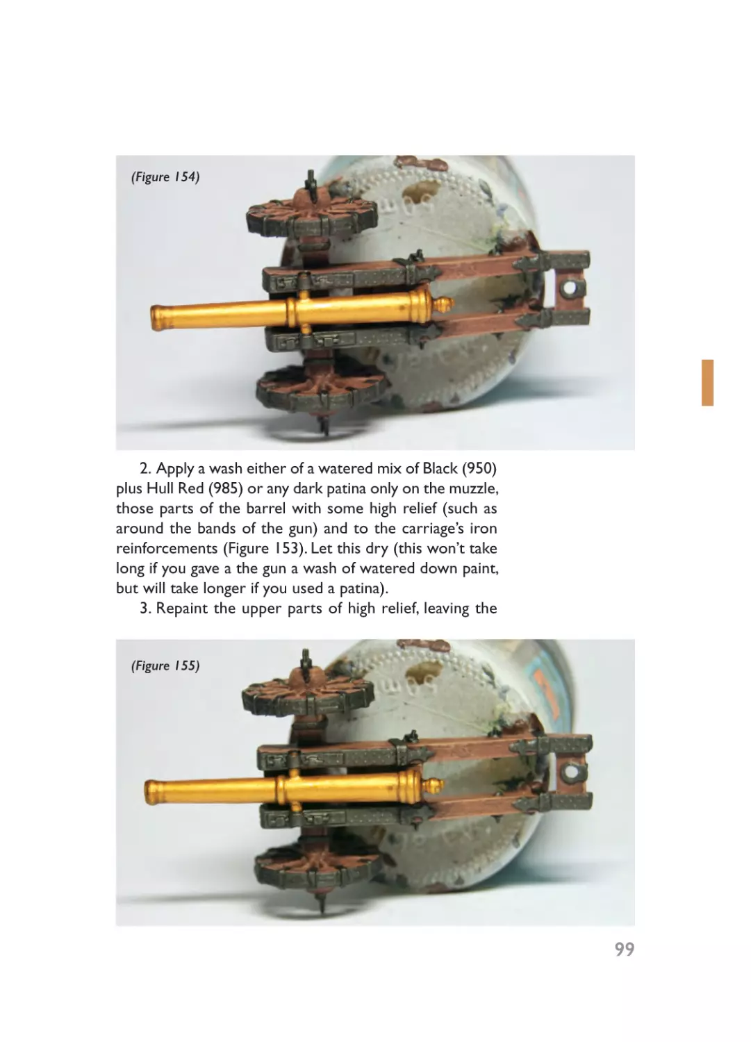

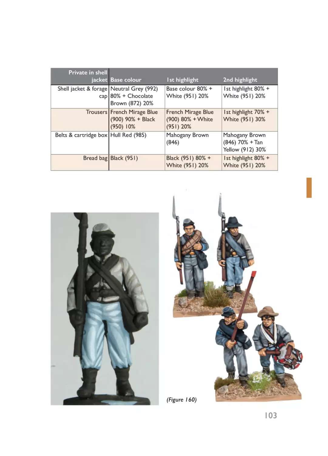
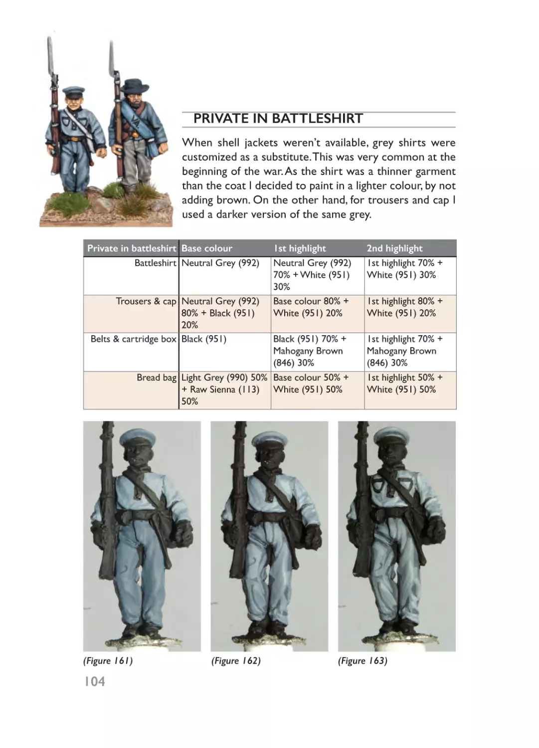
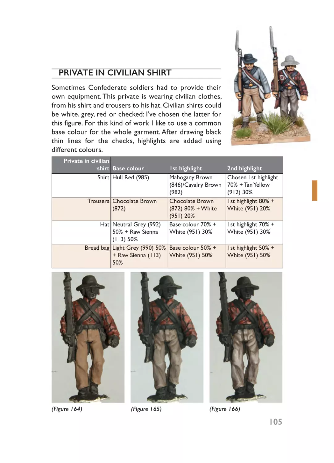

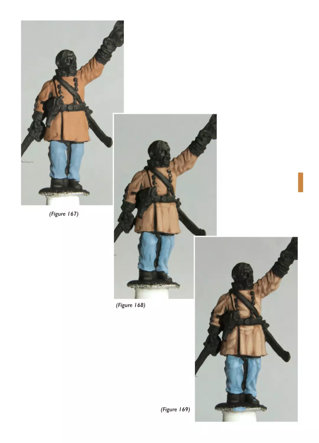


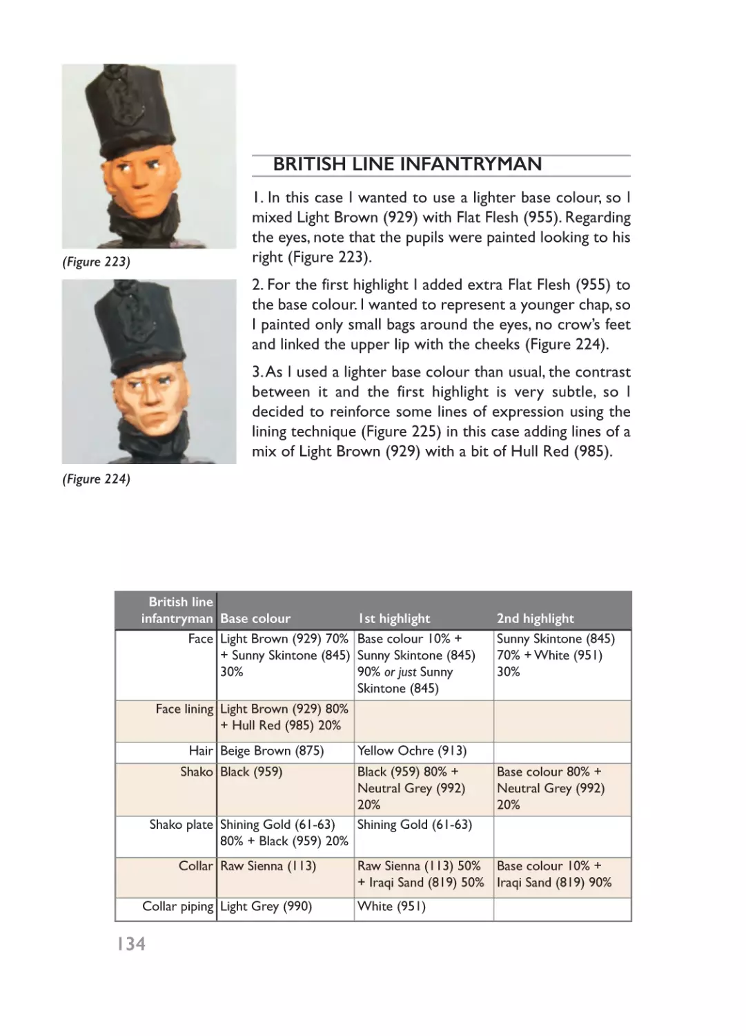


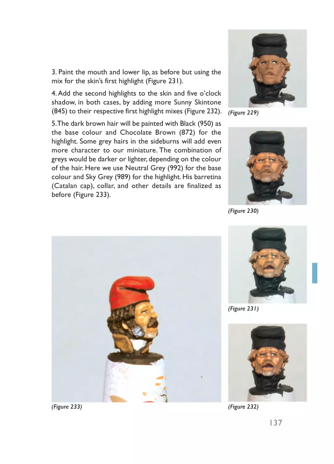


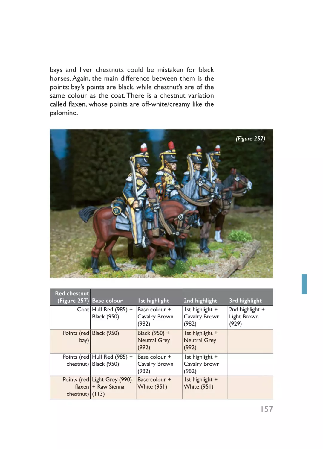
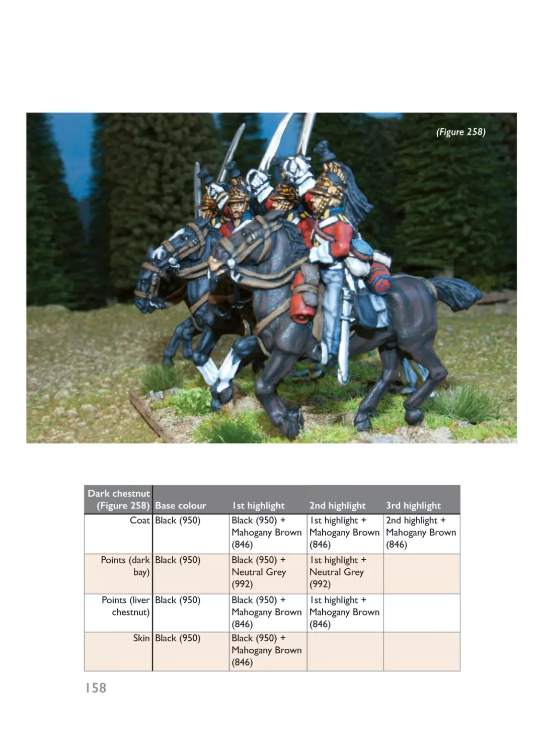

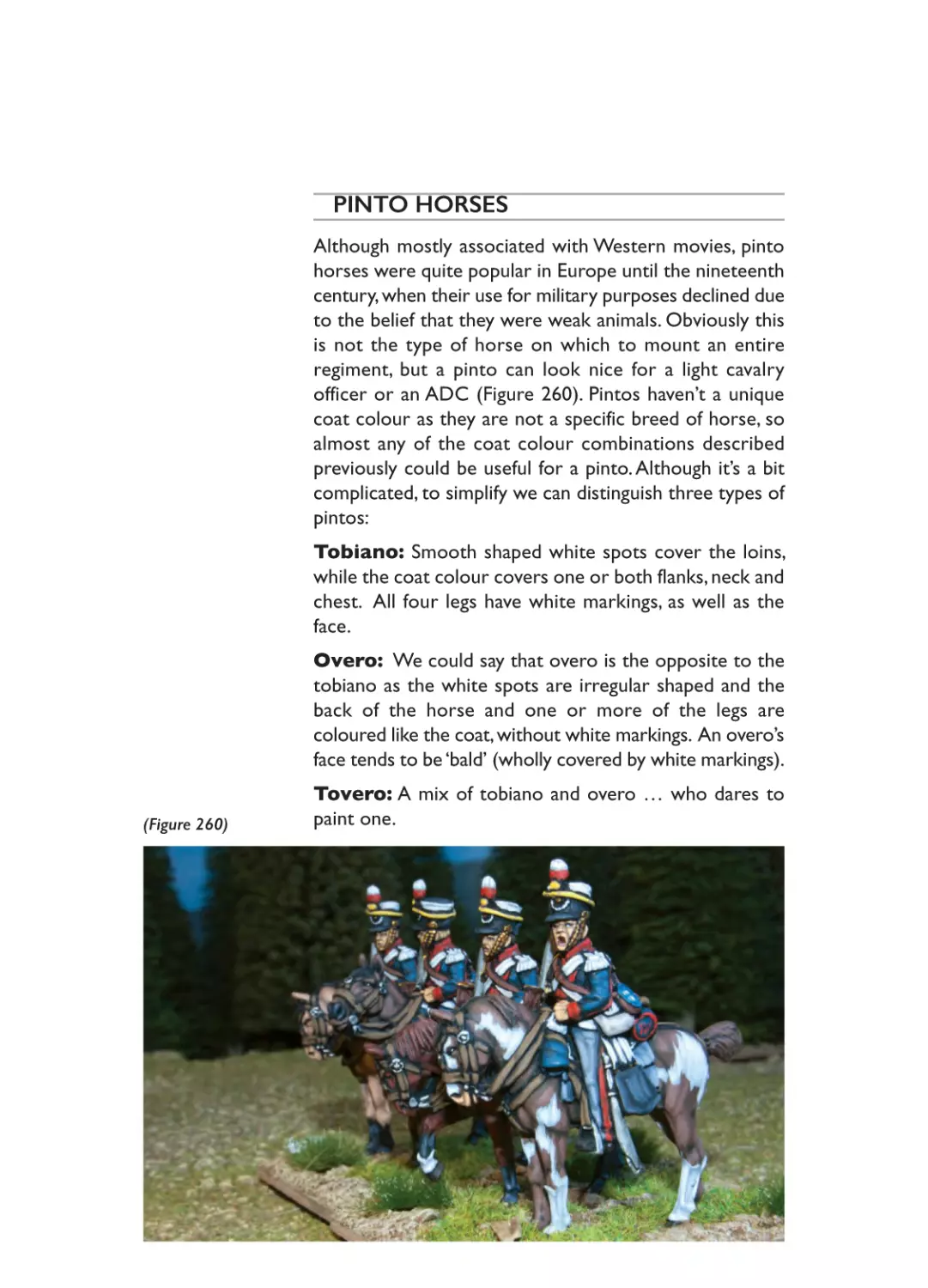
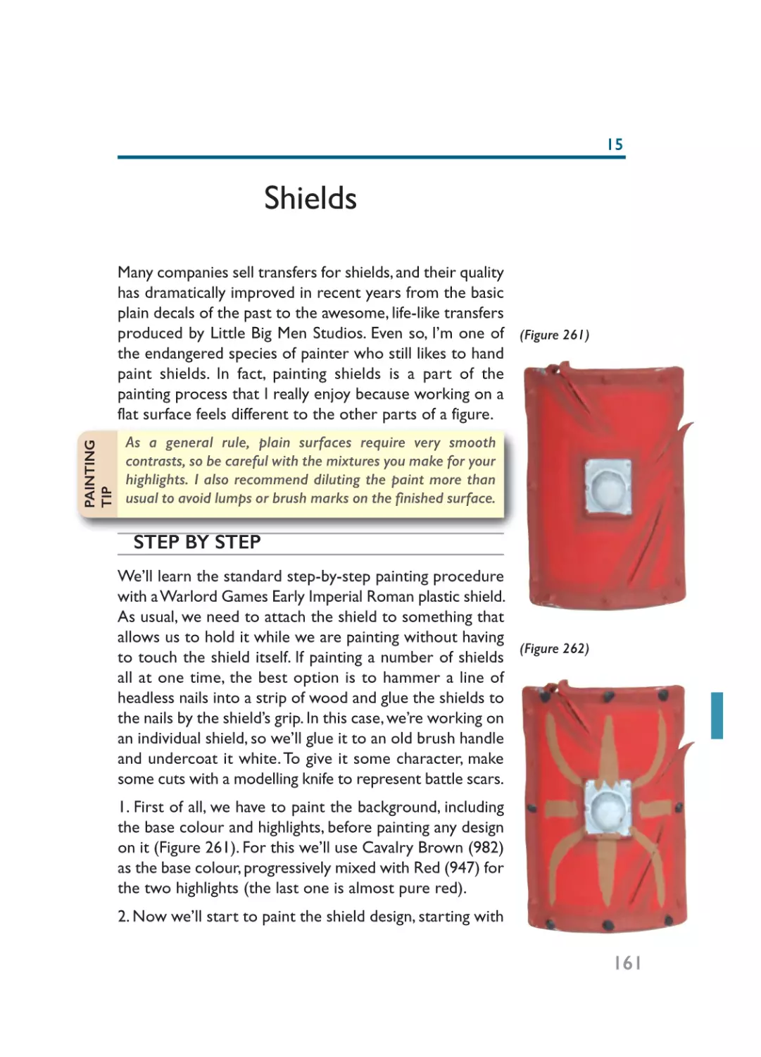


Author: Javier Gomez V.
Tags: magazine painting painting wargaming figures magazine wargaming figures miniatures hobby scale models tabletop games model painting wargame miniatures
ISBN: 9781848848221
00 - Prelims_Layout 1 22/01/2015 19:32 Page 1
Painting Wargaming Figures
00 - Prelims_Layout 1 22/01/2015 19:32 Page 2
00 - Prelims_Layout 1 22/01/2015 19:32 Page 3
Painting
Wargaming Figures
Javier Gomez Valero
“El Mercenario”
00 - Prelims_Layout 1 20/01/2015 18:48 Page 4
First published in Great Britain in 2015 by
Pen & Sword Military
an imprint of
Pen & Sword Books Ltd
47 Church Street
Barnsley
South Yorkshire
S70 2AS
Copyright © Javier Gomez Valero “El Mercenario”
Photographic copyright © Javier Gomez Valero “El Mercenario”,
Anastasio Giménez
ISBN 9781848848221
The right of Javier Gomez Valero “El Mercenario” to be identified as Author of
this Work has been asserted by them in accordance with the Copyright,
Designs and Patents Act 1988.
A CIP catalogue record for this book is available from the British Library
All rights reserved. No part of this book may be reproduced or transmitted in
any form or by any means, electronic or mechanical including photocopying,
recording or by any information storage and retrieval system, without
permission from the Publisher in writing.
Printed and bound in India by
Replika Press Ptv. Ltd.
Pen & Sword Books Ltd incorporates the Imprints of Pen & Sword Aviation,
Pen & Sword Maritime, Pen & Sword Military, Wharncliffe Local History, Pen
and Sword Select, Pen and Sword Military Classics, Leo Cooper, Remember
When, Seaforth Publishing and Frontline Publishing.
For a complete list of Pen & Sword titles please contact
PEN & SWORD BOOKS LIMITED
47 Church Street, Barnsley, South Yorkshire, S70 2AS, England
E-mail: enquiries@pen-and-sword.co.uk
Website: www.pen-and-sword.co.uk
00 - Prelims_Layout 1 20/01/2015 18:48 Page 5
Contents
Preface..............................................................................................................................7
Introduction ....................................................................................................................9
Part One: Basics ..........................................................................................................11
Chapter 1: What Do I Need? ........................................................................13
Chapter 2: How To Paint Miniatures ............................................................23
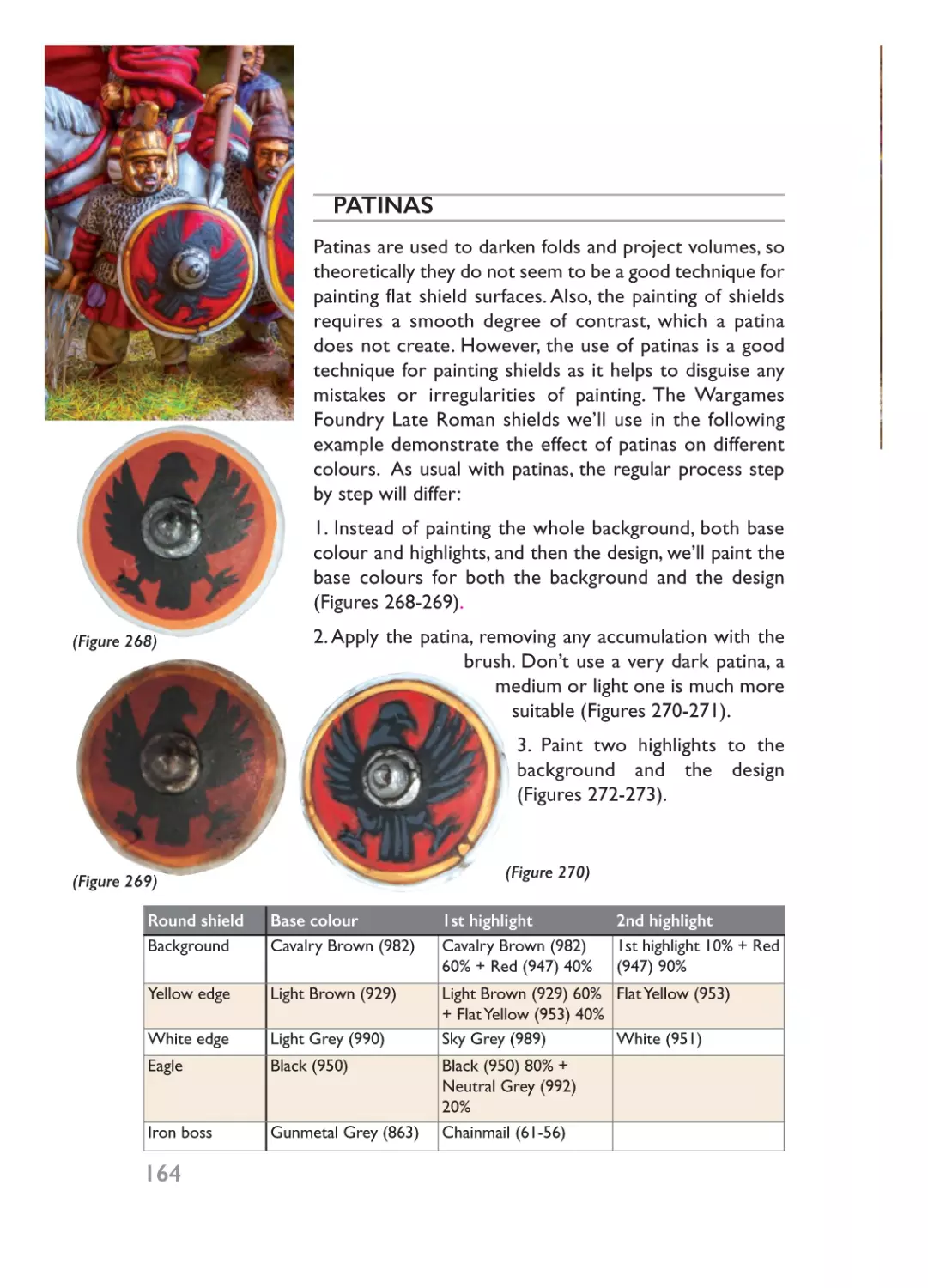
Chapter 3: Using Patinas..................................................................................37
Part Two: Colours ........................................................................................................45
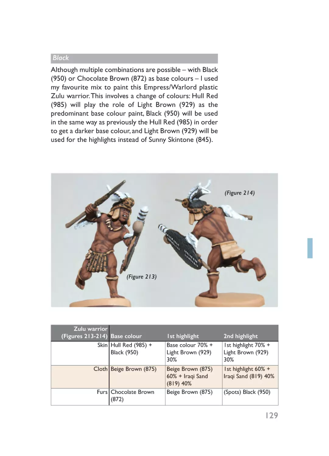
Chapter 4: Black ................................................................................................47
Chapter 5: White ..............................................................................................55
Chapter 6: Blue..................................................................................................63
Chapter 7: Red ..................................................................................................75
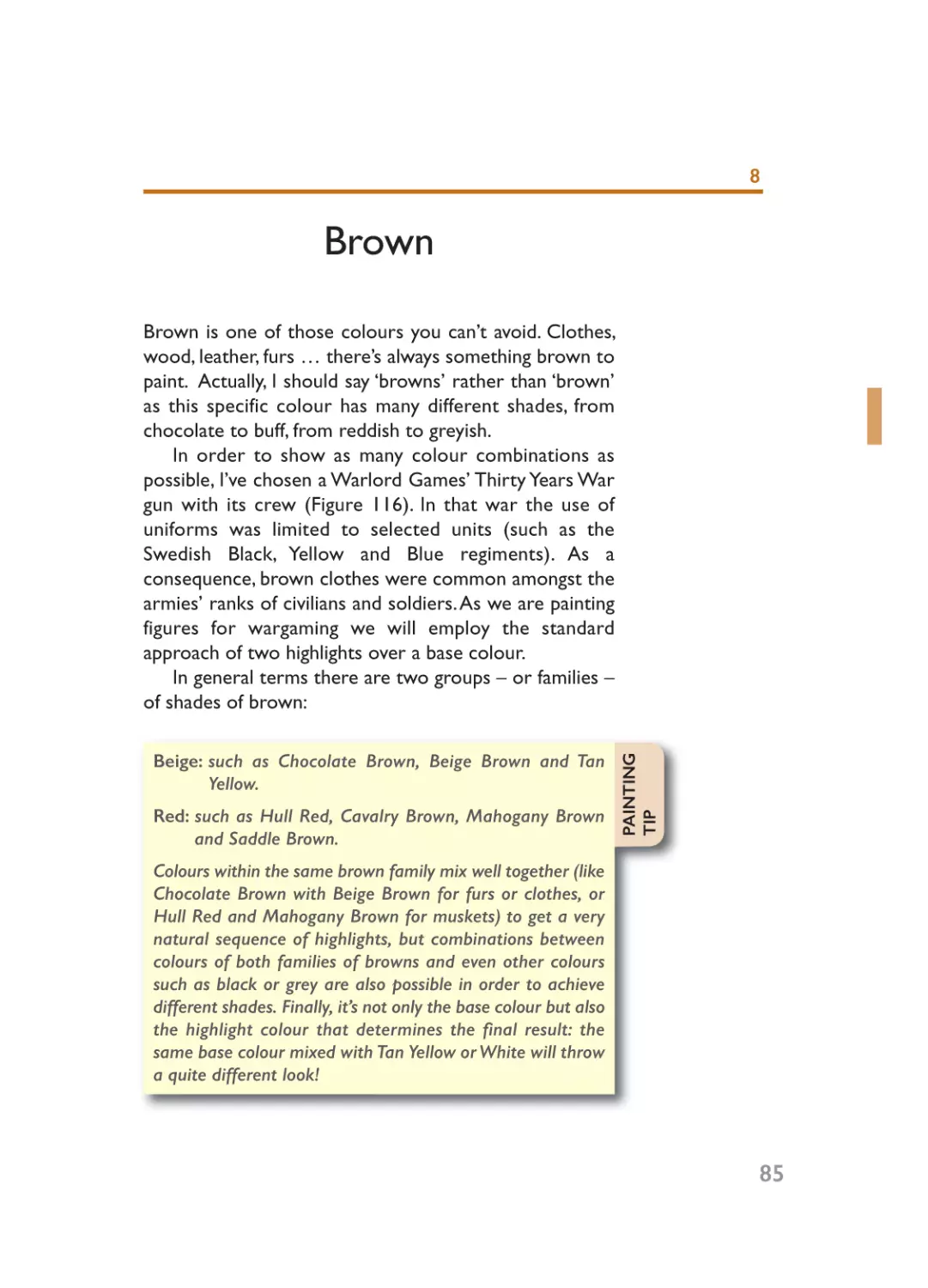
Chapter 8: Brown..............................................................................................85
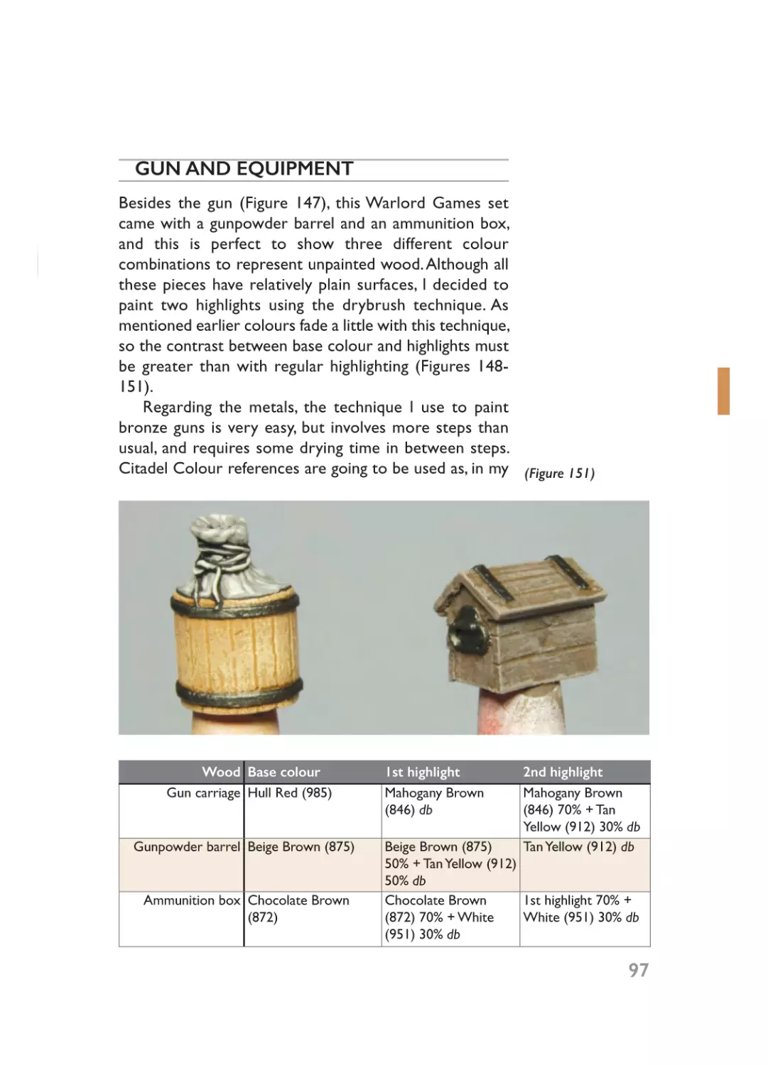
Chapter 9: Grey ..............................................................................................101
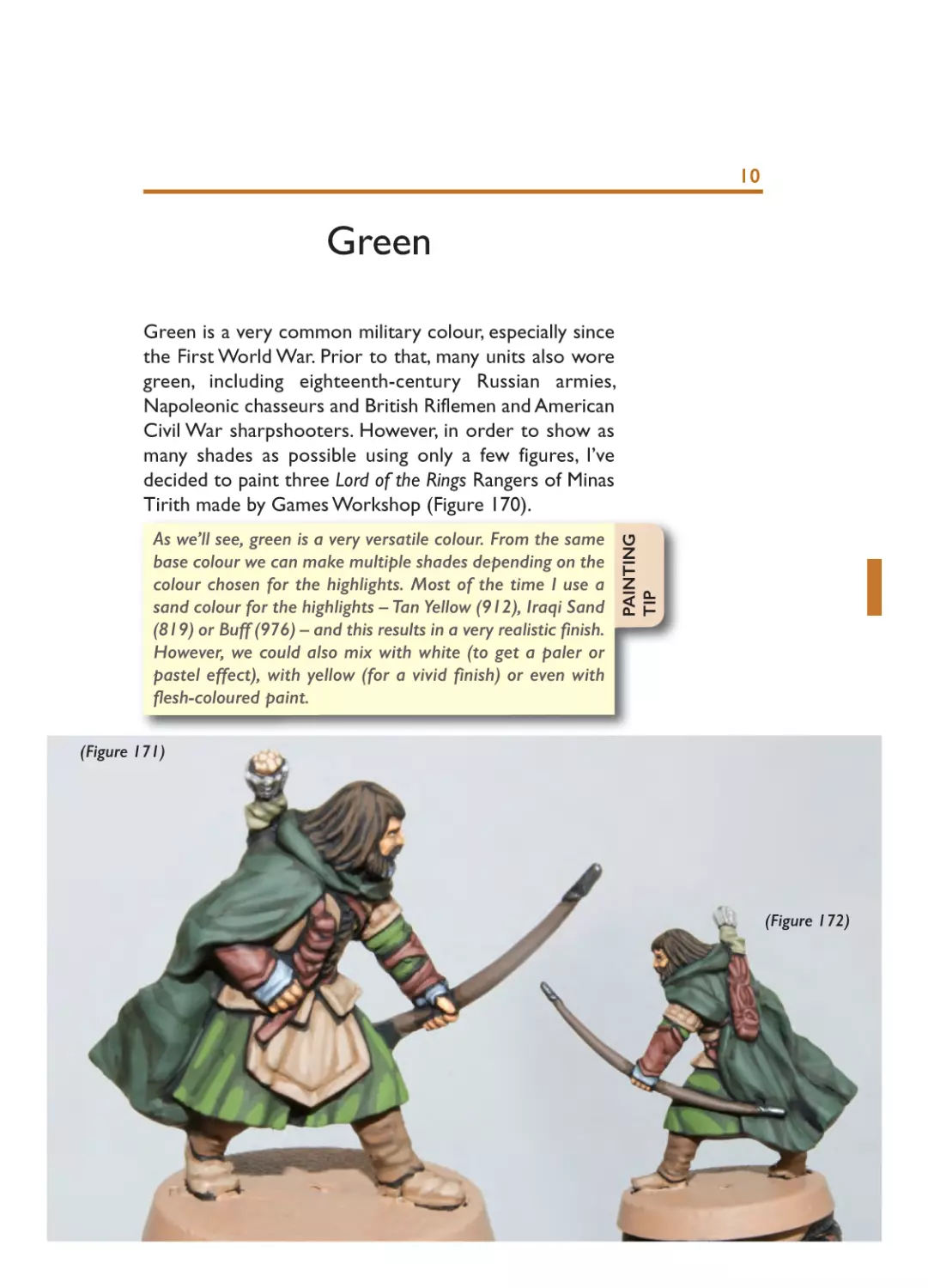
Chapter 10: Green..........................................................................................109
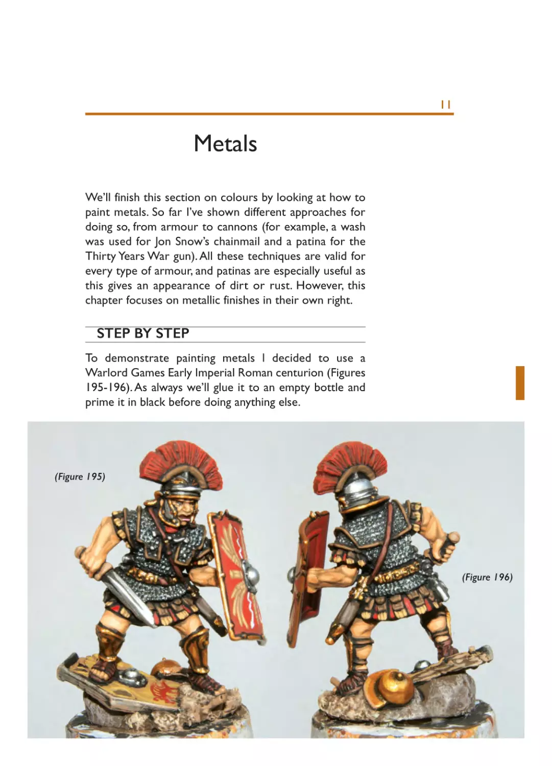
Chapter 11: Metals ........................................................................................117
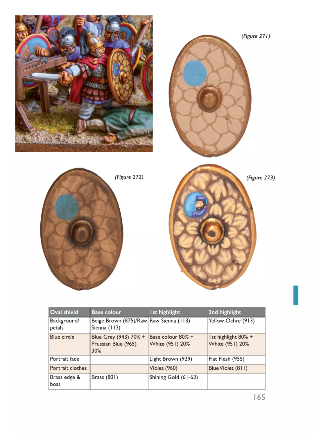
Part Three: Themes ..................................................................................................121
Chapter 12: Flesh............................................................................................123
Chapter 13: Faces ..........................................................................................131
Chapter 14: Horses........................................................................................139
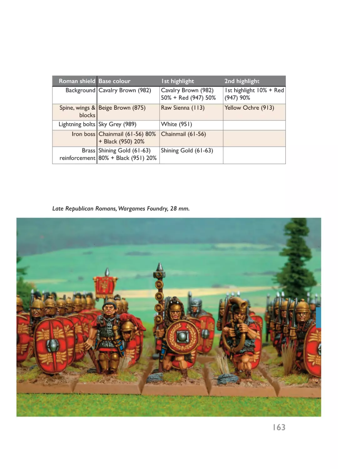
Chapter 15: Shields ........................................................................................161
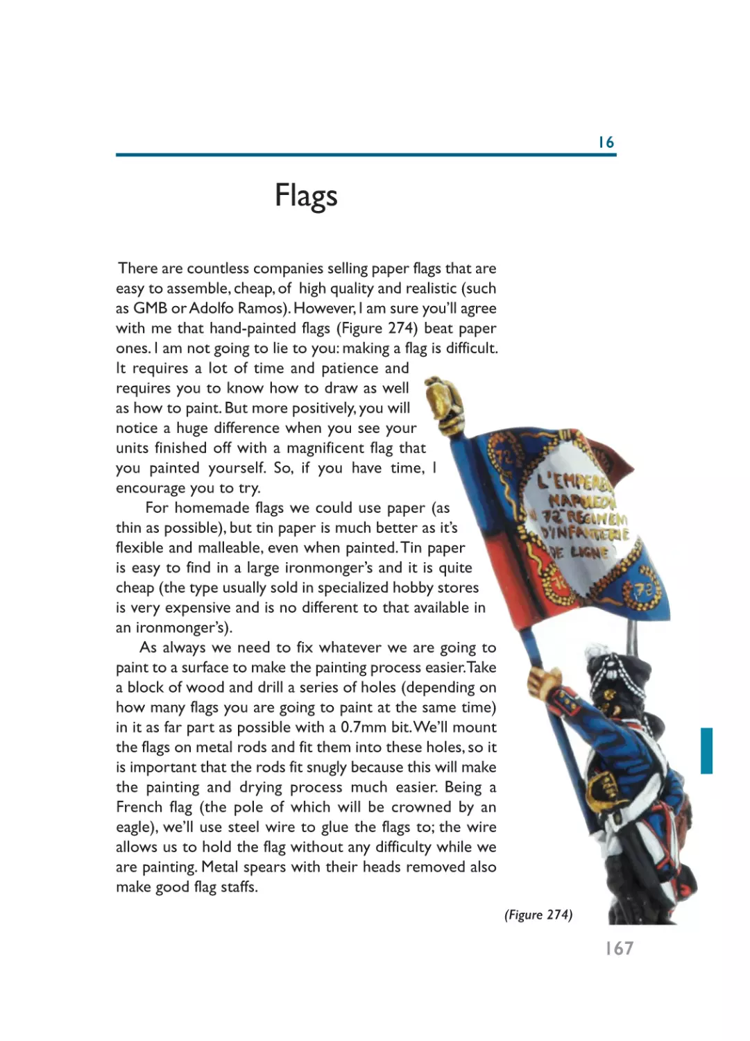
Chapter 16: Flags ............................................................................................167
Chapter 17: Camouflage................................................................................173
Chapter 18: Basing..........................................................................................181
Chapter 19:Varnishing ..................................................................................195
Part Four: Other Scales ..........................................................................................199
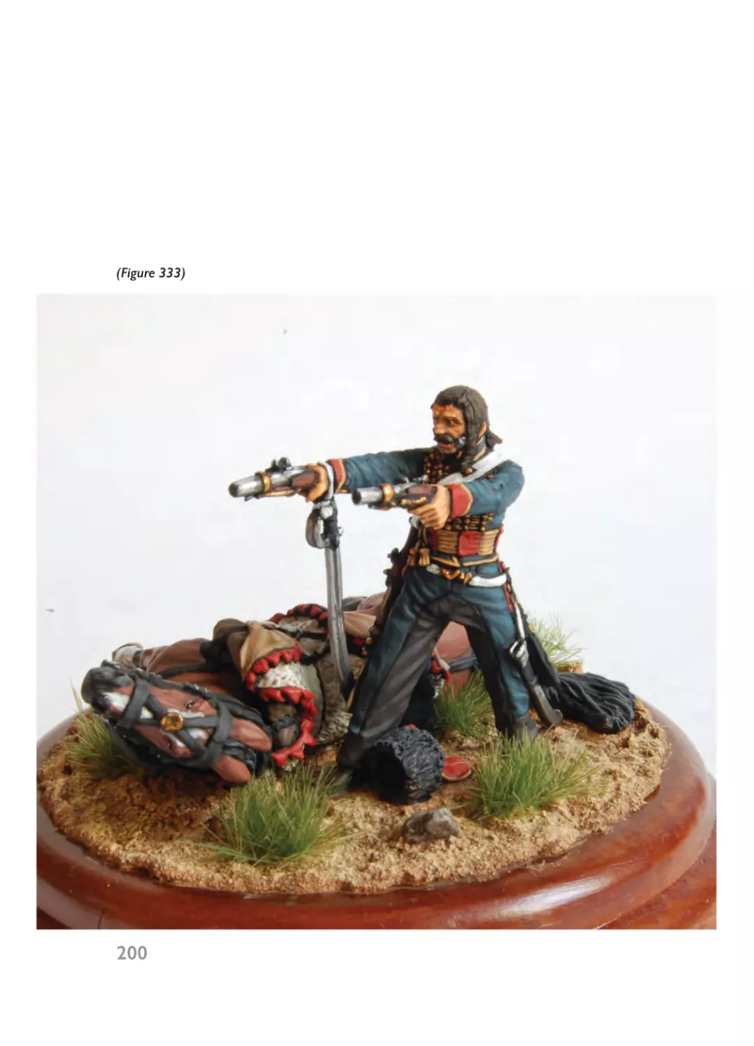
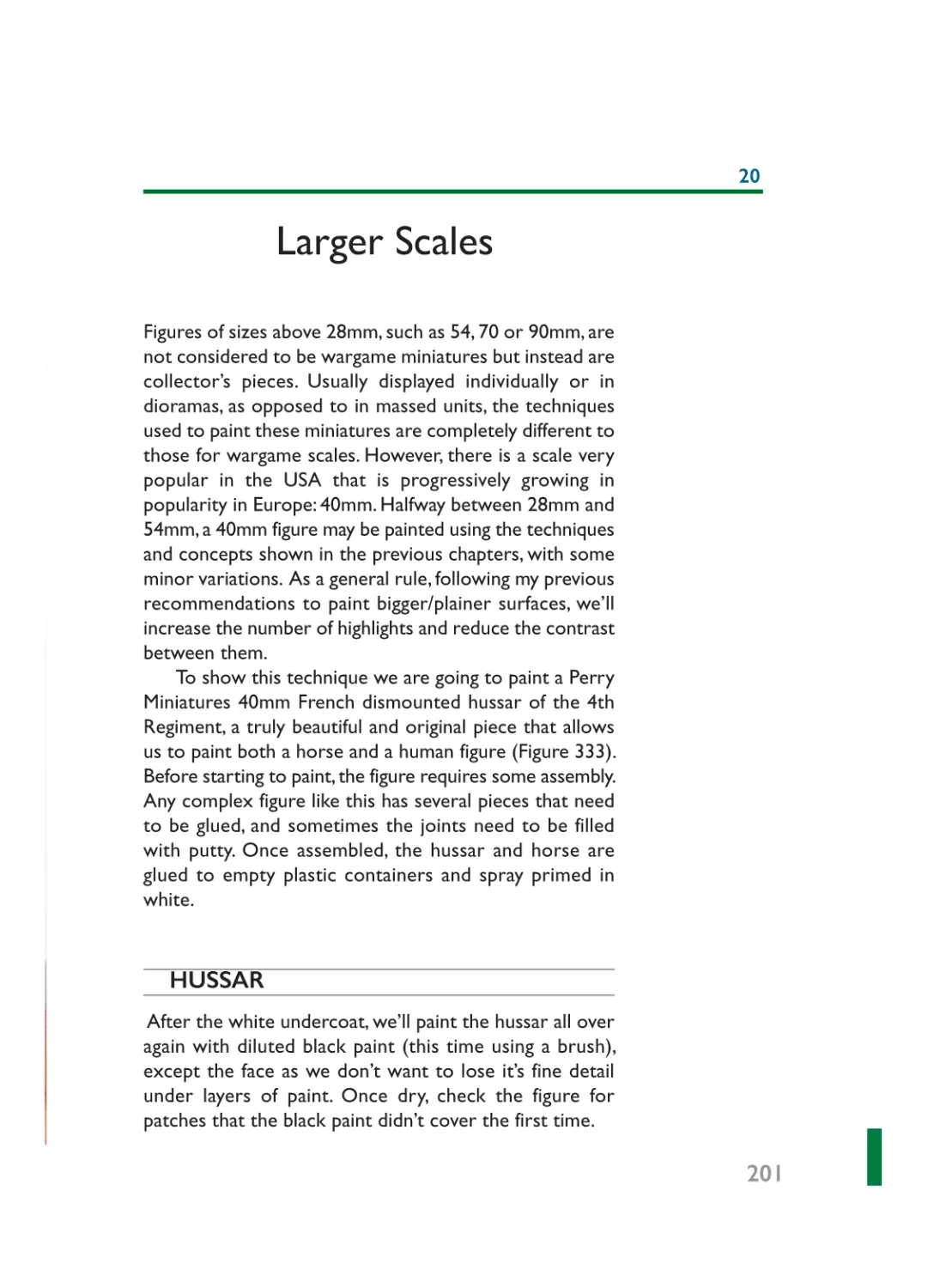
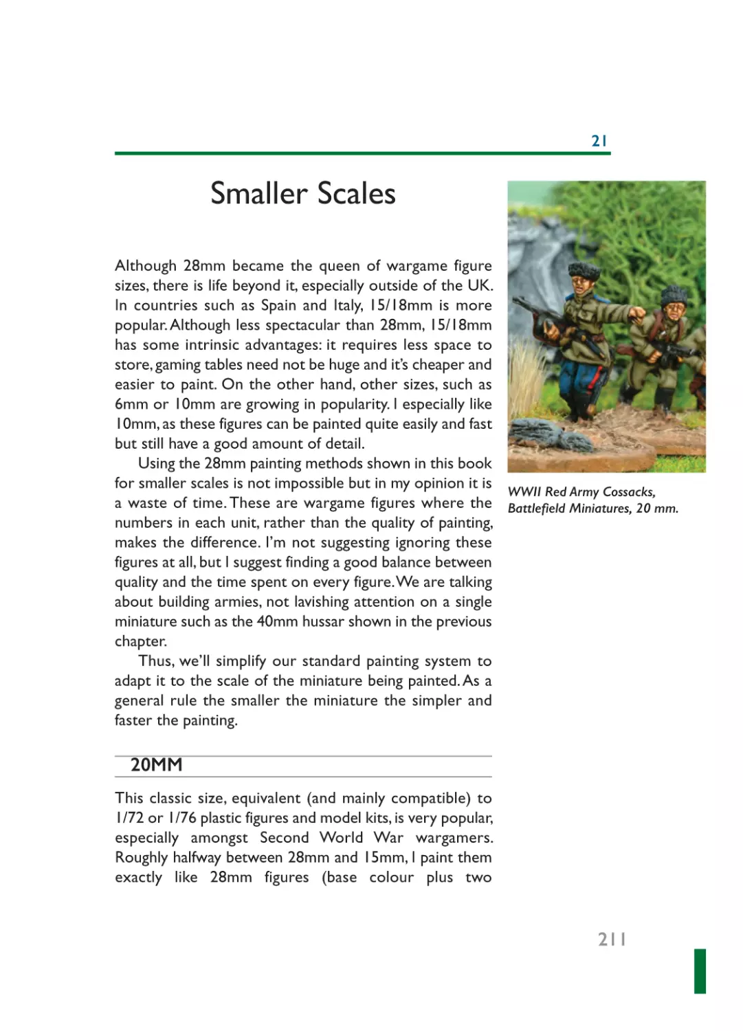
Chapter 20: Larger Scales ............................................................................201
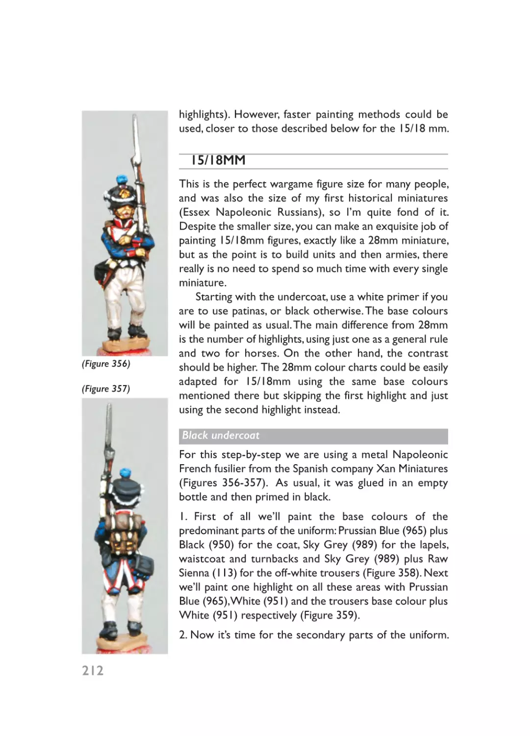
Chapter 21: Smaller Scales ..........................................................................211
00 - Prelims_Layout 1 20/01/2015 18:48 Page 6
Dedication
To my Dad, the real artist of the family and light years ahead of me as a painter.
6
00 - Prelims_Layout 1 20/01/2015 18:48 Page 7
Preface
A malformed lump of highly toxic lead could hardly be called a beautiful
miniature, but it was my first and first times are supposed to be something
nice to remember. It was back in the late 1980s that I lost my (painter’s)
virginity to that Dungeons & Dragons© half-orc, which I stole from my elder
brother’s collection. I had a great time ‘colouring’ it with his smelly Humbrol
enamels, at least until he caught me and kicked my arse. Anyway, I guess it was
worth the effort as I haven’t stopped painting miniatures since.
I can’t say that I was alien to painting as my father was a draftsman and a
painter himself, so that seed germinated easily in me. Like most painters who
started this hobby as kids, I began with fantasy figures for my role-playing games
(yes, everyone has an obscure past, even me!). One thing led to another and I
found myself fascinated by the Warhammer world. It helped that my brother
opened a local hobby shop (that later became Atlantica Juegos, one of the
biggest hobby stores in Europe). However, a good Samaritan (someone
desperate and lonely enough to teach a teenager how to play Empire) rescued
me from the Dark Side and introduced me to historical wargaming. Napoleonic
Empire came first, then Ancient Empire and finally Second World War Command
Decision. I always liked to learn the hard way!
By seventeen I was quite an experienced wargamer and I started to paint
commissions. A couple of years later I joined with my friend and painting
colleague David Gomez (although we were not related at all, besides our
common last name, some people started to call us the Gomez Brothers) and
founded El Mercenario painting service. I learnt a lot from him. David’s
background was painting bigger scale figures and plastic kits, and we
incorporated some of his techniques to our painting style. Shortly afterwards,
we won some painting prizes at Salute and other shows and started to work
for several companies, especially Perry Miniatures. Moreover, we took the reins
of the Spanish magazine Wargames, Soldiers & Strategy. I managed the magazine
for a couple of years, while David took charge of the painting articles. Later,
we swapped roles and I contributed articles and photographs from my own
collections. Those were happy days … we lived and breathed for the hobby.
Over time David replaced his worn-out rocker leather jacket for a suit and
became a respected gentleman with a proper job. Corporate suits were not
made for me: aside from a few years working part-time at my brother’s store,
7
00 - Prelims_Layout 1 20/01/2015 18:48 Page 8
I never had a proper boss. So I decided to keep running El Mercenario by
myself. These years as a full-time painter were intense – very intense – painting
ten to twelve hours a day, six or seven days a week. I always enjoyed planning
new projects, reading about the period to research it and motivate myself
properly, looking for the figures, designing the units and then the divisions or
the armies and finally painting them. But I never was a collector. Once complete,
I sold most of my personal collections. Being a professional painter allowed
me to do what I loved and be paid for it! That doesn’t mean I stopped doing
things for myself, but that is a perilous path for a pro. Like relationships, it would
be tempting to cheat on your usual partner and devote more and more time
to a new and exciting affair, but hobby affairs don’t usually last, and by the end
of the month … you have to pay your bills!
Four years ago my life changed deeply. Although I still enjoyed the painting,
I felt that I needed something else in my life, and I worked with two friends to
publish a new military history magazine called Desperta Ferro. The magazine
was a complete success; the business expanded very fast but also became more
and more demanding. As a day has only twenty-four hours I had to decide
between publishing and professional painting, and I chose Desperta Ferro, to
which I devote my full time, soul and mind. However, I would never quit painting:
for me it’s much more than a hobby or a job, it’s a huge part of my life. My
poor old eyes still can see, but in the end my brushes will need to be pried
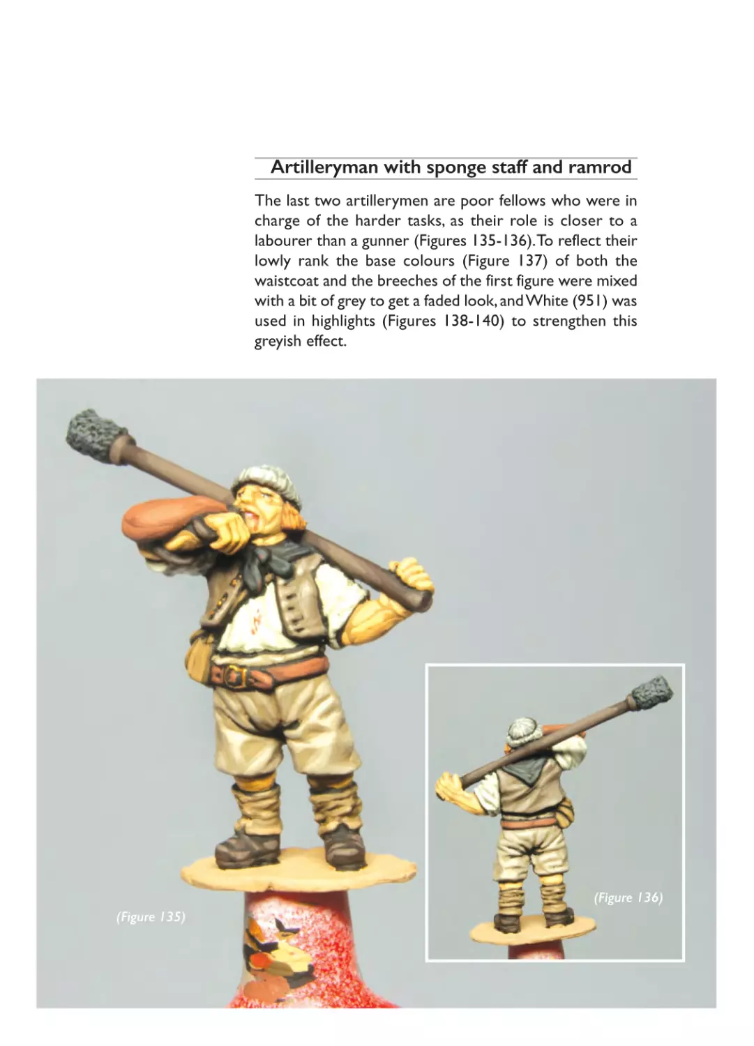
from my cold, dead hands.
8
00 - Prelims_Layout 1 20/01/2015 18:48 Page 9
Introduction
Before getting down to business I would like to say a few things about my
painting technique. First of all, we are not painting 90mm figures destined to
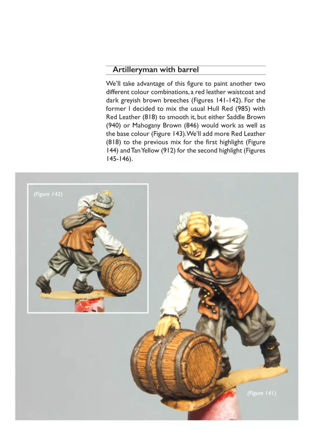
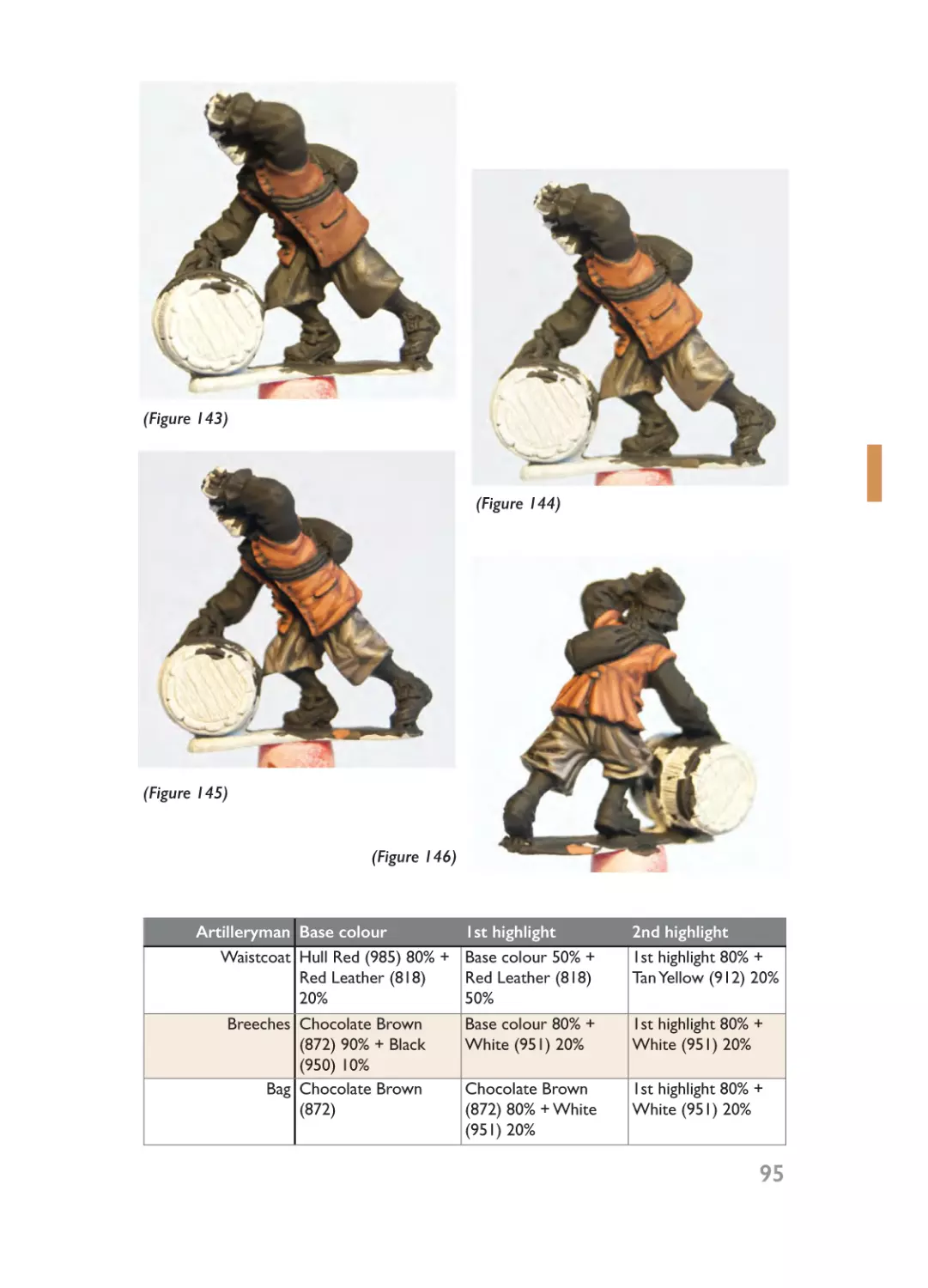
be neatly placed in a display cabinet; these are wargame figures intended to
build armies from and play games with, so in my opinion the goal is to get
the best quality/time investment ratio possible. Although there are several
wargame figure sizes, from 40mm to 6mm, this book pays special attention to
28mm miniatures. Many wargamers prefer to play with smaller scales but from
a painter’s point of view 28mm, given its size and detail, allows me to show all
the techniques needed to paint figures, and it’s also the size of miniatures I
enjoy painting the most. However, the techniques used can be adapted to other
scales.
In the past I was accused by purists of doing a rough paint job, with sudden
transitions between different highlights and brusque contrasts.Well, sometimes
they were right and my painting style has evolved over the years, but my
painting goal remains the same: these are not figures (only) to be displayed in
a cabinet but to be seen on a wargame table at a certain distance, forming part
of bigger units. So, although I always try to paint as realistically as possible, I
use strong and vivid colours for my armies.
Regarding my technique, I normally paint a base colour and two highlights
(sometimes three for bigger surfaces) over a black-primed figure, a system that
became more or less standard in recent years. Ever since Wargames Foundry
released their three-shades colour system of paints, where one blister pack
contains the base colour, first highlight and second highlight for a certain colour,
with no need to mix, many painters made their lives easier and embraced this
new concept. I recognize that this has its advantages, especially for painters of
huge armies or people with a limited time whose priority is speed, but I still
like to mix my own paints. Call me a romantic, but I honestly think that painting
is much more than giving accurate brushstrokes. It’s all about colours: to choose
the proper colours, to mix them to a correct shade, to add different paints to
obtain highlight effects. At the risk of sounding old-fashioned, I still prefer the
old way rather than the faster, standardized new system of three-shade
packaging.
9
00 - Prelims_Layout 1 20/01/2015 18:48 Page 10
01- Ch01_Layout 1 20/01/2015 18:48 Page 11
BASICS
PART ONE
01- Ch01_Layout 1 20/01/2015 18:48 Page 12
01- Ch01_Layout 1 20/01/2015 18:48 Page 13
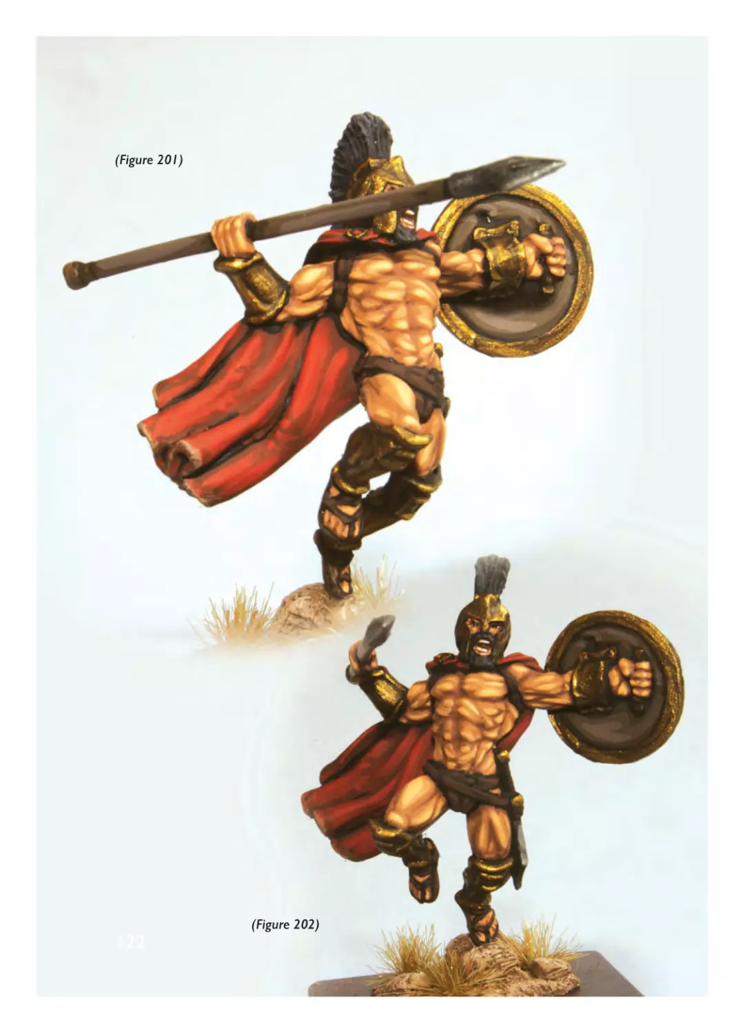
1
What Do I Need?
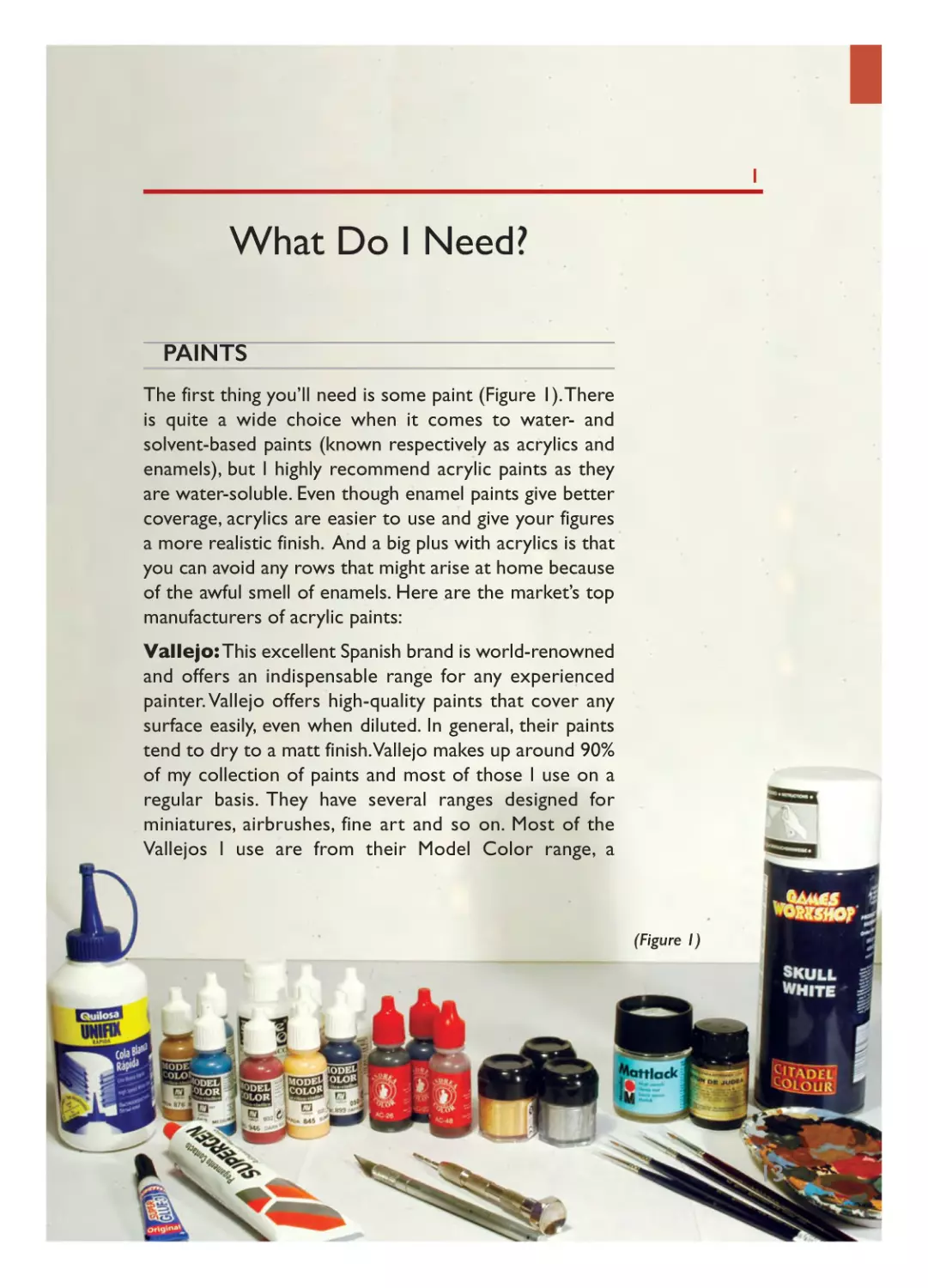
PAINTS
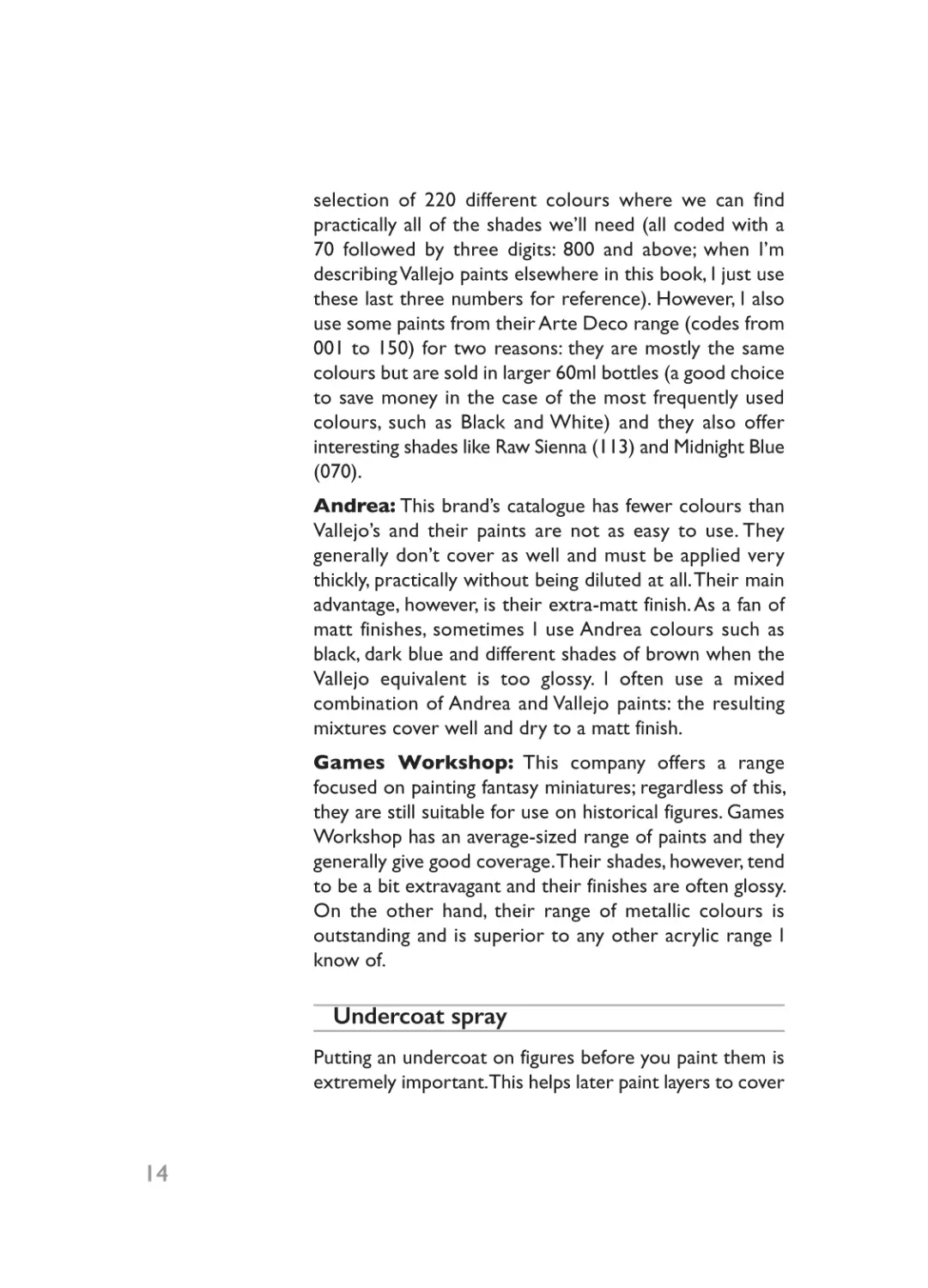
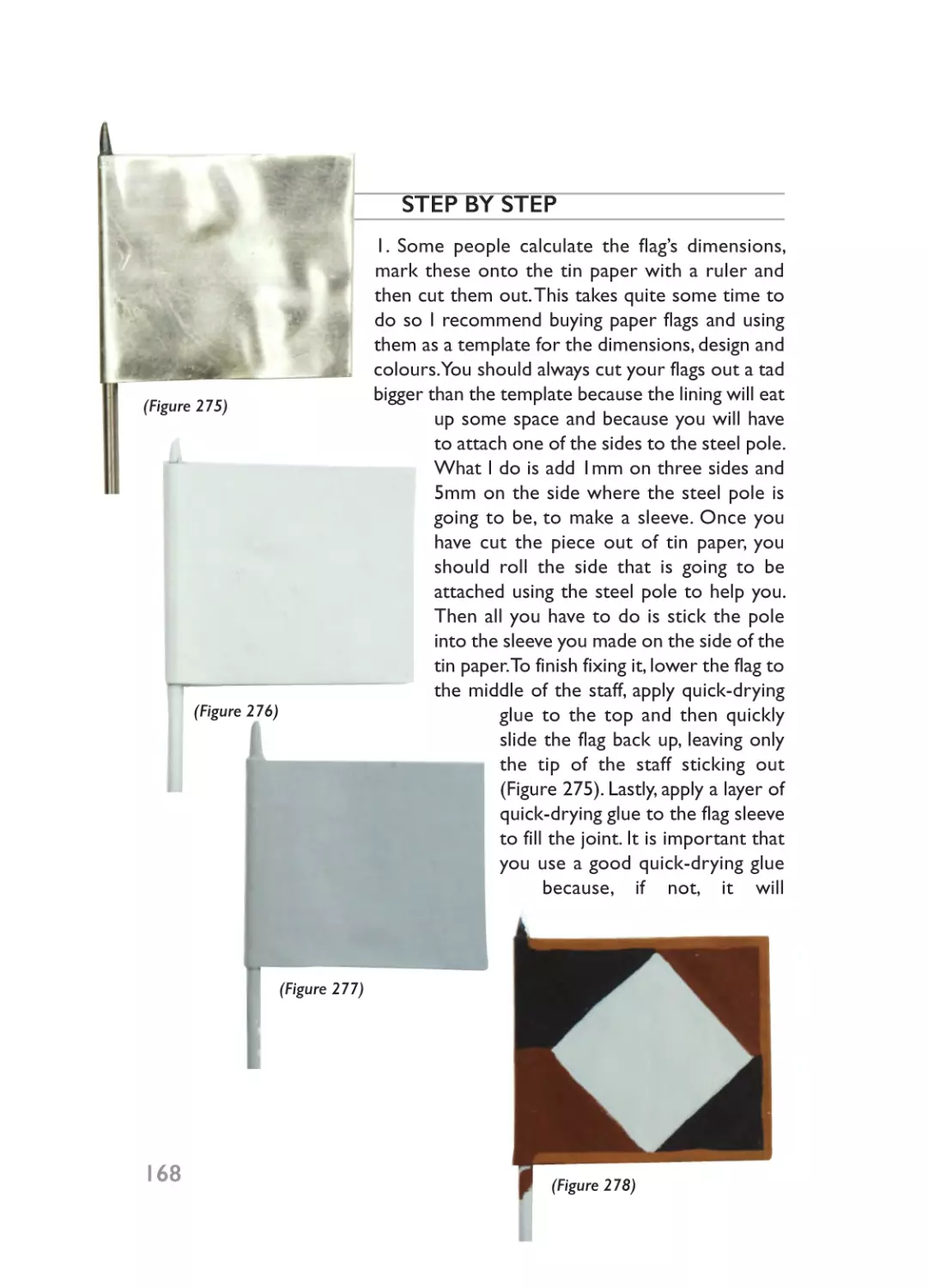
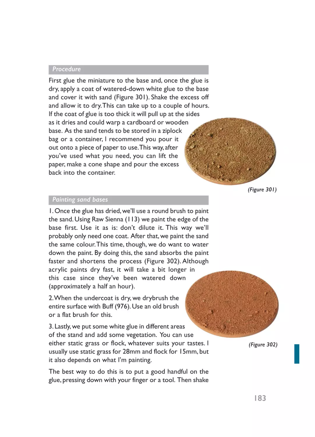
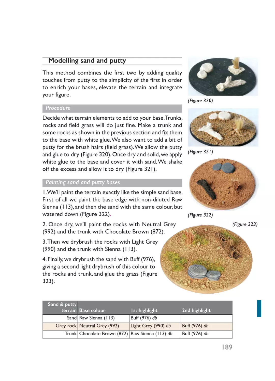
The first thing you’ll need is some paint (Figure 1). There
is quite a wide choice when it comes to water- and
solvent-based paints (known respectively as acrylics and
enamels), but I highly recommend acrylic paints as they
are water-soluble. Even though enamel paints give better
coverage, acrylics are easier to use and give your figures
a more realistic finish. And a big plus with acrylics is that
you can avoid any rows that might arise at home because
of the awful smell of enamels. Here are the market’s top
manufacturers of acrylic paints:
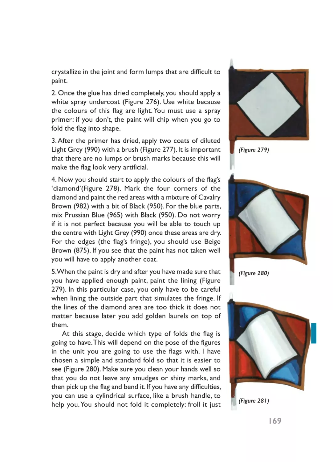
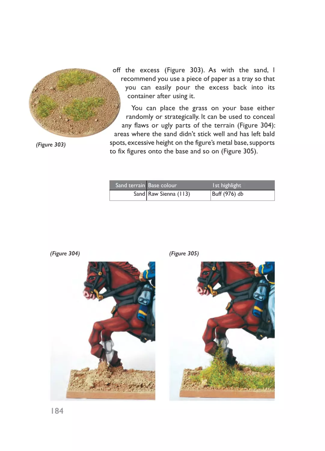
Vallejo: This excellent Spanish brand is world-renowned
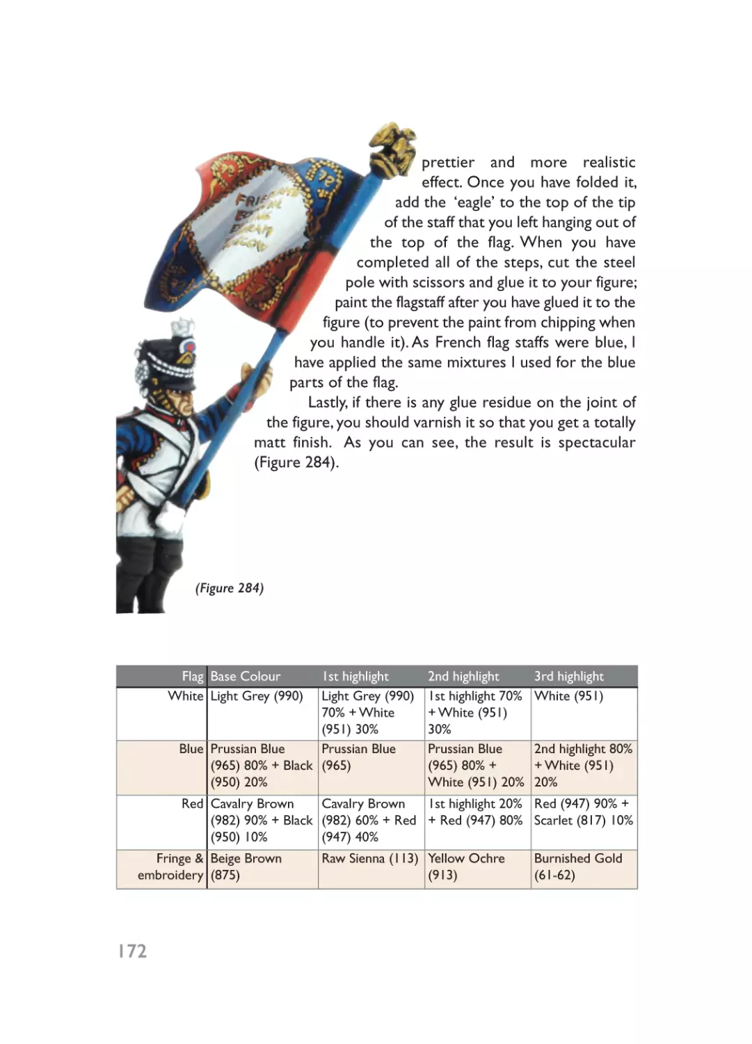
and offers an indispensable range for any experienced
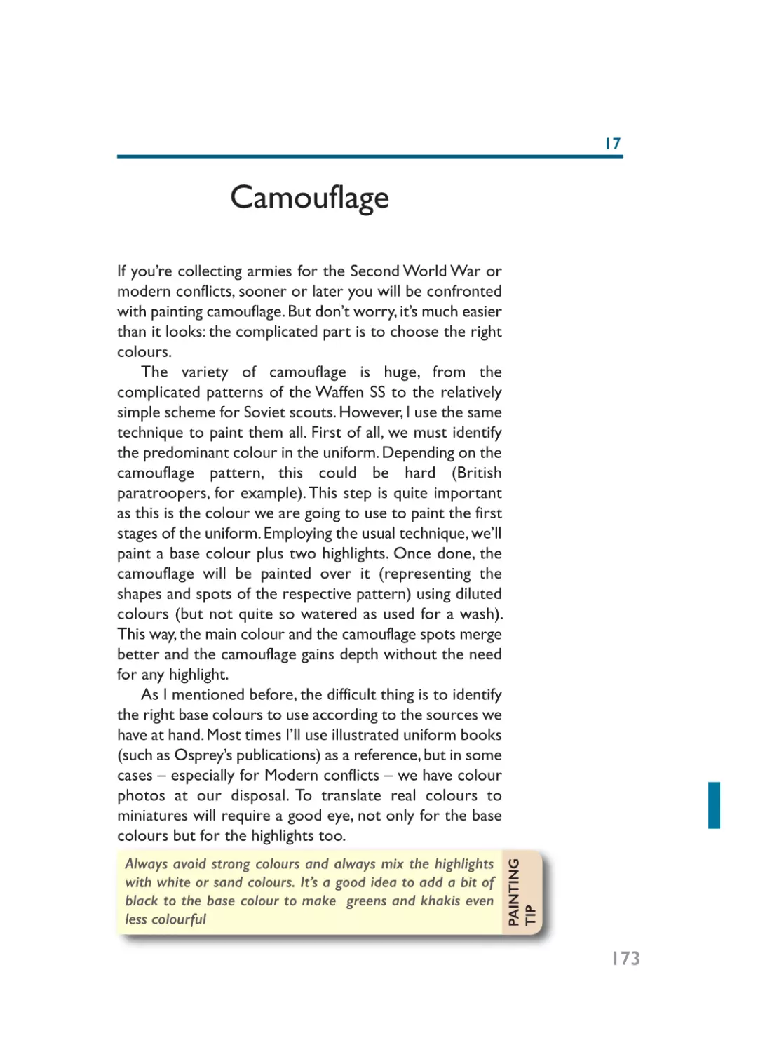
painter. Vallejo offers high-quality paints that cover any
surface easily, even when diluted. In general, their paints
tend to dry to a matt finish.Vallejo makes up around 90%
of my collection of paints and most of those I use on a
regular basis. They have several ranges designed for
miniatures, airbrushes, fine art and so on. Most of the
Vallejos I use are from their Model Color range, a
(Figure 1)
13
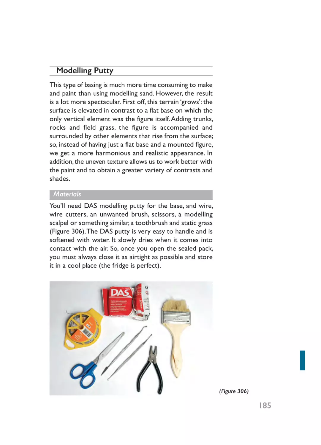
01- Ch01_Layout 1 20/01/2015 18:48 Page 14
selection of 220 different colours where we can find
practically all of the shades we’ll need (all coded with a
70 followed by three digits: 800 and above; when I’m
describing Vallejo paints elsewhere in this book, I just use
these last three numbers for reference). However, I also
use some paints from their Arte Deco range (codes from
001 to 150) for two reasons: they are mostly the same
colours but are sold in larger 60ml bottles (a good choice
to save money in the case of the most frequently used
colours, such as Black and White) and they also offer
interesting shades like Raw Sienna (113) and Midnight Blue
(070).
Andrea: This brand’s catalogue has fewer colours than
Vallejo’s and their paints are not as easy to use. They
generally don’t cover as well and must be applied very
thickly, practically without being diluted at all. Their main
advantage, however, is their extra-matt finish. As a fan of
matt finishes, sometimes I use Andrea colours such as
black, dark blue and different shades of brown when the
Vallejo equivalent is too glossy. I often use a mixed
combination of Andrea and Vallejo paints: the resulting
mixtures cover well and dry to a matt finish.
Games Workshop: This company offers a range
focused on painting fantasy miniatures; regardless of this,
they are still suitable for use on historical figures. Games
Workshop has an average-sized range of paints and they
generally give good coverage. Their shades, however, tend
to be a bit extravagant and their finishes are often glossy.
On the other hand, their range of metallic colours is
outstanding and is superior to any other acrylic range I
know of.
Undercoat spray
Putting an undercoat on figures before you paint them is
extremely important.This helps later paint layers to cover
14
01- Ch01_Layout 1 20/01/2015 18:48 Page 15
the figure more easily and prevents your masterpiece
from chipping once dry. I strongly recommend the use of
sprays to prime miniatures for several reasons: it’s faster,
the coating is thinner than paint you brush on, it dries
quickly and the paint is enamel instead of acrylic (so it
adheres better over any surface and is stronger and more
durable). As we’ll see later, the colour used for priming
(usually black or white) will determine what painting style
we use over it. If we decide to use white as an undercoat,
a single layer would be enough, as that will be completely
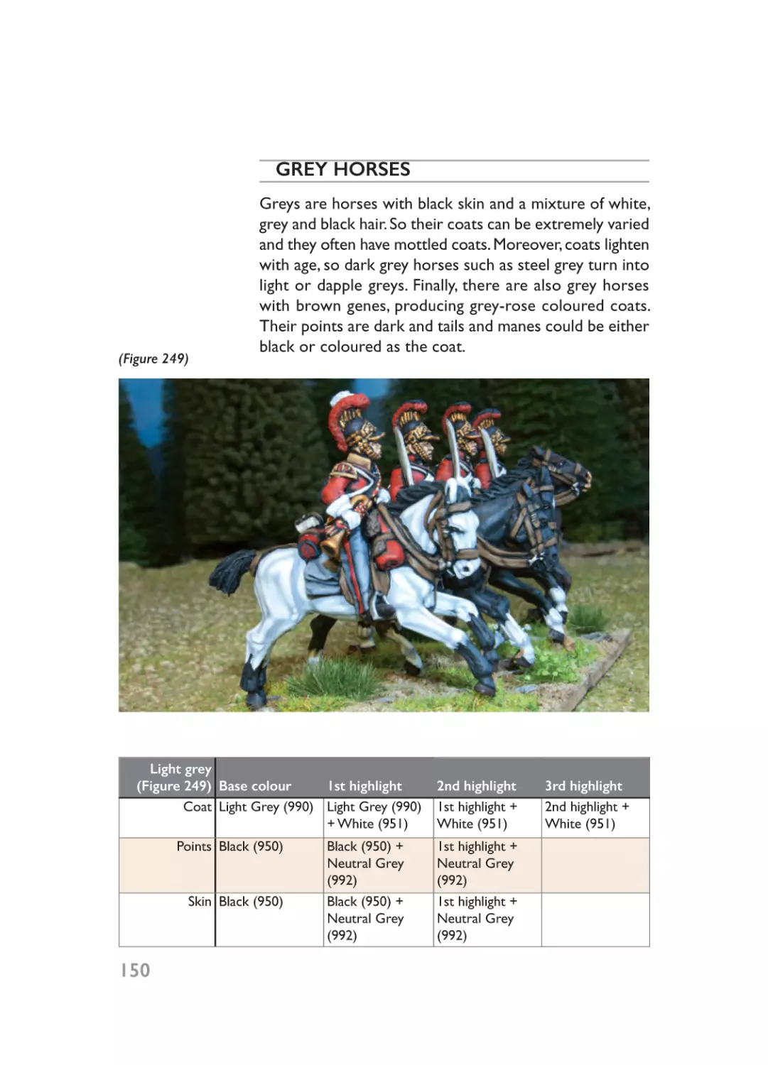
painted over at a later stage, leaving no visible part of the
original undercoat. However, if we opt for a black
undercoat we would need to touch up the figure with
black paint over the spray layer as we have to be sure that
even the most hidden parts (especially those!) remain
black, because some of this undercoat will remain visible
when the figure is finished. Making sure a black
undercoated figure is fully covered is especially important
for metal figures, as they have more depth than plastic
ones; believe me, it’s very distressing to find parts where
the metal can still be seen when you’re half way through
painting a figure!
Like any other spray, you must shake the can well
before using it. When applying the spray, ‘fire’ short bursts
from about 30cm away from the figure. You always need
to hold the can upright rather than upside down because
that makes the nozzle clog up and begin to drip.The smell
of the propellant given off by sprays is very strong, so
always use them in a well-ventilated working area (balcony,
terrace or out the window).
There are many undercoat sprays on the market,
available in a variety of colours. Although most are useful,
I recommend Games Workshop ones. Although a bit
more expensive than the others, they are very reliable,
you can control the paint flow easily to get a thinner or
thicker coat and the paint is matt (I don’t favour satin or
glossy primers).
15
01- Ch01_Layout 1 20/01/2015 18:48 Page 16
Brushes
There are a wide array of brushes for you to choose from.
You’ll find all types of materials and price ranges. In my
opinion, the best (though the most expensive) are sable
brushes. However, you can also get a hold of some highquality synthetic brushes. Sable brushes tend to have soft
bristles while the hair on synthetic brushes is stiffer. As
always, the best type of brush to use is the one that best
suits your painting habits. Regarding size, brushes for
painting miniatures range from 2 (the thickest) to 5/0 (the
finest). The sizes I use most are 1 (especially for base
colours) and 0 (for highlighting and details), though
occasionally I use a 3/0 (for fine details). Besides the
traditional pointed brushes, flat brushes are especially
useful for ‘drybrushing’ (see ‘Highlighting Techniques’ in
Chapter Two).
Varnishes
There are two types of varnish to choose from: water- or
solvent-based. Added to this, we have the choice of three
kinds of finish: matt, satin or high-gloss. Solvent-based
varnishes usually provide better protection and tend to
have more of a matt finish. As we will see later, I highly
recommend you varnish all of your painted figures.
Glues
16
There are quite a few different types of glue to choose
from.You should have three of them on hand: cyanoacrylate
(‘superglue’), multi-purpose contact glue and white glue
(PVA). Use cyanoacrylate, the quickest-drying of the three
for gluing metal or plastic pieces together. This adhesive
is very strong and toxic, so be careful. Once dry (which is
practically instantly), the adhesive crystallizes between the
two pieces, which means that any hard blow (such as
dropping a figure on the floor) will break the bond.
Contact glue is more useful for attaching figures to the
01- Ch01_Layout 1 20/01/2015 18:48 Page 17
temporary base we’ll use when painting as well as to the
figure’s permanent base. After applying contact glue, it’s a
good idea to wait a few seconds before putting the pieces
together, as this will optimize its sticking power. It takes a
little while to dry, but the bond is a lot more solid than
cyanoacrylate. The only way to separate the pieces is by
cutting the glue with a modelling knife. White glue
(diluted) is used to attach the sand or artificial grass that
will decorate the figure’s permanent base.
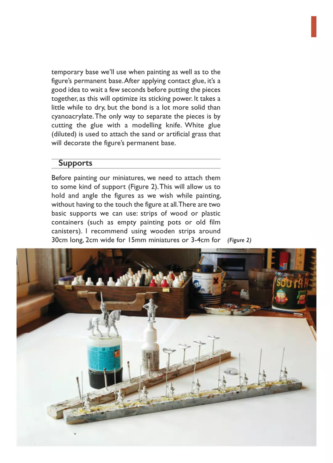
Supports
Before painting our miniatures, we need to attach them
to some kind of support (Figure 2). This will allow us to
hold and angle the figures as we wish while painting,
without having to the touch the figure at all.There are two
basic supports we can use: strips of wood or plastic
containers (such as empty painting pots or old film
canisters). I recommend using wooden strips around
30cm long, 2cm wide for 15mm miniatures or 3-4cm for (Figure 2)
01- Ch01_Layout 1 20/01/2015 18:48 Page 18
28mm miniatures, and no more than 1cm thick. This will
make them more stable since the width is greater than
the height. The strips are our best bet if we are going to
‘mass-produce’ figures with similar or identical uniforms.
Now, if we’re only going to paint one figure at a time,
plastic containers are more appropriate. But, you should
experiment and use whichever is most comfortable for
you. For painting shields, we can use either method: if we
use wooden strips, hammer headless nails into them to
stick the shields onto; if we opt for empty paint pots, glue
on a piece of plastic sprue and use this as a supporting
arm. Use superglue to secure the shield to the support as
this can be easily removed once we’ve finished.
Painter’s Palette
As obvious as it may seem, having a good palette to put
and mix our colours on is very important.You can choose
what you like best, anything from plastic plates, porcelain
appetiser dishes or professional palettes (there are very
cheap plastic ones). The latter is the best option as its
useful concave holes preserve paint for longer (they dry
faster over a flat surface). Since acrylics become fairly
waterproof when they dry, we won’t have any problems
mixing new paint on top of older dry paint.
Modelling Tools
At the minimum we should have modelling knives, a hand
drill with different sized bits and some files. Also it will
be useful to have tweezers, pliers and scissors easily to
hand.
PAINTING SPACE
I know that not everyone has the opportunity to have a
permanent painting space. In my early years I had to
wander around carrying all my stuff from one place to the
18
01- Ch01_Layout 1 20/01/2015 18:48 Page 19
other (from one room to the kitchen, from the kitchen
to another room, like a paint nomad). Needless to say, to
have a permanent painting space appropriately furnished
(close to references books, with a radio for company and
some room for a laptop) doesn’t just save us time and
hassle but adds extra motivation to paint.
SOME BASIC CONCEPTS
How do I handle the brush?
We need precise brushstrokes – we’re not trying to be
Van Gogh! – so the closer to the point we handle the
brush, the better. Just think of it as a pen that we are going
to ‘write’ with on the figure.
How do I clean the brush?
Taking good care of your brushes is a must if you want to
keep them in good condition for a long time.The best way
to do this is to clean them properly. Normally, all you need
to do when using acrylics is put the brush in water and
shake it a bit. But, if you see there is paint still stuck on
the bristles, you can rest the brush on the side of the jar
and gently twist it. Don’t ever clean the brush on the
bottom of the jar and, of course, never store your brush
inside the water-filled jar. Always use toilet paper or paper
towels to dry your brushes with, never ever use rags or
any type of cloth.
Shake it, baby!
All paints have a mixed composition of pigment and
diluent. This is especially obvious when you take a bottle
that has been stored for a long time and can see that the
two have separated. So, anytime we are using any paint,
especially if new or after a long storage, we have to
vigorously shake the bottle to mix the paint properly. If
the paint we put in the palette is oily or has traces of
white, shake it again until it becomes fully homogeneous.
19
01- Ch01_Layout 1 20/01/2015 18:48 Page 20
If the paint is not properly shaken it will dry with a glossy
sheen.
Should I add water to the paint?
Yes, indeed. Unless we are painting some very specific
details requiring a lot of precision (such as eyes), the paint
needs water to flow better. Moreover, when we paint units
of figures we could spend some time working with the
same colour, so adding water will prevent it drying out.
How do I mix colours?
Here’s my tip: don’t drop the paint onto the mix. Doing so
allows no control over the mix and could easily overlighten the colour you’re trying to create. Instead, drop
the paint beside the mix, and blend the colours
progressively. Once you have reached the right shade,
remove the excess of paint.
Regarding the proportions of paint used when mixing,
all the percentages offered in the colour charts of this
book are highly approximate. It’s impossible to offer exact
figures and even so it would greatly depend on personal
tastes. On the other hand, my own mixes change from one
time to another; I don’t view this as a problem as historical
uniforms were not always precisely the same shade of
colour (they wore out fast, were seldom or never washed,
colours fade with rain and sun, and being on campaign
adds yet more grime and dirt).
Drying times
Acrylic paints tend to dry quite fast but it depends on a
series of circumstances, such as the amount of water
added to the mix, temperature and humidity.
Matt or Satin?
I’m a firm advocate of a matt finish for figures, or at least
as matt as possible: I’m not a matt paint fundamentalist! I
always use matt colours but some of the step-by-step
20
01- Ch01_Layout 1 20/01/2015 18:48 Page 21
photos in this book have an artificially glossy effect
produced by camera flash, especially on varnished figures.
HEALTHY PAINTING
Whether painting miniatures is a hobby or a job for you,
you should take into consideration a number of factors
to help both yourself and the environment.
Chemicals
I exclusively use acrylics as explained before: they are
good paints, easier to use and faster to dry than enamels,
and they are odourless and better for the environment
(as they need no toxic thinners or solvents). However, I
do use non-acrylic sprays and varnishes. Today sprays are
CFC free, but some propellants, varnishes and thinners
such as turpentine are still toxic.
My advice is to avoid the use of toxic products as
much as possible. If you do use them, never pour the
remnants down the toilet; if possible, always dispose of
the residue in the locally approved manner (in the UK,
take it to your local waste disposal site and check which
area to put it in). And, always use the sprays in wellventilated areas such as on a balcony, by an open window,
a shed or garage with the door open or even in the
garden.
Lights
Painting can be tiring for your eyes. Although I have
suffered from myopia since my childhood, I didn’t have
problems until recently. Now that I’m in my mid-30s, my
eyes begin to get tired easily and faster, so I’ve started to
value what proper lighting can offer. First of all, although I
have painted at night many times, I prefer to paint with
indirect daylight. Although some painters prefer to paint
using natural daylight, this didn’t work for me. I’m lucky to
live in sunny Spain, where we have many hours of daylight,
even in winter, but whatever daylight is available you will
21
01- Ch01_Layout 1 20/01/2015 18:48 Page 22
also need a good electric light system.You should use two
lamps, one to offer a general light to your whole working
area, the other to supplement this with light directly
where you’re painting. I have tried many different bulbs
over the years. Halogen lights are very powerful, but in my
case they were painful for my eyes and very hot to work
under (during the Spanish summer this is a huge issue to
consider!). Besides the obvious environmental benefits,
low-energy bulbs generate no heat but maybe won’t offer
enough light to paint by. To summarize, take advantage of
daylight as much as possible and use two lamps: an area
light and a direct light, using low-energy bulbs if possible.
Yoga
If you are planning to spend long hours painting, you need
to do some exercise. As a full-time painter, working eight
or more hours a day, I started to experience physical
problems, especially in my back. Muscle spasms started to
be commonplace, as well as lumbar pain. One day I
decided to try yoga. Leaving spiritual considerations aside,
I discovered that yoga is the perfect physical practice for
painters. It’s not an aerobic exercise so you don’t need to
be in good shape (a painter’s life is quite sedentary!) but
on the other hand it offers two essential benefits: building
up and stretching. The building up is slow and progressive,
but it will strengthen your back and prevent spasms. Also,
stretching the muscles of arms, legs and back will be
necessary (and even delightful) after a long painting
journey. After eight years of yoga my only regret is not
having started before! However, you don’t need to be a
yogi to experience the benefits of the practice; there are
some easy asanas such as Adho Mukha that everybody can
do at home and which have immediate benefits.
22
02- Ch02_Layout 1 20/01/2015 18:49 Page 23
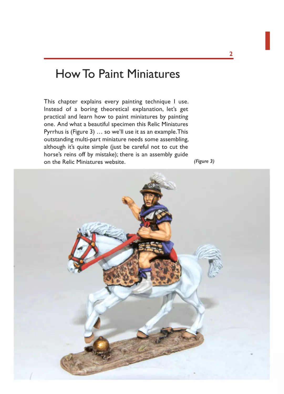
How To Paint Miniatures
This chapter explains every painting technique I use.
Instead of a boring theoretical explanation, let’s get
practical and learn how to paint miniatures by painting
one. And what a beautiful specimen this Relic Miniatures
Pyrrhus is (Figure 3) … so we’ll use it as an example.This
outstanding multi-part miniature needs some assembling,
although it’s quite simple (just be careful not to cut the
horse’s reins off by mistake); there is an assembly guide
(Figure 3)
on the Relic Miniatures website.
2
02- Ch02_Layout 1 20/01/2015 18:49 Page 24
(Figure 4)
THE UNDERCOAT
Any painting work starts with a simple decision: white or
black undercoat? However, which one we choose will
define both the whole painting process and the final result.
Both options have pros and cons:
White undercoat
Pros: Details on the figure can be seen easily and paint
covers white better (Figure 4), even for problematic
colours such as white, yellow or red; painting the base
colours is easier and faster and final result is brighter.
24
Cons: Figures can look too flat so some kind of lining,
wash or patina is often added (if not absolutely necessary)
to separate the different colour areas.
02- Ch02_Layout 1 20/01/2015 18:49 Page 25
Black undercoat
Pros: The undercoat serves as a lining that helps to
separate colour areas and gives contrast to our figures.
This is the best option for metals.
Cons: Details on the figure can be a bit difficult to see
and some colours need a couple of layers to cover the
undercoat properly; painting the base colours can be
slower as we have to keep the a black line between
separate colour areas, and final result looks darker than
using a white undercoat.
As seen in the Pyrrhus figure (Figure 5), the two options
are not mutually exclusive as white undercoat is better
for some parts of the figure and black for others. In this
particular case, my advice is to prime with a white spray
and touch up with brushed black paint any areas missed
by the spray (to provide shading on the finished figure).
(Figure 5)
25
PAINTING
TIP
02- Ch02_Layout 1 20/01/2015 18:49 Page 26
As a general rule, use a white undercoat when you paint
light-coloured figures or use patinas and black base
otherwise.
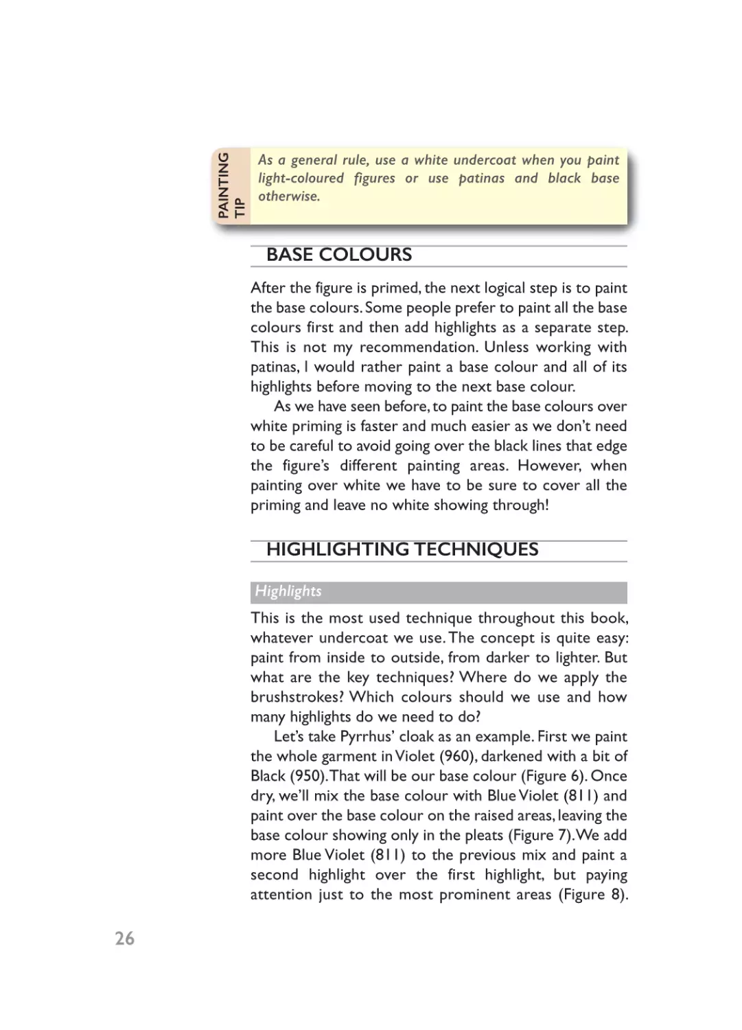
BASE COLOURS
After the figure is primed, the next logical step is to paint
the base colours. Some people prefer to paint all the base
colours first and then add highlights as a separate step.
This is not my recommendation. Unless working with
patinas, I would rather paint a base colour and all of its
highlights before moving to the next base colour.
As we have seen before, to paint the base colours over
white priming is faster and much easier as we don’t need
to be careful to avoid going over the black lines that edge
the figure’s different painting areas. However, when
painting over white we have to be sure to cover all the
priming and leave no white showing through!
HIGHLIGHTING TECHNIQUES
Highlights
This is the most used technique throughout this book,
whatever undercoat we use. The concept is quite easy:
paint from inside to outside, from darker to lighter. But
what are the key techniques? Where do we apply the
brushstrokes? Which colours should we use and how
many highlights do we need to do?
Let’s take Pyrrhus’ cloak as an example. First we paint
the whole garment in Violet (960), darkened with a bit of
Black (950). That will be our base colour (Figure 6). Once
dry, we’ll mix the base colour with Blue Violet (811) and
paint over the base colour on the raised areas, leaving the
base colour showing only in the pleats (Figure 7). We add
more Blue Violet (811) to the previous mix and paint a
second highlight over the first highlight, but paying
attention just to the most prominent areas (Figure 8).
26
02- Ch02_Layout 1 20/01/2015 18:49 Page 27
(Figure 6)
(Figure 7)
Although you could add extra highlights, two is enough in
this case as it’s not an especially large area. As we’ll see,
this rule of two highlights applies in most cases.
Sounds easy, right? Sadly, it’s not always so simple!
What about painting horses, for example, where the
painting surface is larger and plainer? As a general rule
larger painting areas would demand more highlights, and
plainer surfaces would require fewer highlights (Figure 9).
As before, paint from the inside to the outside and from
darker to lighter, but learning where to paint the
brushstrokes isn’t as easy to get right. Painting experience
and common sense are our best allies.
(Figure 8)
27
02- Ch02_Layout 1 20/01/2015 18:49 Page 28
(Figure 9)
Lining
This technique is exactly the opposite of
highlighting as the concept is to paint
from the outside to the inside and from
lighter to darker. It’s very useful when
painting larger sized figures such as 54mm,
where you start with a base colour in the
middle and then paint both highlights and
linings, but in my opinion its use is very
limited in wargame scales, mainly limited
to correcting mistakes or separating
colour areas.
In the case of Pyrrhus’ horse, we didn’t
undercoat the reins in Black (950) as in all
probability they will be touched by mistake
when painting the horse. Although the
reins will be painted red, we should add
thin black lines first to reinforce the
separation of this colour area from the
horse’s body (Figure 10).
(Figure 10)
02- Ch02_Layout 1 20/01/2015 18:49 Page 29
Drybrushing
Drybrushing is a very easy and effective technique,
consisting of painting highlights over an undercoat but not
with the usual brushstrokes. Dip the brush in the colour
or mix of colours we will use for the highlights (Figure 11)
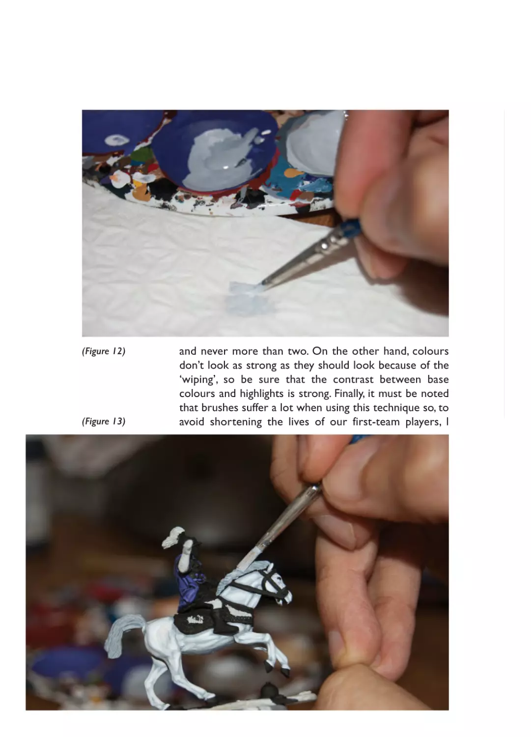
but, instead of going straight to the figure, dab – or ‘dry
clean’– the brush on some tissue paper (Figure 12). This
will absorb most of the paint … but not all of it. This way,
there will still be some paint on the brush, but it won’t
run or drip off. Now go to the figure and ‘wipe’ the whole
area to paint with the brush (Figure 13). As the brush is
mainly dry, the little paint that remains on it will highlight
only the raised areas (Figure 14). Given its simplicity, the
drybrush technique is perfect for a fast paint style, but not
suitable for a quality finish except to work on very specific
areas, either rough or textured (such as chainmail, terrain,
furs or horses tails and manes) or especially plain (cannon
or wagon woodwork).
There are some differences compared to regular
highlighting: one highlight would be enough in most cases,
(Figure 11)
29
02- Ch02_Layout 1 20/01/2015 18:49 Page 30
(Figure 12)
(Figure 13)
and never more than two. On the other hand, colours
don’t look as strong as they should look because of the
‘wiping’, so be sure that the contrast between base
colours and highlights is strong. Finally, it must be noted
that brushes suffer a lot when using this technique so, to
avoid shortening the lives of our first-team players, I
02- Ch02_Layout 1 20/01/2015 18:49 Page 31
recommend either buying specially designed brushes (with
wide, plain and square points) or keeping old or worn out
brushes for drybrushing (square the point with scissors
for a better performance). Drybrushing is indicated in the
colour charts as ‘db’.
In Pyrrhus’ case, we’ll use the drybrush technique to
paint his horse’s mane and tail, his helmet’s horsehair and
the terrain around the figure.
(Figure 14)
Washes
If lining is the opposite to highlighting, washes are the
opposite to drybrushing! While drybrushing highlights the
raised areas, a paint wash shades deep zones or recesses.
It’s an easy technique to shade a specific colour area with
watered-down paint. Like drybrushing, however, in my
31
02- Ch02_Layout 1 20/01/2015 18:49 Page 32
painting system its use is limited to rough areas and maybe
metals.
How does it work? First, paint the base colour, and
then add a lot of water to the colour we are using for the
wash. There are two ways to control the final level of
darkness: by the colour itself and by the amount of water
we add to it. Although a single wash is usually enough,
several layers can be applied to get a progressive effect.
Washes are indicated in the colour charts with a ‘w’.
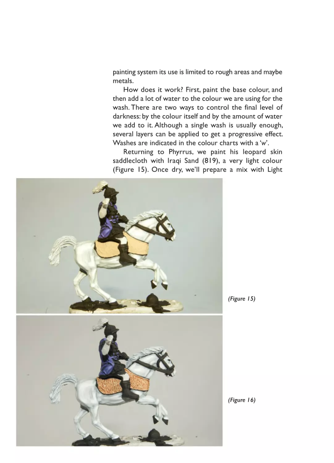
Returning to Phyrrus, we paint his leopard skin
saddlecloth with Iraqi Sand (819), a very light colour
(Figure 15). Once dry, we’ll prepare a mix with Light
(Figure 15)
(Figure 16)
02- Ch02_Layout 1 20/01/2015 18:49 Page 33
(Figure 17)
(Figure 18)
(Figure 19)
33
02- Ch02_Layout 1 20/01/2015 18:49 Page 34
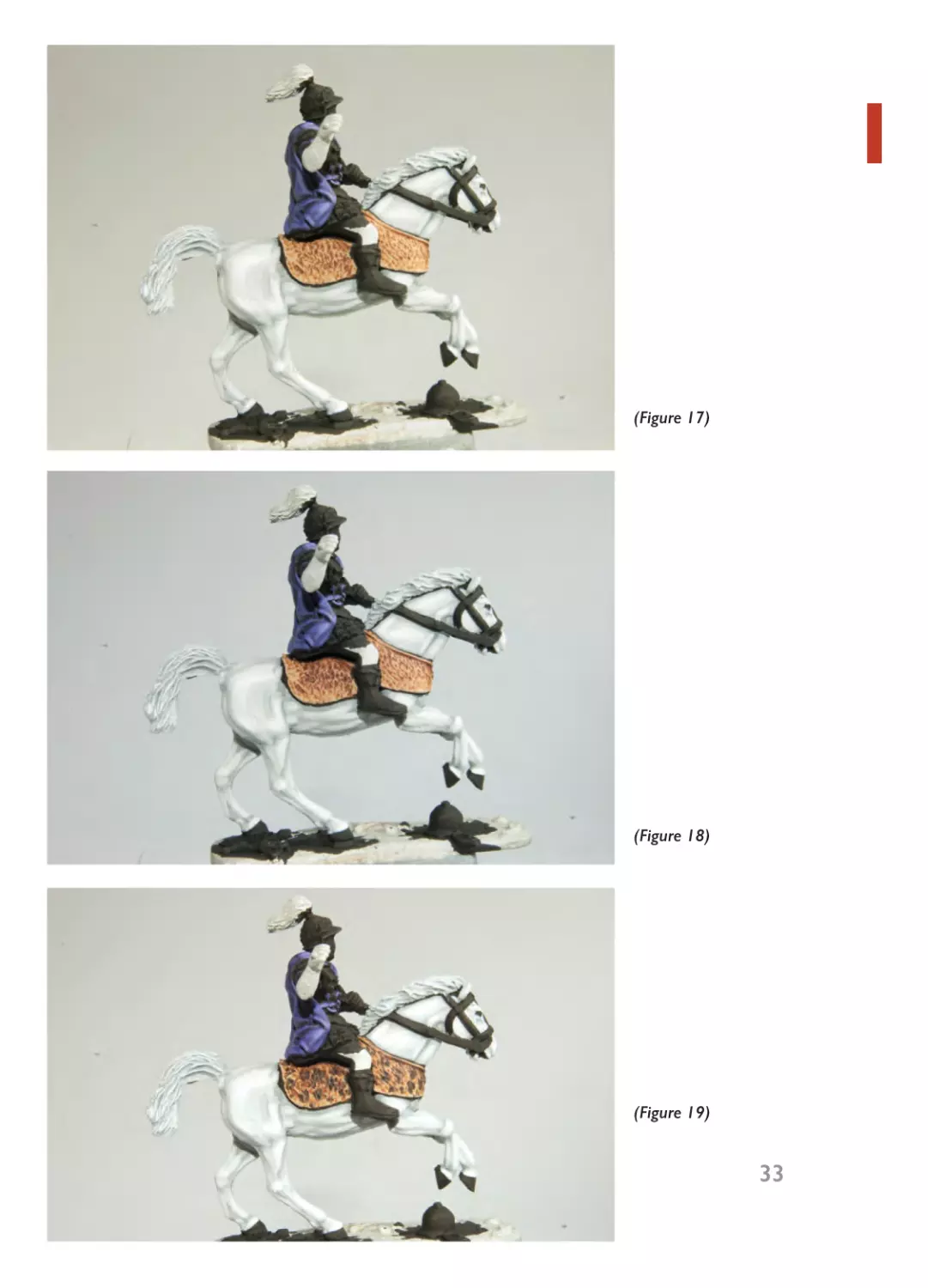
Brown (929) and Hull Red (985) and add a lot of water.
As leopard skins are lighter around the edges, we’ll give it
three coats of brown wash, the first covering all the skin
(Figure 16). Once dry we’ll add a bit more Hull Red (985)
to the mix (and some extra water) and wash over the first
layer, but this time leaving the edges apart (Figure 17).
Once dry, we’ll repeat one more time with more Hull Red
(985) and more water, but this time washing only the
upper part of the skin (Figure 18). Once everything is dry,
we’ll paint the leopard spots with Black (950) mixed with
Mahogany Brown (846), also very watered down (Figure
19). Phyrrus is now finished (Figures 20-21).
(Figure 20)
02- Ch02_Layout 1 20/01/2015 18:49 Page 35
(Figure 21)
02- Ch02_Layout 1 20/01/2015 18:49 Page 36
Pyrrhus
Cloak
Cuirass & helmet
Silver wreath
Pyrrhus’ flesh
Linen armour,
boots, pteryges
(strips hanging
from edge of
armour) &
helmet’s horsehair
Reins & sword
scabbard
Horse’s coat
Tail & mane
Leopard skin
Base
Base colour
Violet (960) 90%
+ Black (950)
10%
1st highlight
Violet (960) 80%
+ Blue Violet
(811) 20%
Chainmail (6156) 80% + Black
(950) 20%
Beige Brown
(875)
Mithril Silver (6155)
2nd highlight
3rd highlight
1st highlight 70%
+ Blue Violet
(811) 30%
Shining Gold (61- Base colour 10% Burnished Gold
63) 70% + Black + Shining Gold
(61-62)
(950) 30%
(61-63) 90%
Light Brown 70%
(929) + Flat Flesh
(955) 30%
Light Grey (990) Base colour 50%
50% + Sienna
+ White (951)
(113) 50%
50%
1st highlight 10%
+ Flat Flesh (955)
90%
1st highlight 50%
+ White (951)
50%
Cavalry Brown
(982)
Red (947)
Cavalry Brown
(982) 50% + Red
(947) 50%
Light Grey (990) Light Grey (990)
50% + White
(951) 50%
Light Grey (990) Light Grey (990)
30% + White
(951) 70% db
Iraqi Sand (819) Light Brown
(929) 90% + Hull
Red (985) 10% w
Chocolate
Brown (872)
Sienna (113) db
1st highlight 50%
+ White (951)
50%
White (951) db
White (951)
1st highlight 90%
2nd highlight
+ Hull Red (985) 90% + Hull Red
10% w
(985) 10% w
Buff (976) db
Note on interpreting the colour charts in this book: All the
percentages indicated for mixes are highly approximate and depends on
personal taste.
db = drybrush
w = wash
36
03- Ch03_Layout 1 20/01/2015 18:55 Page 37
3
Using Patinas
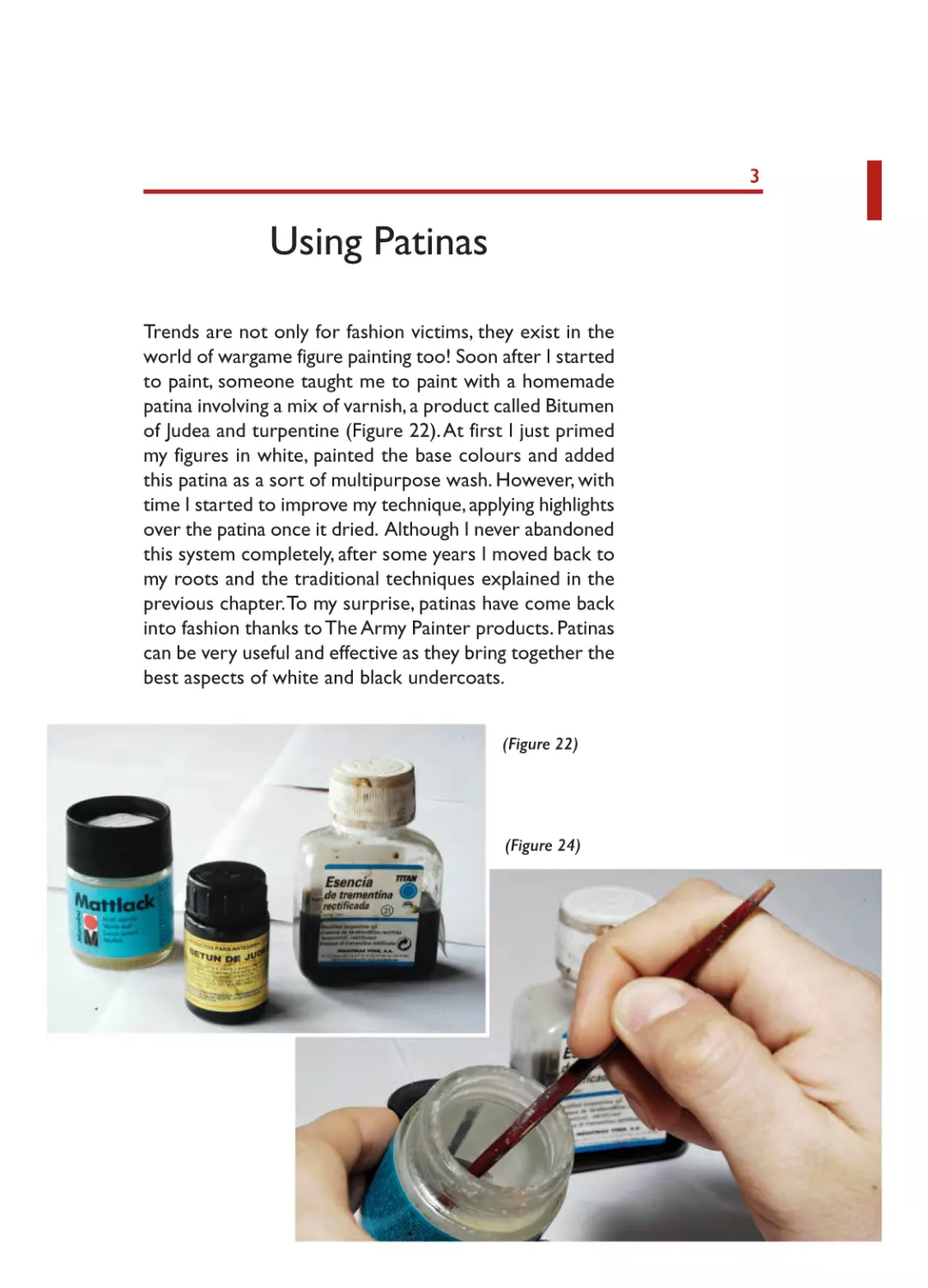
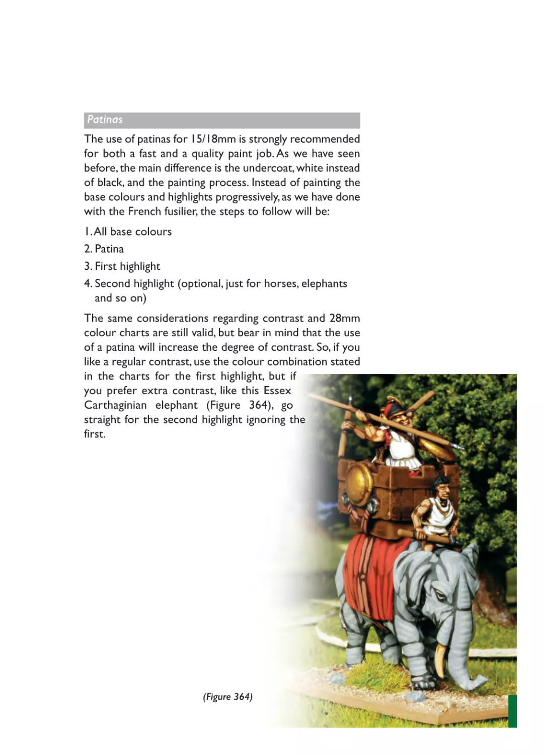
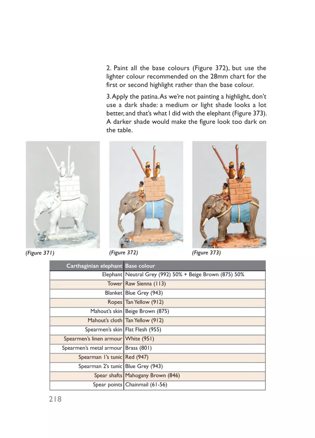
Trends are not only for fashion victims, they exist in the
world of wargame figure painting too! Soon after I started
to paint, someone taught me to paint with a homemade
patina involving a mix of varnish, a product called Bitumen
of Judea and turpentine (Figure 22). At first I just primed
my figures in white, painted the base colours and added
this patina as a sort of multipurpose wash. However, with
time I started to improve my technique, applying highlights
over the patina once it dried. Although I never abandoned
this system completely, after some years I moved back to
my roots and the traditional techniques explained in the
previous chapter. To my surprise, patinas have come back
into fashion thanks to The Army Painter products. Patinas
can be very useful and effective as they bring together the
best aspects of white and black undercoats.
(Figure 22)
(Figure 24)
03- Ch03_Layout 1 20/01/2015 18:55 Page 38
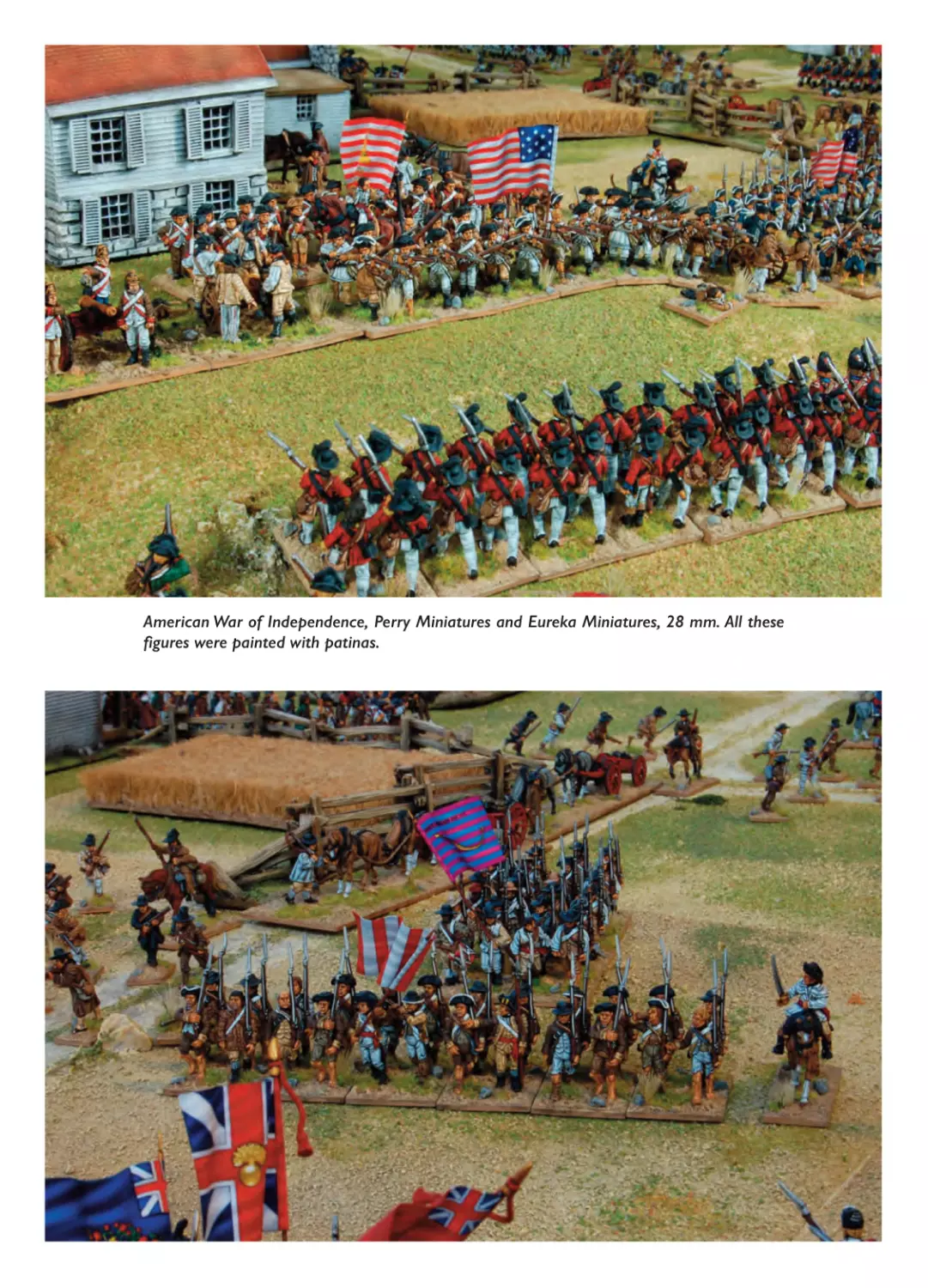
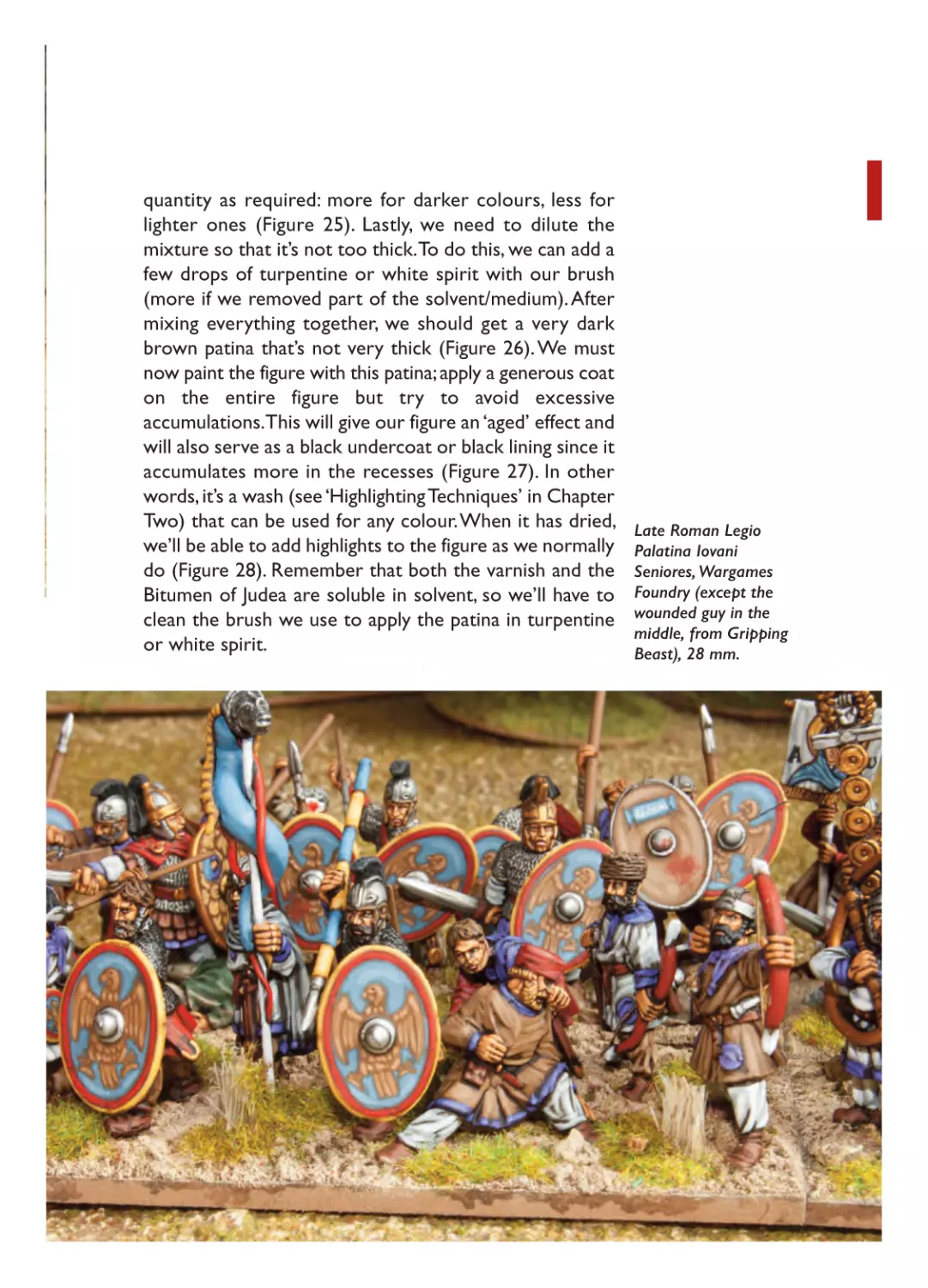
American War of Independence, Perry Miniatures and Eureka Miniatures, 28 mm. All these
figures were painted with patinas.
03- Ch03_Layout 1 20/01/2015 18:55 Page 39
BITUMEN OF JUDEA
‘Bitumen of Judea’ is the general term used to refer to a
patina that actually involves other elements. First we put
a coat of white primer on the figure and then we apply
the base colours (Figure 23). This will be easier and
quicker than over a black undercoat. Once we’ve finished
this step, we prepare a mixture of solvent-based matt
varnish (Marabú Mattlack is a good option), Bitumen of
Judea and turpentine or white spirit (called ‘mineral spirits’
in the US) on a clean non-porous concave surface (plastic
spoons are good). Bitumen of Judea, the key ingredient of
(Figure 25)
(Figure 26)
39
03- Ch03_Layout 1 20/01/2015 18:56 Page 40
Late Roman Legio
Palatina Herculani
Seniores, Wargames
Foundry, 28 mm.
40
this concoction, is very watery, glossy and extremely dark.
Just a few drops added to the mix with a brush will do
the job. The varnish will make up most of the mix; its two
components, varnish and solvent/medium, must be mixed
well before use. I recommend you stir it with the handle
of an old brush instead of shaking it (Figure 24). The
varnish performs several functions in this mixture: it gives
the bitumen more body, helps it adhere to the surface,
reduces its degree of darkness and gives a matt finish. If
we want an extra-matt finish, we can take out some of the
solvent/medium before mixing the components of the
varnish (put it in a spare container, never throw it down
the toilet). By removing a third or a quarter of the solvent,
we’ll increase the proportion of varnish in the container.
I recommend doing this with newly purchased varnish as
it has a tendency to settle and separate before being used.
If you can’t get your hands on Marabú varnish, you can use
Titan’s synthetic matt varnish (intended for use on wood)
or many others.
Put some stirred varnish on the plastic spoon and add
a few drops of Bitumen of Judea, with more or less
03- Ch03_Layout 1 20/01/2015 18:56 Page 41
quantity as required: more for darker colours, less for
lighter ones (Figure 25). Lastly, we need to dilute the
mixture so that it’s not too thick. To do this, we can add a
few drops of turpentine or white spirit with our brush
(more if we removed part of the solvent/medium). After
mixing everything together, we should get a very dark
brown patina that’s not very thick (Figure 26). We must
now paint the figure with this patina; apply a generous coat
on the entire figure but try to avoid excessive
accumulations.This will give our figure an ‘aged’ effect and
will also serve as a black undercoat or black lining since it
accumulates more in the recesses (Figure 27). In other
words, it’s a wash (see ‘Highlighting Techniques’ in Chapter
Two) that can be used for any colour. When it has dried,
we’ll be able to add highlights to the figure as we normally
do (Figure 28). Remember that both the varnish and the
Bitumen of Judea are soluble in solvent, so we’ll have to
clean the brush we use to apply the patina in turpentine
or white spirit.
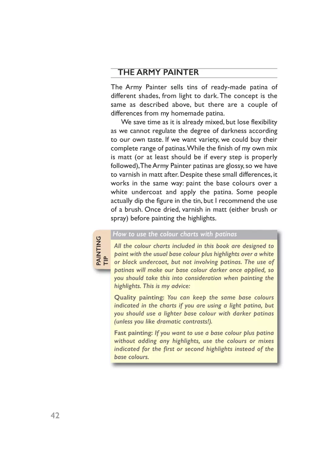
Late Roman Legio
Palatina Iovani
Seniores, Wargames
Foundry (except the
wounded guy in the
middle, from Gripping
Beast), 28 mm.
03- Ch03_Layout 1 20/01/2015 18:56 Page 42
THE ARMY PAINTER
PAINTING
TIP
The Army Painter sells tins of ready-made patina of
different shades, from light to dark. The concept is the
same as described above, but there are a couple of
differences from my homemade patina.
We save time as it is already mixed, but lose flexibility
as we cannot regulate the degree of darkness according
to our own taste. If we want variety, we could buy their
complete range of patinas.While the finish of my own mix
is matt (or at least should be if every step is properly
followed),The Army Painter patinas are glossy, so we have
to varnish in matt after. Despite these small differences, it
works in the same way: paint the base colours over a
white undercoat and apply the patina. Some people
actually dip the figure in the tin, but I recommend the use
of a brush. Once dried, varnish in matt (either brush or
spray) before painting the highlights.
How to use the colour charts with patinas
All the colour charts included in this book are designed to
paint with the usual base colour plus highlights over a white
or black undercoat, but not involving patinas. The use of
patinas will make our base colour darker once applied, so
you should take this into consideration when painting the
highlights. This is my advice:
Quality painting: You can keep the same base colours
indicated in the charts if you are using a light patina, but
you should use a lighter base colour with darker patinas
(unless you like dramatic contrasts!).
Fast painting: If you want to use a base colour plus patina
without adding any highlights, use the colours or mixes
indicated for the first or second highlights instead of the
base colours.
42
03- Ch03_Layout 1 20/01/2015 18:56 Page 43
(Figure 23)
(Figure 27)
(Figure 28)
03- Ch03_Layout 1 20/01/2015 18:56 Page 44
04- Ch04_Layout 1 20/01/2015 18:57 Page 45
COLOURS
PART TWO
04- Ch04_Layout 1 20/01/2015 18:57 Page 46
04- Ch04_Layout 1 20/01/2015 18:57 Page 47
Black
Like many painters, I used to hate painting black. It was a
real pain in the neck so I used to leave the black items
(cartridges, shakoes, backpacks, belts, and so on) to the
very end of a painting batch. I thought it was a plain and
boring colour. I trust this chapter will show you how
wrong this perception is!
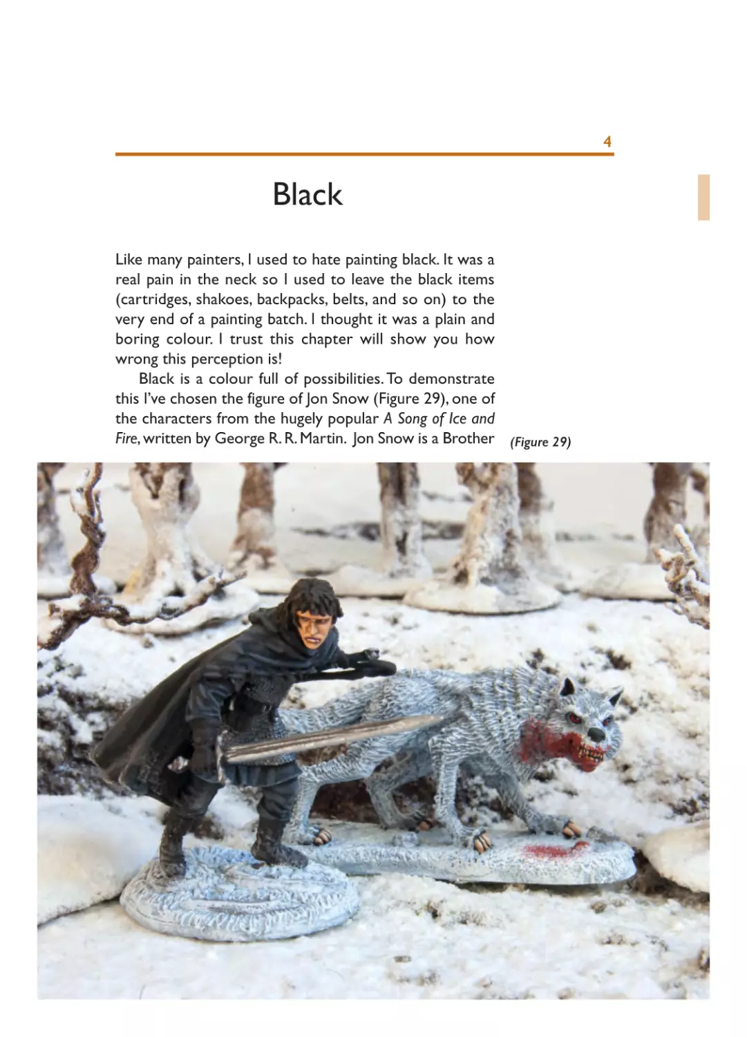
Black is a colour full of possibilities. To demonstrate
this I’ve chosen the figure of Jon Snow (Figure 29), one of
the characters from the hugely popular A Song of Ice and
Fire, written by George R. R. Martin. Jon Snow is a Brother (Figure 29)
4
04- Ch04_Layout 1 20/01/2015 18:57 Page 48
of the Night’s Watch, an order of warriors who always
dress completely in black. I will use this apparently blackonly figure to demonstrate four different shades of black:
clothes, furs, worn-out blackened leather and gleaming
new blackened leather. Black will be the base colour in all
cases, and highlights will make the difference. What I have
aimed for is a figure with considerable diversity within a
black palate yet sufficiently integrated to be appealing to
the eye.
Although we always begin with black as the base
colour, you can create diversity within your black palate
by building highlights with greys, browns and blues. Further
variation can be introduced through the use of metallic
tones or mixing matt and gloss blacks. The resulting
differences are sufficiently subtle to be true to an overall
black effect, but make the final figure (and the painting
process) more rewarding.
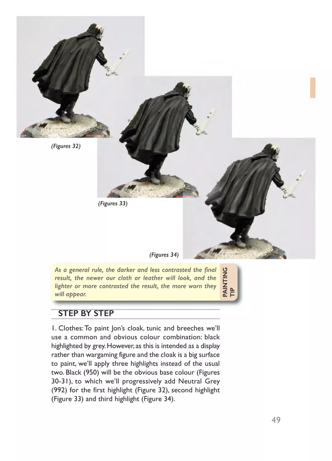
(Figures 30-31)
04- Ch04_Layout 1 20/01/2015 18:57 Page 49
(Figures 32)
(Figures 33)
(Figures 34)
PAINTING
TIP
As a general rule, the darker and less contrasted the final
result, the newer our cloth or leather will look, and the
lighter or more contrasted the result, the more worn they
will appear.
STEP BY STEP
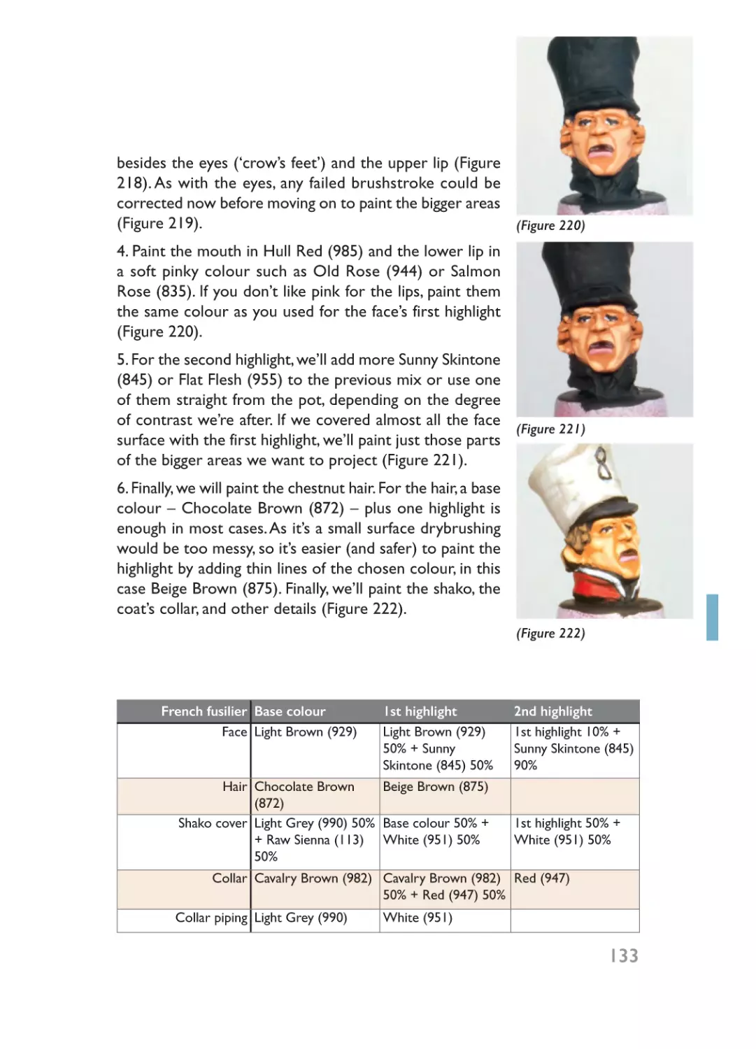
1. Clothes: To paint Jon’s cloak, tunic and breeches we’ll
use a common and obvious colour combination: black
highlighted by grey. However, as this is intended as a display
rather than wargaming figure and the cloak is a big surface
to paint, we’ll apply three highlights instead of the usual
two. Black (950) will be the obvious base colour (Figures
30-31), to which we’ll progressively add Neutral Grey
(992) for the first highlight (Figure 32), second highlight
(Figure 33) and third highlight (Figure 34).
49
04- Ch04_Layout 1 20/01/2015 18:57 Page 50
(Figures 35)
2. Furs and chainmail: The far north is a cold land to live
and the defenders of The Wall must be warm, so furs are
used aplenty. Obviously black fur could also be painted
highlighted with grey, but we’ll choose brown instead.The
base colour will be Black (950) and we’ll apply two
highlights combining the base colour with Chocolate
Brown (872) using the drybrush technique, but being
careful not to mark the already painted clothes.
For the chainmail, although not really black, I wanted to
give it a dark look. Here I combined several techniques:
over the Gunmetal Grey (863) base colour I applied a
wash of Black (950) and, once dry, a slight drybrush of
Gunmetal Grey (863) (Figure 35).
50
3.Worn-out blackened leather:The books usually mention
the Brothers of the Night’s Watch clad in boiled leather
armour. Although our figure wears mainly clothes and
chainmail, the boots, gloves and belts could be painted as
leather. The base colour will be Black (950), mixed with
Mahogany Brown (846) for highlights. One highlight would
04- Ch04_Layout 1 20/01/2015 18:57 Page 51
(Figures 36)
(Figures 37)
be enough for belts, but two will be needed for gloves and
boots (Figure 36).
4. Gleaming leather: Only the sword scabbard remains, but
it’s enough to show you my final way to paint black. We
have two options: to employ the same colour combination
we used for clothes, but substituting flat for gloss black,
or my favourite, which is to highlight the flat black with
dark blue. One unique highlight will suffice in this case
(Figure 37).
Jon Snow
Clothes
Cloak’s lining
Chainmail
Leather
Scabbard
Base colour
Black (950)
Black (950)
1st highlight
Black (950) 80% +
Neutral Grey (992)
20%
Black (950) 50% +
Chocolate Brown
(872) 50% db
Gunmetal Grey Black (950) w
(863)
Black (950)
Black (950) 70% +
Mahogany Brown
30% (846)
Black (950)
Dark Prussian Blue
(899)
2nd highlight
1st highlight 80 %
+ Neutral Grey
(992) 20%
Chocolate Brown
(872) db
3rd highlight
2nd highlight
80% + Neutral
Grey (992) 20%
Gunmetal Grey
(863) db
1st highlight 70%
+ Mahogany
Brown (846) 30%
51
04- Ch04_Layout 1 20/01/2015 18:57 Page 52
(Figures 38)
(Figures 39)
52
04- Ch04_Layout 1 20/01/2015 18:57 Page 53
GHOST
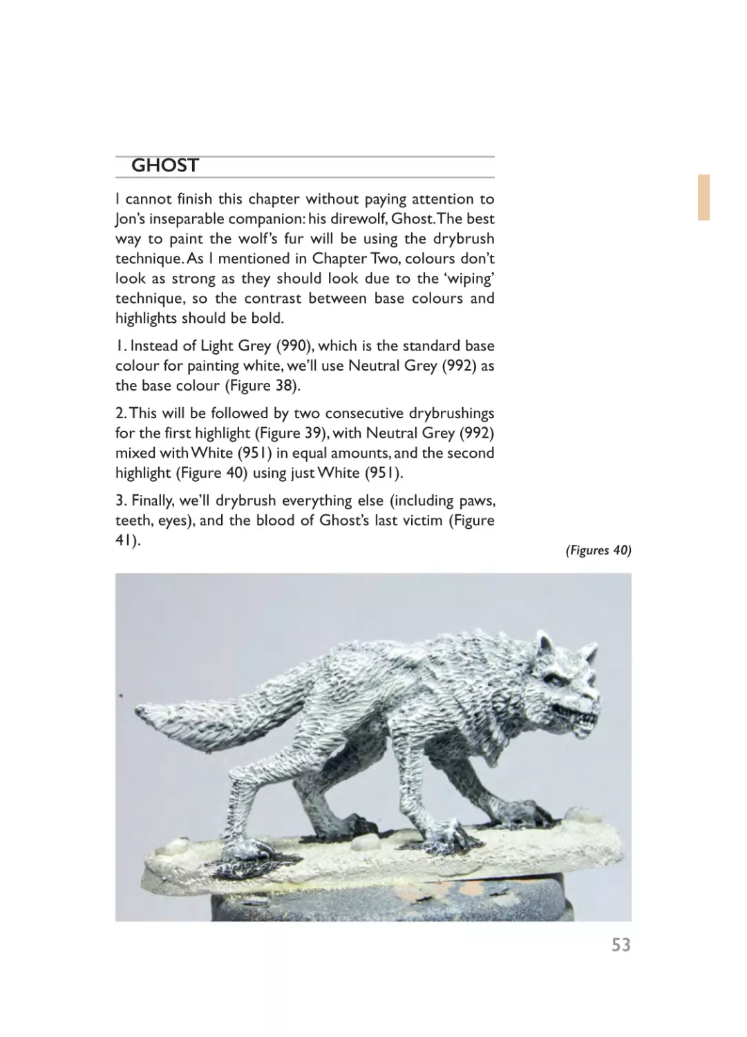
I cannot finish this chapter without paying attention to
Jon’s inseparable companion: his direwolf, Ghost.The best
way to paint the wolf’s fur will be using the drybrush
technique. As I mentioned in Chapter Two, colours don’t
look as strong as they should look due to the ‘wiping’
technique, so the contrast between base colours and
highlights should be bold.
1. Instead of Light Grey (990), which is the standard base
colour for painting white, we’ll use Neutral Grey (992) as
the base colour (Figure 38).
2. This will be followed by two consecutive drybrushings
for the first highlight (Figure 39), with Neutral Grey (992)
mixed with White (951) in equal amounts, and the second
highlight (Figure 40) using just White (951).
3. Finally, we’ll drybrush everything else (including paws,
teeth, eyes), and the blood of Ghost’s last victim (Figure
41).
(Figures 40)
53
04- Ch04_Layout 1 20/01/2015 18:57 Page 54
(Figures 41)
Ghost
Fur
Paws & teeth
Blood
54
Base colour
Neutral Grey (992)
Sienna (113)
1st highlight
2nd highlight
Neutral Grey (992) 50% + White (951) db
White (951) 50% db
Tan Yellow (912)
Tan Yellow (912) 50% +
White (951) 50%
Cavalry Brown (982) db Red (947) db
05- Ch05_Layout 1 20/01/2015 19:00 Page 55
White
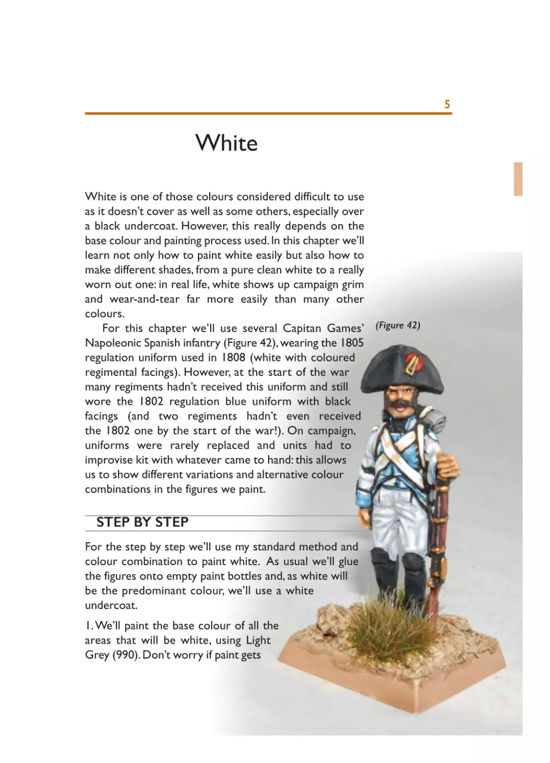
White is one of those colours considered difficult to use
as it doesn’t cover as well as some others, especially over
a black undercoat. However, this really depends on the
base colour and painting process used. In this chapter we’ll
learn not only how to paint white easily but also how to
make different shades, from a pure clean white to a really
worn out one: in real life, white shows up campaign grim
and wear-and-tear far more easily than many other
colours.
For this chapter we’ll use several Capitan Games’ (Figure 42)
Napoleonic Spanish infantry (Figure 42), wearing the 1805
regulation uniform used in 1808 (white with coloured
regimental facings). However, at the start of the war
many regiments hadn’t received this uniform and still
wore the 1802 regulation blue uniform with black
facings (and two regiments hadn’t even received
the 1802 one by the start of the war!). On campaign,
uniforms were rarely replaced and units had to
improvise kit with whatever came to hand: this allows
us to show different variations and alternative colour
combinations in the figures we paint.
STEP BY STEP
For the step by step we’ll use my standard method and
colour combination to paint white. As usual we’ll glue
the figures onto empty paint bottles and, as white will
be the predominant colour, we’ll use a white
undercoat.
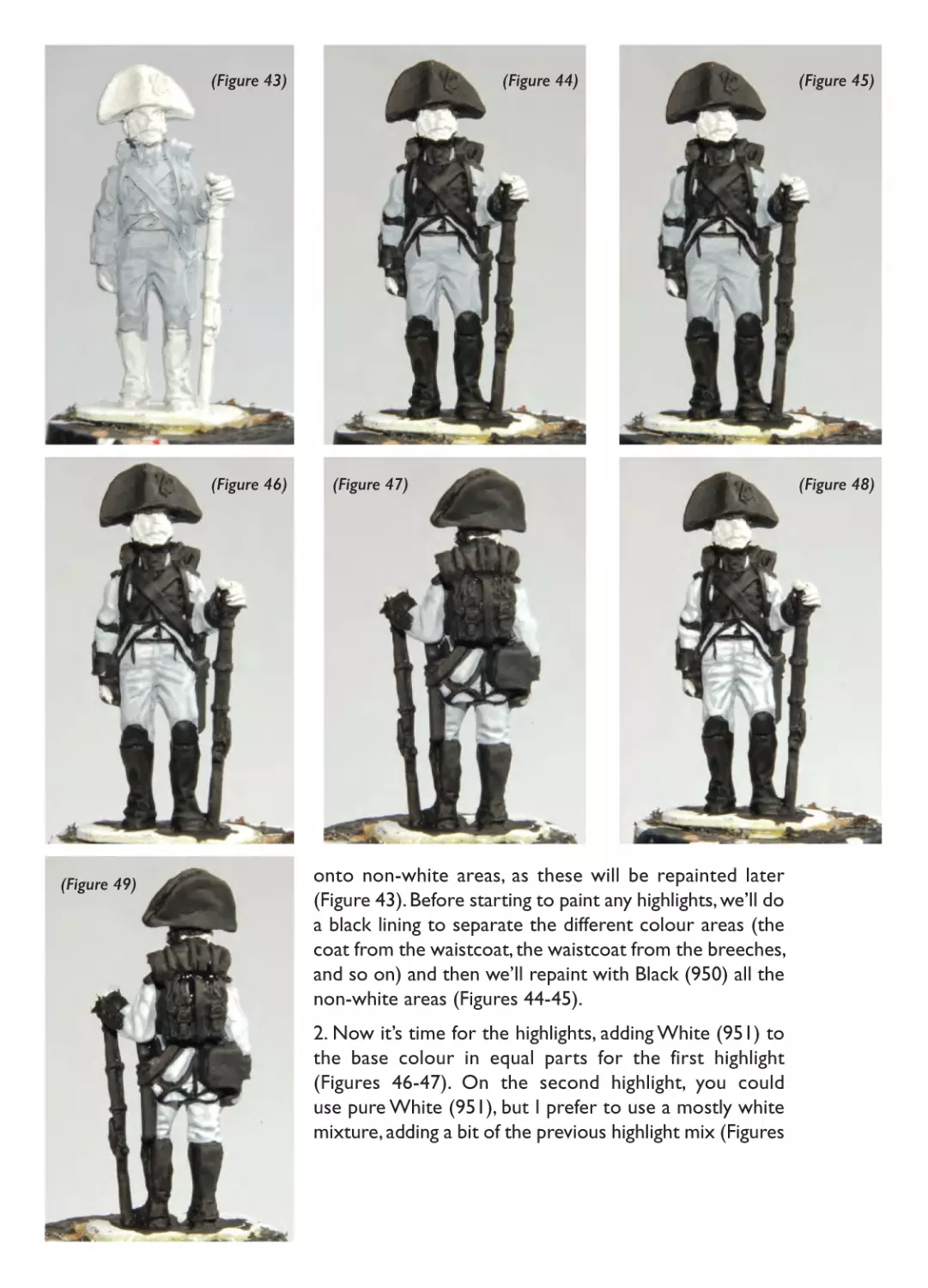
1. We’ll paint the base colour of all the
areas that will be white, using Light
Grey (990). Don’t worry if paint gets
5
05- Ch05_Layout 1 20/01/2015 19:00 Page 56
(Figure 43)
(Figure 46)
(Figure 49)
(Figure 44)
(Figure 47)
onto non-white areas, as these will be repainted later
(Figure 43). Before starting to paint any highlights, we’ll do
a black lining to separate the different colour areas (the
coat from the waistcoat, the waistcoat from the breeches,
and so on) and then we’ll repaint with Black (950) all the
non-white areas (Figures 44-45).
2. Now it’s time for the highlights, adding White (951) to
the base colour in equal parts for the first highlight
(Figures 46-47). On the second highlight, you could
use pure White (951), but I prefer to use a mostly white
mixture, adding a bit of the previous highlight mix (Figures
(Figure 45)
(Figure 48)
05- Ch05_Layout 1 20/01/2015 19:00 Page 57
48-49). In my opinion, this look more realistic as otherwise
the uniform would look too clean.
3. We won’t pay attention to the rest of the figure’s
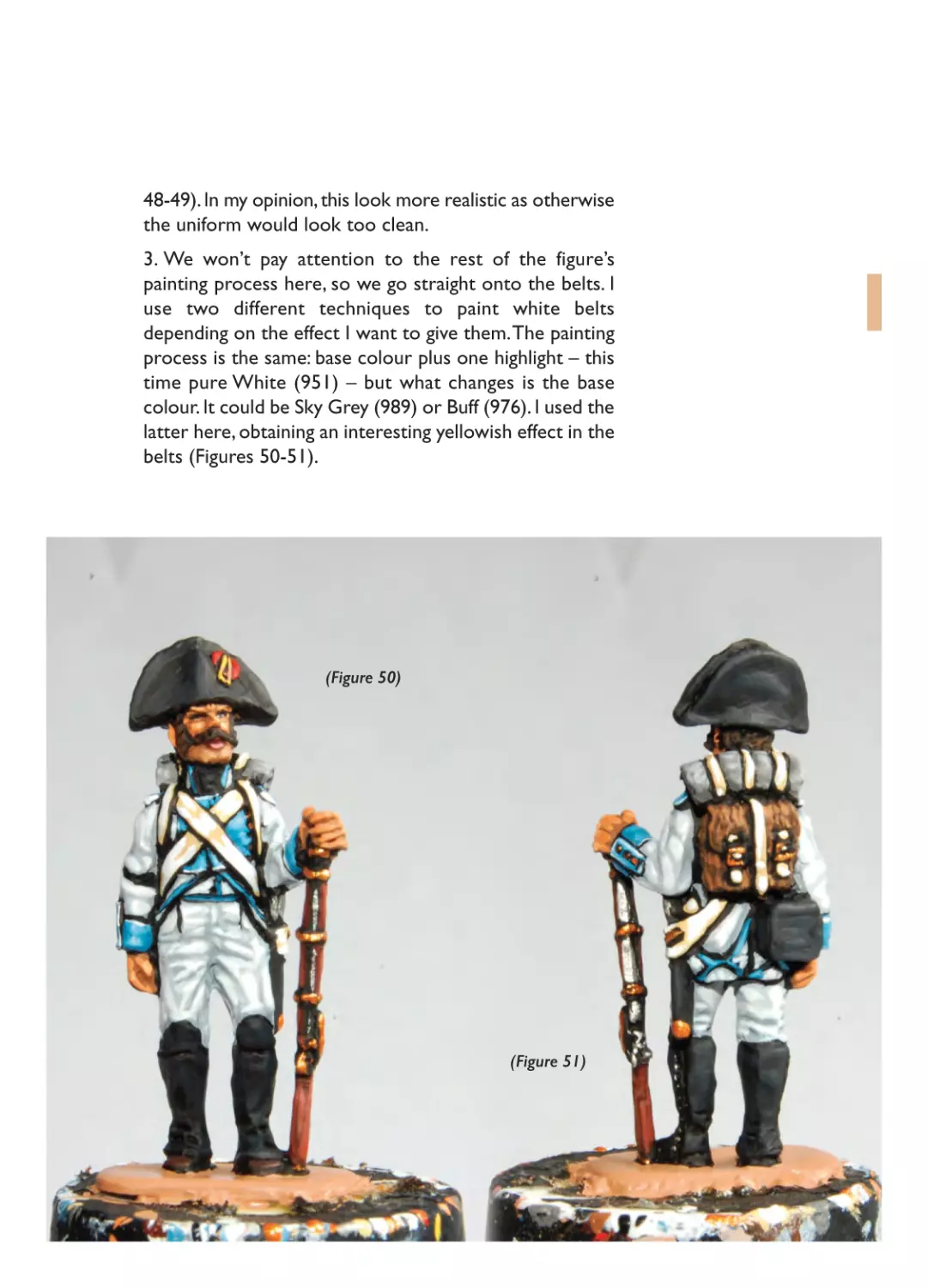
painting process here, so we go straight onto the belts. I
use two different techniques to paint white belts
depending on the effect I want to give them. The painting
process is the same: base colour plus one highlight – this
time pure White (951) – but what changes is the base
colour. It could be Sky Grey (989) or Buff (976). I used the
latter here, obtaining an interesting yellowish effect in the
belts (Figures 50-51).
(Figure 50)
(Figure 51)
05- Ch05_Layout 1 20/01/2015 19:00 Page 58
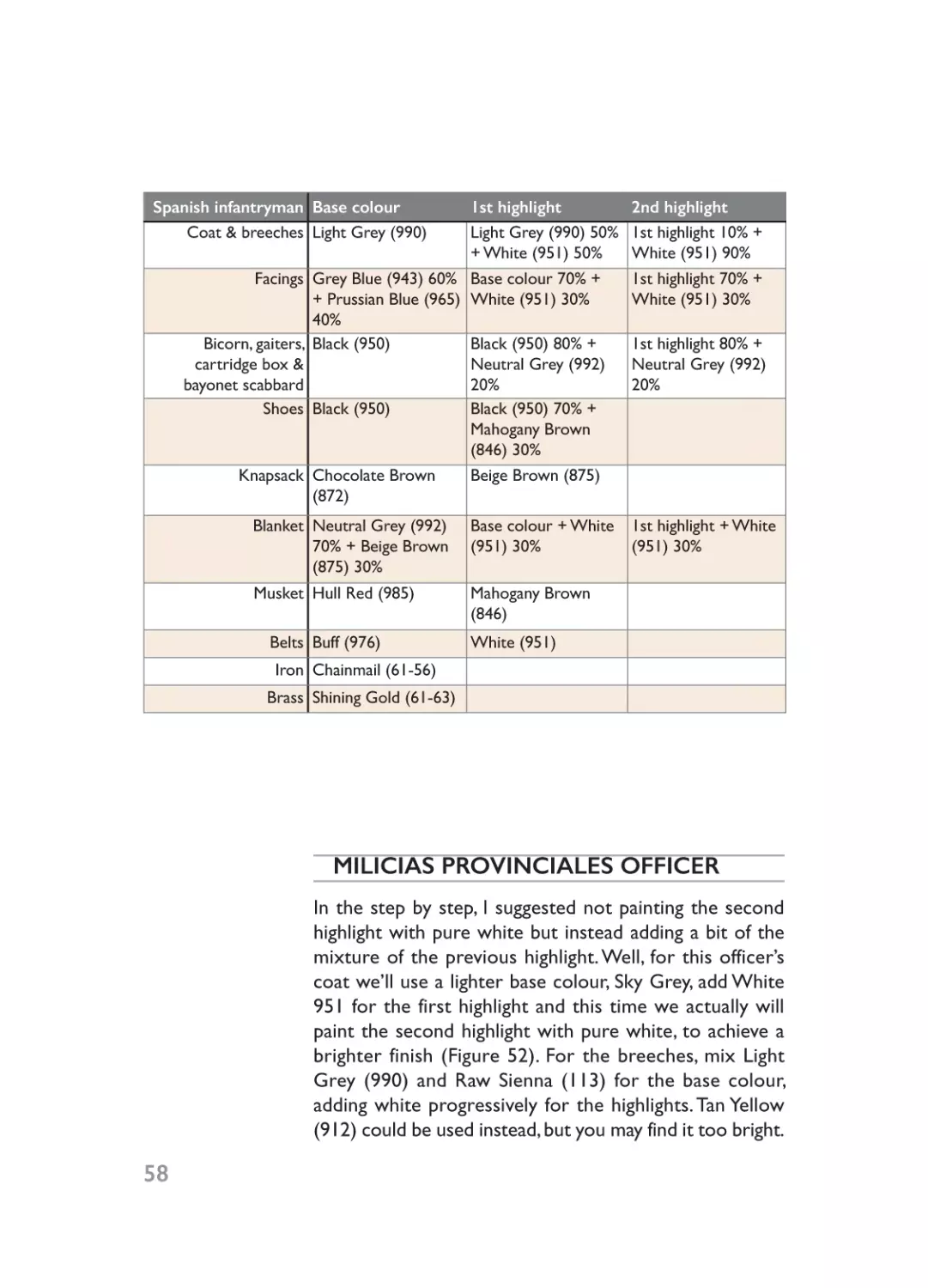
Spanish infantryman Base colour
Coat & breeches Light Grey (990)
Facings Grey Blue (943) 60%
+ Prussian Blue (965)
40%
Bicorn, gaiters, Black (950)
cartridge box &
bayonet scabbard
Shoes Black (950)
Knapsack Chocolate Brown
(872)
Blanket Neutral Grey (992)
70% + Beige Brown
(875) 30%
Musket Hull Red (985)
Belts Buff (976)
Iron Chainmail (61-56)
1st highlight
2nd highlight
Light Grey (990) 50% 1st highlight 10% +
+ White (951) 50%
White (951) 90%
Base colour 70% +
White (951) 30%
1st highlight 70% +
White (951) 30%
Black (950) 80% +
Neutral Grey (992)
20%
Black (950) 70% +
Mahogany Brown
(846) 30%
Beige Brown (875)
1st highlight 80% +
Neutral Grey (992)
20%
Base colour + White
(951) 30%
1st highlight + White
(951) 30%
Mahogany Brown
(846)
White (951)
Brass Shining Gold (61-63)
MILICIAS PROVINCIALES OFFICER
58
In the step by step, I suggested not painting the second
highlight with pure white but instead adding a bit of the
mixture of the previous highlight. Well, for this officer’s
coat we’ll use a lighter base colour, Sky Grey, add White
951 for the first highlight and this time we actually will
paint the second highlight with pure white, to achieve a
brighter finish (Figure 52). For the breeches, mix Light
Grey (990) and Raw Sienna (113) for the base colour,
adding white progressively for the highlights. Tan Yellow
(912) could be used instead, but you may find it too bright.
05- Ch05_Layout 1 20/01/2015 19:00 Page 59
(Figure 52)
Officer Base colour
Coat Sky Grey (989)
Breeches Light Grey (990) 50%
+ Raw Sienna (113)
50%
Facings Cavalry Brown (982)
Bicorn, boots & Black (950)
sword scabbard
1st highlight
Sky Grey (989) 50% +
White (951) 50%
Base colour 50% +
White (951) 50%
2nd highlight
White (951)
1st highlight 50% +
White (951) 50%
Cavalry Brown (982) Red (947) 90% +
50% + Red (947) 50% Scarlet (817) 10%
Black (950) 80% +
Neutral Grey (992)
20%
1st highlight 80% +
Neutral Grey (992)
20%
59
05- Ch05_Layout 1 20/01/2015 19:00 Page 60
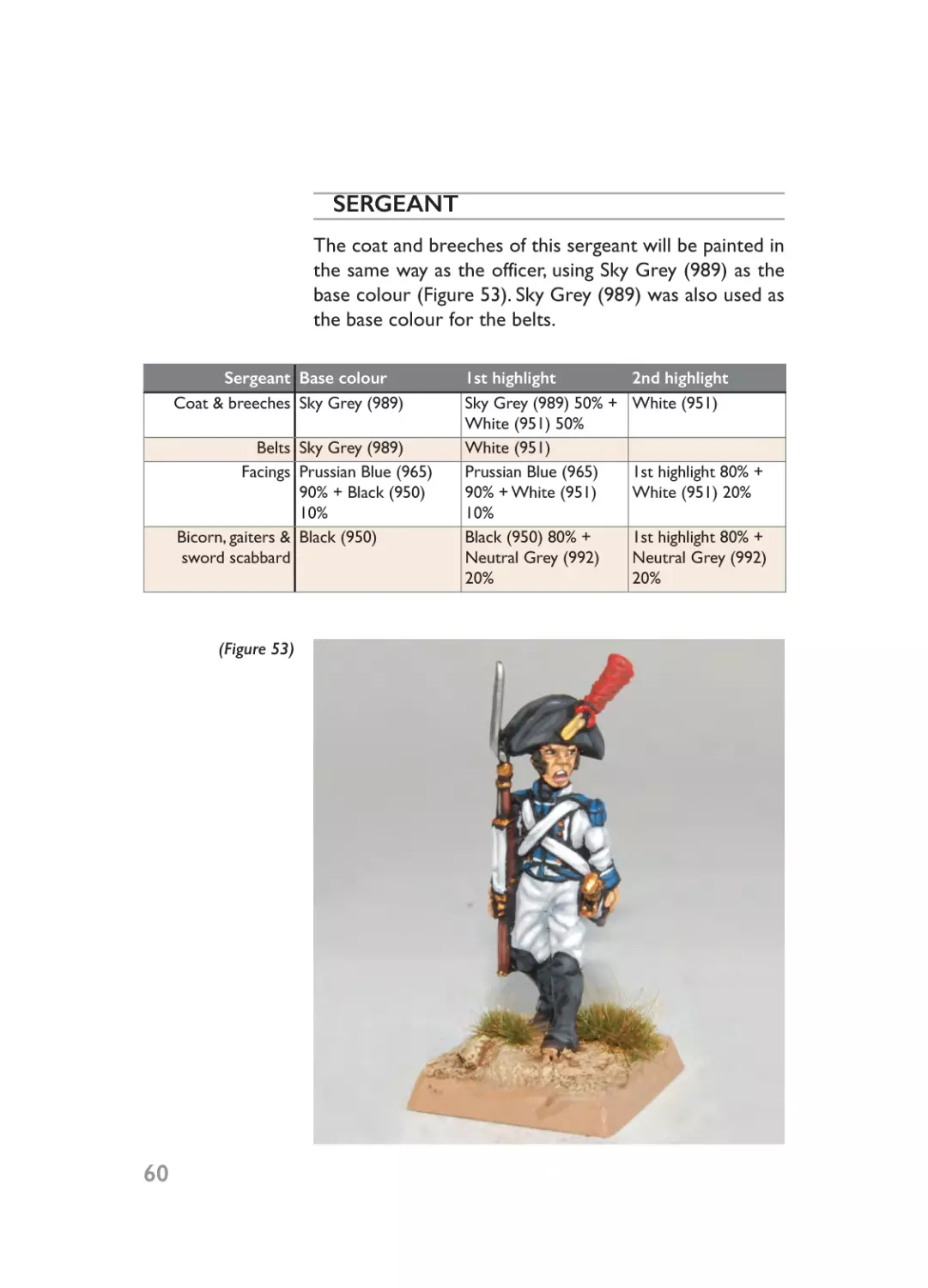
SERGEANT
The coat and breeches of this sergeant will be painted in
the same way as the officer, using Sky Grey (989) as the
base colour (Figure 53). Sky Grey (989) was also used as
the base colour for the belts.
Sergeant Base colour
Coat & breeches Sky Grey (989)
Belts Sky Grey (989)
Facings Prussian Blue (965)
90% + Black (950)
10%
Bicorn, gaiters & Black (950)
sword scabbard
(Figure 53)
60
1st highlight
Sky Grey (989) 50% +
White (951) 50%
White (951)
Prussian Blue (965)
90% + White (951)
10%
Black (950) 80% +
Neutral Grey (992)
20%
2nd highlight
White (951)
1st highlight 80% +
White (951) 20%
1st highlight 80% +
Neutral Grey (992)
20%
05- Ch05_Layout 1 20/01/2015 19:00 Page 61
DRUMMER
With the drummer’s coat I wanted to represent a wornout look, so I mixed Light Grey (990) and Raw Sienna
(113) for the base colour, adding white progressively for
the highlights (Figure 54). I used a different base colour,
Buff (976) and Sky Grey (989), for the drum and sword
belts respectively.
Drummer Base colour
Coat Light Grey (990) 50%
+ Sienna (113) 50%
Facings Grey Blue (943) 60%
+ Prussian Blue (965)
40%
Drum belt Sky Grey (989)
Sword belt Buff (976)
1st highlight
Base colour 50% +
White (951) 50%
Base colour 70% +
White (951) 30%
2nd highlight
1st highlight 50% +
White (951) 50%
1st highlight 70% +
White (951) 30%
White (951)
White (951)
(Figure 54)
61
05- Ch05_Layout 1 20/01/2015 19:00 Page 62
INFANTRYMAN
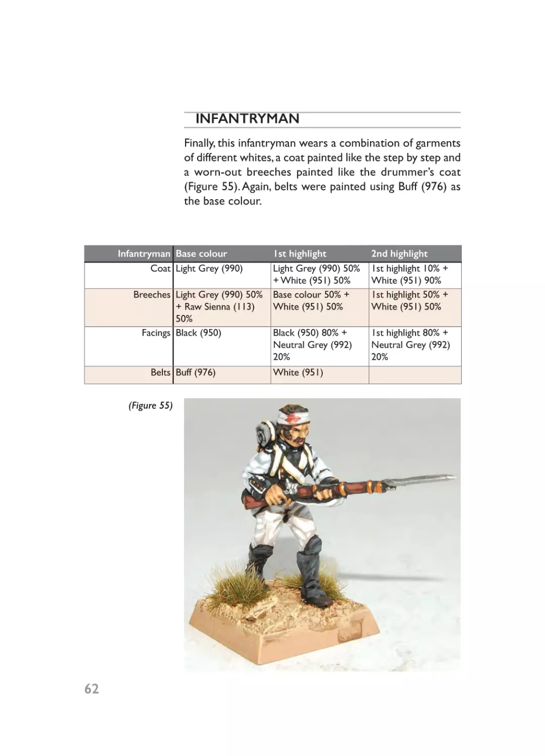
Finally, this infantryman wears a combination of garments
of different whites, a coat painted like the step by step and
a worn-out breeches painted like the drummer’s coat
(Figure 55). Again, belts were painted using Buff (976) as
the base colour.
Infantryman Base colour
Coat Light Grey (990)
Breeches Light Grey (990) 50%
+ Raw Sienna (113)
50%
Facings Black (950)
Belts Buff (976)
(Figure 55)
62
1st highlight
Light Grey (990) 50%
+ White (951) 50%
Base colour 50% +
White (951) 50%
2nd highlight
1st highlight 10% +
White (951) 90%
1st highlight 50% +
White (951) 50%
Black (950) 80% +
Neutral Grey (992)
20%
1st highlight 80% +
Neutral Grey (992)
20%
White (951)
06- Ch06_Layout 1 20/01/2015 19:03 Page 63
Blue
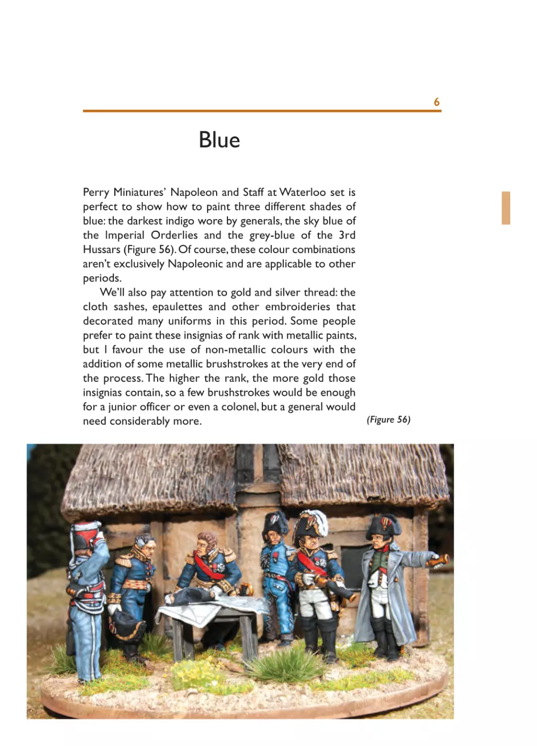
Perry Miniatures’ Napoleon and Staff at Waterloo set is
perfect to show how to paint three different shades of
blue: the darkest indigo wore by generals, the sky blue of
the Imperial Orderlies and the grey-blue of the 3rd
Hussars (Figure 56). Of course, these colour combinations
aren’t exclusively Napoleonic and are applicable to other
periods.
We’ll also pay attention to gold and silver thread: the
cloth sashes, epaulettes and other embroideries that
decorated many uniforms in this period. Some people
prefer to paint these insignias of rank with metallic paints,
but I favour the use of non-metallic colours with the
addition of some metallic brushstrokes at the very end of
the process. The higher the rank, the more gold those
insignias contain, so a few brushstrokes would be enough
for a junior officer or even a colonel, but a general would
(Figure 56)
need considerably more.
6
06- Ch06_Layout 1 20/01/2015 19:03 Page 64
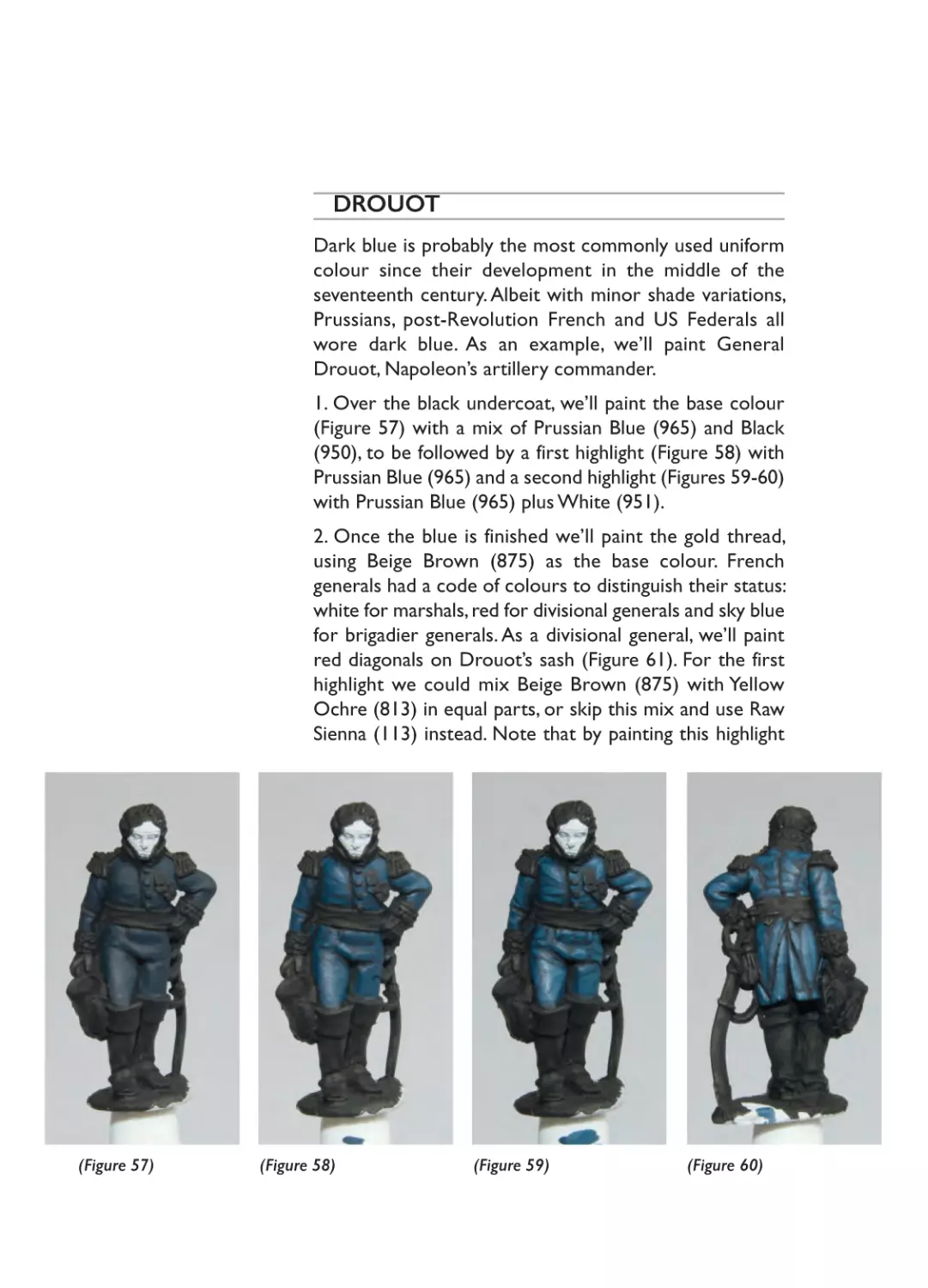
DROUOT
Dark blue is probably the most commonly used uniform
colour since their development in the middle of the
seventeenth century. Albeit with minor shade variations,
Prussians, post-Revolution French and US Federals all
wore dark blue. As an example, we’ll paint General
Drouot, Napoleon’s artillery commander.
1. Over the black undercoat, we’ll paint the base colour
(Figure 57) with a mix of Prussian Blue (965) and Black
(950), to be followed by a first highlight (Figure 58) with
Prussian Blue (965) and a second highlight (Figures 59-60)
with Prussian Blue (965) plus White (951).
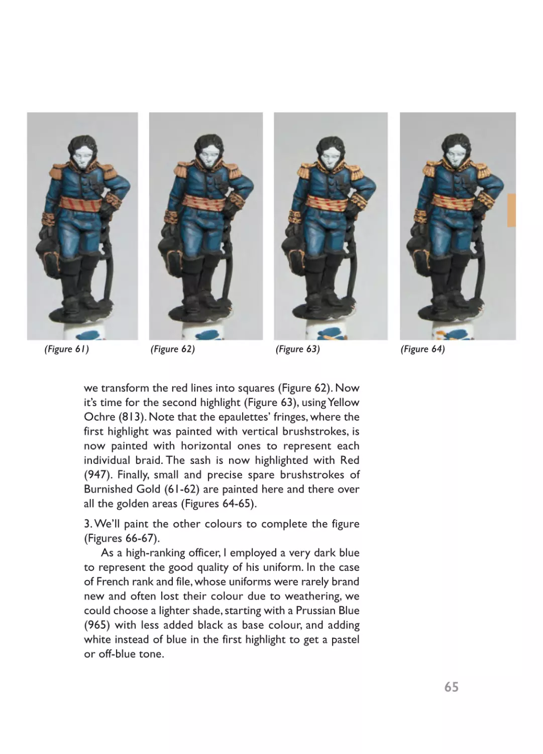
2. Once the blue is finished we’ll paint the gold thread,
using Beige Brown (875) as the base colour. French
generals had a code of colours to distinguish their status:
white for marshals, red for divisional generals and sky blue
for brigadier generals. As a divisional general, we’ll paint
red diagonals on Drouot’s sash (Figure 61). For the first
highlight we could mix Beige Brown (875) with Yellow
Ochre (813) in equal parts, or skip this mix and use Raw
Sienna (113) instead. Note that by painting this highlight
(Figure 57)
(Figure 58)
(Figure 59)
(Figure 60)
06- Ch06_Layout 1 20/01/2015 19:03 Page 65
(Figure 61)
(Figure 62)
(Figure 63)
(Figure 64)
we transform the red lines into squares (Figure 62). Now
it’s time for the second highlight (Figure 63), using Yellow
Ochre (813). Note that the epaulettes’ fringes, where the
first highlight was painted with vertical brushstrokes, is
now painted with horizontal ones to represent each
individual braid. The sash is now highlighted with Red
(947). Finally, small and precise spare brushstrokes of
Burnished Gold (61-62) are painted here and there over
all the golden areas (Figures 64-65).
3. We’ll paint the other colours to complete the figure
(Figures 66-67).
As a high-ranking officer, I employed a very dark blue
to represent the good quality of his uniform. In the case
of French rank and file, whose uniforms were rarely brand
new and often lost their colour due to weathering, we
could choose a lighter shade, starting with a Prussian Blue
(965) with less added black as base colour, and adding
white instead of blue in the first highlight to get a pastel
or off-blue tone.
65
06- Ch06_Layout 1 20/01/2015 19:03 Page 66
(Figure 66)
(Figure 65)
Drouot
Base colour
Coat & breeches Prussian Blue
(965) 80% +
Black (950) 20%
Gold thread Beige Brown
(875)
Reds Cavalry Brown
(982)
1st highlight
Prussian Blue
(965)
2nd highlight
3rd highlight
Prussian Blue
(965) 80% +
White (951) 20%
Raw Sienna (113) Yellow Ochre
Burnished Gold
(913)
(61-62)
Red (947)
Boots & bicorn Black (950)
Black (950) 80%
+ Neutral Grey
(992) 20%
Boots (lower Black (950)
Black (950) 70%
part)
+ Mahogany
Brown (846)
Gloves Light Grey (990) Base colour 50%
50% + Sienna
+ White (951)
(113) 50%
50%
Silver Chainmail (6156)
Gold
66
Shining Gold
(61-63)
(Figure 67)
Mithril Silver (6155)
Burnished Gold
(61-62)
1st highlight 80%
+ Neutral Grey
(992) 20%
1st highlight 70%
+ Raw Sienna
(113) 30%
1st highlight 50%
+ White (951)
50%
06- Ch06_Layout 1 20/01/2015 19:03 Page 67
GOURGAUD
Although not as common in Napoleonic uniforms as dark
blue, sky blue was used, for example, by the Bavarian Army,
for Hungarian breeches and in some specific uniforms
such as the French Imperial Officiers D’Ordonnance. Sky
blue looks smart on Oriental costumes and Western
civilian clothes, especially for women.
1. Over the black undercoat, we’ll paint the base colour
(Figure 68) with a mix of Grey Blue (943) and Prussian
Blue (965) in equal proportions. We’ll progressively add
(Figure 68)
(Figure 69)
(Figure 70)
(Figure 71)
(Figure 72)
(Figure 73)
(Figure 74)
(Figure 75)
06- Ch06_Layout 1 20/01/2015 19:03 Page 68
(Figure 76)
(Figure 77)
(Figure 78)
(Figure 79)
White (951) for the first highlight (Figure 69) and the
second highlight (Figures 70-71).
2. For the silver thread, we’ll use Neutral Grey (992) as
the base colour (Figure 72). The highlights will be painted
as with Drouot, but using Light Grey (990) for the first
highlight (Figure 73), Sky Grey (989) for the second
highlight (Figure 74) and Mithril Silver (61-55) for the final
metallic touches (Figures 75-76).
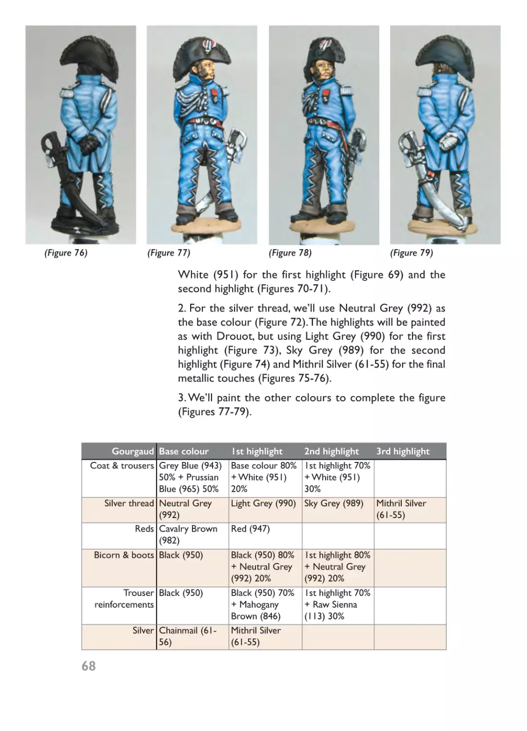
3. We’ll paint the other colours to complete the figure
(Figures 77-79).
Gourgaud Base colour
Coat & trousers Grey Blue (943)
50% + Prussian
Blue (965) 50%
Silver thread Neutral Grey
(992)
Reds Cavalry Brown
(982)
Bicorn & boots Black (950)
Trouser Black (950)
reinforcements
68
Silver Chainmail (6156)
1st highlight
Base colour 80%
+ White (951)
20%
Light Grey (990)
Red (947)
Black (950) 80%
+ Neutral Grey
(992) 20%
Black (950) 70%
+ Mahogany
Brown (846)
Mithril Silver
(61-55)
2nd highlight
3rd highlight
1st highlight 70%
+ White (951)
30%
Sky Grey (989) Mithril Silver
(61-55)
1st highlight 80%
+ Neutral Grey
(992) 20%
1st highlight 70%
+ Raw Sienna
(113) 30%
06- Ch06_Layout 1 20/01/2015 19:03 Page 69
As Napoleon’s Orderly, Gourgaud’s uniform has to
look brighter and more impressive than, for example,
a Bavarian private. To make a worn-out sky blue uniform,
add less Prussian Blue (965) to the Grey Blue (943) in
the base colour, or just use the colour combination
demonstrated on the hussar below.
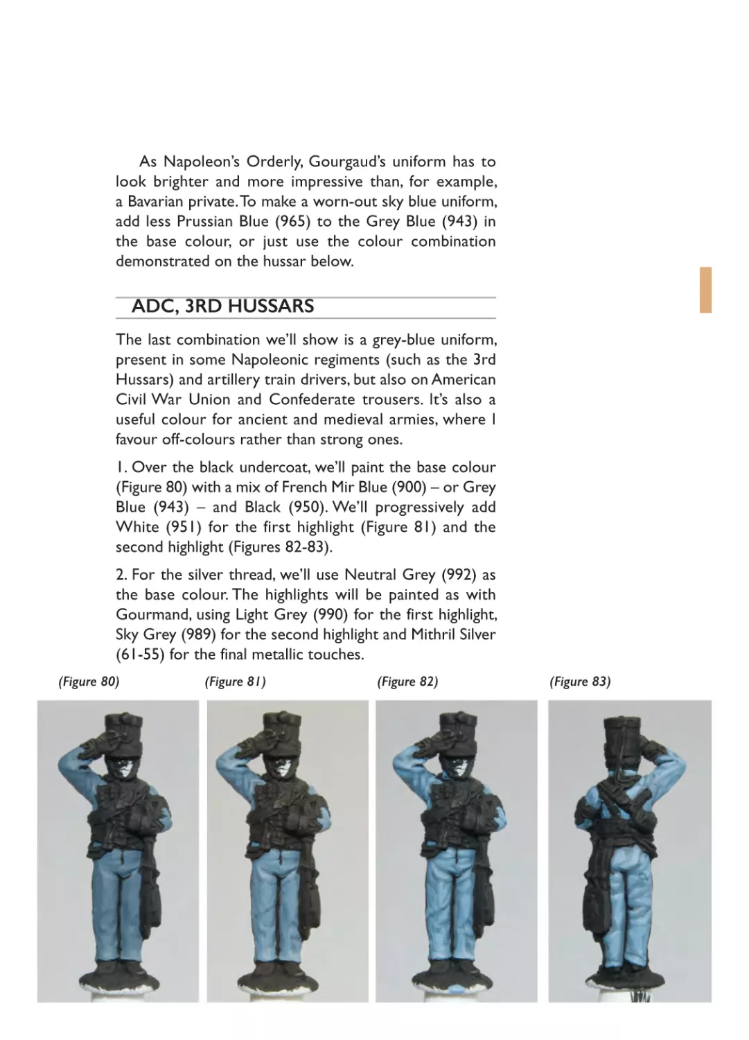
ADC, 3RD HUSSARS
The last combination we’ll show is a grey-blue uniform,
present in some Napoleonic regiments (such as the 3rd
Hussars) and artillery train drivers, but also on American
Civil War Union and Confederate trousers. It’s also a
useful colour for ancient and medieval armies, where I
favour off-colours rather than strong ones.
1. Over the black undercoat, we’ll paint the base colour
(Figure 80) with a mix of French Mir Blue (900) – or Grey
Blue (943) – and Black (950). We’ll progressively add
White (951) for the first highlight (Figure 81) and the
second highlight (Figures 82-83).
2. For the silver thread, we’ll use Neutral Grey (992) as
the base colour. The highlights will be painted as with
Gourmand, using Light Grey (990) for the first highlight,
Sky Grey (989) for the second highlight and Mithril Silver
(61-55) for the final metallic touches.
(Figure 80)
(Figure 81)
(Figure 82)
(Figure 83)
06- Ch06_Layout 1 20/01/2015 19:03 Page 70
3. We’ll paint the other colours to
complete the figure (Figures 8485). Note that the red colour of
the armband indicates that he’s an
ADC attached to a divisional
general.
(Figure 84)
(Figure 85)
ADC 3rd
Hussars Base colour
Coat & trousers French Mir Blue
(900) or Grey
Blue (943) 90% +
Black (950) 10%
Silver thread Neutral Grey
(992)
Shako & cuffs Cavalry Brown
(982)
Shako Black (950)
reinforcements,
sabretache &
cartridge box
Boots Black (950)
Silver Chainmail (6156)
70
1st highlight
Base colour 80%
+ White (951)
20%
2nd highlight
3rd highlight
1st highlight 80%
+ White (951)
20%
Light Grey (990) Sky Grey (989)
Cavalry Brown
(982) 50% + Red
(947) 50%
Black (950) 80%
+ Neutral Grey
(992) 20%
Red (947)
1st highlight 80%
+ Neutral Grey
(992) 20%
Black (950) 70% 1st highlight 70%
+ Mahogany
+ Raw Sienna
Brown (846)
(113) 30%
Mithril Silver (6155)
Gold Shining Gold (61- Burnished Gold
63)
(61-62)
Mithril Silver
(61-55)
06- Ch06_Layout 1 20/01/2015 19:04 Page 71
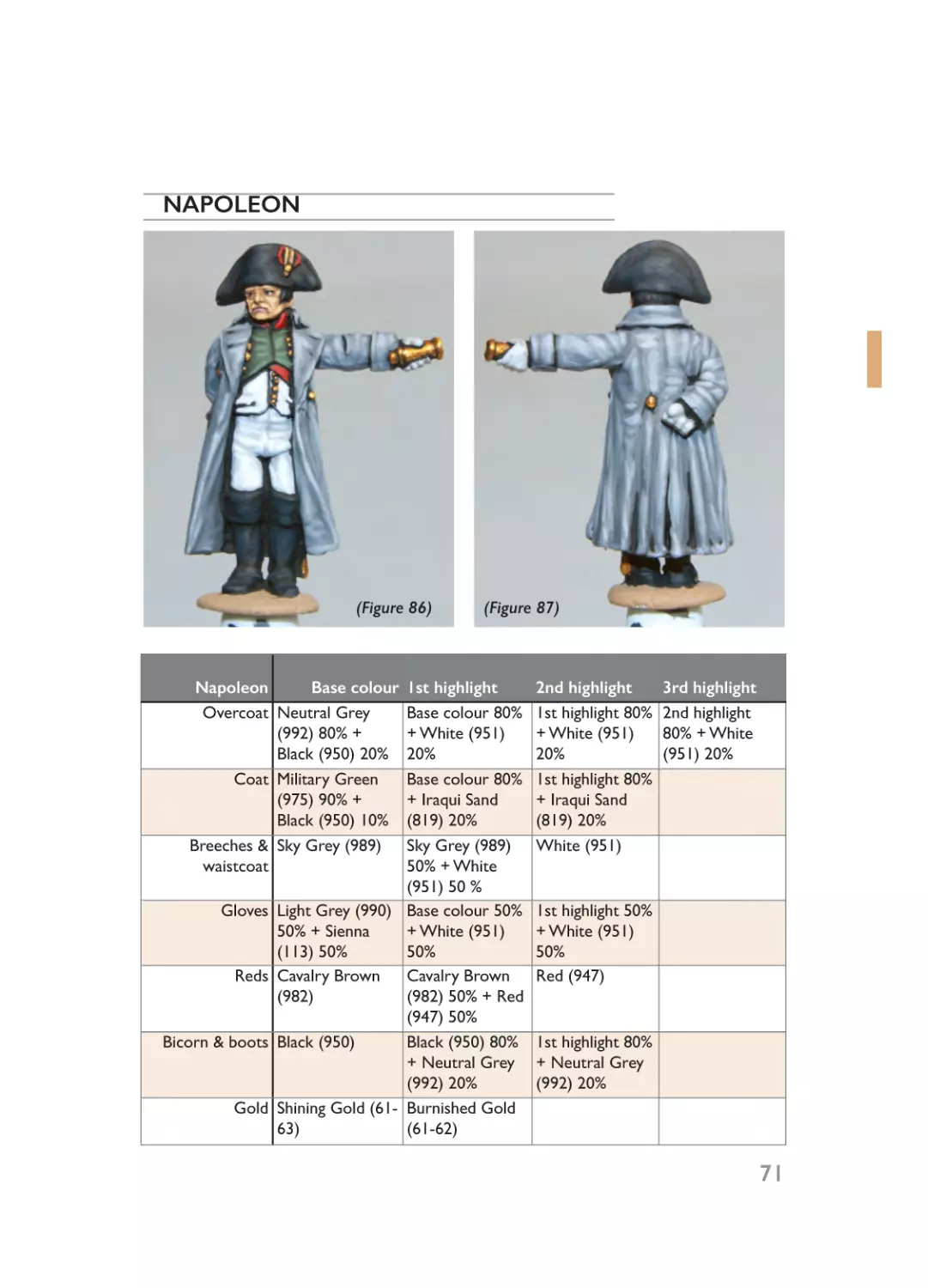
NAPOLEON
(Figure 86)
Napoleon
Base colour
Overcoat Neutral Grey
(992) 80% +
Black (950) 20%
Coat Military Green
(975) 90% +
Black (950) 10%
Breeches & Sky Grey (989)
waistcoat
(Figure 87)
1st highlight
Base colour 80%
+ White (951)
20%
Base colour 80%
+ Iraqui Sand
(819) 20%
Sky Grey (989)
50% + White
(951) 50 %
Gloves Light Grey (990) Base colour 50%
50% + Sienna
+ White (951)
(113) 50%
50%
Reds Cavalry Brown
Cavalry Brown
(982)
(982) 50% + Red
(947) 50%
Bicorn & boots Black (950)
Black (950) 80%
+ Neutral Grey
(992) 20%
Gold Shining Gold (61- Burnished Gold
63)
(61-62)
2nd highlight
1st highlight 80%
+ White (951)
20%
1st highlight 80%
+ Iraqui Sand
(819) 20%
White (951)
3rd highlight
2nd highlight
80% + White
(951) 20%
1st highlight 50%
+ White (951)
50%
Red (947)
1st highlight 80%
+ Neutral Grey
(992) 20%
71
06- Ch06_Layout 1 20/01/2015 19:04 Page 72
NEY
(Figure 88)
(Figure 89)
Ney
Base colour
Coat Prussian Blue
(965) 80% +
Black (950) 20%
Gold thread Beige Brown
(875)
1st highlight
Prussian Blue
(965)
2nd highlight
3rd highlight
Prussian Blue
(965) 80% +
White (951) 20%
Raw Sienna (113) Yellow Ochre
Burnished Gold
(913)
(61-62)
Breeches Light Grey (990) Light Grey (990)
50% + White
(951) 50 %
Gloves Light Grey (990) Base colour 50%
50% + Sienna
+ White (951)
(113) 50%
50%
Band Cavalry Brown
Cavalry Brown
(982)
(982) 50% + Red
(947) 50%
Boots & sword Black (950)
Black (950) 80%
scabbard
+ Neutral Grey
(992) 20%
Silver Chainmail
Mithril Silver (61(61-56)
55)
Gold Shining Gold
Burnished Gold
(61-63)
(61-62)
72
(Figure 90)
1st highlight 10%
+ White (951)
90%
1st highlight 50%
+ White (951)
50%
Red (947)
1st highlight 80%
+ Neutral Grey
(992) 20%
06- Ch06_Layout 1 20/01/2015 19:04 Page 73
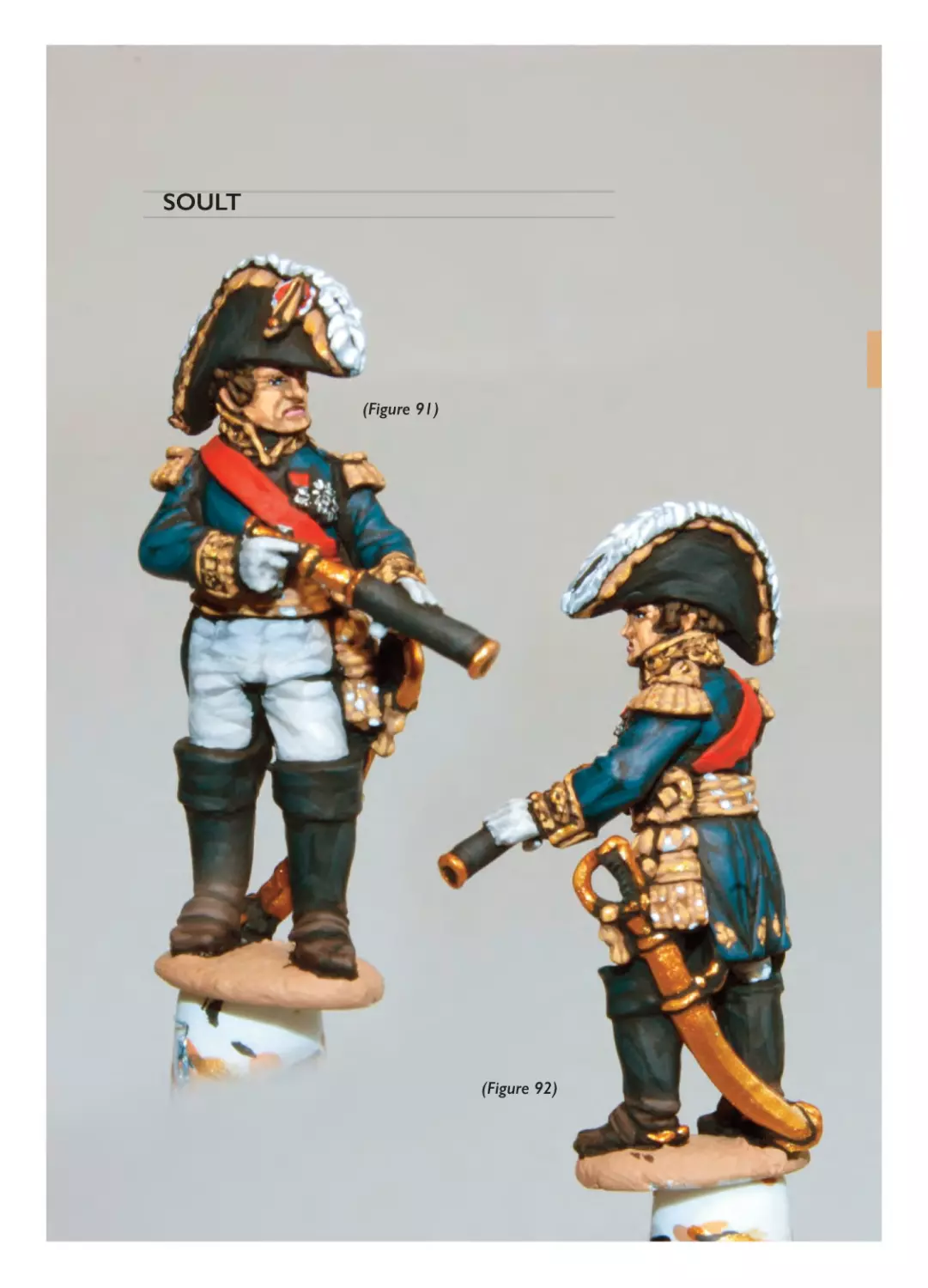
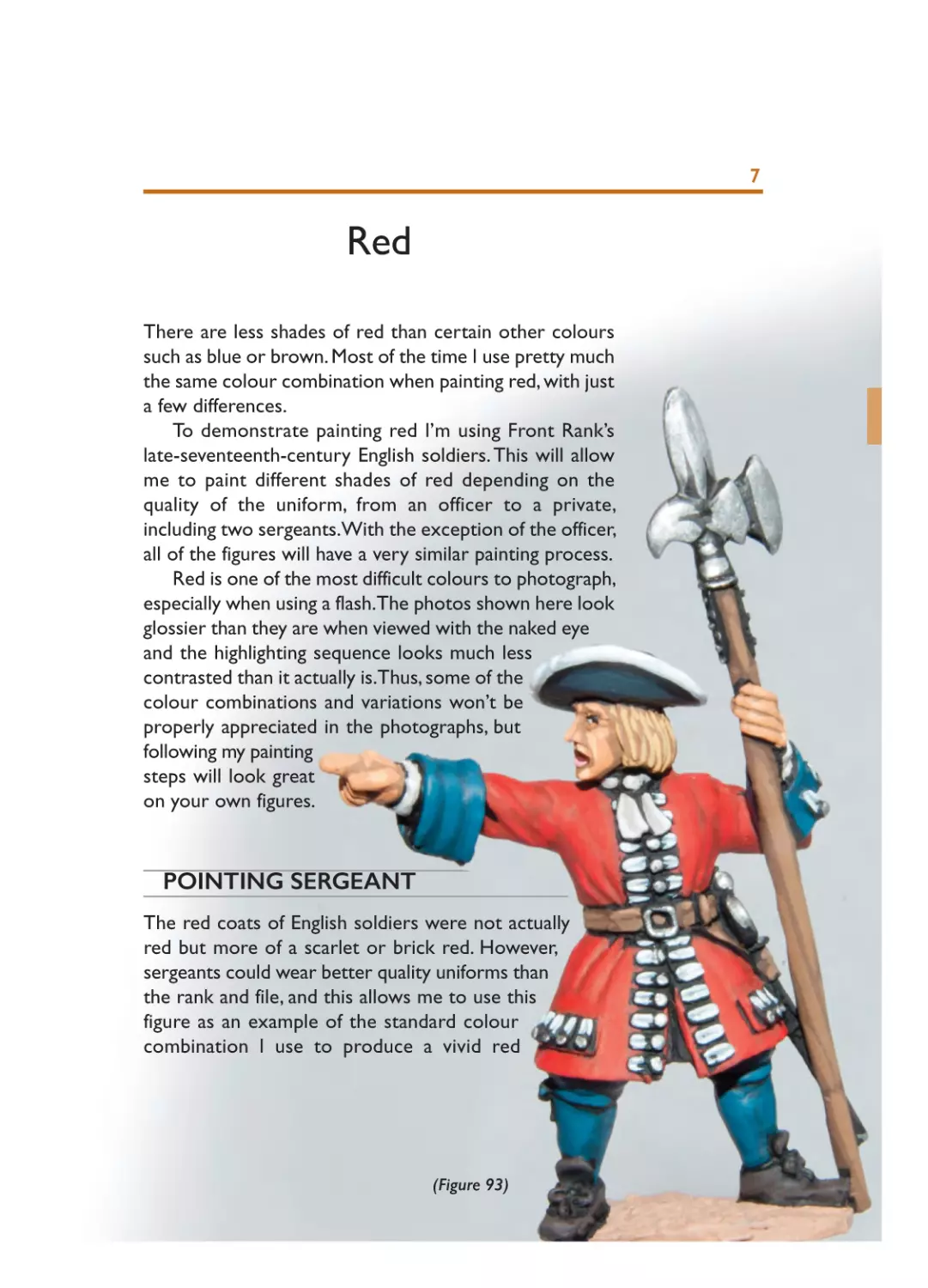
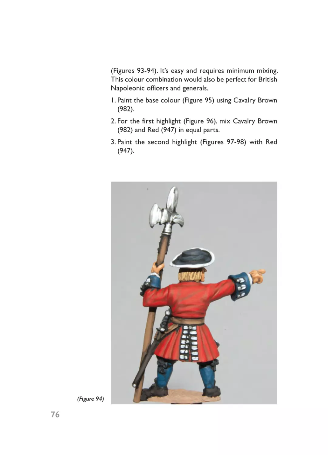
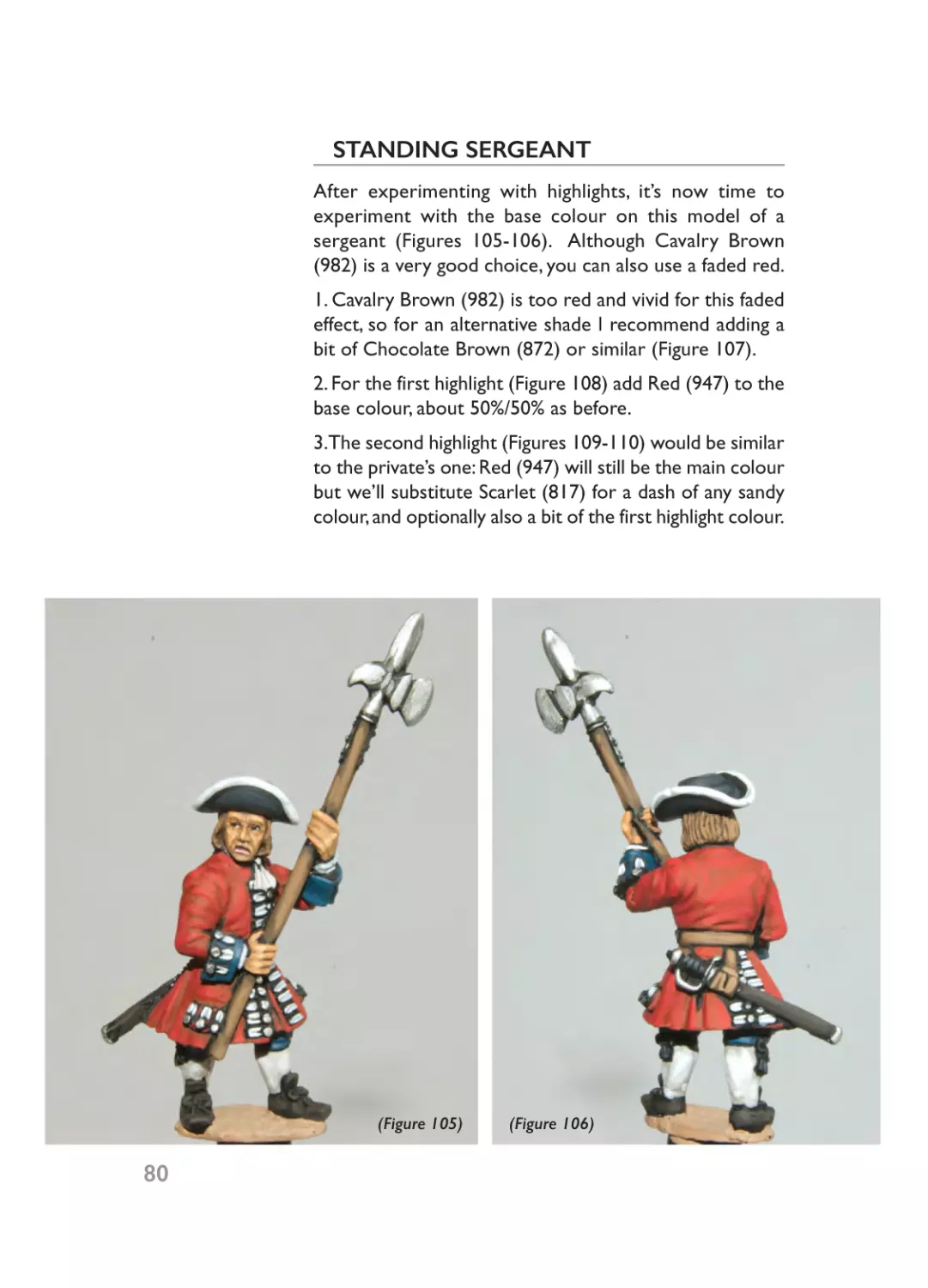
SOULT
(Figure 91)
(Figure 92)
06- Ch06_Layout 1 20/01/2015 19:04 Page 74
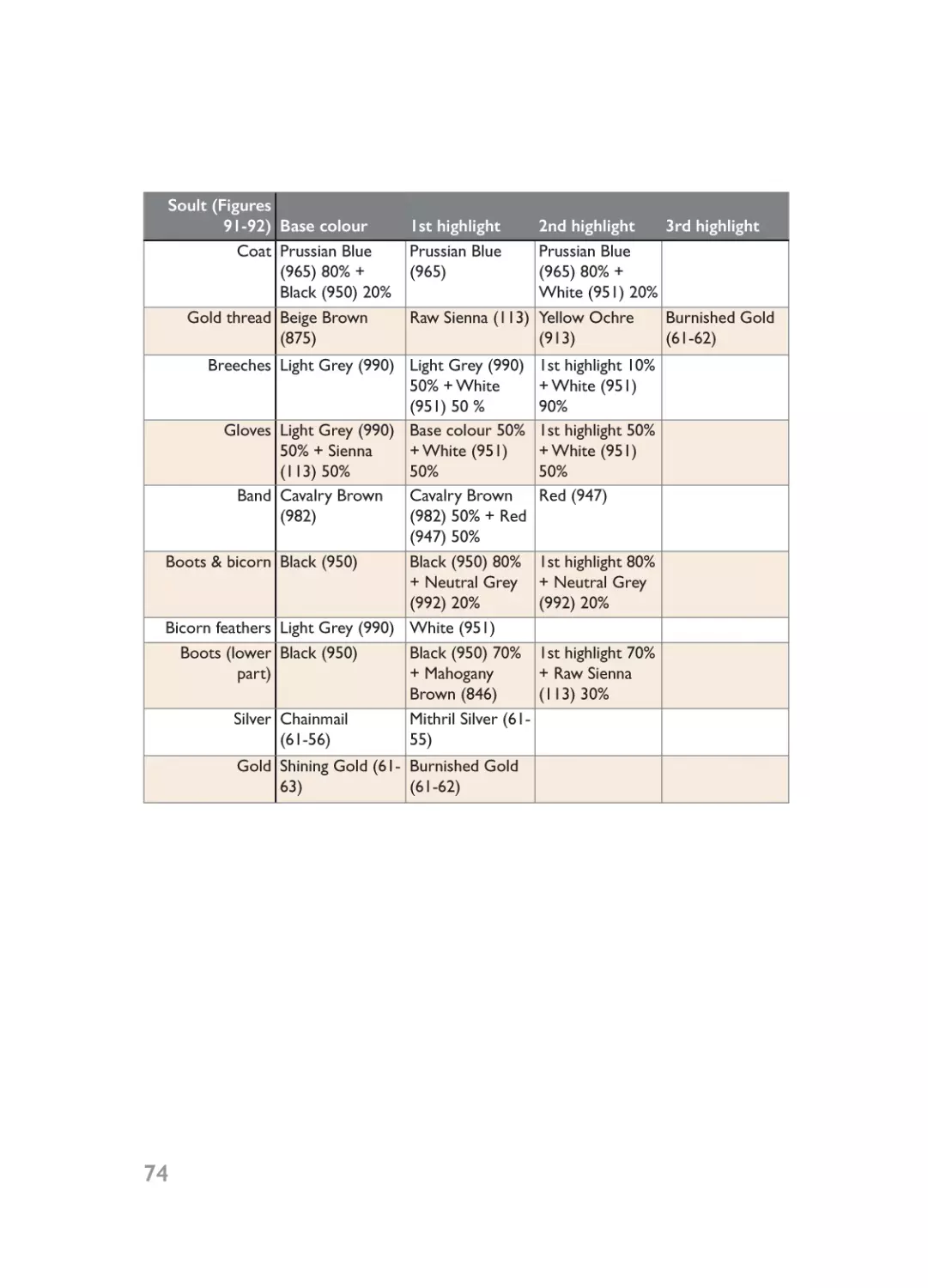
Soult (Figures
91-92) Base colour
Coat Prussian Blue
(965) 80% +
Black (950) 20%
Gold thread Beige Brown
(875)
1st highlight
Prussian Blue
(965)
2nd highlight
3rd highlight
Prussian Blue
(965) 80% +
White (951) 20%
Raw Sienna (113) Yellow Ochre
Burnished Gold
(913)
(61-62)
Breeches Light Grey (990) Light Grey (990)
50% + White
(951) 50 %
Gloves Light Grey (990) Base colour 50%
50% + Sienna
+ White (951)
(113) 50%
50%
Band Cavalry Brown
Cavalry Brown
(982)
(982) 50% + Red
(947) 50%
Boots & bicorn Black (950)
Black (950) 80%
+ Neutral Grey
(992) 20%
Bicorn feathers Light Grey (990) White (951)
Boots (lower Black (950)
Black (950) 70%
part)
+ Mahogany
Brown (846)
Silver Chainmail
Mithril Silver (61(61-56)
55)
Gold Shining Gold (61- Burnished Gold
63)
(61-62)
74
1st highlight 10%
+ White (951)
90%
1st highlight 50%
+ White (951)
50%
Red (947)
1st highlight 80%
+ Neutral Grey
(992) 20%
1st highlight 70%
+ Raw Sienna
(113) 30%
07- Ch07_Layout 1 20/01/2015 19:06 Page 75
7
Red
There are less shades of red than certain other colours
such as blue or brown. Most of the time I use pretty much
the same colour combination when painting red, with just
a few differences.
To demonstrate painting red I’m using Front Rank’s
late-seventeenth-century English soldiers. This will allow
me to paint different shades of red depending on the
quality of the uniform, from an officer to a private,
including two sergeants.With the exception of the officer,
all of the figures will have a very similar painting process.
Red is one of the most difficult colours to photograph,
especially when using a flash.The photos shown here look
glossier than they are when viewed with the naked eye
and the highlighting sequence looks much less
contrasted than it actually is.Thus, some of the
colour combinations and variations won’t be
properly appreciated in the photographs, but
following my painting
steps will look great
on your own figures.
POINTING SERGEANT
The red coats of English soldiers were not actually
red but more of a scarlet or brick red. However,
sergeants could wear better quality uniforms than
the rank and file, and this allows me to use this
figure as an example of the standard colour
combination I use to produce a vivid red
(Figure 93)
07- Ch07_Layout 1 20/01/2015 19:06 Page 76
(Figures 93-94). It’s easy and requires minimum mixing.
This colour combination would also be perfect for British
Napoleonic officers and generals.
1. Paint the base colour (Figure 95) using Cavalry Brown
(982).
2. For the first highlight (Figure 96), mix Cavalry Brown
(982) and Red (947) in equal parts.
3. Paint the second highlight (Figures 97-98) with Red
(947).
76
(Figure 94)
07- Ch07_Layout 1 20/01/2015 19:06 Page 77
(Figure 95)
(Figure 96)
(Figure 97)
Sergeant Base colour
Coat Cavalry Brown (982)
Facings, breeches & Prussian Blue (965)
stockings 80% + Black (950)
20%
Hat Black (950)
Shoes & sword Black (950)
scabbard
(Figure 98)
1st highlight
Cavalry Brown (982)
50% + Red (947) 50%
Prussian Blue (965)
Black (950) 80% +
Neutral Grey (992)
20%
Black (950) 70% +
Mahogany Brown
(846)
2nd highlight
Red (947)
Prussian Blue (965)
80% + White (951)
20%
1st highlight 80% +
Neutral Grey (992)
20%
1st highlight 70% +
Raw Sienna (113)
30%
77
07- Ch07_Layout 1 20/01/2015 19:06 Page 78
MARCHING PRIVATE
Once we’ve mastered the standard red shown above, let’s
start to apply a series of variations starting with the usual
colour combination I use for English or British redcoats
of any period. We’ll use the marching private as an
example (Figures 99-100).
1. The base colour (Figure 101) and first highlight (Figure
102) are exactly the same as in the previous example, but
the second highlight will make the difference.
2. As before, the second highlight would be Red (947), but
we’ll add some Scarlet (817) to give it an orange effect
(Figures 103-104). If this is too vivid for your taste or you
would like to obtain a more realistic final effect, add a little
of the remaining paint from the first highlight if still fresh,
or a pinch of Cavalry Brown (982) if not.
(Figure 99)
78
(Figure 100)
07- Ch07_Layout 1 20/01/2015 19:06 Page 79
(Figure 102)
(Figure 101)
(Figure 104)
(Figure 103)
Private Base colour
Coat Cavalry Brown (982)
Facings & stockings Prussian Blue (965)
80% + Black (950)
20%
Breeches & belts Chocolate Brown
(872)
Hat & bayonet Black (950)
scabbard
Shoes & sword Black (950)
scabbard
1st highlight
Cavalry Brown (982)
50% + Red (947) 50%
Prussian Blue (965)
Chocolate Brown
(872) 50% + Beige
Brown (875) 50%
Black (950) 80% +
Neutral Grey (992)
20%
Black (950) 70% +
Mahogany Brown
(846)
2nd highlight
1st highlight 10% +
Red (947) 80% +
Scarlet (817) 10%
Prussian Blue (965)
80% + White (951)
20%
Beige Brown (875)
1st highlight 80% +
Neutral Grey (992)
20%
1st highlight 70% +
Raw Sienna (113)
30%
79
07- Ch07_Layout 1 20/01/2015 19:06 Page 80
STANDING SERGEANT
After experimenting with highlights, it’s now time to
experiment with the base colour on this model of a
sergeant (Figures 105-106). Although Cavalry Brown
(982) is a very good choice, you can also use a faded red.
1. Cavalry Brown (982) is too red and vivid for this faded
effect, so for an alternative shade I recommend adding a
bit of Chocolate Brown (872) or similar (Figure 107).
2. For the first highlight (Figure 108) add Red (947) to the
base colour, about 50%/50% as before.
3.The second highlight (Figures 109-110) would be similar
to the private’s one: Red (947) will still be the main colour
but we’ll substitute Scarlet (817) for a dash of any sandy
colour, and optionally also a bit of the first highlight colour.
80
(Figure 105)
(Figure 106)
07- Ch07_Layout 1 20/01/2015 19:06 Page 81
(Figure 107)
(Figure 108)
(Figure 109)
(Figure 110)
Sergeant Base colour
Coat Cavalry Brown (982)+
Chocolate Brown
(872)
Facings & breeches Prussian Blue (965)
80% + Black (950)
20%
Stockings Light Grey (990) 50%
+ Sienna (113) 50%
Hat & bayonet Black (950)
scabbard
Shoes & sword Black (950)
scabbard
1st highlight
Base colour 50% +
Red (947) 50%
Base colour 50% +
White (951) 50%
2nd highlight
1st highlight 10% +
Red (947) 80% +
Iraqi Sand (819) 10%
Prussian Blue (965)
80% + White (951)
20%
1st highlight 50% +
White (951) 50%
Black (950) 80% +
Neutral Grey (992)
20%
Black (950) 70% +
Mahogany Brown
(846)
1st highlight 80% +
Neutral Grey (992)
20%
1st highlight 70% +
Raw Sienna (113)
30%
Prussian Blue (965)
81
07- Ch07_Layout 1 20/01/2015 19:06 Page 82
OFFICER
In the late seventeenth century, officers wore very richly
coloured uniforms with gold or silver embroidery. Instead
of the common red coats of the rank and file, officers
wore crimson clothes, sashes, bands and even had gloves
and sword scabbards in that colour (Figures 111-112).
Over time English (and later on, British) officers adopted
red coats like their men (but better quality ones!), but
they kept the crimson sashes as a reminiscence of these
early uniforms. Crimson is not an easy-to-paint colour and
requires some mixing. On the other hand, mixing gives us
many options to get different shades.
1. As a start, instead of using just Cavalry Brown (982) as
base colour, which we do as a general rule when painting
red, we’ll mix it with a bit of Hull Red (985).That way we’ll
get a dark reddish brown as a starting point (Figure 113).
2. For the first highlight we’ll add either Red (947) to get
a conventional dark red shade, Sunset Red (802) to get
a rosier shade, or even better, both (Figure 114).
3. For the second highlight we’ll repeat the procedure,
this time adding Sunset Red (which gives a more vivid
final result), White (which is paler but probably more
realistic) or both. As usual, adapt these combinations
to your own personal preference (Figure 115).
(Figure 111)
(Figure 112)
07- Ch07_Layout 1 20/01/2015 19:06 Page 83
(Figure 113)
Officer Base colour
Coat Cavalry Brown
(982) 80% + Hull
Red (985) 20%
Gold thread Beige Brown
(875)
Breeches & Neutral Grey
stockings (992) + Black
(950)
Hat, shoes & Black (950)
sword scabbard
(Figure 114)
1st highlight
Base colour 50%
+ Sunset Red
(802)/Red (947)
50%
Raw Sienna (113)
Base Colour +
White (951)
2nd highlight
1st highlight +
Sunset Red
(802)/White
(951)
Yellow Ochre
(913)
1st Highlight +
White (951)
Black (950) 80% + 1st highlight 80%
Neutral Grey
+ Neutral Grey
(992) 20%
(992) 20%
(Figure 115)
3rd highlight
Burnished Gold
(61-62)
83
07- Ch07_Layout 1 20/01/2015 19:06 Page 84
(Figure 116)
84
08- Ch08_Layout 1 20/01/2015 19:08 Page 85
8
Brown
Brown is one of those colours you can’t avoid. Clothes,
wood, leather, furs … there’s always something brown to
paint. Actually, I should say ‘browns’ rather than ‘brown’
as this specific colour has many different shades, from
chocolate to buff, from reddish to greyish.
In order to show as many colour combinations as
possible, I’ve chosen a Warlord Games’ Thirty Years War
gun with its crew (Figure 116). In that war the use of
uniforms was limited to selected units (such as the
Swedish Black, Yellow and Blue regiments). As a
consequence, brown clothes were common amongst the
armies’ ranks of civilians and soldiers. As we are painting
figures for wargaming we will employ the standard
approach of two highlights over a base colour.
In general terms there are two groups – or families –
of shades of brown:
PAINTING
TIP
Beige: such as Chocolate Brown, Beige Brown and Tan
Yellow.
Red: such as Hull Red, Cavalry Brown, Mahogany Brown
and Saddle Brown.
Colours within the same brown family mix well together (like
Chocolate Brown with Beige Brown for furs or clothes, or
Hull Red and Mahogany Brown for muskets) to get a very
natural sequence of highlights, but combinations between
colours of both families of browns and even other colours
such as black or grey are also possible in order to achieve
different shades. Finally, it’s not only the base colour but also
the highlight colour that determines the final result: the
same base colour mixed with Tan Yellow or White will throw
a quite different look!
85
08- Ch08_Layout 1 20/01/2015 19:08 Page 86
OFFICER
For the officer (Figures 117-118), who wears a better cut
of cloth than his men, I choose Chocolate Brown (872)
as a base colour (Figure 119), mixed progressively with
Beige Brown (875) for the first highlight (Figure 120) and
second highlight (Figures 121-122). These two colours of
the same family marry very well and produce a smart and
elegant brown. This is the colour combination I use most
often for brown clothes.
The gloves were painted buff using the beige family as
well. However, the leather belts were painted using the
reddish family of colours. In both cases two highlights
were painted, although one highlight would do well
enough for belts.
(Figure 117)
(Figure 118)
08- Ch08_Layout 1 20/01/2015 19:08 Page 87
(Figure 119)
(Figure 120)
(Figure 121)
(Figure 122)
Officer Base colour
Coat & breeches Chocolate Brown
(872)
Gloves Beige Brown (875)
Belts Hull Red (985)
1st highlight
Chocolate Brown
(872) 50% + Beige
Brown (875) 50%
2nd highlight
1st highlight 10 % +
Beige Brown (875)
90% or plain Beige
Brown (875)
Beige Brown (875)
1st highlight 50% +
50% + Iraqi Sand (819) Iraqi Sand (819) 50%
50%
Saddle Brown (940)
Saddle Brown (940)
70% + Tan Yellow
(912) 30%
87
08- Ch08_Layout 1 20/01/2015 19:08 Page 88
(Figure 123)
(Figure 124)
MASTER GUNNER
As a specialist, the richness of his clothes is a sign of his
status (Figures 123-124). For the master gunner I decided
to combine two colours from different families: Beige
Brown (875) with a pinch of Cavalry Brown (982) to get
a vivid tone for the base colour (Figure 125), progressively
mixed with Tan Yellow (912) for the first highlight (Figure
126) and second highlight (Figures 127-128).
Master gunner Base colour
1st highlight
2nd highlight
Coat & breeches Beige Brown (875)
Base colour 70% + Tan 1st highlight 70% +
80% + Cavalry Brown Yellow (912) 30%
Tan Yellow (912) 30%
(982) 20%
Belts Hull Red (985)
88
Saddle Brown (940)
Saddle Brown (940)
70% + Tan Yellow
(912) 30%
08- Ch08_Layout 1 20/01/2015 19:08 Page 89
(Figure 125)
(Figure 126)
(Figure 127)
(Figure 128)
89
08- Ch08_Layout 1 20/01/2015 19:08 Page 90
Artilleryman with portfire
This soldier wears a buff coat, a very popular semi-rigid
jacket used both as clothing and light armour, and
reddish brown breeches (Figures 129-130). The
base colours (Figure 131) will be Beige Brown
(875) and Hull Red (985) respectively,
progressively mixed with Tan Yellow (912) and
Cavalry Brown (982) for the first highlight
(Figure 132) and second highlight (Figures 133134). The original figure’s headgear was an
English montero cap, which was out of place
in the Thirty Years War European context, so
the cap was easily swapped for a Germanstyle morion helmet.
(Figure 129)
90
(Figure 130)
08- Ch08_Layout 1 20/01/2015 19:08 Page 91
(Figure 131)
(Figure 132)
(Figure 133)
(Figure 134)
Artilleryman Base colour
Buff coat Beige Brown (875)
Breeches Hull Red (985)
Boot-hose Chocolate Brown
(872)
1st highlight
Beige Brown (875)
70% + Tan Yellow (912)
30%
Hull Red (985) 50% +
Cavalry Brown (982)
50%
Chocolate Brown
(872) 50% + Beige
Brown (875) 50%
2nd highlight
1st highlight 70% +
Tan Yellow (912) 30%
1st highlight 10% +
Cavalry Brown (982)
90%
1st highlight 10% +
Beige Brown (875)
90% or plain Beige
Brown (875)
91
08- Ch08_Layout 1 20/01/2015 19:08 Page 92
Artilleryman with sponge staff and ramrod
The last two artillerymen are poor fellows who were in
charge of the harder tasks, as their role is closer to a
labourer than a gunner (Figures 135-136). To reflect their
lowly rank the base colours (Figure 137) of both the
waistcoat and the breeches of the first figure were mixed
with a bit of grey to get a faded look, and White (951) was
used in highlights (Figures 138-140) to strengthen this
greyish effect.
(Figure 135)
(Figure 136)
08- Ch08_Layout 1 20/01/2015 19:08 Page 93
(Figure 137)
(Figure 138)
(Figure 139)
(Figure 140)
Artilleryman Base colour
Waistcoat Chocolate Brown
(872) 80% + Neutral
Grey (992) 20%
Breeches Beige Brown (875)
90% + Neutral Grey
(992) 10%
Belt Hull Red (985)
1st highlight
Base colour 70% +
White (951) 30%
2nd highlight
1st highlight 70% +
White (951) 30%
Base colour 70% +
White (951) 30%
1st highlight 70% +
White (951) 30%
Saddle Brown (940)
Saddle Brown (940)
70% + Tan Yellow
(912) 30%
93
08- Ch08_Layout 1 20/01/2015 19:08 Page 94
Artilleryman with barrel
We’ll take advantage of this figure to paint another two
different colour combinations, a red leather waistcoat and
dark greyish brown breeches (Figures 141-142). For the
former I decided to mix the usual Hull Red (985) with
Red Leather (818) to smooth it, but either Saddle Brown
(940) or Mahogany Brown (846) would work as well as
the base colour (Figure 143).We’ll add more Red Leather
(818) to the previous mix for the first highlight (Figure
144) and Tan Yellow (912) for the second highlight (Figures
145-146).
(Figure 142)
(Figure 141)
08- Ch08_Layout 1 20/01/2015 19:08 Page 95
(Figure 143)
(Figure 144)
(Figure 145)
(Figure 146)
Artilleryman Base colour
Waistcoat Hull Red (985) 80% +
Red Leather (818)
20%
Breeches Chocolate Brown
(872) 90% + Black
(950) 10%
Bag Chocolate Brown
(872)
1st highlight
Base colour 50% +
Red Leather (818)
50%
2nd highlight
1st highlight 80% +
Tan Yellow (912) 20%
Base colour 80% +
White (951) 20%
1st highlight 80% +
White (951) 20%
Chocolate Brown
(872) 80% + White
(951) 20%
1st highlight 80% +
White (951) 20%
95
08- Ch08_Layout 1 20/01/2015 19:08 Page 96
(Figure 147)
(Figure 148)
(Figure 149)
(Figure 150)
08- Ch08_Layout 1 20/01/2015 19:08 Page 97
GUN AND EQUIPMENT
Besides the gun (Figure 147), this Warlord Games set
came with a gunpowder barrel and an ammunition box,
and this is perfect to show three different colour
combinations to represent unpainted wood. Although all
these pieces have relatively plain surfaces, I decided to
paint two highlights using the drybrush technique. As
mentioned earlier colours fade a little with this technique,
so the contrast between base colour and highlights must
be greater than with regular highlighting (Figures 148151).
Regarding the metals, the technique I use to paint
bronze guns is very easy, but involves more steps than
usual, and requires some drying time in between steps.
Citadel Colour references are going to be used as, in my (Figure 151)
Wood Base colour
Gun carriage Hull Red (985)
Gunpowder barrel Beige Brown (875)
Ammunition box Chocolate Brown
(872)
1st highlight
Mahogany Brown
(846) db
2nd highlight
Mahogany Brown
(846) 70% + Tan
Yellow (912) 30% db
Tan Yellow (912) db
Beige Brown (875)
50% + Tan Yellow (912)
50% db
Chocolate Brown
1st highlight 70% +
(872) 70% + White
White (951) 30% db
(951) 30% db
97
08- Ch08_Layout 1 20/01/2015 19:08 Page 98
(Figure 152)
opinion, this company’s metallic paints are superior to
Vallejo’s. I follow a five step process:
1. Base colour: Paint the gun barrel with several layers
of watered down Citadel Shining Gold (61-63) to get a
smooth result: we don’t want a rough or lumpy finish!
Repeat until the colour looks homogeneous and the
primer cannot be seen. Paint the gun carriage’s iron
reinforcements (Figure 152).
(Figure 153)
98
08- Ch08_Layout 1 20/01/2015 19:08 Page 99
(Figure 154)
2. Apply a wash either of a watered mix of Black (950)
plus Hull Red (985) or any dark patina only on the muzzle,
those parts of the barrel with some high relief (such as
around the bands of the gun) and to the carriage’s iron
reinforcements (Figure 153). Let this dry (this won’t take
long if you gave a the gun a wash of watered down paint,
but will take longer if you used a patina).
3. Repaint the upper parts of high relief, leaving the
(Figure 155)
99
08- Ch08_Layout 1 20/01/2015 19:08 Page 100
dark wash/patina in the recesses.You have two options for
the gun’s muzzle: don’t repaint it to leave a blackened
effect for a well-used gun (as I’ve done), or repaint it for
cleaner and brighter result (Figure 154)
4. Brass guns would loose their original brightness
pretty quickly on campaign, so I varnish the barrel to give
it a matt effect. Let this dry for a couple of hours or so
(Figure 155)
5. Finally, give the barrel a slight drybrush of a lighter
gilded colour such as Citadel Burnished Gold to get a vivid
effect. A drybrush of Gunmetal Grey could be also applied
to the reinforcements, although I decided not to do it as
I like them just as they are: dark and matt cast iron (Figure
156).
Metals Base colour
Bronze gun Shining Gold
(61-63)
Iron fittings Gunmetal
Grey (863)
(Figure 156)
Wash
Black (951) +
Hull Brown
(985) w or
patina
Watered Black
(951) w or
patina
Repaint
Shining Gold
(61-63)
Varnish
Marabú’s
Mattlack
Drybrush
Burnished
Gold (61-62)
db
Gunmetal
Grey (863) db
09- Ch09_Layout 1 20/01/2015 19:11 Page 101
9
Grey
Like brown, grey is a very useful colour that is easily mixed
to get a wide variety of shades, from darker to lighter and
from pure grey to brownish. Many military units chose
grey for their uniforms, from English Civil War Scots to
First Carlist War Carlists, and it’s also a common colour
for blankets, greatcoats, and other kit. However, the army
chosen to show how to paint this peculiar colour was
pretty evident: Perry Miniatures’ American Civil War
Confederates (Figure 157).
PAINTING
TIP
Unlike other colours you don’t need to have a wide variety
of greys. I do most of my painting with Neutral Grey (992),
which can easily be darkened or lightened by adding black
or white. An extra shade of a lighter grey (mainly to be used
as base colour for whites) and a blue grey would be enough.
(Figure 157)
09- Ch09_Layout 1 20/01/2015 19:11 Page 102
PRIVATE IN SHELL JACKET
The shell jacket was an almost universal garment in
Confederate armies by the mid-war, when early issue
frock coats were worn out (and these jackets were
cheaper to manufacture!).This soldier is relatively well
equipped, wearing the grey shell jacket, regulation blue
grey trousers and a forage cap as a headdress.
However, instead of the usual black leather belts and
cartridge box he has brown leather equipment. As you
will see, adding some brown to the grey makes it look
more realistic. For the trousers, I chose French Mirage
Blue (900) as it’s a bit lighter and more vivid than Grey
Blue (943). However, if you don’t want to buy both
colours just use the Grey Blue (943) and mix it with
black.
(Figure 158)
102
(Figure 159)
09- Ch09_Layout 1 20/01/2015 19:11 Page 103
Private in shell
jacket Base colour
Shell jacket & forage Neutral Grey (992)
cap 80% + Chocolate
Brown (872) 20%
Trousers French Mirage Blue
(900) 90% + Black
(950) 10%
Belts & cartridge box Hull Red (985)
Bread bag Black (951)
1st highlight
Base colour 80% +
White (951) 20%
2nd highlight
1st highlight 80% +
White (951) 20%
French Mirage Blue
(900) 80% + White
(951) 20%
Mahogany Brown
(846)
1st highlight 70% +
White (951) 30%
Black (951) 80% +
White (951) 20%
(Figure 160)
Mahogany Brown
(846) 70% + Tan
Yellow (912) 30%
1st highlight 80% +
White (951) 20%
103
09- Ch09_Layout 1 20/01/2015 19:11 Page 104
PRIVATE IN BATTLESHIRT
When shell jackets weren’t available, grey shirts were
customized as a substitute. This was very common at the
beginning of the war. As the shirt was a thinner garment
than the coat I decided to paint in a lighter colour, by not
adding brown. On the other hand, for trousers and cap I
used a darker version of the same grey.
Private in battleshirt Base colour
Battleshirt Neutral Grey (992)
1st highlight
Neutral Grey (992)
70% + White (951)
30%
Base colour 80% +
White (951) 20%
2nd highlight
1st highlight 70% +
White (951) 30%
Black (951) 70% +
Mahogany Brown
(846) 30%
Bread bag Light Grey (990) 50% Base colour 50% +
+ Raw Sienna (113) White (951) 50%
50%
1st highlight 70% +
Mahogany Brown
(846) 30%
1st highlight 50% +
White (951) 50%
Trousers & cap Neutral Grey (992)
80% + Black (951)
20%
Belts & cartridge box Black (951)
(Figure 161)
104
(Figure 162)
1st highlight 80% +
White (951) 20%
(Figure 163)
09- Ch09_Layout 1 20/01/2015 19:11 Page 105
PRIVATE IN CIVILIAN SHIRT
Sometimes Confederate soldiers had to provide their
own equipment. This private is wearing civilian clothes,
from his shirt and trousers to his hat. Civilian shirts could
be white, grey, red or checked: I’ve chosen the latter for
this figure. For this kind of work I like to use a common
base colour for the whole garment. After drawing black
thin lines for the checks, highlights are added using
different colours.
Private in civilian
shirt Base colour
Shirt Hull Red (985)
Trousers Chocolate Brown
(872)
1st highlight
Mahogany Brown
(846)/Cavalry Brown
(982)
Chocolate Brown
(872) 80% + White
(951) 20%
Base colour 70% +
White (951) 30%
Hat Neutral Grey (992)
50% + Raw Sienna
(113) 50%
Bread bag Light Grey (990) 50% Base colour 50% +
+ Raw Sienna (113) White (951) 50%
50%
(Figure 164)
(Figure 165)
2nd highlight
Chosen 1st highlight
70% + Tan Yellow
(912) 30%
1st highlight 80% +
White (951) 20%
1st highlight 70% +
White (951) 30%
1st highlight 50% +
White (951) 50%
(Figure 166)
105
09- Ch09_Layout 1 20/01/2015 19:11 Page 106
OFFICER IN FROCK COAT
When grey dye was not available, the Confederate army
started to use a butternut colour, especially for officers’
uniforms. Although this is not properly grey, I think a
butternut colour scheme is useful to include for
Confederate figures. In this case it is a frock coat faced in
the sky blue characteristic of the infantry. For the
trousers, this officer wears the regulation blue grey, this
time painted using the Grey Blue (943) instead of the
French Mirage Blue (900) to achieve a more vivid shade.
For gold embroidery see the previous chapter.
Officer in frock coat Base colour
Frock coat Beige Brown (875)
80% + Hull Red (985)
20%
Facings Grey Blue (943) 70%
+ Prussian Blue (965)
30%
Trousers Grey Blue (943) 80%
+ Black (951) 20%
Belts Black (951)
106
1st highlight
2nd highlight
Base colour 70% +
1st highlight 70% +
Tan Yellow (912) 30% Tan Yellow (912) 30%
Base colour 70% +
White (951) 30%
1st highlight 70% +
White (951) 30%
Grey Blue (943)
Grey Blue (943) 70%
+ White (951) 30%
Black (951) 80% +
White (951) 20%
1st highlight 80% +
White (951) 20%
09- Ch09_Layout 1 20/01/2015 19:11 Page 107
(Figure 167)
(Figure 168)
(Figure 169)
09- Ch09_Layout 1 20/01/2015 19:11 Page 108
(Figure 170)
108
10- Ch10_Layout 1 20/01/2015 19:16 Page 109
10
Green
Green is a very common military colour, especially since
the First World War. Prior to that, many units also wore
green, including eighteenth-century Russian armies,
Napoleonic chasseurs and British Riflemen and American
Civil War sharpshooters. However, in order to show as
many shades as possible using only a few figures, I’ve
decided to paint three Lord of the Rings Rangers of Minas
Tirith made by Games Workshop (Figure 170).
PAINTING
TIP
As we’ll see, green is a very versatile colour. From the same
base colour we can make multiple shades depending on the
colour chosen for the highlights. Most of the time I use a
sand colour for the highlights – Tan Yellow (912), Iraqi Sand
(819) or Buff (976) – and this results in a very realistic finish.
However, we could also mix with white (to get a paler or
pastel effect), with yellow (for a vivid finish) or even with
flesh-coloured paint.
(Figure 171)
(Figure 172)
10- Ch10_Layout 1 20/01/2015 19:16 Page 110
RANGER ONE
Let’s start with two versions of the classic Military Green
(975). For the cloak we will paint a ‘Napoleonic’ green,
mixing the Military Green (975) with Black (950) for the
base colour and adding a sandy colour for the highlights.
This also works well for British Riflemen, Napoleonic
Russians and Bergan Sharpshooters. However, for the
tunic we’ll mix the Military Green (975) with an Olive
Green (850) for the highlights, creating a very different
final result. Military Green (975) is a very versatile colour;
besides the combinations mentioned above, it marries well
with white, yellow or flesh.
Ranger One Base colour
Cloak Military Green (975)
80% + Black (950)
20%
Tunic Military Green (975)
1st highlight
Base colour 80% + Tan
Yellow (912) 20%
2nd highlight
1st highlight 80% + Tan
Yellow (912) 20%
Medium Olive (850)
Trousers Chocolate Brown
(872)
Military Green (975)
50% + Medium Olive
(850) 50%
Chocolate Brown (872)
50% + Beige Brown
(875) 50%
Beige Brown (875) 70%
+ Tan Yellow (912) 30%
Armour & shoes Beige Brown (875)
Leather bracelets, Hull Red (985)
belts & quiver
110
1st highlight 10% +
Beige Brown (875)
90%
Beige Brown (875)
70% + Tan Yellow (912)
30%
Mahogany Brown (846) Mahogany Brown
(846) 70% + Tan Yellow
(912) 30%
10- Ch10_Layout 1 20/01/2015 19:16 Page 111
(Figure 173)
(Figure 174)
(Figure 175)
(Figure 176)
(Figure 177)
(Figure 178)
111
10- Ch10_Layout 1 20/01/2015 19:16 Page 112
RANGER TWO
Is this a Ranger or Vasily Zaytsev? He looks like a Second
World War Russian sniper, right? For this figure we’ll paint
a variety of khakis that are very useful for a variety of
twentieth-century forces, not just Russians. Khaki works
well with sandy colours, but may also be mixed with white.
(Figure 179)
112
10- Ch10_Layout 1 20/01/2015 19:16 Page 113
(Figure 180)
(Figure 181)
(Figure 182)
(Figure 183)
(Figure 184)
(Figure 185)
113
10- Ch10_Layout 1 20/01/2015 19:16 Page 114
Ranger Two Base colour
Cloak Russian Uniform
(924)
Tunic Khaki Grey (880)
Armour Khaki (988)
1st highlight
Russian Uniform (924)
70% + Tan Yellow (912)
30%
Khaki Grey (880) 70% +
Tan Yellow (912) 30%
2nd highlight
1st highlight 70% + Tan
Yellow (912) 30%
Khaki (988) 70% +
White (951) 20%
1st highlight 70% +
White (951) 30%
Trousers Military Green (975) Military Green (975)
70% + Tan Yellow (912)
30%
Shoes Chocolate Brown
(872)
Leather bracelets, Hull Red (985)
belts & quiver
1st highlight 70% + Tan
Yellow (912) 30%
1st highlight 70% + Tan
Yellow (912) 30%
Chocolate Brown (872) 1st highlight 10% +
50% + Beige Brown
Beige Brown (875)
(875) 50%
90%
Mahogany Brown (846) Mahogany Brown
(846) 70% + Tan Yellow
(912) 30%
(Figure 186)
10- Ch10_Layout 1 20/01/2015 19:16 Page 115
RANGER THREE
If Ranger Two looked like a Russian sniper, this one could
be Major König as both his cloak and tunic resemble a
Second World War German uniform. As before, these
colours marry well with sandy colours or white.
(Figure 187)
(Figure 188)
(Figure 189)
(Figure 190)
115
10- Ch10_Layout 1 20/01/2015 19:16 Page 116
(Figure 191)
(Figure 193)
Ranger Three Base colour
Cloak German Uniform
(920)
Tunic Dark Green (893)
Armour Chocolate Brown
(872)
1st highlight
German Uniform (920)
70% + White (951) 30%
Dark Green (893) 70%
+ Tan Yellow (912) 30%
Chocolate Brown (872)
50% + Beige Brown
(875) 50%
Shoes & scarf Military Green (975) Military Green (975)
70% + Tan Yellow (912)
30%
Leather bracelets, Hull Red (985)
belts & quiver
116
(Figure 192)
(Figure 194)
2nd highlight
1st highlight 70% +
White (951) 30%
1st highlight 70% + Tan
Yellow (912) 30%
1st highlight 10% +
Beige Brown (875)
90%
1st highlight 70% + Tan
Yellow (912) 30%
Mahogany Brown (846) Mahogany Brown
(846) 70% + Tan Yellow
(912) 30%
11- Ch11_Layout 1 20/01/2015 19:17 Page 117
Metals
11
We’ll finish this section on colours by looking at how to
paint metals. So far I’ve shown different approaches for
doing so, from armour to cannons (for example, a wash
was used for Jon Snow’s chainmail and a patina for the
Thirty Years War gun). All these techniques are valid for
every type of armour, and patinas are especially useful as
this gives an appearance of dirt or rust. However, this
chapter focuses on metallic finishes in their own right.
STEP BY STEP
To demonstrate painting metals I decided to use a
Warlord Games Early Imperial Roman centurion (Figures
195-196). As always we’ll glue it to an empty bottle and
prime it in black before doing anything else.
(Figure 195)
(Figure 196)
11- Ch11_Layout 1 20/01/2015 19:17 Page 118
(Figure 197)
(Figure 198)
PAINTING
TIP
1. First of all we’ll paint the chainmail, using the black of
the undercoat as a base colour and painting two
consecutive highlights with Gunmetal Grey (863) and
Chainmail (61-56) using the drybrush technique.We’ll also
paint the crest now using the drybrush technique (Figures
197-198).
Drybrushing can be a hard to control technique, especially
when painting large areas such as the chainmail in this
example, where leather reinforcements, belts and even
pteryges may be accidentally painted. So it is wise to do this
dirty business before painting any other areas, when it’s still
easy to correct.
2. Right after the drybrush, we’ll repaint in black all the
areas we painted accidentally, and then paint the base
colours of the helmets, greaves, belt, gladius and other
118
11- Ch11_Layout 1 20/01/2015 19:17 Page 119
metal parts using Gunmetal Grey (863) plus Black (951)
for iron, and Brass (801) plus Black (951) for bronze
(Figure 199).
3. Now we’ll paint the first highlight using Chainmail (6156) for iron and Shining Gold (61-63) for bronze. Note
that the brass helmet decoration will be painted over the
same base colour we used for the iron; there is no need
to paint individual base colours to these tiny areas (Figure
200). If you are not a fan of shiny metallic finishes, you can
do what we did with the Thirty Years War gun (varnishing
the metallic parts of the figure to present a matt finish).
(Figure 199)
(Figure 200)
11- Ch11_Layout 1 20/01/2015 19:17 Page 120
4. Finally, we’ll paint the second highlight: just some minor
brushstrokes using Mithril Silver (61-55) for iron and
Burnished Gold (61-62) for bronze. If you intend to
varnish your figures to protect the painting, save this
highlighting until you’ve varnished, otherwise the varnish
will dull down all the shining metalwork.
Roman centurion Base colour
Chainmail Black (951)
1st highlight
2nd highlight
Gunmetal Grey (863) Chainmail (61-56) db
db
Iron items Gunmetal Grey (863) Chainmail (61-56)
80% + Black (951)
20%
Bronze items Brass (801) 80%+
Shining Gold (61-63)
Black (951) 20%
Mithril Silver (61-55)
Burnished Gold (6162)
Crest & tunic Cavalry Brown (982) Cavalry Brown (982) Red (947) 90% +
+ Red (947)
Scarlet (817) 10%
Pteryges, armour Chocolate Brown
leather (872)
reinforcements &
crest base
Pteryges’ fringes Beige Brown (875)
Chocolate Brown
50% (872) + Beige
Brown (875) 50%
Beige Brown (875)
Raw Sienna (113)
Yellow Ochre (913)
Gladius scabbard Chocolate Brown
(872)
Chocolate Brown
80% (872) + White
(951) 20%
1st highlight 80% +
White (951) 20%
Beige Brown (875)
50% + Yellow Ochre
(913) 50%
1st highlight 50% +
Yellow Ochre (913)
50%
Gladius grip Beige Brown (875)
Gladius belt Hull Red (985)
Mahogany Brown
(846)
Celtic shield (on the Beige Brown (875)
ground)
120
Raw Sienna (113)
12- Ch12_Layout 1 20/01/2015 19:18 Page 121
THEMES
PART THREE
12- Ch12_Layout 1 20/01/2015 19:18 Page 122
(Figure 201)
122
(Figure 202)
12- Ch12_Layout 1 20/01/2015 19:18 Page 123
Flesh
12
Painting flesh is no different to painting any other colour,
although the two most important considerations are
which colour combinations we should use and where
exactly to apply the brushstrokes.The latter is the biggest
challenge when painting naked humans, as muscle reliefs
are not always as evident as with cloth or armour. As
usual, this problem is solved by a combination of common
sense, intuition and, of course, experience.
Although there are many colour combinations you
could use to paint Caucasian skin, I mainly use Light Brown
(929) or Orange Brown (981) for the base colour – both
are quite similar – either straight from the pot or mixed
with a pinch of Hull Red (985) for a bronzed skin, and
either Sunny Skintone (845) or Flat Flesh (955) – also very
similar– for the highlights. If you don’t want to mix paints
you could use Beige Brown (875) as the base colour and
a mix of Light Brown/Orange and Sunny Skintone/Flat
Flesh for the highlights. We’ll devote the step by step to
painting Caucasian skin as it’s most common in miniature
painting, but we’ll also pay attention to other skin colours
in this chapter. No matter what skin tone you’re painting,
I suggest reducing the contrast (especially on plainer
surfaces) and in some cases increasing the number of
highlights.
LEONIDAS
As a starting point we’ll use Tale of War’s Leonidas
miniature, based on Frank Miller’s 300 fictional character
(Figure 201-202).With these well-defined muscles, I guess
we’ll have no problems figuring where to paint the
highlights!
1. Assuming that a Spartan who wanders around half
123
12- Ch12_Layout 1 20/01/2015 19:18 Page 124
naked under the scorching Greek sun is going to be well
tanned, we’ll add a generous amount of Hull Red (985) to
the Light Brown (929) for the base colour (Figure 203).
2. For the highlights, given the size of the figure (generously
larger than the typical 28mm) and the volume of the
musculature, I decided to paint three highlights instead of
the usual two, reducing the contrast between them
(Figures 204-205). Regarding the colour combination for
highlights, we could progressively add just Sunny Skintone
(845) to the base colour, or supplement it with a bit of
Light Brown (929). The final highlight (Figure 206) would
be either a mix of the second plus Sunny Skintone or just
Sunny Skintone, depending on the previous highlight’s
contrast and the progression of the mix.
Leonidas Base colour
Skin Light Brown
(929) 80% + Hull
Red (985) 20%
1st highlight
Base colour 70%
+ Sunny Skintone
(845) 20% +
Light Brown
(929) 10%
2nd highlight
1st highlight 70%
+ Sunny
Skintone (845)
30%
3rd highlight
2nd highlight
10% + Sunny
Skintone (845)
90% or just
Sunny Skintone
(845)
Cloak Cavalry Brown Base colour 70% 1st highlight 70% 2nd highlight
(982) 80% + Hull + Red (947) 30% + Red (947) 30% 80% + Iraqi Sand
Red (985) 20%
(819) 20%
Bronze Brass (801) 80% Base colour 80% Brass (801)
+ Black (950)
+ Brass (801)
20%
20%
Chocolate
Brown (872) 80%
+ White (951)
20%
Leather Saddle Brown
Base colour 10%
(949) 80% +
+ Saddle Brown
Black (950) 20% (949) 90%
1st highlight 80%
+ White (951)
20%
Wood (shield & Chocolate
spear) Brown (872)
124
Saddle Brown
(949)
12- Ch12_Layout 1 20/01/2015 19:18 Page 125
(Figure 203)
(Figure 204)
(Figure 205)
(Figure 206)
125
12- Ch12_Layout 1 20/01/2015 19:18 Page 126
SKIN TONE AND VOLUME
Following on from the Leonidas step by step, let’s explore
different examples where both the colour combinations
and the volume of the figure vary substantially.
Medium Caucasian
This Warlord Games’ Celtic fanatic warrior is similar in
terms of musculature to Leonidas, but I decided to paint
him in a lighter tone, more suitable for a less-suntanned
Gaul. No Hull Red (985) was added to the Light Brown
(929) for the base colour. Alternatively, we could use
Beige Brown (875) as a base colour (but not for the
highlights). The contrast between highlights will be a bit
higher than those for Leonidas as we’ll use just two
highlights.
Celtic fanatic
(Figures 207-208) Base Colour
Skin Light Brown (929)
Belt Chocolate Brown
(872)
Sword & scabbard Chainmail (61-56)
80% + Black (950)
20%
(Figure 207)
1st highlight
Light Brown (929)
50% + Sunny
Skintone (845) 50%
Chocolate Brown
(872) 50% + Beige
Brown (875) 50%
Chainmail (61-56)
2nd highlight
1st highlight 10% +
Sunny Skintone (845)
90% or just Sunny
Skintone (845)
Beige Brown (875)
(Figure 208)
12- Ch12_Layout 1 20/01/2015 19:18 Page 127
Pale Caucasian
Daenerys Stormborn will serve as an example for lighter
shades of Caucasian skin. This very detailed and delicate
Dark Sword figure doesn’t have the exaggerate volume
and muscles of the previous two examples, so the contrast
between highlights needs to be considerably smoother.
(Figure 210)
(Figure 209)
Daenerys
Stormborn
(Figures 209-210) Base colour
Skin Light Brown (929)
60% + Sunny
Skintone (845) 40%
Viserion Beige Brown (875)
1st highlight
Base colour 10% +
Sunny Skintone (845)
90% or just Sunny
Skintone (845)
2nd highlight
Sunny Skintone (845)
90% + White (951)
10%
Black (950) 80% +
Iraqi Sand (819) 20%
1st highlight 80% +
Iraqi Sand (819) 20%
Beige Brown (875)
Yellow Ochre (913)
50% + Yellow Ochre
(913) 50%
Rhaegal Military Green (975) Military Green (975) Medium Olive (850)
50% + Medium Olive
(850) 50%
Drogon Black (950)
127
12- Ch12_Layout 1 20/01/2015 19:18 Page 128
North African and Arab
Using the colour combination used for Leonidas, we’ll just
change Light Brown (929) for Beige Brown (875) both in
the base colour and highlights. The Perry Miniatures’
plastic Mahdist Ansar used here is painted with Beige
Brown (875) as the only base colour, but alternatively this
could be mixed with Hull Red (985) to get darker shades
and give variety to your army. As with Daenerys
Stormborn, when he’s not battling the British army this
fellow doesn’t spend his free time at the gym, so watch
the contrast!
(Figure 211)
Ansar
(Figures 211-212) Base colour
1st highlight
Skin Beige Brown (875) + Base colour 80% +
Hull Red (985)
Sunny Skintone (845)
20%
128
(Figure 212)
2nd highlight
1st highlight 80% +
Sunny Skintone (845)
20%
Robes Light Grey (990) 50% Base colour 50% +
1st highlight 50% +
+ Raw Sienna (113) White (951) 50%
White (951) 50%
50%
Belt & scabbard Hull Red (985)
Hull Red (985) 50% + Cavalry Brown (982)
Cavalry Brown (982)
50%
12- Ch12_Layout 1 20/01/2015 19:18 Page 129
Black
Although multiple combinations are possible – with Black
(950) or Chocolate Brown (872) as base colours – I used
my favourite mix to paint this Empress/Warlord plastic
Zulu warrior. This involves a change of colours: Hull Red
(985) will play the role of Light Brown (929) as the
predominant base colour paint, Black (950) will be used
in the same way as previously the Hull Red (985) in order
to get a darker base colour, and Light Brown (929) will be
used for the highlights instead of Sunny Skintone (845).
(Figure 214)
(Figure 213)
Zulu warrior
(Figures 213-214) Base colour
Skin Hull Red (985) +
Black (950)
Cloth Beige Brown (875)
Furs Chocolate Brown
(872)
1st highlight
Base colour 70% +
Light Brown (929)
30%
Beige Brown (875)
60% + Iraqi Sand
(819) 40%
Beige Brown (875)
2nd highlight
1st highlight 70% +
Light Brown (929)
30%
1st highlight 60% +
Iraqi Sand (819) 40%
(Spots) Black (950)
129
12- Ch12_Layout 1 20/01/2015 19:18 Page 130
Rorke's Drift, Empress Miniatures, 28 mm.
13- Ch13_Layout 1 20/01/2015 19:24 Page 131
Faces
13
In many cases the face is the most important part of the
figure and, instinctively, the first thing we look at when we
admire a model. Thus, although there are many aspects in
common with the previous chapter devoted to painting
skin, I’ve decided to devote a whole chapter to painting
faces in order to give it the importance that, in my
opinion, it deserves.
There are two different approaches to the painting of
faces, depending on what overall look you require: the unit
as a whole, depersonalizing individual figures; or miniature
by miniature, reinforcing their individuality. It’s not a
matter of quality, but of concept.
For a less personalized style you can paint as described
in the step by steps, but ignore those details that could
personalize your figure (including the eyes). For a more
individual style, the goal is to personalize as much as
possible every single miniature. I prefer the latter style,
and that’s what I focus on in this chapter.
To explain the painting process I use, I’ve decided to
paint three different Perry Miniatures’ heads from their
40mm Peninsular War range (most of the miniatures
come with several heads to choose, so I have piles of spare
ones lying around). Regardless of their larger size, the
same technique applies to regular 28mm faces but as
these heads are a bit larger, they’ll allow me to show every
step in detail.
The order in which we have to paint the different
elements is very important, and this is the procedure I
always follow:
1. Base colour
2. Eyes
3. First highlight
4. Mouth and lower lip
5. Second highlight
6. Hair, moustaches,
teeth, and other detail
131
13- Ch13_Layout 1 20/01/2015 19:24 Page 132
(Figure 215)
As usual, glue the heads to empty bottles of paint or any
other support to avoid touching the pieces during
painting. Prime them in white using a spray and except for
the face itself paint all over in black with a brush. The base
colour will cover better over white and extra layers of
paint would ruin the fine detail of a face, so it’s better to
avoid that.
FRENCH FUSILIER
(Figure 216)
(Figure 217)
(Figure 218)
1. As we have seen in the previous chapter on painting
skin, we’ll use the medium Caucasian colour combination
for this first figure, so the base colour will be either Light
Brown (929) or Orange Brown (981). The colour should
be slightly watered down, but not too much or we’ll need
to give it two coats (Figure 215).
2. Right after the base colour we’ll paint the eyes. Many
people prefer to paint them as the very last step, when
the rest of the face is finished. However, painting eyes is
problematic and, even if you are very confident and
experienced, it’s easy to do it wrong at the first attempt:
if the face is already painted, that would ruin part of an
already complete paint job. On the other hand, if we paint
the eyes now, we could easily correct them if something
goes wrong. To paint the eyes, first paint the eyeball with
white (Figure 216) and next add a black ‘T’ to represent
the pupil and the upper eyelash (Figure 217). There is no
need to paint all your eyes looking to the front: you could
easily change the expression of your figure just by painting
the pupils to the right or to the left of the eyeball (both
pupils looking the same way, of course!). Now it’s time to
correct any mistakes with the base colour.
3. For the first highlight we’ll mix the base colour with
either Sunny Skintone (845) or Flat Flesh (955), about 50%
of each. The painting process will be split into two steps.
In the first one we’ll paint what I like to call ‘points of
reference’: the smaller areas such as eyelids and bags
under the eyes, the space between the eyebrows and
(Figure 219)
13- Ch13_Layout 1 20/01/2015 19:24 Page 133
besides the eyes (‘crow’s feet’) and the upper lip (Figure
218). As with the eyes, any failed brushstroke could be
corrected now before moving on to paint the bigger areas
(Figure 219).
(Figure 220)
4. Paint the mouth in Hull Red (985) and the lower lip in
a soft pinky colour such as Old Rose (944) or Salmon
Rose (835). If you don’t like pink for the lips, paint them
the same colour as you used for the face’s first highlight
(Figure 220).
5. For the second highlight, we’ll add more Sunny Skintone
(845) or Flat Flesh (955) to the previous mix or use one
of them straight from the pot, depending on the degree
of contrast we’re after. If we covered almost all the face
(Figure 221)
surface with the first highlight, we’ll paint just those parts
of the bigger areas we want to project (Figure 221).
6. Finally, we will paint the chestnut hair. For the hair, a base
colour – Chocolate Brown (872) – plus one highlight is
enough in most cases. As it’s a small surface drybrushing
would be too messy, so it’s easier (and safer) to paint the
highlight by adding thin lines of the chosen colour, in this
case Beige Brown (875). Finally, we’ll paint the shako, the
coat’s collar, and other details (Figure 222).
French fusilier Base colour
Face Light Brown (929)
1st highlight
Light Brown (929)
50% + Sunny
Skintone (845) 50%
Hair Chocolate Brown
Beige Brown (875)
(872)
Shako cover Light Grey (990) 50% Base colour 50% +
+ Raw Sienna (113) White (951) 50%
50%
(Figure 222)
2nd highlight
1st highlight 10% +
Sunny Skintone (845)
90%
1st highlight 50% +
White (951) 50%
Collar Cavalry Brown (982) Cavalry Brown (982) Red (947)
50% + Red (947) 50%
Collar piping Light Grey (990)
White (951)
133
13- Ch13_Layout 1 20/01/2015 19:24 Page 134
BRITISH LINE INFANTRYMAN
1. In this case I wanted to use a lighter base colour, so I
mixed Light Brown (929) with Flat Flesh (955). Regarding
the eyes, note that the pupils were painted looking to his
right (Figure 223).
(Figure 223)
2. For the first highlight I added extra Flat Flesh (955) to
the base colour. I wanted to represent a younger chap, so
I painted only small bags around the eyes, no crow’s feet
and linked the upper lip with the cheeks (Figure 224).
3. As I used a lighter base colour than usual, the contrast
between it and the first highlight is very subtle, so I
decided to reinforce some lines of expression using the
lining technique (Figure 225) in this case adding lines of a
mix of Light Brown (929) with a bit of Hull Red (985).
(Figure 224)
British line
infantryman Base colour
Face Light Brown (929) 70%
+ Sunny Skintone (845)
30%
Face lining Light Brown (929) 80%
+ Hull Red (985) 20%
Hair Beige Brown (875)
Shako Black (959)
Shako plate Shining Gold (61-63)
80% + Black (959) 20%
Collar Raw Sienna (113)
Collar piping Light Grey (990)
134
1st highlight
Base colour 10% +
Sunny Skintone (845)
90% or just Sunny
Skintone (845)
Yellow Ochre (913)
Black (959) 80% +
Neutral Grey (992)
20%
Shining Gold (61-63)
2nd highlight
Sunny Skintone (845)
70% + White (951)
30%
Base colour 80% +
Neutral Grey (992)
20%
Raw Sienna (113) 50% Base colour 10% +
+ Iraqi Sand (819) 50% Iraqi Sand (819) 90%
White (951)
13- Ch13_Layout 1 20/01/2015 19:24 Page 135
4.The mouth and lower lip were painted, as before (Figure
226).
5. The second highlight was added (Figure 227) as before
but using Flat Flesh (955) mixed with White (951).
6.The blonde hair was painted with Beige Brown (875) as
the base colour and Yellow Ochre (913) for the highlight.
Shako, collar, and other details were finished as before
(Figure 228).
(Figure 225)
(Figure 226)
(Figure 227)
(Figure 228)
135
13- Ch13_Layout 1 20/01/2015 19:24 Page 136
CATALAN GUERRILLERO
1. A darker base colour would better suit this hardened
guerrillero, so we could mix Light Brown (929) plus Hull
Red (985), or just Beige Brown (875). This will serve as
the base colour for both the skin and the five o’clock
shadow (described below). As for the eyes, note that he
is looking to his left (Figure 229).
2. The first highlight of the skin will be painted with a mix
of Light Brown (929) and Sunny Skintone (845). The
painting areas are more or less similar to the French
fusilier with the exception of the nasal bridge, here painted
in two parts (like a broken nose). Regarding the five
o’clock shadow, the first highlight will be painted using a
combination of Beige Brown (875) and Sunny Skintone
(845). If you want to simulate a heavier beard, use White
(951) instead of Sunny Skintone (845) – the final effect will
be greyish – or add some Neutral Grey (992) to the base
colour (Figure 230).
Catalan guerrillero Base colour
Face Beige Brown (875)
Five o’clock shadow Beige Brown (875)
Hair Black (950)
Grey hairs Neutral Grey (992)
Collar Chocolate Brown
(872)
136
1st highlight
Light Brown (929)
70% + Sunny
Skintone (845) 30%
Beige Brown (875) +
Sunny Skintone (845)
Chocolate Brown
(872)
Sky Grey (989)
2nd highlight
1st highlight 20% +
Sunny Skintone (845)
80%
1st highlight + Sunny
Skintone (845)
Chocolate Brown
Beige Brown (875)
(872) 50% + Beige
Brown (875) 50%
Barretina Cavalry Brown (982) Cavalry Brown (982) Red (947)
50% + Red (947) 50%
13- Ch13_Layout 1 20/01/2015 19:24 Page 137
3. Paint the mouth and lower lip, as before but using the
mix for the skin’s first highlight (Figure 231).
4. Add the second highlights to the skin and five o’clock
shadow, in both cases, by adding more Sunny Skintone
(845) to their respective first highlight mixes (Figure 232). (Figure 229)
5.The dark brown hair will be painted with Black (950) as
the base colour and Chocolate Brown (872) for the
highlight. Some grey hairs in the sideburns will add even
more character to our miniature. The combination of
greys would be darker or lighter, depending on the colour
of the hair. Here we use Neutral Grey (992) for the base
colour and Sky Grey (989) for the highlight. His barretina
(Catalan cap), collar, and other details are finalized as
before (Figure 233).
(Figure 230)
(Figure 231)
(Figure 233)
(Figure 232)
137
13- Ch13_Layout 1 20/01/2015 19:24 Page 138
FACE PAINTING COLOUR CHARTS
Caucasian Base colour
1st highlight
Light Caucasian Light Brown (929) + Base colour + Sunny
Sunny Skintone (845) Skintone (845) or just
Sunny Skintone (845)
Medium Caucasian Light Brown (929)
Light Brown (929) +
Sunny Skintone (845)
Dark Caucasian Light Brown (929) +
Hull Red (985) or
Beige Brown (875)
Mouth line Hull Red (985)
Lower lip Old Rose (944) or as
1st Highlight
Five o’clock shadow Beige Brown (875)
2nd highlight
Sunny Skintone (845)
+ White (951)
1st highlight + Sunny
Skintone (845)
Light Brown (929) + 1st highlight + Sunny
Sunny Skintone (845) Skintone (845)
Beige Brown (875) + 1st highlight + Sunny
Sunny Skintone (845) Skintone (845)
Non-Caucasian Base colour
1st highlight
2nd highlight
Arab/North African Beige Brown (875) + Beige Brown (875) + 1st highlight + Sunny
Hull Red (985)
Sunny Skintone (845) Skintone (845)
Black Hull Red (985) +
Black (950)
Mouth line Hull Red (985) or
Black (950)
Lower lip as 1st highlight
Hair Base colour
Black hair Black (950)
Dark brown hair Black (950)
Chestnut hair Chocolate Brown (872)
Blonde hair Beige Brown (875)
Ginger hair Mahogany Brown (846)
Dark grey hair Dark Grey (994)
Light grey hair Neutral Grey (992)
White hair Light Grey (990)
138
Hull Red (985) +
Light Brown (929)
1st highlight + Light
Brown (929)
1st highlight
Black (950) + Neutral Grey (992)
Chocolate Brown (872)
Beige Brown (875)
Yellow Ochre (913)
Light Brown (929)
Neutral Grey (992)
Sky Grey (989)
White (951)
14- Ch14_Layout 1 20/01/2015 19:26 Page 139
Horses
14
Painting horses is easier than most people think and
doesn’t require any different techniques. However, there
are two main differences from painting human figures.The
first is that the surfaces are larger and plainer; due to this,
we’ll increase the number of highlights from two to three
and reduce our usual degree of contrast between each
highlight to create a more realistic finish. The second
difference, and this is the big one, is … what colours
should we use? Painting horsehair, the colour of which is
often irregular and full of spots, dapples and different types
of markings, is a real challenge. So developing good colour
combinations is the key.
I’m by no means an expert on horses, and I apologize
for any technical mistake I make about terminology: like
most people, I’ve seen many horses with my own eyes
(usually with a cop sitting astride it!) but never considered
them in any greater detail. However, when I started to
paint miniatures professionally I started to read and
collect pictures of horses in order to develop practical
colour combinations for my miniature equines that
represent actual breeds of horses as realistically as
possible. So, the terminology of this chapter could
be simplistic and full of errors for an expert, but it’s
the practical outcome of years of practice and
experimentation from the point of view of a miniatures
painter.
EQUESTRIAN DEFINITIONS
Lets start explaining some useful concepts:
Coat: This is the colour of hair on the horse.
Points: The tail, the mane, some lower legs, and the
points and the tips of the ears.
139
14- Ch14_Layout 1 20/01/2015 19:26 Page 140
Skin: Seen where the hair is thinner (for example, on
the nose, around the eyes, inside the ears, between the
legs).
Markings: All horses have markings on their faces and
legs of different shapes and sizes. Face markings could be
a small star between the eyes, a stripe or a blaze running
all the face down to the muzzle, the whole muzzle or just
the lips and, in some cases, almost the whole face. Leg
markings are of varied length: starting from the hoof, from
shorter to longer we have coronet (around the hoof),
pastern (up to the ankle), sock (mid lower leg) and
stocking (up to the knee). Markings are always white.
NAPOLEONIC HORSES
The colour combinations described in this chapter
represent modern breeds of horses, like those employed
during the Napoleonic Wars (my examples use Perry
Miniatures’ British mounts).
As a general rule, leaving aside white and grey horses
(which may be either heavy or light), heavy horses tend
to have darker coloured coats and light horses tend to
have lighter coloured coats. Some regiments regulated the
colour of their mounts, either by squadrons or choosing
a unique colour for the whole unit (such as the greys of
the famous Scots Greys), although obviously that was
impossible to maintain on campaign. Finally, it was a
common practice (although not universal) to mount the
trumpeters on white or grey horses.
STEP BY STEP
140
For this chapter’s step by step I decided to use the horse
type I paint more often: the red bay. Except in very special
cases, I always assemble as many pieces as possible
(including mounting riders on their horses) before starting
to paint. I do this for a couple of reasons: first of all, I hate
handling already painted figures, especially using glue on
14- Ch14_Layout 1 20/01/2015 19:26 Page 141
them; and gluing unpainted pieces together (bare metal to
bare metal) is stronger than gluing painted bits (paint to
paint). Once the rider, a British general in this case, was
glued to the horse, both pieces were attached to an empty
bottle of paint and primed in black. The rider was painted
first, following the techniques described in the previous
chapters, but now it’s time to pay attention to his horse.
Coat
1. Using Hull Red (985) with some Black (950) we’ll cover
almost all the horse except for the tail, mane, socks and
reins (Figure 234).There is no need to be especially careful
to avoid these areas as they will be painted afterwards
(just be sure not to ruin the rider!).
2. For the first highlight we’ll add Cavalry Brown (982) to
the base colour mix and paint over it, covering almost all
the surface (Figure 235). This is the most difficult part:
learning where to paint our brushstrokes and where to
leave the previous coat.
3. For the second highlight we’ll add more Cavalry Brown
(Figure 234)
(Figure 235)
14- Ch14_Layout 1 20/01/2015 19:26 Page 142
(Figure 236)
(Figure 237)
(982) to the previous mix and repeat the process (Figure
236).
4. Finally, a third highlight will be painted, but this time
adding not Cavalry Brown but Light Brown (929) to the
previous mix.Watch this step, we don’t want to cover too
much of the previous highlight, just to paint minor touches
to highlight the contours (Figure 237).
Points and markings
1. Once the coat is completed, we’ll paint the base colour
of the black points, the white marks and the nose. At this
stage we’ll paint the eyes too (Figure 238). Horses’ eyes
are not like human eyes: their pupils are bigger and get
bigger when the horse is excited (such as during a charge).
Thus, instead of painting the eyeball in white and the pupil
in black, as we have seen in the chapter devoted to faces,
we’ll paint the whole eye in black, then paint just one small
white ‘corner’ on top of the black pupil.
142
2. Points, markings and the nose receive two highlights, as
do hooves (Figure 239). Hooves could be in different
colours, from dark browns to light beige or bone, including
grey. For the highlights, you could paint vertical stripes
instead of the horizontal brushstrokes I did here. Mane
and tail are highlighted using the drybrush technique. Belts
and reins complete the piece (Figures 240-241).
14- Ch14_Layout 1 20/01/2015 19:26 Page 143
(Figure 238)
(Figure 239)
(Figure 240)
143
14- Ch14_Layout 1 20/01/2015 19:26 Page 144
(Figure 241)
Red bay Base colour
Coat Hull Red (985)
80% + Black (950)
20%
Points Black (950)
Mane & tail Black (950)
Markings Light Grey (990)
Nose Beige Brown
(875)
Hooves Black (950)
144
1st highlight
2nd highlight
Base colour 80 + 1st highlight 80%
Cavalry Brown
+ Cavalry Brown
(982) 20%
(982) 20%
Black (950) 80% +
Neutral Grey
(992) 20%
Black (950) 70% +
Neutral Grey
(992) 30% db
Light Grey (990)
50% + White
(951) 50%
Light Brown (929)
70% + Flat Flesh
(955) 30%
1st highlight 80%
+ Neutral Grey
(992) 20%
1st highlight 70%
+ Neutral Grey
(992) 30% db
White (951)
Flat Flesh (955)
Black (950) 70% + 1st highlight 70%
Mahogany Brown + Mahogany
(846) 30%
Brown (846) 30%
3rd highlight
2nd highlight 80%
+ Light Brown
(929) 20%
14- Ch14_Layout 1 20/01/2015 19:26 Page 145
DAPPLED HORSES
Some horses – especially grey ones – have dapples on
their hindquarters or all over their body. As we’ll see in
the following example, a Scot Greys officer, the painting
process of a dappled horse is quite similar to other horses
until the final highlight.
1. We’ll use Light Grey (990) for the
undercoat (Figure 242), and add White
(951) for the first highlight (Figure
243) and the second highlight (Figure
244).
2.The third highlight, using just White
(951), will be painted all over the
horse’s body except on the
hindquarters, where instead of the
usual brushstrokes we’ll paint starshaped spots (Figure 245). Whatever
the colour of the horse, I always paint
the dappling with the third highlight
colour: using an even lighter colour
creates too dazzling a look for me.
(Figure 243)
(Figure 242)
(Figure 244)
14- Ch14_Layout 1 20/01/2015 19:26 Page 146
(Figure 245)
Dappled Base colour
Coat Light Grey (990)
Points Black (950)
Mane & tail Black (950)
Markings Light Grey (990)
Hooves Beige Brown
(875)
146
1st highlight
Light Grey (990)
70% + White
(951) 30%
Black (950) 80% +
Neutral Grey
(992) 20%
Black (950) 70% +
Neutral Grey
(992) 30% db
Light Grey (990)
50% + White
(951) 50%
Beige Brown (875)
50% + Tan Yellow
(912) 50%
2nd highlight
1st highlight 70%
+ White (951)
30%
1st highlight 80%
+ Neutral Grey
(992) 20%
1st highlight 70%
+ Neutral Grey
(992) 30% db
White (951)
1st highlight 10%
+ Tan Yellow (912)
90%
3rd highlight
2nd highlight 10%
+ White (951)
90%
14- Ch14_Layout 1 20/01/2015 19:26 Page 147
WHITE HORSES
Pure white horses are very uncommon. Actually, most of
the horses that we recognize as white are actually grey.
The main characteristics identifying a white horse are the
points (which are white) and the skin (which is pink), while
on grey horses both are black.There are also two peculiar
horse colours called cremello and perlino, often wrongly
considered albinos. They actually are chestnuts and bays
with a double cream gene, so they are considered whites.
Their coat is similar, though a perlino is a bit darker with
reddish/orange points. Both have pink skin and blue eyes.
(Figure 246)
(Figure 247)
147
(Figure 248)
14- Ch14_Layout 1 20/01/2015 19:26 Page 148
14- Ch14_Layout 1 20/01/2015 19:26 Page 149
White
(Figure 246) Base colour
Coat Sky Grey (989)
or Light Grey
(990)
1st highlight
Base colour +
White (951)
Points Light Grey (990) Base colour +
White (951)
Skin Beige Brown
1st highlight +
(875)+ Old Rose Flat Flesh (955)
(944)
or White (951)
Perlino
1st highlight
(Figure 248) Base colour
Coat Raw Sienna (113) Base colour +
+ White (951)
White (951)
Points Mahogany Brown Base colour +
(846) + Light
White (951)
Brown (929)
Skin Beige Brown
Base colour +
(875) + Old Rose Flat Flesh (955)
(944)
or White (951)
Cremello
(Figure 247) Base colour
Coat Light Grey (990)
+ Raw Sienna
(113)
Points Light Grey (990)
+ Raw Sienna
(113)
2nd highlight
1st highlight +
White (951)
1st highlight +
White (951)
1st highlight +
Flat Flesh (955)
or White (951)
2nd highlight
1st highlight +
White (951)
1st highlight +
White (951)
3rd highlight
2nd highlight +
White (951)
1st highlight +
Flat Flesh (955)
or White (951)
1st highlight
Base colour +
White (951)
2nd highlight
1st highlight +
White (951)
Base colour +
White (951)
1st highlight +
White (951)
Skin Beige Brown
Base colour +
(875)+ Old Rose Flat Flesh (955)
(944)
or White (951)
3rd highlight
White (951)
3rd highlight
2nd highlight +
White (951)
1st highlight +
Flat Flesh (955)
or White (951)
149
14- Ch14_Layout 1 20/01/2015 19:26 Page 150
GREY HORSES
(Figure 249)
Greys are horses with black skin and a mixture of white,
grey and black hair. So their coats can be extremely varied
and they often have mottled coats. Moreover, coats lighten
with age, so dark grey horses such as steel grey turn into
light or dapple greys. Finally, there are also grey horses
with brown genes, producing grey-rose coloured coats.
Their points are dark and tails and manes could be either
black or coloured as the coat.
Light grey
(Figure 249) Base colour
1st highlight
Coat Light Grey (990) Light Grey (990)
+ White (951)
Points Black (950)
Skin Black (950)
150
Black (950) +
Neutral Grey
(992)
Black (950) +
Neutral Grey
(992)
2nd highlight
1st highlight +
White (951)
1st highlight +
Neutral Grey
(992)
1st highlight +
Neutral Grey
(992)
3rd highlight
2nd highlight +
White (951)
14- Ch14_Layout 1 20/01/2015 19:26 Page 151
(Figure 251)
(Figure 250)
Dapple grey
(Figure 250) Base colour
Coat Neutral Grey
(992) + Black
(950)
Points Black (950)
Skin Black (950)
Steel grey
(Figure 251) Base colour
Coat Black (950) +
Neutral Grey
(992)
Points Black (950)
Skin Black (950)
1st highlight
Base colour +
White (951)
2nd highlight
1st highlight +
White (951)
Black (950) +
Neutral Grey
(992)
Black (950) +
Neutral Grey
(992)
1st highlight +
Neutral Grey
(992)
1st highlight +
Neutral Grey
(992)
1st highlight
Base colour +
White (951)
2nd highlight
1st highlight +
White (951)
Black (950) +
Neutral Grey
(992)
Black (950) +
Neutral Grey
(992)
1st highlight +
Neutral Grey
(992)
1st highlight +
Neutral Grey
(992)
3rd highlight
2nd highlight +
White (951)
3rd highlight
2nd highlight +
White (951)
151
14- Ch14_Layout 1 20/01/2015 19:26 Page 152
Rose grey
(Figure 252) Base colour
Coat Neutral Grey
(992) + Raw
Sienna (113)
Points Black (950)
Skin Black (950)
(Figure 252)
152
1st highlight
Base colour +
White (951)
2nd highlight
1st highlight +
White (951)
Black (950) +
Neutral Grey
(992)
Black (950) +
Neutral Grey
(992)
1st highlight +
Neutral Grey
(992)
1st highlight +
Neutral Grey
(992)
3rd highlight
2nd highlight +
White (951)
14- Ch14_Layout 1 20/01/2015 19:26 Page 153
LIGHT BROWN HORSES
There are three types of horses in this category: dun,
buckskin and palomino. They all have a coat colour that
varies from a very light sandy yellow to beige and reddish
browns. The main difference between them is the points:
dun’s points are a darker version of the colour of the coat
(or black), buckskin’s are always black and palomino’s are
cream, off-white or golden yellow. Dun horses keep some
primitive features such as a dorsal stripe and sometimes
even ‘zebra’ markings, especially on their legs.
Light
(Figure 253) Base colour
1st highlight
2nd highlight
Coat Raw Sienna (113) Raw Sienna (113) 1st highlight +
+ Tan Yellow
Tan Yellow (912)
(912)
Points (dun) Raw Sienna (113) Raw Sienna (113)
+ Tan Yellow
(912)
Points Black (950)
Black (950) +
(buckskin)
Neutral Grey
(992)
Points Light Grey (990) Base colour +
(palomino) + Raw Sienna
White (951)
(113)
(Figure 253)
1st highlight +
Tan Yellow (912)
1st highlight +
Neutral Grey
(992)
1st highlight +
White (951)
3rd highlight
2nd highlight +
Tan Yellow (912)
14- Ch14_Layout 1 20/01/2015 19:26 Page 154
(Figure 254)
Bay
(Figure 254) Base colour
Coat Beige Brown
(875)
Points (dun) Beige Brown
(875)
Points Black (950)
(buckskin)
1st highlight
2nd highlight
Beige Brown
1st highlight +
(875) + Flat Flesh Flat Flesh (955)
(955)
Beige Brown
1st highlight +
(875) + Flat Flesh Flat Flesh (955)
(955)
Black (950) +
Neutral Grey
(992)
Points Light Grey (990) Base colour +
(palomino) + Raw Sienna
White (951)
(113)
154
1st highlight +
Neutral Grey
(992)
1st highlight +
White (951)
3rd highlight
2nd highlight +
Flat Flesh (955)
14- Ch14_Layout 1 20/01/2015 19:26 Page 155
(Figure 255)
Red
(Figure 255) Base colour
Coat Beige Brown
(875) + Cavalry
Brown (982)
Points (dun) Beige Brown
(875) + Cavalry
Brown (982)
Points Black (950)
(buckskin)
1st highlight
Base colour +
Flat Flesh (955)
2nd highlight
1st highlight +
Flat Flesh (955)
Base colour +
Flat Flesh (955)
1st highlight +
Flat Flesh (955)
Black (950) +
Neutral Grey
(992)
Points Light Grey (990) Base colour +
(palomino) + Raw Sienna
White (951)
(113)
3rd highlight
2nd highlight +
Flat Flesh (955)
1st highlight +
Neutral Grey
(992)
1st highlight +
White (951)
155
14- Ch14_Layout 1 20/01/2015 19:26 Page 156
DARK BROWN HORSES
Two types of horses represent the dark brown colour
spectrum: bays and chestnuts. Their variations offer us a
good spectrum of colours; depending on the genes, bay
and chestnut coats can vary from a saddle or reddish
brown to a very dark brown, almost black. In fact, dark
Light chestnut
(Figure 256) Base colour
Coat Mahogany Brown
(846) + Black
(950)
Points (bay) Black (950)
Points (light Mahogany Brown
chestnut) (846) + Black
(950)
Points (flaxen Light Grey (990)
chestnut) + Raw Sienna
(113)
1st highlight
Base colour +
Mahogany Brown
(846)
2nd highlight
3rd highlight
1st highlight +
2nd highlight +
Mahogany Brown Tan yellow (912)
(846)
Base colour +
Mahogany Brown
(846)
Base colour +
White (951)
1st highlight +
Mahogany Brown
(846)
1st highlight +
White (951)
Black (950) +
Neutral Grey
(992)
1st highlight +
Neutral Grey
(992)
(Figure 256)
156
14- Ch14_Layout 1 20/01/2015 19:26 Page 157
bays and liver chestnuts could be mistaken for black
horses. Again, the main difference between them is the
points: bay’s points are black, while chestnut’s are of the
same colour as the coat. There is a chestnut variation
called flaxen, whose points are off-white/creamy like the
palomino.
(Figure 257)
Red chestnut
1st highlight
(Figure 257) Base colour
Coat Hull Red (985) + Base colour +
Black (950)
Cavalry Brown
(982)
Points (red Black (950)
bay)
Black (950) +
Neutral Grey
(992)
Points (red Hull Red (985) + Base colour +
chestnut) Black (950)
Cavalry Brown
(982)
Points (red Light Grey (990) Base colour +
flaxen + Raw Sienna
White (951)
chestnut) (113)
2nd highlight
1st highlight +
Cavalry Brown
(982)
1st highlight +
Neutral Grey
(992)
3rd highlight
2nd highlight +
Light Brown
(929)
1st highlight +
Cavalry Brown
(982)
1st highlight +
White (951)
157
14- Ch14_Layout 1 20/01/2015 19:26 Page 158
(Figure 258)
Dark chestnut
(Figure 258) Base colour
Coat Black (950)
Points (dark Black (950)
bay)
Points (liver Black (950)
chestnut)
Skin Black (950)
158
1st highlight
Black (950) +
Mahogany Brown
(846)
Black (950) +
Neutral Grey
(992)
2nd highlight
1st highlight +
Mahogany Brown
(846)
1st highlight +
Neutral Grey
(992)
Black (950) +
1st highlight +
Mahogany Brown Mahogany Brown
(846)
(846)
Black (950) +
Mahogany Brown
(846)
3rd highlight
2nd highlight +
Mahogany Brown
(846)
14- Ch14_Layout 1 20/01/2015 19:26 Page 159
BLACK HORSES
Unlike dark bays and liver chestnut, pure black horses have
no sign of brown on them at all, not even in their mane
or tail.
Black
(Figure 259) Base colour
Coat Black (950)
Points Black (950)
Skin Black (950)
1st highlight
Black (950) +
Neutral Grey
(992)
2nd highlight
1st highlight +
Neutral Grey
(992)
Black (950) +
Neutral Grey
(992)
1st highlight +
Neutral Grey
(992)
Black (950) +
Neutral Grey
(992)
1st highlight +
Neutral Grey
(992)
3rd highlight
2nd highlight +
Neutral Grey
(992)
(Figure 259)
14- Ch14_Layout 1 20/01/2015 19:26 Page 160
PINTO HORSES
Although mostly associated with Western movies, pinto
horses were quite popular in Europe until the nineteenth
century, when their use for military purposes declined due
to the belief that they were weak animals. Obviously this
is not the type of horse on which to mount an entire
regiment, but a pinto can look nice for a light cavalry
officer or an ADC (Figure 260). Pintos haven’t a unique
coat colour as they are not a specific breed of horse, so
almost any of the coat colour combinations described
previously could be useful for a pinto. Although it’s a bit
complicated, to simplify we can distinguish three types of
pintos:
Tobiano: Smooth shaped white spots cover the loins,
while the coat colour covers one or both flanks, neck and
chest. All four legs have white markings, as well as the
face.
Overo: We could say that overo is the opposite to the
tobiano as the white spots are irregular shaped and the
back of the horse and one or more of the legs are
coloured like the coat, without white markings. An overo’s
face tends to be ‘bald’ (wholly covered by white markings).
(Figure 260)
Tovero: A mix of tobiano and overo … who dares to
paint one.
15- Ch15_Layout 1 20/01/2015 19:29 Page 161
Shields
15
PAINTING
TIP
Many companies sell transfers for shields, and their quality
has dramatically improved in recent years from the basic
plain decals of the past to the awesome, life-like transfers
produced by Little Big Men Studios. Even so, I’m one of (Figure 261)
the endangered species of painter who still likes to hand
paint shields. In fact, painting shields is a part of the
painting process that I really enjoy because working on a
flat surface feels different to the other parts of a figure.
As a general rule, plain surfaces require very smooth
contrasts, so be careful with the mixtures you make for your
highlights. I also recommend diluting the paint more than
usual to avoid lumps or brush marks on the finished surface.
STEP BY STEP
We’ll learn the standard step-by-step painting procedure
with a Warlord Games Early Imperial Roman plastic shield.
As usual, we need to attach the shield to something that
allows us to hold it while we are painting without having
(Figure 262)
to touch the shield itself. If painting a number of shields
all at one time, the best option is to hammer a line of
headless nails into a strip of wood and glue the shields to
the nails by the shield’s grip. In this case, we’re working on
an individual shield, so we’ll glue it to an old brush handle
and undercoat it white. To give it some character, make
some cuts with a modelling knife to represent battle scars.
1. First of all, we have to paint the background, including
the base colour and highlights, before painting any design
on it (Figure 261). For this we’ll use Cavalry Brown (982)
as the base colour, progressively mixed with Red (947) for
the two highlights (the last one is almost pure red).
2. Now we’ll start to paint the shield design, starting with
161
15- Ch15_Layout 1 20/01/2015 19:30 Page 162
(Figure 263)
the points of reference, (a concept explained in the
chapter devoted to faces). As this is a symmetrical design,
we’ll mark in black the rivets of the shield’s metal
reinforcements. This will help us as a reference to paint
the first part of our design. With Beige Brown (875) we’ll
paint the main (Figure 262) traces of the spine (from the
middle of the shield boss to the central upper and lower
rivets); the wings (from the corners of the boss to the
rivets in the corners of the reinforcement); the blocks
(between the sides of the boss and the lateral rivets).
Once these main traces are done, we’ll complete the
wings (Figure 263) with three extra lines (for a total of
four) and paint the lightning bolts (Figure 264) with Sky
Grey (989).
3. Next we add the highlights, two for the spine, wings and
blocks using Raw Sienna (113) for the first highlight (Figure
265) and Yellow Ochre (913) for the second (Figure 266),
and one for the lightning bolts in White (951).
4. Finally, we’ll paint the metals, first lining every metallic
area with black and then painting a base colour: Chainmail
(61-56) plus Black (950) for the boss, Shining Gold (6163) plus Black (951) for the edge’s reinforcement, and one
highlight of Chainmail (61-56) and Shining Gold (61-63)
respectively. A Hull Red (985) lining is also painted at the
shield cuts (Figure 267).
(Figure 264)
(Figure 265)
(Figure 266)
(Figure 267)
15- Ch15_Layout 1 20/01/2015 19:30 Page 163
Roman shield Base colour
Background Cavalry Brown (982)
Spine, wings & Beige Brown (875)
blocks
Lightning bolts Sky Grey (989)
1st highlight
Cavalry Brown (982)
50% + Red (947) 50%
Raw Sienna (113)
2nd highlight
1st highlight 10% + Red
(947) 90%
Yellow Ochre (913)
White (951)
Iron boss Chainmail (61-56) 80% Chainmail (61-56)
+ Black (950) 20%
Brass Shining Gold (61-63)
Shining Gold (61-63)
reinforcement 80% + Black (951) 20%
Late Republican Romans, Wargames Foundry, 28 mm.
163
15- Ch15_Layout 1 20/01/2015 19:30 Page 164
PATINAS
Patinas are used to darken folds and project volumes, so
theoretically they do not seem to be a good technique for
painting flat shield surfaces. Also, the painting of shields
requires a smooth degree of contrast, which a patina
does not create. However, the use of patinas is a good
technique for painting shields as it helps to disguise any
mistakes or irregularities of painting. The Wargames
Foundry Late Roman shields we’ll use in the following
example demonstrate the effect of patinas on different
colours. As usual with patinas, the regular process step
by step will differ:
(Figure 268)
1. Instead of painting the whole background, both base
colour and highlights, and then the design, we’ll paint the
base colours for both the background and the design
(Figures 268-269).
2. Apply the patina, removing any accumulation with the
brush. Don’t use a very dark patina, a
medium or light one is much more
suitable (Figures 270-271).
3. Paint two highlights to the
background and the design
(Figures 272-273).
(Figure 269)
(Figure 270)
Round shield
Background
Base colour
Cavalry Brown (982)
Yellow edge
Light Brown (929)
White edge
Light Grey (990)
Iron boss
Gunmetal Grey (863)
Eagle
164
Black (950)
1st highlight
Cavalry Brown (982)
60% + Red (947) 40%
2nd highlight
1st highlight 10% + Red
(947) 90%
Light Brown (929) 60% Flat Yellow (953)
+ Flat Yellow (953) 40%
Sky Grey (989)
White (951)
Black (950) 80% +
Neutral Grey (992)
20%
Chainmail (61-56)
15- Ch15_Layout 1 20/01/2015 19:30 Page 165
(Figure 271)
(Figure 272)
Oval shield
Background/
petals
Blue circle
Portrait face
Portrait clothes
Brass edge &
boss
(Figure 273)
Base colour
1st highlight
Beige Brown (875)/Raw Raw Sienna (113)
Sienna (113)
Blue Grey (943) 70% + Base colour 80% +
Prussian Blue (965)
White (951) 20%
30%
Light Brown (929)
Brass (801)
Violet (960)
Shining Gold (61-63)
2nd highlight
Yellow Ochre (913)
1st highlight 80% +
White (951) 20%
Flat Flesh (955)
Blue Violet (811)
165
15- Ch15_Layout 1 20/01/2015 19:30 Page 166
16- Ch16_Layout 1 20/01/2015 19:31 Page 167
16
Flags
There are countless companies selling paper flags that are
easy to assemble, cheap, of high quality and realistic (such
as GMB or Adolfo Ramos). However, I am sure you’ll agree
with me that hand-painted flags (Figure 274) beat paper
ones. I am not going to lie to you: making a flag is difficult.
It requires a lot of time and patience and
requires you to know how to draw as well
as how to paint. But more positively, you will
notice a huge difference when you see your
units finished off with a magnificent flag that
you painted yourself. So, if you have time, I
encourage you to try.
For homemade flags we could use paper (as
thin as possible), but tin paper is much better as it’s
flexible and malleable, even when painted. Tin paper
is easy to find in a large ironmonger’s and it is quite
cheap (the type usually sold in specialized hobby stores
is very expensive and is no different to that available in
an ironmonger’s).
As always we need to fix whatever we are going to
paint to a surface to make the painting process easier.Take
a block of wood and drill a series of holes (depending on
how many flags you are going to paint at the same time)
in it as far part as possible with a 0.7mm bit. We’ll mount
the flags on metal rods and fit them into these holes, so it
is important that the rods fit snugly because this will make
the painting and drying process much easier. Being a
French flag (the pole of which will be crowned by an
eagle), we’ll use steel wire to glue the flags to; the wire
allows us to hold the flag without any difficulty while we
are painting. Metal spears with their heads removed also
make good flag staffs.
(Figure 274)
167
16- Ch16_Layout 1 20/01/2015 19:31 Page 168
STEP BY STEP
1. Some people calculate the flag’s dimensions,
mark these onto the tin paper with a ruler and
then cut them out. This takes quite some time to
do so I recommend buying paper flags and using
them as a template for the dimensions, design and
colours.You should always cut your flags out a tad
bigger than the template because the lining will eat
up some space and because you will have
to attach one of the sides to the steel pole.
What I do is add 1mm on three sides and
5mm on the side where the steel pole is
going to be, to make a sleeve. Once you
have cut the piece out of tin paper, you
should roll the side that is going to be
attached using the steel pole to help you.
Then all you have to do is stick the pole
into the sleeve you made on the side of the
tin paper.To finish fixing it, lower the flag to
the middle of the staff, apply quick-drying
glue to the top and then quickly
slide the flag back up, leaving only
the tip of the staff sticking out
(Figure 275). Lastly, apply a layer of
quick-drying glue to the flag sleeve
to fill the joint. It is important that
you use a good quick-drying glue
because, if not, it will
(Figure 275)
(Figure 276)
(Figure 277)
168
(Figure 278)
16- Ch16_Layout 1 20/01/2015 19:31 Page 169
crystallize in the joint and form lumps that are difficult to
paint.
2. Once the glue has dried completely, you should apply a
white spray undercoat (Figure 276). Use white because
the colours of this flag are light. You must use a spray
primer: if you don’t, the paint will chip when you go to
fold the flag into shape.
3. After the primer has dried, apply two coats of diluted
Light Grey (990) with a brush (Figure 277). It is important
that there are no lumps or brush marks because this will
make the flag look very artificial.
4. Now you should start to apply the colours of the flag’s
‘diamond’(Figure 278). Mark the four corners of the
diamond and paint the red areas with a mixture of Cavalry
Brown (982) with a bit of Black (950). For the blue parts,
mix Prussian Blue (965) with Black (950). Do not worry
if it is not perfect because you will be able to touch up
the centre with Light Grey (990) once these areas are dry.
For the edges (the flag’s fringe), you should use Beige
Brown (875). If you see that the paint has not taken well
you will have to apply another coat.
5.When the paint is dry and after you have made sure that
you have applied enough paint, paint the lining (Figure
279). In this particular case, you only have to be careful
when lining the outside part that simulates the fringe. If
the lines of the diamond area are too thick it does not
matter because later you add golden laurels on top of
them.
At this stage, decide which type of folds the flag is
going to have. This will depend on the pose of the figures
in the unit you are going to use the flags with. I have
chosen a simple and standard fold so that it is easier to
see (Figure 280). Make sure you clean your hands well so
that you do not leave any smudges or shiny marks, and
then pick up the flag and bend it. If you have any difficulties,
you can use a cylindrical surface, like a brush handle, to
help you. You should not fold it completely: froll it just
(Figure 279)
(Figure 280)
(Figure 281)
169
16- Ch16_Layout 1 20/01/2015 19:31 Page 170
enough so that you can see exactly where you are going
to add highlights (if you fold it too much you will not be
able to paint on it anymore!) and do it gently to avoid the
paint cracking.The final folds will be made at the end
of the process.
(Figure 282)
(Figure 283)
6. After you have made the folds, begin to add the
highlights on the highest areas of them (Figure
281). Applying the first highlights is the most
difficult since these define the flag’s depth and
volume. Make sure that all the highlights are
consistent with the folds that you have made. For
the first highlight of white, mix Light Grey (990)
and White (951). Make sure you dilute the paint
well so that there are no lumps. I recommend
applying two coats because these colours tend to
be difficult, especially when diluted. For the red parts, apply
a mixture of Cavalry Brown (982) and Red (947). For the
blue areas, use Prussian Blue (965).
7. Now that the hardest part of highlighting is finished, you
need to add two more highlights, gradually reducing the
surface where you apply the paint. So, the third highlight
should only be applied to the highest areas of the flag’s
folds.
For reds: For the second highlight, add more
Red (947) to the previous mix. Red (947) with
a bit of Scarlet (817) is used for the third
highlight. You should add two coats of this red
so that it is strong and stands out.
For blues: Apply the second highlight with a
mixture of Prussian Blue (965) and White (951),
adding more white to the mix for the third
highlight.
For white: On the diamond, add more White
(951) to the previous mix for the second
highlight and paint two coats of pure White (990) for the
third highlight.
8. You have now completed the standard flag painting
170
16- Ch16_Layout 1 20/01/2015 19:31 Page 171
process, so now move on to the writing step. Since this
flag has a lot of written decoration on it and it would be
practically impossible to outline each and every one of the
tiny laurels (Figure 282), you should instead paint the area
Black (950). Make the drawing a bit bigger than it should
be so that when you paint the colours of the gold threads
on top a small edge is left exposed, marking and outlining
the drawing (Figure 283).
The most important detail of the drawing is that the
letters fit and that the laurel wreaths do not end up being
too small or too big. To prevent these difficult to correct
mistakes, use visual reference points (the paper flag used
for the template will help you here). In this particular case,
the most difficult part is making sure that all the letters
fit well in the centre. I painted the line in the centre first
as it is the longest and this acted as a reference for the
top and bottom lines.To write the letters and to paint the
laurels I used a brand new thin brush.
9. Now that the most difficult part is done, the only thing
left for you to do is to start to add the gold thread effect.
Use the same mixture that you applied to the edges of
the flag: Beige Brown (875).This mixture should be applied
very carefully with a thin brush over the letters and the
decoration that you previously marked with black. Try to
leave the black outline whenever you can.
10. Once the flag’s lines are perfectly defined, all you have
to do is add the final details. To obtain the gold thread
effect, paint the highest areas of the decoration and the
letters (following the highlights you added in the other
colours). For this, use Raw Sienna (113) or a mixture of
Beige Brown (875) and Yellow Ochre (913). You will use
this same mixture to imitate the flag’s fringe. Paint small
perpendicular lines on the corresponding edge and then
connect these with parallel lines. A second highlight will
be painted using Yellow Ochre (913). To finish it off, add a
few touches of Burnished Gold (61-62) to different areas
of the gold thread so that it shines.
The flag is finished! Now you have to fold it to get a
171
16- Ch16_Layout 1 20/01/2015 19:31 Page 172
prettier and more realistic
effect. Once you have folded it,
add the ‘eagle’ to the top of the tip
of the staff that you left hanging out of
the top of the flag. When you have
completed all of the steps, cut the steel
pole with scissors and glue it to your figure;
paint the flagstaff after you have glued it to the
figure (to prevent the paint from chipping when
you handle it). As French flag staffs were blue, I
have applied the same mixtures I used for the blue
parts of the flag.
Lastly, if there is any glue residue on the joint of
the figure, you should varnish it so that you get a totally
matt finish. As you can see, the result is spectacular
(Figure 284).
(Figure 284)
Flag Base Colour
White Light Grey (990)
1st highlight
Light Grey (990)
70% + White
(951) 30%
Blue Prussian Blue
Prussian Blue
(965) 80% + Black (965)
(950) 20%
2nd highlight
1st highlight 70%
+ White (951)
30%
Prussian Blue
(965) 80% +
White (951) 20%
3rd highlight
White (951)
2nd highlight 80%
+ White (951)
20%
Red Cavalry Brown
Cavalry Brown
1st highlight 20% Red (947) 90% +
(982) 90% + Black (982) 60% + Red + Red (947) 80% Scarlet (817) 10%
(950) 10%
(947) 40%
Fringe & Beige Brown
embroidery (875)
172
Raw Sienna (113) Yellow Ochre
(913)
Burnished Gold
(61-62)
17- Ch17_Layout 1 20/01/2015 19:31 Page 173
17
Camouflage
If you’re collecting armies for the Second World War or
modern conflicts, sooner or later you will be confronted
with painting camouflage. But don’t worry, it’s much easier
than it looks: the complicated part is to choose the right
colours.
The variety of camouflage is huge, from the
complicated patterns of the Waffen SS to the relatively
simple scheme for Soviet scouts. However, I use the same
technique to paint them all. First of all, we must identify
the predominant colour in the uniform. Depending on the
camouflage pattern, this could be hard (British
paratroopers, for example). This step is quite important
as this is the colour we are going to use to paint the first
stages of the uniform. Employing the usual technique, we’ll
paint a base colour plus two highlights. Once done, the
camouflage will be painted over it (representing the
shapes and spots of the respective pattern) using diluted
colours (but not quite so watered as used for a wash).
This way, the main colour and the camouflage spots merge
better and the camouflage gains depth without the need
for any highlight.
As I mentioned before, the difficult thing is to identify
the right base colours to use according to the sources we
have at hand. Most times I’ll use illustrated uniform books
(such as Osprey’s publications) as a reference, but in some
cases – especially for Modern conflicts – we have colour
photos at our disposal. To translate real colours to
miniatures will require a good eye, not only for the base
colours but for the highlights too.
PAINTING
TIP
Always avoid strong colours and always mix the highlights
with white or sand colours. It’s a good idea to add a bit of
black to the base colour to make greens and khakis even
less colourful
173
17- Ch17_Layout 1 20/01/2015 19:31 Page 174
MODERN RUSSIANS
To demonstrate painting camouflage, I decided to use
some fantastic Red Star Modern Russians for the war in
Chechnya. The reason is evident: the Russians employed
an enormous variety of camouflage (including privately
purchased garments), from greens and browns to grey and
blue urban camouflages, so we can try out many different
patterns. If you see a bunch of soldiers from this conflict
Soldier 1
(Figures 285286) Base colour
Uniform Russian Uniform
(924)
1st highlight
Russian Uniform
(924) 70% + Iraqi
Sand 30% (819)
Armour Raw Sienna (113) Base colour 80%
80% + Hull Red + White (951)
(985) 20%
20%
(Figure 285)
2nd highlight
1st highlight 70%
+ Iraqi Sand (819)
30%
1st highlight 80%
+ White (951)
20%
Camouflage
Russian Uniform
(924) & Beige
Brown (875) 90%
+ Hull Red (985)
10%
(Figure 286)
17- Ch17_Layout 1 20/01/2015 19:31 Page 175
all dressed in different uniforms, you can bet they are not
Chechens but Russians! To crown it all, I painted not
regular soldiers but tank riders to place on a ubiquitous
BMP-2 infantry combat vehicle.
As the non-camouflage painting follows the same
procedure explained many times before in this book, I’ll
just focus on the figures pre-camouflage and postcamouflage.
(Figure 287)
Soldier 2
(Figures 287288) Base colour
Uniform Raw Sienna (113)
80% + Hull Red
(985) 20%
Armour Russian Uniform
(924)
(Figure 288)
1st highlight
Base colour 80%
+ White (951)
20%
2nd highlight
1st highlight 80%
+ White (951)
20%
Camouflage
Russian Uniform
(924) & Beige
Brown (875) 90%
+ Hull Red (985)
10% w
Russian Uniform 1st highlight 70% Military Green
(924) 70% + Iraqi + Iraqi Sand (819) (975) &
Sand 30% (819) 30%
Chocolate Brown
(872) w
Hat Chocolate Brown Chocolate Brown 1st highlight 80%
Russian Uniform
(872)
(872) 80% +
+ White (951)
(924) w
White (951) 20% 20%
175
17- Ch17_Layout 1 20/01/2015 19:31 Page 176
(Figure 289)
Soldier 3
(Figures 289290) Base colour
Uniform Neutral Grey
(992)
Armour Dark Green
(893)
(Figure 291)
176
(Figure 290)
1st highlight
Neutral Grey
(992) 70% +
White (951) 30%
2nd highlight
1st highlight 70%
+ White (951)
30%
Dark Green
1st highlight 70%
(893) 70% + Iraqi + Iraqi Sand (819)
Sand (819) 30% 30
Camouflage
Neutral Grey
(992) + Black
(951) & Black
(951) + Neutral
Grey (992) w
(Figure 292)
17- Ch17_Layout 1 20/01/2015 19:31 Page 177
Soldier 4
(Figures 291292) Base colour
Uniform Khaki (988)
Armour Russian Uniform
(924)
1st highlight
Khaki (988) 70%
+ Iraqi Sand (819)
30%
2nd highlight
1st highlight 70%
+ Iraqi Sand (819)
30%
Camouflage
Beige Brown
(875) & Russian
Uniform (924) w
Russian Uniform 1st highlight 70% Military Green
(924) 70% + Iraqi + Iraqi Sand (819) (975) &
Sand 30% (819) 30%
Chocolate Brown
(872) w
(Figure 293)
(Figure 294)
Soldier 5
(Figures 293294) Base colour
Uniform Dark Green
(893)
Armour Grey Blue (943)
70% + Prussian
Blue (965) 30%
1st highlight
Dark Green
(893) 70% + Iraqi
Sand (819) 30%
Base colour 70%
+ White (951)
30%
2nd highlight
1st highlight 70%
+ Iraqi Sand (819)
30%
Camouflage
Military Green
(975) &
Chocolate Brown
(872) w
1st highlight 70% Sky Grey (989) &
+ White (951)
Black (951) w
30%
177
17- Ch17_Layout 1 20/01/2015 19:31 Page 178
(Figure 295)
Soldier 6
(Figures 295296) Base colour
Uniform Khaki (988)
178
(Figure 296)
1st highlight
Khaki (988) 70%
+ Iraqi Sand (819)
30%
Armour Raw Sienna (113) Base colour 80%
80% + Hull Red + White (951)
(985) 20%
20%
2nd Highlight
1st highlight 70%
+ Iraqi Sand (819)
30%
Camouflage
Beige Brown
(875) & Russian
Uniform (924) w
1st highlight 80% Beige Brown
+ White (951)
(875) 90% + Hull
20%
Red (985) 10% w
17- Ch17_Layout 1 20/01/2015 19:31 Page 179
(Figure 297)
(Figure 298)
Soldier7
(Figures 297298) Base colour
Uniform Dark Green
(893)
Armour Dark Green
(893)
1st highlight
Dark Green
(893) 70% + Iraqi
Sand (819) 30%
2nd highlight
1st highlight 70%
+ Iraqi Sand (819)
30%
Dark Green
1st highlight 70%
(893) 70% + Iraqi + Iraqi Sand (819)
Sand (819) 30% 30%
Camouflage
Military Green
(975) &
Chocolate Brown
(872) w
179
17- Ch17_Layout 1 20/01/2015 19:31 Page 180
Common
Equipment Base colour
Fur lining & Chocolate Brown
brown gloves (872)
1st highlight
Chocolate Brown
(872) 80% + White
(951) 20%
Black gloves Black (950)
Black (950) 80% +
Neutral Grey (992)
20%
Helmet Military Green (975)
Base colour 90% +
80% + Black (950) 20% White (951) 10%
Gun metal Black (950)
Small arms Hull Red (985) 80% +
magazines Red Leather (818) 20%
Heavy weapon Military Green (975)
magazines
Boots Black (950)
BMP-2 carrying Russian
troops, Chechen Wars. Resin
vehicle by HLBS.
2nd highlight
1st highlight 80% +
White (951) 20%
1st highlight 80% +
Neutral Grey (992)
20%
Black (950) 30% +
Gunmetal Grey (863)
70%
Red Leather (818)+
Gunmetal Grey (863)
Chocolate Brown
(872) db
Raw Sienna (113) db
18 - Ch18_Layout 1 20/01/2015 19:33 Page 181
Basing
18
This important but overlooked element of miniatures
painting is often regarded as a routine and even
painstaking step for many modellers. However, like the
frame of a masterpiece, basing is an integral part of our
figure and is just as important as any other element of the
piece. In fact, the smaller the scale of our figure the more
relevant the terrain will be to the end result. Both
experienced and not-so-experienced painters know that
obtaining a top-notch paint job requires a considerable
amount of time. So, why not invest a little bit more time
on the figure’s base to achieve a perfect finish?
BASE TYPES
First of all, we must decide which type of base we want
to use for our figures. A wide assortment of ready-made
bases are available, whose measurements normally fit the
most popular rule sets. These bases tend to be made from
plastic, although you can also find some made from
cardboard or laser cut wood. If you don’t like what’s
commercially available, you can make your own at home.
The most common materials for doing this are cardboard,
wood and plastic card since they are easy to work with;
however, other materials – such as aluminium – have quite
a few fans. Using a square, draw the bases you’re going to
need on the material you’ve chosen. The more you do in
one sitting the better. This way you can plot your bases
like a grid on the material to get the most efficient use
out of it. If you opt for aluminium, you’ll have to machinecut it; in this case, it’s a good idea to have the shop you
buy it from do this for you.
The advantage of using plastic and aluminium is that
181
18 - Ch18_Layout 1 20/01/2015 19:33 Page 182
they will stay flat no matter what dimension you use and
they will never warp. However, you have to be really
careful with wood and cardboard because the glue or
the moisture from the putty can warp them.
However, contact glue, modelling putty and paint
do adhere better to cardboard and wood. Plastic
and aluminium usually need to be treated before
use, scoring the surface with a knife or
priming/varnishing the base (Figure 299).
(Figure 299)
Modelling Sand
This creates the easiest and quickest base you can build
and will give you acceptable results.
Materials
A good number of different options of sand are available,
as well as homemade alternatives.To get a variety of sizes
and textures, I use a mixture of beach sand (washed and
dried), fine modelling sand and fine gravel (Figure 300).
182
(Figure 300)
18 - Ch18_Layout 1 20/01/2015 19:33 Page 183
Procedure
First glue the miniature to the base and, once the glue is
dry, apply a coat of watered-down white glue to the base
and cover it with sand (Figure 301). Shake the excess off
and allow it to dry. This can take up to a couple of hours.
If the coat of glue is too thick it will pull up at the sides
as it dries and could warp a cardboard or wooden
base. As the sand tends to be stored in a ziplock
bag or a container, I recommend you pour it
out onto a piece of paper to use.This way, after
you’ve used what you need, you can lift the
paper, make a cone shape and pour the excess
back into the container.
Painting sand bases
(Figure 301)
1. Once the glue has dried, we’ll use a round brush to paint
the sand. Using Raw Sienna (113) we paint the edge of the
base first. Use it as is: don’t dilute it. This way we’ll
probably only need one coat. After that, we paint the sand
the same colour. This time, though, we do want to water
down the paint. By doing this, the sand absorbs the paint
faster and shortens the process (Figure 302). Although
acrylic paints dry fast, it will take a bit longer in
this case since they’ve been watered down
(approximately a half an hour).
2. When the undercoat is dry, we drybrush the
entire surface with Buff (976). Use an old brush
or a flat brush for this.
3. Lastly, we put some white glue in different areas
of the stand and add some vegetation. You can use
either static grass or flock, whatever suits your tastes. I
usually use static grass for 28mm and flock for 15mm, but
it also depends on what I’m painting.
The best way to do this is to put a good handful on the
glue, pressing down with your finger or a tool. Then shake
(Figure 302)
183
18 - Ch18_Layout 1 20/01/2015 19:33 Page 184
off the excess (Figure 303). As with the sand, I
recommend you use a piece of paper as a tray so that
you can easily pour the excess back into its
container after using it.
(Figure 303)
You can place the grass on your base either
randomly or strategically. It can be used to conceal
any flaws or ugly parts of the terrain (Figure 304):
areas where the sand didn’t stick well and has left bald
spots, excessive height on the figure’s metal base, supports
to fix figures onto the base and so on (Figure 305).
Sand terrain Base colour
Sand Raw Sienna (113)
(Figure 304)
184
(Figure 305)
1st highlight
Buff (976) db
18 - Ch18_Layout 1 20/01/2015 19:33 Page 185
Modelling Putty
This type of basing is much more time consuming to make
and paint than using modelling sand. However, the result
is a lot more spectacular. First off, this terrain ‘grows’: the
surface is elevated in contrast to a flat base on which the
only vertical element was the figure itself. Adding trunks,
rocks and field grass, the figure is accompanied and
surrounded by other elements that rise from the surface;
so, instead of having just a flat base and a mounted figure,
we get a more harmonious and realistic appearance. In
addition, the uneven texture allows us to work better with
the paint and to obtain a greater variety of contrasts and
shades.
Materials
You’ll need DAS modelling putty for the base, and wire,
wire cutters, an unwanted brush, scissors, a modelling
scalpel or something similar, a toothbrush and static grass
(Figure 306). The DAS putty is very easy to handle and is
softened with water. It slowly dries when it comes into
contact with the air. So, once you open the sealed pack,
you must always close it as airtight as possible and store
it in a cool place (the fridge is perfect).
(Figure 306)
185
18 - Ch18_Layout 1 20/01/2015 19:33 Page 186
Procedure
1. Let’s start by sculpting the different terrain elements. In
this case, I’ve used a twisted trunk, a rock, two stratified
stones and field grass. First we’ll make the trunk with putty
over a wire frame. We cut out two pieces of wire (Figure
307), bend them in half and twist them together until
(Figure 307) we’ve got the shape we want (Figure 308). Leaving one of
the legs of the wire flat to fix to the base, we cover the
structure with wet DAS putty and give it some texture.
To imitate bark, we add lines lengthwise with the
modelling scalpel or knife and a couple of holes (Figure
309). We can also hollow out one of the two ends of the
trunk if desired. Once this is done, carefully pick it up, add
a bit of glue to the legs and sink it into the putty on the
(Figure 308) base. For the rock, we make a ball out of the putty and
glue it to the base. We can leave it round or use our
fingers to make any shape we like. For the stratified
stones, make two balls of putty – one of which is twice
the size of the other – and glue them together on the
base. Using our fingers to hold the stone down, we use
our other hand to make cuts along one of the sides using
the modelling knife (Figure 310).
(Figure 309)
2. Now we prepare a piece of DAS putty by wetting it and
rolling out before putting it onto the base. Even though
it’s not strictly called for, it’s a good idea to put a diluted
coat of white glue over the entire base so that the putty
adheres better. The layer of putty shouldn’t be too thick
(unless you need it to be for something specific). Here we
want to use just enough so that we can add texture to it
(Figure 310) (Figure 311). While the putty is still fresh, we’ll add the
trunk, the rocks and, lastly, the field grass. Take the
unwanted brush, grab a section of the hairs and use the
scissors to cut them off. While still holding the tuft of
hairs, put glue onto the bottom and press them down into
the putty on the base. If the hairs are very stiff after being
glued on, we can open them up with a knife (Figure 312).
186
(Figure 311)
18 - Ch18_Layout 1 20/01/2015 19:33 Page 187
(Figure 312)
3. After we’ve added all the terrain elements, we need to (Figure 313)
hide any glue that’s showing and add some more texture
to the base. To do this, we use a modelling scalpel or any
other tool we have at hand. We can add cracks, footprints,
grooves, etc., exaggerating or accentuating them all. Once
that’s done, we finish it off by adding texture with the
toothbrush. Use it on the base terrain and the rocks: drag
it, pressing hard or softly or combing the putty with it
(Figure 313).Allow the putty to dry completely; this may
take a couple of hours.
Painting putty bases
1. Paint the base with Raw Sienna (113), the trunk and
rock with Chocolate Brown (872) and the
stratified stones with Neutral Grey (992) and
allow it to dry. We won’t paint the field
grass, but we do want to put a touch of
diluted Sienna Brown (AD113) on the base
so that the hairs absorb the paint from the
bottom up to the tips (Figure 314).
2. Mix Chocolate Brown (872) with a tiny bit
of Black (951); then water this down quite a bit
to use it as a wash. Most of the mixture should be
water since the objective is not to smear the whole base
with it, but to create different nuances by allowing the
paint to accumulate more or less in different
areas. We apply this to the whole piece: the
base, the rocks, the trunk and the base of the
field grass. Let it dry (Figure 315).
3. With a flat brush, we drybrush the base
again with Raw Sienna (113), the trunk and
(Figure 315)
(Figure 314)
18 - Ch18_Layout 1 20/01/2015 19:33 Page 188
(Figure 316)
the rock with Beige Brown (875) and the stratified stones
with Light Grey (990) (Figure 316).
4. We drybrush the whole piece very lightly with Buff
(976). As this last step covers all of the elements on the
base, it pulls them all together and gives us an even finish
(Figure 317).
5. Lastly, we add the grass as shown before (Figure
318). For a finishing touch, we add a light wash
to an area on the rocks or stones with
Military Green (975) to imitate moss
(Figure 319).
(Figure 318)
(Figure 319)
Putty terrain Base colour
Wash
Sand Raw Sienna (113) Chocolate
Brown (872)
90% + Black
Grey rock Neutral Grey
(959) 10% w
(992)
Brown rock Chocolate
Brown (872)
188
Chocolate
Trunk Brown (872)
1st highlight
2nd highlight
Raw Sienna (113) Buff (976) db
db
Neutral Grey
(992) db
Beige Brown
(875) db
Beige Brown
(875) db
18 - Ch18_Layout 1 20/01/2015 19:33 Page 189
Modelling sand and putty
This method combines the first two by adding quality
touches from putty to the simplicity of the first in order
to enrich your bases, elevate the terrain and integrate
your figure.
Procedure
(Figure 320)
Decide what terrain elements to add to your base.Trunks,
rocks and field grass will do just fine. Make a trunk and
some rocks as shown in the previous section and fix them
to the base with white glue. We also want to add a bit of
putty for the brush hairs (field grass). We allow the putty
and glue to dry (Figure 320). Once dry and solid, we apply (Figure 321)
white glue to the base and cover it with sand. We shake
off the excess and allow it to dry (Figure 321).
Painting sand and putty bases
1.We’ll paint the terrain exactly like the simple sand base.
First of all we paint the base edge with non-diluted Raw
Sienna (113), and then the sand with the same colour, but
watered down (Figure 322).
(Figure 322)
2. Once dry, we’ll paint the rocks with Neutral Grey
(992) and the trunk with Chocolate Brown (872).
(Figure 323)
3. Then we drybrush the rocks with Light Grey
(990) and the trunk with Sienna (113).
4. Finally, we drybrush the sand with Buff (976),
giving a second light drybrush of this colour to
the rocks and trunk, and glue the grass (Figure
323).
Sand & putty
terrain Base colour
Sand Raw Sienna (113)
Grey rock Neutral Grey (992)
1st highlight
Buff (976) db
Light Grey (990) db
Trunk Chocolate Brown (872) Raw Sienna (113) db
2nd highlight
Buff (976) db
Buff (976) db
189
18 - Ch18_Layout 1 20/01/2015 19:33 Page 190
Textured pastes
There are several companies that sell textured pastes
(such as Vandal’s white paste and Vallejo’s White Pumice).
This is a very helpful product that brings with it a lot of
advantages. Textured pastes allow us to get a quality and
realistic terrain with the simplicity of the sand and the
volume of the putty. Moreover, the paste can be easily
dyed with acrylic paints, saving us a lot of time in the
painting process. These pastes become really solid when
they dry, so rocks and any other extra elements should
be attached to it when it’s fresh, and you don’t even need
to glue the figures to the base first! As you might imagine,
this is the method I now use most often.
Procedure
1. As I decided to use an aluminium base, this needs some
preparation before we get started. Attach the base to an
empty can and prime it with a
white spray. Then paint the edges
with Sienna (113) and varnish it
with a spray (Figure 324).
2. Now it’s time to mount the
figures. If you prefer to glue the
figures to the base before working
on it, spread the paste over the
(Figure 324)
190
(Figure 325)
18 - Ch18_Layout 1 20/01/2015 19:33 Page 191
(Figure 326)
(Figure 327)
base with a sculpting tool, also covering the miniatures
bases. However, it’s much faster if we use the paste as
terrain and glue as well. First of all place the figures on the
base to make your composition (Figure 325).Then remove
the figures and spread the paste over the base (Figure
326), afterwards returning the figures and pressing them
on hard (Figure 327). After a couple of minutes, cover the
191
18 - Ch18_Layout 1 20/01/2015 19:33 Page 192
(Figure 328)
bases of the miniatures with extra paste (or cover them
later with grass or flock) and distribute some rocks over
the fresh paste (Figure 328).
Painting paste bases
1.The painting of paste bases is similar to modelling putty
ones, but saves the tedious first step of adding the base
colour (as the paste was previously dyed). So, once the
paste is completely dry – be patient, it could take a few
hours – we’ll give it a quick wash of diluted Chocolate
Brown (872) (Figure 329).
2. Now we’ll paint a general drybrush over the sand with
Tan Yellow (912) and the rocks Neutral Grey (992) (Figure
330).
3. Finally, we’ll give a second drybrush to the whole base,
including rocks, with Buff (976) (Figure 331). Instead of
using flock or grass, this base is completed gluing
MiniNatur tufts (Figure 332).
192
18 - Ch18_Layout 1 20/01/2015 19:33 Page 193
Paste terrain Wash
Sand Chocolate Brown
(872)
Rocks
1st highlight
Tan Yellow (912) db
Neutral Grey (992) db
2nd highlight
Buff (976) db
(Figure 329)
(Figure 330)
193
18 - Ch18_Layout 1 20/01/2015 19:33 Page 194
(Figure 331)
(Figure 332)
194
19 - Ch19_Layout 1 20/01/2015 19:34 Page 195
Varnishing
19
Varnish is my personal nightmare. In fact, it’s the only
painting issue I don’t have a completely satisfactory
answer for. As I’ve mentioned before, I like a matt finish
on my figures, and I haven’t found completely matt varnish
yet. However, there is something worse than a shiny matt
finish, and this is ‘whitening’. For several reasons, matt
varnish may whiten when it dries, often in deeply sculpted
areas. There is nothing more appalling than seeing long
hours of hard work ruined because of the varnish, but I
completely understand the necessity of protecting your
figures, especially if you are a wargamer moving your
models across the tabletop.
As a general rule, matt varnishes looks better but gloss
ones give more protection to our figures. Added to this,
solvent-based varnishes also protect better than acrylic
ones.
SPRAY VARNISHING
This is the quickest and easiest way to protect your
figures. Several companies such as Games Workshop and
Army Painter offer good quality gloss, satin and matt
varnishes in spray. However, even the matt ones are not
completely matt. The final effect depends on the thickness
of the coat applied. A thin coat looks better, but it doesn’t
provide much protection. Always remember to shake the
can well before use.
BRUSH VARNISHING
Marabú Mattlack is my favourite varnish to brush onto
models. It must be mixed well before use. I recommend
you stir it with the handle of an old brush instead of
195
19 - Ch19_Layout 1 20/01/2015 19:34 Page 196
shaking it (or even better, do both!). The whitening effect
is generally due to a lack of mixing, so take this step very
seriously: I usually count to one hundred when stirring,
more if the can is new or if it has remained unused for a
long time.
Once well mixed, I don’t use the varnish straight from
the pot. Instead, I put some varnish onto a plastic surface
(an empty blister pack or a plastic spoon) and add some
drops of turpentine or solvent to thin the thick varnish
paste. Apply a thin coat of varnish to the figure and
remove excessive accumulations.
As I explained in the chapter devoted to patinas, we
can take out some of the medium before mixing the
components of the varnish for an extra matt finish. By
removing a third or fourth of the solvent, we’ll increase
the proportion of varnish in the container. I recommend
doing this when you buy a new pot. The varnish settles
on the bottom of the pot, perfectly separated from the
solvent. However, this increases the chances of whitening,
so stir well and add more turpentine or solvent to the
mix once on the plastic surface.
DOUBLE VARNISH
This third option will offer you the benefits of both gloss
(protection) and matt (realism) varnishes. The process is
simple: first varnish the figure in gloss, let it dry overnight
and then paint it matt.You can use brushed varnishing for
both steps (some old-school painters use Humbrol
enamel varnishes for that), but it’s very time consuming
waiting for it to dry. On the other hand you can do both
steps with sprays, but as matt sprays are not completely
matt, and given the indiscriminate nature of sprays, the
second coat (matt) could miss parts previously varnished
in gloss, leaving a patchy final effect.
I use an intermediate option: I apply the first gloss coat
with a spray and, at least twelve hours later, add a second
matt coat with Marabú. If the varnish is properly stirred
196
19 - Ch19_Layout 1 20/01/2015 19:34 Page 197
and thinned with solvent or turpentine, the final effect
should be mostly matt and as we are applying it with a
brush we will cover the whole model without missing bits.
However, once the matt varnish is dry, check the figure
again just in case you have missed an area, and apply extra
varnish accordingly.
First Carlist War (1833-1840), Perry Miniaturas, 28mm. Double varnished figures.
19 - Ch19_Layout 1 20/01/2015 19:34 Page 198
20 - Ch20_Layout 1 20/01/2015 19:35 Page 199
OTHER
SCALES
PART FOUR
20 - Ch20_Layout 1 20/01/2015 19:35 Page 200
(Figure 333)
200
20 - Ch20_Layout 1 20/01/2015 19:35 Page 201
Larger Scales
20
Figures of sizes above 28mm, such as 54, 70 or 90mm, are
not considered to be wargame miniatures but instead are
collector’s pieces. Usually displayed individually or in
dioramas, as opposed to in massed units, the techniques
used to paint these miniatures are completely different to
those for wargame scales. However, there is a scale very
popular in the USA that is progressively growing in
popularity in Europe: 40mm. Halfway between 28mm and
54mm, a 40mm figure may be painted using the techniques
and concepts shown in the previous chapters, with some
minor variations. As a general rule, following my previous
recommendations to paint bigger/plainer surfaces, we’ll
increase the number of highlights and reduce the contrast
between them.
To show this technique we are going to paint a Perry
Miniatures 40mm French dismounted hussar of the 4th
Regiment, a truly beautiful and original piece that allows
us to paint both a horse and a human figure (Figure 333).
Before starting to paint, the figure requires some assembly.
Any complex figure like this has several pieces that need
to be glued, and sometimes the joints need to be filled
with putty. Once assembled, the hussar and horse are
glued to empty plastic containers and spray primed in
white.
HUSSAR
After the white undercoat, we’ll paint the hussar all over
again with diluted black paint (this time using a brush),
except the face as we don’t want to lose it’s fine detail
under layers of paint. Once dry, check the figure for
patches that the black paint didn’t cover the first time.
201
20 - Ch20_Layout 1 20/01/2015 19:35 Page 202
(Figure 334)
(Figure 336)
202
1. As usual, we’ll start by printing the predominant colours
of the figure, in this case blue and red: the colours of the
4th. After the respective base colours (Figure 334) have
dried, we’ll paint three highlights over the blue (reducing
the usual contrast) and two over the red (Figures 335-337).
(Figure 335)
(Figure 337)
20 - Ch20_Layout 1 20/01/2015 19:35 Page 203
2. Next, we paint the coat’s yellow lace, using the base
colour plus two highlights (Figures 338). Don’t forget the
colback bag piping!
(Figure 338)
20 - Ch20_Layout 1 20/01/2015 19:35 Page 204
(Figure 339)
(Figure 340)
3.We’ll paint the skin in Beige Brown (875). Use the same
painting procedure explained in the chapter devoted to
faces, but increase the number of highlights to three and
reduce the contrast between them. We’ll start with the
eyes (Figure 339), correcting any mistakes with the base
colour before moving on.The next step, the first highlight,
is split in two. First we’ll paint the points of reference
(Figure 340) that will help us to paint the rest of the face
(Figure 341). We’ll also paint the first highlight of the five
o’clock shadow, and then the mouth and the lower lip
(Figure 342). Finally, we’ll paint the last highlights: a second
and third highlight for the skin, a second highlight for the
five o’clock shadow and one highlight for the lower lip
(Figure 343). The head is completed by painting the hair
and moustache, including some grey hairs in the sideburns
of this hardened veteran (Figure 344).
4. Finally, paint the weapons, buttons, sabretache, trousers
reinforcements, and other kit in the order you would
prefer (Figures 345-346).
(Figure 341)
204
(Figure 342)
(Figure 343)
20 - Ch20_Layout 1 20/01/2015 19:35 Page 205
(Figure 344)
(Figure 346)
(Figure 345)
20 - Ch20_Layout 1 20/01/2015 19:35 Page 206
Hussar Base colour
Dolman & Prussian Blue (965)
trousers 70% + Black (950)
30%
Facings Cavalry Brown
(982)
Lace Beige Brown (875)
Belts Sky Grey (989)
Face Beige Brown (875)
Five o’clock Beige Brown (875)
shadow
Lower lip Old Rose (944)
Hair & moustache Black (950)
Grey hairs Neutral Grey (992)
50% + Black (950)
50%
Weapons’ wood Hull Red (985)
Iron Chainmail (61-56)
80% + Black (950)
20%
1st highlight
Base Colour 90% +
Prussian Blue (965)
10%
Cavalry Brown
(982) 50% + Red
(947) 50%
Red (947) 90% +
Scarlet (817) 10%
Sky Grey (989) 50%
+ White (951) 50%
Light Brown (929)
70% + Sunny
Skintone (845) 30%
White (951)
Sabretache Black (950)
Colback Black (950)
3rd highlight
2nd highlight 90% +
White (951) 10%
Beige Brown (875) Yellow Ochre (913)
50% + Yellow Ochre
(913) 50%
1st highlight 50% +
Sunny Skintone
(845) 50%
Beige Brown (875) 1st highlight 70% +
70% + Sunny
Sunny Skintone
Skintone (845) 30% (845) 30%
Old Rose (944) 50%
+ Sunny Skintone
(845) 50%
Chocolate Brown
(872)
Neutral Grey (992)
Hull Red (985) 50% Mahogany Brown
+ Mahogany Brown (846)
(846) 50%
Chainmail (61-56)
Brass Shining Gold (61-63) Shining Gold (61-63)
80% + Black (950)
20%
Trousers’ Black (950)
reinforcements
2nd highlight
1st highlight 90% +
White (951) 10%
Black (950) 90% +
Raw Sienna (113)
10%
1st highlight 90% +
Raw Sienna (113)
10%
Black (950) 80% +
Neutral Grey (992)
20% db
1st highlight 80% +
Neutral Grey (992)
20% db
Black (950) 90% +
Neutral Grey (992)
10%
1st highlight 90% +
Neutral Grey (992)
10%
Sunny Skintone
(845)
20 - Ch20_Layout 1 20/01/2015 19:35 Page 207
HORSE
There aren’t many differences from the painting process
explained in the chapter devoted to horses, besides
reducing the contrast between the highlights.
1. Over the white priming we’ll apply the undercoat
(Figure 347) and, once dry, three consecutive highlights
(Figures 348-350).
(Figure 348)
(Figure 347)
(Figure 350)
(Figure 349)
207
20 - Ch20_Layout 1 20/01/2015 19:35 Page 208
2. Once the horse’s coat is finished, we’ll paint the
base colours of the black points (to make a bay),
white marks, as well as the hooves, the eyes, the
teeth (Figure 351) and the belts and reins. Finally,
we’ll give two highlights to all these colours
(Figures 352-353) except to the eyes, where just
a touch of white is needed, and the reins, which
will be highlighted later.
(Figure 351)
3. Once the horse is painted, we’ll do the
equipment (Figure 354), starting by the shabraque.
Here we’ll use the drybrush technique so, as
noted before, it’s recommended to do it sooner
rather than later. Once this is done, line
everything on it with black and paint all the
remaining areas (Figure 355).
(Figure 353)
(Figure 352)
208
20 - Ch20_Layout 1 20/01/2015 19:35 Page 209
(Figure 354)
(Figure 355)
209
20 - Ch20_Layout 1 20/01/2015 19:35 Page 210
Bay horse Base colour
Coat Mahogany Brown
(846) 70% + Black
(950) 30%
Points Black (950)
Tail & mane
Marks
Teeth
Hooves
Reins & pistol
holders
Belts
Sheepskin
Sheepskin (inside)
1st highlight
Base colour 80% +
Mahogany Brown
(846) 20%
Black (950) 90% +
Raw Sienna (113)
10%
Black (950)
Black (950) 80% +
Neutral Grey 20%
(992) db
Light Grey (990)
Light Grey (990)
50% + White (951)
50%
Raw Sienna (113) Raw Sienna (113)
50% + Tan Yellow
(912) 50%
Beige Brown (875) Beige Brown (875)
50% + Tan Yellow
(912) 50%
Black (950)
Black (950) 90% +
Neutral Grey (992)
10%
Sky Grey (989)
Sky Grey (989)
50% + White (951)
50%
Light Grey (990)
White (951) db
50% + Raw Sienna
(113) 50%
Beige Brown (875) Beige Brown (875)
70% + Tan Yellow
(912) 30%
Shabraque’s Cavalry Brown
wolfteeth (982)
Cavalry Brown
(982) 50% + Red
(947) 50%
Valise Prussian Blue (965) Base Colour 10% +
70% + Black (950) Prussian Blue (965)
30%
90%
Valise piping Raw Sienna (113) Yellow Ochre (913)
Saddle Hull Red (985)
Blanket Chocolate Brown
(872)
Iron Chainmail (61-56)
80% + Black (950)
20%
Brass Shining Gold (6163) 80% + Black
(950) 20%
Hull Red (985) 50%
+ Mahogany Brown
(846) 50%
Chocolate Brown
(872) 90% + White
(951) 10%
Chainmail (61-56)
Shining Gold (6163)
2nd highlight
1st highlight 80% +
Mahogany Brown
(846) 20%
1st highlight 90% +
Raw Sienna (113)
10%
1st highlight 80% +
Neutral Grey (992)
20% db
1st highlight 10% +
White (951) 90%
Tan Yellow (912)
1st highlight 10% +
Tan Yellow (912)
90%
1st highlight 90% +
Neutral Grey (992)
10%
White (951)
1st highlight 70% +
Tan Yellow (912)
30%
Red (947) 90% +
Scarlet (817) 10%
1st highlight 90% +
White (951) 10%
Mahogany Brown
(846)
1st highlight 90% +
White (951) 10%
3rd highlight
2nd highlight 80% +
Tan Yellow (912)
20%
21 - Ch21_Layout 1 20/01/2015 19:37 Page 211
Smaller Scales
21
Although 28mm became the queen of wargame figure
sizes, there is life beyond it, especially outside of the UK.
In countries such as Spain and Italy, 15/18mm is more
popular. Although less spectacular than 28mm, 15/18mm
has some intrinsic advantages: it requires less space to
store, gaming tables need not be huge and it’s cheaper and
easier to paint. On the other hand, other sizes, such as
6mm or 10mm are growing in popularity. I especially like
10mm, as these figures can be painted quite easily and fast
but still have a good amount of detail.
Using the 28mm painting methods shown in this book
for smaller scales is not impossible but in my opinion it is WWII Red Army Cossacks,
a waste of time. These are wargame figures where the Battlefield Miniatures, 20 mm.
numbers in each unit, rather than the quality of painting,
makes the difference. I’m not suggesting ignoring these
figures at all, but I suggest finding a good balance between
quality and the time spent on every figure. We are talking
about building armies, not lavishing attention on a single
miniature such as the 40mm hussar shown in the previous
chapter.
Thus, we’ll simplify our standard painting system to
adapt it to the scale of the miniature being painted. As a
general rule the smaller the miniature the simpler and
faster the painting.
20MM
This classic size, equivalent (and mainly compatible) to
1/72 or 1/76 plastic figures and model kits, is very popular,
especially amongst Second World War wargamers.
Roughly halfway between 28mm and 15mm, I paint them
exactly like 28mm figures (base colour plus two
211
21 - Ch21_Layout 1 20/01/2015 19:37 Page 212
highlights). However, faster painting methods could be
used, closer to those described below for the 15/18 mm.
15/18MM
(Figure 356)
(Figure 357)
This is the perfect wargame figure size for many people,
and was also the size of my first historical miniatures
(Essex Napoleonic Russians), so I’m quite fond of it.
Despite the smaller size, you can make an exquisite job of
painting 15/18mm figures, exactly like a 28mm miniature,
but as the point is to build units and then armies, there
really is no need to spend so much time with every single
miniature.
Starting with the undercoat, use a white primer if you
are to use patinas, or black otherwise. The base colours
will be painted as usual. The main difference from 28mm
is the number of highlights, using just one as a general rule
and two for horses. On the other hand, the contrast
should be higher. The 28mm colour charts could be easily
adapted for 15/18mm using the same base colours
mentioned there but skipping the first highlight and just
using the second highlight instead.
Black undercoat
For this step-by-step we are using a metal Napoleonic
French fusilier from the Spanish company Xan Miniatures
(Figures 356-357). As usual, it was glued in an empty
bottle and then primed in black.
1. First of all we’ll paint the base colours of the
predominant parts of the uniform: Prussian Blue (965) plus
Black (950) for the coat, Sky Grey (989) for the lapels,
waistcoat and turnbacks and Sky Grey (989) plus Raw
Sienna (113) for the off-white trousers (Figure 358). Next
we’ll paint one highlight on all these areas with Prussian
Blue (965),White (951) and the trousers base colour plus
White (951) respectively (Figure 359).
2. Now it’s time for the secondary parts of the uniform.
212
21 - Ch21_Layout 1 20/01/2015 19:37 Page 213
(Figure 358)
(Figure 359)
(Figure 360)
The base colours will be Cavalry Brown (982) for collar
and cuffs, Beige Brown (875) for face and hands and
Chocolate Brown (872) for the knapsack and the blanket
(Figures 360-361). On highlights, we’ll use Red (947) for
collar and cuffs, Flat Flesh (955) for the face and hands,
Beige Brown (875) for the knapsack and Chocolate Brown
(872) plus White (951) for the blanket. The face could be
plainer, but I decided to recreate a miniature version of
myself and gave it a five o’clock shadow and a rosy lower
lip (Figures 362-363). At this stage we’ll paint the collar,
cuffs, lapels and turnbacks piping.
(Figure 361)
3. With the major parts already painted, now it’s time to
add minor details such as shako, musket and belts.
(Figure 362)
(Figure 363)
213
21 - Ch21_Layout 1 20/01/2015 19:37 Page 214
French fusilier Base colour
1st highlight
Coat & fatigue cap Prussian Blue (965) 80% + Black Prussian Blue (965)
(950) 20%
Lapels, waistcoat & Sky Grey (989)
turnbacks
Trousers Sky Grey (989) 50% + Raw
Sienna (113) 50%
Collar & cuffs Cavalry Brown (982)
Red piping
White piping
Face & hands Beige Brown (875)
Five o’clock shadow Beige Brown (875)
Lower lip
Knapsack Chocolate Brown (872)
Blanket Chocolate Brown (872)
Shako & cartridge box Black (950)
Shako cords Light Grey (990)
Shako pompom Prussian Blue (965)
Shoes Black (950)
Musket & bayonet Hull Red (985)
scabbard
Belts Buff (976)White (951)
Iron
Brass
White (951)
Base colour 50% + White (951)
50%
Red (947)
Red (947)
White (951)
Flat Flesh (955)
Beige Brown (875) 50% + White
(951) 50%
Old Rose (944)
Beige Brown (875)
Chocolate Brown (872) 60% +
White (951) 40%
Black (950) 70% + White (951)
30%
White (951)
Prussian Blue (965) + White
(951)
Black (950) + Raw Sienna (113)
Mahogany Brown (846)
Chain Mail (61-56)
Shining Gold (61-63)
General Zayas's Division in the Battle of the Albuera (1811). From left to right: 2nd and 4th
Royal Spanish Guards, Walloon Guards, Patria, Toledo and Legión Extranjera. In the rear,
Irlanda and Ciudad Real. Warmodelling Miniatures, 18 mm.
21 - Ch21_Layout 1 20/01/2015 19:37 Page 215
Patinas
The use of patinas for 15/18mm is strongly recommended
for both a fast and a quality paint job. As we have seen
before, the main difference is the undercoat, white instead
of black, and the painting process. Instead of painting the
base colours and highlights progressively, as we have done
with the French fusilier, the steps to follow will be:
1. All base colours
2. Patina
3. First highlight
4. Second highlight (optional, just for horses, elephants
and so on)
The same considerations regarding contrast and 28mm
colour charts are still valid, but bear in mind that the use
of a patina will increase the degree of contrast. So, if you
like a regular contrast, use the colour combination stated
in the charts for the first highlight, but if
you prefer extra contrast, like this Essex
Carthaginian elephant (Figure 364), go
straight for the second highlight ignoring the
first.
(Figure 364)
21 - Ch21_Layout 1 20/01/2015 19:37 Page 216
10/6MM
The advantages of 6mm and 10mm are obvious: even
cheaper than 15/18mm, faster to paint and less demanding
on storage and gaming space. I use three different
techniques to deal with these tiny miniatures.
(Figure 365)
Black undercoat: high-quality finish
This painting process is similar to the 15mm one, but
eliminating the second highlight for horses. Let’s use
Pendraken’s General Lee as an example:
1. First of all, we’ll glue the miniature to an empty bottle
and prime it black (Figure 365).
(Figure 366)
2.We’ll then paint the base colours, as shown in the 28mm
colour charts (Figure 366).
3. Finally, paint a highlight using the colour combination
shown in the 28mm colour charts for the second highlight
(Figure 367), or the third highlight for horses. As you can
see, some parts such as the boots and the reins have no
highlight added.
(Figure 367)
General Lee Base colour
1st highlight
Coat Neutral Grey (992) 80% + Black Neutral Grey (992)
(950) 20%
Saddle cloth Grey Blue (949) 80% + Black
(950) 20%
Face Beige Brown (875) Flat Flesh
(955)
Gloves Raw Sienna (113)
Hat Beige Brown (875)
Hair & beard Light Grey (990)
Horse’s coat Light Grey (990)
Mane, tail & points Black (950)
Boots & reins Black (950)
216
Metal spurs & bite
Grey Blue (949)
Buff (976)
Tan Yellow (912)
White (951)
White (951)
Black (950) 70% + Neutral Grey
(992) 30%
Chain Mail (61-56)
21 - Ch21_Layout 1 20/01/2015 19:37 Page 217
Black undercoat: fast painting
Although the previous method looks good, especially given
the size of the miniature, in my opinion is very time
consuming, and painting these smaller figures should be as
quick as possible. So a good alternative (and how I paint my
own 10mm armies) is to use the black base both as the
undercoat and the base colours, just painting one highlight
over the black. Admittedly this looks odd when you see the
Pendraken Greek in the
(Figure 368)
photo (Figures 368-369), but
remember that the figure is
very magnified in the photo as is
only 10mm tall in real life! Complete
units painted in this way look great when
they’re on the tabletop (Figure 370).
Patinas
This is the quickest way to paint smaller scales, and achieves
very good results.The method is similar to that for 15/18mm
figures but without the highlights. The step-by-step process
for this Pendraken Carthaginian elephant was:
(Figure 369)
(Figure 370)
1. Assemble the different parts of the figure and glue it to
an empty bottle. Prime it white (Figure 371).
217
21 - Ch21_Layout 1 20/01/2015 19:37 Page 218
2. Paint all the base colours (Figure 372), but use the
lighter colour recommended on the 28mm chart for the
first or second highlight rather than the base colour.
3. Apply the patina. As we’re not painting a highlight, don’t
use a dark shade: a medium or light shade looks a lot
better, and that’s what I did with the elephant (Figure 373).
A darker shade would make the figure look too dark on
the table.
(Figure 371)
(Figure 372)
Carthaginian elephant Base colour
Elephant Neutral Grey (992) 50% + Beige Brown (875) 50%
Tower Raw Sienna (113)
Blanket Blue Grey (943)
Ropes Tan Yellow (912)
Mahout’s skin Beige Brown (875)
Mahout’s cloth Tan Yellow (912)
Spearmen’s skin Flat Flesh (955)
Spearmen’s linen armour White (951)
Spearmen’s metal armour Brass (801)
Spearman 1’s tunic Red (947)
Spearman 2’s tunic Blue Grey (943)
Spear shafts Mahogany Brown (846)
218
(Figure 373)
Spear points Chainmail (61-56)
‘Javier is a true genius with a brush, with a great sense
of colour that turns figures into masterpieces.’
Michael and Alan Perry, Perry Miniatures
Javier Gomez, better known as ‘El Mercenario’, is a highly talented figure painter
with plenty of experience and an excellent reputation within the hobby. Now he
shares the secrets of his success in this accessible guide to painting miniatures. He
takes the reader step-by-step through his process, from his choice of materials and
preparation of the miniatures, through to basing the finished model.
Techniques such as drybrushing, washes, shading and highlighting are all
explained clearly with how-to photographs. Specific case studies tackle a variety of
useful subjects, such as mixing realistic flesh tones for different races; painting horses;
guns and limbers; shields and flags; Napoleonic uniforms and camouflage patterns.
Javier also demonstrates how his techniques and processes can be applied to all
wargaming scales, from 40mm down to 6mm. Whatever historical period (or Sci-fi/
Fantasy setting) and whatever scale the reader is interested in, this book is an
invaluable source of practical advice and inspiration.
Jacket Design:
Dominic Allen
uk £16.99
us $29.95
www.pen-and-sword.co.uk
SCAN THIS QR
CODE FOR MORE
WARGAMING
TITLES FROM
PEN & SWORD