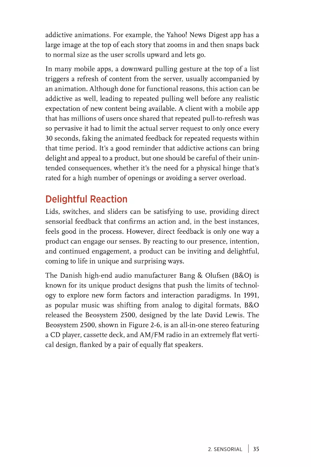
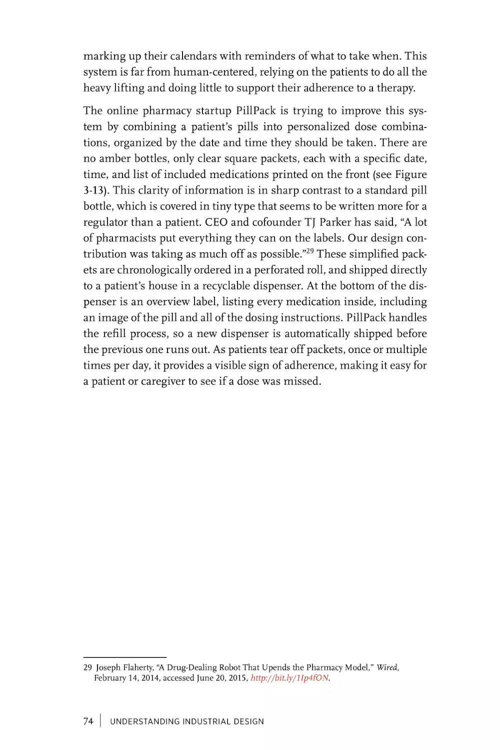
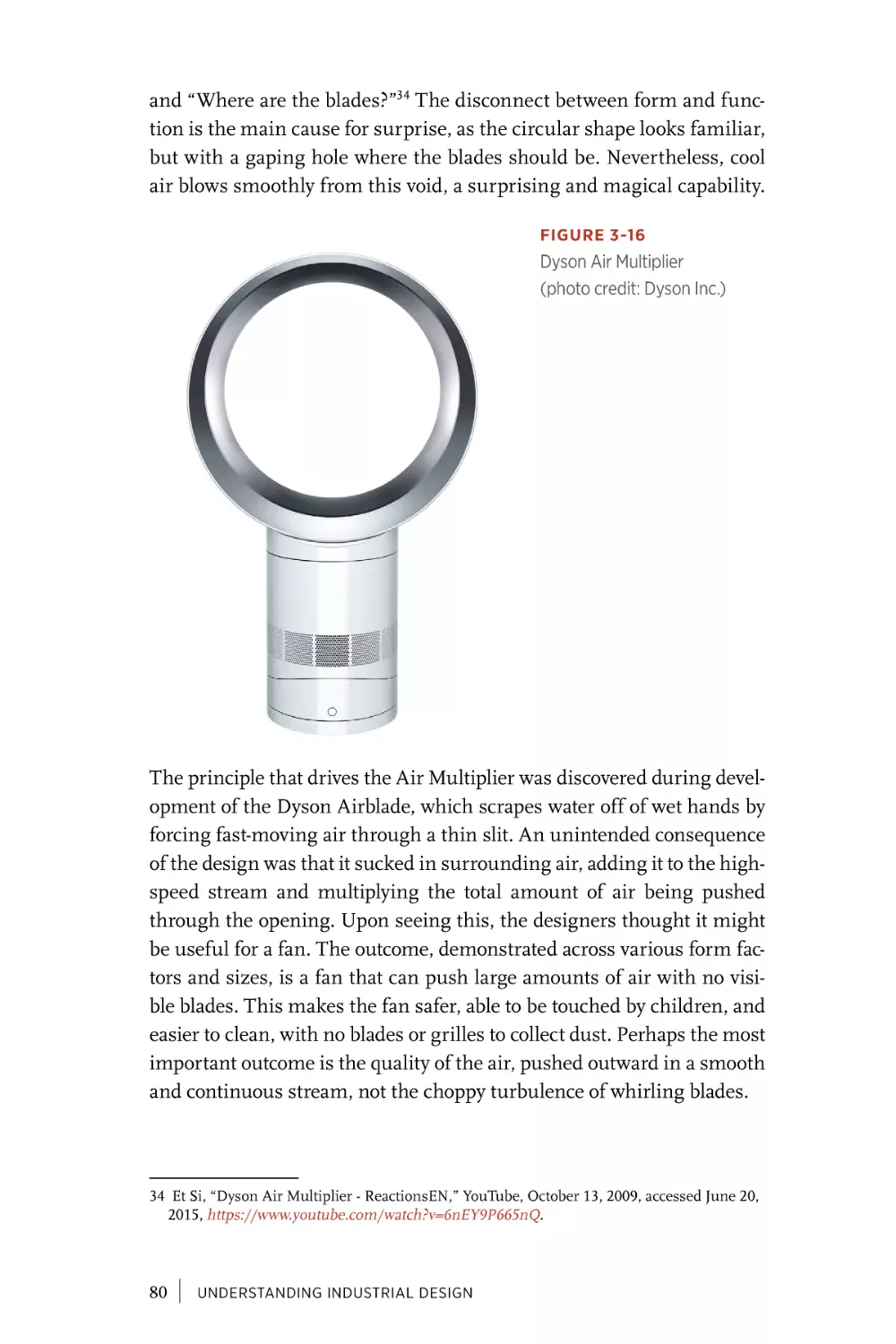
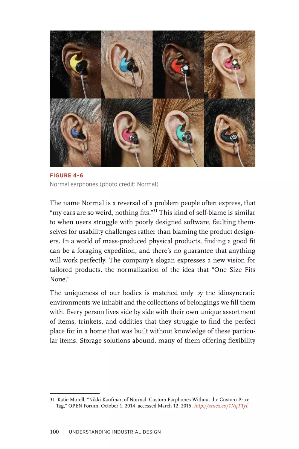
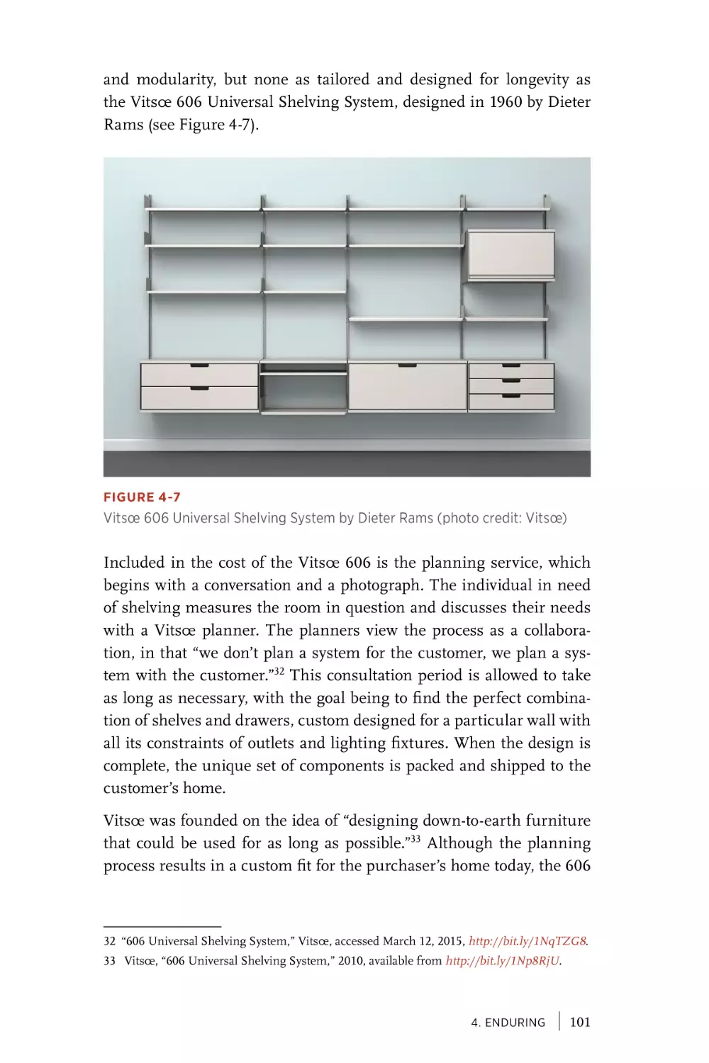
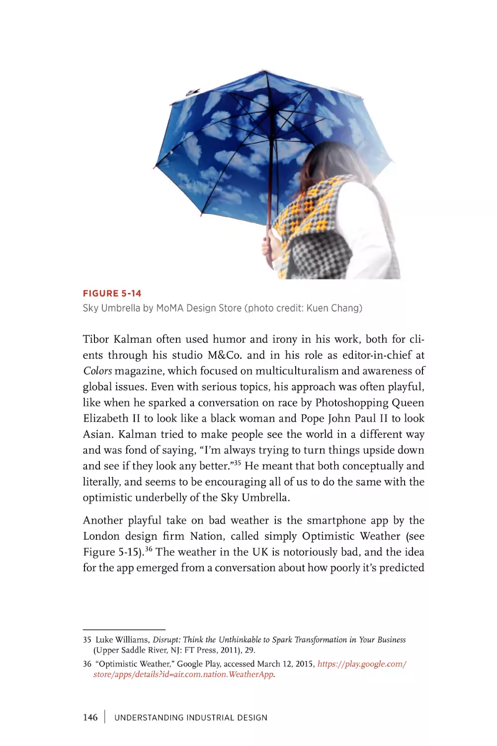
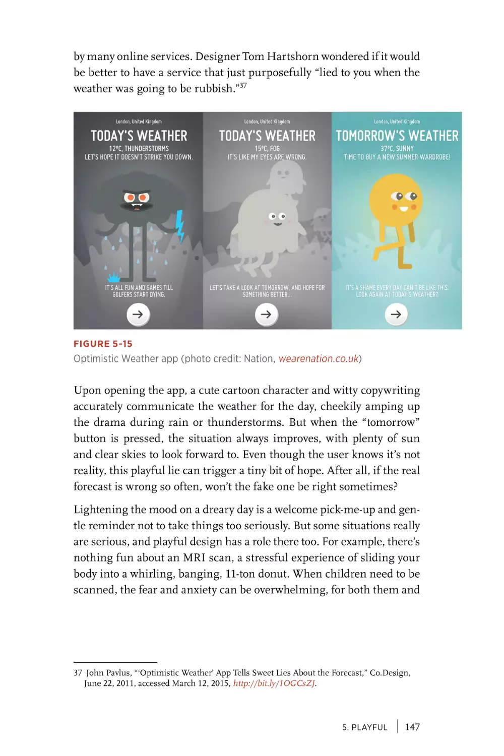
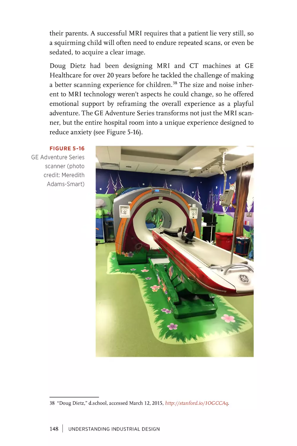
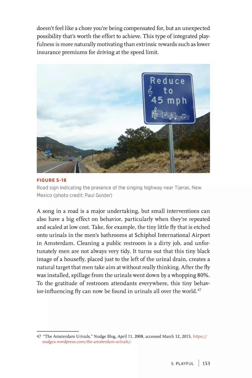
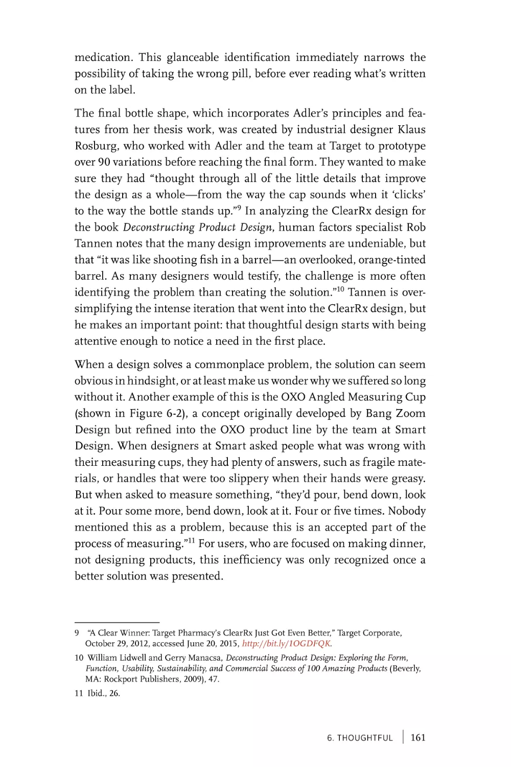
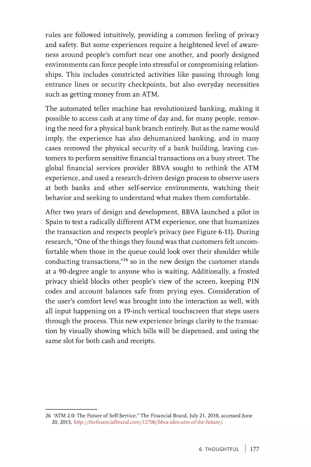
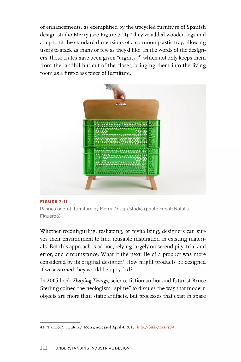
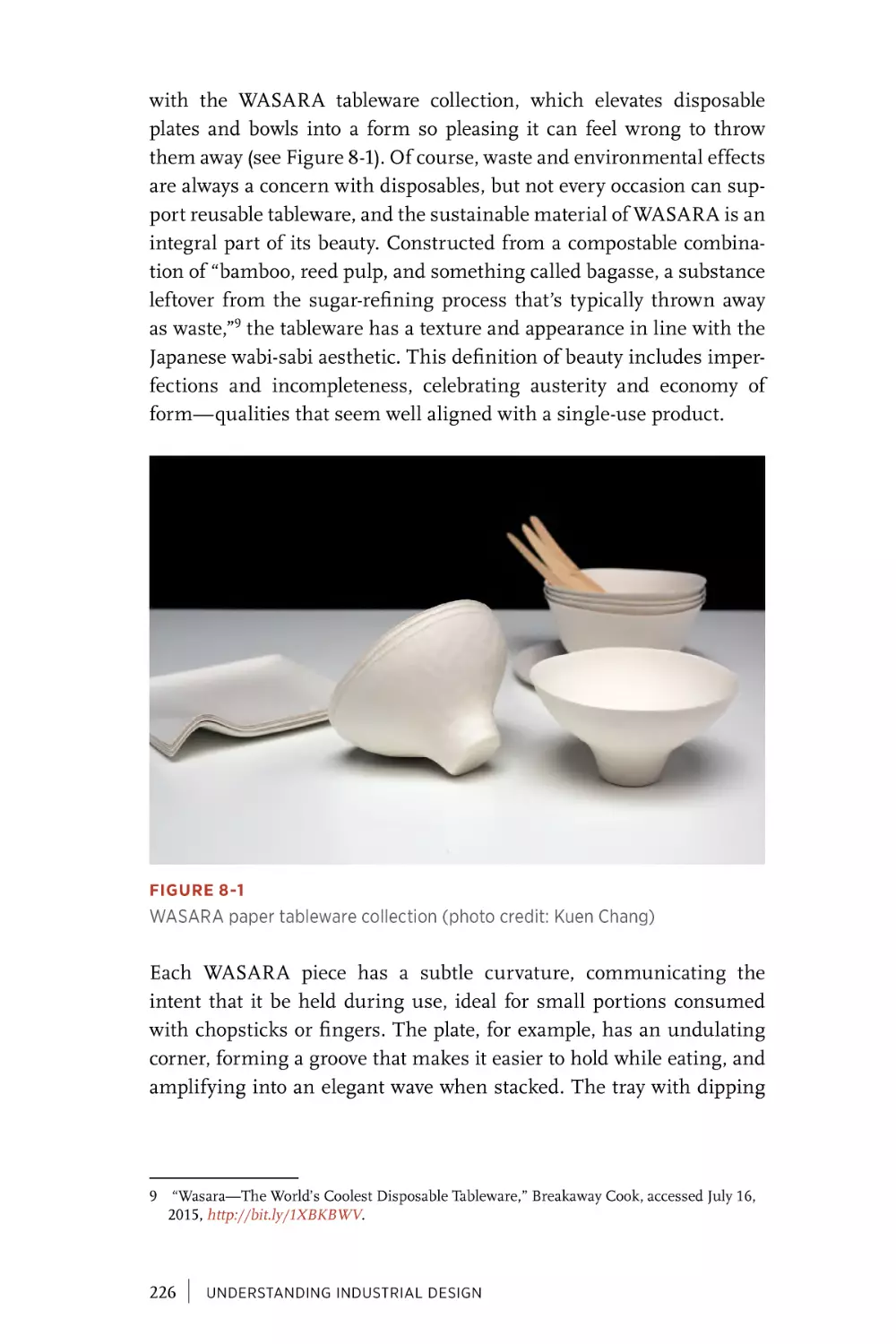
/


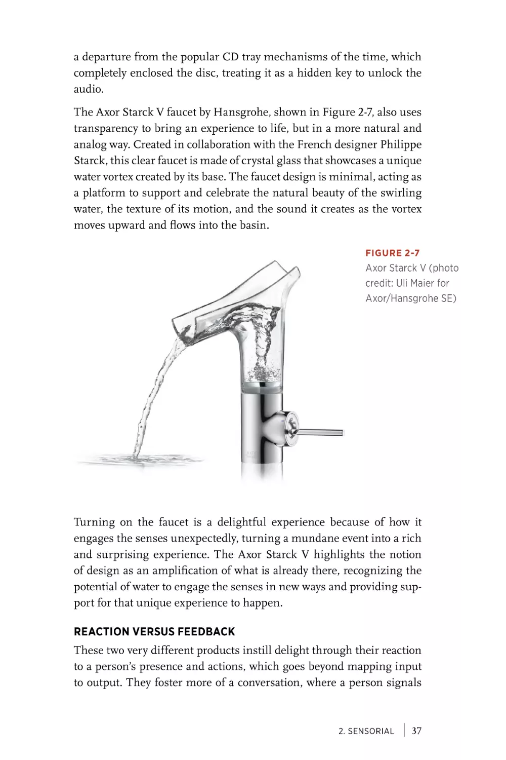
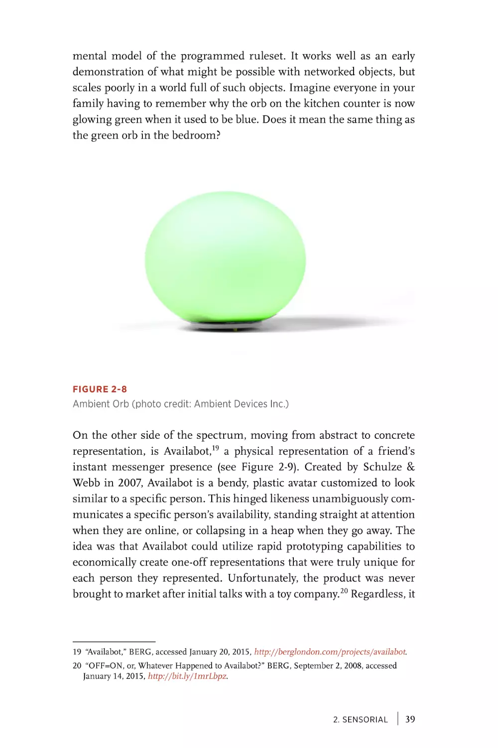


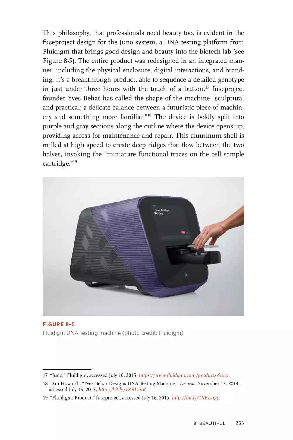


![[ Index ]](https://djvu.online/jpg1/s/y/4/sy4KM5PAcHG0Y/277.webp)


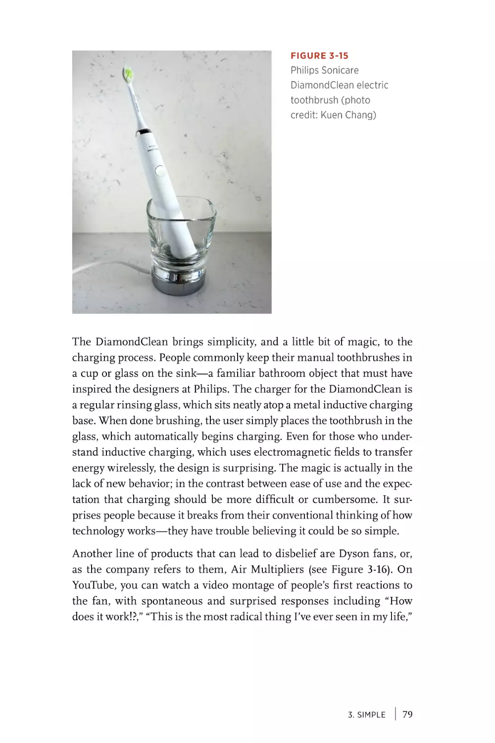
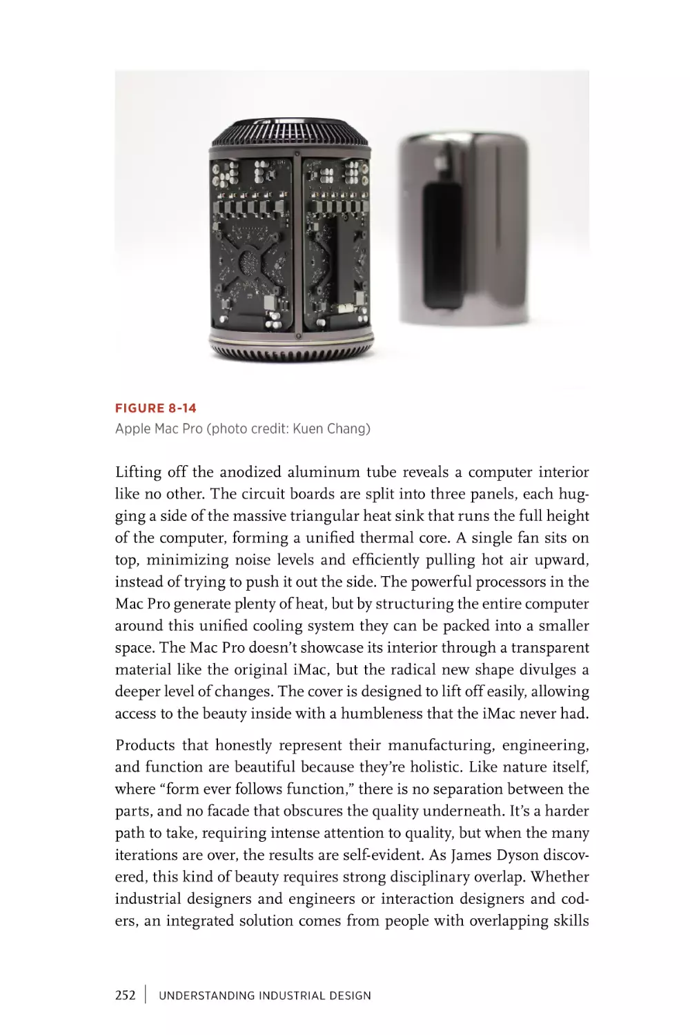
Text
Understanding
Industrial
Design
PRINCIPLES FOR UX AND
INTERACTION DESIGN
Simon King & Kuen Chang
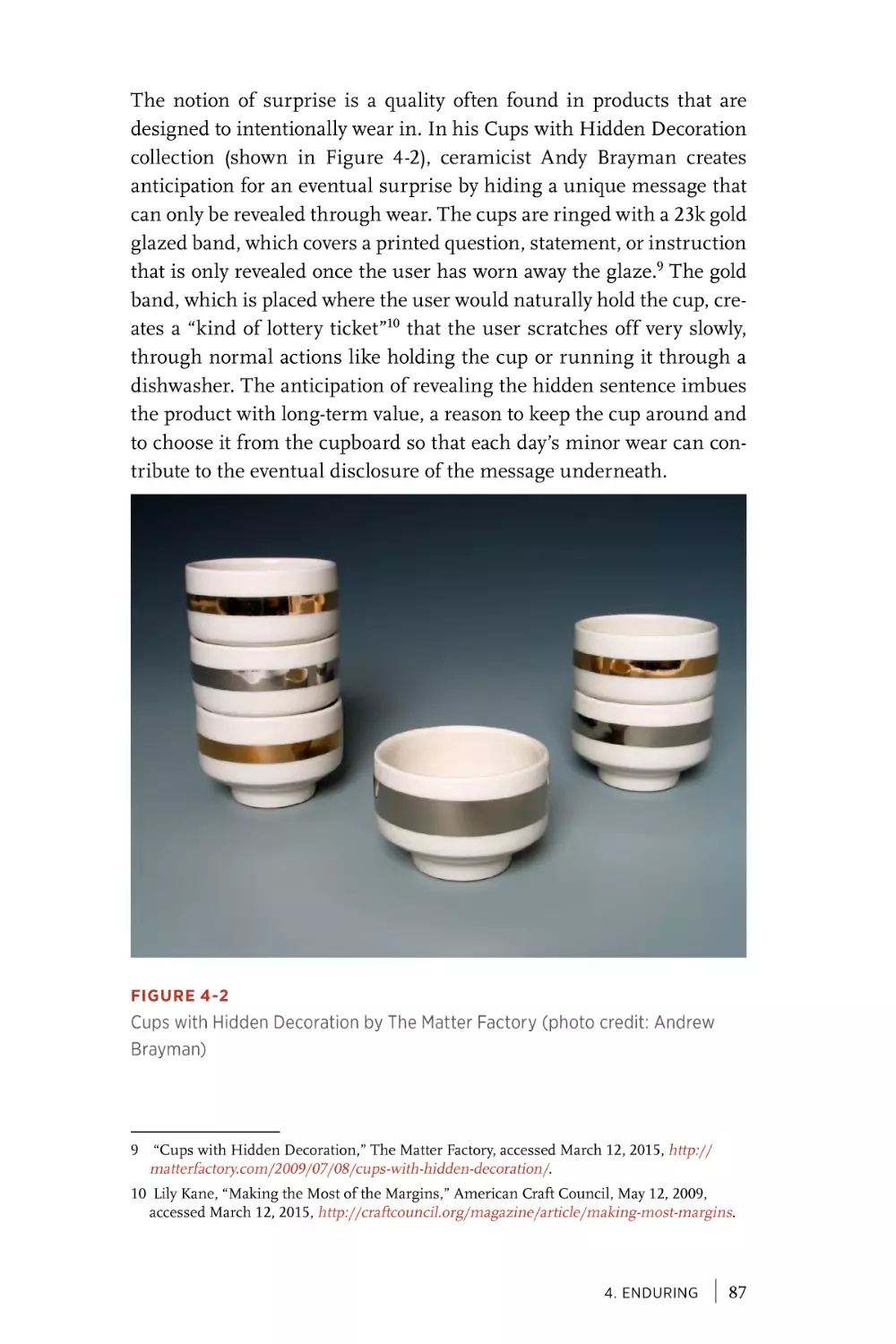
Praise for Understanding
Industrial Design
“The most difficult and interesting problems of the 21st century won’t
be solved by apps alone. Software might be eating the world, but it’s
the hardware mouth doing the chewing. As the boundary between
digital and physical grows ever blurrier, more UX designers will
have to consider more than just a 2D screen to do their jobs. This
book connects the dots between interaction and industrial design in
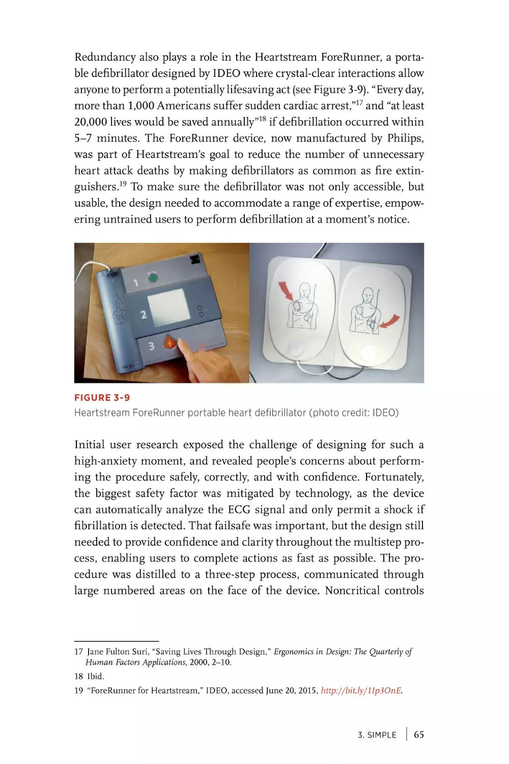
clear, thoughtful prose with vivid examples. Even if you don’t design
hardware (yet), its timeless insights and principles culled from
decades of physical products can’t help but make your designs better.
Get this book.”
DAN SAFFER, AUTHOR OF MICROINTERACTIONS
“Industrial design is one of the great design disciplines, and its
influence on user experience design is both underestimated and
misunderstood. As computing becomes more distributed and the
Internet of Things becomes the dominant context for UX design,
it’s increasingly important for all UX designers to become literate
in the principles of industrial design, to incorporate it into their
practice, and to understand its core ideas to work on teams with
industrial designers. This book is a great and readable introduction
to the intersection of ID and UX, written by designers with years of
experience in both.”
MIKE KUNIAVSKY, AUTHOR OF SMART THINGS
“This wonderful book, full of elaborate and detailed design examples,
represents an important step in the evolution of the field of interaction
design. The principles within are inordinately useful. It’s a must-have
for the bookshelf for communication, industrial, interaction, and system
designers who are practicing design today.”
JODI FORLIZZI, PROFESSOR OF HUMAN-COMPUTER INTERACTION
CARNEGIE MELLON UNIVERSITY
“Great product design needs to consider so much more than functionality
and usability; it is also about emotions, materials, pleasure,
manufacturability, and sustainability, to name just a few other topics. This
book is a journey through different perspectives on design that are often
overlooked, but that matter so much for great products.
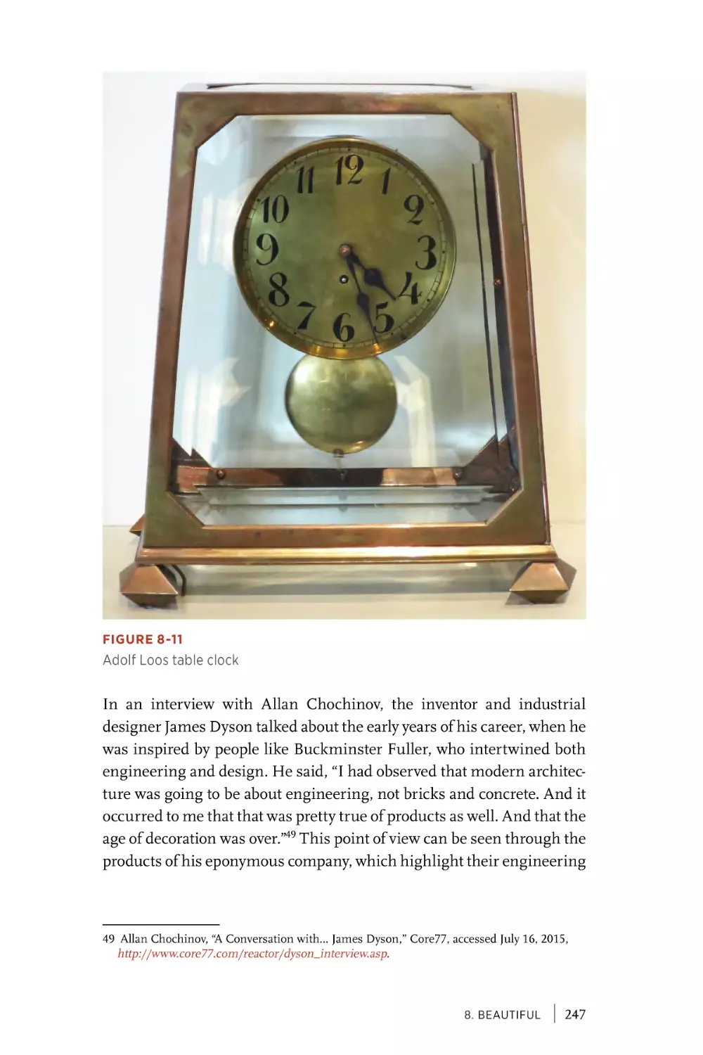
Especially given the IoT, where the digital and physical experiences of
products become much more intertwined, Understanding Industrial
Design is a must-read for any designer, developer, or entrepreneur working
on a product with physical touch points.
The book plays another important role: it fosters mutual understanding
and deeper collaboration of the all too often separated digital and physical
design practices.”
MARTIN CHARLIER, CO-AUTHOR OF DESIGNING CONNECTED PRODUCTS
“An essential read for any interaction designer or UX professional who wants
to understand the history, role, and responsibilities of Industrial Design.”
TOM METCALFE, DESIGNER AND TUTOR
Understanding
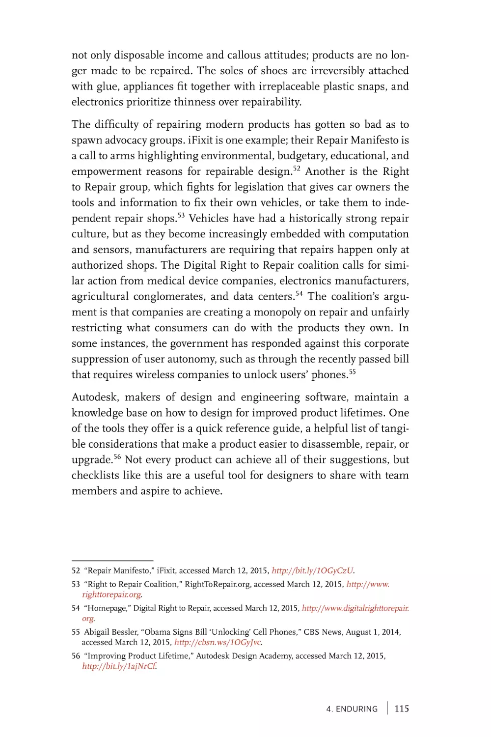
Industrial Design
Principles for UX and
Interaction Design
Simon King and Kuen Chang
Beijing
· Boston · Farnham · Sebastopol · Tokyo
Understanding Industrial Design
by Simon King and Kuen Chang
Copyright © 2016 Simon King, Kuen Chang. All rights reserved.
Printed in the United States of America.
Published by O’Reilly Media, Inc., 1005 Gravenstein Highway North, Sebastopol, CA 95472.
O’Reilly books may be purchased for educational, business, or sales promotional use. Online editions are also available for most titles (safaribooksonline.com). For more information, contact our
corporate/institutional sales department: (800) 998-9938 or corporate@oreilly.com.
Acquisitions and Developmental Editor:
Nick Lombardi
Production Editor: Melanie Yarbrough
Copyeditor: Jasmine Kwityn
Indexer: Lucie Haskins
Proofreader: Rachel Head
Cover Designer: Randy Comer
Interior Designers: Ron Bilodeau and
Monica Kamsvaag
Illustrator: Rebecca Demarest
Compositor: Melanie Yarbrough
January 2016: First Edition.
Revision History for the First Edition:
2016-01-13
First release
See http://oreilly.com/catalog/errata.csp?isbn=0636920037019 for release details.
The O’Reilly logo is a registered trademark of O’Reilly Media, Inc. Understanding Industrial
Design and related trade dress are trademarks of O’Reilly Media, Inc.
Many of the designations used by manufacturers and sellers to distinguish their products are
claimed as trademarks. Where those designations appear in this book, and O’Reilly Media, Inc.,
was aware of a trademark claim, the designations have been printed in caps or initial caps.
Although the publisher and authors have used reasonable care in preparing this book, the
information it contains is distributed “as is” and without warranties of any kind. This book is not
intended as legal or financial advice, and not all of the recommendations may be suitable for your
situation. Professional legal and financial advisors should be consulted, as needed. Neither the
publisher nor the authors shall be liable for any costs, expenses, or damages resulting from use of
or reliance on the information contained in this book.
978-1-491-92039-8
[LSI]
[ contents ]
Preface . . . . . . . . . . . . . . . . . . . . . . . . . . . . . . . . . . . . . . . . . . . . . . . . . . ix
Chapter 1
A Brief History of Industrial and Interaction Design. . . . 1
Industrial Revolution. . . . . . . . . . . . . . . . . . . . . . . . . . . . . . . . . . . . 1
Computing Revolution . . . . . . . . . . . . . . . . . . . . . . . . . . . . . . . . 11
Information Revolution. . . . . . . . . . . . . . . . . . . . . . . . . . . . . . . . 14
Smartphones . . . . . . . . . . . . . . . . . . . . . . . . . . . . . . . . . . . . . . . . . . 15
Smart Everything. . . . . . . . . . . . . . . . . . . . . . . . . . . . . . . . . . . . . . 18
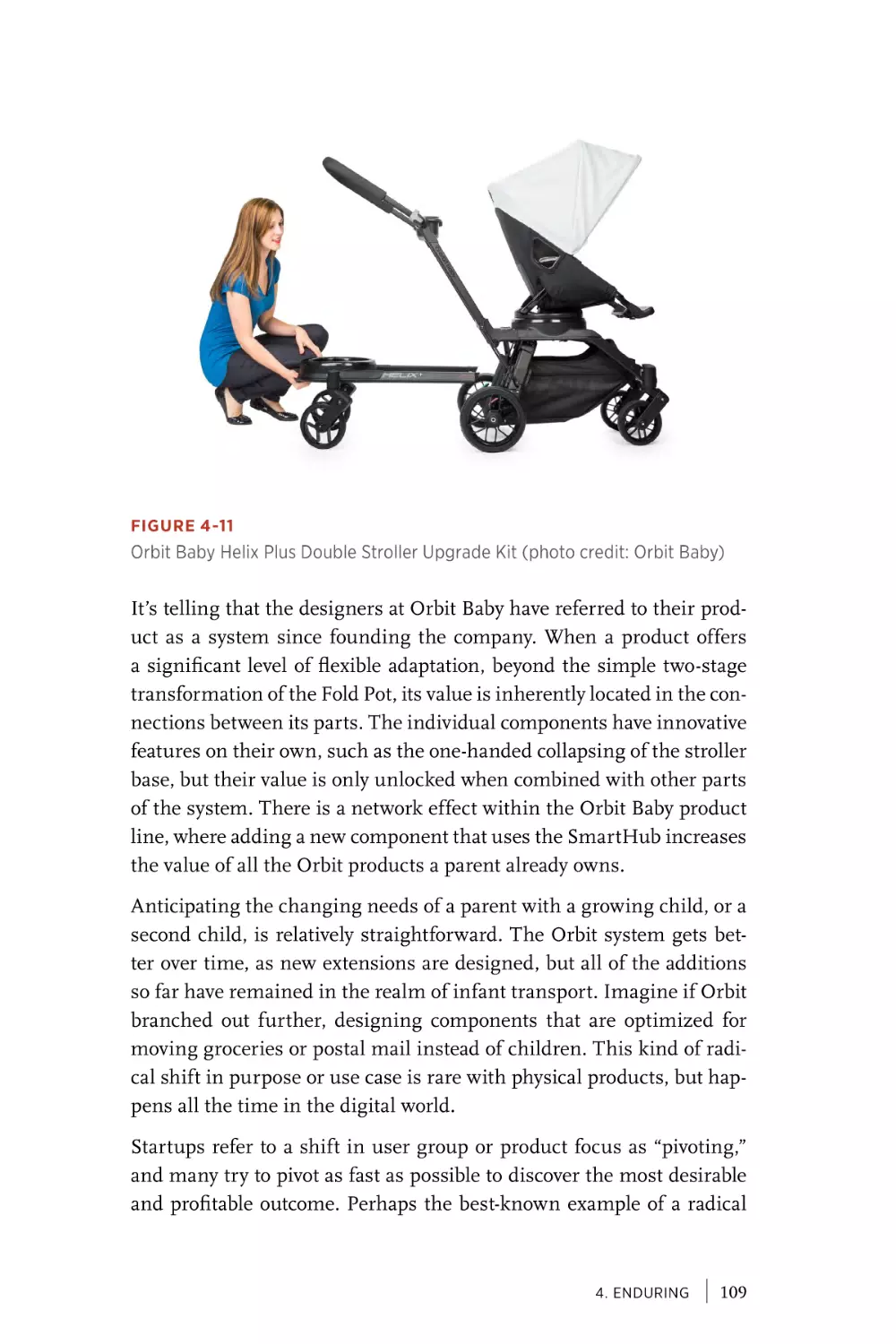
Chapter 2
Sensorial. . . . . . . . . . . . . . . . . . . . . . . . . . . . . . . . . . . . . . . . . . . . . . . 21
Formgiving. . . . . . . . . . . . . . . . . . . . . . . . . . . . . . . . . . . . . . . . . . . . 22
Color, Materials, Finish (CMF) . . . . . . . . . . . . . . . . . . . . . . . . 23
Multisensorial Products. . . . . . . . . . . . . . . . . . . . . . . . . . . . . . . 27
Addictive Action. . . . . . . . . . . . . . . . . . . . . . . . . . . . . . . . . . . . . . . 31
Delightful Reaction. . . . . . . . . . . . . . . . . . . . . . . . . . . . . . . . . . . . 35
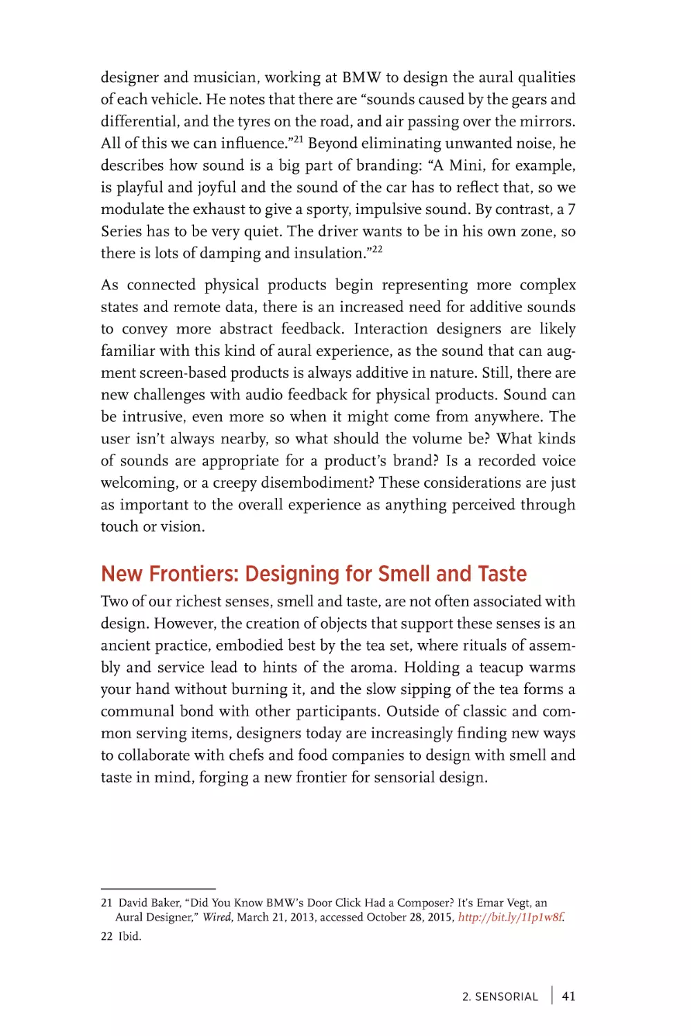
New Frontiers: Designing for Smell and Taste . . . . . . . . 41
An Orchestration of the Senses. . . . . . . . . . . . . . . . . . . . . . . . 45
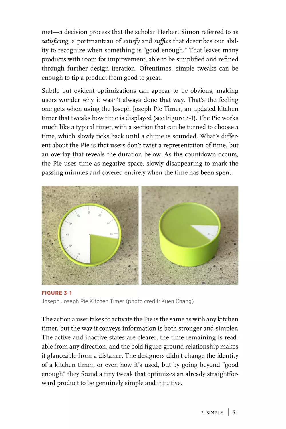
Chapter 3
Simple . . . . . . . . . . . . . . . . . . . . . . . . . . . . . . . . . . . . . . . . . . . . . . . . . 49
Tiny Tweaks . . . . . . . . . . . . . . . . . . . . . . . . . . . . . . . . . . . . . . . . . . . 50
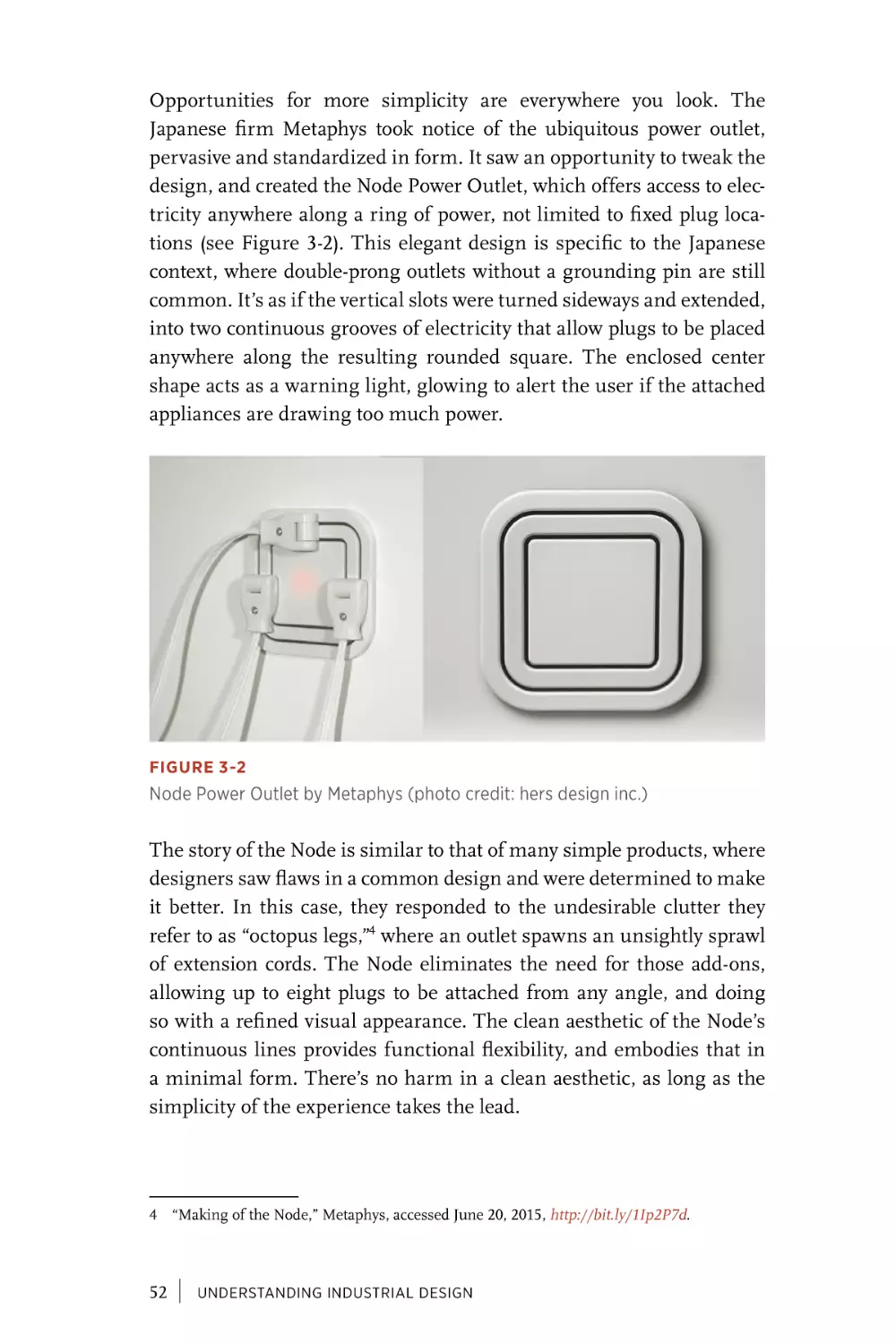
Physical Modes . . . . . . . . . . . . . . . . . . . . . . . . . . . . . . . . . . . . . . . . 57
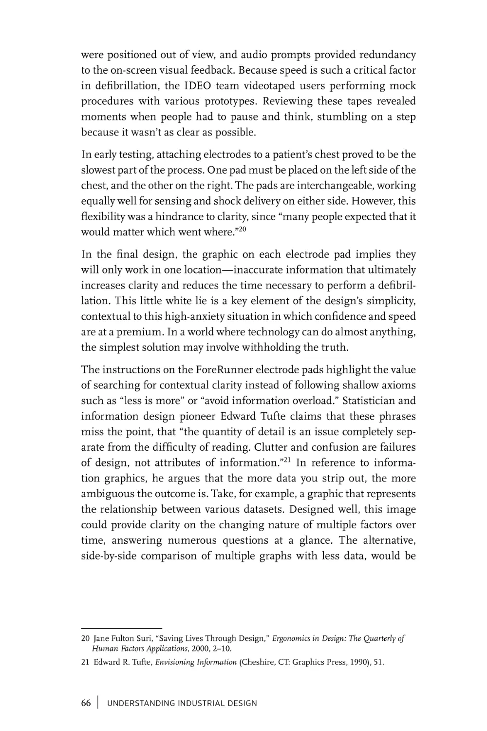
Contextual Clarity. . . . . . . . . . . . . . . . . . . . . . . . . . . . . . . . . . . . . 63
Smart Combinations . . . . . . . . . . . . . . . . . . . . . . . . . . . . . . . . . . 69
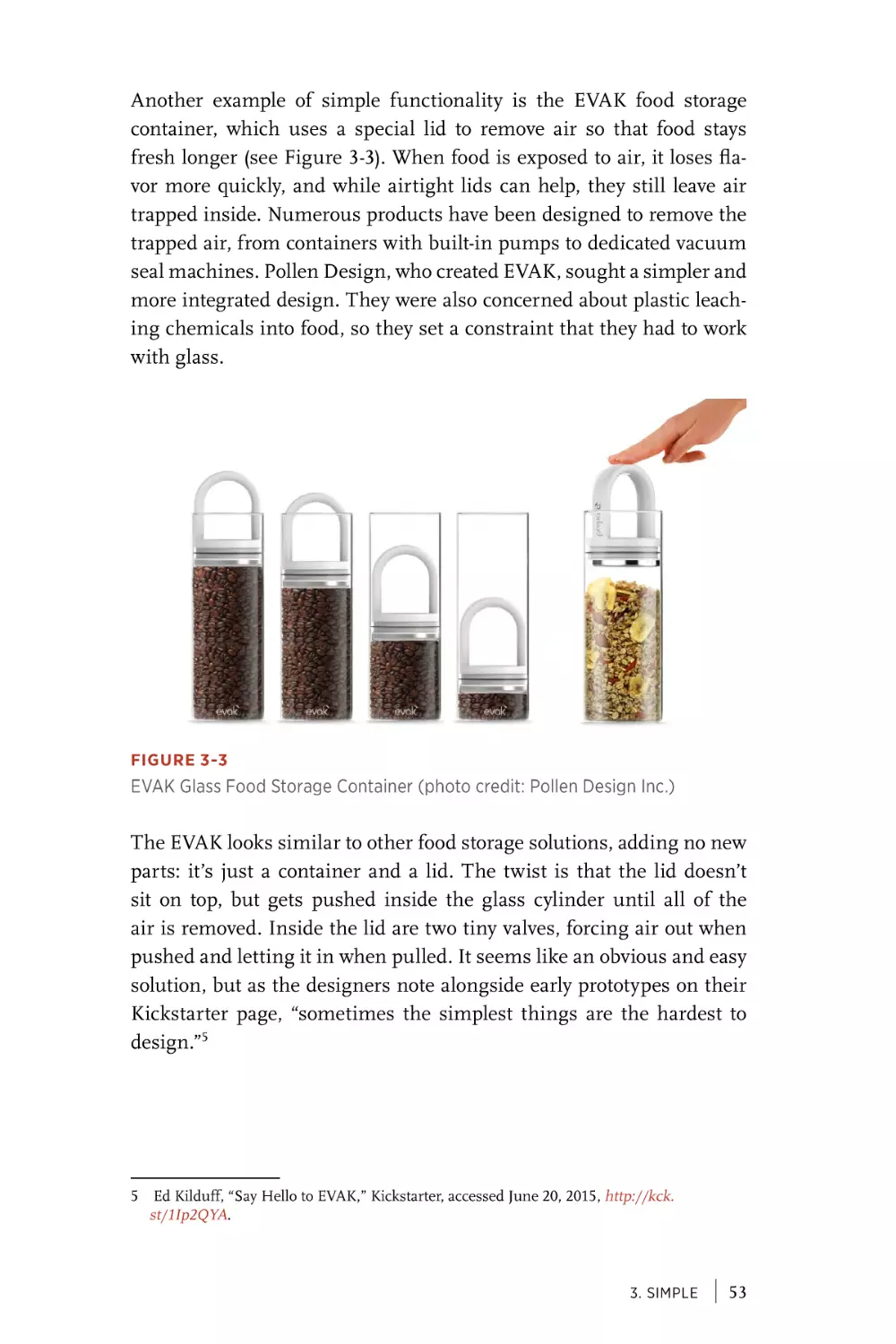
Magical Moments . . . . . . . . . . . . . . . . . . . . . . . . . . . . . . . . . . . . . 76
Simple > Complex > Simplicity. . . . . . . . . . . . . . . . . . . . . . . . 82
v
Chapter 4
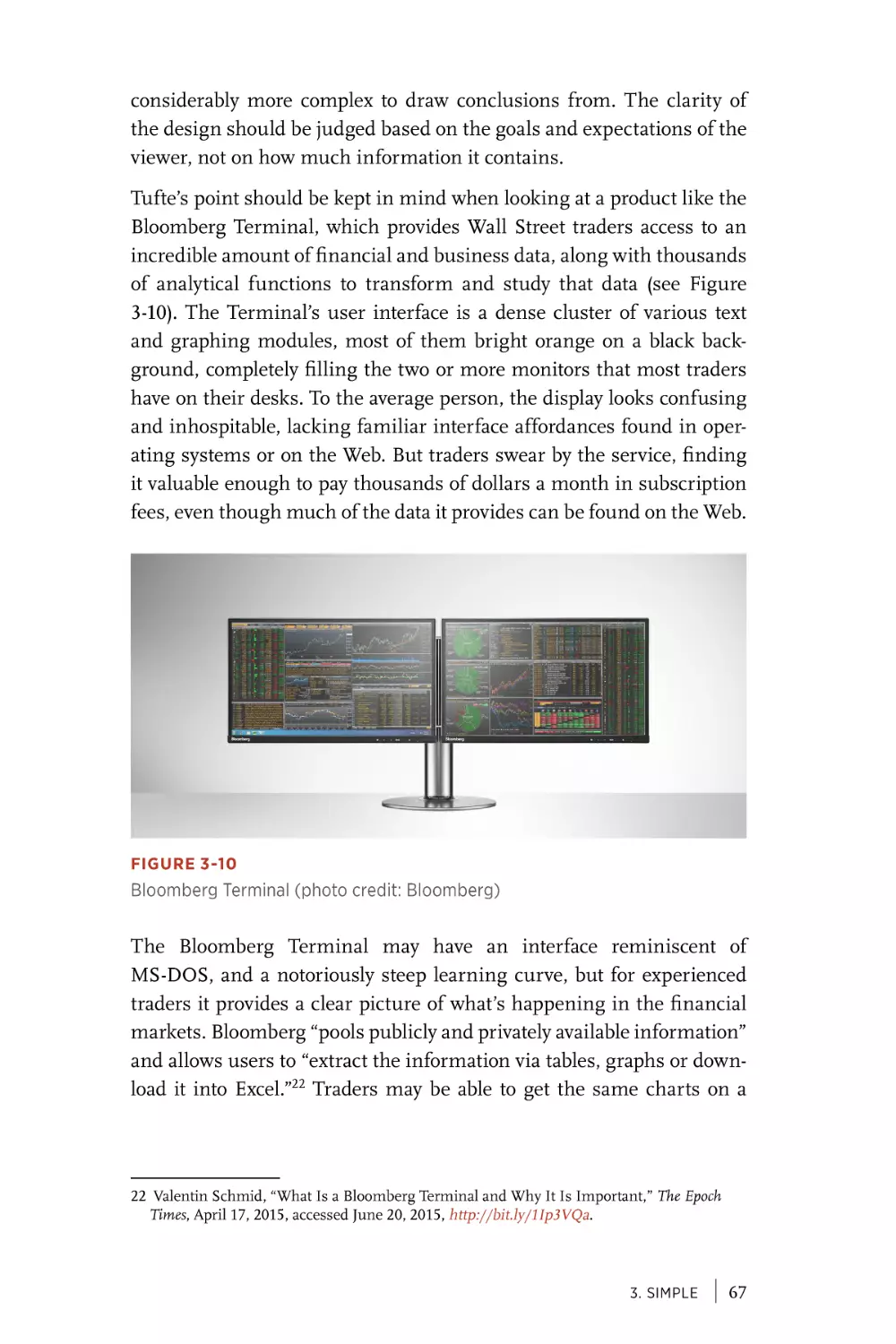
Enduring . . . . . . . . . . . . . . . . . . . . . . . . . . . . . . . . . . . . . . . . . . . . . . 83
Worn In. . . . . . . . . . . . . . . . . . . . . . . . . . . . . . . . . . . . . . . . . . . . . . . . 84
Quintessential. . . . . . . . . . . . . . . . . . . . . . . . . . . . . . . . . . . . . . . . . 91
Tailored. . . . . . . . . . . . . . . . . . . . . . . . . . . . . . . . . . . . . . . . . . . . . . . . 97
Adaptable. . . . . . . . . . . . . . . . . . . . . . . . . . . . . . . . . . . . . . . . . . . . . 105
Repairable . . . . . . . . . . . . . . . . . . . . . . . . . . . . . . . . . . . . . . . . . . . . 114
Layers of Change . . . . . . . . . . . . . . . . . . . . . . . . . . . . . . . . . . . . . 119
Chapter 5
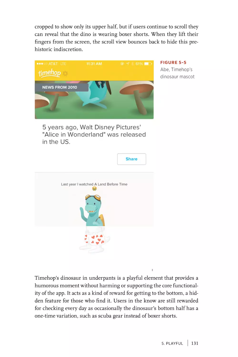
Playful . . . . . . . . . . . . . . . . . . . . . . . . . . . . . . . . . . . . . . . . . . . . . . . . 123
Provide Amusement. . . . . . . . . . . . . . . . . . . . . . . . . . . . . . . . . . 124
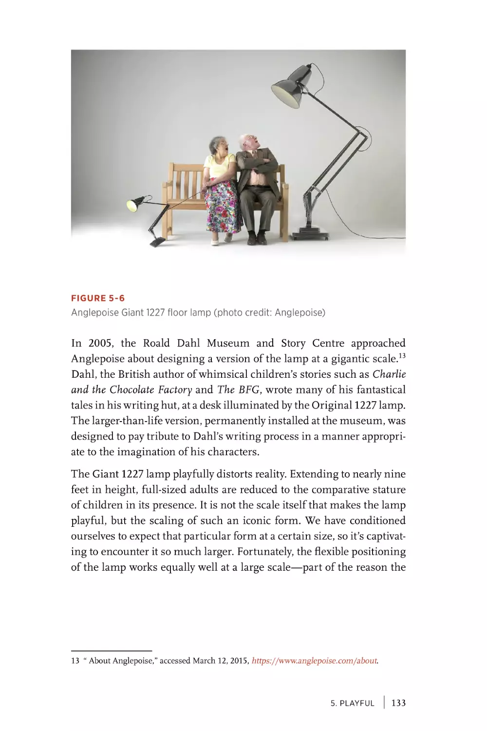
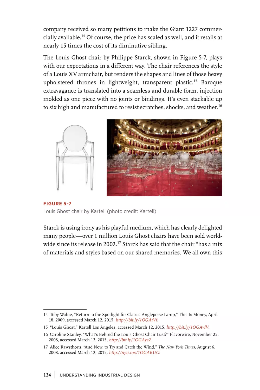
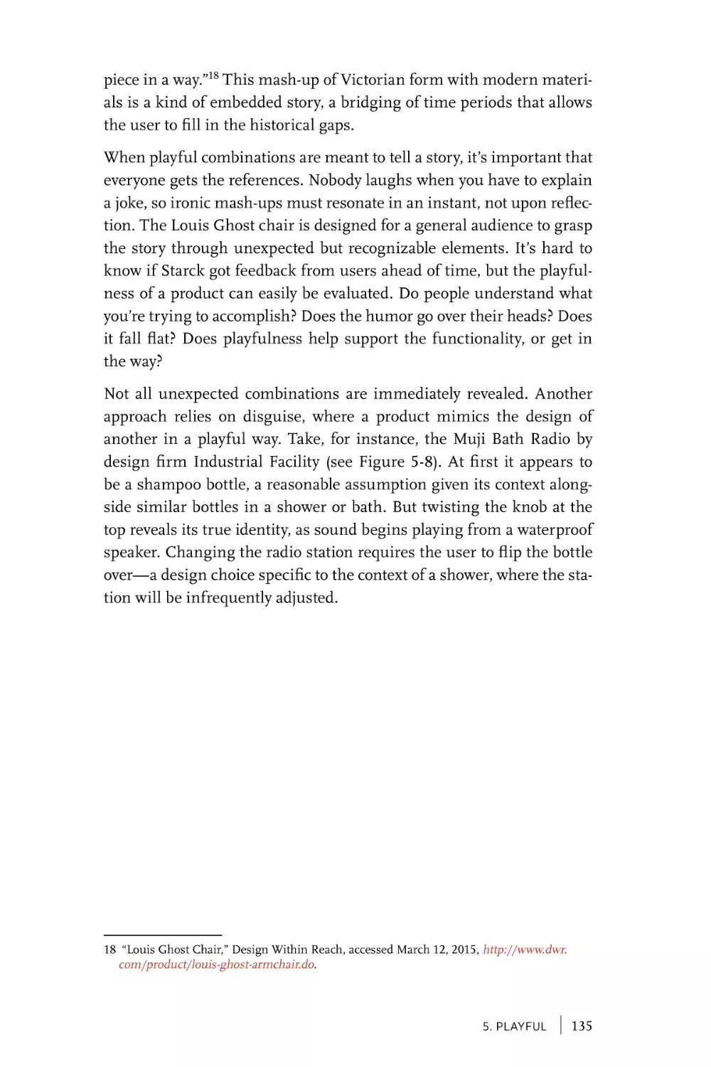
Delight with the Unexpected. . . . . . . . . . . . . . . . . . . . . . . . . 132
Elevate Everyday Actions . . . . . . . . . . . . . . . . . . . . . . . . . . . . . 139
Offer an Emotional Boost . . . . . . . . . . . . . . . . . . . . . . . . . . . . 145
Encourage Behavior Change . . . . . . . . . . . . . . . . . . . . . . . . . 150
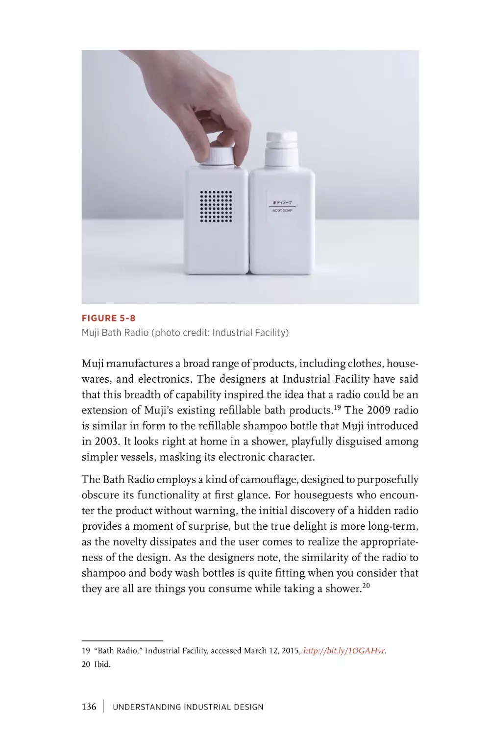
Path to the Playground . . . . . . . . . . . . . . . . . . . . . . . . . . . . . . . 156
Chapter 6
Thoughtful . . . . . . . . . . . . . . . . . . . . . . . . . . . . . . . . . . . . . . . . . . . 157
Observe People’s Struggles. . . . . . . . . . . . . . . . . . . . . . . . . . . 158
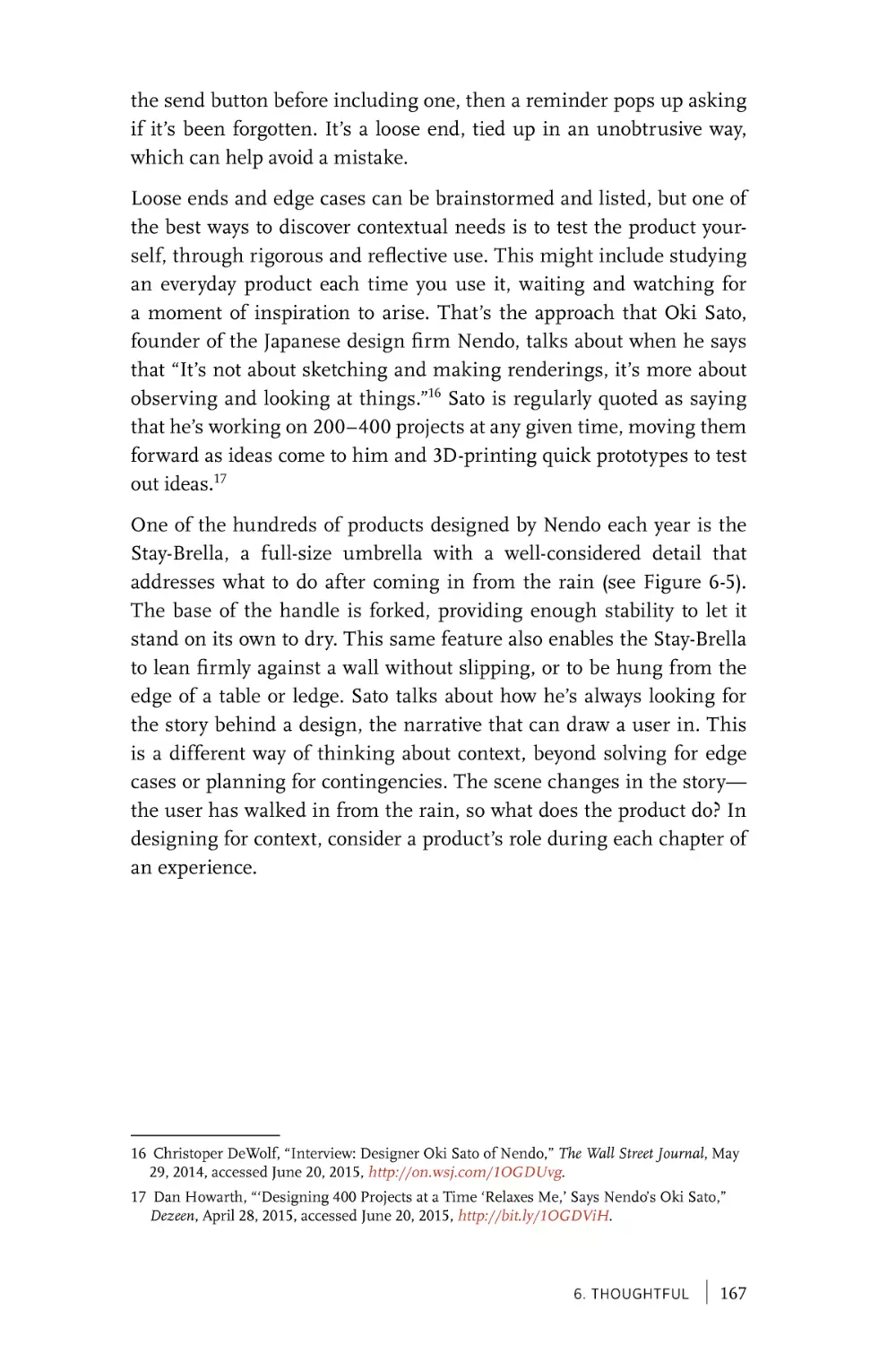
Anticipate the Context of Use . . . . . . . . . . . . . . . . . . . . . . . . 165
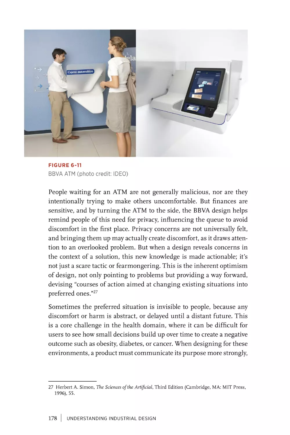
Concentrate on Comfort. . . . . . . . . . . . . . . . . . . . . . . . . . . . . . 172
Include Everyone . . . . . . . . . . . . . . . . . . . . . . . . . . . . . . . . . . . . . 180
Design Is in the (Thoughtful) Details. . . . . . . . . . . . . . . . 187
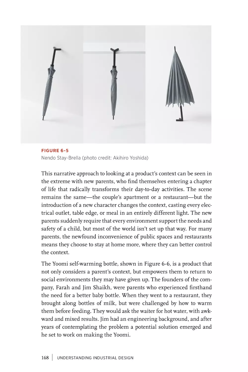
Chapter 7
Sustainable . . . . . . . . . . . . . . . . . . . . . . . . . . . . . . . . . . . . . . . . . . . 189
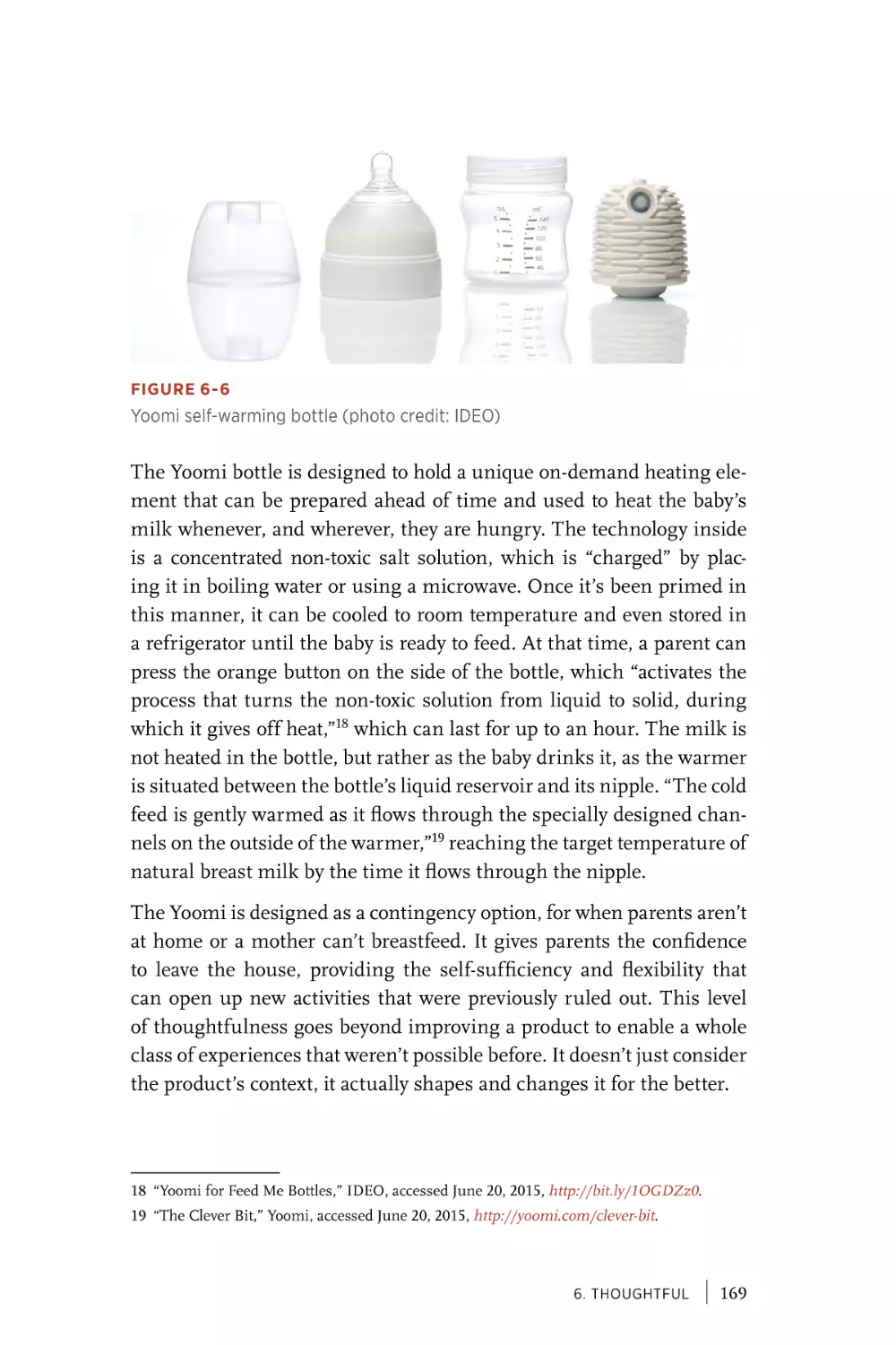
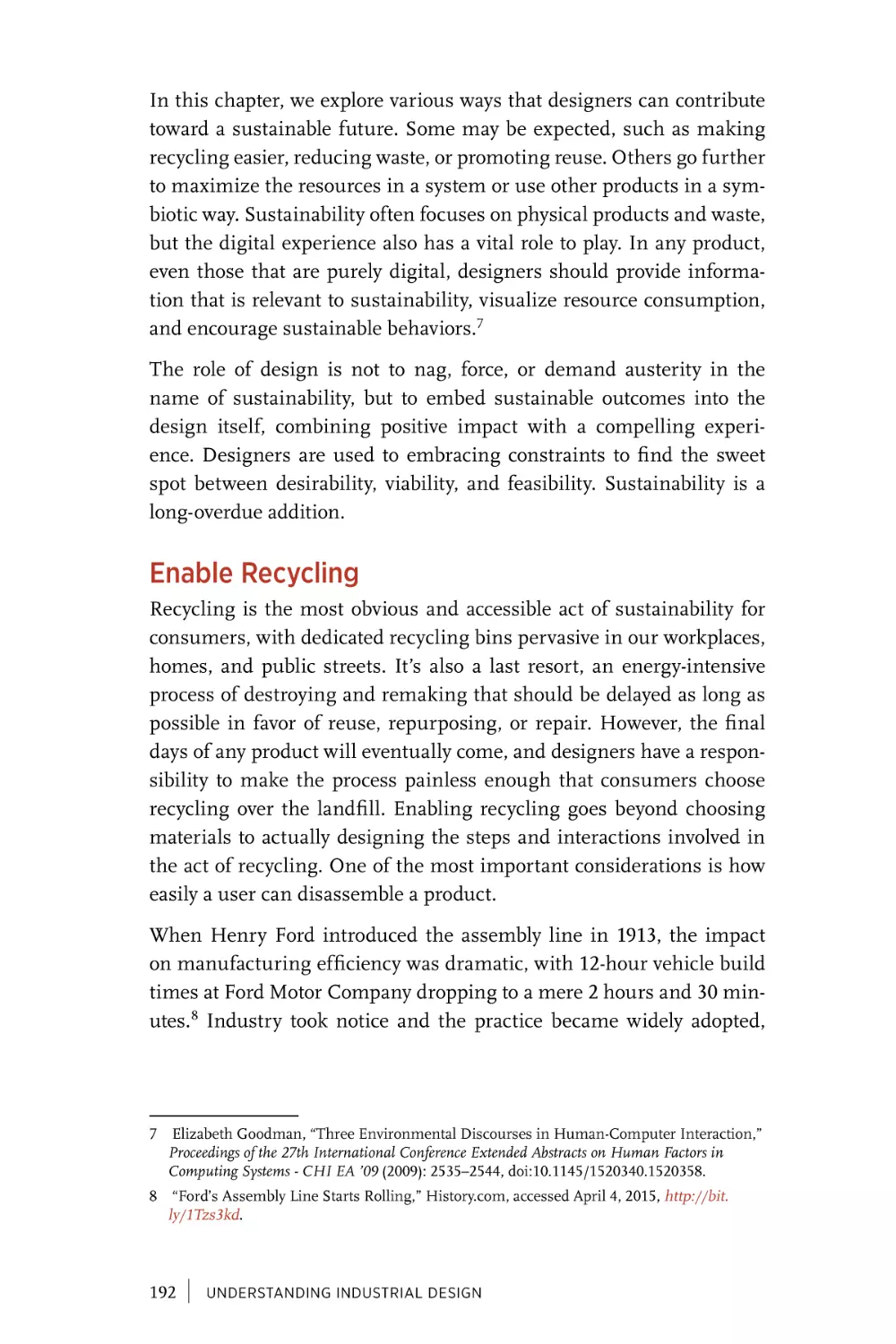
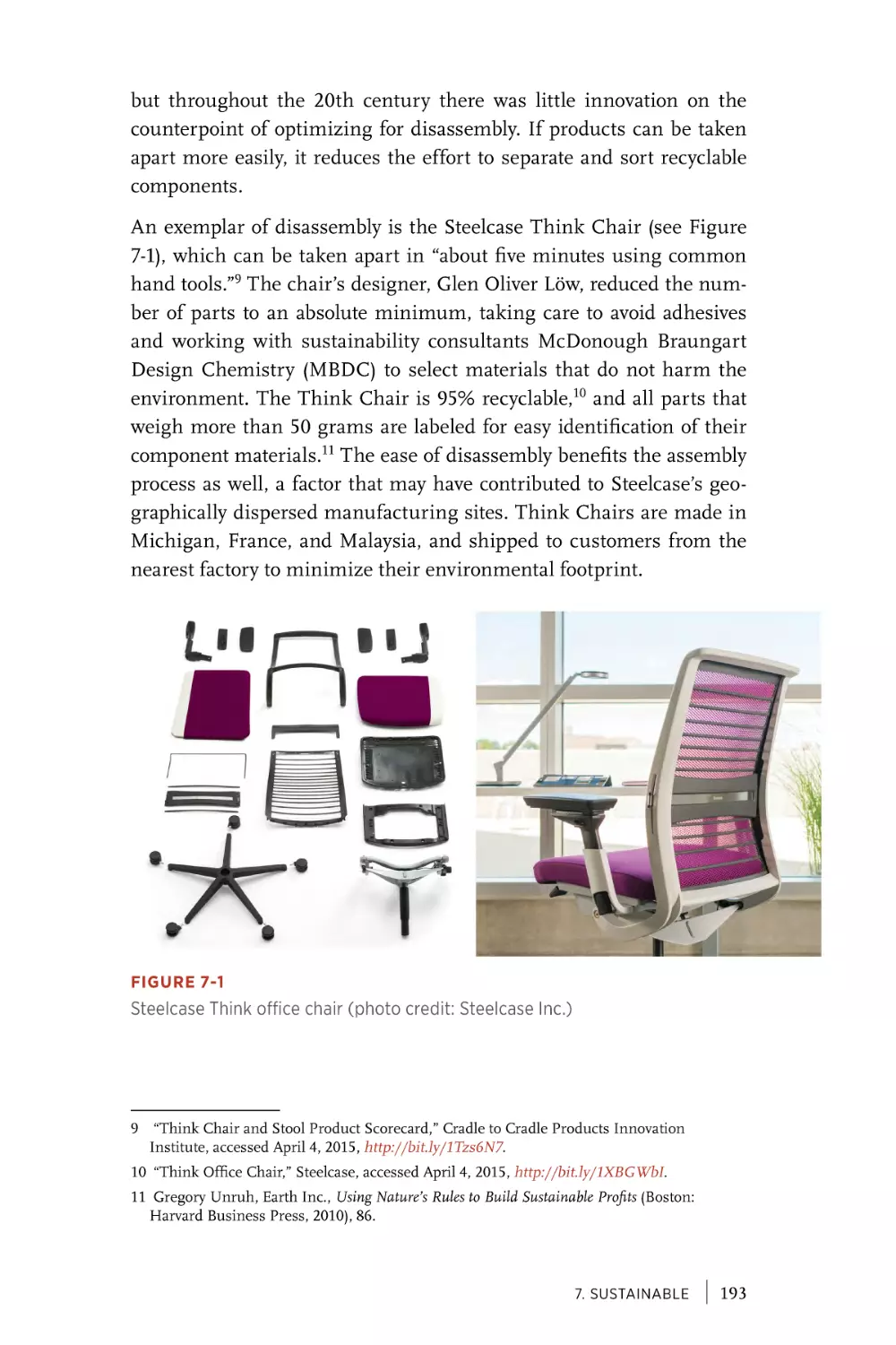
Enable Recycling . . . . . . . . . . . . . . . . . . . . . . . . . . . . . . . . . . . . . 192
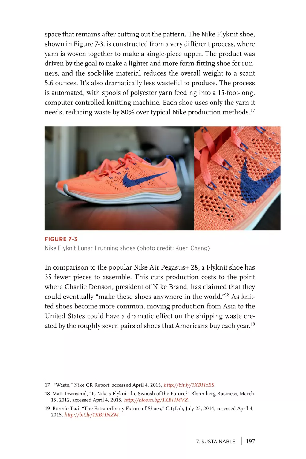
Reduce Waste. . . . . . . . . . . . . . . . . . . . . . . . . . . . . . . . . . . . . . . . . 196
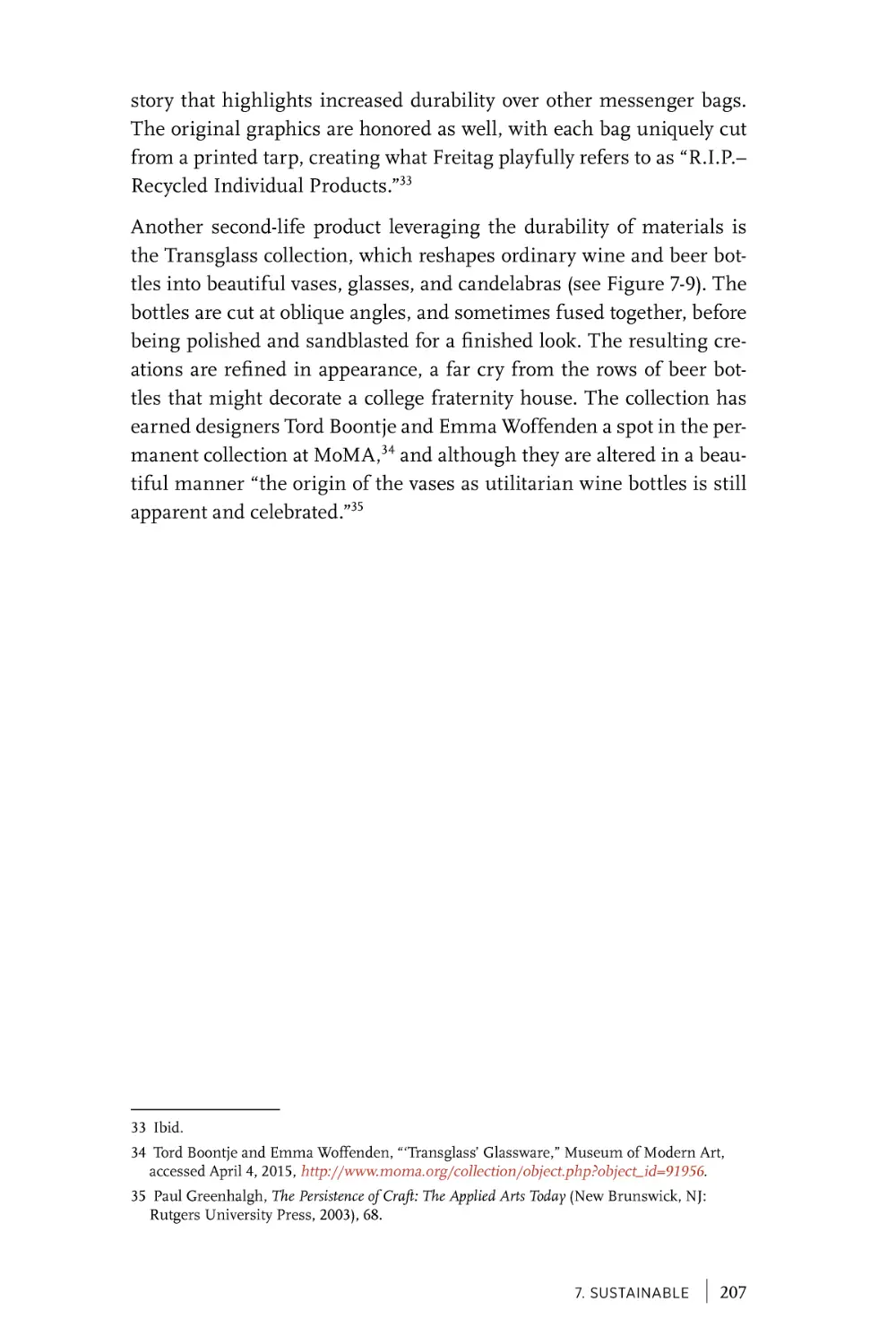
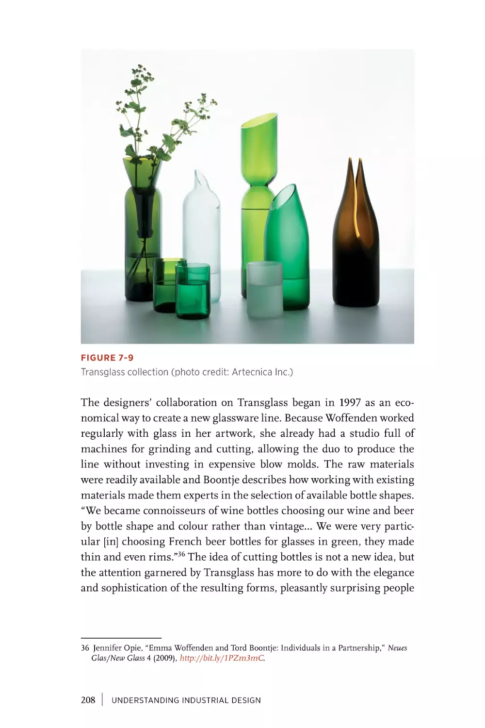
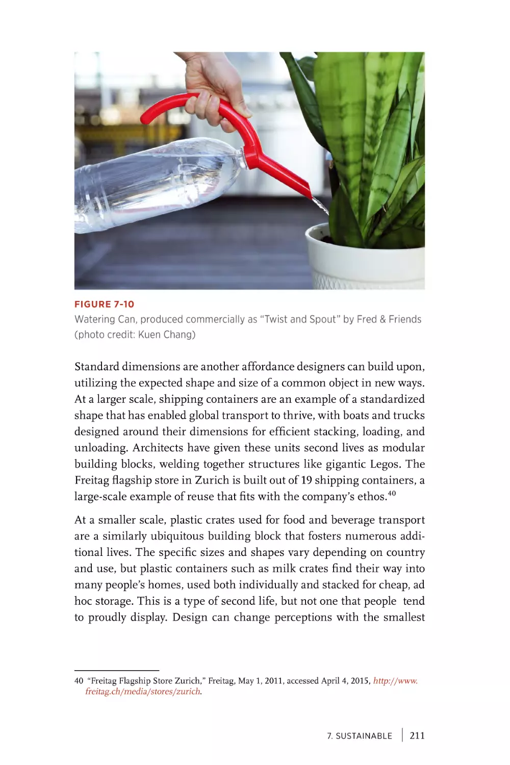
Provide a Second Life. . . . . . . . . . . . . . . . . . . . . . . . . . . . . . . . . 205
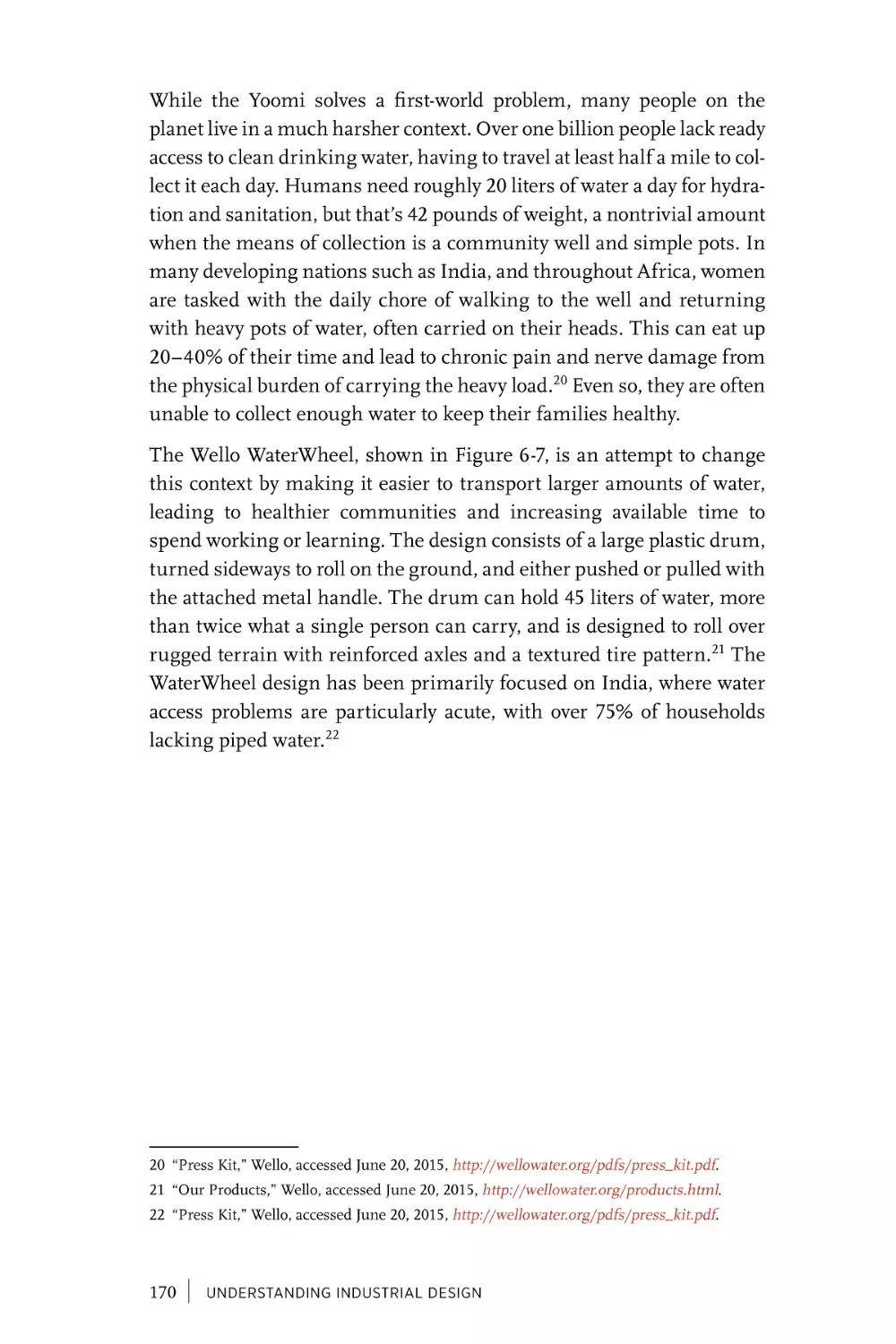
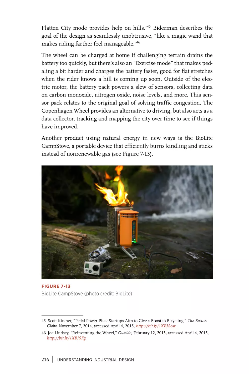
Maximize Resources. . . . . . . . . . . . . . . . . . . . . . . . . . . . . . . . . . 213
Sustainability as a Process. . . . . . . . . . . . . . . . . . . . . . . . . . . . 221
Chapter 8
Beautiful. . . . . . . . . . . . . . . . . . . . . . . . . . . . . . . . . . . . . . . . . . . . . . 223
Beauty as Everyday . . . . . . . . . . . . . . . . . . . . . . . . . . . . . . . . . . . 225
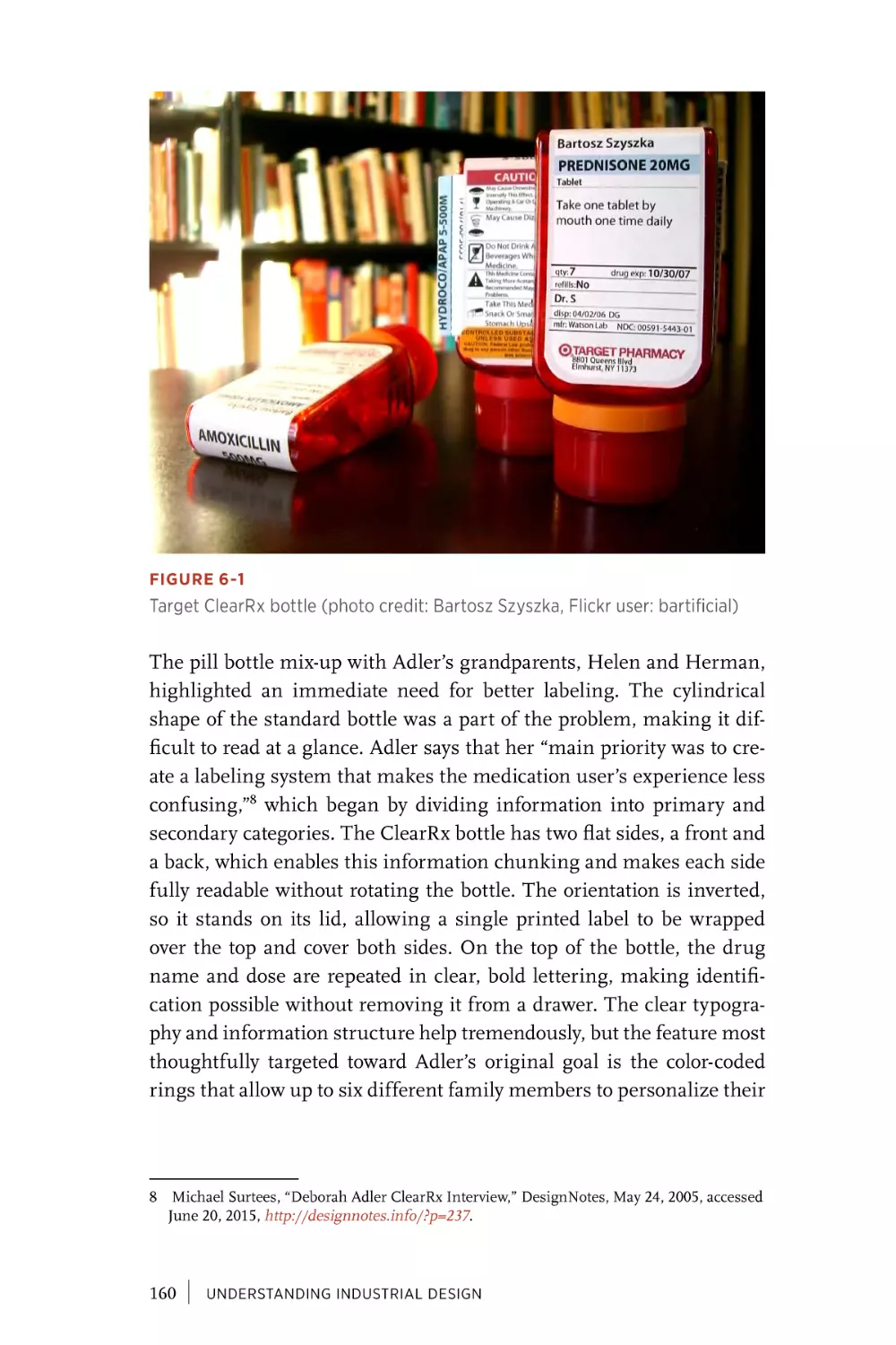
Beauty as Dignity. . . . . . . . . . . . . . . . . . . . . . . . . . . . . . . . . . . . . 235
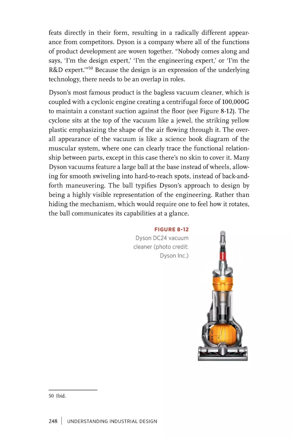
Beauty as Honesty. . . . . . . . . . . . . . . . . . . . . . . . . . . . . . . . . . . . 242
Beauty as Requirement. . . . . . . . . . . . . . . . . . . . . . . . . . . . . . . 253
vi
|
CONTENTS
Chapter 9
Conclusion. . . . . . . . . . . . . . . . . . . . . . . . . . . . . . . . . . . . . . . . . . . . 255
Hybrid Education. . . . . . . . . . . . . . . . . . . . . . . . . . . . . . . . . . . . . 256
Hybrid Business. . . . . . . . . . . . . . . . . . . . . . . . . . . . . . . . . . . . . . 257
Hybrid Designers. . . . . . . . . . . . . . . . . . . . . . . . . . . . . . . . . . . . . 258
Index. . . . . . . . . . . . . . . . . . . . . . . . . . . . . . . . . . . . . . . . . . . . . . . . . . 259
CONTENTS
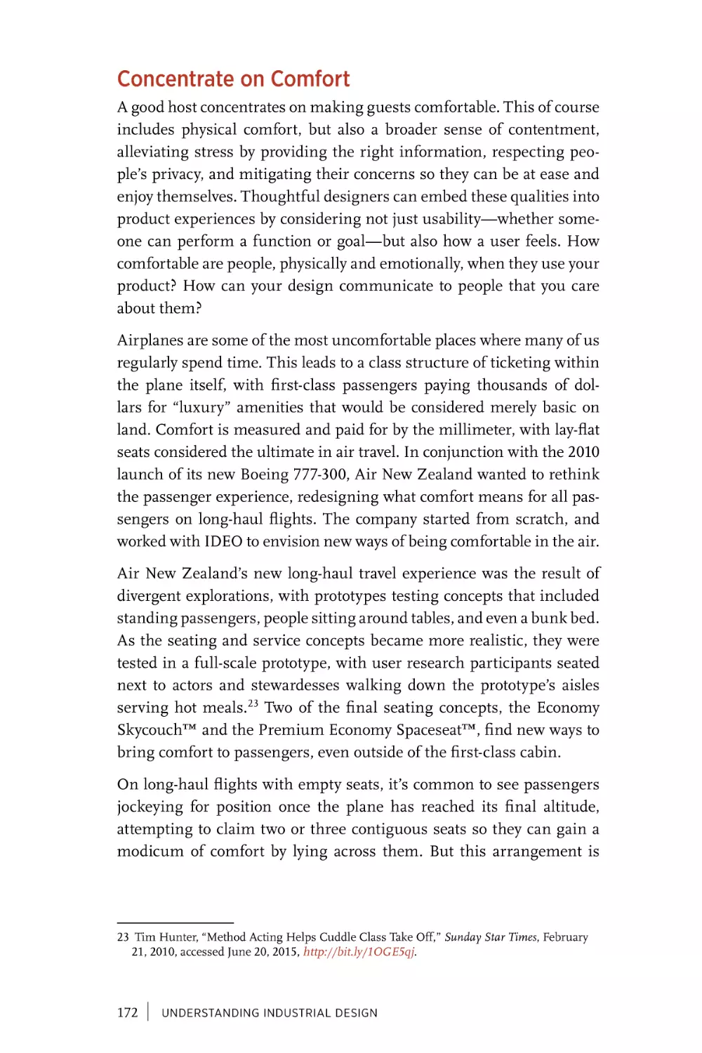
|
vii
Preface
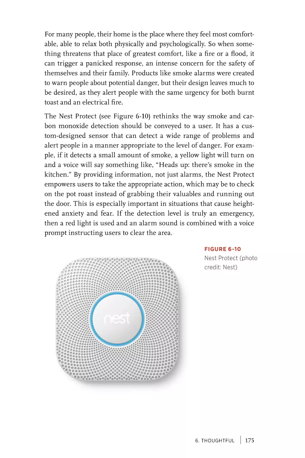
Throughout the last century, the discipline of industrial design has
refined an understanding of how to design physical products for people.
More recently, as computation and network connectivity extend beyond
the screen, interaction designers and UX professionals also find themselves addressing design problems in the physical world. Smart products, connected devices, the Internet of Things—these terms address a
new class of product that is both physical and digital, one that speaks to
the need for design disciplines to leave their silos and find productive
overlap. For designers who built their careers on the nuances of screenbased interactions, it can be disorienting to address broader UX challenges with a substantial physical component. Although the context is
new, much can be learned from the long-standing history and principles of industrial design. Technology evolves rapidly, but the underlying qualities that define the products we love have not changed.
In the past, one could often draw a clean line between hardware and
software. As that edge blurs, industrial and interaction designers need
to combine their expertise and learn from each other. In the 1990s, the
emergence of the Web led designers to develop new interaction patterns
for an entirely new medium. A similar definition of best practices is
needed for this era, drawing from expertise embedded across multiple
disciplines to create an integrative set of practices. Intertwining physical and digital experiences into a unified and coherent whole requires
designers of all types to stretch and learn. Industrial designers need
new sensitivities toward complex system states, remote interactions,
privacy considerations, and the open-ended potential of how input can
ix
map to output. Interaction designers need to embrace physical and spatial possibilities, consider a person’s whole body, and use new forms of
feedback less reliant on a screen.
The goal is not that interaction designers should all become industrial
designers, or vice versa, but that these two design disciplines should
find an overlap of skills and approaches appropriate to a world where
the traditional distinctions between physical and virtual are increasingly blurred. Effective collaboration and professional overlap requires
respect and understanding of each other’s disciplines. Because the
UX community includes people of such richly varied backgrounds, a
grounding in the field of industrial design is often lacking. This book
aims to bridge that divide using tangible examples, organized into
seven design principles, to illustrate processes, products, and points
of view from industrial design practice. Through these case studies,
interaction designers and UX professionals can find inspiration for
how to approach, frame, and evaluate their work as it extends beyond
the screen and into the physical world.
Who Should Read This Book?
The primary audience for this book is interaction designers and UX
professionals who find themselves in the overlap between physical and
digital products, or foresee their practice involving more collaboration
and integration with industrial design. It is written for the thoughtful
practitioner, who wants to learn from practical examples and combine
those approaches into their own point of view. We hope the reader will
bring an open mind, and look for fruitful connections between disciplines while avoiding territorial definitions. The examples in this book
may originate primarily from industrial design, but the reader should
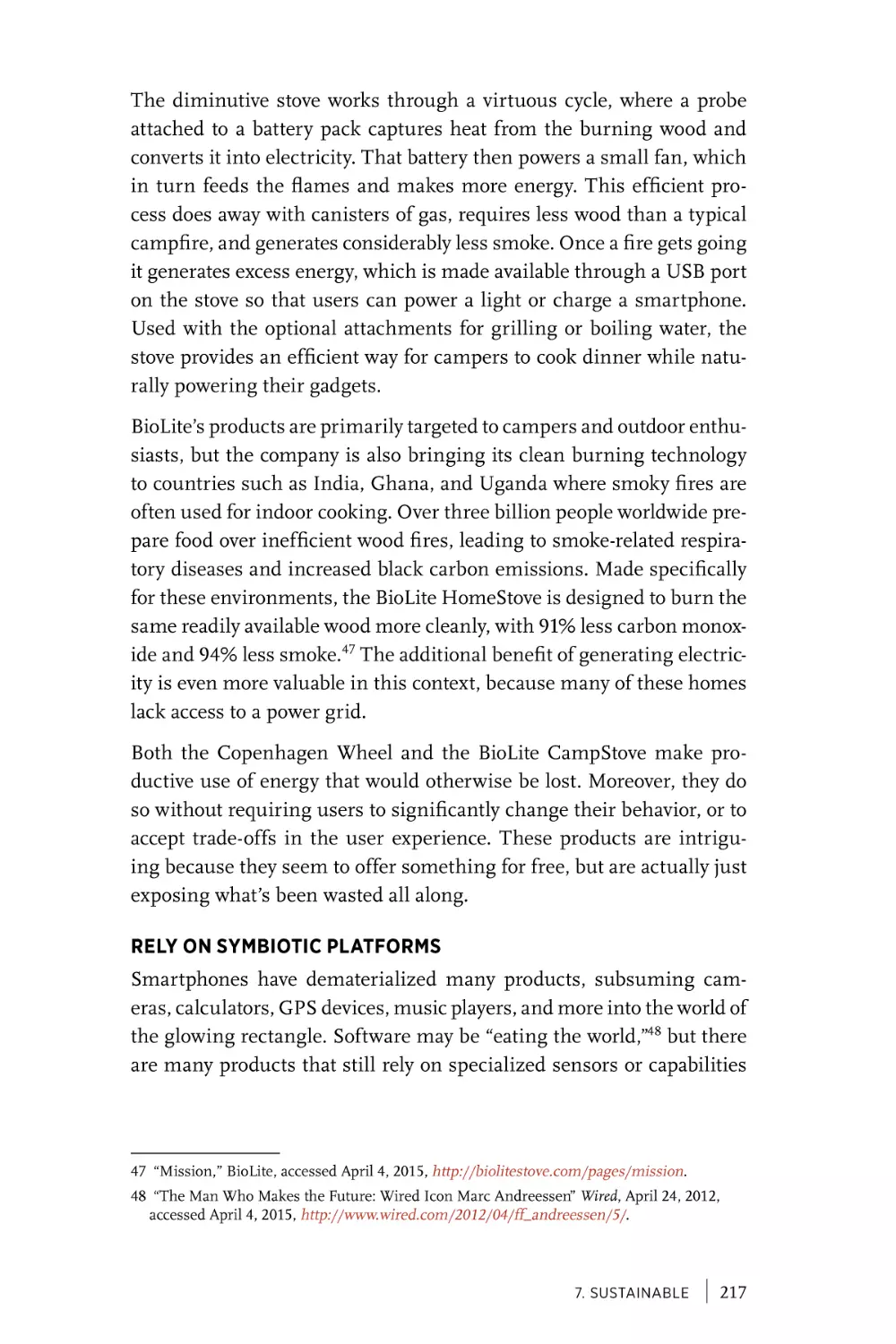
be prepared to view them through a broad lens of user experience.
Designers who intend to focus purely on screen-based products may
find that the principles in this book still provide them with new ways
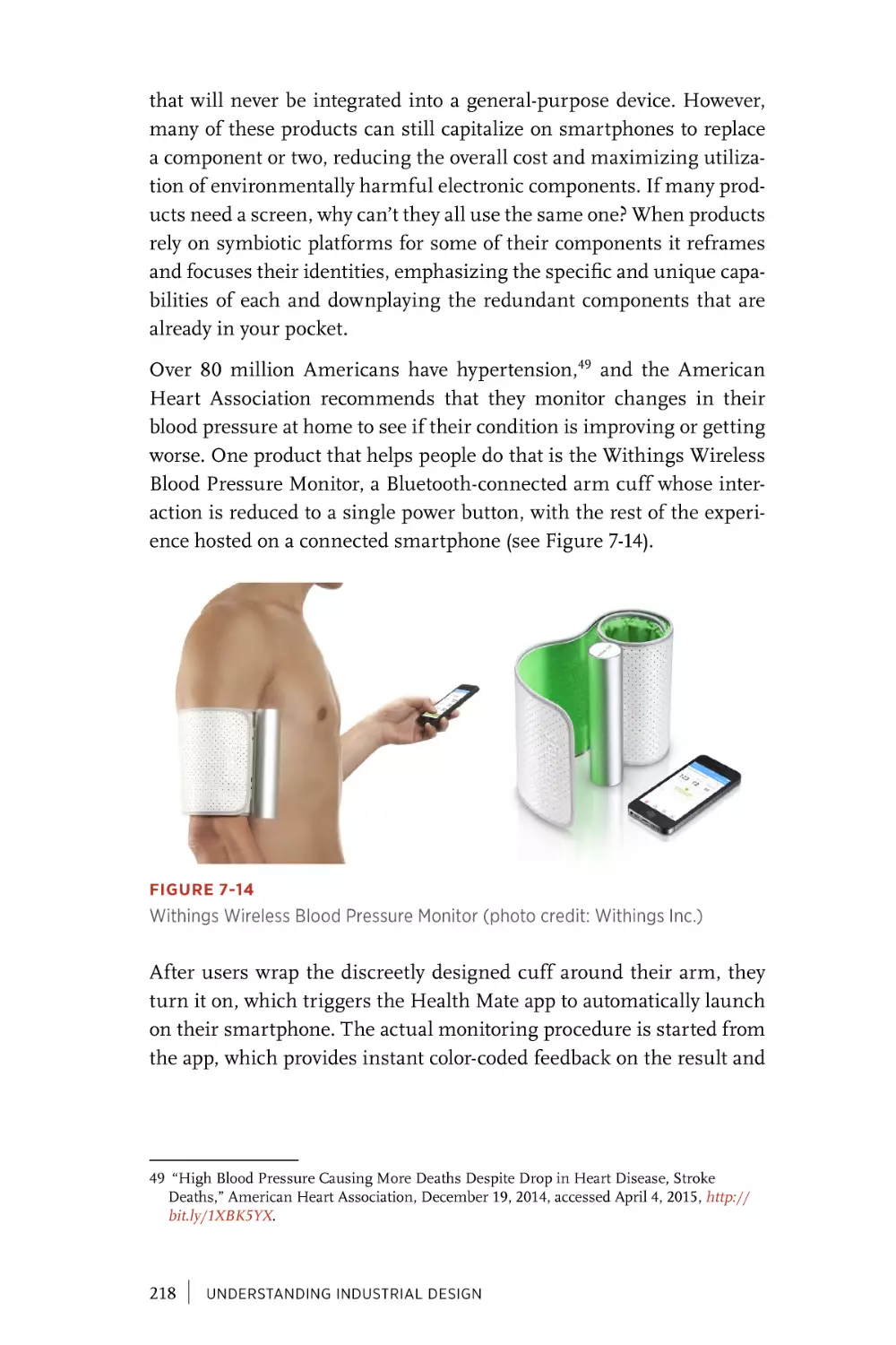
to frame and approach their work. At times, examples from industrial
design provide the possibility of relating a principle directly to a screenbased interaction, but translation of physical design solutions to screenbased alternatives is not a primary goal of this book.
x
|
Students studying industrial design will find a jumping-off point for
further exploration of particular projects and principles, but should
look to other texts for instructional or “how-to” approaches to their
discipline.
Finally, anyone who simply wants to learn more about industrial design
will also find value in the text. A basic familiarity with design professions in general is assumed, but no specific domain knowledge is
expected or required of the reader.
How Is the Book Structured?
The book begins with an introductory chapter providing a history of
industrial and interaction design. Each subsequent chapter focuses on
a different principle, where the theme is explored through extensive
examples drawn primarily from industrial design history and practice,
but including relevant work from screen-based products, advertising,
economics, and academia where appropriate. These chapters can be
read in any order, so you can return to and review relevant principles
when starting a new project. The concluding chapter summarizes the
thesis and points to changes in academic and corporate environments
that signal an evolving landscape for the design disciplines.
CHAPTER 1, A BRIEF HISTORY OF INDUSTRIAL
AND INTERACTION DESIGN
The book begins with a history of industrial and interaction design,
highlighting moments of both shared lineage and divergence. We
describe how design emerged as a professional practice during the
Industrial Revolution, and how the maturing discipline was shaped by
the needs and possibilities of business, people, technology, context, and
behavior. We use the computing and information revolutions of the late
20th century to discuss why interaction design splintered and grew as
its own discipline, and how smartphones and connected products are
causing industrial and interaction design to converge again.
CHAPTER 2, SENSORIAL
The first principle is focused on the senses and how physicality
affords a richer means of engaging people through design. Beyond
the sound and vision common to screen-based design, we look at how
combinations of color, materials, and finishes can create luxurious,
|
xi
multisensorial experiences. We show how information and state can
be physically embodied without relying on a screen, and discuss new
frontiers for sensorial design to enhance taste and smell.
CHAPTER 3, SIMPLE
Simplicity is often confused with minimalism, but true simplicity
comes not from a reduction of elements but from a design’s overall
clarity in relation to its purpose. This chapter looks at examples of simple products and deconstructs what gives them that elusive quality.
Some designers have found simplicity through tiny tweaks to a standard form, while others use physicality as a means to reduce complexity. We look at examples that appear complex but are simple in practice,
and those for which technical innovation enables an almost magical
simplicity.
CHAPTER 4, ENDURING
As the pace of technology accelerates, creating products with longevity is more complicated than ever before. This chapter looks at various strategies to design enduring products, from those that improve
when worn in, to quintessential designs that live on as classics. Some
examples are highly tailored to a particular person, while others adapt
over time to address changing needs. Many products today are made
of numerous layers, each of which needs to evolve at a different rate for
the product as a whole to endure.
CHAPTER 5, PLAYFUL
This chapter looks at how products can be playful, not to turn them
into games, but to accomplish their function with levity. We look at how
playfulness can elevate everyday actions, from making tea to cleaning
the toilet, and offer an emotional boost when we need it most. Perhaps
most importantly, we look at how playfulness can encourage positive
behavior change, where people choose to recycle or drive safely not
because they’ve been told to but because it’s the most enjoyable choice.
xii
|
CHAPTER 6, THOUGHTFUL
Design is inherently about making something for other people, which
requires an empathy and understanding of their needs and desires.
This chapter looks at examples of how designers have embedded
thoughtful consideration into products by observing people’s struggles
and anticipating their context of use. It looks at design through the lens
of comfort, both physical and psychological, and at thoughtful details
that include everyone, regardless of their abilities.
CHAPTER 7, SUSTAINABLE
In this chapter, we look at various ways that design decisions can contribute to sustainable futures. Industrial designers have explored this
principle for decades, as represented by examples of reducing waste,
promoting reuse, and making recycling easier. Other approaches take
advantage of new technology, such as maximizing resources by building upon smartphone platforms that people already own. Whether
baked into the production process or by continually promoting sustainable behaviors, designers have a responsibility for both a product’s user
experience and its broader impact on the planet.
CHAPTER 8, BEAUTIFUL
Beauty is perhaps the most obvious yet misunderstood principle on
this list. While industrial designers generally embrace the goal of making something beautiful, many UX professionals purposefully avoid
discussions of aesthetics, preferring to focus on usability, functionality,
or strategy. But beauty is a core part of design that can elevate the experience of everyday products. It can provide dignity and acceptance to
underserved audiences and honestly represent the qualities of a material. This chapter doesn’t seek to find a single definition for beauty, but
aims to demonstrate the need for including it within the scope of all
design.
CHAPTER 9, CONCLUSION
In this short concluding chapter, we reiterate the need for disciplinary
overlap as designers find themselves at the intersection of the digital
and physical. We look at how design education is changing to support
these hybrid designers, and how corporate strategy is driving demand
for people who can bridge that divide.
|
xiii
Comments and Questions
Please address comments and questions concerning this book to the
publisher:
O’Reilly Media, Inc.
1005 Gravenstein Highway North
Sebastopol, CA 95472
(800) 998-9938 (in the United States or Canada)
(707) 829-0515 (international or local)
(707) 829-0104 (fax)
We have a web page for this book, where we list errata, examples, and
any additional information. You can access this page at: http://bit.ly/
understanding-industrial-design. The author has set up a website for
the book as well at http://beetlebook.com.
To comment or ask technical questions about this book, send email to
bookquestions@oreilly.com.
For more information about our books, courses, conferences, and news,
see our website at http://www.oreilly.com.
Find us on Facebook: http://facebook.com/oreilly
Follow us on Twitter: http://twitter.com/oreillymedia
Watch us on YouTube: http://www.youtube.com/oreillymedia
Safari® Books Online
Safari Books Online (www.safaribooksonline.com) is an on-demand
digital library that delivers expert content in both book and video form
from the world’s leading authors in technology and business.
Technology professionals, software developers, web designers, and
business and creative professionals use Safari Books Online as their
primary resource for research, problem solving, learning, and certification training.
Safari Books Online offers a range of product mixes and pricing
programs for organizations, government agencies, and individuals.
Subscribers have access to thousands of books, training videos, and
prepublication manuscripts in one fully searchable database from
publishers like O’Reilly Media, Prentice Hall Professional, AddisonWesley Professional, Microsoft Press, Sams, Que, Peachpit Press, Focal
xiv
|
Press, Cisco Press, John Wiley & Sons, Syngress, Morgan Kaufmann,
IBM Redbooks, Packt, Adobe Press, FT Press, Apress, Manning, New
Riders, McGraw-Hill, Jones & Bartlett, Course Technology, and dozens
more. For more information about Safari Books Online, please visit us
online.
Acknowledgments
We would like to thank Nick Lombardi and Mary Treseler at O’Reilly
Media for supporting this book and guiding us through the process.
Thanks also to Jason Mesut, Martin Charlier, and Tom Metcalfe for
reviewing the manuscript draft and generously offering their valuable
input.
FROM SIMON
Molly Steenson—much of this book was written on buses and planes,
inevitably traveling to see you. I’m so glad that I’m typing these final
paragraphs while sitting in our new home together. This year had so
many milestones: a dog and a job, a house and a wedding, moving and
joy, sadness and love. Everything that’s happened makes completing a
book feel like a footnote. Thank you so much for all of your support and
faith in me. I couldn’t have done it without you.
Ivo Gasparotto—thank you for your input and advice throughout the
writing process. Knowing that you were there to review each chapter as
it was written was so encouraging and motivating.
Mom, Dad, Grandpa—from each of you I’ve inherited the drive to
tackle big new projects. Thank you for the work ethic, and for always
supporting me.
FROM KUEN
Jin Ko—you are my best friend, inspiration, and love of my life. I could
not have done this project without your endless support, patience, and
encouragement. Thank you!
|
xv
[1]
A Brief History of Industrial
and Interaction Design
This chapter provides a brief grounding in the history of industrial
and interaction design. It covers key moments and people in each discipline, highlighting pivotal events and noting points of convergence
and divergence. The history of personal computing is used to trace
advances in interaction design, with particular attention given to the
physical or virtual nature of different computing platforms.
Even as these two disciplines find new ways to overlap, it is important
to understand their individual histories. Just as empathy with users is
the foundation of human-centered design, empathy for the context of
other design disciplines is what allows us to productively collaborate.
Additional background on industrial design is interspersed throughout the book in conjunction with the examples that illuminate each
principle.
Industrial Revolution
For most of history, when people needed a particular object, they either
created it themselves or found someone to make it for them. Individuals
may have specialized in their production, such as shoemakers and carpenters, but their output was still largely unique creations.
There is evidence that generalized fabrication was used to standardize
crossbows and other weaponry as early as the 4th century BC in China.1
However, it was the rapid improvement of manufacturing capabilities
1 Joseph Needham, Science and Civilisation in China, Volume 1: Introductory Orientations
(Cambridge, UK: Cambridge University Press, 1954).
1
during the Industrial Revolution of the 18th and 19th centuries that
signaled the radical shift to mass production of identical goods. For the
first time, the act of design became separated from the act of making.
Driven by this change in technology, the field of industrial design
emerged to specialize in the design of commercial products that
appealed to a broad audience and could be manufactured at scale. In
contrast to the craftsmen of the past, these designers were challenged
with meeting the needs of a large population, balancing functionality, aesthetics, ergonomics, durability, cost, manufacturability, and
marketability.
The Industrial Designers Society of America (IDSA) describes industrial design as a professional service that optimizes “function, value,
and appearance for the mutual benefit of both user and manufacturer.”2 It is the study of form and function, designing the relationship
between objects, humans, and spaces. Most commonly, industrial
designers work on smaller-scale physical products, the kind you buy
and use every day, rather than larger-scale complex environments like
buildings or ships.
Whether you realize it or not, industrial design is all around you, supporting and shaping your everyday life. The mobile phone in your
pocket, the clock on your wall, the coffeemaker in your kitchen, and the
chair you are sitting on. Everything you see, touch, and are surrounded
by was designed by someone, and thus influenced by industrial design.
Throughout the 20th century, along with balancing the needs of the
user and manufacturer, differences in politics and culture were evident
in the design of objects. A rising consumer culture in the post-WWII
period meant that manufactured goods doubled as a cultural proxy,
intertwining national pride and economic reinvention. Along with
regional differences, numerous philosophical and stylistic periods created distinct and recognizable eras within industrial design, including
the Bauhaus school, Art Deco, Modernism, and Postmodernism.
2 “What Is Industrial Design?” Industrial Designers Society of America, accessed January
22, 2015, http://www.idsa.org/education/what-is-id.
2
|
UNDERSTANDING INDUSTRIAL DESIGN
DESIGN FOR BUSINESS
On a more individual level, there are many famous industrial designers who have had an outsized influence on the history of the discipline.
Raymond Loewy, a French-born American, is often referred to as the
“Father of Industrial Design.”3 Loewy is widely considered to have revolutionized the field by pioneering the role of designer as consultant,
working within a wide variety of industries and mediums.
Loewy designed everything from streamlined pencil sharpeners to
Coca-Cola vending machines, Studebaker automobiles, and NASA
spacecraft interiors. He brought design into the mainstream business
spotlight, gracing the cover of Time magazine in October 1949, where
it was noted that he “made products irresistible at a time when nobody
really wanted to pay for anything.”4 Loewy intertwined culture, capitalism, and style, establishing a template for how design and business
could be mutually beneficial.
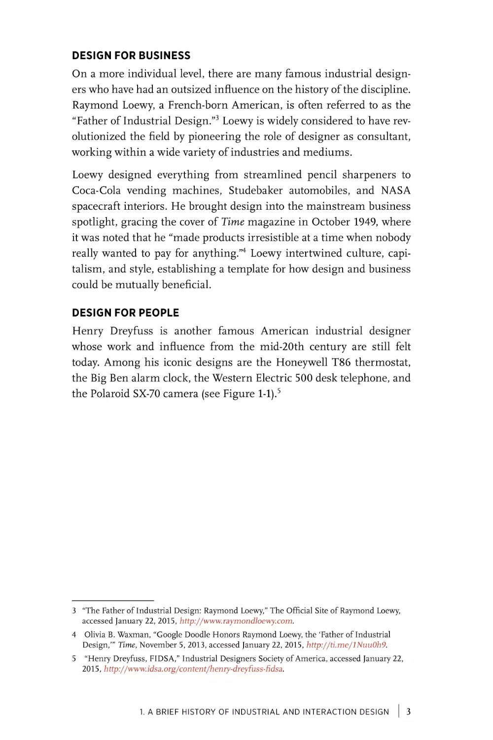
DESIGN FOR PEOPLE
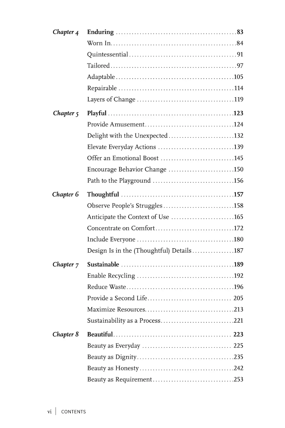
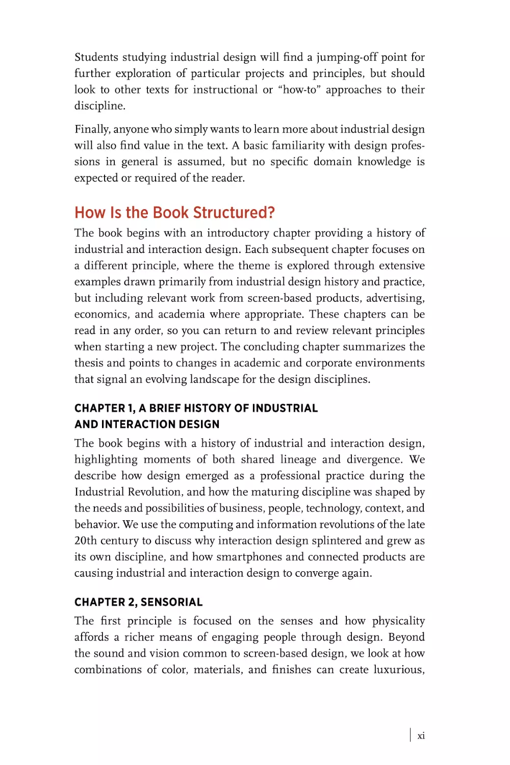
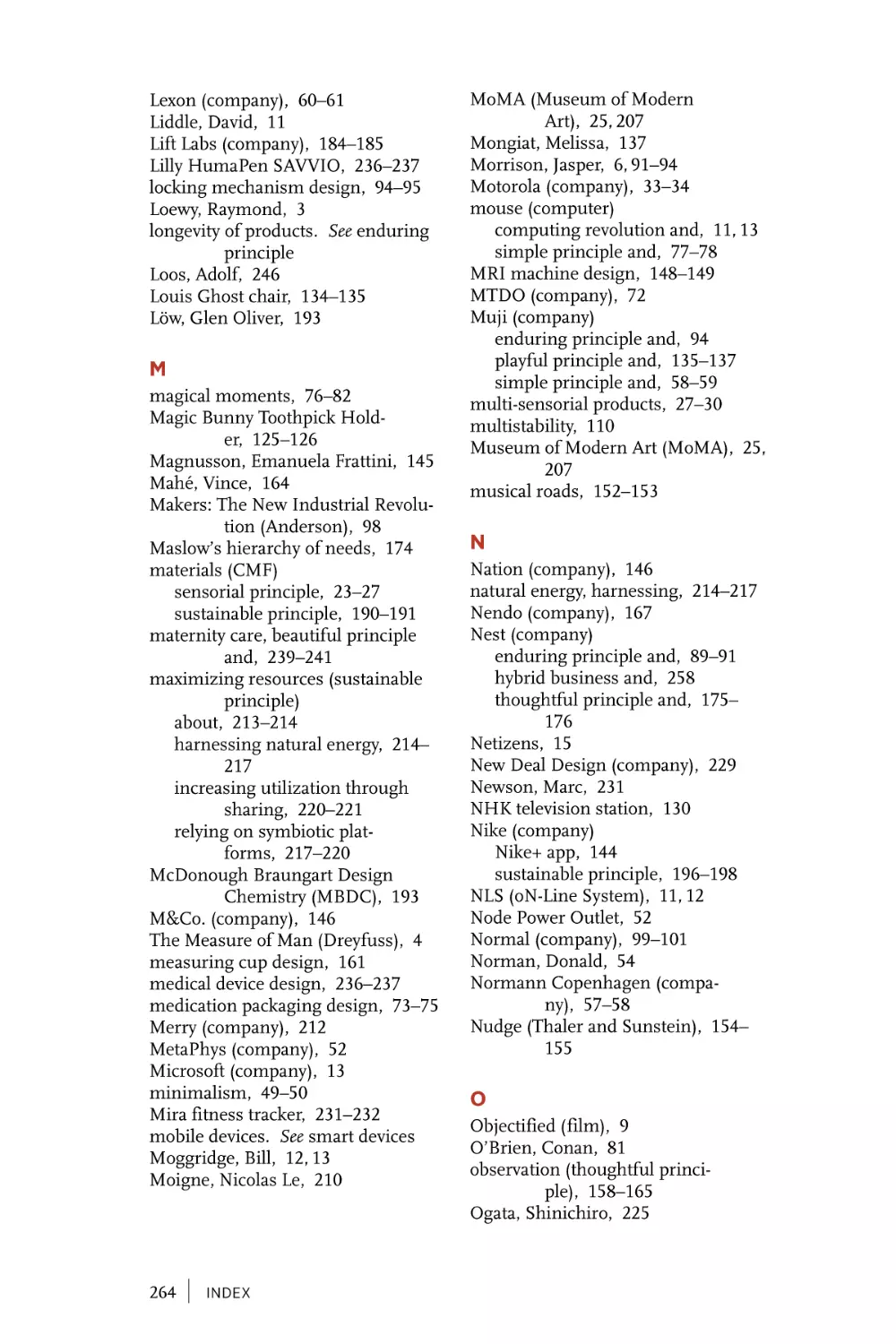
Henry Dreyfuss is another famous American industrial designer
whose work and influence from the mid-20th century are still felt
today. Among his iconic designs are the Honeywell T86 thermostat,
the Big Ben alarm clock, the Western Electric 500 desk telephone, and
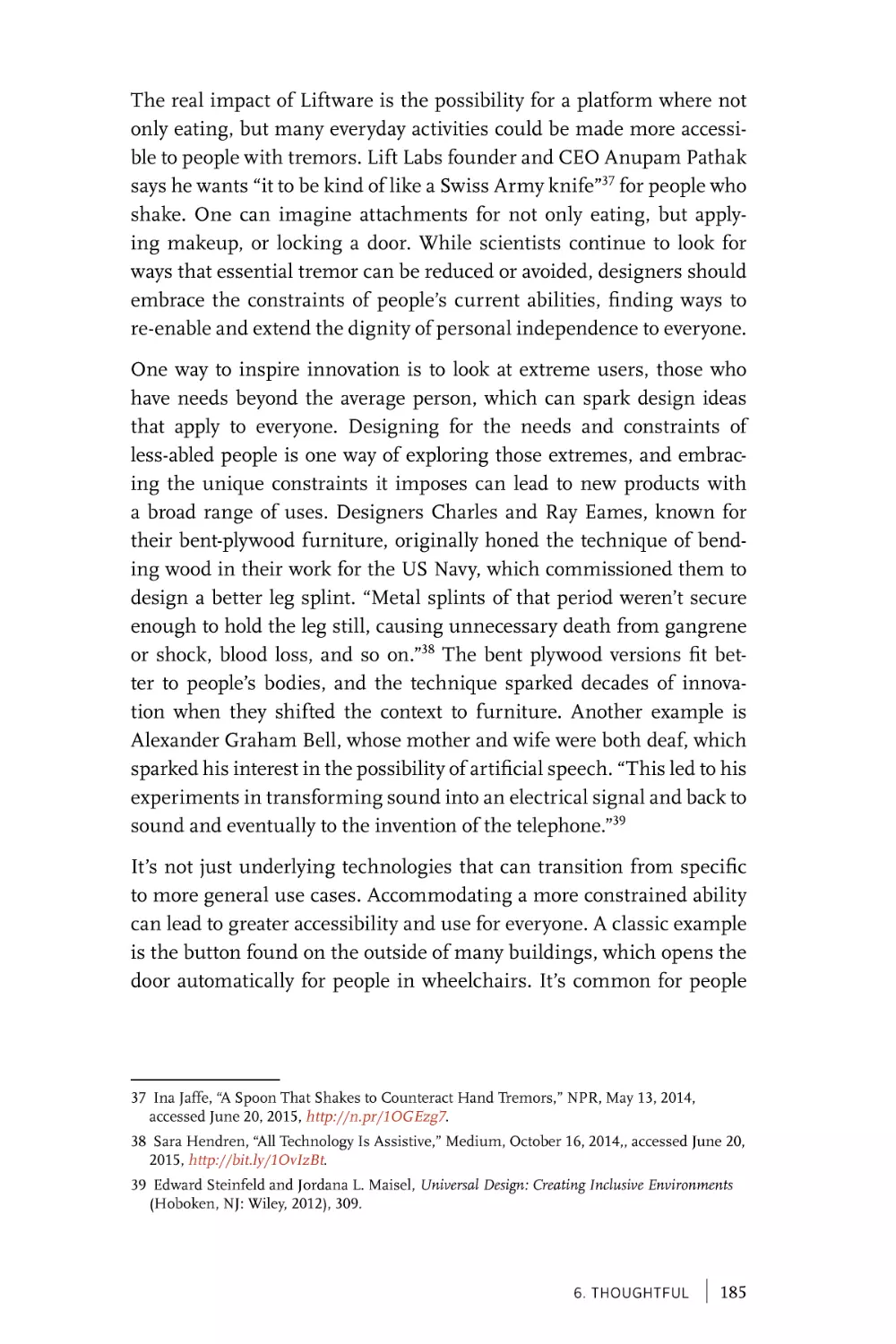
the Polaroid SX-70 camera (see Figure 1-1).5
3 “The Father of Industrial Design: Raymond Loewy,” The Official Site of Raymond Loewy,
accessed January 22, 2015, http://www.raymondloewy.com.
4 Olivia B. Waxman, “Google Doodle Honors Raymond Loewy, the ‘Father of Industrial
Design,’” Time, November 5, 2013, accessed January 22, 2015, http://ti.me/1Nuu0h9.
5 “Henry Dreyfuss, FIDSA,” Industrial Designers Society of America, accessed January 22,
2015, http://www.idsa.org/content/henry-dreyfuss-fidsa.
1. A Brief History of Industrial and Interaction Design
|
3
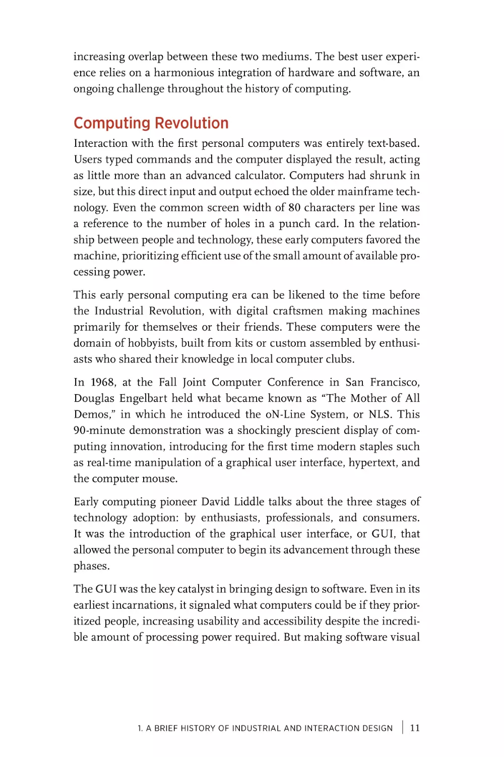
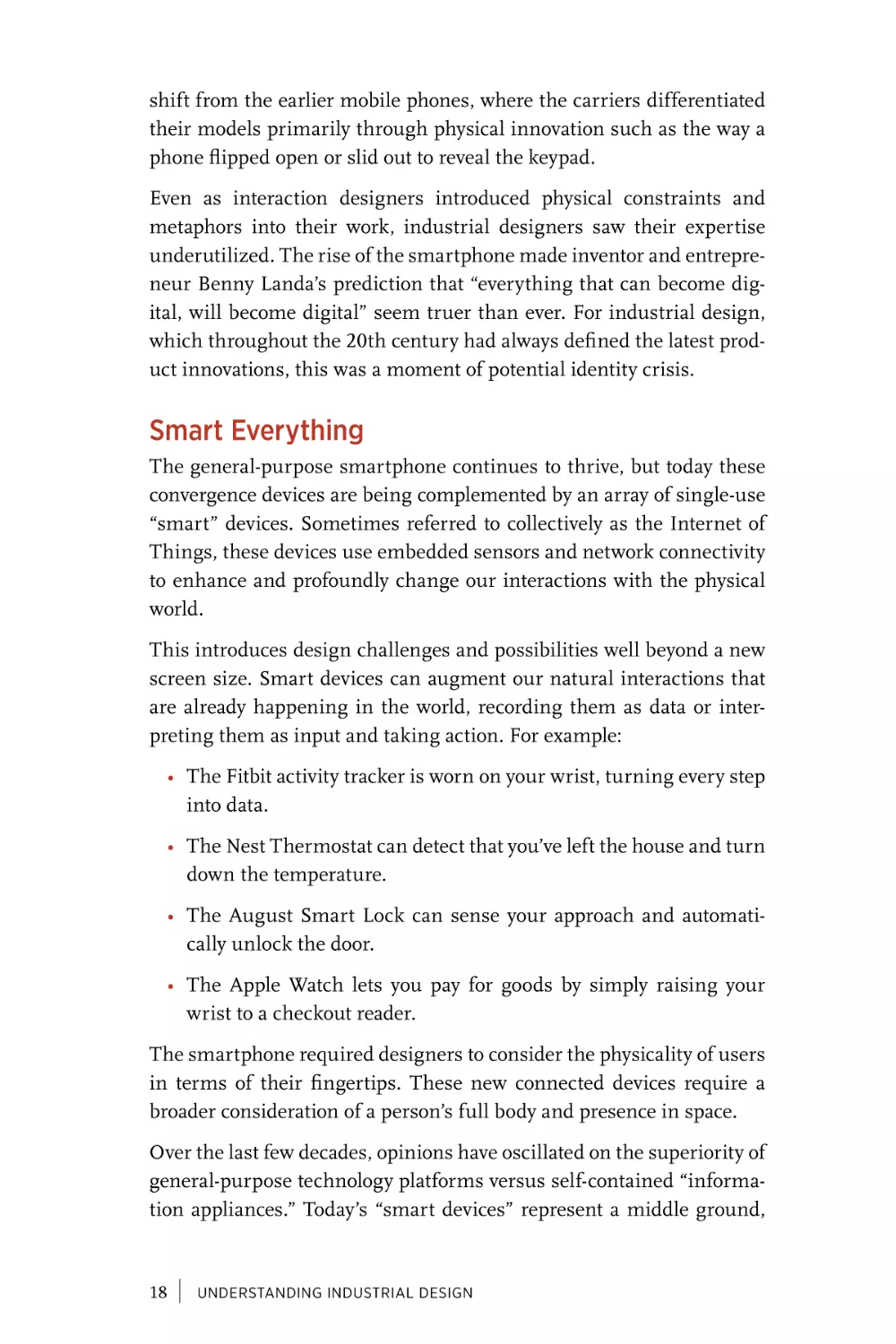
FIGURE 1-1
Honeywell T86 thermostat and Polaroid SX-70 camera, designed by Henry
Dreyfuss (photo credit: Kuen Chang)
Dreyfuss was renowned not only for his attention to formal details but
also for his focus on the user’s needs. He contributed significantly to
the field of ergonomics, pioneering research into how human factors
should be considered and incorporated into industrial design. After
retiring, this focus on anthropometry and usability led him to author
two seminal books: Designing for People in 1955 and The Measure of Man
in 1960. His interest in universal accessibility extended to graphics as
well, as evidenced by his 1972 book, Symbol Sourcebook: An Authoritative
Guide to International Graphic Symbols, in which Dreyfuss catalogs and
promotes the use of internationally recognizable symbols over written
words.
Dreyfuss felt that “well-designed, mass-produced goods constitute a
new American art form and are responsible for the creation of a new
American culture.”6 But he emphasized that good design was for
everyone, that “these products of the applied arts are a part of everyday American living and working, not merely museum pieces to be
seen on a Sunday afternoon.”7 He promoted this approach through his
own work, but also more broadly in his role as a founding member
of the American Society of Industrial Design (ASID). When the ASID
6 Henry Dreyfuss, Designing for People (New York: Simon and Schuster, 1955), 82–83.
7 Ibid.
4
|
UNDERSTANDING INDUSTRIAL DESIGN
merged with the Industrial Designers Institute and the Industrial
Design Education Association in 1965 to form the IDSA, Dreyfuss
became the first president of the new association. In 1965, he became
the first president of the IDSA.
DESIGN FOR TECHNOLOGY
Along with the needs of business and users, the history of industrial
design has been strongly shaped by the introduction of new technologies, which present an opportunity to redesign and improve products.
Industrial design has always been a conduit for innovation, translating
the latest discoveries of science to meet the needs of everyday people.
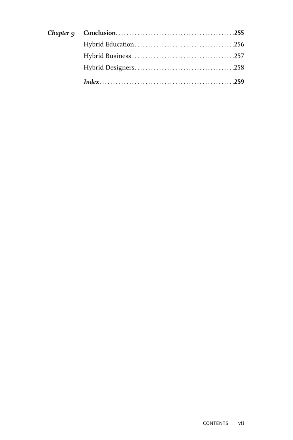
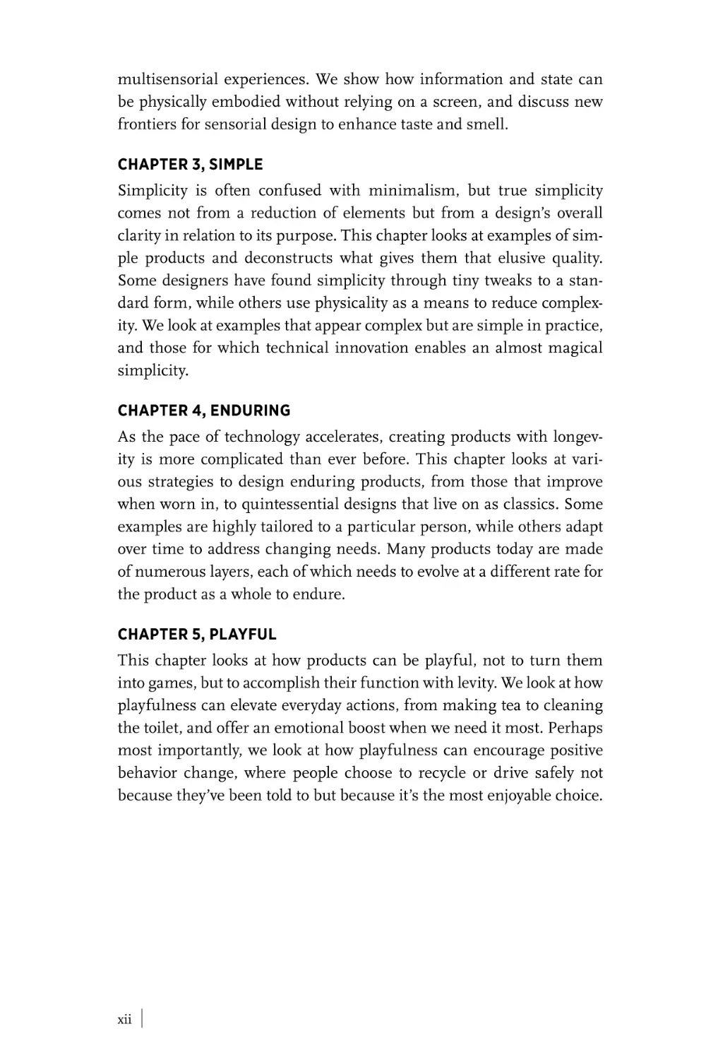
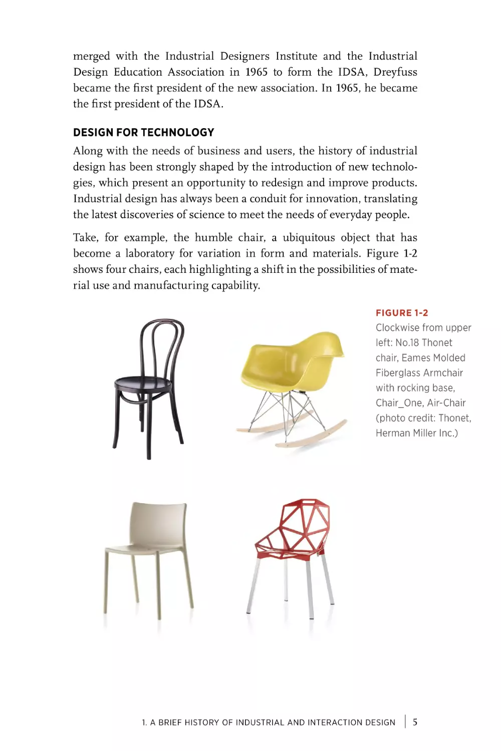
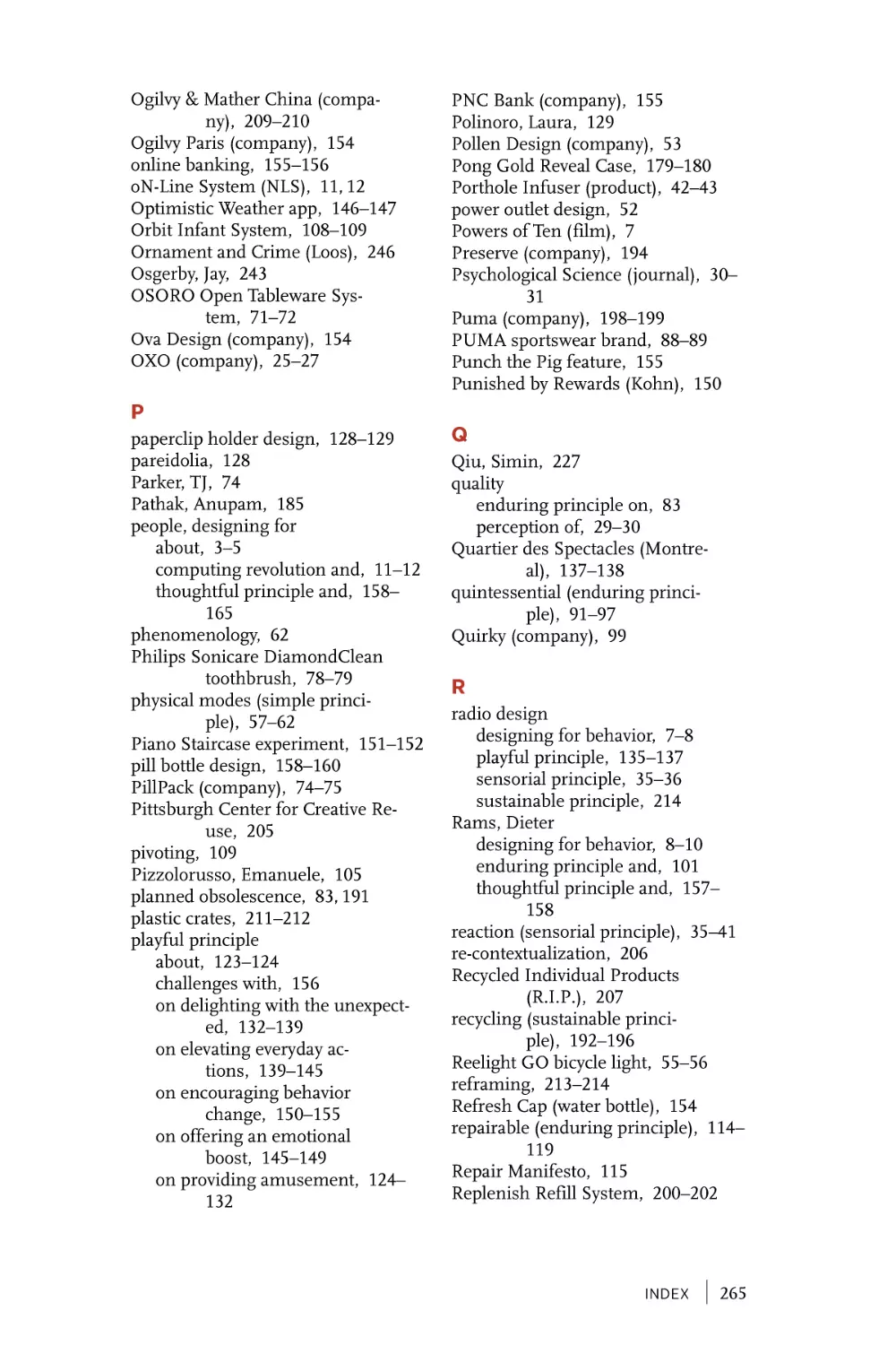
Take, for example, the humble chair, a ubiquitous object that has
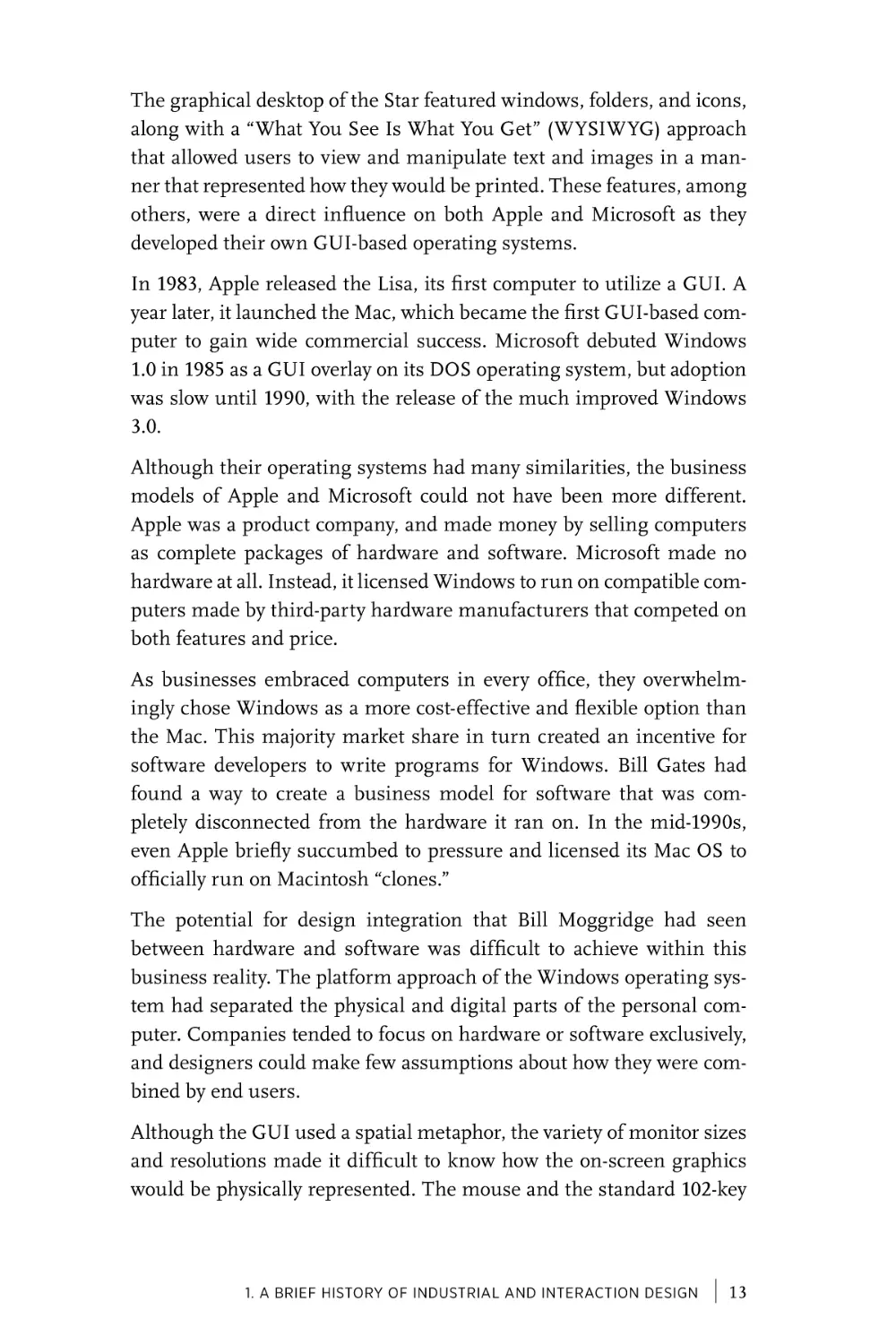
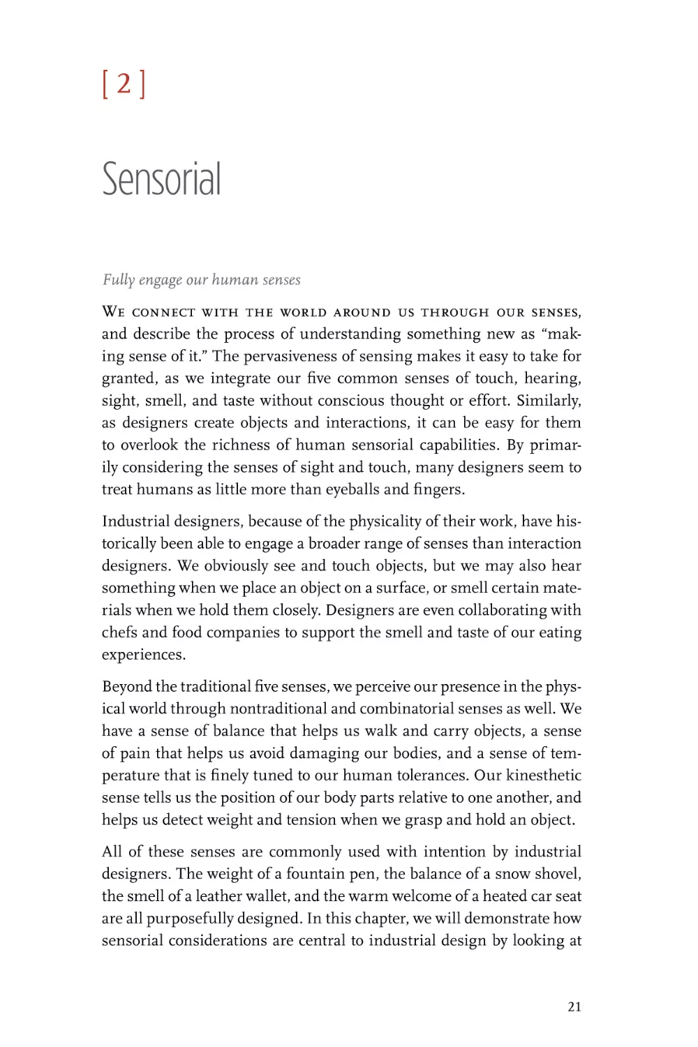
become a laboratory for variation in form and materials. Figure 1-2
shows four chairs, each highlighting a shift in the possibilities of material use and manufacturing capability.
FIGURE 1-2
Clockwise from upper
left: No.18 Thonet
chair, Eames Molded
Fiberglass Armchair
with rocking base,
Chair_One, Air-Chair
(photo credit: Thonet,
Herman Miller Inc.)
1. A Brief History of Industrial and Interaction Design
|
5
The No.18 Thonet chair (1876) was an evolution of experimentation
begun by Michael Thonet, with this variation released after his death
in 1871. 8 Thonet pioneered a new process of bending beech wood to
reduce the number of parts involved, simplifying and strengthening
the chair while increasing efficiency in shipping and assembly. The
aesthetic was influenced by the technology, with generous curves honestly reflecting the bent wood process.
The stamped steel version of the Eames Molded Fiberglass Chair (1950)
features a smooth and continuous organic form, unique in appearance and extremely comfortable. It was originally designed in stamped
metal, which proved too costly and prone to rust. Instead, a new manufacturing technique was utilized that allowed fiberglass to cure at room
temperature. A boat builder who was familiar with fiberglass helped
build early prototypes to prove out the concept.9
Jasper Morrison’s Air-Chair (1999) takes reduction of parts to the
extreme, as it is constructed out of a single piece of injection-molded
polypropylene. Inert gas is pumped into the center of molten plastic,
resulting in a solid, light, and economical product that comes off the
assembly line fully formed.
Konstantin Grcic’s Chair_One (2004) uses a die-cast aluminum process to achieve an original form that is at once full of voids, yet very
solid; angular and sculptural at a glance, yet surprisingly more comfortable than it looks. Grcic says that “a bad chair is one that performs
all of the requirements, but remains just a chair. One that I use to sit
on, but then I get up and it didn’t mean anything to me.”10 He believes
that what makes good design is something hidden in the relationship
you have with the object.
DESIGN FOR CONTEXT
Of the chairs discussed in the previous section, the fiberglass model by
the husband-and-wife design team of Charles and Ray Eames deserves
further attention. The Eameses are known for their enduringly popular
8 “History,” Thonet, accessed January 22, 2015, http://www.thonet.com.au/history/.
9 Kaitlin Handler, “The History of the Eames Molded Plastic Chairs,” Eames Official Site,
May 4, 2014, accessed December 5, 2015, http://bit.ly/1UbYw0l.
10 “On Design: Konstantin Grcic,” NOWNESS, accessed January 22, 2015, http://bit.
ly/1HYjFd9.
6
|
UNDERSTANDING INDUSTRIAL DESIGN
classic furniture designs, most of which are still being manufactured
by Herman Miller. Their work often utilized new materials such as
molded plywood, wire mesh, and the aforementioned fiberglass.
The Eames Molded Fiberglass Chair won second prize in the 1949
International Low-Cost Furniture Competition, primarily for its innovative base that allows it to adapt to different uses and environments
such as nursery, office, home, or school. This notion of adaptability to
context is a theme that runs through much of Eames’s multidisciplinary
work, which spanned products, photography, film, and architecture.
In 1977, Charles and Ray made Powers of Ten, a short documentary
film that explores context by examining the effect of scale. The film
begins at the level of human perception, with a couple having a picnic
on the Chicago lakeshore, and then zooms out by consecutive factors
of ten to reveal the entire universe before zooming inward to the scale
of a single atom. The film has been influential in encouraging designers to consider adjacent levels of context—the details of how a design
relates to the next level of scale, whether that’s a room or a body part.
These details are often overlooked, but as Charles once explained, “The
details are not the details. They make the product.”11
DESIGNING FOR BEHAVIOR
Continuous evolution of manufacturing capabilities, business needs,
human factors, materials, and contexts created a wide spectrum of
ways in which industrial designers could express a particular product. However, it was the embedding of electronics into products that
resulted in the most radical shift in both design possibilities and people’s relationships with objects. For the first time, the potential behavior and functionality of a product was disconnected from its physical
form.
Consider the difference between a chair and a radio. Although chairs
vary widely in form and materials, the way that a person uses them is
largely self-evident, without instruction or confusion. With a radio, the
functionality is more abstract. The shape of a knob may communicate
its ability to turn, but not necessarily what it controls.
11 Daniel Ostroff, “The Details Are Not the Details...” Eames Office, September 8, 2014,
accessed December 5, 2015, http://bit.ly/1MlcCWP.
1. A Brief History of Industrial and Interaction Design
|
7
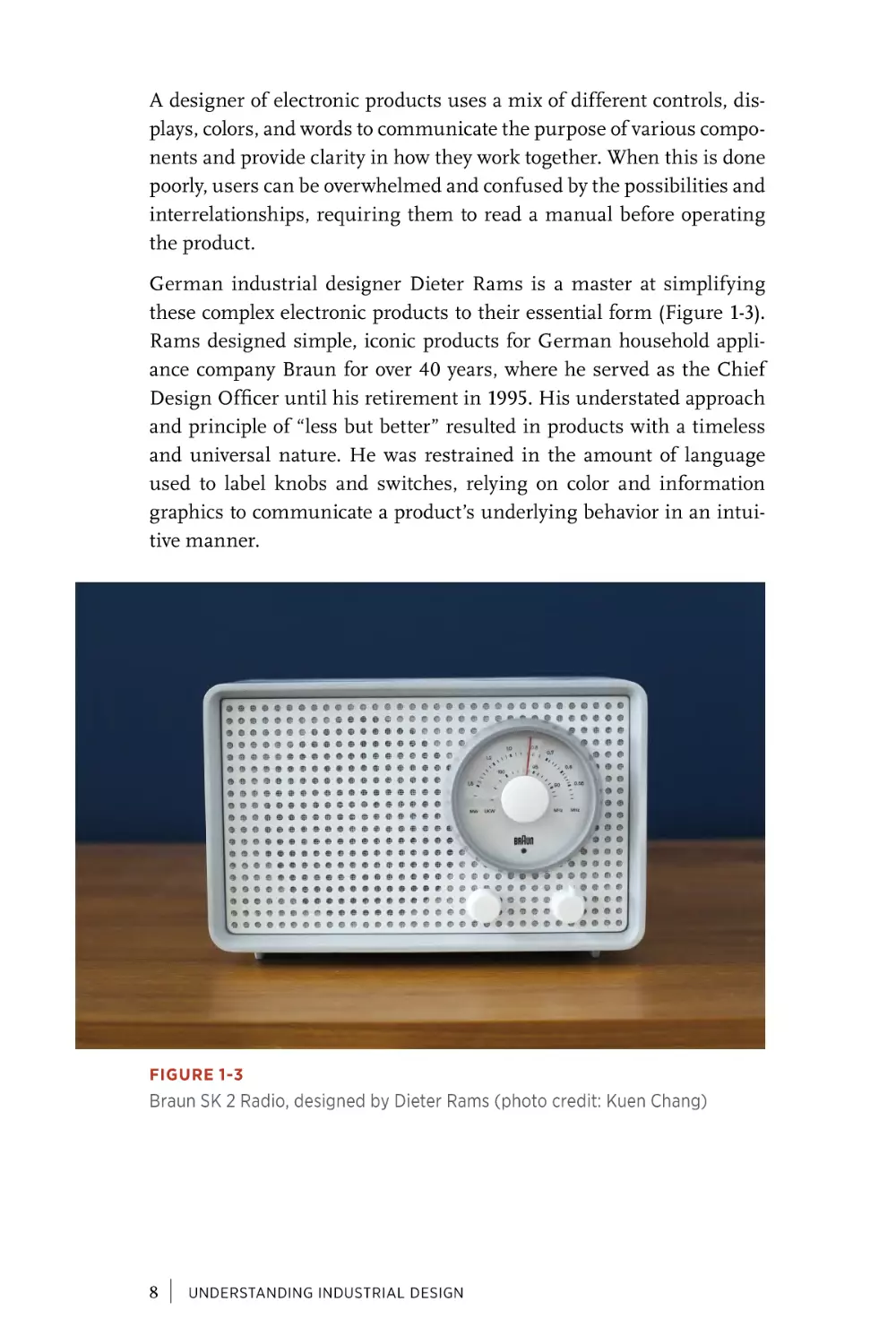
A designer of electronic products uses a mix of different controls, displays, colors, and words to communicate the purpose of various components and provide clarity in how they work together. When this is done
poorly, users can be overwhelmed and confused by the possibilities and
interrelationships, requiring them to read a manual before operating
the product.
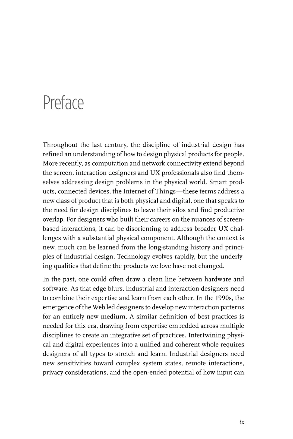
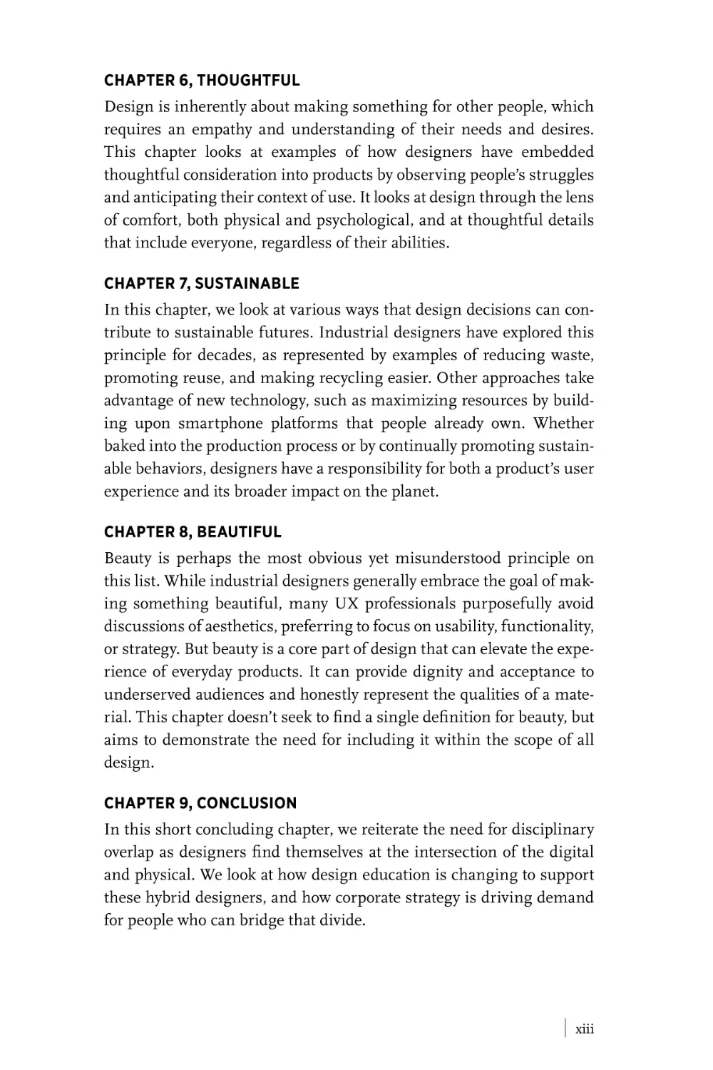
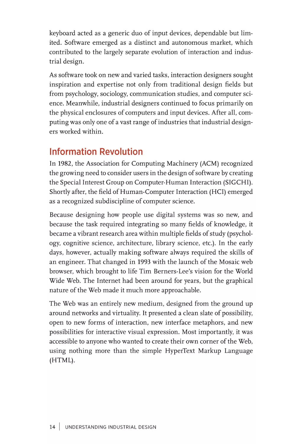
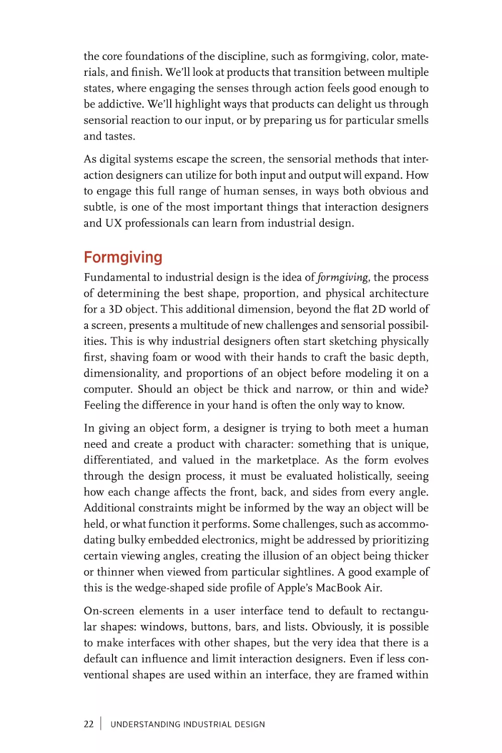
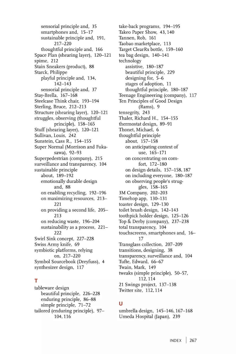
German industrial designer Dieter Rams is a master at simplifying
these complex electronic products to their essential form (Figure 1-3).
Rams designed simple, iconic products for German household appliance company Braun for over 40 years, where he served as the Chief
Design Officer until his retirement in 1995. His understated approach
and principle of “less but better” resulted in products with a timeless
and universal nature. He was restrained in the amount of language
used to label knobs and switches, relying on color and information
graphics to communicate a product’s underlying behavior in an intuitive manner.
FIGURE 1-3
Braun SK 2 Radio, designed by Dieter Rams (photo credit: Kuen Chang)
8
|
UNDERSTANDING INDUSTRIAL DESIGN
Part of Rams’s enduring legacy is his ten principles for good design,12
which are rooted in his deep industrial design experience and remain
relevant decades later to a broad range of designers. The principles we
chose for this book overlap with his list, emphasizing those that relate
best to UX and interaction design challenges. Much has been written
about Rams’s ten principles, and we encourage you to review his list as
a jumping-off point for further learning and inspiration.
Rams has influenced many contemporary designers, and between 2008
and 2012 the Less and More retrospective of his work traveled around
the world, showcasing over 200 examples of his landmark designs for
Braun.13 During an interview with Gary Hustwit for his 2009 film
Objectified, Dieter Rams said that Apple is one of the few companies
today that consistently create products in accordance with his principles of good design.
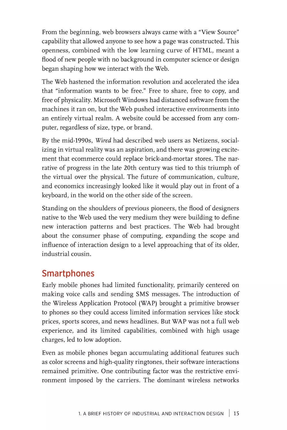
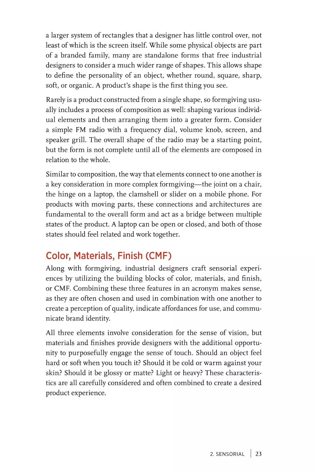
It’s no surprise that Jonathan Ive, Apple’s Chief Design Officer, is a
fan of Rams’ work and ethos. Since joining Apple in the early 1990s,
the British industrial designer has overseen the launch of radical new
product lines with unique and groundbreaking designs, including the
iMac, iPhone, iPad, and Apple Watch (Figure 1-4). Regarding these
innovations, he emphasizes that being different does not equate to
being better. In reference to the first iMac design, Ive has said that “the
goal wasn’t to look different, but to build the best integrated consumer
computer we could. If as a consequence the shape is different, then
that’s how it is.”14
12 “Dieter Rams: Ten Principles for Good Design,” Vitsœ, accessed January 22, 2015, https://
www.vitsoe.com/gb/about/good-design.
13 “Less and More: The Design Ethos of Dieter Rams,” San Francisco Museum of Modern
Art, accessed January 22, 2015, archived here: http://archv.sfmoma.org/exhib_events/
exhibitions/434.
14 Leander Kahney, Jony Ive: The Genius Behind Apple’s Greatest Products (New York: Penguin
Putnam Inc., 2013), 125.
1. A Brief History of Industrial and Interaction Design
|
9
FIGURE 1-4
Apple Watch, iPad, and iPhone, designed by Jonathan Ive (photo credit: Kuen
Chang)
Ive’s approach seems to echo and build upon Rams’s motto of “less but
better,” although the products that Apple makes are significantly more
complex than the ones that Rams designed for Braun. The physical
enclosure and input controls of a computing device are similar to legacy electronics, but the mutable functionality of software on a screen is
its own world of complexity. The introduction of the personal computer
significantly widened the separation of form and function.
In 2012, Ive was knighted by Queen Elizabeth II for his landmark
achievements. In the same year, Sir Jonathan Ive’s role at Apple
expanded, from leading industrial design to providing direction for all
human interface design across the company.15 This consolidation of
design leadership across physical and digital products speaks to the
15 “Apple Announces Changes to Increase Collaboration Across Hardware, Software
& Services,” Apple Inc., October 29, 2012, accessed January 22, 2015, http://apple.
co/1mrHjox.
10
|
UNDERSTANDING INDUSTRIAL DESIGN
increasing overlap between these two mediums. The best user experience relies on a harmonious integration of hardware and software, an
ongoing challenge throughout the history of computing.
Computing Revolution
Interaction with the first personal computers was entirely text-based.
Users typed commands and the computer displayed the result, acting
as little more than an advanced calculator. Computers had shrunk in
size, but this direct input and output echoed the older mainframe technology. Even the common screen width of 80 characters per line was
a reference to the number of holes in a punch card. In the relationship between people and technology, these early computers favored the
machine, prioritizing efficient use of the small amount of available processing power.
This early personal computing era can be likened to the time before
the Industrial Revolution, with digital craftsmen making machines
primarily for themselves or their friends. These computers were the
domain of hobbyists, built from kits or custom assembled by enthusiasts who shared their knowledge in local computer clubs.
In 1968, at the Fall Joint Computer Conference in San Francisco,
Douglas Engelbart held what became known as “The Mother of All
Demos,” in which he introduced the oN-Line System, or NLS. This
90-minute demonstration was a shockingly prescient display of computing innovation, introducing for the first time modern staples such
as real-time manipulation of a graphical user interface, hypertext, and
the computer mouse.
Early computing pioneer David Liddle talks about the three stages of
technology adoption: by enthusiasts, professionals, and consumers.
It was the introduction of the graphical user interface, or GUI, that
allowed the personal computer to begin its advancement through these
phases.
The GUI was the key catalyst in bringing design to software. Even in its
earliest incarnations, it signaled what computers could be if they prioritized people, increasing usability and accessibility despite the incredible amount of processing power required. But making software visual
1. A Brief History of Industrial and Interaction Design
|
11
did not automatically make computers usable by ordinary people. That
would require designers to focus their efforts on the world behind the
screen.
In his book Designing Interactions, IDEO cofounder Bill Moggridge
relates a story about designing the first laptop computer, the GRiD
Compass, in 1979.16 The industrial design of the Compass had numerous innovations, including the first clamshell keyboard cover. It ran
a custom operating system called GRiD-OS, which featured an early
graphical user interface, but with no pointing device. Using this GUI
prompted him to realize for the first time that his role as a designer
shouldn’t stop at the physical form—it needed to include the experiences that people have with software as well.
Years later, Bill Moggridge, along with Bill Verplank, would coin
the term “interaction design” as a way of distinguishing design that
focuses on digital and interactive experiences from traditional industrial design.
Pioneering computer scientist and HCI researcher Terry Winograd
has said that he thinks “Interaction design overlaps with [industrial
design], because they both take a very strong user-oriented view. Both
are concerned with finding a user group, understanding their needs,
then using that understanding to come up with new ideas.”17 Today we
take for granted this approach of designing software by focusing on
people, but in the Silicon Valley of the 1980s the seeds of human-centered computing were only just being planted.
THE SPLIT BETWEEN PHYSICAL AND DIGITAL
In the 1970s, influenced by Douglas Engelbart’s NLS demonstration,
numerous research projects at Xerox PARC explored similar topics.
The Xerox Star, released in 1981, was the first commercially available
computer with a GUI that utilized the now familiar desktop metaphor.
This structure of a virtual office correlated well with the transition that
computing was attempting to make from enthusiasts to professional
users.
16 Bill Moggridge, Designing Interactions (Cambridge, MA: MIT, 2007).
17 Jenny Preece, Yvonne Rogers, and Helen Sharp, Interaction Design: Beyond HumanComputer Interaction (Hoboken, NJ: Wiley, 2002), 70.
12
|
UNDERSTANDING INDUSTRIAL DESIGN
The graphical desktop of the Star featured windows, folders, and icons,
along with a “What You See Is What You Get” (WYSIWYG) approach
that allowed users to view and manipulate text and images in a manner that represented how they would be printed. These features, among
others, were a direct influence on both Apple and Microsoft as they
developed their own GUI-based operating systems.
In 1983, Apple released the Lisa, its first computer to utilize a GUI. A
year later, it launched the Mac, which became the first GUI-based computer to gain wide commercial success. Microsoft debuted Windows
1.0 in 1985 as a GUI overlay on its DOS operating system, but adoption
was slow until 1990, with the release of the much improved Windows
3.0.
Although their operating systems had many similarities, the business
models of Apple and Microsoft could not have been more different.
Apple was a product company, and made money by selling computers
as complete packages of hardware and software. Microsoft made no
hardware at all. Instead, it licensed Windows to run on compatible computers made by third-party hardware manufacturers that competed on
both features and price.
As businesses embraced computers in every office, they overwhelmingly chose Windows as a more cost-effective and flexible option than
the Mac. This majority market share in turn created an incentive for
software developers to write programs for Windows. Bill Gates had
found a way to create a business model for software that was completely disconnected from the hardware it ran on. In the mid-1990s,
even Apple briefly succumbed to pressure and licensed its Mac OS to
officially run on Macintosh “clones.”
The potential for design integration that Bill Moggridge had seen
between hardware and software was difficult to achieve within this
business reality. The platform approach of the Windows operating system had separated the physical and digital parts of the personal computer. Companies tended to focus on hardware or software exclusively,
and designers could make few assumptions about how they were combined by end users.
Although the GUI used a spatial metaphor, the variety of monitor sizes
and resolutions made it difficult to know how the on-screen graphics
would be physically represented. The mouse and the standard 102-key
1. A Brief History of Industrial and Interaction Design
|
13
keyboard acted as a generic duo of input devices, dependable but limited. Software emerged as a distinct and autonomous market, which
contributed to the largely separate evolution of interaction and industrial design.
As software took on new and varied tasks, interaction designers sought
inspiration and expertise not only from traditional design fields but
from psychology, sociology, communication studies, and computer science. Meanwhile, industrial designers continued to focus primarily on
the physical enclosures of computers and input devices. After all, computing was only one of a vast range of industries that industrial designers worked within.
Information Revolution
In 1982, the Association for Computing Machinery (ACM) recognized
the growing need to consider users in the design of software by creating
the Special Interest Group on Computer-Human Interaction (SIGCHI).
Shortly after, the field of Human-Computer Interaction (HCI) emerged
as a recognized subdiscipline of computer science.
Because designing how people use digital systems was so new, and
because the task required integrating so many fields of knowledge, it
became a vibrant research area within multiple fields of study (psychology, cognitive science, architecture, library science, etc.). In the early
days, however, actually making software always required the skills of
an engineer. That changed in 1993 with the launch of the Mosaic web
browser, which brought to life Tim Berners-Lee’s vision for the World
Wide Web. The Internet had been around for years, but the graphical
nature of the Web made it much more approachable.
The Web was an entirely new medium, designed from the ground up
around networks and virtuality. It presented a clean slate of possibility,
open to new forms of interaction, new interface metaphors, and new
possibilities for interactive visual expression. Most importantly, it was
accessible to anyone who wanted to create their own corner of the Web,
using nothing more than the simple HyperText Markup Language
(HTML).
14
|
UNDERSTANDING INDUSTRIAL DESIGN
From the beginning, web browsers always came with a “View Source”
capability that allowed anyone to see how a page was constructed. This
openness, combined with the low learning curve of HTML, meant a
flood of new people with no background in computer science or design
began shaping how we interact with the Web.
The Web hastened the information revolution and accelerated the idea
that “information wants to be free.” Free to share, free to copy, and
free of physicality. Microsoft Windows had distanced software from the
machines it ran on, but the Web pushed interactive environments into
an entirely virtual realm. A website could be accessed from any computer, regardless of size, type, or brand.
By the mid-1990s, Wired had described web users as Netizens, socializing in virtual reality was an aspiration, and there was growing excitement that ecommerce could replace brick-and-mortar stores. The narrative of progress in the late 20th century was tied to this triumph of
the virtual over the physical. The future of communication, culture,
and economics increasingly looked like it would play out in front of a
keyboard, in the world on the other side of the screen.
Standing on the shoulders of previous pioneers, the flood of designers
native to the Web used the very medium they were building to define
new interaction patterns and best practices. The Web had brought
about the consumer phase of computing, expanding the scope and
influence of interaction design to a level approaching that of its older,
industrial cousin.
Smartphones
Early mobile phones had limited functionality, primarily centered on
making voice calls and sending SMS messages. The introduction of
the Wireless Application Protocol (WAP) brought a primitive browser
to phones so they could access limited information services like stock
prices, sports scores, and news headlines. But WAP was not a full web
experience, and its limited capabilities, combined with high usage
charges, led to low adoption.
Even as mobile phones began accumulating additional features such
as color screens and high-quality ringtones, their software interactions
remained primitive. One contributing factor was the restrictive environment imposed by the carriers. The dominant wireless networks
1. A Brief History of Industrial and Interaction Design
|
15
(AT&T, Sprint, T-Mobile, and Verizon) didn’t make the operating systems that powered their phones, but they controlled how they were configured and dictated what software was preinstalled.
Decisions about which applications to include were often tied to business deals and marketing packages, not consumer need or desire. The
limited capabilities and difficult installation process for third-party
apps meant that they were not widely used. This restrictive environment was the opposite of the openness on the Web—a discrepancy that
was strikingly clear by 2007, when Apple launched the iPhone and disrupted the mobile phone market.
Just as Microsoft’s Windows OS had created a platform for desktop
software to evolve, it was Apple’s turn to wield a new business model
that would dramatically shift the landscape of software and interaction.
Although the original iPhone was restricted to the AT&T network, the
design of the hardware and software was entirely controlled by Apple.
This freedom from the shackles of the carrier’s business decisions gave
the iPhone an unprecedented possibility for a unified experience.
For the original release, that openness was focused on the Web. Mobile
Safari was the first web browser on a phone to render the full Web,
not a limited WAP experience. A year later, an update to iOS allowed
third-party applications to be installed. This was the beginning of yet
another new era for interaction design, as the focus shifted not only to a
mobile context but to the reintroduction of physicality as an important
constraint and design opportunity.
The interaction paradigm of the iPhone and the wave of smartphones that have since emerged uses direct touch manipulation to
select, swipe, and pinch as you navigate between and within apps.
Touchscreens had existed for decades, but this mass standardization
on one particular screen size awoke interaction designers to considering the physical world in a way that desktop software and the Web never
had. Respecting the physical dimensions of the screen became critically important to ensure that on-screen elements were large enough
for the range of hands that would interact with them.
Knowing the physical dimensions of the touchscreen also led to new
opportunities, allowing designers to craft pixel-perfect interface layouts
with confidence in how they would be displayed to the end user. This
ability to map screen graphics to physical dimensions was concurrent
16
|
UNDERSTANDING INDUSTRIAL DESIGN
with the rise of a new graphical interface style that directly mimicked
the physical world. This visual style, often called skeuomorphism, presents software interfaces as imitations of physical objects, using simulated textures and shadows to invoke rich materials such as leather and
metal.
Although often heavy-handed and occasionally in bad taste, these
graphical references to physical objects, combined with direct touch
manipulation, reduced the learning curve for this new platform.
Katherine Hayles, in her book How We Became Posthuman, describes
skeuomorphs as “threshold devices, smoothing the transition between
one conceptual constellation and another.”18 The skeuomorphic user
interface helped smartphones become the most rapidly adopted new
computing platform ever.19
Today, skeuomorphic interface styles have fallen out of favor. One
reason is that we no longer need their strong metaphors to understand how touchscreens work; we have become comfortable with the
medium. Another factor is that touchscreen devices now come in such
a wide variety of sizes that designers can no longer rely on their designs
rendering with the kind of physical exactness that the early years of the
iPhone afforded.
The iPhone was also a bellwether of change for industrial design.
Smartphones are convergence devices, embedding disparate functions
that render a variety of single-purpose devices redundant. Examples of
separate, physical devices that are commonly replaced with apps include
the calculator, alarm clock, audio recorder, and camera. Products that
traditionally relied on industrial designers to provide a unique physical
form were being dematerialized—a phenomenon that investor Marc
Andreessen refers to as “software eating the world.”20
At the same time, the physical form of the smartphone was very neutral, designed to disappear as much as possible, with a full-screen app
providing the device’s momentary purpose and identity. This was a
18 Katherine Hayles, How We Became Posthuman: Virtual Bodies in Cybernetics, Literature, and
Informatics (Chicago, IL: University of Chicago Press, 1999), 17.
19 Michael DeGusta, “Are Smart Phones Spreading Faster than Any Technology in Human
History?” Technology Review, May 9, 2012, accessed January 20, 2015, http://bit.ly/1fEBvj0.
20 Chris Anderson, “The Man Who Makes the Future: Wired Icon Marc Andreessen,” Wired,
April 24, 2012, accessed December 17, 2014, http://bit.ly/1IoZe92.
1. A Brief History of Industrial and Interaction Design
|
17
shift from the earlier mobile phones, where the carriers differentiated
their models primarily through physical innovation such as the way a
phone flipped open or slid out to reveal the keypad.
Even as interaction designers introduced physical constraints and
metaphors into their work, industrial designers saw their expertise
underutilized. The rise of the smartphone made inventor and entrepreneur Benny Landa’s prediction that “everything that can become digital, will become digital” seem truer than ever. For industrial design,
which throughout the 20th century had always defined the latest product innovations, this was a moment of potential identity crisis.
Smart Everything
The general-purpose smartphone continues to thrive, but today these
convergence devices are being complemented by an array of single-use
“smart” devices. Sometimes referred to collectively as the Internet of
Things, these devices use embedded sensors and network connectivity
to enhance and profoundly change our interactions with the physical
world.
This introduces design challenges and possibilities well beyond a new
screen size. Smart devices can augment our natural interactions that
are already happening in the world, recording them as data or interpreting them as input and taking action. For example:
• The Fitbit activity tracker is worn on your wrist, turning every step
into data.
• The Nest Thermostat can detect that you’ve left the house and turn
down the temperature.
• The August Smart Lock can sense your approach and automatically unlock the door.
• The Apple Watch lets you pay for goods by simply raising your
wrist to a checkout reader.
The smartphone required designers to consider the physicality of users
in terms of their fingertips. These new connected devices require a
broader consideration of a person’s full body and presence in space.
Over the last few decades, opinions have oscillated on the superiority of
general-purpose technology platforms versus self-contained “information appliances.” Today’s “smart devices” represent a middle ground,
18
|
UNDERSTANDING INDUSTRIAL DESIGN
as these highly specialized objects often work in conjunction with a
smartphone or web server that provides access to configuration, information display, and remote interactions.
Open APIs allow devices to connect to and affect each other, using output from one as the input to another. Services such as IFTTT (IF This
Then That) make automating tasks between connected devices trivial.
For example, one IFTTT recipe turns on a Philips Hue light bulb in
the morning when your Jawbone UP wristband detects that you have
woken up.
Unfortunately, not all connected devices play nice with others, and too
often the smartphone is treated as the primary point of interaction.
This makes sense when you want to change your home’s temperature
while at the office, or check the status of your garage door while on
vacation. But if adjusting your bedroom lighting requires opening an
app, it certainly doesn’t deserve the label “smart.”
We find ourselves in yet another transitional technology period, where
the physical and digital blur together in compelling but incomplete
ways. There is potential for connected devices to enhance our lives,
giving us greater control, flexibility, and security in our interactions
with everyday objects and environments. There is promise that we can
interlace our digital and physical interactions, reducing the need for
constant engagement with a glowing screen in favor of more ambient
and natural interactions within our surroundings. But there is also a
danger that connecting all of our things simply amplifies and extends
the complexity, frustration, and security concerns of the digital world.
The technical hurdles for the Internet of Things are being rapidly overturned. The primary challenge today lies in designing a great user
experience, at the level of both an individual device and how it works
within a unified system. This will require designers who can extend
beyond their disciplinary silos, who understand the constraints and
possibilities at the intersection of digital and physical. The future of
user experience isn’t constrained to a screen, which is why interaction
designers today need to better understand industrial design.
1. A Brief History of Industrial and Interaction Design
|
19
[2]
Sensorial
Fully engage our human senses
We connect with the world around us through our senses,
and describe the process of understanding something new as “making sense of it.” The pervasiveness of sensing makes it easy to take for
granted, as we integrate our five common senses of touch, hearing,
sight, smell, and taste without conscious thought or effort. Similarly,
as designers create objects and interactions, it can be easy for them
to overlook the richness of human sensorial capabilities. By primarily considering the senses of sight and touch, many designers seem to
treat humans as little more than eyeballs and fingers.
Industrial designers, because of the physicality of their work, have historically been able to engage a broader range of senses than interaction
designers. We obviously see and touch objects, but we may also hear
something when we place an object on a surface, or smell certain materials when we hold them closely. Designers are even collaborating with
chefs and food companies to support the smell and taste of our eating
experiences.
Beyond the traditional five senses, we perceive our presence in the physical world through nontraditional and combinatorial senses as well. We
have a sense of balance that helps us walk and carry objects, a sense
of pain that helps us avoid damaging our bodies, and a sense of temperature that is finely tuned to our human tolerances. Our kinesthetic
sense tells us the position of our body parts relative to one another, and
helps us detect weight and tension when we grasp and hold an object.
All of these senses are commonly used with intention by industrial
designers. The weight of a fountain pen, the balance of a snow shovel,
the smell of a leather wallet, and the warm welcome of a heated car seat
are all purposefully designed. In this chapter, we will demonstrate how
sensorial considerations are central to industrial design by looking at
21
the core foundations of the discipline, such as formgiving, color, materials, and finish. We’ll look at products that transition between multiple
states, where engaging the senses through action feels good enough to
be addictive. We’ll highlight ways that products can delight us through
sensorial reaction to our input, or by preparing us for particular smells
and tastes.
As digital systems escape the screen, the sensorial methods that interaction designers can utilize for both input and output will expand. How
to engage this full range of human senses, in ways both obvious and
subtle, is one of the most important things that interaction designers
and UX professionals can learn from industrial design.
Formgiving
Fundamental to industrial design is the idea of formgiving, the process
of determining the best shape, proportion, and physical architecture
for a 3D object. This additional dimension, beyond the flat 2D world of
a screen, presents a multitude of new challenges and sensorial possibilities. This is why industrial designers often start sketching physically
first, shaving foam or wood with their hands to craft the basic depth,
dimensionality, and proportions of an object before modeling it on a
computer. Should an object be thick and narrow, or thin and wide?
Feeling the difference in your hand is often the only way to know.
In giving an object form, a designer is trying to both meet a human
need and create a product with character: something that is unique,
differentiated, and valued in the marketplace. As the form evolves
through the design process, it must be evaluated holistically, seeing
how each change affects the front, back, and sides from every angle.
Additional constraints might be informed by the way an object will be
held, or what function it performs. Some challenges, such as accommodating bulky embedded electronics, might be addressed by prioritizing
certain viewing angles, creating the illusion of an object being thicker
or thinner when viewed from particular sightlines. A good example of
this is the wedge-shaped side profile of Apple’s MacBook Air.
On-screen elements in a user interface tend to default to rectangular shapes: windows, buttons, bars, and lists. Obviously, it is possible
to make interfaces with other shapes, but the very idea that there is a
default can influence and limit interaction designers. Even if less conventional shapes are used within an interface, they are framed within
22
|
UNDERSTANDING INDUSTRIAL DESIGN
a larger system of rectangles that a designer has little control over, not
least of which is the screen itself. While some physical objects are part
of a branded family, many are standalone forms that free industrial
designers to consider a much wider range of shapes. This allows shape
to define the personality of an object, whether round, square, sharp,
soft, or organic. A product’s shape is the first thing you see.
Rarely is a product constructed from a single shape, so formgiving usually includes a process of composition as well: shaping various individual elements and then arranging them into a greater form. Consider
a simple FM radio with a frequency dial, volume knob, screen, and
speaker grill. The overall shape of the radio may be a starting point,
but the form is not complete until all of the elements are composed in
relation to the whole.
Similar to composition, the way that elements connect to one another is
a key consideration in more complex formgiving—the joint on a chair,
the hinge on a laptop, the clamshell or slider on a mobile phone. For
products with moving parts, these connections and architectures are
fundamental to the overall form and act as a bridge between multiple
states of the product. A laptop can be open or closed, and both of those
states should feel related and work together.
Color, Materials, Finish (CMF)
Along with formgiving, industrial designers craft sensorial experiences by utilizing the building blocks of color, materials, and finish,
or CMF. Combining these three features in an acronym makes sense,
as they are often chosen and used in combination with one another to
create a perception of quality, indicate affordances for use, and communicate brand identity.
All three elements involve consideration for the sense of vision, but
materials and finishes provide designers with the additional opportunity to purposefully engage the sense of touch. Should an object feel
hard or soft when you touch it? Should it be cold or warm against your
skin? Should it be glossy or matte? Light or heavy? These characteristics are all carefully considered and often combined to create a desired
product experience.
2. Sensorial
|
23
The unique properties of a material can be the catalyst for a design
idea, even before explorations of formgiving have begun. However, this
inspiration requires that designers have physical access to new materials so they can feel and experiment with them. In 1999, IDEO started
its Tech Box project,1 which collects examples of interesting materials
and mechanisms and distributes them to all of the company’s offices.
Designers can rummage through the Tech Box for inspiration when
they start a new project. This kind of reference library is an important
tool in allowing materials to spark new design ideas.
Like formgiving, CMF is a balancing act between the desired sensorial experience, feasibility of manufacturing at scale, and overall cost
of the product. To achieve that balance, designers must maximize
the impact of every CMF choice. An example of a company that has
made the most of simple materials and color is Fiskars, whose classic
orange-handled scissors have sold more than 1 billion units since their
introduction in 1967 (Figure 2-1).
FIGURE 2-1
Fiskars Original Orange-Handled Scissors (photo credit: Kuen Chang)
1 “Tech Box,” IDEO, accessed January 25, 2015, http://www.ideo.com/work/tech-box/.
24
|
UNDERSTANDING INDUSTRIAL DESIGN
Fiskars has been making scissors since the 1830s, originally for professional use, with wrought iron handles that matched the material
of the blades, and later with brass to increase comfort.2 In the 1960s,
new manufacturing capabilities made it possible to create scissors
with ground metal blades that could outperform their forged counterparts. These lightweight blades were paired with another mid-century
innovation, the molded plastic handle. The combination of these two
materials allowed Fiskars to offer higher quality, more comfortable
scissors at a price that was affordable to everyone, not just tailors and
seamstresses.
The recognizable orange color of the Fiskars scissors, handle has a serendipitous origin story. At the time that the first plastic-handled scissors prototypes were made, Fiskars also had a line of juicers in production. The injection molding machine had leftover orange dye in it, so
that’s what they used to produce the initial handles. The origin of the
color matters less than the company’s disciplined use of this particular
orange from that point onward.
Today, the Fiskars Orange color is a valuable asset for the company. It
was registered as a trademark in the United States in 2007, following its
Finish trademark in 2003.3 The color has successfully extended beyond
the scissors line to include other Fiskars products, making its garden
tools and crafting supplies instantly recognizable. In recognition of
their simple appeal and design legacy, the classic orange-handled scissors are part of the permanent collection of the Museum of Modern Art
(MoMA) in New York.4
Another company whose innovative handle design can be found in the
MoMA collection is OXO,5 whose soft rubber grips with ribbed finishes
transformed the commodity utensil category and launched an entire
product portfolio built around the sense of touch (Figure 2-2).
2 Barbro Kulvik and Antti Siltavuori, The DNA of a Design: 40 Years, 1967–2007 (Helskinki:
Fiskars, 2007).
3 “Our Heritage: From 1649 to the Present,” Fiskars, accessed January 11, 2016, http://www.
fiskarsgroup.com/about-us/our-heritage.
4 “Olof Backstrom. Scissors (1960),” The Museum of Modern Art, accessed January 25,
2015, http://www.moma.org/collection/object.php?object_id=3250.
5 “Smart Design, New York. Good Grips Peeler (1989),” The Museum of Modern Art,
accessed January 25, 2015, http://www.moma.org/collection/object.php?object_id=3758.
2. Sensorial
|
25
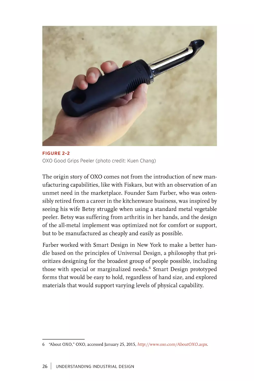
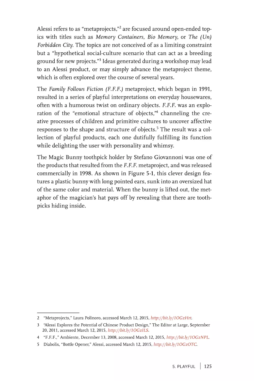
FIGURE 2-2
OXO Good Grips Peeler (photo credit: Kuen Chang)
The origin story of OXO comes not from the introduction of new manufacturing capabilities, like with Fiskars, but with an observation of an
unmet need in the marketplace. Founder Sam Farber, who was ostensibly retired from a career in the kitchenware business, was inspired by
seeing his wife Betsy struggle when using a standard metal vegetable
peeler. Betsy was suffering from arthritis in her hands, and the design
of the all-metal implement was optimized not for comfort or support,
but to be manufactured as cheaply and easily as possible.
Farber worked with Smart Design in New York to make a better handle based on the principles of Universal Design, a philosophy that prioritizes designing for the broadest group of people possible, including
those with special or marginalized needs.6 Smart Design prototyped
forms that would be easy to hold, regardless of hand size, and explored
materials that would support varying levels of physical capability.
6 “About OXO,” OXO, accessed January 25, 2015, http://www.oxo.com/AboutOXO.aspx.
26
|
UNDERSTANDING INDUSTRIAL DESIGN
The final design was a handle made of a soft rubber called Santoprene,
in an oval shape that evenly distributes the user’s force during use.7
The non-slip material provides comfort and grip, even when wet, while
withstanding exposure to kitchen oils and dishwashers. On the sides,
small ribs or “fins” are cut into the rubber, providing an affordance for
where to hold. These tactile elements make the OXO brand recognizable at first touch, even without looking.
The Good Grips handle design has been applied to hundreds of products since its introduction in 1990. But unlike Fiskars, which used a
new material to reduce the cost of its scissors, OXO products are often
more expensive than their traditional counterparts. 8 It’s a compelling
demonstration that people are willing to pay for good design, and that
taking a Universal Design approach can lead to products with broad
appeal.
The stories of both Fiskars and OXO show how simple and disciplined
use of colors, materials, and finishes can define a brand in a way that
extends across an entire product line. Beyond consistency, though, it
is often the CMF of a product that draws us to it. As objects become
increasingly connected and computational, it’s important not to lose
these positive, tactile qualities that make us want to have them in our
lives. For example, instead of a raw LED providing feedback, a light
might be placed under a frosted glass surface. Or, instead of a touchscreen for input, sensors might be placed under a thin veneer of wood.
This is not about hiding technology, but finding ways to integrate it
with the same rigor that goes into all CMF selections.
Multisensorial Products
Straightforward use of a single material can be an innovative advancement for simple tools, but just as most digital products require multiple interconnected states to result in a good experience, a more complex physical product requires bringing together a mix of sensorial
moments. By engaging multiple senses, at every scale and detail, the
overall experience can transcend its parts.
7 “FAQs,” OXO, accessed January 25, 2015, http://www.oxouk.com/faq.aspx.
8 “Identifying New Ideas for Breakthrough Products,” November 20, 2001, accessed January
25, 2015, http://www.ftpress.com/articles/article.aspx?p=24132&seqNum=4.
2. Sensorial
|
27
Cameras can inspire intense loyalty from photographers based not only
on how they perform, but also how they feel. A good camera becomes
an extension of the photographer’s sense of vision, capturing what
they see with minimal interruption. Few brands have spawned as
much obsession among photographers as the German manufacturer
Leica. As French photographer Henri Cartier-Bresson famously said,
“Shooting with a Leica is like a long tender kiss, like firing an automatic pistol, like an hour on the analyst’s couch.”
Leica has been making cameras since the mid-1800s, and even though
today’s models are digital, they feature tactile, analog controls similar
to the earliest models. This decision is driven by more than nostalgia, as familiar physical controls allow photographers to keep their eyes
looking through the viewfinder while they adjust the dials for shutter
speed, aperture, and focus. Unlike selecting on-screen menu items,
twisting an aperture control can be done without looking, and the reassuring click of each demarcation on the dial can be felt and heard.
A Leica is a triumph of engineering, but also of form and finish, the feel
of each dial and marking on the camera body building muscle memory
through use, avoiding a fumble that could lead to a missed shot. It’s the
integration of these tiny details, along with the build quality and craftsmanship, that fosters such passion and commands a premium price.
Leica craftsmanship is celebrated to the point of fetish. For example,
the Leica T camera body is machined out of a solid block of aluminum.9
The marketing materials for the camera boast that the body is hand
polished, and a video ad released by the company showcases the entire
45-minute process in closely cropped shots of gloved hands at work.
The ad’s voiceover boasts that it takes “around 4,700 strokes to finish
each body,” asking the viewer in the end if they can see the difference,
and reassuring them that “you can most certainly feel it.”10
9 “Leica T Camera System,” Leica Camera, accessed January 25, 2015, http://bit.ly/1Ip0JE4.
10 “The Most Boring Ad Ever Made?” Vimeo, accessed January 25, 2015, https://vimeo.
com/92073118.
28
|
UNDERSTANDING INDUSTRIAL DESIGN
The Leica M9-P, Edition Hermès, shown in Figure 2-3, is an example
of how detailed finishes and subtle sensorial experiences can elevate a
product to the level of luxury.11 In collaboration with the eponymous
Parisian fashion house, this limited edition camera is wrapped in a
soft, ochre-colored calfskin leather. The metal body underneath was
redesigned for this special edition by the automotive designer Walter
de Silva, and the exposed portions of the metal are even smoother than
the well-polished standard edition. The contrast of materials heightens
users’ awareness of each as their fingers shift from holding the warm,
soft, natural leather to adjusting the cold, hard aluminum controls.
FIGURE 2-3
Leica M9-P, Edition
Hermès (photo credit:
Leica Camera AG)
The sensorial experience extends beyond the camera itself, though,
with a strap made of matching calfskin, a Hermès designed camera
bag, and a two-volume book of photographs from Jean-Louis Dumas,
shot with a Leica M. These items are packaged alongside the camera
lenses in a fabric-coated custom display box that includes a set of white
gloves, further emphasizing the museum-like quality of the overall
package. All of this can be yours for only $25,000 or $50,000, depending on which limited edition package you choose.
As we’ve seen, there are examples of CMF choices that can make a product more affordable, or push it well out of reach for all but the wealthiest. The more senses that a product engages, through high-quality
materials or finishes, the more luxurious it may appear. However, the
11 “Leica Creates M9-P Hermès 18MP Rangefinder Special Editions,” Digital Photography
Review, May 10, 2012, accessed January 25, 2015, http://bit.ly/1Ip0N6S.
2. Sensorial
|
29
sensorial qualities of a design must be in line with the purpose and
positioning of a product. Lightweight scissors that still cut well are
desirable, but a lightweight luxury item might appear “cheap.” Even
with the use of aluminum bodies, Leica makes its cameras have a significant heft, because people perceive weight as a signifier of quality.
One of the studies documenting this phenomenon can be found in
the journal Psychological Science, where researchers published a paper
entitled “Weight as an Embodiment of Importance.”12 In their study,
they found that varying the weight of a clipboard used by participants
altered their behavior and influenced their opinions. Designers can
make decisions about materials that capitalize on this psychology,
although care should be taken that these choices are authentic to the
purpose of the product.
On top of high-quality design, scarcity is often utilized to further differentiate luxurious from standard products. This sense of luxury is something that has traditionally been very difficult for interaction designers
to achieve. After all, what is a luxurious interaction? For purely digital products, the ability to create unlimited copies of digital resources
makes scarcity too artificial to resonate as luxurious. Offering a limited edition with an improved user experience also comes off as more
unfair than special. Digital experiences seem to be evaluated through
a more egalitarian lens.
However, for the increasing number of products that integrate digital and physical experiences, there are many untapped opportunities
to explore and define luxurious interactions. For all of its fine materials and finishes, the Leica M9-P, Edition Hermès, uses the same firmware, on-screen graphics, and interactions on its digital screen as the
less luxurious standard edition. How might the on-screen interactions
better match the overall feel of the camera? How might the digital and
physical be integrated in a way that seems inherent and specific to this
particular camera? At what point will a luxury consumer’s changing
perception of quality require stronger digital and physical integration
to command a premium price?
12 Nils B. Jostmann, Daniël Lakens, and Thomas W. Schubert, “Weight as an Embodiment of
Importance,” Psychological Science 20:9 (September 2009): 1169–1174.
30
|
UNDERSTANDING INDUSTRIAL DESIGN
Addictive Action
Many products reveal their full set of sensorial qualities only through
use. For physical products with multiple states, such as open/closed or
on/off, the transition between those states can itself be sensorially satisfying, something more than a means to an end.
The opening and closing of a Zippo lighter feels good. Zippo has used
the same design throughout its 80-year history, and the “click” of a
Zippo flipping open is recognizable enough to have served as a dramatic moment in over 1,500 television shows and films.13 Smokers who
use Zippo lighters find themselves addicted to more than their cigarettes, absentmindedly flipping their lighters open and closed repeatedly. It would be hard to estimate the ratio of Zippo clicks to lit cigarettes, but it’s safe to say that it is far from 1:1.
What fosters this kind of delightfully addictive feeling? What triggers
us to do something repeatedly with no apparent purpose? Is this kind
of enjoyable transition something that happens by accident, or can it be
intentionally designed for? In 1933, the differentiating characteristic in
the design of the Zippo lighter was not its resistance to wind, but the
ease of opening and lighting it with one hand. It was a success because
of the experience it provided, including that distinctive click. It’s not
surprising that the company founder, George G. Blaisdell, made up the
word “Zippo” primarily because he liked the way it sounded.
Another addictive transition with a satisfying sound is the repeated
clicking of a ballpoint pen, the metronome for office workers everywhere. With each repeated click, the ink reservoir protrudes or retracts
into the body of the pen, not always to ready the pen for writing, but
simply because it feels and sounds good. The most common addictive
clicker is a toggle at the top of the pen, although the classic Korean
design of the MonAmi 153 ballpoint pen, shown in Figure 2-4, is even
more satisfying and sensorial.
13 “Then and Now,” Zippo, accessed January 25, 2015, http://www.zippo.com/about/article.
aspx?id=1574.
2. Sensorial
|
31
FIGURE 2-4
MonAmi 153 ballpoint pen (photo credit: Kuen Chang)
The MonAmi, which means “my friend” in French, is one of the most
common items ever produced in Korea,14 with over 3.3 billion in sales
since its introduction in 1963.15 The ballpoint tip of the MonAmi is
revealed by pressing down on the top of the pen, but its retraction back
into the body is triggered with a sliding control on the side. These two
separate mechanisms create a more natural mapping between the force
of the action and the direction of the ink cartridge, and the shape of the
spring-loaded slider seems like it’s asking to be triggered. Each control
results in a unique sound, and the possibility of alternating between
single- and two-finger operation adds to the addictive cadence.
A more high-tech product where satisfying transitions played a differentiating role was in the mobile phone market of the early 21st century.
The first mobile phones are often referred to as “bricks,” in reference
to their bulky size as well as their horizontal shape. As phones miniaturized, this basic “bar” form was maintained for many phones, with
keyboard and screen always exposed and at the ready.
14 “Prominent Designs Symbolize Generations of Korean Lives,” Korea.net, February 5, 2009,
accessed January 25, 2015, http://bit.ly/1mrKmx5.
15 “[한국만의 디자인] ‘국민 볼펜’ 모나미 153,” Chosun.com, February 16, 2009, accessed
January 25, 2015, http://bit.ly/1mrKsEV.
32
|
UNDERSTANDING INDUSTRIAL DESIGN
The Motorola StarTAC, released in 1996, was the first phone with a
clamshell or “flip” design that protected the keyboard while significantly reducing the overall height. Motorola not only invented the flip
phone, but eight years later designed perhaps its most iconic representation, the Motorola RAZR V3. The thin design, innovative use of
materials, and durable flip action helped the V3 model become the
best-selling flip phone of all time.16
The flip design made mobile phones more sensorial. Answering a call
with a bar-shaped phone was a matter of pressing a button, but on a flip
phone the conversation could begin with a physical action, a satisfying
flick of the wrist that split the clamshell open as it was lifted toward
the ear. Given that people carry their mobile phones with them everywhere, it’s no surprise that this flipping action became an addictive
transition that people repeatedly performed even when not answering
a call.
Mobile phone manufacturers, keen to capitalize on the success of the
flip phone, began a rapid exploration to patent and release phones
with unique and innovative form factors. By the time that touchscreen
devices eclipsed the market, a nearly exhaustive set of transition types
were available. Phones could flip, slide, and swivel, but also half-swivel,
flip both ways, and bottom pivot.17
All of these transitions were physical, but not all felt good enough to foster repeated, nonfunctional fiddling. Perhaps most successful by this
metric were the slider phones, such as the Motorola RIZR Z3, shown in
Figure 2-5. In this form factor, the numeric keypad was hidden underneath the slider mechanism, with a five-way directional pad available in
a closed state. This allowed many actions to be performed without actually sliding open the phone. In practice, though, it wasn’t functional
necessity that caused people to slide the phone open and closed repeatedly throughout the day. They did it because it felt and sounded good.
16 “The 20 Bestselling Mobile Phones of All Time,” The Telegraph, accessed January 25, 2015,
http://bit.ly/1Ip135O.
17 “Mobile Phone Evolution: Story of Shapes and Sizes,” GSMArena.com, July 15, 2010,
accessed January 25, 2015, http://bit.ly/1mrKEUG.
2. Sensorial
|
33
FIGURE 2-5
Motorola RIZR Z3 slider phone (photo credit: Kuen Chang)
Why does this mechanism feel good enough to invite repeated nonfunctional triggering? For one, the sliding movement is dampened, with a
spring providing slight resistance until it reaches a catch point where
the force is reversed and the cover is accelerated to its final open state.
This avoids accidental opening, but also results in a satisfying “pop”
sound as the mechanism takes over and amplifies the action. Sliding is
also easy to perform discreetly with one hand, without requiring wrist
or arm movements.
Purely digital products can also exhibit moments that cause delight
through repetition. One example is the “bounce” animation at the bottom of a scroll view in Apple’s iOS. As the user swipes their finger
upward, the list scrolls up and off the screen, but the scrolling doesn’t
stop abruptly when the bottom is reached. There is a subtle animation
where the whole list pulls up slightly farther than the last list item,
before easing back to let the final entry sit at the bottom of the screen.
The functional reason for the scroll view bounce is to act as feedback
that the user has reached the bottom of the list. However, even though
the animation is purely visual, it “feels” good enough that one can find
oneself scrolling again and again to watch the list bounce back. Some
apps have built upon this expectation to provide unique and equally
34
|
UNDERSTANDING INDUSTRIAL DESIGN
addictive animations. For example, the Yahoo! News Digest app has a
large image at the top of each story that zooms in and then snaps back
to normal size as the user scrolls upward and lets go.
In many mobile apps, a downward pulling gesture at the top of a list
triggers a refresh of content from the server, usually accompanied by
an animation. Although done for functional reasons, this action can be
addictive as well, leading to repeated pulling well before any realistic
expectation of new content being available. A client with a mobile app
that has millions of users once shared that repeated pull-to-refresh was
so pervasive it had to limit the actual server request to only once every
30 seconds, faking the animated feedback for repeated requests within
that time period. It’s a good reminder that addictive actions can bring
delight and appeal to a product, but one should be careful of their unintended consequences, whether it’s the need for a physical hinge that’s
rated for a high number of openings or avoiding a server overload.
Delightful Reaction
Lids, switches, and sliders can be satisfying to use, providing direct
sensorial feedback that confirms an action and, in the best instances,
feels good in the process. However, direct feedback is only one way a
product can engage our senses. By reacting to our presence, intention,
and continued engagement, a product can be inviting and delightful,
coming to life in unique and surprising ways.
The Danish high-end audio manufacturer Bang & Olufsen (B&O) is
known for its unique product designs that push the limits of technology to explore new form factors and interaction paradigms. In 1991,
as popular music was shifting from analog to digital formats, B&O
released the Beosystem 2500, designed by the late David Lewis. The
Beosystem 2500, shown in Figure 2-6, is an all-in-one stereo featuring
a CD player, cassette deck, and AM/FM radio in an extremely flat vertical design, flanked by a pair of equally flat speakers.
2. Sensorial
|
35
FIGURE 2-6
Bang & Olufsen Beosystem 2500 (photo credit: Bang & Olufsen)
Doors made of smoked glass cover the front of the Beosystem 2500,
further emphasizing the flatness of the design. Raising a hand within
10 centimeters of the doors causes them to automatically glide open
and turns on an interior light, illuminating the now accessible audio
controls. When the hand is removed, the doors close automatically
after a 15-second delay, with the lights remaining on to accompany the
audio, or turning off if no music is playing.18
The use of automatic motion to signal readiness and recognition of
intention gives the Beosystem 2500 a sense of life and personality. It
lends the stereo a magical quality, and reframes the doors as the “face”
of the product, giving them a character beyond their merely functional
purpose. The detection of presence and corresponding motion is fairly
limited and crude in comparison to today’s advanced capabilities, and
yet it is enough to provide a sense of animation and lifelike personality.
Another design element that contributes to the sensorial quality of
the Beosystem 2500 is the transparent cover on the vertically oriented
compact disc holder. As the CD plays, the spinning artwork can be
seen through the glass doors, providing a unique visual reference to
accompany the audio experience. This celebration of the disc itself is
18 “Beosystem 2500,” BeoPhile.com, accessed January 25, 2015, http://bit.ly/1Ip1k8Q.
36
|
UNDERSTANDING INDUSTRIAL DESIGN
a departure from the popular CD tray mechanisms of the time, which
completely enclosed the disc, treating it as a hidden key to unlock the
audio.
The Axor Starck V faucet by Hansgrohe, shown in Figure 2-7, also uses
transparency to bring an experience to life, but in a more natural and
analog way. Created in collaboration with the French designer Philippe
Starck, this clear faucet is made of crystal glass that showcases a unique
water vortex created by its base. The faucet design is minimal, acting as
a platform to support and celebrate the natural beauty of the swirling
water, the texture of its motion, and the sound it creates as the vortex
moves upward and flows into the basin.
FIGURE 2-7
Axor Starck V (photo
credit: Uli Maier for
Axor/Hansgrohe SE)
Turning on the faucet is a delightful experience because of how it
engages the senses unexpectedly, turning a mundane event into a rich
and surprising experience. The Axor Starck V highlights the notion
of design as an amplification of what is already there, recognizing the
potential of water to engage the senses in new ways and providing support for that unique experience to happen.
REACTION VERSUS FEEDBACK
These two very different products instill delight through their reaction
to a person’s presence and actions, which goes beyond mapping input
to output. They foster more of a conversation, where a person signals
2. Sensorial
|
37
intent and the product takes over to enable or perform a multipart sensorial experience. Whether it’s the choreographed movement of doors
and lighting or the swirling vortex of water with its dramatic beginning
and ending scenes, the response takes place over time and relies heavily on motion to engage and communicate with us. It is a conversation,
and the speaking role has briefly passed to the product, while still feeling under our control.
In a purely digital product, a change of state can be done instantaneously, but it has become common for interaction designers to utilize
physics-based motion algorithms to design transitions that feel more
“natural.” One example is Tweetbot for iPhone, which allows a user
to close out of an image detail view by flicking the photo in any direction, causing it to animate off screen in proportion to the speed, direction, and angle of the user’s gesture. The result feels much richer than
a simple close button, although ultimately this animated reaction is
an abstraction that relates only generically to physical forces, with no
intrinsic relationship to the content being acted upon.
As physical products become increasingly embedded with computation
and network connectivity, they are able to react not only to a user’s direct
physical presence but to changes in remote data as well. Designers of
such products should focus on reactions with an innate connection to
the specific material or subject they are working with, resisting the full
abstraction that the digital world makes possible.
It’s great that our products can keep track of changes in remote data,
but when the object reacts to a change and starts a conversation with
us, it should be done in a manner that strongly communicates the
meaning of the data itself. Otherwise, our environments will be full of
objects trying to engage our senses without us knowing how to interpret their messages. An instructive comparison can be found in two of
the simplest, and earliest, explorations of physical objects representing
remote data: Ambient Orb and Availabot.
Ambient Orb, the first product made by the company Ambient Objects
in 2002, is a frosted glass orb with a glowing programmable light inside
of it (see Figure 2-8). The color of the light can be associated with variable data sources, and the value of the data is mapped to the glowing
hue of the orb. The concept behind the design is to provide glanceable information without a screen, which the Ambient Orb achieves,
but only through an abstraction that requires a person to have a clear
38
|
UNDERSTANDING INDUSTRIAL DESIGN
mental model of the programmed ruleset. It works well as an early
demonstration of what might be possible with networked objects, but
scales poorly in a world full of such objects. Imagine everyone in your
family having to remember why the orb on the kitchen counter is now
glowing green when it used to be blue. Does it mean the same thing as
the green orb in the bedroom?
FIGURE 2-8
Ambient Orb (photo credit: Ambient Devices Inc.)
On the other side of the spectrum, moving from abstract to concrete
representation, is Availabot,19 a physical representation of a friend’s
instant messenger presence (see Figure 2-9). Created by Schulze &
Webb in 2007, Availabot is a bendy, plastic avatar customized to look
similar to a specific person. This hinged likeness unambiguously communicates a specific person’s availability, standing straight at attention
when they are online, or collapsing in a heap when they go away. The
idea was that Availabot could utilize rapid prototyping capabilities to
economically create one-off representations that were truly unique for
each person they represented. Unfortunately, the product was never
brought to market after initial talks with a toy company.20 Regardless, it
19 “Availabot,” BERG, accessed January 20, 2015, http://berglondon.com/projects/availabot.
20 “OFF=ON, or, Whatever Happened to Availabot?” BERG, September 2, 2008, accessed
January 14, 2015, http://bit.ly/1mrLbpz.
2. Sensorial
|
39
is instructive as an example of a delightful physical reaction to remote
data (although of course it has the opposite problem of the Ambient
Orb in that it can only ever represent one thing).
FIGURE 2-9
Availabot (photo credit: BERG)
Somewhere between these poles is the sweet spot for Internet of Things
devices that react to remote data. Too much abstraction, and the device
is speaking in hidden codes that feel too machine-like and mysterious.
Too concrete, and the device is too limited to find commercial success
or justify space in a person’s home.
AUDIO FEEDBACK
The sounds that a physical product makes can be classified into two categories: inherent and additive. Inherent sounds emerge from choices
in form and materials, while additive sounds are abstractions played
through speakers. For many products, both kinds of sound must be
addressed, to provide desired feedback and avoid sounds that detract
from the experience.
Consider the example of a car, where the inherent sound of a door
closing can convey the quality of materials and construction, while
the additive sound of reminding a driver to buckle their seatbelt must
get their attention without being annoying. Emar Vegt is an industrial
40
|
UNDERSTANDING INDUSTRIAL DESIGN
designer and musician, working at BMW to design the aural qualities
of each vehicle. He notes that there are “sounds caused by the gears and
differential, and the tyres on the road, and air passing over the mirrors.
All of this we can influence.”21 Beyond eliminating unwanted noise, he
describes how sound is a big part of branding: “A Mini, for example,
is playful and joyful and the sound of the car has to reflect that, so we
modulate the exhaust to give a sporty, impulsive sound. By contrast, a 7
Series has to be very quiet. The driver wants to be in his own zone, so
there is lots of damping and insulation.”22
As connected physical products begin representing more complex
states and remote data, there is an increased need for additive sounds
to convey more abstract feedback. Interaction designers are likely
familiar with this kind of aural experience, as the sound that can augment screen-based products is always additive in nature. Still, there are
new challenges with audio feedback for physical products. Sound can
be intrusive, even more so when it might come from anywhere. The
user isn’t always nearby, so what should the volume be? What kinds
of sounds are appropriate for a product’s brand? Is a recorded voice
welcoming, or a creepy disembodiment? These considerations are just
as important to the overall experience as anything perceived through
touch or vision.
New Frontiers: Designing for Smell and Taste
Two of our richest senses, smell and taste, are not often associated with
design. However, the creation of objects that support these senses is an
ancient practice, embodied best by the tea set, where rituals of assembly and service lead to hints of the aroma. Holding a teacup warms
your hand without burning it, and the slow sipping of the tea forms a
communal bond with other participants. Outside of classic and common serving items, designers today are increasingly finding new ways
to collaborate with chefs and food companies to design with smell and
taste in mind, forging a new frontier for sensorial design.
21 David Baker, “Did You Know BMW’s Door Click Had a Composer? It’s Emar Vegt, an
Aural Designer,” Wired, March 21, 2013, accessed October 28, 2015, http://bit.ly/1Ip1w8f.
22 Ibid.
2. Sensorial
|
41
Martin Kastner is the founder and principal of Crucial Detail, a studio
in Chicago that specializes in custom pieces to support unique culinary experiences. Martin is best known for his work designing serviceware concepts for Alinea, the 3-star Michelin restaurant founded
by chef Grant Achatz. That collaboration has extended to other restaurants owned by Achatz, including The Aviary, a cocktail bar that prides
itself on serving drinks with the same level of attention as a fine dining
restaurant.
At The Aviary, one of the most popular creations by Crucial Studio is
the Porthole Infuser,23 a round vessel that presents the ingredients of
a patron’s cocktail between two flat panes of glass, emphasizing the
transformative action of the steeping process and building anticipation for the cocktail’s taste. The Porthole Infuser, shown in Figure 2-10,
takes a part of the preparation process that is normally hidden and
brings it directly to the table, providing time for the drinker to contemplate the ingredients on display, creating a mental checklist for the
tongue to seek out when they take their first sip.
FIGURE 2-10
Porthole Infuser by Crucial Detail (photo credit: Lara Kastner Photography)
23 “The Porthole Infuser by Crucial Detail,” accessed January 25, 2015, http://bit.ly/1Ip1z3J.
42
|
UNDERSTANDING INDUSTRIAL DESIGN
The popularity of the Porthole Infuser at The Aviary led Kastner to
create a Kickstarter campaign24 to fund the additional design and manufacturing required to release it as a commercial product. Support for
the project was dramatic, achieving 25 times more funding than originally requested. This backing set the course for a redesign that allowed
the infuser to be manufactured at scale and sold for only $100, down
from the several hundred dollars that each custom-constructed Aviary
version cost.
The Porthole Infuser is marketed as more than a cocktail tool, working
equally well to support the smell and taste of oils, teas, or other infusion recipes. It is an example of how designers can enhance the dining
experience, not by crafting the smell or taste of the food itself, but by
working in collaboration with a chef to heighten our awareness of those
senses.
Much of what we eat today comes in packages, rectangular boxes that
homogenize our food into the same shapes and textures without regard
to their smell or taste. Japanese designer Naoto Fukasawa explored how
food packaging could more fully engage our senses in his “Haptic” Juice
Skin submission to the Takeo Paper Show in 2014 (see Figure 2-11).
24 “The Porthole,” Kickstarter, accessed January 25, 2015, http://kck.st/1Ip1DjY.
2. Sensorial
|
43
FIGURE 2-11
Juice Skin, “HAPTIC—Awakening the Senses”; TAKEO PAPER SHOW 2004
(photo credit: Masayoshi Hichiwa)
Fukasawa created various juice boxes, each with a covering and structure that invokes the skin of the relevant fruit. The banana milk package has the rubbery texture of a real banana skin, along with faceted
edges and the ubiquitous oval sticker on the side. The strawberry juice
box is square in shape, but richly textured using real seeds. The kiwifruit juice box, as you might expect, is brown and fuzzy to emulate the
unique feeling of that fruit’s natural shell.
In simulating the color and texture of the fruit’s skin, Fukasawa hoped
to reproduce the feeling of real skin, invoking a more holistic sensory
moment as the juice was consumed.25 Although designed as a concept
25 Naoto Fukasawa, Naoto Fukasawa (London: Phaidon, 2007), 112–113.
44
|
UNDERSTANDING INDUSTRIAL DESIGN
for an exhibition, the banana packaging was actually produced commercially for a limited time by the TaKaRa company. The production
run looked quite similar to the exhibition version, but unfortunately
without the simulated texture.26
How might interaction designers support smell and taste? This is a
truly new and underexplored territory, but there are signs of interest and
one-off experiments happening that point toward a potential role. One
of the most engaging speakers at the IxDA Interaction 2014 conference
in Amsterdam was Bernard Lahousse, who gave a talk entitled “Food =
Interaction.”27 Lahousse, who has a bioengineering background, works
at the intersection of food and science to truly design for taste itself. He
founded the The Foodpairing Company, which provides an online tool
and API for chefs, mixologists, and foodies to explore and be inspired
by potential food combinations through a science-based recommendation engine.28
In Lahousse’s Interaction ’14 presentation he shared how it’s not only
the flavor pairings themselves that contribute to the smell and taste
the environment and manner in which we eat can also have a dramatic
effect. The design of packaging and utensils is one part of this, but he
also gave examples of chefs who are creating interactive, even gamelike eating experiences. One restaurant he highlighted uses room temperature, sound, and projections to design an environment that alters
and enhances the smell and taste of the food. These augmented dining
environments are one area in which interaction designers could contribute their expertise to support the full range of human senses.
An Orchestration of the Senses
Interaction designers have always tried to engage people’s senses, but
in comparison to the tangible output of industrial design, the options to
do so have historically been limited. When designing for the screen the
best option has often been simulation, using metaphor and connotation to invoke a sensorial experience beyond what can truly be offered.
26 “Naoto Fukasawa JUICEPEEL Packaging (Revisited),” Box Vox, September 16, 2014,
accessed January 25, 2015, http://bit.ly/1Ip1PzM.
27 “Food = interaction,” Interaction14, accessed January 25, 2015, http://bit.ly/1MllFqV.
28 “Home page,” Foodpairing, accessed January 25, 2015, http://www.foodpairing.be.
2. Sensorial
|
45
The introduction of the graphical user interface was the first major
advancement in engaging the senses through a screen. The next leap
forward was the “multimedia” era, bringing sound, motion, and interactivity together in unique and immersive environments. Multimedia
was initially made possible through cheap CD-ROM storage, which
offered access to large graphics and video files that were impractical to
store on small hard drives or download over slow Internet connections.
Interaction designers of the multimedia era often utilized the new
capabilities of CD-ROMs to break away from standard interface conventions and mimic as many sensorial, real-world elements as possible. Map interfaces looked like faded and stained treasure maps, deep
drop-shadows created virtual depth, and richly textured environments
launched users into immersive 3D worlds. This was a time of widely
variable interface experimentation, as designers combined text, graphics, audio, video, and animation in unique ways to make encyclopedias,
video games, and educational programs that simply weren’t practical
before CD-ROMs.
Referencing physical materials and properties also found its way into
standard programs and operating systems. Apple first introduced the
brushed metal interface style, which later became a dominant feature
of its OS X operating system, with QuickTime 4.0. By 2004, Apple
had canonized the brushed metal in its Human Interface Guidelines
(HIG), encouraging designers to use the visual treatment if their programs strove “to recreate a familiar physical device—calculator or
DVD player, for example.”29 This visual reference to a physical material
was less sensorial than metaphorical, acting as a bridge to ostensibly
enhance usability and understanding as behaviors transitioned from
physical to digital devices. This was the same rationale employed for
the early versions of Apple’s iOS, and over time both operating systems
evolved to use simpler UI styles once users became familiar with the
platforms.
Obviously, visual references to physical materials cannot engage our
senses in the same way as their physical counterparts. Graphics that
look like leather, felt, steel, or linen are often little more than interface
29 “Brushed Metal and the HIG,” Daring Fireball, October 16, 2004, accessed January 25,
2015, http://daringfireball.net/2004/10/brushedmetal.
46
|
UNDERSTANDING INDUSTRIAL DESIGN
decoration. The sensorial limitations of these graphic treatments highlights the distinction between interface and interaction design. Static
pixels on a screen can only engage us visually, and in most instances
should avoid invoking additional senses they can’t deliver on. But interaction design goes beyond the interface to encompass all the moments
of interaction that a person has with a system over time.
This is why interaction designers tend to think of their work in terms of
“flows,” focusing equally (or more) on the connections between states,
the various inputs and outputs that are possible at that moment. This
focus on the in-between makes time itself a kind of design material.
It is not so much that interaction designers are manipulating a user’s
sense of time—although elements like progress bars do try to ease
waiting—but that they are using this fourth dimension as a connective
platform to combine information, choices, and responses.30 Time is a
kind of stage from which to orchestrate sensorial engagement into a set
of dynamic movements.
On a computer, or mobile device, this orchestration of interaction possibilities and system feedback can utilize animation, translucency,
figure/ground relationships, color, sound, and standardized notifications to facilitate engagement with the system over time. But how
does this work when we move beyond the screen? When a physical
product is embedded with computation and network connectivity, it
transforms from an object to a system. A traditional product has discrete and predictable interactions that take place within a defined session, but once it becomes a system the sequence of interactions is less
predictable and takes place over a longer period of time.
Consider the previously discussed Beosystem 2500, where the opening
and closing of the stereo’s doors represents three clear states, forming a beginning, middle, and end to the experience. Compare that to
the range of possible states and behaviors that a connected, computationally controlled stereo might have. Beyond reacting to your raised
hand, it could detect your presence in the room as a specific individual.
It could respond to your gestures or voice, highlight or hide relevant
modes based on nearby media or subscription status, allow for use of
30 “Defining Interaction Design,” Luke Wroblewski, Ideation + Design, April 14, 2006,
accessed January 25, 2015, http://www.lukew.com/ff/entry.asp?327.
2. Sensorial
|
47
remote speakers, adapt the volume based on time of day, offer you new
music by your favorite bands, start music playing just before you enter
the house—the possibilities are almost limitless.
How could this hypothetical stereo enable and allow for this expanded
set of interaction possibilities? One approach would be to put the majority of interactions on a screen—perhaps a tablet on a stand in the living
room. However, as David Rose of the MIT Media Lab refers to it, the next
era of computing is more likely to be full of “enchanted objects,”31 where
interactions with our products and environment are more natural, more
physical, and less reliant on a glowing rectangle to control everything.
As physical products become increasingly integrated with digital systems, interaction designers should avoid defaulting to a screen for
everything. Computational sensors can be used as richer and more natural inputs, detecting and making inferences from changes in light,
temperature, motion, location, proximity, and touch. Output can move
beyond a screen with voice feedback, haptic actuators, light arrays, and
projection.
In utilizing this mix of inputs and outputs, screen-based interaction
patterns should not always be translated directly into the physical environment. Getting a notification on your phone might be unobtrusive,
but having it spoken aloud in your living room might be less desirable.
In the same way, there is a danger in assuming that a gesture or sensor-based input is necessarily more natural. If users need to develop a
new mental model of how a product “sees” them, or detects their presence, then the illusion breaks down. An example of this can be found
in many airport or hotel bathrooms, where people wave their hands in
frustration near unfamiliar sink fixtures in an attempt to discover how
the sensor is triggered.
The technology may be new, but designers need not start from scratch
as they wrestle with orchestrating good experiences that span the digital and physical. As more complex behaviors move off the screen, interaction designers should augment their knowledge of digital systems
with over a century’s worth of industrial design lessons on how to
engage the full range of human senses.
31 David Rose, Enchanted Objects: What They Are, How to Create Them, and How They Will
Improve Our Lives (New York: Scribner, 2014).
48
|
UNDERSTANDING INDUSTRIAL DESIGN
[3]
Simple
Tame complex situations
At the beginning of a design project, it’s common for everyone
involved to hope that the outcome will be “simple,” but rarely are they
speaking the same language. Simplicity is a concept that people champion as a goal, but they usually have trouble describing what they mean.
Often they will point to other products as oblique examples, as simplicity is easier to recognize in use. In the early years of the 21st century,
businesses often strove to be the “iPod of” their category, an oblique
analogy for simplicity or innovation. Apple is often credited as understanding simplicity, leading many companies to copy its clean aesthetic. But as Apple’s Jonathan Ive puts it, “simplicity is not the absence
of clutter, that’s a consequence of simplicity. Simplicity is somehow
essentially describing the purpose and place of an object and product.”1
In other words, simplicity can’t be copied because it’s specific to the
nature and context of the problem.
Simplicity is often conflated with minimalism, where the goal is to
remove as much as possible. IDEO’s CEO Tim Brown has described
minimalism as a “reaction to complexity whereas simplicity relies on
an understanding of the complex.”2 Minimalism can be beautiful, but
it is often a stylistic choice, a surface treatment with a clean appearance
at the expense of confusion or frustration in use. Minimalism adopts
the notion that “less is more,” but these kinds of pithy maxims can lead
designers astray, as simplicity is not always found through fewer features, visual restraint, or established conventions. The qualities that
1 Shane Richmond, “Jonathan Ive Interview: Simplicity Isn’t Simple,” The Telegraph, May 23,
2012, accessed June 20, 2015, http://bit.ly/1Ip2r8B.
2 Tim Brown, “Simple or Minimal?” Design Thinking, October 26, 2009, accessed June 20,
2015, http://designthinking.ideo.com/?p=404.
49
define simplicity are not universal truths. They must be investigated as
part of a design process, mined and discovered from within the complexity of a situation. Graphic designer Milton Glaser has critiqued
the minimalist mantra by noting that “less isn’t more; just enough is
more.”3 Finding “just enough” is no easy task, requiring designers to
repeatedly iterate on “too little” and “too much” to expose the balance
in between.
Designers need a vocabulary for discussing simplicity. Users and clients will make empty requests to “make it simple” because they lack
a more effective way to describe what they’re seeking. Designers need
to discover the essential qualities of a product, and be able to articulate
how their solutions address the complexity of a situation. This ability
to decipher and convey what makes a product simple can help create
guardrails around a design, to know what to fight for when the feature
creep and change requests come in. As a product evolves, its simple
integrity will only remain if designers can communicate its relevant
qualities.
Although true simplicity is specific to a product’s individual context,
there are categories of approaches that designers can look to for inspiration. In this chapter, we examine various products and explore what
makes them simple. Some might exhibit just a tiny tweak to a common
design; a few more design iterations to uncover simplicity. Others have
a perfect mix of digital and physical, using embodied interactions to
remove ambiguity. Simplicity may also defy expectations, where clarity is achieved through adding more features, being less accurate, or
showing as much possible. Ultimately, simplicity is about taming the
complexity in a situation, which can result in magical moments where
even the most advanced products just work, because their design is just
enough.
Tiny Tweaks
Sometimes all it takes is a subtle shift, a tiny improvement to a familiar product that casts it in the light of simplicity and ease. Most of our
everyday products work well enough, but are rarely worthy of praise
or celebration. Design often stops when basic requirements have been
3 Linda Tischler, “The Beauty of Simplicity,” Fast Company, November 1, 2005, accessed
June 20, 2015, https://www.fastcompany.com/56804/beauty-simplicity.
50
|
UNDERSTANDING INDUSTRIAL DESIGN
met—a decision process that the scholar Herbert Simon referred to as
satisficing, a portmanteau of satisfy and suffice that describes our ability to recognize when something is “good enough.” That leaves many
products with room for improvement, able to be simplified and refined
through further design iteration. Oftentimes, simple tweaks can be
enough to tip a product from good to great.
Subtle but evident optimizations can appear to be obvious, making
users wonder why it wasn’t always done that way. That’s the feeling
one gets when using the Joseph Joseph Pie Timer, an updated kitchen
timer that tweaks how time is displayed (see Figure 3-1). The Pie works
much like a typical timer, with a section that can be turned to choose a
time, which slowly ticks back until a chime is sounded. What’s different about the Pie is that users don’t twist a representation of time, but
an overlay that reveals the duration below. As the countdown occurs,
the Pie uses time as negative space, slowly disappearing to mark the
passing minutes and covered entirely when the time has been spent.
FIGURE 3-1
Joseph Joseph Pie Kitchen Timer (photo credit: Kuen Chang)
The action a user takes to activate the Pie is the same as with any kitchen
timer, but the way it conveys information is both stronger and simpler.
The active and inactive states are clearer, the time remaining is readable from any direction, and the bold figure-ground relationship makes
it glanceable from a distance. The designers didn’t change the identity
of a kitchen timer, or even how it’s used, but by going beyond “good
enough” they found a tiny tweak that optimizes an already straightforward product to be genuinely simple and intuitive.
3. Simple
|
51
Opportunities for more simplicity are everywhere you look. The
Japanese firm Metaphys took notice of the ubiquitous power outlet,
pervasive and standardized in form. It saw an opportunity to tweak the
design, and created the Node Power Outlet, which offers access to electricity anywhere along a ring of power, not limited to fixed plug locations (see Figure 3-2). This elegant design is specific to the Japanese
context, where double-prong outlets without a grounding pin are still
common. It’s as if the vertical slots were turned sideways and extended,
into two continuous grooves of electricity that allow plugs to be placed
anywhere along the resulting rounded square. The enclosed center
shape acts as a warning light, glowing to alert the user if the attached
appliances are drawing too much power.
FIGURE 3-2
Node Power Outlet by Metaphys (photo credit: hers design inc.)
The story of the Node is similar to that of many simple products, where
designers saw flaws in a common design and were determined to make
it better. In this case, they responded to the undesirable clutter they
refer to as “octopus legs,”4 where an outlet spawns an unsightly sprawl
of extension cords. The Node eliminates the need for those add-ons,
allowing up to eight plugs to be attached from any angle, and doing
so with a refined visual appearance. The clean aesthetic of the Node’s
continuous lines provides functional flexibility, and embodies that in
a minimal form. There’s no harm in a clean aesthetic, as long as the
simplicity of the experience takes the lead.
4 “Making of the Node,” Metaphys, accessed June 20, 2015, http://bit.ly/1Ip2P7d.
52
|
UNDERSTANDING INDUSTRIAL DESIGN
Another example of simple functionality is the EVAK food storage
container, which uses a special lid to remove air so that food stays
fresh longer (see Figure 3-3). When food is exposed to air, it loses flavor more quickly, and while airtight lids can help, they still leave air
trapped inside. Numerous products have been designed to remove the
trapped air, from containers with built-in pumps to dedicated vacuum
seal machines. Pollen Design, who created EVAK, sought a simpler and
more integrated design. They were also concerned about plastic leaching chemicals into food, so they set a constraint that they had to work
with glass.
FIGURE 3-3
EVAK Glass Food Storage Container (photo credit: Pollen Design Inc.)
The EVAK looks similar to other food storage solutions, adding no new
parts: it’s just a container and a lid. The twist is that the lid doesn’t
sit on top, but gets pushed inside the glass cylinder until all of the
air is removed. Inside the lid are two tiny valves, forcing air out when
pushed and letting it in when pulled. It seems like an obvious and easy
solution, but as the designers note alongside early prototypes on their
Kickstarter page, “sometimes the simplest things are the hardest to
design.”5
5 Ed Kilduff, “Say Hello to EVAK,” Kickstarter, accessed June 20, 2015, http://kck.
st/1Ip2QYA.
3. Simple
|
53
The simplicity of the EVAK design is the way it increases functionality
as a natural and simple extension of a familiar design. Instead of just
putting a lid on a container, you put it on and push it down. There’s no
button, lever, or pump to remove the air, as the valves are automatically
activated when the lid is pushed or pulled. It’s clear when all the air
has been removed, because the handle has reached the food. As Pollen
founder Ed Kilduff puts it, “you don’t have to think about it, just push
the handle down and pull it up. That’s it.”6
Everyday products, like timers, outlets, or storage containers, are categories where tiny tweaks can have a big impact. In the preface to his
classic book The Design of Everyday Things, Donald Norman talks about
his realization that specialized systems like computers and aircraft are
not unique in their challenges of complexity, that “there was nothing
special about them: they had the same problems as did the simpler,
everyday things. And the everyday things were more pervasive, more
of a problem.”7 His book highlights frustrating examples of common
objects—doors, sinks, teapots—whose poor design is pervasive in our
lives. It’s humbling to think we are entering an era of smart objects,
where products like these can gain vast new capabilities, while the simple unaugmented versions are still ripe for improvement. It would be
naive to believe that adding computation and connectivity is the key to
a simple product. Designers should solve first for ease of use at a basic
level, a foundation of simplicity upon which new capabilities can be
built.
For EVAK, that foundation is the physical action of pushing and pulling the handle. To illustrate the point, let’s consider how designers
might build upon this interaction, extending the container with computation to add new capabilities that leverage its behavioral simplicity.
Sensors could record where the handle stops, and thus how much food
is left, triggering a process to reorder. Other measurements could help
dieters keep track of eating habits, or provide information about portion size. These new capabilities would rely on the simplicity of a single
action playing multiple roles, adding “smarts” to the container without
adding more steps to the process.
6 Ibid.
7 Donald A. Norman, The Design of Everyday Things (New York: Basic Books, 2002), xix–xx.
54
|
UNDERSTANDING INDUSTRIAL DESIGN
Focusing on behavioral simplicity opens up new possibilities for functional enhancements, but also for aesthetic simplicity. Take, for example, the Reelight GO, a bicycle light that intertwines simple form and
function (see Figure 3-4).
FIGURE 3-4
Reelight GO (photo credit: KiBiSi)
Bike lights are an important part of riding safely at night, so any
increase in simplicity and ease could have a big impact if it encouraged more use. Denmark is renowned for both its biking and design
3. Simple
|
55
culture, so it’s little surprise that the Reelight GO emerged from the
Danish design studio KiBiSi. In 2012, the Danish government passed
a law attempting to standardize the quality of bike lights, requiring
visibility at 900 feet and a minimum battery life of 5 hours. 8 That law
created a market opportunity for a better design, a moment in time in
which many people would need to upgrade, and a chance to simplify
the design.
The Reelight GO is mounted to a bike frame, similar to other lights,
with a bracket that affixes to the handlebars and another to the seat
post. The tweak is that the Reelight GO is designed as two halves,
joined through magnets but easily separated, so that the valuable and
fragile half can be stowed while the bracket remains firmly attached.
This structure enables not only security but simplicity, allowing the
magnet to act as a switch to turn the light on and off automatically.
Front and back brackets use opposite polarity, which means the two
lights can magnetically combine into a single compact unit for easy
storage in a bag or coat.
The design tweak in the Reelight GO is behavioral, reducing the hassle
of attaching and removing a bike light and dissolving the power switch
into that action. The minimal formal aesthetics emerged out of those
decisions, removing the need for a button and allowing the bracket to
be attached in a cleaner, more permanent manner. By focusing their
search for simplicity on the interaction, not the form, the designers at
KiBiSi were able to achieve it in both.
Tiny tweaks for increased simplicity are not about additional restraint,
and won’t be found by removing an element here or there. They are
actually a continuation of the design process, treating “good enough”
design as a prototype and optimizing it further until the essential simplicity of an object is revealed. Simplicity in the behavior of a product
should come first, because it acts as a solid footing for additional functionality and can often lead to minimal form as well. Simplicity has an
unusual quality that the longer one spends to unlock it from a complex
8 Kelsey Campbell-Dollaghan, “From Cycle-Crazy Denmark, A Sleek Magnetic Bike Light,”
Co.Design, November 19, 2012, accessed June 20, 2015, http://bit.ly/1XLpa5R.
56
|
UNDERSTANDING INDUSTRIAL DESIGN
situation, the more effortless it seems when completed. This should be
a marker for success—when a design reaches the point of feeling obvious, then there are no more tweaks to be made.
Physical Modes
All but the most basic products have multiple modes, and even binary
states like on/off and full/empty can add complexity unless carefully
designed. When products communicate their status through switches,
lights, or labels, it adds a level of abstraction, a layer of symbolic meaning separate from the object’s form. In contrast, when products change
modes through physical transformation, it makes each state inherent and obvious. Physical mode switching is easier to understand at a
glance and more direct in conveying available actions. Additionally, it
provides an opportunity for design adaptation, where new functionality
is revealed only in certain states—a natural constraint that makes available interactions more clear.
Take, for example, the Beater Whisk, designed by Ding 3000 for
Normann Copenhagen (see Figure 3-5). It eschews the classic form of
a whisk, and gains functionality through a movable plastic ring that is
the centerpiece of the product’s simplicity. The ring slides along the
sculptural body of the whisk, constraining or unleashing the beater’s
tentacles to varying degrees and lengths. This allows a user to choose
more or less surface area, depending on the food being prepared. That
adaptivity could reduce the need for other whisks, but the space-saving qualities are made fully evident when the ring is pulled to the end.
While the open state is variable in size, the closed state is a final transformation, collapsing the whisk into a thin cylinder with a hook on the
end for hanging. That useful loop is hidden when the whisk is open,
but made available and prominent when it’s closed.
3. Simple
|
57
FIGURE 3-5
Normann Copenhagen Beater Whisk (photo credit: Kuen Chang)
The Beater Whisk allows for elegant mode switching through a simple, physical interaction. This manual transformation is direct, and the
changes in form and functionality are apparent and observable. How
might this kind of direct interaction be used in more complex products,
with embedded electronics and computation? When tangible actions
are used to trigger an electronic response, the relationship between
action and consequence becomes less straightforward and more symbolic. Graphical user interfaces rely on metaphor to help people grapple with complexity, and common interaction patterns like the desktop, trash, or buttons help to standardize expectations. In the physical
world, designers can map symbolic relationships to physical interactions that feel natural, thereby reducing ambiguity and meeting people’s expectations for how a product should respond, even as it becomes
more symbolic. Paul Dourish, informatics professor at UC Irvine, has
contrasted this “embodied interaction” with graphical metaphor by noting that “instead of drawing on artifacts in the everyday world, it draws
on the way the everyday world works or, perhaps more accurately, the ways
we experience the everyday world.”9
Physical mode switching is a small, rudimentary part of what embodied interaction can encompass, but its impact on simplicity can be substantial. Consider the MUJI Wall Mounted CD Player, designed by
9 Paul Dourish, Where the Action Is: The Foundations of Embodied Interaction (Cambridge,
MA: MIT Press, 2001), 17.
58
|
UNDERSTANDING INDUSTRIAL DESIGN
Naoto Fukasawa, which strips the player to its bare essence and utilizes
tangible interaction. As shown in Figure 3-6, the CD player hangs on a
wall, a minimal white square dotted with holes in the rounded corners
(a visible sign of the integrated speaker). A CD can be snapped into the
center, and with no cover to obscure it, the album’s artwork becomes
the centerpiece of the object. A matching white cord extends downward
from the bottom of the unit, a power cord that doubles as a switch to
turn the music on and off.
FIGURE 3-6
MUJI Wall Mounted CD Player (photo credit: Kuen Chang)
Fukasawa was inspired by a common kitchen fan design, where pulling a cord starts the blades spinning, first slowly and eventually reaching full speed. He recognized the same progressive spinning in CD
players, and matched this analogous motion to the pull-cord interaction. The hanging cord tempts the user to pull it because they recognize it from another context; from the way they experience the everyday
world. Fukasawa refers to this quality as “without thought,” where even
the symbolic and abstract idea of digital music can be mapped to an
intuitive action. Additional controls are located on the top of the player,
allowing the cord to maintain a single purpose. This simplicity was
actually quite difficult to manufacture, as normally a power supply is
3. Simple
|
59
not designed to have its cord yanked on a regular basis. Luckily, MUJI
saw value in committing to the design, which has become an iconic
product representing the brand’s focus on simplicity.
In 2013 Muji released the Wall Mounted Bluetooth Speaker, with a
design very similar in form to the Fukasawa CD Player. No doubt this
new product was meant to acknowledge the changing nature of music
consumption, with more people streaming or downloading their music
than amassing a collection of CDs. The shape of the player is maintained, as is the cord, but the speaker grill extends from the corners to
cover the space where the CD was mounted. Unfortunately, this design
lacks the simple elegance of the CD version, as without the spinning
disc the pull-cord design is more a reference to the previous product
than to embodied and tangible experience in the world. These two
products demonstrate how simplicity is contextual, and can’t be found
by deconstructing and copying features. The pull cord and spinning
CD have a holistic connection between action and reaction, both of
which are needed to achieve simplicity.
Fukasawa’s design is a poetic expression of tangible interaction, but
physical mode switching is often less about elegance than increased
clarity and usability. This is why the controls in airplane cockpits have
remained physical for so long, with “glass cockpits” only just now
becoming commonplace. Physically representing a mode makes it
unambiguous and persistent, able to be double-checked with a glance.
Even a GUI with a constant status bar lacks the reassurance of physicality. The underlying software for a graphical or physical representation of a mode might be the same, but the tangible version taps into
our psychology of how the world works. Instead of striving to properly
convey the abstractions of a software world, designers can tap into the
real world users already know and align the system state with their natural perceptions.
The need to provide reassurance through physical modes is heightened
in certain contexts, when the stakes are high or perceptions may be
hindered. That’s exactly the situation that designers Jeremy and Adrian
Wright addressed with their FLIP alarm clock for Lexon, providing
crystal-clear interactions for the sleepiest moments of the day. Shown
in Figure 3-7, the FLIP is a colorful plastic rectangle, the size of a
chunky smartphone, with the words “on” and “off” emblazoned on the
top and bottom in a large font. Depending on the side facing upward,
60
|
UNDERSTANDING INDUSTRIAL DESIGN
the alarm is turned on or off, while the LCD screen always rotates to a
readable orientation. When the alarm sounds, touching anywhere on
the top surface will trigger the snooze functionality, providing eight
more minutes until the clock repeats its call for the sleeper to turn it
over. Both sides are touch sensitive, and any contact will momentarily
illuminate the LCD.
FIGURE 3-7
FLIP alarm clock by Lexon (photo credit: Lexon)
The inspiration for the FLIP “came from a simple observation that the
seven segment display is symmetrical, which allows you to display
numbers both ways up.”10 That capability spawned the use of orientation to control the alarm, allowing sleepy users to make large, coarse
movements instead of groping for a tiny switch in the dark. The flipping movement is not only easier, but more satisfying; a more dramatic
banishment of the unwanted noise than a switch could ever provide.
Another benefit is the accessibility of the FLIP, which is easily explained
and operated. Designer Adrian Wright notes that they were striving to
make a simple product for anyone, “but when we heard that people were
also buying it for their children, we realized we must have got it right.”11
10 “FLIP Alarm Clock Turns Off by Turning It Over,” Dezeen, February 12, 2014, accessed
June 20, 2015, http://bit.ly/1mrRw48.
11 Ibid.
3. Simple
|
61
A similar use of flipping can be found in various Nokia phones, which
have a feature called “flip to silence” that disables the phone’s ringtone
when it’s lying facedown.12 It was first introduced in 2007, and highlighted in a marketing video for the touch-enabled S60 operating system in which a woman demonstrates various features in a quick cut
of scenarios. In one scene, she is dining at an outdoor cafe when a call
comes in. She reaches for her Nokia phone, lying faceup on the table,
and simply flips it over to dismiss the caller.13
In his writing, Paul Dourish relates embodied interaction to the philosophical movement of phenomenology, which he describes as exploring
our experiences as physical beings “interacting in the world, participating in it and acting through it, in the absorbed and unreflective manner
of normal experience.”14 In other words, our interactions should feel
normal and natural, like part of our lives, not something that makes
us pause and enter a different world. Designers should look for possibilities like “flip to silence” where users can avoid traversing menus or
pressing buttons, which can feel more like a machine’s language than
our own. Flipping, pulling, sliding, turning—these direct and physical
manipulations are simpler and more natural interactions, even if what
they invoke is a change in bits and bytes. As Dourish notes, “Tangible
computing is of interest precisely because it is not purely physical. It is
a physical realization of a symbolic reality.”15
As digital and physical products merge together, designers should
strive to incorporate the best qualities of both worlds. Physical mode
selection is only one part of embodied interaction, but a good starting
point for simplicity. However, physicality is not a panacea, and any tangible interaction must be appropriate for the context of use. Simplicity
will not be found in a mash-up of inputs and outputs, but in observing
the way the physical world works and integrating that familiarity with
new capabilities.
12 Matt Jones, “Lost Futures, Unconscious Gestures,” Magical Nihilism, November 15, 2007,
accessed May 10, 2015, http://bit.ly/1Ip3vJy.
13 s60online, “S60 Touch UI,” YouTube, October 26, 2007, accessed June 20, 2015, http://bit.
ly/1Ip3sxo.
14 Paul Dourish, “Where the Action Is: The Foundations of Embodied Interaction,” accessed
June 20, 2015, http://www.dourish.com/embodied/.
15 Paul Dourish, Where the Action Is: The Foundations of Embodied Interaction (Cambridge,
MA: MIT Press, 2001), 207.
62
|
UNDERSTANDING INDUSTRIAL DESIGN
Contextual Clarity
We’ve already discussed how minimal design doesn’t always lead to
simplicity; how reducing formal elements may look cleaner but cause
complexity in use. This is true because the real backbone of simplicity
is clarity, not reduction. Users need to see a product as a coherent whole;
self-evident in its purpose, with intelligible states they can understand.
Clarity is highly contextual, so there’s no universal approach or singular way to evaluate it. Consider how an executive summary can bring
clarity to a CEO, while an engineer may insist on a detailed requirements document. The CEO might find the requirements incoherent,
while the engineer might dismiss the summary as overly vague. Clarity
requires alignment with a user’s expectations and needs, and the way
that’s achieved may defy expectations. In this section, we look at examples of simplicity that seem counterintuitive without context, where
purposeful redundancy, inaccurate information, and hidden capabilities are all used in the service of clarity.
For many people, travel alarm clocks have been replaced by smartphones, although dedicated devices are still popular among the older
generation. Design firm Industrial Facility sought to redesign this
now-overlooked product, with the goal of an obvious and clear interface, one that would never require a manual or instructions to operate.
The designers accomplished this not by removing controls, like with
the FLIP alarm clock, but by adding to them.
A typical alarm clock has a single set of buttons to adjust the time, and
a mode where one can choose between changing the current time or
setting the alarm. The Jetlag Clock, shown in Figure 3-8, has the same
functionality, but handles it through two persistent displays, each with
an independent set of controls. Both the current time and the alarm
have their own plus and minus buttons, removing any potential for
ambiguity and doing away with the need for a “setting mode.” The
Jetlag Clock defies the notion of simplicity as reduction, because in
this case more controls are the solution to lower cognitive overhead. As
the company notes on its website, “This simple idea removed a lot of
complexity in using it, even though it added more.”16
16 “Jetlag Clock,” Industrial Facility, accessed June 20, 2015, http://bit.ly/1N5B7cc.
3. Simple
|
63
FIGURE 3-8
Jetlag Clock by IDEA (photo credit: Industrial Facility)
Similar to the Muji CD Player, the Jetlag Clock required a champion
to push for the improved design, because the double set of buttons
was more difficult and expensive to manufacture. The cost went up
“because it required a new microchip along with the costs of programming,” but luckily IDEA, who produces the clock, found the advantages
of simplicity to be worth the investment.
64
|
UNDERSTANDING INDUSTRIAL DESIGN
Redundancy also plays a role in the Heartstream ForeRunner, a portable defibrillator designed by IDEO where crystal-clear interactions allow
anyone to perform a potentially lifesaving act (see Figure 3-9). “Every day,
more than 1,000 Americans suffer sudden cardiac arrest,”17 and “at least
20,000 lives would be saved annually”18 if defibrillation occurred within
5–7 minutes. The ForeRunner device, now manufactured by Philips,
was part of Heartstream’s goal to reduce the number of unnecessary
heart attack deaths by making defibrillators as common as fire extinguishers.19 To make sure the defibrillator was not only accessible, but
usable, the design needed to accommodate a range of expertise, empowering untrained users to perform defibrillation at a moment’s notice.
FIGURE 3-9
Heartstream ForeRunner portable heart defibrillator (photo credit: IDEO)
Initial user research exposed the challenge of designing for such a
high-anxiety moment, and revealed people’s concerns about performing the procedure safely, correctly, and with confidence. Fortunately,
the biggest safety factor was mitigated by technology, as the device
can automatically analyze the ECG signal and only permit a shock if
fibrillation is detected. That failsafe was important, but the design still
needed to provide confidence and clarity throughout the multistep process, enabling users to complete actions as fast as possible. The procedure was distilled to a three-step process, communicated through
large numbered areas on the face of the device. Noncritical controls
17 Jane Fulton Suri, “Saving Lives Through Design,” Ergonomics in Design: The Quarterly of
Human Factors Applications, 2000, 2–10.
18 Ibid.
19 “ForeRunner for Heartstream,” IDEO, accessed June 20, 2015, http://bit.ly/1Ip3OnE.
3. Simple
|
65
were positioned out of view, and audio prompts provided redundancy
to the on-screen visual feedback. Because speed is such a critical factor
in defibrillation, the IDEO team videotaped users performing mock
procedures with various prototypes. Reviewing these tapes revealed
moments when people had to pause and think, stumbling on a step
because it wasn’t as clear as possible.
In early testing, attaching electrodes to a patient’s chest proved to be the
slowest part of the process. One pad must be placed on the left side of the
chest, and the other on the right. The pads are interchangeable, working
equally well for sensing and shock delivery on either side. However, this
flexibility was a hindrance to clarity, since “many people expected that it
would matter which went where.”20
In the final design, the graphic on each electrode pad implies they
will only work in one location—inaccurate information that ultimately
increases clarity and reduces the time necessary to perform a defibrillation. This little white lie is a key element of the design’s simplicity,
contextual to this high-anxiety situation in which confidence and speed
are at a premium. In a world where technology can do almost anything,
the simplest solution may involve withholding the truth.
The instructions on the ForeRunner electrode pads highlight the value
of searching for contextual clarity instead of following shallow axioms
such as “less is more” or “avoid information overload.” Statistician and
information design pioneer Edward Tufte claims that these phrases
miss the point, that “the quantity of detail is an issue completely separate from the difficulty of reading. Clutter and confusion are failures
of design, not attributes of information.”21 In reference to information graphics, he argues that the more data you strip out, the more
ambiguous the outcome is. Take, for example, a graphic that represents
the relationship between various datasets. Designed well, this image
could provide clarity on the changing nature of multiple factors over
time, answering numerous questions at a glance. The alternative,
side-by-side comparison of multiple graphs with less data, would be
20 Jane Fulton Suri, “Saving Lives Through Design,” Ergonomics in Design: The Quarterly of
Human Factors Applications, 2000, 2–10.
21 Edward R. Tufte, Envisioning Information (Cheshire, CT: Graphics Press, 1990), 51.
66
|
UNDERSTANDING INDUSTRIAL DESIGN
considerably more complex to draw conclusions from. The clarity of
the design should be judged based on the goals and expectations of the
viewer, not on how much information it contains.
Tufte’s point should be kept in mind when looking at a product like the
Bloomberg Terminal, which provides Wall Street traders access to an
incredible amount of financial and business data, along with thousands
of analytical functions to transform and study that data (see Figure
3-10). The Terminal’s user interface is a dense cluster of various text
and graphing modules, most of them bright orange on a black background, completely filling the two or more monitors that most traders
have on their desks. To the average person, the display looks confusing
and inhospitable, lacking familiar interface affordances found in operating systems or on the Web. But traders swear by the service, finding
it valuable enough to pay thousands of dollars a month in subscription
fees, even though much of the data it provides can be found on the Web.
FIGURE 3-10
Bloomberg Terminal (photo credit: Bloomberg)
The Bloomberg Terminal may have an interface reminiscent of
MS-DOS, and a notoriously steep learning curve, but for experienced
traders it provides a clear picture of what’s happening in the financial
markets. Bloomberg “pools publicly and privately available information”
and allows users to “extract the information via tables, graphs or download it into Excel.”22 Traders may be able to get the same charts on a
22 Valentin Schmid, “What Is a Bloomberg Terminal and Why It Is Important,” The Epoch
Times, April 17, 2015, accessed June 20, 2015, http://bit.ly/1Ip3VQa.
3. Simple
|
67
website, but the Terminal allows them to manipulate and combine the
data in real time. They can “massage” the data to answer a specific question, an important level of customization in an industry that relies on
seeing things other people don’t. “This ‘massageability’ translates into
real value for the Bloomberg user, a value worth a high price.”23
The Bloomberg interface is optimized to show many different modules
at the same time, an information density that allows traders to monitor relationships across disparate data. The creation or alteration of
these views is commonly done through a command line, not a mouse,
so the full set of possibilities is actually hidden from view. That design
choice limits discoverability, but draws upon the memory and expertise
of traders to enable very direct and specific requests. By typing a single
command, a trader can manipulate multiple datasets, displaying them
in a specific manner to answer a unique question. The interaction is
direct, the result is clear, and for someone who knows the terminology
nothing could be simpler. By contrast, clicking and dragging through
thousands of potential combinations in a GUI would be much more
difficult.
The way that clarity and simplicity is achieved on the Bloomberg
Terminal is specific to the context of Wall Street traders. In a video
on the company’s website the Bloomberg UX team talks about their
user research, and how traders often express that they “love” or “hate”
particular parts of the design.24 The finance industry, like most professional environments, is full of people with strong opinions and
unique needs. The Bloomberg Terminal has been tailored to the specific jobs of traders, resulting in a design that seems complex to a layman’s eye but brings power and clarity to these specialized users. This
is a great example of why designers need to dive deep into the context of their users, and how heuristics from the consumer world aren’t
always translatable. Whether in finance, healthcare, or scientific fields,
professionally trained users may want high information density, workflow customization, or the ability to type a direct command. A blinking
23 Leonard M. Fuld, “Knowledge Profiteering,” CIO Enterprise, March 9, 1999, accessed June
20, 2015, http://www.cio.com.au/article/107328/knowledge_profiteering/.
24 “Hardware | Bloomberg Terminal,” Bloomberg, accessed June 20, 2015, http://www.
bloomberg.com/professional/hardware/.
68
|
UNDERSTANDING INDUSTRIAL DESIGN
command line may be the ultimate confusion for a novice user, but for
experts there’s nothing like the simplicity of asking for exactly what
they want.
Smart Combinations
There are different schools of thought on combining multiple products into one, and attitudes toward convergence seem to ebb and flow
over time. Some argue for the simplicity of a single-purpose device or
app, with a design that is rigorously focused on the unique needs of a
specific task. Others make the case that combined products are more
efficient and powerful, allowing everything to happen in one place.
The ultimate expression of a multiuse product is the Swiss Army knife,
which people invoke in both positive and negative ways, depending on
their point of view. This duality exists because combining products can
certainly be convenient, but doesn’t always make using them simpler.
Designers must choose the right way to merge products, finding combinations that make each component of the whole better than it was
individually. Not all fusion brings simplicity, but smartly chosen combinations can streamline a multistep process, eliminate unnecessary
clutter, or integrate disparate components in a much more human way.
The potential for a smart combination lives in any process where multiple products are always used in sequence. The designers at Dyson,
renowned for innovation in vacuum cleaners and hand dryers, saw an
opportunity in public restrooms, where washing and drying of hands
is separated into two distinct experiences. Typically, in an airport or
office building, a restroom will have a row of sinks where people wash
their hands, and a separate row of hand dryers or paper towel dispensers. This division of process is less than ideal, requiring people to walk
across the room with wet hands and wait their turn for a dryer, dripping water onto the floor. The process is disjointed, messy, and inconvenient, which may cause people to leave the restroom before their hands
are fully dry—turning a frustrating experience into a public health
concern, as “damp hands can spread up to 1,000 times more bacteria
than dry ones.”25
25 “Impatience Over Drying Hands Leaves People Vulnerable to Spread of Germs,” Infection
Control Today, December 1, 2010, accessed December 6, 2015, http://bit.ly/1IMlLx0.
3. Simple
|
69
The Dyson Airblade Tap, shown in Figure 3-11, is the first product
to combine a water source with a hand dryer. It collapses two separate steps into one, and users are able to perform both without moving from the sink. Using the Airblade Tap begins like using any other
motion-activated faucet, with water flow triggered by the presence of a
person’s hands underneath. But on the sides, the faucet features winglike extensions with thin slits on the bottom. When it detects that your
hands have moved under these wings, the water stops and fast-moving
air blasts through the openings. Every second, 28 liters of air are forced
through the tiny slits, which Dyson claims will dry off hands roughly
three times faster than a conventional hand dryer. Because the water
is blown directly into the sink, the whole process is significantly less
messy.
FIGURE 3-11
Dyson Airblade Tap (photo credit: Dyson Inc.)
70
|
UNDERSTANDING INDUSTRIAL DESIGN
A smart combination should be more than just a mash-up of any two
products, but the merger of existing and necessary steps in a process.
The resulting product should feel like it has bridged an identifiable gap,
or jumped an evolutionary boundary, new to the world but somehow
natural once it exists. In contrast, if integrated products are based solely
on shared technological capabilities, then the outcome feels forced and
tacked on. This point is particularly important as computation and network connectivity are increasingly embedded into products, making it
possible—even tempting—for nearly any product to perform similar
informational tasks. Your toothbrush may have the ability to indicate
the weather, but should it? When products blend physical and digital
capabilities, designers must look for smart combinations and be prepared to defend against pointless ones.
One side effect of product combination is the potential for efficiency
and saving space. By integrating a dryer above a sink, the Airblade Tap
removes the need for a dedicated hand drying area, providing extra
space for toilets or reducing the overall footprint of a restroom. Some
products explicitly focus on this space-saving goal, addressing inefficiencies and reducing clutter through smart combinations of similar products. One example is the OSORO Open Tableware System,
a collection of plates, bowls, lids, and connectors that blurs the lines
between the normally separate functions of cooking, serving, and storing food (see Figure 3-12). Typically, food for a single meal will make a
journey through multiple containers, transferred between appropriate
vessels that are optimized for a particular task. This specialization has
led to different containers for cooking, serving, and storing food, but
the OSORO system smartly combines all of those functions together.
3. Simple
|
71
FIGURE 3-12
OSORO Open Tableware System (photo credit: Narumi Corporation)
The OSORO Open Tableware System is targeted to the Japanese home,
where family sizes are small and space is often constrained. In English,
the product’s name translates to “unit,” “together,” “set,” or “suite,”26
a fitting branding for a system whose parts can create over 60 combinations. The designers at MTDO conducted research with over 17,000
Japanese housewives, uncovering the most useful sizes of dishes and
bowls for everyday use.27 The resulting pieces are designed for stackability, and produced from a non-stick material that can withstand
26 “Interview with Narumi Corporation for Osoro,” A’Design Award & Competition, April 24,
2014, accessed June 20, 2015, http://bit.ly/1IMmQF5.
27 “Osoro Open Tableware System by Narumi Corporation,” A’Design Award & Competition,
September 13, 2013, accessed June 20, 2015, http://bit.ly/1IMmQF5..
72
|
UNDERSTANDING INDUSTRIAL DESIGN
temperatures from below freezing to 220 degrees Celsius.28 This durability enables each piece to play double-duty, but the real stars of the
OSORO system are the O-Sealer and O-Connector, two types of silicon add-ons that activate the collection’s versatility. The O-Sealer is a
lid that can seal a bowl with a single touch in the center, transforming a container from tableware into food storage. The O-Connector is
more unique, a double-sided silicon ring that enables two pieces to fuse
together for cooking or steaming. When the food is ready, removing
one side makes for an easy transition from cooking to serving, without
the need to replate.
The key to the OSORO system is the interchangeable use, along with
an aesthetic appeal that allows any of the vessels to appear at home on a
dining room table. What’s been combined is not just multiple products,
but multiple use occasions—a trickier bridge to make as it includes
more situational differences. In this case, designers could control all of
the components, providing a seamless link between moments as long
as a user buys in to the OSORO system. But many experiences are
more challenging to unify because they seem like a single event, but
are inherently delivered by a mix of organizations. There’s an opportunity for designers to merge not just products but whole systems,
repackaging a fragmented infrastructure into a unified holistic experience. This is the smart combination of services like Instacart, which
collects groceries from multiple stores and combines them into a single
delivery. The user’s experience is completely new, not a mash-up of two
previous actions but a unique service layer that fulfills the same functional purpose.
Better grocery delivery is convenient, but of all the areas that need a
simplicity makeover, the byzantine and confusing world of healthcare
is at the top of the list. For people with daily medications, frequent trips
to the pharmacy are a regular part of their lives. They wait in line for
their prescriptions to be filled, returning home with a handful of identical bottles, packaged in separate bags with specific and unique dosing instructions. It’s up to the patient to make sense of this fragmented
collection, sorting them into weekly pill boxes as a memory aid, or
28 Jessy Belle De Castro, “OSORO Open Tableware System,” IPPINKA, April 15, 2013,
accessed June 20, 2015, http://www.ippinka.com/blog/osoro-open-tableware-system/.
3. Simple
|
73
marking up their calendars with reminders of what to take when. This
system is far from human-centered, relying on the patients to do all the
heavy lifting and doing little to support their adherence to a therapy.
The online pharmacy startup PillPack is trying to improve this system by combining a patient’s pills into personalized dose combinations, organized by the date and time they should be taken. There are
no amber bottles, only clear square packets, each with a specific date,
time, and list of included medications printed on the front (see Figure
3-13). This clarity of information is in sharp contrast to a standard pill
bottle, which is covered in tiny type that seems to be written more for a
regulator than a patient. CEO and cofounder TJ Parker has said, “A lot
of pharmacists put everything they can on the labels. Our design contribution was taking as much off as possible.”29 These simplified packets are chronologically ordered in a perforated roll, and shipped directly
to a patient’s house in a recyclable dispenser. At the bottom of the dispenser is an overview label, listing every medication inside, including
an image of the pill and all of the dosing instructions. PillPack handles
the refill process, so a new dispenser is automatically shipped before
the previous one runs out. As patients tear off packets, once or multiple
times per day, it provides a visible sign of adherence, making it easy for
a patient or caregiver to see if a dose was missed.
29 Joseph Flaherty, “A Drug-Dealing Robot That Upends the Pharmacy Model,” Wired,
February 14, 2014, accessed June 20, 2015, http://bit.ly/1Ip4fON.
74
|
UNDERSTANDING INDUSTRIAL DESIGN
FIGURE 3-13
PillPack dispenser and individual pack (photo credit: PillPack)
PillPack’s method of combining medications based on when they
should be taken makes intuitive sense, mapping to the way that people already behave. It’s a smart combination that simplifies the entire
process, removing the burden of organization from a patient, and thus
mitigating the potential for error. For pharmacies and other regulated
businesses, however, the barriers to making this kind of dramatic
change can be high. For PillPack, that meant conforming to unique
rules in each state, such as South Carolina, which required Parker to
3. Simple
|
75
visit the state’s Board of Pharmacy in person before offering the service
there. “The process ended up taking all of five minutes, but is evidence
of a system created before the advent of the Internet.”30
A smart combination, whether of multiple products or integrated services, requires the same level of intense iteration and refinement as
any other approach to simplicity—perhaps more, as combination by
default often increases complexity. A simple combination is one that
creates something new, a synergistic outcome that results in a whole
new experience. Thanks to technology, almost anything could be combined, so design must reveal what should be combined. In this era of
broad technical feasibility, designers can use a lens of simplicity to see
compound futures, to uncover and imagine how experiences that are
separate today might be better together in the years ahead.
Magical Moments
Science fiction writer Arthur C. Clarke famously said that “Any sufficiently advanced technology is indistinguishable from magic,”31 a claim
that seems reinforced with each new advancement in computation and
connectivity. Even at the time of Clarke’s quote, in the early 1970s, the
linkage between magic and interaction design was being established.
David Smith, an interface designer on the Xerox Star team, referred to
the early GUI as the “user illusion,” linking it to the magician’s trade
because they’re both concerned with “making people believe one thing
is going on when quite another is really taking place.”32 The desktop,
trash, and windows in an operating system are only a sleight of hand,
a collection of graphical and behavioral metaphors that we’ve come to
accept as reality, without really knowing how they work. It’s a magician’s trick, repeated ad infinitum, until the magical moment becomes
commonplace, a part of our everyday reality.
30 Ibid.
31 Arthur C. Clarke, “Hazards of Prophecy: The Failure of Imagination,” in the collection
Profiles of the Future: An Enquiry into the Limits of the Possible (New York: Harper and Row,
1962, rev. 1973), 21.
32 Bruce Tognazzini, “Principles, Techniques, and Ethics of Stage Magic and Their
Application to Human Interface Design,” Proceedings of the SIGCHI Conference on Human
Factors in Computing Systems - CHI ’93 (1993): 355–362, doi:10.1145/169059.169284.
76
|
UNDERSTANDING INDUSTRIAL DESIGN
Magical moments are those that mask the complexity behind the
scenes, offering more than meets the eye to create a unique and simple experience. The first encounter is one of delight and surprise, a
moment of discovery that the world can work in a new way. We spend
most of our days with familiar products, so when something breaks
the mold of convention it can feel extraordinary. The fact that our wonder fades over time is not an indictment, but a sign of sophistication.
Designers shouldn’t strive for ongoing spectacle, but for moments that
make us marvel, and afterward just make sense.
Amazement is best triggered by building upon familiar experiences,
referencing existing expectations and then defying them with something new and surprising. In its product keynotes Apple regularly
uses this kind of revelation, a formula for building anticipation before
revealing the “magical” qualities of a product or feature. It makes for
good PR, but often for good design as well. One product whose moniker is inseparable from the marketing is the Magic Mouse, an input
device that leverages years of learned experience to offer advanced
input through a solid, flat surface (see Figure 3-14).
FIGURE 3-14
Apple Magic Mouse
(photo credit: Kuen
Chang)
The Magic Mouse is surprisingly minimal, which can lead people to
assume it has equally limited functionality. This first impression would
be justified, as Apple is known for its staid and limited mice, pioneering and sticking with the one-button pointer even as competitors added
more and more options. On appearance alone, it seems to banish the
scrolling capability, only just introduced in the previous model, known
as the Mighty Mouse. But the Magic Mouse lives up to its name when
3. Simple
|
77
used, as the user begins clicking and scrolling with unconstrained gestures on the flat, unbroken surface. A click just works, as does a rightclick if triggered on the righthand side. Scrolling is as simple as dragging a finger up and down, or left and right, without requiring a wheel
or ball. In fact, for images and documents, it’s possible to scroll in an
unconstrained 360 degrees. If users swipe with two fingers, they can
browse instead of scrolling, jumping between web pages or photos.
The magic that enables the mouse is the capability of its multitouch
surface, unassuming in appearance but powerful in application. The
minimal design is not purely aesthetic, but enables flexibility to offer
previously unavailable gestures without hindering the common click.
Approaching the blank slab of the Magic Mouse for the first time can
be halting, but its recognition of basic pointing and clicking builds confidence rapidly. The additional features support the marvel that earns
its name, but this quick familiarity is what marries the magic to the
simplicity.
Merging magic with the familiar is the way the future will be built, not
all at once in a flash of difference and change, but in simple and accessible steps that use technology to make everyday interactions better than
before. Consider the Philips Sonicare DiamondClean, an electric toothbrush that brings modern technology to the act of oral hygiene, oscillating at 31,000 brush strokes a minute (see Figure 3-15).33 Electric toothbrushes have been around for years, but their adoption is fairly low,
due to price but also to inconvenience when compared to a simple stick
with bristles. One problem is the need for power—yet another item that
users must remember to charge, lest they find themselves rushing out
the door with dirty teeth.
33 “Philips Sonicare DiamondClean,” Cool Hunting, October 23, 2012, accessed June 20,
2015, http://www.coolhunting.com/tech/philips-sonicare-diamondclean.
78
|
UNDERSTANDING INDUSTRIAL DESIGN
FIGURE 3-15
Philips Sonicare
DiamondClean electric
toothbrush (photo
credit: Kuen Chang)
The DiamondClean brings simplicity, and a little bit of magic, to the
charging process. People commonly keep their manual toothbrushes in
a cup or glass on the sink—a familiar bathroom object that must have
inspired the designers at Philips. The charger for the DiamondClean is
a regular rinsing glass, which sits neatly atop a metal inductive charging
base. When done brushing, the user simply places the toothbrush in the
glass, which automatically begins charging. Even for those who understand inductive charging, which uses electromagnetic fields to transfer
energy wirelessly, the design is surprising. The magic is actually in the
lack of new behavior; in the contrast between ease of use and the expectation that charging should be more difficult or cumbersome. It surprises people because it breaks from their conventional thinking of how
technology works—they have trouble believing it could be so simple.
Another line of products that can lead to disbelief are Dyson fans, or,
as the company refers to them, Air Multipliers (see Figure 3-16). On
YouTube, you can watch a video montage of people’s first reactions to
the fan, with spontaneous and surprised responses including “How
does it work!?,” “This is the most radical thing I’ve ever seen in my life,”
3. Simple
|
79
and “Where are the blades?”34 The disconnect between form and function is the main cause for surprise, as the circular shape looks familiar,
but with a gaping hole where the blades should be. Nevertheless, cool
air blows smoothly from this void, a surprising and magical capability.
FIGURE 3-16
Dyson Air Multiplier
(photo credit: Dyson Inc.)
The principle that drives the Air Multiplier was discovered during development of the Dyson Airblade, which scrapes water off of wet hands by
forcing fast-moving air through a thin slit. An unintended consequence
of the design was that it sucked in surrounding air, adding it to the highspeed stream and multiplying the total amount of air being pushed
through the opening. Upon seeing this, the designers thought it might
be useful for a fan. The outcome, demonstrated across various form factors and sizes, is a fan that can push large amounts of air with no visible blades. This makes the fan safer, able to be touched by children, and
easier to clean, with no blades or grilles to collect dust. Perhaps the most
important outcome is the quality of the air, pushed outward in a smooth
and continuous stream, not the choppy turbulence of whirling blades.
34 Et Si, “Dyson Air Multiplier - ReactionsEN,” YouTube, October 13, 2009, accessed June 20,
2015, https://www.youtube.com/watch?v=6nEY9P665nQ.
80
|
UNDERSTANDING INDUSTRIAL DESIGN
The complexity behind the scenes that enables this magical simplicity
is hidden in the base of the fan. That’s where we find the blades, concealed in the pedestal and pulling in “up to 5.28 gallons (about 20 liters)
of air per second.”35 This air is then multiplied up to 15 times through
the physical laws of inducement, which sucks air in from behind the
fan, and entrainment, which causes air surrounding the edges “to flow
in the direction of the breeze.”36 This process is like forming a tiny
tropical storm, where a low-pressure region builds up strength by pulling in air from behind it.37 The magic is that users don’t need to understand the physics. They can simply turn it on, stick their hands safely
through the circular opening if they’d like, and be amazed that it works.
The ways that products can seem magical are expanding every day,
especially in the digital realm, where artificial intelligence leverages
big data, machine learning, and computer vision. But people’s expectations are expanding equally fast, or faster, so that often they assume
and demand a level of seamless capability that simply doesn’t exist yet.
The comedian Louis C.K. riffed on this phenomenon in a 2009 conversation with Conan O’Brien when he talked about how “everything
is amazing, and nobody’s happy.”38 One of his examples is a person on
a plane, complaining about problems with in-flight WiFi, which had
only recently been introduced. He mocks their sense of entitlement by
noting that they are sitting in a chair—in the sky! It’s not as if people
should constantly reflect on the marvels of modern technology, but his
point underscores the speed at which people adapt and grow familiar
with new capabilities. This is why designers should strive for moments
that seem magically simple, not just technically novel.
Digital products will always be inherently less constrained in what they
can do, which is why people’s expectations have soared. However, as
the examples in this section have shown, wonderment can be obtained
not only through digital enhancement, but by creative use of sensors,
35 Jonathan Strickland and Nathan Chandler, “The Mechanics of the Air Multiplier - How the
Dyson Bladeless Fan Works,” HowStuffWorks, accessed June 20, 2015, http://electronics.
howstuffworks.com/gadgets/home/dyson-bladeless-fan1.htm.
36 Ibid.
37 Robert Cong, “How Does the Dyson Air Multiplier Work?” Jameco, accessed June 20,
2015, https://www.jameco.com/jameco/workshop/howitworks/dysonairmultiplier.html.
38 Matt Bedard, “Everything’s Amazing Nobody’s Happy,” YouTube, January 4, 2014, accessed
June 20, 2015, https://www.youtube.com/watch?v=uEY58fiSK8E.
3. Simple
|
81
charging capabilities, and smart engineering. People have a more intuitive sense of what is possible in the physical world, which is partly
why these products can defy their expectations. Regardless of the technology used, when it’s seamlessly integrated with a physical form, the
resulting simplicity can be indistinguishable from magic.
Simple > Complex > Simplicity
During an interview with Wired in 1994, Steve Jobs explained what he
saw as the process of finding simplicity. He said, “When you start looking at a problem and it seems really simple, you don’t really understand
the complexity of the problem. Then you get into the problem, and you
see that it’s really complicated, and you come up with all these convoluted solutions. That’s sort of the middle, and that’s where most people stop.”39 He went on to say that simplicity is only really found when
designers “keep on going and find the key, the underlying principle of
the problem.”40
Simplicity will never be found by removing a few elements here and
there, because as Jobs noted, we must first disabuse ourselves of the
notion that a problem is easy. Designers must dig deeper, understanding and grappling with the complexity of a situation before finding a
way forward. At the end of the journey, the result can seem obvious,
like it shouldn’t have required so much work, but “truly elegant solutions are the result of fighting through complexity”41 without leaving a
visible scar from the struggle.
It’s important for designers to have a vocabulary of simplicity, culled
from relevant examples, which can act as a guidebook in the wildness
of complexity. Each situation is unique, with no template or directions, but there are qualities of simplicity to look for and evaluate when
designing. Simplicity may be deeply hidden, requiring much iteration to uncover, but designers should forge ahead, pushing past “good
enough” until “just enough” reveals itself.
39 Steven Levy, “2.02: Insanely Great,” Wired, February 1, 1994, accessed June 20, 2015,
http://archive.wired.com/wired/archive/2.02/macintosh_pr.html.
40 Ibid.
41 Ariel Diaz, “The Simplicity Paradox: Simple > Complex > Simplicity,” The Ambitious Life,
October 12, 2012, accessed June 20, 2015, http://bit.ly/1UqkkEZ.
[4]
Enduring
Create long-lasting value
What works good is better than what looks good, because what works
good lasts.
—CHARLES EAMES
Designers strive to improve the world, looking for user needs
and situations where a new product or experience could make a difference. The human-centered design process, with its inspiration and
input from users, provides confidence that a solution will work today
but often has less consideration for the future. Needs change, technology expands, and context shifts. Beyond fulfilling the needs of today,
how can a design create long-lasting value?
The reasons to create a new product are usually well intentioned, but
in the mid-20th century a less honorable purpose for newness was
popularized. Planned obsolescence became a common business strategy to incentivize customers to keep buying. In this approach, products are purposefully designed to be replaced on a regular basis, due
to artificially limited durability or the psychological obsolescence of
yearly model updates.1 There is little regard for the long-term needs of
users and even less for ecological sustainability. As we will discuss in
Chapter 7, designers have a responsibility to avoid unnecessary waste
and disposal. Longer-lasting products are better for users and for the
environment.
When discussing the quality and longevity of products, a common
trope is that “they don’t make them like they used to.” This attitude
is usually paired with an example of an enduring product, one that
1 Giles Slade, Made to Break: Technology and Obsolescence in America (Cambridge, MA:
Harvard University Press), 2006, 5.
83
someone has owned for years or that has been passed down between
generations. Beyond an engineered durability—the basic requirement
of not breaking or falling apart—what makes people keep a product
in their lives? An enduring design has both functional and emotional
durability, getting better or more meaningful the longer it’s used.
There are some contexts where longevity is unnecessary, where disposability is appropriate to offer safety, convenience, or integration with
a time-limited event. Consider the case of single-use drug injectors,
on-the-go food packaging, or conference badges. On the other end of
the spectrum there are major purchases, such as cars and appliances,
that most people plan to keep for a long time. Most products live in
between these poles, where an enduring design may be valued but is
rarely offered.
Digital products won’t end up in a landfill, but their longevity is no
less important. We increasingly rely on digital systems to support
our lives, providing information retrieval, health monitoring, security, commerce, and communication services. When these systems are
short-lived, their obsolescence can cause very real pain and annoyance.
Finding, switching to, and reintegrating our lives with a new digital
product is not as trivial as it appears. In theory, digital products should
be able to outlast their physical counterparts by shifting and adapting
their form over time. This requires a different kind of design process,
though; one of continual evolution and codevelopment with the changing needs of users.
In this chapter, we will look at ways of designing enduring products,
both physical and digital, by examining the qualities that can encourage longevity. An enduring product might wear in instead of wearing
out, or represent the quintessential version of its category. It could be
highly tailored to an individual user, or adaptable to change and easily serviced. These qualities represent different approaches to promoting longevity, but consistent among them is a shift in mindset where
designers must strive to make something useful, usable, and desirable
both today and in the future.
Worn In
For physical products, one of the biggest inhibitors to longevity is the
simple fact that over time things wear out, causing users to discard
them earlier than they otherwise would. Engineers are continually
84
|
UNDERSTANDING INDUSTRIAL DESIGN
developing new ways to enhance the durability of materials and finishes, but designers can also play a role by looking at the problem from
a different angle. What if a design could “wear in” well instead of wearing out?
The idea of a product wearing in, or breaking in, is familiar from clothes
and accessories. A leather wallet in your pocket fits better over time, an
often-worn hat becomes perfectly shaped to your head, and your favorite pair of jeans just keeps getting more comfortable. We think of these
items as improving over time, at least up to a point, because their materials soften and mold themselves to our bodies through use.
In some instances, a worn-in product is a matter of pride, or at least
accomplishment. Websites devoted to raw denim enthusiasts post photographs of worn-in jeans and jackets alongside details on how old they
are and how often they’ve been washed.2 The appearance of authentic
wear and tear on a pair of raw denim jeans has reached a point where
the UK denim brand Hiut has employed “50 denim breakers to wear
in jeans before they’re sold, or auctioned, to customers.”3 Hiut’s “No
Wash Club” celebrates customers who wear their jeans without washing them for a full six months, the base requirement to join the club.4
The fervor around raw denim can seem overblown at times, but in a
world where many products are designed for planned obsolescence,
it’s a good example of not just a product but a business model built
around longevity. Contrast that to the world of consumer electronics,
where it made international news that the first buyer of an iPhone 6 in
Perth, Australia, dropped the phone upon opening the package.5 Many
smartphone buyers put their pristine new purchases in protective cases
immediately, in an attempt to keep them free of scratches and even fingerprints. The fades and rips of a worn-in pair of jeans are judged as a
beautiful accomplishment, but a scratched-up iPhone is simply worn
out.
2 “Fades Archives,” Heddels (formerly Rawr Denim), accessed November 12, 2015, http://
bit.ly/1Ip5nSG.
3 Morwenna Ferrier, “The People Who Are Paid to Break in Your Designer Jeans,” The
Guardian, November 28, 2014, accessed March 12, 2015, http://bit.ly/1Ip5oWQ.
4 “The No Wash Club,” Hiut Denim, accessed March 12, 2015, http://bit.ly/1Ip5q0S.
5 “First Buyer in Perth Drops iPhone 6 During TV Interview,” BBC News, September 19,
2014, accessed March 12, 2015, http://www.bbc.com/news/technology-29275039.
4. Enduring
|
85
Wearing well isn’t the only way to promote longevity, but when designers
intentionally plan for how a product will wear they are one step closer to
an enduring design. Consider the Broken White collection by Londonbased designer Simon Heijdens, in which a ceramic dish has unique
characteristics such that “during the time it is in the user’s life, it will
tell and show an evolving story.”6 As shown in Figure 4-1, the dishes
appear to be undecorated when purchased, but through normal use they
reveal small crack lines below the ceramic surface. These cracks “slowly
begin to form a floral decoration that grows, like a real flower would.”7
FIGURE 4-1
Broken White ceramic family commissioned by Droog Design (photo credit:
Studio Simon HeijDens)
The concept behind the Broken White dishes is to go beyond fulfilling
the basic functionality of a plate and reveal something more through use,
an experience that renders them “increasingly precious to the user over
time.”8 There is an element of surprise at work here, where the end state
of the design is unknown, and the user feels a sense of participation in
its conclusion. Even when the pattern of cracks is fully revealed, the story
behind the dish contributes to its timeless nature, an interesting artifact
in a person’s cupboard to be celebrated and talked about for a long time.
6 Simon Heijdens, “Broken White / Blanc Cassée,” January 1, 2004, accessed March 12,
2015, http://bit.ly/1Ip5CgH.
7 Ibid.
8 “Broken White,” SlowLab, accessed March 12, 2015, http://bit.ly/1Ip5A8y.
86
|
UNDERSTANDING INDUSTRIAL DESIGN
The notion of surprise is a quality often found in products that are
designed to intentionally wear in. In his Cups with Hidden Decoration
collection (shown in Figure 4-2), ceramicist Andy Brayman creates
anticipation for an eventual surprise by hiding a unique message that
can only be revealed through wear. The cups are ringed with a 23k gold
glazed band, which covers a printed question, statement, or instruction
that is only revealed once the user has worn away the glaze.9 The gold
band, which is placed where the user would naturally hold the cup, creates a “kind of lottery ticket”10 that the user scratches off very slowly,
through normal actions like holding the cup or running it through a
dishwasher. The anticipation of revealing the hidden sentence imbues
the product with long-term value, a reason to keep the cup around and
to choose it from the cupboard so that each day’s minor wear can contribute to the eventual disclosure of the message underneath.
FIGURE 4-2
Cups with Hidden Decoration by The Matter Factory (photo credit: Andrew
Brayman)
9 “Cups with Hidden Decoration,” The Matter Factory, accessed March 12, 2015, http://
matterfactory.com/2009/07/08/cups-with-hidden-decoration/.
10 Lily Kane, “Making the Most of the Margins,” American Craft Council, May 12, 2009,
accessed March 12, 2015, http://craftcouncil.org/magazine/article/making-most-margins.
4. Enduring
|
87
At the University of Brighton, Jonathan Chapman is a professor in the
sustainable design program, where he champions the idea of “emotionally durable” design through his own research, classes, and workshops with industry partners. Chapman argues that design can move
us away from a “throwaway” culture by highlighting the journey an
object has been through and celebrating the memories that we share
with it. In his broadened definition of durability, he encourages designers to frame the challenge of longevity so that it’s “just as much about
emotion, love, value and attachment, as it is fractured polymers, worn
gaskets and blown circuitry.”11
The sportswear brand PUMA is one of the companies that have partnered with Professor Chapman to explore the topic of emotional
durability. As part of a student competition hosted by PUMA, Emma
Whiting created the Stain Sneakers, a pair of white canvas shoes that
feature an invisible pattern printed with stain-resistant coating. As the
shoe accumulates dust, dirt, and grime, a series of PUMA logos are
slowly revealed, becoming more visible as the shoe gets dirtier. The
Stain Sneakers invert the fashion trend of celebrating brand-new sneakers by turning unavoidable wear into a positive outcome.
For companies like PUMA, the business case behind an emotionally
durable design requires longer-term thinking, but it’s not incompatible
with company goals such as growth and profitability. As Chapman notes,
“When consumers develop empathy with products, a visceral empathy
is nurtured with the brand; customers are subsequently kept loyal and
market share is healthily sustained.”12 Considering the business case for
longevity is an important part of the design process and a key factor in
promoting an alternative to planned obsolescence. A product can only
last for a long time if a company invests in making it in the first place.
When products are enhanced with sensors and computation, they gain
entirely new ways of wearing in, using algorithms and data to mold
themselves to a user’s behavior over time. Just as a new pair of leather
shoes needs to be broken in, these devices need to learn our habits
and preferences in order to provide their full value. Take, for example,
11 “Love Objects: Emotion, Design and Material Culture,” Objects and Remembering, June
30, 2014,, accessed March 12, 2015, http://bit.ly/1Ip5Jsy.
12 Jonathan Chapman, Emotionally Durable Design Objects, Experiences and Empathy (London:
Earthscan, 2005), 134.
88
|
UNDERSTANDING INDUSTRIAL DESIGN
the Nest Thermostat (shown in Figure 4-3), which is designed to go
through a learning period after being installed. The Nest records the
manual adjustments users make to the temperature, and at what time,
until it can detect a pattern and begin automatically scheduling the
appropriate changes.
FIGURE 4-3
Nest Thermostat (photo credit: Nest)
This capacity to learn is something the company refers to as Nest
Sense,13 which uses data from a combination of near and far field
sensors, along with algorithms that are regularly improved through
updates to the product’s firmware. Nest considers every interaction “a
way for the user to communicate with the device about his or her preferences for a particular temperature at a particular time and day of
13 Sorcha O’Brien and Anna Moran, “An Introduction to Learning on the Nest Learning
Thermostat,” Nest Support, accessed March 12, 2015, http://bit.ly/1Ip5LR0.
4. Enduring
|
89
the week.”14 Critically, this includes lack of interaction as well, using
motion sensors to determine that a user is at home and inferring that
non-action is an expression of satisfaction with the current temperature. It also involves learning about the home environment, tracking
how long a room takes to heat or cool so that it can improve its ability to
reach a particular temperature at a specific time.15
Once Nest has learned your behavior and preferences, there is an incentive to continue using the thermostat. This can contribute to longevity,
but also raises questions about whether Nest’s data profile is intended
for “wearing in” or “locking in,” where a company sets up purposeful switching costs that create barriers to competition. The difference
between wear in and lock in can be found in the reason someone continues to use a product. For a product to wear in well, it needs to learn
from a user’s behavior over time, developing a kind of human-and-machine relationship that would need to start over if the user switched to
a competitor. A system designed to lock someone in might also result
in product longevity, but based on an artificial hostage taking more
than the desire for a continued relationship—for example, if a user has
purchased music files that are DRM encrypted, which won’t play on a
competitor’s platform.
To further emphasize the difference in intent between wear in and lock
in, a product that wears in should work well with others. In traditional
products, physical materials can mold to a user’s behavior to improve
the product over time. But Nest Sense uses data as its material, which
allows for improvements to extend beyond the Nest Thermostat, making other products better as well. Using the Nest API, a product can be
certified as something that “Works with Nest,” enabling both products
to work better together. For example, an LG refrigerator can go into
energy saving mode when the Nest detects that inhabitants have left
the home, the Jawbone UP24 band can trigger a temperature change
when the user goes to sleep, and a Whirlpool dryer can delay running
if Nest informs it that electricity will be less expensive later.
14 Nest Labs, “Enhanced Auto-Schedule,” November 2014, available from: http://bit.
ly/1Ip5Mog.
15 Sorcha O’Brien and Anna Moran, “An Introduction to Learning on the Nest Learning
Thermostat,” Nest Support, accessed March 12, 2015, http://bit.ly/1Ip5LR0.
90
|
UNDERSTANDING INDUSTRIAL DESIGN
Although the way that the Nest changes over time is significantly different from the Stain Sneakers or Cups with Hidden Decoration, these
products share the quality of reflecting their relationship with a user.
They feel “human” in their recognition that a relationship changes over
time, and in their subtle shifting of appearance or behavior each day.
This stands in contrast to products that age poorly, where changes in
appearance or functionality are always framed as a decline, gauged by
how much they’ve worsened since they were removed from their packaging. An enduring product is one that gracefully embraces change.
Quintessential
It is usually the inconspicuous objects which really mean something
to us.
—NAOTO FUKASAWA
Design is sometimes positioned as a way to make something special,
so it stands out from other “less designed” options. But in fact, everything is designed: both the ordinary, plain versions and the flashy ones
with patterns and flair. When people refer to a product as having “less
design” or being “undesigned,” what they really mean is that the product has not drawn attention to itself; it has not announced itself as “special.” But as the industrial designer Jasper Morrison has noted, “things
which are designed to attract attention are usually unsatisfactory.”16
He believes that “special is generally less useful than normal, and less
rewarding in the long term.”17
One path to an enduring design is to avoid fashion and seek normality. If a product is designed around the latest trends in presentation,
shape, color, pattern, structure, or interaction, then it will feel dated in
a shorter period of time, triggering people to move on to a new, more
“now” version. When a product is closer to the quintessential essence
that defines a product category, it may not attract as much attention in
a catalog or on a showroom floor, but it will likely remain in people’s
lives for a longer period of time. Purchasing a trendy product is like
16 Jasper Morrison and Naoto Fukasawa, Super Normal (Zurich, Switzerland: Lars Müller
Publishers, 2007), 29.
17 Ibid.
4. Enduring
|
91
starting two lifespan countdown timers: one for when the product will
break and one for when its style will be out of date. The latter is sure to
happen first.
The topic of quintessential design was explored in 2006 by Jasper
Morrison and Naoto Fukasawa through an exhibition and book called
Super Normal. The pair curated a collection of objects that represent
archetypical forms, including both anonymous classics whose creators
have been lost to history and contemporary objects by famous industrial
designers. The show prompted reflection on the purpose of design and
how one can evaluate the essential qualities of an object. In discussing
his selection process, Morrison defined Super Normal as something a
product becomes through use. You can’t fully judge a product at first
glance, but only through “more of a long-term discovery of the quality
of an object, which goes beyond the initial visual judgment and basic
assessment that we make of things when we first notice them.”18
This assessment of a physical product over time draws a parallel to
interaction design, which is notoriously hard to evaluate through static
images or basic descriptions. The kind of evaluation that Morrison
refers to is revealed through living with something, exposing it to a
variety of situations, and testing it against the unpredictability of
life. Quintessential forms have more longevity because they’ve gone
through a process of evolution, their form refined for their purpose
by many different people through an evolutionary-like process. The
wild mutations that Darwin observed in living creatures can be seen
in products too, but these fashion-driven novelties don’t tend to survive
very long.
Fukasawa has described his process as beginning with a study of archetypal form, which he then refines to “suit today’s lifestyle.”19 This is
what separates Super Normal or quintessential design from nostalgia.
It is not about slavishly maintaining a design from the past, nor being
different for its own sake. The middle ground of Super Normal involves
finding the essence of a design and then updating it with modern possibilities such as new materials or technology.
18 Ibid., 99.
19 Ibid., 101.
92
|
UNDERSTANDING INDUSTRIAL DESIGN
This approach can be seen in Morrison’s work as well, such as his 2008
piece for Established & Sons called simply “Crate” (see Figure 4-4). The
design was inspired by a wooden wine crate that Morrison used as a
bedside table. He found the anonymously designed object fit his needs
quite well, so he designed a similar one, built from higher-quality materials. His refined crate is constructed from Douglas fir instead of cheap
pine, and is built with stronger joints for increased stability. However,
aside from a small stamp on the side, visually there is little to distinguish Morrison’s Crate from the typical anonymous design.20
FIGURE 4-4
Crate by Established & Sons (photo credit: Peter Guenzel)
The normality and lack of personal expression in Morrison’s Crate
caused a bit of controversy when it was first released, due partly to the
$220 price tag but also because of an expectation that famous designers should be leaving their mark in less subtle ways. We are used to
designers having a signature style, and products being instantly recognizable as part of a particular brand or collection. There are times when
that kind of personal expression or branded style is desirable, but if the
goal is to create an enduring design, then the discriminating and incremental improvement of Crate is completely appropriate. It’s no surprise
20 Julie Carlson, “Update: Jasper Morrison Crate Controversy,” Remodelista, April 21, 2008,
accessed March 12, 2015, http://bit.ly/1Ip5YUu.
4. Enduring
|
93
that both Fukasawa and Morrison have worked with the Japanese firm
Muji, a company founded on the intersection of two ideas: “no brand
(Mujirushi) and the value of good items (ryohin).”21
It is fairly straightforward to design for the essential qualities of a
crate, but what about Internet of Things products that have increased
complexity due to embedded computation and network connectivity?
Because these devices are both physical and digital, they encounter a
broader set of situations that could cause them to become out of date.
Designers can’t control all the factors that cause a product to become
obsolete, but there’s no reason to throw out years or decades of design
evolution just because a product is now “smart.”
Take, for example, the Kevo Smart Lock, a connected door lock that
uses Bluetooth to enable a smartphone to lock and unlock your home.22
On the digital side, Kevo offers an app with many expanded capabilities over a traditional lock, such as time-limited electronic keys and an
access log of home entry and exit times. However, the physical form of
the lock from outside the house looks very typical, with a standard deadbolt appearance including a slot for a traditional key. The design blends
in with its surroundings and doesn’t draw attention to its new capabilities or enhanced behaviors. The lock is activated by simply touching
it, which triggers Bluetooth to connect to your phone and authenticate
access. The additional feedback necessary for this new interaction is
handled through a circular ring of light, which is hidden until the user
touches the lock (see Figure 4-5).
21 “About MUJI,” MUJI USA, accessed March 12, 2015, http://www.muji.us/about-muji/.
22 “Kevo: The Key Evolved,” Kwikset, accessed March 12, 2015, http://bit.ly/1NqTKej.
94
|
UNDERSTANDING INDUSTRIAL DESIGN
FIGURE 4-5
Kevo Smart Lock (photo credit: AndroidCentral.com)
If a “smart” device adds new capabilities to an existing product, then
designers should try to build upon the essential qualities of that product category. It might be tempting to announce exciting new capabilities through a radical look and feel, but that will make a product seem
dated in a shorter period of time. Instead, consider what new behaviors
and feedback need to be enabled and how those can best be integrated
into a trusted and familiar form.
What does a quintessential design mean for a purely digital product?
Many of the same approaches of avoiding the latest trends and fashions
apply equally well to an on-screen environment. There are always fads
in interaction design that can betray the era in which a website or system was designed. Ultra-tiny pixel fonts, animated website intros, and
parallax scrolling are examples of fashionable styles that helped websites look modern and fresh, right up to the point where they seemed
passé.
As with physical products, the quintessential design of a digital product
involves finding the essence of that product’s use and purpose. What
actions is the product trying to support? What are the qualities of the
information? What methods of presentation, navigation, consumption,
4. Enduring
|
95
and sharing most naturally support that information? An enduring
design prioritizes core actions and content while getting out of the way
by minimizing interface chrome, using direct manipulation where
possible, and ensuring that graphics and animation are used in meaningful ways.
One can see this focused prioritization at its extreme by looking at
some of the longest-lasting software programs still in use today: the
command-line tools of the UNIX operating system. The UNIX design
philosophy encourages programs that are extremely focused, doing one
thing well and working in a modular manner to accept and send input
and output to and from other tools. In his book on the UNIX philosophy, programmer Mike Gancarz extolls principles such as “Small is
beautiful” and “Make each program do one thing well.”23 This philosophy has helped the UNIX operating system steadily improve over many
years, without the need to rewrite everything as it evolved.
Simple, focused tools are not exclusive to command-line programs. In
recent years, a number of desktop and mobile applications have differentiated themselves by addressing a singular task with clarity of
purpose. One example is iA Writer, whose designers call it a “writing
machine”24 that strips away all but the essential qualities writers need
to focus on their words. There are numerous distraction-free text editors designed to help writers focus, but achieving that goal requires
nuance: a design that gets to the essence of the action, not just a minimal feature set.
iA Writer has unique features, such as a “Focus Mode” where the sentence you are currently writing has more prominence than others. But
creating a quintessential tool for writing is less about any particular
feature than finding the right balance and structure for all of them.
A key part of the design is deciding where the purpose of the application begins and ends. Like the UNIX tools, iA Writer is designed to
be part of an overall workflow, not a monolithic end-to-end solution.
The goal is to prioritize writing, and thus not editing, formatting, or
embedding references. This separation of tasks means that iA Writer
23 Mike Gancarz, Linux and the Unix Philosophy (Amsterdam: Digital Press, 2003), 8.
24 “Writer for Mac,” iA, accessed March 12, 2015, https://ia.net/writer/mac.
96
|
UNDERSTANDING INDUSTRIAL DESIGN
can strive to be the writing tool that users choose for a long time, even
if they change their preferred footnote manager or layout program in
the future.
As discussed with Super Normal products, one can only evaluate if
a product has achieved an essential quality through use. On the iA
Writer website, the company attempts to convey this through testimonials, including one from the American writer Augusten Burroughs,
author of the best-selling memoir Running with Scissors. According to
Burroughs, the program “is the single most useful and remarkably
clever—invisibly so—device for writing.” He continues, “Only at first
glance does it appear to be an ordinary text editor. Once in use, I discovered that while it has only a tiny number of features, each is just
the one you want.”25 The creators of iA Writer say that receiving this
feedback gave them goosebumps, and rightly so. This is what you hear
when you’ve designed an enduring product: clever but invisible utility
revealed through use by having just the right number of features.
Designing a quintessential product is a humble act, a removal of the
ego and an acceptance that the best, most long-lasting design may not
be the one that stands out from the crowd. The notion that a product,
physical or digital, can be refined to its essence is in some ways similar
to the idea of invisibility that typographic scholar Beatrice Warde promoted. In her 1932 essay “The Crystal Goblet, or Printing Should Be
Invisible,” Warde said that “Type well used is invisible as type, just as
the perfect talking voice is the unnoticed vehicle for the transmission
of words, ideas.”26 A quintessential design is not truly invisible, but like
good typography, it doesn’t stand out because its form is so appropriately aligned with its purpose.
Tailored
Industrial design has historically been associated with mass production
and products designed for a broad audience. New manufacturing capabilities developed during the first and second Industrial Revolutions
catalyzed the profession and created a consumer culture accustomed
25 “A. Burroughs on IA Writer,” iA, October 19, 2010, accessed March 12, 2015, https://ia.net/
writer/updates/the-pleasure-of-the-text.
26 Michael Bierut, Looking Closer 3: Classic Writings on Graphic Design (New York: Allworth
Press, 1999), 57.
4. Enduring
|
97
to repeatable goods, where each instance of a product conforms to the
same design and standard of quality. If a mass-produced product is lost
or damaged, it can be replaced with an identical copy as easily as taking
a trip to the store. The one-off creations of craftsmen in pre-industrial
times may have been better suited to an individual’s unique needs, but
mass manufacturing offered desirable trade-offs such as consistency
and cost savings.
In an attempt to better meet people’s needs while still appealing to
a broad audience, companies will often segment their customers into
groups based on interests or behavior. If the overall segment is large
enough, then this approach allows a mass-produced product to address
more specific needs while still justifying the up-front cost of production. Chris Anderson, author of Makers: The New Industrial Revolution,
argues that we are entering a new era in which truly individualized
products can be offered affordably at scale, a kind of Third Industrial
Revolution that “is best seen as a combination of digital manufacturing
and personal manufacturing.”27 In this new era, companies can design
for the smallest possible segment: a single person.
Anderson points toward the Maker movement as the dawning of this
new era, highlighting early adopters who embraced technologies such
as 3D printing and open source hardware. Today, these systems have
matured beyond their hobbyist origins, enabling businesses to embrace
mass customization over mass production. In a world where manufacturing is digital, why should every product be the same? By combining rapid manufacturing with the communication possibilities of the
Internet, companies can get input from a user and dynamically tailor a
design before it’s physically made.
Tailoring products to better fit the unique needs of an individual
has been shown to increase customer loyalty,28 but is also believed to
reduce the “replacement rate” of a product,29 meaning that people will
continue to use a bespoke design for a longer period of time. This is a
27 Chris Anderson, Makers: The New Industrial Revolution (New York: Crown Business, 2012),
41.
28 Elizabeth Spaulding and Christopher Perry, “Making It Personal: Rules for Success in
Product Customization,” Bain & Company, September 16, 2013, accessed March 12, 2015,
http://bit.ly/1NqTPyG.
29 Claudio Boër et al., Mass Customization and Sustainability: An Assessment Framework and
Industrial Implementation (New York: Springer, 2013), 188.
98
|
UNDERSTANDING INDUSTRIAL DESIGN
different approach to longevity, one based on up-front perfection rather
than molding to a user over time. There’s no need to keep searching for
a better product if the one you have is perfect for you.
Normal is a company founded on the idea that products should be custom made for individual users. Nikki Kaufman, the founder and CEO,
had trouble finding earbuds that fit her well—a common problem considering ergonomic designs for the ear are notoriously difficult. The
shape of each human ear is unique, to the point that computer vision
researchers have suggested using ears instead of fingerprints to identify people.30 Some earbuds address this challenge by designing for an
“average” ear, while others, like the original iPod earbuds, are round,
seemingly defying the shape of any human ear. Kaufman found herself
surrounded by 3D printing technology at the New York inventions lab
Quirky when she realized that headphones were a product in desperate
need of a more individualized fit.
Normals are in-ear headphones that are 3D printed to perfectly fit the
wearer’s ears (see Figure 4-6). Custom earbuds are not a new idea,
but they were previously limited to a high-end market where a fitting
session involves sitting very still as silicon is squirted into each ear to
make a mold. With Normals, this fitting is done through an app, which
prompts users to take a photo of each ear while holding up a quarter for
scale. This photo is used to create a custom “earform,” one for each ear,
that is 3D printed in a storefront factory in New York. The app allows
users to pick the color of the earform, cord, and housing, and the resulting product is assembled and shipped within 48 hours.
30 Dave Mosher, “Ears Could Make Better Unique IDs Than Fingerprints,” Wired, November
12, 2010, accessed March 12, 2015, http://bit.ly/1NqTT1d.
4. Enduring
|
99
FIGURE 4-6
Normal earphones (photo credit: Normal)
The name Normal is a reversal of a problem people often express, that
“my ears are so weird, nothing fits.”31 This kind of self-blame is similar
to when users struggle with poorly designed software, faulting themselves for usability challenges rather than blaming the product designers. In a world of mass-produced physical products, finding a good fit
can be a foraging expedition, and there’s no guarantee that anything
will work perfectly. The company’s slogan expresses a new vision for
tailored products, the normalization of the idea that “One Size Fits
None.”
The uniqueness of our bodies is matched only by the idiosyncratic
environments we inhabit and the collections of belongings we fill them
with. Every person lives side by side with their own unique assortment
of items, trinkets, and oddities that they struggle to find the perfect
place for in a home that was built without knowledge of these particular items. Storage solutions abound, many of them offering flexibility
31 Katie Morell, “Nikki Kaufman of Normal: Custom Earphones Without the Custom Price
Tag,” OPEN Forum, October 1, 2014, accessed March 12, 2015, http://amex.co/1NqTTyf.
100
|
UNDERSTANDING INDUSTRIAL DESIGN
and modularity, but none as tailored and designed for longevity as
the Vitsœ 606 Universal Shelving System, designed in 1960 by Dieter
Rams (see Figure 4-7).
FIGURE 4-7
Vitsœ 606 Universal Shelving System by Dieter Rams (photo credit: Vitsœ)
Included in the cost of the Vitsœ 606 is the planning service, which
begins with a conversation and a photograph. The individual in need
of shelving measures the room in question and discusses their needs
with a Vitsœ planner. The planners view the process as a collaboration, in that “we don’t plan a system for the customer, we plan a system with the customer.”32 This consultation period is allowed to take
as long as necessary, with the goal being to find the perfect combination of shelves and drawers, custom designed for a particular wall with
all its constraints of outlets and lighting fixtures. When the design is
complete, the unique set of components is packed and shipped to the
customer’s home.
Vitsœ was founded on the idea of “designing down-to-earth furniture
that could be used for as long as possible.”33 Although the planning
process results in a custom fit for the purchaser’s home today, the 606
32 “606 Universal Shelving System,” Vitsœ, accessed March 12, 2015, http://bit.ly/1NqTZG8.
33 Vitsœ, “606 Universal Shelving System,” 2010, available from http://bit.ly/1Np8RjU.
4. Enduring
|
101
system is designed around interchangeability, with components that
can be rearranged and added to over time. It is not meant to be permanently installed, but to move with you and your stuff, reconfigured
as necessary for each location. After a move, the planners will take
into consideration the pieces you already own and suggest additions
or changes to perfectly fit the new space. The company values longevity, marketing the fact that it has been making the same product for
over 50 years and encouraging customers to have confidence in starting small and adding more later, even if it’s just “one more shelf in 20
years’ time.”34
Information about a person is the enabler of any tailored product,
whether it’s customized to fit someone’s body, home, or life. The
Internet has made it easier to learn about and communicate with potential customers, which has driven a 21st-century boom in personalized
products. The desire for mass customization in physical products is
partly influenced by expectations that users bring from the digital
world, where a certain level of tailoring is expected due to the inherently dynamic quality of the medium. It’s no longer surprising that
the Amazon homepage is full of products based on our browsing history, or that Google prioritizes search results that are relevant to our
location. Tailoring is often a key value proposition for digital products,
whether it’s Netflix highlighting a movie you might like to watch or
Foursquare sending you a push notification that you’re near an interesting restaurant.
In the early years of the Web, knowledge about users and their preferences had to be built up over time and was limited to what they chose
to reveal to each specific site. Today, the possibilities have changed, as
data collected elsewhere can more easily be imported, shared, and utilized. Consider what happens when a website or app requires someone
to log in via Facebook Connect. Linking a Facebook account to this
third party not only eases the onboarding process but also provides a
wealth of personal information, including a user’s demographics, preferences, interests, and friends. This allows the site or app to offer a tailored user experience from the very first moment.
34 Ibid.
102
|
UNDERSTANDING INDUSTRIAL DESIGN
The increased ease in sharing and importing personal data means that
digital products must do more than simply provide access if they wish
to achieve longevity. What matters is the specific way that a product tailors the data, creating a relationship with the user that feels more like a
helpful guide than a system to be used. Enduring products blend into
the fabric of your life, becoming something you increasingly rely on
even as you think less about them.
The more information a product has about your preferences, history,
schedule, contacts, finances, health, and travel plans, the more it can
infer about the actions you’ll want to take and automatically provide the
information you might need. One can see this in Google Now, where
the company that wants to “organize the world’s information and make
it universally accessible and useful”35 is going one step further to provide “the right information at just the right time.”36 The premise of
Google Now is that Google knows you so well it can deliver the right
information without you having to search for it. Music to listen to, groceries to buy, traffic alerts, sports scores, schedule reminders, or tips
on nearby attractions are all served up contextually based on where and
when Google thinks you’ll need that information.
In his 2007 TED talk, digital visionary Kevin Kelly reflects on the
first 5,000 days of the Web and ponders what will happen in the next
5,000.37 One of the trends he sees is that we are becoming codependent
on digital products, increasingly at a loss without access to the information and capabilities they provide. We already outsource our memory
to Google, permitting ourselves to forget a phone number or address
because we know how easily we can find it. Kelly acknowledges that
some people perceive this as a problem, but he takes a long view of technology and points to our dependency on other systems we rarely think
about, such as the alphabet and writing. In Kelly’s envisioning of the
35 “Company Overview,” Google, accessed March 12, 2015, https://www.google.com/about/
company/.
36 Google Now | “What Is It,” Google, accessed March 12, 2015, http://bit.ly/1NqU1ht.
37 Kevin Kelly, “The next 5,000 Days of the Web,” TED, December 1, 2007, accessed March
12, 2015, http://www.ted.com/talks/kevin_kelly_on_the_next_5_000_days_of_the_web.
4. Enduring
|
103
future, the Web will become more personalized in a good and supportive way, but he points out that “total personalization in this new world
will require total transparency.”38
Total transparency sounds like a scary idea, but Kelly takes pains to
differentiate this concept from total surveillance. In Kelly’s optimistic
view, the notion of transparency “suggests a more active role, rather
than an imposed view. You have to BE transparent.”39 Of course, in
recent years the issue of Internet privacy has come to the forefront,
especially after the Edward Snowden revelations of NSA domestic spying. We have at least partially gone down the wrong path: one where
the Web resembles a panopticon, where all of our actions can be seen
without us knowing if someone is watching.
Design has a role to play in the debate on surveillance versus transparency. One definition of privacy is “the power to selectively reveal oneself to the world,”40 which interaction designers can support by giving
people control over how their data will be captured, used, and shared.
The benefits and trade-offs of transparency should be made clear. If
a users choose greater transparency, they will receive a more tailored
experience that improves over time. If they choose not to share, a standard experience will always treat them like a stranger.
While physical products are just entering an era of mass customization,
digital products are struggling with the ethical challenges that emerge
when a company knows so much about its users. As computation is
embedded into objects, these privacy considerations will find increasing relevance in the world of physical products. Even today, the personal data captured to tailor a set of Normal earphones or Vitsœ shelving unit should raise questions about how that data is stored, used, and
shared. Tailoring is a powerful option to create enduring products that
blend more seamlessly into our lives, but that comes with a new level of
responsibility to provide both trust and control.
38 Ibid.
39 Kevin Kelly, “Total Personlization Needs Total Transparency,” The Technium, May 5, 2008,
accessed March 12, 2015, http://kk.org/thetechnium/2008/05/total-personliz/.
40 Eric Hughes, “A Cypherpunk’s Manifesto,” Activism.net, March 9, 1993, accessed March
12, 2015, http://www.activism.net/cypherpunk/manifesto.html.
104
|
UNDERSTANDING INDUSTRIAL DESIGN
Adaptable
A traditional human-centered design process involves observing user
needs and designing products, services, and systems to address them.
This process is well intentioned, meant to make sure that people’s
needs and desires are prioritized above engineering possibilities or
business imperatives. However, it can also lead designers to focus too
narrowly on situations that exist today, neglecting how people’s lives
might change over time. Architect Christopher Alexander contrasts
this to the way that nature works, where you have “continuous verysmall-feedback-loop adaptation going on, which is why things get to
be harmonious… If it wasn’t for the time dimension, it wouldn’t happen.”41 No matter how well suited a product is for today, to be enduring
it must adapt to a changing world and evolve over time with the needs
of its users.
When designing for adaptation, there are two distinct approaches
designers can take, depending on how well they can foresee a future
state. Adapting to anticipated changes means that user needs are structured in a predictable progression. If a design can evolve to support the
next known step, then it can effectively replace one or more products.
Adapting to unanticipated changes, such as shifts in technology, society, or policy, requires a more flexible approach. Unplanned product
evolution is a process of co-creation with users.
ANTICIPATED CHANGES
The Fold Pot by Italian designer Emanuele Pizzolorusso is an example of a simple product that adapts to accommodate an anticipated
change.42 A houseplant is expected to grow, at least if properly cared for,
and will eventually need to be transplanted into a larger pot to make
room for its lengthening roots. The Fold Pot, which is made of flexible
silicon, can adapt to support a growing plant: by flipping up the folded
sides, you can double its capacity when the time comes to add more soil
41 Steward Brand, How Buildings Learn: What Happens After They’re Built (London: Penguin
Books, 1995), 21.
42 “FoldPot 3pcs Set ~ Growing Plant Pots,” Shop by Pizzolorusso, accessed March 12, 2015,
http://shop.pizzolorusso.com/product/foldpot.
4. Enduring
|
105
(see Figure 4-8). The pot looks “correct” whether folded up or down,
supporting two stages of the plant’s growth without compromising its
design during either one.
FIGURE 4-8
Fold Pot by Pizzolorusso (photo credit: Emanuele Pizzolorusso)
Similar to plants, products designed for babies and young children are
ripe for adaptation due to the rapid pace at which they are otherwise
outgrown. Many parents choose to purchase a baby crib that can later
convert to a toddler bed, a sensible adaptation that increases longevity
and saves storage space. When a child is ready for more nighttime freedom, the side rails of the crib can be removed without rearranging the
whole room.
The Echo Crib, by Los Angeles design firm Kalon Studios, is a beautiful example of crib-to-bed adaptation. Its solid maple construction is
meant to last for generations, but it can also grow with a single child in
a few different ways. The rails can be removed, turning the crib into a
toddler bed, and the optional Echo Bed conversion kit aesthetically integrates curved safety rails for a more gradual transition from crib to bed
(see Figure 4-9). The designers believe that “Graduating from a crib to
106
|
UNDERSTANDING INDUSTRIAL DESIGN
a bed is a milestone for children that should be fully experienced.”43 To
achieve that goal, the bed is set low to the ground, allowing a child to
build confidence by easily climbing in and out once the rails have been
removed.
FIGURE 4-9
Kalon Studios Echo Crib + Echo Bed (photo credit: Kalon Studios)
Charles and Ray Eames explored modularity in much of their work,
including their classic fiberglass chairs, which feature a wide variety of
interchangeable bases. Their approach provides an instructive example of how modularity alone is different from designing for adaptation.
On Herman Miller’s website, users can configure an Eames chair for
a dining room, office, nursery, or school by selecting from a diverse
set of shells, bases, colors, and finishes. The bases can technically be
swapped out later, but this is not the primary positioning or intent
behind the design. The modular system was originally chosen for manufacturing efficiency and affordability, not to encourage adaptation of a
single chair over time. Swapping out a base to fit a new need is clearly
possible, but not explicitly encouraged, as evidenced by the fact that
Herman Miller’s website does not offer bases and shells separately.
43 “Echo Toddler Bed (or Conversion Kit),” Kalon Studios, accessed March 12, 2015, http://
kalonstudios.com/shop/us/echo-toddler-bed-76.
4. Enduring
|
107
A more explicitly adaptive use of a modular base can be found in the
Orbit Infant System, a series of products and add-ons designed to ease
the transition of a moving a baby between car, destination, and home
(see Figure 4-10). Created by Orbit Baby, the system is centered around
a standardized SmartHub base that allows the Orbit car seat, stroller
seat, or bassinet to snap securely into place and rotate forward, backward, or sideways. The SmartHub can be installed in the backseat of
a car but is also integrated with the Orbit stroller and rocker bases,
allowing for numerous combinations, including a car seat on a rocker,
a stroller seat in a car, or a bassinet on a stroller base. A key goal for the
system, which any parent can relate to, is to transport a child without
waking them up.
FIGURE 4-10
Orbit Baby G3 Infant Stroller System (photo credit: Orbit Baby)
The Orbit Infant System can also adapt to support a growing child—
the toddler car seat snaps into the SmartHub as easily as the infant version. If a second child is born, the stroller can be extended with another
base using the Helix Plus Double Stroller Upgrade Kit (see Figure 4-11).
Older children can ride alongside an infant using the Sidekick Stroller
Board add-on, a foldable wooden extension styled after a skateboard
with grip-tape on top.
108
|
UNDERSTANDING INDUSTRIAL DESIGN
FIGURE 4-11
Orbit Baby Helix Plus Double Stroller Upgrade Kit (photo credit: Orbit Baby)
It’s telling that the designers at Orbit Baby have referred to their product as a system since founding the company. When a product offers
a significant level of flexible adaptation, beyond the simple two-stage
transformation of the Fold Pot, its value is inherently located in the connections between its parts. The individual components have innovative
features on their own, such as the one-handed collapsing of the stroller
base, but their value is only unlocked when combined with other parts
of the system. There is a network effect within the Orbit Baby product
line, where adding a new component that uses the SmartHub increases
the value of all the Orbit products a parent already owns.
Anticipating the changing needs of a parent with a growing child, or a
second child, is relatively straightforward. The Orbit system gets better over time, as new extensions are designed, but all of the additions
so far have remained in the realm of infant transport. Imagine if Orbit
branched out further, designing components that are optimized for
moving groceries or postal mail instead of children. This kind of radical shift in purpose or use case is rare with physical products, but happens all the time in the digital world.
Startups refer to a shift in user group or product focus as “pivoting,”
and many try to pivot as fast as possible to discover the most desirable
and profitable outcome. Perhaps the best-known example of a radical
4. Enduring
|
109
pivot is Flickr, which began as a photo sharing feature within an online
game called Game Neverending. As the photo feature got popular, the
rest of the product was scrapped and the startup pivoted to focus fulltime on photo sharing.44 A fundamental shift of this proportion is obviously jarring to an existing user base, but it highlights the essentially
mutable nature of digital products. An enduring digital product continually adapts, in ways both small and large, to accommodate shifts
in technology and user needs. The end result may include changes the
designers never anticipated.
UNANTICIPATED CHANGES
Designers are used to observing a need in the world today, whether
functional or emotional, and crafting a particular experience to satisfy
that need. How can designers plan for unanticipated changes in the
future? How can they design for the unknown? Although the future
is murky and unpredictable, designers can put structures in place that
allow products to adapt over time.
Designing a user experience is a bit like creating a script for the user—
not a rigid one like in a movie with set lines and linear scenes, but a
flexible one in which every moment has a range of possibilities and
potentialities depending on the actions a user takes. This script defines
the intended experiences a designer has in mind for the user, and
during the design process a series of scenarios might be developed to
communicate this intentionality to stakeholders. However, once a product is out in the world, users can rewrite the script of a product in various ways. They can appropriate, misuse, and combine products, using
them for unplanned purposes and in unplanned contexts.
The philosopher Don Ihde uses the term “multistability” to describe
technologies or products that are successfully used in different ways
based on context.45 Because of their wide reach, most digital experiences achieve some form of multistability, where users redefine the
purpose of the product in an unexpected way. Websites and apps that
allow for user-generated content or communication will regularly have
44 Jefferson Graham, “Flickr of Idea on a Gaming Project Led to Photo Website,” USA Today,
February 28, 2006, accessed March 12, 2015, http://usat.ly/1OGyj87.
45 Peter Verbeek, What Things Do: Philosophical Reflections on Technology, Agency, and Design
(University Park, PA: Penn State University Press, 2005), 136.
110
|
UNDERSTANDING INDUSTRIAL DESIGN
users who ignore, subvert, or simply reinterpret the purpose of the platform. They successfully use the capabilities provided for means other
than intended, such as stores that use Instagram as an ecommerce platform.46 Other times, users try to extend a system’s existing capabilities,
exposing a desire for features that don’t exist—for example, when users
on a discussion forum create site-specific shorthand to make searching
more effective.
When users reinterpret or extend a product, designers have a choice
to either ignore, actively prevent, or incorporate the new usage. A high
degree of multistability could mean that a product is bumping up
against a different world than it was designed for, one where needs
have changed or society has shifted. Or perhaps it’s just kids messing
around. Figuring that out, and adapting as necessary, is how product
evolution is co-developed with users. Designers have two main roles to
play: encouraging multistability and paying attention to whether the
official identity of a product needs to change.
One way to encourage multistability is to design products where users
can easily perceive the capabilities and limitations of the system.
Ubiquitous computing pioneer Mark Weiser refers to this as being
“seamful,” in contrast to being seamless. Designers often strive for
seamlessness, where all parts of a system work flawlessly, and invisibly, to support a singular experience. The problem with this approach
is that the underlying enablers of the experience are effectively, or literally, sealed away from the user. This creates a tightly controlled “script”
for the product, removing some autonomy from the user and requiring that everything work flawlessly behind the scenes. In contrast, if
there are visible seams—ideally, what Weiser called “beautiful seams”
—then users can more easily understand and adapt the capabilities of
a product.
Professor Matthew Chalmers, of the University of Glasgow, has further
explored Weiser’s notion of seamful design. One example he gives is
the status bar on a mobile phone, which could technically go beyond
signal strength to indicate the specific cellular tower it’s connected to.
Normally this information is hidden, but exposing it could help users
46 Jenna Wortham, “On Instagram, a Bazaar Where You Least Expect It,” Bits, March 8, 2014,
accessed March 12, 2015, http://nyti.ms/1OGyn7T.
4. Enduring
|
111
know when a phone is jumping back and forth between two different towers.47 Extending that example, the physical casing of the phone
could use color or texture to indicate the location of embedded antennas, helping users to avoid accidently attenuating the signal with their
hands. Recognizable seams help users develop a mental model for how
a product functions and find workarounds for when it doesn’t.
The most direct way that a digital product can reveal its seams is by
exposing an application programming interface, or API. An API allows
users, or user/developers anyway, to directly access the capabilities of a
product, separate from the official experience that designers have created. Many popular products have APIs, including Flickr, Facebook,
Instagram, and Twitter. This is why third parties are able to build
entirely new Twitter clients, tweaking the official design or offering
new ways to use the platform.
Twitter also provides an instructive example of how to pay attention
when users extend a product. The core features that define Twitter
today, @ replies, #hashtags, and retweets, are all features that were originally developed by users.48 Early adopters used the constraints of 140
characters per message in creative ways, adding codes such as @, #,
and RT that other users copied in their structure and meaning. As their
usage reached a critical mass, Twitter added official support for these
conventions. It’s possible to find the user who first used a hashtag or
retweet, but the individual is not the point. The adaptation was necessary because the collective decided that’s how the product should evolve.
Sometimes the collective leads a product down an entirely different path
than the designers originally intended. Take, for example, the Chinese
video-based social networking site YY. The website began as place for
gamers to stream video games as they played, letting others around the
world watch as they vanquished foes on virtual battlefields. Because typing is difficult while gaming, the site included a high-quality audio feed
47 Matthew Chalmers and Ian Maccoll, “Seamful and Seamless Design in Ubiquitous
Computing,” Proceedings of Workshop at the Crossroads: The Interaction of HCI and Systems
Issues in UbiComp (2003,), available from http://bit.ly/1RdYyWW..
48 Zachary Seward, “The First-ever Hashtag, @-reply and Retweet, as Twitter Users Invented
Them,” Quartz, October 15, 2013, accessed March 12, 2015, http://bit.ly/1OGyosu.
112
|
UNDERSTANDING INDUSTRIAL DESIGN
for users to chat or talk about game strategy. Over time, the company
realized that some users weren’t playing games at all but rather singing—using the audio stream as a platform for karaoke (see Figure 4-12).
FIGURE 4-12
Singer on YY.com
YY didn’t shut down these singers who appropriated the website for
performances, but it also wasn’t sure how to respond. As an experiment, YY created a contest where it gave users virtual tickets to vote
for their favorite performers. A light bulb went off when it noticed that
users were selling their tickets on Taobao, a Chinese online marketplace, for roughly 25 cents apiece. After that, YY embraced singing as
an official use of the site and developed a variety of virtual currencies
at different price points that users can gift to their favorite performers. If you like a singer, you can give them an emoji lollipop or cotton
candy graphic, or throw virtual roses on their stage. These simulated
gifts translate into real money, and the singers get a cut of the profits.
Streaming video games are still allowed on YY, resulting in a strange
kind of split personality, but karaoke now drives over half of the company’s revenue.49
49 Zoe Chace, “YY Changes Its Tune After Karaoke Is a Hit,” NPR, January 2, 2015, accessed
March 12, 2015, http://n.pr/1OGyvEu.
4. Enduring
|
113
We have looked at two different scales of unanticipated adaptation.
Turning hashtags into search links was a small but powerful improvement to Twitter, while YY underwent a larger transformation in features, identity, and business model. Organizational learning theorist
Chris Argyris calls these “single-loop” and “double-loop” changes.
Single-loop adaptations can move a product forward but are largely
meant to maintain equilibrium, like a thermostat turning on and off.
In a single-loop adaptation, designers tweak the system to support
evolving needs of existing users. In a double loop, minor adjustments
are not enough, and major new features or a new identity might be
necessary. Double-loop changes are rarely anticipated by designers and
are commonly driven by what economist Eric von Hippel refers to as
“lead users,”50 people who are not satisfied with existing products and
hack or appropriate others to approximate the experience they want.
Lead users may be extreme, but designers should pay attention to them
because what seems unique today may be commonplace tomorrow.
Repairable
Everything will eventually break. Whether physical or digital, some
part of a product or system will stop working, no matter how durable
or adaptable it is. Enduring products plan for this eventuality and are
designed to be easily repaired, preferably by the user. Today’s products
are complex, involving scores or hundreds of components. Repairability
avoids having to throw a product away when just one of those parts
fails.
In the past, America had a stronger culture of repair, where one was
expected to take worn-out shoes to a cobbler, or a broken radio to the
service center. The increased pace of consumerism and mass production has changed that, although this shift is not universally felt around
the world. Take, for example, India, where lower incomes drive demand
for increased longevity and city streets are filled with repairmen who
specialize in particular items, from umbrellas to bikes to cellphones. In
America, where cobblers and other repair crafts are in steady decline,51
people seem more willing to just throw things away. But the culprit is
50 Eric von Hippel, Democratizing Innovation (Cambridge, MA: MIT Press, 2005), 22.
51 Karen Kovacs Dydzuhn, “Cobblers in Decline,” Westport News, June 21, 2011, accessed
March 12, 2015, http://bit.ly/1OGyBfe.
114
|
UNDERSTANDING INDUSTRIAL DESIGN
not only disposable income and callous attitudes; products are no longer made to be repaired. The soles of shoes are irreversibly attached
with glue, appliances fit together with irreplaceable plastic snaps, and
electronics prioritize thinness over repairability.
The difficulty of repairing modern products has gotten so bad as to
spawn advocacy groups. iFixit is one example; their Repair Manifesto is
a call to arms highlighting environmental, budgetary, educational, and
empowerment reasons for repairable design.52 Another is the Right
to Repair group, which fights for legislation that gives car owners the
tools and information to fix their own vehicles, or take them to independent repair shops.53 Vehicles have had a historically strong repair
culture, but as they become increasingly embedded with computation
and sensors, manufacturers are requiring that repairs happen only at
authorized shops. The Digital Right to Repair coalition calls for similar action from medical device companies, electronics manufacturers,
agricultural conglomerates, and data centers.54 The coalition’s argument is that companies are creating a monopoly on repair and unfairly
restricting what consumers can do with the products they own. In
some instances, the government has responded against this corporate
suppression of user autonomy, such as through the recently passed bill
that requires wireless companies to unlock users’ phones.55
Autodesk, makers of design and engineering software, maintain a
knowledge base on how to design for improved product lifetimes. One
of the tools they offer is a quick reference guide, a helpful list of tangible considerations that make a product easier to disassemble, repair, or
upgrade.56 Not every product can achieve all of their suggestions, but
checklists like this are a useful tool for designers to share with team
members and aspire to achieve.
52 “Repair Manifesto,” iFixit, accessed March 12, 2015, http://bit.ly/1OGyCzU.
53 “Right to Repair Coalition,” RightToRepair.org, accessed March 12, 2015, http://www.
righttorepair.org.
54 “Homepage,” Digital Right to Repair, accessed March 12, 2015, http://www.digitalrighttorepair.
org.
55 Abigail Bessler, “Obama Signs Bill ‘Unlocking’ Cell Phones,” CBS News, August 1, 2014,
accessed March 12, 2015, http://cbsn.ws/1OGyJvc.
56 “Improving Product Lifetime,” Autodesk Design Academy, accessed March 12, 2015,
http://bit.ly/1ajNrCf.
4. Enduring
|
115
One of the goals on the Autodesk list is “Use modular assemblies that
enable the replacement of discrete components.”57 A great example of
this principle in action can be seen in the carpet company Flor, which
has rethought how floor coverings should be assembled and replaced.
Instead of a giant roll of carpet, Flor is a modular system of carpet
squares, 20 inches on each side, which can be assembled by the user
to make custom rugs (see Figure 4-13). The Flor system allows a rug
to be tailored to your space and personal style, but also makes damage incredibly easy to repair. If a stain occurs, from a pet accident or a
spilled glass of wine, then only the affected tiles need to be removed
and either cleaned or replaced.
FIGURE 4-13
Flor modular carpet system (photo credit: FLOR, Inc.)
Another Autodesk guideline is to “Make replacement parts available
and affordable.”58 This, of course, is not always under a designer’s control, and highlights the need to champion repairability throughout all
roles in the organization. One example of a design-led approach can be
57 Ibid.
58 Ibid.
116
|
UNDERSTANDING INDUSTRIAL DESIGN
found in the company Teenage Engineering, makers of the OP-1 portable synthesizer, shown in Figure 4-14. Replacement parts and add-on
knobs for the OP-1 are available from the company, but users often
complained of the high cost, which was largely driven by shipping. To
address these concerns, the company released CAD files of the parts,
so users can 3D print them on their own. Users without access to a 3D
printer can order these versions through the Shapeways service at significantly lower cost than directly from Teenage Engineering.59
FIGURE 4-14
Teenage Engineering OP-1 portable synthesizer (photo credit: Kuen Chang)
The stated goal of releasing the CAD models for the OP-1 accessories
was to make users happy. This kind of attitude is the exact opposite
of planned obsolescence, and results in a high degree of loyalty and
user evangelism for the product. The open source accessories are not
encumbered by license restrictions, which allows users to modify them
or build their own knobs, cranks, or wheels to enhance their synthesizers. Releasing the source for parts that are still in production may not
be viable for every company, but should at least be considered for products and accessories that are no longer officially supported. Imagine a
59 Duann, “Teenage Engineering Make CAD Files Available to 3D Print Replacement Parts,”
Shapeways Blog, September 24, 2012, accessed March 12, 2015, http://bit.ly/1OGySid.
4. Enduring
|
117
product “sunsetting” process where a company no longer takes responsibility for repair, but hands over the necessary tools and information
to the user community.
For physical products with embedded computation, hardware components aren’t the only type of repair to consider. The firmware and software drivers that allow these products to boot and connect to other
devices can break when changes are made to the underlying operating
system or third-party APIs. Generally, users consider these fixes the
responsibility of the company, but this kind of support doesn’t last forever. Similar to releasing CAD files for parts, companies should consider enlisting the open source community to repair their legacy products. Some companies avoid this problem completely by using open
source components from the start; for example, Buffalo routers come
preinstalled with the open source DD-WRT firmware.60
Along with obtaining parts or source code, users need access to technical documentation to guide them through a repair process. With older
electronics, like CRT televisions, manufacturers used to tuck a printed
repair manual inside the casing itself, but most products today aren’t
even designed to be repaired. The website iFixit seeks to remedy this
situation through a wiki-based structure where detailed repair manuals and step-by-step photographic teardowns can be collaboratively created by users (see Figure 4-15). The founders of iFixit “believe that the
easier it is to fix something, the more people will do it.”61 They see their
information platform as a social good that “lengthens the life of products and conserves vital resources.”62
60 “Wireless Networking,” Buffalo, accessed March 12, 2015, http://bit.ly/1OGyWyl.
61 “Media Information,” iFixit, accessed March 12, 2015, https://www.ifixit.com/Info/Media.
62 Ibid.
118
|
UNDERSTANDING INDUSTRIAL DESIGN
FIGURE 4-15
iFixit repair guide
There are many important roles in supporting repairability, but the
underlying iFixit philosophy is one that designers everywhere should
strive toward. What small change in a design could make it easier for a
user to repair a broken product? If we want our products to endure, we
have a responsibility to empower users to repair them.
Layers of Change
In this chapter, we have looked at various approaches to promoting
product longevity. Each of these qualities can be designed for individually, but combining different techniques may prove more valuable. The
longevity of buildings is an analogous example we can look to for inspiration. Buildings routinely outlast their original occupants, and even
their original purpose. To do this, they change over time, in similar
ways to what we’ve discussed for products. Architect Frank Duffy has
said that “there isn’t such a thing as a building… A building properly
4. Enduring
|
119
conceived is several layers of longevity of built components.”63 Stewart
Brand expanded upon Duffy’s notion of layers that change at different
rates in his book How Buildings Learn.
Brand’s “shearing layers” (see Figure 4-16) provide a common-sense
way to think about various time scales within a single design. The six
layers (Site, Structure, Skin, Services, Space Plan, and Stuff) accelerate as they move inward. Any homeowner can relate to his observation
that the exterior skin of a building will last a couple of decades, while
services like plumbing, HVAC, and elevators might change in half that
time. A space plan might adjust every five years, while our stuff—from
furniture to books—moves around all the time.
FIGURE 4-16
Shearing layers, adapted from How Buildings Learn by Stewart Brand
63 Steward Brand, How Buildings Learn: What Happens After They’re Built (London: Penguin
Books, 1995), 12.
120
|
UNDERSTANDING INDUSTRIAL DESIGN
For products the time periods are generally shorter, but similar to
buildings, every product has components that can change at different
rates. Consider this attempt to map a smartphone onto Brand’s building layers:
Site
Company, brand
Structure
Processor, touchscreen, charging port, battery, sensors
Skin
Color, headphones, OS theme
Services
Operating system, application launcher
Space Plan
Apps, plug-ins, protective case
Stuff
Music, photos, video, text
The mapping between buildings and smartphones isn’t perfect, but
it doesn’t have to be, because every product can have its own unique
number of layers. Each layer changes at a different speed, but in relationship to the ones below and above it. Slower layers tend to constrain
faster ones, so choices made about Structure limit the possible Services
and decisions about the Space Plan affect the possible Stuff. Many
products today are part of a larger ecosystem of products and services,
so designers should consider all parts of that ecosystem as they map
how various layers enable and constrain each other.
What are the layers of change for the product you’re designing? What
approaches to longevity are appropriate for each layer? As designers,
we want our work to provide lasting value in the world. Using the techniques in this chapter we can intentionally design for longevity, creating the conditions for a product that works well today and in the future.
4. Enduring
|
121
[5]
Playful
Find occasions for levity
I do believe design is a new form of art and poetry, but with the
strange destiny of bringing a little bit of joy to people. In that sense,
humor probably helps.
—ALBERTO ALESSI
Children have the uncanny ability to turn everything into
play. First-time parents are often perplexed to find their children playing with the box that housed a toy, just as readily as the toy itself. The
world of the imagination is simply more accessible and tangible to children, who are not yet hardened by the years of pattern recognition that
cause adults to categorize and compartmentalize experiences based on
clearly defined expectations.
This library of familiar experiences is often harnessed by interaction
designers, who draw upon standard conventions and commonly understood icons to make a design more discoverable and usable. These established patterns make it easier for people to do new things, because they
recognize the structure from past experiences. They can make new
experiences feel intuitive, from cooking on a new stove to switching
email programs or driving an unfamiliar rental car. But conforming to
expectations can also make a design unremarkable, defined more by a
lack of negatives than by anything unique or compelling.
Good design goes beyond removing pain points or utilizing standards.
Purposefully defying expectations in a playful way can often lead to
a better experience, snapping people out of their everyday routine to
surprise and delight them in some small way. These kinds of playful
moments also require designers to break out of their molds, to look
at problems with the fresh and imaginative eyes of a child instead of
through the established lens of convention.
123
Playfulness should not be thought of as something you can add on at
the end of a project, but as a quality that is deeply intertwined with a
product’s form and purpose. In defying the ordinary, a playful design
represents an alternative approach to solving a problem, a new way of
looking at the world—but not a trade-off in functionality or quality.
This is not about designing toys, which actually requires a very different approach. In this chapter, our focus is on functional products that
use playfulness to create a better overall experience.
Expressions of playfulness are often context specific, so understanding
how to design playful products will be studied through examples. The
chapter is structured around various reasons why a design should be playful, from the simple notion of providing amusement to the larger goals of
delighting users with the unexpected, elevating everyday actions, offering an emotional boost, or even encouraging behavior change.
Provide Amusement
Designers are in a position to bring human values to products and
experiences, integrated with but separate from the engineering concerns of functionality, performance, and efficiency. The value of play
is often only linked with children, an arbitrary cultural limitation that
stunts the possibilities of both expression and design. Playfulness can
be a part of everyday products with no justification needed beyond providing a moment of amusement. There is nothing more human than
humor.
The Italian housewares manufacturer Alessi, which is founded on the
idea that design is an artistic and poetic discipline, is the company
perhaps most associated with joyful and humorous products. Alessio
Alessi, president of the US division, has said that “irony is a very
important element” of their products and that they look for designs
that communicate beyond “representing a functional aspect but also
representing an emotional aspect.”1
Alessi partners with well-known designers to create its products, but
also hosts workshops that bring aspiring young designers together
for an intensive week of creative exploration. These workshops, which
1 “Interview with Alessio Alessi. 2011 Design Miami,” Design Applause, December 14,
2011, accessed March 12, 2015, http://bit.ly/1OGzDb1.
124
|
UNDERSTANDING INDUSTRIAL DESIGN
Alessi refers to as “metaprojects,”2 are focused around open-ended topics with titles such as Memory Containers, Bio Memory, or The (Un)
Forbidden City. The topics are not conceived of as a limiting constraint
but a “hypothetical social-culture scenario that can act as a breeding
ground for new projects.”3 Ideas generated during a workshop may lead
to an Alessi product, or may simply advance the metaproject theme,
which is often explored over the course of several years.
The Family Follows Fiction (F.F.F.) metaproject, which began in 1991,
resulted in a series of playful interpretations on everyday housewares,
often with a humorous twist on ordinary objects. F.F.F. was an exploration of the “emotional structure of objects,”4 channeling the creative processes of children and primitive cultures to uncover affective
responses to the shape and structure of objects.5 The result was a collection of playful products, each one dutifully fulfilling its function
while delighting the user with personality and whimsy.
The Magic Bunny toothpick holder by Stefano Giovannoni was one of
the products that resulted from the F.F.F. metaproject, and was released
commercially in 1998. As shown in Figure 5-1, this clever design features a plastic bunny with long pointed ears, sunk into an oversized hat
of the same color and material. When the bunny is lifted out, the metaphor of the magician’s hat pays off by revealing that there are toothpicks hiding inside.
2 “Metaprojects,” Laura Polinoro, accessed March 12, 2015, http://bit.ly/1OGzHrt.
3 “Alessi Explores the Potential of Chinese Product Design,” The Editor at Large, September
20, 2011, accessed March 12, 2015, http://bit.ly/1OGzILS.
4 “F.F.F.,” Ambiente, December 13, 2008, accessed March 12, 2015, http://bit.ly/1OGzNPL.
5 Diabolix, “Bottle Opener,” Alessi, accessed March 12, 2015, http://bit.ly/1OGzOTC.
5. Playful
|
125
FIGURE 5-1
Alessi Magic Bunny toothpick holder (photo credit: Kuen Chang)
This metaproject was the first at Alessi to include explorations in plastic, and Giovannoni worked with Dupont to utilize a new material that
allowed him to create a thicker than normal plastic mold. The bunny’s
head is 4 cm thick, compared to other plastics at the time that would
only allow for molds of 2–3 mm.6 This thickness provides a satisfying
heft to the bunny’s head and a solid seal for the underlying toothpicks.
Sitting on a tabletop, the toothpicks are kept dust free and clean until
the bunny is lifted, at which point they are splayed outward in the hat,
making them easy to grasp and remove.
Because the Magic Bunny reveals its toothpicks as a surprise, the form
is not optimized for initial discoverability. However, this also presents
an opportunity for interaction with others, as an icebreaker or conversation starter at a dinner party. Once the trick is shown to a guest, it
not only brings a smile to their face, but will surely be remembered in
the future. This trade-off between lower discoverability and delightful
surprise is a common characteristic of playful designs, as they favor
emotional responses over standard conventions.
6 HK DC, “[BODW 2013 | Plenary Session] Stefano Giovannoni,” YouTube, March 12, 2014,
accessed March 12, 2015, https://www.youtube.com/watch?v=0H7xcYPbBps.
126
|
UNDERSTANDING INDUSTRIAL DESIGN
Giovannoni brought a strong point of view to the F.F.F. metaproject. As
both a designer and a toy collector, he was one of the participants who
pushed back when Alessi initially spoke of certain objects as “toys.” In an
interview, Giovannoni said, “I was very upset about that, because I never
wanted to confuse toys with product. I was really interested in creating
a difference.”7 He has stated that the “market and the feelings of the
people are at the center of my work,”8 and that he aspires to democratize
design through broadly appealing products that speak to a large audience. After many successful products, Alessi has embraced Giovannoni’s
views on playfulness, crediting him with a “capacity to understand public sentiment like no other designer”9 the company works with.
Another product that emerged from the F.F.F. metaproject is the
Diabolix bottle opener by Biagio Cisotti, a happy little devil in colored
plastic that appears to bite the cap off your bottle (see Figure 5-2). It’s difficult to use the Diabolix without smiling, bringing a moment of humor
and happiness to the otherwise ordinary task of opening a beverage.
FIGURE 5-2
Alessi Diabolix bottle opener (photo credit: Kuen Chang)
7 italiagrandtour’s channel, “Stefano Giovannoni - Part 3/8,” YouTube, August 18, 2011,
accessed March 12, 2015, https://www.youtube.com/watch?v=OYir9Dpcip4.
8 Ibid.
9 “Stefano Giovannoni,” Alessi, accessed March 12, 2015, http://bit.ly/1OvtFve.
5. Playful
|
127
The amusement in the Diabolix design comes from the playful way that
the form is integrated into the activity of bottle opening. The smooth
curve and jagged top of the exposed steel are the perfect shape for both
gripping a bottle cap and representing the little devil’s smile and fangs.
Our recognition of this duality is what makes the product so enjoyable.
Humans have evolved with a quirk in our neural architecture that
causes our brains to constantly look for significance in random or
vague visual stimuli. This tendency is called pareidolia, from the Greek
words “para,” meaning beside or beyond, and “eidolon,” meaning form
or image.10 Because faces are such common stimuli, our brain looks
for them everywhere, even in our built environment. We’ve all seen
an electrical outlet, building, or car that looks like a face. The Diabolix
bottle opener taps into this phenomenon, taking our brains through
a cycle of recognition, questioning, and confirmation of the designer’s intent—it gives us permission to anthropomorphize. Many playful
products use animal shapes but the Diabolix goes further, tapping into
our natural perceptual tendencies to provide a feeling of discovery.
The best jokes unfold over time, the punch line waiting to land with just the
right effect. The same is often true for playful products, with a moment of
amusement emerging through use. The Diabolix bottle opener requires
only a few seconds to recognize and appreciate, but the full impact of the
Alessi Dozi magnetic paper clip holder unfolds over a longer arc, requiring the user to engage with it before the humor is revealed (see Figure 5-3).
FIGURE 5-3
Alessi Dozi magnetic
paper clip holder (photo
credit: Kuen Chang)
10 Rebecca Rosen, “Pareidolia: A Bizarre Bug of the Human Mind Emerges in Computers,”
The Atlantic, August 7, 2012, accessed March 12, 2015, http://theatln.tc/1OGA2tY.
128
|
UNDERSTANDING INDUSTRIAL DESIGN
Dozi was designed by Mika H.J. Kim, a Korean designer who attended
a 2002 Alessi workshop hosted by Laura Polinoro in Seoul.11 Shaped
like a hedgehog, Dozi is an open-ended design that is only completed
when paper clips are attached to its magnetic back. As the paper clips
pile up, the hedgehog’s spiny coat begins to form and the user realizes
the full possibilities of the design. Inevitably, the imagination is triggered and people try out various stacking techniques or other metal
objects. The design holds paper clips well, but transcends that purpose to become a miniature sculpture that users can continually adjust.
There’s no wrong way to use a Dozi, and because of the user participation, no two Dozis end up looking alike. The open-ended nature of the
design is what makes it playful.
It’s also instructive to look at products that seem to be playful, but fall
short of the deeper qualities represented in these Alessi examples. The
Domo Toaster, shown in Figure 5-4, is one such example, where playfulness and function are at odds rather than reinforcing each other.
FIGURE 5-4
Domo Toaster (photo credit: Kuen Chang)
11 Dozi, “Magnetic Paper Clip Holder,” Alessi, accessed March 12, 2015, http://bit.
ly/1OGA6Kr.
5. Playful
|
129
Domo, or Domo-Kun, was introduced to the world in 1998 as the official mascot of the Japanese television station NHK. However, this original association was all but lost after Domo was featured in a variety
of Internet memes and achieved a more general status of pop culture
icon. In recent years, Domo has appeared in numerous advertising
campaigns for American companies such as Target and 7-Eleven, as
well as being sold as a plush toy at retailers such as Urban Outfitters.12
The shape and color of the Domo Toaster mimic the distinctive character, with its open mouth and pointy teeth, but it goes a step further
to actually burn the character’s likeness onto a piece of bread. It would
seem to be a playful product, featuring a cute character and surprising
us with a novel action, but unfortunately it doesn’t function very well
as a toaster. To imprint a recognizable likeness of Domo on a piece of
bread requires that the character’s eyes and mouth be burned in, while
the surrounding bread is only lightly toasted. The surprise of seeing
Domo on the bread is incompatible with making an edible, enjoyable
piece of toast. The more evenly the bread is toasted, the harder it is to
see the image.
The Domo Toaster may provide satisfaction or fun to Domo fans, but
it fails to integrate its amusement value with its function. In forsaking the core purpose of its product category means the Domo Toaster
should be classified as more of a toy than a playfully designed product.
This is the slippery slope designers can find themselves on when
designing for amusement. The Domo Toaster is at one end of a spectrum, where the playfulness is in opposition to the functionality. On
the other side is the Magic Bunny toothpick holder, where playfulness
and functionality are intertwined and reinforce each other. Many playful designs will be found in the middle, where a moment of humor can
be added without getting in the way.
An example of this middle ground can be found in the smartphone
app Timehop, which aggregates all of your social media activity from a
particular day in history. The mascot for the app is an illustrated dinosaur, which can be found at the bottom of the app’s main scroll view
(see Figure 5-5). When users reach the end of their day’s historical feed,
the dinosaur greets them with a funny daily quip. At first, the mascot is
12 “Domo,” Know Your Meme, accessed March 12, 2015, http://bit.ly/1OGA994.
130
|
UNDERSTANDING INDUSTRIAL DESIGN
cropped to show only its upper half, but if users continue to scroll they
can reveal that the dino is wearing boxer shorts. When they lift their
fingers from the screen, the scroll view bounces back to hide this prehistoric indiscretion.
FIGURE 5-5
Abe, Timehop’s
dinosaur mascot
Timehop’s dinosaur in underpants is a playful element that provides a
humorous moment without harming or supporting the core functionality of the app. It acts as a kind of reward for getting to the bottom, a hidden feature for those who find it. Users in the know are still rewarded
for checking every day as occasionally the dinosaur’s bottom half has a
one-time variation, such as scuba gear instead of boxer shorts.
5. Playful
|
131
Even in the middle of the integration spectrum, playfulness can imbue
a product with a fun personality that benefits a product’s brand. Small
moments of levity can be included without radically transforming a
design, through witty copywriting on labels, navigation, and error messages. If it’s appropriate for the brand, these tiny moments of amusement make a product appear more human, fulfilling a task or function
but doing so in a more lighthearted way that can ease users’ tension
and even make them smile.
Delight with the Unexpected
People bring lots of expectations to products that seem familiar,
assuming each new encounter will vary only slightly from those that
came before. When designers intentionally subvert these assumptions
through unexpected form, materials, scale, and functionality, it can
catch someone’s attention and break them out of their routine. The
unfamiliar can be delightful because it triggers a chemical reaction in
the brain, a tiny release of dopamine that acts as the brain’s reward for
experiencing something new. So as not to confuse, unexpected designs
must be careful to remain coherent and usable, ideally making perfect
sense once the user gets over the initial surprise.
Consider the Anglepoise Giant 1227 floor lamp (shown in Figure 5-6),
which looks identical to the company’s classic desk lamp, but triple
the size. The Original 1227 was designed in 1935 by British designer
George Carwardine, who patented a new approach to using springs
with constant tension that allowed the articulated lamp to be flexibly
repositioned while remaining well balanced. The design became an
archetype for what a desk lamp should be, inspiring countless similar
designs throughout the 20th century.
132
|
UNDERSTANDING INDUSTRIAL DESIGN
FIGURE 5-6
Anglepoise Giant 1227 floor lamp (photo credit: Anglepoise)
In 2005, the Roald Dahl Museum and Story Centre approached
Anglepoise about designing a version of the lamp at a gigantic scale.13
Dahl, the British author of whimsical children’s stories such as Charlie
and the Chocolate Factory and The BFG, wrote many of his fantastical
tales in his writing hut, at a desk illuminated by the Original 1227 lamp.
The larger-than-life version, permanently installed at the museum, was
designed to pay tribute to Dahl’s writing process in a manner appropriate to the imagination of his characters.
The Giant 1227 lamp playfully distorts reality. Extending to nearly nine
feet in height, full-sized adults are reduced to the comparative stature
of children in its presence. It is not the scale itself that makes the lamp
playful, but the scaling of such an iconic form. We have conditioned
ourselves to expect that particular form at a certain size, so it’s captivating to encounter it so much larger. Fortunately, the flexible positioning
of the lamp works equally well at a large scale—part of the reason the
13 “ About Anglepoise,” accessed March 12, 2015, https://www.anglepoise.com/about.
5. Playful
|
133
company received so many petitions to make the Giant 1227 commercially available.14 Of course, the price has scaled as well, and it retails at
nearly 15 times the cost of its diminutive sibling.
The Louis Ghost chair by Philippe Starck, shown in Figure 5-7, plays
with our expectations in a different way. The chair references the style
of a Louis XV armchair, but renders the shapes and lines of those heavy
upholstered thrones in lightweight, transparent plastic.15 Baroque
extravagance is translated into a seamless and durable form, injection
molded as one piece with no joints or bindings. It’s even stackable up
to six high and manufactured to resist scratches, shocks, and weather.16
FIGURE 5-7
Louis Ghost chair by Kartell (photo credit: Kartell)
Starck is using irony as his playful medium, which has clearly delighted
many people—over 1 million Louis Ghost chairs have been sold worldwide since its release in 2002.17 Starck has said that the chair “has a mix
of materials and styles based on our shared memories. We all own this
14 Toby Walne, “Return to the Spotlight for Classic Anglepoise Lamp,” This Is Money, April
18, 2009, accessed March 12, 2015, http://bit.ly/1OGAtVf.
15 “Louis Ghost,” Kartell Los Angeles, accessed March 12, 2015, http://bit.ly/1OGAvfV.
16 Caroline Stanley, “What’s Behind the Louis Ghost Chair Lust?” Flavorwire, November 25,
2008, accessed March 12, 2015, http://bit.ly/1OGAys2.
17 Alice Rawsthorn, “And Now, to Try and Catch the Wind,” The New York Times, August 6,
2008, accessed March 12, 2015, http://nyti.ms/1OGABUO.
134
|
UNDERSTANDING INDUSTRIAL DESIGN
piece in a way.”18 This mash-up of Victorian form with modern materials is a kind of embedded story, a bridging of time periods that allows
the user to fill in the historical gaps.
When playful combinations are meant to tell a story, it’s important that
everyone gets the references. Nobody laughs when you have to explain
a joke, so ironic mash-ups must resonate in an instant, not upon reflection. The Louis Ghost chair is designed for a general audience to grasp
the story through unexpected but recognizable elements. It’s hard to
know if Starck got feedback from users ahead of time, but the playfulness of a product can easily be evaluated. Do people understand what
you’re trying to accomplish? Does the humor go over their heads? Does
it fall flat? Does playfulness help support the functionality, or get in
the way?
Not all unexpected combinations are immediately revealed. Another
approach relies on disguise, where a product mimics the design of
another in a playful way. Take, for instance, the Muji Bath Radio by
design firm Industrial Facility (see Figure 5-8). At first it appears to
be a shampoo bottle, a reasonable assumption given its context alongside similar bottles in a shower or bath. But twisting the knob at the
top reveals its true identity, as sound begins playing from a waterproof
speaker. Changing the radio station requires the user to flip the bottle
over—a design choice specific to the context of a shower, where the station will be infrequently adjusted.
18 “Louis Ghost Chair,” Design Within Reach, accessed March 12, 2015, http://www.dwr.
com/product/louis-ghost-armchair.do.
5. Playful
|
135
FIGURE 5-8
Muji Bath Radio (photo credit: Industrial Facility)
Muji manufactures a broad range of products, including clothes, housewares, and electronics. The designers at Industrial Facility have said
that this breadth of capability inspired the idea that a radio could be an
extension of Muji’s existing refillable bath products.19 The 2009 radio
is similar in form to the refillable shampoo bottle that Muji introduced
in 2003. It looks right at home in a shower, playfully disguised among
simpler vessels, masking its electronic character.
The Bath Radio employs a kind of camouflage, designed to purposefully
obscure its functionality at first glance. For houseguests who encounter the product without warning, the initial discovery of a hidden radio
provides a moment of surprise, but the true delight is more long-term,
as the novelty dissipates and the user comes to realize the appropriateness of the design. As the designers note, the similarity of the radio to
shampoo and body wash bottles is quite fitting when you consider that
they are all are things you consume while taking a shower.20
19 “Bath Radio,” Industrial Facility, accessed March 12, 2015, http://bit.ly/1OGAHvr.
20 Ibid.
136
|
UNDERSTANDING INDUSTRIAL DESIGN
The principles of this simple radio can be applied to more advanced
products with embedded computation and network connectivity. How
might “smart” products perfectly fit into their environment to the point
of disappearing? Based on context, what functionality really needs to be
exposed and what can be hidden away? What other disparate activities
could be unified in their design because they happen at the same time
and place?
Some of the most delightful moments in life are the unexpected interactions we have with other people. In an urban environment, we are
surrounded by strangers, but rarely do we find occasion to meet them.
It’s common to see groups of people at a bus or train station each staring at their phones, isolated, just barely aware of each other. Playful
design at the urban scale can break us out of these personal bubbles,
creating a new environment for potential interaction with others.
Daily tous les jours is a Montreal-based studio that focuses on projects
that foster interaction and collaboration between strangers.21 Founded
by Mouna Andraos and Melissa Mongiat, their work features experiences of collective participation that break from the ordinary, including
installations that get strangers to choreograph a dance together or join a
giant sing-along. In 2011, a project called 21 Balançoires (21 Swings) was
installed on a narrow strip of land separating two buildings in Montreal’s
Quartier des Spectacles (see Figure 5-9).22 With cars and buses on either
side of this median, it’s an unexpected place to find playground equipment—but these brightly colored swings with illuminated bottoms are
not your typical children’s fare. Their hidden magic is revealed through
use, when you realize that each swing is actually part of a giant musical
instrument.
21 “About,” Daily Tous Les Jours, accessed March 12, 2015, http://bit.ly/1OGAKHP.
22 “21 Balançoires,” Daily Tous Les Jours, accessed March 12, 2015, http://bit.ly/1OGAQ2f.
5. Playful
|
137
FIGURE 5-9
21 Swings by Daily tous les jours (photo credit: Olivier Blouin)
As they move back and forth, the swings emit different musical notes:
nine play piano sounds, six sound like guitars, and six others mimic
a vibraphone.23 The sounds are altered by movement, so as you swing
higher the notes correspond with a higher pitch. Some sounds are only
revealed when people swing together, creating a collaborative experience of discovery that can only be unlocked through interaction with
others. If everyone is swinging independently, the sound can be dissonant, but by coordinating movements, participants can play the swings
as one harmonious instrument. There’s even a special sound that is
only revealed when all 21 swings are moving together.
Pierre Fortin, activity coordinator for the Quartier des Spectacles, affirms
the value of play in urban reinvention, saying that it involves getting people to “meet, try things out, get surprised.”24 You can see those qualities
in 21 Swings, as “you watch people on the swings, and they all have a big
smile on their face.”25 A user experience can be playful through small
microinteractions, but projects like 21 Swings use a playful approach to
engage a higher order of design—facilitating interaction between people.
23 Jeff Heinrich, “21-Swing Orchestra Strikes a Chord with Users in Quartier Des
Spectacles,” Montreal Gazette, May 11, 2011.
24 Ibid.
25 Ibid.
138
|
UNDERSTANDING INDUSTRIAL DESIGN
Designers can choose to make functional and usable choices that get
out of a user’s way through conventional and expected design solutions.
In many situations, this kind of invisible conformity is appropriate and
clearly has value in smoothing the edges of an experience. However, to
allow for the possibility of really delighting someone, designers should
also explore the playful path of unexpected solutions. Unusual scale,
ironic combinations, camouflaged identity, and surprising collaboration
are only some of the ways to rethink the ordinary. The resulting design
may be unexpected, but you can plan on a user’s increased enjoyment.
Elevate Everyday Actions
For many people, large portions of their days are filled with routine activities, such as commuting to work, preparing dinner, exercising, or cleaning the house. These habitual actions blend into the background of our
lives, neither memorable nor something we look forward to. Products
to support our everyday activities are often designed around efficiency
and marketed on their ability to accomplish something faster or cheaper.
What if instead products were designed to elevate these everyday
moments? Bringing a playful approach to quotidian objects and situations can add excitement to mundane activities, turning common tasks
into performances and breaking us out of our forgettable routines.
The Japanese designer Naoto Fukasawa regularly works at the intersection of everyday actions and playful design. His versions of common
objects are able to break free from conventional approaches because
his inspiration comes not from studying existing products, but from
observing existing behavior. His process is to look for actions that people do without thinking, “to examine our subconscious behavior and
design for that.”26 Because of this focus on behavior, Fukasawa situates
his work within the broad definition of interaction design. Although
his analog interactions are simpler than the computational possibilities
that many interaction designers address, his focus on observing, supporting, and enhancing people’s behavior should be an inspiration to
anyone designing for good user experiences.
26 Kenya Hara, Designing Design (Baden, Switzerland: Lars Müller Publishers, 2007), 44.
5. Playful
|
139
For the Takeo Paper Show in 2000, Fukasawa redesigned a tea bag to
invoke the shape of a marionette, turning the simple act of making tea
into a performance (see Figure 5-10). The tea bag is a silhouette of a tiny
person, with two strings attached instead of one, connected to a crossshaped handle reminiscent of a marionette control. The concept for the
redesign came from observing people dipping their tea bags in and out
of a cup of hot water, which reminded him of a dancing marionette.
FIGURE 5-10
Marionette tea bag, “RE-DESIGN” Takeo Paper Show 2000 (photo credit:
Naoko Hiroishi, Amana)
140
|
UNDERSTANDING INDUSTRIAL DESIGN
In using Fukasawa’s tea bag, a familiar and ritualized activity is unexpectedly recontextualized. When dipped, “the leaves swell to fill the
bag, creating a deep-hued doll,”27 and people unexpectedly find themselves controlling a puppet. A previously forgettable and unconscious
action is suddenly brought to the fore, an overlooked moment transformed into a playful one. Of course, the difference is also noticeable
to those around the tea drinker, providing amusement and surprise
to others who would have simply overlooked a traditional tea steeping
process.
The Salt and Pepper Maracas shown in Figure 5-11 are another project where Fukasawa recasts existing behavior as a playful act. Salt and
pepper shakers are a common playground for designer creativity, with
many clever variants exploiting the duality of black and white or the
expressive possibilities of a paired set. There are shakers shaped like
robots, batteries, telephone handsets, clouds, grenades, and ghosts.28
But as with the marionette tea bag, Naoto’s redesign is inspired more
by behavior than form.
FIGURE 5-11
Salt and Pepper Maracas by Plus Minus Zero (photo credit: Kuen Chang)
27 Ibid, 47.
28 “Brothers in Arms...I Mean...in Kitchen!”, Architecture of Life, accessed March 12, 2015,
http://www.architectureoflife.net/en/brothers-in-arms-i-mean-in-kitchen/.
5. Playful
|
141
After observing people shaking salt and pepper onto their food,
Fukasawa connected the action and sound to that of playing maracas, so
he added a handle reminiscent of the musical instrument. The shakers
are small in size, more similar to typical salt and pepper shakers than
actual maracas. In this way, they invoke a different and playful context
without impeding the primary activity or fostering self-consciousness.
They introduce a moment of private performance into a meal, along
with a smile before the next bite.
Of course, our days are also full of tasks less innocuous than salting
our food or making a cup of tea. It is our chores that can perhaps benefit most from a playful elevation, the tasks that we need to do but would
rather put off until tomorrow. Take, for example, cleaning the bathroom—what could be playful about that?
The prolific French designer Philippe Starck has designed everything
from chairs to yachts, but has said that it took him “about two years to
come up with the idea that would justify putting yet another toilet brush
on the market.”29 That delay was not for lack of wanting, as Starck has
claimed that it’s a product he’s hoped to design for 20 years, saying that
“I’ve always thought it would be the apotheosis of my career.”30
His design is called the Excalibur Toilet Brush, named after King
Arthur’s sword in an epic elevation of a lowly object (see Figure 5-12).
The handle of the plastic brush invokes a fencing épée with its protective scabbard and rounded bristle brush at the end. The allusion to
doing battle with a dirty toilet ends up being more literal than metaphorical, with the sheathing on the handle dutifully protecting a hand
from the enemy’s splashback. The Excalibur forces the user to acknowledge they’ve been reluctantly jousting with the dirty bowl all along—so
why not get into the fight?
29 Suzanne Slesin, “The Once and Future Brush,” The New York Times, February 15, 1995,
accessed March 12, 2015, http://nyti.ms/1OGBpJi.
30 Ibid.
142
|
UNDERSTANDING INDUSTRIAL DESIGN
FIGURE 5-12
Excalibur Toilet Brush by Heller (photo credit: George Holzer, The Modern
Archive)
The Excalibur comes in a variety of neutral colors, but not pure white.
Starck explains that he wanted to make sure the product was visible in
the bathroom, to be “present but remain discreet.”31 Normally there is
little reason to showcase a toilet brush, but the Excalibur attracts attention, acknowledging the necessary dirty work but flipping that negative
into a playful adventure.
Starck’s toilet brush and Fukasawa’s tea bag and shakers are all designed
to elevate an everyday activity, but not change it. Fukasawa has a principle about “design dissolving in behavior,”32 where even a playful
and performative product blends into the everyday. The act is made
strange through metaphor but not behavior. An alternative approach is
to change the very nature of a common activity, where people can play
along using familiar actions but with completely different rules.
FigureRunning is a playful twist on everyday exercise. One of the most
common uses for connected devices and sensors has been personal
health. Dedicated devices like the Fitbit and Jawbone UP track movement throughout the day, and numerous smartphone apps can capture
31 Ibid.
32 Brian Ling, “Naoto Fukasawa: Without a Thought,” Design Sojourn, May 23, 2008,
accessed March 12, 2015, http://bit.ly/1OGByfH.
5. Playful
|
143
and share movement information. Nike+ and Runkeeper are two popular apps for runners, both of which record a runner’s route while
keeping track of distance and calories burned. Many runners find this
quantification of their exercise to be an important motivator and use it
to track their progress or compete with friends.
The FigureRunning app and website take a different, more playful
approach to running, focusing not on distance or speed but on “drawing” an image by plotting a run on a map (see Figure 5-13). Most running apps provide a visual record of a route, but with FigureRunning,
the resulting image is the entire purpose. Users have been inspired to
run routes in the shape of animals, faces, and words.33 During a run,
the app allows users to change the color of their GPS trail, or “pencil,”
which gives runners more creative control over how their route is rendered. A “multi-artist-run” feature allows multiple people to contribute
to the same drawing, and FigureRunning has hosted challenges where
runners try to find a route that matches a proposed shape.34
FIGURE 5-13
Super Pinguin drawing by FigureRunning user ‘AlanKlein’
33 “Featured Runs,” FigureRunning, accessed March 12, 2015, http://figurerunning.com.
34 “FigureRunning explained by @peprosenfeld in the Grand Theatre at PICNIC11,”
September 18, 2011, accessed March 12, 2015, https://vimeo.com/29227292.
144
|
UNDERSTANDING INDUSTRIAL DESIGN
Optimizing a route for the perfect drawing may require runners to
go well off the sidewalk, through parking lots, down alleys, and over
fences. This playful reframing of why and how someone should run
can lead people to explore their environment in new ways, and get more
out of a run than just a good workout. It elevates an everyday activity
in a hidden way, using what looks like normal exercise for purposes
known only to the runner.
Precise sensors are increasingly being embedded into common objects,
and smartphones provide a wealth of potential data. Designers can utilize this flow of data as a playful design material, treating everyday
objects as individual actors on a larger stage. It’s already common to
create chains of logical events, inferring intent for one action through
another (such as turning off the “smart lights” if the “smart door”
knows the house is empty). This is efficient, but not very fun. How
might connected devices allow for new ways of elevating a daily ritual
that brings a smile to the users and those around them? How might
embedded computation let design dissolve more easily into behavior?
How might we reframe existing activities as part of a playful system
that helps users see their environment in a new way?
Offer an Emotional Boost
Designers are inherently optimistic, always seeing the potential for
a better future through well-designed products and experiences. But
not every day is wonderful, and sometimes people find themselves in
drab, annoying, or scary situations. Design can’t always provide a functional solution, but like a friend offering a shoulder to cry on, products can support people emotionally. Playful designs can inject a bit of
optimism, offering an emotional boost and pointing toward a better
tomorrow.
Rainy days are inevitable, but the Sky Umbrella by graphic designer
Tibor Kalman and Emanuela Frattini Magnusson tries to make them
less of a drag (see Figure 5-14). The umbrella is undistinguished when
collapsed, its black exterior and wooden handle blending in easily with
others in an umbrella stand. But in a dreary downpour, opening the
umbrella reveals a bright blue interior canopy dotted with fluffy white
clouds. Users of the umbrella find themselves under their own private
sky, a playful graphic treatment that may improve their mood, if not the
actual weather.
5. Playful
|
145
FIGURE 5-14
Sky Umbrella by MoMA Design Store (photo credit: Kuen Chang)
Tibor Kalman often used humor and irony in his work, both for clients through his studio M&Co. and in his role as editor-in-chief at
Colors magazine, which focused on multiculturalism and awareness of
global issues. Even with serious topics, his approach was often playful,
like when he sparked a conversation on race by Photoshopping Queen
Elizabeth II to look like a black woman and Pope John Paul II to look
Asian. Kalman tried to make people see the world in a different way
and was fond of saying, “I’m always trying to turn things upside down
and see if they look any better.”35 He meant that both conceptually and
literally, and seems to be encouraging all of us to do the same with the
optimistic underbelly of the Sky Umbrella.
Another playful take on bad weather is the smartphone app by the
London design firm Nation, called simply Optimistic Weather (see
Figure 5-15).36 The weather in the UK is notoriously bad, and the idea
for the app emerged from a conversation about how poorly it’s predicted
35 Luke Williams, Disrupt: Think the Unthinkable to Spark Transformation in Your Business
(Upper Saddle River, NJ: FT Press, 2011), 29.
36 “Optimistic Weather,” Google Play, accessed March 12, 2015, https://play.google.com/
store/apps/details?id=air.com.nation.WeatherApp.
146
|
UNDERSTANDING INDUSTRIAL DESIGN
by many online services. Designer Tom Hartshorn wondered if it would
be better to have a service that just purposefully “lied to you when the
weather was going to be rubbish.”37
FIGURE 5-15
Optimistic Weather app (photo credit: Nation, wearenation.co.uk)
Upon opening the app, a cute cartoon character and witty copywriting
accurately communicate the weather for the day, cheekily amping up
the drama during rain or thunderstorms. But when the “tomorrow”
button is pressed, the situation always improves, with plenty of sun
and clear skies to look forward to. Even though the user knows it’s not
reality, this playful lie can trigger a tiny bit of hope. After all, if the real
forecast is wrong so often, won’t the fake one be right sometimes?
Lightening the mood on a dreary day is a welcome pick-me-up and gentle reminder not to take things too seriously. But some situations really
are serious, and playful design has a role there too. For example, there’s
nothing fun about an MRI scan, a stressful experience of sliding your
body into a whirling, banging, 11-ton donut. When children need to be
scanned, the fear and anxiety can be overwhelming, for both them and
37 John Pavlus, “‘Optimistic Weather’ App Tells Sweet Lies About the Forecast,” Co.Design,
June 22, 2011, accessed March 12, 2015, http://bit.ly/1OGCsZJ.
5. Playful
|
147
their parents. A successful MRI requires that a patient lie very still, so
a squirming child will often need to endure repeated scans, or even be
sedated, to acquire a clear image.
Doug Dietz had been designing MRI and CT machines at GE
Healthcare for over 20 years before he tackled the challenge of making
a better scanning experience for children.38 The size and noise inherent to MRI technology weren’t aspects he could change, so he offered
emotional support by reframing the overall experience as a playful
adventure. The GE Adventure Series transforms not just the MRI scanner, but the entire hospital room into a unique experience designed to
reduce anxiety (see Figure 5-16).
FIGURE 5-16
GE Adventure Series
scanner (photo
credit: Meredith
Adams-Smart)
38 “Doug Dietz,” d.school, accessed March 12, 2015, http://stanford.io/1OGCCAq.
148
|
UNDERSTANDING INDUSTRIAL DESIGN
A variety of prototypes were created to integrate the scan into a broader
playful narrative. In one version, the scanning bed looks like a canoe,
and children are told to “hold still so that they don’t rock the boat.”39
Another transforms the machine into a spaceship zooming through
the galaxy, with the noise of the machine signaling that the ship has
entered “hypermode.”40 Still another appears to be a submarine, with
a disco ball providing “underwater” light bubbles that dance around
the room. The GE Adventure Series has worked, reducing the need for
sedation and prompting at least one child to wonder if they could come
back and do it again the next day.41
Whether a secret sky, a little white lie, or an immersive fantasy experience, these examples all use play to create an alternate reality. The boost
they offer is a small escape, a playful engagement of the imagination
to provide some temporary relief. Their willingness to use fiction is a
welcome change from an increasingly quantified world, with constant
data streams feeding us real-time facts. Ubiquitous access to information has had a positive effect on society, but can also be overwhelming.
In a world full of connected devices, should designers always present
reality, or a version of it? When is willful ignorance OK? How should
we decide if information is important, or actionable? Is a strictly factual
stance the right approach in an emotional context?
Creating an experience is inherently more involved than just displaying
facts. Designers should have an emotional impact in mind, an experiential arc they are hoping to achieve. An experience has a beginning
and key transition moments—opening the Sky Umbrella, tapping the
“tomorrow” button, or lying down on the MRI scanner bed—and the
narrative unfolds from there. Mark Twain famously said that we should
“Never let the truth get in the way of a good story.” Some of the best
narratives are fiction, and sometimes design is most appropriate and
humane when it playfully hides the truth.
39 “From Terrifying to Terrific: The Creative Journey of the Adventure Series,” GE Healthcare,
September 20, 2012, accessed March 12, 2015, http://bit.ly/1OGCDEt.
40 David Kelley, “The Story of Doug Dietz: Creative Confidence in the MRI Suite,” Open
IDEO, October 3, 2013, accessed March 12, 2015, http://bit.ly/1OGCH73.
41 Ibid.
5. Playful
|
149
Encourage Behavior Change
Being playful can lighten the mood, make someone smile, and bring
new life to everyday actions. But can it do more? In recent years, there
has been interest in using playful approaches to change behavior, influencing people toward certain actions and away from others. In working
toward this goal, playfulness is often conflated with “gamification,” an
approach that uses common reward mechanisms from games such as
points, levels, badges, and virtual currency to create motivation within
non-game systems. These game mechanics have been applied toward a
range of outcomes, including curbing addiction, encouraging exercise,
and building healthy habits.
The results of gamification are often mixed. As seen in previous examples, playfulness is best achieved through a deep integration with functionality and activity, not layered on top of an otherwise fully separate
system. The structures and incentives commonly used for gamification are often translated too literally from games, a transparent veneer
of playfulness that users eventually grow tired of because it’s not an
intrinsic motivator.
In his book Punished by Rewards, author Alfie Kohn demonstrates that
manipulating people with external incentives often works only in the
short term. Over time, people grow tired of artificial inducements and
feel no sense of loss when they fall back into their old habits. Kohn notes
that “rewards offer a ‘how’ answer to what is really a ‘why’ question.”42
Why would someone choose to change their behavior? Gamification
often places the user inside of a system that pushes and pulls them
toward particular actions. Kohn suggests that the way forward involves
less manipulation and more respect, and thus providing people with as
much control as possible.
Using playfulness to change behavior is in some ways a simpler notion
than gamification. It relies on the idea that given the choice, people
would rather do something fun and playful instead of neutral or ordinary. Playful designs are good for breaking people out of their everyday routines, which is the necessary condition for behavior change to
42 Alfie Kohn, Punished by Rewards: The Trouble with Gold Stars, Incentive Plans, A’s, Praise,
and Other Bribes (Boston: Houghton Mifflin, 1993), 90.
150
|
UNDERSTANDING INDUSTRIAL DESIGN
occur. People cannot make decisions to change their behavior until they
become aware of it. Instead of abstracting users’ actions into points or
levels, playful designs can help them reflect on the behavior itself.
As part of a 2009 campaign for the German car manufacturer
Volkswagen, the advertising agency DDB Stockholm introduced an initiative called “The Fun Theory,” with the goal of getting people to change
their behavior.43 A series of experiments were launched that tried to
make responsible behavior more fun, encouraging physical activity,
safety, and environmental consciousness—all of which align with the
Volkswagen brand. VW wasn’t trying to scientifically prove their theory,
but the outcome was thought provoking and provides inspiring examples of how to intertwine playfulness with decision making.
The campaign solicited ideas from the public and was run as a contest,
where the best ideas were chosen and then built. One of the experiments, called The World’s Deepest Bin, augmented a normal trash can
with playful sound effects that made it seem as if the refuse had been
thrown into a very deep and reverberating pit. Pedestrians tossing their
trash were surprised by the unexpected sound, and often peered into
the bin to see if it was really as deep as the audible feedback indicated. It
wasn’t a long-term study, but people did throw nearly twice the amount
of trash into that particular bin than into a “normal” bin nearby.44
The Fun Theory experiment that offered the most direct choice
between two behaviors was the Piano Staircase, which was designed
to encourage people to walk up a flight of stairs instead of taking the
adjacent escalator (see Figure 5-17). The experiment was installed in
a Stockholm subway station, where the entire staircase leading aboveground was transformed into an oversized working piano. Each step
was made to look like a piano key, and instrumented with sensors
and speakers so that people’s weight triggered the appropriate note.
The obvious visual transformation drew people in, and the delight at
43 “Home page,” The Fun Theory, accessed March 12, 2015, http://www.thefuntheory.com.
44 “The World’s Deepest Bin,” The Fun Theory, September 21, 2009, accessed March 12,
2015, http://www.thefuntheory.com/worlds-deepest-bin.
5. Playful
|
151
the sound of their steps kept them walking upward. The day it was
installed, “66% more people than normal chose the stairs over the
escalator.”45
FIGURE 5-17
Piano Staircase installation by Volkswagen/The Fun Theory (photo credit: KJ
Vogelius—DDB Stockholm)
Both The World’s Deepest Bin and the Piano Staircase used unexpected
audio feedback to make an experience more playful and encourage a
particular behavior. This technique has also been used on highways,
where strips of uneven surface are purposefully cut into the road so
that vehicles driving over them will “play” a song. These musical roads
can be found in Denmark, Japan, South Korea, and the United States.
Some of the musical roads are designed to attract tourists, or keep drivers awake, but on Route 66 in Tijeras, New Mexico, a stretch of “singing
road” is explicitly designed to encourage drivers to obey the speed limit.
The vibrations from a series of rumble strips are recognizable as the song
“America the Beautiful,” but only when travelling at 45 miles per hour
(see Figure 5-18). New Mexico Department of Transportation Secretary
Tom Church has said that “the goal of this experiment is to change driver
behavior in a fun way.”46 The act of “playing” a highway with your vehicle
45 “Piano Staircase,” The Fun Theory, September 22, 2009, accessed March 12, 2015, http://
www.thefuntheory.com/piano-staircase.
46 Dina Salem, “Route 66 Adds Singing Road as Speeding Deterrent,” ABC News, October 2,
2014, accessed March 12, 2015, http://abcn.ws/1OGD5m7.
152
|
UNDERSTANDING INDUSTRIAL DESIGN
doesn’t feel like a chore you’re being compensated for, but an unexpected
possibility that’s worth the effort to achieve. This type of integrated playfulness is more naturally motivating than extrinsic rewards such as lower
insurance premiums for driving at the speed limit.
FIGURE 5-18
Road sign indicating the presence of the singing highway near Tijeras, New
Mexico (photo credit: Paul Golder)
A song in a road is a major undertaking, but small interventions can
also have a big effect on behavior, particularly when they’re repeated
and scaled at low cost. Take, for example, the tiny little fly that is etched
onto urinals in the men’s bathrooms at Schiphol International Airport
in Amsterdam. Cleaning a public restroom is a dirty job, and unfortunately men are not always very tidy. It turns out that this tiny black
image of a housefly, placed just to the left of the urinal drain, creates a
natural target that men take aim at without really thinking. After the fly
was installed, spillage from the urinals went down by a whopping 80%.
To the gratitude of restroom attendants everywhere, this tiny behavior-influencing fly can now be found in urinals all over the world.47
47 “The Amsterdam Urinals,” Nudge Blog, April 11, 2008, accessed March 12, 2015, https://
nudges.wordpress.com/the-amsterdam-urinals/.
5. Playful
|
153
This kind of attraction to a particular behavior, without being instructed
or forced, is what the behavioral economists Richard H. Thaler and
Cass R. Sunstein refer to as a “nudge.”48 In their book by the same title,
they talk about the concept of “choice architecture,” where designers
can structure a system that nudges people to make better choices without forcing them down a particular path. Playful nudges aren’t explicitly addressed by Thaler and Sunstein, but a playful approach can be
incorporated alongside any of their techniques to create an even stronger pull toward a new behavior.
A playful little nudge to drink more water was developed for the French
company Vittel by the agency Ogilvy Paris in collaboration with Ova
Design.49 The Vittel Refresh Cap looks like a normal twist-on water
bottle top, but with a tiny timer built in. The timer is activated when the
cap is screwed onto the bottle, and a little flag playfully pops up after an
hour to remind the user to drink more water. Vittel has not yet released
the cap commercially, but during a trial run in Paris, initial findings
showed that “people drank more water during the day.”50
The Refresh Cap is a gentle nudge, waiting for you to notice that the
flag has been raised instead of demanding immediate attention. It’s
contextually placed directly on the bottle that contains more water, and
it’s reactivated automatically when the user twists the cap back on. The
raising of a tiny flag is a playful symbol that serves its purpose without
being overly explicit or nagging.
Consider how different this reminder to drink water would be if it
happened on a smartphone. After all, many people assume that for
any problem, there’s an “app for that.” An app could offer an alarm to
remind someone to drink more water, but all of the seamless integration into the experience itself would be lost. Reducing effort and friction is an important part of encouraging behavior change. If the behavior you’re designing for happens in the physical world, then it’s important to integrate the nudge with a physical interaction.
48 Richard H. Thaler and Cass R. Sunstein, Nudge: Improving Decisions about Health, Wealth,
and Happiness (New Haven, CT: Yale University Press, 2008).
49 “Vittel Refresh Cap,” Fubiz, June 3, 2014, accessed March 12, 2015, http://bit.ly/1OGDjJP.
50 Jonathan O’Callaghan, “Never Get Thirsty Again! Alarm inside Vittel Bottle Cap Reminds
You to Drink Every Hour,” Daily Mail Online, May 29, 2014, accessed March 12, 2015,
http://dailym.ai/1OGDkxm.
154
|
UNDERSTANDING INDUSTRIAL DESIGN
Of course, the flipside is that digital interactions need digital nudges.
For example, PNC Bank worked with IDEO to design their Virtual
Wallet bank account, which makes it easier to manage and save your
money. A single Money Bar visualizes all of the user’s accounts in one
graphic, and scheduled bills are plotted on a calendar to point out potential Danger Days where they might fall short and go overdrawn. Along
with avoiding fees, the account has tools to help people save money,
including a playful feature called Punch the Pig.
Punch the Pig references the traditional “piggy bank” coin holders
that children use to save money. In Virtual Wallet, the feature takes
the form of a small pig graphic that appears at the top of the screen,
either according to a set schedule or at random “surprise” moments.
When the pig is visible, clicking on it will transfer a set amount of
money from the user’s checking account into savings. The idea is to
make saving money as spontaneous as spending it. People regularly
make impulse purchases, but Punch the Pig provides an opportunity
for impulse saving.51
Users can customize the feature to allow for spontaneity while still
being in control. The amount of money transferred with each click is
configurable, and users can change the pig’s graphic overlay as well as
the sound it makes when “punched.”
Online banking is not an environment where one would expect to find
a playful interaction, but perhaps that’s why Punch the Pig has been so
well received. In traditional bank accounts, users can always transfer
money into savings, but the playful pig makes that tedious act a little
bit of fun, nudging people toward a behavior they want but may have
trouble following through on.
In all of these examples, the playfulness is an integrated part of the
design, not an add-on feature like a leaderboard, points, or levels. We’ve
seen the techniques before, including amusement, unexpectedness,
and drama, but the difference here is in intention. The goal is not only
to invoke a smile but to influence people toward a particular behavior.
In this aim, designers must avoid pushing too hard in any one direction, always leaving users in control to make their own decisions. Given
two choices, though, they will likely pick the playful one.
51 “Virtual Wallet | Punch the Pig!” PNC, accessed March 12, 2015, http://pnc.co/1OGDnct.
5. Playful
|
155
Path to the Playground
Designers have a responsibility to create useful and usable designs,
those that do their job well without frustrating users. But that goal
should only be a baseline, the foundation of a desirable, empathic, and
enjoyable experience. Playfulness is one way to elevate a design, going
beyond functionality to create an emotional connection with people.
In this chapter, we’ve looked at ways that playfulness can be valuable,
with examples spanning various mediums, environments, and use
cases. Common among them is how playfulness is uniquely intertwined with a design, not a general-purpose add-on or generically
repeatable design pattern. Because of this, the choice to use a playful
approach must be decided early on in a project by looking at what’s
appropriate for the context. Is this an occasion in which humor or lightheartedness would be welcome? Would playfulness help support a user
emotionally?
One challenge for designers is that playfulness will not emerge from
any particular process. It takes creative exploration, trial and error, and
iterative evaluation to see if playfulness is suitably integrated with and
befitting to the functionality of your design. This may require a change
in your process, and definitely requires strong integration between
research, concept, structure, and detailed design. A playful product
will not emerge from a committee or A/B testing. Its essence can be
lost in translation between wireframes and visual design. If you think
a playful approach is warranted, then your role as a designer is to champion and shepherd the concept from beginning to end.
If you need to convince your team and organization to head in this
direction, remember to focus on why playfulness is valuable. It may not
be thought of as part of the traditional human-centered design process,
but nothing could be more human than designing to support emotional well-being alongside functional needs. Play is not only for children. We could all use a bit more levity in our lives.
156
|
UNDERSTANDING INDUSTRIAL DESIGN
[6]
Thoughtful
Delight beyond the first impression
At its core, human-centered design is about empathy for other
people. Designers include research as part of their process so they can
understand people’s lives and situations, channeling their concerns
and needs while suppressing their own biases. But empathy is only a
foundation, a way of inspiring designers, and the meaningful outcome
is in the action it prompts. Design is an act of service, a way to care for
other people by making things that support them and improve their
lives. In this way, a product is more than just an object; it’s a linkage
between people, a tangible representation between designer and user
that says, “I thought about you, and I think you’ll like this.”
How do you treat people when you invite them over to your home?
Guests deserve generous hospitality, so you go above and beyond to
anticipate their needs and make them feel comfortable. The designers
Charles and Ray Eames used the concept of the guest/host relationship
to inform many of their projects, channeling this moment of human
interaction and embedding its values in the process and details of their
work. As Charles saw it, the role of the designer “is that of a very good,
thoughtful host, all of whose energy goes into trying to anticipate the
needs of his guests.”1 He felt that this quality was “an essential ingredient in the design of a building or a useful object.”2
Thoughtful design is found in the details, in the small moments that
demonstrate a designer has accounted for not just the obvious and core
moments, but the unseen and edge ones as well. Dieter Rams said,
1 “The Guest/Host Relationship,” Eames Office, May 4, 2014, accessed June 20, 2015, http://
www.eamesoffice.com/the-work/the-guest-host-relationship/.
2 Ibid.
157
“Good design is thorough down to the last detail,” and that “Nothing
must be arbitrary or left to chance. Care and accuracy in the design
process show respect towards the user.”3 The full extent of this respect
might be hidden at first glance, because thoughtful details go beyond
the first impression, uncovered only if users find themselves in a relevant situation. We can see this in examples like a restroom shelf perfectly positioned to hold a drink, or a mapping application that points
out impending rain if a user chooses bicycle directions. It’s the little
things that can add up to a great experience and give people an overall
sense of being cared for.
Thoughtful details are often noticed only through use, so it can be hard
for designers to find inspiration in the thoughtfulness of other products. One place where these moments are revealed and celebrated is
the website Little Big Details,4 which highlights well-considered microinteractions such as mode switching, error messages, reminders, and
clever messaging that show the depth of thoughtfulness in an app or
website. For users, thoughtfulness isn’t highlighted ahead of time, but
revealed through details that demonstrate empathy for their situation.
Thoughtful products anticipate the context of use, considering a whole
situation, not just a specific moment. They make people comfortable,
both physically and psychologically, supporting a feeling of safety and
belonging. In the true spirit of the guest/host relationship, a thoughtful product is also inclusive, with details that accommodate everyone’s
abilities.
Observe People’s Struggles
In the Design Thinking for Libraries toolkit, a free primer on
human-centered design created by IDEO, there’s a story about user
research that the company often uses to explain the power of observation.5 The design team was working on a healthcare project, and interviewed a woman who suffered from arthritis in her hands. They asked
her if it was difficult to open her numerous pill bottles, and to their
3 “Dieter Rams: Ten Principles for Good Design,” Vitsœ, accessed June 20, 2015, http://bit.
ly/1OGDxR9.
4 “Home page,” Little Big Details, accessed June 20, 2015, http://littlebigdetails.com.
5 IDEO, “Design Thinking for Libraries: A Toolkit for Parton-Centered Design,” accessed
June 19, 2015, http://bit.ly/1l0aRIp.
158
|
UNDERSTANDING INDUSTRIAL DESIGN
surprise she said “no.” By way of demonstration, she walked into the
kitchen and easily opened a bottle with the aid of a meat grinder. This
is an extreme example, but it demonstrates the power of observation to
reveal these kinds of workarounds, where a less than optimal design is
so commonplace that people don’t even articulate its need for improvement. This is one reason why in-person user research is so important,
instead of using only remote techniques like surveys. Through observation, designers can bring fresh eyes to a situation, and thoughtfully
devise a better solution.
While studying for her MFA at the School of Visual Arts in New York,
designer Deborah Adler discovered more problems with the standard
pill bottle than just being hard to open. She realized that the entire
design could use an overhaul, that seemingly nothing about the pill
bottle was thoughtfully considered for the end user, despite the importance of its function. Adler can remember her moment of inspiration,
sharing that “my grandmother accidentally took my grandfather’s medicine; they were both prescribed the same drug, but just different dosage strengths. When I looked in their medicine cabinet, I wasn’t at all
surprised by their befuddlement because it turned out that their package was practically identical.”6 Although the amber cylinders that hold
most pills today are slightly different at every pharmacy, the overall
form has not changed significantly since the 1950s, with the exception
of child-safety lids becoming standard in the 1970s.7 Adler decided that
prescription pill bottles would be the focus of her thesis, and after graduation she worked with Target to commercialize her design as ClearRx,
perhaps the first truly thoughtful medicine bottle (see Figure 6-1).
6 Brandon Schauer, “Interview with UXWeek Speaker Deborah Adler, Designer of Target’s
ClearRx Pill Bottle,” Adaptive Path, August 6, 2007, accessed June 20, 2015, http://bit.
ly/1OGDzIQ.
7 Sarah Bernard, “The Perfect Prescription,” New York, April 18, 2005, accessed June 20,
2015, http://nymag.com/nymetro/health/features/11700/.
6. Thoughtful
|
159
FIGURE 6-1
Target ClearRx bottle (photo credit: Bartosz Szyszka, Flickr user: bartificial)
The pill bottle mix-up with Adler’s grandparents, Helen and Herman,
highlighted an immediate need for better labeling. The cylindrical
shape of the standard bottle was a part of the problem, making it difficult to read at a glance. Adler says that her “main priority was to create a labeling system that makes the medication user’s experience less
confusing,”8 which began by dividing information into primary and
secondary categories. The ClearRx bottle has two flat sides, a front and
a back, which enables this information chunking and makes each side
fully readable without rotating the bottle. The orientation is inverted,
so it stands on its lid, allowing a single printed label to be wrapped
over the top and cover both sides. On the top of the bottle, the drug
name and dose are repeated in clear, bold lettering, making identification possible without removing it from a drawer. The clear typography and information structure help tremendously, but the feature most
thoughtfully targeted toward Adler’s original goal is the color-coded
rings that allow up to six different family members to personalize their
8 Michael Surtees, “Deborah Adler ClearRx Interview,” DesignNotes, May 24, 2005, accessed
June 20, 2015, http://designnotes.info/?p=237.
160
|
UNDERSTANDING INDUSTRIAL DESIGN
medication. This glanceable identification immediately narrows the
possibility of taking the wrong pill, before ever reading what’s written
on the label.
The final bottle shape, which incorporates Adler’s principles and features from her thesis work, was created by industrial designer Klaus
Rosburg, who worked with Adler and the team at Target to prototype
over 90 variations before reaching the final form. They wanted to make
sure they had “thought through all of the little details that improve
the design as a whole—from the way the cap sounds when it ‘clicks’
to the way the bottle stands up.”9 In analyzing the ClearRx design for
the book Deconstructing Product Design, human factors specialist Rob
Tannen notes that the many design improvements are undeniable, but
that “it was like shooting fish in a barrel—an overlooked, orange-tinted
barrel. As many designers would testify, the challenge is more often
identifying the problem than creating the solution.”10 Tannen is oversimplifying the intense iteration that went into the ClearRx design, but
he makes an important point: that thoughtful design starts with being
attentive enough to notice a need in the first place.
When a design solves a commonplace problem, the solution can seem
obvious in hindsight, or at least make us wonder why we suffered so long
without it. Another example of this is the OXO Angled Measuring Cup
(shown in Figure 6-2), a concept originally developed by Bang Zoom
Design but refined into the OXO product line by the team at Smart
Design. When designers at Smart asked people what was wrong with
their measuring cups, they had plenty of answers, such as fragile materials, or handles that were too slippery when their hands were greasy.
But when asked to measure something, “they’d pour, bend down, look
at it. Pour some more, bend down, look at it. Four or five times. Nobody
mentioned this as a problem, because this is an accepted part of the
process of measuring.”11 For users, who are focused on making dinner,
not designing products, this inefficiency was only recognized once a
better solution was presented.
9 “A Clear Winner: Target Pharmacy’s ClearRx Just Got Even Better,” Target Corporate,
October 29, 2012, accessed June 20, 2015, http://bit.ly/1OGDFQK.
10 William Lidwell and Gerry Manacsa, Deconstructing Product Design: Exploring the Form,
Function, Usability, Sustainability, and Commercial Success of 100 Amazing Products (Beverly,
MA: Rockport Publishers, 2009), 47.
11 Ibid., 26.
6. Thoughtful
|
161
FIGURE 6-2
OXO Angled Measuring Cup (photo credit: Kuen Chang)
The interior of the OXO Angled Measuring Cup is sloped, with markings on the edge of the ramp that allow users to see the fill level by looking straight down into the cup. The familiar dance of stooping down,
evaluating the fill level, and pouring out any excess, is now removed.
There had been plenty of innovation in measuring cups before this
design, but usually in materials, durability, or ease of cleaning. The
untapped space for innovation was in behavior; not in how the vessel
held its contents, but in how a person used it.
When a design thoughtfully addresses an overlooked problem, the
result can bring increased usability and satisfaction, but it can also
enhance a company’s brand. Consider Breville, the Australian manufacturer of small kitchen appliance such as toasters, juicers, and coffeemakers. These products perform very different functions, but there’s a
common element between them that’s been thoughtfully considered:
the plug at the end of their electrical cords. Every product in the company’s portfolio features the Breville Assist Plug (shown in Figure 6-3),
which has a finger-sized hole positioned just before the electric prongs.
162
|
UNDERSTANDING INDUSTRIAL DESIGN
FIGURE 6-3
Breville Assist Plug (photo credit: Kuen Chang)
Despite warnings to avoid it, most of us have unplugged an appliance
by yanking its electrical cord instead of carefully removing the plug
from the wall. We resort to this because an obscured or crowded outlet can make proper removal difficult, and a standard plug requires
turning your hand sideways, putting strain on your wrist and reducing leverage. On a Breville appliance, one can easily reach into a tangle of cords, identify the round opening, and use it for leverage to pull
straight backward for easy removal. It’s not a flashy feature, and in fact
may not be experienced for years after purchase, until a user relocates
the appliance. But this detail plays double-duty, helping users to unplug
the appliance and avoiding unnecessary damage, as improper removal
can tear the cord’s protective sheathing and expose the electrical wires.
It’s a thoughtful gesture for usability, but contributes to product durability as well.
Breville has made thoughtfulness part of its brand, building upon the
Assist Plug to offer the Assist Lid on products such as juicers that need
to seal tightly, but open easily. The same round, finger-sized hole protrudes from the top of the juicer’s lid, providing increased leverage
compared to prying up a traditional lid. The consistent naming of these
features emphasizes the thoughtfulness of the design and the brand,
assisting people by removing an unnecessary challenge.
6. Thoughtful
|
163
For digital products, and physical products with embedded sensors,
thoughtful features might be entirely behavioral, and not otherwise
represented until the relevant situation arises. In this way, they can
embody the subtlety of the guest/host relationship, obliging as needed
without continually bringing up their capabilities. An example of this
can be seen in the hands-free, foot-activated liftgate, available on many
Ford vehicles, which allows drivers to open the rear door when their
hands are full.
It makes sense that people commonly have their hands full when opening or closing a vehicle liftgate. With Ford’s foot-activated gate, a driver
can approach the rear of the vehicle with their arms full of groceries
and make a quick kicking motion under the back bumper, which triggers it to automatically open. Lots of care went into making sure the
gate doesn’t accidentally activate, while still being easy to use when
desired. The vehicle first looks for the presence of the wireless keyfob,
likely in the driver’s pocket, and only then enables the sensors to detect
the kicking motion.
Ford engineer Vince Mahé has described the satisfaction of working on
such a thoughtful feature, on an obvious problem that nobody else was
addressing. He said, “Usually when you work in this industry, there’s
always someone who’s developed the concept before, so you go through
this benchmarking exercise. This one, nobody has done before.”12
Mahé also heard from people who found unexpected value in the feature, including disabled users who previously had trouble operating the
liftgate. When thoughtfully addressing an observed need, it’s a common occurrence that there’s also “someone you didn’t think would benefit from it, and it is now making his or her life better.”13
Thoughtful details are inherently specific to the needs of a particular situation, but common among them is the observation of less than
optimal moments, and the compassion to search for a better design.
In each of these examples, people didn’t blame their struggles on their
products, because they lacked a mental model for how the situation
could be any different than it was—pill bottles are round, measuring
cups have markings on the side, car doors need hands to open them.
12 Patrick Dunn, “Open Sesame,” My Ford, accessed June 20, 2015, http://bit.ly/1OGDOnc.
13 Ibid.
164
|
UNDERSTANDING INDUSTRIAL DESIGN
It’s the designer’s role to bring an open and optimistic eye to these situations, thoughtfully seeking solutions instead of accepting the struggle
as inevitable.
Anticipate the Context of Use
A thoughtful design recognizes and addresses the observed struggles
that people have with a product, but designers should also anticipate
future needs, thoughtfully considering the context that a product will
be used within and preparing for that occasion. The Japanese designer
Naoto Fukasawa coined the term “later wow” to refer to thoughtful
details that may not be noticed at first glance, but become present and
appreciated when the relevant situation arises. A later wow is discovered through use, “a sort of deferred surprise”14 that reveals the depth
of a designer’s thinking. Products are used in the real world, with all
of the environmental, social, and economic factors that come with that.
When designers anticipate and plan for a larger context of use they can
build in contingencies, fallbacks, and features that help ensure a good
experience, no matter how complicated the context.
Consider the circumstance of cooking a meal, with a person tending to numerous pots and skillets on a crowded stove, each ingredient still boiling, simmering, and frying in preparation for the evening
meal. The cook juggles a variety of kitchen tools, tending to each dish
with a mix of spoons and spatulas, ladles and servers, setting down
each on the counter as they grab the next in line. When ready at hand,
each utensil performs perfectly well, but with every trip to the counter
they leave a glob of sauce or oil behind, as if to chide the cook for setting them down, despite this being normal and necessary. This is the
expanded context that the Joseph Joseph Elevate line of kitchen utensils
is designed for—not just the moment in the pot, but on the countertop
as well (see Figure 6-4).
14 Ming Huang Lin and Shih Hung Cheng, “Examining the ‘Later Wow’ Through Operating
a Metaphorical Product,” International Journal of Design 8: 3 (2014): 61–78, accessed June
19, 2015, http://www.ijdesign.org/ojs/index.php/IJDesign/article/viewFile/1501/647.
6. Thoughtful
|
165
FIGURE 6-4
Joseph Joseph Elevate Solid Spoon (photo credit: Kuen Chang)
Each product in the Elevate line features a weighted handle, along with
an integrated tool rest that raises its head above the countertop, ensuring a mess-free work surface and more hygienic tool use. The original
concept was developed by the designer Gillian Westley, who showcased
a working prototype of a spoon with a weighted handle at her university
degree show. Richard and Antony Joseph, the twin brothers behind the
namesake company, discovered the product and worked with Gillian to
grow the concept. Their first Elevate collection included six items, from
a slotted spoon to a spaghetti server, and more recently the feature can
be found on knives, tongs, and baking tools. This expansion was made
possible because the thoughtful elevation detail is relevant to the overall context of cooking, not to any one cooking activity.
The design philosophy of Joseph Joseph is one of thoughtfully digging
into the details, to “tie up the loose ends that a simple utensil often
solves only half-heartedly.”15 In digital product design, these “loose
ends” might be thought of as edge cases, situations that a design needs
to accommodate but which don’t happen very often. These details are
the unsung heroes of a product; not the flashy features listed in marketing materials, but the thoughtful details that make users feel supported
and understood. A good example of this can be found in Gmail, which
reminds users when they forget to attach a document to an email. If the
body of the message references an attached document, but the user hits
15 “Interview: Richard and Antony Joseph,” Time Out Hong Kong, August 18, 2010, accessed
June 20, 2015, http://bit.ly/1OGDRzq.
166
|
UNDERSTANDING INDUSTRIAL DESIGN
the send button before including one, then a reminder pops up asking
if it’s been forgotten. It’s a loose end, tied up in an unobtrusive way,
which can help avoid a mistake.
Loose ends and edge cases can be brainstormed and listed, but one of
the best ways to discover contextual needs is to test the product yourself, through rigorous and reflective use. This might include studying
an everyday product each time you use it, waiting and watching for
a moment of inspiration to arise. That’s the approach that Oki Sato,
founder of the Japanese design firm Nendo, talks about when he says
that “It’s not about sketching and making renderings, it’s more about
observing and looking at things.”16 Sato is regularly quoted as saying
that he’s working on 200–400 projects at any given time, moving them
forward as ideas come to him and 3D-printing quick prototypes to test
out ideas.17
One of the hundreds of products designed by Nendo each year is the
Stay-Brella, a full-size umbrella with a well-considered detail that
addresses what to do after coming in from the rain (see Figure 6-5).
The base of the handle is forked, providing enough stability to let it
stand on its own to dry. This same feature also enables the Stay-Brella
to lean firmly against a wall without slipping, or to be hung from the
edge of a table or ledge. Sato talks about how he’s always looking for
the story behind a design, the narrative that can draw a user in. This
is a different way of thinking about context, beyond solving for edge
cases or planning for contingencies. The scene changes in the story—
the user has walked in from the rain, so what does the product do? In
designing for context, consider a product’s role during each chapter of
an experience.
16 Christoper DeWolf, “Interview: Designer Oki Sato of Nendo,” The Wall Street Journal, May
29, 2014, accessed June 20, 2015, http://on.wsj.com/1OGDUvg.
17 Dan Howarth, “‘Designing 400 Projects at a Time ‘Relaxes Me,’ Says Nendo’s Oki Sato,”
Dezeen, April 28, 2015, accessed June 20, 2015, http://bit.ly/1OGDViH.
6. Thoughtful
|
167
FIGURE 6-5
Nendo Stay-Brella (photo credit: Akihiro Yoshida)
This narrative approach to looking at a product’s context can be seen in
the extreme with new parents, who find themselves entering a chapter
of life that radically transforms their day-to-day activities. The scene
remains the same—the couple’s apartment or a restaurant—but the
introduction of a new character changes the context, casting every electrical outlet, table edge, or meal in an entirely different light. The new
parents suddenly require that every environment support the needs and
safety of a child, but most of the world isn’t set up that way. For many
parents, the newfound inconvenience of public spaces and restaurants
means they choose to stay at home more, where they can better control
the context.
The Yoomi self-warming bottle, shown in Figure 6-6, is a product that
not only considers a parent’s context, but empowers them to return to
social environments they may have given up. The founders of the company, Farah and Jim Shaikh, were parents who experienced firsthand
the need for a better baby bottle. When they went to a restaurant, they
brought along bottles of milk, but were challenged by how to warm
them before feeding. They would ask the waiter for hot water, with awkward and mixed results. Jim had an engineering background, and after
years of contemplating the problem a potential solution emerged and
he set to work on making the Yoomi.
168
|
UNDERSTANDING INDUSTRIAL DESIGN
FIGURE 6-6
Yoomi self-warming bottle (photo credit: IDEO)
The Yoomi bottle is designed to hold a unique on-demand heating element that can be prepared ahead of time and used to heat the baby’s
milk whenever, and wherever, they are hungry. The technology inside
is a concentrated non-toxic salt solution, which is “charged” by placing it in boiling water or using a microwave. Once it’s been primed in
this manner, it can be cooled to room temperature and even stored in
a refrigerator until the baby is ready to feed. At that time, a parent can
press the orange button on the side of the bottle, which “activates the
process that turns the non-toxic solution from liquid to solid, during
which it gives off heat,”18 which can last for up to an hour. The milk is
not heated in the bottle, but rather as the baby drinks it, as the warmer
is situated between the bottle’s liquid reservoir and its nipple. “The cold
feed is gently warmed as it flows through the specially designed channels on the outside of the warmer,”19 reaching the target temperature of
natural breast milk by the time it flows through the nipple.
The Yoomi is designed as a contingency option, for when parents aren’t
at home or a mother can’t breastfeed. It gives parents the confidence
to leave the house, providing the self-sufficiency and flexibility that
can open up new activities that were previously ruled out. This level
of thoughtfulness goes beyond improving a product to enable a whole
class of experiences that weren’t possible before. It doesn’t just consider
the product’s context, it actually shapes and changes it for the better.
18 “Yoomi for Feed Me Bottles,” IDEO, accessed June 20, 2015, http://bit.ly/1OGDZz0.
19 “The Clever Bit,” Yoomi, accessed June 20, 2015, http://yoomi.com/clever-bit.
6. Thoughtful
|
169
While the Yoomi solves a first-world problem, many people on the
planet live in a much harsher context. Over one billion people lack ready
access to clean drinking water, having to travel at least half a mile to collect it each day. Humans need roughly 20 liters of water a day for hydration and sanitation, but that’s 42 pounds of weight, a nontrivial amount
when the means of collection is a community well and simple pots. In
many developing nations such as India, and throughout Africa, women
are tasked with the daily chore of walking to the well and returning
with heavy pots of water, often carried on their heads. This can eat up
20–40% of their time and lead to chronic pain and nerve damage from
the physical burden of carrying the heavy load.20 Even so, they are often
unable to collect enough water to keep their families healthy.
The Wello WaterWheel, shown in Figure 6-7, is an attempt to change
this context by making it easier to transport larger amounts of water,
leading to healthier communities and increasing available time to
spend working or learning. The design consists of a large plastic drum,
turned sideways to roll on the ground, and either pushed or pulled with
the attached metal handle. The drum can hold 45 liters of water, more
than twice what a single person can carry, and is designed to roll over
rugged terrain with reinforced axles and a textured tire pattern.21 The
WaterWheel design has been primarily focused on India, where water
access problems are particularly acute, with over 75% of households
lacking piped water.22
20 “Press Kit,” Wello, accessed June 20, 2015, http://wellowater.org/pdfs/press_kit.pdf.
21 “Our Products,” Wello, accessed June 20, 2015, http://wellowater.org/products.html.
22 “Press Kit,” Wello, accessed June 20, 2015, http://wellowater.org/pdfs/press_kit.pdf.
170
|
UNDERSTANDING INDUSTRIAL DESIGN
FIGURE 6-7
Wello WaterWheel (photo credit: Cynthia Koenig, Wello)
The founder of Wello, Cynthia Koenig, utilized a co-design methodology to create the WaterWheel, working directly with potential users in
India to prototype and evaluate the design. The first version featured
a wide barrel, similar to other water transport solutions such as the
South African Hippo Water Roller. Through input from users, the latest design has been refined to roll better on rugged terrain and features
handholds that make filling and emptying easier. The latest shape also
invokes the “matka” design of traditional water vessels, a culturally relevant signifier that helps communicate the product’s purpose.
Whether trivial or life changing, thoughtful design anticipates the context in which a product will be used, looking beyond the thing itself to
the environment it lives within, the moments surrounding its use, and
the social context it’s used within. We can think of this as a deferred
surprise, or as a long-lasting one, where users continually recognize
and appreciate the design because of how it changes their context and
their lives. Good design is often invisible, but truly thoughtful products
are the ones that people rave about to others, continually recognizing
their positive value because of how it impacts their everyday lives.
6. Thoughtful
|
171
Concentrate on Comfort
A good host concentrates on making guests comfortable. This of course
includes physical comfort, but also a broader sense of contentment,
alleviating stress by providing the right information, respecting people’s privacy, and mitigating their concerns so they can be at ease and
enjoy themselves. Thoughtful designers can embed these qualities into
product experiences by considering not just usability—whether someone can perform a function or goal—but also how a user feels. How
comfortable are people, physically and emotionally, when they use your
product? How can your design communicate to people that you care
about them?
Airplanes are some of the most uncomfortable places where many of us
regularly spend time. This leads to a class structure of ticketing within
the plane itself, with first-class passengers paying thousands of dollars for “luxury” amenities that would be considered merely basic on
land. Comfort is measured and paid for by the millimeter, with lay-flat
seats considered the ultimate in air travel. In conjunction with the 2010
launch of its new Boeing 777-300, Air New Zealand wanted to rethink
the passenger experience, redesigning what comfort means for all passengers on long-haul flights. The company started from scratch, and
worked with IDEO to envision new ways of being comfortable in the air.
Air New Zealand’s new long-haul travel experience was the result of
divergent explorations, with prototypes testing concepts that included
standing passengers, people sitting around tables, and even a bunk bed.
As the seating and service concepts became more realistic, they were
tested in a full-scale prototype, with user research participants seated
next to actors and stewardesses walking down the prototype’s aisles
serving hot meals.23 Two of the final seating concepts, the Economy
Skycouch™ and the Premium Economy Spaceseat™, find new ways to
bring comfort to passengers, even outside of the first-class cabin.
On long-haul flights with empty seats, it’s common to see passengers
jockeying for position once the plane has reached its final altitude,
attempting to claim two or three contiguous seats so they can gain a
modicum of comfort by lying across them. But this arrangement is
23 Tim Hunter, “Method Acting Helps Cuddle Class Take Off,” Sunday Star Times, February
21, 2010, accessed June 20, 2015, http://bit.ly/1OGE5qj.
172
|
UNDERSTANDING INDUSTRIAL DESIGN
seldom satisfying, with partially raised armrests, gaps between the
seats, and jabbing seat belts that require passengers to adopt a serpentine horizontal position. The Economy Skycouch, shown in Figure 6-8,
is Air New Zealand’s answer to this discomfort, converting a three-seat
row into a single relaxation zone through flip-up foot rests that use all
of the available space.
FIGURE 6-8
Air New Zealand Economy Skycouch (photo credit: Air New Zealand)
Each footrest can be lifted up individually or together, creating a possible couch length of almost six feet, and nearly doubling the horizontal
space. The armrests can be folded up completely, and passengers can
request a mattress topper to cover the gaps in the seats. Couples travelling together can reserve the third seat and use the couch to sleep next
to each other, a feature that the press has coined “cuddle class.” For
families, a parent can remain seated while the other two foot rests are
flipped up to create a smaller couch, allowing children to sleep soundly
next to them. It’s not the same as being at home in your bed, but the
Economy Skycouch is a great example of prioritizing comfort by looking at how available space can be optimized. It also makes good business sense, giving passengers a stronger reason to buy an extra seat
instead of hoping to find one for free.
6. Thoughtful
|
173
The Premium Economy Spaceseat offers a different kind of comfort,
one that recognizes the varying desires around social interaction
between passengers. User research revealed that passengers wanted
“one of two desired experiences, connection and socialization or solitude and retreat.” The Spaceseat design provides them with that choice.
Passengers can select between two versions of the Spaceseat, a private
one in the side seat columns and a social version in the middle (see Figure
6-9). Both feature many of the same design improvements, such as flexible tray table arrangement and the ability to recline within your own
space, without jutting out into the space of the person behind you. In the
outer seat columns, the chairs are oriented away from each other, providing increased privacy for those who need uninterrupted work time or
prefer to keep to themselves. The middle column is designed for couples,
and allows passengers to turn toward each other, and even eat a meal face
to face. This recognition of both physical and social comfort—especially
a design that promotes social interaction—is a big departure from most
airline configurations. It’s a recognition of human needs further up on
Maslow’s hierarchy,24 providing support for social comfort in an environment where physical space will always be necessarily constrained.
FIGURE 6-9
Air New Zealand Premium Economy Spaceseat (photo credit: Air New Zealand)
24 Abraham Maslow, “A Theory of Human Motivation,” Psychological Review 50:4 (1943):
370–96.
174
|
UNDERSTANDING INDUSTRIAL DESIGN
For many people, their home is the place where they feel most comfortable, able to relax both physically and psychologically. So when something threatens that place of greatest comfort, like a fire or a flood, it
can trigger a panicked response, an intense concern for the safety of
themselves and their family. Products like smoke alarms were created
to warn people about potential danger, but their design leaves much to
be desired, as they alert people with the same urgency for both burnt
toast and an electrical fire.
The Nest Protect (see Figure 6-10) rethinks the way smoke and carbon monoxide detection should be conveyed to a user. It has a custom-designed sensor that can detect a wide range of problems and
alert people in a manner appropriate to the level of danger. For example, if it detects a small amount of smoke, a yellow light will turn on
and a voice will say something like, “Heads up: there’s smoke in the
kitchen.” By providing information, not just alarms, the Nest Protect
empowers users to take the appropriate action, which may be to check
on the pot roast instead of grabbing their valuables and running out
the door. This is especially important in situations that cause heightened anxiety and fear. If the detection level is truly an emergency,
then a red light is used and an alarm sound is combined with a voice
prompt instructing users to clear the area.
FIGURE 6-10
Nest Protect (photo
credit: Nest)
6. Thoughtful
|
175
Nest has thoughtfully considered how voice can be used to inform a
user throughout a house, which is especially effective if there are multiple Nest Protects installed. The message is synchronized between
all devices, so a warning about carbon monoxide in the living room
will be heard in the bedroom on the second floor. There are five different voices to choose from, including localized accents like American
Spanish and Canadian English. Nest allows users to choose the closest possible variant to their language because studies have shown that
children are more likely to wake up to a parent’s voice than the typical
sound of a smoke alarm.25 Choosing a local language variant may help
with immediate recognition in a time-sensitive situation.
Beyond the conveyance of warning information, the Nest Protect
includes other thoughtful features that provide an increased level of
comfort. When the lights in a room are turned off, a feature called
Nightly Promise kicks in, which briefly displays a green ring on the
device if everything is OK, or an orange ring if there are problems,
such as low batteries. This provides daily reassurance that the normally
silent device is still working properly. Another thoughtful touch is the
Pathlight feature, which briefly displays a white light when it detects
motion in a dark room. It’s a small touch, but a gentle reminder that
the Nest Protect is looking out for you, even as you stumble to the bathroom in the middle of the night.
Lighting a nighttime path for a user has nothing to do with smoke
detection, but it’s more than a tacked-on feature. Consider the name of
the product: Nest Protect. It implies a larger role and identity, including
alarms about danger, but opening up the product for other features as
well. It’s an example of how branding and naming can help define the
scope of a product, an identity that gives direction and focus but also
permission to think broadly about how to fulfill a larger goal.
Outside of the home, our comfort can be strongly influenced by other
people, and cultural norms tend to define what makes an “appropriate” social interaction. This includes the distance we should maintain
from strangers, and the etiquette around common courtesies such as
whether or not we should hold open a door. Most of the time, these
25 Paul Sloan, “Nest’s Tony Fadell on Reinventing the Smoke Detector -- and Your Home
(Q&A),” CNET, October 8, 2013, accessed June 20, 2015, http://cnet.co/1OGEbOG.
176
|
UNDERSTANDING INDUSTRIAL DESIGN
rules are followed intuitively, providing a common feeling of privacy
and safety. But some experiences require a heightened level of awareness around people’s comfort near one another, and poorly designed
environments can force people into stressful or compromising relationships. This includes constricted activities like passing through long
entrance lines or security checkpoints, but also everyday necessities
such as getting money from an ATM.
The automated teller machine has revolutionized banking, making it
possible to access cash at any time of day and, for many people, removing the need for a physical bank branch entirely. But as the name would
imply, the experience has also dehumanized banking, and in many
cases removed the physical security of a bank building, leaving customers to perform sensitive financial transactions on a busy street. The
global financial services provider BBVA sought to rethink the ATM
experience, and used a research-driven design process to observe users
at both banks and other self-service environments, watching their
behavior and seeking to understand what makes them comfortable.
After two years of design and development, BBVA launched a pilot in
Spain to test a radically different ATM experience, one that humanizes
the transaction and respects people’s privacy (see Figure 6-11). During
research, “One of the things they found was that customers felt uncomfortable when those in the queue could look over their shoulder while
conducting transactions,”26 so in the new design the customer stands
at a 90-degree angle to anyone who is waiting. Additionally, a frosted
privacy shield blocks other people’s view of the screen, keeping PIN
codes and account balances safe from prying eyes. Consideration of
the user’s comfort level was brought into the interaction as well, with
all input happening on a 19-inch vertical touchscreen that steps users
through the process. This new experience brings clarity to the transaction by visually showing which bills will be dispensed, and using the
same slot for both cash and receipts.
26 “ATM 2.0: The Future of Self-Service,” The Financial Brand, July 21, 2010, accessed June
20, 2015, http://thefinancialbrand.com/12706/bbva-ideo-atm-of-the-future/.
6. Thoughtful
|
177
FIGURE 6-11
BBVA ATM (photo credit: IDEO)
People waiting for an ATM are not generally malicious, nor are they
intentionally trying to make others uncomfortable. But finances are
sensitive, and by turning the ATM to the side, the BBVA design helps
remind people of this need for privacy, influencing the queue to avoid
discomfort in the first place. Privacy concerns are not universally felt,
and bringing them up may actually create discomfort, as it draws attention to an overlooked problem. But when a design reveals concerns in
the context of a solution, this new knowledge is made actionable; it’s
not just a scare tactic or fearmongering. This is the inherent optimism
of design, not only pointing to problems but providing a way forward,
devising “courses of action aimed at changing existing situations into
preferred ones.”27
Sometimes the preferred situation is invisible to people, because any
discomfort or harm is abstract, or delayed until a distant future. This
is a core challenge in the health domain, where it can be difficult for
users to see how small decisions build up over time to create a negative
outcome such as obesity, diabetes, or cancer. When designing for these
environments, a product must communicate its purpose more strongly,
27 Herbert A. Simon, The Sciences of the Artificial, Third Edition (Cambridge, MA: MIT Press,
1996), 55.
178
|
UNDERSTANDING INDUSTRIAL DESIGN
thoughtfully warning users of the long-term danger while providing
reassurance that a change in behavior will contribute to a positive outcome. That communication and visibility was the idea behind the Pong
Gold Reveal, a smartphone case that shields users from cellphone radiation (see Figure 6-12).
FIGURE 6-12
Pong Gold Reveal case (photo credit: Antenna79 Inc.)
As Pong’s CEO Todd DeYong explains, the company’s previous cases
“worked well, but visually it didn’t give the consumer a sense of what
the product did. We really thought it was critical that the product tell a
little bit more of its own story.”28 The technology embedded in a Pong
case is a micro-thin, gold-plated antenna, which works in conjunction with the phone’s built-in antenna to redirect radiation away from
the user. Although “a definitive link between cell phone[s] and brain
28 Liz Stinson, “A Sexy IPhone Case That Shields Your Brain from Radiation,” Wired, June 6,
2013, accessed June 20, 2015, http://bit.ly/1OGEkBG.
6. Thoughtful
|
179
tumors has not been established yet,”29 the Pong case provides people
with the reassurance that they’re doing what they can to avoid a potential danger.
The Pong Gold Reveal case lives up to its name by featuring a cutaway
pattern that showcases the gold antenna within, communicating and
celebrating the technology. Because radiation is invisible, the exposed
antenna acts as continual reminder of both the potential danger and
the protective comfort of the case. It also builds awareness about the
existence of radiation for others, as the distinctive aesthetic inevitably
sparks questions from strangers.
Making people comfortable may not be the way that designers normally frame their role, but doing so acknowledges a need that underlies a diversity of human situations. Comfort is not about luxury, but
achieving an equilibrium that lets people be their best—thoughtfully
addressing a situation to provide the space, information, and reassurance that’s needed for people to focus, relax, and be themselves.
Include Everyone
An interior designer or an architect, if they are working with an individual client, can focus on the specific needs and abilities of that patron,
but for most designers, their relationship with users is more abstract.
The number and type of people who will use a product may be broad,
representing a wide range of ages and abilities. In this context, being
thoughtful means serving the widest possible audience, designing in
a way that considers the full spectrum of human diversity and capability. This goal has been referred to by many terms, such as Universal
Design, Design for All, Inclusive Design, and Accessible Technology.
There is nuance to each of those phrases, but at the root of them all is
the conscious consideration of everyone.
Users of your product will have important differences, including variable levels of mobility, range of motion, and cognition. Humans represent a wide spectrum of sizes and weights, with different levels of
coordination, attention, hearing, and vision. Some people have experienced the world with the same set of abilities since birth, while others
29 Rong Wang, “New Study Found Tripled Brain Tumor Risk for Long-Term Cell Phone
Users,” Pong, January 15, 2015, accessed June 20, 2015, http://bit.ly/1OGElWc.
180
|
UNDERSTANDING INDUSTRIAL DESIGN
have suffered a loss through accident, disease, or age. Designers can
thoughtfully include common considerations in any product, such as
not relying solely on red/green color coding, as 10% of men suffer from
color blindness.30 Other products are more focused, assisting people
with a specific disability and helping to improve their daily lives by
augmenting their capabilities. Artist and professor Sara Hendren has
pointed out that in many ways, “all technology is assistive technology,”
enabling or augmenting our sensory experiences with new information, communication, and computational capabilities. In her work and
teaching, she seeks to reframe the notion of assistive technology, moving away from a medicalized discourse of “fixing” disabled people to
a framing of all design as assistive, because “No matter what kind of
body you inhabit, you are getting assistance from your devices and
extensions and proxies every single day.”31
Products for people with disabilities have been historically ghettoized,
relegated to the realm of medical devices and treated with less aesthetic attention and care. Hendren addresses this issue by first trying
to change people’s attitudes around disability, a bias that’s embedded
into much of our visual and built environment. For example, she spearheaded the Accessible Icon Project, which seeks to “transform the original International Symbol of Access into an active, engaged image.”32
The old icon from the 1960s is the one we’ve all seen, featuring a stick
figure sitting inert in a wheelchair, hands frozen and facing forward.
The new icon, shown in Figure 6-13, depicts the same figure leaning
forward, hands back as if propelling themselves onward, with diagonal
cuts in the wheel to further indicate motion. The new, more active icon
“symbolizes the idea that all people with disabilities can be active and
engaged in their lived environment,”33 a message aimed at destigmatizing disability by emphasizing autonomy over loss.
30 “Prevalence,” Color Blindness, April 13, 2009, accessed June 20, 2015, http://www.colourblindness.com/general/prevalence/.
31 Sara Hendren, “Investigating Normal,” Abler, accessed June 20, 2015, http://ablersite.org/
investigating-normal/.
32 “About,” The Accessible Icon Project, accessed June 20, 2015, http://bit.ly/1OGEuZR.
33 Ibid.
6. Thoughtful
|
181
FIGURE 6-13
The Accessible Icon
Project
Feelings of stigmatization and embarrassment are important reasons to
bring thoughtful design to products that enhance limited or impaired
abilities. The founders of WHILL, who have designed a new personal
mobility device, were inspired by the profound emotional response of
one particular wheelchair user, who had stopped going out, even to the
nearby grocery store, because of the way that people treated him in his
chair. He was run down by “the negative perceptions associated with
wheelchairs; that he must be ill or weak.”34
The WHILL, shown in Figure 6-14, aims to destigmatize wheelchair
users through increased autonomy and high-tech design. The company
avoids calling it a wheelchair, partially because it’s not yet certified by
the FDA, but more so to emphasize the action of mobility over the stasis of a chair. The design looks modern, with clean lines and a comfortable seat. The range of movement is dramatically increased through
an innovative front wheel that uses 24 separate tires to allow for a very
tight, 28” turning radius. In the WHILL, a user can maneuver through
the toughest spots and over the roughest terrain, rolling over snow
and pebbles with ease. The 10.6-mile range gives users the freedom
to roam, and the powerful motor allows for thrusting over obstacles
instead of hunting for curb cuts.
34 “WHILL Takes the Stigma Out of Personal Mobility Devices,” Hotel Business, July 15,
2015, accessed January 11, 2016, http://bit.ly/1ltw1Qn.
182
|
UNDERSTANDING INDUSTRIAL DESIGN
FIGURE 6-14
WHILL Model A (photo credit: WHILL Inc.)
Along with empowering mobility, the WHILL introduces other thoughtful features. The armrests fold up to make ingress and egress easier,
the seat slides forward to make sitting at a table more natural, and the
accompanying app allows for remote control—letting users store and
retrieve the WHILL on their own. The app also lets users customize
the acceleration of the mouse-like controller and access the sliding seat
function, in case the physical controls are hard for them to reach. The
WHILL shows what can happen when designers and technologists
explicitly strive for social inclusion, treating mobility problems with
the full dose of respect and care that regularly goes into mass-market
consumer products.
People who suffer from shaking hands are another group that can regularly feel stigmatized, and a feedback loop of public avoidance can
make it hard to realize how many people are affected. Over 1 million
Americans have Parkinson’s disease and over 10 million suffer from
essential tremor, a nerve disorder that also leads to uncontrollable shaking.35 In their severe form, these conditions can make the simple act of
35 Ina Jaffe, “A Spoon That Shakes to Counteract Hand Tremors,” NPR, May 13, 2014,
accessed June 20, 2015, http://n.pr/1OGEzg7.
6. Thoughtful
|
183
eating in a restaurant nearly impossible. A great deal of social interaction involves food, and most of us take it for granted that we can easily
eat whatever we want, worrying more about how to get a reservation
than how to get food into our mouths.
For people who shake, eating can be both physically difficult and potentially embarrassing. Just getting the food from plate to mouth is a challenge. A company called Lift Labs is seeking to improve this through a
special utensil handle that uses sensors, motors, and stabilization algorithms to detect and adapt to shaking hands in real time (see Figure
6-15). The attachment is called Liftware, and while it can’t stop tremors,
it can minimize their effect by up to 70%.36 In some ways, the Liftware
product is still crude in its physical form, with a white plastic casing
that stands out too much in a typical dining context. However, it’s a
great example of technology from unrelated domains—in this case, stabilization of weapons and cameras—being applied to the goal of letting
everyone thrive.
FIGURE 6-15
Liftware Stabilizer with spoon attachment (photo credit: Liftware)
36 Anupam Pathak, John A. Redmond, Michael Allen, and Kelvin L. Chou, “A Noninvasive
Handheld Assistive Device to Accommodate Essential Tremor: A Pilot Study,” Movement
Disorders, 29: 6 (December 2013): 838–842, doi:10.1002/mds.25796.
184
|
UNDERSTANDING INDUSTRIAL DESIGN
The real impact of Liftware is the possibility for a platform where not
only eating, but many everyday activities could be made more accessible to people with tremors. Lift Labs founder and CEO Anupam Pathak
says he wants “it to be kind of like a Swiss Army knife”37 for people who
shake. One can imagine attachments for not only eating, but applying makeup, or locking a door. While scientists continue to look for
ways that essential tremor can be reduced or avoided, designers should
embrace the constraints of people’s current abilities, finding ways to
re-enable and extend the dignity of personal independence to everyone.
One way to inspire innovation is to look at extreme users, those who
have needs beyond the average person, which can spark design ideas
that apply to everyone. Designing for the needs and constraints of
less-abled people is one way of exploring those extremes, and embracing the unique constraints it imposes can lead to new products with
a broad range of uses. Designers Charles and Ray Eames, known for
their bent-plywood furniture, originally honed the technique of bending wood in their work for the US Navy, which commissioned them to
design a better leg splint. “Metal splints of that period weren’t secure
enough to hold the leg still, causing unnecessary death from gangrene
or shock, blood loss, and so on.”38 The bent plywood versions fit better to people’s bodies, and the technique sparked decades of innovation when they shifted the context to furniture. Another example is
Alexander Graham Bell, whose mother and wife were both deaf, which
sparked his interest in the possibility of artificial speech. “This led to his
experiments in transforming sound into an electrical signal and back to
sound and eventually to the invention of the telephone.”39
It’s not just underlying technologies that can transition from specific
to more general use cases. Accommodating a more constrained ability
can lead to greater accessibility and use for everyone. A classic example
is the button found on the outside of many buildings, which opens the
door automatically for people in wheelchairs. It’s common for people
37 Ina Jaffe, “A Spoon That Shakes to Counteract Hand Tremors,” NPR, May 13, 2014,
accessed June 20, 2015, http://n.pr/1OGEzg7.
38 Sara Hendren, “All Technology Is Assistive,” Medium, October 16, 2014,, accessed June 20,
2015, http://bit.ly/1OvIzBt.
39 Edward Steinfeld and Jordana L. Maisel, Universal Design: Creating Inclusive Environments
(Hoboken, NJ: Wiley, 2012), 309.
6. Thoughtful
|
185
without wheelchairs to use the same button when their hands are full,
or when pushing a cart full of items. This philosophy, that designing
for extreme constraints can lead to something better for everyone, is
enshrined in the name of the company Eone—short for “everyone.”
Their debut product is the Bradley Timepiece (see Figure 6-16), named
in honor of Bradley Snyder, a former naval officer who lost his eyesight in 2011 during an IED explosion in Afghanistan. Snyder’s story
is one of inspiring reinvention: he focused his efforts on competitive
swimming after returning home, winning a gold medal in the 2012
Paralympic Games in London.
FIGURE 6-16
Bradley Mesh Timepiece by Eone Time (photo credit: Eone Time)
While Bradley Snyder is the namesake and spokesperson for the product, the original inspiration came from a visually impaired classmate of
Eoen’s founder, Hyungsoo Kim. This classmate would regularly ask Kim
for the time during class, even though he was wearing a wristwatch.
It turned out that the watch was specifically designed for the blind,
and would speak the time at the press of a button, but he rarely used it
because he found it embarrassing. The talking watch is a great example
of an unthoughtful design, drawing attention to a person’s disability and
lacking features that are useful to a broader audience. Kim sought to find
a better design, and began with a braille version, only to learn that most
186
|
UNDERSTANDING INDUSTRIAL DESIGN
low-vision and blind people can’t read braille. Ultimately, he hit upon
the notion of a tactile timepiece that references the familiar analog clock
structure, readable through touch alone, and useful to everyone.40
Because the design avoids reliance on vision or sound, the company
prefers to call it a timepiece, not a watch, to emphasize its purpose
without referencing any particular sense. The stylish design features
two ball bearings, one on the face of the watch and one on the side,
which respectively represent minutes and hours. Internal magnets
cause these small metal balls to physically rotate in relation to tactile
number markings, allowing users to feel their location and determine
the time. This is obviously useful if one has trouble seeing, but also for
fully sighted users who can check the time without rudely glancing at
their watch during a dinner, meeting, or interview. The overall aesthetics are industrial but refined, a statement timepiece that connotes innovation and fashion more than disability. Perhaps that’s why the Bradley
Timepiece hit $1 million in sales during the first year alone—it solves
a need for everyone, not just the visually impaired.
New advances in sensors and artificial intelligence algorithms are
bringing assistive technology to many new environments. Consider
the driving assistance features available in vehicles today, including
lane-keeping aids, adaptive cruise control, and automatic parking.
These features help everyone drive more safely, including an aging
population that may have slow reaction times or poor vision. As new
classes of products become “smart,” these new automations provide
an opportunity for not only convenience but inclusion, thoughtfully
designing so that everyone can be a participant in the experience.
Design Is in the (Thoughtful) Details
As people use a product, its thoughtfulness is revealed through its
details, surpassing people’s expectations by anticipating and supporting them in ways that go above and beyond notions of usability or functionality. These details reveal that the designers have thought of the
user as a whole person, with emotional as well as functional needs.
Moreover, it can reveal that they value everyone—that they broadly
40 “DC-Based Startup Hit $1,000,000 in Sales in Its First Year - with Hyungsoo Kim,”
Mixergy, November 21, 2014, accessed June 20, 2015, http://bit.ly/1OGEI3d.
6. Thoughtful
|
187
interpret the mandate of human-centered design to be inclusive of
everyone’s abilities. There’s something inherently egalitarian about
thoughtfulness, like a host who treats all of her guests equally. The gesture is embedded in the product itself, a tangible message to the user
about how the designer understood a situation and the care that was
taken to address it.
188
|
UNDERSTANDING INDUSTRIAL DESIGN
[7]
Sustainable
Reduce environmental impact
Concerns about sustainability are prevalent in modern society, intertwining problems from various areas of the public sphere
including health, social justice, and the natural environment. There
are many definitions of what it means to be sustainable, but perhaps
the most straightforward is the idea that we should avoid doing things
that make the world worse tomorrow than it is today.1 Unfortunately,
due to the interwoven complexity of human problems, and individual
agency of the various stakeholders involved, there’s no obvious or definite way to achieve this simple prescription.
In this chapter, we will focus primarily on ecological sustainability
and how designers can have a positive, or at least less harmful, effect
on the environment. We now live in what scientists refer to as the
Anthropocene, a new geologic epoch that signifies the time period in
which Earth’s ecosystems have been significantly impacted by human
activity. The beginning of the Anthropocene is often pegged to the first
Industrial Revolution in the late 1800s, when mass production and
rapid technological expansion led to increased pollution and waste, and
soaring population growth. In many ways, design has been complicit
in the environmental damage of the last century, working hand in hand
with business to create novel and innovative products that made life
better in the short term but failed to consider the long-term future of
humanity. Designers often think of themselves as creating the future,
but philosopher and design theorist Tony Fry has proposed that they
1 Nathan Shedroff, Design Is The Problem (Brooklyn, NY: Rosenfeld Media, 2009).
189
are also involved in “defuturing—by which he means that the unintended effects of design, even well-intentioned, can alter our collective
futures in undesirable ways.”2
We now have sustainability on our radar, but with each passing year, the
rate of global population growth exacerbates our ability to make meaningful change. The number of people competing for Earth’s resources
has gone from approximately one billion in the year 1800 to over seven
billion today. Every major company has an environmental responsibility statement highlighting the various improvements they’ve made, but
these gains can be easily negated by increased global consumption. As
developing nations grow, their citizens often mirror the unsustainable
business and social models of wealthy nations as they attempt to climb
out of poverty. It’s hard to make the case for long-term thinking when
one is barely able to count on short-term survival.
Sustainability is a wicked problem, a term used by design theorist
Horst Rittel to describe problems that are very difficult to solve because
they lack a definitive formulation, are interconnected with other problems, lack examples to follow, and are difficult or impossible to measure
and claim as a success.3 Despite these challenging qualities, meaningful change can still be made once designers shift their thinking from
“fixing” or “solving” problems to supporting them through an ongoing process toward a desired state of being. Wicked problems require
continuous effort and maintenance, along with a systems-thinking
approach that evaluates new inputs holistically to assess their influence
and effect on all other parts of the whole. How does a design impact the
environment throughout its entire lifecycle of manufacturing, use, and
disposal? How does it increase or decrease the need for other products
or resources? What unexpected outcomes might it foster, either positively or negatively?
Take, for example, the essential step of selecting materials for a physical product. Perhaps the designers realize they could use bamboo or
molded pulp instead of plastic. It seems clear at first that a renewable
2 Eli Blevis, “Sustainable Interaction Design,” Proceedings of the SIGCHI
Conference on Human Factors in Computing Systems - CHI ’07 (2007): 503–512,
doi:10.1145/1240624.1240705.
3 Horst W. J. Rittel and Melvin M. Webber, “Dilemmas in a General Theory of Planning,”
Policy Sciences 4: 2 (June 1973): 155–169, doi:10.1007/bf01405730.
190
|
UNDERSTANDING INDUSTRIAL DESIGN
material would be better, but a systemic approach requires broad evaluation. Is the manufacturing process for the new material more energy
intensive? Does it require new equipment or factories to be built? Do
changes in packing and shipping negatively influence transport efficiency? Does it inhibit reuse that might increase longevity?
Part of the problem is the constant creation of new products, which
leaves designers grappling with difficult decisions about how to be less
harmful, lowering negative impact instead of truly effecting positive
change. Whether through new physical products or software that creates a need for the latest device, designers help drive unsustainable
consumption. Consider that 91% of Americans and 95% of Chinese
already have a mobile phone. Even less developed nations have surprisingly high mobile phone ownership rates, including 82% of Kenyan
citizens and 53% of Pakistanis.4 Yet every year there is a push toward
new models that are manufactured and marketed as replacements.
The resource extraction, manufacture, and disposal of phones is just
one example of the “toxic legacy of our digital age,”5 where electronic
waste pollutes our water and damages our ecosystems. One important
approach that designers can take is to purposefully design for longevity
instead of obsolescence—a topic Chapter 4 addresses in depth.
Many roles are required to address the systemic problem of building a
sustainable world. Government policy will be necessary for the most
sweeping changes and impact, but there are meaningful smaller roles
for both business and consumers. Designers have an opportunity to be
a bridge between various stages and stakeholders, influencing manufacturing, business strategy, and user desire. Recent decades have seen
a focus on consumer action, from recycling trash to selecting the least
wasteful products at the store. But “isolated individual actions are insufficient to address challenges that exist on a global scale.”6 Designers
must move the process upstream, amplifying their impact by improving the whole system and guiding users toward sustainable behavior.
4 Lee Rainie and Jacob Poushter, “Emerging Nations Catching Up to U.S. on Technology
Adoption, Especially Mobile and Social Media Use,” Pew Research Center, February 13,
2014, accessed April 4, 2015, http://pewrsr.ch/1TzrU0f.
5 “The Problem with E-Waste,” iFixit, accessed April 4, 2015, http://ifixit.org/ewaste.
6 Nassim JafariNaimi and Eric Meyers, “Play It Seriously,” Interactions 22: 1 (January 2015):
68–70, doi:10.1145/2692208.
7. Sustainable
|
191
In this chapter, we explore various ways that designers can contribute
toward a sustainable future. Some may be expected, such as making
recycling easier, reducing waste, or promoting reuse. Others go further
to maximize the resources in a system or use other products in a symbiotic way. Sustainability often focuses on physical products and waste,
but the digital experience also has a vital role to play. In any product,
even those that are purely digital, designers should provide information that is relevant to sustainability, visualize resource consumption,
and encourage sustainable behaviors.7
The role of design is not to nag, force, or demand austerity in the
name of sustainability, but to embed sustainable outcomes into the
design itself, combining positive impact with a compelling experience. Designers are used to embracing constraints to find the sweet
spot between desirability, viability, and feasibility. Sustainability is a
long-overdue addition.
Enable Recycling
Recycling is the most obvious and accessible act of sustainability for
consumers, with dedicated recycling bins pervasive in our workplaces,
homes, and public streets. It’s also a last resort, an energy-intensive
process of destroying and remaking that should be delayed as long as
possible in favor of reuse, repurposing, or repair. However, the final
days of any product will eventually come, and designers have a responsibility to make the process painless enough that consumers choose
recycling over the landfill. Enabling recycling goes beyond choosing
materials to actually designing the steps and interactions involved in
the act of recycling. One of the most important considerations is how
easily a user can disassemble a product.
When Henry Ford introduced the assembly line in 1913, the impact
on manufacturing efficiency was dramatic, with 12-hour vehicle build
times at Ford Motor Company dropping to a mere 2 hours and 30 minutes. 8 Industry took notice and the practice became widely adopted,
7 Elizabeth Goodman, “Three Environmental Discourses in Human-Computer Interaction,”
Proceedings of the 27th International Conference Extended Abstracts on Human Factors in
Computing Systems - CHI EA ’09 (2009): 2535–2544, doi:10.1145/1520340.1520358.
8 “Ford’s Assembly Line Starts Rolling,” History.com, accessed April 4, 2015, http://bit.
ly/1Tzs3kd.
192
|
UNDERSTANDING INDUSTRIAL DESIGN
but throughout the 20th century there was little innovation on the
counterpoint of optimizing for disassembly. If products can be taken
apart more easily, it reduces the effort to separate and sort recyclable
components.
An exemplar of disassembly is the Steelcase Think Chair (see Figure
7-1), which can be taken apart in “about five minutes using common
hand tools.”9 The chair’s designer, Glen Oliver Löw, reduced the number of parts to an absolute minimum, taking care to avoid adhesives
and working with sustainability consultants McDonough Braungart
Design Chemistry (MBDC) to select materials that do not harm the
environment. The Think Chair is 95% recyclable,10 and all parts that
weigh more than 50 grams are labeled for easy identification of their
component materials.11 The ease of disassembly benefits the assembly
process as well, a factor that may have contributed to Steelcase’s geographically dispersed manufacturing sites. Think Chairs are made in
Michigan, France, and Malaysia, and shipped to customers from the
nearest factory to minimize their environmental footprint.
FIGURE 7-1
Steelcase Think office chair (photo credit: Steelcase Inc.)
9 “Think Chair and Stool Product Scorecard,” Cradle to Cradle Products Innovation
Institute, accessed April 4, 2015, http://bit.ly/1Tzs6N7.
10 “Think Office Chair,” Steelcase, accessed April 4, 2015, http://bit.ly/1XBGWbI.
11 Gregory Unruh, Earth Inc., Using Nature’s Rules to Build Sustainable Profits (Boston:
Harvard Business Press, 2010), 86.
7. Sustainable
|
193
Recycling can only be enabled when designers empower users to take
action. Facilitating disassembly is one approach, aided by minimizing
fasteners, clearly labeling materials, and avoiding glues. An alternative approach is more service-based, where take-back programs allow
users to send a product back to the manufacturer, who can expertly
disassemble and recycle it, or reuse components in the manufacturing
process. Steelcase offers this through its “Phase 2” service, which aims
to meet the company’s “zero landfill” goal by finding new homes for
repairable products and recycling the rest. Take-back programs allow
designers to utilize advanced materials that can finally automate the
disassembly process. Shape-memory polymers and alloys can enable
a process called “active disassembly” where these smart materials can
change to a preset shape when exposed to a specific temperature, usually between 65 and 120 degrees Celsius. A common example is a screw
where the threads disappear at the trigger temperature, allowing the
components it holds together to simply fall apart.12
Take-back programs present their own set of barriers for designers to
overcome. The service must be known to the user, perhaps through
labeling on the product itself, and must be convenient and inexpensive
enough to encourage participation. One inspiring example is Preserve,
makers of plastic toothbrushes and kitchenware who have found a successful approach in their Gimme 5 take-back program.13
Preserve toothbrushes are made with 100% recycled plastic, but the
company wanted to encourage users to recycle them again when the
brushes were worn out. So, they worked with design firm Continuum to
redesign the packaging so it doubled as a postage-paid mailer to easily
return the toothbrushes for recycling (see Figure 7-2).14 Toothbrushes
purchased in non-mailer packaging can still be sent back, and customers will receive a coupon as a reward. Preserve has aligned the coupon
incentive with efficient shipping practices, calculating that 6 brushes
12 Dr. Joseph Chiodo, “Design for Disassembly Guidelines,” Active Disassembly Research,
January 1, 2005, accessed April 4, 2015, http://bit.ly/1XBH1fz.
13 “Gimme 5 Recycling Program,” Preserve, accessed April 4, 2015, http://bit.ly/1XBH0bt.
14 “Preserve: Nothing Wasted, Everything Gained,” Continuum, accessed April 4, 2015,
http://bit.ly/1XBH3nI.
194
|
UNDERSTANDING INDUSTRIAL DESIGN
for a $6 reward is the best cost-to-impact trade-off. It suggests mailing
them inside of a plastic 20 oz bottle with address and postage affixed,
which will also get recycled when it arrives.15
FIGURE 7-2
Preserve Toothbrush Mail-Back Pack (photo credit: Preserve)
The Gimme 5 program has extended beyond toothbrushes to include
any #5 plastic, and partners such as Whole Foods offer in-person
drop-off boxes. Over a third of the municipal recycling programs in
the United States refuse to take #5 plastic, which is commonly used in
food storage, take-out containers, and water filters. Preserve takes all
of these products, provides rewards to consumers, and uses them as
raw material for a range of bathroom and kitchenware offerings. The
system they’ve developed is a virtuous cycle where what is good for the
Earth is also good for their business and consumers.
Similar to sustainability itself, the Gimme 5 program is a system of
many parts that affect the whole, with various touchpoints supporting and benefiting one another. The system includes the product itself,
the packaging, the drop-off boxes, the incentive programs, and even
a smartphone app.16 The Gimme 5 app reminds users what kinds of
products use #5 plastic and allows them to search for nearby dropoff locations. It also enables a new form of incentive and encouragement by allowing the users to “check in” when they drop off their
15 “Mailing Best Practices,” Preserve, accessed April 4, 2015, http://bit.ly/1XBH7Ur.
16 “Gimme 5 – #5 Plastic Recycling,” iTunes Preview, accessed December 5, 2015, http://
apple.co/1ZLRB1d.
7. Sustainable
|
195
recycling. Checking in provides users with instant gratification, giving
them points they can use toward coupons, keeping track of how much
they’ve recycled, and showing that other people are recycling too. The
app alone is not enough to make a difference, but as part of a broader
system it helps enable recycling by making it more visible and associating it with a positive feedback loop.
Recycling is the end point for a product, but a good starting point for
designers who are thinking about sustainability. Having addressed the
inevitable end of life, designers can work backward to consider other
techniques that may extend a product’s lifespan before recycling is necessary. In the systems approach to sustainability, there is no one part of
a product’s lifecycle that designers should focus on. Each design decision is interconnected with the rest, from the beginning, to the end,
and back again.
Reduce Waste
Waste is never desirable, an unwanted byproduct created on the way to
a chosen outcome. But physical products create waste at every stage of
their lifecycle, from leftover material on the factory floor, to unnecessary packaging and inefficient usage. Designers should seek ways to
reduce waste both at a small scale, uncovering efficiencies for a single
product, and at a larger level, by influencing users toward less wasteful
behavior. We often judge products as successful or “good” if they provide a compelling and desirable experience, but a sustainable approach
should consider waste as part of that equation. Calculating “experience
– waste = success” is a more systemic evaluation that would prove many
popular products to be dismal failures.
Incremental design revisions may provide limited possibilities to reduce
waste, but when the opportunity arises to fundamentally rethink a
product, designers can focus on more dramatic improvements. The
Nike Flyknit shoe is one example where the motivation to create an
innovative new product was able to dovetail with the goal of a more sustainable manufacturing process.
Historically, shoes have been made by cutting pieces of leather or other
materials out of larger sheets and sewing them together to create an
“upper,” which is then sewn or glued onto the shoe’s hard sole. The
process is time consuming, requiring much of the work to be done
by hand, and results in leftover scrap material, the unusable negative
196
|
UNDERSTANDING INDUSTRIAL DESIGN
space that remains after cutting out the pattern. The Nike Flyknit shoe,
shown in Figure 7-3, is constructed from a very different process, where
yarn is woven together to make a single-piece upper. The product was
driven by the goal to make a lighter and more form-fitting shoe for runners, and the sock-like material reduces the overall weight to a scant
5.6 ounces. It’s also dramatically less wasteful to produce. The process
is automated, with spools of polyester yarn feeding into a 15-foot-long,
computer-controlled knitting machine. Each shoe uses only the yarn it
needs, reducing waste by 80% over typical Nike production methods.17
FIGURE 7-3
Nike Flyknit Lunar 1 running shoes (photo credit: Kuen Chang)
In comparison to the popular Nike Air Pegasus+ 28, a Flyknit shoe has
35 fewer pieces to assemble. This cuts production costs to the point
where Charlie Denson, president of Nike Brand, has claimed that they
could eventually “make these shoes anywhere in the world.”18 As knitted shoes become more common, moving production from Asia to the
United States could have a dramatic effect on the shipping waste created by the roughly seven pairs of shoes that Americans buy each year.19
17 “Waste,” Nike CR Report, accessed April 4, 2015, http://bit.ly/1XBHzBS.
18 Matt Townsend, “Is Nike’s Flyknit the Swoosh of the Future?” Bloomberg Business, March
15, 2012, accessed April 4, 2015, http://bloom.bg/1XBHMVZ.
19 Bonnie Tsui, “The Extraordinary Future of Shoes,” CityLab, July 22, 2014, accessed April 4,
2015, http://bit.ly/1XBHNZM.
7. Sustainable
|
197
Nike defines waste as “any material purchased anywhere in our supply
chain that does not ultimately end up as a useful component of product, or cannot be reused at the end of product life.”20 This broad view
puts responsibility not only on manufacturing but on design teams as
well, and the company provides a scoring mechanism to see the waste
implications of design decisions. For example, a shoe would score lower
if it featured striped graphics over a dot-based pattern because sheets of
omni-directional dots can be cut with less waste.
Outside of the product itself, the packaging that houses a product is a
promising area to minimize waste. Packaging is inherently ephemeral,
playing a vital role to protect, market, and transport a product before
purchase but rendered unnecessary once the product is bought and
used. Furthermore, the popularity of online shopping, and the fact that
many brick-and-mortar retailers showcase products outside of their
boxes, is diminishing the need for elaborate packaging as an on-shelf
marketing tool. So how can packaging serve its purpose with the smallest footprint possible?
Continuing to look at shoes, the ubiquitous shoe box may be lodged
in our social consciousness as the place to store old photographs deep
in the back of a closet, but in reality most of them are simply thrown
away. Over 62 million shoe boxes are shipped each year, and although
most are made of recyclable cardboard, they are still highly resource
intensive to create and transport. In an effort to reduce waste and cost,
the footwear company Puma worked with design firm fuseproject to
rethink the way shoes are packaged.
The Clever Little Bag performs all the roles of a traditional shoe box
while using fewer resources, being easier to recycle, and offering new
possibilities for reuse. Inside the bag, the shoes are supported by a
minimal cardboard structure with no printed information, making
recycling more efficient (see Figure 7-4). The resulting shape remains
stackable for easy transport, and the handle that secures the packaging
together eliminates the need for an additional bag when carried out of
a retail store. Once at home, there are many more ways to reuse the bag
20 “Why Waste?” Nike CR Report, accessed April 4, 2015, http://bit.ly/1XBHLRS.
198
|
UNDERSTANDING INDUSTRIAL DESIGN
than with a traditional shoe box. An obvious use is to store shoes while
travelling, but Puma’s Flickr account highlights a diversity of other
possibilities, from carrying groceries to storing toys.21
FIGURE 7-4
Puma Clever Little Bag (photo credit: Puma)
Reduced packaging waste can have a dramatic impact when scaled
across all of a company’s products. The Clever Little Bag “saves 20 million megajoules of electricity, 1 million liters of water, 500,000 liters of
diesel fuel (lighter weight), and 8,500 tons of paper per year.”22 Similar
to how the Nike Flyknit technology is both better performing and less
wasteful, the Puma packaging combines a more sustainable design
with a better customer experience. The two are not at odds with each
other, and designers should strive to find the sweet spot that satisfies
both.
Reduction of waste at the manufacturing or packaging stage can happen without consumers’ involvement, leaving their experience of
purchasing and use largely the same. This avoids the difficult task
of changing people’s behavior, an additional design challenge for
products where the reduction of waste happens largely through use.
Educating users on the value of sustainable choices is not enough, as
21 “PUMA Clever Little Bag Uses,” Flickr, accessed April 4, 2015, http://bit.ly/1XBId2v.
22 “Puma Clever Little Bag,” fuseproject, accessed April 4, 2015, http://bit.ly/1XBIceQ.
7. Sustainable
|
199
humans are creatures of habit and wired for short-term reward systems. Designers must find ways to provide both convenience and waste
reduction, promoting sustainability while creating products that easily
fit into people’s lives.
Liquid cleaners, such as hand soap, glass cleaner, and hand sanitizers
are products where the bulk of what is shipped and purchased is waste.
A plastic dispenser of liquid cleaner is filled with 90% water, a fact that
makes concentrated cleaners and refilling of bottles an obviously less
wasteful alternative. This option exists, and there’s nothing stopping
people from making a more sustainable choice, but there’s nothing particularly encouraging them either. When a plastic bottle is empty, the
habitual loop of disposal and repurchasing is the default choice for most
people.
Rather than try to convince, remind, or educate consumers, the design
of the Replenish Refill System embeds the sustainable choice directly
into the product itself. The CleanPath brand, available exclusively at
Wal-Mart, is the first product line to utilize the system, which integrates a multiuse pod of concentrated cleaner directly into a plastic bottle (see Figure 7-5).23 The bottle is empty when purchased, and has a
threaded hole at the base where a pod of liquid concentrate is attached.
Users are instructed to flip the bottle upside down and squeeze the
pod, which dispenses concentrate into an internal measuring cup.
Users then add water from their own faucet, which mixes with the concentrate to create the cleaning solution. Each pod can fill a bottle three
times, after which a new pod can be attached.
23 “CleanPath + Replenish,” CleanPath, accessed April 4, 2015, http://bit.ly/1XBIlPu.
200
|
UNDERSTANDING INDUSTRIAL DESIGN
FIGURE 7-5
CleanPath product with the Replenish Refill System (photo credit: Replenish
Bottling)
The integrated design looks simple, but Replenish founder Jason Foster
found that the engineering challenges were formidable. The precision
required to create a waterproof seal between the bottle and the pod
required an injection molding process, a more expensive alternative to
the blow molding used for most plastic bottles. That’s part of the reason why Foster worked with Wal-Mart, as the scale of their in-house
brand could lower the production costs. After factoring in savings from
reduced shipping weight, Wal-Mart can offer CleanPath products at a
lower price than competing disposables.24 The twin barriers of convenience and cost have both been removed.
The Replenish system is different from other concentrate or refill
designs because the form of the product encourages, and in fact
requires, users to make a more sustainable choice. Because the pod is
literally the foundation of a CleanPath bottle, it “asks” the user to refill
it when empty, in a way that makes other bottle designs seem indifferent. It’s a product with a point of view on how its owner should behave,
collapsing a series of recurring choices about whether or not to refill
24 RP Siegel, “Replenish Brings the Refill to Personal Care,” Triple Pundit, November 7,
2014, accessed April 4, 2015, http://bit.ly/1XBIuT8.
7. Sustainable
|
201
into a single moment: the point of purchase. Once someone owns a
CleanPath product, the convenient, default choice is also the sustainable one.
The Replenish Refill System avoids shipping the water portion of a
cleaning solution, but pure bottled water for drinking represents an
even larger area of waste. Every year, Americans use roughly 50 billion
plastic water bottles, of which only 23% are recycled. That means that
38 billion water bottles, totaling over $1 billion dollars’ worth of plastic,
end up in a landfill each year.25 Hydration is important, but this wasteful behavior is driven by convenience more than necessity. Safe drinking water is plentiful in America, but the allure of easy portability helps
maintain the status quo of disposable consumption.
The 3M Company wanted to develop a product that would convert
bottled water drinkers to the more sustainable refilling behavior. It
developed a new “real-time” filtration technology that eliminates the
delay between filtering and drinking, a common inconvenience with
pitcher-based water filters. Working with IDEO on the design, 3M
created the Filtrete Water Station, which integrates its fast-flow filter
with convenient grab-and-go bottles (see Figure 7-6).
25 “Bottled Water Facts,” Ban the Bottle, accessed April 4, 2015, http://bit.ly/1XBIzG9.
202
|
UNDERSTANDING INDUSTRIAL DESIGN
FIGURE 7-6
3M Filtrete Water Station (photo credit: Kuen Chang)
IDEO’s user research revealed that bottled water drinkers are often
entrenched in their attitudes, unwilling to trade convenience for idealism. Only a superior experience with equal or better ease and portability would convert users to a new behavior. The Filtrete Water Station
has a single filter in its round top basin, under which up to four 16 oz
water bottles are attached using auto-sealing valves. Tap water is filtered in real time and distributed evenly into all of the attached bottles.
Seconds later, users can remove a bottle, seal it with the integrated cap,
and leave the house with their freshly filtered water. One of the key
goals was to support an entire family, all of whom may want their own
water on their way out the door. With regular use in a family setting,
the Filtrete Water System can save up to 3,000 water bottles a year.26
Once a barrier to more sustainable behavior has been removed through
design, there are opportunities to reinforce that behavior through additional information. For example, many public places like airports and
26 “Filtrete Water Station for 3M,” IDEO, accessed April 4, 2015, http://bit.ly/1XBIQ Jf.
7. Sustainable
|
203
schools are converting their drinking fountains into water bottle refilling stations, such as the one in Figure 7-7. Sensors automatically detect
and fill a user’s bottle, making sanitary one-handed operation as easy
as possible. Many also include a digital component, a graphical display
or simple counter that exposes how much waste the refill station has
helped to avoid. Whether individually or collectively, this kind of visible
impact on waste over time is a simple but powerful motivator.
FIGURE 7-7
Elkay EZH2O bottle filling station (photo credit: Kuen Chang)
It’s easy to blame people for wasteful behavior, but the cause is more
often “bad design, with the solution being better design options that
will enable more positive behavior.”27 When designing for sustainability, every product must consider the interactions it encourages or
deters, the relevant information it provides or hides. The physical aesthetics of the Filtrete Water Station or Replenish Refill System contribute to the end goal, but the physical interactions and new behaviors
they encourage are what move the needle toward sustainability. The
further one goes in trying to influence user behavior toward more sustainable choices, the further the lines blur between interaction and
industrial design.
27 Carl DiSalvo, Phoebe Sengers, and Hrönn Brynjarsdóttir, “Mapping the Landscape of
Sustainable HCI,” Proceedings of the 28th International Conference on Human Factors in
Computing Systems - CHI ’10 (2010): 1975–1984, doi:10.1145/1753326.1753625.
204
|
UNDERSTANDING INDUSTRIAL DESIGN
Provide a Second Life
Designers should strive to create products with long and healthy lifespans,
but even after their inevitable end of life there is always the chance for
reincarnation. Products can gain a second life when designers see them
through a new lens, not as functional objects but as raw material for something new. Reuse is more efficient than recycling, which often results in
“downcycling,” where material is converted into a lower-quality product.
By contrast, “upcycling” is when a new product leverages positive qualities
of old materials for a high-value outcome. Upcycling is more than simple
reuse, but a product reinvention, where junk undergoes a transfiguration
into something new.
Creative reimagining of used materials and products has been popular with end users for decades. The idea is often promoted through
community groups such as the Pittsburgh Center for Creative Reuse,
which accepts donations and hosts workshops to help people see new
potential in old products.28 The handmade crafts retailer Etsy is a treasure trove of reuse, with a search on the keyword “upcycle” returning
more than 300,000 results. These grassroots efforts are a positive and
visible contribution to sustainability, but professional designers need to
embrace this approach as well.
Designing for a second life can begin at either end of the process, being
inspired by an existing product or having a new idea and hunting for
something suitable to reuse. Regardless of the starting point, a good
approach is to leverage durable materials, those with strong physical
properties that are not easily worn out. For example, the Swiss bag
maker Freitag created an entire brand by reusing sturdy truck tarps.
Brothers Markus and Daniel Freitag founded the company in the early
1990s when they were still graphic design students, searching for a better way to carry schoolwork on their bicycles. They prototyped a messenger bag using an old truck tarpaulin, a bicycle inner tube, and a seat
belt.29 These hardy materials had outlived their original purpose, but
their heavy-duty build quality left plenty of room for a second life (see
Figure 7-8).
28 “Home page,” Pittsburgh Center for Creative Reuse, accessed April 4, 2015, http://pccr.
org.
29 “Fundamentals Story,” Freitag, accessed April 4, 2015, http://bit.ly/1XBIW3w.
7. Sustainable
|
205
FIGURE 7-8
Freitag F11, F12, F13, F14 messenger bags (photo credit: Peter Würmli)
Semi-truck trailers in Europe are commonly enclosed with heavy tarps
on the sides, which roll up for more flexible loading when compared
with the rigid rear doors of most American trailers. These tarps are
printed with promotional graphics and can easily be replaced if the
truck changes hands, or their buckles and eyelets wear out. This is
where Freitag comes in: its buyers can be found trolling European
truck stops to nab 350 tons of used tarps each year.30 All of them find
their way to Freitag’s headquarters in Zurich, where unneeded hardware is cut off and accumulated road grime is wiped off in giant industrial washing machines. Afterward, bag designers use clear plastic
templates to choose unique swatches of tarp for each bag.31 The leftover
pieces get used to make shoulder pads and iPhone sleeves.
Freitag refers to this process not as reuse but as “re-contextualization,”
where the designers “look at something (a tarp) in one context (on a
truck)” and then “take it and use it in another context (for a bag).”32 The
company chooses to celebrate the original purpose of the material, a
30 “1. Raw Materials,” Freitag, accessed April 4, 2015, http://bit.ly/1XBJ0Ax.
31 “4. Bag Design,” Freitag, accessed April 4, 2015, http://bit.ly/1XBJ17w.
32 “Freewaybags,” Freitag, accessed April 4, 2015, http://bit.ly/1XBJ4Ad.
206
|
UNDERSTANDING INDUSTRIAL DESIGN
story that highlights increased durability over other messenger bags.
The original graphics are honored as well, with each bag uniquely cut
from a printed tarp, creating what Freitag playfully refers to as “R.I.P.–
Recycled Individual Products.”33
Another second-life product leveraging the durability of materials is
the Transglass collection, which reshapes ordinary wine and beer bottles into beautiful vases, glasses, and candelabras (see Figure 7-9). The
bottles are cut at oblique angles, and sometimes fused together, before
being polished and sandblasted for a finished look. The resulting creations are refined in appearance, a far cry from the rows of beer bottles that might decorate a college fraternity house. The collection has
earned designers Tord Boontje and Emma Woffenden a spot in the permanent collection at MoMA,34 and although they are altered in a beautiful manner “the origin of the vases as utilitarian wine bottles is still
apparent and celebrated.”35
33 Ibid.
34 Tord Boontje and Emma Woffenden, “‘Transglass’ Glassware,” Museum of Modern Art,
accessed April 4, 2015, http://www.moma.org/collection/object.php?object_id=91956.
35 Paul Greenhalgh, The Persistence of Craft: The Applied Arts Today (New Brunswick, NJ:
Rutgers University Press, 2003), 68.
7. Sustainable
|
207
FIGURE 7-9
Transglass collection (photo credit: Artecnica Inc.)
The designers’ collaboration on Transglass began in 1997 as an economical way to create a new glassware line. Because Woffenden worked
regularly with glass in her artwork, she already had a studio full of
machines for grinding and cutting, allowing the duo to produce the
line without investing in expensive blow molds. The raw materials
were readily available and Boontje describes how working with existing
materials made them experts in the selection of available bottle shapes.
“We became connoisseurs of wine bottles choosing our wine and beer
by bottle shape and colour rather than vintage… We were very particular [in] choosing French beer bottles for glasses in green, they made
thin and even rims.”36 The idea of cutting bottles is not a new idea, but
the attention garnered by Transglass has more to do with the elegance
and sophistication of the resulting forms, pleasantly surprising people
36 Jennifer Opie, “Emma Woffenden and Tord Boontje: Individuals in a Partnership,” Neues
Glas/New Glass 4 (2009), http://bit.ly/1PZm3mC.
208
|
UNDERSTANDING INDUSTRIAL DESIGN
when they recognize the underlying source material. When designers
work with existing materials, it can elevate quotidian objects, exposing
their hidden beauty and highlighting the wastefulness of abandoning
them prematurely.
Since 2005, all of the Transglass items are produced by a team of artisans in Guatemala, whom Boontje and Woffenden have trained in the
process of glasswork. There is a system to collect bottles from local
restaurants and hotels, and the sustainable product has made an additional impact locally by sustaining a steady income for the young workers it employs. Boontje talks about scaling the production as an extension of the product’s original intent, saying that he’s proud of making a
“really good product in a really ethical, human way.”37
Beyond durable materials, designers can make use of standardized
connectors and sizes as a way to provide products with a second life.
This is different from the transformative, materials-driven approach of
Freitag and Transglass, where instead of viewing products as raw material designers see them as intact components of something new. This
kind of second life is less of a reincarnation than a second career, an
analogous purpose where a product can exercise its strengths in new
ways instead of facing an early retirement.
One example of a standardized connector is the screw-top threads on
glass and plastic bottles. Most manufacturers adhere to the voluntary
standards defined by the Glass Packaging Institute and Society of the
Plastics Industry, which ensures uniformity in thread shapes and sizes
between different brands. It also allows bottles and lids to be manufactured by different companies, a vital efficiency in the low-margin
world of plastics manufacturing. The end result is a common standard
designers can build upon, creating attachments that provide new purpose to old bottles.
A promotional campaign for Coca-Cola, created by Ogilvy & Mather
China, explores potential second lives for soda bottles through 16 different screw-on attachments. Although targeted to Coke, the standardization of thread sizes means any soda bottle would work. The attachments range from useful to playful, turning an empty bottle into a
“paintbrush, pencil sharpener, bubble-blower, water pistol, lotion or
37 “tranSglass by Artecnica,” designboom, accessed April 4, 2015, http://bit.ly/1JFr5m7.
7. Sustainable
|
209
shampoo dispenser, children’s toy, squirter for watering plants, night
light, and ketchup or sauce dispenser.”38 Initially limited to a 40,000
-unit trial, these inventive caps were distributed in Vietnam, with plans
to expand further throughout Asia. Ogilvy chose to target Vietnam
because of the existing culture of reuse, often fueled by economic
necessity, which it refers to as “hacking habits.”39 One can level critiques against the campaign, with concerns about Coke’s commitment
to impact and whether food-related reuse is appropriate for aging plastic bottles. Still, these attachments are inspiring examples of how a single standardized connector can enable so many alternative uses.
Another product leveraging plastic bottles is “Watering Can” by
designer Nicolas Le Moigne (see Figure 7-10). The name is a playful
reference to what is created once this product is attached to an existing bottle, as Watering Can is only a spout without a dedicated receptacle. Winner of Designboom’s “Re-think Re-cycle” competition, Le
Moigne’s simple spout takes for granted that the world has enough containers, and there’s no reason to make another. The product is straightforward, but the philosophy behind it should be a trigger for designers
to rethink what elements they are re-creating, and whether or not that’s
necessary. A common principle in software engineering is referred
to as DRY—Don’t Repeat Yourself—in reference to the efficiency and
clarity achieved when there is only one definitive source for any piece of
information or functionality. In some ways, Watering Can brings this
philosophy to the physical world, recognizing that the form of the spout
is new but the vessel is a needless repetition.
38 Ailbhe Malone, “Coca Cola Has Released a Range of Caps That Let You Hack the Coke
Bottle,” BuzzFeed, June 5, 2014, accessed April 4, 2015, http://bzfd.it/1XBJu9B.
39 Angela Doland, “Coca-Cola Turns Empty Bottles into Paintbrushes, Lamps, Toys,”
AdvertisingAge, May 28, 2014, accessed April 4, 2015, http://bit.ly/1XBJE0E.
210
|
UNDERSTANDING INDUSTRIAL DESIGN
FIGURE 7-10
Watering Can, produced commercially as “Twist and Spout” by Fred & Friends
(photo credit: Kuen Chang)
Standard dimensions are another affordance designers can build upon,
utilizing the expected shape and size of a common object in new ways.
At a larger scale, shipping containers are an example of a standardized
shape that has enabled global transport to thrive, with boats and trucks
designed around their dimensions for efficient stacking, loading, and
unloading. Architects have given these units second lives as modular
building blocks, welding together structures like gigantic Legos. The
Freitag flagship store in Zurich is built out of 19 shipping containers, a
large-scale example of reuse that fits with the company’s ethos.40
At a smaller scale, plastic crates used for food and beverage transport
are a similarly ubiquitous building block that fosters numerous additional lives. The specific sizes and shapes vary depending on country
and use, but plastic containers such as milk crates find their way into
many people’s homes, used both individually and stacked for cheap, ad
hoc storage. This is a type of second life, but not one that people tend
to proudly display. Design can change perceptions with the smallest
40 “Freitag Flagship Store Zurich,” Freitag, May 1, 2011, accessed April 4, 2015, http://www.
freitag.ch/media/stores/zurich.
7. Sustainable
|
211
of enhancements, as exemplified by the upcycled furniture of Spanish
design studio Merry (see Figure 7-11). They’ve added wooden legs and
a top to fit the standard dimensions of a common plastic tray, allowing
users to stack as many or few as they’d like. In the words of the designers, these crates have been given “dignity,”41 which not only keeps them
from the landfill but out of the closet, bringing them into the living
room as a first-class piece of furniture.
FIGURE 7-11
Panrico one-off furniture by Merry Design Studio (photo credit: Natalia
Figueroa)
Whether reconfiguring, reshaping, or revitalizing, designers can survey their environment to find reusable inspiration in existing materials. But this approach is ad hoc, relying largely on serendipity, trial and
error, and circumstance. What if the next life of a product was more
considered by its original designer? How might products be designed
if we assumed they would be upcycled?
In 2005 book Shaping Things, science fiction author and futurist Bruce
Sterling coined the neologism “spime” to discuss the way that modern
objects are more than static artifacts, but processes that exist in space
41 “Panrico/Furniture,” Merry, accessed April 4, 2015, http://bit.ly/1XBJJS4.
212
|
UNDERSTANDING INDUSTRIAL DESIGN
and time. The cover of his book features a wine bottle, which Sterling
uses to illustrate his point, contrasting a simple vessel from preindustrial times with today’s manufacturing, distribution, and marketing
processes that make a bottle of wine part of a larger system through its
brand, label, bar code, and web page. Even simple objects live within a
system of complex information flows, where our relationship to them
is more than meets the eye. His point is that all of these systems are
controlled and planned for up through the point of purchase, but
rarely afterward. As he noted in an interview with The Guardian, “the
moment the bottle is empty, we make a subtle semantic reclassification
and designate it ‘trash.’”42 Ultimately he is calling on society to close
the loop, to extend all the innovation and technology that ships and
tracks our products to the next stage of their lifespan as well.
Considering a product’s lifecycle across space and time would include
recycling, of course, but what if a wine bottle could be intentionally
designed to have a second life, like the ones in the Transglass collection? The shape of the bottle could promote reuse, but what if it was
also built into a larger process? This could come in the form of a service, like a take-back program, or instructions for reuse embedded into
the product itself. An automated sorting facility could separate out
products that broadcast their second lives, delaying the energy-intensive recycling process. Imagine a future where products have awareness of their afterlife, where they “call out” from the trash bin that they
don’t belong with the refuse. Our products could know the materials
they contain and what the next steps should be, taking some burden off
users by guiding them toward appropriate channels for a second life.
Designers creating the Internet of Things have the potential to fully
embrace the lifecycle of a product, making things that are “smart” not
only in use, but in reuse.
Maximize Resources
Sustainability is fundamentally about limited resources, and much of
this chapter has focused on reducing, recycling, or repurposing to avoid
waste throughout a product’s lifecycle. Another approach is reframing, where designers suspend their assumptions about the outcome
42 Anthony Alexander, “Cyberpunk Pioneer Has Designs on a Better World,” The Guardian,
June 1, 2006, accessed April 4, 2015, http://bit.ly/1XBJKFF.
7. Sustainable
|
213
of design, zooming out one level to look at the larger human need. In
this approach, designing a car could be reframed as a need for mobility,
or designing a camera could be reframed as a need to capture memories. By zooming out, designers can gain a more inclusive view of how
resources in a system can be maximized, choosing the best path forward instead of soldiering down a typical route and hunting for minor
resource reductions.
The resource intensity of a product can be decreased through the
design itself, as well as the ways it connects to other platforms and services. The specifics of maximization will vary, but there are common
questions designers should be asking themselves: Could this design
make use of more natural energy sources? Could this design rely on
other platforms for some of its components? Could this design increase
resource productivity through sharing with others?
HARNESS NATURAL ENERGY
Energy consumption is always a concern, and manufacturers strive
to make steady improvements over time. For example, Apple’s 2015
Environmental Responsibility Report notes that the latest iMac uses
97% less electricity in sleep mode than the original model.43 Efficiency
gains can also be seen in vehicles, with fuel economy rising at a steady
clip since 2005.44 But what if designers reframed the challenge around
energy? What if the focus shifted from incrementally reducing our consumption of nonrenewable resources to harnessing natural energy in
new ways? There have long been human-powered alternatives to electric products, such as hand-crank flashlights or radios. These products
are commonly marketed for use in an emergency or power outage, a
limited set of use cases because the effort to value ratio is out of balance.
One product that promises to effortlessly harness and use natural
energy is the Copenhagen Wheel, a back wheel replacement for bicycles that invisibly boosts the rider’s pedal power (see Figure 7-12). Assaf
Biderman, associate director of MIT’s SENSEable City Lab, didn’t set
out to make a better bicycle but to solve the problem of traffic in cities.
43 “Environmental Responsibility,” Apple, accessed April 4, 2015, http://apple.co/1XBJPcA.
44 Brad Plumer, “Cars in the U.S. Are More Fuel-Efficient than Ever: Here’s How It
Happened,” Washington Post, December 13, 2013, accessed April 4, 2015, http://wapo.
st/1XBJRBg.
214
|
UNDERSTANDING INDUSTRIAL DESIGN
He found that bikes are a great way to reduce congestion, but in many
cities they remain impractical or undesirable because of the sprawling
distances that people need to travel. The Copenhagen Wheel, which is
made by Biderman’s startup Superpedestrian, attaches to any bicycle
and augments a person’s physical power to extend their range.
FIGURE 7-12
Copenhagen Wheel by Superpedestrian (photo credit: Superpedestrian Inc.)
The wheel’s electric assist motor doesn’t replace the need to pedal, but
makes it easier to traverse long distances and climb steep hills. It works
in the background, detecting a rider’s physical exertion using torque
sensors and adding a 3–10× power boost without a throttle or buttons.
The overall experience is self-contained and largely invisible, capturing regenerative energy as the user brakes or coasts down a hill. A
Bluetooth-connected smartphone app allows riders to adjust the assistance level, where Turbo mode “gives you maximum assistance, and
7. Sustainable
|
215
Flatten City mode provides help on hills.”45 Biderman describes the
goal of the design as seamlessly unobtrusive, “like a magic wand that
makes riding farther feel manageable.”46
The wheel can be charged at home if challenging terrain drains the
battery too quickly, but there’s also an “Exercise mode” that makes pedaling a bit harder and charges the battery faster, good for flat stretches
when the rider knows a hill is coming up soon. Outside of the electric motor, the battery pack powers a slew of sensors, collecting data
on carbon monoxide, nitrogen oxide, noise levels, and more. This sensor pack relates to the original goal of solving traffic congestion. The
Copenhagen Wheel provides an alternative to driving, but also acts as a
data collector, tracking and mapping the city over time to see if things
have improved.
Another product using natural energy in new ways is the BioLite
CampStove, a portable device that efficiently burns kindling and sticks
instead of nonrenewable gas (see Figure 7-13).
FIGURE 7-13
BioLite CampStove (photo credit: BioLite)
45 Scott Kirsner, “Pedal Power Plus: Startups Aim to Give a Boost to Bicycling,” The Boston
Globe, November 7, 2014, accessed April 4, 2015, http://bit.ly/1XBJSow.
46 Joe Lindsey, “Reinventing the Wheel,” Outside, February 12, 2015, accessed April 4, 2015,
http://bit.ly/1XBJSFg.
216
|
UNDERSTANDING INDUSTRIAL DESIGN
The diminutive stove works through a virtuous cycle, where a probe
attached to a battery pack captures heat from the burning wood and
converts it into electricity. That battery then powers a small fan, which
in turn feeds the flames and makes more energy. This efficient process does away with canisters of gas, requires less wood than a typical
campfire, and generates considerably less smoke. Once a fire gets going
it generates excess energy, which is made available through a USB port
on the stove so that users can power a light or charge a smartphone.
Used with the optional attachments for grilling or boiling water, the
stove provides an efficient way for campers to cook dinner while naturally powering their gadgets.
BioLite’s products are primarily targeted to campers and outdoor enthusiasts, but the company is also bringing its clean burning technology
to countries such as India, Ghana, and Uganda where smoky fires are
often used for indoor cooking. Over three billion people worldwide prepare food over inefficient wood fires, leading to smoke-related respiratory diseases and increased black carbon emissions. Made specifically
for these environments, the BioLite HomeStove is designed to burn the
same readily available wood more cleanly, with 91% less carbon monoxide and 94% less smoke.47 The additional benefit of generating electricity is even more valuable in this context, because many of these homes
lack access to a power grid.
Both the Copenhagen Wheel and the BioLite CampStove make productive use of energy that would otherwise be lost. Moreover, they do
so without requiring users to significantly change their behavior, or to
accept trade-offs in the user experience. These products are intriguing because they seem to offer something for free, but are actually just
exposing what’s been wasted all along.
RELY ON SYMBIOTIC PLATFORMS
Smartphones have dematerialized many products, subsuming cameras, calculators, GPS devices, music players, and more into the world of
the glowing rectangle. Software may be “eating the world,”48 but there
are many products that still rely on specialized sensors or capabilities
47 “Mission,” BioLite, accessed April 4, 2015, http://biolitestove.com/pages/mission.
48 “The Man Who Makes the Future: Wired Icon Marc Andreessen” Wired, April 24, 2012,
accessed April 4, 2015, http://www.wired.com/2012/04/ff_andreessen/5/.
7. Sustainable
|
217
that will never be integrated into a general-purpose device. However,
many of these products can still capitalize on smartphones to replace
a component or two, reducing the overall cost and maximizing utilization of environmentally harmful electronic components. If many products need a screen, why can’t they all use the same one? When products
rely on symbiotic platforms for some of their components it reframes
and focuses their identities, emphasizing the specific and unique capabilities of each and downplaying the redundant components that are
already in your pocket.
Over 80 million Americans have hypertension,49 and the American
Heart Association recommends that they monitor changes in their
blood pressure at home to see if their condition is improving or getting
worse. One product that helps people do that is the Withings Wireless
Blood Pressure Monitor, a Bluetooth-connected arm cuff whose interaction is reduced to a single power button, with the rest of the experience hosted on a connected smartphone (see Figure 7-14).
FIGURE 7-14
Withings Wireless Blood Pressure Monitor (photo credit: Withings Inc.)
After users wrap the discreetly designed cuff around their arm, they
turn it on, which triggers the Health Mate app to automatically launch
on their smartphone. The actual monitoring procedure is started from
the app, which provides instant color-coded feedback on the result and
49 “High Blood Pressure Causing More Deaths Despite Drop in Heart Disease, Stroke
Deaths,” American Heart Association, December 19, 2014, accessed April 4, 2015, http://
bit.ly/1XBK5YX.
218
|
UNDERSTANDING INDUSTRIAL DESIGN
graphs recorded values over time. The Withings device is a great candidate to offload interaction to the smartphone, as a dedicated screen
would be positioned at an awkward angle while wearing the cuff. The
smartphone also provides additional capabilities that would never be
feasible or economical on the device itself, including the ability to leave
notes about high or low readings and share results with a physician or
family member.
A device that more radically offloads functionality to the smartphone
is the Kinsa Smart Thermometer, a thin device reduced to its minimal physical state with no onboard processor, battery, or display (see
Figure 7-15). The thermometer connects to a phone through the headphone port and works with an accompanying app to record a temperature reading, whether taken orally, under an arm, or rectally. It comes
with an optional extension cord so you can hold the phone a bit further
away during use.
FIGURE 7-15
Kinsa Smart Thermometer (photo credit: Kinsa, Inc.)
Beyond the reduction of materials, tethering with a smartphone
improves the Kinsa thermometer in ways both obvious and novel. For
example, although the thermometer has no batteries of its own, it will
always work as long as the phone has power. To help calm squirmy,
feverish children, the app has a feature that plays a simple bubble popping game while their temperature is being determined. Readings for
each family member are stored in separate profiles, which can be used
7. Sustainable
|
219
to accurately show a doctor how a fever has progressed. It also allows
users to enter and track symptoms and to share this data anonymously
with others in their community.
Kinsa founder Inder Singh, who was previously at the Clinton Health
Access Initiative, sees the Smart Thermometer not just as a data supplier but as contributing to the larger goal of making people aware of
illness and treatment options in their area. Within the app, users can
not only find nearby clinics and doctors but also join groups, commonly
based around schools, where they can view and discuss aggregated
information about illness within a group. Parents with sick children
often talk about bugs that are “going around,” but with Kinsa they can
get more specific illness reports for their children’s schools.
Both the Withings Wireless Blood Pressure Monitor and the Kinsa
Smart Thermometer reduce their electronic components by relying on
the fact that a smartphone can do the heavy lifting. This isn’t the best
strategy for all Internet of Things devices, as opening up an app to
interact with a device that’s right in front of you isn’t the most intuitive
experience. However, in both of these cases, the action they facilitate is
something one specifically pauses to perform, and the app feels more
like an extension of the physical device than a workaround to avoid
built-in electronics. This is the balance that designers must strike, finding ways to thoughtfully rely on symbiotic platforms, but in ways that
also improve the user experience.
INCREASE UTILIZATION THROUGH SHARING
Along with dematerialization, where physical products are partially or
fully converted into software counterparts, many products are becoming a part of services. Bike sharing reframes mobility as a matter of
access, not ownership, freeing users from the burden of storing and
securing a bike. Car sharing services like Zipcar do the same, reducing
the number of cars on the road by increasing the utilization of existing vehicles. It’s estimated that the car sharing industry made it possible for over a half million people to avoid buying a car in the period
between 2006 and 2013.50 When products are shared, their overall
50 Neal Boudette, “Car-Sharing, Social Trends Portend Challenge for Auto Sales,” The Wall
Street Journal, February 3, 2014, accessed April 4, 2015, http://on.wsj.com/1XBKcUg.
220
|
UNDERSTANDING INDUSTRIAL DESIGN
utilization—the percentage of time during which they provide value to
people—greatly increases. Designing products and systems that promote sharing may be the ultimate way to maximize resources.
Some products are intentionally designed to be shared, such as the
bicycles used in Divvy, the Chicago bike sharing service. However,
most products are designed for ownership, and companies layer on
additional sharing capabilities through third-party add-ons. Consider
the Getaround service, which lets vehicle owners rent their cars to
others on an hourly or daily basis when they’re not being used. When
an owner registers their car with the platform, the company installs a
special hardware component in the vehicle that they call Getaround
Connect, which enables GPS tracking and keyless entry for renters. It’s
capabilities like these that make sharing easier, by reducing transactional friction and enabling safety and reputation features.
If designers assume that a product will be shared, they can build in features and capabilities that reduce the barriers to sharing. This might
include multiple user accounts, so that presets or favorites are not intermixed between users. It could also involve making products more selfaware, so they can keep track of their usage history for safety and liability purposes. If one assumes that a product will have a single owner,
then keeping an automatic log of location, usage, and access identity
seems like overkill. If one assumes that it will be shared, then those
features are only logical. When designers create the necessary conditions for sharing, a product has a better chance of maximizing its value
through increased utilization.
Sustainability as a Process
Sustainability is not a problem to be solved, but a state of being that we
should strive to make continual progress toward, knowing that it will
take constant maintenance. Because of this, designers should endeavor
not only to create sustainable products, but to design systems that
promote more widespread sustainable practices and behaviors. They
can do this by intentionally considering the entire system: the whole
7. Sustainable
|
221
lifecycle of a product, or the social structures that can reframe how
needs are met. A designer’s role is to “envision products, processes, and
services that encourage widespread sustainable behavior.”51
Designs that promote sustainability must also provide a good user
experience, a compelling interaction or satisfying moment that intrinsically appeals to users without relying on the draw of environmentalism. This approach does not deprioritize sustainability, but recognizes
and acknowledges that designing for humans requires more carrots
than sticks, particularly when the effects of environmental damage are
so disconnected from the actions that cause them. Sustainability is a
systems problem that cannot be addressed through individual actions
alone, but through products and services that foster virtuous cycles of
improvement in our relationship with the planet.
Designers are part of the problem, continually creating new products
that use materials and resources that are quickly running out. But
they’re also vital to the solution, able to affect upstream change that can
influence and impact all parts of the system. Designers have a responsibility to create the best possible experience not only for their products’
users, but also for the planet.
51 Eli Blevis, “Sustainable Interaction Design,” Proceedings of the SIGCHI
Conference on Human Factors in Computing Systems - CHI ’07 (2007): 503–512
doi:10.1145/1240624.1240705.
222
|
UNDERSTANDING INDUSTRIAL DESIGN
[8]
Beautiful
Go beyond utility
A common misconception is that design is primarily concerned
with aesthetics, with giving products style and making them fashionable. Of course, designers have long understood that their role is
something more: that design includes the way things work, not just
how they look. But at times, that pendulum swings too far, breeding
a kind of defensiveness in which designers reject aesthetic concerns
entirely in favor of a focus on usability, functionality, or strategy. This
either/or mentality is a mistake, with negative consequences for our
environment, culture, and lives. Beauty that is only skin deep disappoints, but products that are beautiful throughout have the greatest
possibility to enrich and improve our lives.
What makes something beautiful is a subject of ancient philosophical debate, with viewpoints ranging widely from the Greeks to the
Renaissance. Some argue that beauty can be found in absolutes, in particular measurements and proportions, a perfect order of symmetry
and ratios that brings intrinsic harmony to a design. Others champion
its subjectivity, claiming a dependence on the individual pleasures of
one’s eyes and ears, unique to a culture if not every person. Finally,
there are those who focus on functional beauty, believing “each thing
is beautiful when it serves its purpose well.”1 This latter notion can be
traced back to Socrates, who said, “Even a golden shield is ugly and a
rubbish bin beautiful if the former is badly and the latter well fitted to
1 Wladyslaw Tatarkiewicz, History of Aesthetics, edited by J. Harrell and C. Barrett (The
Hague: Mouton, 1970), 102–103.
223
its purpose. For all things are good and beautiful in relation to those
purposes for which they are well adapted, bad and ugly in relation to
those for which they are ill adapted.”2
This Socratic notion of conflating beauty with a deeper idea of “goodness” will likely resonate with many designers, but there is no need to
choose, as these varying definitions of beauty are only strengthened in
combination.
The Shaker tradition has an appealing simple way of prioritizing these
formal and functional perspectives on beauty, imploring adherents to
avoid making something “unless it is both necessary and useful; but
if it is both necessary and useful, don’t hesitate to make it beautiful.”3
Yves Béhar, founder of the design firm fuseproject, has a similar ideology with a stronger push toward aesthetic necessity, believing that “if
it isn’t ethical as a design, it can’t be beautiful, obviously, but if it isn’t
beautiful it shouldn’t be at all.”4 This belief that beauty is not optional
is where designers have fallen short in recent years as the division of
design roles has splintered and specialized. Too many UX professionals believe that beauty is not their role, or that only visual designers
should be concerned with aesthetics. This perspective is damaging
in multiple ways, as it limits the possibility for holistic aesthetic decisions and overlooks how integral beauty is to usability. Studies have
shown that “people perceive more-aesthetic designs as easier to use
than less-aesthetic designs—whether they are or not.”5 If your aim is to
design a user’s experience, you can’t overlook that user’s unconscious
reaction to beauty.
It can be difficult to agree on what is beautiful, and challenging to
deconstruct why. But while “the object of beauty is debated, the experience of beauty is not.”6 We process our response to beauty emotionally—“an involuntary, fast, and effortless process. Attributed to the visual
2 Ibid.
3 Joshua Porter, “The Shaker Design Philosophy,” Bokardo, March 7, 2007, accessed July 16,
2015, http://bokardo.com/archives/the-shaker-design-philosophy/.
4 “In Studio With: Yves Béhar,” Vimeo, May 21, 2014, accessed July 16, 2015, https://vimeo.
com/95958284.
5 William Lidwell and Kritina Holden, “Aesthetic-Usability Effect,” in Universal Principles of
Design (Gloucester, MA: Rockport, 2003), 20.
6 Maria Popova, “The Science of Beauty,” Brain Pickings, accessed July 16, 2015, http://bit.
ly/1XBKxXi.
224
|
UNDERSTANDING INDUSTRIAL DESIGN
gestalt of an object, this response becomes its beauty.”7 Industrial
design pioneer Henry Dreyfuss was comfortable with the fact that not
everyone would be aware of how a beautiful design was affecting them,
because he was convinced that even unconsciously “Man achieves his
tallest measure of serenity when surrounded by beauty,”8 and that it’s a
designer’s job to help people reach that goal.
Beauty should not be relegated to a museum or art gallery, nor restricted
to the runway or style section. Beauty is a quality that designers can
bring everywhere, to everyday moments at home, work, or school. We
should expand our view of items that deserve to be beautiful, bringing dignity to underserved people and overlooked, underloved objects.
Beauty isn’t always found through ornament, and honestly reflecting
the structure of a product is a striking aesthetic choice. There’s no correct or singular definition for what makes something beautiful, but
designers should strive to find its meaning in everything they create.
Beauty as Everyday
Our most universal and inspiring examples of beauty come from
nature: from the early morning light of a rising sun, the vibrant colors
of a flower in bloom, and the intricate pattern of each fragile snowflake.
While the fashion industry would have us believe that beauty is a rarefied commodity, our natural world is a rebuke to that idea, abundant
and alluring at all scales and time frames. Designers can bring this
generous approach to the artificial world, infusing beauty into everyday
life without question or qualification and treating it as a default, not a
luxury. The way to achieve that goal is different for every product, and
rich materials and finishes aren’t always the right answer. Whether low
cost or expensive, permanent or temporary, on display or behind the
scenes, when our products are designed to be beautiful they go beyond
utility to make our everyday world a more enjoyable place to inhabit.
One category of products that rarely receive aesthetic attention are disposables, their lifespan likely acting as a justification for minimal effort.
But the Japanese designer Shinichiro Ogata has defied that expectation
7 Marc Hassenzahl, “Everything Can Be Beautiful,” Interactions 19: 4 (July 2012): 60–65,
doi:10.1145/2212877.2212892.
8 Ibid.
8. Beautiful
|
225
with the WASARA tableware collection, which elevates disposable
plates and bowls into a form so pleasing it can feel wrong to throw
them away (see Figure 8-1). Of course, waste and environmental effects
are always a concern with disposables, but not every occasion can support reusable tableware, and the sustainable material of WASARA is an
integral part of its beauty. Constructed from a compostable combination of “bamboo, reed pulp, and something called bagasse, a substance
leftover from the sugar-refining process that’s typically thrown away
as waste,”9 the tableware has a texture and appearance in line with the
Japanese wabi-sabi aesthetic. This definition of beauty includes imperfections and incompleteness, celebrating austerity and economy of
form—qualities that seem well aligned with a single-use product.
FIGURE 8-1
WASARA paper tableware collection (photo credit: Kuen Chang)
Each WASARA piece has a subtle curvature, communicating the
intent that it be held during use, ideal for small portions consumed
with chopsticks or fingers. The plate, for example, has an undulating
corner, forming a groove that makes it easier to hold while eating, and
amplifying into an elegant wave when stacked. The tray with dipping
9 “Wasara—The World’s Coolest Disposable Tableware,” Breakaway Cook, accessed July 16,
2015, http://bit.ly/1XBKBWV.
226
|
UNDERSTANDING INDUSTRIAL DESIGN
bowl curves gently around a user’s arm as they hold it, an organic
shape that takes advantage of the material’s lightness to provide plentiful room and separation of portions. The cup with integrated handle embodies WASARA’s economy of form, with a concave shape that
allows for double duty as a spout when needed. These beautiful details
bring an elevated grace to the food they support, a presentation that
enhances the atmosphere and may even improve the food’s taste.10 The
WASARA line doesn’t promote that every meal should be eaten on disposable tableware, but it decouples the need for that convenience from
the expectation of drab design. In providing the possibility for beauty
in even a small and transient moment it embodies the broader idea that
beauty can be everywhere, that no product is too small or insignificant.
In the same way that disposable items can be alluring for a single use,
ephemeral moments deserve beauty as well. One can see this point
of view in the Swirl Sink concept (shown in Figure 8-2), designed by
Simin Qiu while still a student at the Royal College of Art.11 The 2014
IF Concept Design Award winner is less about the form of the faucet,
and more about the beauty of the water as it pours out of the tap. Holes
are cut in the nozzle of the faucet, letting users choose between three
different shapes, from simple swirl effects to complex latticework. A
spinning turbine at the core of the faucet amplifies and sets the pattern
in motion. The water from the Swirl Sink isn’t special, but the everyday
experience of washing your hands is made more delightful, a beautiful pattern for a fleeting moment, until the tap is switched off and the
swirl goes down the drain.
10 Jenn Harris, “You’re Not Being Shallow, Pretty Food Does Taste Better, Science Says,” Los
Angeles Times, July 3, 2014, accessed July 16, 2015, http://lat.ms/1XBKGtD.
11 Simin Qiu, “Swirl,” Behance, accessed July 16, 2015, http://on.be.net/1XBKHhl.
8. Beautiful
|
227
FIGURE 8-2
Swirl Sink Concept (photo credit: Simin Qiu)
Most of our objects have a more permanent place in our lives, living
beside us in our homes, displayed on our shelves and tables, persistently
waiting for us to reach out and use them. These are the products that
we wake up with every morning, and come home to every night. Our
relationship might be functional, as with products that ease our daily
chores, or emotional, reminding us of someone we love. Regardless
of how often we interact with them, these products are present in our
environment, contributing to a holistic aesthetic that can make us happier if it’s beautiful.
For many of us, music is an essential part of our lives. Music collections, whether vinyl, cassettes, or CDs, have been a prominent feature
of people’s homes for decades, along with dedicated hardware to bring
the sound to life. The aesthetic experience of listening to a vinyl record
is rich with sensorial qualities. One begins by browsing a collection
of large visual artwork and pulling out the selected grooved, weighty
platter. After placing it on the turntable, the needle is gently lowered
onto the spinning disk, its inward movement a constant reminder that
the music emerges from a physical process. The sound is specific to
that particular groove, not a symbolic representation of data stored elsewhere, but a literal record of the music itself. The way we can access
music today is more variable and convenient, but also more ephemeral.
Streaming services provide access to thousands of albums through a
smartphone app, but the process of tapping on a screen lacks the tangible beauty of previous formats.
228
|
UNDERSTANDING INDUSTRIAL DESIGN
Technology is at a point where nearly anything can be digital or physical. This puts designers in the position of making a choice, deciding
what’s appropriate for a particular situation and experience. Streaming
services offer greater flexibility and convenience, but physical controls
allow for quickly adjusting music in a way that’s immediate, direct, and
satisfying. The startup company Beep, which has unfortunately shut
down, sought to find the right balance in those choices, with a device
that brings physical controls to streaming music.
The Beep Dial, designed by New Deal Design in San Francisco, is a
small, square device, clad in a gunmetal or copper finish, that connects to your existing speakers and streams music from services like
Pandora and Spotify (see Figure 8-3). Multiple Beep Dials in the same
home can be synchronized, so that music started in one room is played
in all of them. The geometric design is centered around a large faceted
dial, tilted at a 45-degree angle, which can be used to adjust the volume, but also to start, stop, and skip tracks. More complex interactions
are left to an app. The Beep Dial represents a belief that some part of
the music experience should be physical, and if it’s going to be physical, it might as well be beautiful. Underneath the striated grooves that
radiate out from the center of the dial are a series of LEDs, which animate according to a user’s activity. Nic Stauber, the interactive designer
who created the animations, describes them as giving “the device life
while still maintaining the beauty of the minimal form.”12 The LEDs
breathe life into the Beep Dial when touched, providing visual feedback
as music plays, and promoting the idea that this knob is a physical representation of an endless stream. The form, materials, and LED animations are designed to create an emotional tie with the user, a beautiful
representation of all the music they love, sitting neatly on their kitchen
counter.
12 Nic Stauber, “Beep: A Physical Interface Around Sound,” accessed July 16, 2015, http://
nicstauber.com/beep.
8. Beautiful
|
229
FIGURE 8-3
Beep Dial (photo credit: Kuen Chang)
Even more than our homes, the most common association for beauty
and design is with our clothing, where the fashion industry has traditionally taken the lead. Fashion designers have always sought beauty
in their work, sheathing people in garments that can visually transform, providing confidence and poise. Today, there are many designers,
from various backgrounds, making products designed to be worn on
the body. This broad category of “wearables” deserves a greater focus on
beauty, because the bar is much higher for what we wear on our bodies
than for what we place on our shelves.
Many of the early wearable designs, such as those from Fitbit, Jawbone,
or Garmin, were technically something one could attach to one’s body,
but they were far from “wearable” to many people. It’s common sense
that people select their clothing and jewelry with a particular style and
personality in mind, and yet the early wearables were one-size-fits-all,
with an athletic look only appropriate for the gym. That was fine when
the only purpose was to track exercise, but as wearables expand to a
broader health focus, their aesthetic needs to work for all occasions so
the data can be more complete. They also need to consider both genders, whereas early sports-focused designs were primarily targeted to
men. It may technically fit, but if a woman isn’t comfortable wearing a
device, then for her, it isn’t truly “wearable.”
230
|
UNDERSTANDING INDUSTRIAL DESIGN
Companies are beginning to take notice of the need for beauty in wearables, drawing upon the expertise of fashion designers and marketing their products based on aesthetics as well as functionality. Apple
hired Marc Newson to work on the Apple Watch, and Fitbit worked
with Tory Burch to create a line of bracelets that “transform your Fitbit
Flex tracker into a super chic accessory.”13 This awareness is important,
but it takes more than just an add-on or a cover-up. The unique needs
of women should be considered from the beginning, in the design of
both physical form and digital experience. Many products can be gender neutral, but that will be rare for wearables, given the wide range
of variance between men and women’s fashion sense, as well as their
health and fitness goals.
Mira is a fitness tracker designed exclusively for “women who are
fitness-minded but not necessarily hard-core performance athletes.”14 Shown in Figure 8-4, Mira is meant to be worn on the wrist,
in a bracelet made of surgical steel that comes in Brushed Gold or
Midnight Purple. During vigorous exercise, where a dangling bracelet is less desired, the sensor can be snapped out of the bracelet and
clipped to an article of clothing. The goal is to allow women to adapt
the product as needed, blending in with either jewelry or sportswear.
On the digital side, the Mira app is also designed for women, helping them “integrate more activity into their daily routines”15 by monitoring regular movement and suggesting personalized “boosts” to
motivate and inspire more activity. The language of the app is different than those designed for hardcore athletes, with lighthearted copywriting throughout.
13 “Tory Burch for Fitbit,” Fitbit, accessed July 16, 2015, http://www.fitbit.com/toryburch.
14 Kim Bellware, “This Company Wants to Put Women Front and Center of the Wearable
Technology Trend,” The Huffington Post, December 2, 2014, accessed July 16, 2015, http://
huff.to/1NstW1j.
15 Vanessa Monogioudis, “From Counting Steps to Changing Behavior,” Medium, April 8,
2015, accessed July 16, 2015, http://bit.ly/1XBKTx2.
8. Beautiful
|
231
FIGURE 8-4
Mira Bracelet (photo credit: Mira Fitness, LLC)
Beauty is important when designing for both men and women, but the
Mira tracker shows that focusing on beauty as a core component of design
can lead to a focused and differentiated product. Success in the wearables market will require much more aesthetic diversity, and there will be
growing pains for companies used to one-size-fits-all design. For something worn so close to our bodies, beauty is a requirement, not a feature.
It seems obvious that our homes and bodies deserve beautiful products,
but what about our workplaces? The average person spends over 90,000
hours of their life at work,16 a shocking statistic that makes it seem cruel
to overlook beauty in our professional lives as well. Yet often this is what
happens, particularly in jobs that are behind the scenes, away from “end
users” and customers, where aesthetics are an afterthought or ignored
entirely. At times, there is even a sense that beauty is in conflict with
“serious work,” that it doesn’t belong on a factory floor or a scientific lab.
But there are humans in those industrial environments, and while their
equipment should be functional and efficient there are reasons to bring
beauty behind those closed doors. For one, working in an inspiring environment can elevate the mind, leading to less stress and more creative
thinking. Additionally, we should have pride in specialized equipment:
it deserves a design in accordance with its incredible capabilities, which
far outpace what consumers have access to. Look to science fiction for
inspiration—amazing technology should not be drab.
16 Alyson Shontell, “15 Seriously Disturbing Facts About Your Job,” Business Insider, February
24, 2011, accessed July 16, 2015, http://read.bi/1XBL4sd.
232
|
UNDERSTANDING INDUSTRIAL DESIGN
This philosophy, that professionals need beauty too, is evident in the
fuseproject design for the Juno system, a DNA testing platform from
Fluidigm that brings good design and beauty into the biotech lab (see
Figure 8-5). The entire product was redesigned in an integrated manner, including the physical enclosure, digital interactions, and branding. It’s a breakthrough product, able to sequence a detailed genotype
in just under three hours with the touch of a button.17 fuseproject
founder Yves Béhar has called the shape of the machine “sculptural
and practical; a delicate balance between a futuristic piece of machinery and something more familiar.”18 The device is boldly split into
purple and gray sections along the cutline where the device opens up,
providing access for maintenance and repair. This aluminum shell is
milled at high speed to create deep ridges that flow between the two
halves, invoking the “miniature functional traces on the cell sample
cartridge.”19
FIGURE 8-5
Fluidigm DNA testing machine (photo credit: Fluidigm)
17 “Juno,” Fluidigm, accessed July 16, 2015, https://www.fluidigm.com/products/juno.
18 Dan Howarth, “Yves Behar Designs DNA Testing Machine,” Dezeen, November 12, 2014,
accessed July 16, 2015, http://bit.ly/1XBL7nR.
19 “Fluidigm: Product,” fuseproject, accessed July 16, 2015, http://bit.ly/1XBLaQp.
8. Beautiful
|
233
In talking about how Juno compares with other lab equipment, Béhar
claims that “the biotech world often forgets that their incredible scientific lab equipment is used by humans,”20 referring to both the functionality and the aesthetics of most equipment as “burdensome.”21 In
the video highlighting the product’s design, he goes so far as to call
Juno “unscientific,” as a way to emphasize that it’s designed to a higher
standard than one normally finds in the scientific industry. Fluidigm
CEO Gajus Worthington highlights that one of the things he loves
about Juno is the way the purple cover opens with dramatic flair, “like
the hood of an Aston Martin.”22 The science being done with these
machines is groundbreaking, lifesaving, and incredibly futuristic; they
deserve to be as beautiful as anything else.
When beauty is continuously around us, we stop associating it with
special occasions or rare moments. Just as nature doesn’t discriminate
on where beauty should be found—in the morning or the evening, the
mountain or the desert—neither should designers when they create
the artificial world. An example that coincidently finds overlap between
nature and technology is the Chrome extension called Earth View from
Google Earth (see Figure 8-6).23 With this browser add-on installed,
each new tab is filled with a gorgeous satellite image of a remarkable
location on our planet, instead of displaying an empty pane or list of
links. The images are curated to showcase beautiful scenes full of pattern and color, a little surprise with every new browser window. The
best part about Earth View is the way that one can easily forget it’s
installed, until stumbling across it during a routine day at the office.
At times, the unexpected burst of beauty can be distracting, but who
can argue with an interruption that helps you step back and appreciate
nature? The idea of everyday beauty is inclusive, including temporary
items, fleeting moments, our homes, our jobs, our bodies, and even our
empty browser tabs. We create so much of the world we live within; we
might as well make it beautiful.
20 Margaret Rhodes, “A Genome Testing Device That Looks as Cool as a Jambox,” Wired,
November 14, 2014, accessed July 16, 2015, http://bit.ly/1XBLdMc.
21 Ibid.
22 “Fluidigm: Overview,” fuseproject, accessed July 16, 2015, http://bit.ly/1XBLnDg.
23 “Earth View from Google Earth,” Chrome Web Store, July 10, 2015, accessed July 16, 2015,
http://bit.ly/1OIpMBv.
234
|
UNDERSTANDING INDUSTRIAL DESIGN
FIGURE 8-6
Earth View from Google Earth browser plug-in
Beauty as Dignity
Beauty can be associated with glamor or desirability, but it can also
play a humbler role, supporting dignity, self-worth, and pride. This
is particularly important in the context of healthcare, where products
are regularly designed to be functional, but dull. There is a wide gulf
in aesthetic sensibility between medical and consumer products, and
drab utilitarian designs can further emphasize any negative feelings
people have about their health. These products might be helping people with their physical challenges, but they do nothing to support their
emotional well-being. In his biography of Steve Jobs, Walter Isaacson
described a hospital scene where Steve, heavily sedated, ripped off his
mask and mumbled “that he hated the design and refused to wear it.”24
He also “hated the oxygen monitor they put on his finger. He told them
it was ugly and too complex. He suggested ways it could be designed
more simply.”25 Steve Jobs is clearly a unique case, but he was saying
what anyone can see for themselves, that healthcare could desperately
use some beauty.
24 Walter Isaacson, Steve Jobs (New York: Simon & Schuster, 2011), 486.
25 Ibid.
8. Beautiful
|
235
Consider the situation for people with diabetes, especially those who
inject insulin multiple times a day. When at work, or a restaurant, they
may choose to carry a syringe, an efficient but potentially scary device
that has negative connotations when used in public. Insulin pens are
an improvement on this, allowing users to inject themselves using a
thick plastic device with a button on the top, hiding the needle and
reducing error. But the design of these pens is usually lackluster and
generic, standing out as a medical device among other personal possessions. User research has shown that people view their pens as “a
tangible expression of their medical condition and therapy,”26 and that
nuanced changes in a design can convey different “social and emotional messages to themselves and the people around them.”27 People
would prefer that their insulin pens blend in with other objects, a goal
that requires a design to be less sterile and more beautiful.
These research insights were the basis for the design of the Lilly
HumaPen SAVVIO, an insulin pen meant to fit in with people’s lives
(see Figure 8-7). It’s shorter than other pens, so it can be stowed in
a small purse or jacket pocket and used in a more discrete manner.
People can choose from six different colors, picking what best fits their
individual style, and the outer casing is made of anodized aluminum
instead of plastic—a premium touch not commonly found on these
devices. The improved aesthetics make it all the way to the carrying
case, which looks more appropriate for designer sunglasses than a
medical device. The HumaPen SAVVIO isn’t radical in its aesthetics,
but it brings insulin users the clean and simple beauty that’s commonplace in consumer products. Its normality is precisely the point, comfortably blending in with the owner’s smartphone, sunglasses, or lipstick. Meeting this standard for beauty is a sign of respect, indicating
both that the product warrants good design and that people deserve
to be able to integrate their therapy into their lives, without drawing
unwanted attention.
26 “HumaPen® SAVVIO™,” IDEO, accessed July 16, 2015, http://bit.ly/1XBLy1m.
27 Ibid.
236
|
UNDERSTANDING INDUSTRIAL DESIGN
FIGURE 8-7
Lilly HumaPen SAVVIO (photo credit: Kuen Chang)
While insulin users might be looking for discretion, if someone
needs help standing or walking, there is little they can do to hide
their cane. That’s a likely desire, though, as the modern cane has
devolved into a cold, clinical, and just plain ugly device typically made
of unpainted metal with a gray foam handle. There are alternatives to
this standard-issue medical implement, but rarely do they achieve the
beauty exhibited in the past, when walking sticks were fashion accessories for people of all abilities. These relics of the late 19th and early
20th century can still be found in auction houses and secondhand
stores, many with intricate wooden carvings or silver-encrusted handles. This level of ornamentation is unlikely to return, but the simple
elegance of a beautifully designed cane is ripe for a comeback.
A company called Top & Derby has tried its hand at a new generation of
cane with a product called the Chatfield, a sturdy and stylish design it
hopes will rekindle people’s affection for a good-looking walking stick
(see Figure 8-8). The shaft of the Chatfield is American black walnut,
met with a screw-on handle of solid aluminum, coated in brightly colored silicon to prevent slipping in the hand or when leaned against a
wall. The tip at the bottom is matching silicon, contoured like a tennis
shoe to increase stability. Gerrit de Vries, one of Top & Derby’s founders, says the goal “was to make it feel more like a fashion accessory and
8. Beautiful
|
237
less like a mobility aid,”28 so that people feel good about carrying it.
Designer Matthew Kroeker describes the typical cane options as “soulless,” noting “they draw addition to the disability, rather than deflecting it.”29
FIGURE 8-8
Top & Derby Chatfield cane (photo credit: Matt Kroeker, Top & Derby)
Top & Derby uses beauty to reframe its product, from a medical device
to an object of personal style, but doesn’t ignore core functionality, aiding mobility by “reassessing what’s important in the physical qualities
of a cane and creatively deploying materials from outside medical tech
to achieve those qualities.”30 The founders of the company are looking to raise the bar in healthcare, so “the de facto standard becomes
well-designed products”31 and companies that ignore beauty feel a negative impact on their bottom line. The history of eyewear provides a relevant example, having fully transitioned from spectacles one “uses” to a
fashion accessory one “wears.” This change in language “acknowledges
the shift in perspective from a medical model to a social model,”32 and
28 Kyle VanHemert, “A Stylish Cane That Begs to Be Carried,” Co.Design, April 19, 2013,
accessed July 16, 2015, http://bit.ly/1M53yFl.
29 Ibid.
30 Sara Hendren, “A New Golden Age for Cane Design?” Abler, December 2, 2013, accessed
July 16, 2015, http://abler.kinja.com/a-new-golden-age-for-cane-design-1474883656.
31 Ivor Tossell, “Awkward, Clunky and Just Plain Ugly: The Cane Gets a Much-Needed
Makeover,” The Globe and Mail, May 6, 2013, accessed July 16, 2015, http://bit.ly/1XBLM8P.
32 Graham Pullin, Design Meets Disability (Cambridge, MA: MIT Press, 2009), 19.
238
|
UNDERSTANDING INDUSTRIAL DESIGN
was largely influenced by the variety of designer glasses that were made
available in the 1970s. Top & Derby has aspirations beyond canes, looking for other opportunities to transform medical products into social
ones. To that end, the company recently launched its second product
line, a collection of brightly colored compression socks that seek to
beautify the standard beige design.
Like with stylish canes, many areas of healthcare can use beauty as a
competitive differentiator, providing a more dignified experience while
attracting new customers. One area with particularly tough competition is maternity care, because parents-to-be can plan ahead, comparing
the options well before their due date and looking for the best-designed
experience. Because of this, many maternity wards have begun transitioning from the cold and sterile environments of the past to warmer
and more welcoming ones. A particularly beautiful example is the signage designed by Kenya Hara for the Umeda Hospital in Japan, a specialized center that focuses on obstetrics and pediatrics. Hara’s signage
is made of printed white cloth, wrapped around bulbous pillows outside of patient rooms, or stretched over wooden wayfinding forms in the
lobby. This soft, warm material creates a uniquely sanitary appearance,
“designed to be replaced and cleaned regularly to illustrate the hospital’s
dedication to the utmost hygiene.”33 The upkeep of this cotton signage
mirrors the continual attention and care that the hospital provides its
patients, a message that people can both see and feel.
Beautiful signage and interior design can offer a gentle and calming
introduction to life for both parent and child, but the situation is drastically different when a baby is born prematurely, or with health complications. In these cases, the infant lives in a neonatal intensive care unit,
where babies are treated in incubators—the design of which is typically
only a minor update “of a 60-year old technical setup.”34 It can be difficult for a parent to see their child in a ward of machine-like incubators,
and the light and noise that premature babies endure has been shown
33 “New Generation of Signage Is Born to Umeda Hospital,” Hara Design Institute, February
24, 2015, accessed July 16, 2015, http://bit.ly/1ZLX3Rx.
34 BabyBloom Healthcare, “Heleen Willemsen Introducing the BabyBloom Incubator,”
YouTube, November 2, 2010, accessed July 16, 2015, http://bit.ly/1ZLXdbx.
8. Beautiful
|
239
to cause lasting damage. An incubator may be necessary for an infant
to reach full health, but the enclosure can make it difficult for parents
to have regular physical contact, a key component to a healthy recovery.
Heleen Willemsen was a student at TUDelft, in the Industrial Design
Engineering program, when she recognized the need for a better
incubator. Her research showed that “an incubator ward is not a very
attractive environment for young parents,”35 who are often frightened
when they first walk in and find their newborn lying in a scary, technical-looking capsule. It can be hard to cope with the misaligned expectations that instead of in a nursery at home, their child will spend
their first days in a machine room, surrounded by light and noise.
Willemsen wanted to remove some of this fear, creating calm and
dignity through both aesthetic and functional improvements. Upon
graduation, her student work grew into a full-fledged company, and
the BabyBloom incubator now offers an alternative for children, parents, and nurses.
The BabyBloom, shown in Figure 8-9, comes clad in six selectable colors, with approachable, nursery-like graphics on the sides. This visual
appearance makes it immediately more approachable than other incubators, but the improvements go well beyond the surface. The key
difference is the wings, which fold down to completely enclose the
infant, or fold up to give access to parents and nurses. This protective
shield blocks “damaging noise coming from the incubator ward, and
creates a dark environment for the child.”36 When the hood is closed,
a light-sensitive camera allows for monitoring the baby, and can even
stream video to parents on their smartphones. The BabyBloom is
mounted on a rolling stand, adjustable both higher and lower than
other incubators, allowing it to slide over a mother’s hospital bed. The
winged covering can be separately moved upward and out of the way,
revealing a clear enclosure that gives parents access to their children.
35 Ibid.
36 Ibid.
240
|
UNDERSTANDING INDUSTRIAL DESIGN
FIGURE 8-9
BabyBloom Incubator (photo credit: BabyBloom Healthcare BV)
The BabyBloom isn’t beautiful in the sense of a sleek fashion statement, but it uses appropriate aesthetics, invoking a nursery, not a
machine, while addressing unconsidered safety and access issues. A
child’s birth is hugely emotional for the whole family, especially when
there are complications, so the equipment should consider a parent’s
well-being along with the health of the child.
Medical products are not the only area where beauty can help promote dignity, and any overlooked environment and community can benefit from
design. But healthcare is a massive part of our economy, and unavoidable
at some point in our lives. It deserves to be called out specifically because
there is such a disconnect between the need for good design and its availability. The Hippocratic Oath, which every physician repeats, takes care
to note that doctors “do not treat a fever chart, [or] a cancerous growth,
but a sick human being.”37 Designers of medical products should take a
similar stance, ensuring their work not only meets technical standards,
but supports people with care, beauty, and dignity.
37 “Definition of Hippocratic Oath,” MedicineNet, August 28, 2013, accessed July 16, 2015,
http://bit.ly/1XBLOxp.
8. Beautiful
|
241
Beauty as Honesty
Beauty is sometimes thought of as an add-on, a surface treatment to
“beautify” a product like a layer of concealer that smooths the surface
of the skin. In the early 20th century, designers began seeking a deeper
beauty, through the structure and function of an object itself, without the aid of embellishment. The Dutch aesthetic movement De Stijl,
founded in Amsterdam in 1917, explored new approaches to beauty
through restriction, using only elemental visual forms such as straight
lines, squares, rectangles, and primary colors. The proponents applied
this rigor to artwork, industrial design, and architecture, in an attempt
find the truest representation of how form and function should intertwine. Their approach was influential to Bauhaus and International
Style architecture, which moved away from such abstract limitations
but continued to seek a clear relationship between form and function. Ornament was minimized, geometric shapes dominated, and
buildings used steel and glass in a way that exposed their structural
components.
The architect Louis Sullivan coined the oft-repeated phrase “form follows function,” although the full context of his statement reveals this as
a slight misquote. He wrote that “Whether it be the sweeping eagle in
his flight, or the open apple-blossom, the toiling work-horse, the blithe
swan, the branching oak, the winding stream at its base, the drifting
clouds, over all the coursing sun, form ever follows function, and this is
the law. Where function does not change, form does not change. The
granite rocks, the ever-brooding hills, remain for ages; the lightning
lives, comes into shape, and dies, in a twinkling.”38 He goes on to relate
this to architecture, but it’s striking to note how nature is the root of
his inspiration, where beautiful aesthetics are tied together with beautiful purpose and efficiency. Sometimes the phrase “form follows function” is used to justify a spare aesthetic, but Sullivan was advocating
for appropriateness, not minimalism. Designers of our human-made
world should seek to intertwine aesthetics and function in the honest
and beautiful way that nature does, where form is both beautiful and
purposeful.
38 Louis H. Sullivan, “The Tall Office Building Artistically Considered,” Lippincott’s Magazine
(March 1896): 403–409.
242
|
UNDERSTANDING INDUSTRIAL DESIGN
Buckminster Fuller, who referred to himself not as a designer but as a
“comprehensive anticipatory design scientist,” was someone who intertwined design and engineering in an attempt to find radically more
efficient solutions to humanity’s largest problems of housing, transportation, and energy. One of the most well-known legacies of his work is
the geodesic dome, which is based on the concept of tensegrity, a portmanteau of tensional integrity, where continuous tension and discontinuous compression allows interlocking icosahedrons to create a domelike structure. Geodesic domes result in the greatest possible internal
volume from the least possible surface area, and their beautiful form
is an inherent byproduct of the underlying mathematics at work. It’s a
very nature-inspired way of designing, where an underlying principle
spawns a repeatable pattern that can take numerous forms in execution, all based on the same underlying structure.
Radical new forms with an aesthetic purity like the geodesic dome are
a rarity. Most products of industrial design are a combination of many
components, each manufactured using complex equipment to mold,
extrude, or stamp raw materials into an intended form. But there can
be honesty in this process as well, where the form of a product not only
reveals its underlying purpose and function but is true to the way it’s
been made. In 2014, at the Design Museum in London, the designers
Edward Barber and Jay Osgerby curated a show called “In the Making,”
which revealed the beauty of the manufacturing process for everyday
products. The exhibit showcases products midway through their creation, giving us a glimpse of objects such as a MacBook, a French horn,
and a set of graphite pencils, “arrested at some stage in their production before they are finished.”39 The designers’ curatorial goal was “to
get people excited about the making process again,”40 and by revealing
that process they also prompt reflection on why each product is given
the shape it has. One might think that a chamfer or taper on a plastic
chair is just a decoration, but in fact it “might be there so that the justformed chair comes out of its mould easily, to help it stack better, [or] to
39 Rowan Moore, “In the Making – Review,” The Guardian, January 18, 2014, accessed July
16, 2015, http://bit.ly/1XBM2Vi.
40 Kristin Hohenadel, “The Intriguing Beauty of Unfinished Objects,” Slate, January 22,
2014, accessed July 16, 2015, http://slate.me/1XBMiUg.
8. Beautiful
|
243
reduce the amount of material used.”41 These markings of the process
of production should not be considered scars, but beauty marks, signifiers of an aesthetic balance between form, function, and production.
The constraints and possibilities of a manufacturing process can be
an inspiration for aesthetic decisions, and even an entire product. For
example, the designer Konstantin Grcic was intrigued by the possibilities of die-cast aluminum when he created Chair_One, which pushes
this process to its limits (see Figure 8-10). Die-casting is normally used
for smaller parts, not an entire chair seat, and Grcic attributes his
attempt to make such a large piece to naiveté, and “being totally eager
and enthusiastic.”42 It was this approach that led him to spend four years
developing various failed models until he learned enough about the
structural logic of the process to develop a form that would work. The
result uses as little material as possible: a series of flat planes, “more
void than solid,”43 which are angled to create a three-dimensional shape.
The die-casting process works better with flat planes than curved ones,
and the voids help break the surface “into thin sections like branches,”
which “let the material flow through the mold to create the shape, which
is kind of like a basket or a grid.”44
41 Rowan Moore, “In the Making – Review,” The Guardian, January 18, 2014, accessed July
16, 2015, http://bit.ly/1XBM2Vi.
42 Alyn Griffiths, “Konstantin Grcic Presents His Vision of the Future at Vitra Design
Museum Solo Show,” Dezeen, March 30, 2014, accessed July 16, 2015, http://bit.
ly/1XBMrqH.
43 “Chair_One Stacking, Set of 2,” Herman Miller Store, accessed July 16, 2015, http://bit.
ly/1XBMsed.
44 “Konstantin Grcic,” Herman Miller Store, accessed July 16, 2015, http://bit.ly/1XBMx1z.
244
|
UNDERSTANDING INDUSTRIAL DESIGN
FIGURE 8-10
Magis Chair_One, designed by Konstantin Crcic (photo credit: Herman Miller Inc.)
Chair_One has a unique and beautiful appearance, and is available with
numerous bases, including a spare concrete cone that offers a strong
material and formal contrast to the geometric seat. The form is respectful of the die-casting process, exploring its limits but designed for its
constraints. Part of Grcic’s philosophy is to honestly represent the production methods he uses, seeking purity in a single process instead of
bolting together numerous components. His design decisions aren’t
based solely on production, though, and honest representation of function is a vital part of the form as well. The design of Chair_One is optimized for an outdoor setting, as aluminum doesn’t corrode and can
hold up to a rough environment of rain, dirt, and heat. The voids in the
seat avoid traps where rain could pool, and contribute to an aesthetic
designed to complement the urban landscape. The environment the
chair lives within contributes to the overall beauty of the design, shining through the die-cast geometry in a way that achieves the rare effect
of both standing out and blending in at the same time.
A chair reveals what it’s made of at a glance, but more complex products, containing multiple components and parts, often hide their inner
workings. Products with closed, monolithic enclosures seem magical,
8. Beautiful
|
245
as the motors, electronics, and sensors inside go unseen and unknown.
The user must rely on the exposed points of interaction—the buttons,
switches, or screen-based UI—oblivious to what they connect to or control. There’s nothing inherently wrong with this, and hiding components is often essential to simplify an experience, but there’s beauty in
products that honestly reflect their makeup. When a product shows its
inner workings it celebrates the engineering prowess it embodies, and
unlike with an opaque enclosure, the shortcomings cannot be hidden,
requiring confidence and quality at every level.
An early proponent of tightly coupling a product’s form and function
was Viennese architect Adolf Loos.45 His design philosophy and aesthetic “was based on abolishing all embellishment in the name of purity,
truth, and functionality,”46 a perspective not yet common in 1906 when
he designed a clock for the factory owner Arthur Friedmann. Loos’s
clock, shown in Figure 8-11, did away with the heavy ornamentation
that traditionally encased the pendulum and dial, using clear glass to
reveal the inner mechanism from all sides of its trapezoidal enclosure.
The mechanism itself was nothing new, but the bold visual access to
it was a statement of intent, a tangible representation of Loos’s philosophy that society had “outgrown ornament.”47 This radical point of
view would be crystallized in his manifesto Ornament and Crime, in
which he proselytizes with dramatic language the need for functional
honesty in design, contending that “the evolution of culture is synonymous with the removal of ornament from utilitarian objects.”48 His
moralistic language may be distasteful to the modern reader, but his
core argument that we have progressed to a period without the need for
ornament or style continues to find advocates today.
45 Oscar Elliot Pipson, “Is Transparency Really Honesty,” Come in We’re Closed, accessed
July 16, 2015, http://oscarpipson.com/filter/elka/is-transparency-really-honesty.
46 “Clock,” LACMA, accessed July 16, 2015, http://collections.lacma.org/node/213643.
47 Adolf Loos, Ornament and Crime: Selected Essays, edited by Adolf Opel (Riverside, CA:
Ariadne Press, 1998).
48 Loos, A., “Ornament and Crime,” Innsbruck (1908): 20, http://bit.ly/1JFu9i9.
246
|
UNDERSTANDING INDUSTRIAL DESIGN
FIGURE 8-11
Adolf Loos table clock
In an interview with Allan Chochinov, the inventor and industrial
designer James Dyson talked about the early years of his career, when he
was inspired by people like Buckminster Fuller, who intertwined both
engineering and design. He said, “I had observed that modern architecture was going to be about engineering, not bricks and concrete. And it
occurred to me that that was pretty true of products as well. And that the
age of decoration was over.”49 This point of view can be seen through the
products of his eponymous company, which highlight their engineering
49 Allan Chochinov, “A Conversation with... James Dyson,” Core77, accessed July 16, 2015,
http://www.core77.com/reactor/dyson_interview.asp.
8. Beautiful
|
247
feats directly in their form, resulting in a radically different appearance from competitors. Dyson is a company where all of the functions
of product development are woven together. “Nobody comes along and
says, ‘I’m the design expert,’ ‘I’m the engineering expert,’ or ‘I’m the
R&D expert.’”50 Because the design is an expression of the underlying
technology, there needs to be an overlap in roles.
Dyson’s most famous product is the bagless vacuum cleaner, which is
coupled with a cyclonic engine creating a centrifugal force of 100,000G
to maintain a constant suction against the floor (see Figure 8-12). The
cyclone sits at the top of the vacuum like a jewel, the striking yellow
plastic emphasizing the shape of the air flowing through it. The overall appearance of the vacuum is like a science book diagram of the
muscular system, where one can clearly trace the functional relationship between parts, except in this case there’s no skin to cover it. Many
Dyson vacuums feature a large ball at the base instead of wheels, allowing for smooth swiveling into hard-to-reach spots, instead of back-andforth maneuvering. The ball typifies Dyson’s approach to design by
being a highly visible representation of the engineering. Rather than
hiding the mechanism, which would require one to feel how it rotates,
the ball communicates its capabilities at a glance.
FIGURE 8-12
Dyson DC24 vacuum
cleaner (photo credit:
Dyson Inc.)
50 Ibid.
248
|
UNDERSTANDING INDUSTRIAL DESIGN
Perhaps the most radical decision was to make the dustbin out of clear
plastic, exposing the dirt and debris that the cyclone engine removes
from the floor. “Consumer focus groups and retailers responded in horror to the idea,” but Dyson insisted that there was a “kind of delight in
it,” that visual feedback on the effect you’re having would be satisfying.51
Consumers have clearly responded, with Dyson vacuums becoming the
market leader within two years of their release.52 It’s strange to say that
dirt is beautiful, but the clear bin on Dyson’s vacuums has an alluring level of honesty. These machines perform their function extremely
well, and the design is an honest reflection of both their capabilities
and results. Responding to the idea of “form following function,” Dyson
clarified his approach by saying “you’ve got to be able to tell what it is
and what it does, and be taught something, and be excited in some way.
And that isn’t necessarily form following function, but rather something probably much more complex than that. So, for example, part of
the reason for the clear bin is so you can see the technology inside, and
you can see how it works. And not concealing the pipes on our products
isn’t because we want to do form follows function, but because I think
it’s important that people understand how they work.”53
Computers are inherently mysterious products, hiding their infrastructure behind a symbolic interface, abstracting their high-speed binary
math into a “user-friendly” representation. Perhaps this is why their
physical form was so uninspiring for decades: primarily drab, beige
rectangles that sought to obscure the hardware inside as much as the
graphical interface sought to illuminate its software. In 1998, Apple’s
Jonathan Ive called the computer industry “creatively bankrupt,” noting
that “the form of computers has never been important, with speed and
performance being the only things that mattered.”54 He was explaining why his design of the iMac was so different, and perhaps also why
it was so successful.
51 “Dyson Vacuum Cleaner,” Design to Improve Life, November 8, 2011, accessed July 16,
2015, http://designtoimprovelife.dk/dyson-vacuum-cleaner/.
52 John Seabrook, “How To Make It,” The New Yorker, September 20, 2010, accessed July 16,
2015, http://www.newyorker.com/magazine/2010/09/20/how-to-make-it.
53 Allan Chochinov, “A Conversation With... James Dyson,” Core77, accessed July 16, 2015,
http://www.core77.com/reactor/dyson_interview.asp.
54 Kristi Essick, “The Man Behind IMac,” CNN, September 22, 1998, accessed July 16, 2015,
http://edition.cnn.com/TECH/computing/9809/22/imacman.idg/.
8. Beautiful
|
249
The iMac, released in 1998, continued an Apple tradition of all-in-one
computers that began with the first Macintosh in 1984. But the iMac
was a radical reinvention of computing aesthetics, an egg-shaped form
that mimicked the contours of the integrated CRT monitor, housed
in translucent “Bondi Blue” plastic that allowed consumers to get a
glimpse of the inner electronics (see Figure 8-13). The product line
expanded to include six colors, and later a fully transparent model that
allowed unfettered visual access to the circuit boards and CRT tube.
FIGURE 8-13
Apple iMac G3 in Bondi Blue (photo credit: Kuen Chang)
Unlike a Dyson vacuum, the insides of a computer retain some mystery even when visible, but like Adolf Loos’s clock, the transparency
of the iMac was more about statement and philosophy than function.
Even with its opaque enclosure, Steve Jobs “spent a lot of time making the circuit boards of the first Macintosh beautiful—he wanted their
architecture to be clean and orderly.”55 That obsessive level of detail
resonates with Ive as well, who relates this kind of attention to a craftsman finishing the back of a cupboard drawer. He said, “you can argue
that people will never see it and it’s very hard to, in any rational sense,
55 Cliff Kuang, “The 6 Pillars of Steve Jobs’s Design Philosophy,” Co.Design, November 7,
2011, accessed July 16, 2015, http://bit.ly/1XBNeYK.
250
|
UNDERSTANDING INDUSTRIAL DESIGN
describe why it’s important but it just seems important. It’s a way that
you demonstrate that you care for the people that you are making these
products for.”56 Given this attitude, it’s not surprising that Apple’s products would evolve to put these details on display, to let the beautiful
body shine through its clothing. This possibility comes from a truly
integrated product design team, where nobody needs to put a “skin” on
a product, because it’s already beautiful throughout.
A more recent example of integrated design and engineering from Apple
can be found in the 2013 Mac Pro, a complete overhaul that reimagines
how a high-performance computer should look (see Figure 8-14). The
cylindrical black case has a diminutive 6-inch footprint and stands only
9.9 inches high, a far cry from the massive tower design that preceded
it. Part of the size reduction is due to no internal expansion capabilities,
with Thunderbolt 2 and USB 3 ports offering enough speed to allow all
expansion to happen externally. But the slender, mirrored black exterior is only possible because of the fundamentally rethought interior.
“To get a design that looks like this on the outside, you have to start
with the inside,”57 where Apple designers brought beauty not just to the
layout of the circuit boards but to the way that every component works
together to run efficiently and cool.
56 Shane Richmond, “Jonathan Ive Interview: Simplicity Isn’t Simple,” The Telegraph, May 23,
2012, accessed July 16, 2015, http://bit.ly/1Ip2r8B.
57 Don Lehman, “The Brilliant Insanity Behind the New Mac Pro’s Design,” Gizmodo, June
11, 2013, accessed July 16, 2015, http://bit.ly/1XBNmaI.
8. Beautiful
|
251
FIGURE 8-14
Apple Mac Pro (photo credit: Kuen Chang)
Lifting off the anodized aluminum tube reveals a computer interior
like no other. The circuit boards are split into three panels, each hugging a side of the massive triangular heat sink that runs the full height
of the computer, forming a unified thermal core. A single fan sits on
top, minimizing noise levels and efficiently pulling hot air upward,
instead of trying to push it out the side. The powerful processors in the
Mac Pro generate plenty of heat, but by structuring the entire computer
around this unified cooling system they can be packed into a smaller
space. The Mac Pro doesn’t showcase its interior through a transparent
material like the original iMac, but the radical new shape divulges a
deeper level of changes. The cover is designed to lift off easily, allowing
access to the beauty inside with a humbleness that the iMac never had.
Products that honestly represent their manufacturing, engineering,
and function are beautiful because they’re holistic. Like nature itself,
where “form ever follows function,” there is no separation between the
parts, and no facade that obscures the quality underneath. It’s a harder
path to take, requiring intense attention to quality, but when the many
iterations are over, the results are self-evident. As James Dyson discovered, this kind of beauty requires strong disciplinary overlap. Whether
industrial designers and engineers or interaction designers and coders, an integrated solution comes from people with overlapping skills
252
|
UNDERSTANDING INDUSTRIAL DESIGN
collaborating, not just handing off their part to the next person in line.
That’s part of the beauty in products with an honest aesthetic: that we
can see that collaboration, rendered in a form that the designers can be
proud of at every level.
Beauty as Requirement
In recent years, designers have been very successful in expanding
the purview of their profession. Design is recognized as a vital tool
for business and society, used to identify needs, structure solutions,
and address large-scale problems. Designers are starting companies,
sitting on boards, and advising government agencies. Their role has
expanded well beyond a simplistic definition of styling or surface treatment, increasingly focusing on larger problems involving behavior and
organizational change. Through the notion of design thinking, the
core tenets of the profession have expanded to influence many others,
allowing non-designers to act in a designerly way, wielding the tools of
observation and prototyping. These advancements in the field are laudable, and should be celebrated, but in the rush to expand the scope of
“capital-D” design we must be careful not to abandon the goal of beauty.
All design solutions should be beautiful. Whether a service or a product, an interaction or a system architecture, there is nothing incompatible with beauty. Finding it can be a reward in itself, a boost to our
emotions when we’re surrounded with beautiful objects and environments. But beauty also represents dignity, and honesty, a symbol of the
care we have for one another and our work. There’s no one definition
or blueprint for beauty, but returning to Socrates, he taught that “all
things are good and beautiful in relation to those purposes for which
they are well adapted.” Designers inherently embrace constraints, iterating within them until the best adaptation emerges. Although hard
to define, we can identify beauty when we see it, allowing it to signify
success in the design process. If a design is not yet beautiful, then it is
not yet complete.
8. Beautiful
|
253
Conclusion
Expand your disciplinary overlap
Designers need more disciplinary overlap, because products today no
longer cleanly fit into just one medium. From healthcare to retail, every
industry is increasingly innovating at the intersection of digital and
physical. Designers need to stop assuming a default medium and step
back to tease out the appropriate set of possibilities for each situation.
Some products that have traditionally been physical are perfectly suited
to be dematerialized into an app. Others that have been locked behind a
screen can benefit from extending into the physical world. The Internet
of Things isn’t only about bringing computation to the physical world.
We are now at a point where almost anything can be done physically or
digitally—it’s now about choice.
The struggle to decide what form a behavior should take is particularly evident in products like cars, where nearly every function can be
handled either digitally or physically, and carmakers are struggling to
find the right balance. This possibility of choice highlights why it’s so
important for interaction designers and UX professionals to understand
industrial design. Even if they’re not creating the final physical form,
all designers should be familiar with what’s possible and appropriate.
The smartphone may have been the bellwether for the digital intersecting with our physical environment, but a new generation of “smart”
products extends this integration much more deeply. Health monitors,
connected homes, self-driving cars, smart cities—at every scale, technology is becoming more deeply embedded into the physical world. The
choices that designers make now, in these early days, will create a foundation for what’s to come, in topics ranging from privacy to behavior to
social acceptance. These connected services and systems will require a
holistic approach to design.
255
The idea that designers should exhibit both breadth and depth is
not new. A common way to describe this is through the analogy of
a “T-shaped” person, where one has depth in a particular discipline
(the stem of the “T”) and breadth across all aspects of the design process (the top of the “T”). This is still a useful framework, but the best
designers today demonstrate a hybrid depth, with skills that overlap
multiple disciplines to keep them from being overly biased toward a
particular medium. The interplay between digital and physical should
emerge from the design process, rather than being predetermined by
the background of the designer.
Hybrid Education
The education of hybrid designers—those who can embrace both the
digital and the physical—requires changes in the way that designers
are taught. At many universities, different design disciplines are physically separated, based on outdated associations with other fields of
study. Communication design courses may be found in the fine arts
building, while industrial design may be housed with engineering
across campus. Beyond physical co-location, design departments need
to embrace disciplinary overlap as a goal, merging classes together to
build shared skillsets and encouraging cross-disciplinary critique.
There are positive signs that design education is embracing this challenge. Interaction design programs used to be exclusively taught at the
graduate level, but recent programs such as the bachelor of fine arts in
interaction design at the California College of Arts are now available to
undergraduates. Four-year programs such as this have an opportunity
to expose students to a broad definition of interaction and user experience design, building both digital and physical skillsets. The undergraduate bachelor of design degrees at Carnegie Mellon University are
similarly promising. For years, the communication design and product design undergraduate programs at CMU have shared a foundation
year, housing all designers under one roof and building an overlapping
skillset. More recently, the environments focus area has been added,
explicitly positioned toward the intersection between digital and physical environments. For the first three semesters, all students take the
same foundation courses. Afterward, they can pick one of the three
specialties, or combine any two to create a truly hybrid design degree.
256
|
UNDERSTANDING INDUSTRIAL DESIGN
It can be hard for educators to move beyond the disciplinary structures that they’ve taught within for years. Existing programs have been
honed to foster deep knowledge about the craft of design in a particular
medium, helping students build up an intuitive understanding of the
materials of design. But design education is in a constant state of flux,
and has expanded continually as the scope and mandate of design’s
influence has grown to include not just posters and toasters, but user
experience, service design, and social innovation. The challenge today
lies in how to provide the right amount of rigor, along with access to
this full range of design possibility. Educating designers in the overlap
between disciplines requires not just exposure to multiple mediums,
but skills that can demonstrate a truly hybrid depth.
Hybrid Business
These changes in design parallel shifts in the business world, where
companies are resisting narrow definitions of digital or physical. Jeff
Immelt, the CEO of General Electric, told Charlie Rose in an interview
that “every industrial company in the coming age is also going to have
to be a software and analytics company,” and that those who choose to
ignore the intersection of physical and digital will be left behind.1 It’s
a bold statement for a 120-year-old company that specializes in large
industrial equipment like locomotives and jet engines, but as Immelt
puts it, “You wake up one day and realize that the locomotive you used
to sell is a data center.”2 He’s referring to the data that sensors on a
locomotive can capture, sending them back to a data center for analysis
that can inform proactive maintenance, real-time fleet management,
and shipping analytics. GE has embraced the fact that integrating digital capabilities into its physical products can make them better, while
creating whole new service categories in the process.
On the other side, Google began as a pure software company, but is rapidly expanding into the physical world. It now makes consumer products like the Chromebook laptop, Nexus phone, and OnHub router
1 Charlie Rose, “GE’s Jeff Immelt: ‘Every Company Has to Be a Software Company’ (June
15, 2015) | Charlie Rose,” YouTube, June 15, 2015, accessed October 30, 2015, http://bit.
ly/1N5xCm3.
2 Erin Carson, “Immelt: GE Will Use 100-year Legacy to Bridge Physical and Digital, Create
$15 Billion Software Company,” Tech Republic, October 6, 2015, accessed October 30, 2015,
http://tek.io/1N5xD9E.
Conclusion
|
257
that act as a bridge between Google’s digital services and the physical
world. Google’s commitment to physicality can be seen through acquisitions as well, from the connected product company Nest to a slew of
advanced robotics firms.3 Its primary expertise may remain in algorithms and digital services, but like GE, Google is finding opportunities for growth by moving toward the middle to embrace both the digital and physical worlds.
Hybrid Designers
Technology will continue to develop, giving us new materials, better sensors, and increased connectivity. All of these “smart” innovations represent new possibilities, but the qualities that make a product
“smart” should be designed on top of a century’s worth of experience
in what makes a product “good.” That is why interaction designers and
UX professionals must understand industrial design, so as their work
extends beyond the screen they have a foundation and context to build
upon. Similarly, industrial designers will need to stretch themselves as
well, collaborating in new ways and expanding their skills around digital interactions and data. As the lines between digital and physical continue to blur, it is our hope that the principles in this book will provide
a foundation for those looking to build their disciplinary overlap to take
on new design challenges.
3 Kit Buchan, “Google’s Robot Army in Action,” The Guardian, February 10, 2014, accessed
November 4, 2015, http://bit.ly/1eiDZzM.
258
|
UNDERSTANDING INDUSTRIAL DESIGN
[ Index ]
Symbols
3M Company, 202–203
21 Swings project, 137–138
A
accessibility (thoughtful principle), 180–187
Accessible Icon Project, 181
Achatz, Grant, 42
ACM (Association for Computing
Machinery), 14
active disassembly process, 194
adaptable (enduring principle)
about, 105
anticipated changes, 105–110
unanticipated changes, 110–114
addictive action (sensorial principle), 31–35
Adler, Deborah, 159–160
Adler, Helen and Herman, 160
aesthetics. See beautiful principle
Airblade Tap (product), 70–71
Air Multipliers (product), 79–81
Air New Zealand, 172–174
airplane seat design, 172–174
alarm clock design, 60–61, 63
Alessi, Alberto, 123
Alessi, Alessio, 124–125
Alessi (company), 124–130
Alexander, Christopher, 105
Amazon (company), 102
Ambient Objects (company), 38–39
American Heart Association, 218
American Society of Industrial Design, 4
amusement (playful principle), 124–
132
Anderson, Chris, 98
Andraos, Mouna, 137
Anglepoise Giant 1227 floor
lamp, 132–134
animations, addictive, 34–35
Anthropocene epoch, 189
API (Application Programming Interface), 112
Apple (company)
beautiful principle and, 231,
249–252
computing revolution and, 13
designing for behavior, 9–10
sensorial principle and, 34, 46
simple principle and, 49, 77–78
smartphones and, 16–17
sustainable principle and, 214
Application Programming Interface
(API), 112
Argyris, Chris, 114
assistive technology, 180–187
Association for Computing Machinery (ACM), 14
ATM (automated teller machine), 177
audio feedback, 40–41, 152
Autodesk (company), 115–117
automated teller machine
(ATM), 177
Availabot (product), 39
B
BabyBloom incubator, 240–241
baby bottle design, 168–170
ballpoint pens, 31–32
Bang & Olufsen (B&O), 35–37, 47
Bang Zoom Design (company), 161
Barber, Edward, 243
BBVA (company), 177–178
Beater Whisk utensil, 57–58
beautiful principle
about, 223–225
as dignity, 235–241
259
as everyday, 225–235
as honesty, 242–253
as requirement, 253–254
Beep (company), 229–230
Béhar, Yves, 224, 233
behavior, designing for
about, 7–11
enduring principle, 90
playful principle, 150–155,
150–156
simple principle, 55–56, 79
sustainable principle, 201–204
thoughtful principle, 162–163
Bell, Alexander Graham, 185
Berners-Lee, Tim, 14
The BFG (Dahl), 133
bicycle design
simple principle, 56–57
sustainable principle, 214–216
Biderman, Assaf, 214–215
BioLite CampStove, 216–217
Blaisdell, George G., 31
blood pressure monitors, 218
Bloomberg Terminal, 67–68
BMW (company), 41–42
Boontje, Tord, 207–209
bottle opener design, 127–128
bounce animation, 34–35
Bradley Timepiece, 186–187
Brand, Stewart, 120
Braun appliance company, 8
Brayman, Andy, 87
Breville (company), 162–163
Broken White dish collection, 86–87
Brown, Tim, 49
Burch, Tory, 231
Burroughs, Augusten, 97
business, designing for, 3
C
camera design, 28–29
cane design, 237–239
Cartier-Bresson, Henri, 28
Carwardine, George, 132
CD player design, 59–61
chair design
beautiful principle and, 244–245
design for technology and, 5–6
enduring principle and, 107–108
playful principle and, 134–135
sustainable principle and, 193
260
|
INDEX
Chalmers, Matthew, 111
Chapman, Jonathan, 88–89
Charlie and the Chocolate Factory
(Dahl), 133
Chatfield cane, 237–238
Chochinov, Allan, 247
Church, Tom, 152
Cisotti, Biagio, 127
C.K., Louis, 81
Clarke, Arthur C., 76
CleanPath brand, 200–202
ClearRX medicine bottle, 159–160
Clever Little Bag, 198–199
Clinton Health Access Initiative, 220
CMF (color, materials, finish), 23–27
Coca-Cola (company), 209–210
color (CMF)
sensorial principle, 23–27
thoughtful principle, 181
Colors magazine, 146
comfort (thoughtful principle), 172–
180
computing revolution
about, 11–12
designing for behavior, 9–11
split between physical and digital, 12–14
context
designing for, 6–7
playful principle on, 124
simple principle on, 63–69
thoughtful principle on, 165–171
Continuum (company), 194
convergence devices, 17
Copenhagen Wheel, 214–216
crib to bed adaptation, 106–107
Crucial Detail (company), 42–43
CT machine design, 148–149
cuddle class, 173
Cups with Hidden Decoration collection, 87
D
Dahl, Roald, 133
Daily tours les jour (company), 137–
138
DDB Stockholm (company), 151
Deconstructing Product Design (Tannen), 161
defibrillator design, 65
defuturing, 190
delightful reaction (sensorial principle), 35–41
delight with unexpected (playful
principle), 132–139
Denson, Charlie, 197
Designing for People (Dreyfuss), 4
Designing Interactions (Moggridge), 12
Design Museum (London), 243
The Design of Everyday Things (Norman), 54
Design Thinking for Libraries toolkit, 158
de’Silva, Walter, 29
desk lamp design, 132–134
De Stijl movement, 242
DeYong, Todd, 179
Diabolix bottle opener, 127–128
Dietz, Doug, 148
Digital Right to Repair coalition, 115
dignity (beautiful principle), 235–241
disassembly process, 193–194
disposables, beautiful principle
and, 225–228
Divvy service, 221
DNA testing platform, 233–234
Domo Toaster, 129–130
Don’t Repeat Yourself (DRY), 210
double-loop adaptations, 114
Dourish, Paul, 58, 62
Dozi magnetic paperclip holder, 128–129
Dreyfuss, Henry, 3–5, 225
DRY (Don’t Repeat Yourself), 210
Duffy, Frank, 119
Dumas, Jean-Louis, 29
Dyson (company)
beautiful principle and, 248–250
simple principle and, 69–71,
79–81
Dyson, James, 247, 249–250, 252
E
Eames, Charles
designing for context, 6–7
enduring principle and, 83,
107–108
thoughtful principle and, 157, 185
Eames, Ray
designing for context, 6–7
enduring principle and, 107–108
thoughtful principle and, 157, 185
earbud design, 99–101
Earth View browser extension, 234–
235
Echo Crib, 106
electrical cord plug design, 162–163
electric toothbrush design, 78–79
Elkay EZH2O bottle filling station, 204
embodied interaction, 58, 62
emotional boost (playful principle), 145–149
emotionally durable design, 88–89
enduring principle
about, 83–84
on adapatable, 105–114
on layers of change, 119–121
on quintessential, 91–97
on repairable, 114–119
on tailored, 97–104
on worn in, 84
Engelbart, Douglas, 11, 12
Eone (company), 186
Established & Sons (company), 93
Etsy site, 205
EVAK food storage container, 53–54
everyday life
beautiful principle on, 225–235
playful principle on, 139–145
Excalibur Toilet Brush, 142–143
F
Facebook site, 102, 112
Family Follows Fiction (F.F.F.)
metaproject, 125, 127
Farber, Betsy, 26
Farber, Sam, 26
feedback
audio, 40–41, 152
beautiful principle and, 249
reaction versus, 35, 37–40
F.F.F. (Family Follows Fiction)
metaproject, 125, 127
FigureRunning app, 143–145
Filtrete Water Station, 202–203
finish (CMF), 23–27
Fiskars (company), 24–25
Fitbit Flex tracker, 231
fitness tracker design, 230–232
Flickr photo feature, 110, 112
FLIP alarm clock, 60–61
INDEX
|
261
floor lamp design, 132–134
Flor (company), 116
Fluidigm (company), 233
Fold Pot, 105
The Foodpairing Company, 45
Ford, Henry, 192
Ford Motor Company, 164, 192–193
form follows function, 242, 249, 252
formgiving (sensorial principle), 22–
23
Fortin, Pierre, 138
Foster, Jason, 201
Freitag (company), 205–206, 211
Freitag, Markus and Daniel, 205
Friedmann, Arthur, 246
Fry, Tony, 189–190
Fukasawa, Naoto
enduring principle and, 91–94
playful principle and, 139–143
sensorial principle and, 43–45
simple principle and, 59–60
thoughtful principle and, 165
Fuller, Buckminster, 243, 247
Fun Theory experiment, 151–152
fuseproject (company)
beautiful principle and, 224, 233
sustainable principle and, 198
G
gamification, 150
Gancarz, Mike, 96
Gates, Bill, 13
GE Adventure Series scanner, 148–
149
General Electric (company), 257
geodesic domes, 243
Getaround service, 221
Gimme 5 take-back program, 194–
195
Giovannoni, Stefano, 125–127
Glaser, Milton, 50
Gmail app, 166
Google (company)
beautiful principle and, 234–235
enduring principle and, 102–103
hybrid business and, 257–258
graphical user interface (GUI)
computer revolution and, 11–14
sensorial principle and, 46
smartphones and, 16–17
Grcic, Konstantin, 6, 244–245
262
|
INDEX
guest/host relationship, 157, 164
GUI (graphical user interface)
computer revolution and, 11–14
sensorial principle and, 46
smartphones and, 16–17
H
hand dryer design, 69–71
Hansgrohe (company), 37
Hara, Kenya, 239
Hartshorn, Tom, 147
Hayles, Katherine, 17
HCI (Human–Computer Interaction), 14
headphone design, 99–100
healthcare, beautiful principle
and, 235–241
Heartstream ForeRunner difibrillator, 65–66
Heijdens, Simon, 86
Hendren, Sara, 181
Herman Miller (company), 7, 107
HIG (Human Interface Guidelines), 46
Hippel, Eric von, 114
history of industrial and interaction
design
about, 1
computing revolution, 11–14
Industrial Revolution, 1–11
information revolution, 14–15
smart devices and, 18–19
smartphones and, 15–18
Hiut denim brand, 85
honesty (beautiful principle), 242–
253
How Buildings Learn (Brand), 120
How We Became Posthuman (Hayles), 17
HTML (HyperText Markup Language), 14
Human–Computer Interaction
(HCI), 14
human interface design, 10
Human Interface Guidelines
(HIG), 46
Hustwit, Gary, 9
hybrid design
about, 255–256
business world and, 257–258
education for, 256–257
hybrid designers and, 258
hypertext, 11
HyperText Markup Language
(HTML), 14
I
iA Writer app, 96–97
IDEA (company), 64
IDEO (company)
playful principle, 155
sensorial principle, 24
simple principle, 65–66
sustainable principle, 202–203
thoughtful principle, 172
IDSA (Industrial Designers Society
of America), 2, 5
IF Concept Design Award, 227
iFixit website, 118–119
IFTTT (IF This Then That), 19
Ihde, Don, 110
Immelt, Jeff, 257
inclusion (thoughtful principle), 180–187
incubators, beautiful principle
and, 240–241
industrial and interaction design
beautiful principle, 223–254
concluding thoughts, 255–258
enduring principle, 83–121
history of, 1–20
playful principle, 123–156
sensorial principle, 21–48
simple principle, 49–82
sustainable principle, 189–222
thoughtful principle, 157–188
industrial design
described, 2
evolution of, 14–15
Industrial Designers Society of
America (IDSA), 2, 5
Industrial Facility (company), 63,
135–136
Industrial Revolution
about, 1–2, 97–98, 189
designing for behavior, 7–11
designing for business, 3
designing for context, 6–7
designing for people, 3–5
designing for technology, 5–6
information revolution
about, 14–15
enduring principle and, 102–103
smart devices and, 18–19
Instagram site, 111, 112
interaction design
coining term, 12
evolution of, 14–15
International Low-Cost Furniture
Competition, 7
Internet of Things. See smart devices
Isaacson, Walter, 235
Ive, Jonathan, 9–10, 49, 249
J
Jetlag Clock, 63–64
Jobs, Steve
beautiful principle and, 235, 250
simple principle and, 82
Joseph Joseph (company)
simple principle and, 51
thoughtful principle and, 165–
166
Joseph, Richard and Antony, 166
Juno DNA testing platform, 233–234
K
Kalman, Tibor, 145–146
Kalon Studios (company), 106
Kastner, Martin, 42–43
Kaufman, Nikki, 99–100
Kelly, Kevin, 103
Kevo Smart Lock, 94–95
keyboard (computer), 14
KiBiSi (company), 56
Kilduff, Ed, 54
Kim, Hyungsoo, 186
Kim, Mika H.J., 129
Kinsa Smart Thermometer, 219–220
kitchen timer design, 51
Klein, Alan, 144
Koenig, Cynthia, 171
Kohn, Alfie, 150
Kroeker, Matthew, 238
L
Lahousse, Bernard, 45
lamp design, 132–134
Landa, Benny, 18
later wow (term), 165
Leica (company), 28–29
less is more philosophy, 49–50
INDEX
|
263
Lexon (company), 60–61
Liddle, David, 11
Lift Labs (company), 184–185
Lilly HumaPen SAVVIO, 236–237
locking mechanism design, 94–95
Loewy, Raymond, 3
longevity of products. See enduring
principle
Loos, Adolf, 246
Louis Ghost chair, 134–135
Löw, Glen Oliver, 193
M
magical moments, 76–82
Magic Bunny Toothpick Holder, 125–126
Magnusson, Emanuela Frattini, 145
Mahé, Vince, 164
Makers: The New Industrial Revolution (Anderson), 98
Maslow’s hierarchy of needs, 174
materials (CMF)
sensorial principle, 23–27
sustainable principle, 190–191
maternity care, beautiful principle
and, 239–241
maximizing resources (sustainable
principle)
about, 213–214
harnessing natural energy, 214–
217
increasing utilization through
sharing, 220–221
relying on symbiotic platforms, 217–220
McDonough Braungart Design
Chemistry (MBDC), 193
M&Co. (company), 146
The Measure of Man (Dreyfuss), 4
measuring cup design, 161
medical device design, 236–237
medication packaging design, 73–75
Merry (company), 212
MetaPhys (company), 52
Microsoft (company), 13
minimalism, 49–50
Mira fitness tracker, 231–232
mobile devices. See smart devices
Moggridge, Bill, 12, 13
Moigne, Nicolas Le, 210
264
|
INDEX
MoMA (Museum of Modern
Art), 25, 207
Mongiat, Melissa, 137
Morrison, Jasper, 6, 91–94
Motorola (company), 33–34
mouse (computer)
computing revolution and, 11, 13
simple principle and, 77–78
MRI machine design, 148–149
MTDO (company), 72
Muji (company)
enduring principle and, 94
playful principle and, 135–137
simple principle and, 58–59
multi-sensorial products, 27–30
multistability, 110
Museum of Modern Art (MoMA), 25,
207
musical roads, 152–153
N
Nation (company), 146
natural energy, harnessing, 214–217
Nendo (company), 167
Nest (company)
enduring principle and, 89–91
hybrid business and, 258
thoughtful principle and, 175–
176
Netizens, 15
New Deal Design (company), 229
Newson, Marc, 231
NHK television station, 130
Nike (company)
Nike+ app, 144
sustainable principle, 196–198
NLS (oN-Line System), 11, 12
Node Power Outlet, 52
Normal (company), 99–101
Norman, Donald, 54
Normann Copenhagen (company), 57–58
Nudge (Thaler and Sunstein), 154–
155
O
Objectified (film), 9
O’Brien, Conan, 81
observation (thoughtful principle), 158–165
Ogata, Shinichiro, 225
Ogilvy & Mather China (company), 209–210
Ogilvy Paris (company), 154
online banking, 155–156
oN-Line System (NLS), 11, 12
Optimistic Weather app, 146–147
Orbit Infant System, 108–109
Ornament and Crime (Loos), 246
Osgerby, Jay, 243
OSORO Open Tableware System, 71–72
Ova Design (company), 154
OXO (company), 25–27
P
paperclip holder design, 128–129
pareidolia, 128
Parker, TJ, 74
Pathak, Anupam, 185
people, designing for
about, 3–5
computing revolution and, 11–12
thoughtful principle and, 158–
165
phenomenology, 62
Philips Sonicare DiamondClean
toothbrush, 78–79
physical modes (simple principle), 57–62
Piano Staircase experiment, 151–152
pill bottle design, 158–160
PillPack (company), 74–75
Pittsburgh Center for Creative Reuse, 205
pivoting, 109
Pizzolorusso, Emanuele, 105
planned obsolescence, 83, 191
plastic crates, 211–212
playful principle
about, 123–124
challenges with, 156
on delighting with the unexpected, 132–139
on elevating everyday actions, 139–145
on encouraging behavior
change, 150–155
on offering an emotional
boost, 145–149
on providing amusement, 124–
132
PNC Bank (company), 155
Polinoro, Laura, 129
Pollen Design (company), 53
Pong Gold Reveal Case, 179–180
Porthole Infuser (product), 42–43
power outlet design, 52
Powers of Ten (film), 7
Preserve (company), 194
Psychological Science (journal), 30–
31
Puma (company), 198–199
PUMA sportswear brand, 88–89
Punch the Pig feature, 155
Punished by Rewards (Kohn), 150
Q
Qiu, Simin, 227
quality
enduring principle on, 83
perception of, 29–30
Quartier des Spectacles (Montreal), 137–138
quintessential (enduring principle), 91–97
Quirky (company), 99
R
radio design
designing for behavior, 7–8
playful principle, 135–137
sensorial principle, 35–36
sustainable principle, 214
Rams, Dieter
designing for behavior, 8–10
enduring principle and, 101
thoughtful principle and, 157–
158
reaction (sensorial principle), 35–41
re-contextualization, 206
Recycled Individual Products
(R.I.P.), 207
recycling (sustainable principle), 192–196
Reelight GO bicycle light, 55–56
reframing, 213–214
Refresh Cap (water bottle), 154
repairable (enduring principle), 114–
119
Repair Manifesto, 115
Replenish Refill System, 200–202
INDEX
|
265
requirement (beautiful principle), 253–254
resource maximization (sustainable
principle)
about, 213–214
harnessing natural energy, 214–
217
increasing utilization through
sharing, 220–221
relying on symbiotic platforms, 217–220
reuse (sustainable principle), 205–
213
Right to Repair group, 115
R.I.P. (Recycled Individual Products), 207
Rittel, Horst, 190
Roald Dahl Museum and Story Centre, 133
Rose, Charlie, 257
Rose, David, 48
Runkeeper app, 144
Running with Scissors (Burroughs), 97
S
Salt and Pepper Maracas, 141
satisficing, 51
Sato, Oki, 167
Schiphol International Airport, 153
scissor design, 25–26
seamful design, 111–112
second life (sustainable principle), 205–213
sensorial principle
about, 21–22
on addictive action, 31–35
on CMF, 23–27
on delightful reaction, 35–41
on designing for smell and
taste, 41–45
on formgiving, 22–23
on multi-sensorial products, 27–
30
on orchestrating the senses, 45–
48
Services (shearing layer), 120–121
Shaikh, Farah and Jim, 168–169
Shaker tradition, 224
Shaping Things (Sterling), 212
266
|
INDEX
sharing, utilization through, 220–
221
shearing layers, 120–121
shelving system design, 101–102
shipping containers, 211
shoe box design, 198–199
shoe design, 196–197
signage, beautiful principle and, 239
Simon, Herbert, 51
simple principle
about, 49–50
on contextual clarity, 63–69
on finding simplicity, 82
on magical moments, 76–82
on physical modes, 57–62
on smart combinations, 69–76
on tiny tweaks, 50–57
Singh, Inder, 220
singing roads, 152–153
single-loop adaptations, 114
Site (shearing layer), 120–121
skeuomorphism, 17
Skin (shearing layer), 120–121
Sky Umbrella, 145–146
smart combinations of products, 69–
76
Smart Design (company), 161
smart devices
enduring principle and, 85,
94–95, 111
history of, 15–18, 18–19
playful principle and, 130–131,
143–145
sensorial principle and, 32–33,
38, 40
simple principle and, 62, 63
sustainable principle and, 191,
215–216, 218–220
thoughtful principle and, 179–
180
Smith, David, 76
smoke alarm design, 175–176
Snowden, Edward, 104
Snyder, Bradley, 186
Socrates (philosopher), 223–224, 253
software design
beautiful principle and, 231
computing revolution and, 11–14
enduring principle and, 95–96,
112, 118
playful principle and, 130–131,
143–146, 154
sensorial principle and, 35
smartphones and, 15–17
sustainable principle and, 191,
217–220
thoughtful principle and, 166
Space Plan (shearing layer), 120–121
spime, 212
Stain Sneakers (product), 88
Starck, Philippe
playful principle and, 134,
142–143
sensorial principle and, 37
Stay-Brella, 167–168
Steelcase Think chair, 193–194
Sterling, Bruce, 212–213
Structure (shearing layer), 120–121
struggles, observing (thoughtful
principle), 158–165
Stuff (shearing layer), 120–121
Sullivan, Louis, 242
Sunstein, Cass R., 154–155
Super Normal (Morrison and Fukasawa), 92–93
Superpedestrian (company), 215
surveillance and transparency, 104
sustainable principle
about, 189–192
emotionally durable design
and, 88
on enabling recycling, 192–196
on maximizing resources, 213–
221
on providing a second life, 205–
213
on reducing waste, 196–204
sustainability as a process, 221–
222
Swirl Sink concept, 227–228
Swiss Army knife, 69
symbiotic platforms, relying
on, 217–220
Symbol Sourcebook (Dreyfuss), 4
synthesizer design, 117
T
tableware design
beautiful principle, 226–228
enduring principle, 86–88
simple principle, 71–72
tailored (enduring principle), 97–
104, 116
take-back programs, 194–195
Takeo Paper Show, 43, 140
Tannen, Rob, 161
Taobao marketplace, 113
Target ClearRx bottle, 159–160
tea bag design, 140–141
technology
assistive, 180–187
beautiful principle, 229
designing for, 5–6
stages of adoption, 11
thoughtful principle, 180–187
Teenage Engineering (company), 117
Ten Principles of Good Design
(Rams), 9
tensegrity, 243
Thaler, Richard H., 154–155
thermostat design, 89–91
Thonet, Michael, 6
thoughtful principle
about, 157–158
on anticipating context of
use, 165–171
on concentrating on comfort, 172–180
on design details, 157–158, 187
on including everyone, 180–187
on observing people’s struggles, 158–165
3M Company, 202–203
Timehop app, 130–131
toaster design, 129–130
toilet brush design, 142–143
toothpick holder design, 125–126
Top & Derby (company), 237–238
total transparency, 104
touchscreens, smartphones and, 16–
17
Transglass collection, 207–209
transitions, designing, 38
transparency, surveillance and, 104
Tufte, Edward, 66–67
Twain, Mark, 149
tweaks (simple principle), 50–57,
112, 114
21 Swings project, 137–138
Twitter site, 112, 114
U
umbrella design, 145–146, 167–168
Umeda Hospital (Japan), 239
INDEX
|
267
unexpected delight (playful principle), 132–139
Universal Design philosophy, 26–27,
180–187
UNIX design philosophy, 96–97
upcycling, 205
urinal design, 153
utensil design
sensorial principle, 25–27
simple principle, 57–58
thoughtful principle, 161,
165–166, 184–185
utilization through sharing, 220–221
V
vacuum cleaner design, 248–249
Vegt, Emar, 40–41
vehicle liftgate design, 164
Verplank, Bill, 12
virtual office, 12
Virtual Wallet bank account, 155–156
Vitsœ 606 Universal Shelving System, 101–102
Vittel (company), 154
Volkswagen (company), 151
von Hippel, Eric, 114
Vries, Gerrit de, 237
X
Xerox PARC, 12
Y
Yahoo! News Digest app, 35
Yoomi self-warming bottle, 168–170
YY site, 112–113
Z
W
Wal-Mart (company), 200–201
WAP (Wireless Application Protocol), 15
Warde, Beatrice, 97
WASARA tableware collection, 226–
227
waste reduction (sustainable principle), 191, 196–204
water, drinking
playful principle, 154
sustainable principle, 201–204
thoughtful principle, 170–171
Watering Can, 210–211
wearables, beautiful principle
and, 230–232
web browsers
beautiful principle and, 234–235
computing revolution and, 15
smartphones and, 16
Weiser, Mark, 111–112
Wello WaterWheel, 170–171
Westley, Gillian, 166
268
WHILL personal mobility device, 182–183
Whiting, Emma, 88
Willemsen, Heleen, 240
Winograd, Terry, 12
Wireless Application Protocol
(WAP), 15
Withings Wireless Blood Pressure
Monitor, 218
Woffenden, Emma, 207–209
World’s Deepest Bin experiment, 151–152
World Wide Web, 14–15, 102–103
worn in (enduring principle), 84–91
Worthington, Gajus, 234
Wright, Adrian, 61
wristwatch design, 186–187
WYSIWYG approach, 13
|
INDEX
zero landfill, 194
Zipcar service, 220
Zippo lighters, 31–32
About the Author
Simon King is the Director of the CMU Design Center, an interdisciplinary space for design research and education at Carnegie Mellon
University. He was previously a Design Director and Business Lead
at IDEO in Chicago, where he led the studio’s interaction design discipline. During his 8 years at IDEO, Simon’s work spanned diverse
mediums and audiences, including medical imaging equipment, vehicle HMI platforms, personal health apps, financial planning tools, and
consumer experiences for web, mobile, TV, and connected devices.
Simon holds a Master of Design in Interaction Design from Carnegie
Mellon University and a Bachelor of Fine Arts in Graphic Design from
Western Michigan University.
Kuen Chang is a Design Director at IDEO, where he is leading the
industrial design discipline in Chicago. His passion is building great
teams and designing brand-defining products and experiences. Kuen
believes form follows purpose, which speaks to a product’s function,
emotional resonance, and overall brand purpose.
Colophon
The animal on the cover of Understanding Industrial Design is a violet
ground beetle.
The cover image is a color illustration by Karen Montgomery, based on
a black and white engraving from Insects Abroad. The cover fonts are
URW Typewriter and Guardian Sans. The text font is Scala; and the
heading font is Gotham.
269
270
|
UNDERSTANDING INDUSTRIAL DESIGN