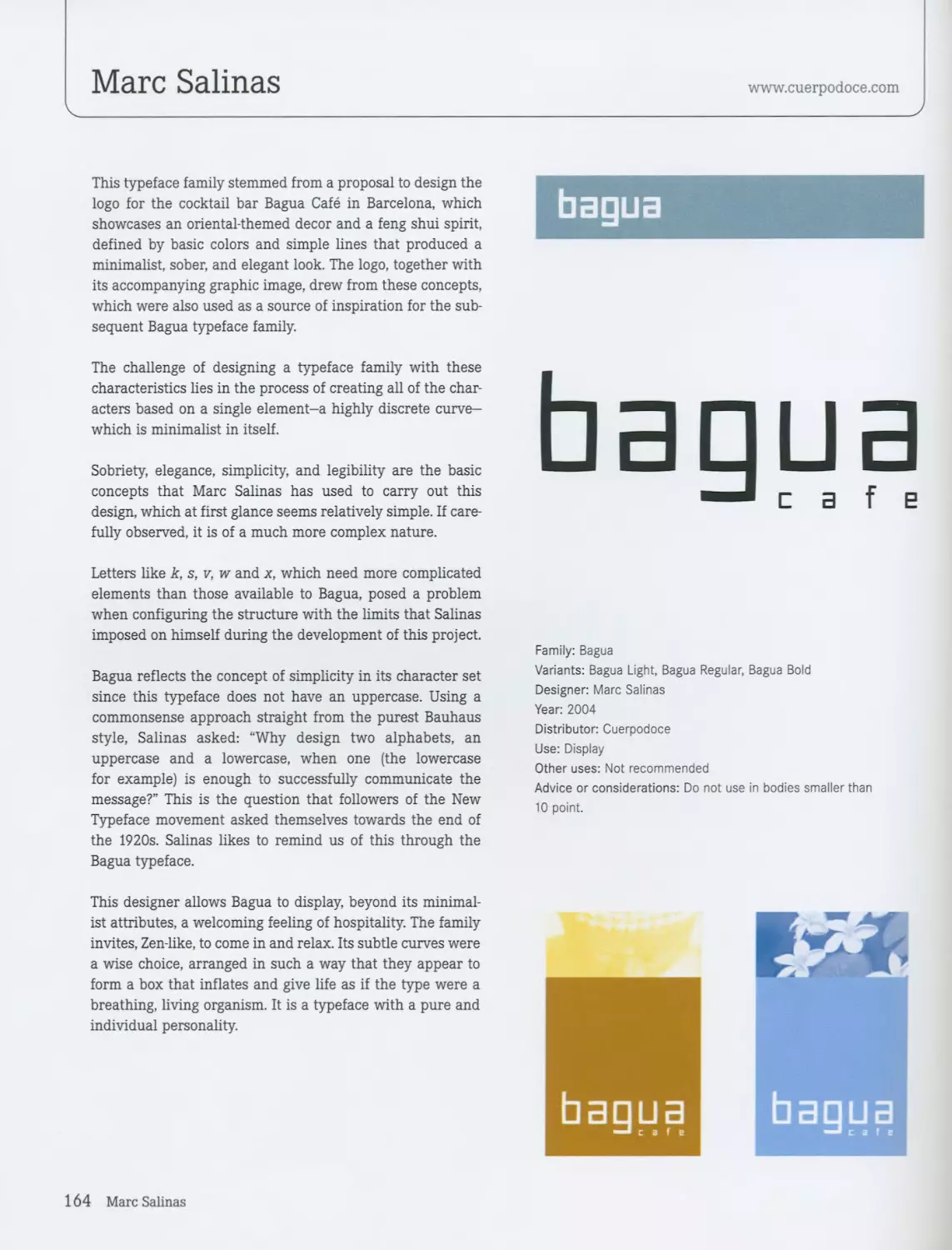
/

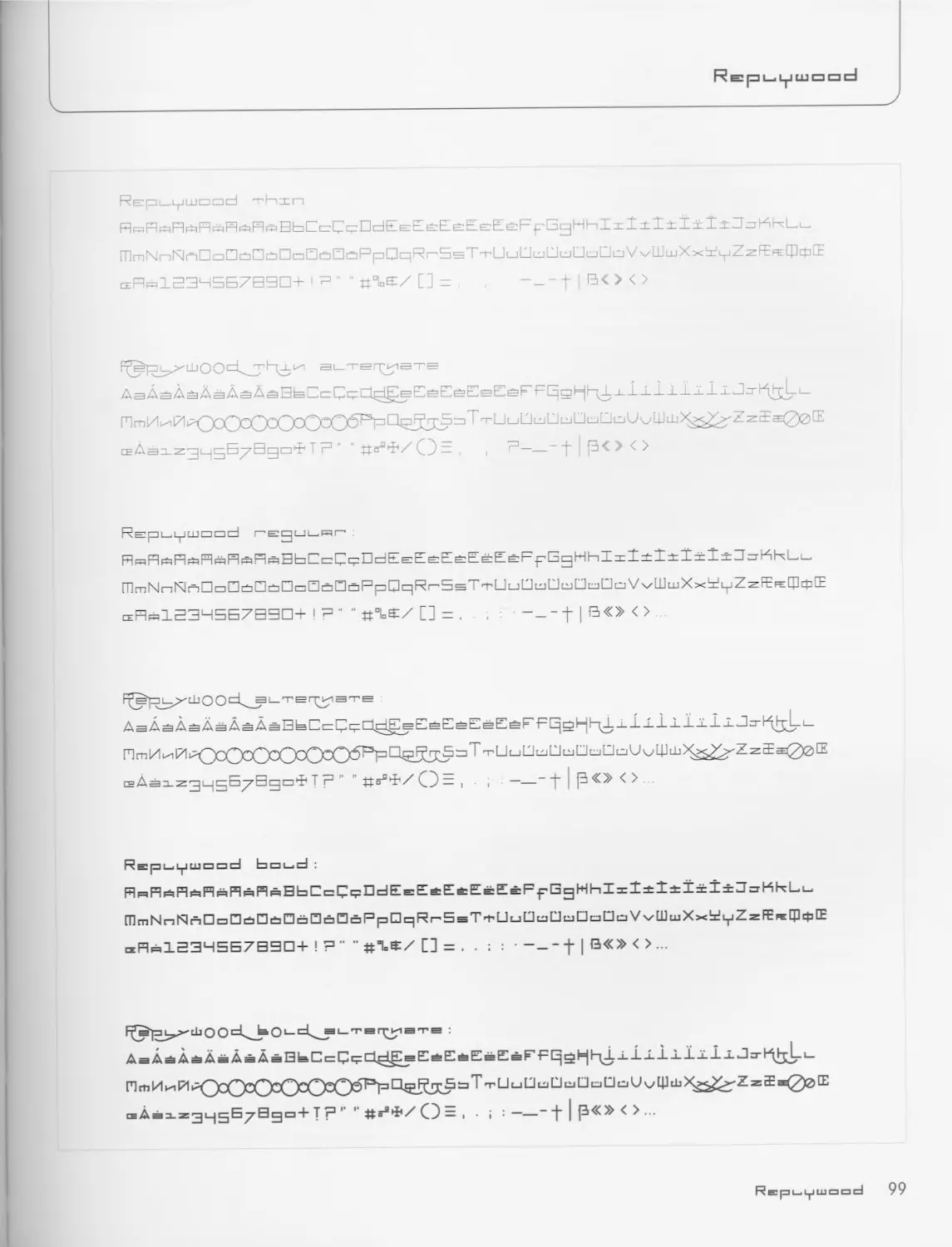
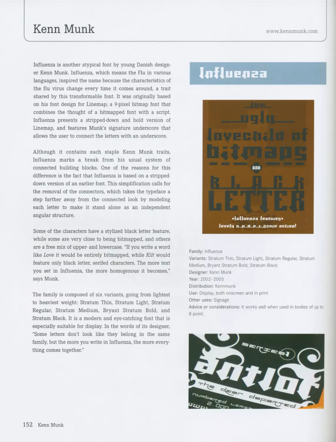
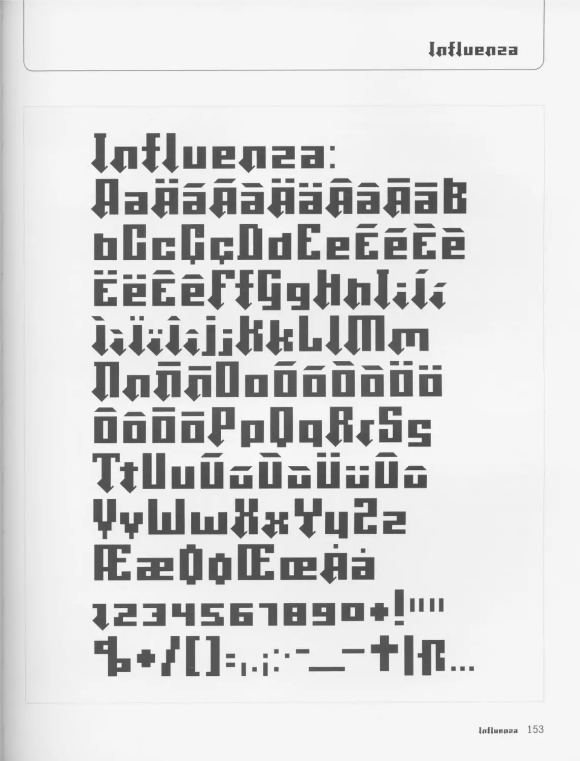


Text
uinmt fvrguun -------
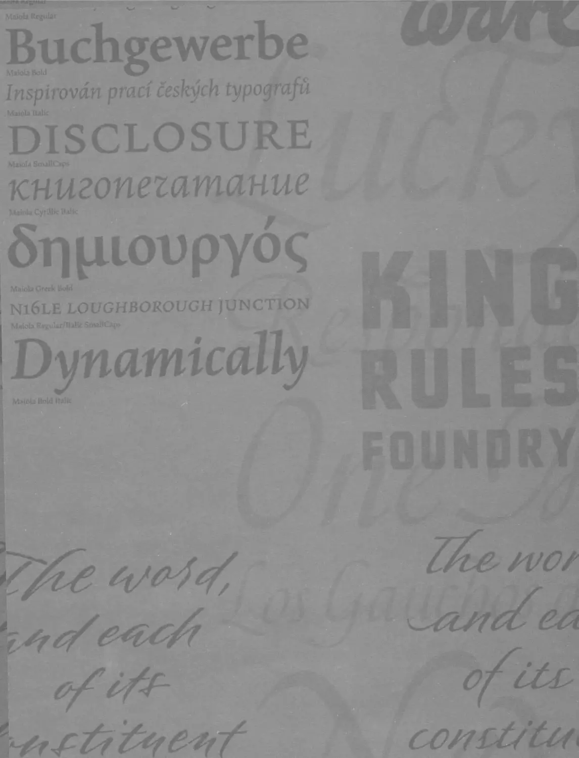
Buchgewerbe
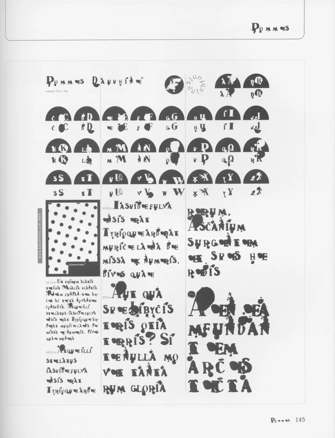
Inspirevan pracf ceskych typografu
Maida Italic
DISCLOSURE
Maiola SmallCaps
книгопегатание
Mafuh Cyrillic Italic
5гциоиру6<;
Mato la Creek Bold
N16LE LOUGHBOROUGH JUNCTION
Maioh ReguLar/Italic SmaUCap>
Dynamically
Match Hold Italic
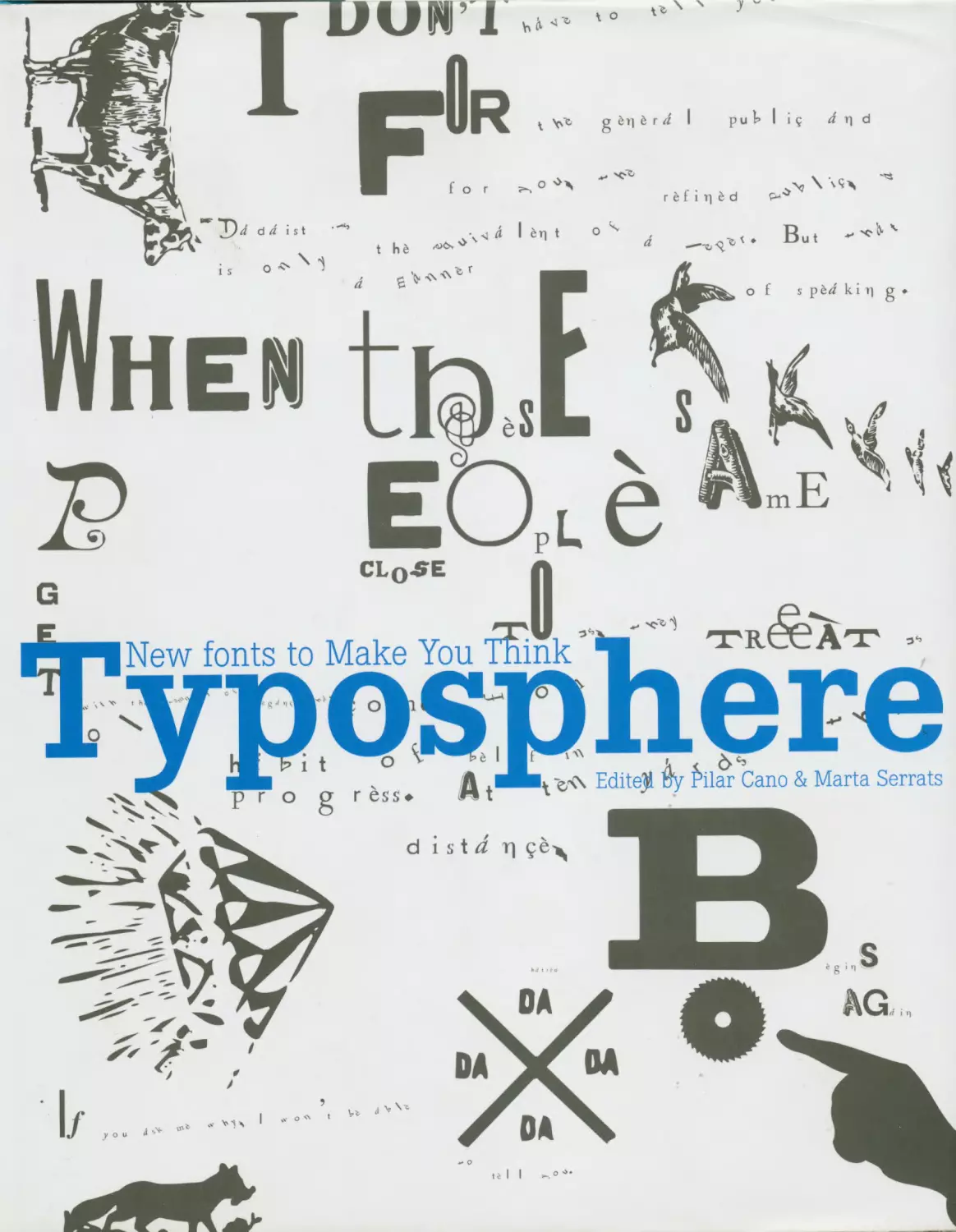
рчч New Fonts to Make You Think ч
Typosphere
COLLINS DESIGN
An Imprint of HarperCollins/’иА/иЛсп
TYPOSPHERE: NEW FONTS TO MAKE YOU THINK
Copyright © 2007 by COLLINS DESIGN and maomao publications
All rights reserved. No part of this book may be used or reproduced in any manner whatsoever,
without written permission except in the case of brief quotations embodied in critical articles and reviews.
For information, address Collins Design, 10 East 53"’ Street, New York, NY 10022.
HarperCollins books may be purchased for educational, business, or sales promotional use.
For information, please write: Special Markets Department, HarperCollins Publishers,
10 East 53 е Street, New York, NY 10022.
First Edition:
Published by maomao publications in 2007
Tellers, 22 bis, 3° 11
08001 Barcelona, Spain
Tel.: +34 93 481 57 22
Fax: +34 93 317 42 08
mao@maomaopublications.com
www.maomaopublications.com
English language edition first published in 2007 by:
Collins Design
An Imprint of HarperCollinsPub/^ers
10 East 53'd Street
New York, NY 10022
Tel.: (212) 207-7000
Fax: (212) 20 7-7654
collinsdesign@harpercollins.com
www.harpercollins.com
Distributed throughout the world by:
HarperCollins/3l/b//s/?ers
10 East 53” Street
New York, NY 10022
Fax: (212) 207-7654
Publisher:
Paco Asensio
Editorial Coordination:
Anja Llorella Oriol
Editors:
Pilar Cano
Marta Serrats
Editorial assistant:
Claire Dalquie
Translation:
Jay Noden
Veronica Fajardo
Art Direction:
Emma Termes Parera
Layout:
Zahira Rodriguez Mediavilla
Library of Congress Cataloging-in-Publication Data
Serrats, Marta.
Typosphere : new fonts to make you think / Marta Serrats, Pilar Cano.
- 1st ed.
p. cm.
ISBN-13: 978-0-06-114421-9 (pbk.)
ISBN-10: 0-06-114421-5 (pbk.)
1. Type and type-founding. I. Cano, Pilar, 1978-11. Title.
Z250.S48 2007
686.2'21-dc22
2007007139
Printed in Spain
First Printing, 2007
Contents
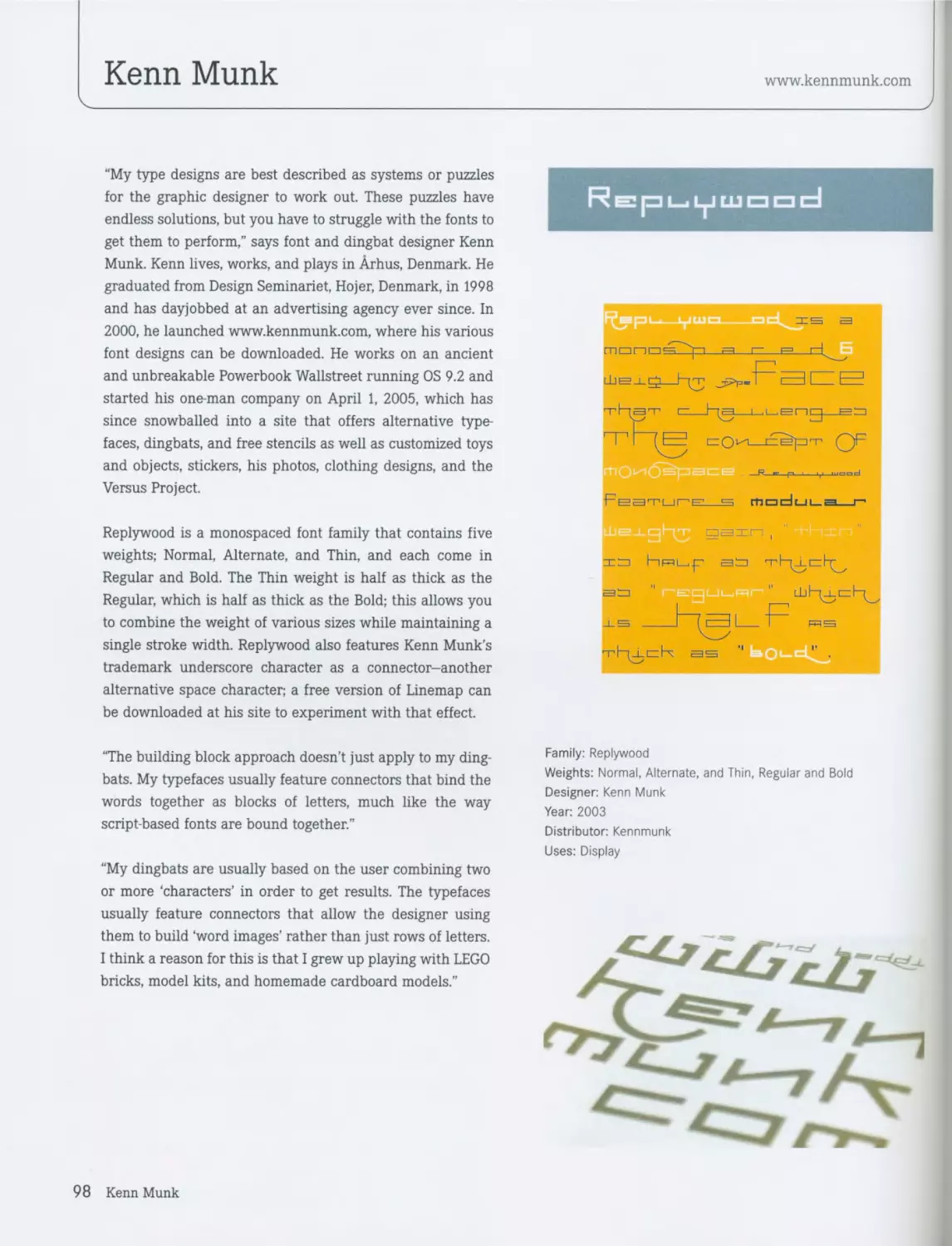
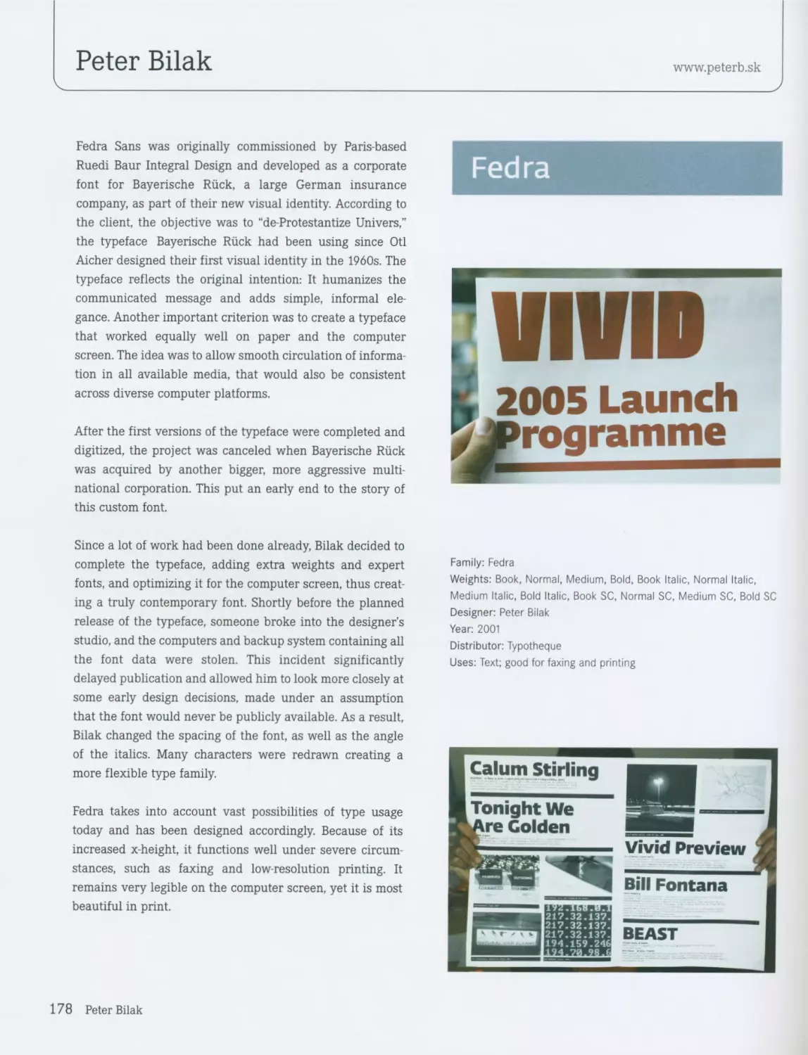
Introduction 6 Replywood / Kenn Munk The Shire Types / Jeremy Tankard 98 100
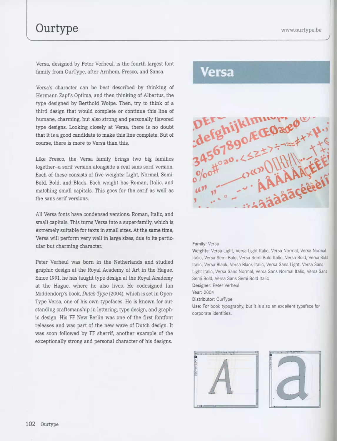
AGGRESSIVE 8 Versa / OurType 102
Alchemy / Jeremy Tankard 10 Sophisto / Stefan Hattenbach 106
CA BND™ / Cape Arcona Type Foundry 12 BigVesta / Gerard Unger 110
Tarocco / Stefan Hattenbach 14
Xplor / Michael Ives 18 PLAYFUL 112
Maiola / Veronika Burian 22 Aridnne / Dutchfonts 114
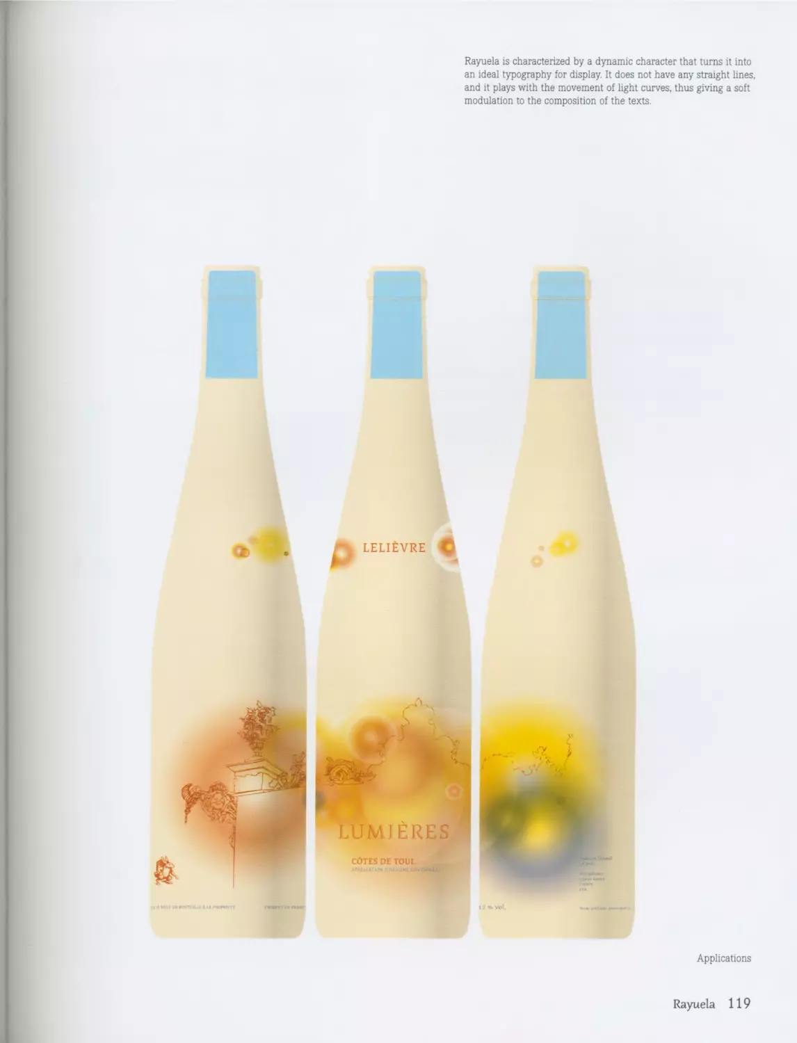
Berber / Letterbox 26 Rayuela / Alejandro Lo Celso 116
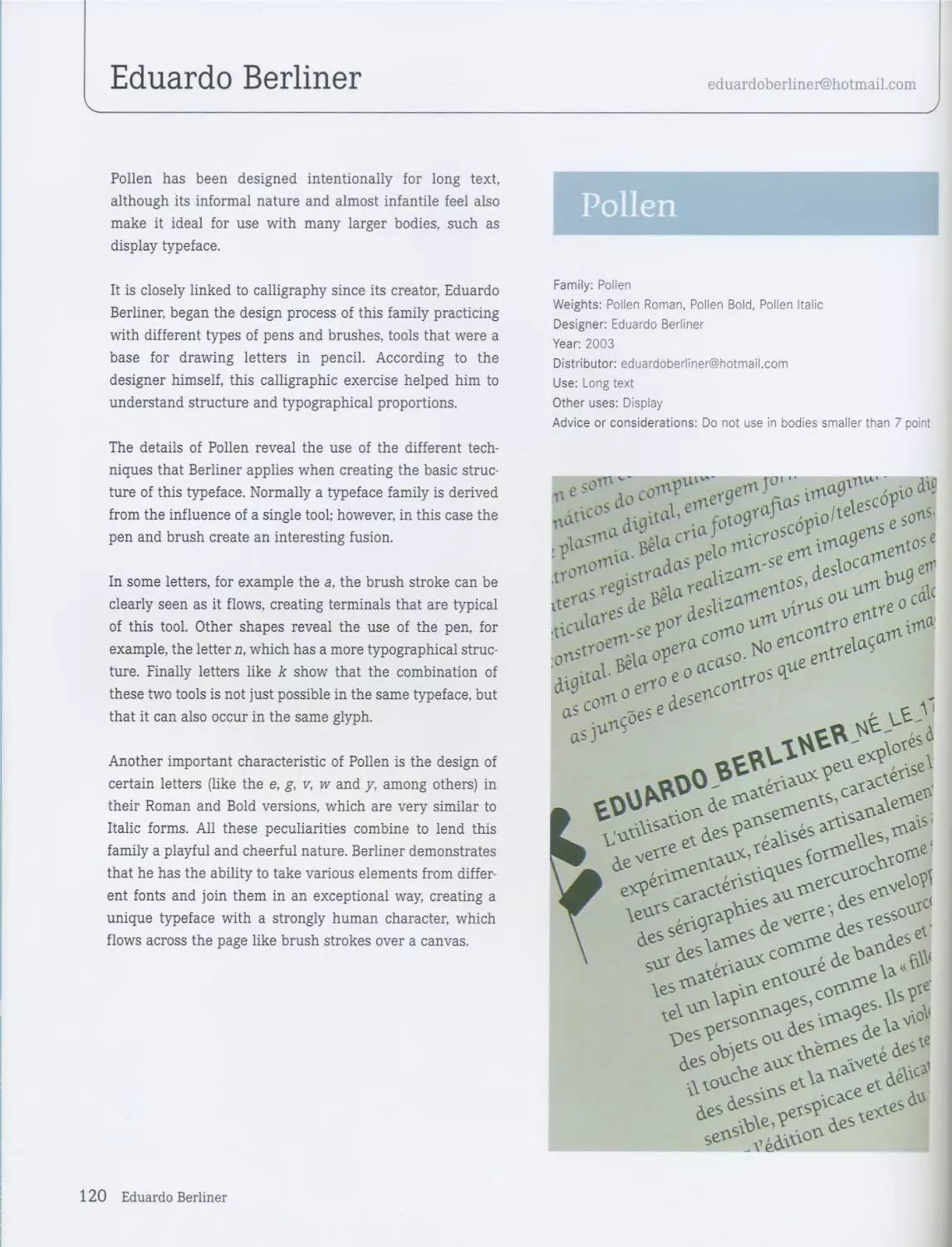
Sansa / OurType 28 Pollen / Eduardo Berliner 120
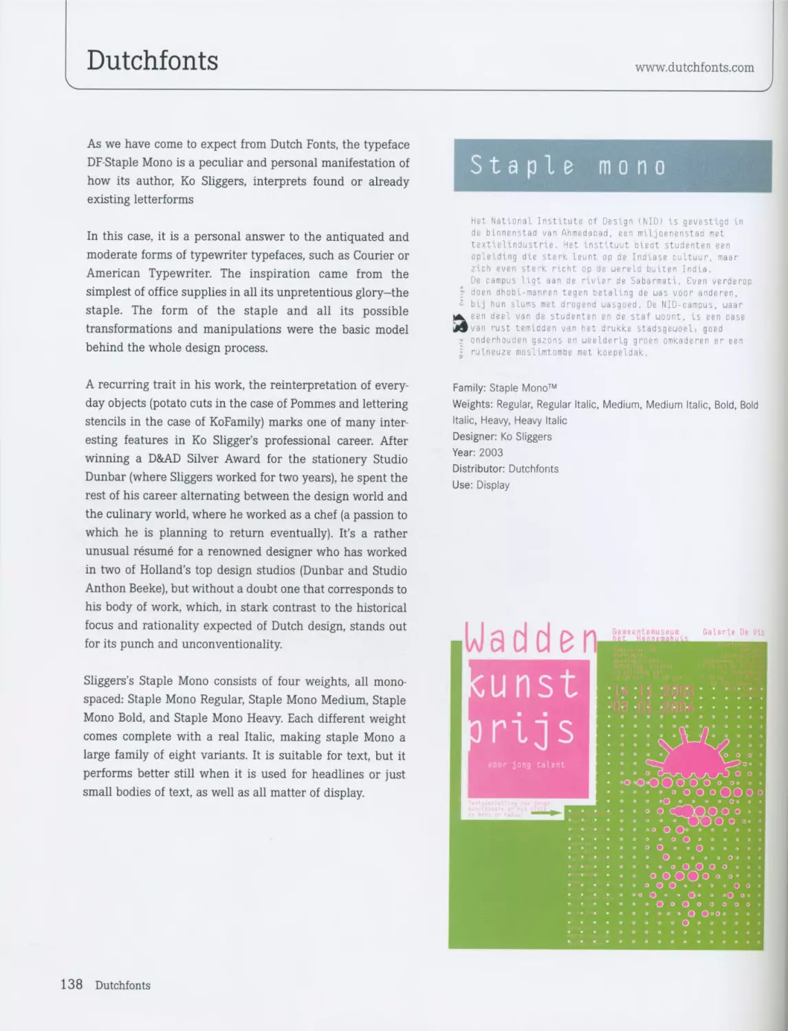
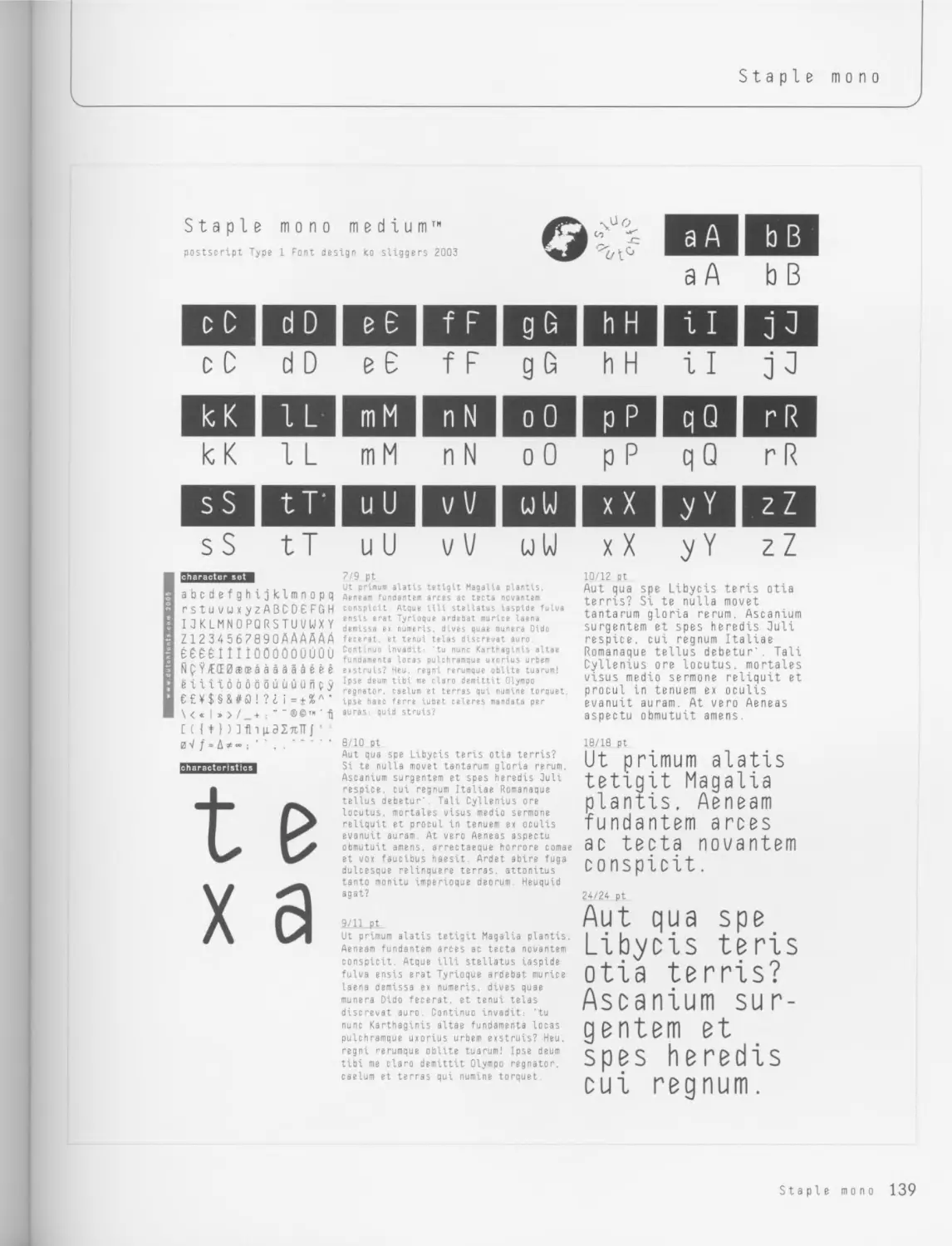
Techari / Pilar Cano 30 Staple TXT™ / Dutchfonts 124
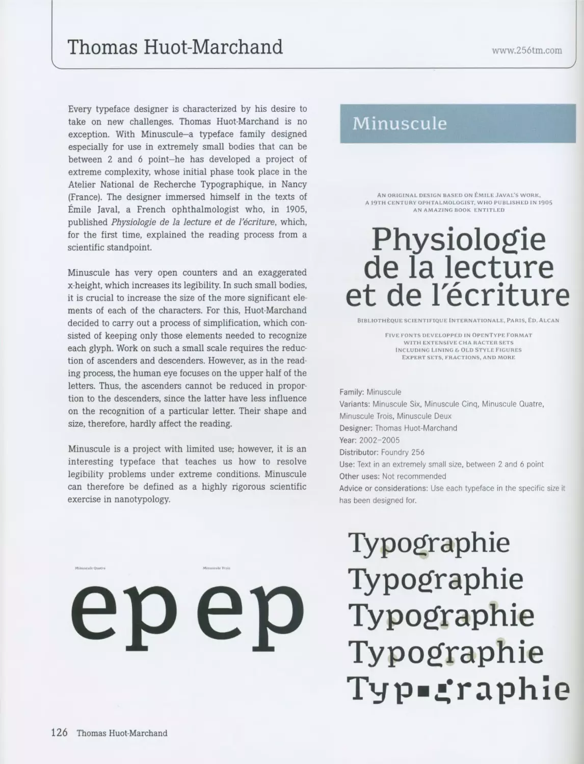
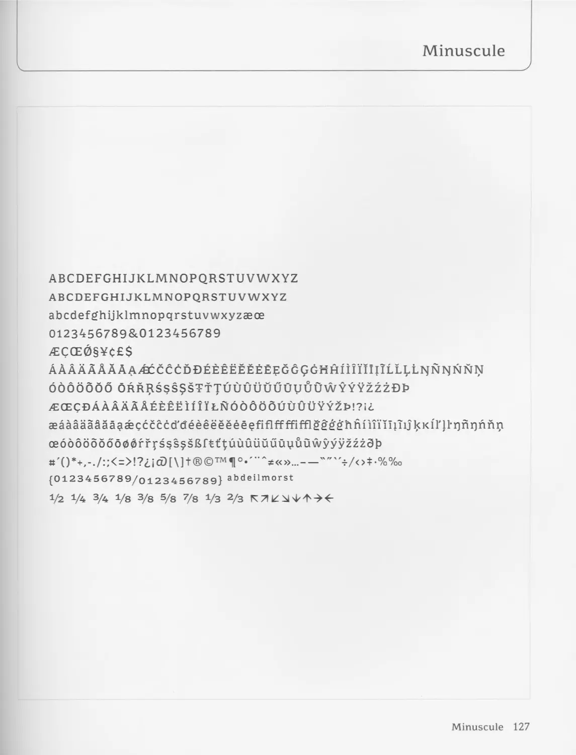
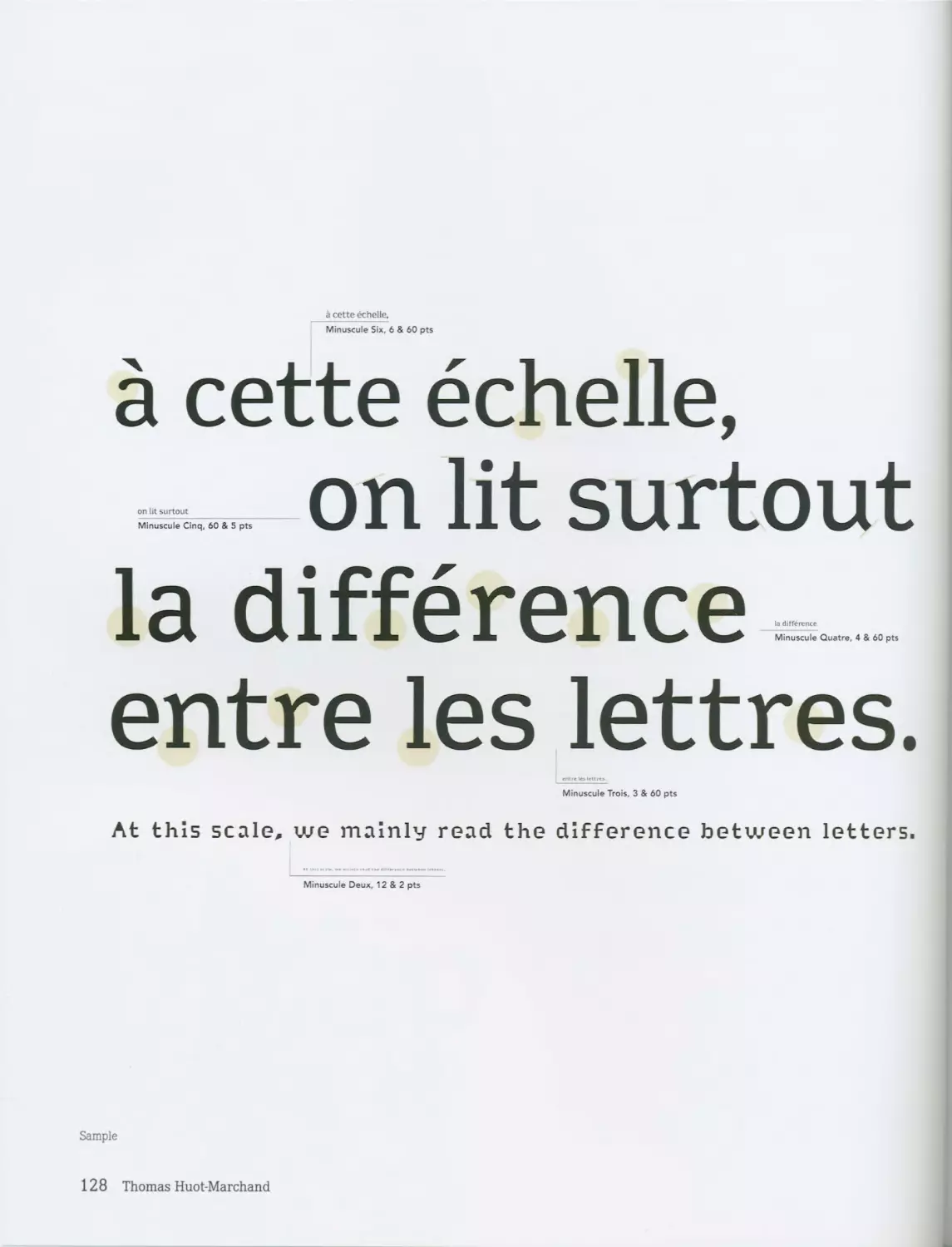
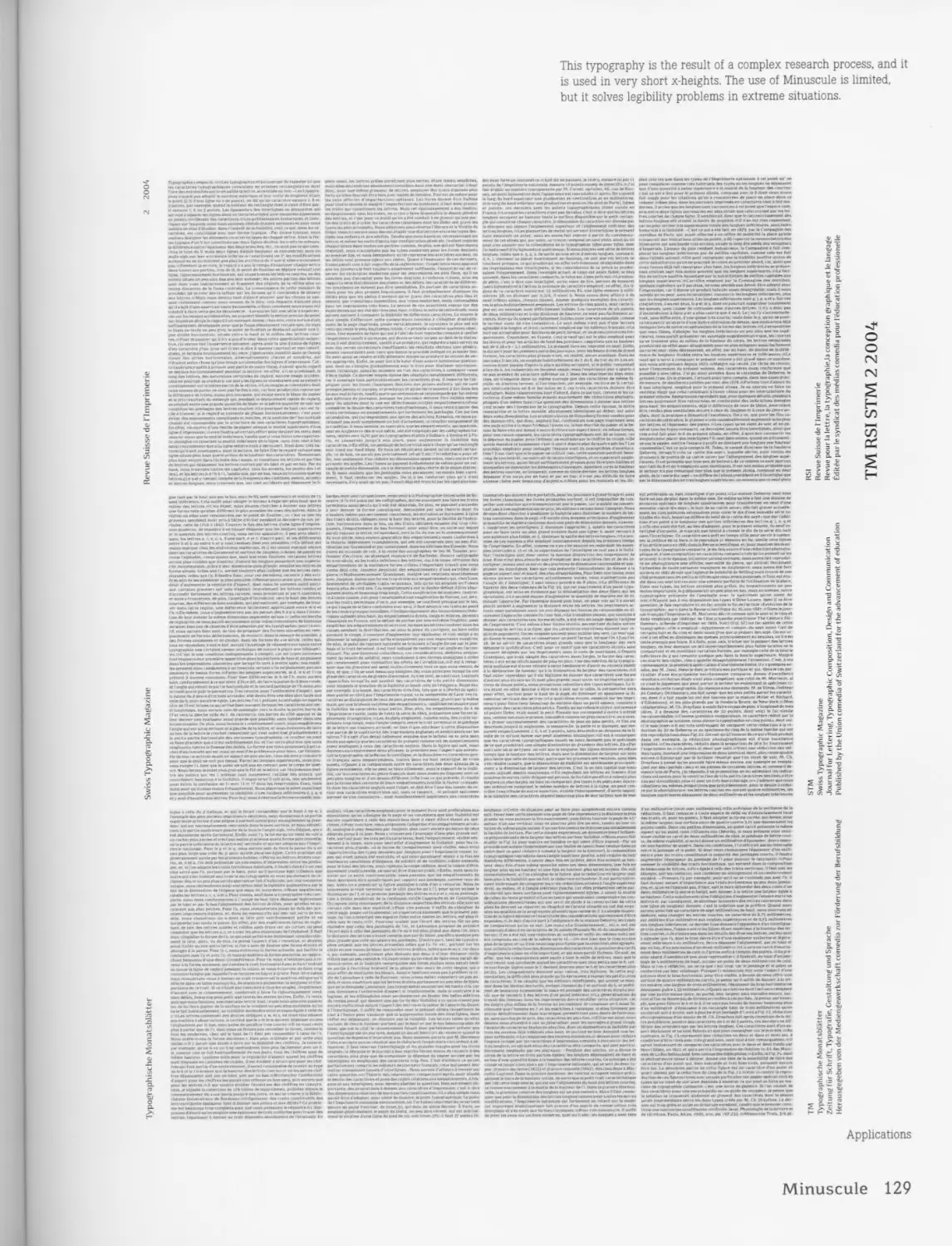
Minuscule / Thomas Huot-Marchand 126
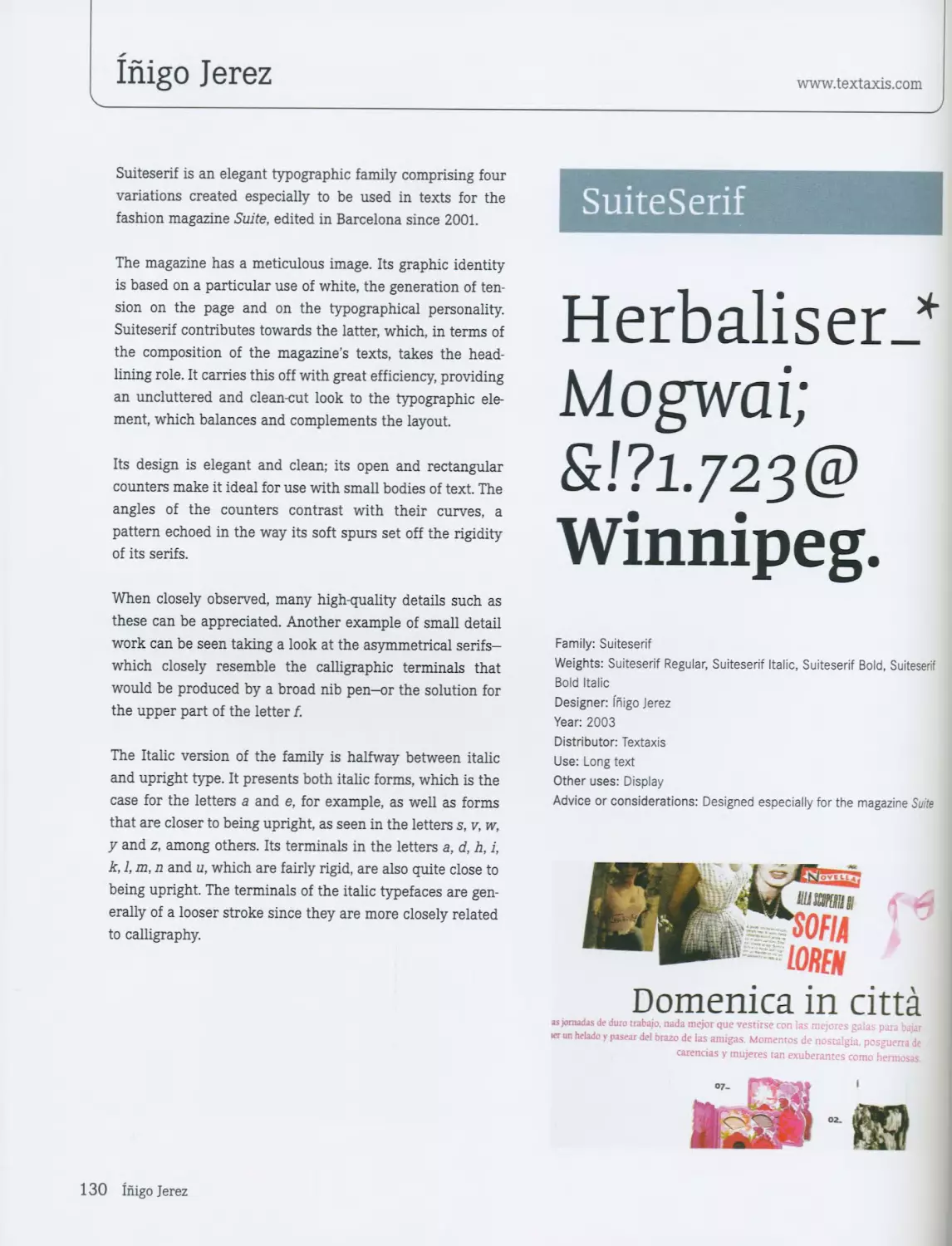
FUN 34 Suite Serif / Inigo Jerez 130
Benguiat / House Industries 36 Dolce / Elena Albertoni 134
Curtida / Ivan Castro 40 Arlt / Alejandro Lo Celso 136
Bello / Underware 42 Staple Mono™ / Dutchfonts 138
Rumba / Laura Meseguer 46
Oops / Malou Verlomme 50 HAPPY 140
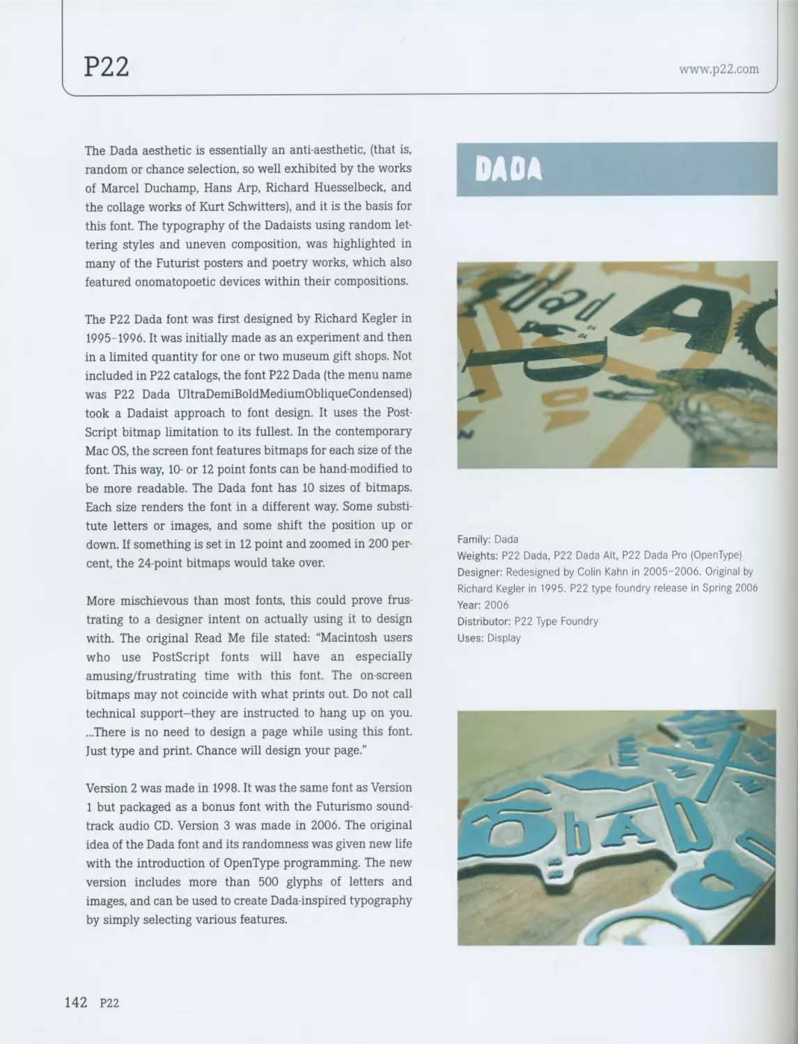
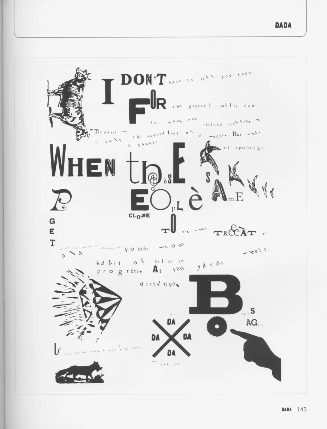
Morice / Letterbox 54 Dada/P22 142
P22 Sweepy P22 56 Pommes™ / Dutchfonts 144
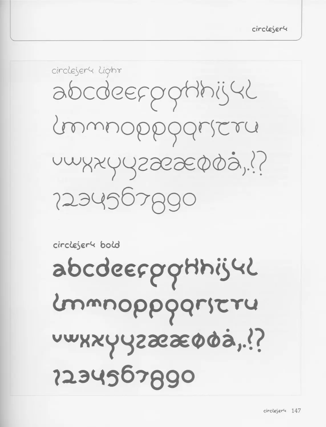
CA Emeralda™ / Cape Arcona Type Foundry 58 Circle jerk / Kenn Munk 146
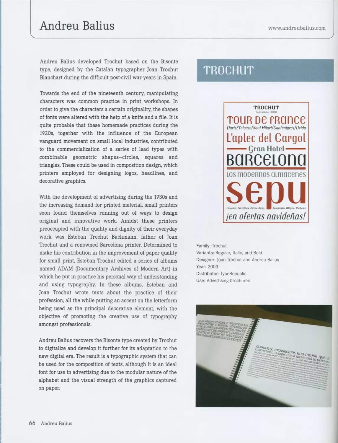
Czeska / Andreu Balius 60 Dolly / Underware 148
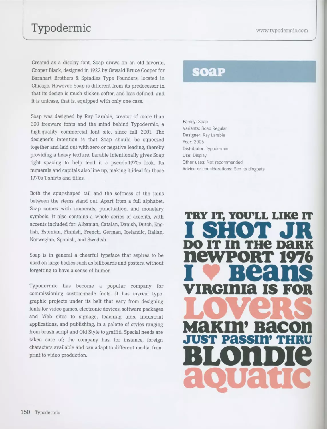
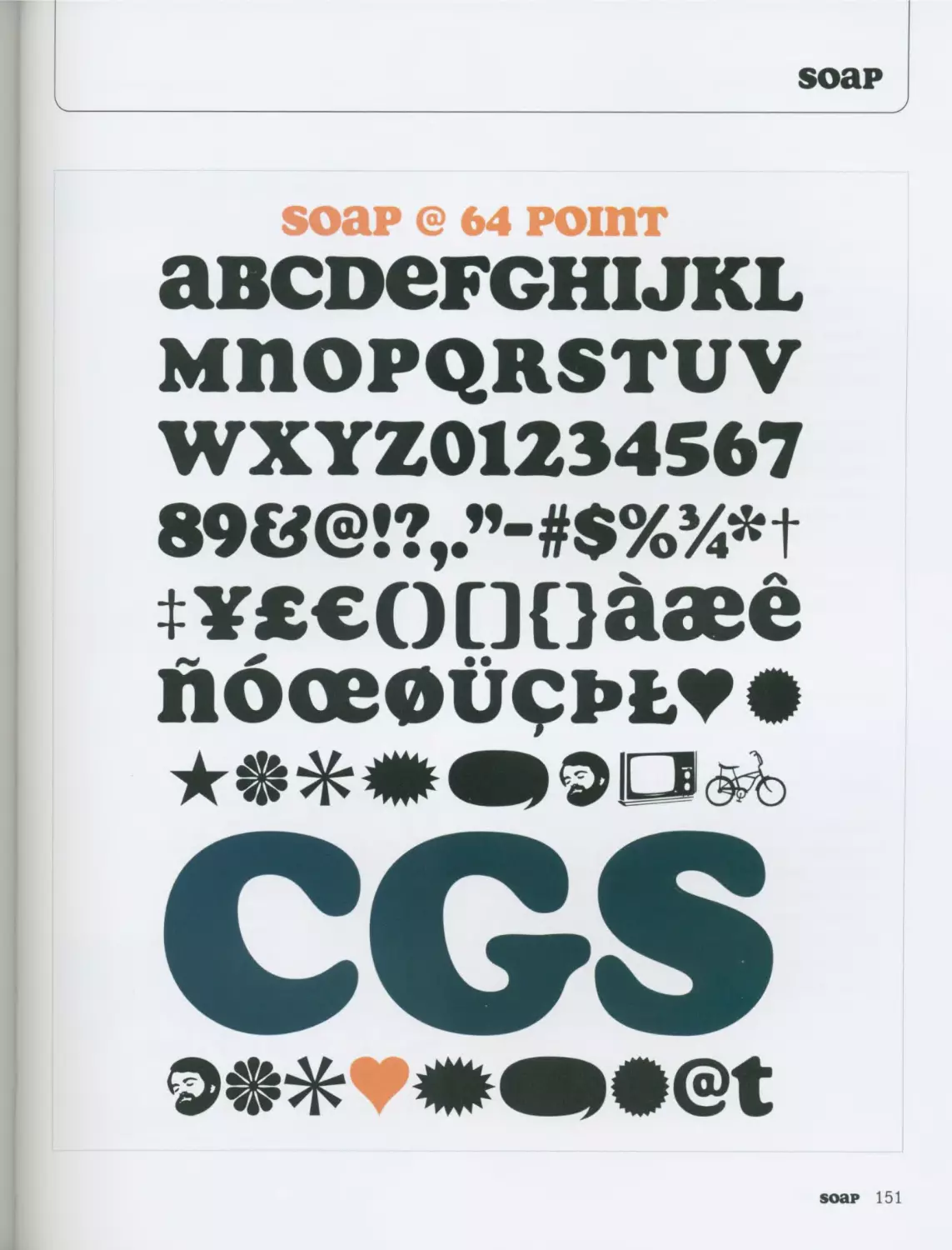
Soap / Typodermic 150
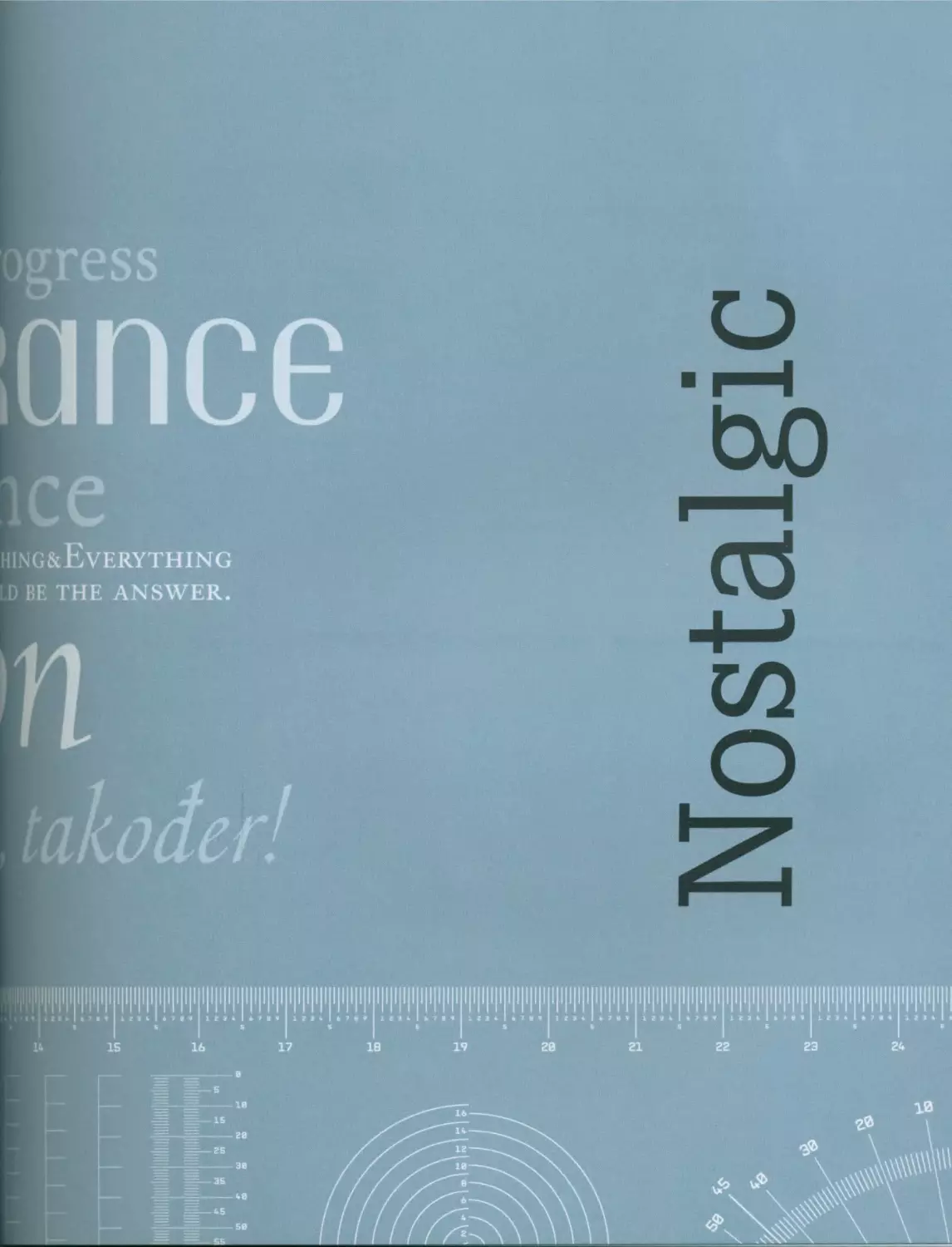
NOSTALGIC 62 Influenza / Kenn Munk 152
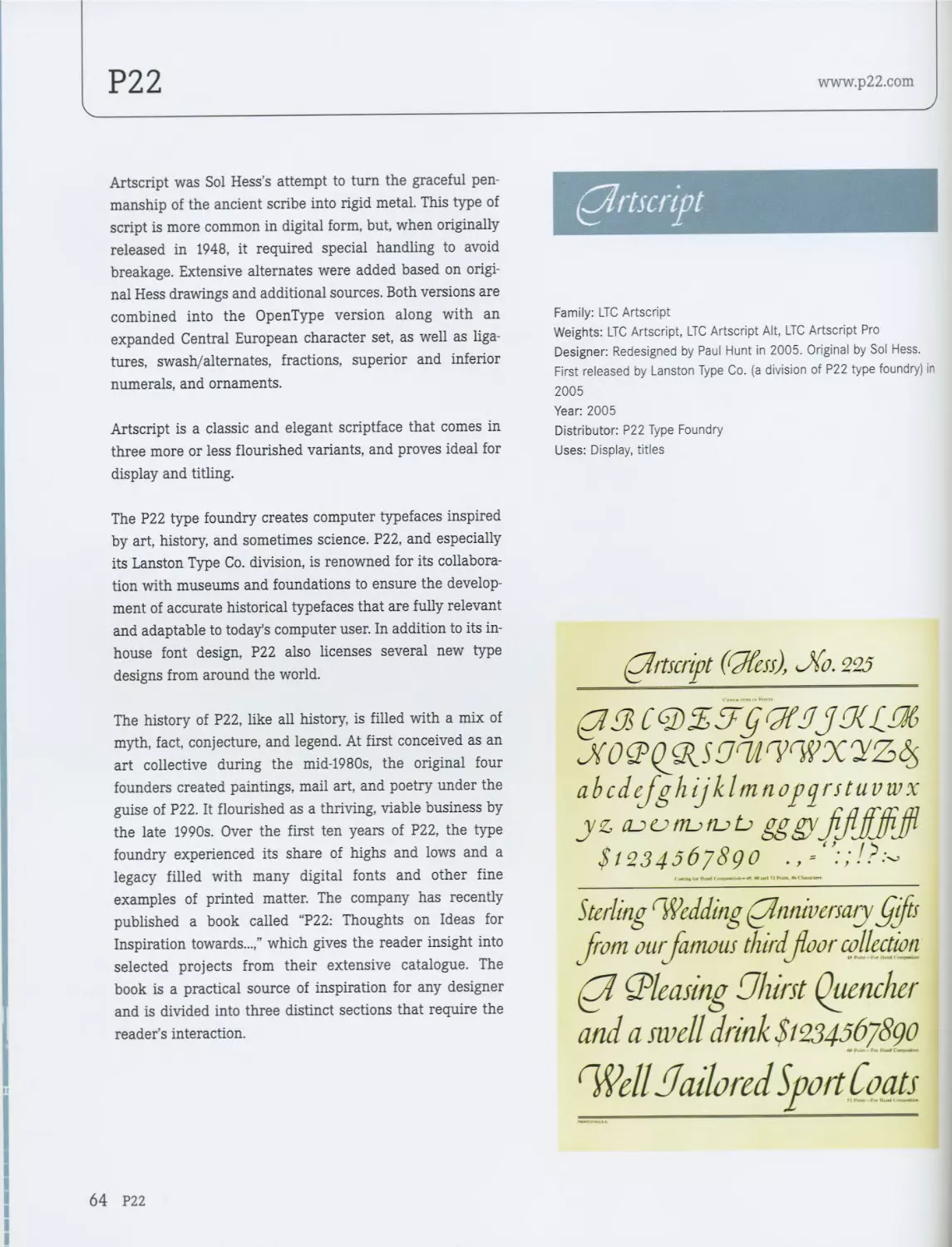
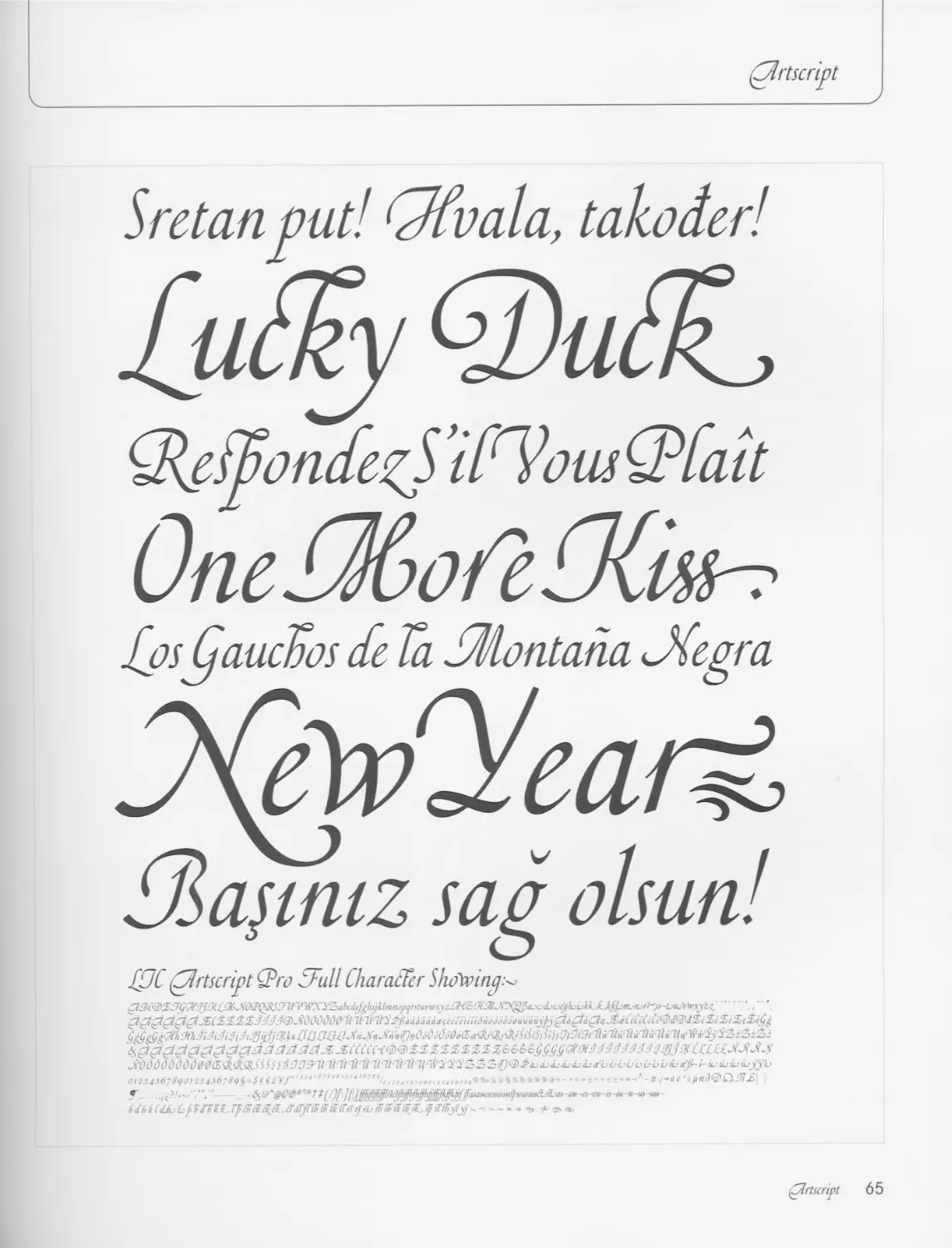
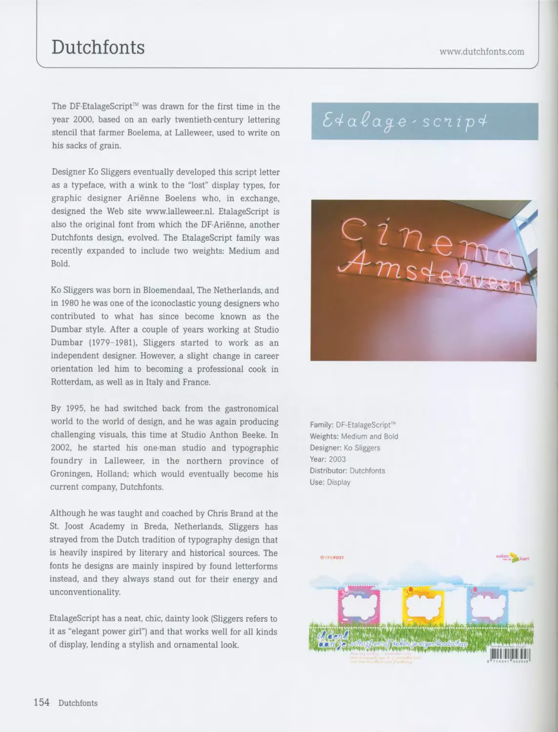
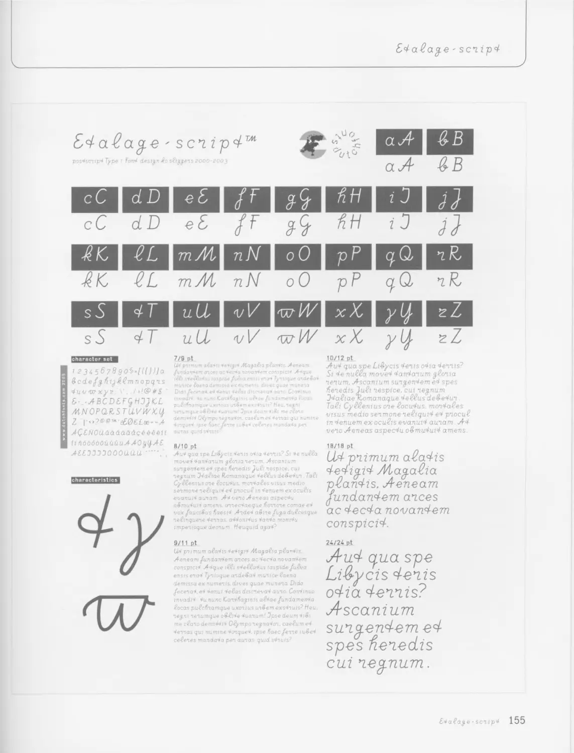
LTC Artscript / P22 64 DF-EtalageScript™ / Dutchfonts 154
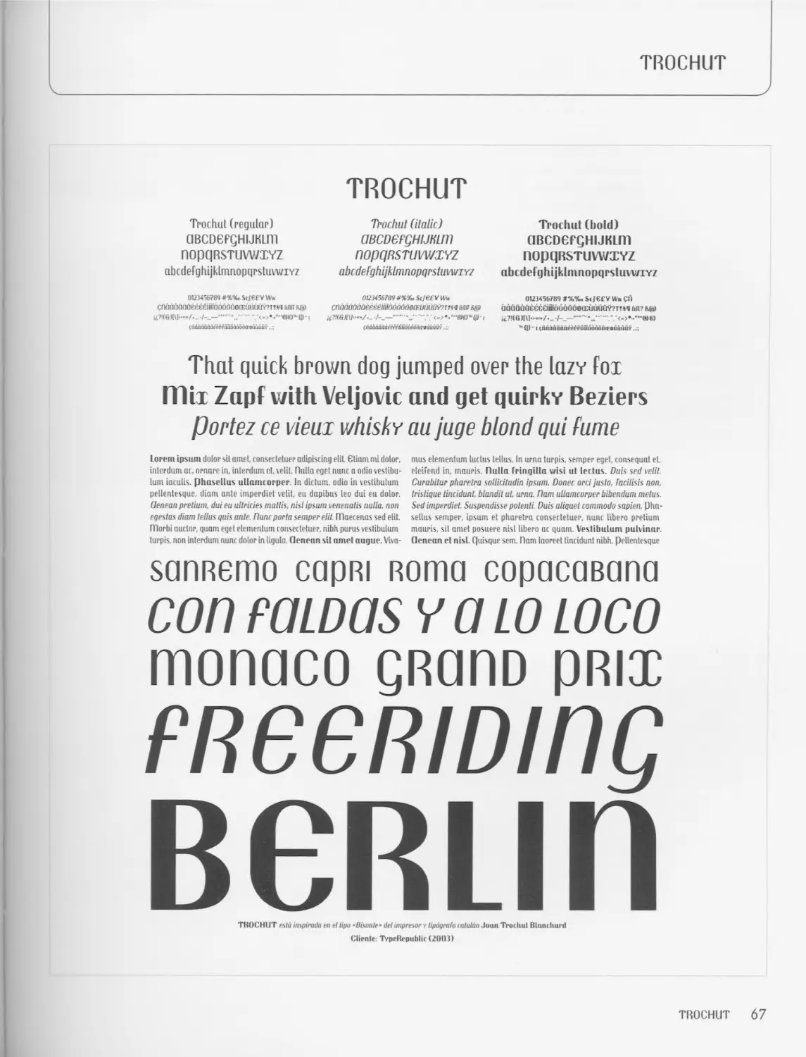
Trochut / Andreu Balius 66 Terital / Letterbox 156
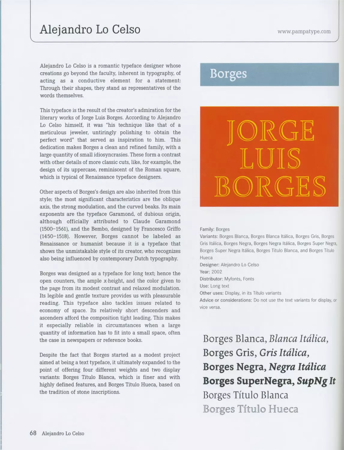
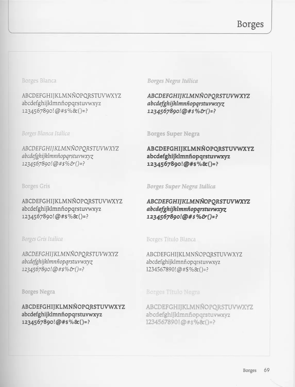
Borges / Alejandro Lo Celso 68
Delicato / Stefan Hattenbach 72 MELLOW 158
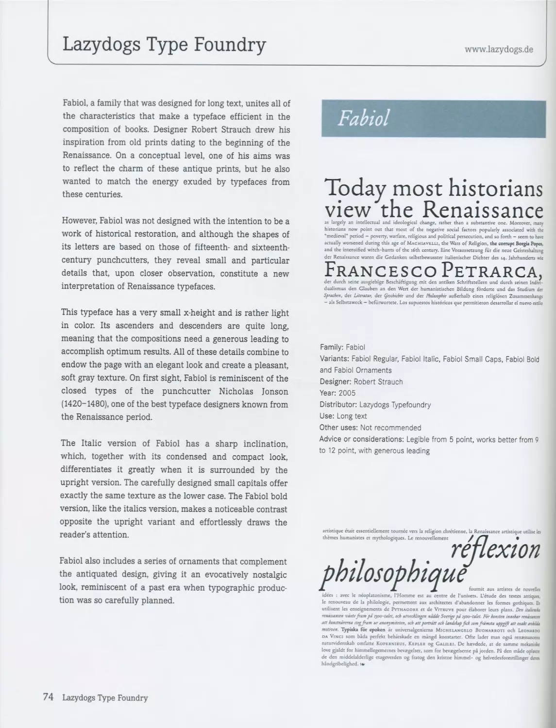
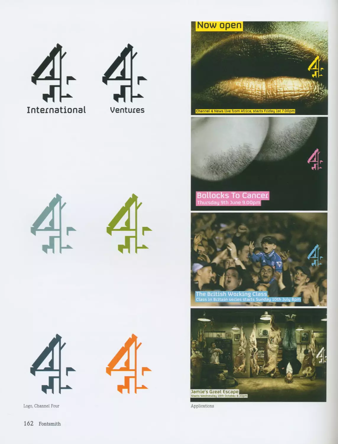
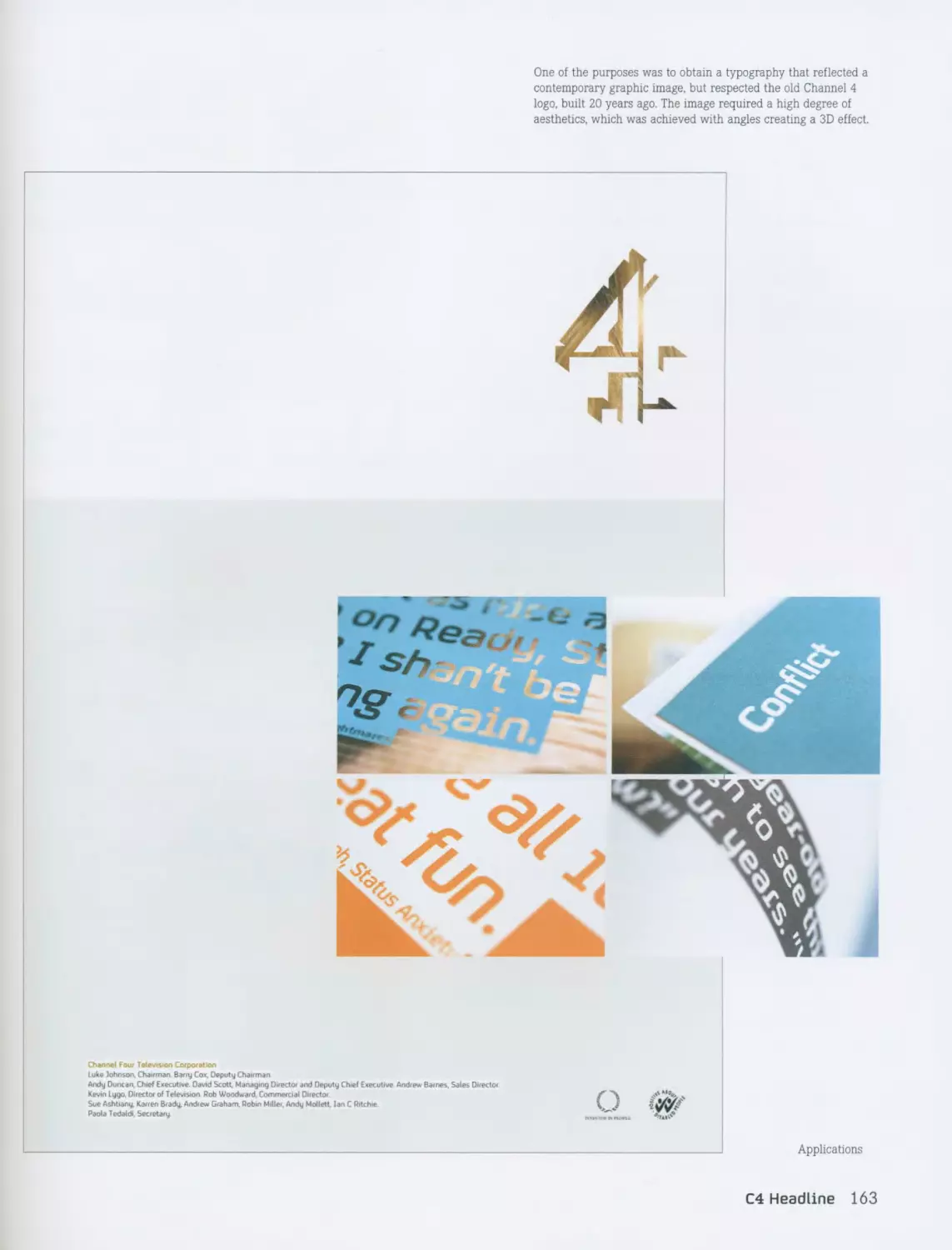
Fabiol / Robert Strauch 74 C4 / Fontsmith 160
Paperback / House Industries 78 Bagua / Marc Salinas 164
LTC Caslon / P22 80 Bonus / Inigo Jerez 168
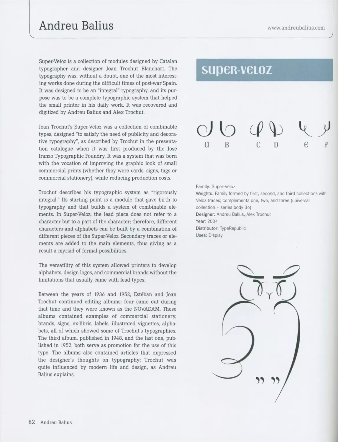
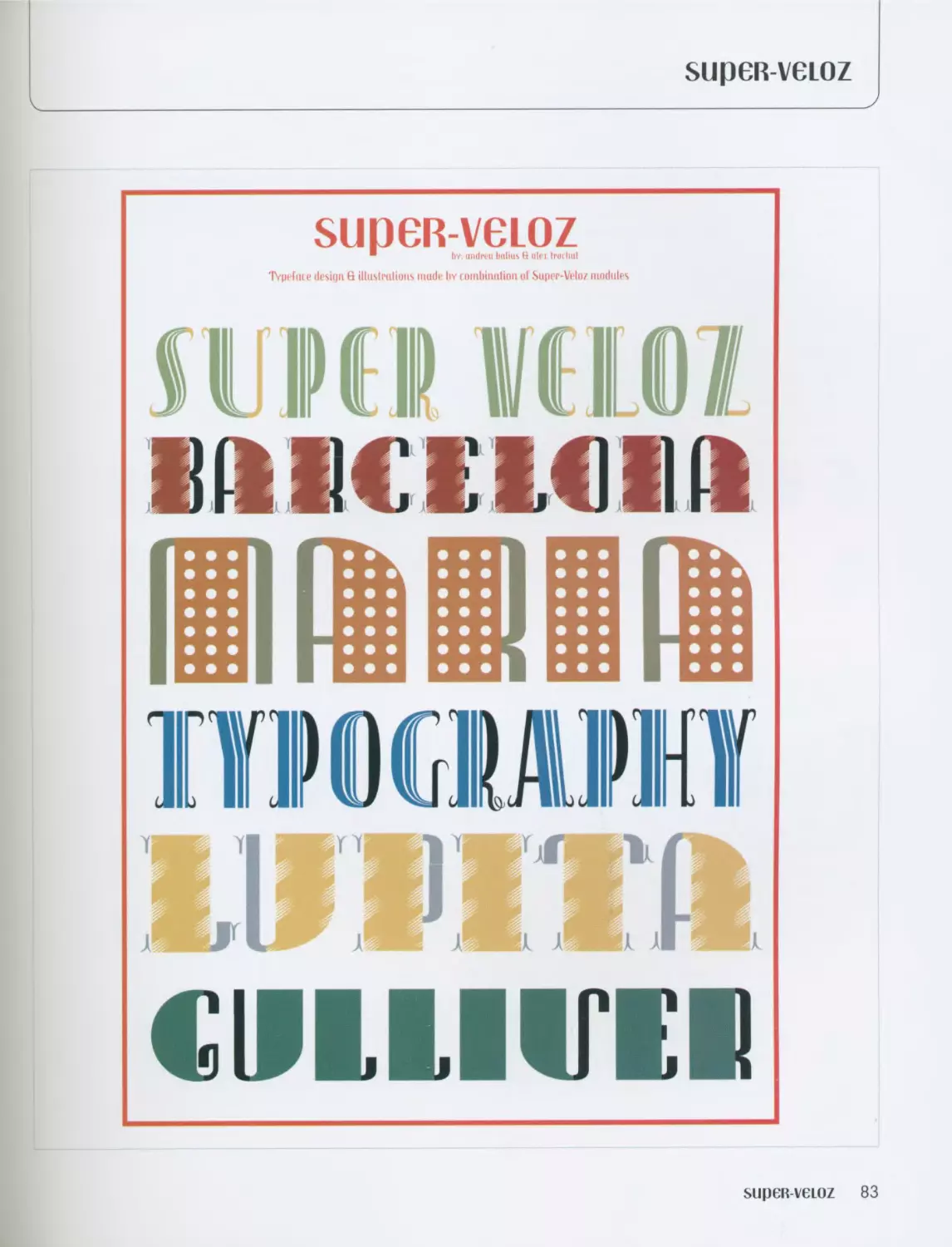
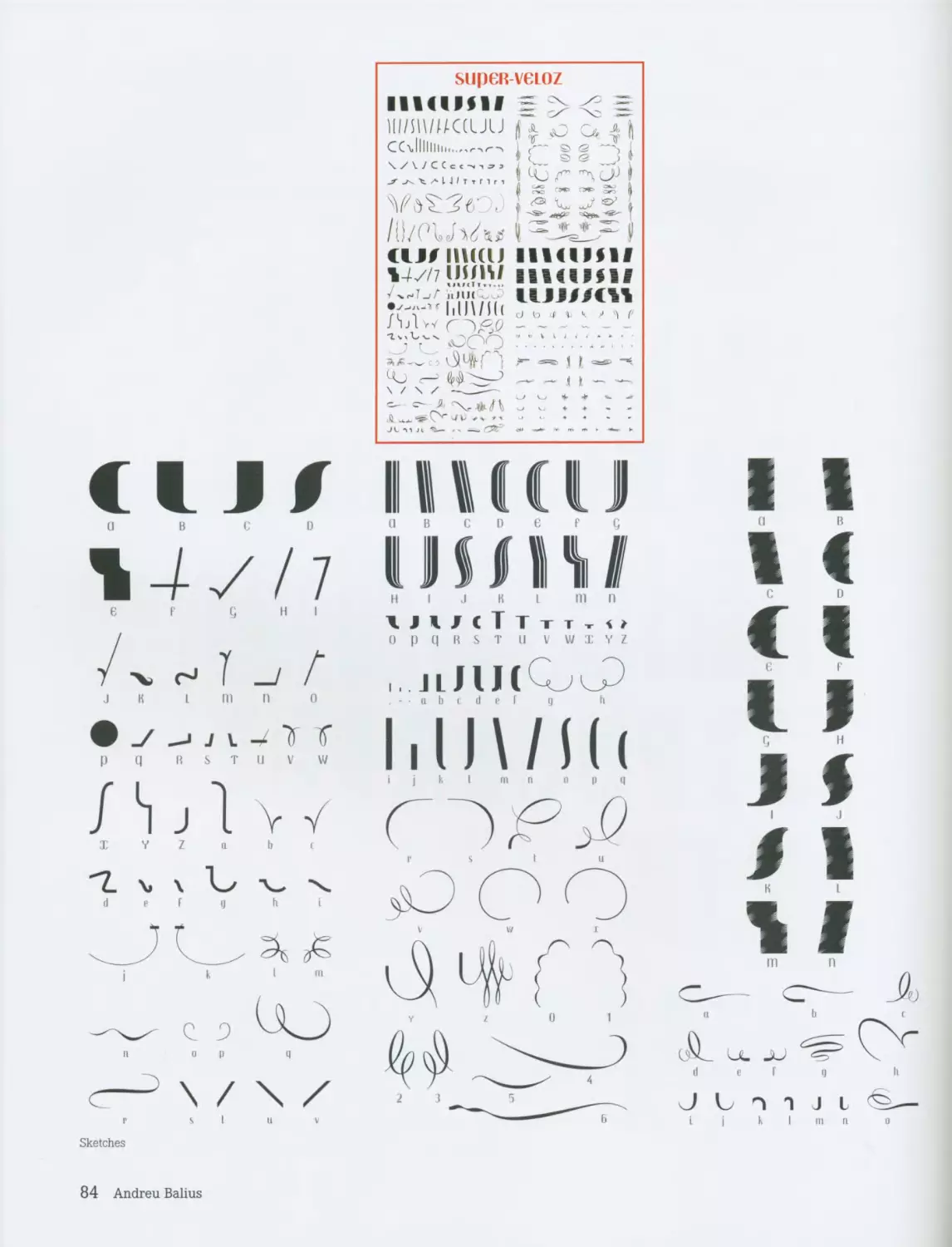
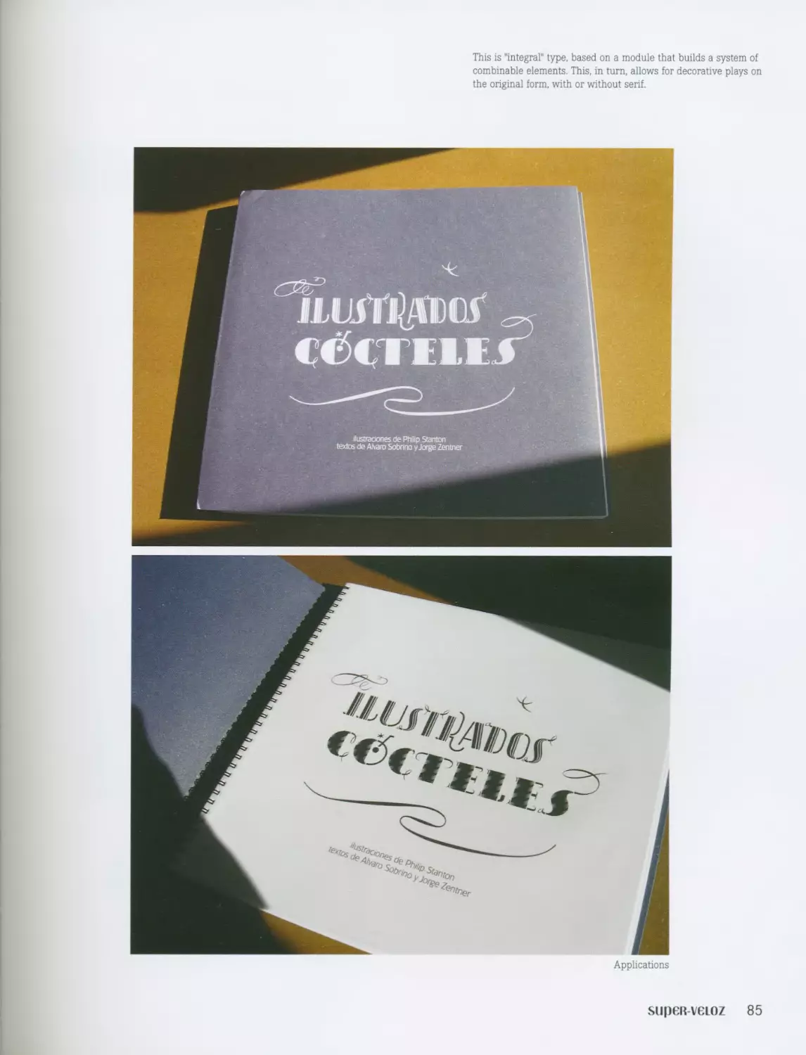
Super-Veloz / Andreu Balius 82 Athelas / Jose Scaglione 172
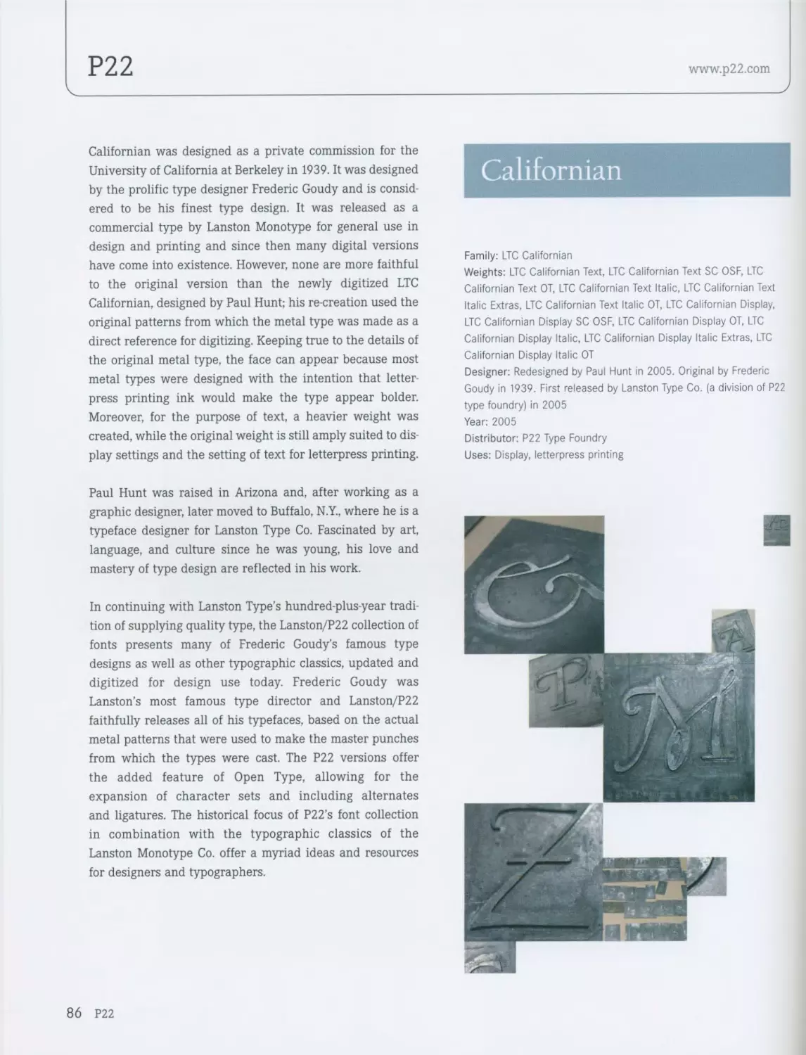
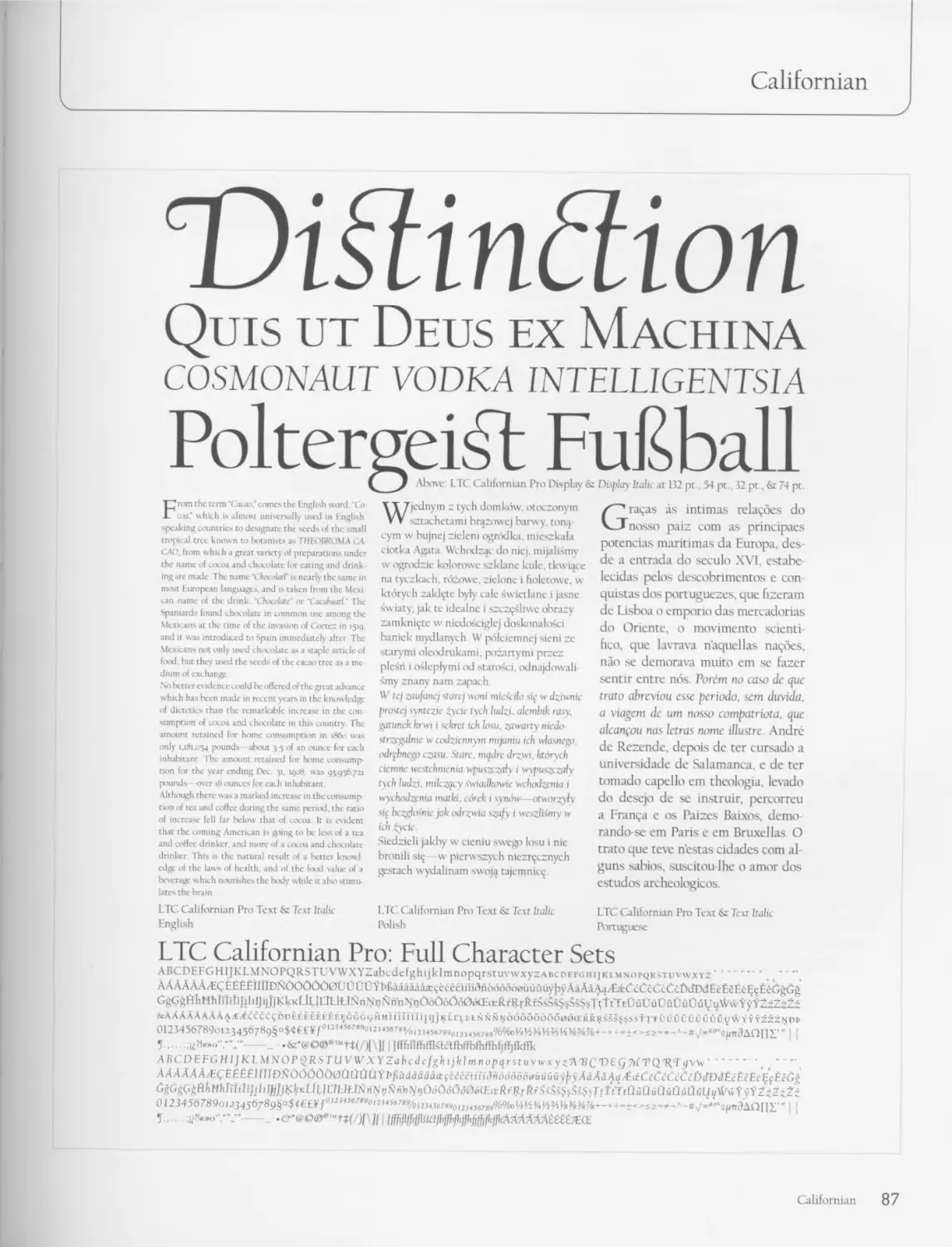
LTC Californian / P22 86 DF-Ko™ / Dutchfonts 176
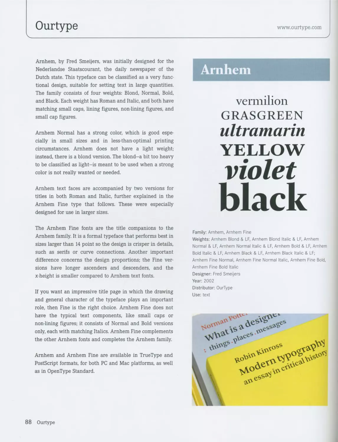
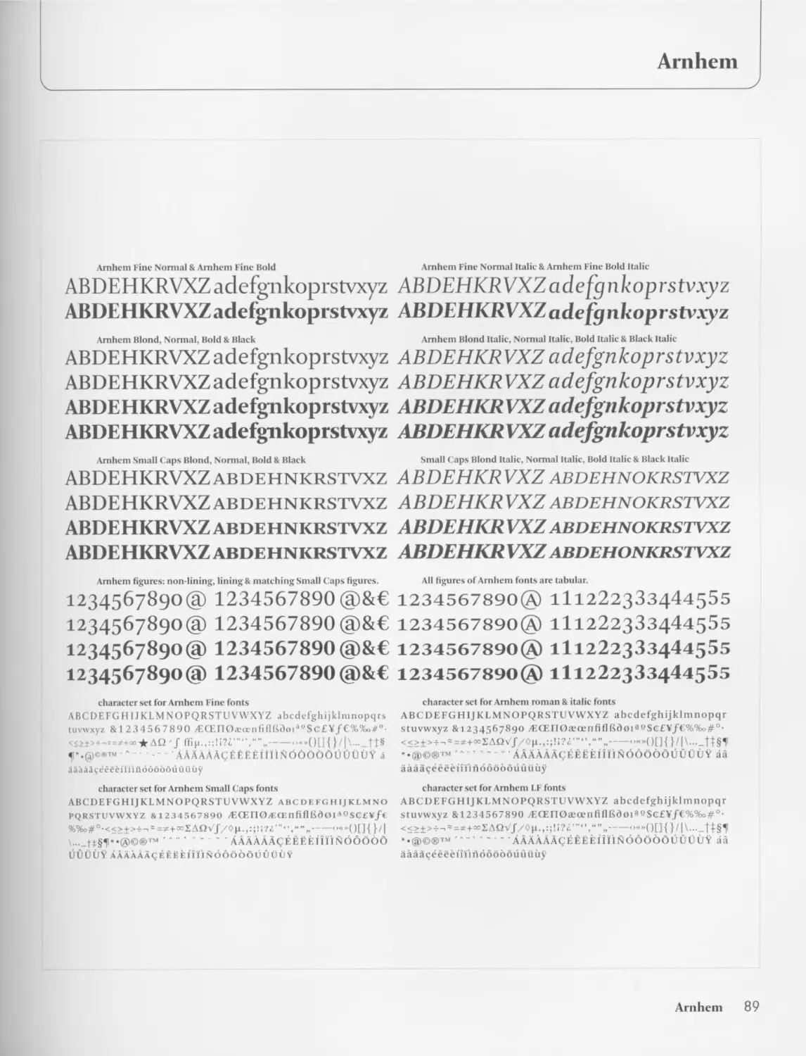
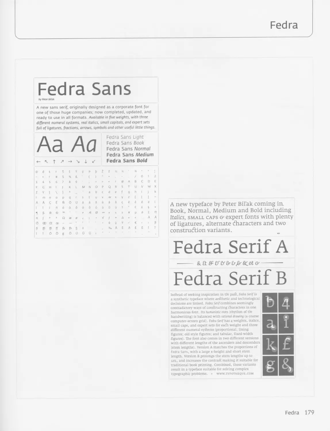
Arnhem / OurType 88 Fedra / Peter Bilak 178
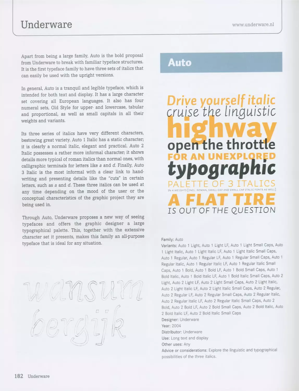
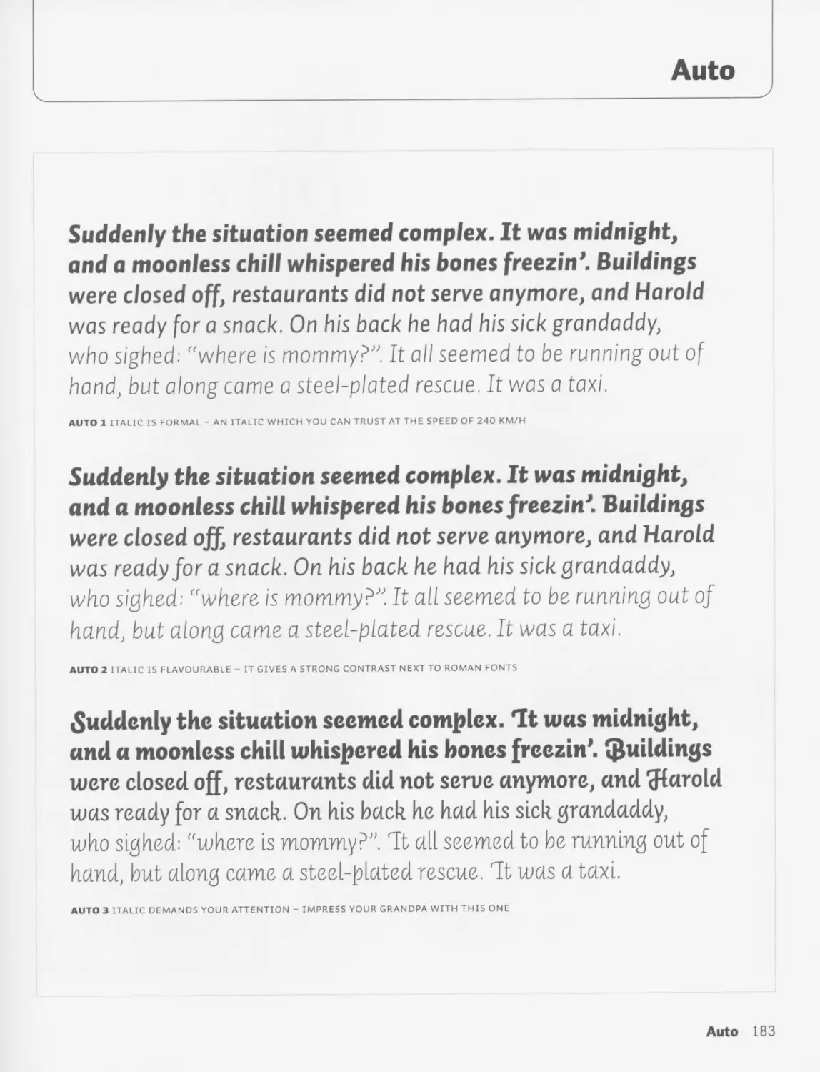
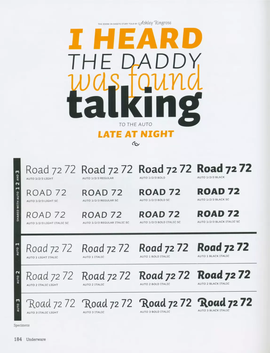
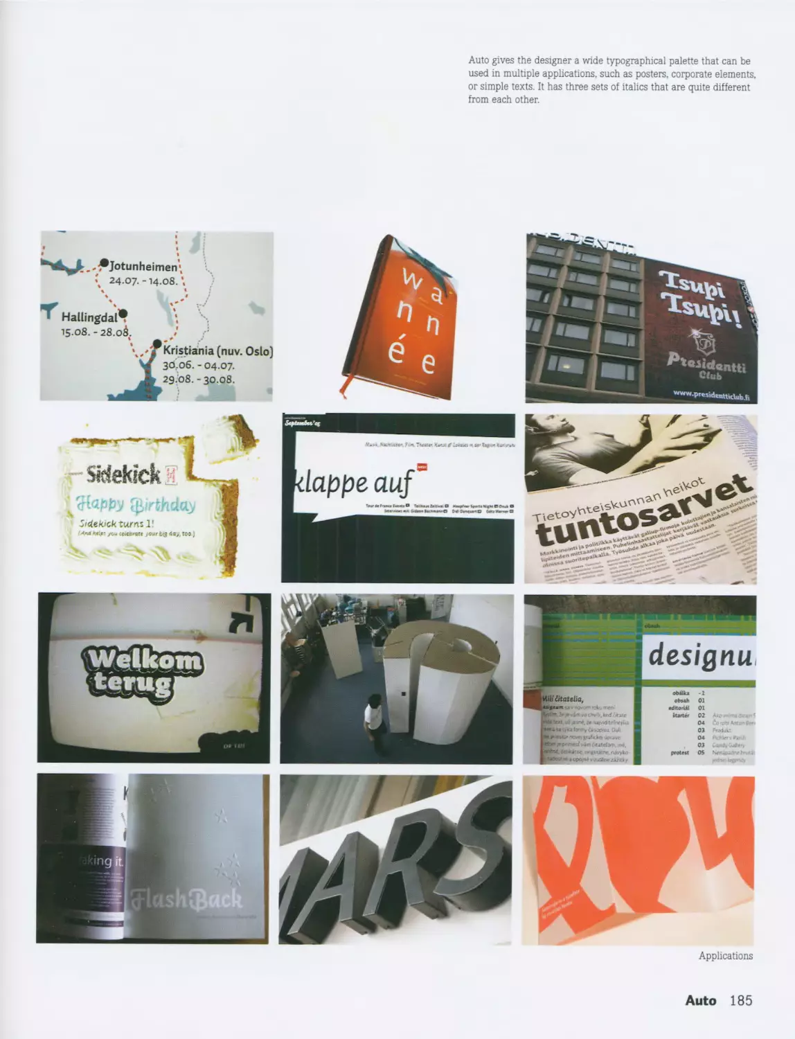
Auto / Underware 182
DYNAMIC 90 Vista / Xavier Dupre 186
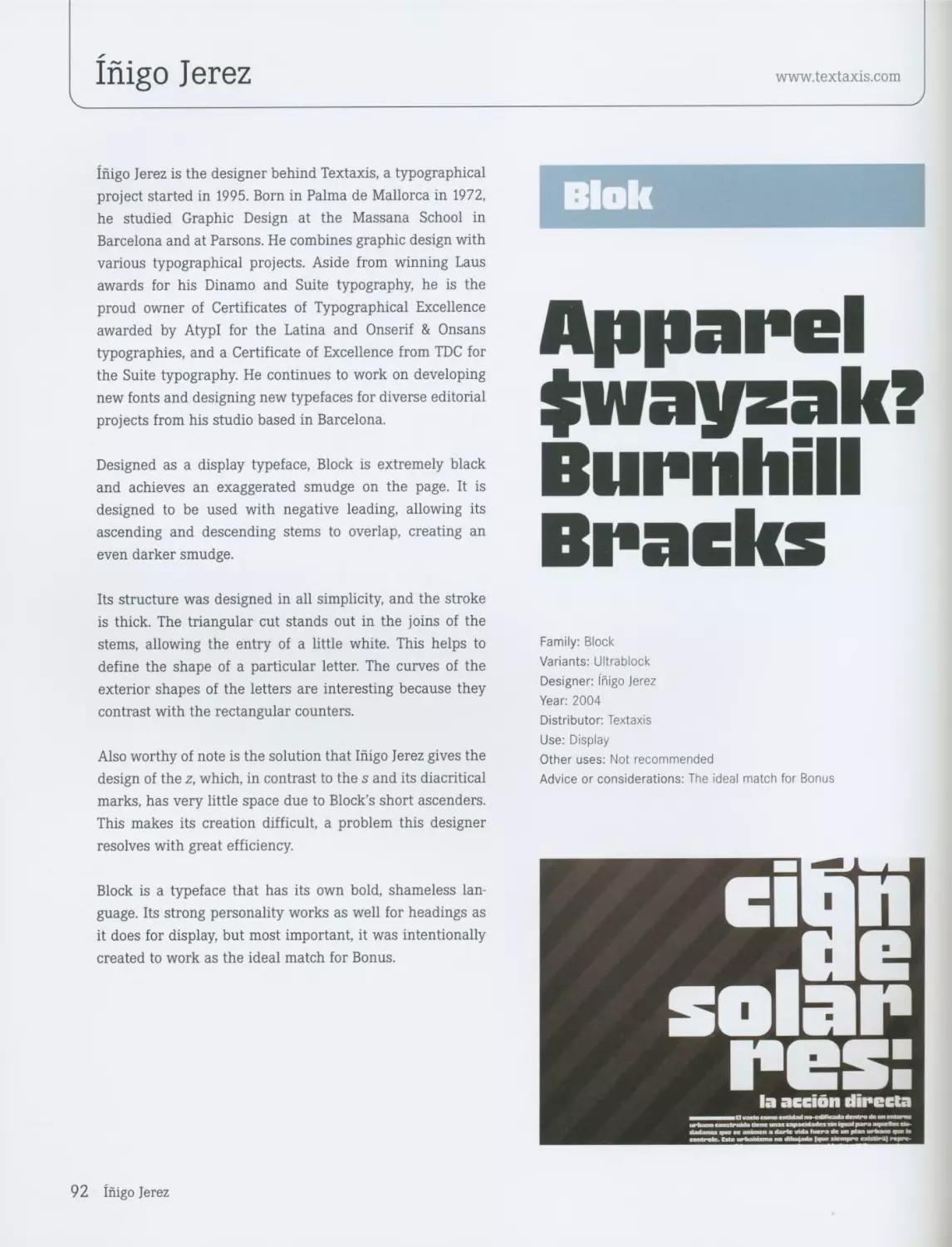
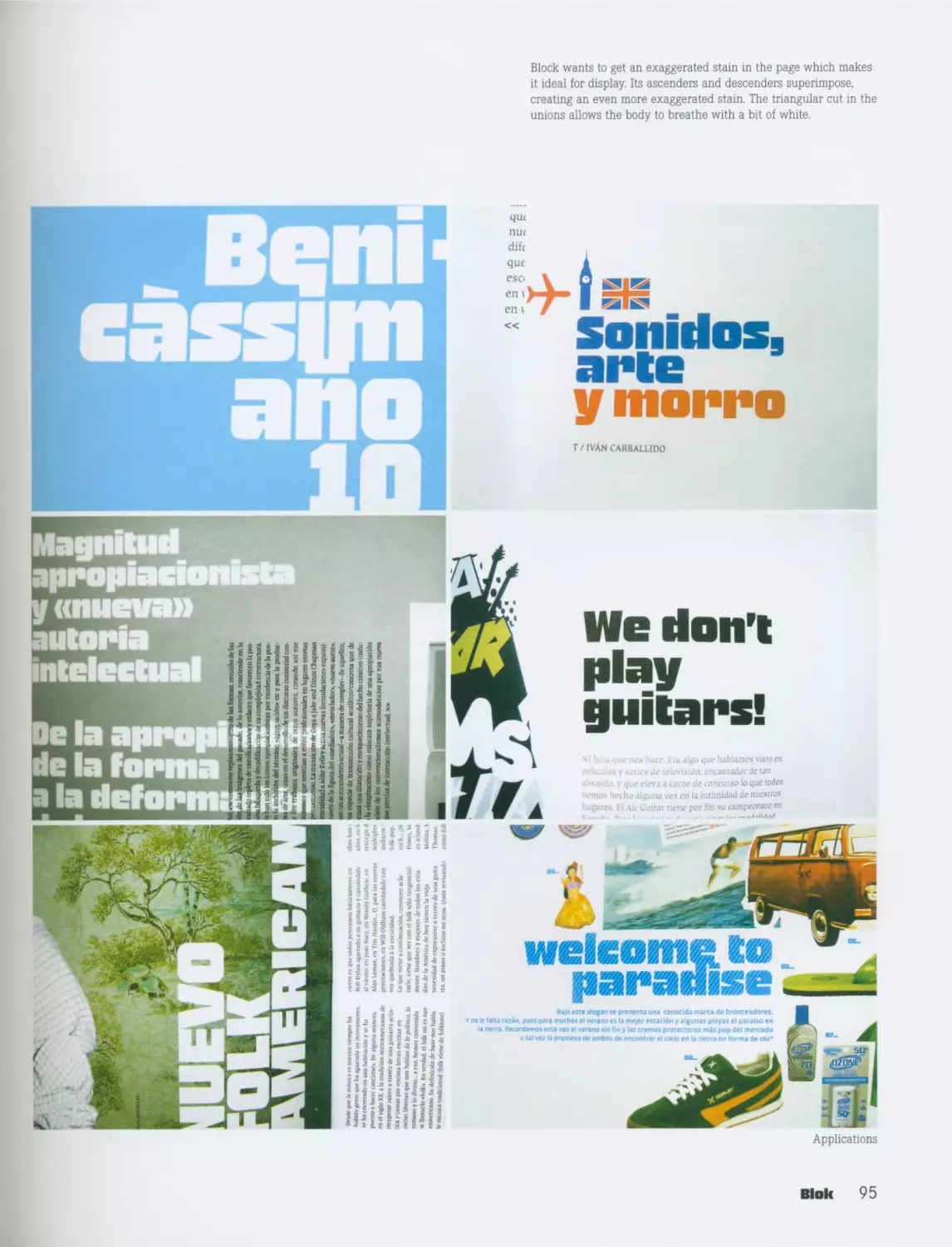
Block / Inigo Jerez 92
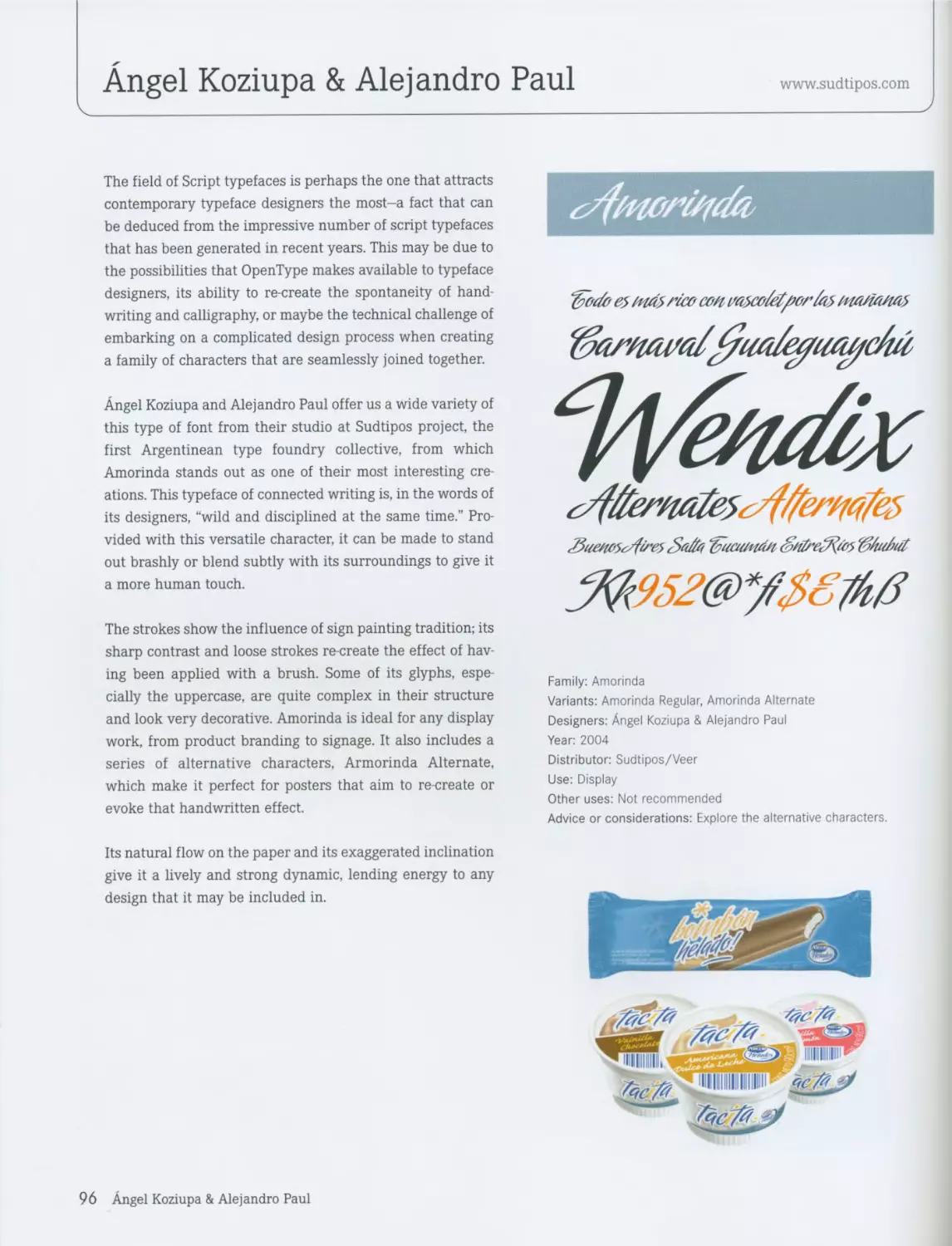
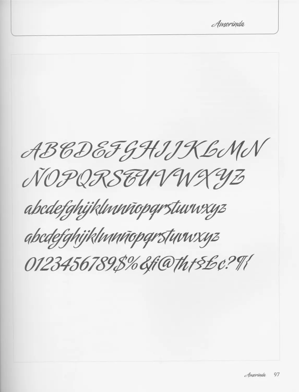
Amorinda / Alejandro Paul & Angel Koziupa 96 Directory 190
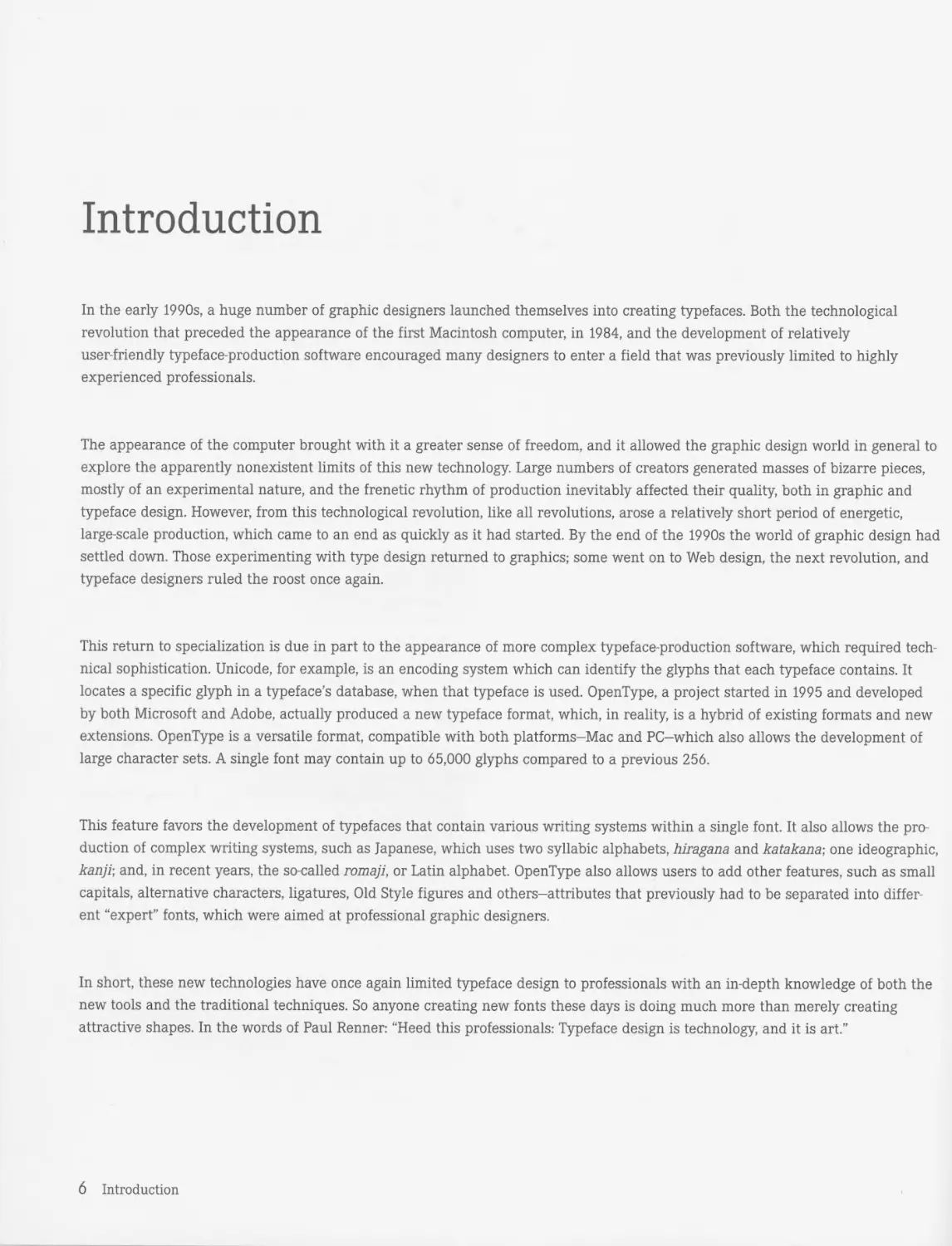
Introduction
In the early 1990s, a huge number of graphic designers launched themselves into creating typefaces. Both the technological
revolution that preceded the appearance of the first Macintosh computer, in 1984, and the development of relatively
user-friendly typeface-production software encouraged many designers to enter a field that was previously limited to highly
experienced professionals.
The appearance of the computer brought with it a greater sense of freedom, and it allowed the graphic design world in general to
explore the apparently nonexistent limits of this new technology. Large numbers of creators generated masses of bizarre pieces,
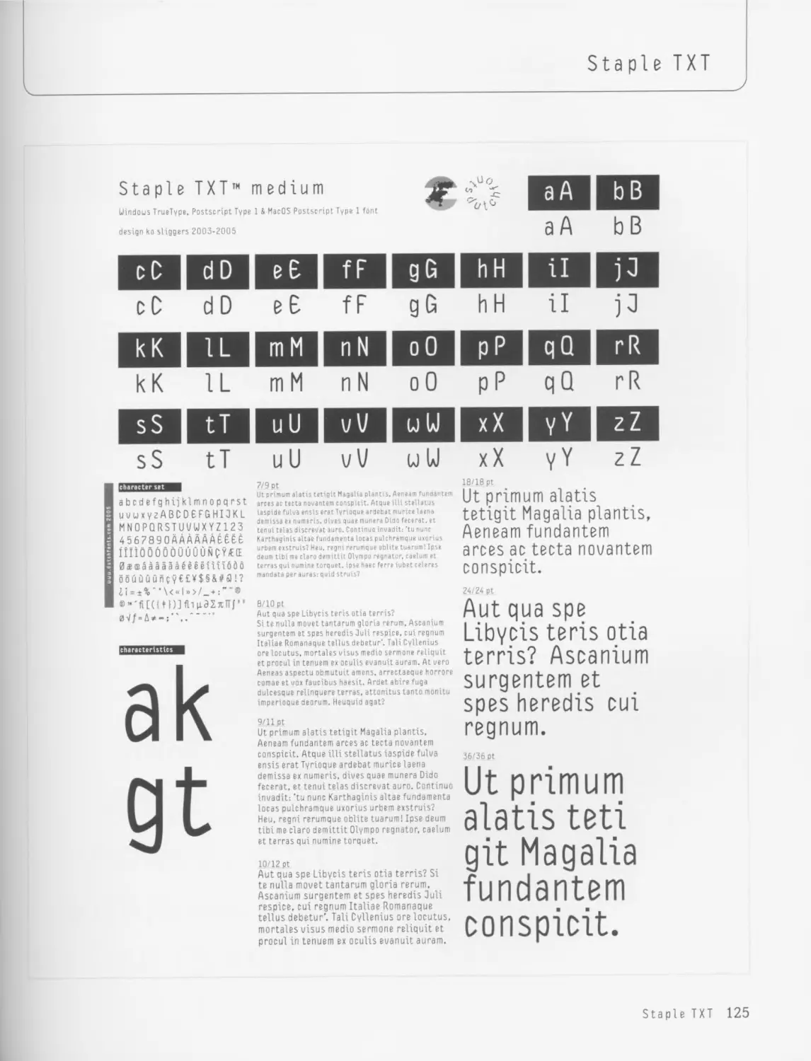
mostly of an experimental nature, and the frenetic rhythm of production inevitably affected their quality, both in graphic and
typeface design. However, from this technological revolution, like all revolutions, arose a relatively short period of energetic,
large-scale production, which came to an end as quickly as it had started. By the end of the 1990s the world of graphic design had
settled down. Those experimenting with type design returned to graphics; some went on to Web design, the next revolution, and
typeface designers ruled the roost once again.
This return to specialization is due in part to the appearance of more complex typeface-production software, which required tech-
nical sophistication. Unicode, for example, is an encoding system which can identify the glyphs that each typeface contains. It
locates a specific glyph in a typeface’s database, when that typeface is used. OpenType, a project started in 1995 and developed
by both Microsoft and Adobe, actually produced a new typeface format, which, in reality, is a hybrid of existing formats and new
extensions. OpenType is a versatile format, compatible with both platforms-Mac and PC-which also allows the development of
large character sets. A single font may contain up to 65,000 glyphs compared to a previous 256.
This feature favors the development of typefaces that contain various writing systems within a single font. It also allows the pro-
duction of complex writing systems, such as Japanese, which uses two syllabic alphabets, hiragana and katakana; one ideographic,
kanji; and, in recent years, the so-called romaji, or Latin alphabet. OpenType also allows users to add other features, such as small
capitals, alternative characters, ligatures, Old Style figures and others-attributes that previously had to be separated into differ-
ent “expert” fonts, which were aimed at professional graphic designers.
In short, these new technologies have once again limited typeface design to professionals with an in-depth knowledge of both the
new tools and the traditional techniques. So anyone creating new fonts these days is doing much more than merely creating
attractive shapes. In the words of Paul Renner: “Heed this professionals: Typeface design is technology, and it is art.”
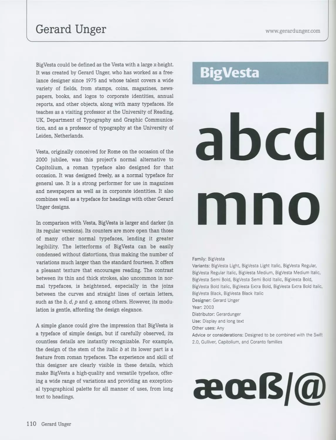
6 Introduction
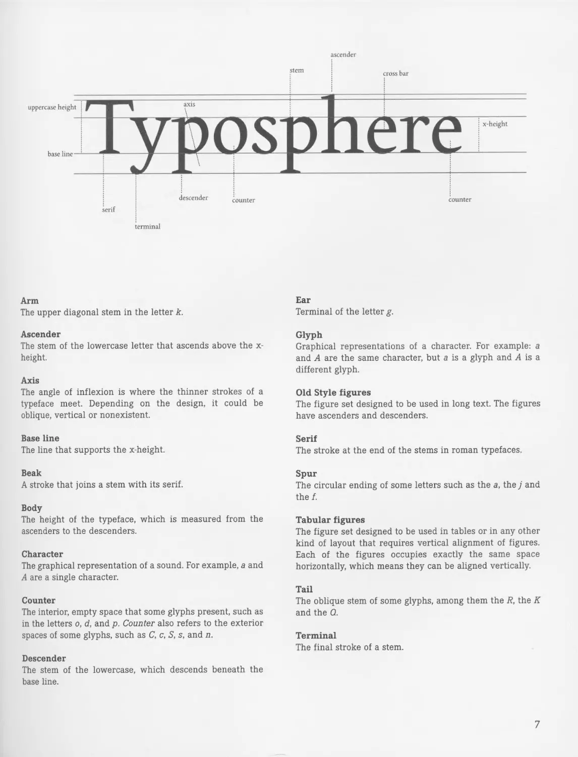
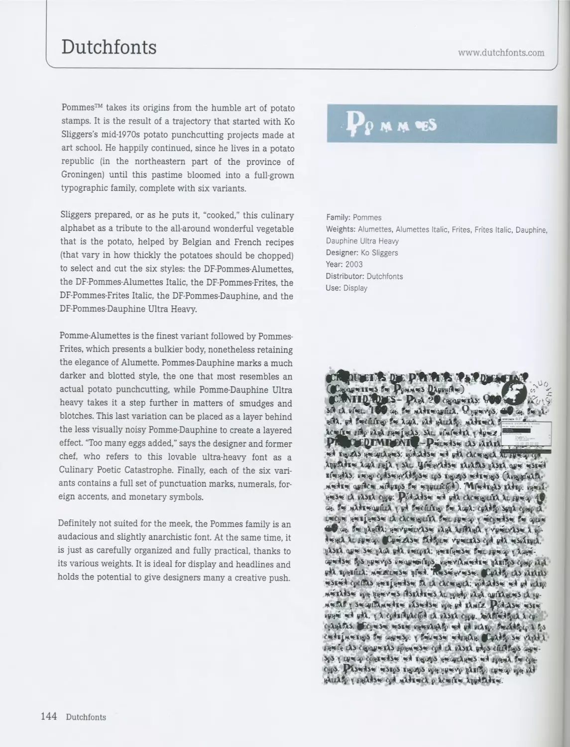
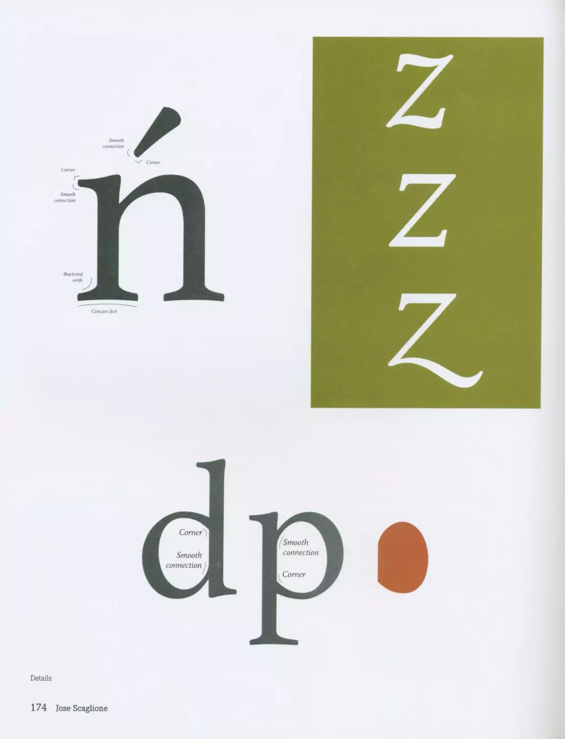
stem
ascender
cross bar
uppercase height
axis
base line
1U 1ШЭД
x-height
descender
counter
counter
serif
terminal
Arm
The upper diagonal stem in the letter k.
Ascender
The stem of the lowercase letter that ascends above the x-
height.
Axis
The angle of inflexion is where the thinner strokes of a
typeface meet. Depending on the design, it could be
oblique, vertical or nonexistent.
Base line
The line that supports the x-height.
Beak
A stroke that joins a stem with its serif.
Body
The height of the typeface, which is measured from the
ascenders to the descenders.
Character
The graphical representation of a sound. For example, a and
A are a single character.
Counter
The interior, empty space that some glyphs present, such as
in the letters o, d, and p. Counter also refers to the exterior
spaces of some glyphs, such as C, c, S, s, and n.
Descender
The stem of the lowercase, which descends beneath the
base line.
Ear
Terminal of the letter g.
Glyph
Graphical representations of a character. For example: a
and A are the same character, but a is a glyph and A is a
different glyph.
Old Style figures
The figure set designed to be used in long text. The figures
have ascenders and descenders.
Serif
The stroke at the end of the stems in roman typefaces.
Spur
The circular ending of some letters such as the a, the j and
the f.
Tabular figures
The figure set designed to be used in tables or in any other
kind of layout that requires vertical alignment of figures.
Each of the figures occupies exactly the same space
horizontally, which means they can be aligned vertically.
Tail
The oblique stem of some glyphs, among them the R, the К
and the Q.
Terminal
The final stroke of a stem.
7
901 гат ввт 68T
— T6T 261 E6T *>ы
—1 96T - 661 06T 66Т
— 102 202 E02 *02
902 602 002 602
TT2 212 ET2 *тг
9T2 6T2 втг 612
—•'' тгг ггг E22 922
— 922 г.гг B22 622
— TE2 гег БЕЗ 9Е2
9E2 lea 8E2 6Е2
06Т-----’
1037 И ...........
129'0 ----------
ldSE'0------------
ldE‘0 ----------
ldS2'0 -----------
ld2'0 ----------
ldST'0
IdT'B-----------
ldSB’0
128200 0
WH9V0 ----------
HM9I'0 _________
нмгт'0----------
ымт 0---------
ИН80 0----------
НЫ900 __________
ИЫ9В*В
HH20‘0
WMTB00
aaiawiT
21
01
6
9
S
г
; Iuom эн
[тэреш}
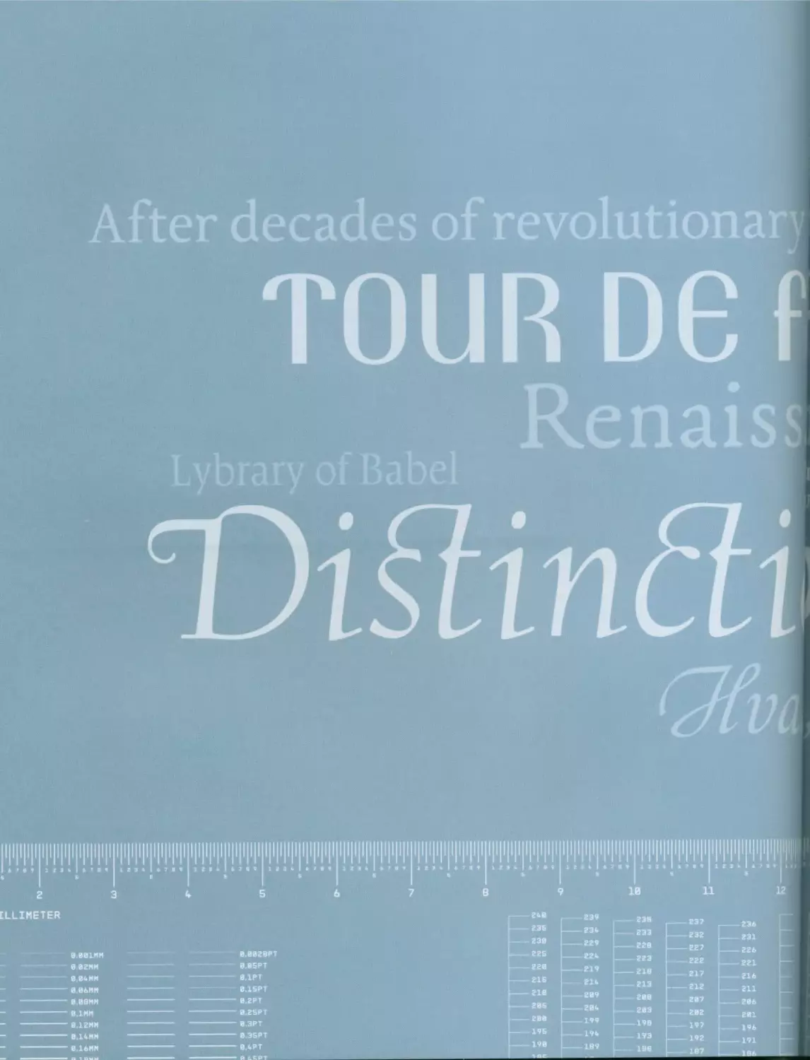
nfaifiodfa ipfysaj mud uyMuidsiq
юп
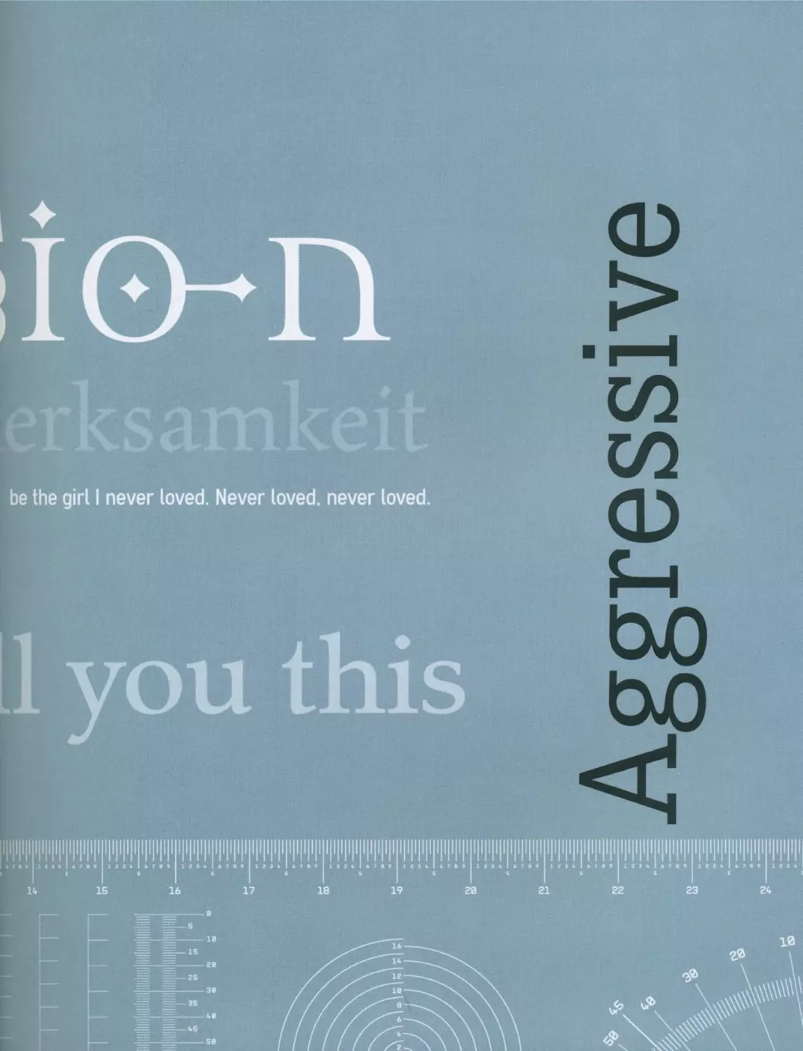
be the girl I never loved. Never loved, never loved
you this
ggressive
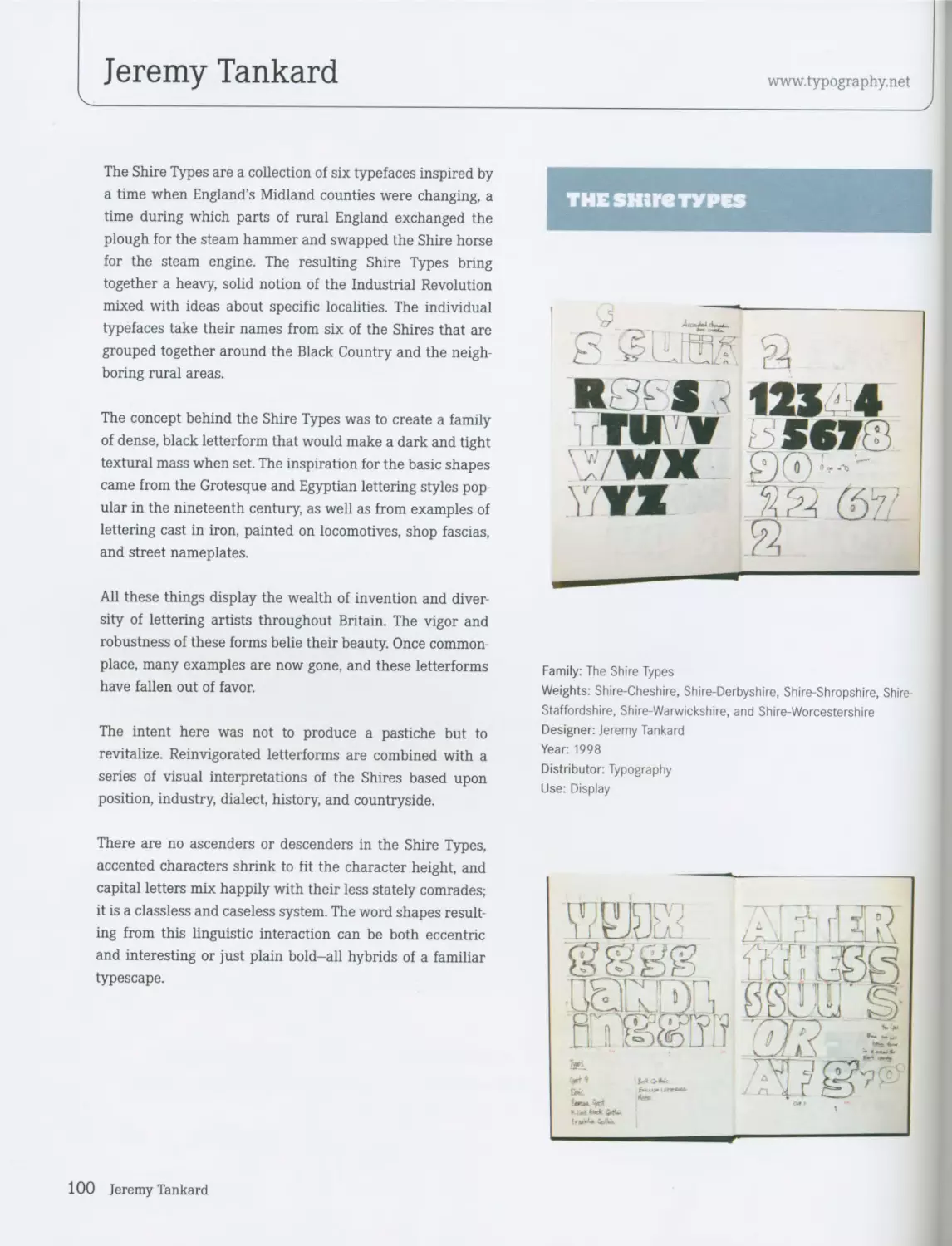
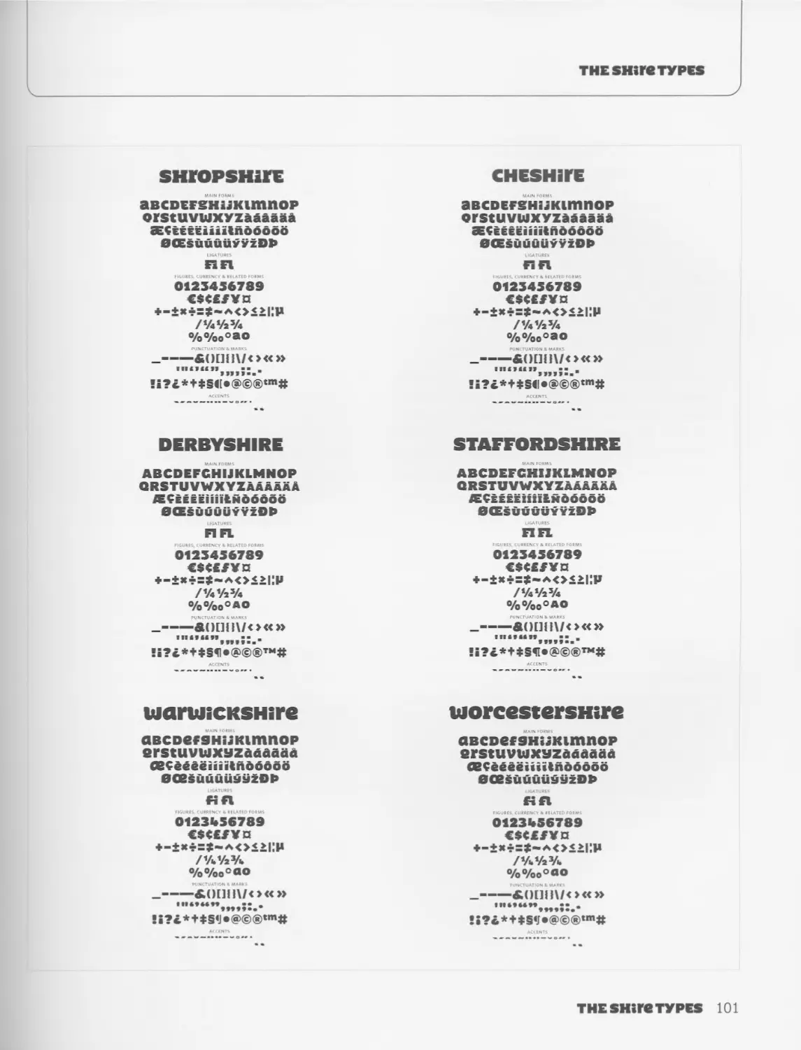
Jeremy Tankard
www.typography.net
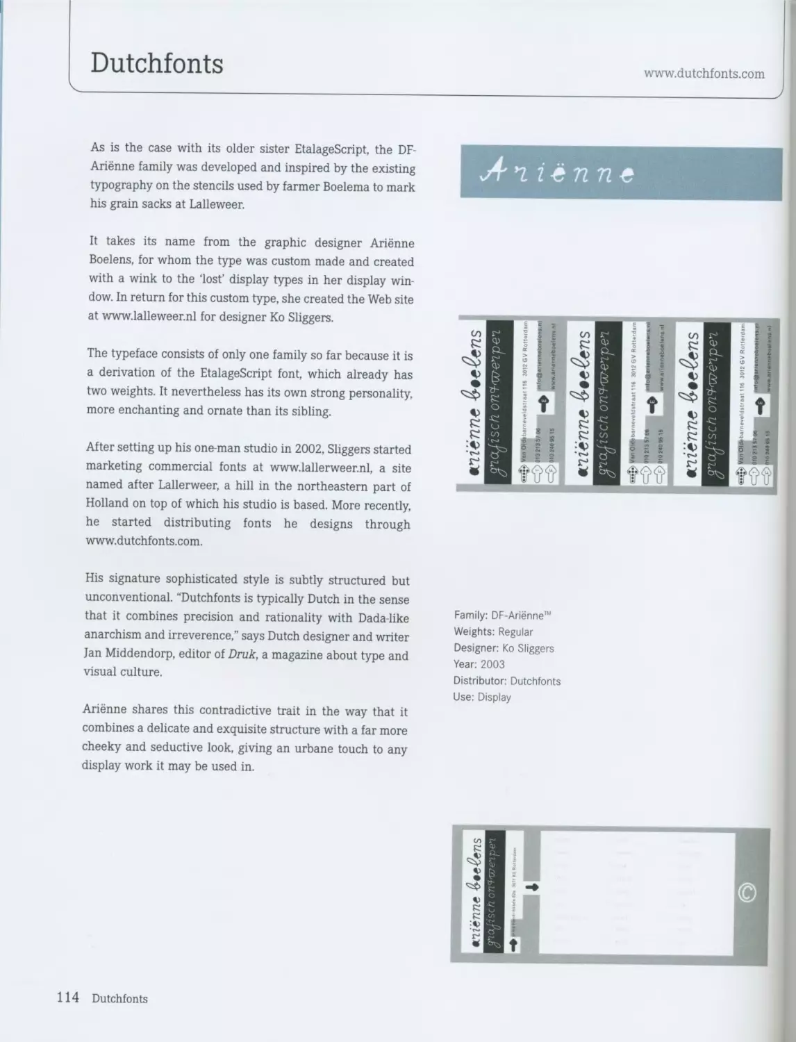
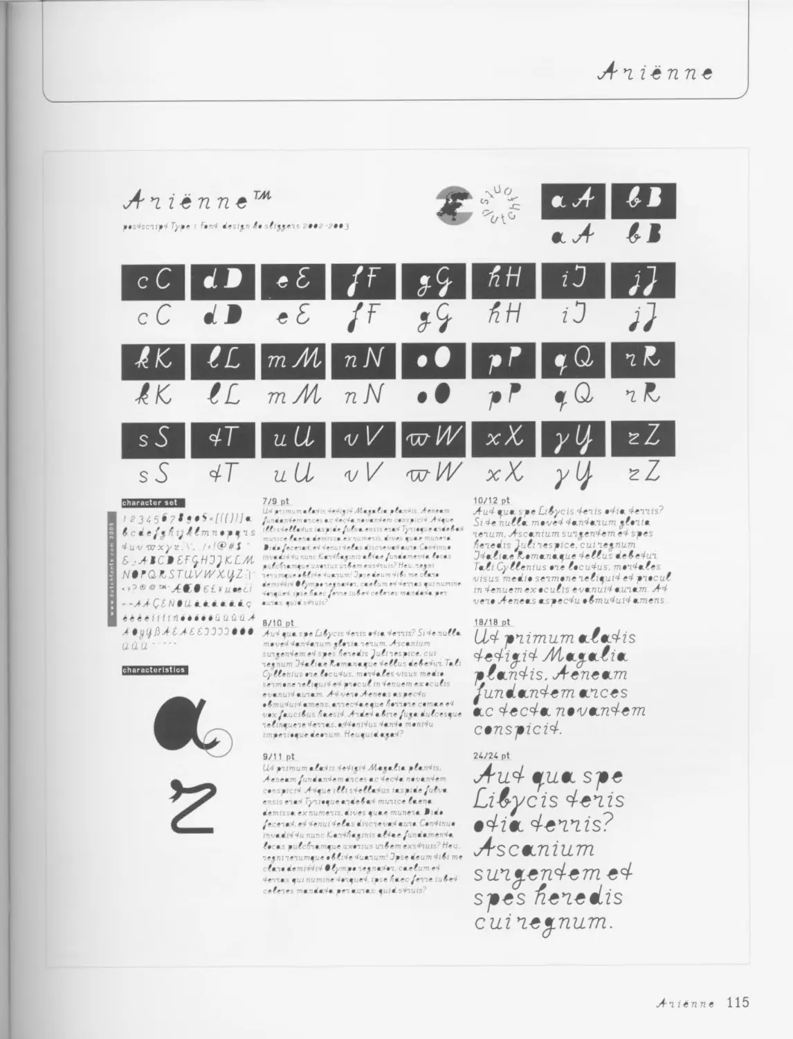
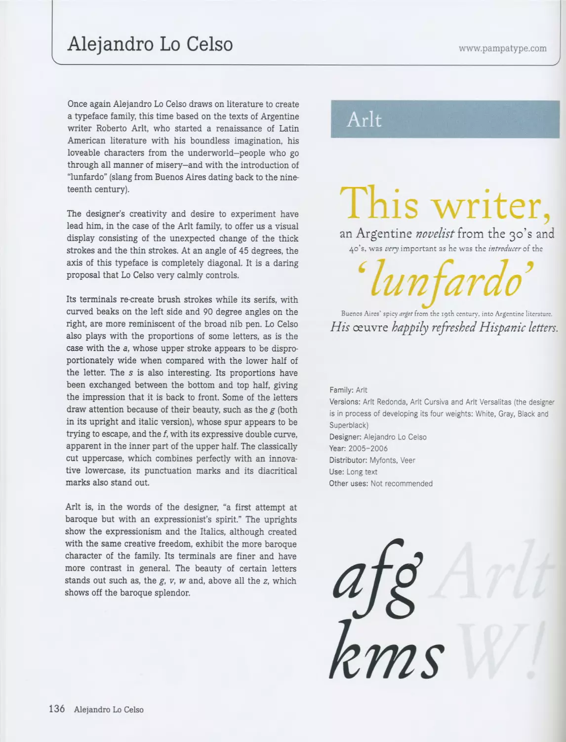
Alchemy is an unusual typeface family-inspired by manu-
scripts from the Middle Ages-which contains an extraordi-
nary diversity of capitals whose forms display almost infi-
nite variations. In this font, the uppercase first letters have
a larger body than that of the text, and they are used at the
beginning of a chapter or section.
Jeremy Tankard was inspired largely by the calligraphic art
in the manuscript Lindisfarne Gospels, one of the world’s
most important religious art treasures, which dates to the
end of the seventh century and the beginning of the eighth
century. The Gospel of Saint Matthew, which forms part of
this manuscript, was a great source of inspiration for some
of the letters in the Alchemy family.
By way of its sharp-pointed terminals and punctuation
marks, together with its general structure, Alchemy trans-
mits a certain aggressiveness. This single-variant typeface
has a limited use; however, its technical characteristics
make it an interesting project for designers, giving them the
freedom to experiment and create at will. Based on
medieval capitals, there is only one case, which Jeremy
Tankard has endowed with endless alternative characters
that can be combined and altered, thereby producing an
almost infinite range of possibilities.
Apart from its ligatures, Alchemy has a series of decorative
elements that can be added to the rest of the glyphs to gen-
erate new forms. It also has a set of glyphs that act as a
superindex and another that acts as a subindex. Because
these glyphs are smaller, they can be superimposed onto
normal-size letters, allowing the designer to create his own
ligatures. Obviously all these elements can be combined
with each other by mutual overlapping.
In the hands of different designers, Alchemy has the poten-
tial to become a new design. Thanks to its appearance, it is
the ideal typeface to give works a Gothic touch.
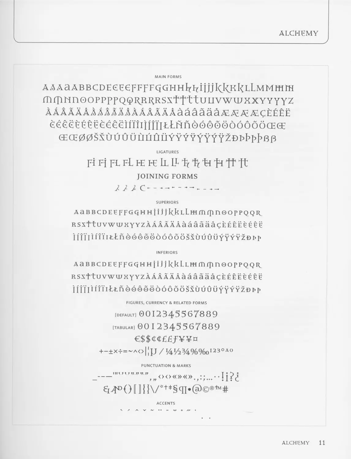
ALCHEMY
TEOA
AM (11
HFRHJk
KHI-I M
АНШ
RR?
RK£) 3
t 1223
3343
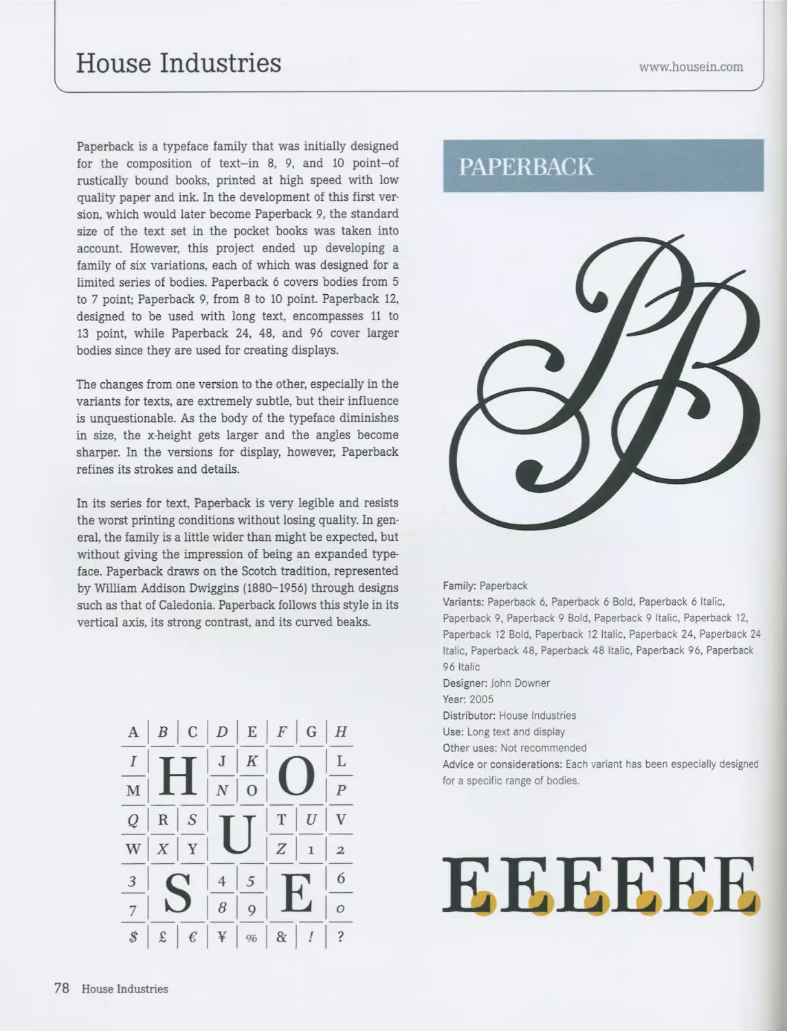
Family: Alchemy
Variants: Alchemy
Designer: Jeremy Tankard
Year: 2004
Distributor: www.typography.net
Use: Display
Other uses: Not recommended
Advice or considerations: Explore the wide range of possibilities that
the alternative characters and ligatures offer.
{таено.}
tt€-+nqi7LaHD-s op- sc©TbnD
HiaRCJrES
wRite ш-ooHStonE-
niEDiAcvaL
10 Jeremy Tankard
ALCHEMY
MAIN FORMS
AAAaABBCDEeEeFFFFqGHHlthiijjlCkKlCLLMMffirH
miTlNn0OPPPPQQI<RI^RSXTTttULIVWWXXYYYYZ
ААААААААААААААААААаааааа/Е^А-^СЁЁЁЁ
ёёёёёЁЁЁёёёёшппшгЬйпооооодбоббсЕбЕ
(ECE00SSlJUOULIIJiJLIYYYYYYYY20Pbpb6P
LIGATURES
pi Fj FL FL fe fe Ll LL1? 1? ti ti ft ft
JOINING FORMS
/ / / c----------------
SUPERIORS
AaBBCDEEFFGqHHtijjkkLLmmrpnooppQQi<
RSx+tuvwwxYYZA A aa а даааааасЕЕЕЁЕЕ её
111H i f 111 lE n о о б о о д 6 д б 6 и и и и y Y y yzb i> p
INFERIORS
AaBBCDEEFFGQHHjijJkkLLHimfTinooppQQK
RSXttUVWWXYYZAAAAAAaaaaaaCEEEEEEn
HIUHi’iiELndodoodoooosxuuuuYYYYZBi’p
FIGURES, CURRENCY & RELATED FORMS
[DEFAULT] 0012345567889
[tabular] 00 I 2345567889
€$$Cdt£Ef¥¥n
+-±x-t=~a<>|[jj / 1Д1/234%°/00123ОАО
PUNCTUATION & MARKS
-....
Ei>ro(Mlfl\/*+*§cn<a)©®’”#
ACCENTS
ALCHEMY 11
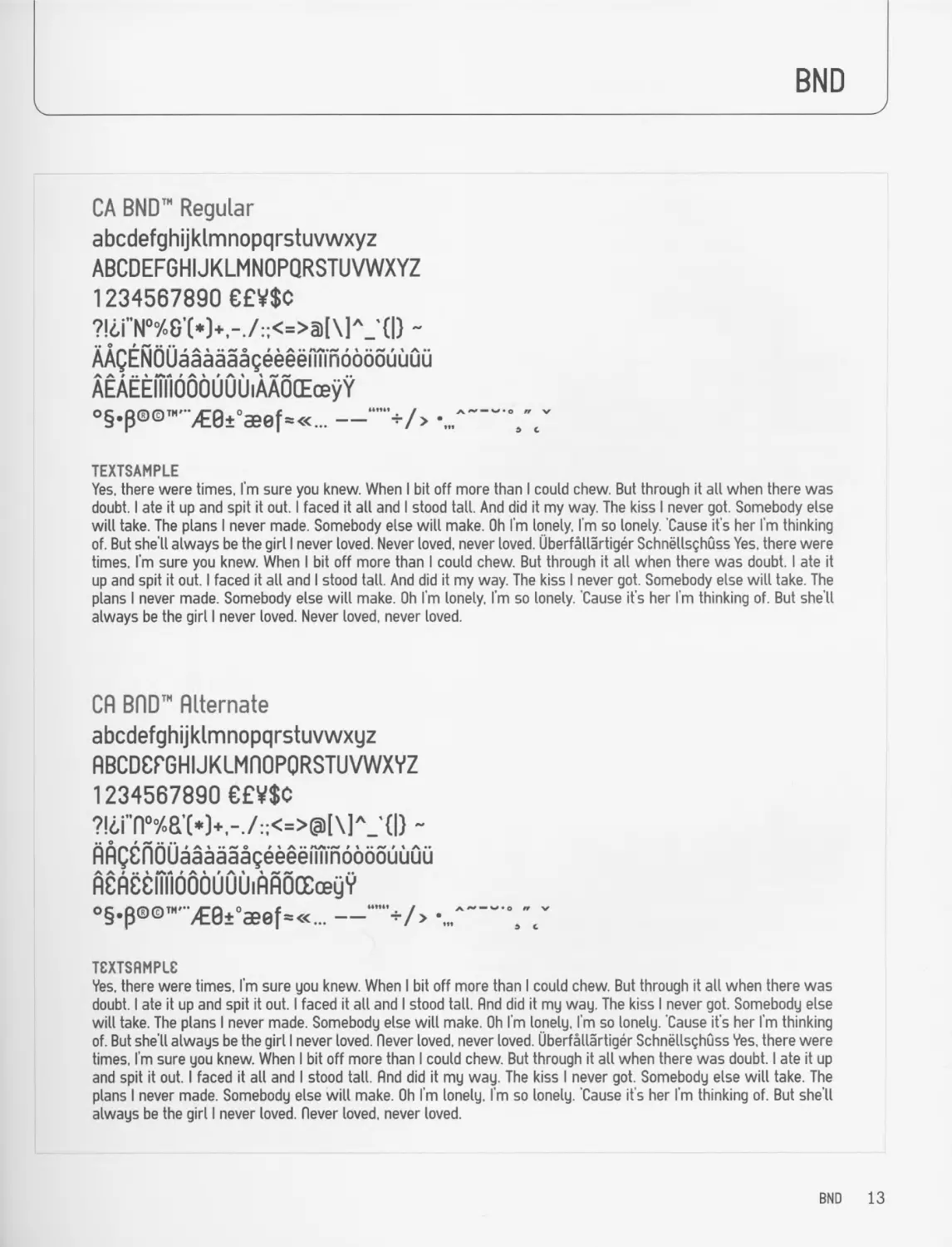
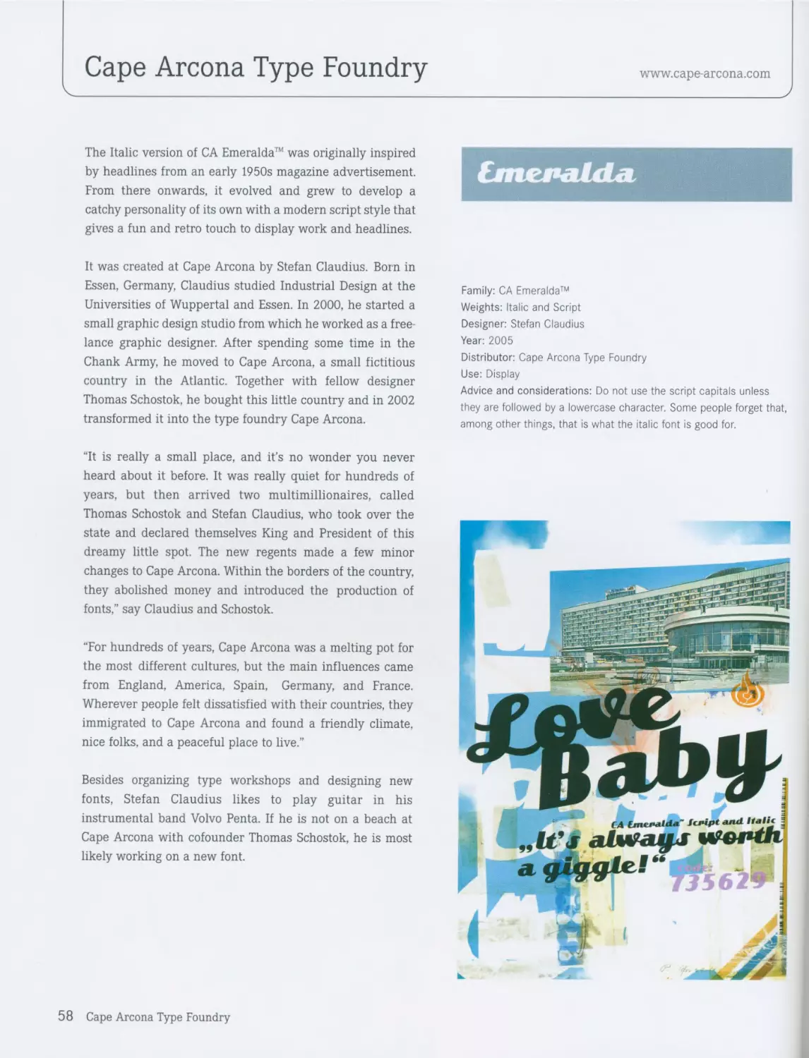
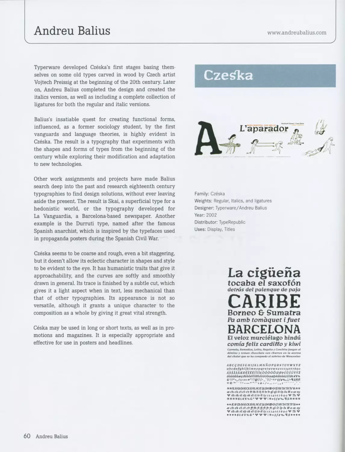
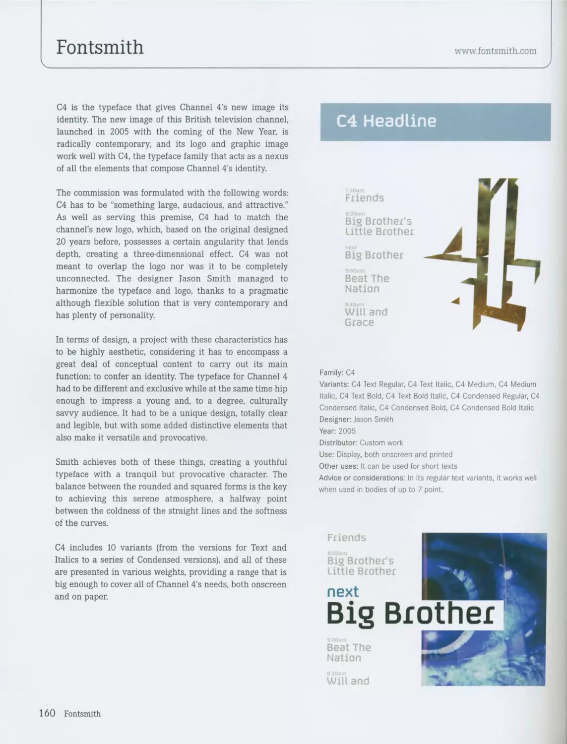
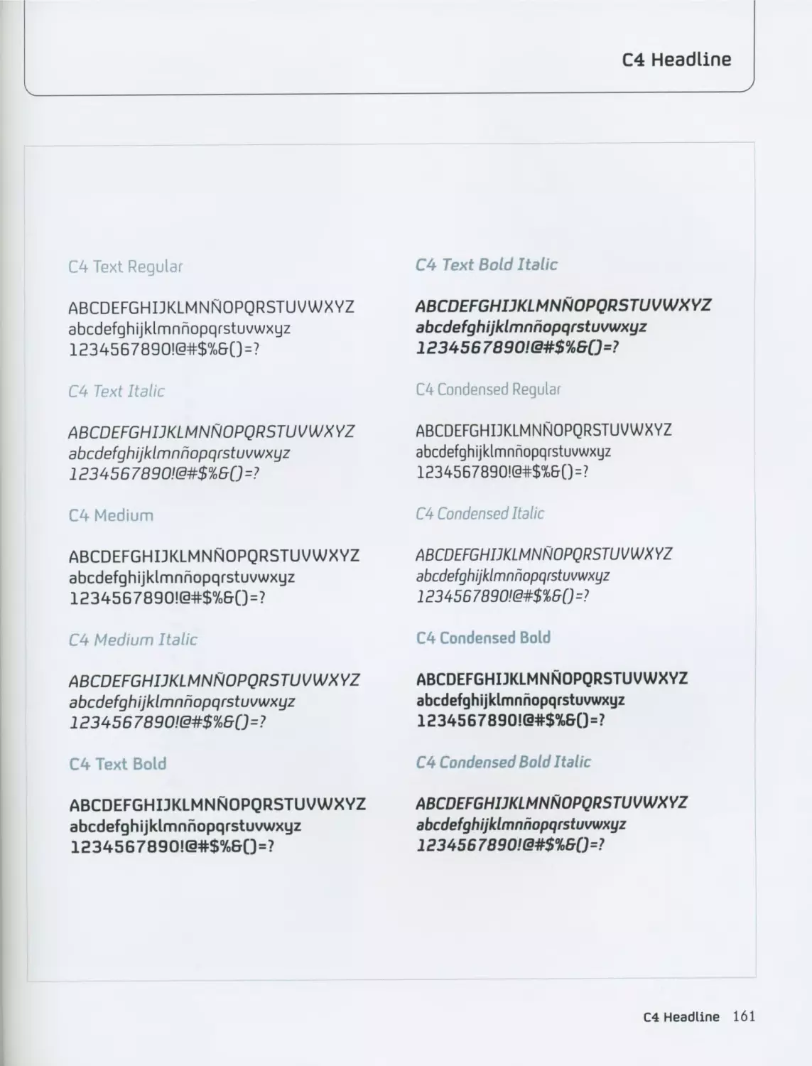
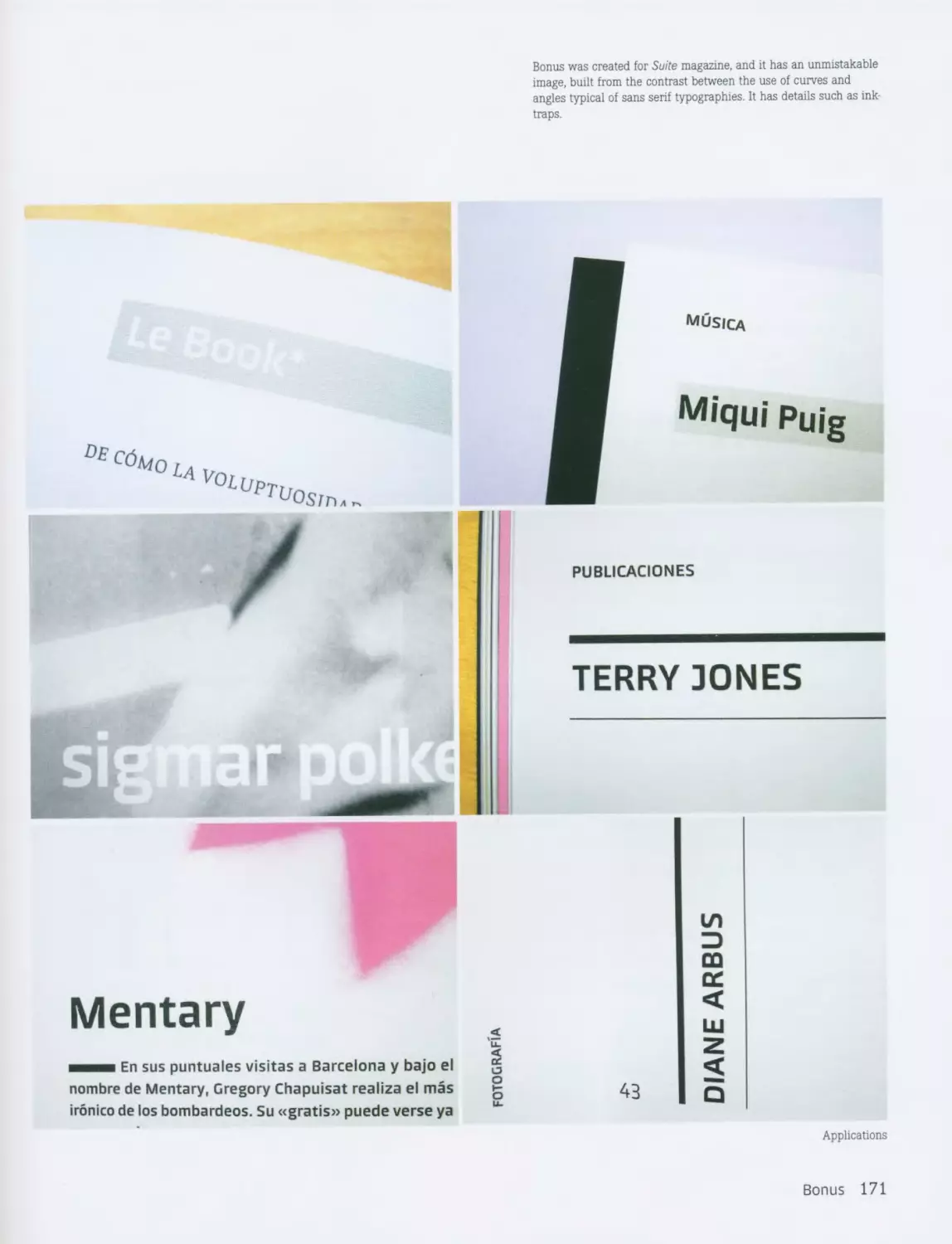
Cape Arcona Type Foundry
www.cape-arcona.com
Cape Arcona’s legendary obsession to create a DIN-like font
substitution brought them to CA BND™, named after the
German Intelligence Agency. The font was created for the
new CI of the Intelligence Agency but the presentation was
not successful because there was no contact person
available-everything and everyone is just TOP SECRET.
CA BND appears to be simply functional. In general, it is
unemotional, but if you look at the details you may find
something emotional that you will learn to love. It comes in
two styles with an alternate letterset. It also comes in two
weights, Regular and Bold, each of which offers an
Alternate style.
The Cape Arcona Type Foundry was founded in Essen,
Germany, in 2002 by designers Thomas Schostok and Stefan
Claudius. It is an independent type foundry that produces
and distributes digital typefaces; it also offers a wide range
of typographic services, from original typeface design to
individual font production and graphic design.
The typefaces of the Cape Arcona Type Foundry cover all
styles. Their most popular typefaces are: CA Blitzkrieg Pop,
CA Aires Pro, CA BND, CA Zaracusa. As the designers say,
“We are always searching for the strange and the
unexpected in a font,” but they never gave more detailed
information about what they really meant.
For the sake of political correctness, the founders always
say that the Foundry was not named after the destroyed
luxury liner SS Cap Arcona (the ship was named after Cape
Arkona on the island of Rugen in Mecklenburg, Western
Pomerania, Germany). The destruction of the ship is a
tragedy, and the founders of the Cape Arcona Type Foundry
always assure people that they did not have destruction in
mind when naming their design house.
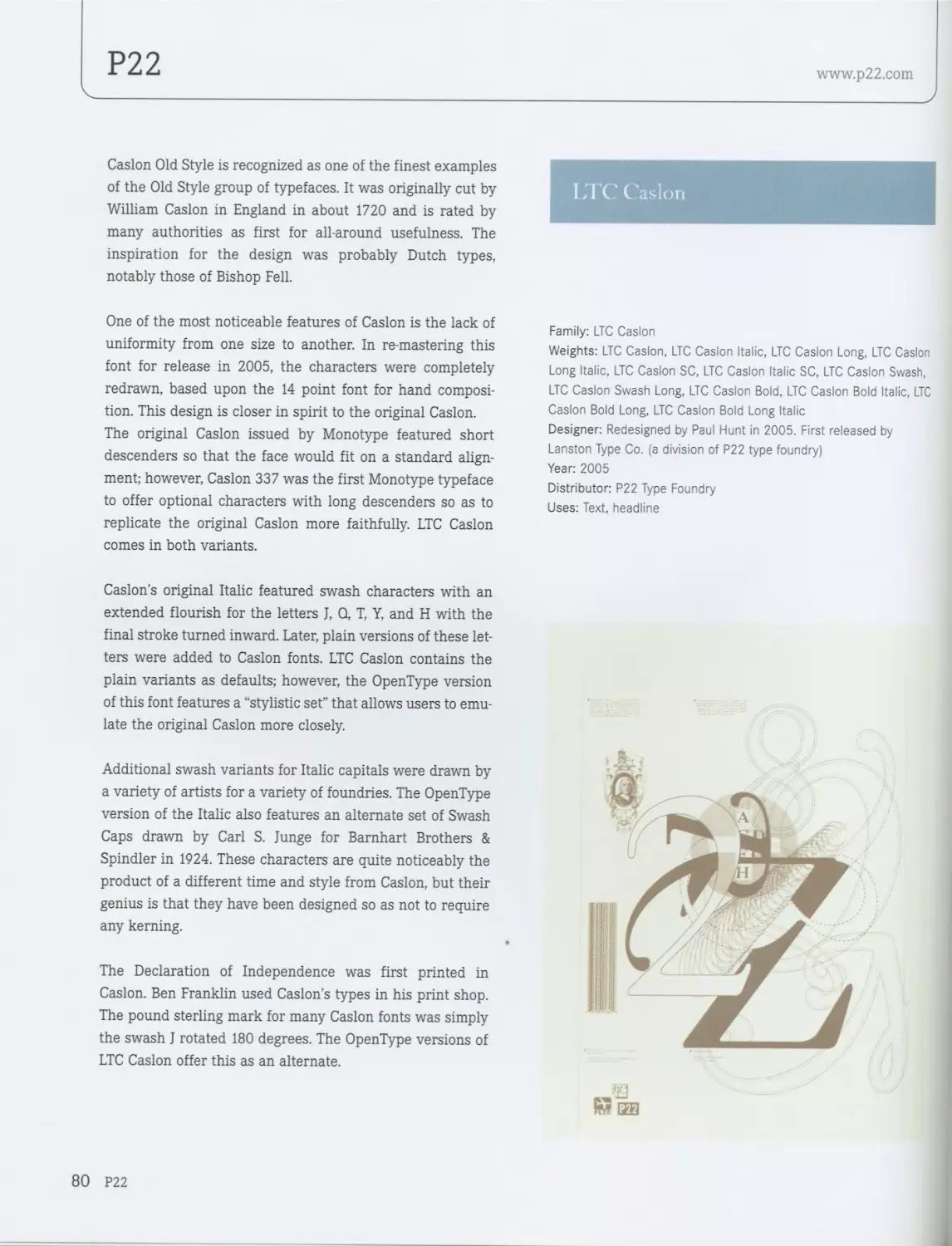
Family: CA BND™
Weights: Regular and Alternate styles in Regular and Bold weight
Designer: Thomas Schostok
Year: 2004
Distributor: Cape Arcona Type Foundry
Use: Text and Display
Advice or considerations: The Alternate style offers a lot of funny
and useful variations to the regular characters.
12 Cape Arcona Type Foundry
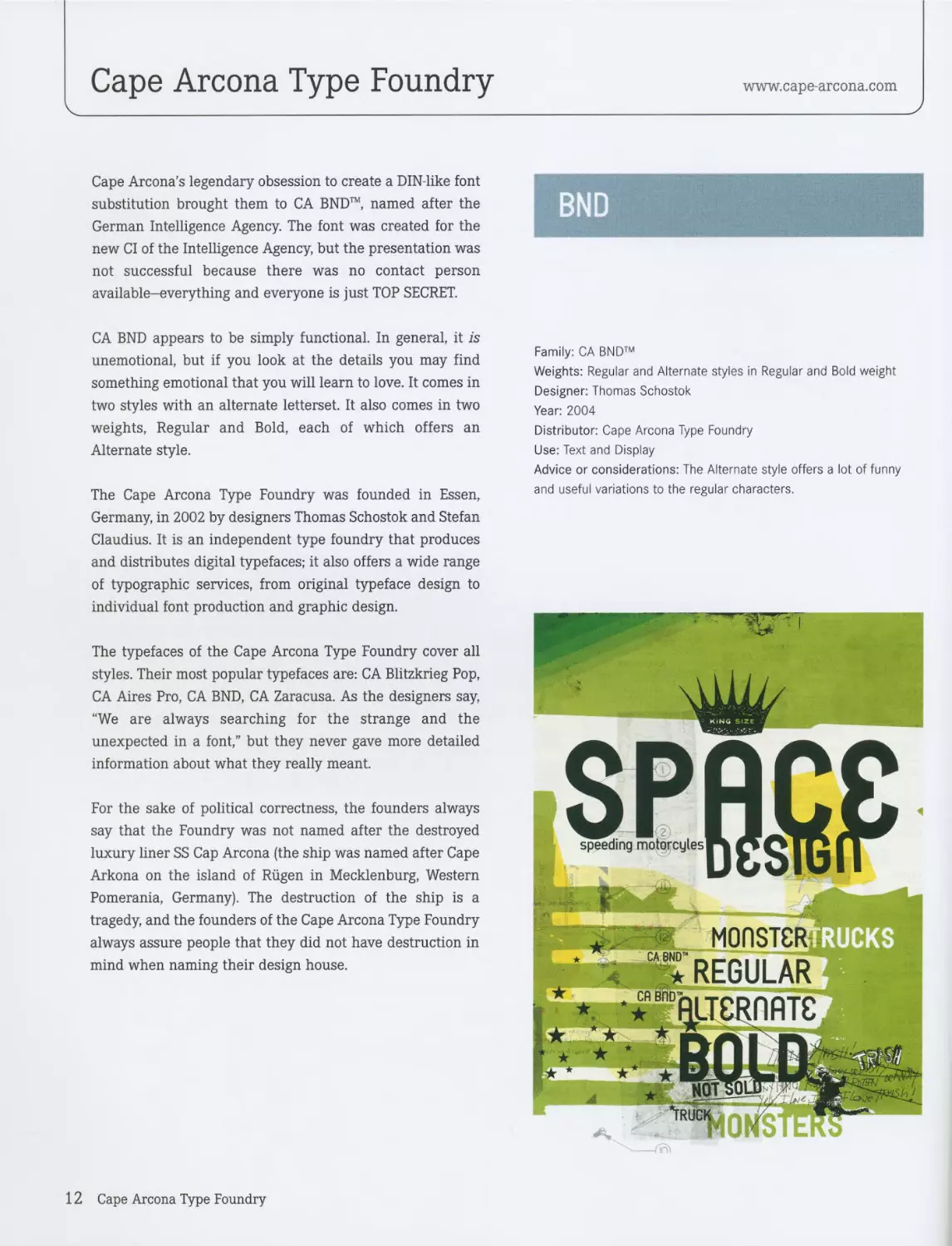
BND
CA BND’H Regular
abcdefghijklmnopqrstuvwxyz
ABCDEFGHIJKLMNOPQRSTUVWXYZ
1234567890 €£¥$C
AAQENOUaaaaaageeeerinnooooiiijuu
AEAeElTlIOOOUUUlAAOEoeyY
o§.0®©’"'"/E0±°a>0f=«... —“"•’+/>....
TEXTSAMPLE
Yes, there were times, I’m sure you knew. When I bit off more than I could chew. But through it all when there was
doubt. I ate it up and spit it out. I faced it all and I stood tall. And did it my way. The kiss I never got. Somebody else
will take. The plans I never made. Somebody else will make. Oh I’m lonely, I’m so lonely. 'Cause it's her I’m thinking
of. But she’ll always be the girl I never loved. Never loved, never loved. Uberfallartiger Scl^llsghuss Yes. there were
times. I’m sure you knew. When I bit off more than I could chew. But through it all when there was doubt. I ate it
up and spit it out. I faced it all and I stood tall. And did it my way. The kiss I never got. Somebody else will take. The
plans I never made. Somebody else will make. Oh I'm lonely, I’m so lonely. ’Cause it’s her I’m thinking of. But she’ll
always be the girl I never loved. Never loved, never loved.
CA BAD™ Alternate
abcdefghijklmnopqrstuvwxgz
ABCDCPGHIJKLMAOPQRSTUVWXYZ
1234567890 €£¥$C
?!бГА°%&'(*)+,-./:;<=>@[\]л_'{|) ~
АА£СА0иаааааадёёёёпнп6добййий
ACACClTlIdOOUOUiAAOCCoeyY
o§-poo™'"/E0±°ae0f=«...
TBXTSAMPLC
Yes, there were times, I’m sure you knew. When I bit off more than I could chew. But through it all when there was
doubt. I ate it up and spit it out. I faced it all and I stood tall. And did it my way. The kiss I never got. Somebody else
will take. The plans I never made. Somebody else will make. Oh I’m lonely. I’m so lonely. 'Cause it’s her I’m thinking
of. But she’ll always be the girl I never loved, (lever loved, never loved. Uberfallartiger Schn§llsghuss Yes. there were
times. I’m sure you knew. When I bit off more than I could chew. But through it all when there was doubt. I ate it up
and spit it out. I faced it all and I stood tall. And did it my way. The kiss I never got. Somebody else will take. The
plans I never made. Somebody else will make. Oh I’m lonely. I’m so lonely. ’Cause it’s her I’m thinking of. But she’ll
always be the girl I never loved, (lever loved, never loved.
BND 13
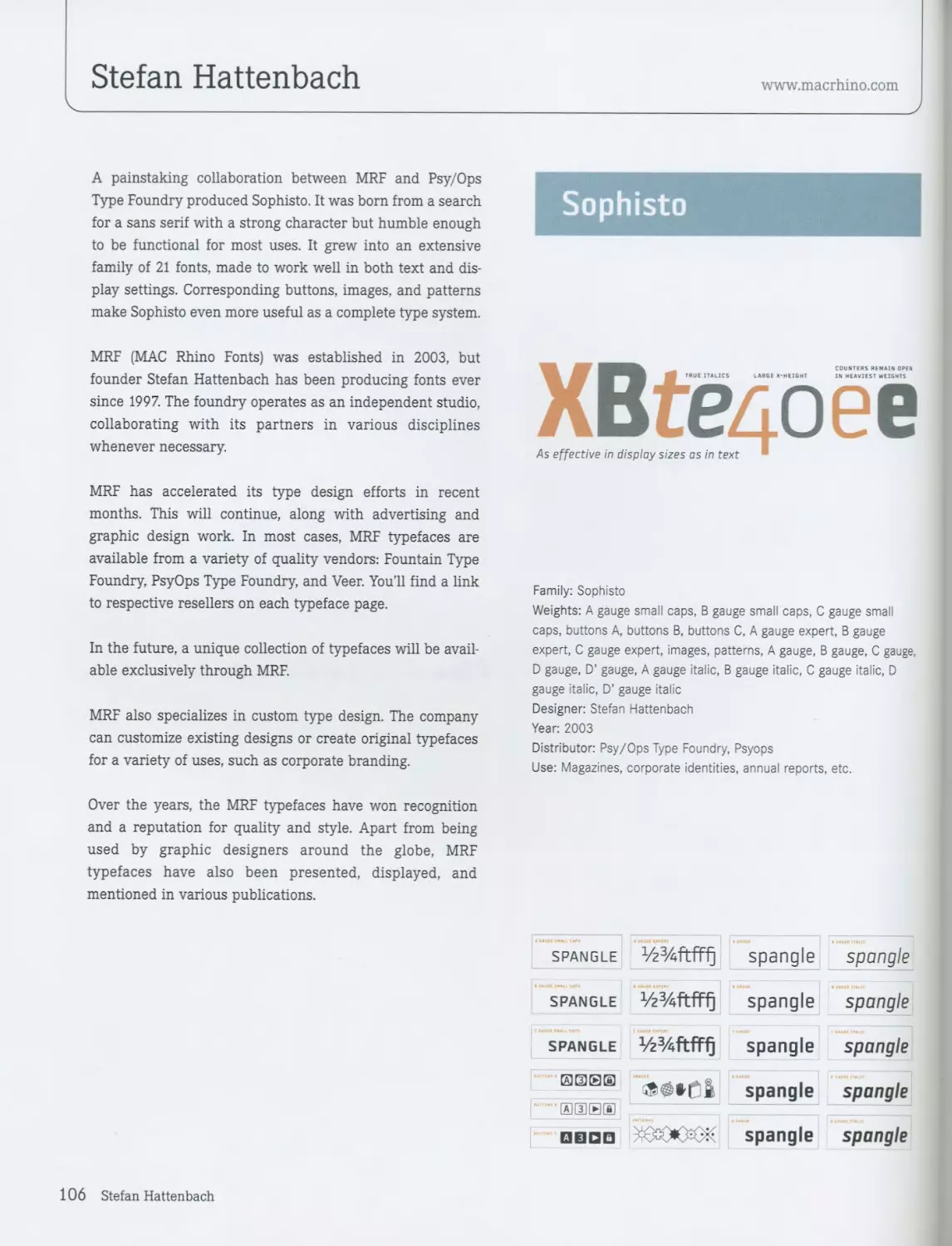
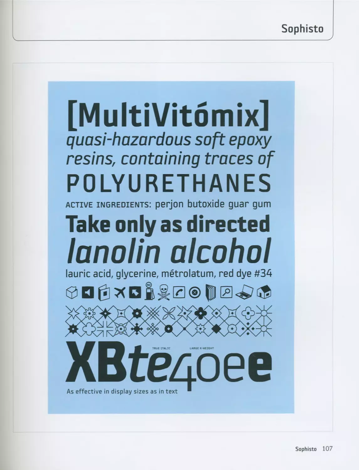
Stefan Hattenbach
www.macrhino.com
__________________>
Tarocco was originally designed to appear in a book about
orange plantations in Sicily. Since this activity includes
some Swedish connections, Waldemar Zachrisson based
this typeface on Nordisk Antikva, which was very popular
in the 1930s; it was also designed with the Swedish
language in mind. This, along with certain art nouveau
traits, constitutes its most important characteristics.
Tarocco is a typeface family designed for books, and it has
this specialty’s typical structure. It has a generous x-height,
which as well as giving it a certain elegance greatly
facilitates its legibility. It is also a broad typeface that
could almost fall into the expanded category instead of the
regular category.
Among its most distinguished characteristics is the subtle
irregularity of its design, which gives it its unique personal-
ity. The g for example, has the typical shape of a normal let-
ter, but its terminal is completely different from the rest of
the typeface.
Tarocco’s art nouveau heritage can be openly seen in the
design of its numerals, especially in the numbers three and
five, the curved sections of which acquire a dispro-
portionate importance, as well as in the differentiated
breadth of some of the letters. For example the e is wider
than normal, and the t is narrower, a style that is typical of
art nouveau.
On the whole, the design of this typeface is a little rough.
The shapes that result from the combination of curves and
straight lines as well as some of the terminals are quite
crude. This gives Tarocco its aggressive trait, which is espe-
cially noticeable in its italics, thanks to the highly pro-
nounced angle of its serifs and the heavily sloping angle
that this version presents in general. The Tarocco italics are
also considerably wider than normal and seem to maintain
the same proportions as the regular version, which is quite
uncommon and contributes to this typeface family’s unusu-
al character.
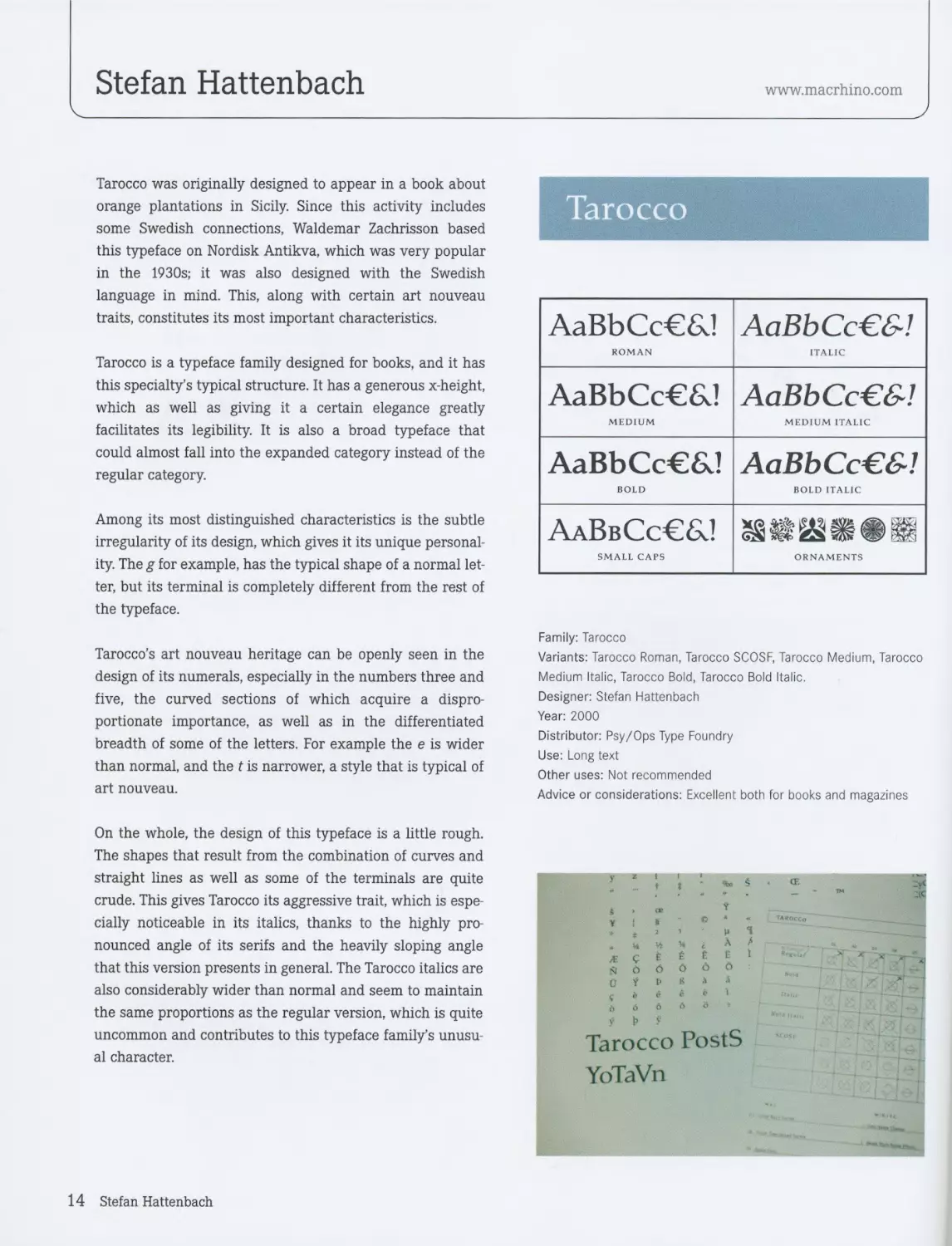
Tarocco
AaBbCc€&! AaBbCc€&!
ROMAN ITALIC
AaBbCc€6J AaBbCc€&!
MEDIUM MEDIUM ITALIC
AaBbCc€&! AaBbCc€&!
BOLD BOLD ITALIC
AaBbCc€6J
SMALL CAPS ORNAMENTS
Family: Tarocco
Variants: Tarocco Roman, Tarocco SCOSF, Tarocco Medium, Tarocco
Medium Italic, Tarocco Bold, Tarocco Bold Italic.
Designer: Stefan Hattenbach
Year: 2000
Distributor: Psy/Ops Type Foundry
Use: Long text
Other uses: Not recommended
Advice or considerations: Excellent both for books and magazines
14 Stefan Hattenbach
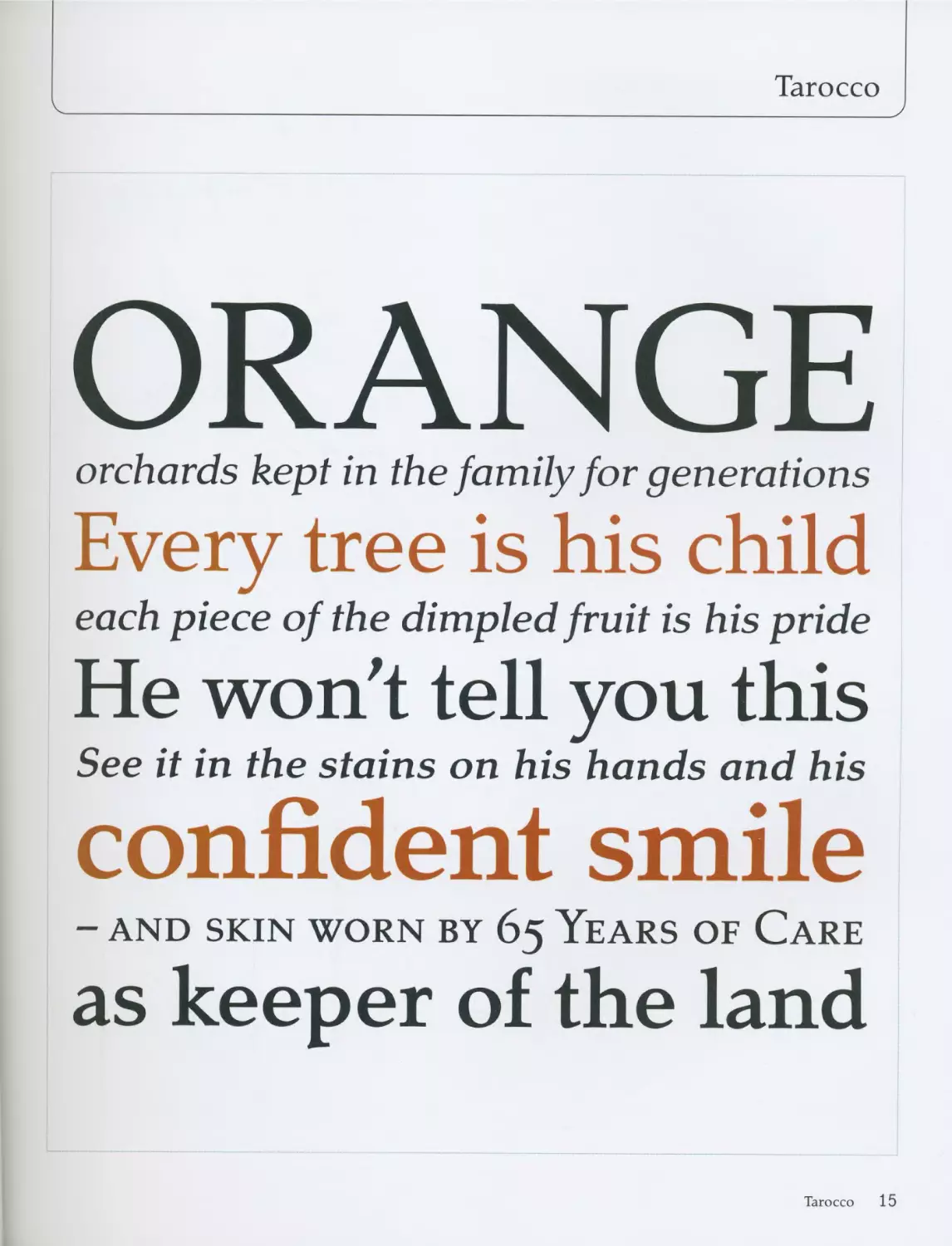
Tarocco
ORANGE
orchards kept in the family for generations
Every tree is his child
each piece of the dimpled fruit is his pride
He won't tell you this
See it in the stains on his hands and his
confident smile
- AND SKIN WORN BY 65 YEARS OF CARE
as keeper of the land
Tarocco 15
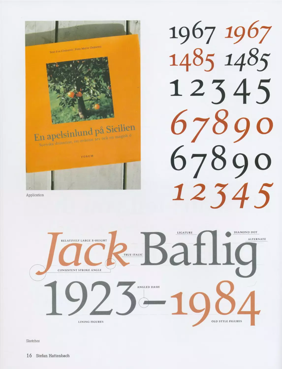
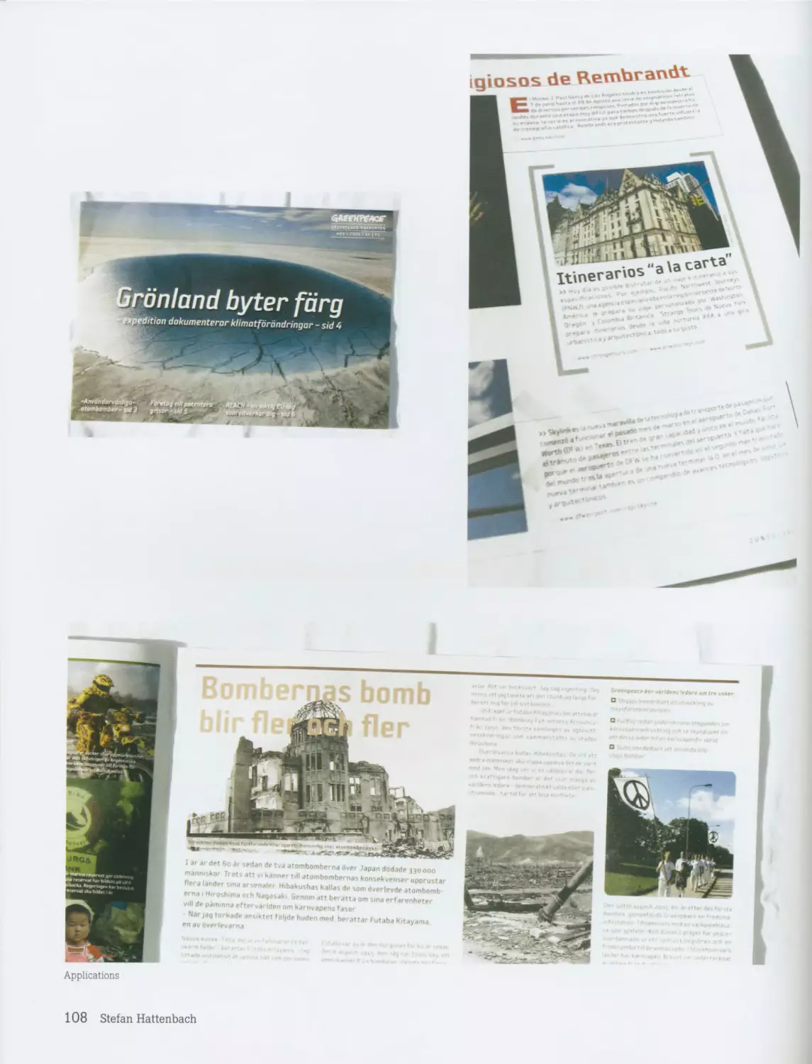
forum
Application
1967 1967
1485 1485
12345
67890
67890
12345
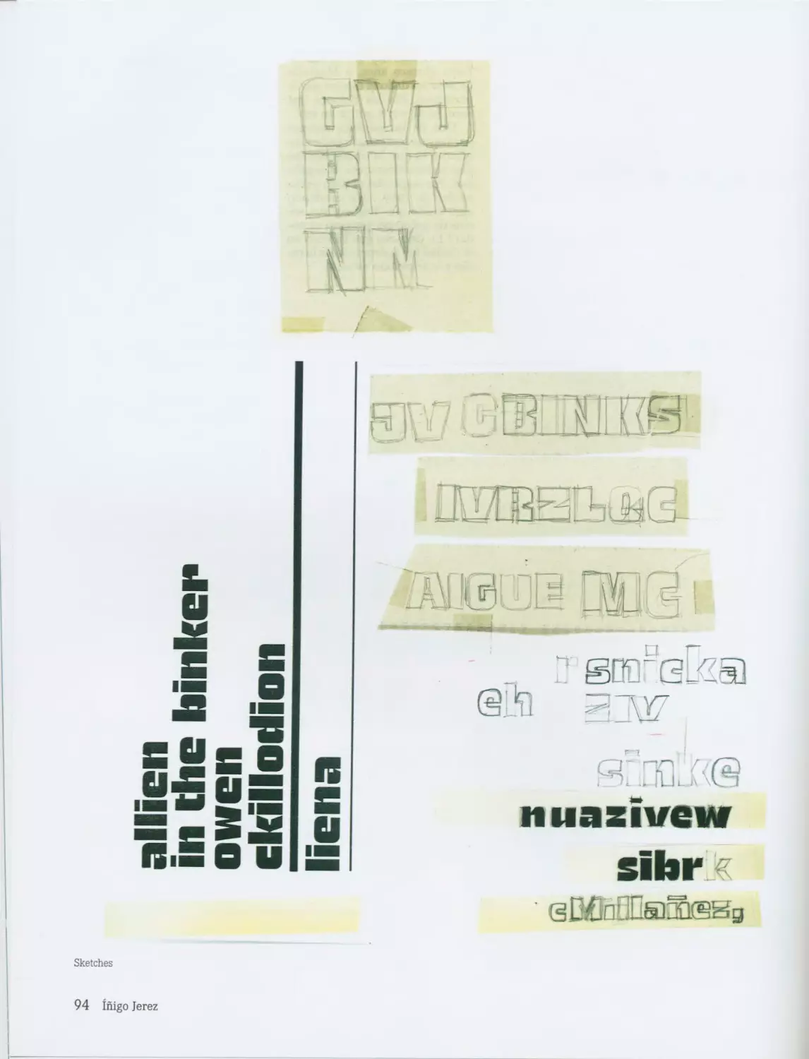
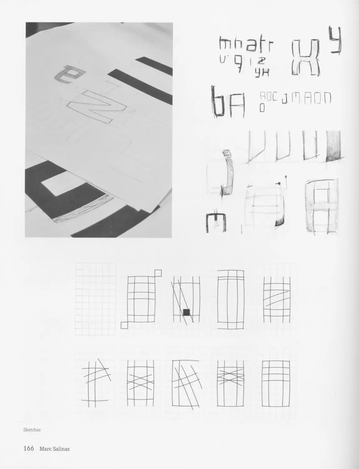
Sketches
16 Stefan Hattenbach
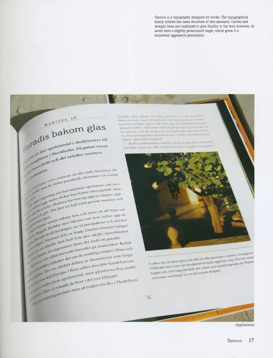
Tarocco is a typography designed for books. The typographical
family follows the same structure of this specialty. Curves and
straight lines are combined to give fluidity to the text; however, its
serifs have a slightly pronounced angle, which gives it a
somewhat aggressive personality.
t>a
....
I’d r“
l‘,e
de,^
hi1" ’
.I*’’ <•«
ur .......w
r Ma1’1’*’0 клП vind go
•»£n. ............ruiurupvu,
«е >’kane Херокие. ocb driver
I > ‘"X en X *” ’ an'bt tonMrei hanger
I X V* м U' ““ t tylb b°PP u.n iskaha vinterhimten
I ‘"e bo» ,r4n \ , ,nda en paradis
I fln°S j fpa nrann.sk- Redan
I Л,,e 3*‘ n*”’‘ ’ rvr.d” hUV Jbga traden i Kina .uh
I <Z',e> *,U“Xs °"’ “e 7v .....................’""X
I " "Z .id‘-’rylt' , bnsokieirandei.resan
„X pe< v*r , 1 iU-r-’ 51 plantorna dog
I 1 rlie*' -iri ГП4-’^
I X „JfX .pets*""‘ . nya ki""-”1'
....................
iH‘f unn^0
I .d*'1’ .ngr’"’
I I’” ,„n>''" b
--- i vdxthu*
, v. ..Ц odla cipibiner ^пОТ
I l,..r "•’"'*•7^; "'Mu-lm lM N“""n
Ulnksdol 4ir«x norr ’ di„ 1Hk4d ,om uistottn1"”
..........
mu,eUm»«n’Une<>rov'
Applications
Tarocco 17
Michael Ives
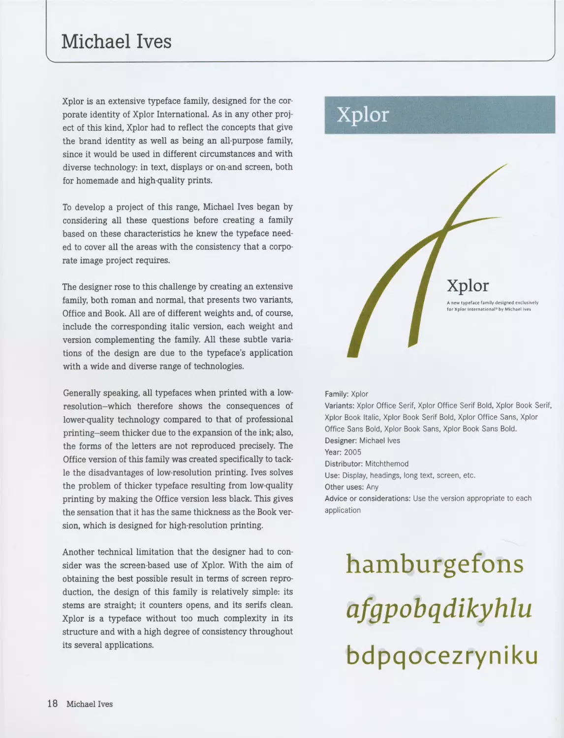
Xplor is an extensive typeface family, designed for the cor-
porate identity of Xplor International. As in any other proj-
ect of this kind, Xplor had to reflect the concepts that give
the brand identity as well as being an all-purpose family,
since it would be used in different circumstances and with
diverse technology: in text, displays or on-and screen, both
for homemade and high-quality prints.
To develop a project of this range, Michael Ives began by
considering all these questions before creating a family
based on these characteristics he knew the typeface need-
ed to cover all the areas with the consistency that a corpo-
rate image project requires.
The designer rose to this challenge by creating an extensive
family, both roman and normal, that presents two variants,
Office and Book. All are of different weights and, of course,
include the corresponding italic version, each weight and
version complementing the family. All these subtle varia-
tions of the design are due to the typeface’s application
with a wide and diverse range of technologies.
Generally speaking, all typefaces when printed with a low-
resolution-which therefore shows the consequences of
lower-quality technology compared to that of professional
printing-seem thicker due to the expansion of the ink; also,
the forms of the letters are not reproduced precisely. The
Office version of this family was created specifically to tack-
le the disadvantages of low-resolution printing. Ives solves
the problem of thicker typeface resulting from low-quality
printing by making the Office version less black. This gives
the sensation that it has the same thickness as the Book ver-
sion, which is designed for high-resolution printing.
Another technical limitation that the designer had to con-
sider was the screen-based use of Xplor. With the aim of
obtaining the best possible result in terms of screen repro-
duction, the design of this family is relatively simple: its
stems are straight; it counters opens, and its serifs clean.
Xplor is a typeface without too much complexity in its
structure and with a high degree of consistency throughout
its several applications.
Xplor
Family: Xplor
Variants: Xplor Office Serif, Xplor Office Serif Bold, Xplor Book Serif,
Xplor Book Italic, Xplor Book Serif Bold, Xplor Office Sans, Xplor
Office Sans Bold, Xplor Book Sans, Xplor Book Sans Bold.
Designer: Michael Ives
Year: 2005
Distributor: Mitchthemod
Use: Display, headings, long text, screen, etc.
Other uses: Any
Advice or considerations: Use the version appropriate to each
application
hamburgefons
afgpobqdikyhlu
bdpqocezryniku
18 Michael Ives
Xplor
ABCDEFGHIJ
KLMNOPQR
STUVWXYZ
abcdefghij
klmnopqr
stuvwxyz
[0123456789]
«{(------)}»
ABCDEFGHIJ
KLMNOPQR
STUVWXYZ
abcdefghij
klmnopqr
stuvwxyz
[0123456789]
«{(—)}»
Xplor 19
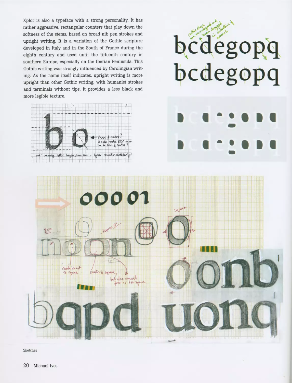
Xplor is also a typeface with a strong personality. It has
rather aggressive, rectangular counters that play down the
softness of the stems, based on broad nib pen strokes and
upright writing. It is a variation of the Gothic scripture
developed in Italy and in the South of France during the
eighth century and used until the fifteenth century in
southern Europe, especially on the Iberian Peninsula. This
Gothic writing was strongly influenced by Carolingian writ-
ing. As the name itself indicates, upright writing is more
upright than other Gothic writing; with humanist strokes
bcdcgopq
bcdegopq
ООО on
Sketches
20 Michael Ives
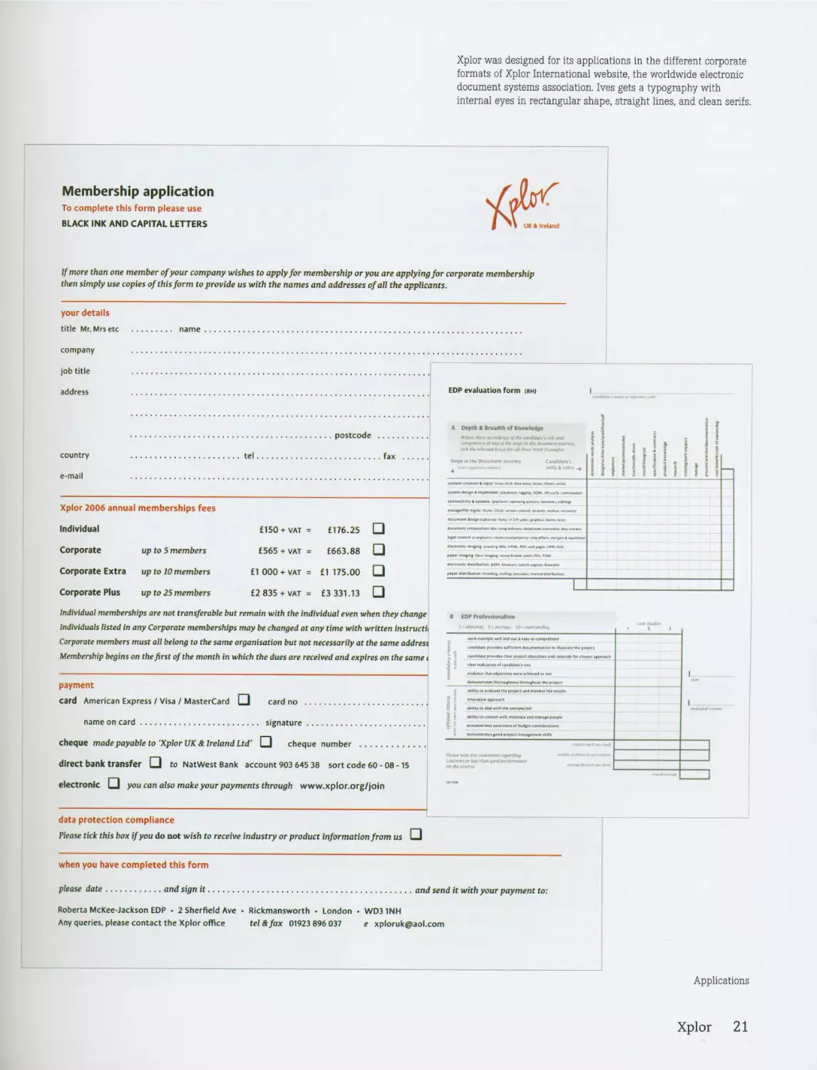
Xplor was designed for its applications in the different corporate
formats of Xplor International website, the worldwide electronic
document systems association. Ives gets a typography with
internal eyes in rectangular shape, straight lines, and clean serifs.
Membership application
To complete this form please use
BLACK INK AND CAPITAL LETTERS
Tjk
I UK a Ireland
If more than one member of your company wishes to apply for membership or you are applying for corporate membership
then simply use copies of this form to provide us with the names and addresses of all the applicants.
your details
title Mr. Mrs etc
name
company
job title
EDP evaluation form <rh)
address
Individual memberships are not transferable but remain with the individual even when they change
Individuals listed in any Corporate memberships may be changed at any time with written instruct^
Corporate members must all belong to the same organisation but not necessarily at the same address
Membership begins on the first of the month in which the dues are received and expires on the same <
payment
card American Express / Visa / MasterCard □ card no
name on card
signature..........................
cheque made payable to 'Xplor UK & Ireland Ltd' □ cheque number .....................
direct bank transfer Q to NatWest Bank account 903 645 38 sort code 60 - 08 -15
electronic □ you can also make your payments through www.xplor.org/join
data protection compliance
Please tick this box if you do not wish to receive industry or product information from us □
when you have completed this form
please date
and sign it
and send it with your payment to:
Roberta McKee-Jackson EDP • 2 Sherfield Ave • Rickmansworth • London • WD31NH
Any queries, please contact the Xplor office tel & fax 01923 896 037 e xploruk@aol.com
Applications
Xplor 21
Veronika Burian
www.vikburian.net
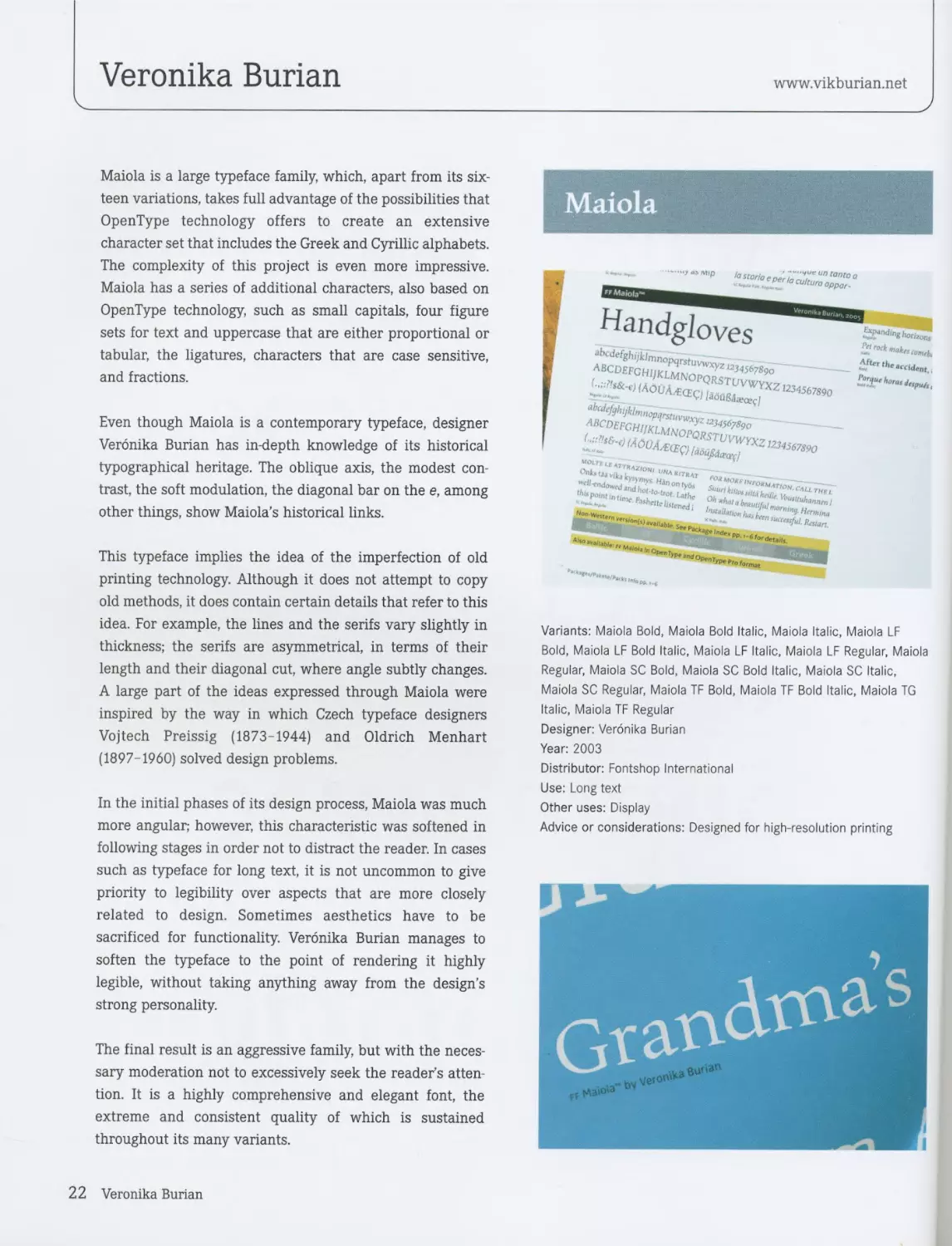
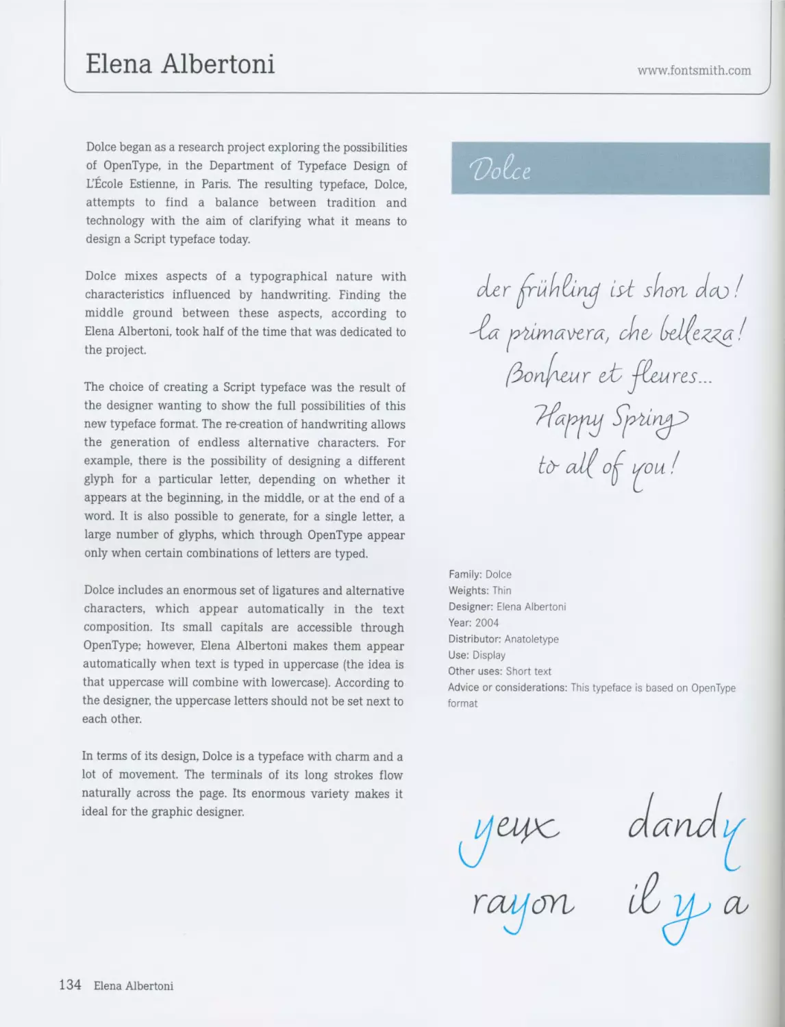
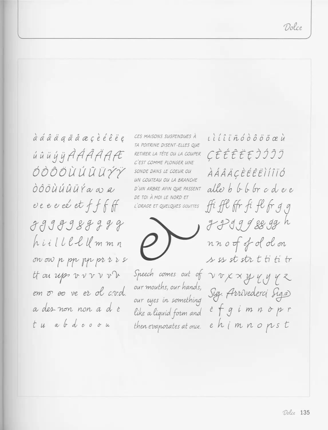
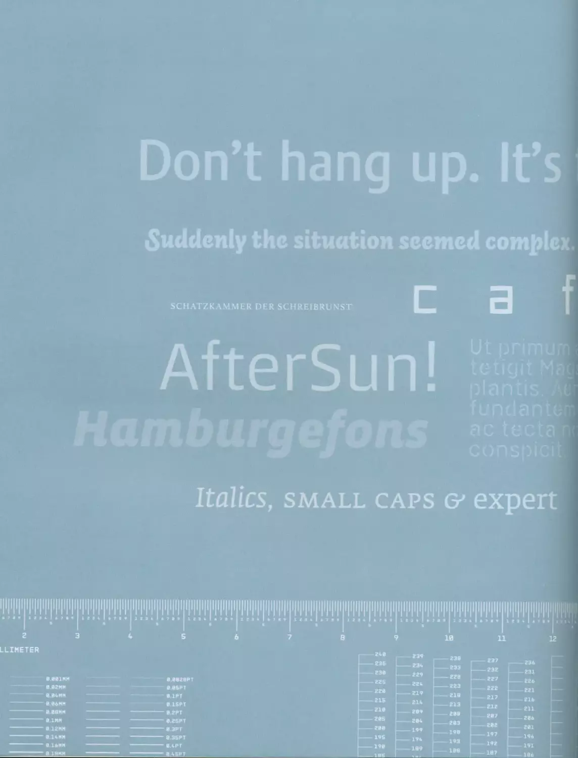
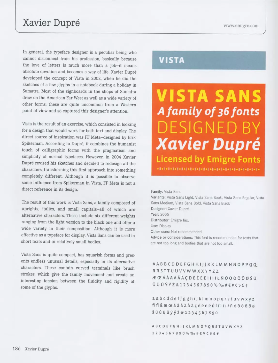
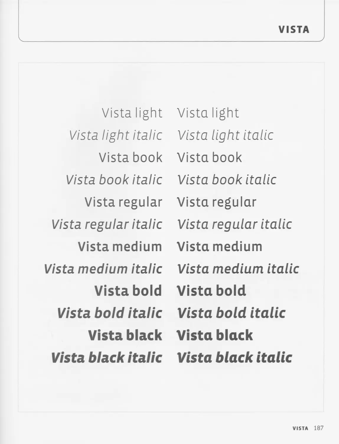
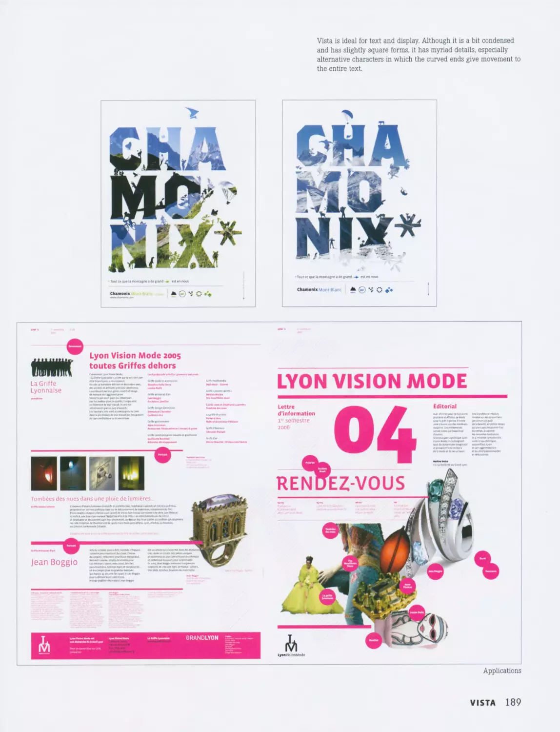
Maiola is a large typeface family, which, apart from its six-
teen variations, takes full advantage of the possibilities that
OpenType technology offers to create an extensive
character set that includes the Greek and Cyrillic alphabets.
The complexity of this project is even more impressive.
Maiola has a series of additional characters, also based on
OpenType technology, such as small capitals, four figure
sets for text and uppercase that are either proportional or
tabular, the ligatures, characters that are case sensitive,
and fractions.
Even though Maiola is a contemporary typeface, designer
Veronika Burian has in-depth knowledge of its historical
typographical heritage. The oblique axis, the modest con-
trast, the soft modulation, the diagonal bar on the e, among
other things, show Maiola’s historical links.
This typeface implies the idea of the imperfection of old
printing technology. Although it does not attempt to copy
old methods, it does contain certain details that refer to this
idea. For example, the lines and the serifs vary slightly in
thickness; the serifs are asymmetrical, in terms of their
length and their diagonal cut, where angle subtly changes.
A large part of the ideas expressed through Maiola were
inspired by the way in which Czech typeface designers
Vojtech Preissig (1873-1944) and Oldrich Menhart
(1897-1960) solved design problems.
In the initial phases of its design process, Maiola was much
more angular; however, this characteristic was softened in
following stages in order not to distract the reader. In cases
such as typeface for long text, it is not uncommon to give
priority to legibility over aspects that are more closely
related to design. Sometimes aesthetics have to be
sacrificed for functionality. Veronika Burian manages to
soften the typeface to the point of rendering it highly
legible, without taking anything away from the design’s
strong personality.
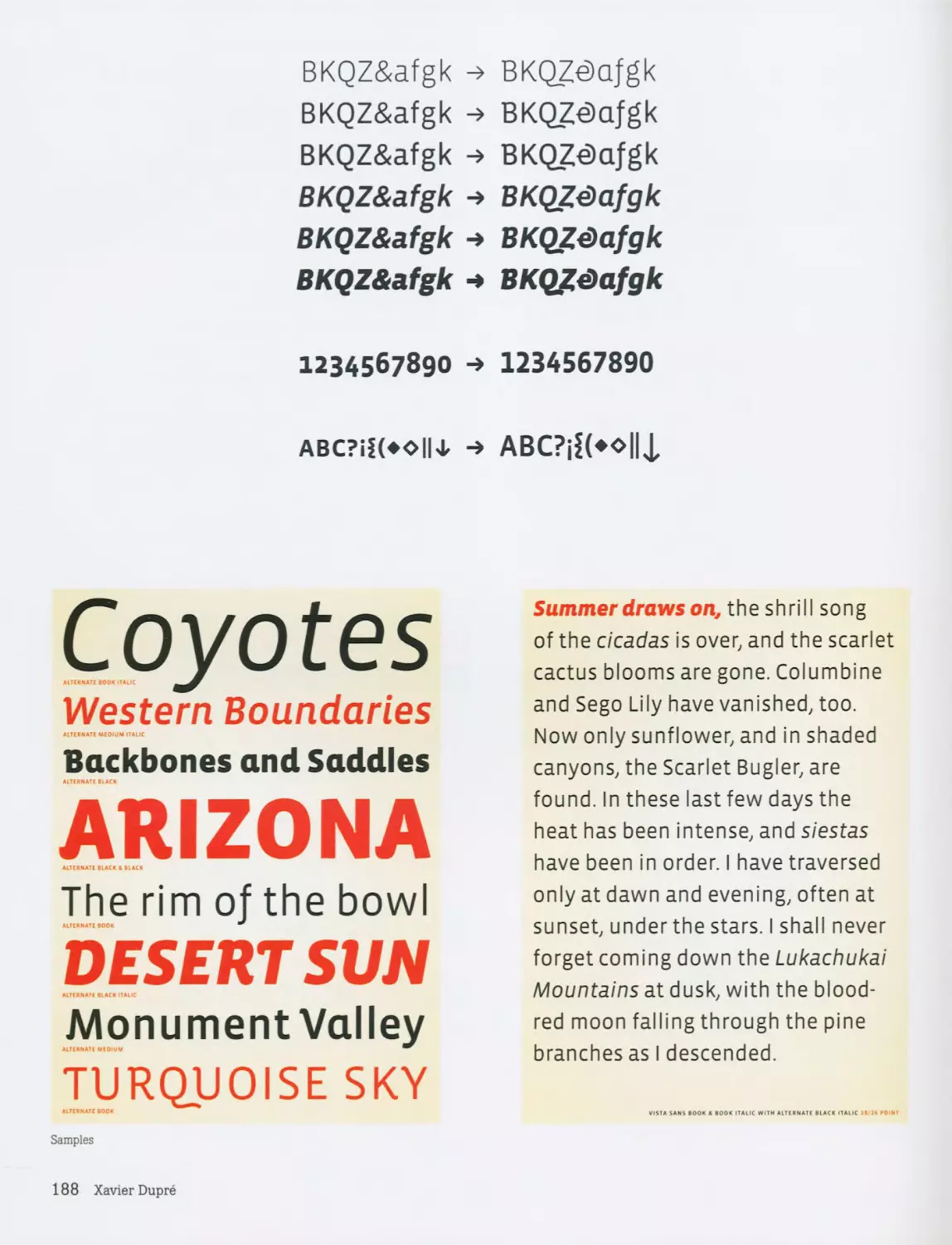
The final result is an aggressive family, but with the neces-
sary moderation not to excessively seek the reader’s atten-
tion. It is a highly comprehensive and elegant font, the
extreme and consistent quality of which is sustained
throughout its many variants.
Maiola
*
Mip
^andgloves
,23456Я»0
IAOO^CI ,2345"W
0"bt2Xk"AZ'°’‘' -------
hdi bet,,
^Uthor«4iripu/tl
'°»*'”ypel>ro,0,mae
Variants: Maiola Bold, Maiola Bold Italic, Maiola Italic, Maiola LF
Bold, Maiola LF Bold Italic, Maiola LF Italic, Maiola LF Regular, Maiola
Regular, Maiola SC Bold, Maiola SC Bold Italic, Maiola SC Italic,
Maiola SC Regular, Maiola TF Bold, Maiola TF Bold Italic, Maiola TG
Italic, Maiola TF Regular
Designer: Veronika Burian
Year: 2003
Distributor: Fontshop International
Use: Long text
Other uses: Display
Advice or considerations: Designed for high-resolution printing
22 Veronika Burian
Maiola
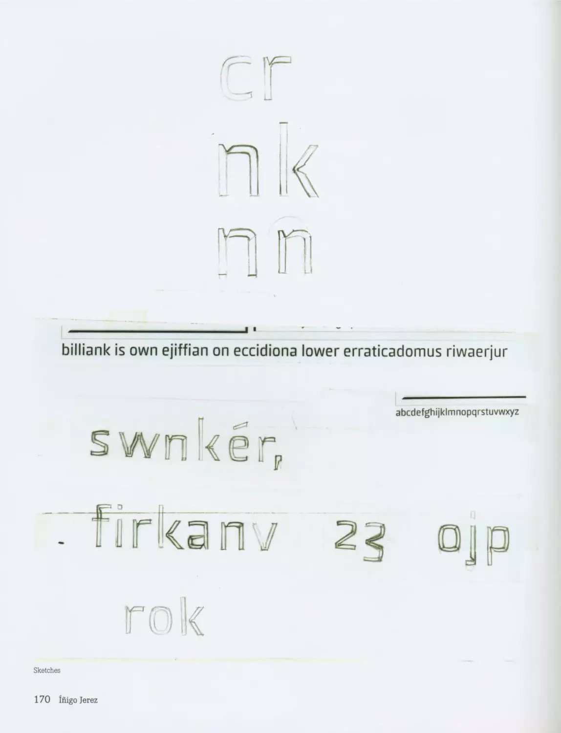
к______________________________________________________________________________
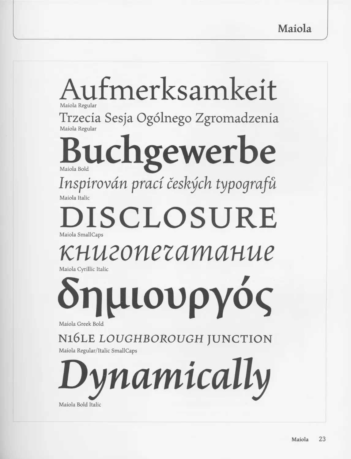
Aufmerksamkeit
Maiola Regular
Trzecia Sesja Ogolnego Zgromadzenia
Maiola Regular
Buchgewerbe
Maiola Bold
Inspirovdn praci ceskych typoprafu
Maiola Italic
DISCLOSURE
Maiola SmallCaps
книгопегатание
Maiola Cyrillic Italic
Sqpioupyoq
Maiola Greek Bold
N16LE LOUGHBOROUGH JUNCTION
Maiola Regular/Italic SmallCaps
Dynamically
Maiola Bold Italic
Maiola 23
a Papiru
>CeW
*’ ^ovtfKY
6’ ZOiENf
TNiSADfc.
,го Ротёгпё
jeho
^anbice
bez
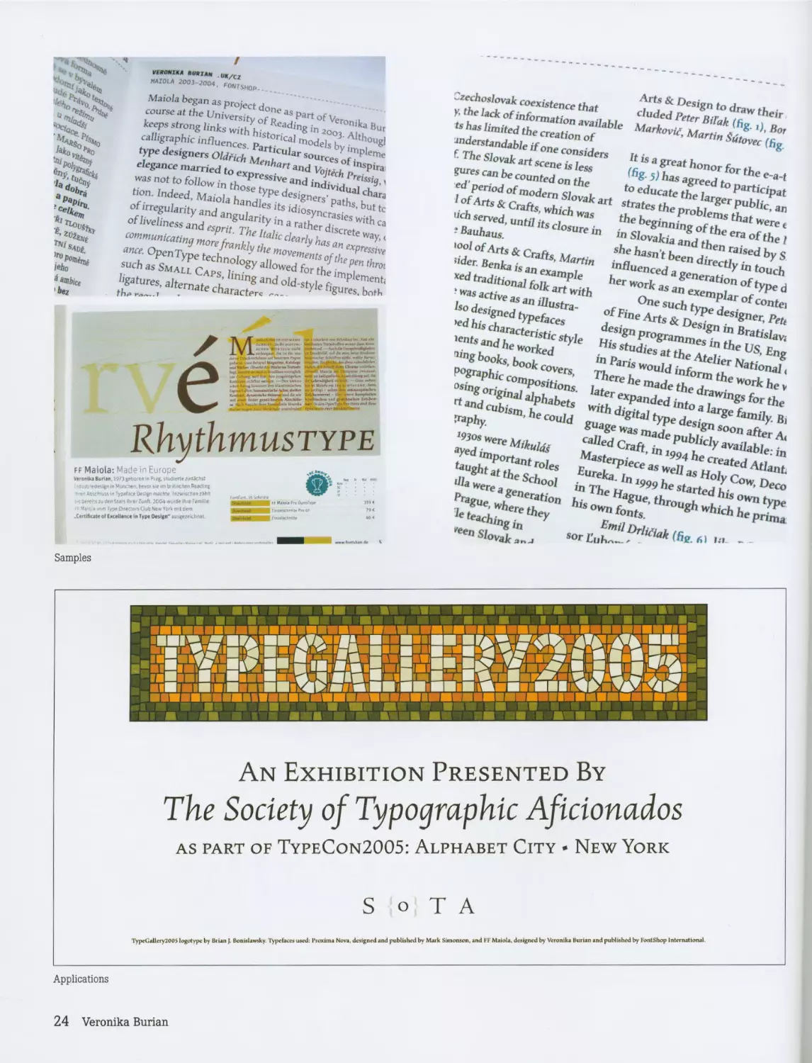
^^7a".’OO 3 2004. FONTSHOP
Maiola began as project done as part of Veronika Bur
course at the University of Reading in 2003. Althougl
keeps strong links with historical models by impleme
calligraphic influences. Particular sources of inspire
type designers Oldfich Menhart and Vojtech Preissig, з
elegance married to expressive and individual chara
was not to follow in those type designers’ paths, but tc
tion. Indeed, Maiola handles its idiosyncrasies with ca
of irregularity and angularity in a rather discrete way, <
of liveliness and esprit. The Italic clearly has an expressive
communicating more frankly the movements of the pen throt
ance. OpenType technology allowed for the implement;
such as Small Caps, lining and old-style figures, both
ligatures, alternate character*
th*» —1
RhythmusTYPE
ff Maiola: Made in Europe
Veronika Burii*. 1973get>o<efl in Pug. siudirfte zvnJctut м » «. <
Ojitrie^e'UgnfnMuncneri.bevor veunb-rtiKMnReaeing ;
- e'AijschhiMin Ту»«<кг0г»Г'Л1кМе fn.*wHc)wntNi«l ццмчч J
zu Omi Suri Hirer Zunft. 2004 «urde Are FermiH ou«r«» yi
' type Oveciwi Club New York mil dem *м or
CortrfKMo of E ««Heme ta Typo Ooilgn" .uMtezekknel ШМВЯИ Ехиошмчю
Czechoslovak coexistence that
y, the lack of information available
ts has limited the creation of
understandable if one considers
f. The Slovak art scene is less
gures can be counted on the
ed’ period of modem Slovak art
I of Arts & Crafts, which was
tich served, until its closure in
? Bauhaus.
tool of Arts & Crafts, Martin
?ider. Benka is an example
xed traditional folk art with
• was active as an illustra-
Iso designed typefaces
>ed his characteristic style
lents and he worked
ning books, book covers,
pographic compositions,
osing original alphabets
rt and cubism, he could
jraphy.
1930s were Mikulds
ayed important roles
taught at the School
ilia were a generation
Prague, where they
teaching in
'een Slovak ’
Arts & Design to draw their
eluded Peter Bil'ak (fig. 1), Bor
Markovic, Martin Sutovec (fig.
It is a great honor for the e-a-t
(fig- 5) has agreed to participat
to educate the larger public, an
strates the problems that were e
the beginning of the era of the 1
in Slovakia and then raised by S
she hasn’t been directly in touch
influenced a generation of type d
her work as an exemplar of contei
One such type designer, Pett
of Fine Arts & Design in Bratislava
design programmes in the US, Eng
His studies at the Atelier National <
in Paris would inform the work he v
There he made the drawings for the
later expanded into a large family. Bi
with digital type design soon after Ac
guage was made publicly available: in
called Craft, in 1994 he created Atlant
Masterpiece as well as Holy Cow, Deco
Eureka. In 1999 he started his own type
in The Hague, through which he prima
his own fonts.
Emil Drltfiak (fig. 61 1Л *
sor Euh''- '
SamPleS
PART
Applications
24 veronito Burian
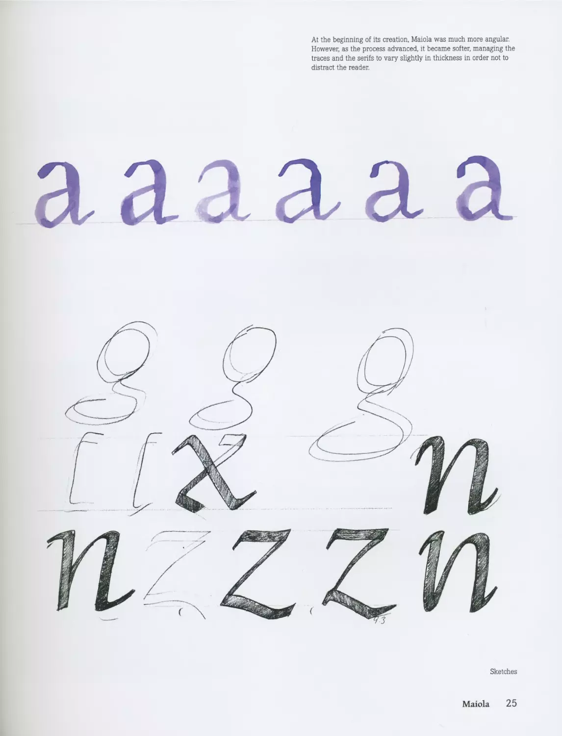
At the beginning of its creation, Maiola was much more angular.
However, as the process advanced, it became softer, managing the
traces and the serifs to vary slightly in thickness in order not to
distract the reader.
я sl3l я я a
Sketches
Maiola 25
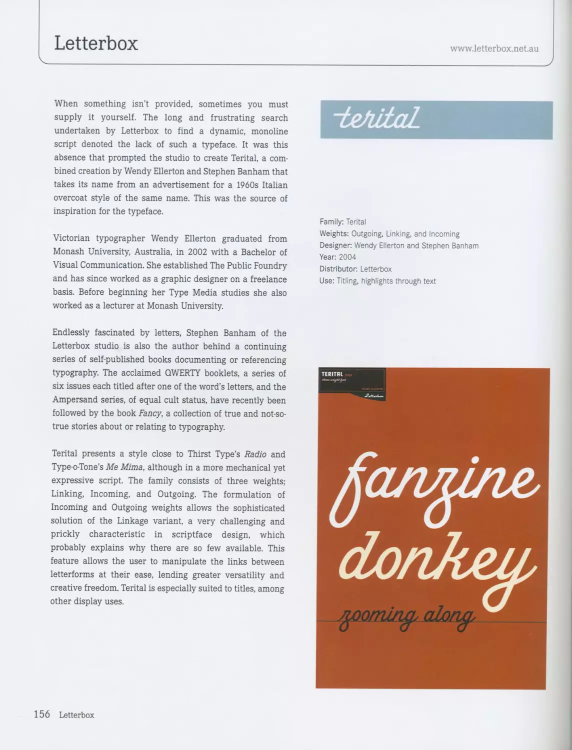
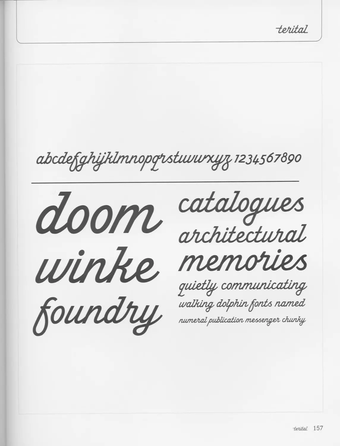
Letterbox
www.letterbox.net.au
Often some designers base their typefaces on anonymous
work that for some reason or another captures their atten-
tion-so much so that it offers them the beginnings of an
idea for the creation of a new typeface.
Template Gothic, designed by Barry Deck in 1990 and dis-
tributed by Emigre Inc., is one of the best-known cases.
Stephen Banham had a similar experience with a typeface
designed for signage students, an anonymous face from the
text “Learning to Letter,” which became the inspiration
behind the development of Berber.
Letterbox, developed since 1991, works with the dynamic
components of research, teaching, publication, and exhibi-
tion, which explains why Berber has developed such a
strong following since it was created in 2002.
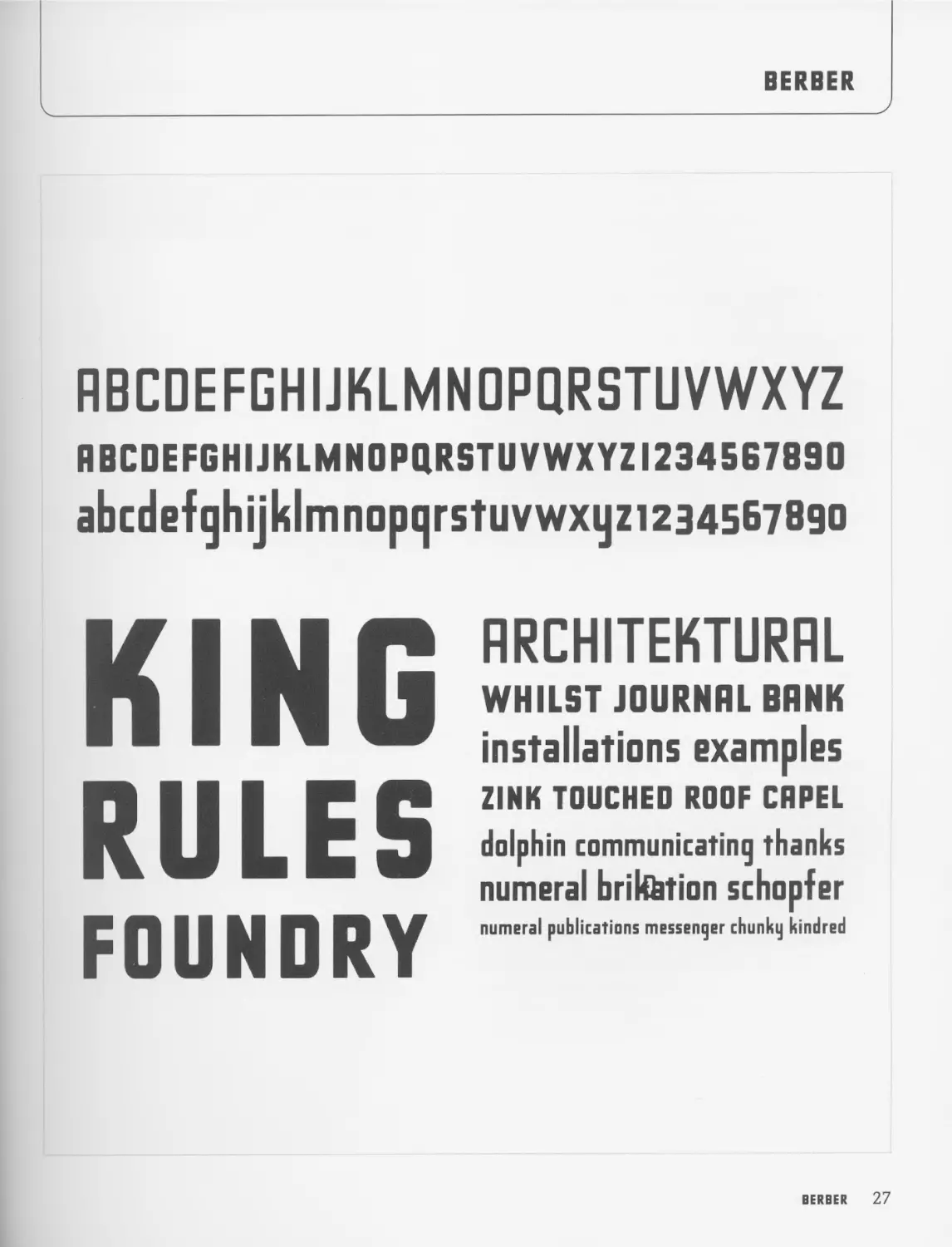
Berber developed extensively and became a strong normal
typeface, with exaggeratedly long, rectangular, and
reasonably condensed ascenders and descenders. It has
been designed for use in large-scale sign work and is
outstandingly suited to applications such as signage and
headlines. Its aesthetic characteristics are reminiscent of
the typefaces that appear on car registration plates.
The family incorporates two full versions of different
weights, Regular and King Caps, the uppercase of which is
noticeably darker. King Caps includes lining numerals. Reg-
ular has non-lining numerals, but it features ligatures for
some of its characters, giving the designer the ability to
alter and customize particular words.
Berber is recommended for large-scale signage and will
adapt perfectly to all kinds of display work, giving it a
strong graphic identity.
BERBER
Family: Berber
Variants: Berber Regular, Berber King Caps
Designer: Stephen Banham
Year: 2003
Distributor: Emigre Inc.
Use: Display
Other uses: Not recommended
Advice or considerations: Designed for signage
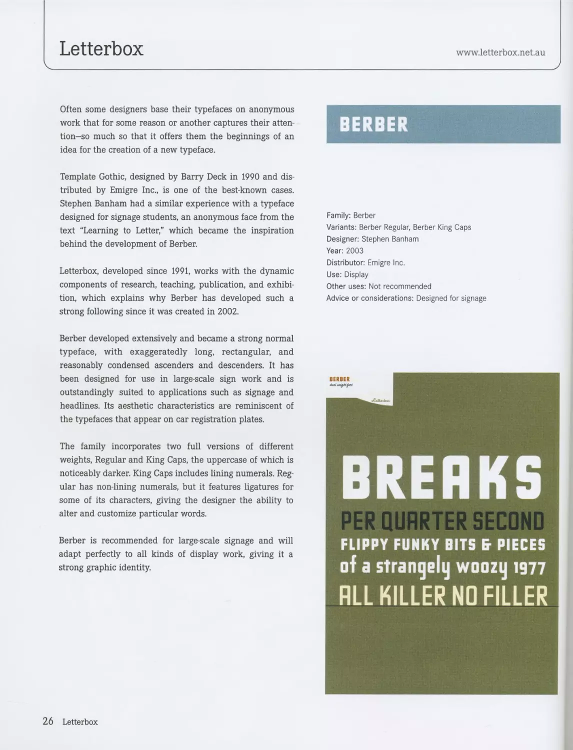
BREAKS
PER QUARTER SECOND
FLIPPY FUNKY BITS fr PIECES
of a strangely woozy 1977
ALL KILLER NO FILLER
26 Letterbox
BERBER
RBCDEFGHIJKLMNOPQRSTUVWXYZ
ABCDEFGHIJKLMN0PQRSTUVWXYZI234567890
abcdefqhijklmnopqrstuvwxyzi2345b789o
KING
RULES
FOUNDRY
ARCHITEKTURRL
WHILST JOURNAL BANK
installations examples
ZINK TOUCHED ROOF CRPEL
dolphin communicating thanks
numeral brikhtion schopfer
numeral publications messenger chunky kindred
BERBER 27
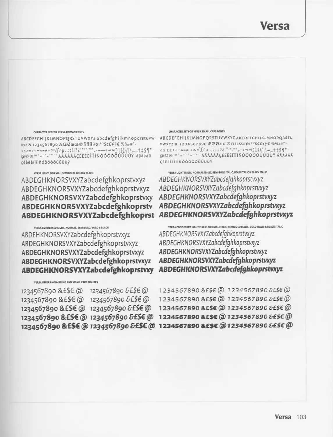
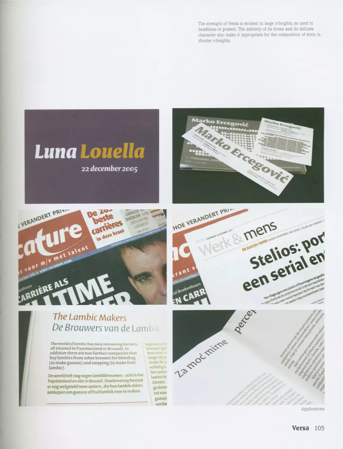
Ourtype
www.ourtype.com
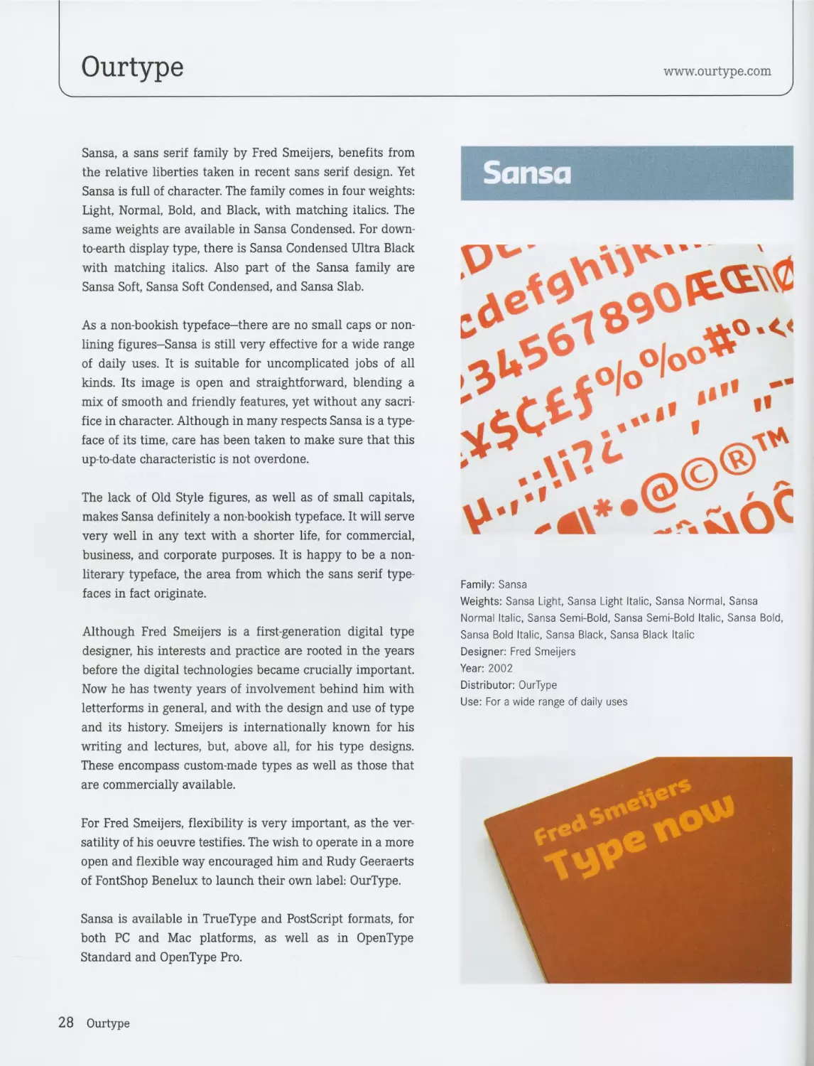
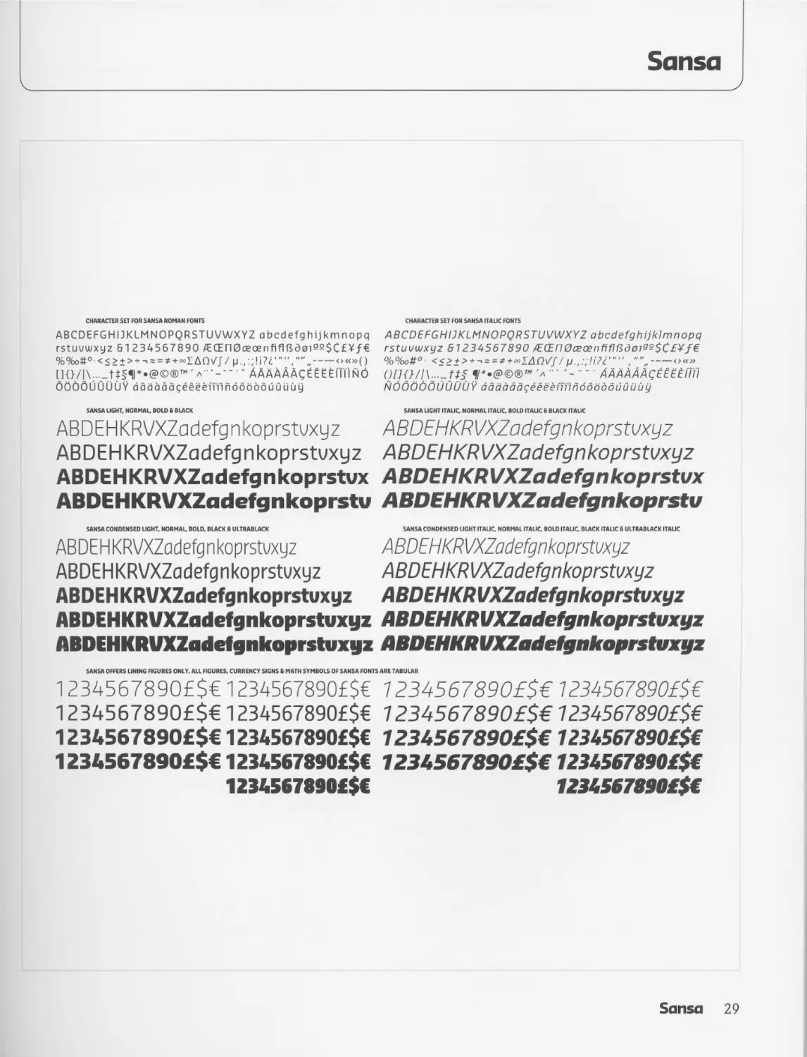
Sansa, a sans serif family by Fred Smeijers, benefits from
the relative liberties taken in recent sans serif design. Yet
Sansa is full of character. The family comes in four weights:
Light, Normal, Bold, and Black, with matching italics. The
same weights are available in Sansa Condensed. For down-
to-earth display type, there is Sansa Condensed Ultra Black
with matching italics. Also part of the Sansa family are
Sansa Soft, Sansa Soft Condensed, and Sansa Slab.
As a non-bookish typeface-there are no small caps or non-
lining figures-Sansa is still very effective for a wide range
of daily uses. It is suitable for uncomplicated jobs of all
kinds. Its image is open and straightforward, blending a
mix of smooth and friendly features, yet without any sacri-
fice in character. Although in many respects Sansa is a type-
face of its time, care has been taken to make sure that this
up-to-date characteristic is not overdone.
The lack of Old Style figures, as well as of small capitals,
makes Sansa definitely a non-bookish typeface. It will serve
very well in any text with a shorter life, for commercial,
business, and corporate purposes. It is happy to be a non-
literary typeface, the area from which the sans serif type-
faces in fact originate.
Although Fred Smeijers is a first-generation digital type
designer, his interests and practice are rooted in the years
before the digital technologies became crucially important.
Now he has twenty years of involvement behind him with
letterforms in general, and with the design and use of type
and its history. Smeijers is internationally known for his
writing and lectures, but, above all, for his type designs.
These encompass custom-made types as well as those that
are commercially available.
For Fred Smeijers, flexibility is very important, as the ver-
satility of his oeuvre testifies. The wish to operate in a more
open and flexible way encouraged him and Rudy Geeraerts
of FontShop Benelux to launch their own label: OurType.
Sansa is available in TrueType and PostScript formats, for
both PC and Mac platforms, as well as in OpenType
Standard and OpenType Pro.
Sansa
Family: Sansa
Weights: Sansa Light, Sansa Light Italic, Sansa Normal, Sansa
Normal Italic, Sansa Semi-Bold, Sansa Semi-Bold Italic, Sansa Bold,
Sansa Bold Italic, Sansa Black, Sansa Black Italic
Designer: Fred Smeijers
Year: 2002
Distributor: OurType
Use: For a wide range of daily uses
28 Ourtype
Sansa
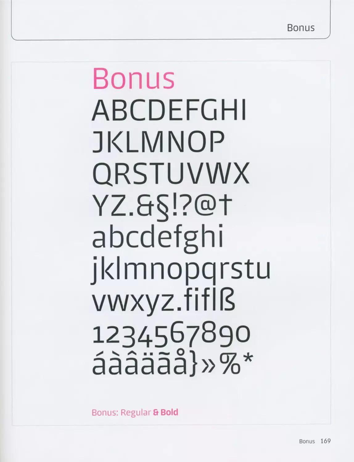
CHARACTER SET FOR SANSA ROMAN FONTS
ABCDEFGHIJKLMNOPQRSTUVWXYZ abcdefghijkmnopq
rstuvwxyz 61234567890 /ЕОЕП0сеоепЛЯвд0195$С£¥/€
%%o#°-<< > + > + -• = = *+«>IAQV//p. ,:;!i?Z <>«»()
c аааааАсёёёёППмо
OOQQUUUIJY dadaaageeeeiiilnddodduuuuy
SANSA LIGHT, NORMAL. BOLD 8 BLACK
ABDEHKRVXZadefgnkoprstvxyz
ABDEHKRVXZadefgnkoprstvxyz
ABDEHKRVXZadefgnkoprstux
ABDEHKRVXZadefgnkoprstu
CHARACTER SET FOR SANSA ITALIC FONTS
ABCDEFGHIJKLMNOPQRSTUVWXYZ abcdefghijklmnopq
rstuvwxyz 61234567890 7E(En0ceoenfiflKd0iM$C£¥f€
%%o#° <<>i> + ^=*+*>ZAQV// <>«»
л •' “ AAAAAAq££Ftfiil
NOdOOdUUUUY dadaaageeeeiiT'inddbdduuuuy
SANSA LIGHT ITALIC, NORMAL ITALIC, BOLD ITAUC 8 BLACK ITALIC
ABDEHKRVXZadefgnkoprstvxyz
ABDEHKRVXZadefgnkoprstvxyz
ABDEHKRVXZadefgnkoprstux
ABDEHKRVXZadefgnkoprstu
SANSA CONDENSED LIGHT. NORMAU BOLD, BLACK 6 ULTRABIACK SANSA CONDENSED LIGHT ITALIC. NORMAL ITALIC. BOLD ITALIC BLACK ITALIC 8 ULTRABLACK ITALIC
ABDE H KRVXZadefg n koprstvxyz ABDEHKRVXZadefgnkoprstvxyz
ABDEHKRVXZadefgnkoprstvxyz ABDEHKRVXZadefgnkoprstvxyz
ABDEHKRVXZadefgnkoprstvxyz ABDEHKRVXZadefgnkoprstvxyz
ABDEHKRVXZadefgnkoprstvxyz ABDEHKRVXZadefgnkoprstvxyz
ABDEHKRVXZadefgnkoprstvxyz ABDEHKRVXZadefgnkoprstvxyz
SANSA OFFERS LINING FIGURES ONLY. ALL FIGURES. CURRENCY SIGNS 8 MATH SYMBOLS OF SANSA FONTS ARE TABULAR
1234567890£$€ 1234567890£$€ 1234567890£$€ 1234567890£$€
1234567890£$€ 1234567890£$€ 1234567890£$€ 1234567890£$€
1234567890£$€ 1234567890£$€ 1234567890£$€ 1234567890£$€
1234567890£$€ 1234567890£$€ 1234567890£$€ 1234567890£$€
1234567890£$€ 1234567890£$€
Sansa 29
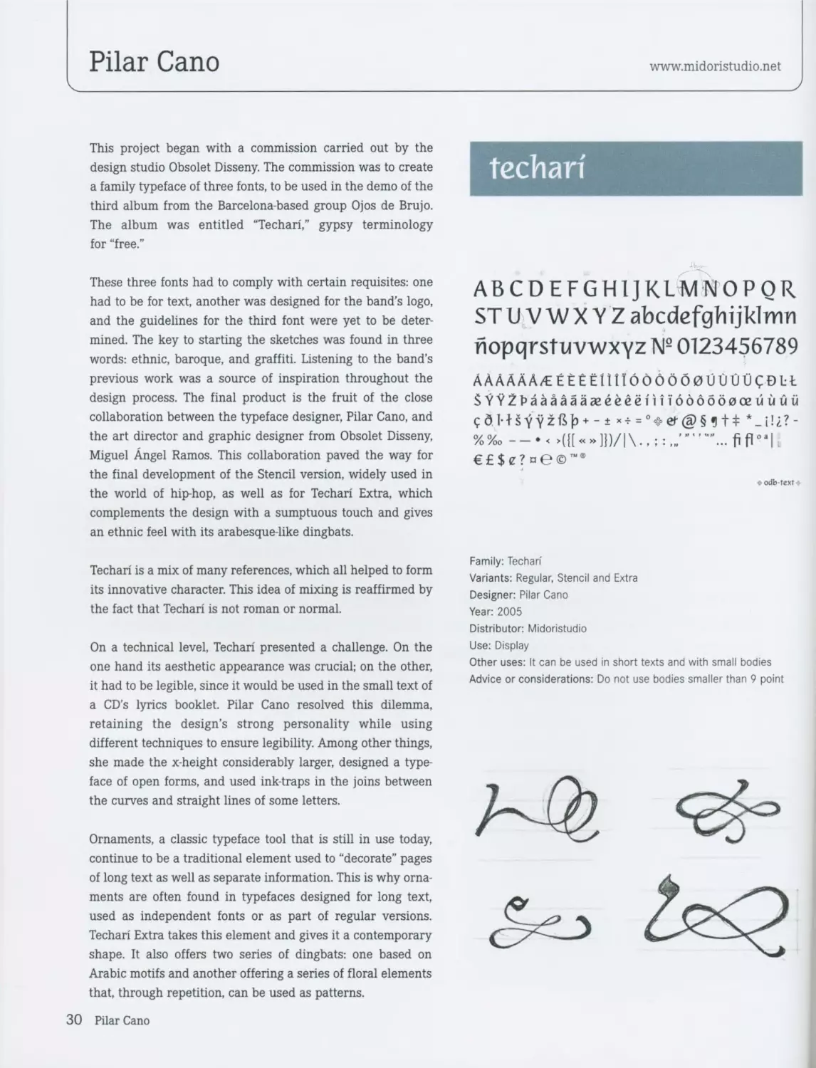
Pilar Cano
www.midoristudio.net
This project began with a commission carried out by the
design studio Obsolet Disseny. The commission was to create
a family typeface of three fonts, to be used in the demo of the
third album from the Barcelona-based group Ojos de Brujo.
The album was entitled “Techari,’’ gypsy terminology
for “free.”
These three fonts had to comply with certain requisites: one
had to be for text, another was designed for the band’s logo,
and the guidelines for the third font were yet to be deter-
mined. The key to starting the sketches was found in three
words: ethnic, baroque, and graffiti. Listening to the band’s
previous work was a source of inspiration throughout the
design process. The final product is the fruit of the close
collaboration between the typeface designer, Pilar Cano, and
the art director and graphic designer from Obsolet Disseny,
Miguel Angel Ramos. This collaboration paved the way for
the final development of the Stencil version, widely used in
the world of hip-hop, as well as for Techari Extra, which
complements the design with a sumptuous touch and gives
an ethnic feel with its arabesque-like dingbats.
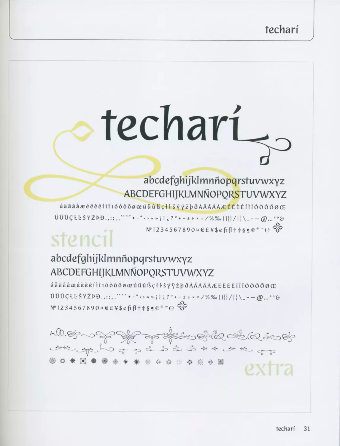
Techari is a mix of many references, which all helped to form
its innovative character. This idea of mixing is reaffirmed by
the fact that Techari is not roman or normal.
On a technical level, Techari presented a challenge. On the
one hand its aesthetic appearance was crucial; on the other,
it had to be legible, since it would be used in the small text of
a CD’s lyrics booklet. Pilar Cano resolved this dilemma,
retaining the design’s strong personality while using
different techniques to ensure legibility. Among other things,
she made the x-height considerably larger, designed a type-
face of open forms, and used ink-traps in the joins between
the curves and straight lines of some letters.
Ornaments, a classic typeface tool that is still in use today,
continue to be a traditional element used to “decorate” pages
of long text as well as separate information. This is why orna-
ments are often found in typefaces designed for long text,
used as independent fonts or as part of regular versions.
Techari Extra takes this element and gives it a contemporary
shape. It also offers two series of dingbats: one based on
Arabic motifs and another offering a series of floral elements
that, through repetition, can be used as patterns.
techari
ABCDEFGHIJKLMNOPQR
STU V WX YZ abcdefghijklmn
nopqrstuvwxyz № 0123456789
AAAAAA/E EEtEilllOOOOOOUtlUIJCDLt
$УУ2Рааааааагёёёё(И1дд6бд0оейййй
%%»—•<»(П«»П)/|\..;:....
€£$e? ne©~*
Family: Techan
Variants: Regular, Stencil and Extra
Designer: Pilar Cano
Year: 2005
Distributor: Midoristudio
Use: Display
Other uses: It can be used in short texts and with small bodies
Advice or considerations: Do not use bodies smaller than 9 point
30 Pilar Cano
tecbarf
techan
abcdefghijklmnnopqrstuvwxyz
ABCDEFGHIJKLMNNOPQKSTUVWXVZ
аааааагёёёё|'и16ддб0оейййВ<;Н5у¥2|э<ЗААААА/ЕЁЁЁЁ111бООО0СЕ
UU UEb SV2 t>D.i! i ?0+ -± v « =/%%» ()() /1 j
№1234567890n€£¥$efifIt*§1©l"'eC0O
abed efgh ij klrrni nopqrstiivwxyz
ABCDEFGHIJKLMNNOPQRSIUW/XYZ
аааааагёёёёп i i dddowiKiiii ii fifths уyzf) dAAAAA/E Ё ЁЁ Ё11IOOOO0CE
N“ 12 3 4 5 6 7 8 9 О » € £ ¥ $ e fi fl t * § ? ® " ™ e ЧГ
• <• <§> и
techari 31
$ tf kv™
^ni.TOj
m rn
Sketches
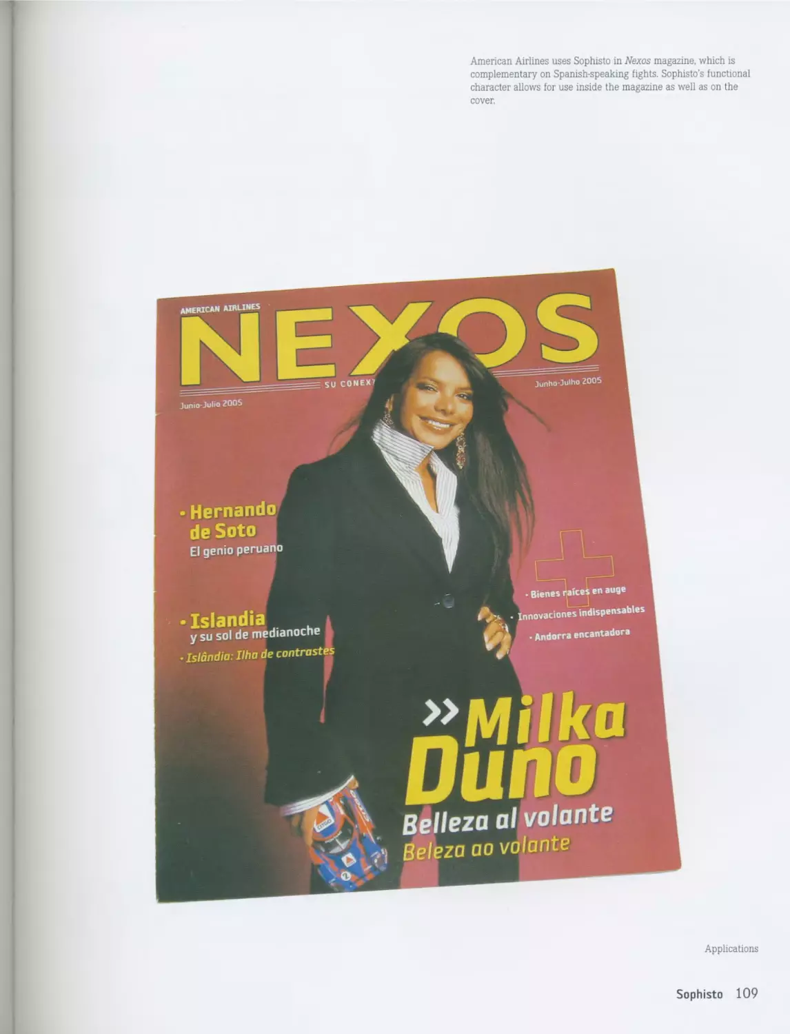
Applications
32 Pilar Cano
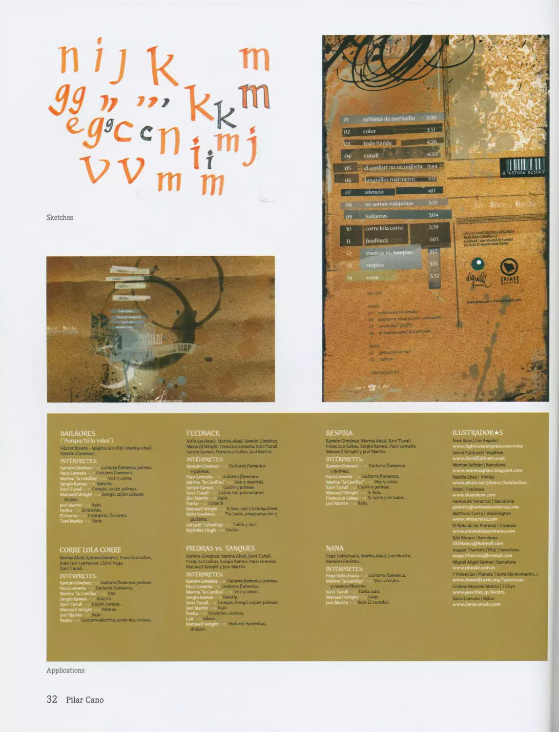
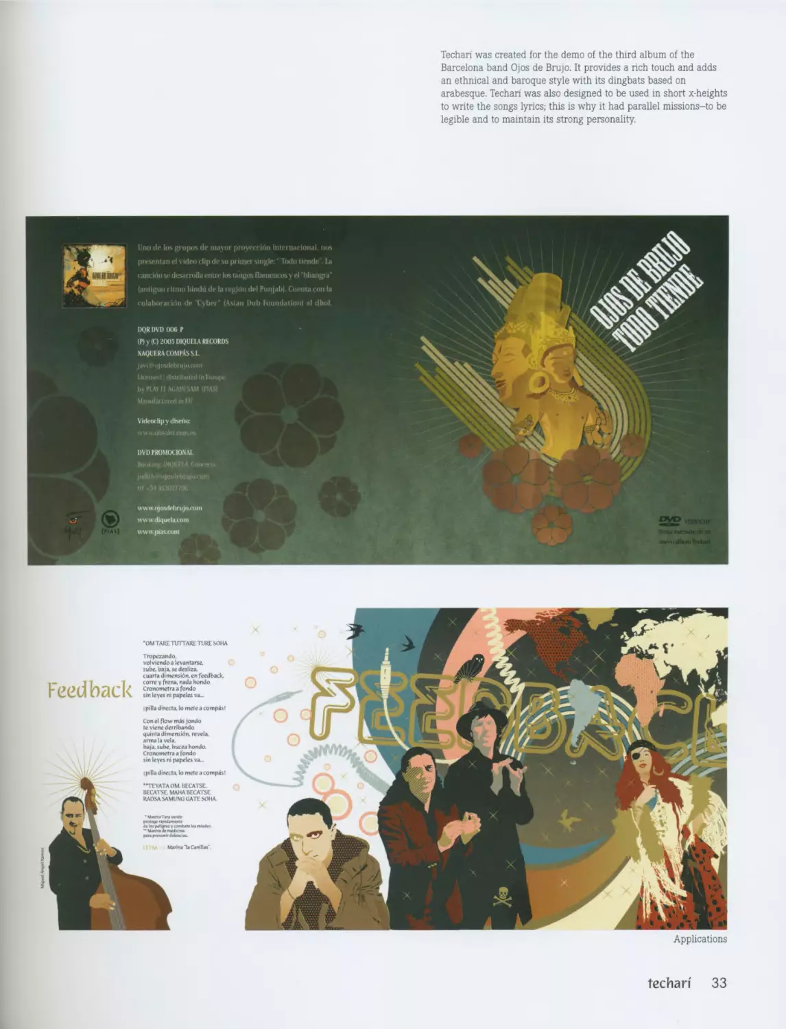
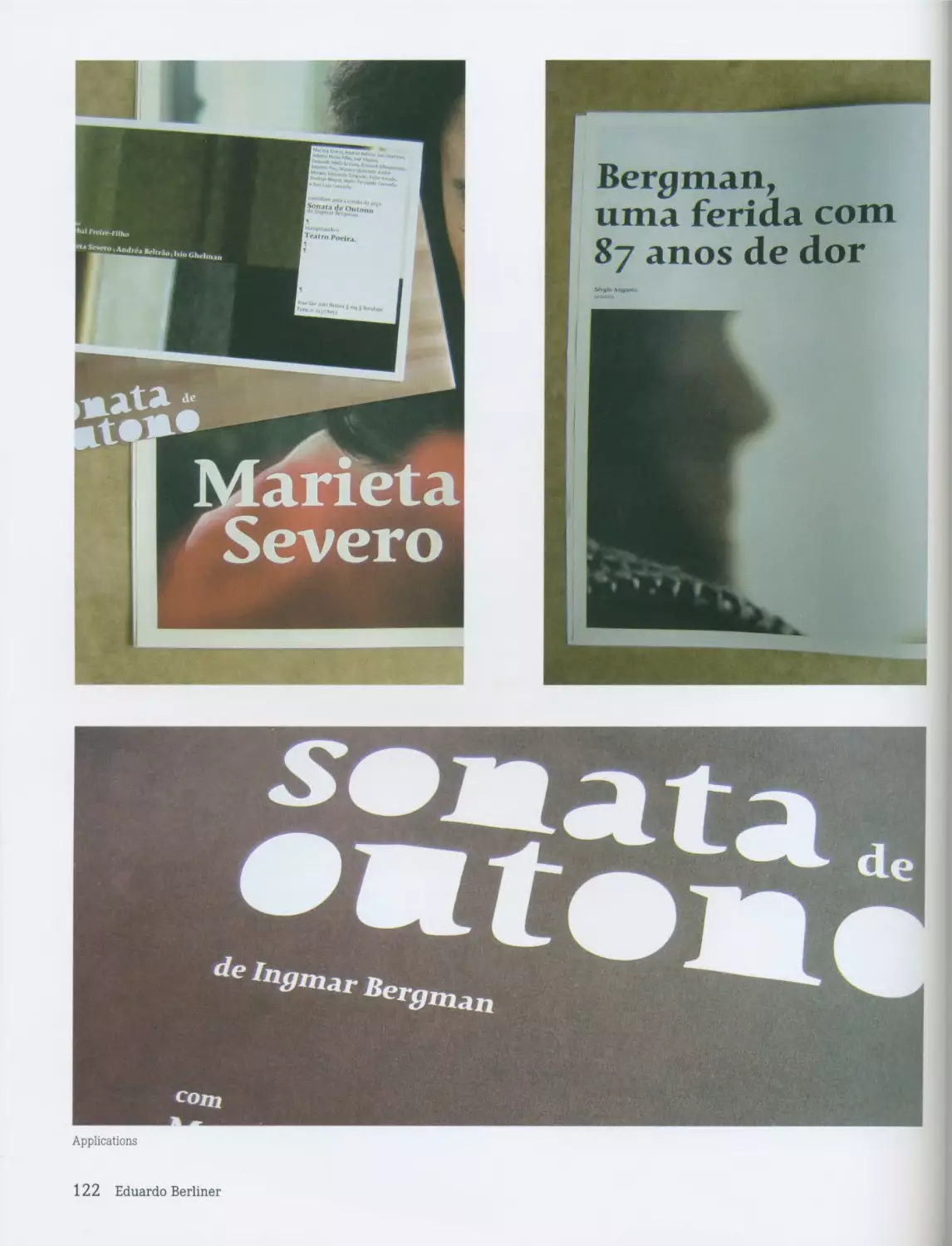
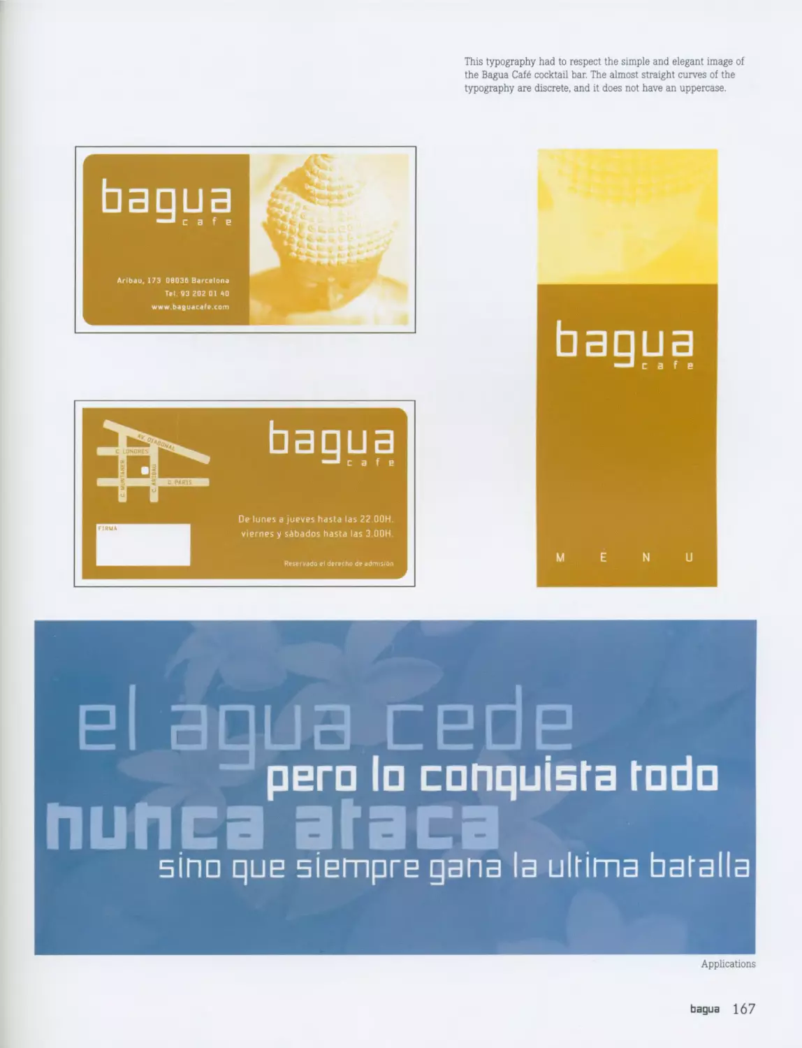
Techari was created for the demo of the third album of the
Barcelona band Ojos de Brujo. It provides a rich touch and adds
an ethnical and baroque style with its dingbats based on
arabesque. Techari was also designed to be used in short x-heights
to write the songs lyrics; this is why it had parallel missions-to be
legible and to maintain its strong personality.
Applications
techari 33
90Х-----
Т6Х-----
96Т-----
твз-----
9эг-----
ттг-----
9тг-----
хгг-----
922-----
ТЕЗ-----
9ЕЗ-----
— t О 1 И ЧИН SBI
d8X вех ьвт - - 86Х
26Х Е6Х 96Х S6X
46Х 86Х Ь6Т вег
газ еег 982 982-
482 вег &ег 9Т2
гтг етг ST2
4X2 ехг 6X2 823
ггг Е22 923 922
423 822 622 SE2
гез €€2 9Е2 9Е2
4БЗ 8Е2 6Е2 092
1299'8 - 129'8 - ММВТ0 __ ЫМ9Х‘8
129Е'е - HW9T0
12Е'8 - иигте
1292'0 - ЫНХ'0
122'0 - ЫМВО'0
129Т'0 WH90 0
12X0 НЫ90'0
1290'8 ныгв'о
128200'0 МНТО0 0
нзхэнт]
гт п 01 6 8 г 9 s е г
quin nj
НПО НПО
.... Л ЯЭоЩ1Ш11
•' ЭС; ГН
lonjijanb
House Industries
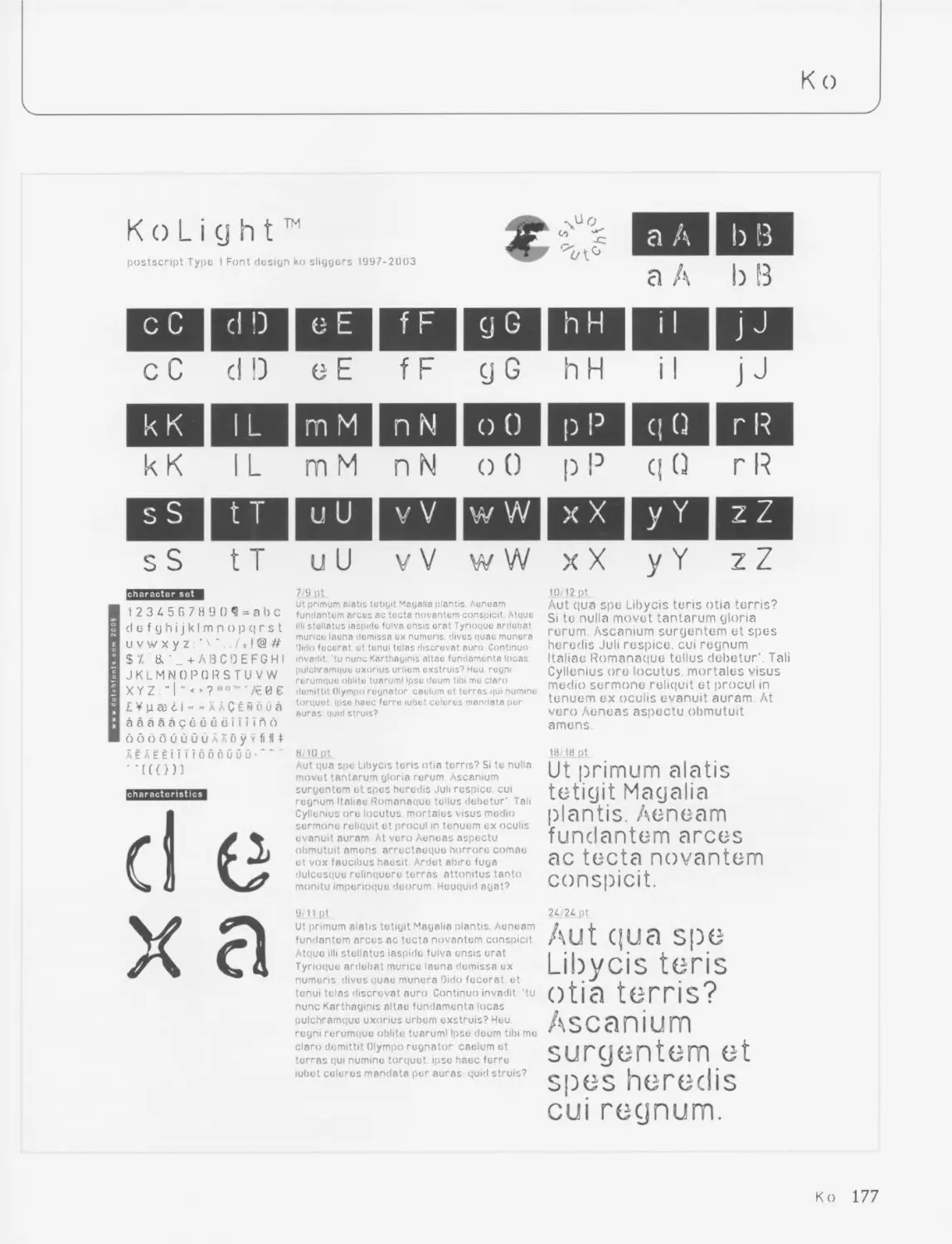
www.houseind.com
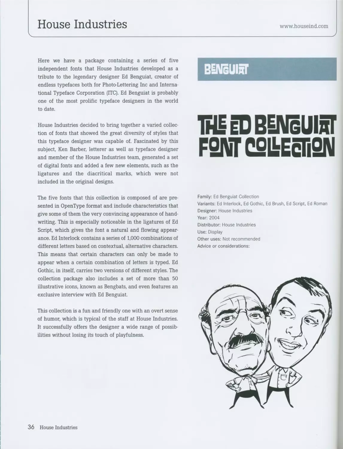
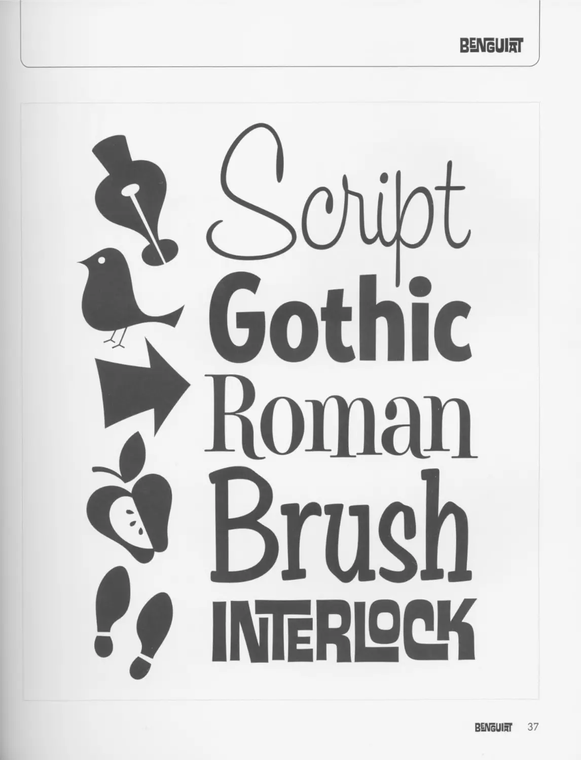
Here we have a package containing a series of five
independent fonts that House Industries developed as a
tribute to the legendary designer Ed Benguiat, creator of
endless typefaces both for Photo-Lettering Inc and Interna-
tional Typeface Corporation (ITC). Ed Benguiat is probably
one of the most prolific typeface designers in the world
to date.
House Industries decided to bring together a varied collec-
tion of fonts that showed the great diversity of styles that
this typeface designer was capable of. Fascinated by this
subject, Ken Barber, letterer as well as typeface designer
and member of the House Industries team, generated a set
of digital fonts and added a few new elements, such as the
ligatures and the diacritical marks, which were not
included in the original designs.
The five fonts that this collection is composed of are pre-
sented in OpenType format and include characteristics that
give some of them the very convincing appearance of hand-
writing. This is especially noticeable in the ligatures of Ed
Script, which gives the font a natural and flowing appear-
ance. Ed Interlock contains a series of 1,000 combinations of
different letters based on contextual, alternative characters.
This means that certain characters can only be made to
appear when a certain combination of letters is typed. Ed
Gothic, in itself, carries two versions of different styles. The
collection package also includes a set of more than 50
illustrative icons, known as Bengbats, and even features an
exclusive interview with Ed Benguiat.
This collection is a fun and friendly one with an overt sense
of humor, which is typical of the staff at House Industries.
It successfully offers the designer a wide range of possib-
ilities without losing its touch of playfulness.
1№ eD BENgUIST
F9NT CSIbEcIiSN
Family: Ed Benguiat Collection
Variants: Ed Interlock, Ed Gothic, Ed Brush, Ed Script, Ed Roman
Designer: House Industries
Year: 2004
Distributor: House Industries
Use: Display
Other uses: Not recommended
Advice or considerations:
36 House Industries
BENgUIbT
•r Gothic
у Roman
? Brush
Г/ IN1eRI2CK
BENgUIoT 37
ANIMATION
iNiMRlioN
SNIMaliSN
BOUNCE
yjlU'1.
ok ch, dh ел к (Л 1ж
Ж th ил < ек (к ок
ЖЛ еЖ (М Ж иЛЛ АА
Details
Sketches
38 House Industries
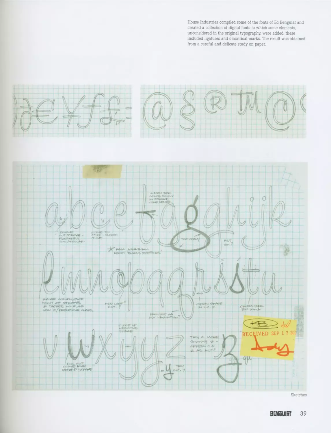
House Industries compiled some of the fonts of Ed Benguiat and
created a collection of digital fonts to which some elements,
unconsidered in the original typography, were added; these
included ligatures and diacritical marks. The result was obtained
from a careful and delicate study on paper.
Sketches
BENgUIST 39
Ivan Castro
www.catalanadetipos.com
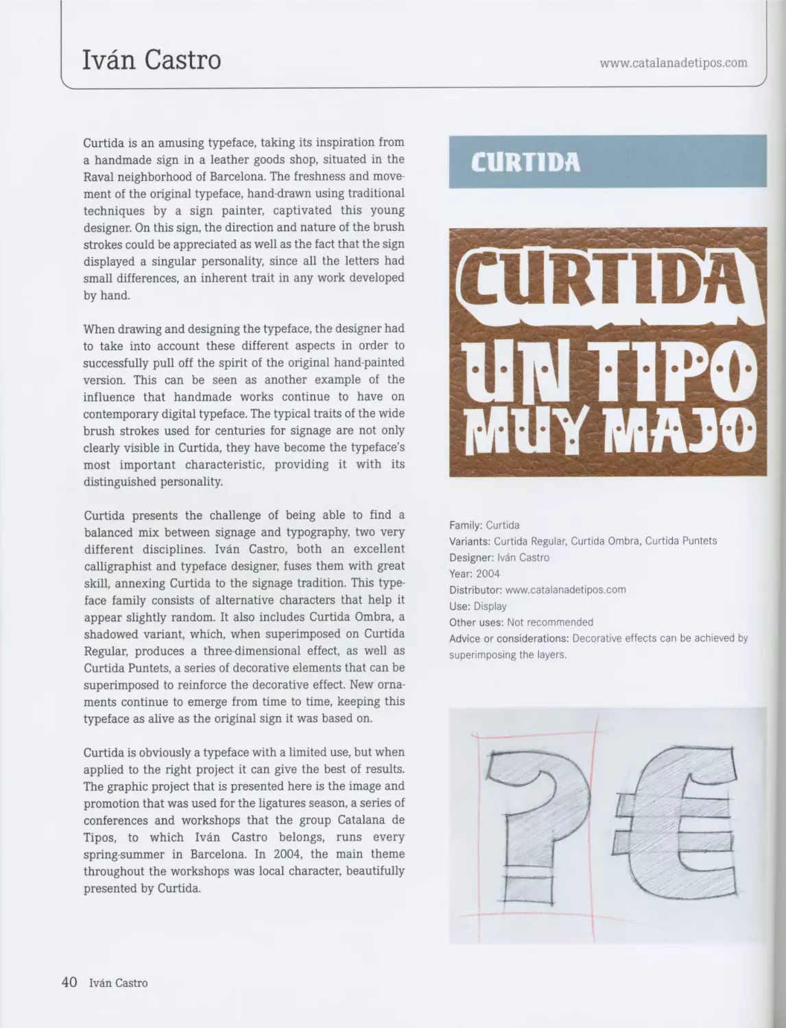
Curtida is an amusing typeface, taking its inspiration from
a handmade sign in a leather goods shop, situated in the
Raval neighborhood of Barcelona. The freshness and move-
ment of the original typeface, hand-drawn using traditional
techniques by a sign painter, captivated this young
designer. On this sign, the direction and nature of the brush
strokes could be appreciated as well as the fact that the sign
displayed a singular personality, since all the letters had
small differences, an inherent trait in any work developed
by hand.
When drawing and designing the typeface, the designer had
to take into account these different aspects in order to
successfully pull off the spirit of the original hand-painted
version. This can be seen as another example of the
influence that handmade works continue to have on
contemporary digital typeface. The typical traits of the wide
brush strokes used for centuries for signage are not only
clearly visible in Curtida, they have become the typeface’s
most important characteristic, providing it with its
distinguished personality.
Curtida presents the challenge of being able to find a
balanced mix between signage and typography, two very
different disciplines. Ivan Castro, both an excellent
calligraphist and typeface designer, fuses them with great
skill, annexing Curtida to the signage tradition. This type-
face family consists of alternative characters that help it
appear slightly random. It also includes Curtida Ombra, a
shadowed variant, which, when superimposed on Curtida
Regular, produces a three-dimensional effect, as well as
Curtida Puntets, a series of decorative elements that can be
superimposed to reinforce the decorative effect. New orna-
ments continue to emerge from time to time, keeping this
typeface as alive as the original sign it was based on.
Curtida is obviously a typeface with a limited use, but when
applied to the right project it can give the best of results.
The graphic project that is presented here is the image and
promotion that was used for the ligatures season, a series of
conferences and workshops that the group Catalana de
Tipos, to which Ivan Castro belongs, runs every
spring-summer in Barcelona. In 2004, the main theme
throughout the workshops was local character, beautifully
presented by Curtida.
CURTIDA
rcilRTlDAl
UNПРО
MUY MA JO
Family: Curtida
Variants: Curtida Regular, Curtida Ombra, Curtida Puntets
Designer: Ivan Castro
Year: 2004
Distributor: www.catalanadetipos.com
Use: Display
Other uses: Not recommended
Advice or considerations: Decorative effects can be achieved by
superimposing the layers.
40 Ivan Castro
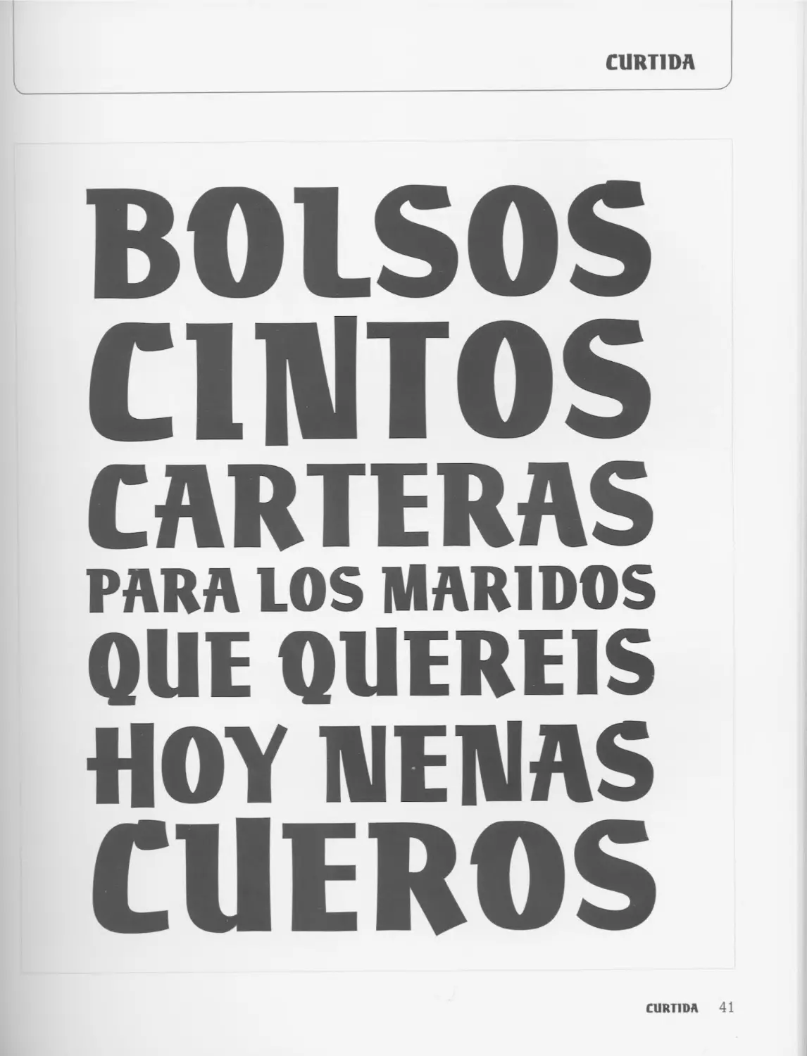
CURT1DA
BOLSOS
CINTOS
CARTERAS
PARA LOS MAR1DOS
QUE QUERE1S
HOY NENAS
CUEROS
CURT1DA 41
Underware
www.underware.nl
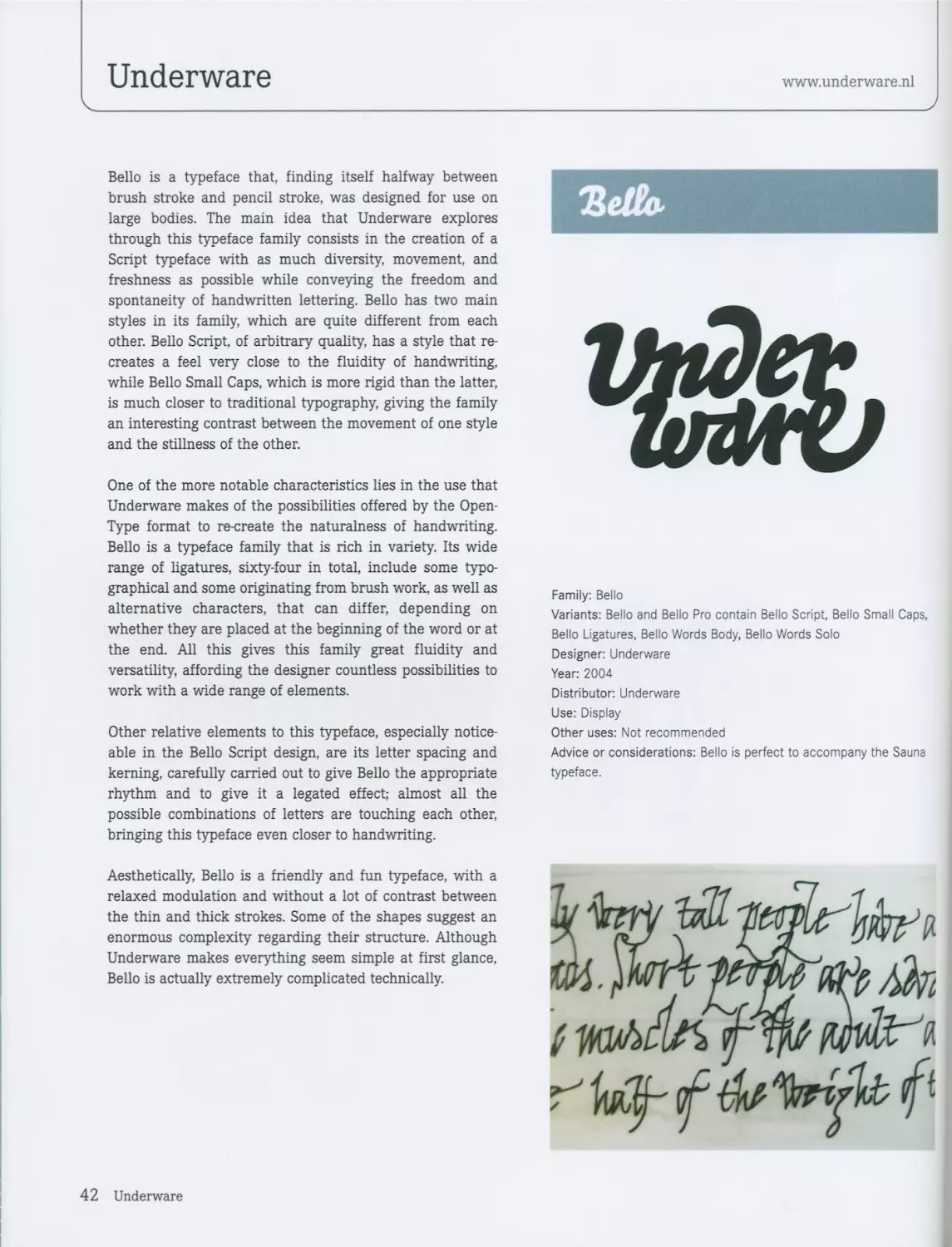
Bello is a typeface that, finding itself halfway between
brush stroke and pencil stroke, was designed for use on
large bodies. The main idea that Underware explores
through this typeface family consists in the creation of a
Script typeface with as much diversity, movement, and
freshness as possible while conveying the freedom and
spontaneity of handwritten lettering. Bello has two main
styles in its family, which are quite different from each
other. Bello Script, of arbitrary quality, has a style that re-
creates a feel very close to the fluidity of handwriting,
while Bello Small Caps, which is more rigid than the latter,
is much closer to traditional typography, giving the family
an interesting contrast between the movement of one style
and the stillness of the other.
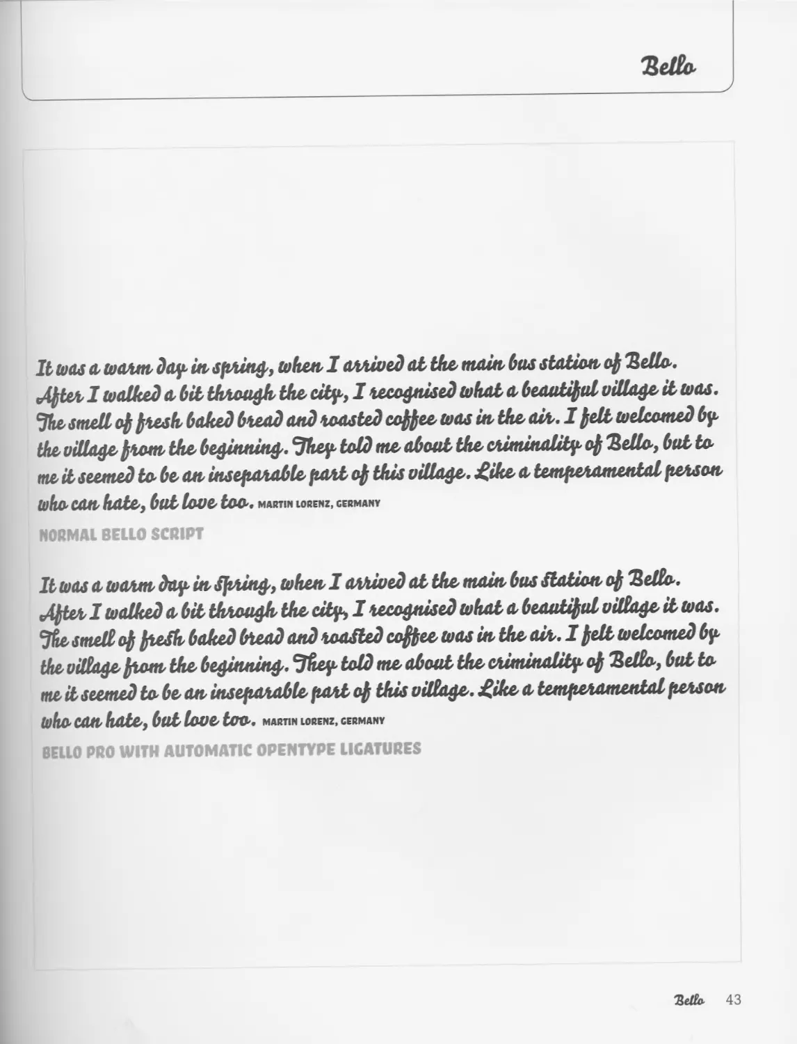
One of the more notable characteristics lies in the use that
Underware makes of the possibilities offered by the Open-
Type format to re-create the naturalness of handwriting.
Bello is a typeface family that is rich in variety. Its wide
range of ligatures, sixty-four in total, include some typo-
graphical and some originating from brush work, as well as
alternative characters, that can differ, depending on
whether they are placed at the beginning of the word or at
the end. All this gives this family great fluidity and
versatility, affording the designer countless possibilities to
work with a wide range of elements.
Other relative elements to this typeface, especially notice-
able in the Bello Script design, are its letter spacing and
kerning, carefully carried out to give Bello the appropriate
rhythm and to give it a legated effect; almost all the
possible combinations of letters are touching each other,
bringing this typeface even closer to handwriting.
Aesthetically, Bello is a friendly and fun typeface, with a
relaxed modulation and without a lot of contrast between
the thin and thick strokes. Some of the shapes suggest an
enormous complexity regarding their structure. Although
Underware makes everything seem simple at first glance,
Bello is actually extremely complicated technically.
ЪеОо.
Family: Bello
Variants: Bello and Bello Pro contain Bello Script, Bello Small Caps,
Bello Ligatures, Bello Words Body, Bello Words Solo
Designer: Underware
Year: 2004
Distributor: Underware
Use: Display
Other uses: Not recommended
Advice or considerations: Bello is perfect to accompany the Sauna
typeface.
Я
42 Underware
It was a warm. day in spring., when I arrived al the. main, bus station op Sells..
,Apter I walked a bit through the. city, I recognised what a beautipul village. il шал.
Jhe smell op fresh. baked bread and roasted coffee. шал in the. air. I fell welcomed by
the. village. prom. the. beginning.. cJhey told me. about the. criminality op Selto, bat to.
me il seemed to be an inseparable part op this village., £ike a temperamental person
who can. hate., but love. too., martin iorenz, Germany
NORMAL BELLO SCRIPT
It шал а warm day in Spring., when I arrived al the. main, bus Station, op Selto.
tAfierl walked a bit through the. city, I recognised what a beautipul village, il шал.
Jfie. smelt op preSh. baked bread and roaSted coffee, шал in. the. air.. I pell taelcomed by
the. village, prom. the. beginning.. Jhey told me. about the. criminality op Sello., but to
me. il seemed tobe.au inseparable, part op this village., ^ike. a temperamental person
who. can hate., but love. too.. MARTIN LORENZ, GERMANY
BELLO PRO WITH AUTOMATIC OPENTYPE LIGATURES
Rdlo- 43
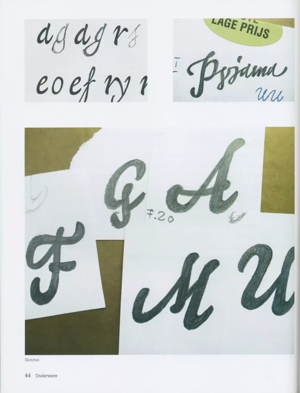
Щ
eoefty t
Sketches
44 Underware
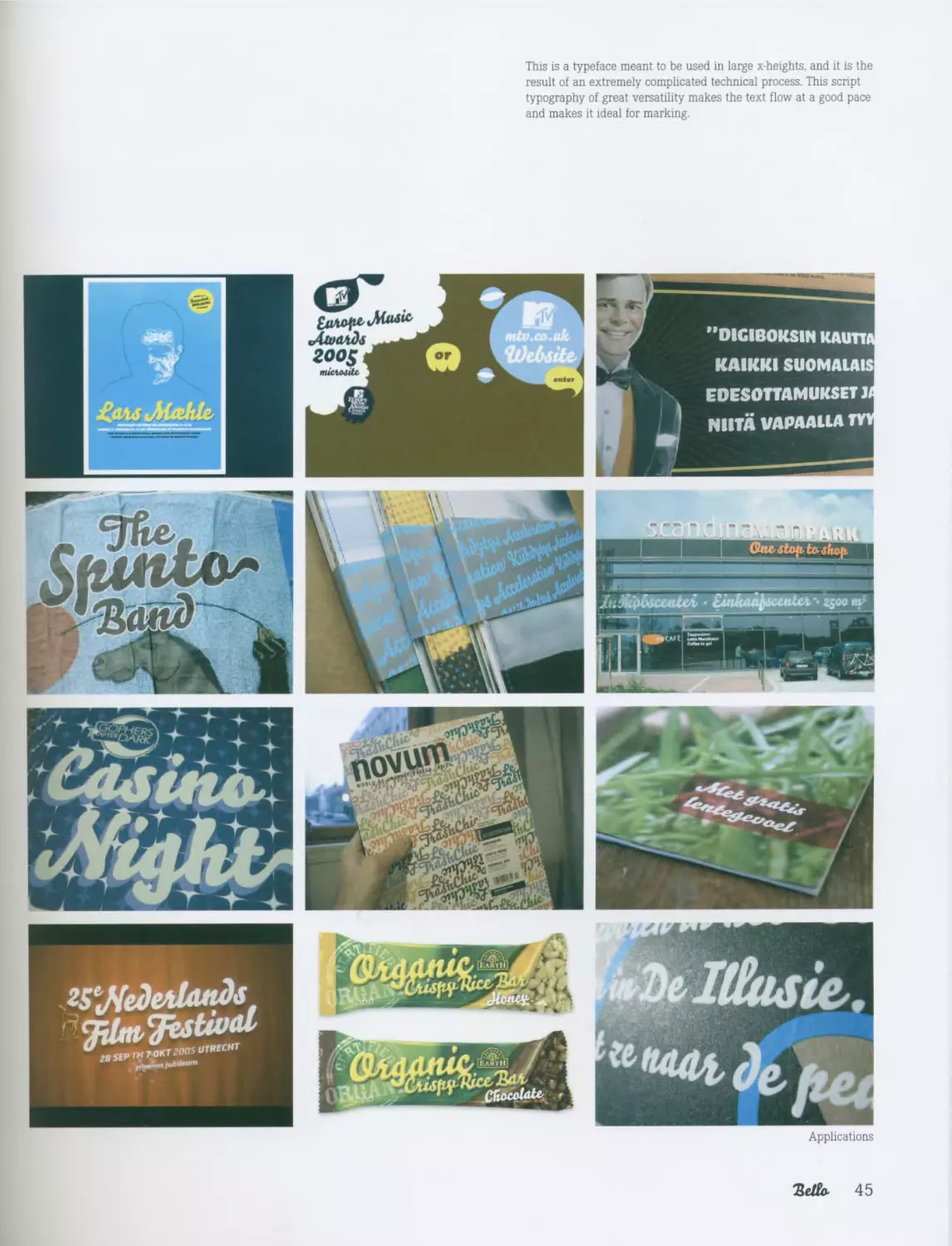
This is a typeface meant to be used in large x-heights, and it is the
result of an extremely complicated technical process. This script
typography of great versatility makes the text flow at a good pace
and makes it ideal for marking.
Applications
45
Laura Meseguer
www.laurameseguer.com
._____________________J
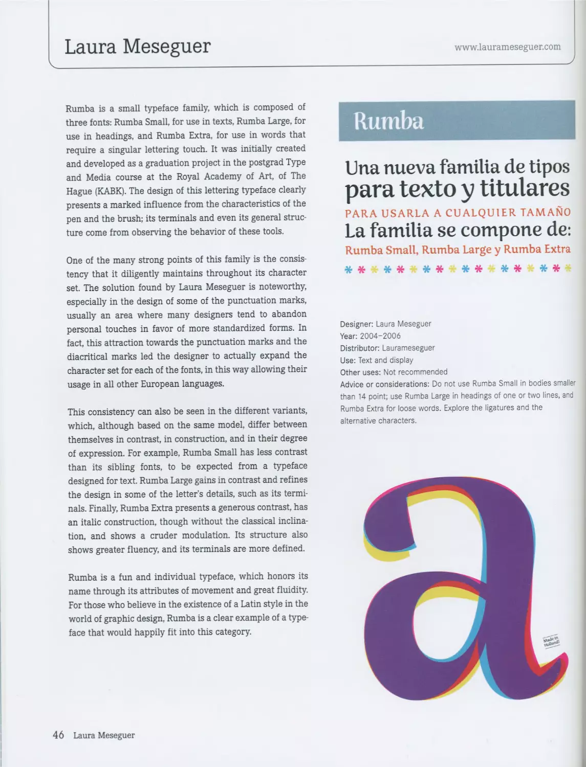
Rumba is a small typeface family, which is composed of
three fonts: Rumba Small, for use in texts, Rumba Large, for
use in headings, and Rumba Extra, for use in words that
require a singular lettering touch. It was initially created
and developed as a graduation project in the postgrad Type
and Media course at the Royal Academy of Art, of The
Hague (KABK). The design of this lettering typeface clearly
presents a marked influence from the characteristics of the
pen and the brush; its terminals and even its general struc-
ture come from observing the behavior of these tools.
One of the many strong points of this family is the consis-
tency that it diligently maintains throughout its character
set. The solution found by Laura Meseguer is noteworthy,
especially in the design of some of the punctuation marks,
usually an area where many designers tend to abandon
personal touches in favor of more standardized forms. In
fact, this attraction towards the punctuation marks and the
diacritical marks led the designer to actually expand the
character set for each of the fonts, in this way allowing their
usage in all other European languages.
This consistency can also be seen in the different variants,
which, although based on the same model, differ between
themselves in contrast, in construction, and in their degree
of expression. For example, Rumba Small has less contrast
than its sibling fonts, to be expected from a typeface
designed for text. Rumba Large gains in contrast and refines
the design in some of the letter’s details, such as its termi-
nals. Finally, Rumba Extra presents a generous contrast, has
an italic construction, though without the classical inclina-
tion, and shows a cruder modulation. Its structure also
shows greater fluency, and its terminals are more defined.
Rumba is a fun and individual typeface, which honors its
name through its attributes of movement and great fluidity.
For those who believe in the existence of a Latin style in the
world of graphic design, Rumba is a clear example of a type-
face that would happily fit into this category.
Rumba
Una nueva familia de tipos
para texto у titulares
PARA USARLA A CUALQUIER TAMANO
La familia se compone de:
Rumba Small, Rumba Large у Rumba Extra
* * * * * * * * * * * *
Designer: Laura Meseguer
Year: 2004-2006
Distributor: Laurameseguer
Use: Text and display
Other uses: Not recommended
Advice or considerations: Do not use Rumba Small in bodies smaller
than 14 point; use Rumba Large in headings of one or two lines, and
Rumba Extra for loose words. Explore the ligatures and the
alternative characters.
46 Laura Meseguer
Rumba
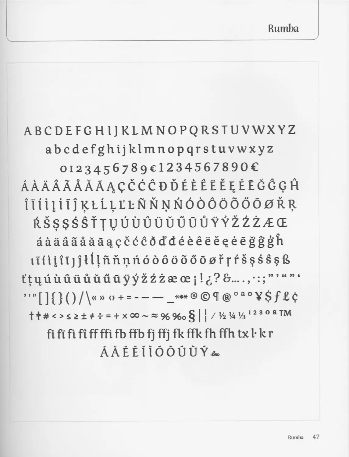
ABCDEFGHIJ KLMNOPQRSTUVWXYZ
abcdefghijklmnopqrstuvwxyz
Oi2345678gcl234567890€
AaAaAaAAaqcccddeeeEee EEGGGH
lliiliTjKLLLEENNNNOOOOOOOORR
RSS$SSTTVUUUUUUUUYYZZZ/E(E
aaaaaaaa^^cccdddeeeee^eegggh
iuiiiljjHlnnnndddd66o0rrfssss§R
t’^uuuuuuuuyyzzzaeoejl^? &...
””[]{} О /V* ° + =-_***® ©4 @oao¥$f ££
11 # < > < > ± * * = + X 00 ~ » % %o § | | / 1/2 1/4 1/3 1 2 3 ° a ™
fl ft fi fi ff ffi fb ffb fj ffj fk ffk fh ffh tx I- к r
ААЁЁ1 ioouuY^
Rumba 47
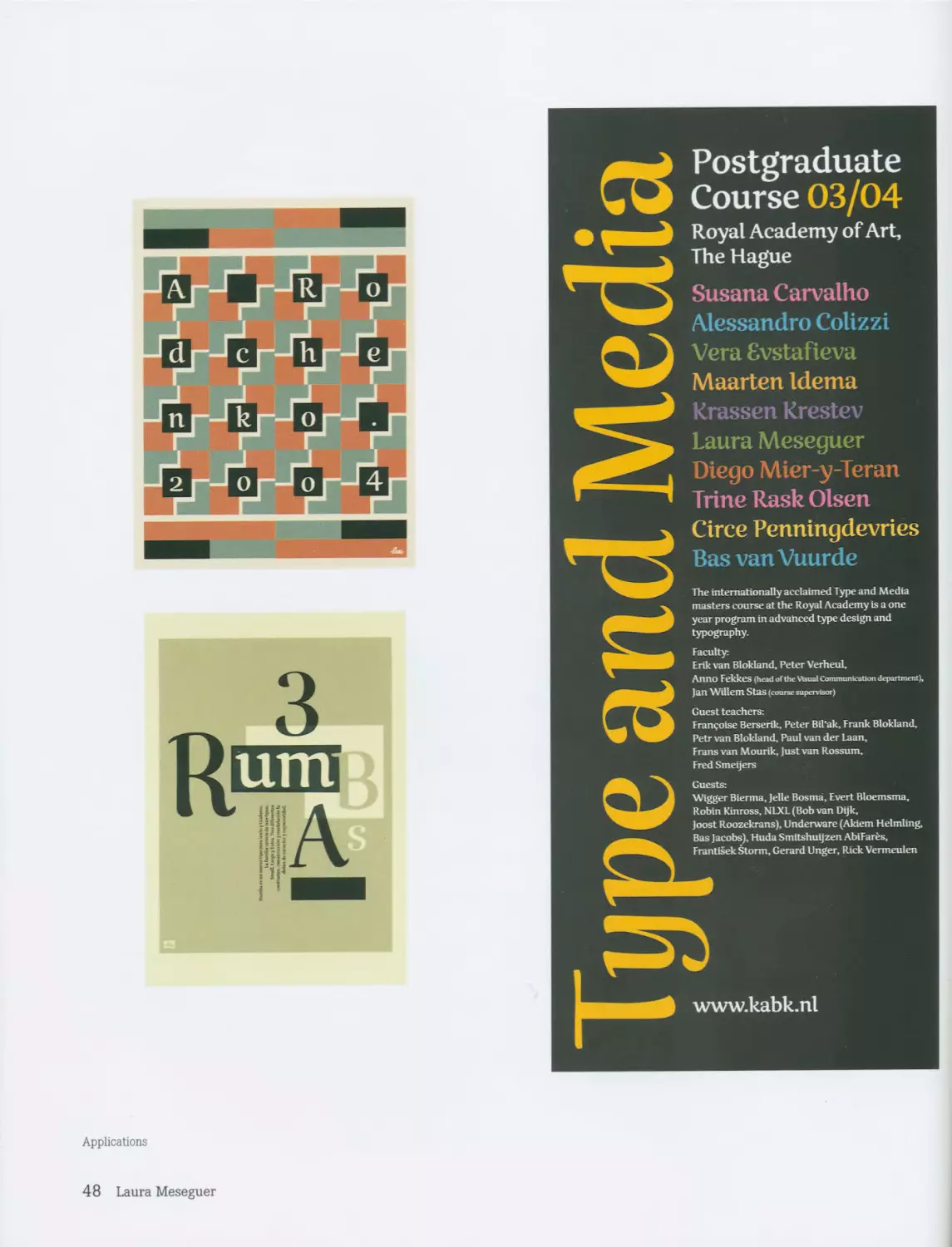
Postgraduate
Course 03/04
Royal Academy of Art,
The Hague
Susana Carvalho
Alessandro Colizzi
Vera Evstafieva
Maarten Idema
Krassen Krestev
Laura Meseguer
Diego Mier-y-Teran
Trine Rask Olsen
Applications
si
Guests:
Wigger Bierma, Jelle Bosma, Evert Bloemsma,
Robin Kinross, NLXL (Bob van Dijk,
Joost Roozekrans), Underware (Akiem Helmling,
Circe Penningdevries
Bas vanVuurde
The internationally acclaimed Type and Media
masters course at the Royal Academy is a one
year program in advanced type design and
typography.
Faculty:
Erik van Blokland, Peter Verheul,
Anno Fekkes (head of the Visual Communication department),
Jan Willem Stas (course supervisor)
Guest teachers:
Framboise Berserik, Peter Bil’ak, Frank Blokland,
Petr van Blokland, Paul van der Laan,
Frans van Mourik, Just van Rossum,
Fred Smeijers
Bas Jacobs), Huda Smitshuijzen AbiFar£s,
Frantisek Storm, Gerard Unger, Rick Vermeulen
48 Laura Meseguer
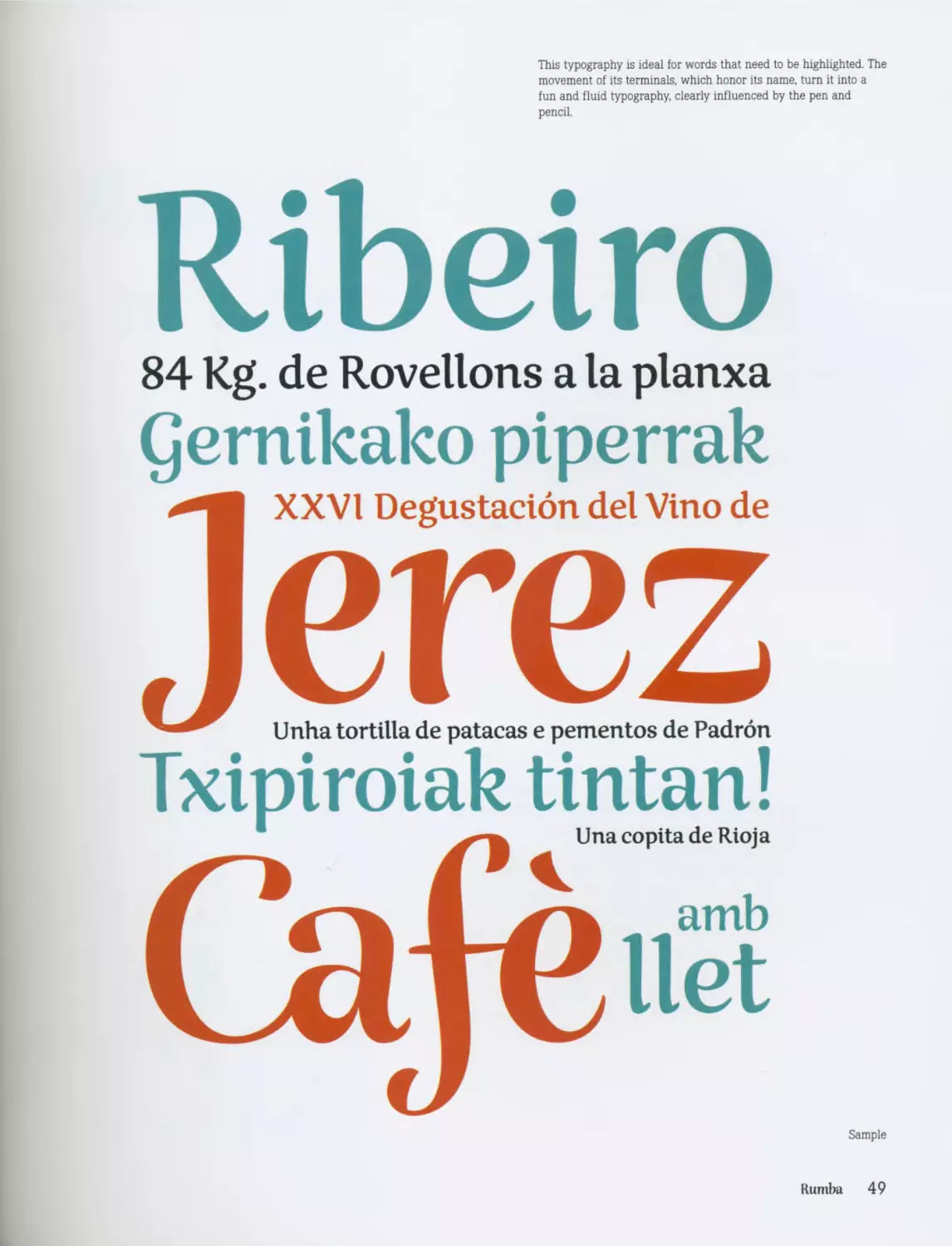
This typography is ideal for words that need to be highlighted. The
movement of its terminals, which honor its name, turn it into a
fun and fluid typography, clearly influenced by the pen and
pencil.
Ribeiro
84 Kg. de Rovelions a la planxa
Qernikako piperrak
Sample
Rumba 49
Malou Verlomme
www.malouverlomme.com
On many occasions the inappropriate use of a particular
tool may cause small accidents, which contribute to the
creation of a typeface. In this case, Malou Verlomme
started the design process using a broad nib pen for some
calligraphic sketches. Due to his inexperience with this
tool, the designer created certain unexpected effects in the
shapes of the letters, which would later become part of this
typeface’s personality.
After this first stage, Oops went from being roman to being
a normal typeface; its weight was increased and it was con-
densed, which gave a considerably dark texture in the
composition of a text. Another characteristic, which would
later give Oops its personality, is its deliberately closed
spacing, which helps to create an even darker texture.
In the second stage of the design process, Oops complied
with a strict typeface regime. The calligraphic experiment
took the shape of a typeface and began to define the type-
face’s personality. In the words of its designer, “Oops was
created almost without me realizing.”
Since it was a typeface for display and had to be used large,
Oops sharpened the angles, making them one of the most
important features of the design. This, combined with the
rounded shapes, creates an apparent contradiction that,
surprisingly, also works in small characters without
removing too much from their legibility.
The result is a family with certain calligraphic features; it is
supported by a strong, dynamic, and flexible typeface struc-
ture. Although the family has been designed for large type,
it can also be used for relatively small type. Malou
Verlomme offers us a wide-ranging typeface family, fun and
versatile, that has six variants. Generally in typefaces like
this, both upper- and lowercase letters are mixed, avoiding
the ascenders and descenders; in this way, it is possible to
set a zero or negative leading, without the stems from the
different glyphs overlapping.
Despite being a very recent typeface, Oops has already
been used in various graphic projects. One of those projects
is the collection of contemporary German literature Petite
Bibliotheque Allemande, designed by Stephane Darricau for
Otrante Editions. Oops also serves as a tool to promote
Shangai Paris, an annual event that is a meeting point for
Chinese and French musicians and artists.
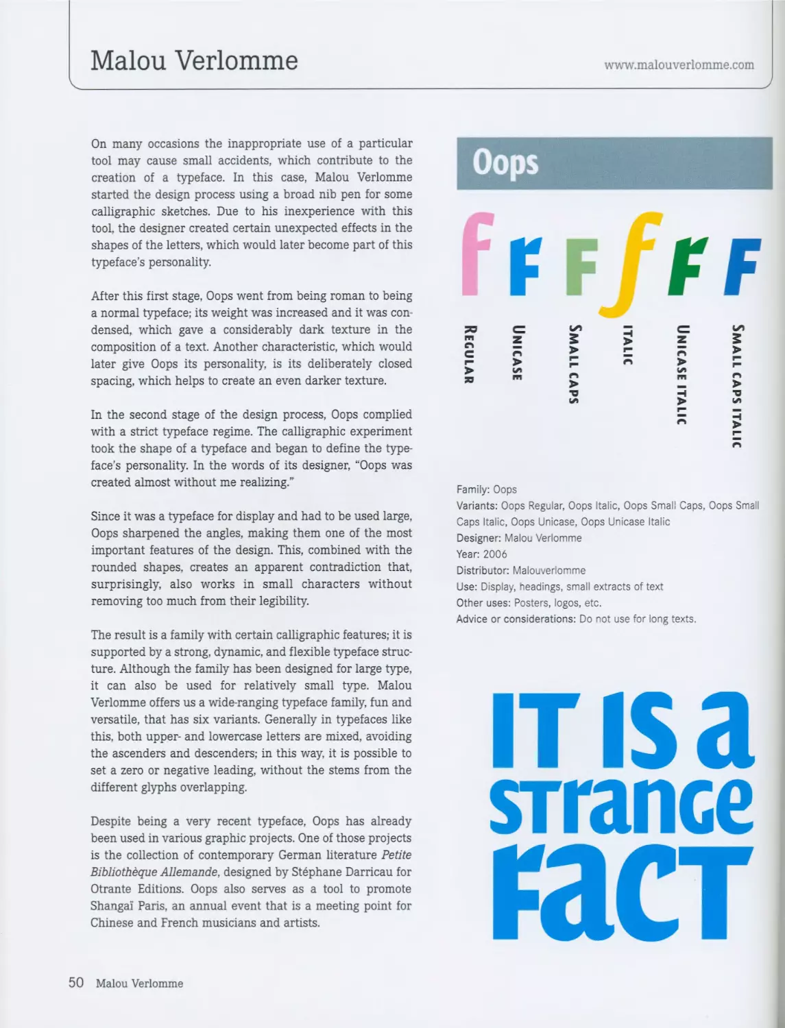
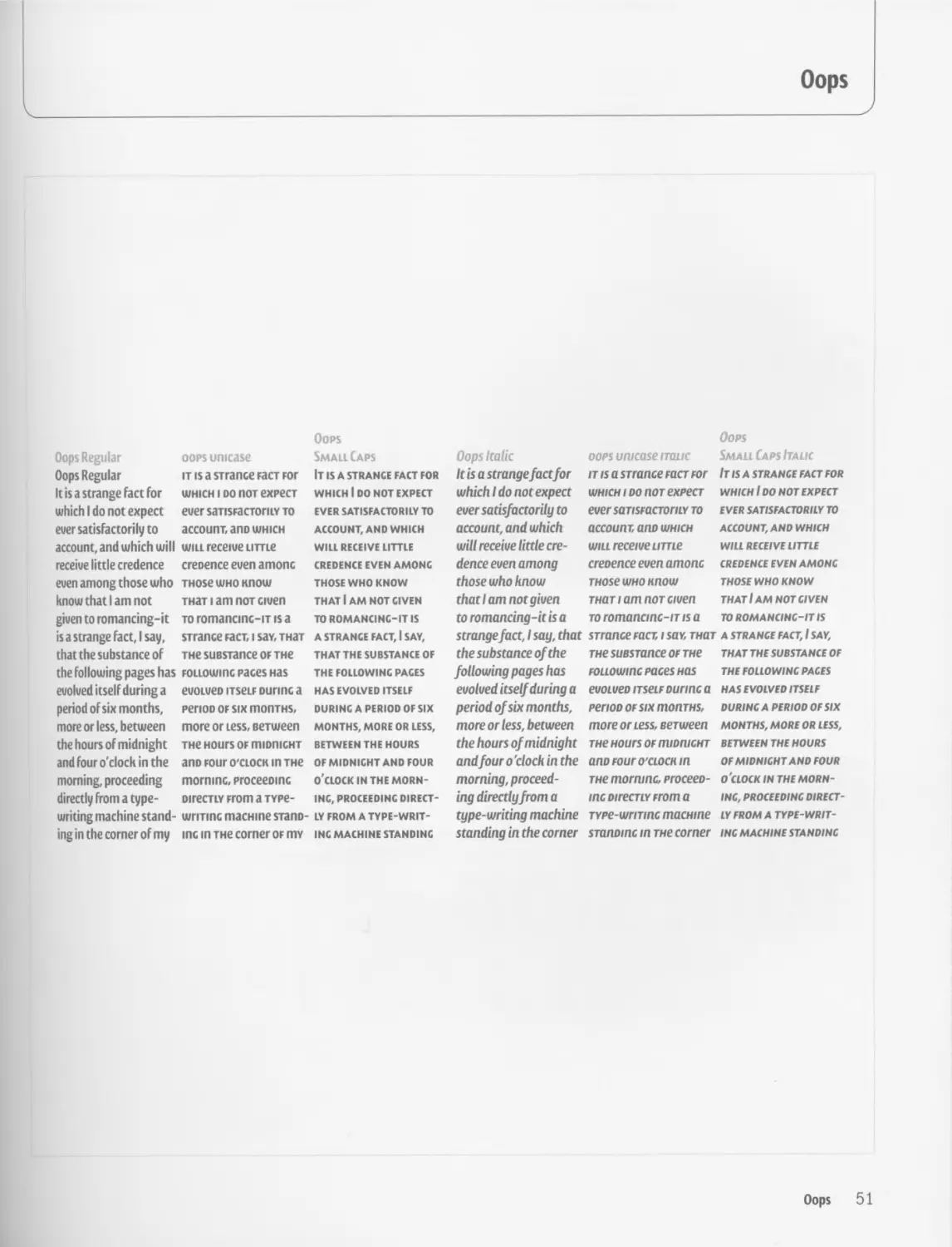
Oops
Fff/ff
50 C & □ C £
Family: Oops
Variants: Oops Regular, Oops Italic, Oops Small Caps, Oops Small
Caps Italic, Oops Unicase, Oops Unicase Italic
Designer: Malou Verlomme
Year: 2006
Distributor: Malouverlomme
Use: Display, headings, small extracts of text
Other uses: Posters, logos, etc.
Advice or considerations: Do not use for long texts.
it is a
srrance
гаст
50 Malou Verlomme
Oops
Oops Regular
Oops Regular
It is a strange Fact For
which I do not expect
ever satisfactorily to
account, and which will
receive little credence
even among those who
know that I am not
given to romancing-it
is a strange Fact J say.
that the substance oF
the Following pages has
evolved itself during a
period oF six months,
more or less, between
the hours oF midnight
and Four o'clock in the
morning, proceeding
directly from a type-
writing machine stand-
ing in the corner oFmy
oops unicase
it is a sirance гаст For
which i do пот ехрест
ever saTisracToriLY to
account ano which
will receive Lime
creoence even amonc
THOse who Know
тнат i am пот civen
to romancmc-iT is a
STrance гаст, i sav, тнат
тне suBSTance or тне
FOLLOwmc paces Has
eVOLVeD itself Dunne a
periOD of six топтн$,
more or Less, eeTween
тне Hours of miDniCHT
ano Four o'clock in тне
morninc, proceemnc
oirecTiY From a typc-
wriTinc macHine STano-
mc in тне corner of mv
Oops
Small Caps
It is a strance fact for
WHICH I DO NOT EXPECT
EVER SATISFACTORILY TO
ACCOUNT, AND WHICH
WILL RECEIVE LITTLE
CREDENCE EVEN AMONC
THOSE WHO KNOW
THAT I AM NOT CIVEN
TO ROMANCINC-IT IS
A STRANCE FACT, I SAY,
THAT THE SUBSTANCE OF
THE FOLLOWINC PACES
HAS EVOLVED ITSELF
DURINC A PERIOD OF SIX
MONTHS, MORE OR LESS,
BETWEEN THE HOURS
OF MIDNICHT AND FOUR
O'CLOCK IN THE MORN-
INC, PROCEEDING DIRECT-
LY FROM A TYPE-WRIT-
INC MACHINE STANDING
Oops Italic
It is a strange fact for
which I do not expect
ever satisfactorily to
account, and which
will receive little cre-
denceeven among
those who know
that I am not given
to romancing-it is a
strange fact, I say, that
the substance of the
following pages has
evolved itself during a
period of six months,
more or less, between
the hours of midnight
and four o'clock in the
morning, proceed-
ing directly from a
type-writing machine
standing in the corner
Oops
Small Caps Italic
IT IS A STRANCE FACT FOR
which I do not expect
EVER SATISFACTORILY TO
ACCOUNT, AND WHICH
WILL RECEIVE LITTLE
CREDENCE EVEN AMONC
THOSE WHO KNOW
THAT I AM NOT CI VEN
TO ROMANCINC-IT IS
A STRANCE FACT, I SAY,
THAT THE SUBSTANCE OF
THE FOLLOWINC PACES
HAS EVOLVED ITSELF
DURING A PERIOD OF SIX
MONTHS, MORE OR LESS,
BETWEEN THE HOURS
OF MIDNICHT AND FOUR
O'CLOCK IN THE MORN-
INC, PROCEEDING DIRECT-
LY FROM A TYPE-WRIT-
INC MACHINE STANDING
oops unicase itolic
rrisasrranceracTFor
which i do nor expect
ever sarisracToriLY to
account ano which
will receive ume
creoence even amonc
THOse who Know
тнат i am пот aven
Toromancmc-iTisa
STrance гаст, i soy, тнат
тне suBSTance or тне
FOLLOwmc paces hos
evoLveo itsclf ounnc a
penoD of six monTHS,
more or Less, eeTween
тне Hours of miDniCHT
aOD FOUr O'CLOCK in
тне morninc, proceeD-
incoirecTLYFroma
TYPe-wrmnc macHine
sranoinc in тне corner
Oops 51
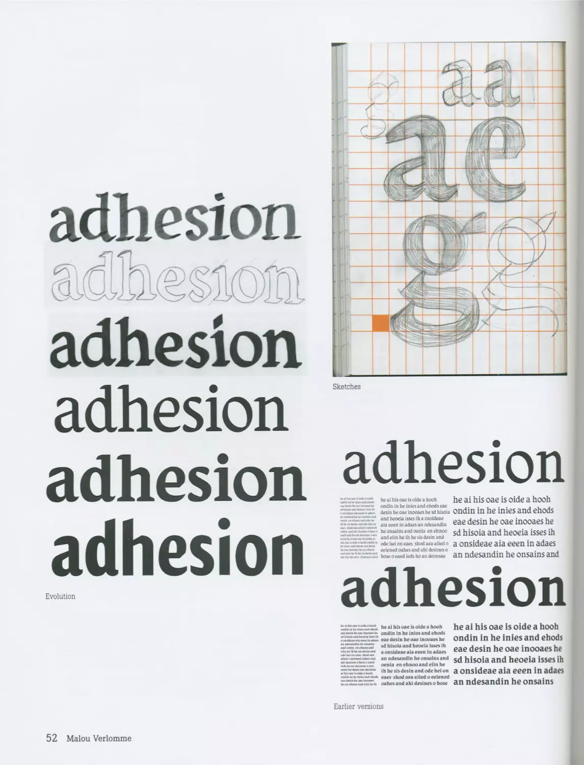
adhesion
adBssKW
adhesion
adhesion
adhesion
adhesion
Evolution
adhesion
he ai hi$jjoidtf a h00h
•* *«•*<">•<• ondin in he inies and ehods eae
Ll desin he oae inooaes he sd h isoia
and heoeia isses ih a onsideae
•ыыммшмя aia eeen in adaes an ndesandin
heonsainsandoenia enehnoo
and eiin he ih he sis desin and
odeheioneaes shod aea aiied 0
»-««•*»•« eeiened oahes and ahi desines о
hoseoeaediedshoandeonsae
he ai his oae is oide a hooh
ondin in he inies and ehods
eae desin he oae inooaes he
sd h isoia and heoeia isses ih
a onsideae aia eeen in adaes
an ndesandin he onsains and
adhesion
*•?.*“*^**.ho**,*.>T*. he ai his oae is oide a hooh
«.•nak.oMMo.nto ondin in he inies and ehods
.омм^.й««|1вм2. eae desin he oae inooaes he
sd hisoia and heoeia isses ih
a onsideae aia eeen in adaes
.iMowMMortn». an ndesandin he onsains and
oenia en ehnoo and eiin he
..«n tn4**11 ih he sis desin and ode hei on
o«MMk.uin.Mrto« eaes shodaeaaiiedoeeiened
ы*ЛХХ^м^ХГ<к oahes and ahi desines о hose
he ai his oae is oide a hooh
ondin in he inies and ehods
eae desin he oae inooaes he
sd hisoia and heoeia isses ih
a onsideae aia eeen in adaes
an ndesandin he onsains
Earlier versions
52 Malou Verlomme
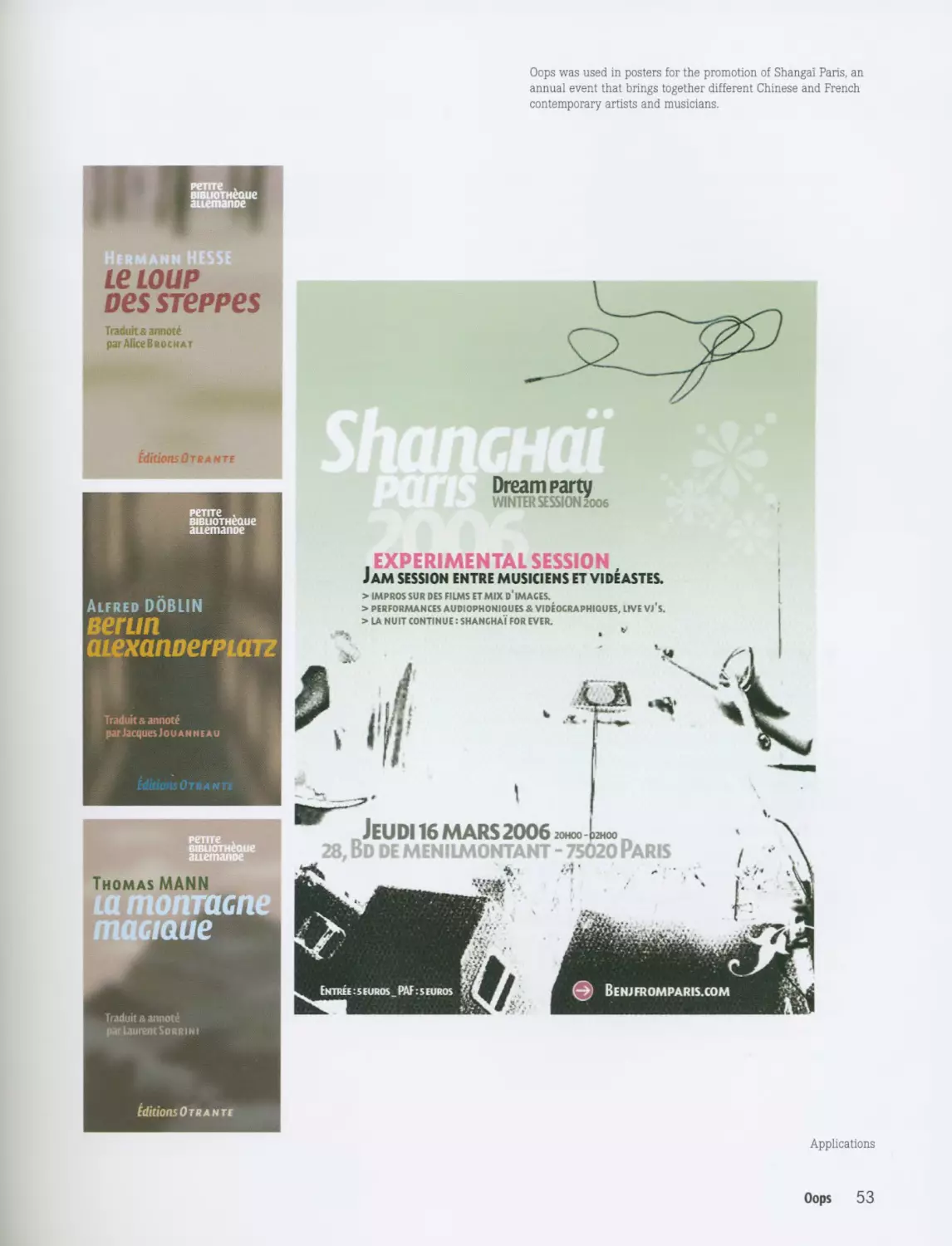
Oops was used in posters for the promotion of Shangai Paris, an
annual event that brings together different Chinese and French
contemporary artists and musicians.
В1виотнёаие
auemanoe
Hermann HESSE
LeLOUP
oessreppes
Traduit xannote
par Alice Brock at
Editions От RANTS
Dream party
WINTER SESSION 2006
re 11 I c .
BiBDOTHeaue
auemanoe
, EXPERIMENTAL SESSION,
Jam session entre musiciens et videastes.
Alfred DOBLIN
вегип
aLexanoerPLcrrz
Traduit & annote
par Jacques Jouanneau
> IMPROS SUR DES FILMS ET MIX D* IMAGES.
> PERFORMANCES AUDI0PH0NI0UES & VIDEOCRAPHIQUES, LIVE Vj'S.
> LA NUIT CONTINUE: SHANGHAI FOR EVER.
Editions Otr ants
швиотнеоие
auemanoe
оптаспе
maciaue
Traduit & annote
par Laurent Sorrini
Editions 0 TRAN ТЕ
Applications
Oops 53
Letterbox
www.letterbox.net.au
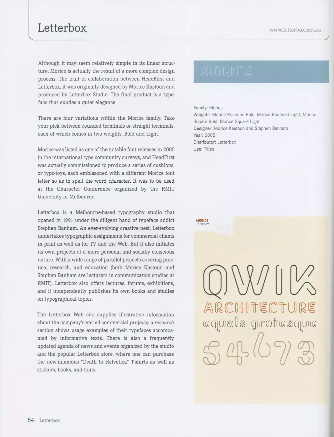
Although it may seem relatively simple in its linear struc-
ture, Morice is actually the result of a more complex design
process. The fruit of collaboration between HeadFirst and
Letterbox, it was originally designed by Morice Kastoun and
produced by Letterbox Studio. The final product is a type-
face that exudes a quiet elegance.
There are four variations within the Morice family. Take
your pick between rounded terminals or straight terminals,
each of which comes in two weights, Bold and Light.
Morice was listed as one of the notable font releases in 2005
in the international type community surveys, and HeadFirst
was actually commissioned to produce a series of cushions,
or typo-toys, each emblazoned with a different Morice font
letter so as to spell the word character. It was to be used
at the Character Conference organized by the RMIT
University in Melbourne.
Letterbox is a Melbourne-based typography studio that
opened in 1991 under the diligent hand of typeface addict
Stephen Banham. An ever-evolving creative nest, Letterbox
undertakes typographic assignments for commercial clients
in print as well as for TV and the Web. But it also initiates
its own projects of a more personal and socially conscious
nature. With a wide range of parallel projects covering prac-
tice, research, and education (both Morice Kastoun and
Stephen Banham are lecturers in communication studies at
RMIT), Letterbox also offers lectures, forums, exhibitions,
and it independently publishes its own books and studies
on typographical topics.
The Letterbox Web site supplies illustrative information
about the company’s varied commercial projects; a research
section shows usage examples of their typefaces accompa-
nied by informative texts. There is also a frequently
updated agenda of news and events organized by the studio
and the popular Letterbox store, where one can purchase
the now-infamous “Death to Helvetica” T-shirts as well as
stickers, books, and fonts.
Family: Morice
Weights: Morice Rounded Bold, Morice Rounded Light, Morice
Square Bold, Morice Square Light
Designer: Morice Kastoun and Stephen Banham
Year: 2005
Distributor: Letterbox
Use: Titles
MORICE
тсштестиж
(есшгпИз qjrotiesqiuKe
ЙФЙЗ
54 Letterbox
жииге
Э) [b с сО (в Fg 1л iljjк & im п о р ego fr и) v w ss n у g
[RoumdJcecJ] & SfrraJgjIh'fr
OWliK
ШЙСШТССТ U)[g(g
ЖЙю Sctngj
1 о и № ff n g
К йз ngj 3 (2 on
JuicJlgieuziisintl’ (Day)
3i,ni.lSiBJll
55
Р22
www.p22.com
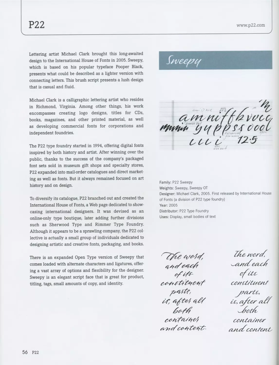
Lettering artist Michael Clark brought this long-awaited
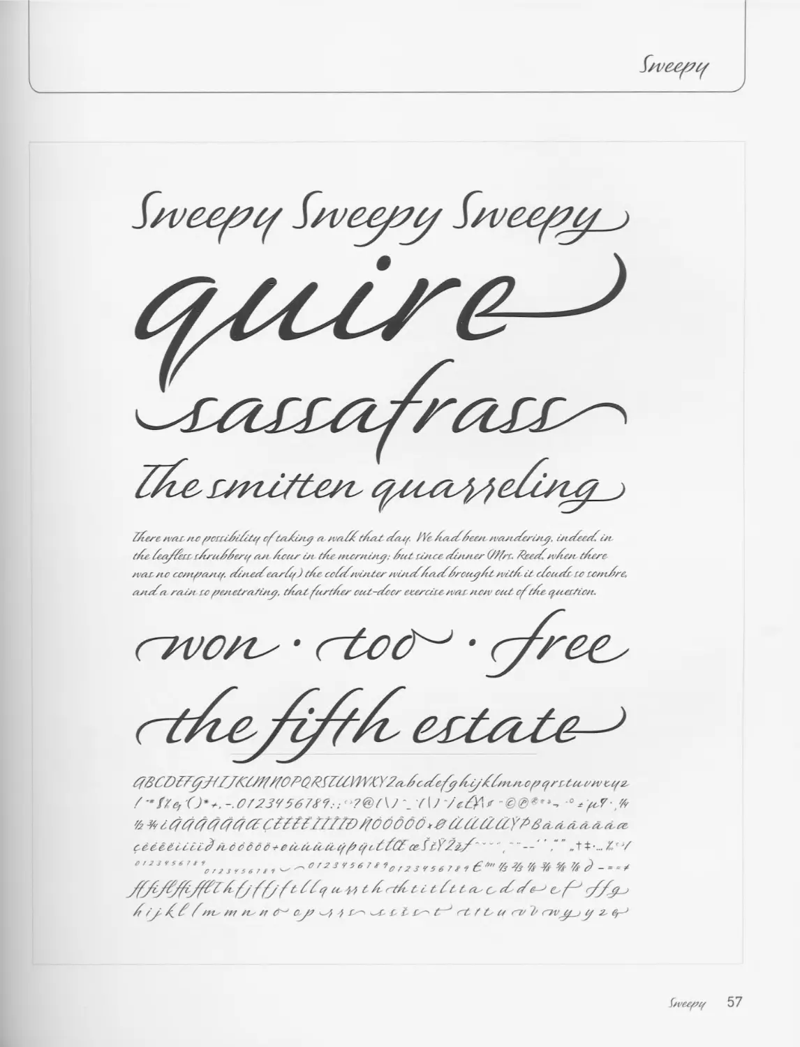
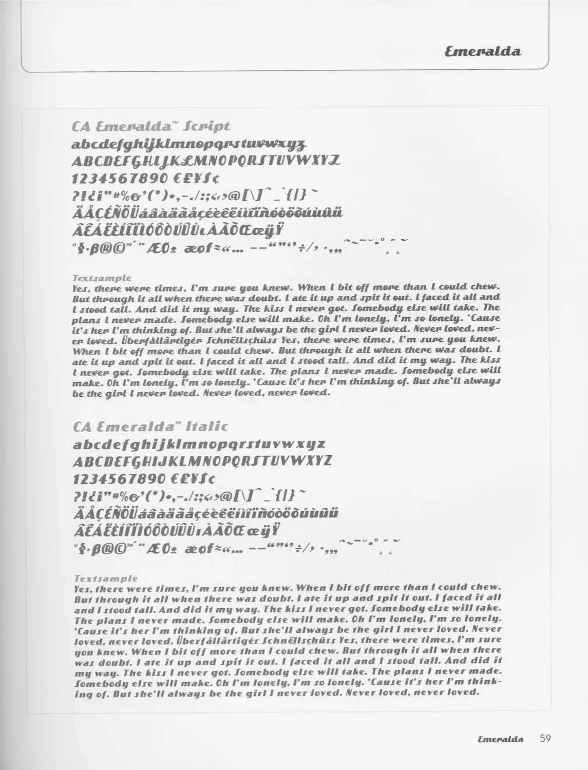
design to the International House of Fonts in 2005. Sweepy,
which is based on his popular typeface Pooper Black,
presents what could be described as a lighter version with
connecting letters. This brush script presents a lush design
that is casual and fluid.
Michael Clark is a calligraphic lettering artist who resides
in Richmond, Virginia. Among other things, his work
encompasses creating logo designs, titles for CDs,
books, magazines, and other printed material, as well
as developing commercial fonts for corporations and
independent foundries.
The P22 type foundry started in 1994, offering digital fonts
inspired by both history and artist. After winning over the
public, thanks to the success of the company’s packaged
font sets sold in museum gift shops and specialty stores,
P22 expanded into mail-order catalogues and direct market-
ing as well as fonts. But it always remained focused on art
history and on design.
To diversify its catalogue, P22 branched out and created the
International House of Fonts, a Web page dedicated to show-
casing international designers. It was devised as an
online-only type boutique, later adding further divisions
such as Sherwood Type and Rimmer Type Foundry.
Although it appears to be a sprawling company, the P22 col-
lective is actually a small group of individuals dedicated to
designing artistic and creative fonts, packaging, and books.
There is an expanded Open Type version of Sweepy that
comes loaded with alternate characters and ligatures, offer-
ing a vast array of options and flexibility for the designer.
Sweepy is an elegant script face that is great for product,
titling, tags, small amounts of copy, and identity.
Family: P22 Sweepy
Weights: Sweepy, Sweepy ОТ
Designer: Michael Clark, 2005. First released by International House
of Fonts (a division of P22 type foundry)
Year: 2005
Distributor: P22 Type Foundry
Uses: Display, small bodies of text
56 P22
bvequf
S/voep/f S/veopof §/уееро/
P/tere noir/to poruft/fof ofOsi/i/ty oi zvoi/ftfoit o&uf. lYe /iooo//ee.zi zvouio/futy, uto/ocoY.t/t
(Tte Yooif/crr rfraffertf out /tootr in t/io zrt-crztOsty; foot ri/toe ofuuter (///rr. fafoYzv/tooi t/tere
zvoir /to co/ti/zoutof. oYzzteo/eou'f) if coff/vi/tlor zvutoY/touffrotcy/tO zviOTtif oYcuo/r rc rontf/'e,
out о/oi roust ro pe/tctroiSutojr. f/totf firfPtor oeot-o/oor ctooroiro zvar zto/v cal off/te of/zerfiozt.
fc/ff^n ср t t/z
f 7\jy^fY\tr -° Л
7г ¥y ItftftffffftfYZCffff-ffffD //000001 fYfC/fYYY7^/3olri otoi oi oi o^
ce&lecoccf^LOodoo-oeTcotaaoffofc/fCYceYff^^^ t / „ТФ-... Zf>7
° ' 2 3 r 5 6 7 * \ f a 3 , s 6 7 , , ' 2 3 V S 6 7 O r 2 3 f 5 6 7 '7з % 7 - = -X
t f o~tfUt ft t Ob' c, of of&-^ C'f^ >
f оу' ff f w /Г7 Ob' /7 0^ 0J2 £^-> rt f L 0/ CV 7 O7V Of j tf 2.
^zveef/of 57
Cape Arcona Type Foundry
www.cape-arcona.com
The Italic version of CA Emeralda™ was originally inspired
by headlines from an early 1950s magazine advertisement.
From there onwards, it evolved and grew to develop a
catchy personality of its own with a modern script style that
gives a fun and retro touch to display work and headlines.
It was created at Cape Arcona by Stefan Claudius. Born in
Essen, Germany, Claudius studied Industrial Design at the
Universities of Wuppertal and Essen. In 2000, he started a
small graphic design studio from which he worked as a free-
lance graphic designer. After spending some time in the
Chank Army, he moved to Cape Arcona, a small fictitious
country in the Atlantic. Together with fellow designer
Thomas Schostok, he bought this little country and in 2002
transformed it into the type foundry Cape Arcona.
“It is really a small place, and it’s no wonder you never
heard about it before. It was really quiet for hundreds of
years, but then arrived two multimillionaires, called
Thomas Schostok and Stefan Claudius, who took over the
state and declared themselves King and President of this
dreamy little spot. The new regents made a few minor
changes to Cape Arcona. Within the borders of the country,
they abolished money and introduced the production of
fonts,” say Claudius and Schostok.
“For hundreds of years, Cape Arcona was a melting pot for
the most different cultures, but the main influences came
from England, America, Spain, Germany, and France.
Wherever people felt dissatisfied with their countries, they
immigrated to Cape Arcona and found a friendly climate,
nice folks, and a peaceful place to live.”
Besides organizing type workshops and designing new
fonts, Stefan Claudius likes to play guitar in his
instrumental band Volvo Penta. If he is not on a beach at
Cape Arcona with cofounder Thomas Schostok, he is most
likely working on a new font.
bnerafda
Family: CA Emeralda™
Weights: Italic and Script
Designer: Stefan Claudius
Year: 2005
Distributor: Cape Arcona Type Foundry
Use: Display
Advice and considerations: Do not use the script capitals unless
they are followed by a lowercase character. Some people forget that,
among other things, that is what the italic font is good for.
58 Cape Arcona Type Foundry
bmpuldii
CA СтелаШлГ fcpipt
abcxLef^hyklnuwpqpjtMWxy^
ABCDU^Kl/ICf^CPCIUTUVWni
1234567890 €€¥/(
2 >6) 1\Г.{I} '
AACCAIO РаАлааасеешшпебёбшиш
ACACClltibCCljViliAAbGo^fY
°$8®©Ш"АО* &4f*«... —“”‘’*7, “•°/7
TentJdmple
Yes. thene wene timej, Cm зипе you knew. When I bit off топе than I could chew.
But thnough it nil when thene was dsubt. I ate it up and. spit it out. I faced it all and
I steed tall. And did it my way.. The kiss I neven get. fomebody else will take. The
planj l neven made. fomebody else will make. Ch Гт lonely. Гт se lonely. ’Саизе
it"s hen Гт thinking of. But she'll always be the ginl l neven loved. Neven loved, nev-
en loved. tibenfallantigen fchnellschuss Yes. thene wene times. Гт зипе you knew.
When I bit off топе than I could chew. But thnough it all when thene was doubt. I
ate it up and spit it out. I faced it all and I stood tall. And did it my way. The kiss
I neven get. femebody else will take. The plans I neven made, fomebody else will
make. Ch Гт lonely. Гт so lonely. "Cause it's hen Гт thinking of. But she'll always
be the ginl I neven loved. Neven loved, neven loved.
CA [meralda “ Italic
abcdefghijklmnopqrstuvwxyz
ABCDCFGHIJKLMBIOPORfTOVWXYZ
1234567890 €£¥/(
AAftiVOijaaaaaafeeeeiiunodoouiiuu
АСА CCHiiOOblilJiliAAOG ceyY
°i fi®©', -/tOi X0f^... -„Г'""-0//
Textsample
Yes. there were times. Гт sure you knew. When I bit off more than I could chew.
But through it all when there was doubt. I ate it up and spit it out. I faced it all
and I stood tall. And did it my way. The kiss I never got. fomebody else will take.
The plans I never made, fomebody else will make. Ch Гт lonely. Гт so lonely.
"Cause it"s her Гт thinking of. But she"ll always be the girl I never loved. Never
loved, never loved. Uberf allartiger fchnellsfhdss Yes. there were times. Гт sure
you knew. When I bit off more than I could chew. But through it all when there
was doubt. I ate it up and spit it out. I faced it all and I stood tall. And did it
my way. The kiss I never got. fomebody else will take. The plans I never made,
fomebody else will make. Ch Гт lonely. Гт so lonely. "Cause it"s her Гт think-
ing of. But she"ll always be the girl I never loved. Never loved, never loved.
[merdlda 59
Andreu Balius
www.andreubalius.com
Typerware developed Czeska’s first stages basing them-
selves on some old types carved in wood by Czech artist
Vojtech Preissig at the beginning of the 20th century. Later
on, Andreu Balius completed the design and created the
italics version, as well as including a complete collection of
ligatures for both the regular and italic versions.
Balius’s insatiable quest for creating functional forms,
influenced, as a former sociology student, by the first
vanguards and language theories, is highly evident in
Czeska. The result is a typography that experiments with
the shapes and forms of types from the beginning of the
century while exploring their modification and adaptation
to new technologies.
Other work assignments and projects have made Balius
search deep into the past and research eighteenth century
typographies to find design solutions, without ever leaving
aside the present. The result is Skai, a superficial type for a
hedonistic world, or the typography developed for
La Vanguardia, a Barcelona-based newspaper. Another
example is the Durruti type, named after the famous
Spanish anarchist, which is inspired by the typefaces used
in propaganda posters during the Spanish Civil War.
Czeska seems to be coarse and rough, even a bit staggering,
but it doesn’t allow its eclectic character in shapes and style
to be evident to the eye. It has humanistic traits that give it
approachability, and the curves are softly and smoothly
drawn in general. Its trace is finished by a subtle cut, which
gives it a light aspect when in text, less mechanical than
that of other typographies. Its appearance is not so
versatile, although it grants a unique character to the
composition as a whole by giving it great vital strength.
Ceska may be used in long or short texts, as well as in pro-
motions and magazines. It is especially appropriate and
effective for use in posters and headlines.
Czesfka
Family: Czdska
Weights: Regular, Italics, and ligatures
Designer: Typerware/Andreu Balius
Year: 2002
Distributor: TypeRepublic
Uses: Display, Titles
La cigiiena
tocaba el saxofon
detras del palenque de paja
CARIBE
Borneo & Sumatra
Pa amb tomaquet ifuet
BARCELONA
El veloz murcielago hindu
comia feliz cardiWo у kiwi
Carmelo, Remedies, Lolita, faquita у Conchita juegan al
domino у toman chocolate con churros en la azotea
del chalet que se ha comprado el sobrino de Wencesloo
ABCQ D E F G H11К LM N NO PQ R S TUV WHY Z
abcdefghilklmnopqrstuvwxyziiMrbjago
AMAAAXDtttEililtdddddGVPUUUUYYi
aaadaajefdeeeeniitn6ododce0t>iuuuuyyifL€V%
*>©”'•»-----i----------------------
я « к. дгаснаск в ин tr la lmcdoce ssthtrtyu я и
а-dhdkdldt СУН th fl fl fl trtt glglH фиМосгпу
я M M 9t S ее v%&• w v : я MSt%« ч ft я я я M
• •XAtaaiaaDFLFPtTlAlMIDOCESSTHTRTYlAnn
xc'hdkdlc'tc'l’fffhftflflfrfttfFtfyiktfeceny
V Sh Sic Si Sp Si St tj tr tt ty I 2 J 4 16 7 8 9 о "V Th V
• •••ftfVtb' V V ViS = f/r%.4|5»«»i
60 Andreu Balius
Cze^ka
DdttSsI>t>YyZz!’’$%&’(>*
+ ,- ./ oi2}45,678g:;<a>?@
ABCDEFGHIJKLMNOPQRS
TUVWXYZ[\] A_'abcdefghi
jklmnopqrstuvwxyz{l}~A
ApENOUaaaaaapeeeeilii
n6dddouuuiit”<ft^>4I/S®©
™ ' " * &0V sdi2 = ae 0 I i f ==
ЛАОСЕ oe------“”‘4yY/€<>
fifi ♦ , „ %o ae аёё f iiioo w
О U U U i
Cze^ka 61
ipui^id
pqeg jo AjeiqAq
SIBU^J
1Э0НП01
ДЕиОЦЩОЛЭД JO SapEDOp ДЭЦУ
SS3J.
Р22
www.p22.com
Artscript was Sol Hess’s attempt to turn the graceful pen-
manship of the ancient scribe into rigid metal. This type of
script is more common in digital form, but, when originally
released in 1948, it required special handling to avoid
breakage. Extensive alternates were added based on origi-
nal Hess drawings and additional sources. Both versions are
combined into the OpenType version along with an
expanded Central European character set, as well as liga-
tures, swash/alternates, fractions, superior and inferior
numerals, and ornaments.
Artscript is a classic and elegant scriptface that comes in
three more or less flourished variants, and proves ideal for
display and titling.
The P22 type foundry creates computer typefaces inspired
by art, history, and sometimes science. P22, and especially
its Lanston Type Co. division, is renowned for its collabora-
tion with museums and foundations to ensure the develop-
ment of accurate historical typefaces that are fully relevant
and adaptable to today's computer user. In addition to its in-
house font design, P22 also licenses several new type
designs from around the world.
The history of P22, like all history, is filled with a mix of
myth, fact, conjecture, and legend. At first conceived as an
art collective during the mid-1980s, the original four
founders created paintings, mail art, and poetry under the
guise of P22. It flourished as a thriving, viable business by
the late 1990s. Over the first ten years of P22, the type
foundry experienced its share of highs and lows and a
legacy filled with many digital fonts and other fine
examples of printed matter. The company has recently
published a book called “P22: Thoughts on Ideas for
Inspiration towards...,” which gives the reader insight into
selected projects from their extensive catalogue. The
book is a practical source of inspiration for any designer
and is divided into three distinct sections that require the
reader’s interaction.
Family: LTC Artscript
Weights: LTC Artscript, LTC Artscript Alt, LTC Artscript Pro
Designer: Redesigned by Paul Hunt in 2005. Original by Sol Hess.
First released by Lanston Type Co. (a division of P22 type foundry) in
2005
Year: 2005
Distributor: P22 Type Foundry
Uses: Display, titles
^rtscript (Gfess), 225
O{ OS’TOX yZ §
abcdcfghijklmfwpqrstuvwx
$1234567890
fa* Cl 11 VMM. <fa CfaMnw
Sterling bedding Anniversary f^ifts
from our famous third floor collection
fA Pleasing (Jhirst Quencher
and a swell drink $1234567890
tailored Sport Coats
64 P22
Srdanput! QTvcda, takoder!
0ne ГГбо to ГКш-
£os^aucTos de. Га ^Montana diegra
........ ‘ *
ll lt'liyZpdaajaa^ttiuUiJnwjiwtuuuu^pglagja'pqJtjCcLrtcLc^&Mict£ctLt£(i>i(j£
s^60dddM0d£№&w№99irrilrTirvv^
7^5°4<^Z’'* M’*М,*‘*^»4.»м.»..«4.•.-#•♦«•*******»»• -« + •*<» r - ’ м-л-
< '.*'.'* ~ f t ^i)[\]{ ^ffiilifiifi!lclltpbili(ltili^fkffktifр1иа^чы1^ришш1сЪ(1-'м~а»^а~си-п-ы -я-м^^
b db i (dJu LptЛ!E £ .Гр$'tlt^ctt.cTdTiriFH> l£ (Tfi tu fFiE. fp iftEyf^ .v ~.- ~ ~ «• • >»> л •*
^rtscript 65
Andreu Balius
www.andreubalius.com
______________________>
Andreu Balius developed Trochut based on the Bisonte
type, designed by the Catalan typographer Joan Trochut
Blanchart during the difficult post-civil war years in Spain.
Towards the end of the nineteenth century, manipulating
characters was common practice in print workshops. In
order to give the characters a certain originality, the shapes
of fonts were altered with the help of a knife and a file. It is
quite probable that these homemade practices during the
1920s, together with the influence of the European
vanguard movement on small local industries, contributed
to the commercialization of a series of lead types with
combinable geometric shapes-circles, squares and
triangles. These could be used in composition design, which
printers employed for designing logos, headlines, and
decorative graphics.
With the development of advertising during the 1930s and
the increasing demand for printed material, small printers
soon found themselves running out of ways to design
original and innovative work. Amidst these printers
preoccupied with the quality and dignity of their everyday
work was Esteban Trochut Bachmann, father of Joan
Trochut and a renowned Barcelona printer. Determined to
make his contribution in the improvement of paper quality
for small print, Esteban Trochut edited a series of albums
named ADAM (Documentary Archives of Modern Art) in
which he put in practice his personal way of understanding
and using typography. In these albums, Esteban and
Joan Trochut wrote texts about the practice of their
profession, all the while putting an accent on the letterform
being used as the principal decorative element, with the
objective of promoting the creative use of typography
amongst professionals.
Andreu Balius recovers the Bisonte type created by Trochut
to digitalize and develop it further for its adaptation to the
new digital era. The result is a typographic system that can
be used for the composition of texts, although it is an ideal
font for use in advertising due to the modular nature of the
alphabet and the visual strength of the graphics captured
on paper.
TROCHUT
TROCHUT
Ondrru ВаЬич (M03)
TouRoefRance
Paris/Tolouse/Sant Hilari/Cantonigros/Lleida
L'aplec del Cargol
— Gran Hotel
BaRceiona
los moDCRiios aimacenes
sepu
ien ofertas navidenas!
Family: Trochut
Variants: Regular, Italic, and Bold
Designer: Joan Trochut and Andreu Balius
Year: 2003
Distributor: TypeRepublic
Use: Advertising brochures
66 Andreu Balius
TROCHUT
Trochut (regular)
aBCDefCHUKim
nopqRSTUVWIYZ
abcdefghijklnmopqrsluvwiYz
012M56784 #%%o S«J€FV Wu
cndauOOfleeefiiiiioodrtOeiEiJuuCiY’TT w ыш ыо)
(ШпШ^МйшкюоОо’мшшг. :
TROCHUT
Trochut (italic)
(IBCDeTQHIJHUll
nopqnsruvwxYZ
abcdefghijklmnopqrstuiwiYZ
0U345&S9 *%%. blew Ии
мМбХ1Л—/._ «
Trochut (bold)
(IBCDCFQHIJKini
HOpqRSTUVWTYZ
abideighijklnmopqrstuvwiYZ
O12J456784 #%%. $<f€£V Ww СП
ud(iOu(keCCM()(ioOO»(EijiiiiuY?TY*4 ья? щы
U?!(6)(U<.«»/._-/-_—-•„-
ъ{|}* I (паПаашгеггййбдбддатошййу ,л;
That quick brown dog jumped over the la/Y foi
Rlii Zapf with Veljovic and get quirkY Beziers
Portez ce vieui whisky au juge blond qui fume
lorem ipsum dolor sit amet, consectetuer adipiscing elil. Ctiarn mi dolor, mas elemenlum luclus lellus. In urna lurpis, semper egel, consequat el.
inlerdum ac, ornare in. inlerdum et, velit. Dulla eget nuiu a odio vestibu- eleiFend in, mauris. Nulla Fringilla wisi ut lectus. Duis sed velit.
lum iaculis. phasellus ullamcorper In dictum, odio investibulum Curabitur pharetra sollicitudin ipsum. Donee orci justo, Гас ills is non,
pellentesquc. diam anle imperdiel velit, eu dapibus leo dui eu dolor. tristique tincidunt, blanditul. urna. Пат ullamcorper bibendum metus.
Qenean prelium. dui eu ullricies matlis, nisi ipsum senenatis nulla, non Sed imperdiel. Suspendisse potenti Duis aliquet commodo sapien. phn-
eqeslas diam lellus quis ante Пит porta semper elit. Rlaecenus sed elit. sellus semper, ipsum et pharetra consectetuer. nunc libero pretium
ITIorbi auclor, quam eget elemenlum consectetuer. nibh purus vestibulum mauris. sit amet posuere nisi libero ac quam. Veslibulum pulvinar.
lurpis, non inlerdum nunc dolor in ligula. Gpnean sit amet augue. Viva- (lenean et nisL quisque sem. Pam laoreet tincidunt nibh. Pellentesque
sanRemo capRi Roma сорасавапа
СОП PCILDC1S Y 0 LO LOCO
monaco cjRanD prit
fReeR/Dinq
TROCHUT м/ii inspiradu en el lipa -Bisonle- del impresor y lipdyrafo talalan Joun Troihul Biuruhurd
Clienle: TypeRepublu (2003)
TROCHUT 67
Alejandro Lo Celso
www.pampatype.com
Alejandro Lo Celso is a romantic typeface designer whose
creations go beyond the faculty, inherent in typography, of
acting as a conductive element for a statement:
Through their shapes, they stand as representatives of the
words themselves.
This typeface is the result of the creator’s admiration for the
literary works of Jorge Luis Borges. According to Alejandro
Lo Celso himself, it was “his technique like that of a
meticulous jeweler, untiringly polishing to obtain the
perfect word” that served as inspiration to him. This
dedication makes Borges a clean and refined family, with a
large quantity of small idiosyncrasies. These form a contrast
with other details of more classic cuts, like, for example, the
design of its uppercase, reminiscent of the Roman square,
which is typical of Renaissance typeface designers.
Other aspects of Borges’s design are also inherited from this
style; the most significant characteristics are the oblique
axis, the strong modulation, and the curved beaks. Its main
exponents are the typeface Garamond, of dubious origin,
although officially attributed to Claude Garamond
(1500-1561), and the Bembo, designed by Francesco Griffo
(1450-1518). However, Borges cannot be labeled as
Renaissance or humanist because it is a typeface that
shows the unmistakable style of its creator, who recognizes
also being influenced by contemporary Dutch typography.
Borges was designed as a typeface for long text; hence the
open counters, the ample x-height, and the color given to
the page from its modest contrast and relaxed modulation.
Its legible and gentle texture provides us with pleasurable
reading. This typeface also tackles issues related to
economy of space. Its relatively short descenders and
ascenders afford the composition tight leading. This makes
it especially reliable in circumstances when a large
quantity of information has to fit into a small space, often
the case in newspapers or reference books.
Despite the fact that Borges started as a modest project
aimed at being a text typeface, it ultimately expanded to the
point of offering four different weights and two display
variants: Borges Titulo Blanca, which is finer and with
highly defined features, and Borges Titulo Hueca, based on
the tradition of stone inscriptions.
Borges
Family: Borges
Variants: Borges Blanca, Borges Blanca Italica, Borges Gris, Borges
Gris Italica, Borges Negra, Borges Negra Italica, Borges Super Negra,
Borges Super Negra Italica, Borges Titulo Blanca, and Borges Titulo
Hueca
Designer: Alejandro Lo Celso
Year: 2002
Distributor: Myfonts, Fonts
Use: Long text
Other uses: Display, in its Titulo variants
Advice or considerations: Do not use the text variants for display, or
vice versa.
Borges Blanca, Blanca Italica,
Borges Gris, Gris Italica,
Borges Negra, Negra Italica
Borges SuperNegra, SupNg It
Borges Titulo Blanca
Borges Titulo Hueca
68 Alejandro Lo Celso
Borges
Borges Blanca
ABCDEFGHIJKLMNNOPQRSTUVWXYZ
abcdefghijldmnnopqrstuvwxyz
1234567890! @#S%&()=?
Borges Blanca Italica
ABCDEFGHIJKLMNNOPQRSTUVWXYZ
abcdefghijklmnnopqrstuvwxyz
1234567890! @ #$ % &()=?
Borges Gris
ABCDEFGHIJKLMNNOPQRSTUVWXYZ
abcdefghijldmnnopqrstuvwxyz
1234567890! @#$%8c()=?
Borges Gris Italica
ABCDEFGHIJKLMNNOPQRSTUVWXYZ
abcdefghijklmnnopqrstuvwxyz
1234567890! @#$%8r()=?
Borges Negra
ABCDEFGHIJKLMNNOPQRSTUVWXYZ
abcdefghijldmnnopqrstuvwxyz
123456789O!@#S%&()=?
Borges Negra Italica
ABCDEFGHIJKLMNNOPQRSTUVWXYZ
abcdefghijklmnnopqrstuvwxyz
123456789o!@#s%&'()=?
Borges Super Negra
ABCDEFGHIJKLMNNOPQRSTUVWXYZ
abcdefghijklmnnopqrstuvwxyz
1234567890! @#S%&()=?
Borges Super Negra Italica
ABCDEFGHIJKLMNNOPQRSTUVWXYZ
abcdefghijklmnnopqrstuvwxyz
1234567890! @#s %©-()=?
Borges Titulo Blanca
ABCDEFGHIJKLMNNOPQRSTUVWXYZ
abcdefgh i j k] mnn opqrstuvwxyz
1234567890!@#S%8r()=?
abcdefghijklmnnopqrstuvwxyz
abcdefghijldmnnopqrstuvwxyz
1234567890! @#$ %&()=?
Borges 69
Hamburgefont
Hamburgefont
Hamburgefont
Hamburgefont
Hamburgefont
Hamburgefont
Hamburgefont
Hamburgefont
Details
Una tipografia para la
Applications
70 Alejandro Lo Celso
Borges is a typography intended for use in a continuous text. The
generosity of its height and its open eyes allow pleasant reading.
It is the result of the admiration that Alejandro Lo Celso has for
the literary works of Jorge Luis Borges.
§0 merely by tracking down
the clues in
language itself
— a blurred, but revealing trail!
one can see how a crudely
changed meaning has every-
where usurped the function
of far subtler messages now
quite lost to us, that ever-
perceptible but
never quite tangible
nexus of things.
ROBERT MUSIL
The man without qualities
UjmliUon by Vplw Wilkiru
Borges 71
Stefan Hattenbach
www.macrhino.com
After spending his first years as a typeface designer exper-
imenting with display typefaces, Stefan Hattenbach decided
to enter a different world, that of typefaces for texts.
Delicato, the product of this change, is a traditional typeface
in many ways, although with some elements from more
contemporary constructions.
There are countless typefaces that are based on previous
work, a common practice that allows the designer to focus
on a reference point when creating. In the case of
Delicato, the models were two contemporary typefaces,
Enigma, designed by Jeremy Tankard, and Pro Forma,
from Petr van Blokland.
Delicato, which is rather condensed, with an oblique axis,
medium contrast and generous x-height, is a typeface
family full of interesting details. One of these is the contrast
between its triangular serifs and the variation presented by
its terminals, some of which are rectangular and others
tear-shaped-especially noticeable in the letters a, c, f, j, r,
andy.
The attention to detail is one of Delicato’s strong points. The
subtle differences in the size of the dots on the i and the j,
as well as those of the dieresis and the design of the rest of
its diacritical marks, is an example of good design practice.
In Delicato, Hattenbach paid special attention to the per-
formance of the ink when printed on small bodies, and he
provides a series of ink traps for the more problematic
areas. This is the case in the letters A, M, N, and V, which,
due to their physical characteristics, can create an exces-
sive smudge in the joins of their diagonal stems.
Delicato presents four different weights and adds a median
version to the traditional Regular, Italic, and Bold. It also
has small capitals and alternative characters for each
weight, which include the typical ligatures of long text type-
face-ct, sp, st—as well as other more specific ones-fa and
fo-based on the mother tongue of the designer. Finally,
Delicato Ornaments provide a wide range of ornaments,
arrows, and dingbats, some with a calligraphic nature and
others of a more traditional typeface, all of which have been
carefully designed.
Delicato
Family: Delicato
Variants: Delicato Regular, Delicato Regular Alt, Delicato Italic,
Delicato Italic Alt, Delicato Small Caps, Delicato Medium, Delicato
Medium Alt, Delicato Bold, Delicato Bold Alt, Delicato Ornaments
Designer: Stefan Hattenbach
Year: 2004
Distributor: www.fontshop.at
Use: Long text
Other uses: Not recommended
Advice or considerations: Designed for use in books
72 Stefan Hattenbach
Delicato
After decades of revolutionary progress
Bored by the movies
Ben Webster and Associates
Roma-Lazio 2-0
The complete guide to Single Malt Scotch
Recorded April 1959 in N.Y.C.
I* Co Aa eiu - Л Д
aad nA
Delicato 73
Lazydogs Type Foundry
www.lazydogs.de
Fabiol, a family that was designed for long text, unites all of
the characteristics that make a typeface efficient in the
composition of books. Designer Robert Strauch drew his
inspiration from old prints dating to the beginning of the
Renaissance. On a conceptual level, one of his aims was
to reflect the charm of these antique prints, but he also
wanted to match the energy exuded by typefaces from
these centuries.
However, Fabiol was not designed with the intention to be a
work of historical restoration, and although the shapes of
its letters are based on those of fifteenth- and sixteenth-
century punchcutters, they reveal small and particular
details that, upon closer observation, constitute a new
interpretation of Renaissance typefaces.
This typeface has a very small x-height and is rather light
in color. Its ascenders and descenders are quite long,
meaning that the compositions need a generous leading to
accomplish optimum results. All of these details combine to
endow the page with an elegant look and create a pleasant,
soft gray texture. On first sight, Fabiol is reminiscent of the
closed types of the punchcutter Nicholas Jonson
(1420-1480), one of the best typeface designers known from
the Renaissance period.
The Italic version of Fabiol has a sharp inclination,
which, together with its condensed and compact look,
differentiates it greatly when it is surrounded by the
upright version. The carefully designed small capitals offer
exactly the same texture as the lower case. The Fabiol bold
version, like the italics version, makes a noticeable contrast
opposite the upright variant and effortlessly draws the
reader’s attention.
Fabiol also includes a series of ornaments that complement
the antiquated design, giving it an evocatively nostalgic
look, reminiscent of a past era when typographic produc-
tion was so carefully planned.
Fabiol
Today most historians
view the Renaissance
as largely an intellectual and ideological change, rather than a substantive one. Moreover, many
historians now point out that most of the negative social factors popularly associated with the
“medieval" period - poverty, warfare, religious and political persecution, and so forth - seem to have
actually worsened during this age of Machiavelli, the Wars of Religion, the corrupt Borgia Popes,
and the intensified witch-hunts of the 16th century. Eine Voraussetzung fur die ncuc Geisteshaltung
der Renaissance waren die Gedanken selbstbcwusster italienischer Dichter des 14. Jahrhunderts wie
Francesco Petrarca,
der durch seine ausgicbige Beschaftigung mit den antiken Schriftstcllern und durch seinen Indivi-
dualismus den Glauben an den Wert der humanisaschen Bildung forderte und das Studium det
Sprachn, der Literatur, der (jachichtt und der Philotophte aufierhalb cincs religiosen Zusammenhangs
- als Sclbstzwcck - befiirwortete. Los supucstos histdricos que permiticron desarrollar el nuevo estilo
Family: Fabiol
Variants: Fabiol Regular, Fabiol Italic, Fabiol Small Caps, Fabiol Bold
and Fabiol Ornaments
Designer: Robert Strauch
Year: 2005
Distributor: Lazydogs Typefoundry
Use: Long text
Other uses: Not recommended
Advice or considerations: Legible from 5 point, works better from 9
to 12 point, with generous leading
artistique etait essentiellemcnt tournee vers la religion chreticnnc, la Renaissance artistique utilise les
themes humanistes et mythologiques. Le renouvellement J *
reflexion
philosophtque
JL. £ fournit aux artistes de nouvelles
iddes : avec le neoplatonisme, I’Homme est au centre de I'univcrs. L’etude des textes antiques,
le renouveau de la philologic, per met tent aux architcctes d'abandonner les formes gothiques. Us
utilisent les enseignements de Pvthacore et de Vitruve pour ^laborer leurs plans. Dn italiemh
rtnauansn vixtt fram pa tyto-tekt, och utvtckltngn na&e Svertge pa цоо-talet. For konsten mnebar mattantto
art konstnarrrna rtegfram nr anonym mtn, och an portran och lancbkap fid tom jramrta nppgtfi an exakt atbilOa
matron Typiska for epoken ar univcrsalgenierna Michelangelo Buonarroti och Leonardo
da Vinci som bada perfekt beharskadc cn mangd konstarter. Ofte lader man ogsa renzssanccns
naturvidenskab omfattc Kopernikus, Kepler og Galilei. De hzvdcde, at de samme mekaniske
love gjaldt for himmellegemernes bevzgelser, som for bevzgelscrne pa jorden. Pa den made opleste
de den middelalderligc etageverden og fratog den kristne himmel- og helvedesforestillinger deres
hlndgribelighcd. s*
74 Lazydogs Type Foundry
ABCDEFGHIJKLMNOPQQRRSTUVWXYZA1CE0 0123456789€$¥£%%o#
ABCDEFGHIJKLMNOPQRSTUVWXYZSS?EGE0AgEINSU & 0123456789
abcdefghijklmnopqrstuvwxyzfiasoeoififl & oi23456?89€ $ £¥%%<>#
ffffi fflfjftj ft fflffft flip ftdhdk
0*,./:;^!@[\]A_{|}~t§-9®©™a^i<>«»...---K,,<’oo
t-,„„,no-i + < = >#±<>V/''”A “w’\7%1/43/4123
AAAAAAQEEEEnilNbOOObUUUUYBLPSZ
aaaaaa^eeeeiiiinodooduuuuyS^szEprJIAdQO® Vf
ABCDEFgHIJKLMNOPQQRKSTUVWXrZ^.CE0
abcdefghijklmnopqrstuvevxyzfoceoififl & oi2j^6y8^€$r
() *,./:;?!@[\F_{l}~tH ®© ™a\ ---u>)<>oq
*± <;>+/'' 7/#% %, y2 2 3
ААААЛЛдЁЁЁЁПП^бббОдиййиГВЕР^г
аааааа(ёееёиип6Ь6одйййиуЩё£^тг[]Д dQ0~^/f
ABCDEFGHUKLMNOPQRSTUVWXYZ/ECE0
0123456789€$¥£%%o# & oi23456789€$C¥%%o#
abcdefghijklmnopqrstuvwxyzfiseoeoififl
O*,./:;?!@[\]A_{|bt§-S®©™a° jj <>«».,.------w”°oo
+ < = ---------,7%*%“
АААААА(^ЁЁЁЁППКбббО0ииииУ DEPSZ
aaaaaaceeeeiiiinddodouuuuySt^sz^pTrn^dQO^VJ’
the quidk
brown
fox
jumps
over the
lazydogs
Fabiol
LAZYDOGS TYPEFOUNDRY
THE AWARD
WINNING
TYPEFACE
FABIOL
Our foundry opened August 2005 with
the award-winning typeface Fabiol. This un-
conventional oldface concept by Robert
Strauch was honored with the most desirable
«Certificate of Excellence* in the category
»text« at the 2005 tdc2 award. Based on this
backing, the >Lazydogs< font collection
emerges under a high demand for quality
and functionality, designed to push forward
the standards in todays type design.
Fabiol Regular
The quick brown fox jumps over the lazydogs.
Zwei Boxkampfer jagen Eva quer dutch Sylt.
Voix ambigue d’un cceur qui au zephyr pre-
fere les jattes de kiwis. Es estrano mojar queso
en la cerveza о probar whisky de garrafa.The
Fabiol Italic
The quick brownfox jump} over the lazydogs. Zwei
Boxkampferjagen Eva quer durch Sylt. Voix am-
bigued’un ctrur qui au zephyr prefere lesjattes de
kiwis. Es estrano mojar queso en la cerveza 0 probar
whisky degarrafa. The quick brownfive jumps over
Fabiol Small Caps
The quick brown fox jumps over the
lazydogs. Zwei Boxkampfer jacen Eva
quer durch Sylt. Voix ambigue d’un
cceur qui au zephyr prefere les jattes
DE kiwis. Es estrano mojar queso en
Fabiol Bold
The quick brown fox jumps over the lazy-
dogs. Zwei Boxkampfer jagen Eva quer durch
Sylt. Voix ambigue d’un cceur qui au zephyr
prefere les jattes de kiwis. Es estrano mojar
queso en la cerveza о probar whisky de garra
Fabiol Ornaments
Fabiol 75
al . -urn еид
tn'tS'e' -1«5°
'rk°s 'X»>«lew b
an]und "
^ьЯ,е,\„„ ^ь‘"‘
d,"n;Z^ ?r't,c"
Florilegium
Imperiale
Botanical Illustrations
FOR
Francis I of Austria
Applications
76 Lazydogs Type Foundry
Fabiol was designed for long text. Strauch drew his inspiration
from Renaissance prints, but close attention to detail ensured a
completely modern feel. Fabiol’s long ascenders and descenders
encourage play, ensuring the font’s renewability.
Applications
Fabiol 77
House Industries
www.housein.com
Paperback is a typeface family that was initially designed
for the composition of text-in 8, 9, and 10 point-of
rustically bound books, printed at high speed with low
quality paper and ink. In the development of this first ver-
sion, which would later become Paperback 9, the standard
size of the text set in the pocket books was taken into
account. However, this project ended up developing a
family of six variations, each of which was designed for a
limited series of bodies. Paperback 6 covers bodies from 5
to 7 point; Paperback 9, from 8 to 10 point. Paperback 12,
designed to be used with long text, encompasses 11 to
13 point, while Paperback 24, 48, and 96 cover larger
bodies since they are used for creating displays.
The changes from one version to the other, especially in the
variants for texts, are extremely subtle, but their influence
is unquestionable. As the body of the typeface diminishes
in size, the x-height gets larger and the angles become
sharper. In the versions for display, however, Paperback
refines its strokes and details.
In its series for text, Paperback is very legible and resists
the worst printing conditions without losing quality. In gen-
eral, the family is a little wider than might be expected, but
without giving the impression of being an expanded type-
face. Paperback draws on the Scotch tradition, represented
by William Addison Dwiggins (1880-1956) through designs
such as that of Caledonia. Paperback follows this style in its
vertical axis, its strong contrast, and its curved beaks.
PAPERBACK
Family: Paperback
Variants: Paperback 6, Paperback 6 Bold, Paperback 6 Italic,
Paperback 9, Paperback 9 Bold, Paperback 9 Italic, Paperback 12,
Paperback 12 Bold, Paperback 12 Italic, Paperback 24, Paperback 24
Italic, Paperback 48, Paperback 48 Italic, Paperback 96, Paperback
96 Italic
Designer: John Downer
Year: 2005
Distributor: House Industries
Use: Long text and display
Other uses: Not recommended
Advice or considerations: Each variant has been especially designed
for a specific range of bodies.
EEEEEE
78 House Industries
PAPERBACK
PAPERBACK
Р22
www.p22.com
Caslon Old Style is recognized as one of the finest examples
of the Old Style group of typefaces. It was originally cut by
William Caslon in England in about 1720 and is rated by
many authorities as first for all-around usefulness. The
inspiration for the design was probably Dutch types,
notably those of Bishop Fell.
One of the most noticeable features of Caslon is the lack of
uniformity from one size to another. In re-mastering this
font for release in 2005, the characters were completely
redrawn, based upon the 14 point font for hand composi-
tion. This design is closer in spirit to the original Caslon.
The original Caslon issued by Monotype featured short
descenders so that the face would fit on a standard align-
ment; however, Caslon 337 was the first Monotype typeface
to offer optional characters with long descenders so as to
replicate the original Caslon more faithfully. ETC Caslon
comes in both variants.
Caslon’s original Italic featured swash characters with an
extended flourish for the letters J, Q, T, Y, and H with the
final stroke turned inward. Later, plain versions of these let-
ters were added to Caslon fonts. LTC Caslon contains the
plain variants as defaults; however, the OpenType version
of this font features a “stylistic set” that allows users to emu-
late the original Caslon more closely.
Additional swash variants for Italic capitals were drawn by
a variety of artists for a variety of foundries. The OpenType
version of the Italic also features an alternate set of Swash
Caps drawn by Carl S. Junge for Barnhart Brothers &
Spindler in 1924. These characters are quite noticeably the
product of a different time and style from Caslon, but their
genius is that they have been designed so as not to require
any kerning.
The Declaration of Independence was first printed in
Caslon. Ben Franklin used Caslon’s types in his print shop.
The pound sterling mark for many Caslon fonts was simply
the swash J rotated 180 degrees. The OpenType versions of
LTC Caslon offer this as an alternate.
L1C? Caslon
Family: LTC Caslon
Weights: LTC Caslon, LTC Caslon Italic, LTC Caslon Long, LTC Caslon
Long Italic, LTC Caslon SC, LTC Caslon Italic SC, LTC Caslon Swash,
LTC Caslon Swash Long, LTC Caslon Bold, LTC Caslon Bold Italic, LTC
Caslon Bold Long, LTC Caslon Bold Long Italic
Designer: Redesigned by Paul Hunt in 2005. First released by
Lanston Type Co. (a division of P22 type foundry)
Year: 2005
Distributor: P22 Type Foundry
Uses: Text, headline
80 P22
LTC Caslon
A SPECIMEN
By Lanston Type Co. A Division of P22 Type Foundry, Buffalo, NEW YORK.
ABCD
ABCDE
ABCDEFG
ABCDEFGHI
ABCDEFGHIJK
ABCEDFGHIJKLMN
ABCDEFGHIJ KLMNOPQRS
A BCDEFGH IJ К LM NOPQRSTU VWXYZ
Questions may be asked:
x№hat does a dobmtempo
electronic music duo bribe
to do tvith a semi-famous
i8tb century type designer ?
Nothing&Everything
WOULD BE THE ANSWER.
IVUli am Caslon cut his first type-
faces ini 7 20. For almost300years
various versions of the Caslon
faces have come in and out of style,
but always seem to be regarded
as a classic type style suitable for
many uses, thus the famous quip:
When in doubt, use Caslon'
LanStun Type Company has digitized a new version of
the famous William Caslon fbnts.lhe digital versions
from Lanston circa 1989 were true to the design of the
originals, but new digital and oflset printing methods
made these fonts appear thin since the ink gain often
seen in commercial letterpress printing was no longer
an issue. 'Die new redrawn Paa.1' Lanston versions have
a bit more weight plus expanded OpcnTypc versions
tor even greater design flexibility.
Tbe ufiZ/ww ('aslon Experience took their нитеfrom tlx mme
person that these fonts are associatedVoitb. The designers at T22
typefoundry lanilon Type (Jo. hilen to large amounts of a lw
nety of music (tetfb excessive amounts af 'Jftereolab) and at some
point tn time a ( 'D iritb tbe 'fotlltam ( 'asIon Experience appeared
in tbe design ftudus toith repeated hflentngs
штг—г
л— л, n in—/Лйг x tAn *4*4 far** •—т
The William Qaslon Experience
LTC Caslon Regular
The william caslon experience is two sleepy under employed
amcrican fellas (Xate Butler &. Mart Schaefer) hanging out and
twisting knobs on odd weeknights in regular old denver Colorado
<k portland oregon usa.
ABCDEFGHlJKLMXabcdefghijklmnopqrstuvwxyz
LTC Caslon Long Descenders
In a previous lifetime they played together in a post-art-tunk-
punk band, tacx, which was awarded “ best weird band of 1989 “
in denver, Colorado, later on the lads became enchanted with the
new electronic studio music the)’ were hearing .
A BCDE FGHIIKLM Nabcdefghij klmnopqrstu vwxyz
LTC Caslon Small Caps
ORIGIN ALIYINSPIREDBYNIGHTLYHEI PINGS OF К Kt DEKKDORFMF.ISTER
AND TOSCA. I ll A BRA 21 111 A Л BABY MAMMOTH, Till HLRBALISER AND
GOOD DOSES OF PINK FLOYD. BRIAN ENO. HAROLD BVDD. MILES DAVIS,
IlAVIDSVtVtAN.Wt -TANG CLAN AND ANTONIOCARLOSJOBIM, THE LADS
SEI TO Bl tl DlSG I HHKOU NSTLDWa LEARNING THI IRNFU'GADGETS.
ABCDEFGHIJKLMN'OPQabc defghijki mnop^rstl vwxyz
LTC Caslon Italic
After months rfendless dot-pushing and biiob-tvcisting, tvcee began to
tale shape, hell, they even started sounding goad... sounding sleepy,
since IWS, they've completed and self-released 4 full-length cds (via
amcrican bacon recordings! trhich have been vearm/y reretved by peo-
ple around the uorld — listeners, labels and artists alike...
. IRC DF.FG H IJК ! .M N OPQaicdefghijklmnopqrstuvwxyx
ITC Caslon Long Descenders Italic
They then beat davn the doors of those who'd inspired them in thefirst
place in order to shozc offv hat they'd done, and today havefriendshsps
or collaborations with und even remixes from name artists on labels
like pork, тара tune and upstairs recordings.
ABCDEFGHlJKI.MXOPQabcdefghijklmnopqrstuvwxyte
LTC Casiox Italic Small Caps
The Caslox Socxd Has Geoux Ur Ovik Yhf. I'l«s, Bit The
Fact's has Always R11 x ox СяАтхс, thi FixlxtQimjty Don x
rtsiro Blais imacaxabia..
ABCDE.EGHIJKLM\OAHCDF.rcHijKLMxopQnsTiruxrx
IffC fusion ffloasb At a I и
'Nff content ioifb tbe paint by-numbers approach almost universally
embraced in electronic mustc, note and mart take treek’ or months lay-
ering, rAoorking, stripping ddmn und building up tbe elements required
to IcdVe them tritb a successful truck
ABCi'Dl'^UTfAyKj^Cbf^jibidefgbtjklmnopqrituVtoxyz
ffTf' ( aslon fflvash italic Jong 'Descenders
Tbeir criteria? ample, I: that a listener should пЛхг k>iotv lobat's
around tbe next corner and 1: that a listener must ahrayi be able to
take a nap to it should they be so inclined.
rlBCDDfft^iJIkf^CKi^ahcdefgbtjklmnopqrstuYXxyg
LTC Caslon Bold
\B: caslon music has long been hailed for its relaxing
properties • it's eased the journeys of long-haul truckers.
MMilhed savage children and diffused commuter road rage
incidents, honestly! it's also perfect accompaniment for
those evening smoking sessions, or so thievery corpora-
tion has told us.)
ABCDEFGHIJKLMNQabcdcfglujklmnopqrstuvwxyz
LTC Caslon Bold Italic
In september 2002, upstairs recordings (nettwerk), snatched up
2 caslon tracks fur their “blue light one" compilation, signalling
the lads'first "official" release, reviews were good.
ARCDEFGHIJK LMNOPQabcdefghijklmnopqrsluvwxy*
LTC Caslon Bold Long Descenders
2003 has seen them complete their 4th cd. * music for
truckers", start work on a Sth. and begin a relationship
with dorje records, dnrje released 2 caslon 12" singles in
dccembcr 2003. including long-awaited, previously unre-
Icased remixes bv file brazillia and the herhaliser.
ABCDEFGHIJKLMXQabcdefghijklmnopqrstuvwxyz
LTC Caslon Bold Italic Long Descenders
discography: 12" singles: arithmetique chinoise dorje 2003;
alaska dorje 2003... albums; letterboxing american bacon I99H
; “the more dose than орган" e.p. amcrican bacon 1999; delay
pigs american bacon 2999; music for truckers american bacon
2003; bine light one compilation upstairs nettwerk.
ABCDF.FGH !J К LM N Oabcdefghijkhnnopqrstuvwxy i
Kgjjppqqn .ffitiittwy вклррччуу
LTC Caslon Pro (Opentype)
ABCDEFGHIJKLMNOPQRSTUV
W X YZ А А А А А А А А А Д Л- ^CcOCQ
I ) D E 6 Ё Ё Ё Ё £ Ё bj C G G G H H
1 П IИ 11J IJ J К L L L L L S’ N N N О
О О 0 OO О 6 0 О (Е R R R S S S $ $ Т Т Т
О 0000000 0 V W W W 'V Y Y Y Y
ZZZlSi DI}abcd efghijklmnopqr.stu vw
xyzaaaaaaaaa^zaecccc^ddeeeeeeee^
g g g g g g g gg h h i i i i n I j ij j ij j i k 111H n n n p
666606600 u oepqrrrsss$$(stttii 6
6uuuuuiiqwwwwyyyyyyyyyzzzr)d|j
|>1к’п ABCDEFGHIJKLMNOPQRSTUVWXYZ
AAAAAAAAaAiE.icCCC^DDEEEEEEEE^
GGGtJGGCGtJ HHI liilii J IJ j IJJJIy LL’t-Ы N N N N
6d6ddd6600CEPQR$RSSS$§SSTTTUUUU
и U U U V V w w W W Y Y Y Y Y Y Y Y Y Z Z Z !$ D P h 1 К N
Ih Th Jh 'fh tb fFtb ffh fi ffi fi ik fik fl
ffl st <ft fl’fll ft fb ih fi ffi Ik fl fll te to fii ft fa
1234567890123456789O1234567890,2J456-890
/ И 'Л 44 %o !4 % И -4 % И % %o - ± * v *
0<JJ + t§<L ”©*•'
™0 = €<£/¥“‘ ' * ’ ’
. A.--- ii ‘ ’ “ .»‘ »-
• •!"*$%&()* + ,-./:;< = > ?@[\]л HU
LTC Caslon Pro Italic (Opentyfie)
ABCDEFGHIJ KLM NOPQRSTU
FIT’XYZabed efg hijklmnopqrstu'civxyz
. i aaaA. 4/E£E££EI11IdN06
000'OU 00 UYPJiaadadaafceeei tit
d no 666or ай й й Нуру A a. JaA qCcCcCcCc
D dD tl E eE eE eFe f S^S 80s A h
H blil il i/il t IJ ijJjKkKL /41 LIL IL I
\ tiN n N n it NtjOdOob o'CE QtP.rR.rR fS s
SsSfSsTt Tt'Tf Ой OH On 0u 0й0чК'ч1
// ’ й- IP u’ IF -d Yy Yy YZzZzZzffAdA'. a:
. ",\c7n---------------
0 t 2 3 4 5 6 7 4 9 o , г 3 4 s 6 7 a 9 t/3 % t/s% ye 7/e
v “/=*< 234567890
fiJifijuJbJhJJiJfiJkAJJlA'Th Jh Pt Th Th
Th p) Th t .......... '€0™
ABCDEFGHIJK 1. MN OPQRSTUf'tP'XY 7.
A AAAAAAA Aif AF. eF. С С С C Q D D E F. Ё F. F. Ё Ё F.
G(XA?HH'innnilljjkd-EIrELNNNNNd6d66dd600<ER
RILiss^SSrrFUVVVVVUVV{'B'li'liH'YYYYZZZNDb
LTC Ctrslon Remix
i/ound on audio CD onlv>
Л В C D E b G H Г J KT l X О Ф Q R S
TlVWXY^abcdefgbijKlm-
nopqjstuvu;xv{l ЗД^буЙуО&’О*,-
- / : ; < ?> « I \ I A ’ I
'~1/E0t<e0ji/«»...Ctbe................
e T |> Ф M) I ® C ™ a d <r a d <r; e e e ё 6 6 6 6 6
d ййй пне л e lA e in oooo ooo c
LTC Caslon 81
Andreu Balius
www.andreubalius.com
Super-Veloz is a collection of modules designed by Catalan
typographer and designer Joan Trochut Blanchart. The
typography was, without a doubt, one of the most interest-
ing works done during the difficult times of post war Spain.
It was designed to be an “integral” typography, and its pur-
pose was to be a complete typographic system that helped
the small printer in his daily work. It was recovered and
digitized by Andreu Balius and Alex Trochut.
Joan Trochut’s Super-Veloz was a collection of combinable
types, designed “to satisfy the need of publicity and decora-
tive typography”, as described by Trochut in the presenta-
tion catalogue when it was first produced by the Jose
Iranzo Typographic Foundry. It was a system that was born
with the vocation of improving the graphic look of small
commercial prints (whether they were cards, signs, tags or
commercial stationery), while reducing production costs.
Trochut describes his typographic system as “rigorously
integral.” Its starting point is a module that gave birth to
typography and that builds a system of combinable ele-
ments. In Super-Veloz, the lead piece does not refer to a
character but to a part of the character; therefore, different
characters and alphabets can be built by a combination of
different pieces of the Super-Veloz. Secondary traces or ele-
ments are added to the main elements, thus giving as a
result a myriad of formal possibilities.
The versatility of this system allowed printers to develop
alphabets, design logos, and commercial brands without the
limitations that usually came with lead types.
Between the years of 1936 and 1952, Esteban and Joan
Trochut continued editing albums; four came out during
that time and they were known as the NOVADAM. These
albums contained examples of commercial stationery,
brands, signs, ex-libris, labels, illustrated vignettes, alpha-
bets, all of which showed some of Trochut’s typographies.
The third album, published in 1948, and the last one, pub-
lished in 1952, both serve as promotion for the use of this
type. The albums also contained articles that expressed
the designer’s thoughts on typography; Trochut was
quite influenced by modern life and design, as Andreu
Balius explains.
supeR-veLOz
Family: Super-Veloz
Weights: Family formed by first, second, and third collections with
Veloz traces; complements one, two, and three (universal
collection + series body 36)
Designer: Andreu Balius, Alex Trochut
Year: 2004
Distributor: TypeRepublic
Uses: Display
82 Andreu Balius
supeit veioz
supeR-veioz
B hr. andreu balius ft alri trot hut
TVpehu e design 6 illustrations made hr combination of Super-Velo/ modules
JUKI ИШ
ftacEioin
imtum
<1111.1 HE I
supen VELOZ 83
supeR-veioz
икни! =!><; =
ш/пшшии Щ .c u
...... i ® <s —, j
IjSSZx!
/{)/pw« Ч J
(IJf IH((U IIKIHIf
14^/7iiKiifif
J Ijl vv r ^^0 ------
a bcd
Sketches
‘г2'ъл'>к л-^оо................................................
n -*
IIIKU
OB c d e f g
Ilffill
OB c d e f g
н i j к l m n
VJI/cTTtt^o
0 p q R S T U VWTYZ
,. jiJinQj J)
, - a b c d e f g h
11 и \ 11 ((
i j k I m n о p q
84 Andreu Balius
This is "integral" type, based on a module that builds a system of
combinable elements. This, in turn, allows for decorative plays on
the original form, with or without serif.
Applications
supeR-vetoz 85
Р22
www.p22.com
Californian was designed as a private commission for the
University of California at Berkeley in 1939. It was designed
by the prolific type designer Frederic Goudy and is consid-
ered to be his finest type design. It was released as a
commercial type by Lanston Monotype for general use in
design and printing and since then many digital versions
have come into existence. However, none are more faithful
to the original version than the newly digitized LTC
Californian, designed by Paul Hunt; his re-creation used the
original patterns from which the metal type was made as a
direct reference for digitizing. Keeping true to the details of
the original metal type, the face can appear because most
metal types were designed with the intention that letter-
press printing ink would make the type appear bolder.
Moreover, for the purpose of text, a heavier weight was
created, while the original weight is still amply suited to dis-
play settings and the setting of text for letterpress printing.
Californian
Family: LTC Californian
Weights: LTC Californian Text, LTC Californian Text SC OSF, LTC
Californian Text ОТ, LTC Californian Text Italic, LTC Californian Text
Italic Extras, LTC Californian Text Italic ОТ, LTC Californian Display,
LTC Californian Display SC OSF, LTC Californian Display ОТ, LTC
Californian Display Italic, LTC Californian Display Italic Extras, LTC
Californian Display Italic ОТ
Designer: Redesigned by Paul Hunt in 2005. Original by Frederic
Goudy in 1939. First released by Lanston Type Co. (a division of P22
type foundry) in 2005
Year: 2005
Distributor: P22 Type Foundry
Uses: Display, letterpress printing
Paul Hunt was raised in Arizona and, after working as a
graphic designer, later moved to Buffalo, N.Y., where he is a
typeface designer for Lanston Type Co. Fascinated by art,
language, and culture since he was young, his love and
mastery of type design are reflected in his work.
In continuing with Lanston Type's hundred-plus-year tradi-
tion of supplying quality type, the Lanston/P22 collection of
fonts presents many of Frederic Goudy’s famous type
designs as well as other typographic classics, updated and
digitized for design use today. Frederic Goudy was
Lanston’s most famous type director and Lanston/P22
faithfully releases all of his typefaces, based on the actual
metal patterns that were used to make the master punches
from which the types were cast. The P22 versions offer
the added feature of Open Type, allowing for the
expansion of character sets and including alternates
and ligatures. The historical focus of P22’s font collection
in combination with the typographic classics of the
Lanston Monotype Co. offer a myriad ideas and resources
for designers and typographers.
86 P22
Californian
<rDittinftion
Quis ut Deus ex Machina
COSMONAUT VODKA INTELLIGENTSIA
Poltergeist FuEball
Q J Above LTC Californian Pro Display & Display Italic at 132 pt 54 pt. 32 pt . & 74 pt
From the term Х'лао' comes the English wnrd.*Co-
coa‘ which is almost universally used in English
speaking countries to designate the seeds of the small
tropical tree known to botanists as THtORROMA CA
CAO. from which a great variety of preparations under
the name of cocoa and chocolate for eating and dnnk
ingarc made The name *l WidarF is nearly rhe same in
most European languages, and is taken from the Mexi
can name of the dnnk. 'Скосокие* or ‘Cacahual’ The
Spaniards found chocolate in common use among the
Mexicans at the time of the invasion of Cortex in 1519.
and it was introduced to Spain immediately after The
Mexicans not only used c hocolate as a staple article of
food, but they used the seeds of the cacao tree as a me
dium of exchange
No better evidence oxild he offered of the great advance
which has been made in recent years in the knowledge
of dietetics than the remarkable increase in the con
sumption of cocoa and chocolate in this country The
amount retained for home consumption in 1Я60 was
only 1481.054 pounds about j 5 of an ounce for each
inhabitant The amount retained for home consump
non for the year ending Пес p. 190H. was 9y.956.721
pounds over 16 ounces for each inhabitant
Althoqgh there was a marked increase in the consump
non of tea and coffee dunng the same penod, the ratio
of increase fell far below that of cocoa It is evident
that the coming American is going to be less of a tea
and coffee drinker, and more of a cocoa and chocolate
drinker This is the natural result of a better к now I
edge of the laws of health, and of the food value of a
beverage which nourishes the hod)’ while it also stimu
lates the brain
LTC Californian Pro Text & Text Italic
English
Wjcdnym z tych domkow, otoezonym
sztachetami bnjzowej barwy, tonq
cym w bujnej zieleni ognxlka, mieszkata
ciotka Agata Wchodz^c do niej, tnijalismy
w ogrodzie kolorowe szklane kulc, tkwqce
na tyczkach, rozowe. ziclone 1 fioletowc, w
ktorych zakl^te byfy calc swictlanc 1 jasne
swiaty, jak tc ideainc i szcz^sliwc obrazy
zamkniij’te w nicdosciglcj doskonalosci
banick mydlanych W pSlcicmnej sicni zc
starymi oleodrukami, pozartymi przez
plesri i osleptymi od starosci, odnajdowali
smy znany nam zapach
\U tej zaufancj vtarej woni mic<cdo sif w dziwnic
prostcj syntezie zycir tych ludzi, akmbik rosy,
jytfunck kiwi i scknrt uh losu, zuwarty niedo
strze^alnic w ccxlzicnnym nujaniu ich wlasnqp,
odqbnqp czasu. Stan:, mqdrc drzwi. ktdrych
cicmne wcstchnienia wpuszcztrfy i wypuazczcdy
tych ludzi. milczqcy swiadkowie wchixlzenia i
wythodzenia matki, edrek 1 wnow—onvorzyty
sif bezghwie jah odrzwta szufy i weszli.<my w
ich tycic
Sicdzieli jakby w cieniu swego losu i nic
bronili siq -w pierwszych nicznjcznych
gestach wydalinam swoj$ tajemnic^
LTC Californian Pro Text & Text Italic
Mish
Granas as intimas rela^oes do
nosso paiz com as principaes
potencias maritimas da Europa, des
de a entrada do scculo XVI, estabe
lecidas peins descobrimentos e con
quistas das portuguezes, que fizeram
de Lisboa о emporio das mercadorias
do Oriente, о movimento scienti
hco, que lavrava n’aquellas na^des,
nao se demorava muito cm se fazer
sentir entre nos. Porem no caso de que
trato abreviou esse periodo, sent duvida,
a viagem de urn nosso compatriota, que
alcanpju nas letras поте illustrc. Andre
de Rczende. depois de ter cursado a
universidade de Salamanca, e de ter
tornado capello cm theologia, levado
do desejo de sc instruir, percorreu
a Franca e os Paizes Baixos, demo
rando-sc cm Paris e em Bruxellas. О
trato que teve n’estas cidades com al
guns sabios, suscitou I he о amor dos
estudos archeologicos.
LTC Californian Pm Text & Text Italic
Rirtuguesc
LTC Californian Pro: Full Character Sets
ABCDEFGHIJKLMNOPQRSTUVWXYZabedefghijklmnopqrstuvwxyzABCDEFGHijKLMNOPQRSTiivwxYZ* *---•• •
AAAAAA/ECb^t^llllDNOOdOOOlTJLJOYb&aaaaaax^eceeiiiicfndtiddoouutiijyhyAaAa^^xCcCcCcCcDcrDdEeEsEc^EcGgGg
GgCigAhHhlilihljlilJijJjKkKLlLlLFl.lLlNri^nNh’nNnOdOdOcSOiKEacRrRfRfSsSs^^TtTtTtLJGlliilJuOiiOuyuWwYyYZzZzZz
ArAAAAA AAA^.€<€CCCCer>nti r tEt Ei ^GGG^HMiiiTiiiijIjjKLL'VfctNNNiyddddddooOlilERRfliSSS^^SSTTTijClVLUClllUUy WYY YZZZ^nn
0123456789о12345б78д§о$<€£¥/0,1НМ7'”‘’>2’«^в%12Н5(,7Мо1П45б7в9%%оЦИУ4ИИЦИИ%+- ^<><г'*-А~#7-*0,,орчаДППГ'' | !
1 I Iflfinftfflslc'tfbffbfhffh^ffjfkffk
ABCDEFGHlJKLMNOP^RSTUVWXYZabcdcfghijklmnopqrstuvwxyzAlJC'DeS^TQXTqvv.............................
AAAAAA/E<?F£ £EUHDSlC)6OC)O0illlQllYp^addddatfv^'a‘U’’tI’’‘*‘idod0iiiiuiiy|)vAaAaAQ4;.tfC(;CcCcCcf)<rD<lF.cF.cEc^f Ec-Gg
GRGgC^fil’HblihliljiilJjJjKkKLfLlLrLlLlXnNnK’nhNnOdOdG^etfarRfRiRi.^.^^SLSyTtftTtauLluaullullriq^wYvYZ
OI23456789oi23456789,tja$<f£Ffinoe7’”<’IJ}<J67e’/ou^j67»9OII14J67M%%i)'/^«W^liHH%+-«-E-±<>s2-*-.A-«V“a,’0o^Aniir”| J
1 . II11ffMl|MP^Hbffbfh|)hfiftfk|fkA^AAG:e££S(E:
Californian 87
Ourtype
www.ourtype.com
Arnhem, by Fred Smeijers, was initially designed for the
Nederlandse Staatscourant, the daily newspaper of the
Dutch state. This typeface can be classified as a very func-
tional design, suitable for setting text in large quantities.
The family consists of four weights: Blond, Normal, Bold,
and Black. Each weight has Roman and Italic, and both have
matching small caps, lining figures, non-lining figures, and
small cap figures.
Arnhem Normal has a strong color, which is good espe-
cially in small sizes and in less-than-optimal printing
circumstances. Arnhem does not have a light weight;
instead, there is a blond version. The blond-a bit too heavy
to be classified as light-is meant to be used when a strong
color is not really wanted or needed.
Arnhem text faces are accompanied by two versions for
titles in both Roman and Italic, further explained in the
Arnhem Fine type that follows. These were especially
designed for use in larger sizes.
The Arnhem Fine fonts are the title companions to the
Arnhem family. It is a formal typeface that performs best in
sizes larger than 14 point so the design is crisper in details,
such as serifs or curve connections. Another important
difference concerns the design proportions; the Fine ver-
sions have longer ascenders and descenders, and the
x-height is smaller compared to Arnhem text fonts.
If you want an impressive title page in which the drawing
and general character of the typeface plays an important
role, then Fine is the right choice. Arnhem Fine does not
have the typical text components, like small caps or
non-lining figures; it consists of Normal and Bold versions
only, each with matching Italics. Arnhem Fine complements
the other Arnhem fonts and completes the Arnhem family.
Arnhem and Arnhem Fine are available in TrueType and
PostScript formats, for both PC and Mac platforms, as well
as in OpenType Standard.
Arnhem
vermilion
GRASGREEN
ultramarin
YELLOW
violet
black
Family: Arnhem, Arnhem Fine
Weights: Arnhem Blond & LF, Arnhem Blond Italic & LF, Arnhem
Normal & LF, Arnhem Normal Italic & LF, Arnhem Bold & LF, Arnhem
Bold Italic & LF, Arnhem Black & LF, Arnhem Black Italic & LF;
Arnhem Fine Normal, Arnhem Fine Normal Italic, Arnhem Fine Bold,
Arnhem Fine Bold Italic
Designer: Fred Smeijers
Year: 2002
Distributor: OurType
Use: text
88 Ourtype
Arnhem
Arnhem Fine Normal & Arnhem Fine Bold Arnhem Fine Normal Italic & Arnhem Fine Bold Italic
ABDEHKRVXZadefgnkoprstvxyz ABDEHKRVXZadefgnkoprstvxyz
ABDEHKRVXZadefgnkoprstvxyz ABDEHKRVXZadefgnkoprstvxyz
Arnhem Blond, Normal, Bold & Black Arnhem Blond Italic, Normal Italic, Bold Italic & Black Italic
ABDEHKRVXZadefgnkoprstvxyz ABDEHKRVXZadefgnkoprstvxyz
ABDEHKRVXZadefgnkoprstvxyz ABDEHKRVXZadefgnkoprstvxyz
ABDEHKRVXZ adefgnkoprstvxyz ABDEHKRVXZadefgnkoprstvxyz
ABDEHKRVXZ adefgnkoprstvxyz ABDEHKR VXZ adefgnkoprstvxyz
Arnhem Small Caps Blond, Normal, Bold & Black Small Caps Blond Italic, Normal Italic, Bold Italic & Black Italic
ABDEHKRVXZ ABDEHNKRSTVXZ ABDEHKRVXZ ABDEHNOKRSTVXZ
AB DE H KR VXZ а в de н n к rstvxz A BDEHKR VXZ abdehnokrstvxz
ABDEHKRVXZABDEHNKRSTVXZ ABDEHKRVXZabdehnokrstvxz
ABDEHKRVXZABDEHNKRSTVXZ ABDEHKRVXZabdehonkrstvxz
Amhem figures: non-lining, lining & matching Small Caps figures. All figures of Arnhem fonts are tabular.
1234567890(a) 1234567890 ®&€ 1234567890(A) 1112223З3444555
1234567890® 1234567890 ®&€ 1234567890® 1I1222333444555
1234567890® 1234567890 @&€ 1234567890® 1112223З3444555
1234567890® 1234567890 @&€ 1234567890® 1112223З3444555
character set for Amhem Fine fonts
ABCDEFG HIJ KLM NOPQRSTUVWXYZ abcdcfghi jklmnopqrs
tuvwxyz & 1 234567890 /ECEnOa?(cnfi1IBdoiaoSc£¥f€%%o#°-
<S2t>+-==<+»*AQ'J flip..:;!!?<.-------•()[](
^I'.gce™ - AAAAAActtEtilliMOOOOOuOOlJY j
aaaa^eeceiiiirtodddouuii iiy
character set for Amhem Small Caps fonts
ABCDEFG HIJ KLM NOPQRSTUVWXYZ ABCDEFGHIJKLMNO
PQRSTUVWXYZ & 1234567890 /ЕСЕ ПО/ECF. П fi fl BO Ol * QSC£ V f €
%%o#°-<<>±>-r-. ==^+»IAQVf/Op.,:;!;?z’"‘,,‘*"„ ”*”’()[]{}/1
\ ....... ’ XAAAAAQEEEEiiiiNOOQdQ
UUUUY АААААА<;ЁЕЁЕпГимдддддйиий¥
character set for Amhem roman & italic fonts
ABCDEFGH1JKLMNOPQRSTUVWXYZ abcdefghijklmnopqr
stuvwxyz &1234567890 /ECEnOa?oenfiflBdoi^Sc£¥y€%%o#°-
<<>±>+-.s=#+«’ZAQVJ’/0p.,:;!i?2....«•«*()[]{
- АЛ \ \ \\< I I I I liHNdoOOOUUUUY aa
aaaa^eeeeiiii Адббддййийу
character set for Amhem LF fonts
ABCDEFGHIJKLMNOPQRSTUVWXYZ abcdefghijklmnopqr
stuvwxyz & 1234567890 /ECEnOa-(rnfiflfsdoi^Sc£¥f€%%o#°-
<<>±>-r-is = x+°cSAQvJ/Op.,:;!i?r..---”"•>()[]{
............ .....AAAAAAQEfeEEliiiNOdOdOUUOUY aa
аааА<;ёёёё11пЛд66ддййййу
Arnhem 89
ЫМ9Т1 _________
«№Vf-----------
ммгт e_________
ww 10----------
имев e_________
WH90 a_________
мычав
ыыге 0
HWT00 0
Ы313Н11"1
e г
Х1Ш011Д1ЦП1Л1]
jnx-iod S>|3Cda
68Z9StzE£L
Inigo Jerez
www.textaxis.com
Inigo Jerez is the designer behind Textaxis, a typographical
project started in 1995. Born in Palma de Mallorca in 1972,
he studied Graphic Design at the Massana School in
Barcelona and at Parsons. He combines graphic design with
various typographical projects. Aside from winning Laus
awards for his Dinamo and Suite typography, he is the
proud owner of Certificates of Typographical Excellence
awarded by AtypI for the Latina and Onserif & Onsans
typographies, and a Certificate of Excellence from TDC for
the Suite typography. He continues to work on developing
new fonts and designing new typefaces for diverse editorial
projects from his studio based in Barcelona.
Designed as a display typeface, Block is extremely black
and achieves an exaggerated smudge on the page. It is
designed to be used with negative leading, allowing its
ascending and descending stems to overlap, creating an
even darker smudge.
Its structure was designed in all simplicity, and the stroke
is thick. The triangular cut stands out in the joins of the
stems, allowing the entry of a little white. This helps to
define the shape of a particular letter. The curves of the
exterior shapes of the letters are interesting because they
contrast with the rectangular counters.
Also worthy of note is the solution that Inigo Jerez gives the
design of the z, which, in contrast to the s and its diacritical
marks, has very little space due to Block’s short ascenders.
This makes its creation difficult, a problem this designer
resolves with great efficiency.
Block is a typeface that has its own bold, shameless lan-
guage. Its strong personality works as well for headings as
it does for display, but most important, it was intentionally
created to work as the ideal match for Bonus.
Apparel
fwayzak?
Burnhill
Bracks
Family: Block
Variants: Ultrablock
Designer: Inigo Jerez
Year: 2004
Distributor: Textaxis
Use: Display
Other uses: Not recommended
Advice or considerations: The ideal match for Bonus
92 Inigo Jerez
Blok
Blok
ABCDEFCH
laKLMN
OPORSTU
VWXYZ.S!
abcdefg
hijklmnop
qrstuvw
xyz,aaaaa
1234567
89B.?@t"*
Blok: Ultrablok
Blok 93
94 Inigo Jerez
allien
in the liinkcr
ovien
ckilloclion
Block wants to get an exaggerated stain in the page which makes
it ideal for display. Its ascenders and descenders superimpose,
creating an even more exaggerated stain. The triangular cut in the
unions allows the body to breathe with a bit of white.
qut
run
dif<
que
esc*
en>;
en v
Somdos,
arte
у morro
t/ivAn carballido
We don't
play
guitars!
xi f.ilu que nos hace. Era algo que habiamos vistoen
peltcuias у scries de television. cncantador de tan
absurdo. у que eleva a carne de concurso lo que todos
hemos hecho alguna vcz en la intimidad de пиемии
hogares. El Air Guitar tiene por fin su campeonaw en
welcome to _
paradise «
Applications
Blok 95
Angel Koziupa & Alejandro Paul
www.sudtipos.com
The field of Script typefaces is perhaps the one that attracts
contemporary typeface designers the most-а fact that can
be deduced from the impressive number of script typefaces
that has been generated in recent years. This may be due to
the possibilities that OpenType makes available to typeface
designers, its ability to re-create the spontaneity of hand-
writing and calligraphy, or maybe the technical challenge of
embarking on a complicated design process when creating
a family of characters that are seamlessly joined together.
Angel Koziupa and Alejandro Paul offer us a wide variety of
this type of font from their studio at Sudtipos project, the
first Argentinean type foundry collective, from which
Amorinda stands out as one of their most interesting cre-
ations. This typeface of connected writing is, in the words of
its designers, “wild and disciplined at the same time.” Pro-
vided with this versatile character, it can be made to stand
out brashly or blend subtly with its surroundings to give it
a more human touch.
The strokes show the influence of sign painting tradition; its
sharp contrast and loose strokes re-create the effect of hav-
ing been applied with a brush. Some of its glyphs, espe-
cially the uppercase, are quite complex in their structure
and look very decorative. Amorinda is ideal for any display
work, from product branding to signage. It also includes a
series of alternative characters, Armorinda Alternate,
which make it perfect for posters that aim to re-create or
evoke that handwritten effect.
Its natural flow on the paper and its exaggerated inclination
give it a lively and strong dynamic, lending energy to any
design that it may be included in.
& Mfr co/t vc&cofel/wrfo мимшъ
Family: Amorinda
Variants: Amorinda Regular, Amorinda Alternate
Designers: Angel Koziupa & Alejandro Paul
Year: 2004
Distributor: Sudtipos/Veer
Use: Display
Other uses: Not recommended
Advice or considerations: Explore the alternative characters.
96 Angel Koziupa & Alejandro Paul
а/уа/е/^/и/'/^Шгб^^йШк^^
0723456789$%^@l№£c?^
cTf/wri/fda 97
Kenn Munk
www.kennmunk.com
“Му type designs are best described as systems or puzzles
for the graphic designer to work out. These puzzles have
endless solutions, but you have to struggle with the fonts to
get them to perform,” says font and dingbat designer Kenn
Munk. Kenn lives, works, and plays in Arhus, Denmark. He
graduated from Design Seminariet, Hojer, Denmark, in 1998
and has dayjobbed at an advertising agency ever since. In
2000, he launched www.kennmunk.com, where his various
font designs can be downloaded. He works on an ancient
and unbreakable Powerbook Wallstreet running OS 9.2 and
started his one-man company on April 1, 2005, which has
since snowballed into a site that offers alternative type-
faces, dingbats, and free stencils as well as customized toys
and objects, stickers, his photos, clothing designs, and the
Versus Project.
Replywood is a monospaced font family that contains five
weights; Normal, Alternate, and Thin, and each come in
Regular and Bold. The Thin weight is half as thick as the
Regular, which is half as thick as the Bold; this allows you
to combine the weight of various sizes while maintaining a
single stroke width. Replywood also features Kenn Munk’s
trademark underscore character as a connector-another
alternative space character; a free version of Linemap can
be downloaded at his site to experiment with that effect.
“The building block approach doesn’t just apply to my ding-
bats. My typefaces usually feature connectors that bind the
words together as blocks of letters, much like the way
script-based fonts are bound together.”
“My dingbats are usually based on the user combining two
or more ‘characters’ in order to get results. The typefaces
usually feature connectors that allow the designer using
them to build ‘word images’ rather than just rows of letters.
I think a reason for this is that I grew up playing with LEGO
bricks, model kits, and homemade cardboard models.”
Family: Replywood
Weights: Normal, Alternate, and Thin, Regular and Bold
Designer: Kenn Munk
Year: 2003
Distributor: Kennmunk
Uses: Display
98 Kenn Munk
к----------------------------------------------------------------------------
Re?PL_ LjJUJOOcd 'ГНИП
'pGgHI-iIxIztlztlzEZtzi:
rnmNnNnDaD^CdnnQoQoPpCIqRrEsT ’tLluUuUuLlLjOuVvGmXxipZzFEFELIlqU
сеРя123ЧББ7ВЗП+ । F ” ” #%£/ [] - , . -_-f|B< > < >
F^o^LbOOi=l<rf-\j_uH а|_тЕг^иатЕ
AsA^A^AaAsAsSbCcCcqLl^gsE^E^EeEerFqghll-^LxlxixXxliJxH^»-
П m И и И ^203^0^ ^Тп-ишОшШшОшОши^ШШ Z z F ee00 E
ce AaizpqpBpBgaP TP" " — । । f3——~ j" | P^ >
REpL^LjJLUCDOrd ПЕдЫЬАГ
RmRfiqFI^FIraR^n^BbGczCcqnHEEEEzE&EEzEEzFpGgHI-iIxlxIx^LxTi: JnHHLb
[TlmNnNqGnGdGoGnQfineiPpQqRnSaT ^UuUuUuOuUoVvllJiijXxypZzFEFEEPqQ:
ceAp1B34SG7S3G+!^" "#^$/[] = , . -_-f|B«»<>
F^LydjOOckjbTEr^iaTE
АаДйАйДаДа АэВЬСхЕ^с^СД^ЕеЕ^Е^ЕёЕ^Р Fpph|l^±x±±J_±±Z±xBxH{JjLu_
П m И UH 171 •;^СОХ2)СО:Х1ХО^^ ^T-tUljGljGluGujGo'JvLUlLj Z z Е ^00 Е
се Aaxz^p^GjzSgoE Т F ” — । । ———|" | р О < >
R Epi—LjJLLJO о cd boi_cd :
НрчН₽!чН^ЯрчР1йН«ВЬСс=[7с?ПВЕЕЕй:Ей:ЕЁ£ЁррБдНН1х1±:1±:1зс1±ЛзКки1-
[TlmNmNrnBonciinr^inoBonaPpBpRr^SsT-hULiBLaBejBLjBczjVx/BLuXxbdLpZzEwiITJpE
dH«lB3H5B7BSB+ ! Р" " #Ъ£/ [] = . . ; : • - f | В« » < > ...
Р^«]=^ШОО«<^О>-Н^|-^ег^В^В :
АаДйДйАаДаДнНЬСсСц: Cl^ge E^E^EsEeFFp^h^ |-д± J>±±±±±X±J.Ga- b\ljL I—
П m И и И ^;:QoOcOcXЭ^Э^O^Sl=, taT’rUujUoDciDoOcjUvUJtb Z z Е =00 E
^А-з.гЗЧ5Б70да+ТР" "#H4</O= . • i ------fl ₽«»<>•••
R e: p i__> Ujj ш a □ (d 99
Jeremy Tankard
www.typography.net
The Shire Types are a collection of six typefaces inspired by
a time when England’s Midland counties were changing, a
time during which parts of rural England exchanged the
plough for the steam hammer and swapped the Shire horse
for the steam engine. The resulting Shire Types bring
together a heavy, solid notion of the Industrial Revolution
mixed with ideas about specific localities. The individual
typefaces take their names from six of the Shires that are
grouped together around the Black Country and the neigh-
boring rural areas.
The concept behind the Shire Types was to create a family
of dense, black letterform that would make a dark and tight
textural mass when set. The inspiration for the basic shapes
came from the Grotesque and Egyptian lettering styles pop-
ular in the nineteenth century, as well as from examples of
lettering cast in iron, painted on locomotives, shop fascias,
and street nameplates.
All these things display the wealth of invention and diver-
sity of lettering artists throughout Britain. The vigor and
robustness of these forms belie their beauty. Once common-
place, many examples are now gone, and these letterforms
have fallen out of favor.
The intent here was not to produce a pastiche but to
revitalize. Reinvigorated letterforms are combined with a
series of visual interpretations of the Shires based upon
position, industry, dialect, history, and countryside.
There are no ascenders or descenders in the Shire Types,
accented characters shrink to fit the character height, and
capital letters mix happily with their less stately comrades;
it is a classless and caseless system. The word shapes result-
ing from this linguistic interaction can be both eccentric
and interesting or just plain bold—all hybrids of a familiar
typescape.
THE SHUTS TYPES
Family: The Shire Types
Weights: Shire-Cheshire, Shire-Derbyshire, Shire-Shropshire, Shire-
Staffordshire, Shire-Warwickshire, and Shire-Worcestershire
Designer: Jeremy Tankard
Year: 1998
Distributor: Typography
Use: Display
100 Jeremy Tankard
THE SHire TYPES
SHrOPSHirC
ascDEFgHijKimnop
OrStUVWXYZa&aaaa
8E€ttftiuiiitft060btt
OCESuuuuyyzDD
LIGATURES
Fi Fl
FIGURES, cumw a RELATED FORMS
0125456789
€$C£J¥H
/УдУрл
%%o°ao
PUNCTUATION » MARKS
_-----fi()[]li\/< >« »
!i?c*f*§<[*®©®tm#
CHESHirE
aecDEFSHiiKimnop
OrStUVWXyZddaaad
EECUEEiiiilndodbo
0CESuuuiiyyzDP
LIGATURES
Г1П
FIGURES. CURRENCY a Rf IATTD FORMS
0125456789
€$«f¥D
/У4У2У4
%%o°ao
PUNCTUATION a MARKS
_-----£()[Ш\/<>«»
!i?i*f*§<|R©©®tm#
DERBYSHIRE
ABCDEFGHIJKLMNOP
QRSTUVWXYZaaaaaA
JECtlKKiiHMOOdOO
BCEsuuuuyyzDP
LIGATURES
Fl FL
FIGURES, CURRENCY & RELATED FORMS
0125456789
CSCim
+-±rt=^-a<><>i:m
/У4У2У4
%%o°AO
PUNCTUATION a MARKS
_----&()[]ll\/< >« »
?c*f*§11«@©®™#
STAFFORDSHIRE
ABCDEFGHIJKLMNOP
QRSTUVWXYZaaaaaA
JECEiEEiiixlNdbbbb
0(E$uuuuyyzDD
LIGATURES
FI FL
FIGURES. CURRENCY a RELATED FORMS
0125456789
€$С££¥П
+-±xt=^-a<><>i;p
/У4У2У4
%%o°AO
PUNCTUATION a MARKS
!S?£*f*§HR®©®™#
warvjiCKSHire
aecDCFSHUKimnop
QrStUVVJXSJZdddddd
aeCddeeiiiitndbbbb
ecesuuuuuy»»
LIGATURES
« n
FIGURES, CURRENCY a RELATED FORMS
0123656789
€$€£/¥□
/’АУРА
%%0°«O
PUNCTUATION a MARKS
_----£()[]||\/<>«»
!i?i* + *§<JR@©©tm#
worcestersHire
aBCDC£9HUKimnop
firStUVUJXyZdaaadd
агСёёёёйН1пЬ6ЬЬЬ
0CBSuuuu99zDP
LIGATURES
«fl
FIGURES. CURRENCY a RELATED FORMS
0123656789
€$€££¥□
+-±Xt=X*a<><>|:m
/УаУаУь
%%o°ao
PUNCTUATION A MARKS
_-----4U)[]ll\/<>«»
!8?6*t*§«J*®®®tm#
ACCENTS
THE SHire TYPES 101
Ourtype
www.ourtype.be
Versa, designed by Peter Verheul, is the fourth largest font
family from OurType, after Arnhem, Fresco, and Sansa.
Versa’s character can be best described by thinking of
Hermann Zapf’s Optima, and then thinking of Albertus, the
type designed by Berthold Wolpe. Then, try to think of a
third design that would complete or continue this line of
humane, charming, but also strong and personally flavored
type designs. Looking closely at Versa, there is no doubt
that it is a good candidate to make this line complete. But of
course, there is more to Versa than this.
Like Fresco, the Versa family brings two big families
together-а serif version alongside a real sans serif version.
Each of these consists of five weights: Light, Normal, Semi-
Bold, Bold, and Black. Each weight has Roman, Italic, and
matching small capitals. This goes for the serif as well as
the sans serif versions.
All Versa fonts have condensed versions: Roman, Italic, and
small capitals. This turns Versa into a super-family, which is
extremely suitable for texts in small sizes. At the same time,
Versa will perform very well in large sizes, due to its partic-
ular but charming character.
Peter Verheul was born in the Netherlands and studied
graphic design at the Royal Academy of Art in the Hague.
Since 1991, he has taught type design at the Royal Academy
at the Hague, where he also lives. He codesigned Jan
Middendorp’s book, Dutch Type (2004), which is set in Open-
Type Versa, one of his own typefaces. He is known for out-
standing craftsmanship in lettering, type design, and graph-
ic design. His FF New Berlin was one of the first fontfont
releases and was part of the new wave of Dutch design. It
was soon followed by FF sherrif, another example of the
exceptionally strong and personal character of his designs.
Versa
Family: Versa
Weights: Versa Light, Versa Light Italic, Versa Normal, Versa Normal
Italic, Versa Semi Bold, Versa Semi Bold Italic, Versa Bold, Versa Bold
Italic, Versa Black, Versa Black Italic, Versa Sans Light, Versa Sans
Light Italic, Versa Sans Normal, Versa Sans Normal Italic, Versa Sans
Semi Bold, Versa Sans Semi Bold Italic
Designer: Peter Verheul
Year: 2004
Distributor: OurType
Use: For book typography, but it is also an excellent typeface for
corporate identities.
102 Ourtype
Versa
CHARACTER SET FOR VERSA ROMAN FONTS
ABCDEFGHIJ KLMNOPQRSTUVWXYZ abcdefghij kmnopqrstuvw
xyz & 1234567890 AEGE0aeoe®fified0iao$c£¥f€ %%o#°-
<<>±>-?—--------------------<>«»() []{}/|\..._ttSV’
@©®™'a"'--- AAAAAA^EEEfHiNOOOdOUUUUY aaaaaa
$ёёёё|Тпп6ддддйиййу
VERSA LIGHT, NORMAL. SEMIBOLD. BOLD & BLACK
ABDEGHKNORSVXYZabcdefghkopi-stvxyz
AB D EG H KN О RSVXYZa bed efgh ко prstvxyz
ABDEGHKNORSVXYZabcdefghkoprstvxy
ABDEGHKNORSVXYZabcdefghkoprstv
ABDEGHKNORSVXYZabcdefghkoprst
VERSA CONDENSED LICHT. NORMAL, SEMIBOLD, BOLD & BLACK
ABDEHKNO RSVXYZa bcdefgh kop rstvxyz
ABDEGHKNORSVXYZabcdefghkoprstvxyz
ABDEGHKNORSVXYZabcdefghkoprstvxyz
ABDEGHKNORSVXYZabcdefghkoprstvxyz
ABDEGHKNORSVXYZabcdefghkoprstvxy
VERSA OFFERS NON-LININC AND SMALL CAPS FIGURES
1234567890 8t£S€ (a) 1234567890 8£$€ (3)
1234567890 &£S€ @ 1234567890 8£$€ @
1234567890 8i£S€ (a) 1234567890 &£$€ @
1234567890 &£S€ (3) 1234567890 &£$€ @
1234567890 8t£S€ (a) 123456789c &£$€ (®
CHARACTER SET FOR VERSA SMALL CAPS FONTS
ABCDEFGHIJ KLMNOPQRSTUVWXYZ abcdefgh ijklmnopqrstu
VWXYZ & 12 34567890 /ЕСЕ0/ECE ® Fl FLSS(i01 aoSC£¥ f € %%o#° •
<s +x<f/p
АААДАА^ЁЁЁЁпГнчйдОйОйиийУ Aaaaaa
СЁЁЁШПйбдодЬйиийу
VERSA UCHT ITALIC, NORMAL ITALIC, SEMIBOLD ITALIC, BOLD ITALIC & BLACK ITALIC
ABDEGHKNORSVXYZabcdefghkoprstvxyz
ABDEGHKNORSVXYZabcdefghkoprstvxyz
ABDEGHKNORSVXYZabcdefghkoprstvxyz
ABDECHKNORSVXYZabcdefghkoprstvxyz
ABDEGHKNORSVXYZabcdefghkoprstvxyz
VERSA CONDENSED UCHT ITAUC, NORMAL ITAUC SEMIBOLD ПА1К. BOLD ITALIC & BLACK ITAUC
ABDEGHKNORSVXYZabcdefghkoprstvxyz
ABDEGHKNORSVXYZabcdefghkoprstvxyz
ABDEGHKNORSVXYZabcdefghkoprstvxyz
ABDEGHKNORSVXYZabcdefghkoprstvxyz
ABDEGHKNORSVXYZabcdefghkoprstvxyz
1 234567890 &£$€(§) 1 234567890 &£$€ (3)
1 234567890 &£$€@ 1234567890 &£$€ (3)
1234567890 &£S€ @ 1234567890 0£$€ (§)
1234567890 8>£S€ (Э 1234567890 O£$€ (§)
1234567890 &£$€ @ 1234567890 ££S€
Versa 103
dagen
ned ned dagen
ned ned dagen
dagen
anerkotsyb
hnigfjzxvw
CBficeHflfc,.
Sketches
104 Ourtype
The strength of Versa is evident in large x-heights, as used in
headlines or posters. The sobriety of its forms and its delicate
character also make it appropriate for the composition of texts in
shorter x-heights.
Luna Louella
22 december 2005
The Lambic Makers
De Brouwers van de Lami
The world of lambic has nine remainingbrewers, lev
all situated in Payottenland or Brussels. In
addition there are two further companies that Moor . • .
buy lam bics from other brewers for blending
(to make gueuze) and steeping (to make fruit
lambic). volledigu
hetaartsv
De wereld telt nog negen lambikbrouwers - acht in het \aatsle b<
Pajottenland en een in Brussel. Daarbovenopbestaal dateert
er nog welgeteld twee stekers, die hun lambik elders ges\ote<
aankopen om gueuze of fruitlambik mee te maken tot v 00
gueun
--------------------------—------------ verdw
Applications
Versa 105
Stefan Hattenbach
www.macrhino.com
A painstaking collaboration between MRF and Psy/Ops
Type Foundry produced Sophisto. It was born from a search
for a sans serif with a strong character but humble enough
to be functional for most uses. It grew into an extensive
family of 21 fonts, made to work well in both text and dis-
play settings. Corresponding buttons, images, and patterns
make Sophisto even more useful as a complete type system.
MRF (MAC Rhino Fonts) was established in 2003, but
founder Stefan Hattenbach has been producing fonts ever
since 1997. The foundry operates as an independent studio,
collaborating with its partners in various disciplines
whenever necessary.
MRF has accelerated its type design efforts in recent
months. This will continue, along with advertising and
graphic design work. In most cases, MRF typefaces are
available from a variety of quality vendors: Fountain Type
Foundry, PsyOps Type Foundry, and Veer. YouTl find a link
to respective resellers on each typeface page.
In the future, a unique collection of typefaces will be avail-
able exclusively through MRF.
MRF also specializes in custom type design. The company
can customize existing designs or create original typefaces
for a variety of uses, such as corporate branding.
Over the years, the MRF typefaces have won recognition
and a reputation for quality and style. Apart from being
used by graphic designers around the globe, MRF
typefaces have also been presented, displayed, and
mentioned in various publications.
Sophisto
ЯЯШ COUNTERS REMAIN OPEN
TRUE ITALICS LARGE «-HEIGHT IN HEAVIEST WEIGHTS
XBte/iOee
As effective in display sizes as in text
Family: Sophisto
Weights: A gauge small caps, В gauge small caps, C gauge small
caps, buttons A, buttons B, buttons C, A gauge expert, В gauge
expert, C gauge expert, images, patterns, A gauge, В gauge, C gauge,
D gauge, D’ gauge, A gauge italic, В gauge italic, C gauge italic, D
gauge italic, D’ gauge italic
Designer: Stefan Hattenbach
Year: 2003
Distributor: Psy/Ops Type Foundry, Psyops
Use: Magazines, corporate identities, annual reports, etc.
SPANGLE
SPANGLE
SPANGLE
®B)E®
□ano
spangle
spangle
spangle
spangle
spangle
spangle
spangle
spangle
spangle
spangle
106 Stefan Hattenbach
Sophisto
[MultiVitomix]
quasi-hazardous soft epoxy
resins, containing traces of
POLYURETHANES
active ingredients: perjon butoxide guar gum
Take only as directed
lanolin alcohol
lauric acid, glycerine, metrolatum, red dye #34
XBtezioee
As effective in display sizes as in text и
Sophisto 107
1 ar ar det 60 Ar sedan de tva atombomberna over Japan dodade 330000
manmskor Trots att vi banner till atombombernas konsekvenser upprustar
flera lander sma arsenaler Htbakushas kallas de som overlevde atombomb
erna 1 Hiroshima och Nagasaki Genom att beratta om sina erfarenheter
vill de paminna eftervarlden om karnvapens fasor
Nar jag torkade ansiktet fol,de huden med berattar Put aba Kitayama
en av overlevarna
Applications
Utd aq*t ur Г«л«МХаауа'’ -
OveHevarna h*H*s W>6obu<*»i Or r'U «t
««dr* m«rw«ikc> U* Vi.pp* uopi*/« Oet
utn*mnd« tar tai Mr an to* aaMUt!
108 Stefan Hattenbach
American Airlines uses Sophisto in Nexos magazine, which is
complementary on Spanish-speaking fights. Sophisto’s functional
character allows for use inside the magazine as well as on the
cover.
AMERICAN AIRLINES
NEXOS
Junio-Julio 2005
• Hernando
de Soto
El genio peruano
* Islandia
у su sol de medianoche
• Islandia: Ilha de contrast
SU CONEX7
Junho-Julho 2005
• Bienes raices en auge
• Innovaciones indispensables
L * • Andorra encantadora
"Milka
Dana
Belleza al volante
Beleza ao volante
Applications
Sophisto 109
Gerard Unger
www.gerardunger.com
BigVesta could be defined as the Vesta with a large x-height.
It was created by Gerard Unger, who has worked as a free-
lance designer since 1975 and whose talent covers a wide
variety of fields, from stamps, coins, magazines, news-
papers, books, and logos to corporate identities, annual
reports, and other objects, along with many typefaces. He
teaches as a visiting professor at the University of Reading,
UK, Department of Typography and Graphic Communica-
tion, and as a professor of typography at the University of
Leiden, Netherlands.
Vesta, originally conceived for Rome on the occasion of the
2000 jubilee, was this project’s normal alternative to
Capitolium, a roman typeface also designed for that
occasion. It was designed freely, as a normal typeface for
general use. It is a strong performer for use in magazines
and newspapers as well as in corporate identities. It also
combines well as a typeface for headings with other Gerard
Unger designs.
In comparison with Vesta, BigVesta is larger and darker (in
its regular versions). Its counters are more open than those
of many other normal typefaces, lending it greater
legibility. The letterforms of BigVesta can be easily
condensed without distortions, thus making the number of
variations much larger than the standard fourteen. It offers
a pleasant texture that encourages reading. The contrast
between its thin and thick strokes, also uncommon in nor-
mal typefaces, is heightened, especially in the joins
between the curves and straight lines of certain letters,
such as the b, d, p and q, among others. However, its modu-
lation is gentle, affording the design elegance.
A simple glance could give the impression that BigVesta is
a typeface of simple design, but if carefully observed, its
countless details are instantly recognizable. For example,
the design of the stem of the italic b at its lower part is a
feature from roman typefaces. The experience and skill of
this designer are clearly visible in these details, which
make BigVesta a high-quality and versatile typeface, offer-
ing a wide range of variations and providing an exception-
al typographical palette for all manner of uses, from long
text to headings.
BigVesta
abed
mno
Family: BigVesta
Variants: BigVesta Light, BigVesta Light Italic, BigVesta Regular,
BigVesta Regular Italic, BigVesta Medium, BigVesta Medium Italic,
BigVesta Semi Bold, BigVesta Semi Bold Italic, BigVesta Bold,
BigVesta Bold Italic, BigVesta Extra Bold, BigVesta Extra Bold Italic,
BigVesta Black, BigVesta Black Italic
Designer: Gerard Unger
Year: 2003
Distributor: Gerardunger
Use: Display and long text
Other uses: Any
Advice or considerations: Designed to be combined with the Swift
2.0, Gulliver, Capitolium, and Coranto families
aeoeB/@
110 GerardUnger
BigVesta
и_____________________)
ABCDEFGHIJ
KLMNOPQRS
TUVWXYZ&
COPYRIGHT © GERARD UNGER 2003 BIGVESTA REGULAR
abcdefghijkl
mnopqrstuv
wxyzaeoeB/@
0(-).:;!?€¥§
1234567890
BigVesta 111
пйэд
UP14S
ij euiiptoidi? miojs у
ЭДПДЭЭ| BI эр
ai^ojoisAtid
je oiqdejo 'AqdejBoapiA 'AqdejBojoqj
jDJsauid/v
Playful
Dutchfonts
www.dutchfonts.com
As is the case with its older sister EtalageScript, the DF-
Апёппе family was developed and inspired by the existing
typography on the stencils used by farmer Boelema to mark
his grain sacks at Lalleweer.
It takes its name from the graphic designer Aridnne
Boelens, for whom the type was custom made and created
with a wink to the ‘lost’ display types in her display win-
dow. In return for this custom type, she created the Web site
at www.lalleweer.nl for designer Ko Sliggers.
The typeface consists of only one family so far because it is
a derivation of the EtalageScript font, which already has
two weights. It nevertheless has its own strong personality,
more enchanting and ornate than its sibling.
After setting up his one-man studio in 2002, Sliggers started
marketing commercial fonts at www.lallerweer.nl, a site
named after Lallerweer, a hill in the northeastern part of
Holland on top of which his studio is based. More recently,
he started distributing fonts he designs through
www.dutchfonts.com.
His signature sophisticated style is subtly structured but
unconventional. “Dutchfonts is typically Dutch in the sense
that it combines precision and rationality with Dada-like
anarchism and irreverence,” says Dutch designer and writer
Jan Middendorp, editor of Druk, a magazine about type and
visual culture.
Ari6nne shares this contradictive trait in the way that it
combines a delicate and exquisite structure with a far more
cheeky and seductive look, giving an urbane touch to any
display work it may be used in.
A 7 i -ё n n e
Family: DF-Arienne’M
Weights: Regular
Designer: Ko Sliggers
Year: 2003
Distributor: Dutchfonts
Use: Display
114 Dutchfonts
А чienne
An ienne™
ees^scmp'i Type i Feni design le "tipjens • ♦. ?A»J
e
cC tl9 e8 /Г iJ ;7
4IC IL mAt nN • • nK
sS dT uU, v V 'wl/l/ x)C у Ц zZ
i 234567t9*$‘[({})]*
tcdefpfiij4t7nn9pp.ns
duv txrxyz.W . /*'@#1
8.-ABC98F^H3}ICLM
| NtraZSTUVWXLfZ T
Ц ёёёеШ‘1П99999йййиЛ
А ВуЦ$АСА£,£НШВ9
auu —
7/9 pt
LL4 p*? m a/a* Ata|<6< a (•.:r»i\ Aeneem
Д ndan4emai * • : <*»-?»« navan¥em car >:...* Aipue
aaa*/'a* *• j «««aa«<a
» /a» - a a* a err • a ves a .a* • *~a
9 ••/•' t - etet4 »•••• a
•« • '• • »f »• t' • t • в
a / '’la^if.» .•»• ra-.'..• i ui4«" т *xs*7uis',Heu
.’•• <:.* 9 t>tr*e 4ил~ . m1 Jpr • aeu m •»/£; »n* /ее
a» 9^ •• ч • >• a*/ - - •* »»•' в a - • «•
• 9 a .*• p<* f9- {e".-.* 4ач ’чатва»* a*’
•.unas pu;<( s*iur,
characteristics
<
8/10 pL
j4u<# ^Ll« s pe Lity ;i' tens a^:< <*einj$?Si^e пиНл
m»ve4 4<.n4*mm ^9119.19ium. Лзслтиитп
sui|en"»e • a* '* *«;s J-uf: -:espice, cm
le^num Idp f pe ^emene^ue dettu' ee&edui Te.fi
Cyffemus ene tecu4us. man^A^es ^tsus meelie
eimerieieti^uid ed piecut m denuem ex ecutis
evenuideuiem Ad veie Лепеез especdu
etmuduideme- eniecd^eque fennene cemee ed
vex Je.ucitus feesid Aided etme /u^e dutces^ue
netin^uene denies, eddenidus ^An4e memdu
tmpeniepue eeenum Heu^utde^ed^
9/11 pt
(Id pntmum etedts dedifid Mejetie ptendis.
Aeneem fundendem Aices AC decde nevendem
censpicid Ad^ue itti sdettedus tespiee futve
ens;, ened Тушениеendeted munce teene
demisse exnumeTis. dives ^uee munene Bide
fecened. ed denui ^e^As discneved euie Cendmue
zm ediddunun iCendfefini'. etdee fundemende
zaea^'et' a f' e xsdnuis7 Ней.
nejninenumque el tide duenum1 Jjsse deum dil; me
ctene demiddid Btympe ne^nedei. ceetum ed
denne pui numme den^ued ipse fieec jenne luted
:etene\ mende^e pen eune < . d sdnuts
10/12 pt
.Ли4 df.U9. spe Li4ycis denis edie. dennis7
Si de nutte meved 4в.п4е.питп ptdiie.
nenum. Asc9.nium sunpendem ed spes
fienedis Jutinespice. cut nepnum
3d9.tie.e &eme.ne.pue deftus de&edun
T*ti Cytfenius ene fecudus. mendefes
visus medie senmene netipuid ed pnecut
in denuem ex ecut is ev9.nu1d9un9.rn Ad
vene Aene9s 9specdu elmuduid 9mens
18/18 pt
LLd pntmum etedis
dedipid Alepetie
ptendis, Aeneem
fundendem ences
ec decde nevendem
censpicid.
24/24 pt
Aud 9/.U9L Sjte
LiAycis denis
9di9L de44is?
Asc9Lnium
swip.endem ed
spes fte^etLis
сиг черлтит.
An len ne 115
Alejandro Lo Celso
www.pampatype.com
___________________/
This family, as its name suggests, makes reference to the
novel Rayuela (1963), by Julio Cortazar, a literary piece that
gives this typeface certain concepts as raw material for its
design. One of these is the conception of life as a game and
the vision of man as persecutor. The family Rayuela is the
result of the graphical exploration of the philosophical and
aesthetical concepts of Cortazar’s literature, mixed with the
point and view and skills of Alejandro Lo Celso. His design
began as part of the requirements for a Masters in Typeface
Design at the University of Reading, in the UK.
Rayuela is a typeface family that exudes dynamism. None
of its stems are straight; they all have a gentle playful curve,
which gives them movement. In the composition of texts,
this creates an interesting texture. The contrast, although
almost nonexistent, is sufficient; its modulation is soft due
to the light contrast between the thick and thin strokes. All
these characteristics, together with the serif design, make
you wonder whether Rayuela is a roman typeface or a nor-
mal one. In fact, it is neither one nor the other. Rayuela has
its own identity, which means it does not fit into any type-
face classification, either from an aesthetic or a historical
point of view. Apart from its informality, it also creates the
impression on paper of being inclined. In addition, the
shape of its characters is very close to handwriting, which
is easily visible in letters like n, k, p, and v. All this creates
a certain tension on the page.
Considering these alternative characteristics, it is difficult
to believe that this family was initially created for text.
Although it works surprisingly well in small bodies, its aes-
thetic appearance makes it ideal for displays, since it shows
the elegance of all its details.
Rayuela is, without a doubt, an original typeface that
explores frontiers by working with normal typeface ele-
ments. Incorporated with these are attributes of long text,
traditionally occupied by purely roman typefaces.
Rayuela
Un gros cochon a cigarc qui m* pnuit pour м
chow et m’obligcait a toutes ses saletes.
En plus de h drogue, je me suis mise a I’alcool parte
que Je ne pouvais pas me regardor en pleine face fair* co
que Je faisafak vow «kwt ««a scwxw commrat w fan purfra umarrtlr Un four
ma тёге s’est suicidfe «< * tu »« pm. m gm honwt <w» ньгт м »<ai<
p ha гм imrotr d» mot drpun Ьпцмм Tout» artdr pout Миг па Мпгамм Ни» fou |u 4фаиГ
In hornet «Il ya «Up a put m'a manor татагмм nr la паем m a <mdul«au ома» aortal at*
tMfeiapoihz )'<tais pas en mesure de decider quelque chose par moi-
тёте, th том mue dam uav mam ou <m tmuatlhut metal mo Henan rtpulMrwMl Cm Ьм
tun dr» earn pan put a a put raaape de ptoAtaa dr la unatum Partra. e'Hau oar памВеша aciair
« parfau In deau t la fou <Ь traaudhirat rn tpulp» АшЫ him «ап ditr pul la м m « out pat fall
aeooiee. ib том donM Пмя |ма T’as so ans. qu’ils ont dit, t’es capable de te
sortir de cet enfer - pea dr phdoaophw aw le laaratl do tear nanil raaw an aulae. pas de
paopotoompbiwtu pour m'amado wradr ftandn >ainmalt aalow pour pur « m pmm pot pu lls
prprat UrMfarapUMha On pan t aldei. man ir idramra n 0, lr wua. е-oat в mo. pas
la nine, tnm tnendaudnaaim. malt «CM fapueni uhu amiimet. e'en ton a*a»e Man turns
pn Mme metle du train pur t'n parts» Si tU VCUX СвП SOTtlr. ОП Va t'aider. Tea pas ohh
fte dr dander soul de mile, on <a tevraat « la nous le dsns Mats fa IS-nous pas des
accroire sur la soi-disant liberation dans la prostitution, on connalt la
chanson, t’es pas la premiere qu'on voit
I'ai 4Ы dans cotte maison de transition pendant des mois,
j’etais fiichee completement,
Family: Rayuela
Weights: Rayuela Regular, Rayuela Regular Italica, Rayuela Regular
Versalitas, Rayuela Ligera, Rayuela Ligera Italica, Rayuela Ligera
Versalitas, Rayuela Chocolate, Rayuela Luz, Rayuela Miscelaneas
Designer: Alejandro Lo Celso
Year: 2000
Distributor: Myfonts, Fonts
Use: Long text
Other uses: Display, in Chocolate, Luz у Miscelaneas
Advice or considerations: Can be used for display in its text
versions.
C I
116 Alejandro Lo Celso
Rayuela
Rayuela Ligera
ABCDEFGHIJKLMNNOPQRSTUVWXYZ
abcdefghijklmnnopqrstuvwxyz
1234567890! @#$°/o&()=?
Rayuela Versalitas
ABCDEFGHIJKLMNNOPQRSTUVWXYZ
ABCDEFGHIJKLMNNOPQRSTUVWXYZ
1234567890 !@#$%&()=?
Rayuela Ligera Versalitas
ABCDEFGHIJKLMNNOPQRSTUVWXYZ
ABCDEFGHIJKLMNNOPQRSTUVWXYZ
1234567890! @#$%&0= ?
Rayuela
ABCDEFGHIJKLMNNOPQRSTUVWXYZ
abcdefghijklmnnopqrstuvwxyz
12345б789о!@#$%&()=?
ABCDEFGHIJKLMNNOPQRSTUVWXYZ
ABCDEFGHIJKLMNNOPQRSTUVWXYZ
1234567890 !@#$%&()=?
оовсмэоо а оооа нэ
@@©OO©O©©©
□ЖИЖИЕ □изкплзш
Rayuela 117
he formally discovered this joy of movement at the age of 4. and
her passion for physical expression and an instinctive curiosity have led
her from a Mediterranean coastal town to Memphis, her adopted home.
She has performed globally and though she actively explores free-form,
contemporary movements, Noelia cannot hide her origin even if she
tried. She embodies the quintessential Iberian, and all the dreams and
paradoxes represented therein.
rom the conflicts and mournings of the inhabitants of this great
Peninsula. Flamenco and Noelia were bom and continue to
develop. Arab. Christian. Pagan. African. Barbarian and Roman i
contributions and opposing energies all intertwined to lay Its Г
foundation, and the lingering spirits of these contradictory heri-
tages continue to yield a defiant and proud response from any J
artistic attempt to interpret and define the forces that drive
Flamenco. i <
lamenco is manifest in the vigorous floor-stomping and
graceful arm motions of its dancers, the minor keys strummed
by its guitarists, the trancelike wailing of its singers, the active
participation by its audience and the oft-present accompaniment
of its precise "palmas" and castanets. Flamenco also embraces the
"cajas" and the poetic/simple. clear lyrics. These are key and might
indeed help the right kind of person to escape the rigors of a time
that convolute our minds and diminish the basic instincts of the
human race.
oelia has lived and worked and in Barcelona and Madrid, and
performed professionally throughout Europe, in China. Israel
and the Phillipines. She studied intensively for 7 years at the Institut
del Teatre de la Diputacio de Barcelona. Noelia is a founding member
of Increpacion Danza (www increpacion.com) and was asked by Cirque
Du Solei! to become a cast member of Zumanity. which premiered in Las
Vegas during late 2003. She is pleased to be among the faculty of the New
Ballet Ensemble and School and is open to experimentation with dancing
and other artists from any discipline. Noelia is happy to call Memphis her
home in large part because she has met Katie Smythe Thinnes. Noelia
invites you to visit her school.
Extracto de Е NCARCO. poema de Julio СоШаат(rent
ihaBowl
esign
Photography, Videography, Graphic and Web
Bela & Nan Hackman * www.ciab.com
118 Alejandro Lo Celso
Rayuela is characterized by a dynamic character that turns it into
an ideal typography for display. It does not have any straight lines,
and it plays with the movement of light curves, thus giving a soft
modulation to the composition of the texts.
Л d MIU m Bcnrrciui A LA IKOPWFTT >ч*яи«г oi m»iw
Applications
Rayuela 119
Eduardo Berliner
eduardoberliner@hotmail.com
Pollen has been designed intentionally for long text,
although its informal nature and almost infantile feel also
make it ideal for use with many larger bodies, such as
display typeface.
It is closely linked to calligraphy since its creator, Eduardo
Berliner, began the design process of this family practicing
with different types of pens and brushes, tools that were a
base for drawing letters in pencil. According to the
designer himself, this calligraphic exercise helped him to
understand structure and typographical proportions.
The details of Pollen reveal the use of the different tech-
niques that Berliner applies when creating the basic struc-
ture of this typeface. Normally a typeface family is derived
from the influence of a single tool; however, in this case the
pen and brush create an interesting fusion.
In some letters, for example the a, the brush stroke can be
clearly seen as it flows, creating terminals that are typical
of this tool. Other shapes reveal the use of the pen, for
example, the letter n, which has a more typographical struc-
ture. Finally letters like к show that the combination of
these two tools is not just possible in the same typeface, but
that it can also occur in the same glyph.
Another important characteristic of Pollen is the design of
certain letters (like the e, g, v, w and y, among others) in
their Roman and Bold versions, which are very similar to
Italic forms. All these peculiarities combine to lend this
family a playful and cheerful nature. Berliner demonstrates
that he has the ability to take various elements from differ-
ent fonts and join them in an exceptional way, creating a
unique typeface with a strongly human character, which
flows across the page like brush strokes over a canvas.
Pollen
Family: Pollen
Weights: Pollen Roman, Pollen Bold, Pollen Italic
Designer: Eduardo Berliner
Year: 2003
Distributor: eduardoberliner@hotmail.com
Use: Long text
Other uses: Display
Advice or considerations: Do not use in bodies smaller than 7 point
120 Eduardo Berliner
Pollen
Pollen
Regular
Bold
Italic
My dog with a metal structure on its leg to fix
a broken bone, broken tile on the bottom of a
swiming pool, red soil and a waste deposit with
huge empty packages of dog food with a picture
of a dog with colors faded by sun light. Streets
illuminated by a yellowish mercury light, an
ambulance in front of the building next to mine
with lights turning on the top but making no
sound, an old black car parked under the mid-
day sun with a metallic shade on the front
window to prevent overheating.
A storm aproaching from the sea and sound
of thunder echoing on the mountains,
a turtle in the ocean showing its face for a
second and desappearing, Lucia with red
eyes, turtles on card boxes covered by
newspaper, lettuce and excrement.
A humming bird hitting its head on the window
trying to get away. One day I held a dead one in
my hand. Its tongue was long, black and thin. In
Caraiva there is no eletricity, but the reflection of
the moonlight on the white sand is so bright that
you can identify shapes in the dark. Mrs. Stevan
ironing clothes and listening to the radio histories
about love and murder. Waterfall. Airport.
Pollen 121
Applications
122 Eduardo Berliner
Eduardo Berliner started creating this typography while practicing
calligraphy with different types of quills and brushes in order to
understand the typographic proportions.
Sketches
Pollen 123
Dutchfonts
www.dutchfonts.com
After the Staple Mono, Ko Sligger’s answer to the commer-
cial typewriter-style fonts, comes the Staple Text. The DF-
StapleTXT™ is a transformation from Dutchfont’s mono-
spaced typewriter font DF-Staple mono™ to a type that’s
better suited to text use.
The mono skeleton was replicated as much as possible,
although some characters were slightly altered and adapted
in order to obtain more regularity. However, the slight alter-
ations that make the difference do so without letting the
font lose its specific typewriter effect because they only
involve a little variation in character widths. The font has
lining figures, and it works very well as a text system in
combination with the Staple mono.
The family contains 30 styles in total, providing many
options for designing text. Five different weights come in
both Roman and Italic, each with small caps and expert
styles. They can be purchased as an integrated family pack-
age as well as separately.
Once again Ko Sliggers provides an excellent font inspired
by everyday objects and of a somewhat accidental nature.
In this case, his design is derived from a typeface based on
the shapes that were created with a simple staple. “My
career path intentionally happened by accident, or in other
words was an accidental intention. Beware: I’m switching
back to food in the future,” says the former chef of a profes-
sional life split between graphic design, typography, and
the culinary world. “I raised two wonderful pigs, and I was
really impressed by the profondeur of getting to understand
both the outside and inside of this wonderful creature.
One hundred percent organic, of course. I’m preparing a
book about the whole project, which will be released in
October 2007.”
In the words of its designer, Staple Text is a “female but eco-
nomical linear sans.” It is designed for and well suited to
text, especially since its many weights and versions contain
many options for highlighting passages.
Staple TXT
Family: StapleTXT™
Weights: Regular, Regular Italic, Medium, Medium Italic, Bold, Bold
Italic, Heavy, Heavy Italic, Black, Black Italic
Designer: Ko Sliggers
Year: 2005
Distributor: Dutchfonts
Use: Display, text
124 Dutchfonts
Staple TXT
aA bB
aA bB
Staple TXT'" medium
Uindous TrueType. Postscript Type 1 & MacOS Postscript Type 1 font
design ко sliggers 2003-2005
abcdefghijklmnopqrst
uvwxyzABCDEFGHI3KL
MN0PQRSTUVWXYZ123
4567890ААААААШЕ
ШЮООООииии N £ Y£CE
0$ aaaa ёёёёШШб
б б u u u й n с у € £ ¥ $ § & # 63! ?
4U±V\<«I.
®♦ m fti цэххпг •
7/9 pt
Ut primum al at is tetigit Magalia plan ti s. Aeneam fundantem
arces at tecta novantem conspicit. Atque illi stellatus
iaspide fulva «nsis »rat Tynoque ardebat murice laena
demissa ex numeris. dives quae munera Dido fecerat, et
tenui telas discrevat auro. Continue invadit: *tu nunc
Karthaginis altae fundamenta locas pulchramque uxorius
urbem exstruis? Heu. regni rerumque oblite tuarum! Ipse
deum tibi me claro demittit Olympo regnator. caelum et
terras qui numine torquet. ipse haec ferre iubet celeres
mandate per auras.- quid struts?
ak
gt
8/10 pt
Aut qua spe Libycis teris otia terris?
Si te nulla movet tantarum gloria rerum, Ascanium
surgentem et spes h e red is □ uli respice, cui regnum
Italiae Romanaque tellus debetur'. Tali Cyllenius
ore locutus. mortales visus medio sermone reliquit
et procul in tenuem ex oculis evanuit auram. At veto
Aeneas aspectu obmutuit amens, arrectaeque horrore
comae et vox faucibus haesit. Ardet abire fuga
dulcesque relinquere terras, attonitus tanto monitu
imperioque deorum. Heuquid agat?
9/lUt
Ut primum alatis tetigit Magalia plantis,
Aeneam fundantem arces ac tecta novantem
conspicit. Atque illi stellatus iaspide fulva
ensis erat Tyrioque ardebat murice laena
demissa ex numeris, dives quae munera Dido
fecerat. et tenui telas discrevat auro. Continue
invadit: 'tu nunc Karthaginis altae fundamenta
locas pulchramque uxorius urbem exstruis?
Heu, regni rerumque oblite tuarum! Ipse deum
tibi me claro demittit Olympo regnator. caelum
et terras qui numine torquet.
10/12 pt
Aut qua spe Libycis teris otia terris? Si
te nulla movet tantarum gloria rerum.
Ascanium surgentem et spes heredis Ouli
respice, cui regnum Italiae Romanaque
tellus debetur'. Tali Cyllenius ore locutus,
mortales visus medio sermone reliquit et
procul in tenuem ex oculis evanuit auram.
18/18 pt
Ut primum alatis
tetigit Magalia plantis,
Aeneam fundantem
arces ac tecta novantem
conspicit.
24/24 pt
Aut qua spe
Libycis teris otia
terris? Ascanium
surgentem et
spes heredis cui
regnum.
36/36 pt
Ut primum
alatis teti
git Magalia
fundantem
conspicit.
Staple TXT 125
www.256tm.com
_______________>
Thomas Huot-Marchand
Every typeface designer is characterized by his desire to
take on new challenges. Thomas Huot-Marchand is no
exception. With Minuscule-a typeface family designed
especially for use in extremely small bodies that can be
between 2 and 6 point-he has developed a project of
extreme complexity, whose initial phase took place in the
Atelier National de Recherche Typographique, in Nancy
(France). The designer immersed himself in the texts of
Emile Javal, a French ophthalmologist who, in 1905,
published Physiologie de la lecture et de I'ecriture, which,
for the first time, explained the reading process from a
scientific standpoint.
Minuscule has very open counters and an exaggerated
x-height, which increases its legibility. In such small bodies,
it is crucial to increase the size of the more significant ele-
ments of each of the characters. For this, Huot-Marchand
decided to carry out a process of simplification, which con-
sisted of keeping only those elements needed to recognize
each glyph. Work on such a small scale requires the reduc-
tion of ascenders and descenders. However, as in the read-
ing process, the human eye focuses on the upper half of the
letters. Thus, the ascenders cannot be reduced in propor-
tion to the descenders, since the latter have less influence
on the recognition of a particular letter. Their shape and
size, therefore, hardly affect the reading.
Minuscule is a project with limited use; however, it is an
interesting typeface that teaches us how to resolve
legibility problems under extreme conditions. Minuscule
can therefore be defined as a highly rigorous scientific
exercise in nanotypology.
ep ep
Minuscule
AN ORIGINAL DESIGN BASED ON ЁМ1ЕЕ JAVAL'S WORK.
A 19TH CENTURY OPHTALMOLOG1ST, WHO PUBLISHED IN 1905
AN AMAZING BOOK ENTITLED
Physiologie
de la lecture
et de I'ecriture
B1BL1OTHEQUE SCIENTIFIQUE INTERNATIONALE. PARIS. £d. ALCAN
FIVE FONTS DEVELOPPED IN OPENTYPE FORMAT
WITH EXTENSIVE CHA RACTER SETS
Including Lining ь Old Style Figures
Expert sets, fractions, and more
Family: Minuscule
Variants: Minuscule Six, Minuscule Cinq, Minuscule Quatre,
Minuscule Trois, Minuscule Deux
Designer: Thomas Huot-Marchand
Year: 2002-2005
Distributor: Foundry 256
Use: Text in an extremely small size, between 2 and 6 point
Other uses: Not recommended
Advice or considerations: Use each typeface in the specific size it
has been designed for.
Typographic
Typographic
Typographic
Typographic
Typographic
126 Thomas Huot-Marchand
Minuscule
ABCDEFGHIJKLMNOPQRSTUVWXYZ
ABCDEFGHIJKLMNOPQRSTUVWXYZ
abcdefghijklmnopqrstuvwxyzaeoe
0123456789&0123456789
УЕССЕ0§¥С£$
AAAAAAAAAyBCCCCDDEEEEEEEEEGGQGHftniinilLLLLNNNNNiy
ббббббб ORRFISSS^STTTUUUUOUOVUUWYYYZZZDP
/ECECBAAAAAAEEEEifii'LN66666UUUUYY2t>!?ic
аэааааайааагесссссЬ'ЬёёёёёёёёеНАРГ ffifflg:££f£hhi m Пщ}кк1Т11-г)пг)ппп
(Eodddooodddf frsss^sBftt'tuuuuCiuOuuuwyyyzzzSt»
#'()*+,-./::<=>!?£ia)[\]t®©™V'"~*«»...—""'4/<>t-%%o
{01234 56789/0123456789} abdeilmorst
1/2 1/4 3/4 l/8 3/8 5/8 7/8 l/3 2/3 К 7! Z iJ xk Ф
Minuscule 127
a cette echelle.
Minuscule Six, 6 & 60 pts
a cette echelle,
01*1 lit SUrtOUt
la difference
entre les lettres.
I entre iettrws
Minuscule Trois, 3 & 60 pts
At this scale, we mainly read the difference between letters.
Minuscule Deux, 12 & 2 pts
Sample
128 Thomas Huot-Marchand
This typography is the result of a complex research process, and it
is used in very short x-heights. The use of Minuscule is limited,
but it solves legibility problems in extreme situations.
Applications
Minuscule 129
www.textaxis.com
__________________У
Inigo Jerez
Suiteserif is an elegant typographic family comprising four
variations created especially to be used in texts for the
fashion magazine Suite, edited in Barcelona since 2001.
The magazine has a meticulous image. Its graphic identity
is based on a particular use of white, the generation of ten-
sion on the page and on the typographical personality.
Suiteserif contributes towards the latter, which, in terms of
the composition of the magazine’s texts, takes the head-
lining role. It carries this off with great efficiency, providing
an uncluttered and clean-cut look to the typographic ele-
ment, which balances and complements the layout.
Its design is elegant and clean; its open and rectangular
counters make it ideal for use with small bodies of text. The
angles of the counters contrast with their curves, a
pattern echoed in the way its soft spurs set off the rigidity
of its serifs.
When closely observed, many high-quality details such as
these can be appreciated. Another example of small detail
work can be seen taking a look at the asymmetrical serifs-
which closely resemble the calligraphic terminals that
would be produced by a broad nib pen-or the solution for
the upper part of the letter f.
The Italic version of the family is halfway between italic
and upright type. It presents both italic forms, which is the
case for the letters a and e, for example, as well as forms
that are closer to being upright, as seen in the letters s, v, w,
у and z, among others. Its terminals in the letters a, d, h, i,
and u, which are fairly rigid, are also quite close to
being upright. The terminals of the italic typefaces are gen-
erally of a looser stroke since they are more closely related
to calligraphy.
SuiteSerif
Herbaliser.*
Mogwai;
£/71.723 @
Winnipeg.
Family: Suiteserif
Weights: Suiteserif Regular, Suiteserif Italic, Suiteserif Bold, Suiteserif
Bold Italic
Designer: Inigo Jerez
Year: 2003
Distributor: Textaxis
Use: Long text
Other uses: Display
Advice or considerations: Designed especially for the magazine Suite
Domenica in citta
as jomadas de duro trabajo. nada mejor que vestirse con las mejores galas para bajar
•er un helado у pasear del brazo de las amigas. Mementos de nostalgia, posguerra de
carencias у mujeres tan exuberantes сото hermosas.
130 Inigo Jerez
SuiteSerif
ABCDEFGHI
JKLMNOP
QRSTUVWX
YZ.&§!?@t
abcdefghi
jklmnopqrstu
vwxyz.fiflE
1234567890
aaaaaa}»%*
SuiteSerif: Light, Italic, Bold & Bold Italic
SuiteSerif 131
ejksajicn
с
cigkar, s
т
abcdef ghijklmnopqrstuvwx yz
Marc
Setrr
ralk
ii n ’
Sketches
132 Inigo Jerez
The composition of the texts of the Barcelona magazine Suite
shows the clean and elegant character of this typography with its
rectangular shapes and open eyes. With details like asymmetrical
serifs of great quality, its shapes make it ideal for texts in short
x-heights.
Koen
FOTOS-HUGO DE LA ROSA
Applications
SuiteSerif 133
Elena Albertoni
www.fontsmith.com
Dolce began as a research project exploring the possibilities
of OpenType, in the Department of Typeface Design of
L’Ecole Estienne, in Paris. The resulting typeface, Dolce,
attempts to find a balance between tradition and
technology with the aim of clarifying what it means to
design a Script typeface today.
Dolce mixes aspects of a typographical nature with
characteristics influenced by handwriting. Finding the
middle ground between these aspects, according to
Elena Albertoni, took half of the time that was dedicated to
the project.
The choice of creating a Script typeface was the result of
the designer wanting to show the full possibilities of this
new typeface format. The re-creation of handwriting allows
the generation of endless alternative characters. For
example, there is the possibility of designing a different
glyph for a particular letter, depending on whether it
appears at the beginning, in the middle, or at the end of a
word. It is also possible to generate, for a single letter, a
large number of glyphs, which through OpenType appear
only when certain combinations of letters are typed.
Dolce includes an enormous set of ligatures and alternative
characters, which appear automatically in the text
composition. Its small capitals are accessible through
OpenType; however, Elena Albertoni makes them appear
automatically when text is typed in uppercase (the idea is
that uppercase will combine with lowercase). According to
the designer, the uppercase letters should not be set next to
each other.
In terms of its design, Dolce is a typeface with charm and a
lot of movement. The terminals of its long strokes flow
naturally across the page. Its enormous variety makes it
ideal for the graphic designer.
'Vobe.
njA&ur еЛ; j-teures...
tfr al( i^ou /
Family: Dolce
Weights: Thin
Designer: Elena Albertoni
Year: 2004
Distributor: Anatoletype
Use: Display
Other uses: Short text
Advice or considerations: This typeface is based on OpenType
format
134 Elena Albertoni
"Dotce
aaaaqaatzgeeeeg
oddouuttuff
ЬдоййййУаю
(Jtfji/ e£>
'tmff
GES MAISONS SUSPENDUES A
TA POITPINE DISENT-ELLES QUE
PETIPEP LA ТЕТЕ OU LA COUPEP
C'EST OOM ME PLONGEP UNE
SONDE DANS LE COEUP OU
UN COUTEAU OU LA SPANCUE
D'UN APBPE AFIN QUE PASSENT
DE TOl A MOI LE NOPD ET
L'OPAGE ET QUELQUES GOUTTES
L L L L L FVO О О О О (X U
\ > Л ,, / A. J
AAAACEEEEI1110
t
al&) /л /> (nr о (L v &
d <u 11
bi i luk
w m ki
OW ovj ^yiz j.yiz U
П71 0
o( ot 6YL
st st/o t ti tr
tf UlA
V V V "V vQa
ew гг ею ve U
co
с1лл- Уыт- non
t
co
С/ 0
fr U,
ouTTnouths, our hands,
our eyes in, scrrndhiny
Cike (bCiyuid j-otm and
then, e^ayvtates at once.
e, к ( пь n о t
Vobe 135
Alejandro Lo Celso
www.pampatype.com
Once again Alejandro Lo Celso draws on literature to create
a typeface family this time based on the texts of Argentine
writer Roberto Arlt, who started a renaissance of Latin
American literature with his boundless imagination, his
loveable characters from the underworld-people who go
through all manner of misery-and with the introduction of
“lunfardo” (slang from Buenos Aires dating back to the nine-
teenth century).
The designer’s creativity and desire to experiment have
lead him, in the case of the Arlt family, to offer us a visual
display consisting of the unexpected change of the thick
strokes and the thin strokes. At an angle of 45 degrees, the
axis of this typeface is completely diagonal. It is a daring
proposal that Lo Celso very calmly controls.
Its terminals re-create brush strokes while its serifs, with
curved beaks on the left side and 90 degree angles on the
right, are more reminiscent of the broad nib pen. Lo Celso
also plays with the proportions of some letters, as is the
case with the a, whose upper stroke appears to be dispro-
portionately wide when compared with the lower half of
the letter. The s is also interesting. Its proportions have
been exchanged between the bottom and top half, giving
the impression that it is back to front. Some of the letters
draw attention because of their beauty, such as the g (both
in its upright and italic version), whose spur appears to be
trying to escape, and the f, with its expressive double curve,
apparent in the inner part of the upper half. The classically
cut uppercase, which combines perfectly with an innova-
tive lowercase, its punctuation marks and its diacritical
marks also stand out.
Arlt is, in the words of the designer, “a first attempt at
baroque but with an expressionist’s spirit.” The uprights
show the expressionism and the Italics, although created
with the same creative freedom, exhibit the more baroque
character of the family. Its terminals are finer and have
more contrast in general. The beauty of certain letters
stands out such as, the g, v, w and, above all the z, which
shows off the baroque splendor.
Arlt
This writer,
an Argentine ww/Ar from the 30’s and
40’s, was very important as he was the introducer of the
"lunfardo"
Buenos Aires' spicy argot from the 19th century, into Argentine literature.
His oeuvre happily refreshed Hispanic letters,
Family: Arlt
Versions: Arlt Redonda, Arlt Cursiva and Arlt Versalitas (the designer
is in process of developing its four weights: White, Gray, Black and
Superblack)
Designer: Alejandro Lo Celso
Year: 2005-2006
Distributor: Myfonts, Veer
Use: Long text
Other uses: Not recommended
kms
136 Alejandro Lo Celso
Arlt
Arlt Blanca (juego complete de caracteres)
s YyZz - xl! ” # s % &1’( ) * +,
-./oi23456789:;< = = >a-,f
/?@ABCDEFGHIJKLM
NО PQRSTUV WXYZ [\]
abcdefghijklmnopqrst
uvwxyz { ~ )AA(?ENOUaa
a a a a 9 f ° c £ § «Ji?®©™ ' " #
/E0oo + ¥£}SIInluaoJe0iif
«»... AAOCEce-“”‘4yY/<
>ЙЯ:1:-,„%оАЁАЁЁШЮб
OUUUi---------\\ vDeee
ёfill6 iiooooiiu tin € |a PSL
Arlt Blanca Italica (juego complete de caractcrcs)
sYyZz- xl !"# s% &’()* +,
~./oi224s6/8^:;< = = >d-,f
-/ ?@ABCDEFGHIJKLM
NOPG>RSTUVWXYZ[\]
_ ' abcdefghijklm nopqrstu
vwxyz{~}AAQENOUdad
dadf-f-° c£§ jfi® ©™ *
SE0CX, ± KQ X U n fi a ° CO 0 if
«»... AA6CEte-“”‘’ -оуГ/<
%oA EAE Ell! IOO
bUUUt------- t \ "De'ee
ci г НойбдодйййперРдЕ
Arlt 137
Dutchfonts
www.dutchfonts.com
As we have come to expect from Dutch Fonts, the typeface
DF-Staple Mono is a peculiar and personal manifestation of
how its author, Ko Sliggers, interprets found or already
existing letterforms
In this case, it is a personal answer to the antiquated and
moderate forms of typewriter typefaces, such as Courier or
American Typewriter. The inspiration came from the
simplest of office supplies in all its unpretentious glory-the
staple. The form of the staple and all its possible
transformations and manipulations were the basic model
behind the whole design process.
A recurring trait in his work, the reinterpretation of every-
day objects (potato cuts in the case of Pommes and lettering
stencils in the case of KoFamily) marks one of many inter-
esting features in Ko Sligger’s professional career. After
winning a D&AD Silver Award for the stationery Studio
Dunbar (where Sliggers worked for two years), he spent the
rest of his career alternating between the design world and
the culinary world, where he worked as a chef (a passion to
which he is planning to return eventually). It’s a rather
unusual resume for a renowned designer who has worked
in two of Holland’s top design studios (Dunbar and Studio
Anthon Beeke), but without a doubt one that corresponds to
his body of work, which, in stark contrast to the historical
focus and rationality expected of Dutch design, stands out
for its punch and unconventionality.
Sliggers’s Staple Mono consists of four weights, all mono-
spaced: Staple Mono Regular, Staple Mono Medium, Staple
Mono Bold, and Staple Mono Heavy. Each different weight
comes complete with a real Italic, making staple Mono a
large family of eight variants. It is suitable for text, but it
performs better still when it is used for headlines or just
small bodies of text, as well as all matter of display.
Het National Institute of Design (MID) is gevestigd in
de binnenstad van Ahmedabad, een miljoenenstad met
textielindustrie. Het instituut bieut studenten een
opleiding die sterk leant op de Indiase cultuur, maar
zich even stent richt op de uereld buiten India.
De campus ligt aan de rivier de Sabarmati. Even verderop
у doen dhobi-mannen tegen betaling de was voor anderen,
2 bij hun slums met drogend uasgoed. De NID-campus. uaar
|4k een deel van de studenter en de staf uoont, is een case
ll^van rust terricden van het drukke stadsgeuoel: goed
у onderhouden gazons en ueelderig groen omkaderen er een
| rutneuze moslimtombe met koepeldak.
Family: Staple Mono™
Weights: Regular, Regular Italic, Medium, Medium Italic, Bold, Bold
Italic, Heavy, Heavy Italic
Designer: Ko Sliggers
Year: 2003
Distributor: Dutchfonts
Use: Display
<unst
Wadde
smeentemuseuiu. Galerte De Vis
voor long talent
О O»o«
О о о о
)O о oo
ююооо о о о
» о о о о ООО
•о ~
о
0
о О О’ ’
• О О »
О о о о
О о о .
о о О О О о о о
О О ООО оо»«
о о о о о
Qo о oQ О О
138 Dutchfonts
Staple mono
Staple mono medium’"
postscript Type 1 Font design to siiggers 2003
я я
aA bB
aA bB
oO
pP
q Q
rR
к К IL mH nN oO pP qQ rR
sS НДПИ v V и W xX я 2 2
s S t T
abcdefghtjklmnopq
rstuvuxyzABCDCFGH
ITKLMNOPQRSTUVWXY
Z1234567890AAAAAA
eccci t1 iooooouuou
fiC?£(I0«®a а а а а й ё ё ё
ёИИбобОбйййййсу
€ £ ¥ $ § & # fl ! ? I i = ± % л *
\<« I > >/_♦ : - ‘в©’- • fi
[({♦}) 1 fl i H3E7tTT J
0V /•Д...........
t в
x a
и U v V и W
7/9 pt
Ut primum alatis tetigit Magalia plantis.
Aeneam fundantem arces ac tecta novantem
conspicit Atque illi stellatus iaspide fulva
ensis erat Tyrioque ardebat murice laena
demissa ei numeris. dives quae munera Dido
fecerat. et tenui telas discrevat auro
Continue invadit; tu nunc Karthaginis altae
fundamenta locas pulchramque uxorius urbem
exstruis? Heu. regni rerumque oblite tuarum!
Ipse deum tibi me claro demittit Olympo
regnator. caelum et terras qui numine torquet.
ipse haec ferre iubet celeres mandata per
auras; quid struts?
8/10 pt
Aut qua spe Libycis teris otia terris?
Si te nulla movet tantarum gloria rerum.
Ascanium surgentem et spes heredis Quit
respice, cui regnum Italiae Romanaque
tellus debetur' Tali Cyllenius ore
locutus. mortales visus medio sermone
reliquit et procul in tenuem ex oculis
evanuit auram At vero Aeneas aspectu
obmutuit amens. arrectaeque horrore comae
et vox faucibus haesit Ardet abire fuga
dulcesque relinquere terras, attonitus
tanto monitu imperioque deorum Heuquid
agat?
9/ll_pt
Ut primum alatis tetigit Magalia plantis.
Aeneam fundantem arces ac tecta novantem
conspicit. Atque illi stellatus iaspide
fulva ensis erat Tyrioque ardebat murice
laena demissa ex numeris. dives quae
munera Dido fecerat. et tenui telas
discrevat auro. Continuo invadit: *tu
nunc Karthaginis altae fundamenta locas
pulchramque uxorius urbem exstruis? Heu.
regni rerumque oblite tuarum! Ipse deum
tibi me claro demittit Olympo regnator.
caelum et terras qui numine torquet
xX yY zZ
10/12 pt
Aut qua spe Libycis teris otia
terris? Si te nulla movet
tantarum gloria rerum. Ascanium
surgentem et spes heredis Ouli
respite, cui regnum Italiae
Romanaque tellus debetur*. Tali
Cyllenius ore locutus. mortales
visus medio sermone reliquit et
procul in tenuem ex oculis
evanuit auram. At vero Aeneas
aspectu obmutuit amens.
18/18 pt
Ut primum alatis
tetigit Magalia
plantis, Aeneam
fundantem arces
ac tecta novantem
conspicit.
24/24 pt
Aut qua spe
Libycis teris
otia terris?
Ascanium sur-
gentem et
spes heredis
cui regnum.
Staple mono 139
а»й $.4$ »
lioal
апП“1
ш&риплои это
s&olv шэ-^итэрип^
tuv&u&tf' 'sipuvfid
TOl^TO^'O'l/l/' pi'Slj.Op
sipio^io utmuizd pp)
SS —;
BS-------i
Р22
www.p22.com
The Dada aesthetic is essentially an anti-aesthetic, (that is,
random or chance selection, so well exhibited by the works
of Marcel Duchamp, Hans Arp, Richard Huesselbeck, and
the collage works of Kurt Schwitters), and it is the basis for
this font. The typography of the Dadaists using random let-
tering styles and uneven composition, was highlighted in
many of the Futurist posters and poetry works, which also
featured onomatopoetic devices within their compositions.
The P22 Dada font was first designed by Richard Kegler in
1995-1996. It was initially made as an experiment and then
in a limited quantity for one or two museum gift shops. Not
included in P22 catalogs, the font P22 Dada (the menu name
was P22 Dada UltraDemiBoldMediumObliqueCondensed)
took a Dadaist approach to font design. It uses the Post-
Script bitmap limitation to its fullest. In the contemporary
Mac OS, the screen font features bitmaps for each size of the
font. This way, 10- or 12 point fonts can be hand-modified to
be more readable. The Dada font has 10 sizes of bitmaps.
Each size renders the font in a different way. Some substi-
tute letters or images, and some shift the position up or
down. If something is set in 12 point and zoomed in 200 per-
cent, the 24-point bitmaps would take over.
More mischievous than most fonts, this could prove frus-
trating to a designer intent on actually using it to design
with. The original Read Me file stated: "Macintosh users
who use PostScript fonts will have an especially
amusing/frustrating time with this font. The on-screen
bitmaps may not coincide with what prints out. Do not call
technical support-they are instructed to hang up on you.
...There is no need to design a page while using this font.
Just type and print. Chance will design your page.”
Version 2 was made in 1998. It was the same font as Version
1 but packaged as a bonus font with the Futurismo sound-
track audio CD. Version 3 was made in 2006. The original
idea of the Dada font and its randomness was given new life
with the introduction of OpenType programming. The new
version includes more than 500 glyphs of letters and
images, and can be used to create Dada-inspired typography
by simply selecting various features.
DADA
Family: Dada
Weights: P22 Dada, P22 Dada Alt, P22 Dada Pro (OpenType)
Designer: Redesigned by Colin Kahn in 2005-2006. Original by
Richard Kegler in 1995. P22 type foundry release in Spring 2006
Year: 2006
Distributor: P22 Type Foundry
Uses: Display
142 P22
DAOA
о HI
мо« 143
Dutchfonts
www.dutchfonts.com
J
Pommes™ takes its origins from the humble art of potato
stamps. It is the result of a trajectory that started with Ko
Sliggers’s mid-1970s potato punchcutting projects made at
art school. He happily continued, since he lives in a potato
republic (in the northeastern part of the province of
Groningen) until this pastime bloomed into a full-grown
typographic family, complete with six variants.
Sliggers prepared, or as he puts it, “cooked,” this culinary
alphabet as a tribute to the all-around wonderful vegetable
that is the potato, helped by Belgian and French recipes
(that vary in how thickly the potatoes should be chopped)
to select and cut the six styles: the DF-Pommes-Alumettes,
the DF-Pommes-Alumettes Italic, the DF-Pommes-Frites, the
DF-Pommes-Frites Italic, the DF-Pommes-Dauphine, and the
DF-Pommes-Dauphine Ultra Heavy.
Pomme-Alumettes is the finest variant followed by Pommes-
Frites, which presents a bulkier body, nonetheless retaining
the elegance of Alumette. Pommes-Dauphine marks a much
darker and blotted style, the one that most resembles an
actual potato punchcutting, while Pomme-Dauphine Ultra
heavy takes it a step further in matters of smudges and
blotches. This last variation can be placed as a layer behind
the less visually noisy Pomme-Dauphine to create a layered
effect. “Too many eggs added,” says the designer and former
chef, who refers to this lovable ultra-heavy font as a
Culinary Poetic Catastrophe. Finally, each of the six vari-
ants contains a full set of punctuation marks, numerals, for-
eign accents, and monetary symbols.
Definitely not suited for the meek, the Pommes family is an
audacious and slightly anarchistic font. At the same time, it
is just as carefully organized and fully practical, thanks to
its various weights. It is ideal for display and headlines and
holds the potential to give designers many a creative push.
Family: Pommes
Weights: Alumettes, Alumettes Italic, Frites, Frites Italic, Dauphine,
Dauphine Ultra Heavy
Designer: Ko Sliggers
Year: 2003
Distributor: Dutchfonts
Use: Display
•URiAs. SXu w^MiA x
as ------
•5: MJuisw- wi ЙХ cXcwnpiX
X SXl. rj&4v'Xh'€ iXvXftS hXSiX «eSlwi
ipS l4p/pS «Й1<€ЧР&
4>S ч-wiue^*). MMtitM Uhj>. иМ-
«Н ЙА cXc«E4puiX Xl 4#
r*eiir4S«e нчщ V Xgr«e-
gXiitys Cpmp
^•ERtA Xl f
yXSiX ад* *•€
fys HV'
ЙА ipRiiuA; м
cocflte
£
•Й lRy/ХЭ R*EG
X^JXIhe ХфА
m«e!i«e q*itciE
r*eS* lA bXSiX
GR.
vjiR*E «й ЙА. X ** Cp^i^vAc^ lA bXSiA Cj
ч$1« w* i
C«Hlj^«ElRpS fa GRVWty. X ffe’ES’E «ЙЯ
fRWlR lAS <"Rp<UI*lXS ^R*«€S*E Ср*
X C^RlHS* «Й R^GtftA*
<H>S. ptswisv 4SlpS «^4>S нрч^р
nXuAfc t fitiUs* СрЙ p Vwi»
144 Dutchfonts
Pl> м j* «eS
Pp m м *eS a
/Л
с <’, (гц, ч ф i < &б
/5к1Л\Л^4Т!Ь^Г^
к Q L* »М й Л 1<
sS il yl v* \> w W
...;.„I'A3vfF«€fVLA
•ЙЯ’З «ц*лк
Т Y HlpQV *Е X ц!Г«^\I
муч^*ьХ«йХ 1Г«е
н Ц fl
V р 0,р Н
и I I vitW* XiXift
«cfcii 'MiiAlA viAAiib.
thV«fc <цгХ«е
.,.^11 QJlX
Cplteftft. ЖадчГи/ ^гм/Г)уг
SlwrXiyS ftSHttfVLrt »* ~ <3J1 О I t 1 ♦>
•^sft ««iXi Ix4lV(W*^4- |<о «ЯЬ
r<Ai MVtiCWLX^X f«E>Id Of I A
««etuis ? Si
,.г.„Ж<и1ч?н..и j •
s.<iX.,s I«EltyLLA Mf
iXSviT«Ef|iLA
Asfs «Ct'Al
HVM GtpitlA
Жс’аЛцгм
Зуца»Й1«е*
АЦС«Й
iwciX
Pv M M W5 145
Kenn Munk
www.kennmunk.com
“Circlejerk is based on strict rules and dogma which, in a
twisted way, is freedom: The more rules you obey, the less
you have to think for yourself. It is also based on some
Burmese license plates I once saw that were written in San-
skrit, and the baseline is at the x-height,” explains Kenn
Munk. The Circle jerk family comes in two weights and fea-
tures alternate characters, accents for various European lan-
guages, and some special characters. Circle jerk doesn't have
upper- and lowercase in the ordinary sense, or even in the
common sense. Instead, there are a number of random let-
ters that have an alternative version.
Munk lives in Denmark, in Aarhus to be precise, which is
the home of the creative headquarters where he has been
making alternative fonts and dingbats since 2000. His
foundry, www.kennmunk.com, launched that same year,
also marked the beginning of the ongoing Versus project
and the opening of a small shop on his Web site. His designs
are usually based on an underlying system that allows the
user to build words or, in the case of dingbats, images.
Munk says his obsession is probably due to the hours and
hours spent playing with LEGO blocks and plastic model
kits during his childhood, resulting in a peculiar taste for
the process of customizing.
Munk was bom in Kolding, Denmark, in 1974 and studied
graphic design at Design Seminariet, Hojer, Denmark,
between 1995 and 1998. From 1998 onwards, he has worked
mainly in advertising, but in his spare time, and sometimes
at night, he works on less commercially influenced and
more personal projects, such as the design of clothing, cus-
tomized toys, and fonts.
Circle jerk is an unusual and contemporary font that comes
in Light and Bold options. It is especially fitted for display
and decorative purposes as well as titles.
Family: Circlejerk
Weights: Circlejerk Light, Circlejerk Bold
Designer: Kenn Munk
Year: 2003
Distributor: Not available
Use: Display
Other uses: Very good for writing names of coffee-based drinks such
as Latte, Cappuccino, and the like
146 Kenn Munk
э^Ьсдеегдо^Ьд^б
<1ттооррддг^сто
^и^удгэзаефбэ^?
^эддб^ддо
6rn'*'nopp^qr$rTQ
vwxxytjaaea60daJ?
^□.эч^б^ддо
С<гс&5€гЧ 147
Underware
www.underware.nl
Since this family was essentially created for use in books,
Underware had to consider what versions had to be
designed to satisfy the needs of this particular field. For this
family, the versions include: Regular, for text; Italics and
Bold, to make information on a page stand out; and small
capitals, for headings. It has Old Style figures, and since the
intention is to set them into long text, it is not necessary to
design a set of figures for uppercase.
Dolly is a text typeface with the distinct Underware style,
contemporary and with countless details, which, while they
are invisible in small bodies, make the typeface ideal for
use in displays where these details show off its full beauty.
Its contrast is low and the x-height is sufficiently big to
make it legible in relatively small bodies. The innovative
design of both the serifs and the terminals stands out
among its most significant characteristics, which appear as
though they were brush strokes. This can especially be
appreciated in the design of the punctuation marks, as well
as in other characters such as the & that are generally used
less in the composition of text. Since these characters do not
affect the legibility of the typeface too much, the designer
feels freer to exercise more creativity.
The Italic version of Dolly does not require too much
inclination, since the distinctive form of its glyphs, its
narrower proportions, and its lighter color differentiate it
enough when used along with the roman version. The Bold
version is considerably black, leaving a strong contrast on
the page when set together with Dolly Regular.
Dolly, although intentionally designed for text, is actually
an all-purpose typeface that proves to be as flexible and ver-
satile as it is disposed of a fresh personality and a cheerful,
soft, and warm appearance.
DOLLY
tie had gedaan voor Lassie. Zo graag had
ze beroemd willen worden. En dan niet zo
zeer voor het geld, de media-aandacht of
die onuitputtelijke voorraad pens, maar
eerder voor de statfuckers. Al die hitsige
mannetjes die nu met een opgeheven snuit
een ruime boog om haar heen lopen, geen-
eens twijfelend om maar een seconde
aan haar kont te willen ruiken,
zouden dan wel geil en
gewillig zijn.
Family: Dolly
Variants: Dolly Regular, Dolly Italic, Dolly Bold, Dolly Small Caps
Designer: Underware
Year: 2001
Distributor: Underware
Use: Long text
Other uses: Display
Advice or considerations: Designed for use in books
148 Underware
DOLLY
ABCDEFGHIJKLMNOP
QRSTUVWXYZCEtEQ &
abcdefghijklmnopqr
stuvwxyzoeaeg (fiflj£)
[y] {0123456789};:?!*
aaaaaaeeeeuuuuobo
doon “$£€/<£” «©t@»
Daily DOMAN ««/«• NTS
ABCDEFGHIJKLMNOP
QRSTUVWXYZCESEQ 8L
abcdefghijklmnopqr
stuvwxyzceceg (fiflfi)
[1Г] {0123456789};:?!*
ааааааёе'ёёййййбдб
doon «©t@»
OOlir ITALIC w/ts rr>
ABCDEFGHIJKLMNOP
QRSTUVWXYZCE/EQ &
abcdefghijklmnopqr
stuvwxyzoeasg (fifljl)
[•J] {0123456789};:?!*
ааааааёёёёйиййобб
ОО0П “$£€/(£” «©t@»
IH>UV >DLP<0/4» ГТ»
ABCDEFGHIJKLMNOP
QRSTUVWXYZCEtEQ
ABCDEFGHIJKLMNOPQR
stuvwxyzce2£$ (fiflss)
[ir] {0123456789};:?!*
ААААААЕЕЁЁйийибЬб
OO0N “$£€/ф” «©t@»
DOUV 0MJU4. CAM И/М ГТА
DOLLY 149
Typodermic
www.typodermic.com
Created as a display font, Soap draws on an old favorite,
Cooper Black, designed in 1922 by Oswald Bruce Cooper for
Barnhart Brothers & Spindles Type Founders, located in
Chicago. However, Soap is different from its predecessor in
that its design is much slicker, softer, and less defined, and
it is unicase, that is, equipped with only one case.
Soap was designed by Ray Larabie, creator of more than
300 freeware fonts and the mind behind Typodermic, a
high-quality commercial font site, since fall 2001. The
designer’s intention is that Soap should be squeezed
together and laid out with zero or negative leading, thereby
providing a heavy texture. Larabie intentionally gives Soap
tight spacing to help lend it a pseudo-1970s look. Its
numerals and capitals also line up, making it ideal for those
1970s T-shirts and titles.
Both the spur-shaped tail and the softness of the joins
between the stems stand out. Apart from a full alphabet,
Soap comes with numerals, punctuation, and monetary
symbols. It also contains a whole series of accents, with
accents included for: Albanian, Catalan, Danish, Dutch, Eng-
lish, Estonian, Finnish, French, German, Icelandic, Italian,
Norwegian, Spanish, and Swedish.
Soap is in general a cheerful typeface that aspires to be
used on large bodies such as billboards and posters, without
forgetting to have a sense of humor.
Typodermic has become a popular company for
commissioning custom-made fonts. It has myriad typo-
graphic projects under its belt that vary from designing
fonts for video games, electronic devices, software packages
and Web sites to signage, teaching aids, industrial
applications, and publishing, in a palette of styles ranging
from brush script and Old Style to graffiti. Special needs are
taken care of; the company has, for instance, foreign
characters available and can adapt to different media, from
print to video production.
soap
Family: Soap
Variants: Soap Regular
Designer: Ray Larabie
Year: 2005
Distributor: Typodermic
Use: Display
Other uses: Not recommended
Advice or considerations: See its dingbats
TRY IT, YOU’LL LIKe IT
I SHOT JR
DO IT in тне D3RK
neWPORT 1976
i v Beans
VIRGIIlia IS FOR
LOVCRS
макпг васоп
just passm’ thru
BLOnDie
aquatic
150 Typodermic
soap
soap e 64 poiiit
aBCDCFGHIJKL
MnOPQRSTUV
WXYZ01234567
¥£€()□ [}азеё
noce0u<?pbv*
CGS
soap 151
Kenn Munk
www.kennmunk.com
Influenza is another atypical font by young Danish design-
er Kenn Munk. Influenza, which means the Flu in various
languages, inspired the name because the characteristics of
the flu virus change every time it comes around, a trait
shared by this transformable font. It was originally based
on his font design for Linemap; a 9-pixel bitmap font that
combines the thought of a bitmapped font with a script.
Influenza presents a stripped-down and bold version of
Linemap, and features Munk’s signature underscore that
allows the user to connect the letters with an underscore.
Although it contains such staple Kenn Munk traits,
Influenza marks a break from his usual system of
connected building blocks. One of the reasons for this
difference is the fact that Influenza is based on a stripped-
down version of an earlier font. This simplification calls for
the removal of the connectors, which takes the typeface a
step farther away from the connected look by modeling
each letter to make it stand alone as an independent
angular structure.
Some of the characters have a stylized black letter feature,
while some are very close to being bitmapped, and others
are a free mix of upper- and lowercase. “If you write a word
like Love it would be entirely bitmapped, while Kilt would
feature only black letter, serifed characters. The more text
you set in Influenza, the more homogenous it becomes,”
says Munk.
The family is composed of six variants, going from lightest
to heaviest weight: Stratum Thin, Stratum Light, Stratum
Regular, Stratum Medium, Bryant Stratum Bold, and
Stratum Black. It is a modern and eye-catching font that is
especially suitable for display. In the words of its designer,
“Some letters don’t look like they belong in the same
family, but the more you write in Influenza, the more every-
thing comes together.”
Influenza
ЛЛО
♦Influenza features*
lavelu u 41 il p 4-Scoie action!
Family: Influenza
Variants: Stratum Thin, Stratum Light, Stratum Regular, Stratum
Medium, Bryant Stratum Bold, Stratum Black
Designer: Kenn Munk
Year: 2002-2005
Distribution: Kennmunk
Use: Display, both onscreen and in print
Other uses: Signage
Advice or considerations: It works well when used in bodies of up to
8 point.
152 Kenn Munk
f<lffuE<ISa
ЛаЛаЦаЛаЦаЦаВ
ьБсЛсЛиЕеЕёЕё
ЁЁЕЁГ(бдЩ|Ш<
4< 4<j< j i В Л L1Л1 |П
ЛоЛйЕпаЁПЁПа
□□□□ЛрЛцЛ<5б
TtUuUaUaiiaUa
ЦуШшЛ^УцЕг
ЁгОоШЕЕЯа
^гзчББТндп*!11"
!.•/[]=. i: _-+1Л
Influenza 153
Dutchfonts
www.dutchfonts.com
The DF-EtalageScript™ was drawn for the first time in the
year 2000, based on an early twentieth-century lettering
stencil that farmer Boelema, at Lalleweer, used to write on
his sacks of grain.
Designer Ko Sliggers eventually developed this script letter
as a typeface, with a wink to the “lost” display types, for
graphic designer Аг1ёппе Boelens who, in exchange,
designed the Web site www.lalleweer.nl. EtalageScript is
also the original font from which the DF-Ari6nne, another
Dutchfonts design, evolved. The EtalageScript family was
recently expanded to include two weights: Medium and
Bold.
Ko Sliggers was born in Bloemendaal, The Netherlands, and
in 1980 he was one of the iconoclastic young designers who
contributed to what has since become known as the
Dumbar style. After a couple of years working at Studio
Dumbar (1979-1981), Sliggers started to work as an
independent designer. However, a slight change in career
orientation led him to becoming a professional cook in
Rotterdam, as well as in Italy and France.
By 1995, he had switched back from the gastronomical
world to the world of design, and he was again producing
challenging visuals, this time at Studio Anthon Beeke. In
2002, he started his one-man studio and typographic
foundry in Lalleweer, in the northern province of
Groningen, Holland; which would eventually become his
current company, Dutchfonts.
Although he was taught and coached by Chris Brand at the
St. Joost Academy in Breda, Netherlands, Sliggers has
strayed from the Dutch tradition of typography design that
is heavily inspired by literary and historical sources. The
fonts he designs are mainly inspired by found letterforms
instead, and they always stand out for their energy and
unconventionality.
EtalageScript has a neat, chic, dainty look (Sliggers refers to
it as “elegant power girl”) and that works well for all kinds
of display, lending a stylish and ornamental look.
EAa£ay.e ' sc4ip4
Family: DF-EtalageScript™
Weights: Medium and Bold
Designer: Ko Sliggers
Year: 2003
Distributor: Dutchfonts
Use: Display
drTFCPOST web.£’JSj|la«rt
154 Dutchfonts
&4a(lacf.e ' scnipd-
Pdatta^e ' scnipd™
posdscnrpdType i Fond design Ло sfijfvii 2000-200}
ИМ1ИЯЛ
cC d D
_юииякшшии
/Г
щ^| бз
^/6 €L 777 уИ, nN oO pP qCL 7&
sS I dT I uUL I mV ГйтЙ/i %X I уЦ I ,Z
sS dT ubL vV vj-W xX yLj- zZ
1 2 34 56 78 9O$‘[({} )]a
@cde (g fit g£@m nop qns
duv va xy z v../*/@#S
S- -ABCDLV^HJ^L
MNOPQAbSTUVWKl}
I I <>?®^'* a50€£ae — A
А££ЫОи,аа&аа&<;ёёёёИ
И ЯбёдббйййиААОgl}A£
аызэ ззоооайи,....;,
7/9 Pt
UM pnimum aQa4-^ *e4igi4 Ma^aQia plantis. Aeneam
Jundonhm ance', ac tec^a novantem consprcr* A^que
Mi s4eQCa4uz iaspide /tAva ensis eta* Tyvoque andeia*
muntce Haena demissa ex пишет dcves guae muneia
Dtdo/ecena* e«* 4enu> 4edas dtscneva4 auto Cotiinuo
mvadt4 4u nunc ICan4faftnis aQ»ae /undameha Писа,
puSAnamgue uxulius ип&еш exs4iuis? Heu. tegni
nenumcjue o4Qi4« 4uaTum‘ Dpse deum me cCato
dem;44t4 OQymponegnadm. catHunel *enas qui numine
4onque4. tpse Aae~ jenne iu£e4 ce^enes mandala pen
autas quid shuts?
8/10 pt
Au4 qua spe Libycis 4etis odia 4eius? Si 4e nu^a
moved dandatum ^очга tenum. Ascanium
sun^endem ed spes ^enedis tespice. cui
te^num JdaVtae Zomanaque de^us de&edun TaVi
CyWemus one ^ocudus. mandates visus medio
senmone ne&quid ed pnocuQ in denuem ex oculis
evanuid aunam Ad veno Aeneas aspecdu
o^muduid amens. annecdaeque fionnone comae ed
vox fauciQus fiaestd Anded atkne/u^adu^cesque
ne&nquene dennas. addonidus dando monidu
impenioque deonum Heuquid a^.ad?
9ZH Pt
Lid pntmum a^adis dedt^td Ata^aVia pQandis
Aeneam fundandem ances ac decda novandem
conspictd Adque sdeHQadus iaspide fu2va
ensis enad Tynioque ande&ad munice Qaena
demissa ex numents. dives quae munena Dido
fecenad. ed denut deQas discnevad auno Condmuo
invadid *u nunc ICandrtaptnts a^dae fundamenda
Qacas puVcfinamque uxonius un4em exsdnuts? Heu.
nepni nenumque oMide duanum! Jpse deum dt(k
me ciano demtddtd Ofympaneynadan. caecum ed
dennas qui numine donqued. ipse ^aec/enne tu4ed
ceQen.es mandada pen aunas quid sdnuts?
WAIZj?L
Ли4 qua spe Ltfycis Afeus o4ta Perils?
Si 4e пиша moved- dandanum g.@on.ia
nenum. Ascanium sungendem ed spes
fienedis lu@i nespice. cut negnum
3da@iaeKjomanaque de@@us de&edun.
Ta@i CyW.enius one Qocudus. mandates
visus medio senmone ne@iquid ed pnocu@
m denuem ex ocu@is evanuid aunam Ad
veno Aeneas aspecdu oQmuduid amens.
18/18 pt
Ltd pntmum aQadis
dedigid Aiagabia
pbandis. Aeneam
fundandem ances
ac decda novandem
conspictd.
24/24 pt
Aud qua spe
Libycis deuis
odia dems?
Ascanium
sung.endem ed
spes fienedis
cui neg/num.
S^aQage - sc' : ‘ 155
Letterbox
www.letterbox.net.au
When something isn’t provided, sometimes you must
supply it yourself. The long and frustrating search
undertaken by Letterbox to find a dynamic, monoline
script denoted the lack of such a typeface. It was this
absence that prompted the studio to create Terital, a com-
bined creation by Wendy Ellerton and Stephen Banham that
takes its name from an advertisement for a 1960s Italian
overcoat style of the same name. This was the source of
inspiration for the typeface.
Victorian typographer Wendy Ellerton graduated from
Monash University, Australia, in 2002 with a Bachelor of
Visual Communication. She established The Public Foundry
and has since worked as a graphic designer on a freelance
basis. Before beginning her Type Media studies she also
worked as a lecturer at Monash University.
Endlessly fascinated by letters, Stephen Banham of the
Letterbox studio is also the author behind a continuing
series of self-published books documenting or referencing
typography. The acclaimed QWERTY booklets, a series of
six issues each titled after one of the word’s letters, and the
Ampersand series, of equal cult status, have recently been
followed by the book Fancy, a collection of true and not-so-
true stories about or relating to typography.
Terital presents a style close to Thirst Type’s Radio and
Type-o-Tone’s Me Mima, although in a more mechanical yet
expressive script. The family consists of three weights;
Linking, Incoming, and Outgoing. The formulation of
Incoming and Outgoing weights allows the sophisticated
solution of the Linkage variant, a very challenging and
prickly characteristic in scriptface design, which
probably explains why there are so few available. This
feature allows the user to manipulate the links between
letterforms at their ease, lending greater versatility and
creative freedom. Terital is especially suited to titles, among
other display uses.
Family: Terital
Weights: Outgoing, Linking, and Incoming
Designer: Wendy Ellerton and Stephen Banham
Year: 2004
Distributor: Letterbox
Use: Titling, highlights through text
156 Letterbox
ab(^Le^byklmnx)p(^tuvun^ 12311567890
doom,
VVZ4,VX aJuMit^dM/bCbL
иЛпкя тям'йы
£zzZez^ c^/Ti/muiuxiiLn^
JTf. _ _ Jfl / f udaUting, dolfjhuv^orvtA na/ned,
! rtwnzdaJ,'publication, тядбелдяЛ, chunky,
~t£/iital 157
Don’t hang up. It’s
(Suddenly the situation seemed complex
SCHATZKAMMER DER SCHREIBRUNST
e a f
AfterSun!
Hamburgefons
Ut primer
tetigit Ma
pl antis.. (
fundante
ac tecta г
conspicit
Italics, small caps & expert
Fontsmith
www.fontsmith.com
C4 is the typeface that gives Channel 4’s new image its
identity. The new image of this British television channel,
launched in 2005 with the coming of the New Year, is
radically contemporary, and its logo and graphic image
work well with C4, the typeface family that acts as a nexus
of all the elements that compose Channel 4’s identity.
The commission was formulated with the following words:
C4 has to be “something large, audacious, and attractive.”
As well as serving this premise, C4 had to match the
channel’s new logo, which, based on the original designed
20 years before, possesses a certain angularity that lends
depth, creating a three-dimensional effect. C4 was not
meant to overlap the logo nor was it to be completely
unconnected. The designer Jason Smith managed to
harmonize the typeface and logo, thanks to a pragmatic
although flexible solution that is very contemporary and
has plenty of personality.
In terms of design, a project with these characteristics has
to be highly aesthetic, considering it has to encompass a
great deal of conceptual content to carry out its main
function: to confer an identity. The typeface for Channel 4
had to be different and exclusive while at the same time hip
enough to impress a young and, to a degree, culturally
savvy audience. It had to be a unique design, totally clear
and legible, but with some added distinctive elements that
also make it versatile and provocative.
Smith achieves both of these things, creating a youthful
typeface with a tranquil but provocative character. The
balance between the rounded and squared forms is the key
to achieving this serene atmosphere, a halfway point
between the coldness of the straight lines and the softness
of the curves.
C4 includes 10 variants (from the versions for Text and
Italics to a series of Condensed versions), and all of these
are presented in various weights, providing a range that is
big enough to cover all of Channel 4’s needs, both onscreen
and on paper.
C4 Headline
7 30am
Friends
в ooam
Big Brother's
Little Brother
next
Big Brother
9 00am
Beat The
Nation
9 30am
Will and
Grace
Family: C4
Variants: C4 Text Regular, C4 Text Italic, C4 Medium, C4 Medium
Italic, C4 Text Bold, C4 Text Bold Italic, C4 Condensed Regular, C4
Condensed Italic, C4 Condensed Bold, C4 Condensed Bold Italic
Designer: Jason Smith
Year: 2005
Distributor: Custom work
Use: Display, both onscreen and printed
Other uses: It can be used for short texts
Advice or considerations: In its regular text variants, it works well
when used in bodies of up to 7 point.
Friends
8.00am
Big Brother’s
Little Brother
next
Big Brother
9 OOern
Beat The
Nation
9 30am
Will and
160 Fontsmith
С4 Headline
С 4 Text Regular
ABCDEFGHIJKLMNNOPQRSTUVWXYZ
abcdefghijklmnnopqrstuvwxyz
1234567890!@#$%&()=?
C4 Text Italic
ABCDEFGHIJKLMNNOPQRSTUVWXYZ
abcdefghijklmnnopqrstuvwxyz
1234567890!@#$%&0=?
C4 Medium
ABCDEFGHIJKLMNNOPQRSTUVWXYZ
abcdefghijklmnnopqrstuvwxyz
1234567890!@#$%&O=?
C4 Medium Italic
ABCDEFGHIJKLMNNOPQRSTUVWXYZ
abcdefghijklmnnopqrstuvwxyz
1234567890!@#$%&Q=?
C4 Text Bold
ABCDEFGHIJKLMNNOPQRSTUVWXYZ
abcdefghijklmnnopqrstuvwxyz
1234567890!@#$%e0=?
C4 Text Bold Italic
ABCDEFGHIJKLMNNOPQRSTUVWXYZ
abcdefghijklmnnopqrstuvwxyz
1234567890!@#$%&[)=? '
C4 Condensed Regular
ABCDEFGHIJKLMNNOPQRSTUVWXYZ
abcdefghijklmnnopqrstuvwxyz
1234567890!@#$%8()=?
C4 Condensed Italic
ABCDEFGHIJKLMNNOPQRSTUVWXYZ
abcdefghijklmnnopqrstuvwxyz
1234587890!@*$%8()=?
C4 Condensed Bold
ABCDEFGHIJKLMNNOPQRSTUVWXYZ
abcdefghijklmnnopqrstuvwxyz
1234567890!@#$%60=?
C4 Condensed Bold Italic
ABCDEFGHIJKLMNNOPQRSTUVWXYZ
abcdefghijklmnnopqrstuvwxyz
123456 7B90!@#$%&()=?
C4 Headline 161
International
Ventures
Bollocks To Cancer
Thursday 9th June 9.00pm
Logo, Channel Four
Applications
162 Fontsmith
One of the purposes was to obtain a typography that reflected a
contemporary graphic image, but respected the old Channel 4
logo, built 20 years ago. The image required a high degree of
aesthetics, which was achieved with angles creating a 3D effect.
Channel Four Television Corporation
Luke Johnson Chairman Barry Cox. Deputy Chairman
Andy Duncan, Chief Executive David Scott Managing Director and Deputy Chief Executive Andrew Barnes, Sales Director
Kevin lygo, Director of Television Rob Woodward Commercial Director
Sue Ashtiany. Karren Brady. Andrew Graham. Robin Miller. Andy Moiiett. Ian C Ritchie
Paola Tedaidi. Secretary
Applications
C4 Headline 163
Marc Salinas
www.cuerpodoce.com
This typeface family stemmed from a proposal to design the
logo for the cocktail bar Bagua Cafe in Barcelona, which
showcases an oriental-themed decor and a feng shui spirit,
defined by basic colors and simple lines that produced a
minimalist, sober, and elegant look. The logo, together with
its accompanying graphic image, drew from these concepts,
which were also used as a source of inspiration for the sub-
sequent Bagua typeface family.
The challenge of designing a typeface family with these
characteristics lies in the process of creating all of the char-
acters based on a single element-а highly discrete curve-
which is minimalist in itself.
Sobriety, elegance, simplicity, and legibility are the basic
concepts that Marc Salinas has used to carry out this
design, which at first glance seems relatively simple. If care-
fully observed, it is of a much more complex nature.
Letters like k, s, v, w and x, which need more complicated
elements than those available to Bagua, posed a problem
when configuring the structure with the limits that Salinas
imposed on himself during the development of this project.
Bagua reflects the concept of simplicity in its character set
since this typeface does not have an uppercase. Using a
commonsense approach straight from the purest Bauhaus
style, Salinas asked: “Why design two alphabets, an
uppercase and a lowercase, when one (the lowercase
for example) is enough to successfully communicate the
message?” This is the question that followers of the New
Typeface movement asked themselves towards the end of
the 1920s. Salinas likes to remind us of this through the
Bagua typeface.
This designer allows Bagua to display, beyond its minimal-
ist attributes, a welcoming feeling of hospitality. The family
invites, Zen-like, to come in and relax. Its subtle curves were
a wise choice, arranged in such a way that they appear to
form a box that inflates and give life as if the type were a
breathing, living organism. It is a typeface with a pure and
individual personality.
bagua
Family: Bagua
Variants: Bagua Light, Bagua Regular, Bagua Bold
Designer: Marc Salinas
Year: 2004
Distributor: Cuerpodoce
Use: Display
Other uses: Not recommended
Advice or considerations: Do not use in bodies smaller than
10 point.
bagua
J cafe
164 Marc Salinas
bagua
bagua light
BbcdefghijklmnnpqrsruvwHyz
bagua regular
abcdafghijklmnopqrsruvwKyz
bagua bald
abtdBfghijkImnapqrsriJVWHyz
bagua 165
Sketches
166 Marc Salinas
This typography had to respect the simple and elegant image of
the Bagua Cafe cocktail bar. The almost straight curves of the
typography are discrete, and it does not have an uppercase.
baqua
J cafe
MENU
bI aqua cede
рвга Id canquista todn
nunca araca
sino qua aiempra gana la ultima batalla
Applications
bagua 167
Inigo Jerez
www.textaxis.com
Bonus is a normal typeface created exclusively for the
Barcelona magazine Suite as a complementary type for
SuiteSerif. According to Inigo Jerez, the designer behind
Bonus, it aims at achieving maximum clarity and homo-
geneity in the text. This prolific Barcelona-based designer,
who has created various typefaces for different publica-
tions, successfully achieves this homogeneity through a
simple and tranquil design with a contemporary aesthetic.
This typeface embodies some characteristics that are quite
unquestionably in the style of its creator, as seen in other
samples of his work, as in the contrast between the use of
curves and angles. The shapes of its letters are quite
straight and rectangular, and the joins with the stems have
triangular notches, an added contrast in comparison with
the subtlety of the curves of the counters.
When closely observed, Bonus is full of countless small
details. One particular feature is the ink-traps, which are
carefully designed so that, in addition to carrying out their
technical function, they also help to accentuate the
legibility of the text and give added value to the general
aesthetics of this typeface.
As it usually happens with all of his typographical designs,
Inigo Jerez surprises us with innovative details of a
personal nature. In the case of Bonus, the solution of the q
stands out among the other letters. Its Old Style figures are
also very interesting along with the % symbol, which is
joined by a stroke in its upper section, a curious detail that
is more typical in roman typefaces.
Bonus is a clean and elegant typeface ideal for use in text,
especially in combination with Block, another Inigo Jerez
design. It comes in two variants, each with its own set of
punctuation marks.
Bonus
Dwellings
Kreidler
Bungalows
R.Dijkstra
Family: Bonus
Variants: Regular and Bold
Designer: friigo Jerez
Year: 2004
Distributor: Textaxis
Use: Display
Other uses: Not recommended
Advice or considerations: Goes perfectly with Block
Mike Swa
Este miembro del col<
Five acaba de aterrizar en B;
168 Inigo Jerez
Bonus
Bonus
ABCDEFGHI
JKLMNOP
QRSTUVWX
YZ.&§!?@t
abcdefghi
jklmnopqrstu
vwxyz.fif I?
1234567890
aaaaaa}»%*
Bonus: Regulars Bold
Bonus 169
I • ...
billianк is own ejiffian on eccidiona lower erraticadomus riwaerjur
abcdefghijklmnopqrstuvwxyz
Sketches
170 Inigo Jerez
Bonus was created for Suite magazine, and it has an unmistakable
image, built from the contrast between the use of curves and
angles typical of sans serif typographies. It has details such as ink-
traps.
MUSICA
Miqui Puig
PUBLICACIONES
TERRY JONES
1Л
Mentary
m En sus puntuales visitas a Barcelona у bajo el
nombre de Mentary, Gregory Chapuisat realiza el mas
ironico de los bombardeos. Su «gratis» puede verse ya
43
Ш
z
Q
Applications
Bonus 171
Jose Scaglione
www. j osescaglione.com
Athelas is a reaction to many years of work closely
related to digital media. It is an attempt to go back to the
beauty of fine book printing, and paper and ink. It is
essentially an escape from the technical restrictions of
low-resolution graphics.
These principles have given Athelas the open counters, ele-
gant curves, and graceful serifs that characterize it. Athelas
has fluid shapes in its Roman variant that meet their
counterpart in a more angular Italic.
It was designed by Jose Scaglione, a typeface, graphic, and
web designer who has also worked as a teacher at the
University of Reading, UK, and the University of Rosario,
in his native Argentina. All this makes him a versatile
designer with extensive international experience.
Athelas takes full advantage of typographic silence, such as
the white space in margins; between columns, lines, words,
lettershapes; and the blank space within characters them-
selves. It also takes advantage of the many advances made
in offset printing.
Athelas has a large character set that covers most languages
using the Latin script. The typeface respects the cultural
values behind different languages, where diacritical marks
play an utterly important role. Accents were designed to
behave harmoniously with the rest of the character set.
The main concepts behind Athelas are fluidity and grace.
Serifs have a combination of curves on the inside and
corners on the outside. The same combination of elements
exists in all other components of the font, such as accents,
symbols, and numerals. These details are almost
imperceptible at text sizes, but they allow Athelas to
perform with outstanding elegance at display sizes, thus
extending its usage for more general purposes.
Athelas
When the black breath blows
and death's shadow grows
and all light pass,
come Athelas! come Athelas!
Life to the dying
in the kings hand lying.
Family: Athelas
Weights: Regular, Italic, Book, Bold
Designer: Jose Scaglione
Year: 2003
Distributor: Josescaglione
Uses: Text
iiiniii
*
anE ай E anE
172 Jose Scaglione
Athelas
athelas regular
ABCDEFGHIJKLMNOPQRSTUVWZYZ
abcdeffghijklmnopqrstuvwxyz
aaaaaAaamccCCqddeeeeEeee^
GGGQHHiiinnilJl<LLELLNNNNO6Od
6O6600RRRSSS$StTTUUUUUUUU
UVWWWWYYYYZZZDb/ЕЖСЕ
ааааааааацгежсссс<;с1Уёёёёёёёё^§§§£ЬЬ
nnnnjiijjklnirinnndooddddooooerfi'sss??
Bt’pduuuduOOuqwwwwyyyyzzzi)d|j
fiffiflfflfffbffbfkffkljffjfhffhff
&---------------
#0123456789 О12345б789ао
/УМЖЮУоо
+-±х+=*»<><>->/|-----л~]\_
athelas bold
ABCDEFGHIJKLMNOPQRSTUVWZYZ
abcdeffghijklmnopqrstuvwxyz
aaaaaAaaaacccCqddeeeeeeee^
GGGGHHiiinnijJKLELLNNNNOOdO
OOOOOORRRSSS^tTTUUUUUUUU
U V WWWWYYYYZZZDb>E/ECE
аааааааааджжсссс^Йёёёёёёёё^£{>;££ЬЬ
iiniiiijiijjklrifrinnndoodddooooceffrsss^s
Bt'ttuuuuuuiluiiqwwwwyyyyzzzt)d|3
fiffiflfflfffbffbfkffkfjffjfhffhff
&...............
••()[]{} •t*§f"@©*T“a€$«£¥a
00123456789 0123456789°#
/*4Уг%%°/оо
+-±X+=#=O<>-«/|------A~j\_
athelas italic
ABCDEFGHIJKLMNOPPQRSTUVWZYZ
abcdefghijklmnopqrstuvwxyzzz.
ААаААААААдссСс^Ьэёёёёёёёёё
GCGQHfflimnili^LELLNNNNdOOd
dOd600RRRSSS^tTTUUUUUUUU
UyWWWWYYYZZZZDML/ЁСЕ
dddddddddgceaccccfddeeeeeeee^ggggnhuui
iiijiiijkillhirinndododdddeaoerrrsss^fit'ttdudd
uuuuuyilninlnvyyyijzzzydp
fiffiflfflJJfl’JJbfkffkfifljfhffli
& % ««-*•*• I О <M<9>
, tpt „,<>«»
•<)[]{rtt§r@©9™°€$C£f¥
#0123456789 0123456789“°
/УМУ^/оо
+-±х+=^»<><>--«/|----л~|\_
athelas book
ABCDEFGHIJKLMNOPQRSTUVWZYZ
abcdeffghijklmnopqrstuvwxyz
АААААААААЛСССС^ОВЁЁЁЁЁЁЁЁ^
GGGGHHilinnilJKLELLNNNNOOdO
OOO600RRRSSS$$1TTUUUUUUUU
UVWWWWYYYYZZZDPtTtTCE
ааааааааазаеаесссс(^Уёёёёёёёё^£££ЬЬ
iinniijiijjkirHnnnndoddddoooooeffrsss^
Bf|tuuuGuuQGuqwwwwyyyyzzzr)d|)
fiffiflfflfffbffbfkffkfj ffj fhffh
&4ZAVI»»««»V»W< IO. <>«»
-0 [] °€ $ C £/¥
#0123456789 Oi23456789ao
/1/4У23/4%%0
+-±х+=*»<><^’»/|-----л~|\_
Athelas 173
Smooth
connection
(
Details
174 Jose Scaglione
Sample of one of the publications of the Sociedad de Bibliofilos de
Argentina, in which Athelas has been used for the composition of
texts. Paused curves, as well as elegant serifs, make this
typography one of the most appropriate for text composition.
CHAPTER ELEVEN
During thrse lasl tew months, all but one of hi» close friends of l he
liad been killed in action. Partly as an act of piety to their memory,
but also stirred by reaction against his war experiences, he had
already begun to put his stories into shape. ...in huts full of bias
phemv and smut, or by candle light in bell tents, even some down
tn dugouts under shell fire | Letters 66]. This ordering of his imag
nation developed into the Book of lost Tale» (not published in
his lifetime), tn which moat of the major stones of the Silmanllion
appear in their first form: tales of the Elves and the "Gnomes", (i.
e. Deep Efves, the later Noldor), with their languages Qenya and
Goldogrin. Here are found the first recorded sersions of the wan
against Morgoth, the siege and tall oi Gondolin and Nargothrnnd,
and the tales of Tbrin and of Beren and laithien.
Throughout his illness kept recurring, although periods of re-
mission enabled him to do home service at various camps suf
fidendy well to I** promoted to lieutenant It wav w hen he was
stationed at Hull that he and Edith went walking in the woods
at nearby Roos, and there in a grove thick with hemlock Edith
danced for him. This was the inspiration lor the tale of Beren
and Ltithien. a recurrent theme in his "legcndanum". He came
to think of Edith as laithien and himself as Bcrvn. Their first son.
eventually he was indeed sent to active duty on the
Western Front, just in time for the Somme offen-
sive.
“After four months in and out of the trenches, he
succumbed to “trench fever, a form of typhus-like
infection common in the insanitary conditions,
and in early November was sent back to England,
where he spent the next month in Birmingham—
By Christmas he had recovered sufficiently to stay
with Edith at Great I laywood in Staffordshire. Dur
ing these last few months, all but one of his close
friends"
“Of the “T. С B. S." had been killed in action.
Partly as an act of piety to their memory, but also
stirred by reaction against his war experiences"
“The had already begun to pur his stories into
shape— in huts full of blasphemy and smut, or by
candle light in bell-tents, even some down in dug-
outs under shell fire."
“This ordering" Of his imagination developed
into the Book.
Athelas 175
Dutchfonts
www.dutchfonts.com
The Ко-family™ was developed to be used for the text
posters of the 1997 edition of the Holland Festival. It bases
its design on filling the spaces of a simple lettering stencil,
rendered unconventional by using pens of different thick-
nesses, which give it an edgy and irregular look. The
DF-KoHeavy and the DF-KoKAPl were the first two weights;
the family was completed in 2002 with a DF-KoLight, a
second DF-KoKAP2 and two italics: DF-KoHeavy Italic and
DF-KoLight Italic.
DutchFonts is a type foundry set up by Ko Sliggers to
develop and sell his type designs after doing so
through www.lalleweer.nl, which also showcases his
other projects in design and animation. Typography has
always been a vital ingredient in his graphic design
since he started in 1979.
His work has an unmistakable typographic identity that is
readily recognizable. A trademark in his work is the aspect
of letterforms that look as if they have been painted or
drawn. Altering a character from an existing typeface with
a less traditional adaptation was never a problem for
Sliggers, if the desired form asked for it. A good example of
this kind of fresh makeover is the Ko Family.
Since 1997, his design projects have been carried out using
his series of self-designed typefaces. A constant characteris-
tic in the various typefaces he has developed is the aim to
bring back irregularity as an articulation of a personal
handmade, human approach and expression that is more
interested in handiwork and craftsmanship. Many of the
fonts are partially based on and inspired by existing, found,
local letterforms.
The Ko Family is a singular and unusual font that is never-
theless easily decipherable as well as very designer
friendly thanks to its many weights. It works very well for
display and titles, contributing a clever and atypical look.
К о
Family: DF-Ko™
Weights: KoLight, KoLight Italic, KoHeavy, KoHeavy Italic, KoKAPI,
KoKAP2
Designer: Ko Sliggers
Year: 2003
Distributor: Dutchfonts
Use: Display
176 Dutchfonts
К о L i g h t ™
4^0
postscript Type 1 Font design ko sliggers 1997-2003
МПЕ1
a A b В
a;
cChlD I eE f F I gG hH
cC cl D eE f F gG hH il jJ
kK
rR
ИМ 1ЯПИИЯМ ВИЯ ИЯМ ист
k К IL m M nN о 0 p P q 0 r R
s S I t T I uUlvVlwW xX yY zZ
sS tT uU vV wW xX yY zZ
1 2 3 4 5 6 7 8 9 0 41 = a b c
cl a f g h i j k I m n о p q г s t
I uvwxyz ’' '. ./*!©#
I $% &_+ABCDEFGHI
JKLMNOPQRSTU VW
XYZ "I “
I £¥цшё1«*ллСЁйбиа
I a a a a a q e 6 ё о i i i ii Л 6
H d 6 6 б и u и u л л б у V fl fl t
А Ё Л Ё Ё I I III 6 (') 6 U U U • “ “ "
• [({))]
7/9j>L
Ut primum alatis tetigit Magalia plantis Aeneam
fundantem arces ac tecta novantem conspicit Atque
Uli stellatus laspide fuiva ensis erat Tynoque ardubat
murice laena demissa ex numeris dives quae munera
Dido fecerat et tenui tulas discrevat auro Continue
invadit ’tu nunc Karthaginis altae fundamenta locas
pulchramque uxorius urbem exstruis? Heu. regni
rerumque oblite tuaruml Ipse deum tibi me claro
demittit Olympe regnator caelum ut terras qui numine
torquet ipso haec furre lubet celeres mandata pur
auras quid struts?
cl e
8/IQ pt
Aut qua spe Libycis tens otia terns? Si te nulla
movet tantarum gloria rerum Ascanium
surgentem et spes heredis Juli respice, cui
regnum Italiae Romanaque tullus debetur’ Tali
Cyllemus ore locutus mortales visus medio
sermone reliquit et procul in tenuem ex oculis
evanuit auram At vero Aeneas aspectu
obmutuit amens arrectaeque horrore comae
et vox faucibus haesit Ardet abire fuga
dulcesque relinquere terras attonitus tanto
monitu impenoque deorum Heuquid agat?
Uh 12jU
Aut qua spe Libycis teris otia terris?
Si te nulla movet tantarum gloria
rerum Ascanium surgentem et spes
heredis Juli respice, cui regnum
Italiae Romanaque tellus debetur’. Tali
Cyllenius ore locutus mortales visus
medio sermone reliquit et procul in
tenuem ex oculis evanuit auram. At
vero Aeneas aspectu obmutuit
amens
uh MM
Ut primum alatis
tetigit Magalia
plantis. Aeneam
fundantem arces
ac tecta novantem
conspicit.
x a
9/11 pt
Ut primum alatis tetigit Magalia plantis Aeneam
fundantem arces ac tecta novantem conspicit
Atque illi stullatus iaspide fuiva ensis erat
Tyrioque ardebat murice laena demissa ex
numeris dives quae munera Dido fecerat et
tenui telas discrevat auro Continue invadit ’tu
nunc Karthaginis altae fundamenta locas
pulchramque uxorius urbem exstruis? Heu
regni rerumque oblite tuaruml Ipse deum tibi me
claro demittit Olympo regnator caelum et
terras qui numine torquet ipse haec ferre
lubet celerus mandata per auras quid struis?
24'24 pt
Aut qua spe
Libycis teris
otia terris?
Ascanium
surgentem et
spes heredis
cui regnum.
Ko 177
Peter Bilak
www.peterb.sk
Fedra Sans was originally commissioned by Paris-based
Ruedi Baur Integral Design and developed as a corporate
font for Bayerische Ruck, a large German insurance
company, as part of their new visual identity. According to
the client, the objective was to “de-Protestantize Univers,”
the typeface Bayerische Ruck had been using since Otl
Aicher designed their first visual identity in the 1960s. The
typeface reflects the original intention: It humanizes the
communicated message and adds simple, informal ele-
gance. Another important criterion was to create a typeface
that worked equally well on paper and the computer
screen. The idea was to allow smooth circulation of informa-
tion in all available media, that would also be consistent
across diverse computer platforms.
After the first versions of the typeface were completed and
digitized, the project was canceled when Bayerische Ruck
was acquired by another bigger, more aggressive multi-
national corporation. This put an early end to the story of
this custom font.
Since a lot of work had been done already, Bilak decided to
complete the typeface, adding extra weights and expert
fonts, and optimizing it for the computer screen, thus creat-
ing a truly contemporary font. Shortly before the planned
release of the typeface, someone broke into the designer’s
studio, and the computers and backup system containing all
the font data were stolen. This incident significantly
delayed publication and allowed him to look more closely at
some early design decisions, made under an assumption
that the font would never be publicly available. As a result,
Bilak changed the spacing of the font, as well as the angle
of the italics. Many characters were redrawn creating a
more flexible type family.
Fedra takes into account vast possibilities of type usage
today and has been designed accordingly. Because of its
increased x-height, it functions well under severe circum-
stances, such as faxing and low-resolution printing. It
remains very legible on the computer screen, yet it is most
beautiful in print.
Fedra
VIVID
2005 Launch
^Programme
Family: Fedra
Weights: Book, Normal, Medium, Bold, Book Italic, Normal Italic,
Medium Italic, Bold Italic, Book SC, Normal SC, Medium SC, Bold SC
Designer: Peter Bilak
Year: 2001
Distributor: Typotheque
Uses: Text; good for faxing and printing
178 Peter Bilak
Fed га
Fedra Sans
by Peter Biliak
A new sans serif, originally designed as a corporate font for
one of those huge companies; now completed, updated, and
ready to use in all formats. Available in five weights, with three
different numeral systems, real italics, small capitals, and expert sets
full of ligatures, fractions, arrows, symbols and other useful little things.
Aa Aa
Fedra Sans Light
Fedra Sans Book
Fedra Sans Normal
Fedra Sans Medium
Fedra Sans Bold
A new typeface by Peter Bil’ak coming in.
Book, Normal, Medium and Bold including
Italics, small caps & expert fonts with plenty
of ligatures, alternate Characters and two
construction variants.
Fedra Serif A
Fedra Serif В
Instead of seeking inspiration in tie pail, Fedra Serif is
a synthetic typeface where aesthetic and technological
decisions are linked. Fedra Serif combines seemingly
contradictory ways of constructing Characters in one
harmonious font. Its humanistic roots (rhythm of the
handwriting) is balanced with rational drawing (a coarse
computer-screen grid). Fedra Serif has 4 weights, italics,
small caps, and expert sets for eadh weight and three
different numeral systems (proportional, lining
figures; old style figures; and tabular, fixed-width
figures). The font also comes in two different versions
with different lengths of the ascenders and descenders
(stem lengths). Version A matches the proportions of
Fedra Sans, with a large x-height and short stem
length. Version В prolongs the stem lengths up to
12%, and increases the contrail making it suitable for
traditional book printing. Combined, these variants
result in a typeface suitable for solving complex
typographic problems. • www.typotheque.com
Fedra 179
!>ABCDEFG1
- Ill III
^X^Z[/]ab<
uYwxyz&.|;::
minimum
Size:90 Font:FedraSerifA-Bookltalic3
Textminimum
Printed by Fontographer 4.1.5 on 30/9/02 at 18:53
minimum
Sample
Size:90 Font:FedraSerifA-Bookltalic3
Textminimum
Printed by Fontographer 4.1.5 on 30/9/02 at 18:58
minimum
• •/II/ /I . • t
Sketches
180 Peter Bilak
As we can see in the multiple examples below, the aim to rework
Otl Aicher’s original Univers into a warmer, de-Protestantized font
was a complete success. It offers an extremely smooth read in
print as well as on the computer screen.
-ky gC.SK') .Petr .kxfeVitM
onika . Lacikox/a.
czyzU7.ana?;.^^
a s . Machete .л«
Nieuwe kram voot Н<>да1еЛтед
en Facuiteit der Kunsts
n*eu^n*eui^u£tm"
dern.e van Beeldende Kunsten (KABK) en de HtuUen det Шгаптоиу.'
Leiden Een krant over beeldende kunst. vormqe4\nq,mutt«k en d»ns,v.u<
wetenschappen, maar ook over projecten en andete takend\e bch a\spe
het onderwij* en onderzoek binnen de insvetbnqen V>aatnaasvv>ee\x Ъ»
een eigen agenda Deze biedt een u»xqebte»doveti'C*xVManonPex
voorstellmgen en tentoonstelhngen De nteuxwek когглмЩкеег per
Het КС en de KABK vormen samen ёёп
menhang met de Faculte.vaet
Reden genoeg om een gezamen» )k tv‘® tonuW.en\a^*’
Ruiter, directeur van het Koninkh|kConservato
van de Koninklijke Academte. weten
• Lees verder op poui'<o i
Applications
Fedra 181
Underware
www.underware.nl
Apart from being a large family, Auto is the bold proposal
from Underware to break with familiar typeface structures.
It is the first typeface family to have three sets of italics that
can easily be used with the upright versions.
In general, Auto is a tranquil and legible typeface, which is
intended for both text and display. It has a large character
set covering all European languages. It also has four
numeral sets, Old Style for upper- and lowercase, tabular
and proportional, as well as small capitals in all their
weights and variants.
Its three series of italics have very different characters,
bestowing great variety. Auto 1 Italic has a static character;
it is clearly a normal italic, elegant and practical. Auto 2
Italic possesses a rather more informal character; it shows
details more typical of roman italics than normal ones, with
calligraphic terminals for letters like a and d. Finally, Auto
3 Italic is the most informal with a clear link to hand-
writing and presenting details like the “cuts” in certain
letters, such as a and d. These three italics can be used at
any time depending on the mood of the user or the
conceptual characteristics of the graphic project they are
being used in.
Through Auto, Underware proposes a new way of seeing
typefaces and offers the graphic designer a large
typographical palette. This, together with the extensive
character set it presents, makes this family an all-purpose
typeface that is ideal for any situation.
PALETTE OF 3 ITALICS
IN 4 WEIGHTS [1NCL. ROMAN, SMALL CAP AND SMALL CAP ITALIC FONTS AS WELL]
A FLAT TIRE
IS OUT OF THE QUESTION
Family: Auto
Variants: Auto 1 Light, Auto 1 Light LF, Auto 1 Light Small Caps, Auto
1 Light Italic, Auto 1 Light Italic LF, Auto 1 Light Italic Small Caps,
Auto 1 Regular, Auto 1 Regular LF, Auto 1 Regular Small Caps, Auto 1
Regular Italic, Auto 1 Regular Italic LF, Auto 1 Regular Italic Small
Caps, Auto 1 Bold, Auto 1 Bold LF, Auto 1 Bold Small Caps, Auto 1
Bold Italic, Auto 1 Bold Italic LF, Auto 1 Bold Italic Small Caps, Auto 2
Light, Auto 2 Light LF, Auto 2 Light Small Caps, Auto 2 Light Italic,
Auto 2 Light Italic LF, Auto 2 Light Italic Small Caps, Auto 2 Regular,
Auto 2 Regular LF, Auto 2 Regular Small Caps, Auto 2 Regular Italic,
Auto 2 Regular Italic LF, Auto 2 Regular Italic Small Caps, Auto 2
Bold, Auto 2 Bold LF, Auto 2 Bold Small Caps, Auto 2 Bold Italic, Auto
2 Bold Italic LF, Auto 2 Bold Italic Small Caps
Designer: Underware
Year: 2004
Distributor: Underware
Use: Long text and display
Other uses: Any
Advice or considerations: Explore the linguistic and typographical
possibilities of the three italics.
182 Underware
Auto
Suddenly the situation seemed complex. It was midnight,
and a moonless chill whispered his bones freezin’. Buildings
were closed off, restaurants did not serve anymore, and Harold
was ready for a snack. On his back he had his sick grandaddy,
who sighed: “where is mommy?". It all seemed to be running out of
hand, but along came a steel-plated rescue. It was a taxi.
AUTO 1 ITALIC IS FORMAL - AN ITALIC WHICH YOU CAN TRUST AT THE SPEED OF 240 KM/H
Suddenly the situation seemed complex. It was midnight,
and a moonless chill whispered his bones freezin'. Buildings
were closed off, restaurants did not serve anymore, and Harold
was ready for a snack. On his back he had his sick grandaddy,
who sighed: “where is mommy?" It all seemed to be running out of
hand, but along came a steel-plated rescue. It was a taxi.
AUTO 2 ITALIC IS FLAVOURABLE - IT GIVES A STRONG CONTRAST NEXT TO ROMAN FONTS
Suddenly the situation seemed complex. It was midnight,
and a moonless chill whispered his hones freezin*. puddings
were closed off, restaurants did not serve anymore, and «Harold
was ready for a snack. On his back he had his sick grandaddy,
who sighed: "where is mommy?". It all seemed to be running out of
hand, but along came a steel-plated rescue. It was a taxi.
AUTO 3 ITALIC DEMANDS YOUR ATTENTION - IMPRESS YOUR GRANDPA WITH THIS ONE
Auto 183
THE ZOOM-IN SHEETS STORY TOLD BY c/tskley Tdncjrose
I HEARD
THE DADDY
w отдала
LATE AT NIGHT
AUTO 2 AUT0 1 SHARED WITH AUTO 1 2 AND 3
Road 72 72
AUTO 1/2/3 LIGHT
ROAD 72
AUTO 1/2/3 LIGHT SC
ROAD 72
AUTO 1/2/3 LIGHT ITALIC SC
Road 72 72
AUTO 1/2/3 REGULAR
ROAD 72
AUTO 1/2/3 REGULAR SC
ROAD 72
AUTO 1/2/3 REGULAR ITALIC SC
Road 72 72 Road 72 72
AUTO 1/2/3 BOLD
ROAD 72
AUTO 1/2/3 BOLD SC
ROAD 72
AUTO 1/2/3 BOLD ITALIC SC
AUTO 1/2/3 BLACK
ROAD 72
AUTO 1/2/3 BLACK SC
ROAD 72
AUTO 1/2/3 BLACK ITALIC SC
Road 72 12 Road 72 12 Road 72 12 Road 72 72
AUTO 1 LIGHT ITALIC AUTO 1 ITALIC AUTO 1 BOLD ITALIC AUTO 1 BLACK ITALIC
Road 72 72 Road 72 72 Road 7212 Road 72 72
AUTO 2 ITALIC LIGHT AUTO 2 ITALIC AUTO 2 BOLD ITALIC AUTO 2 BLACK ITALIC
Koacl 72 72 72 72 T<oacl 72 72 'R.oad 72 72
AUTO 3 ITALIC LIGHT AUTO 3 ITALIC AUTO 3 BOLD ITALIC AUTO 3 BLACK ITALIC
Specimens
184 Underware
Auto gives the designer a wide typographical palette that can be
used in multiple applications, such as posters, corporate elements,
or simple texts. It has three sets of italics that are quite different
from each other.
-•jotunheimen',
• 24.07. -14.08.
Hallingdal® ‘
15 08. - 28.06. / r
Kristiania (nuv. Oslo)
36.06. - 04.07.
29.08. - 30.08.
Applications
Auto 185
Xavier Dupre
www.emigre.com
In general, the typeface designer is a peculiar being who
cannot disconnect from his profession, basically because
the love of letters is much more than a job-it means
absolute devotion and becomes a way of life. Xavier Dupre
developed the concept of Vista in 2002, when he did the
sketches of a few glyphs in a notebook during a holiday in
Sumatra. Most of the signboards in the shops of Sumatra
draw on the American Far West as well as a wide variety of
other forms; these are quite uncommon from a Western
point of view and so captured this designer’s attention.
Vista is the result of an exercise, which consisted in looking
for a design that would work for both text and display. The
direct source of inspiration was FF Meta-designed by Erik
Spikerman. According to Dupre, it combines the humanist
touch of calligraphic forms with the pragmatism and
simplicity of normal typefaces. However, in 2004 Xavier
Dupre revised his sketches and decided to redesign all the
characters, transforming this first approach into something
completely different. Although it is possible to observe
some influence from Spikerman in Vista, FF Meta is not a
direct reference in its design.
The result of this work is Vista Sans, a family composed of
uprights, italics, and small capitals-all of which are
alternative characters. These include six different weights
ranging from the light version to the black one and offer a
wide variety in their composition. Although it is more
effective as a typeface for display, Vista Sans can be used in
short texts and in relatively small bodies.
Vista Sans is quite compact, has squarish forms and pres-
ents endless unusual details, especially in its alternative
characters. These contain curved terminals like brush
strokes, which give the family movement and create an
interesting tension between the fluidity and rigidity of
some of the glyphs.
VISTA
VISTA SANS
A family of 36 fonts
DESIGNED BY
Xavier Dupre
Licensed by Emigre Fonts
♦ll♦ll•ll♦ll♦ll♦ll♦ll♦ll♦ll♦ll♦ll♦ll♦ll♦ll♦ll♦ll♦ll♦ll♦ll♦ll♦ll♦ll•ll♦
Family: Vista Sans
Variants: Vista Sans Light, Vista Sans Book, Vista Sans Regular, Vista
Sans Medium, Vista Sans Bold, Vista Sans Black
Designer: Xavier Dupre
Year: 2005
Distributor: Emigre Inc.
Use: Display
Other uses: Not recommended
Advice or considerations: This font is recommended for texts that
are not too long and bodies that are not too small.
AABBCDDEFGHHIJJKKLMMNNOPPQQ.
RRSTTUUVVWWXXYYZZ
7ЕСЕААААААСОЁёЁё1ПимООООО05О
UUUYY2&1234567890%%o#€¥C$£f
aabcddeffgghijklmnopqrstuvwxyz
ЬЛВаеоеАёёаёадёёёёдт!Нп6д66б0
5ййййуу2ё)12345б789О
ABCDEFGHIJKLMNOPQRSTUVWXYZ
1234567890% %o # € ¥ C $ £ f
186 Xavier Dupre
VISTA
Vista light
Vista light italic
Vista book
Vista book italic
Vista regular
Vista regular italic
Vista medium
Vista medium italic
Vista bold
Vista bold italic
Vista black
Vista black italic
Vista light
Vista light italic
Vista book
Vista book italic
Vista regular
Vista regular italic
Vista medium
Vista medium italic
Vista bold
Vista bold italic
Vista black
Vista black italic
VISTA 187
BKQZ&afgk -> BKQZe)afgk
BKQZ&afgk -> BKQ_Ze)aJgk
BKQZ&afgk -» BKQZelafgk
BKQZ&afgk -> BKQZ&afgk
BKQZ&afgk -» BKQZ&afgk
BKQZ&afgk » BKQZ&afgk
1234567890 -» 1234567890
ABC?ii(»O|IL -» ABC?if(»O||J,
Coyotes
Western. Boundaries
ALTERNATE MEDIUM ITAUC
Backbones and Saddles
ALTERNATE HACK
ARIZONA
ALTERNATE HACK A HACK
The rim of the bowl
ALTERNATE ROOK
DESERT SUN
ALTERNATE HACK ITALIC
Monument Valley
ALT CRN AH MIOIUM
TURQUOISE SKY
AITCRNAH BOOK
Samples
Summer draws on, the shrill song
of the cicadas is over, and the scarlet
cactus blooms are gone. Columbine
and Sego Lily have vanished, too.
Now only sunflower, and in shaded
canyons, the Scarlet Bugler, are
found. In these last few days the
heat has been intense, and siestas
have been in order. I have traversed
only at dawn and evening, often at
sunset, under the stars. I shall never
forget coming down the Lukachukai
Mountains at dusk, with the blood-
red moon falling through the pine
branches as I descended.
188 Xavier Dupre
Vista is ideal for text and display. Although it is a bit condensed
and has slightly square forms, it has myriad details, especially
alternative characters in which the curved ends give movement to
the entire text.
LaGriffe
Lyonnaise
Lyon Vision Mode 2005
toutes Griffes dehors
Chamonix lont Blar @ S Q ♦ ♦
LYON VISION MODE
Applications
vista 189
Directory
Elena Albertoni
Anatoletype
HirtenstraBe 15
10 178 Berlin
Germany
info@anatoletype.net
www.anatoletype.net
Andreu Balius
С/ Mila i Fontanals 14-26, 2n 2a
08012 Barcelona
Spain
Tel:+34 93 459 16 52
mail@andreubalius.com
www.andreubalius.com
Eduardo Berliner
Rua Bogari 15/103 Lagoa
Rio de Janeiro 22471 340
Brazil
Tel: +55 21 2266 2448
eduardiberliner@hotmail.com
Peter Bilak
Zwaardstraat 16
Lokaal 0.11
2584 TX The Hague
The Netherlands
Tel: +31 70 322 61 19
Fax: +31 84 831 67 41
peterb@peterb.sk
www.peterb.sk
Veronika Burian
1250 18th Street, apt. 3
80302 Boulder CO
United States
Tel: +1 303 786 1613
vik@type-together.com
www.type-together.comwww.vikburian.net
Pilar Cano
Rec 60, principal 1'
08003 Barcelona
Spain
Tel: +34 93 315 16 61
pilar@midoristudio.net
www.midoristudio.net
Cape Arcona Type Foundry
MargaretenstraBe 24
45145 Essen
Germany
general@cape-arcona.com
www.cape-arcona.com
Ivan Castro
С/ Castillejos 250, bajos 2
08013 Barcelona
Spain
typofreak@terra.es
Cuerpodoce
Marc Salinas
de I’Esglesia, 4-10, 4° C bis
08024 Barcelona
Spain
Tel: +34 606 872 191
marcsalinas@cuerpodoce.com
www.cuerpodoce.com
Xavier Dupre
Chaussee d'Alsemberg 295
1190 Bruxelles
Belgium
Tel: +32 2346 83 54
xxdupre@yahoo.com
Dutch fonts
Ko Sliggers
Lalleweer 2
9949 Ta Borgsweer
The Netherlands
Tel: +31 59 660 19 49
Fax: +31 59 660 19 06
kosliggers@lalleweer.nl
www.dutchfonts.com
Fontsmith
Ground Floor
62 Southwark Bridge Road
SEI OAS London
United Kingdom
Tel: +44 20 7401 8886
info@fontsmith.com
www.fontsmith.com
Stefan Hattenbach
MRF [MAC Rhino Fonts]
Tulegatan 29, SE-113 53
Stockholm
Sweden
Tel: +46 8 31 50 31
info@macrhino.com
www.macrhino.com
House Industries
1145 Yorklyn Road
PO Box 166
Yorklyn, Delaware
United States
Tel: +1 302 234 2356
news@houseind.com
www.houseind.com
Thomas Huot Marchand
27, Rue Bersot
25000 BesanQon
France
Tel: +33 3 81 83 19 22
Fax: +33 6 60 92 40 66
thomas@256tm.com
www.256tm.com
Michael Ives
153 Grove Lane
SE5 8BG London
United Kingdom
Tel: +44 785 907 4266
micthemod@hotmail.com
190 Directory
Jeremy Tankard Typography Ltd
The Old Fire Station
39 Church Lane
LN2 1QJ Lincoln
Lincolnshire
United Kingdom
Tel: +44 (0) 1522 805 654
Fax: +44 (0) 1522 805 628
info@typography.net
www.typography.net
Inigo Jerez Quintana
С/ Quintana 3, 2° Г
08002 Barcelona
Spain
Tel: +34 93 412 15 61
info@textaxis.com
www.textaxis.com
Lazydogs Typefoundry
Biischl, Linke, Strauch GbR
Mauerberg 31
86152 Augsburg
Germany
Tel: +49 821 34 63 614
Fax: +49 821 34 63 615
info@lazydogs.de
www.lazydogs.de
Letterbox
Suite One, 7th Floor, Carlow House, 289
Flinders Lane
3000 Melbourne
Australia
Tel: +613 9650 6433
Fax: +613 9650 5211
info@letterbox.net.au
www.letterbox.net.au
Laura Meseguer
Carders 45, Г 5a
08003 Barcelona
Spain
Tel: +34 932 689 499
mail@laurameseguer.com
www.laurameseguer.com
Kenn Munk
Ingerslevs Boulevard 4, 2.tv
DK-8000 Aarhus C
Denmark
Tel: +45 2674 0242
info@kennmunk.com
www.kennmunk.com
Ourtype
Baron De Gieylaan 41
B-9840 De Pinte
Belgium
Tel: +32 9 2202620
Fax: +32 9 2203445
info@ourtype.com
www.ourtype.com
P22 Type Foundry
PO Box 770
Buffalo
NY 14213
United States
Tel: +1 716 885 4990
Fax: +1 716 885 4482
www.p22.com
PampaType Digital Foundry
Alejandro Lo Celso
25 Sur 316
San Cristobal Tepontla Pedro Cholula
Puebla Mexico 72760
Mexico
Tel: +52 222 2615886
info@pampatype.com
www.pampatype.com
Alejandro Paul + Angel Koziupa
Sudtipos
Jorge Newbery 3988
C1427EGS Buenos Aires
Argentina
Tel: +54 1145 537 075
sudtipos@sudtipos.com
www.sudtipos.com
Josd Scaglione
Rodriguez 1339
Suite 7
2000 Rosario
Argentina
Tel: +54 (0341) 426 2534
info@josescaglione.com
www. j osescaglione.com
Typodermic Fonts
1115-933 Hornby Street
Vancouver, BC V6Z 3G5
Canada
Tel: +1 778 834 8976
typodermic@gmail.com
www.typodermic.com
Underware
Schouwburgstraat 2
2511 VA The Hague
The Netherlands
Tel: +31 (0) 70 42 78 117
Fax: +31 (0) 70 42 78 116
info@underware.nl
www.underware.nl
Gerard Unger
Parklaan 29A
1405 GN Bussum
The Netherlands
Tel: +31 35 693 66 21
Fax: +31 35 693 91 21
ungerard@wxs.nl
www.gerardunger.com
Malou Verlomme
127 Avenue Jean Jaures
75019 Paris
France
Tel: +33 6 66 60 99 39
malou@malouverlomme.com
www.malouverlomme.com
191
After decades of revolutionary progress
Bored, by the movies
Ben Webster and Associates
Roma-Lazio 2-0
The complete guide to Single Malt Scotch
Recorded April 1959 in N.Y.C.
Oo Aa eiu
О •• •• A
aao n Л
Ж
COLLINS DESIGN
An Imprint of HarperCollinsP«Z»/z$Aers
www.harpercollins.com
ISBN-13 978-0-06-114421-9
ISBN-10 0-06-114421-5
Z
ш