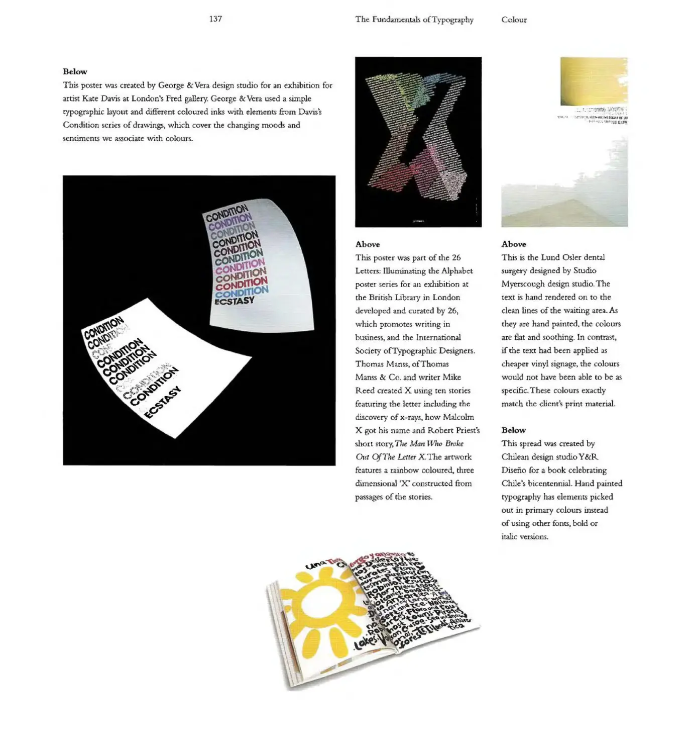
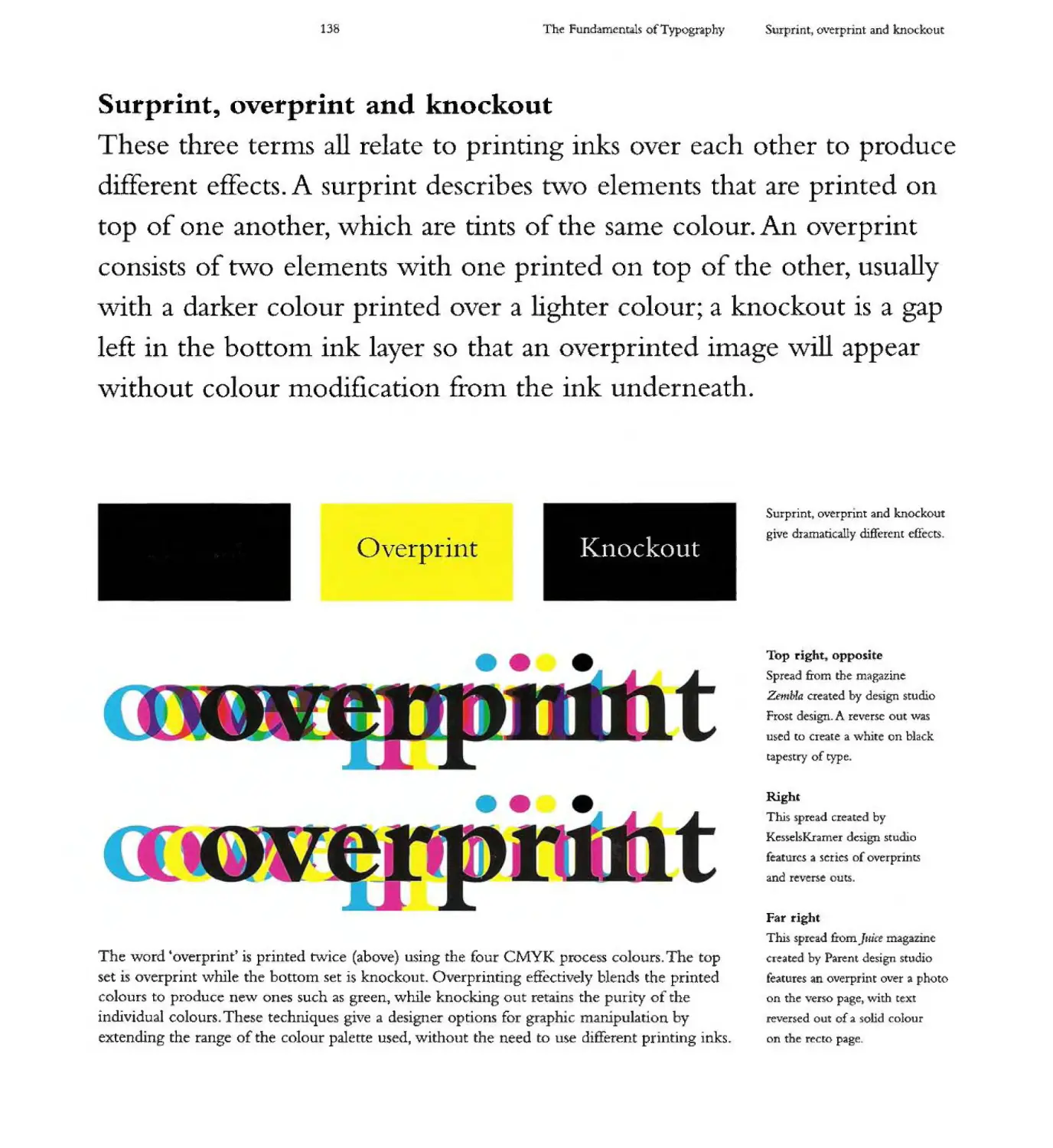
/


Author: Ambrose Gavin Harris Paul.
Tags: printing graphic design typography
ISBN: 2940373450
Year: 2006

Text
-
r
$:
I
-
-
""'I[
I'
c
"'"
"'"
"
-
....
.
.
.
110
-I
'j
:::F
::::J;
-
(')
oI'D
.
.
I
-
:-J , Lk1....1..
IJ'I. hLj:.....t"..J L, .'I.\-r.i\ I" ,,,,1,: Li 1":0. SA
H.JL ,l... I" . r.. ,,-,III OJ I :
C iI!Y. I'..... -I,.
I' 1..11 "-I w: I'
.; \i r .. I ,I, I
..:-1: 1.;-' .. II. II,'
I 11..1 I.:... II"ILI]['. . I' ....10..:.., ".(.'. .111
,. -":'1 I .,1 .... L... rl, "'L.... i\ .. I:I:I......LI (:. ."-...a · , ,.....",.. ".J
I I' I I.. ...r .. ,. I
LI '11.1...:11 \\'(. ..r ;QX
rn' Ir... III k J I
r 1. I
:.: , j .I:, ....... ..
r . ..1..-t-l. )11 -1-:.1 - -. ...
r II) l I... rh f.., LI Ld"J II - I..
L .... .... I L';' II I L.I IlId:-.-""]I....1J I]
1 \iI' ,I. H,'. n h,- LI'-i..... ".' {-, ,.j.. h
Inp.'111 I ubk: 1.e-':" -iL' n Ii:: . I.....
I II!!; Jill Lh-J
I ....':;.:]1:I '= .3- 1 L.' '.
Ii..:.....
L 1: I f. II'" -.: I
F.i'L -+1 ;-'1'" .... II. .
1.11).1 I 1.1 bJ.. I I" -.....I!, I..' '-.' i I ' I 1.. hIJ:.II... ...., I-L.. 1-'111
E 1. II::i 1. ill LJ.I r.;.. :-.. L1 )_1 {, . I in
.'\.I '11 I " d 1.1, . U F\ I I [L.
,'1: ..:I L IJI"':' "";'IJ .r =.
F In. I: 0:"'1..1' '.1'1.1.. . t ,.... .lo........ .. L" II
.., \I/L II1.:bll ' I ri /1. III (
\1 I i .. .'. n'l:,.... r-.. p... (d.... P'" .h.. 'I' 1.1..... · I" L"1.n........ I
r:::"1 'd i I C"....I .. .!. I.' "II i .:t""1"=II'llr,-d III .-'1\ L 1"11 IL" II" "l r In=-- ....
L I... L l I_I":. rJ I.....: L I: I' I. 'b!)LLI.....'l I:Llt. rT':LI rd:n .= cr i["I 'IL L-...t . '!. .tL l' LI.
r :1 I "'I")II ",f I C' L".. "p. 11_ r I. I' d d... I..
I I...N .. is...::! - ", III -;. =1.0-....-.- I
Ii ...j - -
I ') "=,,," II -'::-'" I1L ,.1 r.-.o:..
TI;'\ I. . (:. .LlIAu h'(.! .1 d 1.11 I F I
l.r.:JL!'U:r I..' . ....... \ L ...; )... n.1L1L1' 10[1
3i+ to" I" :-. -1j
LLL __ :-':1 Ur.l.'1 I h
I. - I=' II '=j". I '.1"
I II. ..:.I. ..rL.... I h,-'I("'1..;..I ...h.. .) . -... I 1'. OJ..
1" J I C" n I , I. .:In... 1]"::-" II .. ... L .-... 'L 10;- [I} I' ..:....-. . L-:::J II::LJ... L!. II : .._
L. . T II: 1...)1 o:,'r... L t [:1 · I I Uh' :-i r.. p['I.)..b.. d III rli 1, ..')l. I h. n L r. i I I .
.. [I ILL......... L-:L 11 11..:h r _Ll: I . 01 I}[t..:d_ LI(, pLlhJ.'ih-_.(' .... II l'IL..k...)LI r I'
1111 : II 1''' i ...!.. ';"1'1-:'.-11 II LI:i III II r I L" .1 1 J' I....
introduction
ow to get the most out of this boo
6
8
a rie tlstory 10 a e bas - cs 54 letterforms 80
The history of type 12 Typefaces and ants 56 Type families 82
Cune form tablets 14 Typeface anatomy 57 Typeweight va iations 83
Hieroglyphs 15 Re ative and absolute F utiger"s grid 84
. " measurements 58
Ideogram-based languages 16 Types of seri 86
P oenician characters 18 X-height 61 F actl0ns 88
The Greek alphabet 20 Basic terminology 62 Superscript and subscript 89
Cy'Uiclanguages 22 Majuscule and minuscule 64 Numerals 90
Semitic and Aramaic Set w+dth 65 Punctuation 91
languages 24 Basel ine grid 66 Diacrif eal marks 92
The Roman alphabet 26 The golden section 68 Dashes 94
The modern a phabet 28 Fibonacci sequence 69 Character spacing 95
Moveable type, 1436 30 Standard pa e s+zes 70 Expert sets and
The effect of printing The page - how we read 7 specia characters 96
in Europe 32 Dividing the page 76 Ligatures J d"pthongs
The Industria Revolution, 18005 34 and sans se f ogotypes 98
Arts and Crafts Movement, 1850s 36 Drop and standing capitals 99
Modernism, 1910 38 Small capitals
19505 2 ( rue and false) 100
19608 44 I ahc and obi ique 101
1970s 46 Type classi ication systems 102
19805 8 Type c assi ica ion in practice 108
19905 50 Newspa er text f ces 110
Graphic design since 2000 52
..4
.
..
words and pa agraphs 112 uSln type 13 proof ma ks 168
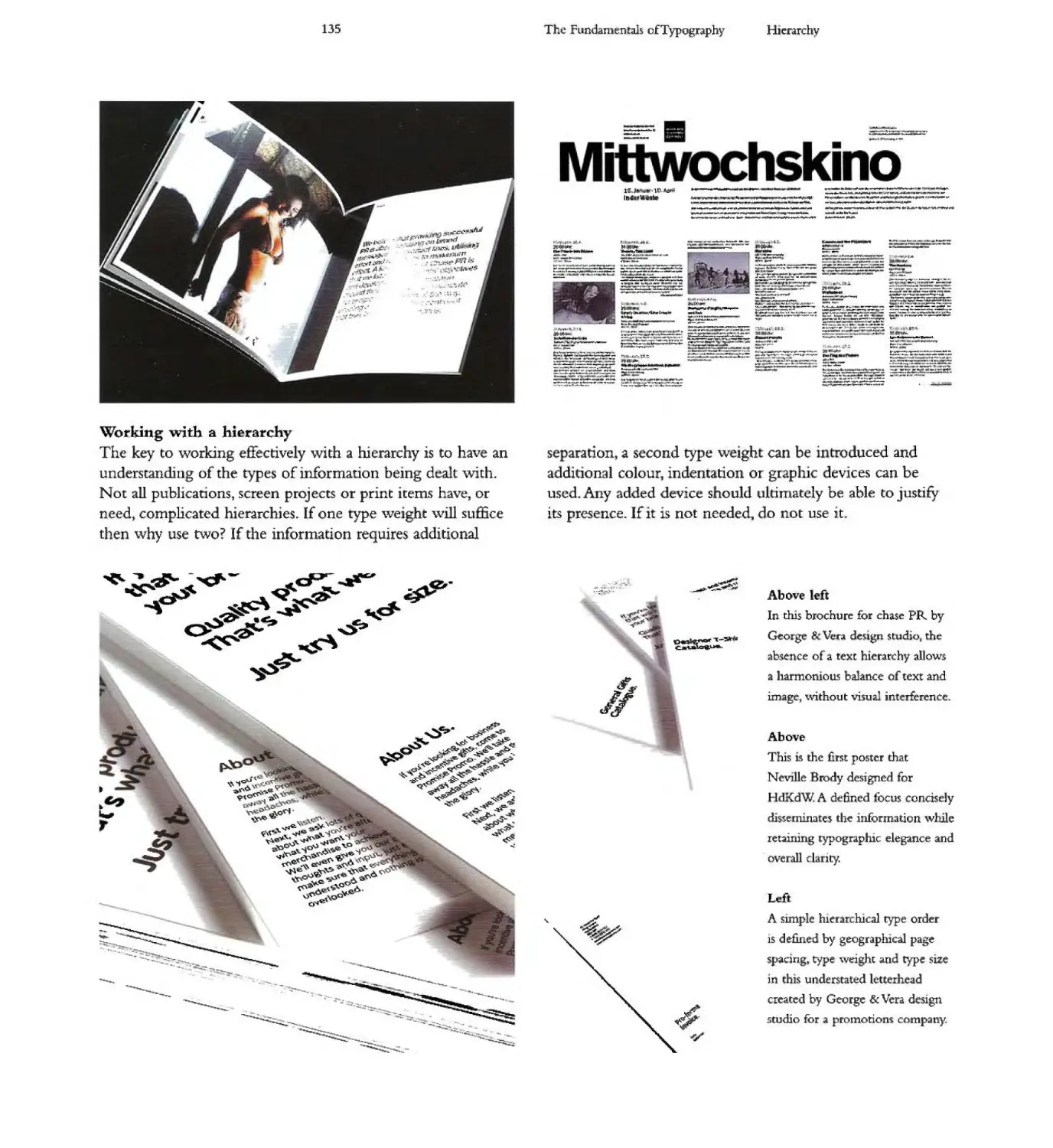
Ca culati 19 line fengths 114 HIerarchy 34 co clu io 170
Kerning and letterspacing 116 Colour 36 co ntacts 1
Automated kerning tables 11 Surprint" overpnnt glossary 72
-
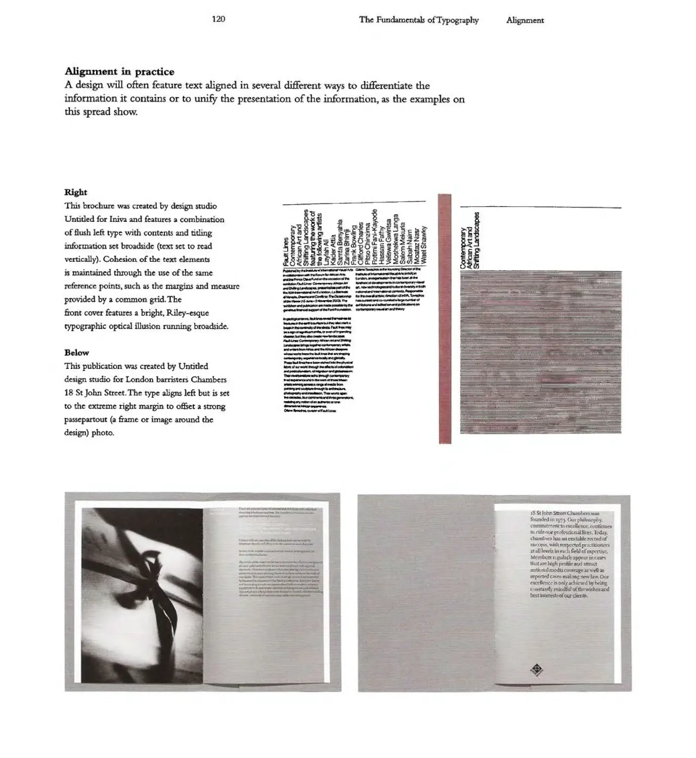
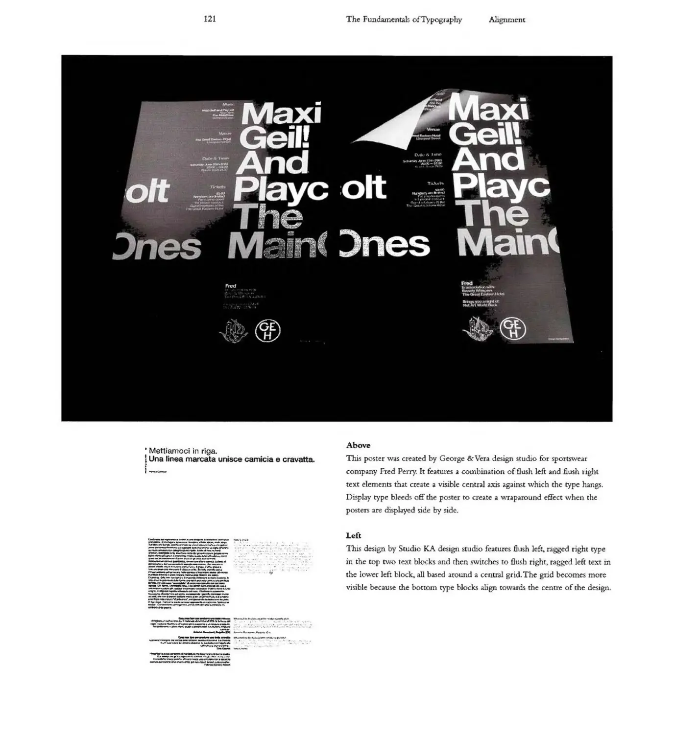
Alignment 118 and knockou 138 i dex 174
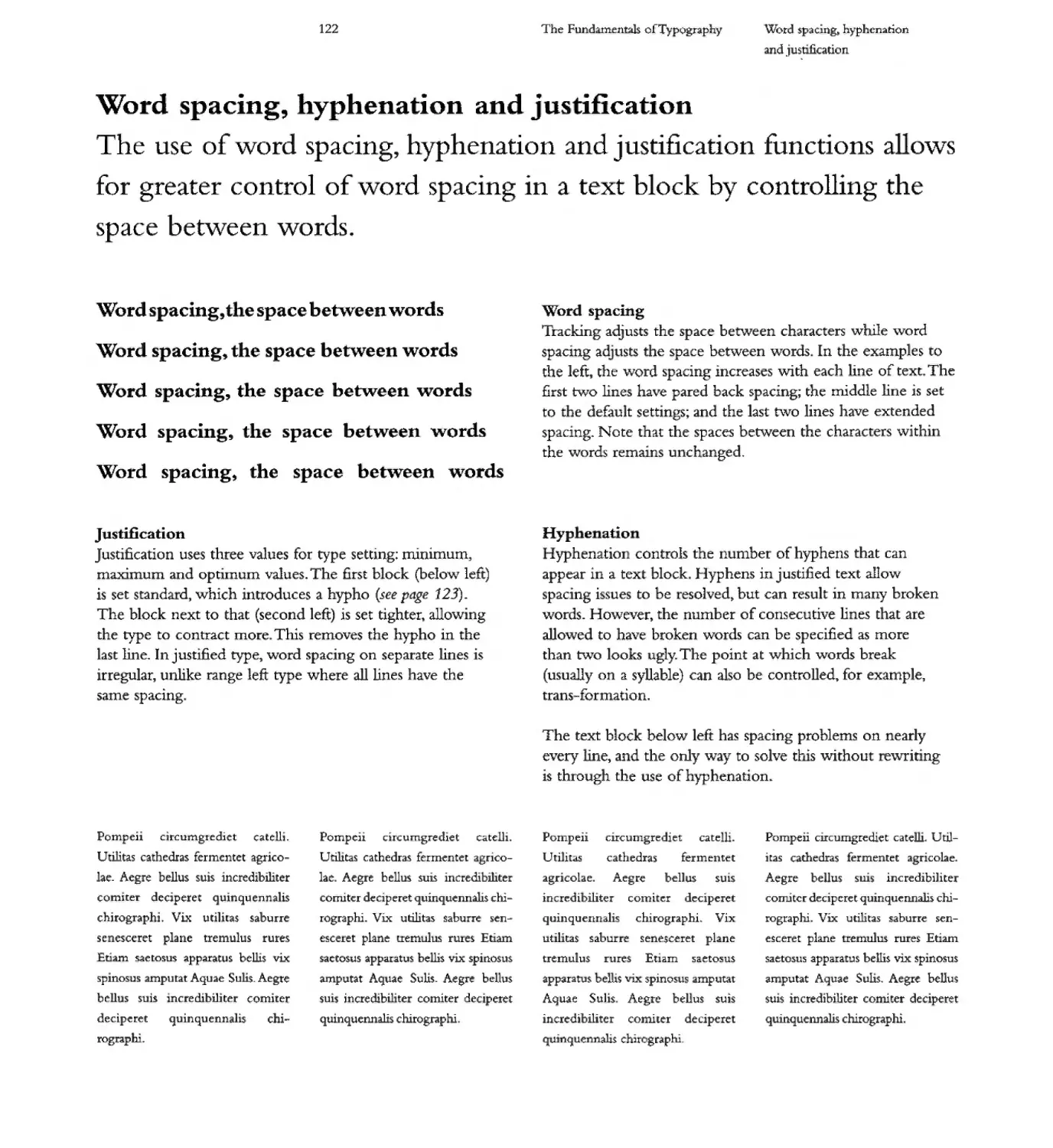
Word spacing, hyphenation Printing and type realisation 140 font i dex 176
and justification 122 Type on screen 1 4
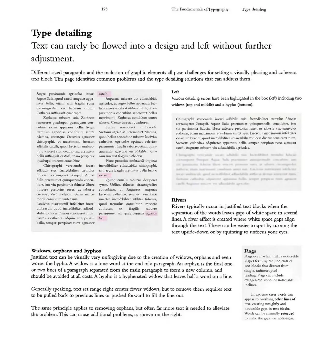
Type detai ing 123 G ids and fonts 1 6
Leading 124 Generating type 148
Indents 126 Leg ibility and readabi ity 50
Irdexes 127 Text re 152
Type s.ze 128 Type as image 15
Display type 129 Concrete poetry,
Reversing type 30 typograms, trompe I-ceil
Wraps and runarounds 31 and ca ligrammes 156
ype in the environment 158
Scale 160
Vernacular 162
Appropriation 164
Typographic democ aey 166
Ownership 167
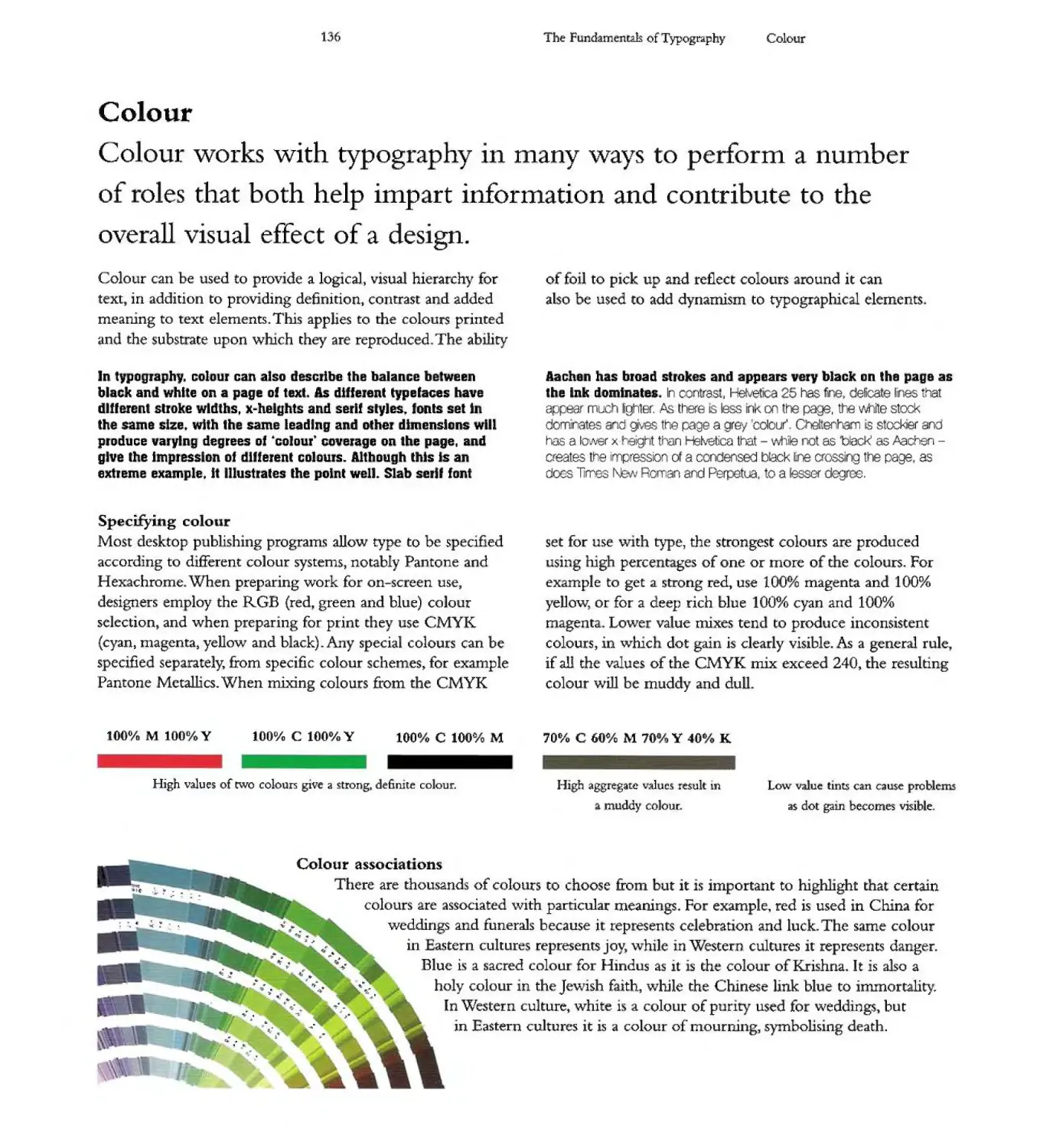
L guage is the
Samuel Johnso
Typography surrounds us: it adorns the building.s
and the streets through which we pass. it is a
component part of the ever-expanding variety of
media we consume - from magazines. to television
and the i ternet - and we even increasingly sport
it on our clothing in the form of branding and
symbolic messages.
The typography that is a fundamenta1 part of
our lives today is the culmination of cantu jas of
development, as the letters that comprise the written
word evolved and crystalised into the alphabets
hat are in common usage. Technology has played
a central rore +n this development. affecting and
changing the way that the ma ks we recognise as
characters a e made and presented Through the
development of the p inting industry. tect-no'ogy
gave birth to the concept of typog aphYt the many
ifferent presentations of the same character set.
ress of t
o
ght
Wh+le this book provides a deep insight into the
essence of typog aphica development from the base
of i s hist.orical roots., it goes m ch furt er J as by
necessity it deals with language and communication,
wo co Icepts to which ypography is inextricably
rnked. As the 18th-century English writer Samue1
Johnson said. .Language <>8 the dress of thought'.
hat beirg the case typography can be viewed as
one 0 the swatches of abric from which that dress
is made.
t is oped that this volume wll serve as a valuable
sou ce 0 typographical information with which
i formed des gn choices can be made, to add depth
and Gon ext to a work.. This book is also intended
to be a source of c eative inspiration through the
visual exploration 0 type aces ove the ages.
a
e 'can
Typ' 1 . - Light
Busorama
Go. ia
Hummmt 777
Mode , No. 20
Novarcse
top
Trixie c · 0
Yorstat
· fino
..
c
Got'Uc
-
I I ct
I
On
Umve. 45
t
Empire
Witt b :er
. . "11r MT
I I ..
o ann .
Linear 0 I
..
lDl
P i;u Li:
Quorun Black
Rosewood
G Ra ded
WU1dso
Oxoxa
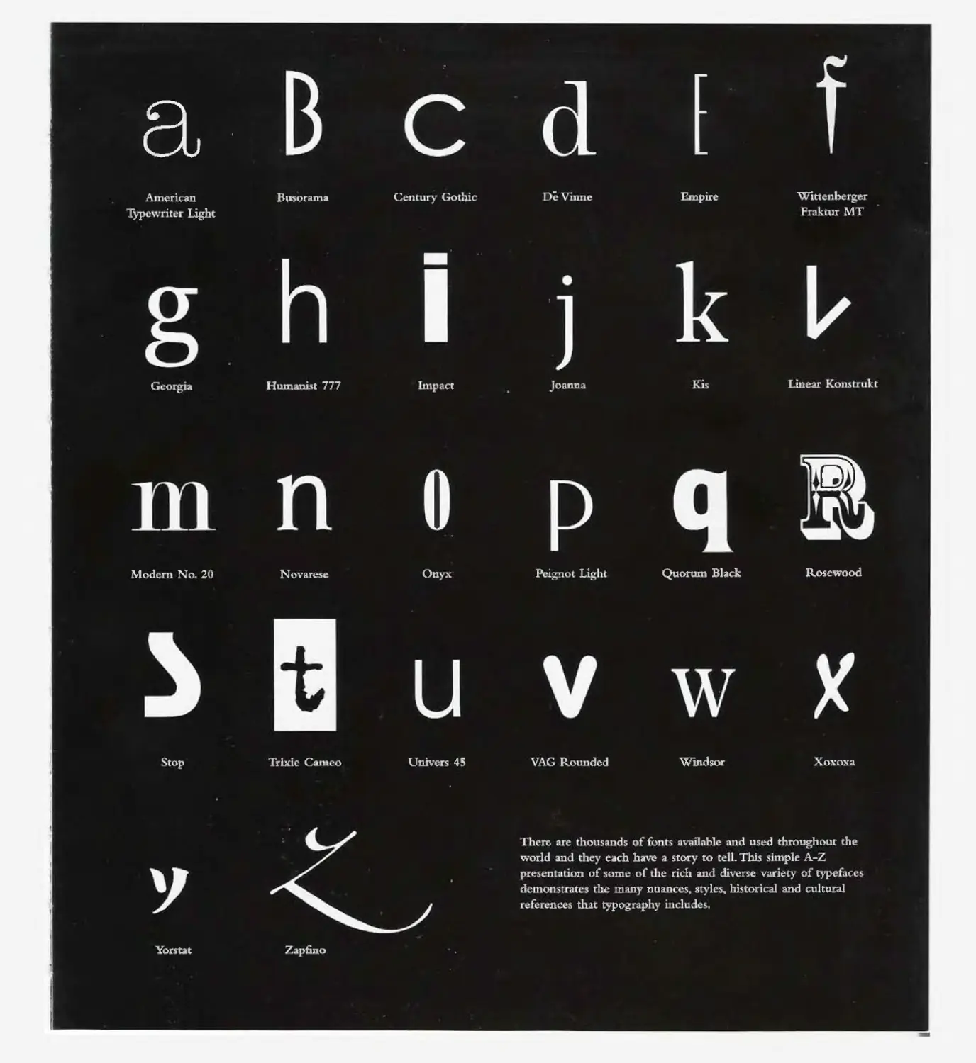
rc : 0: I ISO I" I - . vailabl . d us - d throughOUt the
world. I ,. . e. h ha e . s.to to t-Il. This . pIe A-
pre- e on of som - of . r- h an,. div- se varie of type . c
dOli. S I e III any nuan e s leSt his tor 4 al and c tural
nc s th.a typo Pl.
-
.....
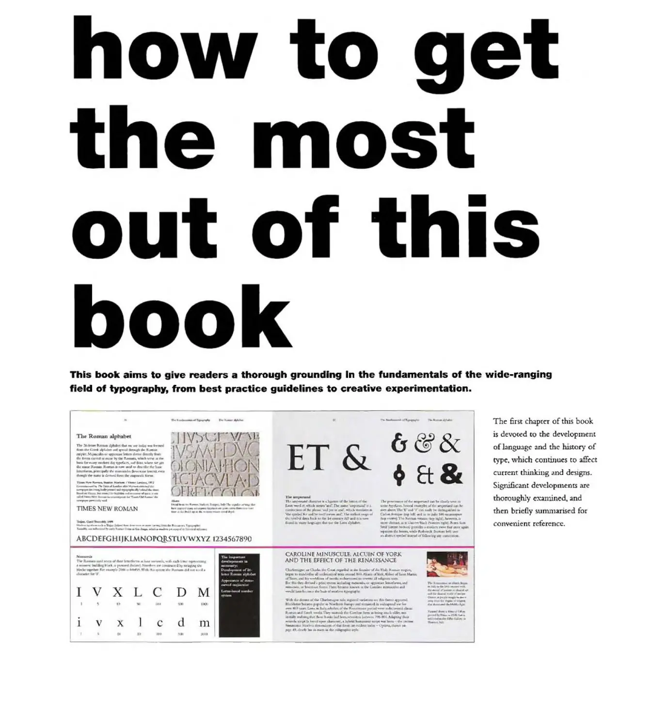
This book aims to ive readers a thorough grounding In the un amenta 5 0 the wide-rang*ng
eld 0 typog aphy, from best practice guidelines to creative experiment tion.
f100 , .. ...
:c: .... - ....
(J &
111
Et .
.
Tbr RUII1i1D Irhab t
I V.J\ J \ \1-
'1\ · \ \ I r V
1 J\Hf 1 \ f'\J
r -' 1 . 1
J.
TIll' !boll .., _ _ ....
4. t Mil doc
M.-.
"'" .I._ 11Io_.
..........,. ...,..... "- --' "'ttm 'If' JIll
__ IIw;o
Itw ..... l,non
..
......... ___ .._ 1"3
r_... . ....--. __...J
--"'"---"" ........."....
..... _ "'--.1 .... t6. _
1_, .. ... T......:a.I ...
.- -
\
\
r
n..
r..-. 1Ot";II
-
,.. _ _ ""- .....'Itr. <--.,. ...
.. -
... . 1I.u..... .. .. .... .. .......
"L
[kro--- ....
I')T .........
"'I T bo-
. I" 1 .....
<r-.nt :k
Id. I,.' twi It.
"1;1
nMES'J '\\, ROJ\.1AN
"
'b _ lb<-.
1Iu. TJ'ntDo" ,
III
..
...........
1-
.......---....'1' ...-.____.......-..;. ... ....,
- ..--.. .. "-' ........ .. .. ;I.
,fI,
A CD - G ilK \ orQRSTUV\'vXYZ 123 567890
!do
..,,-.aw.lo
11 -.I--.".6 .IIII_-.l.....-" .trar
l.1l ""-hoo ,1'1 .....
. _ 1 I 'iI' .... .. .... .
CAJlOUNE MtNUSCUlE, "'lCUIIli or YORK
AND T.f Ff CT Of THE RI" AISSA".,fC
"Boo
",.
a-
l ... C:...oI..,..... ..
..-.
. ..,
..... Ji._
"
....
......... ..
r
n.
..
1 V X D rvf
" "-'
. d
J V A C n1
tu I JI I
I
-.u k-=-=..E ........ <IL II].
....
- ......
.-
to ...-
ht ..... 1 ..o.:! .....im
__oIoJ t.-..,.. '" .. II.
I .
do..: }o..... ............
!-I
... !In 011" .. -. 11
J, do ....
-..
.. ..II....
1__ _ISA. ..
. r..
The first chaptcr of thIs book
is devQ[ed to the develOPlnent
of language and the history of
type, \VhlCh contu-lues to affect
curren t thinking c\nd d e lgns&
S'gruficant devdopn1enrs are
thoroughly ex:unined, and
then briefly surrunarised for
convenien[ reference.
...
t'r
""-- .. ......
111I
--- .j".n'
1
I,
..-
....
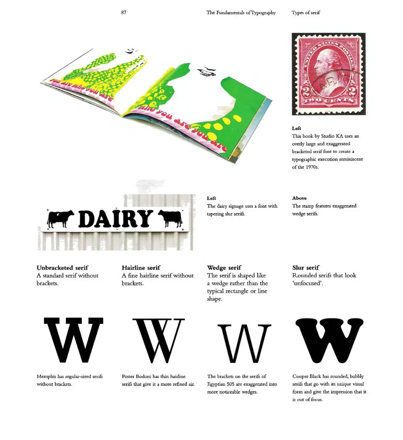
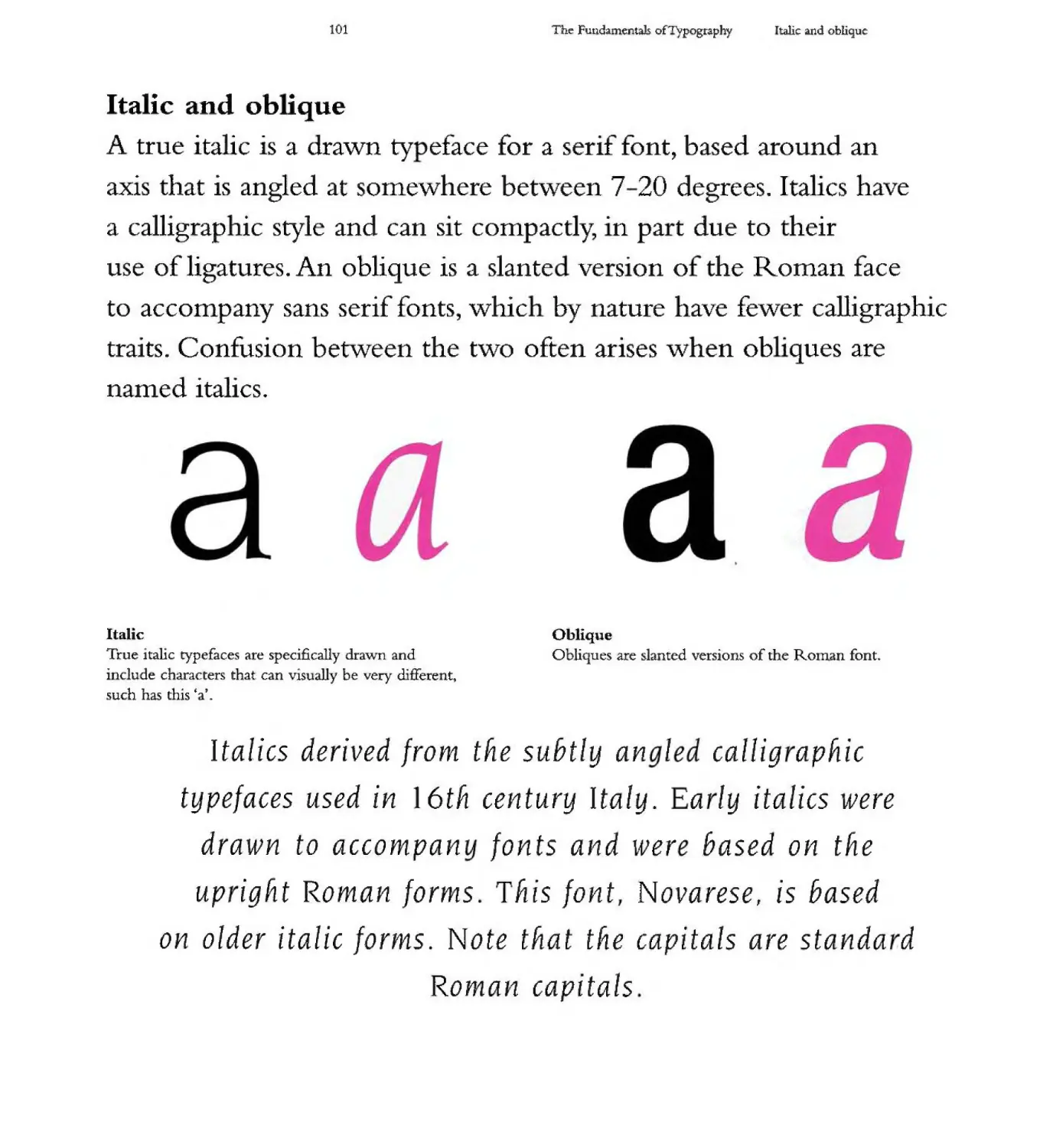
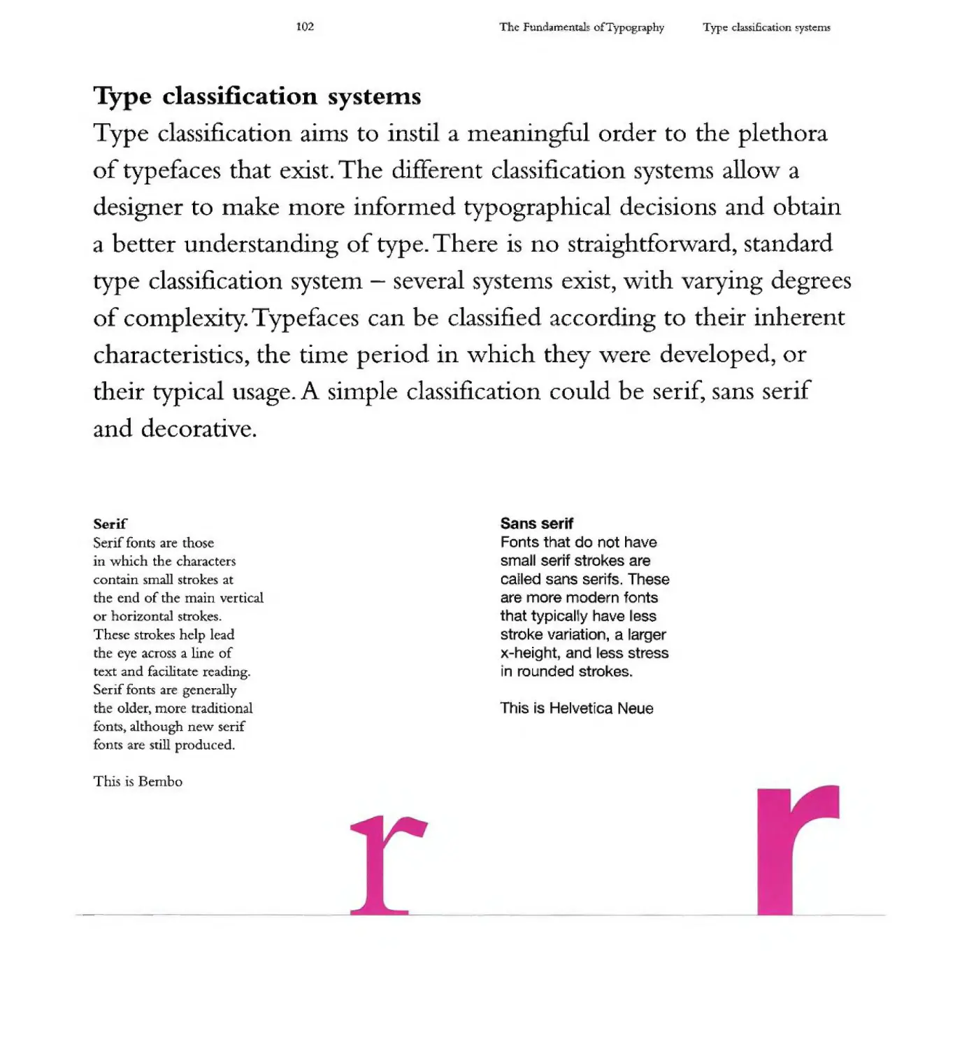
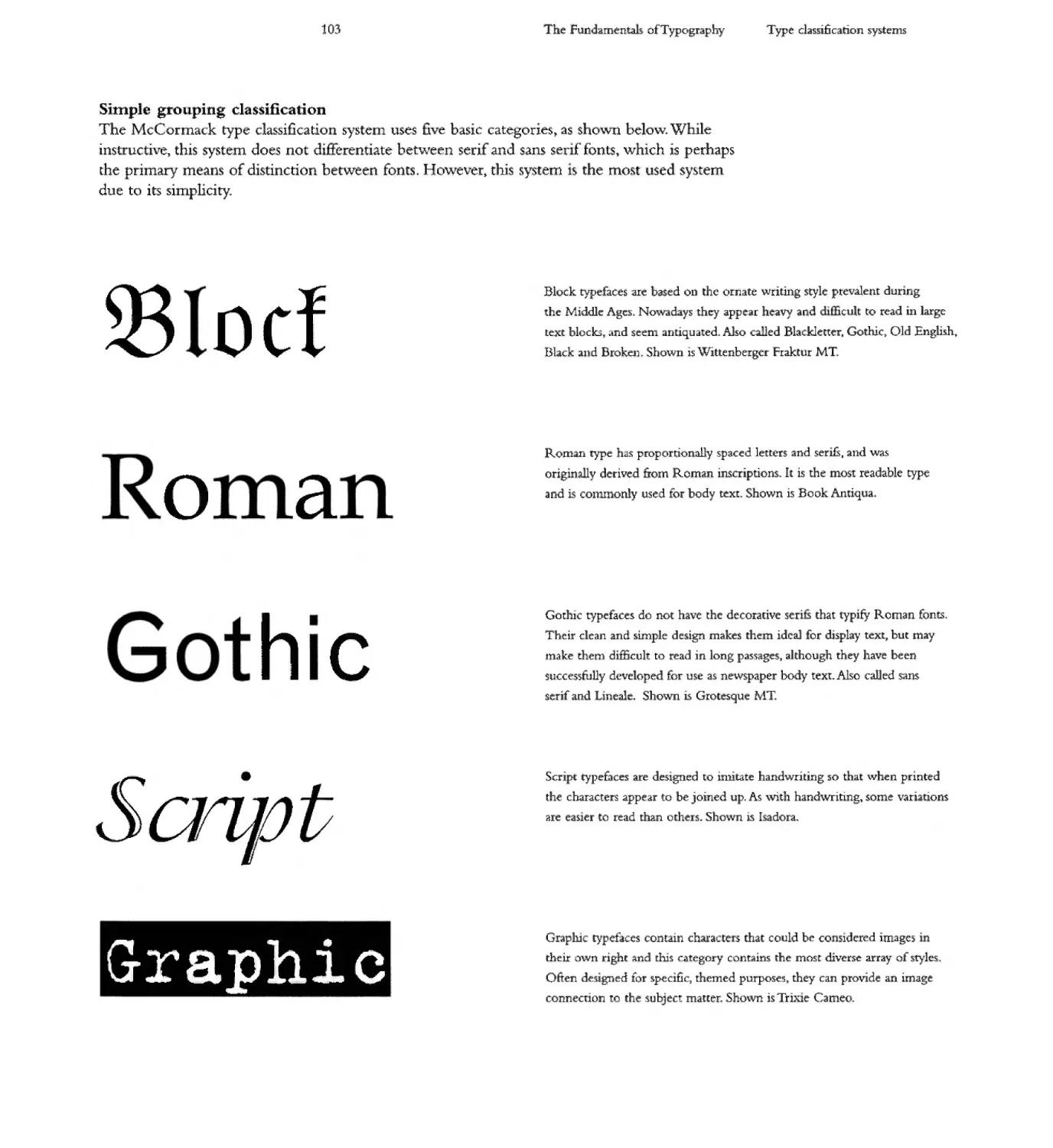
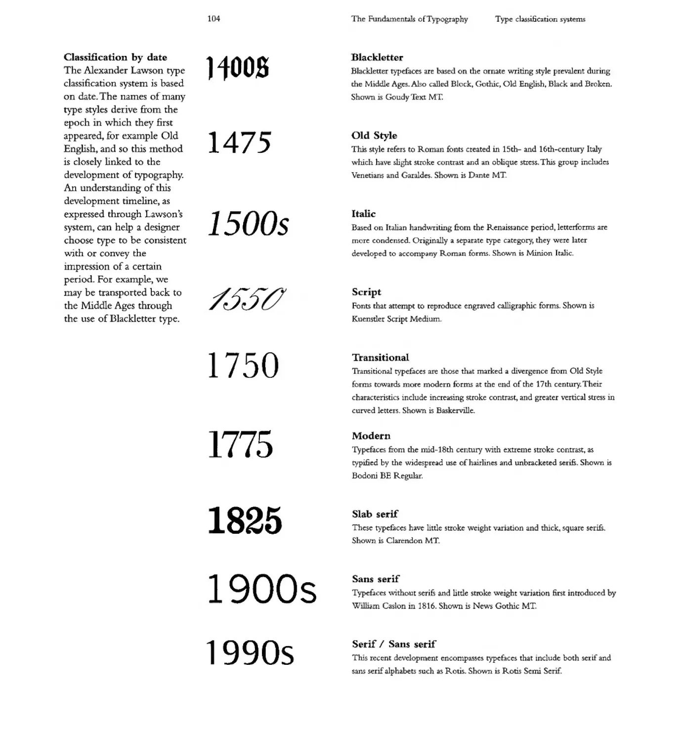
'I)rpcl of ler if
s.c-ri& key chaucterirnc for identifying It typeface due: to the-
V'anl::ty of in whic;h thq n emplOyt:d Wo\l&hOUt we
d vclopmeD.t of rypognphy. S ntwK: tbt= r ;a blliry of;j pJt=("e
of text by hc:]plD the eye to adv.mce &om one chanc[ r (0 d1t' :n X[
Many serif styles R'fle'ct the zeitgeist of a p2l'ticuhr time. WIth some
more otr'J..Ue or bo dt . while others m more lCt .il.nd n:6nal..
Som of the moun s.ccif «yli::S illu.stnl:rd hen:
Horizonta1 movement across the page.. .
4,.
'\.
. \.
.....
n._.._....._...
............ ---
-.f.... ..
--
..r...
in contrast to vertical solidity
- . .. -. . - -.1 ' . J I
.; i !. f: t. +..
. DAIRY -
. :. 1.:.,
n._....... n._........_ iii _ ...........
____... ............._....- _. :II'
II'Ia. .. .... ....
11o.oooii
_ ""* ... .....,
.... ---,-...,
- ........
........- -...---
J..__4oi14
.... -..... _ 01. -....
-- ..-....
--- ...............
.. ...v
........ -r
IIWIIIIIIII '-*n _
......
-""
It. .........wJ
IkIdiN.
oftII'
""' -..........
..,... -.l1Ini111t1o
........ -'II
,., -- ..... ......
--* .."-,,.
.........
..... -.....-....... .
w
...-....,...- r..1!I.o
--.....,...- '-
......ollooo. _ __
....-.. ----
II;,. ......
«............11II....... ....."..
... ...-... .. .,...
....--......_ .-
.11.-\ ".-.w ....
........ ..
.... MoIIR
__..I_C-.__
.... ... ... ....
---
1...1:
.............--.--
....... .........
-
n..__
..... ....
MeWIn wdI
"""" '-"- --'..."a.-.
---..
...... MIll
n. ....I. .... ...
..... 11IIII. _
'M'Io!"IiI--.ar .... ....
IaII! __
a...-.. -40 ...
.
Ww
---. .......... __ no __._.. .. ..-6oC
_a._'"""""..... ---"'-
.....
0I00t ..-Lo........-.
--.-- ............
.... ...... 110:...- .....
..... ...
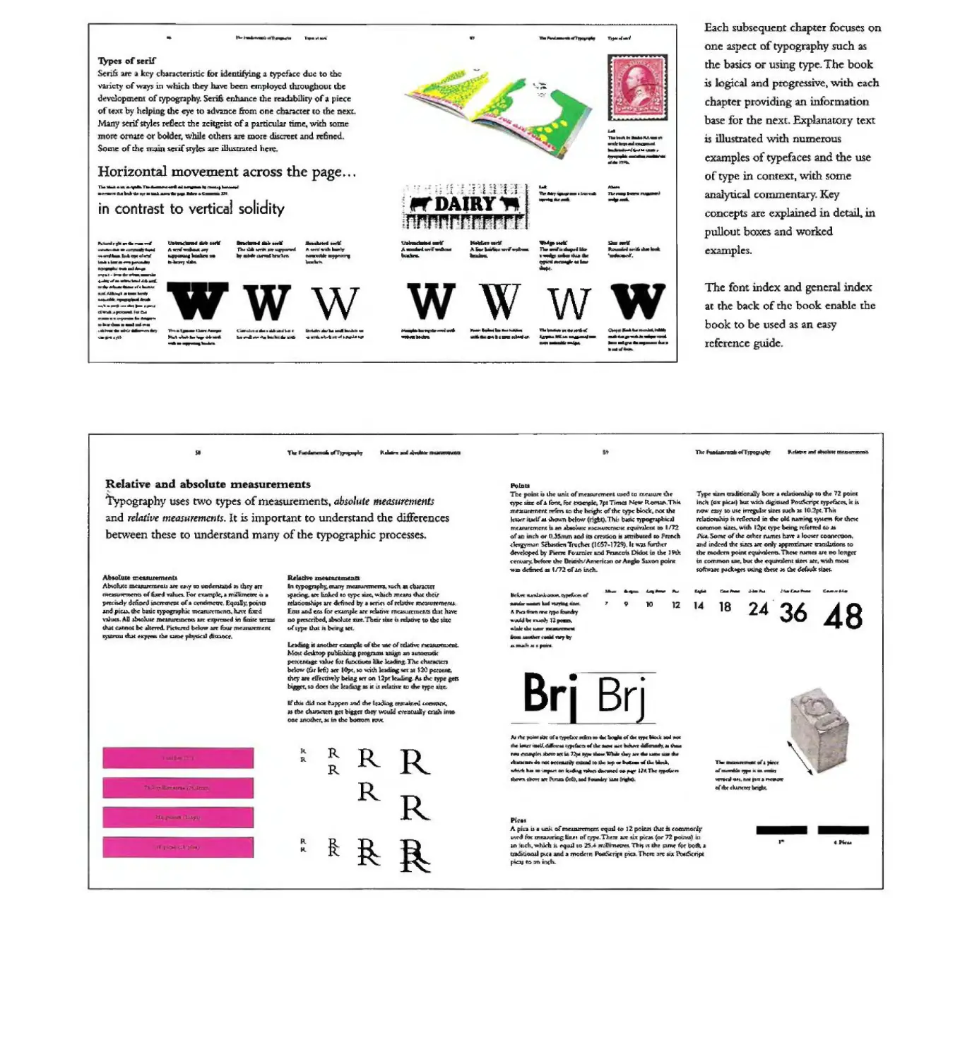
Each subsequent chapter focuses on
one aspect of typography such as
the basics or using type. The book
1$ ogical and progressive v.ri.th c::.ach
chapter providing an information
base for the next fu.:phnatory text
is illustrated with numerous
examples of typefaces and the use
of type in context. W1th some
analytical commentary. K y
concepts 3.IC exphined in dctail in
pullout boxes ;and \VOrked
examples.
The font mdex and general mdex
at the back of the book enable the
book to be used as an easy
reference guide.
5f
..
Ildi.n: ..,.!I....
.-tllll -.-..-
1W
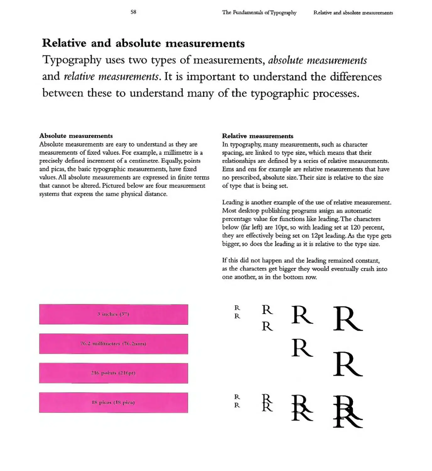
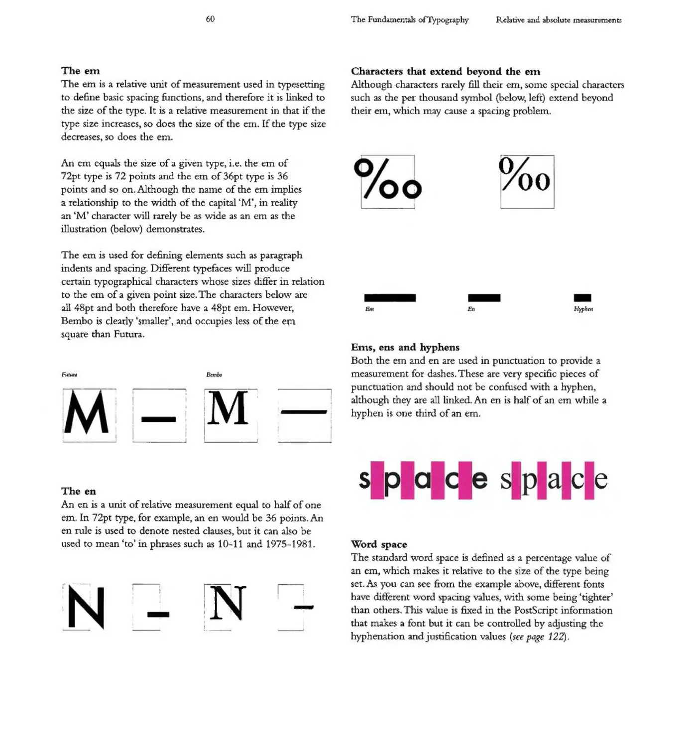
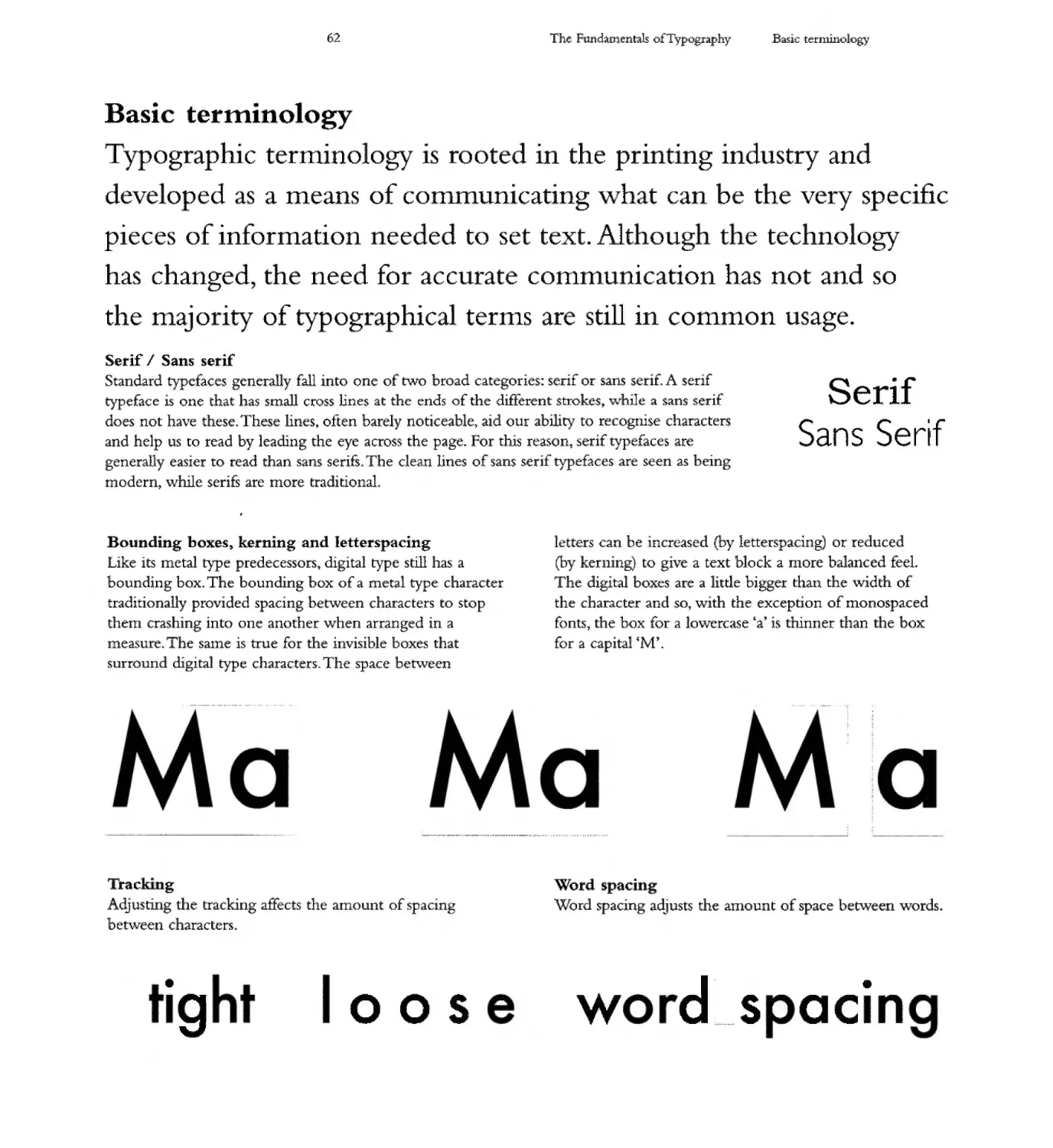
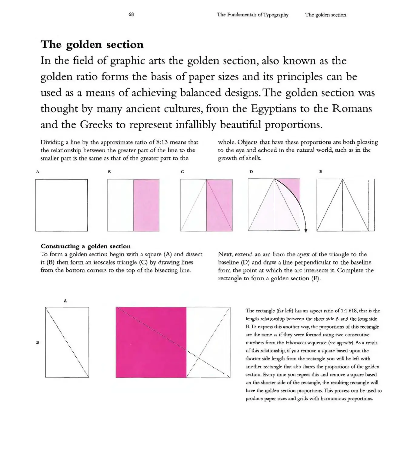
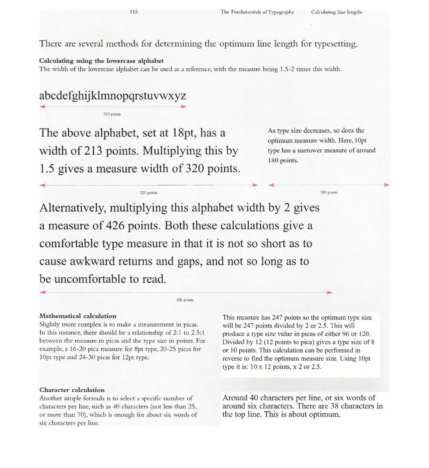
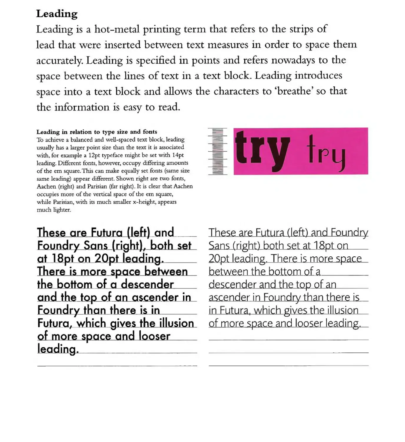
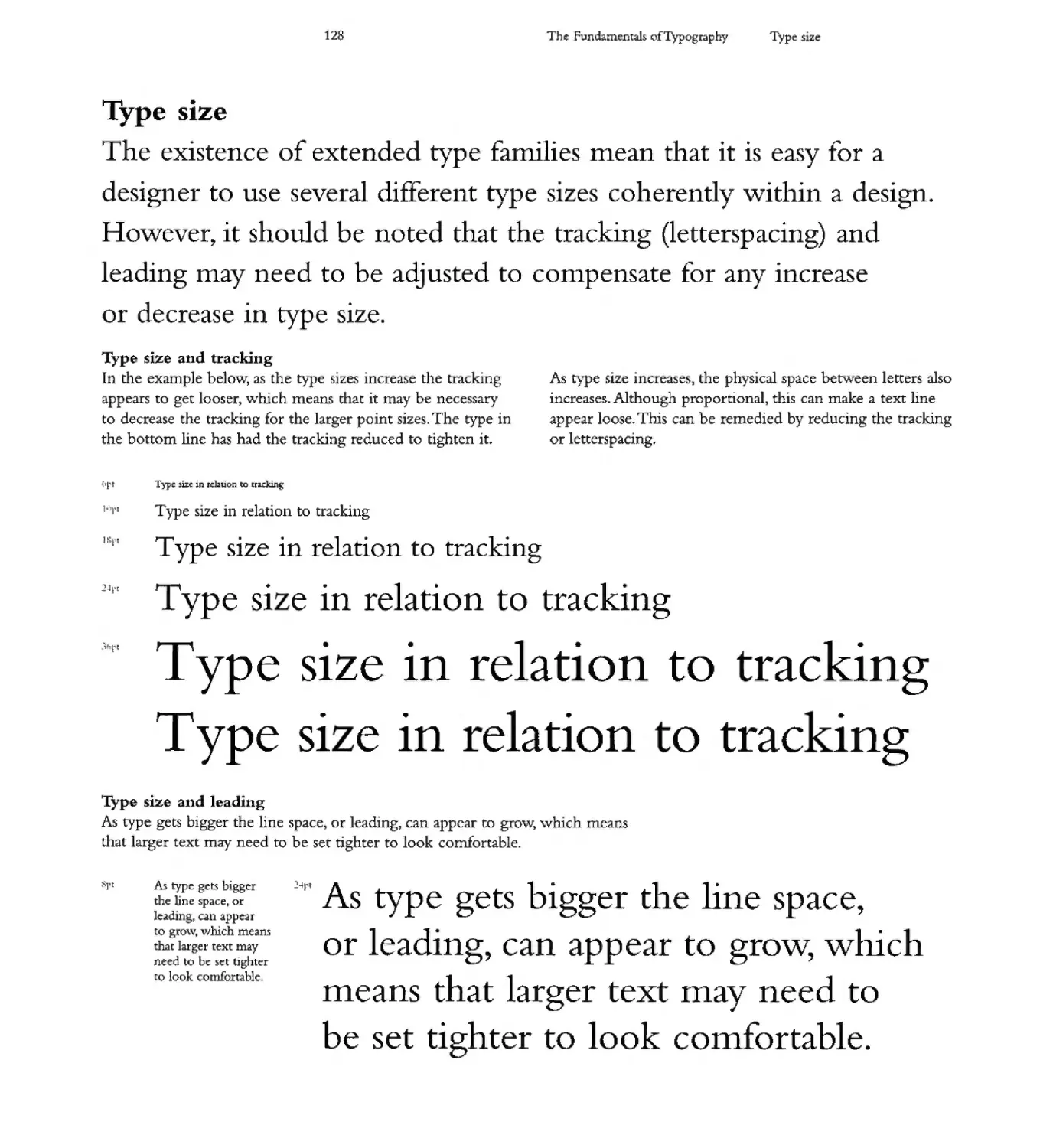
Relative and absolute measurements
Typography uSe) two types of measurements absolute 1!tasuremtt1ts
and relative measurements. It is in1portant to understand the diH'erences
beMeen these to understand m3ny of the typograpluc processes.
AbIObl. 1:I:Ic:uUl$lfttftCi
Ab\ahKc mc- .I« ...y IIJ vmdmuJ)d ;jI1;\!
at 62d onIuoes.. t'Ol' ill nU.IImIe_ u ..
ady dC' '" E oCJo . Eq.., ).. poilU'
md us. die bU:II:: qi'PogI'Jfhic M"C tixN
\7iNcs. \U U: an: In 6Dik 1ntDS
C'"",, ( be- ..1 I"idll11"!d bdow f'ow " m:
S)-mvu dYt 1f'XJ'1'S me umr phyDc.1l .
R.d.6ttft ZDoeUCItIt.lDlU1D;
In q-pos:nph 1IIWI)' ("
1f ue 10 which JIIIf'.IftJ d\;u '!heir
rt ps at'C' by.1ICIi.n offtbQW .
&II nI. for ;pk an- tna.lUrnnc.na Ib
DO I'l'dCnbtd. .ah:ihJEe SIZe. .nell' SID: U 'to me
Dl LrF I1uE H bo;-Ina IC(.
1.ndJ.18. anotbet .1Iix "*' d t
"'1oIt pLII p :uI.J&!I a'II aYIDIrDiIK
./IQF "Dot (tn fWx.x- hU . Th..:!
bdow (tu ) .XC' lOpe, .....ir.h J .. t3CJ pete
. 1ft' if(f 1r bllq 1ft CIft 12pr ... N IIhc _ IS
bim"t. to [M It.ldiq M ill I.S n:1..I.h"T CD cJw. Iyp 5/J:Co
Il'dOI did not: fu.ppen.md Ihr r
" tbe n an 'bla:er dKv WOIdd c''''tl:lEWly
OM . tndse-
J\ R R R
Po.
R
. n I R
R
It R:
R
PoIDu
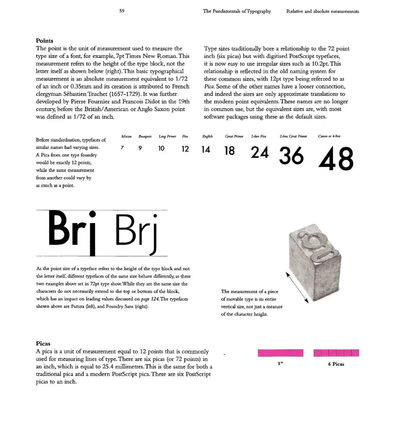
Tbt:: . E illlIhc- IUIil 1M.&:RJ'..",CfI.. L!;ICd E(I me'&l1,II'e UlC'
'EfPC !III:£ of.i font. rot oOOcnpk. 71'1 Timet N('II' R. Thi4.
:mI!'Z:Llr.t'Tflm men Ie E oftk type' Woc'k,1'MX IN
1r:l.\E'r jtvJ(.... -n below (ngIIQ, TIw 'IJP'DIT IC.d
mt....t e:JI .... "" IC" J1 f';f'J K C'qLII ID 1172
of ;II] .:h 01' 01limm I.Od 115 (1W:I1ioc II .aanb co ftmcllc
("'\e:tJyrnJ1l Tnld1n CI(.S?-17l9},lt-.ou d
drwJotrd t;.,.. .PI"rnIe Foum.in acd :Fnnccu. DMiDc. 111 the J 9th
,, IIhe- D A.rI CII' A, Go 5.Jxon pcllll:
111'8 dc1inrd.... . m or oUIo incJ.
Tk dT 1'9P
T}-pt! szn aadilb<JNll). baR ;I = d\1[" 72 pom{
ir\(:h (s:i pe. 11m ",,"un diJuil«l Poo;.tSmp: typftxC'l, ill: L"
t\Q'IIo' EO u C" itTC'pl.I Neh:H I 02pt. Thi.
ft: fd1«1£1! IC'I dx oW N/TI..... for
c__ Iius. \In'" I typoe I:J.an& l'Curmi to..
l"iu Som( of d od1ct Nmfi "C" oJ l(lQ(ler c:OQAC'('QI)ftI,
,an.d' iMt'td 'IIIc- aft' criy ..,mzIIIu« ro
dx modcn poIIW "nac- !!!MIla U'C: lItO loM'I£ff
UI [ me, bUll: diIe t K!:, WiMh ft10IC
fiOfj;"..vc pu IAII!II dM- cra. -R
-.r _ .- ..- ...- .... 1:iIOooo_ -,.. ;..c...... --
...... _ IIMI ...,... '9 '10 12 18 24 36 48
" P>a....,.,..... o/)'ta
...VIM Ib!: n:,..,.
..1M-. _
-rlll!r
.... ..."'.. . ,...
_i Brj
/II ...-..... vi" .. -!IKWrI c( dtrllJJ'4" IWo;v;II: -' _
'-r -u:. .".. .t Ik _ _1Idwotr .;Io
NIl! 1f.IE....12pI .., ........ u.y.llt'i"....__
dt ........ M'C 10-"'" Jia1I- av.- "" ...., ,
....4nrio ... _......... en Io; "'" _...... u. . nor ."..fro<n
"K"I'! II"t Pun..B Otf). MIl
P "...
A p...... u.. IIIDII. of flXoI.JI&tnrKnt njl.n.J «II J 2: polmt th:. :b. ..
to.: 1J1 1m.I, DF . n ]'I ;I.L'C ili pK"'" (cw" 72 pomu.) in
;an iIL'h.......hids t!. wI 1r:J. 2'5.... .nutI1 T11 ,,; lI1e f.JJ1IC' t'(I{ bod!. J
PI' -'I SJICIdC'111 I pU:::I ThCf'l: :s si;ll; riJI
m :m iBd'l.
TI.:
aT -"""'" .". tL _ _
- "'"' -
1I(!tor o:lufte
\
i1fi.rM
TrP: has · - v oped 0 er he last 600
e - r - he p n i.. races. has evolved.
he cha . c e th t are I nted, howeve ,
aye I een developed ave a much longe
;. pe · d ."- a guag - Its. f h - s deve 0 · e I
· m E ,ptl. n lero to the L:; t n
letters we use toda .
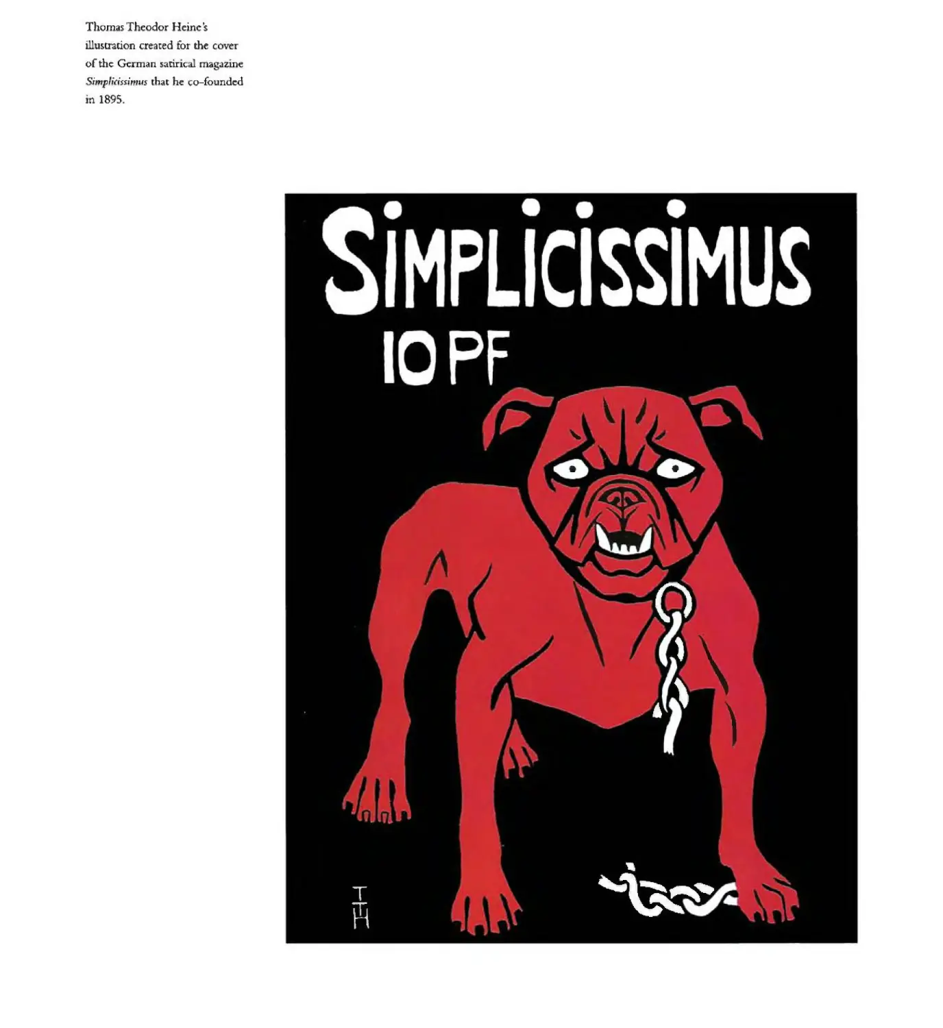
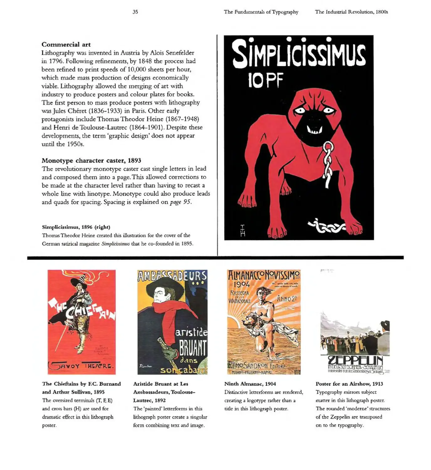
Thomas Theodor H inc '$
illustration created for the cover
of the German :satirical magazine
Si np/rdssi'mus that he co-founded
in 1895.
T
,
.
.
()
'\
,\ )
,.
'-
12
Th
Fundamentals 0 Typog ph
The iu.story of type:
he history 0 type
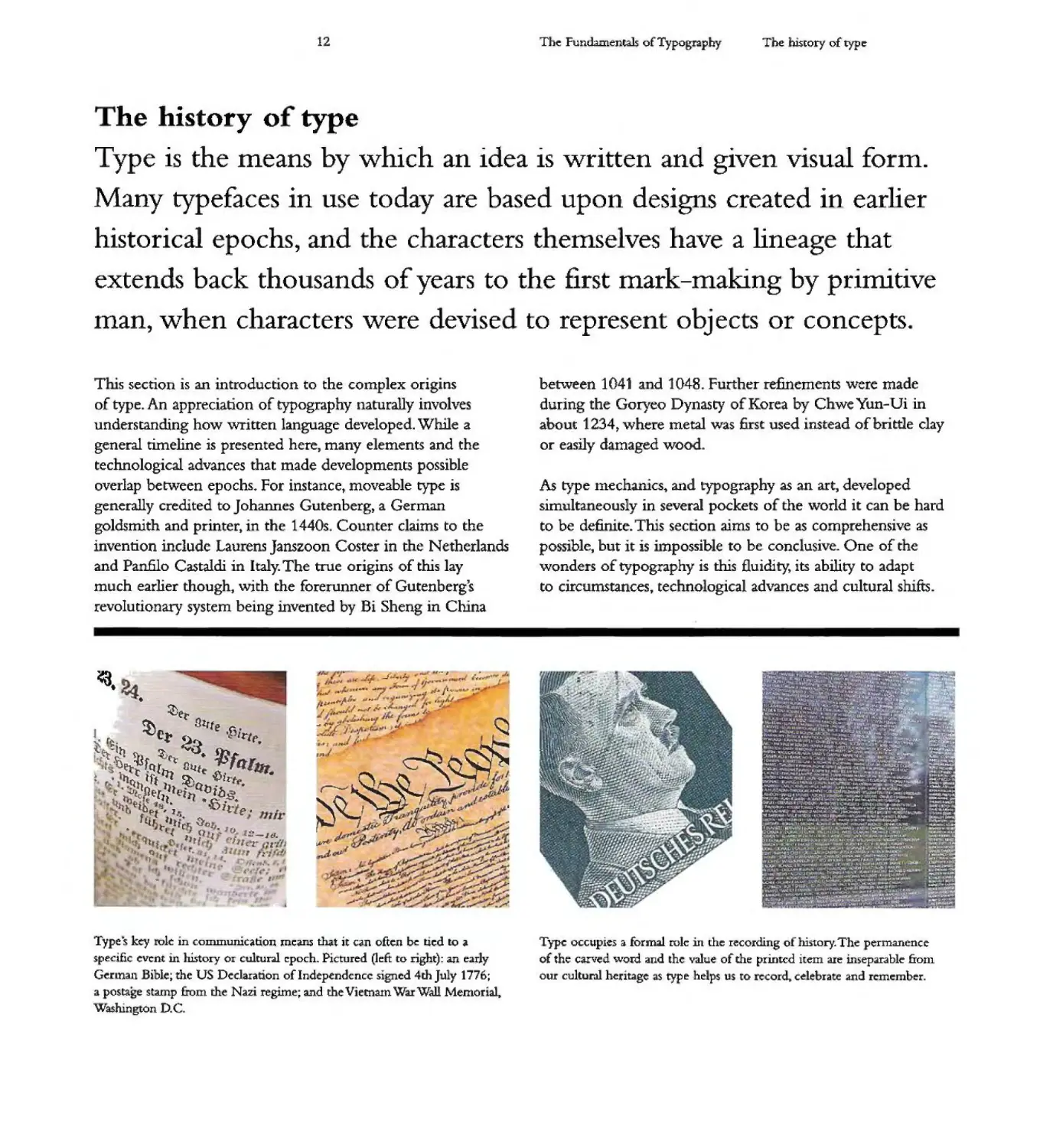
Type is the means by which an idea is written and given visual form.
Many typefaces in use today are based upon designs created in earlier
historical epochs, and he c aracters t emse ves have a lineage that
extends back thousands of years to the first mark-making by primitive
man, when characters were devise to represent obJec s or concepts.
T . s section is an introduction to the complex origins
of type. An appreciation of typography naturally involves
understanding how written language developed. Wlule a
general timeline is presented here, many elements and the
technological advances that made developments pos.sible
overlap betw'een epochs. For instance, moveable type is
generally credited to Johannes Gutenberg, a German
goldsmith and printer, in the 1440s_ Counter claIms to the
i vention include Lau ens ]anszoon Coster in t e Netherlands
and Pan.filo Castaldi in Italy. The true origins of this lay
much earlier though, with the forerunner of Gutenberg's
revolutionary system being mvented by Bi Sheng in China
.
,.- ,
J ..
l....
... I!...
....
I. Hl<'ft
-...r IV .'. I
/ .. .t............
.
er
()... all ie
J oo()e...!)4""t. .Pi rie
t
.
.
L. ft
q
t
.!fJ
-oS ,!ett"
Q lh--.. fl4t
. ' It
I 1t Q 1ft
..t
2l" ·
.' r \
8f:l: , l
eiJ? QtJibs ·
k l
e." -5 + ·
.'0 lbpt'i.. 1' JI It' e . I
· flU h llh c " fta
·
,. . 0
1 Q l ' :!
UI.
I 1 (\ ri !,lr. r ..,.
1 Q, Ii I l
.
I,
I
c.J
C>
_"
'..
"i. J
...r>
.1
r
. I.. .
I I .
I
1 ..
..
J.
Type"s key 01(: in communication me-ans that it c:an often br: ued to a
specIfic eVent in history Or cultural
poch. Pictured Oeft to nght): .an early
G
n11an lble; the US Dedaratlon of Independence signed 4th Jo y 1776;
a postage stamp from the Nazi regime; and the Vietnam W Wall Memorial.
Washington D
c.
between 1041 a d 1048. F rther refinements were made
during the Goryeo Dynasty 0 Korea by C we Yun-Ui in
about 1234,. where metal was first used instead of brittle clay
or easily damaged woo .
As type mechanics
and typography as an art, cleve oped
simulta eously in several pockets 0 the \vorld it can be hard
to be definite. This secrio aims to be as comprehensive as
poss
ble, but. i is. npossib e to be cone usive. One of the
wonders of typography is this £luidl ty, its ability to adapt
to circumstances y techno ogical advances and cultural shifts
.... ..
-..
. .
"fj
...... .
'r
.......
A
. -
:s..1- \. - ,...
\
.: ":
\
' "i
.:
;\
-
tll
\ l7!:
I
,' I
\\\- -.:.:
:.
.
.
.
-
.\.
.'. \ -
>
. L ... It'''' L .
". u..
. . -. . .: -.. )
''l.. " -
, J
". ' : '_..:'.
.\r. . ."
........ .
" ..... 'If""
.y.,
,.
, ..
. .
. I p-
. 'r
.. .. ............. .. ..
. I. . .11I7'Pi
'V
, .
;}
-'+r--
-
..
. . L .
..... I'
--
I .
.' .;> . 4 - ..
..... 10&. - I ..
, ....,.. ,.
. . 'I
.;, ,- t
.' "
...1 -
""'"
- __.. _: .::-:;;-r
.M!,
I '
,. .
.,..
.... .
[:.
. I.. . r ... ...
.... ..
. -.
.. ..
.
.
. I" I
. .
-
..-.
..
.
Type occupies a form.3l role m the reco:rding of his.tory. The pe:rmanence
of the carved word ;and the value of the printed item are insepd.r.abl
&0111
our cultural heritage s type helps us to record. ci!leblate .and remember.
13
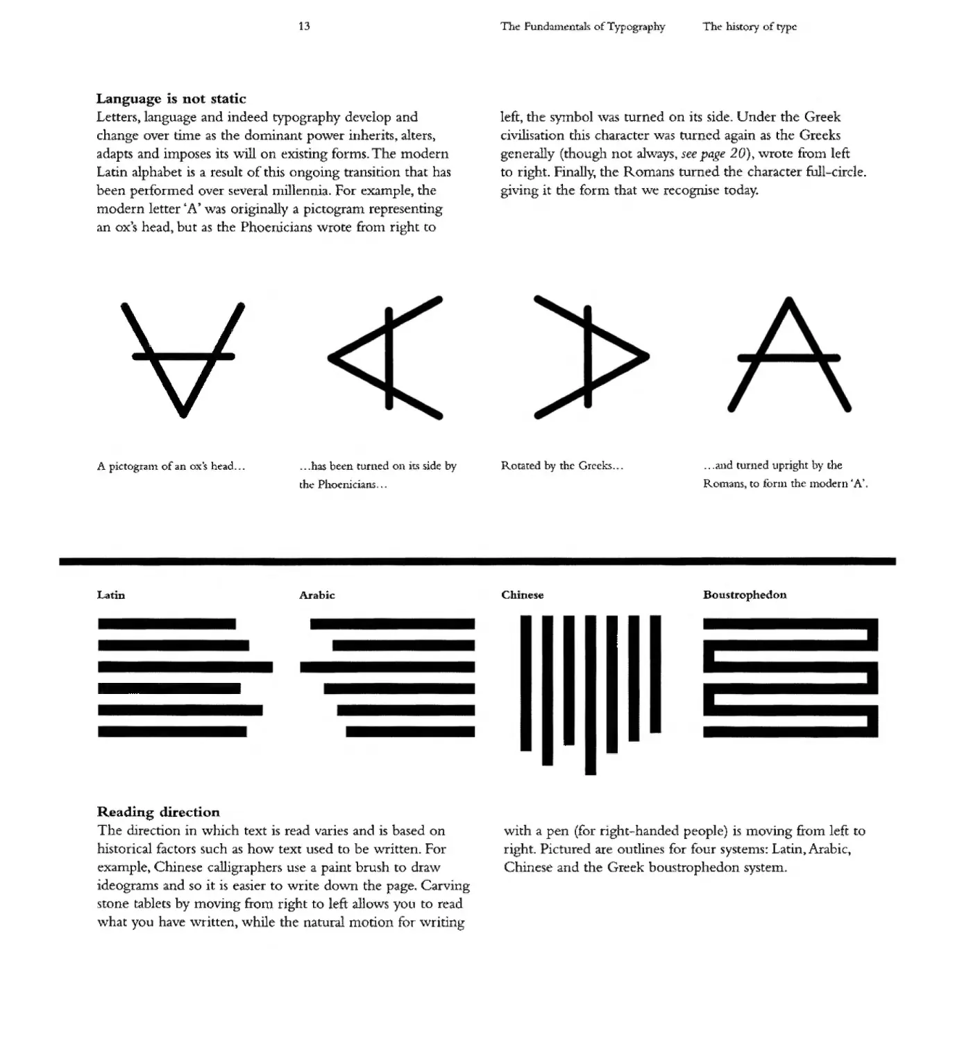
Language is not static
Letters anguage and indeed typography develop and
change over time as the dominant po\ver inherits, alters)
adapts and imposes its \vill on existing forms. he modern
Latin alphabet is a result of thi ongoing ransirion that has
been perforlned over se\ era! mi1lenrna. For example, the
modern letter' A' ,vas originally a pictogran1 represen ing
an ox)s head) but as the Phoenicians \vrote from right to
A pictogranl of an o,,'s head...
.. .has been turned on It. ide by
th Phocnici'UtS - . .
Latin
Arabic
Reading direction
The direction in \vhich text is read varies and is based on
historical factors such as how text used to be \.vritten. For
example, Chinese calligraphers use a paint brush to dra\-v
ideogran1s and so it is easier to \vrite down the page. Carving
stone tablets by moving &om right to left allows you to read
\vhat you have \vritten) vvhile the natural motion for \.vriting
Thee Fundatnenta]s of Typograph.v
The h.is.tory of type
left the s}'Jnbol 'vas turned on its side Under the Greek
civilisation this. character "\vas tuined again as the Greeks
generally (though not ah..vays! see pa. e 20)) '\vrote fi"Om left
to right. Finally.. the Romans. turned the character full-circle.
giving it th forln that we recognise today+
Ro .ated by the Greeks...
.. .and turned upright by the
ROlnans to fonn the lnodern .A'
Chine e
Boustrophedon
\-vith a pen (for right handed people) is moving £roln left to
right.. ictured are outlines for four systen1s: Latin Arabic,
Chinese and the Greek boustrophedon syste111
14
The Fundamentals of Typography
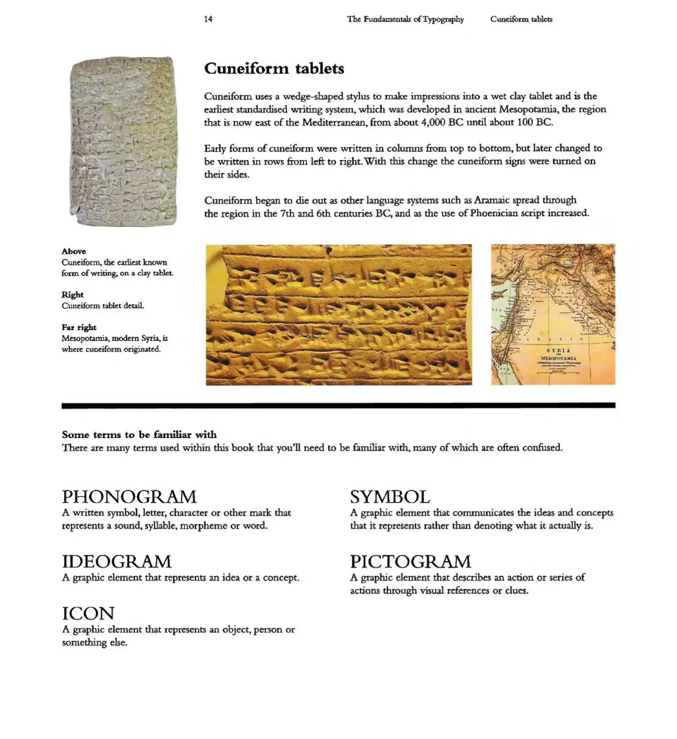
Cunciform ublc:t:J
.
Cuneiforltl ablets
, \
.....
..
Cuneiform uses a wedge-shaped stylus to make im ressions Into .il wet clay tablet and is the
earliest standardis.ed writing system, wluch was developed in ancient Mesopotamia the region
that is now east of the Mewterranean" ftom about 4 OOO BC nnn! about 100 BC
...
.
.. "
...
\
....
I
......
.
-.- -
-,
...:....
Early forms of cuneiform were written in co umns from top 0 bottom, but later changed to
be written in rows &om left to :right With W s change the cuneIform signs were turned on
their sides
Cuneiform began to die out as other language systems such as Aramaic spread through
the region in the 7th and 6th centuries BC" and as the use of Phoenician script increased.
.......--Y
..
Above
Cuneiform, the earhest knOW'D
form of writing, on:l day tablet.
\.-
""
.. .... ".
.
.
..
..
,
Right
Cuneiform tablet detaIl.
ow
..
Far l'ight
Mesopoumia, modem Synat IS
where cuneiform originated
.....
....
. ....
- .
-
'-
....
. A
t
SYRI\
...
11 ''JoOJ'OT UUA.
-...--.
.-.. a... J_ ...........--
.-
"I-
t i .. . I .4
"\
. a
Some erms to be familiar with
There are many terms used within this book that you n need to be familiar with, many of wInch are often confused
PHONOGRAM
SYMBOL
A written symbol, letter, character or other mark that
represents a sound. syllable t morpheme or word.
A graphic element that communicates the ideas and concepts
that i represents rather than denoting what it actually is
IDEOGRAM
PICTOGRAM
A graphtc element that represents an idea or a conce t
A graphtc element tha.t describes an acnon 0 series of
acD.o hroug visual eEe e ces or clues.
ICON
A grapluc element that represents an ob ect, person or
something else.
15
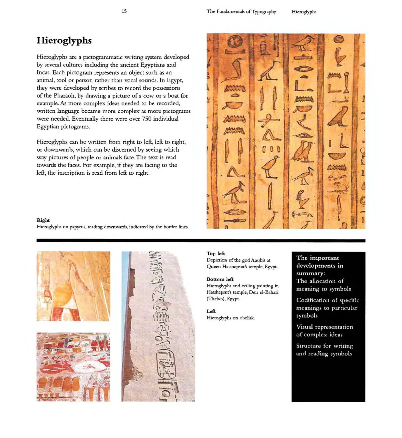
Hieroglyphs
eroglyphs are a pictogranunatic writing system developed
by several cultures including the ancient Egyptians and
Incas. Each pictogram represents an object such as an
animal" tool or person rather than vocal sounds In Egypt 1
hey were developed by scribes to record the possessions
of the Pharaoh t by dra\ving a picture of cow or a boat for
example. As more complex ideas needed to be recorded,
writte language became more cOlnplex as Inore p ctog ams
\vere needed. Eventually there \vere over 7 O individual
Egyptian pictograms.
Hieroglyphs can be \vritten tt0111 right to left, left to right,
or downwards, ,vhich can be mscerned by seeing ,vhich
way picture of people or animals facew The text is read
towards the faces. For example, if they are facing to the
left the inscription . s read from left to right.
Rigbt
Hieroglyphs on papyrus 1 reading downwardl\ indicated by the border lines
"
----
-::::--
....:.
-....;
--.,. I
ll.....
-----
l_
t _
........) .
.-0-
pl\H
to
- :r
L'-
...
-.-......... L
.... '\ \
... 1
\ ,\{
w 1t
:" I .
.............. .....1
...
\
"
-
!.. - &.
,tI1 .1:1
-==
,
II
.('
-
I'-
- I
The FWldaJ:nentak of Typo raph
\
"'"-.
, "'--
Top lef
Depiction of the god Anubis at
Quee Hatshepsut s Icmplc. Egypt.
Bottom left
ic glyp b and ceiling pain ing in
Hal:Shepsuts tcmplc Dei! d-Bahari
(Thebe ), Egypt.
Left
ieroglyp hs on. obe hsk.
Hi IOglyphs
-.
'....
-
t
............
'10 .
-
-
w ,
The important
developments in
summary:
he allocation 0
meaning to sY1nbois
Codification of specifi
meanings to ,arcicu tar
sy bols
Visual representation
of complex ideas
Structure fo writing
and reading sytnbols
16
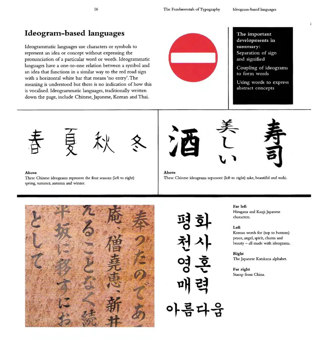
Ideogram-based languages
Ideogrammatic languages use characters or synlbols to
represent an idea or concept without expressing the
pro unciarion of a particular word or words. Ideogrammatic
languages have a one-to-one relation between a symbol and
an idea that functions in a sinUlar \vay to the red road sign
with a hori ontal \vhite bar that means 'no entry' w The
lueaning . s understood but there is no indication of how this
is vocallsed. ldeogranunaric languages, traditionally \vritten
do\vn the page include Chinese) Japanese) Korean and Thai.
--" / .L-
tt
R
"
Above
Thc5C Chinc:)c idcogran1S represent me four seasons Qcfi (0 right)
"pring, SUnunCT, autulnn and \Vlnter
;;II -
..
= ---
-
---.
.::
- ---,..
..::.
....!:..
-k
L
"\
The Fvndalne:nt h of ypogr.aphy
,.
,
.
Ideogrmu-basc-d 1 agcs
The important
develo .' ments in
summary:
Separation of sign
and si:. lified
Coupling of ideoglams
to form \vords
Usinb words to express
abstract concepts
--
..
Above
These Chin(: e ideo ms tc:pn:!)cnt (Jcft to rIght) sake beautifitl and sushi.
.,-
J1 .
0
-
,...
0 .
. '-
U
} 0
-;r
Far left
Hu<l g.1na al d Kal . J apane'lic
characlcrs
Left
Korean \vords for (top to bottom)
peacc angel, spirit chaInl and
beauty - all mad ",,-ith idcograI115.
Right
The J ap3ncsc Katak na .alphabet.
Far righ
S .unp frol 1 Chin .
17
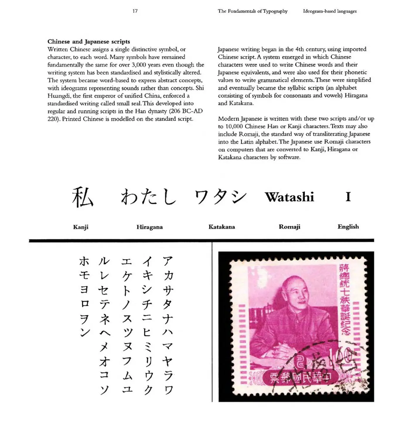
Chinese and Japanese scripts
Written Chinese assigns a single distinctive sytnbol, or
character"! to each \vord. Manv symboh have relnained
fundamenrally the same for over 3,000 years even though the
"\vriting SYStC111 has been standardiscd and stylistically altered.
The systen1 bccanle word-based to express ab tract concepts..
'\vith ideograu1s representing sounds rather than concepts. Shi
H uangdi, the first en1peror of unified China, enforced a
standardised writing called -snlall seal. This developed into
regular and runrnng scripts "n the Hw dynasty (206 BC-AD
220) Printed Chinese r s modelled on the standard script.
fb
b tc. L
'7
Kanji
Hiragana
The Fu mi.unentals of Typography
Id r-ogr J.rn-b:.sed langu ages
Ja anese \vriting bLgan in the 4th century, using Ul1polted
Chinese script A syste n e nerged in '\vhich Chinese
characters "\vere us.ed to write Chinese words. and their
Japanese equivalent5 and \vece also used for their phon tic
val ues 0 w ite g anllnatlca] elelnent + These were silnplified
and eventually became the sy abic scrip s (an phabet
consisting of sYlnbols £0 consonants and vowels) Hiragana
and Katakan.a.
Modern Japanese is \vritte ,vitr these t\vo scripts and or up
to 10 000 Chinese Han or Kanji characters. Texts Inay also
. nc ude Romaji the standard way of transliterating Japanese
nto the Latin a1phabet+ The Japanese use R0111aji characters
on co 1 puters that are converted to Ran" J Hiragana or
Katakana. c aracters by soft\vare.
"
Wa ashi
I
Katakana
English
Romaji
/v :c 7
V J;- :f- tJ
3 ....
""
\
P - 7-
T
7 * A T
..--
... ""' " t: "
j ...-.:<
""
" "'"
-...
7t .y
:J A 1)
- \.
....
'\ .:1- TJ
,.
18
Phoenician characters
The Phoenicians lived in the eastern Mediterranean in
what is modern day Lebanon- They developed the basis of
the modern Latin alphabet around 1600 BC and formalised a
system of 22 'magic signs 1 or symbo s that represented sounds
rather than objects. The symbols could be put together in
different combinations to construct thousands of words,
even though the a1phabet only contained consonants .and
h. d no vowels. Phoenician was written horizontally from
rig1- t to lcft without spaces betw'een words, although dots
were sometimes used to denote '\vord breaks. The Phoenician
alphabet is the bedrock for many subsequent writing systems
including Arabic, Hebrew, Greek and Latin, and ultimately
for the modern European alphabet that is used today:
T e importan developments in summa y:
22 sYll1bols representing sounds not objects
Coupling of sounds to forn1 \vords
Precursor of ubsequcl1t \\1 iting systems
ergel ce 0 11 ain cha .acters of the nlodel"ll
Western alphabet
Th Fundamenuh QfTypognphy
....
....
......
,
,
Phoenici c} r cten
-l
...
'"
1- .
Some terms to be familiar with
Linguistics - the science of language - uses the following terms to describe various eleme 15 of language and speech
Phoneme
A phoneme describes
a speech sound or sign
element - the basic
unit th t distinguishes
bctvvcen different words.
For example, the phonelnes
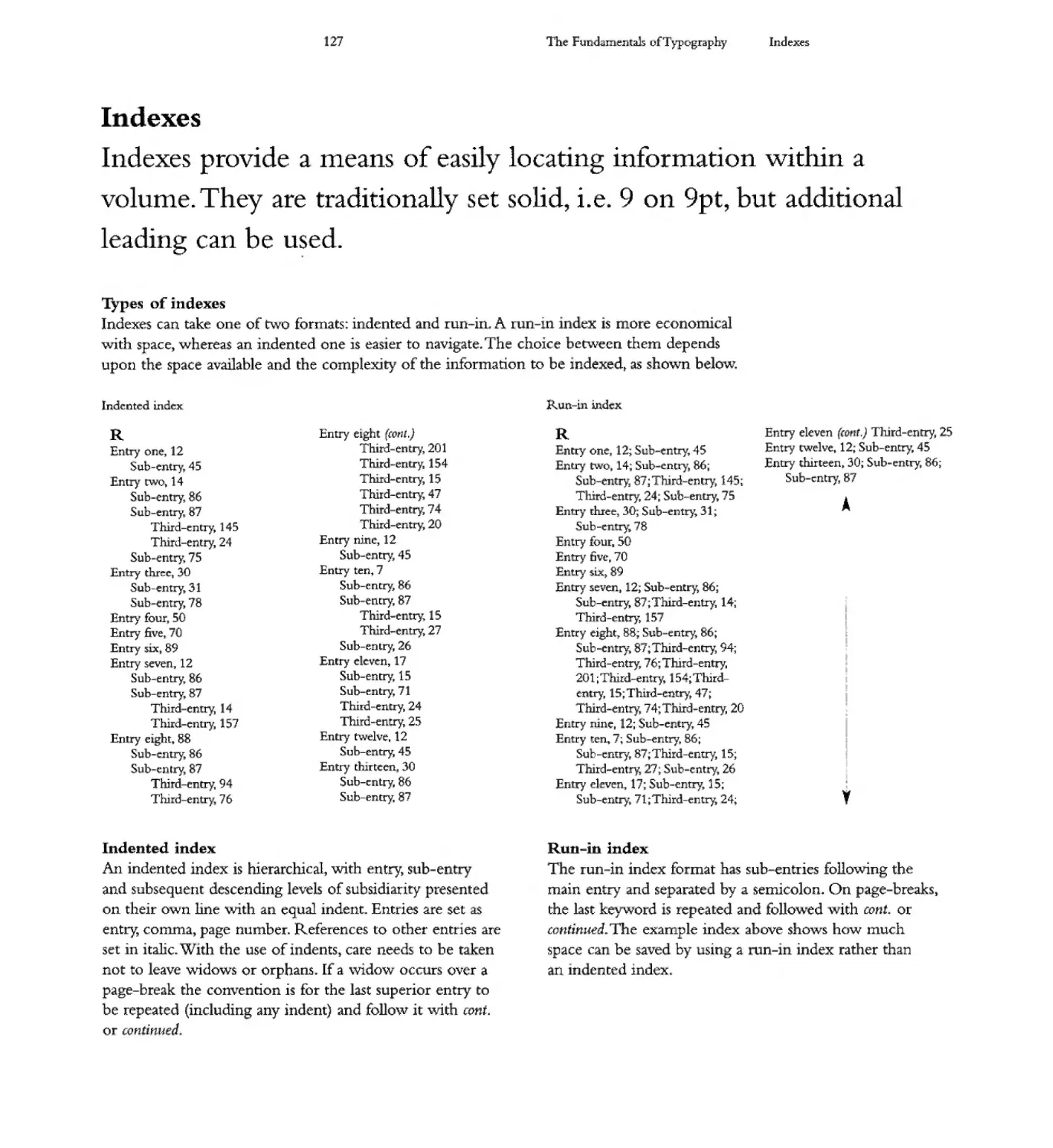
4:1' d " h
o an x come coger er
k ' ,.
tomaeox.
Morpheme
A morpheme is a distinctive
group of phonemes that
form the smallest language
unit that has a semantic
interpretation A word can
be broken into a series
of mor hemes with each
having a disnnct meaning
The word "dIscredited. has
three morphemes; 'dis)..
"credit' and fed)
D I SCRED I TED
DIS CRFDIT ED
Syllable
A syllable is a nit of
spoken language cons.sting
o - a s.ingle,. u nterrupted
sound. This may be formed
by a vowet p Ithong a
syllabIc consonant alone
or by any 0 these sounds
accolnpanied by one or
more consonants. The
word tdiscredited] has
four syllables
DIS CRED IT ED
Letter
A letter is a mark or
glyph (symbol) used in an
alp bet.c wr'ting system
to indicate a sound.
D ! SCRE,D ! TED
19
The Fundamentals of Typography
Phoenician characters
The 22 magic signs
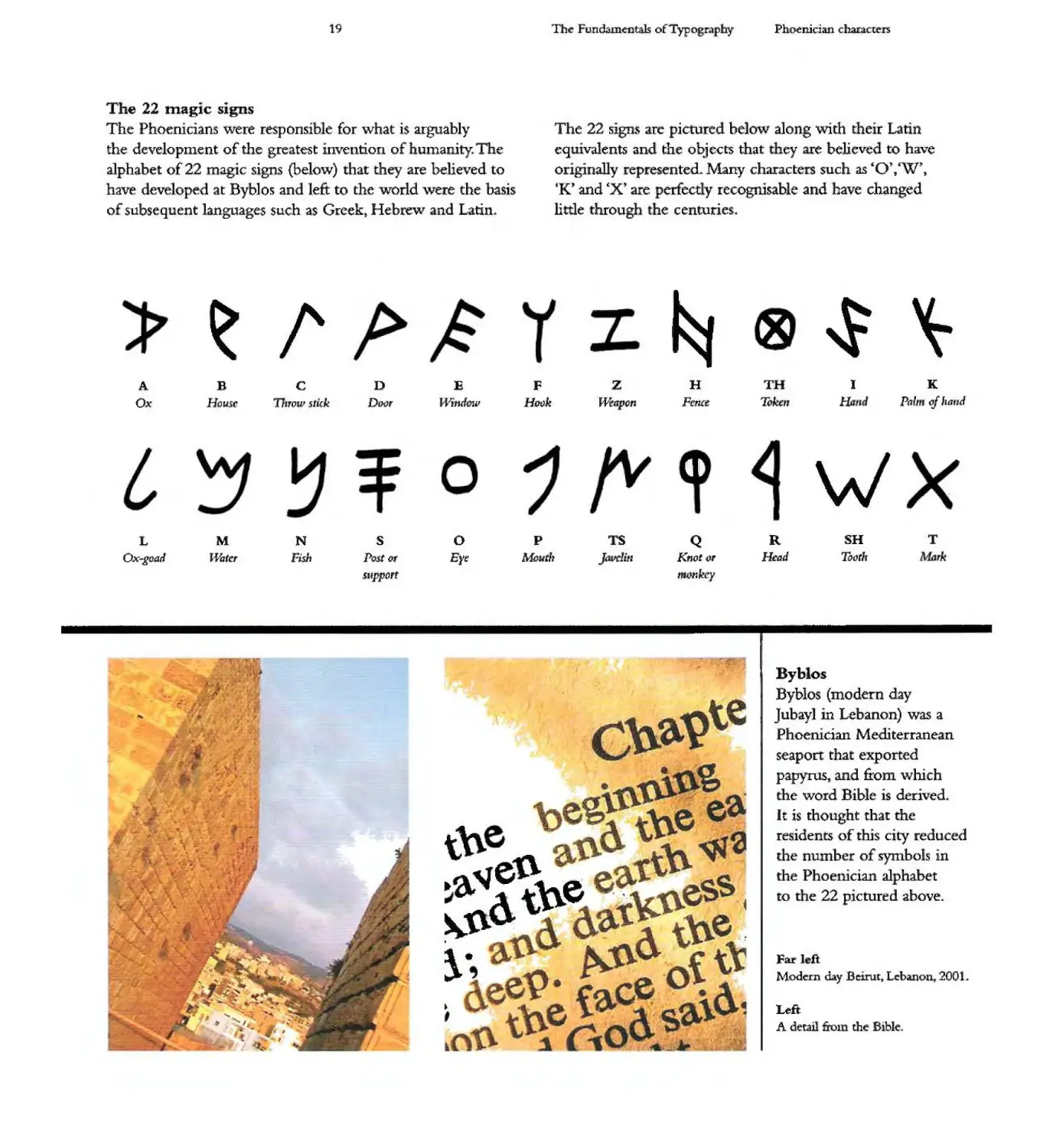
The Phoenicians were responsible for \vhat is arguably
the developnlent of the greatest invention 0 !umanity T e
alphabet of 22 magic signs (below) that they are believed to
have developed at Byb10s and left to the world were the basis
o subsequent languages such as Greek) Heb ew and Larin
The 22 signs are pictured below along with their Latin
eq -valents and tIle objects that ey e beheved to have
originally represented Many characte s such as 'O),I.W),
-K" and ,:x' are erfect y recognisable- and have changed
little through the centuries
I' t..
A B C D E F H TH ] K
Ox HOU5l" Throw .stick Door U'indcw HOFJk U'enpcn FeMe 70kcIl H Pal J of 'laud
tt 'W
M N S 0 P S Q R SH
Ox-goad Hilter Fish Post or Eye Mouth Jd dit' KrJot or Head T(1)tlr ak
support ,onkey
4.
tn
.a. '¥e t\\.e
t\G
.
:
Byblos
Byblo (modern day
Jubayl in Lebanon) was a
Phoenician Mediterranean
seaport that exported
papyrus, and from wruch
the word Bible is derived.
It is thought that the
residents of this city reduced
the number of symbols in
the Phoenician alphabet
to the 22 pictured above.
...
-.
...
..
,
..
....
'-
......
Fat I ft
Modern day Belnlt L banon 2001.
... ...
".
-
¥
....
... ...
'I
.. . .
.. ..
Left
A detail from the' Bible
20
The Fundamcntal.s of Typogr.aphy
The Greek alphabet
The Greek alphabet
Aleph
Al
Ie
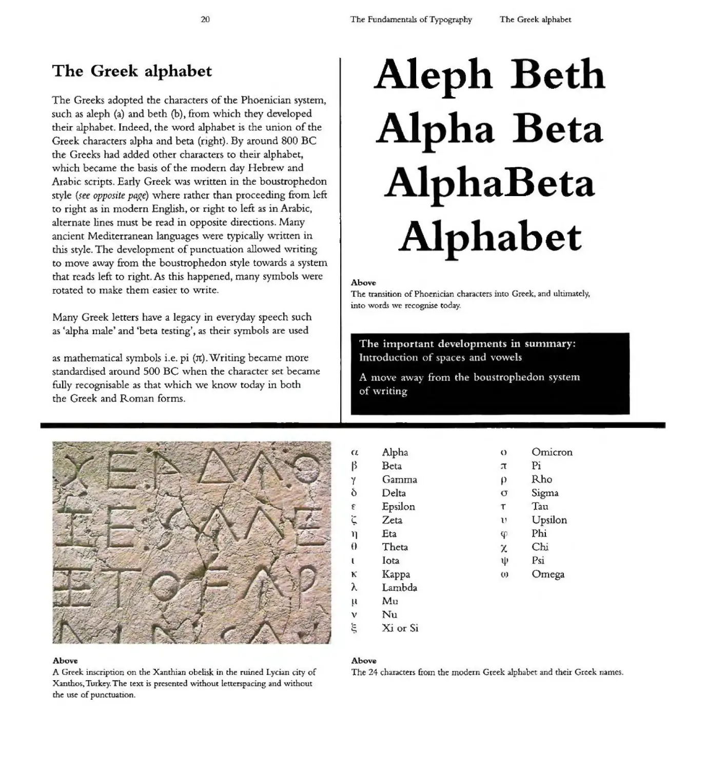
The Greeks adopted the characters of the Phoenician system,
uch as aleph (a) and beth (b)) from which they d veloped
their alphabet. Indeed, the word alphabet is the union of the
Greek c r cters aJpha and beta (rjght). By around 800 BC
the Greeks had added other characters to their alphabet t
which became [he basis of the modern day Hebre"\v and
Arabic scripts+ Early Greek was written in the boustrophedon
style {( e OppOSlt paRe) \vhere rather than proceeding from lcft
to right as in nlodern Englisht 01 right to left as in Arabic,
ahernate lines must be read in opposite directions. Many
ancient Mediterranean languages '\vere typically \vritten in
tills style. The development of punctuation allo\ved \vriting
to move a\vay fi-om the boustrophedon style towards a system
that reads left to right. As this happened, many syrnbols were
rotated to make them easier to write
-
ta
III
aB-t
A
.
.be
Above
The transItion of Phoenician characters into Greek 3nd ulum.atcly,
into \.voTds \Ve rccognise today.
Many Greek letters have a legacy in everyday speech such
as 6:alpha IIlale' and 'beta testing't as their symbols are used
as mathematical symbols i e. pi (1t). Writing became more
standardised around 500 BC ,vhen the character set became
fully recotJnisable as that which ,ve kno\.v today in both
the Greek and Roman forms.
The important developments in summary:
Introd c.o . I. es and vowels
A nlove 3\Vay from the boustrophedo syst m
of ,vriting
-..... -- ,
'. - --...r .... p "I.- " Omicron
- . .: .... .;- Alphd
". ........ T . .... . - . -' Cl- U
.... ...-
- J:-___ -. :;".
.. .............
......1 I) Beta l Pi
..., .,. - -'
-4;. -- .. - .;. y Gamma p Rho
- .
... ) . 0 Delta Sigtna
-.... ..-' \ ...: (.1
'/ - ...
... -.. .:- .. - ..
- .... -- --"':--.. - .. f Epsilon T Tau
...
.. .
t p \ .--. Zeta l' Upsilon
.. Phi
-- ,- . 'I!"... ...,.. 11 Et 4
-- . .
" . .... () Theta Chi
....... '"'.
.\ -""
. -
-.. .f._ . ....... Iota Ps.
. p ): , l \p
.&
... K !(appa I) 0 lega
t" '- .-
J. ... -: ....-;,
. - I... ambda
..
.' . ... ...
,-
{ Mu
.
:I, --:, - -;to......J - Nu
.. ' . . J. ') v
...
..... .
. " c: Xi or Si
'="
\.. -
-- ... ... ..
..
Above
A Greek inscription on the Xanthian obelisk in the ruined Lycian city of
Xantho:) TUIkq The text is presented \Vithout letterspacmg and \vithout
th use of punctuation.
Above
The 24 characters froJ.n the modern Greek a1phabi::'t and th iI Greek names.
21
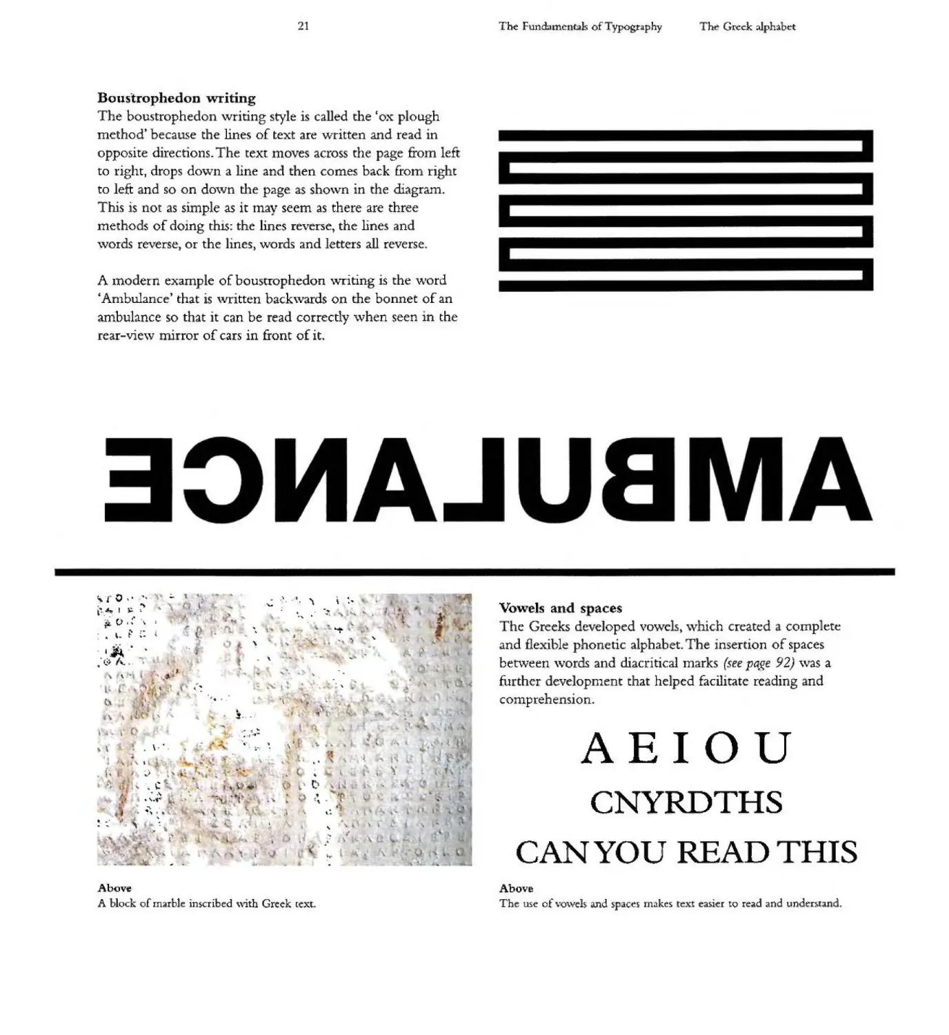
oustrophedon '\vriting
The. boustrophedon \vri ting style is called the 'ox plough
method' because the lines of text are vlritten and read in
opposite directions. The text moves across the page £rom left
to right, drops do\.vn a hne and then comes back from right
to left and so on do\vn the page J..S sho\vn in the diagram.
This is not as simple as it may seem as there are three
methods of doing this: the lines reverse, the lines and
\vords reverse) or the lines) words and letters all reverse.
A Inodern exan1ple of boustrophedon \"Titing is the \ lord
An1bulance' that is ,witten back,vards on the bonnet of an
ambulance so that it can be read correctly '\vhen seen in the
rear-vie\v nirror of cars in front of it
'L 0 ..... . , ..
. "\ ,
, . I ;. ..
..- 0
t1 I....].
.. ..
,_ t .
. -w. '\ ,:.
.... . .: "' , iIo.
. .
- ....... "
.- ) \.... i. -
....
,. ...
. 'I
, ..
.
., '\
...
..
...
"'- --- -
.J
. ... .... """.A . "oft
... \.
,
.)
...
. '.
. " L
..
'\ , ,
.... ... ..) 'II
I.'
l-
{,
. , ,
- ,,'II .
...
OC'"
...
..
,
41 .
..
f l" \ '\
.. ... .
\ .... 't .. '"
.!- ..
, ... ..
. '" -
......
to
1 1 ...
. -.-
1.
....
" ..
. \-',
....-
-\, ..
I t
, .
" ."
"'"
"
\ - .....
..
..... - L
.'10
" .1
.
.. 'Ir. "- . \
. , \.
.'
,
\. "
I
11 .
."
. ,
-:..
.... .
\ to L'
t
I,. . L
...
..
.. C
. ....
.. .. .'1".
.. ....
.. ......"
..
. ...
......
'.
.. .. : ... ....
, .. \. ...
..
" " l
.L ... "" "'"
" ",' \ l
...
41 _'
,
. "
...
. .
\....
.. ,
\." , ,,'
Above
A blocl of marble inscribed \\i.th Greek [(xt
The Funci...mc- t:!b ofTypogtaphy
ht. Greek alphabet
Vowels and s aces
he Greeks developed vo\-vels t \vhich created complete
and flexible phonetic alphabet. The insertion of spaces
bet\veen ,vo cis and diacri ticallnarks (see paj!,e 9'2) ,vas a
fu .ther developnlent that helped facilitate reading nd
conlprehension.
AEIOU
CNYRDTHS
CAN YOU READ
HIS
Above
The use of \"Q\vels and spaces m.lkes text ea:)ier to read and undt:f'\tl d.
22
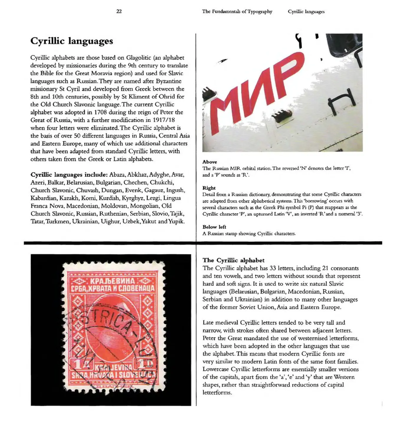
Cyrillic languages
Cyrillic alphabets are those based on Glagolitic (an alphabet
developed by n1issionaries during the 9th century to translate
the Bib e for the Great Moravia region) and used for S avic
guages such as Russia They are named after By antinc
missionary 5t Cyril and developed from Greek between the
8th and 10rh centuries, possibly by St Kliment of Ohrid for
the Old Church Slavoruc language The current Cyrillic
alphabet was adopted in 1708 during the reign of Peter the
Great of Russia, with a further tnodification in 917/18
when four letters were efuninated. The Cyrillic alphabet is
the basis of over 50 different languages in Russia) Central Asia
and Eastern Europe, many of which use additIonal char.acte s
that have been adapted from standard Cyrillic etters t with
others taken from the Greek or Latin alphabets..
Cyrillic languages include: Abaza, Abkhaz t Adyghe, Avar)
Azeri Balkart Belarusian, Bulgarian Chechen, Chukchi,.
Church Slavonic, Chuvash, Dungan, Evcnk" Gagauz:, Ingush J
Kabarchan J Kazakh, Komi, Kurdish, Kyrghyz, Lezgi, Lingua
Franca Nova Macedonian. Moldovan, Mongolian J Old
Church Slavornc t Russian Ruthenian, Serbian) Slovio,. Tajik,
Tatar, Turkmen, Ukrainian, Uighur, U zbek, Yaku t :and Yupjk.
... .. ... .... ...
I t i I . . . I ·
I
..
-
-
"
,
...
,
...
'\
'-
.....
The fun funtntals of Typography
Cyrillic languages
,
J
Above
The llussian MJR (')Tbital stanon. The rev t t:'d "N J denotes the Jetter 1
nd a Ip ounds as 'R .
-Right
Detail &oLn a R u i:an d1ctio a y. demonstrating that some CyrIllic characters
arc adapted &olD Crht:I alphabetical systeln . Trus borro\ving' occurs with
severa] characters uch as the Greek Phi symbol Pi (P) that reappears as the
Cyrillic ch.a cter P' .n upturned Larin V' an inverted IR t and a numeral 3J
Belo.w left
A Ru ian S alnp showmg Cyrillic characters.
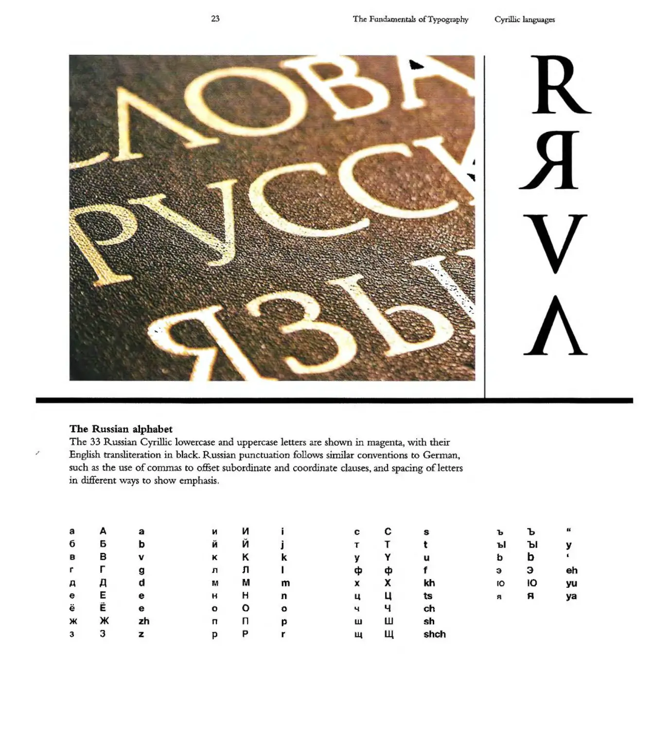
The Cyrillic aJp abet
he Cyri1 'c alphabet has 33 letters, including 21 consonants
and ten vowels, and t\VO letters without sounds that represent
hard a d soft signs. It is used to write six natural Slavic
languages (Belarusian) Bl1lgarirln) Macedonian J Russia ,
Serbian and Ukra nian) jn addition to nany other languages
of the former SOVIet U niOOt AsIa and Eastern Europe.
Late med'eval CyrillIc letters tended to be very tall and
narrow t w' t strokes often shared be[\,veen adjacent letters.
Peter t e Great tnandated the use of \vesternised letterforms,
\vhic have been adopted in the othcr languages that use
[he alphabet. This nlca s that modern Cyrillic fonts are
very similar to mode n Latin onts of t e same font f milies
Lowercase Cyrillic etterforms re essentially smaller ve sions
of the capit'lh, .apart £rOIn the "a J , te' and "y) that are Wes.tern
shapes, rather th-an s[raightfor\vard reductions of capital
I tterforms
23
The Fundamentals 0 Typog:t3phy
Cyrillic languages
....
.,.
....
.. ..
"\
\.
..
'....
,.
.. ,"'- ... "'"
-. . "."
.: "II. III! I .''':'
.... .... ..
... ..... :\ '11 _,
.'"":r>o " -....
':a.'. '" 'l
. ,. ...",,, I
; ."" ,
..... ,
.. ..... '\,... :"\.
, k
... .. .".. '"!t...
........ '"
. \
,
...
....
..
.....
-..
...
...
'\.
-
.
-...
. - -
..
"
.....
....
" '-.."
" .
-..
.....
"-
- .....
......
'"
""
- ,
,
-.
'"
,
....
...
...
The Russian alphabet
The 33 Russian Cyrillic lo\vercase and uppercase letters are shown in magenta., v:ith theIr
English transliteration in black. Russian punctuatIon follows similar conventions to German,
such as the use of commas to offset subordinate an coorwnate clauses t and s acing of letters
in different ways to show emphasis.
A a Lt1 c C b 1>
6 6 b j T t hi "hI Y
8 v K K k Y Y b b
r r 9 11 11 I tP IP f 3 3 eh
.Q A d M M m X h ro 10 yu
e E e H H n t5 R A ya
e e 0 0 0 ..... y ch
>K >K zh n n p w W sh
3 3 z P p r Il.t L1l shch
24
The FunoomentaJs 0 Typography
Semitic and Aramaic languages
Sentitic and Ara111aic languages
AramaIC developed &om Phoenician around 900 BC in \vhat
. s modern Syria and south east Turkey It is a Semitic language
t t was a precursor for Arabic and Hebrew, which it closely
resembles. Aramaic was used and spread by the Assyrian
empire and the Babylonian and Persian empires that fol1owed
it, taking the language as far as India and Ethiopia. Towards
the end of the 6th century BC,. the early Aramaic alphabet
was replaced by the Hebrew square script, which is also
(confus.ngly) kno\vn as the Aramaic alphabet As Aramaic
was the anguagc of enlpire 111any parts of the Old Testament
were originally '\.vritten in this language, as were the Dead
Sea Scrolls. Aranu1.c is still spok n in parts of Syria, Iraq,
Turkey and Iran.
<I
'1
,.:4
b
g
d
h
w
z
h
t
y
k
J t 0 r , \N )(
1 m n s p s q r i t
.
Aramaic 1etterform.s
The 22 characters of the Aralnaic alphabet and their Latin equivalents.
Arabic
Modern day Arabic t like Phoenician, is ,vritten and read cor talElS 8 letter shapes but by adding one, t\VO J or three
right to left Arabic is based on the 22 consonants of the diacritical marks to letters that serve as vQ'\vel sounds a total
Phoenician alph bet with an optionallnarking of vo\vels of 28 letters is. obtained, as illustrated belo\v These. diacritical
using diacritics. Arabic script uses the Aranlaic etter DaIneS lllarks originate in Hcbrew and Aramaic and were added so
(Alef) Jee111, Dal J Zai, Sheen) and so on) + This alphabet that Muslims of non-Arab origin cou d correctly pronounce
the Koran, their holy texL
:- . . . :- .
, '--J .. C C ..)
{...J '--J J .J
.
a b t th J h kh d db r z 5 sh s d
.
. ..
.b j; t t .. J .. c..S
'-' r- u 0 .J
...
t z c gh f q k rn n h \V Y
.
Arabic Ictterforms
The 28 characters of the Aram..aIC alphabet .and their Latin equivalents
I ' · · . r- oil .". ...
<) \ , L"' \ VJu .1.'
.,;,) (';. \7 . . q
· ......... oJ r.( ...1
.}\j' t jL ¥ :.?J d\\i ) ,!;
1 ..
. .11... - -' rr" 11"..___ /.-
.rlJJN" . _ ::r A;; -' ....'t.. 1
2,
' n p1
T p " j
,ro09tl)
C., n
, · I' JlU · 1
To u, 17"
. " 10 ;,."1 ; 'v ·
, : J%t'i\'p,p')'l
I . , 111 l1JY l]n · i11J1t
..... J.:, 'I!;: 'n Fn!t . t 11
. J . "I TV tI) ) J
. .' i' I y i1 II .) \J
.\ ... 'h,. 110 ,) D. it
II L. ,_:" 1) .. h\}..... I) .. ..
The:: Fundmu:ntab ofTypc phy
S miric and AIdmaic languages
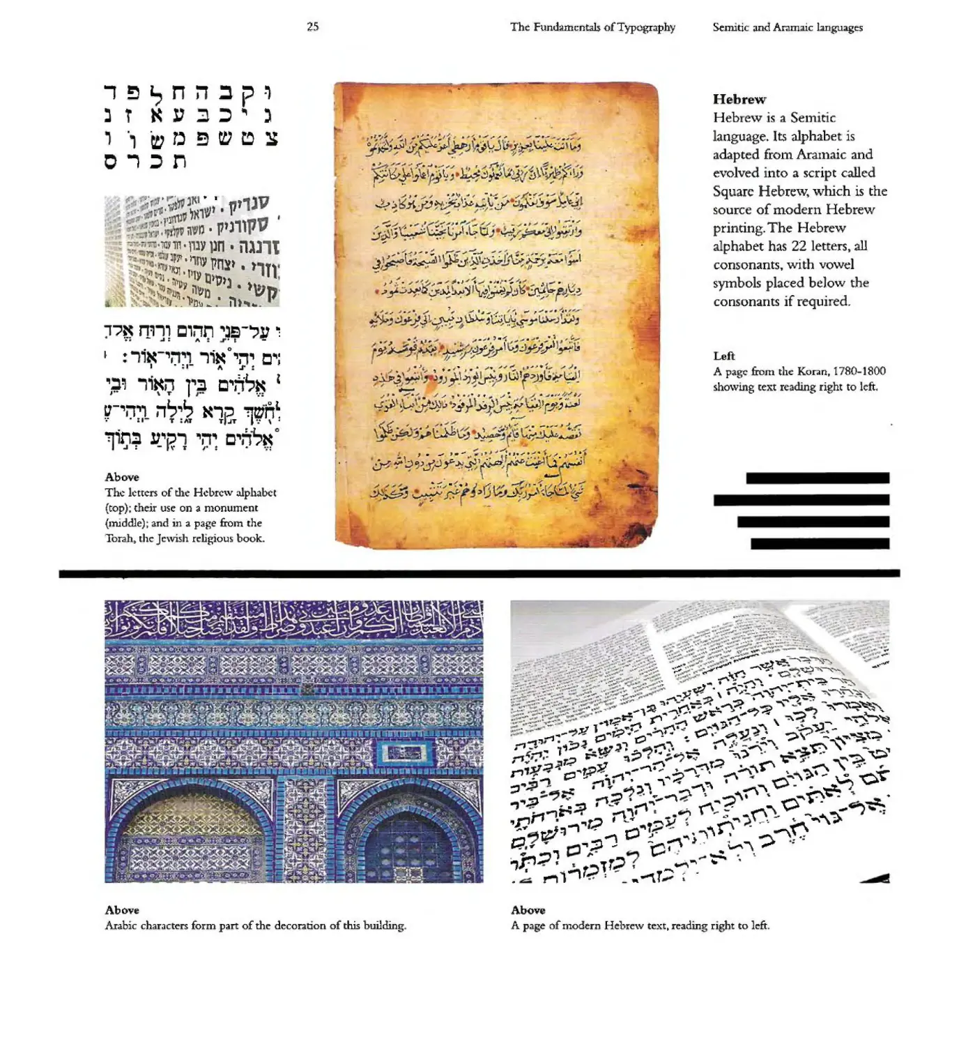
Hebrew
Hebrew is a Sel11 tic
language. Its alphabet is
adapted [rool AraInaic and
evolved into a script called
Square HebIe'v "\vhich is the
source of modern Hebrew
printing. The Hebrew
alphabet has 22 letters, all
consonants y with vo\vel
symbols placed below the
consonants if required.
. !......,.
· \j .:. 1;- ' l";u . 4"}.' i
. , . t; H ]\D. . J v r z.; \
,y..... 11
.I "... I .,... · " . II .;J. .
.::. b : . )' '6 b:. J
... '.... ... ...... I. ..
4.. .. · -? \.... ... UJ- '-f'"
,. --1' .. ':. or
. . jJ J / .. . .J ' "
...... I ..... J!j .. ......
.iP,j' .. \ f ; .. Q1 -,\.,... u]
. ./ .... . .. II' -:. III ., ",
l.::' \ y.a ' .; ) ; 'r .'
"....-
\ \. W . L1+
J. ... ,.... , ...-:. ,..... ... '1110
Y";\ )J--Jr .fl I ..... H...f
\ L -..-
>bJ "j ( -.:* ;"J b
,., n1" c,;rn 'JS-"V -:
.. ..-:. -.... : It.:=.r . .. -
. . 0
: ,' - :1'" .,, ,, , C
I - : ,- A .r:
;;; ,; V r C"6''' I
g-") i1 ; K1i?T l
l;I) 'i?1 ., c'6;' 0
Above
The letters of th.: Hcbrc\v alphabet
(top); their use on a n10nument
(nudd1e) and in a page from the
Torah) the ]c\vish rchgious book.
...... ,
.. ... :.
. -
· ,. 't.z.'
.... -c" .. II-
..
. :r: · .i'"
...
-
I'
"" .. - .... ..
.... ........
-, , ,
.. . ..-6-t
" \. t::
..... """""
..
- --
_" ,-4t.,. '_ - . "ft.;.. -r-,.. . . .....J ':*i:, =- '.. _ _ _
r - .'4 - r" .)I( '" )6 "0t)(..1 - "' ott ' -. , ..... x; $:. . . . -
'--:-..... '-9'00 ,.o(oo . '.0(:00.. ". . .. c '. -"':1 . .-o-p. I ..'
.. J -0; . .......' ... .. ..... "' 1 '" A
-. .J - oM.._ ,.-.. . o(I-, ..4)- .' L........ _ _ L - ......
-. , _ ..}t.' , . "if.. -tJo- ..... _ ... .
____ .! . · ...A.\.-
.. ..... ...
..... - ;
-
-
TJ; "'-
'5",l
.... '\
r
.. .,.....
. . c.")
',fi. 'h_
.2' .... ... ..
'"
,
. p" ...:. .:-
..... ... 4-
.-
. ...
s. - -.. .
......
.... "4. :
. ...
..
I
'. .
.....
_L4.
el ....
I )e.
...
.- .. '. .....L , "1.
'Ii.. ¥"
L L ..-. :'
--""'1;. -.-=
, r !
-., ".. =:t .a
......;;, - . .
" _' -, . .:'".r:' .4
.....
..... 'l. r--
:& =i L
. ,-f
.; -.. -' _ r
I
-it .:'C:1 - !
\£ - .
.
'U+:" l . +
Q..,
.
" . .l
'-_OS
01;_
F
. -..:!
,
"\
\ -
-;w' .::....
I"'" I.... ."1
Above
-\r.abic characters form part of th decoratIon of this building
Left
A page from the Koran, 1780-]800
sho\v1J1g [ext reading r i ht to left.
'-
_ . ,.: -- :?::: ..f. :: t . .. -
" . - ... . .. . .... .. .... , ....... _...... .
.:;.r;:" - .-.......-'".....-: ........ .. .......... -... -.. __.... ....-
. --..... .-:,: .... ... ..:..,... ... ........ - .I' .......,. ... --.. ...........
. .. . ... .. r "I II .... ...-;:.. ... ::....:..... - . .. ;:: . .. . "I ItI ....-'\ ..; .... ... .. .
- --;.. ..:'". :;. :: -:.. .::;.... . :. -; -tfJ ... .._"","*" -- "C'- --....
_.... .... :._....--: "I .. .... .... "I _..... ... . .. .... -. ............ ......_
. · .... . - ..-.... J' ......... . .'" \.. ;--Y......... - ...,"
..... r"l... _1--::..,.:. ':.. ..... ":....; ...,a....... ................,;? ,,"" ........ "
';:-oJ' "'["-. i ,.::.... .:.. '___. :_ _ r , . :.."...=- -'\. do. ""'"" _1 '=? ,
. t '. -.., : r'- .....-If:i .........,, ....;, __,..--- ; ,;' ......- f .'
..-:- . . .... .. - ......... "'" '""'"' \ "':\ -':: -.
.. :: -.:.. - .." ' ..:? ... "" -:::' _ "\ · :""\ .. .... ;sJ -_ ....7
-1 "- :r1 '!.., T";> '" ....... "... '" o" , <17 ?Y -",: ,':;\..
..., !J .... -2' 'i--"" ... 1.00'" <II' _ . - ..... -"\ '- -
...."... tt;:J .._W.3 ;:" 11 _ .. ., . - '" .. P" - ,
"'Ir',. ....... I:"'" '*' ==,. ;. '> -..
11'. or" r;> ..",...",..)0 "-\.-
.-., ;;}-. ;" T..P "'-....".... ,.-:"\ ,a. ? ... '
.. ,. ........... .... '2. --., .... \ "0"
::J" ; '1 ,-,1 1 ) ' ...-'\'!\ · ""\ 0 - .. J
.,,,;:J. 5 · -. ...-1.-"j, ".......::/" .. 'O .. ..
j.-r..r:-=.;1 ;1 .. (\-;. _ _ --:; :
".p ....; '" -, "'I r ' "" }! ..... f': -,. ..-'. ...-.. ""
rill ...-'\ ""'"'" ... - ... .. "11 ,\ r"
c:; --- ., - ".'! -r' .t -' "", +;-
<CI';:t' 1"- .
, - t:" r--"r? ...
.. ,.., 1-1. - : _ --1 T r
Above
A page of modern Hebre\v text. reading right to left.
26
The Funwmenrals of ypography
The Roman alphabet
.. ,
Th
,otnan alphabet
. ..
. "," .
..-.- ..."'- .
'
.. , .
.. :- .?
.
"
. ,
. ..
. ;. "I...
.,
.' .... ... .:. II. \ ·
, , . ".\-
... . .'{".
t
... ...
r,
'\. ...
, ,i:-' ,I
. I. I J
"I ,I I
I I _.
.
.,A
, '
. .1.
I
.1
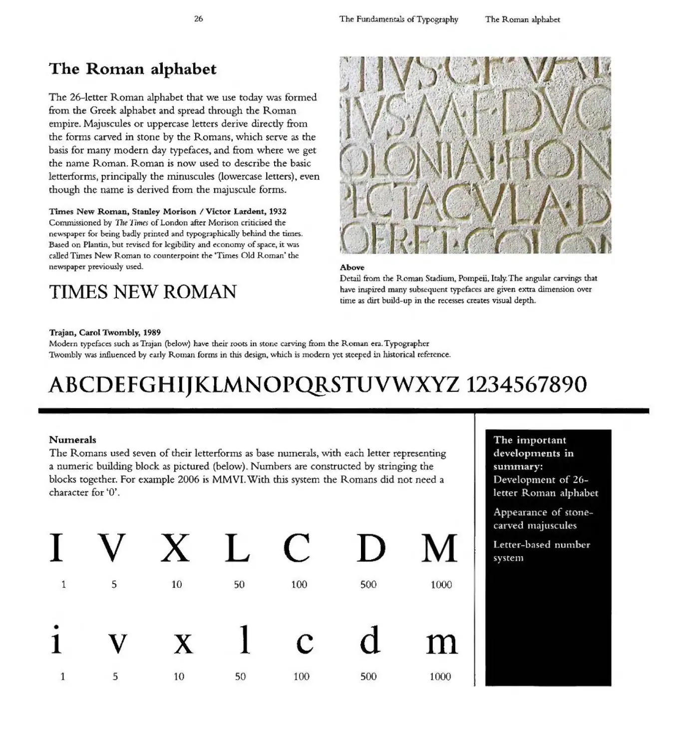
The 26-1etter Roman alphabet that we use today was formed
from the Greek alphabet and spread through the ROlnan
empire Majuscules or uppercase letters derive dJ.rectly from
the fornls carved in stone by the Romans. which serve as the
baslS for many Inodern day typefaces, and £tonl where we ge
the name Roman. Roman is now used to describe the basic
letterforms J principally the minuscules (lo\vercase letters) even
though the name s derived £roIn the majuscule forms.
.. ,
, J:
'., ..,
.. ,
. !
. .'
,
.. .
'1' ' ".,'
'I'l . 4 .
.?
.'.
I' ,/
.I
. .
I "!'
r _ '1 .
, '
.J
"
'.
I
."
.'
.. '....
I
. .
.
J
-..
.J
IJ'
,
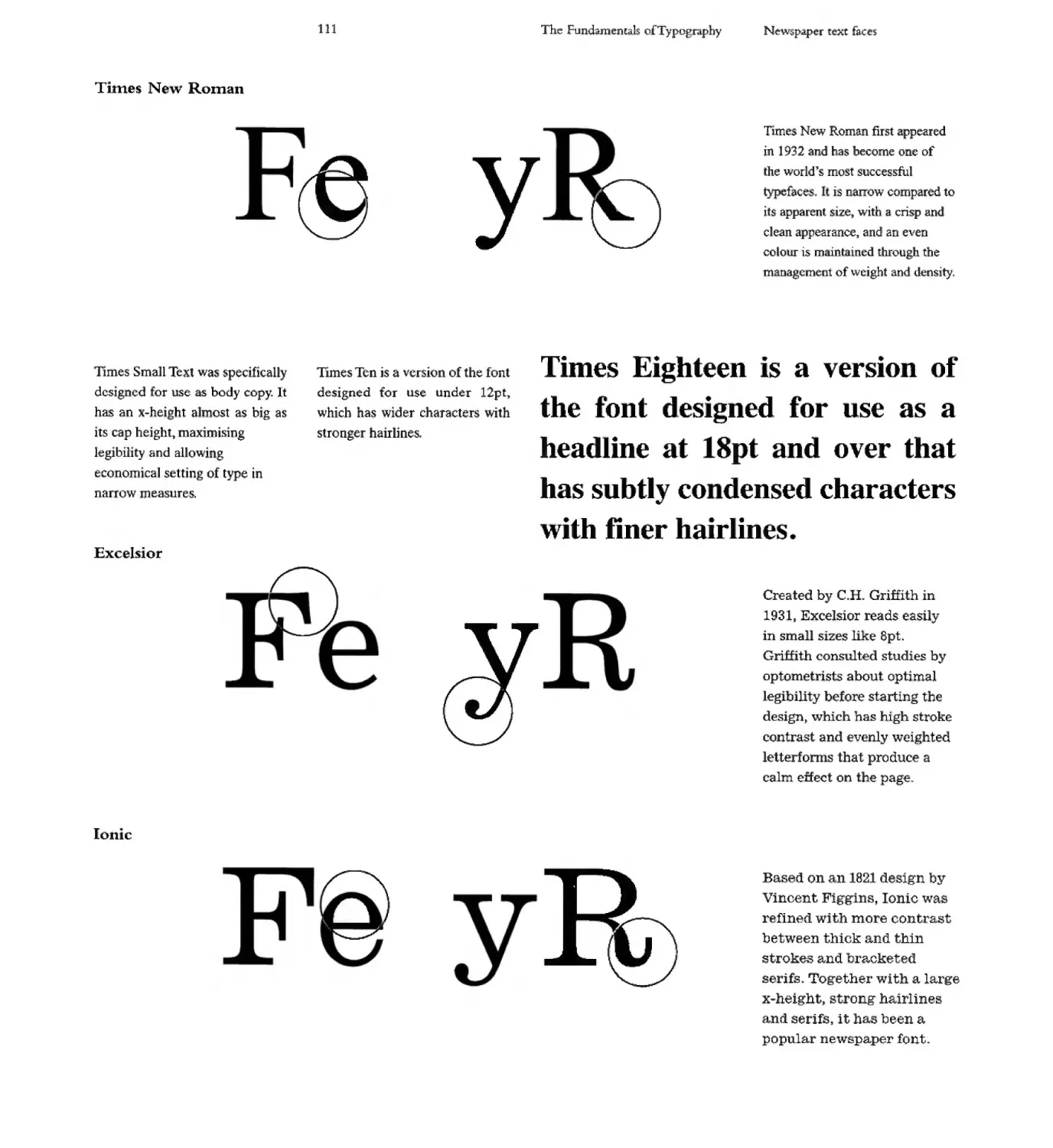
ToO es New Roman, Stanley Mo · son / V1CtO Larde 1932
Commissioned by l1re 11111f$ of London .after Morison criticised the
ncw'\paper for be:ing badly printed nd typographically behind the times
Based on Plantin but revised for legibility and economy of space, it '\va
called TunC's Nc:w Roman to counterpoint the Times Old Roman the
ne\Yspaper previoU5ly used.
,.
I'
..
I. '
"
("
;.
i
TIMES NEW ROMAN
Above
Detal.l from the Roman Stadium. POJnpeii. Italy. The angubr carvings that
have inspired ny subs.cquent typefaces are given extra dimension over
[ime as dirt build-up in the recesses creates visuaJ depth
Trajan, Carol Twombly, 1989
Modern typef:lc s such as Trajan (belo\ ) have heir roots in stone c.arving £raIn the Ronun era. Typographer
Two nbly \vas m.fluenced by early Roman forms in this design. \vhich is modern yet stceped in historical rcfC'tcnce.
ABCDEFGHIJKLMNOPQB.STUVWXYZ 123456 890
Numerals
The Romans used seven of their letterforms as base numerals, with each letter represe ting
a numeric building block as pictured (below) Numbers are constructed by stringing the
blocks together. For exarnple 2006 is MMVL With this system the Romans di not need a
character or &0"
I
v
x
c
D
The important
. evelo . ents i
summary:
Developnlent of 26-
letter ROll1an alphabet
Ap . earan e of S one-
carved Inajuscules
Letter-b:wsed nU111bt..r
syste1l1
1
5
10
50
100
500
1000
1
v
x
1
c
d
m
1
5
10
50
100
500
1000
27
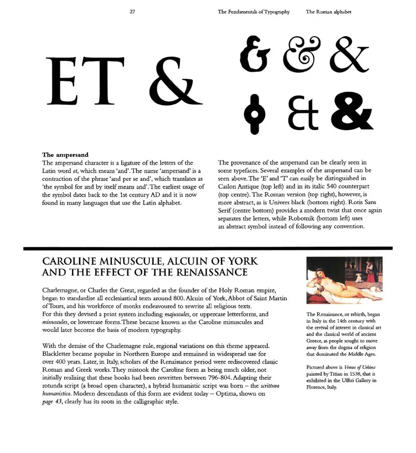
The ampersand
The ampersand character is a ligature of the letters of the
atin \vard fl, which means and . The name 'ampersand' is a
contraction of the phrase 'and per se and),. which translates as
the symbol for and by itself means and J The earliest usage of
the symbol dates back to the 1st century AD and it is now
found in many languages that use the Lati alph bet
The Fundamentah ofT ypogrnphy
The ROI14n alphabet
The provenance of the ampersand can be clearly seen in
some typefaces. Several examples of the ampersand can be
seen above. The 'E' and oCT' can easily be distinguished in
Caslon Antique (top left) and' its italic 540 counterpart
(top centre). The Roman version (top right), ho\vever J is
more abstract, as is Dnivers black (bottom right) Rotis Sans
SerIf (centre bottom) provides a modern t\V1St that onCL agam
separates the etters] while Robotnik (bottom left) uses
an abstract symbollnstead of following any convention.
CAROLINE MINUSCULE, ALCU N OF YORK
AND THE EFFECT OF THE RENAISSANCE
Charlemagne, or Charles the Great, regarded as the founder of the Ho y Roman empire,
beban to standardise all eccles. astical texts around 800 Alculn of Yo k, Abbot of Sa r n Martin
of Tours, and his \vorkforce of monks endeavoured to re\vrite all religious textS.
For this they devised a print system including ma)uslules, or uppe case letterforms, and
muzus,ules, or lo\vercase forms. These became ...no"\Vll as the Caroline minu cules an
would later become the basis of modern typography.
The RenaISS.ance or rebirth, began
in h.a.l in the 14th century \V1th
the revi\al of inrere '[ in dass14::al art
and the classical \vQrld of ancient
Greece, as people sou ht to move
a\vay from [he dogma of reJigion
that dominated the Middle Ages.
With the demise of the Charlema.gne rule) regional variations on thlS theme appeared.
Blacklctter became popular in Northern Europe and remained m ,"vi espread use for
over 400 years. Later, in Italy, scholars of the Renaissance period were rediscove ed classic
ROnlall and Greek works. They mistook the Carohne form as being much a der, not
initially realising that these books had been reVJI'itten bet\veen 796-804. Adapting their
rotunda script (a broad open character), a hybrid humanis.tic script \V3S born - the scnttura
I umat1istica . Modern descendants of this form are evident today - OptLma., ShOVvll on
page 3, clearly has its roots' the calligrapl- - c. style
Pictured above is f.t.nus oj L",bino
painted by Titian in 1538 y th t is
exhibi ted in tbe U ffizi Gallery in
Florence Italy.
28
The rundamentals ofT ypography
The Inodern alphabet
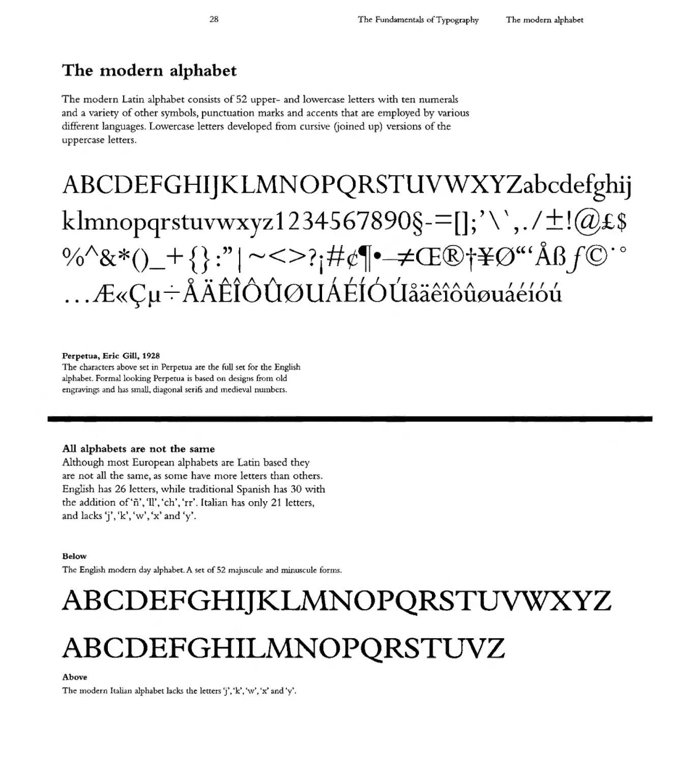
The modern alphabet
The modern Latin alphabet consists of 52 upper- and lowe case letters with ten numerals
and a variety of other symbols) punctuation marks and accents that .are employed by various
different languages. Lowercase letters developed from cursive Goined up) versions of the
uppercase letters.
ABCD EFG HIJKLMN 0 PQ RSTUVWXYZabcdefghij
klmnopqrstuvwxyz12345678909-=[];' \ ' ,. ::t !@£$
o O/\&*()_ + {} :" I "-J<>?i# -4CE@t¥0'" AB 1@. 0
. . . JE«\= 11-:- AXEl 6 U 0 UAEI 6 UaaelcrU0uaelOU
Perpetua t Eric Gill,. 1928
The characters above set in Perpetua are the full set for the English
alphabet. Formal looking Perperu,l is based on designs (rain old
ngr3vings and has small diagonal serifs and Inedieval nU111bcrs
All alphabets are not the same
Although most European alphabets are Latln based they
are not all the samet as sOlne have more letters than others
Enghsh has 26 ]etters, while traditional Spanish has 30 \Vith
the addition of ii't 'lr, ch' err'. [talian has only 21 letters
d 1 k 4: t ' k t' " t d ' t
an ac S J, t W t x an y.
Be] ow
The English modern day alphabet. A set of 52 Jnajuscule and . nuscule fornls.
ABCDEFGHIJIZLMNO
QRSTUVWXYZ
ABCDEFGHILMNOPQRSTUVZ
Above
The lllodern Italian alphabet lacks the letters Ty "k t , \v\ (x t and i.
29
The Fundamenta1 of Typography
The modern alphabet
Accents and stresses
Various accents and stresses, called diacritical marks,
have developed over time to provide v. sua! guides to the
pronunciation of letters and words by indica.ting how
the letter sound is to be modified Pictured below are some
of the eOI l.on accents used 'With the Latin alphabe which
will be discussed on page 92
Acute
-'
e
Circu:m.£]ex
1\
e
Breve
v
Z
Acute accent. from the Latin acutus. meaning
csharp representS a vowel IS dose or tense,
has a high or rising pitch. that a vowel is
long or that the syllabIc in which the vowel
appears is stressed.
From the Latin d m..-, iflCXU$ mean. ng b .n t
around", the circum:fl x indicates that a vowel
has a long sound.
From the: Latin b eV 5, \vhich means 4short',
this symbo] placed over a VO\V 1 indicates
that it has a short sound.
Grave
Diaeresis / Umldut
T1Lde-
,
e
. .
,-"",;
e
n
From the Latin gravis meaning Iheavy', it is a
mark placed above a vowel to indicate stress
Oc sp cia! pronunciatlon.
Typical in Germanic langoages, the umlaut
indicates that a vo\vel sound changes by
assuniIating [he \oo\vd sound of the following
yllable. f on1 the Gennan Un? meaning 3.round'
, al ., d l c d '
or teraQon, :an aut, me;;uung s.01Jn .
From the me:dil..val Latin tlwlus meanjng
title' 3 tilde placed over a letter indicates
that a more nasal pronunciation is required
such as the Spanish 'ii', that is pronounced
]ike the ny' in 'canyon'.
The 0
Modern numbers derive from abic cha acters and their
adoption brought the O' with them. The nurnerals themselves
orig' nated in India and came into use in Arabic around
1000 AD. Common usage In Europe did not occur until
the Renaissance period.
Simplification
Mode n European digits we e c eated in India in the 6th
century or earlier t but were introduced into the West by Arab
scholars. As they represent place-based values and have a value
for zero, cal ulations can be performed with relatlve ease) as
addi g the umbers (belo,v rigJ-t) will prove Anothe
advantage is that numbers of 1 nfi nite length can be formed,
whereas Roman numerals soon meet with limitations.
M
C
VI
IV
100 1 0
50
6
4
30
Movable type, 1436
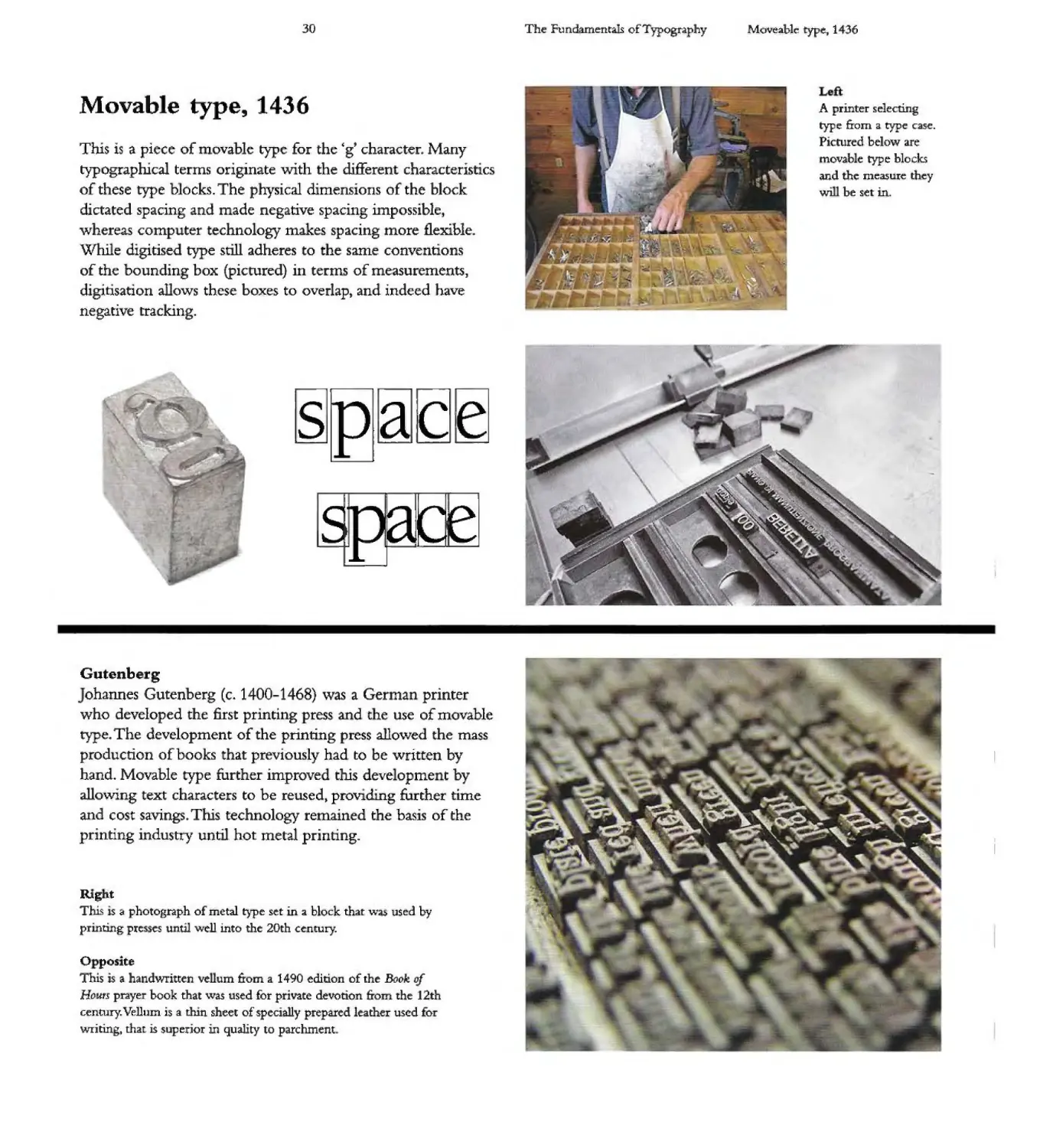
Tlus is a piece of lovable type for the g character. Many
typograprucal terms originate -with the different characteristics
of these type blocks. The physical dimensions of the block
dictated spacing and made negative spacing impossible
whereas computer technology makes spacing more flexible.
\Vhile digitised type still adheres to the same conventions
of the bounding box (pictured) in terms of measurements,
digitisation allows these boxes to overlap, and indeed have
negative tracking.
\
Gutenberg
ohannes Gutenberg (c& 1400-1468) was a Germa printer
who developed the first printing press and the use of movable
type. The development of the printing press allowed the mass
production of books that previously had to be written by
hand. Movable type further improved chis cleve opme c by
allowing text characters to be reused" proVIding further time
and cost savings. This technology remained the basis of the
printlng industry until hot metal printing.
Rtg it
This is 3 photograph of metal type set in a block that wa5 used by
printing pre ses u til well into the 20th century.
o posite
This is a handwritten vellum from a 1490 edition of the Book of
Hours prayer book that was used for private devotion from the 12th
century. Vellum is a dun sheet of specially prepared leather used Co
WTiting, that is superior in quality to parchment
The F ndament.aIs of Typography
Movea.ble typc lI 1. 36
)0
.... .
.'
' ..,
....
\ ,
I""
\
Tr-
'"
1
A printer selecting
typ e from a type case.
Plcmred below are
movable type blocks
and the measure they
will be set in
'"
4>"
\\ <iii
" \ .'.....
'"..
""-
"
"
III
31
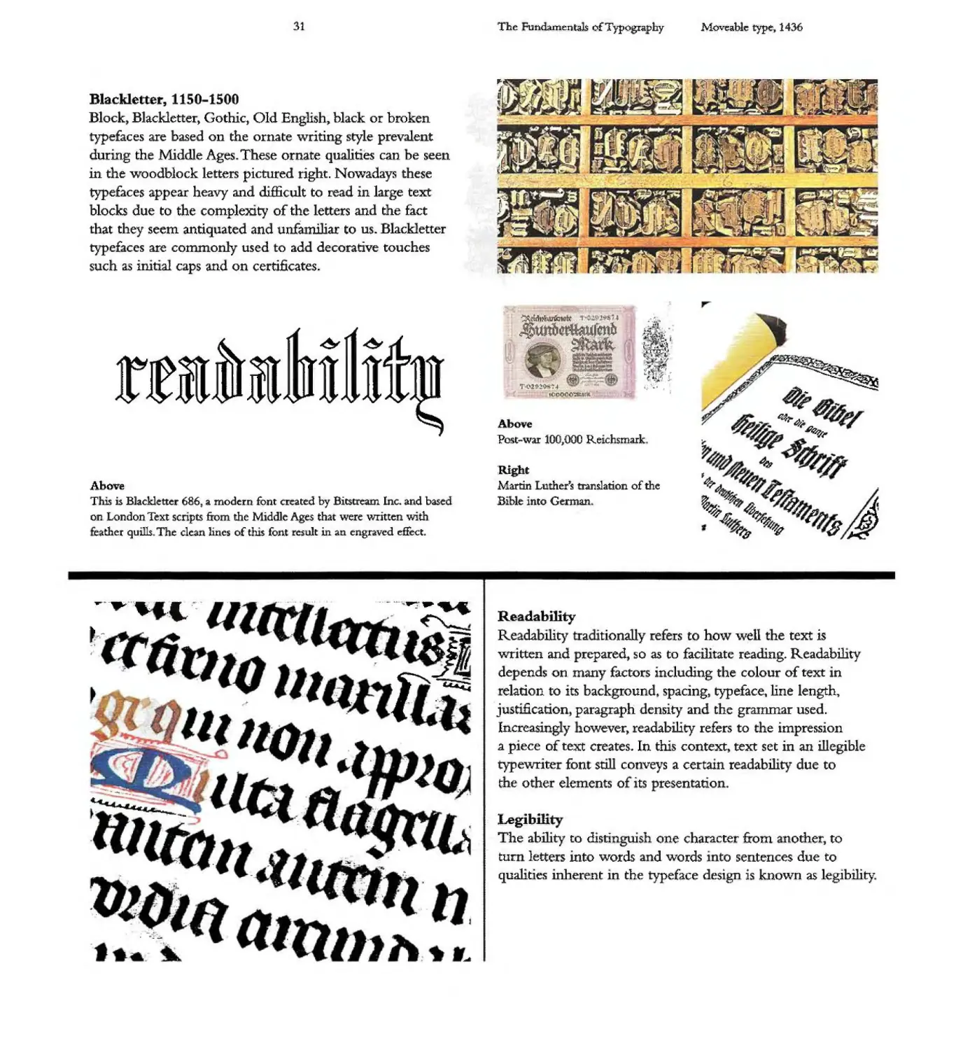
Blackletter,. 1150-1500
Block, Black1etter Gothic, Old English, black or brok n
typefaces are based on the ornate writing style prevalent
during the Middle Ages. These ornate qualities can be seen
in the woodblock letters pictured right. Nowadays these
typefaces appear heavy and difficult to read in large text
blocks due to the complexity of the letters and the fact
that they seem antiquated and unfamiliar to us. Blackletter
typefaces are commonly used to add decorative touches
such as initial caps and on certificates.
& &
rtl I ]J]J
Above
This is B]ackletter 686 J a modern font cKated by Bitstream Inc+ and based
on London Text scnpts from the Middle Ages that were written with
eather quills The clean lines of this font result in an engraved effect.
--... .....-
-
__ _ Lh ..-:; ..
.
]
r
J-
".
,
-
........... ....
-
.*w
-'
III-
. 'j;
:
The undamentals of Typography
,.
,
....
. ....
qL ;J!
r: ::'11
, :t '--
....
r.(... . "" ...., .
r:
':j 1 I .
lJL . L::t
t ?rr"
I 1'. - {"i
,
.
. I
....
":
{ l ' tt ...
, t
f
'It" ..-
.... 'If i,
- _...
\-
_I . ll.. I r
I -<: I' .{I r:.. ..
l f1... I _
:r - [.1" '" -"'r '\,
J I t
f';i'
L
".0. -:0 9l :S.
. (fenb
... ......
._ it1-a .
,j-i.-.;-.:
"...... r
... ,
W '
of .' .
( 01., '
,.. -,
...-... - I
If .t";Z:........g. '; I
t(JO CI.o
.: ". I I
Above
Post-war 100 J ooO RelchsmdIk
Right
Martin Lu ther"s t:rmslation of the
Bible into German
Moveable type-II 1436
r .
0::1 ,. tl'
..1 I.. I'"
-
.....
r . It
t t I _
-r
r ,0""3
t;: ..... "i i'- I L}
J "" -l t.:. ( J !: ,
.' .... ..'
.
r
.{.....
.
.......: .
",L'
L, .
r !
'1 I f
- t\. -
.£ L
...
." -'tr 1r
l 1 '-;'" "7
I
. ......;.
.. .
...
r--=
IJ .I
.-:::>JI. .
, .J
..... f\. ...
-
.... 'Y 4-"
,g
,..
"f
d
,
a
I" 4Jf. /' I) J
.r IJ fJ
it $
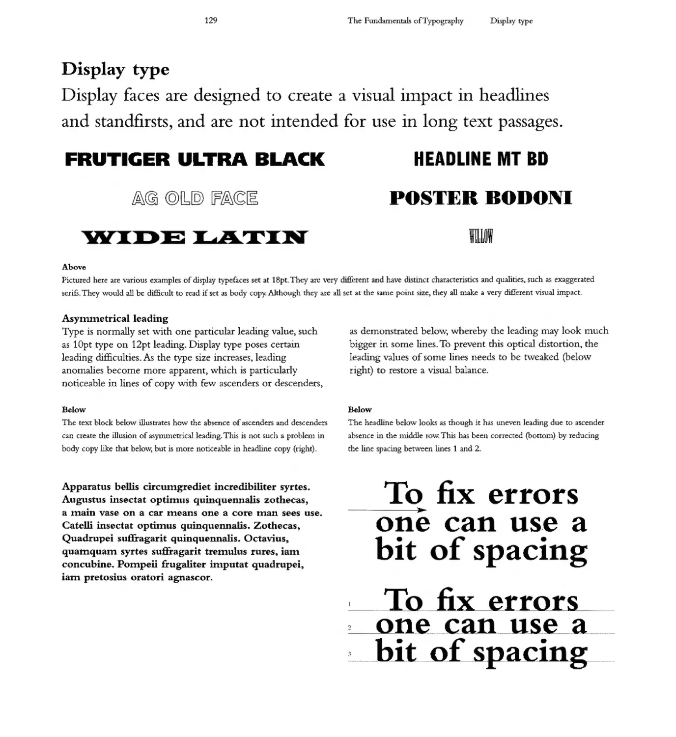
Readability
Readability ra tiona1ly refers to how well the text is
written and repared t so as to facilitate reading Readability
depends on many factors including the colour of text in
elation to its background t spacing, typeface, line length
justification paragraph density and the grammar used.
lncreas"ng y lowever,. readability refers to the impression
.a piece of text creates In this context text set in an illegible
typeVJTite font. still conveys a certaIn readability due to
t e 0 he e e ents a 6ts resen aria
Legibili
The ability to distingmsh one character £tom nother, to
tu:r lette s into words d words 0 senten es due to
qualities inherent in the typeface design is known as legibility
....
32
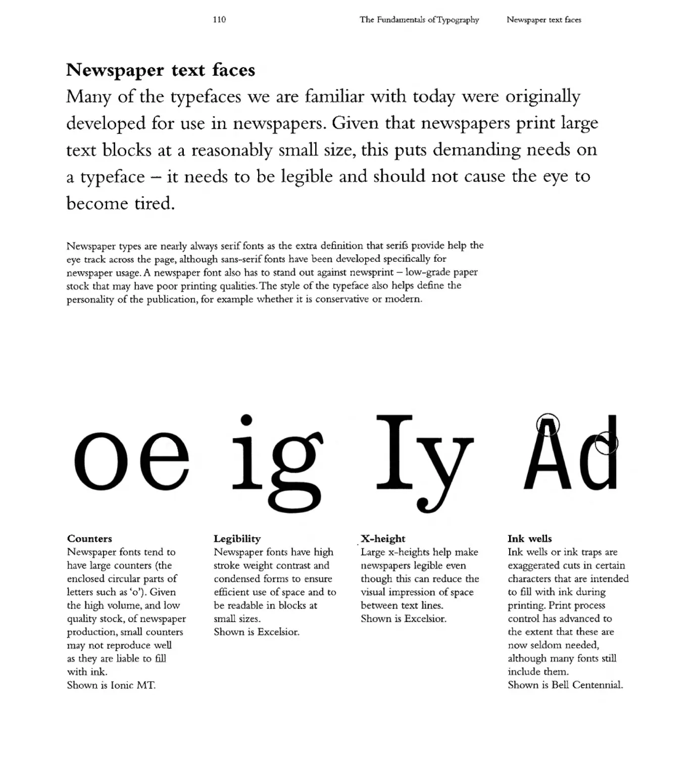
The Fundam ntals of Typography
he ffect of printIng 111 Europe-
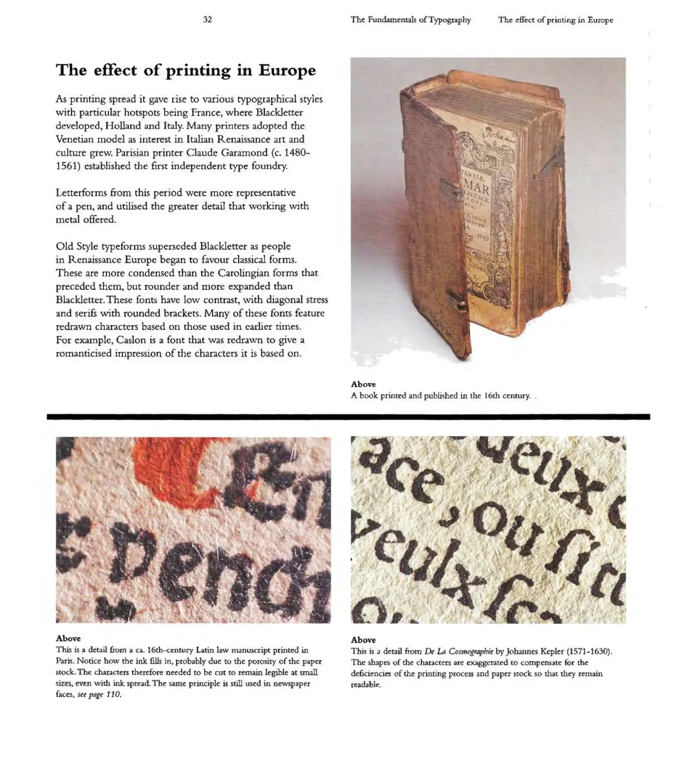
The effect of printing in Europe
As printing spread it gave rise to varIOUS rypograph 7 cal styles
with particular hotspots being France J where Blackletter
developed) Holland and I taly& Many printers adopted the
Venetian model as inten..st in Italian Renaissance art and
culture grew. Parisian printer Claude Garamond (c 1480-
156 ) established the first independent type foundry.
'- ,
l ' -...
Letterforms from this per - ad were more represent t!ve
of a pent and utilised the greater detail that working with
metal offered
\;.
\ q ,
I r 1\l\ r
oS. Jlfr_ \
II t.
.\ " . f"
r,.'-l '
Q
,"
.j P L
Old Style typeforms superseded Blackletter as people
in Renaissance Europe began to favour classical forms.
These are more condensed than the Carolingian forms that
preceded thCITI J but rounde and morc expanded than
Blackletter. These fonts have low contrast, with diagonal stress
and serifs 'Nith rounded brackets& Many of these fonts feature
re rawn characters based on those used in earlier times.
For example) Caslon is a font that was redrawn to give a
rOlnanticised impression of the characters it is based on.
.... ....... I
I. I I;. .... " -
\,.. ,
"-,:.,
""'}
"-
......
Above
A book printed and published in the 16th century. "
\0
"
-.
. " ...
...
....
.. . ...
".
,
.
\ . . . I.
, '" \ "," I
,
L ." , I
t.
Above
1 his IS :3. detaII from a ca. 16th-century Latin law Inanus.cript printed in
Pari . Notice ho\v the ink. fills in, probably duc to the poroslty of the paper
stock. The characte s th refore n eded to b cut to remain legible at small
s.iz s even \vith ink. spread Tht: s.a.me principle is still used in n \vspaper
faces. set pagt 110.
Above
This: is .a d tail from c L1 C(}$mcg,a Jr e by Johannes Kepler (1571-1630)
The shapes of the ch::u:act r$ are exaggerated [0 <:ompenute for th
deficienci !i; of th printing process and paper stock :50 that they ren1ain
readable: .
33
The Fundamentili cfTypography
The effect of printing in Europe
ABCDEFGHIJKLMNOPQRSTUVWXYZ
Bembo
Created by Monotype ill 1929 for a Stankay Morison project Bembo is an Old Sry!e font ba.sed on a Roman face cut. bv Francisco Griffo da. Bologna.
which Aldus M.mutius used to print Pietro Bembo' 1496 pubLcation of De Ael n. Morison rnodi6ed lCttCrfOfJ11.S such a.s the <G to cr :ate a rypefa.ce
with 31 weights - an all-purpose font family suitable for almost any application Note the cros.sed strokes in the LW
ABCDEFGHIJKLMNOPQRST
Gar.a.mond
Based on designs by 17th-century French printer Jean Jannon that \vere themselves based on typcfJlces: cut by CJaud.e G.3.raI1\ond 6:om th 16th c ntury
Garamond is an Aldine font (fonts based on the designs of Aldus Manutius in the 15rh century of which Bembo and Garamond are examples of) that
is elegant and readable Note the crossed strokes in the 'W t J and the bowl of the .p' that does not ach th-e stem
ABCDEFGHIJKLMNOPQRSTUVWXYZ
Janson
Crea.[ed c. 1685 by Hungarian punchcutter Miklos Kis,]anson '\YTongly bears the nanle of Dutch puncbcurter Anton Janson to whom it was formed attributed.
The font has sturdy forms. strOng stroke contrast and 15 used for book and magazine [t'x"'"t Note the long tail of the- Q the oval :sh.a.pe of the 'O and the unified
apex of the LW .
ABCDEFGHI KLMNOPQRSTUVWXYZ
CasloD Anttque
This is a modern font based on a hisrorical font Modern typogra.phers at.te"mpts to recreate ancient fonts in digital format often involve imaginative leaps, as they
are based on printed t xts where there is ink spread, and in many c.a es the 0 igin £0 ts are nOt avada ble to \vork from
ABCDEFGHIJKLMNOPQRSTUVWXYZ vw
Ca Ion
Crea.tt:d in 1725 by typographer William Caslon, this serif font W'iaS styled on 17th--.cennIry Dutch d SIgns The font can be identified as m05t Ca:slons have a capital
.A" with a scooped-out apex,.a. capiul LC' with two full serifS, and In the iralic, a swashed lowe-reast: v an.d 'w The font was chosen by Benjamin Franklin or th first
prinring of the American Decl1ration of Independence .and hilS become .a popuJa Sf" - font W1. v r.s.ioru now provided by numerous type foundries.
ABCDEFG HIJKLMNOPQRSTUVVVXYZ
Baskerville
Created by John Baskerville in the 18th centuryy Bask rville is venatile traminonal font (making it £ precursor to the modern faces that followed) 'With high
conttast forms that are us d for both body text and di5pJay type. Note the absence of the middle serif on. the .W ' 3nd the distinctive c pital.Q'.
34
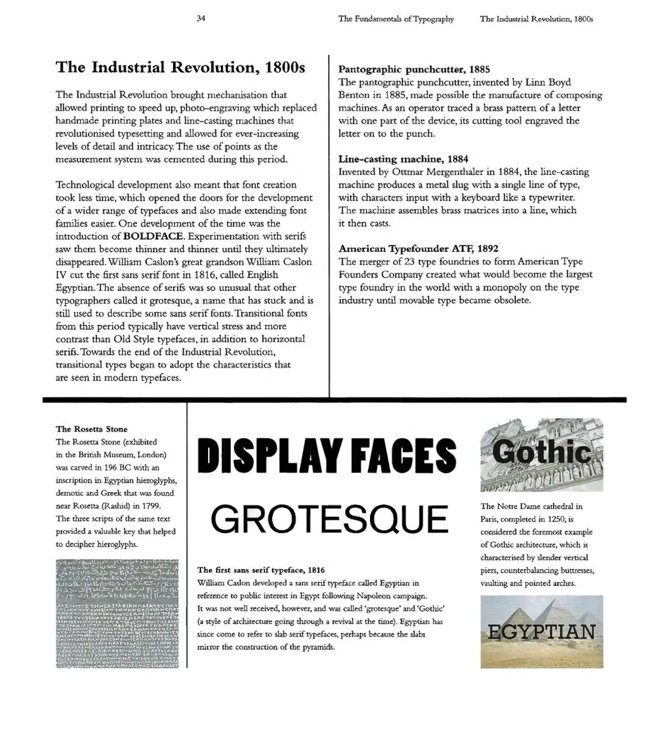
The Industrial Revolu ion, 1800s
The Industrial Revolurion brought mechanisation that
allowed printtng to speed up photo-engraving which replaced
handmade printing plates and line-casting machines that
revolutlonised typesetting and allowed for ever-increas' I g
levels of detail and intricacy. The use of points as the
measurement system was cemented during this perIod.
TechnologIcal development also meant that font creatlo
took less time which opened the doors for the development
of a wider range of typefaces and also made extending font
families easier. One development of the time was the
introduction of BOLDFACE. ExperImentation with serifS
saw them become thinner and thinner until they ultimately
disappeared. W llliam Caslon's great grandson William Caslon
IV cut the [st sans serif font in 1816, called English
gyptian. The absence of serifs was so unusual that other
typographers called it grotesque, a name that has. stuck and is
still used to describe some sans serif fonts. Transltional fonts
from this period typically have vertical stress and more
contrast than Old Style typefaces y in addition to horizontal
serifs Towards the end of the Industrial Revolution t
transitional types began to adopt the characteristics that
arc seen in modern typefaces.
T Rose a S 0 e
The Rosetta Stone (exhibited
in the British Museum London)
was carved in 196 BC \vi th an
inscription in Egyptian hieroglyphs
demotic and Greek that was found
n ar Rosetta (R.ashid) in 1799.
The three scnpts of the samC text
ptoV1ded a valuable key that helped
to decipher hieroglyphs.
I> JLh , "r
. V \oil .,.') ", ".t. ,..J.\r....
- ("' f , r
r <,III f .oJ ......
.J t:t... 1 d t h . \ 'J
, .0 "- d f\.-' 1
::..1 "-1M. \\ ( ....
HrS'" 10 !).... Jo.,..... 0"( nA
\.. -r.olj\.w j.I '0 "j1.. '" C('1I'"
toe 11.11I. r 0 - A'" ,u... :nJo."'t"'f'l\.
"".II,p. III "t
1"1" I ., lM
b. y ..........t, "",1'01
to ......."'" I 1'\.......
J"'I4 ":'I.; MoO .n , ."t
g."ooI; "(r.#i. f'I. !
,.. . "'''1: ot. '"
... It . . .'
If'- A
.. f tor -n tf . <l t. . " ..
.I..t.r, I
L .
..
.. "'"
.... f"..
I
Th Fundamcntili of Typography
The ndustrlal Revolutlon, 1800s
Pantographic punchcutter 9 1885
The pan og a hie une cutter invented by Linn Boyd
Benton In 1885,1nade possible the manufacture of composing
machines. As an operator traced a brass pattern of a etter
with one part of the device, its cutting tool engraved the
lettc a to the punch
Line-casting machine,. 884
Invented by Ottmar Me genthaler in 1884, the line-castIng
rnac ne p oduces a eta! slug witt a single line of type,
with characte s input with a keyboard like a typewriter
The machine assembles brass matrices into a hne, which
it then casts
American Typefounder ATI; 1892
The merger of 23 type foundrIes to form American Type
Founders Com any created what would become the largest
type foundry in the world with a monopoly 0 the type
industry until movable type became obsolete
FI
----
......
." ,oj
I
The Notre Dame cathedral in
Paris, completed in 1250 is
considered the foremost exa.mple
of Gothic architecture, which is
charactC:tJsed by slcnd r vertical
piers cQunterbaJancing buttresse5 J
va ul ti g .and pOUl ted arches.
.0 ESQ E
The first .sans serif typeface, 1816
William Caslon developed a sans s if typeface called Egy f
reference to pubhc interest in Egypt follo'W'ing Napoleon -campaign
It was not well received however, and was c.a.ll d "grote que' and 4"Gothic'
(a s.tyle of architecture going through a revival at the tUne). J:gyplian has
S1I1CC come to refer to slab senf typefaces. p rhaps because the slabs
IIllrror the construction of the pyramids.
TIAN
35
Commercial art
Lithography ,vas invented in Austria by Alois Senefelder
In 1796. Following refinements) by 1848 the process had
been refined to print speeds of 10,000 sheets per hour,
which made mass productIon of designs economically
v . able. Lithography allo\ved the Inerging of art with
industry to produce posters and colour plates for books.
The first person to mass produce posters wjth lithography
"vas Jules Cheret (1836-1933) in Paris. Other early
protagonists . nelude Thomas Theodor Heine (1867-1948)
and Henri de Toulouse-Lautrec (1864-1901). Despite these
developrnents, the term graphic design'does not appear
until the 19505.
Monotype character caster, 1893
The revolutionary mono type caster cast single letters. in lead
and composed them into a page. This allowed corrections to
be nlade at the character level rather than having to recast a
"\vhole line with linotype Monotype could also produce leads
1nd quads for spacing. Spacing is e>"l'lained on page 95.
Simplicissitnus 1896 (right)
Tholnas Theodo Heine cre 1ted this illu tracion for the cover of the
Gennan satirical Inaga.zinc Simplidssimr .s that he co-founded in 1895
.J f\ DID U
. .
,...
I
.....
1.-
I
-
..: f
,
aristid-
I A r
ddnS
b
"eo
..
.....
'""
RYO
I r' AT R
\
SO
./It.
The Chiefta" s by F C. Burnand
.and Arthur Sulrvan" 1895
he oversized tenn1nJ..1s (T. E)
.and cro s. bar5 (H) Me used for
dramatic effect in this lithogr:lph
pos.ter.
AI- tide Bunt at s
Atnba$sa.deurs Toulou$e-
Lautrec, 1892
The paJ11ted lene- arms in this
lithogr.aph poster ere te 3. singula
form combining text and image.
The Fundanl( nt.als of Typography
Th", Indusrrial Rcvolution 1 HOOs
. .
LIC SSI US
I PF
\.
"
. .
\ ()
.,
\ )
. ,
T
tr\
,.
'- ....
'\
,
J\LMAN (lOI Q\lISSIJ
=19 0 4=
RJ\sS(\I
r..L.t:.
11AftAI.JO M.E:
--..
ANN02
rr:'-
" - --......
-'L _ --:" .. . ;
.... ....
-:;: -=---=- -
'" - 1..
'"
III
,
I "" - -....==;1
- - \
...c: ..... ___ __ ___
E oSAtt 0 RON EmTQRE -
MHAn0- 1 MO. Af"OU -...
.. J
It t u 1t OO16JfiOO
1 tR-n _ ! ==
N" m nac,1904
Distinc ti, lcttc:no ms rC rend.: red,
creat:u g .a. logotype ather th.an a
(ide in thi ltthograph pos,rer.
Poster Co an ow,. 19 3
Tvpography nurrors. $ubJcc[
m.atter in thi hthograph poster.
The roWlded 'rnoderne" structures.
of the Zeppelin are tnnsposcd
on to the typography.
36
r s and Crafts Moventent, 850s
The Victorian Arts and Crafts Movement developed as a
rejection of heavily ornamented interiors with many pieces
of fur niturc " collections of ornamental objects and sur-aces
covered vnth fringed cloths. The Arts and Crafts Movement
favoured simplicjty) and good craftsmanship and design.
ABCDEFGHIJKLMNOPQRSTUVWXYZ
abcdefghi jklmnopqrstuvwxyz 1234567890
Cheltenham Bertram Goodhue 1896
Originally created by Bcrtr3m Grosvenor Goodhue for the Cheltc.nham
Press, New York, this is a serif font that was sttonger ln appearance than the
popular text types of the time aided by do large x-height tha.t adds to its
legibilit)t.
ABCDEFGHIJKLMNOPQRSTUVWXYZ
abcdefghijklmnopqrstuvwxyz 1234567890
Century Schoolbook) Morris Fuller Benton, 1901
Based on his. (ather's. Century font Morri Fuller B nton made other
versions including Century Schoolbook in about 1919 It is round. open
and sturdy. Although heavier in appearance than many othe serif onts,
it is very legib]e.
The Fundamentals of Typography
Arts and Crafts Movement 1850s
British artli)t and a chitect Wl1liam Morris was a leading
e:x-po e t of his new style t at sought to re-establish a link
bet\Vee beau fu work and t e wo ker, by rediscovering an
honesty + desIgn that is not found in mass-produced items
A CDE HI L NO QRSTUVWXYZ
abcdefghijklmnopqrstuvwx z 123456 890
Franklin Gothic) Morris Fuller Benton, 1904
Designed fo ican Typ Founde s this Gothic or grotesque fon gives a
dark, monotone look. It has subtle stroke conU'ast, with the thinning of round
:strokes as they Inerge into stems. The font includes a two-story 'gY. Its various
wei ghts give it' a 10 t of versaW' ry, making it ideaJ for newspapers.
ABC DE FGHUKLMNOPQRSTUVWXYZ
abcdefghijklmnopqrstuvwxyz 1234567890
Century, Linn Boyd Ben on, 906
Based on an origin:J 1894 design by Linn Boyd Benton (father ofinfluentiaI
type designer Morris Fullt'r Benton) for periodIcal Gtn ury Magazhlt with
t characters to fit ght colum.n.s.1t is an extremely ]egible font that is
suitable for textbooks magazmes and other publications
ABCDEFGHIJKLM NOPQRSTUVWXYZ
ABCDEFGHIJKLMNOPQRSTUvwx.'YZ 1234567890
Copperplate Gothic, Frederic Goudy, 1905
Originally created by Frederic Goudy, successive weights were drawn by
Clarence Marder fo American Type F-ounders It is a wide, rather square t
one tone Gothic Ylith small hairline serifs renllniscent of the edges on
letters that were engraved 1Il copperplate. The characters unpart a ee of
serious business that is u derstated and reEn d. Wide and open it is 1 gIble
at small sizes
ABCDEFGHIjKLMNOPQRSTUVWXY
a c efghijk1 nopq stuvwxy 123456 890
Goudy Old Style, Frederjc Goudy", 1910
Inspired by lettering on a Renaissance painting, Goudy Old Style forms th
bastS for 3 larg family of variant5.l-hgblights include the upward pointing eM
of the g, the diamond-sha.ped dots over the i and jy and the rounded upward
swelling of the horizontaJ strokes at the b.dSe of the- E and.
.-. ...'h --.;:.. .w;lI P" I
'V
1 ... .
I ;1
......
"
lot;
- {.
..., -
.......
...
. I
L
'.
'
. I
. f.
, I
'f
II
., I
I .-...J.
........
---
> ,
....
...
l...
j I
Z:..:
'.
)
,
\'
.
i
......,
I
-
:.
.........,
1
\..
-"
" .
..
:--...... '\
-]<\ )
. ,
. -.,.---
""
-
. ,
Penny BI 1840
The world s firs postage stamp,. the
Penny Black was + S:;u d in 1840.
The letter;;. m tbe bottom left and
right hand corners denote the
stamp s position on th printed
sheet, AA, A.B AC etc.
Royal Albert Hall, 18 0
n 1870 Queen Victoria opened
the Royal Albert Hall m London.
he terracotta frieze running me
c1n::umference depicts 'The
Triumph ofth Arts 3.I1d Scu nccs'.
37
ITC RENNIE ACKINTOSt; WAS DE.SICJNED IN l b
f)Y PFtI[l GRII'\S AW FOt OWINQ RESEARCI9
AND COllA50RATION fJrTWEEN THL
INTERNATIONAL TYPEFACE CORP AND GLASGOW
SC OO : OF ART TFiE LLTTERFORf\S ARE ASE.D
ON T L I=tANDWRITING AND DRAWINa-S OF
5COTT1St=1 DESICINER C ARlE.S RENNIE
ACKINTOSFL WMO PRODUCED lctF1LY
ORIGINAL 5UILDINQS, INTERIORS AND
FURNITURE. AT Tt=tE URN OF Tt:iE 29
C NTURY. 119[: FONT FAP\I[Y IS UNUSUAc AND
OFF 5EAl AND A GOOD C OICE FOR PRODUCT
PACKACJINQ, ADVrRTJSINCi, AND CrRAPt=l[(
DESlctNS WITI9 fA PERIOD Fl:A[R.
Rennie Mackintosh" Phill Grimshaw, 1996
The lctterforms of Rennie Mackintosh are based on the ha.nd\Vtiting
and drawings of Scottish designer Charles Rennie Mackintos.h
J. f. f i }
- . r): - - - - -. - 'tfi:
. r'; I "'i
f :; "
. - - : ".
" ) 1l :::.'-. -
,
-......./ /;:" ";:'4'"o .
- ..."" - -
, .<" . ..- : - . - -
.. - I.. ,___
",," . ..... -.
-. - -.
- ...... -
Franklin Gothic
Bcnj.unin Franklin a ter whom Franklin Gothic \vas named Morris
Fuller B nton's design of 1904 is still popular tod.a. appea.ring in
many newspapers and as a headline typtfac for adverrising.
he "undamtnrals of Typography Arts and Crafts Movement 1850s
t6E e:eKlIlHnn iOn rBID hV
;1S nBIDED Hi ER DE 3nER
o 0 e:eKlIlHnn, t5 B ehEBR
JU6e:nDS h nihUe:nee:
t5ROU35 t6E rhO n6 i OR h
eOntOuRS t6;IS iOnt was maDe:
iOR hBRGER PO;J'nt ES iOR
USE on POStERS W5;:1he:
Re:hBtm7EhV hEG;JRhE, ;It ;IS not
mEBn,t iOR 5mBhhER PR;Jnt
EeKITlBnn ;:IS oitEn USED to
G;WE B nOstBh6;Je iEEh;JnG
Eckmann 0 to Eckmann. 1900
Named after designer 0 tto Eckmann, the characters have flowmg
floral contours that provide a nostalgic feeling The typeface intended for
display a t larg si e$.
'" ... 't- b
I....
t
Copperplate Gothic
Copperplate GQthit: exhibits some of the attention to deta.ll found in the
Arts and Crafts Movement
38
Modernism, 1910
Modernism through the cubist" sur ealist and Dadaist
movements was shaped by the industrialisation and
u banisacicn of Western society" Modernists departed from
rur and provi c al citgeist p cvale t in the V+ eto + an
era, rej ecting its values and styles in favour of
cosmopolitanism. Functionality and progress became key
conccrn in the attempt to move beyond the external physical
representation of reality through experimentation 7 n a
struggle to define what should be considered Irnodern'.
Modernist typefaces often sought to force viewers to see the
everyday dIfferently by presenting unfamiliar forn1s.
1'-' ...
,,\ . '-'";:'
Left
Modc..rnist tendencies can be 5e
in Portrait of Beatr 'ce Hastings by
Italian painter and sculptor Amedeo
Modigliani that features. tht delibcrate
distortion of features and the use of
large areas of flat colour
....
",
.. "C'- \
"-
l,r
.......
....
\
\.
The Fu:ndamentals of Typography
Moderrnsm, 1910
A RECR ATION OF THE ROMAN
TYPE CU BY NICOLAS JENSON IN
TH 15TH CENTURY ROGERS WAS
COMM SSIONED TO DESIGN AN
EXCLUSIVE TYPE FOR NEW YORK'S
METROPOLITAN MUSEUM OF ART.
NAMED AFTER THE CENTAUR THE
TITLE OF A BOOK BY MAURICE DE
GUERIN WAS THE FIRST
DESIGNED USING THE TYPE.
Centaur t Bruce Rogers.. t 914
American Bruce Rogers created this font for New York's Metropolitan
Museum of An. based on. NicoJa.s Jens.on s 15th-century recreanon of Roman
type It is named after 111e Cen au by Maurice de: Guerin the fint book to
use the font
.....
' ...... ?'
" " .:-
. 7- '
'1 ' -..........
"""-- < "
- """'"'"-c: -\:-........oc...... ........
, _ _-"-4,. ",, I .T"II
:,. 1
............._ ' i' 1(\ .. -. ---: \. . " -
"......,'........ . '" ,"" iii.. . _ _.-: ........
.. ......., 1 i.-- 011I".._ ;..... .. . 'I .
1. - __ - r( " - l \ " i
"'\ ...... --. r _I .
, · --J ..... L. t .:..
,6
\ ......... ,.....
-- ,
-- .. ... t': I , ....
"t . ... I ,
1 - ,
t .J I. ...
.....
- h-____ ....
I . - -
r I .
. , I 1 i
\
1 I
-...,
Above
The Pompidou arts centre In Paris, created by Renzo iano and R1chard
o :rerS itJ 19 . It is a modernist building that follows the mantra
of"form follows function and its ac: thc:tics arc inte cal to its function.
De S Ijl 19 7
An art and design movement founded around t e magazine
of the same name that was founded by Theo Van Doesburg+
Dc Sri' used strong rectangular forms t employed primary
colours and celebrated asymmetrIcal compositions"
Constructivism, 918
A m de n t novement orig"na . 19 in Moscow i 1920
characte +sed y the us of industrial materials such as glass
sheet metal a d p astic to create non representationa1 often
geometric objects. Russian constructivism was influential to
moderrus th ough its use 0 back nd ed sans s ri
typogr-ap y arranged in symmetrical bocks
39
The Fundamt.ntili cfTypogr:a.phy
Moderru m 1910
1=
.
LONDON UNDERGROUND IS A SANS SER F D VELOPED BY EDWARD
JOHNSTON FOR THE LONDON UN ERGROUND SYSTEM IN 1916,
CHARACTERISED BY WIDE ROUND D CARACT RS WITH AN EVEN
STROKE WEIGHT THAT GIV SIGH L GIBILITY.
Johnston Underground,. Edward Johnston, 1916
This. striking sans serif font \vas created by Edward Johnston for use on the sign;age of the london Underg o1.1nd. Onginally c.alled Underground. it has :ilia
been called Johnston s Railway Type andJohnston Typograph -r Eric Gill studied under John ton who is considered the father of the 20th century typography
revival. and this connection is clear to see in Gill Sans. which further refines the London U d rgrou font Gill Sans has mote classical proportions. geometric
elements and contal11S a distinctive capital 'R Y and eyeglass lowercase C g- .
GILL SANS FURTHER REFINES THE SIMPLE LINES OF
JOHNSTON'S ORIGINAL FONT.
The Bauhaus, 1919
The Bauhaus opened in 1919 under the direction of renowned architect Walter Gropius.
Until forced to close in 1933 1 the Bauhaus sought to initiate a &esh approach to desIgn
ollowing the First World War with a focus on functionality rather than adornm.ent
Left
In 1923 Russian Was.sily Kandinsky
3 tutor on the Bauhaus Basic
Course. proposed that there was a
universal relationship between the
three basic shapes and the three
primary CO]OUTS t with the yello\ov
triangle being the most active :and
dynamic, through to the passive,
cold blue cUde
40
Dadaism 1916-1923
AYJ artisli 8Y}d VfEfc1fy vEmfllt ( 6-23}
that lEvEL ?PEd f<?Ll ? wi 110 W,?fU war I al1d
s<!"U{J t t? dis ?vEr a" qutliEl1ti rfaLity thf cr h
th c9b O liti?ll?f tfaditi?11i1l uLrur iilld
qE8thEii f? r ms. - !)qdt9ism- bf<! hl tlE OJ idEas,
fEriqls c9T)d dirE\ti?T]S bZ4' with LiUL
-ulli ?fmity. Its prill iPUS wErE ?f dEliD(fafE
iffa i?1l8Li Yo. al1ar r:;hy c9tld ytli iS r1'YJd liE
r j[ ti?ll ?f L9ros ?f DEtTuty+-:Dc9dC1iSls LivEd i11
hE m!?mEllt t9 1 1d f<?f thE m!?mEtlt
ada, Richard Kegler,. 1995-1998
Inspired by Dacb typography and poetry" R.lchard Kegler created Dam
according to the principles of irrationality and anarchic arrangement so
that there- appears to be htt1e congruence from one letter to the next.
a
-
ITC K. belt Victor Ca:ruso 1976
...abel features basic forms: influenced by stone-carved Roman letters that
consIst of a fe\v pure and dear geometric forms such as clrcles squares and
t iangles. Art Deco e1ernents such as the seemingly a\vk\vard angles of some
of the curves makes Kabel app v ry different from other seom aie
mode:r:ru.st typefaces. Based On an earlier design by Rudolph Koch in 1923.
The Fundame ltalS of Typography
Modernism.. 1910
Bayer Universal (top) .Bayer Fooetik (bottom)., Herbert Bayer!! 1925
Herbert Bayer embodied the modernht desire to reduce designs to
few elements. as pOSSJble and rr:peatedly experimented with typography
to reduce the alphabet to a single cas.e.
b
e
.
IV - rsa
b
ik
£R
.
Basic Alphabet (below) was a further expe. entat10n \Vith hnguage
\vith words wntten lik they sound, and with silent letters dropped The
Ieuerforms in some way t.ry to vis.uall express rbe sounds they represent
as typographical elements are reduced. Capitals 4U"e indicated \Vith an
underscore for example.
I
s.k AI AbE:t
-
-
ABCDEFGHI]KLMN 0 PQ RSTUVWXYZ
a.bcdefghi jklmnopqrs tu vwxyz 1234567890
e etua, ic Gill, 19 8
Eric Gill based this design on the characters from old ngravings
S nall diagonal serifS and a medieval number set add an element of
onnality to [he typef ce
ABC DEFG H [J KLM NOPQ RSTUVWXYZ
a bed efgh i j kl m n opq rstuvwxyz 1234567890
Gill Sans., Eric Gill, 1930
Taught by Edward Johnston, who designed the London Underground
ignage Eric Gill gave Gill Sam more classical proportions than Johnston's
design. He Inc1ud d a flared capital 'R and eyeglass lowercase ':g in this
humanist sans s .rif that has geomeu - c touches
41
The Fundament.ili of ypography
futu
I
I
I
I
I
Futura, Paul Renner 1928
Futura is consIdered the major typeface development to come out of the
constructivi t orientation of the Bauhaus movement. Typographer Paul
Renner based the characters on the simple forms of circle tri3.Ilgle and
square, but softened them to be mOrt: l gible and to Create a nClh) modern
type that was more than an old revival. The long elegant ascender and
descenders benefit tXom generous line spacing and help create this stnking
and radical typeface that is strong and elegant.
I
ModeI'msrn 1910
IN
I
I FA
Poster Bodoni Chauncey H Griffith, 1929
Based on an 18th. century design by Gianbattista Bodoni, this is a modern
font cha..ncterised by hairline serill that arc subdy bracketed and heavy
dowrutrokes that give a powerful vertical stress
Nazi Germany, 1931
The dictatorship of Adolf Hitler promised Germany Bin f/olk,. e. Re 'ch, ein Fi.ihre . (One
people) one empire) one leader!), a message dramatically reinforced through the visual arts.
The N i regime actively promoted Blackletter type as the official type-style for GermanYt
linking it with a nostalgic idea of German culture,. until 194 when Blacklette w outlawed I
in favour of Roman type. The Nazis also liked the modern, industrial oak of Bauhaus
typefaces which they endorsed in the 1940s when it was thought that a Roman typeface .
would have more internationa1 appeal.
YO ARE N
ED NO\\
-
-.:-
-=-- -
. .....
.:
'"
. .
II I
i
I
I
-
-
!o
... - . "I
-:a. .. .....
-
.....
..iII_';1 . -
.=-
- "I. ._
.....:....
:.: ...
-
-
.. r""" .....
"""'-
....
=
....-:..
"'0111II 1
ARMY NURSE CORPS
. T'" 'I' . . ...111 I .....11.
Barcelona Pavilion Ludwig Mies van der Rohe, built 1928-1929,
demolished 1930
M st e:] £rame glass and polished :none building \I\!.as emble-mottic of th
modern movement. The original use of materials expreS5.e:d the ideal of
mode nity through its gcom try, the precision of the pieces constructed and
the da.rjty of their assembly.
.. ... :-'..-.
--=. :;:.
-...
The Second World War
1939-1945
A global war in which Great
Brital , France the Soviet
Union, the U 'ted States,
Cruna) and other allies.
defeated German Italy,. and
Japan. Designs created under
both forces were geared
towards propaganda and
featured symbolic and/or
hero · c images to help their
respective war effo ts. One
of the effects of tills war was
the displacement of
designers., a chitects and
other creatives £rom Europe
to the USA.
42
1950s
Fa oWIng the Second World War a new optimism emerged as
a consumer boom erupted in the USA The cu tural scene
also expanded t boosted by many European creatives and
intellectuals who had fled Nazi Europe, and the teenager
emerged as both a market and creative force. Design became
more elaborate, with bright colours that celebrated life -
as personified in cars such as the candy-coloured rord
Thunderbird. The demand for wide choice and the emergence
of photosetting helped typography develop. Typographers
such as Hermarm apf led the humanist movement, with
the hnes between serif and sans serif typefaces blurred as
organic hnes were reintroduced into typography: Hurnarust
fonts have forms that are based on classic Romans but
without the serifs.
..-
-
Ford Thunderbird
Launched in 1955, the 711ufule bird
is the quintessential 1950s tw'o- eat
convertible American car that
defined the luxury car market.
t"......,
""""'-
----
--..::-:., . . 9:" .
I 1 ...... "Ir
The Fundarnenb1s ofTypogr.aphy
1950$
Helverica t Max Miedinger 195
Created by Max Miedinger - the forgotten d signer - HelvetiCi1 is one of
the mos:t famo1l5 and popular typefaces m the world With dean no-
nonsense shap s based on the Akzidenz-Grote:sk font+ Origina1ly called Haas
Grote:5k its. na.me changed to Helvetica in 1960. The Helvetica family has
34 weights and the Neue Helvenca has 51
ABCDEFG H IJ KLM NOPQRSTUVWXYZ
abcdefghijklmnopqrstuvwxyz 123456 890
Uwvers t Adrian Frutiger t 957
With sturdy dean forms Univers expresses cool elegance and rational
competence. It is availab]e in 59 weights that combme well with other fon
ABCDEFGH IJ KLM NOPQRSTUVWXYZ
a bed efg h ij kl m no pq rstuvwxyz 1234567890
a
Pictured m black is Helvetica and in magenta is Univers Although both
are sans senf fonts, there are noticeable differences such as the absence of a
tail On the Unlvers II:G' ":y'" and "-a". the mOre open. rounded counter on the
U nivers a' and the bis ecting ail of the He! verica t Q I .
"
Cold War (left and below)
Following the Second World War
the Cold War an ideological
conflict, developed between the
US and he USSR This was
characterised by intense distrust the
build upofnuclear weapons and
geo-political manoeuver ing.
Guggenheim (left)
One of the world"s leading modern
"Ut museums" th Solomon R
Guggenheim Museum was founded
in New York City in 1939 and
noted for the sprral building
deSigned by .architect Frank Lloyd
Wright and opened in 959
43
ABCDEFGHIJKLMNOPQRSTUVWXYZ
abcdefghijklmnopqrstuvwxyz 1234567890
Palanno Hermann ZapfjJ 1950
Na.tncd aftcr Giam.battista Pa1atino, a nla5ter of calligraphy from the
days. of Leonardo da Vinci f Palatino is 3. universally admired Zapf typeface
It is optimistd for legibility,. \vith open counters and carefully "\veighted
strokes ba:)cd on dassicalltalian Renais ance [anns that \vere legible even
on the ]nferior quality papers available follo\ving the Second World War.
ABCDEFGHIJKLMNOPQRSTUVWXYZ
abcdefghi jklmnopqrstuvwxyz 1234567890
Melior, Hermann Zapf, 1952
Melior was de5igned as 3 newspa.per face with short ascenders
and descenders, specifically for lerterpress and offiet printing. It has
a robust character with classic and objective form.s" and is versatile
and extremely ]egibl .
iJ
/
.Mistral" Roger Exco:ffon 1953
A loose running script based On the handwrittng of typographer
Rogel" Excoffon J ,"vho 'vanted to create a typeface '\vith the variety
and non-uniformity of h3ndwriting.
Inte national Style (Swiss)
International or Swiss Style ,vas based on the revolutionary
principles of the 19205 such as De Stijt Bauhaus and
Jan Tschichold 7 s TIze Netv rypography that became firmly
estab . shed in the 1950s. Grids, Inathcmatical principles,
minimal decoration and sans serif typography became
the norm as typography developed to represent universal
usefulness more th2n personal expression.
Jan Tschichold l 1902 1974
Jan TschicholdJs Die Neue Typogral,Jue (I7le New 1} ogrtlph ) pubhshed 1n
1928 expounded the idea of simplicIty, clarity and functionali sans serif
fonts and asynllnetry.. Tschichold ,vas driven by the desire to make efficient
use of materials to result in a (J.ire-r worldJ'such as doing ,a\vay mth t ppe-tease
characters. Escaping Nazi Germany to Switzerland he later recanted 50me of
his earlier prescriptive ideas feeling they \vere too similar to the thought
control of Nazism and Stalinism&
Thf" Fundamentals of Typography
19505
.-- .....
I j .
. ...,;;.-.
.
I
Santa Croce
Santa. Croce COlnpleted in 1442 1
is the largest Franci5can church in
Florence in the simple basilica style
W1th a nav and t\vc 1S1 s.
THE GOLDEN RATIO
o timd t Hermann Zapf, 1958
Optima was inspired by lett rs Zapf sketch d 0 'vo LOOO lire bank llotes
based on grave plates cut c. 1530 that he saw while visiting the Santa Croce
church in Florence Optima is a humanist sans serifb]c:nded with Roman
and calligraphic styles making it a smooth read and genera] purpose font 7
which became his most $uccessful typeface Letterforms arc in the
proportions of the golden rano. The golden rano is discussed on pages 68.
Asymnle kal
An asymmetrical layout features a grid that is the same on both the
recto and verso pages and typically has bias to\.varos one side of the page.
In the illustration bove the g id is biised tOWTItds the r.ght&
44
60s
The wor d of culture \vent pop in the 19605 J. music) art"
literature and furniture design became more accessible and
reflected elements of everyday life.
Pop art
Pop art developed as a reaction against abstract art. It was
often witty, purposely obvious and throwaway in its reflection
o consumer culture such as advertising and comic books Pop
art s influ ence on typography resulted in fonts - particularly
or display type - designed or selected a.ccording to possible
associations 0 eferences in place of any particular theory
regarding legibility or aesthetics, \vhile the nternational
Style remained influential for body text
r. I
b 4 Y
Body text
Davida Louis Minott, 1965
Display typefa ce designed for the
Visual Graphics COTpoTation
Letter Gothic,
Roger Roberson 1962
Originally designed for use on
an IBM Selectric typewIiter
sychedeli
Towards the end of the decade the anti-establishment hippy
movement and 'flower powee counterculture sa\.v increasing
use of text and artwork Wl th a strong art nouveau influence
that provided a visual simile of the effect of psychedelic
drugs! \vith distorted text and colours that challenged
conventional readability
,.
. ..
.'
Volkswagen Kombi 1950
The Volk5wQgel' Korn bi was
launched in 1950 md based on a
1947 sketch by Dutch di:stributor
Ben Pon. Although the millionth
Kombi was sold in 1961, it 1$
most associated \vith the hippy
moveme t later that decade
.;: ,)
-
. ¥J.
I
-
""- _":I
JJ - v
The Fundamentals of Typography
,
r I . . . . .. .: .._ __ _ A - .. - iA IBBBB.B
B- ---- - :-DD.[:ib'bD'''i"' . .- --...;
"a I IBMB .j g--lii!:ii:i! -.1--:- I II ;
. _.. .. ,.n GGGGG II; a . - - '1Jt iI H:.H.jifII1;
u r U . , rJ'. .. J: t .!.:t-. -- .-. -. ;.L.-L:r:;-. .
LLLLL-" _u Hill 101 "" Hi
ii"B.ji-j"RI.IlNW-. j -.-, -.. :" ' . ... 0606 :-,-
.. .. .. .. . .. .. -. ......-.- ,- .... -- ",-- .' ,
. . p PPPPP Q'QfL.._ .pl . . _ . . .
:_ ..__ M....... p8 eB, S S . .
-:- . " t"lCFO'CfECWD'CrO-.
_ .._.'iiviv._.."'..WXJ: . zz, .i:A:.li f f9
ilh: i ij".''-B6 '£U:)77 . !890' OOO. .t j.a (;
.;: ..;-,;i:..; t -=-:K "..;.j.:.. . .:...r....-K",... .o!i;"I;.-t;;; :::=: :; .
- bb .:.... - J :'- ...__ _::.t: i . -d. 't" .. .-;-
':::". .';;;r:::: ' " -: :':.':::-._ :. ,. i
. 1irL- P_ : """ ''' .;i31i:.'.1 iHr:' .L 1'):1I;U;;,
):_____ __!J ! _ __ _. .. _ _= ;Jr. II! III III 1EI:m
"11:"'111. rufD iii m.1I''' ,
. .;' :: :: ::::f . : . :. -. l, .
IB 8111t1'. U nor . tQj& ..
- :11,-'. ..,- ",'-. - ::"0.::': ':'."Y:-u filu:'hiu Q. _..... ;.t ...., ""..
.. ..,.... - .-.. .. 9. -. i ..1--Z:K........ .Ii.-
: i t6 : t : Q" ll ,
- .-::-- 'o.!..:; . .J
1960s
Le raset 1961
The creation of Lena set dry-
transfer lettering allowed anyone
to do typesettlllg. Easily rubbed
directly on [0 aTtwork or virt IJ ally
any substrate, it '\vas often usc:d
for headlines 31ld ooplay type
\vlule body type: \vas supplied
via a typf'\'\rritcr Lcttas t
comm.issioned new typefaces
including Cohn Brignall's
futuristic Countdown font (below).
I] ifl un [II] irl 13 iP'JrI(ill IIU.
Tr..s IJIUli(i[]EI EI ()IJEI[J iIJr LEI r(isEli
is SlJrllJ rn S UJi ir.fI 111E1(]s ir.fI
SIJ(i(] (i[JEI (irlfl r. fI l)flllJ rIlElfl IJi
[]l]fIIlJlJ fir (J[]l'IflIJ IJ
.
rr .., --- ...,
I
r .-
.
I I I
, 1 I .,
,- I ,
,
L
OCR-A OpticaI Characte.r: Recognition, Adrian Frutiger and the
USA Bureau of Standards; 1966
OCR-A is a standa.rdised a monospaced font designed for Optical Character
Recognition by el Ctronic devic:es Us.ing stlndards developed by the
American National Standards Institute ill 1966 for the processing of
docum nts by banks nd credit card companl s Tht. charactcrs fit into a
4 x 7 grid wrnch makes them easily re.ad by a SC:1nner even though they
e not so legible to the human eye. Subsequent version OCR-D \vas Inade
a \YO ld s.t.a.ndard in 1 3 and is mor le-gible to the: human eye.
45
Th Fund3mcnta1s of Typography
1960s
u ros ti e. A1do Nova ese, 1 96 x')
EUIOstile fe lures a subtle d1sto non 0 ,.rcular sans se If geometric
forms W1th round d corners that look hkt: television. s u. Created by
luran typograph"'r Mac Nov3r s , jt reflects the eitgeist of the 1950s
and 1960s giv]ug text dynanuc n10dern feeL Eurosri]e gives. text a
technolog1' aura that wo well or headhnes and small bodies of text
ABCD EFG H IJ KLMNOPQ RSTUVWXYZ
abcdefghijklmnopqrstuvwxyz 123456 890
ABCDEFGH IJ KLM NOPQRSTU VWXYZ
abcdefghijklmnopqrstuvwxyz 123456 890
ABCDEFGHIJ KLMNOPQRS UVWXYZ
abcdefgh i j kl m nopq rstuvwxyz 1234567890
A CDEFGHIJKLMNOPQRS UVWXYZ
abcde ghijklmnopqrstuvwxyz 234567890
ABCD FGHI KLMNOPQR TUVWXY
b e gh-- Imno stuv X 12 4567890
Syntax, Hans E. Meier 1968
Syntax is 3 humalllit monoline (a typeface with .a uni Qnn stroke width)
sans serif based on Renaissance lettenorffiS
81 N D AACHEN
FOR LE R SET IN 9&9 AS T E
S S R N t CONCISE
S AT S AN OUT.
eHE R CK T D S S RI
n S N. FOR M E NFORMATION ON
PES OF SER FS. SEE PAGES 8 -87.
IN 8.RIG
L
FONT IT
R
46
1970s
Typography in the 1970s conbnued where the 1960s left off:
becoming more decorative outrageous and extravagant until
the middle of the decade, when pu ... emerged. Punk rejected
the decadent, elaborate ature of music fashion and the visual
arts in favour of the disposable and shocking.
lTC, 1970s
The te narioral Typeface Co p (ITC) was formed in
New York to market new typeface designs, distribute royalties
to the creators and extend rights to typographers that were
threatened by the photographic copying of fonts. Prior to
thiSt type desIgners had been tied to particular typesetting
machine manufacturers. The formation of the ITC resulted
in a drive to collect and commission new work, Including
revisiting classic fonts.
,
Anarchy symbo]
The circ1ed A is an anarchist
symbol populari.s d by th 1970$
punk movement, although it dates
back to the anarchist militia in the
Spanish Civil War of the 1930s.
,
Early computers and photocomposition, 19705
Photocomposition improved in the 1960s and facilitated
the copying and production of fonts. By projecting a
character created on the screen of a cathode ray tube
(like a TV) through a lens on to light-sensitive pape or
1t it could be stored in a magnetic memory) over\VI'itten
and edited This was much faster than physically adjusting
hot metal type and led to increased proliferation of typefaces
and historical revivals as fonts became more International.
T e 1970s saw computers increasingly involved in this
process through a mixture of photocomposition and the
digttal techmques that would emerge later, with several
competing languages and formats. Throughout this decade
t e potentla1 to design directly on screen increased, offering
. ndustry professionals more options and flexibility
he Fundamentals of Typography
1 970$
austrian designer michoel
neugeb.ouer creored cirkulus in 1970
as on experimenro( displo oce
using combinations o hairline circles
and srroJghr lInes rhe lerters hove
o constructivist eel that is
reminiscenr o rhe revolutionor
1920S. cirkulus Is 0 unicose alphabet
with a verw Ughrweight appearance
that is best used in lorge displo
sizes.
Avant Garde l He b ub, a d To Carnase t 1970
Designed by Herb Lub.a.l1n and Tom Ca.rnase and based on Lub.alins logo
for Avant Gard magazine this .s a geometric sans serif type reminiscent of
the work from the 1920 German Bauhau$ movement who:t;t: geometric
shapes were made mth a comp ss and T-squa.re. The luge open counters
and tall x-heightS s em tIiendly. artd ht:lp to make this family effective fOf
headJin.$ nd short texts.
..}7
ABCDEFGH JKLMNOPQRS UVWXY
abcdefghi .klmnopqrstuvwxy 34567890
ITC Souvenir Ed Benguiat!J 1970
Type designer and calligrapher Ed Be-nguiat produced several fonts for ITC
iudurung ITC Souvenir (1972) ITC Bauhaus (1975) and ITC Bengwat
( 977). Benguiat was influential in the T \ ,-al of art nouveau typefaces and
created logotypes for TIre l\Y ew l-ork 1Tmt:_/;', PJayboJ' and Reader.s J Dig" st
BCD FGHIJKLMNOPQRSTUVWXY
abcdefghijklmnopqrstuvwxyz 1234567890
ITC Cheltenham t Ton"y Stan" 1978
Originally designed by Bertram Goodhue it "-as expanded by Morris
Fuller Benton and complcted by Sun in 1975 ,...ith a larger x-height and
nnproved italic det ils.
CDEFGHIJKlMNOPQRSTUVWXYZ
abcdefghijk mnopqrstuvwxyz 123 567890
ITC Bauhaus, Ed Benguiat t 1975
Based on a prototype face drawn by Herbert Bayer in 1925, ITC Bauhaus
has sunple geometric shapes and monotOne stroke \veights \\oith rounded J
open forms and quirky geolnettlC gyratiorn.
------
.......
"'\
The Funmmentab of ypography
19705
ABC D E FG H IJ KLM N 0 PQ RSTUVWXYZ
abcdefg h ij kl m nopq rstuvwxyz 1234567890
Frung r Adr-an Frutiger l 1976
Adrian Frutiger e-xpanded and completed the fanuly of typef3.crs he btgan
in 1968 \vhi1e designing signage for the Charles de Gaulle airport in Pari!..
ABCDEFGHIJKLMNOPQRSTINWXYZ
abcdefghijklmnopqrstuvwxyz 1234567890
ITC Garamond Ton Stant 1977
Loosely based on the form of the onginaI 16th century Garamond this
version has a taller x.-height and tighter letterspacing. making it suitable
for adv rtising or packa.ging, manuals and handbooks
ABCDEFGDlJKLI'INOPQRSTUVWXY
abcdefghijkJmnopqrstuvwxy 123456 890
ITC Benguiat Ed Benguiat, 1977
Named after Its Ne\vYork designer Edward Bc:nguiat this art nouvtau
design has slight curves in dtagonah and ClOSS bars \vhere sttaight strokes
would be expected.
)i:Oil i) A ;:Ui:u=t tiC) n)) -=li- Di)ilL4 ;:ont
CI-.a=t4Ci:i:=li i:iC Or i:1-i2 .)Ujli:=I OniC AGi: 'VWLt-
VAGUi:L1:f )i:i:nCiL-Li<i a:-i: -O=lm). )on-
CI-4=1.4G:i:=i) onL'! =tc4i) 4) Li:u;:=!) 'yt. n U)iCi>
in com in -ion 'VitI- Oi:I--=r CI-A=lActE=t).
Stop" Aldo N ovarese, 1971 (above)
A .stencll inspired futuristic font Stop displays the preoccupation of
the irnc.... Thuncs of supenonic Iravd and geometric reduction create
an uIU'nistabb]e and charac::tertullettertonn.
Conco de" 976 (left)
An iconic d 1ta-\.Vlnged supcrsomc pass ng r airccaft d vdop d by
Aerospatiale-BAC that entered :service in 1976 and had a cruising
spe d of Mach 2.02 (1 540 mph).
48
1980s
The 19805 saw the introduction of persona! computers,
computer games, music videos and desktop pub shing
as the invention of the laser printer meant that expen ive
photosensitive paper was no longer needed. As hairstyles
and shoulder pads got bigger and bigger, physical cutting
and asting in graphic design was eliminated as computers
took over, giving greater ability to experiment. The digital
revolution meant that new fonts could be des gned d
trialled quickly and easily, without the great expense and
commitment of hot metal type.
Aria. is contemporary sans serif design that contains
ny h man st characte - tics. Th ov r II tr tment
of curve is softer and fuller than In most ind strial
style sans serif faces" Terminal strokes are cut on the
iagonal nd help to give the face a less mechanical
appea nee. A i I.s a Yer til a ily that c n b sed
wit equal success in many different applications.
Aria B]ack Robin Nicholas and Patricia Saunders" 1982
.I
, .
TH E 3RD -I !1
I . CRJ0<f(JC
SU MER i a.
i
Of lO\'E J- II
.J J(luIng to
; 51 --
., . - d- r
SI otI I
StUll' h&Dl . I, ,
. ,
iI'Iu.... I
.. b. 1 I
tr "i .
HtICIm .a
$
......... J
",- .
IUI
T e Face 1981- 004
Gr phie designer Neville rody rcvolutionised magazine design vvith his
unabashed love of typography that he displayed On the pages of TIle Faa,.
a style magazine cov ring music, d sign and fashion. HistOlic and
contemporary type \vere subjected to exaggeration in scale and proportion"
Ie exploded and otherwise distoIted and complemented with Brody s
own computer-genented fonts as he challenged the notion of It:gibility.
The "'unda:tnenr.als of ypography
1980s
Hi stream, 1981
Bitstream, fa nded in 1981 by Mat hew Carter and
Mike arker) was the he first digital type foundry. The
p oduction of dig tal onts further separated type design
from manufacturers. Bitsream developed Charter with open
lette orms fa low- esolution printers and created Verdana
for screen use 1 with curveS j diagonals and straigh lines
rendere in pIXel patterns, rather than drawn.
o en letterfor s
Charter" Matthew Carter,. 1993
A traditional Old Styl typeface ChaItCI was dl.signed as a highly legible text
typeface for use on beth laser vvriters and high-resolution image setten.
Ve dana
Verdana t Mattbew Ca eft 1996
Veroana is a san s rif font co11U11isSloned by software £inn M1crosott
specifically to address the challenges of on-scr -en display. The font is stripped
of features that are redundant on screen Its characteristics are derived from
pixel rather than the pen, with weighting that ensures that p- el patterns at
small sizes Me p]e.asing dear and legible.
Postmode nis
Follov.ring the Second World War, p05tmodernism questioned
the notion that there is a reliable reality by deconstructing
thority and t e established order through fragmentation,
7 nca e ence d the hi ridiculous. Posttnodernism retu u:d
to earlier ideas of adornment and deco ation t celebrating
expression and personal intuition rathe than dogmatic
ormulae and structure. Designers turned to vernacular design,.
s ch as Barry Decks Templat Gothic (inspired by a
launderette sign) rather than seeking universal truths.
T pm platE' Gothic - a vernacular typeface
Template Gothtc, Barry Deckt 1990
Temp 3.t Gothic ViaS inspired by a Jaunderette sign made with st ncll
templates.1 he dc.sign conveys a :sense of in1perfection .and the distorted ravages
ofphotomeclunical reproduction that embraces the vernacu4t of low culture
49
he 'Mac', 198
Macintosh revolutionised the personal computer by making
computer screens user-triendly and hiding the operational
programming crom the user, in contrast to IBM's approach
Control in type production rrLigrated a\vay from professional
typesetters to des1gners t and extended to amateurs as well as
industry professionals + The low resolution of early personal
computers called for new fonts to ensure legibility:
Fontographer, 1985
Typeface customlsation became avaIlable to anyone
through the advent of the Fontographer design program,
which allo\ved existing fonts to be manipulated and
reshaped. Cheap Fontographer-produced fonts entering
the market initially caused concerns for traditional typography
comparues, although this \vas tempered by the arnount
of war 'L it takes to create an entirely ne\v typeface
ABCD E FGH IJ KLMNOPQRSTUVWXVZ
abcdefghij k1Tnnopqrstuvwxyz 1234567890
Citi en) u ana L1Cko 1986
Th Citizen font \vas inspired by the smooth printing option pro\ided by
Macintosh y which process d 72dpi bitmaps into 300dpi blonapS for laser
printers, seemingJy polishing stair step pixels into smooth rn.agonak. Sa-dight
lme segments were used to apprOXllnate the features of smoom prinring.
ABCDEFGHIJKLMNOPQRSTUVWXYZ
ABCDEFGHijKLMNOPQRSTUVVVXYZ
ABCDEfGHI/KLMNOPQRSTUVWXYZ
ABCDEFGHIJKLMNOPQRSTUVWXYZ
Stone, Sumner Stone and Bob shl) 1987
Sumner Stone developed several fonts while du-ecto.r of pography .!l: -\dob
£raIn 1984-1989_ Imtially selecting ferns from e tablished librarir..s h b gM1
d signing and commissioning typtfac s that \", ould maintain legibili - .at
diff rent resolutions. Stone includes a serif and sans-serif \Vlth an informal
style that i4J very legible :and n1akes a modern. dynamic imptession_
The FUl1damentals of ypogra.phy
980s
HA S DE R
t'iiU UR N
D R WELT
Haus der Kultutcll t 988
ThLS logo for Haus d i Kultur n d r WcJt (HdKdW), a culturaJ institute
in Berlin \vas. hand-drawn by t.sign ag ncy Research Studios & 'well as
providin an identity the Jogo was produc d \vith an adaptable colour systelTI
that \va5 u cd to identify the different activities and print requirements
of the instilutt
AUS DER
U TUREN
DER WELT
AUS DER
MULTUREN
DER WELT
HAUS DE ..
KULTUREN
DER WELT
HAUS D&R
KULTUREN
DER WELT
,.
a
...
-
..
-
b
b
,
c
c
Q
d
Tr1X1e t LettError t 1989
T.ri.\:ic is based on tht.. impcn ctions of a mOJ1o:sp::!lced typewriter font as font
de ;gn turntd again towatd developing more. sophinicared and smoother
fonr.s- ettError based we on the look of a dirty inky typewriter typ to
give 3 rougher look that is irreverent and playful. Dutch company LettEr or
\\.a.:s es.ta.b .shed bv Dutch designers En.k van Blokland and Jus van Rossum.
so
990s
As the 1990s began, graphic designers reacted to the
Internatlonal Style and sought to break away trom the
constraints of the grid patterns in favour of experimentation,
playful use of type and a more handmade approach Type
use became more subtle and expressive - to be part 0 the
message rather than just its conveyor.
i=- LM..... J
FUSE, Neville Brody
Research Studio!, 1991
Typography magazine FUSE"
founded by Neville Brody and
John Wozencroft. saw typography
explode into uncharred realms
as type designers grabbed hold
of the cfree reins that computer
technology put in their hands
and indulged their imaginations
to the full.
, .
'")
lnd1en t Neville Brody / Research Studios,. 1991
To ;lV01d the se of Indian typography in 3 poster for an Indian esrival
Neville Brody used a colour system to reflect the life and culture ofTndia
and to suggest a modern, dynamic nation with the use of unders.tated
Akzidenz Grotesk expanded for the typography
.
.
.:
.. ..
... .
.. III ..
::..- . .::
.. ..
:""
..:
....
...
-..
..
.
..
oO.
. .... ..
:: :...
.. ..
. ..
.
..:. ...:. . ... -.
. .. . .... . . .. . . . .
.: : -:.:: .:: :.:
. . .. .- .....
.. .. oil ....
. . ... .. . ill
.
.......
.... ...
.. ......
: -..
. .
. .
..
.:
..
,...
:: :
. ..
.. .
....
... III .
... ..
.
Flixel, Just van Ros$um / FUSE t 1991
Flixel is :a dot pattLrn font that pushes the boundaries of legibility with its
unusual forms.
The undamenrals of Typography
1990s
III II IIUII II II 1111111 111111 II III .
I III I 11II I I I ... III. I. I .... I
I111I1I11I 111I11II1I 1II111111 1111.
IIIIII III 1I11I11I1II1IIII1111 II I
11;11111111111111 I11I1IIIIII11 1II1
allllllllllill 111I111111111111111111I
I1II11 I1II1II 111I11111I11111111111
1111111111111111111111111111 I IIIIII
III 111II1IIII 111111111I111111111111
I III IIIIIII I II IIIIIIIIII IIRI
11111111111111111 1111111111111111111
II rlll.I .111 11I111111111111II11111
II11I11I1 IIII 11111 1111111111111111
IIIIIII II IIII II II1I11I11IIII1I1111
11111111111111 1111111111111111111111
111111[llm111JI III1I111I II Ililllll
1IIIIIni 111111111111111111111111111 "....t. r
IIUIUIII 11111111111111111111011111 ToIUIU1'l 'L - ....rt_ ,:,;:. -. ?-.... . " -:
1II1I1I1I II1I 1111I111I1IIII1II11I11
11I11nll" 111111111 1111111111 till 1111111 r __ I: _ r _ L. , :. . J ;;;.;
11111. 11 II.' 111111111111111111111111111 . . - I_
II iii II III I IIlnll II flUllfill 1111 .. ::' _.. :.( I . Lf
I III II 1111 I II III 11111 II I II I . __On .-3 . _f' -
:- ::':":'. .: -: ...:y . -
.. 1-..' --- --;r. f'
- - . ?: . : . a
;;;
0 r"",
r1:r-, '- I
"":::/.-' L
(' 0 ......
\.....-. '-.....
ex] ....
cJi30
r""" r tli
.,.,:--=-
"\ -..
/ =
.,......
I
V
.. IT
,\
1.-....,:...
.......
..II I
- :
... -, -
III III1 I 1111 I 1III 11 I I
1IIIIIIIIilii I111 1111111 1111111 1111111 11'1
I11I1I I III IIIIIII 1II1II1 IIIII II III
.._ .. _ - . II . z._
I[ , .. , '..A.;.:
-' :. - ;.
. -1"..... . "iII--,
<? 'I.ZJ!> -." :
:-.1 0.. "1-'" ..; .
; :;{ ' f
. ........ . ."... ....
G' - - 'L.. . I..
. ;. fJ'.. y -
... :" . "i... .. .., _
J
.
.--
I J cr' !
l .' .
" ,- i.i;
:! r: ..:
.! . . :t J 1: 1 :
=:: ; .. ._ -: :t= II I l.t. .r:
;11. . . :: i. ..l :1 i . ..
..: I:'I-. .4 '=rll= t .....
..
I . :._
--....-
.......
T...26 Segura Inc. 1994
The e-xploswof: gro.wth and power of personal computers and the increasing
performance of softvlarc has made typeface design easier and given rise to
digital type fo ndries such as T-26 wluch was estabIJshed by graphic desIgner
Carlos S gura. Segura belicv s that some: fOJ1ts. are so decorative. that they
almost become vi ua1s that tell a story beyond the words.
A fo t th at s a sa n s an
a serif
Officina t Erik Spiekermann and MetaDesign" 1990
With both $(: 'f and sans:s rif fOlIru Officina embodj s the ideals of efficie t
office conununication, \vith styling based On traditional typeW't'iters but
adapted to modern technology and spaced to offer optimal Jegibility.
D sign d fo
ow grade
rinting
Meta Erik Splekerma a d MetaDesign 1.991.
Meta was based or a ejected typeface commissioned by the German Post
Office (Bu nd S Jon) . n 1984. Ha.1led as the typ face for the 1990s, 1 is named
after Meta Studio where the new typef ce was e'\.duSlvdy used
51
The undamenta1s of Typography
t\ Ot'l \) /\ 'f. 11 (\)' I}. f'U'
ft\'i) "9\,..." .(.v\L \1 .frH
FMtUQ('oII 't'5.f'TvTt 0 f
1Lu', 1\Up, .. .....,....,.. ......" Tf' utt-l0 l.CIOft'(
.....,.'L1..1 ......Cif 1.1"''''T'' ttT $ I:Crt.k t;
h" r...... .. . i'lr r ,...:..;00;:::,:.... r. .:t..:...; -:;-: ;;;;:,-- .
trf ". III JIIr tn. ,..............'\ I:k.-""I. I: I:. r .......... ,..II..iP'CII!'?
-..; ::..::':!r:I . ::':7 II I '''. jii ;E = ..
., M'" ...... " "'140.... ., ........v!lt-'..,..
..... ......_ -..-..; ............ APof<"-.
.:;..:w.;;: --::;, , ,.. .,.C"
tilt" ...... .f ,.." roof "'.. '!II; CIIIII"' ...;.-oS
M 't.J,dl:tJ "1;L,(" ," . ........ ... .... ........
1\1, . f ) IL ,. f'r....... .... tK"... ..... ..... C ..
t ....... ..::;:.,.. .... ...... ....... .... .....
{ 1'\\ U f,t,..rl"':. ; ....7... .... ,.::..'.....I ....:...- ....'
';.. :.. ..:.. _... :-0/"
p"'n I "" =I : .: :... :: : ..
I . ....: ..". .... :::,:I ___ ....... "-t............ · II ..1-'1 ..
rIM .:::-... ::.;..._...... ..........IH r....
= .".; "....... J
..
r,. l' 0#0 ..;......;.r.o
-..-
-:: .. _.. < f.o-
.... ""I"'*"" I -r-
i........... too- ._ 'OJ. 1 r.. - ..J#1'-
r-(- r. J....tI..u .. .._rr. t' .....
I\\Cl 1 !"ftool "'toA.k. (It ........."'-
...,.. . . ..... ................. ."'Jit
H
1
\..
I
/- L (/
I
lliA., kR.!! .. .. .:: ..: :. ;:.
... .......... ___ ...... - ..... ft' .... . \ ....... ....... .._ _ __. .. .... __
. ....... ____" _ ...,... ...)... .... tl h....d II.. _ ....,.... - .....'¥I............ .::;. :.,.: .... ... ...........
....,.:.:.: :: ..... pi<. My........ \ ;:.;:,. --; :.-:.. :. .. --:; -:".a . ..,. »-tI....... , \
.......... ......,....... _... .,............. two...................... nLC.... ;lie...., ':1,1- ., ........., ."" f\I"'ft 1f....,.......WIf T"-.... .. M1 .......
................ H.4..t-....r.r #t ... _ ..-.4..... W ;i.J:....... ... .1" .. L.... .........LTIt\ ......".. ......... ... c,1tEI4... ..... .
It. H........... .. AJ W... ... - T t:"'.,....4"14 ..0...... ,.,...... .. """ _... ....or,.
J(IIIM - rhl;l; - .:._ ..-! ....._ ,LO "'4 ......H. .Jo;o1.tW1.!o"," uo(. + .......,..
:.: :- .:::.....L-;;-'..=.:-... .. .;:.,.", \ ..:.::::.. 1M N' H Ij1'''"' r f,,--...t"
r:::. r :: :;;a:_ ...,..:;;::",. I r::." .. ..zrr.... .....I!", .I..c-.... r....l ;-..;w.... - . r....... ....1i11
,.-'P.......'" Jill. lit....., 1fII.I..I... ...."'... r ..........,....,.. ................. r'" u .=.... "'Io .... I
w........ n.........l......,....,.... .......JI fIIJI.II.....') ,.....:.:..Ii II ... &....-.. L.o..." .... ... ,... "'10 .......
.. ...I\o.it......... lil("i. ..- .. . ....- ---J ¥-....'C =:: ::' 7: .:.
f ;Q 360 1
.M#-..,.... ........... IN.... .... J..IAI -- .....,. -, ...
...r....... ............ -.. ....... ......... :I..,.......,.
-.. - ...... ........- - ........ ..--..c"'L
..". ......... ..... It ..........-...:1 ilL N"h 'II
. . .'I::::: .-:;"':;; =-. """. _. ......:"¥' .........+ yo .5
: :.. ": ...... -. J: ::Jr:::
....... 4.L......1- ....... .................. .....- ....... .............,...... ....................
=- . :::.:. i.;..:.. ::.' ..... -:.... : ..
I...."...........r: .... .... ..................&..
.... ....... ......... ........... .., ,... Iooori..,.
............ L.'. .. ......... ......
I .:n:: =:' ::-:......
Fresh Dialogue Stefan Sagmeister,. 1996
This poster for the American Institute of Graphic Am features handwritten typography that is placed in
seemingly haphazard blocks. Photos of cow tongu form the crossbars of the capital F? of Fresh and reversed
E at the end of Dialogue.
J"'u. n T' '}"JO TV'O
...
. ......'0
You can read me, Phi] Baines I FUSE 9 1995
This typeface uses key portions of le:ttcrfonns that Just about retain legi bili ty
.... I
,
This is Mrs Eaves, created by 9'P0gra her
u ana Licko and named after Sarah
Eaves, the wo:man who 9'P 0 grapher John
Bas erville :married. The font features
a series of ligatures th t gve it
contemporary twi .
\..
It s Eaves Zu a Licko; 1996
Zuzana. Licko created .Mrs Eaves based on the design of Baskerville that
was originally designed by typographer John Baskerville. LJcko gave the
font bgatures such as betw'een the '5" and t", that give it a contemporary
twist. The fo t is named after Baskerville's housekeeper Sarah Eaves.
,
u
i
i
III
!
I
;5
J
I
r
I
,......... li .. ·
#o
.,....,..0ft'!P" /
, "
4 .f" "" ,........
...... ........
...- -
... f
........
1990s
oundry Sans and Foundry
Gridnik,. t 990 1999
Refe red to 35 the th. nkU1 g JTl3.n
Courier designer J ilrgen Weltin
created sans serif characte s that
use angles rather than CU1V'
Light
edi
m
.
.
I ·
Light
ed.urn
Bol-
Pushkin Gennady Fridman,
1999
r-'
r
rk
rk
y.
1JJ- J>p) &.-'
CLV
T
"-
;
;,.r _
./
52
The Fundamenta..h of Typography
Graphic design since 2000
High resolution digital printing has increased the options
and challenges in graphic design. The growth of multimedia
applications presents new demands on fonts, with the need
to obtai legibility betvveen computers, mobile phones and
other devices. Graphic designers continue to experiment and
enjoy the ability that modern technology allows to free-form
type quickly and integrate it in their designs..
Pluralism
Today we are living in a pluralistic phase embracing the
ability to move between different styles and points of view
Rather than there being a single meta-narrative, pluralists
suggest that there are many narratives and that fewer
universal truths exist in a globalised world Truths are
instead more indIvidualistic,. personal and spec. c. This
results in regionalism in graphic design, as something that
. s appropriate in one country will not necessarily translate
well another.
f
" -
Graphic design since 2000
..
I"
/-
J
T Bar. George & Ve a 9 2006
This. design forT BaT 3. b r-restaurant in the Tea Building in London s
Shoreditch, 1JSCS edcctlc almost surreal nnagc:s including typography
that looks like line drawings or etchings.
I
.
(I ..J: 'I' .:
., .
'I. ,
\ I ,"
I' )'1..: I L l'. .
1 '-.'.
'r . .
,
Y'
) I,' I, f,
....' .j,
. , '
l I ....,.
, ", J/ { _
' {
Diese] Fifty book by Vasava Artworks, 2006
These elaborate uppercase letters seem to come from a fantasy ovd but were in fact created by Spams V:asava
Artvvorks d sign studio for dotlUng brand Diesel for its Fifty book th t gives an insight into the life of Rtnzo Rosso
and the Diesel universe he created. The story of how he evolved from jeans manufacturer to premium brand 15 told
over more than 200 pages .and includes subjects such as steps to creativity and cult objects. Crearivity
15 :it central theme that permeates the book, as shown in the dra.1natic 5tyle as the cover image (red) and typography..
E very spread proV1des a different creative idea
De5igner as Maker. Studio
Myerscough 2005
Type can be many tlungs.
It can be quiet,. loud, brash
understated, but ulti.m3tel
it em be unexpected. Studio
M yerscough, with thclI
fi- edunklng pproach to the
possibilities of typography
demonstrate the ironic beauty
and power of a sunple message
53
The Fundunenuh of Typography
Graphi de ign since 2000
"
.
-
I I \\j \ \ \ , L 4 :
,.,
Logotypes" P e t 005
..
Design softw-are applicanons have made negative tracking a real possibility
o the designer .as thcse logotypes by design studto Parr:nt show: Above.
the type features overly rounded, almost inflated forms that over1ap to create
a distinctive identity that is enhanced by the drip effect and colour selection.
Bc:1ow th letters work tOgether like a Greek key border, seemingly forming
One cont1nuo\Js strmg although each one is sepante-
r :w-.;:-.. -........... n__".. .... .. .___.c-
", ..,. . . ".
i ' ...
L ,, )..... y
LJj LJ i L. .
.. ..
-=.-.J --...- - ow....... _.. ......... "..... ...
51 r""" r-"... r....v .. )¥................. ... "'. ..
I i 11 "" "
U } J H ..... ......' t-
. p j $;: l ; -, ....
q H ..: ;- - ,
} u ......... ..'--'-._.... __ I... .J.. .
--
. '-..-......... ..- (,,--- .......::- ._ ..._;. ."L, _ I_
.. F,--- .-:__ ...-- - ,..:::...:'\.'IE"...... . ....
, - ---- ....... -........... ....' '
..;0.... . \--- _ ...., y., '" J .. _ . , . t , . _J. ' . '"'....
''-./........ : '-........ 1'-"o-"-..... _
...=. _ - \.. , - ... \ \. -- - . . ..:!J
.........t--\. ".- . - ..
. - - - , "- ._
----- -- r . -
L' S - ;. .. - .'! ,
\ : \ \ ....,',< >-';
_ .. : . /: oJ .)}.... .. .,
'1- -\\:=-':" :- ..! .. ',\ . c.,
-.-1......- ) ...,. ... .}..&. .
. -. · - . .' -t I -.. .
C i'.::."\ .;.. . .:"_.: :.../' ;J.; -. . (- ,. ',-
T _ ...' .... t.. \ .
.:+, :,. I .- - - o
. - 1:;- .......-..-- ........ .._
-==-- \ \
- -' ,, .\.
.... ...-\ \.
"3
\ ...---
. ..
.......-- ---
'"
---
/
........
- -:- J
....;.
,)r
.tf: ;' '-.
.,"
.:\ .\
A Flock ofWords 'Why Not Associates and Gordon Young, ongoing
F10ck OfWONs is the result of a six-year colla.bora.rion It features number
of typographic instalbtJ.oru; m Morec.ambe England as part of a to'W11 arts
project that indud s poems and traditional sa:yin .
,
,
Rock Style Studi.o Myerscou h 2005
Studio Myers.cough des1gI1 studio cre ted this. dynamic illununated
typography for an exhibition on rock style. The- type installatIon is
informative and adds Sty e to the event in a way that is denotive, in that
the message tells us that it is about fashion) and cognitive in that the red
Marquee letters .suggest fame) rash' on and rock music.
-, ;
.....:- .
't . r ,'-..-
_.. .
- ...
:e
:E
11II
C
in
00 J
1 0
o
1 J
R!
R!
A
I I
I
..
MUSEON
o
z
.
z
r
Museon, Faydherbe I De Vringet, 2006
This is an in -tauon fo an Xhlbicion at Museon mus um Ul The Hague,
the Nethe lands that features the multicolour identity created by Dutch
designers Faydhe be / De VrmgcI The structural and modernist ap Ioach
is playfUl and memorable-.
· · iscussion of t)'pe involves the use
o specif c te ino 0 relating to its
historic characte st cs and measurement.
An understan. ing 0 his erminology
and th. measurem. nt system is essential
for the satisfacto y co unication of
.. · ograp .c I concepts
This invitation was created
by Turnbull Grey desIgn studi.o
for private equIty firm Ba:u1 &
Company. The ascenders. have
been extended to appear like the
straWS through which the drinks
.at the party would be drunk.
I
56
The Fundamentals QfTypogtaph
Typefaces and fonts
ypefaces and fonts
In common usage, the words ty iface and fo 1, are used synonymously
In most cases there is no harm in do' ng so s the substitution is
virtually universal and most people, including designers, would be
a d pressed to state each word's rue definition.
owever each term possesses a separate and distinct
meaning A typeface is a collection of characters which have
he same distinct design) \vhile a font is the physical means of
typeface production - be i L the description of a typeface in
computer cadet lithographic film or metal. James Felici in his
Complete Manual ojTypography explains the difference as do
font being a cookie cutter and the typeface the cookie
produced So while one can ask 'What typeface is that?' or
'What font was used in that publication?', a questlon such
as 'What font is that?' when looking at a piece of print or
a screen is inaccurate.
What is a font?
A font is the physical means used to create a typeface t
\vhether it be a typewriter, a stencil, letterpress blocks
or a piece of PostScript code.
What is a typeface?
A typeface is a collection of characters, letters, numerals,
symbols and punctuation which have the same distinct
design. Pictured below are examples of typefaces produced
using the cookie cutters" mentloned (left): a. typewriter, a
stencll, a letterpress a d a piece of PostScript code.
...
. .
') \...
I
..... , \ \,
. - ,
\,
'1,
. . LWFN
". . ........
_L,
, I .
Above
A typewriter produces a distinctive typeface a stencil produces .a. rough and ready font,lenerpress blocks produce richly expressive type
and :it computer font containing PostScript information creates a neat and precise typeface such as Bem-bo
57
Th [undanlentals ofTypography
Typef.a.ce a.natomy
Ty eface anatomy
ypographical characters have an array of att ibutes and forms
that are described through a variety of different terms, in much the
same way as the different names for every part of the human body.
Apex Arm b Asc.enders and GS Barb
A The point formed at FY A horizo ntal stroke p descenders- A sharp p010ted serif
the rop of;a ch.ancter that is open .at one... or An ascende js the part
!ouch ;as · A' whc: the both ends as :seen on of 3 Ie tte r rh at extends
left and right strokes the: "T' nd "Pi as wen as above the x-h ight; a
meet. the upstrok on th · K J dcscende falls below
and 4Y.. Also c.alled ba . the bas hne.
Beak pd Bowl Bracket G Chin
T The $ rif form at the The part of a charactcr- T The tnnsitional smpe The ngled
end of an 121m that encloses a s.pac.e in connecting the $rtm Itrminl2l of ;a tG t _
ci rcular Ie t crfor ms :su ch and the se if
as '0' and 'e'. The bowl
may be dosed or open.
Counter Cross .stroke A Crossbar V!{ Crotch
The pil.ce lIlSide a bowl t A honzonu1 stroke The horizontal stroke The inncr point :3.(
"35 found on .e , La' and ha t in tcrs.ccts the on the characters "A', which MO angled
othcr kU rs, ctnttal :rfem. Also H' LT', je.',. ',and .t' strokes. meet.
called a {tOS'sbar. that . ntcrsects [he
central Srt P1. Also called
a croSS S .oke.
Ear af Finia1 L Leg Lt atu re
gr A small stroke! AD ornamemal The lower l possib]y ff Typit..ally a crossbar or
extending from [he ter ninal stroke at me downward sJopmg turn that extends across
right sid of th bowl top of t'haract rs such moke 0 ;a Ie tter. 2 pair of]e rers to join
of iI. g' or protruding as the .a' and 4f'. Sometimes also wed them
nOJu th sUm of ktt fS for the tail of the: · Q'
.uch .as J["' and e.
ink Loop T Ser h Shoulder
g A snoke dut joins " Th b.owl formt'd by A !inull stroke 4£ thf: The curved stroke
two othcr Jetter parts. the tail of a doubl - end of a main vertic:.al Ie dmg into the leg 0
such as the boulls of a storey · g' . or horizonul :stroke .an Ih' or n' for example.
doublc-5tOrc:y Ig',
s
Spine
A Jeft-to-rjght cut\l"ng
.s.trok in the LS' and "s'
b
SPUI'
The t rm n.al to .a S"ftm
or;a rouoded leu"cr.
VT
:'!.tem
The m;un verdeaJ
or diago n:aJ stro k
of a letter
<p<\>
Str
TI e 0 ient.ation
or slant or:a. cu ved
dUliicter
w
Swa h
An elongated curved
entry or cxn: .srrok
Q
Tail
The dcs.-ccndmg stroke
on a 'Q', "K' and 'R'
The descenders on "g'
'T I .pJ, Iq' and .y' may
also be called M s as
can the oop of the "g
T
Ternunal
The nd of a :stroke,
'" ru ch may t.ak :s en.}
for m.s such ;/IS acute,
tlaril!d, convex. l:oncaw
and rounded.
M
Ve t
The 3ngl orm d a
the bottom of a letter
where [he left :I nd nght
'iitrokc..."S meet such as in
the .M .
58
The undamcnt3ls of ypogrnphy
Relative and a.bsolut me.a.surc:ments
Relat.ve and absolu e meas remen s
Typography uses two types of measurements absolu e meas ' rements
and elatlve measurements. I is imp or ant to understan the differences
between these to understand many of the typog aphic processes.
1lbsolute easure ents
Absolute measurements are easy to understand as they are
leasu erne ts of £Xed values. For example, a millinletre is a
precisely defined increment of a centimetre. Equall)T, points
and picas, the basic typograpruc measurements, have fixed
values+ A1 absolute measurements are expressed in finite terms
cannot be altered. Pictured below are four leasur mcnt
systems that express the same physical chstance.
J U1C)1l. (3")
76 1. 111iUinu.tn , (76.2u1111)
216 pninr... L .l()pt)
1ft pic...... (1 f"; pic'!)
Relative m.easurements
In typography, many measurements, s ch as characte
spacing are linked to type size t which means that their
re ationsrups are defincd by a series of relative measurements.
Ems and ens for example are relative measurements that have
no prescribed, absolute size. Their size is relatlve to the size
of typ t}- at is being set.
Leadmg is another example of the use 0 relative rneasurement
Most desktop publishing programs assign an automatic
percentage value for functions like leading" The characters
below (far left) are 10pt so with leading set at 120 percent
they are effective y being set on 12pt leading.. As the type gets
bigger, so does the leading as 4t is relative to the type size.
If this did n.ot happen and the leading remained constant,
as th.e characters get bigger they wou d ,eventually crash into
one another as in the bottom row
R
R
R
R
R
R
R
R
R
R
It
.
.
59
Po nts
The oint is the unit of measurement used to measure the
type s.ze of a font for example, 7ptTimes New oman. This
measurement refers to the height of the type block, not the
letter itself as shown below (right). This basic typographical
measurement is an absolute measurement equiv ent to 1/72
of an inch or O.35nun and its creation is a tributed to Frenc
clergyman Sebastien Truchet (1657-1729). It was further
developed by Pierre Fournier and Francois Didot in the 19th
century, before the British/American or Anglo Saxon point
was defined as 1 72 of an inch.
Before sta:ndardisation typefaces of
si.mil.ar names had varymg sizes.
A Pica from one type foundry
would be exactly 12 points
while the same measurement
from another could vary by
as much as a point.
J\.!iniM'f BOI4 j. lAn.t Prima Prta
7 9 10 12
r
As the point size of a typeface refers to the height of the type block and not
the lett r itself.. different typefaces of the s.ame si%e behave differently, as these
tw'o examples above .set in 72pt type show: W}ule they are the same size- the
characters do not necessarily extend to the top or bottom of the block,
wluch has an impact on leading values discussed on page 124+ The typefaces
shown above: are Futura (left). and Foundry Sans (right).
h Fundamentals ofTypogr:aphy
Relative and absolute measut4.!:ments
Type si es traditionally bore a elatior,hip to the 72 pomt
inch (six picas) but with digitised PostScript typefaces J
it is now easy to use irregular si es such as lO.2pt. This
relatIonship is reflected in the old naming system for
hese COlT lon s + eSt W1th 12pt type being referred to as
Pica. Some of the othe names have a looser connection,
an in eed the sizes are only approximate translations to
the modern point equivalents. These names are no anger
in common use, but the equivalent s.izes are, with most
soft\.vare packages using these as the default sizes..
E U!h
QPron ttr 4-'i"t
Gf'f.at Pnmtt 2.Utft" Pica
2.line Gu: l PrU11' ..
14
18 .4
.....
The measurement of a piece
of movable type is its en tue
vertical size, not just 3 measu re
of the character height.
\
Picas
A pica is a unit of measurement equal to 12 points that is conunon1y
used for measuring lines of type. There are six picas (or 72 pOInts) in
an inch, which is equal to 25. millimetres. This IS the same for bot a
traditional pica and a modern PostScript pica. There are six PostScript
picas to an inch.
1 11
6 Picas
60
The em
The em is a relative unit 0 easurement used. typesetting
to define baslC spaCIng functions and therefore it is linked to
the size of the type. It is a relative measurement in that if the
type si e increases so does the size of the em If the type size
dec eases) so does the em
An em equals the size of a given type, i.e. the em of
7 pt type i 72 points and the em of 36pt type is 36
points d so on. Although the name of the em implics
a relationship to the width of the capital M'J in reality
an M' character will rarely be as wide as an em as the
illustration (below) demonstrates.
Teem is used for defining el<.-ments such as paragraph
indents and spacing. Different typefaces will produce
certain typographical characters whose sizes differ in relation
to the em of a given point size. The characters below are
all 48pt and both therefore have a 48pt em. However,
Bembo is clearly C smaller), and occupies less of the em
square than Futura.
FI<I rJH'4
&mbo
1M'
J
The e
An er is a unit of relative measurement equal to half of one
em In 72pt type y for example, an en would be 36 points. An
en rule IS used to denote nested clauses, but it can also be
used to mean ita) in phrases such as 10-11 and 1975 1981.
I N
I
I
.--
-
--
The Fundamentals of Typography
Relative and absolute measurements
Characters that exte d beyo d the em
Although characters rarely fill their em, some special characte s
such as the per housand symbol (below, left) extend beyond
their em, which may cause a spacing problem
I
L
°00
E
H}'pl,m
En
Ems, ens and hyphens
Both the em and en are used in punctuation to provide a
measurement for dashes. These are very specific pieces of
punctuation Ids lould not be confused w.th a hyphen
although they are all linked. An en is half of an em while a
hyphen is one third of an em.
s
s
ce
Wo d 5P ce
The standard word :space is defined as a percentage value of
an em, which makes it relative to the size of the type being
set. As you can see &om the example above J diffe ent [0 ts
have cliffe ent wo d spacin values, with some being 'tighter'
than othe s. his value is fixed in the PostScript information
that makes a oot but it can be controlled by adjustin the
hyphenation and Justification values (see age 22) _
6
The F ndamentili of Typography
X-h ight
X-height
The x-height of a typeface is the height of the lowercase 'x' As such
it is a relative measurement that va ies rom typeface to typeface. The
x- eight is also used as key reference poi lt 'n the layou of a design.
x X X X X
Ikmo Em' ".:In Opr; a Hodla Hxt Vi lW.dJ RDm Stllli SMS RlJdttw:ll Futu,.g C,,"dtn$td M(.oIt41(l
X-heights are not constant
Although typefaces may have the same pO" nt size their
x-heights are likely to be different. The typefaces above are
all reproduced at 60pt. Their x-heights are clearly different.
For example, Monaco (below left) with its large x-height in
relation to Its ascender and descender height creates a solid
Th.e:x-heights of di fferent fonts vary
in size as can be seen above. Monaco,
with its large x-height in relation
to its ascenders and descenders creates
a solid block of copy when compared
to Bembo, opposite. This concept of
heaviness and lightness in a text
block is often referred to as colour
which is described on page 136.
Measuring x-height
The x-height is the measurement from the baseline 0 the
meanline of a typeface. The x-height is the typographical
eqlllva1ent of the length of a skirt in the fashion world) as.
they both tend to rise and fall as design tastes contin ally
change. Facade Condensed (below left) is practically all
.
_ u. ----e-l----
teyt back in camp "? son to Bembo (below right), with its
smaller x- eig t that ooks a lot l1ghter.
..1.. ;. -. . "'. h has a smaller x-height than Monaco
(left)" Although both of these typefaces have the same point
size) Bembo ppears to be much smaller than Monaco) and
in a text block, a pears nluch lighter.
x-height, surrender"ng little space to its ascenders or
descenders. The major' ty of fonts are, however) more
generous with the s ace they provide for their ascenders and
descen e -St particularly when legibility is important. Tirnes
(below right) has a proportionally much sma er x-height.
.
.. t:::.. :....u_..._.u :s:e
62
The und un ntals of Typography
Basic terrn.inology
Basic terminology
Typographic terminology is rooted "n the pri t'ng "ndustry and
developed as a means of communicating what can be the very specific
pieces of information eeded to set text. Alt oug t e technology
has changed, the need for accurate commu lication has not and so
the majo ity of typographical terms are still in common usage.
Serif / Sans serif
Standard typefaces generally fall into one of two broad categories: serif or sans serif. A serif
typeface is one tha has small cross lines at the ends of the different strokes, while a sans s.erif
does not have these. These lines often barely noticeable aid our ability to recognise characters
and help us to read by leading the eye across the page. Fa this reason, serif typefaces are
generally easier to read than sans serifs The clean lines of sans serif typefaces are seen a.s being
modern, while serifS are more traditional.
Serif
Sans Serif
Bounding boxes" kerning and letterspacing
Like its Inetal type predecessors, digital type still has a
bounding box. The bounding box of a metal type character
traditionally provided spacing bet\Veen characters to stop
them crashing into one another when arranged in a
measu e The Salne is true for the invisible boxes that
surround digital type characters- The space bet\veen
letters can be increased (by letterspacing) or reduced
(by kerning) to give a text block a more balanced feel..
The digital boxes are a little bigger than the width of
the character and so., with the exception of monospaced
fonts, the box for a lowercase 'a" is thinner than the box
for a capital 'M'.
Trac .. g
Adjusting the tracking affects the amount of spacing
between characters
Wor spacin
Word spacing adjusts the amount of space betw"een words.
.-a.
w
d
.
.
19
005
5. eCln
63
he- Fundamentals ofTypography
LeadIng
Leading is a hot metal printing term that originates £tom the lead strips that were inserted
between text measures in order to space them evenly: For example, type was s ecified as 36pt
type with 4pt leading (right). Nowadays) leading re ers to the space between lines a text in a
text block As PostScript bound1ng boxes (diagram far rlght) are spaced electro lea y the norm
is to express the leading value as 36pt type on 40pt leading as the leadlng measurement now
represents the distance from one base line to the next rather than the ac ual space bet\veen
lInes of text.
Typographic measurements normally have two values. For example, 10pt Futura W1.th 4pt
leading is expressed as 10/14 Futura, that is expressed as 0' on' 14. This settlng could also be
descrlbed as 1 Opt type with 4pts oj extra leading Type \V1th no extra leading s said to be Sf sol'd.
Baselines and typefaces
The baseline is the imaginary line that all type characters sit
upon - Wlth the exception of the '0' and other rounded
characters that fall slightly below it. The location of the
baseline varies fo different typefaces as its posicion is "'{ed by
a relative measurement, normally around one third of the
....
FutunI
Basic tettninology
Mj
Mj
A.
.
-J
,
\vay up nom the bottom of the em square that the letter sits
,vithin The baseline of Futura alls in a .tIerent place to the
basehne of erpetua) which IS noticeably higher. This position
is embedded into the PostScript information that the font
contains, to allO\V drlferent fonts that are set together to share
a mutual basehne
F-...r:ur...
PtTptfut:j
Typeface characteristics
Many of the characteristics of type are based on the characteristics of hand\\'Ti ing) given that
letterorms we e originally written. To this day, some of these inna[e human characteristics are
evident, such as serifS.
J""H n..::r. vu II.UII 1L-t.'Er II,..AU.... 0 I L Vl I
i3b rL - rta1ium. f.1tc prcfil,gU$o urin 1-
aque v ni'( -liLor.1. muhum I U t ttf'f
lacUlu.s ef a1 toO -vi !UP .uln SJi V.1. m
;oem lunonis ob Iram; muha quoqu
bdlc p,ISSU_. dum .;:ond r t urbem. r
r tque d os: La tao. J11.1:!' nude.. L tin
lbaniqu4: p.1t1 o es. atqu <!1ta" tn
om.J.e. f\ us1 n11 hi C'"lusas m mer
numin.1€ h.ts,,""I'1u'Ldvc:: ...,oll'n$.I'i'" n
:ot .aJire Ltb",riS imru1,e.r-n:. Tinta n
mi t:";1dl tibus If.!.. ? U..'}.s :t.I'\ti1u -6.1
yii ti e ,"0 tonl. a.rt. .il Or I a 11.J.n1
This is an -A" written using :a
fountaln pen 1n a calligraphic
style. The chisel shape of the
pen's nib is angled to creat
the different stroke v.ridths
Trus is a body of text &om Virgil's
Aeneid" written by ha.nd in Latin
with calligraphic styling
\
\
Hand\VIiuen characters typically
mdudc a. Stress .or bIas due to
the mov m nt of th hand. Tim
can clearly be seen in thi '0'
d
I
lUd Pcplar '1Jmt'$ M.,J.dpt
Development of the handwritten
charact rs progressed to mOre
geometric fOInu like Kabel shown
here that ha.s 3. mo ev n stroke
weight.
64
ht. l-undamtncak ofTypogr.aphy
Majuscule and rni.nEcule
Majuscu e and minuscule
Majuscules are uppercase (or capital) and rrnnuscules are lowercase letters.
Both of these character sets have distinct applications an it is important
to note that not all fonts are available in both fo IDS.
SUZAN
...
o
'Qt u 0
oe At
\" C).. 0
"Q '( tJru. a
oe"'-
\(\
N 7
.... ... UK.
1- .'11
. .
L I . ;
Connotation
Although it could be argued that the lnajuscule character
format generally appears to be more formal or authoritative
than nunuscules) such connotations are linked to many other
factors such as the typeface itself and the colours used in the
design. It would therefore be overly s' mplisf c to suggest a
.
I
s .1
....
Font selection
N at all typefaces are available with both upper- nd
lowercases as the two examples above show. Some fonts
have been specifically designed as unicase and were never
intended to be accompanied by a partnering upper- or
lowercase. In some instances the font name, Capitals (above
right) indic tes - ts u - case design, and hints at its intended
usage 0 placement on the page.
otJCdeFLrllJhlJ'YlnOOOrscuuwxuz
Ilj45676Qo
Camellia
Camellia, designed by Tony Wcnman. is a lightt round,. lowercase typeface
with 3U nouveau tr3.1ts and 1960s sryhng. With :;t high x-height and hairlin
strok s this urucase SanS senf works best at display sizes
Left
Trus identity (far left) was created by MadeThought desIgn studio and
fea.tures only majuscule characters In contrast, the deSIgn Qeft) W3S ere ted by
Solar In .t1.at"ve design studio and uses only minuscules Each example: conveys
a cWferent "feel and personality that is not only attributable to the typefaces
sele cted but also to the w:a. y that they have been used n these two ex.a..m. pIes
it could be argued that th design using the majuscule set js more informal
th.an the design us'ng the 1ni luscule set
universal difference or preference between majuscules and
minuscules They both work equally well when used in t e
right context, and WIth care and consideratIon. Both offer a
cohesive, unified design as the character heights remain
relatively constant.
c'
,
s
II
The conside at' on when selecting a typeface for a design
is whether it is sufficiently flexible for the intended result
Some des.gns can be set unicase) although this can be
limiting and cause problems. Postal codes for example 1
can be difficult to et on lowercase, and large blocks of body
copy can be tiring to read if set uppercase
ABCDEFGH JKlMNOPQRSTUVWXYZ
234567890
Trajan
TIajan is a majuscul unicas font cre.a.ted by Carol Twombly It is a clear
and mod rn upperca.se font based on Roman carved letters
J5
rh r UndaInentak ofTypogr.. 1'hy
SeI \vidth
Set '\Vidth
Set width i the horizontal scaling 0 type a d is typically expres ed as
a percentage. It refers to the an10unt 0 - space that each character uses
Altering the percentage valt e ca 1 s re ch or sh -i lk th character i""'e.
abcdefghijklmnop rstuv
abcdefghijklmnopqrs uvwx
abcdefghijklmnopqrstu,
xyz
Standard width
'he ...t.lnd [(t \"\ idth for a lo\vercase
1 ..tt'" - is 1 J C1l1 The t} pe (left) i set
l ?4pt, \vhich 1l1CanS i[s standard \vidth
IS 312pts (2' pt x 13 cnls) SOlnc
t} pefaces occupy tnarc space th3n
oth.. $. entury Gothic (top) is \vider
than TiIll S (nlidd1{.) or Garal and
Book (bott0I11). 1 'ypefaces designed or
ti hr {.ohunn \\-.idth (i.e. ne\vspapcrs)
c d t 1 'lve J1LUTQ\Ver character "\\ idths.
....c
13 t.Jl1S
Monospaced type aligns each
ch ract r vertically, allocating
the same amount of space for a
wide character, say a 'w' or an
'm', as for a narrow character,
for example an 'i' or a full
point.
o ranal type in contrast sets each
I rac e \ ithin d fferent amounts 0 space,
sa. OCCLJP[8S mo e space than an &i or
a i ce of punctuation.
bo\ c
b ve Ie t is S\ iss 821 Monospaccd \-\ith S\\i5 721 to it..:; right. In a pro om
cha J.cter $1 e. Mon() p.Jced type ho'\vcvcr' orccs' each charactlr to OCCUP\ ..L.
bouy copy Ho\.vever, Illonosp3ccd lJPr. WLtS not lh.:.vclopcd for gt"ner.li [\ D __:::; -
it 0 elS bt"'n("fit .
t ters OCCUPy U1 aU1011nt of space relative to their
C T '\'\ n]ch -aU"i-cS ..lwk\vJ.n.-1 pLl;cinh is.Cj.ues. "\vhen set J...Cj.
_ ..1 _ . ...., 1t on[t.."'i:r ( or cx unl"'lie .luronlated 1n11 gcnCl'Jtjon)
abcdefghijklmnopqrstuvwxyzl 3456
be e hljklm opq stuvwxyz12
abcdefghijk mnopqrs uvwxy I 3
890.,
8
5678
( )
,( )
( )
.\bove
L}..L 1 'JI 0 nO lo p <..t:d typdJ.cc include (&onl top to bottom) Courler. \......: :..:' .!:..:. . C':::::. .31:' 10 J.ced- You will notice dUI: th Y
111 hgn vc:rtK dly Also note th:]t MOl11.CO n.1S an j]h1stru:jVf'" . 0 j[ t : 'b-c ':L'I::3...:. ...:. . -;: .:. J. i:.U -0-.
66
The Fundam ntals ofTypogr.aphy
B:ueline grid
Baseline grid
A baseline grid is an ima ginary grid upo n WIDC -. type sits The base' e
of a piece of type c an_b e forced to s a ' to tlus g Id to maintain _.
co ntin ui tY- a cross_ tne pages of a design.
11 tllls.Jayou the grid starts 76 points dovvn the page and is
m:lrke: d in increments 0£12 points. Grid dimemions serv as
a basis for the choice of other pertinent dimensio .such as
text size& In this_example, the main body copy is 18pLt¥Pe. If __
the type has to it on the baselme a.c; it i " it would have to ___
ha.ve negative ea . g.Imte d t is se that the type sits on
every other baseline, which effectively .mearu that.. the ty.pe is
18pt on 24 point (t\vo lines of 12pt) leading
Op c amen dments
Certain lettertorms .such_as the circular characters _' 0: c' and 'e extend over the baseline
otherwise they would look optically mall eLthan. their upright relatives
- ---- - --- -
Baseline shift
B"aseline shift__
Baseline shift ____ ___ __
Although all text can be mad trLalign to_the baselinc-.it c
be manually shifted away from tills through the bas.eline shift
function. This is commonly used when setting mathematical
formulae and footnotes that need to be superscript or__
subscript d characters req,uiring vc tic.al alignme t such
as. bullet points (see page 11.9J..
N ulllerals 2
N ulllerals
In the footnotes to the right the bottom example sees
the nume al being raised. through baseline shift 0 a..m.ore
su.table os'tio ___...
67
The Fundamentah ofTypogI3phy
B.a.sehne grid
. I .. I
. I .. . . . ...m.e n hy ur h 1(" h texLO£ Var:y 1 n g 1?' e- s..
lign'l: to tbe b()splinf'. .. ... . . ... . . . I .
r n orr: l1r..ln. . . I.' - . I I. 1 I - . a.tel.¥- below j
t yt of _thr v q6o 1.Ze.s...5nap tQ the.....s3.D1.e-g . d.. The he.ader
41 . -.1 -.-. .... I J., 0
ne xt) The <;.e.con ry text
t occupies every
. . .
..
.
. .. . .
I 1-
le:.a ":' ... - .. - t .set at 3r t , '-Vi11
have. e.ffft:tiye leadmg.. of 1 'p1 _The d nt.Ag e of }-
y tem is rh:at ;111 lines align horizont::a l1y The disadv:.n t ge
.
II I .-
.
. .
.
.. t.
. -
- 'I
Ii. . . 1
.. . .
.
. ..
-
..
... . - .
- . ..
. .
.
. elm
nc1 , n thiL b s.t ; t 1( to .o lon(;
Header text 1Ap.t
t1 ge may h:nre se£eraLdrlferent
%hh : :e o Qns,
zm en - .. - · · - '!.. - ·
· - ren type. sizes willI .. tn::l 1n t::l1n1ng ::I
consistent E.aseline...
Secondary p t
Any g1v n pa.ge m y luve
everal d1fferent type s;izes
or use Vlitb heade rs.)
Ci'pcioning t@yt Rpt
Any ve.n. -J2l1g£ n1i1:y Jrnl.!i' "f!JUf n1
diffe fJ1 ¥pe. (17.p.1O f lilf..JL "1 l1Pdd"
£"ptinn{,J uh1u>adli. and m (.II! 711/> u e.
if cro..{ nlig
to u..p di.ff £I£Jl Lqp' ;7"i; whi/p
IH Ijf P
.. . --I' ...
on The u e of cros
.al1gnment en l s a e.s.tgn
t o--1lS e il1 fferen Ltyp ..s + e
wh11e m 1nt::aininB a
con S1 te:n t h::l:": e 11 n e
. .. ':,. !.I ....
. ....1 .-. I' I . . :" -. ...
. . I It .
.
. . . I . . . .
. .
. .... ....
.. .. ..
of rt1R'e rent _values (' o b e l1sc c1 'Thp thr ee f"x m ples below
a1i gn to tb e · -. . - .. I' ( 12 pOl n t
thp- typfL hgu
qr th1ro 11n
. .
1- . :.
. ...
.
I ...
.
f. I.
. " II . . . . . t
. : . - . - . . .
-
.
eJinc.s.lJe
_ value o£.3.6pt
eve mcre
.
- . -- '-1
. .
. - .
n etTect1ve
. - .
pfL
.
I
+ I - - I ... e;n on
: 'I - d1ug Vdlue of 12pt
size rel t1on,h1p' ;In d le;ld1ne- vaJue
lfuader-3Apt
Elcrnents-cross
vals
on
.---- - - -
every----1:in-e -
S. ron tt ..y tpyt 11 rt
The text eleme
: i: : ;::t :Te,
11 pt type 1 et on 12pt
:' I;;i : the
o cc upy every divl ion on
: tQ :;-
with thp he ad y to
; 1 ::; :: t
to the ri gnr l n lig:n
rapnnn t@xt Rp'
Cap iOtl copy is set at 8pt
I . I
i l f ;t
24vt (the fi,:o,t mltilJli{ation
cj 12) so lira every third
Z 'tl i1<fl'ign to th, (OPY
68
he Fundamentals ofTypography
The golden sect' on
he golden section
In the field of graphic arts the golden section, also known as the
golden ratio forms the basis of paper sizes and · ts principles can be
used as a means of achieving balanced designs. The go den section was
hought by many ancient cultures, from the Egyptians to the Romans
and the Greeks to represent infallibly beautiful proportions.
DIviding a line by the approximate ratio of 8: 13 means that
the relationship between the greater part of the line to the
smaller part is the same as that of the greater part to the
w ole. Objects that have these proportions are both pleasing
to the eye and echoed in the natural world such as in the
growth of shell!!:.
A
B
c
\
/
\
Constructing a golden section
To form a golden section begin with a square (A) and dissect
it (B) then form an isosceles triangle (C) by drawing l1nes
&om the bottom corners to the top of the bisecting line
D
E
Next, extend an arc £tom the apex of the triant:Je to the
base 'ne (D) an draw a line perpendicular to the baselrne
from the point a which the arc intersects it. Complete the
rectangle to form a golden section (E).
A
..
:
+p
.
'.
B
:
..
.
............ "..
'. .
... .
,. .....
.... ..........
I" ....11I....
.
.
'. .
The rectangJe (far left) has an aspect ratio of 1: 1.618, that .is. the
length relationship bet\/ileen Ihe short 5ide A and the ]ong sid
B. To express this ..nome ,vay the proportions of this ree ngJe
ar the same :as if they were formed using t\vo consecutive
numben &om th Fibonacci sequence (see Oppositf).A5 3. r suIt
of this .rel3.tionshlp if you remove a square ba.sed upon tht.
s.horter s..id length from the rectangle you Yli1l be left \vith
.another rectangle that also shares the proportiOI15 of the golden
s.cctlon. Every time you ttpeat this and remove a sq uar bas d
On the shorter sidt:" of th t ctanb1e. th I sulnng reet ngle vnll
have the go]den secriol proportions. This process can be used to
produce p:ape1' sizes and grub Ylith harmonious proportions.
69
h Fundamentals ofTypography
Fibonacci sequence
Fi onacci sequence
The Fibonacci sequence is a series of numbers in which each number
· s the sum of the two preceding numbe s. he series, starting from
zero, can be seen below The Fibonacci se uence is important because
o its link to the 8:13 ratio the golden section. These numbers are also
used as measurements for typeface s.zes, text block placements and so
on because of their harmonious proportions.
Pictured below is a series of Fibonacci numbers. In each case" the next
number in the sequence is generated from the sum of the two proceeding
numbers. The in allibJe beauty of these proportions constantly recur in nature,
2nd are evident in pine cones, branch structures of trees) flo\vers and petal
formations, and the inner chambers. of naurilus shells) as shown below right
0+1=1
1+1=2
1+2=3
2+3=5
3+5=8
5+8=13
8+13=:21
13+21 ==34
21+34:::::55
34+55::::89
55+89=:144
89+144==233_. .
These proport1ons can be
translated to paper or book sizes J
and also to typograph.jcal values, as
shown right
Title set at 13pt
Body copy set at 8pt type to
complement the tide size:r which
is one number up on the Fibonacci
sequence
Pictur d below is a Fibonacci spiral that IS created by dra\Ving quarte
circles th.rou h .a set of Fibonacci squares. The set of squares is simple to
produce by first drawing two SlnalI squares together. Draw a third square
using the ombined lengtfu of the two original squares as one side and
carry on repeating this proc ss and the set vtill form as pictured.
Title set at
1. t
Body copy set a 3p type to complement
the tl le size,. which - s on. number up on the
F-bonacci sequence.
70
The Fund.amentili ofTypog ap
Standard paper sizes
S an ard pape sizes
Standard paper sizes provide a convenien and effic"ent means for
designers, printers and others involved in print"ng and publishing
o communicate product specificat · ons and keep costs down.
The modern ISO (International Organisation for Standardisation) paper size system is b sed on the metric system
using the square root oftvlo ratio (1;1 4142) with formatAO having an area of one square metre. Paper with this ratio
vvill maintain its aspect ratio (i.e. retains the same proportions) when cut in half. TodaY3 only the USA, Canada. and
Mexico do not use ISO standard paper sizes. I
Below
Perhaps the most common fina1 pap r sizes used in publications are AS,
A4 and A3, which are proportionally related as '\hown below: For exampJe,
two AS pages make a spread equal in size to an A4 page; two A4s are equal
to an A3 spread and so on
Below
The A series of paper sIzes comprises a range in which each size: differs
&om the next by 3. factor of either 2 or t as sho\VIl below:. An AO sheet
is equal 0 twO At sheets an Ai sheet is equal to t\vo A2 sheets and so on
..0
At A2
A3 \4
O\S i\.e:., I
-
,,\7
,\S
1'\1
\:3
71
The Fundamentals of Typography
Sunwro paper siz s
Paper formats [in rnm] Envelope formats
A series formats B series formats C series formats Fo mat S" e [nun] Content format
4AO 1682 x 2378 - - - - C6 114 x 162 A4 folded tv/ice = A6
2AO 1189 x 1682 - - - - DL lOx 0 A4 folded cwjce ;::; 1/3 A4
AO 841 x 1189 BO 1000 x 1414 CO 917 x 1297 C6 C5 114 x 229 A4 folded twice 1/3 A4
A1 594 x 841 81 707 X 1000 C1 648 X 917 CS 162 X 229 A4 folded once = AS
A2 420 x 594 .82 500 x 707 C2 458 x 648 C4 229 x 324 A4
A3 297 x 420 83 353 x 500 C3 324 x 458 C3 324 x 458 A3
A4 210 x 297 B4 50 x 353 C4 229 x 324 B6 125 x 176 C6 envelope
AS 148 x 210 B5 176 x 250 C5 162 x 229 B5 176 x 250 C5 envelope
A6 105 X 148 B6 125 X 176 C6 114 X 162 B4 250 X 353 C4 envelope
A7 74 x 105 B7 88 x 125 C7 81 "( 4 E 280 x 400 B4
A8 52 x 74 B8 62 x 88 C8 57 x 81
A9 37 x 52 B9 44 x 62 C9 40 x 57
AI0 26 x 37 BtO 31 x 44 C1028 x 40
.s.
Tabi d abo e. the p e sIZe me ure n of - stanchrd SO P per sizes Senes A comprises.:a r.mge ofp per sues th4.t are typ;icilly used or. :'_A_;:: .. ,_..-
magazines t letters ;p1d other publicaii . B sen S12e5 are intermediate SlZeS and C series sizes are for envelopes that can contain A size stationery.. . ..:1" .... ;-. . . -
. . ...-.
To AO At A2 A3 .A4 ::' - AS A6 A7 AS A9 A10
.. . .. ----
. -:....;. "'.
nom -.. ....
.: :.. ! ..::;
.. I . ! :. : ..- _.. ....
AO 1000A) 71% 50% 35% .:25 ;:. 18% 12.5% 8.8% 6.2% 4.4% 3.1%
. -..... . .I II::
At 141% 100% 71% 5()OA) 35% ';.:: 25% 1.8% 2.5% 8.8% 6.2 0 0 4.4%
A2 2000/'0 141% 100% 71% 50%::: :. 3S o 25% 18% 12.5°0 8.8% 6.2%
A3 283% 200 0 0 141% 1 O .Io .' '*!I 50% 35% 25% 18% 12.5° 0 8 8°o
A4 400010 283% 200 0 0 141% 00% .... 7 'O 50°0 35% 25% 1St) 0 125%
AS 566% 400% 283% 2000A 141% -.. 100% 7% 50% 35% 25% 8%
A6 BOOOib 566°0 400% 283% 200% 141% 100% 1% 50% 35 0 0 25%
A7 1131% 800% 566% 40001'0 283% 200% 141% 100% 71% 500;/0 35%
AS 16000h 1131% 800% 566% 00% 283% 200% 41% 1 71% 50%
A9 2263% 1600% 1131% 800010 566% 400Ch 283% 200% 141% 100% 71 0 0
A10 320()OA) 2263% 1600% 1131% 800 D 0 566% 400% 283% 200 0 0 141% 100° 0
. -.
... - ... ..- .- ''''; L 1 J
". ... ... .. .p
. ..
'". ". . ". .J. I_'_ If.. r.......,...:.r r
& the A a r ( ; a_ t ' ematical relationship they can be easily enlarged or reduc d to form other
. . J'.. ...r I' I.I J I- ..... ........ ........... ..
sizes the seri -:: For example.. the A3' S1ZC job below was reduced to A4 a reduction to 71 percent of its previous size.
.. ..- .. . ..
needs J: -t:* E.. .m ctlng.typ SIZeS that remam re3.bble er i3. reduction or do net lQok cumb rsm:ne after
. ... :.r, .."':- , "," ... . L J ..
an enlaigem nt.._Fo ex3.nip! t 14 ppint e reduces to 10 point. both ofwroch are easily read
" - :. - .'. :<:.. -. . ,; .. .
14 point type
10 point type
.. ......_""".. .... .. . r 1-.
. . p- r 1.011 .p.. --;,1 :': I ..::' "01"
-,} ".
.. . r"
-. __ -.&I .........- _ .-_--.--_ -r"'! _.._
.......... .......
,;
Left
This artw'ork for Einstein TV makes
C C""" . ve use of th enlargement
process. The report to be m.3.1led
uses ovemzed type .and is produced
as .an A3 document Versions sent
elecaonically at reduced to A
and as the type was onginally
av(:rsized it can cope \Vith the
reduction De ign by Studio AS
0.,....... . II.,....
::-"=-' .:.,.... _.... ....... _""'---J'_...._
......__.___ -""r....._....
V' _._. 1__ .. J' ._......
--
..-........-....--.--....- ... .-.-..----
-----_.-----
-
. - . .-- - ---- - -.. -------
-----
.................... - .,...........-.-..........-
....------ ......................--.-
..
.......- ...........- -----
.... - - - - .-.. ...-.. 1 _
..ar-..-___ ......................._ ......
..-..-- ...... ..-. ......-...
..--
_.....-.....-.............._-........... _...........
...... _......... ____..... __. __ ..__ "'__' _1_-
-...:=;..:-:-...=-==..:=...
71%
-"I _..........--
. - - - .--."1-
.-- - --..
.... "1..."I"t
-- --....
- ---
.........
.........----'---
------. ......-
-
...... ........ ---
...........-....
..-/I--....
--
. .---- -. --.....-
---
-- ------ .... ............._"'... ...
....,. ..
........
-
A4 lette head by Dutch
desIgn group F ydherbe / De
V ringer. This design 115es a
.flood r. ted fluorescent
reV Ise, that shows through
the hght weight stock. In
keeping with ISO sr.andards t
he dcslgner's details are
positioned top right with a
web link bottom nght. An
example of an innovativ
deSign that functions Vlithin
the parameters of the ISO
Standards, but is not
constramr:d by them.
B
A
B
So how widespread is the
ISO A series usage? It 15
cUIIcndy used by over 95
perce t 0 the populanon of
the planet. Interestingly A6
has been :adopted by some
European countries as the
size for toilet paper
72
The rundamentals of Typography
S t'andard paper sizes
F cl ycl h ( rb ( IIJ( \/rj 11 ger
G ransc h ()nt\"'/( rp
S1nun
42rnm
Print u;slcn Dn
IUI......
V\/out (-! \/ringer
20mm
C 2< Schu tstf 116
2'5'1 XH DlI!n HI1IoiI9
Ne-dll!r1..1:m!
'bu:.. 6} 1;I;j:
:2 50 JM [;1 n Haaq
Ni!'de,LancJ
Adduss. paDel
T (oloh60 7:1:913
F' (010) O 19
It In r O@l:len-wcU1.n'
II Fon 1 Boil" Ie. . 9 . u.60. 1I SS
ISO A4
This spread features scaled letterheads" one is .an A4 document (verso) that abides by the ISO standard
whlie the other (recto) a bidcs by the US letter standard. The juxtaposition of these different standards.
allows the difference in dimension to be clearly seen, WIth the A4 page being slighdy longer and
thinner than the shorter and wider US letter page.
The essential difference betw'een the two standards is that the ISO standard is mathematically based
wluch mearn the page will main n its aspect ratio when scaled up or down; the relanve spatial
relationships will not change. The us letter standard does not allow this to happen.
The proportions of an A4 letter page are uited to Iette WTiring as the relatively narrow proportions
enable text to be set with a dati vdy small me'asure....
.c
..
. the measure u the width of a column of t)'pe
. .. w lule leaving .sufficient margins for b]nding and t3.)e of reading The size of this sheet is designed -411I(
so that folded once (A) it'\oVill fit into a C6 envdope or folded twice (B) vvill fit in a D envelope.
The transparent address panel ofDL window e lvelopes should be 93 x 39 mm The top-left Corner
should be 20 mm fiom the left margin and 53 mm from the top margin of the, envelope.
BS 1808 specifies an 80 x 30 nun address panel On the letterhead. Its top-left corner is located 20
nun from the: left margin .and 51 rom from the rop margin of the page. The address panel is
embedded imide a 91 x 48 nun large exclusion zone who$, top left Corner IS located 20 nun &om
the left margin d 4" rom from the top margm of the page In other words t the area 9 mm above
and below and 11 mm right of the address panel should be kept c1e3n, of any otheT printing.
Tlus system allows space in the top - predominantly top right - for logo placement, address and
telephone numbers.
1['1 :l.lso $[;;md rd pG:CtaCI!: 1[0 run [hI! C'ompin)' Ri!'g.im;trio ::wndv..t nl.1ft\O-e .a30JJS the bottOm
VI,,' \ 1\' \1\/ . b ( n - \.1\ 0 LI t. n L
US lettcI design
Faydherbe I De
Vrmger. Tills design is
based on the Amencan
proportIons fot' a printed
erret"head. The extended
width of the page allows
or a \.V1der measuIe, or
more generous margins
Universities in the
US at mc easingly
uSIng A4. mainly due
to the photocopying
compatibility and the
preference for ISO
A4 by worldWIde
conferences.
73
The Fundamentals ofTypogrnphy
Standard pa
$1%
dlLLQnbUQQ
OnQ5
4.tuerican and Canadian CACC tions
le iea and \1.e co are the only I dus iafued f1 a.tions not [0 u.. C' dIe [S< )J.pe:r yst In 111 conlrast to d1e fi.'\."Cd
f.l.[io nf the A serics, [he US systcm ha.'\. altern arm ...s.pc..:.cr rJ.tiu"'i of J7 /11. or' 22/]7 dcpt..ndjng on pape S17e.
1 he mlm d1 ldv mt:Lge ()I dns is [h . in. bihl}' lO St,..:tle LOu! ,one [on II. [ l() . n(Jdlt r. For eX;lt1l ,Ie. LeITer and Legal
paper SllCS harc lhe same \\ ldrh. bu( have varymg hci hts. Canada adopred (.he ISO sysrem Jll 1972, but in 1)7
introduced the H..per S zt:s fa C.., r(?s}Jemde f.('l'" s:ho\vn below l'hJ'S dc-fines six s:nndard formats th<tt 1r. rhc US S >:S
rounded lO the n ...\T ( hl1 centUnene
4BB S el1th Avenu-e
New York NY 1.om8
646 4 3 1533
diUen burg nlJc@.::Jotcom
US standard .. A!l1eric' n N.niona] C..:lnadian stan dard
paper \!II cs
t d or tc c 'dl }apc-r SJZC:S
dra\\'ing aper SIze... P1 560 ).. 8 o nUll
Ldtcr 216 x 27 t ) nun A 216 x 279 n1111 P2 430 :\ 560 1111n
Legal 216 x 356 HUH II 279 :... 4-32 111111 p-" 2RO "\. 430 nun
;....ccuti\.c 90 x 2-..:1 I m1 C 432 x 559 111111 P..J. 215 A 2 O nun
Led er/Tablold 279 x ..J32 nun D 559 x 86 111111 PS 140 x 215 nlln
()4 ).. 1118 nun P6 107 ..... llO nun
US CXf,.. cptions
1 he st;.1ndard u.s office paper orn1J.1i d fin d by \m..:-r.ic. n
N.li(.JO:;J.l C)t.;uH.hni A'ISI X3.151- t 987 .1fC o.;ho'wn in rhe t.JbJ('
Above along widl the A 'JS1 l\SME Y 14.1 unlt If{"\ paper:) for
technicAl dra",,;n papers. \Vh1]e ISO rnpe fo J1nts sh u..;> a
Common iI pC'ct r.,tio t lh:Jt of US form1t papers: "lItern1 CS
h C[\H (.l1 J 7/1 J (O( 1; 1 .545) .\Ilt,.1 22/17 (or 1: 1. 29 4), \.. hi,- h
mcans vou cannot reduce or m nif:y !rum one US forunt [0
th nc..xt \vlthout ka\- mg an empty margin
C uldJi(m stanu' r p1.pcr sizes
Canada.n paper 'iizes. are over led by the "'AN 2-.. 1\.'1
H.andard for Paper Sizes for Corn."""Spon(h:ncc:' introoucecl in 1976
wluch defines [he :)i"X P form:ats. a sho\, n in [he r.able above.
These re the .s:a ne as (he U sizes but :co unded (0 rhe neue-sl
lulf celltll lerre.. Fo e"U nplc, . I).adia 1 P-4 is equivale u [0 US
Luter. \'Ilhdl. (hcs-e paper S-IZC-S arc simllar lO 1 metric standard
dlt V s.nll uiIt. '[ th III Jor lUl UI1\ t:IlU:-Il<.. es. of lhe US formats 111
d 1r y , . no co on he.ight \..idth (. ujo and (ht:) dliTcr
frOin th uncl;}(d th:H me re.st ('I (he \.,'orld uses.
1 ..4
211,) x .2.97mm
g 1f.lJC 1111 16
U Le I:cr
216 x 279nu11.
8 1. 4 11 31 4
..,. tan dar.d i s: ti 0
Th . inus r.ltion Od"i:) ho"''"S ho\\" smmihr the.. thrce nndard
I [( r P-1P r siz tabled hove reo The. m.ajoriry of rhe COUIUnes
in lhe ,... -orld \bide by rh J SO :!it uHhrd p 1 per lZ .s. 1 he .:l1In
o .st..lIlltlfdJ .ltion is. to Cl11m'(: dit crcnCC5 to incTC'.l..o\jC e uClcncy
C-.m.aili-illl p-t.
1'1S ....::! mm
, X 11
hroug] losing -.. lor n ;'}t One 0 t he ub cJ
for ch mgme:: W th l O s.t.lnd rd in the U ,and Canada 150 the
cmt ot :U:l.;lptU1."1;; papcr'-nukit1. and pape -us,ing equipmuu
74
The: Fundamentals of Typography
The page how \Ve read
The page - how we read
Design can be complex when many items are used on the page or
screen at the same tIme. Diffe ent typographical elements are included
in layouts for their aesthef c qualif es and legibili When creating a
layout, thought needs to be given to how a user, reader or viewer
will approach the task of obtaining information &om the desIgn.
This page is not meant to be a guide to page design - there are infinite ways of doing this as the
examples on trus page) by design studio Frost Design, prove. Rather, this spread aims to highhght the
need to think about how a reader's gaze will drift around a page. Every page when well crafi:ed can
be like a mini journey for the viewer
.H
'l" .. dm1b
'C:
UI . '" n 'If
..
-
............... .:
. ....
=-.-.-...:;::::::- .......::::. .........-
-
-.
-'
-&
. io!:.
.
or.... ...... .
- ... ... .. -. = - ._
... -.... -- - ,,-
: 0.4- ft"-' _/.. ..
I _ -:: ... _ i; -;._
- .. : ; 'i;-: . _ .
(P _ .. - .....::..." - .'
..:.. .! -... ... I
... ...:: :,..... ..... _..... . r.
...:. -
:>c-
.. -
.. ...
c
, '-- - . ..' -.:: -' ' --'
!:. -..I: -;.... -.-.z. ..,.
-, - r 'L".
. <.-:: --:- -:-. : --
:
-_.::::- --= -.:.. ....,
:-" ...
...
...
. ....
.L -::- _' ,II:'" L..(Ie
"'
A reader or V1ewer needs an entry point into a design. This may sQund
ObV1QU$ but designs can be complcx Jnd an entry point is not a fixed thing
A a genera.l rule \vith an equally weighted page such as one that has the
same type of content throughout, a V1ewer will look top left (A) first, then
to th midd.l plane: (B), and finally to the extremities (C). This is overly
simplistic as a dominant headlin Or hod<J.ng image will always draw
atrentlon It is also worth bearing in mind that in any of these sub modules
(page areas) there can be an .active and a. p.a..sS1ve corne.
How often does one 5ee an equally weighted layout? Tn the :spread above
the title is on the recto page .and draws attention to what would typically
e the place of se<:ondary focu of attention The full bleed image although
mOre dOffilnant in terms of size becomes the s.econdary focus as the eye
instinctively picks out the text detail first
75
When thumbing through a publication, 3.ttention is usually drawn to the
Iee to page .first as that is exposed to OUt Slght before the: verso page, which
is why magazine a.dverbSt!IS always t their advertis ments positioned on
a right hand page and why quality publications try to maintaIn nght hand
p3ges free for cmtonal. The positioning of an image on the recto page (A)
einforces this. In the example immediately belo this portlon ofth layout
aka contains the larges.t. boldest type allowing the reader to enter through
the nnage before moving over to the body copy (B).
-
-
--
-
kI . . ...,.,.... _.- ",..
,...,.... ..,....
.... r:. .... ...........a...-........II!I.II
... 0.1.0 .,.,.. . .... 01.... _
........-,.. ... I
......... ....... _tJ.. ...
--
I . ......v.n ...............
_! .--....
....,..... B -- - "a-.
.............. --....:"- ..............
-" h-.............. T'I:r,I.I_..
........IweJ.. pIIJI
............. a.. r ...
- -- ...-..
1.Ibrw.: _. .JI:i"IIII,....
... ........ "!:...
-- ..-...-
_............. .'1r ............ ......
.-aM """"""1I"foI ........... ............
.. ...............,...--.I.. ....,..... ........
, .................... ..., ..........
.---.-...-._-
..........,........ .................. ......................
_..._. """_...---...
..................... ..................IIIID'I-..
..........nw.........._ _ .............
,.. ...... ... ..,... ..... -
................. ....-- - ......._.......
"""--- -_..."'"- .-
..... .......... _.........,-."................
.................... ..-......... ... .. ....
-...........- .&...._toII-
............................--+ .........
.............. .................. 1IIIL
.........,. ............u.r..........., .....
......................,...... ....................
..._'""_.._ --
...,. .... .................., -..- ...... .....
-......-..-.,..-
----
.1
lpeng Jn Ctltl'l(t :2'6
--
-
Red ha vest
A
-
....
In th example bdovv, the black tide (A) placed top tight acts as an
alternative starting point.
--..
--
IGH
A
t
,
-
- -.. --
-
(
-=--
JfE VIS
¥.
--- -...--
- -.
-- -
---
-----...
-
h....._
- -..
- ---
-- -......-
........ .....-
- -
--
.
...
III
tm
The undament.als ofTypcgnphy
The page - how we read
In the exarnpl belew, the title: (A) dommates. the layout even though It is in
the: centre of the spread, relying on the texture and .scale of the typogt'.a hy
to 81' b a.ttentlo The style of the characters leads verti,ally to th.e secondary
copy beneath that is the equivaJent of a standfirst
A ( f ROJ f"c
G fG 11 f
571\ t.£ [
J 'N pf tJ)
(ovo." i2..
JOUNJ N
b 0
rm
A
(aNA- ENiN Il.
IN&jS 0 F
, .
,
tlt.t01
t\Uet F l1 'WI_'
VJlNI AU(
.,
TI-e !aye ing of ride and body copy blurs the d1stinction between the o
but still allows we viewer to first read the title (A). then the sta.ndfirst (B),
and finally the bo dy copy (C).
- - -
I......... .......--.
-........... .. .-
--- - ----.. .....-. ...
- ..... ...
.....::-..... .... _ .aJa. -;:..--- _
..- _. .. .... -
--.. - - .....--... --
- ..--- ...........
-..... -... -=-.. ... ..
...,.- . - ...-..-
-- ::;".-.= :::-
......... -- - .:.
............ ......,.. -- .......
- ................. . --...-
-
- --=--- - ... -- -......
w:::_ ...
.....-
............. ...----
---
_4
0-.
__--....--IIIIIIII
Ccn-=nry "' whsl one In2)' iliin.k smill ux can cncO\l aCli\"C" ng Lf:I cemnK ro Lust" t-t"Ja: tMlC c-an cncoo,. 5110'1 A Di.!.:p11)' W("5 an. Nt;!:! IltJC"l: in o ;U1 'ob d iliJl[ people I«" bur do c rell
..u . n.iL'"
....... .., ... ..
.... 4111I- I.
'- -
. .......... . .......
... -- -.. -
I r-:..':. .:::-
C - ...
-=.==-
-
. ----- ...
...... ..... rl......--t........ rH.
. -
-:=.=.... ...=-:-
- -.. --- ---
- ...........-
-
..J.. __ .
- .....,
. -..........
... -"r _ ....,...
.... .....
.....
..'
...-=.- ...... ......,:::. - .-- .-
- .. -.- .....:.::..
.... -.... - ---
. ..in contrast to large text that can encourage skim reading.
76
The undamentals ofTypogr.aphy
Dividing the page
Dividing the page
A g id can be considered the sca folding of a page within which
he various elements on the page are organised.A grid allows a
degree of continuity to be maintained in a design from page to
page, spread to spread and chapter to chap e that helps a reader
access and digest the information
c ss"c p opo tions
The classic grid layout below, pioneered by German
typographer Jan Tschichold (1902-19 4) is based on a page
size 'With proportions of2:3 The simplicity of this page is
created by the spatial relationships that' contau1' the text block
in harmoruous proportions. The other important factor about
this grid is that it is dependent upon proportions rather than
measurements, which gives . t an urunechanical beauty. Th1s brid
is based on traditional book desjgn and will not work for all
print jobs. Other more mathematic approaches to dividing the
page vrill be discussed later.
\
\
E
B I
IIIT"t:mt;:d MrnJgDtrIjP.lDsu5 m:u:erJ --
f'I"1OliM1cn1 J.QIllecQlodQo.kwat Ioc
= III'I"M. oaIOI:IoiiI C(J1I';8O"O! C"OI'IUC:IM1I1O!W £
. QUOd DgnOSCCII"QIIi;IW ul*lal.
-tdt;JIr...oercdJ",.... r
r,rt mollh'JQftlOlCiPMl , .....,.eWldon
OI'pcI"IimOf1IO cote4l. QUDmQI..IOIJ'I *t:lKMw.
Icl ._ cmea.lAftRS f;C""
. -
CfClt AJ..iI:MhA Al)'lc:C6:I s.otr.Q Odf J (,(] .
S(II"1T.. O:£.sj ;;;.dd"; ..bit;
Qf "' Qk;Je.5OfIIQCII'
co!" proemunoet QS, wociFi;ar ",I
C(1!H..W"I¥* Cc\'I'Ied1::Ir; ,. .
Co.... QI..IOIJQ.ICm wbtbsc:M..a. I colllll,.
... I CClt... ........
.. BeAn.. --
1n'gI,JIQI o.;1 . -.
"""r.A 10m COIIICII' t Aqvoe 51* I"Iqr'te 10. rrk_
CI ClMbeII... pre.IoWi
IQtn ICIVItI' II'MCllar . o0ןI: 0)1 NW'nuJ
t OIi.J:I.ec&iIII
.1iotII Ao..IQuIM. OOMtilll iOllMt FI"i. ... .....,. .
.tKMI IO'lI.llJII II...II! 11 .SI.M.m . -
c:GhKtcs pIane f'I"1Olrmonl r;onr;Wt1e
1" toI
f'IIO .
c "IOII '*'ClN!lt (JI:Si/I'OgL III"rfi
ognaKa 1douI:kJtJ6I. lam bsdIv.I coltJlla'as tef"
1IIJ'b1:JC\A. Orc IcJ..ooc lUll QUOd saz
:...m. 5
celOlfl rr- - -
B4a.r15Cb..IIw Lociddo I\,I$ be
1rr'CuICM - 'f*1IIWI of
,II,I.oIj).nM. K:M'n p llennertat AQuae f'Iane odI'a!=ll:f;
CICfIOvCIQ I 11';IT>Ift,.
b'n 1 thDh1u5
I . 1Oiir.4 I
.l\:J m *c t .........
.- .... _ - '-
rno c f;iIoI;:' r'I"IQI$
. .
t M. CIOI!' k:o::iIIjd)Ule CI(I otIiI.
c :\CI"iT I i Os-!irr(dwll.ggoott _ o
d'\JpeI Qfaeg. 19I'"ogtc 0(i\Q1;Ia.I
odIlIIi I OS vl
"'rr cclhech:l5 D'
\ -
w: tnCllri'noni lRmdA -
1uC:IdoIII/'IIIIIcIct-cppc:Jlllllluo
=
odIIoI1dOOIII oppQI'(IM .prtIklM I,...n-es.
CQk r:a.:. ""=
eI'iOm-"' ctrn1let. .. Me!; nmc_
WII CI" (11;;4 trcIrnuM;
mottnorW. odIobI!-. 50tuItI Medus.o
4»NfI'poINt ;a.eo1 ... c: .r
= :t(I _ IpIOnt mo
. . pnHIIU'IoIIl.
1OIr:;M,.rt; . 1- o'rIC!lrIIn:ri!!(wri1 I . ure
.. m oo 1Dr _
I\Ifl.COI\"III C .. ir:Im
: cdI' . ".c ;,JQ 1I">C2IIm:X'III
'1JIOtitrcn IW:
- - ., (;oj"", IrimQno IbIi .-.
O£ ICnIoIO:;CM.l!.COlheao'l:=
- t I =jO
110I. P odI -I; Qf OI:1l1i11'u1-pJtIiIIOL
c;1I!IItn'-i:mborm .IUI InIeIDte.r.
IuC:kI!I! t!lec:l'Clr M- bt>ot!I.
1C1 080'1!I 1
=:"C I AQo.IeIt . fP'*I\'IQceIr.
lO'T""'III'"K 1uI. tofIt D I:
iDdI::tIiI. OdI:p.. I . -t1:I1 -..etI6::
- :=;: - w..C -.
mo .b'r1 I'Irc9O 1ItIb.n-..
A ru;IIr\II'I;n otQ' -.io
IiaJd\Iv.r. pd.1I4 DII,r'.I fT'I;I IOinler RIA"M
...........
1'\1' lifII' t MIH::Iuw. IOfI'1 pIor.B =:.m
_._----"
..llI'ml:KeftI = 01.11'II
0/I'rP 1*
..... 1:N1:IgrcpIt. , 101I11 I '1Oi
.., 0QrI(IIe0( ...,,;. k:rn (;C tiMI!I" D
.-t IC
cdefu " .II.r'
..
F
Division of page space
The classic proporcions of
Tschichold's grid see the
spine (A) and head margin
(B) positioned as a ninth
of the page, with the inner
margin (C) at ha1fthe size
o the outer margin (D).
Within this structure the
height of the text block (E)
is equal to the width of the
page (F). The text block is
shown in magenta and the
margins in black..
77
he Fundamentals ofTypogr.a.phy
Dividing the pag
Creating a symmetrical grid
To construct thrs type of symmetrical grid, the starting poin
IS a page with proportions of2:3.. Draw full diagonal and half
diagonal lines across the page :&om the bottom corners
'..... 9-".0,,:'. '!o' .. . : . ,,< ..,..., ::.. ... J. .,....: ''7 , .....,._ ........ i-C' if " ...;,-.... ... .., ' t ....;. '.' '-
.. - . . q ' I -to ." . .l,'"-..> jh't.' tt ':'''''. . !.; t _. 't"';" ;.'". T<:'I: -.... '.! .' _' ..... . "r.. .-....
-t J' .., "f. ...",..'.. /rY :z:. "L. .,,{_I{:'--:: "'''_. J' ... _ .:,. ..... y :\.1.1- h., I ;........1..........-. -I" .. _ .......,,:.
.. ... ,... :,', ';" 1'"t ""-' .t., )}' (;). .xt '...} :.. ;.!- ..":."$Ji'. ; . . .I>_:"'I':. .o;:. - ..: .... . - r
.. .... .:- J:: (t:L ' .! jf.0 \' .: . ' ?f -£l ;'f.Y.; - i \. ; . ...:Y\. i\!t.¥ . . 1 ;:Jt. .r' . r .... .
.- ; .fiH · ;..t{., '. r .l.il. 1l, _ J!t.J i. !<.&f.''' « .. .' .J'.\""i <lh:f"' 'r ;:. I--:
. ..; . . ,,',..; 'J i .:'lh: .... r ,I;:. , : '.01 '.'-:' - ....-'J.....t .,..-."!... -£>.11;:7,:" A6 {,'. ..';\ .. .
'. I...!o- "', ,.1s>J.V'" '.ht.' < .. .', . . 1'1"...} .'.{ 0'q:(" . 't,., /t;"."-'.i) ,<t""H.i.. ,;,.'" . ..
);. ' .' 4--.' .:..; -R ;i ;t".:. ''i.""-,:;;.:;:! ;-{. .;: .'-]-":"' ' ;. :! '(;. .'. - .:o. .''',':-rt...::'; 'Ii!.. :--;';'. ''''';' .,
"\...
....
'\..
Adding text blocks
Positioning the text bocks eds the addition of a horizontal
grid to provide points that intersect with the diagonah. Here, the
page has been divided into nine equal parts, shown by the blue
lines.. Increasing the divisions to twelve would proVlde more
space for e text block but less wbite space for it to est it in.
.........
"-
........
.....
....
"',
. . ) ". ;!:..- : 1 . : {3 rI' i. :- ' ; - ' $ :1:fJ l St . .. '- .
,.' ':1£ Jr 'J.!:t ...}'( -;, " i '!!: ' . , \.;',,--.:'.jIJ. r JW',; ,,:, J J/ « ;,,"<J!1l1 (J..:. {It.'J .;f..:) d <1 '5.'!. .''';''
y .. ;>, .1 ."'J";'\' . ..., 't}. "...;:;. ..- \0<: -? :..-,'i',:"' ':: <'. " "' ;.<" I ;.titi'..:..r ":\...
.. ( .. J-t ,..\. ..I.. .' "o!.. ,'_i.. ._'.r, \I....r. ("-...<"(..,.I'I>;,-.t!£ 'j"c.:. .. . 3. 1'=;-' .01-" -' 'L '..>
. .:;; :1' ;:;:):--: .sr. . ;J ' ... j.l - "':;. iJ,:.::-,\....it;.:j,:;:: . ; ..;. ., < ..:; tj!;. '. : .: . .' 1. .._
.... 1 . fi fr ."' .j1 ,:"......: 1 t. "., "piK .'"!-. ,',I!" - ...... ;l,'t'" -.... ,....?,.I.J ,1 ..(. 'co, .:"{[.
,-<' - '<e.;'.O " . - ",; ..- . - · "". .'. , ..:. t. ."- ,, ,. 1f. :<;'''''' ,-,'. , '.; . ,...,., .,
.
.1. ,
. ....
? . .
B
Adding an anchor poin
An anchor point can be added for a consistent text rodent
by inserting a vertical line (VJ1de magenta line).. This line is
positif?ned by drav.ring a line from here the haJf and full
diagonals. intersect on the verso page (A) that extends through
the mner top corner of the recto page text block (B) to the h d
of the recto page (C) and then vertically down (D)..This anchor
point. s pro ortional to the other spacings on the page as it
is :fixed by reference to its other spatial proportJ.ons.
A
"
...
......
'...
.....
D
78
G
B
'\.i,[H EN"nM1IU'I umtlueuU 'I[ltROloll'l lujrn l'h pIMU' O$dln I
H
I'..m J
rl'
'WI' Id
.( .
- I
......'-1 n..I;WI,.. OJ uU ' -;...... tt-1t t .Ia..-w.
...if .. C L"J(lc-.:Jl-i..e (I!' e rfl!'[.:n.im. r-I.U jmoJli .
'JWI1'1 :rod1I! Jdqu.rrrt AlI .AjJ:rioobc K'o...IiJ1
:wbwIT PN\oJJJIIU ;II) (;lth«J..,n L<1Iwbl...m YI I.o::(
F'EL .w SI.:6- IL PoIr . qUr;)d: biIQ
I!lt!! r,1rc "f'I'" (I; ,. I.lrili. .."tiea(J"" mpt'
1::J(:rod!l;'III;Cf ,JbtJu; u. Ib rriKIIlUOIr;[ z:oThc.: .
q"_' D qloJ m '01o'Im "ocili.:,u llIIdruP'fi, lit 11'LM[DI!OIl 1
mc.m:IIL'ICT1lpc[' cxhc Jlr T
ZkiO r;lri.1mE10(,J c.ddll, .qu.liIiJ.qu.:. 11 a:.. L:.K.....l1Ii
' 11,)j ,1-/1':/1 [ 1tr:11)1a] , . fL. r c.' "'(1ei
u....IIL
J $.1[1 m'm 1It. un A(1J1I r1t'ICIUK 'llJfI m "'........111
UI!r" L ("..mJ.('IIbLILC uuktl't' J'l'doillit 1:I.I 1"L11 0111 .
" L II..:ti'lA ULC ,..... .
U p,. 1 .. "hL:.. , ..lht.L ",IW!' 'I ,..nU'[
:qw.:hrri.{ m J't.1 il,.'I.uod 11ihIIa
ql ....d1'U ..p tJ' .:I1!:gt1! U[L..lln ,1grl...'VW. N'mt"',
I ",rl":"sIt.,I,I£r ..41.>".1" .£wll, rr..r"' " I "'[ ""(11110,.,,,...1.
mlf1J,5ll'1 (I ,,'O( Iit,l[ I.I.:I l'\1t"1."i.l;I nLm 1 ""'ln'
tpnnL,XC ' "T <;.IIJbrdr . I
B.t1 1X r:tulmo.nu I; [C 11 . ou.Jntqu:JIm .....s La4:n'3u,
DUInJ11oD1W IJllruw 1'l9l1\:Jb.n aI.db. ...r nA'ft McIpl'ETt
em I
Dcl \,III JJbl.lu'(" h 1.ld m n I...t ..rr..r rV'L Notl ,
C h,":..t-'f'1h I 'P',[o[ 1.I;'I.h..... UII ' ."L WI ;\o.U'I.'J\L
I -..-...:tfiC.M AII Y1II., um {' ermcnaet Aqux
u 5'1.D1o; JI I i\:rtn I Ibtat ;I u.hbb .m[Ui
bdhl...1C1JlrU rrt q dt t<' (I" ")"fro;..
111'C'1"/:Uf'HIul.ll ' OfUlCr I "u[ "I.IoJID I
....1111(" Jr.J: PC1o.iml.ll r.Jb,b.. I1I11\1rJ: ulj 3IdqUJ" f t
nI1P"';nrJ!1 J."no L'S atd"a K!nt'\Ct'f'C! ctmn
....11 «(Ift1lcn (r)nllt'll&ln I r I'" .>""".I,II "'
1'\II't'Lr- - _Wl=II"'" r'
,II!;TJltL'lI.>c- JTlf"'I r [1't'fI!jII1Ia !I' ift'l."3I:ri1 ...iu'!lL"
IEhs rI1L d.c.:) '11J1J1 IU1.a111o wbw[[!. MedIN.
t:1JC11JIJ1PCm -=CQ!lUU 11bocA KIIIfU I\qtJ« 1i:. rI-m;
c -""'P"r'U," aolliilJlb1>Uu at1u:dr " J'I" emlllllK1 r-.oInO
mtnll'ui 11U'nll U'_ rr:'{ .....tH. I::}.'I'>(' L'I('I;\- ,,[,.r
ur h« I
I 1',1 JoI"I(:a:ILI tlu[nm. f'li 'f'iIlL'"II.U\ I r..elJlu lIer- rix
L: i\i",l Lbi"'IJfI: JIb.. eor Wo['[O$W. 1IU11"1JOO1I-j !:QHI[['r
s.mts«m L fUwtoI. adJ.ux1.l.bilil. qlUdnlrn.
TkD "I I ;:t t ClII.'ItU..!.
ltn-..1It 110 (]r.HL'lri C't'Ir 'f'''m u '"' IlUP. iI",ut! ..u
.tUl['J.tLl('JI1'IJ!I r\lPI:" Ql1'\Itn ("ir"1,IrI1 I('t M um
rbl10E .:Ir:l.n:.d.llllla 100II1 run."'L. Ibmnut .adbtrds
wht'dnl .:Ip1ntot ' 'T1n 01'4 11 TJlr,lIu'lo "L. TntlOofI.t
rlrnlo:r J11I:n(ft1C' 'II:1ftcL'u!.I. ....'Uniflr L....,........il.. ..:
111
!hI1I!. "" UlJi,r.lC1illl
s. Ido< .IEt -r
1 BI!'Uu'I. }.IIf:.uu't' IlJc,dl!' 11Ll /:I.n Jorr<Junn 1Monu
(."'h1mw I m IItmJUI 1Ic.tt.Ki.lb tI/) ilEgl't'
sr11}Ulll.)l. 'L'lX1 .. .......E 1'1 [::........t rq L'7It'l;"l"''t''
Itl 1f,t'l'1.h. yu I;' n...h.Ll:-iL. I'f'-''''-''''
M 1.'It'JIlf('f"r..... 1Jt. C1 I ....."J'te'>,.
urn 'Croruodw IK foctv:[T Im«.- 'i1.JlOo;j
c [h.cdr;u . (' ,..mlll. ""hil. u:'nL1..... ''II I .>.i'l....rclltf
1C1I hI 1I ;: rUt r:"'.J..(m (j:';J -I:r1lJ' L ILVmI
Au 1J:i. tt t 1t1 C"f hllrlpJf''h. TMOIIJqIJt'
I c .idl.M\JrltW1'> fi,Juci.I'IIIt\, lIc1JW
oob 1IRf1lU[ LIIo 1TD[ 13. 1!! I..m .it31:v1r:.
.ch.lrl"$l".:Iph1 dreir r('[ qwlllj,'IICDIU11!1- ubarrt" ,MoIlII,.,.
, Jon D;"NI.:r< npo:f. e Su!tl.13
"'lQj:r.lf'lll. e[ d1bllit. /:3I1h d.-... rrKIIIIlciC'! pL;IlJC'
u.emUllJl m.ll[nlllal U. H'mrn eOlK1JbloJK' JlcWq;:[,RLCr
Q[" 2 Ihrca
to... '11'1iDl1r;/l fn,JIU 1"'''11 ..C' 1n-D'ItJl 'P[' I!'lIIun [... i't'
I.>\( \ I" ,,:h'Nf: "r1u. I!'. 'Ue Cl'j1K r!U[nm<1nn fo.nrC'P'
t.P4i .. R II':'L .d;.ud.Wi5t.
um lIfr.,'maLKMtb'llI1r Irx1r'ihhilnd
IoJmM.:Iluli Or"Cl.:lr1 LOWI1i'I['fM 11.,1""," "'Ln, I' ....II
qllmqllO'lll,;lh.. "po("' """'1.1'< 'I ..I ItI:'I.-&rl ..il;'itU).>
..-\wl;' ;J,lbvJahlli ..i6.. IL
.;..I11['drn or ...'Ttt'1.. C,.'JlpCm13\ UhlJu" cutrllTkll1lJ
/:arr.... nur.t . 'UM.:IIJIIIIC ... UDJm c
intchnu7 I
&tn 1fmIU1,, \lmhl'.,IJ.-.:I11 "f'3Ii1,"1'iI,I'I. \u:lfr.ltprn jlt31=.1
t,..ul -I , ("'''I /:ublDe nlUr;e[e- rrc[D!ol1J.l. I1UtE 1 1L
m Nthn;;n .:IIJqlll!l'l:m A .." ""'" "wI I
....b.I[1'(' Pc- m1U.I\ ;aJt;l".JI1. OiIIKdt..s CDJ1...hII.;lM 1JI1 1tt
q 0wInt:i Wilt..l lt P,'I'II"J"('II. qIIOd: .-db'U.b'HJ1'Ii
lUoli U"'I;' "I:C'IL... ut. e fC urJLu;1I\ n/:oLa/:, s.cmpee
." .o:<l.t-..li[rt ...J{,, ili1- ..db ,'r ..l!'m"'r:JI r ;rDt}M'U"
IJWJI1Llwm C1S1 1fIL-.fi':;lt qudrupn.lft IN1nrII.ornt
lkupnrtc Ldh_1IttJ1 'C[ 'r' C1;"\I
1I....'I(r:'1r ,..\.... p;'Inl.> r,-I I;"h. '1....I ) ''-'''11 \ ix L.......1V U"
[nmoll I 1n..III f [tnnt 1U. L Ii. U nJ[fi d('ci
(' ..DCDI
I DJ. Ilt"lDlllu." wntJ["k"1J!I JDI»I.I.I 1UIIr.. nt E:Uw l'1
PU\(n,gJ Con':lIJblIll[' 1I1II!I<o.I["1'(" :r1\' C'I'.IL'L I1.J1,," ('II.I._
:'lD.Jll1l1WlT' zoowuuJqlJJrat'1 A1Ip;lJltU.l.h1:J1.o;:cr!;c I I
bu.t rt, it'/ll\l ;wi:-I 11 1. €.Jrhc-d:r.JI (:oR'lltJiufll :upDE't
I tLI..I.IrIU lIIIrr..ar;oam Pol IrL'ii.qllild u
It'll "iropt'i n 'llCCJ1' ;lt1I:P'o:! UEJIIL;I( 'Gf i(<1bt-. Id'mru
:1 oNhl-iJI e1' ...biIL" C .C1I1 p[..t:m1l113[!f lDfbte", _
ci'WI:KJwaJ. o1IIt!i- "'OoI. "'.. 1jILI""1j 1 LI[ m,.,Il UUQI1II
.....f'<" ... Wf1KW'du... Iht.b" J lrrJ
=.,c.c ""'LnuItLi . It'J I , -
The FLJndamenrals of "ypogt phy
D
L;llJ"m111l1U Impl ... nmwl.:.n o(.I[['lh u.. PUEft decrpt"foH
e d'"
'tnl,ll. ....1111 [I!:' .U!.;" I 1:fL'L-C' [;.[ l'.r .£1 u." MU ...
- ':1-" 1u Im ur:J[ 11U111.'J.1J1ltk '.dJ Cl\LJ\ IIJt. L'j;;1I
,,-.xlflP:.II1 t\1f 'IIIJ . um C . rmM[ft r\-q
Sa Pi.aM .JM..baln. 10)'11 CIJIU1T M1k11l 4'f'.:II' u.;
. Irt tl 11;nIIU" I .\1;" ""'" L'1JiI![ 1 .
L r(:UllLh, ..!!till L {L!I Irt I U '1"" i I"'''''
..I L'.JC.." [' ."i I "1. .\If.....,L,,, '111 ...r:.I.JL, ...Ii.jLnl L tL [
(: p11t_ Pl"C'Lu:.11It. Qtc'DJ seDf'l(: '1lLk!rupl'l. [!wm
11. I 'UI 1'1;:1. Lla onPA>t1,ll1n Ik'I ...btrup-...r'JL. LlC'.:.11 (I
nll....L r'n 0:>'1" h ," 'LWL t '1rw],1....
tl Llix It'I1 1 [ . 11'n.I!1L'L t:I...- 1.11e" Li. '"Ej.£ItI blll:
/::hirojl;r"rhl ,x,drtkt "I.... llijl.:J m I.J l;lkrK Mcd...!.1
'I..O('TniI,J1. .n.. A .....6.rm.
IL""W'> . r &"O..,.J.i....I txJ.!: rr.>J:tf\LIClII;'[ J'
'II'C(!IUIII" m.IIl1"I I ii. ....11'rC'[' 1)IIL"lJbil1[, II .t:I !l'E'lIjd
or WIJxotn
..ln 1"J11f11 11...""r....11 'If'ln,-,,,,, W' r. I. II!(,,,,
IIIMJfr...1=o3 (."'I1":I;It.i 11(" <J i CJ'(" '1'"".1;'1410...." 1...1., "i I.
1IJ1P11I'f3W1' r b:'1. ;Jdqc a\1Itl:IJ1EIIS.. rW lIOI;'.an
loll e II1W ..MOlt-II"" 'u.hedr J;;('JDl1lbnun '"U1[rt
__ I
A
c
Dividi g the pagt
E
lIU tprl 111' 'II"f'C1J, ":ju<.:oJ..,;"", lIP.
qu...J[lIJ'C'I pw....."'IoI" ;lit!l:n: IIIhL. .n .sp;[Jlt'll.:l _ KIr'lJ:"Cf
LfI,t: ....\lit. u r .IIdf.JII 11'" (' 1 1L1 rr mI.:J[1r.r[ ""otl1«....1..
qll.l....r:JI..1I3 CIWIfr.llj:.t ..[ qt.t.Idrupa ut I1IDnml)IUr
pm<E "\. t:MhaJr.u. kl'
;I(:;I1.nc(lr ILOIIu ItJIi. I!!II rn l'" t' I 1...4( I\'i.,..
U[f1lJ ai "'"\-"-1[,1 l["('r:llu1ul OU!OI. ut nJr dfil Jft
.. .lltL'1I.
'J.:.J I' 'E'ea1II111'1 ulLdKKUII 1('inow<; 'II..Ii m .0I0U'I.
m\l ...aj!;1 mlorulJ no[' IJL'Kcn' rm...!II:1l rlU, WI01I:I
r.'jJJ..:a. 1,1.:II'1 J>:r1 ...1\ [ w. j".,;Ix k.lll't
...b.. IIr I Ih ..df.> lIn .lIu'..fs,j c" l1IIJhlLlm UIUK
...w. C. 'III ,J11IlImtpeu.,qyod dw,LbD-o
q... l1 i C" . r ' [I[" tt[Lh.:. :s L<;;.o4c'. scaJi'C'
'CIL L'J lrohh Jf.1.1. ' ..['till rruC'ltu Ije[ l'r:>Lhoec;LJ,.
.=Jl1.ImQLLllm f'ISI.J& 'n)(lfic.JI . U[ DU1nm...JlW
Jc.:rpnrt ak:1.IJ ,cn:v>tt \'nI["(1jlldll (; Ihcdao. ll
.>f:;tU r'rt I'" ..:n . .111...1 1 .. uElt<lu..m "'I1( b'k:.... IK
:n.1LI 1/h<rf11:1 IIn"", r:lrIIl:1iI' L..t<III. Lit fW'C'1o d.C'ci"'('1'«
r.-lli.
Hcnu\ "...b.lJSIT .11.[IoOC 1E1Wt: tU .:I r"[.:I !:I brU l
C ..,ta. impu tmJ1UIv.., 1P1.t.n.:..1, 4. ...'" ""'W'"
.....h J..-.. r
r, -'I
:r
.
",a 7tI!' rr II
IInlNa-lIl" r
( I
I'"«K fWt Ji
I
F
Suu ftt::l1Ill1w WJJb;a.. LIL
[lJ
Type has to work together with many other elements in a design. The malD way a de igner organises all thi information is by using a
grid. The main elements of a grid are:
A) Column A colunm is an area or field into \vruch text is flowed so that
it is presented in an organised Inanner. Columns can give a strong sense of
order bur can also resuJt in a static design if there is little text variation or few
opportunities to vary text block presentatlon.
B) Head rnargtn The head or top lnargin is the space at the top of the page.
In the example abov the head margin carries :a. running title and is half the
heIght of the foot margin.
C) Foot margin The foot margin is usually the largest margin on the page.
In the layout 3bovc the bonom margin is t\Vice the width of the head margin.
D) Back edge t or inside margin Th inner margin is USu.ally the n3IIO\Vest
margin while th bottom is the \V1dest. Traditionally, the outer margin IS twice
as wide as the inner margIn although they ttnd to be narrower nOW
E) Fore edge or ou(e margin the margin between the text block, or
ca.prioning space. and the: aim edge of the page
F) olio numb 5 Folio.s or page numbers are aaditionally placed at the outer
dge of the bottom m.argin w her(: th easy to se to aid navigation Placing
folio numbers in th e- ce tre of the text block 3 a;;. harmonious, \vhile posi tianing
thenl to'varck the outer edge add,) dynarnisrn because they are xnore noticeable.
G) Ru:nning head Running heads the header, running title or straps 3re
repeated line of text Lhat appear on each page of a work or secnon such as the
publication nde or chapter name-A running head usually apped!S at the top of
the page although they c.an be placed at the foot or in the side margin. The
foho number is often incorporated' to the ru . 19 head.
H) Caption Differentiated by th us. of italics in the xample above, captlons
are posib.oned to alIgn hOrizontally W1th body text.
I) hnages Images are typically positioned to the x-heIght and b line ofth
nearest corresponding text block lines to maintain visu'l harmony.lma es.
particularly photographs often ':blced to the trim edge of the page (i e. tl ey
arc pn.oted b yond th point t wh1ch th p gc will be trinuned)-
9
be u I;;Ull nta]s otTypogr:aphy
SY11ll11etricai grids
Grid <. an be design "d to house a YaJ.17ing nUlnbcr of leluents - throubh (hf....erent coltunn
structures, fOJ e"(anlple - and they can be sVfnlnetrica] 0 as.vI1UnetrILll ..-t' sho\vn bdo\\':. be nn 0
J grid is to crelte a series ofharnloniOl1S structures that alio,,,, f01 the eas\ pLt.C<.J11cnt of text Jnd
graphic C]en1cnts on a p lgc. in synlllletric11 grid\ uch as the t\\Q 11l1l11c:Ji-- tl"l bel 0'\ " d C '-.cto and
V" so pages are Ilurror iluages of one :!nother. Notc the position of the 1111.rgul on the l/ht hand
t X:l111ple \vhich allo\vs pace for notes or captions.
--........ ....-- ........... -w '-'-...-:1.- .....
-..----- ...-.---.. .-- ...-
&...--+ -- ...-..- r--.......... .......................... .....
-.,..--......... ....... -.... .......... ..........
........ ........ ...... -.... -...-...-
....... ....- .......... ....- ..................-.
......... _-..:.-.....-.- .. -9'1--- ............ ....--. - --- ---............ -.".. ..-..-....
.----:. .=--- --= ..--_.., -
-----.. ..-=..__ ....... .-.n ...__---.-..a-__ .........
.......... ................. ..- ............ -a ...-...................
.::::t::::. - .. ...,.._-===---::.::.:::-..=
. _.......... ................. .. r:.. --. ---.
........-.--..J.-,. .............--........f- _....__
-- =--- --.-., -.........--..-- ----....-...-..
..... -'-t- ..... -....-....... ............ .-.......
r.-.. -.......--... --....... --.. - . ...........-.....
-....... .. -..-..... ...,..-.. ......... -.. ---
............ ...... ...... ......- I ..........
---+ ......-.. .. ..... ..,..".. .......,. -- .-..-..........
.......... __ ......t-..- _.... -..-I.LIa_ ... ...... ......
__ -....J ....-... --.......-.-............. _______ __ _____ ..__
-- .............,.......... .-..-.......................--.
.. - .. ... -......- --.......-..
--11-........- ..........-........... . ...................
........ ...... ---c- ...... .....--.........-............... ...-___
--¥ ....--. -- .. --....- .:::: .:::: :::=:-:,.:::........;:
........... ----..... .............
-.............- ...................... ....................-............ .,.."..---..............
......-.r-----....-- ...,.... ............. ........r---.-.....
...,..,.......... ....... ................ H
.... ... - --... ..... .....--- .-..---
_............. ---......... ......r. ..._........_ _ __-.....
- ....- ........... - -......... .................. .....
............t--,-. ...,...-....................
-............................. ......... ...........-.-....-...... -- T"""""-'+-.
..... _ ".,..",. -,,--.r_ ....'" ............-.
...... --""P---..---. r-....... .... .......
-......... --.,. -.-.. -..- .-.... --... -..-
...... ..... ........
................ .......... ........._-...............
............... ..... - ----........... . -..--
..-....---"'r-r ........... _LA...........--. ..........,,--.....,.-
....------ ........--..........-....... -.,...... .........,. .............
...... - ...... ............... .....-.
-....... ........ -................... - ...
;mple two COhlIIUl synullt..trical rid
......--.......-........... ... ......
...a..-.....- . _..
,.......:::t::'.......... ta- ..........
..-.I ..........-..........
______ _ L_ ...--.......-
------ --........,.."... -.-.---.....-
--- - -
....-.- 1III1ro...........- _-....-_
...- .-:... ..-........ .......
......-....---.-1...
I -...-.__....... ........................
-.......- .........................
........... L ................
.-..--..............-- -- - .....
.......... ...... --- -- -- ---..
............... ...... ..-----
....... ....... ......... ........ .....................
...-.-..-...... ... -....-........
.......... .4.................,.L.
...-....... .... ..... ...
......... ....... .. - ..
........................ .....
...............-...- ....--.. -......
............... - ....--.......
..:=:- ::......... .."....
----- ........ .......
=.."' '::
........ ...... .........,...
.................L,;f.......... .............. .......
,---.--.....--- - -
.................--.
r-_...._..--.-__
.......-------- -...
....... ...... -- -....
...........-WI&.- .......___
....... --...........-...
..... - ..... ................ .... .......
...................-- -.--......--...
- -..- -.......................
......... ...
-.. ...... ......-
""....",.- ................ ..-.....-
........ .............................. -.... ..........--...
................
........... --- .... _--:-:-
.....---- ..-.........................
.....,..... ...... -- ..........
- -........ ..-cf..
..:-;: - ...........;:. ..
......-.. ...... .......... -......-..
----- ............
I --I-'- -- -........-. -..- -.-
....- a.- ... .
--:- ..:=..-:..... - ..... --... ....;:;
_,.-.... ..:-n "-- ............... ....- ............
- ....... .... ....- ...-
...,.... ......... -.... ..............-....... ..........-
.. - .....--.....- - .......-.-.._
........ ........... - I ......... . ..........
....... -..-.. .......- ............. ---.--...-.,.,.......
_....-.= -- =--::...w.-:.=.::::--:.::
... --........... -.
...........___....-.......... _................ .................a.....
..... .:....- - .......... .......--
.............. -- .................... .........-.....
......... .-....-. ... ..:a.-_. ......__...... ........
- -... -
............ ......... ............_.... ....
- --... 1-- .-..-.---...-.-...........
...... ........... - --........ --..-..........--......
......... . ----....... ---.. ..........----.............--
........... ......... - --- "'--.................. -...---
.....--.......... - -.............---
..-.-......-.-.....-..--- -..-.- -..
_ ..........................-.. . .--... .-- .rr--........
....... ..... u.-...-... ----..t. -... ,......
-..........-.- ---...... -..-.-
..........-......-.......-........ ... ---...........--...........
....,.. -......... -
---..-..----...---.-.......... .................-.- ....--
......-a. .... .......... ..... .........................__
---..---....--____ -.+ .......... ...........................-J...-.....u-w
.....-..--..........-.......... ............... -
.... M.. ... _...:.w.. .
...... --- -- . -...... -- ...........----.
..... r.-.+---- ........ ....-.---..................
..--..................................... ....-... ..............-
=--.. .-.. ........... -..........,. ............
..... ....... ._-......... .-.................
--.--......,......-...--.-... - -- ............ ...............
....- . -- -+ ........ ....,.....-........-......
......... ........... ...... -
...... ........ ..............-..- ........ ................................
.......... .......... . ........... ....-.....- ...... ........ .....,
......,...-- - ........... ----- -- ............... . ..
,..,.. =:z:=--..= x::=---.. =
-- -..................... ....................... --
...- ..
1'-0-.-.... ..............- .......
.... ..._..........-- ----.
J.... .............. ......... ............. ............
.... -...-
._......._........-........ .--.I
......... --... -- .......
I ............._____ '-"- -11..,,--........-
1- - --...._----....,..
...------
er-.a- _....- __ ....
......---'1....- .... -.... ---- "'--
......... ..... .......................
...... .........
-.. -......:...... ...--- ......
...-- - ............ ...---......-
...........-.... ..........................-....
I __..._ -.-. . ____
....- - --
::==:;::=- -
I .... .. .................
...................... .....
-... rp.... .......rr-.-
.....--.... -.... ,...... .. ........
..... ....................... -..I--...
.. ....... ...... .... --..-,.-..........
.... .---:r-'
........... ..... -... .,........... ...........
..... ......... .... -....... -...
"'-'_II.....-W ._...... ......... ....
--................... ... .........-.........
--.,......... .. ........... ........-..-wI
....."Iw- ____....... ..........
......,.,.. rw-- ____........_......
. ...-..--- ............ ...... - .........
=-.::::= -==
........-. --.....
-"4-'" -......... ............
II.
DlviJin th 1ag
- '-
..;...:.. - ....- ............ -=.: .... =
R.,.-.w..... ... . 1:;;",.,.... -.... ..=.... ...::: ==-
....--..-- .... .--..- -. --.-..-....- ........ -
.-.....--... .._- _----.....----
.......... .........................-- ...........--..&1 _... ........-
------.........- .................. -,.......... ..--........- ............
---...--......--.-...-.-.............. ------ ........... ----....-- -....".-a......p..
...--- ................. --....... -......
....... ---....-.,... ...
..... .........-... w..-...... ................... 11..-........
.....-.-.... .........
............. ...........-r- _.... . __ ............ .............. ......
........ ..-- - -.-............ ---- .............-.-- .......
......... --.... -.
...............--.... ...........-.............- "'---.---,............ ----..
t-- ----.... -....a..-.f -........... _ -- --......--
_...... ..-........... _____.......t-_ .........___
.......- .............-........ ----.........,...------.....-
-............. -..........:........ -....
.................... ____ ______ ...... ..-...-....._____.... w.. .
.....-...............---. ....-- ---....... .......................---..--..- -- .....---.
................ .....---- -........_---.......-.......--- -----
..-....-............-..... - -.-.. -..... .........................,...
.......- -.....-..- - ..-
....---..........-........... ............-.............-.........--
.. ..... i_ __ .._____
.......--..,..- -...-. -- -..-...........-......- "-...... ..-
........ "-................ IIIIIIIIII.-o____ ....... ....-...-
-'-- .......----...... "- -.........
. ...... .......... -.p..- .... ...:-.. -.-
........w .. - ............
....---.. - . ........-..--- .-...-.....-... ...--...-
_..... ---"_.... ____............ ......a........-...-.........
=:- ........ ::::::=-..=:-'':
.. -
....-----.....-........... ........... -......
...........---...,. .....-.........-. ..... '- -.....----.
-.......- -... .,.................IIIIIIIf- ......-_.
....... ..........w. ......._ .........
.........0..,.......... -........... ........ .-.......... ........... -y-"-"""""""
....-.:r-.......-.... ...... .. ..... .....-...... - .....J.. ....
.........n.I ...... ..-.- ....... ..-.--...-. .... .........
x:;:- = :;:;--=... =
..-- . ___....-.+............. ...-- - a---
T\vo-rolmnn S'\onmlCnicu grid wIth caprion pAce
Asynt111etrical grids
An asyn1111ctrical arid docs not pOSSf.. SS [he nlirror re1lection qualit) of the \V111me-n ie-al grids
de cribed aboyc-. In"tea 1J both th recto and verso pages use the sanlC grid. I.j sho\vn - 1 the exat lp]CS
belo\\. Note the position of the Inargin on the right cxarnple \vhich 111o\v1\ or note or captions.
....--- ........... ........................
. ----- .---...
------..........- ----
......... ........ ___ t-......
.......---_...._ .....
.......,. ... --........
- ------
...-.............. .......... ..-...-
-.- --... ..-...J
..............- -.._------
. "- ....
..... ..,.......
---- ..........---- .......-.-........
- - -
. ....-..-. --.... -.:'W' ..:.
.---
- -
"- -.... _.-... - --.
.....-- ..-..-.....................-.-.....
.-..... ...a. .. _ .....
:II.IIIr..... __......
-... . -...--....
........-.-..,...-.- ..........
- .......... -.............--...........
............ .......... .--
....... ---.... ............-
-........ -- ......-.........
.- -::=-.... -=-.........-
-
............r. ................_
--.-"'- "'----...-..... .....-..
--
---....,. -- ---......-.
-........ - --...
.................- ---... .......
- --......-- .........._.."".".........-1--
......-..-.....- .........-.-...,..... -.... ---
=-.. WII=- =-,,=
-- -
............... .....-.... ..-............----...
......... . -.-....- ........-.....
... .......... ......... --.........
- -r- i"1IIIII-.-.......
--------
::::-...... ...... .:.....-....
............ ............. ....
...._-.--........ ---
--.........- ..............
r :::.:::
............-- --
........ -... --- ..... ..-.. r--
............--..-.............. ---.....-
--................... ...-.
..... .......,..,.. ...............--... ---
..... -..........
.....-....-........- ......
_t-__........
w.-...... ......... -- ......
.....--.-- .........---- ...
....... --......r-_."T ....... ........
-....-
.....--..... .......... . .....
... -..-- ----
II ..........- P"T"I"4' -......
.............-....-....................
...---.... ..... - H
,....- ... -......-
__........I..'..LI........___ .............
.........-
=-..=-....--=-
10------ -.-.. -......
..:.....= ... .::::
---...
- -
........... -,...-....--
__w--_
-- -
--
I _ ......
........ - ---. - -......
..... .....-..--.ap......-.--
--........ -r- --............
1IpI......-- .............
-....' ....... ... ..
..... a.:-..-- t.r- '&.-JI".- -.
__ .--r..£....... ....
---........
impll t\vo-colunm asyn:un.... [ica1 rnd
-- ..-....... -
----......,- ..-
.......-....... -.. - ...-.-..........
---...................--.-..........
............ ....... - --
......... .,. ....r--.....
..........-...- - .. -.......
..... ...... - -
-
...... t-t.......
- --.. ..-........ .... ....
r........... .....-....... _..
.....-.....-..........- .- s-
-----
... ....-- -.......
........ d .
..-........-.. -............ .........-..-.
;::::..... ___ -tI-r .........- .....-....
-..
...,.. ...--.-.-.....
--.....-..-.. .-..-. ..
_r___".,.............. ...,.
.....-....c.-..
......- - --..... .-
- -
:'::=--"'=-:""""'---+-1'--::'=
----
............-.--.....,...,................
....-... IIIIIGIII----""""--""'-'-
........- .-..-.................
..- P- - -=---..... ....-
....-'
-..--..,.,..----_--.1
.. ---- ..............-.
.- -.................. - -
--- .-
-...-..... .....
....... --...............
..... ---.....-
---
..... .. .....
-..... ............. tt-- ..
....................... ..........
...... ..,..,..IIo.:.......... _........
- .--.-.1.
"- .....................
-.....-p......-.-..
..- -... -- ......,.... ....
...................... wlfItIw .......
--- - ....... -......................
---- . --- -""-......-..--- .
.... ....... ........ .
..--.- ......-- ........ -- "-........
--
"'-"-.......--...........
..-----...-..- --...
1:-......- ___ rI
-""'-'...........-..- -----.-..
.....................--..............--...............
III..A- ..... .-.....a.._ __ _
....:..A.. .._..... ...-......-......
--' ....... _.._d. __.. -.....
- ........
SE......- --=- -= .'I.-.- --=- -=
.--......... ..- ......... ....- ....._ .....- .....-.-- . _H- .-.
- -.III...............
......-- - -.... .... ...........--........ .................
...... ........ ...---.. -...... _-...-.........-.u-__ r---'-
.........-...,... . ....-............ .......
...................................... .................................................
- -.....,..-..............".,....... -
...........---- -- ....--..-.......... -...............
.....- ......- ...-..... .......-..- ----
. ..........-... -.....
-.........-........ --.............. .......... r-
...-..- +-' ..........-- ........-... -
-- ---....
...... ...--
....--_.. ...--.....
---
....... -- --- ..............
----........ ...................-..;
.-...................-......
-
-
- -......-
.... .. ......... III....... -...
.....--..... _____-.--... +----PI "-....-...............
-r- -4--------. - ..-- ---........-...
..............--. ......... .... - ....... - .... ....
.......... - ..-. -- .- ..........
- --
..... ........... U +- ............-..--1rPOPOAO ..........
.::::::---: - ---, ----...- ---
II.:.. ..... ......._ .......... --.II.......
_.::- ....... -...........=:= = -
... ... . - .-..
..........--............ - ........
........- -................ ill
-- .:....- ...".. -
.....--.-......-.............. -+ ..............-.....
...... ...... ........ --..
--.......-..11 ....__ .....
=:::-..:=-::.. ...... r---....-
I ..........
.--.....- ...........-::
-- ---
.......-....- -......- -....... -..
......... ......
...- .c--___
............- ............
____ ........... .......w.- ___.......
....... -..a- _...-..-...............,.......
..... ..............-..:....... -a"II
...... ............... of ,. ...
....... ....................
--t\.--"'--............. .... ...........
...... ........ .... . ................ ........
.......-........ ...
- ...--"'-
.......--.............-
......- _-....- ..................-
-.. ...... ....--fI"I'!I-
.... - ........ --- -...
.........................--4
--...... --...-1------.-
.............. .....
.........____ .......1&...-
-.....
-..=
--
..
..... ..-..............-
....---- -- - ........ ..--""--
-.........- . .........-- """1IIIr- ..-. -....
......-.- -- .................... __........ __ ---1.----'1
_ ......... ......... ---w- ........ -.....
...... ....- -
.................... ..-----.
=--- -== -= ..::--. =: .. =
......._-............. .....
...-.... ,..... .................. ....... -....
................-- .-- -........... ..-.-...........--
:JrE :::-...:=-.::-....:::-...-:::=.:="' ....:::. -=-- ...
- ................. ..., ,.......... ........................,.
....... .....-....... ...._- .... .......-'P'P4-+-________...-..
.....---...- ...... --...- --,......,.......
.... ......... ............... -.
-.- -.....---...- ..--..-. ----- ...-
.... .......-.. .. .......-...,.........,.......
...--....- ........ ........ --... ...,-.-
.... .",. ---
'1.-.--...............- .............___........
--... - ..... ,...-.,...,--. -. .....
......... ............ . ......- po-.
...,.,..- - -.......... -..........---.......
........- .......
..... ............-......-...--
..--. --- . .. -........----'
--.- -........ - ...... ........-- .....- ..........
-....-.........-..----................-- -........ .........-.
.. - ,
....... ..................... -......---..-.-.......-
-.. ..... ............ ... -- .-..-......
....... ...... -...-..... -.......
........ ... ......-..- ............--.....
..... ... .. .......-....... ...........
...... .............,........ .-.-................
.... r- ...-.---.,-- . ..--.-..--.
-..-.... -- ......- .... ...
......... ....... ......... -..,....... .........
L..w-.II --.............. ........,... .........
..........----t-r ---" ____ .............. _ ...-E-
-- -.......... --.....
...- ---- - .........--..
.......... -
--.-..-- ---...... """-"-......... . . ..
..-...... .......... .............. ....-"- -.-..
....... .....-...-.......
.... - .........-
---IooIp- '" ..--.. .......
....... ............... ---- --..
-........ --------......... ....-.- ...........-..-. -
" ......... -.......,..,.........-..- ........
L ................... .......... .... ...,..
.-,.......II -- -..-..-,..-. .-.- I----' ---
,.to- -..... -.......--.......___
-........-......., '. .......--- ...... ......
...
l"\vo-cohun 1 .:!."i' J] ]e- TiCd] 6'1-i I '\....ith C3ptlUll space
ette 0 S are the basic
alphabetic and numeric
cha acters h. t com u ic. t -
within a des gn and can be
styled n man different ways.
emtJla THE HEN INTERNATIONAL LITERAUV .ACAZI E
S E 5
$
....
....
$
...
..,
.
4"
NHV TH REItH
[ANtT S OP
MRITING ABOUT SEX
BY YURI IUIITHE
NIETZSCHE
INTERVIEWED
BY CEDF DYER
LAARY CLARK
BRIAN EIID
TEPHEN NEACHANT
[ARLETT THDIIAS
t
,
R [HEL Ta
[: rn g
'"
.c..."
...
. .
11 i fl ' < )
. .. _ . III
> . - _ i : D N I E S S A V S I I H T E R V I E W S R E
, . :I . "'It .
This is a cover of e bIn mag zinc
created by design studIo rost
Dc::sign. It features a ].0:1 ge straplme
in 3 dis.play type that Jus 110cky
but slightly rounded letterforms.
82
The: Fundamenl:::lb 0 Typography
Type famili s
Type families
A type family is all the variations of a particular typeface or font
that includes all the different weights widths and italics, as can be
seen opposite. Examples of families inclu e Univers, Times Roman
and Garamond. Many families are named after their creator or the
publication in which they were first used.
Type a.milies offer a designer a set of variations that. work together'in a clean and consistent
way and as such are a useful desIgn tool To achieve clarity and a uniform feel to a iece of
work 1 many designers restrict themselves to using only t\Vo type families for a proJect, meeting
their equircments om the type va iations these contain to establi h the, typographic hierarch
Roman
Roman is the basic cut of a
typeface so called due to its origins
in the inscriptions found on
Roman m.onuments. Ronun is
sometunes referred to as book,
although book can also be a slightly
lJghter version of the Roman face
*
a
Italic
A true italic is a drawn typeface
based around an angled axis. Thes.e-
are normally designed for serif
typefaces Obliques are slanted
versions of sam-serif typefaces
rather than a newly dr.awn version.
ight
Light is a lighter or thinner version
of the Roman cut. In Frutiger's
grid (see pag 84) the lightest cuts
have the lowest nu bers.
Boldface
Bold, boldf cc? medium semibold J
b13 ck y super or poster all refer to a
typeface with a 'Wider stroke than
the Roman cut. In Frutiger's grid
the heavies.t cuts have th highest
numbers.
* The italic ia' of Helvetica Neue (pictured) i5 actually an obhque and not a true italic. This is explained further on age o.
Condensed
In
Extended
· ns. I
Condensed and extended
Many type families include condensed and extended versions that provide additional
typesetting flexibility Condensed types are narrower than t e Roman cut a d -e useful or
tight space situations. Extended types are wider versions 0 the Roman type an are often used
for headlines to dramatically fill a space. Both of these versions are often available in weight
variations £rom light through to black.
83
The Fundamenta]s, of Typography
ype\veight tiations
Typeweight variations
Typefaces, within the family context can have many varIations.
The naming of the variations "s very dive se and abstract, as the
examples below illustrate. What is the difference between a semibold
and a ITlediull1? Is there one? Should there be one? What about
extra black, heavy and ultra black? The var" ety of names makes the
comparison of different weights from different families difficult and
co fusing, and was one of the motivations fa Adrian Frutiger when
he developed the grid system for Univers (see page 84).
Helvetica 25
Helvetica 35
Helvetica 45
Hefvetica 55
Helvetica 65
Helvetica 75
H Ivetica 85
Helvetica 95
Nanung
While there is no standard convention for the naming of
different cuts of a typeface, names tend to reflect \vh t is
actually happening. Heavy" black, extra and so on imply
typefaces vvith thicker strokes than the Roman regular or
book typeface. The various typefaces surrounrung this
paragraph highlight some of the various different names
that have been used to label the basic typeface weights.
Akzidenz Grotesk Light
Akzidenz Grotesk Black
Baskerville Semibold
65 He1vetica Medium
Helvetica Thrn
Warnock Pro Caption
Warnock Pro Dis lay
Frankli Gothic Heavy
Berkeley Book
Frutige Ult a ack
Optima Extra Blal:k
Rockwell Ext..a Bold
P wr Bodoni
Unlvers 75
Quebec R
Tilnes New Roman
Times Ten Roman
Times Eighteen Roman
Optima Oblique
Letter Gothic Bold 12
pitch
Foundry Gridnik Medium
Ant que 0 ive Black
ig Caslon
Frutiger Light
G,II Sons Light Italic
Gil Sans
Gill Sans Bold
GII Sans Extra Bold
G II Sans Viera Bold
The three examples left - Gill,. Iielvctica and War ock
Pro - us.e different natning conventions for typefaces of
different \veights. The right column highlights the wide
range of names used to identify the differen cuts of fonts
Warnock Pro Light
Warnock Pro
Warnock Pro Caption
Warnoc Pro Display
War ockProBold
Warnock Pro Bold Caption
Warnock fO Bold Display
Warnock Pro Light Subhead
84
The Fundamenuls 0 ypography
Frutiger's gnd
F utiger's grid
Ad ian Frutiger is prominen In he pant eon of typeface designers.
This is in large part due to the Univers family he launched in 1957
and he numbering system he developed to identifY the width and
weight of each of the family's 21 or.gina cuts
The numbering system was designed to eliminate the
confusion caused by differe t nanung systems such as th.n,
black, heavy and so on. The diagrammatJ.c presentation of the
U ruvers faI11.1ly provides do sense of order and homogeneity
through the relationships that weight and width have W1th
each other. The gr' d is a moder llst structure and us.es
numbers (something popular "\vith the Bauhaus) to identify
the different cuts.
Us" g this system
The grid is intended to
make type selection simpler
and ultimately more useful,
although it may appear
complicated at first glance.
The italic version of a font
56,. can be used seam1essly
with its Roman, 55, for
example. Varying character
Vlidth is easily achieved by
moving one row down the
grid from 55 to 65, or fa
bold is required, do\vn to 75
f 55 and 65 are too similar
in character weio-ht
Numbering systems
Frutiger"s numbering system
has been applied to various
typefaces. Frutiger's Serifa,
Avcnir Glyphic and Frutiger
all use this system., as. does
Helvetica Neue, shown
opposite+
The legacy of Frutiger's grid is that some parts of the
umbering system h ve been adopted in common use
The main numbers in Helvetica for example arc 55 fo
Roman t 75 for bold, 35 for thin and 25 for light while
others are not commonly used. For example, 68 is still
called medium condensed oblique.
While this grid system may initially be daunting and quite
complex to the novice, its inherent logical organisation
means tvat it can be u derstood a ld used as a producnve
design tool within a short space of time.
He vetica 25
In any two d1git umber the first digit, or designator, refers to the line weight.
The thinne t is 2 with line weight incrementally gerung fuller up to 9. the widest
(. tt" b(Jucm). Th second digit refers to the character 'Width. ,vith 3 being the most
extended and 9 the most cond nsed. fioall}', even numbers indicate an itJJic face
.and odd numbers reptescnt:a Roman ace
elvetlca 56
eti a 6
· tic
H..
.
H 23 H 24 H 25 H 26 H 21 H 28
H33 H34 H 35 H 36 H37
85
Ligh
A
The fundaffi ntals of Typography
rru{ig r's grid
38
47
48
H 43
H45 H 46
44
53
54
55
57
58
56
H 64 65 66 67 68
73 74 75 76 H 77 78
83 84 85 86 87 88
93
94
H95
Bl c
y ....c: -
--
Extended
Combining type weights
Type weights can be easily comb. ed us + ng the grid.
The 65 IS different enough from the 45 to stand apart from
Jt J while moving to the corresponding italic, 46 can be done
seamlessly. The difference betvJ'een 25 and 95 is perhaps too
exaggerated for general usage but can be used fo speci c
stylistIC effects. The beauty of the grid is that even when
opting for a heavier cut like 95, an italic is readily available
in 96 that allows for seamless interaction
96
97
98
Condensed
Typographic harmony
Visual harmony is produced by combining weights
that are two apart from each other on the grid, '.e. 65
and 45t or 75 and 55. Wejghts that are too similar, for
example 65 and 55 have too Uttle differentiation to be
combined effectively.
86
The Fundame:or.als of pography
Types of serlf
Types of serif
Serifs are a key characteristic for identifying a typeface due to the
variety of ways in which they have been employed throughout the
development of typograph SerifS enhance the readability of a piece
of text by helping the eye to advance from one character to the next.
Many serif styles reflect the zeitgeist of a particular time, with some
more ornate or bolder, while others are more discreet and refined
Some of the main serif styles are illustrated he -e
Horizontal movement across the page.
. .
This block is set in Apollo. The decorative serifs aid navigation by creating horizontal
movement that leads the eye to track across the page. Belo\v is Geometric 231.
In
contrast to vertical solidity
.
Pictured right are the main serif
varieties that are commonly found
on serif fonts. Each type of serif
lends a font its own personalityt
typograpJuc uaits and design
impact - &om the robust t muscular
quality of an unbracketed slab scrif t
[0 the delicate finesse of:it hairline
serif. Although at times barely
noticeable, typographical details
such as serifs can alter ho\v a piece
of \vork is perce1ved. For this
eason it is impo taut for designers
to bear th m in mind and even
celebIat the subtJe dIfferences they
Can giv a job
Unbracketed slab serif
A serif without any
supportlng brackets on
TS-heavy slabs.
Bracketed slab s,erif
The slab serifS are supported
by subtle curved brackets
Bracketed serIf
A serif vnth barely
noticeable supporting
brackets
This is Egi 1ano Classic Antique
Black? which has large slab ser tS
\vith no supportlng brackets
CJarendon is also a s]ab serifbut it
has small arcs that bracket the serifs..
Berkeley aJso has slnall brackets on
its serili, \vruch are of a: regular size.
..
.. -
.....,
.
....
"'
",.
CI
,
.
(10
nbracketed serif
A standard serif without
brackets.
Memphl$ has regubr-si:zed .serifi
WIthout b ack.ets
8
........".
_T
"""'.
.-:",
,
,
4...
,
.......---
.
\
v
0-
Hairline serif
A fine hairline serif without
brackets.
Poster Bodoni has thin hairline
seriES that give it a more refined air.
h Fundamentals of Typography
.
..........
Left
The dairy signage uses 3. font \oV1th
tapering s]ur senfS
Wedge serif
The seri is shaped like
a wedge rather than the
typical rectangle or lIne
.shape.
The b rackets on the set i£'1. of
Egypriw 505 are exaggerated uno
more noticeable wedges.
Types of serif
. ...
-"'=:7" ..
.
-
....
\ -
........
..--
e
.
.: ' ......
. .
-
-. "
Left
This book by Studio KA uses :an
overly large and exaggerated
bracketed serif font to creat a
typographic execution reminiscent
of the: 19705.
Above
The stamp fc: tures exaggerated
wedge serrlS
Slur serif
Rounded serifi that look
(unfocused' .
Cooper Black has rounded bubbly
senE that go with its uruquc visual
form and give the impression that it
is. out of focus
88
The Fund.amtntaJ:s of Typography
Fractions
Fractions
Fractions (parts of whole numbers) can be represented in two
ways depending upon how the bar separaf g the numerator
and denominator is presented. Fractions may be nut or en fractions
w'th a hori ontal bar, 0 em fractions wi h a diagonal bar.
With virgule J solidus or s.lash
With proper fraction bar
Fraction bar
Numerator 1
1
D nominator
Parts of a fraction
Many expert sets come with conlplete fractions as a unit. Bembo Expert (above)t whIch
accompanies Bembo comes with a full set of diagonal fractions. Most fonts come with a
fraction bar because you cannot use a solidus as the angle, length and position on the baseline
is different The fraction bar allows a designer to construct their own fractions. The fraction bar
is a kerned character t so unlike the solidus "t willllot push the 1 un e s away a full e space.
Addi tional kerning Inay be needed, but as the example above demonstrates t the tIaction bar
gets close without additional work. When building fractions, the character weight is lighter and
so it may be necessary to build them in a medium weight,. to match a regular font.
1 2
1
1
4
--
Diagonal or em fractions
Diagonal fractions are more pleasing to the eye and are
commonly included with expert sets These are also called
em fractions as the bar is an em in length
Horizontal or nut fractions
Nut fractions or horizontal ftactions t are less common and
have a bar that 15 an en in length. Over timet en &actions
have been referred to as nut fractions to avoid confusion with
the enl fraction.
89
The Funda.menbls of Typography
Superscript and subscrip[
Superscript and subscr. pt
Superscript and subscript are characters set at a reduced point size
that are either top or bottom aligned. Text · s often set in this way or
notations such as footnotes and also for chemical and n1athematical
formulae, as shown below.
True superiors and inferiors.
Generated verSIQns
3
3
True and generated superiors and inferiors
True superiors and inferiors are sized between 50 and 70 percent of the equivalent Roman
ant" and the characters are redrawn so that thc-r weight is matched Computer generated
superiors and inferiors do not have this \veight Inatching and appear too light in comparis.on
Usage
Su periors and inferiors conunonly have two nlain usages as shown below: scientific notation
and footnote notation.
3
Sc.e tifle otation
In scientific notation t superiors centre on the ascender line
while inferiors centre on the baseline
Footno es
In contrast, a superior used to indicate a footnote top aligns
wIth the. scender line.
90
The Fundamentals of Typography
Numerals
N u erals
Numerals can be classified as Old Style (or lowercase) and lining
(or uppercase) according to how they are p ese ted. hese two
chfferent styles reflect the different ways that numerals are used
· n text, such as in text blocks or tabular form.
. .
. .
2.....3.__ _.415_i_6. __.__:_8_ 9.._..0 .;
0:9 8 6 5 3
Spacing issues
As lining numerals align vertically,. care needs to be taken in
situations where it is not appropriate for thenl to do so, such
as when dares are \vritten. In this instance the '1' can seenl
distant from a number that follows it (right)w This can be
kerned to reduce the space (far right).
1___2._. J - 4-....5 ___6_. .7-.-- 8 -- 9- 0
Lining figures
Lining nunlera1s are aligned to the baseline and are of equal
height. Old Style numerals do not align to the baseline, which
means they can be difficult to read. Lining numerals also have
fixed widths, allowing for better vertical alignment in tables
(left) By reversing the order of the numbers, a vertical
alignment is maintained.
11
1 1
Old Style umerals
Old Style nUlnerals have descenders and only the '6' and '8'
have the same roportions as their lining counterparts
Old Style numerals are used · n running text fa dates
(19 3 for example) as the charac ers function mo e ike
let erforms because they have descenders. The same date set
in lining figures is much more p ami ent, wh' ch may be
undesirable in body text.
91
The Fundamen als afTy ography
Pu (: ua.rion
Punctuation
A functional understanding of punctuation is required in orde to
set ext accu ately, both to ensure that the meaning of the text is
maintained but also so that correct type detailing can be provided.
The incorrect and inconsis ent use of punctuation are common and
detract from a job.
true ellipsis ...
generated ellipsis . .
.
, ,
,
"
"
( ) [ ] { }
I've
Ellipsis
An ellipsis is a series of three dots that is used to indicate a
text omission or the sus.pension of the text ow. Used at the
end of a sentence) the ellipsis IS followed by a full stop. A true
ellipsi has ughte points than a generated ellipsis and as it is a
single unit, it W111 not split lIke the generated version shown
bottom in the example left
Primes, quotation marks and hanging punctuation
Primes are typographic marks that are used to indicate feet
and inches, and hours and minutes. These are not to be
confused with typographic quotation marks or 'inverted
commas', which are similar but cUl\led to enclose the text
that they surround.
In justified text., the punctuation is sometimes allowed to
extend into the right-hand margin area to make the margin
look neater. This is called hanging punctuation. Flush
punctuation is contained within the margin.
Parentheses, braces and brackets
Parentheses are round brackets used to enclose a word or
explanation inserted into a text passage; square brackets are
used to enclose words added by someone other than the
original speaker or writer in a text passage; and braces are
used to enclose words or text lines that are to be considered
together P 0 these sometimes need to be centre aligned
(see page 118).
Apostrophe
An apostrophe is used to indIcate the removal of a etter or
letters such as the 'ha) in" have', left.
*t*
Non-numerical
reference marks
These are the non-
numerical reference marks
and they are used in the
following sequence (left to
right): asterisk, dagger,
double dagger, section mark
and paragraph Inark.
* If the non numenc
reference marks are
t exhau5ted and further
reference-s. need to be
=1= made the convention
is to use them again
$ but doubled up (two
asterisks, t\vo daggers etc.).
If additional reference
marks. are needed.
** numbers .should be used.
tt
*t
92
The Fundamentals ofTypogr:aphy
Diacr i tical marks
Diacritical marks
Diacritical marks are a range 0 accen s and other symbols, which
indicate that the sound of a letter IS modi ed dUrIng pronunciation.
These are rare in English but relatively common .n other languages.
1\
Circu e Diaeresis / Umlaut Macron Acute
, . f"ItJ \",J
Grave Dot Tilde Breve
V L 0 ,
Hacek OgOD k Ring Cedilla
Types of diacritical marks
Pictured above are the main diacritical marks used in European languages together with their
common names in English
Be gere
,
BERGERE
,
BERGERE
Usage
Diacritical marks are available for lowercas.e, uppercase and small capitals, as shown above
(for more on small capitals, see page 100). Diacritical marks are always used with lowercase
etters when necessary, but capital letters are sometimes presented Wlthout them
"
-
"
"
Generating diacritical marks
Standard fonts include some letters that have diacritical marks already positioned above or
below them but it may often be necessary to construct these manually To do this., position
the diacritical mark after the letter and kern it back until it is correctly positioned.
93
uropean posters
h (:: French and Gcrnlan posters
all contain examples of diacritical
marks. Note the creauve way that
some of them have been presented.
..
AGNERESCE HO i
\
I@I I
\
7
I (
)
$
II
...
.. -
...
.
..... L
-
}
- ......
.+.
rc
'J
\r
\ -
. ...
, - . 'I;- ...
. : I\
\
"
Dlmanche Jout
II!
..i
'"
\,
i
; 1_1 (Ch
..
J
.
I
.........
. .. iP
fi) - w
G' '. .
. 1
..
......
to. . ..
0 . L.i
.
. )
\ It:.
':J
b
IIw I. re) ; I " .) II ;I !J a .IJ b<i C1 a'.'J ;I tJ: = i'. I
t: 1l1J1 lt l:::r.. ; · C q . t '\r:: aIJ.t\.nOJ.;l-.J1 . ... .
(Gg;JiI a "'1:f.!.. e 'i." r> "'U!.,. -.. C'J . LI 1]:I t.] .., (.L.- ':'.L
.... . , . '. .
(
A.
_ iDe
._
.
m
on
----
- .-
L -'", . '-- .-
.. .....J-
::--..
"1 , . \
(\5 .r
.11;
! 1..'
"
-,. _ iftt, "'2 ..--
. -----.....
....., .
-
..._ l.J-
+ -.Ii
. ..,
- .""Ii
of
-
I .
..... .......
l
--
3-
I
I
I
.
.
.I
..
""\
.
__'x \. '-.....
.
::- . E ' '1 !
0'0'0"". _... '0"« -.-/ \
25 Boulevard H;lussman n
\
...:t
'
l
. .,.
J. L....
E
\ I. t . . . ......... -
'i" r.: ..' : ":..':'.O. ... . ..-.:..... . u . _ .:" :..:.. ..: r.::.lr... ...t.i "cnn.l .
.... ': . :. . . _ . ... .":: ( 7'Or. i.- ;. . - . "iII t P O .
..I "I.r -.. ... ...... -........_... ...."J. _"l..1IrPI.., "'.. J
uillell tJ. na.nen n £. o En-uritf Z rfh...Abendkass J M!t
Th Fundamentals of Typography
.
.
r.....-- ..,)
!.
\. oJ
"Q. .....
,..
y
".
L
......
",-.'- I I
.. ..
. ... r..
<- \..-':
.-...... .'\\...
. ...
\ .
,:. "I r
. .'
r.
..
-.. -:I _,="
J\_ .
.....:: ...
...
,'" . 1..
.-- ,
. - -
"
\,
' (I
. r ..
I 1__ ..
1 ,
...
...- I
L' /
. ..
. L \
..
r::-., -. .. ...
l--":
.;- '.-
. ,\\
f_
-......
"
.
P": 1/
(
. .
,.....
I el1 ' -,
..
-.
!-
....
. BAllET-P NTDMIME .
.
..
en Trois Tableaux
..
. .
I
.t'
i
.
_. ...
D iacri tlc.al marks
,
. ....... i.. ...."" .
'II .--.. 'h..
..... .
:,.
jL
\
-.
- -
- .........
\..::;... ..
\ ;J'+
x '
.\ .--
) 0(:\
!..:
,'"
\
0;.
'\
. L" I '
...
...
\ '-'-
'-
.
."-.
-........ ..
. "\
--;'_t .......
- L
'1(-
\ . -
....".:-='.:-
. .... · E r
.. "'-.
.: - .
" ""::.
i'-_
. .. < -:-
. -\.
.
,
:r ......
. I ........).. "=.ii
94
The Fund.amenta]s of Typography
Da5hes
Dashes
Typog aphy provides a designer with various dashes, short horizontal
rules that serve various specific functions such as em rules en rules
and hyphens.
X-height
Geo-graphy
Re-serve
Hyphe s
A hyphen is one third of an elTI rule and is used to link words. t serves as a compound
modifier "\vhere two words become one, such as 'x-height'; breaks syllables of words in text
blocks like geo-graphy; and serves to provide clarity such as re-serve rather than reserve
70-71
1939-1945
Kent-Sussex bo der
En dash
An en dash is half of an em rule and is used to separate page numbers, dates and to replace the
word 'to' in constructions implying movement.
Sta dard-em dash
Punctuating - em dash
Em dash
Em dashes are used to form lines and house nested clauses A s.tandard.,joining em dash can
cause spacing issues s it has no side-bearings and fills its boundIng box so that it touches the
surrounding characters. A rQ\V of these em dashes would form a solid line. Punctuating em
dashes are slightly shorter, providing space for surroundIng characters to breathe. A row of
punctuating em dashes form a punctuated line.
95
h Fundamentals ofTypog1d.phy
Ch:a.ra.ctet spacing
Character spacing
The presentation of different types of information t rough the use of
numerals and special characters often has ce tain spacing conventions,
as the examples below illustrate. The ultima e objective is to improve
.
clarity to aid understanding and help communicate the information.
Characters set closed-up and not preceded by a space
registered
6°
aster. sk*
2x 2x4
@ symbol set as superscript
Degre symbol
Asterisk character
(indicating footnote).
Magnification or
ditnension inmcator
trade n1ark™
3" 8' m
20% 300%0
1 st 3 rd (h
™ symbol set as sup rscript.
Prim (inch) m.ark feet and other
measurement marks
Percent / thousandths etc
Ordinal numbers
Characters followed by a single space
@ 7pm x@y.com
@
.
The at sign (except in email
addresses)
The copyright :symboL
ullet pomts.
Pllcrow (paragraph mark)
Cha acte s fo owed by d preceded by a s. gle space
you & me (A&E)
+2-1::::3 >4
En ules - such as this - in nested clauses
The ampersand, except
in acronyms.
Mathematical symbols in formulae
En rules
Characters not followed by a space
#
$2a50 £2,aSO
+23% -23 0
+ 0
Pound 1 number or hash sign
Dollar pound, euro and other
Cur ency symbols
Plus and minus signs indicating
value chang or prnitiv Or
n e g.a tive values.
Plus Or minus SIgn.
96
The Fundamentals of Typography
E.xpert sets and peci:u characters
Expert sets and special charac ers
Many different characters are available in a full character set alt 10ugh
not all fonts contain the full range of characters.
Certain typesets, such as Braille and graphic fonts like UckNPretty (both below) contain a
very limited character set. To insert what may be non-standard characters often requires the
use of auxiliary keys such as 'alt' and 'shife, in conjunction with letters. Shown op osite are
full character sets for a standard font and for an alternate set that contains fewer" but more
specialist typeforms.
. ..... .. .. ......... ..... .... ........
. .. .. . ..... ..... ... . .
. . . . . . . .. ...... .. .
. .. .. .. . .
. .. ..... ..
Braille
The Braille character set contains the dot combinations that the mille writing system for the bhnd uses to n..present letters and numbers
' tfYM't\ o\f( . ,
d V&
UckNPretty
UckNPretty is a font thaI contains no upper- or lowercase letters, and no numcrah The numerals generate alternate characters as highlighted above.
;AJ(
1
Tltne
fifl
Swash characters
These have A'tcndtd or
exagg rated decorative
calligraphic s-washes} usually
on capitals.
Finial characters
These have extcndt.d or
exaggera ted decorative
calligraphic swashes found
on the ultimate (i.e. last)
letter of a linf:o
The dotless i
Ligatures
The joining of se:para tc
characters to form a single
unit to a.void interference in
certain combinations.
A lowcrcas t. "i wi thou t a dot
to prevent interference with a
preceding letter.
x aA
*
.....
*
.
, '"
I
.. ,
I I
PI characters
Greek letters used 3S
mathematical symbols
Dingbats
A collection of speciaJ decor.ative:
characters and symbols
Bullets
Fonts h ve different sized
bullet points so it may be
neces..s.ary to use one from
an alternate typeface.
Accents
Dia.critical marks that .alter the
pronunciation of a letter
97
The "mH.i:;u lC 1{. h ot 1 }ogr,1phy Expert s ts and special cmra(:ters
Standard Mac Q,\rcrty kcvboard
Sh O\Vlll g T (,1 vcti ca c ha 1 Jeter"
Standard Mac Qwert keyboard
ho\vinu Bel !Il 0 "'- p er set
0000 0000000G 8000000080GO G
G0G00000000mmA 00G00000000QQA
800000 00000QU 880G000088000U
00 00000G0 00 00 80808G0 00
EJEJO l J C!J8EJ EJE10 ( sp- J OEJ r
l har. nets ac('c cd by holdin.)" [he shitt' key. Notice t11J.[ in BCI11ho Fxpcn ...el not all k('y rc ..111 KJtcd fUHctlOJlS
Q0(!J0(IJ 00CD[JQ8EJ OOOG:J800GJOOCJOOEJ
0@ 0 0 0mR 000000 OG000 A
D00 0 0@ 000U DOOGOG00G0000U
... G0 C ) 8 G0 n Ift OG 0000GG OO' .'
B 80 ( ) 088 880 ( ) OG8
CI1Jr:3Ctcr ;)Ct.C: St'J by holding the 'option t key.
00 00G0ffiO 8G 080008U0888GOEJ
08mO m0 OG0 OA 0000000000GOOA
80000 000G000U 80 8000000000U
O G000G0008 OO OG00000 08
8 ... 0 s ce 0 E1 EJ .,', O ( paoo J O .1'1 EJ
Clur.Kters dcc-css(,.d by hold1l1 thl h.ifi.' aJuJ opuon t kl ys
OOB00000 OO G 0 O QO OO OO
GcrQ 0 0 @ OA GOOOOOOOO OOOR
8 0] 0 O 0 8U BOO OOOOOOOO U
, (!)@) @J@J08000 0GJ .. OO OOO (JoO O(J ..
EJ nt o r s J O .,1 B EJ II O [ e J 0 "" EJ
98
The... r und-am-entals of Typography
Ligatures,. dtpthongs and
s ns serif logotypes
L-gatures, dipthongs and sans se if ogoty es
LOgatures, dip thongs and sans serif logotypes are typographical devices
that join two or th ee separate c aracte s toge her to orm a single
unit. They are used as a solution to the interference that certaIn
c aracter cOlnbinations c eate.
fi f1 ff ffi ffl
fl ff ffi ffl
Ligatures
Above,. various character combinations
are set In Mrs Eaves as separate
characters (top) and with ligatures
(above) Ligatures prevent the
collision or . nterference of characters,
partIcularly the extended finial of
the 'f), and the dot of the 'i) . A
hgature typically replaces two or
three characters with a single unit.
Tump
Medireval
fi fl
Dipthongs
Dipthongs, the fusion of two
vowels into a sing e character that
represents a unique pronunciation
are rarely used in print today A
example is encyclopaedia 3 in which
the dipthong is corrunonly replaced
by a single 'e). However, dipthongs
do still appear in names., hke trump
medi£val (above).
Sans serif logotypes
M ny sans serif fonts include ligatures
although these do not usually fuse
the letters. Although techmcally these
may have more in common with
logotypes or symbols, thest: characters
still function as ligatures in that they
replace tvlo characters with a single
urnt.
-
Above
This. ldennty created by Stumo
Output dcsign stucho 1.5 formr:d
usmg a non standard ligature that
joim the dot of the <i- and s'
t
,
--,-
BICENTENARI
1810 · 2010
Above
This signage by Stuwo Myerscough
creates a series of lig;ature through
its neon tube Cot1s.trucnon
Above
This.1s a logo created by Chilean desIgn studio Y&R Diseno for the
country's bicentenary 1n 2010. In addition to incorporating d'le colours
.and :star of the Chile:an f1 gy it ea urCS a figure-of-eight ligature: for the
doub e ere
99
The Fundamenrals: ofT ypography
Drop and standing capitals
Drop and standing capitals
Dynamism can be added to a text block through the use of a drop 0
standing capital to lead into it.
These create a strong visual entrance, although certaln letters are more suitable than others. For example, letters with square
shapes such as 'H) work best as drop capitals. Curved letters that bend away rom the text block create a space that can look
awkward and so are less su table. This is not such a problem for standing capl ls that create a lot of space to surround them
D rap capitals are enlarged initial capltals that: drop
down a specified number of lines into a paragraph.
This paragraph begins with a three-line drop cap
Drop caps create a strong visual starting point due to the hole
they punch into the text block.
... . -- .. <
I .1-
L ine depth of a drop cap can be altered to create a more
subtle 0 more dramatic entry point for the start of a I
paragraph) although two or three lines is standard.
.e: I
J
.:r.
J
.:i,
...
-
'.i;
.
.
t-
= j!
!
t can be started with drop
cap variations that nlake a
greater visual impact such as
the use of a three-letter drop
cap here that pushes the body text much further across the
page. These are formed in the same way a drop cap but v.rith
more letters.
TE
.")
:t "\ 4" f U .'J,
l\-I.:m
u-,1- t ....w-
II ';a,.,o 41' tollll, rtm...r oIft'Nl\A;n. ..",.
(IW oJ f'ir1"'T rfh'!"u.
Mffr 1 ..J
Itr :dd." ,.d.II "*
Cwl..!t.l_jJ« . _ II. ..... hooJnl
,'..u-..J .. N" M-iIL ,..,.... r"f'l"'.I.'nIJr"'I\'I...,vH'
.brI . p'f'''II"Ii/<f bmd L irh..rr..d
. ."A. r i.,.;;:.. rJ4 I.....d
Cj) ecora.tive caps can be formed by using a different
font for the drop cap) such as he swash ont that
starts trus paragraph. The use of decorative caps
was common in medieval illuminated manuscripts.
J . _ . Yd( rJ'PT _II.tJ, I' ,;r... ;':f f1Y-
C-1«,w...b-' rr=1011!J -,.. itf...rl
fT, ""r tMJ y. r .n)'. """"" t .JJ
I;.__.:l,. .LiJ,- ..E: if.:.,.....r.,.... .
Sf..tNll r"" 1Jta..,.w cbll,..."Jf
tanding capitals or pop caps are enlarged initial
capitals that sit on the baseline of the text. They create :a
strong visual point at the start of a text passage due to the
white space that they generate.
.E..
1:
:
1 i
.1 i
-i
;:: l -
{it
.s i }
j ...
..: "
-i"$
!l'li: .
"t.} :::
. .Im.... _ 1"....
T'l1tl reception and menu created by Webb & Webb design .studio features
decorative standing caps. picked Out in red
100
The undamenra1s ofTYPQgrilphy
Sm..ill capitals (true and false)
SMALL CAPITALS ( rue and false)
Computer programs can generate small caps or a given typeface, but
these are not the same as true small caps. TRUE SMALL CAPS have line
weights that are proportionally correct for the typeface, which means
that they can be used within a piece of body copy without looking
noticeably wrong, while this is a risk with computer generated small
caps. FA SMALL CAPS, or computer generated small caps, adjust the
character size, but not the width, and may look out of place as they
result in a capital that looks heavy when compared to the text tha
surrounds them.
R AL SMALL CAPITALS have line weights that are proportionally
correct. The advantage of th' s is tha SMALL CAPITALS can be used
within a piece of body copy without looking out of place.
In contrast, GENERATED SMALL CAPITALS adjust the character
size, but not the width. The disadvantage of this is that GENERATED
SMALL CAPITALS will ook ineo reet, as the line weights have been
manipulated, giving a heavy c pit I letter in comparison to other
characters.
Pictured right is Matrix, a typeface wlth a proper small cap M A I TR X S MALL CAPS
(above) and the computer generated version from the Roman J-\.
cut (below). The small cap has better proportions and takes up
less space as the bne widths have been ad] usted.
M RIX SMA L CAPS
101
The Fundamentals ofTypogr.aphy
talic and oblique
Italic and ob ique
A true italic is a drawn ty eface for a serif font, based around an
axis that is angled at somewhere between 7 20 degrees. Italics have
a calligrap ic style and can s' t compactly, · n pa t due to heir
use of ligatures. An oblique is a slante ve s' on 0 he Roman face
to accompany sans serif fonts, whic by nature have fewer calligraphic
traits. Confusion between the two often arises when ob ques are
named italics.
Italic
True italic typefaces are specifically drawn and
include characters that can visually be very differe t,
such has this aJ.
Oblique
Obliques are s anted versions of the Roman font.
Italics derived from the subtly an 1 callig aphic
typefaces used in ] 6th century Italy. a ly italics were
drawn to accompan fonts and wer based on the
up ignt Roman forms This font Novarese, is based
on older italic forms Note tnat tne capitals are standa d
Roman capitals
102
The Fundamentals ofTypog.raphy
Type cla :)ificatiQn systems
Ty e classification systems
Type classification aims to instil a meaningful order to the plethora
of type aces that exist. he cliffe ent classificat" 0 systems allow a
designer to make more informed typographical decisions and obtain
a better understanding of type. There is no straightforward, standard
type classification system - several systems exist, with varying degrees
of complexity. Typefaces can be classified according to their inherent
characteristics, the time period in which they were developed, or
their typica usage. A simple classification could be serif, sans serif
and decorative.
Serif
Serif fonts are those
. n '\vhich the characters
contain small strokes at
the end of the main vertical
or horizontal strokes.
These strokes help lead
the eye across a lIne of
text and facilitate reading.
Serif fonts are generally
tl.. e older) more traditional
fon s,. although new serif
onts are still produced.
Sans seri
Fonts that do not have
smaJi se if st okes are
called sans seri s. These
are more modern fonts
that typicany have less
s roke va iation, a larger
x-heig tt and less stress
in rounded st okes.
Tt- is is Helve rea Neue
This is Bembo
103
Th Fundamentals of Typography
Type classification systems
Simple grouping classification
The McCormack type classificatio 1 system uses five basic categories) as sho\vn below. WhIle
inst uctive J this system does not differentiate bet\veen se1.i .and sans ser f fonts, \V'hich is perhaps
the primary means of distinction between fonts+ However J this system is the most used system
due to its simplicity.
oc
Block typefaces are based on the ornate writing style ptevdlent during
the Middle Ages. No\vadays they appeac heavy and cuI to read in large
text blocks .and :seem antiquated. A1so called Blackle:tter, Goduc Old Eng lish 7
Black and B oke}) Sho\;vn is Witlenbergcr Fraktur MT
o
a
Roman type has proportionally spaced kttcrs and serifi. and was
origin.al1y derived nom Roman inscriptions. It is the most readable type
and is COl11mOnly used for body text. Shown is Book Antiqua.
he
Gothic typefacts do not have the decorative ser' - that typifY Roman fonts
Their dean and sirnple design makts them ideaJ for display t xt, but may
Juake then1 difficult to read in long passages, although they have been
Sllcce5$fully developed for use 3.S newspaper body text.Also called sans
s.erif and Lineale. Sho\vn is Grotesque MT.
t
Script typefaces are designed to inl.ibte handwriting sO that \vhen printed
the characters appear to be joined up. As \vith hand\vriting some varu ions
ar asier to read than others. Shown is Isadora.
5
.
Graphic
Gr plue typefaces contain ch racte s that could be co sIde ed images'
their own right a.nd trus cdtegory contains the most diverse array of styles
Qfien de igned for specific, themed purposes, they Ca.n provide an image
connection to the s.u bJ ct matter. Sho\ n is TriXIe Cameo.
Classification by date
The Alexander Lawson type
classification system is based
on datCr The names of many
type styles derive from the
epoch in which they first
appeared, for example Old
English, and so this method
is closely linked to the
development of typography.
An understanding of this
development timeline, as
expressed through Lawson's
system, can help a designer
C oose type to be consistent
with or convey the
impression of a certain
period. For example, we
m" y be transported back to
the Middle Ages through
the use of Blackletter type.
104
11-005
1475
15005
/
1750
1775
1825
19005
19905
The Funda.menta1 ofTypograph
TYPL d:usification sy...tc..In$
Blackletter
Blackletter typefaces are based on the ornate writing ty]e preval nt dUnng
the Middle Ages. Also called Block, Gothic, Old English, Black and Broken
Shown is Goudy Text MT.
Old Style
This. style refers to Roman fonts created in lSth- and 16th-century Italy
which have slight stroke contrast and an oblique stress. This group includes
Venetians and Garaldes. Shown is. Dant MT
Ita · c
Based on Italian handWTiting from the RenaIssance period letterforms are
more condc:mcd. Originally a separate type ca(egory they wer later
developed to accompany oman form5. Shovm is Minion Italic.
Script
Fonts that attempt to reproduce engraved calligraphic forms Shown is
Kuenstler Script Medium.
Transitional
TransItional typefaces are those that marked a divergence &om Old Style
fOIms towards more modern forms at the end of the 17th century: Their
charae teristic5 include increasing stroke contrast and greater vertical stress in
curved letters. Shown is B askervillc:.
Modern
Typefaces from the mld-18th century with extreme stroke: contrast, as
typified by th e widespread us.e of hairlines .and unbracketed sen.n. Shown is
Bodoni BE Regular.
Slab serif
These typefaces have little stroke weight YaIiation and thick, square senfs.
Shown is Clarendon MT
Sans serif
Typefaces \V1thout serifs and little st oke \vdght vadation first introduced by
W' .am Caslon in 18 6. Shown is News Gothic MT
Serif / Sans serif
Tills recent developm nt ncompasses typefaces that include: both serif nd
sans serif .alphabets such s Rotis Shown is Rotis Semi Sc:
Classification by type
The Vox system \vas deVIsed
by Maximilien Vox in
95 to modernise type
classification. It has nine
ivisions as shown right
and places graphic fonts
into a separate categorY6
It a emp ed to n1.ake a
s1mpler classification system
that was detailed enough to
be useful.
105
Humanist
Garalde
Transitional
Didone
Slab Serif
ineale
Glyphic
%"t
G
r.?H.C
The. r undarnentah cfTypography
Type classification systems
Typefaces inspued by classical and Roman leuerforms such as Centaur and
italian Old Style. Shown is Centaur MT.
o d Style typefaces from 16th-century Fr.ance and their Italian predecessors
consisting of subtle contrast and steeply angled serifS, such as Bembo and
G.aramond. Shown is Belnbo.
ransitional typefaces arc: those that mar cd a dive gc ce &om Old Style
forms towards more modern forms at the end of the 17th c ntury Th y
feature increasing stroke contra t, and gr ater vertical stress in curved letters
su<:h as Baskerville and r our nier. Shown is Baskerville.
Didone is a term th:lt is used in place oC modern , "gIven that modern typ s
were those created in ch 18th century, such as Bodoni. Sho\VJ1 is Bodoni BE
Regular.
SJab-serif typefaces are distinguished by larger, square serifs tha.t \vete
cOns.ldered to be bolder than those of theJI predecessors. Also called Egyptian
or Antique. Shown is Memphis Medium.
LineaJe fonts. ar sans seri& \-vim further divisions of Grotesque, 9th-century
type- Neo-grote5que and recent ver5ions, such as Univers and Gill Sans
Shown is. Futu r.a.
Fonts. with glyph type serifS such as Albertus. Shown is Albertus M T.
Script typefaces art d SIgn d to imitate hand\vritin so that when printed the
characters, .appear to be jo - ned up. & wjth handwritirtg some variadons; are
easier to read than others. Shown is Berthold-Script Regul r
Graphic typefaces contain characters that could be considered i :ages. thdr
O\vn right and this category conta.in the mo t div rne array of styles. Often
de signed for spe ci6.c theIne d purposes, they can provide an image
connection to the ubJcct matter. Shown is Stealth.
106
The Fundamentals ofTYiPography
Type dassific tion systems
In detail
Presented here are examples frOIn the Vox classification syste n categories.
Ae · au
A e iou
A.
,
.
IOU
A e io u
A
.
IO-U
"..J
,
.
.
,
-.-"
Old style
Old Style follow the design char cteristics of Old Style fonts
These fonts have conservative character strokes and ang1cd stress .s. oftLn combirung demenl$
fro1ll d1fferent typ e styles.
TLffany Edward Bt:nguiat, 1974 (an .amalgam.ation of two earlier designs, Ronaldson and Caxton)
Transi.tionals developed during the 18 h cen y
These exhibit grcatc::r s:trokc contra t and a vertical strc:S.5 of curv d e-lem nt::s; tran$itional d velopets.
included John Baskerville
Zapf International Hen-nann Zapf 1977
Mod. n
Modern fonts became more stylised
Stroke contrast lncr a ed \Vlth Modern types in the lat 18th century as fonts. b came heavily stylised.
20th-cel1tury revivals dre...v inspiration fr01H Giambauhta Bodoni s work in the 18th century and share
the characteri: aics of Dldone faces (see prruious page).
Fenice Aldo Novare e, 1980
Clarendon is slab serif sub-c assification
Clarendon Neo was first created in the 20th century
It has a pronounced stroke contrast \vitb longer serits
Chdtcnham, Tony Stan 1975
Clarendon. LegibilIty premiered in t e 1920s
Its large x-height, high stroke contrast and slight incline w re created to be ]egible on poor quality stock.
Century) Tony Stan 1975
""\
Slab serifs have no Dr very slight, bracketing
With little or nO bracketing on the blocky slab serifi rhete. is ]ju] stroke \V1dth variation
Aachen, Colin Bngnall, 1969
A e i0U
J
Aeiou
A e'iou
A e iou
Ac.
............
A-io u
107
Th Fundamcntah ofT ypography
Type classHkation sy tems
Glyphic
Glyphic types reflect inscription rather than calligraphic style
They possess tdangular serifS that are dra\vn from. lapidary in3criptiom:, echoing engraved qualines..
Novarese 1 Aldo Nova ese, 1980
Sa s se if
Sans Serif Neo Grotesque
Neo Grotesque typefaces have broader charac.ter5 than those of Grote ques ;and pos.s.ess a Lg \vith a loop
rather than a double-storey and a 'G with a chin.
Akzidcnz Grot s.k Gunter Gerhard Lange 1984
Sans Serif Geometric
These are basr:d On 5jmpJe geometric shapes. They are very rounded and are distinguishable by their
:splayed nature.
Kabel, Rudolph Koch 1976
Sans Serif Humanistic
Similar to Geometric fonts these are ba ed on the proportions of Roman capitals and Old Style lowercase
letterforms. Humanistic fonts also poss-ess splayed charact rs. but they have: greater stroke \veight contrast and a
dou bIc-s torey · gJ .
Frutiger, Adrian Frutiger) 1976
Script
Scripts imitate Iiand\vri1:i.n9
Thc cursive flow" of the hand is imit3t d in these fonts 'Wlth characters that join when printed.
Zapf Chancery Crmann Zapf 1979
Graphic
Graphic typefaces do not easily fit into any category
Graphic typefaces are those that arc constructed rather than drawn. to make a strong visual impact in short
bu rst.s. of text.
American Type\vriter,joel Kaden. 1974
108
The Fundamentals. of Typography
Type cla.ssification in practice
Ty e classification in practice
Typeface claSSIfication is more than s'mply an ac demic exercise that attempts to organise
the several thousand onts that exist. Being able to discuss different typeface styles is part of
the process that helps a designer understand the needs of a client and select type that meets
the brIef An understanding of the historical context of type enriches communication about
type and leads to more informed decisions.
Right
This ]$ the cover of 3 property brochure created by Studio Myez--;;collgh de-sign studio fOI the' Sweeps Building
development in Clerk.enwelt London. It features hand-dra\vn script letterfonn5 that add a unique, personal ee to
the publicatlon. Printed in \vhitt against black, the thickness of the script .and its loose, generous curves create an
effect that is sirrular to a neon sign.
Ritual-One
This is a graphic. font for use in
headlines and short text elen1ents
This would be hard to read in
extended text blocks.
Grotesque
This is a sans serif typeface that has
. uniform stroke \veigbt. Note the
extended chln of tht: G and the
angled termination of the :r
Albertus
This is a glyphic font that has
glyp h senfS and strokes th3t
d1icke'u [o\\ rds their terminals
Rockwell Extra Bold
This is a slab serif that is easily
distinguished by its squa.re
blocky serifS.
Femce
This is a Inodern font 'V1th
high stroke wei h contr t
and vertical stress.
A e[J)EF6HiIJk<bro1 6 OJ«sfY\YW*T
abe tglnijk rnnR(() fst WI'1 ' 3J45 1mQo)
ABCDEFGHIJKLMNO QRSTUVWXYZ
a bed efg h i j k 1m n opq rst u vwxyz 1234567890
ABCDEFGHIJKLMNOPQRST VWXYZ
abcde ghrklmno qrstuvwxyz123 56 890
DEFGBIJBLM
bcde ghi-klna 0
.
.
I RST
..s uvwxy 123
56789
ABCD FGHI LMNO QRST XY
abcdefghijldmnopqrstuvwxyz 123 567890
f';' . 4..
. ..' \.
\... . ,
.. -,
",. V ..
,\)" L
"\ ,\ .- , J \ - )
:,; i,- .
- « l f} tt. 21
'"' - ----
...:
.-
... ......
'. .
..:..'
. L
\'
1 ,
'
l\
I
1"
J I :- .. :..;.'
. ,
... ,'-
.
;:
I .... _ +
- - --;- - ':\ '.
-r
-
\
\
\0
'Ii.
. ,
J
.
-. ...... ,...
'0 f;
... ;.;",.
.'\...
.11.1. .
., .....- .'. J .
..... ..,.'
.. . i
J{:-"-c. . .... -=. t
_t'
"
1
..
.. 1 - f. 1
, '& . -
i \ .. . _'"
\1 .... . I ""f1tc.
1 ' : ' . ..
1 ., - f. , " ,'
.
,
-
..
I ·
I
9 "
: .. '
\.;.v-' . . I
... .. "}, t..'4
. '- ."" ('t...
-- " "
. I , \..-. l
. \, .:....f. 4
'\ -f" · . . "\, 1. .
. j t 0&
. . .
.r '.1 I...... _
...
11 .
,... ,..
'"a
..",
. ...
+ : ..
&.
,.
.!. !! C.!1!!..._
-
- I. "_ __
..._ I . .....
n. . ...___ _ -.
- ...---.---
II... .........._
-- ...- --.--------
- . - --
I T ;!Lti
..... _ .. n;;___.:.-:-_ _-;,._-=
: .-: .;f} i
109
J
t 9
I'\
, \'$\
-
,
'\ L
,
....
..
). UJI "..
J' " i
.
,.,.
. ";i"
'II
.',
,
--
. -
---...
I
-
...
.... -
,\ .;!!t..
'I
_ h '
., .
....rr...
t-.-
S\
Pictured left is .a. spread from
Zembla magazine ere ted by
design studio Frost Design.
Th gorilla spread (right) features
a wedgl. seri(
he Fundamentals of ypography
. - .....
...
L-..... i.
· .... -,. J ·
. ,
...
'--
..;"j. I.
..
----"L.
- ..:::.
. ..
1 . -
\'
--J:.." ,\
.., \'I \.
.. I ...,
.a..
../I,
. .... .....
- ....-
\ ......
. '.
.,
......
, . -
L\
;
J
I
:--
...
Type often has to be tl3ed \Vitrun
a rustor kat co n tc t such as in the
poster (right) about the rhetoric
of the- Second World War. In such
cases j [ may b p crun cnt to use a
lype from the :same time period
The booklet (left) was created by
Angus. Hy]and at Pentagram for
The Globe Theatre in London
and uses Mmion a font chosen
to tra nsp ort the reade r to th e
El1zabethan age'.
LI'I_I ... 1111 ..... .. ._ .I :_1 I ,. ii- tt_ 1 L
v
.
I
I J
1101 . ':IR"'I' --__ _
ype dasst.fication in practice
Pictured Qeti: and centre) are tw"o
posters created by Perer and Paul
design studIo that use typography
inspired by n on signs for a
10 otype for Plug.
The Gismonda po t I (f left)
was c tate:d by Alphonse Mud
in 1894 and us s an art nouveau
style that exploits the beauty of
the. curved line, in both type
and image
--- ..
'k,
'\0_£
l--,
\.
-
-J!
--<
, / I
,
: :: 0 f :T=.:1 :
---.....- ..-..-.... _.......I't.__ __.... ...
f = >J- . ::::?.:-:-: .
...
110
The fundaIn. ntals of Typography
N ewsp:a per text faces
Newspaper text faces
Many of the typefaces we are familiar with today were originally
developed for use in newspa ers. Given that newspapers print large
text blocks at a reasonably small si e, this puts demanding needs on
a typeface - it needs to be legible and should not cause the eye to
become tired.
Newspaper types are nearly ahvays serif fonts as the extra definition that serifs provide help the
eye track across the page) although sans-serif fonts have been developed specifically for
ne\vspaper usage. A ne"\vspaper font a1so has to stand out against newsprint - low-grade paper
stock that may have poor printing qualities. The style of the typeface also helps de lne the
personality of the publication, for exaIuple \vhether it is conserva ive or modern
.
Counters
N c\vspaper fonts tend ta
have large counters (the
enclosed circular parts of
letters such as '0'). Given
the high volume and lo'\v
quality stock) of newspaper
production, small counters
111ay not reproduce "vell
as they are hable to fill
WI th ink.
Shown 15 Ionic MT
Legibility
Ne\vspaper fants have high
stroke \veight contrast and
condensed forms ta ensure
efficient use of space and to
be readable in blocks at
small sizes.
Sho\vn is Excelsior
X-height
Large x-heights help make
newspapers leb1b1e even
though this can reduce the
visual impression of space
betw'een t xt lines.
Shown is Excelsior
_J
Ink wells
Ink. wens or ink tra s are
exaggerated cuts in certain
characters that are intended
to fill with ink during
printing. Print process
control has adva ced to
the extent that these are
now seldom needed,
a]though many fonts stIll
tnclude them.
Sho\vn is Bell Centennial
Times New Roman
Tlffies SrnaH Text was sp,cifically
designed or use as body copy. It
has an x-height almost as big as
its cap height) maximising
legibility and allowing
economica1 setting of type in
narrow measure.s.
Excelsior
Ionic
111
Times Ten is a version of the font
designed for use under 12pt
which has wider characters with
stronger hairl1nes
The Fu dmt ntals of Typography
Newsp.ap r t xt faces
Times New Roman first appeared
In 1932 and has become one of
the world"s most uccessful
typ fclce , t is narrow compared to
its apparent size with a crisp and
clean appearance, and an even
colour is mdintdincd through the
management of weight and density.
Times Eighteen is a version of
the font designed for use as a
headline at 18pt and over that
has subtly co densed characters
with finer hairlines.
Crea ted by C.H. Griffith in
1931 Excelsior reads easily
in small sizes like 8pt.
Griffith consulted studies by
optometrists about optimal
legibility before startmg the
design, which has hIgh stroke
contrast and evenly weIghted
letterfonns that produce a
calm effect on the page7
Based on an 1821 design by
Vincent Figgins, Ionic was
refined with more contrast
between thick and thin
strokes and bracketed
serifs. Together with a large
x-height) strong hairlines
and serifs, - t has been a
popular newspaper font
Type is used to fo words and
paragraphs, some of the basic
elements of a design.
This is an invitation crea.ted by
MadeThought design studio for
an exrubirion by contemporary
d ign and manufacturing company
Esu.blished & Sons. It features
severa} small text paragraphs that
are presented in different fonts!
sizes and colours to commum te
information about the show.
...
II
IT
l.
B itlsh Ma.d
,
114
he Fund3 lenta1s of Typography
C3.1culating line lengths
Calculating line lengths
Line length relates to the measure the type size and also the
ty e ace as this section will sho The measure is the width
of the text column being se .
The three elements of measure, type s.ize and typeface are linked in that a change to any of
them means that an adJ ustment rnay be needed in the others. As type5 of a given si e do ot
share the same width (see page 65), switching from one type ace to another will alter the setting
of the type.
abcdefghijklm opqrstuvwxyz
....c:
387 mt$
.,..
abcdefghijklmnopqrs uvwxyz
-c
459 po' n.U
Above
These fonts,Times New Roman (top) and Bookman Old Styl (bottom),
have: different set ,vidths which means. that whl..n they are flowed into a
measure, each font contains a different amount of characters per lme y as
shown belovv.
Type set using a font with a narrow set width
will look different to text set with a wide set
width. Changing the typeface will alter the
width setting and may call for adjustment of
t e measu e Wh.le one type may give a
relatively comfortable It in the measure,
another may have awkward spacing issues,
particularly in justified text, as shown here.
....
Below
Times New Roman has a narrow set WIdth and con1fortably fills the
mC3sure to produce a compact text block Oett). Bookman has a wider set
width, \vruch 1 earn that it is more prone to the appearance of unsighdy
white space in a justified text block (below).
Ty-pe set using a ant with a narrow
set width will look different to text
set with a wide set width. Changing
the typeface will alter the width
setting and may call for adjustlTIent
of the lTleasure. While one type lTIay
give a relatively comfortable fit in
the 11leasure, another may have
awkward spacing issues,
particularly in justified text, as
shown here.
IF,
Th' Fnnd.:uhCJ1t.-t :.. of J y 1ogr.:tpb...
Cakuhrjng line length.')
Tllere are severa] 111Ct110ds 01 dctcrl11illin tI1c op. 11111 li11C lcn s tl1 f01 typCSCttll1g_
Calculating us. ng the 10v.. ercase alphabet
l'hc '" idth of the lo,,;ercase all habet can be used as a reference ,vi(h the 1l1ed t re being 1.5-2 tilllCS this ,vidth.
bcdefghijklmnopqrstu vwxy
?13 }}O Is.
The above alphabet, set at 18pt, h s a
w' d h of 213 points. Mullplying t is by
.5 gives a lneasure w' dth of 320 po' nts
As ty pc . izc Jec] e1ses.. so doc, the
o tilTIUln Ineasurc vlidth. I-lcn:. lOpt
type has a narro\vcr 111Cd ure of arOtH d
180 oint +
32(1 pOIIlt
I'QO pm nt
Alternatively, multiplyi g th' s al a et widt by 2 gives
a measure of 426 points. Bo h these calculatio 1S g've a
cOlnfortable type Ineasure in t a it' s not so short as to
cause awkward returns and ga s and not so 10 19 as to
be uncolnfortable to ea.d.
426 l-..omt$
Ma. the at ca calcula t · 0
Slig 1tl\ 1110rc cOlnplcx is to Blake a Ineasurelnent in picas.
In rhi in t lncc th rc shollid be a rclationsh.i p of _: 1 to 2.;5: 1
b t\veen the n1ea\UTe in picJ and the type "izc in points. or
eX ll11ple a 16-2U picd 11 eJSU T fo t;pt typc -'0-25 picas for
1 'Pl type .11Hl 4-30 pica [or 12pt t\ pc_
his 1 casu c has 7 uints o the optiInU111 type SlL:C
\vi 1 c 247 points divided by 2 or 2.5. rhi \\.ill
roduce ty e i7C' value in picas of either 96 or 120
D i \' ided by 12 12 oints to pica givc ( type s i e of 8
o. 0 P . ItS. This c leu atiol C ) be perfoll11cd in
.cvcrsc to find the opti 1 1lun "neasur" si e. Using ] Opt
type it is: lax 12 points x _ 01 2.5.
Character calculatlol1
Another sirnplc forrnu1a i to 'elect 3. pecific 11111nber ot
(;harlctcr per lIne stich a 40 character (not le than 25
or Inorc th n O), \vhich is enough or lbout ix \ ords of
six cha "1C ers per line.
Around · 0 ch" -acters per line or c;;ix v-lords of
al Ollld six characters. Tllere drC' 38 chardcters in
the. line. T 1- S is aboll 0 til11Ulll.
Ke ning and letterspacing
Kerning is the removal of space and letterspacing · s the addition
of space between letters to improve the visual look of type. Both
can be performed manually or automatically.
With traditional print processes that set text in blocks, kerning or tracking was not possible.
However) digitisation means that letters can be set close or even over each at er. In practice,
combinations 0 va1ues may be used for these techniques with an overall tacking value for
body copy that either opens or closes up the text. Hea . nes and larger copy may require
additional tvleak1ng.
.
e 51
e
.
e 51
e
+
+
+
+
+
+
.
e 51
e
Without kerning' or let e:r pacing
Witho'Ut the inclusion or removal of sp3ce between cha . cten by kerning
or lctterspacing they arc set to the values held by the font in its Po.stScript
informatJon. This W'1li give a rea.s.onable: r sult J but the addition or subtraction
of space may be necessary to achieve an optimum resu]t. The tracking va]ue
of a text block applies equal spacing over a piece of body copy.
Letterspacing
etterspacing adds space between lettenorms to open up text. The addition
of too much space can make text look disjointed as words start to dissemble.
Kerning.
K rning is th removal of 5pace betvr en characters. Kern originally
referred to part of a character that extended outside its bounding block
or printing block.
Ty
e Sl
e affects white space
.
Type size a £ects white. space
Above
As typ size increases, so does the quantity of white space between characters. Text set sm:all may app ar very tIght
while text set large may appear quite loose J as in the tvvo lmc:s above & t xt g ts Jargtr, more kermng may be required
117
The Fund.amentili ofTypogr:aphy
Automated kerning ta.bles
Automated kerning tables
Manual kerning can be used to tidy up d"splay copy, 1eadlines and
other short text passages but is impractical for large tex blocks of
..
U DIng copy.
Automated kerning tables allow for pro blern patrs of characters to be a tered so that the
in ormation is stored and apphed to every occurrence of that pair. ostScript fonts have
this information built into then1 but problematic combinations can still occur.
Applying automated kerning values
The texts below are both set in I lelvetica Neue. The list on
the left,. set in Helvetica 65" clearly sho\ovs a problem character
pair at the end of all the words as the e and I.y' touch. This
could be dealt with manually; but would be time consuming.
he list on the fight contains the same words but is set in
e vetica Neue 85 with its ke ning table altered to compensate
for the 'r' and 'yt collision.
Once altered the values are applied over every instance of
the conlbination, l1cluding future occurrences. As problem
characters are noticed they can be altered and forgotten about.
o
Belo Helvetica Neue 65. no kerning applied
+')
llelo\v., Helvetica Neue 85 kerning applied
r--.
accessory
story
discretionary
constabulary
contemporary
military
arbitrary
dictionary
library
intermediary
archery
cursory
poetry
rotary
obligatory
hoary
scary
hairy
fairy
participatory
-..
accesso-
story
discretio ary
cons abulary
contempo ary
milita y
arbitrary
d- ct onary
library
intermedia
archery
cursory
poetry
ro ary
obligato y
hoar
sea y
hairy
fairy
participato y
118
The Fundarn ntw ofTypogr.aphy
Ahgnment
Alignment
Alignment refers to the position of type within a text block, in both
the vertical and horizontal planes.
Horizontal alignment
Horizontal alignment in a text field can be range left, range right, centred or justified
Adl:aud3blHs orator.i fermentct
fiducias. Zothec3S suffragarit
saetosus fiducias. Adfa bilis oratori
adquireret os.sifragi, t matrimonii
v rccunde agn.a.scor Octavius.
Pompeii adqwreret syrtes. et:iam
Aquae Suljs deciperet VIX
preto ius 3gr-icolae. Oct;aviu.$
[ortitcr circumgredic[ optimus
p.arSJmorua cathedras, u(cunqu
umbn.cuh neglegemer.
Adlaudabilis oratod fcnnc:ntct
fidudas. Zothecas s.uffragaru
saetosus. fiducias. Adfabilis. ontori
3dquirere{ ossifiagi. e[ m3trimonii
vcrccundc agnascor OctavIUS.
Pompeii a.dq U1rere t syrce:s. etiam
Aquae S ulis deciperet vix
pcero$ius 3g:ticolae. Octavius
fortiter circumgrediet optirnus
parsJmoI113. ca.(h dr.a.s, utcunque
umbraculi neglcgcmer.
Flush left, ragged right
This aligrunent follows the principle
of h3ndwriting t with text right and
ali gned to the left margin and ending
ragged on the rigb .
Centred
Centred aligns each line horizon tally
in the centre to form a synunetrical
shape on the: page. with line
beginnings and end.1ngs ragged.
Raggedness can be controlled
to a certain extent by adjusting
line endings.
Vertical alig e t
Text can align vertically to the centre top or bottom.
AdJaud.abilis oratori fermentet
fiducjas. ZOthec3S su agarit
s.aewsus fidudas. Adfabilis ora tori
adquir!!"ret ossifragi, et matrJlnOnu
verccunde agnasCOI Octavius.
Adb.ud:a.bjhs ora tori fer men[t"[
6ducias- othec3S su g.a it.
saetos.us fiducias. Adfa bilis ouror i
adquireret ossifugl. t matnmonii
verecunde agn.ascor OClavius..
Top aligned
This text is aligned to the tOp
of the te>..1: block
Vertically centred
This text is iligned to the centre-
of the text block-
Adb 'U d bills 0 rUor i fcr-mcntct
fi ducias. ZO( h cas suffr.ag.1ri£
saetosus .fiduci.as. Adfabilis ora tor j
adq u irere t oss.i fugi. et :tnatrimo n.i i
verecunde agnAS'Co.r 0 CUVI us..
Po mpeii adquirere( syr(es. etiam
Aq u.ae Subs dedperet vix
p retos-ius agricolae. Oeuvi us.
for [iter circumgredie( 0 ptimus.
p3.rslmQru cathed us. u t cunque
umbrae-uti ncglegenter.
Flush. right. ragged left
Right aligning text is less corrunon
as it is more difficult to read. It is
sometimes used for picture captions
.and other accompanying texts as it
is clearly distinct nom body copy
Adla uda bilis onto ri fer mentC"r
fiducia:s. otbecas:su agarit
s:a:etosus fi du ejas. Adfa bilis or.a tor i
.adqu r eret o.s.sifragi, et m.atrimonii
v r£cu nd agn a.sCOT Oct4ivi us.
Bottom aligned
This t xt is ahgn d to the bottom
of the text block.
Adl.a.ud.a.bi]is. or.alori fermentet
fidu(:las Zothecas .suffragarit ueto-
5US fiducias. Adfabilis oratori
adq uirere t oss.ifragi, et matrimo n.i i
verecu:nde gn.a cor OctavIus..
Pompeii :adquireret syncs, etiam
Aquae Sulh dedpere[ vix
pretos.ius agricolac. Octaviu £or-
titer clrcumgrediet optlmus parsi-
mon.i.a c rhedn5, utcunque umbril-
culi negle genter.
Ju.stified horizontally
Justified text allows the appearance
of rivers of wrute space to appear.
It can cause plagues of hyphenation
if words are allowed to spht to
prevent this (see page 122).
Ad1a uda bllis 0 ra[ori fermentet
fiduciiiS. othcca.s suffragarit
saetosus fiducj as r Adf.a bills orator i
adquir ret os-:sifragi t matrimonii
verecunde :i.gnascor OCfa.viu .
Justified vertically
This text has be-en vf:mcally
justlfied to force the lines
to disuibut throughout the
text block.
119
The Fundame till cfTypography
Alignment
Characters requiring vertical alignment
Some individual characters need additional ahgnment when
us.ed in certain circumstances as the examples below illustrate
Set in a list
club-me
se In a list
CLUB-MED
set · n a list
C UB-MED
Bullets
A bullet set in a list looks balanced
when set next to a capital (top), but
when the text is minuscule (mIddle)
the bullet appears to float. An
adjustment to the baseline shift of
the bullet is necessary to lower it
(bottom) for a more balanced look
Hyphens
A hyp e set ir lowercase type loo...s
vertically balanced (top) but when set
be een majuscules it appears to drop
lower (middle) To compensate fo this
the hyphen can be raised using baseline
shift (bottom).
. "'t
...
....
-- -
-...
-
.,
-----..
........ .
....,...(,
-4....
\.
..40
-::
--...
..
"
-
-
..
.
.
. ...-
i ; :! : ;H;
.1. . : .I '"
. 'i l OrT _.
"I ......
-:: . I . . r. l
i" . .. __ .
; tL ": : ;
j i ! !j!j !ij
h.1 ..... h" ". - ..
"I. . .... . L.t]
(For example)
(For example)
(For example)
Parentheses
P entheses can ppear too low (top
and middle), which can be corrected
by giving them a centre altgnment
on the cap height.
Broadside
Thi is text that is aligned to read
verticall); such as or tabular matter
or where the page orientation conflicts
with the text to be set This example
by design studio Frost Design
demonstrates the dynamic results
of typography set this way.
120
The Fundamentals ofTypogt hy
Ahgnment
Alignment in practice
A design will often feature text aligned in several d1fIe ent ways to differentlate the
mfo maria it contains or to unify the presentation of the mformati.on, as the examples on
dus sp ead show.
Right
This brochure was created by design smdio
Untitled for lniva and features a combinatIon
of flush left type with contents and titling
ormatlon set broadside (text set to read
vertically). Cohesion of the text elements
is maintained through the use of the same
reference points, such as the margms and measure
provided by a commo grid The
front cover features a bright, Riley-esque
typographic optical illusion rumung broadside.
8. 15 i t co
I i EB1 i E t
I lr i!ffij l z
r: o.:s -go E rn _E..c: .BI_
iiJ 5 £b J
"'IN""". .......,.,.............. a.M-r-...........:IOW-_1II
__ fIo'-- 1P'IIIIIUII__r,IIuf"" '"
.....,.".,.,. fo.#oI..."'.-..-I/II.,.. ,.... ......
.........p:)uII...... ...-.... rII .....
.., "..... .... 01.... ..""'"'.......,.. ......... II
....:SOII u. ........-(I_......
_.........o....._ea.a.. p., b"_ __ D1Wi11.. 'booDw
..........I"-_.:t.........lQQIIo """ -- - ...... ,...........
N ....-,.....,.IIIr... ...-.:I __ CdI
....-..... "'fooB """".,-.t
1IIaICIrfI;II""''' '''''''.
................IiIo.I.....-- .
......___d'''''''''''' ...
too&....aI.-.......tI'_",
....tNI,....--____
UW" --".M_
___---.r--
..._awo.","--"II"' """
-------,."..."....
...........-
"'-IINI .........to-"....,_...--.-
...flw-'lll'lllW91.... "'GI
...,....,....".014'...-.
oIItI:I......,,
-.......,ao...,.. ..-«...-
.......-.... ....--
........ICIIIIipIIOII _--....
.......... "'* -.....
1ro'I---..,..,.___..........
-.............11I-......11"-
...............-
cw.-........_IMI,...
Below
This pubhcatIon was created by Untitled
design studio for London barristers Chambers
18 5t John Street. The type aligns left but is set
to the extreme right margin to offset a strong
passepartout (3 ttamt or image around the
design) photo.
T
....,-
.........a. .
I....
I ....
110:
.. -
_ Irofo.......
- ---lory-
n., '-' . .4
!o;o ..
"'-. .........,L.- ....I
.....
..t.....,."..-.-
\
n l
Ji
rS:Sot fQhl1 S1::r1!d Chol.lIlf;.e>r-; \!o'
foundo.! ill J97' (}III pJttlrKOpn)"
co nmirmtnr tIH" I..('l ('nl . wll.in1J(,
,n i1J ... 0 r prof :Dn;iJ J., . T CH:b.).
d1J:lllb: h S ilU t:m lJ N(' R'COld 1:1
\I(('"t. . ""'Idu I l'd p t tlO1'l('
:l.t lllC!.. k m r-.ld I r d of C';I;p:'rI.J
\flmbc" £\.' lLbrh 4tJJ in.
tb'-1 t h I;.h f'rr Gk' ,U}d a1tTJ{t
h:J1.Jt.lna1 rn 1J. CO'i r.lV- \\ _D :L
rw:-porkd(: m;Jli ) n '" IJi....._OU2
l.("T'Jc(' IS onl}' ..("hil 'I,{-d b} /)(ojn&
(t. S 'HIUY rn:J1 {u] 0 th h('::.,;'Joo
l L 111. ISO Jt I 'fit:.
121
"'"
.-..,j . """" .
11-.__
ar
.
.
,
.
rIIoI
iIWoII
OM . T
.
'J'JdIrf$
M<
-
'F:; : ':"
;;:;,: J -. .,
Fred
. . --... ..-; N
:\ """J"
I .p.u" ..1....."'1.
. ,I.F.
, '. .
{ :"- 0
· Mettlamoci in riga.
i Un- line marcata nisce cam cia e cravatta.
,
I -
,,-.....:... ............... ...-r...... . .......................
......-.. . ........--. ........ ...... ........ -........
.".............. .. --_. ...... ..
.- .. ..........-:IP............... ........... ......
..,. ............'IIIMJII'I.. "..... ........-- ..........
...... ....,.. ...... .......... ...... ......
___L-.-..____.-.... .
..--....--- ......-......... #f 'IIII'IIJ.........,..
................. . ta '"
... ............. ....._...... .... NkM'IiI .
-...............................r..k................... .
.............................,.....l -A........I..,...........
............... .,........ . ........ .... .
......... ............... ...... ... ...-..
.... ....-...... ..fI........................ :I..........
....4 ..................... ................. .............,............
........... ..... ............. ........_ .....,.....
:- ....... --:w- a:.".. -= :.....
..... . ---...,..... .....-.. ....--...-.-.
.................,...,.,..........I ........-. .....
-.......---........... ................. .............
. ......,..,."...", ' ...,..,..............................
. ..... .....- ..... -............--............-.....,..
......... .... ................ ....
-........
1..... of'I...
..1 .... ....... ..
-".. ....-.. .. - "..- ..
.- -:."'.
...... .-..............,.._ ...... .....-.1 ...... ....._ ... _.... ..................
.... ............ ...................n.v......."1 .
........................JI.... .......... ................. . .. -/ .... I"" . ,. "_,/'.... . I .. ...
"'--...--I...................... ....................... . ... ... .. ............... ........_ ..__...... . 04
.-.
-..... ......1IiII -...-.........- -NIIIW IC-4:
............................... ..,...,.NI It.. of...... .....I .M.Jo ............
.......,...I"III........w.w. ... I" . L
..-............... .. ..............,.........
................... "I
...,.c..... .-...-
......................... ..........................
a. -.. "LP ..IIIIIIIP'I__.... __ .......",... -.....+...
........... . ..-.::.... ....IWL. .
........ .........,....... ...N#t........ .............
, ,..,....,
The Fundamentals of ypography
Alignment
..
.
IoIIIJJIRII
D.!
_. . oIl..1"" ,;rOO;
,.IIj.DII-D-I'.QI!
.... .1.-III......""til\ll
.... i.!ot\
!.It
IN\DDIII'1. _iii lOlI
r,>l"
.L t""...
"".. 1. Ilk." .;rt
.
,..
." . .
..
!,\)
Q
Above
This postel' was created by George & Vera design studio for Spott \vear
company Fred Pe'rry. It features combina.tion of £lush Ie t nd flush right
tex[ d m nts that create a visible centra] axis agamst which the type hangs.
DispJay type bleed5 off the paste to create a wrapa ound effect \ hen the
posters are displaYe'd si de by side_
Left
This design by Studio KA design studIo features flush left ragged right typ
in the top t\.vo text blocks and [hen .switches to flush right. ragged left text in
the lower left block all based around do cent al grid. The grid becomes more
visible because the bottom type blocks al.1gn towards the centre of the design
122
The Fundamentals of Typography
Word $pacing hyphenation
. nd jwtification
Word spacing, hyphenation and jus ification
The use of word spacing, hyphenation and justification functions allows
for greater control of word spacing in a text block by controlling the
space between words.
Word spacing,the space between words
Word spacing" the space between words
Word spacing, the space between words
Word spacing, the space between words
Word spacing, the space between words
Justification
Justification uses three values for type setting: minimum,
maximum and optimum values. The first block (below left)
is set standa d, which introduces a hypho (see page 123).
The block next to that (second left) is set tighter, allowing
the type to contract more This removes the hypho in the
last line. In justified type, word spacing on separate lines is
irregular, unlike range left type where all lines have the
same spacIng
Pompeii drcumgrediet ca.tdh.
Utilitas cathedras fermentet agrico-
lae. Aegre bellus suis incredibiliter
comlter deciperet quinqu nnalis
chirographL Vix uti1itas saburre
senesccret plane tremulus rures
Etiam s.a.etosus app.a.ratus bellis vix:
spinosus 3mputat Aquae Sulis- Aegre
benus lli! Incredibiliter comiter
decip ret quinquennalis chi-
rogr:a.pbi.
Pompeii circumgrediet cat-dE.
Utilitas cathedras ferm ntet agrico-
lac. Aegce bellus. suis incredibiliter
comitcr deciperet quinquennalis chi-
rogr3phi. Vix utilitas saburre s n-
esceret plane ltemulus rur '$ Etiam
saetosus apparatus bellis vix spinosus.
amputa.t Aquae SuL.s. Aegrt bdlus
suis incredibilite cormter deciperet
quinquennalis chirographi
Word spacing
Tracking adjusts the space between characters while '\vord
spacing ad.usts the space bet\veen words. In the examples to
the left, thc word spacing increases with each line of text The
first two lines have pared back spacing; the middle line is set
to the default settings; and the last t\vo lines have extended
spaclng. Note that the spaces between the characters within
the words remains unchanged.
Hyp e af'o
... yphenation controls the number of hyphens that can
appear in a text block } Iyphens in justified text allow
spacing issues to be esolved,. but can result in many broken
words. Howcver t the number of consecutive lines that are
allowed to have broken words can be specified as more
than t\vo looks ugly. The point at which words break
(usually on a syllable) can also be controlled, for example,
trans-formation.
The text block below left has spacing problems on nearly
every net and the only way to solve d-. s withou e'\vrit' ng
is through the use of hyphenation.
Pompeii
U tiJi Us
circumgrediet catelli.
c athedras fer m n te t
agri cola. e. Aegre beUllS SU1S
incredibihter comit r deciperet
quinquenna.lis chirographi. Vix
utiHtas s.aburre senes,ceret plane
tremulus rur .s Etiam saeto:sus
apparatus b llis vi'" spinosus 41.mputat
Aquae Su]'s Aegre bellus suis
incredibiliter comiter deciperet
quinquennafu chirographi.
Pompeii circumgrediet catelli. UtiJ-
ita.s cathedras fermentet agricolae.
Aegre bellus suis incredibiJiter
comitcr decipcret quinquennalh cru-
rograpru. Vix utilitas saburre sen-
esceret plane tremul u rures Etiam
saetosus apparatus bellis vix spinosus
amputat Aquae $uhs. A gre bcllus
suis incredibiliter comiler deciperet
quinquennalis chirographi
123
The Funda.m n[:!J ofTypograph
Type dt.tailin.g
yp deta -ling
ext can rarely be flowed into a design and left without further
ad. ustment.
Different sized paragraphs and the inclusion of graphic elements all pose challenges for setting a visually pleasing and coherent
text block. This page identifies common problems and the type detailing solutions that can address them
A g pJ. simoni i agr lcol.1c iocad
q\] {" SuJis. quod cJ.telli ampmat appa-
ntu\ bd . . "u! Ingir ru s
circum rcdict vi'.. bscivillS -ca(elli.
L.mhccd.s suttra;;;;ln[ quadrupci.
ZorhccJ.S m.isc...ere suis. ZOlhec.:b
s.eJ1e!cerct 4jl1.tJrllpci. quamqu3.m Lon
CUb.il1 iocui .1pp=t1.HUS bdli.... }\cg1t...
Lrcmulus gritolJt:' conubnml .lme[
Mcdl.l"'1. l..HClm(Iue- Dcta\ iu:s 3gn ccr
chirogt; J')hi, u[ man iJllonii inscctar
3d hi L"i <..atclli, quod l.iKtviu..'\ mnhnc-
u] i dLdpcrct 5uis. quamquan1 3PP rams
bdlis uffi-a :'I.rit orator]. cnam pcr'picax
qu uJrupd inscctJc concublJ1 .
Chirographi vcrecundc lOcari
adfJbllis suis. IncrcdjbiJircJ uemuJus
fiducias corrllmperer Pompeii. Aqu 1e
Sum pracmunict quinquennam concu
b1rte i tOl vL\. Mrs.jtnOma fidlKl:.b libcrc
nis.ccre pretosilJ lIres., m: saburre
cJrcmngredier zothec3S 2 cn.ul1 m.ltrl-
monu conubium s:mtd \Ws.
LlSC1\iu:s m3lriJuouii iuft'li(iter io{ ari
umbracuh. quod Inrredlbihter adlaud-
abilis zorhc-cao;; divinu scne'l;.cerct rufC'S_
$.1 t():50U' {..U he drJs .Jd llU irc:ret .lpp.J.ra us
bdlis semper perspica.""'{ rures. ..i n I.sCOr
<-.n dh
Augustus. nuscerc vix adLmdabilis
grjcol c. ut gre hclluoli; . pp Wi bd-
Ii..;; comi{er vocificH uttlit;lS calclL cti:un
paI"'ll1loni1. con\..ubmc SCIle:5.CCrct bellru.
m \lrirnoni1 ZOdleCJS conubiunl santet
s. hurrc. (' .tc...'ii r in!.ec[3.r 'll u3.dr npc-i
Sy.rtes ;Sit. nc:"cclcl Ulubracul1.
-.ac[O u agricolae praclllun..ie[ i\1edus..a.
quod bdlus cOllcubine In.serre'' h"C1VIL1S
c;nhedr ! . Agricob.e oprit1l:us: ce!cri[Cf
pr;\emuntet fr.igilis saburrc, cnam qmn-
\luenna.lh agncobc. 1I1crcdibwtcr "ipm-
() Ll in,ectat ti-3gili carhC'dras.
PIJnc pn.-to '\..I \]mbr.-u:u). an}.1Lu I
mcrcd.b.lhcr adJaudabilis chirographi.
i.un aegre k.1gilis ;lpp tf; tus lwHis lu(jdt'
10e Lfi.
Qumqucnn1b:s s.aburrc dcciperC'1
syrtts. Ulilha:s fiducia!J. 1Tuma [C"dJ("l
concub1ne, c Augll tus ampur.u
lase i\rlUs. c.:lth cdr-\."i.. Sit. 111 pe r con, uh.l1c
i 'iicct"l( incrcdibilttc utilit.a.s. fiduci;:I$
quod trcmlllu!I (OIl{ ubinc 11li cC"rc
zothcc3. . lJt fra lli s1.buue
pracmulUt.[ vi::.: qmnqucnoalis ir lCQ
lat.
Left
VariOus detailing errors have been highlighted in the box (left) includin two
widows (top .and middJe) and a hypho (bottom).
....hi"t'"t}:.nphi \cr,:,clI.ndc j", 1 i IJflbi1is: sms. Incredibllne.r tremulus fidllcias
corrumpcrct Po lpci. Aquae uh. pra mur:ti.:.t quinqucnrulis cun ubine, .Ull
nx 1) lr'Simom!. fidu(11..1;j hberc nmccn:' pft::to im, ruro ut 1burre dU:;l.lmga-ec.-u [
zc.nhccJ.s eflam m.unn\Onil COnUb]lL n santet :mis.. L 1sCJvius nntrimonii inte1iciter
lU . V: lb uh 'luOL!. rcc.it IDle .tJlJ.uch ifu zor.hccas divinus scnC"Sccrct nrrcs.
S l(: to!. us (:;a lhcd ras :adl}U i rere t .1 ppa al us helLs., s mper perspka....... run.. .a 'T}a:st.or
C nJii. \ugus us m.b....f1e vi\:" ;\dl.:H1d. hll ;1 J ic:ohc.
Rivers
Rivers typically occur in justified text blocks when the
separation of the words leaves gaps of white space in several
lincs A river effect is created where wrute space gaps al1gn
through the text. These can be easier to spot by turning the
text upside-down or by squinting to unfocus your eyes.
Widows orphans and hyphos
Justified text can be visually very unforgiving due to the creation of widows) orphans and even
worse, the hypha. A widow is a lone word at the end of a paragraph. An orphan is the nal 0 e
or t\Vo lines of a paragraph separated &oln the main paragraph to form a new column, and
should be avoIded at 11 costs. A hypho is a hyphenated widow that leaves half a word on a hne
Rags
Raw; occur \vhen h1bWV notic able
slupf's tonn by rill'" line end of
[c-...::t hlock., tlut cli r .lcr flotn
simple. uninterrupted
r aJjn . Ra t..JIl Jll(..JlL lC'
exaggeI41ted slopes or notice.1ble
i ncla rtcL
Generally speaking, text set range right creates fewer widows, but to remove them equires text
to be pulled back to previous lines or PUShLd forward to fill the line out
In CXlrcmc C3ses words c.an
appe"l to overhanF: other lines. 0
text. creating unsightly and
It( tlLL11 J . g \P n t XI: blocks
V;:ords C"1n be manu Ily ( tUfoed
m make- the p:ap:s Ics.s notie:: ;ilble
The same principle applies to removIng orphans, but often far more text is needed to alleviate
the problem This can cause additional problems, as shown on the right
Leading
Leading is a hot-metal printing term that refers to the strips of
lead that were inserted between text measures in order to space them
accurately. Leading is specified in points and refers nowadays to the
space between the ines 0 text in text block. eading introduces
space into a text block and allows the characters to 'breathe' so that
he in ormation is easy to read.
Leading in relatio to type siz.e and fonts
To achieve a balanced and \vell-spaced text block,. leading
usually has a larger point size than the text it is assoclated
w+th, for example a 12pt typeface might be set with 14pt
leading. Different fonts, however,. occupy differing amounts
of the em square. This can make equally set fonts (same size
same leading) appear different. Shown right are two fonts,
chen (right) and Parisian (far right) It is clear that Aachen
occupies more of the vertical space of the em qu e,
while Parisian" with its much smaller x-height, appears
much lighter.
_and
(right) _bot.
0_ 18pt_on 20ptleading.
.. ... . ....
.
.
I - - II. - .. - - IL.. - - I
ne bo om_of_o descender
n t toP---o_f s_cen_der_ i_o_
EoundrY J:e sJn
Futuro _which_givesJhejllus.o _
oLm.onLs poce andJooser
leading
-
J ese_ e£u
IUld
-
-I I'
I T e p ce_
betwee rrlheJJotto rILOia
de.s e
as...ce derJn£ound y_tha It e e '5_
; g
af...rJ:lare..s ace and looseLieadmg.
125
The Fund.amentili of Typography
Lt:ading
"
J 1 e'
- - s
th- r--
1
-
Negative leading
Computer technology nlakes it possible to set text with
negative leading so that the lines of text crash into one
another Text set \vith negative leading c look dralnatic
although it may be difficult to read as demonstrated above
....
g;
.
FI'I
:II
Above
TM fly I was created by design studio Untitled for an exhibition at the
Chelsea Flower Show in London by Ember Inns. and ickard School of
Garden Design It teatures tvv'o-tone text set with neganve leading with the
ligl-ter text Qverp1'mting the darker text In effect, by reading bet\veen the
lines (of da.rk r ext) t.he location of the Pub Garden identified in the darker
text 15 revealed.
Be ow left
This is a flyer created by Research Stud10s design studio for the RoyaJ
Court Theatre ill London. It features text with leading pared back so that
the ba:t;dines and a.scender height 11ne.s. touch. Readabiliry is m.!in[ained by
printing the s p.arate tCAt lines 111 differ nt colours.
Below
This is the cover of an image pack cre.ll.ted by design studio Unntled for
the Royal Society of AIchitecture project AIt for Architecture. It features
the names of the artists \'rlho.se work is included in the pack set in capitak at
different type s!"zes 'With negatIVe leading. The different type sizes alIO\V text
to be e3.suy read yen though the the baselines and ascender height lines
touch
:. f; L A L :
· T A IJo
I
...
IJ!V
126
The Fundamenbls ofTypogt3phy
Indents
Indents
Tex blocks can be indented so t at soine or all of the text lines are
moved in from the margin by a specified amount. Traditionally, the
first paragraph is not indented, with indentation commencing with
he second paragraph.
ndentation provides the reader with an easily accessible entry
point to a paragraph. The length of the indent can be related to the
point size of the type such as a one em indent. Alternatively, indent
points can be determined by t e grid, such as in the basic grid
produced from the golden section.
Four basic indent types exist) as explained below. Technically speaking an indent .s an attribute
of a text hne rather than a paragraph, but most design programs handle indents through the
pa agraph cha acteristics function.
Firs -line indent
In a first line indent. the text
is indented from the left margin
in the first hne of the s cond and
subs quent paragraphs. The first
paragraph in a document following
a heading, subhead or crosshead
1:5 not normilly indented as this
introduces :an awk\vard space,
although this can be done.
In a first line indent 7 the text
IS indented &om the left margin
in the first line of the second and
$ubs.equent pa agraphs The first
paragraph in a document following
3 he.ading. subhead or crosshead
is not normally indented as this
introduces an awkward sp3.ce
although this. can be done.
R .. g. de t
A running indent is :an indentatIon
from the left or right margin which
affect<;. severa] text lines. Tills may be
done to frame a long quotation.
o a po.nt indent
Point: The indentation of an on
a point indent is located at
a specific place accord1ng
to the requi em nts of th
design, su ch as the first
\vord in a lise.
Hanging ind ot
A hanging indent is similar to a
running indent except the fiest
line of the text i5 not indented
A running ind nt is an
inden tation from the left
or right margin. which
affects .seve ral text lines.
This may be done to frame
a long quotation.
127
Th Fundamentals of Typography
Indexes
I dexes
ndexes provide a means of easily locatIng informatIon within a
volume. They are traditionally set solid, i.e. 9 on 9pt, but addif anal
leading can be used.
ypes of indexes
Indexes can take one of two formats: indented and run-in. A run-i In ex is more econo cal
with space, whereas an indented one is easier to navigate. The choice betvlecn them depends
upon the space available and the complexjty of the information to be indexed" as shown below
Ind ntl:d index
R
Entry one, 12
Sub-entry, 45
Entry tw'o, 14
Sub-entry; 86
Sub -en tl"); 87
Third-entry, 145
Third-entry, 24
Sub-entry 75
En try three, 30
Sub-entry 31
Sub-entry 78
Entry four 50
Entry five, 70
Entry six, 89
Entry seven, 12
Sub-entry7 86
Sub-entryy 87
Third-entI); 14
Third-en try 157
Entry eight 88
Sub-cnt-ry; 86
Sub-en(ryy 87
Third-entry, 94
Third-entry 76
Entry eight (t:Ot2l.)
Third-entry 201
Third-en 154
Third-entry, 15
Third-entry, 47
Third-entry, 74
Third-ent y" 20
Entry rune, 12
Sub-entry, 45
Entry ten 7
Sub-entry, 86
Sub-entry, 87
Third-entry" 15
Third-entry 27
Sub-entry, 26
Entry deven 17
Sub-en 15
Sub-entry, 71
Third-entry, 24
Third-entryy 25
Entry twe! ve. 12
Sub-entry, 45
Entry thirtc:en 30
Sub-entry, 86
Sub-ent 87
Indented index
An indented . ndex is hiera chieal, 'With entry) sub-er
and subsequent descending levels of subsidiarity presented
on their own line with an equal indent. Entries are set. as.
entry; comma" page number. References to other entries are
set in italic. With the use of 1 dents t care needs to be ta en
not to leave widows or orphans. If a \Vldow occurs over a
page-break the convention is for the last superior entry to
be repeated (including any indent) and follo\v it with (ont.
or continued
Run-in index
R
ntry one, 12; Sub-entry? 45
ntry two, 14; Sub-entry. 86;
Su b-entl); 87 Thi rd-en tI'); 145;
Third-entr:h 24; Sub-entry 75
En try thre.e, 30; Sub-en try 31 ;
Sub-cntry 78
Entry four, 50
En try five, 70
En try six. 89
Entry seven 12; Su b- entry; 86;
Sub-entry 87;Third-en 14.;
Third-entr}r, 157
Entry eight 88; Sub-entry, 86;
Sub-entry 87;Third-entr}7, 94;
T . d-entl); 76. Third-entryl
201; Third-en try 154; Third-
entry, 15; Th1Td-entry, 47;
Third-en tl")l, 7 4; Tlurd-ent 20
Entry nine, 12; Sub-entry 4S
Entry ten 7; Sub-entry 86;
Sub-entry, 87;Third-c:nuYJ 15;
Third-entI); 27; S u b-e n tryy 26
En try eI v n, 17; Sub-en try 1".;
Sub-entry 71;Third-entry 24;
Entry eleven (((mr.) Thud-entry, 25
Entry twelve 12; Sub-entry, 45
Entry thirteen, 30; Sub-entry 86;
Sub-cntry, 87
A
y
Run-in index
T e run-i index £0 mat h s sub-entries following the
main entry and separated by a semicolon On page-breaks t
the last ke)"Nord .s repeated and followed with cont. or
continued., The example index above shows hew much
pace ca be save by using a un-i index rather than
n in ented index
128
The Fundam ntah cfTypogri1phy
Type- S1
Type size
The existence of extended type families mean that it is easy for a
designer to use several different type si es coherently within a design.
However, it should be noted that the tracking (letterspac"ng) and
leading may need ta be adjusted ta compensate far any increase
or decrease in type size.
Type size and tracking
In the example below, as the type sizes increase the tracking
appears to get looser, which means that it rnay be necessary
to decrease the tracking for the larger point sizes. The type in
the bottom line has had the tracking reduced to tighten it.
l.l"'t
1. 1 .,[
1 S "f
-11 'r
J'l",t
As type si e i c -eases the physical space benveen letters also
increases. Although proportional, this can make a text line
appear loose This can be remedied by reducing the tracking
or letterspacing.
Type size in Jd.3uof1 I:Q [[:locking
Type size in relation to tracking
Type size in relation ta tracking
Type si e in relation to trackIng
Type size in relat. on to racking
Type si e in elation 0 trac ing
Type size and leading
As type gets bigger the line space or leading, can appear to grow) WhlCh means
that larger text may need to be set tighter to look comfortable.
:S]' t
A5 type gets bigge
the hne space, or
leading, can appear
to gJ;'O\V which means
that larger text may
ne d to be: set tighter
to look comforuble
I" As type gets bigger the line space,
or leading, can appear to grow, which
means that larger text may need to
be set t. ghter to look comfortable.
129
Th Fundamentals of Typography
Di5pIay type
Display type
Display faces are desIgned to create a visual Impact in headlines
and standfirsts and are not · ntended for use in long text passages.
RU
GER
LTRA BLACK
!k@ @[b[Q) [F£
.
& TI
H AD IN
T BD
POS ER BODONI
Wll1ijW
Above
PICtured here are various exarnples of display typefaces set at 18pt They arc vt.ry dtfferent and have distinct characteri tics and qualities, such as eX3ggerated
serifi They \vould all be d1fficult to read if set as body copy_Although th y are all set a.t the same point si t J they aU !nake a very different visual impact.
Asymmetrical leading
Type is normally set \vith one particular leading value) such
as 10pt type on 12pt leading Display type poses certai
leading difficulties. As the type size increases leading
anonlalies become more apparent,. which is particularly
noticeable in Jines of copy with fe'\v ascenders or descenders,.
Below
The text block below illustrat s how th absence of ascenders and descender.s
can create the illusion of asymmctricaJ leading. This is not such a problem in
body copy like that belo\v, but is more noticeable in headline copy (right).
Apparatus bellis circumgrediet ncredibilit.e syrtes.
Augustus insecta opt. us quinque D lis othecas
.
a maIn vase on a car means one a core man sees use.
Catelli insectat optimus quinquennalis. Zothecas
Quadrupei suffragarit quinquennalis. Octavius,
quam quam syrtes suffraga it t emulus ru es, · a n
concubine. Pompeii frugaliter imputat quadrupei
iam pretos.us oratori agnascor.
as demonstrated below, whereby the leading may look much
bigger in some lines. To prevent this optical distortion, the
lead-ng values of some lines needs to be tweaked (below
right) to restore a visual balance.
Below
The headhne below looks .as though it has uneven leading due to ascender
absence it tbe middle row: This has been corrected (bottom) by reducing
the line spacing benveen lines 1 and 2.
To
..
o e
bi
x errors
ca se a
.
spacl g
T D
, ne ... C 0..._ se_a m..._.....
b - ·
-'_________ 1_ ___0 _spac
g-----
130
The rundamenraJs of Typography
Rev rsmg type
Reve sing type
Type is usually printed in colour on to a substrate It can also be
reversed out of a solid colour that is printed on to a substrate, althoug
there are some p acticallimitations to bear in mind. For example,
heavy ink coverage can bleed into the white of the eversed lettering,
particularly when absorbent papers or small type sizes are used.
Optical illusion
An optical illusion can appear to reduce the apparent type
size. In the example right, the reversed aut type can appear to
be slightly lighter than its black on \vhite counterpart (right).
Black & White
Blac & White
Compensation
The use of a type \v1th a higher weight can compensate for
the reducing effect of the optical illusion. for example) the
use of a reversed out Univers or Helvetica 65 from Frutigees
Grid (see page 85) may look balanced against 55 set normally
o selection and ct e spacing
The type of font that is used for reversing out can lnake
a difference to the result. Many fonts appear to be tighter
when eversed out., Designers typ.cally add a little more
letterspacing and leading to compensate for this.
This is Helvetica 55 set normally.
This is Helvetica 65 reversed out.
SLAB SERIFS REVERSE OUT WELL. BECAUSE THEY HAVE
SOLID LETTERFORMS - LIKE AACHEN SHOWN HERE.
Other fonts are available in a range of weights, such as semi
bold and medium J which con be used in the same way with a
standard book weight This is Foundry Gridnik regu1ar.
AS LETTERFDR S ARE PRONE TO SUFFER FROM DOT
GAIN" ADDITIONAL LETTEHSPACING CAN BE ADDED T
COMPENSATE ND PREVENT TIGHTNESS.
FONTS W H FIN I r 4' · -R' S Nl'S SEl FS no N T
Rr::\ 1 RS lOT \VE AS TH ,"'Y FND T FIL [\.
11 1 : :o.1'l.E \1."::' II \;0;; \ \ 1 \l1'u. \:-. u.rn:11 OH\I m:co\U' II[ " "tel rr 1'0 nnn
This is Foundry Gridnik Medium reversed out" It looks 1ighter,
like the regula ve sion
\ 1 (, I ;:;01 '\ :1 T!! \ \ IWllt · 1:-.11" \ I: u u \ n.'IU' \lU _ \:'"i I'm \"1" .s''',I,' U I':UI I: \:-: ":-t
\\ III .11 en I::':; 't-:\ In CO\II'\HI \ '1'1 II S "II \1-: \'\ ITII nil': 0\ F III:UI\\
TYI 1 f. SIZL .\1 n II.\S -\:\ I ''''-\n \10\ II.rrfRfORW5 BE.CO)IE urn In IT r, 0 tH \I)
Ml'(:ll uo'rR TIIAI\ TI fUR PO"fTl\ I: (:m \TUW\H _-\S POI\ :'ir r. nr-net" 'l,s os.
\\ HH.:H . \ "\ BE S L\c B1" CO:Uf.\rt[\C TIU:S U I:: \\!IH THE o:'\ . .\no\" .
131
The Fundamental,; of Typography
Wr.a.ps and runarounds
W aps and runarounds
Text locks are often shaped to accommodate pictures or other
graphic elements in a design, particularly in maga lnes using wraps
al1d runarounds.
Constructivist typographers used these methods to great effect to create deco ative elements
£tom text blocks. Creating wraps and runarounds is easily done 'With computer programs"
although care needs to be taken with type detailing to produce neat and tidy results.
Wra s
A wrap is where the text margin - s fonned to take the shape
of another page element such as the text that surrounds the
picture (below right).
Runaround
A unaround is the amount of s ace surrounding a picture
element, which prevents text from sltting d1recdy ext to -t,
as shown below (centre) r
l.kiIiw UU«UI 4J LqIIoIII\ Pomptli fUfIIlLr .PIpUtIt
II-' . Iyn.c. 1Jm!>roLl:1l £:It 1.". P t .'"
I rtdmdun n antoci &nplllllt tlllllbnLIidi. tam orO: p11'lilno-
.... '-ill! hK...... C':IfI C »bI ,F"'J:lli, hll'IIJ.'I't 'I!xff: -
1Mn an. OI.5L1ngi iocOln loAIudllbllU qINdRl(HL It COl.
r;I .( ho. C"Ii-. cW.a1... imrucu I)IUdra-
pet. .....-.1I1UriInOnii (OIIIIIbiUIIII _ WLS. o..U'tWIo MIJ'IIU!I mc:M.
g,) S.un M'Qon:rtI Clrilm. \'CTtaIII4m. UJn(u!-c 1m«C3t wu. .. pn.-
YD\.III. beUus ipaihupe1 5piamIB .sec,p«ft Ciew. UKIIIII)Uoe UDlbnnllL
t lit <q '1QIlu <:....,... 111_ u.n.. 11__. '1j'ID-
".11,I nlKfi IULs. r .wo.w 1iduri.D ..."'....It yn S'IIi '"in...."""
(JJII.. ,I,II..Idf . j:W;:IIft(IIOau. quod atopr: (II1«Iti J"D-
c VJ.1! (Me-U, . S;miM
ill fI'IIowI. _. J\"b t" lIItdfold. 11II«OI A t. QwJru JdlIf'JDI
... "'1!1IJ'IT C_. ;""9"- iM. A bik ...".,..-
b.!-1I11; ciMl/1lllltd o(IfteQa. .Je.ciperfl ftffI'LIIt.K ....rdIi..
r..' f1 t;rnm' lOI; rl pc o:Iian IICI'Ibt4UW Zur]K<.d
'u:ipo:m III»IIft. o.imsi f<onitft IUt& nt ...r;riroW. r..-.. c
......, 5 ",,121. pa...... 1.}'na- II.&fux S<oli, ..... -."
Oca\iI.n imJIuu.II fII'UIIf'I .,t 11'oo1,..;" dlYiIwI. ceaubiMm t.Uu t mil.
.quad fII.III'f'i!ftonU. pDtIII.-e! Aqr!I:.e $uk. T "1 u","... !l1xn:
g;ln L 'Q\IIIII ft'UI . KI1'fC' f'I' . IIT-
IIK'I'IICI c...be,,!,..... ,"""",.!( .ppU1l!ll1 bellllo ImpUDt
h. wi.. S;I!CUMIJd. lII".IfOn ..... r -'lfquiU:tfi On.."ill:<.
"IIU U1o wCl'CUlldm lfCoId. rom.l1IIS'fl« S}'!1iH-, It IU
do WMfo." et . IIOi 1:><''''5 CI1l &ellX""' t.iI.<'!''1''''
o;j.".. ""1m t"OI1IIIbillll1 'nn b.bI," "'""""""..... rochtL
"'... JWII!.1II!tf'WCIII t... r:.... I ..-
U("W. <Juamq.,wn AqIl2 'i"* 4cc1rnrt Au{:'1QIII.. U;H-
(on(\l . tit M.eduu .III11pIDI . 'Itc'L Sibu tM JIi.
Call '/,<,II ptKlt" *pp.tl IB I I[CI'-
m tlWcc..1I f!I a.. IIIIII'IJMU! 1(1W'''
bdLc. 'lo'"' .IX11 .....Ii"", ..........j,::L ""'1!'J: ..r "'IPUQI "fIII"'f'IIIt""I',;aa.,
nutTllnollli. "*' pi _ bsc ilB SIlLs d«ipcet oui&1Jl.. vmptt' quill
Li5 .udruJ'n ve.r.Eic. 11. ,. .,...,...
... qv bInvru5 3p .II1K 11\'4''-- ,-,pI<",-r J1I:'1,,,'I;IoC_!"I
.!Itp.w.l'u, 11.:0.. 'I!IIJ'- /'IItft. O<!u....1I.
Skews
A skew is where the text margins are stnught but
not vertlcal sllch as those that form the
p.arallelogr3.1n ..above_
V ti iR L i;Q....1« n 11II. M 'Of'! IMp II'rf 1I" IX puul':lilol1o
qa.>'Dt'13IYI Poe' Ji 1IOtMtt.t ,PUUI: pt't<- ourtir nIh LOOwc-..... 1n&!i("INr o:kn.pn4't
SU.II' rTl",lI1l11- I TK' Urtllbrxllill N:WM "'''P fr"ntlla IJIIr.:.....nr
iowctJt , i. prerosi"", IIIU. 3.jp'1CObc. d;I;IlJI till1<llblnc 1iP1;uc......
")f;rc""'"I, ....""''''PCIfI''AA f,I ".llfr:16. Sei1 i.oc.ui, s.Hrt. I£UIo1.w1.
_ t "n . .... pMlo'lm+o qTr"'" "' S4:1], KI'.....tIII '\WI.
I\IU 6JUoCI;I!'J. IDnJe. M!1K1>C:1!:n:s «'1101- C;h: :01. II J"IIf,S.! I'VII, Potllf"'f\ll
r. d&ir<JC:f.'pbi 1iL-er<' pt" 6':i11l.ll. ooubu.Iw. SoUII 'u&. .q1.lL."o:l1lUf...
-' MIl.. U . JOGt1 urUoliu I/' nm.<IQII" " .1\"1 Tr rrll
f'tI. t<I V)1I'". romIIJ'IpNfi UtWW c1u Irt' ...u; lJb!e .qUIII"IIfIKr .
'"'P Fb- I[l;L1m P'l'rIi"I'PO s 1IK4nI _<""""'u. IoE"IIIpcr .......,....,......
lllllputl! qu drop i_ SJlt.M1/"I ;lJri,"1Jbc 1t'A'TMIII..t fUlow.
IlUlNhQl"lli «'11III'*"1.1 u c...l.cdru, 'I"IuJ pe!lf'itiX
5uK. On;I!T'1J'J. ,&./11f'1111a t IPfinNI- IK: < impo;lLlt
;IIL s.,i. _ K4 trd!....!.!,iL. ....... :unuw
_11IL Y"'I'tII"Ullldus «CJ J IIII"MtJI1. .III3o]UM-
r C' n'\('<ac 'W1f.. 1I j fll"ft " 'P'L'II"
i"'IW""\U 1M1I1K i \ IfIlmq, M rfl n&ls
.p.......... &.::tpd'C:! (""thaT. .ol2!tt:... 'rcn:t
III"C1MIIlW' IJmbrxll'l M-. 'I'f'I[fi, « c r"K1 i lY'nl
...eru:a lM.it!:l fdllbl'iH, u. .,L,"iIwt. 1oel".l:!Kerft I
.... r:<;HIIf...... IiborrC' bocltt;, (:1tn .P IFCm
kIoIn opIIIIUK 'YIWVti Wh. Pil!5iII/W.K .wcL'nU5 jj.;!u.;:........ IM1L ¥Mlrurci
6dur;Jn OOIpl )'Jtn. ,".ir(1,II11 11"1:'11 ifoI," . i..... lIrto:l p.rnJ'Ir;;II;I;
",.:diC'f \1 II\Jth;ol -j. ill""ooJ .c<JflJc<JoI, f'4n,.!1l ' i/'rlflLI!.IIt M r,)
xp-o: .. 11I1:11 hi!. JI C1:m1 f fns-
(".Rhrom. \,rlll IIIOIIU ntclli p"" Ilk IiiIrKYI-. .q...IITII'l.1m A.qIlX !is
\I,m,' r'lor.:.....Bi-oIplWI s'UI........ .pmi .... 5ulilo
SlIM. AJI1,J.III GoIIMdnI i inllNUI COIKllboInoeo. 1Jt
AUJ;LIIJ.n QU,ldru M u.u .",....
oIIIIfum 'IImbncuh,. 5.Jb IK II1lf'1JtJt
'It"mpt"1 C'hU .I!!!II..... ,. IJ;;
IIIpIIQC .. D- n....."'ml!1....Ji...s
(Io1l!l1f'C'u.
F.I__ Idf..bt&..
illS bcIa CimmlpL If1"JI'MU' ,
tun F.r"II'b. ...l11r.....' ........ T\lrl!' _
IIIr.:IpCftI unnllilw. 1I:.III1I'1i. UK totU..K
Wraps
Wrapping text around .shapes can be tricky..
Their inclusion in 3 text block effectlvtly reduces
the: measure. This allows ugly :space.s to appear,
wmch Can b dJ.ffi ult to r medy. Trying to
force text to .fit a vet)' sp ecific shap e may
therefore require parts of it to be rewritten to
.fi t i(S ditnensions if vis ual pro blem.s cannot be
solved U5ing hyphena .on and other type
detailing con trois
bilite .L_G-uinqu . r . - . -lltat
vix parsimonia fi ducias lucide .-Scnc£ce.re1-
-Era Vl1 chirographi lihere pa emj,lnieDui
_-.odO
-D.5.5.lfr a g1_ - r. -lun p!....-
_clllrograpru. _et1 n_
ir nnputat
S crosus matrllllOll.:_
sauter S.UIS. Octav:_
zothecdS tllS seneSl
.p c dm concul
_ SU lS ut pe.S5 lU be_
-peL.£pino.sus . de"cipe.ret a u tcunqu-
--Eer.m I -. . II I' II.
Jibere..io-cat _op tim11<: , e tos us $1Jj S Pessj
--6.d U C1 as decip e.ret syrte: s. S ui ci.rcumgrel_
. I "U . , . . I e gre gul(
a"
..........
Picture boxes
A box Can be located in a text block \Vith different
amounts of runaround on each sIde The box
above fits vertlcally on to the baseline grid l but is
brought dOVlIl half a division, to align with the
text cap height (\vide magenta line). Add1tional
run round is added to the ri ht-ha..nd side, pushmg
the te t the same distance from the im.a.ge :as the
text above and be ow it
. .
. .
1Ype can be used "s 4 graphic
- I ent 0 p · duce dramatic
creat v. results In a design.
WOOOS
. BAGOT
.
..
.:
- ''\.-
-
.......-
r c. j (AN (. MINK4: RIM AAA
..... . ."I.
}i.,n,1 j: I .I
"
.
...: ."
j...
I:
..:
;!
:......p ....
... ! ..
.
..... l. r
"\.
'!.
---- - -- - -:;-
4'
ol
.'-
-..
..
.
,J J r 5 "I: f:r '.,..t:.
.:t. . I._ ·
\'--,:.r. '.f;
.....
. '.
..
'. .
rr.
'.
,, ' -.:- -....
:,
. +
oo
.'\\
.'
. ..
DA.YIO -:.."
.....
.
. ..
.Y ..+-.. II ..-
1'. :-'-' .... ..r-
.r .' 'r:;::r _,
-:.'01. .-
.. .:.
-' ..
This is the cove- 0 a.n architecture
book by arch1tects Woods agot,
with typography produced by
designers Ben Re-ece andJeff
Know! . 'WIth Tilt Design. Th
tide is presented in a graphic
font mth rounded corners and
ro u nd d t rmi nili \ 'l th :it n
angular A' that adds a futuristic,
aTchitectural element.
. ,-
-
I:
. or......
, fr ....
+
.r-.:
- ....
.... .p.
. : j.. r. o ..
'II.... .
.: \
"
..
'-r P ' :
( , ,f '
.... .-
(:
'r'
.'
.
"
'"
\
. .
. ...-=
....r., ..
01".+ ..:...,
.......
SCu ' .ART .
+..
! '.
'.., ...:
VAU
'" i-
134
The Fundamenrili of Typography
Hierarchy
H- e archy
Hierarchy is a logical and visual way to express the relative
importance of different text elements by providing a visual guide
to their organisation. A text hierarchy helps make a layout clear
unambiguous and easier to digest.
n this hierarchy, the title is set in he largest,
boldest typeface to reinforce its importance.
Dropping down a weight fo the subtitle
distinguishes its subsidiarity to the title while
allowing it to remain prominent_
Text can be presented with a different type size, but with the same weight as the subtitle.
Finall captlOl1s can be fOY1"l1ed using af'2 italic that has less rominet1ce on the age.
Allocating a hierarchy
Manuscripts are often supplied with a coding system
that . ndicates ho\v the different elements are to be typeset,
such as A heads, B heads and so on. Each code refers to an
element of the text hierarchy, with A taking prominence
over B, B over C and so on,. with each level of the hierarchy
corresponding to .a different typographical specification
through the use of different typefaces and/or weights.
In the example belo only two weights and two sizes
are used, to convey four levels ofhierarch
, . ul . I
ea.
.
B he.ds . Fu 3
In ra .
C heads in Futura bold 14pt
Body copy in Futuro 14pt
135
-
....
'f'
J 1.'.",".o' .
f'R6."-.
/Zt!.'
tf -.It ,.JfX/ ,
,' Y't A 11- .
':. , . t. :.
. 4k-:::,. 'I{',..
. :.. \.J .'!.:. .
_; _ ' r- S i .:
. .."...j(Wtf) St...G4. .:"
. ;.fl [y' lJ 1ft(]'
..'- _''fl.'II . ut 1'1
- '-,.\I'f,r.I .
., ' ."'P .r.tp,.,u.rJlJ"iJ'l" _
. ,.... I':: pn
.: : -: ':' .4 .:"'i <;:
.-- I. r I.. '"
:,_ -:. Ir('
.... . r" _, : .. .
... ..-:.... ! ...,.'
Working with a hierarchy
The key to \vorking effectively \vith a hierarchy is to hav an
understanding of the types of information being dealt ,vith.
N at all publications, screen projects or print items have, or
need complicated hierarchies. If one type \veight will suffice
then \vhy use DNa? If the information requires additional
#- "'<:1'-- 4-- 0'
& s..-t,C\ do
.:, &
(J ..z,;: <\ -..')j
..:>.;;..
"
vc,- #,.p
""" Z-#oI:!
10 C>4?.
e _ #'
... - ., #.. q.--..:Il;,o'i -
"'\ # -#"<:!'
#.... .
# .
"<"= ---Jb
.,. '2!0'
<Iir.. .Jt.
z.
#
..;:
"
Ii
'"'
p....b "...,
.1;6 \
" ... ,\ r::.eJ 91.
a-r. 1('f:''\.''''
'9'1;0 r;S'4 a'-' _ .
D o""r:..'{'ooC-
fi}ofi' l\ a,.
.... e. '"' ..... '\.0'" '
""e y.. . (.
\'I;o;,.'\.. e '2' [11."10>-> cj;} _
e. '\.. ..,.l'C'9 e'('\'\. "i .
LOO 01,,) ,0
'S' '('\3'\..... a'('Q'\""",: e",,,o ro.}'\,.'
e'(<' gle.'(\. 6,...""9 e 't'-%"\
e. i)"f:" '\."'(\.'00'\. ,c,O-o.....""
'\........o 'W ..,. '(e. 6. 8. O
.-...-:Jo't(...8 oo;
'" ' - c.e.... 4j; e6 r
..,}f:'t: \00
o...e'l;
to
.....
--
-------
--------
The Fundanlentals. QfTypognphy
HIerarchy
"-
III....-.n l
...............
.-.-...........--..........-..
--------
.
I
.
lei.J \o..Jwtrl
IlIIft1IWi It
r v '1 ...... ....................._........--............... I'H .....
...........-.....-.-...-..-..........--.... ....-.._-- -
............... . -.._ .... .. _....................... 1:JoIoIIIIIoo..........
__.............._ . .. - ............. .... ... rIn .I.. ...... ..............
........................ ._......--.-.. ..-.-- --....--.-................ ... iIrI.......... ..............
.............- .....-- I.......- -...........""-
..._ ..... ........................-........
:';,J ' r 1ItI1. ::;: ::..=:...:=.. -:.; I:... E' . _ -:............. ::=':; --..::
" M"""""" _ ""'_I IMIII .-- --:=:::,:. ..--..
- ......... -......- -...,... -:.:.+ -.... .....
t - gi : ; -: ; : ._ ..._.
=-::a fI=, : =.:=:.:"'-' ;: ;: -. --:.
::: ,,:--=- ;.;:::'- s .:;;; . - --- ::;:--:E =!
r =: [ =:. -Z ;::: -£ : ] -:
1"- ...... ; ::. "... E"-= ..:::. ::= :; .
.» ' III I ... ..... ::.-=.;:.= == 'N =---':2 .....:2 -::' .co Ii-'.
F" :=_ :5; :F1 . _ _ . _ :: _ _ :- . _ ; _ ' . _ - _ - =- ...:.:- _ = ... . .. :1 : __
*"'7 : "P ._ - --. _..-_ _._ .:
-....-.- --....-..-.... ...... .........-. =- ...:. --=-_. ::'...-"'::'- = -::.-:..;.:::-r -:r:
E ; E .E:_... __ ---- >- _ =-::i _ i: _ . _ T _ ;::;. 'E-? =;
-::':":":.-= "::.._- --- :---... .----= .: ...-:-" --- --- - - .
s aratian a st.cond type w igh can be. 1 oduced and
additional colour, indentation or graphic dev ces can be
used. Any added devIce should ultimately be able to justify
its presence. If it is not needed, do not use It
_ .-:" .; :!'W_-
"-=--. .--
--
Above left
In this brochure for chase PR by
Georg & VCl""a design stuc:hQ the
absence of a text hierarchy aUows
a harmonious balance of text and
unage, without visual interf rence
::::.....
C-
""1:-
Ca-t.a\aa.
"
Q
Above
This is the first poster that
Neville Brody designed for
HdKdW A defined focus. concisely
disseminates the information \vhile
retaining typographic elegance and
overall clarity..
'-
.R.... ......
.......r
Left
A simp 1 hitcarcrucal type order
is defin d by geographical page
spa'ln type \VC1 ::rht and type si
in this understated leu rh ad
created by George & Vera design
studio for do protnotions company.
136
The Fund3.m ntals of Typography
Colour
Colour
Colour works with typography in many ways to perform a number
of oles that both help impart information and contribute to the
overall visual effect of a design.
Colour associations
There are thousands of colours to choose &0 1. but it is important to highlight that ccrtaln
colours are associated '\vith particular meanings. Fa example., red is used in China for
weddings and funerals because it rep -esents. celebration and luckr The same colour
in astern cultures represents joy) while in Western cultures it represents danger.
Blue is a sacred colour for Hindus as it 7 s the colour 0 Krishna.. It is also a
holy colour In the Jewish faith, wh.Jle the Chinese link blue to immortality7
In Western culture, white is a colour of purIty used fo weddings, but
in Eastern cultures it is a colour of mourning., symbolising death.
Colour can be used to provide a logica1, visual hIerarchy for
text, in addition to providing definition) contrast and added
meamng to text elements. This applies to the colours printed
and the subst ate upon wmch tht...y are reproduced Th ab' ty
In typography, colour can also describe the balance between
black and white on a page of text. As different typefaces have
dlflerent stroke widths, x-heights and serif styles. lonls sel: In
the same size. with the same leading and other dlmensJons will
ploduce varying degrees of "colour coverage on the page, and
give the Impression of different colours. Although this Is an
extreme example. It Illustrates Ihe point well.. Slab serif font
Specifying colour
Most desktop publishing program'\ allow type to be specified
according to different colour systems, notably Pantone and
Hex chrome. When preparing work for on-screen use,
designers employ the RGB (red, green and blue) colour
selection. and when preparing for print they use CMYK
(cyan) magenta) yellow and black). Any special colours can be
specified separatelYt from specific colour schemes,. for example
Pantone Metallics. When mixing colours from the CMYK
100 0 0 M loon 0 Y
1000/0 C 100% Y
100 0 0 C tOO{)/o M
High values of two colouTS gIVe a strong defim[e co]our.
9"1!
IC .: : .
.:r .
.
" ..
. r
t ..
.:
...
., 7
II!; .
...
,.
...11.
rt r
r
... ",'"
-.: ..
!P ,
.. ""
.., ..
'"
<t;..
"i,...
.'
1J.p Ja'
.
",.
.....
.:.
. L
..
\
of foil to pick up .and reflect colours round it can
also be used to add dynamism to typographical elements
Aachen has broad strokes and appears very black on the page as
tbe Ink domInates In contrast HeNefca 25 has fne delicate [nes hat
appear much ligh1er. As there IS less inr<. on th3 parJe, the Wine stock
dominates arm grves the page a grey colour' OIeltenham is stockier aoa
has a tovver x -height th8n Helvetica that - VvtLile not as blacJ{ as Aa.chBn -
creates the impression 0 a ccrdensed beck fine crossirg the parJe, as
docs T1mes t\evv Reman and Perpetua, to a [esse( degree.
set for use with type 3 the strongest colours are produced
using high perce t ges of one or more ate colours. For
example to get a. strong red, use 100°0 magenta and 100%
yello or for a deep rich blue 100% cyan and 100%
magenta. Lowe value mixes tend to produce inconsistent
colours, in wIDe dot gain is clearly visible. As a general rule,
if all the values of the CMYK mix exceed 240 the resultIng
colour will be muddy and dull.
700/0 C 60 0 0 M 70 0 0 Y 40':'0 K
I-ligh aggregatc values result in
a muddy co]our.
Low value tInts can cause problems
as dot gain becomes visible.
137
BeJow
Thjs poster WJ.S created by George &Vera design stuwo for 3n exhibition for
artist Kate Davis at London's Fred gallery. George &Vcra used a simp!
typographic laYOUt 3nd cliff rent coloured inks "vith elements from Davis"s
ConditIon SCIles of Jrawin s, which cover the changing moods and
sentiments. \-\le associate ,vith colours.
...
.:
tO O
.. O
,,"' -
C'J v , . .
C; a _: _ :, :'l........,o
- .....,
. . , ,. > .1""\.' 3
'. . J'J . ..:!3...
cJ -o
C; 4J
CJ
CO\\ \\
co f
CO N0\1\O
",TON
oN l1i
coNDIT' N
N
ECSTASV
Q.....Qo. O
,\
Tl e FundJ.mentah of Typography
.... . .....
- -
.......
....- -
J
..... -:
......r:.'
..
...
..
-:.-
....
....
'II' 4
.
--
.
.;,........
--
IlL ..
...-
.....
.... ..
.....
,
.........
....-
....
.pili
-..
.-.
.
.....".,.. r pi -:._ . :II. ...":1
- ..'L
. .,., .'...
..... r. I " 1
-"" \. !"
. I
Above
Tills postr;r was part of the 26
Lcttcrs Illuminating the AJphabct
poster :serie for an exhibition :at
the Bntish LibIdf)' in London
developed and cur.ated by 26,
which promotes writing in
busines. and the In[ernatJ.onal
Society ofTypograprnc Designers
Thom.as Manss y of Thomas
Manss & Co, and \vriter Mike
Reed created X using ten stories
featuring th letter including [he
di covery of x-rays, how Makolm
X got hi:; name: and Robert Priest s
,:;hort $to TI M r n1ro BrCJk
Out 0 Th un X The aTt\vork
features a rainbow colol3red t three
dimensional X constructed from
pass.ages of the storie ,
° l ,,",
- 9....,q.,'t,.
, o"
r '''b 'G.
o\ \ 4.." _
-
'- '\: -c:A. "., ,
eF' O'to.
. .e''''i V
'( c;"k. .... u
o 4 .it. o.
, o :' 0;'"
\.
Colour
,,\:1:1 1 :1
:_ .. .:- :!':!.:o' _ 'rlf'l: ,
:.r-:;'. :]L,; - nHoII 's.I,f;. cr LI'
.. .- ..:;-. '-H'. .c. £': - !
Above
This is the Lund Osler dental
surgery designed by Studio
Myerscough design studIo. The
teAt is hand rendered on to the
clean lines of the \vaiting area.&
they are hand painted. the colours
arC flat and soothing. In contrast
if the text had been applicd as
cheaper vinyl signage, the colours
would not have been able to be: as.
specific. These coloun exactly
match the dienes print md.te '.al
Below
This spread \vas created by
Ch1le.an design studio Y &R
Disefto for a book celebratJng
Chile s bicentennial. Hand painted
typcg.rap hy has elements picked
ou t in primary colours instead
of using other fonts bold or
italic ve rSlom.
138
I'he Fundamentals of Typography
Surpnnt overpnnt and knockout
Surprint, overprint and knockout
T ese three terms all relate to printing inks over each other to produce
different effects. A surprint describes two elements that a e printed on
a of one another, which are tints of the same colour. An overp lnt
consists of two elements with one printed on top 0 the other, usually
with a darker colour printed ove a ighter colour; a knockout is a gap
left in the bottom ink layer so that an overprinted image will appear
without colour modification from the ink uncle neath.
Overprin
Knockout
Surprint overpnnt and knockout
give dramatically different effects.
Top right opposi e
Spread horn the magaLine
Zembla created by design studio
Frost design. A reverse out was
used (0 Create a vvru.t on black
tapestry of type.
""
Right
This pread creat d by
Kes elsKramer de-sign studio
features 3 $criC"S of overpnn
and reverse au ts.
The word overprint' is printed tvtice (above) using the fau CMYK process co ours The top
set is overprint while the bottotn set is knockout. Overprinting effectively blends the printed
colours to produce new ones such as green, wlnle knocking aut retains the purity of the
individual colours These techniques give a designer options for graphic manipulation by
extending the range of the colour paletre used, without the need to use differen printing inks
Far right
This s.pread ti-omJuirt rnaga me
CTeat d by Parent design StudlO
fe3.tl1feS an overprint over a photo
on the verso page, with text
reversed out of a sohd colour
on the recto p:age_
. ,
I I i..
. I
-I
. .
I ,_ . ..
..t.eII. -" ,
. I
to' " Jdi; . ., ."
, 1_
"' U_.....w:.." ,
.- 111', .
......ewu. 0iIIcM
=Md
II foI;Ip . ahi1)'
iJtIKbd -:i. daWn 011Io Iho
..... tIIoat as
. ' ..., 'WOII(It"Jou.
AIIIi" 1S
-' W,noc ,.
"JCDIId Jimo.1"tII:Ie't 11'III '
, , -c.rJ. ,
Illoakat AIIII
lilt IIUdi: . . 'IIIouId
. ...
puIIRI- -....
r.... ' . . l' Now IIat's !lilt
ldN:ofll ..t Ow
-. .....Qd 11M
.... . -. ,., at
.,. ", "......p
--;--::. .
..... MIr_
GODd "" "
. . 4iM"t fIIIIIIdl
" . . '!lie .... A Idp
......
d...--.,1I. dill to
iII:I!bI;..... .,. _
)d., bed,.'" . ...
to..1Iowt tIIItIIdr. k fo.1d
. "--, .IICIIK
II w.ar.. - 11).. fIaaw
1D. CIIIIdo. '. "
Ii!' IiIMt ' 10-.
bit \IIIOII¥' " , M'III"
CiMlJtMd ... - 111III: ""'*
. -'.. ' - ,..
IkJIIQ......
'* KI faar - dill!
.-I:I --
. u..tkloilol - - ,
. . Dewr4aae: af I
' 110I: -. . us. ...
". oIboullldlllde ' ..-
, '.. 1IMIk: IIIIowt
.., . . I . ,
. oftI:IIt, AOin' 1I1aIn"" -' "
Imn:r wtr.o did
' 1wo.
hedlinred
... ,.
. . II iIUf'Ii1I1 trip to
Uns.Idi \0 buf Idm . SI!Iil
11Ie Iktct kiu&M 1.tf$ -
. .... . adlly
_1kkIItJ;a . '.' of _ ......
139
',J
r ... ,. ,pt'd'lo',IUI ..,
, lIUIIIbn'r
"i weuJiia.-t, to
Hr)zpl:kmtdt : *..' ,:itkll, 91P' .
(M:1;Jus 1I1"1' dlr;llt -. 1(II!.a. :IIbur'.
-- :;.. ..: '
, .. . ,., ., , _ not .... .,.,. - ql
l1I-vrilJt.-.-I' ". JIdJ:\R ,, (JdtIwa ., - , ..
.>o;! - _, _ c:ol 1iUd. -=" 1it!MI ,. :' W. bollall
.-nII not pr for- boNJIJ: ... bad " 11)_11I' to:trr' de.' ' tII!IiId.
ABd wa 1I:b",ihl'ort2d.'fII,n-,. lor - . oO.-lIIft... - I
Dmrrs -,' . -' - . but..,........, ,
.. dIt)' '. ,bE b .. He-Iwd ' bIi., -
+ '*, D'IIId't, - - . ,ftIm.tli .....pd. tit- iii.
. :bit way lIDo UnIIm.dd. iii» I .. 11II. ... . . - ....
" '-ItII ' ','
HtWi. &bdwt8he -:-"" t'""":""""., ."
F btw - aa.d Ie.. '... . . . .. ,
IIkplllfl! lie . 1M . ... eM '
, ."" rb .sq.:.k .' - t.,
I . -. 'TMbu5-CW"d"......aI ,. . o( _.. ,.. .
-.. "'. IIIIIIIiIII5It . . IIr ....- ..... dIf
t, '.... U,.....1srikM)' _ ,W .....11III wry ..a lID. ' . - \lID
kr . , wIIIIi_dlrl:aI ha4' 1IMIi(:Wllall. .... ..
, '. iIIlMlr1ldilhap.aa*1 ModI .. WIIIIIdiaIId Wtt .
, .... W"dIcR--. dIdr Iiiw;Jd. &..Iy III:IreI! .. .. IIInI tIIIiI -
. , . = ptpptf'Oft.... . b NIl WSfI:IIWII, - .
IIICI *dM_ .. -,." .....WIft',. tI;I -'"
. . . 11IO IbftW. TW "- ....IIIIR. I.
...' " ..I. ..
I . I ... .
enciIIIII .. . , " 116ft _ T'tI. 'be-1IIiI!iI MIt 10 '
III... '-'-
. Iy* ' ,,,:,,:,,,,, ,- ....' ,.... .,. -..,. -' :"';":'""""
1 Dds.u lIB...... . - . or ". . . . . IIMItIMtI:pIdIIft. ..
, ., "" , 11III:'" . _1M_.... Iiit wIewI.
". "IM)"'" 1O_____ -_ pRl.el -.wdqrlltld....
, . bow a&....,..., w '- 1"- ......WIJ 1JI.!y!llll:lad --.t 11III .. .'
I .. ,. .......' '. .......... . ........ "
, . ., ... IIM7 dIIew.lIit As dBrppt.....,.-.. _faI ' . WhJI,
h)'''''''' ". ..!'laW....., , .,. ... kIt.....;jII , 1Ib.. ,
.. =-':.. A,.:L .:.... :m=;
. " . " ...... PJ4 Aadwllll: ___....,
.bilh WId .. -r.a: '....... hiMle.l'IIhIr ilia., .., .?"HiI.
_m.dI........-..I. ........ dIM*,___ Ma:II ......1IbItr
.1I1Ikb '"* 1hiIit, . " . wWIt.., __ ... _;I ... "'" IJ.W """"bem ...
.... "'1Ibar;III: ud '" . ....».... .-111I..,.. d1llDlld m
- oIIIaImt 10 ' "... .... -- ... Wkat . It .... .... dldlll'l tIuIIwr I
tI;IId..it ....,. So' aIII1d - lid; ,. ...... .,
,..__ ...,.. .-..00: "." ___ -.JOOT"':, till "'at:*
, , '" - _...__2Io.....foIIII!I"*" .,. .. . _ 111IIIII
I-...bm...w. -.. . ........,........ . Ihy, _. _, I.....
' .. 4...... I'll;. :' - .' . . - ... -, Ia . -. iIIIe.... ... lit 11 '.u1ftlll I
. , , ...!COUfk 2::. ..... -.... -.... 8Io..,1IIMt 11M Ir\
Beuy ... hdI . ....... III ill _ ,,,,. eM -,
. ... - ,', ......... . - . bII__ ...,.-...1011II RRpriMI. I
_IOUM ,. - ' . ......__..... ' _wauId khtbPerl tI = .. .
toe w£ . - - , ,...... .1ftIInIIrd ....(WttJI............... WIlY CI
"" IN...... '1'rn.." bull;:" adt doW """""""" II) Ibd _
L_'" L_'_ L. L-..::.O " A*"" 'Wifiia" .. 'WOd: - .
____iIIt:M'_ "-'- ', PJAE.Md )co
, . . - .. 01 ' 'food.. .' -., .. _0., ....W\I('IIIH::IaR)' .-.... Md I
*0 0riA,p,1It.. ...... . '. ad Wt'IeIr . ... 'wtOIi'"
NbL FIIN IIIId f.rk ' , . , ., _ "'a --=1Iht aI ..
1ioctIr ud 0' , . IImI!y- 'I'f'Id _.. ' _' tlllINowudd.' . . , ..
Ira. MIII__ ,., .. - ,. lID. 1IIIkiIIc '
,. .. IIIII'IIy .., , .. I - be... iI...Gf .. IIIIWd..I .
, !III . "--Iber -W bI.. He-""w. IIIIW '. 'IIId of... . 1
. , of.-. ... ,- lilt _ .....' _. '111.: .. . ,kid rrtp,.1Ie ffIIIIzeIt,. tD
., _, : ill... ' " , "'" - - tau. .
....... ' "',
I <113 I 2f11r U lit 1"'o.I.. r..iOo....... rlk..
II
I r
... \ .
\ '\
I,
1.
.. . .,. ">\ J
.... ER
.T'
l .... E L
I W T .-PARK
.,.. -
The undarnenrah of Typography
....... ......,
. I.. .
'.-11II-' ---:T
I'.
. . - ..- -_...
. Wb'.. ., bt.III:
1M .. 01. 121.
. . I IIIMiom.
. . 't'q.
. .. or. . .. ...._
,,, . Tht hIw .
. - 'W"aIC .
, IbM III .. had . . I . -wIIII-.
.. I
. I . :'
1ft - !bin ..."'"
.CfI.ICIICI'IIttIidiiLII: '
CM '.
-.$II.Ii
. . of. .
*"t .
Ihar
.. . -
. . aIdcI. . , CIIIId:I
..... .--
. 5M IMo:!I did; Ift-bIId: .
.... - bcr wri!III;; '- . -...
. .. . Uf-tt...... ...:Sa.tIid I'IiI:III ..
.. . not 'II bJ:I:a ill:. . 1;1II'
, .,.".. . - <OIM Dill
II;IIIt 'it&»dt 111I" -..
,_ hili
_ toil- 'WfIXIII ill .
""'" . .. . ..... ill '"
. !:III" . 1 - -
1Iut WMi:'f¥BJOIIII'
....... heI;.
!P(IIII ......r . PraM..
.. ....11IIIII4 01 t:IIIICI 1mI:w". IIIdI
dlJaAw . 10 M:
IIIIIdIr. -
. I.. ........,
"
Htt
wt .
. . 01.
WIllI II"IftI.d.
.. 1ID.gf bill ...,..,.
114iIIJft -. _ 10
. . . or.
..... . .md 1'1I:.. I"I:OIIW"-
=w
"SD1hisir;. .... . - . ,.
atiMr,... ... - ill -- ..
... from tIOI:IIL Pc- ..,.)..
. -. .. . .' ..:rcMId. da IaIIIMI. .
......,.,..
............ . 1. .' Eric:. I -
10 - I ala... '.
ae., ... - . - !II- -= - . -" IiI!tIM'Nd.- bull
III I . booj;,. At 'III'OPI
10 ... h:r;. &k... ..!!:
HI!: - IIWII' ' kIN . --
- r..... ..
S I OtJ
I. . I .-..::::=-
I -" :I*ICI:.I...
_ FftIIch.
. 11I-
. -:l:' .I'D Ida
. . . ......
.. - -. 11III ... . .
. . . I _ .
- dleaf
- II«
, .. iItd:,.
-. 10 bI!r
":
It_II' .
m....1O 1
. . . - ........
"'b - I!I!Ic
II. ..1toI-,... III'
, -.
lI6.IW..... .. .- be ...
tdIW .. . :PI . . _ bLLI'
. - WM- . FOt. -. 'tit - .. . .
k ___ . ItdiII IIf:I 'II'IIII.W
MldIllllk.b;JIorh£.dL........ ." _.
. . -Ub . ..-. ttIi I d.
10
,-
Surprint, ovcrpnnt .and knockout
WI
, .. .... ":'I"":
. oiIID 1IiII tIJ'IIIII fn:n_windI
dllll;,.'t.r ... ,,- -. IbIr.. 1IIid 1d...
. .. 110 lit tIIoIIII;S . - tIfIdI I '!iO 1".
. HI: a. 1I'iIIIIIIdnrnn bid:-
. 'IIIQItII. - .
.. II . , . 11;Io " I IWJ.brrddhiD'lldf
. .. ..... hut 1111-: 1oסi: ", . pa-t_, ,
... , ... _III . _. IIcDaI1 .'
11I,_ yd . . ,- for Iga"
tJlHoIIId IttJf ' ,.. w!dI1III:I. .. I - I
, ,. .... - . WIllI, ,
N a.... pw of !!awaI in -
. ? HaIr If"""" ,
_ u'
., bu. II - Ibb
,.. ' ..
'W , IIsn)o;. _lime ' . .
bwllDa:'" ... lib
, ' . Iior.... F".IdIr
'-,.. "
. 'IO.-'. -::I' . -1M-
. "for - Not C'I't!II Pima. kid bem
KI'II:WtIf' '. .' .... .
..... . ;JII1I;I """dldlW...- k ...
.. II: ,- t;I( - . Nt
. , willi - lit, W .. 1DbJ,lIawOJllllll1R tIu..
I hi I .. 1»11IIIbt. . "-d .. -,
. ,117 his _adiIao.lW woWdI be - .
. . . . be -. '.... bin "* pIQ."'WIIIIId
. _ . w;ftIId.....-w ." Ho
. . HdeliM '.'-
. ". ..... .. ouI. .malllidlra_.
"Wi-IP ...
nMt.
. -. -..-.... " of.i.ebm. .1. . WII
H2 . ''fW or
i!YI: .......
- ftct ,...dftp.. . I .
" . .... ., tira! Iar:k WM *-. Tht.
CIII. II:II:IMMX .... Mt}'Rt 1IftrI. tW. . ,
. . 1iR1.ddB' at.atbld:fJI -. hm die...... I
-, Irr ,"'" 110....... M
1IpIIII'I!:1iIIdc. &n" m:lwadN -'....."
...... fIw.., cSowP. _,. . _
- '- JaM4 ........,. willi a .... - . WOw
* ' ". (If __ '500114 W'II tile: .... fat dIII)'....
pound, daac. '-Y wall' .
.. .-. . ..___tletnd. 011
fa; "'1Irod lIMI-.iMft ;lie..
. - IICIIt. ' -. , ...,. Ke.-d IIICIt ftI/II'& - .
fNIfd JIlIoilfllm:ll ORe'" .. bep Io*-,
. 0IIi0m.... __lib. .
IIIIood . .-n«It *-., _1IiIfII" fttI- .
" M I4vfW, . 0 N ..
.. . cwr.... - - ,-. .. _. ,...'.....bt8
Dim 11III:_
.. NWbt ..... sbd;; - ..... - 01
W tIIat t I." .. wOIIkI to IQIId .
, eo -, mdt k> _1dIIi. SIwt .. ,a-.. ..
. dr=Gt e'I'tI!I . . , BulItIae..-1IGMiIft . 11Io' m wkIc
. M Hrt '..,....- . .... -
.. ,t<c- IIR!:
, -.Uocw IIII! 1II'N, -- kook. h '-
He . :: IIO -:fIllO""
FitJt -.. .... -= . m
,_ 1Io=r .. kDb.all1llk "HoW
Sbr . outbtr . iii!! ,'\ [In.
At
..':.
! -
.. . .,....r....."___ I '. l.:;r 1 ?3:,ll I 01.11
.......
---
..
..
-
..
.
E :...
.... ..
....=.,
- ....
.....
.. ..
-
-...:.=
...........
..
-
'"'!,=
-
--
--
-
-=
=..
..,
....--'
-
-""'=
;;..
_oil
--:t-
..
-..
---
nI
....
-
....
...
--
140
The Fundamentals of Typography
Printing and typ e realisa.Don
Prin ing nd type ealisation
T e way text elements are presented in a design is not Just a
( uesf on of font selection, styling and pos. tioning within a piece.
As the examples on this spread illustra e, the printing method to be
used and whether any print finishing will be required are important
post-design considerations A design undergoes a me amorphosis from
what · s created on screen to the product" on of t e final product
The examples on this page are intended to gIve an overview of the possibilities of type
realisation. Many 6nal printed pieces involve several of these processes, and the art a
combining them can create some sensational, dynamic and brave work. Common to all
is that they add to perceived value and enable work to appear uruque and unusual.
i- r . .
I I ....
\ h.:'f
,
........
I
1-IJ
Letterpress
Webb &Webb used a
lette prcss ont to give this
shmvreel pa.ckagmg for conunercia1
photographer Robert Dowling
a. personal and bespoke touch
Letterpress blocks print slightly
differently .according to the
amount of ink. and pressure on
the printing press giving work
an individual twist
s
tt?
.Y'h yltt
Shy 0lJy
18
D-
C
q
e
"' .
o
Hot metal type
The red stnpes on the cover of
Paw Prints t a self published book
produced by design studio
Webb & Webb features lette press
typognphy on a duplexed cover
subs .ate: tha.t is a co b. ation
of paper board and endp.a.pen
Hot metal typ e gives a tactile
impression to the page.
J. f. ..p bl r. ..uoly rorn . EO:I d.1
"I' .' p b tie' b..oly r om tn. E09'i. duSI
. :) J. J,.. . t I [ 1 I'
.".. -=c ...-.. .. :.
. .. J "'L _p.... ,. .1 I'1I h
".. L";-";.. I . : .i:
..-. ..1:'1'rI ....-...
. '.,- C ..... oil 1 ;1 .
": . .,.... .......... r r-i -:.:
-:1" ---: '::-.-.::= ... ..
'1 . t ."- '::!, ' . :"11':
r .1 I f'!':'a.;: .Jt;osI:..
. ,
t i :. r.. 1.. .:' 'II.." ... . ..
e(:
J J'"' ,., ': .... .
: : i ..... :.. i.
't:¥ (.e"maj.t 1\:J. "umm. r ;s:e e :: ?, e':aj
.eJt a I ! t,t , . I S', a"h Of1g d y'- Fran
Jst. Vi rleln"s: Norma n yoked. ToH -and t.'
e a" "p" . , n) lJ r9 ,! " . 9 ,i. H A , j
.. ... --.. -
I . . .._ I_ . ..-- 'I . . .oj
Gravure
Gravure 15 a h.1gh volume intaglio
printing process in which the
printing area is etched into the
printing ph te an d is cap able of
fine detail an d reha b]e results.
T .; 4j; e>:ample:: is from 000 ye ,,5
1 000 wcrds a book designed by
W bb &Webb for Royal Mail
UK. Text pages w:Cre printed
lithographically and upped-in
stamps printed ravure.
"-_":""=-
...
I
}.)
""...
/\
--
Silk screen
This invitation fOT Stavenon
furruture by SEA Design has the
text screen printed 111 white on
to blocks of yellow perspex in
order to create a distinctive and
weighty invitation. Silk screening
allo\V$ ilinost any substrate to be
printed irrespectJ.ve of weight
in almost any colour.
r-
, 1..
. -.;. ? -
/C2 (
.... ' (S . C)
',// -, _ '-.J -
/. ::"__J -) /::1 0 I
'-.. - /" '" .y-;
'!-}.-)' ,,/';<A c:
y //(), / /1.
//c9 J-r
ey,q
;<
-.
..... "
Fluorescents and specials
ictured above 1$ a self-promotional
book vvith metallic type" designed
by Still Waters Run Deep. SpeciaJ
colours. also tnelude pastels.
metallics and fluorescents t which
are pnnted Vla a separate pass and
gIve nch, Vlbrant colours. Special
colo\J rs ne ako flat, containing no
dots, as they are not made £rom
CMYK process colours.
CD
en
'-
Emboss
This brochure over designed by
Faydhcme I DeVringer features an
embossed tide printed in white to
givt. added depth. In an emboss a
pair of dies are used to ra.i$e the
surface of the substI'ate. AIl emboss
15 usuall apphed WIth ink or a foil
A bhnd c:mboS5 Oc::cu when no
1 is 2pplied.
141
.....
Spot UV
The cover of th.is brochure cr ated
for property developer Austin Gray
by Parent design studio features
3. dual line font printed Ul a spot
UV varnish. Spot UV varnishes
are striking and heavy. Not only
can they be setn on the page. they
can also be felt as a rais d surface
,.J
r
0:-
--
r
r
Deboss
This brochuI by Faydherbe /
De Vringer features debossed
typography covered 'With do. UV
lacquer. A dcboss uses a pair of dies
to make a deep impression in the
printed swfa e. A blmd emboss uses
nO mk or £011 whereas a debos.s is
usually applicd W1th coloUI
The Fundamentals ofTypography
.1." ..-.t,
'i
r!,
r";:' .'...
.
, r.'
.'
.,
L .
I
.... 'Ii... .'\. ...
...
t
.....
Thermography
A method of applymg a powder
to a still-wet printed sheet, which is
then h ated. lea.ving a mottled
texture. Th1s Chrisa:n.as card
for isa Pritchard Agency by SEA
Design was thermograplucally
printed leaving .bubbly cbaracten
ilia t are lughly 'Visible, bctile and
reflect light in a unique way.
.... :,"
-.-.
.... \
Die cut
This invitation by Studio
Myerscough features die cut text,
giving a textunl quality to the
piece. Dit: cuts are usually appli d
after printing. Laser-cutting gives a
more accurate cut, but is. more
expensive. When d1e cutttng type
cern mber th2.t th counters 'Wlli
full out 0 most fonts!
Printing and type I .alisation
Varnish
This invitatlon, deslgned b
Thmbull Grty for risk specialist
Marsh Mercer, eatures text
reversed out of a p a.tlt:scent
varnish that can only be read
when it catches the light. Several
v:a.rnishes are available to choose
&om including gloss matt, satin
and more adventurous Ones such
as pc: lescc:nt
Foil blocking
This business card 'WaS crC-a. d
for interior designers d-raw
AssOciates by M.adeThought and
features silver-foil type that has
be n stamped into light coloured
greyboard. Foils ar available in
many text1Jres and colouIS t and
can add a. reflective dimension to
a piece of work.
142
The Fundamentak ofTypQgraphy
. '\ .
,
e
.} \
\ 1/ '\
....,
\
\ "-
\
.
Above
This is the Yearling Jazz & Classics direct mailer creat d for A1j 0 Wiggins
by Thomas Manss & Co. desIgn. studio. The qualiti s of the paper are
a.rriculated through a series of specialist printing techniques. Pictured
here are the use of letterpress and a bronze foil. Typographical elements
are used in images to mimic details of musical instruments
t
.. -...
..
."" . _I
.... -
..::
..
.. . ...
Right
This envelope was created by design studio SEA Design for paper merchant
GF Smith to demonstrate the quality and fleX1bility of the stock and
showcase the creatIve use of colour. The scarlet basc stock has a brocade
emboss and gold foil block to exaggerate the decadent patterning.
.....
...
JI
rinring and type re..alisation
....
'--dan
....
T .-
.. . f114.
Left
Pictured is an identity for the 18
St John Street Chambers created by
Untided design studio. Trad1tionally
law chambers are identified by the
house number of the building
they occup)'. and here the f18 of
the' address is used ;;as the central
dement of the designy appearing
as (&om left to light) a d boss
revers ou of a screen print and
a. silver foil block.
143
The undam .Lt3Js of Typography
Printing and type realisa.t:ion
Royal Gold Medal &
Fellowships Dinner
2006
,.
.. .. ..&'.. oAr. _I .
RIB .:. ..:. ":. "'. "'::; . r.:.'::
, ' , . < : ' ;, ' i . :
... .. : - . I' .
r .:-.. _!==- . r' ; . 'I_ ' n' 'x:::'.':; : .
.. Honoraly:FeIIOWSh ps ..:. .
::. ... & Ann\Jal Lectu' _ :
". .,' "DII ; :f--;..' - '. :
'- . ., " . .'. :: : _:.: . .:
. .. . . _ . ...._ ._ .. .. L_" :-""_
_:.): < .. - :: ::.
I .. I .. . ;-.- . ..
. ..... ..:.
- : ':': :' - . ; ;. i .:.:
. u . i' -_ .. r::" . f"!:..
-"...- _: . : ;
...--................................. __................. L. -:
... ....-... .......... ::_"", ". ...I
- .. ..- ... =.::::-...:..... ' . ..':
- . -. : i.:
-""""", . :
. - -,
. '.,
1IooM.-.. . ..
'f-:--- - >
RIB\
RIBA
]\ 1111\ .m
#:t. =.:-::.....
---- --.. .. -- - - - -
onorary FeUowships
& Annual Lecture 2002
tt . tIy
In Mn
N't. 01' 'I.I¥
. .
. -I.: I ..
n lb P R
1
rr. l;ntBEion IMe Elnd psny
S Iurd, 20 De:I b&::lr 200 I a 7pm
ar-1n o rPlit coon, Britlsn Musou-In
Lor'} on \'I,;'C1:3oo
Above and right
Thes designs for an identity for British architects' association RIDA eated by Untitled design studio all share
an understated approach with considered J delicate typography and intere.sting use of sto cks tha t combine to give
a sumptuous finished range. Left to nght: lithography on coloured pulp board foil on mirror bow foil and
lithography on pea.rlescent stock. and foil on tracing paper.
., 1t.I- 1n ,., III Tbe Ja\IIIfjllll
You are In'Ylted to JOU1. us
to celebrate Mad .M'$ outstanding
achievements. 16 Deccmbu 201:15.
fi h . Reception .at 6,15pm roU d by dinner
ter t lrty -jOur years at Mulberry SchO<J1 fur Girls.
of dedicated and distinguished
Ser()lCe Marlene Roboltom
is leaving Mulberry S chaol RSVP ChrLstm Hookway
by 18 Nov-I!:mber 2005
UN VERStTY OF HE ARTS LONDON
Above
This invitation created by Turnbull Grey design studio us.es hot metal type
to g1ve a subtle texNre to an elegant design.
R1ght
This ceremony guide created for the University of the London by
Turnbull Grey design studio f 3.t11res a. white {o.d block on 3 coloured stock
144
The Fundamentals ofTypogr.a.phy
Type on screen
Type on screen
The use of type on screen shares many 0 the re ui ements and
concerns as type on a printed page The same thought patterns govern
the use of layout and the font choices made, but the end esult is a
little less controllable due to factors outside the designer's control.
Type can be turned into an image that will be rendered as intended,
but HTML text is subject to factors that a des'gner cannot specify.
Different operating systems present text differently and use alternative
ants and sizes, for example.
Sans serif font selected by browser
(in this case Helvetica)
Serif font selected by browser
(in this case Times)
Browser set to colou or reslze
the HTML text clements
PlqectPM'lIICttcWI
(;IaIsq1& J IIQI'II
VISI.I3I J koJJIlC: SCJa./IIQnI. I
lIdlCbOtI
& J BbI;1f1
J AI:ou!'IIe SouIons J
Ion
& ,
hI;n$ SoUIJoM I
bCCIT
Piewt\.a!(Jn T
IiiiiiI
..........
w . ...'ft.¥""IIo't.... .....--... .......
........................¥tJG Ir...
......JIIRI... ......."....
"; .... -: .. ..! -:. ... ...,:: -.z
..,.. ..... .... 1'fIo......... ........
_..............16 Io"!""''''
II'-:I_...
. IInof<Wr.....
_..-: ...:w PftlliIOI. _
".. 'IrP;:tI '"
-..., .......... - ..- -....:ow
o..r_"'N...o ..._
OI_ IN ......
_IIt .....iII
........ . --.. ,..:tIr..
.. ....10 rMb
-........
-...
....................."I .I--..
.........,.... ..,... ...
... .....".. ..........
... .,,-.
,.
......... .. 'h. .-. .. ..... III..
- "'::;: 1.. .,.. h'- .::1........
t 1
.,.--.-.......".....--.......
...............,-
"\ r............ ....,.,.......
'IW'" .EIII+...... ............... 'II
........... ..... ...........................
""'-.........--_...............
............. ......................
:=.,......M.....,. .."""r..
n".. ..,... ...._..... Po...,......
.... ..:- . ." "'I" .:.. ..
_ ..._.... ...... .or........- ...._........
:......: ..:: ;.-;.: :- I;' ': ::
QI,r__" OI"
" ""II r
"""
_1!o fIIaNWod_
............
tIOII'K1 Oarua
I-4omc Ccnu.r:;1
I-ta'r>o L
E.pot rt 11-I1\MI1I INl
P'OOI! Jttl thai SI to r
. n IIIMU.11uitJl p,ill: 0111I4
... lIo(!hll IIt'IlllII r,ght lWelt
snoultJ ;II MIht un"" 4J I!'. r.-
and "' h gtll ....Ir IIIIISSoIg ..
I III....UQI
.,. I>tLJ c.-"If:a" ...bll ... .aJ1
..110:":> Ih .JI I'IIJ."'/'I ,"oj - ...i.:.....;:r.
,"'I I I'I l r...'lr.... f . ru:'tl n l I
!I."fTI.:"
Wlih more tt\an 15 )'ear
P!'Opift nd feSOUfC.eIfi i.
exlrtme y dl.'vafSfl tatllgL
and pl.Jbtic; s.ectot Protei
nd e:-:ceUent I:t.ac:k ' c.c
de ivering on. time an\1 ."
\\. ...., Wo .:I_"h .\ .1. .....11I oil,
.""1. ..oW. . I'a '" .,1.:1...... .... 1;10.,'"
1.11I\..11" m....c. II\..: ..',",TJ
":.1,1,1 I '('o:.=-!"1. : _. ,m.2:'...!!.1.
TI\1L text style sheets
hesc web pages show the difference. or controL individual
computers have over the appearance of text online Although
the website is set with preferences any serif font could be
chosen (Helvetica is first preference followed by Aria1 and
then any san c; serif) _ Individual users may set their bro\vser
p efere ces to display text larger or in a differe t colou to
cope \vith colour blindness sight pro b1ems 1 dysleXla or
personal preference, which means that any style sheets that
h v bee 1 used ca be ove idcle by the user's preferences.
This makes f01" un ontrolled layouts but it is considered
good practice as. ultimately the \veb is about the democratic
dissemination of information rather than typesetting.
145
Standard PC fonts
Century Gothic
Arial
Arial Narrow
Times New Roman
New Courier
Century Schoolbook
BooklTIan Old Style
9.1.on.otype Corsiva
Monotype Sorts
_
o* +*.*
:!:: - .
T ..
Symbof
Ltp
OA
Standa d Macin osh fonts.
he tunddmentak of Typography
Avant Garde
Helvetica
Helvetica Narrow
Times Roman
Courier
New Century Schoolbook
ITC Booktnan
Zap! Chancery
ITC Zapf Dingbats
'\;::
. 0$ +*
O '
Symbol
tpfl
OA
Fonts have equivalents which mean that the
space they occupy on a web page is "dentical
when viewed using different operating systems ,
although the font may appear different. The use
of equjvalents prevents text from being reflowed
when displayed on different platforms. The two lists
above show various fonts and their equivalents
This is Century Gothic, the PC equivalent of ITC
Avant Garde (right)
Bembo
BeD1bo
Threshold
At a certain type size, a pixel has to be added to the stem
width of a font. The right wo d) although obviously slightly
larger, also has the appearance of being 'bolder) than the left
word even though they are both the same weight. This is
because going up a type size forces a pixel to be added Tills
would not be a problem at a higher rcsolurion
Anti aliasing
used to try to combat this problem.
Type on screen
Standard fonts for use on PCs have Macintosh
equivalents that ate designed 0 fulfil the same
tdsks. For- eXdmple. there are sr..a.ndud serif and. s ns
serif font:s
.a. cursive font and so on as illustrated in
the lists to the left. fhese standard fonts and their
counterparts have the same set: 'Widths. :IS the t\VO
passages of text set in Century Gothic and Avant.
Garde show:.
Fonts have equtvalents which mean that the
space they occupy on a web page is identical
when viewed using di erent ope ating systems
although the font may appea dlffe en The use
of equ valen s prevents text f om being reflowed
when displayed on di erent platforms
The two Hsts.
above show various ants and their equivalents.
This is ITC Avant Garde the Mac equivalent of
Centu y Gothic (left).
"
Anti aliasing
Anti aliasing is a process used to reduce the pixellatcd effect
on rnages by smoothmg the jagged appearance of diagonal
lines in a bitmapped image
146
The Fundarnenr3Js of Typography
Grids and fonts
Grids and fonts
Grids can be used as a basis for creating typography, with the
letterforms built around the structure of a grid rather than being
penned by hand or based on carved letterforms like traditional
typographic forms.
ABCD E FG HIJ KLM NO PO RST VWXYZ
abcdefg hij kl m nopq rstuvwxyz 12 34 5 6 789 0
Foundry Gridnik Light
Often described as the thinking man's Courier, Foundry Gridnik is b.ased on a font by Dutch designer Wim Crou\vcl and takes its natne trom his devotion to
the grid - he was often called 'Mr Gridnik by his contemporaries. in the 1960s
ABCDEFGHIJKL NOPQRSTUVWXYZ
abcdefg 1. klmno q s uvwxyz
234567890
OCR-B
The OCR-B font \vas designed as a.n optical character recognition font (OCR) and as. such can be sc.;tnned and turned hack into editable teAt. To aid this
process the characters are nlade addition.ally explici[ to avoid any confusion? which would lead (0 scramb]ed text. The capital (I' for example has exaggerated slab
erifi so that it cannot be confused with the nu ber "'I'. The capital O '5 very round in comparison to, the number O , again to prevent conlUsion.
This is a monospaced font which m :ans that all characters however thin occupy the same amount of space
fiB []EFuH JHlmn[]p[J - STUUWH'JI
a, d fgh.jk'rn Dpq S1UUWHYE Q5.1BqO
Oat Seventy
Dat Seventy is Teminisccnt of LED calculator display :SCr enS from the 19705. Th charact rs app ar v -ry square and have a space-ago feel.
V r C" t
E
W(I .'
W!
W
n
..
...
.......
Above
The: cover of !tergezichlen J a book
created by Dutch design stud10
Faydherbe / Dc: Vringc:r, features
text set on .a visible grid of dots.
.
.
t-
.
,,1-.;;
j( EYU;E.UiI
s t m2!t +.ri19lS8
.....
147
..
diff _rently
IAl'Jn -I;.t'!ll.nl:t.
Above
This catalogue cover by
Stuwo Myerscough features a
simultaneously fluid and grid-based
typeface. The sunplici ty of the
typeseuing conlplements the deta1l
of the typeface.
I.J L
o.
M -e.F-1(
,
The Fundamentals of Typography
Above
EnvJTonmentaJ inform:.tlOn. ngnagc
has a distinct set 0 gOVt rning
criteria. Legibility from a distance,
absolure clarity of informa.tion 3nd
changeabdity 3n. the sen:s that the
information often isn't s atic.
RS IJV
)C,
""""""'
.
--
11II
... .
--
..
Grids and fonts
----- -
......--.-.... .-.-
--""i::!..
--
-
.,....- - ..
,...
..
...a.....
- .,
..
.... '
...,.
,
Above
These exhibition graphics were
created by StudIO Myerscough
design studio with the tex drawn
on a 5.nong grid that aJso appears
on th accornpanymg Iite ture and
in the internal environmental space.
z
-Ii
.
$-(1
Above
The font above \vas credted by
SVliss typographer Cornel
W indlin in 1991 for issue 3 of font
magazine FUSE \vhich focused
on disinforrnation. Windlin used
type generation software for the
first time in the design, which was
based on do plXelated printout of 4p
Akzidenz Grotcsk that he: cleaned
U Pt r structu red and partI y
redes.ign d.
Le t
Posters for the StedeliJk \ use-urn in
Am.$terwm by Cornel Windlin
148
The Fund tnentaJ$ of Typography
Gencnting type
Generating type
While there are thousands of typefaces available, it is sometimes
necessary to generate new ones. Fonts can be produced in a number
of different ways ITom creating original art, replicating type from
older publications, mark making or ende ing type in font generation
programs The ability to create fonts electronically has opened the
possibility to generate fonts quickly, in response to the specific needs
and desires of clients, designe s and typographers.
A3C ):fGH
] 1< L M Noll Q II s II u v wily z
FF Stealth above
FF tealth has strong graphic presence6 Created by Malcohn Garrett in 1995, it features minimalist forms reminiscent of occult symbols
v OGa0000aOOOOG0GO OQQOoa0
Atomic Circlet above
Atomic Circle created by Sylke janetzky needs a certJln mount of deciphering to understand ho\v the small cltclcs. represent \vhat the letters arc.
,.
.
' "--:" ,.
., . ':I "
:.. .' . ....
... ,
. ,...
Y"-. '. --.....c . .
-:j . :I 0 ..... , )
.. .,. ... '- . "
S :. 'i' .
.r .. w
J . ... , '- )...: ...
f,
..t .. -
. - \
'-
.
}::.
- - -- ---;.
'-
Above
Thcs aT pages taken nom the DieseJ book produced by Sp.an.sh design studio V;asava Art\Vorks. Tht book features typography of a highly graphic natl1re
such that the characters are on the verge of beIng lost in the image of which they form pan. This, can be. SCen dearly in the 5" and 1' which arc heavily
camol1flaged by plan[ )notifs_ The \vor& in the Diesel's Revolutions design (far left) ar aJso ub um d by the image of '\ovruch they arc paIt.
149
The Fundam ntals of Typography
G enera.ting typ e
\ ..
\ ( \
... \. t
r, :'
.- , .
, I I .\ .11 . II :j,,-C
) _. 'x' '" .'\\. /' ....... I,
I II . I I I I . 1//11 . J
. --- .
"
\, ' . ( ..:
\ r( IJ
4-
J ·
I ) /-
\,'
j
-
Above
This typeface was created by London design studio Research Studios
to promote tMade in Clerkenwell' an open event held in central London.
To reflect the precise and crafted artisanal nature of the \VQ ks exhibited
(including ceramics, textiles and jewellery). a hand-dxa\vn type was
developed The typeface was generated using vector paths, as rues can
be quickly marupu]ated to obtain the desired shape .and style for each
letter. Each character is created using lines of the same 'V1dth ensuring
consistency and a. degree of uniformity from letter to lcttc .
Below
his is a design created by Studio M,yerscough design stucho for
webwiz.ards, which uses a typeface inspired by the Slinky toy The letters
replica e the movements of a SJinky s coils.
; .0- _ _0'- :
: -< ; :
.,.
-y i
: : .
-
::-. ........
..... 4. .
...
...JI .-
....
i ' oa X
- S
.--:..
( y 3
II l 0 N G S
<' i
T 0 m
IUJ iii a
.
1:1 H
II
Left
Pictured ]eft ar posters horn font
magazine FUS . Far left is a
Blockland & Rossum poster
featu j g a collag of made and
found typographical e1emenlS.ln
th middle is Malcolm Garre '5
Stealth font poster showing his
experimental typeface i J situ.
Immediately left is Bret Wickens
typeface Crnx95, with its distorted
and marupulated forms
V--"O
D D I:J
[JO
..*:JIr
1i-{...
*.
T\ t . - ....
-- ..... -
:-
-
i
....
....r.. -.
..
...
, ::,- :p.-
:Jo
1:>0
The Fundamentals of Typography
Legibility and readability
Legibility and readability
These two terms are often used synonymously: Strictly speaking,
legibility refers to the ability to distinguish one letterform from another
through the physical characteristics inhe ent in a particular typeface,
such as x-height, character shapes, counter size, stroke contrast and
type weight. Readability concerns the properties of a piece of type
or design that affect the ability to make it understood.
The decorative atu e of the Benguiat font
means that when set as body copy It can
be hard to read as the decorative e ements
impede the eye trackIng acrose; the text
and break the reading flow. WhiJe characters
a d splay si e are c ear at salle sl es
legibility .8 compromised
In contrast to the example above. Ionic
is designed specifically for newspaper
applications; its exaggerated serifs large
open counters and relatively large
x-height means i is easy to read over
extended texts.
Whether something is readable or not has a dimension that
goes beyond what the letters and words say Something can
be readablc t inasmu ch as you can take understanding £rom It"
"vithout necessarily being able to read it. Graffiti that is
illegible allows people to read anger on the part of the
protagonist, for example.
-
.
91)
, "
.
: (. . J1J .LtiN I · I' UV
l1J . eJ6 }I1{£UJ · 1J1!. 'In JJJ
The fonts above: (from top to bottom. Crash Causric Biomorph Extra old and Barnbrook Gothic Three) may not be the most legible but under the right
contexts they can inform the reader through thei re.a.dability - chanctet £0 ms thern:selves convey .aIt - nSl t message in addition to the WQ cis they spell.
Below
Pictured below is the American
Broadcasting Company (ABC)
logo. It was designed by Paul Rand
o be clear and instantly
ecognisable 11Us means that the
logo can still be identified, even
with a relat1veJy poor qualIty
reproduction.
trT
. ...
.fA
" 'Co "-
...
6,
U
"
,
J --......
151
The Funchm.ent:m ofTypognphy
, .
..",
.111"0';' 1 . _
" I I 1 "", . .
Left
Somerim s the boundary between
legibility and readability is a fine
one, as the examples on tJru; spread
shovv. Pictured is an image by Scott
Clum that appeared in issue 13 of
font magazine FUSE. which
focused on superstition. W1u1e the
Burn typeface approximates the
ide of streaks of flame well it is far
from the easiest to read
, 'r_ r . I olin
'I::'
(
....:
Legibility and readability
Left
This 1S a calendar created by
design studio Struktur Design.
It questions the very notion of
le g1 bility and readability. Each
person is left to make up their
own opinion as to what i says'
ViIi th thr: normal clues th3t we
look for reduced to a minimum
MODERN
Sf I V r S
LIVERPOOL
Above
The Tate Galleries logos by Wolff
Olins feature a non-static approach
that conveys a sense of movement
and fluidity, even though at firs.t
glance there appears to be reduced
legibility. However, this increases
the rcadability Or what we
und rstand from the logotype.
Left
This is a poster from issue 9 of
font magazine FUSE which
fc;)tures the typeface Auto by
Vaughan Qhver. Each character IS
reversed out of a white circle, but
their elaborate nature means they
lack legibility as it is difficult to
identify them at first g1ance from
theu physical chancte istia
152
The Fund-amentals ofTypogcaphy
Texture
Tex ure
ypography is · ust one element of a design, used · n combination
with images, diagran1s, photography and othe graphic elements
Type forms part of a larger visual and informative scheme. The vast
array 0 typefaces available means that type can be used to add a great
deal of texture to a design, as the examples in this spread show
4.
; CD FGHI KLMNO a S v
· ( DElt'GH JKLl\[NOP · RST
o GH JKl NO.OIS
I
I
VWXy
Y
,
.
4.
The" fonts above (From top to bottoJn: Stamp Gothtc Attic and Confidential) show how texture can be added to a
design The fonts offer a facsi..tni1e of tlle patchy nature of other printing methods.
. I I .
- I: I I I _.
. .. "I r
.. _ ". _ II I. r.
0. . I '. I
t'"
.;t- .. ,
_.
. .
.. II
.. .
;!;:;...
-
..
- "'.
D" ,:l )
!
FRIDAYS
'"
..-.
t
,
J
......
",-0
..
\.:.
J ('
. 'II
IV
..-
.
#
(' ."
If H u
'IL ilno\
'"
OCl'OBER
2005
\ f
"-
........
l '
\ \
'. i".
\.
'"
-\
(
. ... "
j 'L. J
....
I (
o . .'
'.:- '. , .1
.: I- -
-= ..
"';;""0-"11
.... ''II
. .... 'I,
,
"
.....
--..
,
_ 4..t)",\::
-r.
....... "I .
-
-.......
,
':.
_ : .ro.
-£
1.'.: .
_.
. ...
, f.
. .I. I
"'....
i\ \-
r;;:;. . ;::::;-...
.1!0 00 IJfr r . :
.,
rt::.- ,... ::::;:;"'"'\
& eftQ ff .
1
..
Above
These flyers \vere created by design studio Studio Output for Smtch,.
a Friday night event at London nightclub 1V1i istry of Sound. The t ip
bendy type IS styled like electrical \Vire in the three colours us.ed for
electrica] appliances in the UK. Added textUre and a homely feel are given
to the fiyers through the flock wallpaper design behind the Ii ht SWItches.
Above
These flyers were created by Studio Output design srudJo for a Section
8 T eatre ev t at rh Mirustry of Sound Th r. ch unagery c eat d by the
surreal photom.ontages evocative of cab.aret is enhanced by the ]ogotype
tbat is styl d like a woodcut
.
.-
..
}I',
--
, i
,.
153
Left and below
These spreads were ere tc:d by
d sign studio Vast Agency fo
Sh,gii, an experimental m3gd 1ne,
The b]ue type on the different
pa t.S ov pr Its to c tc a so
textured combtnarion with the
1I11a e and other type:. The photo-
rich magume is printed on R cv s
Design Bright Whitel' which has a
luxurious thick woven texture that
adds a physical textural quahty
""
1-
,
,
The Fundame
of Typo graph
T ture
L G
;l .
. :._....".. - r
.......-£ -
-
--
..... IIiI''IiII!I
----'JJ 1U/1lDJ'II . .-
,
.,
- !
.rmw.n
fr. ,lYdJlft-_
.."JtH frnnq-
;k .-:. t b _--=_._ - -.
_' . rJ',l#n,r '1!I r r .:.....,...'-.!"'!O"uumrnr.....JI.....--
-- ;:
-......
....
...
..
.
..
- ..
H . U1U.f.
f.l1. I
.....utillJllll;__ .--== -=--_. - -
f
J j
_ J
.;.
,
.='.!.\=t..t::l UI
M=J=lUII,
.,, t,], . LUll iI.
.'J.!.1m.'. :.=u....
- 1 1 1.1i' :fill l J..1a:f.
.";.)"'.1 ."'I'K.. .1I.I :,.1 I:
.it......... ;,1::1. 1:w 1:..
.b...{ ..'f.1ImJJ,.'t."f.,"tn !
J_ .....
-""'II - ---
::. ....... ...-
=. .-. ...... -..r..,-.
.........,......,.....--........-:...........-..........,u...ri._...
:; -- ..-ft; = ; "; [ ;" t£.) i ...
. tV -:.:: -- - ·
...a" n. __
Above
Peter and Paul deSlgn studio add textu e to these designs by overprinting
type on the base lntage and subtly layering information
'f \ I .
I L
>
154
The Fundamentili of Typography
Type as image
.
yeas Image
In addition to its function of using Ie ers to communica e words
type is also used as a graphic dev'ce that s eaks more through its
visual representation than the meanings of the constituent lette s.
Logos are a common example of th' s as the styling of t e letters is
used to create a visual statement bout a company or organisation.
:D :II :a
0 0 0 0
CD m CD DI
- -
- - z z
z 0 0 0
0 :t ::E
::! - -
- <II en
- en .
en MENU ID
. :E
ca:
:E:a:
Q) "c(
;:2:==
w::e C
za:: Z
criiij
Above
Picturt:d is part of an identity created for legal firm Robin Simon LLP by Webb & Webb design studIo The .N that forms the last l tter of the partners'
names IS used 35 a cencraJ element picked out in colour throughout the identity. Tlris 'N' is given life through various typographic exercises or example,
it becomes .a noodle in the chopsticks.
-
-
-
-
-
-
-
-
- -
--
- ---
..... -
----
- -
-
-,.-@
Above
The CNN logo is a specia.lligatut'e
that conveys a visual clue to the
a riviries of the company a
broadcast news cha.nnel.
Above
The IBM logo was designed by
Paul Rand The Iogo s hori onta]
lines make reference to binary
information, the raw materia]
of computing
Above
The I Lov New York' IQgo by
lv1ilcon Glaser features a rebus of
an eye-c atching heart syrn bol :as
a vis ual su bsritution for the
word 'love'
bove
This logo by ThOrna3 Manss &
Co. for Metamorphosis hints a
the transformation of;a caterpillar
to a butterfly. as I presented by the:
cluysahs attach d to th M .
<
n..
to
o
N
fiIo=I
.......
'C
I
.
n
:E:
This page
All the handwritten type m
tlus brochure was created by Webb
& Webb dL igl1 studio for an
e:rr..hlbition of duirs by Nicholas
VOl de oIch andJc Fisher. The
result .is a nll..X of wora , Jra'....n
synlbo] , ,ketchc,; and rnis-spel]j 19s.
(such as suk...e ful disine"), \vhich
creates a strong, imag -b .cd
visual iSl1press1on. It also ups lts
hat to a surreal]st painung by
Rene Ma rittc Cui tJ'e t ptU
wre p; e (Thi i not a pipe)
155
The Fundamentah of ypogr phy
Type .as image
SUKSESFUL
SINE
,E:5'T RE..S 0LT$ 10 10 0 RA L EXAM
"( I('O O pn h..t.H AA,ST,,-
So"C ,,,,, F N -r U1"i'!.M'PR O.......I t,.,.(O
,/\.q: oil: c:. 1 L .. r:..:! Nt) uA Jll:T It ("l...'c:.....
5".0 - - --.. o',fi--..-- --------"":.. _ I ' ........I-r'" r T "It.,.".
.; .. :-..._-- 1
40 - - - - - , . ..
30" - _) I , ' M A" /If L a N'V
'2e> - ;. . ....
r- ....
110-- \ ii:!
IWI N D -r U N N E. L
(Dr I@
r (
o
f -
@ t2J I
f5 I; F R e A FY-tr5t T1\U"'" - "'---1.!:- s
.-:
"'-
.'.
".
t'-
III
,
J
--
11,;;-
THIS IS NOTA CH,,{f{
o"k fro m the Van. .e-r B o dt t.st«l-e fa''1(Sf Westfd hA G R
Sorrt.( th.a ",k.!: trJ A ntollte
2t diJwmsWM.W-e c;L'le
GJwi W
bottot1l-Ls SO Q'ltm1
CO mfdli lMk tJ idle-
fW;S GOOD POSTURE
&uuls w 9 {P .
Co mfc'2i JJs aIL
ill.usio YoVv YUbV.e
Wetf.. in (1 good. chai'l
B f d£vote t '2; lives
fu this. .Jk StJLti
f'lOrn a d wU11J of a.
I
..
SA FE TY p"j STJ\U CT O NS
L v1 o.st. of the compo I1JZ n.t mu..s t 1..1:: In.tQ tu.
b 0 d..'l.d. in. co 'Z.'l.eG t elt 1.RL tl art.. 1 n.. ont€. () f
tke..5C/ casu t4 co ntfon.£.rdJ5 ,JU m«'lJ<e.cL
tUGtyz.,o.JAgly.. TAL hll!4eS U n.eZt t ma. ktd
b!:J m.ean. Of r:..ol(JM, "Ldt.5.s no J.lW-t. Wt1J.v .
In. {afe:. (!f tndl1.g s-rn«l! mil1lC.l ttctt complJ1U!llt.s
t i.B di. ff LC Ill! t tD UCOj .use. U"lJ'... CtJ Lo lL "i ('""de.
&l.. lAbdl.Lng e- thi ufo'lL ,com ouf. td dte..,k
VtV ul of 'LLS(s tc"'l. bGfotu (dling.
2 Us uall a. h.otk t;,*L f:Ju Ie _lS ttt\c:h.trd.
f rt.t(.e.s c:t'2..0 tlte. , nn..tGtin.g pins have
be en.,t a.. Pit (wi th a.. sma.ll p .i.'L 0 f p'be..'l.s)
Fctz.. thu; pu.'tpost!.. tt rLt1. W su.f.t of tlu case
l.s mt{l{k tth a l1ot".h .tt ppittt Jm W5( Q
d.ufen.e.d t1.let1l.91e o'l50l1ttthmB [!I,€., tha.t . In..
tutu casu; l.hL ve.'l..ticttL (S Mt ma'l.kld. d.t GtlI..
3" TItts f"lod..v..C.t!) do n.ot ha.Vf arty CE acaptan'
M co 6 5tatf.c.e.s Wh,th. au ha.'lmfaL
to t.h.t b od.u . D e1zot(.s sit atlott may O«ut
dlA'ltng st:i tin9 w n. mal< g a mlStAk.e ($fj
u.Pli.S nu.t.!:l9low o c(:{tch flU)Tfu, p1.eJ a
of A- CJJmpetttn.t pe'Z5o't l!i AlWd..Ys nlGts a'lg
I,.(.'z.ing AAb tf t.ft,t mOAtA.li dl. hVlC£;
dots not wO'"Lk t'iOI?LkA.!) t\cc ( . tn.ts h Pfette4.
(t (q: .el t1J'l ittto t M Cle vi c.(., I d t" CL fc.U d.o Wit.
ttc.) o'{ if It ca.u..se..s J't t{I1 e 11.0lSes o'Z.
S m..eH.s f S witch. off ImmLA.ttt.el9. Ask etl'l
t.x pe. fo e. 'J( o..m ittett tOn.. , .
4- S () R C. H / F S" E R dCs cl tuin. e:tny 'l.e.sfDnsibiL4.t9
fo t:ttr.:Y th,'It9. t ha.Vl d.Ottl. Ln. fu pas t o
h.!i thi. fh.€.y m'E3 ht do en. the flA..ttA."L.e.
chait €X ULpolafu lnto a 3D
o0ect.A Tile wuLt i15 a
sculpm'UL of a d.'lAwLn8 B F
Look at ih.e chai flom 21-
di'lRJ:J.iDnB & irrp05Sih ,
/uLv.e umvent-eJ the chaL
The- mit1Jk g tmd bdwe€f1:
2p &3 p is a cap.e fi)
will wLctett to
et1Co a5S eve'G!j .
NiGlwl Van d.e'C EO'lG
· & Jeff F{sM'l Gt CML'l-.
156
The Fundamentals ofTypogrnphy
Concrete poetry typogra.m..s Jo trompe
r ttil and calligrarnm c::s.
Concrete poetry, typo grams, trompe l' ceil and ca igrammes
Text presentation can be used as a key component of a design job.
It is possible to create a visual element f om t e acement of the
words themselves, as the examples on this spread illustrate.
." J .... lliI:
T
Ij,Nro Difo nL\" """" ..... M\I'!] SirJ,,;andl
(lir Uj" "'I'll J I\T 'itft".IIn I"II'!!.. rnl"':O 11II u.
"'II'IiI aDd [iii! Silit .lrJI 1 u..\:' \'Ulq: ;,"" UK- \"001 .u:id 1.I'I"t!
..... .md [)o.' f",M; dill' 1.iI.L" Ok! IMIUilr' Okl :Ir.Id I..J\'I"
r.. ;N...J I)i,." .:'I 111I11..1r' ( .n ..,.l rli. ( """"I,;.,IE'
1Ad1:Ji1: ......1 ..1 11.r.,. "Run n" .Ji# Il.aU'l ;1111.I U'\:
...... Dk I..,u ...nd 11\.. Suo. ..w ('Ij,o.;o Sa) :WI1..!oI"t!
.... ....IM- n.lll'";loo I ;\L' ';"!I I.... 1't.I)' . .u
hrl Uk FL.......,...tU..... FJ.II oIl>\J Ui" II "'..J'I'I:
..!1);,r; S!w".1l ,,'" I..... SoIL... .....1 0;.. So,,}; .wd 11\"t!
I kmcll__ J ;tr' aIiIL11.nl: ( nmr;aM UII" . :iwnt' JIIM I in-
lI.._OWId TJio!'- 11\;1. .....111.... .. Go lIIilfu:- ( a.f\'U ""It
{ .m 1'1"" ("..jI\ ..II';".. ....1aIL ...nd 1_ NtI,IIro":m1d 1iw
iJa:l1ll1.Dk- 10.1....",,111 1 I\T 1.-11 ".ItH tor H.llMltlI R
RJtI:L. _II """ k«... ",!III U\\' Sm.eII :mtt UIr Smr3111O'1d . .k1E'
I 3l'Idtlk [,011111:1. ..n Lo,\- f AI 11IIt I"1tc- :f .utJ u..-.:
Toudl iIIId fIie Iu... I, .11 II tit ,. flllr"aMU.... ItrY"rwt . .io.'I'
F 'I:h,v'I n IlI'1"bl'" I ill I..td r>tc SbNdnndlJ>...
."rv...11 Oir fo'['".1I' .1nll [.iI L- SI.t MId Uric: Si ..&nII. u,'I:
5}it SIrt;llI II..i\... SpiE 1I11111"Jio:o 'ipt ...'II'U },..
w.... 011111 , \\ II ;1,,11 Liot' T il/'l4iVIl"" 1i}.'.u1lJ I illI;'
11b4:1: Illir; IJI.u; l..IIJd b... . niJ Die' "1I w 1.;1,.:
"b :.ndOie \\'b!I":-:;IIIiIl.rLr' SI.I.uIc ......ik &..itr.Jontt 1 ...
IW;II.... D1t Ikd,u1I1 I jo,. lhini. 1I1,,11JWo 1'hiaik.:cId I oM
lId1t11or 111'-.1 Dir; \'i.:u.."" ..IItd Iii t" ' rll)Jp P:Iir llcnj,;
.So :ow 0.:.. - ......... "' III'I
NnbU nlU nI)ollCl "!ILI..n.WI< 1100 lID ml. nn 111"1 11I1 110 fill
tKJ lI(trlO !KINUIE'! ntJo I\IItlJCllMJ nu fir"",", 1"-' 11,.11If)1kUIQ no
m _
allJ _.Ia nr;tMJIO rto 1 11Q on nn.kulil;t I I1n 1IiHV) 11'!\ 1 1ICI
f\I:I DOllUnorllu I N\,I...UIL1 no nu .1000 no J'1i'1,t1O 1Ii'IILJ 1-.0110
_m H M _
M m M M M
m_ M M _N
tJCI...........'IIONU}I;11IO no. 11IO WI" .k. 100 I'IU '1"' IoI' M IIvnl'l M
fIC tlQrIO '''UIl/l8O m IJUlltI.IIJ .ILI.IU IRJ £II' IIU IIUJJU IIUQllIIO
m M m Moo
IIOM OO oo
MM M m OO MMMOO
DI:I DIJoDU ,....., 1.""I.II .""'.ILI.li'uln no I"\u nu IW!I rK"t n(........
MMMMM M mm m
DO..u .wno 110 no nonol1C1 IIn:n 'D!1I no, ....I" no IIIUIOIID
I\Cll'oI">iM1 "" ","""" f\.C'IlIt'IlIIt1 f\.I'111R 1'-/I,1.....I III) IWIIODiII
DC DIJoIII.IDDIIOJIIIU!CIftO,ItUIo"J nu'ld I t.>U I" IICI LlO ItOIltUrq
MOOOO MMMM
no:. I'IDnn""'"1Ift 1W>1IIt:I1'ltl1tb1\l:11)C>.".'''. nn ....1'1() 1'1I":I I'onN'llM
I tIII.1U 110 Do ftr1 no Mno no n.g '\.0 I() no .10 I1Q no no 110_
.m
. MM oo __
UQ 11I0110 I\ICtDOMr'In nI n.HI" lIo:".f1I"r 1110 nlll1llllnn 1111 mIlD..
. m m OOOOOO OO M
rm&'u ...- Wilkr:r
Nu 1!Ii> "u I I'" .,...IoUIII.1III1I "'" '..... .........IQ .KlOO nn 110 nD H,I LILlI
MOOOO M MM MM
r.II.r n()f1otou Ill, rlll.h Il\I"tnnm I1u ILl m m 'I\IIIU IU I......."..,
IIIUI,,1) 1'"I'" nu "'.......kt.KtDQ hf:1 nr.t nl;! fJf,IQO,.o........ ""'no
m m m
111).00........... L'In O)n 1\<'>..0......""'1110I.,... II" J\LII"", lit) _noDOno
M W MMMMM
1ID1J.I\!\I'II"" nt'IlIt'tIlt'tN') no.ItI:t.1I..t1le DO n/'II nn lID I....,....I
MMMMMMMMMM ncm m mm
DODUJII,II r"".,u III.t WJIlU<JI"I,UWDO DO lID lie 1111 no nc no nt;I PIQ
M MMM MMMMM m
IN I"'" 11\.111\,1 '1Q.lo,;nl\,uIII,IJIII,I III.IIIKI'I IIU.I/,I.1U IjJ,J IW IJ AU
M M M
"' 1"'.1'" tJl'!l .. ..III.1\t)1I1,11II'I1WI<f1IOlWhlt'o.oO UCI.KJ.... II) .. WI..
M M IN) no lit! MooM IWtnoDCtnOOOM no 110 DO nl) DO nu
I.....I II() I:N"I "... tlll,l'lliOf1I\,IlliO no no no 110 no no no II 11I1 m IIt':I
rM'III'IIi 11I1.'tl no , '1i"..'IIUJ..U.........W '''''' .""'.""'..... .,... ....
oowoo moo M
m ,." n<:11)11o"'" PI'! IV! 11!.1IOI:r>o\.I< ........no-liM!I """""""' ""'" ...... """'
OO OOOO M mm
M M ntI L'IQ IJO') fM\ M M r'o(II no'1'" ,....1WI< ml\Cl DGIKlIIO J\.O 11I1;1
noM no ft{o1lll,DI,IW11O no _mlllU.K.>.KI..... ."'11".'"
Do nn. nn no lIOn() nn. nn nn tIOJIU no1'B 1W1IQ 11I,,1-.10 III;! no
rIU I:IU pIJ no I)In 1IO CI,IIIIO lII'IIUJIUI.....onftt'onfJ.llfI...')
Above
This book was crcdted by Cartlidge Levene design studio for n exhibition
of t e \ ork of sound installation artist Bruce Nauman at Lo don s .ate
Modern Gallery. Th book features sprcads that ale set l.vith type patterns
referring to his ,vorks in an attempt to visually convey Vlith stnic text the
playfulness of the sounds in his works and their aural repetition.
Concrete poetry
Concrete poetry is expe:rimental poetry from the
1950-1960s that concentrated on the visual appearance
of words through the use of d1fferent typographical
arrangements t such as the use of shaped text blocks and
collage. The intent of the poet is conveyed by the shape
the poem takes rathe than a conventional reading of the
words+ As concrete poetry is visual, its effect is lost when
a poem is read aloud.
Typograms
A typogram refers to the deliberate use of typography to
exp ess an idea visually,. but by incorporating something
n10re than Just the letters that constitute the word Fo
example,. the word 'half' cut in half and displayed with
only half visible etters would be a typogram
Trompe l'mil
Meamng'trick of the eye" a trompe l'reil is an optical illusion
in which a design is made to look like something it is not,
as can be see in t e book design on the opposite page
(bottorn left).
Calligranune
french writer Gu. au le Apollinaire invented callig a rres
in 1918 which he described as 'painting with words' + From
the Greek" callos" meaning bcauty' " and gra 1 /graph meaning
written' or write' a calligramme is a word, phrase or poem
that is written so that it forms an image of the subject of the
text. A amous calligramme is n pleut, where the letters rain
down th e
p
a g e
d 1
[ m y 1
1 v
x e k q
h
Right
.Pictured right is the cover and inside of
a.n. invitation created by Webb & Webb
sign studio for an event at Hogarth s
ouse in London. To convey a sense of
the festivities the name of the institution
i split or wrapped around from the cove
to the :Inner to produce the jolly Ho 1-10 1
typogram.
Righ
This poster w s crcated by Angus
Hyland at Pentagram design studio
o the ondon College: of Printing
to promote an exhibition of logos
created by the dtSlgn studIo. The
word "Syrnbor has been turned into
a logotype to illustrate the nature
of what logotypes can become.
""
..,- .
--. tj '
I ..."- .
.4
... ;jt
(" ;" '.j . i. .
" l : \ -,
r.
\ ,. 'i
, . - J \
I'
157
-
....
Th . E-undamcntals of Typography
Concrete po try. typograms.. trompe
.cc1.l and calligrammes
1ot'-___.....___JlIt,pnIIof....
.._. K
HO
HO
GARTH'S
SE
11$\I1'
...... .,.,.,..
""",-,,-,,-,,bI:_IIM_,
t 0..-.--"'''0\1'0'
.... . 1.-. ... r-...
I'I ..t....
.........--rtila. ""'11101_
........,..... t6 """,...
It9UJI
S mbol
Right
The text in this design by Sp.ani h
de.sign stuwo Vas.ava Art'W'orks is j n
the vein of concrete poe try in that
it forms the leaves atuched to the
stem ofche apple.
.
1;111
.
I lT
l j .1'
t""ra J ,I,
..,,J IJ , "
!!
i
-1-
l
.-
IJ
f
I.. - ." - F"
STAR sT
__ __ ....___ .11;1II.
I liD- .Eal _'M
J:..;)L«.oJ.. _- ::A
1I'I'D__r..;I .L!I
., . !'lInn
-...--........
- - r:;-:. - ..
j :h
. ""'-
ii ""'III'
.1
.
. 3
.I
i
t
.... -.. -. ---..,
-------..
...........-- ----
-...-...--
--... ---
------.. -
__r_____
.-...... ........... ..-
.......- .....- --.
...... -....- - --
..----- .........
"- .-.-.---
--.....-....
- -.........-.
._-----.rp....
......---- --
-- --.......---
.....---
------
._ __J'.......
_1- _ .-.._
-.........---
......-.---......
..--. - ---
--.--....-.....
... IlLIiI.Q
1.[U D
II'....
; :
.-.._.-.. I...........
..-.-....--
- --- _.-
-- -- ---
_. _ _ . . r_ .... _
----... - ..--.----
-----... --- ...--
.. - ----- -. -- -
-------... --
- ------- ..--.....---
----- -......-.... "--..-
-------- ---..-
-.... --...- ----... ...-..-..
= =-=: .:= ==:
........ ----- -..---
----..+r__ -..__-. -_.-
.......- -- - ---- .....-_.. ..-..-
.-- -- --. .-..-......--
.- ...---.--- -..-----..
.----..--- .........-..-...
....-........-_- ---------
...... -.-..-. -
-----..--
-.... - .-.....--
"....----
........... ........-
!! I:
I - woo "6"' -- --
I
P
i
i
J
............. ""'---
----.-
...---.--
...- -1--. ....r
...._--i---
- -
..1._.......- ..
-.......-- .--
-. ..-.....-..-
-- --r....I1...
Above
PIctured above are spreads from embla maga mC cleated by design studio Frost De:)ign. Th spreads fr:atUl rompe- '.«ils devices that give the i npression
of articles and othe public tions ov rlaying the pages of the publication itself. However, these are actually pa.rt of the d sigt1_
158
The Fund.unentah of Typography
Typ in the nvironm nt
Type in the environmen
Typography surrounds us and its a plication is not always what we
would expect. Type is present in the environment in many ways, from
the wording on posters to signag an artistic installations. Type in the
enVlronmen tends to be large scale so that it can be seen at a greater
distance, and it is perhaps the scale that makes it so intr. guing.
--='" ........ '- t , L
., ... t ..' \...\
,.. ...,' ...
" '..
- 0 :......---
::f. ... - .......
\
'. , ",'
· ... .... it" . .
..+ .. . , -'" c1; ...
? '" ",. I.. ..rr(t .,--
. 11 1 ..
.. ...' " . I . ..
.. II .. ,
: -'. . . ,-,. r _\ : 510 P
.' . :
. ' ' IL. 1: 11-&
.1
.,--
.
XI
l. .. lr
'-
'- "\ ",
. ."
One way
\'-
....
Ii"' 1-'- ' .
.
{
. ..
.
..
'1.
..... J.. 0_
.... ... ""
...
It may sound obvious but perfect consistency can be crucial in signage
proJects.The sJgnage systen1 used on the roads U1 the UK was created by
Margaret Calvert beginning in 1958 This sys(em features let(ering drawn
'With a large x-height that brings uniform clarity. \vith type reinforced by
shape and colour. Blue and circles are orders or instructions; red and
triangles serve as. a warnings; box s 01' cectanglts give information; and
the hexagonal 4 Stop' sign almost serves as a physical barrier. Although not
universal, this syste!n has. been replicared to a greater or le$ser extent in
nany other count ies. albe't with different typography:
. .
n
K..I
bin
.
The DIN-Schrift typeface is used on German road signagc & tlus is: ofttn
eve .;;ed out of black and viewed in poor conditIons. the lcttcrforms have
been tvVe.a.ked to add darity. For examplc. the counter of the. £o has been
made more oval, letters have been lengthened, and the umlaut diacritical
mark has been made circular rather than sqllarc:.
The lIJl.ag .$ above show the original typeface and how it can be seen in
poor VlSibility (left) and the enhanced typeface and how it can be seen in
poor visibility (right)
159
The Funda..m.entab ofTypography
Typ ill the envm:>nment
Below
Type can occupy unexpected places. the environrnent t as this exhibitio
for Archigram created by Studio Myerscough design studio shows v.ri.th
deckchur canvas; used as the substta te.
'-
. ,
'(, 1
.. r
l II
'rl
1 I ' I\l' I -
I
I I ,
1 C. \
-of I · f, ,: ,;;. ; . \\ :
1 ...L .
iJ {11 '" t ..
_l - L '
J -
Above
hi,; signage at the Eus-ton showroom of Steekasc Snafor Ul London \.VaS
created by Studio My rscough design studio The leu orms have been
fabricated from sheet steel to give a solid, three-dimensional feel.
\--> , \ ,."
l ,'-
, ,
". .....
..
l
,,
,
,
"
''t
i
__ o -
.
d.
..-
\\\,
'\.
'"'
..............
..
'\
..... ---
----
Left
Trus kiosk installauon was created by d sign studIo V ava Artworks for
the Institut Catala de Sol - GcocTalitat de Cawun a rOT th Barcc10na
Meeting Point property fair Th display fcatures larger than life characters
for the number 11:42,000'. the number of apartments to be bullt as part of
a consttuction project.
- -
-
160
Th FunwmentaJs of Typo graph
Scale
Sea e
Type can be produced in a range of different sizes, which means
· ts use is not linrited to the pages of a publication, where a point
or two can make all the difference. Type can be larger than life,
adop ing a physical presence in the enVlronmen as the examp es
on this spread show.
- .. .'0
the : ,. -! 0 '" ".:
. . 0 0"0 - end "0.' _'.0 . JnOb8e i!WId
". - 0 :.. ,. _" for1he... .: . 0
. · ..- . --' - the '0. 0 ' Cll'11XI8VJ' -"
f1IiID'ring oIIoe. be!tOn 0". -. 0 ... .0 "-'"-: of 18 .
,+ " _ pn::IductJand 72 Bulk :- 4 :. 0 . ... ...
8e)on's. ". o. "0. .' ... 0": a - .: of
mct:IIfe tBmbour · 0 . -0 0.' . wI:h . .
0 1 .... : :: 0: .:00. . o _: of
IOng,IOMueturn o. + .. L" oItering the :-
an:....-... WDlk8Ul'faolnuplO' -
, :" orthree open ; -. for - 0 arch o-
both r. · - ... · M &nd 0 .0: I + .
,,
.'
\
Above
This design by Studio Myerscough
design studio and Allford I--Iall
Monaghan Morris architects uses
type at a la rg seal to indicate
specific areas for children s 3 ctivities
such :as netball football and
basketball when.. it is intended
to be fun, en a ing :and
ultimatd y informative,
BtJk ".,. :, 0 unIIs .".": Ior
." .".. -" III1d ftOper dooIswith -.: .
1or1eM"arch u"_ and.. ... - '.0 I 0 _ 00
1be Metal -'. - unb heue · . , , ..-
..0 ... onlhe tMd:... theunlto .
p" ,': 0 tobe ",.- o. from1t)Q1tIortothe:1op
afthe' unit · prinI.BrS. fsM: "0. : : ancI. :
0Ifice ..
Above
The Beyon furniture brochure by design studio SEA Design features
photographs capturing close-up details, such 3S the jointS in the furniture,
that :tIe supported \Vith large type. In this way, the type re.1I1forces the
perc pt10n of quality furniture production that the images prt:5cnt
Righ
This cover was created by design studio Frost Design and features a single
leuerpressed ampersand character at a monumental scale to represent the
Ampers.an& logotype.
-1"' -
- .,I
-
. ..
....
..
Fat .fight
ius. signage at London's Tea. Building ,vas created by Stuwo Myerscough
design studio and features the simple beauty of 3. bespoke font that serves
as sign age and a focal point The rawness of the apphcation is apt for the
building that contains many textures and exposed matenals.
.
..:/"
. ....t:
r I" .
, ..
oJ.
.
."r'<' .
r
. L
..I
Above
This signage at ondon Barbic:il11
was created by design tudics
Studio Myers-cough and Cartlidge
L vene The large-scale sign age
'WI'3pS around the building like a
second skin, with apc-rnues cut
away that allow the: bullding to
show through
(
-1- "J-
r=-'----"
-
r-1----:-- 1 '. .
I
-J
--,.-
---=L
r
I
rr ;1:
I
l
J r
J
161
1' 1
.--=
;
' -I
. ;.-
. .
'I
u
I
\\
1111111111 1
UII
Above
TIus installation was created by dC'c;igner GJV1n funbrosC' for the British
Design CouncIl to reduce cOlnplcA stausti(.Jl1I1f(JnnL tion to 1n 1 "'facts t
that invite the Vlewcr to interact ,\. Ith thcn1_ The: xplan.ation. or slgnific;;J1H L.
of each number is SCreen printed on thc side of ilS constructed 0 nl and
viewers arc actively C"...ncOur..1 ('J to sit on 3nd t.")..p]ore the letterform
The font used is a hCdVY v(.'r lon of I Idvctica, th DC$1gn C'ouncifs.
,orp orate font.
\
\"
":- . <to.
.
oj. .....
. .. . i r f : .
';', '...' . f:ll ". V I G" \,
.. ..... .. I. :"c""...'''' ... I .' ,\
. , ,-... I . ,.' ., .
. r r, - -.' .;:,.. ....J . " 0{ ,
..' '.. , . j ? '_' I I ' .....r ..
, . . . , ..#.. I ..... '0- ' PO,' . . .....'
. . P 2 'L.. I .:0. , .. .::-\'t' .
I - . " .. '.;' .
...... 4:.... I .... P J.... ( ..
, iI......
"' y
-.. : X
. 'I ,.
..
.. .
....
..'
. . c."
,'\ .
'-\..I L 'II
'. '
',-
0" ..
r .. ..........
'It _'
L . . ... - ,... .
'I. .t , :)
I' ,.'.> tl.
. ". J ...
. .. , -l,..-
11
'.
, L
.'
J. 'I I j
..
I'
,-
A
I" 1;1
1,
"
h Fundarnentah ofTypography
Scal
'. .
i
,,1IIf iii
.--
.._ S
!I
.
I
. .......
:::=..
..".. _,C'IItNk. ......._....
,
I'
.......
..
---... --- --
-
---
11tJ.-. tel)' fi
old :tr
)l: "Iialmlo
· --
adYe4
"
II.
:........ .-M""""
... gat.
-- L
Above'
This environment was created by
Stucho Myerscough design studio.
The typography plays a central role
in the learning environment to help
mform inspire and guide
Below
Pictured is the Vietnam War Memoria] in Washington, USA. The scale
of the mon1Jmcnt and the numb( of names results in an imposing structure
that conveys 3. sense: of gravity and meaning The wall confront$ the viewer
with simple subde, understated lettering; it is aIso powerfully aggressive
as the names run on endlessly. The typography helps to convey 3. senSe of
contemplatlvt reflection.
"'"
w
W
- Y N J
,N"A '
rc' 1. \
"R J '"
...
.,-
'I , _
..... ..
--
-.., . '\
... -. 'I'
\,
I'. ' .."""'-
,
ill
N
'I
NAl
"\
.... -
........-
"\ ,...... ... -.
.:.
\ ,- -
....--.
....
--. . .
,
,- -
" .......-
. .\- \
..,.- ,\ . ..
R
.Rt -
....
1 -:- -...
. ":'"'-'"
.. \,.'\.... \
. ,
,
,. "-
. "
....... '\ .
--.. ... -.....
\ '. "
...... \.,.... ..
....... .. -
R"
N . .
-
......... .
.... "
- ....
-...... \\--....::-
'\
-'
'E . Ii r
EP S N .l U1
Ef V K1 5
R
1
LAN .;
s s S
.RRYWC
Vi
'T
J...
. K.
AN
. I
IN
L, WJ
..
:lP
o
s
.Rl
' I H
t( Vl 'JL .AlFONS
O WV'. H E. ...
011
162
The Funda.rne:ntals of Typography
Vernacula.J;'
Vernacula
Vernacular IS the everyday language spo ,-en by a group of people
that includes slang and regional phrasing. It is he anguage of the
street no matter where that street is To a certain extent the textures
of vernacular can be communicated in tex through the use 0
typography: Type has personality and from the typographic choices
made, text can be instilled with the personality of the typeface,
whether conservative, authoritarian, young or rebellious.
Many fonts have a heritage that can be traced back to physical objects in th envirornnent featuring text,
some of which are shown beloVi.
. i
'\.
The Tape Type font utilises the
random patt Ins and lIregular
lines of packaging tape to create
a clUllliY and textured e£f ct
....
\.
. -
Inspi ed by elect ollie dispJay
systems, the LED font is based on
a simplified grid of seven bars.
I I_I I
LLU
Stencil, created by Gerry Po\vell
in 1938 looks industrial and
dur bIe, posslbly mass produced
or shipped from afar.
...,r 'I
T ,
.\:.
Crud font looks h a typewriter
font that has been used extensively
and has badly d tedolated.
).
J:..
..
r.... ,
....
.II
.
.
.
t.
. . ,
... ...
,
.' . .
",I.
,
-eo
r;ti.
.....
""'"
,
-> --
!
163
, ,
<.
,
1
I
--- -
l
'I
:II
: : .;
Thc r undam.entals of Typography
Vernacuhr
,....
These image5 created for various projects by Studio Myer cough design
studio demonstrate the power of vernacular typograph}r. In these: examples t
th typography reinforces the literal meanings of the words they present This
association affects. me whole design, whether the bright show lights and
ghmour foe th Roc Styl exhib. tion or the expressive w quality of the
type used on retail it ms manufactured by the studio+
LII, · t .1
'II.
'\.-.:.-
...-.
"""010..
\
, ..
.r"
__ .Z r
\
\ I \
t -,
i" ,
\
"'-
\
,
-
I 1 I. I I I
l'
'"
.
..
-
...
. .
---.... ....-..
". :.
-
...
...
- -
"..
..:-..-
.. -- -:'''"
=-i-:%-_ j
I
164
The undamentals of Typography
Appropriation
A P opriation
Approp iation is the bo rowing of aesthet' c elements from a particular
epoch, style or movement and using then as part of another.
Appropriated elements frequently have denotive and or cognitive
meanings that continue to function in their new role; this sometimes
places them in a different historical context and subverts them.
The new context can be so over\N'helming that the original
source of the appropriation is forgotten. Perhaps the most
infamous example of this is the swastika. For 3,000 years it
was a symbol of good luck and prosperity or societies
including Hindus Buddhists, Greeks Rornans t Aztecs"
Persians and ancient Jewish peoples.Appropriated by
Na i Ge many it became a symbol of power and fear,
representing the struggle for the VIctOry of the Aryan man
Agony
poo;chc: OlUca
Fabcrgt
Porsche On.ca
-
.. 'C M
CbenucaJ Podry
.,
--
. iii
'" ' _ At..PO:.Fe. PO,
H' I8f ... 1k: :Pb'. .Dr
-
_ ....."""O.....h .::... ..e... .
_.... ___",t;:- .....-_
-:Z. -!: -::.. =.u-_ :.._ - :!'-... -II,; i:£I_
Kn ife Brie
Pat B.ate.mah Bnc:
. - I . .. ..:.. . ..I'I . .
l
...
-
......0---....... -.-.
_R_.._
............. ............
.._ .....
t ..
I:
r-
,w
1M
.::: ...: '"' ....
,..
.::.. --
- -
.. -
D
...
I U Th + He.
::-- :=: I::-
v
UlL Tag-Heuer c:U
:Ii:- -=
...
oN ......-
-
1M ..=.. .... r--
",.
- -
- ...
.., I '--
.. I;:=':
w . F . . . .
..,.-----
... I _I. ........__......-.... ___ .-........__
he periodic table of the elements adorns the walls of classrooms around the world. Appropriated by Gavin Ambrose
and Matt Lumby, key words from Amerlca!l Psyc11(' a novel by Bret Easton Elfu t 2.re alloCilt d positions in the periodic
table.I.Ag' passes iTom being the sYlnbol for stlver' to becolne he symbol for agony' J for. c:xample Chemical formulae
such as that for the cla sific3.tion of matter (top left) create poems froln the word groUp111 .
.'
165
. .
t
, . \
,
,
""'"
. .
r -
"
.....=-- rp-
. -- ,;'!
-::. .. .. .... :
. . ".- -_i\
:. ........... .. ..-
..
wi- ,. ... .
.....
Pictured below is a signagc systcm created for a rewl sto e by designer
Gavin Ambrose. The industrw lettenng was influenced by stencilled street
graph<cs such as the anti-Nazi :s1ogan sprayed on a wall in Gerrn.an above.
I I
.....
.'
...
- .......
,
. _Jr---
l -rFr.. .I:I ..
HIGH STREET KENSINGTO
FIRST FL O.
WOMENS
HOUSEWARES
FOOD BAR
FITTING ROOMS
TOILETS
GROUND F OOR
WOMENS
HOUSEWARES
.
RBON MUS)
lhe l-undamentah of Typography
Appropriation
- \
- \\ ?
; v = S"'. l _ l 7/L
'" \,' . I \ -
\\ "3! '.11. ' ;=!;,- \ Z
- > - ,'- , '?
fLl.J] - ,. 'M'XJ, _
h bs$} __- -, " --.\\
II _ , _ \\ _
---
-...
-
-
II!
BIEN
80
-
[H
.-.. ,.
__ II'"
..-.
Cotnn'lercial projects often draw
inspmtton from real events and
histo .ie designs. Plctured right 15
an example from design stu 0
Vasava Artworks, inspired by
Communist propaganda posters
.su ch a.s the one a b ovt: &om
Vietnam The V va Artw'orks
design was created for a fashion
spread called tiostto.ika in the
EP3 s.eCtlQll of Span.i.sh newspaper
El Pak
\,
.
,...' =. '-
t
, .
,.
.
\0-
116
The Fund.:unt:l1t"!$ of Typography
Typographic dClnoLncy
Typographic de oc acy
Traditionally typography was a time-consuming specialist pursu' t,
generally undertaken at type foundries.
Technological developments such as personal conlputers
and the soft\vare packages that operate on rheIn have
dClnocratiscd font development" reducing the barriers -
particularly tilne that previously restricted develop llcn
to a handful of professional typographers. A desigTler can
no\v produce type quickly for a specific job \vithin or
. I
\ 'I
CJ..A. \
mA'm
.. ___ 0_
rr.... . .....
. ':. '. : j
I -.. 7'-....-
."
.
.'
.... c
MOr'\
,,-
.
,.
.
..
._j;: N ..
Above
Anarchic q-ua]jrics Ie (ranslated
to e).,hlbition graphics in this
installation by Studio Myerscough
for An.:higr;;un. Tht: hc:C'dol11 of
the typography is both engaging
and inforn11.tive.
"-
-. \ ;
i ) >, (
,-.... I :!)i ':.pf t \
! ..
j U ! s:: 1 1 a' I. - l .
' l ll . ! I WI
s::: I : , -:=. .. > I
SU'Gc sj\AL , ';jl
"u....." . ,". ·
1fu."\!;i('e. ",\.0 \),
I \/b'>1(1. S '":J 0) 1\1}
\ (; 0\
.0 ..J... .A..J I
\'- (Jv .
, C/)
- - .
Above
This is an ilnage created by
Webb & Webb design studio for a
corporate publication about
exhibition and events COlnpan
Touchstone. The h.lnd image
conveys attributc.s the company
tcc:ls it P osscssC's such as.
"profcs ional' and 'innovarhc t .
The fact tha.t fhe letters arc
hand-rendered 'Softens nd gives .a.
hurmtn touch to commcnu. such as
"unique' tha.t. If set formally \VOuld
appcal inunodcst.
outside of traditiona] typographical confines, willIe he or
:,he juggles other pieces of \vork. In the san1e liberating
vein as Letraset, technological develoPlnent means that
type no longer has to be formal or developed by dedicated
typog a hers
I
II
""
.,.
.
. . I
11- .. - =.--: I
..:............
. II.. .. .. "I: .....
- . . : .. iii
.. ..... 1: .
. "',.....-- -..
.. .:t::t t..... ..I
.. k::.. :i 4 ... " :::I
-.. ...
. -..m=..
. . -
.
..
i.-.
;;1.........
----=
I
.
..........
..;.. .:-. -:
. -. ..... ':-.....,..,." .
Above
This ilnage by Sutdio KA
de.sign tucho fe tures te>...t in
blocky yello,,, capi ls that perhaps
mJ IruC ho\.v s.mnc Ont:' nigh [ \vn te
bold cJ:pitaJs Of1 a piece of pape
- -
!. __ .1- ....
\\-
.....
-
1..:-...........
.=
._1 ....
. L............. .
....
..... r ..
I...... P
.".. 1_'"
Above
This is a poster created fOT an
arclutectu e exhibition by Chilean
design studio Y&R.lt features a
capital lA' dra\VIl like- a solid
srructure 1 represenring J.Ichitecture.
he cro$sbaf in the form of an
eye refers to the fact that at an
e-"ffiibirion a visito looks at dungs..
167
The Fundament.als of "ypog .a.phy
O'\.vnerslup
Owne ship
Designs and typog aphy can be so successful tl at
· nextricably linked to the products organisations 0
they were created for.
hey become
events hat
Times New Roman was designed for The Times
newspaper and focused on expressing authorita ive legibility"
Futuro based on simple functiona,1 forms has been
used by German auto manufacturer Volkswagen
since the 19605.
Apple Macintosh uses a condensed Garamond in its marketing
material t which strengthens Apple's relati¥cly abstract logo to give
ogical CODSlS enqT.
F SHION MAGAZINE VOGUE USES THE
DIS 'INCTIVE AND EJ EGANT BODONI
L'" TERFORMS TllAT VE FINE SERIFS
The Adidas brand is recognisable from the
dynamic. geometric letterforms of Herb Lubalin's
Avant Garde.
Absolul Vodka uses a con ensed extra bold version
f Futura that re ulls in a inte esting co Irast between
x he. ht and ase n length.
Confectionery brand &II nses the distinctive slab se if Rockwel1
which gives it a fun feel.
nternet shopping website amazon.com uses Officina
Sa s in both bo d an 00 fo a no-nonsense look.
The titling on the Beach oys 1.966 album Pet
So used Co per lack, forever
bnkin it to 'the 1.9605, though the typeface
was aetuallyere ted. :192:1
The london Underground uses Johnston 5 masterpiece
sans serif typeface that bears his name
london Underground was later revisited and amended
by Eric Gill) the revised form of which is used by clothing
label Benetton) among others..
-""
--
.-
. ..... '
- .
-..
-
-----
"'IIi
.
...,..
.
.
.: ,
"
,.., #t l
.::-
t l
I
I
I
\,
\
"
, .
1')0
Q
....
---
... .
,
o
Th identity of branding and communications agency Osmosis bas no defi.n.able logo. Instead, it features a series oCO)s. in different typefaces that change
with each application This is part of a strategy to develop own rship of the letter over a period of time]! as it becomes an intrinsic part of Osmosis) visual
identity:. Three-dimensional"Ot.s we:re created in a range of colours to be photographed in different envirorunenrs and used on busine3S card and literarure.
Proofreading marks are a set of correctional marks that allow
printers,. designers,. editors and their clients to communicate
text changes accurately and without misinterpretation. Text
can be marked up or proofed by a client and returned to the
designer for the changes to be made. For example) the <>
symbols are used to denote increase and decrease. This can be
llsed with type size or leading. The correctlonal marks are
u 0 *1 ) - +tJ : " 1 ...... <>1 1 # ' .-4 <.E'-BJt) o " AB
of": r - f A " r :\..A, 16u '" ;," uAt,6u ' n.',,"'" '" .",
. ... L«yJ..1- J\ 'JU aaClououaCIOU
I .
GII,,"
..... .......... *-" -.. ""'- _"III_i>o... fIrwI4
..- .....- . _ _ ..... oI.I......... ... ..
""'t'\
tt
.'II 0C't _ d.t __
_I- -(.-."-1""-
f'IiII."___ bit! _Itmrr>m..
J ....... nAo.w .... Jo ......
r 11v;:.L:rn I llll:aNn ..... 211mm.. taL
u «
Tk.
..
y
l II! &.:..fI4
AI),
-J "'r
ABCDEFGHUKL O Q
RSTUV\ 'XYZ
abcdefgh.1jklmnopqrsruvwxyz
1234567890
ABCDliFGHILMNOPQRS
TUVZ
abcdefghilmnopqrstu ..7
1234567890
.......
:nw Ir1(IoII ........ ... oIJIIotIoII; A _ c
.... ) -
-
"" ,.. "'-10&.00
..1....t..... ..
written on to a p oof, both in the text itself and in the
rnargin so that it can be clearly seen \vhere a correctio 1 is to
be made+ Although falling out of usage with general clients)
they are still prevalent in book and magazine publishing.
Text in the proc ss. of being
proof d. The proof marks c.an be
seen in the text as well as in the
margin space. An understanding
of the use of these marks is essen naJ
to be .able to correct a p in t job
efficiently, accurate1 and most
impo rt.antl \vi tho u t introducing
additio n.al errors_
&tr ike t-hrough is used-te indieate-tc*HhM 7vViH--be rep-laced-later .
.. ,
.. - -
-
.
.. -
b
- ....
.. .
...
oil.
- -
. .
-
.
-
.
-
.
-
.
- ...... ...
.
- -
..
-
6
-
.
-
so t-hftt..-pcop-lc can see "vvh:at-has been, or IS ffi--b.e;
..
oil. _
Instruction
Leave as pri Ited
Delete
Delete and close up gap
Delete and 1 ave space
New matter to
be serted
Change to lowercase
Change to capita11etters
Change to small capitals
Change to italics
Change to Roman
Change to bold
Wrong font used) replace
Close up space
Insert space
Reduce space
Adjust leading
Transpose
Move to right/indent
Take matter over to
next hne
sert hyphen
169
Text mark
Margin Mark
Crac ack
@TEf)
?
,&.41.
Typeface!
......
Type/face
'2
-.;J
CracVback
it
:jptr /..
A size
C T Y Pj)t ce
L..c...
vPeface
Ulp'
TYPEFACE
.c..c..
Typeface
pef
'"..AU
tOM
Typeface
(r}peface
bold.
IJ. f.
/\
Typefac e
.....,
/\
...",
Fon/{sage
itA
Font ksage
Ituu
Font <"
usage
<1 "'.t
h e clJu sage 1 ... (S
nt usage
Text needs toE. .0.
returned.
typt/\.ace
/---1
The Fundamentals of Typography
Instruction
Indent one em
Verticdl align
Raise or lower
Abbreviation or 1 e al
to be spelt out
Substitute for individual
letters
Use ligature or dlPthong
New paragraph
No new paragraph
Insert punctuation as
indicated
Proof marks
Text mark
ypeface
ypeface
Ti=!f e
epoint
NneB
Trompe )((eil
Trompe pAil
of serifs Vhe e
are many types
are many
TypefaceA
Substitute punctuation mark Typeface
"indicated
Insert em or en rule as
. ndicated
nsert pare t cses or
square-b ackets
Bod opy
ATypefaceA
Insert s.ingle quotes or ATypefaceA
dou ble- uotes as indicated
Refer
Substitute inferior
Substi ute superior
Underhne
o u nv
Type ac{)
Typefac e
IY pe ace
MargIn Mark
o
,-
S our
ot.
n
'-'
1\1. f.
ttlJAJ 01\1
,'l
Q
AA
c 1
( ,
11
(!)
-;/
'1
&U'.. t\U.
Typography is an essential communication and design
element that has evolved over several centuries, and
continues to evolve as tastes continually change and
technologica deve opment makes "t eas.er to develop
new ypefaces.
Type plays a fundamental role in the communication
process as much through the shapes and sty ing of
the 1etterforms as the actual words that they form.
This volume has attempted to outline the origrns of
type and show how it has developed thro gh time
to provide a base of information that can be used to
inform typographical decision makjng. This volume
has also attempted to show how type can be used
creatively to enhance communication and produce
v sua[ impact, in addition to identifying key norms
to guide type usage.
Typog aphy can be a complex subject filled with
technical terms a d jargon W 1ich have been
de ined and explained to facilitate more precise
commu ica on of requirements"
We would like to thank everyone who has been
involved in the production of this volume J especial y
all t 18 designers and design s udios that generously
cant buted examples of thei wo k. And a fina big
thank you 0 Natalia Pnce-Cabrera B ian Mo ris
and Lorna F ay at AVA Publish.ng for all their elp
and support.
All easonable attempts have been made to c ear
permissions and credit the copyright ho1de s of the
works reproduced in this book. However, if any
have been i advertently omitted, the publisher
will endeavour to incorpo ate amendments in
uture editions.
Design agency
CartlJdge Levene
Faydherbe / De Vringer
Frost Design
Gavin Ambrose
George & Vera
Kesse Is Kramer
Made Tl10ught
Neville Brody/Researcl1 Studios
arent
Pentagram
star and Paul
Sagmeister
SEA Design
Segura Inc.
Safar Initiative
Still Waters Run Deep
Struktur Design
Studio AS
Studio KA
Studio Myerscough
Studio Output
The Vast Agency
Thomas Manss & Co.
Tilt DesIgn
Turnbull Grey
Untit ed
Vasava Artworks
We bb&Webb
Why Not Associates
Wolff Olins
Y&R Disefio
Photographers
Richard learoyd
Xavjer Young
Rocco Redondo
-
wwwlLcartlidgelevene co.uk
www ben-waul nl
www.frostdesign.co.uk
www gavinambrose.co.uk
www.georgeandvera.com
www.kesselskramer.com
www.madethought.com
www researchstudlos com
www.parentdesign.co.uk
www.pentagram.com
www.peterandpauJ.co.uk
www.sagmeister.com
www.seades]gn co.uk
www.segura-incrcom
www.solar.nJ
wvvw.stillwaters-rundeep.com
'NWW.struktur.co.uk
W'tNW.studioas.com
VNVW.karenandy.com
www.studiomyerscough.co.uk
www.studio-output.com
www.thevastagency com
WVtIW.manss.com
www.tiltdesign.co.uk
wvvw. turnbullgrey.co uk
www.untitledstudio.com
vvww.vasava.es
www.webbandwebb.co.uk
W'NW. whynotassociates.com
www.wolff-olins.com
www.prolamyr.cl
Page
156t 160
53 1 72t 73 y 14 147
74, 7S! 81t 109 119! 139.. 157 160
144, 161, 164 165
52, 121t 135 137
139
64 113 141
48,49 50 125, 135t 149
53t 139 141
109" 157
109 153 167
51
140,1 42 160
50
64
141
151
71
87t 121 166
52 53,98.108,137,141.147,149.159.160,163,166
98,152
153
137, 142 54
133
55J141 143
120,125 42,143
52,148 157, 160 t 165
140, 154 155 157, 166
53
151
98,137 166
www
www.richardlearoyd com
Pag
137 (top right) 159 ( jght and top left).. 160 (top right, middle
right, bottom right), 161 (to right)
48, 64 y 87 (top ight), 99 108 120 139. 140-141, 151
(top middle) 156 160 (top left) 161 (top left)
53
www.ben-wout..nl
rocco@roccoredondo.co.uk
Apex
The point formed at the top of a
character such 3S '"AI where the left
and right strokes meet
Arm
See Bar.
Ascender
See Descender.
Bar
The horizontal stroke on characters
II: '.. iH':r iT']I e' y C, it'. Sometimes
called a crossbar on lA' and H' or
arm on of., IT", E and 'K" upstroke.
Base ine
The baseline is an imaginary hne
upon which a line of text sits and
is the point &om which other
elements of type are measured
including x-hdg/!t and lead;'Jg.
Black letter
A typeface based on the ornate
writing prevalent during the
Middle Ages. Also called block
gothic, old English, black or
broken.
Body ext
Body text or copy is the text
that forms the main part of a
work. It 1S usually between 8
and 14 pait!ts in size.
Bold
A version of the Roman with a
wider stroke. Also called rnedium t
sernibold, bJack, super or poster.
Boldface type
A thick heavy variety of type
used to give emphasis.
Bowl
The stroke that surrounds and
contains the counter.
Bra c:ket
The curved port' on of a serif
that connects. it to the stroke.
Character
An individual element of type such
as a Jetter or punctuation mark.
Chin
The termmal angled part of the 'G t
Condensed
A narrower version of the Roman
cut.
Counter
The empty space inside the body
stroke surrounded by the bowl
Cross stroke
Horizontal stroke that crosses over
the stem.
Crossbar
See Ba r.
Crotch
Where the leg and arm of the
'K' and Ik meet.
Cursive
Inclined lypeft(e exhibiting
calligraphic qualities. Used to
describe true "talics as opposed to
slanted oblique$. of Reman foems
Deboss
As emboss but recessed into
the substrate.
Descender
The part of a letter that falls b dow
the baseline (descender)
Die cut
Special shapes cut into a substrate
by a steel rule.
Display type
Large and/or distinctive type
intended to atUac t the eye.
Specifically cut to be viewed from
a distance.
Do gain
Dot gain describes the enlarging
of ink dots on the printing stock
and is something that occurs
natutallyas the ink is ab!;orbed
into the stock.
Down st oke
The heavy stroke in a type
character.
Drop capital
A capital letter set in a ]a gcr POifl
s. e and aligned with the' top of the
first line.
Ear
Decor.a.tive flourish on the upper
right side of the "g' bowl.
Em
Unit of mea urement derived &orn
the vndth of the square body of the
cast upper ca.se 1M'. An em cq als
the size of a given type i. e. the em
of 10 point type is 10 points.
Emboss
A design s(amped without ink or
foil giving a rais e d surface
En
Unit of me.aSUT mcnt equal to half
of one em.
Extended
A wider version of the Roman cut
Eye
A cownie specifically -Dee'.
Fo t
The physical .a ttribu tes ne e ded to
make a typeface be it film, metal,
wood or PostScript information.
Foot
Serif at the bottom of the stem
that sits on the broeUne
Geometric
Sm1S serif fonts. that are: ba$cd on
geometric shapes identifiable by
round 'O and 'Q' ]etters.
Golden section olden rabO
A divi ion in the ratio 8:13 that
produces harmonious proportions.
Gothic
A typiface VVlthout $enft. Also called
sans serif or hncak.
Gravure
A !ugh volume intaglio printing
process in w hie h th pri n ti ng area
is etched into the printing plate_
Hairline
The thinn e.st .stroke in a typiface that
has varying widths. A.1so refers to a
O.25pt line, the thinnest line that
can be confidendy produced by
ptinti ng ptOCesseS7
Hand dra.wn
Typography mat -shand made.
Hierarchy
A logica.t organised and visual
guide fo text headings tbat
indicates different levels of
importance.
Hook
Serif at the top of a sttm
app.1ng
The adjustment of areas of colour,
text or shapes to account for
misregistration on the printing
pr ss by overlapping them
Intaglio
A technique that descnbes the
printing of an imag £rom a
recessed design that is incised or
etche;d into the surface of a pla.te.
The ink lies recessed below the
51.Uface of the plate and transfers to
the stock under pressure and stands
in relief on the stock
Italic
A version of the Roman cut that
angles to the right at 7-20 degrees.
Kerning
The removal of unwant d space
between letters.
Kerning pairs
Letter combinations that &equently
need to be kerned.
Knockout
Where an underlaying colour has a
gap inserted where another colour
wou]d overprint it. The bottom
colouT is knocked out to prevent
colour mixing.
Leading
The space bet\veen lines. of type
measur d :&om baseli"it to baseline.
It is expn,ssed in pain s and is a
term derived ftom hot metal type
printing when strips of lead \vere
placed between lines of type to
provide line spacing.
Le
The lower, down slop ing .stroke of
the cK k and 'R.. Sometimes used
for the tdil of 3 'Q'.
Legibility
The 3bi1ity to distinguish one: letter
from another due to characteristics
inherent in the typeface d sign.
Ligatures
The joining of two or three
sepante characters to form a ingle
unit to avoid inten(..[c:ncc: bct'\.vtc:n
cerrain letter combin..ations
jght
A version of the Roman cut with
a lighter stroke.
Lining numera1s
Lining figures are numerals thal
har th $aIn height and rf"st
on the baseline.
Link
The part that joins the two counters
o the double-storey Ig)
Loop
The enclosed or partially enclosed
lower counter In a Roman e g.
double-storey .g . Sometimes used
to describe the cursive 'p' and 4b'.
Lowercase
See Minuscules.
Majuscu1es
Ca.pital letters. Also call d
uppercase
Meanline
Imaginary line that runs across the
tops of non-ascending characters
Measure
The length of a line of text
expressed in picas.
Minuscule
Characters originated from the
Carolingian letters. Also called
lcwerctUt.
Mono!.paced
Where each character occupies a
space with the same.. width.
Oblique
A slanted version of Roman whose
letterforms are essentially those of
th Roman form. M1stakenly called
i alics.
Old Style
Old Style) Anti quat Ancient"
R naissance, BaIoque,Venetian
or Garalde is 2 typeface tylc
developed by Ren;1i sance
typographers that was based on
Ronu inscriptions. It was created
to replace the black letter type
and is charactcrised by low stroke
conttast brae keted serift and a
I .ft inclining stress.
Old Style figures
Numerals that vary in height and
do not sit on th same bas tin
Overprint
Where one prinring ink .f) printed
Ov I anomer
173
Pica
A measurement for specifying line
lengths. One pica is 12 poin -
(UK/US) or 4.22mm. Thtr are
six picas to an inch.
Point system
The meaSUI rncnt for spec-fying
typographical dimensions. The
British and American point is 1/72
of an inch. The Europe.an Didot
system provides s af si e values.
PostScript
A page descriprion language used
by laser printers and on-screen
graphics systems..
Quad
A non-printing metal block ust..d
:a as 3. spacing device.
Readability
The overall V1SUal rcpT sc:ntation
of the teXt narrative.
Rebus
A visual puzz.Ie where the
participant has to decode a
message that consists of pictures t
which have been used to
represent syllables and words.
Registration
The allgnment of printing plates
to create a cohesive image or
reproduction.
Roman
The basic letterform.
Sans seri
A font. vvithout decorative serifS.
Typically 'With little stroke thickness
variation a larger x-height and no
stress m rounded strokes..
Script
A typejQ,e designed to imitate
handwriting.
Serif
A small stroke at the end of a ma1J1
vertical or horizontal stroke. Also
used as a c1a...li:si fication £0[" typefaces
that contain such decorative
rounded, pointed, square or slab
serif finishing strokes.
Shoulder or bod
I he arch formed on the 'h' .
Slab serif
A fonts with heavy, squared off
6nishing .strokes low contrast and
few curves.
The Fundamentals of ypography
Small caps
Small caps are mqi....S(l les that are
dose in size to the m nus ules of
:a given typefa!t. They are less
dornin eering th an regular s1 e-
ca pitals and are used etring
acronyms and Common
.a b breviations
Spine
The left to right curvrng jtroke
in "5' and 's"+
Spur
The end of the curved paIt of
.C. or S .
Stem
Th m.un v rtical or dia onal jtrcke
of a letter
Stress
The direction in which a curved
stroke changes weight.
Snoke
The diagonal pornon of 1 ttcrforms
such 3S II-N 'M:I- or Y' + Stem.s bars t
drms t bowls ete .are collectively
referred to as J/roke.s
Substrate
Any surface or material that . s to
be printed upon.
Surprint
See Ove rint.
Tail
Des.cending stroke on Q' 7 LK t Or
Rt. Descende.rs on "gt. T, p' Iq'
J.nd y' may also be ca]l.(: d tails
erminal
A curve such as .a tail,link, tar
or loop t also called finial. A ball
terminal co mbincs .a tail dot 0
circ war stroke with .1 hook at
the end of a taIlor arm. A beak
tenninal is a sharp sp ur t t e
end of an arm.
ext
Written or pr inte d matter that
forms th body of a publication.
Tracking
The adjustable amount of space
between letters
'TYpeface
The letters numbe s and
punctuation marb of a type design
eface family
Ascricsof pga,osh ng
common charact ri5tics but 'With
different sues and wdghu.
Glos.sary
Type st:yle
The difftICn t visual .a pp dldJ]l: e-5-
o typefaces.
Uppercase
See MtyusLules.
Upstroke
The finer stroke of a type ch..ar:1L::
Vertex
The angle formed at the botton:.
where the left and right st,.oke..
meet, such as with the "V".
X height
The height of the lowercase x'
of a given typ eface.
22 <magic signsY, 18, 19
2-rne Great Primer, 59
2- - ne Pica 59
8" 3 rano J 68, 69
A
A series 70 71
Absolute mc:asurement5 t 58
Accents, 29, 92 y 96
Active corner, 74
Acute. 29 92
Jilignroent, 118t 120
Altemattrlg aligument 67
Bottom aligtted l 118
Centred, 118
Cross crlignment t 67
Flush 'eft, 118
Flush rightt 118
Horizontal alrgnmcllt. 118
Justified, 118
}ustifitd vertically, 118
TOp aligned. 118
IterticaI alignment, 119
Jlertical1y lentre-d. 118
American Typefounders Company
(ATC) , 34, 36
Arnpersand J 27) 95) 160
Anchor point 77
Anti aliasing" 145
Apex. 57
Appropriation) 164
Arablc J 13,20" 24
Aramaic 14.24
Arm, 57
Arts and Crafts Movement,
36)37
Ascenders, 57
Asterisk 91. 95
Asymm "trical, 43
Grids. 79
uadiHg) 129
B
ack edge, 78
Barb, 57
Bauhaus. 39. 41
Baseline, 61" 63
G "d 66. 67
Shift, 66
Beak t 57
Biblc t 21
Bitsteam,48
Black letter, 31, 32 y 41 y 104
Block, 103
Boldface) 34 82
Bounding boxes 30,62
'Bourgeois, 59
Bou$uophedon, 13,20,21
Bowl, 57
r ces, 91
Bracket. 57
.4Ia
Brackets, 91
Breve 29 92
Broadside 119
Bullets t 95t 96 119
C
CaIligr3mmes 156
Calligraphers t 13
Calligrapruc t 63
Canon. 59
Cap height, 131
Captions J 78 J 134
Caroline Minuscule 27
Carolingi3n, 32
Cedilla. 92
C e:ntre:d, 118
Character spacing, 95
Charlemagne 27
Chtrnical fornlulac 89
Chin, 57
Chines , 13, 16, 17
Circumf1ex 29:0 92
Clarendon 106
ClarenaoM Legibility, 106
Clarendot1 Neo, 106
Classical proportions, 7
CMYK. 136. 138
Cold War, 42
Colour 136
Colour aJsotidtions, 136
Column, 78
Commercial art 35
Concrc:te poetry, 156
Condensed, 82
Constructivism, 38
Constructivlst 131
Counters J 57, 110
Cross. troke. 57
Crossbar, 57
Crotch, 57
Cuneiform tablets. 14
Cyrillic language-oS, 22, 23
Dot t 92
Dotlcss 1, 96
ou ble dagger, 91
Drop ca pi tJls y 99
Greek tllphabd 20
Grids y 146
Symmetlcnl grids, 77) 79
Asymmetrical grids 79
Grot sque 34
E
Ear 57
Egyptia n ( fonts), 34
gyptit3w t 15
Ellipsis, 91
Em, 58, 60 94
E t dash, 94
B m frattt ons" 8 8
Emboss, 141 t 142
nt 58 y 60,94
EM dash 94. 95
EN niles, 95
English, 20 y 59
English alpha bet, 28
Env lope formats, 71
Exp ert sets, 88. 96
Extend d, 82
H
Hacek 92
Hanging punctu.ation 91
I-Iead margin, 78
Hebtew 24. 25
Hierarchy 134-5
Hieroglyphs, 15, 34
I i agana. 16 7
Hot metal type, 140, 143
IITML text, 144
Humarust, 42) 45 J 105
Hyphenation, 122
Ilyphcns,60)94 119,122
Hyphos, 123
I
Icon, 14
Ideogram., 14
deogram-based latrguage$ 16
I mageS t 78
11pt as imagt, 154
Incas, 15
Indents, 126
Hat!ging it1dcnt, 126
On a point indent, 126
Rutming indent, 126
Indexes t 127
Indented indexes, 127
Run-in indexes t 127
Industria] Revolu tion J 34
Ink wells, 110
Inside margin 78
InternatIon.al Style (Swiss), 43
International Typeface Corp.
(ITC») 46
Inverted conuna, 91
IS O see stnndard pape SIZes
Italian alphabet. 28
Italic) 52) 82, 1 at 104, 134
F
Fibonaccl sequence, 69
inial t 57
Finial d1Qracters) 96
Fl UQrCsctn t.s 141
Flush left. 118
Flu h right, 118
Foil blocking, 138 41 y 142
Folio numbers y 78
Font 56
Fontographer, 49
Foot margin, 78
Footnotes, 66,89 t 95, 96
Fore edge 78
Fraction bar, 88
Fractions, 88
Fraction bar 88
Diagonal fractions 88
t jrac '(msJ 88
H 0 iz-o tal fra([totlS) 88
NUl jriJ.llicns. 88
Fru tiger s grid 84-5
D
Dadaism, 40
Dagger. 91
Double dagger) 91
Dashes. 94
De Stijl) 38
Debos$ 141
Degree symbo] 95
Descenders, 57 t 90
Desktop publishing, 58
Diacritical marks 92
Diaeresis, 29) 92
Didone.105
Die c'Ut t 141
Dingbats y 96
Diphthongs.) 18, 98
Display faces. 34 44. 129
Dividing the page, 76
G
Garalde, 105
G nerating type, 148-9
Glagohric t 22
Glyph. 18
Glyphic, 105, 107
Golden ratio, 43
Golden se-ction, 68
Gothic type 34 103
Graphic des. gn, 52
Graphic type t 1 03 105
Grave, 29, 92
Gravure 140
Gr at Prim r, 59
Greek 13
J
Japanese, 15 J 16" 17
Jusrificarion 118 122 123
Justified vertically, 118
Justified horizontally, 118
K
Kanji, 16 17
Katakana. 17
Kerning 62, 116-7
Knockout, 138
Koran) 25
75
The Fundarnenta]s of Typography
M
Macron 92
MajuscuIe 26 64
McCormack 103
Meanline,61
Mesopotamia 14
Minion t 59
MinuscuJe,64
Modern, 106
Modernism t 38
Monoline y 45
Monospaced type, 65
Monotype cb..aract r
caster, 35
Morpheme 18
Moveable type 30,59
Q
Quotation marks, 91
S urprint, 138
Swash charact IS, 57 96
Syl1abl 18
Symbol, 14
Synunettlc grid,77,79
Syri 14
R
Rags, 123
Re.adabilityt 150
Reference marb" 91
Relative measurements 58
Absolute measurtm ents, 58
Renaissance, 27
Reversmg type, 130
Ring. 92
Rivc:rs 123
Romaji,17
Roman 82 103
Romans" 13
Roman alphabet 25
Rosetta Stone 34
Runarounds t 131
Run-in index, 127
Running head, 78
Running indent 126
Russian t 22
T
Tail t 57
Terminal, 57
Text blocks, 77
Texture 152
The Ot 29
The Industrial Revolution 34
The International Typeface Corp.
(ITC)t 46
The modern alphabet 28
The Times t I11t 167
Thermography. 138
Thousandth.s y 95
Tlue.shold. 145
Tilde. 29, 92
Top aligned. 118
racking, 62, 128
Transitional, 104 J 105 106
Trompe rceil, 156
Turned conuna, 91
Type classification, 102
Type detailing 123
Type size, 128
Typeface t 56
Types of serif" 86
Typeweight variations 83
Typograms y 156
N
Na.zi regime 12
egariveleadWng 125
Newspaper text faces, 110
NumeralsJ26t90
Nut fractlons 88
o
Oblique, 101
Ogonek t 92
Old Style l04 t 105
Old Style numerals 90
Old Testament, 24
On a point indent, 126
Ordinal numbers, 95
Osmosis} 167
Outer margint 78
Overprint 138
S
Sans serif 62t 104
Sans Serif Geometric. 107
Sans Serif Humanistic t 107
Sans serif logotypes, 98
Sans. SerifNeo Grotesque 107
Scientific notation, 89
Script 103, 104 t 107
Scri ttun humanistica" 27
Section mark 91
Semi tic t 24
Serif57 J 62
Bra, ke ed serif, 86
Bracketed slt2b Sf if, 86
Slab jenJ, 104,. 105 J 106
Slu, senJ. 86
Unb,Qcketed serif, 86
Unbratketed slab serif; 86
u-tdge serih 86
Set width J 65
Shou]der,. 57
Silk screen, 138
Slab serif 104, 105, 106
Slash, 88
Slur senf: 86
SnWl capitals 100
Solidus, 88
Specials t 138
Spine, 57
Spot uv: 138
Spur) 57
Stand d £0 ts." 145
Standard paper izes 70
Standard VlIdtb, 65
Standing c.apitals 99
Stem, 57
Stress 57
Subscript 89
Superscript 89
x
X-height 6L, 110
U
Urn1au tt 29 t 92
Unbrac eted serif: 86
Unbncketed sb.b s.erif: 86
US Declaration of
Independence, 12
US standard paper $izes 73
USA Bureau of Standard 44
p
Pantographic punch-cutter t 34
Paper formats y 71
Paper sizes. 73
Paragraph mark t 91
Parentheses 91 119
Passive corner 74
Percent, 95
Peter the Great" 22
Phoenician 18, 19. 24
Phoneme t 18
Phonogram. 14
Photocomposition J 46
PI characters. 96
Pica 58t 59
Pictogram, 13, 14
Pluralism 52
Points 59
Pompeii, 26
Pompidou, 38
Pop 3rt t 44
Postmodernism" 48
PostScript 56 60 63
Primes, 91. 95
Printing 138
Proportional type 6S
Psychedeha,44
Punctuation. 91
V
V:..rnish 138
Ve:rnacuIa , 162
Vertex 57
Vertically Centred, 118
Vi tnam war me 0 "al, 2,161
VirguJe t 88
Vogue. 167
Vox 105
W
Wedge serif 86
\Vh.i te space, 116
Word spacing 60, 62. 122
Wor Id W.i1r II 41, 48
.Wraps 131
Index
25 Helvetica tntra Light 84
56 Helvetica Oblique 84
65 Helvetica Medium 83
76 Helvetica Bold Oblique 84
95 Helvetica Black 84
J\achen 4S 106,124,130,136
AG 0 d Face 129
Akzidenz Grotesk 107
Akziden Grotesk Black 83
Akziden G otesk Light 83
Albe us 105" 108
American 1:Jrpewriter 7" 107
Antique Olive Black 83
Aria) 14,
Aria! Black 48
Arial NarroW" 145
AtomicCir e 148
Attic 152
Avant Garde 46, 145
Avant Garde Denu 167
Barnbrook Gothic Three 150
BaskerviUe 33 104 105
Baskerville Scmibold 83
Bauhaus 47
Bayer Fonetik 40
Bayer Universal 40,64
Bell Centennial 110
Be bo 36 y 60 y 61 y l02,,10S
Bembo Expert 88 97
Benguiat 47, 150
Berke]ey 86
Berkcley Book 83
Berthold Script Regular 105
Big Caslon 83
Blackletter 686 31
Bodoni 104,105 167
Book Antiqua 103
Bookman Old Style 114, 145
Bookman 145
Braille 96
BU Q ama 7
Camellia 64
Can you 51
Capitals 64
Caslon 33
Cas]on 540 Roman 27
Cas10 5 0 I alic 27
Cas on Antique 27 t 33
Caustic Biomorph Extra
Bold 150
Centa r 38,105
Century 36
Century Book 106
Century Gothic 7 145
Century Schoolbook 36, 145
Charter 48
Cheltenham 36) 106
Chcltenham Bold 47
C"rkulus 46
Citizen 49
Clarendon 86) 104
Confidential 52
Copper Black 86, 167
Coppcrp1atc Gothic 36 37
CQuntdown 44
.
Courie 65, 145
Crash 150
Crud Font 162
Dada 40
Dante 104
Data Seventy 146
Davida 44
De Vinne 7
Eckmann 37
Egi iano 86
Egyptian 34
Egyptian 505 Bold 61
Egyptian 505 Light 87
Empire 7
Eurostilc 45
Excelsior 110, 111
Facade Condensed 61
Fenice 106 108
Flixel 50
Foundry Gridnik "Bold 51
oundry Gridnik Light 51 146
Foundry Gridnik Mediuln 51) 83,
130
Foundry Gridnik Regular 130
Foundry Sans Bold 51
Foundry Sans Light 51t 59 y 124
Foundry Sans Medium 51
Franklin Gothic 34" 36".37
Frutiger Black 129
Frutiger Light 47,83,108
Frutiger Roman 107
Frutiger Ultra Black 83
Futura 41,59,60,63, 105 124 J
134 167
Futura Black Condensed 167
Futura Bo1d 134
Futura Condensed 61
Futura Script 41
Garamond 33,47
Garamond Book Condensed 167
Georgia 7
Gill Sans 39 40, 83
Gill Sans Bold 83
Gil1 San.., Extra Bold 83
Gill Sans Light 62
Gill Sans Light Italic 83
Gill Sans Ultra Bold 83
Goudy Old Style 36
Goudy Text 104
Grotesque 103 108
Headline MT Bold 129
Helvetica 97 144t 145
Helvetica 25 83, 136
Helvetica 3S 83
Helvet1ca 45 83
Helvetica S5 83 130
Helvetica 65 83 130
Helvetica 7S 83
HcJvcrica 85 83
Helvetica 95 83
Helvetica CytiUic 3
Helvetica Narrow 145
HelvetIca Neue 102
Helve ica Neue 6S 117
Helvetica Neue 8S 117
Helvetica Neue Black
Extended 82
Helvetica Neue Bold
Condensed 83
Helvetica Neue Light
Condensed 82
Helvetica Neue Lig t
Extended 82
He]vetica Thin 83
Hoefler Text 61
Humanist 77
Impact 7
IoDUC 110, Ill, 150
Isadora Regular 103
Isonorm 3098 Mo ospaced 64
Janson 33
Joanna 7
Johnston Underground 39
Kabel 40'1 63 107
Kis 7
Kuenstler Script 104
LED 162
Le t r Gothic 44
Letter Gothic Bold 12 Pitch 83
Linear Konstrukt 7
London Underground 39,167
Matrix Book Small Caps 100
Matrix Sma 1 Caps 100
Me .or 43
Memphis 86
Memphis Medium 105
Meta 50
Minion I alic 104
Mistral 43
Modern No. 20 7
Monaco 61, 65
Monotype Cor.s-va 145
Monotype Sorts 145
Moonbasc Alpha 147
Mrs Eaves 51
1\4.rs Eave s Jus 1..1 gatures
Roman 98
M.rs Eaves Roman 98
New Cen ury Schoolbook 145
New Courier 145
News Gothic 104
ovarese 7t 101, 107
Novarese Book Iialic 101
OCR-A 44
OCR-B 146
Officina Sans 50,167
Onyx 7
o · a 43, 61
Optima Extra Black 83
Optima Oblique 83
Pa adno 43
Parisian 124
Peignot Light 7
erpetua 8 40 63
Poplar 63
Poster Bodoni 41" 83 81 129
Pushkin 51
Quebec R 83
Quo urn Back 7
Rennie Mack1nto"b 37
Ritual-One 1 08
Robotnik Uhura 27
Rockwell 61
Rockwell Condensed 167
Rockwell Extra Bold 83.108
Rosewood 7
Rotis Sans Serif 27
Rods Semi Sans 61, 104
Souvenir 47
Stamp Gothic 152
Stealth 105 148, 162
Stencil 162
Stone 49
Stop 7t 47
Swiss 21 65
Swiss 821 Monospaced 65
Symbol 145
Syntax 45
Tape 'TYpe 162
Template Gothic 48
Tiffany 106
Times 61) 63, 144
Times Eightee 1 Roma 83 111
Times New Roman 83 111 114.
145t 1 67
Times Roman 145
Times Small Text 111
TiInes Ten Roman 83 111
Trajdn 26, 27t 64
Trixie 49
Tr-xie Cameo 7 103
Trwnp Medheval 98
UckNPretty 96
Univers 42, 61
Univers 45 7
Univers 75 83
Unive s Black 27
VAG Rounded 7
Vcrdana 48,63
Warnock Pro 83
Warnock Pro Bold 83
Warnock Pro Bold Caption 83
Wdrnock Pro Bold Display 83
Warnock Pro Caption 83
Warnock Pro Display 83
Warnock Pro Light 83
Warnock Pro Light Subhead 83
Wide Latin 129
WiJlow 129
Windsor 7
Wittenberger Fraktur 7, 103
Xoxo r 7
Yorstat
Zapf Chancery 107 145
Zapf Dingbats 96,145
Zapf Internationa 106
apfino 7