/


Text
Designing Visual Interfaces
Communication
Oriented
Techniques
Kevin Mullet
Darrell Sano
SunSoft Press
A Prentice Hall Title
Prentice Hall
PTR
© 1995 Sun Microsystems, Inc.—
Printed in the United States of America.
2550 Garcia Avenue, Mountain View, California
94043-1100 U.S.A.
All rights reserved. This book is protected by copyright and distributed under licenses
restricting its use, copying, distribution, and decompilation. No part of this book may
be reproduced in any form by any means without prior written authorization of Sun
and its licensors, if any.
RESTRICTED RIGHTS LEGEND
Use, duplication, or disclosure by the United States Government is subject to the
restrictions set forth in DFARS 252.227-7013 (c)(1)(H) and FAR 52.227-19.
TRADEMARKS
Sun, the Sun logo, Sun Microsystems, SunOS, OpenWindows and NeWS are
trademarks or registered trademarks of Sun Microsystems, Inc. in the U.S. and certain
other countries. UNIX is a registered trademark in the United States and other
countries exclusively licensed through X/Open Company, Ltd. OPEN LOOK® is a
registered trademark of Novell, Inc. All other product names mentioned herein are the
trademarks of their respective owners and are listed under the Acknowledgments.
The publisher offers discounts on this book when ordered in bulk quantities.
For more information, contact-
Corporate Sales Department
Prentice Hall PTR
113 Sylvan Avenue
Upper Saddle River, NJ 07458
Phone: 800-382-3419 or 201-592-2863
Fax: 201-592-2249
E-mail: dan_rush@prenhalLcom
CREDITS
Editorial/production supervision: Lisa larkowski
Manufacturing manager: Alexis R. Heydt
Acquisitions editor: Phyllis Eve Bregman
Cover designer: Jean Orlebeke
Text printed in the United States at Offset Paperback Manufacturers in Laflin, Pennsylvania.
Printing 18 October, 2006.
ISBN 0-13-303389-9
SunSoft Press
A Prentice Hall Title
Table of Contents
Foreword: Jakob Nielsen ♦ i
Preface v
Introduction 1
The Mess We're In 2
What Visual Designers Do 7
Art and Design 8
Functional vs. Aesthetic Concerns 9
Form, Function, and the Question of a Universal Aesthetic 12
Design and Rationality 14
Elegance and Simplicity 17
Principles 19
Unity 20
Refinement 23
Fitness 26
Common Errors 29
Clutter and Visual Noise 29
Interference Between Competing Elements 30
Using Explicit Structure as a Crutch 31
Belaboring the Obvious 32
Overly Literal Translation 33
Excessive Detail and Embellishment 34
Table of Contents iii
Gratuitous Dimensionality 35
All of the Above 36
Techniques 37
Reducing a Design to Its Essence 38
Regularizing the Elements of a Design 42
Combining Elements for Maximum Leverage 46
Scale, Contrast, and Proportion 51
Background: Visual Variables 54
Principles 57
Clarity 58
Harmony 61
Activity 64
Restraint 66
Common Errors 69
Insufficient Contrast 69
Excessive Contrast 70
Visual Interference 71
Spatial Tension 72
Overextension 73
Awkward Dimensions 74
Techniques 75
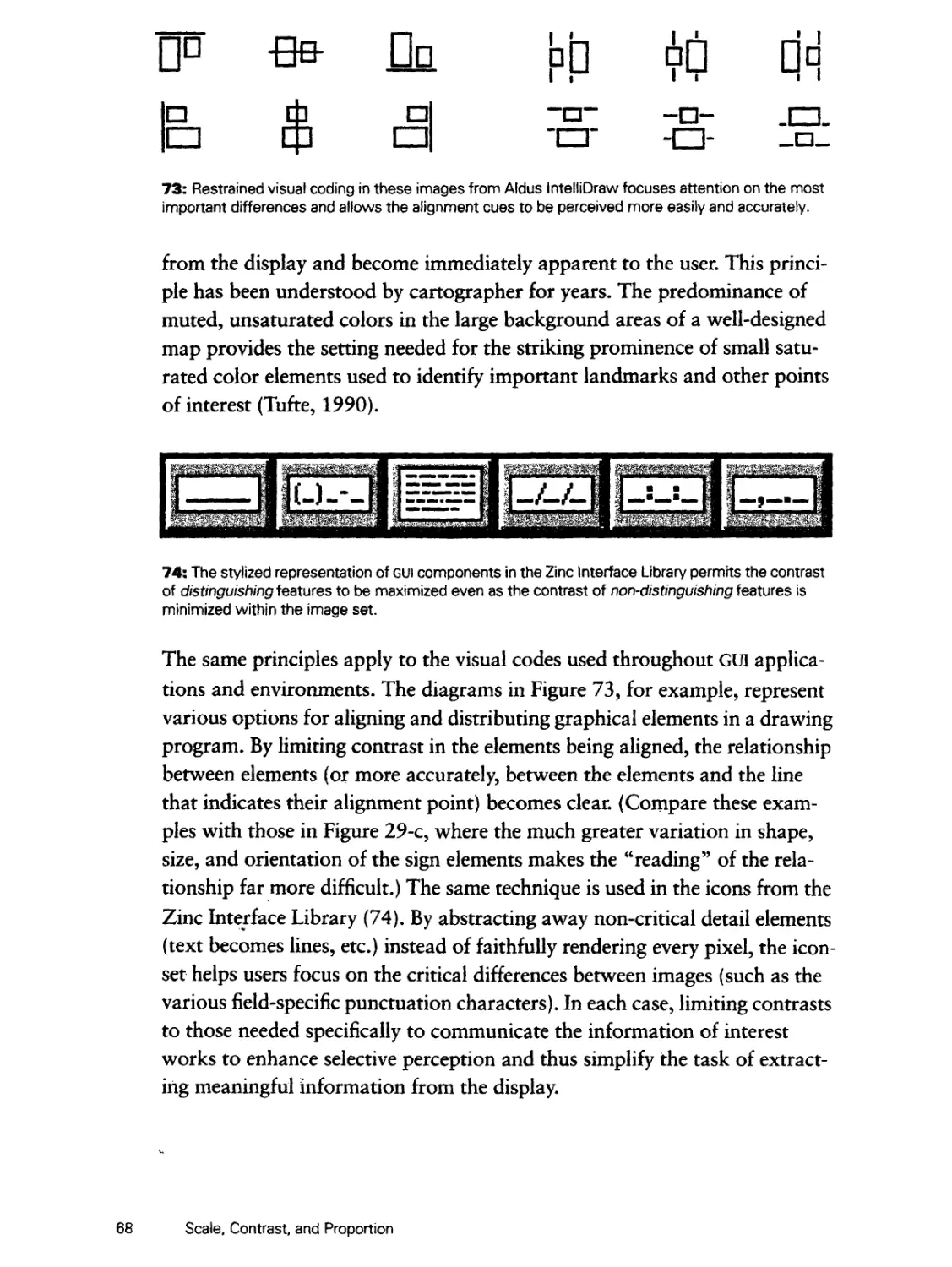
The Squint Test 75
Establishing Perceptual Layers 76
Sharpening Visual Distinctions 80
Integrating Figure and Ground 84
Organization and Visual Structure 89
Background: Perceptual Organization 91
Principles 93
Grouping 94
Hierarchy 97
Relationship 99
Balance 102
Common Errors 105
Haphazard Layout 105
Conflicting Symmetries 106
iv Table of Contents
Ambiguous Internal Relationships 107
Aligning Labels but not Controls 108
Alignment Within but not Across Controls 109
False Structure 110
Excessive Display Density 111
All of the Above 112
Techniques 113
Using Symmetry to Ensure Balance 114
Using Alignment to Establish Visual Relationships 118
Optical Adjustment for Human Vision 122
Shaping the Display with Negative Space 126
Module and Program 131
Background: Grid-Based Design 133
Principles 137
Focus 138
Flexibility 141
Consistent Application 144
Common Errors 147
Arbitrary Component Positions 147
Arbitrary Component Dimensions 148
Random Window Sizes and Layouts 149
Unrelated Icon Sizes and Imagery 150
Inconsistent Control Presentations 151
Inconsistent Visual Language 152
Techniques 153
Reinforcing Structure through Repetition 154
Establishing Modular Units 158
Creating Grid-Based Layout Programs 162
Image and Representation 169
Background: Semiotics 171
Principles 775
Immediacy 176
Generality 179
Cohesiveness 182
Characterization 185
Table of Contents v
Communicability
188
Common Errors 191
Misleading Syntax 191
Poorly Integrated Structure 192
Dominant Secondary Elements 193
Using Type as Image 194
Using Images for Abstract Concepts 195
Images Based on Obscure Allusions 196
Culture or Language Dependencies 197
Offensive or Suggestive Imagery 198
Techniques 199
Selecting the Right Vehicle 200
Refinement through Progressive Abstraction 204
Coordination to Ensure Visual Consistency 208
So What About Style? 213
Principles 215
Distinctiveness 216
Integrity 218
Comprehensiveness 221
Appropriateness 224
Common Errors 227
Unwarranted Innovation 227
Combining Unrelated Elements 228
Partial Fulfillment 229
Internal and External Inconsistency 230
Incompatible Concepts 232
Techniques 233
Mastering the Style 234
Working Across Styles 238
Extending and Evolving the Style 242
Conclusion 247
Further Information 249
About the Authors 253
Bibliography 255
Index 269
vi Table of Contents
Foreword
I recently tried out a spreadsheet package that was installed on the
corporate-wide computer net accessible through my workstation. Immediately
after firing it up, I was struck by its primitive visual appearance. It spoke
"stone-age design" and I simply couldn't get myself to use that ugly-looking
a program. Admittedly, I was in a somewhat unusual situation since I had
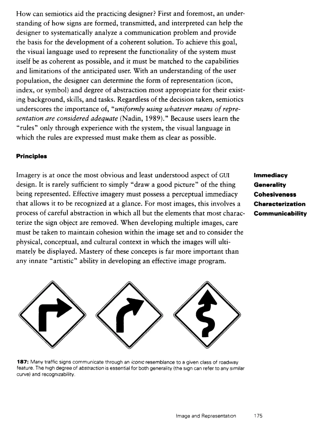
just started using a networked computer with access to a myriad of different
software that had already been installed. If I had bought the package myself
as part of a small set of tools, I would obviously had invested more time in
exploring its possible hidden charms.
As software gets closer to achieving commodity status, users can be expected
to make very rapid choices between the huge number of offerings available
on the net, and just as I did, they will immediately discard any interface that
looks boring, obsolete, or too confusing. Think of home users flipping
through 500 channels of cable TV and then multiply by a factor of several
thousands to match the smorgasbord of options on the Internet, commercial
subscription services, and major corporate nets. Alternatively, to mention a
current commercial product, think of Apple's Software Dispatch CD-ROM,
which is distributed to large numbers of home computer owners with demo
copies of 75 applications: Each of these applications would at best have a
minute or two in which to seduce the customer. Intuitive appeal will thus be
essential for the survival of software products in the future. In fact, we may
Foreword vii
not even talk about software as "products" any more if the model turns out
to be more that of service provision through subscription and browsing.
Graphic design is the first and the last part of the user interface observed by
the user. Immediately when novice users start up a new software package
they are confronted by its visual design and the possibility of a profusion of
icons, windows, panes, and dialog boxes. Even after having graduated to
the expert user stage, people still have to look at the icons and other visual
design elements of their favorite software every day. Would you want to live
in a house where the bedroom was painted in an ugly combination of
brown and purple? Probably not, but you may spend more time looking at
the visual interface elements of your favorite software than you do looking
at your bedroom walls.
In the bedroom wall example, people might buy the house anyway and then
paint over the wall with a more agreeable color. This example leads me to
consider an excuse some developers have for not providing a satisfactory
visual interface to their products: "the user can just customize the design to
his or her individual taste!" Leaving the design to the users is the ultimate
abdication of the designer's responsibility to provide a quality product, and
many studies have shown that users are in fact very poor designers and
often customize their interface in ways that are detrimental to their
productivity (e.g., by using color combinations that are known to cause reduced
readability of screen text). Even though there are often reasons to allow
users to customize some aspects of their environment, it is absolutely
essential for the designer to give the users a carefully thought-out set of defaults
to start out with. Also, users will be much more likely to end up with an
appropriate customized design if they are given some pre-specified (and
well-designed) options to chose from as done, for example, in the
Pantone®ColorUP™ set of recommended color combinations for
presentation slides.
This book gives many systematic steps one can go through to improve the
visual design characteristics of an interface. Mullet and Sano succeed in
demonstrating that graphic design is not a black art but a very
engineeringlike discipline with its own rules. Also, just as in other types of engineering,
the rules sometimes conflict and one has to make appropriate trade-offs to
arrive at the design that best satisfies the needs at hand. One thing I
particularly like about this book is that it makes it clear that graphic design in the
viii Foreword
user interface business is not just a matter of aesthetics. There is much more
at stake than simply pretty pictures, and good graphic design can
significantly improve the communicative value of the interface, leading to
increased usability.
System usability has many components, including ease of learning, efficiency
of use, memorability, reduced number of user errors, and subjective
satisfaction. Good graphic design can improve all these quality attributes, though of
course graphic design is only one element of overall user interface design,
and one should employ systematic usability engineering methods in addition
to the principles of graphic design discussed in this book.
It is amazing how much software gets released with horrible interfaces
because the developers did not bother to apply a few simple graphic design
principles like those explained in this book. For example, I recently saw a
system where the concept of a "queue" was represented by an icon of a
billiard ball ("cue ball," get it?). Such visual puns may be fun to throw around
in a design session but they are often detrimental to the novice user trying to
make sense of a new visual environment. Also, of course, this product would
be dead on arrival if it was ever exported to a non-English speaking country.
There is no substitute for having "real" graphic designers involved from the
beginning in the design of any important interface with major visual
elements. Given this fact, other user interface professionals are still often called
upon to get involved in graphic design. This book makes it possible for the
larger community of interface designers to improve their graphic design
skills and understanding of graphic design concepts. Not only will this
enable them to communicate better with their visually trained colleagues on
interdisciplinary teams, but it will also enable them to do some designs on
their own. Face it, we will never bring in enough professional graphic
designers to fine tune every last dialog box in all the interfaces in the world,
but at least there is no excuse any longer for leaving those dialog boxes to
the tender mercies of people with zero understanding of graphic design.
Jakob Nielsen,
Mountain View, California
May 1994
Foreword ix
Preface
To design is to plan, to order, to relate, and to control. In short, it
opposes all means of disorder and accident.
Emil Ruder
Typography
This book describes a set of fundamental techniques used routinely by
practitioners of communication-oriented visual design. With a little practice,
these techniques can be applied by anyone to enhance the visual quality of
graphical user interfaces, data displays, and multimedia documents. Because
all graphical user interfaces (GUI's) are communication systems, their design
should be held to the same standards of functional and aesthetic relevance
that have evolved over the centuries for traditional print media. While the
new electronic media differ greatly from print in many important ways
- they are inherently dynamic, for example, and their raster displays provide
lower resolution but greater freedom to manipulate color and contrast -
there is nevertheless a significant static component to all interactive displays,
and much of the knowledge gained from centuries of print design is directly
applicable within this domain. Our focus is on optimizing the static displays
that provide the building blocks for any dynamic, interactive system.
The approach we describe has its roots in the rational, functional aesthetic
seen in modern graphic design, industrial design, and architecture. We
believe that the orientation, process, and training of these visual design
disciplines are especially well-suited to the problems of visual interface design.
Unfortunately, the typical software developer, development manager, or
human factors engineer receives little or no formal training in these areas.
Designing Visual Interfaces attempts to address this problem by describing a
number of important design rules and techniques internalized by every
Preface xi
visual designer through course work and studio experience. While we don't
mean to imply that readers of this book will be instantly transformed into
expert (or even proficient) visual designers, we believe there are
nevertheless valuable insights that can be exploited with minimal training in a few
basic "tricks of the trade." Although mastery of these techniques depends
on a heightened sensitivity born of extensive practice, the guiding
principles are not overly difficult to understand and most can be applied
immediately - even imperfectly - to produce noticeable improvements in real-
world product development.
This book is a direct outgrowth of a tutorial (Applying Visual Design:
Trade Secrets for Elegant Interfaces) we have presented at various
professional conferences (the X Technical Conference, INTERCHIP, and CHI'94,
among others) over the past several years. Feedback from tutorial
attendees confirms that practical applicability is a reasonable claim. Numerous
non-designers have credited the tutorial with stimulating their interest in
further study as well as their successful application of the techniques we
describe to produce a visible impact on their user interface designs. While
we do not mean to suggest that professional design talent is unnecessary,
we would be delighted to see the book fill precisely this role. In addition,
we have been particularly surprised and pleased with the positive response
from graphic designers who have taken the tutorial. We welcome this
endorsement of communication-oriented design principles and we hope
that graphic designers will find the book equally stimulating.
The basic plan of the course is reflected in the arrangement of chapters in
the book, the choice and structuring of the examples, and the presentation
of the techniques themselves. Because the typical reader is engaged in
commercial product development, we strive to keep the focus on visual
phenomena as they are manifested in current software products. Instead of the
usual organization (e.g., color, typography, layout) seen in the typical
academic design curriculum, we present our topics in an order that relates
them to the specific problems of GUI design. Following the Introduction, in
which we characterize the discipline of visual design and qualify our own
particular niche within it, we present six chapters addressing the major
visual concerns in present-day GUI's: Elegance and Simplicity addresses
poorly scoped or overly complex designs; Scale, Contrast, and Proportion
describes ways to establish clear yet harmonious contrasts within a
composition or coding system; Organization and Visual Structure explains how
xii Preface
to exploit characteristics of human perception to structure displays more
effectively; Module and Program describes how to extend the structure of
an individual display to produce a unified system spanning many displays;
Image and Representation provides guidance on the production and
effective use of abstract and concrete imagery; and finally, So What About Style?
considers common GUI standards and cross-platform design issues. Each
chapter begins with an overview of several important Principles governing
the phenomena in question and concludes with a description and step-by-
step summary of three or four practical Techniques relating to the
phenomena just described. Marking the boundary between these discussions in each
chapter is a catalog of Common Errors drawn from existing GUI
applications and environments to illustrate problems to avoid.
Designing Visual Interfaces will be useful to anyone responsible for
designing, specifying, implementing, documenting, or managing the visual
appearance of any form of computer-based information display. Software
engineers and development managers, in particular, are our primary
audience, both because these groups may have little exposure to the ideas we
present and because successful interface design is impossible without their
active participation and support. Readers from the psychological and
human factors communities should be more familiar with the principles and
effects we describe, but visual design - particularly its aesthetic component
- will still be unfamiliar territory for most. Practicing graphic designers will
be familiar with most of the techniques we describe, but they too should
find the application to interface design both interesting and informative. We
hope every reader will gain a new perspective on product development as
well as an appreciation for the contribution visual design can offer their
products and users. Whether you're doing the work yourself, participating
in a design team, or directing the work of others, this book should help you
understand your communication problem, establish reasonable design
goals, and evaluate your progress toward them.
The principles we describe - and the examples we present - are truly generic
in that they are equally applicable to any of the existing GUI standards.
While the implementation of a particular design goal may vary from widget
set to widget set, the principles of effective visual communication do not.
Many of our examples happen to have been drawn from the OPEN LOOK
GUI-an open GUI standard found primarily in UNIX environments-which
may be unfamiliar to some readers. There are two reasons for this. First, as
Preface xm
employees of Sun Microsystems, much of our own work has been in OPEN
LOOK during the past several years, so examples of both good and bad
design were readily at hand. More importantly, OPEN LOOK remains the
only GUI standard attempting to address-however imperfectly-many of the
communication oriented principles we describe, so it is in many cases the
only available example of a particular design goal. To learn more about
OPEN LOOK, see the Functional Specification (Sun, 1989) and Application
Style Guide (Sun, 1990).
Like any large project, Designing Visual Interfaces would not have been
possible without the cooperation and support of many individuals and
organizations. We are deeply indebted to all those who offered their time,
their material, or simply their advice and encouragement during the
development of the project. Without their help this book would not have been
possible. In addition to the many we cannot thank individually, we would
like to explicitly acknowledge the following friends, associates, and
colleagues for their generous contributions.
For help in selecting examples of good design and/or permission to
reproduce copyrighted work, we thank: Deirdre Quinn, Melinda
Maniscalo, Neil Shakery, and Sarah Haun at Pentagram; Erik
Spiekermann, Terry Irwin, and Bill Hill at MetaDesign, Mark Johnson,
and Mark Goldberg at The Understanding Business; Peter Spreenburg at
IDEO; Stephanie Harwood at Clement Mok designs, Inc.; Craig Syverson
and Julian Schmidt at frogdesign; Josef Muller-Brockmann; Armin and
Dorthea Hofmann; Rudi Ruegg; Paul Rand; Inge Druckrey; Phillip Meggs;
Linda Meyers at the Division of Publications, US National Park Service;
Martin Fox at RC Publications, Inc.; Lynn Briber at Michael Graves
Architects; Eric P. Chan and Jeff Miller at ECCO Design, Amy Edelson at
Swatch US; Audrey Hirschfeld at Sony, Bob Panzer at VAGA, Professor
Emeritus Shozo Sato, Northern California Center for Japanese Art and
Aesthetics and the University of Illinois at Urbana-Champaign.
For artwork and examples from various hardware and software products,
we thank: Debra Coelho at Sun Microsystems Computer Corporation,
Tony Hoeber at Go Corporation; Lorraine Aochi at Apple Computer, Inc.;
Heidi Bollan at NeXT Computer; Steve Anderson at Hewlett-Packard,
Todd Fearn at Visual Cybernetics, Gabriella Pacini of Regis Mackenna,
and Alesha Marie Guyot of Sunnyvale, California.
xiv Preface
Many people provided helpful comments on earlier drafts. We are especially
grateful for comments, suggestions, and insight provided by Diane Schiano,
Mihai Nadin, Rob Mori, Jay Guyot, Jarrett Rosenberg, Sean Curry, Jakob
Nielsen, Rolf Molich, and Stacey Ashlund.
Phyllis Bregman at Prentice-Hall and Karin Ellison at SunSoft Press showed
patience and encouragement throughout the often arduous publication
process. Management support from Bob Glass and Rick Levenson in
SunSoft and from Nancy Yavne and Kevin Whiting in SunPro was also
invaluable.
Finally, we extend our special thanks to Jakob Nielsen for the Foreword and
to Jean Orlebeck for the cover design.
Preface xv
Introduction
! To design is much more than simply to assemble, to order, or even
', to edit; it is to add value and meaning, to illuminate, to simplify, to
, clarify, to modify, to dignify, to dramatize, to persuade, and perhaps
I even to amuse
: Paul Rand,
1 Design, Form, and Chaos
This book is about visual design for graphical user interfaces. We have found
the orientation, process, and training of the visual design disciplines to be
especially well-suited to the problems of graphical user interface (GUI)
design. When we speak of the visual design disciplines, we include
communication-oriented graphic design (often described as visual communication
design), industrial design, and architecture (including interior space design).
These are the professions concerned most directly with the user's experience
of a form in the context of a specific task or problem, as opposed to its
functional or aesthetic qualities in isolation. Other visual disciplines - such as
painting, sculpture, illustration, filmmaking, or photography - while they
have much in common with the visual design disciplines, typically adopt a
more specialized focus or a less applied orientation. Other design disciplines
- including most branches of engineering - also have substantial overlap,
particularly in process and methodology, but they tend to focus largely or
even exclusively on functional issues, often at the expense of aesthetics.
Visual design attempts to solve communication problems in a way that is at
once functionally effective and aesthetically pleasing.
By communication, we mean the full process by which the behavior of one
goal-seeking entity comes to be affected by that of another through the
reciprocal exchange of messages or signs over some mediating physical channel.
Research in communication theory (see Cherry, 1978) has investigated the
statistical properties of communication channels, the structure of language
Introduction
systems, the psychological and social characteristics of message senders and
receivers, and the effectiveness of various coding techniques. All of these
factors must be considered in communication-oriented design. Even more
fundamental is the field of semiotics - the general theory and practice of signs
(Peirce, 1931, Morris, 1938) - which we review briefly in Chapter Six. The
goal of communication-oriented design is to develop a message that can be
accurately transmitted and correctly interpreted, and which will produce the
desired behavioral outcome after it has been understood by its recipient.
We refer frequently to visual language, by which we mean the visual
characteristics (shape, size, position, orientation, color, texture, etc.) of a particular
set of design elements (point, line, plane, volume, etc.) and the way they are
related to one another (balance, rhythm, structure, proportion, etc.) in
solving a particular communication problem. Any language system defines both
a universe of possible signs and a set of rules for using them. Every visual
language thus has a formal vocabulary containing the basic design elements
from which higher-level representations are assembled, and a visual syntax
describing how elements may be combined within that system. We will
return to these topics shortly, but first we must review the state of the art.
The Mess We're In With a few notable exceptions, present-day GUI applications leave much to
be desired from a communication standpoint. The arrival of GUI technology
has opened up new degrees of freedom in the use of color, typography, and
imagery. Most of the world's character-based applications are rapidly being
ported to Microsoft® Windows™ (hereafter denoted simply as Windows),
the Macintosh, or OSF/Motif (a GUI for UNIX workstations). The results are
reminiscent of the early days of desktop publishing, when computers first
gave people without the appropriate background and skills the mechanical
1: Imagery that distracts, confuses, or simply bewilders the uninitiated user is all too common in the
current generation of graphical applications. (Palettes from Builder Xcessory by ICS.)
2 Introduction
UT A L< H E m Y
QQggl
/ |( Load... )
Brush Standard Sb oke- Vide
r— Positioning
Horizontal Uariation: ] 50 |fr
Uertical Uariation:
©Random Layering
O Ordered Layering
O Paint Layering
( Randomize )[ 1 ]
2: Non-standard graphical elements intended to differentiate an application from
its competition undermine the opportunity for transfer of learning offered by the
GUI environment. Do you want users thinking about their work or your sliders?
capacity to produce "realistic" printed materials. While the technical level of
production was indeed impressive, the aesthetic quality left much to be
desired simply because powerful tools had been placed in the hands of
people without the training needed to use them correctly. Today's GUI
applications suffer from exactly the same problem, as shown in Figures 1-4.
The public is more familiar with bad design than good design. It is,
in effect, conditioned to prefer bad design, because that is what it
iives with. The new becomes threatening, the old reassuring.
Paul Rand
Design, Form, and Chaos
Ironically, given the graphical nature of the GUI revolution, imagery is one of
the biggest problems. The Windows user, in particular, has been "blessed"
with a hieroglyphic outpouring of tool bars, icon bars, button bars, help
bars, QuickAccess bars, SpeedBars, and Smartlcons. The vast array of icons
needed to satisfy this burgeoning demand (it is now customary to provide a
configurable toolbar with an icon for each function in one's application)
combined with the need to support low-resolution 16-color displays has led
to an astonishing proliferation of low-quality images (1, see also 212-218,
Note: our convention is to cite figures parenthetically by number only, with
multi-part examples labeled from left to right: (a), (b), (c), etc.) that sacrifice
Introduction 3
Batch Saue
( Nem... ] [ Edit... ) [ Delete
List:) Drag & Drop Images ^
k>
® open [bll
P Acquire
km
For each image in List:
• Do Script:] NOTHING
• Display: | Pause for 2 seconds ▼!
• Saue: [ fluto Naming Options... I
® TO: [Set...]Scamm*r rUtils:DeBab*tizer •
O To: Folder image came from
OTo: Manually select
Type: | PICT2 ▼Jnormal
Colors:}' '256'W mi} ^|E] fluto set
D[Slice...] E|Uerify replace
n Picture Preuieui D 1 image/Hi*?
D Picture Icon D1 <i»im<ition/fiU?
3
El Bypass warning messages
□ Hit OK in unattended dialogs
D Don't go into subfolders
( DO IT ]|(cancelj(EHit ti'ith settings][Help.
3: Reducing the number of dialog boxes may improve the organization of your application, but there
will be little net benefit to the user if the dialogs are this crowded and disorganized as a result.
valuable communication bandwidth in a well-intentioned pursuit of
graphical glitz and "fun." Unfortunately, many of these images are so poorly
designed as to be practically unintelligible, even when (as is rarely the case)
there is some degree of consistency across (or even within) applications.
Even in a well designed and fairly well standardized environment such as the
Macintosh desktop, it has proven difficult to stem the tide of application-
specific styles, arbitrary mappings, and idiosyncratic imagery (2). Flexible
authoring environments such as HyperCard extend the "naive desktop
publisher" phenomenon to the design of even the GUI primitives themselves. The
situation isn't much better in the Windows world, where at least four major
"house styles" are now evident among mainstream applications (Berst, 1992
a-b). In fairness to application developers, existing user interface toolkits
have provided very little support for communication-oriented visual design.
In fact, most toolkits impose unnecessary design restrictions as a side effect
of their own implementation or internal architecture.
Another problem that has been around as long as the GUI itself is evident in
the haphazard, devil-may-care arrangements of controls in windows and
dialog boxes (3). In fact, the typical application interface was probably
structured more effectively in the days of character-oriented displays, since
4 Introduction
the limited number of positions in a character-mode screen had to be
managed more carefully - and permitted less variation in the first place - than
today's high-resolution raster displays. Basic principles of visual
organization developed through centuries of experience with print media have rarely
been applied to the on-screen media, and communication has suffered as a
result.
Graphical interfaces have generated a prodigious body of research (Shu,
1988, Eades and Tamassia, 1989, Myers, 1990) leading to dozens of
commercial products based on visual programming, program visualization, and
graphical data display. A wide variety of scheduling tools, project
management systems, and personal information managers, not to mention visual
programming environments (4) employ visual representations to help users
make sense of complex serial dependencies and interleaving or concurrent
processes. Despite their commercial success, these applications are plagued
by the generally low quality of their visual displays. There appears to be a
tacit assumption in each of these areas that simply using a graphical display
will automatically confer all the benefits of effective visual presentation on a
4: Existing "visual" applications have generally made surprisingly poor use of visual language and
spatial organization in their graphical displays. Both this visual programming environment (a) and this
graphical project manager (b) do a poor job of making the essential information obvious "at a glance "
Introduction 5
complex problem domain. Unfortunately, a spatial representation must use
visual (and non-visual) language effectively for the potential of graphical
displays to be realized. The fact that it takes a very good picture to be worth a
thousand words has rarely been appreciated within this domain (one notable
exception can be seen in the elegant BALSA algorithm simulation
environment [Brown and Sedgwick, 1984]). The use of color has created similar
problems. The limitations of a small color palette have long been
compounded by the tendency to fill the color table with colors that are easy to
Frame Maker
Info
[p -B& Dd
r-1 trttb Panel.
File**
Bm
Format
? ?r 1 Copyright..* *
Help./
.. 7
* f I Preferences..
1°
PD
a
a
$
?0 dD!
Page '"
Graphics
Table
Windows
[']) Handwritin; O
U Case
Q Word
HW
♦ Miscellaneous
©Sat 7/10
OE
5: Excellent design can be found in modern GUI environments - albeit mostly at the system software
level - as evidenced by this collage of effective graphical elements (each described in greater detail
in the chapters to come) from various graphical applications and GUI standards.
describe digitally. This practice inevitably produces the familiar range of
intense, over-saturated colors that still predominates in many computer
displays. Eventually, the problem should diminish as displays with higher color
resolution become the norm, but better solutions will only arise if the
problems with current displays are recognized. As with any dimension of visual
language, color can enhance communication, but only if it is used correctly.
6 Introduction
Of course we don't mean to imply that the industry has been completely
without success in the area of visual design. On the contrary - a number of
successful products have led the way with excellent visual solutions. Most of
the familiar operating environments, for example, employ some visual
elements, and occasionally a comprehensive visual language, that are effective
for their target markets (5). These elements succeed from a visual design
standpoint largely because their sponsors have made the commitment to
involve professional designers. For large system software vendors, the
investment is easily justified by the leverage gained in standard user interface
toolkits that can be re-used by all developers.
Unfortunately, development organizations have rarely shown the same
vision at higher levels of the software food chain, and much of the
momentum provided by standardized toolkits has been squandered as a result.
Today, simply using the low-level toolkit components does little to ensure a
high quality (or even a style guide compliant) application because the way
the pieces are put together is usually as important as the pieces themselves.
The remainder of this book will describe ways in which these higher level
issues can be addressed. We expect that real success will only be achieved
through close collaboration between system-sensitized visual and conceptual
designers and design-sensitized software engineers and managers. The rest of
this introduction describes the field of visual design and the contribution
that a competent visual designer can make to the development team.
Design is not something that can be applied after the fact, when the funda- What Visual
mental organization of the product has already been determined - though Designers Do
this is indeed a common misconception. To be effective, design must be an
integral part of the product development lifecycle. The process employed by
visual designers is comparable to the typical engineering methodology. An
initial understanding of the problem based on thorough background
research is followed by an iterative cycle of generation and evaluation until
the solution that best meets the requirements is selected for production. The
designer serves typically as a planner, coordinator, and orchestrator of many
specialist subcontractors. Areas of direct responsibility typically include
background research and problem definition; high level design and concept/
program development; planning, coordination, and design specification;
production supervision and quality control. Some designers produce their
own copywriting, illustration, photography, or pre-press production, but
more commonly these tasks are contracted out to production specialists.
Introduction 7
6: The painting. Number 1A, by Jackson Pollock, illustrates the concern of the fine
arts for pure form - divorced completely from functional or representational
criteria - as a direct expression of the personal aesthetic vision of the artist.
© 1993 Pollock-Krasner Foundation/ARS, New York.
The designer is not an artist, at least not in the sense in which that term is
commonly understood. This remains a point of confusion for many in the
software industry. The artist, like the poet, is engaged in the manipulation of
the formal qualities of a particular medium to produce an aesthetic response.
Aside from the technical ability of the artisan and the limitations of the
medium, there are few if any constraints on the forms produced by the artist.
That forms can be taken from their original context and experienced on
their own terms is a central tenet of modern art. This concept underlies the
work of modern artists from surrealist sculptor, painter, and conceptual
artist Marcel Duchamp to abstract expressionist painter Jackson Pollock (6).
I The designer is a visually literate person, just as an editor is
expected by training and inclination to be versed in language and
literature, but to call the former an artist by occupation is as absurd
i as to refer to the latter as a poet.
! Douglas Martin
i Book Design
Art is valued for its originality and expressiveness. Its focus is on individual
artifacts crafted through the manual and aesthetic virtuosity of the artist.
Design, in contrast, is valued for its fitness to a particular user and task.
Certainly, design is concerned with producing a life-enhancing aesthetic
experience where possible, but the design aesthetic is always related to the
intended function of the resulting product. Design is focused on the specifi-
Introduction
cation of products intended for mass production and widespread
distribution. Whereas art strives to express fundamental ideas and perspectives on
the human condition, design is concerned with finding the representation
best suited to the communication of some specific information. The choice
and arrangement of elements in the concert poster by Inge Druckrey (7), for
example, are constrained by the need to effectively communicate the date,
time, place, and event in question. The elegant manner in which this
information is conveyed within the context of a formal aesthetic statement that
reinforces and enhances the message is a hallmark of good design.
Designers are constantly asked to resolve conflicting demands imposed by Functional vs.
the problem, the budget, the schedule, and the desired quality level. As in Aesthetic Concerns
any engineering discipline, trade-offs must be continuously identified,
evaluated, and decided on the basis of the best information available. Among the
most common sources of contention is the apparent opposition of functional
and aesthetic criteria. Communication-oriented visual design views these
forces not as irreconcilable opponents, but as symbiotic components of
every high-quality solution.
ft(ddy Oc*»i»iXi WS SOBm W**«sj Halt Admission **w
Yattt Symphony Orchestra
7: Design elevates communication over expression,
but without forsaking aesthetic values. Design by Inge
Druckrey for the Yale Symphony Orchestra.
Introduction 9
Some of the best examples of the synergy between form and function can be
seen in the dynamic compositions and active constructivist typography of
the so-called Dutch Constructivists - including Piet Zwart, Paul Schuitema,
and Gerard Kiljan, among others - in the 1920's and 1930's. Faced with the
need to produce visually interesting advertising material for some rather
ordinary-looking industrial equipment, telephone cabling, and public
utilities, these designers turned the problem on its head by celebrating rather
than obscuring the formal characteristics of the products being advertised.
Unconventional orientations and viewing angles and dynamic graphical
devices - including photomontage and superimposition - were used to
underscore relationships among elements throughout the composition.
8: The striking formal juxtaposition of both long distance and close-up photography,
active typography, and unifying graphical elements plays a clear functional role in
this advertisement created by Gerard Kiljan for the Dutch Post Telefon Telegraff.
Gerard Kiljan's poster for the Dutch PTT (8), for example, uses diagrammatic
elements and close-ups of callers superimposed in multiple layers upon a
dramatic aerial view to show the telephone's ability to transcend physical
distance. Note how closely the elements in each layer work together to
convey the message of the poster while at the same time producing an
aesthetically delightful statement. Similar effects can be seen in the advertising
materials and catalog spreads produced by Piet Zwart and Paul Schuitema
(9). Unusual framing, scale, and viewing perspectives are in each case used
10 Introduction
to produce images that are visually arresting and yet intimately related to the
product itself. Superimposed graphical devices (the square on the left; the
circle on the right) are again used to draw the viewer's attention to a
particular area of the display and to relate elements to one another. By drawing
attention first to the advertisement as a whole, and only secondarily to the
image of the product, the formal aesthetics of the design complement the
information content of the advertisement.
Good design defuses the tension between functional and aesthetic goals
precisely because it works within the boundaries defined by the functional
requirements of the communication problem. Unlike the fine arts, which
■ mm
steem' tal« &w easier *
9: Unconventional viewing angles and dynamic composition - in which superimposed graphical
elements play a critical role - play a functional role (by highlighting the product) in these industrial
posters by Piet Zwart (a) - © Piet Zwart/VAGA, New York 1993 - and Paul Schuitema (b).
exists for their own sake, design must always solve a particular real-world
problem. Functional criteria govern the range of possibilities that can be
explored; aesthetic possibilities that are not compatible with this minimum
standard of usability must be quickly discarded, if they are considered at all.
Fortunately, there is almost always a wide latitude for aesthetic expression
within these bounds, and experienced designers realize that solving a
problem in a manner that is uniquely appropriate brings an aesthetic satisfaction
all its own.
Introduction 11
*o
\&fi%
t Cs\**i iUf; rM in!
\
r;4
10: Good design is timeless, if not universal. Grace, economy, and fitness of purpose can be
seen in both the monumental Roman inscription from Trajan's Column (a) and the modern
Japanese gardener's secateurs {b).
Form, Function, and
the Question of a
Universal Aesthetic
The timeless quality of a classic design is immediately apparent. From the
majestic capital letterforms of the Roman inscription (10-a) to the towering
grace of the cathedral's apse to the simple, natural forms of traditional
Japanese craftsmanship and design (10-b), the human race has delighted in forms
reflecting widespread agreement on basic qualities of scale, rhythm,
proportion, balance, harmony, and craftsmanship. The same formal characteristics
have been appreciated in advanced civilizations throughout human history
and they are central to any coherent philosophy of design. An elegant
solution is both an artistic and an intellectual achievement that - while it may
come to be taken for granted - never becomes trite or irrelevant.
Modern design arose out of the Arts and Crafts movement of the late 19th
Century, which in turn had its roots in the depredations of the early years of
the industrial revolution. In the torrent of manufactured goods that followed
the introduction of mass production, there was little concern for the quality
of the design, the integrity of the materials, or the humanity of the
production process. The resurgent concern for quality - in materials and
construction as well as design - fueled a manufacturing explosion that has continued
ever since. Phillip Meggs (1992) writes that, "the history of design is the his-
12 Introduction
11: Shaker cabinetry shows the simple elegance of even a purely utilitarian application when
natural materials are used with integrity. Does a woodgrain-printed vinyl dashboard really
project the same image of quality? Photography by Michael Freeman.
tory of technology and craftsmanship" While design today remains
grounded in mass production, the technology of manufacture is viewed as a
means rather than an end. The ultimate focus is on the appropriateness of
the design in relation to both the function the product is intended to fulfill
and the materials from which it is constructed.
An appreciation for the inherent beauty of natural materials is unavoidable
for anyone who has taken the time to reflect on the fine grain of properly
finished hardwood, the texture of cleanly cut stone, or the fit of a well made
artifact. Objects constructed from genuine materials are always valued more
highly than those that use a cheaper substitute. The imposition of simulated
woodgrain on aluminium siding or simulated leather on vinyl upholstery
reflects not a preference for these surrogate materials, but rather, a deference
toward the cost or availability of the genuine article. Compare the typical
false wood dashboard of an American automobile to the delicate grain and
careful seamless construction of Shaker cabinetry (11). The irony in this
dishonest substitution is that the natural material qualities of the plastic or
vinyl themselves - which often hold their own fascination (cf., Tecce and
Vitale, 1990) - are prevented from revealing themselves.
Introduction 13
12: The logarithmic spiral can be constructed geometrically, yet it provides the basis for countless
beautiful forms produced by the growth of living organisms throughout the natural world-
Design and Is design fundamentally a rational or an intuitive endeavor? The great inter-
Rationality national design movements arising since the end of the 19th century have all
advanced the belief that good design is a reflection of some higher truth,
whether in form, method, or materials. From the beginnings of the Arts and
Crafts movement, through the Vienna Secessionists and the Deutsch Werk-
bund, the De Stijl movement in the Netherlands and Constructivism in the
emerging Soviet Union, through the Bauhaus and on to the rest of the world
following the rise of National Socialism in Germany - modern design has
been predicated on the rationalist belief that all design decisions should in
principal be justifiable on objective grounds. While Modern design has
occasionally been charged with mistaking post-hoc rationalization for functional
determinism (cf., Banham, 1960, Margolin, 1989), there can be no serious
question that the intent of these pioneering design movements was to
promote appropriate design solutions that addressed the needs of the modern
consumer as well as the requirements of mass production.
As to our initial question, of course both approaches to knowledge are
essential. Modern design movements have emphasized the rational
dimension, without rejecting completely the use of intuition as an important
generative element. As with most classic dichotomies, there is value on both sides
of the equation:
14 Introduction
Method helps intuition when tt is not transformed into dictatorship.
Intuition augments method if it does not instill anarchy. In every
moment of our semiotic existence, method and intuition
complement one another.
Mihai Nadin
i Interface Design and Evaluation - Semiotic Implications
Without minimizing the value of intuition as a problem solving tool, we
propose that systematic design programs are more valuable from a
communication standpoint than are ad hoc solutions; that intention is preferable to
accident; that principled rationale provides a more compelling basis for
design decisions than personal creative impulse. When designing for human-
computer interaction, communication is the overriding concern and creative
expression is simply one means to this end. This is the orientation we
consider most effective for designing visual interfaces and the perspective we
adopt throughout this book.
The following pages describe some of the most important design rules and
techniques learned by all students of the visual design disciplines that apply
directly to GUI design. Most of the techniques we describe can be easily
mastered and applied to your next product. We have tried to formulate the rules
as crisply as possible, both to distinguish them from more general principles
or guidelines that frequently conflict with one another, and to make them as
useful as possible for addressing real-world problems. We do not mean to
suggest, of course, that any of these rules should never be broken. As
designers have realized for centuries, all rules are made to be broken - at least by
the experienced practitioner.
Some consider it noble to have a method; others consider it noble
not to have a method. Not to have a method is bad; to stop entirely
at method is worse still. One should at first observe rules severely,
then change them in an intelligent way. The aim of possessing
method is to seem finally as if one had no method.
The Mustard Seed Garden Manual of Painting
We maintain that a rational approach to design is not only possible, but that
it is essential, if high-quality design skills are to be replicated and
transmitted across the generations.
Introduction 15
Elegance and
Simplicity
■ tn anything at all, perfection is finally attained not when
I there is no longer anything to add, but when there is
■ no longer anything to takeaway.
Antoine de Saint Exupery
The term, elegance derives from the Latin eligere, meaning to "choose out"
or "select carefully." The same Latin root gives rise as well to terms such as
elect and select - both of which carry a similar implication of reflection and
careful decision. More recently the term has acquired the familiar
connotations of refinement and grace, reflecting thoughtfulness and good taste.
Achieving the latter, of course, depends upon the former. Visual design is
intimately concerned with careful decision making and judicious selection of
formal elements. Visual design decisions extend beyond the surface to the
very heart of the product concept. The visual designer enhances
communication by carefully selecting the elements to be emphasized - and this may
involve selecting the elements to be included - and ensuring that they are
presented so as to be perceptually salient.
Elegance in design is seen in the immediately obvious success of a novel
approach that solves a problem completely yet in a highly economical way.
The importance of simplicity can hardly be overstated. In fact, the sheer
simplicity of an elegant solution is often its most startling and delightful aspect.
Elegant solutions reveal an intimate understanding of the problem and an
ability to ensure that its essence is grasped by the consumer as well.
Economy of expression - the ability to cut directly to the heart of the matter -
provides the basis for aesthetic evaluation in art and science alike. Simplicity
abounds in the beauty of nature, from the laws of physics, to the
symmetrical growth of crystals, to the structure of living organisms.
Elegance and Simplicity
13: The Belmont Radio features clean lines and simple, approachable controls. The radio's basic
forms are tightly integrated with the circular dial that serves as its focal point. From Radios: The
Golden Ageby Philip Collins ©1987, published by Chronicle Books.
Simplicity plays a central role in all timeless designs. We appreciate solutions
that - all other things being equal - solve problems in a clear, economical,
fashion. The most powerful designs are always the result of a continuous
process of simplification and refinement. We will return repeatedly to
simplicity in the chapters to follow, as many of the other design goals depend
critically on simplification as a means to their own particular end. Before
you do anything else to improve the quality of a design, make sure you have
reduced its formal and conceptual elements to the absolute minimum. The
benefits of simplicity are functional as well as aesthetic in nature:
Approach ability. Simple designs can be rapidly apprehended and
understood well enough to support immediate use or invite further exploration.
The Belmont Radio (13) includes only three sets of controls - the volume
knob, tuning knob and dial, and station presets. The functional relationships
of each control group are readily apparent in the absence of competing
elements. Anyone can tell "at a glance" how to operate this simple design.
Recognizability. Simple designs can be recognized more easily than their
more elaborate counterparts. Because they present less visual information to
the viewer, they are more easily assimilated, understood, and remembered.
18 Elegance and Simplicity
The function of the Belmont radio is a readily identified by its tuning dial
and louvered speaker enclosure, both of which are emphasized by the
absence of competing formal elements.
Immediacy. Simple designs have a greater impact than complex designs,
precisely because they can be immediately recognized and understood wit a
minimum of conscious effort. The radio's simple color scheme ensures that
the eye is drawn immediately and involuntarily to the bright white controls.
The most powerful symbols in human culture are always reduced to their
absolute minimal form.
Usability. Improving the approachability and memorability of a product
necessarily enhances usability as well. Simple designs that eliminate
unnecessary variation or detail make the variation that remains more prominent and
informative. In fact, it is nearly impossible to operate a simple design like the
Belmont radio incorrectly.
Principles
Understatement can be a difficult quality to grasp through conscious effort. Unity
Apart from the obvious focus on economy, or minimization of component Refinement
parts and simplification of the relationships between parts, simplicity in Fitness
design depends upon three closely related principles. The elements in the
design must be unified to produce a coherent whole, the parts (as well as the
whole) must be refined to focus the viewer's attention on their essential
aspects, and the fitness of solution to the communication problem must be
ensured at every level.
14: Traffic signs depend heavily on over-simplified, highly schematic imagery to alert the driver to
potentially dangerous situations. Each sign refers to a general class of hazard, with a corresponding
set of plans and precautions, rather than the specifics of any particular roadway.
Elegance and Simplicity 19
iiiplf:;
mm M-
15: The elegant Japanese chasen whisk is
created from a single piece of bamboo whose
fibers have been split, formed, and rejoined.
Unity
Elegant tools and utensils such as the Japanese chasen tea whisk (15)
possess a unity that derives from the intimate relation of a minimal set of parts
in pursuit of a common goal. Whenever a single part plays more than one
role, the unity of the overall design is enhanced. Elegant solutions produce a
maximum of satisfaction from an absolute minimum of components.
16: Circle and star are fused together in the
classic identity symbol for Mercedes-Benz.
Image courtesy of Daimler-Benz, Stuttgart.
20 Elegance and Simplicity
British poster designer Abram Games recognized the key to communication-
oriented design in his philosophy of "maximum meaning, minimum means"
(Livingston, 1992). Visual identity programs, like posters, must be very
concise to cut through the torrent of competing messages encountered in
everyday life. Identity symbols have evolved over the centuries from the highly
pictographic trade-marks of the medieval shopkeeper to the more abstract,
symbolic marks used in today's brand and corporate identity programs.
The classic Mercedes Benz identity symbol (16) is a familiar example with a
strong symbolic quality. Its unity derives from the powerful integration of
the three-pointed star with the center of the circumscribing circle. The axes
of the star focus the viewer's attention on the origin of the ring. This
convergence maximize the integration of the basic forms and the unity of the
resulting design.
The EC2 phone from ECCO Design, Inc., (17) displays a similar unity of form
in the common curvature of its handset and cradle. Instead of resting in a
cavity carved into or molded onto the surface of the phone, as in most
contemporary designs, the handset is held in place by virtue of its integration
with the contours of the base itself. The relationship of the two elements was
clearly planned from the beginning rather than a tacked-on as an
afterthought. Visual unity in product design ensures that all of the individual
components work together toward a common purpose. The role of the
housing is to provide not merely an enclosure, but also a visual field within which
control elements and visual displays can be properly related.
•8* <2>3fe^ » ■%**
17: The unified form of the EC 2 Phone from ECCO Design Inc. is most apparent in the
shared contour of handset and cradle. The mechanism is designed-in not tacked on as an
afterthought. (See also color plate 1).
Elegance and Simplicity
18: A common design language can be seen in the NeXTStation hardware and the
NeXTStep GUI. Regardless of which came first, the coordination of on-screen imagery
and physical product underscore the impression of a total solution.
Visual unity in the human-computer interface may take many forms. The
foremost consideration is the integration of the visual language elements
used throughout an application. Ideally, the same visual language should be
apparent in the system software as well, and indeed, throughout the entire
end-user environment. NeXT pursued this ideal to its logical conclusion by
using a single design language to unify even the hardware with the system
and application software (18,19). This elegant design contrasts sharply with
the colorful workstations from Silicon Graphics (e.g., Indigo, Crimson,
Onyx), which awkwardly share the same egg-shell colored monitor. With the
demise of the NeXT hardware business, this admirable unity will disappear
for most NeXTStep users.
f HieVieuer
19: By matching the visual qualities of the hardware, NeXTStep transformed
the original grayscale display from a marketing liability to a high-style asset.
22 Elegance and Simplicity
20: The network diagram for the London Underground reflects a problem-oriented
refinement of the area's physical geography. By radically compressing the distances
between outlying stations, this diagram became the first "fisheye" view. Design by
Henry C. Beck, 1935. (See also color plate 2).
Reduction through successive refinement is the only path to simplicity. To
create an elegant solution, anything that is not essential to the
communication task must be removed. Public transportation maps have for years
applied this principle to present complex routing information in an
understandable way. one of the earliest and most famous examples is the route
diagram for the London Underground system (20), which has retained its
basic form since 1935. Instead of maintaining the geographically correct
position and orientation of each line, these diagrams maintain topological
Refinement
j>
<*
<*
<?
if
«?
J*
sv
^
*r
£>
^
.JL.
<*
<*F
21: The representation oi a single line permits even further refinement of the diagram's form, since
travellers who are already aboard the train need only concern themselves with the sequence of stops
and the availability of connections.
Eiegance and Simplicity 23
accuracy while introducing simplifying generalizations that regularize the
positions and orientations of lines, stations, and transfer points. In addition,
the diagram provides a primitive fisheye view (Furnas, 1988) by compressing
physical distance in outlying areas. By reducing and regularizing the spacing
between stations, the diagram can accommodate more information in the
same physical space. The same approach is used in the route diagram for the
London Underground's Victoria Line (21). In this case, however, the
generalization is even more extreme, since the orientation with respect to the
surrounding geography or even the relative distance between stations is not
important to riders who are already on the train. All that matters is the
sequence of stops and availability of connections.
22: Simple, refined, forms convey the basic functionality of the these pointing devices from Microsoft
(a) - (design by IDEO Product Associates) and Apple Computer (b). The aesthetics and ergonomics of
each design are superior to their recent replacements.
■J Refinement of physical form can be seen in the original Microsoft Mouse
and Apple ADB Mouse (22). The elegance of each design surpasses that of
competing designs created before and since. Both designs feature button
elements integrating tightly with the basic curves or planes of the mouse while
still retaining a distinct identity. In the Microsoft Mouse, the left button (the
primary control in the Windows environment) is half again as wide as the
right button. This simple visual cue for button targeting is supplemented by
a tactile cue in the form of a subtle ridge separating the two buttons.
The external appearance of GUI software has changed very little over the
years. Researchers have experimented with minimalist interfaces that reduce
the prominence of window borders, scrollbars, and other familiar GUI
controls, but few tangible results have been obtained. One problem is that
hiding "distracting" controls also removes the visual affor dances (things that
24
Elegance and Simplicity
suggest interaction possibilities^ those elements provide. The scrollbar itself,
for example, reminds the user of its availability as well as its operation.
Removing visual cues is disorienting, particularly for beginning users, but
also for experienced users who can be disrupted by the abrupt transitions as
controls materialize and disappear again.
An alternative approach can be seen in PenPoint, where some controls were
replaced with simple gestures. PenPoint's elegant notebook metaphor (23-a)
eliminates all extraneous details (note the absence of spiral bindings,
perforations, rounded corners, ruled lines, etc.), depending largely on its vertical
orientation and, of course, the tabs that have inspired a whole new genera-
y Richards Notebook
Q3 Handwriting Recognition
J Case Heuristics
_l word-level Accuracy
2\ Wall Street Journal Sentences
D Usability. PenPoint vs Macintosh
[£) PenPoint Product Team
'yn) Notes 8/91
-X^ Agenda 9/2/91
CD 199 I Blazers Games . -
^d) Notes
0 Directions to Coliseum
J Analysts of Losses (2) to Warriors
D Law School Memoirs
JA V IS 0
M«lp Settings Accessories Stationery Connections
23: The elegant, highly refined interpretation of a paper notebook in the PenPoint user interface (a)
contrasts sharply with the intrusive, overly literal "notepad" cues provided by the Sharp Wizard (b).
The former conveys a global impression of notebook-ness, while the latter depends on crude "labels."
tion of notebook-builders. Compare the elegant PenPoint display to the busy
Sharp Wizard screen (23-b) with its bulky spirals and axonometric rendering
showing the dimensionality of the pad. Note how the spiral must sometimes
be shortened due to space constraints. How interesting that this product,
with its much smaller display, chose the more costly (in terms of screen real
estate) route of a highly detailed literal representation.
•\
board triBox Out Box
Elegance and Simplicity
24: The frugal design of this Shaker sewing desk makes full use
of the many small enclosed spaces while providing constant
access to the work surface. Photo by Michael Freeman.
Fitness Designs are never evaluated in absolute formal terms, but rather, succeed or
fail on the basis of how well they solve a particular problem. Solutions can
be more or less appropriate in their method, their process, or their outcome.
Elegant solutions solve problems with maximum effectiveness through
avenues that are desirable in their own right. In addition to its fine construction,
the Shaker sewing desk (24) reveals a design of remarkable compactness and
25: The Japanese kanban sign identifies the type of goods or
services offered by this establishment while blending naturally
with traditional building materials used in the facade.
26 Elegance and Simplicity
* File Edit Search Format Font Style
26: The modest design goals and focus on core functionality apparent in the original MacWrite and
MacPaint applications reflect the commitment to an appropriate balance between capability and
complexity seen in the first wave of software created for "the rest of us."
economy. The maximum use is made of the space consumed by the desk.
The depth and accessibility of the drawers, as well as the leg-room under the
desk, are all increased by allowing the drawers to open to the side, rather
than the front. Tiny storage compartments throughout the desk reflect the
need to accommodate materials and supplies. In short, every element reflects
the practical concern of supporting the task of sewing.
The traditional kanban sign on many Japanese storefronts (25) reveals a
similar sensitivity to the qualities of the material. In Japanese architecture,
the concepts of subdued beauty (shibui) and elegant simplicity (wabi) are
seen in the refinement and natural character of the buildings themselves. The
kanban is an art form in its own right, but its fitness as a signage element is
apparent in its visual compatibility with the surrounding material context.
In user interface design, the material choices are typically much narrower,
but the digital medium can still be presented more or less appropriately. The
original MacPaint and MacWrite applications (26) exemplified (and in some
Elegance and Simplicity 27
sense, defined) the philosophy of the early Macintosh software environment.
These simple, straightforward, and highly graphical applications were
appropriate for the technical level of the target user as well as for the limited
capabilities of the original machine. The presentation in each case is concrete
and explicit, with visual affordances or reminders to help users recognize the
tools available to them. Simple mechanisms such as the memorably vivid
"Fat Bits" magnification mode in MacPaint helped users understand the
novel technology while exposing them to some of its power and flexibility.
As simple as they were, these two "bundled" applications met the needs of
many early users all by themselves.
abcdefghijklmnopqrstuuwxyz
RBCDEFGHIJKLMNOPQRSTUUUIKVZ
$12345678901., '-;:!)?&
27: The Chicago screen font was designed with the limitations and requirements of the low-
resolution Macintosh display in mind. The thick vertical elements ensure that each character
remains visible when dimmed with the standard 50-percent gray pattern.
The Chicago screen font used for widget labels throughout the Macintosh
system software (27) provides an even better example of matching a design
to the material qualities of the medium. The font was designed to ensure
adequate legibility and contrast on low resolution (72 dots per inch) video
displays. The thick vertical elements provide characters that remain legible
even when some of their pixels are removed by the standard fifty percent
gray pattern used to indicate the inactive state on the Macintosh. The
Chicago font's unique typographic character and fitness to the display task
helped make it a defining feature of the Macintosh interface from its earliest
days on. The original design continues to thrive even as the technological
limitations it was designed to accommodate have begun to disappear.
Apple's recently introduced TrueType fonts include a scalable, outline-based
version of Chicago even though the need for the pixel-level tuning seen in
the original bitmap font is largely eliminated by the higher resolution output
devices for which scalable fonts are intended.
28 Elegance and Simplicity
Common Errors
Common errors related to elegance and simplicity can usually be attributed
to poor planning, poorly communicated structure, or attempts to go beyond
the scope of a coherent, focused design. The inevitable result is visual or
conceptual complexity and confusion. The mistakes described below are all too
typical in today's GUI applications.
Morrttel
SSII32
28: Clutter and visual noise. The advent
of the GUI has meant more, not less visual
clutter in most computing environments.
Today software products are designed,
marketed, evaluated (and all too often,
purchased) on the basis of their aggregate
feature set, even though many features
are used rarely, if ever, by the vast majority
of users. The only way to deal effectively
with this unfortunate reality is to logically
structure the presentation so that each
display contains a manageable amount of
information. Applications that try to pack
as much information as possible into each
screen create problems that rival the
worst character-based displays. This
window from a personal information manager
is crowded, confusing, and almost
impossible to scan. The window contains so
much functionality that the usual 1-pixel
lines were not prominent enough to divide
the layout into multiple regions. Instead,
the design uses heavy 4-pixel horizontal
and vertical dividers that do more to attract
attention to themselves than to create
meaningful higher-level units. In addition,
the window's gray background turns a
series of carelessly positioned text fields
(with their bright white interiors) into a
distracting pattern snaking randomly through
the left-hand side of the display. While
functional overload is clearly a problem
with this design, effective use of visual
language and display structure would bring a
noticeable improvements.
Elegance and Simplicity 29
Hkalttl^^^HHHI
Cul
£opy
| Baste
Undo
Cut
Copy
Paste
Shrft+Del
Ctrl*Ins
Sh'rft+lns
New Transaction Ctrl+N
Delete Transaction Ctrl+D
Void Transaction Ctrl+V
Memorize Transaction Ctrl+M
! Find
Go To Transfer
Preferences
Fleet* Mh" ?<iviw
Ctrl+F
Ctrl+X
►
:r^RT*
§€Z
9€C
3€U
i
9€R
3€D
(b)
Horizontal:
Vertical:
Distribute:
Center:
ODieMiiIL
4
dp
<r5|
ft |
Up
UD
«-o-»
uu
(a)
(0
29: Interference between competing
elements. Menu accelerators (i.e., indivi
dual keyboard shortcuts that invoke menu
commands directly) in Windows (a) use
purely textual cues for both the qualifier
(e.g., Ctrl, Alt, Shift-the keys you press to
indicate that the next key should invoke a
command) and accelerator keys. These
alphabetic qualifiers - along with the "+"
symbol used to separate qualifier and
accelerator - interfere with the accelerator
characters, and sometimes with the menu
items themselves. Contrasting these
accelerators with their Macintosh
counterparts (b) demonstrates the effectiveness
of the simpler approach, in which a single
graphical symbol is used as the qualifier
for all accelerators. Because the
"propeller" symbol is not confusable with the
alphabetic characters, and because there is
less visual information in the surrounding
area, the Macintosh accelerator characters
are far more readable than their Windows
equivalents. They can be noticed in
peripheral vision while choosing items with the
mouse, which makes the logic of the
accelerator scheme more apparent and
incidental learning more likely. The same kind
of visual interference is apparent in the
Alignment icons from the open look
Developer's Guide (c). The readability of
these images suffers from an irrelevant
variation in shape within each icon that
serves to obscure the relevant variation in
alignment.
30 Elegance and Simplicity
i Footnote
MaHtmum Height Per Colunj
Numbering Style:
<•) 1 Numeric (4) ▼!
O Custom: [*ft I
Sort
First Sort
Sort By:
I Start Time
(§) Ascending
O Descending
Second Sort
Sort By:
I No Sort
O Dps* ^ftdfnq
Third Sort
Sort By:
O Bateendrng
Cancel
Number Format:
In Main Tent: in Footnote:
Position: | Superscript ▼!
1 Prefiw: | 11
Suf fin: | |
Position: | Baseline ▼(
PrefiH: | |
SuffiH: [At |
?et~J [ Cancel
Help
(a)
<b)
30: Using explicit structure as a crutch.
The presence of nested bounding boxes is
usually a symptom of a poorly organized
layout. Packing information as densely as
possible and surrounding the resulting
groupings with explicit borders is never a
good substitute for structuring the layout
effectively in the first place. Bounding
boxes interfere not only with the scanning of
the items they contain, but with the
surrounding items (including other bounding
boxes) as well. Note, for example, how the
gaps between bounding boxes, border
lines, and textfield boundaries form a
mesmerizing pattern at the bottom of the
Footnote dialog above (a), where a single
textfield is surrounded by four levels of
boundary information. When proper spatial
relationships and sufficient margins are
maintained, explicit structure is rarely
needed to ensure proper visual separation.
Unfortunately many applications include
structuring devices even when they are
completely unnecessary. The Sort dialog
(b) would have reasonably effective spatial
grouping based on vertical alignment alone
if the vertical dividers were simply
removed.
Elegance and Simplicity 31
Type in the path to the folder and press Return.
( Co To: sT) „
Current Folder
/home/mu I let/Book
Select a file or folder and click Open Folder.
|fr ...Go up one folder...
j>::,enK.-:.r? Gi>
QFrame_templates
Save: snapshots
(Open FoldeT) (Cancel) CSavj
(a)
Lotus SmartPics
XDr% 1. Choose * *ynv^>?! l,le
[ animal I. xyl
Aim*** »yl
jbckginds sy1
\nMngs ty]
tTTffirf
Copy complete
Hetom to your Application and
use t d»t Paste to odd the symbol.
T?T 3 Copy to clipboaid
j£gpy J I...", el*** 1
31: Belaboring the obvious. Users of GUI
applications remain totally unfamiliar with
the application functionality only for a
relatively short period. Unnecessary
navigational aids that might be useful the first
time a user sees a product quickly get in
the way as soon as even a basic familiarity
with the application has been established.
Excessive "assistance" doesn't just slow
semi-experienced users down - it can also
prevent users from understanding the
application in the first place, if it obscures the
underlying structure of the window. The
excessive verbal prompting in the file
selection dialog above (a) consumes valuable
space to tell users something that should
have been obvious from the organization
of the window and a basic understanding
of the ubiquitous task of opening a file.
Like the presence of taped-on instructions
in the physical workplace, the presence of
help text in the interface is itself a reliable
indicator of flaws in the underlying design.
As many as five additional items could
have been included in the list (or the
window made smaller) simply by removing
(perhaps optionally) the redundant text.
Similarly, the pointing hands in the Smart-
Pics dialog box (b) merely lead the eye
along a path it would have followed
naturally in any case. Such self-consciously
"helpful" feedback does little more than
parrot the viewer's natural movement
through the dialog. In fact, it may well
impede performance by interfering with
otherwise obvious spatial relationships.
Elegance and Simplicity
Scientific Calculator
File Edit Calculator Help
;*eh3:.:Y"'."■£*■:■■■ ■.'ft:'::.''VSk-:'...eV.. \
PW PSS |^!f BTf F?f i
f^ J^SS 0SS W^ W^\
f&^M fES $£5 W^ \
A
(a)
Unit CbRversioii^
Pe nta Calc Option Help
0£JUJUUC^$
32: Overly literal translation. Even if the
metaphor can be realized completely,
presenting a software artifact as a direct
analog to a physical object almost always
imposes unnecessary visual and
conceptual restrictions on the design. Most GUI
calculators, for example, simply replicate
the heavily moded, poorly labeled, and
difficult to manipulate designs of existing
physical designs. The model on the left (a)
even goes so far as to replicate shifted
functions (deg, oct, hex), even though
dedicated software buttons could have
been provided within the same space.
While they may be familiar (to experienced
users of the physical analog) these
designs do little to leverage the power and
flexibility of their computational host. The
uncritical acceptance of the material
constraints of a physical calculator prevents
these calculator designs from focusing on
the essence of the problem of calculation
in any meaningful way. PentaCalc (b), in
contrast, is only loosely patterned after a
physical calculator (why shouldn't every
GUI calculator provide the valuable tape
feature, which is trivial to implement?).
While perhaps less similar to "real-world"
designs, it has been more carefully
adapted to the capabilities and limitations of the
GUI. It features flexible display modes,
closely spaced buttons (which minimize
mousing), and provides an excellent
keyboard interface.
Elegance and Simplicity
JL/ I *. J^ He
i -
<b)
?.-Quit,£H& ! .tftuice Settft
.iijck Ted
fefererii
33: Excessive detail and embellishment
The siren song of photographic realism is
difficult to resist, particularly given the
natural human receptiveness to visual
stimulation. In the GUI, as in any new
medium, more effort has been expended on
faithfully replicating familiar themes than
on uncovering the unique characteristics
and qualities of the new electronic
medium itself. Electronic media allow us to
focus to an unprecedented extent on the
essential elements of a design, but only if
the available bandwidth is not squandered
on graphical cliches and self-conscious
ornamentation. Graphical embellishments
that serve only to underscore the
"realism" of the design such as the sheen of
simulated brushed aluminum buttons (a),
the sparkling splash screen (b) or the
specular reflections on spherical plastic buttons
(c) eventually grow tiresome despite the
initial "oohs" and "aahs". These qualities
rarely add to the long-term visual appeal of
the product because they subvert rather
than enhance communication. The extent
to which this quest for graphical pizzazz
has replaced concern for effective
communication can be seen in the subtle
highlighting of the sphericar'OK" and "No"
buttons (c). The buttons change color when
pressed (woe to the user with
color-deficient vision), but otherwise provide none
of the essential visual feedback that
provides the illusion of manipulating a tangible
object.
34 Elegance and Simplicity
•Aaaa***^1 pppv < . 4 j^t mi' vfti lit till
34: Gratuitous dimensionality. Most
people love the sense of tangibility imparted
to a widget set by the popular pseudo-3D
rendering technique in which highlighted
and shadowed borders simulate a
physically raised surface. It can even be argued
that this visual treatment plays a valuable
role in identifying "pushable" controls.
The increasing use of 3D in situations that
do not take advantage of the added
dimensionality, however, is more difficult to
defend. In the examples above, the chiseled
"inactive" feedback in the toolbar icons (a)
and the 3D treatment of the textual label
(b) both impede the legibility of the
resulting signs. Legibility is also reduced by the
unnatural foreshortening of the sides of
the 3D palette (the Button Cube) (c). This
3D structure actually completes a complex
(and sloWj animated rotation whenever the
user switches to a different set of tools.
While the obvious efficiency and scalability
concerns (how do the design handle more
than four palettes?) are serious enough,
the design has problems even as a static
display. The view of the "next" palette is
too narrow and distorted to be very
recognizable, so the complexity introduced by
the third dimension provides little
additional information over its 2D equivalent. Like
the upturned page corner in the bottom of
a "book" window (d), it is simply
decoration attempting to woo the consumer with
its seductive splendor.
Elegance and Simplicity 35
35: All of the above. The most
spectacular failing of simplicity is often seen in
those products trying most earnestly to
simplify the GUI for non-technical users.
Applications - even whole environments
such as MagicCap from General Magic -
attempting to leverage users' knowledge
about the physical world through a "3D
Office" (or 3D world) metaphor are
beginning to reach the marketplace. This
approach has always been something of a
rite of passage for GUI designers. While
many would admit (when pressed) to
having their version of the 3D desktop tucked
neatly away in their files, its basic flaws
are widely recognized. The extremely
literal translation of the "real" world seen in all
such attempts, for example, virtually
ensures that users will find the resulting
environments cumbersome and inefficient,
and probably just as cluttered as their real-
world office. Interestingly enough, the 3D
office nearly always suffers from both an
unnatural point of w'ewand an awkward
rendering style that effectively eliminate
the impression of being in a real physical
space. Ironically, this phenomenon can be
traced directly to the 3D representation
itself, since accurate perspective conflicts
with effective use of display space
wherever two-dimensional editing tasks
predominate. When the standard File
Manager, Task Manager, and Program
Manager appear in front of the virtual desk,
as in the Windows desktop replacement
shown here, any illusion of true
three-dimensionality that might have arisen is
quickly shattered.
36 Elegance and Simplicity
What is simple should be treated simply, what is difficult
should be reduced to the simplest terms.
Josef Miiller-Brockmann
The Graphic Designer and His Design Problems
Techniques
Elegance cannot be easily summarized in a few rules of thumb. It depends
heavily on taste, and taste can only be developed through prolonged
exposure to a series of high quality examples forming the benchmark against
which subsequent solutions can be judged. Because complex designs rarely
seem elegant, simplification is an important step in the development of any
elegant solution. Three basic techniques can be used to simplify a design
solution:
Reduction
Regularization
Leverage
• Reducing a Design to its Essence
• Regularizing the Elements of the Design
• Combining Elements for Maximum Leverage
To the extent that the overall approach is appropriate to the task, the
elegance of the resulting solution will be enhanced as these techniques are
applied. With practice, these techniques become second nature. You will
begin to apply them - almost unconsciously - to every emerging solution.
Elegance and Simplicity 37
Reducing a Design
to Its Essence
36: This map of the San Francisco Bay area from USAtlas shows use of reduction to produce a level
of detail appropriate for the intended audience. The simplified design speeds orientation and
facilitates reading at a glance. Design by The Understanding Business. (See also color plate 5).
The most fundamental design technique is reduction. An elegant design
must be reduced to its essential elements and each element reduced to its
essential form. The travel maps produced by The Understanding Business
(36) make extensive use of reduction as part of its distinctive visual
language. This map of San Francisco and the surrounding area of Northern
California eliminates any detail that is not likely to be needed by someone
traveling through the area (the audience for the atlas in which these maps
appear). The result is a truly elegant solution in which the simplified
presentation solves the navigation problem for its target user in a way that makes
the maps aesthetically effective on purely formal grounds as well.
37: Reduction plays the critical role of emphasizing canonical features in these public information
icons developed for the U.S. Department of Transportation {dot) by the American Institute of
Graphic Arts (aiga). Design by Cook & Shanosky Associates.
38 Elegance and Simplicity
Good design is simple, bold, and direct. It ensures that significant design
elements will be noticed by removing insignificant elements wherever possible.
The familiar public information signage (37) developed for the U.S.
Department of Transportation (DOT) was commissioned by the American Institute
of Graphic Arts following an extensive study comparing the legibility and
aesthetic qualities of 28 existing signage programs (AIGA, 1981). The picto-
graphic signs focus on elements typical of an entire class of objects rather
than on the details of any one instance. All visual details except those needed
to identify the object's category are removed. This reduction of iconicity
makes the images more portable across cultural and linguistic boundaries.
Even "essential" elements can often be removed to good effect. Images are
often more visually appealing - and just as identifiable - when portions of
the image are suggested rather than explicitly depicted. This technique is
especially common in visual identities and signage systems where impact and
recognizability are critical. The partial contour of the "A" in the identity for
London's Victoria and Albert Museum (38-a), for example, is easily
completed by the viewer, thanks to graphical cues provided by the serif of the
ampersand and the top of the partial letterform. Similarly, the upper portion
of the wheel of the wheelchair in the DOT pictogram set (38-b) is only
suggested, with no loss in clarity. Viewers are not only able to fill in "missing"
contours. They delight in doing so. The active involvement of the viewer can
make recognition easier and communication more effective.
To apply this technique to interface design, the designer must simplify the
presentation as much as possible and question the functionality being
presented when the resulting display is still too complex. Every aspect of the
38: Even basic contour information can sometimes be removed without impeding communication.
When the overall form is clear, the eye is quite willing to supply missing details, as in this identity for
the Victoria and Albert Museum, London (a) - design by Pentagram - and the DOT'S access icon (b).
Elegance and Simplicity 39
fesUt.^^y^^^fi*... ..•?■> a'a j^I. ,** ~t
eNOTE
P'lil'l'u ',.'4"" 'J1. '"I1 U J'! 'I1 r.'l U*1 ' J ' '''". ■ ''' ■
«*»«*■*-. >r*. -
39: Simplified iconic imagery \s a necessity at the small scale required by the eNote workgroup
popup messaging system, from Visual Cybernetics. Reducing the images to their essence and
eliminating unnecessary variation helps the icons communicate clearly even at this small scale.
eNote pop-up messaging system (39) is devoted to conserving display space
so that the window to remain open on the screen most of the time. The
simple, elegant, imagery used for the button labels communicates effectively
without a need for verbal labels and the additional space they would require
(the process of reducing an image to its essence will be discussed at length in
Chapter 6). But the designers did not stop there. Most of the product
functionality has been off-loaded into separate, task-specific dialog boxes. This
design keeps the main window small and simplifies its window management
tasks: since the window need not be resizable, even the window header and
borders can be reduced to a simple outline.
An even more ambitious reduction can be seen in the Macintosh start up
screen. Instead of a stream of cryptic and often confusing textual status
messages, the Macintosh operating system displays a simple image (the "happy
Mac" icon in 40-a) that conveys the system status while introducing
personality and occasionally even a little humor into a potentially stressful situa-
* tion. A textual error message (and the "sad Mac" icon in 40-b) is displayed
only if a problem is encountered during the start up sequence.
for i-^y >«w.,, >*a j^yA-v:: „ 5
40: The minimal feedback provided during the Macintosh boot sequence simply identifies the
system status as normal (a) or abnormal (b).
40 Elegance and Simplicity
Simplicity does not mean want or poverty. It does not mean the
absence of any decor, or absolute nudity. It only means that the decor
should belong intimately to the design proper, and that anything
foreign to it should be taken away.
Paul Jacques Grillo
Form, Function, and Design
In all of these examples, the message is reinforced, not weakened, by Summary:
removing non-essential elements from the design (or by resisting the tempta- Reduction
tion to add them in the first place). Even experienced designers depend
heavily on trial and error to determine which elements are truly essential.
The use of reduction as a design technique should be approached as a
three-step process:
1 Determine the essential qualities (typically a short list of adjectives)
that should be conveyed by the design, along with any fixed formal
elements, such as a name or label, an essential control, or a color,
texture, pattern, or image.
2 Critically examine each element in the design and ask yourself why
it is needed, how it relates to the essence of the design (identified
above), and how the design would suffer without it. If you can't
answer any of these questions, remove the element.
3 Try to remove the element from the design anyway. What happens?
If the design collapses, either functionally or aesthetically, the
element must be replaced. Otherwise, consider omitting it from the
final solution.
Don't be afraid to remove peripheral features or redundant information.
These can always be replaced if users subsequently demand them. Effective
design often involves oversimplifying to help make a point. An ounce of
inaccuracy can be worth a pound of explanation - if it helps the viewer gain
a basic understanding of the message you are trying to convey.
Elegance and Simplicity 41
41: In this elegant route diagram for the commuter rail system north of Milan,
the orientations of the station labels are regularized along the same diagonal
used to govern the placement of the lines themselves.
Regularizing the When further reduction is not feasible, the remaining elements can be regu-
Elements of a Design larized to further simplify the design. Regularity reduces information by
repeating elements according to a discernible rule, principle, or rhythm.
Human perception and memory operate more efficiently on regularized
stimuli, since the visual complexity of the display is reduced while its
structure is enhanced. The predictability of a regular pattern allows the viewer to
"scan ahead" more easily to the area of interest when making a comparison
or answering a question. Regularity also introduces significant aesthetic
benefits, as evidenced by the near-universal human fascination with the
decorative effect of repetitive patterns.
Regularity can be achieved by aligning or reflecting elements along common
axes, by standardizing or repeating sizes and spacing of components, or by
reducing components to basic geometric forms wherever possible. In the
diagram in Figure 41, the placement of the station labels on the same 45-degree
diagonal used to govern the lines themselves underscores the schematization
of the line orientations. Regularizing the weight of the lines throughout the
diagram enhances communication by making the one discontinuity - the
double width portion in the lower right - immediately apparent.
42 Elegance and Simplicity
c
A
F
JM
M
O
u
O
X
T
A
S
O
O
F
H
R
E
F
E
O
E
T
U
R
R
M
N
D
42: The signage program designed by Pentagram for the Oxford (England) Museum of Modern Art
utilizes the regular spacing of its vertical rules to modulate the sharp contrast between thick and thin
elements in order to create a sense of stability in the dynamic visual identity.
Effective design balances contrast with regularity. The signage program for
the Oxford Museum of Modern Art (42) uses regularization to balance the
playful contrast between thick and thin forms seen throughout the system.
Note how the regularity introduced by the absolutely consistent spacing
between characters, lines, and vertical rules creates the impression of rigid
vertical alignment at the global level (even though characters on two lines
fall on different axes entirely), while exhibiting playful variation locally
(where the three-letter words can be seen to break the alignment). This
interplay between global and local readings produces a dynamic visual identity
that is stable, yet active and visually interesting.
L
o y, £r'"s<
■W^vrA
■t&%*t->"?S? t
c* *J sL_.V. <• *** ...v, *~ *» v v v
l^^tf? l^^W^ H^Ht^ f^^ff
s*1 CSB"* EfcS Hter By t^fey Pupw*^
Et*
43: Regularization is both necessary and apparent in any keyboard layout. This information
terminal designed by Pentagram for the Reuters news agency employs subtle color coding to
establish functional key groupings that emerge from the rhythmic modular background pattern.
Elegance and Simplicity 43
44: The elegant NeXTStep browser displays uniform spacing from column to column. As the
window is resized, it "snaps" to the modular dimension to maintain constant spacing.
Effective design establishes a predictable rhythm. The importance of
predictability in a keyboard layout (43) is obvious, but simpler tools benefit as well.
The simple elegance of the NeXTStep browser, like that of a well-designed
page, owes much to the regularity of its column widths (44). Columns can
be added or removed by resizing the window, but the width remains
constant throughout. Note how the rhythm is disrupted when the widths of the
columns are reduced to the minimum required to display the labels at each
level of the hierarchy (45). The irrelevant variation in column widths merely
introduces visual noise and distracting apparent motion as the hierarchy is
traversed, so the minor reduction in screen space is hardly justified.
F*" file Viewer
45: Reducing column widths to the minimum needed to display the widest
item may seem like a good idea, but the irregular pattern that results is visually
disorienting. The impact on the readability of the resulting display more than
offsets the minor savings in terms of screen real estate that results.
Elegance and Simplicity
Continuity is not only the uninterrupted steps from
one point to another, but it is also the cohesive force
that holds a diverse composition together.
Donis A. Dondis
A Primer of Visual Literacy
Establishing a pattern simplifies the design by moving the viewer's experi- Summary:
ence to a higher level of abstraction. Thus, a series of black and white rect- Regularization
angles becomes a "checkerboard" when suitably arranged. Design elements
must be regularized on many levels simultaneously to produce this effect.
Some generally useful strategies include:
1 Use regular geometric forms, simplified contours, and muted colors
wherever possible.
2 If multiple similar forms are required, make them identical, if
possible, in size, shape, color, texture, lineweight, orientation,
alignment, or spacing.
3 Limit variation in typography to a few sizes from one or two
families.
4 To reap the benefits of regularity, make sure critical elements
intended to stand out in the display are not regularized.
Any irregularity will be interpreted as significant by the user, who will
cheerfully ascribe to it a meaning even where none was intended. By regularizing
non-critical design elements throughout the work, you will be able to attract
the user's attention reliably by introducing an obvious irregularity whenever
you do wish to make a distinction.
Elegance and Simplicity 45
46: The ubiquitous paper clip achieves its marvel of simplicity by combining the tensioning and
grasping functions needed by any clipping device within a single wire element. The Norwegian
inventor Johann Valer is credited with the original design in 1899.
Combining Elements for The most challenging means of simplification involves finding points of
Maximum Leverage leverage at which design elements play multiple roles. When one part does
the work of two, the elegance of the solution is always enhanced. The
humble paper clip (46) shows that elegant design is not limited to expensive
luxury items. The effectiveness of this familiar commodity is not compromised
by its incredible simplicity. The clip combines the tensioning and grasping
functions needed by any clipping device in a single strand of carefully
stressed wire. Though we rarely pause to appreciate this elegant solution (an
unfortunate consequence of effective design is that it tends to "disappear" as
use of the product becomes transparent), its grace is hardly diminished by its
ubiquitous presence and utilitarian role.
47: Individual design elements play multiple roles in these identity marks for the Ohio
Department of Education - Office of Sex Equity (a), and the Floral Images florist service.
46 Elegance and Simplicity
Effective design is visually efficient. Both of the identity marks in Figure 47
incorporate multi-functioning visual elements. The rectangular element in
the symbol for the Office of Sex Equity (47-a), for example, forms part of
the "E" in equity while forming the square that serves as counterpoint to the
circular element in the underlying "different but equal" theme. In the second
example (47-b), the vertical stroke of the "F" (for Floral Images) curves
organically through a transitional flourish to double as the stem of the
mark's bird-of-paradise flower.
Leverage is particularly important in user interface design, where screen real
estate (the amount of display space available to the application) is a precious
commodity that's always in short supply. Successful designs use leverage
extensively to simplify standard elements that recur throughout the
environment. One of the best examples is a GUI window's title bar (48), which
provides not only a place for labeling the window, but also an area for locating
Images
Name Size Kind Last Modified
D Freehand 1 13K document Mon, Jan 111 1993
D Freehand 2 9K document Mon, Jan 11, 1993
D Freehand 3 10K document Mon, Jan 11, 1993
D Picture 5 17K document Mon, Jan 11, 1993
m
M
pfg
48: Leverage abounds in a window header, which is at once a label, a drag area, and a space within
which to present window management controls. The lines used to highlight the active window
provide further leverage by affording draggability even as they increase the window's prominence.
window management controls, indicating when the window is active, and
allowing the user to drag the window to a new location. Similarly, a scroll
bar provides not only a handle with which to scroll the window content, but
also an indication of the current location in the document and (in some
GUI's) the portion of the document that is currently visible (44, 48).
Leverage is difficult to achieve because it requires insight into the user's task
domain. When it becomes apparent that two controls or displays are almost
perfectly coordinated (or perfectly complimentary) the designer can use the
same mechanism to support them both. A clever example of this technique is
seen in WordPerfect Office (49). Instead of adding an extra message line to
Elegance and Simplicity 47
(jS Search users* calendars to find free tees
File JEjH tfew
ill
C3 Personal
Q Projects
C3 Business
CJ Office A 0|
C3 Support
:.;| Actions Iools Window jjelp
New Mail Ctrl+M
New Appointment Ctrl*A
Newlask Ctrl+T
New jlote Ctri+N
New Phone Message Ctrl+P
Address Book... Ctrl+Shlft+B
jditional product information 07/07/93
(nail presentation 12/15/93
|ar-end company party 12/17/93
ill for questions 03/20/94
{•■U uK' m ^r»rs.d; '
49: Leverage in a GUI presentation is often made possible when two aspects of the user's task
are mutually exclusive. In this window from WordPerfect Office, the window title is replaced with
a string describing the current function as the user browses through a menu.
each window, the design re-uses the window's title bar to display help
information while browsing items in the menu. Because users necessarily choose
the correct window before they begin looking for the menu command, they
are unlikely to need the contextual information provided by the title while
navigating the menu system (which is the only time the help display is used).
Effective design utilizes every component to its fullest. While every GUI
control requires some form of label, each control doesn't necessarily require a
label all its own. Indeed, identification can often be provided by context.
When controls have different logical priorities, labeling items uniformly
across levels (50-a), obscures the relationship. Combining labeling functions
allows the logical relation of the subordinate parameters to be conveyed by
their position and "indentation" while making it clear that the higher level
labels to apply to the subordinates as well (50-b). The consolidation of
irrelevant detail makes the important information immediately apparent.
Size: [ Dimensions | Scaling | ijj ■ ;■<:!:•
Uniformity: □ Preserve Proportions
Height: _50_Q£) % of original
Width: 200_Q£| % of original
Position: |Center [offset | Q cm
Left Offset 20 (Xfr) cm
Top Offset: 20 Q9 cm
Size: [ Dimensions [ Scaling | ijj : «d
D Preserve Proportions
JE2.QzJ * °f original height
200 gfr| % of original width
Position: [center | Offset | Q cm
20 Qv| cm from left
20 ffiyi cm from top
50: Leverage can often be achieved by exploiting contextual information provided by the display
itself. Visual interference between adjacent labels (a) can be reduced by allowing each bold label
in the left-hand column to set the context for several subordinate controls on the right (b).
48 Elegance and Simplicity
Elegance is achieved when a variety of roles is accepted by
each part, permitting the whole to operate at several levels of
awareness, with interweaving functions inflecting one to
another in a state of equilibrium and flux.
Krome Barrett
Logic and Design
Achieving maximum leverage for each element in your design requires a Summary:
thorough understanding of both the communication problem at hand and Leverage
the design elements at your disposal. As a design nears completion, it should
be systematically examined to determine if any unneeded redundancy
remains:
1 Review the functional role played by each element in the design.
(This information should be a natural product of the reduction
phase.)
2 Look for situations where multiple elements are filling (or partially
filling) the same role.
3 Question whether an element's role could be filled as well by an
adjacent component, possibly after minor modifications.
4 Combine redundant elements into a single, simpler unit or replace
the lot with a common higher-level idiom from the target
environment designed to address the situation.
Maximum leverage is not desirable in every design. Particularly in user
interface applications, too much leverage can cause problems if it introduces
complex mappings that must be remembered by the user. The classic
example is the digital watch whose multiple functions and modes of operation are
accessed through a pair of tiny buttons. The difficulty of remembering which
buttons to press (and how many times!) quickly outweighs the aesthetic
advantages of the economical design. When leverage can be used to reduce
the complexity of the interface, however, it enhances both the usability and
the aesthetics of the product.
Elegance and Simplicity 49
Scale, Contrast,
and Proportion
; Information consists of differences that make a difference.
I Edward Tufte
I Envisioning Information
The subtle interrelationship of scale, contrast, and proportion can be seen in
every harmonious design. The effectiveness of a clear composition always
depends at least as much (often more) on the relationships among the parts
as it does on the parts themselves. These relationships, which emerge at the
global level of the display, must nevertheless be manipulated locally, by
modifying the attributes of the displays component parts. Unfortunately this is
one of the most difficult problems in visual design - and the one that requires
the most practice to develop. Altering even a single attribute of one part in a
complex composition can have a significant impact on the balance, the unity,
and ultimately the harmony of the whole. When a single element is too large
or too small, too light or too dark, too prominent or indistinct, the entire
design suffers. This section describes ways in which relationships between
elements can be manipulated to produce the desired global effect.
Scale describes the relative size or magnitude of a given design element in
relation to other design elements and the composition as a whole. Grillo
(1960) describes scale as, "the feeling of a design fitting its space and its
surroundings" Scale is never meaningful in an absolute sense - if nothing else,
it is defined in relation to the human viewer. Achieving the right balance
between point and counterpoint, between pattern and focus, between figure
and ground, depends on careful manipulation of the graphical qualities of
each element in the display. The magnitude of the differences required to
establish this balance are governed by the principles of contrast.
Scale, Contrast, and Proportion
Contrast results from noticeable differences along a common visual
dimension that can be observed between elements in a composition. Contrast
provides the basis for visual distinctions, which are the building blocks of
meaning in a visual message. The dimensions along which visual contrasts
can be drawn include shape, size, color, texture, position, orientation, and
movement. Effective visual design consists of selecting - for each part and
for the whole composition - the visual treatment that most effectively
realizes the communication goal. Visual design, however, is lifeless when its only
concern is for communication efficiency. Scale and contrast must be
modulated to produce the right balance between interesting visual dynamics and
pleasing, harmonious proportions.
Proportion, described by Grillo (1960)as, "a rapport between two
dimensions" deals in ratios rather than fixed sizes. It determines the balance and
harmony of the relation between elements. Proportion is the metric that
guides the choice of scales in a contrast relationship. Classical systems of
proportion codify relationships known to please the mind as well as the eye.
In practice most designers manipulate proportion on the basis of a highly
developed perceptual sensitivity acquired through years of experience, rather
than through mechanical techniques, but classical systems such as the
Golden Rectangle are the inevitable starting point. Regardless of its source,
the effective use of scale, contrast and proportion confers many benefits:
Differentiation. Contrast is essential for differentiating elements from one
another - for allowing form to emerge from the void. We see Cassandre's
steamship (51-a) first, for example, as a large rectangular form emerging
from the lighter background. Similarly, the hands in Armin Hofmann's
theater poster (51-b) depend on high-contrast contours to differentiate them
from the dark background. Their size, weight, and organic form help to
further distinguish them from the hard-edged typographic message.
Emphasis. Scale and contrast can be used to emphasize important elements
or areas in the composition. In Cassandre's poster, the framing of the
minuscule tugboat within the dark mass of the ocean liner emphasizes both the
smallness of the tug and the colossal scale of the liner. The name of the ocean
liner ("1/ Atlantique") is emphasized by contrasting its size and value with
those of the other typographic elements to make it the most prominent piece
of text in the display despite its location at the bottom of the poster. In the
Hofmann poster, the high-contrast photography highlighting the contours of
52 Scale, Contrast, and Proportion
51: Posters often use extreme contrasts to great effect. The poster's image must be sufficiently
dynamic to capture the viewer's attention and hold it until the message can be delivered. Designs by
A.M.Cassandre (a) (© 1993 ARS, New York/ADAGP. Paris) and Armin Hofmann (b), Basel.
the fingers and hands adds emphasis to their evocative gestures - the
orientation of the fingers is more apparent as background detail is removed - and
provides a heightened sensation of movement throughout the composition.
Activity. Scale and contrast move the viewer's eye through the composition
in a predictable sequence that can be used to support a particular
communication goal. Note how the eye is drawn almost involuntarily to the tugboat
in the Cassandre poster, despite its small size. This tendency is reinforced by
the careful merging of the smoke trails from each vessel. The medium value
smoke contrasts with both the dark hull and the light sky to provide a
prominent path leading the eye from smaller to larger vessel and back again.
Interest Scale and contrast add visual interest to a composition by
juxtaposing elements with strongly opposed visual qualities to create tension,
drama, and excitement. In the Hofmann poster the contrast in orientation
and gesture of the five hands projects a strong sense of theatrical movement
and emotional involvement that draws the viewer in to the point where the
poster's message can be delivered. Delivering the message effectively depends
on appropriate use of visual language, which we now review briefly.
Scale. Contrast, and Proportion 53
O • <D * V ° °
o • 2> m o
^ jfe, ^~\ Ml I I ^
r^ mm* • ; rail I O
52: BertirVs "retinal variables" form the basis for all forms of visual coding. A visual code can be
based on (from left to right) contrasts in size, value, orientation, texture, shape, or position in 2D or
3D space. Hue {chromatic color) provides an additional dimension not pictured here.
Background: Effective design respects the capabilities and limitations of visual language,
Visual Variables which, at its most basic level, concerns the primitive visual distinctions that
are available in human vision. Visual contrasts must be established by
manipulating the perceptual qualities (52) oi size, value, hue (not shown),
orientation, texture, shape, and position. These characteristics are described
by Bertin (1983) as the retinal variables, because they are perceived
immediately and effortlessly "above" the picture plane and across the entire visual
field. This automatic perceptual characteristic makes the visual variables the
fundamental units of visual communication. In the hands of a skilled visual
designer, they can be manipulated to structure and enhance the experience of
a composition, package, environment, or user interface.
Bertin (1983,1989) provides a comprehensive survey of the visual variables
and the rules governing their effective use. All of the material in this chapter
depends critically on these phenomena, so we will review them briefly. The
information to be represented in a visual display is characterized by the
number of dimensions (i.e., the things being measured), their length (e.g., the
number of possible values on each dimension), and the scale of measurement
(e.g., nominal, ordered, quantitative) for each dimension. The nominal scale
supports two kinds of reading, so Benin's taxonomy considers four styles of
perception: associative, selective, ordered, and quantitative. The visual
variables differ greatly in their suitability for the four types of analysis. Learning
to use them correctly is essential to effective visual communication.
54 Scale, Contrast, and Proportion
In using a nominal scale, the user is concerned only with categorizing or
differentiating (notnin = name) the things being observed. In associative
perception, the viewer ignores variation on one visual dimension in reading the
remainder of the display. A visual variable is considered associative if it does
not affect the visibility of other dimensions in the elements to which it is
applied. We can recognize the hue of an object, for example, regardless of its
orientation. Conversely, a visual dimension is dissociative if visibility is
significantly reduced for some values along that coding dimension. It can be
difficult, for example, to determine the hue of a very small dot or thin line.
All visual variables except size and value are associative - they can be
"overlooked" when necessary. Size and value are dissociative because they
dominate perception and disrupt the processing of other correlated dimensions.
In selective perception, the viewer attempts to isolate all instances of a given
category and perceptually groups them into a single image. The task is to
ignore everything but the target value on the dimension of interest - to see at
a glance where all the targets are within the display. A visual variable is
selective only if the grouping is immediate and effortless. All of the visual
variables except shape are selective (orientation is selective when represented
by points or lines, but not when represented by area). The fact that shapes
must be identified individually under focused attention while other visual
variables can be perceived across the entire visual field explains why a graph
is more effective than a table for certain communication tasks.
NZKMN NZKMN
MZNZ MZNZ
NKKKZ NKKKZ
MNZM MNZM
ZNKNZ ZNKNZ
53: Shape is the only variable that does not permit selective perception. The "K" is difficult to locate
in (a) because the other characters in the visual field, while differing in shape, have the same size,
color, and value, and are formed from lines of the same weight and orientation. When a redundant
value cue is added, however (b), perception of the "k" is immediate and effortless because the eye
can selectively attend to value differences across the entire display. Although shape coding can be
highly effective in identification tasks, it is poorly suited to location tasks.
Scale, Contrast, and Proportion 55
In ordered perception, the viewer must determine the relative ordering of
values along a perceptual dimension. Given any two visual elements, a
natural ordering must be clearly apparent so that the element representing
"more" of the corresponding quality is immediately obvious. When a
variable is ordered, there is no need to consult a key to determine the ranking of
the various levels. Position, size and value are ordered in human perception:
rankings based on these qualities are immediately obvious and readily
apprehended. Texture is also ordered to the extent that value covaries with
the granularity of the texture.
x •
2x 0
54: Ordered {a) and quantitative (b) perception. A natural ordering is apparent-the items can be
arranged objectively from greatest to least-when objects vary in size, value, or position (a). Only size
and position, however, permit objective judgment of how much greater the difference is (b)
In quantitative perception, the viewer must determine the amount of
difference between two ordered values. When a variable is quantitative, the user
Moes not need to refer to an index or key to determine how much more of a
quantity is represented by a given mark. The relative magnitudes must be
immediately apparent. The viewer can immediately see, for example, that
one line is twice as long or half as wide as another. Only position and size
are quantitative: they permit accurate approximation of the true ratio from
the observed visual differences.
The visual variables also differ substantially in their length, or the number of
discernibly different measurement levels each can support. Shape is the
"longest" visual variable. We can recognize an almost infinite variety of
different values along this dimension (i.e., recognizably different shapes),
making it particularly well-suited for identification (e.g., "what is the thing
located here?"). Position in two-dimensional space also supports an infinite
number of values in theory, but in practice the limits of display size and res-
56 Scale, Contrast, and Proportion
olution normally constrain its effective length. Because even small relative
differences are easily discriminable, however, position nevertheless supports
more fine-grained variation than any other variable.
Orientation is the "shortest" dimension, with frequent visual confusions
arising if more than four levels are attempted. The other dimensions fall
somewhere in between. Value and texture support fewer than ten levels; size
and color can support a few more, depending on the communication task.
Benin's findings are based largely on experience, but they are supported by
experimental research on pre-attentive processing in vision by Treisman
(1984, etc.) and on graphical perception by Cleveland, et al. (1983, 1984),
In addition, two excellent surveys have been produced by Tufte (1989,
1991). A command of these principles is essential for the design of effective
information displays, to which we now return.
Principles
Scale, contrast, and proportion are powerful tools in the hands of an experi- Clarity
enced designer. If proportion sets the rhythm of the display, then the scale of Harmony
its components determines its forcefulness and their contrasts determines its Activity
excitability. These powerful elements must be used with care, particularly in Restraint
user interface design, where the goal is rarely to shock, to arrest, or to
persuade. Contrasts must be clear enough to convey the intended distinctions,
yet subtle enough to produce a harmonious relation between the elements in
the display. The dominant contrasts must be strong enough to produce an
effective dynamic within the display, yet sufficiently restrained to permit the
viewer to remain in control of the experience.
55: Global shape coding can be effective in situations-such as traffic control and road hazard
warnings-where identification supersedes location. Drivers are trained to notice any sign that appears
along a roadway. A clear shape code provides a redundant cue to help identify critical situations.
Scale, Contrast, and Proportion
57
PROFESSOR HANS' >> ,
POELZIG1
56: A clear typographic hierarchy conveys information in this poster
announcing an architecture exhibition at the Bauhaus. Design by
Herbert Bayer, © 1993 ARS, New York/VG-Bild-Kunst, Bonn.
Contrast, like any other aspect of design, is effective only when it is clearly
intentional rather than random or accidental. Clarity of intent ensures that
contrasts can be easily perceived and that values can be clearly equated or
differentiated. Ambiguity is costly as well as unsettling. When the intent of
the designer is clear, viewers don't need to waste valuable time wondering if
the subtle distinction they have noticed is relevant to the message being
communicated or simply an accident. Herbert Bayer's poster for a lecture on
architecture at the Bauhaus (56) establishes a clear hierarchy of information
based on the position, size, and orientation of the poster's typographic
elements. The subject and date of the lecture are at once the most prominent
elements in the display and the most important pieces of information in the
message being communicated. Their sharp contrasts with the other
typographic elements ensures that the information will be noticed in a
predictable order corresponding to the sequence intended by the designer.
Good design clarifies the role of each element in the ensemble. Clarity results
from a single-minded focus on communication. It ensure that whatever the
message or purpose of the product, its essence is reflected in the physical
form of the design. Clarity of form, for example, is used to good effect in the
construction of the Kodak Carrousel slide projector (57). This early example
of the movement toward externally obvious product semantics shows how
contrast in form between the circular elements and the rectilinear housing
underscores the function (to rotate) of the circular elements.
Scale, Contrast and Proportion
57: Clarity of form is apparent in the original design for the Kodak Carrousel projector. The contrasting
qualities of roundness in the rotating elements and rectangularity in the housing amplify and reinforce
one another and underscore the function of each part. Design by Hans Gugelot.
Clarity is equally essential for effective user interface design. Shape coding is
used in the OPEN LOOK GUT (58) to distinguish between commands, which
initiate actions, and settings, which reflect state. Controls with setting
semantics always have sharp rectangular borders, while those with
command semantics are always presented with rounded ends or filleted corners.
The strong perceptual cue provided by this distinction improves the global
structure of control areas and helps clarify the role of menus, which can
contain either type of element.
Contrasts in value can be very useful in helping to segregate the display into
meaningful regions. One useful application of the popular "pseudo-3D"
| Option 1 "] g[ Option 1
| Option 2 I g[ Option 2
| Option 3 "] □ Option 3
T
58: Shape coding in a gui can be used to identify different classes of controls. The open look gui
distinguishes between commands, which initiate actions and are identified by curved ends or rounded
corners, and settings, which store the state of an attribute and are identified by squared off sides and
ends. Where the primary task is location (as in a default button) a stronger visual cue is needed.
( Action )
( Menu v^)
( File v)
(Load ) 1
Save 1
Save As... 1
1 State 1 I
State 2
| State 3 I
I State 1 I
State 2
| State 3 ]
Scale, Contrast, and Proportion 59
Send Command
T&: ^J I M9r/f0ters^ftft
i»pnd (omnia mi
To- JfJ I M9rv Pe^fs^r^
Clear *«
ifer^:
a
i
=4
Ctear }
59: Use of the "pseudo-3D" visual effect can help distinguish control areas from data-entry areas
(controls that can be manipulated with the mouse are "raised," while areas into which text is typed
are "lowered"), but its effectiveness is increased when a redundant value cue is present as well.
look is the distinaion this treatment permits between data-entry and control
areas (59). In this case, the value contrast is supplemented by a
"dimensionality" contrast. In addition to their near-universal preference for the con-
creteness of this style of imagery, users derive genuine functional benefit
from the early and automatic perceptual separation of figure (places to type)
and ground. Note the importance of the correlated value contrast, however.
When foreground and background have the same color, the clarity of the
display is greatly reduced. When the distinction between controls and data
breaks down, as it did in the early days of HyperCard (60) users become
confused about the intended interaction model.
t °Pen |
•en
^
60: The freedom introduced by authoring products like Apple's HyperCard quickly began to break
down many of the benefits associated with the standard GUI. Because "Icons" in HyperCard
followed the interaction protocol of buttons, the function was no longer indicated by the form.
60 Scale, Contrast, and Proportion
.^m
In a c □ u
! ! 1 ' i
; ' i ' i
| i 1 ; 1 |
Mm !
MM i
ri 1 i ; i |
] n d u/n 1
1 )
1 1/
! /
i / '
/ i
y j
i i
i
J L
i ('
! 1
i
i
i
i
j
M
::^X^_
3 □ □ L
An u
1
j
n T7
! ! ,\l
! i i \
Mi
1 i 1 !
! i !
1 l !
1 i 1 i
il
61: The Golden Section was used to govern the overall proportions of the facade-as well as
many of the internal structural relationships-in the sacred architecture of classical Greece.
The Parthenon is widely recognized as the most perfect example of centuries old tradition.
Harmony describes the effect, seen at the level of the whole, of the pleasing
interaction of the parts. The Parthenon in Athens (62-a) - and in fact all
sacred architecture in classical Greece - was based on an elaborate
mathematical canon relating the width, height, and spacing of interior and exterior
components to one another. The canon was parametric - the number of
columns and overall scale of the temple could changed without disrupting the
system - as seen in the Temple of Concorde at Agrigento in Sicily (62-b).
While the Parthenon is based on a variety of formulaic ratios, the most
famous is the Golden Section, which governs the overall proportions of the
facade (61). The Golden Section is formed by sweeping the diagonal from
Harmony
HI
5?r?E^^«4s^3st^^^^S^
62: The Ancients' love of rhythm and proportion is still apparent in the Parthenon, Athens (a) and the
Temple of Concorde, Agrigento, Sicily <b).
Scale. Contrast, and Proportion 61
63: Classic layout schemes for book design are carefully constructed to ensure
harmonious relationships between parts. This example establishes a dynamic
symmetry in which the proportions of copy area, page, and spread are identical.
the lower midpoint of the square to the baseline, where it forms the longer
side of a rectangle whose height is the unit square. Research has shown this
ratio to be the most inherently pleasing, when viewed as a simple rectangle,
of many possible alternatives (Barratt, 1980, 109-113). It shares the
property of dynamic symmetry with similarly constructed ratios like the "root 2"
rectangle used in the classic page layout schemes developed by medieval
monks and scribes (63) as well as the modern DIN system of paper sizes. This
property allows the rectangle to be recursively subdivided into ever-smaller
copies of itself, each retaining the same proportion.
About Microsoft Project
Mi ottvft Microsoft Project Version 3.0
is ??rr Copyright© 1990-1992 Microsoft Corporation
This copy of Microsoft Project is licensed to:
Project Microsoft
SunPro
Serial number: 3786437864 37864
386 Enhanced Mode
Conventional Memory: 37864 KB Free
Math Co-processor: Present
Disk Space: 48368 KB Free
gpsffl
64: An application's most carefully organized window layout is
often seen in its "About box," which represents an insignificant
portion of the application's functionality by any metric.
62 Scale, Contrast, and Proportion
ID _===
Control Panel
El
General
radius
RadiusVare
Capture
Color
STT
R2
Desktop Pattern
!!■■■■■
Rate of Insertion
Point Blinking
o V o
Slow Fast
Menu Blinking
o oo<§>
Off t 2 3
Time 0
9:07:15 AM
® 12hr. Q24hr.
12/ 9/92
RAM Cache I256K
®0n
Ooff
7
6
5
4
3
2
1
0
Speaker
Volume
65: In the haphazard, unplanned layout of the "General"
Control Panel from the Macintosh System 6.08, control groups
appear to have been placed wherever they would fit, with little
regard for their effect on the organization of the window itself.
In contrast to these classical composition systems, which evolved over
hundreds of years and embodied the craftsman's respect for the integrity of the
sacred artifact, today's windows and dialogs are ad hoc and highly arbitrary,
seemingly thrown together with little thought or consideration for the
relation of one element to another, or of anything to the whole (65). This is
beginning to change, however, as design firms increase their involvement
with large scale, multimedia information systems (66), and as the focus of
GUI software moves increasingly beyond the realm of graphical editing tools
to the much broader world of content delivery and presentation.
Video
Liiffi
■■ mm
66: The systematic layout scheme used in this multimedia production for Apple Computer relates
elements in the composition to one another and to the screen-specific information presented in the
headline and right-hand margin. Design by Clement Mok designs. Inc.
Scale. Contrast, and Proportion 63
67: Sharp contrasts add activity to posters by Herbert Matter (a) and Joseph Muller-Brockmann (b)
Activity Elements in contrast exert an influence on each other that exaggerates their
contrasting qualities. Posters depend heavily on the resulting compositional
dynamics to draw the viewer's attention to the focal point of the message.
Herbert Matter's travel posters (67-a) exhibit strong contrast between
foreground and background elements. The twisting mountain road contrasts
effectively with the foreground close-up of the roadway surface as well as
with the monumetal Alps in the distant background. In similar fashion,
Josef Miiller-Brockmann's concert poster (67-b) captures the dynamic ten-
68: The supergraphic sign applied to a building exterior creates dramatic tension through a contrast
in scale to both that of the building itself and to that of "normal" signage. From Basic Typography:
Design with Letters, by Ruedi Ruegg, ABC-Verlag, Zurich, 1987. Design by Giulio Cittato.
64 Scale, Contrast, and Proportion
sion apparent in the music of these 20th Century composers with the drama
of its strongly contrasting thick and thin forms and its disquieting diagonal
orientation. Contrasts such as these provide visual interest, especially when
familiar elements are presented in unexpected ways. Giulio Cittato's super-
graphic building sign (68) is an example of the excitement that can be
created by juxtaposing familiar objects at unusual scales. Such monumental
signs may be inappropriate in some circumstances, but when used to support
an important communication goal, their effects can be powerful indeed.
Graphical user interfaces can exploit the activity generated by effective
contrasts to help users maintain orientation and context. In the graded, three-
level input focus feedback provided by NeXTStep windows (69), for
example, the black header of the active window is easily distinguishable from the
lighter headers of the inactive windows. When a pop-up window receives the
input focus, the window header of its parent lightens to a medium gray that
contrasts with both the black header of the key window and the lighter gray
69: The unique, multi-level input focus feedback in NeXTStep uses contrast in value to directly indicate
which window is active, and-when a secondary window becomes active-which primary window it is
associated with. Because value is an ordered dimension, the mapping is both natural and obvious.
of the inactive windows. Because value is dissociative (Bertin, 1983), the
perceptual dynamics of this coding scheme are affected by the medium gray of
the screen background and the white of window data panes, both of which
can act to disrupt the code in certain window arrangements. When the user's
attention is focused on the window headers, however, the naturally ordered
perceptual scale allows the gradation from light to dark to map naturally to
the semantic relationships among windows.
Scale, Contrast and Proportion 65
tfMppqifi ^p^B^S
70: The subtle interplay of positive and negative space in the Japanese shojiscreen is made possible
by the absolute regularity of the spacing between elements along the horizontal and vertical axes and
by the lack of distracting variation in the form of the elements themselves. (Photo by Shozo Sato.)
Contrasts should be strong, but few in number. When too many contrasts
are drawn, when too many scales are applied within the same design, when
too many proportional relationships are established among elements, the
resulting chaos makes effective communication impossible. The most
successful designs rely on a few basic contrasts to establish order and visual
identity within the work. The elegant Japanese Shoji screen (70), for
example, employs only a few different modules in the thickness of its structural
components and the widths of its paper panels. The regularity produced by
eliminating all other variation makes the critical proportions more apparent
and enhances the transparency of the screen as a whole.
TH
::::::::
■■■##■■■
■■■++■■■
■■■++■■■
♦
71: Understatement need not impair communication in designs based on subtle contrasts. In each
of these examples, a subtle variation of position (a) or orientation (b,c) is enough to convey the
intended meaning. (Design of identity program for Tactics cosmetics (b) by Pentagram.)
66 Scale, Contrast, and Proportion
systemtechnisch,.
systemtechnisch..
Software . *«J Software
anwendungs- ^ Integration Text/
technisch , - . . *J Grafik und Bild ,
► QUAL1FIKATION;
Mitarieiter/Setzer: ausreichenderKenntnisstariti
Nachschulung
Inkaber/Disponent: gutesfachlich/technisches Niveau
Qualitatsinteresse gut/fundiert. . .
starkes kaufmannisches Interesse.
Schulung sollte angeboten werden
72: The restrained use of contrast in this form by MetaDesign ensures that critical orienting elements
(e.g., the red triangle and bold headline) will emerge automatically from the page. The red triangle is
able to function effectively as an attractorprecisely because there are no red dtstractors in the display.
Contrast is always most effective when limited to one or a few dimensions.
Note how the visual impression of a bunch of grapes can be captured by
varying only the spacing between grapes (71-a).There is no internal detail
and practically no variation in size. Effective visual identity programs are
often based on simple repetition based on translations of the same basic
forms. The identity marks for Tactics cosmetics (71-b) and Sun
Microsystems, Inc. (71 -c) both rely exclusively on the selective rotation of elements in
a regular pattern. Eliminating distracting contrasts on other visual
dimensions makes the movement and articulation of the basic forms more
apparent. When the user can see how the configuration is constructed, the surprise
of an unexpected approach adds visual interest to the resulting display.
Effective visual design uses the compositional dynamics produced by
effective use of contrast to enhance communication, not simply to add variety or
interest. Contrasts are conscious, few, and never overwhelming. Gratuitous
graphical embellishment are never added as decorative afterthoughts or used
simply because the technology is available. The small red triangle in the
form above (72), for example, is designed to draw the users attention to a
critical area, not simply to entertain. The subtle background texture created
through the use of a consistent gray tone for the questions and even the
check boxes ensures that the suitably emphasized titles will "pop" visually
ja/nein
ja/nein
ja/nein
ja/nein
ja/nein
ja/nein
Scale, Contrast, and Proportion 67
0° -B& Dd pb aD Do
In ± □
fcl Cp □
73: Restrained visual coding in these images from Aldus IntelliDraw focuses attention on the most
important differences and allows the alignment cues to be perceived more easily and accurately.
from the display and become immediately apparent to the user. This
principle has been understood by cartographer for years. The predominance of
muted, unsaturated colors in the large background areas of a well-designed
map provides the setting needed for the striking prominence of small
saturated color elements used to identify important landmarks and other points
of interest (Tufte, 1990).
74; The stylized representation of GUI components in the Zinc Interface Library permits the contrast
of distinguishing features to be maximized even as the contrast of non-distinguishing features is
minimized within the image set.
The same principles apply to the visual codes used throughout GUI
applications and environments. The diagrams in Figure 73, for example, represent
various options for aligning and distributing graphical elements in a drawing
program. By limiting contrast in the elements being aligned, the relationship
between elements (or more accurately, between the elements and the line
that indicates their alignment point) becomes clear. (Compare these
examples with those in Figure 29-c, where the much greater variation in shape,
size, and orientation of the sign elements makes the "reading" of the
relationship far more difficult.) The same technique is used in the icons from the
Zinc Interface Library (74). By abstracting away non-critical detail elements
(text becomes lines, etc.) instead of faithfully rendering every pixel, the icon-
set helps users focus on the critical differences between images (such as the
various field-specific punctuation characters). In each case, limiting contrasts
to those needed specifically to communicate the information of interest
works to enhance selective perception and thus simplify the task of
extracting meaningful information from the display.
tzt
-□-
-CZL
_□_
68 Scale, Contrast, and Proportion
Common Errors
Common errors involving scale, contrast, or proportion typically involve
contrasts that are too sharp or not sharp enough, or figures that relate
poorly to their ground. Some specific examples include:
Alignment
Align: ® Elements O To grid
[X] Uertical: ® Rlign Q Distribute
OTop 1
OK
Cancel ]
®Center
O Bottom
OLeft
3 Horizontal:
®Center
O AHgn
O Right O Width
® Distribute
(a)
(b)
75: Insufficient contrast. The effects of
too much and too little contrast are
surprisingly similar. Both make elements difficult
to distinguish, resulting in an undirected
uniformity at the one extreme and utter
chaos at the other. Lack of typographic
contrast was a problem in many early
Macintosh dialog boxes. Most relied
exclusively on the Chicago font, which made it
difficult to visually distinguish labels from
values and subsidiary labels - both within
and across controls. Note the
homogeneous "wallpaper" effect that effectively
masks the internal structure of this dialog
box from Aldus Freehand (a). The word
"Align" appears in four different places,
with three different meanings, but with no
typographic coding to help underscore the
distinctions. Very little structural
information can be called out to help guide the eye
through the layout when the typographic
uniformity is this dominant. Sometimes
contrasts must be exaggerated beyond
"realistic" levels in order to have the
desired effect (b). In these folder icons, the
upper image is more physically accurate,
but the impression it creates is weaker due
to inadequate contrast between folder
height and tab height. The lower example
exaggerates the tab to more strongly
convey its identity as a folder. In essence, the
GUI depends on caricatures of the objects
being represented, so this approach is
perfectly appropriate.
Scale, Contrast, and Proportion 69
Sfide Shout Options...
I—Timing
® Vait for Click
O Timer
Seconds
i—Sound
Sort By..
Caption ▼ [
-Direction
® Ascending
O Descending
[ Cancel j |( OK
—Option
[3 Loop Mode
n Random Overlay
£3 Fit in Windov
H Show Menu Bar
( Set )
[ Cancel )
□ Play Sound [Choose Sound File... j
(b)
(a)
76: Excessive contrast The excessive
typographic contrast seen in these dialogs
from the Kudo Image Browser is also a
problem. This dialog box contains no less
than five different type sizes in three
different fonts. Note the apparent lack of
reason behind many of the typographic
decisions - why is the Chicago font used
inside the "content area" of one dialog (a)
but not the other (b)?, why does one
window (b) contain a button with a light sans
serif label?, why do the two dialogs use
different fonts to label their bounding
boxes? To make matters worse, the fonts are
similar, but not visually compatible. A
cardinal rule of typographic design is that
fonts from different families in the same
style of face {e.g., serif or sans serif)
should not be mixed under any
circumstances. Finally, the fonts are used
incorrectly, since in one window (a), the less
prominent typeface serves as a higher
level label for its more prominently labeled (in
Chicago) subordinate control. Garish color
schemes are another familiar example of
the same problem. In both cases, so many
contrasts are being drawn that none of
them can emerge and contribute to the
organization of the display.
Scale, Contrast, and Proportion
# File Edit LMeuj Fonts ^^^W
BQm
Avant Garde ►
Bodoni r
Bookman ►
Chicago
! Courier ►
Future) ►
Monaco
New Century Schoolbook ►
New York ►
Zfj.i|3oA
(a)
flmber ►
Blue ^
t 4Ui}} y VHtoii? ►
Green
Grey ►
Mustard ►
Orange
Ochre ►
V':in: ►
Red
Sand
Liiolet
(b)
77: Visual interference. Contrast on one
visual dimension often disrupts the
processing of visual information on other
dimensions. This is the phenomenon
termed dissociative perception by Bertin
(1975) One common example is seen
when font names are displayed in their
actual fonts (a) or color names in their actual
colors (b) or. Aside from the fact that some
values (such as the current background
color and any Symbol or Dingbat fonts),
are inherently pathological, this
well-intentioned coding is rarely sufficient to identify
the target. The thin, linear elements of
typographic labels provide a very poor
context within which to display subtle variation
in color and font. Perception is dominated
by both the background and the
surrounding elements, and the small size and
limited scope of the label rarely provides an
adequate preview in any case. The result is
almost always a visually disorienting
display that makes processing all of the
information more difficult.
Scale, Contrast, and Proportion
71
£,- ..^^asss^... PhntMonitor ^^^^
J^rliitifi •
J £3, Pirt.ure 4 '3' Immediate Gratr'-.cati
Waiting
KH
(d)
( Cancel Printing""")
Printing Status: Picture 4
Set Print
JT
Pages To Print: 2
Looking for LaserWriter "immediate Gretifl
(a)
(b)
^ *" 'S' *W **f
^^- Preferences I
0 Snap to point
D Transform pattern tiles
fx] Scale line weight
E3 Preview and print patterns
D Show placed images
D Split long paths on Sane/Print
Constrain angle: fig]*
Corner radius: |0.05 [in
Cursor key distance: 10.014} in
Freehand tolerance: |2 Ipixpi*
fluto Trace ouer gap: 10 Ipocek
Output resolution: jdpi
("Cancel}
[ Type Preferences... )
[ Progressive Colors... ]
Artwork hoard
O Tile imageable areas
O Tile full pages
® Single full page
Ruler units —
O Centimeters
<§> Inches
Q Picas/Points
(c)
78: Spatial tension. Because screen real
estate is always at a premium, the
temptation to consume as little space as possible
for each window is often overwhelming.
Spatial tension occurs when controls (or
controls and labels) are placed too closely
to one another. It's hard to imagine a
better example of this problem than the
extremely tight, even overlapping, spacing
between labels and controls in the
Macintosh System 6 Print Monitor (a). Tension
also arises when figural elements are too
large to fit comfortably in the available
ground, as in the various arrow controls
above (b,d). In each case, the arrows
extend too close to the border, and the unity
of the sign suffers as a result. Miserly
windows crowd their contents and make it
unnecessarily difficult to extract information
by failing to provide an adequate ground
upon which an appropriate global figure
can be formed. The Preferences dialog
above (c) exhibits this problem as well as
interference between its closely spaced
controls. Note the contention between the
boundaries of the stacked textfields as
well as the tension created by the very
narrow gaps at the top and bottom of the
dialog.
72
Scale, Contrast, and Proportion
IDs
i Control Panel i
nfl
w
DiskExpress
(H
wn
|[ Change Color]
(a)
Copies: 1 gfcj
Header: ffi
D
( Print)
( Properties ,)
[crunchy
PostScript
beaver
j=? (information,,,)
S1ze(K) Tine
(b)
79: Overextension. A less common, but
still serious problem arises when windows
are too large for the information they
contain. Usually this occurs because the same
window is being used to display multiple
chunks of information one chunk at a time,
as in the original General control panel (a).
When the chunks vary widely in size,
some are bound to be too small to
integrate effectively with the space in which
they are displayed. The problem can
usually be addressed by reorganizing the
information to reduce the variability between
groups. Other problems with
overextension involve poor use of space within the
window. Unless an extravagant - even
artistic - effect is intended, the addition of
this much space in the margins and
between controls is both wasteful and
visually discomforting. The extra space does
little except obscure contextual
information that might otherwise be provided by
the rest of the display. In this example (b)
a transient textfield can appear in the gap
below the first scrolling list, but it is used
far too rarely to justify the wasteful layout.
Scale, Contrast, and Proportion
gMiffidi^^ i;^^>¥&fffC^feM^^
^^9^SW
V^
:^L* ^ 1***, l1 ?™.
I fei^X Reset XSroo %$' ^-S!
(a)
(b)
80: Awkward dimensions. Extremely
large or small windows (a) relate poorly to
the screen or window context within
which they appear. Aside from the
obvious functional problem of obscuring the
rest of the display, very large windows are
visually discomforting because they
almost (but not quite) fill the display. They
also tend to be visually disorienting, since
they obscure most, if not all. of the
window from which they were invoked. Very
small windows that are similarly unsuited
to the context in which they appear can be
equally troublesome. They are easy to
"misplace" during the normal course of
window management and, in a busy
display, may never be noticed in the first
place. Windows or controls that are
disproportionately tall or wide (b) can produce
similarly awkward results. Dialog boxes
designed to handle very long message
strings often introduce this problem. The
more general awkwardness of "incorrect"
proportions is also seen frequently when
familiar objects that differ widely in scale
and proportion are forced into a common
display unit, as in the case of the widget
icons used in many GUf development
environments.
74 Scale, Contrast, and Proportion
Visual ambiguity, like verbal ambiguity, obscures not only
compositional intent, but also meaning... visual forms should not be
purposefully unclear; they should harmonize or contrast, attract or
repel, relate or clash.
Donis A. Dondis
A Primer of Visual Literacy
Techniques
Scale, contrast, and proportion are among the most subtle aspects of design. Layering
The popularity of classical systems of proportion reflects both the difficulty Sharpening
of these problems and the desire for foolproof mechanical solutions. Three Integration
simple techniques, while falling short of an automatic solution, are relevant
to most interface design problems:
•Establishing Perceptual Layers
• Sharpening Visual Distinctions
• Integrating Figure and Ground
Mastery of these techniques requires extensive practice, but the underlying
principles are not difficult. The ability to perfectly balance the interplay of
scale and contrast comes only with experience. The boundaries of
insufficiency and excess, however, are easier to define, and it is here that we begin.
One trick that is especially helpful in all of the following techniques (and The Squint Test
many in the subsequent chapters as well) can be described as the squint test.
The squint test can be used to simulate the early visual processes that form
the basis for perceptual organization and any coding effects operating across
the entire display. To apply the technique, simply close one eye completely
and "squint" the other eye to reduce the light and disrupt the focus. Looking
at the entire display, try to identify the features of interest using only that
eye. Lean back from the work, if necessary, to make it easier for your eye
take in the entire composition. Anything not readily apparent to the
squinting eye it will not be apparent "at a glance" in the finished display.
Scale, Contrast and Proportion
75
81: Layering based on hue, value, and orientation (curvature) is apparent in the U.S. FAA's Sectional
Aeronautical Charts. Such dense information displays can succeed only if contrast is carefully
controlled to prevent one dimension from dominating another. (See also Color Plate 4).
Establishing
Perceptual Layers
Scale and contrast can be used to divide the display into a few distinct
regions or layers that are processed selectively or in a predictable sequence.
Maps for aeronautical navigation (81) replace most ground detail with
additional information relevant to the pilot. Because flight-related and
geographical information are often spatially contiguous, an effective layering scheme
is essential. Contrasting color, value, and texture are used to segregate
geographical from flight-related information. This allows the most important
features (airports, radio beacons, altitudes, etc.) to emerge clearly from the
dense display. The pilot can then determine the information needed and use
the layer that isolates that material to extract it quickly from the display.
"/, %&&*&&'
|g*-~
^*v-^**ym
82: Effective perceptual layering is required whenever foreground and background must be read
independently. These timetable pages use background elements to establish a global context that
identifies the mode of transit for a given page. Courtesy of MetaDesign, Berlin.
76 Scale. Contrast, and Proportion
Effective layering is essential whenever it is necessary to read overlapping
elements independently. The graphical variables involved must be selective
(meaning elements with this characteristic can be viewed independently,
without interference from other variables already plotted in the display) and
associative (meaning they do not affect the visibility of other elements. The
timetable for the Berlin Transit Authority (BVG) (82) uses color to layer a
large but lightly screened background symbol identifying the mode of
transport (e.g., U-bahn, S-bahn, Tram, Bus, etc.) represented by that page. This
allows users to quickly identify the contents of the page while flipping
through the book without interfering with the detailed reading of the
schedule. Electronic illustration and publishing systems use similar contrasts to
distinguish guide lines, margins, and other "invisible" elements from the
content being edited (83). In each case, it is easy to ignore a layer you're not
interested in.
83: Because it is both selective and associative, color is especially useful as a
layering device. In this window from QuarkXPress, color-coded guidelines group
easily and naturally according to purpose. (See also Color Plate 3a).
Layering can take place even when elements in the layers do not physically
overlap. The classification of Macintosh icons (84), while superficially
dependent on shape, actually operates on the basis of orientation cues. The
most common elements - documents, folders, and applications - have
important orientation tendencies (vertical, horizontal, diagonal) that are
quickly learned by all users. The NeXTStep font selector window (85) uses
color (in this case white) to group subsets of its information content for
Scale, Contrast, and Proportion
r-\
0
84: Layering based on orientation (e.g., horizontal, vertical, diagonal) in Macintosh Finder icons
allows the class of icon (application, folder, document/template, etc.) to be recognized independently
of the internal imagery identifying the creator application or even the particular document.
independent processing. The font window uses color in a similar manner to
tie the components of the font name together across lists, and to link the
resulting font name to the preview area at the top of the window.
Effective design creates no more contrast than necessary. This usually means
variation along one dimension at a time. To layer effectively, you must
maintain a strong similarity between the elements being grouped within a layer or
region. This allows the viewer to easily identify the elements in question as a
strongly defined subset of the available information. The visual
characteristics of the group can then be manipulated to make the layer more or less
prominent than the rest of the information on display.
85: Even when elements don't overlap, layering
can bring elements together to be read as a unit,
as seen in the NeXTStep font panel.
78 Scale, Contrast, and Proportion
In combining contrasting values, care must be exercised that the
uniform effect of the whole remains unaffected. If the contrasts
are violent... one element can be so dominant that the balance
between it and the contrasting value is upset, or never comes
into being.
Emil Ruder
■ Typography
To apply this technique, you must begin with a thorough understanding of Summary:
your communication goals. Communication design always begins with an Layering
analysis and organization of the information to be communicated. This is
one area where the aesthetics of a display cannot be considered in isolation
from the purpose for which the display is intended. We will therefore treat
this analysis as an integral part of our four-step layering process:
1 Group each item of information into a small number (7+1- 2) of
categories according to its origin or intended use. A group must be
established for any group of items that will need to be processed
independently. Each item must be assigned to at least one group.
2 Determine the rank or importance of the various groups and
organize them into an even smaller number (e.g., 3-5) of echelons
based on this ranking.
3 Use appropriate perceptual variables to establish the layering effect.
Size and value can establish clear perceptual hierarchies, while hue
is most effective for non-hierarchical grouping.
4 Maximize the perceptual difference between groups while
minimizing the difference within groups.
5 Use the squint test to ensure that elements in the same layer group
together as a unit, but that group itself can be visually separated
from the rest of the display.
Effective perceptual layering allows the viewer to attend selectively to the
elements in any one group with a minimum of interference from the others.
Layers in different echelons will differ in their perceptual prominence (see
techniques under Sharpening below), but perceptual coding must be used
carefully to ensure that the user can ignore the more salient information
when necessary during extended use.
Scale. Contrast, and Proportion 79
abcdefghijklranopqrstuvwxyz
ABCDEFGHIJKLMNOPQRS
TUVWXYZ
$1234567890(.,""";:!)?&@#%
86: Its straight serifs and sharpened contrast between horizontal and vertical strokes distinguish
Bodoni-the first modern typeface-f rom its subdued, organic, old style and transitional predecessors.
Sharpening Visual Like all meaningful contrasts, those used in layering must be strong enough
Distinctions to clearly distinguish the elements in question. Sharpening is a technique
that ensures that contrast between elements is adequate for effective
discrimination or aesthetic effect. The classic Modern typeface, Bodoni (86),
increases - or sharpens - the distinction between horizontal and vertical
strokes seen in earlier serif typefaces to produce a powerful and radically
different visual effect. Bodoni uses maximum contrast between thick and
thin strokes to suggest modernity, tension, and visual interest.
87: The extreme scale contrasts apparent in the typography of the journal cover by Carlo Vivarelli (a),
are appropriate for a newsstand, but would be overkill for a GUI. The much smaller difference seen
in the NeXTStep file selection dialog (b) provides adequate contrast at typical viewing distances.
80 Scale, Contrast, and Proportion
Effective design creates meaningful distinctions when it creates any at all.
The cover design in Figure 87-a leaves no ambiguity about the relative
importance of headline and content. The size contrast in the "headline" of
the NeXTStep file selector (87-b) is weaker, but still adequate at typical
viewing distances. The minimum acceptable contrast depends on the viewing
task, but a useful guideline is available in the standardized type sizes of
traditional metal typography. The series made it easy to establish easily dis-
criminable size differences since display type (14 point or larger) was
generally provided in even multiples of 12 points. The rule is never to use
adjacent values from this series, since this leads to ambiguity. While greater
flexibility is provided by digital systems, the same principles of legibility
Black Black Bold Bold
Black Bold Bold Medium
i _ _
Black Medium Bold Light
Black Light
88: Typographic contrasts based on weight should generally span more than one "step" on the scale
to ensure adequate legibility. The contrast between bold and medium or between black and bold, for
example, is generally unclear and should be avoided. Better results are obtained using the stronger
bold-light and black-medium, or even black-light contrasts.
apply today. Adjacent values often provide inadequate contrast in type
weight as well. For the Univers family (88), the minimum contrast needed
for effective communication is achieved with medium-black (a) and light-
bold (b). Contrasts above the line are weak and ambiguous, while those
below the line are adequate.
Effective design ensures that all contrasts are clearly intentional and
designed to fulfill a specific communication goal. Sharpened contrasts are
especially important for providing critical state feedback in GUI's. Selections,
the availability of controls or menu items, and window focus are all
important examples of sharpening in the Macintosh desktop interface. Active,
selected, or focused elements are more prominent (by virtue of a sharp value
contrast) then the surrounding area, provided the solid black (or colored)
Scale, Contrast, and Proportion
Aldus SuperPaint 5.0
66,89H< in disk 1,00lK»v«UM»
K a
AWusSup*rf»*tnt SP Pouch
CD B ,
S*mpl« images InstaJter History
Current Work
I Images 1
498K available
Oil
Freehand 2 "—""»» UMWIMI
D D D
Picture 3 Picture 4 Picture 5
D D
1 Mac Sy stem 6 Picture 2
En
89: Sharpening of visual feedback in Macintosh selection and
window focus feedback ensures that users will immediately
recognize the scoping of the menu commands they issue.
selection dominates the window borders within the "focus layer" (89). If
users are allowed to customize the selection color, the critical visual mapping
needed for ordered perception may be disrupted.
Sharpened contrasts are affected by the background against which they
appear. The common practice of dimming unavailable commands and
controls (90-a) makes it easy to tell at a glance what options are available to the
user. If the background is colored, however, it becomes more difficult to
ensure that a third color can be found midway between those two colors
that will make inactive items sufficiently distinct from active items while
maintaining their legibility (90-b). The chief goal of the layering technique is
to limit contrast within layers to minimize this sort of effect across layers.
Uieui Special Color
Uieiu Special Color
Undo mi
Copy 9§C
Pasts #0
£ fc>ar
Select All ggfl
Show Clipboard
90: Effective sharpening provides adequate contrast between active and inactive menu items
in every GUI. The effect is influenced by the menu background: maximum contrast is achieved
on a white background (a) with progressive weakening as the background darkens (b).
82 Scale, Contrast, and Proportion
i Combining two values in accordance with the laws of contrast
i changes and enhances the effect of both values. Round treetops
look rounder if there are angular buildings near them; a tower
, looks taller if it stands on a flat plain; a warm color looks warmer
■ if it is combined with a cold color.
Emil Ruder
Typography
Sharpening ensures that the perceptual distinction between two echelons - Summary:
and indeed between any two contrasting elements-is large enough to permit Sharpening
easy recognition. Once the necessary layers have been identified, the
sharpening technique used to ensure their adequate discriminability and proper
ranking is straightforward:
1 Identify the rankings that need to be established across the groups of
information (see analysis under Layering, above).
2 Determine the range of variation (e.g., minimum and maximum
values or sizes, number of colors, etc.) available and use as much of
it as possible in the resulting code.
3 Use logarithmic rather than linear scaling across the visible range to
ensure the discriminability of contrasts at large absolute magnitudes.
Doubling each successive level is usually sufficient.
4 Use the squint test to ensure that at least the first two or three
echelons can be easily recognized "at a glance."
It is important to utilize as much of the "visual bandwidth" as possible.
Elements in the first echelon (e.g., the most important information) should be
prominent enough to emerge from the design and secure the user's attention
almost involuntarily. Less important information may require focal attention
and conscious effort to extract, but the layering should work to make this
easier to do once the viewer's intent has been established.
Scale, Contrast, and Proportion 83
®0©
®©
91: The Information symbol from the U.S. dot signage program (a) shows perfect integration
between figure and ground. Unlike the distorted versions on the right (b), the circle and question
mark possess a unity of scale that cause them to be read as one, rather than two objects
Integrating Figure To ensure the impression of a single unified design, the perceptual qualities
and Ground of the figure - the primary formal element - must be carefully matched to
those of its ground - the visual context within which the figure appears. The
symbiotic relationship between figure and ground is apparent in all effective
designs. We recognize forms on the basis of their outer contours, which
become apparent by virtue of the contrast - normally in terms of value -
between the internal (figure) and external (ground) areas. When properly
integrated, these internal and external forms complement one another.
92: Figure and ground are tightly
integrated in this identity for the 1994
Winter Olympic Games coverage.
Design by Pentagram.
84 Scale, Contrast, and Proportion
The seemingly straightforward Information symbol from the US DOT public
information system (91-a) is the product of a complex balancing act between
the size of the question mark (the figure) and its containing circle (whose
white interior portion forms the ground for the mark). If the question mark
is even slightly too large or too small, too thick or too thin in relation to the
outer circle (91-b), the result is visual tension and discomfort. When not
properly integrated, the question mark and its containing circle no longer
appear to be part of the same unitary sign because the harmony and balance
of their relationship has been disrupted.
Visual integration requires that figure and ground be approximately equal in
terms of their scale and visual weight. In Figure 91(a), the visual weight - or
dominance in human perception - of the symbol's dark and light areas are
approximately equal. In the symbol for the 1994 Winter Olympic Games
coverage (92) the figure emerges through the implicit closure of the lines
forming the mountain tops. In this case the enclosed area of the figure -
including the symbols for the Olympic Games and CBS, as well as the
mountains - is approximately equal to that of the ground, even though the dark-
light ratio is biased heavily toward the dark value.
Effective visual integration ensures that figure and ground exist in a state of
balance and stability. In GUI design, where some form of bounding structure
is normally present, adequate separation between the figure and its
containing element should always be maintained. The top row in Figure 93 shows
the overly cramped default horizontal and vertical padding for button labels
in the OSF/Motif toolkit. Increasing the space surrounding the label (bottom
row) enhances both the readability and integration of the visual form.
t | w»niMrtii»mmiii
i '•-. :jS
4i*
j^ipiwifiijttHNi^jr **, MpmMmmmmm
M
93: Poor integration often results from improper default values in Ul toolkits such as OSF/Motif. The
tight padding {upper row) provided by default in Motif (perhaps appropriate for applications such as
telephone keypads). Better integration (lower row) can be achieved by increasing these values.
Scale, Contrast, and Proportion 85
^ra
<? K>
94: These Macintosh scroll arrows suffer from poor integration between figure and ground. The
arrows are off-center (and thus asymmetrical with respect to their ground) because their width is an
odd number of pixels (note the single-pixel point) while the ground has an even number. "Blunting"
and centering the arrow leads to improved integration, albeit of a weaker form.
To maximize visual integration, internal element should be placed as
symmetrically as possible within the enclosing space. The Macintosh scroll
arrows have always been off-center in their containing rectangles (94-a),
because the 16-pixel dimension that is "natural" for the raster
implementation conflicts with the arrow's width of an odd number of pixels.
Compensating by "thickening" the point of the arrow (94-b) enhances visual
integration, albeit at the cost of a lower-quality arrow.
1
Rlign Objects
r-Horizontal alignment —i
® No change
O Left sides
O Centers
O Right sides
r-Uertical alignment ,
® No change
O Tops
O Centers
0 Bottoms
[ Cancel ) fl OK j
95: Integration is important for higher level GUi objects as well. The
effective balance between figure and ground in this dialog from Aldus
SuperPaint, for example, make the four element groups apparent.
The same integration issues apply at higher levels of application design as
well. While a window may not require the same degree of unification as a
symbol, both its appearance and its organization are enhanced by the
proper integration of the control groups it contains. The technique applies
recursively: this dialog box from Aldus SuperPaint provides adequate
margins around the entire content region, and between the four major element
groups within the content region, and between the internal labels and
bounding contours of each control.
86 Scale, Contrast, and Proportion
The feeling of a design fitting its space and its surroundings is what
we call scale. A design may be good in ali other respects, but if its
scale does not fit where it belongs, it is wrong while many a design
in poor taste is admissable if it possesses the quality of scale.
Paul Jacques Grilfo
Form, Function, and Design
These examples show the wide range of situations in which figure and Summary:
ground must be related to one another. In a GUI, everything - from individ- Integration
ual symbols to entire layouts - appears within an explicitly or implicitly
defined visual context. Fitting the design to the context in which it appears is
usually a four-step process:
1 Determine the overall size of the figure/ground combination. Note
that designs will usually require adjustment as the overall size is
changed, since critical internal relationships are disrupted when a
figure is scaled uniformly. Also note that the size of either figure or
ground may be adjusted to produce the necessary scale relationships.
2 Equalize the visual weight of figure and ground. Use the "squint
test" to check that neither the positive or negative space dominate.
3 Provide enough space around the margins of the figure to eliminate
unwarranted visual tension. This is often the most difficult aspect of
the technique in GUI design, particular since screen real estate is such
a precious resource.
4 Position the figure correctly within the ground. The figure should
usually be centered within the ground unless communication
requirements dictate otherwise. Use the squint test to ensure that the
figure still appears to be centered.
Effective integration ensures that figure and ground act to reinforce rather
than distract from one another. Because the background in a GUI uses the
same visual elements as the foreground, margins must be more generous
than in print design. Simply ensuring an adequate margin area around the
content region of each window or icon will do much to improve a GUI. With
practice, your eye will become trained to recognize exactly how much space
is needed to achieve the proper balance between figure and ground.
Scale, Contrast, and Proportion 87
Organization and
Visual Structure
1 The eye travels along the paths cut out for it in the work.
i
i Paul Klee
! Pedagogical Sketchbook
Organization and visual structure provide the user with the visual pathways
needed to experience a product in a systematic way. Structure affects the
visual experience at its most primitive level because it is the first aspect of
the display to be perceived as information is extracted and used to guide
subsequent interaction. Because they are experienced effortlessly and
automatically, phenomena at this level provide critical communication channels
that can be used to supplement or interrupt the user's higher level activities.
Organized structure does not occur naturally in man-made artifacts, so it
must be consciously induced by establishing relationships among the
components of the design. Effective use of structure allows individual elements
to work in concert without being diminished in their own right. The eye
craves structure and will seek to impose its own organization onto a design
whose structure is not readily apparent. This breakdown threatens
communication, since the designer is no longer in control of the message.
Without the integrity provided by a coherent visual structure, a design
quickly becomes impossible to interpret and understand. The cost is
functional as well as aesthetic, since progress toward any goal is continually
impeded - even for expert users. Structure introduces several key benefits:
Unity. Visual structure ties even highly disparate design elements together
and allows them to work in concert toward a common communication
Organization and Visual Structure
96: Structural elements designed to aid the user engaged in typical reading tasks play a crucial role
in organizing the large quantity of information presented in these posters, which explain a special
mass transit fare system based on distance traveled. Courtesy of MetaDesign, Berlin.
goal. The lightly screened bars forming the background of the timetable in
Figure 96 serve not only to reinforce the tabular structure of the layout at a
global level, but also to simplify the local reading of the tabular display.
Integrity. A strong and coherent structure keeps the design focused on the
communication goal by creating an emergent form that contributes to the
meaning of the ensemble. The strong repeating element of the screened bars
helps integrate the design on both the horizontal and vertical axes. On the
horizontal dimension, the bars tie the rows strongly together and make it
easy to make comparisons across columns. On the vertical dimension, the
bars establish a rhythm that leads the eye down the page and makes it easy
to scan ahead by a predetermined number of rows.
Readability. Structure enhances readability by dividing the information
content of the entire display into manageable subsets that can be processed
separately or in parallel, according to the designer's wishes. The discontinuity
created by simply removing the screened bars from the timetable is itself a
powerful structural element.
90 Organization and visual Structure
Control. Structure allows users to predict areas of interest and eases their
navigation through the composition. Control of structure allows the
designer to influence this process of exploration and ensure that the
information is delivered effectively. The large scale of the timetable's headlines
captures the viewer's attention and ensures that no time is wasted in looking at
the wrong display. Four smaller labels identifying the denser tabular areas
serve the same function at that level of detail as the viewer progressively
focuses on the appropriate cell.
Information intensive applications such as timetables for transportation
systems are among the best and most familiar applications of visual structure.
Although the information they present is primarily tabular, powerful visual
cues are used to guide the user to the relevant portion of the display. We turn
now to a brief review of the early visual processes that support the
processing of these cues and the separation of the display into figure and ground.
Several general principles of perceptual organization were first described in Background:
the 1920's by psychologists of the Gestalt school. The gestalt psychologists Perceptual
were interested in describing the processes by which individual elements Organization
were grouped into gestalts (wholes) during early visual perception (Werthe-
imer, 1958). By describing how the global structure of the whole emerges
from the finer-grained local structure of the parts, the Gestalt principles can
explain the success of many visual design techniques.
The principle of proximity describes the tendency of individual elements to
be associated more strongly with nearby elements than with those that are
farther away. This phenomenon can be observed on two different levels in
Figure 97(a). They eye organizes the dots first into four vertical columns
because the horizontal separation is much greater than the vertical
separation. Then, because the separation between the middle two "columns" is
greater than the outer gaps, the whole figure is seen as two groups of two
columns each.
The principle of similarity observes that elements will be associated more
strongly when they share basic visual characteristics (such as the visual
variables of shape, size, color, texture, value, and orientation described
previously) than when they differ along these dimensions. Thus, the figure in
97(b) again appears as two groups of two columns each, despite the fact that
the inter-element and inter-column spacings have now been equalized.
Organization and Visual Structure
91
; u v o
) O O O
) O O O
n
U O
o, o
97: Gestalt grouping phenomena: proximity (a), similarity (b), and continuity (c).
The principle of continuity describes the preference for continuous,
unbroken contours with the simplest possible physical explanation, rather than
more complex but equally plausible combinations of more irregular figures.
The form in Figure 97(c) is thus perceived as two crossing lines rather than
four abutting lines or two (or even four) opposing angles. The related
principle of closure describes the powerful human tendency to interpret visual
#i
: Gestalt phenomena in form perception: closure (a), area (b}, and symmetry
(c).
stimuli as complete, closed figures, even when some of the necessary
contour information is absent. Figure 98(a) is easily seen as a triangle
superimposed on three complete circles even though neither of these forms is
technically present. This example also has the interesting quality of figure-
ground reversal, in which the viewer's visual attention alternates between
the white triangle and notched black circles (98-a). Either (or both) can be
viewed as the figure - the object of interest - or the ground on which the
figure rests. As we shall subsequently see, this phenomenon can be used to
great effect in producing engaging graphical identities and effective window
layouts.
Returning to the grouping principles, the principle of area states that the as
a smaller of two overlapping figures will tend to be interpreted as figure
while the larger is interpreted as ground. In Figure 98(b), the inner square is
92 Organization and Visual Structure
perceived as a distinct form in front of a larger square instead of a hole in
the larger form. Since these phenomena appear in virtually every design
problem, the successful designer must take care to ensure that the emergent
structure works to reinforce the function of the display.
Finally, the principle of symmetry describes grouping based on the emergent
properties of the form instead of the characteristics of its constituent parts.
The greater the symmetry of a possible figure, the more likely we are to use it
as our interpretation of the gestalt. Figure 98(c) is thus seen as two
(overlapping) rather than three objects. This claim has received solid empirical
support in recent years (Hochberg and McAlister, 1953, Hemenway and Palmer,
1978). Forms with a high degree of "figural goodness" are rated more highly
and perceived more readily than weaker, more ambiguous forms.
Principles
Organization and visual structure are the staples of successful communica- Grouping
tion-oriented design. Whereas scale, contrast, and proportion can be elusive, Hierarchy
unpredictable, even capricious, organization and visual structure are based Relationship
on steady, reliable methods that can be applied time and again in the same Balance
familiar way. Organization begins with classification, which involves
grouping related elements and establishing a hierarchy of importance for elements
and groups. When this hierarchy is clear, the display itself can be structured
to reflect the relationships between the elements while maintaining a
pleasing balance in the resulting composition.
99: The U.S. Interstate Highway signage program makes effective
use of perceptual grouping and information hierarchy. The eye is
drawn immediately to the city name and route numbers.
Organization and Visual Structure 93
100: The button layout in this Sony Mini-Disc player illustrates effective
grouping based on proximity, similarity, and continuation. Some groupings
are reinforced by physical borders. Courtesy of Sony Electronics, Inc.
Grouping The first step in the development of structure is the grouping of display
elements into higher-order units. The words in a book, for example, are
grouped into columns, sections, pages, etc. By grouping similar elements
together, the designer helps the user deal with a complex information display
by reducing it to a manageable number of units. Higher level structures
orient the user and help them establish a plan for moving the attention to some
interesting portion of the display for a more detailed reading.
Several of the gestalt effects - including proximity and continuity - are
exploited in the Reuters logotype (101), which brings to mind the punched
tape motif from the early news ticker. In addition to producing a unique
graphical effect, the forms underscore the historical cachet of the well-
101: The familiar logotype for the Reuters news service depends on several Gestalt grouping
phenomena (proximity and continuation) that turn a dot pattern into a word. Design by Pentagram.
94 Organization and Visual Structure
known firm. Effective perceptual grouping is always based on the Gestalt
principles. Powerful grouping of individual elements can be seen in the Sony
MiniDisc recorder (100). The controls on this device group naturally due to
the high degree of similarity (in terms of shape, size, color, and surface
texture) within groups and the generous spatial separation between groups (i.e.,
proximity within groups). The shallow, dished-out "bounding boxes"
surrounding each control group serve more as a sensuous accent than a
functional grouping device in this product design.
The standards manual for the Berlin Transit Authority (BVG) in Figure 102
also makes heavy use of proximity and similarity (the two most powerful
and general grouping principles), but it shows effective perceptual grouping
based on continuity as well. The groups break the page up into several
regions of interest, allowing the viewer to easily select a "topic" for more
detailed examination. Because the types of information in each group are
fairly obvious - even at a distance it is easy to recognize groups dealing with
color schemes, identity symbols, etc. - there is little need for explicit
labeling. The only "added" structuring device is the dark block in the lower left-
102: Elements group naturally based on similarity and alignment
("common fate") in this spread from a standards manual for the
BVG Potsdam lines. Courtesy of MetaDesign.
hand corner. This element shows the effect of the visual identity on a dark
background and is exploited compositionally as an important part of the
spread's overall structure. Note the operation of continuity in allowing the
eye to group the horizontal rows of circular identity marks and the value
scales below them as individual objects extending "over" the darker field.
Organization and Visual Structure 95
The user interface designer rarely enjoys the luxury of negative space to the
extent seen in the BVG standards manual. Proper use of spacing and
alignment, however, can produce grouping that is just as effective. This dialog
box from Adobe Photoshop (103-a) uses explicit bounding boxes to
organize eight vertically stacked controls into four pairs. This arrangement is
difficult to scan because the alternating displays cannot be easily isolated
perceptually. Because the task may involve comparing adjacent rows or
ignoring intervening rows, there is no ordering of the controls that would
not produce some interference. The problem, however, is easily solved by
simply realigning the controls into a two-column layout (103-b) that puts
the image components on the left-hand column and the corresponding alpha
channels in a right-hand column. The improved spatial logic of this
reorganized display allows the bounding boxes to be removed, the secondary
labels consolidated, and the group labels moved into the right-hand margin,
where they are much easier to scan.
| Channel: | BBB ▼! 9
i— Destination —■ ■ D
Document: i New ■* { \
Channel: | New v \ I
i \\\ I
103: This before-and-after example shows ineffective grouping with explicit bounding boxes (a) and
effective grouping without explicit reinforcement (b). Spatial logic (i.e., coding based on position) is
always more powerful than graphical embellishment at producing effective perceptual grouping.
Grouping in interface design is always used to bind functional units tightly
together while distinguishing them from the surrounding controls. The
same Gestalt principles can be applied to ensure effective grouping without
heavy boxes and borders. When properly established, groupings can be
recognized immediately and effortlessly by the user because they depend on
visual phenomena operating below the level of conscious attention.
Organization and Visual Structure
104: Strong scale contrasts in the typographic elements of this booklet cover lead the eye
through the composition to create an effective information hierarchy. Courtesy of MetaDesign.
As groupings are established, they must-by manipulating the visual variables
described by Bertin (1985)-be ordered in a hierarchy of perceptual
prominence corresponding to the intended reading sequence. These examples from
the public information system for the Berlin Transit Authority (BVG) show a
clear typographic hierarchy reinforced by strong graphical elements. The
booklet above (104) uses the monumental scale and oblique orientation of
the "B" letterform to set the context for the rest of the design. This is the
most important signal identifying the geographical region to which the
timetable applies. Other typographic elements in the background support this
Hierarchy
Hunde...
bttte immer
ander
kurzen Leine
ftihren.
Wir bitten urn
Verstandms.
•i
60,- i
kostel s
ohiie
. Jgultigin Fahrausvueis
4-Ausgang
Gontardstr.
Rathausstr.
Fernsehturm
®257
105: Although size contrast is the most powerful tool for creating visual hierarchies, contrasts in
position and value (the other ordered variables in human vision) can be used as well. In these print
collateral (a,b) and signage (c) examples from MetaDesign's BVG program, the prominence of the
yellow bar depends on position and value, both of which are superceded by the large "60,-" in (b).
Organization and Visual Structure 97
global reading with more detailed information at a lower level of perceptual
prominence. The yellow rectangular element at the upper right is a motif
recurring throughout the program (see examples in 105 also). It groups
visually in the middle of the information hierarchy with the BVG mark
appearing directly below and the marks for the various modes of
transportation covered in this booklet. Finally, two additional levels of typographic
coding based on size appear in white superimposed against the larger
background elements to specify the precise content and applicable dates. The
printed materials below (105) show comparable hierarchies based on
contrasts in position and value.
Poster design has always been focused on the creation of effective
information hierarchies. The most important elements must be large enough to
draw the viewer in close, to a point where the specifics can be presented.
This detail from a concert poster by Josef Muller-Brockmann (106-a)
shows an elegant typographic hierarchy with three levels based on contrasts
in size and position/alignment. These same typographic conventions can be
adapted directly to the presentation of information hierarchies in user
interfaces The standard labeling practice for property windows in the OPEN
LOOK GUI (106-b), for example, is remarkably similar. Though the contrasts
in typographic scale are less extreme, the global context is again established
by the larger, darker label in the upper left of each region, while the shorter,
right-aligned labels provide a local context for the denser, left-aligned
information on the right.
„-tW Pizza: Pizza Pie Properties
BOTTOM STUFF
Style: [ Thin \ Thick | crust
Sauce: | Regular \ Spicy | Pesto ]
TOPPING STUFF
Meat Veggies Other
Toppings: | Ham ] 1 Olive [ \ Cheese \
| Bacon | | Pepper | \ Pesto |
| Sausage | | Onion | [ Anchovy |
Option*: SJ Red Peppers
D Extra Cheese
106: An effective typographic information hierarchy based on size and position is apparent in this
detail from a poster by Josef Muller-Brockmann (a). The same approach is used to visually encode
the information hierarchy in the labeling standards for the open look property Window (b).
beethoven
98 Organization and Visual Structure
107: Structural relationships in, Lozenge with Blue. Red. and Yellow, by Piet Mondrian (a) are made
explicit by the lines dividing the composition. © 1993 Estate of Piet Mondrian/E.M. Holtzman Irrevocable
Trust.Though entirely implicit relationships between elements are equally important in this concert
poster from the Musica Viva series by Josef Muller-Brockmann (b). (See also color plate 6).
Grouping and hierarchy are both supplemented and reinforced when ele- Relationship
ments are visually related to one another. Relations between elements can be
based on any of the visual variables, but the dominance of position, size, and
value provide the most effective visual cues. Of these variables, position in
the two-dimensional plane is the most useful. The eye is very sensitive to
alignment, as witnessed by the Gestalt phenomena of "good continuation"
and "common fate" (97). Position can also be manipulated independently of
each element's semantics, since other visual variables have a larger impact
on the salience of the elements to which they are applied.
The De Stijl painter Piet Mondrian made visible all of the structure in his
abstract compositions using explicit lines (107-a). The seemingly simple
forms are in fact carefully related to one another in size, proportion, and
position within the composition. The concert poster by Josef
Muller-Brockmann (107-b) occupies the opposite extreme by implicitly suggesting strong
relationships even across large amounts of space without the use of explicit
internal structure. Subtle alignment of the poster's elements is enough to
suggest the structured aspect of music without reducing the sense of freedom
and energy. Even more complex internal structure is apparent in the poster
Organization and Visual Structure 99
*r
SBSTERNJITIOi^lE
TENTOONSTEU.MG
OF HUMGEUB)
14 APRIL
15 ME!
108: Relationships among elements in this poster by Piet
Zwart create a captivating internal structure providing many
pathways for the eye. © Piet Zwart/VAGA, New York 1993.
for a film festival by Piet Zwart (108). Every element is related to at least
one other element, but the relationships are always implied, based on
alignment along critical margins, rather than explicitly reinforced through the
introduction of external elements.
Window layouts in graphical user interfaces can make use of the same
principles of visual relationship based on alignment and similarity of form.
While these effects are exploited automatically at the lowest levels (the
items in a scrolling list, for example, are pre-aligned by the UI toolkit),
developers must establish higher level relationships themselves. The spatial
logic of a layout can help reveal the underlying semantic relationships of the
individual components, but only if the visual relationships are carefully
manipulated. When properly executed, the meaning of each element is
implied by its location relative to its surrounding elements, and the need for
explicit labeling is reduced.
Organization and Visual Structure
3v?&
109: Poor use of spatial logic in the layout of components can obscure their
semantic relationships. In the Windows file selector, the spatial ordering of
filename, directory, and drive reverses the concepts' logical precedence.
In the Windows File selector (109), for example, the sequence of controls
(reading from top to bottom) provides a poor spatial analog to the logical
information hierarchy (volume, directory path, directory contents, and
filename). Its ordering of components is the reverse of the normal scanning
order for the window, and additional, lateral motion is needed to take in the
entire hierarchy. The Macintosh equivalent (HO)uses a more compact,
natural arrangement in which elements are scanned in an order corresponding to
their position in the hierarchy. The perceptual salience of the pre-selected
filename draws the eye "through" the hierarchy on its way to the textfield.
gj Add ▼ |
8c1Kmi1«rrMMT
RH>sh<* Mm i« (*m)$t
&&f>f>fe\8p*ions.Pia'
II
If
o Homey
[ Desktop^
Saue this document as: J^Sauj^l
Nte;rilei:ii<iiiiff.l>tgrg|^l [ Cancel ]
File Format: PICT File
1 lO: The Macintosh file selector places directory, contents, and
filename in the correct spatial relationship. It also relates the Save
command to its argument and the directory to its containing volume.
Organization and Visual Structure 101
Ill: Balance in classical composition (a) is purely symmetrical, restful, and monumental. The New
Typography of the 20th century (b) uses asymmetrical layouts to create more complex, task-oriented
relationships among elements, but balance must still be maintained. Both designs by Jan Tschichold.
Balance All of the previous goals must be accomplished while maintaining an
harmonious global arrangement of the elements in the composition. The
quality of balance ensures that the display remains stable in its position on the
page or screen. Balance can be achieved using either symmetric or
asymmetric layout, as demonstrated in these sharply contrasting yet equally striking
designs by the great German typographer Jan Tschichold (111). Classic
display typography (111-a), which evolved over centuries from conventions
originating in monumental inscriptions and other forms of public
proclamation, is simple, centered, and perfectly symmetrical. In the 20th Century,
I j r
|-^ !! „_ji I
j !
112: Balance in a composition is analogous to balance in physical
quantities. Smaller elements can offset the "visual weight" of
larger elements if placed higher in the picture plane and farther
from the compositional center of balance.
102 Organization and Visual Structure
typographic designers discovered the greater vitality and inherent visual
interest provided by active, asymmetric layouts. The resulting "New
Typography" introduced the revolutionary form language seen in Tschichold's
poster for an exhibition on Constructivist art (111—b), which exploits a
dynamic asymmetrical composition to create an appropriate (for the subject
matter) tension without producing a sense of instability within the space it
occupies. The felt axis of the composition is moved well to the right of
center, but the horizontal rule and outlying element on the left provide the
counterweights needed for a well-balanced display.
Balance in display design is analogous to balance in everyday physics. A
composition is balanced when the visual weight of design elements on either
side of the composition are approximately equal. The visual weight of the
composition is distributed across the center of balance (the "fulcrum" in the
physical analogy) like the weights on a scale (112). When the visual weight
and distance from the center of elements on each side of this axis are
physically equal, the impression of balance is guaranteed. Symmetrical layouts
.,-fcU Load Document
DlrectoryName
l"°1 ItemName
Q ItemName
C3 ItemName
O ItemName
Q ItemName
0 ItemName
Name:
113: Axialfy symmetrical layouts ensure acceptable balance in these secondary window
layouts from NeXTStep (a) and the open look gui (b). The axis of symmetry can be
vertical (b) or diagonal (a), so long as elements are balanced properly about it.
provide this visual equilibrium automatically. Asymmetrical layouts can
achieve equilibrium as well, but their tenser, more dramatic form of balance,
depends on careful manipulation to compensate visually for differences in
the size, position, and value of major elements. As with a physical balance,
lighter elements can balance heavier elements if their size or value (visual
weight) is increased, or if they are moved farther from (or the heavier
element moved closer to) the center of balance (112-b).
Organization and Visual Structure 103
Window layout brings balance issues to the forefront of GUI design. Button
placement policies, in particular, can affect the balance of the resulting
displays. The large icon in the upper left-hand corner of the NeXTStep File
selector (113-a) effectively balances the dialog's response buttons in the
lower right-hand corner to produce a layout that is balanced along on a
diagonal, rather than a vertical axis of symmetry. Other GUI standards such
as OPEN LOOK (and particularly OSF/Motif) favor highly symmetrical
window layouts by distributing response buttons in secondary windows and
dialog boxes evenly across the bottom of the window (113-b). In practice,
windows in most GUI applications are so over-crowded that balance is
outweighed by more serious problems.
114: Using a "worst case" window size for all messages, as in this dialog from Time Manager for
Windows; often leads to unbalanced layouts when messages are very short.
An exception is often seen when the amount of information presented in a
window^aries significantly from one presentation to the next. This problem
is especially likely if the application employs a static window size designed
to accommodate the worst case (i.e., the largest amount of information)
presentation scenario (114). This dialog always places the response buttons
and condition code on the left-hand side of the dialog. It leaves plenty of
room for the text of the error message or warning. Unfortunately, this
means that the window will go out of balance occasionally, particular when
the message is as brief as the example shown here. Balance can be improved
in these situations by anticipating the potential for empty space in the
variable portion of the display and adjusting the fixed elements accordingly.
Simply repositioning the response buttons in this dialog in the lower right-
hand corner, while it would not address the problem of an overly lengthy
default dialog size, would effectively balance the window even for messages
as short as the one shown here.
104 Organization and Visual Structure
Common Errors
Common shortcomings in organization and visual structure result from a
failure to establish high-level regularities in the display by relating individual
components. Some typical mistakes include:
1 (3 xbugtoei 2.0 Beta 2 Server elmer-bb.Cerp
'l«l'J fVer-) -• > l*«w) ■_Pnn. oj Resets)
j.'C«e«i*v c)» Priority- 1 1 I 2
' S-bu'ew ) Severity- , i :
"*
\ Prwi) ( Ctn Kelp v
'■"»■'""')
? | 4 | 5
: !-» 1 5
|i_K«iBMgr... _) Bug/Me: fctT^I
Ifvtw >) Responsible Englneer
fl
Kevwords- ' |
I OtwiCW) i work around J (, SoflotsttO ♦.> ) ( ilcmmentV) (_ f u
1 State triggers'
,' nnm-.t-f-v ir, r«l j
1 , T7f-1 ..-. n)!«ST. J
j in'erv** -n r*i*K*i ) .—
! .-«'.r«4 .«.-..•.,.,. )
I ,77.^7mITuS ^
I I. K^HtW b*s».,Jt Ui
l'"**l«u« )
.";;. jfier,, ^5 c,-)
1 Ouplicate or; Interest list:
llK summary) ' 1
i Patch M- See also (bugUc): | |
History:
Submitter Date:
Centric SVR4 eroblem7: | n } y«s |
Dispatch operator Date:
Evaluator Date;
Cam in It operator Date
>-
j
(a)
,f5
Bug ID. (2)
Category: l£) «vre\»
Subcategory: (3 ■ "brery
Release' ® 1 0
Status Q S Mb mitts
Synopsis:
Type. [ Bug 1 "E 1
SeWKy: | 1 | S | 3 | «. | S ]
115: Haphazard layout. The most
common problem of visual organization is
without a doubt the failure to establish or
reinforce logical relationships among
components by establishing spatial
relationships within the design. This original
window layout (a) for an internal software
defect tracking system (essentially the
front-end to a highly structured database)
suffers from a poorly organized structure
in which weak relationships are
established within the major component groups
and practically none are established across
groups. Note especially the distracting
effect of the varying widths of the vertically
stacked buttons. The existing design was
improved considerably by reorganizing its
contents and establishing stronger
relations among the elements (b). Alignment
was used to create a strong vertical axis
along which the primary fields were
positioned, as well as a subordinate axis on the
right-hand side of the window for
secondary controls.
Organization and Visual Structure
I £> intpaetor
1 No Selection
|l^|^[#
I 1 Unite* Measured
Pa
Size. © I
614
79^
Bleed Size [
Snap lo 1
g) Points
DCrM
gj Guides
n
r
[Grid Size:
Taigpl Prints
?5a dPM
(a)
+*\m I®J
"S tapwtor
No Selection
|l^|
|L
W
#l^llB|gil
jabcjd
E) Extra
Baseli
i -
Hjfizor
\9t
Tra
^ 5
Z] inhibit 1
D Keep Oi
1 ^
fe None
J9 Inspartor 1
No Selection
M
M
•
^|@| m |
Stroke Type:© Basic
1 Color
H Black
1 D Overprint
Width
k 0==
Line Cap:
Line join:
B
^
1(S) I
1 ^ 1
is)
^s
QCXS
|C
Dash
*
1
Arrowheads |
C^-i gX^^-__^)|
/: None Matter!
-^^Tp> Select desired calculation
0EPBECIBTI0N
{ Bote
f~~Amount
( Soluage Uolue
INTEREST
( Nominal Rote
( Effective Rate
(
LORNS
J ( Principal ]
"j ( Regular Payment j
~J [ !-«** Poyment "]
[ Remaining Balance ]
~) ( Term )
} ( Annual Rate }
Quit j
INVESTMENTS
( Initial )
[ Future value j
(Regular tlWhdrau/al)
[ Minimum Required ] j
ocposm ,
( future Value j 1
( Regular j
(b)
116: Conflicting symmetries. While
symmetry can be useful as an organizing
technique, it will not rescue a display from
more serious internal problems. In both of
these examples, the perceptual
interaction between the information content and
the closely spaced boundaries (button
labels on the right and bounding boxes on
the left) create a distracting "beat" that
prevents the symmetry of the overall
display from emerging. Unlike Tschichold's
monumental frontispiece (111) the
example on the left (a) features elements
whose boundaries-but not their contents-
are arranged symmetrically. In addition,
the distraction produced by the unrelated
widths of these hard-edged borders is
heightened by their spatial proximity. The
eye is drawn involuntarily to the
mesmerizing outer contour of the centered bounding
boxes, where sharp contrasts and
intriguing spatial tensions have been
unintentionally created. While the button labels on the
right do not share a similarly noisy contour,
they nevertheless how difficult scanning a
column of vertically-centered labels
becomes as soon as the labels are placed
inside of buttons in multiple columns.
106 Organization and Visual Structure
Desktop
r Pattern
Name: [(None)
JB
EdftEottef
Ifgt&llll
Applications
S Fast "Ait^Tab" Switching
Name: | (None)
HI ISMS
d^ p5—iMinu... laaiaMi
Wallpaper l
Eile: |(None) ] HB 1
® Center O lile |
icons
Spacing: [75 ^ Pixels
|E3 Wrap Title
Sizing Grid 1
granularity: |0 ||] I
fiorder Width: [3 [§]
1 cursor BimK naie
Slow Fast
-j.rn^-.-vV.-T^i
|L^S^;9^||
#4
intrfifiTHiira'i-rri
(b)
(a)
117: Ambiguous internal relationships.
Both of these examples contain elements
whose sizes and positions are similar, but
not identical. The consistent placement of
some internal margins only serves to
increase the prominence of the many
elements that are almost-but not quite-in
alignment. In the Desktop Properties
dialog (a), the careful alignment, both
horizontally and vertically, of the bounding boxes
is squandered in the completely haphazard
arrangement of their contents. There is no
apparent consistency in the size or
placement of the individual controls, nor even in
their spacing or separation from the
enclosing border. In addition, the positions of
many elements are similar enough to
create the almost-alignment phenomenon.
Labels within each group, for example, are
inset ever-so-slightly from the position of
the group label appearing in the bounding
box. The difference is not great enough to
produce an effective perceptual
distinction, but it is enough to be noticeable and
distracting. The same is true of the two
pushbutton groups and the prominent
"column" of three-dimensional controls in
the middle of the window. The almost-
alignments are even more pronounced in
the detail from Dashboard for Windows
(b). While the vertical divisions are
relatively uniform, the horizontal divisions on
which elements in the three "rows" are
positioned are essentially random.
Organization and Visual Structure 107
Document setup
Page size: ® [letter
OCustom |612 I by [792
Orientation:®Tall QWitie Bleed:
points
I points
OK
[ Cancel
Target printer: [ General
D Include process colors
Unit of measure: Points
Grid
Display quality: <§) Faster O Better
(a)
(b)
List Uiew Options
CheckbOKes □: OHide ©Show
Topic Spacing: |o |eHtra points between topics
Grid Lines: D Between Topics
D Between Columns
Date Format: 1 1/8/94 |
® Date first O Time first
[— Printing ■ —
Topic Labels: [ Triangles fr Dots |
[ Cancel ] |[ OK
118: Aligning labels but not controls.
Potentially useful internal structure is often
squandered by failing to consider the
natural margins within the layout. The controls
in Aldus Freehand's Document Setup
window (a) are dutifully aligned on the left
(though note the intrusion of the check
box) to make scanning for labels relatively
straightforward. Unfortunately, the
controls simply begin immediately after the
label so that the controls themselves do not
align with one another. This muddies the
image of the dialog box and makes
scanning for current values much more difficult
than it needs to be. The List View Options
window, from InControl (b) suffers from
the same problem. In this case, however,
the generous use of white space and
otherwise sensible organization act to
exacerbate the problem. Functionally, this
arrangement is undoubtedly superior to
the Document Setup example, but from an
aesthetic standpoint, the general quality of
the rest of the layout makes the failure to
establish alignments even more prominent
than it might otherwise have been.
108 Organization and Visual Structure
RppleTalk Ima-elHriterLQ "Una.elDriter"
<§)Best
Quality:
Head Scan:
Page Range:
Copies:
Output:
Tiling:
Color:
OFaster ODraft
O Bidirectional <•> Unidirectional
<D mi
O From:
To:
Cancel
[Options]
<•) Normal Q Rough □ Thumbnails
® Rll Pages O Odd Pages O tven Pages
D Back to Front □ Collate Q Spreads D Blank Pages
D Registration Marks O Centered O Off Center
OPI: Q Qt alitor a ted Output
<§) Off O Manual O Ruto, overlap: [216 pt ~|
D Make Separations Plate: [RlTplaTeT]
□ Print Colors as Grays
119: Alignment within but not across
controls. Even when strong margins are
established for both labels and controls,
problems can arise when potential
margins within controls are ignored. The Apple
Imagewriter LQ dialog shown here wastes
the beginnings of a promising layout in the
upper half of the window by permitting the
internal control layouts to degenerate into
total chaos in the lower half. Although the
labels and controls have been neatly
aligned at the highest level, the dialog is
made unnecessarily difficult to scan by the
density and lack of internal organization of
the control groups themselves. Note too,
the curious divergence from the standard
Macintosh Print dialog ordering. Restoring
the "Page Range" and "Copies" items to
their standard positions on the first line
would reclaim valuable space and allow
the lower portion of the window to be
structured more effectively.
Organization and Visual Structure 109
! Section
Start: j Neu* Page |Q| D JneliNie Endn&t&s
■Page Number
S «uto
□ Restart at 1
LL2J5 M
From Top:
From Right:
0.5in |
0.5in |
rLine Numbers 1
1 By Page {Q\
Count by:
From Tewt:
"l ~~|
fluto |
Columns-
Number:
Spacing:
0.5tn
Header/Footer
From Top:
From Bottom:
O.Sin
0.5in
O First Page Special
(a)
(b)
|a
Soue changes to
current picture?
1 t Sauefls... H
1 [ Cancel 3JT
1 [Discard »P)
1
D
I
1 Cancel j
[ apply ]
[Set Default]
120: False structure. To relieve
excessive display density (see facing page),
many applications make heavy use of
bounding boxes to more strongly group
subsets of the window content. While the
practice is encouraged by many
environments, it should be used with restraint,
since explicit structure is a very poor
substitute for effective spatial segregation.
This approach rarely rescues the layout
and usually introduces new problems,
such as the narrow gaps between the
bottom of the textfields and the bounding
boxes in the Section dialog from Microsoft
Word (a). Under the influence of the black
lines on either side, these 1-pixel gaps
take on a gray tone and become emergent
visual cues that compete for the user's
attention as energetically as those denoting
the relevant information. The bounding
approach descends into absurdity when, as
in the NeXTStep Print dialog (c), the boxes
are used as grouping devices wherever an
external label is required. Bounding boxes
for single-item groups introduce more
confusion than they alleviate. False structure
can also arise from unintended conf igural
effects, such as those seen in the strange
confirmation dialog from DeBabelizer (b).
While the layout succeeds in its main goal
of being visually arresting, the highly
unconventional button arrangement is
exceedingly disruptive, since it breaks with
both the visual language and the
interaction pattern of the normal style.
110 Organization and Visual Structure
HsT '"
( update to"oT) (nesti values In properties
conttg»r*»i« Fields
Create edit
Sf Q Keywords
Si Responsible Manager
§5 gf Responsible Engineer
ST Bl worR Around
ST Bf suggested f<x
er er ««*'«<>
a a h.oki
□ a Hookz
□ B KootCause
□ gf fix affect> documentation
Sf 8f interest list
D D Patch id
D 8T Company
□ ST Employee
□ 8i oswmon
0 □ 50 number
D □ sun contact
(a)
sheep
Creati
a
D
□
a
a
bugtoal properties
(update tool and
Edit
Sf Evaluation
Si Co mm it to fix
ST fmed in
gf integrated in
□ Verified in
Bf Closed because
Si incomplete becaus
H submitter
gf Dispatch operator
□ Evaiuawr
Q commit operator
□ Fix operator
Q integrating operaio
□ verify operator
Q Clostout operator
Q Duplicate of
Q Old name
□ Change log
bugtraqrcflle^
Oefautt rid« valats
(category dtshs
(subcategory.. f.'.l,t|?d-r
(Release . 3 Oow,prefcs
("Hardware . ~>un4c_?5
(os version . 4,1 lrtvb
Priority:
favertty:
Bag/ftfe:
Company:
saa co»tai
Ct:
MlfCtlUat
Numberof r
30 5 «
(Texttubwj
(Autoupda
(view win di!
Qtartjnr^o,
(BuqTraq i
server me
i
1
2
2
7
2
L^J
4
4
S
5
J*J
Sun Microsystems, inc.
r<9 Bugtool: Properties
H
Category: |v) Default Submission Info
Hardware Model: Q SPARCstation SLC
OS Version: Q SunOS 4 1
Window System: [t) OW 3.0
Company
Sales(
Sun C(
)ffice:
ntact:
i MPP'y a t, Kas»t j
^
,. ^
(bit
121: Excessive display density. I nstead
of increasing efficiency, forcing too much
information into too little space typically
results in a useless display. The large
property window in the example above (a)
originally filled an entire 19" workstation
display. In an effort to circumvent this
problem, the size for the controls and their
label font was reduced to below normal so
that the window consumed "only" 75% of
the display. These changes, however,
made the window harder to read and led
to side effects in the alignment of
elements in the right-hand column. The
redesign (b) removed some functionality that
had been rendered unnecessary by the
restructuring of the primary window that
was previously configured by these
settings. The remainder of the information
was reorganized into a single small
window containing three separate "panes"-
each containing a closely related subset of
the information-between which the user
can easily move using standard navigation
techniques. {For views of the individual
panes in the redesign, see Figure 175).
Organization and Visual Structure 111
^j • Display: [ Pause for 2 seconds ▼[
Bypass warning messages
D Hit OK in unattended dialogs
DOtT fCancei)[EHit with settings) (Help..,
122: All of the Above. This amazingly
unstructured fc^/out violates nearly all of the
principles we have described thus far. The
exceedingly dense display has multiple
areas of extreme spatial tension produced
by elements that nearly touch the borders
of one another or of their containing
element. The radio buttons on the left, the
pop-up menus on the right, and the
buttons in every location, are all close enough
to the adjacent visual elements to produce
the kind of emergent perceptual effects
seen in the Microsoft Word Section dialog
(120-a). Dark patterns produced in the
gaps between closely spaced elements
begin to compete with the elements
themselves for the viewer's attention. The
presence of explicit structural elements
(dividing lines) in the bottom portion of the
display, far from clarifying the logical
structure of the remaining elements, simply
adds more spatial tension and nearly-
aligned positioning to the confusion
already rampant in the rest of the window.
112 Organization and Visual Structure
Just as in nature systems of order govern the growth and structure
of animate and inanimate matter, so human activity itself has, since
the earliest times, been distinguished by the quest for order.
Josef Miiller-Brockmann
Grid Systems in Graphic Design
Techniques
Organization and visual structure depend on careful planning and
meticulous implementation. It is also assumed that prior analysis has revealed the
conceptual structure of the information being presented. Without a clear
understanding of the, effective organization is impossible. Given this
information, however, four important techniques for structuring the display can
be applied directly:
Symmetry
Alignment
Optical Adjustment
Negative Space
• Using Symmetry to Ensure Balance
• Using Alignment to Establish Visual Relationships
•Optical Adjustment for Human Vision
• Shaping the Display with Negative Space
It is virtually impossible to practice competent design without a command of
these techniques. Fortunately, the methods are straightforward and mastery
comes quickly with even a small amount of practice. Because of their near-
universal applicability to interface design problems, these are among the
most valuable tools at the designer's disposal.
Organization and Visual Structure 113
Using Symmetry to
Ensure Balance
L£ HAVRE- SOUTHAMPTON-NEW-YORK
123: In this poster by A.M. Cassandre, a
strong axial symmetry balances the
composition and emphasizes the ship's prow.
© 1993 ARS. New York/ADAGP, Pans.
Symmetry - in all its forms - has a universal aesthetic appeal reflected in its
most general connotation of beauty as a result of balance or harmonious
arrangement. The ratio 1:1, which forms the basis of all symmetry, is easily
recognized and inherently satisfying. Wherever a form is repeated, whether
in translation (repetition), rotation, or reflection (mirror image), symmetry
124: The Chinese yin-yangsymbol depends
on rotational symmetry \o evoke the
impression of duality visible in its pair of
opposing yet complementary forces.
114 Organization and Visual Structure
acts to unify those parts of the configuration sharing similar formal
characteristics. The rising popularity and effectiveness of asymmetrical layout in
modern design reflects not a denial of the inherent qualities of symmetry, but
rather, the need to present increasingly complex information in a
task-oriented way. Symmetry remains a useful tool, particularly when the
communication goal depends on balance, order, and simplicity.
Cassandre's travel poster Nortnandie (123) presents a powerful image based
on its near-perfect symmetry about a central vertical axis. While effects this
dramatic are rarely necessary in GUI design, the unifying qualities of the
symmetrical composition are invaluable, particularly for lower-level
components. In the realm of visual symbols, for example, the most powerful and
memorable signs are always highly symmetrical. The Chinese yin-yang (124)
is a familiar symbol employing rotational, rather than axial symmetry. Other
125: GUI standards, such as OSF/Motif (others include open look and PenPoint),
rely on axial symmetry to ensure adequately balanced dialog layouts. When toolkit-
level support is provided, effective design can be surprisingly automatic.
archetypal examples are seen in the star, the arrow, the cross, the swastika,
the pentagram, the smiley face. In each case, axial or rotational symmetry
binds the participating visual elements together to produce a single
integrated form.
Symmetry provides an effective default strategy for organizing information
in GUI applications. Some GUI standards such as OSF/Motif (125) strongly
encourage symmetrical arrangement of windows and dialog boxes
throughout the environment. The results are practically guaranteed to succeed on an
aesthetic level. When the information content is not overwhelming, the sym-
Organization and Visual Structure 115
11 Directory Name 1
S ItemName
0 ItemName
O ItemName
G ItemName
J £) ItemName
0 ItemName
D ItemName
1 D ItemName
Name:
GHO
T^ m
||
3
Co to:
Display:
Filter:
Window:
(v] FrequentFolder
D f»le format A
□ File Format B j
D Fife Format C
D File Format D
D Fite Format E
D File Format F
D File Format C
foo-foo*
| Current \ New |
J
126: Symmetry about the axis of expansion enhances both the aesthetics and the understandability
of multi-part windows. In the open look expandable window design, pressing the "+" button in the
lower right(a) displays the secondary panel (b). When the widths of the panels are equalized, the axial
balance of the window in its expanded state is virtually guaranteed. More importantly, the salience
of the axis of symmetry enhances the division of space and accentuates the expansion and
contraction buttons at the bottom-center of the window.
metrical layout provides a functionally appealing solution as well, since
there is no need for emphasis or differentiation of subsets of the displayed
information. Symmetrical layout simplifies the production process, whether
manual or automated. For simple layout problems - such as the global
organization of a dialog box - the approach is extremely effective.
For more complex layout problems, symmetry can encourage proper
interpretation of the display at higher levels. The expandable pop-up window in
Figure 126 divides its contents into basic (126-a) and advanced (126-b)
functionality. By making the window layout symmetrical about the point of
expansion, the functional division is reinforced as the visual division of the
window into two equivalent spaces becomes more apparent. In addition,
the symmetrical arrangement of the expansion and contraction (+/-) buttons
across the axis at the bottom of the window makes their complementary
role obvious without the need for intrusive verbal labels.
Symmetry ensures balance and clear organization, if sometimes at the
expense of visual interest. Fortunately, the goal of effective interface design
is not to entertain or excite, but to present information efficiently and non-
intrusively, so the restful character of the symmetrical layout is often
perfectly appropriate. Given the ease with which it can be applied, the
technique is an invaluable starting point for effective design.
116
Organization and Visual Structure
[Symmetry] is a useful and almost foolproof method for the
solution of compositional problems for the inexperienced and
unskilled visual message-maker. The rules to follow are as
simple and clear as can be, and if they are followed rigidly, the
results are predictably attractive. You just cannot go wrong.
Donis A. Dondis
A Primer of Visual Literacy
Because symmetry contributes to good design on several dimensions at once, Summary:
its prominent historical role should not be surprising. In fact, asymmetrical Symmetry
design concepts are a very recent phenomenon that found widespread
acceptance in print materials only in the 20th century. In contrast to the
complexity of effective asymmetrical layout, maintaining symmetry is a relatively
straightforward process that can be used to ensure adequate balance in
almost any design:
1 Identify the axes along which symmetry will be established. In visual
interface design this decision usually boils down to whether
horizontal and/or vertical symmetry.
2 Symmetry about the vertical axis is more prevalent in human
perception and is generally more useful in visual displays.
3 Center the information on the axis of symmetry by carefully
balancing the amount of information on each side of the axis. The
information need not form a literal mirror image provided the mass
and extent are equalized.
4 Make sure the axis of symmetry is itself centered within the overall
display context (i.e., the window or icon in question).
5 Use the squint test to verify the results.
Symmetry (at least in the axial sense) need not be present in every design. It
is merely the simplest of several compositional techniques for ensuring good
balance. Because of their inherent stability and restfulness, heavy use of
symmetrical layouts can lead to "unexciting" displays. While this may be a
drawback for a poster series or a retail packaging, it is perfectly appropriate
for a user interface.
Organization and Visual Structure 117
liii«lpMHniiiBiiilii*rfchj
OB
Ranee d'autourdhul
«> m Paracelsus Bad
l>Residenzstr.
LFranz-Neumann-PI.
i"A AOstoerStr.
Ipankstr.
»ad X Gesundbrunnefl
Ivoltastr.
jiBernauerstr.
WRosenthalerstr.
Jannowrtzbriicke
Heinrich Heine Str.
Moritzplatz
Kottbusser Tor
Kottbusser Damm
Herrmannplatz
£«S»j»«a*«wa<*«»*f
Using Alignment
to Establish Visual
Relationships
127: Alignment is used to relate elements visually in this poster by Swiss designer Gottlieb Soland
(a) (From Graphic Design: Visual Comparisons by Fletcher/Forbes/Gill) and the diagram for a single U-
bahn line(b) (courtesy of MetaDesign}.
Effective design depends critically on meaningful global structure.
Positional alignment of elements reduces the complexity of a display by making
the global form cleaner and more understandable. By limiting exceptions to
the positioning rules obeyed by elements within the composition, alignment
makes intentional deviations more salient. Used in conjunction with
negative space, alignment is an important tool for constructing visual
hierarchies. The poster by Gottlieb Soland (127-a) uses one of the prominent
internal margins in the French tricolor as a natural axis along which the
bulk of the information in the poster is organized. The two pieces of text
that hang to the left of this margin enjoy the highest degree of prominence
available in the composition. Similarly, the route diagram for an U-bahn
line on the BVG (127-b) uses vertical alignment to associate the station
names to the right of the route line with the connection icons on the left.
Alignment is the most important means of establishing relationships among
elements. In addition to providing the most general technique, it is among
the most perceptually powerful and immediate. Objects in alignment create
a strong attraction to one another even when separated by large distances.
The eye exhibits a natural bias toward the perception of regular structure.
118
Organization and Visual Structure
1 Snapshot directory: /hoiiie2/lu>ynow/innllet/woi "k/Dpsksir
Directory: /home2/heynow/rrmllet/wQrk/Dg$kset/l
File: Snapshot/*
Timer: [oj 2 | 4 | 8 | ll~| seconds
| Hide Snapshot During Capture]
(!:Sir^p.yirijfej!iij!;:) (Snap Region) ( Snap Screen)
(View Snap) (Print Snap <?)
SELECT - Select Window. ADJUST or MENU - Cancel.
□
. G^DC
File Name:
Snap Type:
Snap Oelay:
Snapshot
Save ) (Save as...)( Print v)
| window j Region | Screen | ||
J 0 | 1 | 2 | 4 | 8 | 16 | sees
□ Beep During Countdown
□ Hide Window During Capture
( Snap )( View )
128: The redesigned layout (a) of an existing OpenWindows productivity application (b) shows the
effectiveness of aligning elements to simplify the display. By re-factoring the haphazard group of five
buttons at the bottom of the window (b) into two buttons and three settings-and by aligning the
resulting groups-the functional organization of the tool is greatly clarified.
The viewer will try to make sense of an image by dividing it into regions
along major structural axes. Careful alignment of elements in the display
makes these axes crisp and clear. Noticeable tension results, however, when
elements positioned near the axis don't quite align with it.
The additional "information" introduced by accidental and irrelevant
variation in placement or sizing of interface elements is simply visual noise that
inhibits communication. In the OpenWindows 2.0 Snapshot tool, for
example (128-a), five buttons at the bottom of the window are positioned with no
apparent spatial relation to the options and parameters appearing in the
window above them. The redesigned layout created for OpenWindows
Version 3 (128-b) shows the power of alignment in eliminating distracting
irregularities and reinforcing meaningful relationships. In addition to replacing
three of the buttons with the more appropriate exclusive settings, the design
enhances the organization of the display by bringing all major commands,
options, and parameters into alignment on the same vertical axis.
The tightly structured modular layout of the Workspace Manager in
Hewlett-Packard's Visual User Environment (129) makes alignment almost
automatic. With two minor exceptions in the lower corners, every major
#
.-;■*» **
^
129: A crisp module (see following chapter) ensures the clean alignment of elements in the VUE
Workspace ManagerUow Hewlett-Packard. Compare the clear structure revealed here to the jostling
confusion seen in the same company's Dashboard for Windows product seen in Figure 117 (b).
Organization and Visual Structure 119
structural element aligns with at least one other in a simple, harmonious
fashion. This crisply defined structure prevents the layout from becoming
overly busy despite the fact that the Workspace Manager depends on
component modules of four different sizes. The regularity produced by effective
alignment makes the surface of the VUE "dashboard" far more transparent
than its much busier counterpart in the Windows environment (see detail in
Figure 117-b)
130: When alignments can be extended across windows in a multi-window
application, the benefits of coherent visual organization accrue at a higher level.
Effective vfsiial design establishes structural relationships wherever possible
within an image or composition. When practical, structural relationships
can even be extended across multiple windows in the application. The video
conferencing application shown above is used to narrowcast live video over
Sun's campus network. Because the individual windows are designed to
relate to one another (and to the standard screen dimensions) at their
default sizes, the application is far more unified, both functionally and
aesthetically, than most multi-window applications. The control elements in
the narrow windows on the left share a common width and internal
subdivisions allowing vertical alignments to emerge naturally when the windows
themselves are vertically aligned. The size and placement of the two upper
windows relates them to the larger window (the main video screen) - with
which they align horizontally - while helping to separate them from the
transient lower window whose boundary falls on the same margin.
Organization and Visual Structure
A regulating line is a safeguard against arbitrariness. It is a way of
checking a work created in enthusiasm; it is the schoolboy's proof
positive, the mathematician's QED.
Lo Corbusier
L'Esprit Nouveau
The effect of alignment on a visual display is analogous to that of a conduc- Summary:
tor marking time for an orchestra. By coordinating the visual activity of Alignment
many diverse elements, alignment works to ensure that all parts work
together regardless of their individual roles. Alignment is a necessary
(though not always sufficient) step toward a coherent display. This four-step
technique is a good starting point:
1 Identify the major boundaries in the existing layout, and look for
ways to enhance them by moving additional elements into alignment
with them.
2 Look for elements and margins - both internal and external - that
almost, but not quite, align with one another and bring them into
alignment by altering the size or position of one or both elements.
3 Look for free-standing elements and make sure they are aligned with
something else in the display - either a major margin or some other
element to which they are related.
4 If an element cannot be related to anything else in the display, try to
relate it to the proportions of the display itself by positioning the
element to correspond to a regular division of the space.
You will be surprised at how quickly the establishment of proper alignment
become second nature to you. Moreover, you will become increasingly
aware of disorganized layouts and wonder why such simple goals receive
such a pathetic level of support in most current-generation GUI toolkits. As
exasperating as it may be, the extra development effort is almost always
rewarded in the visual quality of the final product.
Organization and Visual Structure 121
131: Proper alignment of curvilinear elements to the typographic baseline and the x-height of a
font requires compensation for optical effects. Curves must extend slightly beyond the point of
physical alignment to create the appearance of alignment. After Ruder (1981).
Optical Adjustment Visual design is grounded in perceptual, rather than physical phenomena, so
for Human Vision compensation for the peculiarities of human vision is often required. Proper
visual alignment depends critically on careful optical adjustment to
compensate for differences in shape and contour of the elements being aligned. In
typography, for example, characters with curved bottoms must extend
slightly below the baseline or to the left of the column margin (131) or the
line will appear to undulate in waves across the page. Optical adjustment is
a general phenomenon that applies not only to alignment, but to scaling and
spacing as well. Curved elements in general must project slightly farther
beyond the margin than linear elements, while more acute angles must
project even further to achieve the same effect. The more acute the angle,
more compensation is needed to maintain the proper alignment.
132: With physically equivalent scaling, rounded or acute
forms appear too small relative to rectangular elements.
122 Organization and Visual Structure
mw
Typography Typography
133: Optical spacing in typography depends not on equalizing the distance between characters (a),
but on equalizing the area in the counterform between characters (b). Due to their larger counter-
forms, characters with curved edges must be spaced more tightly than those with straight edges.
In optical spacing (133), the rule of thumb is to equalize the area rather than
the distance between elements. In typography, the tightest letterspacing is
reserved for adjacent characters with curved edges or horizontally projecting
strokes. The widest spacing is allotted to pairs with adjacent vertical stroke,
with the remaining pairings falling somewhere in between. Although the
phenomenon occurs most frequently in typography, the same set of issues
arises whenever dissimilar forms must be evenly distributed across space.
To produce optically equivalent scaling (132, 134), circles must be slightly
larger than squares and diamonds slightly larger than circles. The examples
below show the physically equivalent (132) and optically adjusted (134)
versions of these shapes. This phenomenon arises frequently in icon design,
• ♦
134: Extending rounded or acute elements slightly beyond
the target dimension produces optically equivalent scaling.
Organization and Visual Structure 123
where rounded or acute-edged images are combined with square images
sharing the same maximum area (135). In order to match the scale of the
rest of the program, square icons must be limited in size to substantially less
than the maximum dimensions permitted by the icon format. The principle
of acuteness applies here as well: the more acute the angle, the farther
beyond the margin it must extend to be visually correct. Only icons with
acute angles should be allowed to continue all the way to the limits of the
image area.
Effective visual design accounts for the optical qualities of every design
element and provides compensation where necessary. There is, unfortunately,
no sure method for determining the necessary degree of adjustment
mechanically. Careful observation and extended practice are the only routes
to developing the necessary skills. Figure 135 shows examples of optical
| Path | Destination [
Animation 1
Animation 2
Animation3
Animation 4
Animation 5
( Create.,,"^) ( Delete ^) ( Preview"^)
135: Optical alignment requires that open or round-ended controls extend slightly beyond margins
established by rectangular elements (a). Optical scaling suggests that rectangular images be held to
less than the maximum size to avoid dominating curved or angular images in the ensemble (b).
adjustment in GUI design. The most prominent parallel axis within the
interface component should be used to establish the alignment relationship.
Note that for this reason, non-critical elements such as scrollbars or
auxiliary buttons may project beyond the margin of alignment in order to allow
the stronger contour of the main control to create a more powerful visual
impression. This is the GUI equivalent of "hanging" a quote - allowing the
quotation mark to extend beyond the left margin of a block of text so that
the first letter of the first line will align with those in subsequent lines. The
goal of effective design is to create apparent visual relationships between
conceptually related elements. Optical adjustment ensures that these
relationships arise when, and only when, the conceptual relationship makes it
appropriate.
1
#
124 Organization and Visual Structure
, Often inconspicuous, optical adjustment is the precise visual
; alignment of typographic elements in space... (that) is necessary
1 for visual clarity.
Rob Carter, Ben Day, Phillip Meggs
Typographic Design: Form and Communication
As evidenced by these examples, optical effects are inherent in most visual Summary:
design problems. Even the familiar vocabularies of geometrical and typo- Optical Adjustment
graphic form, which we have long taken for granted, depend critically on
subtle phenomena that continue to elude the naive viewer precisely because
they are normally corrected in advance by the design professional. With the
current explosion of design activity in non-traditional settings (such as
software development organizations), a widespread understanding of these
effects is becoming increasingly important. Regardless of the particular
application, optical adjustment is a three-step process:
1 Determine the true point of alignment, dimension of extent, or unit
of spacing required. Translate this into the "normal" margin that
would be occupied by a rectangular element in the same position.
2 Extend elements beyond the margin according to the sharpness of
their adjacent angle. The greater the acuteness of the angle, the
farther it will need to extend beyond the "normal" margin.
3 Use a "close-up" version of the squint test encompassing only the
elements in question to verify alignment with the intended margin or
visual equivalence of the relevant intervals.
As your experience with this technique increases, you will quickly become
familiar with the situations where adjustment is usually necessary. In time,
you will be able to approximate the required compensation even before you
attempt the sort of fine-grained adjustment described here.
Organization and Visual Structure 125
musica viva
tonhalle, grosser saa(
donnerstag,10.mar2
20,15 uhr, 1960
16.voIkskonzert der
tonhalle-gesellschaft
Zurich
leitung
erich schmid
solisten
annie laffra
violoncello
eva maris rogner
sopran
hans wemer henze
sonata per archi
luigi dallapiccola
<concerto per la notte
di natale dall'anno
1956> fur sopran und
kammerorchester
arthur honegger
konzert fur violoncello
und orchester
henri dutilleux
erste sinfonie
kartenzufr.l-,2-,3.-
tonhalle, hug, jecklin
kuoni,dep.kasse oer-
likon,kreditanstalt
KATALOG
DER
MUSTER
Shaping the Display
with Negative Space
131: Proper alignment of curvilinear elements to the typographic baseline and the x-height
of a font requires compensation for optical effects. Curves must extend slightly beyond the
point of physical alignment to create the appearance of alignment. After Ruder (1981).
Designers in every arena are frequently pressured by their clients to include
as much information as possible on every page or in every screen.
Particularly in user interface design, there is a heavy emphasis on utilizing every
pixel. But apparently empty regions are, in fact, being utilized in a
well-organized display. They play the crucial role of directing the viewer's attention to
the regions where important information is provided and allowing the
global structure of the composition to assume a meaningful configuration.
Without negative space - which is simply another way of describing the fig-
ural qualities of the ground on which the figure appears - there can be no
meaningful global structure.
Negative space is often called "white space" in print design, where paper is
the common, static background. Every competent designer knows that white
space is not wasted space - it is a powerful tool that allows the designer to
direct the viewer's attention to critical regions of the display. The
"emptiness" of the left half of the poster by Josef Muller-Brockmann (136-a)
focuses the viewer's attention almost involuntarily on a single line of text.
Although the text is no larger or otherwise more prominent than the other
information in the display its spatial isolation transforms it into the primary
126 Organization and Visual Structure
LaserWriter Page Setup
5.2
Paper: ® US Letter O H4 Letter
O US Legal Q B5 Letter
Reduce or
Enlarge:
O Tabloid
Orientation
fp
Printer Effects:
[X] Font Substitution?
£3 Text Smoothing?
E] Graphics Smoothing?
[X] Faster Bitmap Printing?
[ Cancel^
[Options]
f Help ]
137: Three large areas of negative space in the Apple LaserWriter Page Setup dialog effectively
segregate the three major control groups to produce meaningful global structure.
element (the title) of the entire composition. Herbert Bayer's cover design
(136-b) uses negative space to create a strong vertical axis and to isolate and
emphasize the title and the Bauhaus identity symbol at the bottom of the
page. These powerful spatial effects can be achieved only when sufficient
area remains as part of the ground from which the figure emerges.
Because screen space is always at a premium in GUI design, negative space
must be employed judiciously. It's value is, if anything, greater than in print
applications simply because of the dense displays. The use of negative space
in the Macintosh Page Setup dialog box (137), while not as powerful as the
examples on the facing page, is effective nonetheless. Here negative space is
used to set off the response buttons, the printer effects options, and the criti-
■-*—-=^
J—
j • Name:
1
j <MF' Type:
1 Data List:
1 Entry Helpers:
j fluto-Enter:
] Sort Order:
r^1 . Column Info tl.__
Column
Text
| Left Aligned
"-"" """]
H
i
7?
I] Sort & Match teHt using Data List order
None |
Nothing
Normal
1
I
[Cancel)
(L2L
J
138: The excellent use of negative space and alignment on the left
side of this dialog (from the InControl to-do list manager) is enough to
overcome the unsystematic control extents on the right-hand margin.
Organization and Visual Structure 127
cal scale and orientation parameters. A little more space above and below
the scaling control would make this layout even more effective, but the
existing design uses negative space more effectively than most window
layouts. An even more clearly organized display appears in Figure 138. The
Column Info dialog from InControl provides more than enough space to
permit easy location and scanning of the labels in the left-hand column and
the response buttons in the lower right.
.-w
Image Preferences
image Type:
|Monochrome| Gray Scale | Color
EPSF Quality:
| Use Preview Image | Use Postscript
Greeking Text Limit:
7.Q pt
Options:
D Auto Backup on Save
□ Auto Save Every Minutes
1 o-W
Image Type:
EPSF Quality:
Greeking:
Options:
Image Preferences '•
|Monocrtrorne| Grayscale | Color | |
| Use Preview image J use Postscript |
7.0 pt.
D Auto Backup on Save
□ Auto Save Every Minutes
(("Apply )) (Cancel) ( Reset )
139: The importance of negative space (and alignment) in making labels easy to scan is clear in
these examples. When labels are placed above controls (a), the eye must skip over the intervening
elements, which can be difficult even if the labels share a selective perceptual cue (such as a bold
font). Scanning is simplified when the labels are separated by non-confusable white space (b).
The OPEN LOOK property windows in the Figure 139 compare the use of
value and spatial isolation in separating groups of information - in this
case, controls and their labels - for independent processing. OPEN LOOK is
designed to make it easy to rapidly scan lists of labels to locate the desired
control. This works well when the labels are physically separated from the
controls. When labels are placed above the controls rather than to the left,
(as is often done to preserve precious screen real-estate), the ease of
scanning suffers tremendously. For the "labels above" approach to work
effectively, additional visual information is needed to sharpen the distinction
between labels and controls and produce the proper layering effect.
Cleveland and McGill (1984,1985) have shown position to be the most effective
coding dimension in graphical displays. The use of negative space in display
design is simply the most effective means of contrasting different categories
of items on the basis of their spatial location.
128
Organization and Visual Structure
Some space must be narrow so that other space may be wide,
and some space must be emptied so that other space may be filled.
Robert Bringhurst
i The Elements of Typographic Style
White space is needed for proper figure-ground integration as well as for the Summary:
effective manipulation of local compositional dynamics. The eye must be Negative Space
directed - both globally and at each major stopping point - toward the cues
needed to locate the information of interest. Careful allocation of white
space is the most effective technique for achieving this goal:
1 Review the organization of the information into a prioritized set of
chunks of manageable size. Note: the groups identified for
techniques described previously serve this purpose as well.
2 Ensure spatial separation of independent units of information by
adding extra white space between chunks. Extra space is needed
even if explicit boundary delimiters are used!
3 Determine which elements - and these often include individual
elements used as labels for larger, less important chunks - require
additional visual emphasis.
4 Increase the white space surrounding critical elements by moving
them into the margins, by moving other elements away from them.
5 Always remember that white space is not wasted space! Its role is to
direct the viewer's attention to adjacent regions containing critical
information.
Spatial segregation is the most powerful of the perceptual variables. It is also
among the most costly, so its judicious use is essential. White space can be
used to great effect in calling out the most important display elements when
strong size or value contrasts are not available. When redundant coding is
present, the need for spatial segregation decreases, though it rarely
disappears entirely. The exact amount of space to allocate for display structuring
is always a judgment call, but you will rarely go wrong by "calling out" the
highest level of structure for which multiple tags exist within a given display.
Organization and Visual Structure 129
Module and Program
The module is a scale of proportions that makes
the bad difficult and the good easy.
Albert Einstein
to LeCorbusier (1964)
Communication-oriented visual design is always concerned with the
development of programs, or comprehensive systems of organization. Whether
the designer's product spans multiple pages in a single printed piece or
dozens of manufactured artifacts sharing a common design language,
programmatic design is an essential facilitator. Programs are based on repeated sizes
and proportions (module) or upon forms and ideas (theme) that bring
regularity and structure to the user experience. The controlled variation seen in a
well-designed program provides the flexibility needed for innovation while
maintaining the integrity of a coherent aesthetic experience.
Aspects of program are applied throughout the spectrum of design activity.
A corporate identity is not created by simply designing a mark. A printed
book or brochure is not a singular entity; nor is it a collection of independent
pages that can be designed in isolation. A GUI environment is not merely a
random collection of programs that happen to operate on a bitmap display,
nor is a GUI application a random assembly of "off-the-shelf" idioms and
application-specific concepts. The designer must establish a program with
sufficient flexibility to accommodate the demands of the each part while
molding the components into an approachable, understandable system.
By establishing the rhythm and tone of the solution space, module and
program orchestrate the synthesis of a complex solution for both designer and
end-user. The benefits of a systematic approach include:
Module and Program
Yosemite
140: A standard design program ensures that Informational brochures for the hundreds of sites
administered by the U.S. National Park Service share the same high level of quality and consistency.
Design by Vignelli Associates. (See also color plate 8).
Structure. Module is intimately related to structure. The module reflects
and draws justification from structural requirements while the structure is
revealed and reinforced through consistent application of the module. In
most effective programs, the internal structure is drawn directly from the
requirements of the communication problem. Highway signage, for
example, has a clearly defined viewing distance, angle, and duration, all of which
are used to determine the module upon which the program is based.
Predictability. Programmatic design simplifies the communication task by
preparing the user to respond to a small number of familiar patterns in a
predictable way. The critical nature of the information being conveyed
means that traffic signage must be familiar enough to be processed
accurately even in the absence of focused attention. The simplicity and regularity
of the program make it easier to learn, easier to remember, and easier to
apply correctly when a quick decision is required.
Efficiency. Modular design permits great economies of production once the
general scheme has been extended to cover the entire problem space. The
detailed plan that results allows large quantities of high-quality output to be
produced in very little time while requiring minimal expertise. Because the
program is clearly defined, highway signage can be assembled with remark-
132 Module and Program
able quality and consistency by the maintenance arm of each local
Department of Transportation instead of by a single central authority. This kind of
efficiency is leveraged in exactly the same way by the corporate identity
program, the weekly news magazine, and the GUI standard.
Grid-based design is essential to the development of effective large-scale Background:
information systems. The design program (the UniGrid) for informational Grid-Based Design
brochures developed by Massimo Vignelli Associates for the U.S. National
Park Service (140) imposes a coherent structure on the printed materials
distributed at hundreds of Park Service locations. This beautifully designed
system accommodates ten different page formats to address the needs of sites as
diverse as the sprawling Yellowstone National Park and the urban Freedom
Trail in Boston. Each brochure contains a map of the site, which determines
the format and orientation of the brochure. The broad black banner and
bold headline spanning the top of each sheet unify the formats and provide a
visual anchor for the viewer. Standard column widths and typographic
conventions (141) ensure quality, consistency, and economy across the full range
of publications, freeing the Park Service design staff to focus on content
development. The program based on the Unigrid retains its freshness and
vitality even after nearly twenty years as the most successful design system in
the American public sector.
141: The flexible layout system used in the brochures for the U.S. National Park Service
provides a paradigmatic example of programmatic design. The system is based on a single
grid - the UniGrid - which is capable of supporting ten different publication formats.
Because the same underlying grid governs the layout of each publication, even brochures
that differ greatly in size share a unified typography, layout style, and folded size Design
by Vignelli Associates.
Module and Program 133
16 2 -IB 2 18
10 2 10 2 10 2 10 2 10
13 2 13 2 13 2 13
142: These typographic grids for book design subdivide the page uniformly into one to six columns.
Grids for gui design have important differences, but the goal of providing systematic structure is the
same. From Basic Typography: Design with Letters, by Ruedi Ruegg, ABC-Verlag, Zurich, 1987
The grid is the conceptual embodiment of the design program. It allows the
static layout principles described in the previous chapter to be codified and
propagated consistently across a series of displays, whether they are
separate printed pieces, a series of pages in a book, or different screens in a
graphical user interface. By structuring each presentation along similar
lines, the grid ensures that users will benefit from experience with the
system as they learn to predict where a particular piece of information will be
found.
The grid is a tool that helps the designer maintain a coherent program that
becomes apparent to users as their experience with the system grows. While
the grid can greatly simplify and rationalize the design and production
process, its use need not inhibit the development of novel solutions when
unanticipated problems arise. When new, general problems are resolved in a
systematic way, the grid can be modified to incorporate new techniques and
exploited as a vehicle for propagating changes throughout the program.
Figures 142 and 143 show simple typographic grids for book design and
some typical resulting layouts. Note the different formal qualities - particu-
134 Module and Program
143: Each of the grids in Figure 142 leaves a distinct imprint on the resulting layout. When the same
grid is used throughout a book - or gui application - this imprint becomes a unifying element for the
entire work. From Basic Typography. Design with Letters, by Ruedi Ruegg, ABC-Verlag, Zurich, 1987.
larly the density, rhythm, and opacity - of the layout programs dividing the
space into one to six columns. A one-column grid (142 - a) provides almost
no structure to guide the eye, and the page becomes impossibly dense (the
layout is all too reminiscent of many overcrowded dialog box designs). As
the number of columns increases, the flexibility of the program grows, since
the designer can choose to respect individual columns or to aggregate them
into larger units providing a pleasing contrast in the layout (143 - c, 143 - e,
143 - f). Images add an additional degree of freedom to the grid, but they
are handled in the same way as text, with major grid divisions determining
where important text and image boundaries should fall.
The grid divides the page rationally into a small number of primitive units
along each dimension and permits important structural elements to be
placed consistently across displays. Note that the grid specifies the widths of
gutters (the spaces between columns) as well as columns and includes both
horizontal and vertical divisions. Typographic grid systems are more than
simple-minded graph paper. They are carefully structured programs
designed to produce readily apparent global structure, harmonious
proportions and aesthetically pleasing contrasts, and adequate readability given the
Module and Program 135
Spalteneiitteilung
AHe Informationselemente
basieren auf einem Modul
aus 24 mal 24 Einheiten.
Alle Positionen ergeben
sich aus dieser Proportion.
mm
Alexanderpl
Kongressha
3 Paracelsus E
24 'A 20 'k\A 14
26
144: The grid's value extends well beyond page design. A modular approach is
essential in large scale public information systems such as this signage program for
the Berlin Transit Authority (BVG). Courtesy of MetaDesign.
chosen text and display fonts. Far from locking the designer into a rigid,
overbearing regime, the grid frees the designer to worry about more central
issues dealing with the content itself.
Grids have widespread applicability to all areas of two and
three-dimensional design. Swiss designer Josef Miiller-Brockmann uses grids extensively
even for individual poster designs. The grid, however, truly comes into its
own in the design of large information systems whose complexity would
quickly become, unmanageable otherwise. The signage program developed
for the Berlin Transit Authority (BVG) by MetaDesign is a good example of
the rational structure provided by a coherent system (144). The grid's basic
145: Grids can also be used to govern the internal structure of an image program.
The familiar U.S. DOT pictograms are based on an underlying grid defining standard
element positions and orientations that are applied throughout the image set.
136 Module and Program
unit is the square used to relate the size of the primary typography and the
system's pictograms and directional arrows. The subdivisions of this basic
unit and the offsets for various critical margin points are designed to ensure
proper spacing between letters, words, and lines. By fully specifying the
system in advance, the designers can turn control over to the client without
foregoing the possibility of quality results.
Even image programs can benefit greatly from grid-based design, as
evidenced by the familiar pictograms developed for mass transit signage by the
U.S. DOT (145). In addition to establishing the overall size limit for each
pictogram, the grid restricts positions and orientations of major design
elements to ensure a strong family resemblance when the images are viewed as
a set. Note how the major internal structural division in each pictogram falls
on the grid's centerline. Note too how the restriction of angular elements to
the 45-degree orientation, along with the repetition of basic forms across
images, promotes consistency across the image set.
Principles
Design programs represent the pinnacle of achievement for systematic,
communication-oriented visual design. The central element of any successful
program is the grid, which provides a unifying framework for the diverse
elements of the system. This framework must exhibit a focus that is natural
for the information being conveyed while retaining the flexibility needed to
deal with a variety of communication problems. The need to reinforce the
program through consistent application of the framework must be balanced
against the need to make conscious exceptions in dealing with unanticipated
material.
Focus
Flexibility
Consistent Application
146: Traffic control signage employs a standard visual language combining textual and graphic
notations. Because the signs are used fairly consistently throughout a nation's roadways, their
meanings become clear "at a glance" to the experienced driver.
Module and Program 137
musicaviva
matthiashauer
werner speth
karlheinz stockhausen
Jacques wildberger Z
igorstrawinsky
147: A crisp focus on the unit square is apparent in
both positive and negative space in this concert
poster by Josef Muller-Brockmann.
Any successful program should have a clear focus on one or a small number
of modular units that reveal the underlying spatial logic of the program. In
this exquisitely-structured concert poster by Josef Muller-Brockmann (147),
the square embodies the basic unit of composition. Virtually every layout
decision can be traced back to the size and position of the squares in the
central vertical column. Major spatial divisions are multiples of one, one-
half, or one-fourth of the unit embodied in the basic square. The resulting
display ensures that each element is tightly integrated with the emergent
whole while retaining the playful sense of randomness and freedom needed
to characterize the music it promotes.
The same crisp focus on a central module is seen in the Japanese tatami
(meaning, "grid") mat system. The tatami system uses a dynamic symmetry
based on the double square (148) to produce a space with clearly defined
subdivisions upon which the traditional tea ceremony is based. The module
used in the tatami system is based on an appropriately human-centered scale
to bring important points on the "grid" within easy reach. By using the
same grid to structure the dimensions of the tea room itself, the tatami
system allows the common focus to unify the person, space, and actions.
138 Module and Program
148: The human scale (3x6 ft.) of the tatami
mat governs both the actions of participants
and the subdivision of space in the Japanese
tea ceremony
A clear focus enhances the readability of a display by introducing a rhythm
and regularity that makes make the structure predictable and explicit. These
qualities simplify the movement of visual attention across the display by
allowing the viewer to unconsciously estimate the distance between resting
points and to skip over uninteresting portions when necessary. In this sense,
the well-focused program functions very much like a spatial map of the
information domain. Musical scores (149) provide one of the finest
examples of this characteristic. Despite their flexibility and occasional complexity,
they must communicate clearly and concisely to allow the musician to
effectively divide attention between instrument and music.
149: A clear focus on a well-chosen module produces a visual rhythm that pleases the eye
with its patterning effect. A clear underlying unit also allows an image to be read as a spatial
map in representing temporal or statistical phenomena.
Module and Program 139
1 grid unit between
labels and controls
2 grid-
units
between
groupings
I o-0=0 Terminal Connect Properties j
Piai; .555-44.44., . -.
Establish: 1 Data.) Voice | session __
Baud; 300
4900
1200
9600
2490.
19.2
Parity; f"5dd J Even] None | _.
_Length; j 7.1 0 1 characters _.
Stop Bits; I LlZ 1 . _ _-
-J
Reference
baselines
150: The focus on a key dimension in the design of a widget set allows a simple,
parameterized layout system to be used throughout the open look gui. Because each
widget is structured in relation to the baseline of its typographic label, the widgets can
be arbitrarily combined with uniform spacing on a standard grid.
A well-defined focus is essential in the graphical user interface as well.
Individual applications and even layouts within an application will inevitably
define their own higher-level structure, but important structuring devices
are established most effectively at lower levels. A GUI standard, and ideally
the user interface toolkits that support it, should provide mechanisms that
make the systematic sizing and positioning of user interface elements the
path of least resistance for the developer.
In the OPEN LOOK GUI, for example, elements are scaled and positioned
according to a module based on one of four standard font sizes. Because the
user interface elements are designed around an common module (the font
size) and specify a common reference point (typographic baseline), a simple
set of layout rules defining the canonical property window layout yields
surprisingly credible results using only a single parameter. Designers position
elements relative to the layout grid shown in Figure 150. Controls fill the
window uniformly from top to bottom with the designer leaving one unit of
space between controls, two units between groups of controls, and no extra
space within controls spanning multiple rows.
140 Module and Program
S3
Univers
63
Univers
73
Univers
83
Univers
45
Univers
55
Univers
65
Univers
75
Univers
46
Univers
56
Univers
66
Univers
76
Univers
47
Univers
57
Univers
67
Univers
48
Univers
5B
Univers
68
Univers
39
Univers
49
Univers
59
Univers
151: The incredible flexibility and dynamic range of Adrian Frutiger's Univers typographic program
nake it one of the most useful families ever created. The first digit in the numbering system indicates
he weight of the face, while the second indicates both the set width and slant (even numbers denote
talic faces; odd numbers denote increasingly narrow Roman faces), with "5" as the norm in either
;ase. From Typographic Design: Form and Communication, Carter. Day, and Meggs (1985).
Flexibility in dealing with unanticipated situations is a hallmark of any
successful design program. The best systems are consciously designed to
encompass boundary conditions, since this is where breakdowns most often occur.
Few systems provide a better example of this approach than Adrian
Frutiger's Univers typographic family (151). The boldest and lightest faces push
the limits of legibility, and the remainder of the program is designed to
uniformly fill the space between these two extremes. The individual faces share
ascender, descender, and character heights, allowing the varieties to be freely
intermixed and the broad selection of available weights allows the family to
represent almost any typographic contrast.
Flexibility
A similar flexibility is seen in the identity program created by Paul Rand for
the design studios of IDEO (152). The individual elements can be presented in
a wide range of permutations while still retaining the connectivity that
Hjg
m idh y
tor Ta
01
IEL JOT,
0
rro
o
152: The flexible identity program created by Paul Rand for ioeo Product Associates reflects the
creative, exploratory dynamic of the design process itself. In this program, the unifying element is not
the order in which the elements appear, but rather, the rules that govern their connectivity.
Module and Program
141
153: These unusual grid designs by Karl Gerstner (a) and Josef Muller-Brockmann (b)
underscore the flexibility of grid-based design. The grid is a tool reflecting the overriding
theme of the program, not a straightjacket into which each new design must be coerced
When the requirements of the program change, the grid must change as well.
defines the corporate identity. The flexible application is particularly
appropriate in this program, since it emphasizes the wide range of capabilities and
creative focus of the company. The importance of flexibility, it should be
noted, does not eliminate the need for focus: in fact, flexibility makes focus
even more important if the programmatic nature of the design is to be made
apparent.
154: The series of advertisements based on the grid in Figure 153 (b) shows the
integration of the internal structure of the photographic elements with the global
structure laid down by the grid. Design by Josef Muller-Brockmann
142 Module and Program
Layout grids can provide flexibility as well. Karl Gerstner's grid for the Swiss
magazine Capital (153-a) is complex but recognizable as the internal
structure is grasped. The grid provides for two, three, four, five, or six column
layouts, each defined by a series of squares that grow smaller as the number
of columns increases. The wide variety of layouts possible within such a
flexible system contrast sharply with the closely synchronized advertisement
series (154) designed by Josef Muller-Brockmann using a much more
problem-specific grid (153-b). This example shows that grids need not be
restricted to simple, regular constructions, and that they can be varied to suit
the unique requirements of the composition or the task domain.
Layout programs developed for GUI applications demand an additional
dimension of flexibility in supporting dynamic layout. Since windows can
generally be resized by the user, they must be able to recompute their layout
on demand. Most toolkits for the X window system, for example, support
some kind of higher-level geometry management system based on
constraints satisfied continuously as the window is resized (155). In this system,
the grid is defined relative to the current size of the window (expressed as a
percentage of its overall dimensions) rather than in absolute terms. While
the designer may choose to enforce a minimum of maximum size for the
window, users are otherwise free to tailor its dimensions to address the
demands of the task.
155: Constraint-based toolkits permitting "on-the-fly" layout as windows are resized by the user
require grid systems with the flexibility to support dynamic re-configuration.
Module and Program 143
156: Consistent layout, typography, imagery, and color characterize the exquisite Dutch paper
currency designed by R.D.E. Oxenaar. From the size and position of the denomination to the similarity
of the portraits, these bills exemplify the unity in diversity that forms the core of every program. (See
Color Plate 9, for additional examples). Photos courtesy of RC Publications, Inc., New York.
Consistent Application For any design program to be effective it must be used consistently wherever
it appears to ensure that its programmatic aspects will become visually
apparent after even minimal exposure. The rich visual texture and extensive
use of color and layering in the Dutch paper currency (156) are central
aspects of the visual identity of this widely recognized program. The rich,
colorful designs play a functional as well as an aesthetic role. The high end
materials and processes needed to reproduce the delicate engravings and
patterned overlays-*ire intended to make counterfeiting difficult, if not
impossible. In addition to its saturated colors and rich textures, the Dutch currency
157: A corporate identity becomes apparent only when the visual language seen in the identity
mark and usage guidelines is applied consistently to the wide variety of products associated
with the modern corporation. The program becomes the public image of the company.
144 Module and Proaram
employs a standard layout grid to produce a tight structural consistency
across denominations. Note the consistent size and position of the portrait,
denomination (both verbal and numeric), and texture band in each note.
This visual consistency ties the bills together in a coherent system and is an
essential aid to users who frequently need to thumb quickly through a wad
of bills under poor viewing conditions.
Corporate identity programs depend heavily on the consistent use of color,
imagery, and typography to establish a clear visual expression of the values,
culture, and image of the ethereal corporate entity. These programs pose
great challenges for consistent application because of the bewildering variety
of objects that must receive the corporate mark (157-158). The program's
elements must be applicable with minimal alteration to objects of vastly
different scales, ranging from monumental architectural signage and vehicular
graphics through product, packaging, and collateral, and on down to forms,
stationery, and business cards. Successful identity programs may exploit
nearly any visual characteristic, but the selected characteristic must hold up
across the full range of applications and it must be applied consistently in
each of these contexts.
Interface applications for programmatic design have requirements that are
surprisingly similar to the corporate or product identity program. The
familiar "look and feel" of standard GUI environments such as the Macintosh
Desktop or Microsoft Windows helps users know what to expect when a
new dialog box appears. The consistent appearance, placement, and
meaning of important visual cues make it easier for users to interpret and respond
to new situations as they arise. Like the harried consumer thumbing quickly
§111 ♦ * ^.?# ZZZI
158: In addition to the products manufactured by the corporation, a corporate identity program
must encompass the physical plant, equipment, printed collateral, and often a wide variety of
novelties and collateral items, each with its own specific scale and material requirements.
Module and Program 145
1 LaserWriter "LaserWriter IINT"5^2
1 lopies:|j|| Pages:® Ml OFrom:| J To: J
I Couer Page: <§> No O First Page O Last Page
1 Paper Source: ® Paper Cassette O Manual Feed
- t OK J 1
"]* 9 1
-I [ Cancel ] 1
[ Help ]
159: The standard Print dialog is used consistently by virtually all Macintosh applications,
creating a common point of reference even for relatively inexperienced users.
through a stack of bills, users often scan quickly through the dialog boxes
in a GUI application, searching for a command or control whose location
they have forgotten. Visual and structural consistency across windows,
menus, and dialog boxes is as important in this context as in the paper
currency described above.
A coherent layout program extending across applications (159,160)
permits the user to momentarily "ignore" familiar areas such as the response
buttons and dialog title and concentrate on the areas containing the relevant
information. When a portion of a dialog box's functionality is shared
throughout the environment, its consistent presentation allows users to
instantly recognize the common functionality and use it or ignore it as
necessary. The template for the basic LaserWriter dialog (159), for example, is
incorporated as a unit by most vendors, even when the vendor adds
significant application-specific functionality of their own (160). The global
consistency that results enhances the transfer or learning across applications and
helps users work more efficiently.
LaserWriter "LaserWriter I INT"
5.2
Copies:[Q[]
Pages:®fill QFrom:
To:
Couer Page: <§> No O First Page O Last Page
Paper Source: (•> Paper Cassette O Manual Feed
□ Print Selected Area Only Encoding:
□ Print Selected Channel Only O ASCII
D Print Using Color PostScript <•> Binary
□ Correct for Printing Colors
OK
[ Cancel ]
160: For application-specific extensions to the basic Print functionality, preserving the
layout and functionality of the standard dialog can provide a familiar anchor for the new
functionality.
146 Module and Program
Common Errors
Programmatic design applies within as well as across windows at both the
application and system software levels. Failure to establish a coherent design
statement at each of these levels is all too common.
Copies: 1 Q*j
Header Bf
□
(JVjnT)
PostScript
beaver
( Properties- )
R ( information...)
Jan 5 0?:09
(a)
fajntea
161: Arbitrary component positions. By
far the most common shortcoming in the
layout of existing GUI applications is the
haphazard placement of controls and
unsystematic variation in control sizes. The
current generation of GUI toolkits is, again,
at least partially responsible. Since the
default button width in most toolkits is based
directly on the length of the button label,
the sizes of the buttons are often no more
closely related than the lengths of their
labels. The policy is especially disruptive
when the buttons are stacked vertically,
making the length disparity particularly
apparent (a). While this approach may
conserve a small amount of screen real estate
(note the extension of the textfield into
space "borrowed" from the Print button),
the savings are minor and hardly justify the
disorganization that results. The
misleading "information" provided by the variation
in button lengths has no relation to the
user's task. It is simply an artifact of the
labels chosen. Similar distractions are
created by components whose sizes are
almost - but not quite - identical and which
produce the sort of "near alignments"
described in the preceding chapter (b). The
tight spacing of the controls in these
palettes makes the near total lack of
alignment painfully obvious. Effective
programmatic design establishes positions for
each element, in addition to controlling the
formal qualities of the elements
themselves.
Module and Program 147
m—
( Load 7)
Bug Id:
[[(Category-
||(Subcatego
|1 ( Resp MgTT
(State
Synopsis:
Keywords:
(Store) ^
ZZD*
ZZ -
(Description) (Work
xbugtool 2.0 Beta 2
Nur,-r:'-U: -'^ (View) (
Cc:
around) ("Suggested fi
Server
Print
D
^
(a)
cd Homey
1 i;i*^ 1
[ Desktop-]
Catalog
"current"
directory
(b)
162: Arbitrary component dimensions.
In the original Bugtool Ul (a), the space
conserved by shrinking button widths to
match label lengths was immediately
squandered on the seemingly arbitrary
positioning of the buttons themselves and in
the distractingly large and non-uniform
gaps that separate the buttons in the top
row. Even in the vertical button stack, the
"reclaimed" space has not been re-used,
since the fields are (as they^hould be) left
aligned. Note the shortening of even the
button whose label ("Resp.Mgr.") has
been abbreviated. While other component
groups are at times aligned internally,
there are few if any relationships across
groups throughout the window.
Inconsistent sizing on the vertical dimension
creates a similarly disquieting effect in this
detail of dialog buttons from a disk
cataloging utility (b). Note the use of four different
button heights, each with no relation to the
others. While undoubtedly based on
defensible reasoning (the larger buttons'
functions are presumably more important
than those of the smaller buttons), this
style is both globally inconsistent - when
compared to dialogs in other Macintosh
applications - and locally inconsistent -
when considered in isolation. Users of this
dialog are more likely to be distracted than
enlightened by the unfamiliar code based
on variation in button heights. With such a
small set of visual elements, the use of the
dominant perceptual cue is clearly overkill,
particularly when each of the elements
already has a "canonical" location in the
standard layout paradigm.
148 Module and Program
& Workspace Properties
Basic Setting: (?) USA
Specific Setting:
Oisptay Language: (?) English
Input Language; Q English
Time Format Q 12/31/89 21 30:30
Numeric Format (v) 10,0000
(Apply)
v;-7;s .r
( Reset)
-...■- ",
(9 Workspace Properties
Category, (?) Miscellaneous
Beep: {Always ) Notices Only | Never
Set Input Area: j Click SELECT | Move Pointer |
Scrollbar Placement: | Left | Right )
(Apply) ( Reset)
163: Random window sizes and layouts.
Programmatic design of secondary
windows and dialog boxes is rarely seen in
today's GUI applications. Because they tend
to appear in isolation, dialog boxes are not
usually viewed as part of a series by the
developer. The user, however, encounters
dozens if not hundreds of dialog boxes in a
typical workday, and the lack of any real
coordination has functional as well as
aesthetic costs. Each of the five window
layouts in this example displays a different
subset of the functionality in the
Workspace Properties dialog for OpenWindows
2. Each layout corresponds to a choice in
the "Category" menu, which can be used
to navigate directly to any other "page"
within the same window. This
high-frequency operation should be simple and
Q
Workspace Properties
Category: Q Menus
Drag
-Right distance (pixels):
SELECT Mouse Press:
(Apply)
20
| Selects Default | Displays
(Reset)
Menu |
© Workspace Properties
Category. Q Mouse Settings
Scrollbar Pointer Jumping: £f
Pop-up Pointer Jumping: 6f
MMlti-cUck Timeout (sec/10): 3 2 «0 => 10
(Apply) (Reset)
(9 Workspace Properties
Category (?) Icons
Location: | Top | Bottom ) Left | Right |
(Apply^ ( Reset)
straightforward, but because the layout
sizes are completely unrelated (note that
no two dimensions match on any of the
windows - not even positions of the
critical Apply and Reset buttons), the process
is slow, awkward, and disorienting. The
window grows, shrinks, and changes its
proportions so radically that the familiar
impression of paging through a persistent
window object is completely disrupted.
When dealing with unconnected dialog
boxes the effect is less pronounced, but
still significant. Though some variation in
size is inevitable, given varying levels of
content, the dimensions and certainly the
layouts can and should be more modular
than this.
Module and Program 149
1 calculator!
^
mailtool
(a)
[^
mailtool !l
default
printtool
January 1993
S fl T W T f S
1 2
3 4 5Q0 7 8 9
10 11 12 13 14 15 16
17 18 19 20 21 22 23
24 25 26 27 28 29 30
31
CD PLAYER
^
PST
Mailtool
FiteMgr
Calctool
Compose
Prtnttool :
2
January 91
CD-Mgr
Trash
(b)
164: Unrelated icon sizes and imagery.
Icons, like buttons, are typically presented
in arrays and should therefore be sized
consistently to avoid alignment problems
of the kind seen in Figure 163 (b). These
desktop icons from OpenWindows 2 (a)
are consistent (with two notable
exceptions) in their overall size, but vary greatly
in their layout and typography, and in the
scale, viewpoint, and density of the
images themselves. Some images are so large
that the label must be rendered within
their boundaries, while others are so small
{CD player) or light (folder) as to seem out
of place when compared to the rest of the
icons. Substantial variation in line
thickness and level of detail can be seen across
icons (CD player, calculator, wastebasket),
and at least four different typefaces and
three different capitalization policies are
apparent in the labels. As might be
expected, these inconsistencies arose largely
because each icon was produced by the
developers of the corresponding tool, with
little or no coordination among
development groups, with existing artwork (from
multiple sources) being used wherever
possible. Whenever the images in a set
cannot all be produced by the same
designer, the role of explicit, written
standards is elevated from helpful design tool
to essential coordination technology. The
redesigned icon set for OpenWindows
Version 3 (b) adopted a more consistent
image size, orientation, and dimensionality
across tools, resulting in a heightened
image quality and a stronger product identity.
150 Module and Program
^ ID 7 Mac I lei.
o ID 6 FUJITSU 124M
ID 2 CONNER 102M
(a)
165: Inconsistent control presentations.
Faithful adherence to the conventions
established by the target GUI environment
appears to be one of the more difficult
challenges facing the developer today.
While the urge for creative expression is
increasingly being suppressed in
mainstream application development, it
continues to thrive among developers of utilities
and peripheral applications in nearly every
environment. This detail from the Anubis
SCSI Formatting Utility (a) shows one of the
more energetic violations of the
Macintosh conventions to date. The tri-colored
radio buttons, in which the current choice
is marked by a blue dot centered in
concentric white and red circles, are
reminiscent of the colorful roundels used as
aircraft insignia. For added interest, the dark
E-Machines ^m
* E-MACMNES
3.51
Brightness Contrast
Dim
Level
Dim Delay
42.5 min
Display: 5 Futura LH
(b)
background is "marbled" with a random
dot pattern. An even more unusual form of
radio button is seen in the E-Machines
monitor configuration panel (b). This
window features a row of controls that look
like command buttons (in a different GUI
standard) but act like radio buttons, since
they retain state (the button on the far left
is selected, not disabled) and control the
contents of the window. Still other visual
inconsistencies must be attributed to
shortcomings in the GUI standard itself.
The unusual slider controls seen in this and
many other Macintosh applications, for
example, are a by-product of Apple's curious
failure to specify the sort of generic slider
visual defined by most other gui
environments.
Module and Program 151
DeskScan It
File "Wit Ctistom ^Tools Help
§^^^^^^^^^^^^^^^^^^j^^^lj^
i'T^SPSW*
fl^^MI
IB Preview S|
mmmKmmm^m^m^s
3Q & ♦■»» fzZJH
Ml Hi #1*1
^*ssw* H f*^0* B
(a)
CD Remote
a
stop
j - - elapsed nn nn
U I time ULIUU
n i
Track
I^Jl^J I^JI^J
Audio Channels
Repeat
mm
(b)
166: Inconsistent visual language. When
the visual language h\ a particular gui
standard is not used consistently throughout
the user's environment, its ability to
reinforce communication is greatly
diminished. Radical departures from convention
often produce adverse effects that extend
well beyond the offending product. The
DeskScan utility from Hewlett-Packard (a)
uses non-standard "reverse video"
window borders that disrupt the Macintosh
active window feedback, since the dark
gray title area is more prominent than the
active window header even when
DeskScan does not have the input focus.
(It may also be the only Macintosh
application ever with menus inside the main
window.) In similar fashion, Apple's CD
Remote desk accessory (b) shows that
even utilities supplied by the vendors
themselves don't necessarily respect the
visual language conventions of that
vendor's own environment. The window,
which plays audio CD's on a cd-rom reader,
typically remains on the display after users
return to their primary applications. There,
its large black rectangle interferes visually
with both selection and window focus
feedback, since it is easily the most
prominent object on the display. Non-standard
applications like these always feel out of
place in a standard gui environment. Even
when competently executed, the overly
distinctive application eventually becomes
an aesthetic irritant, if not an outright
detriment to performance.
152 Module and Program
The essence of rhythm is the fusion of sameness and novelty; so the
whole never loses the essential unity of the pattern, while the parts
exhibit the contrast arising from the novelty of their detail.
Alfred North Whitehead
Principles of Natural Knowledge
Techniques
Module and program are especially relevant to graphical user interfaces.
Unlike a poster, letterhead, or logotype (any of which may involve only a
single, static layout), a graphical user interface almost always includes many
different displays - in the form of main windows, secondary windows,
dialog boxes, and tool palettes. Three important techniques can be used to help
the displays work together and bring a sense of regularity and predictability
to the user's experience:
Repetition
Modular Units
Grid-Based Design
• Reinforcing Structure through Repetition
•Establishing Modular Units
• Creating Grid-Based Layout Programs
When creating design programs, the techniques of organization and visual
structure for static displays must be extended to develop common local
structures into themes that recur across displays. The rules of static layout
still apply, but special attention must now be paid to the global ramifications
of every local design decision.
Module and Program 153
167: The use of repeated elements positioned consistently along the margins creates an emergent
structure that binds together this stationery program by MetaDesign.
Reinforcing Structure A program's thematic character can be reinforced by repeating common ele-
through Repetition ments throughout the individual participants. Simply repeating several
elements in a standard location can hold a loosely defined program together. In
the stationery system in Figure 167, the bright red bars and reversed
typography at the top and right of each piece unify the diverse formats while
keeping most of the "image area" free for content.
168: The repetition of dot elements in this identify program for Trevi faucets creates a patterned
ground against which the figure of the "T" letterform can emerge. In addition to its inherent formal
qualities, the dot pattern suggests the spray associated with the product. Design by Pentagram.
154 Module and Program
A similarly non-intrusive repetition can be seen in the "droplet" pattern used
in the Trevi identify program (168). The repetition of circular elements
throughout the program reinforces the nature of the product while
enhancing the continuity of the system as a whole. In addition, the emergence of an
intelligible foreground image from a regular background composed entirely
of the same formal elements is inherently interesting - as witnessed by the
near-universal fascination with repetitive pattern throughout human history.
Structural repetition is particularly important in user interfaces to online
information systems where efficient navigation is of critical importance. The
online catalog for Intellimation (169) exemplifies the orienting function pro-
PreVue
A Software and Multimedia Sampler
Now students can learn the leuont laugnt by frog
aisseeton *imou: thee*. —-■■-■■ ---
mvoived Simulate actua
latroatay application disoleys information about each organ
%i it's removed Animation illustrates function! that are
Stucwnts begin with P>
function, and location of pads from me frog's five systems.
Students tan receive answers to their questions. Than aquir
r*Y.evw ntio 'emforces learning foilowng eacn system At tr*
end of irw procedure, the -Frog Test* give* learners e
Print In
Tabic of Contents
Tafctoof Content* i RT~^ ©fdortara
r ^ Product Infa
I Hi
ai
How lo Become a Developer
Jntefllmation-aacauM loamins Should Haw No kV
resources that can mate a slarifteeni rifference «n nstrjetion
. We recognize the need to prowle the resources and support to
you, es educator developers, so that you vehiebte creations ca
and international scale.
wteamation is tookng for the best ptogranu for the Macintosh.
n at dkcipa-wc, in «\anety of mod*, Inducing print. CD-ROM.
■ and vrtec discalone and m conuwxtjori
Our new network, the hteajmation for the Mscfritcih, quartos
merfcets and dstnButes educator developed software end
multimedia oroducts throughout the world fl products in tr»s
catalog have been unrvertity rewei-^d for academic content and
At products m this catalog have beer unrvenity n
m
169: Structural elements that are repeated across screens (e.g., the icon in the upper left, the title
bar, the buttons in the lower left, etc.) provide critical support for orientation and navigation in these
screen designs from an online software catalog. Design by Aaron Marcus and Associates.
vided across screens by the careful repetition of structural elements. The
continuity ensured by consistent placement of icon (upper left), title area
(upper right), and navigation buttons (lower left) across the various screens
is essential for efficient movement through the product space defined by the
catalog. While every region contains standardized content, these critical
areas exploit visually invariance - their size and color do not change from
screen to screen - to maintain visual momentum across displays.
Module and Program 155
Thin lines - or rules - can also be used effectively as repeated structural
elements. Rule reinforces implicit structure by making it tangible and visible. It
provides natural lines of movement that lead the eye from one part of a
composition to another and satisfies the human desire for order and
structure in the visual field. The rather ordinary layout program in Figure 170
depends heavily on the rule linking dialog title with response buttons in
each window. Rule is the most flexible element on which to base repetition,
since it occupies practically no space and can be introduced to any region
without significantly affecting the balance of the display as a whole.
1 Ellipse
Position (in points);
1 Top ||560
I Bottom |449
Flatness: [o
Left
Right
229
321
| OK 1
[ Cancel ] 1
Layer control
Drawing layer: j 100 [
Rctiue layers: ® Rll Q Drawing layer only '
OFrom |l | to [200 |
Uisible layers: ® Rll layers O Rctiue layers only
Background: 0 Uisible 0 Rctiue
1 Skew
1 Rngle: Horizontal
Vertical
1 Center: <§> Mouse Ic
1 O Center o
0
0
cation
f seled
•
io
O Other. Horizontal
Uertical
1 Skew options: 0 C<
intents
E
\
266
506
3 Fills
| OK J
[ Cancel ]
1 points 1
j points j
1 Scale
I Scale: ® Uniform scaling:
j O Other. Horizontal
Uertical
im i
100
100
too
Center; <§) Mouse location
j O Center of selection
O Other: Horizontal
270
Uertical J505
1 Scale options: [x] Contents £3 Fills
( Cancel ] 1
%
%
points 1
j points
S Lines
Moue elements f^n^ll 1
1 Offset (in points):
Horizontai
Uertical
1 Moue option
0
0
s: SConW
[ Cancel ]
snts 0 Fills
170: The simple repetition of a standard component group (the line linking title to default button}
greatly enhances the apparent consistency of these dialogs from Aldus Freehand. Except for the
low-level typographic conventions, however, the individual layouts have little else in common.
Rule is most effective in displays that are otherwise devoid of linear
elements. The biggest source of interference for any rule is another rule
competing for the viewers' attention and offering to lead them through the
composition along its own route. Instead of beating the user over the head
by explicitly delineating each contour, consider suggesting the visual
organization implicitly using negative space and alignment of the elements
themselves. The three lower components of the ubiquitous bounding box, for
example, are usually redundant and merely add visual noise. A simpler
system using only the topmost line is usually just as effective.
156 Module and Program
Rule has the additional narcotic property of seeming to remedy
weak design; it can balance a precarious layout just as a tightrope
j walker is preserved by his pole, it can be added as an afterthought
; to disguise the emptiness of a badly calculated page, or to create
a semblance of unity running through unrelated spreads by its own
i reappearance in a standard position.
Douglas Martin
The Form of the Book
The programmatic effect of repetition can be based on content or visual Summary:
characteristics and can be established using virtually any design element. Repetition
The powerful human tendency to perceive regularity in the display leaves the
designer with a wide latitude for choosing an element whose repetition
facilitates communication while providing the comforting familiarity of a well-
defined program. Effective use of this technique depends first on leveraging
the inherent structure of the display, and only secondarily on the
introduction of subsidiary structure:
1 Start with rough sketches of the series of layouts to be produced.
2 Look for common margins or functional units that must be clearly
perceived across displays. Individual displays should be adjusted to
ensure consistent positioning of major structural elements.
3 Look for widely-spaced elements that should be visually related but
which cannot be positioned next to one another,
4 Look for paths the user's eye needs to follow through the display.
Repeated structural elements can serve as landmarks and guides that
help users with the navigation task as they become familiar with the
program.
5 Use standard locations and a consistent presentation style for rules,
text, or images introduced to visually reinforce the naturally
repeating elements of the design.
Failing other inspiration, the top and/or bottom of the layout can always be
effectively emphasized using a light rule, since these normally appear in the
same position in each layout. If both rules are used (an early warning sign of
the addiction to the narcotic properties" described by Bringhurst), the lower
rule should normally be of lighter weight to establish a contrast that helps
lead the eye through the display.
Module and Program 157
171: Modular design provides the basis for the functional as well as the
aesthetic excellence of the program in this stackable tableware system
designed by Hans Roericht for Thomas/Rosenthal AG. From the permanent
collection of the Museum of Modern Art, New York.
Establishing Proper choice of module is the key to any effective design program. The
Modular Units tableware in Figure 171 can be viewed as a system whose horizontal
parameters are governed by the spatial layout of the place setting (which is in turn
determined by human ergonomics) and whose vertical dimensions are
governed by the volume requirements for each piece. Grid-based design
generally requires the specification of both a vertical and a horizontal module. In
a purely typographic grid, the vertical module is based on the point size and
leading of the primary text font while the horizontal module is a function of
both page size and optimum line length for the chosen font.
In the grid program developed by Vignelli Associates for the AIGA, a basic
module is repeated to produce multi-column formats keyed to various
standard paper sizes (172). The modular design allows the same typographic
specifications to be used in each format. The imprint of the common
module can be seen in designs using the grid as their foundation (173). Note that
each major structural element begins on a grid boundary. Even the broad
band at the top of the poster is part of the grid program as reflected in the
top margin of the grid. Note too that, while the horizontal divisions are
followed more closely than the vertical divisions, each is violated freely when
dictated by the content.
158 Module and Program
;'
,
,1 !
II
;L .
1
■ :! '
!'
>
1 ;
j: i> i
i; li ■
;
172: A standard column-width provides the module in this flexible grid program offered by the AIGA
as a public service to non-profit organizations. Design by Vignelli Associates.
Layout grids for interface design differ from those for general purpose
typography, but many of the same principles apply. Grids are based on the
dimensions of the controls in the target GUI, which are in turn based on
those of the primary display font. The internal structure of a well designed
GUI is highly modular. With the parameters of the primary display font
serving as a starting point, control sizes are adjusted to maximize the visual
integration of label and control. As in the design of an alphabet, extensive
sharing of formal elements allows a complete program to be derived from a
small set of primitives. In the OPEN LOOK GUI (Sun Microsystems, 1989) as
[._., . Il_
1 II
H \UZ
! Il_
1 II
1 II
i \r~
i in-
i li
1 !l
! II
ii_
ZZ3CZ
zdcz
znnz
Z3CZ
zncz
Z3CZ
ZDCZ
ZJCZ
Z3EZ
znnz
ii i
ii i
~ni 1
~~II 1
"HI 1
"11 1
~1l 1
~~\\ 1
~1l 1
_JI 1
II 1
i ■ ir- ii ~ir 1
I )L_
1 li
1 II
[.... II
I \\—
I ii—
ZDUZ
Z3CZ
JCZ
ZJCZ
ZjCZ
\r~
~\\ 1
"HI 1
~ll 1
—\\ 1
~ll 1
II 1
173: This well-structured poster laid out on the same grid shows the value of even a very general
design program. Each major element - the headline, the horizontal rules, the top of each column -
begins on a horizontal grid boundary. Even where grid cells are locally ignored {e.g., within text
columns) the vertical module ensures common baselines for all text. Design by Vignelli Associates.
Module and Program 159
gj ( Pizza )
S3 | Pan
(Load
Save
Save As...
Thin
Pan
Calzone
(?J Bf Ham
100
go aa
174: The modular design of the open look widget set attempts to
ensure that critical overall dimensions {including necessary vertical
spacing) are shared by analogous controls, making them
interchangeable in various display contexts and simplifying automated layout.
few as 3-5 primitive measurements determine the dimensions of all major
components (174). Control heights are based closely on the label
dimensions. Control widths are variable, but are generally constrained to
multiples of the basic grid unit. Spacing between controls is addressed by defining
each control relative to a known reference point - typically the baseline of
the primary label - that ensures the proper separation between controls
under regular spacing. When combined with a simple layout system (see
Figure 150) this mddular widget set produces very effective layouts (175)
through the almost mechanical application of a few governing rules.
Bugtool: Properties
Category: © Default Field Value;
Category: Q OYP
Subcategory: El "<it<:h
Release: (t) 1.0
cc list:
Interest List:
Resp Engineer:
Resp Manager:
( Apply > i
r<9 8«fltool: Properties "*
| Category: Q
| Hardware Made): @
OS Version: ©
j Window System: ©
Company:
Default Submission Info
SPAftCstetlor. Sic
SunOS 4.1
OW 3.0
j Employee:
| SalesOffice:
Sun Contact: 1
1 j ftpr';-' ) ( Heset )
( I
^
_ . ., , . .^
Category: © Preferenc
Startup Mode: j Paste | Edit [
C Add Cate^y...)( Detete )
Options: G Aul? Update Text Version
f Apply t (T^eT)
175: Effective window layouts can be achieved with a minimum of effort when the underlying
widget set is designed to provide a modular architecture. The grid on which these windows are laid
out is inherent in the internal dimensions and spacing rules of the open look widgets themselves.
160
Module and Program
1 Standardization demands that the number of units employed be as
small as possible and that the units combine readily with each other.
i Rudolf Arnheim
A Review of Proportion
If regularity and flexibility are the essence of modularity, then maintainabil- Summary:
ity and extensibility are its inherent by-products. A small investment of Modular Units
design effort made at the beginning of a large project can pay huge dividends
throughout the remainder of the product lifecycle. While the technique
described here is superficially complete, its full appreciation will depend on
experience with the actual application of the module to real layout problems
and the difficulties and insights that result:
1 Determine the vertical unit. In GUI design this means defining the
standard control height and the spacing between controls. You will
need to do this once for each GUI toolkit at each standard size you
intend to support.
2 The vertical unit should allow any two controls to be placed next to
one another, and should provide for proper spacing of multi-line
controls, multi-control groups, and separations between groups. If
labels are to be placed above rather than beside controls, the vertical
unit must provide for correct positioning of labels as well.
3 Determine the horizontal unit. The unit should be large enough to
accommodate most of the one-word labels in the design space and
should be at least three times as wide as the vertical unit.
4 The optimum horizontal unit should provide 5-7 divisions of the
typical display width and should be easy to factor evenly into partial
or multiple units.
The temptation to locally employ a smaller-than-normal module to
accommodate an especially dense display should be resisted at all costs. Any
deviation from the focus on a single, central, module must be based on a clear
communication goal and be applied consistently throughout the product or
the benefits of the programmatic approach will be lost.
Module and Program 161
176: This canonical grid supports two-, three-, four-, and six-column layouts in any graphical user
interface (the 1/6 and 5/6 divisions are implicit). The gray bars reflect the widths of components
spanning (from top to bottom) 6, 3,1.5, and 1 column-units, respectively, on the basic 6-column grid.
The grid can be used with any vertical module, depending on the widget set and type size.
Creating Grid-Based In this section we describe a general purpose layout system that can be used
LayoutPrograms to solve almost any window layout problem. We call this the "canonical"
grid for interface design, because it provides the flexibility needed to
accommodate practically any combination of controls within a given window.
Unlike a purely typographic grid, where the number of text columns is
typically fixed by the page design, a layout grid for graphical user interfaces
must be able to accommodate different numbers of divisions (i.e.,
"columns") on each line because individual widgets frequently have different
numbers of internal components. Our canonical grid is designed to provide
a fairly mechanical approach to achieving modularity and alignment in
window layouts, and to that end it can be quite effective.
The canonical grid (176) is an abstract division of space that is scaled to the
appropriate dimensions and superimposed on the empty window. The grid
covers the entire area on which controls are to be arranged. The standard
response buttons are not usually considered, since their positions are largely
predetermined. The canonical grid may or may not be used to
accommodate labels appearing to the left of the control layout. When the area
reserved for labels is sized consistently across windows (this is usually a
good idea), the canonical grid is simply scaled to fill the remainder of the
162 Module and Program
window. We present examples of both approaches in the discussion below.
The examples we present use an extended version of the OPEN LOOK GUI, but
the same techniques can be applied to any GUI standard.
The canonical grid helps determine column positions and gutter widths for
the most common layout formats. This basic version can directly
accommodate 1, 2, 3, and 4-column layouts. Because any column can also be
subdivided at the halfway point (faint guidelines are provided for assistance),
extension to 6 and 8-column layouts within the same grid space is
straightforward. The limiting factor is simply the visual noise that results when too
many guidelines are incorporated into the grid. The vertical dimension is
based on the proper inter-line spacing of components in the target GUI. For
complex layout problems, a "custom" grid, developed along the same
principles but omitting unnecessary margins, may indeed prove more useful.
To use the grid, simply match control widths to the appropriate column
margins. In our first three examples, we start with a basic layout plan that
177: This two-column layout is based on the canonical grid (in our first three examples, the grid is not
used for the labels in the left-hand column). To visualize this grid, ignore all but the middle three lines
of Figure 176. The Name, Type, Vendor, and Note fields span both of the columns that remain, while
the items in the Mode setting. Progress indicator, and Scope options span one column each.
Module and Program 163
includes the label column and use the canonical grid to lay out the
remainder of the window. The basic 2-column example (177) shows a number of
fields that run the full width of the window and two groups of check boxes,
each of which spans the width of one column in the 2-column layout.
Positioning the check boxes in the second group along a common margin
improves the readability of the array and implicitly defines a key boundary.
This same boundary is reflected in the division of the 2-item setting at the
top of the window, and in the length of the progress indicator and
positioning of its secondary label directly above the checkbox group.
The 1, 2, and 3-column textfields of our next example (178) demonstrate
even more clearly how a multi-column layout accommodates elements
spanning any number of columns up to and including the maximum. We begin
with a good idea of the ordering of control elements and a goal of
correspondence to the familiar envelope address format. To maximize alignment,
items are always extended to the right margin of the corresponding row or
column, even if less space would actually be required to accommodate the
maximum-length entry. (We would not be using this space in any case, since
178: The imprint of the 3-column version of the canonical grid (ignore the middle and outermost
gutters in Figure 176) is apparent in this layout. Note that separate elements fall on gutter margins,
while abutting elements - such as the items in the Address setting - fall on the gutter centerline.
164 Module and Program
179: This layout follows the four-column version of the canonical grid (ignore the second and fourth
gutters in Figure 176). Note the introduction of half-column elements (Size, Leading, and Kern). Any
grid column can be subdivided about its midpoint (using the standard gutter width) if necessary.
doing so would reduce alignment and impede the visual processing of the
rest of the display.) Thus the ZIP Code, State, and E-mail fields are
lengthened to reach the next column margin. Fields should be extended if doing so
helps unify the layout and clarify the relation between fields through their
alignment. Extending the Name field in this case allows the short ZIP row to
form a clear boundary between the physical and electronic addresses. By
extending some fields (and shortening others) beyond their actual limits we
can produce the best "silhouette" for the data in each layout.
Our next example (179) is dominated by two scrolling lists, each of which
spans two columns on a 4-column grid. These elements, along with the 4-
item setting at the top of the window, determine the choice of a four-column
layout. The remaining controls fit neatly in the space below the scrolling
lists. Note the shortening of the Size, Leading, and Kern fields to half the
normal column width. Single-element controls should be extended to the
right margin of the appropriate column whenever their "natural" width
extends beyond the half-way point, but they can be held at the halfway point
otherwise.
Module and Program 165
180: In this example, the full six-column grid is used to lay out the left-most label column as well as
five columns of controls. Note the presence of controls spanning one, two, three, and five columns.
Note too that elements of different widths can be placed in the same row without problems.
Our final example (180) employs a 6-column grid in which the first column
is used for the labels on the left-hand side of the window (i.e., they are
placed on the grid), with the rest of the 5-column display being reserved for
controls. The margins of the 5-item setting at the top of the window are
mirrored in the non-exclusive choices beneath the image pane. Note that an
item in a component array can span more than the "normal" extent for
other elements in the array if necessary to accommodate a long label. Good
design is always flexible. If a component is too wide for the chosen column
width, a higher-order grid may be needed for that row. Each row can use a
different "version" of the canonical grid, but the layout will be most
effective when the same column layouts recur across rows.
Besides governing layout, the grid can and should influence content
decisions. When the grid suggests ways of re-structuring or re-ordering
information to better fit the program, communication is often enhanced. While the
designer must take care not to violate the semantics of the information
being presented, "designing backward" may be the best route to clear
communication.
166 Module and Program
The use of the grid system implies
the will to systematize, to clarify
the will to penetrate to the essentials, to concentrate
the will to cultivate objectivity instead of subjectivity
the will to rationalize the creative and technical production processes.
Josef Miiller-Brockmann
Grid Systems in Graphic Design
Effective grid-based design requires both careful planning and a willingness Summary:
to adjust the content itself when appropriate. Fitting the content to the grid Canonical Grid
should be viewed not as a concession to aesthetic indulgence, but as a way of
regularizing the information and increasing its internal consistency in order
to enhance communication (improved aesthetics are a welcome side effect).
Except for the critical phase of determining the basic layout (and hence the
proper grid structure), applying the canonical grid is largely mechanical:
1 Determine any size restrictions on the area to be laid out.
2 Determine the basic vertical and horizontal modules. The vertical
module is determined by the widget set, while the horizontal module
is determined by the number of controls (and sometimes by the
lengths of their labels). These parameters (row height, column
width, and number of columns) define precisely the canonical grid
that will be used for this layout problem.
3 Develop a rough layout sketch that approximates the sizes,
positions, and orientations of the relevant control elements.
4 Use the canonical grid to adjust the sizes and positions of elements
across rows. Short elements are extended to begin and end on grid
boundaries, while long elements are allowed to span multiple grid
units or are shortened to fit within the standard unit. In this way, the
grid is merely being used to help establish consistent alignment
relationships of the type described in the previous chapter.
Symmetry-enhancing adjustments to control ordering and
arrangement can also be introduced anywhere in the display.
5 For dynamic layouts, identifying the minimum size that can be
accommodated by the layout is usually a better solution than trying
to recompute the layout for arbitrarily small display sizes.
Module and Program 167
Applying the technique is much simpler than understanding (or writing!)
this textual description. When the vertical unit is clearly established (as in
GUI's that favor a standard "normal" size), the most difficult part of the
problem is choosing a grid with the "right" number of columns. This will
depend on the rough layout you've developed. If your "longest" control is a
set of six radio buttons, you could use a 6-column layout (if the labels were
very short), a 3-column layout (where the control would be split across two
rows instead of one), or even a 1-column layout (with very long labels
requiring six lines, in which case the grid would probably be determined by
some other control with a larger number of divisions per line). Once the
proper variant on the canonical grid has been chosen, placing the remaining
controls should require only minor adjustments.
168 Module and Program
Image and
Representation
! Every blink of the eye brings a picture to
| the human mind.
| Adrian Frutiger
I Signs and Symbols: Their Design and Meaning
Imagery is essential for communication throughout the product user
interface. The "blink of the eye" is the span - the length of a single glance - over
which the most powerful visual phenomena operate. Images are perceived as
configurations that utilize many of the same the organization and grouping
effects described previously. While effects such as the Gestalt phenomena
operate across the entire visual field, their contribution to image recognition
takes place primarily under focused attention. We find it difficult to
recognize (beyond the vague sense that "something is out there") images
appearing only in our peripheral vision or that are visible for very short periods of
time. What the recognition process lacks in scope, however, it makes up in
depth. Images we see can be recognized quickly and committed to memory
with surprising persistence (many people "never forget a face").
Most of the factors considered previously - simplicity, structure, scale,
contrast, program, etc. - are applicable to imagery as well. Images possess
internal structure that must obey the same rules of organization considered
previously for the display itself. Images appear, moreover, as part of a
coordinated program when used in support of a graphical user interface. The
effectiveness of the whole, is diminished by shortcomings in any of its parts.
In this chapter, we add a discussion of the use of representation to introduce
meaning to the visual display. Without effective visual representations, the
graphical user interface is no more effective than a character-based interface
using an unfamiliar script.
Image and Representation
■&>0t%>^
'"W/icu arte nine.
ceptual mod,? h e™r°nmernt- Their >mP^t on the Presentat,on of a
conceptual model, the tightness of the feedback loop between person and
machine, and the apparent tangibility of a synthetic virtual space is greater
than any Other aspect of the application. Images are particularly important
in three areas:
Identification. When serving as representations of concrete* real-world
objects, images make identification easy. We learn the names of things at an
early age, but we must first learn to recognize the image of the named object.
When word and image collide, as in Figure 181, the image dominates
perception. The picture must be seen and recognized as a pipe before the logical
conundrum ("this is not a pipe") can be raised by the caption.
Expression. Imagery offers great latitude for expression and personalization
in the designed artifact. Magritte could have chosen any of a variety of pipe
forms and representation styles in The Treachery of Images. The sense of
reality created by his selection of an ordinary pipe and realistic style of
rendering simply underscore the contradiction being set up between word and
170 Image and Representation
image. The dominant position of imagery in human communication confers
both the greatest opportunity for success and with the greatest risk of
failure. When handled correctly, however, effective use of imagery can make
your product more engaging and enjoyable.
Communication. Pictorial representations cross social and linguistic
boundaries with ease when the objects being represented are relatively constant
across cultures. Symbols can communicate with immediacy and impact, but
they are dependent upon the culture in which their meaning is established.
This dichotomy is clear in Figure 181. Magritte's painting can be recognized
as a pipe by anyone (at least by those in Western cultures), but only
Francophones will appreciate the full meaning of the work. Communication is
always affected by the context in which it occurs. To place our discussion in
context, we present a brief overview of the relevant aspects of semiotics.
Representation (literally, to present again) provides the basis for all commu- Background:
nication. We can convey (and indeed, even consider) ideas about things that Semiotics
are not materially in our presence only by calling forth an appropriate
mental representation. The manner in which such representations are interpreted
by participants in a communication system to create shared meaning can be
fully understood only within the interdisciplinary context of semiotics.
Mihai Nadin (1989) defines semiotics as "the general theory and practice of
signs (whose scope includes) everything that is interpreted by human beings
as a sign, and defines the circumstances under which interpreting something
as a sign allows for its better understanding, or for an improved use of it."
The graphical user interface is a sign system, in which signs play the role of
intermediary between user and program/programmer.
A sign is defined by Charles S. Peirce (1931) as, "something that stands for
someone or something in some respect or capacity." The sign itself is the
product of a three-way relation between the representamen (that which
represents), the sign's object (that which is represented), and its mental
interpretant (the situated intelligence that performs the necessary
substitution of signifier for signified). Nadin's (1989) diagrammatic representation
(182-a) makes this triadic relationship apparent. Because each person is the
product of a unique social, cultural, and experiential history, the manner in
which the sign object is recalled by the representamen will be different
(however slightly) for each interpretant. Clearly then, "where we interpret a sign,
we become part of it for the time of that interpretation (Nadin, 1989)."
Image and Representation 171
Representamen
®
<D\
Object Interpretant
182: In Peirce's definition of the sign, the
Representamen stands for some Object in the
presence of a given Interpretant. (Nadin, 1989)
The triadic structure of the sign permits the sign process (semiosis) to be
considered at three levels. Syntactics (183-a) addresses the internal structure
of the representamen itself, particularly in terms of the relationships among
its parts. Semantics (183-b) addresses the tacit relation between
representamen and sign object (that is, the intended meaning of the sign). Pragmatics
(183-c) considers the effect of the syntactic and semantic aspects in relation
to a particular interpreter in their personal psychological context. Signs must
be considered at all three levels to determine their appropriateness for a
particular communication problem and to develop visual representations that
can be expected to communicate effectively to a particular target audience.
The critical process of representation (the focus of analysis at the semantic
level) depends on establishing a clear relationship between a representamen
and its object. Peirce (1931) identifies three forms this relationship can take.
An icon (184-a, 185-a) denotes its object by virtue of its own likeness to or
Syntax Semantic Pragmatic
183: Sign processes can be analyzed at the level of syntax (a) - relations between elements of the
representamen, semantics (b) - relations between representamen and sign object, or pragmatics (c)
- the effectiveness of a given syntax/semantics for a particular interpretant. After Nadin (1989).
172 Image and Representation
184: The concept of Fire can be represented visually as an icon (a) through visual resemblance to
flames, as an index (b) through visual suggestion of smoke {sound, temperature, or smell would work
as well, in this case), or as a symbolic) such as the Medieval alchemists conventional notation.
resemblance of that object, on the basis of some quality or characteristic
inherent in the icon itself. An index (184-b, 185-b), in contrast, refers to its
object indirectly, by means of an association based on contiguity rather than
on resemblance, and by virtue of its being actually affected or modified by
the sign object. Either form may, over time, develop into a symbol (184-c,
185-c), which denotes its object by convention alone, and which thus
depends on agreement between the parties in communication.
In common usage, the term, icon, has come to denote any small raster image
appearing in a GUI display. This source of confusion has arisen because the
imagery used in existing GUI's is predominantly (though by no means
exclusively) iconic. We can say that the "desktop metaphor" seen in standard GUI
environments such as the Macintosh Finder or Microsoft Windows, conveys
the functionality of a suite of programs by analogy to the semantics of an
office environment using an iconic form of representation.
Iconic Indexic Symbolic
I O
185: Representation can be grounded in an iconic, or resemblance-based (a), an mdexical, or affect-
based (b), or a symbolic, or convention-based (c) relationship between object and representamen
For best results, the same form should be used throughout an image set. After Nadin (1989).
Image and Representation 173
X
186: The ease of interpretation varies with the level of abstraction of the sign representation. As
highly concrete, realistic representations are simplified, they become easier to interpret - up to a
point beyond which further abstraction begins to obscure the sign's semantics. After Nadin (1989).
Finally, a given sign representation can be characterized by its degree of
abstraction - the extent to which the essential qualities upon which the
representation is based are isolated from the literal perceptual characteristics of
the sign object. A photograph or realistic illustration provides a high degree
of fidelity to a particular sign object (an instance of its class), and is usually
easy to recognize as a result. More schematic representations, because they
permit the selective omission of detail, are better able to represent a broader
class of objects (as opposed to one of its instances) or to focus on some
characteristic aspect of the object (rather than on the perceptual reality of a
specific individual).
Interpretation is the process of reconstructing the meaning of a sign by
identifying the sign object and grasping the significance of the connection
between object and representamen. As shown in Figure 186, interpretation
becomes easier (to a point) as the representation becomes more schematic.
As the level of abstraction increases, the sign becomes progressively more
generic, more canonical, and less complex. To complete the interpretation of
a graphic sign in a GUI, the user must draw the connection between the
iconic representamen and the corresponding system function. The problem
is simplified when the sign object is concrete, but problems can arise if the
representamen can be mistaken for the object. Understanding what a thing
represents - as opposed to merely what it depicts - is a prerequisite for using
the sign correctly, since the same physical representation can be used in
many signs (See, for example, Figure 215 c, d). Users must recognize the icon
on the display screen as a sign for the thing (e.g., an icon for a calculator
program), rather than the thing itself (Nadin, 1989). Interpretation becomes
more reliable when moving from left to right in Figure 188, since only the
first two or (possibly) three signs could be mistaken for the object itself.
174 Image and Representation
c
3
QQQC
OCDCDQ
QCDCDQ
□oar
23 4
DDDD
DDDD
DOO~
DDD
—"D
| 2x2=4|
DDD
DDD
DDD
How can semiotics aid the practicing designer? First and foremost, an
understanding of how signs are formed, transmitted, and interpreted can help the
designer to systematically analyze a communication problem and provide
the basis for the development of a coherent solution. To achieve this goal,
the visual language used to represent the functionality of the system must
itself be as coherent as possible, and it must be matched to the capabilities
and limitations of the anticipated user. With an understanding of the user
population, the designer can determine the form of representation (icon,
index, or symbol) and degree of abstraction most appropriate for their
existing background, skills, and tasks. Regardless of the decision taken, semiotics
underscores the importance of, "uniformly using whatever means of
representation are considered adequate (Nadin, 1989)." Because users learn the
"rules" only through experience with the system, the visual language in
which the rules are expressed must make them as clear as possible.
Principles
Imagery is at once the most obvious and least understood aspect of GUI Immediacy
design. It is rarely sufficient to simply "draw a good picture" of the thing Generality
being represented. Effective imagery must possess a perceptual immediacy Cohesiveness
that allows it to be recognized at a glance. For most images, this involves a Characterization
process of careful abstraction in which all but the elements that most charac- Communicability
terize the sign object are removed. When developing multiple images, care
must be taken to maintain cohesion within the image set and to consider the
physical, conceptual, and cultural context in which the images will
ultimately be displayed. Mastery of these concepts is far more important than
any innate "artistic" ability in developing an effective image program.
187: Many traffic signs communicate through an iconic resemblance to a given class of roadway
feature. The high degree of abstraction is essential for both generality (the sign can refer to any similar
curve) and recognizability.
Image and Representation
175
188: Bold, simplified, symmetrical imagery ensure that the immediacy
needed for an effective corporate identify program will be present in these
familiar pictograms Air Canada logo is a registered trademark of Air Canada
Immediacy Effective visual representations can be perceived effortlessly and
involuntarily. Only under extremely poor viewing conditions - or during extremely
short presentations - does the viewer "see" something they cannot
recognize. This distinguishing characteristic of visual phenomena is apparent in
the viewer's ability to hoiistically and automatically extract information
from the "snapshot" of the overall display that can be perceived during the
span of a single glance. The impact, or "graphical power" of effective visual
signs springs directly from this quality of perceptual immediacy. Because we
need not consciously analyze the pieces of a powerful image to understand
the whole, we cannot? avoid recognizing the image when it confronts us.
Perceptual immediacy allows appropriately designed images to force their way
into our awareness. By carefully manipulating the weight, balance, and sym-
189: The immediacy of this
familiar symbol is enhanced
by removing the verbal label
176 Image and Representation
moo
190: These simple logograms, while more heavily dependent on a shared
linguistic context than the pictographic imagery on the left, nevertheless
possess a similar perceptual immediacy by virtue of their minimal form.
metry of the graphic sign, designers produce images with the impact and
memorability required for effective trademarks, brand marks, corporate
identities, and signage systems.
Signs to be "read" as images can be based on pictures (pictograms) or words
(logograms). Each of the pictograms in Figure 188 and the logograms in
Figure 190 presents a powerful graphic image because each has been reduced to
the essence of the underlying sign through a process of simplification and
abstraction. Note the solid forms, simplified contours, and complete absence
of any internal detail. The fir tree of Boise-Cascade (188-a), the maple leaf of
Air Canada (188-c), and the men of Henckels (188-f) are all highly stylized
to emphasize their most important formal characteristics. The BMW mark
(188-b) reduces the checkered standard of the Bavarian state to a single
foursquare motif, while the Westinghouse mark (188-e) recalls the image of a
circuit board. The Mitsubishi ("Three Diamonds") mark produces a strong
emergent form that evokes a subtle reference to the Mercedes mark (16).
Each of the pictograms is simple and direct, bold and clear, balanced - if not
highly symmetrical, and well-integrated with its ground. The same is true of
the logograms. Even when effectively designed, however, logograms - which
are by definition purely conventional - are less universal than pictograms.
Basing visual representation on the spelling (in one particular language) of a
verbal label (190 a-d) is always a dangerous game to play. These signs may
Image and Representation
succeed in Western cultures, if only because common Latin roots have led to
related spellings in many languages. For a more global pragmatics, however,
this approach is an admission of failure and the practice should be avoided
when possible. Note, however, that an effective graphical image can be
constructed from an isolated verbal symbol when appropriate.
When stylized into simple geometric shapes or powerful graphic forms, pic-
tographic images become symbols depending entirely on convention for
their interpretation. While its original iconographic relation to the sign
object may long since have disappeared, the symbol's ability to penetrate
into the viewer's awareness - even in the midst of noise and distraction - is
greatly enhanced. The quality of perceptual immediacy makes images ideally
suited to public safety applications such as the labeling of hazardous
materials, the signage needed for traffic control, or any other situation that
demands a rapid, reliable response (189).
The graphical user interface includes many situations where the user's
attention must be captured and a certain amount of context conveyed. The
symbols appearing to indicate a particular class of dialog box or alert in most
environments (191) are the GUI equivalent of the traffic sign. The immediacy
of the image provides an important visual cue telling the user something
about the nature and potential seriousness of the situation even before the
detailed textual message has been read.
[x Microsoft Excel [
1 ( !) That name is not valid. 1
1 1 1
Li£ Microsoft Excel ' J
1 STOP Memorized List is empty. 1
1 BBH |
'•tJ ;":'■•'■'' Microsoft Excel
I ll Place diskette in drive B: 1
1 IMS
— 1
j„;i Microsoft Excel 1
1 bJ Save changes in 'Sheetl'? 1
I 111111
mmi
plieHl 1
191: The immediacy of the supergraphic visual symbols (which arises from their size and color
contrast with the contents of the rest of the dialog, as much as from the simplicity of the symbols
themselves) provide important contextual information in these standard Windows dialog boxes.
178 Image and Representation
192: Visual representations can be very abstract while still maintaining a high degree of iconicity.
These icons are used to represent broad categories of goods and services in the SMART Yellow
Pages™ telephone directory. Design by Richard Saul Wurman and The Understanding Business.
In GUI applications, imagery is normally used (there are exceptions) to repre- Generality
sent a class of artifacts, rather than any particular instance of that class.
Generality describes the ability of the individual sign to represent these
higher-level groupings. Images with a high degree of abstraction (192)
automatically provide a general representation of a class of similar objects by
removing visual details specific to any one instance. The generality of these
images, moreover, allows them to be interpreted as representative of a
broader class (e.g., "painting supplies") than might be suggested by a
photograph or detailed drawing of the same object (e.g., "No. 4 Paint Roller").
The images depend on highlight, shadow, and a consistent orientation of
object and light source - rather than extensive detail or contour information
- to convey the essential characteristics of the objects they represent.
A conscious retreat from photorealism need not result in a less recognizable
image. In fact, the converse is often true. Generalization results in simpler
forms that, because they contain less visual information, are easier to
process, recognize, and react to. Generalization also allows elements of the
original form to be selectively emphasized or de-emphasized to facilitate
particular communication objectives as detail is removed from the image.
Image and Representation 179
193: Two very different levels of abstraction are apparent in these icons The realistic images on the
left provide a representation that is more direct, but less general. Their accuracy strongly suggests
that the icons in (a) represent typical individuals, rather than the more general populations seen in (b)
Generalization is essential when creating images of great perceptual
immediacy and lasting graphical impact. The process of abstraction - upon which
the generality of an image depends - leads to "better" forms that can be
processed and assimilated more rapidly despite their reduced iconicity (193). It
is no accident, for example, that the world's great mystical and religious
symbols, as well as its alphabets, have evolved through a process of
simplification and abstraction extending over many centuries. By removing details
associated with the particular, the designer can use the general qualities that
remain to establish a background, or context, against which the message can
be delivered. The identity program for the Mandarin Oriental Hotel (194),
for example, employs a greatly simplified paper fan motif throughout. The
fan itself is stripped of all detail except that needed to identify it as a member
of its most general class. The internal structural details, in particular, are
merely suggested - not rendered - through judicious use of negative space.
MANDARIN ORIENTAL
194: Simplification of the iconic representation
produces a more generalized interpretation of the
paper fan in this identity Design by Pentagram.
195: Simple, abstract representations such as these standard transport control symbols are
generalizable not only across software applications, but across hardware platforms and product
categories {e.g., consumer electronics) as well. They are widely understood when used consistently.
Generalized, conventional signs are seen throughout the human-computer
interface, and indeed throughout product user interfaces in general. The
familiar transport control symbols for sequential media (e.g., Play, Pause,
Cue, Review, Stop, Record) have gained near universal acceptance in
consumer electronics in recent years and are now used commonly in GUI
applications (195) as well. Originally used in conjunction with textual labels
identifying their function, these abstract symbols are now familiar enough to
stand on their own. They provide an excellent example of a coherent visual
language that can be adapted directly to the human-computer interface.
Many common GUI design problems, of course, have no corresponding real-
world lexicon upon which to draw, so designers must invent their own visual
language. The window management controls seen in most
current-generation GUI's (196) are usually good examples of abstract imagery. Due to the
severe space constraints, the number of pixels available is rarely sufficient
for elaborate iconic representations. This turns out not to be a problem in
this case. Since window management controls appear in nearly every
window, they are learned through constant exposure when their meaning is not
immediately obvious. Abstract, general imagery permits the designer to
trade intuitiveness for efficiency of use in the resulting symbols.
196: Generalized imagery is used throughout the GUI environment to represent standard control and
feedback mechanisms. These examples from the OSF/Motif (a) and Macintosh (b) standards, are
abstract symbols depending on constant exposure to ensure their understandability.
Image and Representation 181
197: Cohesive image programs are created by employing the same visual primitives consistently in
every image. In this identity and signage program for the Hotel Hankyu, the visual language is based
on thin, organic linework, pronounced dark bias, and floral imagery. Design by Pentagram.
Cohesiveness Images rarely appear in isolation. Particularly in user interface applications,
each image generally forms part of a larger system in which many individual
visual elements must work together effectively as a group. A cohesive system
arises when shared formal qualities of the images themselves can be
recognized effortlessly in early visual perception. Any of Bertin's visual variables
can form the basis for the emergent properties of the group as a whole. The
common visual characteristics that result allow each image to be perceived
as part of the larger program even as it is distinguished from the other
members of the ensemble.
Cohesive image programs can be based with equal effectiveness on bold or
delicate imagery, so long as a consistent visual vocabulary is maintained
throughout the program. The signage programs for the Hotel Hankyu (197)
and the Mexico City Olympics of 1968 (198), for example, could hardly be
more different at the syntactic level. Basic perceptual processes allow the
viewer to recognize these differences effortlessly, and either system stands
out in its environment due both to this contrast and to its internal
consistency. Mixing and matching images from these two extremes would be
confusing on both the functional and aesthetic levels.
182 Image and Representation
OSmRi
198: A similar cohesiveness based on a very different set of visual primitives can be seen in these
icons for the 1968 Mexico City Olympics. Bold forms, close cropping, and light/dark balance are used
consistently throughout the set. Design by Lance Wyman, Eduardo Terrazas, and Manuel Villazon.
Note also the repetition of basic forms throughout both programs. The
delicate forms, parallel lines and common curvatures of the floral imagery tie
the Hotel Hankyu signs together as powerfully as the bold forms, undulating
waves, isolated limbs, and close cropping unite the Olympics pictograms.
Repetition of common forms throughout an image set helps users learn to
"read" the resulting visual language and further enhance their processing of
the information being presented. The waves in the Olympic pictograms, for
example, make it easy to identify those icons representing water sports.
199: Coherent use of visual language is important wherever classification based on visual appearance
is necessary. Their vertical orientation and turned down corner identify the objects on the right as
documents, while systematic use of internal imagery identifies two levels of document category.
Image and Representation 183
The consistent application of visual language in a coherent image program is
essential to the success of a graphical user interface. The basic object
categories (document, container, tool, etc.) need to be clearly and visually
distinguished if a convincing artificial reality is to be created. The dog-eared
document outline not only helps users distinguish the corresponding
software object as a document, but also forms the basis for an extended visual
ensemble of similar objects that can be recognized on the basis of their
shared size, line thickness, and density (199).
Graphical applications can often benefit from coherent image-based
representations as well. Figure 200 shows several excellent examples. The display
selection icons for the DayMaker personal organizer (a) use a clear, concise
notation to represent views of the current day, week, or month. The familiar
spatial language of the calendar is leveraged by highlighting the
corresponding range of cells in the icon. A similar spatial correspondence is exploited
by the paragraph alignment commands seen in most word processors (b).
The images use a consistent line weight and length to make the differences
between the icons readily apparent. These icons contrast sharply with the
equally common text style icons (e.g., Plain, Bold, Italic, Underline, etc.),
200: Cohesiveness in any image program depends on repeating elements and using common sizes,
line weights, and densities. These buttons from various Windows applications use iconic imagery to
represent day/week/month (a), and paragraph alignment (b), and symbols for logical inequalities (c).
(Note how gratuitous dimensionality impairs the readability of the images in the left-hand column.)
with which it is practically impossible to create a coherent visual program if
the intent is to encode the visual characteristics of the corresponding style
attribute in the image itself. Even when the same font and size are used, the
resulting images have little in common due to their variation in the basic
perceptual variables (c).
Image and Representation
201: By focusing attention on a few essential aspects, visual representation can strongly characterize
an object despite a relatively high level of abstraction. Design by The Understanding Business.
Iconic signs fulfill the representation function by calling to mind one or more Characterization
essential characteristics of the sign object. Effective characterization requires
a focus on these distinctive features. The images in Figure 201 emphasize the
flexibility or rigidity of the material used in each object in the contours of
each icon. The folds produce discontinuities that are accentuated by the
removal of most other detail from the image and by the use of negative space
to focus attention on important details. Contrasting material properties -
such as the sharp, rigid needle and the limp, twisting thread or the regular
unit markings and the undulating tape - enhance one another to help iden-
202: These stamp designs by students of Armin Hofmann use visual cues such as narrow counter-
forms and radial typography to emphasize curvatures that characterize their corresponding object.
Image and Representation 185
203: Effective characterization depends critically on selecting a point of view from which the
characteristics being represented are clearly visible. Design by Rudolf Modley
tify the object in each case. Contrasts can often be used to underscore
essential qualities in an image (202). The thin linear elements and radial
typography in these stamp designs make the rounded forms at each stamp's
focal point appear that much rounder. The curvature of the dove's head and
outthrust breast of the pigeon evoke the birds' characteristic posture and
appearance, while the spiraling curvature of the horn is similarly
underscored by the thin slice of negative space delineating the bell.
Choosing the right point of view can be as important as determining which
qualities to emphasize, since, from some vantage point, the parts that most
effectively characterize the subject may be visible poorly or not at all. It
would rarely be useful, for example, to depict a chair from above or a radio
from behind. Similarly, the dress of each worker in Figure 203 would be
unclear from any other perspective since the frontal view - which exposes
seams, fasteners, pockets, etc. - carries most of the visual information. The
204: Effective characterization depends on choosing the right point of view, eliminating non-
characteristic details, and exaggeration of defining features, as in these icons from the u s. dot's
Symbol Signs program Design by Cook & Shanosky Associates
186 Image and Representation
icons developed for the U.S. DOT (204) also show how choosing the right
viewpoint can help distinguish objects. The most informative vantage point
is usually the one with the most complex contour or the greatest amount of
distinctive internal detail, but the viewer's experience can also influence the
decision. The viewpoints chosen for the DOT icons, for example, are those
from which these vehicles are seen most frequently in the viewer's everyday
experience. This strategy allows the image set to exploit the viewer's
familiarity with a particular characteristic viewpoint. As in the cartoonist's
caricature, effective communication may demand exaggeration beyond purely
physical accuracy to emphasize important components, such as the rotor
blades of a helicopter or the sign on the roof of a taxicab.
oHtt
Q
205: Expressive visual imagery from various GUI environments shows how characteristic features of
the object (real or imagined) can be captured using contrast, viewpoint, and exaggeration. Changes in
appearance in response to user actions add believability as well as useful feedback.
Visual representations that characterize their objects effectively can do much
to add interest and vitality to the human-computer interface. Engaging
visual details from real-world objects, such as the dog-eared corner on the
"paper" document (205 - a) or the notch on the floppy diskette (205-c) are
made more noticeable by their contrast with the rectangular contour of the
rest of the icon. These enhanced representations - caricatures, if you will -
do more than literal realism to create believable signs. They complement
exaggerated animated representations such as the bulging Macintosh trash
can (205-b) the playful "poof" of the Macintosh Close box (205-d) and the
two-state setting of the OPEN LOOK Pushpin (205-e) in creating a convincing
virtual world.
rsr
Image and Representation 187
206: These designs by Paul Rand show the importance of shared context in communication. The
cover on the left is an appropriate Christmas theme for a society engulfed in war, while the ad on the
right is more than just a pleasing arrangement of dots and dashes to those who read Morse code.
Communicability The communicability of any representation depends on a shared context
between sender and receiver that allows signs to be interpreted within a
pragmatics comparable to the one under which they were encoded. The
experience of an image is affected not only by other images in the ensemble,
but also by the physical, cultural, and conceptual environment in which it
appears. Two extraordinary designs by Paul Rand (206) depend heavily on
context for their appreciation. In the Christmas 1940 cover for Direction
magazine (206-a), the use of a barbed wire cross as the ribbon on a gift
wrapped package (note the Christmas tree shape of the perforations)
provides a stark reminder of the war engulfing Europe. Whereas today, the
semantic dimension is initially obscure, in 1940, the message was
immediate. The adjacent newspaper advertisement (206-b) can be enjoyed purely as
a visual analogy and a playful contrast between the dot-dash pattern at the
■ D I
207: Cultural dependency is apparent in these icons representing mailboxes in the U.S (a), Denmark
(b), France (c), and Italy (d). Each could be interpreted as a control box or trash can by someone
unfamiliar with the local convention. Line art is the property of Apple Computer, Inc.
Image and Representation
208: Each of these representations presents a poor analogy between sign object and system
concept. The fuel gauge and odometer (a) are monotonic functions that have little in common with the
actual pattern of memory or disk space usage. The "bag over the head" icon (b) means "suppress
video preview," which would properly be represented as an invisible person. Finally, the ubiquitous
American rural mailbox icon (c) is always used "incorrectly." The flag on a real mailbox is raised to tell
the mail carrier that outgoing mail is present, not to tell the homeowner that incoming mail has arrived.
top and the exclamation mark at the bottom. The targeted audience,
however, could grasp the design at a deeper level. Any one of them would
immediately recognize the dots and dashes as the Morse code for their own
company name (RCA). Context provides the key to correct interpretation.
Communicability demands that the pragmatics of a sign be considered very
carefully. Precisely because we carry it about subconsciously in the form of
our own life experience, the effect of context on our understanding of the
world goes largely unnoticed. What is "obviously" a mailbox in one culture,
for example, would be surprisingly unfamiliar to people from other cultures
(207). Effective visual representations for international audiences should be
based on aspects of the sign object that are truly universal within the target
population (such as an envelope, in this example).
Visual metaphors can help users understand the working of their
environment, but only to the extent that the mapping between image states and
system states corresponds to the user's understanding of the real-world analog.
In the rush to add familiar imagery to GUI environments, metaphors are
209: At the lowest level, communicability is affected by syntactic
decisions. When the background color of an image is allowed to
vary, the designer gives up any ability to ensure adequate contrast.
Image and Representation
often stretched beyond recognition. The fuel gauge and odometer (208-a),
for example, are supposed to represent the amount of free memory and disk
space, though neither of these analogies is particularly relevant. The other
examples (208-b,c) exhibit similar problems. Metaphorical signs involve a
two stage interpretation between representamen and sign object, on the one
hand, and between sign object and system function on the other. Only when
the semantics of both relationships are clear will communication succeed.
Finally, the communicability of any visual sign depends on its physical
display context. Employing narrow, colored figural elements on a ground
whose color can be customized by the user, for example, will inevitably lead
to situations where the icon is illegible (209). The need for adequate contrast
between figure and ground is so critical to image recognition that an icon
Empty
Dictionar
y
Refere
nee
Job
jOpps
Converter
210: Competition between visual and verbal
elements at the syntactic level will subvert
communication regardless of a sign's
appropriateness at the semantic or pragmatic level
should never relinquish control of that portion of the background that falls
within the boundaries of the image itself. For similar reasons, images rarely
provide an effective display context for textual labels. In GUI applications,
the addition of an internal label places additional formal constraints on a
visual representation, which must depend largely or exclusively on contour
information to ensure proper interpretation. The "natural" size of an image
in the target environment, moreover, restricts the length of the label as well.
The curious decision to place labels within icons in the Xerox Star and
Viewpoint environments produces a number of bizarre line breaks (210).
While the labels can be read, they are distracting enough to divert the
attention from the visual qualities of the image itself. A more effective syntax
would ensure that word and image complement - rather than compete
with - one another in supporting the sign's interpretation.
190 Image and Representation
Common Errors
The advantages of imagery are realized only when the image is appropriately
designed and carefully produced. Problems can arise at the level of syntax,
which governs relationships between elements within the sign; semantics, or
the meaning of the sign elements; and pragmatics, or the suitability of the
image for a particular physical display and set of interpreters.
®®
211: Misleading syntax. The elements of
any visual representation must combine
properly to form a coherent sign. Every
apparent logical relationship between
elements in the image should reflect an
analogous relationship between the
corresponding sign objects. These images from
an air terminal signage program are
extremely confusing because the logical
relation of the aircraft to the arrow is unclear.
Because the viewer assumes that all
elements of the image exist within the same
coordinate system, the arrows appear to
be "pushing" the tail of the plane to the
left in each image. The intended meanings
- Take Offs and Landings- can be
understood only when the viewer realizes that
while the aircraft is being viewed from
above, the arrow is being viewed from the
side. While the selected viewpoint makes
the aircraft easily recognizable, it is a highly
unfamiliar vantage point for take-offs and
landings. A more natural perspective
presenting the aircraft in a side view - with
the nose pointed up or down, for takeoff
and landing - would communicate more
effectively. This representation would
place the aircraft in the appropriate attitude
and bring the elements of the sign into a
more compatible spatial relationship.
Image and Representation 191
212: Poorly integrated structure. High
quality images exhibit a spatial unity that
ensures the parts work together to
strengthen the whole instead of competing for
the viewer's attention as independent
elements. A well designed image never
needs to be disassembled to be
understood. When the parts of an image must
be individually analyzed and then put back
together to reach the proper
interpretation, the perceptual immediacy of the
image disappears completely. The "Exit"
icon above (a) not only forces a serial
reading, but even worse, it is ambiguous once
the parts have been reassembled (does
the icon mean "Exit to Windows" or "Exit
Windows"?). When the visuaf variables
needed for discrimination - primarily
orientation - are identical in two signs
ambiguity at the syntactic level can produce the
wrong response even when the semantics
and pragmatics are clear. Discriminating
between two images that differ only in the
pointing direction of an arrow (c, d), for
example, is slow and error-prone even
though the correct interpretation is clear
following the proper reading. The same
problem arises when an image is overly
detailed, or when its individual elements
are so small that they become difficult to
recognize on their own merits or even to
group together into the same perceptual
unit. In all of the monochrome examples
above (c), the sensation is more like
reading a newspaper than looking at a picture.
192 Image and Representation
@-
2
^mK^^
j—ir-
E*^l
mJSLmm^^
U0
<fl
1
b 1
51
m
s^|
JlB
Partition Table Bool Recotd File Allocation Table
Oireclofp Structure Fde Structure Lost Clutters
(b)
(a)
213: Dominant secondary elements.
Creating composite imagery is always fraught
with syntactic problems. When secondary
elements are balanced correctly, they can
provide valuable context without unduly
interfering with the image as a whole.
Unfortunately, this is easier said than done.
When individual elements are too weak,
the problems seen in Figure 212 quickly
arise. At the opposite extreme, when
secondary elements are too strong, they can
so dominate perception that the rest of the
information in the image can be extracted
only with difficulty. Dominant program
characteristics are apparent in the
standard control panel icons from the
Macintosh System 7 (a). The heavy, 3Dslider
control draws the viewer's attention from
the primary image (telling them which
parameters the icon controls) even as it
identifies the icon as Macintosh control panel.
(Note that the distracting effect of the
slider is heightened considerably by its
frequent alternation between horizontal and
vertical orientations.) The gray
pseudo-dimensionality intensifies this masking
effect by lowering the contrast and making
individual icons harder to recognize in the
first place. The same problems are
produced by the red cross and disk drive
elements in the disk utility icons above (b).
Together, these elements are so much
more prominent than anything else in the
images that it becomes difficult to ignore
them and focus on the distinguishing
elements of the individual icons.
Image and Representation 193
E3
? £
S
3TT-D
• «:* &* TABS J
(c)
5' M
S-rc i»&
(d)
214: Lte/rtgr type as image. Effective
visual representation depends heavily on the
use of high quality images. Using poorly
rendered or poorly integrated textual
elements as graphical devices in a pseudo-
pictorial representation is even less
effective than using a poorly rendered image.
Even "graphical" characters from a
standard font, such as "<"and ">," (or worse,
the strings "<—" and "->") are not strong
enough to serve as stand-alone graphical
elements (a, b). Every gui toolkit supports
graphical as well as textual button labels,
and bold, clear arrow symbols are trivial to
produce. Similarly, the use of verbal
phrases (e.g., "Red Tabs") as visual signs (c)
ensures that any advantage of pictorial
representation will be lost. Forcing these
verbal symbols into a small raster image
format provides virtually no benefit from a
communication standpoint - it simply
makes them harder to read. Even when
supported by graphical stunts such as the
ubiquitous magnifying glass, the verbal
label produces a weak visual sign. The idea
that grotesquely distorted words serving
as toolbar images (d) add any value beyond
their textual menu equivalents is self-evi-
dently absurd. A more common crutch is
the use of a single character to suggest
some aspect of a sign that is difficult to
represent graphically (e). When the verbal
element dominates, its abstract nature
ensures that unintended associations will
arise in addition to - or instead of - the one
intended. When the pictorial element
dominates, the "background" character simply
adds visual noise.
194 Image and Representation
1*3*
U*^c W rag
*' '
k J '^ '
I 1
(a)
-if
(b)
215: t/s/ng images for abstract concepts.
Images of familiar, concrete objects are
easy to interpret correctly. Iconic
representations excel at the identification
function precisely because of the directness of
the relationship (resemblance) on which
the sign is based. Abstract concepts,
processes, or situations, because they are
less tangible, depend on less direct forms
of representation in which even a
well-designed image may be difficult to interpret
correctly. Even when the sign's syntax is
clear, its semantics can be obscured by
the weak, largely conventional association
between the visual elements of the sign
and the abstract or temporal aspects of
the signified. The example above (a)
shows just a few of the dozens of icons
that can be added to the toolbar of a
leading spreadsheet application. (How many
you can identify?) Many of these examples
are almost diagrammatic, yet their
meanings remain unclear. Perhaps the ultimate
example of a concept that is impossible to
convey graphically is the NoOp ("does
nothing") function. The boomerang
analogy (b) is very weak (it would be more
appropriate for Undo), and the visual sign
would fail completely without the
accompanying text When meaning is
conventional, the same image can be used in
different signs. The stepped images (c, d)
can be readily identified as stairs, but this
does not reveal their full meaning ("sort by
increasing or decreasing order" and, "step
through a macro," respectively). In all of
these examples, verbal representations
would have many advantages.
Image and Representation
216: Images based on obscure allusions.
When portraying abstract concepts, the
designer often has no choice but to
substitute an evocative concrete object. The
semantic relation, however, is rarely a strong
one, even with a well chosen metaphorical
reference. When the allusion is strained or
obscure, the meaning is never apparent.
One of the better examples of this
phenomenon is the "stove" icon above (a).
This icon represents a Master Task List of
things you'd " like to do someday but don't
want to schedule for a particular day." The
viewer is supposed to notice that the pot
of boiling water - like an item on the
Master Task List - is on the "back burner" of
the stove, and thus make the leap to
enlightenment. Few examples are this
obscure, but many have similar problems.
The tool palette on the right (b) relies
heavily on literal, concrete metaphors to
suggest the corresponding functions. The
magnet tool lets you move an entry from
one page to another in an appointment
book. The axe tool is used to break the
links established by the anchor tool, and
the footprints represent the Backtrack
function.. .a navigational aid allowing you to
retrace your steps. Even when a visual
reference is fairly direct, unnecessary
embellishment of the image (c) can distract if it
evokes additional, undesired associations.
The Label icon above, for example, seems
more like a price tag, or ticket, while the
Scrolled Text icon, thanks to its dog-eared
paper element, misleadingly suggests a
file- or document-level operation
196 Image and Representation
n n
FAULTS
(a)
SCREEN
^
V r
^
w1
(b)
(g>
(d)
<e)
(f)
ww—i
^
fr
(c)
217: Culture or language dependencies.
The pragmatic aspect of an image
describes assumptions about the viewer and
the viewing environment that are implicit
in any visual representation. An image
may "work" for some viewers, but not for
others. If the image relies on inside jokes,
figures of speech, slang, or other
terminology that is well-known only within a
particular subculture, than it will be intelligible
only to members of that group. The icons
for Hello World, Screen Dump, Defaults
Edit, and c-shellia), for example, use visual
and verbal puns that are recognizable only
to those for whom the concepts are
already familiar. Other images depend on
historical knowledge of an industry or
product. The "DOS" icon (b) is a very
literal representation of the original IBM-PC,
which bears little resemblance to the
"DOS" PC's of today. Unless the viewer
knows what PC's used to look like,
communication is likely to break down.
Similarly, the origins of the term, "debugger" (c)
are familiar to most developers, but not to
many end-users, while the reference to
the "apple for the teacher" tradition in
American schools (d) would have little
meaning in cultures without this custom.
Linguistic dependencies operate on many
levels. Users in non-Western cultures, for
example, would have trouble making the
connection between, "ABC" and
"spelling" (d,e). Familiarity with the figure of
speech equating "back burner" with low
priority is a precondition for understanding
the stove image (f), while simple phonetics
are sufficient for the "drag-on" target (g).
Image and Representation 197
I;:;ek<J
liHiimm Km-ill
Cancel:]
^srnzfcs&x- i*s««ti«*» *« > f -* ^r -sse*8*^"***^ «■ -«-4- -i
I ft
<d)
*
1 *& v % n
K
L
hlV
l£f!lv. ;,\
, . ^
*
~ V ^*«
v^fi
~r£|
*
(e)
p;t*~ **%*
(f)
(b)
(0
218: Offensive or suggestive imagery.
Imagery that some users may find
personally or culturally offensive should always
be avoided in commercial products. While
examples as extreme as the Kill icon from
NeXTStep (a) are rare, it is not hard to find
images that would be considered at least
mildly upsetting in some cultures or to
some users. Even otherwise benign icons
may be offensive if they are overly
intrusive (b) or even suggestive (c). Gestures
too have different meanings in different
cultures -the "thumbs up" sign (d) does
not mean "OK" in the Middle East, for
example! - and even the depiction of
"disembodied" limbs (f) is considered taboo in
many parts of the world. Images related to
death, injury, or violence, in particular, are
almost never appropriate in an office
environment. The typical user is not even
aware of the "dead" software entities to
which the tombstone (g) and pistol (d)
icons refer, and the grisly connotations of
the battle axe (e) have little to offer an
office automation task. All of these images
add unnecessary fear and confusion to the
typical user's experience. Today's
hardware and software environments are
already intimidating for most non-technical
users. Adding stress-inducing imagery can
only compound the problem.
198 Image and Representation
One does not put signs along a railroad track saying, "Please come
to a stop." Instead, we have very sensibly devised colored signals,
which are kinds of ideograms and are infinitely more expressive and
more readily understood than verbal messages. Obliged to get its
message across rapidly, the poster uses the same language—the
image, the true vehicle of thought.
A.M. Cassandre
Techniques
Sound draftsmanship is a skill that develops only after years of practice, but Selection
electronic media are continually decreasing the importance of manual tech- Refinement
niques. Far more important than a skilled hand are a sensitive eye and a Coordination
knowledge of how to use visual representations correctly. These can be
acquired more easily than a general proficiency in illustration. Three simple
techniques can help improve the quality of your images:
• Selecting the Right Vehicle
• Refinement through Progressive Abstraction
•Coordination to Ensure Visual Consistency
Effective visual imagery can be produced (or at least art directed) even by
those without a lot of natural "artistic" talent. The only real requirement is
an appreciation for the role of imagery and a basic understanding of visual
language (Dondis, 1984, Bertin, 1985, and Tufte, 1989, are especially
enlightening to this end).
Image and Representation 199
V) ® ® ® © @
;<Ltf;, rv U^ lrf%i Lk}. .'.
(^7 ®r W Ui
5. ^ ^ a^
♦/' vv v*v w vT
r*
0
U
219: Even well-designed images are poorly suited to the problem of representing abstract concepts
and complex processes. These elegant symbols representing common data processing operations
never gained popularity or widespread use. Design by Tomas Maldonado. © Olivetti S.p.A
Selecting the Designers choose between verbal and pictorial representations every day. As
Right Vehicle the world moves to graphical user interfaces, there is a growing prejudice
favoring the use of images. In many cases this represents nothing more than
a naive technological determinism demanding that the graphical display be
exploited to its "fullest" irrespective of task demands or user needs. It is also
widely assumed, however, that images are, on their own merits, more useful,
interesting, and (of course) more "fun" than verbal representations. Today's
proliferating toolbars often attempt to provide an icon for every function in
the application. While they may be popular for other reasons, we have yet to
hear someone claim that toolbars are helpful because their icons are easy to
understand.
Pictorial images can be very effective in representing familiar concrete
objects from the user's everyday experience. Pictorial signs have also been
shown to be far superior to verbal signs for representing inherently spatial
concepts (e.g., traffic directions) under brief presentations and poor viewing
conditions (Carr, 1973). Images are much less useful, however, in
representing abstract concepts or operations without a familiar experiential reality.
Particularly when the connection to the sign object is narrow or tenuous,
based on obscure language- or culture-specific allusion, failure of
interpretation can be expected. Even when carefully designed as part of an elaborate
symbol system, images for abstract processes or conditions (219) are purely
conventional - they must be learned before they can become useful.
200 Image and Representation
Effective design respects the capabilities and limitations of the material or
medium. This principle extends to choice of representation as well. Words
convey nuance far more effectively than pictures. The four iconic signs on
the left in Figure 220 are more ambiguous than the corresponding verbal
labels on the right. The useful semantic distinctions between bar, snack shop,
cafeteria, and restaurant are difficult to express visually because the tangible
elements with which the viewer is already familiar - the tableware, the
eating utensils, even the food - are roughly comparable in all four settings.
These well designed images make the distinctions recognizable with just a
little practice, but only when viewed as a set. In isolation, the individual
images again seem to be applicable to more than one alternative. The verbal
labels, in contrast, are immediately understood along with all their subtle
connotations.
Visual interface designers face these problems on a daily basis. Even an
appropriate conceptual model will fail if the user is unable to correctly
evaluate and interpret the underlying system states based on the visual feedback
presented (Norman, 1988). The difficulty of developing visual
representations that effectively distinguish between Save and Save as, between Cut,
Delete, and Clear, or between controls with similar or identical appearance
but different behaviors, should not be underestimated. The problem is
especially common in "toolbars" which, for all their popularity in the Windows
environment, exhibit very little similarity across applications in the graphical
devices they use to represent the same set of abstract operations (221-a).
Those toolbar icons reported to be most useful typically correspond to
concrete attributes of visible objects, such as font attributes, paragraph
alignment, linespacing, or to concrete system objects such as printers and folders.
Bar
Snack
Selfservice
Restaurant
220: Words are usually more effective than images for conveying subtle distinctions
or shades of meaning, even when the concept being represented is fairly concrete.
After Frutiger (1981).
Image and Representation 201
221: Toolbars in Windows productivity applications contain abstract commands (which are also
presented as verbal menu items) that are difficult to represent clearly using images. Tool palettes in
graphics applications, in contrast, represent persistent modes providing concrete visual feedback.
The visual confusion of most Windows toolbars contrasts sharply with the
success of tool palettes in various graphics editing applications (221-b). Tool
palettes differ from "toolbars" in that most of the icons they contain
represent actual application modes (i.e., the "tool" you have picked up) that
maintain a tangible existence of their own by virtue of their persistence and
visual feedback. The changing shape of the mouse pointer, for example, is
usually related to the icon (tool) corresponding to that mode. Because a tool
providing proper feedback is more concrete than an abstract verbal
command (which becomes visible only indirectly, by virtue of its effect on its
target object), the tool palette is both more natural and more effective than the
icon bar. A well-organized GUI application should place commands in
menus, where the more descriptive verbal representation can be used (along
with a suitably mnemonic accelerator), and reserve the visible portion of the
display for important tools and direct access to properties with an inherently
spatial character.
h&D
ICPI S»
t IW
'fp;'
r;-
1 r —i
II i |
II 1 i
P
m
w
F>
\
^
k
\-_./ II
\
£
<\\\
Hii
A
M
/
■
pool
202 Image and Representation
A picture is worth a thousand words, unless of course, you're
talking about a picture of a thousand words
Anonymous
An essential aspect of visual imagery is the speed and directness with which Summary:
recognition and identification take place. This critical advantage, however, is Selection
heavily dependent on the quality and familiarity of the image, as well as its
appropriateness for the concept being represented. Choosing and using the
right medium for a particular communication task is more a discipline than
a technique. Four simple rules should nevertheless be kept in mind when
considering these problems:
1 If the concept to be communicated is a concrete, familiar object or a
tangible, externally obvious state, use an iconic sign.
2 If the concept to be communicated will be used repeatedly
throughout an application or environment, consider establishing a
conventional symbolic or indexical sign, especially if an existing sign
can be borrowed from the "real" world.
3 In most other cases - and particularly when the concept to be
communicated is an abstract process or a subtle transition between
states - a textual label should be used.
4 Avoid, as much as possible, the mixing of purely textual, iconic and
indexical or symbolic signs within a single image set.
Historical debate over the relative strengths and weaknesses of visual and
verbal representations has focused on which vehicle is inherently superior.
Interface designers follow this misguided path by trying to do everything
either textually or graphically. The optimal representation varies with the
communication problem. Fortunately, the recognizability and understand-
ability of visual representations can be easily and economically subjected to
early usability testing (cf., Nielsen, 1993, 37-40). You don't even need a
functioning product - a simple list of visual (and verbal) signs can be used to
gain a useful assessment.
Image and Representation 203
222: A gradual process of simplification and refinement can be seen in the evolution of the Pepsi
Cola identity and trademark. The familiar waveform motif has evolved from a calligraphic flourish
through the bottlecap application to its use as an abstract symbol. Used by permission of Pepsico.
Refinement Abstraction is the process by which the essential qualities of the thing being
Through Progressive represented are separated from the actual physical object or event. By
Abstraction removing superficial or idiosyncratic details, the designer helps the viewer
see the formal qualities that tie the representamen to its object. Good
imaging, like good writing, is always the result of a careful process of revision
and refinement. In visual, as in verbal communication, the objective is to
distill the message to its essence. Only a crisp message will be processed
efficiently and interpreted correctly. Image refinement depends on a continuous
process of simplification, removal of extraneous detail, and regularization of
irregular elements. Developing the "correct" form for a given subject and
communication objective may require that you start over several times,
using the most promising results of previous explorations as a starting point.
® ill
223: Typographic forms such as the question mark symbol from the U.S. dot series (a)
must be carefully adjusted when they are to be read as images. The other examples (b) are
all from classic typefaces, but none have the graphical integrity to stand on their own.
204 Image and Representation
224: These pictograms for the 1964 Tokyo Olympic Games convey a simple elegance through
effective use of negative space By using the background as part of the image, these icons reach
a higher level of abstraction and engagement. Design directed by Masaru Katzumie.
The visual history of a trademarks or product identity reflects the same
process of refinement - albeit one stretched out over many years - seen in the
movement from concept to finished design for a single product. The Pepsi
Cola identity (222) has evolved over nearly a century from the ornate,
decorative logotype on the left, to the increasingly stylized and graphically
powerful mark on the right. Note how each revision has incorporated the
flourishing forms seen in the original logotype. At each revision, however,
the flourishes have become increasingly independent of the lettering style as
the style has grown bolder and more modernized. The most recent design
increases the focus on the flourish and circle (i.e., bottlecap) motif that forms
the core of the product identity.
As visual forms are refined, they become simpler, bolder, more direct.
Comparing the question mark seen in the U.S. DOT symbol (223-a) set to the
unaltered examples on the right (223-b) shows the degree of refinement needed
to produce the Information symbol. Each of the smaller question marks is
part of a beautiful, classic font, yet none have the proportion, balance, or
graphical power, to stand alone effectively as an independent visual symbol.
The individual characters in a text font are always subservient to the whole,
since letters must be designed to work well together rather than as individual
elements. (This is why text characters make poor substitutes for graphical
elements in a GUI.) The U.S. DOT question mark, for example, cannot be
found in any existing text or display font because it has-been hand tuned to
meet the special requirements of a large display graphic.
Image and Representation
Highly refined images operate on many levels. Most importantly, they work
effectively at the lowest levels of perceptual processing, where their
simplicity enhances the perceptual immediacy of the image. One refinement
technique exploits the figure-ground reversal phenomenon that so interested the
Gestalt psychologists (Wertheimer, 1958). Figure-ground relationships can
be consciously manipulated, as in the pictograms for the 1964 Tokyo
Olympics (224). By making the areas of positive and negative space
approximately equal, and using both to represent essential elements of the figure (or
better yet, separate, but complementary figures), the image can be made to
exhibit a playful instability between the alternate interpretations. Using
"negative space" (defined by the absence of ink) effectively can create visual
interest even as it simplifies the resulting image. The eye delights in
completing the image by filling in the "missing" contours.
225: These icons for localized desktop utilities from Ninon Sun depend on careful refinement to
convey subtle distinctions within categories The icons in the second column, for example, represent
font editors for Chinese, Japanese, and Korean, respectively. The subtle application of color and
texture provides visual cues that help establish category membership. (See also Color Plate 10).
Careful refinement allows subtle relationships to be established between
elements in an image set. Many successful monochromatic icon series fail when
color is applied because the colors either work poorly together or break up
the internal structure of the icon set. The detailed icon set in Figure 225
shows how the careful application of a few colors, used meticulously and
purposefully, can produce the minimum adequate contrast in the
background elements while permitting the foreground elements to be sharply
distinguished.
206 Image and Representation
A good map tells a multitude of little white lies; it suppresses truth
to help the user see what needs to be seen.... the value of a map
depends on how well its generalized geometry and generalized content
reflect a chosen aspect of reality.
Mark Monomier
How to Lie With Maps
Abstraction begins with a literal representation and works backward to Summary:
extract the essence of the target object. Beginning with an accurate represen- Refinement
tation eliminates subtle errors in scale or proportion that can undermine the
effectiveness of the final image. Don't assume you "know" what something
looks like: always find a high-fidelity original upon which to base your
work. When the right original has been found, the process can proceed:
1 Determine the appropriate level of abstraction for your image set,
based on the subject matter, audience, and display resolution.
2 Begin with an image seen from the viewpoint including the most
characteristic contours. The source can be a photo-graph, drawing,
or sketch of the object from the desired point of view.
3 Use the trace overlay technique to rapidly develop a series of
drawings derived from the initial image. Omit details until only the
most essential or characteristic elements remain. Experiment with
different combinations of elements to identify those that best
characterize the object.
4 Simplify complex shapes into regular geometrical forms where
possible. Repeatedly tracing the outline of the shape through
multiple layers will itself tend to regularize the image.
5 Eliminate contour information that is not required for recognition of
the object. Experiment with negative space to suggest contours.
Image development is visual design in a microcosm and many of the
techniques discussed previously are relevant here as well. Note, for example, the
direct incorporation in the last three steps of the simplification techniques of
Reduction, Regularization, and Combination. Scale, contrast, and
proportion are important as well, and must be manipulated carefully and
consistently both within and across images.
Image and Representation 207
226: These icons from the Pacific Bell smart® Yellow Pages share a common image orientation and
viewpoint, as well as a similar level of abstraction Awareness of the program can aid in the
interpretation of images that might otherwise be obscure. Design by The Understanding Business.
Coordination For a set of images to work together effectively, they must share a coherent
to Ensure Visual language of form that makes the interrelatedness of every image in the group
Consistency immediately apparent. This level of integration can be achieved only by
consistently manipulating the perceptual characteristics of each image to
balance similarity and differentiation across the ensemble. The most important
parameters to standardize dre the dominant visual variables of size and value
(often described as the "visual weight" of the image). Consistent application
of the rest of Benin's (1985) visual variables is almost as important, as are
the use of a consistent point of view and level of abstraction.
Most images in GUI applications are roughly consistent in size, if for no
other reason than that UI toolkits prefer to deal with bitmaps in digitally
"natural" sizes. While care should still be taken to ensure that image scales
are optically - as well as physically - equated, real problems are seen more
frequently in the visual weight and level of abstraction of the images. These
qualities often vary wildly within an icon set, and they almost always vary
substantially across icon sets in the same environment. While some lack of
cross-application coordination is unavoidable, the use of style rules and
platform standard imagery can help to define a coherent direction.
208 Image and Representation
227: In this final example from the SMART® Yellow Pages series, the formal choices differ
substantially (e.g., orthographic vs. perspective views, extreme vs. moderate abstraction) from those in
Figure 226, yet the same internal consistency is apparent. Design by The Understanding Business.
The imagery in Figures 226 and 227 (see also 192 and 201) shows the level
of integration that can be achieved within an image set by combining
elements of the same formal vocabulary. In the first set, where each object is
represented by a few planes or surfaces with simplified exterior contours and
virtually no interior detail, the unifying factors are the level of abstraction,
oblique orientation, and perspective view. Note how the consistently
positioned light source underscores both the common orientation and point of
view. The second set relies on an absolute uniformity of line weights and a
consistent, linear drawing style. These images too show a minimum of inter-
228: Perhaps in hope of compensating for the lack of color in the display, images from the initial
NeXTStep release were strongly biased toward maximum concreteness. The detailed iconic
representations make the cube symbol of the corporate identity appear somewhat out of place.
Image and Representation 209
229: These icons from OpenWindows 3 use orientation as part of a visual language. Oblique images
of documents and media designate tools or devices rather than the documents or media themselves.
nal detail and are likewise consistent in both their orientation (45 or 90
degrees) and their flat orthographic presentation. Icons in existing GUI
applications have rarely used abstraction as effectively as in these image sets. The
original NeXTStep icons (228) provide a good example of the opposite,
representational extreme. The NeXTStep environment began with a highly-
illustrative, sharply dimensional style that maximized the impact of their
high-resolution grayscale display. Because only four colors were available,
the resulting images are more effective than many current GUI icon sets that
use color with far less restraint.
230: This monochromatic version of the Nihon Sun icon set (225) shows the concern for visual
compatibility with existing OpenWindows icons (229, see also 204). Orientation cues are used in the
same way, and existing formal elements such as books and brushes are incorporated or adapted.
The multi-colored Nihon Sun desktop icons (225) were designed to use color
effectively in an 8-bit environment. To integrate cleanly with an existing set
of monochromatic icons (229), a monochromatic version (230) was created
simultaneously. This set was required to work consistently with the visible
language of the existing monochromatic icon set. The new icons were also
required to be compatible with the new color imagery. The new, slightly
more illustrative image program as successfully integrated with the existing
icon set by adopting similar size, orientation, line thickness, and point of
view.
Image and Representation
[In designing image sets, the designer] is looking for the most
characteristic visual quality of the object being represented in each case
together with the maximum consistency of treatment.
Peter Wilbur
Information Design
Consistency is particularly important in an image set. Because they are such Summary:
powerful attractors to begin with, images can totally dominate the display if Coordination
allowed to flower in all its glorious variety. It is better to relate the images
visually so that they form a perceptual layer of their own. Users can then
attend to the images when necessary and ignore them when appropriate.
Achieving consistency in an image set is simply a matter of equating as many
of the images' visual qualities as possible:
1 Begin with sketches of a full set of images that have been sufficiently
developed to establish the visual characteristics of each image.
2 Use a similar or identical point of view and type of perspective for
each image. Determine the predominant viewpoint and redraw any
divergent images from the new perspective.
3 Use a similar form of representation and level of abstraction (i.e.,
don't combine icons with symbols).
4 Use a consistent size, orientation, layout, color, and overall visual
weight for each image. Use a layout grid to help ensure consistent
internal structure across images.
5 Wherever possible, use the same elements - including line weights,
curvatures, textures, and forms - throughout the image set. In fact,
it is not difficult to completely redraw the entire image set using
standard components once a formal vocabulary has been defined.
This technique will help you produce image sets that are functional as well
as aesthetically pleasing. Regularity within the image set helps distinguish its
members from images outside the set. Regularity also makes the individual
members more identifiable, since their distinguishing characteristics stand
out more strongly as local inconsistencies. Extending the set by adding new
images is simplified as well since the design constraints are clear.
Image and Representation 211
So What About
Style?
Style is the visual synthesis of the elements, techniques, syntax,
inspiration, expression, and basic purpose.
Donis A. Dondis
A Primer of Visual Literacy
Style encompasses all those characteristics of a particular approach to
problem solving that distinguish one design from other solutions to the same
problem. In addition to the apparent formal characteristics of the design, a
style describes the means by which aesthetic ends are achieved, the values
reflected in those ends, and the culture within which those values prevail.
The same information can be presented in many different graphic styles, just
as the same application program can be realized in different GUI
environments or the same algorithm implemented in different high-level
programming languages. The choice of style, however, does affect the choice of
material and - more importantly - the emphasis placed on its different
aspects as a means of communication with the intended audience.
In visual design, a legitimate style produces a unique visual language
reflecting the moral and aesthetic values of the culture within which it arises. All
styles build upon (or react against) the forms embodied in their predecessors,
but significant stylistic movements are never based on superficial
embellishment, eclectic imitation, or self-conscious ornamentation. A style that
panders to the fashion of the day will be short-lived and soon forgotten. Such is
the fate of style for the sake of style, or originality for the sake of originality.
Fashion is driven by the need (psychological, social, commercial) for
constant change and variety. While a style may become apparent only in
retrospect (Gombrich, 1984), its broader scope and greater endurance reflect its
deeper connection to the intellectual fabric of its time.
So What About Style?
231: The unabashedly synthetic materials, exotic patterns, and colorful, decorative intent of the
Swatch® - along with considerable marketing savvy - have shattered the image of the stately
timepiece throughout Western culture. Swatch is a registered trademark of Swatch S.A., Switzerland.
While largely independent of content, the chosen style is itself part of the
message. Its pragmatic implications must always be addressed in effective
communication-oriented design. Because it governs formal decisions, style is
the first thing people notice in a design. It tells the viewer how to interpret
the design by providing clues to the cultural context within which it was
created and the audience for whom it is intended. Perhaps most importantly,
style provides a means of connecting with an audience at a very primitive
level. This expressive directness makes style a central component of the
aesthetic experience. When used with honesty and integrity, style provides
several key benefits:
Emotion. Style provides great latitude for expression. Because they are
largely independent of content, stylistic decisions place few restrictions on
the designer's imagination and creativity. The familiar style of the Swatch
consortium (231) expresses a personal, playful attitude that shatters the
image of the stately timepiece as family heirloom. The wristwatch becomes a
fashion accessory - and an expression of the wearer's personality - with
different designs for different occasions.
214 So What About Style ?
Connection. Because style emerges from a shared cultural experience, it
produces a direct sense of identification in those who are part of that culture.
For those on the outside, style can also provide a basis for understanding, if
not appreciating the culture, through the designed artifact. Individual
Swatch designs reflect a frame of mind and an attitude (not always the same
one!) toward precision, accuracy, seriousness. The large collections
introduced twice yearly provide a variety that offers personalization.
Context. A recognizable style provides a historical, cultural, and artistic
context that - to the extent it is familiar - makes the message and function
of the designed artifact immediately apparent. The success of the Swatch has
spawned many imitators, but the original retains a continuity of form,
content, and expression that continues to set it apart. The Swatch product line
has evolved and expanded to include new mechanisms, and new physical
packages (even telephones and soon, an automobile!). It succeeds because it
continues to evolve with the underlying social context, while the
competition just tries to look like a Swatch.
Principles
The effectiveness of a graphic style depends more on the selection and com- Distinctiveness
bination of formal elements rather than on the particular forms themselves. Integrity
Effective styles must be distinctive enough to be readily identifiable. They Comprehensiveness
must possess an integrity that reflects the central ideas of the worldview they Appropriateness
represent, and be comprehensive enough to generalize across a range of
design problems. Finally, and most importantly, they must be appropriate
for the problem, the designer and the targeted consumers. Styles that meet
these criteria rarely disappear completely. Instead, they inform the
development of new styles and frequently experience revival and rebirth.
232: Highway route markers exhibit considerable stylistic variation from state to state (a,c) and
between state and federal (b) levels. By contributing to the navigational context, each distinctive
approach can become a meaningful sign in its own right.
So What About Style? 215
bssssss
4S&
58 «%,*
233: The distinctive forms and unprecedented (in the computer industry, at least) black surfaces of
the original NeXT hardware created an immediate sensation. This visual language evokes images not
of computation, but of sophisticated personal electronics. Courtesy of frogdesign.
Distinctiveness
To maintain its visual and conceptual identity, a style must be easily
distinguishable. Though it may be influenced by its predecessors, a successful
style must always add something new and uniquely relevant to the cultural
context in which it appears. The visual impact of the original NeXT cube
(233) was heightened by the sharp visual contrast of its black magnesium
housing with the putty-colored uniformity seen in all other systems at the
time. The dark sheen, exposed louvres, and stark geometric forms is
evocative of both personal electronics and sophisticated technology. The exotic
forms were well-matched to NeXT's original target market, but they
undoubtedly hindered its lateV^acceptance in the corporate world.
Os,
i
f, ^ <
J?© * ;
MUSIC TELEVISION
,^P»fe?^5."%:
--<**.
13PG*' *
.-jsr*
234: These promotional spots illustrate just two of the countless variations on the MTV logo that
appear regularly on the original music video channel The MTV Logo appears courtesy of MTV
Networks, a division of Viacom International Inc. € 1993 MTV Networks. All Rights Reserved.
216 So What About Style?
The dynamic visual identity and thematic signature of the MTV network
(234) stands in sharp contrast to the cool, restrained design language of the
NeXT hardware and display. The style established by the original music
video channel on American cable-television reflects the nature of the
channel's content. Like the music video, MTV's promotional spots are humorous
and ironic, with quick cuts and visually stimulating colors, textures, and
patterns changing in tight synchronization with a musical theme. The wide
variety of media range from hand-drawn illustrations to 3D computer graphics
to photomontage. In this case, as with the Swatch, the unifying elements of
the style have more to do with dynamics and point of view than with any
particular characteristic of the diverse visual forms.
235: The success of the Macintosh created a vocal community of users who insisted on "Mac-like"
behavior in every application. Simply using the right toolkit was no longer enough. Applications had to
follow the expected style of interaction in critical situations or risk rejection by the marketplace.
In similar fashion, the style of a successful GUI standard depends greatly on
its feel as well as its look. The Macintosh interface includes conventions that
encompass more than just the on-screen appearance of the application.
Macintosh users came to recognize - and demand - applications that were fully
"Mac-like" in their organization, appearance, and interaction (Tognazzini,
1989). The expectations reflected in these demands rely upon the visual
language of the display to provide a perceptual connection to the underlying
behavioral model (235). Users are at best, uncomfortable, and at worst,
confused and disoriented when the familiar visual cues, affordances, and
feedback are not present.
So What About Style? 217
III
3 MONDRIAN
1
ESTALTUNC
5.
236: The same form language and impression of infinite space is present in the book cover by Piet
Mondrian (a) (© Estate of Piet Mondrian/E.M. Holtzman Irrevocable Trust), and the Red-Blue chair (b)
by Gerritt Reitveld (© Estate of Gerrit Reitveld/VAGA, New York 1993)
To remain coherent, a style must be internally consistent. The integrity of the
formal style reflects the underlying philosophy on which the form is based.
The Utopian De Stijl (literally, "the style") movement that flourished in the
Netherlands throughout the 1920's represented one of the first systematic
attempts to break with traditional conventions of representation and design.
The goal of its practitioners was to create a new visual language that was at
once, "so coherent, so intelligible, and so complete that the distinctions
between art and life would eventually be erased, when everything produced
by human agencies, from tea cups to town plans, would participate in a
universal, visual, and intellectual harmony" (Hamilton, 1967). De Stijl's
unprecedented focus on simple geometrical shapes and pure primary colors
reflected the emerging philosophy of Modernism and provided the
movement with the most recognizable formal vocabulary in modern design.
De Stijl's focus on basic forms is seen clearly in the Red/Blue Chair, by Gerrit
Reitveld (236-b), and in the cover design by Piet Mondrian (236-a). The
construction of the Red/Blue chair shows Reitveld's concern for structural
integrity, economy of production, and visual simplicity. The absence of flush
joints suggests a space without fully or explicitly defining it. Similarly, the
negative space in Mondrian's cover design can be read alternately as figure
So What About Style?
or as ground, creating a playful spatial tension. As in Mondrian's abstract
paintings, the structure of both designs produces a delicate balance between
the opposing forces of linear and planar elements. In keeping with the
idealism of the De Stijl movement, each of these examples can be enjoyed purely
as an expression of the universality of space that exhibits intrinsic aesthetic
merit without compromising its functional role [the Red/Blue chair was
produced as a monochromatic furniture piece, and was quite comfortable
(Friedman, 1982)].
While perhaps not as visually arresting as the language of De Stijl, the
extensive cartographic generalization and consistent formal vocabulary of the
maps created for USAtlas by The Understanding Business (237, see also 36)
produces a similar perceptual unity that makes these images immediately
recognizable as part of the same series. The muted colors, minimal detail
and superimposition of main arteries represents a radical departure from the
forms used in conventional road map design. This new visual language for
map design not only permits the graphical treatment to be very consistent,
but also makes the maps easier to use (for the intended audience) than
conventional designs. Even the "drop shadows" provide an essential cue that
makes freeways (the most desirable routes for the intended user) emerge to
form their own perceptual layer "above" the rest of the map.
237: The visual integrity of the maps produced by The Understanding Business derives from a
relentless focus on the needs of the reader. The maps are used in a wide variety of applications,
including the ACCESS® travel guides, US Atlas, and the Pacific Bell SMART® Yellow pages.
So What About Style? 219
Because GUI environments are social constructions produced by dozens or
even hundreds of independent development organizations, a comparable
integrity of style is not easily achieved. The highest level of integration is
seen when a completely new environment is first introduced. Apple's
Newton Toolkit (238) is a leading current example that is similar in its visual and
conceptual integrity to thoughtfully designed predecessors such as the
Macintosh and PenPoint interfaces. Most components in the Newton user
interface are simplified versions of the canonical widget types. While the visual
language itself has many ragged edges, the net effect of even loosely
coordinated elements is nevertheless a unified visual experience.
Prpference*
{-Handwriting Style
My ha»d wrrtinf style i«
',;; Cutmvc Only
Printed Oftty
• Mm*4C«rsive& Printed
«ri4efy spaced <t»**ly spac*4
ftec«f»iz« my KwMhwrtttnf
*ccw*teiy
MC<*r«trty
Tr*»»ftrm nty tt«A4wrtti»g
■MMMBBBO
mmedittely *ft«r a4*Uy
C^ftfifer* f*r 9**e*t twcr Q
0S*t7/fO-
+MlSCellaMMMI*
-OQ
The Best Brownies I
One Cup Walnuts
Two Cups Flourvk
One Cup Chocolate
tetter Styles—" '
VjJ S47AS.O0
"®
238: Reduction of detail complements frequent allusions to hand-drawn gestures and paper forms
in the Newton toolkit. The simplified representations needed to efficiently utilize limited screen real
estate provide the unifying theme scene throughout the Newton interface.
Design for a new product category presents a unique opportunity to define
solutions in a manner that is both comprehensive and internally consistent,
and early adopters tend to work within the constraints of the style. As
competition increases, however, the lust for product differentiation inevitably
leads developers to break with the integrity of the original formal language.
Sadly, the results affect not just the offending products, but the very style
itself, which disintegrates and becomes increasingly difficult for newcomers
to understand (or even recognize).
So What About Style?
239: The eclectic style of architect Michael Graves
is exemplified by this design model for the
Metropolis Phase One Office Building, Los Angeles.
The most effective styles are not limited to one or a few forms of expression, Comprehensiveness
but can be applied to a wide range of artifacts. The eclectic post-modern
style of architect Michael Graves, for example, has been applied with equal
effectiveness to public buildings, industrial plants, private residences,
interior spaces, furniture, packaging, product design and corporate identity.
Graves' desire to break with the dull uniformity of Late-modern architecture
240: Forms, patterns, and colors based on the architectonic motifs seen in Graves' architectural work
are applied with equal fluidity to a corporate identify program for Lenox china (a), furniture for the
Kyoto Collection from Arkitektura (b), and the Big Dripper teapot from Alessi (c), all by Michael Graves.
So What About Style? 221
led him to adapt Roman motifs to produce expressive, monumental forms.
The same concise vocabulary of classical forms and a few subdued colors is
apparent throughout Graves' work. Thus, many of the formal characteristics
of a monumental office building (239) can be seen in his packaging and
corporate identity (240-a) as well as in his desks, chairs, and accessories (240-
b), and even in small scale, utilitarian objects such as the Big Dripper coffee
maker (240-c). The unity of these diverse products is based not on
superficial adornment or even a consistent color palette, but on the individual
forms and the way they are related to one another in the assembly.
Stylistic movements that encompass a wide range of designed artifacts
always depend on fundamental aspects of the ultimate form - from material
selection, to method of construction, to finish and presentation. Each
movement reflects a unique value system and approach to problem solving that
inevitably shapes the solutions that emerge, regardless of the specific artifact
in question. Thus it is that a piece of furniture produced by a Gerritt
Reitveld can be more visually reminiscent of a painting by Piet Mondrian
than of a similar piece of furniture by Michael Graves.
Each of today's GUI standards also embodies a distinctive style that must be
applied across a range of software artifacts. Despite their broad similarity,
each environment provides a unique set of formal, visual, and behavioral
conventions grounded in the goals, values and interests of its designers and
the characteristics of its anticipated users. Every GUI depends on a small set
of visual primitives designed for comprehensive use throughout the software
frW^i'"""'"
:|p3P|iyiew
WM** -
1 Spicy
Pesto
Regular
fy^-yiV"'"''f^^v---
fife;" .Si' ■,
® Tops
O Centers
O Bottoms
(a)
IM Cover '"■-■'
Bf Pepperoni
Sf Mushroom
□ Olive
'$i*"':- ■::■■■' '■■■■i^- •'■'■'■
SFont
Ex] Tent
□ Graphics
(b)
241: The largely conventional semantics of exclusive (a) and non-exclusive (b) settings in many gui
standards {clockwise from top left in each group: NeXTStep, OSF/Motif, Macintosh, open look)
underscores the importance of consistent application throughout the environment
222 So What About Style?
c: \Iang\turbocc\bin\untiHed. re
has changed. Save?
Yes
O, N°
Cancel
Help
mmmmaamMumme- A^t
242: Non-standard graphical elements provided by Borland's Application
Framework for Windows produce applications that break the consistency of the
Gui environment. Despite its potential advantages, a graphical language such as
the one proposed here will only create confusion and annoy users until
comprehensive deployment throughout the environment is achieved.
environment. Because their semantics are largely conventional (241),
elements must be used consistently to be understood by the user. Non-standard
elements such as the large, graphical dialog buttons provided by some
application frameworks (242) can be distracting if they don't appear in every
application. A similarly graphical "Cancer' button in the Newton interface
succeeds even without the accompanying label because it is designed for
general application and is used throughout that environment (243).
Country
F)
8
!<!*
!'
2
1 • J
9\
6 |
3 J
Phone
Phone
Phone
Birthday
+Li* thy Last Name ♦Card Styl*
243: In the Newton user interface, where space
constraints are far more serious than in Windows,
simple graphical abbreviations such as the "X" for
"Close" are accepted as part of a small vocabulary
of graphical primitives that becomes familiar
through its ubiquitous application.
So What About Style? 223
244: The graphical language of sketching and gesture is apparent throughout the PenPoint product
identity. The fluid, informal style reflected in this sales collateral and documentation is appropriate for
a product promising to replace the keyboard with the stylus. Design by Clement Mok designs. Inc.
Appropriateness Successful styles develop a visual language based on formal and
compositional elements reflecting the inherent qualities of the cultures within which
they evolve. PenPoint (see screen in Figure 23) was the first GUI environment
designed with support for handwriting recognition as a central feature. The
loose, informal character of written language thus became an organizing
visual theme for the product arki its supporting documentation (244). In this
setting, the concrete notebook-like character of the PenPoint interface
provides a far more appropriate formal language than, for example, the
abstract, geometrical forms produced by the De Stijl movement.
Styles emerge from a social and cultural milieu that is at once shaped by and
reflected in the style. The stated goal of the Russian Constructivist
movement, for example, was to enlist the arts and design in support of the new
communist society in the early post-revolutionary years (Meggs, 1992). The
monumental typography, dynamic layout, and heavy use of symbolism seen
throughout Constructivist work (245-246) proceed directly from this
political imperative. Constructivist designers used both overt and subtle
relationships among elements to control the viewer's experience and emphasize
critical elements to evoke the desired reaction.
224 So What About Style?
■•m-HKi
ncrti
AnPEflb-MAIi
I
I MAPT
I9HM0CHBAB23
— HtyPHAJl ——
jiEioro mm
HCKyCGTB
usaaranb: rocM3AAT
OTBtTCTBfHMblW PEA*HTOP
B. B. MAHKOBCKMM
245: The radical perspective and activist political agenda of the Russian Constructivist movement are
reflected in these cover designs for the Soviet arts journal. Left Front of the Arts. Design by Alexander
Rodchenko. © Estate of Alexander RodchenkoA/AGA. New York 1993.
Alexander Rodchenko's cover designs for Left Front of the Arts (245) typify
the urgency and emotional appeal of Russian design in the early
post-Revolutionary years. Each of these designs uses bold forms and sharp contrasts in
size, color, and imagery to arrest the viewer's attention while the message is
delivered. While contrast remains the dominant theme, the fundamental
*.
lii
\
*•>
246: The dynamism of the revolutionary era is
reflected in El Lissitzky's cover for Object
magazine. © 1993 ARS. New York/ADAGP, Pans.
So What About Style?
225
Construedvist technique of creating tension by establishing visual
relationships between contrasting elements is readily apparent as well. A similar
tension can be seen in El Lissitzky's cover design for the journal, "Object,"
(246) features a characteristically asymmetric layout, with the visual weight
moved high in the composition to ensure that the composition remains
dynamic, if not mildly unsettling. Note the heightened level of visual activity
introduced by juxtaposing vertically oriented and oblique elements. This
would often be stylistically inappropriate in a user interface, but could be
used to draw the attention when appropriate.
247: The bright, saturated colors, playful, concrete imagery, and
ubiquitous sound effects provided by KidPix quickly grow tiresome for the
adult, but they are an endless source of fascination to the child. Image
courtesy of Alesha Marie Guyot, Sunnyvale, CA (See Color Plate 13).
Appropriateness as a design criterion for GUI applications ensures that
"primitive" visual language elements - such as those seen in the menus and
tool palettes of the wildly successful KidPix (247) - are used only in
situations where they will enhance, rather than subvert, communication with the
anticipated user. KidPix uses large, detailed icons, and bright, contrasting
colors because the young children for whom it was designed have not yet
learned to make the subtle perceptual distinctions required by a more
sophisticated formal language. While this approach may be perfectly
appropriate for a child, it quickly becomes tedious and excessive for more
sophisticated users. A recent study showed, for example, that the highly concrete
sound effects accompanying each action were less entertaining and more
distracting for older users (Nielsen and Schaeffer, 1993).
226 So What About Style?
Common Errors
The luxury of fixed stylistic conventions that are largely pre-determined by
the target GUI standard is rare outside the GUI domain (the book is perhaps
the closest analogy). In this section, as in the presentation of Techniques to
follow, we will focus on errors in the application of style to GUI design
problems rather than on the development of the styles themselves.
l&System Folder
|Q Sg stem
[0 Finder
j D Monitors
\ Q Desktop
j <9> TeachText
\D Sound
Q General
jQOL File Kinds
;D Scrapbook File
j D Access Privileges
iQ Brightness
*2D0n Location Indexes
ID System Startup Index
iQKey layout
26 Files Found
1.071K
730K
1G7K
39K
22K
19K
14K
T4K
12K
\\K
9K
7K
7K
7K
6K
folder
System document
System document
Control panel doc..
Desktop file
application
Control panel doc.
Control panel doc
On Location file k..
System document
DA suitcase
Control panel doc.
folder
On Location misc.
Key layout file
ELmmm
6/2/94 5:11 AM System Startup:
6/2/94 5:0S AM System Startup System Folder:
9/4/90 12:00 PM Sy stem Startup System Folder:
9 /4 /90 12:00 PM Sy stem Startup :Sy stem Folder:
6 /2 /94 5.09 AM Sy stem Startup:
Indexing...
• Creating index for "System Startup"
• Stored index file in System Folder on "System Startup"
• Indexed names of 23 files and 3 folders
• Indexed OK bytes of text in 0 files
• Indexing completed
Size of index: 14K' Elapsed time 0 ;03 minutes
248: Unwarranted innovation. Design
professionals learn quickly that constraints
free the designer to focus their resources
on those portions of the problem where
innovation is most likely to lead to a
successful product. The very essence of the
GUI lies in a desire to eliminate the need to
re-invent common components in every
application. This not only makes the
designer's job easier; it also lowers the
barriers that slow user acceptance of the
environment (not to mention the
application). Despite these strong arguments for
respecting established convention,
deviation from the visual language of each gui
standard is fairly common. One of the first
"mainstream" Macintosh applications to
follow this path was the file indexing and
retrieval product, OnLocation. It
self-consciously rejected the Macintosh toolbox in
favor of its own heavily rendered, pseudo-
3D visual treatment. The reaction was
predictably negative in the Macintosh
community, where users are notoriously vocal
in their demands for conformity to the Mac
style. One columnist compared the
program's unusual appearance to, "a third-
generation photocopy of the NeXTStep
user interface {Levy, 1989)." OnTechnolo-
gy founder Mitch Kapor acknowledged the
mistake and a version with the standard
look and feel was eventually released.
While creative excess can still be found in
utility programs and smaller applications,
such self-conscious disregard for the
standard is increasingly rare in mainstream
development organizations.
So What About Style? 227
Paragraph
rlndents
Left:
Right:
First:
Spacing
Line:
Before:
After:
fcC&ncel
□ Page Break Before □ ime
D Keep With Nent «H D Keeri
( Tabs... ~] [Borders..7] (Pos
(a)
(b)
f Open'
;*^q- -
NextUbrarv
NexTfour
private.
S&fc r. -
taw ; -v
testpraj -"
tap -
usr
NeXT
i
M ./**"
f
.4.^J-
T - - *-
- . P
\"
*
Name I
[71
rr
P
eootettetve's
Documentation
Fax *
Fonts "
Images ~
Keyboard ,
Literature
J AjjMUSJt
i
*
. t-
•J-r
r-
r
f-
f-
r
"(Canceijf OK
249: Combining unrelated elements.
Combining elements or ideas from
different gui standards inevitably leads to
confusion. The components are unlikely to use
the same visual language and have
certainly not been designed to work together
in any case. A design program is a subtle
construction in which complex internal
relationships are reflected in the external
appearance of each component. New
elements simply cannot be added a la carte
with any reasonable hope of success.
Extensions to a style must be carefully
designed to fit within the existing visual and
conceptual framework. That "widgets"
lifted directly from one gui environment
and deposited in another should fail should
not be particularly surprising. The gray,
three-dimensional NeXTStep buttons look
awkward enough in the Macintosh dialog
above (a), but the stark, two-dimensional,
monochrome Macintosh buttons look
even more out of place in the elegant
three-dimensional, grayscale NeXTStep
window (b). These examples are synthetic,
but the same effect is being consciously
repeated by Macintosh developers who
demand a gray background, (just like
Windows) even though appropriate control
•■definitions are not yet available on that
platform. Every designer is familiar with
the inspired client's ubiquitous request:
"make it just like that one (only with my
logo on it!)" In visual interface design,
even more than in other areas, this
pressure must be resisted, since breakdowns
in the visual language threaten the integrity
of the entire environment.
So What About Stvle?
Update Rill
) (§)© ri^^ @® r^l
^ .
Iffil
250: Pa/T/a/ fulfillment Ever since the
appearance of the widely acclaimed
NeXTStep user interface, gui designers have
searched for ways to incorporate the
much beloved "pseudo-3D" look into their
own products. While the motivation has
always been sound - with critics and
customers alike contributing to the deafening
consensus that the 2D look was dated and
even boring - the desire to add "3D" for
its own sake quickly overtook any rational
consideration of the functional and stylistic
reasons for doing so. The goals were clear
enough, but tight development schedules,
and assumptions buried deep in existing
toolkit architectures, limited the ease with
which the new presentations could be
retrofitted onto existing platform technology.
On the assumption that anything was
better than nothing, partial solutions (in which
only some elements received the 3D
treatment) were quickly incorporated into both
Windows 3.0 and Apple's System 7. While
these extensions were handled with
restraint, applications quickly followed suit
by freely intermingling two- and
three-dimensional, colored and monochromatic
controls. As in Figure 249. applications
have often attempted to provide a 3D
context without removing dependencies on
existing 2D controls (a). In other cases, 3D
controls are simply inserted into a 2D
context (b), These "enhancements" simply
undermine attempts at a coherent visual
language and unnecessarily complicate
the user's experience.
So What About Style?
(a)
IH.J If!
Communications Port
€OMj: j 1 » COM& \ J^mEomT
mam.
- Baud Rate
* 11° . J
"* 2400 j
^3«&_ j|#690
*4800 J |* 9600
J I2.HSJ
Tl* ..""■> I
~ Dial Option
biJOTML.J
» Pulse j
Kfl\.<f ttWMMM«BWitillif» »a.
ass&a^M.
£ancel
i
(b)
(c)
251: Interns! or external inconsistency.
Most applications eventually find areas in
which they must break with the
conventions of the GUI standard, if only to provide
functionality that was never anticipated by
the toolkit providers. Even then, however,
it can be assumed that the rest of the
application will be able to use standard
components. There is every incentive, then, to
design extensions to be visually and
conceptually compatible with the standard -
in the interest of internal consistency, if
nothing else. Alas, application-specific
extensions frequently differ from, but rarely
improve upon the standard. Using "folder
tabs" (the latest metaphor mania) because
they are "easier" than scrolling, for
example, adds little value if a supplementary
scrollbar (a) is required to support more
than a few categories. The strange
juxtaposition of tabs and scrollbar is far less
elegant than either mechanism alone.
Similarly, using red and green "LED buttons"
(b) in place of standard radio buttons blurs
the distinction between settings and
commands. The resulting array is difficult to
read (particularly for users with
color-deficient vision) and visually disorienting. The
three-way scrollbars on the right (c) are
even more unusual. They allow the user to
independently manipulate the duration and
start time of an interval. While their value
in a scheduling application is clear, these
visuals are so unrelated to anything else in
the Windows environment that a user's
initial response is typically, "What the heck
are those things?"
So What About Style?
Time Manager - Daily plan
File Edit Views Actions
\*ipi£ V *;?-ipf Sk^C
Meip
252: Internal or external inconsistency.
GUI applications are externally consistent
when they adopt the same visual language
and behavioral conventions used
throughout the environment. They are internaily
consistent if the same elements are used
in the same way throughout the
application itself. Because applications depend
heavily on services provided by the
environment, however, they may not be able
to achieve even internal consistency if
they are radically inconsistent with the
rest of the environment. As this example
shows, even a carefully designed
application - for which a great deal of effort is
expended on a custom presentation for the
primary window - can experience
"consistency leaks" in the form of secondary
windows or dialogs that have not benefitted
from the same stylistic treatment. In this
case, the application framework on which
the program is based provides the dialog
for free, at the cost of consistency with the
rest of the application (and the standard
environment as well, for that matter).
Moreover, any GUI-standard dialogs - such
as File selectors, Print controllers, etc. -
are likely to produce exactly the same
problem for this application. While the
importance of external consistency varies
with the application type ("vertical"
applications have more latitude than
"horizontal" applications, for example, because
they tend to have dedicated users), the
users of any application will be distracted by
serious internal discontinuities.
So What About Style? 231
HEim^,,:l"*;S,^"'^StS^
Credit Cards Social Security #*s Bank Accounts Policies
y /F
%,
Frequent Flyer Auto Rental
Lodging
Restaurants
253: Incompatible concepts. Often the
question of appropriateness is simpl^a
matter of taste. Effective design always
begins with knowing the user in hopes of
understanding their needs, goals, and
values. Only when you identify with the user
will you recognize that an idea - or simply
its presentation - is going to seem stilted,
unnatural, or upsetting. Novel imagery,
concepts, or metaphors should always
have some degree of conceptual
compatibility with those already present in the
standard GUI environment, or at least with
familiar concepts in the user's task
domain. While most would agree that the
Windows desktop leaves much to be
desired as a complete operating
environment, the Wild West imagery seen here
seems a curious choice of metaphorical
replacement. The associations between
information management tasks and their
representation in the OK Corral (e.g.,
"Show Your Cards" for the Rolodex) are
extremely weak. In fact, beyond the pun-
based function labels and the gaudy,
fenced in work area, there is little to
integrate the Wild West metaphor with the
rest of the product. Note, for example,
that none of the button labels inside the
corral have any relation whatsoever to the
cowboy theme. While the OK Corral may
provide a playful diversion, it strains
credulity to imagine a busy executive depending
on this conceptual model for critical
information management tasks.
232 So What About Style?
Although style divorced from its raison d'etre by time and
circumstance is just an empty shell, some designers may
see it as a tempting refuge when faced with the necessity
for original thinking.
Steven Heller
Graphic Style
Techniques
The most important techniques for working with style in GUI environments
do not address the creation of the style itself. Particularly in user interface
applications, the style is largely pre-determined by the target GUI standard.
Moreover, GUI styles are rarely "designed" self-consciously and
intentionally, but tend instead to emerge organically from a series of successful
existing solutions to comparable problems. In this review, we focus on three
techniques aimed at developers working within the well-defined style
typified by the standard GUI environment:
Mastery
Generalization
Evolution
• Mastering a Style
•Generalizing Across Styles
•Extending and Evolving the Style
Those charged with defining a new style face a more serious challenge. We
suggest a thorough review of the Principles section above and an analysis of
what works well and poorly in existing stylistic approaches.
Experimentation and invention will of course have their role to play, but ultimately, the
style must emerge of its own accord, with its appropriateness ensured
through a convergence of the worldviews of user and designer.
So What About Style? 233
7 va^t^*^ 'iM"^f
*4 5U*»
.^^
*4&»
" -T**N.C' <
*
§85 v
Mastering the Style
254: Published style guides have recently become widely available for virtually every standard GUI
environment, so there is no longer any excuse for remaining ignorant of the design conventions -
and even more importantly: of the reasoning behind them - prescribed for your target environment.
In designing for standard GUI environments, choosing the "right" style is
easy; the selection is implicit in your choice of GUI standard. Every
mainstream GUI now provides a published style guide (254) documenting the
conventions prevailing throughout that environment. Familiarity with the style
guide may seem like an obvious first step, but our experience suggests
otherwise: a surprisingly large percentage of the design errors in a typical
application can be attributed to simple ignorance of the conventions of the target
environment. The rules embodied in a GUI style guide are more than just
"common sense" - they cannot be inferred without a full understanding of
*>
.PICT
' '-ji*MM«fei<liKKB^ _ I
| Sauc J D RH celts
, •"""^ DlSlice...] |
l8nte> □ Picture Icon 1
[ Help... ") fj Pic Preuiew
<[ Naming... ]
Saue type:| PICT2 ▼]normal |
ue # colors:; 2*& titbits* HE! Auto set
sA^^v^vA^vv^wrt^^vw/.VA*Aw^^^vwwAW.w.vwJW,w.^^^ r
255: This detail from a popular graphics utility contains numerous violations (e.g., the use of a button
in the Slice check box, the arrow to the left of the Naming button, the settings to the right of the
popup menus) of the agreed-upon syntax and semantics of the Macintosh visual language.
234 So What About Style?
the GUI standard's visual language and its underlying conceptual model. Nor
can these rules be extracted inductively by looking at a few existing
applications (even those provided by the vendor of the environment itself).
The first thing to do, then, is to read and understand the style guide for your
"host" environment. Only after you fully understand the style - including its
limits and its philosophical underpinnings - will you understand when to
"violate" it and how to extend it to cover new situations in a logically
consistent way. A designer who understood the Macintosh human interface
conventions, for example, would never, as seen in Figure 255, use buttons as
labels for check boxes or textfields. Novel constructions such as these
quickly forfeit any promised efficiencies if users are forced to pause and re-
familiarize themselves with the situation.
Most GUI standards define a number of higher-level idioms in addition to
their basic controls. Controls are intended to be put together in specific ways
in certain recurring situations. In the Microsoft Office conventions, for
example, navigation through windows containing multiple panes or
categories is supported using "tabbed" dialogs (256-a). The OPEN LOOK GUI
addresses the same problem using an exclusive setting or - as in Figure
256(b) - an exclusive setting menu. The Macintosh environment favors
scrolling lists of icons, with one icon representing each category (65). It is
important to follow these local conventions when possible, because they
support basic orientation and navigation tasks. Any advantages that might
be gained by the introduction of a "better" approach will usually be
dissipated by their unfamiliarity to the target user.
~] CaapaOMy
s
, |*evr.M
.' trOMts:
[km
& Workspace Properties
Category:® Miscellaneous i
Se
Scrollbal
Icons
| Menus 1
Mouse Settings
| Miscellaneous |
| Local izatiorc [
(Apply)
|j Notices Only j Never | |
pLECT7] Move Pointer J
light]
C Res ei-)
256: Different higher-level idioms are used to present the same functionality (display a given "page"
m the dialog} in Windows and open look It is important to know the standard approach in your target
environment, especially when (as in this example) no direct support is provided by the toolkit.
So What About Style?
Appointments
Calendars Insert Access
|mullet@schen»a V |
C3
i
m
257: The toolkit doesn't always provide the right
behavior for free, even if you use it "correctly"
The interior labels on these open look scrolling
lists conflict with the standard design for
hierarchical lists, in which that part of the list is used to
support navigation through the hierarchy.
Because they represent low-level platform technology, GUI toolkits are often
so flexible that it becomes easy to produce non-compliant designs. Toolkit
designers won't prevent you from doing the wrong thing, because they want
to permit you to be able to do the right thing, when circumventing the
standard becomes necessary. Non-compliant behavior may even be built into the
toolkit itself, since the design and development of GUI standards normally
take place in different engineering organizations. In the example above
(257), scrolling lists developed for a particular OPEN LOOK toolkit introduce
elements (the column labels at the top of each list) that clash with elements
of the standard OPEN LOOK scrolling list. Learning when to - and when not
to - use the built-in behavior is an essential step in the mastery of any GUI
standard.
Many user interface professionals view GUI standards as unnecessary
constraints on their design activities. We think this is precisely the wrong
attitude. Standards free the designer from having to worry about a myriad of
detail requiring hundreds of coordinated decisions. All of the time that
would otherwise be spent worrying about what shape the buttons (or
windows) should be (or what font, color, labeling style, etc.) can instead be
spent refining the conceptual model, streamlining the interaction design, or
testing the usability of the product.
236 So What About Style?
, When all else fails, standardize.
I Don Norman
I The Design of Everyday Things
Using a GUI standard correctly requires more than merely "complying" with Summary:
the style guide. A GUI application should reflect the spirit rather than the let- Mastering the
ter of the law. The visual language in a GUI environment is a fragile conven- Style
tion that depends almost entirely on a consistent mapping of behavior to
visual elements in all client applications. Your application will avoid causing
problems if you keep four rules in mind:
1 Read the style guide(s) describing the environments for which your
application is intended. Learn the overall conceptual model and the
important details from the user's point of view.
2 Respect the visual language of the style. Understand the user
interface toolkit(s) you will undoubtedly be using in terms of the
user-level concepts and standard elements they are intended to
support. Never use the standard elements for purposes at odds with
the ones for which they were originally intended.
3 Learn the idioms of the target environment. Don't assume that the
toolkit will take care of everything for you.
4 Pay particular attention to the usage and availability of user-
customizable attributes (such as colors and fonts) in the target
environment.
Simple ignorance of the standard is still the greatest impediment to success
for many GUI developers. This is indeed a tragedy, since the documentation is
so readily available (usually on the developer's own bookshelf). The
concepts involved are not difficult, but they are not always just common sense
either. Understanding the rules and rationale of a style is a prerequisite for
every other aspect of working with that style, from applying it correctly and
working across styles, to extending and evolving the stye, and even breaking
it if necessary.
So What About Style? 237
258: Immersive games - such as the CD-ROM adventure Iron Helix-
simplify cross-platform design by "taking over" the display environment.
Standard gui elements are entirely replaced with custom controls.
Working Across Styles With the noted exception of games, simulations and other "immersive"
programming (258), everyone can agree that cross-platform applications should
be as consistent as possible - all other things being equal - with the user's
local environment. Today, however, the benefits of consistency with a
particular GUI standard must be balanced against the increasing likelihood that a
given individual will also be using your application on an entirely different
platform - whether on a home machine, on a portable while traveling, or
during collaboration with colleagues in an off-site work environment. Other
factors that argue for cross-platform consistency in the application, even at
the expense of cross-application consistency within an environment, include
reduced documentation costs, reduced support costs, reduced training costs
(for the user), and (potentially) lower development costs.
Successful cross-platform vendors have discovered the value of designs that
lend themselves to implementation in multiple GUI environments (259).
Standards can be bent when doing so produces real portability benefits. This
approach allows developers to maximize consistency with the environment
while sacrificing few of the benefits of consistency across platforms. While
significant differences exist between GUI's, many of the same components
reappear (albeit somewhat differently) in virtually every environment (260).
Your Macintosh version may not be quite as "Mac-like" as a Mac user
would like, but you may be forgiven if the product becomes available much
sooner than would be possible with a "native" design.
238 So What About Style?
r -*—
a, A
Snaps
«gaeip.
'MSSk
;v$sr
* '^^S&^iL-iJ
( Load... )(^
J
File Name:
Snap Type:
Snap Delay:
Save ) (^Save as...) ( Print v_)
| Window J Region | Screen | jj
| 0 | 1 | 2 | 4 | 8 | 16 | sees
□ Beep During Countdown
□ Hide Window During Capture
( Snap ) ( View )
259: Local policies for high-level (i.e., window level) structure should be followed wherever possible.
Cross-platform translation is rarely this straightforward, but when it is, simple constraint-based
geometry managers can remove much of the burden from the application developer.
Even so, it is important to recognize and respect important differences in the
formal vocabularies of the various GUI standards. Common controls may
have an entirely different appearance in each environment, and changing the
standard presentation may lead to confusion and even errors. Layout
considerations can be equally important, particularly when arbitrary, but well-
learned mappings are in effect. In Windows, for example, the convention for
dialog layout is to place the affirmative response to the left of the negative
response (e.g., OK, Cancel), while the Macintosh convention (Cancel, OK)
is exactly the opposite (261). Ignoring the local practice in this case can have
catastrophic results, since dialogs are used to confirm most dangerous
operations and even a momentary confusion can lead to data loss.
y&tyAM;'
Default
[v) Preferences
English (American)
English (American)
English (International)
Finnish
French
Canadian
s
Basic
Normal
260: These functionally equivalent examples of the pop-up settings menu drawn from six gui
standards (top to bottom, left to right: NeXTStep, OSF/Motif, open look, Windows, Macintosh (new),
and Macintosh (oldl) are easily interchangeable for the developer, but are significantly different and
potentially confusing to the user. Always use the correct presentation and style of interaction for each
target environment when any functional difference is apparent.
So What About Style ? 239
©
Place diskette in drive B:
|g J
Cancel
A
The Trash contains 3 items, which use
330K of disk space, fire you sure you
want to permanently remove these
items?
Cancel I
261: The standard button order in dialog boxes is reversed between the Macintosh and Windows.
Even in the presence of a clear default button indicator (and a safe default!), problems can arise for
single-platform users if the designer chooses to standardize on one ordering across platforms. A
tendency to "mouse ahead" - or simple force of habit - can cause damaging operations to be
confirmed unintentionally, particularly in stressful situations
The key to usable cross-platform design lies in isolating and preserving
critical elements in the visible language of each platform and maximizing the
cross-platform consistency of the remaining elements. Consistency of
sequencing and arrangement is more important than visual identity in this
case, even if this entails minor divergence from the locally optimal design.
Ideally, a consistent control arrangement can be encapsulated within the
structure of a platform-specific presentation context. When conventions are
flexible, adopt the most general approach. Both Windows and Macintosh,
for example, permit either horizontal or vertical arrangement of dialog
response buttons. In this case, the horizontal arrangement at the bottom of
the window is not only more portable to environments such as Motif or
NeXTStep, but is also more space efficient and compatible with the spatial
continuity of the dialog. Standard components, such as the File selector in
Figure 262, can be augmented when necessary, but should rarely be replaced
w7ith entirely application-specific b^signs.
Open
File Name:
Mxt
bootlog.txt
setup.txt
ll
Directories:
1 List File* of Jjtpe:
1 |Text Files ("TXT) [i]
c:\win31
fH win31
CD msapps
CD system
CD temp
CD «hkit
Drives:
[^ 13
I OK |
I ^ i "J I
| Cancel ] |
262: The "correct" functionality is normally encapsulated behind a high-
level programmatic interface, so there is little incentive to standardize
common dialogs (file selectors, print controllers, etc.) across platforms.
240 So What About Style?
I The nice thing about standards is that we have so many to choose
I from
I Anonymous
As cross-platform design becomes increasingly competitive, the need for Summary:
cost-effective development techniques will continue to press designers Working Across
toward "least common denominator" solutions. These should be avoided, Styles
since the kinds of things that need to be modified - such as labeling policies
and button arrangements - usually provide critical orienting cues for the
user. The right thing to do is to evolve the standards toward global
consistency and create smarter toolkits (or toolkit extensions) that can handle the
layout for you. In the meantime, keep these rules in mind when designing for
multiple styles:
1 Develop a matrix of standard elements that covers the mapping of
each GUI element to all of the target environments. Most
environments include the same elements, but there are exceptions.
2 When a target environment doesn't support an essential component,
consider altering or extending existing widgets (see Extending and
Evolving the Style) to create an equivalent for each style.
3 Non-essential elements - such as menu and control mnemonics (the
underlined characters in Figure 262) - should be supported in their
native environments but should be omitted elsewhere.
4 In promoting consistency across platforms, focus on high-level
orienting features such as the organization of menus and the layout
of control areas. Keep the general arrangement of windows and
dialog boxes as consistent as possible with the rest of the target
environment, even if this means special-casing some of the code.
Success requires balancing the needs of the development organization with
those of the user. There is much than can be generalized across
environments, provided the basic user-level concepts and conventions are left intact.
So What About Style? 241
JCiale I -,NupriiU .vv'-f -'":Desci^Dtion •"■^;:|= BurnetiiH|'C-|« Deposit | -'Balance JK
1)12/13!
1992i
12/1
II 1992
Opening Balance 1
[bar]
j
x
1,000100
If " >, • r "v- *'^ ~ «► ^%^fe«-!-,,TA- * $ . * p '"'
i I Save |
ft&sjbre' J
1 fipen Splits I
1,000
ej0&
1
1
1
I
/*" / '* i
||. ^^^a*a*^"1^"^^^, ^ ' ^ - 7^-;—-■■-'■^7 fct- oiujny , $ f^uuauUj
263: The ledger representation seen in Quicken - the popular financial management application
from Intuit - is an effective application-specific extension to the Windows environment. Because it
occupies only the window's client area, the ledger does not interfere with other standard elements.
Extending and No GUI standard is intended to preclude application-specific extensions and
Evolving the Style enhancements. On the contrary, the standard GUI provides a suitable context
within which coherent application-specific extensions can be developed with
minimal interference across applications. Stylistic innovations are, in fact, an
important generative influence on the evolution of new or improved
conventions. When extensions are necessary, however, it is important to ensure
their visual and conceptual compatibility with the visual language and
underlying conceptual model used by existing GUI components.
The Windows version of Quicken (263) demonstrates the latitude provided
by a standard GUI. By affecting only the client area of a standard editor
window, this application-specific extension meshes cleanly with the existing
Windows document model. The functionality of the ledger is clearly
communicated by the subtle banding of the alternating lines, which evoke the
familiar visual pattern of a check record.There is no need to eliminate the
standard window borders or button controls, to add a 3D view of the
thickness of the pad, or to suggest the presence of a binder or checkbook cover.
Arbitrary divergence from existing visual language conventions can, in
contrast, lead to serious breakdowns in communication. One toolkit-level
So What About Stvle?
£0
I ^fei;«iifciii
W GptfaaJ^
p,^^-_.
Opthmjt
.-si-at*, an itati r~.
| QpfmnZ
VB font prd^^rffl^g.^Tr>j5^!'.
Fonfc3D property!/Click on the Ifej
P""^flfaitt^£*
of $ubmerui, with a SeteclMype of 1n$$ Fan©!1/
jQK*
r' ;o:?::i8
264: Incompatible extensions, such as these "Menus with Pictures
Beside Text" conflict with established visual language conventions {in
this case, they conflict with both menus and toolbars in Windows).
extension to Windows, for example, offers "Menus with Pictures Beside
Text" displayed in place of the standard menu bar (264). Even ignoring the
dubious value of iconic menu labels, there are serious problems with this
approach. Because there is no visual cue to suggest the presence of a menu,
these elements are likely to be confused with the more familiar toolbar
(which would appear in the same location). Users may even waste time
searching for hidden menus in conventional toolbars.
Hie Edit View Send lools Window Help
In Box Out Box Trash
SenctMal/-../ Schedule "' Assign Task - ,r Write Note'/Phone Message
I'Parf $1 iMarf i] \Mmtim £1 1 Task ,_$| 1 Notice t\ [WYWO 3
265: Users are surprisingly attendant to subtle visual cues. Extensions that ignore or contradict the
cues used elsewhere in the environment - such as the non-standard icons (which /oofc like buttons)
and pop-up menus in this window - will be temporarily confusing and permanently annoying.
So What About Style? 243
Assigning non-standard meanings to standard visual elements can be even
more confusing. The bottom row of controls in the WordPerfect Office (265)
uses two familiar elements in the Windows visual vocabulary. The beveled
3D borders signify a button operated by pressing with the mouse, and the
up-and-downward pointing arrows identity a spin-box used to cycle through
the possible values for a textfield. In this application, however, the "buttons"
must be double-clicked to invoke the corresponding function, while the
"spin boxes" display a menu of commands instead of simply moving to the
next valid state. Standard keyboard navigation commands also fail to work
as expected. Even after adapting to the non-standard visual cues, users can
expect frequent mode errors when switching between applications.
Click OK if you are ready
to erase all of your coloring.
[ Cancel J jj OK "|
266: This tongue-in-cheek extension to the Macintosh visual language is from Four Footed Friends.
by ZoomBooks. As with the imagery in KidPix (247), a frivolous treatment such as this can succeed
when it is appropriate for the product's intended audience.
Good design, like good engineering, doesn't start from scratch. Even a
completely new look should be based on what's right in the old look. Styles
change more rapidly than content or structure, but they too must retain
some links with the past in order to be understood by users and designers
accustomed to working with existing forms (266). All styles evolve - and
eventually fall out of favor - as the existing social and cultural contexts are
replaced by new techniques, new materials, new perspectives, and new
practitioners. The careful interface designer, however, will ensure that change
takes place thoughtfully, consistently, and uniformly so as to work with
existing components and leverage existing knowledge.
244 So What About Style?
i Styles . emerge as outward expressions of a society's underlying
i philosophies and attitudes. The style that endures within a society is
' that which best reflects it.
: Suzanne West
I Working With Style
Most GUI standards contain elements and conventions that could have been Summary:
designed more effectively. Resist the temptation to "fix" these in your appli- Extending and
cation. Your resources can be more effectively applied to the development of Evolving the Styl<
high-level extensions that support your task better than the raw GUI
components. Instead of simply adding esoteric or application-specific widgets or
interaction techniques to your product, consider following this systematic
extension process:
1 Review the style guide to see if any component provides the desired
capability. Never invent new concepts when existing concepts can be
extended or re-used.
2 Understand the internal logic of the style and extend it in ways that
will be predictable and understandable for those familiar with the
style.
3 Respect established conventions for component size, weight,
dimensionality and curvature. Use existing visual primitives
wherever possible.
4 Consider documenting your design and underlying rationale and
perhaps even offering your implementation to the system vendor
and the rest of the development community.
The need for application-specific extensions is common even in
single-platform designs. In vertically integrated markets or for dedicated users, such
extensions can greatly increase the value of the product, and most GUI
toolkits provide hooks for overriding or circumventing their existing behavior.
Thoughtfully-designed extensions benefit both the user and the environment
itself, which often incorporate the concepts and appearance, if not the
implementation, of a successful extension.
So What About Style? 245
Conclusion
| To describe the problem is part of the solution. This implies
; not to make creative decisions as prompted by feeling but by
j intellectual criteria. The more exact and complete these cri-
I teria are, the more creative the work becomes.
! Karl Gerstner
i Designing Programmes
If you take only one idea away from this book, let this be the one. Problem
solving and communication, not personal expression, is the key to effective
visual design for graphical user interfaces. A clear visual organization is
essential for effective communication. The techniques described in Chapter 4
provide the foundation for all communication-oriented visual design, and
the ability to establish clear visual relationships among the elements of a
composition is central to every one of them. This is the place to begin for
those who wish to put our methods to an immediate test.
The techniques we've described can be applied by anyone-carefully and
consciously at first, then subconsciously and even automatically-as you gain
experience and a better understanding of visual phenomena. Of course the
results will not be perfect on your first try, but you'll do better than you
would without them. Patience, sensitivity, and a lot of practice are needed to
become skilled in these techniques, but anyone can do it if they're willing to
invest the effort.
Of course all design decisions can never be covered by a simple set of design
rules and techniques. We hope these techniques will prove enlightening -
perhaps even useful, but because we know you all have responsibilities
unrelated to visual design, we strongly recommend you retain the services of a
professional designer for all serious development work. Visual designers are
probably the most cost-effective addition available to your development
Conclusion
254: Clear internal organization, spatial relationships among conceptually
related elements, and restrained contrast are apparent in this advanced
design concept for a network video phone tool.
team: they are relatively inexpensive and their impact on the quality of your
product can be phenomenal, because practically everything they produce
will be visible to the end user. There are also a plenty of consulting firms and
independent designers to assist you on a contract basis.
We close with the observation that visual design is happening to your
product even now, regardless of whether you've explicitly assigned someone to
tackle the visual design decisions. We know you care about design issues, or
you would have put this book dowji long ago. If your product team has a
hole in it where the visual designer should be, consider this observation
before you decide that professional design support is too expensive:
; Questions about whether design is necessary or affordable are quite beside the point: design is
j inevitable. The alternative to good design is bad design, not no design at all. Everyone takes design
i decisions all the time without realizing it - like Moliere's M. Jourdain who discovered he had been
: speaking prose all his life - and good design is simply the result of making these decisions
' consciously, at the right stage, and in consultation with others as the need arises.
Douglas Martin
Book Design
We couldn't agree more.
248 Conclusion
Acknowledgments
To find out more about the work of any of these leading international design
consultancies, contact them at the following addresses.
11 Needham Road, London Wll 2RP England
Phone: +44 01.229.3477: Fax: +44 01.727.9932
Pentagram
212 Fifth Avenue, New York, NY 10010 USA
Phone: +1 212.532.7000; Fax: +1 212.532.0181
620 Davis Street, San Francisco, CA 94111
Phone: +1 415.981.6612; Fax: +1 415.981.1826
300 Broadway, Suite 29, San Francisco, CA 94133 USA
Phone: +1 415.627.0790; Fax: +1 415.627.0795
MetaDesign
BergmannstraSe 102, D-1000 Berlin 61 Germany
Phone: +1 030.69.00.62-00; Fax: +1 030.69.00.62-22
1160 Battery Street, San Francisco, CA 94111 USA
Phone: +1 415.616.4800; Fax +1 415.616.4899
The Understanding
Business
Acknowledgments 249
All product names are trademarks of their respective companies.
•Ami Pro is a trademark of Samna Corporation.
•Apple, the Apple logo, Macintosh, and LaserWriter are registered
trademarks of Apple Computer, Inc.
•ASCEND is a registered trademark of NewQuest Technologies, Inc.
•Button Cube is a trademark of Software Workshop, Inc.
• deskMinder is a registered trademark of TECHSoft.
•FrameMaker is a registered trademark of Frame Technology
Corporation.
•FreeHand is a registered trademark of Aldus Corporation.
•GO, PenPoint, are trademarks of GO Corporation.
•Hewlett Packard, HP, HP Visual User Environment, DeskScan II,
Dashboard for Windows are trademarks of Hewlett Packard Company.
•Intellimation logo and Intellimation Library for the Macintosh are
trademarks of Intellimation, Inc.
•Kodak logo is a registered trademark of Kodak Company.
•MacPaint and MacWrite are registered trademarks of Claris
Corporation.
•Mercedes Benz logo is a registered trademark of Daimler Benz.
•Microsoft is a registered trademark of Microsoft Corporation.
•MS-Windows is a trademark of Microsoft Corporation.
•Motif and OSF/Motif are registered trademarks of Open Software
Foundation Inc.
• NeXT, the NeXT logo, Workspace Manager, NextStep are registered
trademarks of NeXT, Inc.
•Norton Desktop for Windows, Norton Disk Doctor for Windows are
registered trademarks of Symantec Corporation.
•On Location is a trademark of ON Technology.
•Pepsi Cola logo is a registered trademark of PepsiCo.
•Quark XPress is a registered trademark of Quark, Inc.
•Quicken is a registered trademark of Intuit, Inc.
•Sheridan Personal Integrator, PTask, 3-D Widgets & MenuButtons are
registered trademarks of Sheridan Software Systems.
• Smartlcons and SmartPics are trademarks of Lotus Development
Corporation.
•Sony and the MiniDisc logo are trademarks of Sony.
•Star and Viewpoint are trademarks of Xerox Corporation.
250 Acknowledgments
•Sun, the Sun logo, Sun Microsystems, NeWS are registered trademarks
of Sun Microsystems, Inc.
• SunOS and Open Windows are trademarks of Sun Microsystems, Inc.
• SuperPaint is a registered trademark of Aldus Corporation.
•UNIX is a registered trademark in the United States and other countries,
exclusively licensed through X/Open Company, Ltd.
• OPEN LOOK is a registered trademarks of Novell, Inc.
• WinDings and O.K. Corral are registered trademarks of Application
Techniques Inc.
•WordPerfect is a registered trademark of WordPerfect Corporation.
•Zinc Interface Library is a registered trademark of Zinc Software Inc.
• Line art in Figure 207 used with the permission of Apple Computer, Inc.
Acknowledgments 251
About the Authors
Kevin Mullet holds a BS and MA in Industrial Design from The Ohio State
University, where his graduate work on animated graphical displays
combined coursework in experimental psychology and computer science with
the existing design development curriculum. He is currently designing an
advanced multimedia production environment at Macromedia, a leading
provider of authoring tools for the Macintosh and Windows environments.
Mr. Mullet worked previously as a human interface engineer at SunPro, the
software engineering tools business unit of Sun Microsystems, Inc., where he
designed graphical programming tools and visualization techniques, and at
SunSoft, Inc., where he worked on a variety of OpenWindows products. He
has consulted extensively on system- and application-level software design
issues and is a leading expert on the OPEN LOOK Graphical User Interface.
Before joining Sun, Mr. Mullet was Senior Designer at Aaron Marcus and
Associates, a Berkeley, California-based design firm consulting in visual
design research, user interface design, and electronic publishing. His
research interests include visual and diagrammatic displays, visual
programming environments, and algorithms for automating the layout of controls
and displays.
Darrell Sano holds a BFA in Graphic Design from the University of Hawaii
and a MFA in Graphic Design from the University of Illinois at Urbana-
Champaign, where his work involved research and development for
computer-based design education programs, including layout principles, pattern
generation, and symmetry studies. Mr. Sano is currently a user interface
designer at Silicon Graphics, Inc. Prior to joining SGI, he was an interface
designer at SunSoft Inc., where he designed and prototyped advanced
interface concepts for UNIX" and Mosaic Internet applications. Mr. Sano
worked previously as an interface design consultant and has more than
seven years of experience as a professional graphic designer and consultant
on corporate communications, identity systems, and publication design.
Mr. Sano's research interests include visual design systems for future
interactive environments, designing interactive information and communication
systems, and alternative representations and metaphors for graphical user
environments. His design work has been recognized by the American Center
for Design and has been published in the international design journals Gra-
phis and Novum Gebrauchsgraphik.
Bibliography
Ades, Dawn
The ZOth-Century Poster: Design of the Avant-Garde, New York:
Abbeville Press.
Albers, Josef (1963)
Interaction of Color, New Haven: Yale University Press.
Aldersey-Williams, Hugh (1992)
World Design, New York: Rizzoli International.
Alexander, Christopher (1964)
Notes on the Synthesis of Form, Cambridge: Harvard University Press.
American Institute of Graphic Arts (1981)
Symbol Signs, New York: Hastings House.
Apple Computer, Inc. (1992)
Human Interface Guidelines: The Apple Desktop Interface, Reading:
Addison-Wesley.
Ardalan, N., Bakhtiar, L. (1973)
The Sense of Unity: The Sufi Tradition in Persian Architecture, Chicago:
University of Chicago Press.
Bibliography 255
Baecker, Ronald M. and Buxton, William S. (1987)
Readings in Human-Computer Interaction: A Multidisciplinary
Approach, Los Altos, CA: Morgan Kaufmann.
Baer Capitman, Barbara (1976)
American Trademark Designs, New York: Dover.
Banham, Reyner (1960)
Theory and Design in the First Machine Age, Cambridge: MIT Press.
Barratt, Krome (1980)
Logic and Design, Westfield, New Jersey: Eastview Editions.
Berlo, David K. (1960)
The Process of Communication, New York: Holt, Rinehart, and Winston.
Berst, Jesse (1992-a)
Windows Watcher, Windows Magazine, August 1992, 89-92.
Berst, Jesse (1992-b)
Windows Watcher, Windows Magazine, September 1992, 69-70.
Benin, Jacques (1989)
Graphics and Graphic Information Processing, translated by P. Berg and
P. Scott, Berlin: William de Gruyter and Co.
u
Bertin, Jacques (1983)
Semiology of Graphics, translated by P. Berg, Madison: University of
Wisconsin Press.
Bothwell, Dorr and Mayfield, Marlys (1961)
Notan: The Dark-Light Principle of Design, New York: Dover
Bringhurst, Robert (1992)
The Elements of Typographic Style, Vancouver: Hartley & Marks.
Broos,Kees(1985)
ontwerp: Total Design, Amsterdam: De Beyerd, Breda.
256 Bibliography
Brown, Mark, and Sedgwick, Robert (1988)
A System for Algorithm Animation, Computer Graphics,
SIGGRAPH'84 Conference Proceedings, 18, 177-186.
Brown, Robert K., and Reinhold, Susan (1979)
The Poster Art of A.M. Cassandre, New York: E.R Dutton.
Card, Stuart K., Moran, Thomas R, and Newell, Alan (1983)
The Psychology of Human-Computer Interaction, Hillsdale, NJ:
Lawrence Erlbaum Associates.
Carr, Stephen (1973)
City Signs and Lights, Cambridge: MIT Press.
Carroll, John M., Mack, Robert L., and Kellogg, Wendy A. (1988)
Interface Metaphors and User Interface Design, in Helander, M. (ed.),
Handbook of Human-Computer Interaction, Amsterdam: Elsevier
Science Publishers, 67-85.
Carter, Rob, Day, Ben, Meggs, Phillip (1985)
Typographic Design: Form and Communication, New York: Van
Nostrand Reinhold.
Cherry, Colin (1978)
On Human Communication-a Review, a Survey, and a Criticism, Third
Edition, New York: John Wiley and Sons.
Christ, Robert E. (1975)
Review and Analysis of Color Coding Research for Visual Displays,
Human Factors, 17, 542-570.
Cleveland, WilliamS. (1985)
The Elements of Graphing Data, Monterey, CA: Wadsworth Advanced
Books and Software.
Cleveland, William S. and McGill, R. (1985)
Graphical Perception and Graphical Methods for Analyzing Scientific
Data, Science, 229, 828-833.
Bibliography 257
Cleveland, William S. and McGill, R. (1984)
Graphical Perception: Theory, Experimentation, and Application to the
Development of Graphical Methods, Journal of the American Statistical
Association, 79, 531-554.
Collins, Phil (1987)
Radios: The Golden Age, San Francisco: Chronicle Books.
Crosby, Theo, Fletcher, Alan, and Forbes, Colin (1970)
A Sign Systems Manual, New York: Praeger Publishers.
Diethelm, Walter (1976)
Signet Sign Symbol, Zurich: ABC Verlag.
Dondis, Donis A. (1973)
A Primer of Visual Literacy, Cambridge: MIT Press.
Dreyfuss, Henry (1972)
Symbol Sourcebook, New York: Van Nostrand Reinhold.
Droste, Magdalena (1990)
Bauhaus 1919-1933, Koln: Benedikt Taschen Verlag GmbH & Co. KG.
Dwiggins, William Addison (1948)
Layout in Advertising, New York: Harper and Bros.
Edwards, Owen (1989)
Elegant Solutions, New York: Crown Publishers, Inc.
Elemond Editori Associati (1991)
Swatch after Swatch after Swatch, Milan: Electa.
Fleig, Karl (1963)
Alvar Aalto, Zurich: Editions Girsberger.
Fletcher, Allen, Forbes, Colin, Gill, Bob (1963)
Graphic Design: Visual Comparisons, New York: Reinhold Publishing
Corporation.
258 Bibliography
Friedmann, Mildred (ed.) (1982)
De Stijl: 1917-1931, Visions of Utopia, New York: Abbeville Press.
Frutiger, Adrian (1989)
Signs and Symbols: Their Design and Meaning, New York: Van Nostrand
Reinhold.
Frutiger, Adrian (1980)
Type Sign Symbol, Zurich: ABC Verlag.
Furnas, George W. (1986)
Generalized Fisheye Views, CHT86 Conference Proceedings, 16-23.
Gallo, Max (1972)
The Poster in History, Secaucus, NJ: The Wellfleet Press.
Garner, William R. (1974)
The Processing of Information and Structure, Potomac, MD: Lawrence
Erlbaum Associates.
Gerstner, Karl (1986)
The Forms of Color, Cambridge: MIT Press.
Gerstner, Karl (1981)
The Spirit of Colors, Cambridge: MIT Press.
Gerstner, Karl (1974)
Compendium for Literates: A System of Writing, translated by
Stephenson, Dennis Q., Cambridge: MIT Press.
GO Corporation (1992)
PenPoint User Interface Design Reference, New York: Addison-Wesley.
Gombrich, Ernst H. (1984)
The Sense of Order: A study in the psychology of decorative art, Ithaca,
NY: Cornell University Press.
Bibliography 259
Grillo, Paul-Jacques (1960)
Form, Function, and Design, New York: Dover (Originally published as,
What is Design?, Chicago: Paul Theobold and Co.).
Gropius, Walter (1965)
The New Architecture and the Bauhaus, Cambridge: MIT Press.
Hambidge, Jay (1948)
The Elements of Dynamic Symmetry, New York: Dover (originally
published as, The Diagonal, New Haven: Yale University Press).
Hamilton, George H. (1967)
Painting and Sculpture in Europe 1880-1940, New Haven: Yale
University Press..
Hanks, Kurt and Belliston, Larry (1980)
Rapid Viz: A New Method for the Rapid Visualization of Ideas, Los
Altos, CA: William Kaufmann, Inc.
Hanks, Kurt and Belliston, Larry (1977)
Draw: A Visual Approach to Thinking, Learning, and Communication,
Los Altos, CA: William Kaufmann, Inc.
Helander, Martin (ed.) (1990)
Handbook of Human-Computer Interaction, Amsterdam: Elsevier
Science Publications.
Heller, Steven and Chwast, Seymour (1988)
Graphic Style: from Victorian to Post-Modern, New York: Harry N.
Abrams, Inc.
Hemenway, Kathleen and Palmer, Steven E. (1978)
Organizational Factors in Perceived Dimensionality, Journal of
Experimental Psychology: Human Perception and Performance, 4, 388-
396.
Herdeg, Walter (1983)
Gr aphis Diagrams: The Graphic Visualization of Abstract Data, Zurich:
Graphis Press.
260 Bibliography
Herdeg, Walter (1981)
Archigraphia, Zurich: Graphis Press.
Hibi, Sadoa(1987)
Japanese Detail Architecture, San Francisco: Chronicle Books.
Hochberg, J. and McAlister, E. (1953)
A Quantitative Approach to Figural "Goodness," Journal of
Experimental Psychology, 46, 361-364.
Hofmann, Armin (1965)
Graphic Design Manual, New York: Van Nostrand Reinhold Company,
Inc.
Hofmann, Armin (1989)
Armin Hofmann His Work, Quest and Philosophy, Basel: Birkhauser
Verlag.
Hurlburt, Allen (1978)
The Grid, New York: Van Nostrand Reinhold Company Inc.
Hurlburt, Allen (1981)
The Design Concept, New York: Watson-Guptill.
Kepes, Gyorgy (ed.) (1966)
Sign Image Symbol, New York: George Braziller.
Kepes, Gyorgy (ed.) (1966)
Module, Proportion, Symmetry, Rhythm, New York: George Braziller.
Kepes, Gyorgy (ed.) (1966)
Sign, Image, Symbol, New York: George Braziller.
Kobara, Shiz(1991)
Visual Design with OSF/Motif, New York: Addison-Wesley.
Kubovy, M. and Pomerantz, J.R. (eds.) (1981)
Perceptual Organization, Hillsdale, NJ: Lawrence Erlbaum Associates.
Bibliography 261
Kuwakama, Yasaburo (1989)
Trademarks & Symbols of the World, Rockport, Massachusetts:
Rockport Publishers.
Laundy, Peter, and Vignelli, Massimo (1980)
Graphic Design for Non-Profit Organizations, New York: The American
Institute of Graphic Arts.
Laurel, Brenda (ed.) (1990)
The Art of Human-Computer Interface Design, Reading, MA: Addison-
Wesley.
LeCorbusier(1987)
The Decorative Arts of Today, translated by James Dunnett, Cambridge:
MIT Press.
Le Corbusier (1964)
The Modulor, New York: Faber and Faber.
Levy, Steven (1990)
Mitch's Manifesto: One Man's Crusade to Rehabilitate Software Design,
MacWorld, October 1990, 57-68.
Lindinger, Herbert (1990)
Ulm Design: The Morality of Objects, Cambridge: MIT Press.
Livingston, Alan and Isabella (1992)
The Thames and Hudson Encyclopedia of Graphic Design and Graphic
Designers, London: Thames and Hudson.
Lucio-Meyer, J.J. de (1973)
Visual Aesthetics, London: Lund Humphries.
Marcus, Aaron (1992)
Graphic Design for Electronic Documents and User Interfaces, New
York: ACM Press.
Margolin, Victor, (ed.) (1989)
Design Discourse, Chicago: University of Chicago Press.
262 Bibliography
Martin, Douglas (1989)
Book Design, New York: Van Nostrand Reinhold.
McFadden, David Revere (ed.) (1982)
Scandinavian Modern Design, New York: Henry A. Abrams.
McKim, Robert H. (1980)
Experiences in Visual Thinking, Second Edition, Boston: PWS.
McLean, Ruari (1975)
Jan Tschichold: Typographer, Boston: David R. Godine.
Meggs, Philip B. (1992)
A History of Graphic Design, 2nd Edition, New York: Van Nostrand
Reinhold.
Microsoft Corporation (1987)
The Windows Interface: An Application Design Guide, Redmond,
Washington: Microsoft Press.
Mitchell, William (1990)
The Logic of Architecture, Cambridge, MA: MIT Press.
Modley, Rudolph (1976)
Handbook of Pictorial Symbols, New York: Dover
Monmonier, Mark (1991)
How to Lie with Maps, Chicago: University of Chicago Press.
Morgan, Hal (1986)
Symbols of America, New York: Steam Press.
Morris, Charles W. (1938)
Foundations of the Theory of Signs, Iternational Encyclopedia of Unified
Science Series, 1(2), Chicago: University of Chicago Press.
Mouron, Henri (1985)
A.M. Cassandre, translated by Michael Taylor, New York: Rizzoli.
Bibliography 263
Miiller-Brockmann, Josef (1988)
Grid Systems in Graphic Design, Stuttgart: Verlag Gerd Hatje.
Miiller-Brockmann, Josef (1983)
The Graphic Designer and His Design Problems, New York: Hastings
House.
Myers, Brad (1990)
Taxonomies of Visual Programming and Program Visualization, journal
of Visual Languages and Computing, 1, 97-123.
Nadin,Mihai(1988)
Interface Design and Evaluation-Semiotic Implications, in Hartson, R.
and Hix, D. (eds.), Advances in Human-Computer Interaction, Volume
2,45-100.
Nichols, Karen Vogel, Burke, Patrick J., Hancock, Caroline (1990)
Michael Graves, Buildings and Projects 1982-1989, Princeton: Princeton
Architectural Press.
Nielsen, Jakob (1993)
Usability Engineering, San Diego: Academic Press.
Nielsen, Jakob and Schaeffer, Lynn (1993)
Sound effects as an interface element, Behaviour and Information
Technology, 12(4), 208-215. *.,
Nielsen,Jakob(ed.)(1989)
Coordinating User Interfaces for Consistency, Boston: Academic Press.
Norman, Donald A. (1988)
The Psychology of Everyday Things, New York: Basic Books (paperback
edition titled, The Design of Everyday Things).
Norman, Donald A. and Draper, Stephen K. (1986)
User-Centered System Design, Hillsdale, NJ: Lawrence Erlbaum
Associates.
264 Bibliography
Palmer, Steven E.( 1985)
The Role of Symmetry in Shape Perception, Acta Psychologia, 59, 67-90.
Passini, Romedi (1992)
Wayfinding in Architecture, New York: Van Nostrand Reinhold.
Pearce, Peter (1990)
Structure in Nature is a Strategy for Design, Cambridge: MIT Press.
Peirce, Charles Sanders (1931)
Collected Papers, Cambridge, MA: Harvard University Press (excerpted
in Buchler, Justus, ed., Philosophical Writings of Peirce, New York:
Dover, 1955).
Purvis, Alston W. (1992)
Dutch Graphic Design: 1918-1945, New York: Van Nostrand Reinhold.
Rand, Paul (1993)
Design: Form and Chaos, New Haven: Yale University Press.
Rand, Paul (1985)
Paul Rand: A Designer's Art, New Haven: Yale University Press.
Ruder, Emil (1981)
Typography, New York: Hastings House.
Riiegg, Ruedi(1989)
Basic Typography: Design with Letters, New York: Van Nostrand
Reinhold.
Sexton, Richard (1987)
American Style, San Francisco: Chronicle Books.
Spencer, Herbert (1983)
Pioneers of Modern Typography, Cambridge: MIT Press.
Spiekermann, Erik and Ginger, E.M. (1993)
Stop Stealing Sheep & Find Out How Type Works, Mountain View, CA:
Adobe Press.
Bibliography 265
Spoehr, Kathryn T. and Lehmkuhle, Stephen W. (1982)
Visual Information Processing, San Francisco: W.H. Freeman.
Sprigg,J.,Larkin,D. (1987)
Shaker Life, Work, and Art, New York: Stewart, Tabori & Chang.
Stevens, Peter (1981)
Handbook of Regular Patterns, Cambridge: MIT Press.
Strunk, William, Jr. and White, E.B. (1979)
The Elements of Style, Third Edition, New York: Macmillan.
Sun Microsystems, Inc. (1989)
OPEN LOOK Graphical User Interface Specification, New York:
Addison-Wesley.
Sun Microsystems, Inc. (1990)
OPEN LOOK Graphical User Interface Application Style Guidelines,
New York: Addison-Wesley.
Tecce, Angela and Vitale, Nunzio (1990)
In Plastica, Naples, Italy: Electa Napoli.
Teichner, W.H. and Krebs, M.J. (1974)
Visual Search for Simple Targets, Psychological Bulletin, 81, 15-28.
Teichner, W.H. and Mocharnuk, J.B. (1979)
Visual Search for Complex Targets, Human Factors, 21, 259-27S.
Tognazzini, Bruce (1989)
Achieving Consistency for the Macintosh, in Nielsen, J. (ed.),
Coordinating User Interfaces for Consistency, Boston: Academic Press,
57-73.
Treisman, A.M. (1985)
Preattentive Processing in Vision, Computer Graphics and Image
Processing, 31, 156-177.
266 Bibliography
Treisman, A.M. and Paterson, R. (1984)
Emergent Features, Attention, and Object Perception, Journal of
Experimental Psychology: Human Perception and Performance, 10, 12-
31.
Treisman, A.M. and Schmidt, H. (1982)
Illusory Conjunctions in the Perception of Objects, Cognitive Psychology,
14, 107-141.
Troy, Nancy (1983)
The De Stijl Environment, Cambridge: MIT Press.
Tschichold, Jan (1991)
The Form of the Book: Essays on the Morality of Good Design, Point
Roberts, WA: Harley and Marks.
Tufte, Edward R. (1990)
Envisioning Information, Cheshire, Connecticut: Graphics Press.
Tufte, Edward R. (1983)
The Visual Display of Quantitative Information, Cheshire, Connecticut:
Graphics Press.
Warncke, Carsten-Peter (1991)
De Stijl 1917-1931, Koln: Bendikt Taschen Verlag GmbH & Co.
Walker Art Center (1989)
Graphic Design in America: A Visual Language History, New York:
Harry N. Abrams.
Wertheimer, Max (1958)
Principles of Perceptual Organization, in Beardslee, D.C. and
Wertheimer, M. (eds.), Readings in Perception, Princeton: Van Nostrand,
115-135.
West, Suzanne. (1990)
Working with Style, New York: Watson-Guptill.
Bibliography 267
Wilbur, Peter (1979)
International Trademark Design, New York: Van Nostrand Reinhold.
Wilbur, Peter (1989)
Information Graphics, New York: Van Nostrand Reinhold.
Wong, Wucius (1972)
Principles of Two-Dimensional Design, New York: Van Nostrand
Reinhold.
Wrede, Stuart (1988)
The Modern Poster, New York: Museum of Modern Art.
Wurman, Richard Saul (1991)
USAtlas, New York: Access Press.
Wurman, Richard Saul (1989)
Information Anxiety, New York: Doubleday.
Yoshida, M», Earle, J.V., Katzumie, M., Lehmann, J. (1980)
japan Style, Tokyo: Kodansha International.
Ziegler, Ulf Erdmann (1992)
Nicolaus Ott + Bernard Stein: Vom Wort zum Bild und ziiruck, Berlin:
Ernst & Sohn.
268 Bibliography
Index
Numerics
3D Office 36
A
abstract concepts 196
abstraction 174,204
activity 53, 64
Adobe Photoshop 96
American Institute of Graphic Arts
(AIGA) 38,39, 158
Air Canada 177
Aldus SuperPaint 86
alignment 31, 43, 99, 105, 108, 109, 118
121
almost-alignment phenomenon 107
Apple ADB Mouse 24
application-specific extensions 242
approachability 18
appropriateness 224
art 8
Arts and Crafts 12, 14
associative perception 55, 77
asymmetric layout 102, 226
automatic perception 54
B
back burner 196
balance 93, 102
BALSA 6
Bauhaus 58, 127
Bayer, Herbert 58, 127
Belmont Radio 18
Berlin Transit Authority (BVG) 77, 95, 97,
118, 136
BMW 177
Bodoni 80
Boise-Cascade 177
bounding box 31, 96, 110, 156
C
calculators 33
canonical grid 162,167
caricature 187
Cassandre, A. M. 52, 53, 114, 115
CBS 85
characterization 185
chasen tea whisk 20
Chicago screen font 28
choice of representation 201
Cittato, Giulio 65
clarity 58
classic display typography 102
Clement Mok designs, Inc. 63
closure 92
cohesiveness 182
color 52
color-deficient vision 34, 230
combination 49
communicability 188
communication 1, 2, 171
composite imagery 193
comprehensiveness 221
conceptual compatibility 230, 232
concrete object 196
connection 215
consistent application 137,144
Constructivism 14, 103, 224
context 48, 189, 215
continuity 92
contrast 52, 58, 67
control. 91
coordination 211
corporate identities 145, 177, 205
cross-platform design 238, 240
culture 213
D
DayMaker 184
DeStijI 14,99,218,224
design and rationality 14
design process 7
design program 228
desktop metaphor 173
Deutsche Werkbund 14
diagrams 23,42
differentiation 52
discontinuity 90, 185
dissociative perception 71
dissociative visual variables 55
distinctiveness 216
dominant program characteristics 193
Druckrey, Inge 9
Duchamp, Marcel 8
Dutch Constructivists 10
Dutch paper currency 144
dynamic symmetry 62
E
EC2 phone 21
ECCO Design, Inc. 21
efficiency 132
elegance, origin of term 17
embellishment 34, 196
emergent perceptual effects 112
emotion 214
emphasis 52
eNote pop-up messaging system 40
evolution 233
expression 170
expressive directness 214
extending and evolving the etyle 242
external inconsistency 230
F
felt axis 103
figure and ground 51, 84, 87
figure-ground relationship 206
figure-ground reversal 92
fisheye view 24
fitness 26
flexibility 137, 141
focus 137, 138
formal vocabulary 2
Frutiger, Adrian 141
G
games 21
generalization 179, 233
geometry management 143
Gerstner, Karl 142
gestalt 91,94, 169,206
global structure 118, 135
golden ratio 52
golden section 61
gratuitous dimensionality 35
Graves, Michael 221
grids 134, 159
grid-based design 133, 162
grouping 93, 94, 96
GUI standard 235, 239
GUI toolkits 236
gutters 135
H
harmony 61
help text in the user interface 32
Henckels 177
Hewlett-Packard 119
hierarchy 93
higher-level idioms 235
Hofmann, Armin 52, 53
Hotel Hankyu 182
HyperCard 4, 60
I
icon 172, 173
icon set 150
identification 170
identity marks 46
IDEO 141
imagery 169
immediacy 19, 176
InControl 128
index 173
input focus 152
integration 87
integrity 90, 218
Intellimation 155
270 Index
interest 53
internal consistency 182
internal inconsistency 231
mterpretant 171
Interpretation 174
K
kanban 27
KidPix 226
Kiljan, Gerard 10
Kodak 58
L
language system 2
layering 79, 82
layout grid 162
legibility 28, 81
level of abstraction 174, 208
leverage 46
Lissitzky, El 226
literal representation 25, 197
literal translation 33, 36
logograms 177
London Underground 23
M
Macintosh 4, 127, 240
Macintosh scroll arrows 86
MacPaint 27
MacWrite 27
MagicCap 36
Magritte, Rene 170
mailbox 189
maps 23, 38, 76
mastering the style 234, 237
mastery 233
Matter, Herbert 64
Meggs, Philip B. 12
menu accelerators 30
Mercedes Benz 21, 177
MetaDesign 76, 90, 95, 97, 118, 136, 1
metaphor 25, 33, 189,232
metaphorical reference 196
metaphorical signs 190
Mexico City Olympics 182,183
Microsoft Mouse 24
Microsoft Office 235
minimalist interfaces 24
Mitsubishi 177
modern art 8
modern design 14
modular units 158, 161
Mondrian, Piet 99,218
Motif 240
movement 52
MTV Network 217
Muller-Brockmann, Josef 64, 98, 99, 126,
136, 138, 142
N
navigation 91, 155
near alignments 147
negative space 127, 129, 185, 206
New Typography 103
Newton 223
Newton Toolkit 220
NeXT 22,216
NeXTStep 22, 44, 65, 77, 81, 104, 210,
240
Nihon Sun icons 210
nominal measurement scale 55
O
OK Corral 232
Olympic Games 85
OPEN LOOK GUI 59, 104, 128, 236
OpenWindows Snapshot tool 119
optical adjustment 122, 125
optical scaling 122
optical spacing 122
ordered perception 56, 82
organization 89
orientation 52, 54
OSF/Motif 85, 104
Oxford Museum of Modern Art 43
P
paperclip 46
Parthenon 61
PenPoint 25, 224
Pentagram 43, 84, 154
Pepsi Cola 205
perceptual grouping 95
perceptual immediacy 192,206
perceptual layers 76
perceptual variables 79
peripheral vision 169
photorealism 34
Index 271
pictograms 177
point of view 186, 208
pointing devices 24
Pollock, Jackson 8
position 52, 54
pragmatics 172
pragmatics 189
predictability 132
proportion 52
proximity 91, 95
pseudo-3D 35,59,277, 193
pseudo-pictorial representation 194
Q
quantitative perception 56
QuarkXPress 77
Quicken 242
R
Rand, Paul 141, 188
readability 90, 139
recognizability 18
reduction 38, 41
refinement 23, 204, 207
regularity 42
regularization 45
Reitveid, Gerrit 218
relationships 93, 99
repetition 154, 157
repetition of basic forms 183
representamen 171, 174, 190, 204
representation 169
restraint 66
retinal variables 54
Reuters 94
rhythm 44, 90, 135
Rodchenko, Alexander 225
rule 156
S
scale 51
Schuitema, Paul 10
screen real estate 47, 72
selection 203
selective 77
selective perception 55
semantics 172
semiotics 2, 171
Shaker design 13, 26
shape 52, 54
Sharp Wizard 25
sharpening 83
shoji 66
sign 171
signage systems 39, 177
signs 181
Silicon Graphics 22
similarity 91, 95
simplicity 17
simplicity, importance of 17
simplification 204
size 52, 54, 208
Soland, Gottlieb 118
Sony 95
Sony Mini-Disc player 94
spatial correspondence 184
spatial logic 96
spatial relationships 31, 105
spatial segregation 110
spatial tension 72, 106
squint test 75, 79
state feedback 81
structure 132
style 213
style guide 234
Swatch 215
symbols 173, 181
symmetric layout 102
symmetry 93. 114, 117
syntactics 172
r
tableware 158
tatami 138
Temple of Concorde 61
texture 52, 54
The Understanding Business 38, 219
timetables 90, 91
title bar 47
Tokyo Olympics 206
tool palettes 202
toolbars 200, 202
trademarks 177, 205
Trevi identify 155
Tschichold, Jan 102
type 28
typographic coding 98
typographic contrast 69, 70, 141
Index
u
z
U.S. Department of Transportation Zinc Interface Library 68
(DOT) 39, 85, 136, 187, 205 Zwart, Piet 10, 100
U.S. National Park Service 133
understatement 19
UniGnd 133
unity 20, 89
Univers typographic family 81, 141
usability 19
USAtlas 219
user interface toolkits 7
V
value 54, 208
verbal representations 200
Victoria and Albert Museum 39
Vienna Secessionist 14
Vignelli Associates 133,158
visual affordances 24
visual complexity 42
visual design 1
visual field 55
visual identities 39
visual interference 30
visual language 2, 38, 54, 152, 181, 183,
210, 213,217,224, 227
visual noise 29
visual programming environments 5
visual representation 187
visual structure 89
visual syntax 2
visual variables 54, 208
visual weight 87, 103, 208
VUE Workspace Manager 119
W
Westmghouse 177
white space 126
Windows 240
WordPerfect Office 47, 244
working across styles 238, 241
X
Xerox Star 190
Y
ym-yang symbol 115