/


Text
157
June /
July 2024
The magazine for artists by artists from around the world • Le magazine pour les artistes par des artistes du monde entier
• Das Magazin für Künstler von Künstlern aus der ganzen Welt • La revista para los artistas por artistas de todo el mundo •
La rivista per gli artisti di artisti da tutto il mondo • 由来自世界各地的艺术家创办的艺术家杂志 • 世界中からのアーティストによるアーティスト
のための雑誌 •ໞઢੜ༜ਜ਼ച༜ਜ਼ၼხ
INSIDE THE STUDIOS OF THE
WORLD’S BEST ARTISTS
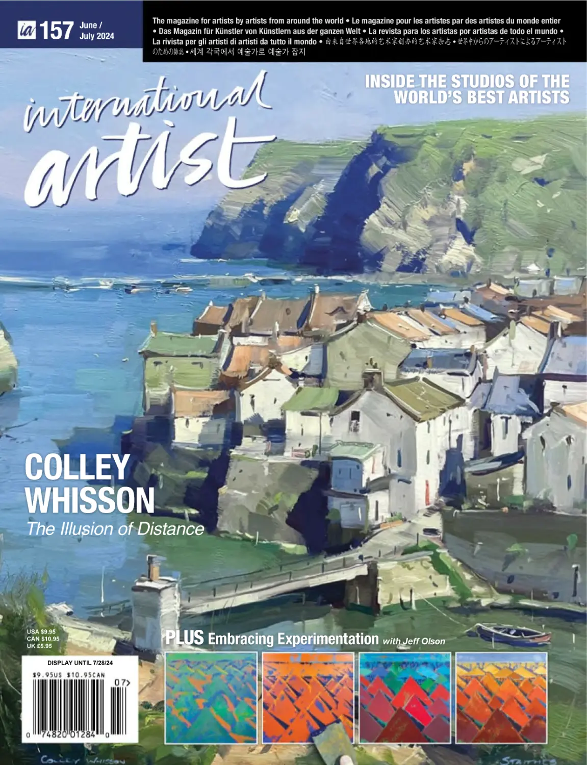
COLLEY
WHISSON
The Illusion of Distance
USA $9.95
CAN $10.95
UK £5.95
DISPLAY UNTIL 7/28/24
PLUS Embracing Experimentation with Jeff Olson
FUEL YOUR
ARTISTIC JOURNEY
*VSQXLIFPEROGERZEWXSXLIƼREPQEWXIVTMIGIKIXXLIQSWX
SYXSJ]SYVTVEGXMGI[MXLXSTUYEPMX]EVXMWXXVYWXIHWYTTPMIW
JSVIZIV]PIZIPERHXIGLRMUYI
Shop in stores and online.
DickBlick.com
800.828.4548
© Copyright 1999 - 2024 Blick Art Materials, LLC. All Rights Reserved.
.com
Issue 157 June/July 2024
LETTER FROM
THE PUBLISHERS
Adolfo Castillo Publisher: Editorial/Creative
acastillo@internationalartist.com
Wendie Martin
Publisher: Business/Art Community Development
wmartin@internationalartist.com
Vincent Miller Founder
EDITORIAL
Alyssa M. Tidwell Editor
atidwell@internationalartist.com
ADVERTISING
Michael Bright Senior Account Executive
mbright@internationalartist.com
Allyson Chomyn Sponsorship Coordinator
achomyn@internationalartist.com
Michael Bright Senior Account Executive
mbright@internationalartist.com
Jennifer Gombash Senior Account Executive
jgombash@internationalartist.com
TRAFFIC
Jennifer Nave Traffic Manager
traffic@internationalartist.com
MARKETING
Robin Castillo Social Media Engagement Manager
social@internationalartist.com
PRODUCTION
Tony Nolan Art Director
Dana Long Production Artist
Lizy Brautigam Production Artist
SUBSCRIPTIONS
Emily Yee Office Manager
service@internationalartist.com
April Stewart Accounts Receivable
astewart@internationalartist.com
Bianca Martos Administrative Assistant
& Marketing Coordinator
bmartos@internationalartist.com
Address all correspondence to our office, see Contents page.
INTERNATIONAL ARTIST (ISSN 1440-1320)
Published 6 times a year by International Artist Publishing Inc.
3260 N. Hayden Rd. Suites 201-203 Scottsdale, AZ 85251
Telephone (480) 425-0841 Website: www.internationalartist.com
Copyright ©2024. All material appearing in International Artist is
copyright. Reproduction in whole or part is not permitted without
permission in writing from the editor. Editorial contributions are
welcome and should be accompanied by a stamped, self-addressed
envelope. All care will be taken with material supplied, but no
responsibility will be accepted for loss or damage. The views
expressed are not necessarily those of the editor or the publisher.
The publisher bears no responsibility and accepts no liability for the
claims made, or for information provided by advertisers. Printed in
the USA. International Artist ® is a registered trademark.
ATTENTION RETAILERS
You can sell International Artist in your store. Contact us in:
USA and Canada Telephone (480) 425-0841,
Fax (480) 425-0724 or write to International Artist,
PO Box 2320, Scottsdale, AZ 85252, USA
CANADA International Artist
PUBLICATIONS MAIL AGREEMENT NO. 40064408
RETURN UNDELIVERABLE CANADIAN ADDRESSES TO EXPRESS
MESSENGER INTERNATIONAL PO BOX 25058 LONDON BRC,
ONTARIO, CANADA N6C 6A8
UNITED STATES OF AMERICA
International Artist (ISSN 1440-1320) 3260 N. Hayden Rd. Suites
201-203, Scottsdale, AZ 85251, USA. Single copies in USA $9.95.
Online subscription rate for one year in USA $48.
The Artist’s Journey
Welcome to the June/July issue of International Artist! Our podcast channel The American Art
Collective is celebrating its 268th podcast in June. That’s right, we have 268—soon to be over
300—artists’ stories that will live forever in the digital audio world. Artists and collectors
and the world will be listening to these stories for decades to come because four years ago
we believed artists’ stories should be heard and seen in print, audio and online. If you haven’t
listened to a favorite artist’s story please come find us on Audible, the Apple podcast app or
Spotify and join the 200,000 other listeners looking for inspiration and education.
Speaking of education, we have an important new special section in this issue. It is our
Art Schools & Workshops Directory. You will find a few of the top art schools and workshops
around the country (and the world) to hone your skills, as well as read how the masters explain
their techniques. We bring this together because we believe in the artist’s journey. There is a
saying that goes, “It is the journey, not the destination.” International Artist magazine is here
for your journey in exploring technique, change and refinement. We also love the community
that has been built. This spans from our 25-year-old Art Competitions, which have discovered
many great artists of the past 25 years, to our two-year-old Creative Spark!, showcasing artists’
unique artistic interpretations in each issue.
In this issue you will find 10 demonstrations from artists around the world. Even our
selections of artists for demonstrations has evolved over the 25-year span. Initially, providing
a demonstration was a very analog process even just four years ago. The artist selected would
receive a physical packet with samples and ideas for their demonstration painting. The process
would take between three months to one year to receive the demonstration back with photos
and explanations. We would scan the photos, stylize editorial and put the demonstration
together for you with our own International Artist flare. Fast forward to the present day—Alyssa
Tidwell, editor, uses many modern vehicles to select artists including Instagram, our podcast
stories, art groups and societies. She is creating her own universe with a mix of new talent and
master painters to bring diversity to you each month. If there is
one thing we can say about International Artist, it is that we are
highly selective to ensure that when the issue arrives you are
excited to open the first page. Enjoy this issue!
Sincerely,
Wendie Martin & Adolfo Castillo
Publishers
P.S. If you would like your work to be considered for a
demonstration in a future issue of International Artist, please
contact Alyssa Tidwell at atidwell@internationalartist.com.
MAIN COVER ARTIST
COLLEY WHISSON
Staithes Symphony,
England, oil on MDF
gessoed panel, 14 x 11"
(35 x 27 cm)
To place an order, change of address or a customer service question,
please send to PO Box 2320, Scottsdale AZ 85252 Periodicals
Postage rates paid at Scottsdale, AZ and at additional mailing offices.
POSTMASTER Send all address changes to International Artist,
PO Box 2320, Scottsdale, AZ 85252
Letter from the Publishers
1
LETTER FROM THE EDITOR
FOR
Made by Human Hands
International Artist
I think that now, more than ever, we must value things created directly from human
hands. It feels like everywhere I turn, I see more and more imagery created entirely with
artificial intelligence. And while it can be used as a tool to help get ideas flowing, AI
imagery itself inherently cannot ever contain the essence of the human spirit. This, to me,
is what makes art so important. So beautifully, incredibly valuable. It is the mere fact that
a person put their time, effort, heart and soul into this object they’ve created, whether it
be a painting, a sculpture or a story. The intention matters, and the context matters.
So, what I’m trying to say here is, please continue doing what you are doing. Please
continue pouring your souls and your paints onto the canvas. Because what you do
every day as artists is an enormous part of what makes this world beautiful.
Turn to page 36 to read more about the Art Renewal Center, a nonprofit organization
that centers its mission on “leading the revival of realism.” Through worldwide
competitions, exhibitions and educational resources, ARC is continuously supporting
artists working in traditional media.
And speaking of traditional mediums, we have a wonderful lineup of demonstrations
and workshops this issue including four watercolor demos by Australian artist Heidi
Willis, American artist Aki Kano and floral painter Marie Burke from the United Kingdom,
as well as our regular contributor John Lovett. Each artist has something unique to offer.
You’ll also be able to dive into a comprehensive acrylic demo from abstract landscape
painter Jeff Olson, a demo from Australian oil painter Colley Whisson, and much more.
For those of you traveling this summer to pursue your art adventures, be sure to
check out David Barclay’s guide to traveling by plane with your art supplies on page
40. I’d also like to direct you toward our special section on Art Schools & Workshops,
beginning on page 46. This section delves into some of the many options out there
today for building up your skills as an artist.
THE
American Art Collector
LOV E
Western Art Collector
OF
American Fine Art
Magazine
Warmly,
Native American Art
Alyssa M. Tidwell
Editor
atidwell@internationalartist.com
@internationalartistmagazine
International Artist Magazine
www.InternationalArtistPublishing.com
Letter from the Editor
3
157
June /
July 2024
CONTENTS
Bon mots appearing throughout this magazine
are from the varied, exciting and weird life of
artist Harley Brown
Art Prize Challenges
6
17
International Prize Winners
All the Prize Winners in
International Artist
magazine Challenge
No. 141, Landscapes
Call for Entries
Entry form for International Artist
magazine’s Challenge No. 143,
Cityscapes. Or you can enter using digital
printouts and online!
Page 36 Donald Demers, Crossing the Gulf Stream, 2020, oil on linen, 44 x 58" (111 x 147 cm)
Special Section: Art Schools & Workshops
Schools & Workshops
46 Art
Directory
Industry Insider with
50 Art
Vanessa Rothe
School’s in Session
the Palette with
48 Beyond
Scottsdale Artists’ School
The Art of the Portrait
22 Chair’s Letter
Fraughton:
24 Edward
Sculpting the Spirit of the
In this special edition of Beyond the
Palette, we asked SAS executive director Trudy Hays about the benefits of art
school, community and more
American West
By Christine Egnoski
Columns & Features
Station Points
32 Tips
& Insights from James Gurney
Building an Art Career Online, Part I
Keep It Real
36 The
Art Renewal Center bolsters the
support and reverence of traditional
representational art
By Alyssa M. Tidwell
Flying Colors
40 Artist
David Barclay discusses how to
pack painting gear for air travel—
managing bulk, weight restrictions
and more
Principles of
122 Important
Art
Harley Brown’s fascinating things no
one else will tell you
Departments
Workshop
116 InPainting
every issue of International Artist we feature a Painting Workshop
from Richard Robinson, one of New
Zealand’s best artists
4
www.InternationalArtist.com
126 Creative Spark!
28 Master Showcase
by Step: A Portrait of
30 Step
Connection
By Miriam Escofet
SUBSCRIPTION REQUESTS
INTERNATIONAL ARTIST
PO Box 2320, Scottsdale, AZ 85252, USA
Tel 1 (877) 947-0792
Email: Service@InternationalArtist.com
www.InternationalArtist.com
EDITORIAL INQUIRIES
ALYSSA M. TIDWELL, EDITOR
atidwell@InternationalArtist.com
Tel (480) 425-0841 Fax (480) 425-0724
INTERNATIONAL ARTIST
PO Box 2320, Scottsdale, AZ, 85252, USA
Artists from Around the World in this Issue
Demonstrations, Workshops & Master Painters of the World
OIL
54 USA
Peaceful Places
Sara Linda Poly creates a sense of atmosphere
and depth in her soft, ethereal landscapes
80 Canada
102 UK
Grand Gestures
Lightness and Grace
An instinctive painter, Holly Dyrland uses bold
brushwork and energetic color to define her
scenes
Marie Burke captures the delicate forms of
flowers through a wet-on-wet approach
60 Australia
WATERCOLOR
A Sense of Depth
86 Australia
A solid grasp of foreground, mid and background
makes Colley Whisson’s scenes come to life
68 USA
Sue Barrasi
Compelled to create
ACRYLIC
70 USA
The Naturalist
Always striving for accuracy, Heidi Willis
bring the natural world to life in her watercolor
paintings
96 USA
Ephemeral Moments
110 Australia
Painting Tasmania
John Lovett takes us on a painting tour of one of
Australia’s most extraordinary islands
COLORED PENCIL
114 Germany
Rebecca Neundorf
Crisp forms
A slow and steady application of soft washes
allows Aki Kano to create portraits that capture
nuanced emotion
The Edge of Reality
Jeff Olson’s abstract landscapes embrace the
spontaneity of both nature and the painting
process itself
Contents
5
nge
Challe
All the Prize Winners in our International Artist
Magazine Challenge No. 141
LANDSCAPES
Jennifer
Sowders
Ohio, USA, Brecksville Ridge, acrylic, 20 x 40" (50 x 101 cm)
Grand Prize is a four-page editorial feature
in American Art Collector magazine
Shrouded in Nature
Growing up in rural Ohio surrounded by
farmland, woods and a stream, artist Jennifer
Sowder is a natural realist at heart. “While
my friends in town rode bikes and played
all summer, I found myself adventuring
and studying nature. I moved back to my
childhood home in 2012, and thereafter,
a plein air painting group reawakened my
inspiration to study and explore but this
time through landscape painting,” she says.
“Gardening has always gotten me outside
and inspired, but traveling and looking for
showstopping scenes fuels my work—I am
blessed to be able to walk out my studio
door and go on a hike on our property and
be enveloped by nature.”
Light is an important element in Sowders’
art (she used to paint with her plein air
group weekly), chasing the perfect light for
her nature scenes. “I have had some outings
where the sun hasn’t shone and yet the color,
texture and value in the scape have satisfied
my requirements for a painting,” she says.
“But I’ve also leaned up against a tree for
10 minutes waiting for the light to break
as well!” While the artist primarily paints
6
www.InternationalArtist.com
in acrylic, she also works with watercolor,
watercolor pencils and ink.
“I began painting acrylics with a palette
knife during the 2021 Covid lockdown,”
she reflects. “Because it was an impromptu
decision, I didn’t prepare the canvas with
any white-knocking washes. I simply did
a quick sketch on the white ground and
began painting. Not always, but this method
has ‘stuck’ with me because I value the fact
that it forces me into building texture and
more color variation simply because I’m
doing more mark-making than allowing a
generic colored ground to peek through the
painting.”
She adds that while she loves painting
landscapes, she’s fond of portraiture as well.
“Again, something that stemmed from
Covid lockdowns—in spending so much
time with family. Because painting with a
palette knife can be such a physical ordeal,
especially with a larger canvas, painting in
between my acrylic work with a landscape
or my genre/portraiture series (both utilizing
watercolor on Yupo) gives me a little bit of
a rest. Not to mention, never getting bored.
I find myself already dreaming of the next
painting in an opposing series at the end of
one I’m currently working on.”
My Inspiration
I am most inspired by dense landscapes
from trips I take, like this one from the
Cuyahoga National Valley Park, specifically
in Brecksville, Ohio. Especially during
my favorite season of fall; not only for the
beautiful show of color but the quality of
autumnal light. The specific trail I took
led out onto a peak of a ridge where both
sides had steep slopes. It was an adrenaline
rush in watching my step, so as to not fall
headlong, but also because the light was so
magical slipping through the dips in the
ridge, making a marvelous dance of light
and dark in the scape.
stick closer to my reference image because
the accuracy in object size helped to push
the depth in my painting. The light and
color did the rest.
My Design Strategy
My Working Process
I don’t consider myself a photographer,
but I really do look for scenes that carry a
balanced and yet magnificent view. I look
for a “lush-and-loaded” scene full of color,
texture and dappled light, and this scene
checked off all the boxes. I took hundreds
of pictures that day in the fall of 2022. I did
For Brecksville Ridge, I put a banded
ground wash down on the surface of the
painting before I laid my sketch down. The
palette knife was definitely the workhorse
in my painting. I started with sky and
then concentrated on dark values. Next,
definitive patches of color, and then
the painstaking development from the
highlights, through the middle-grounds
and back into the darks. Next,
I combed over the surface of the painting
several times to cover up any ground
poking through, dotting thick paint with
a silicone-tipped implement. Lastly, I used
paint-laiden string in a whipping fashion
for creating some of the tree branches.
Contact Details
» Email: mongalleryandart@gmail.com
» Website: MONgallery.us
Art Challenge
7
ART CHALLENGE #141
Dan Knepper Ohio, USA, If I Could Walk On Water, oil, 30 x 40" (76 x 101 cm)
Second Prize is a two-page editorial feature in American Art Collector magazine
8
My Inspiration
My Design Strategy
This is the easiest question to answer. I went to
the mountains, and I found my path. I realized
this is what I want to paint—this feeling, this
connection, this discovery, this moment. I want
to paint these last wild places and the wildlife
that inhabits them in such a way that standing
before my paintings you are transported to the
moment, in that place. I want you to smell the
sagebrush and pine, marvel at the sparkle on
the water cascading and plunging to fall from
dramatic heights, taste the dust kicked up by
the bison or cowboys working the herd and
breathe in the West.
I was at Quest for the West and realized I had
moved back to look longer at the painting
I’d just left. What a revelation! I try to use
strong design to bring the viewer in from
across the room, and then color and detail to
keep the viewer transported into this place
at that moment. My colors are the slightly
saturated chroma that we remember from
being there rather than the disappointing
colors captured by a camera.
to be in the right place at the right time of day,
sometimes hiking before dawn to be there, or
sometimes just facing in the right direction to
allow descriptive light to illuminate foliage, or
reflect as well as pass into water. I vary angles
and exposures. I’m always experimenting with
my painting process so it varies from painting
to painting. I’m a bad example. I often get
caught up in details too quickly, so I’m trying
to make myself start with the large areas and
gradually work toward the details.
My Working Process
Contact Details
www.InternationalArtist.com
My working process begins with taking good
reference photos, which often means planning
» Email: danknepperart@yahoo.com
» Website: danknepperart.com
Mark Hobson British Columbia, Canada, Sun Rays In The Forest, acrylic, 32 x 64" (81 x 162 cm)
My Inspiration
I’m fortunate to be living on the west
coast of Vancouver Island where there still
exists stands of unlogged ancient forests,
so most of my paintings are celebrations of
the natural world. Many of the cedars are
over a thousand years old, and over time
the forest floors have acquired an endless
variety of complex shapes as layers of fallen
trees overlap with one another. These scenes
appear utterly chaotic, but every species of
tree, moss or fungus has its own specific
role. Within the chaos everything has its
place. As a trained biologist I love the way it
all fits together. It is this interconnectedness
that I wanted to portray.
My Design Strategy
A cohesive composition of a complex
forest scene is tricky. The design evolves
from hours of observation. Creating the
feeling of such an expansive subject within
the confines of a canvas is a challenge and
took a few days of planning. Maintaining
the randomness of the forest and not
making it look contrived or organized is
important to the overall impact. There
were a few pieces that I wanted to include
to tell the story: the large old cedar, a
stream, some twisted young cedar, a fallen
tree, mosses, ferns and rotting wood. The
wood adds an important reddish brown
color to the overwhelming greens.
My Working Process
To start I layered multiple coats of acrylic
paint with sponges, making a gradual
transition of warm colors to cooler gray. Once
dry I painted the sky holes using a mixture
of white and cadmium orange, working in
the various tree species shapes. Next, layers
were added from the most distant to the
foreground using raw sienna. To keep the
perspective I premixed these colors and stored
them in air-tight containers. This is a crucial
step since the acrylics dry darker than when
applied, which makes it impossible to create
aerial perspective. Keeping the ferns and
moss-covered logs fairly dark at the beginning
is helpful. Once the canvas was covered,
I went in and carefully added sunlit highlights
to the edges of various shapes. The last
nerve-wracking step was the streams of hazy
sunlight. To keep straight masking tape was
used on each ray. With the canvas lying flat
I wiped over with a moist sponge and a dilute
mix of cadmium orange and white. Before
it dried I removed the tape and quickly ran
my finger along the edges to soften the harsh
edges.
Contact Details
» Email: art@markhobson.com
» Website: markhobson.com
Art Challenge
“Accurate, bold brushstrokes are earned over time.” – Harley Brown
Third Prize is a one-page editorial feature in American Art Collector magazine
9
ART CHALLENGE #141
FINALISTS
Each receives an Award Certificate and a one-year subscription to International Artist magazine PLUS having their work seen worldwide by
international galleries looking for new talent.
Chien Chung Wei New Taipei City, Taiwan, Potala Palace on the Loess Plateau, watercolor, 29½ x 41/" (75 x 105 cm)
Finalist
My Inspiration
My Design Strategy
My Working Process
In September 2023, I was invited to visit
Jinzhong City in Shanxi Province, China,
where there is a village over 400 years
old called “Dongjialing.” It was named
a famous historical and cultural village
in Shanxi Province in 2009. Surrounded
by mountains, the quaint houses of the
village are layered on the slopes, creating
a spectacular and breathtaking sight that
fills one with surprise and admiration!
At that moment, I decided that I would
paint a large watercolor with the theme
“the Potala Palace on the Loess Plateau” to
commemorate this memorable trip.
I started by determining the colors of
various elements, such as the yellow earth,
gray old houses, red brick walls, bright
yellow sky and dark green trees. After
simplifying the shapes of these elements,
I then allocated suitable areas and positions.
My interest in two-dimensional composition
far exceeds that of representing real threedimensional spaces. In the process of design,
I emphasized the rhythmic sense of abstract
lines, which is the secret weapon I use to
unify the image.
Since this watercolor painting has a long
side exceeding 100 cm, I had to use a flat
painting technique to fill in the areas with
color blocks before delving into the details.
I often repeatedly wash the color blocks to
adjust the brightness and hue, ensuring that
each individual color block complements
the overall design. Additionally, I use a
palette knife on some color blocks to create
interesting textures and scratches, making the
image rich and enduring to behold.
Contact Details
» Email: hibariprince@gmail.com
» Website: facebook.com/hibariprince
10
www.InternationalArtist.com
Andy Eccleshall Washington, USA, Icon, oil on canvas, 48 x 72" (121 x 182 cm)
My Inspiration
My Design Strategy
This painting depicts a beautiful old barn
just south of Edison, Washington, in the
Skagit Valley. Subjects like this fascinate
me. It’s the untold story. Who built it and
why? What is their story, and why was it left
to decay? Since I completed the painting
the old barn has been torn down, and
I’m honored to have been able to capture
it before it was gone. The drama of the
structure in shadow against the bright,
minimal landscape made for a striking
composition, especially on such a large
canvas.
This painting is composed with an emphasis
on balance. Warms and cools, positive and
negative spaces, light and dark. The sky
changes subtly from warm white on the left
to pale cerulean on the right. The contrast of
the barn in shadow is enhanced by a hairline
of manganese, which runs around the
outside of the structure. The visual weight of
the barn balances the light of the open sky
and the warmth of the grass below.
painting. Once I have my study I begin
working out the composition with a series
of thumbnail sketches, in this case working
with the golden ratio to establish important
intersections within the painting. The canvas
is toned and then the entire composition is
blocked in, slowly getting refined with each
additional layer until I am satisfied with the
overall feeling of the painting. I always want
the viewer to be able to “feel” the painting,
the sun, the wind, the rain.
My Working Process
Contact Details
I like to create plein air color studies. I find
it the perfect starting point for a studio
» Email: ajeccleshall@gmail.com
» Website: andyeccleshall.com
Art Challenge
“Unlike the Olympics, art is not really a competition.” – Harley Brown
Finalist
11
ART CHALLENGE #141
Mark Harrison East Sussex, UK, The Safe House, oil on canvas, 16 x 39" (40 x 99 cm)
Finalist
My Inspiration
This painting is part of a series of
metaphorical American landscapes called
Point Of Light, all of which are variations
on the theme of the individual—you,
me—within the natural world and society
and how we deal with them. I see turbulent
times ahead (the storm clouds) so we need
to find a nurturing space within ourselves to
get us through them (the house).
My Design Strategy
All of the paintings in this series are designed
to take advantage of the panoramic canvas
12
www.InternationalArtist.com
format, which gives them a wide angle
cinematic feel. It is composed so that the
storm clouds dominate the painting with
the lonely house exposed on the featureless
Kansas landscape. But there is hope—a
beautiful light still bathes the scene, the lights
are on in the house and maybe the storm
is passing away to leave a brightly lit fall
landscape.
the basic shapes and proceed to a tonal
underpainting using a mix of burnt sienna
and dioxazine purple oil paint thinned
with Liquin and applied with a rag and
brushes. This stage allows me to tweak any
compositional problems that may arise
before I proceed to color. Changes are
made as I go along with the basic reference
usually left far behind by the end.
My Working Process
Contact Details
I give the canvas three extra coats of
gesso (sanding between coats) to fill in
the weave a bit before I loosely sketch in
» Email: msgn.harrison@gmail.com
» Website: paintingsbymarkharrison.com
ART CHALLENGE #141
Troels Kirk Skåne, Sweden, Summer Walk, acrylic, 23½ x 55" (60 x 140 cm)
Finalist
My Inspiration
Walking down this ancient stone-fenced path
on a warm afternoon in the early summer is
really all the inspiration I need. This place
begs to be painted—I love the simplicity of
such a place. Just a tree, a path and summer.
Sitting in the shade of a hazel bush sketching
gives you time to closely observe the effects
of haze, the variety of colors and tones, and
really feel the mood of the place.
My Design Strategy
Back in my studio I use photos and sketches
to compose the scene. Rather than an exact
14
www.InternationalArtist.com
depiction, I aim to recreate the feeling of
sitting there in the shade. I make the final
compositional sketch, placing the main tree
and stone walls to guide the eye down the
path. The high contrast in front and the
softness of the background haze establishes
the depth of the scene. Wedges of light fields
provide a backdrop for foreground details.
and more detail, contrast and saturation. A
rich variety of greens, from very warm to
icy blue, were used to create depth and rich
shade. The bluish gray of the stones and the
pink of the dirt path are colors also used in
the oak bark details.
Contact Details
My Working Process
» Email: info@troelskirk.com
The stretched Belgian linen canvas was
given very light washes of yellow and blue
to establish the backdrop and sky. Working
in layers from back to front, I added more
» Website: troelskirk.com
Linda Boisvert DeStefanis Connecticut, USA, Evening Glow, oil on linen, 12 x 12" (30 x 30 cm)
My Inspiration
Waterscapes are my favorite subjects.
I constantly watch for the beauty in nature
and try to capture it on my canvases. On this
day, I rushed out to catch the sunset over this
pond, with the telephone wires and the street
in the distance. It became my next challenge.
In my work, I like to create the feeling of
distance between the foreground and the far
away objects. I also loved the glow of the sun
coming through the trees at the end of the
day and the reflections on the pond in the
foreground.
My Design Strategy
As an oil painter who loves detail and
works in realism, I love working on smooth
surfaces like linen and the ability to blend
with oils. I find that sometimes my subjects
require a rectangular size, but I often want
to challenge myself and work out a design
in a square. My challenge was to sketch it
out and create a successful composition
for this beautiful “evening glow.” I knew
that the brushwork for the distant fence,
street, homes and telephone poles would
be difficult, but these small details are what
make this painting special.
My Working Process
Once I’ve sketched my design onto the
linen canvas, I begin by mixing paint for
the background of the sky. I used fine detail
Liquin mixed with a little Gamsol to create
an underlayer. For the sky, I used some
cobalt blue with white and added a bit of
orange in some of the areas where the clouds
will reflect the setting sun below. Eventually,
I would add the lavenders into the clouds.
I also placed the darks below and wiped out
where the light streak of the pond below
would reflect the sky above. I work in layers,
and it would dry overnight before I added
the next layer. The final details are added
when the underlayers are fully dry. I enjoyed
this piece and felt I was successful in my
challenge.
Contact Details
» Email: lbdestefanis@gmail.com
» Website: destefanisfineart1.com
Art Challenge
“A painting doesn’t have to have everything detailed.” – Harley Brown
Finalist
15
Deborah Tilby, “Sunlit,” Oil
Jennifer Dettmer, “Ozark Spring House,” Watercolor
Exhibit your work with prominent artists
Level up your knowledge,
insights, and standing in
the national community
of artists by joining AAPL.
@aapl_nyc
AmericanArtistsProfessionalLeague
Full schedule of all juried shows, including
the 96th Grand National Exhibition at the
esteemed Salmagundi Club at:
www.aaplinc.org/ia-aapl
www.aaplinc.org
COLORED PENCIL ARTISTS
Make Your Mark!
The Colored Pencil Society of America is the
largest colored pencil organization in the world.
U.S. and international members receive our
twice-yearly magazine, our colored pencil
lightfastness guide, can enter two annual juried
exhibitions, join a regional U.S. chapter, and
are invited to attend our annual summer
convention with workshops and events that
will knock your socks off!
Won’t you join us?
Become a
positive voice for
colored pencil fine art
cpsa.org/join-cpsa
John by John Smolko, CPSA, CPX
CALL FOR ENTRIES
HOW TO ENTER OUR ART COMPETITIONS
FULL COLOR DIGITAL PRINT-OUTS
Use the Official Entry Form over the page
#
ONLINE
Visit our website to upload digital files
of the images you want to enter and
pay for them using our secure server.
www.internationalartist.com
To upload your entries you need to
prepare your image files to be at least
400 pixels at the shortest edge. Once
CHALLENGE ENTRY FORM
SCHEDULE AND CLOSING DATES
you are in the Official Online Entry
page simply select which challenge
you wish to enter then follow the
prompts and finally pay the entry fee
via our secure server. There you can
also see other entries received along
with past winners of our competitions.
Theme
Issue Closing
143 Cityscapes
IA157 July 10, 2024
144 Seascapes,
Rivers & Lakes
IA158 Sep. 11, 2024
145 Favorite Subjects
IA159 Nov. 13, 2024
146 Still Life
IA160 Jan. 8, 2025
147 People & Figures
IA161 Mar. 13, 2025
148 Wildlife
IA162 May 8, 2025
149 Landscapes
IA163 July 10, 2025
HINTS FOR PHOTOGRAPHING YOUR ARTWORK
• Set your camera to the highest quality available.
• Turn the date off!!
• Shoot your paintings dead square on and fill the
frame as much as possible. We can crop out
everything else.
• Rather than look through the display screen
when shooting your digital pictures, use the
viewfinder because there is less likelihood of
the camera moving and creating a fuzzy picture.
• Take your paintings outside and photograph
them in the shade. Indoor lighting can create
unpleasant orange or blue color casts.
• To ensure crisp pictures, use a tripod.
• Make sure no clips or easel clamps intrude
into the painting, and that frames don’t cast
shadows that fall onto the painting.
• Then print out your entries on photographic
quality paper no smaller than 8 x 5" (20 x 13 cm)
size. (Some papers have a yellow tint, which
impacts on the finished result. If you are unsure,
it might be best to take your photo files to your
local digital photolab.)
• The full-color prints must be crisp and sharp,
not jagged or bitmapped, and you must be
happy with the color.
7SLHZLUV[L[OH[\UKLYUVJPYJ\TZ[HUJLZ^PSSHU`PTHNLZ\WWSPLKHZHKPNP[HSÄSLVU*+ILHJJLW[LK+PNP[HSÄSLZPTHNLZT\Z[ILLU[LYLKVUSPUL
Call for Entries
17
CALL FOR ENTRIES
ART PRIZE CHALLENGE SERIES
A continuing series of art competitions designed to encourage the best talent
working in the world today open to any painting or drawing medium.
ENTER OUR NEW ART COMPETITION
156
April /
May 2024
The magazine for artists by artists from around the world • Le magazine pour les artistes par des artistes du monde entier
• Das Magazin für Künstler von Künstlern aus der ganzen Welt • La revista para los artistas por artistas de todo el mundo •
La rivista per gli artisti di artisti da tutto il mondo • 由来自世界各地的艺术家创办的艺术家杂志 • 世界中からのアーティストによるアーティスト
のための雑誌 •ໞઢੜ༜ਜ਼ച༜ਜ਼ၼხ
INSIDE THE STUDIOS OF THE
WORLD’S BEST ARTISTS
&+$//(1*(1R
Cityscapes
See your work published in International Artist magazine and also receive
a 4-page Editorial Feature in American Art Collector, the prestigious
magazine read by collectors and galleries looking for new art work in the
world’s biggest art market.
KESJA
TABACZUK
Painting Warmth
& Emotion
PLUS
Sculptural
Pastels
with Lyn Diefenbach
Winners and Finalists in our competitions don’t just win awards to hang on their
walls. The real value of entering and being one of the winners is that your work
will not only be seen by hundreds of thousands of readers worldwide but also by
leading galleries and collectors in America, the biggest art market of all. Our
*UDQG3UL]H:LQQHUVUHFHLYHDSDJHVSUHDGLQInternational Artist magazine
DQGDSDJH(GLWRULDO)HDWXUHLQAmerican Art Collector. Publicity at this level is
priceless and could be a career changing opportunity for any artist, working in any
WZRGLPHQVLRQDOPHGLXP
CHALLENGE No. 143
Cityscapes
Medium
Any painting or drawing media
Entries Close
Last mail received on July 10, 2024
Entry Fee
US $9 / £5 / €8 / AUS $10 (See overleaf)
6HQG(QWULHV7R
6HHSDJHRI2IåFLDO(QWU\)RUP
Winners Featured
Issue No. 159 October/November 2024
The winners and a selection of highly commended
works will be published in our International Artist
magazine Art Prize report.
the magazine for artists by artists is proud to award
the magazine for artists by artists is proud to award
ADRIENNE STEIN
CEJAY HELT
GRAND
PRIZE
WINNER
SECOND
PRIZE
WINNER
in International Artist magazine’s
in International Artist magazine’s
Art Prize Challenge No. 88
FAVORITE SUBJECTS
Art Prize Challenge No. 88
FAVORITE SUBJECTS
for a work entitled
for a work entitled
Pink Bride
Ambrosia
as published in
Issue 104 • August/September 2015
as published in
Issue 104 • August/September 2015
the magazine for artists by artists is proud to award
the magazine for artists by artists is proud to award
DAGGI WALLACE
ANN KRAFT WALKER
THIRD
PRIZE
WINNER
FINALIST
in International Artist magazine’s
Art Prize Challenge No. 88
FAVORITE SUBJECTS
for a work entitled
in International Artist magazine’s
Art Prize Challenge No. 88
FAVORITE SUBJECTS
NOTE:7KHZLQQHUVDQGåQDOLVWVLQ&KDOOHQJH1RÓ)ORUDOV *DUGHQVZLOOEHIHDWXUHG
in International Artist issue No. 158, which comes out in August/September 2024
Every winner and finalist will receive an Award Certificate authenticating their prize.
18
www.InternationalArtist.com
for a work entitled
Trust
as published in
Issue 104 • August/September 2015
Jesse’s Pears
as published in
Issue 104 • August/September 2015
“I was contacted by a large gallery in Massachusetts after they saw my
work in American Art Collector magazine. We have enjoyed a great
relationship for several years now.”
— Jim Seitz, Artist
GRAND PRIZE WINNER
Our Grand Prize Winner receives;
2ND PRIZE WINNER
2XU6HFRQG3UL]H:LQQHUUHFHLYHV
Ý$Q$ZDUG&HUWLåFDWHWRDXWKHQWLFDWHWKHSUL]H
ÝSDJHVSUHDGLQInternational ArtistPDJD]LQH
ÝSDJHVSUHDGLQInternational Artist PDJD]LQH
UHDGZRUOGZLGHE\PRUHWKDQUHDGHUV
ÝSDJH(GLWRULDO)HDWXUHLQAmerican Art
CollectorPDJD]LQH
ÝSDJH(GLWRULDO)HDWXUHLQAmerican Art
Collector PDJD]LQH
Ý$ZDUG&HUWLåFDWH
American Art Collector is the most prestigious
magazine in America focusing on traditional
ÄULHY[·[OLHY[TVZ[WLVWSL^HU[0[PZYLHK
I`HMÅ\LU[HY[JVSSLJ[VYZHUKNHSSLYPLZJVHZ[[V
JVHZ[HSSVU[OLSVVRV\[MVYUL^HY[^VYRHUKUL^
HY[PZ[Z/H]PUNHWHNL,KP[VYPHS-LH[\YLPU[OPZ
art market bible is the kind of publicity that could
JOHUNL`V\YJHYLLYHZHUHY[PZ[
;OLW\ISPJP[``V\YLJLP]L[OYV\NO[OPZ
WHNLHY[PJSLPUAmerican Art Collector
JV\SKSLHK[VT\S[PWSLZHSLZPU[OL^VYSK»Z
IPNNLZ[HY[THYRL[
3RD PRIZE WINNER
2XU7KLUG3UL]H:LQQHUUHFHLYHV
ÝSDJHVSUHDGLQInternational ArtistPDJD]LQH
ÝSDJH(GLWRULDO)HDWXUHLQAmerican Art
Collector PDJD]LQH
Ý$ZDUG&HUWLåFDWH
“In large measure due to my
exposure in International Artist
magazine, I have now had almost
6,000 visits to my website from
all round the globe. Being in
International Artist magazine has
truly proved to be an
international experience
for me and I continue
to be grateful to the
magazine.”
— Alfred Nichols, Acrylic
Artist, Mississippi, USA
HONORABLE MENTIONS
2XU)LQDOLVWVHDFKUHFHLYH
Ý$QHQWU\LQInternational Artist PDJD]LQHZLWK
WKHLUZRUNVHHQZRUOGZLGHE\LQWHUQDWLRQDO
JDOOHULHVORRNLQJIRUWDOHQWHGDUWLVWVWR
UHSUHVHQW
Ý\HDUVXEVFULSWLRQWRInternational
Artist PDJD]LQH
Ý$ZDUG&HUWLåFDWH
INTERNATIONAL
ARTIST CHIEF JUDGE
Portrait of Vincent
by Everett Raymond Kinstler
Vincent Miller, founder of
International Artist magazine, is
our Chief Judge for our challenges.
He has judged art for more than
40 years worldwide, including
in the USA, Singapore, Australia,
Canada and the U.K., to name just
a few countries. In addition, he
is an artist and sculptor himself.
Mr. Miller works with many of
the greatest living artists and art
schools. He supports great art by
judging our challenge program.
If your art is selected you are
among the elite in the world
to be selected by Vincent
Miller. We welcome you to
submit your entries for the
next challenge judging.
SUBMIT
YOUR DIGITAL
ENTRIES ONLINE;
IT'S SO EASY!
5HDGDERXWWKHH[SHULHQFHVVRPHDUWLVWVKDYH
KDGDIWHUWKHLUZRUNDSSHDUHGLQInternational
Artist PDJD]LQH
9<3,: *65+0;065:
)LOO RXW WKH IRUP RYHUOHDI WR HQWHU \RXU GLJLWDO SULQWV RU YLVLW RXU
ZHEVLWH^^^PU[LYUH[PVUHSHY[PZ[JVTWRHQWHURQOLQH2QO\HQWULHV
RQWKLV2IILFLDO(QWU\)RUPZLOOEHHOLJLEOH<RXPD\HQWHUDVPDQ\
WLPHVDV\RXOLNH VHHSRLQW 6HHRYHUOHDIIRUHQWU\DGGUHVVGHWDLOV
,30.0)030;@7KLVLVDQRSHQFRPSHWLWLRQDOODUWLVWVZRUNLQJLQ
SDLQWLQJRUGUDZLQJPHGLDDUHHOLJLEOHWRHQWHUSURYLGHGWKH\PHHW
WKHUXOHV7RFRQIRUPZLWKWKHVSLULWRIWKHDZDUGVDOOZRUNPXVWEH
RULJLQDODQGFRPSOHWHGZLWKLQWKHODVWWZR\HDUVDQGZRXOGQRWEH
GLVTXDOLILHGLILWKDVZRQDQ\SUHYLRXVSUL]HRUDZDUGLQDQ\RWKHUDUW
FRPSHWLWLRQ1RFRSLHVIURPRWKHUDUWLVWVÖZRUNVRUSDLQWLQJVIURP
RWKHUDUWLVWVÖSKRWRJUDSKVRUIURPSXEOLVKHGPDWHULDOZLOOEHDOORZHG
6 RXUFH PDWHULDO PXV W EH RULJLQDO DQG DYDLODEOH RQ UHTXHV W
1RVXSHUYLVHGZRUNZLOOEHDOORZHG
KV UV[ ZLUK VYPNPUHS HY[^VYR 3LFWXUHV ZLOO QRW EH UHWXUQHG VR
SOHDVHPDNHGXSOLFDWHVIRU\RXUVXEPLVVLRQV
,5;9@ -694 0DLO,Q (QWULHV PXVW EH DFFRPSDQLHG E\ RQH
RULJLQDO2IILFLDO(QWU\)RUPSHUDUWLVWDVSULQWHGRQWKHVHSDJHV$
SKRWRFRS\ RU IDFVLPLOH PD\ EH XVHG IRU PRUH WKDQ WKUHH HQWULHV
:KHQHQWHULQJGLJLWDOHQWULHVYLDRXUZHEVLWH\RXPXVWDJUHHWRRXU
UXOHVDQGFRQGLWLRQVEHIRUHVXEPLWWLQJ\RXULPDJHV
,5;90,:*36:,<RXPXVWKDYH\RXUHQWU\LQE\-XO\
70*;<9,3(),305.(5+:<)40::065(DFKSULQWPXVWEHFOHDUO\
PDUNHGRQWKHEDFNZLWKWKHDUWLVWÖVQDPHWKHWLWOHPHGLXPDQGWKH
GLPHQVLRQVRIWKHZRUN'RQÖWZULWHRQWKHEDFNRI\RXUGLJLWDOSULQWV
LQVWHDGZULWHRQDODEHODQGVWLFNWKDWRQWKHEDFN2QO\SURSHUO\
PDUNHGGLJLWDOSULQWVWRJHWKHUZLWKIXOO\FRPSOHWHG2IILFLDO(QWU\
)RUPV ZLOO EH DFFHSWHG )RU SURWHFWLRQ VLPSO\ IROG D FDUGERDUG
VWLIIHQHUDURXQG\RXUHQWU\
+0.0;(37905;:'LJLWDOSULQWVVKRXOGEHSULQWHGRQSKRWRJUDSKLF
TXDOLW\SDSHUQRVPDOOHUWKDQ[ [FP (YHU\HQWUDQWPD\
VXEPLWDQXQOLPLWHGQXPEHURIHQWULHVIRUHDFKFRPSHWLWLRQ7SLHZL
,5;9@-,,7KHUHLVDQ(QWU\)HHIRUHDFKSLFWXUHHQWHUHGLQWKH
FRPSHWLWLRQ VHH QH[W SDJH SD\DEOH E\ 9LVD 0DVWHU&DUG FUHGLW
FDUGV RU E\ FKHFN PRQH\ RUGHU DQG WKLV PXVW DFFRPSDQ\ WKH
SLFWXUH V DQG(QWU\)RUP7KH(QWU\)HHLVQRQUHIXQGDEOH
1<+.05. $OO HQWULHV UHFHLYHG ZLOO EH YLHZHG DQG VHOHFWHG
E\WKH&KLHI-XGJHRI,QWHUQDWLRQDO$UWLVWPDJD]LQHRIInternational
Artist PDJD]LQH
7<)30*(;0656->6926LJQLQJWKH(QWU\)RUPZLOOEHWDNHQDV
SHUPLVVLRQWRSXEOLVKWKHSDLQWLQJLIFKRVHQDVDZLQQHURUILQDOLVW
ZRUNLQRXUSUL]HUHSRUW$Q\ZRUNUHSURGXFHGLQWKLVZD\ZLOOEH
JLYHQSURSHUFUHGLWDWDOOWLPHV$OWKRXJKHYHU\FDUHLVWDNHQE\WKH
SXEOLVKHUV WR PDWFK SURRIV WR WKH PDWHULDO SURYLGHG WKHUH LV WKH
SRVVLELOLW\WKDWYDULDWLRQVPD\RFFXUEHWZHHQWKHVOLGHVSURYLGHGDQG
WKHFRORUVUHSURGXFHGLQWKHDFWXDOPDJD]LQHGXHWROLPLWDWLRQVRI
WKHIRXUFRORUSULQWLQJSURFHVVEH\RQGWKHFRQWURORIWKHSXEOLVKHUV
;,94: 6XEPLVVLRQ RI HQWU\ LQ WKLV FRPSHWLWLRQ DXWRPDWLFDOO\
F RQVWLW XWHVWKHHQWUDQWÖVDFFHSWDQFHRIDOOFRPSHWLWLRQUXOHV7KH
MXGJHVÖGHFLVLRQZLOOEHILQDODQGQRFRUUHVSRQGHQFHZLOOEHHQWHUHG
LQWR :LQQHUV ZLOO EH QRWLILHG E\ PDLO DQG DQQRXQFHG LQ WKH ILUVW
DYDLODEOHLVVXHRIInternational Artist
Call for Entries
19
OFFICIAL ENTRY FORM
THREE INTERNATIONAL ENTRY POINTS
For your convenience there are three International Entry Points. You can pay your Entry Fee by Visa or MasterCard.
1
USA / CANADA
THE AMERICAS
2
Send your entry and payment of
US $9 per entry/picture to:
International Artist magazine
Challenge No. 143:
Cityscapes
3260 N. Hayden Rd. Suites 201-203
Scottsdale, AZ 85251, USA
UNITED KINGDOM / EUROPE
AFRICA
3
Send your entry and payment of
£5 (or €8) per entry/picture to:
International Artist magazine
Challenge No. 143:
Cityscapes
3260 N. Hayden Rd. Suites 201-203
Scottsdale, AZ 85251, USA
Enter your Credit Card details on the
Entry Form below or include a Check/Money
Order made payable to International Artist.
(Checks must be in US Dollars and drawn
on a US bank)
AUSTRALIA / NEW ZEALAND
ALL OTHER COUNTRIES
Send your entry and payment of
AUS $10 per entry/picture to:
International Artist magazine
Challenge No. 143:
Cityscapes
3260 N. Hayden Rd. Suites 201-203
Scottsdale, AZ 85251, USA
Enter your Credit Card details on the
Entry Form or include a Cheque/Money
Order made payable to International Artist.
(Cheques must be in Pounds Sterling,
and drawn on a United Kingdom bank)
Enter your Credit Card details on the
Entry Form or include a Cheque/Money
Order made payable to International Artist.
(Cheques must be in Australian Dollars
and drawn on an Australian bank)
DEADLINE LAST MAIL RECEIVED ON JULY 10, 2024
Please send your entry to the Art Prize coordinator responsible for your zone to the address shown above.
CITYSCAPES
I am submitting images listed below for this Art Prize Challenge and
enclose my Entry Fee for each entry as described.
When posting your entries, please don’t use
staples or paperclips on your printouts!
YOUR DETAILS
I understand these pictures will not be returned and that they may be
published, properly credited, in a future issue of International Artist
magazine. I warrant that the entries submitted are entirely my own work
and that I own the copyright on each, as well as copyright on all source
material from which these works were created. I hereby grant permission
to the publishers for reproduction of this work for the purposes of this
competition and agree to the terms and conditions as set out overleaf.
Please print clearly
Your name____________________________________________________________________________________________________
Address
________________________________________________________________________________________________________________________________________________________
City/State _________________________________________________________ Zip/Postcode ________________________ Country ____________________________
Telephone __________________________________________________________________ Email ____________________________________________________________________________
(So we can contact you if you win)
YOUR ENTRIES
ENTRY 1:
ENTRY 2:
ENTRY 3:
Title of work ___________________________________
Title of work ___________________________________
Title of work ___________________________________
Medium
Medium
Medium
________________________________________
________________________________________
________________________________________
Dimensions (H x W) ____________________________
Dimensions (H x W) ____________________________
Dimensions (H x W) ____________________________
Signature _______________________________________
Signature _______________________________________
Signature _______________________________________
Don’t write on the back of your digital prints, instead, write on a label and stick that on the back. Please do not use bubble wrap, tissue, excessive tape or
other elaborate forms of wrapping. Simply fold cardboard around the entry form as protection.
YOUR PAYMENT
Please find attached my check/money order for the amount of
______________________
made payable to International Artist
OR
Charge the total amount to my
Visa
MasterCard
Signature ______________________________________________________________ Expiry Date ______________________ CVV __________
20
www.InternationalArtist.com
TS
OIL PAIN
QUALITY
handcrafted to create glowing, seductive paintings with
top-quality, professional pigments designed to fuel an
experience of intense joy and bring you one step closer
\WXIQV\QVO_Q\PKWVÅLMVKM
only at
cheapjoes.com
800.227.2788
THE ART OF THE PORTRAIT
The Portrait Society of America
Chairman’s Letter
Preserving the
Soul of Art
T
hroughout human history, people have
used art to express themselves, record
their daily activities, capture moments and
share their emotions. Think back to those
ancient cave paintings in places like the
Lascaux caves—they are like snapshots of
life dating back to 15,000 BCE. Or think about
paintings like the Mona Lisa’s smirk or Van
Gogh’s Starry Night and how they communicate
the creator’s vision with us, the viewer.
Now, fast forward to the 21st century
and at the forefront of both excitement
and skepticism is artificial intelligence (AI).
The fusion of AI and fine art sparks both
controversy and enthusiasm, challenging
traditional notions of creativity, authorship
and the very essence of art itself.
Although most of us probably think of AIgenerated art as a new idea, it actually dates
back to 1968 when artist Vera Molnár began
experimenting with early programming
languages to produce randomly generated
artwork. Now in 2024, the use of AI to create
art has become accessible to anyone with
a computer and an internet connection.
With AI text-to-image generators, one can
simply type a prompt (such as “impressionist
painting of a landscape with a river and purple
trees”), and the AI creates the image, usually
in under a minute. If the user isn’t happy
with how the text was initially visualized, the
process can be repeated to generate more
images, either using the same prompt or by
changing the wording a bit to better refine
what the user is envisioning.
At its core, art has always been a deeply
22
www.InternationalArtist.com
human endeavor, full of emotion, intuition
and personal experiences. It serves as a means
of self-expression, reflection and cultural
preservation, transcending mere aesthetics to
evoke profound thoughts and emotions from
the viewer. However, the use of AI-generated
art introduces a fundamental disconnect
between the artist and the creation. By using
algorithms, the very essence of art is diluted,
reducing it to a mechanical exercise. While
proponents argue that AI can mimic artistic
styles and techniques, it inherently lacks the
depth of human experience and consciousness
essential for genuine creativity.
Art is not merely about copying what one
sees in front of them, nor is it simply about
creating aesthetically pleasing images. Art
is about capturing the feeling and the spirit
of the subject that is being painted, drawn
or sculpted. As my mentor, Everett Raymond
Kinstler, often said about photography, “The
camera records. The artist selects.” Much
like a camera, artificial intelligence is a tool
that is incapable of the kind of selection an
artist must make when painting, drawing
or sculpting. AI-generated art ultimately
devalues the labor and craftsmanship that
goes into the artistic process. In a world
inundated with algorithmically produced
artworks, genuine human art risks being
overshadowed and marginalized, relegated
to the sidelines in favor of novelty and
technological gimmicks. This not only
undermines the economic livelihood of
working artists, but it also erodes the intrinsic
value of art as a form of human expression.
Another issue with AI-generated art is that
it stifles innovation and diversity in artistic
expression. AI uses an extensive database of
images to recognize patterns and create new
images based on the data set that was used
in its programming. For example, if you give
an AI generator a prompt to depict a chair, the
AI will take all the information it has learned
about what a chair looks like to create a new
image. Because AI algorithms dictate artistic
trends and preferences based on past patterns,
there is a risk of stagnation and cultural
regression, depriving society of the richness
and diversity that is inherent in human
creativity. In other words, rather than fostering
true artistic innovation, AI-generated art risks
reducing art to a formulaic exercise, devoid of
the spontaneity, passion, and individuality that
defines true artistic genius.
This argument came to light recently
when the Hague’s Mauritshuis museum
loaned out its crowned jewel, Girl With a
Pearl Earring, for a comprehensive Johannes
Vermeer exhibition. Without the famous
painting on view, the museum decided to
launch a competition for any interested
artists to reimagine the artwork created
in 1665. Out of nearly 3,500 submissions,
the judges selected five winners, and one
stood out but was created with the AI
program, Midjourney. Thus began a social
media frenzy with comments running the
gamut between decrying the use of AI
to condemnation of the choice to elevate
machine created images over the handiwork
of real human artists. Many of the posts
Johannes Vermeer (1632-1675), Girl with a Pearl Earring, 1665-66, oil on canvas, 17½ x 15 1/3" (44 x 38 cm)
pointed out the difficult questions that arise
from AI and fine art including artist agency,
copyright and market value.
Watching the process of AI creating
something visually in a matter of seconds
from only a few words typed in a prompt is
truly amazing. However, we need to think
how AI may negatively affect the future of
the art world. By separating art from its
human roots and reducing it to a mechanical
process governed by algorithms, we really do
risk sacrificing the soul of art on the altar of
technological progress. Only by preserving
the sanctity and authenticity of art can
we ensure that it continues to inspire for
generations to come.
Sincerely,
Michael Shane Neal
Chairman
The Portrait Society of America
23
THE ART OF THE PORTRAIT
EDWARD
FRAUGHTON
Sculpting the Spirit of the American West
By Christine Egnoski
B
orn in 1939 in Park City, Utah, Edward
Fraughton is a distinguished American
artist, sculptor and inventor, renowned
for his monumental works and collector
editions, many that reflect the rich history of
the American West. With a civil engineering
background and a Bachelor of Fine Arts from
the University of Utah, Fraughton’s evolution
from a struggling artist to a celebrated sculptor
is as captivating as the narratives portrayed in
his artworks. Selected as the Portrait Society’s
2024 Gold Medal Recipient, Christine Egnoski
recently interviewed Fraughton about his
career, inventions and latest project.
Christine Egnoski: You attended the
University of Utah, majoring in civil
engineering, but changed your major to
sculpture. Can you tell us about that time in
your life and how you made that decision?
Edward Fraughton: My University of Utah
experience was somewhat exasperating. As
a civil engineering student in 1957, I loved
inventing and building things. I also played in
the concert and marching bands, but
I signed up for far too many classes.
Struggling to survive on the $15 a month my
family was sending me for food, I was literally
starving. I failed a couple of classes, and as
a break, decided to take an art class. Most
students had studied art in high school, but
coming from a poor family in an old mining
town that offered no art classes, I had had
no formal art training. However, as a child I
had always been creating art. After my first
college art class I thought, “I love engineering,
I love music, and I love art.” Although I hadn’t
yet made a decision relative to sculpture, and
since I wouldn’t be taking my first sculpture
class until the end of my second year, I
definitely made a decision to change my
major to art. This is how I reasoned, “I could
be a good engineer, an outstanding musician,
but what is the one thing I could do that I
think would make a greater contribution to
society?” That is the day I made my resolve,
then never turned back.
CE: When you look back at your career, which
spans more than 60 years, what are some of
the specific sculptures that you have created
that stand out for you?
EF: Each piece I do is purposely designed to
stand out in some unique way. Of course, my
most comprehensive monumental piece was
the Omaha project, which will be mentioned
Edward Fraughton, Study-Time, bronze.
A monument to education on the campus of
Ricks College.
24
www.InternationalArtist.com
later. Several others include the Mormon
Battalion Monument, which was my first major
monumental commission; Spirit of Wyoming
for the State Capitol Building in Cheyenne,
Wyoming; Clearing the Haul-Way for Rock
Springs, Wyoming; Study-Time for Ricks College
in Rexburg, Idaho; The Cadet at RandolphMacon Academy in Front Royal, Virginia; my
20-foot-high Ancient Ones (Anasazi) at Mesa
Verde National Park; and the latest A Man to
Match My Mountains, a mountain-climber/skier
monument at Snowbird Ski Resort in Utah.
CE: In addition to being an artist, you have
made a mark as an inventor in both aviation
and sculpture. Can you tell us about the
technology you invented for tracking aircraft
that is now used by the FAA and known as the
ADS-B?
EF: A mid-air collision over the Salt Lake Valley
in 1987 in which 10 people lost their lives is
what led me to creating a new technology
for tracking, not just aircraft but traffic on
the ground, ships at sea, vehicles or people
walking on the ground. In brainstorming the
concept, a simple question came to mind: as
Leonardo da Vinci of old might have wondered,
how is it possible that birds are able to fly
in tight formations without colliding, and
how are they able to communicate with one
another? The answer was obvious; they talk,
look about, feel the air currents, anticipate
the movements of one another in motion
just as we do when driving, walking through
crowded streets or running in a marathon. A
pilot is isolated inside a closed-in cockpit, so
the answer was quite simple: get rid of the
closed environment. If everyone knew their
position in space and transmitted a periodic
report, anyone within proximity with a radio
receiver could know who else was reporting
their aircraft ID, their 3D position (latitude,
longitude, altitude) and speed. That’s it. So,
I built a system that worked, demonstrated
it to the FAA, and in 1991 patented my
technology in 17 countries. It was later
adopted by the FAA and given the acronym
ADS-B (automatic, dependent surveillancebroadcast). The rub was, they failed to honor
my patents and simply waited until my patents
became public domain, so I will never receive
the recognition or see any money from my 15
years of technology development. And by the
Edward Fraughton, Mormon Battalion Monument, bronze. Fraughton’s first monumental commission,
San Diego, California.
way, the Find My Friends app also uses the
same technology, should anyone care to read
my patent (U.S. #5,153,836).
CE: You also developed an improved method
for enlarging sculpture into monumental scale.
Can you tell us more about that method?
The Portrait Society of America
25
THE ART OF THE PORTRAIT
Edward Fraughton, Home is Where the Heart Is, bronze. Omaha, Nebraska.
EF: That one is quite simple. In this day of 3D
scanning and 3D printing or enlarging, any
computer-savvy engineer will tell you,
“I can take your model and enlarge it to any size,”
and they can. Using routers and/or 3D printers,
they can produce a replica, which must then be
covered with clay for further refinement. This
approach has its limitations. Instead, I decided
to create a mold into which a thin layer of clay
could be poured or painted, then backed up with
a layer of polyurethane foam, into which an
internal metal structure or armature can then
be added. When removed from the mold, each
component part, like bricks, already have the
layer of clay with its highest level of modeling
and textures on the outside surface of the
piece. Thus, the aesthetic integrity of the
original model, into which I put so much
creative time and effort, is preserved. The
end result is, instead of spending 15 to 18
months producing a single monumental element,
I created an equivalent of three and a half major
monumental elements (figures) per year over
a span of 10 years. The process is more labor
intensive for my employees, but saves 70 percent
of my normal worktime, while producing a better
end result.
CE: Recently you completed a 10-year
collaborative project with fellow sculptors
Kent Ullberg and Blair Buswell for the First
National Bank of Omaha, which was installed
over five city blocks in Nebraska. The expansive
multi-piece sculpture features a historic pioneer
wagon train moving through Nebraska’s
wilderness, encountering a herd of American
bison, which in turn run through the city
streets towards the bank’s new 40-story office
building. Can you tell us how this project came
into fruition and what parts of this collaborative
Edward Fraughton, Lincoln, Now He Belongs to the Ages, clay.
26
www.InternationalArtist.com
Edward Fraughton, Home is Where the Heart Is (detail), bronze. Omaha, Nebraska.
project did you undertake?
EF: I was invited to participate in an open
Request for Proposals and sent a packet
of information. Several things piqued my
interest. The prospective client was looking
for a team of “top” sculptors to create a
westward migration monument to honor
America’s pioneer history. The location was
Omaha, Nebraska, a key point for travel
west, since early emigrants needed to
follow the water before construction of the
transcontinental telegraph and railroad.
Other than stating that wagons, animals and
people were to be employed and depicted in a
traditional manner, the client offered an open
canvas to the artists, with no pre-defined time
or budget limits. Once selected, the artists
were to work together to develop an overall
plan, design, budget, timelines, etc. What was
really great is that the three artists chosen
knew each other well and their works were
entirely compatible. The project took 10 years
to complete and covered a linear area of five
city blocks long. Personally, I completed 36
major monumental elements, which included
a wagon pulled by draft horses, a wagon
pulled by oxen, about 18 human figures, a
dog and hunter group of a rider pulling a pack
horse loaded with wild game.
CE: In addition to being a sculptor and an
inventor, you have taken on the role of teacher
and mentor by helping to launch the online
New Masters Academy and serve on the Board
of Directors for the Beaux Arts Academy
of Utah. Can you tell us why teaching is so
important to you?
EF: I guess I thought of what I had missed.
Then I heard a statement: “If you don’t own
it, you can’t give it away.” Later, when invited
to show my works with some of the greatest
artists in America, giants like Everett Raymond
Kinstler, Bettina Steinke, John Stobart, Tom
Lovell, Bob Lougheed, Wilson Hurley, Harry
Anderson, John Clymer, Arnold Friberg
and others, I saw mentors willing to give
everything they had to help each other and
younger [upcoming] artists. Unlike the artists
I had encountered in the official state-owned
education system, whose works typically stay
in one place and look dead to me, I wanted
to be more like them, my real heroes and
mentors, to continue to develop and grow.
The surest way to grow is to share what you do
know and your life experiences with others.
After all, if they are to become as impassioned
with their work as we are with ours, we know
how difficult it will be for them to reach their
highest goals. And isn’t that the real purpose
of being alive? Aren’t we all here to learn how
to help one another?
Christine Egnoski is the executive director of the
Portrait Society and has served in that capacity
since the organization’s founding in February
of 1998.
The Portrait Society of America
27
THE ART OF THE PORTRAIT
Master Showcase
Samuel Hoskins
Howard Lyon
Portrait of Dr. James Allister Odd, oil, 30 x 20" (76 x 50 cm)
Sonja Flora, oil, 5 x 7" (12 x 17 cm)
INSPIRATION
INSPIRATION
Sir James Allister Odd, a multifaceted individual with titles including
the 9th Count of Valais and 19th Lord of Hasley, is renowned for his
contributions in cybersecurity, investigation and music, and is a
respected philanthropist. Educated in computer science and information
security, he began his career as a cyber warfare specialist in the United
States Air Force and later worked in computer forensics. Residing in the
northwestern United States with his wife, Clarity Rose Odd, he is deeply
committed to community service, actively participates in charitable work
and upholds a strong interest in art, literature and history.
I have always had a great love for Greek mythology, especially the
writings of Ovid and his Metamorphoses. I am inspired to create works
that depict a transformation or a creation. In this painting, I have
created a portrait of my friend Sonja, with inspiration from Flora, who
affected the coming of spring in Greek and Roman mythology. She is
spontaneously creating the flowers as she walks through a dark forest in
the moments before dawn on the first day of spring.
PROCESS
To start this painting, we met at my studio to take photos of different
positions, and upon settling on one, I began a short sketch from life.
I set the paper up right next to him so I could prioritize getting life-size
proportions that I could use as scaffolding for the painting. This painting
was made from a combination of working from life and photos. I started
the painting by working with a thin grisaille to resolve the largest
proportions and then went into full color. I used a mix of direct and
indirect painting methods, painting some areas solidly, wet into wet, and
others building up and glazing to get a dynamic synergy within the piece.
28
www.InternationalArtist.com
PROCESS
I painted her skin and hair with the same range of colors that you find in
the petals of the flowers, as if they are made from her being.
I enjoy finding opportunities to paint a portrait and convey an aspect of
someone’s appearance or personality in this way. Sonja radiates beauty
wherever she goes as if she were projecting flowers into the space around
her. I started with a small sketch, done in Procreate, and then had a
photoshoot, both for the model and for the flowers. With those assets
in hand, I created a digital composite. I outlined the shapes on the panel
and finished the painting with three passes, all in oils. The first pass was a
rough color wash, the second pass finished 95 percent of the painting, and
the third pass was to add refinements and make any adjustments needed.
The painting was finished with a coating of Gamvar gloss varnish.
Susan O’Neill
Jackson Wrede
Unexpected Portrait, mixed media charcoal/water soluble,
20 x 15" (50 x 38 cm)
Girl with a Sleeve, oil, 30 x 24” (76 x 60 cm)
INSPIRATION
I was struck by the dynamic shapes of shadow and light in this profile
view and immediately wanted to capture the portrait. I often use a
mixed media approach in my drawings, with water-soluble charcoals
and graphite, where I first prepare the surface of my paper with a toned
gesso mixture. This provides a stable, workable surface to experiment
with mixed media, both dry and wet. I intentionally leave the toned
surface more expressive than evenly consistent, provoking a response
between what inspires me about my subject and my creative process. The
ensuing process becomes a dialogue where I push and pull the materials
in concert with the pictorial space. I favor this spontaneous and intuitive
approach, combining it with my classical fine art training.
This painting is from a series for an upcoming solo exhibit that
features portraits of people I have met since moving to Grand
Rapids, Michigan, in 2019. The model here is my friend and local
photographer Kate Robertson. I admire her entrepreneurial spirit, and
I thought her bold tattoo sleeve would be a great point of interest
for a portrait. This new series remixes the compositions of classical
paintings to create more modern renditions, and for this piece I had
the Mona Lisa in mind. I wanted to situate Kate in a space that gave a
sort of fantastical, illusory vibe, and for the landscape I was looking at
Flemish Renaissance master Pieter Bruegel the Elder. This is a modern
portrait featuring a contemporary woman, but its inspiration mainly
comes from the 16th century.
PROCESS
PROCESS
On this particular day, I did not have prepared paper, so I challenged
myself with a scrap paper I found on the studio floor left over from a paper
toning demo that I had done. It had been worked several times over,
becoming thick and slick from an inexpensive gesso. The challenge of
creating art from scraps that generally are ignored has always fascinated
me, and this paper did not disappoint. I began drawing the expressive
gesture, followed by a classical block-in of large shapes. Finding the
right consistency of charcoal to achieve my desired mark proved highly
challenging on the overworked tone. However, the thick gessoed surface
allowed for endless applications of water, which produced layers and
unexpected marks. The drawing went through countless renditions while
I experimented with materials on the strange surface.
Whenever I tackle a new project, I am reminded of Andrew Loomis’
quote: “All creativity is in the planning. The rest is just good carpentry.”
I first collect inspirational images that may relate to composition,
pose, expression, background, even how I want to apply the paint. For
this painting, I invited Kate to my studio where we had an hour-long
photoshoot trying the outfits and poses we had targeted ahead of time.
I then took my favorite aspects from the photos and assembled them into
a polished mockup I rendered in Photoshop. The execution of the actual
painting is a whole beast of difficulty in its own right, but the more
investment I spend up front planning and preparing, the better finished
result I usually get.
INSPIRATATION
The Portrait Society of America
29
THE ART OF THE PORTRAIT
Step by Step
A Portrait of Connection By Miriam Escofet
S
ir Mark Welland was coming to the end of
his term as Master of St. Catharine’s College
Cambridge when he contacted me about the
possibility of painting his portrait. I enjoy the
collaborative process of a commission, and one
of Mark’s fundamental requests for his portrait
was that it should somehow include his family,
which breaks the mold for a Master’s portrait.
I love a compositional challenge and was
determined to make this added dimension of
the painting work for him symbolically and for
me artistically.
Mark is a physicist, a leading
nanotechnologist, and was also chief scientific
adviser to the Ministry of Defence. Our first
meeting was at the Master’s Lodge, and
it was important for me to see Mark in his
environment, as it would open clues as to what
might be possible to include in his portrait.
I also met his wife Lyn and eventually their
family, who would feature in the portrait.
Having seen the richness of the Lodge’s interior,
I knew that it would have to form the setting
for the portrait, and this eventually provided
the key for incorporating Mark’s family as a
reflected image in a mirror in the painting.
STAGE 1 - EXPLORING COMPOSITION AND
SYMBOLISM: Composition and symbolism are
very important elements in my paintings, so as
well as working from life as much as is practicable,
I always take many photographic references at the
outset of a sitting as these allow me to explore
possibilities for the layout of the painting in my
own time. Despite the high degree of realism in
my work, there is always a large part of invention
too, often expressed in the environment around
the sitter. The first stage is to prepare at least one
layout drawing for the portrait, which is always
tonal and shows the client the direction of the
work, but also helps me resolve the composition
and lighting. I love process and drawing, so in
30
www.InternationalArtist.com
1
2
3
4
truth I indulge in these layouts to a higher degree
than is necessary.
STAGE 2 - ESTABLISHING THE FOUNDATION:
I paint on panels, which I prepare myself and
to which I apply several coats of mid-tone
gray gesso. I focus on value before color
when evolving the painting, so not fighting a
white surface is hugely helpful. I transfer the
essential lines of the drawing onto the panel
by gridding up or by printing it out to scale and
tracing it through, as was the case here. These
5
6
lines become the scaffolding on which the painting is evolved, but they
can shift and be refined as I progress with the work.
STAGE 3 - SETTING THE SCENE: I key in the background areas before starting
on the figure. I have a slight obsession with the ground and floor areas of
paintings, as I am fascinated by perspective, but I also feel the ground sets the
stage for the narrative of the painting. The tiled floor of the Master’s Lodge
was a gift for me compositionally as it helped me create a sense of space and
light in the work and provided a link and visual echo with the image of Mark’s
family reflected in the mirror in the background of the painting. I try to resist
the temptation to get drawn into too much detail at this stage.
STAGE 4 - LAYERING ATMOSPHERE AND DEPTH: After most of the
blocking in is completed, I will start to introduce glazes, to add subtlety
and atmosphere, to refine volumes, add spatial qualities and adjust light
values. Glazing is a fundamental part of my painting process, and I use it
throughout most of the painting stages. My paintings take months to evolve
and probably half that time is spent on micro-adjustments of light and color.
Some areas of a painting can have about 20 or more layers of paint.
STAGE 5 - CONVEYING CHARACTER AND ESSENCE: A portrait is
about more than just capturing someone’s likeness, it is ideally about
transmitting their character and essence. This can feel very elusive as
the smallest most unexpected details in a face often hold the clue to the
character of the person, and they are never predictable. It was important
to me that my interpretation of Mark should convey his phenomenal
intelligence and strong character.
STAGE 6 - INCORPORATING BIOGRAPHICAL AND ARTISTIC
SUPRISES: There are several biographical elements of Mark’s professional
life reflected in the objects on the table. I also like to include an element of
surprise in my paintings, and this portrait provided an opportunity for this in
the family group setting, which is set within a reconfigured Master’s Lodge
interior. In the room glimpsed through the doorway, I whimsically included
the Self Portrait as Saint Catharine of Alexandria by Artemisia Gentileschi.
Aside from being the College’s patron saint, St. Catz also has a very fine
replica of the original Gentileschi, made for them by the National Gallery. In
my painting the Gentileschi is about the size of a thumbprint!
7
STAGE 7 - FINISHED ARTWORK
Portrait of Prof Sir Mark Welland, Master of St Catharine’s College, Cambridge, oil
on linen over panel, 47¼ x 35½" (120 x 90 cm)
Miriam Escofet was born in Barcelona, Spain, and moved to the United Kingdom
at age 12. She lives and works in London and has exhibited internationally. Escofet
was awarded First Prize at the BP Portrait Award 2018 and was commissioned to
paint HM The Queen for the Foreign Office in 2020. She is a member of the RP.
The Portrait Society of America
31
īĔĺPħŕ
AN ART CAREER
ONLINE
In this two-part series, James Gurney
presents options for artists who want to
improve their internet business strategies
Kurbmaster, watercolor with white gouache, 5 x 8" (12 x 20 cm)
32
www.InternationalArtist.com
o matter how traditional we want
our art to be, we have to come to
terms with using computers and the
internet to get our work seen and sold.
What’s the best way to allocate our
time and resources? How can we be as
effective as possible at promoting our
work and building a following? And
how do we make a living at it?
I’ll be delving into some of these
questions below, as well as providing
a short painting demonstration that
illustrates the type of material I create
for my own online content.
An artist friend in Greenport, Long
Island, stops by to see how I’m coming
on the sketch of the van. As the drizzle
turns into a light rain, my diffuser (just
above my hat) serves as an umbrella
over my easel.
N
SHIFTING GOALPOSTS
Let’s start by looking at the state of
social media. The last two decades have
witnessed the invention and evolution
of social media. They have received
a lot of criticism, but they are still
the most popular way to spend time
online. Over the years, the goalposts
have changed. The original idea was
to share your life and thoughts with a
finite network of known friends and
family. Nowadays it’s much more about
building follower counts by creating
more entertaining content.
SHORT FORM OR LONG FORM?
Along with that change of network
orientation has been an evolution in
content. Today there’s less emphasis
on words and pictures alone, and
more focus on short-form video. These
changes were already happening at
Facebook, Instagram and Twitter/X
before TikTok came along, but the
dramatic success of TikTok led all the
others to emphasize attention-getting
video content. YouTube created Shorts,
and they’ve been successful with it.
But it’s not just a story of attention
spans getting shorter. Long-form
podcasts and real-time videos get a lot
of views, too, especially in the art field.
So you can do well going short or long.
FEEDING THE ALGORITHM
The recommendation algorithms used
by these platforms determine which
videos and which posts get seen. The
algorithms are optimized for maximum
engagement, hooking the viewer’s
attention and holding it. This has led
to an over-saturation of emotionally
charged content, and unfortunately
that means prioritizing outrage and
negativity over nuance and constructive
discourse.
Most of us need to promote ourselves
online if we want to make a living at
art. Many creators try to second-guess
the algorithm in hopes of maximizing
subscribers, comments and likes.
Painting the Kurbmaster.
That’s fine as long as you don’t get too
emotionally attached to the numbers
or the negative comments. It helps to
think of platforms as “push media,”
meaning places to publish, rather than
consume, information. To make the
most of your time spent in content
creation, it helps to streamline your
workflow so that you can post similar
content on multiple platforms. You
can develop a considerable amount of
synergy by cross-linking content, or
publishing both in print and digital.
MONETIZING SUBSCRIBERS
If you’re popular as an artist on social
media, how do you convert that into
lunch money? First, you can think of
this exposure as a promotional tool.
Any place you share your artwork,
such as Pinterest, Behance, ArtStation
or LinkedIn, plus the social media
mentioned earlier, raises awareness for
your work.
If you want to be hired by a studio
or commissioned by an art director or
collector, then you can think of your
feed as a place to present your portfolio,
announce your shows, or offer work for
sale. You can occasionally use your feed
to announce a new print on Etsy, an
original for sale or a gallery exhibit. But
you can’t always be passing the hat. You
have to give a lot of stuff away if you
Station Points
33
ŝEĦI
Measuring
I establish a unit of length. The
distance from the left edge of
the windshield to the back of the
door equals the distance from the
A-pillar to the back of the van.
want to sell other stuff.
In addition to directly promoting what you
have to offer, you can market your influence
through advertising and product promotion.
YouTube is the social medium best able to yield
a passive advertising income for its creators.
Currently the platform shares 55 percent of its
advertising revenue to the creator, and that can
start to add up once your subscriber count passes
into the six figure range.
PROMOTING OTHER BRANDS
Another way to make a living on social media
is the placement of affiliate links to Amazon or
other online retailers. These links are coded in
such a way that you can earn you a small kickback
for each sale you generate without costing the
customer anything. Some manufacturers offer a
full-fledged affiliate partnership program, where
you act as a brand ambassador for their products.
When your following is large enough, companies
are willing to pay you to personally promote
their products or services with sponsored posts or
brand integrations.
It’s essential to be completely open with your
followers about these product promotions to
avoid giving the appearance that your judgments
aren’t independent, especially if you use those
products in your public posts. Monetizing a large
following on social media is just one strategy for
building a career online. In the next issue, we’ll
look at other approaches.
34
www.InternationalArtist.com
ŝEĦI Mapping
I mark out the basic lines in a red-brown watercolor pencil.
ŝEĦI
Blocking In
I continue to map out the basic lines and start blocking in major shapes.
ŝEĦI Big Areas First
ŝEĦI Getting Opaque
I’m eager to dive into the details, beginning with the reflections in the
windshield, and after that I’ll do the front lights and grillwork.
I paint the leaves transparently on the first pass, then start bringing
in opaques.
ŝEĦI
Finished Artwork
Kurbmaster, watercolor with white gouache, 5 x 8" (12 x 20 cm)
This is a Kurbmaster delivery van, made with aluminum paneling by the
Grumman company.
ŝEĦI
Pencil Lines
I use a ruler and a pencil for the fine lines of the clapboards on the far building.
óī3ć8ßõ)%ïß-Ď8
James Gurney is the author of two Amazon-bestselling
books: Color and Light and Imaginative Realism, which are
also available in Spanish, Japanese, Korean and Chinese.
His original Dinotopia artwork has been featured in over
30 one-man museum exhibitions.
Contact at gurneyjourney.blogspot.com
Find me on
@jamesgurneyart
@gurneyjourney
James Gurney
Facebook groups: “Sketch Easel
Builders” and “Color in Practice”
Station Points
35
Keep It
The Art Renewal Center
bolsters the support and
reverence of traditional
representational art
By Alyssa M. Tidwell
“T
Above: Donald Demers, Crossing the Gulf Stream, 2020,
oil on linen, 44 x 58" (111 x 147 cm). Honorable Mention
- Landscape Category, 16th ARC Salon.
36
www.InternationalArtist.com
here is an inborn awe—an innate reverence when one feels
they are looking at a real person or object standing before
them that is, in truth, nothing but paint and canvas, graphite
and paper, or even earthen minerals like clay or bronze transformed, as if
by magic, into the real world,” says Kara Ross, co-chair and chief operating
officer of the Art Renewal Center. Founded in 1999, the Art Renewal
Center (ARC) is a 501(c)(3) nonprofit dedicated to the advancement and
appreciation of representational art as well as the preservation of traditional
mediums and techniques.
Mary West, Buntings With Wildflowers, 2022, oil on panel, 16 x 12" (40 x 30 cm). ARC Staff Award, 16th ARC Salon.
37
Mark Pugh, An Unsatisfying Ending, 2021, oil and ink on linen mounted
panel, 36 x 24" (91 x 60 cm). Best in Show, 16th ARC Salon.
“By having computer programs do
this work,” Ross continues, “the fine arts
would lose this magic and its intrinsic
value, which exists because of the time,
skill and personal creativity—in essence
the human soul—that must go into
each and every masterfully created work
of traditional art. Humanity has always
had an innate desire to tell stories.
Even before recorded history, we know
storytelling was used to pass knowledge
from one generation to the next. It is a
unique characteristic of our species, to
tell stories…It is more important than
ever that we hold on to this integral
part of our humanity.”
Primarily an educational foundation
and hub for visual arts, ARC also houses
the largest online museum dedicated
solely to realist art, including works by
the Old Masters as well as 19th-, 20thand 21st-century artists, plus articles,
38
www.InternationalArtist.com
Melissa Breault, Gold Embrace, 2022, soft pastel, 31 x 23" (78 x 58 cm).
International Artist Award, 16th ARC Salon.
letters and other online resources.
Ross adds that ARC is the foremost
service for representational art schools,
ensuring that the teaching curricula
and quality of teacher and student work
meet their strict standards to become
“ARC Approved.” The organization
currently has three classifications for
ARC artists: ARC Living Artist, ARC
Associate Living Master and ARC
Living Master. Some of the most
esteemed artists working today are
affiliated with ARC—Kazakhstani
artist Anara Abzhanova, Swiss artist
Patrick Devonas, Japanese artist Hiroki
Fukuda, Brazilian artist Gilberto
Geraldo, Australian artist Stephen Jesic
and Chinese artist Wang Kun, as well
as preeminent American artists like Ed
Copley, Jeremy Lipking, Paige Bradley,
Julio Reyes, Jeff Hein and many others.
ARC also honors the realm of
realist art by hosting the ARC Salon
Competition, which has been running
since 2004. [“This is] the world’s largest
and most prestigious competition for
contemporary realist artists working
in painting, sculpting and drawing,
receiving over 5,400 entries from 75
countries [during the] last competition,”
says Ross. The competition is open to
anyone who wishes to apply worldwide,
and there is no limit to the number of
works that may be submitted.
Categories include Figurative,
Portraiture, Imaginative Realism,
Landscape, Plein Air, Fully From Life,
Animals, Sculpture, Drawing, Teens
and Still Life. International Artist
Publishing is a proud sponsor of the
Still Life category for the 17th ARC
Salon competition.
All winners, honorable mentions,
finalists and semi-finalists are published
on ARC’s website, which receives close
to 2 million visitors a year. Artists also
have the chance to win a large number
of opportunities provided by various
partnering organizations. For the 17th
ARC Salon, International Artist and its
sister publications American Art Collector,
American Fine Art Magazine and Western
Art Collector will each be selecting
winners for their respective awards.
The prestigious Best in Show award,
selected by ARC, receives a $25,000
cash prize. Dozens of other honors are
awarded as well. “Special opportunities
are also being provided through Rehs
Contemporary Galleries, who will be
selecting a group of artists to create
new works for an exhibition and sale
at their New York City venue,” says
Ross. “Fashion Week San Diego…
will be selecting five artworks to pair
with their designers who will create
couture looks inspired by the art to
be displayed on live models for a
special event. Also participating is
the European Museum of Modern
Art, which will be selecting works to
exhibit at their museum in Barcelona,
and the Springville Museum of Art in
Utah, which will be selecting an artist
Annie Murphy-Robinson, Lucid Dreaming (Forward Back), 2022, charcoal on paper, 60 x 74" (152 x 187
cm). Second Place - Drawing Category, 16th ARC Salon.
to display works in their founder’s
gallery over the course of a year.”
The 17th ARC Salon is accepting
entries through June 13, 2024, and will
be publishing the results in January
2025. After that, the 18th ARC Salon
will begin again on March 1, 2025,
subsequently publishing awards in
January 2026. ARC will then be
holding a joint exhibition of nearly 100
of the best works from both the 17th
and 18th salons as one combined show
at Sotheby’s New York in the summer of
2026 at what is planned to be their new
headquarters on Madison Avenue.
“From ancient cave drawings
to ancient Rome and the High
Renaissance, humanity continues to
create visual representations of the
world. A record of time, place, culture
and the human mind interpreted
through individual human perspective,”
says Ross. “This is an elevated form
of primal communication, one that is
protected and cherished in museums
across the globe—universally recognized
as some of humankind’s greatest
achievements. The techniques used to
create representational works, like those
studied and used by the Old Masters,
are part of what makes us human.”
To learn more about the Art Renewal
Center and its competitions,
scholarships and educational resources,
visit artrenewal.org.
Attendees view artwork at the 16th International ARC Salon Exhibition at Sotheby’s New York in July 2023.
Keep It Real
39
g
n
i
y
Fl
COLORS
Artist David Barclay discusses
how to pack painting gear for air
travel—managing bulk, weight
restrictions and more
40
www.InternationalArtist.com
How to
Prepare
he key to economically packing painting
T gear for air travel is to minimize
weight, bulk and luggage expense without
compromising equipment needs. This article
focuses primarily on oil painting because it
poses the most challenges, but most of the
practices apply equally to acrylic, watercolor
and pastel work.
Equipment Weight
The two key takeaways for oil painters are
these: 1. Your painting gear will likely weigh
between 20 and 27 pounds and 2. Your easel
will comprise about half of that amount.
Standard airline weight limits are 50 pounds
per checked suitcase, and typical large suitcases
weigh eight to 12 pounds. This means that
your painting gear plus your suitcase itself will
likely fall between 30 and 40 pounds, leaving
little weight for clothes. The best strategy is to
move the heaviest item—your easel—to your
carry-on luggage if possible. It is of course
possible to pay the airline to take a second
checked bag or hire a shipping service and
send one on ahead. This article assumes that
you would prefer to avoid that additional
cost and travel lighter, whether you are flying
domestically or internationally.
A ½" to ¾" wooden
edge attached to the
perimeter of a 10-mm
corrugated plastic
sign board protects
canvases in your
baggage and doubles
as a backing board in
the field.
Alternatively, roll the canvas or paper
around a smaller diameter tube (2½" or
larger) and insert it in a larger protective
tube. I recommend a rigid cardboard tube
or a piece of PVC plumbing pipe roughly
3½" in diameter. Bigger painting surfaces
necessitate the rolled approach.
Packing
Painting Materials
Canvas vs. Board
The most lightweight solution for transporting painting surfaces is to cut pre-gessoed
canvas blanks in your favorite sizes from a canvas roll. Canvas boards are an option,
but they are heavier and require more space.
Transporting the Canvas
Pre-cut canvas blanks can be
transported either flat or rolled. For the
flat option, glue a ½" or ¾" wooden
lip to the perimeter of a lightweight
backing board to create a “pocket.”
Place the pre-cut canvases inside. A
second backing board serves as a lid,
creating a protective sandwich to hold
the artwork. I simply tape the two
boards together. This also works well to
protect watercolor and pastel papers.
Transporting Panels
The major advantage of canvas covered
or hardboard panels, such as those
made by Raymar, is that they do not
need to be mounted or stretched later
before framing. Some are made with
lightweight material. If the paint is
relatively thin and a drying accelerant
is used, painted panels can be stacked
42
www.InternationalArtist.com
between non-stick paper for transport
without damaging the work. The key is
to prevent the panels from being pressed
tightly together. If no drying accelerant is
used, numerous manufacturers offer wet
panel carriers that separate the panels.
While effective, panel carriers are bulky.
Backing Boards
Flexible canvas blanks need a stiff
backing board in the field. I recommend
using a 10-mm corrugated plastic sign
board or ½" Gator Board as a backer.
These are flat, stiff and super lightweight.
(Sign board is a thicker version of what
is used to make plastic yard signs.)
Before painting, attach your canvas or
paper to the board with masking tape
or push pins. The backing board should
be slightly larger than your largest blank
canvas to allow for taping. My standard
sizes for plein air work when traveling
are 9 by 12" or 11 by 14". I pack two or
three signboards because I typically work
on more than one painting at a time. For
pastel work, the surface of the backing
board needs to be perfectly flat. Some
sign boards have a slight ribbing on the
surface, so Gator Board is a better option
for pastel work.
Transporting Oil Paints
Oil paints pose a potential problem for
airline security and should be placed
in checked airline luggage. Art supplier
Gamblin offers this advice: “Artist’s oil
colors contain no solvents so they are
not hazardous. When security asks,
‘What are these?’ never say oil paints.
The word ‘paint’ is a hot-button issue
with them…Tell them that they are
‘artist’s colors made from vegetable oil.’”
***
TIP! Package your colors in a leak-proof container or double Ziploc bags. Include the
corresponding material safety data sheets and an explanatory note for airline inspectors.
***
Another professional artist and
international plein air painter, Scott
Ruthven, recommends labeling the
box “Vegetable-Based Artist Colors.”
Watercolors and acrylics can be
labeled simply “Artists Watercolors.”
Pastels need no label. The Federal
Aviation Administration’s (FAA)
Pack Safe regulations state that,
“For transportation purposes,
‘nonflammable’ paints are those
David Barclay painting out in the field.
with a flashpoint above 140° F/60°
C.” I recommend finding, printing
and including your paints’ material
safety data sheets (MSDS) with your
paints and highlighting the products’
flashpoint (section 9 or 10) and the
non-hazardous-for-transportation
statement (section 14).
Not all manufacturers list flashpoints
on their MSDS, but all indicate if the
product is regulated for transportation
in Section 14. “Non-regulated” means
not hazardous for transport. It is not
necessary to have an MSDS for each
color. Most manufacturers have a single
MSDS that covers all their artist oil
paints. Take one MSDS per brand.
The fewer brands you pack, the fewer
MSDS sheets you will need.
I also recommend clearly labeling your
paints for airline inspectors with a label
similar to this one, which I have adapted
from a version by artist Lori Putnam.
Paints should be packaged in a
sealable container or multiple Ziploc
bags to catch any oozing due to
air pressure changes. I use a plastic
camping food container with a
waterproof seal.
Solvents and mediums cannot be
put in checked or carry-on baggage
because they have low flashpoints.
An art retailer can ship these directly
to your destination or you can
identify a local art supply store. If
you are traveling internationally,
don’t let foreign languages intimidate
you. Google Translate or other
online translation programs make
communication about art supplies
Flying Colors
43
David Barclay,
Flight Plan, oil,
24 x 36" (60 x
91 cm)
possible in virtually any language.
TSA inspectors are supposed to
make decisions based on MSDS
classifications but, ultimately, the agent
has the final decision. If there is a
problem, Gamblin advises: “Keep your
cool—don’t hassle security. Show them
the MSDS and explain that you are
going on a painting holiday.”
Checked vs.
Carry-on Luggage
Plein Air Magazine’s Outdoor Painter
newsletter provides the following
comprehensive list of items and how to
transport them:
» Checked Luggage
Make sure you pack these items with
your checked luggage, as you cannot
include them in your carry-on: tube
paints; mediums for…acrylic and
watercolor; palettes with paint on
them; containers carrying paint out of
the tube; and sharp tools like knives,
palette knives, razor blades or scissors.
» Carry-on Luggage
Items that you can carry on include
brushes, easels in backpacks, clean
palettes, pan watercolors, pastels,
canvases, panels, paper, drawing
materials (pencils, pens, charcoal,
erasers or Conté), sketchbooks, paint
cups, trays and empty vessels for water
and solvents, viewfinders, bottles of
ink (3 oz or under), camera, hand
wipes and plastic gloves.
Easels
A three-part tripod, palette and panel
holder system or pochade box/tripod
combination generally offer the lightest
options. Half-box French easels fall in
the middle weight range. Traditional
full-size French easels, while quite
functional, are the heaviest and take
up the most room. Hands-down the
weight-to-size winner is the Daytripper
Easel/tripod system offered by Prolific
Painter, which weighs in at an amazing
5.4 pounds, roughly half the average of
other systems. Which easel you take is
a personal decision, but its weight and
bulk will be the driving factors.
What To Buy On Site
Paper towels, mini trash bags, dish soap
for brush cleaning and bottled water
are easy to purchase in most grocery
stores. I have had some difficulty
finding thin protective gloves in
quantity, so I pack them.
Protecting
Paintings for the Return Trip
Drying Accelerants
Oil paintings must be dry to transport
stacked or rolled. My solution is to use a
medium that accelerates the drying of oil
paint. I use Winsor & Newton Liquin
Original or Gamblin Galkyd to ensure
my paintings are dry to the touch in less
than 24 hours.
Minimizing Space
Ten dry, stacked canvases will take up less
than about 1¾" of space when loosely
sandwiched between two sign boards.
44
www.InternationalArtist.com
If you opt to bring hardboard or canvas
panels, the issue is bulk, weight, and
more importantly, how to safely store
them on the return trip.
If you use a drying accelerant, your
paintings should be dry enough to stack
with non-stick paper between them,
as long as they are not pressed tightly
together. Robert Sweeney, a prolific
professional artist and experienced
international traveler, recommends
putting a layer of Glassine paper between
the paintings, because although they are
dry to the touch, they are not completely
cured. Glassine’s teflon-like surface
makes it ideal for separating recently
painted oil, acrylic or pastel artwork to
prevent sticking and smudging. Kitchen
wax paper or non-stick baking sheets are
the second best options.
Panel Holders
If you do not intend to use a drying
accelerant and your canvases are still
wet at the time of your return, a panel
holder is required. If you paint 10
Artists paint during a plein air retreat in France.
paintings on your trip, you will likely
need multiple panel carriers, and it will
take up a considerable amount of space.
Protecting Against Loss
Artist Robert Sweeney also told me
he never puts his finished paintings
in checked luggage out of concern for
potential loss. He always carries his
completed paintings with him in his
hand luggage on the plane in a special
portfolio case. Whether you use carryon or checked luggage to transport
finished work, you can use the same
backing board pocket arrangement to
protect paintings or, alternately, a tube.
A Final Note: Watch
Your Weight and Size
Depending upon your ticket type,
some airlines charge for your first
checked bag, a carry-on and definitely
for a second bag. Confirm your full
ticket cost and what it includes before
booking your flight. By managing
the weight and bulk of your painting
gear, you may be able to avoid the
expense of a second suitcase. I strongly
recommend buying a hand-held
digital luggage scale for under $15.
David Barclay is an artist living in both
Massachusetts and France. He specializes
in painting landscapes in which water
is a major visual element, as well as
classic automobiles. Barclay has twice
been an artist-in-residence at Chateau
d’Orquevaux in the Champagne-Ardenne
region east of Paris. In 2023, he co-led a
Airline weight limits are not all the
same, and being told at the ticket
counter that your bag is too heavy can
be very frustrating. Be sure to check
carry-on size restrictions as well. For
example, the maximum dimensions
for carry-on (AKA hand luggage) for
Air France, Lufthansa and Icelandair
are all slightly different.
group of plein air artists on a retreat to
South West France.
Contact at
davidbarclay100@hotmail.com
davidbarclayart.com
Find me on
@davidbarclayart
Flying Colors
45
The Americans in
Paris Workshop in the
South of France.
PRESENTS
S&W
O
OL
O
SHOPS
RK
Open
ARTIST
TS
AR CH
INTERNATIONAL
Enrollment
B
eing an artist means expanding your horizons, exploring the world around you and, at times, working on
improving your technical prowess. In short, it’s about personal growth—journeying to see where your art
might take you next. As part of this ongoing journey, artists often enroll in various programs, workshops
and courses. Whether pursuing a formal degree, attending an atelier, taking online classes or embarking on a
destination workshop with an established artist, the opportunities to hone your skills are virtually endless. In
this day and age, the flexibility is endless as well, from traditional classroom approaches for those who crave
structure to 100 percent online programs that allow artists to go at their own pace. Our Art Schools & Workshops
Directory on the following page takes readers through a few of the many options out there today.
46
www.InternationalArtist.com
T SCHO
AR
SHOPS
RK
S & WO
OL
A painting retreat in Provence, France.
Joseph Michael Todorovitch, Approach (detail), oil on panel, 40 x 30" (101 x 76 cm)
SCOTTSDALE ARTISTS’ SCHOOL
Scottsdale Artists’ School teaches artistic excellence with the best artists of
our time. Programs at SAS are more than just art classes: explore, discover
and be inspired. Unlock your potential today. SAS offers art workshops and
classes for all ages and skill levels.
Contact Info
3720 N. Marshall Way, Scottsdale, AZ 85251 | (480) 990-1422
info@scottsdaleartschool.org | scottsdaleartschool.org
WORKSHOPS IN FRANCE
Workshops in France offers premiere art retreats and workshops, fostering
creativity through small enrichment groups. Enjoy beautiful settings making
art while immersed in stunning scenery, hilltop villages, regional cuisine
and wines, ensuring a once-in-a-lifetime experience. Travel to picturesque
locales in France, Scotland and Italy. Seize the moment—your painting
adventure awaits.
Contact Info
(818) 533-2363 | team@workshopsinfrance.com | workshopsinfrance.com
MMIAM students in Bogotá, Colombia.
MASTER OF MANAGEMENT IN
INTERNATIONAL ARTS MANAGEMENT
Introducing the globetrotting Master of Management in International Arts
Management, where love of the art meets international adventure. Study arts
management in not one but five different countries, explore multicultural
approaches to art management and learn directly from thought leaders
worldwide. The application period for US citizens is open through June 1.
Contact Info
3000, Chemin de la Côte-Sainte-Catherine, Suite 4.363,
Montréal, Québec, H3T 2A7 Canada | (514) 340-6925 | mmiam@hec.ca
master-in-international-arts-management.com
Birgit O’Connor, Rhododendron bud (detail), watercolor, 22 x 15" (55 x 38 cm)
BIRGIT O’CONNOR WATERCOLORS
Become the artist you have always dreamed of. Birgit O’Connor Watercolors
offers one of the best learning experiences for students of any age or skill
level who want to learn about watercolor. Her online workshops and courses
cover a wide range of subjects.
Contact Info
birgitoconnor.com | birgitoconnorwatercolors.teachable.com
47
Beyond the Palette with
Scottsdale Artists’ School
TS
AR CH
SHOPS
RK
Collaborative
Environment
S&W
O
OL
O
In this special edition of Beyond the Palette, we asked Scottsdale Artists’ School executive director
Trudy Hays a few of our own questions—about the benefits of art school, community and more
Oliver Sin’s workshop “Expressive Portrait Drawing” at Scottsdale Artists’ School.
INTERNATIONAL ARTIST: Can you tell
us a little bit about Scottsdale Artists’
School and its history?
SCOTTSDALE ARTISTS’ SCHOOL: Scottsdale
Artists’ School (SAS) is located in a
charming historic school house in the
arts district in Scottsdale, Arizona.
SAS is a 501(c)(3) nonprofit founded
by a group of dedicated artists and
community art advocates who wanted
to create a space where people could
learn and grow as artists. With a legacy
48
www.InternationalArtist.com
spanning 41 years, SAS is recognized
nationally and internationally as a
leader in fine arts education for all
skill levels from absolute beginner to
professional.
IA: What kinds of programs and courses
does SAS offer?
SAS: Scottsdale Artists’ School offers
a variety of programs and courses
for artists of all skill levels, including
drawing, painting, sculpture and
printmaking. We offer over 250 adult
workshops, classes and online courses
taught by award-winning artists from
across the country and from out of
country. Our Youth and Teen Academy
is Arizona’s premier fine art school for
ages 6 to 18. We offer open studio three
times a week, art history lectures once
a week, and we engage the community
with fine arts programming for schools,
camps, events and festivals. SAS partners
with local charitable organizations
SAS instructor Charles Miano works on a portrait from life.
and businesses to provide hands-on
workshops, art demonstrations, lectures,
art shows and more.
IA: While many artists are choosing to
go the self-taught route, what do you
feel are the benefits of attending an
art school?
SAS: While self-teaching can be a viable
option for some artists, attending an
art school like SAS can provide many
benefits. For example, students can
learn from experienced instructors,
receive feedback and guidance, and
connect with other artists who share
their passion. Additionally, art school
can provide a structured environment
that allows students to focus on their
artistic development and growth.
IA: How does connection and
community play into it?
SAS: Connection and community are
a big part of the experience at SAS.
Award-winning painter and SAS instructor Kyle Ma.
The school fosters a supportive and
collaborative environment where
students can learn from each other, share
ideas and build lasting relationships.
There is something about the energy and
the synergy when a group of artists are
in the studio. It is truly inspiring.
IA: What advice would you give to
artists interested in going to art school?
What would you say to those who don’t
know where to start?
SAS: If you’re an artist interested in
attending art school, my advice would
be to research schools that align with
your interests and goals, and to consider
visiting them in person to get a feel for
the environment and community. Don’t
be afraid to reach out to instructors or
current students to ask questions and
get their perspective. And if you’re not
sure where to start, consider taking a
few classes or workshops to test the
waters and see if art school is right for
you. At Scottsdale Artists’ School, we
offer scholarships for both adults and
youth, which provides a wonderful
opportunity for aspiring artists.
IA: Favorite (or stand-out) memory
at SAS?
SAS: One memorable experience at SAS
was witnessing the transformation of
a young artist through Palette Project,
a complimentary two-and-a-half-day
mentorship program that we host
in collaboration with artist Daniel
Keys. This talented individual has
since evolved into a thriving artist and
has returned to SAS as an instructor.
That individual is Kyle Ma. It’s truly
gratifying to see the cycle of growth and
mentorship come full circle.
Visit scottsdaleartschool.org for more
information on the school and its
upcoming workshops.
Art Schools & Workshops: Beyond the Palette
49
TS
AR CH
S&W
O
OL
O
SHOPS
RK
ART
INDUSTRY
INSIDER
with Vanessa Rothe
Bonjour and welcome to Art Industry Insider. I’m Vanessa Rothe and in this column, I’ll be
sharing my knowledge acquired by working in the art world as a curator, art dealer, editor
and fine artist. From the creation of the work to the business of selling your art, my hope is
to give you some useful behind the scenes information.
School’s
in Session
A look at some of the many in-person and online art
classes and workshops available today
B
ack in the August/September 2022
issue, I wrote an article called “Art
School Today,” and discussed various art
schools and avenues to learn, both in-person
and online. As this important topic is always
changing, we felt it was important to help
you discover a few new exciting art classes
with top notch instructors.
Everyone is at a different stage with their
work, and with their career. Beginners
may desire classical training instruction,
or they may simply want to take a trip
to a beautiful place and try a fun new art
class. Intermediate painters usually have a
particular frustration they want to fix in
their work and will seek out an instructor
who can help them get to the next level.
A group of art students at Aristides Atelier.
50
www.InternationalArtist.com
Did you know that advanced artists also
take classes? Even some of the most talented
artists I know occasionally get online and
take a class to improve their work or to
push themselves to brush up on their figure
drawing skills, or discover a new color
theory or painting method. Top artists also
get together and learn from one another.! So
we are all always art students of art, it seems.
There are solutions for every need out
there. With so many great options both
online and in person, you will no doubt
find your niche. These days with so many
expanded options for online learning there
is little need to step out of your home or
studio. Online can also be less expensive
and offer some scheduling flexibility. Some
people prefer to work online and not have
the pressure of painting or creating next to
others. This can be great for concentration
and you can often pause the recording, or
even interact, when you want, with the class
on a Zoom session. There are some great
online classes that meet once a week, just
like some college students these days who
take some of their classes online only.
Others crave or simply enjoy the
camaraderie of an in-person workshop.
These can take place in classical art ateliers
all over the world, or as travel workshops
with well-known artists. Some even take
place in a castle in Europe! In-person has so
many hidden benefits. An artist’s life is often
a solitary job, so it can be quite valuable and
affirming to meet and paint with other likeminded individuals.
Whichever your persuasion, here are a few
that have popped up on my radar as of late
that are worth the share.
In my last article, I had mentioned the
amazing online hub called Patreon where
various top fine artists teach online classes at
very reasonable rates. Everything is filmed
in advance so there is absolutely no pressure
from others.
Vanessa Rothe’s art teaching materials in the studio.
Artists painting on location in Europe
with Workshops in France.
For more colorful plein air landscape
workshops online or on location, I would
suggest either award-winning artists Scott
L. Christensen or Ray Roberts. Christensen
has an excellent comprehensive online art
class system called “Adventure of Painting.”
Another online recommendation for
figure drawing fundamentals, using a very
structural method, is Foundation Art School
with Brian Knox. I have personally taken
these classes, and I so enjoy this type of
building the figure. It’s very handy to know
this method when you need to invent the
figure without a model, and very helpful if
you have one as well. Classes are uploaded
by the teacher once a week and you have
all week to complete it. You can even fall
behind and catch up as well. It’s at your
pace. To this day, I take one of these classes,
ongoing, whenever I have time.
For a very fun, light and more
expressionist/impressionist approach there
is the amazing Peggi Kroll Roberts who
offers a colorful set of classes live on Zoom.
Her classes have become quite famous and
encourage camaraderie and the freedom to
create with many mediums. “I gave myself
permission a long time ago to avoid the
beaten path!” says Roberts.
Art organizations are also a great resource.
Don’t forget you can often turn to the
art organizations—such as the American
Impressionist Society or Oil Painters of
America—online for lists of their “artists
workshops.” Often, you don’t have to be a
member to take most of these classes; they
are simply helping their members by listing
their classes on their workshops page. It’s a
great resource.
Carmel Visual Arts is a smaller workshopbased art school along the coast of California
and has a great roster of in-person and travel
workshops in the United States. It boasts
the famous Carmel and Big Sur coastline as
a setting and offers workshops in all sorts
of mediums from watercolor to oil to pastel
and even gouache. Although geared more
toward intermediate landscape artists, they
sometimes offer beginner workshops as well.
For more classical figure drawing, Juliette
Aristides, an award-winning fine artist in
classical realism, runs Aristides Atelier and
offers structured online art classes.
“After running the Aristides Atelier in
Seattle, Washington, for over two decades,
training some of today’s top realist painters,
I moved my program online and now offer
intense training within an online Atelier
community—leading students through a
curriculum steeped in the time-honored
techniques and principles of classical
ABOUT VANESSA ROTHE
In addition to her curatorial, editorial and
lecturing, Vanessa Rothe is a fine artist
exhibiting the last 20 years alongside the
nation’s top artists in galleries, art clubs, as
well as museums. After majoring in business
at USD and French literature at UCI, Rothe
received classical fine art training at Laguna
College of Art + Design and received honors
throughout. Rothe has been working as an
editor, graphic designer and artist in the
art…Students get personalized feedback
in a supportive online community that
ensures that distance is not a barrier to an
excellent education. This is more than just
an educational experience; it’s a journey
of self-discovery and artistic fulfillment,
designed for those who thought such
rigorous study was beyond their reach,”
according to Aristides. She has also
published a variety of fine art books on
these subjects, which can be found on her
website, as well as in-person workshops in
beautiful European locations.
Speaking of painting in incredible
locations, I highly recommend the
various travel retreats and celebrated artist
workshops with Workshops in France.
From Provence to Scotland to Italy and
more, one can study with their favorite
artist or take their beginning plein air
workshop amidst the poppy fields. As this
is a forward-thinking workshop company,
new classes are being offered that also
include how to run your art business. They
will be hosting my new workshop called
“Making the Leap!” which will help many
aspiring or professional artists properly set
up their business, write strong biographies
and artist statements, advertise and market
their artwork.
Remember, if you are not sure whether
you are better suited for in-person or online
learning, give them both a try and see where
you thrive and learn best. And don’t be
afraid to try new mediums, subjects and
teachers.
publishing industry for 35 years.
Contact at
vanessarothefineart.com
Find me on
/Vanessa Françoise Rothe
@vanessarothe
@VanessaRotheStudio
Art Schools & Workshops: Art Industry Insider
51
See More
From the Artists
You Love
Check out our newest ar t book s today!
10%
OFF
www.iabookstore.com
PROMOCODE:
BOOKS10
PROMO CODE EXPIRE S: 6/20/2
4
book store
International Artist Publishing’s Online Book Store
Wild Now.
WILD FOREVER.
SEWE 2025 | FEB. 14-16 | CHARLESTON, SC | SEWE.COM
ARTIST APPLICATIONS OPEN JUNE 1 AT SEWE.COM
#INTERNATIONALARTISTMAGAZINE
We want to connect
with you on social media!
Share your art, upcoming
workshops, time-lapse
videos, new works
and more with the
global community
of International
Artist Magazine.
HANDMADE WATERCOLORS, ARTIST SUPPLIES,
BOOKS AND CLASSES
Wednesday - Saturday 11am - 6pm, Sunday 12- 5pm
717 Canyon Road, Unit C, Santa Fe
www.ldbastudio.com • (505) 780-8761
OIL
UNITED STATES
DEMONSTRATION
Sara Linda Poly
Peaceful Places
Sara Linda Poly creates a sense of atmosphere and depth in her
soft, ethereal landscapes
High Country Gold, oil, 24 x 36" (60 x 91 cm)
have always been at home under the
open sky. To try and capture in paint
the beauty and mystery of nature is
a joy like no other—it is like coming
home.
My happy place has always been in
nature. I have done a lot of traveling
and camping all over the country and
abroad observing natural beauty of all
I
54
www.InternationalArtist.com
kinds. I have a special interest in trees
and skies, sunsets and sunrises. Over
many years I have painted plein air and
sketched many outdoor scenes to use
as a basis for the large studio work I
like to do. I use some photography but
don’t depend on it too much lest I lose
the freshness of the scene. Often I paint
from memory or my imagination.
My love of drawing led to working
as an illustrator, until I realized I just
wanted to paint. I have loved painting
with oils for as long as I can remember.
I love the possibilities of application
and the very nature of this medium,
which allows me to get the quality of
color and texture that I want.
Design, composition and placement
Early Morning Light, oil, 40 x 30" (101 x 76 cm)
Oil Demonstration
55
Soaring, oil, 36 x 48" (91 x 121 cm)
of elements are always important to
me in a landscape. I hope to draw the
viewer to “travel” into it by providing
a lot of perceived distance and maybe
take a little vacation there! The essence
of painting a landscape, for me, is to try
and share in some way what I felt about
the beauty or importance of the scene.
I hope to provide a way the viewer
might experience that place in some way
themselves.
I rarely paint exactly what I see,
making sure trees are all shaped and
spaced differently. This means I often
change them from the original scene.
56
www.InternationalArtist.com
I did this in my demonstration by
making the road off center and having
three trees on one side and one on the
other and varied the color of the bark
and leaves, etc. Variety is incredibly
important. I make my own grays using
the complementary colors that I am
already using to keep it harmonious.
I think the “grays are the glue that holds
everything together” in a painting.
The passage of light is also very
important to me. I like to show how the
light moves in a scene, where it comes
into the painting and how it lights the
elements it touches, as well as where it
leaves. I especially love backlighting.
I like to keep the background light,
soft and ethereal using brushes and
then work my way forward to find
an occasional “sparkle” as it lights
the elements in the foreground where
there is more detail. I like to pull
certain things forward with warmer
colors and more texture to create more
dimension. This is where I do much of
the work with a palette knife, which is
very satisfying. I am always working
towards putting as much distance as
possible between the farthest and closest
elements.
My Art in the Making Where Dreams are Made
STAGE 1 BASIC DESIGN
I started on a 24 by 36" linen oil-primed stretched canvas that has
been toned with a thin coat of cadmium orange oil paint mixed with
a small amount of safflower oil and rubbed in with a soft paper towel
and left for several days until dry. Next, using a medium-sized brush
I started sketching in the basic design and composition with a range
of warm to cool neutral colors, mostly using sap green and alizarin
and maybe some blue or Indian yellow to show the warm and
cool, light and dark, side of the trees, I then designated the main
focal point, or subject, which is where the sunlight shines through
and across the road. I will have a secondary smaller focal point to
compliment the first and draw the eye across to the other side since it
is a long horizontal. I am careful of the organic shapes, keeping them
varied and not static. These beginning steps are very important.
WHAT THE ARTIST USED
Additional Materials
» Rosemary ivory long flat
brushes, sizes 2,6,8 and 9
» Safflower oil (medium)
» Krylon Kamar gloss spray
varnish
» Gamblin Gamvar varnish
» Paper towels
Once this was dry I began to anchor the focal point with more color
and detail, deciding on the shape and how it would spill across the
road and hit the tree on the other side. I blocked in the darker areas
and decided which things I wanted the light to hit and left some of
them unpainted, as the leaves hanging down near the tree on the
right. I continued to show the cool and warm areas, adding more blue
and letting it dry a bit, but not completely.
Continued
Gamblin Oils
» Radiant lemon
» Cadmium medium yellow and
India yellow
» Cadmium orange
» Permanent alizarin
» Quinacridone red
» Manganese blue hue
» Ultramarine blue
» Sap green
» Titanium zinc white
STAGE 2 ESTABLISHING A FOCAL POINT
Oil Demonstration
57
STAGE 3 FILLING
IN THE TREES
This time I started filling
in more of the trees, again
keeping in mind the cools in
the shadow side of the trees
and thought more about
how the shadows would lie
across the road. I changed
some of the shapes of the
trees and started adding
leaves to hang down. I also
added some warmer colors
to the foreground, though
the sides will mostly be
cooler for contrast. While the
foreground is still wet,
I used a wipeout tool to
adjust a few things and also
to sign it. I like my name to be
scratched down to the tone
color but subdued.
STAGE 4 ATMOSPHERIC PERSPECTIVE
Now I worked to enhance the colors, strengthening the distant blues but keeping it soft to show atmospheric perspective. I filled in the areas
that needed darkening or more or different color and made sure everything was feeling balanced. I filled in the “sky holes” with the sky color,
sometimes a bit darker. I warmed up parts of the foreground then worked to make sure there were a lot of varieties of color and value especially in
the greens from front to back.
58
www.InternationalArtist.com
STAGE 5 FINISHED ARTWORK
Where Dreams are Made, oil, 24 x 36" (60 x 91 cm)
Finally, I am carefully making all adjustments in color and adding the “sparkle” or points of light, making sure these have a variety of interesting
patterns. I also added more violet to help push the yellows forward. I love how violet can be used in different tones and strength, both in the
distance and in the foreground.
ABOUT THE ARTIST
Born in 1945 and raised near Philadelphia,
Pennsylvania, Sara Linda Poly has spent many
years living, traveling, painting and teaching in
the United States, Europe and Mexico. Known
for her radiant light and her sweeping skies and
landscapes, she is the winner of numerous awards
and a participant in many local and national
shows. Her most recent honors include showing
her work at Plein Air Easton and the National
Waterfowl Festival in 2020 and the Oil Painters of
America Exhibition in 2019. Currently a full-time
painter and instructor, Poly lives and maintains
a studio in Easton, Maryland. She is represented
by Berkley Gallery (Virginia), Principle Gallery
(Virginia and South Carolina), Warm Springs
Gallery (Virginia) and Troika Gallery (Maryland).
Contact at
saralindapolystudio.com
Find me on
/saralindapolystudio
@saralindapoly
Oil Demonstration
59
OIL
AUSTRALIA
DEMONSTRATION
Colley Whisson
A Sense of Depth
A solid grasp of foreground, mid and background makes
Colley Whisson’s scenes come to life
think of myself as a direct
impressionist, able to paint any
subject in any lighting. I must admit
there are a few subjects I still find a bit
of a struggle. The surface texture of my
I
finished painting is extremely important
to me, and I believe my brushwork to
be a subtle secret code. When thinking
of paint application, one of my favorite
things I’ve learned is to think of the sky
as if it were a piece of fine silk, the mid
distance as the texture of cotton and
the foreground a thick piece of carpet.
I place a high importance on creating
depth in my paintings, almost to an
The Signal Tower, Sydney, oil on MDF gessoed panel, 9 x 12" (22 x 30 cm)
On rare occasions, an artist stumbles on a great subject, and this is one of them. My son Alex and I flew a drone up to see if there was a better angle. I found the
aerial view had too much rooftop, so in the end, I settled for the vantage point on the ground this time. If you go to my YouTube channel, you will be able to see an
abbreviated video version of this painting being created.
60
www.InternationalArtist.com
Staithes Symphony, England, oil on MDF gessoed
panel, 14 x 11" (35 x 27 cm)
Staithes is a magical place to paint. So often it sets
itself up so perfectly, foreground, mid-distance
and distance. The biggest worry is whether I can
do the scene justice. On this trip, I had the great
pleasure of painting English master artist David
Curtis. Arranging the rooftops was the most
difficult aspect, creating unity and individuality
of the different shapes and colors.
obsession, looking for ways to get more
French ultramarine blue into my work,
wherever or whenever, especially in
the distance. I like to think of it as the
power of blue, and my mentor is our
earth’s atmosphere. Sometimes before
I start a painting, I’ll photograph the
scene and flip the image upside down,
as this gives me a true indication of the
amount of atmosphere that is in my
chosen subject on the day.
The fact that we work on a onedimensional surface without depth
means that all the detail in the world
won’t create the effect I’m after. So
Under Repair, UK, oil on MDF gessoed panel,
11 x 14" (27 x 35 cm)
With each painting I’m aiming to employ a type
of visual shorthand, as I find this helps me get
my message across. To achieve this, I’m placing a
high importance on my edges, especially the edge
where one shape starts and another shape begins.
This is a marvelous way to achieve visual impact.
often I see a painting with plenty
of visual information but very little
illusion of distance. One of the best
pieces of advice that I’ve ever received
was from art gallery director David
Galloway. After nearly 25 years owning
a gallery, he said the one thing most
people admire in a piece of art is the
sense of depth—they want to get the
feeling they’re looking out a window
at a beautiful view. I was 23 years
old when he said this to me, and
this simple statement has had a huge
influence on my work.
Oil Demonstration
61
My Art in the Making
A Time and Place to Rest, USA
STAGE 1 ROUGH SHAPES
I find this stage is all about construction lines
because it’s so easy to adjust things at this stage
rather than later. I like to stop and pause for a while
to contemplate the shapes and mass of each area.
STAGE 2 STARTING TO DEFINE THE FORMS
I must say these lines look a little uninspiring, but when I bring my big hog hair
brush into action, the skeleton shapes will start to get some muscle onto them.
WHAT THE ARTIST USED
Chroma Archival Oils
» Titanium white
» French ultramarine blue
» Permanent alizarin
» Cadmium yellow medium
» Yellow ochre
» Cadmium red
62
www.InternationalArtist.com
» Cadmium red light (scarlet)
» Phthalo green
» Light red ochre or terra rosa
Brushes
» Rosemary & Co. Chungking
Series 2025, long flat, long
handle, size 12
» Rosemary & Co. Masters Choice
Series 279, long flat, long
handle, size 3
» Rosemary & Co. Eclipse extra
long comber, ¼" and ¾"
» Stiff synthetic, size 6
(approx. ¼" wide)
» Neef 990 Taklon script, size 2
» Metal palette knife
Additional Materials
» MDF gessoed panel (tinted off
white)
» Archival odorless lean medium
» Archival odorless solvent
STAGE 3 UNIFYING
THE MAJOR SHAPES
This is quite a complex scene,
and I’m realizing that I needed
to spend more time on the initial
stage. The most imperative thing
is to keep thinking of unification
of the big shapes.
MY DESIGN AND
COMPOSITION
TACTICS
» Directional lines can be dramatic
or they can be subtle. I like to
think of the stronger lines like
a steel chain. My mid-strength
directional lines are a piece of
rope, and my finer, more subtle
lines are the strength of a piece
of string.
» Unification of the shapes. I find
this to be important when trying
to create depth and a level of
solidarity in my composition.
» I have employed an S-shape
design approach. Even
though there are plenty
of compositional devices,
I find I mostly use the S, L
and X-shaped compositional
devices.
» Overlapping shapes naturally
create a sense of depth and tie
my composition together.
Continued
STAGE 4 ADJUSTMENTS
Once I am happy with stage 3, I will then start to use thicker paint, aiming to cover the board and
make any small adjustments where I see necessary.
Oil Demonstration
63
STAGE 5 WINDOWS AND BACKGROUND WALL
I am now able to begin work on the windows and the background wall. This is the first moment that I’ve put paint on the window
areas. I like to approach it this way because it helps me guarantee that I’m using clean color. It is very easy to go one value too
dark, and the overall contrast will be off.
64
STAGE 6 CHAIR IN THE BACK
STAGE 7 THE SOFA
The chair in the background on the right is now ready
for a little more attention. The one key important aspect
that I am mindful of is that I need to allow certain areas
time to set up. By this, I mean that the paint has started
to tack off.
The large sofa in the mid-distance is easy to overwork. The way I like to approach
this situation is to think, “I’ll try to get it right in one go,” but I’ll still allow myself to
rework it, maybe putting in more detail or less.
www.InternationalArtist.com
STAGE 8
SUBTLE BLUES AND GREENS
One of my overriding concerns was color saturation, which is why I took every opportunity to add some subtle blues and greens. The footstool now
needs some refinement, as it’s an important shape for the overall composition and helps tie the foreground with the background.
STAGE 9
MAIN CHAIR
The main chair is pivotal
to this painting’s success,
which is why I like to
leave it until I’m closer
to the end. I now have a
greater understanding
of its position visually in
my painting, especially
the intensity of the cast
shadow.
Continued
Oil Demonstration
65
STAGE 10
BUILDING UP THE FLOOR
Everything has been leading up to this point.
The floor is possibly the largest individual
shape in my painting. It also helps provide a
few subtle directional lines.
STAGE 11 ALTERNATE VERSION
This is around the time in the painting process that I like to
take a visual break. Sometimes I’ll even spend some time
working on an earlier painting. Here, I included a different
version of the same scene, except this version was all about
color balance. It’s amazing how looking at a different
painting cleanses and refreshes my eye.
66
www.InternationalArtist.com
STAGE 12
FINISHED ARTWORK
A Time and Place to Rest, USA, oil on MDF
gessoed panel, 14 x 11" (35 x 27 cm)
Even though we paint locally, I need to
view my painting globally, so stepping
back is vital. As a conductor of a royal
symphonic orchestra, I am hoping my
painting is really starting to sing. I’m
sizing up the relationship between the
small, medium and large shapes.
ABOUT THE ARTIST
Colley Whisson was born in Brisbane,
Australia, in 1966 and grew up in semi-rural
surroundings. This gave him an immense
appreciation for nature and the outdoors,
enjoying every opportunity he’s been given to
study and appreciate its nuances. He has long
believed, “It’s not what you paint but how you
paint it.” With this in the forefront of his mind,
Whisson has dedicated himself to developing
his skills to the highest level possible. The
artist aims to tell a visual story with clarity
and sophistication but is also driven to
distort and abstract the image as much as
possible while still maintaining a realistic
image. Whisson holds exhibitions, conducts
in-person and online workshops and does art
demonstrations across Australia and abroad.
Online courses taught by Whisson can be found
at tucsonartacademyonline.com.
Represented by
» Montville Art Gallery, Queensland,
Australia, montvilleartgallery.com.au
Contact at
colleywhisson.com
Find me on
/Colley Whisson
@colleywhissonartist
/Colley Whisson
Oil Demonstration
67
OIL
UNITED STATES
MASTER PAINTERS OF THE WORLD
Sue Barrasi
Compelled to create
Sunstrokes, oil, 16 x
20" (40 x 50 cm)
I am always inspired
by flowers and how
light can make them
glow. To capture
these golden beauties
I aimed for bold
brushwork and
thick paint. I love
losing edges, as
I feel it creates a
bit of mystery as
well as unifies the
painting. I suggested
a subtle pattern in
the background to
contrast against the
yellow shapes of the
petals and to give
some movement to
the painting. The
objects were placed
to guide viewers into
the blossoms, around
the painting and back
into the petals. I was
conscious to lay each
stroke down with
intent and purpose.
here’s a dance that unfolds when
I’m able to silence the cacophony
of everyday life. Painting is not just my
passion; it is my addiction. My intent is
to create serene yet compelling images,
letting emotions guide my brush.
Approaching the easel, I allow myself
to become entranced by the beauty
before me, breathing in the scene or
still life, absorbing hues and moods. As
I take time mixing and shifting paint
into a harmonious string of color pools,
a word will often come to mind as if
distilled from all I’m taking in. That
T
68
www.InternationalArtist.com
word becomes my intention, my idea
for the piece, resonating throughout
the entire session, often influencing the
title.
Beginning with a quick sketch, then
a thin wash to lay in the composition
(and moving a horizon if it enhances
the design), I consider the focus and
examine a direction for the viewer’s eye
to travel. Often inebriated by colors
when painting at the margins of day
or in north light, I brush strokes of
energy across the canvas as I block in
color shapes, adjusting values, edges
and form. My favorite step is loading
up my palette knife to create texture
and impasto areas, further exploring
the potential of paint while pushing
and pulling things in and out of
space. Throughout the painting I am
considering mood, atmosphere, balance
and movement. Even a quiet little still
life needs to breathe.
The benefits of painting, aside from
the obsessive desire to create, is about
reflecting the time one lives in and
expressing emotions with the aim of
sharing it for those who come after.
I strive to show the beauty nature
offers and the mesmerizing effects of
light. Painting soothes my soul and helps
me celebrate moments of inspiration,
Persevere, oil, 20 x 24"
(50 x 60 cm)
I started this painting
set up in north light
and then put it aside
for over a year.
I eventually decided
I wanted to add
some movement so
I added a bird’s nest,
eggshell and feathers,
strategically placing
them to have the
viewer’s eye travel
around the painting
into the point of
interest. Eucalyptus
leaves were also
redesigned to follow
this path. I no longer
had the set up available
so I incorporated
these new items from
memory. Adding these
elements not only
helped the composition
but suddenly added a
“story” to the painting.
Persevere was juried
into the OPA National
Juried Exhibition.
reflection and regret, but it is my hope
that my brushwork and tonal harmonies
evoke emotions, breathing joy and
awareness into others.
ABOUT THE ARTIST
Bronx native Sue Barrasi began painting with artist Lee Hochberg while in
high school, subsequently earning a degree in illustration from the School of
Visual Arts. She embarked on a brief career as an illustrator, where she was
commissioned to do a series of postage stamps, book and magazine covers,
ads and backdrops for theatrical productions. Under the guidance of William
Heapps she worked as a graphic designer and was able to travel extensively
in Europe, Central America and the United States, absorbing the masters,
especially Claude Monet and Joaquin Sorolla, who remain her artistic heroes.
Barrasi continued her training in painting and sculpture at the Art Students
League where she had the incredible fortune to study with Sherrie McGraw,
David Leffel and Gregg Kreutz. In 2014 she joined the Ridgewood Art Institute
and studied with John Phillip Osborne whose collective impact on her
sensibilities cannot be put into words. It is here she began to explore the
prismatic palette which she continues to study today.
Barrasi has won numerous awards and accolades, artist grants and
residencies. In 2022 Barrasi’s landscape painting received the prestigious
Alden Bryan Memorial Award. She maintains active membership in the Oil
Painters of America and the National Oil and Acrylic Painters Society, is a
resident member of the Salmagundi Club, Signature member of the American
Artists Professional
League and is a lifetime
member of the Art
Students League. She
serves as juror for local
and national exhibitions
and her works hang
in private collections
throughout the United
States and abroad.
When not painting plein air or in
her New York studio, she teaches oil painting and continues to compete in
regional and international competitions. Barrasi is represented by Gruber
Gallery and Sugarlift Gallery in New York, Geary Gallery in Connecticut, Artful
Deposit in New Jersey and Ballard’s Fine Art Gallery in Wyoming.
Contact at
suebarrasi@gmail.com
suebarrasi.com
Find me on
@SueBarrasiArt
Master Painters of the World
69
ACRYLIC
UNITED STATES
DEMONSTRATION
Jeff Olson
The Edge of Reality
Jeff Olson’s abstract landscapes embrace the spontaneity of
both nature and the painting process itself
Peaks, acrylic on canvas, 30 x 30" (76 x 76 cm)
M
y paintings offer a unique
vision of the landscape and the
forces of nature that shape it. They
are inspired by the hidden geometries
that exist on the edge of our visual
experiences, found in the shadows of
great mountains, the faces of ancient
stones, reflections on the surface of
lakes and seas and within the everchanging currents of rivers.
Many subjects can inspire the artist,
and one must have the confidence to
explore a variety of sources.
I draw from personal experiences
and memories that have impacted
my world vision. I spent much
70
www.InternationalArtist.com
Silverado, acrylic on canvas, 24 x 24" (60 x 60 cm)
of my youth in the mountains of
North Idaho and Western Montana.
The forests, rivers and lakes of my
childhood became a foundation for
my perception of the world. As an
abstract painter, my approach is, in
many ways, the same as that of a
representational artist. I employ a
technique with the goal of creating
something both inventive and
descriptive, images that speak to the
actual act of making marks on the
canvas and can simultaneously be
imagined as the surface of something
else altogether.
The brushwork and surfaces of my
paintings are energetic, reflecting
the physicality of the land and the
painting process. My primary medium
is Amsterdam Expert Acrylic paint, an
artists’ grade, highly pigmented heavy
body acrylic that is excellent for direct
applications, including layering and
masking.
I use very few mediums and prefer
to use the paint straight from the tube
or jar. My method relies on a rapid
layering of color, making acrylic the
best paint for me, as it dries much more
quickly than oils.
My brush choices have developed as
my techniques have evolved. Mark-
Bajadas (Winter), acrylic on canvas, 34 x 34" (86 x 86 cm)
making is central to my concerns as
a painter, and I tend toward bristle
brushes, using mostly brights and
filberts. I like these brushes for their
strength and flexibility. They also wear
over time, giving each one its own
recognizable and individual character.
Brushes are not the only tools
I employ; experimenting with painting
knives, sponges and even old rags has
become essential in my most recent
paintings. The central theme of my
work has always been the primacy
of the application of material in the
painting process. I’m searching for a
quality that can suggest something
exciting and will lead to real
exploration.
After applying the paint onto the
canvas, I search for an image that
appears realistic but has enough
vagueness to create a sense of
ambiguity. This allows the paint to
exist in a state of possibility, where it
can transform into something greater.
I rely on spontaneity, embrace the
unplanned and accept that painting,
like nature, is a continuous chain.
The emphasis of my effort is one of
discovery.
Acrylic Demonstration
71
Canyon, acrylic on
canvas, 24 x 38"
(60 x 96 cm)
My canvases are boldly colored
because I seek to harness colors’
ability to transport the viewer
emotionally. I often begin by
overlapping complementary colors,
creating a vibrant surface. My palette
includes mostly mono-pigmented
paints centered around primary and
secondary colors, creating variations
in value and intensity through basic
mixtures and juxtapositions of color.
Abstraction is a product of the
imagination. It isn’t simply a matter of
making something odd or different.
WHAT THE ARTIST USED
Amsterdam Expert Acrylics
» Titanium white 105
» Titanium buff 290
» Cadmium yellow medium 271
» Cadmium orange 211
» Cadmium red light 303
» Cadmium red medium 314
» Cadmium red deep 306
» Ultramarine blue 504
» Cobalt blue 511
» Sèvres blue 530
» Indigo 533
» Light oxide red 339
» Burnt sienna 411
» Permanent green light 616
» Sap green 623
» Ivory black 701
72
www.InternationalArtist.com
Brushes and Knives
» Bristle brushes (hog hair
and synthetic blends) - flats,
brights and filberts, sizes 4-12
» Royal Talens painting knife
3010
» 1", 2", 3", 6" steel blade
painters putty knives
Additional Materials
» 4 x 24" heavy duty stretcher
bars
» Cotton canvas, 12 oz
unprimed
» Amsterdam white gesso 1001
» Blue painter’s tape, 1" wide
I believe in the uniqueness of
experience, as I believe in the
uniqueness of painting. The difference
may be only a matter of inches, and it
only takes a few inches to alter one’s
entire way of seeing and transform
one’s understanding of reality.
My Art in the Making Gem Mountain
T
his painting is an exploration of
themes that are common to my
studio practice. Beginning with the
idea of the landscape based on memory
and continuing through layering,
masking and palette knife techniques,
I echo the experience of the forces of
nature through the painting process.
The colors in this painting are intuitive
and create a dynamic visual experience
for the viewer that aims to elicit an
emotional response based on their own
experiences of seeing. Gem Mountain
refers to a sapphire mine in Montana
that dates from 1892. Still operating
today, it also welcomes the public
to try their hand at discovering the
perfect gem. Both of my grandfathers
were miners in North Idaho and
Western Montana, and their stories
were one of my direct connections to
the land and the mythology I created
around it as a child.
STAGE 1
TONING
THE CANVAS
I always begin by toning my
canvas. The colors I use for
this can vary and are selected
based on an intuitive sense
of where I would like the
painting to evolve. Here, I am
beginning with cobalt blue.
The color I start with sets
the mood and tone for the
rest of the painting; some of
this color will always “peek
through” in the finished
painting.
STAGE 2 DESIGNING
THE COMPOSITION
Continued
I don’t do any preliminary sketches
or drawings but rather work out my
composition directly on the surface of
the dry-toned canvas using a brush. I am
searching for something balanced yet
pleasing that leaves enough room for
improvisation as the painting develops. This
is also where I explore color combinations,
in this case using both cool and warm
colors—a mixture of greens enriched
with burnt sienna—that complement and
contrast from the ground.
Acrylic Demonstration
73
STAGE 3 EXPLORATION
In these early stages, experimentation and free play dominate. Rather
than labor over what to do next, I work rapidly, pausing after each
new application of color and evaluating the result. I avoid getting
too locked into any one shape or color, instead favoring a process of
creation and destruction, much like the processes at work forming the
landscape.
STAGE 4 TAKING SHAPE
In this stage of the painting, I begin to define my shapes and composition with a complementary color, in this instance, light oxide red, applying
the color using the painting knife. The painting knife allows me to create cleaner edges, where I can see the interaction of the color and form
clearly. This is also where editing begins, adjusting and even removing shapes. I’ll also start making decisions on value and color.
74
www.InternationalArtist.com
AMSTERDAM EXPERT
ACRYLICS
STAGE 5
REFINEMENTS
Acrylic Demonstration
Continued
Once I have a good
handle on the overall
composition, I will refine
elements using a masking
technique with painter’s
tape. Because acrylic paint
dries quickly, it is excellent
for masking techniques
like this, which results in
sharp, crisp edges. This
allows me to focus on the
application of the paint
with the painting knife,
knowing the edges will
be clean. As the shapes
in this stage are intended
to suggest shadows, I’m
using a rich Indigo. This
cool dark blue creates a
great sense of depth.
The first artist acrylic paints, as we know them
today, were introduced in the 1950s. By the
end of the last century, they had become the
most used painting medium around the world
and continue to grow in popularity, primarily
because of their versatility and ease of use. As
a paint binder, the acrylic polymer emulsion
has many advantages over other paint
binders like linseed oil or gum arabic: greater
resistance to moisture, better adhesion,
superior resistance to blistering and cracking,
is non-yellowing and alkali resistant. While
acrylic is a plastic, not all plastic is acrylic.
Acrylic has outstanding strength, optical
clarity and superior weathering properties
compared to many other plastics. Amsterdam
Expert is one of Royal Talens’ highest-quality
professional acrylic paints. It boasts superior
pigmentation, which means excellent tinting
strength for better color mixing. The extra-fine
grind on a triple-roll mill ensures the highest
pigment dispersion for more brilliant and true
color. Only high-quality, lightfast pigments are
used to ensure the paint’s archival quality. The
70-color line includes opaque and transparent
colors, providing a complete palette for a
variety of techniques and color combinations.
Artist-exclusive colors like cadmium and cobalt
are included. The high-viscosity heavy body
professional paint allows for firm brushstrokes
and knife marks, great texture and a soft satin
finish. Amsterdam Expert’s 100 percent acrylic
resin binder produces an exceptionally durable,
alkali-resistant paint film, making it ideal for
interior or exterior wall painting. A proprietary
preparation technique makes the paint
virtually odorless, perfect for comfortable use
in personal workspaces, classrooms and other
shared spaces.
75
STAGE 6 BOLD COLORS
Now that I’m satisfied with the initial shapes, value and composition, I begin experimenting more boldly with color. In this
stage, I’m not working toward something as much as I’m engaging in a dialogue. I have chosen a mixture of sap green and
permanent green light. The strong contrast in temperature and intensity to the light oxide red will create a powerful dynamic
at the edges of the shapes. As I continue to layer the colors, areas of broken color will emerge to add interest for the viewer as
well as tell the story of the process of the painting.
MY DESIGN AND COMPOSITION TACTICS
» Value – While my paintings are abstract,
I employ many of the same strategies as
traditional landscape painters, including the
use of atmospheric perspective and warm and
cool colors to create a sense of depth.
» Color – I gravitate toward bold colors. While
many of the colors I employ can be found in
the visual experience of the landscape, I’m
less concerned with using colors to describe
objects and more in favor of exploiting the
energy, drama and emotion associated with
color itself.
76
www.InternationalArtist.com
» Composition – I’m always looking for
a certain sense of balance that melds
the symmetrical and asymmetrical, the
iconographic and the narrative. I often
work on a square canvas as it frees me from
the associations of figure (vertical) and
landscape (horizontal).
» Surface (Texture) – Much of what interests
me in painting lies on the surface of the
canvas. The textures and effects I can create by
layering, dragging and scrapping paint provide
a record of my interaction with the material, a
sense of time and place, and are akin to those
forces that shape the landscape itself.
» Layering (Broken Color) – Building up
multiple layers of paint is essential to
developing the surface texture I desire.
Through this process, I can exploit the nuances
of color revealed by allowing previous layers
of paint to show through at the edges of
shapes and where I let the brush and painting
knife drag and skip. This technique creates
interesting details and focal points, telling the
story of the creation of the painting.
STAGE 7 LARGE PALETTE KNIFE
As the paint is drying, I’ll drag my largest palette
knife across the entire painting surface in both
horizontal and vertical strokes. This process does
a couple of things—it helps speed up the drying
so I can get to the next layer sooner, and where
the paint is still wet, the smears and smudges
create a looser and more spontaneous surface.
The result generates some exciting surprises.
Most importantly, it keeps me from getting too
hung up on small details.
STAGE 8
JUXTAPOSITIONS OF COLOR
At this stage, the process repeats, again
employing bold color juxtapositions with a
mixture of different cadmiums.
Continued
Acrylic Demonstration
77
STAGE 9 INTERESTING DETAILS
As the finished painting emerges, I refine colors and values and create exciting details that speak to the subject matter. I’m looking to make marks
specific enough to make the association needed to tell the story without being literal. Abstract painting, for me, is a balancing act of creating
descriptive marks that speak to our collective visual experiences without losing their core identity as a record of the paint on the canvas.
ABOUT THE ARTIST
Jeff Olson is a Seattle, Washington-based artist
with a significant and original body of work
spanning more than 30 years. He was brought
up in the Inland Northwest among the lakes,
rivers and mountains of Eastern Washington,
North Idaho and Western Montana and these
experiences still resonate within his art today.
Olson holds an MFA in painting and drawing
from Washington State University. Since
graduating, he has lived and traveled across North
America, and journeyed throughout Europe and
into North Africa, developing a passion for art
history and art education along the way. He has
more than a decade of college and university
teaching experience in studio art and art history,
and 25 years in the art materials industry with
product expertise in a variety of mediums.
78
www.InternationalArtist.com
Olson is currently the director of art education
for Royal Talens of North America. He speaks and
leads workshops regularly at colleges, universities
and art organizations. Olson’s lectures deliver
meaningful insights into the history, development
and application of artists’ materials.
Represented by
» Marmot Art Space, Washington, USA,
marmotartspace.com
Contact at
jeffolsonart.com
Find me on
/ jeffolsonseattlepainter
@jeffolsonart
STAGE 10 FINISHED ARTWORK
Gem Mountain, acrylic on canvas, 24 x 24" (60 x 60 cm)
To finish the painting, I adjust the colors’ value and intensity. I will use a painting knife to pull color from one shape to another to unify the
painting and create looser, more interesting marks and surfaces in the final application. I’ve also added compositional elements where I thought
changes were needed. In the end, I employ a masking technique to create sharp horizontal lines defining what can be read as the horizon. This
provides a visual cue for the viewer when reading the painting, marking the transition between the foreground and background.
Acrylic Demonstration
79
ACRYLIC
CANADA
DEMONSTRATION
Holly Dyrland
Grand Gestures
An instinctive painter, Holly Dyrland uses bold brushwork
and energetic color to define her scenes
or as long as I can remember,
I have been an observer with a
deeply rooted desire to be an artist.
As a rural farm kid, I quietly took in
the world around me, but there was a
disconnection between what I saw and
the understanding of knowing how to
paint it. Fast forward a few years, and
with a degree in interior design and
architecture under my belt, a husband
and a young family of three boys, we
returned to farm life after 10 years
in the city. The impact of what I saw
around me literally took my breath
away. I decided that if the landscapes
around me created such an emotional
response, I should try to bring that
same emotion to the canvas.
A lifetime of observing as well as
my design training helped me to
focus on composition first. Quick
sketches/thumbnails are incredibly
useful to simplify shape and play with
composition. For reference, I found the
idea of notan drawings fascinating as
they really focused the balance in the
composition. I found that the more
I did this, my sketches would continue
to simplify down to the main idea.
Once I knew “the main idea,” I could
begin to create the story. Developing
the story of a painting and captivating
the audience is very important, and
I do this in a few ways. First, I really
believe in instinctive painting, where
I deliberately try to not copy my
reference material. I do this because
freedom of expression goes a long way
in creating the energy in a piece, and
F
80
www.InternationalArtist.com
Dusk, acrylic, 36 x 36" (91 x 91 cm)
This is a high contrast painting with bold and loose brushwork, evoking movement and changing light.
it’s my desire to convey the emotion in
that particular scene. I lay out paint on
my palette in the same order so that
I don’t need to think about where my
color is or what I need next. Once
I start painting, I don’t like to stop.
I use big brushes and I show up to have
fun. I want to capture the emotion in
the moment I am painting, and
I develop this with grand gestures, bold
brushwork, interesting compositions
and intense movement. My subject
matter is literally out my window and
my desire is to let you feel the breath of
these places.
Once my initial pencil sketch is on
the canvas, I deepen the sketch by hard
lining it with paint. Then I cover it all
Summer Skies at Cole Lake, acrylic, 36 x 36"
(91 x 91 cm)
Here, I’m using bold, directional brushwork and
a very distinct scale (large foreground clouds to a
small body of water). This gives the sense that the
clouds are moving and are very large overhead on
this sunny summer day.
Evening Glow, acrylic, 48 x 60" (121 x 152 cm)
It was important in this painting to create a warm evening light. I’m maintaining bold brushwork to
accentuate movement and shape. Warm glazes were used over the field and trees to unify and add a
similar color tone. The overall atmosphere was also achieved with a darker, more neutral color palette.
up with a transparent glaze over the
whole canvas, wiping out the lightest
spots, essentially building a valuescaled monochrome painting.
Working top to bottom, I start by
adding glazes of color—blocking
in the sky, for example, which will
change in value and saturation as
I work through the painting. This
creates fantastic layers while helping
me to further see pattern and
exaggerate shape. Changing the value
also enables the creation of distance,
especially closer to the horizon line in
a landscape.
Being very sensitive to the direction
of light, I apply paint loosely and
quickly, working between lights and
darks to establish volume in the spaces
and shapes. Maintaining some of
the translucency is important as it
adds a lot of depth; the colors created
with the layering of glazes can be
both subtle and spectacular! As the
painting progresses, I like to bring bold
brushwork and more opaque paint
into areas that I want to pull forward,
always exaggerating depth of color for a
bold aesthetic.
The final stage of my work is where
I finesse the painting. I soften edges,
add glazes to push areas back and apply
deeper colors to pull areas forward.
I clean up areas that are a bit messy,
and I assess for one final bold stroke of
paint to break up an area or enforce a
focal point. It’s my goal to help people
to see the world around us for how
incredible it is.
Let’s have a look at what I mean.
Acrylic Demonstration
81
Reference Photo
Georgian Bay, Ontario. Photographer: Mark Fletcher.
STAGE 1 THUMBNAIL DRAWING
I begin with thumbnail compositional drawings
focusing on form, movement and the emotional
impact of what I’m hoping to say.
STAGE 2 SKETCH
Then, I create a hardlined sketch on canvas, pencil first,
followed by a line drawing with fluid acrylic mixed with GAC
500 (both by Golden). This guarantees I won’t lose my pencil
drawing while I build the painting. The painting is laid out
based on the thumbnail.
WHAT THE ARTIST USED
Golden Heavy Body Acrylics
» Titanium white
» Raw umber
» Burnt umber
» Yellow ochre
» Cadmium yellow medium
» Cadmium orange
» Quinacridone red
82
www.InternationalArtist.com
» Phthalo blue light
» Manganese blue
» Cobalt blue
» Ultramarine blue
» Payne’s gray
Golden Fluid Acrylics
» Quinacridone/nickel azo gold
Brushes
» Winsor & Newton University
Series 233 – round, size 6
» Royal & Langnickel jumbo firm
flat, size 60
» Princeton flat aspen, size 10
» Princeton flat aspen, size 16
» Princeton flat aspen, size 4
Additional Materials
» GAC 500, gloss glazing liquid
» Wet palette
» Containers of water for rinsing
brushes
» Blue shop cloth
» Pencil
» Gum eraser
» Sketchbook
STAGE 3 GROUND COLOR
STAGE 4 GLAZE
Here, I am showing the application of a common ground color (seen
here is a transparent orange mixed with GAC 500). Areas that I want
lighter I wipe out with blue cloth and add another layer of ground
color to the darkest areas of the painting.
Adding color happens quickly in layers. I start by applying a glaze—
again, color mixed with some GAC 500—to block in colors, always
starting with the background and working to the foreground, top to
bottom.
DETAIL 2
DETAIL 3
Initial glazes to block color and build distance.
Horizon line detail showing value of distant
clouds as well as brushstroke development (used
to enforce movement and break up open areas
where needed).
Close up of cloud development, showing
transparent layering of color, building to opaque
and bold brushwork where that part of the cloud
pulls forward.
Acrylic Demonstration
Continued
DETAIL 1
83
STAGE 5
BLOCKING IN COLOR
The color is blocked in with the
intention of creating value, working
the whole area.
STAGE 6 APPLYING
PAINT OVER THE GLAZE
Paint is added over the top of the glaze.
I like to leave some of the glaze in areas
to show through, as well as some of
the underpainting as I paint. It gives a
coherent feel to the painting and can
enforce the movement. It also creates
beautiful depth.
STAGE 7 CLOUDS
The clouds are blocked in, moving
between darks and lights while the
paint is layered and adjusted. Brushwork
is bold and fast to enforce a sense of
movement.
84
www.InternationalArtist.com
STAGE 8 FINISHED ARTWORK
Day on the Water: Georgian Bay, acrylic, 36 x 60" (91 x 152 cm)
Water is painted in and final adjustments are made to strengthen the overall intent. I’m also brightening and tinting whites where there is
backlight, as well as darkening darks, balancing contrasts and adding glazes to recede (i.e., at the horizon line).
ABOUT THE ARTIST
Primarily self-taught, Holly Dyrland has
been pursuing her career in art since
2010. Watching her grandmother paint
while growing up ignited a passion,
curiosity and drive to work in a creative
capacity. After achieving her degree
in interior design from Mount Royal
University in Alberta, Canada, she
started the exploration of acrylics.
Dyrland is greatly influenced by
artists such as David Langevin, Min Ma,
Robert Genn and Doug Swinton, who
leave visible brushstrokes and have
distinct technique in their work. She
desires to capture light and the life of
the subject, learning to capture the
heart and soul of what she is painting.
She uses glazes and veils, as taught
by Langevin, to add depth, light and
translucency to her work.
Her work has won numerous awards,
has been juried into international shows
and is included in private collections
around the world. Dyrland is represented
by the following galleries located in
Canada: Gibson Fine Art, Lloyd Gallery,
Mayberry Fine Art, Crown & Press, Cloud
Gallery and Paula White Diamond.
Contact at
hollydyrland.com
Find me on
/hillhousesd
@hillhousestudiodesign
Acrylic Demonstration
85
WATER
COLOR
AUSTRALIA
DEMONSTRATION
Heidi Willis
The Naturalist
Always striving for accuracy, Heidi Willis bring the natural
world to life in her watercolor paintings
atural history illustration is
a challenging, exacting and
fascinating craft that you’ll never stop
learning about, striving towards or
being fascinated by. This gorgeous
genre of painting brings art and science
together along with a wonderful, multilayered purpose to your work and a bar
of excellence that keeps you constantly
striving. From the simple pleasure and
beauty of fine art, to the important
documentation of our natural world, to
the personal challenge, this fascinating
genre is nourishing to the mind
and soul, and I find that incredibly
appealing.
For me it’s all about the exploration
of our remarkable natural world,
exploring the world, subject, medium,
science and self in each story. Nature
truly offers an endless plethora of
inspiration to us as artists, so full of
beauty, divine color, endless textures,
myriads of intricacy and complexity to
delve into, and an abundance of magic
and wonder to express your visions
with. For me, even after all these years,
I remain enthralled and completely
sustained by its focus, driven still by
the desire to do it better.
Being a nature and science painter,
realism and accuracy is the goal when
representing my subjects. As artists
however, we also have the luxury of
entwining our own self and expression
into the story to create this wonderful
balance between these more rigid and
creative realms.
N
86
www.InternationalArtist.com
St Vincents Amazons & Cannonball Tree, watercolor, 35½ x 26" (90 x 66 cm)
So how is the actual painting done?
Well, there’s no fast road to realism in
any medium. Put in the simplest terms,
I work in many delicate, intricate
layers that ultimately collect into one
story. With watercolor, I work in the
wash to rough my painting in, glaze
to volumize, intensify and create form,
and then dry brush to refine and finish
the painting. The careful combination
of these three approaches is a fabulous,
effective way to work that creates a
really wonderful outcome.
Color can also be reduced to simple
combinations and even single colors at
a time too. Many simple steps,
I find, can still amount to a complex
outcome, so for students I’ve found this
approach is ideal. Understanding that
you can match your approach and your
subject to meet your level of experience
certainly gives great comfort and
confidence to step in and explore this
beautifully rewarding genre.
It’s difficult to be a good natural
history artist while avoiding too much
detail when Mother Nature is all about
complexity. For me this is exactly what
draws me so much to the art form, the
fabulous challenge of it, that incredibly
gorgeous tangle of color, texture and
life to get lost in. Some compositions
are simpler, some are not, some pieces
are large, some are small, but my goal
in my work is simply to try to capture
and honor nature’s beauty and each
little story I’m presented as best I can,
and to share a little joy with the world
through my work.
Gang Gang Cockatoos and
Brachychiton captures two classic
naturally Australian subjects, both
bird and botanicals, and I am thrilled
Cockatoos & Silky Oak, watercolor, 35½ x 26" (90 x 66 cm)
to be sharing a deeper look into this
painting with you here. This large study
is one I’ve wanted to paint for some
time now, but because of its ridiculous
complexity, I kept putting the idea
aside because I knew it was a marathon
of an undertaking to create. Aren’t they
always for me though? Paintings have a
way of nagging me until they are done,
and this was one of those persistent
stories.
In this piece I wanted to capture the
outrageous beauty, complexity and
wonderful relationship between these
subjects. I love how the male cockatoo
takes a back seat to the female in
this piece, allowing her to shine. It’s
a magical love affair all around and
watercolor seemed such a beautiful,
romantic medium to express it with.
As I often do, I wanted to work in a
large size to tell the story just as it is
in nature, so I finally accepted the
challenge and set about bringing this
unique and significant natural history
painting to life.
Watercolor Demonstration
87
My Art in the Making Gang Gang Cockatoos
and Brachychiton
hen creating immaculate work, every step in the process must also be
immaculate. It takes time, patience and care to produce realistic styled work,
and every mark and stroke on your page must be considered. Creating a strong
familiarization and connection between your subject and painting is essential, and
this really starts to solidify in the drawing process. It’s like getting to know each
other, understanding and respecting the uniqueness of this balance and building
strong foundations of the relationship to come.
W
STAGE 1 SMALL
SECTION OF
DRAWING
The first step is the drawing.
Being such a complex piece,
this takes time, and accuracy
is critical. Every line needs
to be clear, consistent and
purposeful so you don’t
lose your way amongst the
complexity.
Reference Photo
STAGE 2 THE RED FLOWERS BEGIN
Stepping into the first strokes of this painting, I begin the
detangling process or rendering the intricate masses of
red micro-sized flowers that cascade and sweep across
the painting, each of them completely unique.
WHAT THE ARTIST USED
Winsor & Newton Artists’
Watercolors
» Winsor violet
» Perylene maroon
» Permanent rose
» Permanent magenta
» Winsor red
» Indigo
88
www.InternationalArtist.com
»
»
»
»
»
»
»
»
»
French ultramarine blue
Raw sienna
Burnt sienna
Olive green
Permanent sap green
Cobalt blue
Cerulean blue (red shade)
Cobalt turquoise light
Green gold
» Winsor lemon
» Winsor yellow deep
» Winsor orange (red shade)
» Scarlet lake
» Neutral tint
Additional Materials
» One sheet of Daler Rowney
watercolor board
» Heidi Willis brand Taklon nylon
round brushes, size 5/0, 000, 1,
3 and 5
» ¼" rake brush
» HB mechanical pencil
» 2B pencil
» Tape
» Tissues
» Palette
STAGE 3 THE RED
FLOWERS GROW
Here we can see that many individually
rendered red flowers takes shape,
meaning and substance, creating a
dense coverage of flowers throughout
the background. Individual flowers are
now forming trusses of richness, bold
color and delight.
STAGE 5 GROWTH
In this step, we start connecting the red flowers to the
background of the painting, creating more substance,
connection and depth in both the flowers and the larger
background overall. Our palette shifts to more diversity too.
Here we start to incorporate more of the background elements, which shifts
the story significantly, bringing new colors, textures and interest to the mix.
While I’ve kept the flowers in focus, the rest falls away to softness.
Watercolor Demonstration
Continued
STAGE 4 FLOWERS MEET BACKGROUND
89
MY DESIGN AND
COMPOSITION TACTICS
» Be Resourceful
Much of my own unique style comes
from my limitations—and there were
many, especially starting out. I had
to be resourceful with my materials
and adjust my style to meet those
challenges. In time I came to realize that
it’s those limitations and resourcefulness
that created so much of my treasured
uniqueness. This will be the case for you
too, so work with it positively and see the
opportunity at hand.
STAGE 6 THE BACKGROUND GROWS
Incorporating the first of the leaves here, we meander through sharp and soft focus, slipping
in and out of the story’s depths with color, tone and technique. I love this complicated play in
my work.
» Walk Your Own Path
Being so young and broke when I began,
I started out simply “using what I had,”
and I am still a great advocate of this
now (outside of the importance of good
pigments). One very significant thing this
led me to were the brushes, a product
I loved so much I’ve literally put my name
to them as my own brand. For me they
were so good! Completely against the
grain back then, I found these to be a
true asset moving forward. Affordable,
durable and manageable, just by being
open, experimenting and following my
own path.
» Let Your Loves Inspire You
For the design and composition of my
work, I leave this largely to Mother
Nature. If ever there was a divine
knowledge and skill in design, nature
is where to find it! My goal in my work
is to capture what I see and love in my
subjects. In nature, the more you look the
more you see, so I am guided enormously
by what it suggests.
STAGE 7 FOCUSING
ON THE LEAVES
Focusing strongly on the leaves in this stage, a
flush of lively, earthy green emerges, bringing
a luxuriously organic shift to the balance of
the background. It’s not just flowers now, it’s a
complex show of stunning Brachychiton.
90
www.InternationalArtist.com
STAGE 8
FLOWERS,
LEAVES,
BRANCHES
Flowers, leaves,
branches and soft
background fill the
white of the paper
here, completing
the Brachychiton
story more with
every brushstroke.
It’s a feast for
the senses now,
reflecting the
glorious tangle of
this stunning tree.
STAGE 9 BUILDING THE BACKDROP
The background is large and intricate and there is much work to be done in its rendering. Slowly, the background closes in, consuming the white of
the paper, bringing every part of it carefully to life.
Watercolor Demonstration
91
STAGE 10 MAINTAINING FOCUS
Many weeks into the process now, focus shifts to patience, perseverance and endurance while maintaining a completely present and total love
affair with your painting. Too far in to quit, too far out to look ahead. It’s a practice of mindfulness and being present in the moment.
STAGE 11
BRINGING THE
BACKGROUND
ELEMENTS
TOGETHER
The final brushstrokes
go down to complete
the background, tying
all elements together
with cohesion, depth,
diversity and interest,
strong enough to hold
the gang gangs in their
dreamy, beautiful natural
environment, nestled in
amongst the Brachychiton.
92
www.InternationalArtist.com
STAGE 12 MAIN BRANCH
We come to the primary branch now, which could be seen as an entire painting
exercise and study in itself. Rich in color and texture, you can really lose yourself in this
element alone.
STAGE 13
STARTING
ON THE
COCKATOOS
The rendering of
the first gang gang
begins with the
males brilliantly
colored red head,
and it’s a delight.
He has such a
beautiful eye, bold
colorings and soft
texture, all coming
together to create
this character.
Watercolor Demonstration
93
STAGE 14 MALE COCKATOO COMPLETE
STAGE 15 FEMALE COCKATOO
The male cockatoo is now complete, head to tail. The colors
are diverse, the tone broad and the texture consistent
throughout, making this an extremely challenging painting
subject—but wait until we tackle the female!
With the female cockatoo, the challenge only intensifies as her complexity,
palette and texture increases. Layers are built up slowly with a million tiny
brushstrokes and delicate color shifts coming together to capture her beauty.
ABOUT THE ARTIST
Australian-born Heidi Willis is an entirely self-taught
natural history watercolor artist, specializing in
botanical illustration and bird painting. Painting full
time since 2003, Willis quickly established herself
as one of Australia’s emerging artistic talents. Her
reputation as a leading natural history, wildlife
and botanical artist is well-established, and her
meticulous and intricate studies of botany and
birds can be found in significant public and private
collections around the world.
Willis’ work has been featured in prominent
national and international exhibitions over her career
including the Waterhouse Natural Science Art Prize
at the South Australian Museum, the Hunt Institute
for Botanical Documentation, the Shirley Sherwood
Collection and Birds in Art at Leigh Yawkey Woodson
Museum in Wisconsin, USA. Willis is a freelance
94
www.InternationalArtist.com
illustrator for clients around the world and is highly
sought-after due to the quality, reliability, consistency
and diversity of her work.
With over 20,000 students from around the world,
Willis is also a well-established painting teacher and
tutor with online courses available on Udemy. Artists
can join her Patreon community and enjoy her
monthly painting lessons, large and small.
Contact at
heidiwillis.com.au
Find me on
@heidiwillisart
/Heidi_Willis
/HeidiWillis.EarthenArtist
STAGE 16 FINISHED ARTWORK
Gang Gang Cockatoos and Brachychiton, watercolor, 30 x 22" (76 x 55 cm)
Watercolor Demonstration
95
WATERCOLOR
UNITED STATES
DEMONSTRATION
Aki Kano
Ephemeral Moments
A slow and steady application of soft washes allows Aki Kano
to create portraits that capture nuanced emotion
W
hen I painted my first
watercolor portrait of my
toddler son 10 years ago, I discovered
something very special that would
greatly influence my artistic direction.
I found out that I love painting
faces, carefully mapping out their
subtle nuances of colors, shapes and
lines. In a recent series, I’ve delved
into painting watercolor portraits
of myself, my friends and family.
My introspective self-portraits are
contemplative and capture subtle
emotions during cherished, ephemeral
moments in my life. As I slowly and
carefully build up the soft washes,
I strive to capture more than just
my likeness, but my feelings and
internal experience at that time. In
my portraits of friends and family,
I offer viewers a glimpse into the
beauty and complexity of human
relationships, celebrating the richness
of our shared moments. My affection
for each subject is visible in the gentle
brushstrokes and the delicate hues I’ve
chosen to create them. I find the slow
and steady process of painting in this
meticulous way is both meditative and
grounding.
The Shop Keeper, watercolor on aquabord cradled
board, 36 x 24" (91 x 60 cm)
This painting depicts a lovely person who helped
me when I was shopping in a cool boutique.
I immediately asked her if I could take a photo
of her for a painting as I wanted to capture her
striking and eclectic vibe.
96
www.InternationalArtist.com
Winter Watercolor, watercolor on paper, 18 x 13" (45 x 33 cm)
This is an important self-portrait, the first in my series of paintings of
myself. It captures me in the act of painting with an inspired look on my
face wearing a T-shirt that says “MoM,” a play on words with MoMA, the
Museum of Modern Art.
To achieve this sensitivity and
subtlety in my work, I’ve developed
various go-to techniques. I use just
a little bit of water and even less
pigment on my brush and very slowly
and patiently build my colors up,
waiting in between washes for the
watercolor to dry. Th is process creates
a luminous and subtle effect. I often
paint wet on dry, which also helps me
control the application of the paint.
Generally, I use round brushes sized
4 to 7, and reserve the larger mop or
flat brushes for backgrounds. I use
a wet-on-wet technique for areas of
the skin where I would like to have
subtle transitions. I emphasize the
main features of the face such as the
Maki, watercolor on paper, 12 x 9" (30 x 22 cm)
This is a portrait of my sister. I painted it with a sepia underpainting first to
capture the contrasts between the areas of shadows and the highlights on
her face.
eyes and mouth with darker lines and
contours, while the rest of the face is
kept soft and subdued.
For my process to be effective, I must
plan carefully. Because it’s difficult to
lift large areas of pigment in watercolor
painting, this planning is essential.
Using the right tools is important too.
Whenever I need to erase or blend an
area, I use a handy blending brush.
I also use masking fluid and masking
tape to help me protect the white
of the paper to achieve and retain
highlights.
When I first began painting in
watercolors I worked on smallersized paper (9 by 12 to 10 by 14").
My favorite paper is Arches 140-lb
cold press. If I don’t want to stretch
my paper, I sometimes use 300-lb
paper, which is rougher and thicker.
As I continue to grow and evolve as a
watercolorist, I have challenged myself
to paint on larger pieces, up to 24
by 36". I use Ampersand Aquabord
for my larger work so that I won’t
need to frame my finished painting
with glass or acrylic. The clay surface
has a different, slicker feel than the
Arches paper, and I like both for the
different ways they accept pigment.
I usually paint in my studio using
photo references, but I also look
forward to drawing and painting
from a live model whenever I have the
opportunity to do so.
Watercolor Demonstration
97
My Art in the Making Liz
Reference
Photo
STAGE 1 SKETCH/UNDERDRAWING
In this critical first step of a painting, I typically sketch my portrait
carefully onto the vellum, and then using a burnishing tool I transfer
the drawing from the vellum onto the watercolor paper. Drawing on
vellum first allows me the ability to erase and correct my drawing. On
watercolor paper, it’s always hard since graphite is hard to erase, and
erasing on watercolor paper can be tricky. I use a very hard lead 6H
pencil on watercolor paper for the underdrawing. Take your time to
get the proportions of the features correct.
WHAT THE ARTIST USED
Winsor & Newton Professional
Grade Watercolors
» Winsor red
» Permanent rose
» Raw sienna
» Hooker’s green
98
www.InternationalArtist.com
»
»
»
»
»
»
Winsor blue red shade
Winsor blue green shade
Violet
Payne’s gray
Burnt sienna
Brown madder
Brushes
» Rosemary & Co. round
synthetic/sable blend brushes
402, sizes 4, 5 (for details), 7 (for
hair and larger areas)
» Isabey flat squirrel wash brush,
size 8 or 10 (for background)
» Dr. Georg Kremer synthetic/
squirrel brush, size 10 (for larger
areas)
» Princeton chisel blender brush,
sizes 2 and 4 (for blending and
lifting)
Paper
» Arches 140-lb cold press paper
(in blocks) or separate sheets
with Gatorboard support
Additional Materials
» Graphite clutch pencils, 2B (for
the transfer)
» 6H (for underdrawing)
» Vellum
» Potter’s tool for burnishing
the tracing from the vellum to
watercolor paper
» Eraser
» Masking fluid (and a pointy,
inexpensive brush to apply it)
» Rubber cement pickup eraser
STAGE 2 PAINTING FIRST
LAYER OF SKIN TONE
AND EYES
I paint very light washes of pigment
section by section. I often mix
permanent rose with raw sienna and a
touch of hooker’s green (to neutralize
the flesh tone) for my caucasian skin
tones. I keep my transitions in the skin
tones very soft and gradual. I work
wet on dry and use water to soften my
edges. Early in the painting, making
“eye contact” with my subject helps
me connect with the person, and I can
start to envision what the rest of the
face should look like.
MY DESIGN AND
COMPOSITION TACTICS
» Directional lines can be dramatic or they
can be subtle. I like to think of the stronger
lines like a steel chain. My mid-strength
directional lines are a piece of rope,
and my finer, more subtle lines are the
strength of a piece of string.
» Take many photos of people that interest
you, even if they are strangers. Don’t
be afraid to ask if you can photograph
someone for a portrait. In most cases,
they will be flattered. Start designing
your compositions from the moment you
start taking photos of your subjects.
» Constantly go through your photo
library for inspiration and ideas.
Remember to look through older
photos, too.
» Before I start painting, I get a full-scale
photo reference of my subject printed.
Try not to work from a photo on a phone
or a small photo that’s not in focus.
Remember to crop into your subject’s
face so that the face is clearly the
subject of the composition.
» Plan out the location of your lights and
darks before you start painting. For
example, when I paint a portrait I make
sure the area around the face, such as
the hair, is darker than the face so that
the face will stand out. Also, painting
the background darker than the subject
often creates a striking design due to
the contrast it creates.
» If the background is darker than the
subject, masking your subject before
painting in the background could be
helpful.
STAGE 3 PAINTING FIRST LAYER OF HAIR AND GLASSES
Watercolor Demonstration
Continued
Soon after I paint in the first or second layers of very thin wash over the face, and after the
eyes have been carefully rendered, I start putting a light all over wash on the hair using the
lightest tone I see in the hair (watered down burnt sienna mixed with raw sienna). I begin to
model the glasses and use masking fluid to mask the white areas/highlights in the glasses
and on my subject’s face.
» Do not use white paint except for
emergencies. The white of the paper
peeking through is what should create
the highlights.
99
STAGE 4
DARKENING INITIAL LAYERS ON FACE AND HAIR
The portrait is slowly emerging and coming to life! I apply more layers of color
to the face by slowly sculpting it. I apply the paint along the contours and the
volume of the face. I begin to paint the shadows in the hair (with a mixture of
burnt sienna and Payne’s gray) especially darkening the areas that surround the
face to create contrast against her skin.
STAGE 5 REMOVING THE MASKING
At this stage where the face is almost finished, I remove the masking fluid using
a rubber cement pickup eraser. As you can see the highlights have been retained.
I continue to darken her hair and skin. My process is slow, and sometimes I paint
many light transparent washes over each other to achieve a luminous and rich
appearance.
STAGE 6 PAINTING THE BACKGROUND
I paint the details on the background of the scene, two framed paintings
hanging on the wall, and paint the light blue wall behind the subject. Because
the wall is lighter than the subject’s hair, I don’t need to worry about the edges.
Even if I overlap the hair with the blue paint slightly, it won’t be visible.
100
www.InternationalArtist.com
STAGE 7 FINISHED
ARTWORK
Liz, watercolor, 15 x 11" (38 x 27 cm)
The highlights, including the white
sparkle in her eyes, help give the
portrait life and dimension. By keeping
the background relatively simple and
neutral, the focus of the viewer is on
the subject’s intense gaze. The blue
complements the warm tones in her
skin and hair.
ABOUT THE ARTIST
Aki Kano is a New York-based representational
watercolor painter and instructor. She received her BFA
from the University of Michigan’s School of Art and
later, following her passion for fashion design, attended
the Fashion Institute of Technology in New York City.
Her meticulous and sensitive watercolor paintings,
which consist mostly of portraits, have been accepted
into prestigious juried shows in galleries worldwide,
the Salmagundi Club and museums, and have won
numerous awards. She has been the President of the
American Artists Professional League since 2021, a
non-profit organization founded in 1928, consisting of
over 600 of America’s most accomplished realist artists.
Kano is an honorary member of the Salmagundi Club, a
juried member of the Catharine Lorillard Wolfe Art Club,
a juried member of the International Guild of Realism
and a member of PoetsArtists. She is represented by
33 Contemporary online at Artsy.net and is having an
online solo show through the gallery, titled Face to Face,
this July 2024. This year she is one of the jurors for the
Spain-based 2024 Almenara Art Prize competition.
Kano is very excited that five of her watercolor portraits
reached the moon via the Lunar Codex in February 2024.
The Lunar Codex includes the works of more than 30,000
artists, writers, musicians and filmmakers from 161
countries. To learn more visit lunarcodex.com.
Represented by
» 33 Contemporary on Artsy.net,
artsy.net/partner/33-contemporary
Contact at
aki@akikano.com
akikano.com
Find me on
/akikanonyc
@akikanonyc
Watercolor Demonstration
101
WATER
COLOR
UNITED KINGDOM
DEMONSTRATION
Marie Burke
Lightness and Grace
Marie Burke captures the delicate forms of flowers through a
wet-on-wet approach
y choice of subject matter
represents the beauty of nature
in all its forms, taking into account all
stages of the aging process—from the
tightly furled flower bud right through
to the very end of the plant’s life cycle.
This is because there are so many
interesting and unexpected changes that
take place in shape, color and texture as
a plant grows and matures.
Searching for inspiration means that
I have to stop and really take notice
of my environment, honing in on the
beautiful, complex details in nature that
exists all around us, from the sculptural
structures and shapes that a plant or
flower can weave as it grows, to its tiniest
details and surface patterns that can be
easily missed in the blink of an eye.
As I spend a lot of time out in nature
deciding on which subjects to paint,
I opened an online painting school to
help and encourage others to get out
into the healing powers of nature while
learning new skills to further their own
creative journey. I provide dozens of
step-by-step tutorials to help people
learn the skills needed to paint using
my method. And once you’ve mastered
the techniques, a whole new world of
creative possibility opens up.
Although my tutorials are painted at
a more manageable size, when I do my
own work for exhibition or commission,
I like to paint my subjects large. I enjoy
the impact that a painting delivers
when it is at least ten times its original
size, and I also think it reminds people
to slow down and really look and see
M
102
www.InternationalArtist.com
Peony on Blue, watercolor, 25½ x 21½" (65 x 55 cm)
I usually paint my subjects on a white background as I like them to really stand out. I don’t want to
detract from the main subject or its details, but I decided to experiment here. I used blue gouache to
create a solid matte background so that the peony itself would still stand out and remain the central
focus, while creating a more colorful overall image.
Iris Bouquet, watercolor, 23½ x 15¾" (60 x 40 cm)
I originally thought I might add more color as I went along to this tumble
of dark irises, but I liked the tonal contrast I was achieving using just one
color, so I continued, just adding water for the lighter tones and then a
more saturated pigment for the darkest. I added just a touch of burnt
sienna and cadmium yellow for the stamen and the stems. It was a good
exercise in creating form through tonal value.
what is around them when they are out
and about during their daily routines. It
promotes a more mindful approach to life
and encourages a more settled, peaceful
state of mind.
I mainly use a wet into wet technique
as this allows me to create smooth
transitions between my lighter and
darker tonal values within the same petal
or leaf. I like to start off by dropping in a
thicker, more saturated consistency of my
mix and then use my brush, clean and
barely damp, to pull the paint out into
the lighter surrounding areas. Working
in this way I find it easier to create
areas of intense, rich color. I find that
while using watercolor, one of the most
important things is to make sure that
I retain the lighter areas and highlights,
Blue Iris, watercolor, 43 x 31½" (110 x 80 cm)
I wanted these two pale blue irises to flow into one another, like a cascade
of soft petals. My aim was to capture as much movement as possible and
have the petals fade out at the edges to create a feeling of fragility and
lightness. I painted layers of water with my pigment gradually fading out,
and then I used the contrast of the darker bud behind to really add impact
and depth to the overall image.
because once lost, they are very difficult,
if not impossible, to retrieve and this
results in a flatter looking image overall.
Working onto a damp surface also
helps any texture or detail that I apply
to soften into the background layers
and look more natural. Toward the end
of a painting, I also sometimes use a
wet onto dry method. This is usually to
deepen areas of color or shadow or to add
definition and fine detail, but I am always
aware of keeping my lines and edges soft
and natural. I especially like to build up
layers using color and pattern to create
textured surfaces. When I’m creating a
textured surface, I make sure each layer
I apply dries thoroughly, so that when
I add a patterned texture over the top,
the underneath layer is not disturbed.
And because of the transparent nature
of watercolor, the texture, pattern and
color will show through, creating a
multi-layered effect that adds depth to
my painting.
I like to focus on the juxtaposition
of strong solid structures against the
fragility, lightness and grace that can
be found in all stages of the plant’s life
cycle. I find that watercolor lends itself
to capturing the lightness and fragility
of my subjects while still allowing me
to build up layers to create deep, dark
contrasts within the shadows and more
solid areas of my subject.
My aim in painting these larger-thanlife subjects from nature is to draw
people’s attention to the wealth of beauty
in the natural world on our doorsteps.
Watercolor Demonstration
103
My Art in the Making Peony Bud
Reference Photo
STAGE 1 DRAWING
Once I’ve drawn the outline of my peony bud onto my watercolor
paper, making sure to be very precise with the edges and any
details, I’m ready to start.
STAGE 2 EDGES OF PETALS
I paint in the pink areas around the edges of the
petals. I’m using a wet into wet technique so that I get
a smooth covering without creating hard edges within
the petals.
104
www.InternationalArtist.com
STAGE 3 BUILDING FORM IN THE PETALS
Using a wet into wet method of painting allows me to blend my darker pink into
the lighter and white areas to create shape and form within each section of the
petal.
STAGE 4 DARKENING AREAS
Letting my first layer dry, I come back in with a saturated consistency
of my pink to darken up certain areas, letting the edges of the paint
gently dissipate to create a natural edge.
WHAT THE ARTIST USED
brushes, series 6228, sizes 1, 2
and 4
Additional Materials
» Arches Aquarelle hot-pressed
watercolor paper
» Palette
» Water pot
» Paper towels
» Masking tape (narrow)
» HB or mechanical pencil
» Eraser
STAGE 5 THE GREENS
Once I’ve completed the pink areas and let them dry completely,
I start to introduce the green areas starting with the lightest
green and again using a wet into wet method.
Watercolor Demonstration
Continued
Winsor & Newton Professional
Watercolors
» Permanent rose
» Quinacridone magenta
» Sepia
» Yellow ochre
» Cadmium yellow pale
» French ultramarine blue
» Cadmium red deep
Brushes
» Isabey pure sable watercolor
105
STAGE 6 BLENDING
I blend the green into my pink and white areas, making sure
not to muddy my colors, so I have to carefully control how
wet my paint and my paper are in order to control where the
paint flows.
STAGE 7 DEPTH OF COLOR
Then I add my darker green to build up the depth of color
where needed, while the first layer is still wet, so that the
lighter and darker green merge into each other at the edges.
MY DESIGN AND
COMPOSITION TACTICS
CHOOSING YOUR SUBJECT
» I like to spend a lot of time looking until I find a
certain shape, color or composition that really speaks
to me. It may be a combination of all three, but you
know it when you see it!
WET INTO WET
» I use this method most of the time as it allows me to
create smooth transitions between colors and light
to dark values. It also helps me keep control over
the quality of edges that I want, but I do control the
amount of water I use very precisely.
BLENDING COLORS
» It’s important to keep my colors “clean” while I blend
one color into the next on my paper to avoid them
becoming muddy, so I make sure my paint and paper
are not too wet and lightly blend at the edges where
they meet, always making sure I’m using clean water.
CREATING CONTRAST
» Contrast—the difference between the light and
dark elements on the image—is so important as it
creates form and depth in my paintings and helps
create a realistic look.
106
www.InternationalArtist.com
STAGE 8 PAINTING THE LEAF
Then I come over to paint in the leaf using various hues of green to add form and depth. I paint onto a barely damp
surface and make sure I retain the lighter edges.
I work over my flower, adding definition, darkening the shadows and adding in any finer details. This stage creates contrast between the colors of
the petals and creates a truly realistic three-dimensional image.
Watercolor Demonstration
Continued
STAGE 9 REFINING THE FLOWER
107
STAGE 10 SECOND LEAF
I paint in my second leaf, again
painting onto a lightly damp surface
as I want to keep the edges, veins
and any details soft, but without
losing definition.
STAGE 11 THE STEM
While painting the stem,
I leave a highlighted area
down the center. This creates
the illusion of a curved surface
as the light is hitting the
highest point of the curve.
ABOUT THE ARTIST
Marie Burke runs an online watercolor tutorial
membership club. It is her mission to help people
explore their own creativity while gaining an
increased sense of wellbeing through their
connection with nature. She has had a creative
passion for all things artistic since childhood.
After studying in both the UK and Sweden,
she finally settled on watercolor as it perfectly
reflects the qualities that can be found in her
choice of subject matter.
Burke started out working with abstract
sculpture inspired by plant life, and this naturally
transitioned into her painting, this time choosing
a more realistic representation of nature.
She has exhibited widely and has awardwinning paintings in private collections around
the world. Her work has also appeared in
108
www.InternationalArtist.com
magazine articles and as book cover art and can
also be found in collaboration with soft furniture
designer Voyage Maison.
The artist lives in Glastonbury, UK, where she
runs the Watercolor Members Club, alongside
widely exhibiting her own work. This Peony
Bud demonstration is offered as a free online
tutorial, which can be found at marieburke-art.
com.
Contact at
marie_uk@yahoo.com
marieburke-art.com
Find me on
/marieburke.art
@marie.watercolors
STAGE 12 FINISHED ARTWORK
Peony Bud, watercolor, 15¾ x 12" (40 x 30 cm)
Watercolor Demonstration
109
WATER
COLOR
AUSTRALIA
WORKSHOP
John Lovett
Painting Tasmania
John Lovett takes us on a painting tour of one of Australia’s
most extraordinary islands
he southernmost state in Australia
is the island of Tasmania. It has
a fascinating history, spectacular
landscape and well-preserved colonial
architecture—the ideal place to
conduct a painting workshop. Our
group consisted of painters from
all over Australia, some from New
Zealand and some from the United
States. The two-week workshop was
based in three locations: Smithton in
the North of the state, Strahan on the
West Coast and Hobart on the lower
East Coast. From these three locations
we had a coach to take us to various
painting, sightseeing and historical
locations.
T
Close to Smithton is the small town of Stanley. The village is tucked under
an ancient volcanic plug called “The Nut.” It is surrounded by beautiful
beaches and has many interesting old cottages dating back to the 1800s.
We also encountered a curious chicken that inspected our work and kept
a close eye on the interesting display of painting materials.
110
www.InternationalArtist.com
Strahan is located on Macquarie
Harbour and has a colorful fleet of
cray fishing boats. We were lucky
to have fine sunny weather and a
convenient park with tables and
chairs to paint the boats from. To
create the luminous orange of the
hull, I used a glaze of permanent
rose overlaid (once dry) with a
glaze of Aerolin. The lower half of
the hull was then darkened with
a wash of ultramarine. The rusty
patina was applied with a pen and
burnt sienna pigment ink.
From Strahan we moved on to
Hobart and spent a day in Franklin
painting some of the wooden
boats the town is famous for. The
forests of Tasmania grow a tree
called the Huon Pine. It grows very
slowly and possesses an oil that
makes it impervious to water and
the various organisms that attack
normal timber. Its status as a boat
building timber is legendary, and
the craftsmen in Franklin are
famous for their vessels built from
this timber.
The old jetties and boat
moorings in Franklin make a great
subject. It looks terribly confusing,
but by breaking the subject down
into three interesting, varied
shapes (foreground, area of interest
and background) the process is
made much simpler. The area of
interest is then broken up into a
varied collection of roughly boat
and building-like shapes. Once the
masts and some fine rigging are
added the impression of intricate
nautical detail is created.
Watercolor Workshop
111
This old ferry called “Cartela” is moored in
Franklin awaiting restoration. The peeling paint,
rust stains and frayed ropes make a great painting
subject. I couldn’t help exaggerating the green
of the hull with a mixture of phthalo blue and
phthalo green. While this mixture was still wet
ultramarine was splashed in to add variation.
On our travels around Tasmania we
also did a lot of sketching. Often as a
preliminary to a finished painting and
also as a quick record of interesting
things we encountered. A number of
the group were keen sketchers and had
112
www.InternationalArtist.com
beautiful sketchbooks, filled in daily
with all sorts of interesting drawings
and paintings. My traveling painting
equipment is fairly compact, but
sometimes it is handy to have just a
tiny pouch with a few colors, a couple
of small brushes and one or two fiber
tip pens. This and a small sketchbook
fits easily in my camera bag. It means
I can spend the day walking and
exploring and still be able to do some
small, quick paintings.
While in Hobart we traveled out
to Richmond to paint the old stone
convict built bridge. I don’t imagine
the convict workers in the mid 1800s
would have thought the fruits of their
labor would have been the subject
of so many paintings, sketches and
photographs forever into the future.
This was a fabulous workshop—
great food, wonderful Tasmanian
wine and beer, painting subjects
everywhere and lots of new
friendships with interesting, likeminded people.
Join me for an art retreat in Southern
France in September/October 2024.
Learn more at johnlovett.com/workshops
or email contact@uptrek.com.
Contact at
www.johnlovett.com
Watercolor Workshop
113
COLORED
PENCIL
GERMANY
MASTER PAINTERS OF THE WORLD
Rebecca Neundorf
Crisp forms
n my artwork, I mainly deal with
wildlife, portrayed primarily with
colored pencil and sometimes acrylic.
However, I did not choose this
genre out of a purely conservationist
approach, but rather because of the
beauty, the character and the diversity
that nature as a reference provides me
with time and time again. I want to
create art that can easily be understood
without the need to be highly educated
or having to think about it for hours on
end before understanding its meaning.
It is my own joy and amazement that
I experience while drawing or painting
that I would like to pass on to the
collectors of my art.
It is also very important to me
that I create artwork of impeccable
craftsmanship and quality that will
accompany collectors for a long period
of time. This is why I spend several
hundreds of hours creating my realistic
artworks to capture the very textures
and expressions I want to achieve.
I do use multiple reference photos in
order to get the anatomy and textures
right, yet I do not intend to merely
copy my references because I want
to create artwork that has its own
soul—or maybe even a part of mine.
Meticulously planning the artwork
by making small sketches as well as
executing a detailed freehand draft on
the same canvas or paper I am using
for the actual artwork is also part of my
process.
I
Ara, colored pencil on paper, 30/ x 22½" (77 x 57 cm)
This colorful macaw portrait shows perfectly what a great artist nature is. I was trying to capture the
intense colors and attentive look of the macaw while also playing with and emphasizing the shape of the
feathers to create that special look in the lower half of the drawing. I also added a little extra feather, just
because.
114
www.InternationalArtist.com
Feldhase/common
hare, colored pencil
on paper, 15¾ x 12"
(40 x 30 cm)
This hare drawing
is one of my earlier
works but still one
of my favorites
because of the
moment and the
expression that is
captured. You do
not need a whole
lot of interpretation
to feel what is
going on. All you
need are those two
blades of grass and
this shiny eye.
ABOUT THE ARTIST
Rebecca Neundorf is a self-taught artist, born
in Stuttgart in the southwest of Germany. After
graduating high school, she was not sure for a
while which professional path she wanted to
take, so she completed a federal voluntary service
first before studying art history, history and
philosophy.
During this entire time, however, Neundorf
realized that she wanted to pursue art as a career.
When the pandemic began in 2020, she decided
to take a leap of faith, leaving university and
embarking on a journey as a self-employed artist.
She took up a pen for the first time in more than
five years and started to draw again and has never
stopped. Since then, Neundorf has been
showcasing her works at art fairs and
exhibitions all across Germany. She sells
her artwork to collectors who are equally
fascinated by the beauty of nature,
appreciate strong craftsmanship and who
want to have artwork that makes them
smile when looking at it.
Contact at
info@atelierneundorf.com
atelierneundorf.com
Find me on
@thebecs.art
Master Painters of the World
115
ACRYLIC
NEW ZEALAND
WORKSHOP
Richard Robinson
In every issue of International Artist we feature a Painting Workshop
from Richard Robinson, one of New Zealand’s best artists
Painting a Walk to the Beach
ome paintings seem to glow with
an inner warmth. How do they do
that? Turns out it’s not rocket science.
All you need to do is remove all cool
colors from your palette and use a
gray instead of blue. Swedish portrait
painter Anders Zorn (1860-1920) is
known to have used just such a reduced
palette to achieve his warm paintings.
These colors are vermilion, ivory black,
flake white and yellow ochre. Today
you could use titanium white and
cadmium red instead.
S
Richard Robinson, Rangiputa, acrylic on canvas, 15 x 15" (38 x 38 cm)
Rangiputa Beach in New Zealand.
116
www.InternationalArtist.com
STUDENT CRITIQUES
1
2
Elena Sokolova
Vibrant beach sunset, acrylic on canvas,
15/ x 15/" (39 x 39 cm)
That’s beautiful work Elena. I love that you have pushed the
colors, adding more purple to the shadows, which looks
really vibrant against the warm grasses and yellow glow in
the sky. Congratulations!
A walk to the beach, oil
Lovely work, Elmari. The whole painting looks very organic and wind-swept,
with a casual charm. I would just like to see a smoother transition from warm to
cool in the sky. The rest of the painting is great.
4
3
Ian States
Tranquil beach sunset
Great color and brushwork and this one, Ian. Nice job.
Elmari van Zyl
Joanna Balaski
“Rangiputa” Study of
Richard Robinson’s painting
Hi Joanna, there’s a lot going well in
this painting including the drawing,
the placement of the major shapes
and the interesting variety of
brushwork from large washy areas
to small impasto highlights and fine
details. Nicely done.
It’s just a shame you were a little
heavy-handed with the black or very
dark gray that you are using. It has
overpowered most of the shadow
colors and the lower third of the
painting. Compare the dark areas in
your painting with those in mine,
and you will see that the darkest dark, close to black, was used rather sparingly on
mine. When you have too much darkness in a landscape painting like this it seems to
suck the color out of it. Also, when the warms and dark cool grays in the foreground
sand are smooshed together you get a muddy gray that seems out of place, rather
than a selection of slightly different grays painted in a patchwork fashion that sit
nicely side by side. It’s easy to get lost when gray colors are so similar side by side,
which is when you need to take a harder look at your resource image or scene in
front of you and figure out those subtle differences. I ask myself two questions in
this order: Is it lighter or darker? Is it warmer or cooler?
Acrylic Workshop
117
6
5
Darla Calhoon-Rice
oil on canvas, 12 x 12" (30 x 30 cm)
Beautifully painted, Darla. I love the subtle variations you have
throughout the color blocks, the softness of the whole painting, the
subtlety of the color in the sky and your thoughtful brushwork. Great job!
7
Nancy Newton
A Walk to the Beach, oil on canvas, 14 x 14"
(35 x 35 cm)
Beautiful work there Nancy! I love
the softness that the oils have given
this painting compared to the sharper
roughness given by my acrylics. It’s also
interesting to see the more dynamic
contrast you have given it with lighter
cooler sand and darker darks. That’s lost
a little of the warmth in the sand, but
the contrast between the cool sand and
the warm grasses is really eye-catching.
That’s all good in the foreground, but in
the ocean and clouds I would recommend
you add more warmth so that these
background elements can stay in the
background a little better.
118
www.InternationalArtist.com
Geoffrey Geeson
Walk to Beach, oil with palette knife
Hey Geoffrey, that’s really interesting to see it done in a chunkier
style—really adds a lot of life to it. Beautiful! I would just like to see the
trees drawn a little more carefully and some of the muddiness in the
sky cleared up.
10
9
Louise Villegas
A Walk to the Beach, oil on wood panel, 12 x 12" (30 x 30 cm)
Hi Louise, nice job here. Really vibrant colors and a pervading
softness to the whole painting. My only concern is the light gray
clouds behind the trees; this color seems out of place because it is too
cool compared to its neighbors. Better to make that a warmer gray.
Deborah Calow
A walk to the beach, acrylic on canvas
Great work, Deborah. You’ve done a particularly good job of the
glow of the sun in the sky, and overall the colors are very good. Your
brushwork is varied and interesting. My only suggestion would be to
always be careful to make your horizon level and straight.
Get the full course here:
“Thanks to everyone who was part
of the monthly workshop!”
ABOUT YOUR TUTOR
Richard Robinson is one of New Zealand’s
premier outdoor painters. You can view
his extensive online lessons at
www.mypaintingclub.com.
Acrylic Workshop
119
$
Stay Connected…
WITH
FINE ART
FOR 6
ISSUES!
20
%OFF
NEWSSTANDS!
Subscribe today to get the most
comprehensive magazine filled with demonstrations,
workshops and creative inspiration from the best
international artists working today. International
Artist is the only educational magazine by artists
for artists devoted to sharing voices from across
the world, along with special features, columns and
more. In every issue, you’ll find:
»
6 issues a year, each one featuring
a diverse range of work from artists
around the globe!
»
8+ artist demonstrations and
workshops, featuring mediums, styles
and subject matter that will inspire you.
»
Special features that dive deeper into the
world of art and the artists.
»
Regular columns from famous artists
such as James Gurney and Harley Brown.
»
Enjoy features from esteemed
organizations including the Portrait
Society of America every month.
Join our huge community of artists who have
chosen International Artist as their trusted
source for continued growth and education in
all mediums.
SUBSCRIBE TODAY
BY VISITING
www.InternationalArtist.com/subscribe
Don’t Miss Our Other Titles!
International Artist Publishing
also offers these great titles:
American Art Collector
American Fine Art Magazine
www.AmericanArtCollector.com
www.AmericanFineArtMagazine.com
Western Art Collector
Native American Art
www.AmericanArtCollector.com
www.NativeAmericanArtMagazine.com
IMPORTANT PRINCIPLES OF ART
PRAISING US REALISTS
Harley Brown’s fascinating things no one else will tell you
Our Time in History
Artists of our present era are amongst
the greatest in history. I say this with
an impassioned heart, having observed
art all my life. I’ve experienced so many
of today’s works in museums, studios,
art events, books, magazines and
traveling to countries around the world.
I cannot fully express my emotions
when speaking here of representational
artists; they are phenomenal in so
many ways. Certainly, art is timeless.
Centuries ago, shapes, shadows,
colors and designs were observed and
expressed in art. Centuries from now,
the complement to red will still be
blue/green. Design and drama are
important. Center of interest will have
contrasting colors, values and details.
Just remember, one or more of your art
works will be seen and appreciated way
into the future.
Let’s Be Real
There are those who think
representational art is simply no more
that a photographic copy on canvas.
Yes, we are realists and every stroke we
lay onto canvas or paper is our personal
depiction of the subjects in front of us.
Just as actors use their own portrayals
as they stick to the actions and scripts
given them.
Singers stay with the melodies and
words of great music, using their own
memorable delivery. I was raised with
classics in music, but I also played
piano in night clubs—jazz and boogie
bits but sticking close with the original
122
www.InternationalArtist.com
melodies. As do impressionists when
they keenly emphasize the colors and
shapes, staying with realism in their
interpretations.
So, these words are about the claim
that we “representational artists” are
painting or drawing exactly what’s in
front of us. We do stick close to our
subject. But, as you know dear reader,
at the same time we are using our own
totally inspired, individual approach
of what we see. In so many ways music
stirs receptive cells within artists’
minds, which parallels with art. Now,
with music, please go to YouTube,
and then watch and experience Khatia
Buniatishvili’s performance of Sergei
Rachmaninoff’s Piano Concerto No
3. You won’t be able to control your
emotions as she goes through glorious
passages. You’ll understand what she
is feeling as she plays this masterpiece
of music.
Mother Nature
Mother Nature is the most original
artist of all. Of the trillions of cloud
formations she has created, no two are
anywhere similar. It is the same with
trees, flowers, mountains and waves in
the ocean. All offered to us, day by day
from sunrise to sunset.
We artists are good at creating from
those glories of life handed to us with
the colors and shapes and lighting and
designs. Best of all, see them with very
personal insights—our interpretations
unending. Mom Nature is always there,
waiting to express herself through us.
We Never Stop
Way back when I didn’t sell much at an
art show, I was very upset.
I thought no one liked my art. What
was I going to do? Well, I kept at it
and as the years went on, more pictures
were purchased than not. Also, I got
to the point when not selling once in
a while was something I could handle.
My life soon came with a combination
of good days and better days.
Always succeeding is not the point.
We are humans and learn from failures
and going on to achievements.
I happily live with life being not
perfect, which is perfect for me.
Life, Subject and Me
When I do a portrait, there are two
elements that intertwine within my
mind. My subject and me. When
creating, I allow nothing else to step
in the way. There’s a pure flow from
subject to eye to brain to hand to paper,
continuously flowing back and forth.
When I’m fully finished with each
art piece, I let my outside world have
its way with me: love of life, family,
friends, food and whatever else turns
up. And always stirring deep within
is that very special relationship in art:
myself and my subject.
That Wonderful
Subconscious
How about this: When typing, our
fingers know just where to go as our
poetic thoughts come streaming.
But do we know which letters are on
She’s Here, pastel, 20 x 18" (50 x 45 cm)
»
»
»
»
»
»
»
What is she looking at? Her thoughts are a mystery.
Dramatic turning: Her shoulders turned one way with her head turned to her left and her eyes turned further.
I didn’t think about anatomy but about combining shapes that are always different depending on the moment.
The shapes in the background help the overall design.
The slight cool shade in the background complements her warmth.
Her charismatic presence creates this artwork.
Try to imagine what she is seeing 100 years from now.
Important Principles of Art
123
Cowboy, pastel, 24 x 18" (60 x 45 cm)
»
»
»
»
»
»
»
Cowboy about to go to the stable.
Quiet moment in a complex world.
Lost/found and hard/soft edges.
Overall warm, with slight touches of cool.
The hat brings artistic drama.
No areas fussed.
The joy of laying in shapes and shadows.
each key without looking at our
typewriter? If you’re like me, you
don’t know where any of the letters
would go. Our fingers do.
It’s somewhat the same when
we’re sketching something in front
of us. Our hand is avidly laying
variable details; we don’t have to
specifically notice each stroke as it’s
moving so quickly. And gradually
there appears a beautiful drawing
of pet cat, “Trudy.” I thank
my creative mind and “muscle
memory” for my typing, piano
playing and years at the easel.
Golden Memories
It is so important to keep
connected with artists over the
years. My art companions have
been blessings throughout my
life. Yes, we all enjoy each other’s
thoughts and talents but more
important is our loving, genuine
friendships. Such glorious times.
Golden memories so often come
back to me. All of us in the art
world are truly joined together.
Free the Mind
Once in a while, take some free
time doing a bit of physical
activity. Also let the mind wander
or concentrate: playing a game,
tennis, a walk, a buoyant film, etc.
124
www.InternationalArtist.com
BA LI NOFSK I
It is like getting on a magic carpet and
eventually landing back in your art
studio with mind and body refreshed
and ready.
Interesting Errors
Sometimes a seemingly sloppy stroke
is not a mistake, but something inside
the artist that yearns to go its own way.
The more we paint, the more those
“mistakes” become interesting. And we
gain insight in knowing when to keep
or eliminate.
In the art world, nothing should be
taken for granted. Nothing.
Many artists starting out make
important mistakes with values. For
instance, when the artist sees light areas
and makes them all the same. Like
the areas of the face or figure; variable
lights of the forehead, cheeks, nose,
shoulders, knees.
Also, light can look lighter when it
is next to a dark area. The artist should
closely look at each of the lights and
just see how different they might be by
covering the values next to them and
comparing. Also, a light area makes a
dark area next to it appear darker.
REVEALING THE
INNER MIND
Balinofski wanted me to give a few details about his work in this
issue. He says that, as with all his art, the images seen here are
created with his inner and outer minds working closely together.
He says that having a lifetime creating with nature’s shapes, values
and colors, his inner mind is so vision-filled, he’d need several
lifetimes to lay them all onto paper and canvas. And this is true
of both his representational and abstract art. Every pastel drawing
here was expressed with no hesitation, no contemplation. This
expressive flow is found in all the arts.
Balinofski asks: “Will you, dear reader, look closely into each of
these images and see if you can understand my inner mind?”
A Dream Come True
I have lived the life that I earlier
fantasized about. Those fantasies were
quite unbelievable. Putting it another
way: if the life of an artist sounds ultra
bizarre, it’s quite likely true. Dear
reader, what you and I do and how
we live is quite complex for others to
understand. Yet putting it in simple
terms, you and I are living a very
normal life—for ourselves.
In the arts I won’t say this artist is
better than that artist. Like saying
Rembrandt is better than Rubens. The
arts are not the Olympics. No winners
in the realm of the greats. That includes
so many of today’s masters.
Important Principles of Art
125
Spark.
Creative
.
Scan for
larger
reference
image:
F
or artists, inspiration can strike anywhere at any time. In this section, we’ll present a different
photo prompt in each issue for artists to use as inspiration for their next piece. Rather than a
reference, this photo is meant to be interpretive. It’s a jumping off point—a means to spark
creativity and get the imagination going. Capture the image exactly as you see it, or take elements of
it to create something entirely new. Submissions can be fully completed artwork or rough sketches.
Every approach is the right approach.
In the following issue of International Artist, we’ll highlight several Editor’s favorites (including
your Instagram username), along with the next photo prompt. Chosen submissions also receive a
free six-month digital subscription to International Artist. Happy painting/drawing/sketching!
HOW TO PARTICIPATE: Follow @internationalartistmagazine and post your artwork on your Instagram timeline by
June 16. Tag us and include the hashtag #iacreativespark to be considered for publication. By submitting your art, you agree
to allow us to publish your work in International Artist if chosen.
126
www.InternationalArtist.com
A SNEAK PEEK AT NEXT
ISSUE’S PROMPT!
Scan for larger
reference
image:
#iacreativespark
1 Nathan Bartlett
.
@nathan_b_64
Highlights From
Last Issue
2 Kay Ashton
Thank you to everyone who
participated in the April/May
2024 round!
4 Enikő Orbán
@kayashtontheartist
3 Gabriella Di XX Miglia
@gdixxmigliaart
@enyorbanart
1
2
4
3
Be sure to check out submissions by our talented readers. Search the hashtag #iacreativespark
127
Index June/July 2024
MISSING
AN ISSUE?
ARTISTS IN THIS ISSUE
VISIT INTERNATIONALARTIST.COM/ISSUES/PAST-ISSUES
Barclay, David
44
Knepper, Dan
Barrasi, Sue
68
Lovett, John
110
Breault, Melissa
38
Lyon, Howard
28
Brown, Harley
122
Murphy-Robinson, Annie
39
Burke, Marie
102
Neundorf, Rebecca
8
114
Chung Wei, Chien
10
O’Connor, Birgit
47
Demers, Donald
36
O’Neill, Susan
29
DeStefanis, Linda Boisvert
15
Olson, Jeff
70
Dyrland, Holly
80
Poly, Sara Linda
54
Eccleshall, Andy
11
Pugh, Mark
38
Escofet, Miriam
30
Robinson, Richard
116
Fraughton, Edward
24
Sowders, Jennifer
6
Gurney, James
32
Todorovitch, Joseph Michael 47
Harrison, Mark
12
Vermeer, Johannes
23
Hobson, Mark
9
West, Mary
37
Hoskins, Samuel
28
Whisson, Colley
60
Kano, Aki
96
Willis, Heidi
86
Kirk, Troels
14
Wrede, Jackson
29
ADVERTISERS IN THIS ISSUE
American Artists
Professional League
16
Art Renewal Center
13
Bennett Prize, The
2
Cheap Joe’s
Colored Pencil Society of
America
Dick Blick Holdings
Cover 2
Heilman Designs
21
L’Ecole Des Beaux Arts
53
Raymar
Cover 4
21
Southeastern Wildlife
Exposition
53
16
Workshops in France
Cover 3
Create a library of art instruction in your home by
purchasing past issues of International Artist magazine.
Enjoy timeless demonstrations, refine your
skills and explore new techniques. Artists of
all levels rely on International Artist magazine
to stay informed and up to date on the latest
techniques from the world’s top artists.
Stay informed on the latest techniques
subscribe today online at
WWW.INTERNATIONALARTIST.COM
128
www.InternationalArtist.com