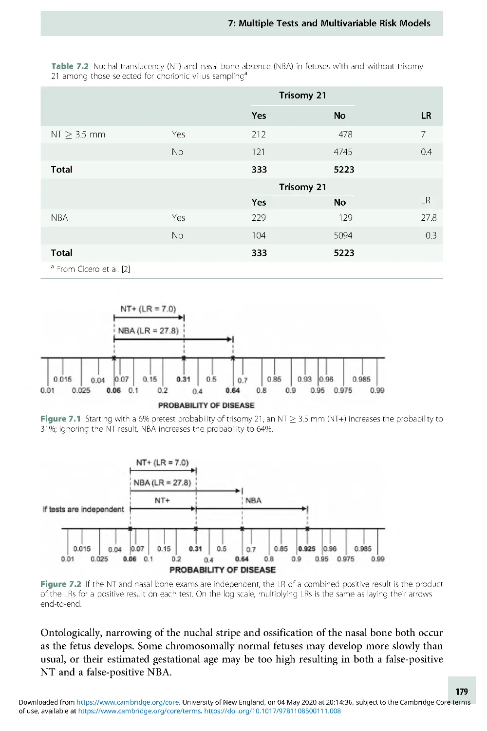
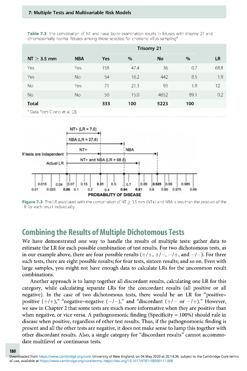
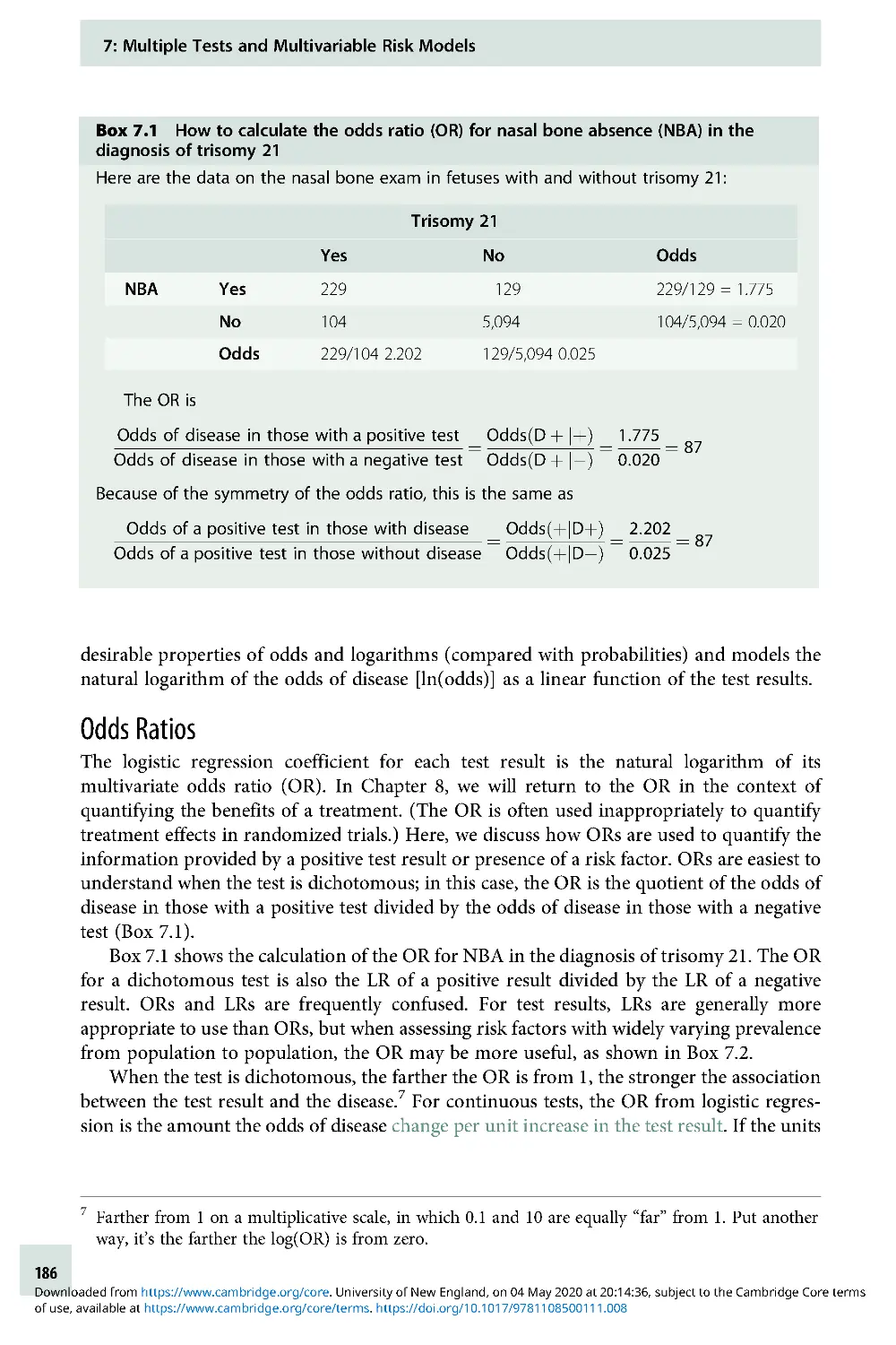
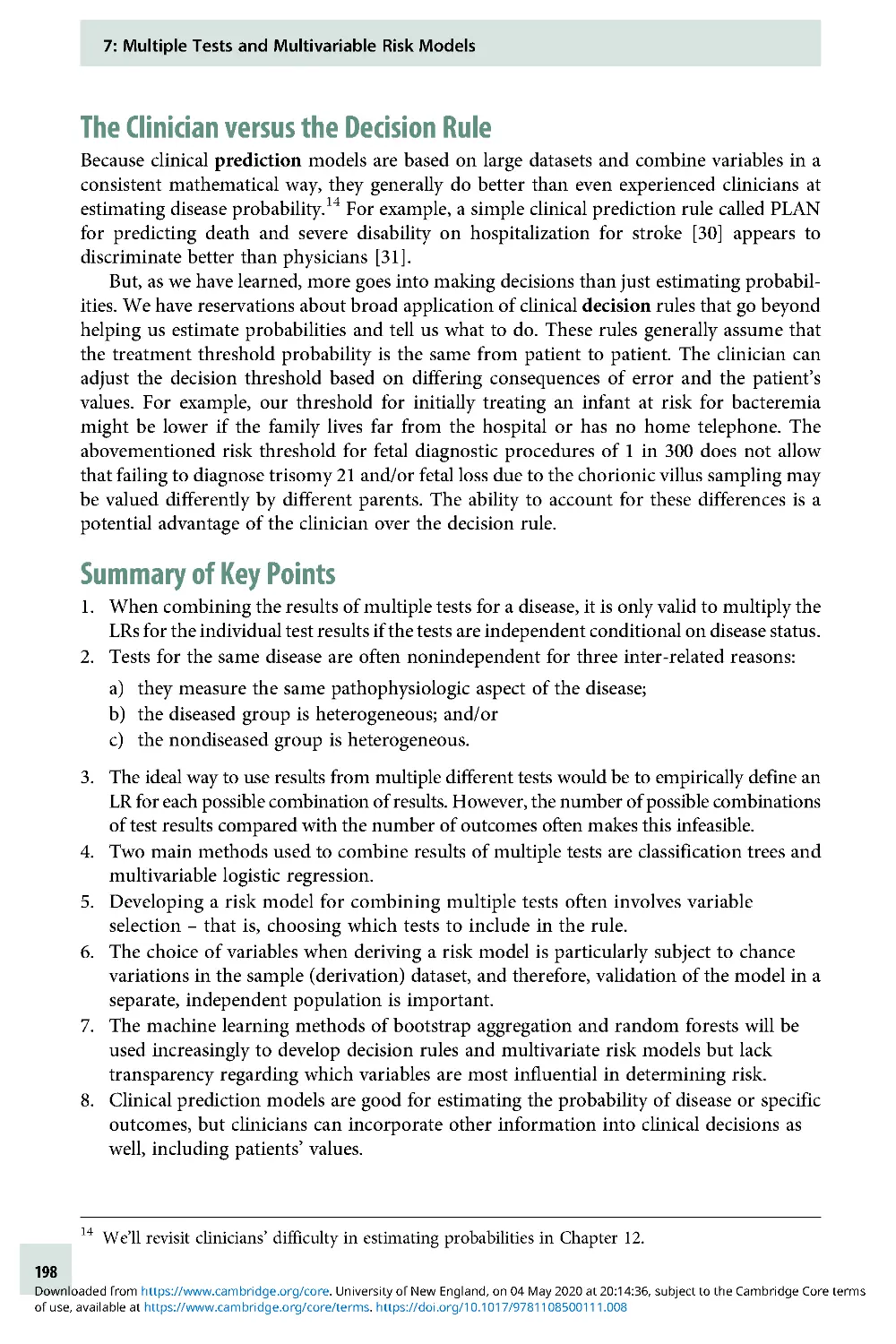
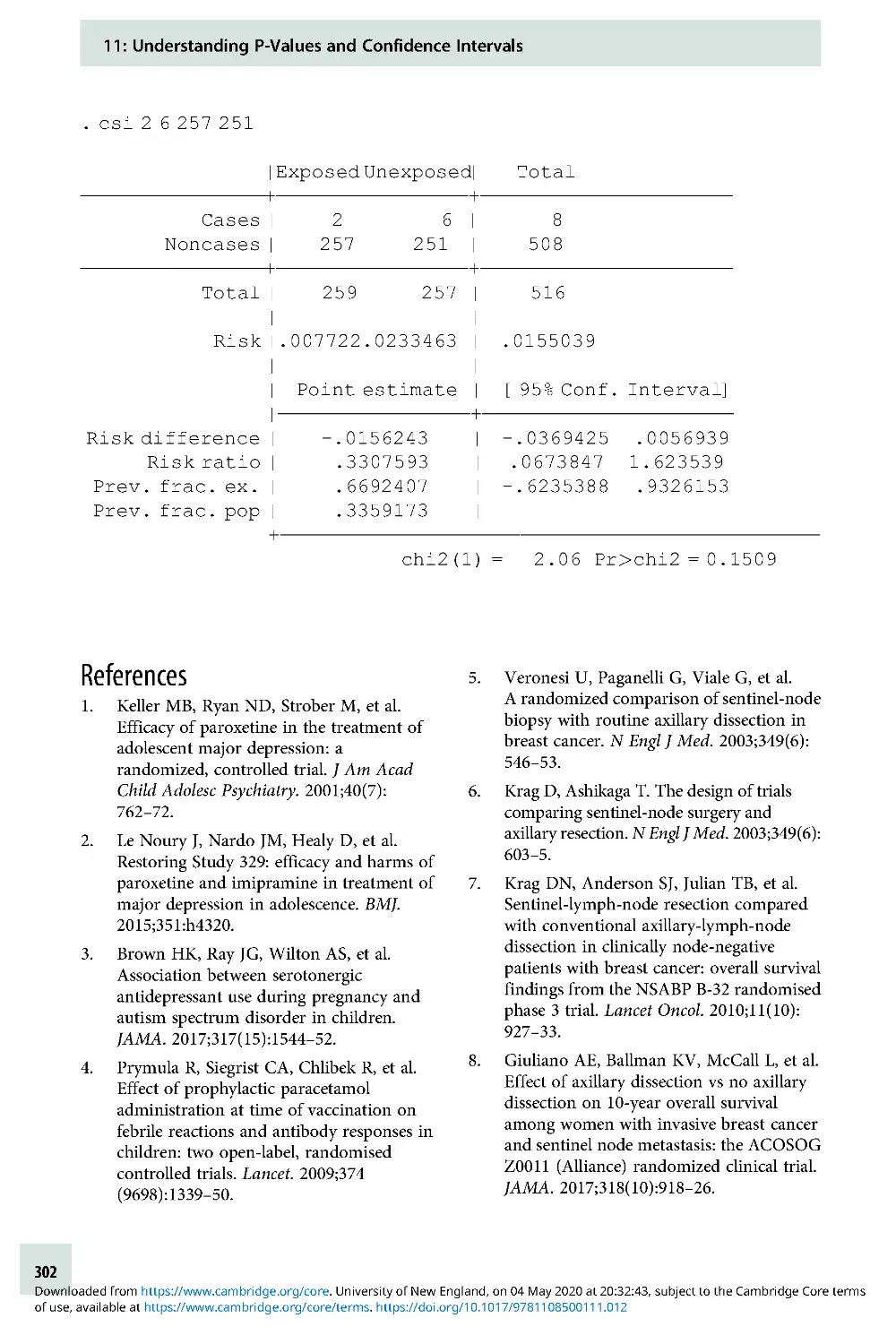
/


Text
Cambridge University Press
978-1-108-43671-7 — Evidence-Based Diagnosis
2nd Edition
Frontmatter
More Information
www.cambridge.org
© in this web service Cambridge University Press
Evidence-Based Diagnosis
Cambridge University Press
978-1-108-43671-7 — Evidence-Based Diagnosis
2nd Edition
Frontmatter
More Information
www.cambridge.org
© in this web service Cambridge University Press
Cambridge University Press
978-1-108-43671-7 — Evidence-Based Diagnosis
2nd Edition
Frontmatter
More Information
www.cambridge.org
© in this web service Cambridge University Press
Evidence-Based
Diagnosis
An Introduction to Clinical Epidemiology
Second Edition
Thomas B. Newman MD, MPH
University of California, San Francisco
Michael A. Kohn MD, MPP
University of California, San Francisco
Illustrations by Martina A. Steurer
University of California, San Francisco
Cambridge University Press
978-1-108-43671-7 — Evidence-Based Diagnosis
2nd Edition
Frontmatter
More Information
www.cambridge.org
© in this web service Cambridge University Press
University Printing House, Cambridge CB2 8BS, United Kingdom
One Liber ty Plaza, 20th Floor, New York, NY 10006, USA
477 Williamstown Road, Port Melbourne, VIC 3207, Australia
314–321, 3rd Floor, Plot 3, Splendor Forum, Jasola District Centre,
New Delhi – 110025 , India
79 Anson Road, #06–04/06, Singapore 079906
Cambridge University Press is part of the University of Cambridge.
It furthers the University’s mission by disseminating knowledge in the
pursuit of education, learning, and research at the highest international levels
of excellence.
www.cambridge.org
Information on this title: www.cambridge.org/9781108436717
DOI: 10.1017/9781108500111
First edition © Thomas B. Newm an and Michael A. Kohn 2009
Second edition © Cambridge University Press 2020
This publication is in copyright. Subject to statutory exception
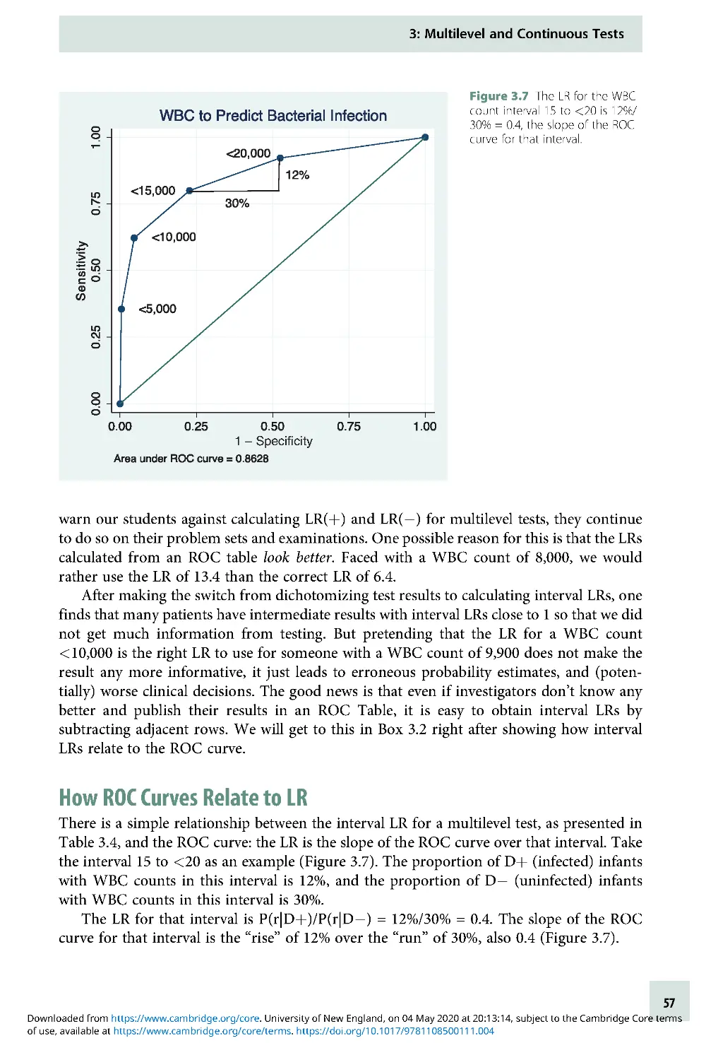
and to the provisions of relevant collective licensing agreements,
no reproduction of any part may take place without the written
permission of Cambridge University Press.
First published 2009
This edition 2020
Printed in Singapore by Markono Print Media Pte Ltd
A catalogue record for this publication is available from the British Library.
Library of Congress Cataloging-in-Publication Data
Names: Newman, Thomas B., author. | Kohn, Michael A., author.
Title: Evidence-based diagnosis : an introduction to clinical
epidemiology / Thomas B. Newman, Michael A. Kohn.
Description: Second edition. | Cambridge ; New York : Cambridge University
Press, 2019. | Includes bibliographical references and index.
Identifiers: LCCN 2019038304 (print) | LCCN 2019038305 (ebook) |
ISBN 9781108436717 (paperback) | ISBN 9781108500111 (epub)
Subjects: MESH: Diagnostic Techniques and Procedures | Clinical Medicine–
methods | Evidence-Based Medicine | Problems and Exercises
Classification: LCC RC71.3 (print) | LCC RC71.3 (ebook) |
NLM WB 18.2 | DDC 616.07/5–dc23
LC record available at https://lccn.lo c.gov/2019038304
LC ebook record available at https://lccn.loc.gov/2019038305
ISBN 978-1 -108 -43671-7 Paperback
Cambridge University Press has no responsibility for the persistence or
accuracy of URLs for external or third-party internet websites referred to in
this publication and does not guarantee that any content on such websites is,
or will remain, accurate or appropriate.
..................................................................
Every effort has been made in preparing this book to provide accurate and
up-to-date information that is in accord with accepted standards and practice
at the time of publication. Although case histories are drawn from actual
cases, every effort has been made to disguise the identities of the individuals
involved. Nevertheless, the authors, editors, and publishers can make no
warranties that the information contained herein is totally free from error,
not least because clinical standards are constantly changing through research
and regulation. The authors, editors, and publishers therefore disclaim all
liability for direct or consequent ial damages resulting from the use of
material contained in this book. Readers are strongly advised to pay careful
attention to information provided by the manufacturer of any drugs or
equipment that they plan to use.
Cambridge University Press
978-1-108-43671-7 — Evidence-Based Diagnosis
2nd Edition
Frontmatter
More Information
www.cambridge.org
© in this web service Cambridge University Press
Tom : I would like to thank my wife, Johannah, and
children, David and Rosie, for their support on the
long road that led to the publication of this book.
I dedicated the first edition to my parents, Ed and
Carol Newman, in whose honor I donated my share
of the royalties to Physicians for Social Responsibility
(PSR), in support of its efforts to rid the world of
nuclear weapons. There was good news on that front!
In 2017, ICAN, the International Coalition to Abolish
Nuclear Weapons (started by International Physicians
for the Prevention of Nuclear War, of which PSR is
the US affiliate), won the Nobel Peace Prize for its
successful work on a United Nations Nuclear
Weapons Ban Treaty! But much work remains to be
done, so I reaffirm my commitment to donate all of
my royalties to PSR, in memory of my late parents.
Michael: I again thank my wife, Caroline, and
children, Emily, Jake, and Kenneth, and dedicate this
book to my mother, Jean Kohn, MD, MPH, and my
late father, Martin Kohn, MD.
Martina: I would like to thank Tom Newman and
Michael Kohn for letting me be part of this journey,
and my husband Marc for his support and patience
when I was buried behind the computer, designing
the figures. I dedicate this book to my parents,
Suzanne and Thomas Mueller.
This book is a labor of love. Let us know how you
like it!
In solidarity,
Tom, Michael, and Martina
Cambridge University Press
978-1-108-43671-7 — Evidence-Based Diagnosis
2nd Edition
Frontmatter
More Information
www.cambridge.org
© in this web service Cambridge University Press
Cambridge University Press
978-1-108-43671-7 — Evidence-Based Diagnosis
2nd Edition
Frontmatter
More Information
www.cambridge.org
© in this web service Cambridge University Press
Contents
Preface ix
Acknowledgments x
1 Introduction: Understanding
Diagnosis and Evidence-Based
Diagnosis 1
2 Dichotomous Tests 8
3 Multilevel and Continuous Tests 47
4 Critical Appraisal of Studies of
Diagnostic Test Accuracy 75
5 Reliability and
Measurement Error 110
6 Risk Predictions 144
7 Multiple Tests and Multivariable
Risk Models 175
8 Quantifying Treatment Effects Using
Randomized Trials 205
9 Alternatives to Randomized Trials
for Estimating Treatment
Effects 231
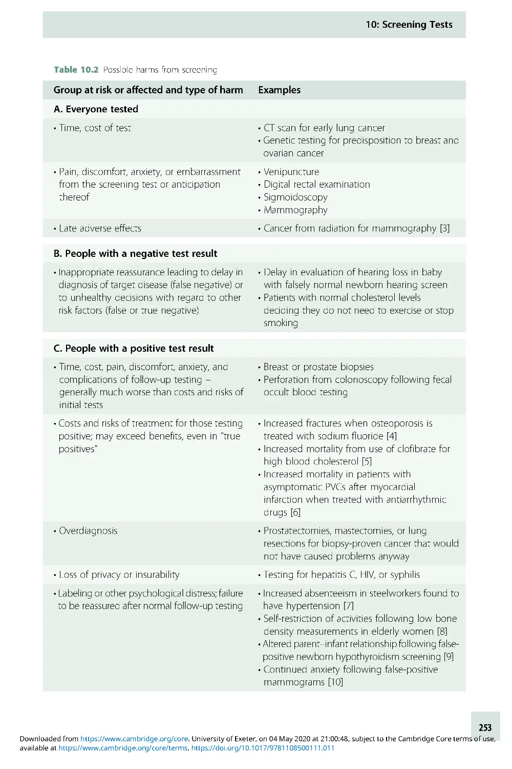
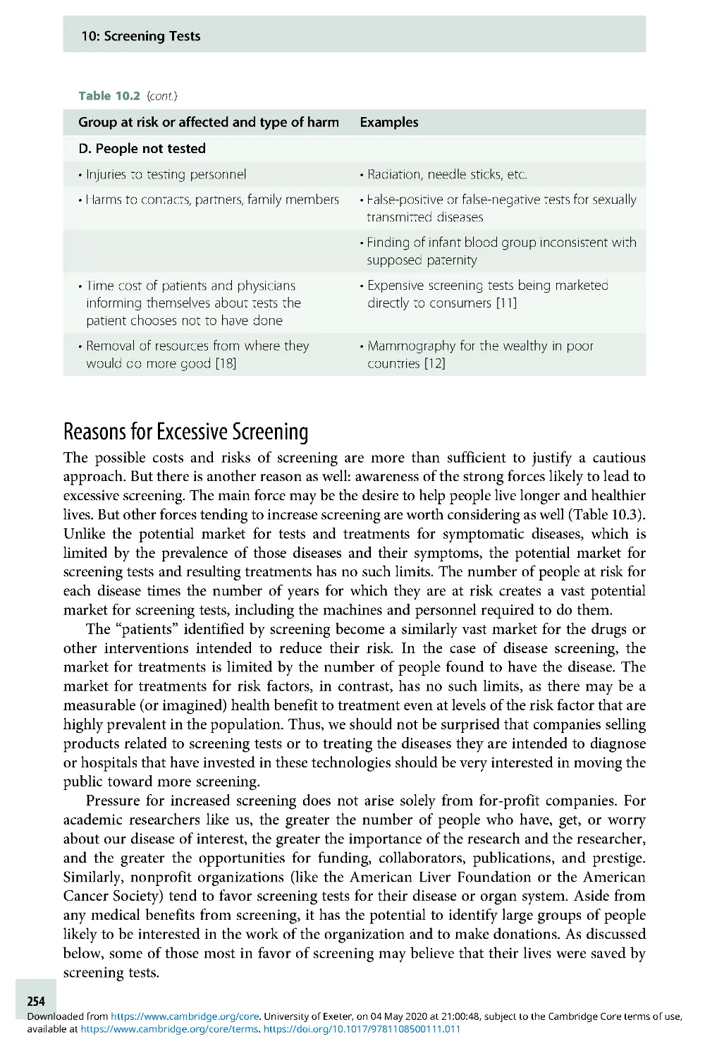
10 Screening Tests 250
11 Understanding P-Values and
Confidence Intervals 280
12 Challenges for Evidence-Based
Diagnosis 303
Answers to Problems 318
Index 357
vii
Cambridge University Press
978-1-108-43671-7 — Evidence-Based Diagnosis
2nd Edition
Frontmatter
More Information
www.cambridge.org
© in this web service Cambridge University Press
Cambridge University Press
978-1-108-43671-7 — Evidence-Based Diagnosis
2nd Edition
Frontmatter
More Information
www.cambridge.org
© in this web service Cambridge University Press
Preface
This is a book about diagnostic testing. It is aimed primarily at clinicians, particularly those
who are academically minded, but it should be helpful and accessible to anyone involved
with selection, development, or marketing of diagnostic, screening, or prognostic tests.
Although we admit to a love of mathematics, we have restrained ourselves and kept the
math to a minimum – a little simple algebra and only three Greek letters, κ (kappa), α
(alpha), and β (beta). Nonetheless, quantitative discussions in this book go deeper and are
more rigorous than those typically found in introductory clinical epidemiology or evidence-
based medicine texts.
Our perspective is that of skeptical consumers of tests. We want to make proper
diagnoses and not miss treatable diseases. Yet, we are aware that vast resources are spent
on tests that too frequently provide wrong answers or right answers of little value, and that
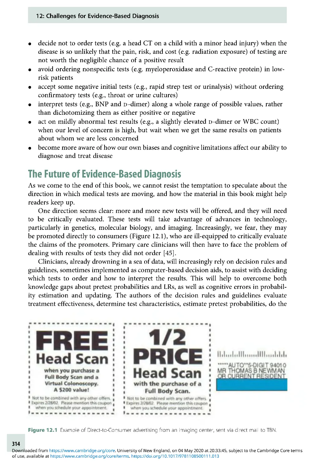
new tests are being developed, marketed, and sold all the time, sometimes with little or no
demonstrable or projected benefit to patients. This book is intended to provide readers with
the tools they need to evaluate these tests, to decide if and when they are worth doing, and to
interpret the results.
The pedagogical approach comes from years of teaching this material to physicians,
mostly fellows and junior faculty in a clinical research training program. We have found
that many doctors, including the two of us, can be impatient when it comes to classroom
learning. We like to be shown that the material is important and that it will help us take
better care of our patients, understand the literature, and/or improve our research. For this
reason, in this book we emphasize real-life examples.
Although this is primarily a book about diagnosis, two of the twelve chapters are about
evaluating treatments – using both randomized trials (Chapter 8) and observational studies
(Chapter 9). The reason is that evidence-based diagnosis requires being able to quantify not
only the information that tests provide but also the value of that information – how it
should affect treatment decisions and how those decisions will affect patients’ health. For
this last task we need to be able to quantify the effects of treatments on outcomes. Other
reasons for including the material about treatments, which also apply to the material about
P-values and confidence intervals in Chapter 11, are that we love to teach it, have lots of
good examples, and are able to focus on material neglected (or even wrong) in other books.
The biggest change in this second edition is the addition of color and new illustrations
by Dr. Martina Steurer, a graphic artist who also is a neonatologist and pediatric intensivist.
Martina, a 2012 alumna of the clinical epidemiology course for which this book is the
prescribed text, joined the teaching team of this course in 2015. We hope you will find this
edition as visually pleasing as it is intellectually satisfying.
As with the first edition, we include answers to all problems at the back of the book. We
will continue to share new ones on the book’s website (www.EBD-2 .net). The website also
features a virtual slide rule to help readers visualize the calculation of the posterior
probability of disease and an online tool that produces regret graphs like those in Chapters 2
and 3 to aid in visualizing the tradeoff between false-positives, false-negatives, and the cost
of a test. Take a look!
ix
Cambridge University Press
978-1-108-43671-7 — Evidence-Based Diagnosis
2nd Edition
Frontmatter
More Information
www.cambridge.org
© in this web service Cambridge University Press
Acknowledgments
This book started out as the syllabus for a course Tom first taught to Robert Wood Johnson
Clinical Scholars and UCSF Laboratory Medicine Residents beginning in 1991, based on the
now-classic textbook Clinical Epidemiology: A Basic Science for Clinical Medicine by Sackett,
Haynes, Guyatt, and Tugwell [1]. Although over the years our selection of and approach to
the material has diverged from theirs, we enthusiastically acknowledge their pioneering
work in this area.
We thank our colleagues in the Department of Epidemiology and Biostatistics, particu-
larly Dr. Stephen Hulley for his mentoring and Dr. Jeffrey Martin for his steadfast support.
We also thank our students, who have helped us develop ways of teaching this material that
work best and who have enthusiastically provided examples from their own clinical areas
that illustrate the material we teach. Many of the problems we have added to the book began
as problems submitted by students as part of our annual final examination problem-writing
contest. (Their names appear with the problem titles.) We particularly thank the students
who took Epi 204 in 2017 and 2018 and made suggestions on chapter drafts or problems for
this second edition.
Reference
1. Sackett D, Haynes RB, Guyatt GH, Tugwell P. Clinical epidemiology: a basic science for clinical
medicine. Boston: Little, Brown and Company; 1991.
x
Chapter
1
Introduction
Understanding Diagnosis and
Evidence-Based Diagnosis
Diagnosis
When we think about diagnosis, most of us think about a sick person going to the health-care
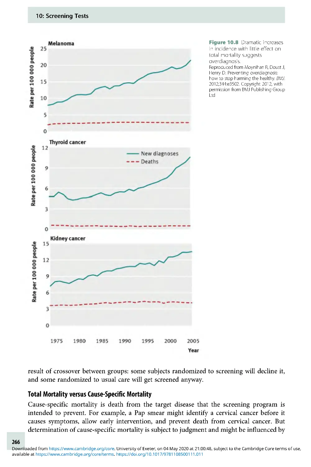
provider with a collection of signs and symptoms ofillness.Theprovider, perhaps with the help
of some tests, names the disease and tells the patient if and how it can be treated. The cognitive
process of diagnosis involves integrating information from history, observation, exam, and
testing using a combination of knowledge, experience, pattern recognition, and intuition to
refine the possibilities. The key element of diagnosis is assigning a name to the patient’s illness,
not necessarily deciding about treatment. Just as we name a recognizably distinct animal,
vegetable, or mineral, we name a recognizably distinct disease, so we can talk about it and study it.
Associated with a disease name might be a pathophysiologic mechanism, histopatholo-
gic findings, a causative microorganism (if the disease is infectious), and one or more
treatments. But more than two millennia before any of these were available, asthma,
diabetes mellitus, gout, tuberculosis, leprosy, malaria, and many other diseases were
recognized as discrete named entities.
Although we now understand and treat diabetes and malaria better than the ancient
Greeks, we still diagnose infantile colic, autism, and fibromyalgia without really knowing
what they are. We have anything but a complete pathophysiologic understanding of
schizophrenia, amyotrophic lateral sclerosis, and rheumatoid arthritis, all diseases for which
treatment (at present) can only be supportive and symptomatic, not curative. Diagnosing a
disease with no specific treatment may still help the patient by providing an explanation for
what is happening and predicting the prognosis. It can benefit others by establishing the
level of infectiousness, helping to prevent the spread of disease, tracking the burden of
disease and the success of disease control efforts, discovering etiologies to prevent future
cases, and advancing medical science.
Assigning each illness a diagnosis is one way that we attempt to impose order on the
chaotic world of signs and symptoms. We group diagnoses into categories based on various
shared characteristics, including etiology, clinical picture, prognosis, mechanism of trans-
mission, and response to treatment. The trouble is that homogeneity with respect to one of
these characteristics does not imply homogeneity with respect to the others, so different
purposes of diagnosis can lead to different disease classification schemes.
For example, entities with different etiologies or different pathologies may have the
same treatment. If the goal is to make decisions about treatment, the etiology or pathology
may be irrelevant. Consider a child who presents with puffy eyes, excess fluid in the ankles,
and a large amount of protein in the urine – a classic presentation of the nephrotic
syndrome. In medical school, we dutifully learned how to classify nephrotic syndrome in
1
available at https://www.cambridge.org/core/terms. https://doi.org/10.1017/9781108500111.002
Downloaded from https://www.cambridge.org/core. University of Exeter, on 04 May 2020 at 19:52:51, subject to the Cambridge Core terms of use,
children by the appearance of the kidney biopsy: there were minimal change disease, focal
segmental glomerulosclerosis, membranoproliferative glomerulonephritis, and so on.
“Nephrotic syndrome,” our professors emphasized, was a syndrome, not a diagnosis; a
kidney biopsy to determine the type of nephrotic syndrome was felt to be necessary.
However, minimal change disease and focal segmental glomerulosclerosis make up the
overwhelming majority of nephrotic syndrome cases in children, and both are treated with
corticosteroids. So, although a kidney biopsy would provide prognostic information,
current recommendations suggest skipping the biopsy initially, starting steroids, and then
doing the biopsy later (if at all), only if the symptoms fail to respond or frequent relapses
occur. Thus, if the purpose of making the diagnosis is to guide treatment, the pathologic
classification that we learned in medical school is usually irrelevant. Instead, nephrotic
syndrome is classified as steroid-responsive or nonresponsive and relapsing or non-
relapsing. If, as is usually the case, it is steroid-responsive and non-relapsing, we will never
know whether it was minimal change disease or focal segmental glomerulosclerosis, because
it is not worth doing a kidney biopsy to find out.
There are many similar examples where, at least at some point in an illness, an exact
diagnosis is unnecessary to guide treatment. We have sometimes been amused by the
number of Latin names that exist for certain similar skin conditions, all of which
are treated with topical steroids, which makes distinguishing between them rarely
necessary from a treatment standpoint. And, although it is sometimes interesting for an
emergency physician to determine which knee ligament is torn, “acute ligamentous knee
injury” is a perfectly adequate emergency department diagnosis because the treatment is
immobilization, ice, analgesia, and orthopedic follow-up, regardless of the specific ligament
injured.
Disease classification systems sometimes have to expand as treatment improves. Before
the days of chemotherapy, a pale child with a large number of blasts (very immature white
blood cells) on the peripheral blood smear could be diagnosed simply with leukemia. That
was enough to determine the treatment (supportive) and the prognosis (grim) without any
additional tests. Now, there are many different types of leukemia based, in part, on cell
surface markers, each with a specific prognosis and treatment schedule. The classification
based on cell surface markers has no inherent value; it is valuable only because careful
studies have shown that these markers predict prognosis and response to treatment.
For evidence-based diagnosis, the main subject of this book, we move away from
discussions about how to classify and name illnesses toward the process of estimating
disease probabilities and quantifying treatment effects to aid with specific clinical decisions.
Evidence-Based Diagnosis
The term “Evidence-based Medicine” (EBM) was coined by Gordon Guyatt around 1992, [1]
building on work by David Sackett and colleagues at McMaster University, David Eddy [2],
and others [3]. Guyatt et al. characterized EBM as a new scientific paradigm of the sort
described in Thomas Kuhn’s1962bookThe Structure of Scientific Revolutions [1, 4].
Although not everyone agrees that EBM, “which involves using the medical literature more
effectively in guiding medical practice,” is profound enough to constitute a “paradigm shift,”
we believe the move from eminence-based medicine [5] has been a significant advance.
Oversimplifying greatly, EBM involves learning how to use the best available evidence in
two related areas:
1: Introduction: Understanding Diagnosis and Evidence-Based Diagnosis
2
available at https://www.cambridge.org/core/terms. https://doi.org/10.1017/9781108500111.002
Downloaded from https://www.cambridge.org/core. University of Exeter, on 04 May 2020 at 19:52:51, subject to the Cambridge Core terms of use,
Estimating disease probabilities: How to evaluate new information, especially a test
result, and then use it to refine the probability that a patient has (or will develop) a given
disease.
Quantifying treatment effects: How to determine whether a treatment is beneficial in
patients with (or at risk for) a given disease, and if so, whether the benefits outweigh the
costs and risks.
These two areas are closely related. Although a definitive diagnosis can be useful for
prognosis, epidemiologic tracking, and scientific study, in many cases, we may make
treatment decisions based on the probability of disease. It may not be worth the costs and
risks of testing to diagnose a disease that has no effective treatment. Even if an effective
treatment exists, there are probabilities of the disease so low that it’s not worth testing or so
high that it’s worth treating without testing. How low or high these probabilities need to be
to forgo testing depends on not only the cost and accuracy of the test but also the costs,
risks, and effectiveness of the treatment. As suggested by the title, this book focuses more
intensively on the probability estimation (diagnosis) area of EBM, but it also covers
quantification of the benefits and harms of treatments as well as evaluation of screening
programs in which testing and treatment are impossible to separate.
Estimating Disease Probabilities
While diagnosis is the process of naming a disease, testing can be thought of as the process
of obtaining additional information to refine disease probabilities. While most of our
examples will involve laboratory or imaging tests that cost money or have risks, for which
the stakes are higher, the underlying process of obtaining information to refine disease
probability is the same for elements of the history and physical examination as it is for
blood tests, scans, and biopsies.
How does new information alter disease probabilities? The key is that the distribution of
test results, exam findings, or answers to history questions must vary depending on the
underlying diagnosis. To the extent that a test or question gives results that are more likely
with condition A than condition B, our estimate of the probability of condition A must rise
in comparison to that of condition B. The mathematics behind this updating of probabil-
ities, derived by the eighteenth-century English minister Thomas Bayes, is a key component
of evidence-based diagnosis, and one of the most fun parts of this book.
Quantifying Treatment Effects
The main reason for doing tests is to guide treatment decisions. The value of a test depends
on its accuracy, costs, and risks; but it also depends on the benefits and harms of the
treatment under consideration. One way to estimate a treatment’s effect is to randomize
patients with the same condition to receive or not to receive the treatment and compare the
outcomes. If the treatment’s purpose is to prevent a bad outcome, we can subtract the
proportion with the outcome in the treated group from the proportion with the outcome in
the control group. This absolute risk reduction (ARR) and its inverse, the number needed to
treat (NNT), can be useful measures of the treatment’s effect. We will cover these random-
ized trials at length in Chapter 8. If randomization is unethical or impractical, we can still
compare treated to untreated patients, but we must address the possibility that there are
other differences between the two groups –an interesting topic we will discuss in Chapter 9.
1: Introduction: Understanding Diagnosis and Evidence-Based Diagnosis
3
available at https://www.cambridge.org/core/terms. https://doi.org/10.1017/9781108500111.002
Downloaded from https://www.cambridge.org/core. University of Exeter, on 04 May 2020 at 19:52:51, subject to the Cambridge Core terms of use,
Dichotomous Disease State (Dþ/D): A Convenient
Oversimplification
Most discussions of diagnostic testing, including this one, simplify the problem of diagnosis
by assuming a dichotomy between those with a particular disease and those without the
disease. The patients with disease, that is, with a positive diagnosis, are denoted “Dþ,” and
the patients without the disease are denoted “D . ” This is an oversimplification for two
reasons. First, there is usually a spectrum of disease. Some patients we label Dþ have mild
or early disease, and other patients have severe or advanced disease; so instead of Dþ,we
could have Dþ,Dþþ, and Dþþþ. Second, there also is usually a spectrum of nondisease
(D) that includes other diseases as well as varying states of health. Thus, for symptomatic
patients, instead of Dþ and D, we should have D1, D2, and D3, each potentially at varying
levels of severity, and for asymptomatic patients, we will have D as well.
For example, a patient with prostate cancer might have early, localized cancer or widely
metastatic cancer. A test for prostate cancer, the prostate-specific antigen, is much more
likely to be positive in the case of metastatic cancer. Further, consider a patient with acute
headache due to subarachnoid hemorrhage (bleeding around the brain). The hemorrhage
may be extensive and easily identified by computed tomography scanning, or it might be a
small “sentinel bleed,” unlikely to be identified by computed tomography and identifiable
only by lumbar puncture (spinal tap).
Even in patients who do not have the disease in question, a multiplicity of potential
conditions of interest may exist. Consider a young woman with lower abdominal pain and a
positive urine pregnancy test. The primary concern is an ectopic (outside the uterus) pregnancy.
One test commonly used in these patients, the β-human chorionic gonadotropin (β-HCG), is
lower in women with ectopic pregnancies than in women with normal pregnancies. However,
the β-HCG, is often also low in patients with abnormal intrauterine pregnancies [6].
Thus, dichotomizing disease states can get us into trouble because the composition of
the Dþ group (which includes patients with differing severity of disease) as well as the
D group (which includes patients with differing distributions of other conditions) can
vary from one study and one clinical situation to another. This, of course, will affect results
of measurements that we make on these groups (like the distribution of prostate-specific
antigen results in men with prostate cancer or of β-HCG results in women who do not have
ectopic pregnancies). So, although we will generally assume that we are testing for the
presence or absence of a single disease and can therefore use the Dþ/D shorthand, we will
occasionally point out the limitations of this assumption.
Generic Decision Problem: Examples
We will start out by considering an oversimplified, generic medical decision problem in
which the patient either has the disease (Dþ) or does not have the disease (D). If he has
the disease, there is a quantifiable benefit to treatment. If he does not have the disease, there
is an equally quantifiable cost associated with treating unnecessarily. A single test is under
consideration. The test, although not perfect, provides information on whether the patient
is Dþ or D . The test has two or more possible results with different distributions in Dþ
individuals than in D individuals. The test itself has an associated cost.
Here are several examples of the sorts of clinical scenarios that material covered in this
book will help you understand better. In each scenario, the decision to be made includes
1: Introduction: Understanding Diagnosis and Evidence-Based Diagnosis
4
available at https://www.cambridge.org/core/terms. https://doi.org/10.1017/9781108500111.002
Downloaded from https://www.cambridge.org/core. University of Exeter, on 04 May 2020 at 19:52:51, subject to the Cambridge Core terms of use,
whether to treat without testing, to do the test and treat based on the results,ortoneither
test nor treat. We will refer to these scenarios throughout the book.
Clinical Scenario #1: Sore Throat
A 24-year-old graduate student presents with a sore throat and fever that has lasted for 1 day.
She has a temperature of 39°C, pus on her tonsils, and tender lymph nodes in her anterior
neck.
Disease in question: Strep throat
Test being considered: Rapid antigen detection test for group A streptococcus
Treatment decision: Whether to prescribe penicillin
Clinical Scenario #2: At-Risk Newborn
A 6-hour-old term baby born to a mother who had a fever of 38.7°C is noted to be breathing a
little fast (respiratory rate 66). You are concerned about a bacterial infection in the blood,
which would require treatment as soon as possible with intravenous antibiotics. You can wait
an hour for the results of a white blood cell count and differential, but you need to make a
decision before getting the results of the more definitive blood culture, which must incubate
for many hours before a result is available.
Disease in question: Bacteria in the blood (bacteremia)
Test being considered: White blood cell count
Treatment decision: Whether to transfer to the neonatal intensive care unit for intravenous
antibiotics
Clinical Scenario #3: Screening Mammography
A 45-year-old economics professor from a local university wants to know whether she should
get screening mammography. She has not detected any lumps on breast self-examination.
A positive screening mammogram would be followed by further testing, possibly including
biopsy of the breast.
Disease in question: Breast cancer
Test being considered: Mammogram
Treatment decision: Whether to pursue further evaluation for breast cancer
Clinical Scenario #4: Sonographic Screening for Fetal Chromosomal Abnormalities
In late first-trimester pregnancies, fetal chromosomal abnormalities can be identified defini-
tively using chorionic villus sampling (CVS). CVS entails a small risk of accidentally terminating
the pregnancy. Chromosomally abnormal fetuses tend to have larger nuchal translucencies (a
measurement of fluid at the back of the fetal neck), absence of the nasal bone, or other
structural abnormalities on 13-week ultrasound, which is a noninvasive test. A government
perinatal screening program faces the question of who should receive the screening ultra-
sound examination and what combination of nuchal translucency, nasal bone examination,
and other findings should prompt CVS.
1
Disease in question: Fetal chromosomal abnormalities
Test being considered: Prenatal ultrasound
Treatment decision: Whether to do the definitive diagnostic test, chorionic villus sampling
(CVS)
1
A government program would also consider the results of blood tests (serum markers).
1: Introduction: Understanding Diagnosis and Evidence-Based Diagnosis
5
available at https://www.cambridge.org/core/terms. https://doi.org/10.1017/9781108500111.002
Downloaded from https://www.cambridge.org/core. University of Exeter, on 04 May 2020 at 19:52:51, subject to the Cambridge Core terms of use,
Preview of Coming Attractions
In Chapters 2, 3, and 4 of this book, we will focus on testing to diagnose prevalent (existing)
disease in symptomatic patients. In Chapter 5, we will cover test reproducibility, then in
Chapter 6, we will move to risk prediction: estimating the probability of incident outcomes
(like heart attack, stroke, or death) that are not yet present at the time of the test. In
Chapter 7, we will cover combining results from multiple tests. Throughout, we will focus
on using tests to guide treatment decisions, which means that the disease (or outcome)
under consideration can be treated (or prevented) and, under at least some conditions, the
benefits of treatment outweigh the harms. Chapters 8 and 9 are about quantifying these
benefits and harms. Chapter 10 covers studies of screening programs, which combine
testing of patients not already known to be sick with early intervention in an attempt to
improve outcomes. Chapter 11 covers the parallels between statistical testing and diagnostic
testing, and Chapter 12 covers challenges for evidence-based diagnosis and returns to the
complex cognitive task of diagnosis, especially the errors to which it is prone.
Summary of Key Points
1. The real meaning of the word “diagnosis” is naming the disease that is causing a
patient’s illness.
2. This book is primarily about the evidence-based evaluation and use of medical tests to
guide treatment decisions.
3. Tests provide information about the likelihood of different diseases when the
distribution of test results differs between those who do and do not have each disease.
4. Using a test to guide treatment requires knowing the benefits and harms of treatment, so
we will also discuss how to estimate these quantities.
References
1. Evidence-Based Medicine Working Group.
Evidence-based medicine. A new approach
to teaching the practice of medicine. JAMA.
1992;268(17):2420–5 .
2. Eddy DM. The origins of evidence-
based medicine – apersonal
perspective.VirtualMentor. 2011;13(1):55–60.
3. Smith R and Rennie D. Evidence based
medicine – an oral history. BMJ. 2014;348:
g371.
4. Kuhn TS. The structure of scientific
revolutions. Chicago: University of Chicago
Press;1962. xv, 172pp.
5. Isaacs D and Fitzgerald D. Seven
alternatives to evidence based medicine.
BMJ. 1999;319(7225):1618.
6. Kohn MA, Kerr K, Malkevich D, et al.
Beta-human chorionic gonadotropin
levels and the likelihood of ectopic
pregnancy in emergency department
patients with abdominal pain or vaginal
bleeding. Acad Emerg Med. 2003;10
(2):119–26 .
Problems
1.1 Rotavirus testing
In children with apparent viral gastroenteritis
(vomiting and diarrhea), clinicians some-
times order or perform a rapid detection test
of the stool for rotavirus. No specific antiviral
therapy for rotavirus is available, but rota-
virus is the most common cause of hospital-
acquired diarrhea in children and is an
important cause of acute gastroenteritis in
children attending childcare. A rotavirus vac-
cine is recommended by the CDC’sAdvisory
Committee on Immunization Practices.
Under what circumstances would it be worth
1: Introduction: Understanding Diagnosis and Evidence-Based Diagnosis
6
available at https://www.cambridge.org/core/terms. https://doi.org/10.1017/9781108500111.002
Downloaded from https://www.cambridge.org/core. University of Exeter, on 04 May 2020 at 19:52:51, subject to the Cambridge Core terms of use,
doing a rotavirus test in a child with apparent
viral gastroenteritis?
1.2 Probiotics for Colic
Randomized trials suggest that breastfed new-
borns with colic may benefit from the probio-
tic Lactobacillis reuteri [1]. Colic in these
studies (and in textbooks) is generally defined
as crying at least 3 hours per day at least three
times a week in an otherwise well infant [2].
You are seeing a distressed mother of a breast-
fed 5-week-old who cries inconsolably for
about 1–2 hours daily. Your physical examin-
ation is normal. Does this child have colic?
Would you offer a trial of Lactobacillis reuteri?
1.3 Malignant Pleural Effusion in an old
man
An 89-year-old man presents with weight loss
for 2 months and worsening shortness of
breath for 2 weeks. An x-ray shows a left
pleural effusion (fluid around the lung). Tests
of that fluid removed with a needle (thora-
centesis) show undifferentiated carcinoma.
History, physical examination, routine
laboratory tests, and noninvasive imaging do
not disclose the primary cancer. Could “meta-
static undifferentiated carcinoma” be a suffi-
cient diagnosis or are additional studies
needed? Does your answer change if he has
late-stage Alzheimer’sdisease?
1.4 Axillary Node Dissection for Breast
Cancer Staging
In women with early-stage breast cancer, an
axillary lymph node dissection (ALND) to
determine whether the axillary (arm pit)
nodes are involved is commonly done for
staging. ALND involves a couple of days in
the hospital, and is often followed by some
degree of pain, swelling, and trouble moving
the arm on the dissected side. If the nodes
are positive, treatment is more aggressive.
However, an alternative to this type of
staging is to use a genetic test panel like
OncoTypeDX® to quantify the prognosis.
A woman whose two oncologists and tumor
board all said an ALND was essential for
staging (and therefore necessary) consulted
one of us after obtaining an OncoTypeDX
recurrence score of 7, indicating a low-risk
tumor. An excerpt of the report from her
test is pasted below:
Five-year recurrence or mortality risk (95%
CI) for OncoTypeDX score = 7, by treatment
and nodal involvement. (Numbers come
from post hoc stratification of subjects in
randomized trials comparing tamoxifen
alone to tamoxifen plus chemo.)
Assuming the OncoTypeDX report accur-
ately summarizes available evidence, do
you agree with her treating clinicians that
the ALND is essential? What would be
some reasons to do it or not do it?
References
1. Sung V, D’Amico F, Cabana MD, et al.
Lactobacillus reuteri to treat infant colic: a
meta-analysis. Pediatrics. 2018;141(1).
2. Benninga MA, Faure C, Hyman PE, et al.
Childhood functional gastrointestinal
disorders: neonate/toddler.
Gastroenterology. 2016 . doi: 10.1053/j.
gastro.2016 .02 .016 .
Number of nodes involved
(based on ALND)
Treatment
No
nodesþ
1–3
Nodesþ
4
Nodesþ
Tamoxifen 6%
(3%–
8%)
8% (4%–
15%)
19%
(11%–
33%)
Tamoxifen þ
Chemotherapy
11%
(7%–
17%)
25%
(16%–
37%)
1: Introduction: Understanding Diagnosis and Evidence-Based Diagnosis
7
available at https://www.cambridge.org/core/terms. https://doi.org/10.1017/9781108500111.002
Downloaded from https://www.cambridge.org/core. University of Exeter, on 04 May 2020 at 19:52:51, subject to the Cambridge Core terms of use,
Chapter
2
Dichotomous Tests
Introduction
For a test to be useful, it must be informative; that is, it must (at least some of the time) give
different results depending on what is going on. In Chapter 1, we said we would simplify (at
least initially) what is going on into just two homogeneous alternatives, Dþ and D . In this
chapter, we consider the simplest type of tests, dichotomous tests, which have only two
possible results (Tþ and T) .
While some tests are naturally dichotomous (e.g., a home pregnancy test), others
are often made dichotomous by assigning a cutoff to a continuous test result, as in
considering a white blood cell count >15,000 as “abnormal” in a patient with suspected
appendicitis.
1
With this simplification, we can quantify the informativeness of a test by its accuracy:
how often it gives the right answer. Of course, this requires that we have a “gold standard”
(also known as “reference standard”) against which to compare our test. Assuming such a
standard is available, there are four possible combinations of the test result and disease
state: two in which the test is right (true positive and true negative) and two in which it is
wrong (false positive and false negative; Box 2.1). Similarly, there are four subgroups of
patients in whom we can quantify the likelihood that the test will give the right answer:
those who do (Dþ) and do not (D) have the disease and those who test positive (Tþ)
and negative (T). These lead to our four commonly used metrics for evaluating
diagnostic test accuracy: sensitivity, specificity, positive predictive value, and negative
predictive value.
Definitions
Sensitivity, Specificity, Positive, and Negative Predictive Value
We will review these definitions using as anexampletheevaluationofarapidbedside
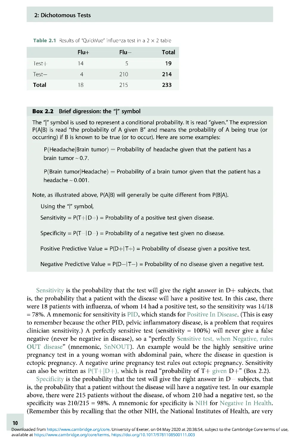
test for influenza virus reported by Poehling et al. [1]. Simplifying somewhat, the study
compared results of a rapid bedside test for influenza called QuickVue with the true
influenza status of children hospitalized with fever or respiratory symptoms. As the gold
1
We will show in Chapter 3 that making continuous and multilevel tests dichotomous is often a bad
idea.
8
available at https://www.cambridge.org/core/terms. https://doi.org/10.1017/9781108500111.003
Downloaded from https://www.cambridge.org/core. University of Exeter, on 04 May 2020 at 20:38:54, subject to the Cambridge Core terms of use,
standard for diagnosing influenza, the authors used either a positive viral culture or
two positive polymerase chain reaction tests. We present the data using just the
polymerase chain reaction test results as the gold standard. The results were as shown
in Table 2.1.
Box 2.1 Dichotomous tests: definitions
Sensitivity: the probability that the test will be positive in someone with the disease:
a/(a + c)
Mnemonics: PID = Positive In Disease; SnNOUT = Sensitive tests, when Negative, rule OUT
the disease
Specificity: the probability that the test will be negative in someone who does not
have the disease: d/(b + d)
Mnemonics: NIH = Negative In Health; SpPIN = Specific tests, when Positive, rule IN a disease
The following four parameters can be calculated from a 2 × 2 table only if there was cross-
sectional sampling:
2
Positive Predictive Value: the probability that a person with a positive test has the
disease: a/(a þ b).
Negative Predictive Value: the probability that a person with a negative test does
NOT have the disease: d/(c þ d).
Prevalence: the probability of disease in the entire population: (a þ c)/(a þ b þ c þ d).
Accuracy: the proportion of those tested in which the test gives the correct answer:
(aþd)/(aþbþcþd).
Disease þ
Disease
Total
Testþ
aba
þb
True positives
False positives
Total positives
Test
cdc
þd
False negatives
True negatives
Total negatives
Total
aþcb
þda
þbþcþd
Total with disease
Total without disease
Total N
2
The term “cross-sectional” is potentially confusing because it is used two ways in epidemiology. The
meaning here relates to sampling and implies that Dþ,D,Tþ, and T subjects are all included in
numbers proportional to their occurrence in the population of interest. The other use of the term
relates to the time frame of the study, when it means predictor and outcome variables are measured
at about the same time, in contrast to longitudinal studies, in which measurements are made at more
than one point in time.
2: Dichotomous Tests
9
available at https://www.cambridge.org/core/terms. https://doi.org/10.1017/9781108500111.003
Downloaded from https://www.cambridge.org/core. University of Exeter, on 04 May 2020 at 20:38:54, subject to the Cambridge Core terms of use,
Sensitivity is the probability that the test will give the right answer in Dþ subjects, that
is, the probability that a patient with the disease will have a positive test. In this case, there
were 18 patients with influenza, of whom 14 had a positive test, so the sensitivity was 14/18
= 78%. A mnemonic for sensitivity is PID, which stands for Positive In Disease. (This is easy
to remember because the other PID, pelvic inflammatory disease, is a problem that requires
clinician sensitivity.) A perfectly sensitive test (sensitivity = 100%) will never give a false
negative (never be negative in disease), so a “perfectly Sensitive test, when Negative, rules
OUT disease” (mnemonic, SnNOUT). An example would be the highly sensitive urine
pregnancy test in a young woman with abdominal pain, where the disease in question is
ectopic pregnancy. A negative urine pregnancy test rules out ectopic pregnancy. Sensitivity
can also be written as P(Tþ|Dþ), which is read “probability of Tþ given Dþ” (Box 2.2).
Specificity is the probability that the test will give the right answer in D subjects, that
is, the probability that a patient without the disease will have a negative test. In our example
above, there were 215 patients without the disease, of whom 210 had a negative test, so the
specificity was 210/215 = 98%. A mnemonic for specificity is NIH for Negative In Health.
(Remember this by recalling that the other NIH, the National Institutes of Health, are very
Table 2.1 Results of “QuickVue” influenza test in a 2 × 2 table
Flu+
Flu
Total
Testþ
14
5
19
Test
4
210
214
Total
18
215
233
Box 2.2 Brief digression: the “|” symbol
The “|” symbol is used to represent a conditional probability. It is read “given.” The expression
P(A|B) is read “the probability of A given B” and means the probability of A being true (or
occurring) if B is known to be true (or to occur). Here are some examples:
P HeadachejBrain tumor
ðÞ
1⁄4
Probability of headache given that the patient has a
brain tumor e 0:7:
P Brain tumorjHeadache
ðÞ
1⁄4
Probability of a brain tumor given that the patient has a
headache e 0:001:
Note, as illustrated above, P(A|B) will generally be quite different from P(B|A).
Using the “|” symbol,
Sensitivity = P(Tþ| Dþ) = Probability of a positive test given disease.
Specificity = P(T| D) = Probability of a negative test given no disease.
Positive Predictive Value = P(Dþ| Tþ) = Probability of disease given a positive test.
Negative Predictive Value = P(D| T) = Probability of no disease given a negative test.
2: Dichotomous Tests
10
available at https://www.cambridge.org/core/terms. https://doi.org/10.1017/9781108500111.003
Downloaded from https://www.cambridge.org/core. University of Exeter, on 04 May 2020 at 20:38:54, subject to the Cambridge Core terms of use,
specific in their requirements on grant applications.) A perfectly specific test (Specificity =
100%) will never give a false positive (never be positive in health), so a “perfectly Specific
test, when Positive, rules IN disease (SpPIN).” An example of this would be pathognomonic
findings, such as visualization of head lice, for that infestation or gram-negative diplococci
in a gram stain of the cerebrospinal fluid, for meningococcal meningitis. These findings are
highly specific; they never or almost never occur in patients without the disease, so their
presence rules in the disease. Note that, although NIH is a helpful way to remember
specificity, we want the test not just to be negative in health but we also want it to be
negative in everything that is not the disease being tested for, including other diseases that
may mimic it. Specificity = P(T|D) .
Positive predictive value is the probability that the test will give the right answer in
Tþ subjects, that is, the probability that a patient with a positive test has the disease. In
Table 2.1, there are 19 patients with a positive test, of whom 14 had the disease, so
the positive predictive value was 14/19 = 74%. This means that, in a population like
this one (hospitalized children with fever or respiratory symptoms), about three out
of four patients with a positive bedside test will have the flu. Positive predictive value =
P(Dþ|Tþ).
Negative predictive value is the probability that the test will give the right answer in
T subjects, that is, the probability that a patient with a negative test does not have the
disease. In Table 2.1, there were 214 patients with a negative test, of whom 210 did not
have the flu, so the negative predictive value was 210/214 = 98%. This means that, in a
population such as this one, the probability that a patient with a negative bedside test does
not have the flu is about 98%.
3
Negative predictive value = P(D|T). Another way to say
this is the probability that a patient with a negative test does have the flu is about 100%
98% = 2%.
Prevalence, Pretest Probability, Posttest Probability, and Accuracy
We need to define four additional terms.
Prevalence is the proportion of patients in the at-risk population who have the disease at
one point in time. It should not be confused with incidence, which is the proportion of the
at-risk population who get the disease over a period of time.InTable 2.1, there were
233 children hospitalized for fever or respiratory symptoms of whom 18 had the flu. In
this population, the prevalence of flu was 18/233 or 7.7%.
Prior probability (also called “pretest probability”) is the probability of having the
disease before the test result is known. It is closely related to prevalence; in fact, in our flu
example, they are the same. The main difference is that prevalence tends to be used when
referring to broader, sometimes nonclinical populations that may or may not receive any
further tests, whereas prior probability is used in the context of testing individuals, and may
differ from prevalence based on results of the history, physical examination, or other
laboratory tests done before the test being studied.
3
It is just a coincidence that the negative predictive value 210/215 and the specificity 210/214 both
round to 98%. As we shall see, the probability that a patient without the disease will have a negative
test (specificity) is not the same as the probability that a patient with a negative test does not have the
disease (negative predictive value).
2: Dichotomous Tests
11
available at https://www.cambridge.org/core/terms. https://doi.org/10.1017/9781108500111.003
Downloaded from https://www.cambridge.org/core. University of Exeter, on 04 May 2020 at 20:38:54, subject to the Cambridge Core terms of use,
Posterior probability (also called “posttest probability”) is the probability of having the
disease after the test result is known. In the case of a positive dichotomous test result, it is
the same as positive predictive value. In the case of a negative test result, posterior
probability is still the probability that the patient has the disease. Hence, it is 1 negative
predictive value. (The negative predictive value is the probability that the patient with a
negative test result does not have the disease.)
Accuracy has both general and more precise definitions. We have been using the term
“accuracy” in a general way to refer to how closely the test result agrees with the true disease
state as determined by the gold standard. The term accuracy also refers to a specific
numerical quantity: the percentage of all results that are correct. In other words, accuracy
is the sum of true positives and true negatives divided by the total number tested. Table 2.1
shows 14 true positives and 210 true negatives out of 233 tested. The accuracy is therefore
(14 þ 210)/233 = 96.1%.
Accuracy can be understood as a prevalence-weighted (or prior probability-weighted) –
weighted average of sensitivity and specificity:
Accuracy = Prevalence × sensitivity þ (1 prevalence) × specificity.
Although completeness requires that we provide this numerical definition of accuracy, it is
not a particularly useful quantity. Because of the weighting by prevalence, for all but very
common diseases, accuracy is mostly determined by specificity. Thus, a test for a rare
disease can have extremely high accuracy just by always coming out negative.
False-positive rate and false-negative rate can be confusing terms. The numerators for
these “rates” (which are actually proportions) are clear, but the denominators are
not (Box 2.3). The most common meaning of false-positive rate is 1 specificity or
P(Tþ|D) and the most common meaning of false-negative rate is 1 sensitivity
or P(T|Dþ).
Importance of the Sampling Scheme
It is not always possible to calculate prevalence and positive and negative predictive values
from a 2 × 2 table as we did above. Calculating prevalence, positive predictive value, and
negative predictive value from a 2 × 2 table generally requires sampling the Dþ and D
patients from a whole population, rather than sampling separately by disease status. This is
sometimes called cross-sectional (as opposed to case-control) sampling. A good way to
obtain such a sample is by consecutively enrolling eligible subjects at risk for the disease
before knowing whether or not they have it.
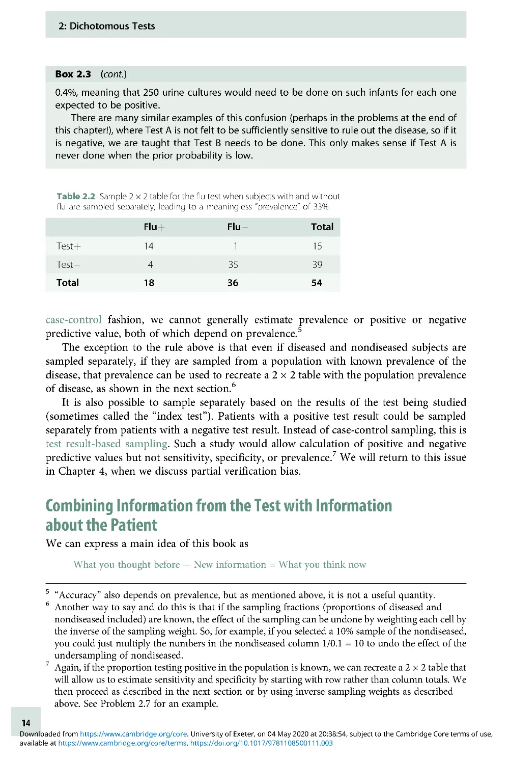
However, such cross-sectional or consecutive sampling may be inefficient. Sampling
diseased and nondiseased separately may increase efficiency, especially when the preva-
lence of disease is low, the test is expensive, and the gold standard is done on everyone.
What if this study had sampled children with and without flu separately (a case-control
sampling scheme) with two non-flu controls for each of the 18 patients with the flu, as in
Table 2.2?
We could still calculate the sensitivity as 14/18 = 78% and would estimate specificity as
35/36 = 97%, but calculating the prevalence as 18/54 = 33% is meaningless. The 33%
proportion that looks like prevalence in the 2 × 2 table was determined by the investigators
when they decided to have two non-flu controls for each flu patient; it does not represent
the proportion of the at-risk population with the disease. When patients are sampled in this
2: Dichotomous Tests
12
available at https://www.cambridge.org/core/terms. https://doi.org/10.1017/9781108500111.003
Downloaded from https://www.cambridge.org/core. University of Exeter, on 04 May 2020 at 20:38:54, subject to the Cambridge Core terms of use,
Box 2.3 Avoiding false positive and false negative confusion
A common source of confusion arises from the inconsistent use of terms like false-positive
rate
4
and false-negative rate. The numerators of these terms are clear – in 2 × 2 tables like the
one in Box 2.1, they correspond to the numbers of people with false-positive and false-
negative results in cells b and c, respectively. The trouble is that the denominator is not used
consistently. For example, the false-negative rate is generally defined as (1 sensitivity), that
is, the denominator is (a þ c). But sometimes, the term is used when the denominator is (c þ
d)oreven(aþbþcþd).
Here is an example of how this error can get us into trouble. We have often heard the
following rationale for requiring a urine culture to rule out a urinary tract infection (UTI), even
when the urinalysis (UA) is negative:
1. The sensitivity of the UA for a UTI is about 80%.
2. Therefore, the false-negative rate is 20%.
3. Therefore, after a negative UA, there is a 20% chance that it’s a false negative and that a
UTI will be missed.
4. The 20% chance of missing a UTI is too high; therefore, always culture, even if the UA is
negative.
Do you see what has happened here? The decision to culture should be based on the
posterior probability of UTI after the UA. We do want to know the chance that a negative
UA represents a false negative, so it seems like the false-negative rate should be relevant. But
the false-negative rate we want is (1 negative predictive value), not (1 sensitivity). In the
example above, in Statement 2, we began with a false-negative rate that was (1 sensitivity),
and then in Statement 3, we switched to (1 negative predictive value). But we can’t know
negative predictive value just from the sensitivity; it will depend on the prior probability of UTI
(and the specificity of the test) as well.
This is illustrated below for two different prior probabilities of UTI in a 2-month-old boy. In
the high-risk scenario, the baby is an uncircumcised boy, has a high (39.3°C) fever, and a
UTI risk of about 40%. In the low-risk scenario, he is circumcised, has a lower (38.3°C) fever,
and a UTI risk of only ~2% [2]. The sensitivity of the UA is assumed to be 80% and the
specificity 85%.
For the high-risk boy, the posterior probability after a negative UA is still 13.5%, perhaps
justifying a urine culture. In the low-risk boy, however, the posterior probability is down to
High-risk boy: prior = 40%
Low-risk boy: prior = 2%
UTI
No UTI
Total
UTI
No UTI
Total
UAþ
320
90
410
UAþ
16
147
163
UA
80
510
590
UA
4
833
837
Total
400
600
1,000
Total
20
980
1,000
Posterior probability after negative
Posterior probability after negative
UA = 80/590 = 13.5%
UA = 4/837 = 0.4%
4
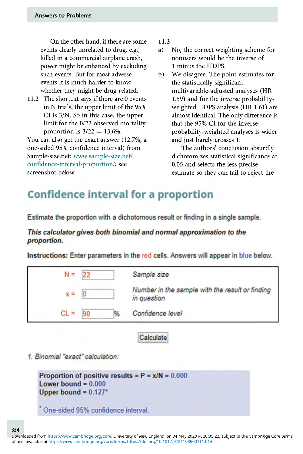
Students who have taken epidemiologic methods may cringe at this use of the term “rate,” since these
are proportions rather than rates, but that is not the confusion we are addressing here.
2: Dichotomous Tests
13
available at https://www.cambridge.org/core/terms. https://doi.org/10.1017/9781108500111.003
Downloaded from https://www.cambridge.org/core. University of Exeter, on 04 May 2020 at 20:38:54, subject to the Cambridge Core terms of use,
case-control fashion, we cannot generally estimate prevalence or positive or negative
predictive value, both of which depend on prevalence.
5
The exception to the rule above is that even if diseased and nondiseased subjects are
sampled separately, if they are sampled from a population with known prevalence of the
disease, that prevalence can be used to recreate a 2 × 2 table with the population prevalence
of disease, as shown in the next section.
6
It is also possible to sample separately based on the results of the test being studied
(sometimes called the “index test”). Patients with a positive test result could be sampled
separately from patients with a negative test result. Instead of case-control sampling, this is
test result-based sampling. Such a study would allow calculation of positive and negative
predictive values but not sensitivity, specificity, or prevalence.
7
We will return to this issue
in Chapter 4, when we discuss partial verification bias.
Combining Information from the Test with Information
about the Patient
We can express a main idea of this book as
What you thought before þ New information = What you think now
Box 2.3 (cont.)
0.4%, meaning that 250 urine cultures would need to be done on such infants for each one
expected to be positive.
There are many similar examples of this confusion (perhaps in the problems at the end of
this chapter!), where Test A is not felt to be sufficiently sensitive to rule out the disease, so if it
is negative, we are taught that Test B needs to be done. This only makes sense if Test A is
never done when the prior probability is low.
Table 2.2 Sample 2 × 2 table for the flu test when subjects with and without
flu are sampled separately, leading to a meaningless “prevalence” of 33%
Fluþ
Flu
Total
Testþ
14
1
15
Test
43
53
9
Total
18
36
54
5
“Accuracy” also depends on prevalence, but as mentioned above, it is not a useful quantity.
6
Another way to say and do this is that if the sampling fractions (proportions of diseased and
nondiseased included) are known, the effect of the sampling can be undone by weighting each cell by
the inverse of the sampling weight. So, for example, if you selected a 10% sample of the nondiseased,
you could just multiply the numbers in the nondiseased column 1/0.1 = 10 to undo the effect of the
undersampling of nondiseased.
7
Again, if the proportion testing positive in the population is known, we can recreate a 2 × 2 table that
will allow us to estimate sensitivity and specificity by starting with row rather than column totals. We
then proceed as described in the next section or by using inverse sampling weights as described
above. See Problem 2.7 for an example.
2: Dichotomous Tests
14
available at https://www.cambridge.org/core/terms. https://doi.org/10.1017/9781108500111.003
Downloaded from https://www.cambridge.org/core. University of Exeter, on 04 May 2020 at 20:38:54, subject to the Cambridge Core terms of use,
This applies generally, but with regard to diagnostic testing, “what you thought before” is
also the prior (or pretest) probability of disease. “What you think now” is the posterior (or
posttest) probability of disease. We will spend a fair amount of time in this and the next
chapter discussing how to use the result of a diagnostic test to update the prior probability
and obtain the posterior probability of disease. The first method that we will discuss is the
2 × 2 Table Method; the second uses likelihood ratios.
2 × 2 Table Method for Updating Prior Probability
This method uses the prior probability, sensitivity, and specificity of a test to fill in the 2 × 2
table that would result if the test were applied to an entire population with a given prior
probability of disease. Thus, we assume either that the entire population is studied or that a
random or consecutive sample is taken, so that the proportions in the “disease” and “no
disease” columns are determined by the prior probability, P(Dþ). As mentioned above, this
is sometimes referred to as cross-sectional sampling, because subjects are sampled
according to their frequency in the population, not separately based on either disease status
or test result.
The formula for posterior probability after a positive test is
Sensitivity × pior probability
Sensitivity × prior probability þ 1 specificity
ðÞ
×1 prior probability
ðÞ
To understand what is going on, it helps to fill the numbers into a 2 × 2 table, as shown in a
step-by-step “cookbook” fashion in Example 2.1 .
Example 2.1 2 × 2 table method instructions for screening mammography example
One of the clinical scenarios in Chapter 1 involved a 45-year-old woman who asks about
screening mammography. If this woman gets a mammogram and it is positive, what is the
probability that she actually has breast cancer?
8
Among 40- to 49-year-old women, the
prevalence of invasive breast cancer in previously unscreened women is about 2.8/1,000,
that is, 0.28% [3, 4]. The sensitivity and specificity of mammography in this age group are
about 75% and 93%, respectively [3, 5]. Here are the steps to get her posterior probability of
breast cancer:
1. Make a 2 × 2 table, with “disease” and “no disease” on top and “Testþ” and “Test” on the
left, like the one below.
2 × 2 table to use for calculating posterior probability
Disease
No disease
Total
Testþ
aba
þb
Test
cdc
þd
Total
aþcb
þda
þbþcþd
8
We simplify here by treating mammography as a dichotomous test, by grouping together the three
reported positive results: “additional evaluation needed” (92.9%), “suspicious for malignancy”
(5.5%), and “malignant” (1.6%) [3].
2: Dichotomous Tests
15
available at https://www.cambridge.org/core/terms. https://doi.org/10.1017/9781108500111.003
Downloaded from https://www.cambridge.org/core. University of Exeter, on 04 May 2020 at 20:38:54, subject to the Cambridge Core terms of use,
Likelihood Ratios for Dichotomous Tests
One way to think of the likelihood ratio is as a way of quantifying how much a given test result
changes your estimate of the likelihood of disease. More exactly, it is the factor by which the
odds of disease either increase or decrease because of your test result. (Note the distinction
between odds and probability below.) There are two big advantages to using likelihood ratios
to calculate posterior probability. First, as discussed in the next chapter, unlike sensitivity and
Example 2.1 (cont.)
2. Put a large, round number below and to the right of the table for your total N (a þ b þ c þ
d). We will use 10,000.
3. Multiply that number by the prior probability (prevalence) of disease to get the left
column total, the number with disease or (a þ c). In this case, it is 2.8/1,000 × 10,000 = 28.
4. Subtract the left column total from the total N to get the total number without disease
(b þ d). In this case, it is 10,000 28 = 9,972.
5. Multiply the “total with disease” (a þ c) by the sensitivity, a/(a þ c) to get the number of
true positives (a); this goes in the upper-left corner. In this case, it is 28 × 0.75 = 21.
6. Subtract this number (a) from the “total with disease” (a þ c) to get the false negatives (c).
Inthiscase,itis2821=7.
7. Multiply the “total without disease” (b þ d) by the specificity, d/(b þ d), to get the number
of true negatives (d). Here, it is 9,972 × 0.93 = 9,274.
8. Subtract this number from the “total without disease” (b þ d) to get the false positives (b).
In this case, 9,972 9,274 = 698.
9. Calculate the row totals. For the top row, (a þ b) = 21 þ 698 = 719. For the bottom row,
(cþd)=7þ9,274=9,281.
The completed table is shown below.
10. Now you can get posterior probability from the table by reading across in the appropriate
row and dividing the number with disease by the total number in the row with that result.
So the posterior probability if the mammogram is positive (positive predictive value) =
21/719 = 2.9%, and our 45-year-old woman with a positive mammogram has only about
a 2.9% chance of breast cancer!
If her mammogram is negative, the posterior probability (1 negative predictive value) is
7/9,281 = 0.075%, and the negative predictive value is 1 0.075% = 99.925%. This negative
predictive value is very high. However, this is due more to the very low prior probability than
to the sensitivity of the test, which was only 75%. In fact, if the sensitivity of mammography
were 0% (equivalent to simply calling all mammograms negative without looking at
them), the negative predictive value would still be (1 prior probability) = (1 0 .28%) =
99.72%!
Completed 2 × 2 table to use for calculating posterior probability
Breast cancer
No breast cancer
Total
Mammogram (+)
21
698
719
Mammogram ()
7
9,274
9,281
Total
28
9,972
10,000
2: Dichotomous Tests
16
available at https://www.cambridge.org/core/terms. https://doi.org/10.1017/9781108500111.003
Downloaded from https://www.cambridge.org/core. University of Exeter, on 04 May 2020 at 20:38:54, subject to the Cambridge Core terms of use,
specificity, likelihood ratios work for tests with more than two possible results. Second, they
simplify the process of estimating posterior probability.
You have seen that it is possible to get posterior probability from sensitivity, specificity,
prior probability, and the test result by filling in a 2 × 2 table. You have also seen that it is kind
of a pain. We would really love to just multiply the prior probability by some constant derived
from a test result to get the posterior probability. For instance, wouldn’t it be nice to be able to
say that a positive mammogram increases the probability of breast cancer about tenfold or
that a white blood cell count of more than 15,000/μL triples the probability of appendicitis?
But there is a problem with this: probabilities cannot exceed 1. So if the prior probability
of breast cancer is greater than 10%, there is no way you can multiply it by 10. If the prior
probability of appendicitis is more than one-third, there is no way you can triple it. To get
around this problem, we switch from probability to odds. Then we will be able to say
Prior odds × likelihood ratio = posterior odds
Necessary Digression: A Crash Course in Odds and Probability
This topic trips up a lot of people, but it really is not that hard. “Odds” are just a probability
(P) expressed as a ratio to (1 P); in other words, the probability that something will
happen (or already exists) divided by the probability that it won’t happen (or does not
already exist). For our current purposes, we are mostly interested in the odds for diagnosing
diseases, so we are interested in
Probability of having the disease
Probability of not having the disease
If your only previous experience with odds comes from gambling, do not get confused – in
gambling, they use betting odds, which are based on the odds of not winning. That is, if the
tote board shows a horse at 2:1, the odds of the horse winning are 1:2 (or a little less to allow
a profit for the track).
We find it helpful always to express odds with a colon, like a:b. However, mathematic-
ally, odds are ratios, so 4:1 is the same as 4/1 or 4, and 1:5 is 1/5 or 0.2 .
Here are the formulas for converting from probability to odds and vice versa:
If probability is P, the corresponding odds are P/(1 P).
If the probability is 0.5, the odds are 0.5:0.5 = 1:1 = 1.
If the probability is 0.75, the odds are 0.75:0.25 = 3:1 =3.
If odds are a:b, the corresponding probability is a/(a þ b)
If the odds are 1:9, the probability is 1/(1 þ 9) = 1/10.
If the odds are 4:3, the probability is 4/(4 þ 3) = 4/7.
If the odds are already expressed as a single number (e.g., 0.5 or 2), then the formula
simplifies to Probability = Odds/(Odds þ 1) because the “b” value of the a:b way of writing
odds is implicitly equal to 1. In class, we like to illustrate the difference between probability
and odds using pizzas (Box 2.4).
The only way to learn this is just to do it. Box 2.5 has some problems to practice on your
own right now.
2: Dichotomous Tests
17
available at https://www.cambridge.org/core/terms. https://doi.org/10.1017/9781108500111.003
Downloaded from https://www.cambridge.org/core. University of Exeter, on 04 May 2020 at 20:38:54, subject to the Cambridge Core terms of use,
Box 2.4 Understanding odds and probability using pizzas
It might help to visualize a delicious but insufficient pizza to be completely divided
between you and a hungry friend when you are on call together. If your portion is half
as big as hers, it follows that your portion is one-third of the pizza. Expressing the ratio of
the size of your portion to the size of hers is like odds; expressing your portion as a fraction
of the total is like probability. If you get confused about probability and odds, just draw a
pizza!
Call night #1: Your portion is half as big as hers. What fraction of the pizza do you eat?
Answer: 1/3 of the pizza (if odds = 1:2, probability = 1/3).
Call night #2: You eat 10% of the pizza. What is the ratio of the size of your portion to the size
of your friend’s portion?
Answer: Ratio of the size of your portion to the size of her portion, 1:9 (if probability = 10%, odds
=1:9).
Box 2.5 Practice with odds and probabilities
Convert the following probabilities to odds:
(a) 0.01
(b) 0.25
(c) 3/8
(d) 7/11
(e) 0.99
Convert the following odds to probabilities:
(a) 0.01
(b) 1:4
(c) 0.5
(d) 4:3
(e) 10
Check your answers with Appendix 2.3. Then take a pizza break!
2: Dichotomous Tests
18
available at https://www.cambridge.org/core/terms. https://doi.org/10.1017/9781108500111.003
Downloaded from https://www.cambridge.org/core. University of Exeter, on 04 May 2020 at 20:38:54, subject to the Cambridge Core terms of use,
One thing you probably noticed in these examples (and could also infer from the
formulas) is that, when probabilities are small, they are almost the same as odds. Another
thing you notice is that odds are always higher than probabilities (except when both are
zero). Knowing this may help you catch errors. Finally, probabilities cannot exceed one,
whereas odds can range from zero to infinity.
The last thing you will need to know about odds is that, because they are just ratios,
when you want to multiply odds by something, you multiply only the numerator (on the left
side of the colon). So if you multiply odds of 3:1 by 2, you get 6:1. If you multiply odds of
1:8 by 0.4, you get odds of (0.4 × 1):8 = 0.4/8 = 0.05.
Deriving Likelihood Ratios (“Lite” Version)
Suppose we want to find something by which we can multiply the prior odds of disease in
order to get the posterior odds. What would that something have to be?
Recall the basic 2 × 2 table and assume we study an entire population or use cross-
sectional sampling, so that the prior probability of disease is (a þ c)/N (Table 2.3).
What, in terms of a, b, c, and d, are the prior odds of disease? The prior odds are just the
probability of having disease divided by the probability of not having disease, based on
knowledge we have before we do the test. So
Prior odds 1⁄4
P disease
ðÞ
P no disease
ðÞ
1⁄4
Total with disease=Total N
Total without disease=Total N
1⁄4
aþc
ðÞ
=N
bþd
ðÞ
=N
1⁄4
aþc
ðÞ
bþd
ðÞ
Now, if the test is positive, what are the posterior odds of disease? We want to calculate the
odds of disease as above, except now use information we have derived from the test. Because
the test is positive, we can focus on just the upper (positive test) row of the 2 × 2 table. The
probability of having disease is now the same as the positive predictive value: True
positives/All positives or a/(a þ b). The probability of not having disease if the test is
positive is: False Positives/All Positives or b/(a þ b). So the posterior odds of disease if the
test is positive are
P diseasejTestþ
ðÞ
P no diseasejTestþ
ðÞ
1⁄4
True positive=total positive
False positive=total positive
1⁄4
a= aþb
ðÞ
b=aþb
ðÞ
1⁄4
a
b
Table 2.3 2 × 2 table for likelihood ratio derivation
Diseaseþ
Disease
Total
Testþ
aba
þb
True positives
False positives
Total positives
Test
cdc
þd
False negatives
True negatives
Total negatives
Total
aþcb
þda
þbþcþd
Total with disease
Total without disease
Total N
2: Dichotomous Tests
19
available at https://www.cambridge.org/core/terms. https://doi.org/10.1017/9781108500111.003
Downloaded from https://www.cambridge.org/core. University of Exeter, on 04 May 2020 at 20:38:54, subject to the Cambridge Core terms of use,
So now the question is by what could we multiply the prior odds (a þ c)/(b þ d) in order to
get the posterior odds (a/b)?
aþc
bþd
×?1⁄4
a
b
The answer is
aþc
bþd
×
a=aþc
ðÞ
b=bþd
ðÞ
1⁄4
a
b
So,
?1⁄4
a=aþc
ðÞ
b=bþd
ðÞ
This must be the likelihood ratio (LR) we have been searching for!
9
But look more closely at the formula for the LR that we just derived – some of it should
look familiar. Remember what a/(a þ c) is? That’s right, sensitivity! And b/(b þ d) is (1
specificity). So the LR for a positive dichotomous test is just sensitivity/(1 specificity).
You do not need to derive this every time you want to know what an LR is, although you
could. Instead, just remember this one formula:
Likelihood ratio result
ðÞ
1⁄4
P resultjdisease
ðÞ
P resultjno disease
ðÞ
Stated in words, this says that the likelihood ratio for a test result is the probability of
obtaining this test result in those with the disease divided by the probability of obtaining
this result in those without the disease. This formula is a good one to memorize because, as we
will see in Chapter 3, it works for all tests, not just dichotomous ones. The numerator refers to
patients with the disease, and the denominator refers to patients without the disease. One way
to remember it is WOWO, which is short for “With Over WithOut.”
10
Each possible test
result has an LR. For dichotomous tests, there are two possible results and therefore two LRs:
LR(þ), the LR of a positive result, and LR(), the LR of a negative result.
To derive the formula for the LR for a negative result, you might first find it helpful to go
back to the 2 × 2 table and retrace the steps we took to get the LR for a positive result, but instead
use the cell values for the negative test, which appear in the lower row of the 2 × 2 table. If you do
this, at the end, you should have derived for the “?” factor the formula (c/(a þ c))/(d/(d þ b)). If
you think about what other ways we have to express this, you should come up with the
likelihood of a negative result in patients with the disease divided by the likelihood of a negative
result in patients without the disease, the same as the WOWO formula above.
Likelihood ratio
ðÞ1⁄4
PTjdisease
ðÞ
PTjno disease
ðÞ
1⁄4
1 sensitivity
specificity
9
In case you are wondering why we call this the “lite” derivation, it is because the formula for the LR
works even when sensitivity and specificity come from a study that does not have cross-sectional
sampling, but this derivation would not work in such a study. See Appendix 2.2 for a rigorous
derivation.
10
Thanks to Dr. Warren Browner for this mnemonic.
2: Dichotomous Tests
20
available at https://www.cambridge.org/core/terms. https://doi.org/10.1017/9781108500111.003
Downloaded from https://www.cambridge.org/core. University of Exeter, on 04 May 2020 at 20:38:54, subject to the Cambridge Core terms of use,
Example 2.2 Using LRs to calculate posterior probability
Let us return to Example 2.1 where the prevalence (prior probability) of breast cancer was 2.8/
1,000, the sensitivity of the mammogram was 75%, and the specificity was 93%. The LR for a
positive mammogram would then be [sensitivity/(1 specificity)] = 0.75/0.07 = 10.7. Since
odds and probabilities are almost the same when probabilities are low, let us first try a short
cut: simply multiply the prior probability by the LR:
0.0028 × 10.7 = 0.030 = 3%
This is close to the 2.9% we calculated with the 2 × 2 table method used before. However, if
the prior probability and/or the LR are higher, this shortcut will not work. For example, consider a
65-year-old woman (prior probability ≈ 1.5%) with a mammogram “suspicious for malignancy”
(LR ≈ 100). If we simply multiplied the prior probability by the LR(þ), without conversion to odds,
we would get [0.015 × 100] = 1.5, which doesn’t make any sense as a posterior probability,
because it is greater than 1. In general, if the either the prior probability or posterior odds are
more than about 10%, we have to convert to odds and back again. For the example above, the
steps are
1. Convert prior probability (P) to prior odds [P/(1 P)] = 0.015/(1 0.015) = 0.0152.
2. Find the LR for the patient’s test result (r): LR(r) = P(r| Dþ)/P(r| D) = 100.
3. Multiply prior odds by the LR of the test result: 0.0152 × 100 = 1.52.
4. Convert posterior odds back to probability (P = odds/1 þ odds):
P1⁄4
1:52
1þ1:52
ðÞ
1⁄4
1:52
2:52
1⁄4 0:60:
So if the prior probability of breast cancer were 1.5%, a mammogram “suspicious for malig-
nancy” would raise the posterior probability to about 60%.
Using the LR Slide Rule
Although LRs make calculation of posterior probability a little easier than the 2 × 2 table
method, it still is rather burdensome, especially if the probabilities are too high to skip the
conversion from probability to odds and back. An alternative is to use an online calculator
or a LR slide rule (Figure 2.1), which uses a probability scale that is spread out so that
distances on it are proportional to the logarithm of the prior odds. An online calculator
with an animated slide rule is available at www.EBD -2 .net.
To use the slide rule to calculate posterior probability from prior probability and LR:
1. Line up the 1 on the LR portion (sliding insert) with the prior probability on the
probability (lower) portion.
2. Find the LR of the test result on the LR (top) half and read off the posterior probability
just below.
Figure 2.1 shows the position of the LR slide rule if the prior probability is 0.015 and the
likelihood ratio is 100. The posterior probability is about 0.6 .
We will see how the LR slide rule can help us understand testing thresholds. We like
the slide rule because we think it helps visualize how the LR moves the prior probability
to the posterior probability. However, for readers who may think slide rules just too
2: Dichotomous Tests
21
available at https://www.cambridge.org/core/terms. https://doi.org/10.1017/9781108500111.003
Downloaded from https://www.cambridge.org/core. University of Exeter, on 04 May 2020 at 20:38:54, subject to the Cambridge Core terms of use,
quaint, there are also smartphone apps
11
that will calculate the posterior probability from
the prior probability and likelihood ratio.
Treatment and Testing Thresholds
Recall that in Chapter 1 we said that a good reason to do a diagnostic test is to help you
make a decision about administering or withholding treatment. There are two main factors
that limit the usefulness of tests:
1. They sometimes give wrong answers.
2. They have a cost, which includes the financial cost as well as the risks, discomfort, and
complications that arise from testing.
Even a costless test has limited usefulness if it is not very accurate, and even a 100% accurate
test has limited usefulness if it is very costly. In the following sections, we will show how test
inaccuracy and costs narrow the range of prior probabilities for which the expected benefits
justify performing the test. Readers interested in a more in-depth discussion should read
about decision analysis [6, 7].
As an example, we will consider the question of whether to use a rapid bedside test, such
as the QuickVue test discussed earlier in this chapter, to guide antiviral treatment for the
flu. An antiviral medication, such as oseltamivir (Tamiflu
®
), reduces the duration of flu
symptoms in people with confirmed flu by 32 hours or 1.33 days [8, 9].
Figure 2.1 Likelihood ratio slide rule. See also www.ebd-2 .net
11
Try searching your App Store for “evidence-based medicine” to find them.
2: Dichotomous Tests
22
available at https://www.cambridge.org/core/terms. https://doi.org/10.1017/9781108500111.003
Downloaded from https://www.cambridge.org/core. University of Exeter, on 04 May 2020 at 20:38:54, subject to the Cambridge Core terms of use,
Quantifying Costs and Benefits
In order to calculate the range of prior probabilities for which the expected benefits justify
testing, we need to quantify three things:
1. How bad is it to treat someone who does not have the disease? This quantity is generally
denoted “C” (for cost) [10, 11]. C is the cost of (unnecessarily) treating someone without
the disease. In the flu example, we will take the cost of this unnecessary treatment as just
the monetary cost of the antiviral medication, about $60.
12
2. How bad is it to fail to treat someone who has the disease? This quantity is generally
denoted “B”)[10, 11]. You can think of B as the cost of failing to achieve the Benefit of
treatment. For example, if the value we assign to patients with the flu feeling better 1.33
days sooner is $160, but the medication costs $60, the net benefit of treatment is $160
$60 = $100, so we can think of that missed opportunity to get the $100 benefit of
treatment as the net cost of not treating someone with the flu.
3. What is the cost of the test? This cost includes the cost of the time, reagents, and so on, to
do the test, as well as the cost of complications or discomfort from doing the test itself
(including assigning a dollar value to any pain and suffering involved). We will denote
this test cost as “T.”
A note about the term “cost”: Some of our colleagues have objected to using the term “cost”
because readers might construe it to refer only to monetary costs. Our various “costs”
include all harm, pain, suffering, time, and money associated with 1) treating someone
unnecessarily, 2) failing to treat someone who needs treatment, and 3) performing the
diagnostic test. These costs must be measured in the same units. We chose dollars, but the
units could be QALYs (Quality Adjusted Life Years) or “utils” (an arbitrary utility unit).
Finally, what we refer to as “cost” might more strictly be termed “regret,” the difference
in outcome between the action we took and the best action we could, in retrospect, have
taken. (See Hilden and Glasziou [11].) The regret associated with treating a patient who
turns out to have the disease is zero, since it was the best action we could have taken.
Similarly, the regret associated with not treating an individual who turns out not to have the
disease is also zero. For this reason, the graphs you are about to see are called regret graphs.
The Treatment Threshold Probability (PTT)
First introduced by Pauker and Kassirer [12], the treatment threshold probability (PTT)is
the probability of disease at which the expected costs of the two types of mistakes we can
make (treating people without the disease and not treating people with the disease) are
balanced. By expected costs, we mean the cost of these mistakes (C and B) multiplied by
their probability of occurring. For example, the expected cost of not treating is P (the
probability of disease) × B. This is because the probability that not treating is the wrong
decision is the probability that the person has the disease, or P, and the cost of that wrong
decision is B. This makes sense: if P = 0, then not treating will not be a mistake, and the cost
will be zero. On the other hand, if P = 1, the person has the disease, and the expected cost of
not treating is 1 × B = B. If P = 0.5, then half the time the cost will be zero, and half the time
the cost will be B, so the expected cost is 0.5 × B. We can graph this expected cost of not
12
This was the lowest price (with a coupon) at www.GoodRx.com 6/27/17.
2: Dichotomous Tests
23
available at https://www.cambridge.org/core/terms. https://doi.org/10.1017/9781108500111.003
Downloaded from https://www.cambridge.org/core. University of Exeter, on 04 May 2020 at 20:38:54, subject to the Cambridge Core terms of use,
treating as a function of the probability of disease: P×Bis the equation for a straight line
with slope B and intercept 0, as shown in Figure 2.2 .
Similarly, the expected cost of treating is (1 P) × C. The probability that treating is the
wrong decision is the probability that the person does not have the disease (1 P), and the
cost of treating someone who does not have the disease is C. Because (1 P)×C=C C×P,
the expected cost of treating is a straight line, with intercept C and slope C. The place
where these two lines cross is the treatment threshold probability of disease, PTT, at which
the expected costs of not treating and treating are equal (Figure 2.2). Put mathematically,
PTT is the probability of disease at which
PTT ×B=(1 PTT)×C
And therefore, the treatment threshold odds are given by
PTT
1PTT
ðÞ
1⁄4
C
B
and the treatment threshold probability is
PTT 1⁄4
C
CþB
ðÞ
Stop here to convince yourself that this formula makes sense. If treating someone who
does not have the disease is half as bad as failing to treat someone who does have the
disease, we should be willing to treat two people without disease to avoid failing to treat one
person who has it, and the threshold probability PTT should be 1/3. Using the formula
above,ifB=2×C,thenwegetPTT=C/(Cþ2C)=C/3C=1/3.Similarly,ifthetwotypes
of mistakes are equally bad, C = B, and PTT should be 0.5 .
Finally, look at the regret graph in Figure 2.2 and visualize what happens as C gets closer
to zero. Can you see how the treatment threshold, PTT, slides down the “no treat” line,
approaching zero? This makes sense: if the cost of treating people without disease is low
relative to the benefit of treating someone who has it, you will want to treat even when the
probability of disease is low. Similarly, imagine what happens when C goes up in relation to
B. The treatment threshold, PTT, will move to the right.
Figure 2.2 Expected costs of not treating and treating by probability of disease. For probabilities from 0 to PTT, “No
Treat” has the lower expected cost. For probabilities from PTT to 1, “Treat” has the lower expected cost.
2: Dichotomous Tests
24
available at https://www.cambridge.org/core/terms. https://doi.org/10.1017/9781108500111.003
Downloaded from https://www.cambridge.org/core. University of Exeter, on 04 May 2020 at 20:38:54, subject to the Cambridge Core terms of use,
As did Pauker and Kassirer [13], we now extend the threshold calculation to the case
where a dichotomous diagnostic test is available. There are now two threshold probabilities:
the no treat–test threshold and the test–treat threshold (Figure 2.3)
Testing Thresholds for an Imperfect but Costless Test
We will first assume that the test itself has absolutely no monetary cost or risks to the
patient. Even if a test is very inexpensive or free, if it isn’t perfect, there are some situations
in which testing is not indicated because it should not change the treatment decision. If a
dichotomous test has less than perfect specificity (i.e., false positives are possible) and the
treatment has some risks (i.e., C > 0), there will be some low prior probability below which
you would not want to treat even if the test were positive. This is because the low prior
probability keeps the posterior probability low, so that the false positives would overwhelm
the true positives and there would be too many people treated unnecessarily. That defines a
lower testing threshold, the no treat–test threshold, below which there is no point perform-
ing the test. For a dichotomous test, this lower threshold is related to the LR for a positive
result.
At the other end of the scale, if the test has less than perfect sensitivity (i.e., false
negatives are possible) and the treatment has some benefits (i.e ., B > 0), there will be some
high prior probability above which you would want to treat even if the test were negative.
This is because the high prior probability keeps the posterior probability high, so that false
negatives would overwhelm the true negatives and testing would lead to too many failures
to treat patients with the disease. That defines a higher testing threshold, the test–treat
threshold, above which one should just treat, rather than do the test. This higher threshold
is related to the LR of a negative result for a dichotomous test.
Between these two testing thresholds, there is a zone in which the results of the test have
the potential to affect your decision to treat (Figure 2.3).
Example 2.3
In patients with the flu, we quantified the net benefit of antiviral treatment at $100 and the
cost of unnecessary treatment at $60. Then, our treatment threshold should be C/(C þ B) =
60/160 = 37.5%. That is, after we do our rapid bedside test, if the probability of influenza is
greater than 37.5%, we will treat the patient. We will assume that the sensitivity of the rapid
antigen test is 75% and specificity is 95%. (These are close to, but slightly worse than, the
estimates from Table 2.1.) What are our testing thresholds in this case? That is, for what range
of prior probabilities of influenza should the results of the bedside test affect the decision to
Figure 2.3 The no treat–test and test–treat probability thresholds, between which the test can affect treatment
decisions.
2: Dichotomous Tests
25
available at https://www.cambridge.org/core/terms. https://doi.org/10.1017/9781108500111.003
Downloaded from https://www.cambridge.org/core. University of Exeter, on 04 May 2020 at 20:38:54, subject to the Cambridge Core terms of use,
Example 2.3 (cont.)
treat? (For now, we are assuming that the test is free and harmless to the patient.) Here are
the steps to follow:
1. Calculate LRs for positive and negative test results:
LRþ
ðÞ1⁄4
sensitivity
1 specificity
ðÞ
1⁄4
0:75
10:95
ðÞ
1⁄4
0:75
0:05
1⁄415
LR
ðÞ1⁄4
1 sensitivity
ðÞ
specificity
1⁄4
10:75
ðÞ
0:95
1⁄4
0:25
0:95
1⁄4 0:26
2. Convert the treatment threshold of 0.375 to odds:
Odds 1⁄4
P
1P
ðÞ
1⁄4
0:375
1 0:375
ðÞ
1⁄4 0:6
3. Divide LR(þ) and LR() into treatment threshold to get the prior odds for the testing
thresholds:
(since posterior odds = prior odds × LR, then posterior odds/LR = prior odds)
Posterior odds
LRþ
ðÞ1⁄4
0:6
15
1⁄4 0:04 for positive test
ðÞ
Posterior odds
LR
ðÞ1⁄4
0:6
0:26
1⁄4 2:3 for negative test
ðÞ
4. Convert each of these prior odds (for testing thresholds) back to a prior probability
P = odds/(1 þ odds):
P1⁄4
0:04
1:04
1⁄4 0:04 for positive test
ðÞ
P1⁄4
2:3
3:3
1⁄4 0:70 for negative test
ðÞ
5. Interpret the result:
If the prior probability of influenza is <4% (the no treat–test threshold), then even if
the rapid antigen test is positive, the posttest probability will still be below 37.5% (the
treatment threshold), and you would not treat the patient.
If the prior probability is >70% (the test–treat threshold), then even if the antigen test
is negative, the posttest probability will be above 37.5%, and you would treat the
patient in spite of the negative test result.
If the prior probability is between 4% and 70%, the test may be indicated, because it at
least has the potential to affect management.
So far, we have not considered costs or risks of the test (as opposed to those of the
treatment). When these are factored in as well, the testing range will be narrower.
Visualizing Testing Thresholds
The LR slide rule’s log(odds) scale provides a nice way of visualizing testing thresholds
when the accuracy of a test (rather than its costs or risks) is the main thing that limits its
usefulness. In the flu example (Example 2.3), the positive and negative LRs of the bedside
2: Dichotomous Tests
26
available at https://www.cambridge.org/core/terms. https://doi.org/10.1017/9781108500111.003
Downloaded from https://www.cambridge.org/core. University of Exeter, on 04 May 2020 at 20:38:54, subject to the Cambridge Core terms of use,
antigen test can be visualized as arrows. If they are placed with their points on the treatment
threshold, their origins will define the testing thresholds as in Figure 2.4 .
Looking at the slide rule, we can see that the origin on the LRþ arrow is at about 0.04,
indicating that if the prior probability of influenza is less than about 0.04, even if the test is
positive, the posterior probability will remain below 0.375, and we should not treat.
Similarly, the origin of the LR arrow is at about 0.7, indicating that if the prior probability
is more than 0.7, even if the test is negative, the posterior probability will remain high
enough to treat. These are the same numbers we got algebraically in Example 2.3 .
You can also visualize the testing threshold using a regret graph like Figure 2.2 . In this
case, we draw a line for the expected cost of testing and treating according to the result of the
test. When the probability of disease is zero, the expected cost is C × (1 Specificity). This is
the cost of unnecessary treatment (C) times the probability that the test will be falsely positive
in patients without the disease. Similarly, when the probability of disease is 1, the expected
cost is B × (1 Sensitivity). This is the cost (B) of failing to treat times the probability that the
test will be falsely negative. If we connect these two points with a straight line, we can see that,
at very low and very high probabilities of disease, “no treat” and “treat” have lower expected
costs than “test,” because testing too often leads to wrong answers (Figure 2.5).
Figure 2.4 LR slide rule arrows demonstrate the concept of test and treatment thresholds.
Figure 2.5 Imperfect but costless test. The expected cost of the “test” option is higher than the cost of “no treat”
below the no treat–test threshold, and higher than the cost of “treat” above the test–treat threshold.
2: Dichotomous Tests
27
available at https://www.cambridge.org/core/terms. https://doi.org/10.1017/9781108500111.003
Downloaded from https://www.cambridge.org/core. University of Exeter, on 04 May 2020 at 20:38:54, subject to the Cambridge Core terms of use,
Testing Thresholds for a Perfect but Risky or Expensive Test
In the preceding discussion, we showed that, when tests are imperfect, there are some prior
probabilities for which the test is not worth doing because the results do not have the
potential to affect management. But some tests, with close to 100% sensitivity or specificity,
do have the potential to change management, even when the prior probability of disease is
very close to zero or one. However, because there are risks and costs to tests themselves,
even a nearly perfect test may not be worth doing in some patients. Although it has the
potential to change management in some clinical situations, the probability of it doing so is
too small to justify the cost of the test.
To explore this issue, we now assume that the test is perfect (Sensitivity = Specificity =
100%), but that it has some “cost.” Keep in mind that “cost” could represent monetary cost,
which is easy to quantify, or risks to the patient (such as pain and loss of privacy), which are
harder to quantify. In this situation, there are still two threshold probabilities: 1) the no
treat–test threshold, where the expected benefits of identifying and treating Dþ individuals
first justify the testing costs; and 2) the test–treat threshold, where the expected savings
from identifying and not treating D individuals no longer justify the testing costs.
If the bedside test for influenza were perfect and the prior probability of influenza were
5%, we would have to test 20 patients to identify one case of the flu. If the prior probability
were 10%, we would have to test 10 patients to identify one case. For a perfectly sensitive
test, the number needed to test to identify one Dþ individual is simply 1/P(Dþ), where
P(Dþ) is the prior probability of disease.
To find the no treat–test threshold probability, we need to ask how many individuals we
are willing to test to identify one Dþ individual.
We have already utilized B, the cost of not treating a Dþ individual, which we can also
think of as the net benefit of treating someone with the disease, and C, the cost of
unnecessarily treating a D individual; now we utilize T, the cost of the test. For a perfect
test, the no treat–test threshold probability is T/B.
Assume that the perfect bedside flu testing kits cost $10 each (T = $10). If B = $100 after
subtracting the cost of the drug, then T/B = $10/$100 = 10%. This makes sense: for every
10 patients we test, on average one will have the flu and be treated, which is worth $100, but
the cost of testing those 10 people is also 10 × $10 = $100. The costs of testing and benefits
of treating are equal, and we break even. If the prior probability of flu is less than 10%, on
average we will have to test more than 10 people (and hence spend more than $100) for each
one who tests positive and gets the treatment; hence the average costs of testing would
exceed the benefits.
To understand the test–treat threshold probability, we reverse the logic. We again
assume that C, the cost of treating someone without the flu, is just the $60 cost of the
medication. Start by assuming that the probability of influenza is 100%. There is no point in
testing to identify D individuals because there aren’t any, so we would just treat without
testing. As the probability of flu decreases from 100%, it eventually reaches a point where
the $60 treatment cost we save by identifying a D individual justifies the cost of testing to
identify that individual. This occurs when the probability of not having the disease is T/C,
corresponding to a probability of having the disease of (1 T/C), the test–treat threshold.
This makes sense, too. When the probability of nondisease is 1/6, the number needed to
test to identify one patient without the disease is six. We test six patients at a testing cost of
$10 each in order to save $60 on the one without disease, and hence we come out even. We
2: Dichotomous Tests
28
available at https://www.cambridge.org/core/terms. https://doi.org/10.1017/9781108500111.003
Downloaded from https://www.cambridge.org/core. University of Exeter, on 04 May 2020 at 20:38:54, subject to the Cambridge Core terms of use,
have to convert this 1/6 probability of nondisease to a probability of disease by subtracting
from 100%, so the test–treat threshold probability of disease is 1 1/6 = 5/6 = 83.3%.
You can easily visualize testing thresholds for a perfect but costly test by drawing a
horizontal line at expected cost = T for the testing option (Figure 2.6).
Testing Thresholds for an Imperfect and Costly Test
Using the same parameters, C = $60, B = $100, T = $10 (or $0), Sensitivity = 0.75 (or 1.0),
and Specificity = 0.95 (or 1.0), Table 2.4 gives the testing thresholds assuming the test is 1)
imperfect and costless, 2) perfect and costly, and 3) imperfect and costly. For interested
readers, the formulas for the testing thresholds of an imperfect and costly test are given in
Appendix 2.4 . The graph showing expected costs would be the same as Figure 2.5, except
that the testing line would be displaced upward by an amount equal to the testing cost (T).
As mentioned above, in order to do these calculations, we have to express misclassifica-
tion costs (B and C) and testing costs (T) in common units. It is usually difficult to reduce
the costs and risks of testing, as well as failing to treat someone with disease or treating
someone without the disease, to units such as dollars. We present the algebra and formulas
Table 2.4 Thresholds for a flu test, taking into account accuracy, cost, and both
Test characteristics
No treat–test threshold
Test–treat threshold
Imperfect
a
but costless
0.04
0.70
Perfect but costlyb
0.10
0.83
Imperfect and costly
0.17
0.57
a
Sensitivity = 0.75; Specificity = 0.95; C/B = 60/100.
b
T=$10.
Figure 2.6 “No Treat–Test” and “Test–Treat” thresholds for a perfect but costly test.
2: Dichotomous Tests
29
available at https://www.cambridge.org/core/terms. https://doi.org/10.1017/9781108500111.003
Downloaded from https://www.cambridge.org/core. University of Exeter, on 04 May 2020 at 20:38:54, subject to the Cambridge Core terms of use,
here, not because we want you to use them clinically, but because we want you to
understand them and want to show that the theory here is actually quite simple.
Testing thresholds exist both because the test is imperfect (and might lead to too many
misclassifications) and because the test has costs and risks (that might outweigh the benefits
of the additional information). Sometimes, especially when the test is expensive and risky
but accurate, the testing costs so outweigh the misclassification risks that you can ignore the
misclassification risks. Would you do the test if it were perfect? If the answer is “no,” then
the risks and costs of the test, not the misclassification risks, are driving your decision. We
don’t do lumbar punctures on well-looking febrile infants. This is not just because we are
worried about false positives but because the low probability of a positive does not justify
the discomfort, risk, and expense of the test.
Would you do the test if it were free of discomfort, risks, and costs? If the answer is
“no,” then the misclassification risks, not the costs and risks of the test itself, are driving
your decision. This is one reason we don’t perform screening mammography on 30-year-
old women. The false positives would vastly overwhelm the true positives and cause an
enormous burden of stress and ultimately unnecessary follow-up testing.
Summary of Key Points
1. The accuracy of dichotomous tests can be summarized by the proportion in whom the
test gives the right answer in five groups of patients:
those with disease (sensitivity)
those without the disease (specificity)
those who test positive (positive predictive value)
those who test negative (negative predictive value)
the entire population tested (accuracy)
2. Although sensitivity and specificity are more useful for evaluating tests, clinicians
evaluating patients will more often want to know the posterior probability of disease
given a particular test result.
3. Posterior probability can be calculated by using the sensitivity and specificity of the test
and the prior probability of disease. This can be done by using the 2 × 2 table method or
by converting probabilities to odds and using the LR of the test result, defined as P
(Result|Disease)/P(Result|No disease).
4. The treatment threshold (PTT) is the probability of disease at which the expected cost of
treating those without disease equals the expected cost of not treating those with the
disease: PTT = C/(C þ B).
5. If a test is less than perfectly specific or has costs or risks, it does not make sense to use it
on patients with very low prior probabilities of disease – probabilities below the “no
treat–test” threshold.
6. Similarly, if a test is less than perfectly sensitive or has costs or risks, it does not make
sense to use it on patients with very high prior probabilities of disease – probabilities
above the “test–treat” threshold.
7. Both the “no treat–test” and “test–treat” thresholds can be visualized graphically or
calculated algebraically if the cost of treating someone without the disease (C), the cost
of failing to treat someone with the disease (B), and the cost of the test (T) can all be
estimated on the same scale.
2: Dichotomous Tests
30
available at https://www.cambridge.org/core/terms. https://doi.org/10.1017/9781108500111.003
Downloaded from https://www.cambridge.org/core. University of Exeter, on 04 May 2020 at 20:38:54, subject to the Cambridge Core terms of use,
Appendix 2.1 General Summary of Definitions
and Formulas for Dichotomous Tests
If sampling is cross-sectional (i.e ., diseased and nondiseased are not sampled separately),
then
Prevalence 1⁄4 Prior probability 1⁄4
aþc
ðÞ
N
Positive Predictive Value PPV
ðÞ
1⁄4
Posterior probability if testþ1⁄4
a
aþb
ðÞ
Negative Predictive Value NPV
ðÞ
1⁄4
1 Posterior probability if test1⁄4
d
cþd
ðÞ
For tests with dichotomous results:
LRþ
ðÞ1⁄4
P þjDþ
ðÞ
P þjD
ðÞ
1⁄4
Sensitivity
1 specificity
ðÞ
LR
ðÞ1⁄4
P jDþ
ðÞ
P jD
ðÞ
1⁄4
1 sensitivity
ðÞ
Specificity
Probability 1⁄4 P 1⁄4
Odds
1þOdds
ðÞ
;
Odds 1⁄4
P
1P
ðÞ
or
If odds 1⁄4
a
b
, probability 1⁄4
a
aþb
ðÞ
Prior odds × LR = posterior odds (ALWAYS TRUE!)
Disease
No disease
Totals
Test+
aba
+
b
Test
cdc
+
d
Totals
a+c
b+d
N=a+b+c+d
Sensitivity 1⁄4 a= a þ c
ðÞ
1⁄4PþjDþ
ðÞ
1 sensitivity 1⁄4 P jDþ
ðÞ
Specificity 1⁄4 d= b þ d
ðÞ
1⁄4 PjD
ðÞ
1 specificity 1⁄4 P þjD
ðÞ
31
available at https://www.cambridge.org/core/terms. https://doi.org/10.1017/9781108500111.003
Downloaded from https://www.cambridge.org/core. University of Exeter, on 04 May 2020 at 20:38:54, subject to the Cambridge Core terms of use,
Appendix 2.2 Rigorous Derivation
of Likelihood Ratios
Here is a real derivation – it is not that hard!
First, you need to accept some basic axioms of probability:
1. P(AandB)=P(BandA)
2. P (A and B) = P(A|B)P(B). This just says the probability of both A and B is the
probability of B times the probability of A given B.
From 1 and 2 (which both seem self-evident), it is easy to prove Bayes’s theorem:
3. P(A|B)P(B) = P(A and B) = P(B and A) = P(B|A)P(A). Therefore,
P(A|B) = P(B|A)P(A)/P(B), which is how Bayes’s theorem is generally written.
4. Now by Bayes’s theorem (where r = a specific test result): Posterior probability =
P(Dþ|r) = P(r|Dþ)P(Dþ)/P(r)
5. 1 Posterior probability = P(D|r) = P(r|D)P(D)/P(r)
6. Dividing 4 by 5 gives:
PDþjr
ðÞ
PDjr
ðÞ
1⁄4
PrjDþ
ðÞ
PrjD
ðÞ
×
PDþ
ðÞ
PD
ðÞ
Posterior odds 1⁄4 LR rðÞ×Prior odds:
Note that this derivation applies regardless of the form the result takes (dichotomous,
continuous, etc.) and requires no assumptions other than the probability axioms we
started with.
32
available at https://www.cambridge.org/core/terms. https://doi.org/10.1017/9781108500111.003
Downloaded from https://www.cambridge.org/core. University of Exeter, on 04 May 2020 at 20:38:54, subject to the Cambridge Core terms of use,
Appendix 2.3 Answers to Odds/Probability
Conversions in Box 2.5
If probability is P, Odds are P/(1 P)
If odds are a/b, probability is a/(a þ b).
Probability
Odds
a.
0.01
1/99
b.
0.25
1/3
c.
3/8
3/5
d
7/11
7/4
e.
0.99
99
Odds
Probability
a.
0.01
1/101
b.
1:4
1/5
c.
0.5
0.5/1.5 = 1/3
d.
4:3
4/7
e.
10
10/11
33
available at https://www.cambridge.org/core/terms. https://doi.org/10.1017/9781108500111.003
Downloaded from https://www.cambridge.org/core. University of Exeter, on 04 May 2020 at 20:38:54, subject to the Cambridge Core terms of use,
Appendix 2.4 Formulas for Testing
Thresholds for Dichotomous Tests
B = Net Benefit of Treating a Dþ individual
C = Cost of Unnecessarily Treating a D individual
C/B = Treatment Threshold Odds
T=CostofTest
2.4a For an imperfect but costless test
No Treat Test Threshold Odds 1⁄4
C=B
LRþ
ðÞ
1⁄4
CðÞP þjD
ðÞ
BðÞP þjDþ
ðÞ
No Treat Test Threshold Prob 1⁄4
CðÞP þjD
ðÞ
BðÞP þjDþ
ðÞ
þ
CðÞP þjD
ðÞ
Test Treat Threshold Odds 1⁄4
C=B
LR
ðÞ
1⁄4
CðÞP jD
ðÞ
BðÞP jDþ
ðÞ
Test Treat Threshold Prob 1⁄4
CðÞP jD
ðÞ
BðÞP jDþ
ðÞ
þ
CðÞP jD
ðÞ
Example Imperfect but costless test for influenza
B = Net Benefit of Antiviral Treatment = $100
C = Net Cost of Antiviral Treatment = $60
Sensitivity = P(þ|Dþ) = 0.75; 1 Sensitivity = P(|Dþ) = 0.25
Specificity = P(|D) = 0.95; 1 Specificity = P(þ|D) = 0.05
No Treat Test Threshold Prob 1⁄4
CðÞP þjD
ðÞ
BðÞP þjDþ
ðÞ
þ
CðÞP þjD
ðÞ
1⁄4
60
ðÞ0:05
100
ðÞ0:75 þ 60
ðÞ0:05
1⁄4 0:04
34
available at https://www.cambridge.org/core/terms. https://doi.org/10.1017/9781108500111.003
Downloaded from https://www.cambridge.org/core. University of Exeter, on 04 May 2020 at 20:38:54, subject to the Cambridge Core terms of use,
Test Treat Threshold Prob 1⁄4
CðÞP jD
ðÞ
BðÞP jDþ
ðÞ
þ
CðÞP jD
ðÞ
1⁄4
60
ðÞ0:95
100
ðÞ0:25 þ 60
ðÞ0:95
1⁄4 0:70
2.4b For a perfect but costly test
No Treat–Test Threshold Probability = T/B
Test–Treat Threshold Probability = 1 T/C
Example Perfect but costly test for influenza
B = Net Benefit of Antiviral Treatment = $100
C = Antiviral Treatment Cost = $60
T = Cost of the Perfect Bedside Test = $10
No Treat–Test Threshold Probability = T/B = $10/$100 = 0.10
Test–Treat Threshold Probability = 1 T/C = 100% $10/$60 = 0.833
2.4c For an imperfect and costly test
No Treat Test Threshold Odds 1⁄4
CðÞP þjD
ðÞ
þ
T
BðÞP þjDþ
ðÞ
T
No Treat Test Threshold Prob 1⁄4
CðÞP þjD
ðÞ
þ
T
BðÞP þjDþ
ðÞ
þ
CðÞP þjD
ðÞ
Test Treat Threshold Odds 1⁄4
CðÞP jD
ðÞ
T
BðÞP jDþ
ðÞ
þ
T
Test Treat Threshold Prob 1⁄4
CðÞP jD
ðÞ
T
BðÞP jDþ
ðÞ
þ
CðÞP jD
ðÞ
Example Imperfect and costly test for influenza
B = Net Benefit of Antiviral Treatment = $100
C = Antiviral Treatment Cost = $60
T=CostofTest=$10
Sensitivity = P(þ|Dþ) = 0.75; 1 Sensitivity = P(|Dþ) = 0.25
2: Dichotomous Tests
35
available at https://www.cambridge.org/core/terms. https://doi.org/10.1017/9781108500111.003
Downloaded from https://www.cambridge.org/core. University of Exeter, on 04 May 2020 at 20:38:54, subject to the Cambridge Core terms of use,
Specificity = P(|D) = 0.95; 1 Specificity = P(þ|D) = 0.05
No Treat Test Threshold Prob 1⁄4
CðÞP þjD
ðÞ
þ
T
BðÞP þjDþ
ðÞ
þ
CðÞP þjD
ðÞ
1⁄4
60
ðÞ0:05 þ 10
100
ðÞ0:75 þ 60
ðÞ0:05
1⁄4 0:167
Test Treat Threshold Prob 1⁄4
CðÞP jD
ðÞ
T
BðÞP jDþ
ðÞ
þ
CðÞP jD
ðÞ
1⁄4
60
ðÞ0:95 10
100
ðÞ0:25 þ 60
ðÞ0:95
1⁄4 0:573
2: Dichotomous Tests
36
available at https://www.cambridge.org/core/terms. https://doi.org/10.1017/9781108500111.003
Downloaded from https://www.cambridge.org/core. University of Exeter, on 04 May 2020 at 20:38:54, subject to the Cambridge Core terms of use,
Appendix 2.5 Derivation of No Treat–Test
and Test–Treat Probability Thresholds
We’ll do these derivations two ways: with geometry (2.5a and 2.5c) and with algebra (2.5b
and 2.5d).
B = cost of failing to treat a Dþ individual
C = cost of treating a D– individual unnecessarily
T=costoftest
P = probability of Dþ
p[–|Dþ] = Probability of negative test given Dþ =1– Sensitivity
p[þ|D–] = Probability of positive test given D– =1– Specificity
Expected Cost of No Treat Strategy: (P)B
Expected Cost of Treat Strategy: (1 – P)C
Expected Cost of Test Strategy:
P(p[–|Dþ])B þ (1 – P)(p[þ|D–])C þ T
Reminder about odds and probability:
Convert odds to probability by adding the numerator to the denominator. If threshold
odds are C/B, then threshold probability is C/(B þ C).
No Treat–Test Threshold
2.5a Geometry
N
u
m
e
r
a
t
o
r
B
C
p[–|D+]B+T
p[+|D–] C + T
T
P
T
P
P = No Treat-Test Threshold
Probability of Disease
C
o
s
t
D
e
n
o
m
i
n
a
t
o
r
Convince yourself that the ratio of the line labeled “Numerator” to the line labeled
“Denominator” is equal to the threshold odds P/(1 – P)
37
available at https://www.cambridge.org/core/terms. https://doi.org/10.1017/9781108500111.003
Downloaded from https://www.cambridge.org/core. University of Exeter, on 04 May 2020 at 20:38:54, subject to the Cambridge Core terms of use,
P=1P
ðÞ
1⁄4
p þjD
1⁄2
ðÞ
CþT
Bp
jDþ
1⁄2
ðÞ
BT
1⁄4
p þjD
1⁄2
ðÞ
CþT
B1 p
jDþ
1⁄2
ðÞ
T
Substitute p[þ|Dþ]for 1 – p[–|Dþ]
1⁄4
p þjD
1⁄2
ðÞ
CþT
p þjDþ
1⁄2
ðÞ
BT
1⁄4 No Treat Test Threshold Odds
add numerator to denominator for probability
ðÞ
1⁄4
p þjD
1⁄2
ðÞ
CþT
p þjD
1⁄2
ðÞ
Bþ pþjD
1⁄2
ðÞ
C
1⁄4 No Treat Test Threshold Probability
No Treat–Test Threshold
2.5b Algebra
No treat–test threshold is where the expected cost of the “no treat” strategy equals the
expected cost of the “test” strategy.
(P)(B) = P(p[–|Dþ])B þ (1 – P)(p[þ|D–])C þ T
Substitute (P)(T) þ (1 – P)T for T
(P)(B) = P(p[–|Dþ])B þ (P)(T) þ (1 – P)(p[þ|D–])C þ (1 – P)T
PðÞBðÞ1⁄4PpjDþ
1⁄2
BþT
ðÞ
þ
|fflfflfflfflfflfflfflfflfflfflfflfflfflffl{z ffl fflffl ffl ffl fflffl ffl fflffl fflffl fflffl}
Subtract this
1P
ðÞ
p þjD
1⁄2
CþT
ðÞ
(P)(B) – P(p[–|Dþ]B þ T) = (1 – P)(p[þ|D–]C þ T)
(P)[(B)(1 – p[–|Dþ]) – T] = (1 – P)(p[þ|D–]C þ T)
Substitute p[þ|Dþ] for 1 – p[–|Dþ]
(P)[p[þ|Dþ](B) T] = (1 P)(p[þ|D–]C þ T)
P
1P
ðÞ
p þjD
1⁄2
CþT
p þjDþ
1⁄2
BT
This is threshold odds. To get threshold probability add the numerator to the denominator.
P1⁄4
p þjD
1⁄2
ðÞ
CþT
p þjDþ
1⁄2
ðÞ
Bþ pþjD
1⁄2
ðÞ
C
1⁄4 No Treat Test Threshold Probability
38
2: Dichotomous Tests
available at https://www.cambridge.org/core/terms. https://doi.org/10.1017/9781108500111.003
Downloaded from https://www.cambridge.org/core. University of Exeter, on 04 May 2020 at 20:38:54, subject to the Cambridge Core terms of use,
Test–Treat Threshold
2.5c Geometry
D
e
n
o
m
i
n
a
t
o
r
B
C
p[–|D+]B+T
p[+|D–] C+T
T
P
T
1–P
N
u
m
e
r
a
t
o
r
C
o
s
t
Convince yourself that
P=1P
ðÞ
1⁄4
C pþjD
1⁄2
ðÞ
CþT
p jDþ
1⁄2
ðÞ
BþT
1⁄4
C1 p þjD
1⁄2
ðÞ
T
p jDþ
1⁄2
BþT
Substitute p[–|D–]for1– p[þ|D–]
1⁄4
CpjD
1⁄2
ðÞ
T
p jDþ
1⁄2
ðÞ
BþT
1⁄4 TestTreat Threshold Odds
add numerator to denominator for probability
ðÞ
P1⁄4
p jD
1⁄2
ðÞ
CT
p jDþ
1⁄2
ðÞ
Bþ pjD
1⁄2
ðÞ
C
1⁄4 Test Treat Threshold Probability
Test–Treat Threshold
2.5d Algebra
The test–treat strategy is where the expected cost of the “test” strategy equals the expected
cost of the “treat” strategy.
P(p[–|Dþ])B þ (1 – P)(p[þ|D–])C þ T=(1– P)C
Substitute (P)(T) þ (1 – P)T for T
2: Dichotomous Tests
39
available at https://www.cambridge.org/core/terms. https://doi.org/10.1017/9781108500111.003
Downloaded from https://www.cambridge.org/core. University of Exeter, on 04 May 2020 at 20:38:54, subject to the Cambridge Core terms of use,
P(p[–|Dþ])B þ (P)(T) þ (1 – P)(p[þ|D–])C þ (1 – P)T = (1 – P)C
PpjDþ
1⁄2
BþT
ðÞ
þ
1P
ðÞ
p þjD
1⁄2
CþT
ðÞ
|fflfflfflfflfflfflfflfflfflfflfflfflfflfflfflfflfflfflfflffl{zffl ffl ffl fflffl ffl fflffl ffl fflffl fflffl ffl fflffl ffl ffl fflffl}
Subtract this
1⁄4 1P
ðÞ
C
P(p[–|Dþ]B þ T) = (1 – P)C – (1 – P)(p[þ|D–]C þ T)
Rearrange P(p[–|Dþ]B þ T) = (1 – P)(1 – p[þ|D–])
–
(1–P)T
Substitute p[–|D–]for1– p[þ|D–]
P(p[–|Dþ]B þ T) = (1 – P)(p[–|D–]C – T)
P
1P
ðÞ
1⁄4
p jD
1⁄2
CT
p jDþ
1⁄2
BþT
This is threshold odds. To get threshold probability add the numerator to the denominator.
P1⁄4
p jD
1⁄2
CT
p jDþ
1⁄2
BþpjD
1⁄2
C
1⁄4 Test–Treat Threshold Probability
References
1. Poehling KA, Griffin MR, Dittus RS,
et al. Bedside diagnosis of
influenzavirus infections in hospitalized
children. Pediatrics. 2002;110(1 Pt 1):
83–8 .
2. Newman TB, Bernzweig JA, Takayama JI,
et al. Urine testing and urinary tract
infections in febrile infants seen in
office settings: the Pediatric Research in
Office Settings’ Febrile Infant Study.
Arch Pediatr Adolesc Med. 2002;156
(1):44–54.
3. Kerlikowske K, Grady D, Barclay J, Sickles
EA, Ernster V. Likelihood ratios for
modern screening mammography: risk
of breast cancer based on age and
mammographic interpretation. JAMA.
1996;276(1):39–43.
4. Kerlikowske K, Grady D, Barclay J, Sickles
EA, Ernster V. Effect of age, breast density,
and family history on the sensitivity of first
screening mammography. JAMA. 1996;276
(1):33–8 .
5. Losina E, Walensky RP, Geller A, et al.
Visual screening for malignant melanoma:
a cost-effectiveness analysis. Arch
Dermatol. 2007;143(1):21–8 .
6. Hunink MGM. Decision making in health
and medicine: integrating evidence and
values. 2nd ed. Cambridge, UK: Cambridge
University Press; 2014. xxi, 424pp.
7. Sox HC, Higgins MC, Owens DK. Medical
decision making. 2nd ed. Chichester: John
Wiley & Sons; 2013.
8. Dobson J, Whitley RJ, Pocock S, Monto AS.
Oseltamivir treatment for influenza in
adults: a meta-analysis of randomised
controlled trials. Lancet. 2015;385
(9979):1729–37.
9. Treanor JJ, Hayden FG, Vrooman PS, et al.
Efficacy and safety of the oral
neuraminidase inhibitor oseltamivir in
treating acute influenza: a randomized
controlled trial. US Oral Neuraminidase
Study Group. JAMA. February 23,
2000;283(8):1016–24 . PubMed PMID:
10697061.
2: Dichotomous Tests
40
available at https://www.cambridge.org/core/terms. https://doi.org/10.1017/9781108500111.003
Downloaded from https://www.cambridge.org/core. University of Exeter, on 04 May 2020 at 20:38:54, subject to the Cambridge Core terms of use,
10. Sox HC, Blatt MA, Higgins MC, Marton
KI. Medical decision making. Boston:
Butterworths; 1988. 406pp.
11. Hilden J, Glasziou P. Regret graphs,
diagnostic uncertainty and Youden’s Index.
Stat Med. 1996;15(10):969–86.
12. Pauker SG, Kassirer JP. Therapeutic
decision making: a cost-benefit
analysis. N Engl J Med. 1975;293(5):229–34 .
13. Pauker SG, Kassirer JP. The threshold
approach to clinical decision making.
N Engl J Med. 1980;302(20):1109–17.
Problems
2.1 Grunderschnauzer disease
You are informed by your doctor that you
have tested positive for Grunderschnauzer
disease. You may ask one question to help
you figure out whether you really have it.
What do you want to know (choices are
sensitivity, specificity, prevalence, predict-
ive value, etc.)?
2.2 Information from negative and posi-
tive results
Are negative and positive test results always
equally informative?
Give a REAL example of a test for which
a positive result is generally very informa-
tive but a negative test is not. It need not be
medical – in fact, we encourage you to
think outside the medical box! What are
the characteristics of a test for which posi-
tive results are generally more informative?
2.3 Accuracy of the “Classic Triad” for
Spinal Epidural Abscess
Spinal epidural abscess (SEA) is a rare but
potentially devastating infection in the
space next to the spinal cord. Davis et al.
[1] studied the accuracy of the “classic
triad” of fever, spine pain, and neurologic
deficit to diagnose spinal epidural abscess
in emergency department (ED) patients.
From the abstract: “Inpatients with a dis-
charge diagnosis of SEA and a related ED
visit before the admission were identified
over a 10-year period. In addition, a pool of
ED patients presenting with a chief com-
plaint of spine pain was generated; controls
were hand-matched 2:1 to each SEA patient
based on age and gender.” The results were
as follows:
a) What is the sensitivity of the “classic
triad” for spinal epidural abscess?
b) What is the specificity of the “classic
triad” for spinal epidural abscess?
c) The authors’ table 1 reports a positive
predictive value of the “classic triad” as
5/6 or 83.3%. Do you agree with their
calculation? Explain.
d) The authors do not provide the number
of subjects in the “pool of ED patients
presenting with a chief complaint of
spine pain,” from which the control
group was selected. Let’s suppose that
the pool included 1,260 patients with
the same age and gender distribution
as the cases and controls they selected
and that within this group, their control
selection process was random. How
would you use this information to
obtain an alternative estimate of the
positive predictive value?
2.4 Rapid Influenza Diagnostic Testing
on the CDC Website
The US Centers for Disease Control (CDC)
has a web page intended to provide
guidance to clinical laboratory directors
Spinal Epidural
Abscess
Yes No Total
“Classic
Triad”
Present 516
Not
Present
58 125 183
Total
63 126 189
Data from Davis DP, Wold RM, Patel RJ, et al. The
clinical presentation and impact of diagnostic
delays on emergency department patients with
spinal epidural abscess. J Emerg Med. 2004;26
(3):285–91 .
2: Dichotomous Tests
41
available at https://www.cambridge.org/core/terms. https://doi.org/10.1017/9781108500111.003
Downloaded from https://www.cambridge.org/core. University of Exeter, on 04 May 2020 at 20:38:54, subject to the Cambridge Core terms of use,
about rapid influenza diagnostic tests
(RIDT) (www.cdc.gov/flu/professionals/
diagnosis/rapidlab.htm, accessed on 7/13/
18). It includes a table with calculations of
positive predictive value as a function of
specificity and pretest probability. A por-
tion of the table is reprinted below.
(We deleted calculations assuming a
“moderate” specificity of 80% because spe-
cificity is generally much higher than that.
Although the table uses the term “preva-
lence,” the web page says, “The interpret-
ation of positive results should take into
account the clinical characteristics of the
case.” So by “prevalence” they actually
mean pretest probability.)
a) What definition of false-positive rate
did the CDC use in this table?
b) In the first row of the table, the pretest
probability is 2.5% and the PPV ranges
from 39% to 56%. What sensitivity for
the RIDT did they use for the 39% PPV
estimate?
c) The “GOOD” specificity of 98% may be
too low. The Quidel (QuickVue) rapid
antigen test has a specificity of at least
99% [2]. How would using 99% instead
of 98% specificity change the LR(þ)?
d) Repeat the calculation of the PPV for
the first row of the table using 99%
instead of 98% specificity.
The CDC website says that when the pretest
probability of influenza is relatively low and
the RIDT is positive,
If an important clinical decision is affected
by the test result, the RIDT result should be
confirmed by a molecular assay, such as
reverse transcription polymerase chain
reaction (RT-PCR).
e) Assume that the “important clinical
decision” is whether or not to treat with
oseltamivir (Tamiflu
®
) and the patient
is a pregnant woman at high-risk for
complications. Further assume that the
RT-PCR will not further identify the
strain or sensitivities of the flu virus,
13
and it will take 3 days to get the results
back. Do you agree with the CDC about
confirming a positive result? Why or
why not?
2.5 Breast/Ovarian Cancer Test with
Oversampling of Positives (with
thanks to Yi-Hsuan Wu)
Mutations in BRCA1 and BRCA2 (BRCA1/
2) genes increase the risk of breast and
ovarian cancer, but the genetic test for
them is costly. There are models to assess
the probability of carrying a BRCA1/2
mutation, but they are complicated and
time consuming, requiring a very detailed
family history (“pedigree”). Bellcross et al.
[3] evaluated the accuracy of a referral
screening tool (RST) designed for use in
primary care practice to help clinicians
select patients for BRCA testing (figure on
next page).
Positive Predictive Value (PPV) of a Rapid Antigen Test
for Influenza
If Influenza
Prevalence
is...
And
Specificity
is...
Then
PPV
is...
False
Pos.
rate
is...
VERY LOW
(2.5%)
HIGH (98%) LOW
(39–
56%)
HIGH
(44–
61%)
MODERATE
(20%)
HIGH (98%) HIGH
(86–
93%)
LOW
(7–
14%)
13
At this writing, the CDC’s assay for the novel swine-origin influenza A (H1N1) virus (S-OIV)
known as swine flu is not widely available. RT-PCR is the gold standard for identifying an influenza
A virus infection but cannot further identify the strain or subtype. This can only be done at special
labs, primarily county health departments and the CDC.
2: Dichotomous Tests
42
available at https://www.cambridge.org/core/terms. https://doi.org/10.1017/9781108500111.003
Downloaded from https://www.cambridge.org/core. University of Exeter, on 04 May 2020 at 20:38:54, subject to the Cambridge Core terms of use,
From the abstract (reprinted with per-
mission; see above):
Methods: The RST was administered to
2,464 unselected women undergoing
screening mammography. Detailed four-
generation cancer pedigrees were
collected by telephone interview on a
random subset of 296 women. The
pedigrees were analyzed using four
established hereditary risk models ...
Figure BRCA testing referral tool.
Reprinted by permission from Springer Nature Customer Service Centre GmbH: Springer Nature Genetics in Medicine. Evaluation of a
breast/ovarian cancer genetics referral screening tool in a mammography population. Bellcross CA, Lemke AA, Pape LS, Tess AL,
Meisner LT. Evaluation of a breast/ovarian cancer genetics referral screening tool in a mammography population. Genet Med. 2009;11
(11):783–9 . Copyright 2009.
2: Dichotomous Tests
43
available at https://www.cambridge.org/core/terms. https://doi.org/10.1017/9781108500111.003
Downloaded from https://www.cambridge.org/core. University of Exeter, on 04 May 2020 at 20:38:54, subject to the Cambridge Core terms of use,
with a 10% BRCA1/2 mutation
probability using any [established]
model as the definition of “high risk.”
Results: The RST identified 6.2%
of subjects as screen “positive” (high
risk). ... In comparison with the
pedigree analyses [i.e., the four
established hereditary risk models],
the RST demonstrated an overall
sensitivity of 81.2%, specificity of
91.9%, [PPV of 80%, NPV of 92%],
and discriminatory accuracy
of 0.87 .
For the pedigree analysis of 296 women,
the authors chose to oversample (randomly)
from the RST-positive group,
14
which only
represented 6.2% of the screening mam-
mography population, “to provide a suffi-
cient number of potentially high-risk
pedigrees to adequately address sensitivity.”
a) Isthesamplingofthe296womeninthis
study cross-sectional, case–control, or test-
result-based (index positive-negative)?
The top table below shows results in the
pedigree analysis sample consistent with
what the authors reported:
Now you want to know the sensitivity
and specificity of RST in the underlying
mammography population (n = 2,464).
b) Giventhat6.2%ofthesubjectsinthe
entire mammography population
were identified as RST positive and
the predictive values observed, com-
plete the bottom 2 × 2 table below
and calculate the sensitivity and speci-
ficity of RST in the entire mammog-
raphy population. (Hint: First figure
out how many in the entire population
tested positive, to fill in the cell
labeled “A” .)
c) Compare the sensitivity and specificity
of the RST in the mammography popu-
lation you obtained from (b) with what
was reported in the abstract. Why are
they different? Which do you think is
correct?
14
To simplify this problem, we have combined “moderate” and “high-risk” groups into a single
“positive” category.
Risk based on pedigree analysis and risk models
High risk
Low risk
Total
RST result Positive
69
17
86
PPV = 80%
Negative 16
194
210
NPV = 92%
Total
85
211
296
Sensitivity = 81.2% Specificity = 91.9%
Sample
Risk based on pedigree analysis and risk models
High risk
Low risk
Total
RST result Positive
A
PPV =
Negative
NPV =
Total
2464
Sensitivity =
Specificity =
2: Dichotomous Tests
44
available at https://www.cambridge.org/core/terms. https://doi.org/10.1017/9781108500111.003
Downloaded from https://www.cambridge.org/core. University of Exeter, on 04 May 2020 at 20:38:54, subject to the Cambridge Core terms of use,
In the Results section the authors wrote:
It should be noted that these predictive
values are not representative of those that
would be obtained in a general
mammography population, as ... high-risk
subjects were intentionally oversampled.
Using the prevalence of 6.2% RST screen-
positive individuals in this study, and the
overall sensitivity and specificity obtained,
the PPV and NPV values expected in a
general mammography population would be
0.39 and 0.78, respectively.
d) Do you agree with the authors that the
PPV and NPV, not the sensitivity and
specificity, are the measures that
needed to be adjusted to be representa-
tive of the ones in the mammography
population? Explain.
2.6 Testing Thresholds for Strep Throat
Let’s return to Clinical Scenario #1 from
Chapter 1 in which we had a graduate stu-
dent with sore throat, fever, pus on the
tonsils, and tender lymph nodes.
Assume:
i. The drug cost of a course of penicillin V
(500 mg three times a day) to treat acute
Group A streptococcal throat infection
(“strep throat”) is about $12 (www
.GoodRx.com, with a coupon), and the
expected cost in patient inconvenience,
risk of adverse or allergic reactions, and
contribution to antibiotic resistance is
another $48. So, the total expected treat-
ment cost is $60.
ii. Treating someone who really has strep
throat (and not some other pharyngitis)
decreases symptom severity, length of ill-
ness, transmission to others, and the
(already minute) risk of rheumatic fever.
The value of this averages about $150, but
since the cost of treatment is $60, the net
benefit of treating someone with strep
throat is $90. This can also be viewed as
the net cost of failing to treat someone with
strep throat. Penicillin will not help the
patientifthesorethroatiscausedbysome-
thing other than Group A strep.
a) Draw a regret graph like Figure 2.2,
labeling the axes, lines, and intercepts.
Although you can check your answer
at www.ebd2.net, draw the graph by
hand.
b) At what probability of strep throat
should you treat with penicillin? Show
the point on the graph and the equation
to derive it; you can check your answer
at ebd2.net
c) According to UpToDate [4], the sensi-
tivity of a rapid strep test is 77%–92%
and specificity is 88%–99%. If a rapid
strep test were 85% sensitive and 95%
specific, for what range of prior prob-
abilities would it have the potential to
affect management? (Ignore the cost
of the test.) Do this calculation
using likelihood ratios, then draw a line
for “free rapid strep testing” on the
graph.
d) Now assume that a perfect rapid strep
test for Group A streptococcal
throat infection has been developed.
The test causes negligible discomfort
and results are available nearly instant-
aneously, but the test costs $40. When
does it make sense to use this test?
Draw a line for testing on the graph
and explain.
e) UpToDate recommends using the Cen-
tor criteria to estimate the pretest prob-
ability of strep throat to assist in the
decision to do a rapid strep test in
patients with a sore throat. The criteria
are 1) tonsillar exudates (pus on the
tonsils); 2) tender anterior cervical (front
of the neck) lymph nodes; 3) fever; and
4) absence of cough. The authors recom-
mend forgoing testing for patients with
≤ 2 criteria (probability of strep ≤ 21%)
and testing for three criteria (probability
of strep 38%) or four criteria (probabil-
ity of strep 57%). Use the regret graph
calculator at www.ebd2.net to find
a cost T for the rapid strep test that
would be consistent with the UpToDate
recommendation.
2: Dichotomous Tests
45
available at https://www.cambridge.org/core/terms. https://doi.org/10.1017/9781108500111.003
Downloaded from https://www.cambridge.org/core. University of Exeter, on 04 May 2020 at 20:38:54, subject to the Cambridge Core terms of use,
f) Perhaps when you read the stem of this
question you were surprised at how
much we inflated the cost C of treat-
ment, to about five times the actual
medication cost. Experiment with the
regret graph calculator and see how
much you can reduce C while still
having the calculator provide results
consistent
with the UpToDate
recommendations.
References
1. Davis DP, Wold RM, Patel RJ, et al. The
clinical presentation and impact of
diagnostic delays on emergency
department patients with spinal
epidural abscess. J Emerg Med. 2004;26
(3):285–91.
2. Faix DJ, Sherman SS, Waterman SH.
Rapid-test sensitivity for novel swine-
origin influenza A (H1N1) virus
in humans. N Engl J Med. 2009;361
(7):728–9 .
3. Bellcross CA, Lemke AA, Pape LS, Tess AL,
Meisner LT. Evaluation of a breast/ovarian
cancer genetics referral screening tool in a
mammography population. Genet Med.
2009;11(11):783–9 .
4. Chow AW, Doron S. Evaluation of acute
pharyngitis in adults 2018. December 12,
2018. Available from: www.uptodate.com/
contents/evaluation-of-acute-pharyngitis-
in-adults.
2: Dichotomous Tests
46
available at https://www.cambridge.org/core/terms. https://doi.org/10.1017/9781108500111.003
Downloaded from https://www.cambridge.org/core. University of Exeter, on 04 May 2020 at 20:38:54, subject to the Cambridge Core terms of use,
Chapter
3
Multilevel and Continuous Tests
Introduction
Up to this point, we have discussed the accuracy of dichotomous tests – those that are either
positive or negative for the disease in question. Now, we want to consider the accuracy of
multilevel tests – those with more than two possible results. As discussed in Chapter 2, the results
of such tests can be ordinal if they have an intrinsic ordering, like a urine dipstick test for white
blood cells, which can be negative, trace positive, or positive. Test results also can be discrete
(having a limited number of possible results, like the dipstick test) or continuous, with an
essentially infinite range of possibilities (like a serum cholesterol level or white blood cell count).
In this chapter, we discuss how best to use the information from multilevel or continuous
tests, showing that the common practice of dichotomizing these test results into “positive”
and “negative” generally reduces the value of the test. We also introduce Receiver Operating
Characteristic (ROC) curves to summarize a multilevel test’s ability to discriminate between
patients with and without the disease in question. In evaluating a patient, we must use the
patient’s test result to update his or her pretest probability of disease. In Chapter 2,welearned
the 2 × 2 table method for probability updating, but it only applies to dichotomous tests. The
LR method will be more useful now that we have moved to tests with more than two results.
Making a Continuous Test Dichotomous
In Chapter 1, we described the case of a 6-hour-old baby whose mother had a fever of 38.7°C.
The disease we were concerned about was bacterial infection, and the test we were
considering was the white blood cell (WBC) count. One possible approach is to make the
WBC count into a dichotomous test by choosing a cutoff, such as 10,000/μL, below which
the test is considered “positive” (Table 3.1). Note that in newborns, it is low WBC counts
that are most concerning for infection, not high WBC counts.
1
We can see from Table 3.1 that a WBC count <10,000/μL increases an at-risk newborn’s
pretest odds of bacteremia by a factor of 13.4 .
However, we also might look at Table 3.1 and think, “Yuck! A sensitivity of 0.62 is not very
good for a serious illness like bacterial infection in a newborn. Let’s try raising the cutoff for an
abnormal result to 15,000/μL so more newborns with infection will have ‘positive’ results.”
Results of raising the cutoff for a positive result to <15,000 are shown in Table 3.2 . The
good news is that we have indeed managed to raise the sensitivity of the test (modestly),
1
This may take some getting used to for some readers, but besides being clinical reality, it makes the
ROC curve easier to draw; see next section.
47
of use, available at https://www.cambridge.org/core/terms. https://doi.org/10.1017/9781108500111.004
Downloaded from https://www.cambridge.org/core. University of New England, on 04 May 2020 at 20:13:14, subject to the Cambridge Core terms
from 0.62 to 0.80 . However, the bad news is that we paid a price with the specificity;
newborns without infection are also more likely to have a WBC count < 15,000 than to
have one < 10,000, so specificity declined from 0.95 to 0.77 .
We could try some other cutoffs too. If we were willing to further sacrifice specificity, we
could consider any WBC < 20,000 abnormal, which would give a sensitivity of 0.92, but a
specificity of only 0.48. On the other hand, if we wanted a much higher LR(þ), we could go
for a high specificity and set the cutoff at <5,000, which would give a specificity of 0.9956
and LR(þ) of 80.5, but a sensitivity of only 0.36. Each possible cutoff is associated with a
sensitivity/specificity pair, with one generally decreasing as the other increases.
ROC Curves
The trade-off between sensitivity and specificity is summarized in Table 3.3, which we call
an ROC (Receiver Operating Characteristic) table. In addition to the sensitivity/specificity
pairs previously mentioned, we added two additional cutoffs: 1) lower than the lowest value
in the study, which gives sensitivity of 0, since no one with infection had that low a WBC
count and specificity of 1, since no one without infection had that low a WBC count; 2)
lower than or equal to the highest value in the study, which gives sensitivity of 1, since
Table 3.1 Dichotomizing the WBC count at 10,000/μL as a test for bacterial infection in newborns 4 hours
old at risk of infection
WBC count (×1,000/μL)
Bacteremia
No bacteremia
<10 (þ)
56
1,123
10 ()
34
23,113
Total
90
24,236
Sensitivity = 56/90 = 0 .622
Specificity = 23,113/24,236 = 0 .954
LR(þ) = 0.622/(1 0.954) = 13.4
LR() =(1 0 .622)/0.954 = 0 .40
Data from Newman et al. [1].
Table 3.2 Dichotomizing the WBC at 15,000/μL as a test for bacterial infection in newborns at risk of infection
WBC count (×1,000/μL)
Bacteremia
No bacteremia
<15 (þ)
72
5,518
15 ()
18
18,718
Total
90
24,236
Sensitivity = 72/90 = 0 .80
Specificity 18,718/24,236 = 0.77
LR(þ) = 0.8/(1 0 .77) = 3.5
LR() =(1 0 .8)/0.77 = 0 .26
Data from Newman et al. [1].
3: Multilevel and Continuous Tests
48
of use, available at https://www.cambridge.org/core/terms. https://doi.org/10.1017/9781108500111.004
Downloaded from https://www.cambridge.org/core. University of New England, on 04 May 2020 at 20:13:14, subject to the Cambridge Core terms
everyone with infection had that low a WBC count but specificity of 0, since everyone
without infection also had that low a WBC count.
The information in an ROC table like Table 3.3 can be summarized graphically with an
ROC curve (Figure 3.1).
ROC curves were introduced as part of signal detection theory when radar was being
developed during World War II [2].
2
Each point on the ROC curve represents a different
Table 3.3 ROC Table showing the effect of changing the cutoff for defining an abnormal
result on sensitivity and specificity of the WBC as a test for infection in at-risk newborns
Cutoff for abnormal
Sensitivity
Specificity
1 Specificity
<Lowest
0
1
0
<5,000
0.356
0.996
0.004
<10,000
0.622
0.954
0.046
<15,000
0.800
0.772
0.228
<20,000
0.922
0.475
0.525
≤Highest
1
0
1
Figure 3.1 ROC curve illustrating
the trade-off between sensitivity
and specificity at different cutoffs
for calling the WBC count positive
in newborns at risk of infection.
2
The question was whether a blip on the radar screen represented a true signal (e.g., an airplane) or
“noise.” If a radar operator tried to raise his proportion of true signals identified, he also increased
his number of false calls. In other words, lowering the threshold for identifying a signal increased
sensitivity but decreased specificity.
3: Multilevel and Continuous Tests
49
of use, available at https://www.cambridge.org/core/terms. https://doi.org/10.1017/9781108500111.004
Downloaded from https://www.cambridge.org/core. University of New England, on 04 May 2020 at 20:13:14, subject to the Cambridge Core terms
cutoff for calling the test positive. The sensitivity (true-positive rate) is plotted on the y-axis
against 1 – specificity (the false-positive rate) on the x-axis. The general idea is that you
want to get as many true positives as you can (go up the graph) without getting too many
false positives (which move you to the right).
If the distribution of test results is similar in people who do and do not have the disease,
then no matter what the cutoff is, the proportions of people with and without the disease
who are considered “positive” will be about equal. That is, the true-positive rate will about
equal the false-positive rate. In that case, the test discriminates poorly, and the ROC curve
will approximate a 45-degree diagonal line (Figure 3.2).
If the test results are lower in people who have the disease, the curve will go up faster
than it moves to the right. The closer the curve gets to the upper left-hand corner of the
graph, the better the test (Figure 3.3).
Figure 3.2 Test discriminates poorly between patients with disease (Dþ) and patients without disease (D) .
Panel A: The distribution of test results in Dþ patients is similar to the distribution in D patients.
Panel B: This rather pathetic ROC curve approaches a 45-degree diagonal line.
Figure 3.3 Test discriminates better between patients with the disease (Dþ) and patients without the disease (D).
Panel A: The distribution of test results in Dþ patients differs substantially from the distribution in D patients.
Panel B: This much better ROC curve nears the upper left corner of the grid.
3: Multilevel and Continuous Tests
50
of use, available at https://www.cambridge.org/core/terms. https://doi.org/10.1017/9781108500111.004
Downloaded from https://www.cambridge.org/core. University of New England, on 04 May 2020 at 20:13:14, subject to the Cambridge Core terms
Area Under the ROC Curve (AUROC)
The area under an ROC curve (AUROC)3 quantifies the discrimination of the test: 1.0 is
perfect discrimination; 0.5 is no discrimination. The AUROC has another interpretation as
well: it is the probability that a randomly selected person with the disease will have a more
abnormal result on the test than a randomly selected person without the disease [3].
What if the ROC curve goes under the 45-degree diagonal and AUROC < 0.5? Then
results you were calling “abnormal” occur more often in those who do not have the disease,
and you just need to switch your definition of what constitutes a more abnormal result (e.g.,
consider a high WBC count indicative of infection rather than a low WBC count). If you
wanted to know the shape of the ROC curve without redrawing it, you could turn it upside
down. You would not need to recalculate AUROC; it will be just 1 minus the AUROC that
you calculated before.
ROC curves are for tests with multiple possible cutoffs for calling the test “positive.”
However, we can draw a one-point ROC curve for a dichotomous test. For example, in
Chapter 2, Box 2.3, we treated the urinalysis as a dichotomous test for urinary tract
infection with Sensitivity 0.8 and Specificity 0.85 (Figure 3.4).
The AUROC for a one-point ROC curve is just the average of sensitivity and specificity,
(Sensitivity þ specificity)/2. The AUROC varies from 0.5 for a worthless test to 1.0 for a
perfect test. If you want a measure of discrimination that ranges from 0 for worthless to
1 for perfect, you can subtract 1⁄2 from the AUROC and then multiply by 2. For a one-point
ROC curve, this works out to sensitivity þ specificity 1, which is also called Youden’s
Index.
ROC Curves for Continuous Tests
The ROC curve illustrated in Figure 3.1 shows just four possible cutoffs, with these few
discrete points connected by straight lines. This is the typical appearance of ROC curves for
tests with ordinal results or for a test with continuous results categorized by defining a few
0.15, 0.8
0
0.1
0.2
0.3
0.4
0.5
0.6
0.7
0.8
0.9
1
0
0.2
0.4
0.6
0.8
1
S
e
n
s
i
t
i
v
i
t
y
1 – Speciicity
Figure 3.4 One-point ROC
curve for a dichotomous test
with Sensitivity = 0 .8 and
1 specificity = 0 .15 .
3
This is also sometimes denoted “c” and corresponds to the “c” statistic used to assess the predictive
accuracy of a multiple logistic regression model.
3: Multilevel and Continuous Tests
51
of use, available at https://www.cambridge.org/core/terms. https://doi.org/10.1017/9781108500111.004
Downloaded from https://www.cambridge.org/core. University of New England, on 04 May 2020 at 20:13:14, subject to the Cambridge Core terms
possible cutoffs, as we have here. On the other hand, if we were to plot the ROC curve for a
test with continuous (or many discrete) results (or, preferably, get a computer to do it), it
would show what happens when the cutoff is incrementally changed from the most
abnormal to the least abnormal value in the sample. Figure 3.5 shows two such ROC curves
for two different WBC counts used to help diagnose bacterial meningitis in infants from
3 to 89 days old [4]. Both WBC counts were treated as if higher values were more suggestive
of bacterial meningitis. We will return to this figure at the end of this section.
The Walking Man Approach to Understanding ROC Curves
Here is a good way to think about the ROC curves in Figure 3.5 . Imagine you have 20
patients, 10 of whom have the disease of interest and 10 of whom do not. Perform the test
on all of them, and then arrange the test results in order from most abnormal to least
abnormal, using “N” to indicate someone with no disease, and “D” to indicate someone
who has the disease. (Put ties in parentheses.) Then, for a perfect test, the list would look
like this (with spaces added only to enhance readability):
DDDDD DDDDD NNNNN NNNNN
Now picture a little man starting at the lower left corner of the ROC curve. That is the
corner that represents 0% sensitivity and 100% specificity – when you say no one has the
disease. Put another way, if a low result on the test is abnormal, it is when you say the result
has to be lower than the lowest value of your sample to be called abnormal. Because there
are 10 patients in each group, make a 10 × 10 grid. Now start at the beginning of the list
above. This little man will take a walk on this grid, tracing out an ROC curve. You are going
to read the list above out loud to him. Every time you say “D,” he will take one step up,
Figure 3.5 Examples of ROC curves drawn for individual test results, rather than grouping results in categories. The
cutoff for considering the test “abnormal” is systematically decreased from the highest to the lowest values observed
in infants with and without bacterial meningitis. Note that two different WBC counts are considered: the WBC
count in the cerebrospinal fluid, which discriminates fairly well between those with and without bacterial meningitis
and the WBC count in the peripheral blood, which discriminates poorly. Both WBC counts were treated as if higher
values were more suggestive of bacterial meningitis. AUC, Area Under the Curve.
(From Bonsu and Harper [4], with permission)
3: Multilevel and Continuous Tests
52
of use, available at https://www.cambridge.org/core/terms. https://doi.org/10.1017/9781108500111.004
Downloaded from https://www.cambridge.org/core. University of New England, on 04 May 2020 at 20:13:14, subject to the Cambridge Core terms
corresponding to one more patient with the disease being identified (true positive) and a
10% increase in sensitivity. Every time you say “N,” he will take one step to the right,
corresponding to one more nondiseased person being identified (false positive) and a 10%
decrease in specificity. For every new value of the test, he walks up or over for the number of
D or N patients who have that value, then drops a new stone. Each stone represents a point
on the ROC curve. You can see, for the perfect test above, he will walk straight up to the
upper left-hand corner of the graph, then turn right and walk straight across to the upper
right corner, dropping stones all along the way (Figure 3.6, Perfect Test).
Similarly, for a worthless test, the ordering would look something like this:
NDNND DNDDN NDDND NDNDN
You can see with this test that he will go up one step about each time he goes over one step,
so his path will more or less follow the diagonal line that indicates a worthless test
(Figure 3.6, Worthless Test).
If the test actually provides some information but is not perfect, the ordered list might
look like this, with more Ds at one end and more Ns at the other (Figure 3.6, Imperfect
Test):
DDDDN DDNDN DNNDN DNNNN
You do not need equal numbers of patients per group. If the number of patients is not
equal, just divide the vertical scale into d steps, where d is the number with disease, and
divide the horizontal scale into n steps, where n is the number without disease. Then just go
through your list, going up one step for each D and over one step for each N. (Note: if
Figure 3.6 Perfect, imperfect, and worthless tests corresponding to the ordered lists of test results given in the text.
3: Multilevel and Continuous Tests
53
of use, available at https://www.cambridge.org/core/terms. https://doi.org/10.1017/9781108500111.004
Downloaded from https://www.cambridge.org/core. University of New England, on 04 May 2020 at 20:13:14, subject to the Cambridge Core terms
people with disease have a higher value for the test result, just arrange the values in
descending order, again from most abnormal to least abnormal.)
What about ties, that is, when there are both N and D patients with the same test result?
The answer is that, when there is a tie, the ROC curve is diagonal. Recall that the little man
only drops a stone after he has walked out all the D and N patients for a particular test value.
So if there are three Ns and four Ds that all had the same result, he would take three steps
over and four steps up (in any order) before dropping his next stone.
Of course what is happening here is that we are creating the ROC curve by taking each
result obtained on the test in order and saying, “a result more abnormal or equal to this is
positive for disease.” As we move that number from more abnormal to less abnormal, we
first start picking up more and more diseased individuals (increasing sensitivity), and the
little man walks mostly vertically. As we lower this threshold further, we start picking up
more nondiseased individuals. For results that are equally likely in diseased and nondi-
seased people, the little man walks at about a 45-degree angle. Eventually, we get to results
that are more common among people who do not have the disease than among people who
do (normal values of the test), and he walks more horizontally.
Box 3.1 ROC curves and the Wilcoxon Rank-Sum test (also called the Mann–Whitney
U test) [3]
If you think about the process of the little man tracing out an ROC curve, you can see that the
actual values of the test are not important for the shape of the ROC curve or the area under
it – only the ranking of the values. The ranking determines the order of the Ns and Ds, and
hence the pattern of the little man’s walk. Thus, it is not surprising that the statistical
significance test for the AUROC is the same as that for the Wilcoxon Rank-Sum test, a
nonparametric alternative to the t-test, used to investigate whether numbers in one group
tend to be higher than those in another.
The AUROC and the rank sums can be related as follows. List all of the n patients without
disease and d patients with disease in order from most to least abnormal and assign ranks,
where 1 is for the most abnormal value and (n þ d) is for the least abnormal value. (The way
to do ties is assign the average rank to all members of a tie. Thus, if two people are tied for
third and fourth, assign both the rank of 3.5; if five people are tied for 7, 8, 9, 10 and 11, assign
all of them the rank of 9.) Then take the sum of the ranks of the diseased group; call that S. If
the test is perfect, all of the lowest ranks will belong to the diseased group, and S will equal
d(d þ 1)/2 (this is the minimum value of S, Smin). If all of the people with disease test less
abnormal, then S will equal Smax =Smin þ dn. The area under the ROC curve, AUROC, is related
to these values as follows:
AUROC 1⁄4
SmaxS
Smax Smin
1⁄4
SmaxS
dn
(Note: if this gives a value <0.5, the ranking was in the wrong order, and you can just change
your definition of what direction constitutes abnormal, turn the ROC curve upside down, and
subtract the area you got from 1.)
Abbreviations
AUROC Area under ROC curve
d
Number of patients with disease
n
Number of patients without disease
3: Multilevel and Continuous Tests
54
of use, available at https://www.cambridge.org/core/terms. https://doi.org/10.1017/9781108500111.004
Downloaded from https://www.cambridge.org/core. University of New England, on 04 May 2020 at 20:13:14, subject to the Cambridge Core terms
Box 3.1 (cont.)
S
Sum of ranks in diseased group
Smin
Minimum possible value of S = d(d þ 1)/2
Smax
Maximum possible value of S = Smin þ dn
Getting the Most Out of ROC Curves
Take a closer look at the ROC curves in Figure 3.5 and see how much information
they contain in addition to the areas under them. First, notice that the points are spread
apart on the vertical axis but right next to one another on the horizontal axis. This
makes sense if you recall the walking man approach to drawing ROC curves. The grid that
the little man walks on is divided into d vertical steps and n horizontal steps, where d and n
are the numbers with and without disease, respectively. Because meningitis is rare, we
expect d to be much smaller than n, so each time he hears “D,” he takes a pretty big step up,
compared with small steps to the right for each “N.” In fact, it is pretty easy to count the
number of vertical steps in Figure 3.5 and see that only 22 infants in the study had bacterial
meningitis.
Now look at the upper right portion of the ROC curve for the peripheral blood WBC
count. What is going on there? In that part of the curve, the little man is walking almost
straight up. This means that almost all of the patients with what the investigators had
considered the most normal (in this case, the lowest) peripheral WBC counts had bacterial
meningitis. Although the peripheral WBC count is not a generally good test for meningitis,
when it is very low, it does strongly suggest meningitis, that is, the odds of meningitis are
substantially increased.
Since the AUROC for the peripheral WBC was <0.5, we might want to turn the ROC
curve upside down. Go ahead and do that now with Figure 3.5 . What you can see is that, if a
low WBC count is defined as abnormal, we can get about 30% sensitivity and close to 100%
specificity by using as a cutoff the value at which the ROC curve turns sharply to the right.
That sensitivity of about 30% makes sense because you can actually count the little steps and
see that seven (32%) of the 22 infants with bacterial meningitis had very low peripheral
WBC counts.
LRs for Multilevel Tests
Recall from Chapter 2 that the general definition of the LR for a test result was the
probability of the result in patients with disease divided by the probability of the result in
patients without disease. Abbreviating result as r, we can write this as
LR rðÞ1⁄4
PrjDþ
ðÞ
PrjD
ðÞ
Because a multilevel test has more than two possible results, it has more than two possible
LRs. There are no unique values for LR(þ) or LR(), because there are no clearly defined
“þ” and “ ” results. Similarly, there are no unique values of positive predictive value,
PV(þ), or negative predictive value, PV(), only predictive values of specific results, PV(r).
3: Multilevel and Continuous Tests
55
of use, available at https://www.cambridge.org/core/terms. https://doi.org/10.1017/9781108500111.004
Downloaded from https://www.cambridge.org/core. University of New England, on 04 May 2020 at 20:13:14, subject to the Cambridge Core terms
Return to Table 3.3, which we called an ROC table because every row in the table
corresponded to a different cutoff for considering the test positive and to a different
point on the ROC curve. By subtracting adjacent rows (or using the actual original
data, if available, as in Table 3.4), we can create what we call an LR table in which
each row corresponds to a different interval of test results and different line segment
on the ROC curve. In an LR table, we can easily see what percent of those with and
without disease have a test result in each interval, and take the quotient to get the
interval LR.
We already mentioned the LR of 80.5 for the top row of the table, which was LR(þ)
when we defined a positive test as WBC count <5,000, but the LR of 6.4 (27%/4.2%),
for WBC of 5,000 to <10,000 is one we have not seen before. If our patient had a
WBC count of 8,000 and we had only read material in Chapter 2, we might use the
LR obtained by dichotomizing the WBC count at 10,000 (Tables 3.1 and 3.3), which
was 13.4, because 8,000 is less than 10,000. But that LR is too high for a result of
8,000 because it is calculated from a group in which more than half of the subjects (32/56
actually) had WBC counts < 5,000, which are associated with a much higher risk of
infection.
Furthermore, while we could consider a WBC count of 8,000 to be a positive test if we
set the cutoff at <10,000, we could consider it to be a negative test if we set the cutoff at
<5,000! Then, we would calculate LR()=(1 Sensitivity)/Specificity = (1 0 .36)/0.996 =
0.64. So depending on what cutoff we chose, the LR for the same WBC count of 8,000 could
be 0.64 or 13.4!
We have been teaching about interval LRs for decades, and they really are not that hard.
However, we are struck by the pervasive persistence in the literature of ROC tables with
accompanying LR(þ) and LR() for each row in the table. No matter how vehemently we
Table 3.4 LR Table showing distribution of interval test results by disease status
WBC
interval
N with
infection in
interval
% with
infection in
interval
N with no
infection in
interval
% with no
infection in
interval
Interval
LR
0to
< 5,000
32
36
107
0.44
80.5
5,000 to
<10,000
24
27
1,016
4.2
6.4
10,000 to
<15,000
16
18
4,395
18
0.98
15,000 to
<20,000
11
12
7,198
30
0.41
20,000 7
7.8
11,520
48
0.16
Total
90
100
24,236
100
Data from Newman et al. [1].
3: Multilevel and Continuous Tests
56
of use, available at https://www.cambridge.org/core/terms. https://doi.org/10.1017/9781108500111.004
Downloaded from https://www.cambridge.org/core. University of New England, on 04 May 2020 at 20:13:14, subject to the Cambridge Core terms
warn our students against calculating LR(þ) and LR() for multilevel tests, they continue
to do so on their problem sets and examinations. One possible reason for this is that the LRs
calculated from an ROC table look better. Faced with a WBC count of 8,000, we would
rather use the LR of 13.4 than the correct LR of 6.4 .
After making the switch from dichotomizing test results to calculating interval LRs, one
finds that many patients have intermediate results with interval LRs close to 1 so that we did
not get much information from testing. But pretending that the LR for a WBC count
<10,000 is the right LR to use for someone with a WBC count of 9,900 does not make the
result any more informative, it just leads to erroneous probability estimates, and (poten-
tially) worse clinical decisions. The good news is that even if investigators don’t know any
better and publish their results in an ROC Table, it is easy to obtain interval LRs by
subtracting adjacent rows. We will get to this in Box 3.2 right after showing how interval
LRs relate to the ROC curve.
How ROC Curves Relate to LR
There is a simple relationship between the interval LR for a multilevel test, as presented in
Table 3.4, and the ROC curve: the LR is the slope of the ROC curve over that interval. Take
the interval 15 to <20 as an example (Figure 3.7). The proportion of Dþ (infected) infants
with WBC counts in this interval is 12%, and the proportion of D (uninfected) infants
with WBC counts in this interval is 30%.
The LR for that interval is P(r|Dþ)/P(r|D) = 12%/30% = 0.4. The slope of the ROC
curve for that interval is the “rise” of 12% over the “run” of 30%, also 0.4 (Figure 3.7).
1 – Specificity
Figure 3.7 The LR for the WBC
count interval 15 to <20 is 12%/
30% = 0.4, the slope of the ROC
curve for that interval.
3: Multilevel and Continuous Tests
57
of use, available at https://www.cambridge.org/core/terms. https://doi.org/10.1017/9781108500111.004
Downloaded from https://www.cambridge.org/core. University of New England, on 04 May 2020 at 20:13:14, subject to the Cambridge Core terms
The ROC curve shows graphically something we might have noticed from Table 3.4,
which is that even when the WBC count is high, it is not particularly reassuring.
This reflects the important fact that many infected infants will have totally normal
WBC counts. In addition, because you can see that the slope changes very little once the
WBC count exceeds 15,000, little would be lost by collapsing those last two categories
(15,000 to <20,000 and 20,000) into a single 15,000 category. Although there is a slight
risk of overfitting (see Chapter 7), if there are places where the slope of the ROC curve
seems to change significantly, those are usually good places to create cutoffs for result
intervals.
Box 3.2 Obtaining interval LRs from an ROC table (and ROC curve)
Back when it was a relatively new test, Maisel et al. [5] described the performance of B-Type
Natriuretic Peptide (BNP) as a test for congestive heart failure in an article in the New England
Journal of Medicine. They published the ROC curve and ROC table below, reprinted with
permission, except for the part in red, which we added. Now that you know that the slope of
the ROC curve is the LR, you can see why we added the red arrow: it would be nice to know
the BNP at which the slope seems to change – all we know is that it is a BNP higher than 150
pg/mL – perhaps 400 pg/mL?
Also, for the purpose of deciding how to treat patients presenting to the emergency
department with shortness of breath, this ROC curve and the associated table breaks up BNP
less than 150 too finely [6]. Note that, in this range, the slope of the ROC curve is not well
behaved, that is, not monotonically decreasing. The slope between 100 and 125, for example,
is a little higher than the slope between 125 and 150, which makes no sense biologically; this
is probably just due to chance. So looking at the ROC curve, we might want to have interval
LRs for BNP < 50 (corresponding to the flat part of the ROC curve to the right of the 50 pg/mL
point), 50 to <80, 80 to <150, 150 to < X (where X is the mystery point at the red arrow,
andX.
Start with a BNP of <50 pg/mL. If the sensitivity of a BNP 50 pg/mL is 0.97, then that
must mean 3% of those with CHF were falsely negative, and P(BNP < 50|CHF) = 3%. That will
be the numerator of our LR. Because Specificity = 62% (and recall specificity means negative
in health), 62% of those without CHF had a BNP < 50 pg/mL. So our first LR is P(BNP <50 pg/
mL|CHF)/P(BNP < 50 pg/mL|No CHF) = 3%/62% = 0.048.
We will skip the interval with BNP of 50 to <80 because Michael does not consider it
very relevant and to show that you can get an LR for any interval without having to do all of
them. So now consider a BNP from 80 to <150. When we raised the cutoff from 80 to 150
pg/mL, the sensitivity dropped from 93% to 85%. That means that 93% 85% = 8% of the
CHF patients must have had a BNP in that range, because sensitivity went down when they
got converted from true positives to false negatives. So P(BNP 80 to <150|CHF) must be 8%.
Similarly, specificity increased from 74% to 83%, so there must have been 83% 74% = 9% of
subjects without CHF who had BNP from 80 to <150 pg/mL because specificity went up when
they converted from false positives to true negatives. So our second LR is P(BNP 80 to <150|
CHF)/P(BNP 80 to <150|No CHF) = 8%/9% = 0.89. If we had information for the mystery point
X at about 80% sensitivity and 87% specificity, we could compute the LR for the interval
150 to < X the same way. It would be about (85% 80%)/(87% 83%) = 1.25. Above that
point, the LR would be about 80%/13% = 6.2.
All we are doing is subtracting sensitivities and specificities to estimate the slope of the
relevant part of the ROC curve.
Don’t you feel empowered?
3: Multilevel and Continuous Tests
58
of use, available at https://www.cambridge.org/core/terms. https://doi.org/10.1017/9781108500111.004
Downloaded from https://www.cambridge.org/core. University of New England, on 04 May 2020 at 20:13:14, subject to the Cambridge Core terms
Posterior Probability for Multilevel Tests
LRs for the results of multilevel tests like this are combined with prior odds to get
posterior odds the same way as for dichotomous tests. (In fact, we already snuck this into
Example 2.2, when we used the LR of 100 for a mammogram read as “suspicious for
malignancy.”)
Box 3.2 (cont.)
0.0
0.0
0.2
0.4
0.6
0.8
1.0
0.2
0.4
1–Specificity
BNF
pg/ml
SENSITIVITY SPECIFICITY
(95 percent confidence interval)
150
85 (82–88) 83 (80–85) 83 (80–85) 85 (83–88)
84
125
87 (85–90) 79 (76–82) 80 (78–83) 87 (84–89)
83
100
90 (88–92) 76 (73–79) 79 (76–81) 89(87–91)
83
80
93 (91–95) 74 (70–77) 77(75–80) 92 (89–94)
83
50
97 (96–98) 62 (59–66) 71 (68–74) 96 (94–97)
79
POSITIVE
PREDICTIVE
VALUE
NEGATIVE
PREDICTIVE
VALUE
ACCURACY
BNP, X?
Area under the receiver-operating-characteristic cur ve,
0.91 (95% confidence inter val, 0.90 – 0.93)
BNP, 150 pg/mL
BNP, 125 pg/mL
BNP, 100 pg/mL
BNP, 80 pg/mL
BNP, 50 pg/ml
S
e
n
s
i
t
i
v
i
t
y
0.6
0.8
1.0
From Maisel AS, Krishnaswamy P, Nowak RM, et al. Rapid measurement of B-type natriuretic peptide in the emergency
diagnosis of heart failure. N Engl J Med. 2002;347(3):161–7; reprinted with permission
Example 3.1
Assume the pretest probability of infection in a newborn infant is 0.01 (as might be the case in
an infant who had a rapid heart and respiratory rate and whose mother had a high fever while
in labor). What would be the posterior probability if the WBC count were 17,000/μL?
1. Convert prior probability to prior odds. Odds = P/(1 P); because prior probability was
0.01, prior odds = 0.01/(1 0.01) = 0.010/0.99= 0.0101. (When prior probability is this low,
converting to odds makes little difference.)
3: Multilevel and Continuous Tests
59
of use, available at https://www.cambridge.org/core/terms. https://doi.org/10.1017/9781108500111.004
Downloaded from https://www.cambridge.org/core. University of New England, on 04 May 2020 at 20:13:14, subject to the Cambridge Core terms
Example 3.1 (cont.)
2. Find the LR corresponding to the result of the test. From Table 3.4, the LR for 15,000 to
<20,000/μL is 0.41.
3. Obtain the posterior odds by multiplying the prior odds times the LR. Posterior odds =
0.0101 × 0.41 = 0.0041.
4. Convert posterior odds back to posterior probability. P = Odds/(1 þ Odds). So this is
0.0041/(1 þ 0.0041) = 0.0041 or about 0.4%.
Example 3.2
When adults present to the emergency department with sudden onset of shortness of breath,
one possibility is a blood clot in the lungs or pulmonary embolus (PE). Although the definitive
diagnosis (more or less) is obtained by computed tomographic pulmonary angiogram (CTPA),
a blood test called d -dimer is available that may be sufficiently reassuring to avoid the CTPA
in subjects whose prior probability is low or moderate.
Based on pooled data from 5 PE diagnostic management studies [7], LRs for d -dimer in
four intervals are
Consider a patient with a moderate prior probability of PE of 0.14. Figure 3.8 shows an “X”
at the point on the scale representing the prior probability of 0.14. We can visualize test
results as arrows with a direction and length. The direction is to the left if the LR is <1 and to
the right if it is >1. The length depends on how far the LR is from 1. It is on a logarithmic scale,
so an LR of 10 has the same length as an LR of 0.1 (see Appendix 3.1). In Figure 3.8, the arrows
above the scale show how the posterior probability of PE would change with different results
on the d -dimer.
For example, a d-dimer in the interval 500–999 ng/mL (LR = 0.4) decreases the probability
to 0.06. In our patient with a prior probability of PE of 0.14, you can see that her posterior
probability could go as low as about 0.006 or as high as 0.39, depending on the results of the
d-dimer (Figure 3.8).
Note that in the WBC count and d -dimer examples above, there are as many LRs as there
are test results (actually test-result intervals), and there is no LR(þ) or LR() . If you have the
result of a multilevel test, and you find yourself looking for the LR(þ) or the LR() associated
with that test result, you need to revise your thinking.
d-Dimer (ng/mL)
Interval LR
>1,500
4
1,000 – 1,499
1
500 – 999
0.4
<500
0.04
3: Multilevel and Continuous Tests
60
of use, available at https://www.cambridge.org/core/terms. https://doi.org/10.1017/9781108500111.004
Downloaded from https://www.cambridge.org/core. University of New England, on 04 May 2020 at 20:13:14, subject to the Cambridge Core terms
Optimal Cutoff between Positive and Negative for a Multilevel Test
The foregoing discussion argued that dichotomizing a multilevel or continuous test by
choosing a fixed cutoff to separate positive from negative results entails a loss of information.
However, for expediency, we still sometimes choose a cutoff for a continuous diagnostic test
to separate abnormal from normal. Examples of cutoffs that separate “positive” from
“negative” test results include the body temperature (typically 38.5°C) that identifies intra-
venous drug users to be admitted for an endocarditis workup and the plasma glucose level
(typically 180 mg/dL at 1 hour) that defines glucose intolerance in pregnancy.
The purpose of dividing a clinical population into higher risk and lower risk groups is to
provide differential care: hospitalization for intravenous drug users with fevers and diet or
insulin therapy for pregnant women with glucose intolerance. However, as we learned in
Chapter 2, costs are associated with both types of misclassification. These can be expressed by
using C and B from Chapter 2: C = the cost of treating someone with a false positive (a test result
that falls on the “high-risk” side of the cutoff value, even though the patient will not benefit from
treatment); B = the cost of not treating someone with a false negative (a test result that falls on the
“low-risk” side of the cutoff, even though the patient would benefit from treatment). The optimal
cutoff exactly balances expected misclassification costs. (As always, we use the term “cost”
synonymously with “regret” and intend it to include much more than monetary cost.)
Example 3.2 is about using the d -dimer blood test result to guide ordering of CT
pulmonary angiogram (CTPA) in emergency department patients at moderate risk for
pulmonary embolism (PE). We want to know the d -dimer cutoff above which we will order
the CTPA (and below which we will forgo the CTPA). The first question to ask is about the
consequences of error. On how many patients without PE are we willing to obtain an
ultimately unnecessary CTPA (which entails exposure to intravenous contrast and ionizing
radiation) in order to avoid not getting a CTPA on a patient who does have PE? Based on
calculations by Lessler et al. [8], we will assume the answer is 30, that is C:B = 1:30. This
Example 3.2 (cont.)
PROBABILITY OF DISEASE
0.005
0.5
x
0.01
0.02 0.03
0.05
0.1
0.2 0.3
0.14
0.39
0.006
0.06
xx
x
LR=4
LR=1
LR=0.4
LR = 0.04
D-Dimer (ng/mL)
≥ 1500
1000 - 1499
500 - 999
< 500
Figure 3.8 Likelihood ratios for d -dimer results. The length and direction of the arrows are proportional to the
log of the LR. >1,500 ng/mL, LR = 4; 1,000 –1 ,499 ng/mL, LR = 1; 500–999 ng/mL, LR = 0 .4; <500 ng/mL, LR =
0.04 . The pretest probability is 0.14 .
3: Multilevel and Continuous Tests
61
of use, available at https://www.cambridge.org/core/terms. https://doi.org/10.1017/9781108500111.004
Downloaded from https://www.cambridge.org/core. University of New England, on 04 May 2020 at 20:13:14, subject to the Cambridge Core terms
corresponds to a probability of 1/31 or 0.032 . We want to obtain CTPA for post-d -dimer
probability of PE 0.032 and forgo CTPA for post-d -dimer probability < 0.032 . We also
need to know the pre-d -dimer probability of PE. In Example 3.2, we said moderate risk was
roughly 0.14 [9]. Figure 3.8 shows that, starting with a pretest probability of 0.14, only a d -
dimer < 500 ng/mL yields a post-d -dimer probability below 0.03 . So for a patient with
moderate probability of PE, the d -dimer threshold for getting a CTPA is 500 ng/mL.
What about a patient with a low pre-d -dimer probability of 5%? Now, a d -dimer in the
interval 500–999 ng/mL results in a post-d -dimer probability of <0.032 . (Figure 3.9) So for
a patient with a low probability of PE, the d -dimer threshold for getting a CTPA is 1,000
ng/mL. Several authors have proposed using a d -dimer threshold of 1000 ng/mL when pre-
d -dimer probability PE is low [10, 11].
Mathematically, the optimal cutoff r* is the least abnormal r, such that
Pretest Odds × LR(r∗) Threshold Odds (C/B)
As the pretest probability of disease decreases, the optimal cutoff increases (is more
abnormal).
ROC Curves and Optimal Cutoffs
You cannot use an ROC curve alone to choose the best cutoff for a multilevel or continuous
test. Substituting P/(1 P) for pretest odds and C/B for threshold odds, the optimal cutoff
r* is the least abnormal r, such that
P
1P
ðÞ
×LR r
∗
ðÞ
C
B
Because the LR is the slope of the ROC curve at a particular point, LR(r) may be obtained
from the ROC curve. But, the optimal cutoff also depends on the pretest probability (or
odds) of disease and the ratio of misclassification costs, neither of which is depicted in the
ROC curve.
Occasionally, someone suggests that the optimal cutoff is the point where the slope of
the ROC curve is 1 [i.e., 45°, LR(r
*
) = 1]. This will only be true if the pretest odds of disease
PROBABILITY OF DISEASE
0.005
x
0.01
0.03
0.1
0.2 0.3
0.05
0.17
0.002
0.02
xx
x
LR=4
LR=1
LR=0.4
LR = 0.04
D-Dimer (ng/mL)
≥ 1500
1000 - 1499
500 - 999
< 500
Figure 3.9 Posttest probabilities for d -dimer in different intervals starting with a pretest probability of 0.05 instead
of 0.14 as in Figure 3.8. The length and direction of the arrows are proportional to the log of the LR.
3: Multilevel and Continuous Tests
62
of use, available at https://www.cambridge.org/core/terms. https://doi.org/10.1017/9781108500111.004
Downloaded from https://www.cambridge.org/core. University of New England, on 04 May 2020 at 20:13:14, subject to the Cambridge Core terms
P/(1 P) are equal to the treatment threshold odds C/B. For example, if failing to treat a
Dþ individual is 30 times worse than treating a D individual unnecessarily and the pretest
odds of disease happen to be 1:30, then the optimal cutoff is where the slope of the ROC
curve is 1. This would also be true if misclassification costs were equal (B = C) and the
pretest odds of disease were 50:50. These situations are uncommon, however, so it is seldom
true that the optimal cutoff is the point on the ROC curve where the slope is equal to 1.
Equivalent to suggesting that the optimal cutoff r* is where the LR(r) = 1, is suggesting
that the optimal cutoff r* is the cutoff that maximizes Youden’s Index: Sensitivity þ
Specificity 1 . Of course, that will also be the point that maximizes Sensitivity þ Specifi-
city. Since there is nothing in this process about pretest probability or threshold odds (C/B),
this also is not a valid way to calculate the optimal cutoff.
Another suggestion is to use the point on the curve closest to the upper left-hand corner
where Sensitivity = 100% and Specificity = 100% (1 specificity = 0%). This is called the
“Euclidean” or “analytic” method. It is equivalent to minimizing the sum of the squares of
(1 sensitivity) and (1 specificity). Again, this calculation fails to account for pretest
probability and misclassification costs, so it generally will not be the optimal cutoff.
Regret Graphs and Multilevel Tests
In Chapter 2, we introduced a regret graph that showed the expected cost associated with a
test/treatment strategy depending on the pretest probability of disease P(Dþ). There were
only three strategies: no treat, test, and treat. One way to look at a multilevel test is to view it
as many dichotomous tests, one for each potential cutoff. We return to low WBC count as a
test for bacterial infection in a 6-hour-old baby. Requiring a WBC count < 5,000/μL before
you treat means you are less worried than requiring a WBC count < 10,000/μL. Figure 3.10
shows expected cost based on pretest probability for five strategies: no treat; test with cutoff
< 10 (treat only if WBC count < 10,000/μL); test with cutoff < 15; test with cutoff < 20;
and treat.
To understand Figure 3.10, recall that the lowest expected cost strategy is the most
desirable. Start at the far left end of the probability axis (the x axis) where probability of
disease is 0. You can see that, for a range of very low probabilities, the lowest cost strategy is
“no treat,” that is, do not even test. Then for another interval of low probabilities, the
optimal strategy is to test using a cutoff of 10; you would treat for a WBC count < 10,000/μL.
As you move rightward on the axis and the probability of disease increases the WBC cutoff
increases to 15 and then 20. Finally, at the far right end of the axis, the probability of disease
is so high that you should treat without testing.
As the probability of disease increases, the optimal WBC cutoff increases from 0 (don’t
test, don’t treat) to infinity (don’t test, treat). This is shown in the bottom panel of
Figure 3.10 . The discrete steps in Figure 3.10 result from dividing the continuous range
of WBC counts into discrete intervals (0 to <5, 5 to <10, 10 to <15, 15 to <20). Of course,
nothing magical happens at the round numbers of 10,000, 15,000, and 20,000 WBC/μL. For
a similar discussion using smooth curves, see [12].
Although Figure 3.10 does use the sensitivity/specificity data from Table 3.3, for
purposes of illustration, we have assumed that the cost of failing to treat a newborn with
bacterial infection is only slightly higher than the cost of treating unnecessarily (B = 1.1 ×
C). If we had used a realistic misclassification cost ratio, the entire graph would be
concentrated between pretest probabilities of 0.00 and 0.03 .
3: Multilevel and Continuous Tests
63
of use, available at https://www.cambridge.org/core/terms. https://doi.org/10.1017/9781108500111.004
Downloaded from https://www.cambridge.org/core. University of New England, on 04 May 2020 at 20:13:14, subject to the Cambridge Core terms
Summary of Key Points
1. For tests with more than two possible results, making a test dichotomous by choosing a
fixed cutoff to separate “positive” from “negative” wastes information. Some positive
results will be more abnormal than others, and some negative results will be more
normal than others.
2. The distribution of test results among those who do and do not have the disease can be
presented graphically using an ROC curve.
3. ROC curves allow visualization of the trade-off between sensitivity and specificity as the
cutoff for classifying a test as positive changes. They also allow visualization of the LRs
for different test results, because the slope of the ROC curve is the LR.
4. The Area Under the ROC Curve (AUROC) provides a summary of how well the test
discriminates between those who do and do not have the disease.
5. The LR associated with a particular result on a multilevel or continuous test is the
probability of that result in people with the disease divided by the probability of that
result in people without the disease. Because nondichotomous tests have more than two
possible results, they have more than two LRs.
6. In an individual patient with an individual test result, posttest odds of disease equal
pretest odds multiplied by the LR associated with the test result.
7. The optimal cutoff for considering a test positive and therefore treating the patient will
depend on the prior probability of the disease as well as the relative costs of false
positives (C) and false negatives (B).
Figure 3.10 Top panel: Expected costs of the “test” strategy using various cutoffs to distinguish positive from
negative results. WBC values are in 1,000 ’s per μL. Bottom panel: Optimal WBC threshold at which to treat as a
function of prior probability of disease. Note for visual clarity Martina has drawn this with B = 1.1 × C, but in clinical
practice B would be > 100 × C.
3: Multilevel and Continuous Tests
64
of use, available at https://www.cambridge.org/core/terms. https://doi.org/10.1017/9781108500111.004
Downloaded from https://www.cambridge.org/core. University of New England, on 04 May 2020 at 20:13:14, subject to the Cambridge Core terms
Appendix 3.1 Logarithms and
the Likelihood Ratio Slide Rule
How Does the LR Slide Rule Work?
The LR slide rule relies on the idea that multiplying two numbers (e.g ., the pretest odds and
the LR of a test result) is the same as adding their logarithms. This requires a brief review of
logarithms.
Mathematical Digression: Logarithms
Recall that the common or base-10 logarithm of a number is defined as the power to which
10 is raised to get that number. log(a) = b, where a = 10
b
: log(100) = 2, log(10) = 1, log(1) =
0, log(0.1) =1, log(0.01) =2 . If you multiply two numbers, x and y, the logarithm of the
product is the sum of the logs: log(xy) = log(x) þ log(y). For example, log(10 × 100) = log
(10) þ log(100) = 1 þ 2 = 3. Similarly, if you divide two numbers, the logarithm of the
quotient is the difference of the logs: log(x/y) = log(x) log(y). For example, log(10/100) =
log(10) log(100) = 1 2=1.
Practice Problems:
1. log(2) = 0.3 . What is log(5)?
2. log(3) ≈ 0.5 . What is log(1/3)?
Answers:
1. 5 = 10/2, so log(5) = log(10/2) = log(10) log(2) = 1 0.3 = 0.7
2. log(1/3)) ≈0.5
Natural Logarithms
Just as common logarithms are base-10 logarithms, natural logarithms are base-e loga-
rithms, where e is the mathematical constant 2.7183 .. . ln(a) = b, where a = e
b
. The change
of base from 10 to e affects the actual numerical value of the logarithm, but nothing else: ln
(xy) = ln(x) þ ln(y); ln(x/y) = ln(x) ln(y).
Natural logarithms are “natural” when you are interested in percentage rather than
absolute differences, because (x1 – x0)/x0 ≈ ln(x1/x0) = ln(x1) – ln(x0).
4
For example, if you
are more interested in the percentage change in BNP (Box 3.2), a 12.5% increase from
200 to 225 pg/mL should be the same as an increase from 800 to 900 pg/mL.
ln(225) – ln (200) = ln (900) – ln (800) = 0.117
Note that 0.117 is somewhat close to the percentage change of 0.125 . The difference in base-
10 logarithms would be 0.051 .
4
ln(1 þ x) ≈ x for x near 0. We will see this again in Chapter 11 when we discuss the “Rule of 3.”
65
of use, available at https://www.cambridge.org/core/terms. https://doi.org/10.1017/9781108500111.004
Downloaded from https://www.cambridge.org/core. University of New England, on 04 May 2020 at 20:13:14, subject to the Cambridge Core terms
log(Odds)
You have already become comfortable dealing with odds instead of probabilities. You did this
because of the simple relationship between pretest odds and posttest odds. Now you need to get
comfortable with the logarithm of odds, log(Odds), instead of the odds themselves. By taking
the logarithms, we can convert the equation for posttest odds from multiplication to addition:
Posttest odds = (Pretest odds) × (likelihood ratio of test result)
log(posttest odds) = log(pretest odds) þ log(likelihood ratio of test result)5
In Example 3.2, we discussed a patient with a 0.14 pretest probability of pulmonary
embolism and a d -dimer > 1,500 ng/mL. The LR associated with that result is 4. Let us
calculate the posttest probability using logarithms and show you how this helps to visualize
the process of probability updating.
1. Convert prior probability to prior odds. Odds = P/(1 P). Because prior probability is
0.14, prior odds = 0.14/(1 0 .14) = 0.14/0.86 = 0.16.
2. Convert prior odds to log(Odds): log(0.16) = 0 .79.
3. Find the log(LR) corresponding to the result of the test. The LR for a d -dimer > 1,500
ng/mL is 4, and log(4) = 0.6.
4. Obtain the posterior log(Odds) by adding the log(LR) to the prior log(Odds): Posterior
log(Odds) =0.79 þ 0.60 = 0.19.
5. Convert posterior log(Odds) back to posterior Odds: 10
0.19
= 0.65
6. Convert Odds to probability: 0.65/(1 þ 0.65) = 0.39.
The key advantage of the log(Odds) scale is our ability to display probability updating as a
problem of addition. We just lay the back end of the log(LR) arrow at the pretest probabil-
ity, and the arrow tip points out the posttest probability.
The LR slide rule does the conversion between log(Odds) and probability for you by
spacing the probabilities according to the logs of their corresponding odds.
Log(Odds)
Odds
Probability
-2
1:100
0.01
- 1.5
1:33
0.03
-1
1:10
0.09
-0.5
1:3
0.25
0
1:1
0.5
0.5
3:1
0.75
1
10:1
0.91
-0 .79
1:6
0.14
x
-0.19
2:3
0.39
x
Log(LR) = 0.6
Log(Odds)
Odds
Probability
-2
1:100
0.01
-1.5
1:33
0.03
-1
1:10
0.09
- 0.5
1:3
0.25
0
1:1
0.5
0.5
3:1
0.75
1
10:1
0.91
-0 .79
1:6
0.14
x
5
This log-odds form of Bayes’s Rule was preferred by Alan Turing when deciphering the Enigma
messages in 1941 and subsequently by E. T . Jaynes [13].
3: Multilevel and Continuous Tests
66
of use, available at https://www.cambridge.org/core/terms. https://doi.org/10.1017/9781108500111.004
Downloaded from https://www.cambridge.org/core. University of New England, on 04 May 2020 at 20:13:14, subject to the Cambridge Core terms
References
1. Newman TB, Puopolo KM, Wi S, Draper
D, Escobar GJ. Interpreting complete blood
counts soon after birth in newborns at risk
for sepsis. Pediatrics. 2010;126(5):903–9 .
2. Swets JA. Signal detection theory and ROC
analysis in psychology and diagnostics:
collected papers. Mahwah, NJ: L. Erlbaum
Associates; 1996. xv, 308pp.
3. Hanley J, McNeil B. The meaning and use
of the area under a Receiver Operating
Characteristic (ROC) curve. Radiology.
1982;143:29–36 .
4. Bonsu BK, Harper MB. Utility of the
peripheral blood white blood cell count for
identifying sick young infants who need
lumbar puncture. Ann Emerg Med.
2003;41(2):206–14 .
5. Maisel AS, Krishnaswamy P, Nowak RM,
et al. Rapid measurement of B-type
natriuretic peptide in the emergency
diagnosis of heart failure. N Engl J Med.
2002;347(3):161–7 .
6. Kohn MA, Steinhart B. Broadcasting not
properly: using B-type natriuretic peptide
interval likelihood ratios and the results of
other emergency department tests to
diagnose acute heart failure in dyspneic
patients. Acad Emerg Med.
2016;23(3):347–50.
7. Kohn MA, Klok FA, van Es N. D-dimer
interval likelihood ratios for pulmonary
embolism. Acad Emerg Med.
2017;24(7):832–7 .
8. Lessler AL, Isserman JA, Agarwal R,
Palevsky HI, Pines JM. Testing low-risk
patients for suspected pulmonary
embolism: a decision analysis. Ann Emerg
Med. 2010;55(4):316–26 e1.
9. Wolf SJ, McCubbin TR, Feldhaus KM,
Faragher JP, Adcock DM. Prospective
validation of Wells Criteria in the
evaluation of patients with suspected
pulmonary embolism. Ann Emerg Med.
2004;44(5):503–10 .
10. Char S, Yoon HC. Improving appropriate
use of pulmonary computed tomography
angiography by increasing the serum
D-dimer threshold and assessing
clinical probability. Perm J.
2014;18(4):10–5 .
11. Kline JA, Hogg MM, Courtney DM, et al.
D-dimer threshold increase with pretest
probability unlikely for pulmonary
embolism to decrease unnecessary
computerized tomographic pulmonary
angiography. J Thromb Haemost.
2012;10(4):572–81 .
12. Kohn MA, Newman MP. What white blood
cell count should prompt antibiotic
treatment in a febrile child? Tutorial on the
importance of disease likelihood to the
interpretation of diagnostic tests. Med
Decis Making. 2001;21(6):479–89.
13. Jaynes, ET and Bretthorst, GL. Probability
theory: the logic of science. Cambridge, UK;
New York, NY: Cambridge University
Press; 2003. p . 116 .
Problems
3.1 Septic arthritis of the knee and WBC
count in the joint fluid
Septic arthritis is a bacterial infection in a
joint. Patients with septic arthritis of the
knee present with a painful, swollen, warm
knee, but other conditions such as gout or
pseudogout can cause a similar presenta-
tion. One test for septic arthritis is to insert
a needle into the joint space, withdraw
fluid, and send it to the lab for a white
blood cell (WBC) count. Septic arthritis
tends to cause higher WBC counts than
the non-septic arthritis conditions.
You study 15 consecutive patients who
presented to the emergency department
with a painful, swollen, warm knee, and
who had joint fluid WBC counts. On all
15 patients, a final diagnosis was estab-
lished by an independent, valid gold stand-
ard. Five had septic arthritis, ten had
something else. Here are the joint fluid
WBC counts:
3: Multilevel and Continuous Tests
67
of use, available at https://www.cambridge.org/core/terms. https://doi.org/10.1017/9781108500111.004
Downloaded from https://www.cambridge.org/core. University of New England, on 04 May 2020 at 20:13:14, subject to the Cambridge Core terms
We are going to ask you to draw the
ROC curve, so we are doing you the favor
of sorting the test results from most abnor-
mal to least abnormal:
a) Draw an ROC curve for this test.
b) Estimate the area under the ROC curve.
(Hint: Count boxes and divide by 5 ×
10 = 50.)
c) Now assign ranks to each distinct result.
The highest result gets rank = 1. Assign
the average rank to ties. For example, if
the same result appears twice after the
result ranked 5, assign both occurrences
the average rank (6 þ 7)/2 = 6.5. If the
same result occurs three times after the
result ranked 2, assign all three occur-
rences the rank 4 (the average of 3, 4,
and 5). You can write the ranks next to
the values in the sorted list above. (Hint:
you can check your answer by remem-
bering that the sum of all of the ranks
should=N×(Nþ1)/2,whereNisthe
total number of subjects.)
d) Now calculate the RANK SUM, S, as
well as Smin and Smax. (See Box 3.1 .)
e) NowusetheformulagiveninBox3.1
to determine the area under the ROC
curve from these ranks. You should
get the same answer you got for part
babove.Isn’tthatsatisfying?
Septic Arthritis
No Septic Arthritis
30
0
37
6
64
7
112
8
128
12
12
23
37
48
71
Septic Arthritis
No Septic Arthritis
128
112
71
64
48
37
37
30
23
12
12
8
7
6
0
0
1
01
S
e
n
s
i
t
i
v
i
t
y
1 – Specificity
3: Multilevel and Continuous Tests
68
of use, available at https://www.cambridge.org/core/terms. https://doi.org/10.1017/9781108500111.004
Downloaded from https://www.cambridge.org/core. University of New England, on 04 May 2020 at 20:13:14, subject to the Cambridge Core terms
3.2 Urinalysis in febrile infants
Below are some real data on urine white
blood cells from urinalyses as a test for urin-
ary tract infection (UTI) of febrile infants
<3 months old [1, 2]. The top number in
each cell is the number of infants; the
number just below is the column percent.
So, for example, 25.21% of the infants with a
UTI had 0–2 white blood cells per high-
power field (WBC/HPF).
a) Label the axes and draw an ROC
curve for this test below.
b) What is the area under it? (You can just
estimate it by counting boxes.)
[1 point]
c) What are likelihood ratios for each
category of urine WBC?
d) You are seeing a febrile 6-week old who
you can assume as the same prior prob-
ability of UTI as the infants in this
study. If the urine has 11–20 WBC/
HPF, what is your best estimate of the
posterior probability?
e) In this study, the prior probability of
UTI in a girl was about 12%. What
would the posterior probability be if
she had 6–10 WBC/HPF on her
urinalysis?
f) Let’s suppose you would begin empiric
treatment for UTI if the probability
were 15% or more. At what prior prob-
ability of UTI would you treat regard-
less of the urine WBC result (the test-
treat threshold)?
3.3 PE Diagnosis
A pulmonary embolism (PE) is a blood clot
in the lungs. There are many risk factors,
including age >65 years, recent surgery,
cancer, and a previous deep vein
thrombosis (DVT) or PE. It is an important
consideration in the differential diagnosis
of acute chest pain or shortness of
breath because it is treatable (with anti-
coagulants) and can cause death if the
diagnosis is missed. The “gold standard”
(more or less) to make the diagnosis is a
CT Pulmonary Angiogram (CTPA), but
this entails cost and radiation, so we
would prefer not to do it if the probability
of PE is low enough. For this problem, we
will say we should do a CTPA if the (post-
test) probability of PE is 5%, i.e., we are
MICROSCOPIC|
UTI?
URINE WBCS | YES | NO | Total
——— ——————— —+—— ————+— —————+ ——————
0-2/HPF |
30| 857| 887
| 25.21 | 83.53 | 77.47
———— —————— —+——————+———— ——+—— ————
3-5/HPF |
11|
94| 105
| 9.24| 9.16| 9.17
———— ——————— +———— ——+——— ———+ ——————
6-10/HPF |
12|
43|
55
| 10.08 | 4.19 | 4.80
———— ——————— +————— —+——— ———+— —————
11-20/HPF |
33|
19|
52
| 27.73 | 1.85 | 4.54
————— —————— +————— —+———— ——+— —————
>20/HPF |
33|
13|
46
| 27.73 | 1.27 | 4.02
————— ——————
+——————+———— ——+——— ———
Total | 119 | 1026| 1145
|100.00 |100.00|100.00
3: Multilevel and Continuous Tests
69
of use, available at https://www.cambridge.org/core/terms. https://doi.org/10.1017/9781108500111.004
Downloaded from https://www.cambridge.org/core. University of New England, on 04 May 2020 at 20:13:14, subject to the Cambridge Core terms
willing to do up to 20 CTPAs to
diagnose one PE. d -dimer is a fibrin
degradation product present in blood
when there is a blood clot. It is used
clinically to help estimate the likelihood
ofaPE.
Duriseti and Brandeau [3] published a
detailed evaluation of different strategies
for diagnosing pulmonary embolism (PE).
They estimated that among patients at risk
of PE, the sensitivity of d -dimer level 500
μg/L was 98.1% and the specificity was
45.8%.
a) What would be the LRþ for a d -dimer
level 500 μg/L?
b) Julie is 67 years old and has acute chest
pain and shortness of breath, but no
other PE risk factors or signs
except her age. Her prior probability
of PE is about 10% [4]. Her d -dimer
level is 575 μg/L. Based on the LR cal-
culated in part a, should she get
a CTPA?
c) The d -dimer test is not naturally
dichotomous, so the cutoff chosen to
define a positive test will determine the
sensitivity and specificity, as shown in
the (corrected) table from Duriseti and
Brandeau below:
Use the table above to estimate what
percent of patients with a PE will
have a d -dimer level between 500 and
649 μg/L, as Julie does.
d) Now estimate what percent of subjects
without a PE will have a d -dimer level
in that range.
e) Use the general definition of an LR to
calculate the LR for having a d -dimer
level between 500 and 649 μg/L.
f) Use the LR from part e to estimate the
posterior probability that Julie has a PE,
given her prior probability of 10% and
her d -dimer of 575 μg/L.
g) Recall that the threshold for ordering a
CTPA was a 5% probability of PE.
Should she get a CTPA? Discuss
how the answers to parts b and f differ.
Which estimate should you use? Explain
why.
h) The following ROC curve is based on
the data in the table above.
h.1 Which interval (provide the letter) on
the curve corresponds to the d -dimer
interval between 500 and 650 μg/L?
h.2 Which d -dimer levels corresponds to
the letter a?
3.4 Number of Jurors to Convict
Federal courts and most states in the US
require that all 12 jurors agree on guilt
before a defendant can be convicted. But
in Oregon (and Louisiana until 2018),
only 10 of the 12 jurors are needed to
convict for noncapital cases [5]. (A bill in
the Oregon legislature to reconsider this
policy died in 2019 [6].) Meanwhile, the
D-dimer Level:
lower limit for
abnormal
Sensitivity
for PE (%)
Specificity
for PE (%)
Cutoff I (200 μg/L) 99.9
8.31
Cutoff II (350 μg/L) 99.8
30.0
Cutoff III
(500 μg/L)
98.1
45.8
Cutoff IV (650 μg/L) 92.1
63.1
Cutoff V (800 μg/L) 80.0
76.1
3: Multilevel and Continuous Tests
70
of use, available at https://www.cambridge.org/core/terms. https://doi.org/10.1017/9781108500111.004
Downloaded from https://www.cambridge.org/core. University of New England, on 04 May 2020 at 20:13:14, subject to the Cambridge Core terms
material in Chapter 3 may help clarify some
of the issues.
6
Simplify this problem by ignoring mis-
trials and considering only two possible
verdicts: guilty and not guilty. In this ana-
logy, a truly guilty defendant is like a
patient with the disease, and an innocent
defendant is like a patient without the dis-
ease, and a conviction by the jury is like a
positive test.
a) If you continue with the diagnostic test
analogy, what would you call the pro-
portion of innocent defendants who are
acquitted?
b) If your only goal were to maximize
“sensitivity,” would you tend to favor
the Oregon approach? Why or
why not?
c) A key question for this debate is what is
the trade-off between “true positives”
and “false positives”? That is, how
much do you increase your chance of
convicting someone who is innocent in
order to convict more people who are
guilty? This trade-off can be visualized
with ROC curves. Draw two hypothet-
ical ROC curves
7
for this problem. Each
curve should have the points labeled
“10” and “12” on it for the number of
jurors needed to convict. Make the first
ROC curve one that would lead you
unequivocally to support convictions
with only 10 jurors voting guilty, and
the other ROC curve one that would
lead you unequivocally to oppose such
split convictions. (Label the curves
“Support” and “Oppose.”) Explain your
answer.
d) One reason why rational people might
disagree on whether to support split-
jury convictions is that their estimates
of the slope of the ROC curve between
the 10 and 12 juror points differ. Sup-
pose two people agree completely on
that. What are at least two additional
reasons why they might still disagree on
whether to change the law?
3.5 The Grim Reaper’s Walking Speed
To estimate the walking speed of the Grim
Reaper, Stanaway et al. [7] studied walking
speed as a predictor of mortality in 1,705
Australian men at least 70 years old. Of the
1,705, 266 died during follow-up, so 1,705 –
266 = 1,439 survived. They treated walking
speed (in m/s) as a continuous diagnostic
Grim Reaper at the Cathedral of Trier
This image is licensed under the Creative Commons
Attribution 3 .0 Unported license
6
We must admit that material in Chapter 3 won’t help with the fact that the intention of the just-
repealed Louisiana law was overtly racist, which would be a reason to change the law even if one were
agnostic about the shape of the ROC curves to be drawn later in the problem.
7
Hint: ROC “curves” need not be curved! In this case, the ROC curves should be made up of straight
line segments.
3: Multilevel and Continuous Tests
71
of use, available at https://www.cambridge.org/core/terms. https://doi.org/10.1017/9781108500111.004
Downloaded from https://www.cambridge.org/core. University of New England, on 04 May 2020 at 20:13:14, subject to the Cambridge Core terms
test and created the ROC Curve for
mortality below: Slower walking speed was
a predictor of higher mortality in this study.
a) What are two errors in the labeling of
this figure?
b) What part of the ROC curve refers to
the slowest walking speeds?
c) (Extra Credit) The authors found that
although there were 266 deaths during
follow-up, no one in the cohort who walked
faster than 1.36 m/s (about 3 miles per
hour) died. They proposed the following
explanation: “This supports our hypothesis
that faster speeds are protective against
mortality because fast walkers can maintain
a safe distance from the Grim Reaper.”
About how many men walked faster
than 1.36 m/s? (Again, of the 1,705, 266 died
during follow-up, so 1,705 – 266 = 1,439
survived.)
3.6 A Calibrated Finger Rub Auditory
Screening Test (CALFRAST)
A quick screening test for hearing loss is the
Calibrated Finger Rub Auditory Screening
Test (CALFRAST). The examiner with
arms extended stands facing the patient
and rubs her fingers together strongly and
asks if the patient can hear the rubbing
sound on each side. Because this strong
stimulus is presented about 70 cm from
the patient’s ear, it is called CALFRAST
Strong 70. If the patient can hear the finger
rubbing, the examiner repeats the test at the
quietest level the examiner can hear (CAL-
FRAST Faint 70). Torres-Russotto et al. [1]
reported test characteristics for the CAL-
FRAST, using audiometry as the gold
standard, with normal hearing defined as
<25 decibel hearing loss at 1000, 2000, and
4000 Hz.
Reprinted from Stanaway FF, Gnjidic D,
Blyth FM, et al. How fast does the Grim
Reaper walk? Receiver operating
characteristics curve analysis in healthy
men aged 70 and over. BMJ . 2011;343:
d7679. Open access under a Creative
Commons License
3: Multilevel and Continuous Tests
72
of use, available at https://www.cambridge.org/core/terms. https://doi.org/10.1017/9781108500111.004
Downloaded from https://www.cambridge.org/core. University of New England, on 04 May 2020 at 20:13:14, subject to the Cambridge Core terms
Results from a consecutive sample
of consenting patients, adapted and cor-
rected from table 2 of that study and
reprinted with permission are shown below:
Consider the CALFRAST-70 as a single
multilevel test where Strong-70 and Faint-
70 are two results for the same test. (Not
hearing a strong stimulus is a more abnor-
mal result than not hearing a faint
stimulus.)
a) Draw and label an ROC curve that
summarizes the accuracy of the CAL-
FRASTStrong70andFaint70results
summarized above as a single test. This
is challenging, but you should be able
to do it!
The study also examined the patient’s self-
assessment of hearing compared with the
same gold standard, as shown in the
bottom pannel of table 2 below.
Hearing Loss
Subject’s self assessment
Yes
No
Total
Hearing abnormal
91
41
132
PPV = 69%
Hearing normal
60
250
310
NPV = 81%
Total
151
291
442
Sens. = 60% Spec. = 86%
Table 2 from [1]
Hearing Loss
CALFRAST Strong 70 result
Yes
No
Total
Positive (Rubbing NOT heard)
90
0
90
PPV = 100%
Negative (Rubbing heard)
61
291
352
NPV = 83%
Total 151
291
442
Sens. = 60% Spec. = 100%
Hearing Loss
CALFRAST Faint 70 result
Yes
No
Total
Positive (Rubbing NOT heard) 149
73
222
PPV = 67%
Negative (Rubbing heard)
2
218
220
NPV = 99%
Total 151
291
442
Sens. = 99% Spec. = 75%
3: Multilevel and Continuous Tests
73
of use, available at https://www.cambridge.org/core/terms. https://doi.org/10.1017/9781108500111.004
Downloaded from https://www.cambridge.org/core. University of New England, on 04 May 2020 at 20:13:14, subject to the Cambridge Core terms
b) You are seeing a patient similar to those
included in this study whose self-
assessment is that his hearing is
normal. What would be that patient’s
prior probability (before the CAL-
FRAST) of 25 dB hearing loss?
c) Suppose a patient with a 20% prior
probability of hearing loss can hear the
strong stimulus, but not the weak stimu-
lus. What is your best estimate that he has
significant (at least 25 dB) hearing loss?
References
1. Schroeder AR, Newman TB, Wasserman
RC, Finch SA, Pantell RH. Choice of urine
collection methods for the diagnosis of
urinary tract infection in young, febrile
infants. Arch Pediatr Adolesc Med.
2005;159(10):915–22 .
2. Newman TB, Bernzweig JA, Takayama JI,
et al. Urine testing and urinary tract
infections in febrile infants seen in office
settings: the Pediatric Research in Office
Settings’ Febrile Infant Study. Arch Pediatr
Adolesc Med. 2002;156(1):44–54.
3. Duriseti RS, Brandeau ML. Cost-
effectiveness of strategies for diagnosing
pulmonary embolism among
emergency department patients
presenting with undifferentiated
symptoms. Ann Emerg Med. 2010;56
(4):321–32, e10.
4. Le Gal G, Righini M, Roy PM, et al.
Prediction of pulmonary embolism in the
emergency department: the revised Geneva
score. Ann Intern Med.
2006;144(3):165–71.
5. Swenson D. Understanding Louisiana’s
nonunanimous jury law findings:
Interactive, animated slideshow. The
New Orleans Advocate [Internet].
April 1, 2018. Available from:
www.theadvocate.com/new_orleans/news/
courts/article_159e7f5a-3459-11e8-b935-
e7a91fc85713.html.
6. Ross, M. Oregon Dems preserve nation’s
only nonananimous juries, wait on
supreme court decision. Available from:
www.Oregonlive.com/news/2019/07/
oregon-dems-preserve-nations-only-non -
unanimous-juries-wait-on -supreme-court-
decision.html
7. Stanaway FF, Gnjidic D, Blyth FM, et al.
How fast does the Grim Reaper walk?
Receiver operating characteristics curve
analysis in healthy men aged 70 and over.
BMJ. 2011;343:d7679.
3: Multilevel and Continuous Tests
74
of use, available at https://www.cambridge.org/core/terms. https://doi.org/10.1017/9781108500111.004
Downloaded from https://www.cambridge.org/core. University of New England, on 04 May 2020 at 20:13:14, subject to the Cambridge Core terms
Chapter
4
Critical Appraisal of Studies of
Diagnostic Test Accuracy
Introduction
We have learned how to quantify the accuracy of dichotomous (Chapter 2) and multilevel
(Chapter 3) tests. In this chapter, we turn to critical appraisal of studies of diagnostic test
accuracy, with an emphasis on problems with study design that affect the interpretation or
credibility of the results. After a general discussion of an approach to studies of diagnostic tests,
we will review some common biases to which studies of test accuracy are uniquely or especially
susceptible and conclude with an introduction to systematic reviews of test accuracy studies.
General Approach
A general approach to critical appraisal of studies of diagnostic tests is to break the study
down into its component parts and consider strengths and weaknesses of each, as outlined
in Table 4.1 [1].
Study design: All study designs have both strengths and weaknesses. Make sure you
understand both the timing of measurements (cross-sectional vs. longitudinal) and the
sampling scheme (e.g., consecutive sample vs. case–control type sample). Watch out for
studies of diagnostic tests with a case–control sampling scheme in which subjects with the
disease are sampled separately from those without the disease.
We previously mentioned that the separate sampling of those with and without disease
cannot provide information about prior or posterior probability. Another problem is that
because studies with this design do not begin with a population with unknown disease
status, they tend to select subjects with a clinically unrealistic spectrum of disease (and
nondisease), including subjects in whom true disease status is more clear-cut than it is in
clinical practice (spectrum bias, discussed later in this chapter).
Because the ultimate goal of testing is to improve outcomes by enhancing decision
making, the ideal study of a diagnostic test would compare outcomes in patients random-
ized to receive or not to receive the test. This has been done mainly for screening tests
(Chapter 10) or tests used to monitor disease, such as natriuretic peptide as a guide for
management of chronic heart failure [2]. In this chapter, we limit our discussion to
observational studies of diagnostic test accuracy, assuming that a more accurate test will
lead to better treatment decisions, and therefore better outcomes. We should be clear,
however, that this is an assumption.
Study subjects: As in any clinical research study, the extent to which findings can be
generalized depends on how the subjects were sampled for the study. Are the prevalence and
severity of the disease (and of diseases that could be confused with it) similar to those in your
clinical population? If not, in what direction would the differences change the results?
75
of use, available at https://www.cambridge.org/core/terms. https://doi.org/10.1017/9781108500111.005
Downloaded from https://www.cambridge.org/core. University of New England, on 04 May 2020 at 20:11:50, subject to the Cambridge Core terms
Table 4.1 Step-by-step critical appraisal of studies of diagnostic test accuracy
Study component
Examples
Issues for consideration
Study design: Timing of
measurements and sampling
scheme
• Cross-sectional: used to
estimate prevalence of
disease. Covered in this
chapter.
• Are subjects sampled
separately by disease status
or by test results?
• Cohort: used to estimate the
incidence of disease and of
other outcomes over time
(Chapter 6)
• Was the index test done
before, at the same time, or
after the gold standard?
• Case–control study: people
with and without disease
sampled separately
• Randomized trial: compare
those who get the test to
those who do not (Chapter 10)
Subjects: How the subjects
were identified and selected,
and the inclusion and
exclusion criteria
• Emergency department
patients with spinal epidural
abscess and age- and sex-
matched controls with spine
pain
• Are the subjects (both with
and without disease, if
sampled separately)
representative of those to
whom you wish to
generalize the results?
• Women 35–75 years old
presenting for routine Pap
smear
• If not, in what direction will
differences alter the results?
Index Test: may also include
how the test was done
• 2 2q11 microdeletion on
chromosome 22
• How difficult is it to do the
test?
• Results of Pap smears read by
4 cytology technicians and
5 cytologists at 2 academic
medical centers
• If it requires skill or training,
will the skill and training of
those doing the test in your
setting be similar to what
was studied?
Gold-standard
determination of disease
status:
• Influenza diagnosed by viral
culture or two consecutive
positive polymerase chain
reaction (PCR) tests
• Is the gold standard really
gold?
• Pathological diagnosis of
appendicitis
• Is it clinically relevant? i.e.,
how well does the gold
standard correlate with what
you really want to know?
• Were those measuring it
blinded to results of the test
being evaluated?
4: Critical Appraisal of Studies of Diagnostic Test Accuracy
76
of use, available at https://www.cambridge.org/core/terms. https://doi.org/10.1017/9781108500111.005
Downloaded from https://www.cambridge.org/core. University of New England, on 04 May 2020 at 20:11:50, subject to the Cambridge Core terms
Index test: In appraising a study, look at exactly how the index test was done. Are there
factors, such as freshness or preparation of the sample, skill of those obtaining the sample,
those doing or interpreting the test, or the quality of the equipment used, that might affect
the results? If so, in what direction would results be affected?
Gold standard: Ideally, measurements of the outcome variable should be made by
people blinded to the result of the predictor variable, although as will be discussed later,
this is not always practical.
Table 4.1 (cont.)
Study component
Examples
Issues for consideration
Results and analysis: What
the authors found at the end
of the study. May include
whether results vary in
different subgroups of patients
or by center or examiner.
• Sensitivity, specificity,
predictive value, LRs, AUROC
curve, all with confidence
intervals
• Were all the subjects
analyzed or were some (e.g.,
those with ambiguous or
intermediate results or some
with negative results)
excluded?
• If sensitivity, specificity, or LRs
were reported for ordinal or
continuous tests, were
standard cutoffs or intervals
used?
• If predictive value is reported,
is the prevalence in the study
representative of your
patient population?
• Were confidence intervals for
relevant quantities included?
Conclusions: The authors’
conclusions regarding the
research question, based on
the results of the study
• Authors’ conclusions often go
beyond estimates of test
accuracy or reliability and
address whether or when the
test is worth doing
• Do you believe the results
are true in the population
studied (internal validity)?
• Do you believe they apply to
patients you see (external
validity)?
• Did the test provide new
information, beyond what
was available without the
test?
• G iven your estimates of prior
probability and the costs of
false-positive and false-
negative results, do you
agree with authors’
conclusions on indications
for the test?
4: Critical Appraisal of Studies of Diagnostic Test Accuracy
77
of use, available at https://www.cambridge.org/core/terms. https://doi.org/10.1017/9781108500111.005
Downloaded from https://www.cambridge.org/core. University of New England, on 04 May 2020 at 20:11:50, subject to the Cambridge Core terms
Results: Test accuracy is usually presented using the parameters described in Chapters 2
and 3, sensitivity, specificity, ROC curves, likelihood ratios, and so on. Because there is a
trade-off between sensitivity and specificity, watch for studies that only highlight one or the
other; any test can be 100% sensitive if specificity can be zero or 100% specific if sensitivity
can be zero. These parameters should be accompanied by confidence intervals to quantify
the precision of the estimates. We will discuss confidence intervals at length in Chapter 11;
for now, we will just say that they show the range of values consistent with the study results.
Conclusions: If a study concludes that a test is useful, pay particular attention to
limitations in its methods that would tend to make the test look falsely good. On the other
hand, studies that conclude a test is not useful should be scrutinized for biases that will
make the test look worse in the study than it might be in practice.
Conclusions about usefulness of tests often require information and judgments that go
far beyond the results of the study. For example, a study that estimates only sensitivity and
specificity may conclude that a test is or is not worth doing when the answers to that
question depend on the prior probability of the disease, the cost of the test, and the
consequences of false-negative and false-positive results, all of which may vary in different
populations and may depend on which decision the test is supposed to help with. History
and physical examination findings, for example, may not be sufficiently accurate to
determine treatment, but may be sufficient to tip the balance toward or away from
additional tests. An example of this is provided in Box 4.1 .
Important Biases for Studies of Diagnostic Test Accuracy
The general approach outlined above should help you appraise most clinical research
studies of diagnostic tests. In this section, we turn to potential problems that are either
unique or particularly important to studies of diagnostic test accuracy. Five important
biases in studies of diagnostic test accuracy are incorporation bias, partial verification bias,
differential verification bias (double gold standard bias), imperfect gold standard bias, and
spectrum bias. These five biases tend to affect the estimates of sensitivity, specificity, and
positive and negative predictive value (PPV and NPV) in different but predictable direc-
tions, as summarized in Table 4.2 . For a discussion focused on examples from emergency
medicine, see Kohn et al. [6].
Incorporation Bias
In order for a study of a diagnostic test to be valid, the index test must be compared with an
independent gold standard. If the gold standard is in any way subjective, it must be applied
by observers blinded to the index test results.
1
It is surprisingly common for the index test
to be incorporated into the gold standard, leading to falsely high estimates of both
sensitivity and specificity. For example, a recent systematic review examined the accuracy
of serum amylase and lipase (among other tests) for the diagnosis of acute pancreatitis [7].
The authors included 10 studies, but found that 5 were at unclear risk of bias and 5 at high
risk of bias due to lack of blinding and/or choice of the reference standard. A commonly
used reference standard for pancreatitis was the consensus conference definition [8], which
required presence of at least two of three features, one of which was either an amylase or
1
Similarly, those doing the index test must be blinded to the results of the gold standard test, if those
results are available at the time the index test is being done or interpreted.
4: Critical Appraisal of Studies of Diagnostic Test Accuracy
78
of use, available at https://www.cambridge.org/core/terms. https://doi.org/10.1017/9781108500111.005
Downloaded from https://www.cambridge.org/core. University of New England, on 04 May 2020 at 20:11:50, subject to the Cambridge Core terms
Box 4.1 Example of step-by-step appraisal of a diagnostic test study
As described in Problem 1.4, women with breast cancer often have lymph nodes removed and
checked for cancer to assist in staging and to guide treatment decisions. Recent developments
in microscopic image scanning have allowed the digitization of pathology slides and the
possibility of using computers to read the microscope slides. Bejnordi et al. [3] reported results
of a contest to develop automated methods for detecting breast cancer metastasis in sentinel
lymph nodes. Their research question was how the accuracy of diagnoses from these auto-
mated “deep learning” algorithms would compare with the accuracy of pathologists.
The study design was cross sectional.
The subjects were (one slide each from) 399 women undergoing breast cancer surgery at
two hospitals in the Netherlands. The investigators randomly divided the 399 slides into
training (N = 270) and test (N = 129) sets. They provided the training sets to the contestants;
all reported results are from the test set.
The index tests were blinded interpretations of 11 pathologists on a 5-point scale (from
“definitely normal” to “definitely tumor”) and 32 machine-learning algorithms submitted by
23 teams, which rated the estimated probability of cancer on each slide (from 0 to 1). The
11 pathologists were asked to attempt to review the 129 slides in about 2 hours, which was
felt to be clinically realistic, but they were allowed to take longer; the median actual time
spent was 120 minutes (range, 72–180 minutes). In addition, a pathologist “without time
constraint” spent a total of 30 hours looking at the 129 slides.
The reference standard was the judgment of 1 of 2 expert study pathologists if an “obvious”
metastasis was seen or immunohistochemistry in all other (negative and difficult) cases.
Results: Forty-nine of the 129 samples were positive for cancer according to the reference
standard. The best algorithm (from Harvard Medical School and the Massachusetts Institute of
Technology) had an AUROC of 0.994; the average AUROC of the top five algorithms was 0.960. For
the 11 pathologists urged to finish in about 2 hours the average AUROC was 0.810 (range
0.738–0 .884) and for the pathologist who spent 30 hours reviewing the slides the AUROC was
0.966 .
The authors concluded that some deep learning algorithms were more accurate than the
pathologists participating in a “simulation exercise designed to mimic routine pathology
workflow,” but that similar studies in a clinical setting are needed to evaluate clinical utility.
Critical appraisal: This study provides an impressive proof of concept. These sorts of
deep learning algorithms have also shown promise for diagnosing diabetic retinopathy [4]
and possibly cancerous skin lesions [5]. Approaching the study systematically, the cross-
sectional design was appropriate. The authors do not provide much information about the
subjects whose nodes were studied so we don’t know much about the spectrum of disease
and nondisease included. However, in order to invalidate their conclusions, the spectrum
could not just be toward slides that were exceptionally easy or exceptionally hard to classify.
To invalidate their conclusions, the spectrum would have to be unrealistically hard for humans
but easy for algorithms. The fact that the human pathologist who spent 30 hours got almost
all of them right suggests this was not the case.
Part of the index test in this case is the slide preparation, hence the authors provided
details on the instruments, magnification, pixel size, and so on, used to create the slides. This
is important, because the performance of the machine learning algorithms is likely dependent
on the quality of the images they are evaluating, and it is likely that they used state-of-the-art
technology that may not yet be widely available. Also, many of the algorithms performed
poorly; it seems that since the authors averaged results of all of the pathologists but only the
five best algorithms, the two averages are not truly comparable.
The reference standard was not entirely objective since a human pathologist judged
whether obvious metastases were present. If this is an imperfect gold standard, then it appears
that both the errors of the best algorithms and of the pathologist without time constraint closely
4: Critical Appraisal of Studies of Diagnostic Test Accuracy
79
of use, available at https://www.cambridge.org/core/terms. https://doi.org/10.1017/9781108500111.005
Downloaded from https://www.cambridge.org/core. University of New England, on 04 May 2020 at 20:11:50, subject to the Cambridge Core terms
lipase level more than three times the upper limit of normal! Obviously, if you are assessing
a test’s ability to detect disease, and you define disease partly by a positive test, the test is
likely to look good. This does not mean that studies susceptible to incorporation bias are
useless. Sometimes, despite the possibility of this bias, a test still does not look very good in
which case the results can be believed.
Sometimes, the gold standard that determines disease status is review of clinical infor-
mation by an expert or panel of experts. We include with incorporation bias the failure to
blind the reviewers to the results of the index test, which is also referred to as review bias.In
Box 3.2, we mentioned a study by Maisel et al. [9] of B-type natriuretic peptide (BNP) as a
test for acute heart failure. The gold standard was the consensus diagnosis of two cardiolo-
gists who were blinded to the BNP and emergency department diagnosis but who reviewed
the patient’s medical records, including the chest x-ray. The chest x-ray was not the index
test that the study was designed to evaluate, but the authors incidentally reported on its
ability to predict heart failure. Since the reviewers who determined whether the patient had
congestive failure were not blinded to the chest x-ray, it is not surprising that “the best
clinical predictor of congestive heart failure was an increased heart size on chest roentgen-
ogram [x-ray].” The cardiologists incorporate the chest x-ray into their “gold standard.”
Studies of test accuracy that use the treating physician’s final diagnosis as the gold
standard are subject to incorporation bias if the physician could have used the index test to
help determine the final diagnosis. For example, studies of the accuracy of regional wall
motion abnormalities on the emergency department echocardiogram for acute cardiac
ischemia generally accept the clinician’s diagnosis of “unstable angina” as the gold standard
[10]. This means that the diagnostic accuracy (sensitivity and specificity) of the emergency
department echocardiogram is overestimated since its result undoubtedly contributed to
the final diagnosis of acute ischemia versus another condition. A study of test accuracy that
uses the clinician’s diagnosis as the gold standard actually answers a different question: how
well does the test result predict the diagnosis of disease? These studies may conflate doctors’
understanding of the disease with the accuracy of the test.
Partial Verification Bias
In a study of a diagnostic test, application of the gold standard should not depend on the result
of the index test being evaluated. “Partial verification bias” (also known as verification, referral,
or workup bias) occurs when people who are positive on the index test are more likely to get the
gold standard, and only those who receive the gold standard are included in the study.
Box 4.1 (cont.)
match the errors of the reference standard, given the AUROCs >0.99 that were achieved. Such
correlated errors would be expected, given that the training set would have had the same errors.
Bottom Line: This is both an impressive computing feat and a sobering reminder of the
imperfection of human pathologists who normally operate under time constraints. We are
likely to see many more such studies in the future. We need to be clear on what decision the
tests are intended to guide to determine the value of any increment in accuracy. In this case, it
may be that, if it’s not worth doing, it’s not worth doing well. As described in Problem 1.4,
once one knows the genetic signature of the primary tumor, the additional prognostic
information that can be obtained from examining lymph nodes may be limited, even if the
presence of cancer therein could be determined with 100% accuracy.
4: Critical Appraisal of Studies of Diagnostic Test Accuracy
80
of use, available at https://www.cambridge.org/core/terms. https://doi.org/10.1017/9781108500111.005
Downloaded from https://www.cambridge.org/core. University of New England, on 04 May 2020 at 20:11:50, subject to the Cambridge Core terms
Table 4.2 Biases in studies of diagnostic test accuracy
Bias type
General description
Specific situations
Sensitivity
is
falsely...
Specificity
is falsely...
Positive
predictive
value is
falsely...
Negative
predictive
value is
falsely...
Incorporation
bias
Classification of disease status
partly depends on the results of
the index test. Gold standard
incorporates the index test.
↑↑↑ ↑
Partial verification
bias
Patients with positive index tests
are more likely to get the gold
standard, and only patients who
get the gold standard are
included in the study.
Given test result, those who
get gold standard are similar
to those who do not
↑↓Not affected Not affected
Partial verification
bias
Patients with a negative index
test who get gold standard are
at higher risk
↑↓Not affected
or↑
Likely ↓
Differential
verification bias
(aka double gold
standard bias)
Patients with a positive index test
are more likely to receive one
(often invasive) gold standard,
whereas patients with a negative
index test are more likely to
receive a different gold standard
(often clinical follow-up). Bias
occurs only if there is a subgroup
where the two gold standards
give different answers.
For disease that can resolve
spontaneously
↑↑↑ ↑
For disease that becomes
detectable during the follow-
up period
↓↓↓ ↓
8
1
o
f
u
s
e
,
a
v
a
i
l
a
b
l
e
a
t
h
t
t
p
s
:
/
/
w
w
w
.
c
a
m
b
r
i
d
g
e
.
o
r
g
/
c
o
r
e
/
t
e
r
m
s
.
h
t
t
p
s
:
/
/
d
o
i
.
o
r
g
/
1
0
.
1
0
1
7
/
9
7
8
1
1
0
8
5
0
0
1
1
1
.
0
0
5
D
o
w
n
l
o
a
d
e
d
f
r
o
m
h
t
t
p
s
:
/
/
w
w
w
.
c
a
m
b
r
i
d
g
e
.
o
r
g
/
c
o
r
e
.
U
n
i
v
e
r
s
i
t
y
o
f
N
e
w
E
n
g
l
a
n
d
,
o
n
0
4
M
a
y
2
0
2
0
a
t
2
0
:
1
1
:
5
0
,
s
u
b
j
e
c
t
t
o
t
h
e
C
a
m
b
r
i
d
g
e
C
o
r
e
t
e
r
m
s
Table 4.2 (cont.)
Bias type
General description
Specific situations
Sensitivity
is
falsely...
Specificity
is falsely...
Positive
predictive
value is
falsely...
Negative
predictive
value is
falsely...
Imperfect gold
standard bias
The “gold standard” test result
does not always represent the
true disease state.
No correlation in errors
between the two tests
(conditional independence)
↓ (If gold
standard <
100%
specific)
↓(If gold
standard <
100%
sensitive)
Varies
a
Varies
a
Errors between the two tests
are (positively) correlated
↑↑Varies
a
Varies
a
Spectrum bias
Spectrum of disease and
nondisease differs from clinical
practice. Sensitivity depends on
spectrum of disease. Specificity
depends on spectrum of
nondisease or of diseases that
might mimic the disease of
interest.
When disease is skewed
toward higher severity than in
clinical practice – “sickest of
the sick”
↑
Not
affected
Slight ↑b
↑
Spectrum bias
Disease group includes the
“ w ellest of the sick”
↓
Not
affected
Slight ↓b
↓
Spectrum bias
When nondisease is skewed
toward greater health –
“ w ellest of the well”
Not
affected
↑↑ Slight ↑c
Spectrum bias
Nondisease group includes
the “sickest of the well”
Not
affected
↓↓ Slight ↓c
Spectrum bias
Intermediate or ambiguous
group not included in the
study
↑↑↑ ↑
a
Hard to predict; see text.
b
Positive predictive value may change because of more true positives, but tends to be much more affected by specificity.
c
Negative predictive value changes because of more true negatives, but tends to be much more affected by sensitivity.
8
2
o
f
u
s
e
,
a
v
a
i
l
a
b
l
e
a
t
h
t
t
p
s
:
/
/
w
w
w
.
c
a
m
b
r
i
d
g
e
.
o
r
g
/
c
o
r
e
/
t
e
r
m
s
.
h
t
t
p
s
:
/
/
d
o
i
.
o
r
g
/
1
0
.
1
0
1
7
/
9
7
8
1
1
0
8
5
0
0
1
1
1
.
0
0
5
D
o
w
n
l
o
a
d
e
d
f
r
o
m
h
t
t
p
s
:
/
/
w
w
w
.
c
a
m
b
r
i
d
g
e
.
o
r
g
/
c
o
r
e
.
U
n
i
v
e
r
s
i
t
y
o
f
N
e
w
E
n
g
l
a
n
d
,
o
n
0
4
M
a
y
2
0
2
0
a
t
2
0
:
1
1
:
5
0
,
s
u
b
j
e
c
t
t
o
t
h
e
C
a
m
b
r
i
d
g
e
C
o
r
e
t
e
r
m
s
Effects on Sensitivity and Specificity
To understand our partial verification example (and fully appreciate Figure 4.1) you need a
little clinical background on jaundice in newborn babies, one of Tom’s favorite topics.
Jaundice is due to increased levels of bilirubin, a yellow chemical breakdown product of
heme (from hemoglobin). Before birth, the mother’s liver handles the fetal bilirubin. After
birth, the baby’s own liver may take several days fully to develop that capability. We pay
attention to jaundice because very rarely the bilirubin can get high enough to cause brain
damage. We typically estimate how high a baby’s bilirubin level is by how far down the
baby’s body the jaundice goes (from the head to the feet) and may use that estimate to
decide whether to do a blood test.
2
To estimate the accuracy of these visual jaundice assessments, Moyer et al. [11] asked
doctors and nurses caring for newborns to estimate how far down the baby’s body the
jaundice reached and compared these estimates with the “gold standard” total serum biliru-
bin level. The authors reported that the sensitivity of jaundice extending below the nipple line
for a blood bilirubin level of 12 mg/dL was 97%, but the specificity was only 19%.
But here’s the hitch. To make the study more feasible, they included newborns only if
they were going to get a bilirubin blood test anyway. Because the people deciding whether to
do this blood test were making that decision based partly on their examination of the baby,
this almost certainly led to underrepresentation of babies with no or mild jaundice. Thus,
while the study might have included all of the newborns with jaundice below the nipple line
(“positive” test result), those who had no jaundice or milder jaundice (“negative” test result)
were almost surely underrepresented. Figure 4.1A and 4.1B show how, compared with the
results that would have been obtained in a representative sample of newborns, under-
sampling those with a negative test result falsely increases sensitivity (due to the shortage of
false negatives) and decreases specificity (due to the shortage of true negatives).
The more the index test affects who gets the gold standard (and hence who is included in
the study), the worse the partial verification bias will be. The most extreme example we know
is a study of pediatric appendicitis that used the pathologic diagnosis (i.e., microscopic
examination of the removed appendix) as the gold standard [12]. That study therefore
included only children who had an appendectomy! The 96% sensitivity and only 5% specifi-
city of right lower quadrant (RLQ) pain made that study an outlier compared with more
inclusive studies that used other gold standards [13]. The study showed that whether or not
they have appendicitis, almost all children who have their appendix removed have RLQ pain.
But of course, many subjects with no RLQ pain whose treating clinicians therefore thought
they did not need to have their appendix out were excluded from the study!
Effects on Positive and Negative Predictive Value
If you look at the Testþ and Test (yellow/not yellow) rows of Figure 4.1A and 4.1B, you’ll
see that positive and negative predictive values were not affected by partial verification bias
when entire groups or representative samples of Testþ and Test subjects were studied.
As we discussed in Chapter 2, this separate sampling of Tþ and T subjects is the flip side
of the separate “case–control” sampling of Dþ and D subjects. With case–control sam-
pling, we sampled the two columns separately. We were able to obtain valid results within
2
An alternative is an instrument that estimates the blood bilirubin level from a measurement of the
yellow color of the skin, a transcutaneous bilirubinometer.
4: Critical Appraisal of Studies of Diagnostic Test Accuracy
83
of use, available at https://www.cambridge.org/core/terms. https://doi.org/10.1017/9781108500111.005
Downloaded from https://www.cambridge.org/core. University of New England, on 04 May 2020 at 20:11:50, subject to the Cambridge Core terms
Figure 4.1A All babies get the bilirubin blood test, regardless of jaundice level. No bias.
Figure 4.1B All babies with significant jaundice (i.e . , a positive index test) get the bilirubin blood test, but only
a (representative) sample of those with less or no jaundice (6 of 12) get the blood test. Sensitivity will be biased up
and specificity down, but predictive values will be unbiased.
This infant is at
high risk for high bilirubin
because she has a positive Coombs
test. I will measure a bilirubin serum
level although she is
not yellow.
Figure 4.1C All babies with significant jaundice (i.e . , a positive index test) get the bilirubin blood test, but those
with less or no jaundice who get the blood test may have had another reason (positive Coombs’ test). Only positive
predictive value is unbiased.
4: Critical Appraisal of Studies of Diagnostic Test Accuracy
84
of use, available at https://www.cambridge.org/core/terms. https://doi.org/10.1017/9781108500111.005
Downloaded from https://www.cambridge.org/core. University of New England, on 04 May 2020 at 20:11:50, subject to the Cambridge Core terms
columns (sensitivity and specificity), but not across columns (positive and negative predictive
value) directly from the 2 × 2 table. However, we showed (Example 2.1) that if we know the
prior probability we can use it to obtain the Dþ and D column totals of a 2 × 2 table that
reflects the underlying population. We can then use sensitivity and specificity to get the
interior cells of the 2 × 2 table, and thereby estimate positive and negative predictive value.
We can do the same thing if we sample Tþ and T separately. If we know what
proportion of the target population is Tþ, we can use that proportion to fill in the Tþ and
T row totals of a 2 × 2 table, then use the PPV and NPV to get the individual cells of that
table, as in Problem 2.5 (the one about the Rapid Screening Tool for heritable breast
cancer). Then, because the Tþ and T totals are now in their proper proportions, we
can use the numbers in the Dþ and D columns to obtain sensitivity and specificity. In the
example shown in Figure 4.1 Panel B, if we know we took a 50% random sample (6 of 12) of
the subjects with mild jaundice, we could undo this verification bias in our estimates of
sensitivity and specificity by doubling the numbers in that test-negative row. That would get
us back to our original 2 × 2 table, and then allow us to calculate sensitivity and specificity.
What if (as is more commonly the case), the Tþ and T subjects for a study were not
randomly sampled from all Tþ and T subjects, but instead were a convenience sample based on
having received the gold standard? Now, we have a problem because the PPV and NPV measured
from the study will be suspect. How suspect? It depends on what other (nonrandom) factors led to
some Tþ and T subjects getting the gold standard (and hence being included in the study).
The most common situation is that the T subjects who got the gold standard differed
from those who did not because they had some other reason to suspect the disease. This is
illustrated in Figure 4.1C. A risk factor for neonatal jaundice is increased destruction of the
baby’s red blood cells due to the presence of maternal antibodies. A test for this is the
Coombs’ test (shown in Figure 4.1C as a red blood cell with antibodies on it). So one reason
why a baby without much jaundice might get a bilirubin blood test is if the doctor knew that
the baby had a positive Coombs test. Such babies also would be more likely to have a high
bilirubin level. In general, we would expect that if the T group is not representative, it will
be because the prior probability in the T group included in the study is likely to be higher
than in the T group as a whole. Because a higher prior probability leads to lower NPV
(Chapter 2), we would expect the reported NPV to be falsely low.
Less commonly (and not shown in Figure 4.1), if the Tþ subjects did not all get the gold
standard, we might want to ask why not? Was there some other aspect of the history,
physical exam, or laboratory evaluation that made treating clinicians believe the Tþ result
was a false positive, and therefore that the patient did not need the gold standard test? (In
the case of a jaundiced newborn, maybe the baby was equally jaundiced the day before, and
a bilirubin level on that day was fine.) In that case, the prior probability (and hence PPV)
estimated by the study will be too high. Alternatively, were those findings so indicative of
disease that the gold standard test was believed to be unnecessary once the patient was Tþ?
That situation would make the prior probability (and hence PPV) too low. Or maybe both
of these phenomena occur, and their effects cancel out!
The bottom line is that unless the samples of Tþ and T subjects who receive the gold
standard are representative of the underlying Tþ and T populations (e.g ., due to consecu-
tive or random sampling), the only way to estimate the degree and direction of an effect of
partial verification bias on PPV and NPV is to have some understanding of the factors that
led to some Tþ and T subjects and not others getting the gold standard test (and hence
being included in the study).
4: Critical Appraisal of Studies of Diagnostic Test Accuracy
85
of use, available at https://www.cambridge.org/core/terms. https://doi.org/10.1017/9781108500111.005
Downloaded from https://www.cambridge.org/core. University of New England, on 04 May 2020 at 20:11:50, subject to the Cambridge Core terms
Differential Verification (aka Double Gold Standard) Bias
A bias related to partial verification bias occurs when two distinct gold standards exist and
the results of the index test affect which one is applied. People who are positive on the index
test are more likely to get one gold standard (often one that is more invasive, such as a
surgical procedure), whereas people who are negative on the index test are more likely to get
a second gold standard (often less invasive, such as clinical follow-up).
3
In some cases, a
double gold standard is unavoidable for ethical or practical reasons. For example, a biopsy
can be used as the gold standard in people with a positive result on a screening test and is
hard to justify in those with negative results. But this application of different gold standards,
depending on the result of the index test can cause problems.
Differential verification bias is a common problem with cancer screening tests. We will
see in Chapter 10 (on screening tests) that many cancers are clinically harmless; they can
either resolve spontaneously or just sit there and never cause the patient any problem.
Consider a person with such a cancer, or for that matter any currently detectable disease
destined to resolve on its own. If he tests positive, he will get the invasive test, and we’ll find
the disease and give the test credit for getting the right answer, a true positive. If he tests
negative, he’ll get clinical follow-up and remain well, and once again we will give the test
credit for getting the right answer, a true negative. Thus, in this situation of spontaneously
resolving disease, double gold standards make the test appear always to give the right answer:
both sensitivity and specificity are falsely increased. In Chapter 10, we will show how this not
only makes the test appear to be more accurate (our topic here), but also can make the test
appear to reduce mortality among people with the disease. In that context, we will refer to this
problem of detecting disease that will never cause clinical problems as “overdiagnosis.”
Although it is a much smaller problem, for symmetry, we include the other possibility,
which is that disease could be missed by the first (invasive) gold standard, but nonetheless
detected on follow-up. This could occur, if the disease was either not present or not
detectable initially, as might occur with a fast-growing tumor that could become detectable
and lead to symptoms in a short time. In the case of newly occurring or newly detectable
disease, the double gold standards make the test always appear to give the wrong answer:
both sensitivity and specificity are falsely decreased. If the test is initially positive, and the
patient is referred for the invasive gold standard, the test will look like a false positive
because the disease has not yet occurred or is not yet detectable by the gold standard. If the
test is negative, the patient will be followed, the tumor will present with symptoms, and the
test will be considered falsely negative.
With double gold standard bias, the degree of distortion of sensitivity and specificity
depends on how closely correlated the test result is with the choice of which gold standard
to use and on how often the two gold standards give different answers (which depends on
the natural history of the disease). Box 4.2 gives a worked example of this type of bias
for intussusception, a disease that might resolve spontaneously. For visual learners,
Figure 4.2 shows the same example, but with smaller numbers to make it easier to see what
is going on.
3
This led us to name the bias “double gold standard bias” in the first edition of this book, but we’ve
since found that it is more commonly referred to as differential verification bias. Others call it
“referral bias” or “verification bias” and do not distinguish this type of bias from what we called
partial verification bias in the previous section.
4: Critical Appraisal of Studies of Diagnostic Test Accuracy
86
of use, available at https://www.cambridge.org/core/terms. https://doi.org/10.1017/9781108500111.005
Downloaded from https://www.cambridge.org/core. University of New England, on 04 May 2020 at 20:11:50, subject to the Cambridge Core terms
Box 4.2 Numerical example of differential verification bias
In a study of ultrasonography to diagnose intussusception (a telescoping of the intestine
upon itself ) in young children [14], all children with a positive ultrasound scan for intussus-
ception received a contrast enema (Gold Standard #1), whereas the majority of children with a
negative ultrasound were observed in the emergency department (Gold Standard #2). The
results of the study are shown below:
The 104 subjects with a negative ultrasound listed as having “No Intussusception” actually
included 86 who were followed clinically and did not receive a contrast enema. If about 10%
of these latter subjects (i.e ., 9 children) actually had an intussusception that resolved spon-
taneously but would still have been identified if they had a contrast enema, and all subjects
had received a contrast enema gold standard, those 9 children would be considered false
negatives rather than true negatives, with a resulting sensitivity of 37/49 = 76% and specificity
of 95/102 = 93%, as shown below:
Thus, compared with the single gold standard of the contrast enema, the double gold
standard leads to higher estimates of both sensitivity and specificity because it counts as true
negatives some of the subjects who would be considered false negatives by the contrast enema.
Now consider the 37 subjects with positive ultrasound scans, who had intussusception
based on their contrast enema. Suppose about 10% (i.e ., 4) of those intussusceptions would
have resolved spontaneously, if given the chance. Then, if the single gold standard were
clinical observation, four children considered true positives by the contrast enema would
become false positives, with a small decrease in specificity from 93% to 90%. The loss of these
four true positives also decreases sensitivity a little, from 93% to 92%. Thus, compared with
the single gold standard of clinical follow-up, the double gold standard again leads to higher
estimate of both sensitivity and specificity because it counts as true positives some subjects
who would be considered false positives by clinical follow-up.
Intussusception
No intussusception
Ultrasoundþ
37
7
Ultrasound
3
104
Total
40
111
Sensitivity = 37/40 = 93%
Specificity = 104/111 = 94%
Intussusception
No intussusception
Ultrasoundþ
37
7
Ultrasound
3þ9=12
104 9=95
Total
49
102
Sensitivity = 37/49 = 76%
Specificity = 95/102 = 93%
Intussusception
No intussusception
Ultrasoundþ
374 =33
7þ4=11
Ultrasound
3
104
Total
36
115
Sensitivity = 33/36 = 92%
Specificity = 104/115 = 90%
4: Critical Appraisal of Studies of Diagnostic Test Accuracy
87
of use, available at https://www.cambridge.org/core/terms. https://doi.org/10.1017/9781108500111.005
Downloaded from https://www.cambridge.org/core. University of New England, on 04 May 2020 at 20:11:50, subject to the Cambridge Core terms
Box 4.2 (cont.)
Thus, for spontaneously resolving cases of intussusception, the ultrasound scan will
appear to give the right answer whether it is positive or negative, increasing both its apparent
sensitivity and specificity.
Figure 4.2A The ultrasound study is followed by the gold standard, contrast enema, in all cases; there is only one
gold standard.
Figure 4.2B If the ultrasound study is positive, patients are more likely to get the contrast enema, whereas if the
ultrasound is negative, there may be clinical follow-up only. The ultrasound will always appear to give the right
answer in cases with spontaneously resolving disease.
4: Critical Appraisal of Studies of Diagnostic Test Accuracy
88
of use, available at https://www.cambridge.org/core/terms. https://doi.org/10.1017/9781108500111.005
Downloaded from https://www.cambridge.org/core. University of New England, on 04 May 2020 at 20:11:50, subject to the Cambridge Core terms
Imperfect Gold Standard Bias
We previously discussed differential verification bias, which arises when different gold
standards are used depending on the result of the index test and the different gold standards
at least sometimes give different answers. That different gold standards can give different
answers implies that not all gold standards are really gold – if they disagree, they can’t both
be right. We might call them “copper standards” [6]. Copper standards are a particular
problem for new diagnostic tests, which might actually be better than the tests they could
replace [15]. If you use the old test as the gold standard, it is impossible to show the new test
is better. In fact, the greater the improvement in accuracy, the worse the new test will look!
This is easy to see when the new index test is actually perfect; it correctly classifies
disease and should be the gold standard. In testing this perfect index test against the copper
standard, we are swapping the roles of the index test and gold standard, which is like
turning the 2 × 2 table on its side (Figure 4.3). Assuming cross-sectional sampling, the true
prevalence of disease is actually the proportion with a positive index test. What we estimate
as the sensitivity of the index test is really the PPV of the copper standard relative to the
index test, and what we estimate as the specificity of the index test is really the NPV of the
copper standard relative to the index test. The same things that lower PPV of a test relative
to a true gold standard will lower the apparent sensitivity of the index test (which is really
100%) relative to a copper standard: lower prevalence and lower specificity (i.e., more
frequent false positives) of the copper standard. The same things that lower NPV of a test
relative to a true gold standard will lower the apparent specificity of the index test (which is
really 100%) relative to a copper standard: higher prevalence and lower sensitivity (i.e.,
more frequent false negatives) of the copper standard.
If the index test is also imperfect, the effect of comparing it to a copper standard on
measured sensitivity and specificity depends on whether the index test tends to give wrong
answers on the same subjects as the copper standard [6, 16].
Errors Are Conditionally Independent (Uncorrelated)
If there is no correlation between the errors on the two tests, we say they are conditionally
independent (more on this in Chapter 7) and the effect is to make the index test look worse
than it really is.
To understand this, first consider the effect on sensitivity. If the specificity of the copper
standard test is less than perfect, then some of the people it says have disease will really be false
positives. In fact, the lower the prevalence of the disease, the more of those testing positive on
the copper standard will really be false positives. Now along comes the poor index test, which
correctly gives a negative result on these subjects in whom the gold standard was falsely positive.
Figure 4.3 If the index test is perfect, the effect of imperfect gold standard bias can be seen by rotating the
2 × 2 table and putting the index test at the top instead of on the side. (Then we still need to take the mirror image
if we want D+ on the left.)
4: Critical Appraisal of Studies of Diagnostic Test Accuracy
89
of use, available at https://www.cambridge.org/core/terms. https://doi.org/10.1017/9781108500111.005
Downloaded from https://www.cambridge.org/core. University of New England, on 04 May 2020 at 20:11:50, subject to the Cambridge Core terms
Its true negative result gets counted as giving a wrong answer (false negative) and its sensitivity
gets dinged (underestimated). So in the case of conditional independence, the downward bias of
sensitivity will increase with decreasing prevalence of the disease and decreasing specificity of
the copper standard. Given the low prevalence of many diseases, this effect can be substantial.
Now consider the effect on estimated specificity. If the copper standard is imperfectly
sensitive, then some of the people it says do not have the disease will really have it – they will
be false negatives. The higher the prevalence of the disease, the more of those testing
negative on the copper standard will really be false negatives. If the index test correctly
identifies these subjects as having the disease, it will get dinged for a false positive, and
estimated specificity will be underestimated. So in the case of conditional independence, the
downward bias of specificity will increase with increasing prevalence of the disease and
decreasing sensitivity of the copper standard.
The effect of an imperfect gold standard on positive and negative predictive value is a
little less intuitive. You might think if both sensitivity and specificity are falsely low, positive
and negative predictive value would both be falsely low as well, but this is not always the
case. For example, if the true prevalence is very low, there can be enough false positives on
both tests to falsely elevate the PPV [16].
When the assumption of conditional independence is reasonable, a statistical technique
called Latent Class Analysis can be used to infer the likelihood of disease from results on
two or more diagnostic tests, even when there is no gold standard [17].
Errors on the Gold Standard and Index Test Are Correlated
Unfortunately, in many cases, the assumption of conditional independence is unreasonable.
For example, recall that many diseases have a spectrum of severity, and that sensitivity tends
to be lower in those with milder disease. The subjects with mild disease are more likely to
have false negative results on both the index test and the copper standard. This means that
what should have been false-negative results get classified as true negatives by both the index
test and the copper standard, raising apparent sensitivity (by losing the false negatives) and
(usually slightly) increasing specificity (by adding true negatives). Similarly, if results are
falsely positive on both the index test and the copper standard, they would be counted as truly
positive, increasing apparent specificity (by losing false positives) and increasing sensitivity
(by adding true positives). Thus, positively correlated (i.e ., in the same direction) errors on
both the index test and the copper standard tend to make the index test look falsely good.
In some cases, the problem with the copper standard is thought to be only with sensitivity or
specificity. For example, when testing for chlamydia or pertussis, the problem with the copper
standard is inadequate sensitivity; when it’s positive, it is correct, but when it is negative, it may
be falsely negative. In these cases, it often makes sense to use an “either/or” composite standard
4
consisting of two highly specific reference tests with imperfect sensitivity. If either reference test
is positive, the patient is considered Dþ. For example, if you are looking at an ELISA (index)
test for chlamydia, you consider the patient Dþ if either the culture or the PCR is positive.
Seroconversion can also be used as a third reference test to include in the composite standard.
In practice, the effects of an imperfect gold standard may be hard to predict because
both correlated and uncorrelated errors could occur and bias sensitivity and specificity in
different directions.
4
Michael wanted to call it a “brass standard,” but Tom thought this was carrying the metallurgic
analogy too far.
4: Critical Appraisal of Studies of Diagnostic Test Accuracy
90
of use, available at https://www.cambridge.org/core/terms. https://doi.org/10.1017/9781108500111.005
Downloaded from https://www.cambridge.org/core. University of New England, on 04 May 2020 at 20:11:50, subject to the Cambridge Core terms
What If There’s No Gold Standard?
Diagnosis of some diseases (including many mental health disorders) is inherently subject-
ive. What should investigators do in that case?
A practical approach is to consider what decisions (e.g., treatment decisions) the test is
supposed to help with. As discussed in Chapter 1, while assigning a name to the entity
causing a patient’s illness is comforting, a pragmatic approach to these diagnoses is to
identify predictors, not of disease, but of outcome in response to various treatments.
Spectrum Bias
Definition and Explanation
The best studies of diagnostic tests are those that replicate the conditions of clinical practice, that
is, those in which the disease status of the subjects is not known (and is of interest) when the
index test is done. Many tests can be made to look good if they only need to distinguish between
theverysickandtheverywell.“Spectrum bias” isthenameforthebiasthatoccursifthesubjects
for a study of a diagnostic test did not have both a representative spectrum of the disease being
tested for and a representative spectrum of the nondisease that may mimic it (Figures 4.4)
We warned you in Chapter 1 that the assumption that disease was dichotomous is an
oversimplification and that in real life diseased and nondiseased populations may be
heterogeneous. In fact, we can be a bit more specific: sensitivity (or, for non-dichotomous
tests, the distribution of test results in the diseased group) will depend on the spectrum of
disease and specificity (or the distribution of results in the nondiseased group) will depend
on the spectrum of nondisease.
A study that disproportionately includes patients with more severe disease (the “sickest
of the sick”) will often have a falsely high sensitivity and negative predictive value, whereas a
study that disproportionately includes mild cases of disease (the “wellest of the sick”) will
have a falsely low sensitivity and negative predictive value. Specificity won’t be affected, and
the effect the spectrum of disease on positive predictive value will generally be small because
Figure 4.4A The population has a spectrum from very well (dark green) to very diseased (dark red). If the study
includes a representative sample of the full spectrum of disease, there will be no spectrum bias.
4: Critical Appraisal of Studies of Diagnostic Test Accuracy
91
of use, available at https://www.cambridge.org/core/terms. https://doi.org/10.1017/9781108500111.005
Downloaded from https://www.cambridge.org/core. University of New England, on 04 May 2020 at 20:11:50, subject to the Cambridge Core terms
positive predictive value is usually more affected by specificity and pretest probability
(Table 4.2).
Similarly, a study in which the patients without the disease are very healthy or do not
have anything resembling the target disease (the “wellest of the well”) will give a falsely high
specificity and positive predictive value, whereas a study in which the nondisease subjects
disproportionately include subjects who almost qualify for the disease or have diseases
similar to the target disease (“the sickest of the well”) will have a falsely low specificity.
Sensitivity will not be affected by the spectrum of nondisease so the effect on negative
predictive value will generally be small (Table 4.2).
Sensitivity, specificity, and predictive value will all tend to be falsely high if the investi-
gators exclude subjects whose disease state is still uncertain after application of the gold
standard (e.g ., if the gold standard pathologists disagree on whether disease is present).
Conversely, sensitivity and specificity will be lower if the authors intentionally oversample
the most difficult cases, the ones in the middle of the spectrum between disease and
nondisease, or the ones with intermediate test results.
As an example of spectrum bias, suppose you are interested in LRs for the erythrocyte
sedimentation rate (ESR; a test for inflammation) for diagnosing appendicitis in patients
Figure 4.4B If the spectrum of nondiseased patients included in the study is only the “wellest of the well,”
specificity will likely be falsely increased.
Figure 4.4C If the spectrum of diseased patients included in the study is only the “sickest of the sick,” sensitivity will
likely be falsely increased.
4: Critical Appraisal of Studies of Diagnostic Test Accuracy
92
of use, available at https://www.cambridge.org/core/terms. https://doi.org/10.1017/9781108500111.005
Downloaded from https://www.cambridge.org/core. University of New England, on 04 May 2020 at 20:11:50, subject to the Cambridge Core terms
with abdominal pain. The LR for a particular ESR result is P(result|appendicitis)/P(result|
no appendicitis). But P(result|no appendicitis) clearly depends on what the patients who do
not have appendicitis actually do have. A study of the ESR in young women with abdominal
pain who may have acute salpingitis (inflammation of the fallopian tubes), a disease
associated with high values of the ESR, will give different LRs from a study in children or
in men. The distribution of ESRs in the no appendicitis groups (and hence the LRs) will
differ, even if the distribution of ESRs in subjects with appendicitis is the same.
Spectrum Bias vs. Disease Definition
Up to this point, the biases we have discussed have all been systematic errors in which
shortcomings in study design cause the results to differ from the ideal, for example, what
would be obtained if a single gold standard were obtained blindly on an entire tested
population at risk of the disease. But an issue related to spectrum bias can arise where the
results of one study may differ from those of other studies (or your idea of a more relevant
study) due to decisions by the authors on how to define the disease, rather than from
deviations from a perfect study design.
Underlying Continuous Disease Variable
For example, consider lower extremity arterial stenosis (blockages in leg arteries), which can
cause leg pain with walking when the muscles do not get enough blood. Koch et al. [18]
studied the drop in transcutaneous oxygen pressure during exercise as a test for lower
extremity arterial stenosis, using computed tomography angiography (CTA) as the gold
standard. But the level of stenosis on CTA at which to define the disease is somewhat
arbitrary. In fact, the authors compared three different “gold standards” for the disease:
50% stenosis, 60% stenosis, and 70% stenosis. Not surprisingly, the test’s sensitivity
went up (from 73% to 86%) as the degree of stenosis used to define the disease went up and
the diseased group increased in average severity. The specificity came down with this
increasingly severe disease definition as well (from 83% to 76%), as one would expect,
given that the “nondisease” in those with 60%–69% stenosis would likely be more difficult
to diagnose than in those with less stenosis.
5
Dichotomizing a continuous measure of
disease at different cutoffs leads to the same sort of tradeoff in sensitivity and specificity
as dichotomizing a continuous test, and also (theoretically) could be summarized using an
ROC curve (if the test is dichotomous),
6
though we have not seen this done.
Underlying Categorical Disease Variable
Differences in disease definition affecting sensitivity and specificity can also occur when the
disease is a categorical variable, not just when it is a continuous variable with an arbitrary
cutoff, like percent stenosis. Consider Clinical Scenario #4 in Chapter 1, concerning
prenatal ultrasound screening to detect fetal chromosomal abnormalities. Cicero et al.
[19] reported on the diagnostic accuracy of absence of the nasal bone at 13 weeks for
trisomy 21 (Down syndrome; Table 4.3).
5
Of course with small sample sizes, chance can play a role too. In this study, the specificity was
unexpectedly higher (88%) for the 60% occlusion cutoff than for 50%, but this due to only 5 subjects
with 50%–59% occlusion, all of whom had negative test results.
6
If both the index test and the gold standard are continuous measurements, then the problem
becomes one of method comparison or calibration, which we discuss in Chapter 5.
4: Critical Appraisal of Studies of Diagnostic Test Accuracy
93
of use, available at https://www.cambridge.org/core/terms. https://doi.org/10.1017/9781108500111.005
Downloaded from https://www.cambridge.org/core. University of New England, on 04 May 2020 at 20:11:50, subject to the Cambridge Core terms
In Table 4.3, the authors defined the Dþ group as including only fetuses with trisomy
21. They excluded 295 fetuses with other chromosomal abnormalities, especially trisomy 18.
Their observed sensitivity was 69%.
However, if the purpose of the ultrasound scan is to determine whether to do the more
invasive chorionic villus sampling, it makes more sense to include these 295 fetuses with
chromosomal abnormalities other than trisomy 21 in the Dþ group. Of those 295 fetuses
with other chromosomal abnormalities, 95 (32%, not 69%) had absence of the nasal bone
(Table 4.4).
Including these 295 in the Dþ group results in a sensitivity of 52%, not 69%, which
constitutes a more clinically useful estimate of the sensitivity of nasal bone absence.
Note that the specificity was 97.5% in both Tables 4.3 and 4.4. That is because the fetuses with
chromosomal abnormalities other than Down syndrome were not included in the D group in
either table. This is an example of spectrum bias. While investigators can choose to study a
particular disease definition (in this case Down syndrome for the Dþ group), there is no rationale
for excluding the 295 fetuses with other chromosomal abnormalities from the D group in that
case. Including them provides an unbiased estimate of sensitivity and specificity of nasal bone
absence for Down syndrome (Table 4.5). Although we do not like the idea of including 295 fetuses
with chromosomal abnormalities in the D group, we do it to show that excluding individuals
from the sample who are neither clearly Dþ nor clearly D falsely increases either sensitivity or
specificity, depending on the group (Dþ or D) from which they are excluded.
Potential Association between Prevalence and Spectrum of Disease
In previous chapters, we have assumed that test characteristics like sensitivity, specificity,
and LRs do not vary with the prevalence of disease. However, when differences in disease
prevalence are associated with differences in disease (and nondisease) spectrum, this
assumption may be incorrect.
Table 4.4 Absence of the nasal bone at 13 weeks as a test for any chromosomal abnormality
D+
D
Nasal bone absent
Yes
(229+95=)324
129
No
(104 + 200 =) 304
5,094
Total
(333 + 295 =) 628
5,223
Sensitivity = 324/628 = 52% (not 69%)
Specificity = 5 ,094/5,223 = 97 .5%
Table 4.3 Absence of the nasal bone at 13 weeks as a test for Down syndrome, excluding 295 fetuses with
other chromosomal abnormalities
D+
D
Nasal bone absent
Yes
229
129
No
104
5,094
Total
333
5,223
Sensitivity = 229/333 = 69%
Specificity = 5 ,094/5,223 = 97 .5%
4: Critical Appraisal of Studies of Diagnostic Test Accuracy
94
of use, available at https://www.cambridge.org/core/terms. https://doi.org/10.1017/9781108500111.005
Downloaded from https://www.cambridge.org/core. University of New England, on 04 May 2020 at 20:11:50, subject to the Cambridge Core terms
For example, in the United States, a country of relatively low prevalence of iron
deficiency, possible tests for iron deficiency anemia, such as pallor on physical examination,
a low hematocrit, or low mean red cell volume, are likely to have lower sensitivity than in
Tanzania, where the prevalence of iron deficiency anemia is higher [20]. This is because the
severity of iron deficiency in Tanzania is likely to be greater so that the Tanzanian patients
with iron deficiency will be more iron deficient, and the tests above are more likely to be
abnormal in those with more severe disease (i.e ., have higher sensitivity).
The same considerations apply to specificity, except that in this case, the “nondiseased”
populations in the two countries are likely to differ. Specificity does not depend on the
prevalence of the disease, but it does depend on the prevalence of diseases that can be
confused with the disease in question. Specificity of the tests or findings for iron deficiency
anemia could be lower in Tanzania because other diseases (like malaria or HIV) that might
make children anemic (and therefore pale) are more common there, and “tests” like pallor
will be abnormal with these other diseases as well.
In the iron deficiency example, sensitivity increases with prevalence, because greater
prevalence is associated with greater disease severity. But the opposite could also be true. If
the (apparent) prevalence of disease depends on the level of surveillance, then an area with
high prevalence might also be an area where the average severity of disease is less because
the additional cases picked up by closer surveillance are likely to be milder than those that
presented with symptoms. In that case, sensitivity of some tests could be lower in the high-
prevalence area. For example, consider the sensitivity of digital rectal examination for
detecting prostate cancer. In a place where prostate-specific antigen screening is wide-
spread, the prevalence of prostate cancer would be higher, and the population of prostate
cancer patients would presumably include many more in whom no tumor was palpable,
leading to a lower apparent sensitivity of digital rectal examination.
When you read a paper that tries to measure sensitivity and specificity, think about whether
the spectra of disease and nondisease in the study subjects are similar to those in patients you
are likely to see. As a general rule, the more severe the disease in the patients who have it, the
greater the sensitivity, whereas the healthier the nondiseased group, the greater the specificity.
Spectrum of Test Results – Exclusion of Intermediate Test Results
7
We include the bias resulting from exclusion of intermediate or ambiguous test results under
the general heading of spectrum bias because this bias results from limiting the study to an
unrepresentative spectrum of test results. The effect of excluding intermediate results depends
Table 4.5 Absence of the nasal bone at 13 weeks as a test for trisomy 21. An unbiased estimate includes
295 fetuses with chromosomal abnormalities other than trisomy 21 in the D group
D+
D
Nasal bone absent
Yes
229
(129+95=)224
No
104
(5,094 + 200 =) 5,294
Total
333
(5,223 + 295 =) 5,518
Sensitivity = 229/333 = 69%
Specificity = 5 ,294/5,518 = 95 .9%
7
This section is partially excerpted from Kohn et al. [6].
4: Critical Appraisal of Studies of Diagnostic Test Accuracy
95
of use, available at https://www.cambridge.org/core/terms. https://doi.org/10.1017/9781108500111.005
Downloaded from https://www.cambridge.org/core. University of New England, on 04 May 2020 at 20:11:50, subject to the Cambridge Core terms
on how they would have been handled if included. Compared with treating intermediate results
as positive for disease, excluding them biases sensitivity down and specificity up. Compared
with treating intermediate results as negative for disease, the effect of excluding them is the
opposite; sensitivity increases and specificity decreases. This is illustrated in Figure 4.5
Rather than classifying all the intermediate results as either positive or negative, the
study could force the test reader to make the choice between classifying the result as positive
and negative for each patient. Compared with that forced choice, the effect of excluding
intermediate results is similar to spectrum bias that excludes Dþ patients with mild disease
and D patients with other conditions that look like the disease. Sensitivity and specificity
are both likely to be falsely increased. Dþ patients with intermediate results may have
milder disease that the test reader is more likely to call falsely negative, and D patients
with intermediate results may have more challenging nondiseases that the test reader is
more likely to call falsely positive.
Consider the accuracy of the emergency physician-performed bedside compression
ultrasound for diagnosis of deep vein thrombosis (DVT). Two studies [21, 22] of a combined
146 patients showed perfect (100%) sensitivity and high specificity (pooled specificity = 95%)
for the bedside ultrasound relative to a gold standard of color-flow duplex ultrasound
Figure 4.5 Including intermediate results with their own segment on the ROC curve gives a greater area under the ROC
curve than treating intermediate results as either positive (green dotted line) or negative (blue dotted line). Excluding
intermediate results gives a biased (falsely favorable) estimate of test discrimination (red point and dotted lines).
8
8
Note the biased point will only be at the intersection of the continuation of the high and low result
lines when the slope of the intermediate line segment is 1, but the principle of a falsely high area
under the ROC curve from excluding intermediate results holds in general.
4: Critical Appraisal of Studies of Diagnostic Test Accuracy
96
of use, available at https://www.cambridge.org/core/terms. https://doi.org/10.1017/9781108500111.005
Downloaded from https://www.cambridge.org/core. University of New England, on 04 May 2020 at 20:11:50, subject to the Cambridge Core terms
performed by radiologists blinded to the bedside ultrasound result. Both of these studies used
convenience sampling and may have excluded ambiguous results on the bedside ultrasound.
A third similar study [23] of 183 patients showed much lower sensitivity (70%) and specificity
(89%) relative to the same gold standard. This study used consecutive sampling and included
patients with ambiguous ultrasounds, forcing the bedside sonographer to state whether the
exam was positive or negative. Assume that the convenience samples excluded patients with
ambiguous ultrasounds. The excluded patients with DVT might have been disproportio-
nately false negatives, and the excluded patients without DVT might have been disproportio-
nately false positives. This could explain the higher accuracy in the convenience samples.
Sostman [24] reported on the accuracy of ventilation-perfusion (V/Q) scans done as
part of the larger Prospective Investigation of Pulmonary Embolism Diagnosis II (PIOPED
II) study [25] for diagnosing Pulmonary Embolism (PE). Their calculations of sensitivity
and specificity excluded intermediate test results. Figure 4.6 uses some of their data to
provide a numerical example of how exclusion of intermediate results can falsely increase
sensitivity and specificity.
The best way to handle intermediate results is to report them, replacing the standard
2 × 2 table with a 3 × 2 table [26, 27]. The index test is no longer dichotomous (þ or ); it
has three possible results (þ, ?, and ). We learned in Chapter 3 how to handle tests with
more than two possible results. We abandoned sensitivity and specificity in favor of
reporting the probability of each of the three results in the Dþ and D populations. The
test now has three likelihood ratios: LR(þ), LR(?), and LR(), where LR(?) denotes the
likelihood ratio of an intermediate result.
Figure 4.6 Effect of excluding intermediate test results in a study of V/Q scans for pulmonary embolism.
Reprinted from Kohn MA, Carpenter CR, Newman TB. Understanding the direction of bias in studies of diagnostic test accuracy. Acad
Emerg Med. 2013;20(11):1194 –206 . Copyright 2013 John Wiley & Sons
4: Critical Appraisal of Studies of Diagnostic Test Accuracy
97
of use, available at https://www.cambridge.org/core/terms. https://doi.org/10.1017/9781108500111.005
Downloaded from https://www.cambridge.org/core. University of New England, on 04 May 2020 at 20:11:50, subject to the Cambridge Core terms
Systematic Reviews of Diagnostic Tests
Clinicians wishing to practice evidence-based diagnosis are often faced with a problem: when
we look in the literature to find values for sensitivity, specificity, LRs, or other test characteris-
tics, we find studies with varying results. Or, perhaps more commonly, we look in a textbook
chapter or a typical review article and find statements like “the XYZ test has sensitivity from
63% to 100% and specificity from 34% to 98%,” followed by a string of references. For many
tests, the range of reported estimates for sensitivity and specificity is so large that the resulting
LRs could be consistent with either an informative or useless test. What do we do?
One approach is to pull all of the articles and critically appraise them, using the general
approach you have learned in this book or by using a quality checklist for test accuracy
studies. (See below.) However, most of us do not have the time to do this, and even if we did,
it would be hard to synthesize the results. To address this problem, more and more systematic
reviews of diagnostic tests are being published. As with other systematic reviews, systematic
reviews of diagnostic tests should have four key features: 1) a systematic and reproducible
approach to finding and selecting the relevant studies; 2) a summary of the results of each of
the studies; 3) an investigation seeking to understand any differences in the results (hetero-
geneity) between the studies; and 4) a summary estimate of results, if appropriate.
A difference between systematic reviews of test accuracy studies and systematic reviews
of treatments (Chapter 8) is that reviews of diagnostic tests commonly attempt to estimate
two parameters (sensitivity and specificity), rather than one (e.g ., a risk ratio). These two
parameters are related: as one goes up, the other usually goes down, especially if one of the
reasons for differing estimates is a difference in the cutoff (or some underlying hidden
threshold) used to define a positive result.
One approach to this is to plot the sensitivity and specificity obtained from different studies
on the same axes used to draw an ROC curve (Sensitivity vs. 1 – Specificity; see Chapter 3). This
gives a visual representation of the extent to which differences in reported sensitivity and
specificity could be the result of differences in the threshold for a positive test. The authors can
then use software to draw the best line through these points, considering the sample sizes of
diseased and nondiseased subjects in each study [28, 29] (Littenberg, 1993 #936; Macaskill, 2004
#937). Generally, this is most appropriate for studies with similar designs, in similar popula-
tions, and with similar gold standard definitions, making the results more homogeneous. The
resulting line is called an sROC curve, where the “s” stands for summary.
For example, Downar et al. [30] did a systematic review of the “surprise question” for
predicting death in the next 6–18 months in seriously ill patients.
9
The index test in this case is
for treating clinicians to ask themselves: “Would I be surprised if this patient died in the next 12
months?” An answer of “no” is considered a positive test result. The authors summarized their
results with an sROC curve, reprinted in Figure 4.7. Note that each study is represented by a
rectangle with dimensions proportional to the standard error of sensitivity and specificity.
10
The sROC curve does indeed suggest that some of the variation across studies comes
from different thresholds for considering the test positive. Consider the point at the very
9
This is a prognostic test (Chapter 6) rather than a diagnostic test, but the sROC curve is just as
appropriate in this context.
10
The caption to the figure says, “the width of the rectangle is proportional to the standard error (SE)
of the sensitivity, and the height is proportional to the SE of the specificity,” but this would not
make sense; we think they reversed width and height.
4: Critical Appraisal of Studies of Diagnostic Test Accuracy
98
of use, available at https://www.cambridge.org/core/terms. https://doi.org/10.1017/9781108500111.005
Downloaded from https://www.cambridge.org/core. University of New England, on 04 May 2020 at 20:11:50, subject to the Cambridge Core terms
top of the ROC curve. This corresponds to a study from Ireland in which not one death was
surprising to the treating clinicians (sensitivity 100%). However, based on the ~30%
specificity, about 70% of the subjects who survived also could have died without surprising
their doctors. Clinicians in some places are harder to surprise than others.
It is particularly helpful if characteristics of the studies help explain the location of their
points on the ROC plane. For example, Figure 4.8 is taken from a systematic review of
magnetic resonance imaging for the diagnosis of multiple sclerosis (MS) [31]. It shows that
studies with a cohort design (red circles) in which subjects with symptoms concerning for
MS were followed to see if they developed clinical criteria for MS tend to have lower
accuracy estimates. Almost all of the points in the upper left corner of the ROC plane
(corresponding to the highest estimates of accuracy) came from studies with case–control
or cross-sectional designs in which MS was either already present or not.
This type of heterogeneity in accuracy estimates can also be investigated statistically,
using analyses in which each study constitutes an observation, characteristics of the study
(like design, blinding, spectrum of disease, etc.) are the predictor variables, and the results
of the study are the outcomes. Whether the review uses these sophisticated methods, or
simply identifies and summarizes studies, your goal as the reader of a systematic review of
test accuracy is to obtain estimates of test characteristics based on the most valid studies, in
populations and under testing conditions that best duplicate the conditions under which
you would be using the test.
Individual Patient Data Meta-Analysis
The sROC curve depicts sensitivity/specificity pairs from multiple similar studies of the
same index test that may differ in the explicit or implicit threshold for calling the test
Figure 4.7 SROC curve for the
surprise question as a predictor of
mortality.
Reprinted from Downar J, Goldman R,
Pinto R, Englesakis M, Adhikari NK. The
“s urprise question” for predicting
death in seriously ill patients: a
systematic review and meta-analysis.
CMAJ. 2017;189(13):E484–E93. Used
with permission
4: Critical Appraisal of Studies of Diagnostic Test Accuracy
99
of use, available at https://www.cambridge.org/core/terms. https://doi.org/10.1017/9781108500111.005
Downloaded from https://www.cambridge.org/core. University of New England, on 04 May 2020 at 20:11:50, subject to the Cambridge Core terms
positive. If the index test gives a numerical result, it is possible to recalculate sensitivity/
specificity pairs from each of the studies using a set of common thresholds and create an
ROC Table (Chapter 3) using the pooled data. From the pooled ROC table, it is then
possible to create an LR table and calculate pooled interval LRs, including confidence
intervals. Since the studies will not have reported patient counts, sensitivities, and specifi-
cities using the same set of cutoffs, this type of analysis requires the authors of the
systematic review to communicate with the study authors and obtain the required data,
either counts of Dþ and D subjects in specific test–result intervals, or better yet, subject-
level results of both the index test and the gold standard. Pooling subject-level results is
called individual patient data meta-analysis [32]. For example, Kohn et al. used pooled
patient-level data from five diagnostic management studies to estimate interval LRs for d -
dimer as a test for pulmonary embolism [33].
Beyond Checklists
Several authors have proposed checklists of questions to determine whether a study of test
accuracy is valid [34, 35]. The Quality Assessment of Diagnostic Accuracy Studies (QUA-
DAS) tool is a 14-item checklist to help in the evaluation of diagnostic accuracy studies
primarily for use in preparing systematic reviews [36]. Some of the items on the QUADAS
list address the reliability (reproducibility) of the index test outside of the research setting.
We discuss reliability of diagnostic tests in Chapter 5. The creators of the QUADAS
checklist have released a more complex second version, QUADAS-2 [37], which has most
of the same questions as the first version but broken into four domains: Patient Selection,
Index Test, Reference Standard, and Flow and Timing. A checklist is useful in performing a
systematic review when multiple reviewers are reading multiple test accuracy studies. It can
Figure 4.8 Studies of MRI for the
diagnosis of multiple sclerosis.
Cohort studies (solid red circles)
produced lower estimates of
accuracy than studies using other
designs.
From Whiting P, Harbord R, Main C,
et al. Accuracy of magnetic resonance
imaging for the diagnosis of multiple
sclerosis: systematic review. BMJ .
2006;332(7546):875–84 . Used with
permission
4: Critical Appraisal of Studies of Diagnostic Test Accuracy
100
of use, available at https://www.cambridge.org/core/terms. https://doi.org/10.1017/9781108500111.005
Downloaded from https://www.cambridge.org/core. University of New England, on 04 May 2020 at 20:11:50, subject to the Cambridge Core terms
also be useful in evaluating an individual study to identify potential problems. However, we
encourage you to go beyond identification of a potential bias and predict how it will affect
the study results.
If a study concludes that a diagnostic test is not useful in a particular situation, and
biases in the design of the study would have led to the test looking better than it really is, the
study’s conclusion is still likely to be valid. On the other hand, if biases in the study design
would tend to make the test look bad, the conclusion that the test is not useful may simply
be due to these biases. For example, if a test distinguishes poorly between people with severe
disease and healthy medical students, it is likely to do even worse in patients with a more
clinically relevant spectrum of disease and nondisease. Similarly, if a study subject to partial
verification bias still reports that sensitivity is poor, that conclusion is probably valid. In
these examples, the key is to notice that the potential bias would make the test look falsely
good. On the other hand, consider the study of ultrasonography to diagnose intussuscep-
tion [14]. The ultrasonographers were not the world experts; in fact, many of them were
junior radiology residents new to the procedure. If the authors had reported poor accuracy,
the generalizability of the results to a setting with more experienced ultrasonographers
would have been questionable. However, since the reported accuracy was good, this lack of
ultrasonographer experience is of less concern.
Summary of Key Points
1. Critical appraisal of a study of diagnostic test accuracy requires identification of the
index test, the gold standard used to classify patients into the Dþ and D groups, the
sampling scheme, and the characteristics of the study subjects.
2. Test accuracy studies are susceptible to incorporation bias, partial verification bias,
differential verification bias (double gold standard bias), imperfect gold standard bias
(copper standard bias), and spectrum bias.
3. Incorporation bias occurs when classification of the patient as diseased depends partly
on the result of the index test. It biases both sensitivity and specificity up.
4. Partial verification bias occurs when patients who are positive on the index test are
more likely to be referred for the gold standard, and hence to be included in the
study. It biases sensitivity up and specificity down. How partial verification
bias affects predictive value depends on whether there are other factors (besides
the index test result) that determine who gets the gold standard and is included in
the study.
5. Differential verification bias (double gold standard bias) occurs when there are two
different gold standards applied selectively based on index test results – for example, an
invasive test that is more often applied when the index test is positive and clinical follow-
up that is more often applied when the index test is negative. It biases both sensitivity
and specificity up in the case of spontaneously resolving disease, and down in the case of
newly occurring or newly diagnosable disease.
6. Imperfect gold standard bias occurs when an (often new) index test is compared with a
sometimes erroneous “gold standard.” It will make the index test look falsely good if
errors on it and the imperfect standard are correlated and falsely bad if not.
7. Spectrum bias occurs when the spectrum of disease and nondisease in the study
population differs from that in the clinical population in which the test will be used. If
the group of patients with the disease has severe disease (“the sickest of the sick”),
4: Critical Appraisal of Studies of Diagnostic Test Accuracy
101
of use, available at https://www.cambridge.org/core/terms. https://doi.org/10.1017/9781108500111.005
Downloaded from https://www.cambridge.org/core. University of New England, on 04 May 2020 at 20:11:50, subject to the Cambridge Core terms
sensitivity will be biased up. If the group of patients without the disease is very healthy
(“the wellest of the well”), specificity will be biased up.
8. When there are multiple studies of the same test, it may be possible to do a systematic
review and develop summary estimates of test sensitivity and specificity and to
summarize the results using an sROC curve. Calculating pooled estimates of interval
LRs generally requires an individual patient data (IPD) meta-analysis.
9. Even flawed studies of diagnostic tests can be useful as long as the flaws affect sensitivity
and specificity in predictable ways.
References
1. Hulley SB, Cummings SR, Browner WS,
Grady DG, Newman TB. Designing clinical
research. 4th ed. Philadelphia: Wolters
Kluwer/Lippincott Williams & Wilkins; 2013.
2. Felker GM, Anstrom KJ, Adams KF, et al.
Effect of natriuretic peptide-guided therapy
on hospitalization or cardiovascular
mortality in high-risk patients with heart
failure and reduced ejection fraction: a
randomized clinical trial. JAMA.2017;318
(8):713–20.
3. Ehteshami Bejnordi B, Veta M, Johannes
van Diest P, et al. Diagnostic assessment of
deep learning algorithms for detection of
lymph node metastases in women with
breast cancer. JAMA. 2017;318
(22):2199–210 .
4. Gulshan V, Peng L, Coram M, et al.
Development and validation of a deep
learning algorithm for detection of diabetic
retinopathy in retinal fundus photographs.
JAMA. 2016;316(22):2402–10 .
5. Esteva A, Kuprel B, Novoa RA, et al.
Dermatologist-level classification of skin
cancer with deep neural networks. Nature.
2017;542(7639):115–18 .
6. Kohn MA, Carpenter CR, Newman TB.
Understanding the direction of bias in
studies of diagnostic test accuracy. Acad
Emerg Med. 2013;20(11):1194–206 .
7. Rompianesi G, Hann A, Komolafe O, et al.
Serum amylase and lipase and urinary
trypsinogen and amylase for diagnosis of
acute pancreatitis. Cochrane Database Syst
Rev. 2017;4:CD012010.
8. Banks PA, Bollen TL, Dervenis C, et al.
Classification of acute pancreatitis – 2012:
revision of the Atlanta classification and
definitions by international consensus. Gut.
2013;62(1):102–11 .
9. Maisel AS, Krishnaswamy P, Nowak RM,
et al. Rapid measurement of B-type
natriuretic peptide in the emergency
diagnosis of heart failure. N Engl J Med.
2002;347(3):161–7 .
10. Lau J, Ioannidis JP, Balk EM, et al.
Diagnosing acute cardiac ischemia in the
emergency department: a systematic review
of the accuracy and clinical effect of current
technologies. Ann Emerg Med. 2001;37
(5):453–60 .
11. Moyer VA, Ahn C, Sneed S. Accuracy of
clinical judgment in neonatal jaundice.
Arch Pediatr Adolesc Med. 2000;154
(4):391–4 .
12. Pearl RH, Hale DA, Molloy M, Schutt DC,
Jaques DP. Pediatric appendectomy.
J Pediatr Surg. 1995;30(2):173–8; discussion
8–81 .
13. Bundy DG, Byerley JS, Liles EA, et al. Does
this child have appendicitis? JAMA.
2007;298(4):438–51.
14. Eshed I, Gorenstein A, Serour F, Witzling
M. Intussusception in children: can we rely
on screening sonography performed by
junior residents? Pediatr Radiol. 2004;34
(2):134–7 .
15. Limmathurotsakul D, Turner EL,
Wuthiekanun V, et al. Fool’sgold:why
imperfect reference tests are undermining
the e valuation of novel diag nostics: a
reevaluation of 5 diagnostic tests for
leptospirosis. Clin Infect Dis. 2012;55
(3):322–31.
16. Valenstein PN. Evaluating diagnostic tests
with imperfect standards. Am J Clin Pathol.
1990;93(2):252–8 .
4: Critical Appraisal of Studies of Diagnostic Test Accuracy
102
of use, available at https://www.cambridge.org/core/terms. https://doi.org/10.1017/9781108500111.005
Downloaded from https://www.cambridge.org/core. University of New England, on 04 May 2020 at 20:11:50, subject to the Cambridge Core terms
17. van Smeden M, Naaktgeboren CA, Reitsma
JB, Moons KG, de Groot JA. Latent class
models in diagnostic studies when there is
no reference standard – a systematic
review. Am J Epidemiol. 2014;179
(4):423–31 .
18. Koch C, Chauve E, Chaudru S, et al.
Exercise transcutaneous oxygen pressure
measurement has good sensitivity and
specificity to detect lower extremity arterial
stenosis assessed by computed tomography
angiography. Medicine (Baltimore).
2016;95(36):e4522.
19. Cicero S, Rembouskos G, Vandecruys H,
Hogg M, Nicolaides KH. Likelihood ratio
for trisomy 21 in fetuses with absent nasal
bone at the 11–14 -week scan. Ultrasound
Obstet Gynecol. 2004;23(3):218–23 .
20. Collaborators GBDMM. Global, regional,
and national levels of maternal mortality,
1990–2015: a systematic analysis for the
Global Burden of Disease Study 2015.
Lancet. 2016;388(10053):1775–812 .
21. Farahmand S, Farnia M, Shahriaran S,
Khashayar P. The accuracy of limited B-
mode compression technique in diagnosing
deep venous thrombosis in lower
extremities. Am J Emerg Med. 2011;29
(6):687–90.
22. Jang T, Docherty M, Aubin C, Polites G.
Resident-performed compression
ultrasonography for the detection of
proximal deep vein thrombosis: fast and
accurate. Acad Emerg Med. 2004;11
(3):319–22 .
23. Kline JA, O’Malley PM, Tayal VS, Snead
GR, Mitchell AM. Emergency clinician-
performed compression ultrasonography
for deep venous thrombosis of the lower
extremity. Ann Emerg Med. 2008;52
(4):437–45.
24. Sostman HD, Stein PD, Gottschalk A, et al.
Acute pulmonary embolism: sensitivity and
specificity of ventilation-perfusion
scintigraphy in PIOPED II study.
Radiology. 2008;246(3):941–6 .
25. Stein PD, Fowler SE, Goodman LR, et al.
Multidetector computed tomography for
acute pulmonary embolism. N Engl J Med.
2006;354(22):2317–27.
26. Schuetz GM, Schlattmann P, Dewey M. Use
of 3x2 tables with an intention to diagnose
approach to assess clinical performance of
diagnostic tests: meta-analytical evaluation
of coronary CT angiography studies. BMJ.
2012;345:e6717.
27. Simel DL, Feussner JR, DeLong ER,
Matchar DB. Intermediate, indeterminate,
and uninterpretable diagnostic test
results. Med Decis Making. 1987;7
(2):107–14 .
28. Littenberg B, Moses LE. Estimating
diagnostic accuracy from multiple
conflicting reports: a new meta-analytic
method. Med Decis Making. 1993;13
(4):313–21 .
29. Macaskill P. Empirical Bayes estimates
generated in a hierarchical summary ROC
analysis agreed closely with those of a full
Bayesian analysis. J Clin Epidemiol. 2004;57
(9):925–32 .
30. Downar J, Goldman R, Pinto R, Englesakis
M, Adhikari NK. The “surprise question”
for predicting death in seriously ill patients:
a systematic review and meta-analysis.
CMAJ. 2017;189(13):E484–E93.
31. Whiting P, Harbord R, Main C, et al.
Accuracy of magnetic resonance imaging
for the diagnosis of multiple sclerosis:
systematic review. BMJ. 2006;332
(7546):875–84 .
32. Stewart LA, Clarke M, Rovers M, et al.
Preferred reporting items for systematic
review and meta-analyses of individual
participant data: the PRISMA-IPD
Statement. JAMA. 2015;313(16):1657–65.
33. Kohn MA, Klok FA, van Es N. D-dimer
interval likelihood ratios for pulmonary
embolism. Acad Emerg Med. 2017;24
(7):832–7 .
34. Guyatt G, Rennie D, Evidence-Based
Medicine Working Group, American
Medical Association. Users’ guides to the
medical literature: a manual for evidence-
based clinical practice. Chicago: AMA
Press; 2002. xxiii, 706pp.
35. Straus S, Richardson W, Glasziou P,
Haynes RB. Evidence-based medicine: how
to practice and teach EBM. New York:
Elsevier/Churchill Livingstone; 2005.
4: Critical Appraisal of Studies of Diagnostic Test Accuracy
103
of use, available at https://www.cambridge.org/core/terms. https://doi.org/10.1017/9781108500111.005
Downloaded from https://www.cambridge.org/core. University of New England, on 04 May 2020 at 20:11:50, subject to the Cambridge Core terms
36. Whiting P, Rutjes AW, Reitsma JB, Bossuyt
PM, Kleijnen J. The development of
QUADAS: a tool for the quality assessment
of studies of diagnostic accuracy included
in systematic reviews. BMC Med Res
Methodol. 2003;3:25.
37. Whiting PF, Rutjes AW, Westwood ME,
et al. QUADAS-2: a revised tool for the
quality assessment of diagnostic accuracy
studies. Ann Intern Med. 2011;155
(8):529–36.
Problems
4.1 Wall Motion Abnormalities as a Test
for Myocardial Ischemia
Consider a study of the accuracy of regional
wall motion abnormalities on the emer-
gency department (ED) echocardiogram as
a test for acute cardiac ischemia (ACI; the
heart not getting enough blood flow). The
index test is a yes/no reading of regional
wall motion abnormalities by the perform-
ing clinician. The gold standard for ACI is
the final ED/hospital diagnosis, for
example, “unstable angina” [1, 2]. The test
result and the final diagnosis were recorded
as part of clinical care and abstracted for
the study from the hospital chart by trained
reviewers using explicit criteria. All patients
who received an ED echocardiogram were
included in the study, regardless of whether
they were hospitalized. If the patient was
discharged from the ED, the final diagnosis
was the diagnosis assigned on the basis of
the ED evaluation.
a) This study’s estimates of the sensitivity
and specificity were probably biased
because the final diagnosis of cardiac
ischemia was based in part on the result
of the echocardiogram. What is the
name of this bias?
b) How would this bias sensitivity (rela-
tive to a study in which the echocardio-
gram result was withheld from the
clinicians)? Explain.
c) How would this bias specificity (rela-
tive to a study in which the
echocardiogram result was withheld
from the clinicians)? Explain.
4.2 Elbow Extension Test for Elbow
Fracture (with thanks to Matt
Hickey)
Appelboam et al. [3] studied the elbow
extension test (inability fully to extend the
elbow) as a predictor of elbow fracture in
960 adult emergency department patients.
All 647 patients who had a positive test
(were unable to extend fully) received an
x-ray (gold standard #1), but only 58 of the
313 patients with a negative test received an
x-ray of whom 2/58 = 3.5% showed frac-
tures. The remaining 255 received clinical
follow-up for subsequent elbow problems
(gold standard #2); only 3/255 = 1.2% had
problems on follow-up.
a) Of the 647 patients with inability to
fully extend the elbow (a positive test),
311 (48.1%) showed an elbow fracture.
This 48.1% represents which index
(sensitivity, specificity, positive predict-
ive value, negative predictive value,
etc.) of test accuracy?
b) As above, of the 313 patients who had a
negative elbow extension test, 2 had a
positive x-ray, and 3 had problems on
clinical follow-up and should be inter-
preted as false negatives. Assuming that
x-rays and clinical follow-up always
give the same answer, what was the
negative predictive value (NPV) of the
elbow extension test?
c) Again, assuming that x-rays and clinical
follow-up always give the same answer,
create a 2 × 2 table using the numbers
from part b above, and calculate sensi-
tivity and specificity.
d) Now re-create the 2 × 2 table in (c)
above but assume that the rate of x-ray
positivity among those with normal
elbow extension who did not receive
x-rays would have been the same as
among those who did. Under this
assumption, 9 (3.5%) of the 255 patients
receiving clinical follow-up would have
4: Critical Appraisal of Studies of Diagnostic Test Accuracy
104
of use, available at https://www.cambridge.org/core/terms. https://doi.org/10.1017/9781108500111.005
Downloaded from https://www.cambridge.org/core. University of New England, on 04 May 2020 at 20:11:50, subject to the Cambridge Core terms
had positive x-rays had all patients in
the study received an x-ray as a single
gold standard. Combined with the
2 patients with positive x-rays from
among the 58 who actually received an
x-ray, there would be a total of
11 patients with normal elbow exten-
sion and a positive x-ray. Calculate sen-
sitivity, specificity, PPV, and NPV.
e) Under the assumption of Part (d),
which implies that six patients with
negative index tests and negative clin-
ical follow-up would have had a positive
x-ray, how did using a differential
gold standard in the actual study affect
sensitivity and specificity relative to a
study in which all patients received
x-rays?
f) If you were willing to do up to 20 x-rays
to find one elbow fracture, would the
possibility of differential verification
bias significantly affect your decision
to trust the elbow extension test
based on this study (assuming the
observed prior probability is similar
to yours)?
g) Repeat part f, but this time assume you
are willing to do 50 x-rays to find one
elbow fracture.
4.3 Findings Suggestive of Meningitis in
Children
Although vaccination has significantly
reduced its incidence, the possibility of bac-
terial meningitis (a bacterial infection of
the area around the brain) remains scary
for clinicians seeing young children with
fevers. Israeli investigators reported on the
diagnostic accuracy of clinical symptoms
and signs of meningitis in children [4].
They enrolled 108 patients, 2 months to
16 years old who underwent lumbar punc-
ture (also called a spinal tap; using a needle
in the back to remove spinal fluid) for
suspected meningitis and correlated signs
and symptoms with the diagnosis of men-
ingitis. The gold standard for meningitis
was a white blood cell count of 6 or
higher per microliter of cerebrospinal
fluid (CSF).
(Clinical information: bacterial menin-
gitis is more severe and less common than
aseptic (viral) meningitis, and CSF white
blood cell (WBC) counts with meningitis
are typically much higher than 6 WBC/μL,
especially in those with bacterial
meningitis.)
From the abstract:
Results: Meningitis was diagnosed in
58 patients (53.7%; 6 bacterial and 52
aseptic). Sensitivity and specificity were
76% and 53% for headache (among the
verbal patients)... Photophobia {pain or
discomfort from bright light} was highly
specific (88%) but had low sensitivity
(28%). Clinical examination revealed
nuchal rigidity {stiff neck} (in patients
without open fontanel) in 32 (65%) of the
patients with meningitis and in 10 (33%) of
the patients without meningitis.
These are disappointing results for
some of the main symptoms and signs we
use to decide whether to do a lumbar
puncture.
Consider clinical findings such as head-
ache as the index tests and the CSF cell
count 6 as the gold standard for
meningitis.
For each of the following statements,
answer whether it is true or false and
explain your answer.
a) The low sensitivity of the findings could
be due to partial verification bias
because only subjects who received a
lumbar puncture were included in
the study.
b) The higher specificity of photophobia
could be due to partial verification bias,
if clinicians deciding to do a lumbar
puncture were particularly influenced
to do so because photophobia was
present.
c) If we wished to use this study to esti-
mate the sensitivity of clinical findings
for bacterial meningitis, we would have
4: Critical Appraisal of Studies of Diagnostic Test Accuracy
105
of use, available at https://www.cambridge.org/core/terms. https://doi.org/10.1017/9781108500111.005
Downloaded from https://www.cambridge.org/core. University of New England, on 04 May 2020 at 20:11:50, subject to the Cambridge Core terms
to be concerned about falsely low sensi-
tivity due to spectrum bias: sensitivity
probably would have been higher if
more of the meningitis group had bac-
terial meningitis.
d) The low specificity of these tests could
be due to spectrum bias: specificity
probably would have been higher if
more of the meningitis group had bac-
terial meningitis.
Assume that the photophobia results were
as in the following table:
e) If the authors had used a WBC cutoff of
30/μL for the meningitis gold stand-
ard, both sensitivity and specificity
would have been higher.
4.4 Imperfect Liver Biopsy for Hepatitis
C staging
According to Mehta et al. [5], biomarkers
have not been accurate enough to use as
noninvasive alternatives to biopsy for
staging of liver disease caused by Hepatitis
C virus (HCV). The staging is important
because it can affect treatment decisions
such as whether to treat with anti-HCV
drugs. But the problem may not be with
the markers but with the reference standard
liver biopsy. In this problem, we will
explore the effect of an imperfect gold
standard (aka copper standard) on the
apparent sensitivity and specificity of an
index test that is actually better than the
copper standard biopsy at identifying liver
cirrhosis (scarring), the true disease state of
interest.
Assume that the copper standard liver
biopsy (B) has sensitivity 75% and specifi-
city 95% for true cirrhosis (D). The preva-
lence of “true” disease Dþ is 0.40 . The table
below illustrates this with a hypothetical
population of 1,000.
Assume that the new biomarker (index
test) T is perfect relative to the “true” dis-
ease state Dþ/D .
So, all 100 false nega-
tives on the biopsy will be Tþ and none of
the 570 true negatives on the biopsy will be
Tþ, as shown below.
a) Fill in the other three rows of the
table above.
The true disease status Dþ/D is never
observed, so the table used to calculate the
sensitivity and specificity of the test T will
be the following.
b) Fill in the other three cells of the table
above. How does it compare with the
first table in this problem that showed
the sensitivity and specificity of the
biopsy relative to the true disease
status?
c) Calculate the apparent sensitivity and
specificity of T relative to the liver
biopsy B. How do these compare to
the “true” PPV and NPV of the
biopsy?
CSF WBC count per μL
Photophobia >30
7–30
≤6
Yes
61
06
No
04
24
4
65
25
0
Dþ D Total
Bþ 300 30 330
B 100 570 670
Total 400 600 1,000
Dþ D
BþTþ
BþT
BTþ 100
0 100
BT
400 600 1,000
Bþ B
Tþ
100
T
4: Critical Appraisal of Studies of Diagnostic Test Accuracy
106
of use, available at https://www.cambridge.org/core/terms. https://doi.org/10.1017/9781108500111.005
Downloaded from https://www.cambridge.org/core. University of New England, on 04 May 2020 at 20:11:50, subject to the Cambridge Core terms
Now, repeat the process, but assume that
T is 85% sensitive and 95% specific (com-
pared with the true gold standard). You
may assume that the sensitivity and specifi-
city of T are independent of the biopsy
result. For example, 85% of the 100 false
negatives on B (0.85 × 100 = 85) will be
positive on T and 5% of the 570 true nega-
tives on B will be false positive on T.
d) Fill in the other three rows of the table
above.
e) Fill in the other five cells of the
table above.
f) Calculate the apparent sensitivity and
specificity of T relative to the liver
biopsy B. Compare these to the true
sensitivity and specificity of T.
g) (Extra credit) If you were a scientist
developing a marker you believed to be
superior to liver biopsy for Hepatitis
C staging, what data could you collect
to make a case for your new marker
even if (as seems likely) the errors
between the two tests (biopsy and
marker) were not independent?
4.5 Pain over speed bumps and diagnosis
of acute appendicitis (with thanks to
Kali Zhou, Michelle Gomez Mendez,
John Sy, and Benjamin Lee)
Acute appendicitis is an important cause of
emergency department visits for abdominal
pain. In an Ig-Nobel prize-winning (see
www.improbable.com/ig/winners/) article,
Ashdown et al. [6] looked into utilizing
speed bumps as a potential diagnostic tool
for acute appendicitis. The abstract is
excerpted below.
Objective: To assess the diagnostic
accuracy of pain on travelling over speed
bumps for the diagnosis of acute
appendicitis.
...
Participants: 101 patients aged 17-76
years referred to the on-call surgical team
for assessment of possible appendicitis.
Main outcome measures: Sensitivity,
specificity, positive and negative
predictive values, and positive and
negative likelihood ratios for pain over
speed bumps in diagnosing appendicitis,
with histological diagnosis of
appendicitis [i.e., examination of the
removed appendix under a microscope]
as the reference standard.
Results: The analysis included
64 participants who had travelled over
speed bumps over their journey to the
hospital. Of these, 34 had a confirmed
histological diagnosis of appendicitis,
33 of whom reported increase pain over
speed bumps. The sensitivity was 97%
(95%CI 85-100%), and the specificity was
30% (15% to 49%). The positive
predictive value was 61% (47% to 74%),
and the negative predictive value was
90% (56% to 100%). The likelihood ratios
were 1.4 (1.1 to 1.8) for a positive test
result and 0.1 (0.0 to 0.7) for a negative
result. Speed bumps had a better
sensitivity and negative likelihood ratio
than did other clinical features assessed,
including migration of pain and rebound
tenderness.
Conclusions: Presence of pain while
travelling over speed bumps was
Dþ D
BþTþ
BþT
BTþ 85 28.5 113.5
BT
400 600 1,000
Bþ B
Tþ
113.5
T
Total
4: Critical Appraisal of Studies of Diagnostic Test Accuracy
107
of use, available at https://www.cambridge.org/core/terms. https://doi.org/10.1017/9781108500111.005
Downloaded from https://www.cambridge.org/core. University of New England, on 04 May 2020 at 20:11:50, subject to the Cambridge Core terms
associated with an increased likelihood of
acute appendicitis. As a diagnostic
variable, it compared favorably with
other measures commonly used in
clinical assessment. Asking about speed
bumps may contribute to clinical
assessment and could be useful in
telephone assessment of patients.
Reproduced from Ashdown HF,
D’Souza N, Karim D, et al. Pain over speed
bumps in diagnosis of acute appendicitis:
diagnostic accuracy study. BMJ. 2012;345:
e8012. Copyright 2012, with permission
from BMJ Publishing Group Ltd.
a) Below is a 2 × 2 table that summarizes
the results on the 64 patients who had
traveled over speedbumps. Are their
values for positive and negative predict-
ive value correct?
b) The 33 patients who did not recall
traveling over speed bumps were
excluded from the study. If many of
them had, in fact, gone over speed
bumps, but did not remember because
it had not hurt, what kind of bias would
result from excluding these patients
from the study, and how would it affect
reported sensitivity and specificity?
c) Assume that those excluded from the
study because they did not remember
traveling over speed bumps were other-
wise similar (in terms of appendicitis
risk) to those who remembered travel-
ing over speed bumps, but not feeling
pain. How would the exclusion of
these subjects affect the negative
predictive value?
d) Another possibility is that the reason
why those 33 patients did not recall
going over speed bumps was that they
deliberately avoided them because they
thought it would hurt. If just this (and
not forgetfulness from part b) caused
some of the 33 patients to be excluded,
how would that affect the reported sen-
sitivity and specificity, compared with
including them and counting them as
positive for pain over speed bumps?
(Hint: don’t try to name this bias.)
e) The diagnosis of appendicitis was con-
firmed histologically in all cases. How-
ever, the diagnosis of no appendicitis
was sometimes made clinically (e.g.,
pain resolved without surgery). If
appendicitis sometimes resolved spon-
taneously and those with positive speed
bump tests were more likely to have
appendectomies, what bias would that
cause, and how would it affect reported
sensitivity and specificity?
4.6 Dermoscopy versus Naked Eye for
Diagnosing Melanoma
Dermatologists often are asked to evaluate
suspicious looking moles to estimate the
likelihood of malignant melanoma.
Although this has traditionally been done
with the naked eye, there is some evidence
that a magnifying device called a derma-
scope may improve discrimination.
As was shown in Chapter 4, one way to
summarize results of multiple studies of
diagnostic test accuracy is to plot the results
on an ROC plane. Vestergard et al. [7] did
exactly that in a systematic review of 9 stud-
ies that compared the accuracy of dermo-
scopy with naked eye examination for
Pain over speed bumps?
Appendicitis No
appendicitis
Total
Positive 33
21
54
Negative 1
9
10
Total
34
30
64
4: Critical Appraisal of Studies of Diagnostic Test Accuracy
108
of use, available at https://www.cambridge.org/core/terms. https://doi.org/10.1017/9781108500111.005
Downloaded from https://www.cambridge.org/core. University of New England, on 04 May 2020 at 20:11:50, subject to the Cambridge Core terms
diagnosing malignant melanoma. For each
study, the authors plotted two points on the
ROC plane – one for naked eye examin-
ation and one for dermoscopy. Dermo-
scopy performed unequivocally better in
7 of the 9 studies. (sROC stands for Sum-
mary ROC curve, the ROC curve that best
fits the points taking sample sizes into
account.)
Of the five studies with letter labels,
dermoscopy performed unequivocally
better than Eye in four. In which of the
5 labeled studies (A, B, C, D, E) was that
not the case? Explain your answer.
References
1. Lau J, Ioannidis JP, Balk EM, et al.
Diagnosing acute cardiac ischemia in the
emergency department: a systematic review
of the accuracy and clinical effect of current
technologies. Ann Emerg Med. 2001;37
(5):453–60 .
2. Lau J, Ioannidis JP, United States. Agency
for Healthcare Research and Quality. New
England Medical Center Hospital. Evidence-
based Practice Center. Evaluation of
technologies for identifying acute cardiac
ischemia in emergency departments.
Rockville, MD: The Agency; 2001. ix,
315pp.
3. Appelboam A, Reuben AD, Benger JR,
et al. Elbow extension test to rule out elbow
fracture: multicentre, prospective
validation and observational study of
diagnostic accuracy in adults and children.
BMJ. 2008;337:a2428.
4. Amarilyo G, Alper A, Ben-Tov A,
Grisaru-Soen G. Diagnostic accuracy of
clinical symptoms and signs in children
with meningitis. Pediatr Emerg Care.
2011;27(3):196–9 .
5. Mehta SH, Lau B, Afdhal NH, Thomas DL.
Exceeding the limits of liver histology
markers. J Hepatol. 2009;50(1):36–41 .
6. Ashdown HF, D’Souza N, Karim D, et al.
Pain over speed bumps in diagnosis of
acute appendicitis: diagnostic accuracy
study. BMJ. 2012;345:e8012.
7. Ve stergaard ME, Macaskill P, Holt PE,
Menzies SW. Dermoscopy compared
with naked eye examination for the
diagnosis of primary melanoma: a meta-
analysis of studies performed in a clinical
setting. Br J Dermatol. 2008;159
(3):669–76.
E
D
C
B
A
Reproduced with permission from
Vestergaard ME, Macaskill P, Holt PE,
Menzies SW. Dermoscopy compared
with naked eye examination for the
diagnosis of primary melanoma: a
meta-analysis of studies performed in a
clinical setting. Br J Dermatol. 2008;159
(3):669–76 . Copyright 2008 British
Journal of Dermatology
4: Critical Appraisal of Studies of Diagnostic Test Accuracy
109
of use, available at https://www.cambridge.org/core/terms. https://doi.org/10.1017/9781108500111.005
Downloaded from https://www.cambridge.org/core. University of New England, on 04 May 2020 at 20:11:50, subject to the Cambridge Core terms
Chapter
5
Reliability and
Measurement Error
Introduction
A test should give the same or similar results when administered repeatedly to the same
individual within a time too short for real biological variation to take place. Results should
be consistent whether the test is repeated by the same observer or instrument or by different
observers or instruments. This desirable characteristic of a test is called “reliability” or
“reproducibility.”
Measures of reliability quantify differences between distinct measurements of the same
thing. These differences can be random, if there is no particular pattern to the disagree-
ments, or systematic if the disagreements tend to occur in one direction. How reliability is
quantified depends on whether the result of the measurement is expressed as a number or a
category.
Of course, just because two measurements agree with each other does not mean they are
both giving the right answer. In Chapters 2–4 we assumed that there was a “gold standard”
that allowed us to determine accuracy – how often a test gave the right answer in different
groups of patients. However, in some situations, there is no gold standard and we need to
settle for reliability. Although reliability is no guarantee of accuracy, an unreliable test
cannot be very accurate.
Types of Variables
How we assess reliability of a measurement depends on whether the scale of measurement is
numeric, the number of possible values, and whether they are ordered. Dichotomous
variables, like alive or dead, have only two possible values. Nominal variables like blood
type, race, or cardiac rhythm can take on a limited number of separate values and have no
inherent order. Ordinal variables, such as pain that is rated “none,”“mild,”“moderate,” or
“severe,” have an inherent order. Many scores or scales used in medicine, such as the
Glasgow Coma Score, are ordinal variables.
Numeric variables are continuous if they can take on an infinite number of values,
such as weight, serum glucose, or peak expiratory flow. In contrast, numeric variables are
discrete if they can take on only a finite number of values, like the number of previous
pregnancies or heart attacks, or the number of decayed, missing or filled teeth. If discrete
numeric variables take on many possible values, they behave like continuous variables; if
there are just a few possible values we can treat them as ordinal variables. Either continu-
ous or discrete numeric variables can be grouped to create ordinal or dichotomous
variables.
110
available at https://www.cambridge.org/core/terms. https://doi.org/10.1017/9781108500111.006
Downloaded from https://www.cambridge.org/core. University of Exeter, on 04 May 2020 at 20:05:31, subject to the Cambridge Core terms of use,
In this chapter, we will learn about the kappa statistic for measuring intra- and inter-
rater reliability of nominal measurements and about the weighted kappa statistic for
ordinal measurements. Assessment of intra-rater or intra-method reliability of a con-
tinuous test requires measurement of either the within-subject standard deviation or the
within-subject coefficient of variation (depending on whether the random error is
proportional to the level of the measurement). A Bland–Altman plot [1]canhelp
visualize both systematic bias and random error. While correlation coefficients are
often used to assess intra- and inter-rater reliability of a continuous measurement, we
will see that they are generally inappropriate for assessing random error and useless for
assessing systematic error (bias). We conclude with a brief discussion of calibration in
which a continuous measurement is compared to a reference standard that is also
continuous.
Measuring Interobserver Agreement for Categorical Variables
Agreement
When there are two observers or when the same observer repeats a categorical measure-
ment on two occasions, the agreement can be summarized in a k × k table, where k is the
number of categories. The simplest measure of interobserver agreement is the concordance
or observed agreement rate, that is, the proportion of observations on which the two
observers agree. This can be obtained by summing the numbers along the diagonal of the
k × k table from the upper left to the lower right and dividing by the total number of
observations.
We start by looking at some simple 2 × 2 (yes or no) examples. Later in this chapter, we
will look at examples with more categories.
Example 5.1 Suppose you wish to measure inter-radiologist agreement at classifying
200 x-rays as either “normal” or “abnormal.” Because there are two possible values, you can
put the results in a 2 × 2 table.
In this example, out of 200 x-rays, there were 40 that both radiologists classified as
abnormal (upper left) and 110 that both radiologists classified as normal (lower right), for
an observed agreement rate of (40 + 110)/200 = 75%.
When the observations are not evenly distributed among the categories (e.g., when the
proportion “abnormal” on a dichotomous test is substantially different from 50%), the
observed agreement rate can be misleading.
Classification of 200 x-rays by two radiologists
Radiologist #2
Abnormal
Normal
Total
Radiologist #1
Abnormal
40
30
70
Normal
20
110
130
Total
60
140
200
5: Reliability and Measurement Error
111
available at https://www.cambridge.org/core/terms. https://doi.org/10.1017/9781108500111.006
Downloaded from https://www.cambridge.org/core. University of Exeter, on 04 May 2020 at 20:05:31, subject to the Cambridge Core terms of use,
Example 5.2 If two radiologists each rate only 5 of 200 x-rays as abnormal (2.5%), but do not agree
at all on which ones are abnormal, their observed agreement will still be (0 + 190)/200 = 95%.
Radiologist #2
Abnormal
Normal
Total
Radiologist #1
Abnormal
05
5
Normal
5
190
195
Total
5
195
200
In fact, if two observers both know an abnormality is uncommon, they can have nearly
perfect agreement just by never or rarely saying that it is present.
Kappa for Dichotomous Variables
To address this problem, another measure of interobserver agreement, called kappa (the Greek
letter κ), is sometimes used. Kappa measures the extent of agreement inside a table, such as the
ones in Examples 5.1 and 5.2, beyond what would be expected from the observers’ overall
estimates of the frequency of the different categories. The observers’ estimated frequency of
observations in each category is found from the totals for each row and column on the outside of
the table. These outside totals are called the marginals in the table. Thus, kappa measures
agreement beyond what would be expected from the marginals. Kappa ranges from 1 (perfect
disagreement) to +1 (perfect agreement). A kappa of 0 indicates that the amount of agreement
was exactly what would be expected from the marginals. Kappa is calculated as:
Kappa 1⁄4
Observed % agreement Expected % agreement
100% Expected % agreement
(5.1)
Observed % agreement is the same as the concordance rate.
Calculating Expected Agreement
We obtain expected agreement by adding the expected agreement in each cell along the
diagonal. For each cell, the number of agreements expected from the marginals is
the proportion of total observations found in that cell’s row (the row total divided by the
sample size) times the total number of observations found in that cell’s column (the column
total). We will illustrate why this is so in the next section.
In Example 5.1, the expected number in the “Abnormal/Abnormal” cell is 60/200 × 70 =
21. The expected number in the “Normal/Normal” cell is 140/200 × 130 = 0.7 × 130 = 91.
So, the total expected number of agreements is 21 + 91 = 112, and the expected % agreement
is 112/200 = 56%. In contrast, in Example 5.2, in which both observers agree that abnormal-
ity was uncommon, the expected % agreement is much higher:
[(5/200 × 5) + (195/200 × 195)]/200 ~ 95 %.
Understanding Expected Agreement
The expected agreement used in calculating kappa is sometimes referred to as the agree-
ment expected by chance alone. We prefer to call it agreement expected from the marginals,
5: Reliability and Measurement Error
112
available at https://www.cambridge.org/core/terms. https://doi.org/10.1017/9781108500111.006
Downloaded from https://www.cambridge.org/core. University of Exeter, on 04 May 2020 at 20:05:31, subject to the Cambridge Core terms of use,
because it is the agreement expected by chance only under the assumption that the
marginals are fixed and known to the observers, which is generally not the case.
To understand where the expected agreement comes from, consider the following
thought experiment. After the initial reading that resulted in Table 5.1 , suppose our two
radiologists are each given back their stack of 200 films with a jellybean jar containing
numbers of red and green jelly beans corresponding to their initial readings. For example,
since Radiologist #1 rated 70 of the films abnormal and 130 normal, she would get a jar with
exactly 70 red and 130 green jellybeans. Her instruction is then to close her eyes and draw
out a jellybean for each x-ray in the stack. If the jellybean is red, she calls the film abnormal.
If the jellybean is green, she calls the film normal. After she has “read” the film, she eats the
jellybean. (This is known in statistics as “sampling without replacement.”) When she is
finished, she takes the stack of 200 films to Radiologist #2 (and retreats to the privacy of the
reading room to reflect on the wisdom of eating 200 jellybeans). Radiologist #2 is given the
same instructions; only his bottle has the numbers of colored jellybeans in proportion to his
initial reading, that is, 60 red jellybeans and 140 green ones. The average agreement between
the two radiologists over many repetitions of the jellybean method is the expected agree-
ment, given their marginals.
If both radiologists have mostly green or mostly red jellybeans, their expected agreement
will be more than 50%. In fact, in the extreme example, where both observers call all the
films normal or abnormal, they will be given all green or all red jellybeans, and their
“expected” agreement will be 100%. Kappa addresses the question: How well did the
observers do compared with how well they would have done if they had jars of colored
jelly beans in proportion to their totals (marginals), and they had used the jellybean color to
read the film?
Now, why does multiplying the proportion in each cell’s row by the number in that cell’s
column give you the expected number in that cell? Because if Radiologist #1 thinks 35% of
the films are abnormal and agrees with Radiologist #2 no more than at a level expected from
Table 5.1 Formula for kappa
Rater #2
+
Total
Rater #1
+
a
b
R1
cdR
2
Total C1 C2 N
Observed % agreement (sum
along diagonal and divide by N):
(a + d)/N
Expected number for +/+ cell:
R1/N × C1
Expected number for / cell:
R2/N × C2
Expected % agreement (sum
expected numbers along diagonal
and divide by N):
(R1/N × C1 +R2/N × C2)/N = (R1 ×C1 +R2 ×C2)/N2
Kappa 1⁄4
Observed % agreement Expected % agreement
100% Expected % agreement
5: Reliability and Measurement Error
113
available at https://www.cambridge.org/core/terms. https://doi.org/10.1017/9781108500111.006
Downloaded from https://www.cambridge.org/core. University of Exeter, on 04 May 2020 at 20:05:31, subject to the Cambridge Core terms of use,
that, then she should think 35% of the films rated by Radiologist #2 are abnormal,
regardless of how they are rated by Radiologist #2.
1
“Wait a minute!” we hear you cry, “In real-life studies, the marginals are seldom fixed.” In
general, no one tells the participants what proportion of the subjects are normal. You might
think that if they manage to agree on the fact that most are normal they should get some credit.
This is, in fact, what can be counterintuitive about kappa. But that is how kappa is defined, so if
you want to give credit for agreement on the marginals, you will need to use another statistic.
Understanding the Kappa Formula
Before we calculate some values of kappa, let us make sure you understand Eq. (5.1). The
numerator is how much better the agreement was than what would be expected from the
marginals. The denominator is how much better it could have been, if it were perfect. So,
kappa can be understood as the percent of the way from the expected agreement to perfect
agreement the observed agreement was.
Example 5.3 Fill in the blanks: If expected agreement is 60% and observed agreement is 90%,
then kappa would be __ because 90% is __% of the way from 60% to 100% (Figure 5.1).
Answers: 0.75, 75.
Example 5.4 Fill in the blanks: If expected agreement is 70% and observed agreement is 80%,
then kappa would be __ because 80% is __% of the way from 70% to 100%.
Answers: 0.33, 33
Returning to Example 5.1, because the observed agreement is 75% and expected
agreement 56%, kappa is (75% 56%)/(100% 56%) = 0.43 . That is, the agreement
Figure 5.1 Visualizing kappa as the proportion of the way from expected to perfect
agreement the observed agreement was for Example 5.3 .
1
In probability terms, if the two observers are independent (that is, not looking at the films, just guessing
using jellybeans), the probability that a film will receive a particular rating by Radiologist # 1 and
another particular rating by Radiologist #2 is just the product of the two marginal probabilities.
5: Reliability and Measurement Error
114
available at https://www.cambridge.org/core/terms. https://doi.org/10.1017/9781108500111.006
Downloaded from https://www.cambridge.org/core. University of Exeter, on 04 May 2020 at 20:05:31, subject to the Cambridge Core terms of use,
beyond expected, 75% 56% = 19%, is 43% of the maximum agreement beyond expected,
100% 56% = 44%. This is respectable, if somewhat less impressive than 75% agreement.
Similarly, in Example 5.2, kappa is (95% 95%)/(100% 95%) = 0, indicating that the
degree of agreement was only what would be expected based on the marginals.
Impact of the Marginals
If the percent agreement stays roughly the same, kappa will decrease as the proportion
of positive ratings becomes more extreme (farther from 50%). This is because, as the
expected agreement increases, the room for agreement beyond expected is reduced.
Although this has been called a paradox [2], it only feels that way because of our ambiva-
lence about whether two observers should get credit for recognizing how rare or common
a finding is.
Example 5.5 Yen et al. [3] compared abdominal exam findings suggestive of appendicitis,
such as tenderness to palpation and absence of bowel sounds, between pediatric emergency
physicians and pediatric surgical residents. Abdominal tenderness was present in roughly
60% of the patients and bowel sounds were absent in only about 6% of patients. The
physicians agreed on the presence or absence of tenderness only 65% of the time, and the
kappa was 0.34. In contrast, they agreed on the presence or absence of bowel sounds an
impressive 89% of the time, but because absence of bowel sounds was rare, kappa was
essentially zero (0.04). They got no credit for agreeing that absence of bowel sounds was a
rare finding.
Balanced versus Unbalanced Disagreement
When, as is often the case, kappa is disappointing, we should try to understand why. In
many cases, additional investigation, and then targeted training, can help improve
reliability.
One reason for poor reliability that suggests a possible solution is when disagreement is
unbalanced. Unbalanced disagreement can occur if one observer has a lower threshold than
the other for stating that a finding is present. (This is reminiscent of different cutoffs for
defining a positive test for which we used ROC curves in Chapter 3.) For example, if one of
the observers is hard of hearing, he won’t hear as many heart murmurs as the other unless
he gets an amplified stethoscope. Alternatively, if one observer attaches greater importance
to avoiding false negatives (i.e., to not missing a finding), he will call more questionable
findings present than an observer who wants to avoid false-positives. While two such
observers will have different overall prevalence of positive findings (as reflected in their
marginals), a better way to look for this kind of unbalanced disagreement is to focus on the
subjects about whom they disagree. That is, compare the numbers above and below the
agreement diagonal.
Although less common, unbalanced disagreement of ratings can occur in studies of
intra-rater reliability (comparing the same observer at different time points) as well as inter-
rater reliability (comparing two or more different observers). For example, imagine a
radiologist reviewing the same set of x-rays before and after being sued for missing an
abnormality. We might expect the readings to differ systematically, with unbalanced
disagreements favoring abnormality on the second reading that were normal on the first
reading.
5: Reliability and Measurement Error
115
available at https://www.cambridge.org/core/terms. https://doi.org/10.1017/9781108500111.006
Downloaded from https://www.cambridge.org/core. University of Exeter, on 04 May 2020 at 20:05:31, subject to the Cambridge Core terms of use,
Example 5.6A The age at which girls in the United States first experience breast development
has been dropping over the last generation, [4] likely due to some combination of increasing
obesity and exposure to environmental pollutants [5, 6]. Terry et al. [7] compared ratings of
mothers and trained clinicians as to whether breast development had begun among 282 girls
aged 6–15 years old (mean age 9.5 years). Results are shown in Table 5.2. You can see that
clinicians detected breast development in 44% of the girls, slightly more than the 37%
detected by the mothers, but this difference does not seem particularly impressive.
However, if you look at the girls on whom they disagreed, a clear pattern is evident: there
were 28 girls in whom the clinician but not the mother believed breast development had
begun, but only 9 in whom the opposite was the case. This imbalance can be tested
statistically using McNemar’s test; the P-value is 0.003.
2
Kappa versus Sensitivity and Specificity
In the study described in Example 5.6A, the girls themselves were also asked to determine
their stage of pubertal development (on questionnaires that used line drawings to depict the
five Tanner stages of puberty), so their answers could also be compared with those of their
mothers and the clinicians. In addition to providing kappa statistics, the authors reported
sensitivity and specificity of the girls (for those at least 10 years old) and their mothers at
determining whether breast development had begun, using clinicians as the gold standard.
They found similar sensitivities (both 83%), but lower specificity of the girls compared with
their mothers (61% vs. 79%).
As discussed in Chapter 4, if the clinicians were an imperfect gold standard, the
sensitivity and specificity reported above could be misleading – either too high, if errors
were correlated, or too low if not. To help justify their use of clinicians as a gold standard,
the authors also reported inter-rater reliability between clinicians. This was excellent, with
kappa ranging from 0.94 to 1.00 for pairwise comparisons between the three raters,
suggesting that using them as a gold standard was reasonable.
Table 5.2 Comparison of mothers’ and clinicians’ determinations of whether breast
development had begun in 282 girls
Clinicians
Mothers
No
Yes
Total N
Total (%)
No
150
28
178
63
Yes
9
95
104
37
Total N
159
123
282
100
Total %
56%
44%
100%
Data from Terry et al. [7].
2
It is easy to find web-based calculators to do the McNemar test: just Google “McNemar test
calculator.” (Don’t be alarmed if the test mentions matched case–control studies; the same test is
used for them.) If you play around a little you can find that the result depends only on the
disagreement cells – just the two numbers. This makes sense: the number of times the observers
agree provides no information about whether disagreement is unbalanced.
5: Reliability and Measurement Error
116
available at https://www.cambridge.org/core/terms. https://doi.org/10.1017/9781108500111.006
Downloaded from https://www.cambridge.org/core. University of Exeter, on 04 May 2020 at 20:05:31, subject to the Cambridge Core terms of use,
In contrast, Siew et al. [8] studied reliability of telemedicine for the assessment of
seriously ill children. They compared ratings of seven items on a respiratory observation
checklist between observers performing the examination at the bedside and telemedicine
observers watching via FaceTime® on an iPad
®
. They found good interobserver agreement
between the bedside and telemedicine observers (kappa 0.6 –0 .8 for different items).
Importantly, they did not use the observations of the bedside observer as the gold
standard to estimate sensitivity and specificity, which would have suggested that disagree-
ments were due to errors by the telemedicine observer. Instead, they measured interobser-
ver agreement between two bedside observers and found kappa values in the same 0.6 –0 .8
range, supporting their conclusion that telemedicine observations were similar in reliability
to bedside observations.
Sometimes kappa is used, rather than sensitivity and specificity, even when there is a
gold standard. This is most common when there are multiple possible diagnoses being
considered simultaneously, so that both the test result and the gold standard are nominal
variables. For example, Perry et al. [9] compared results of pre-operative CT scans with
operative results in adults with nontraumatic abdominal pain. They classified CT scans and
operative findings by anatomic location (e.g., upper gastrointestinal, lower gastrointestinal,
etc.) and pathology (perforation, obstruction, bleeding, etc.). They found that kappa for
agreement between CT and operative findings was similar for scans performed during
regular working hours and scans performed on nights and weekends.
Kappa for Three or More Categories
Unweighted Kappa
So far, our examples for calculating kappa have been dichotomous ratings, like abnormal
versus normal radiographs or presence versus absence of breast development. When there are
three or more nominal (not ordered) categories, the calculation of kappa is the same: observed
agreement is still calculated by looking at the proportion of observations along the diagonal,
and expected agreement is calculated as before: for each cell along the diagonal the expected
proportion agreement is the proportion in that row times the proportion in that column.
Of course, the more categories there are, all else being equal, the less likely it is that
observers will agree on the category by chance alone. The key feature of unweighted kappa
is that there is no credit for being close: only the numbers along the perfect agreement
diagonal are counted towards the observers’ agreement.
Weighted Kappa
Linear Weights
When there are more than two categories, it is important to distinguish between ordinal
variables and nominal variables. For ordinal variables, kappa fails to capture all the infor-
mation in the data, because it does not give partial credit for ratings that are similar, but not
the same. Weighted kappa allows for such partial credit. The formula for weighted kappa is
the same as that for regular kappa, except that observed and expected agreement are
calculated by summing cells, not just along the diagonal, but for the whole table, with each
cell first multiplied by a weight for that cell.
The weights for partial agreement can be anything you want, as long as they are used to
calculate both the observed and expected levels of agreement. The most straightforward way
to do the weights (and the default for most statistical packages) is to assign a weight of
5: Reliability and Measurement Error
117
available at https://www.cambridge.org/core/terms. https://doi.org/10.1017/9781108500111.006
Downloaded from https://www.cambridge.org/core. University of Exeter, on 04 May 2020 at 20:05:31, subject to the Cambridge Core terms of use,
0 when the two raters are maximally far apart (i.e., the upper right and lower left corners of
the k × k table), a weight of 1 when there is exact agreement (along the diagonal from upper
left to lower right), and weights proportionally spaced in between for intermediate levels of
agreement. Because a plot of these weights against the number of categories between the
ratings of the two observers yields a straight line, these are sometimes called “linear
weights.” We will give you the formula below, but it is easier to just look at some examples
and see what we mean.
If there are three categories, the ratings can be at most two categories apart. The cells in
the upper right and lower left corners, with maximal disagreement, get a weight of zero. The
cells along the diagonal get a weight of 1 for perfect agreement. There is only one other
group of cells, and they are half way between the other cells, so it makes sense that they get a
weight of 1/2 (Table 5.3).
Similar logic holds for larger numbers of categories; if there are four categories, the
weights would be 0, 1/3, 2/3, and 1.
Now for the formula: If there are k ordered categories, for each cell take the number of
categories between the two raters, divide by k 1 (the farthest they could be apart) and
subtract this from 1. That is,
Linear weight for the Cell in``Row i, Column j'' 1⁄4 1
jijj
k1
(5.2)
Along the diagonal, i = j and the weight is 1, for perfect agreement. At the upper right and
lower left corners, |i j|= (k 1), and the weights are 0. You can think of the second part of
the weight, which gets subtracted from 1, as the penalty for not being exactly right, which is
maximized when the raters disagree completely.
Example 5.6B The mothers, daughters, and clinicians in the study by Perry et al. actually rated
the breast development of the girls according to five Tanner stages, with stage 1 indicating no
breast development and stage 5 indicating complete breast development. Results comparing
mothers to clinicians are shown in Table 5.4. Because Tanner stage is an ordinal variable, it
makes sense to use a weighted kappa. The authors reported an unweighted kappa of 0.54
and weighted kappa of 0.72 for these results. That the weighted kappa was higher than
unweighted kappa is typical; you can see that the observations cluster along the main
diagonal and along the diagonals just above and below it. This means that most of the time
when there was not perfect agreement, the mothers and clinicians disagreed by only one
Tanner stage. For five categories, linear kappa weights are 1.0, 0.75, 0.5, 0.25 and 0, so parents
and clinicians got 75% credit for those (27+7+4+8+8+7+4+4=69)girls on whom they
disagreed by only one stage.
Table 5.3 Linear weights for three categories
Rater #2
Category 1
Category 2
Category 3
Category 1
1
1/2
0
Rater #1
Category 2
1/2
1
1/2
Category 3
0
1/2
1
5: Reliability and Measurement Error
118
available at https://www.cambridge.org/core/terms. https://doi.org/10.1017/9781108500111.006
Downloaded from https://www.cambridge.org/core. University of Exeter, on 04 May 2020 at 20:05:31, subject to the Cambridge Core terms of use,
Quadratic Weights
A commonly used alternative to linear weights is quadratic weights. With quadratic
weights, the penalty for disagreement at each level, ji j j/(k 1), is squared:
Quadratic weight for cell at Row i and Column j 1⁄4 1
ij
k1
2
(5.3)
Because this penalty ji j j /(k 1) is less than 1, squaring it makes it smaller. Smaller penalties
mean that quadratic weights give more credit for partial agreement. For example, if there are
three categories, the weight for partial agreement is 1 (1/2)2
= 0.75, rather than 0.5; if there are
four categories, the weight for being off by one category is 1 (1/3)2
= 8/9, rather than 2/3.
Table 5.5 shows the quadratic weights for a five-category variable like Tanner stage.
Recall that the linear weight for being off by one in a 5 × 5 table was 0.75, so the penalty
was 0.25, or 1/4. If we square that penalty, we get 1/16, or 0.0625, so the quadratic weight is
0.9375. Not surprisingly, calculating kappa for Table 5.4 using quadratic weights gives an
even higher value: 0.86. (Recall unweighted kappa was 0.54 and weighted kappa was 0.72 .)
Quadratic weighted kappa will generally be higher (and hence look better) than linear
weighted kappa, because the penalty for anything other than complete disagreement is smaller.
Table 5.4 Comparison of mothers’ and clinicians’ Tanner stage ratings for breast
development of 282 girls
Clinicians
Mothers
1
2
3
4
5
Total
1
150
27
1
0
0
178
2
82
573043
3
171
9 4132
4
0141
2825
5
00040 4
Total
159
60
31
23
9
282
Data from Terry et al. [7]
Table 5.5 Quadratic weights for five Tanner stages
Clinicians
Mothers
12345
1
1
0.9375
0.75
0.4375
0
2
0.9375
1
0.9375
0.75
0.4375
3
0.75
0.9375
1
0.9375
0.75
4
0.4375
0.75
0.9375
1
0.9375
5
0
0.4375
0.75
0.9375
1
5: Reliability and Measurement Error
119
available at https://www.cambridge.org/core/terms. https://doi.org/10.1017/9781108500111.006
Downloaded from https://www.cambridge.org/core. University of Exeter, on 04 May 2020 at 20:05:31, subject to the Cambridge Core terms of use,
Thus, a simple manipulation available to authors studying reproducibility who want to report
higher kappas without actually improving inter-rater agreement is to use quadratic weights.
Custom Weights
Of course, these linear and quadratic weights are just two ways to do the weighting. If you want
more generous weights than linear weights, quadratic weights will do the trick. But if you want
weights less generous than linear weights, or you believe some disagreements are much worse
than others that differ by the same number of categories, you can create your own weights.
Example 5.7 The Glasgow Coma Scale (GCS) is commonly used in emergency department
patients to quantify the level of consciousness. Gill et al. [10] examined the reliability of the
components of the GCS by comparing scores of two emergency physicians independently
assessing the same patient. They chose to use custom weights, giving half-credit for disagree-
ments differing by only one category and no credit for disagreements differing by two or three
categories. Their custom weights for the eye-opening component of the GCS are shown below.
In this case, the kappa using custom weights was greater than the unweighted kappa and
slightly less than the linear weighted kappa. This makes sense because linear weighted kappa
gave more credit for disagreements differing by one category (2/3 vs. 1/2 weight) or two
categories (1/3 vs. 0 weight).
Although weighted kappa is generally used for ordinal variables, it can be used for
nominal variables as well, if some types of disagreement are more significant than others.
For example, in the previously described study of CT scans for nontraumatic abdominal
pain [9], the authors used a weighting scheme that gave more credit if the CT scan’s
anatomic location was close to that found at operation (e.g ., small bowel vs. colon) than
if it was farther away (e.g., stomach vs. colon). This might make sense if, for example, the
CT scan determined the location of the incision made by the surgeon.
Whatever weighting scheme we choose, it should be symmetric along the diagonal so
that the answer does not depend on which observer is #1 and which is #2.
Kappa also generalizes to more than two observers, although then it is much easier to
use a statistics software package. When there are more than two observers, calculation of
kappa does not require that each of the observers rate each subject in the sample. The
number of raters can vary across subjects and the number of subjects can vary across raters.
This same approach works with pairs of observers when the observers in each pair vary.
Systematic (unbalanced) disagreement can be suspected if observers have very different
marginals and confirmed by comparing ratings of observers that have rated the same
subjects. Additional information on multi-rater Kappa is provided in Appendix 5.A .
Custom weights for the four eye-opening ratings
None
To pain
To command
Spontaneous
None
1
0.5
0
0
To pain
0.5
1
0.5
0
To command
0
0.5
1
0.5
Spontaneous
0
0
0.5
1
5: Reliability and Measurement Error
120
available at https://www.cambridge.org/core/terms. https://doi.org/10.1017/9781108500111.006
Downloaded from https://www.cambridge.org/core. University of Exeter, on 04 May 2020 at 20:05:31, subject to the Cambridge Core terms of use,
What is a good kappa?
Students frequently ask us what constitutes a good kappa. Two proposed classifications are
shown in Table 5.6. For reasons discussed below, the classifications in Table 5.6 are probably
most appropriate for dichotomous variables. However, what constitutes a good kappa also
depends on the clinical context. The classifications in Table 5.6 seem appropriate for physical
examination findings on which agreement is often moderate or worse, and which generally
determine which tests to do or at most whether to start treatments that are not particularly
onerous. On the other hand, if the kappa is describing agreement between pathologists whose
diagnosis could mean the difference between a sigh of relief and a long course of chemotherapy,
we would hesitate to call a kappa of 0.81 “almost perfect” or even “very good”!
We also saw that with two categories and a given level of observed agreement, kappa
depends on both the overall prevalence of the abnormality and whether disagreements are
balanced or unbalanced. In our discussion of kappa for three or more categories, another
problem became apparent. It should be clear from Example 5.6A that kappa depends on the
weights used: the same dataset generated kappa values from 0.54 for unweighted kappa to
0.86 using quadratic weights. The kappa classifications in Table 5.6 are probably generous
for linear weighted kappa and not appropriate for quadratic weighted kappa.
Reliability of Continuous Measurements
With continuous variables, just as with categorical and ordinal variables, we are interested
in the variability in repeated measurements by the same observer or instrument and in the
differences between measurements made by two different observers or instruments.
Test–Retest Reliability
The random variability of some continuous measurements is well known. Blood pressures,
peak expiratory flows, and grip strengths will vary between measurements done in rapid
succession. Because they are easily repeatable, most clinical research studies use the average
of several repetitions rather than a single value. We tend to assume that the variability between
measurements is random, not systematic, but this may not be the case. For example, the first
grip strength measurement might fatigue the subject so that the second measurement is
systematically lower. Similarly, a patient might get better at peak flow measurement with
practice. In these cases of systematic variability, we cannot assess test–retest reliability, because
the quantities (grip strength and peak flow) are changed by the measurement process itself.
When the variability can be assumed to be purely random, it can be approximately
constant across all magnitudes of the measurement or it can vary (usually increase) with the
magnitude of the measurement.
Table 5.6 Kappa classifications
Kappa
Sackett et al. [11]
Altman [12]
00.2
Slight
Poor
0.2 0 .4
Fair
Fair
0.4 0.6
Moderate
Moderate
0.6 0.8
Substantial
Good
0.8 1.0
Almost perfect
Very good
5: Reliability and Measurement Error
121
available at https://www.cambridge.org/core/terms. https://doi.org/10.1017/9781108500111.006
Downloaded from https://www.cambridge.org/core. University of Exeter, on 04 May 2020 at 20:05:31, subject to the Cambridge Core terms of use,
Within-Subject Standard Deviation and Repeatability
The simplest description of a continuous measurement’s variability is the within-subject
standard deviation, Sw [13]. This requires a dataset of several subjects on whom the
measurement was repeated multiple times. You calculate each subject’s sample variance
according to the following formula:
Single subject sample variance 1⁄4
M1 Mavg
2
þM2Mavg
2
þ M3Mavg
2
þþ MN Mavg
2
N1
ðÞ
(5.4)
where
N is the number of repeated measurements on a single subject,
M1,M2,M3, ...,MN are the repeated measurements on a single subject,
and
Mavg is the average of all N measurements on a single subject.
Then, you average these sample variances across all the subjects in the sample and take the
square root to get Sw. When there are only two measurements per subject, the formula for
within-subject sample variance simplifies to
Sample variance for two measurements 1⁄4
M1M2
ðÞ
2
2
(5.5)3
Example 5.8 Suppose you want to assess the test–retest reliability of a new pocket blood
glucose meter. You measure the finger-stick glucose twice on each of 10 different subjects:
Calculation of within-subject standard deviation on duplicate glucose measurements
Glucose measurement (mg/dL)
Specimen #1
#2
Difference Variance = (M1 M2)
2
/2
1
80
92
12
72
2
89
92
3
4.5
3
93
109
16
128
4
97
106
9
40.5
5
103
87
16
128
6
107
104
3
4.5
7
100
105
5
12.5
8
112
104
8
32
9
123
110
13
84.5
10
127
120
7
24.5
Average variance = 53.1
Sw=7.3
3
The 2 in the denominator may look odd, but you will see it is correct if you substitute (M1 +M2)/2
for Mavg in Eq. (5.4) and do the algebra.
5: Reliability and Measurement Error
122
available at https://www.cambridge.org/core/terms. https://doi.org/10.1017/9781108500111.006
Downloaded from https://www.cambridge.org/core. University of Exeter, on 04 May 2020 at 20:05:31, subject to the Cambridge Core terms of use,
For Subject 1, the difference between the two measurements was 12. You square
this to get 144 and divide by 2 to get a within-subject variance of 72. Averaging
together all 10 variances yields 53.1, so the within-subject standard deviation Sw is
ffiffiffiffiffiffiffiffiffi
53:1
p
or 7.3.
4
If we assume that the measurement error is distributed in a normal (Gaussian or
bell-shaped) distribution, then about 95% of our measurements (on a single specimen) will
be within 1.96 Sw of the theoretical true value for that specimen. In this case, 1.96 × 7.3 = 14.3
mg/dL. So about 95% of the meter readings will be within about 14.3 mg/dL of the true value.
The difference between two measurements on the same subject is expected to be within
1:96 ×
ffiffiffi
2
p1⁄4
2:77 × Sw 95% of the time.
5
In this example, 2.77 × Sw = 2.77 × 7.3 = 20.2. This is
called the repeatability. We can expect the difference between two measurements on the
same specimen to be less than 20.2 mg/dL 95% of the time.
Why Not Use Average Standard Deviation?
Rather than take the square root of the variance for each subject (that subject’s standard
deviation) and then average those to get Sw, we first averaged the variances and then took
the square root. We did this to preserve desirable mathematical properties – the same
general reason that we use the standard deviation (the square root of the mean square
deviation) rather than average deviation. However, because the quantities we are going to
average are squared, the effect of outliers (subjects from whom the measurement error was
much larger than average) is magnified.
Why Not Use the Correlation Coefficient?
A scatterplot of the data in Example 5.8 is shown in Figure 5.2 .
You may recall from your basic statistics course that the correlation coefficient measures
linear correlation between two measurements, ranging from 1 (for perfect inverse correl-
ation) to 1 (for perfect correlation) with a value of 0 if the two variables have no linear
correlation or are independent.
6
For these data, the correlation coefficient is 0.67. Is this a
good measure of test–retest reliability? Before you answer, see Example 5.9 .
4
If there are more than two measurements per subject, and especially if there are different numbers of
measurements per subject, it is easiest to get the average within-subject variance by using a statistical
package to perform a one-way analysis of variance (ANOVA). In the standard one-way ANOVA
table, the residual mean square is the within-subject variance [13].
5
The variance of the difference between two independent random variables is the sum of their
individual variances. Since both measurements have variance equal to the within-specimen variance,
the difference between them has variance equal to twice that of the within-specimen variance and the
standard deviation of the difference is √2×Swithin. If the difference between the measurements is
normally distributed, 95% of these differences will be within 1.96 standard deviations of the mean
difference, which is 0.
6
Our point here is going to be that two measurements can have poor agreement but a correlation
coefficient close to 1 because a strong linear relationship does not necessarily imply good agreement.
You should also know that two measurements can be closely related and have a correlation
coefficient of 0, so long as the relationship isn’t linear. For example, if values of x are centered around
0(e.g., 3, 2, 1,0,1,2,3)andy=x
2
, the correlation coefficient between y and x would be 0.
5: Reliability and Measurement Error
123
available at https://www.cambridge.org/core/terms. https://doi.org/10.1017/9781108500111.006
Downloaded from https://www.cambridge.org/core. University of Exeter, on 04 May 2020 at 20:05:31, subject to the Cambridge Core terms of use,
Example 5.9 Let us replace the last pair of measurements (127, 120) in Example 5.8 with a
pair of measurements (300, 600) on a hyperglycemic specimen. This pair of measurements
does not show very good reliability. The glucose level of 300 mg/dL might or might not
prompt a patient using the pocket glucose meter to adjust his insulin dose. The glucose
level of 600 mg/dL should prompt him to call his doctor. Here are the new data:
And the new scatterplot is shown in Figure 5.3 .
Duplicate glucose measurements from Example 5.8 (except for the last observation)
Glucose measurement (mg/dL)
Specimen
#1
#2
Difference
Variance
1
80
92
12
72.0
2
89
92
3
4.5
3
93
109
16
128.0
4
97
106
9
40.5
5
103
87
16
128.0
6
107
104
3
4.5
7
100
105
5
12.5
8
112
104
8
32.0
9
123
110
13
84.5
10
300
600
300
45,000.0
Average Variance = 4,550.7
Sw = 67.5
Figure 5.2 Scatterplot of
the blood glucose meter
readings in Example 5.8 .
Correlation coefficient =
0.67 .
5: Reliability and Measurement Error
124
available at https://www.cambridge.org/core/terms. https://doi.org/10.1017/9781108500111.006
Downloaded from https://www.cambridge.org/core. University of Exeter, on 04 May 2020 at 20:05:31, subject to the Cambridge Core terms of use,
Although it is tempting to use the correlation coefficient between the first and second
measurements on each subject as a measure of reliability, here is why that’s usually a bad
idea [14]:
1. As we just saw, the correlation coefficient is very sensitive to outliers.
2. (Related to 1): The correlation coefficient will automatically be higher if the range of
measurements is higher, even though the precision of the measurement stays the same.
3. The correlation coefficient is high for any linear relationship, not just when the first
measurement equals the second measurement. If the second measurement is always 300
mg/dL higher or 40% lower than the first measurement, the correlation coefficient is 1,
although the measurements do not agree at all.
4. The test of significance for the correlation coefficient uses the absence of relationship as
the null hypothesis. This will almost invariably be rejected because of course there is
likely to be a relationship between the first and second measurements, even if they do
not agree with each other very well.
Measurement Error Proportional to Magnitude
Sometimes the random error of a measurement is proportional to the magnitude of the
measurement. An example of this is where the measurement is accurate to ±5% rather than
± a fixed number of mg/dL. We can visually assess whether error increases with magnitude
by graphing the absolute difference between the two measurements versus their average.
The glucose meter readings from Example 5.8 show no clear trend of error increasing with
the magnitude of the measurement, as shown in Figure 5.4 .
The correlation coefficient for these data is 0.99. We have added a single pair of
measurements that do not even agree with each other very well, and yet the correlation
coefficient has gone from 0.67 to 0.99 (almost perfect). Meanwhile, the within-subject
standard deviation Sw has increased from 7.3 to 67.5 mg/dL (it has gotten much worse),
and the repeatability has increased from 20.2 to 186.9 mg/dL.
Figure 5.3 Scatterplot of
the glucose meter
readings in Example 5.9 .
Correlation coefficient =
0.99 .
5: Reliability and Measurement Error
125
available at https://www.cambridge.org/core/terms. https://doi.org/10.1017/9781108500111.006
Downloaded from https://www.cambridge.org/core. University of Exeter, on 04 May 2020 at 20:05:31, subject to the Cambridge Core terms of use,
If the random error of a measurement is proportional to the magnitude of the meas-
urement, we cannot use a single value for the within-subject (or within-specimen) standard
deviation because it increases with the level of the measurement. In cases like this, rather
than estimating the within-subject standard deviation, the variability could be better
summarized by the within-subject coefficient of variation (CV), equal to the standard
deviation divided by the mean.
Example 5.10 Sometimes, the difference between measurements tends to increase as the
magnitude of the measurements increases.
Figure 5.4 Plot of the absolute
difference between the two
measurements against their
average for the data in
Example 5.8 .
Duplicate glucose measurements illustrating increasing error proportional to the mean
Glucose measurement
(mg/dL)
Specimen
#1
#2
Difference
(mg/dL)
Mean
(mg/dL)
SD
(mg/dL)
CV (%)
11
93
107
14
100
9.9
9.9
12
132
117
15
124.5
10.6
8.5
13
174
199
25
186.5
17.7
9.5
14
233
277
44
255
31.1
12.2
15
371
332
39
351.5
27.6
7.8
16
364
421
57
392.5
40.3
10.3
17
465
397
68
431
48.1
11.2
18
518
446
72
482
50.9
10.6
19
606
540
66
573
46.7
8.1
20
682
806
124
744
87.7
11.8
5: Reliability and Measurement Error
126
available at https://www.cambridge.org/core/terms. https://doi.org/10.1017/9781108500111.006
Downloaded from https://www.cambridge.org/core. University of Exeter, on 04 May 2020 at 20:05:31, subject to the Cambridge Core terms of use,
Again, this is better appreciated by plotting the absolute value of the difference between
the two measurements against their average (Figure 5.5).
Note that, in the table for this example, the CV remains relatively constant at about 10%.
To get the summary within-subject CV, we average the squares of the individual CVs and then
take the square root, which is 10.1%. (See https://www-users.york.ac .uk/~mb55/meas/cv.htm).
Method Comparison
In our discussion of test–retest reliability, we assumed that no systematic difference existed
between initial and repeat applications of a single test. When we compare two different
testing methods (or two different instruments or two different testers), we can make no such
assumption. Oral temperatures are usually lower than rectal temperatures, abdominal aortic
aneurysm diameters are usually lower when assessed by ultrasound than by computed
tomography (CT) [15], and mean arterial pressures are usually lower when measured by a
finger cuff than by a line in the radial artery [16]. So, when we are comparing two methods, we
need to quantify both systematic bias and random differences between the measurements.
Researchers comparing methods of measurement often present their data by plotting
the first method’s measurement versus the second method’s measurement, and by calculat-
ing a regression line and a correlation coefficient. We have seen that the correlation
coefficient is not good for assessing measurement agreement. A so-called Bland-Altman
plot comparing the difference in the measurements to their mean is more informative.
Example 5.11 We compare two methods of measuring bone mineral density (BMD) in
children in Figure 5.6: quantitative CT (qCT) and dual-energy x-ray absorptiometry (DXA)
[18]. Both qCT and DXA results are reported as Z scores, equal to the number of standard
deviations the measurement is from the mean among normals.
7
We would like to get the
same Z score whether we use qCT or DXA.
Figure 5.5 Check for
error proportional to the
mean by plotting the
absolute value of the
difference between the
two measurements
against their average. This
is done for the data in
Example 5.10 .
7
If m and s are the mean BMD and standard deviation in the normal population, then Z = (BMD – m)/s.
5: Reliability and Measurement Error
127
available at https://www.cambridge.org/core/terms. https://doi.org/10.1017/9781108500111.006
Downloaded from https://www.cambridge.org/core. University of Exeter, on 04 May 2020 at 20:05:31, subject to the Cambridge Core terms of use,
In the dataset depicted in Figure 5.6, we can replace a pair of measurements showing
moderate agreement (ZDXA =3,ZCT = 2.25) with a pair of measurements showing perfect
agreement (ZDXA =0,ZCT = 0), and the correlation coefficient decreases from 0.61 to 0.51. The
regression line is not particularly informative either, because we want the two methods of
measurement to be interchangeable, not just linearly related. Rather than graph the regres-
sion line, most of us would prefer the line of identity on which the measurement by the
second method equals the measurement by the first method (Figure 5.7).
Looking at the points relative to the line of identity in Figure 5.7 reveals that in this
dataset, where most of the measurements are negative, qCT gives a higher (less negative)
measurement than DXA. This is easier to see by plotting the differences between the
Figure 5.6 Comparison
of BMD Z scores obtained
by quantitative CT (ZCT)
and DXA (ZDXA) (r = 0 .61).
Fictional data based on Wren
et al. [18]
Figure 5.7 Line of
identity where ZCT =ZDXA.
Fictional data based on Wren
et al. [18]
5: Reliability and Measurement Error
128
available at https://www.cambridge.org/core/terms. https://doi.org/10.1017/9781108500111.006
Downloaded from https://www.cambridge.org/core. University of Exeter, on 04 May 2020 at 20:05:31, subject to the Cambridge Core terms of use,
measurements versus their average, a Bland–Altman plot (Figure 5.8)[1, 17].
8
The mean
difference (ZCT – ZDXA) is 0.75. The mean difference between two measurements is also
sometimes called the “bias.” The standard deviation of the differences is 1.43. The 95% limits
of agreement are 0.75 ± (1.96 × 1.43) or 2.06 to 3.56. This means that 95% of the time, the
difference between the Z scores, as assessed by CT and DXA, will be within this range.
A Bland–Altman plot shows the mean difference and the 95% limits of agreement.
That BMD Z scores by CT are, on average, higher than by DXA is not a severe problem. After
all, we know that rectal temperatures are consistently higher than oral temperatures and can
adjust accordingly. However, the large variability in the differences and the resulting wide limits
of agreement make it hard to accept the use of these BMD measurements interchangeably.
Calibration
Method comparison becomes calibration when one of the two methods being compared
using a plot like Figure 5.8 is considered the gold standard and gives the “true” value of a
measurement. For a true calibration problem, the gold standard method should be
much more precise than the method being compared against it. In fact, the test–retest
variability of the gold standard method should be so low that it can be ignored. The x-axis
of the plot should then correspond to the measurement by the gold standard method rather
than the mean of the two measurements [19]. The plot then compares the difference between
the methods versus the gold standard value. This is called a “modified Bland–Altman plot.”
9
Figure 5.8 Bland–
Altman plot showing the
difference in BMD Z scores
as measured by CT versus
DXA with mean difference
and 95% limits of
agreement.
8
According to Krouwer [19], the 1986 article by Bland and Altman on method comparison is the most
cited paper ever published in The Lancet, a medical journal that has been published weekly since 1823.
9
This is despite the fact that Bland and Altman said they weren’t talking about calibration:
“Sometimes we compare an approximate method with a very precise one. This is a calibration
problem and we will not discuss it further here.” [20].
5: Reliability and Measurement Error
129
available at https://www.cambridge.org/core/terms. https://doi.org/10.1017/9781108500111.006
Downloaded from https://www.cambridge.org/core. University of Exeter, on 04 May 2020 at 20:05:31, subject to the Cambridge Core terms of use,
Example 5.12 Earlier, we assessed the variability of repeated glucose measurements by a
finger-stick blood glucose meter. Now, we compare the meter’s finger-stick measurement to a
laboratory measurement on a simultaneously drawn plasma specimen, which is the reference
standard. In fact, we compare two meters, Meter A (AgaMatrix CVS Advanced) and Meter
B (Advocate Redi-Code Plus) to the plasma specimen [21]. As in Example 5.10, the difference
between the finger-stick and plasma measurements is proportional to the magnitude of the
measurement, so we plot percent error rather than absolute error (Figure 5.9). As mentioned
above, the mean error is also called the bias, which is reported along with the standard
deviation of the error.
Figure 5.9 shows that Meter A provided an unbiased estimate (bias = 0.3%) of the
plasma glucose level, while Meter B tended to understate the level (bias = 9.2%). Meter
A also had a lower standard deviation, so the zone of 95% agreement is narrower.
We prefer calibration plots like those in Figure 5.9 that plot the differences between two
measurements, so we can compare them to the horizontal zero line. It is a better way to visualize
measurement agreement (or lack thereof ) than plotting one measurement against the other and
comparing results to a 45-degree diagonal as in Figure 5.7 . Unfortunately, as we will see in
Chapter 6, the standard calibration plot used to evaluate predictions uses the 45-degree diagonal.
Using Studies of Reliability from the Literature
In Chapter 4, we provided guidance on critical appraisal of studies of diagnostic test
accuracy. In this section, we provide some tips on studies of reliability.
–40.0%
–30.0%
–20.0%
–10.0%
0.0%
10.0%
20.0%
30.0%
40.0%
50
100
150
200
250
300
350
400
%
D
i
f
f
e
r
e
n
c
e
,
M
e
t
e
r
-
R
e
f
e
r
e
n
c
e
Reference Value (mg/dL)
Meter A
Meter B
Meter A 13.5%
Meter B 9.9%
MeterA -14.0%
Meter B -28 .2%
Figure 5.9 Modified Bland-Altman plots comparing finger-stick measurements on Meter A and Meter B to
glucose level measured by the reference lab on a simultaneously obtained plasma specimen. Bias
(Coefficient of Variation): Meter A 0 .3% (7.0%); Meter B 9 .2% (9.7%). Meter A = AgaMatrix CVS Advanced,
Meter B = Advocate Redi-Code Plus; N = 318 .
Data from Klonoff et al. [21]
5: Reliability and Measurement Error
130
available at https://www.cambridge.org/core/terms. https://doi.org/10.1017/9781108500111.006
Downloaded from https://www.cambridge.org/core. University of Exeter, on 04 May 2020 at 20:05:31, subject to the Cambridge Core terms of use,
First, consider the study subjects. In studies of reliability, there are really two sets of
subjects: the patients, who will have a particular distribution of results or findings, and the
examiners. If we want to know whether results are applicable in our own clinical setting, the
subjects in the study should be representative of those whom we or our colleagues are likely
to test. Specifically, the way that we would like them to be representative is that their
findings should be as easy or as difficult to discern as those of patients in our own clinical
population – neither very subtle nor very obvious nor very extreme findings should be
overrepresented. Watch for studies in which subjects with ambiguous or borderline results
are under-sampled or not included at all.
Similarly, consider whether the examiners or instruments used in the study are represen-
tative. How were they selected? If examiners were selected because of their interest in
interobserver variability or their location in a center that specializes in the problem, they
may perform better than might be expected elsewhere. But the opposite is also possible:
sometimes investigators are motivated to study interobserver variability or method compari-
son of instruments in a particular setting because they have the impression that it is poor.
In testing the reliability of two observers on a normal/abnormal rating, it does not make
sense to include only subjects rated abnormal by at least one of the two raters. This excludes
all the agreements where both raters thought the subject was normal. Nor does it make
sense for the second rating to occur only if the first rating is abnormal. This excludes
disagreements of type normal/abnormal and only allows type abnormal/normal.
Next, think about the measurements in the study. Were they performed similarly to how
such measurements are performed in your clinical setting? Were there optimal conditions,
such as a quiet room, good lighting, and/or regular maintenance of the instruments to do
the measurements? Are the investigators studying the whole process for making the
measurement, or have they selected only a single step? For example, a study of inter-rater
reliability of interpretation of mammograms, in which two observers read the same films,
will capture variability only in the interpretation of images, not in how the breast was
imaged. This will probably overestimate reliability. On the other hand, cardiologists reading
a videorecorded echocardiogram might show lower reliability than if they were performing
the echocardiogram themselves.
Finally, did the authors investigate predictors of reliability? Associations between
variables are often more generalizable across populations than are descriptive statistics on
the variables themselves. For example, Terry et al. [7] found that reliability of breast staging
was better in younger and slimmer girls. In fact, among girls over 10 years old with a body
mass index above the 85th percentile, kappa was 0 .06 for both the girls themselves and
their mothers (compared with clinicians). Identifying predictors of poor reliability can
suggest targeted interventions to improve it or help identify subsets of patients in whom a
particular test may be too unreliable to use. In this case, the results suggest not relying on
mothers’ or daughters’ self-assessments of breast development if the girl’s body mass index
is above the 85th percentile.
For further discussion of these issues, see Chapter 12 of Designing Clinical Research, 4th
Edition [22].
Summary of Key Points
1. The methods used to quantify inter- and intra-rater reliability of measurements depend
on variable type.
5: Reliability and Measurement Error
131
available at https://www.cambridge.org/core/terms. https://doi.org/10.1017/9781108500111.006
Downloaded from https://www.cambridge.org/core. University of Exeter, on 04 May 2020 at 20:05:31, subject to the Cambridge Core terms of use,
2. For categorical variables, the observed % agreement is simply the proportion of the
measurements upon which both observers agree exactly.
3. Particularly when observers agree that the prevalence of any of the different categories is
high or low, it may be desirable to calculate kappa (κ), an estimate of agreement beyond
that expected based on the row and column totals (“marginals”) in a table summarizing
the results.
4. For ordered categories, weighted kappa provides partial credit for close but not exact
agreement. Linear, quadratic, or custom weights can be used.
5. For continuous measurements, the within-subject standard deviation expresses the
spread of repeated measurements around the subject’s mean.
6. When measurement error increases with the value of the mean (e.g., a measurement is
accurate to ±3%), the coefficient of variation, equal to the within-subject standard
deviation divided by the mean, is a better way to express reproducibility.
7. Bland–Altman plots are helpful for comparing methods of measurement. They show the
scatter of differences between the methods, whether the difference tends to increase with
the magnitude of the measurement, and any systematic difference or bias.
8. Comparing an alternative method for making continuous measurements with a highly
reliable reference standard is called calibration.
5: Reliability and Measurement Error
132
available at https://www.cambridge.org/core/terms. https://doi.org/10.1017/9781108500111.006
Downloaded from https://www.cambridge.org/core. University of Exeter, on 04 May 2020 at 20:05:31, subject to the Cambridge Core terms of use,
Appendix 5.A Multi-Rater Kappa
As noted in Chapter 5, kappa can be calculated for more than two observers, and the
number of observers can vary from subject to subject. This appendix shows how multi-rater
kappa is calculated and illustrates the need to be on the lookout for systematic disagree-
ment, which can be subtler when results are not presented in a 2 × 2 table.
A study
10
of the inter-rater reliability of an expert panel of dermatopathologists special-
izing in diagnosing malignant melanoma asked them to review 37 slides and classify them
as either benign melanocytic nevus, malignant melanoma, or indeterminate (defined as
“unable to provide a definitive diagnosis”)[23]. Pathologists F and G had the (rather
disturbing) results shown in Table 5.A.1 .
11
The standard kappa recognizing that these were two unique pathologists is 0.44 . We
cannot tell from the kappa that the disagreements were unbalanced, but we can suspect
unbalanced disagreement from the marginals: Pathologist F thought 21/37 = 57% were
malignant whereas Pathologist G thought only 10/37 = 27% were malignant.
The 2 × 2 table shows just how unbalanced the disagreement is: Pathologist F often rated
the slides as malignant when G thought they were benign, but never vice versa. (Which
pathologist would you want reviewing your slides? That’s a tough one!)
There were actually eight pathologists rating the slides in this study. The authors
reported a multi-rater kappa of 0.5 . This treats the raters as indistinguishable.
Limiting the results to Pathologists F and G, the record for each slide used to calculate
multi-rater kappa will only reflect that both rated Benign, both rated Malignant, or they
disagreed (Table 5.A .2). The striking level of unbalanced disagreement is lost.
Table 5.A.2 Pathologists’ agreement summarized as it is for
multi-rater kappa
Rating
N
Both Benign
16
Both Malignant
10
Disagreed
11
Table 5.A.1 Summary using a 2 × 2 table for standard kappa
Pathologist G
Benign
Malignant
Total
Pathologist F
Benign
16
0
16
Malignant
11
10
21
Total
27
10
37
10
The results of this study came to our attention through H. Gilbert Welch’s excellent book, Should I Be
Tested for Cancer? Maybe Not and Here’sWhy. Berkeley, CA, University of California Press, 2004.
11
Pathologist G rated one slide (#37) “Indeterminate,” but we switched it to “Benign” to simplify this
example.
133
available at https://www.cambridge.org/core/terms. https://doi.org/10.1017/9781108500111.006
Downloaded from https://www.cambridge.org/core. University of Exeter, on 04 May 2020 at 20:05:31, subject to the Cambridge Core terms of use,
When the agreement between Pathologists F and G is evaluated using multi-rater kappa,
the kappa is now 0.39 (not 0.44). This is the value that would be obtained for standard
kappa if the 11 disagreements were evenly split (even though 11 is an odd number) between
(F-Benign, G-Malignant) and (F-Malignant, G-Benign), as shown in Table 5.A .3 .
The dataset required to calculate multi-rater kappa does not allow creation of the
standard 2 × 2 table. We commend the authors of this study [23] for reporting their results
in complete detail. Their (very slightly altered) results, with a standard kappa calculation
from Stata are shown in Table 5.A.4 .
Table 5.A.3 Multi-rater kappa evaluates to the same answer as standard kappa would if the disagreement were
completely balanced, as shown below
Pathologist G
Benign
Malignant
Pathologist F
Benign
16
5.5
21.5
Malignant
5.5
10
15.5
21.5
15.5
37
kappa = 0 .3893
Table 5.A.4 Results for Pathologists F and G, tabulated for standard kappa and
analyzed using Stata’s command to calculate kappa for two observers (“kap”)
Slide
F’s Rating
G’s Rating
1M
B
2B
B
3B
B
4M
M
5B
B
6M
B
7M
M
8B
B
9M
B
10
B
B
11
M
M
12
B
B
13
B
B
14
M
B
15
B
B
16
M
B
17
B
B
18
M
M
5: Reliability and Measurement Error
134
available at https://www.cambridge.org/core/terms. https://doi.org/10.1017/9781108500111.006
Downloaded from https://www.cambridge.org/core. University of Exeter, on 04 May 2020 at 20:05:31, subject to the Cambridge Core terms of use,
Table 5.A.4 (cont.)
Slide
F’s Rating
G’s Rating
19
M
B
20
M
M
21
M
B
22
M
B
23
B
B
24
M
M
25
B
B
26
M
M
27
M
M
28
M
M
29
M
B
30
M
B
31
B
B
32
B
B
33
B
B
34
M
M
35
M
B
36
B
B
37
B
B12
Adapted from table 2 of Farmer ER, Gonin R, Hanna MP. Discordance in the
histopathologic diagnosis of melanoma and melanocytic nevi between expert
pathologists. Hum Pathol. 1996;27(6):528–31 . Copyright 1996, used with
permission.
M = Malignant
B = Benign
12
Pathologist G rated one slide (#37) “Indeterminate,” but we switched it to “Benign” to simplify this
example.
5: Reliability and Measurement Error
135
available at https://www.cambridge.org/core/terms. https://doi.org/10.1017/9781108500111.006
Downloaded from https://www.cambridge.org/core. University of Exeter, on 04 May 2020 at 20:05:31, subject to the Cambridge Core terms of use,
For multi-rater kappa, the data look like Table 5.A .5 . You can easily see how this format for
summarizing the data can accommodate more observers and can easily generate data in the form
of Table 5.A .2 .
Table 5.A .5 Results for Pathologists F and G, tabulated for multi-rater
kappa and analyzed using Stata’s command (“kappa”) to calculate multi-
rater kappa
Slide
Benign
Malignant
111
220
320
402
520
611
702
820
911
10
2
0
11
0
2
12
2
0
13
2
0
14
1
1
15
2
0
16
1
1
17
2
0
18
0
2
19
1
1
20
0
2
21
1
1
22
1
1
23
2
0
24
0
2
25
2
0
26
0
2
27
0
2
28
0
2
29
1
1
5: Reliability and Measurement Error
136
available at https://www.cambridge.org/core/terms. https://doi.org/10.1017/9781108500111.006
Downloaded from https://www.cambridge.org/core. University of Exeter, on 04 May 2020 at 20:05:31, subject to the Cambridge Core terms of use,
If you are doing a study of inter-rater reliability that includes more than two raters so that
you can’t easily summarize results with a 2 × 2 table, be alert to the possibility of hidden
systematic disagreement and make sure you at least examine the marginals (in this case, the
proportion of samples rated malignant) to evaluate this possibility.
References
1. Bland JM, Altman DG. Statistical methods
for assessing agreement between two
methods of clinical measurement. Lancet.
1986;1(8476):307–10 .
2. Feinstein AR, Cicchetti DV. High agreement
but low kappa: I. The problems of two
paradoxes. JClinEpidemiol.1990;43
(6):543–49.
3. Yen K, Karpas A, Pinkerton HJ, Gorelick
MH. Interexaminer reliability in physical
examination of pediatric patients with
abdominal pain. Arch Pediatr Adolesc Med.
2005;159(4):373–6 .
4. Kaplowitz PB, Oberfield SE. Reexamination
of the age limit for defining when puberty is
precocious in girls in the United States:
implications for evaluation and treatment.
Drug and Therapeutics and Executive
Committees of the Lawson Wilkins
Pediatric Endocrine Society. Pediatrics.
1999;104(4 Pt 1): 936–41 .
5. Maron DF. Early puberty: causes and
effects. Sci Am. 2015;312(5):28, 30.
6. Ozen S, Darcan S. Effects of environmental
endocrine disruptors on pubertal
development. J Clin Res Pediatr Endocrinol.
2011;3(1):1–6.
7. Terry MB, Goldberg M, Schechter S, et al.
Comparison of clinical, maternal, and self
pubertal assessments: implications for
health studies. Pediatrics. 2016;138(1).
https://pediatrics.aappublications.org/
content/138/1/e20154571.
8. Siew L, Hsiao A, McCarthy P, et al.
Reliability of telemedicine in the
Table 5.A .5 (cont.)
Slide
Benign
Malignant
30
1
1
31
2
0
32
2
0
33
2
0
34
0
2
35
1
1
36
2
0
37
2
0
The numbers in each cell are the number of observers who rated that slide
as indicated in the column header.
5: Reliability and Measurement Error
137
available at https://www.cambridge.org/core/terms. https://doi.org/10.1017/9781108500111.006
Downloaded from https://www.cambridge.org/core. University of Exeter, on 04 May 2020 at 20:05:31, subject to the Cambridge Core terms of use,
assessment of seriously ill children.
Pediatrics. 2016;137(3):e20150712.
9. Perry H, Foley KG, Witherspoon J, et al.
Relative accuracy of emergency CT
in adults with non-traumatic abdominal
pain. Br J Radiol. 2016;89(1059):20150416.
10. Gill MR, Reiley DG, Green SM. Interrater
reliability of Glasgow Coma Scale scores in
the emergency department. Ann Emerg
Med. 2004;43(2):215–23 .
11. Sackett D, Haynes R, Guyatt G, Tugwell P.
Clinical epidemiology: a basic science for
clinical medicine. Boston: Little, Brown and
Company; 1991. 52 p.
12. Altman DG. Practical statistics for medical
research. 1st ed. London; New York:
Chapman and Hall; 1991. xii, 611pp.
13. Bland JM, Altman DG. Measurement error.
BMJ. 1996;313(7059):744.
14. Bland JM, Altman DG. Measurement error
and correlation coefficients. BMJ. 1996;313
(7048):41–2 .
15. Lederle FA, Wilson SE, Johnson GR, et al.
Variability in measurement of abdominal
aortic aneurysms. Abdominal Aortic
Aneurysm Detection and Management
Veterans Administration Cooperative
Study Group. J Vasc Surg. 1995;21
(6):945–52.
16. Bos WJ, van Goudoever J, van Montfrans
GA, van den Meiracker AH, Wesseling KH.
Reconstruction of brachial artery pressure
from noninvasive finger pressure
measurements. Circulation. 1996;94
(8):1870–5 .
17. Bland JM, Altman DG. Measuring
agreement in method comparison studies.
Stat Methods Med Res. 1999;8(2):135–60 .
18. Wren TA, Liu X, Pitukcheewanont P,
Gilsanz V. Bone densitometry in pediatric
populations: discrepancies in the diagnosis
of osteoporosis by DXA and CT. J Pediatr.
2005;146(6):776–9 .
19. Krouwer JS. Why Bland–Altman plots
should use X, not (Y+X)/2 when X is a
reference method. Stat Med. 2008;27
(5):778–80.
20. Altman DG, Bland JM. Measurement in
medicine: the analysis of method comparison
studies. The Statistician. 1983;32:307–17.
21. Klonoff DC, Parkes JL, Kovatchev BP,
et al. Investigation of the accuracy of
18 marketed blood glucose
monitors. Diabetes Care. 2018;41
(8):1681–8 .
22. Hulley SB, Cummings SR, Browner WS,
Grady DG, Newman TB. Designing clinical
research.4thed.Philadelphia:Wolters
Kluwer/Lippincott Williams & Wilkins;
2013.
23. Farmer ER, Gonin R, Hanna MP.
Discordance in the histopathologic
diagnosis of melanoma and melanocytic
nevi between expert pathologists. Hum
Pathol. 1996;27(6):528–31 .
Problems
5.1 Less than 50% agreement, Kappa > 0
Make a 2 × 2 table (2 observers rating a
sample of patients as either positive or
negative for a finding) where the observed
agreement is less than 50%, but Kappa is
nonetheless more than 0.
5.2 Abdominal Tenderness to Palpation
in Children
Yen et al. [1] compared abdominal exam
findings suggestive of appendicitis, such as
tenderness to palpation, between pediatric
emergency physicians and pediatric surgi-
cal residents.
Assume that the emergency physician
and the surgeon each examine the same
10 patients for right lower quadrant tender-
ness with the following results:
a) Note that the observed agreement is 3 +
3 = 6/10 = 60%. Calculate kappa.
Now, assume that the emergency physician
and the surgeon both find a higher preva-
lence of right lower quadrant tenderness,
but still have 60% observed agreement:
Emergency
physician
Surgeon
Tender Not tender Total
Tender
32
5
Not tender 23
5
Total
5
5
10
5: Reliability and Measurement Error
138
available at https://www.cambridge.org/core/terms. https://doi.org/10.1017/9781108500111.006
Downloaded from https://www.cambridge.org/core. University of Exeter, on 04 May 2020 at 20:05:31, subject to the Cambridge Core terms of use,
b) Calculate kappa.
c) Compare the values of kappa for the
tables in part (a) and part (b). The
observed agreement was 60% in both
cases, why is kappa different?
Now, assume that the surgeon has a higher
threshold than the emergency physician for
calling tenderness. This is a source of system-
atic disagreement.
13
Results follow:
d) Note that the observed agreement is
still 6/10 or 60% and calculate kappa.
e) If you answered (a), (b), and (d) cor-
rectly, you found that the highest value
of kappa occurred in (d) when disagree-
ments were unbalanced. Why?
5.3 Emergency department interpret-
ation of CT scans for body packing
(with thanks to Kimberly Kallianos)
Individuals suspected of drug smuggling by
ingestion of drug packages (known as body
packers) may be brought to emergency
departments for abdominal computed tom-
ography (CT) scanning. Sometimes the
diagnosis is obvious (figure on the right),
but in other cases emergency department
clinicians may sometimes find it challen-
ging to interpret these CT scans if formal
radiology interpretation is not available
overnight. Missing concealed drug pack-
ages has important clinical implications,
as the packages may rupture leading to fatal
overdose.
Asha and Cooke [2] investigated (among
other things) the inter-rater reliability of the
ED physicians for whether the CT scan was
or was not positive for packing.
The authors reported Kappa = 0.46 (95%
CI 0.30 0 .62, P < 0.001). For parts a to c,
which of the following statements about that
Kappa are true? Explain your answers.
a) The Kappa of 0.46 indicates agreement
was worse than would be expected by
chance alone, since by chance we would
expect ~50% agreement.
Emergency
physician
Surgeon
Tender Not tender Total
Tender
52
7
Not tender 21
3
Total
7
3
10
Emergency
physician
Surgeon
Tender Not tender Total
Tender
34
7
Not tender 03
3
Total
3
7
10
Example of a positive CT scan in a body packer.
Reprinted from Asha SE, Cooke A. Sensitivity and specificity of
emergency physicians and trainees for identifying internally
concealed drug packages on abdominal computed
tomography scan: do lung windows improve accuracy? J
Emerg Med. 2015;49(3):268–73 with permission from Elsevier
13
In fact, in the Yen et al. study, abdominal tenderness was reported much more frequently by the
emergency department residents (73.5%) and attending physicians (72.1%) than by the surgical
residents (43.5%).
5: Reliability and Measurement Error
139
available at https://www.cambridge.org/core/terms. https://doi.org/10.1017/9781108500111.006
Downloaded from https://www.cambridge.org/core. University of Exeter, on 04 May 2020 at 20:05:31, subject to the Cambridge Core terms of use,
b) If ED raters agreed that the approxi-
mate prevalence of packing on CT
scans was only about 25%, then we
would expect them to agree > 50% of
the time, even if they did not know
anything about how to read CT scans.
c) The authors of this study could have
obtained a higher Kappa value (without
at all changing their study or their data)
simply by calculating a quadratic-
weighted Kappa.
d) If you look at the figure, it’s hard to
believe Kappa was only 0.46. Why do
you think Kappa was not higher?
5.4 Agreement on Elements of History in
Chest Pain Patients
Cruz et al. [3] studied the agreement
between research assistants (RAs) and
emergency physicians (MDs) on the pres-
ence or absence of certain symptom char-
acteristics in patients presenting to the
emergency department with chest pain.
The following table shows responses to the
question “Was the quality of the chest pain
crushing?”
Note to non-clinicians: “crushing” chest
pain suggests a possible myocardial infarc-
tion (heart attack), which is something
emergency physicians always worry about
in people with chest pain.
a) What is the observed percent
agreement?
b) What is expected agreement based on
the marginals?
c) What is Kappa?
d) What does it mean when we say the
disagreements were “not balanced” in
this study?
e) Why do you think there was imbalance
in the direction observed in this study?
5.5 Pediatric Ulcerative Colitis Activity
Index (PUCAI, with thanks to Jacob
Robson).
When it is bad, ulcerative colitis causes
frequent, bloody stools and abdominal
pain. However, due to embarrassment from
talking with doctors about their excreta,
some children have trouble quantifying
their symptoms sufficiently to help their
clinicians to make treatment decisions.
Therefore, Turner et al. [4] created a Pedi-
atric Ulcerative Colitis Activity Index
(PUCAI ) with specific questions about
symptoms. However, it is time consuming
for physicians to go through the PUCAI
with children or parents. Lee et al. [5] stud-
ied whether patients could reliably report
the PUCAI directly to their doctors by
comparing patient-completed and phys-
ician-completed PUCAI in 70 children, div-
iding the PUCAI into three disease activity
groups. Results are shown in table 2,
reprinted with permission below.
a) What was the observed percent com-
plete agreement in this study?
b) What percent complete agreement
would be expected from the marginals?
c) The researchers report an unweighted
Kappa statistic of 0.78 . Is their calcula-
tion correct (±0.01)?
d) Explain in words what this Kappa
signifies.
e) Is the disagreement between patient-
and physician-completed PUCAI scores
balanced? Support your answer with
numbers from the table and explain
what this means.
f) The researchers are disappointed that,
based on their Kappa, their agreement is
only “substantial.” They feel like they
deserve half credit when ratings are off
by one category, such as when the MD
“ Crushing”
pain?
MD
recorded
Yes
MD
recorded
No
RA
recorded
Yes
117
6
123
RA
recorded
No
18
2
20
Total
135
8
143
5: Reliability and Measurement Error
140
available at https://www.cambridge.org/core/terms. https://doi.org/10.1017/9781108500111.006
Downloaded from https://www.cambridge.org/core. University of Exeter, on 04 May 2020 at 20:05:31, subject to the Cambridge Core terms of use,
classifies the disease as inactive and the
patient classifies it as mild. Calculate a
weighted Kappa using that weighting
scheme.
5.6 Agreement on Culposcopic Photo-
graphs for Child Sexual Abuse
A brave group of investigators [6]examined
inter-rater reliability of clinicians interpret-
ing culposcopic photographs for the diagno-
sis of sexual abuse in prepubertal girls.
Experienced clinicians (N = 7) rated sets of
photographs on the following 5-point scale:
1, normal; 2, nonspecific findings; 3, suspi-
cious for abuse; 4, suggestive of penetration;
5, clear evidence of penetration.
a) The published unweighted kappa in this
study was 0.20; the published weighted
kappa (using quadratic weights) was
0.62. Why do you think there is a big
difference between them?
b) The authors used quadratic weights. As
shown in Table 5.5, these weights give
43.75% credit for answers that are three
categories apart (e.g., “normal” and
“suggestive of penetration”). This
might seem excessively generous. Pro-
pose an alternative weighting scheme,
by creating a 5 × 5 table with weights
(you only need to include the numbers
above the diagonal) and justify it.
(Hint: Don’t just use linear-weighted
Kappa. Ask yourself: are some 1-level
disagreements more clinically signifi-
cant than others? Should there be any
credit at all for 3-level disagreements?)
c) The data collection form for the study
included a sixth category: “unable to
interpret.” Most of the kappa values
published for the study were based on
the subset of 77 (55%) of 139 sets of
photographs that were “interpretable”
by all seven clinicians.
i. Did including an “unable to interpret”
category and then excluding photo-
graphs for which anyone selected that
category probably increase or
decrease kappa (compared with not
including that category)?
ii. How else could they have handled that
sixth “unable to interpret” category?
d) The practitioners who participated in
this study were all trained in evaluating
suspected sexual abuse, with a min-
imum experience of 50 previous cases
(6 of 7 had seen more than 100 previ-
ous cases). How does this affect the
generalizability of the results and your
conclusions?
Table 2 Comparison of the patient-completed PUCAI with the physician-completed PUCAI by disease activity
groups (n = 70)
Patient-completed PUCAI*
Inactive
(n=30)
Mild
(n=24)
Moderate/severe
(n=16)
Kappa
(95% of Cl)
Physician-completed PUCAI
0.78¶ (0.65-0 .90)
Inactive(n=36)
30(100%)
6(25%)
0(0%)
Mild(n=20)
0(0%)
17(71%) 3(19%)
Moderate/severe(n=14)
0(0%)
1(4%)
13(81%)
CI = confidence interval; PUCAI = Pediatric Ulcerative Colitis Activity Index.
* Percentages are based on column totals.
¶ Scale of agreement: poor (<0), slight (0.01–0 .20), fair (0.21 –0 .40), moderate (0.41 –0 .60), substantial (0.61 –0.80),
and near perfect (0.81 –0 .99) (12).
Reprinted with permission from Lee JJ, Colman RJ, Mitchell PD, et al. Agreement between patient- and physician-
completed Pediatric Ulcerative Colitis Activity Index scores. J Pediatr Gastroenterol Nutr. 2011;52(6):708–13 .
5: Reliability and Measurement Error
141
available at https://www.cambridge.org/core/terms. https://doi.org/10.1017/9781108500111.006
Downloaded from https://www.cambridge.org/core. University of Exeter, on 04 May 2020 at 20:05:31, subject to the Cambridge Core terms of use,
e) The authors actually assessed inter-
observer agreement in two groups of
clinicians, both with and without
blinding them to the patients’ histories.
Results are shown below:
(Unweighted) Kappa Values for
Interpretation of Culposcopic Photos
on a 5-Point Scale
What are some possible explanations for
the higher kappa values when observers
were blinded to the history?
5.7 Ultrasound vs. computed tomog-
raphy to assess abdominal aortic
aneurysm size
An abdominal aortic aneurysm (AAA) is a
dilation of the abdominal aorta. One of the
dangersofthisballoon-likedilationisthatthe
aorta can catastrophically rupture (burst).
One of the strongest predictors of rup-
ture is the size of the aneurysm; an accepted
indication for operative repair is a maximal
aneurysm diameter larger than 50–55 mm
(5.0 –5 .5 cm; about 2 inches).
Sprouse et al. [7] compared the max-
imal diameter (in mm) of 334 abdominal
aortic aneurysms as measured by CT
(CTmax
) and as measured by ultrasound
(USmax
). Figure 2 from the paper is
reprinted below.
a) Can you tell from this figure whether
US measurements of AAA diameter
tend to be higher than CT measure-
ments, or lower?
b) In the discussion of the results, the
authors write:
Although the difference between CTmax
and
USmax
was statistically significant, the
correlation (figure 2) between CTmax
and
USmax in all groups was good (correlation
coefficient, 0.705).
If the goal is to determine whether clinicians
can use CTmax
and USmax
interchangeably
in the management of patients with AAA, is
a “good” correlation sufficient? (Answer
this part before doing the next part.)
Blinded
(N = 456)a
Provided history
(N = 510)a
Group 1 0.22
0.11
Group 2 0.31
0.15
a
These N values indicate the number of pairwise
comparisons in which both clinicians considered
the photograph to be interpretable.
Figure 2 Correlation between CTmax
and USmax
.
Reprinted from Sprouse LR, Meier GH, Lesar CJ, et al. Comparison of abdominal aortic aneurysm diameter measurements obtained
with ultrasound and computed tomography: is there a difference? J Vasc Surg. 2003;38(3):466 –71; discussion 71–2 . Copyright 2003,
with permission from Elsevier
5: Reliability and Measurement Error
142
available at https://www.cambridge.org/core/terms. https://doi.org/10.1017/9781108500111.006
Downloaded from https://www.cambridge.org/core. University of Exeter, on 04 May 2020 at 20:05:31, subject to the Cambridge Core terms of use,
c) Here is figure 3 from the article:
What is the name of this type of graph?
d) Based on figure 3, does Ultrasound or
CT tend to give higher AAA diameter
measurements?
e) Can CT and US assessment of AAA be
used interchangeably for purposes of
deciding on operative intervention?
References
1. Yen K, Karpas A, Pinkerton HJ, Gorelick
MH. Interexaminer reliability in physical
examination of pediatric patients with
abdominal pain. Arch Pediatr Adolesc Med.
2005;159(4):373–6 .
2. Asha SE, Cooke A. Sensitivity and
specificity of emergency physicians and
trainees for identifying internally concealed
drug packages on abdominal computed
tomography scan: do lung windows
improve accuracy? J Emerg Med. 2015;49
(3):268–73.
3. Cruz CO, Meshberg EB, Shofer FS, et al.
Interrater reliability and accuracy of
clinicians and trained research assistants
performing prospective data collection in
emergency department patients with
potential acute coronary syndrome. Ann
Emerg Med. 2009;54(1):1–7.
4. Turner D, Otley AR, Mack D, et al.
Development, validation, and evaluation of
a pediatric ulcerative colitis activity index: a
prospective multicenter study.
Gastroenterology. 2007;133(2):423–32 .
5. Lee JJ, Colman RJ, Mitchell PD, et al.
Agreement between patient- and physician-
completed Pediatric Ulcerative Colitis
Activity Index scores. J Pediatr
Gastroenterol Nutr. 2011;52(6):708–13 .
https://journals.lww.com/jpgn/fulltext/
2011/06000/Agreement_Between_
Patient__and_Physician_
completed.11 .aspx
6. Sinal SH, Lawless MR, Rainey DY, et al.
Clinician agreement on physical findings in
child sexual abuse cases. Arch Pediatr
Adolesc Med. 1997;151(5):497–501.
7. Sprouse LR, Meier GH, Lesar CJ, et al.
Comparison of abdominal aortic aneurysm
diameter measurements obtained with
ultrasound and computed tomography: is
there a difference? J Vasc Surg. 2003;38
(3):466–71; discussion 71–2 .
Figure 3 Limits of agreement (broken lines) between CTmax
and USmax (4 .5 to 23.6 mm) compared with clinically
acceptable limits of agreement (highlighted area) between CTmax
and USmax (5 .0 to 5.0 mm).
Reprinted from Sprouse LR, Meier GH, Lesar CJ, et al. Comparison of abdominal aortic aneurysm diameter measurements obtained
with ultrasound and computed tomography: is there a difference? J Vasc Surg. 2003;38(3):466–71; discussion 71–2 . Copyright 2003,
with permission from Elsevier
5: Reliability and Measurement Error
143
available at https://www.cambridge.org/core/terms. https://doi.org/10.1017/9781108500111.006
Downloaded from https://www.cambridge.org/core. University of Exeter, on 04 May 2020 at 20:05:31, subject to the Cambridge Core terms of use,
Chapter
6
Risk Predictions
Introduction
In previous chapters, we discussed issues affecting evaluation and use of diagnostic tests:
how to assess test reliability and accuracy, how to combine the results of tests with prior
information to estimate disease probability, and how a test’s value depends on the decision
it will guide and the relative cost of errors. In this chapter, we move from diagnosing
prevalent disease to predicting incident outcomes. We will discuss the difference between
diagnostic tests and risk predictions and then focus on evaluating predictions, specifically
covering calibration, discrimination, net benefit calculations, and decision curves.
Keep in mind throughout that, although we may have other reasons to estimate the risk
of an outcome, our main purpose is to guide decisions: statin treatment for people at high
risk for coronary artery disease, hospital admission for transient ischemic attack (TIA)
patients at high risk for stroke, intensive care unit (ICU) admission for pneumonia patients
with high mortality risk, and so on.
Risk Predictions versus Diagnostic Tests
Prediction is difficult, especially about the future.
— variably identified as a Danish proverb or attributed to Niels Bohr, Yogi Berra, Mark
Twain, or others
1
We originally called this chapter “Prognostic Tests,” but prognosis is “a forecasting of the
probable course and termination of an illness” [1], which means predicting incident outcomes
in sick people. The tests and risk models discussed here are not necessarily applied to sick
people. In fact, the incident outcome being predicted may be the development of a disease.
Except for a brief section at the end of the chapter, we are still talking about dichotomous
outcomes: heart attack vs. no heart attack, stroke vs. no stroke, ICU death vs. survival. The
distinction between a diagnostic test and a risk prediction is that, at the time of the test, the
outcome being predicted has not yet happened; future (seemingly2) random events occur to
the subjects to determine whether (or when) they develop the outcome (Figure 6.1).
When we did a diagnostic test, we generally assumed that the subject was already either
Dþ or D , and the gold standard could determine which. Even when we talked about using
clinical follow-up to determine disease status, we assumed that the disease was already
1
https://quoteinvestigator.com/2013/10/20/no-predict/ accessed December 7, 2018.
2
We say “seemingly” random because some events that appeared to occur at random 200 years ago
are now understood; things that seem random to us today may be better understood in the future.
144
of use, available at https://www.cambridge.org/core/terms. https://doi.org/10.1017/9781108500111.007
Downloaded from https://www.cambridge.org/core. University of New England, on 04 May 2020 at 20:29:21, subject to the Cambridge Core terms
present at the time of the index test. Referring to Figure 6.1, at the time of the diagnostic
test, the needle has already spun, and we are just trying to figure out where it ended up. At
the time of the prediction, the needle hasn’t spun yet, and we are trying to figure out the
proportion of the area in the red sector corresponding to occurrence of the outcome.
3
By our definition of prediction, there is no immediately applicable gold standard; the only
way to determine outcomes is through follow-up over time. For studies of diagnostic tests, the
time frame is generally cross-sectional; for studies of predictions, it is longitudinal. In other
words, studies of predictive accuracy are necessarily cohort studies. We still use ROC curves to
evaluate predictions, but the AUROCs tend to be lower than for diagnostic tests (Table 6.1).
Figure 6.1 Random (or as yet unexplained) factors
determine whether the subject develops the outcome
(red sector). At the time of the prediction, the outcome
has yet to occur. We can think of predictors as
indicating the size of the red sector, but there still will
be a spin of the needle.
Table 6.1 Diagnosis vs. prediction
Diagnosis
Prediction
Purpose
Identify prevalent disease
Predict incident disease/outcome
Chance event
occurs to subject
Prior to test
After test
Study time frame Cross-sectional
Longitudinal (cohort)
Maximum
obtainable
AUROC
1 (gold standard)
Almost always <1 (no clairvoyance)
Test result
þ/, ordinal, continuous
(use P(D+) and LR(r) to
estimate risk)
Risk group (obtained directly for categorical
variables and by grouping similar results for
continuous variables)
3
Epidemiologists and statisticians sometimes use the term “prediction” to describe studies that relate
predictor variables to outcome variables without seeking to draw causal inferences. Cross-sectional
studies of diagnostic tests would be included under that prediction rubric because they are not
concerned with causality. (In fact, causality is from disease to test.) In this text, we use prediction in
the usual way, to refer to prediction of future outcomes.
6: Risk Predictions
145
of use, available at https://www.cambridge.org/core/terms. https://doi.org/10.1017/9781108500111.007
Downloaded from https://www.cambridge.org/core. University of New England, on 04 May 2020 at 20:29:21, subject to the Cambridge Core terms
With diagnostic tests, we often assume that likelihood ratios are independent of pretest
probability. This permits us to estimate the individual subject’s pretest probability and use the
likelihood ratio of the test result to update it. Studies of prediction often assume that all
subjects come from a common population with a given average probability of the outcome
and estimate risk directly. In the Chapter 7, we will discuss ways to generate risk estimates,
including logistic regression and classification trees. In this chapter, we won’t worry about
whether the risk estimates came from updating a pretest probability using a likelihood ratio
or from the latest predictive analytic model; we will focus on how accurate and useful they are.
Quantifying the Accuracy of Predictions
To assess a predictive test or risk model, we assemble a cohort, use the model to estimate
each subject’s risk then follow the subjects over time, and see who develops the outcome.
Ideally, treatment of subjects should be independent of predicted risk and follow-up should
be complete. For now, we will assume both.
To simplify the math, we will use an example of a fictitious disease called mastate cancer.
We assume that everyone with mastate cancer gets a mastatectomy. At that point, the tumor
tissue is sent to three different commercial laboratories (like OncotypeDx mentioned in
Problem 1.4) to estimate the likelihood of recurrence. A high likelihood of recurrence may
justify chemotherapy. We will assume that 300 people are tested and that each laboratory
divides the subjects into the same 3 groups and assigns a 5-year recurrence risk to each
group. (Agnosia assigns the same recurrence risk to all 3 groups, so it really doesn't divide
the population). The subjects are followed for 5 years and predicted and observed recur-
rence risks can then be compared (Figure 6.2).
Predictive accuracy has two dimensions: calibration and discrimination. Calibration
refers to how well the risk prediction matches the actual proportion that develop the
outcome; discrimination refers to how well the test differentiates between subjects more
and less likely to develop the outcome.
Figure 6.2 Predictions of 5-year recurrence risk for mastate cancer from three different
laboratories compared with actual recurrences, by tertile of predicted risk.
Commercial lab
High tertile
(N = 100)
Middle tertile
(N = 100)
Low tertile
(N = 100)
Bleakhaus, Inc
Risk = 50%
Risk = 35%
Risk = 20%
AgnoSIA, Inc
Risk = 20%
!
PolyANA, Inc
Risk = 25%
Risk = 10%
Risk = 5%
Spin the Needles
Recurrences in 5 years 33
17
11
6: Risk Predictions
146
of use, available at https://www.cambridge.org/core/terms. https://doi.org/10.1017/9781108500111.007
Downloaded from https://www.cambridge.org/core. University of New England, on 04 May 2020 at 20:29:21, subject to the Cambridge Core terms
Calibration
Because each individual subject either will or will not develop the outcome, calibration is
measured by comparing the predicted risk to the proportion that develops the outcome in
subgroups of subjects. For example, in a cohort of HIVþ subjects who are starting
combination antiretroviral therapy, the predicted 10-year mortality in those with CD4
counts <500/ μL might be 18% [2]. If the observed mortality in that group after 10 years
were 17%–19%, calibration would be good; the observed proportion who died would match
the predicted probability of death.
Calibration is often measured by dividing the population into quantiles
4
of risk and
comparing the predicted and observed incidence proportions. Since the incidence proportion
is a roughly continuous measurement between 0 and 1, it would be natural to evaluate calibration
using a modified Bland–Altman plot (Chapter 5) with observed proportion on the X-axis and the
difference between predicted and observed proportions on the Y-axis. In our mastate cancer
example, the population divides conveniently into tertiles of risk. In each tertile, we can plot the
difference between each lab’s risk prediction and the actual proportion with the outcome
(Figure 6.3). We like the plot in Figure 6.3 because it is easy to see that Bleakhaus overestimates
risk and PolyANA underestimates risk. Also, the vertical distance corresponding to the differ-
ence between predicted and actual risk is perpendicular to the horizontal zero-difference line.
Unfortunately for us, the standard plot for assessing calibration of risk predictions puts
predicted risk on the X-axis and observed risk on the Y-axis. The difference between the
predicted and observed risk is the horizontal or vertical
5
distance from the 45-degree
diagonal (Figure 6.4). The points for Bleakhaus, which overestimated risk, are below and
to the right of the diagonal, while the points for PolyANA, which underestimated risk, are
above and to the left.
The easiest way to assess the calibration of a risk model is to visually inspect a plot like
Figure 6.4 (or maybe Figure 6.3), but you may encounter numerical quantities used to
assess calibration such as the mean bias, mean absolute error, and Brier score.
Mean Bias, Mean Absolute Error, and Brier Score
Three numerical quantities used to assess calibration are the mean bias, mean absolute
error, and Brier score. The mean bias for a risk prediction is similar to the mean bias for a
continuous measurement calibrated against a reference standard (Chapter 5), except now
the reference standard is the observed outcome, coded as 1 if it occurred and 0 if it didn’t.
For a given individual, the error is the difference between that individual’s risk prediction
and the outcome observed. If the risk estimate is 20% and the outcome did not occur, the
error is 0.2 0 = 0.2; if the outcome occurred, the error is 0.2 1= 0.8 .
To get the mean bias, just average the individual errors across the entire population. To
get the mean absolute error (MAE), take the absolute value of the error before averaging. To
get the Brier Score (mean squared error) square it before averaging. Calculating the mean
bias, MAE and Brier Score does not require dividing the population into risk groups, but as
we have seen, creating a calibration plot does. If individuals are assigned to risk groups, the
4
Quantiles are population groups of equal size. If you divide the population into 10 risk groups, they
are called deciles; 5 groups, quintiles; 3 groups, tertiles; floor groups, floor tiles; etc.
5
The 45-degree diagonal makes an isosceles right triangle, so the horizontal and vertical distances are
the same.
6: Risk Predictions
147
of use, available at https://www.cambridge.org/core/terms. https://doi.org/10.1017/9781108500111.007
Downloaded from https://www.cambridge.org/core. University of New England, on 04 May 2020 at 20:29:21, subject to the Cambridge Core terms
mean bias is algebraically equivalent to the average of predicted group risk minus observed
group risk across all risk groups, weighted by the size of the groups. The mean bias is also
the difference between the overall average predicted risk (R) and the population proportion
with the outcome (P).
Themeanbias(RP)rangesfrom–P(ifR=0)to1P(ifR=1)andprovidesasense
of whether the risk estimates tend to be too high or too low, but of course large overesti-
mates can balance out large underestimates. For example, the mean bias will be 0 if the risk
model overestimates risk by 40% in one-third of the population and underestimates risk by
20% in two-thirds of the population.
This is why, some people use the mean absolute error (MAE) to assess calibration
and others use the Brier Score. (Note that for the MAE and Brier Score the shortcut of
subtracting observed from predicted risk in the entire groups does not work and you need
to take the absolute values or square the errors separately for those who did and did not
have the outcome). Table 6.2 shows the mean bias, MAE, and Brier score for the three
fictitious genetic labs.
The theoretical maximum (i.e., worst possible) MAE or Brier score is 1, but that would
require perfect reverse discrimination: assigning risk = 0 to all outcome-positive individuals
and risk = 1 to all outcome-negative individuals. More realistically, both MAE and Brier
score will vary between 0 and the larger of P and 1 P. Some authors will say that the MAE
varies between 0 and 2P(1 P) and the Brier score varies between 0 and P(1 P). This
assumes that P is known at the time of the risk predictions so that the worst a model can do
is predict risk = P in everybody as did AgnoSIA. AgnoSIA’s MAE = 2 × 0.2 (1 0 .2) = 0.32
–10%
–5%
0%
5%
10%
15%
20%
0%
10%
20%
30%
40%
50%
P
r
e
d
i
c
t
e
d
-
O
b
s
e
r
v
e
d
Observed Outcome Proportion
Bleakhaus
AgnoSIA
PolyANA
Figure 6.3 Modified Bland–Altman-style calibration plot of the difference between predicted risk and observed risk
(Y-axis) versus observed risk (X-axis) for the fictional mastate cancer example. Mean bias = 15% (Bleakhaus), 0%
(Agnosia), and 7% (PolyANA).
6: Risk Predictions
148
of use, available at https://www.cambridge.org/core/terms. https://doi.org/10.1017/9781108500111.007
Downloaded from https://www.cambridge.org/core. University of New England, on 04 May 2020 at 20:29:21, subject to the Cambridge Core terms
and Brier score = 0.2(1 0 .2) = 0.16. Note that these are clearly not the maximum possible
values since Bleakhaus had higher MAE and Brier score.
As AgnoSIA illustrates, if you have a good estimate for the overall proportion of the
population who will have the outcome and simply use that as your risk estimate for each
individual, your calibration will be perfect, at least in terms of the calibration plot and mean
bias. But the purpose of assessing risk is to improve decision making. In our mastate cancer
example, we are trying to decide who needs chemotherapy. For this purpose, a risk model
that does not discriminate between high- and low-risk individuals is useless.
0%
10%
20%
30%
40%
50%
0%
10%
20%
30%
40%
50%
O
b
s
e
r
v
e
d
O
u
t
c
o
m
e
P
r
o
p
o
r
t
i
o
n
Predicted Risk
Bleakhaus
AgnoSIA
PolyANA
Figure 6.4 Standard calibration plot of observed risk (Y-axis) versus predicted risk (X-axis) for the fictional mastate
cancer example. (Error bars = 95% confidence intervals.)
Table 6.2 Mean bias, mean absolute error, and Brier score for three fictitious labs predicting 5-year recurrence
risk for mastate cancer
6
Mean bias
Mean absolute error
Brier score
Bleakhaus
0.1467
0.3890
0.1765
AgnoSIA
0.0033
0.3220
0.1620
PolyANA
0 .0700
0.2667
0.1583
6
We provide these to four decimal places only in case you want to check your work and make sure
you got them exactly right.
6: Risk Predictions
149
of use, available at https://www.cambridge.org/core/terms. https://doi.org/10.1017/9781108500111.007
Downloaded from https://www.cambridge.org/core. University of New England, on 04 May 2020 at 20:29:21, subject to the Cambridge Core terms
Discrimination
Discrimination refers to how well the predictor can separate the patient’s probability of
developing the outcome from the average probability (the proportion in the entire popula-
tion who develop the outcome) to values closer to 0 and 1. In the example of HIVþ people
with CD4 counts <500/μL who had a predicted 18% mortality rate, discrimination could be
improved by further subdividing the CD4 count into smaller categories, so that subjects
with CD4 counts <50, who have the worst prognosis, would not be lumped together with
those with counts from 350 to 499, whose prognosis is better [2].
We can then express the discrimination of a predictive test or risk model using our old
friend from Chapter 3, the AUROC. Instead of comparing test results in disease and
nondiseased, we compare the results in those who did and did not develop the outcome,
and the varying risk threshold for calling the test “positive” is what traces out the ROC curve.
We emphasize that the AUROC only measures how well the predictor discriminates
between those who do and those who don’t develop the outcome; it says nothing about
calibration. Recall from Chapter 3 that the ROC curve depends only on the ranking of
individual measurements (in this case, risk estimates) and not their actual values. Given any
pair of subjects with opposite outcomes (e.g., one who died and one who survived), the
AUROC is the probability that the one who developed the outcome was assigned a higher
risk than the one who did not.
In Chapters 2 and 3 on diagnostic tests, we calculated posttest probability by going
horizontally across a table with Dþ and D as the column headings and test results as the
row headings. This required that sampling be cross-sectional. For a predictive test, calibra-
tion is assessed going horizontally across a table with outcome positive and negative as the
column headings and assigned risk groups as the row headings. Since studies of predictive
accuracy are necessarily cohort studies and rarely sample separately on outcome,
7
it is
natural to present results in a calibration table such as Table 6.3 for Bleakhaus.
As with a diagnostic test, creating an ROC table for a prediction means going vertically
and calculating cumulative column percentages (Table 6.4). If a risk prediction from
Bleakhaus of 50% or greater is considered “positive,” the sensitivity is 33/61 = 54% and
1 – specificity is 67/239 = 28%. If the threshold is 35%, then the values are (33 þ 17)/61 =
82% and (67 þ 83)/239 = 63%. The corresponding ROC curve (Figure 6.5) has AUROC =
0.65.
Table 6.3 Calibration table for Bleakhaus
Outcome
Bleakhaus’s
prediction (%)
N
Yes
No
Proportion with
outcome (%)
Predicted –
Observed (%)
50
100
33
67
33
17
35
100
17
83
17
18
20
100
11
89
11
9
Total
300
61
239
20%
7
In a cohort study, sampling separately on outcome is called a nested case–control sampling.
6: Risk Predictions
150
of use, available at https://www.cambridge.org/core/terms. https://doi.org/10.1017/9781108500111.007
Downloaded from https://www.cambridge.org/core. University of New England, on 04 May 2020 at 20:29:21, subject to the Cambridge Core terms
Since PolyANA divided the population into exactly the same risk groups and ranked
them the same way, we do not need to recalculate Table 6.4 for PolyANA; all we need to do
is change the row labels to PolyANA’s risk predictions, substituting 25%, 10%, and 5% for
50%, 35%, and 20%, respectively. The ROC curve and AUROC are the same. Again, the
ROC curve reflects only the risk rankings, not the calibration of the risk estimates. Trying to
create an ROC curve for AgnoSIA is pointless since it assigned the same risk to all members
of the population; the only possible points are Sensitivity = 0%, 1 – specificity = 0% and
Sensitivity = 100%, 1 – specificity = 100%. Drawing the 45-degree diagonal line between
these two points might imply that you could actually choose a cutoff that would allow say
50% sensitivity and 50% (1 – specificity).
ROC Curves and Calibration Plots
Calibration plots like Figure 6.4 allow visual assessment of discrimination as the vertical
spread of points (Box 6.1). (In a modified Bland–Altman-like plot such as Figure 6.3,itis
the horizontal, not vertical, spread that represents discrimination.) Compare the calibration
Table 6.4 ROC table for Bleakhaus
Outcome positive
Outcome negative
Bleakhaus’s prediction
N
Sensitivity (%)
N
1 Specificity (%)
50%+
33
54
67
28
35%+
50
82
150
63
20%+
61
100
239
100
50%+ Risk
35%+ Risk
0%
10%
20%
30%
40%
50%
60%
70%
80%
90%
100%
0%
20%
40%
60%
80%
100%
S
e
n
s
i
t
i
v
i
t
y
1 – Specificity
Figure 6.5 ROC Curve for Bleakhaus (or PolyANA). AUROC = 0 .65.
6: Risk Predictions
151
of use, available at https://www.cambridge.org/core/terms. https://doi.org/10.1017/9781108500111.007
Downloaded from https://www.cambridge.org/core. University of New England, on 04 May 2020 at 20:29:21, subject to the Cambridge Core terms
plots for Bleakhaus and PolaANA in Figure 6.4 with their common ROC curve in Figure 6.5 .
Note that points on the calibration plot correspond to segments on the ROC curve, and
calibration points that are higher and to the right correspond to ROC segments that are
lower and to the left.
Box 6.1 Calibration and discrimination for prognosis of low back pain
Dutch investigators studied predictors of prognosis in patients presenting to general practi-
tioners with low back pain [3]. They developed a clinical prediction rule that provided an
estimated probability of an “unfavorable course,” defined as back pain perceived by the
subject as at most “slightly improved” at subsequent follow-up visits. The prediction rule was
based on answers to a baseline questionnaire covering things like radiation of the pain,
previous history of back pain, and general health. (Clinical prediction rules are discussed in
Chapter 7.) They also asked the general practitioners to estimate the probability of restricted
functioning at 3 months to the nearest 10% (i.e ., on an 11-point scale: 0%, 10%, 20%, 30% ...
100%). The calibration of the two methods is illustrated in Figure 6.6A and 6.6B.
Calibration was good for both – most of the points are close to the line that represents
perfect calibration. However, discrimination was better for the clinical prediction rule, which
had an area under the ROC curve (AUROC) of 0.75 (95% CI 0.69–0.81), compared with 0.59
(95% CI 0.52–0.66) for the general practitioner’s estimate.
8
However, a major limitation, clearly
acknowledged by the authors, is that the clinical prediction rule was evaluated in the same
dataset used to develop it. As we will see in Chapter 7, this overestimates the performance of
a risk model. In addition, the clinical prediction rule and the clinicians were being asked to
predict slightly different outcomes.
Figure 6.6 Predicted probability plotted against observed frequency of continued low back pain among
subjects seen by Dutch general practitioners. (A) Clinical prediction rule. (B) General practitioner rule.From Jellema
P, van der Windt DA, van der Horst HE, Stalman WA, Bouter LM. Prediction of an unfavourable course of low back pain in
general practice: comparison of four instruments. Br J Gen Pract. 2007;57(534):15–22 . Used with permission
8
A clue to the better discrimination of the clinical prediction rule is that the points on its calibration
plot have a wider range of observed frequencies (greater vertical spread). The better the
discrimination, the more the points on a calibration plot move away from the overall observed
frequency in the population (37.6% in this case) toward 0 and 1.
6: Risk Predictions
152
of use, available at https://www.cambridge.org/core/terms. https://doi.org/10.1017/9781108500111.007
Downloaded from https://www.cambridge.org/core. University of New England, on 04 May 2020 at 20:29:21, subject to the Cambridge Core terms
As mentioned in Boxes 6.1 and 6.2, the vertical spread of points on the calibration plot
gives us a sense of the discrimination of the test, but this assumes that the points represent
equal numbers of individuals. Under this assumption, it is possible to create a table like
Box 6.2 Calibration and discrimination in the ICU Mortality Probability Model
The Mortality Probability Model at ICU admission, MPM0-II, is a logistic regression model
developed using data on 12,610 ICU patients treated in 1989–1990 to predict the risk of ICU
death based on variables available within 1 hour of ICU admission [4]. In 2007, MPM0-II and an
updated model, “MPM0-III”, were evaluated in approximately 50,000 patients from the Project
Impact dataset of ICU patients treated between 2001 and 2004 [5]. Here (with the original
caption) are the calibration plots for both models. Although the paper does not label the axes,
this is a traditional calibration plot in which the vertical axis represents observed mortality and
the horizontal axis represents predicted mortality.
Since the calibration points represent deciles of risk, the vertical spread of points provides
a reasonable measure of discrimination. On visual inspection, the vertical spread looks similar
between MPM0-II and MPM0-III, and the ranking is obviously the same, so the ROC curves and
AUROCs for these two models will be very similar.
9
The real difference between MPM0-III and
MPM0-II is improved calibration, not improved discrimination.
0
0
0.1
0.2
0.3
0.4
0.5
0.6
0.1
0.2
0.3
0.4
0.5
0.6
0.7
0.8
MPM-III
MPM-II
Calibration plot of Mortality Probability Admission Model (MPM0-III) and Mortality Probability Model version 2
(MPM0-II) on 2001–2004 Project IMPACT validation data. Graphic representation of calibration; database
collapsed into 10 equal sample sizes. Line at 45 degrees represents identity, circles represent population deciles.
The MPM0-III model (dark circles) calibrates well. The light circles define the relationship between predicted and
actual mortality outcomes when MPM0-II model is applied to the same dataset (2001–2004 data from Project
IMPACT). Actual mortality is below the line of identity except at the lowest deciles of risk, demonstrating that
MPM0-II no longer calibrates.
Figure and original caption reprinted with permission from Higgins TL, Teres D, Copes WS, et al. Assessing contempora ry
intensive care unit outcome: an updated Mortality Probability Admission Model (MPM0-III). Crit Care Med. 2007;35(3):827–35 .
9
The AUROC would be the same if the scores were only in deciles, but each subject’s actual risk
prediction (rather than just the decile) was used to calculate the AUROC.
6: Risk Predictions
153
of use, available at https://www.cambridge.org/core/terms. https://doi.org/10.1017/9781108500111.007
Downloaded from https://www.cambridge.org/core. University of New England, on 04 May 2020 at 20:29:21, subject to the Cambridge Core terms
Table 6.3 from the calibration plot, convert it to a table like Table 6.4, and draw the ROC
curve. Going the other direction – from the ROC curve to the calibration plot – additionally
requires the overall proportion of subjects with the outcome and the predicted risk
associated with each segment of the curve (in order to get the calibration point’s X-axis
coordinate).
Recalibration
Recalibration means keeping the same model-defined risk groups but adjusting each
group’s risk estimate to the observed proportion with the outcome in that group. It seems
circular to recalibrate a model before evaluating its performance or comparing it with other
models using net benefit calculations or decision curves. You can’t see how well a model
predicts the risk of an outcome by peeking to see who had the outcome and then changing
the model’s risk estimates. As demonstrated by the ICU Mortality Probability Model
(Box 6.2), the difference between two models may reside almost entirely in better calibra-
tion. After recalibrating, the models will look equivalent. If you want to focus on discrimin-
ation alone, use the ROC curve. On the other hand, once you have evaluated your models
and chosen the one to use going forward, it makes perfect sense to recalibrate it.
Risk Ratios, Rate Ratios, and Hazard Ratios
Although use of the AUROC to quantify discrimination is common and easy to understand,
choosing one time point to evaluate the outcome may lead to loss of information. For
example, making survival dichotomous at 10 years equates a death at 1 week with a death at
9.9 years, and a death at 10.1 years with >20-year survival. One approach to this problem is
to make a whole family of ROC curves for outcomes occurring at different periods (e.g., 1-,
5-, 10-, and 20-year survival).
Some studies merely identify significant predictors of an outcome and report relative
measures like risk ratios, rate ratios, or hazard ratios. These measures all express the
likelihood of developing the outcome in people who have a risk predictor compared with
those who do not. As with the use of ROC curves, the use of risk ratios requires evaluating
for the outcome at a single time point, which leads to loss of information about when the
outcome occurred. Rate ratios and hazard ratios can account for variable times to the
outcome. But the relative risk, rate ratio, or hazard ratio alone is not that useful for clinical
decision making. Patients want to know their absolute risks. They do not just want to know
if their chance of dying in the next 5 years is half (or twice) as high as someone else’s; they
want to know what their chance of dying (or expected survival time) actually is – that is,
their prognosis, and clinical decisions should be based on absolute rather than relative risks.
Assessing the Value of Predictions
Many predictors are available at little cost or risk; variables such as age, current symptom
burden, extent of disease, and functional status are often highly predictive of outcome. We
should use this information to help people obtain an accurate assessment of their risk.
Patients may value prognostic information beyond its ability to help with clinical decision
making because not all decisions are clinical (e.g., whether to take early retirement, sell the
house, or move up the date of the family reunion). On the other hand, some prognostic tests
are risky or expensive. For these tests, value mainly depends on whether and to what extent
they help improve clinical decisions.
6: Risk Predictions
154
of use, available at https://www.cambridge.org/core/terms. https://doi.org/10.1017/9781108500111.007
Downloaded from https://www.cambridge.org/core. University of New England, on 04 May 2020 at 20:29:21, subject to the Cambridge Core terms
The first step in evaluating a risk model is to identify the treatment or management
decision the risk estimate is supposed to guide. In Chapter 2, we looked at how the value of
doing a test varied with the prior probability of disease. The answer depended on
estimates of C, the cost or “regret” associated with treating someone without disease, and
B, the cost of failing to treat someone with the disease. These misclassification costs
determined the treatment threshold probability, PTT = C/(C þ B). Net benefit calculations
and decision curves show how the value of doing the predictive test varies with the
treatment threshold in a population that has a given overall proportion P that develops
the outcome.
Net Benefit Calculation
In Chapter 2, when we were dealing with prevalent disease, B was the regret associated with
not treating someone who had the disease and C was the regret associated with treating
someone who did not. We now extend these concepts to incident outcomes that have not yet
occurred. We’ll also call the regret associated with not treating someone who develops the
outcome B and the regret associated with treating someone who does not C.
These definitions imply that our treatment threshold risk, PTT, will be C/(C þ B), and
that it’s only C/B times as bad to treat someone unnecessarily as it is to fail to treat someone
destined to develop the outcome. Returning to our mastate cancer example, assume that
giving chemotherapy to someone who will otherwise die from a mastate cancer recurrence
is worth giving chemotherapy to three people who will not die of a recurrence (treatment
threshold 1/4 = 25%). If that’s the case, the regret from the 3 patients we treated unneces-
sarily must equally balance the one who benefitted, C/B must = 1/3 and it must be 1/3 as
bad to treat someone unnecessarily as it is to fail to treat someone destined to have a
recurrence.
Vickers et al. [6] call C/B the “exchange rate” because if you multiply false positives
(people you treated unnecessarily) by the exchange rate, you can see whether their harm
cancels out the benefit of the true positives:
Net benefit 1⁄4 NB 1⁄4
TP
N
C
B
×
FP
N
Where
C/B = treatment threshold odds = PTT/(1 PTT)
TP = true positives (depends on C/B)
FP = false positives (depends on C/B)
N = number of individuals in the population
The maximum NB is TP/N = P = the proportion that develops the disease. The NB will
approach its upper limit of P when either the proportion of false positives or their cost relative
to B approaches 0. The NB will be zero if the expected frequency of false positives times the
exchange rate exactly equals the true positives. There is no lower limit to net benefit: if C is
large compared with B or if false positives are frequent, NB can be very negative.
Sometimes, the net benefit is standardized by dividing NB by the population proportion
that develops the outcome, P. Therefore, the maximum of the standardized net benefit
(sNB) is 1 rather than P.
6: Risk Predictions
155
of use, available at https://www.cambridge.org/core/terms. https://doi.org/10.1017/9781108500111.007
Downloaded from https://www.cambridge.org/core. University of New England, on 04 May 2020 at 20:29:21, subject to the Cambridge Core terms
Now that we understand net benefit calculations, we can calculate the net benefit
associated with applying a risk model in a cohort of untreated individuals.
1) Obtain the risk prediction ri for each of the N individuals in the cohort (r1,r2, ...,rN1,
rN).
2) Choose a risk threshold for treatment, PTT = C/(C þ B).
3) For individual i, if ri > PTT and the outcome occurred, classify it as a true positive (TP);
if ri > PTT and the outcome did not occur, classify it as a false positive (FP).
4) Count up all of the TPs and FPs in the population to get the population net benefit
(NB):
NB1⁄4
TP
N
C
B
×
FP
N
Remember that we set the benefit of treating Dþ individuals at 1, so the units of NB are true
positive equivalents per person evaluated. We calculate the number of true positives and
subtract the number of false positives multiplied by an exchange rate (C/B).
We can calculate NB for each mastate cancer DNA lab’s risk predictions (Table 6.5). The
risk threshold PTT = C/(C þ B) = 25%. Since Bleakhaus’s predicted risks for Group A (50%)
and Group B (35%) are both greater than 25%, the (33 þ 17 =) 50 outcomes in those two
groups are true positives and the other (67 þ 83=) 150 subjects in those groups are false
positives. Since Bleakhaus’s predicted risk for Group C (20%) is less than 25%, the subjects
in that group do not count as either true positives or false positives. At an exchange rate of
1:3, the 150 false positives exactly balance out the 50 true positives and the net benefit for
Bleakhaus is 0. Since AgnoSIA’s predicted risk for all subjects (20%) is less than 25%, the net
benefit for AgnoSIA is the same as “Treat None,” which is 0. Since PolyANA’s predicted
risk of 25% for Group A is the same as PTT, we will count the 33 outcomes in the group as
true positives and the 67 others as false positives leading to NB = 33/300 – (1/3) × 67/300 =
0.036. The “Treat All” strategy would result in 61 true positives and 239 false positives for
NB of 0 .062.
Decision Curves
Decision curves display the NB of a risk model in a sample population as a function of the
treatment threshold risk PTT =C/(Cþ B). The appearance of the decision curve depends on
P, the proportion of the sample population that developed the outcome. For reference, the
plot always includes the NB of the Treat All strategy P – [PTT/(1 PTT)] × (1 P), which
crosses the X-axis (NB = 0) at PTT =P(Figure 6.7A).
Net benefit calculations and decision curves can reflect discrimination. To show this, we
can perfectly recalibrate either the Bleakhaus or PolyANA predictions (once recalibrated
they will be the same because they had the same discrimination). Both have three recogniz-
able risk groups: low, intermediate, and high. A perfectly calibrated model (Figure 6.7B) can
improve over both Treat None and Treat All strategies for two ranges of risk thresholds.
Reading the decision curve from right to left, at a high PTT, the NB is the same as Treat
None, that is, NB = 0. At a certain PTT (0.33 in this example), true positives (TPs) first
outweigh false positives (FPs) in the highest risk group yielding an NB > 0. Then at a lower
PTT (0.17 in this example), TPs outweigh FPs in both the high and the intermediate risk
groups. Finally, for PTT below the risk in the lowest risk group, the NB of the model is the
same as Treat All. A well-calibrated model that divided the population into more widely
6: Risk Predictions
156
of use, available at https://www.cambridge.org/core/terms. https://doi.org/10.1017/9781108500111.007
Downloaded from https://www.cambridge.org/core. University of New England, on 04 May 2020 at 20:29:21, subject to the Cambridge Core terms
Table 6.5 Net benefit calculations for risk predictions from three fictional laboratories
PTT = 25% (C/B = 1/3)
Bleakhaus
AgnoSIA
PolyANA
Treat all
Group N
Outcomes
Prediction (%) TP FP
Prediction (%) TP FP Prediction (%) TP FP TP FP
A
100 33
50
33
67 20
0
0
25
336733
67
B
100 17
35
17
83 20
0
0
10
0
017
83
C
100 11
20
0
020
0
0
5
0
011
89
Overall 300 61
50 150
0
0
336761239
NB=TP/N(C/B)×FP/N
0
0
0.0356
0 .0622
1
5
7
o
f
u
s
e
,
a
v
a
i
l
a
b
l
e
a
t
h
t
t
p
s
:
/
/
w
w
w
.
c
a
m
b
r
i
d
g
e
.
o
r
g
/
c
o
r
e
/
t
e
r
m
s
.
h
t
t
p
s
:
/
/
d
o
i
.
o
r
g
/
1
0
.
1
0
1
7
/
9
7
8
1
1
0
8
5
0
0
1
1
1
.
0
0
7
D
o
w
n
l
o
a
d
e
d
f
r
o
m
h
t
t
p
s
:
/
/
w
w
w
.
c
a
m
b
r
i
d
g
e
.
o
r
g
/
c
o
r
e
.
U
n
i
v
e
r
s
i
t
y
o
f
N
e
w
E
n
g
l
a
n
d
,
o
n
0
4
M
a
y
2
0
2
0
a
t
2
0
:
2
9
:
2
1
,
s
u
b
j
e
c
t
t
o
t
h
e
C
a
m
b
r
i
d
g
e
C
o
r
e
t
e
r
m
s
separated risk groups or a greater number of risk groups would provide greater NB at a
wider range of risk thresholds.
Net benefit calculations and decision curves can also reflect calibration. A model
(Bleakhaus) that consistently overestimates risk can have a negative NB when PTT is high.
This corresponds to the idea that overestimating risk leads to overtreatment (Figure 6.7C).
Box 6.3 shows how a decision curve reflects overestimation of cardiovascular risk by the
NICE Framingham equation. A model that consistently underestimates risk (PolyANA) can
have NB < NB(Treat All) when PTT is low because underestimating risk leads to under-
treatment (Figure 6.7D).
Decision Curves vs. Regret Graphs
Both the decision curves discussed here and the regret graphs of Chapters 2 and 3 involve
the quantities B and C as well as the treatment threshold probability PTT =C/(Cþ B), but
Figure 6.7 Decision curves for the mastate cancer example. Decision curves display the net benefit (NB) of a risk
model as a function of the treatment threshold probability PTT = C/(C + B). All panels: Horizontal line: Treat None
strategy. Dotted line (sometimes under solid lines): Treat All strategy.
Panel A. The Treat All strategy has zero net benefit when the Threshold Probability = P, the proportion of the
population that develops the outcome.
Panel B: A perfectly calibrated model that only divides the population into three risk groups will have two PTT ranges
where it has NB > NB (Treat All) and NB > 0. As PTT increases, false positives (FPs) first outweigh true positives (TPs) in
the lowest risk group, then in both the lowest and the intermediate risk groups. When PTT increases above the risk in
the highest risk group, the NB is 0.
Panel C: A model (Bleakhaus) that consistently overestimates risk can have a negative NB when PTT is high.
Panel D: A model that consistently underestimates risk (PolyANA) can have NB < NB (Treat All) when PTT is low.
Code for creating curves like these in Stata, R, or SAS is available at www.decisioncurveanalysis.org. The mastate cancer toy dataset
and the Stata do-file that created it are on the book’s website www.ebd-2 .net
6: Risk Predictions
158
of use, available at https://www.cambridge.org/core/terms. https://doi.org/10.1017/9781108500111.007
Downloaded from https://www.cambridge.org/core. University of New England, on 04 May 2020 at 20:29:21, subject to the Cambridge Core terms
Box 6.3 QRISK2 vs. NICE Framingham Risk model
Collins and Altman [7] compared the performance of the QRISK2 score for predicting the 10-
year risk of cardiovascular events with the NICE (National Institute for Health and Clinical
Excellence) version of the Framingham equation. Presumably, these risk estimates would
guide an intervention such as statin therapy. They applied both models in an independent UK
cohort of subjects from general practice that included more than 2 million subjects (11.8
million person-years) with more than 90,000 cardiovascular events. The models were applied
separately to men and women. The decision curves for women and men aged 34–75 years are
shown in Figure 6.8.
In the legend, the Treat All curve is labeled “Strategy with all at high risk.” Based on where
the Treat All curves cross the X-axis, the proportion of women with a cardiovascular event at
10 years was about 6%, while the proportion of men was about 9%.
10
We can also see that the
Figure 6.8 Decision curves
for NICE-Framingham
equation, QRISK2–2008 , and
QRISK2–2011 in predicting
10-year risk of cardiovascular
events in participants aged
34–75 years in an
independent UK cohort of
subjects from general
practice. QRISK2–2011 is a
refinement of QRISK2–2008
with a richer characterization
of smoking status.
Reproduced from Collins GS,
Altman DG. Predicting the
10 year risk of cardiovascular
disease in the United Kingdom:
independent and external
validation of an updated version
of QRISK2. BMJ . 2012;344:e4181.
Copyright 2012 with permission
from BMJ Publishing Group Ltd
10
In fact, these decision curves were adjusted for varying lengths of follow-up using Kaplan-Meier
methods, so these aren’t actually the proportions with the outcome at 10 years, but the proportion
who would have the outcome at 10 years assuming those who were followed for shorter than
10 years (censored observations) would have had the same pattern of CV event occurrence as those
who were followed longer.
6: Risk Predictions
159
of use, available at https://www.cambridge.org/core/terms. https://doi.org/10.1017/9781108500111.007
Downloaded from https://www.cambridge.org/core. University of New England, on 04 May 2020 at 20:29:21, subject to the Cambridge Core terms
the vertical and horizontal axes represent different things. On regret graphs, the vertical axis
represents expected regret of a treatment decision relative to the best decision we could have
made; higher is worse. B is the regret of failing to treat someone with the disease and C is
the regret of treating someone without the disease. On decision curves, the vertical axis
represents expected net benefit relative to not treating; higher is better. B is the benefit
associated with treating someone who will develop the outcome and C is the benefit (or
disbenefit since it’s negative) of treating someone who will not develop the outcome. On
regret graphs, the horizontal axis represents the pretest probability of disease, which can
range from 0 to 1. Regret graphs assume that C/B is fixed or constant. On decision curves,
the horizontal axis represents the treatment threshold probability PTT = C/(C þ B), which
can range from 0 to 1. Decision curves assume that the proportion P who will develop the
outcome is fixed or constant.
The regret graphs in Chapter 2 convey the concept of no treat–test and test–treat
threshold probabilities. We assume that pretest probabilities differ from patient to patient
but the characteristics of the test (e.g. sensitivity and specificity) remain constant. Decision
curves show how the value of a risk model depends on the relative consequences of error.
We assume that all patients come from a common population with a given average
baseline risk.
Diagnostic Probability or Predicted Risk
Although decision curves arose in the context of predicting the risk of incident outcomes,
they can also be used to evaluate tests for prevalent conditions as long as the result of the
test is converted into a probability. This again raises the distinction between using a test
result to update a pretest probability of disease, which can vary widely from patient to
patient, and using a model to directly estimate risk, implicitly assuming that the patient
comes from a population with a common overall baseline risk.
Critical Appraisal of Studies of Prediction
We have seen that the prototypical study of a predictive test or risk model is a cohort
study. The risk predictions should be based on information that was available at
inception, and subjects should be treated similarly and followed for occurrence of the
outcome. We now highlight several issues that arise commonly in evaluating studies of
prediction.
Effects of Treatment
If the outcome being predicted is preventable, then its likelihood may be affected by
treatment. If subjects at highest risk receive more aggressive treatment and the treatment
is effective, the discrimination of the risk model is attenuated and the predicted risks may be
Box 6.3 (cont.)
NICE Framingham equation overestimates risk because at high-risk thresholds, it has negative
net benefit, that is, it would lead to overtreatment. Both models would increase net benefit at
a risk threshold greater than about 4% by identifying low-risk individuals for whom the costs
and risks of treatment outweigh the benefits.
6: Risk Predictions
160
of use, available at https://www.cambridge.org/core/terms. https://doi.org/10.1017/9781108500111.007
Downloaded from https://www.cambridge.org/core. University of New England, on 04 May 2020 at 20:29:21, subject to the Cambridge Core terms
too high. There is also the possibility of a self-fulfilling prophecy. A study of prognostic
factors in elderly ICU subjects would likely find associations with mortality either for
factors that really do predict mortality or for factors that treating physicians strongly
believe predict mortality because having many of the latter factors may lead to withdrawal
of life support.
Loss to Follow-Up
Subjects lost to follow-up add uncertainty to estimates of predictive accuracy. This is a
particular problem if there is reason to believe they differ in important ways from subjects
with complete follow-up. One way to get some limits on the degree to which subjects lost
to follow-up could affect the study results is to recalculate the proportion with the
outcome (e.g ., death) first assuming that all those missing had the outcome and then
assuming none did. For example, consider a follow-up study of 200 subjects, of whom
60 died, 120 survived, and 20 could not be accounted for at 5 years. If the subjects lost
to follow-up are simply not counted, mortality would be 60/180 = 33%. If all 20 subjects
lost to follow-up are assumed to have died, the observed mortality would be 80/200 = 40%,
and if none had died, it would be 60/200 = 30%. Thus, the largest effect of loss-to-follow-up
in this example would be to decrease apparent mortality from 40% to 33% or increase it
from 30% to 33%. If this very conservative approach still yields useful predictive infor-
mation, you are on firm ground. A less conservative approach would be to assign the
missing subjects the lowest and highest plausible event rates (rather than the rates of 0% and
100% used above). For more on the sensitivity of study results to incomplete follow-up, see
Chapter 8.
Overfitting
With the exception of the clinical prediction model for subjects with low back pain
discussed in Box 6.1, all the examples in this chapter have been about evaluating risk
models in samples separate from the ones in which they were developed. In the next
chapter, we will discuss developing a risk model in a derivation sample and testing it in a
validation sample. Testing a model in the sample in which it was developed overestimates
performance even more severely than recalibrating prior to evaluation. If you look at
enough variables, you are bound to find some combination that is associated with adverse
outcomes in one particular sample. You can also find the best weighting scheme for the
variables and select the cutoffs that best separate those who develop the outcome from those
who don’t. To be convincing, the risk model developed in one study needs to be restudied in
another dataset, separate from the one in which it was derived, using the same variable
weights and cutoffs to define abnormal results [8].
Publication Bias
Publication bias occurs when studies that have favorable results are published preferentially
over those that do not. Although publication bias is a problem for all types of studies, it may
be a particular problem for studies of risk markers. This is fairly understandable – it is hard
to get very excited about submitting or reading a paper about factors that are worthless for
predicting an outcome. On the other hand, if you look at enough possible risk predictors in
enough different ways, it is easy to find a few that are strongly associated with the outcome.
These few predictors may be mentioned in the abstract of a paper, so a PubMed or Google
Scholar search should identify prior studies that mention them. In contrast, all of the
6: Risk Predictions
161
of use, available at https://www.cambridge.org/core/terms. https://doi.org/10.1017/9781108500111.007
Downloaded from https://www.cambridge.org/core. University of New England, on 04 May 2020 at 20:29:21, subject to the Cambridge Core terms
possible candidate predictors that were not associated with outcome in a study will be
harder to find. They may or may not be listed in a table or mentioned in the “Methods”
section of the current paper, but more significantly, evidence of their lack of association
with outcome is unlikely to be found with a search. Publication bias is a significant problem
for meta-analyses of studies of prediction [9].
Keep in mind that clinically useful information about risk does not just come from
studies that focus primarily on prediction. Much valuable information can be obtained
from the outcomes in either control or treated groups in randomized trials (depending on
whether the subject of interest will be treated or not). Randomized trials (as discussed in
Chapter 8) have the advantages that ascertainment of outcome is more complete and more
objective than is typical of less rigorous designs.
Quantifying New Information
Many studies identify findings and markers that statistically significantly predict outcome.
However, the key questions are how much new information a test provides beyond what
was already known, and how valuable that information is. Watch out for two ways the
apparent predictive ability of a test can be inflated. First, if measurements of other variables
that predict risk are absent, coarse, or imprecise, the apparent contribution of the new test
will be larger because information from the other variables will be incompletely taken into
account in multivariate models. Second, the apparent predictive ability of a test can be
inflated by comparing risks at extremes of the test, such as reporting the hazard ratio for a
comparison between the highest and lowest quintiles of the measurement. Box 6.4 illus-
trates both of these problems.
Comparing a risk model with and without a new predictor requires using the two models
to predict risk in a cohort (with data available at inception) and then comparing the risk
predictions to the actual outcomes. We can compare calibration using calibration plots, mean
bias, mean absolute error, and Brier score. We can compare discrimination using ROC curves
and the area under them. Comparing net benefit (NB) requires specifying the treatment
threshold (PTT) or, equivalently, the relative misclassification costs (C/B), but decision curves
can demonstrate the sensitivity of NB to PTT. Two additional measures, the net reclassifi-
cation index (NRI) and integrated discrimination improvement (IDI), have been proposed to
quantify the difference in predictive accuracy between two models. As explained in Appendix
6.1, we join several other authors [10–12] in discouraging the use of the NRI and IDI.
Genetic Tests
Because there seems to be so much interest and excitement (and hype!) about new genetic
tests, we should clarify how they differ from other tests discussed in this book. A large part
of the excitement about genetic tests relates to the possibility of greater understanding of
underlying molecular mechanisms of disease. The hope is that, by identifying alleles of
specific genes that cause or predispose to disease, we may be able to learn what these genes
do and understand how variations in their expression can lead to ill health. Although so far
the track record of success in this area is underwhelming, undoubtedly some genetic tests
have value for this purpose. Because the goal in this situation is improved understanding of
disease rather than assisting with clinical decisions, assessment of these tests and the studies
that describe them requires specific content knowledge about the underlying biology and is
not covered in this book.
6: Risk Predictions
162
of use, available at https://www.cambridge.org/core/terms. https://doi.org/10.1017/9781108500111.007
Downloaded from https://www.cambridge.org/core. University of New England, on 04 May 2020 at 20:29:21, subject to the Cambridge Core terms
In contrast, other genetic tests may have the potential to improve health by allowing
better estimates of the probability of various diseases either being present already or
developing in the future. The evaluation and interpretation of these genetic tests is the
same as for any other test – it involves asking the same questions about the information
different test results provide: how likely a particular subject is to have a result that is
informative, how the test will improve clinical decisions, and the estimated impact of these
improved decisions on clinically relevant outcomes.
In interpreting studies of genetic tests and gauging which of the two purposes above
may be most relevant, it is helpful to ignore low P-values and look for clinically meaningful
measures of effect size. For example, consider a report of risk alleles for multiple sclerosis
(MS) [16] identified by a genome-wide study. No disease-causing mutations for MS have
been identified; it is thought that multiple common polymorphisms work in concert to
increase susceptibility to the disease. The investigators reported associations between MS
and multiple single-nucleotide polymorphisms. Most P-values for the single-nucleotide
polymorphisms they found were in the 10
–4
–10
–8
range, although the authors reported a
P-value of 8.94 × 10
–81
for the HLA-DRA locus.
12
However, the corresponding odds ratios
Box 6.4 Example of a prognostic test study
Paik et al. [13] reported on the ability of a multigene assay (much like OncoType Dx or the
mastate cancer example) to predict recurrence of tamoxifen-treated, node-negative breast
cancer. They used the assay to create a “recurrence index,” which they then classified as low-,
intermediate-, or high-risk. The 10-year Kaplan–Meier estimates of distant recurrence rates
were 6.8%, 14.3%, and 30.5% in the three groups, respectively. When entered into a Cox
proportional hazard model, the recurrence index was a strong, independent predictor of
prognosis, with a hazard ratio of 3.21 per 50-point change in the index (P < 0.001).
A strength of this study is that all of the decisions about how to create the index from the
results of individual gene tests, including the cutoffs, were made in advance. This should
reduce overfitting. However, the reported hazard ratio of 3.2 is impossible to interpret without
knowledge of the meaning of a 50-point change in the index. (The hazard ratio for a 25-point
change would be √3.2, or about 1.8.) In this study, a 50-point difference in the index was a
large difference: 51% of the subjects had scores less than 18 and only 12% had scores more
than 50. On the other hand, the authors simply dichotomized age (at 50 years) and tumor size
(at 2 cm).
11
By failing to capture all information in these covariates, they may have inflated the
apparent predictive power of their new index. A Letter to the Editor by Goodson [14] brings
up a similar point with respect to the pathological grading of the tumors. Again, if the
pathologists grading the tumors are not very good at that task, the recurrence index will
look better in comparison. Supplementary appendices to the paper indicate that the agree-
ment on tumor differentiation (in three categories) was only fair (kappa = 0.34–0.37), sup-
porting Goodson’s concern. Finally, the authors do not indicate the degree to which adding
their test to what was already available improved discrimination, how this would improve
decisions, or how these better decisions might improve outcomes. These are relevant consid-
erations because, at the time of the study, the test (patented and/or owned by many authors
of the study [13]) was being sold for $3,500 [15].
11
The investigators could have treated tumor size the way they treated their recurrence index, as a
continuous variable, and reported the hazard ratio per 10-cm increase in tumor size!
12
We find it amusing that the significance was reported with 3 digits when the exponent was 81!
6: Risk Predictions
163
of use, available at https://www.cambridge.org/core/terms. https://doi.org/10.1017/9781108500111.007
Downloaded from https://www.cambridge.org/core. University of New England, on 04 May 2020 at 20:29:21, subject to the Cambridge Core terms
for most of the risk alleles were only 1.08 –1 .25, and the odds ratio for the HLA-DRA locus
was only 1.99 . It is hard to make a case that odds ratios of this magnitude could be helpful
clinically, and the authors do not do so. Rather, the hope is that these results may contribute
to better understanding of the pathogenesis of MS.
Predicting Continuous Outcomes
It is also possible to assess the accuracy of a prediction in individual subjects when the
outcome variable of interest is continuous. For example, you might predict that a woman
with osteoporosis will lose 0.5 cm of height per year, or that a pregnant woman with
diabetes will have a 4-kg baby. For subjects with incurable disease, an estimated survival
time (typically in months) is also a continuous outcome. In the case of a continuous
outcome, the accuracy in individual subjects can be assessed by the difference between
what was predicted and what was observed, and the mean and distribution of these
differences can be studied in groups of subjects. A graph with the difference between
predicted and observed outcomes on the Y-axis versus observed outcome on the X-axis
produces a modified Bland–Altman plot similar to those discussed in Chapter 5.
Summary of Key Points
1. Risk predictions differ from diagnostic tests because their goal is to predict events that
may happen in the future rather than to identify conditions already present.
2. Studies of the value and accuracy of risk predictions generally require longitudinal
follow-up of groups of subjects.
3. The potential value of risk predictions is related to both their calibration to the actual
proportions with the outcome and their discrimination between those more and less
likely to develop the outcome.
4. Calibration plots and ROC curves are useful in evaluating risk predictions.
5. The net benefit (NB) estimates the value of treating a population according to a risk
model relative to not treating anyone. It requires specification of relative
misclassification costs, which is equivalent to specifying a treatment threshold risk.
6. Decision curves plot the NB of treating according to the risk model over a range of
misclassification cost ratios (risk thresholds). They should always include a curve
representing the Treat All strategy.
7. In appraising a study of a risk model, we should assess whether the study sample was
separate from the one used to develop the model, treatment was independent of
predicted risk, and follow-up was adequate.
8. Genetic tests whose purpose is to inform clinical decision making are critically appraised
and used in the same way as other prognostic tests.
6: Risk Predictions
164
of use, available at https://www.cambridge.org/core/terms. https://doi.org/10.1017/9781108500111.007
Downloaded from https://www.cambridge.org/core. University of New England, on 04 May 2020 at 20:29:21, subject to the Cambridge Core terms
Appendix 6.1 Net Reclassification
Index and Integrated Discrimination
Improvement
The net reclassification index (NRI) was proposed to quantify the difference in predictive
accuracy between two risk models, often a base model with and without an added predictor.
The first use of the NRI was to quantify the improvement in accuracy from adding HDL
cholesterol to the Framingham risk model for coronary heart disease events [17]. Assume
that a single risk threshold divides the population into a low-risk and a high-risk group.
TPR (= sensitivity) is the proportion of outcome-positive individuals assigned to the
high-risk group and FPR (= 1 – specificity) is the proportion of outcome-negative individ-
uals assigned to the high-risk group. The risk model without the added predictor has
TPR0 and FPR0; with the added predictor, it has TPR1 and FPR1. The two-category NRI
is given by
NRI = (TPR1 TPR0) (FPR1 FPR0)
In Chapter 3, we briefly mentioned Youden’s Index: Sensitivity þ specificity – 1 . The two-
category NRI is the difference in Youden’s Index between the model with and without the
added predictor.
If the new model with the added predictor is perfect (TPR1 = 1, FPR1 = 0) and the base
model is equivalent to the Treat None strategy (TPR0 = 0, FPR0 = 0), then the NRI = 1.
Although an NRI of 2 is a mathematical possibility, it would require that the base model be
perfectly wrong (TPR0 = 0, FPR0 = 1). If that were the case, you could use either the base
model or the new model, since both discriminate perfectly. If you use the base model, just
treat whenever it says not to treat and vice versa.
It is instructive to compare the two-category NRI to the difference in net benefit (NB)
between two risk models. Recall that the NB is given by
NB=TPR×PFPR×[PTT/(1PTT)]×(1P)
PTT = risk threshold = C/(C þ B)
TPR = sensitivity (at PTT)
FPR = 1 – specificity (at PTT)
P = proportion of the population with the outcome
The difference in NB is given by
ΔNB = (TPR1 TPR0)×P (FPR1 FPR0)×[PTT/(1 PTT)] × (1 P)
Remember that PTT/(1 PTT) = C/B, the misclassification cost ratio.
ΔNB = (TPR1 TPR0)×P (FPR1 FPR0) × [C/B] × (1 P)
Comparing the NRI to ΔNB, we see that ΔNB weights the change in FPR by both C/B and
the probability of not having the outcome, (1 P). This weighting makes sense to us since
165
of use, available at https://www.cambridge.org/core/terms. https://doi.org/10.1017/9781108500111.007
Downloaded from https://www.cambridge.org/core. University of New England, on 04 May 2020 at 20:29:21, subject to the Cambridge Core terms
the effect of a change in the FPR should depend on what proportion of the population will
be affected by a false positive and by the relative cost of treating someone unnecessarily.
Consider a situation in which the proportion of the population who develop the outcome is
high and it is much worse to fail to treat than to treat unnecessarily. In such a case, a change
that leads to a small decrease in the TPR may not be worth even a large decrease in the FPR.
ΔNB will reflect this and be negative, but the NRI will be positive because it weights
decreases in the TPR and the FPR equally. Previously, we said that, when C:B = 1:9 (PTT
= 0.1), PolyANA’s risk prediction has a lower NB than the “Treat All” strategy (ΔNB =
0 .019), but PolyANA’s NRI is 0.19.
13
The NRI is also defined when there are more than two risk groups. For example, there
might be low-, medium-, and high-risk groups. The NRI still does not weight errors by the
proportion of the population affected or by relative misclassification costs, but presumably,
it is worse to misclassify an outcome-positive individual as low risk than it is to misclassify
him as medium risk. Similarly, it is worse to misclassify an outcome-negative person as high
risk than to misclassify him as medium risk.
Two additional proposed measures to quantify the improvement in predictive accuracy
are the “category-free” NRI and Integrated Discrimination Improvement (IDI), which are
calculated as follows:
1) For each individual in the population, obtain the risk predictions r0 without the new
predictor and r1 with the new predictor.
2) Determine the proportion Q
þ
of the outcome-positive population with r1 > r0 and the
corresponding proportion Q
of the outcome-negative population (with r1 > r0).
3) Calculate the mean predicted risks in the outcome-positive and outcome-negative
populations: r0
þ
,r1
þ
,r0
,r1
.
For the new model to be better than the old, we would like to see r1 > r0 in people who
ultimately have the outcome but not in people who don’t have the outcome, so the category-
free NRI is defined as
Category-free NRI = 2 × (Qþ
Q)
Similarly, we would like the new model to have higher average risk in the outcome-positive
group and lower average risk in the outcome-negative group, so the Integrated Discrimin-
ation Improvement is defined as
IDI = (r1
þ
r0
þ
)(r1
r0
)
The categorical NRI, category-free NRI, and IDI are problematic metrics. They do not
account for the proportion of the population affected by a classification error or the relative
costs of different types of error. They have been shown to yield results favorable to a new
risk marker even when the risk marker was specifically designed to contain no new infor-
mation [10–12]. That’s why, even though they are more widely used than NB, we’ve
relegated them to an appendix in this chapter.
13
At a risk threshold PTT = 0.1, PolyANA’s TPR = 0.82 and FPR = 0.63, so Youden’s Index = 0.82
0.63 = 0.19. For “Treat All”, TPR = 1, FPR = 1, so Youden’s Index = 0.
6: Risk Predictions
166
of use, available at https://www.cambridge.org/core/terms. https://doi.org/10.1017/9781108500111.007
Downloaded from https://www.cambridge.org/core. University of New England, on 04 May 2020 at 20:29:21, subject to the Cambridge Core terms
References
1. Webster’s. Random House Webster’s
unabridged dictionary. 2nd ed. New York:
Random House Reference; 2001. 2230pp.
2. May MT, Vehreschild JJ, Trickey A, et al.
Mortality according to CD4 count at start
of combination antiretroviral therapy
among HIV-infected patients followed for
up to 15 years after start of treatment:
collaborative cohort study. Clin Infect Dis.
2016;62(12):1571–7 .
3. Jellema P, van der Windt DA, van der
Horst HE, Stalman WA, Bouter LM.
Prediction of an unfavourable course of
low back pain in general practice:
comparison of four instruments. Br J Gen
Pract. 2007;57(534):15–22 .
4. Lemeshow S, Teres D, Klar J, et al.
Mortality Probability Models (MPM II)
based on an international cohort of
intensive care unit patients. JAMA.
1993;270(20):2478–86 .
5. Higgins TL, Teres D, Copes WS, et al.
Assessing contemporary intensive care unit
outcome: an updated Mortality Probability
Admission Model (MPM0-III). Crit Care
Med. 2007;35(3):827–35. https://
journals.lww.com/ccmjournal/Abstract/
2007/03000/Assessing_contemporary_
intensive_care _unit.21 .aspx.
6. Vickers AJ, Van Calster B, Steyerberg EW.
Net benefit approaches to the evaluation of
prediction models, molecular markers, and
diagnostic tests. BMJ. 2016;352:i6.
7. Collins GS, Altman DG. Predicting the
10 year risk of cardiovascular disease in the
United Kingdom: independent and external
validation of an updated version of
QRISK2. BMJ. 2012;344:e4181.
8. Hilsenbeck SG, Clark GM, McGuire WL.
Why do so many prognostic factors fail to
pan out? Breast Cancer Res Treat.
1992;22(3):197–206 .
9. Kyzas PA, Loizou KT, Ioannidis JP.
Selective reporting biases in cancer
prognostic factor studies. J Natl Cancer
Inst. 2005;97(14):1043–55.
10. Hilden J, Gerds TA. A note on the
evaluation of novel biomarkers: do not rely
on integrated discrimination improvement
and net reclassification index. Stat Med.
2014;33(19):3405–14 .
11. Kerr KF, Janes H. First things first: risk
model performance metrics should reflect
the clinical application. Stat Med.
2017;36(28):4503–8 .
12. Pepe MS, Fan J, Feng Z, Gerds T, Hilden J.
The net reclassification index (NRI): a
misleading measure of prediction
improvement even with
independent test data sets. Stat Biosci.
2015;7(2):282–95.
13. Paik S, Shak S, Tang G, et al. A multigene
assay to predict recurrence of tamoxifen-
treated, node-negative breast cancer. N Engl
J Med. 2004;351(27):2817–26 .
14. Goodson WH, 3rd. Molecular prediction of
recurrence of breast cancer. N Engl J Med.
2005;352(15):1605–7 .
15. Tanvetyanon T. Molecular prediction of
recurrence of breast cancer. N Engl J Med.
2005;352(15):1605–7 .
16. Hafler DA, Compston A, Sawcer S, et al.
Risk alleles for multiple sclerosis identified
by a genomewide study. N Engl J Med.
2007;357(9):851–62 .
17. Pencina MJ, D’Agostino RB, Sr.,
D’Agostino RB, Jr., Vasan RS. Evaluating
the added predictive ability of a new
marker: from area under the ROC curve to
reclassification and beyond. Stat Med.
2008;27(2):157–72; discussion 207–12 .
Problems
6.1 Meteorologists on Two Television
Channels
During a rainy month, you watch the
weather report and decide whether to carry
an umbrella. Your decision is irrevocable in
that, if you decide not to carry an umbrella
and head off to work and it rains, you can’t
change your mind.
You have decided that being in the rain
without an umbrella is exactly three times
as bad as carrying an umbrella
unnecessarily.
6: Risk Predictions
167
of use, available at https://www.cambridge.org/core/terms. https://doi.org/10.1017/9781108500111.007
Downloaded from https://www.cambridge.org/core. University of New England, on 04 May 2020 at 20:29:21, subject to the Cambridge Core terms
The Channel 2 meteorologist predicts a
33% chance of rain on every single day of
the month. The Channel 3 meteorologist
predicts a 50% chance of rain on two-thirds
of the days and a 100% chance of rain on
one-third of the days. At the end of the
month, it turns out that it rained on
10 out of 30 days. It also turns out that
every time the Channel 3 meteorologist
predicted a 50% chance of rain, it didn’t
rain; and every time she predicted a 100%
chance of rain, it did.
a) What is your threshold probability of
rain for carrying an umbrella?
b) If you watched and believed the Chan-
nel 2 meteorologist, how many days of
the month did you carry an umbrella?
c) If you watched and believed the
Channel 3 meteorologist, how many
days of the month did you carry an
umbrella?
d) What is the average predicted chance of
rain for Channel 2? What is it for
Channel 3?
e) Calculate the mean bias, mean absolute
error, and Brier score for each
meteorologist and fill out the following
table:
f) Assuming discrimination and calibra-
tion of each channel’s meteorologist
will be similar next month, which chan-
nel should you watch and when should
you carry an umbrella?
6.2 ABCD2 Score to predict stroke after
a transient ischemic attack
The ABCD2 Score was developed to
estimate the risk of stroke in patients
after a transient ischemic attack (TIA, a
brief period of neurological symptoms
due to diminished blood flow to the
brain) [1].
For your information, here is how the
ABCD2 score is calculated.
The 2-day risk of stroke by ABCD2
score is shown below:
One of the main reasons for hospitaliz-
ing a patient after TIA is to enable rapid
treatment with thrombolytics (to dissolve
blood clots) if the patient has a subsequent
stroke in the next 2 days.
a) Assume you are willing to admit
25 patients to the hospital for 2 days
Mean
bias
MAE
Brier
score
Channel 2
Channel 3
Risk factor
Points
Age
60 years
1
Blood pressure
Systolic 140 mm Hg or Diastolic
90mmHg
1
Clinical features of the TIA
Unilateral weakness (with or
without speech impairment)
2
Speech impairment without
unilateral weakness
1
Duration
TIA duration 60 minutes
2
TIA duration 10–59 minutes
1
Diabetes
Diabetes diagnosed by a
physician
1
Total ABCD2 Score
0–7
Score
%ofTIA
patients
2-day stroke
risk (%)
0–3
34
1.0
4–5
45
4.1
6–7
21
8.1
6: Risk Predictions
168
of use, available at https://www.cambridge.org/core/terms. https://doi.org/10.1017/9781108500111.007
Downloaded from https://www.cambridge.org/core. University of New England, on 04 May 2020 at 20:29:21, subject to the Cambridge Core terms
unnecessarily in order to avoid dischar-
ging one from the emergency depart-
ment who goes home to have a stroke in
the next 2 days. What is your ABCD2
score cutoff for hospitalization?
b) The above table of 2-day stroke risks
can be converted into an ROC table and
an ROC curve. Without doing any cal-
culations, what do you expect the
AUROC to be?
i) <0.5
ii) 0.5 –0 .74
iii) 0.75 –0 .89
iv) 0.9–1
We will convert the table of 2-day risks
above into an ROC table and calculate the
area under it.
First, order the results from most to
least abnormal:
Next, calculate the individual cell percent-
ages. To get the Dþ column, we multiply the
proportion of patients in each risk stratum by
the 2-day stroke rate in that stratum. Thus, for
example, if we had 10,000 patients, 21% (=
2,100) would have a score of 6–7 and 8.1% of
those 2,100 = 170 would have a stroke. So the
top Dþ cell would be 170/10,000 = 1.70%.
Then, calculate the column percentages.
For example, for the top Dþ cell, 1.70%/
3.89% = 43.77%.
Finally, change them to cumulative per-
centages.
c) Use the above ROC table to plot the
ROC curve.
d) If you didn’t admit any TIA patients
(“No Treat”), what proportion would
have a stroke within 2 days? (Elsewhere
we have referred to this as P, the overall
risk, that is, the proportion of the popu-
lation who ultimately develop the out-
come within the specified time period.)
e) If you admitted all TIA patients (“Treat
All”), what proportion would you admit
unnecessarily?
Remember that an unnecessary admis-
sion of a TIA patient who doesn’t have a
stroke in the next 2 days is 1/25 as bad as
failing to admit someone who does have a
stroke in the next 2 days.
f) Calculate the Net Benefit of the Treat
All strategy relative to treat none. Recall
Net
Benefit
=
(Patients
Treated Appropriately – C/B × Patients
Treated Unnecessarily)/(All Patients)
and explain in words what it means.
Score
%ofTIA
patients
2-day stroke
risk (%)
6–7
21
8.10
4–5
45
4.10
0–3
34
1.00
Score
D+
(%)
D
(%)
%ofTIA
patients
6–7
1.70
19.30
21
4–5
1.85
43.16
45
0–3
0.34
33.66
34
Total
3.89
96.11
100.00
Score
D+ (%)
D (%)
6–7
43.77
20.08
4–5
47.48
44.90
0–3
8.75
35.02
Total
100.00
100.00
Score
D+ (%)
D (%)
6
43.77
20.08
4
91.25
64.98
0
100.00
100.00
6: Risk Predictions
169
of use, available at https://www.cambridge.org/core/terms. https://doi.org/10.1017/9781108500111.007
Downloaded from https://www.cambridge.org/core. University of New England, on 04 May 2020 at 20:29:21, subject to the Cambridge Core terms
g) Calculate the net benefit of a hospital-
ization
strategy
using
the
ABCD2 cutoff in (a). Is it higher or
lower than the NB of the “Treat
All” strategy?
6.3 Prediction of mortality from
community-acquired
pneumonia
Schuetz et al. [2] compared three
previously derived rules for predicting
mortality in patients with community-
acquired pneumonia. The three rules were
the Pneumonia Severity Index (PSI), the
CURB65, and the CRB65.
14
They used each
of these three rules to predict risk of
death in 373 patients with community-
acquired pneumonia seen in the emergency
department of a Swiss university hospital,
of whom 41 died within 30 days. Their
calibration plots are shown in the next
column.
For all 3 rules, the predicted and
observed 30-day mortality rates differed
substantially. The authors therefore recali-
brated the prediction rules.
a) Figure 2c is the calibration plot for
the CRB65 rule. The open diamonds
(◊) represent the original risk
predictions prior to recalibration. Prior
to recalibration, did the CRB65 rule
overestimate or underestimate mortal-
ity risk? Explain briefly.
b) Figure 2b is the calibration plot for
CURB65 (note the letter “U”). CURB
65 assigned only three patients to its
highest risk group. How many of them
died?
Figure 2: Agreement between predicted and
observed 30-day mortality (calibration) for
three pneumonia severity prediction rules (a)
) CURB65 and (c) CRB65. Observed
mortality is plotted according to classes of
predicted risk for each prediction rule
separately. The solid line of identity represents
perfect calibration of predicted risk within new
patients.
From Schuetz et al[2], used with permission
from Cambridge University Press.
Before recalibration
After recalibration
PSI, (b
14
The CRB65 is just the CURB65 without a lab test called the BUN (blood urea nitrogen).
6: Risk Predictions
170
of use, available at https://www.cambridge.org/core/terms. https://doi.org/10.1017/9781108500111.007
Downloaded from https://www.cambridge.org/core. University of New England, on 04 May 2020 at 20:29:21, subject to the Cambridge Core terms
The ROC curves are shown below:
c) Do you think the ROC curves in Figure
3 (above) were based on the pre-
recalibration or post-recalibration risk
predictions? Does it matter? Explain
your answer.
d) Below and to the left the calibration plot
for the PSI with three risk classes
circled. Draw a circle around the part
of the ROC curve that corresponds to
these three risk classes.
e) The authors were interested in a rule
that could identify pneumonia patients
at such low risk of death that they could
be safely discharged from the emer-
gency department. Even after re-
calibration, only one of the three rules
could identify patients at low enough
risk to send home. Which of the three
rules was it? Explain how you know.
6.4 Pooled Cohort Equations for esti-
mating risk of cardiovascular events
For many preventive interventions, the bal-
ance of benefits and harms depends on the
absolute risk of the event(s) to be pre-
vented. Thus, guidelines for statin and
aspirin treatment to prevent cardiovascular
disease are based on the 10-year risk of
heart disease or stroke, estimated using an
online calculator (available at www.cvrisk
calculator.com/).
Figure 3 Receiver-operating
characteristics analysis for 30-day
mortality prediction with three
pneumonia severity prediction
rules (PSI, CURB65, and CRB65) in
373 patients with community-
acquired pneumonia.
From Schuetz P, Koller M, Christ-Crain
M, et al. Predicting mortality with
pneumonia severity scores:
importance of model recalibration to
local settings. Epidemiol Infect.
2008;136(12):1628–37 , used with
permission from Cambridge University
Press
6: Risk Predictions
171
of use, available at https://www.cambridge.org/core/terms. https://doi.org/10.1017/9781108500111.007
Downloaded from https://www.cambridge.org/core. University of New England, on 04 May 2020 at 20:29:21, subject to the Cambridge Core terms
However, Ridker and Cook [3–5] have
found that the risk estimated from the pooled
cohort equations is substantially higher than
that observed in more recent cohorts. (Three
examples are shown in the figure on the right,
from [3]).
a) Is this a problem with discrimination or
calibration? Explain.
b) The guidelines recommend estimating
each subject’s risk using a calculator,
then managing based on whether the
predicted 10-year risk is <5%, 5%–
7.4%, 7.5%–9.9%, or 10%. Based on
the description above, do the risk
groupings in the figure represent quar-
tiles of risk?
c) Explain briefly, step–by-step, how the
numbers needed to produce figures like
these bar graphs would be obtained.
d) In which cohort was the calculator
most poorly calibrated? Explain your
answer including any assumptions you
had to make given your answer to
(b) above.
e) As already mentioned, treatment rec-
ommendations are based on a patient’s
risk group as determined by the calcula-
tor. If we assume that, in fact, the risk
calculator is overestimating risk, what
more do we need to know about the
recommended treatment thresholds to
conclude that these overestimated risks
will lead to excessive treatment? Explain.
f) Ridker and Cook [5] have pointed out
that American Heart Association/
American College of Cardiology
(AHA/ACC) risk calculator was based
on pooled cohort equations derived
from cohorts that enrolled subjects
from 1968 to 1990, whereas the con-
temporary external validation cohorts
in which risk was found to be overesti-
mated enrolled subjects 20–30 years
later. During that time, death rates
from cardiovascular disease (CVD)
and coronary heart disease (CHD) were
declining (see figure on next page).
From Ridker and Cook[3], used with permission
6: Risk Predictions
172
of use, available at https://www.cambridge.org/core/terms. https://doi.org/10.1017/9781108500111.007
Downloaded from https://www.cambridge.org/core. University of New England, on 04 May 2020 at 20:29:21, subject to the Cambridge Core terms
They wrote that data from these older
cohorts “do not reflect the lower current
rates of cardiovascular disease that largely
result from secular shifts in smoking, diet,
exercise, and blood pressure control.” The
calculator’s inputs include current smoking
(yes or no), and levels of total cholesterol,
HDL-cholesterol, and systolic and diastolic
blood pressure.
f) If secular shifts in cardiovascular risk
factors are responsible for poor calibra-
tion, which of the above risk factors do
you think are the most likely to be
responsible?
g) The secular decrease in CHD death
rates shown in the figure could also be
partly due to widespread use of statins
in later years. If you wish to use the
calculator to help decide whether to
start taking a statin, all else being equal,
would it be better to have it be well
calibrated for cohorts not taking statins
or cohorts in which statin use was
common?
Figure US death rates per 100,000 from cardiovascular disease (CVD) and coronary heart disease (CHD).
From Ridker PM, Cook NR. Statins: new American guidelines for prevention of cardiovascular disease. Lancet. 2013;382(9907):1762–5
(Open access article; figure reprinted with permission from the author)
6: Risk Predictions
173
of use, available at https://www.cambridge.org/core/terms. https://doi.org/10.1017/9781108500111.007
Downloaded from https://www.cambridge.org/core. University of New England, on 04 May 2020 at 20:29:21, subject to the Cambridge Core terms
References
1. Johnston SC, Rothwell PM, Nguyen-
Huynh MN, et al. Validation and
refinement of scores to predict very early
stroke risk after transient ischaemic attack.
Lancet. 2007;369(9558):283–92.
2. Schuetz P, Koller M, Christ-Crain M, et al.
Predicting mortality with pneumonia
severity scores: importance of model
recalibration to local settings. Epidemiol
Infect. 2008;136(12):1628–37.
3. Ridker PM, Cook NR. Statins: new
American guidelines for prevention of
cardiovascular disease. Lancet. 2013;382
(9907):1762–5.
4. Cook NR, Ridker PM. Calibration of the
pooled cohort equations for atherosclerotic
cardiovascular disease: an update. Ann
Intern Med. 2016;165(11):786–94.
5. Ridker PM, Cook NR. The pooled cohort
equations 3 years on: building a stronger
foundation. Circulation.
2016;134(23):1789–91.
6: Risk Predictions
174
of use, available at https://www.cambridge.org/core/terms. https://doi.org/10.1017/9781108500111.007
Downloaded from https://www.cambridge.org/core. University of New England, on 04 May 2020 at 20:29:21, subject to the Cambridge Core terms
Chapter
7
Multiple Tests and Multivariable
Risk Models
Introduction
At this point, we know how to use the result of a single test to update the probability of disease
but not how to combine the results from multiple tests, and we can evaluate risk prediction
models but not create them. In making a clinical treatment decision (or any other decision),
we usually consider multiple variables. This chapter is about combining the results of
multiple tests with other information to estimate the probability of a disease or the risk of
an outcome. We begin by reviewing the concept of test independence and then discuss how to
deal with departures from independence, which are probably the rule rather than the
exception. Next, we cover two common methods of combining variables to predict a binary
condition or outcome: classification trees and logistic regression. Finally, we discuss the
process and pitfalls of variable selection and the importance of model validation.
Test Independence
Definition: Two tests are independent if the LR for any combination of results on the two
tests is equal to the product of the LR for the result on the first test and the LR for the result
on the second test.
Explanation: What independence means is that, among people who have the disease,
knowing the result of Test 1 tells you nothing about the probability of a certain result on
Test 2, and that the same is true among people who do not have the disease. When we say the
two tests are independent, we mean they are independent once disease status is taken into
account. That is why we keep putting that part in italics. This is called “stratifying” on
disease status. If we did not do this, then patients with an abnormal result on Test 1 would
be more likely to be abnormal on Test 2 simply because they would be more likely to have
the disease. Mathematically, the way to express this is to say the tests are conditionally
independent, by which we mean they are independent once the condition of having or not
having the disease is accounted for.
Using probability notation, independence means that for every possible result rA of Test
A, the probability of a patient with disease having that result, P(rA|Dþ), is the same
regardless of the result that the patient has on Test B. If Tests A and B are dichotomous
and the patient actually has the disease, independence requires that a false negative on Test
A is no more likely because the patient had a false negative on Test B. It is easy to think of
counterexamples – nonindependent tests – where a false negative on Test B makes a false
negative on Test A more likely. For example, in Problem 4.6, a systematic review compared
the accuracy of dermatologists diagnosing melanoma with and without the help of
175
of use, available at https://www.cambridge.org/core/terms. https://doi.org/10.1017/9781108500111.008
Downloaded from https://www.cambridge.org/core. University of New England, on 04 May 2020 at 20:14:36, subject to the Cambridge Core terms
dermoscopy. It is easy to imagine that the same melanomas that look normal with dermo-
scopy (Test B) would look normal to the naked eye (Test A).
Similarly, in a patient without disease, independence means the probability of any
particular result on Test A, P(rA|D), is the same regardless of the result on Test B. For
dichotomous tests on a patient without the disease, independence requires that a false
positive on Test A is no more likely because the patient had a false positive on Test B. Again,
counterexamples are numerous. A patient with abdominal pain who does not have appen-
dicitis who nevertheless has a fever is also more likely also to have an elevated WBC count
because infections other than appendicitis can cause both fever and a high WBC count.
If neither P(rA|Dþ) nor P(rA|D) depends on the result of Test B, then the LR for
result rA, P(rA|Dþ)/P(rA|D), will not depend on the result of Test B. When this is the case,
the tests are independent. We can start with any prior odds of disease and multiply by the
LR for the result of Test A to get posterior odds of disease. Then, we use these odds as the
prior odds for Test B, multiply by the LR for the result of Test B, and get the posterior odds
after both Test A and Test B.
Perhaps, it is easiest to understand independence by giving some more examples of
nonindependent tests. Suppose you are doing a study to identify predictors of pneumonia in
nursing home residents with fever and cough. You determine that cyanosis (a bluish tint to
the skin due to low oxygen levels) has an LR of 5 and that an oxygen saturation of 85%–90%
has an LR of 6. If the patient is cyanotic and has an oxygen saturation of 87%, does that
mean we can multiply the prior odds by 5 × 6 = 30 to get the posterior odds? No. Once we
know that the patient is cyanotic, we do not learn that much more about the probability of
pneumonia from the oxygen saturation and vice versa.
There are at least three related reasons why tests can be nonindependent. The first is that
they are measuring similar things. The cyanosis and low oxygen saturation example
illustrates this. Some patients with pneumonia will have hypoxemia (low oxygen levels)
and some will not, and both the patient’s color and the oxygen saturation are giving
information on that one aspect of pneumonia: hypoxemia. Jaundice, dark urine, light
stools, and a high bilirubin level provide a similar example of tests that are measuring the
same basic pathophysiologic manifestation of hepatitis (poor bile flow), and therefore will
not be independent.
A second reason is that the disease may be heterogeneous. Pneumonia is heterogeneous
in that some cases are associated with hypoxemia and some are not. Similarly, some cases of
hepatitis include jaundice and some do not. But disease heterogeneity can lead to test
nonindependence even when the tests do not measure the same pathophysiologic aspect of
the disease. For example, another cause of heterogeneity is disease severity. We already
mentioned this in Chapter 4 when we discussed spectrum bias and said most tests are more
sensitive when the diseased patients are the “sickest of the sick.” Similarly, most tests will be
more likely to give false-negative results in the diseased patients with less severe disease, the
“wellest of the sick.”
Varying disease severity is an obvious cause of nonindependence for diseases with an
arbitrary definition. For example, if we define coronary heart disease based on at least 70%
stenosis of a coronary vessel, patients with 71% stenosis are more likely to have false-
negative results on most tests than those with 98% stenosis, regardless of what pathophy-
siologic alteration is actually being measured.
Third, the nondisease may be heterogeneous. Lack of coronary disease is going to be
much more difficult to diagnose in a patient with 69% stenosis than it is in patients with
7: Multiple Tests and Multivariable Risk Models
176
of use, available at https://www.cambridge.org/core/terms. https://doi.org/10.1017/9781108500111.008
Downloaded from https://www.cambridge.org/core. University of New England, on 04 May 2020 at 20:14:36, subject to the Cambridge Core terms
10% stenosis. Alternatively, the nondisease group could be heterogeneous because it
includes patients with other diseases that make the test results falsely positive. For example,
as discussed in Problem 4.3, if we were looking at LRs for bacterial meningitis in patients
with headache and fever, the comparison group might include both patients with no
meningitis at all and patients with viral meningitis. If that were the case, we would expect
findings that pointed to meningitis in general (e.g., headache, stiff neck, photophobia, white
blood cells in the cerebrospinal fluid (CSF)) also to be nonindependent because all of these
would be more likely to be falsely positive in the subset of nonbacterial meningitis patients
who had viral meningitis.
Test Nonindependence and Spectrum Bias
When we discussed spectrum bias in Chapter 4, we saw that the pretest probability and LRs
of a test may not be independent. If it’s a dichotomous index test, the sensitivity and
specificity may depend on pretest probability. In Chapter 4, our topic was how spectrum of
disease and spectrum of nondisease relate to pretest probability, but we can also think of
this as nonindependence between the index test and another “test” used to estimate pre-
index test probability.
For example, in a classic article on spectrum bias [1], the authors studied the leukocyte
esterase and nitrite
1
on a urine dipstick as predictors of a urinary tract infection (UTI),
defined as a urine culture with >105 bacteria/mL. They divided the 366 adults subjects in
the study into those with high (>50%) and low (≤50%) prior probability of UTI, based on
the signs and symptoms recorded by clinicians before obtaining the urine dipstick result,
which was classified as positive if either the leukocyte esterase or nitrite was positive. They
found marked differences in both sensitivity and specificity in two groups defined by prior
probability (Table 7.1).
How can we account for these results? If you think of this as spectrum bias, you say
that the patients with higher prior probability of UTI had more severe UTIs. Thus, their
UTIs were easier to diagnose, and sensitivity was higher. Similarly, perhaps some of
those with high prior probability of UTI had urine cultures with just less than 10
5
bacteria/mL. In that case, their lack of UTI would be harder to diagnose, leading to a
lower specificity.
Alternatively, you could say that the index test (dipstick) is measuring something that
has already been measured by another test: in this case, the clinical assessment based on
signs and symptoms. Perhaps there is a subset of patients with UTI who have inflammation
of the lower urinary tract. If this inflammation is what leads to both pain with urination and
abnormal urine tests, then, in a way, painful voiding (obtained from the history) is
measuring the same aspect of the disease (urinary tract inflammation) as the inflammation
identified with the dipstick leukocyte esterase. In that case, we would expect the two tests –
clinical assessment of dysuria (painful urination) and a dipstick positive for leukocyte
esterase – to be nonindependent. Once you know that a woman has dysuria, you do not
learn as much from finding out that she has a positive leukocyte esterase on her urine
dipstick. Nonindependence tends to make the sensitivity of the index test appear better,
whereas the specificity will generally decrease. The results in Table 7.1 are consistent with
this explanation.
1
The leukocyte esterase is a test for white blood cells in the urine; the nitrite test is for bacteria.
7: Multiple Tests and Multivariable Risk Models
177
of use, available at https://www.cambridge.org/core/terms. https://doi.org/10.1017/9781108500111.008
Downloaded from https://www.cambridge.org/core. University of New England, on 04 May 2020 at 20:14:36, subject to the Cambridge Core terms
Combining the Results of Two Dichotomous Tests: An Example
Recall Clinical Scenario #4 from Chapter 1 in which we wished to identify fetal chromosomal
abnormalities on a prenatal ultrasound at 13 weeks. Two prenatal sonographic tests for
trisomy 21 (Down syndrome) are nuchal translucency (NT) and examination for the nasal
bone. Nasal bone absence (NBA) constitutes a “positive” nasal bone exam for trisomy 21. NT
is the measurement (in mm) of the subcutaneous fluid between the skin at the back of the
fetal neck and the soft tissue overlying the cervical spine. We pointed out in Chapter 3 that
choosing a cutoff to make a continuous or multilevel test into a dichotomous test discards
information. However, for purposes of exposition, we will use the cutoff of 3.5 mm to make
NT a dichotomous test; we will consider an NT 3.5 mm “positive” for trisomy 21.
Cicero et al. [2] reported NTs and nasal bone examinations on 5,556 fetuses. The tests
were done prior to definitive determination of trisomy 21 versus normal karyotype via
chorionic villus sampling. The results are shown in Table 7.2 .
2
The screened fetuses had a prevalence of trisomy 21 of about 6% (much higher than the
general population because all had been referred for chorionic villus sampling). If a fetus
had an NT 3.5 mm, the posttest probability of trisomy 21 was 31%. Ignoring the NT, if
the fetus had NBA, the posttest probability was 64%. See if you can reproduce these
calculations. They are displayed in Figure 7.1 on the LR Slide Rule’s log (Odds) scale.
The calculations in Figure 7.1 apply if we consider either the NT 3.5 mm or NBA.
What if we consider both? First, let us assume the two tests are independent. If the two tests
are independent, we can multiply their LRs, so the LR for a combined positive result, NT
3.5 mm and NBA, would be 7.0 × 27.8 = 194. Using this LR and a pretest probability of 6%
results in a posttest probability of 92.5%. Figure 7.2 displays this calculation.
Now, rather than assuming independence, let us look at the actual data from the sample.
If we consider both NT and the examination for the nasal bone together, there are four
possible results. Table 7.2 shows the data and LRs associated with those four results.
Look at the top row of the table, where both tests are positive for trisomy 21. If both tests
are positive, the LR is 68.8, not 7.0 × 28.8 = 194. Therefore, if the pretest probability of
trisomy 21 is 6% and both tests are positive, the posttest probability is 81%, not 92.5%
(Figure 7.3, Table 7.3).
NBA does not tell you as much if you already know that the NT is 3.5 mm. Even in
chromosomally normal fetuses, greater NT is associated with NBA. Of normal (D) fetuses
with a negative NT (<3.5 mm), only 2.0% had NBA. Of normal (D) fetuses with a positive
NT (3.5 mm), 7.5% had NBA. A false-positive NT makes a false positive NBA more likely.
Table 7.1 Differences in test characteristics of the urine dipstick in women at high and low prior probability
of UTI, based on signs and symptoms
Sensitivity (%)
Specificity (%)
LRþ
LR
High prior prob.
92
42
1.6
0.19
Low prior prob.
56
78
2.5
0.56
From Lachs et al. [1].
2
See the discussion of spectrum bias in Chapter 4 and Table 4.3 . These data exclude fetuses with other
chromosomal abnormalities.
7: Multiple Tests and Multivariable Risk Models
178
of use, available at https://www.cambridge.org/core/terms. https://doi.org/10.1017/9781108500111.008
Downloaded from https://www.cambridge.org/core. University of New England, on 04 May 2020 at 20:14:36, subject to the Cambridge Core terms
Ontologically, narrowing of the nuchal stripe and ossification of the nasal bone both occur
as the fetus develops. Some chromosomally normal fetuses may develop more slowly than
usual, or their estimated gestational age may be too high resulting in both a false-positive
NT and a false-positive NBA.
Figure 7.1 Starting with a 6% pretest probability of trisomy 21, an NT 3.5 mm (NT+) increases the probability to
31%; ignoring the NT result, NBA increases the probability to 64%.
Figure 7.2 If the NT and nasal bone exams are independent, the LR of a combined positive result is the product
of the LRs for a positive result on each test. On the log scale, multiplying LRs is the same as laying their arrows
end-to-end.
Table 7.2 Nuchal translucency (NT) and nasal bone absence (NBA) in fetuses with and without trisomy
21 among those selected for chorionic villus sampling
a
Trisomy 21
Yes
No
LR
NT3.5mm
Yes
212
478
7
No
121
4745
0.4
Total
333
5223
Trisomy 21
Yes
No
LR
NBA
Yes
229
129
27.8
No
104
5094
0.3
Total
333
5223
a
From Cicero et al. [2]
7: Multiple Tests and Multivariable Risk Models
179
of use, available at https://www.cambridge.org/core/terms. https://doi.org/10.1017/9781108500111.008
Downloaded from https://www.cambridge.org/core. University of New England, on 04 May 2020 at 20:14:36, subject to the Cambridge Core terms
Combining the Results of Multiple Dichotomous Tests
We have demonstrated one way to handle the results of multiple tests: gather data to
estimate the LR for each possible combination of test results. For two dichotomous tests, as
in our example above, there are four possible results (þ/þ, þ/,
/þ, and /) . For three
such tests, there are eight possible results; for four tests, sixteen results; and so on. Even with
large samples, you might not have enough data to calculate LRs for the uncommon result
combinations.
Another approach is to lump together all discordant results, calculating one LR for this
category, while calculating separate LRs for the concordant results (all positive or all
negative). In the case of two dichotomous tests, there would be an LR for “positive–
positive (þ/þ),”“negative–negative (/),” and “discordant (þ/ or
/þ).” However,
we saw in Chapter 2 that some tests are much more informative when they are positive than
when negative, or vice versa. A pathognomonic finding (Specificity = 100%) should rule in
disease when positive, regardless of other test results. Thus, if the pathognomonic finding is
present and all the other tests are negative, it does not make sense to lump this together with
other discordant results. Also, a single category for “discordant results” cannot accommo-
date multilevel or continuous tests.
Table 7.3 The combination of NT and nasal bone examination results in fetuses with trisomy 21 and
chromosomally normal fetuses among those selected for chorionic villus sampling
a
Trisomy 21
NT3.5mm
NBA
Yes
%
No
%
LR
Yes
Yes
158
47.4
36
0.7
68.8
Yes
No
54
16.2
442
8.5
1.9
No
Yes
71
21.3
93
1.8
12
No
No
50
15.0
4652
89.1
0.2
Total
333
100
5223
100
a
Data from Cicero et al. [2].
Figure 7.3 The LR associated with the combination of NT 3.5 mm (NT+) and NBA is less than the product of the
LR for each result individually.
7: Multiple Tests and Multivariable Risk Models
180
of use, available at https://www.cambridge.org/core/terms. https://doi.org/10.1017/9781108500111.008
Downloaded from https://www.cambridge.org/core. University of New England, on 04 May 2020 at 20:14:36, subject to the Cambridge Core terms
A variant of the “lumping together” approach is to combine multiple tests into a
decision rule that is considered positive if any one of the tests is positive. This approach
has been used in the Ottawa Ankle Rule [3] to determine which ankle-injury patients should
get radiographs
3
and the NEXUS (National Emergency X-Ray Utilization Study) Rule [4, 5]
to determine which neck-injury patients should get cervical spine films.
4
This strategy
clearly maximizes sensitivity, though at the expense of specificity. Two issues that arise in
the creation of such rules are the selection of which of the many candidate tests to include in
the rule and the assumption that the decision threshold is the same for all patients – topics
to which we will return.
Classification Trees
Another approach is to use classification trees to develop a fixed sequence in which to do
the multiple tests. The classification tree approach is also called recursive partitioning,
which is just what it sounds like – recursive meaning you do it over and over again and
partitioning meaning you divide up the data in different ways. First, you (or the software)
find the single variable and cutoff that best
5
splits the data into two groups. Then for each of
the subgroups, you repeat this process separately, until the subgroups are homogeneous
(e.g ., all Dþ or all D), further splitting does not result in improvement, or the subgroups
reach a specified minimum size (e.g., 5) [6].
In our example of NT and NBA for trisomy 21, which test should we do first? Figure 7.4
shows a tree of probabilities of trisomy 21 after each possible test result: (A) performing the
NT test first and (B) performing the NBA test first. The NBA test is unequivocally better
than the (dichotomized) NT at discriminating between trisomy 21 and chromosomally
normal fetuses; both its positive predictive value (64% vs. 31%) and negative predictive
value (98% vs. 97.5%)6
are higher. When neither split is unequivocally better, we must
consider the relative importance of false positives and false negatives. The software pro-
grams that create classification trees, such as the rpart routine in the R statistical package,
allow you to specify a loss matrix that assigns costs to different types of errors. When the
purpose of the classification tree is to distinguish between two groups (e.g ., trisomy 21 and
chromosomally normal), specifying a loss matrix is equivalent to specifying our old friends
B (the cost of a false negative) and C (the cost of false positive). As we learned in Chapter 2,
B and C determine the treatment threshold probability PTT. Just as a dichotomous test is
only worth doing if it can move the probability of disease across the treatment threshold,
the value of a split depends on how many individuals it moves across the treatment
threshold.
Relative to real trees, classification trees are upside down. The top node is the root,a
dividing point (e.g., NBA yes vs. no) is a branch, and a terminal node is a leaf. The tree need
3
Radiographs are recommended if the patient has tenderness of the navicular bone, the base of the
fifth metatarsal, or of either malleolus or if the patient is unable to bear weight for four steps both at
the time of injury and the time of evaluation.
4
Cervical spine films are recommended if the patient has any of the following: midline posterior
cervical spine tenderness, alcohol or drug intoxication, abnormal alertness, focal neurologic deficit,
or distracting painful injury.
5
How “best” is determined depends on parameters selected by the user; e.g., the misclassification costs
for false-positives compared with false negatives.
6
Calculate the negative predictive value as 1 – P(trisomy 21) when the test is negative.
7: Multiple Tests and Multivariable Risk Models
181
of use, available at https://www.cambridge.org/core/terms. https://doi.org/10.1017/9781108500111.008
Downloaded from https://www.cambridge.org/core. University of New England, on 04 May 2020 at 20:14:36, subject to the Cambridge Core terms
not display every possible leaf. With two dichotomous tests, there are four possible leaves,
but suppose that your threshold probability (PTT) for going on to chorionic villus sampling
is 15%. After a positive NBA, a negative NT does not lower the probability of trisomy
21 below 15%, and after a negative NBA, a positive NT does not raise the probability of
trisomy 21 above 15%. This suggests that you could stop after the nasal bone exam, because
with PTT = 15% the (dichotomized) NT would not affect your management. The classifica-
tion tree only has two leaves. (Note: this example is not perfect because the probabilities of
Trisomy 21 from a study of fetuses already selected to receive chorionic villus sampling
probably do not generalize to fetuses in whom that decision has not yet been made and
because in real life there is little additional risk or expense in measuring the NT after the
NBA. In addition, if we did not dichotomize the NT, some very high values of NT might
have high enough LRs to be able to move past the 15% threshold.)
If your threshold for chorionic villus sampling is 5% rather than 15% and the initial
NBA test is negative, you should continue with the NT test; a positive test will move the
probability above the 5% threshold (Figure 7.5). If the initial NBA test is positive, it is not
necessary to do the NT test because (at least as dichotomized here) the result cannot change
your decision to proceed with chorionic villus sampling. The tree has three leaves. Note that
with this decision threshold, the combination of NBA and NT becomes a two-test rule that
is considered positive if either of the tests is positive.
(A)
(B)
Figure 7.4 (A) Tree with branch-point probabilities of trisomy 21, assuming the NT test is performed first. (B) Tree
with branch-point probabilities of trisomy 21 assuming the nasal bone exam is performed first. D+ = trisomy 21;
NT = nuchal translucency; NBA = nasal bone absent. Data from Cicero et al [2]
7: Multiple Tests and Multivariable Risk Models
182
of use, available at https://www.cambridge.org/core/terms. https://doi.org/10.1017/9781108500111.008
Downloaded from https://www.cambridge.org/core. University of New England, on 04 May 2020 at 20:14:36, subject to the Cambridge Core terms
Specifying a decision threshold probability (or equivalently C/B) allows omission of
some of the possible branches and leaves of the tree. However, the initially developed tree is
often still too complex or “bushy.” This makes the tree impractical to use clinically and
raises the problem of over-fitting to which we will return. The tree software allows us to
limit the complexity of the tree.
A famous example of using classification trees to develop a testing algorithm was
developed by Goldman et al. to identify myocardial infarction in emergency department
patients with chest pain [7](Figure 7.6). The percentages at each branch and leaf in
Figure 7.6 represent the proportion of patients with acute myocardial infarction. A much
simpler example from the Pediatric Research in Office Settings Febrile Infant Study [8]is
shown in Figure 7.7 . The percentages next to each branch and in each leaf are the
proportions of infants with bacteremia or meningitis.
Figures 7.5 through 7.8 display probabilities rather than LRs. This is common for
multivariable models, including classification trees. Instead of providing an LR with which
to update a pretest probability estimate, the models tend to provide the posttest probability
estimate directly. As mentioned above, the user is allowed to specify a loss matrix, which in
the two-category case is equivalent to specifying the ratio B:C – that is, how much worse it is
to have a false-negative than a false-positive result. For the febrile infant study example
(Figure 7.7), the tree resulted from an analysis with the ratio of false-negative to false-
positive misclassification costs set at 50:1 .
Classification trees handle continuous test results by selecting cutoffs to dichotomize the
results. Because the software will try every possible cutoff to find the one that performs best,
the cutoffs for continuous variables are unlikely to be round numbers. If you see a clinical
prediction rule or decision tree with odd-looking cutoffs for continuous variables, it is likely
the result of a classification tree analysis and likely to be subject to some degree of over-
fitting, as will be discussed below. As we often did in Chapter 3, we can convert a continu-
ous variable into an ordinal variable by choosing our own dividing points to break up the
range of possible values into a small number of results. Then, the dividing points can be
round numbers. Classification-tree algorithms deal well with ordinal variables.
As we discussed in Chapter 3, selecting a fixed cutoff to dichotomize a test reduces the
information to be gained from it because a result just on the abnormal side of the cutoff is
Figure 7.5 If the threshold probability for proceeding to chorionic villus sampling is 5%, the combination of
nasal bone exam and NT becomes a two-test rule that is considered positive if either of the tests is positive.
D+ = trisomy 21; NT = nuchal translucency; NBA = nasal bone absent. Data from Cicero et al [2].
7: Multiple Tests and Multivariable Risk Models
183
of use, available at https://www.cambridge.org/core/terms. https://doi.org/10.1017/9781108500111.008
Downloaded from https://www.cambridge.org/core. University of New England, on 04 May 2020 at 20:14:36, subject to the Cambridge Core terms
equated with a result that is maximally abnormal. However, with classification trees, you are
not necessarily finished with a variable once you have dichotomized it. For example, an
algorithm for predicting bacterial meningitis from CSF findings might first dichotomize the
CSF WBC count (per mm
3
) at 1,000; then, if it was <1,000, dichotomize again at 100, where
patients with CSF WBC count between 100 and 1,000 would be classified as high risk for
bacterial meningitis if they had some other finding (e.g ., low CSF glucose) as well.
Obviously, using classification trees to combine tests produces trees, not scores,
formulas, or nomograms. Our next method for combining tests, logistic regression, does
Figure 7.6 Classification tree to predict the likelihood that a chest pain patient has myocardial infarction [7, 9].
The percentages at each branch-point or terminal node (leaf ) represent the proportion of patients with acute
myocardial infarction. The figure is adapted from Goidmen et al [7] and Lee et al [9].
7: Multiple Tests and Multivariable Risk Models
184
of use, available at https://www.cambridge.org/core/terms. https://doi.org/10.1017/9781108500111.008
Downloaded from https://www.cambridge.org/core. University of New England, on 04 May 2020 at 20:14:36, subject to the Cambridge Core terms
produce scores, formulas, or nomograms. We can still evaluate the predictions from a
classification tree using the methods covered in Chapter 6, such as calibration plots, ROC
curves, net benefit calculations, and decision curves. However, since a classification tree
breaks the population into groups with discrete or “lumpy” risk estimates, it is difficult
to divide the population into quantiles of risk for the calibration plot, and the decision curves
will not be smooth (as in Box 6.3) but piecewise linear as in Figure 6.7 . Classification trees do
not assume that the risk of disease changes monotonically with a continuous test result.
However, if risk does change monotonically with a continuous test result, logistic regression
generally provides a more efficient use of the data in predicting the risk of disease.
Logistic Regression
Partially because classification trees deal less efficiently with continuous variables than with
discrete variables, a popular way to accommodate the results of multiple tests where at least
some results are continuous is multiple logistic regression modeling [10, 11]. In Chapter 2,
we used odds instead of probabilities in Bayes’ Theorem. Unlike probabilities, odds do not
have an upper bound of 1, and pretest odds can be multiplied by the LR of a test result to get
posttest odds. Also in Chapter 2, we converted this multiplication into addition by replacing
odds with their logarithms on the LR slide rule. Unlike both odds and probabilities,
logarithms do not have a lower bound of 0. Logistic regression takes advantage of these
Figure 7.7 Classification tree combining general appearance, age in days, and temperature to determine likelihood
of bacteremia or bacterial meningitis in febrile infants ≤ 3 months old [8].
Used with permission.
7: Multiple Tests and Multivariable Risk Models
185
of use, available at https://www.cambridge.org/core/terms. https://doi.org/10.1017/9781108500111.008
Downloaded from https://www.cambridge.org/core. University of New England, on 04 May 2020 at 20:14:36, subject to the Cambridge Core terms
desirable properties of odds and logarithms (compared with probabilities) and models the
natural logarithm of the odds of disease [ln(odds)] as a linear function of the test results.
Odds Ratios
The logistic regression coefficient for each test result is the natural logarithm of its
multivariate odds ratio (OR). In Chapter 8, we will return to the OR in the context of
quantifying the benefits of a treatment. (The OR is often used inappropriately to quantify
treatment effects in randomized trials.) Here, we discuss how ORs are used to quantify the
information provided by a positive test result or presence of a risk factor. ORs are easiest to
understand when the test is dichotomous; in this case, the OR is the quotient of the odds of
disease in those with a positive test divided by the odds of disease in those with a negative
test (Box 7.1).
Box 7.1 shows the calculation of the OR for NBA in the diagnosis of trisomy 21. The OR
for a dichotomous test is also the LR of a positive result divided by the LR of a negative
result. ORs and LRs are frequently confused. For test results, LRs are generally more
appropriate to use than ORs, but when assessing risk factors with widely varying prevalence
from population to population, the OR may be more useful, as shown in Box 7.2 .
When the test is dichotomous, the farther the OR is from 1, the stronger the association
between the test result and the disease.
7
For continuous tests, the OR from logistic regres-
sion is the amount the odds of disease change per unit increase in the test result. If the units
Box 7.1 How to calculate the odds ratio (OR) for nasal bone absence (NBA) in the
diagnosis of trisomy 21
Here are the data on the nasal bone exam in fetuses with and without trisomy 21:
The OR is
Odds of disease in those with a positive test
Odds of disease in those with a negative test
1⁄4
Odds D þjþ
ðÞ
Odds D þj
ðÞ
1⁄4
1:775
0:020
1⁄487
Because of the symmetry of the odds ratio, this is the same as
Odds of a positive test in those with disease
Odds of a positive test in those without disease
1⁄4
Odds þjDþ
ðÞ
Odds þjD
ðÞ
1⁄4
2:202
0:025
1⁄487
Trisomy 21
Yes
No
Odds
NBA
Yes
229
129
229/129 = 1 .775
No
104
5,094
104/5,094 = 0.020
Odds
229/104 2.202
129/5,094 0.025
7
Farther from 1 on a multiplicative scale, in which 0.1 and 10 are equally “far” from 1. Put another
way, it’s the farther the log(OR) is from zero.
7: Multiple Tests and Multivariable Risk Models
186
of use, available at https://www.cambridge.org/core/terms. https://doi.org/10.1017/9781108500111.008
Downloaded from https://www.cambridge.org/core. University of New England, on 04 May 2020 at 20:14:36, subject to the Cambridge Core terms
of measurement vary, ORs farther from 1 may not mean a stronger association with disease.
The OR for fever per degree will differ depending on whether the temperature is measured
in Centigrade or Fahrenheit. (It will be farther from 1 for temperature measured in
Centigrade.)
Box 7.2 Understanding the difference between ORs and LRs
If we start with the prior probability of disease, P(Dþ), we can convert to prior odds, Odds
(Dþ), and then multiply by the LR(þ) or LR() to get the posterior odds:
Odds of disease given a positive test or exposure 1⁄4 Odds D þjþ
ðÞ
1⁄4
Odds Dþ
ðÞ×LR þ
ðÞ
Odds of disease given a negative test or no exposure 1⁄4 Odds D þj
ðÞ
1⁄4 Odds Dþ
ðÞ×LR
ðÞ
The OR is the ratio of the posterior odds in those who test positive (or are exposed to a risk
factor) to those who test negative (or are unexposed). Because the prior odds cancel out of
that ratio, the OR is just LR(þ)/LR().
OR1⁄4
Odds D þjþ
ðÞ
Odds D þj
ðÞ
1⁄4
Odds Dþ
ðÞ×LR þ
ðÞ
1⁄2
Odds Dþ
ðÞ×LR
ðÞ
1⁄2
1⁄4
LRþ
ðÞ
LR
ðÞ
If you want the odds of disease in a patient with a positive test result or exposure to a risk
factor, you can either multiply the odds of disease in the overall population by the LR(þ), or
multiply the odds of disease in the test-negative or unexposed population by the OR. In other
words, if you start with the overall odds of disease, you use the LR(þ); if you start with the
odds of disease in the test-negative or unexposed group, you use the OR.
It makes more sense to use ORs (or risk ratios) for risk factors that cause the disease and
likelihood ratios for test results that are caused by the disease. A good reason to avoid LRs for
causal risk factors is that they will vary with the prevalence of the risk factor.
This is illustrated in Figure 7.8. Consider a disease that has a strong risk factor, the
prevalence of which varies widely in different populations. An example one of us has
studied is urinary tract infections (UTIs) in young infant boys with fevers [12]. The OR for
UTI in uncircumcised boys, compared with circumcised boys, is about 10. What would be
the LRs? The answer is that the LRs will depend on the proportion of the boys in the
population who are circumcised. In Figure 7.8A, most of the boys in the population are
circumcised. Therefore, the prior odds of UTI in a febrile boy will be low, and if he is
circumcised (which we are calling being unexposed to the risk factor), the odds will not
decline very much because they already start out low. On the other hand, if he is one of
the few who is uncircumcised, the LRþ will be high and significantly increase his
posterior odds.
Now consider the situation in a population where hardly any boys are circumcised
(Figure 7.8B). The prior odds start out much higher, reflecting this high prevalence of a strong
risk factor for UTI. However, in this case, the odds change much more if the boy is circumcised
than if he is not. For causal risk factors like circumcision, LRs have the disadvantage that they
are unlikely to be generalizable from one population to another. No wonder a systematic
review of predictors of UTI in febrile infants reported a wide range of LRs for circumcision in
different studies [13].
In contrast LRs are much less variable across populations for the sort of predictive factors
that LRs were designed for: clinical tests, such as laboratory and imaging tests that are caused
by the disease rather than are causes of it.
7: Multiple Tests and Multivariable Risk Models
187
of use, available at https://www.cambridge.org/core/terms. https://doi.org/10.1017/9781108500111.008
Downloaded from https://www.cambridge.org/core. University of New England, on 04 May 2020 at 20:14:36, subject to the Cambridge Core terms
Logistic Regression Modeling
We applied a logistic regression approach to the NT and nasal bone exam data, using
NT 3.5 mm and NBA as dichotomous predictors of trisomy 21. The dataset included
5,556 records, one for each fetus evaluated. The variable for NT was valued 1 for NT 3.5
mm and 0 for <3.5 mm; the variable for NBA was similarly valued 1 if the nasal bone was
absent or 0 if the nasal bone was present. The binary outcome variable for trisomy 21 was
also coded in standard fashion. The results, as they might appear in a journal article, are
shown in Table 7.4 .
The multivariate OR for NBA is much greater than the multivariate OR for NT. This
allows us to say that, when both are available, NBA is a stronger predictor of trisomy 21
than NT.
A multiple logistic regression model adjusts the OR associated with one dichotomous
test for the fact that one or more additional tests are performed. Based on the data in
Figure 7.8 Relationship between prior odds, LRs (LR+ and LR) , posterior odds, and the OR. (A) Low prevalence of
strong risk factor. (B) High prevalence of strong risk factor. The length and direction of an LR arrow correspond to the
logarithm of the LR; the LR points downward because its logarithm is negative. The LR magnitudes change
depending on the prevalence of the risk factor, whereas their ratio, the OR, remains the same.
7: Multiple Tests and Multivariable Risk Models
188
of use, available at https://www.cambridge.org/core/terms. https://doi.org/10.1017/9781108500111.008
Downloaded from https://www.cambridge.org/core. University of New England, on 04 May 2020 at 20:14:36, subject to the Cambridge Core terms
Table 7.2, the bivariate OR for NT is 17.4 and the bivariate OR for NBA is 87.0 (calculated
in Box 7.1). Because the two tests are not independent, the multivariate ORs are lower when
both variables are included together than they are for each variable separately.
Logistic Regression Using the Results of a Single Continuous Test
So far in this chapter, we have ignored the advice of Chapter 3 and discarded information
by dichotomizing NT at 3.5 mm, calling an NT <3.5 mm “negative” and 3.5 mm
“positive” for trisomy 21. In fact, an NT of 6 mm is much more suggestive of trisomy
21 than an NT of 3.5 mm. One of the main reasons to use logistic regression is to
accommodate one or more continuous test results.
To see one reason why logistic regression models ln(odds) instead of probability,
consider another predictor of trisomy 21: maternal age. Figure 7.9A shows the probability
of trisomy 21 (at 16 weeks’ gestation) by maternal age [14]. The relationship between
probability of trisomy 21 and maternal age is distinctly nonlinear. In fact, like many
biological relationships, the relationship is approximately exponential: each additional year
of age multiplies the risk by a certain amount rather than adding an amount. If, instead of
probability, we graph the ln(odds) as a function of maternal age, as in Figure 7.9B, we get a
relationship that is much closer to linear.
8
This is one reason why logistic regression models
ln(odds) instead of probability as a linear function of test results.
As discussed in Chapter 3, we sometimes choose a cutoff value for a continuous test to
trigger some action. In maternal–fetal medicine, the cutoff for obtaining a fetal karyotype
by chorionic villus sampling or amniocentesis has been traditionally and arbitrarily set at a
1 in 300 (0.33%) risk of trisomy 21. Based on logistic regression models used to fit data like
those displayed in Figure 7.9, the maternal age cutoff would therefore be 35 years.
Logistic Regression Using the Results of Two Continuous Tests
The situation becomes more complex when logistic regression models use more than one
continuous test to determine the patient’s probability of disease. For example, a decision
rule about proceeding to chorionic villus sampling might consider NT as well as maternal
age. Now, we move from a single-variable logistic regression model to a multivariable
model. The single cutoff value (35 years old) is replaced by a cutoff line or curve
(Figure 7.10). The line represents the NT cutoff at each maternal age. We expect this line
Table 7.4 Multivariate ORs resulting from a logistic regression model using fetal NT and NBA as dichotomous
predictors of trisomy 21
Multivariate OR Trisomy 21
95% CI
NT3.5mm
8.7
6.3 –11 .8
NBA
53.0
38.7–72.7
8
The “ln” part of the ln(odds) transformation is what straightens out the curve at the low end because
of the exponential relationship. The “odds” part would straighten out the curve at the high end if
probabilities approached 1 because, while probabilities have to be ≤1, odds go to infinity. The
probabilities in 7.10 are low, so simply taking their logarithms would also have straightened out the
curve.
7: Multiple Tests and Multivariable Risk Models
189
of use, available at https://www.cambridge.org/core/terms. https://doi.org/10.1017/9781108500111.008
Downloaded from https://www.cambridge.org/core. University of New England, on 04 May 2020 at 20:14:36, subject to the Cambridge Core terms
to have a negative slope because the NT threshold should decrease as the maternal age
increases.
For Figure 7.10, we defined high risk of trisomy 21 as probability greater than 1%. In a
21-year-old woman, a fetus with NT of 3 mm is considered low risk (<1% probability of
trisomy 21), but in a 35-year-old woman, a lower NT of 2.5 mm is considered high risk
(>1% probability).
We have previously shown that when tests are not conditionally independent, the LR for
one may depend on the value for the other. The same thing can happen with odds ratios:
the odds ratio for one predictor may depend on the value of another. We call this an
interaction. For more on interactions, see Box 7.3
Figure 7.9 Probability of trisomy 21 as a function of maternal age. (A) Plot of probability versus maternal age.
(B) Plot of ln(odds) versus maternal age. (Data from Snijders et al. [14], table 1).
7: Multiple Tests and Multivariable Risk Models
190
of use, available at https://www.cambridge.org/core/terms. https://doi.org/10.1017/9781108500111.008
Downloaded from https://www.cambridge.org/core. University of New England, on 04 May 2020 at 20:14:36, subject to the Cambridge Core terms
Figure 7.10 A hypothetical nomogram showing the combinations of maternal age and NT that identify fetuses at
high risk for trisomy 21. In this nomogram, “high risk” is greater than 1% probability of trisomy 21.
(Data abstracted from Nicolaides [15], figure 6, page 20).
Box 7.3 Advanced material on logistic regression: interaction terms and goodness of fit
The logistic model presented in Table 7.4 does not include an interaction term. In a model
with two dichotomous tests, an interaction term is an additional term that distinguishes when
both tests are positive from when only one or the other is positive. In the above model, the
interaction term would be NT × NBA, which would equal 1 only if both tests were positive.
Since this model now includes three variables, we are modeling all four possible test result
combinations (þ/þ, þ/,
/þ, /).
Unless a logistic regression model includes interaction terms, a one-unit change in the
result of any given test changes the ln(odds) of disease by the same amount, regardless of
how the other tests came out.
9
For this reason, it is important to assess how well the logistic
model fits the data – the so-called goodness of fit.
Table 7.5 shows the multivariate ORs when an interaction term is included in the logistic
model. The OR of 0.51 for the interaction term means that the OR for having both NTþ and
NBAþ (compared with neither) is only 0.51 times as high as the product of the NTþ and
NBAþ ORs obtained when only one of them is positive.
9
A one-unit change in the result of a dichotomous test is just going from negative to positive. But
examining the goodness of fit of the logistic model is especially important for tests with continuous
Table 7.5 Multivariate ORs resulting from a logistic regression model using fetal NT and NBA as dichotomous
predictors of trisomy 21, including an interaction term
Multivariate
OR Trisomy 21
95% CI
NT+ (3.5 mm) only
11.4
7.6–16.9
NBA+ only
71.0
46.9 –107.7
NBA+ and NT+ (both)
0.51
0.27–0 .94
7: Multiple Tests and Multivariable Risk Models
191
of use, available at https://www.cambridge.org/core/terms. https://doi.org/10.1017/9781108500111.008
Downloaded from https://www.cambridge.org/core. University of New England, on 04 May 2020 at 20:14:36, subject to the Cambridge Core terms
Clinical Risk Models Developed Using Logistic Regression
Like the rule of Goldman et al. for predicting myocardial infarction, developed using
classification trees, a famous example of a clinical decision rule developed using logistic
regression is also for predicting myocardial infarction, as well as unstable angina. This is the
Acute Coronary Ischemia–Time Insensitive Predictive Instrument (ACI-TIPI) [16, 17]. The
predictors in this logistic model include sex, age, existence/importance of chest pain as a
presenting symptom, and multiple ECG findings (Table 7.6).
As an example, a 55-year-old man with chest pain as his major symptom and new
Q waves on his ECG but no ST or T wave changes would have ln(odds) of acute coronary
ischemia of 3.93 þ 1.23 þ 0.88 þ 0.71 þ 0.67 0.43 þ 0.62 =0.25, so the odds would be
e
0.25
= 0.78 and the probability would be 0.78/1.78 = 44%.
Although this is not practical for a clinician to calculate, the rule can be programmed
into an ECG machine so that, if the technician enters a few items from the history, the
estimated probability of acute coronary ischemia can be printed with the automated ECG
analysis.
Another famous use of multiple logistic regression was the development of the PORT
Pneumonia Score [18] to predict death in patients with pneumonia. The authors used the
coefficients from their logistic regression model to create the point scoring system shown in
Tables 7.7 and 7.8 .
Unlike classification trees, logistic regression models produce formulas, scores, and
nomograms. It is generally easy to divide a sample population into quantiles of risk for a
calibration plot, and the ROC curves and decision curves can often be smooth, as in
Box 6.3 .
Selecting Tests to Include in a Risk Model
Thus far, we have focused on how to combine the results of several tests, not on which tests
to include in a risk model. We want to include those tests with the greatest ability to
discriminate between Dþ and D individuals (at reasonable cost and risk). These are also
the tests that we want to do first in a classification tree.
Many candidate variables may be important in determining the probability of disease.
In developing a clinical decision rule, we often have to choose just a few of these variables.
This variable selection is best done based on biological understanding and the results of past
studies [10]. Often, however, research studies measure many predictor variables, and there
is no strong basis for narrowing down the large number of candidate variables to the
handful that provide the most predictive power. Classification trees can help with this. In
the simplified case of using NBA and (dichotomized) NT to identify trisomy 21 fetuses, we
saw that a decision threshold of 15% allowed us to drop NT from consideration. After a
positive NBA test, a negative NT could not move the probability below 15%, and after a
negative NBA test, a positive NT could not move the probability above 15%.
or ordinal results, even if there are no interactions because the model assumes that the effect of a
one-unit change in the result is the same across the full range of the results. While the model fits well
for maternal age and trisomy 21 in Figure 7.9B, one should not assume that will be the case.
7: Multiple Tests and Multivariable Risk Models
192
of use, available at https://www.cambridge.org/core/terms. https://doi.org/10.1017/9781108500111.008
Downloaded from https://www.cambridge.org/core. University of New England, on 04 May 2020 at 20:14:36, subject to the Cambridge Core terms
When trying to select variables to include in a logistic regression model, some authors
use a stepwise process. They either start with a large number of variables in the model and
remove the least statistically significant variables one at a time (backward) or start with no
predictor variables and add variables one at a time, each time adding the one that is most
statistically significant (forward). More recently, LASSO (Least Absolute Shrinkage and
Selection Operator) regression has been used for variable selection [19]; details are beyond
the scope of this book.
Whatever technique is used for variable selection, the resulting model may best predict
outcome in the particular dataset from which it was derived but generally will do less well in
other datasets, as discussed below.
Overfitting and the Importance of Validation
If you torture data sufficiently, it will confess to almost anything.
— Fred Menger
Table 7.6 Logistic regression coefficients from the ACI-TIPI model
a
Variable
Coefficient
Multivariate ORb
Interceptc
3.93
Presence of chest pain
1.23
3.42
Pain major symptom
0.88
2.41
Male sex
0.71
2.03
Age ≤40
1.44
0.24
Age >50
0.67
1.95
Male >50 yearsd
0.43
0.65
ST elevation
1.314
3.72
New Q waves
0.62
1.86
ST depression
0.99
2.69
T waves elevated
1.095
2.99
T waves inverted
1.13
3.10
T wave + ST changes
0.314
0.73
a
From Selker et al. [17].
b
The multivariate OR is obtained by exponentiating the coefficients.
c
The intercept is added to the total for all subjects; it is equal to the log of the pretest odds in subjects who have
a value of 0 for all variables in the model. For the model above, this makes sense because all variables are
dichotomous. For models with continuous variables, the intercept is what the model would predict if all
continuous variables were set to zero, even though in many cases (weight, systolic blood pressure, temperature,
etc.) , this would make no biological sense.
d
This score includes two interaction terms. Male sex has an OR of 2.03 and age >50 years has an OR of 1.95.
Without an interaction term, the OR for being both male and over 50 would be 2.03 × 1.95 = 3 .96 . The OR of
0.65 for being both male and over 50 indicates that 3.96 is too high and that 0.65 × 3.96 = 2 .57 is a better
estimate.
7: Multiple Tests and Multivariable Risk Models
193
of use, available at https://www.cambridge.org/core/terms. https://doi.org/10.1017/9781108500111.008
Downloaded from https://www.cambridge.org/core. University of New England, on 04 May 2020 at 20:14:36, subject to the Cambridge Core terms
“Overfitting” refers to use of models that are made overly complicated in order to fit the
data that has been collected. It is analogous to gerrymandering of congressional districts, in
which legislators choose their voters, rather than vice versa, which provides perhaps the best
way to visualize the problem (Figure 7.11). Just as you can choose boundaries on a map to
maximize your party’s congressional seats, you can choose boundaries for dividing your
dataset that maximize the degree to which Dþ and D subjects are separated, but since
Table 7.7 Calculation of the PORT score to predict likelihood of death among patients with
pneumonia
Characteristic
Points assigned
a
Demographic factor
Age
+Age (years)
Women
10
Nursing home resident
+10
Coexisting illness
Neoplastic disease
+30
Liver disease
+20
Congestive heart failure
+10
Cerebrovascular disease
+10
Renal disease
+10
Physical-examination findings
Altered mental status
+20
Respiratory rate 30/min
+20
Systolic blood pressure <90 mm Hg
+20
Temperature <35°C or 40°C
+15
Pulse 125/min
+10
Laboratory and radiographic findings
Arterial pH <7.35
+30
Blood urea nitrogen 30 mg/dL
+20
Sodium <130 mEq/L
+20
Glucose 250 mg/dL
+10
Hematocrit <30%
+10
Partial pressure of arterial oxygen <60mm Hg
+10
Pleural effusion
+10
a
A total point score for a given patient is obtained by summing the patient’s age in years,
subtracting 10 for women, and adding the points for each applicable characteristic. The points
assigned to each predictor variable were based on coefficients obtained from a logistic-
regression model.
7: Multiple Tests and Multivariable Risk Models
194
of use, available at https://www.cambridge.org/core/terms. https://doi.org/10.1017/9781108500111.008
Downloaded from https://www.cambridge.org/core. University of New England, on 04 May 2020 at 20:14:36, subject to the Cambridge Core terms
they take advantage of the idiosyncrasies of your current dataset, these boundaries won’t
work as well in a new dataset.
For example, Oostenbrink et al. [20] used four history variables, four laboratory variables,
and ultrasound results to predict vesicoureteral reflux among 140 children (5 years and
younger) who had their first UTI. Their final prediction rule had an AUROC of 0.78; at the
cutoff they chose, it had 100% sensitivity and 38% specificity for Grade III or higher reflux,
which was found in 28 subjects in their sample. When another group attempted to validate
the rule on a similar group of 143 children, sensitivity and specificity at the same cutoff were
only 93% and 13% respectively, neither clinically nor statistically significant [21].
10
One way to quantify overfitting is to develop a risk model on one (generally randomly
selected) group of patients, called the “derivation set” and then test it on a second group,
called the “validation set.” If overfitting occurred, the performance on the validation set will
be substantially worse. If derivation and validation sets came from the same study, the
investigator might be tempted to try again, tweaking the prediction rule so it performs
Table 7.8 Mortality according to the PORT score
a
Score
30-Day Mortality (%)
<71
0.6
7190
2.8
91130
8.2
>130
29.2
a
From Fine et al. [18].
Figure 7.11 Gerrymandering, provides a visual image of overfitting. This is the 4th Illinois Congressional District
(Source: https: //en.wikipedia.org/wiki/Illinois%27s_4th_congressional_district#/media/File:Illinois_US_Congressional_District_4 _
(since_2013).tif, used with permission)
10
Quick shortcut: If the sum of sensitivity and specificity is 1, the test is useless. In this case, the sum is
1.06.
7: Multiple Tests and Multivariable Risk Models
195
of use, available at https://www.cambridge.org/core/terms. https://doi.org/10.1017/9781108500111.008
Downloaded from https://www.cambridge.org/core. University of New England, on 04 May 2020 at 20:14:36, subject to the Cambridge Core terms
better in the validation set. But, of course, this defeats the purpose of the validation set, and,
in effect, makes the whole study a derivation set. (There is a subtle example in Problem 7.1 .)
Finally, even if a prediction rule performs well in a validation set randomly selected from
the study population, additional validation is helpful to determine how well it performs in
different populations and different clinical settings.
K-Fold Cross-Validation
We can make a multivariable model more complex and flexible by including more
predictors, allowing a more complex or “bushier” tree, or for a continuous predictor (x),
by including a quadratic term (x
2
) or cubic term (x
3
). Making a model more complex and
flexible always improves its fit in the derivation dataset, but at a certain point, makes
performance in the validation set significantly worse due to overfitting. K-fold cross-
validation can help identify the appropriate level of complexity [22]. The software randomly
divides the dataset into k (typically 5 or 10) equal-sized groups or “folds.” The first fold is
used as the validation dataset and the multivariable method (e.g ., classification trees or
logistic regression) is fit on the remaining k 1 folds. This is repeated k times holding out a
different group each time, resulting in k estimates of the model error. These k estimates are
averaged together for a summary estimate of the model error. We can vary the complexity
of the model, for example, the number of included variables, the number of terminal nodes
(leaves) in a tree, or the number of quadratic terms, and see how the summary estimate of
model error changes. Generally, the estimated model error will decrease when moving from
a very simple model (such as assigning the mean probability from the derivation dataset to
every point in the validation set) to a more complex model. However, at a certain point,
increasing the model complexity increases the error due to overfitting. The purpose of
k-fold cross-validation is to identify the level of complexity that minimizes model error.
11
Machine Learning
We have discussed classification trees and logistic regression as ways to combine multiple
variables to diagnose a disease or predict an outcome. These are two of the most basic
algorithms falling under the rubric of machine learning. Machine learning, also known as
statistical learning, encompasses a large number of predictive analytic techniques and
comes with its own terminology. For example, in machine learning, the derivation dataset
is usually referred to as the “training set” and the validation dataset is referred to as the “test
set”; predictors are often referred to as “features.” Machine learning is increasingly applied
in medical diagnosis and risk prediction [23, 24]. As with the predictions from genetic tests
(Chapter 6), the predictions from machine learning are still just risk predictions; we
evaluate them using ROC curves, calibration plots, net benefit calculations, and decision
curves. But you should know about two important techniques utilized in machine learning:
bootstrap aggregation and random forestsTM.
12
We will describe these by starting with what
we already know about classification trees.
11
This discussion or k-fold cross-validation assumes that a single modeling approach, such as
classification trees or logistic regression, has been chosen and the question is how complex to make
the model. K -fold cross-validation can also be used to compare different modeling approaches.
12
Random Forests is a registered trademark for the software developed by Leo Breiman and Adele
Cutler, who use singular verbs with it, so we will, too.
7: Multiple Tests and Multivariable Risk Models
196
of use, available at https://www.cambridge.org/core/terms. https://doi.org/10.1017/9781108500111.008
Downloaded from https://www.cambridge.org/core. University of New England, on 04 May 2020 at 20:14:36, subject to the Cambridge Core terms
A classification tree like the chest pain rule in Figure 7.6 estimates the probability of
disease (myocardial infarction in this case) for a subject with a given set of predictor values
(e.g ., test results). Bootstrap aggregation or “bagging” consists of creating a large number
(usually > 1,000) of training datasets by randomly sampling with replacement from the
original training dataset. The computer algorithm generates a different classification tree
for each of these training datasets. When given a new subject with a set of predictor values,
each tree produces a probability of disease. For example, if we set the number of bootstrap
samples at 1,000, then there will be 1,000 probability estimates for each subject.
The average of these 1,000 probabilities is the bootstrap estimate for the subject’s disease
probability and the variance is used to generate a confidence interval around the estimate.
We will discuss confidence intervals in Chapter 11, but in this context, a confidence interval
is the range of disease probabilities for our subject that is consistent with the training data.
A bootstrap probability estimate has a narrower confidence interval (is more precise) than
the probability estimate from a single classification tree created without resampling. Once
we have gone to bootstrap aggregation, we are no longer very concerned about the
bushiness of the tree. The algorithm becomes more of a “black box” that produces
probability estimates (with confidence intervals) based on the training dataset but does
not indicate which variables are most important in determining risk.
Bootstrap aggregation differs from k-fold cross-validation. K-fold cross-validation div-
ides the dataset into 5 or 10 nonoverlapping groups. Its purpose is to estimate model error
as a function of model complexity and determine the appropriate balance between a model
that is too simple and one that suffers from overfitting. Bootstrap aggregation involves
generating 1,000 or more new datasets by sampling with replacement from the original
dataset. Its purpose is to generate a more precise estimate of disease probability (or
outcome risk).
Bootstrap aggregation entails random sampling of observations from the training
dataset. Random forests goes one step further and randomly selects the predictors (or
features) to be considered at each branch in the tree. Let’s say we have data on 100 candidate
variables on which to split and are going to obtain 1,000 bootstrap samples. In each one of
the 1,000 bootstrap samples, a tree is created, but at each branch point, the candidate split
variables are limited to a random subset (e.g ., 1/3) of the total number of potential split
variables [25].
As an extension of bootstrap aggregation, random forests also produces black-box
probability estimates or classifications rather than a simple comprehensible rule for classi-
fying an observation or estimating disease probability. The advantage of random forests is
surprisingly good performance. For example, Guncar et al. found random forests to be
clearly superior to other machine learning techniques in diagnosing hematologic disorders
[26]. Caruana [27] compared eight different machine learning techniques for binary
classification using a variety of performance metrics on eleven different datasets, including
two medical datasets; random forests performed best in both medical datasets.
13
You are
sure to see more applications of random forests to clinical diagnosis and prediction [27–29].
13
Random forests performed best in the MEDIS dataset and “bagged trees” (which is so similar to
random forests that we will not distinguish between them) performed best in the MG dataset.
7: Multiple Tests and Multivariable Risk Models
197
of use, available at https://www.cambridge.org/core/terms. https://doi.org/10.1017/9781108500111.008
Downloaded from https://www.cambridge.org/core. University of New England, on 04 May 2020 at 20:14:36, subject to the Cambridge Core terms
The Clinician versus the Decision Rule
Because clinical prediction models are based on large datasets and combine variables in a
consistent mathematical way, they generally do better than even experienced clinicians at
estimating disease probability.
14
For example, a simple clinical prediction rule called PLAN
for predicting death and severe disability on hospitalization for stroke [30] appears to
discriminate better than physicians [31].
But, as we have learned, more goes into making decisions than just estimating probabil-
ities. We have reservations about broad application of clinical decision rules that go beyond
helping us estimate probabilities and tell us what to do. These rules generally assume that
the treatment threshold probability is the same from patient to patient. The clinician can
adjust the decision threshold based on differing consequences of error and the patient’s
values. For example, our threshold for initially treating an infant at risk for bacteremia
might be lower if the family lives far from the hospital or has no home telephone. The
abovementioned risk threshold for fetal diagnostic procedures of 1 in 300 does not allow
that failing to diagnose trisomy 21 and/or fetal loss due to the chorionic villus sampling may
be valued differently by different parents. The ability to account for these differences is a
potential advantage of the clinician over the decision rule.
Summary of Key Points
1. When combining the results of multiple tests for a disease, it is only valid to multiply the
LRs for the individual test results if the tests are independent conditional on disease status.
2. Tests for the same disease are often nonindependent for three inter-related reasons:
a) they measure the same pathophysiologic aspect of the disease;
b) the diseased group is heterogeneous; and/or
c) the nondiseased group is heterogeneous.
3. The ideal way to use results from multiple different tests would be to empirically define an
LR for each possible combination of results. However, the number of possible combinations
of test results compared with the number of outcomes often makes this infeasible.
4. Two main methods used to combine results of multiple tests are classification trees and
multivariable logistic regression.
5. Developing a risk model for combining multiple tests often involves variable
selection – that is, choosing which tests to include in the rule.
6. The choice of variables when deriving a risk model is particularly subject to chance
variations in the sample (derivation) dataset, and therefore, validation of the model in a
separate, independent population is important.
7. The machine learning methods of bootstrap aggregation and random forests will be
used increasingly to develop decision rules and multivariate risk models but lack
transparency regarding which variables are most influential in determining risk.
8. Clinical prediction models are good for estimating the probability of disease or specific
outcomes, but clinicians can incorporate other information into clinical decisions as
well, including patients’ values.
14
We’ll revisit clinicians’ difficulty in estimating probabilities in Chapter 12.
7: Multiple Tests and Multivariable Risk Models
198
of use, available at https://www.cambridge.org/core/terms. https://doi.org/10.1017/9781108500111.008
Downloaded from https://www.cambridge.org/core. University of New England, on 04 May 2020 at 20:14:36, subject to the Cambridge Core terms
References
1. Lachs MS, Nachamkin I, Edelstein PH,
et al. Spectrum bias in the evaluation of
diagnostic tests: lessons from the rapid
dipstick test for urinary tract infection. Ann
Intern Med. 1992;117(2):135–40 .
2. Cicero S, Rembouskos G, Vandecruys H,
Hogg M, Nicolaides KH. Likelihood ratio
for trisomy 21 in fetuses with absent nasal
bone at the 11-14 -week scan. Ultrasound
Obstet Gynecol. 2004;23(3):218–23 .
3. Stiell IG, McKnight RD, Greenberg GH,
et al. Implementation of the Ottawa ankle
rules. JAMA. 1994;271(11):827–32 .
4. Hoffman JR, Mower WR, Wolfson AB,
Todd KH, Zucker MI. Validity of a set of
clinical criteria to rule out injury to the
cervical spine in patients with blunt
trauma. National Emergency X-
Radiography Utilization Study Group.
N Engl J Med. 2000;343(2):94–9 .
5. Hoffman JR, Wolfson AB, Todd K, Mower
WR. Selective cervical spine radiography in
blunt trauma: methodology of the National
Emergency X-Radiography Utilization Study
(NEXUS). Ann Emerg Med.1998;32
(4):461–9 .
6. Therneau T, Atkinson E. An introduction
to recursive partitioning using the RPART
routines [web page/pdf]. cran.r-project.org;
2018. Available from: https://cran.r-
project.org/web/packages/rpart/vignettes/
longintro.pdf.
7. Goldman L, Cook EF, Brand DA, et al.
A computer protocol to predict myocardial
infarction in emergency department
patients with chest pain. N Engl J Med.
1988;318(13):797–803.
8. Pantell RH, Newman TB, Bernzweig J, et al.
Management and outcomes of care of fever
in early infancy. JAMA. 2004;291
(10):1203–12 .
9. Lee TH, Juarez G, Cook EF, et al. Ruling
out acute myocardial infarction.
A prospective multicenter validation of a
12-hour strategy for patients at low risk.
N Engl J Med. 1991;324(18):1239–46 .
10. Stoltzfus JC. Logistic regression: a brief
primer. Acad Emerg Med. 2011;18
(10):1099–104.
11. Laupacis A, Sekar N, Stiell IG. Clinical
prediction rules. A review and suggested
modifications of methodological standards.
JAMA. 1997;277(6):488 –94.
12. Newman TB, Bernzweig JA, Takayama JI,
et al. Urine testing and urinary tract
infections in febrile infants seen in office
settings: the Pediatric Research in Office
Settings’ Febrile Infant Study. Arch Pediatr
Adolesc Med. 2002;156(1):44–54.
13. Shaikh N, Morone NE, Lopez J, et al. Does
this child have a urinary tract infection?
JAMA. 2007;298(24):2895–904.
14. Snijders RJ, Sundberg K, Holzgreve W,
Henry G, Nicolaides KH. Maternal age-
and gestation-specific risk for trisomy 21.
Ultrasound Obstet Gynecol. 1999;13
(3):167–70.
15. Nicolaides KH. The 11-13þ6 weeks scan.
London: Fetal Medicine Foundation; 2004.
112p.
16. Selker HP, Beshansky JR, Griffith JL, et al.
Use of the acute cardiac ischemia time-
insensitive predictive instrument (ACI-
TIPI) to assist with triage of patients with
chest pain or other symptoms suggestive of
acute cardiac ischemia. A multicenter,
controlled clinical trial. Ann Intern Med.
1998;129(11):845–55 .
17. Selker HP, Griffith JL, D’Agostino RB.
A tool for judging coronary care unit
admission appropriateness, valid for both
real-time and retrospective use. A time-
insensitive predictive instrument (TIPI) for
acute cardiac ischemia: a multicenter study.
Med Care. 1991;29(7):610–27.
18. Fine MJ, Auble TE, Yealy DM, et al. A
prediction rule to identify low-risk patients
with community-acquired pneumonia.
N Engl J Med. 1997;336(4):243–50.
19. James G, Witten D, Hastie T, Tibshirani R.
Chapter 6 linear model selection and
regularization. An introduction to statistical
learning: with applications in R. 103 . New
York: Springer; 2013.
20. Oostenbrink R, van der Heijden AJ, Moons
KG, Moll HA. Prediction of vesico-ureteric
reflux in childhood urinary tract infection:
a multivariate approach. Acta Paediatr.
2000;89(7):806–10 .
7: Multiple Tests and Multivariable Risk Models
199
of use, available at https://www.cambridge.org/core/terms. https://doi.org/10.1017/9781108500111.008
Downloaded from https://www.cambridge.org/core. University of New England, on 04 May 2020 at 20:14:36, subject to the Cambridge Core terms
21. Leroy S, Marc E, Adamsbaum C, et al.
Prediction of vesicoureteral reflux after a
first febrile urinary tract infection in
children: validation of a clinical decision
rule. Arch Dis Child. 2006;91(3):241–4 .
22. James G, Witten D, Hastie T, Tibshirani R.
Chapter 5 Resampling methods. An
introduction to statistical learning: with
applications in R. 103 . New York: Springer;
2013.
23. Obermeyer Z, Emanuel EJ. Predicting the
future – big data, machine learning, and
clinical medicine. N Engl J Med. 2016;375
(13):1216–9.
24. Jordan MI, Mitchell TM. Machine learning:
trends, perspectives, and prospects. Science.
2015;349(6245):255–60 .
25. Efron B, Hastie T. Chapter 17 Random
forests and boosting. Computer age
statistical inference: algorithms, evidence,
and data science. Institute of Mathematical
Statistics monographs; 2016. pp . 324 –50.
26. Gunčar G, Kukar M, Notar M, et al. An
application of machine learning to
haematological diagnosis. Sci Rep. 2018;8
(1):411.
27. Caruana R, Niculescu-Mizil A. An
empirical comparison of supervised
learning algorithms. Proceedings of the
23rd international conference on machine
learning. 2006 .
28. Ozcift A. Random forests ensemble classifier
trained with data resampling strategy to
improve cardiac arrhythmia diagnosis.
Comput Biol Med. 2011;41(5):265–71.
29. Yang F, Wang HZ, Mi H, Lin CD, Cai
WW. Using random forest for reliable
classification and cost-sensitive learning for
medical diagnosis. BMC Bioinformatics.
2009;10(Suppl 1):S22.
30. O’Donnell MJ, Fang J, D’Uva C, et al. The
PLAN score: a bedside prediction rule for
death and severe disability following acute
ischemic stroke. Arch Intern Med. 2012;172
(20):1548–56.
31. Reid JM, Dai D, Delmonte S, et al. Simple
prediction scores predict good and
devastating outcomes after stroke more
accurately than physicians. Age Ageing.
2017;46(3):421–6 .
Problems
7.1 Predicting coronary artery aneur-
ysms in children with Kawasaki
Disease
Kawasaki disease is an acute febrile illness in
children of unknown cause that includes a
rash, conjunctivitis, inflammation of mucous
membranes of the mouth, swollen lymph
nodes, and swelling of hands and feet. Affected
children are treated with intravenous
immunoglobulin (IVIG) to prevent coronary
artery aneurysms, the most serious compli-
cation of the disease. Using data from the
intervention groups of two randomized con-
trolled trials of IVIG, Beiser et al. [1]
developed an instrument to predict which
children with Kawasaki disease would develop
coronary artery aneurysms. The predictive
instrument they developed is shown in Figure
1 from the paper, reprinted on the next page.
a) At first it might look like Figure 1 was
created with classification tree software,
such as the rpart routine from the stat-
istical package R. What features of the
figure suggest it was not simply the
product of classification tree analysis?
b) Assume you are treating a child like
those included in the study. His initial
complete blood count shows a hemo-
globin of 11.2 g/dL, 600,000 platelets
and 13,000 white blood cells/mm,
3
with
8,000 (61.5%) neutrophils of which
1,000 (1,000/8,000 = 12.5%) are bands.
On day 2 of the illness his temperature
is 38.1°C. Would you classify him as
high- or low-risk?
c) Now imagine the patient is at low risk.
Does this mean you don’t need to treat
him with IVIG? Why or why not?
d) In a study such as this, it is important
that the clinical prediction rule be val-
idated on a group of patients separate
from the group used to derive it. The
abstract of the study states:
The instrument was validated in 3 test data
sets ... [it] performed similarly in the 3 test
7: Multiple Tests and Multivariable Risk Models
200
of use, available at https://www.cambridge.org/core/terms. https://doi.org/10.1017/9781108500111.008
Downloaded from https://www.cambridge.org/core. University of New England, on 04 May 2020 at 20:14:36, subject to the Cambridge Core terms
data sets; no patient in any data set classified
as low risk developed coronary artery
abnormalities.
However, the methods section states:
We developed many such [sequential
classification] processes, each using a
different combination of risk factors ...
Instruments that performed well on the
development data set were validated using
each of the 3 test data sets.
Is there a problem here? If so, what is it and
how would it affect the results?
7.2 McIsaac Score and Rapid Antigen
Detection Test for Strep Throat
Tanz et al. [2] investigated whether the sensi-
tivity and specificity of a rapid antigen detec-
tion test for group A streptococcal infection
(“strep”) depended on the prior probability
of strep. They did rapid antigen detection
tests (RADT) on 1,848 children 3–18 years
of age with sore throats using a laboratory
throat culture as the gold standard. They
estimated the prior probability of strep throat
using the McIsaac Score, which gives 1 point
for each of the following items:
15
history of temperature of >38°C
absence of cough
tender anterior cervical lymph nodes
tonsillar swelling or exudates
age <15 years
a) For this part, ignore the RADT and
consider the McIssac Score as a single
test for strep (as determined by the gold
standard throat culture). If clinicians
used some of the items in the McIsaac
score to decide which children to
Figure 1, reprinted from Beiser AS, Takahashi M, Baker AL,
Sundel RP, Newburger JW. A predictive instrument for coronary
artery aneurysms in Kawasaki disease. US Multicenter Kawasaki
Disease Study Group. Am J Cardiol. 1998;81(9):1116–20, with
permission from Elsevier. Neutrophils (also known as
polymorphonuclear leukocytes) are one kind of white blood
cell. Bands are immature neutrophils. “ Neutrophils < 0.5 ”
means that, based on the white blood cell count differential,
less than 50% of the white cells are neutrophils. “ Bands/
neutrophils < 0.5 ” means that, of all the neutrophils, fewer
than 50% are bands.
15
You may notice that the McIssac score uses the 4 Centor criteria you met in Problem 2.6, and adds
an additional point for Age < 15 years.
7: Multiple Tests and Multivariable Risk Models
201
of use, available at https://www.cambridge.org/core/terms. https://doi.org/10.1017/9781108500111.008
Downloaded from https://www.cambridge.org/core. University of New England, on 04 May 2020 at 20:14:36, subject to the Cambridge Core terms
enroll in the study, what bias would this
cause, and how would it affect the
apparent sensitivity and specificity of a
McIsaac score 3 as a test for strep
throat?
The study found that the sensitivity and
specificity of the RADT varied with the
McIsaac clinical symptom score. In other
words, the sensitivity and specificity were
different depending on the estimated prior
probability of strep.
b) Using terminology from Chapter 7, how
can we describe the relationship
between the McIsaac Score and rapid
antigen detection as tests for strep
throat?
c) The authors reported that (in their
entire sample of children, i.e., strepþ
and strep) McIsaac scores >2 were
significantly associated with a positive
result on the rapid antigen detection
test (compared with scores of 0–2):
odds ratio 3.44, 95% CI: 2.66 –4 .44,
P < 0.001, a result they implied demon-
strated spectrum bias.
i. Explain in words what the odds
ratio of 3.44 reported above means.
ii. The term “spectrum bias” is some-
times used to describe nonindepen-
dence (conditional on disease status)
between two tests, where one test is
a clinical assessment like the McI-
saac score and the other test is a
laboratory test like the rapid anti-
gen test. Does the odds ratio of 3.44
show that the McIsaac Score
and the rapid antigen test are not
conditionally independent? Explain
your answer.
d) Treat the McIsaac Score as a dichot-
omous test for strep throat with
scores of 3, 4, and 5 considered “posi-
tive” andscoresof0,1
,a
nd2as
“negative.” Assume that the sensitiv-
ity and the specificity of this dichot-
omous test are 80% and 70%. In a
population with a pretest probability
of strep throat of 25%, what is the
probability of a “positive” McIsaac
Score? What is the positive predictive
valueoftheMcIsaacScore?(Hint:
Itmayhelptousethe2×2table
method with 1,000 total patients of
whom 250 have strep.)
e) Assume that the sensitivity and speci-
ficity of the RADT are 60% and 90%
andthattheyareindependentofthe
McIsaac Score. This means that you
can assume that the 60% sensitivity
applies to Dþ patients with a positive
McIsaac Score and the 90% specificity
applies to D patients with a positive
McIsaac Score. Take all the patients in
the population above with a positive
McIsaac Score and apply the RADT
test. What is the probability that the
RADT test will be positive? (Hint: If
youusedthe2×2tableforPart(d),
youcanusethetoprow(cellsa&b)as
the totals of Dþ and D for your new
2×2table.)
f) You can also assume that the 60% sen-
sitivity applies to Dþ patients with a
negative McIsaac Score and the 90%
specificity applies to D patients with
a negative McIsaac Score. Take all the
patients in the population above with a
negative McIsaac Score and apply the
RADT test. What is the probability that
the RADT test is positive? (Hint: If you
used the 2 × 2 table for Part (d), you can
use the bottom row (Cells c & d) as the
totalsofDþandDforyournew2×2
table.)
g) In order to get the odds ratio calculated
by the authors, you have to convert
your answers in (e) and (f ) above to
odds and take the ratio. Do so now.
h) The calculations that you have done in
(e), (f ), and (g) assumed that the McI-
saac Score and the RADT are condi-
tionally independent, that is, that you
can multiply their LRs. Answer c (iii)
again.
7: Multiple Tests and Multivariable Risk Models
202
of use, available at https://www.cambridge.org/core/terms. https://doi.org/10.1017/9781108500111.008
Downloaded from https://www.cambridge.org/core. University of New England, on 04 May 2020 at 20:14:36, subject to the Cambridge Core terms
7.3 New Wells Score and D -dimer for
Pulmonary Embolism
Recall from Problem 3.3 that a pulmonary
embolism (PE) is blood clot in the lungs.
A PE typically occurs when a blood clot
that formed in a leg or pelvic vein breaks
off and ends up in the lungs. This can cause
shortness of breath, chest pain, low blood
pressure, and death.
Assume that computed tomographic
pulmonary angiogram (CTPA) is a per-
fectly accurate test for PE, but we can’t
obtain a CTPA on every emergency depart-
ment (ED) patient who has a slight possi-
bility of PE. This is because a CTPA
involves ionizing radiation, exposure to
intravenous contrast, and ties up an
imaging resource that may be needed by
other patients. Assume that the risks and
harms of a CTPA outweigh the benefit of
identifying a PE when the probability of PE
< 3% [3]. We will consider two tests to help
decide whether to obtain a CTPA on a
patient with symptoms possibly suggestive
of PE: 1) the simplified Wells Score and 2)
the plasma d -dimer level, which we met in
Problem 3.3 .
The Wells score stratifies patients into
low-, moderate-, and high-risk groups.
Here are data on the prevalence of PE in
6,013 patients in different Wells Score
groups [4].
d -dimer appears at higher levels in the
blood when the body’s clotting system is
activated, so higher values are more sug-
gestive of PE. Data from the same 6,013
patients fit the interval likelihood ratios in
this table surprisingly well.
Assume that the Wells Score and the
d -dimer are independent conditional on
PEþ/PE.
a) For patients like those in this dataset,
what is the probability of PE in a
patient with a low-risk Wells Score
and a d -dimer 750–999 ng/mL?
b) What if the Wells Score is still low-risk
but the d-dimer is 500–749 ng/mL?
c) Based on (a) and (b), what is the d-
dimer threshold for getting a CTPA in a
patient with a low-risk Wells Score?
d) What is the d -dimer threshold for get-
ting a CTPA in a patient with a
moderate-risk Wells Score?
e) What is the d -dimer threshold for get-
ting a CTPA in patient with a high-risk
Wells Score?
f) You have just derived a decision rule
for obtaining a CTPA in an ED patient
with symptoms suggestive of PE that
uses Wells Score and d -dimer level.
Summarize the rule in words, a table,
or a tree diagram.
Wells risk group
Wells score range
PE+
PE
Total
P(PE|r) (%)
Low
<2
229
2,513
2,742
8.4
Moderate
2–5
586
2,220
2,806
20.9
High
>5
232
233
465
49.9
Total
1,047
4,966
6,013
17.4
D -dimer (ng/mL)
Approximate LR
<250
1/16
250–499
1/8
500–749
1/4
750–999
1/2
1,000–1,499
1
1,500–2,499
2
2,500–4,999
4
5,000
8
7: Multiple Tests and Multivariable Risk Models
203
of use, available at https://www.cambridge.org/core/terms. https://doi.org/10.1017/9781108500111.008
Downloaded from https://www.cambridge.org/core. University of New England, on 04 May 2020 at 20:14:36, subject to the Cambridge Core terms
7.4 Maternal age and Trisomy 21 in San
Francisco and South Dakota
The age at which women first give birth has
been increasing in the United States, in
some places more than others. According
to the New York Times [5], our home town
of San Francisco has the distinction of
having the oldest first-time mothers in the
US, at an average age of 32 years. The
youngest first-time mothers in the US are
in Todd County, South Dakota with an
average age of 20 years.
As was previously mentioned, maternal
age is a strong risk factor for trisomy 21
(Down syndrome). Assume that the associ-
ation between maternal age and trisomy
21 illustrated in Figure 7.10 applies in both
San Francisco and Todd County. For sim-
plicity, let’s dichotomize maternal age at 35
years. You are trying to estimate the likeli-
hood that a fetus of a first-time mother
has trisomy 21. How would you expect the
LRþ for the test: “Is mother 35 years
old?” to differ in San Francisco compared
with Todd County, South Dakota? Explain.
References
1. Beiser AS, Takahashi M, Baker AL, Sundel
RP, Newburger JW. A predictive
instrument for coronary artery aneurysms
in Kawasaki disease. US Multicenter
Kawasaki Disease Study Group. Am
J Cardiol. 1998;81(9):1116–20 .
2. Tanz RR, Gerber MA, Kabat W, et al.
Performance of a rapid antigen-detection
test and throat culture in community
pediatric offices: implications for
management of pharyngitis. Pediatrics.
2009;123(2):437–44 .
3. Lessler AL, Isserman JA, Agarwal R,
Palevsky HI, Pines JM. Testing low-risk
patients for suspected pulmonary
embolism: a decision analysis. Ann Emerg
Med. 2010;55(4):316–26 e1.
4. Kohn MA, Klok FA, van Es N. D-dimer
interval likelihood ratios for pulmonary
embolism. Acad Emerg Med. 2017;24
(7):832–7 .
5. Bui Q, Miller CC. The age that women have
babies: how a gap divides America. New
York Times. August 4, 2018.
7: Multiple Tests and Multivariable Risk Models
204
of use, available at https://www.cambridge.org/core/terms. https://doi.org/10.1017/9781108500111.008
Downloaded from https://www.cambridge.org/core. University of New England, on 04 May 2020 at 20:14:36, subject to the Cambridge Core terms
Chapter
8
Quantifying Treatment Effects
Using Randomized Trials
Introduction
As we noted in the Preface and Chapter 1, because the purpose of doing diagnostic tests is
often to determine how to treat the patient, we may need to quantify the effects of treatment
to decide whether to do a test. For example, if the treatment for a disease provides a
dramatic benefit, we should have a lower threshold for testing for that disease than if
the treatment is of marginal or unknown efficacy. In Chapters 2, 3, and 6, we showed
how the expected benefit of testing depends on the treatment threshold probability
(PTT =C/[Cþ B]) in addition to the prior probability and test characteristics. In this
chapter, we discuss how to quantify the benefits and harms of treatments (which determine
C and B) using the results of randomized trials. In Chapter 9, we will extend the discussion
to observational studies of treatment efficacy; in Chapter 10, we will look at screening tests
themselves as treatments and how to quantify their efficacy.
In a randomized trial, investigators randomize study participants to treatment groups
and then compare the outcomes between groups over a follow-up period. We begin by
briefly reviewing the reasons to do randomized trials, then we discuss their critical
appraisal. Our approach is somewhat eclectic. Our goal is to highlight issues most import-
ant for obtaining and interpreting estimates of treatment effects, not to review the entire
topic of randomized trials, and our selection is based partly on issues that have received
insufficient attention elsewhere.
We conclude this chapter with a discussion of calculating the treatment costs and side
effects per bad outcome prevented or good outcome caused, a rough step forward in the
process of quantifying risks and benefits of treatments.
Why Do a Randomized Trial?
The main reason to randomize is to estimate the effect of an intervention without con-
founding. “Confounding” in this context is the distortion of the estimated treatment effect
by extraneous factors associated with the receipt of treatment and causally related to the
outcome.
1
This distortion can occur in either direction. Confounding can make a treatment
look better than it really is if factors associated with receiving treatment have a favorable
effect on outcome. This can happen if, for example, the treatment is more likely to be
1
Terminology for this is not uniform. Some authors refer to this as selection bias. We prefer to refer to
it as confounding because many of the methods used to deal with the problem are used to control
confounding.
205
available at https://www.cambridge.org/core/terms. https://doi.org/10.1017/9781108500111.009
Downloaded from https://www.cambridge.org/core. University of Exeter, on 04 May 2020 at 20:18:20, subject to the Cambridge Core terms of use,
received by people who are wealthier, better educated, or have better health habits or access
to other beneficial treatments. Confounding can make a treatment look worse than it really
is if the treatment is more likely to be given to people with a worse prognosis, for example,
those who have a particular disease or whose disease is more severe.
In Chapter 9, we will discuss ways to address the problem of confounding in observa-
tional studies of treatments. In this chapter, we discuss randomized trials, which minimize
the possibility of confounding as a source of error. Randomization reduces the problem of
confounding by creating treatment and control groups likely to be similar with respect to all
confounders, both measured and unmeasured, known and unknown.
Of course, even with proper randomization, it is possible that the two groups will differ
with regard to certain confounders. If the groups do have significant chance asymmetries
in important measured confounders, a multivariate analysis that controls for these con-
founders will yield a different estimate of the treatment effect than the simple comparison.
In this way, a multivariate analysis of clinical trial results can be a test for the success of
randomization in creating comparable groups. Multivariate analysis also increases the
precision (decreases the variance) of the treatment effect estimate, but in the absence of
chance asymmetries in important measured confounders, it will not significantly change the
direction or magnitude of the effect estimate. In the rest of this chapter, we limit our
discussion to bivariate comparison of groups.
Critical Appraisal of Randomized Trials
Before we turn to quantifying the effects of treatments, we will review some issues in
the design, conduct, and analysis of randomized trials that can affect the validity of these
estimates.
Design and Conduct
We suggest a systematic approach to critical appraisal of randomized trials, much as we did
in Chapter 4 for diagnostic tests.
Authors and Funding Source
A good way to start when reviewing any research study, but particularly randomized trials,
is by asking the questions, “Who did it and who paid for it?” Clinical trials are increasingly
being financed by industry [1], and published industry-sponsored trials are much more
likely to have results and conclusions that favor the drug or device made by the sponsor
than trials with other funding sources [2–5]. (We say published because industry sponsored
trials that give results the sponsors don’t like are less likely to be published [6].)
Note that just because a trial was funded by a company that sells the treatment does not
mean that you should disregard it. One of the best and most influential trials of the
twentieth century was the HERS trial [7] of estrogen plus progestin therapy for secondary
prevention of coronary heart disease. The trial was funded by WyethAyerst, who sold the
drugs that were studied. Their sponsorship made the trial’s conclusion that the treatment
was not beneficial and potentially harmful even more convincing.
Study Subjects
For any clinical trial, the investigators must decide which subjects to try to study. Most
investigators (industry sponsored or not) probably want to find that their treatments are
8: Quantifying Treatment Effects Using Randomized Trials
206
available at https://www.cambridge.org/core/terms. https://doi.org/10.1017/9781108500111.009
Downloaded from https://www.cambridge.org/core. University of Exeter, on 04 May 2020 at 20:18:20, subject to the Cambridge Core terms of use,
safe and effective, so they will tend to study those subjects most likely to benefit and least
likely to be harmed. There is nothing wrong with this, but critical readers should be wary of
applying the effect estimates in carefully selected trial populations to the clinical popula-
tions they treat, which may be more elderly, on more medications, and/or less severely ill
than those originally studied in clinical trials [8, 9].
For expensive or potentially risky new medications, the subjects of greatest interest are
those who have failed previous cheaper or safer medications. But these may not always
be the subjects studied in clinical trials. For example, the usual approach to treating
iron deficiency anemia (or even suspected iron deficiency anemia) is to treat with oral
iron. Yet, an industry-sponsored randomized trial of an intravenous iron preparation for
iron deficiency anemia in subjects with heart failure did not require that the subjects first
fail a trial of oral iron [10].
An example of the tension between wanting to find that your drug is safe and
choosing the most clinically relevant population in which to study it is provided by the
GlaxoSmithKline-sponsored AUSTRI trial [11]. The investigators compared fluticasone,
an inhaled steroid used for asthma, to fluticasone plus salmeterol, an inhaled long-acting
beta-agonist (LABA). The trial was done because of strong evidence from randomized trials
that LABAs alone increase the risk of severe asthma attacks and asthma deaths [12] and
uncertainty about whether adding an inhaled steroid such as fluticasone might protect
against that effect.
There were no asthma-related deaths in the study and only 2 subjects (of 11,679, both in
the fluticasone-alone group) required intubation. But subjects with life-threatening or
unstable asthma, arguably those in whom the research question would have been most
relevant, had been excluded from the study. Furthermore, 63% of the subjects were
already on the combination fluticasone þ salmeterol (Advair
®
) at the time of randomization.
Thus, the study primarily addressed the effect of stopping the salmeterol in people who were
already on salmeterol plus fluticasone rather than the safety of starting the combination.
Intervention and Comparison Group
Critical readers of randomized trials should pay attention, not just to the intervention being
studied but to the comparison treatment, and ask whether the comparison is clinically
relevant. Consider the topical calcineurin inhibitors, pimecrolimus (Elidel
®
) and tacrolimus
(Protopic®), which are in a relatively new class of topical agents used to treat eczema (itchy
allergic skin) in children. A meta-analysis found 19 randomized trials of these agents, all of
which were sponsored by one of the manufacturers (Novartis or Fujisawa) [13]. When the
comparison group is vehicle alone (i.e., petroleum jelly with no active drug), the drugs are
superior. But they are no better than the usual treatment with low-potency topical steroids
[14], and they cost 10–30 times as much. (The one thing they excel at is not being steroids:
the outcome “steroid-free days” strongly favors them! [15])
The choice of comparison group and the choice of study subjects are related. For newer,
potentially less safe, or more expensive drugs, we would like to see either 1) that the study
subjects are those who have failed or responded poorly to existing treatments or 2) that the
comparison group is one that receives standard treatment, not placebo. A study that shows
that a new, expensive, or risky drug is better than placebo in subjects who have not even
tried the current treatment, like the study of intravenous iron cited above [10], provides an
answer to a question that is of great interest to the manufacturer seeking regulatory
approval to market the drug, but of little interest to clinicians or patients.
8: Quantifying Treatment Effects Using Randomized Trials
207
available at https://www.cambridge.org/core/terms. https://doi.org/10.1017/9781108500111.009
Downloaded from https://www.cambridge.org/core. University of Exeter, on 04 May 2020 at 20:18:20, subject to the Cambridge Core terms of use,
Blinding
A key feature that can increase your trust in the results of a clinical trial is blinding. Blinding
(or masking) means keeping the treatment allocation secret.
Levels of Blinding
Blinding can be done at three levels: the patient, the care provider, and the person assessing
outcome. Blinding the patient prevents differences between groups due to the placebo
effect. It is particularly important for subjective outcomes, like pain. Blinding patients in
the control group keeps them from finding out that they are not getting active treatment
and procuring it outside the study.
The importance of blinding patients to the treatment received is illustrated by a
randomized trial of arthroscopic partial meniscectomy [16], a procedure that the (Finnish)
authors pointed out was the most commonly performed orthopedic procedure in the
United States, at an annual cost of about $4 billion. The operation involves removing some
of a torn meniscus, a C-shaped cushion between bones in the knee, in patients with knee
pain. The investigators blinded the patients by performing a sham meniscectomy in the
control group: “To mimic the sensations and sounds of a true arthroscopic partial menis-
cectomy, the surgeon asked for all instruments, manipulated the knee as if an arthroscopic
partial meniscectomy was being performed, pushed a mechanized shaver (without the
blade) firmly against the patella (outside the knee), and used suction. ” The group that
received the meniscectomy had a marked improvement in their symptoms, but it was just
the same as the improvement in the sham surgery group.
Blinding the care provider as well as the patient helps avoid differences in co-
interventions – that is, changes in treatment outside of the intervention under study, such
as additional care or medications.
Blinding the person responsible for outcome ascertainment is important to prevent
observer bias. Again, this is most important for subjective outcomes. Thus, blinding the
person responsible for outcome ascertainment would not be very important when total
mortality is the outcome, but might be important for cause-specific mortality, which, as
discussed in Chapter 10, depends on a more subjective process: assigning a cause of death.
The importance of blinding those assessing outcomes is illustrated by a Canadian trial of
two treatments for multiple sclerosis in which both blinded and unblinded neurologists
assessed outcomes [17]. The unblinded neurologists found an apparent treatment benefit,
but the blinded neurologists did not.
Assessment of Blinding
Sometimes investigators will assess blinding by asking participants to guess which treat-
ment they are receiving. Successful blinding does not require that about 50% in each group
(if there are two groups) believe they are getting active treatment. If the disease tends to
improve, it would not be surprising if more than 50% in both groups believed they were on
active treatment. Similarly, for diseases that tend to persist or worsen, majorities in both
groups might suspect they are receiving placebo.
Lack of blinding is a concern when the proportion of subjects in the treatment group
who believe they are on active treatment differs significantly from the proportion in the
control group who believe they are on active treatment, especially if that difference is larger
than the apparent difference in treatment efficacy (and therefore cannot be attributed to
better outcomes).
8: Quantifying Treatment Effects Using Randomized Trials
208
available at https://www.cambridge.org/core/terms. https://doi.org/10.1017/9781108500111.009
Downloaded from https://www.cambridge.org/core. University of Exeter, on 04 May 2020 at 20:18:20, subject to the Cambridge Core terms of use,
Drawbacks of Blinding
Although blinding is important for scientific validity, it does mean the question answered
by the study may be different from the one some patients might believe is most relevant. For
example, the patients whose knee pain improved after surgery (whether real or sham) might
be more pleased and even have less disability than if they had not received surgery. Thus,
this well-done trial might have addressed a relevant scientific question but maybe not the
one most relevant to patients, which is whether their outcome would be better with surgery
than without.
There also is the problem that among treated patients, the effect of knowing you have
been randomized to a 50% chance of receiving treatment of uncertain efficacy may not be
the same as knowing you are receiving a treatment you believe is effective. For example,
patients taking statin drugs to lower their cholesterol may be less careful about diet and
exercise because they believe the drug will take care of their dietary indiscretions [18]. This
effect would likely be absent or diminished during early clinical trials when the effects of
taking a statin were less well known. Similarly, believing one has received an effective HIV
vaccine might lead to more risky behavior than knowing that one has only a 50% chance of
receiving a possibly effective vaccine [19]. Thus, this could lead efficacy in a vaccine trial to
overestimate effectiveness in the field.
Outcomes
In evaluating a randomized trial, look at the outcomes being compared between groups and
how they are measured. Are those outcomes the ones that would be most important to you
and do you trust the way they were measured?
Surrogate Outcomes
It is important to distinguish between clinical outcomes the patient can perceive (like pain,
disability, and death) and surrogate outcomes that are important only to the extent that they
predict clinical outcomes. Randomized trials often use surrogate outcomes because they
may be more easily or precisely measurable or because they occur more frequently or
quickly and are therefore easier and less expensive to study. However, they may correlate
poorly with more relevant outcomes [20], often giving more favorable results! [21].
Examples of surrogate outcomes include using changes in levels of risk factors for
disease (like blood pressure or bone density) rather than in the development of the disease
itself (stroke or fractures) or changes in markers of disease activity or severity (e.g., viral
load, hemoglobin A1c) rather than changes in morbidity or mortality from the disease.
There are multiple examples of treatments that make the surrogate outcome better but have
no effect (or harmful effects) on clinical outcomes of interest [22]. As a general rule, you
should be skeptical of studies where the only way the investigators could tell who benefited
from an intervention was by doing tests.
Composite Endpoints
In some trials, several possible outcomes are grouped together into a composite endpoint.If
this composite endpoint combines outcomes of varying importance, it may find a lower risk
in the treatment group due entirely to a difference in the risk of a less important outcome.
For example, in the AUSTRI trial [11] mentioned earlier, the primary efficacy endpoint was
the first “severe asthma exacerbation,” defined as an asthma-related hospitalization or an
asthma deterioration leading to use of systemic steroids. Fewer subjects in the fluticasone
8: Quantifying Treatment Effects Using Randomized Trials
209
available at https://www.cambridge.org/core/terms. https://doi.org/10.1017/9781108500111.009
Downloaded from https://www.cambridge.org/core. University of Exeter, on 04 May 2020 at 20:18:20, subject to the Cambridge Core terms of use,
plus salmeterol group had at least one severe asthma exacerbation, but this was entirely due
to a lower rate of outpatient exacerbations leading to use of steroids: the numbers of asthma
admissions in the two groups were identical: 36 (0.6%) in each group.
It is even possible for the treatment group to have more of the most important outcomes
but sufficiently fewer minor outcomes to mask the increased risk of treatment or even make
the composite treatment effect favorable. For example, in the Action to Control Cardiovas-
cular Risk in Diabetes (ACCORD) trial [23] of aggressive control of blood glucose in adults
with diabetes (target hemoglobin A1c level <6% vs. 7 7 .9%), the prespecified primary
outcome was a composite outcome consisting of nonfatal myocardial infarction, nonfatal
stroke, or cardiovascular death. After a mean of 3.5 years of follow-up, there was a
nonsignificant reduction in the risk of the primary outcome. But this negative result
masked a statistically significant 1% absolute increase (P = 0.04) in total mortality that
was balanced by a 1% decrease (P = 0.004) in nonfatal myocardial infarction [23, 24].
Similarly, the FOURIER (Further Cardiovascular Outcomes Research With PCSK9
Inhibition in Subjects With Elevated Risk) trial [25] was a randomized controlled trial
of an intravenous cholesterol-lowering agent called evolocumab (Repatha®) in almost
28,000 patients at high risk for a heart attack or stroke. The primary endpoint included
cardiovascular death, myocardial infarction, stroke, hospitalization for unstable angina, and
coronary revascularization. The intervention group had 429 fewer primary endpoints
than the control group (P < 0.001), but 11 more cardiovascular deaths (P = 0.62) and
18 more deaths from any cause (P = 0.54). According to the USA Today
2
story,
For the first time, research shows that a pricey new medication called Repatha not only
dramatically lowers LDL cholesterol, the “bad” kind, it also reduces a patient’s risk of dying or
being hospitalized.
The slight increase in deaths in the evolocumab group is certainly consistent with chance,
but the trial does not show that this expensive, intravenous medication reduces the patient’s
risk of dying.
This discrepancy between more and less serious components of composite outcomes has
been observed in other cardiovascular trials as well. A review [26] of 114 randomized trials
of cardiovascular interventions that used composite endpoints found that only 68% of the
studies reported results for each component of the primary composite endpoint and that
outcomes of greater importance to the patient (such as death) were associated with smaller
relative treatment effects than less important outcomes. This is concerning because of
evidence that use of such composite outcomes is increasing [27].
Loss to Follow-Up
Loss to follow-up poses one of the most serious threats to the validity of randomized trials.
A good rule to follow is “once randomized, always analyzed.” However, especially in long-
term trials, it is possible to lose track of some study participants and, consequently, not
know their outcomes. These losses to follow-up can reduce the power to find a difference
simply by reducing the effective sample size, and they can introduce bias in either direction,
if the reasons for losses to follow-up differ between the treatment groups.
2
www.usatoday.com/story/news/2017/03/17/cholesterol-drugs-prevent-heart-attacks-but-they-dont-
come-cheap/99286008/ (accessed November 22, 2017).
8: Quantifying Treatment Effects Using Randomized Trials
210
available at https://www.cambridge.org/core/terms. https://doi.org/10.1017/9781108500111.009
Downloaded from https://www.cambridge.org/core. University of Exeter, on 04 May 2020 at 20:18:20, subject to the Cambridge Core terms of use,
For example, if the patients in the treatment group are lost to follow-up because of some
negative effect of the treatment or the patients in the control group are lost to follow-up
because they have recovered from their illnesses, the study will be biased in favor of the
treatment. As we described in Chapter 6, a sensitivity analysis can explore the maximum
potential bias due to loss to follow-up.
To study the potential magnitude of this problem, the Loss to Follow-up Information in
Trials (LOST-IT) investigators did three types of sensitivity analysis on 235 clinical trials
reporting a statistically significant difference for a binary outcome in five top general
medical journals [28]. They assumed 1) no one lost to follow-up had the (bad) event of
interest; 2) all lost to follow-up had the event; and 3) a “worst-case” scenario that all of those
lost to follow-up in the treatment group and none in the control group had the event. They
found that the reported statistically significant benefit disappeared in 19%, 17%, and 58% of
the trials, respectively, suggesting disturbing fragility of the conclusions of many promin-
ently published clinical trials.
If a favorable effect of treatment persists even in the worst-case scenario, you can be
confident that it is not an artifact due to losses to follow-up. More often, this approach will
eliminate the treatment benefit or make treatment appear harmful and other approaches
will be needed, such as seeking evidence of differences in prognostic factors between
subjects lost to follow-up in the two groups.
Analysis
Intention-to-Treat, As-Treated, and Per-Protocol Analyses
When analyzing results in a randomized trial, the groups compared should generally be
based on the treatment assigned rather than the treatment received. This is sometimes
called an “intention-to-treat,” (ITT) as opposed to an “as-treated” analysis, because subjects
are analyzed according to the intended treatment.
An ITT analysis is important because patients who complete the course of treatment to
which they were assigned often have different (usually better) prognoses than patients who
do not. For example, two options to fix a broken hip in the elderly are internal fixation
(using screws to put the broken bone back together) and hip joint replacement. In a
randomized trial comparing these two options, 5 of 229 subjects randomized to hip
replacement were believed unfit to receive that more demanding operation and were treated
with internal fixation (screws) instead [29](Figure 8.1).
With an ITT analysis, these 5 subjects are included in the group randomized to
hip replacement, even though that was not the treatment they received (Figure 8.2A).
If the results of this trial were analyzed on an “as-treated” basis, those randomized
to hip replacement but too ill to receive it would be included in the screws group, which
would move patients with the worse prognoses from the hip replacement group to the
screws group and bias the results in favor of hip replacement (Figure 8.2B).
Between ITT and as-treated analyses are “per-protocol analyses” in which only those
who were treated according to the protocol are analyzed. Although not as obviously biased
as an as-treated analysis, a per-protocol analysis is still susceptible to bias because patients
treated according to the protocol are likely to be different from those who are not. A per-
protocol analysis in the study of hip fractures would have excluded the patients deemed
unfit for hip replacement (because those patients did not receive the protocol treatment),
but it would have included similar patients in the screws group. This still would have biased
8: Quantifying Treatment Effects Using Randomized Trials
211
available at https://www.cambridge.org/core/terms. https://doi.org/10.1017/9781108500111.009
Downloaded from https://www.cambridge.org/core. University of Exeter, on 04 May 2020 at 20:18:20, subject to the Cambridge Core terms of use,
the results in favor of hip replacement because the sickest patients would have been
removed from that group (Figure 8.2C).
As was the case with blinding, a disadvantage of an ITT analysis is that it, too, may
provide a valid answer to a less relevant research question. An ITT analysis answers the
question, “What is the effect of being randomly assigned to Treatment A?” (compared
with e.g ., Treatment B, which might be usual care or a placebo). But a question of
greater interest to people making clinical decisions is, “What is the effect of actually
getting Treatment A?” If there is a lot of nonadherence or crossover between groups, the
effect of being assigned a treatment will provide a biased estimate of the effect of
getting it.
On the bright side, at least the direction of this bias is predictable: the greater the level of
nonadherence or crossover, the less power the study will have and the more the measure of
effect size will be biased toward no effect.
3
In Chapter 9, when we discuss instrumental
variable analysis, we will learn about ways to adjust for this bias toward the null and
estimate the actual treatment effect. Other statistical techniques are also available to
estimate the treatment effect [30], but anything other than an ITT analysis will require
assuming that there are no unmeasured confounding variables (i.e., factors that affect both
adherence and outcome), a strong and unverifiable assumption.
Figure 8.1 Randomized trial of hip replacement vs. hip screw for hip fracture. Patients are not always treated
according to the group to which they were randomized. This is especially problematic if those not treated according
to the protocol differ in some way, such as being sicker, as in the figure.
3
Strictly speaking, this will be true as long as blinding is maintained and the nonadherent subjects
assigned to active treatment do not find some other treatment that is more effective than the
treatment to which they were assigned.
8: Quantifying Treatment Effects Using Randomized Trials
212
available at https://www.cambridge.org/core/terms. https://doi.org/10.1017/9781108500111.009
Downloaded from https://www.cambridge.org/core. University of Exeter, on 04 May 2020 at 20:18:20, subject to the Cambridge Core terms of use,
Subgroup Analyses
The focus of a randomized study is the comparison of the overall groups to which subjects
are randomized, not comparisons of subgroups. Beware of studies that find no overall
difference between treatment and control but highlight a treatment effect in one or another
subgroup. If the authors looked at enough subgroups, they were bound to find a treatment
effect in one of them. Similarly, beware of studies that find a statistically significant
(but undesired) overall result (such as the increase in catastrophic asthma events with
salmeterol) but then find a subgroup (such as those who were using inhaled steroids) in
whom it is not statistically significant.
A classic illustration of the perils of subgroup analysis appeared in the publication of
the ISIS-2 (Second International Study of Infarct Survival) results [31]. This was a random-
ized trial of intravenous streptokinase, oral aspirin, both, or neither among 17,187 cases
of suspected acute myocardial infarction. The important overall result was lower cardiovas-
cular mortality with aspirin (9.4%) than with placebo (11.8%; P < 0.00001).
The authors examined the effect of aspirin therapy in several subgroups (diabetics,
patients 70 years old, patients with hypertension, etc.). They then cautioned readers about
these subgroup analyses. To make their point, they divided the study population by
astrological sign and showed that among Geminis and Libras aspirin provided no apparent
benefit: those randomized to aspirin had 11.1% cardiovascular mortality, whereas those
randomized to placebo had 10.2% mortality (P = NS). Quoting from the paper:
Figure 8.2 (A–C) Three ways of analyzing a randomized trial.
8: Quantifying Treatment Effects Using Randomized Trials
213
available at https://www.cambridge.org/core/terms. https://doi.org/10.1017/9781108500111.009
Downloaded from https://www.cambridge.org/core. University of Exeter, on 04 May 2020 at 20:18:20, subject to the Cambridge Core terms of use,
It is, of course, clear that the best estimate of the real size of the treatment effect in each astrological
subgroup is given not by the results in that subgroup alone but by the overall results in all
subgroups combined.
A key step in interpreting subgroup analyses is assessing their statistical significance. This is
not the same as noting whether P < 0.05 in one group and not in another. The authors
should do appropriate statistical tests (for “interaction”) to assess whether the subgroup
differences are greater than would be expected by chance. Unfortunately, reporting sub-
group analyses without such tests is common, especially in industry-sponsored trials [32].
The ultimate message is to be wary of subgroup analyses. As we will discuss in greater
detail in Chapter 11, this is particularly true when there is not a strong biologic basis to
expect differing treatment effects among subgroups.
Multiple Outcomes
Subgroup analysis is one way of doing multiple comparisons. Another is to analyze many
outcomes and highlight those that give the answer you want. Unless there is a breakdown in
either the randomization or the blinding, the only way to come up with a falsely positive
result in a randomized double-blind trial (analyzed according to ITT with good follow-up)
is by chance. But that possibility can be maximized: the P-value provides only a rough
indication of the likelihood of chance as a basis for the association. (We will discuss
P-values in Chapter 11.) One of the common causes for a falsely positive result in a
randomized double-blind trial is that the investigators looked at multiple different
outcomes.
An egregious example of this was uncovered as part of a US Justice Department fraud
investigation of GlaxoSmithKline (GSK) [33]. A GSK-funded study [34] of the antidepres-
sant drug paroxetine (Paxil®) published in the Journal of American Academy of Child and
Adolescent Psychiatry (the questionable conclusions of which we highlighted in Problem
11.5 of the first edition of this book) concluded that paroxetine was “generally well-tolerated
and effective for major depression in adolescents.” A subsequent analysis by independent
investigators [35] found that the original investigators had added 20 outcome measures to
the 8 originally in the protocol and then highlighted those that were favorable. None of the
four outcomes reported in the originally published paper as statistically significant had been
included in the original study protocol or in any amendments to it. (GSK paid a $3 billion
fine and expressed regret, but sales of the three drugs involved in the settlement during the
years covered totaled $27.9 billion [36].)
Between-Groups versus within-Groups Comparisons
One would think that, having gone to all of the trouble of randomizing the subjects to
different treatment groups, investigators would then compare the outcomes between these
groups; however, this is not always the case. Sometimes in a randomized trial, investigators
will focus on within-group comparisons.
For example, a randomized trial of patients with acute coronary syndrome compared
recombinant ApoA-I Milano with placebo [37]. The authors reported in the abstract that
atheroma volume decreased significantly in the treatment group (P = 0.02) but not in the
control group (P = 0.97). However, for the difference between the two groups, the P-value
(reported in a footnote) was 0.29. Focusing on the within-group changes (in this surrogate
outcome) suggested stronger evidence of benefit than the study provided.
8: Quantifying Treatment Effects Using Randomized Trials
214
available at https://www.cambridge.org/core/terms. https://doi.org/10.1017/9781108500111.009
Downloaded from https://www.cambridge.org/core. University of Exeter, on 04 May 2020 at 20:18:20, subject to the Cambridge Core terms of use,
Direction of Biases in Randomized Blinded Trials
If randomization and blinding are done properly, follow-up is reasonably complete, and an
ITT analysis is done, most other problems, such as poor adherence to treatment and
random error in the measurement of the outcome variable, will make it harder to find
statistically significant differences between the two groups, even if they exist (i.e., results will
be biased toward the null).
The tendency of poorly done studies to be biased toward finding no effect is a particular
problem with equivalency trials, where a drug is judged to be effective if it is not demon-
strably worse than a drug of known efficacy. In the case of equivalency trials, the normal
motivation of investigators to do a trial very carefully in order to maximize the probability
of finding a difference between groups is missing. This presents a difficult problem for
regulatory agencies. If a treatment is known to be effective, it may not be ethical to
randomize people to placebo. But if the investigators’ goal for a trial is to demonstrate
equivalence, it is easy to do a sloppy job in multiple subtle ways and increase the likelihood
of obtaining the desired equivalent result [38].
Quantifying Treatment Effects
Continuous, Ordinal, and Count Outcome Variables
Many randomized trials have continuous, ordinal, or count outcome variables. For
example, in Chapter 2, we estimated the benefit of treatment of influenza with oseltamivir
as a reduction in the duration of illness by about 1 day. It is actually about 32 hours [39].
Ordinal variables like symptom scores or pain scales and count variables like number of
headaches per week are good outcome variables because they are outcomes that the patient
can perceive, rather than surrogate outcomes. In many cases, the most meaningful out-
comes are changes in these variables over time; the changes are then compared between
treatment groups.
For example, in a randomized trial of plecanatide (Trulance
®
)[40], a new treatment for
chronic constipation, one study outcome was the change in the number of complete
spontaneous bowel movements (CSBMs) per week. It averaged an increase of 2.5 CSBM
per week in the plecanatide 3 mg/day treatment group, compared with 1.2 CSBM/week in
the placebo group, a difference of 1.3 CSBM/week (P < 0.001).
4
The magnitude of differences between groups will depend on the units of measurement.
When outcomes are measured on an unfamiliar scale (e.g ., a newly created symptom score),
it may be helpful to standardize them by dividing the difference between groups by the
standard deviation of the measurement.
Dichotomous Outcome Variables
For dichotomous outcomes, such as death or recurrence of cancer, the treatment effect in a
randomized trial can be measured with the risk ratio or relative risk (RR), relative risk
reduction (RRR), the absolute risk reduction (ARR), and its reciprocal, the number needed
4
This is another new, expensive, potentially risky medication being compared with placebo in subjects
who have not failed previous treatments. If they had compared plecanatide with an active drug rather
than placebo, the effect size would presumably have been considerably smaller, maybe even negative.
8: Quantifying Treatment Effects Using Randomized Trials
215
available at https://www.cambridge.org/core/terms. https://doi.org/10.1017/9781108500111.009
Downloaded from https://www.cambridge.org/core. University of Exeter, on 04 May 2020 at 20:18:20, subject to the Cambridge Core terms of use,
to treat (NNT). The odds ratio (OR), as discussed below, is overused for measuring
treatment effects in randomized trials. These measures are defined in Table 8.1 .
A helpful (but by no means universal) convention is to put outcomes in columns and
interventions in rows, with the “Bad Outcome” column on the left and the “Treatment” row
on the top. When this convention is followed, an RR < 1 means the treatment is beneficial –
that is, it decreases bad outcomes. In contrast, an RR > 1 means the treatment is harmful in
some way, as is commonly the case when the bad outcome is a side effect. Box 8.1 gives a
specific example, calculating RR, RRR, ARR, and NNT for severe asthma exacerbations in
the AUSTRI trial [11].
Relative versus Absolute Measures of Treatment Effect
As was the case in the article cited in Box 8.1, many trials summarize their results using the
RRR. Truly understanding the effectiveness of the treatment requires not only relative
measures like the RRR and RR but also absolute measures (ARR and NNT) that account
for the baseline risk.
Table 8.1 Measures of effect size from a randomized trial summarized in a 2 × 2 table
Bad outcome
No bad outcome
Totals
Treatment
a
b
a+b
Control
c
d
c+d
RT = Risk in Treatment Group = a/(a + b)
RC = Risk in Control Group = Baseline Risk = c/(c + d)
RR = RT/RC = a/(a + b)/(c/(c + d))
RRR=1 –RR
ARR= RiskDifference= (RTRC)=RCRT=c/(c+d)a/(a+b)
Also, RRR = (RT RC)/RC, so ARR = RRR × RC.
NNT = 1/ARR
OR = ad/bc (generally should not be used for clinical trials)
Box 8.1 Efficacy of salmeterol + fluticasone vs. fluticasone alone at preventing “severe
asthma exacerbations” in the AUSTRI trial
Risk(Fluticasone + Salmeterol) = 480/5834 = 8.2%
Risk(Fluticasone only) = 597/5845 = 10.2%
RR = Relative Risk or Risk Ratio = (8.2%)/(10.2%) = 0.81
RRR=RelativeRiskReduction=1 RR =1 0.81=19%
ARR = Absolute Risk Reduction = Risk Difference
= (8.2% 10.2%) = 2.0% (over 6 months)
NNT = Number Needed to Treat = 1/ARR = 1/2.0% = 50 for 6 months. This means that we
need to treat 50 asthma patients with fluticasone + salmeterol vs. fluticasone alone for
Exacerbation
No Exacerbation
Total
Fluticasone+Salmeterol
480
5354
5834
Fluticasone only
597
5248
5845
8: Quantifying Treatment Effects Using Randomized Trials
216
available at https://www.cambridge.org/core/terms. https://doi.org/10.1017/9781108500111.009
Downloaded from https://www.cambridge.org/core. University of Exeter, on 04 May 2020 at 20:18:20, subject to the Cambridge Core terms of use,
Under Composite Endpoints above, we quoted from the USA Today report on the
FOURIER trial of the cholesterol-lowering agent evolocumab. The story continued:
[Evolocumab] cut the combined risk of heart attack, stroke and cardiovascular-related death in
patients with heart disease by 20%, ...
For the primary composite endpoint, the RRR was 15%, but for the “key secondary
endpoint” (cardiovascular death, myocardial infarction, or stroke), it was 19.5%. The
ARR for this endpoint was 1.4%.
6
(NNT = 70 for 26 months to prevent one key secondary
endpoint.) A relative difference, such as an RRR of 19.5%, will always be larger and seem
more impressive than an absolute difference, such as an ARR of 1.4% (unless the baseline
risk, Rc, is 100%). For this reason, press releases and news stories usually report the RRR as
the summary measure of treatment effect.
If you know the baseline risk, Rc, you can calculate the ARR as RRR × Rc. In the
FOURIER trial, the risk in the control group was 7.4%, so the ARR was 19.5% × 7.4%= 1.4%.
In addition, because the RRR is more likely than the ARR, to generalize to another population
with a different baseline risk Rc
0
, it may make sense to estimate the new ARR0 from RRR × Rc
0
.
For example, to estimate the ARR0 in a lower risk population with a baseline risk of only 1%,
the ARR0 would be 19.5% × 1% ≈ 0.2%, leading to an NNT0 of 500.
Inflating the Apparent Effect Size by Using the Odds Ratio
The OR (Table 8.1) is another measure of treatment effect that is sometimes reported.
However, it is generally neither necessary nor desirable to report the OR as a measure of
effect size in a randomized controlled trial. The OR is an appropriate measure of association
for case–control studies and a natural output of observational studies that use logistic
regression to control for confounding. However, the RR has a much more natural and
intuitive interpretation than the OR.
Perhaps the reason that investigators sometimes use the OR to report treatment effects
in randomized controlled trials is that the OR is always farther from 1 than the RR (unless
Box 8.1 (cont.)
6 months (i.e ., 25 person-years of salmeterol treatment) to prevent one asthma
exacerbation requiring systemic steroids.
Treatment Cost per Bad Outcome Prevented (CBOP): The price of an Advair
®
inhaler
(Fluticasone 250 μg + Salmeterol 50 μg per inhalation, the midrange dose used in the trial)
was $367.55 on GoodRx.com (on October 16, 2017). Fluticasone 250 μg alone (Flovent
Diskus) was $234.11. Each of these inhalers has enough for about a month. So the
difference in medication cost per patient over 6 months is about 6 × (367.55 234.11) = 6
× $133.44 = $800. So the approximate additional medication cost to prevent one course of
systemic steroids (and the medication cost and suffering associated with it) is NNT × cost
per patient = 50 × $800 = $40,000.
5
5
But this also just shows how much more you pay for brand-name medications! It turns out that the
GoodRx website also lists generic AirDuo
®
fluticasone (232 mcg) þ salmeterol (14 mcg) for only
$48.58 per inhaler! So it’s less salmeterol than Advair
®
, so not strictly comparable, but given the
questionable safety, that lower dose may be a good thing.
6
Rt = 816/13784 = 5.92%; Rc = 1013/13780 = 7.35%; Rt/Rc = 0.805; (RT RC) = 1.43%.
8: Quantifying Treatment Effects Using Randomized Trials
217
available at https://www.cambridge.org/core/terms. https://doi.org/10.1017/9781108500111.009
Downloaded from https://www.cambridge.org/core. University of Exeter, on 04 May 2020 at 20:18:20, subject to the Cambridge Core terms of use,
both are equal to 1) [41]. This can make results seem much more impressive than they are,
especially when the outcome is relatively common. For example, in a randomized trial of
varenicline to support smoking cessation, the 13-to 24-week abstinence rate was 70.5% with
varenicline, compared with 49.6% with placebo [42]. The authors reported an OR of 2.48
for abstinence, which is more impressive than the RR of 1.42 . (They also did not follow the
convention of calculating the risk of the bad outcome, resumption of smoking, instead of
abstinence.)
Number Needed to Treat (NNT)
Remember that the lower the NNT the better. If everybody in the control group dies and
everybody in treatment group survives, the NNT to prevent one death is 1. NNTs should be
reported specifying the follow-up time, the bad outcome being prevented, and the charac-
teristics of the people being treated. Previously, we mentioned a randomized trial of hip
replacement vs. screws to fix a broken hip in elderly patients. Hip replacement surgery is
more difficult and has more short-term complications than using screws, but a hip
replacement generally lasts longer before requiring re-operation.
In the trial, one of the outcomes compared between groups was the need for re-
operation within 2 years. In the hip replacement group, the proportion was 12/229
(5.2%); in the screws group, it was 90/226 = 39.8%. The ARR was 39.8% 5 .2% = 34.6%
and the NNT was 1/34.6% ≈ 3, but reporting this very low (i.e., good) NNT in isolation
doesn’t mean much. Instead, we should say that we need to treat three elderly hip-fracture
patients with joint replacement instead of screws to prevent one from requiring re-
operation within 2 years.
Similarly, in Box 8.1, we interpreted the NNT of 50 to mean that we need to treat
50 asthma patients with fluticasone þ salmeterol instead fluticasone alone for 6 months to
prevent one asthma exacerbation requiring systemic steroids. Since we don’t like thinking
in terms of fractional people, we often round the NNT to the nearest integer, especially for
the purposes of communicating with patients. However, fractional NNTs are fine too.
Treatment Cost and Benefit per Bad Outcome Prevented (CBOP & BBOP)
In our flu example from Chapter 2, we weighed the benefits of oseltamivir treatment in flu
patients (B) against the harm of treating patients who did not have the flu (C, for which we
just used medication cost of $60 for simplicity) to estimate the treatment threshold C/(C þ
B). For that calculation, we assumed everyone who actually had the flu received the average
benefit of about one day shortening of the duration of illness [44]. In that case, the cost per
bad outcome prevented was simply the cost of medication divided by the difference in
illness duration or about $60 per 1-day reduction in the duration of flu.
If the outcome variable is dichotomous, things get just a little more complicated. If the
NNT is the number needed to treat to prevent one bad outcome and it costs C to treat 1
patient, then the treatment cost to prevent one bad outcome must be NNT × C. Let’s see
how this works when we consider using oseltamivir to prevent flu in the household contact
of someone who already has the flu.
Welliver et al. [43] addressed this question with a randomized blinded trial of oselta-
mivir (Tamiflu
®
; 75 mg/day for 5 days) to prevent influenza in the household contacts of
patients with flu-like symptoms. The results were stratified by whether the index case had
laboratory-proven influenza (415 subjects) or not (540 subjects). This study was properly
randomized and blinded, used an ITT analysis, and had minimal losses to follow-up.
8: Quantifying Treatment Effects Using Randomized Trials
218
available at https://www.cambridge.org/core/terms. https://doi.org/10.1017/9781108500111.009
Downloaded from https://www.cambridge.org/core. University of Exeter, on 04 May 2020 at 20:18:20, subject to the Cambridge Core terms of use,
When the index case had laboratory-proven influenza, the baseline risk of the family
contacts getting symptomatic influenza in the placebo group was 12.6%. The oseltamivir
prophylaxis reduced this risk to 1.4%, an RRR of 89%, and ARR of 11.2%. The results of
prophylaxis when the index cases did not have influenza suggested a nearly identical RRR,
but a much lower baseline risk of getting symptomatic influenza. In these family contacts of
a flu-negative index case, the baseline risk of influenza was only 3.1%. The prophylaxis
reduced this risk to 0.4%, again an RRR of 89% but an ARR of only 2.7%.
If the RRRs were reported without the baseline risks, we would have no way of knowing
how much better it is to treat a household contact when the index case is positive than when
the index case is negative; the RRR was 89% in both groups, but numbers needed to treat
were very different.
Tamiflu
®
costs about $50–$90 (with a coupon) for ten 75-mg pills.
7
We assume that a
prophylactic course (five pills) would cost about $40. With this treatment cost (C), we can
calculate the cost of preventing a case of influenza if the index case is influenza-positive
(Fluþ) or influenza-negative (Flu).
Index Case Fluþ:
NNT = 1/11.2 % = 9 (Treat 9 household contacts, prevent 1 flu case.)
NNT×C1⁄49×$401⁄4
$360
Flu case prevented
Index Case Flu:
NNT = 1/2.7 % = 37(Treat 37 household contacts, prevent 1 flu case.)
NNT×C1⁄437×$401⁄4
$1480
Flu case prevented
The RRR associated with treating the contacts of Flu index cases is the same as for
contacts of Fluþ index cases. However, the baseline risk of contracting influenza is four
times lower, so the absolute benefit is four times lower, and the cost per flu case prevented is
four times higher.
So if the patient in front of us has the flu, it costs about $360 to prevent a case of flu in
family members. We’ll call NNT × C the Cost per Bad Outcome Prevented or CBOP. Is a
CBOP of $360 a good deal to prevent a case of the flu? That depends on the Benefit per Bad
Outcome Prevented, which we’ll call BBOP. We earlier set the value of shortening the
duration of flu by a day at $160. The average duration of illness without oseltamivir is about
5 days [44], so we could the set value of preventing a case of flu at 5 × $160 = $800. But we
should add something because preventing a case of flu might also mean preventing
its transmission to another person. So we’ll set the benefit of preventing a case of the
flu = BBOP = $1080 to account for that possibility and to make the math come out even.
7
www.GoodRx.com (accessed 10/12/18). It only comes in packages of 10, but many families will be
able to share.
8: Quantifying Treatment Effects Using Randomized Trials
219
available at https://www.cambridge.org/core/terms. https://doi.org/10.1017/9781108500111.009
Downloaded from https://www.cambridge.org/core. University of Exeter, on 04 May 2020 at 20:18:20, subject to the Cambridge Core terms of use,
Among people who have the disease, if the BBOP is less than the CBOP, then we should
not treat. If the BBOP equals CBOP, we just break even by treating. If BBOP is more than
CBOP, then we should treat. In fact, if the BBOP is a lot more than CBOP, as it is in this
case ($1080 $360), it might make sense to treat even if we are not sure the patient has the
disease. This is the topic of the next section in which we unify the concepts of NNT and
treatment thresholds.
In Chapter 1, we discussed the definition of disease and the assumption that nondi-
seased patients would not benefit from treatment. In this case, the “disease” is being the
household contact of a Fluþ index case. While the “nondiseased” contacts of a Flu case
would, in fact, benefit slightly; for simplicity, we will ignore this small benefit for the rest of
this discussion.
NNT and Treatment Threshold Probability (PTT)
We now consider the case where BBOP > CBOP, and we wish to estimate the probability of
disease at which the expected benefits of treatment exceed the costs, our old friend PTT.
We will assume that if the patient does not have the flu, the cost of treatment is
C=$40, as before. If the patient does have the disease, what is B, the expected benefit
of treatment?
Now, because we have a dichotomous outcome, instead of using an average benefit that
everyone with disease gets, like the benefit of recovering 1 day sooner from the flu, we need
to use the benefit of preventing a bad outcome (BBOP) times the probability that the bad
outcome will be prevented, which is the absolute risk reduction. We do still have to pay the
cost C of the medication, so we have:
B=BBOP×ARRC
Alternatively, since ARR= 1/NNT, we could write:
B=BBOP/NNTC
Since the treatment threshold is C/(C þ B), that will be
PTT 1⁄4
C
CþBBOP=NNTC
ðÞ
1⁄4
C
BBOP=NNT
ðÞ
, and since C×NNT 1⁄4 CBOP,
PTT1⁄4C×
NNT
BBOP
1⁄4
CBOP
BBOP
Note that if CBOP is more than BBOP, this gives a PTT > 1, meaning even if you have the
disease you would be below the treatment threshold; i.e., you should not treat.
In our flu prophylaxis example, the treatment cost C = $40, BBOP= $1080 and the
NNT = 9. Then we could either calculate B and get the treatment threshold the old way:
B = (BBOP/NNT) C=($1080/9) $40 = $120 $40 = $80
PTT 1⁄4
C
BþC
ðÞ
1⁄4
$40
$40 þ $80
ðÞ
1⁄4 0:33
Or we could just use the shortcut: PTT = CBOP/BBOP = $360/1080 = 0.33 .
Thus, if you treat household contacts when the index case’s probability of the flu is 33%
or higher, you will not spend more than the BBOP of $1080 to prevent a case of flu.
8: Quantifying Treatment Effects Using Randomized Trials
220
available at https://www.cambridge.org/core/terms. https://doi.org/10.1017/9781108500111.009
Downloaded from https://www.cambridge.org/core. University of Exeter, on 04 May 2020 at 20:18:20, subject to the Cambridge Core terms of use,
Now, assume that you can test for the flu. In Chapter 2, we discussed how to use PTT and
the test characteristics [LR(þ) and LR()] to calculate lower and upper probabilities where
a testing strategy could make sense.
Note that we can estimate CBOP and BBOP whether the bad outcome being prevented
is a count outcome, like days with the flu, or a dichotomous outcome, like whether the
person gets the flu. The RCTs that compared oseltamivir vs. placebo in patients with the flu
used duration of symptoms in days as the outcome. The difference in duration between the
oseltamivir and placebo groups (the treatment effect) was one day. Then CBOP is just the
treatment cost divided by the group difference:
CBOP 1⁄4
C
Treatment effect
1⁄4
$60
1 days
1⁄4
$60
Day
The trial that compared oseltamivir vs. placebo in household contacts of patients with the
flu used contracting the flu as the outcome. The difference in risk of the outcome (the
treatment effect) was 0.112 cases of the flu. Then CBOP is just the treatment cost divided by
the group difference:
CBOP 1⁄4
C
Treatment effect
1⁄4
$40
0:112
1⁄4
$360
Case of flu prevented
For dichotomous outcomes, it’s easier to think about CBOP as C × NNT, but it is also just
C/(treatment effect).
Treatment Cost per Good Outcome Caused
Of course, not all relevant outcomes are bad. In people with constipation, complete
spontaneous bowel movements (CSBM’s) are good. So we can use the previously cited
clinical trial [40] to estimate the cost per CSBM by dividing the medication cost by the
difference in change in this good outcome. The medication cost for plecanatide 3 mg is
$406 for 30 tablets,
8
or about 7/30 × $406 = $95 per week. Since, as noted above, that week’s
worth of medication buys 1.3 CSBM, the cost per CSBM is about $95/1.3, or about $73.
Note that although this may seem like a lot of money to pay for one CSBM, it actually
looks better than if you look at the cost per good outcome caused using the dichotomous
primary study endpoint, a “durable overall CSBM response” over the 12-week trial period.
This outcome occurred in 21% of subjects on plecanatide (3 mg/d) and 10.2% of those on
placebo, for a risk difference of 10.8% and an NNT of 9.3. So the treatment cost per 12-week
durable CSBM response (compared with placebo!) would be $95/week (medication cost) ×
12 weeks × 9.3 (NNT) ~$10,600, or more than $42,000/year, if that durable constipation
relief is maintained for another 9 months after the 12 weeks of the trial.
Number Needed to Harm
To this point we have only considered the trade-off between the costs of treatment and the
effectiveness of treatment in preventing bad outcomes or causing good outcomes. Ideally,
all of the bad things associated with treatment should be included in C, but sometimes it
makes sense to consider them separately from financial costs. If adverse effects of treatment
8
Lowest price available to the public (with coupon) from www.GoodRx.com (accessed 10/12/18).
8: Quantifying Treatment Effects Using Randomized Trials
221
available at https://www.cambridge.org/core/terms. https://doi.org/10.1017/9781108500111.009
Downloaded from https://www.cambridge.org/core. University of Exeter, on 04 May 2020 at 20:18:20, subject to the Cambridge Core terms of use,
are dichotomous, they can be evaluated using the same kind of 2 × 2 table as desired effects.
In the hip fracture trial, 19.7% of the joint replacement patients required blood transfusion
during surgery versus 1.8% for the patient who received screws. Because the risk of the bad
outcome is higher in the treatment group than in the control group, the ARR is negative.
Because we prefer dealing with positive numbers, we calculate an absolute risk increase
(ARI = ARR), rather than an ARR. The number needed to harm
9
(NNH) is defined as
1/ARI, so it is the number of patients treated for each one harmed. In this case, the ARI was
19.7% 1.8% = 17.9% and the NNH was 1/17.9% ≈ 6, so for every six hip-fracture patients
treated with joint replacement instead of screws, one extra patient required a blood transfusion.
In some cases, especially when a treatment is associated with severe or common side
effects, we might be interested in quantifying the trade-off between side effects and primary
outcome prevention, rather than the trade-off between dollar costs and outcome preven-
tion. In thinking about hip replacement vs. screws, we might be interested in the trade-off
between postponing the need for reoperation beyond 2 years and needing to give the patient
a blood transfusion during surgery. This is simply the ARI for the undesired effect (blood
transfusion) divided by the ARR for the primary outcome (re-operation at 2 years), or
equivalently, the NNT divided by the NNH:
“Harms”/Bad Outcome Prevented = NNT/NNH.
In the joint replacement example, the ratio is 3:6. For every three patients we treat with joint
replacement instead of screws, we prevent one reoperation, and for every six patients, we cause
one blood transfusion. So that’s 0.5 blood transfusions caused per re-operation prevented.
Although, as pointed out in an advertisement for Trulance
®
, diarrhea isn’t the goal of
constipation relief (who knew?), it happens. In the trial of plecanatide for chronic consti-
pation, diarrhea occurred 4.5 times more often in those on plecanatide than in those on
placebo (Table 8.2). In this case, the NNH is about 22, so for every 22 patients treated, we
will cause one additional case of diarrhea.
As mentioned above, the dichotomous primary endpoint in this study was “durable
CSBM response” with NNT of 9.3 . So the trade-off between causing diarrhea and getting a
durable response is as follows:
Patients with Diarrhea/Durable CSBM responder = NNTNNH = 9.3/21.7 = 0.43
This means that we cause 0.43 cases of diarrhea for each durable responder or almost one
patient with diarrhea caused for every two durable responders.
Table 8.2 Association between plecanatide and diarrhea
Diarrhea
No diarrhea
Total
Risk
Plecanatide 3 mg
28
446
474
28/474 = 5 .9%
Placebo
6
452
458
6/458 = 1 .3%
RR: 5.9%/1.3% = 4 .5
ARR:1.3% 5.9% = 4.6%
ARI:5.9% 1.3% =4.6%
NNH: 1/ARI = 21 .7
9
“Number Needed to Harm” is an established term that really means “Number Needed to Treat to
Cause Harm in One.”
8: Quantifying Treatment Effects Using Randomized Trials
222
available at https://www.cambridge.org/core/terms. https://doi.org/10.1017/9781108500111.009
Downloaded from https://www.cambridge.org/core. University of Exeter, on 04 May 2020 at 20:18:20, subject to the Cambridge Core terms of use,
Summary of Key Points
1. In a randomized blinded trial of a treatment, the purpose of the randomization is to
ensure that, at baseline, the groups are similar with respect to confounders, both
known and unknown.
2. Critical appraisal of randomized trials should consider the funding source, study
subjects, intervention and comparison groups, blinding, choice of outcomes, and
completeness of follow-up.
3. The purpose of blinding is to prevent the placebo effect, differential co-interventions,
and biased outcome assessment.
4. To preserve the value of randomization, the study should compare the randomized
groups in an intention-to-treat analysis and minimize losses to follow-up.
5. Use caution with studies using surrogate outcomes or relying on subgroup analysis to
show a treatment effect.
6. When the outcome of a randomized trial is a continuous, ordinal, or count variable,
results can be summarized as a mean difference between groups, or (preferably) a
difference in mean changes between groups before and after treatment.
7. When the outcome of a randomized trial is dichotomous, such as death or recurrence of
cancer, one assesses the treatment effect by comparing the outcome risk in the treatment
and the control groups. The ratio of these risks is the risk ratio; the difference between
them (RT RC) is the risk difference; its negative (RC RT) is the absolute risk reduction.
8. The reciprocal of the absolute risk reduction is the number needed to treat to prevent
one bad outcome (or cause one good outcome).
9. The treatment cost per bad outcome prevented (CBOP) is simply the number needed
to treat times the cost of treatment.
10. We can divide the cost per bad outcome prevented (CBOP) by the benefit per bad
outcome prevented (BBOP) to get PTT, the treatment threshold probability of disease.
11. In the case of side effects, when the risk of the undesired outcome is higher in the
treatment than the control group; the risk difference is the absolute risk increase, and
its reciprocal is the number needed to harm.
References
1. Ehrhardt S, Appel LJ, Meinert CL. Trends in
National Institutes of Health Funding for
Clinical Trials Registered in ClinicalTrials.
gov. JAMA. 2015;314(23):2566–7 .
2. Lexchin J, Bero LA, Djulbegovic B, Clark O.
Pharmaceutical industry sponsorship and
research outcome and quality: systematic
review. BMJ. 2003;326(7400):1167–70.
3. Bekelman JE, Li Y, Gross CP. Scope and
impact of financial conflicts of interest in
biomedical research: a systematic review.
JAMA. 2003;289(4):454–65.
4. Heres S, Davis J, Maino K, et al. Why
olanzapine beats risperidone, risperidone
beats quetiapine, and quetiapine beats
olanzapine: an exploratory analysis of
head-to-head comparison studies of
second-generation antipsychotics. Am
J Psychiatry. 2006;163(2):185–94.
5. Lundh A, Lexchin J, Mintzes B, Schroll JB,
Bero L. Industry sponsorship and research
outcome. Cochrane Database Syst Rev.
2017;2:MR000033.
6. Turner EH, Matthews AM, Linardatos E,
Tell RA, Rosenthal R. Selective publication
of antidepressant trials and its influence on
apparent efficacy. N Engl J Med. 2008;358
(3):252–60 .
7. Hulley S, Grady D, Bush T, et al.
Randomized trial of estrogen plus
8: Quantifying Treatment Effects Using Randomized Trials
223
available at https://www.cambridge.org/core/terms. https://doi.org/10.1017/9781108500111.009
Downloaded from https://www.cambridge.org/core. University of Exeter, on 04 May 2020 at 20:18:20, subject to the Cambridge Core terms of use,
progestin for secondary prevention of
coronary heart disease in postmenopausal
women. Heart and Estrogen/progestin
Replacement Study (HERS) Research
Group. JAMA. 1998;280(7):605–13 .
8. Van Spall HG, Toren A, Kiss A, Fowler RA.
Eligibility criteria of randomized controlled
trials published in high-impact general
medical journals: a systematic sampling
review. JAMA. 2007;297(11):1233–40 .
9. Zimmerman M, Chelminski I, Posternak
MA. Generalizability of antidepressant
efficacy trials: differences between
depressed psychiatric outpatients who
would or would not qualify for an efficacy
trial. Am J Psychiatry. 2005;162(7):1370–2 .
10. Anker SD, Comin Colet J, Filippatos G,
et al. Ferric carboxymaltose in patients with
heart failure and iron deficiency. N Engl
J Med. 2009;361(25):2436–48 .
11. Stempel DA, Raphiou IH, Kral KM, et al.
Serious asthma events with fluticasone plus
salmeterol versus fluticasone alone. N Engl
J Med. 2016;374(19):1822–30 .
12. Salpeter SR, Buckley NS, Ormiston TM,
Salpeter EE. Meta-analysis: effect of long-
acting beta-agonists on severe asthma
exacerbations and asthma-related deaths.
Ann Intern Med. 2006;144(12):904–12 .
13. Chen SL, Yan J, Wang FS. Two topical
calcineurin inhibitors for the treatment of
atopic dermatitis in pediatric patients: a
meta-analysis of randomized clinical trials.
J Dermatolog Treat. 2010;21(3):144–56.
14. Huang X, Xu B. Efficacy and safety of
tacrolimus versus pimecrolimus for the
treatment of atopic dermatitis in children: a
network meta-analysis. Dermatology.
2015;231(1):41–9 .
15. Sigurgeirsson B, Boznanski A, Todd G,
et al. Safety and efficacy of pimecrolimus in
atopic dermatitis: a 5-year randomized
trial. Pediatrics. 2015;135(4):597–606 .
16. Sihvonen R, Paavola M, Malmivaara A,
et al. Arthroscopic partial meniscectomy
versus sham surgery for a degenerative
meniscal tear. N Engl J Med. 2013;369
(26):2515–24.
17. Noseworthy JH, Ebers GC, Vandervoort
MK, etal.Theimpactofblindingonthe
results of a randomized, placebo-controlled
multiple sclerosis clinical trial. Neurology.
1994;44(1):16–20.
18. Sugiyama T, Tsugawa Y, Tseng CH,
Kobayashi Y, Shapiro MF. Different time
trends of caloric and fat intake between
statin users and nonusers among US adults:
gluttony in the time of statins? JAMA
Intern Med. 2014;174(7):1038–45.
19. Eaton LA, Kalichman S. Risk compensation
in HIV prevention: implications for
vaccines, microbicides, and other
biomedical HIV prevention technologies.
Curr HIV/AIDS Rep. 2007;4(4):165–72.
20. Kemp R, Prasad V. Surrogate endpoints
in oncology: when are they acceptable
for regulatory and clinical decisions, and are
they currently overused? BMC Med. Jul 21,
2017;15(1):134. doi: 10.1186/s12916-017-
0902-9. PubMed PMID: 28728605; PubMed
Central PMCID: PMC5520356.
21. Ciani O, Buyse M, Garside R, et al.
Comparison of treatment effect sizes
associated with surrogate and final patient
relevant outcomes in randomised
controlled trials: meta-epidemiological
study. BMJ. 2013;346:f457.
22. Guyatt GD, Rennie D, Meade M, et al.
Users’ guides to the medical literature: a
manual for evidence-based clinical practice.
2nd ed. Chicago: AMA Press; 2008.
23. Action to Control Cardiovascular Risk in
Diabetes Study G, Gerstein HC, Miller ME,
Byington RP, et al. Effects of intensive
glucose lowering in type 2 diabetes. N Engl
J Med. 2008;358(24):2545–59.
24. Group AS, Gerstein HC, Miller ME, et al.
Long-term effects of intensive glucose
lowering on cardiovascular outcomes.
N Engl J Med. 2011;364(9):818–28 .
25. Sabatine MS, Giugliano RP, Keech AC,
et al. Evolocumab and clinical outcomes in
patients with cardiovascular disease. N Engl
J Med. 2017;376(18):1713–22 .
26. Ferreira-Gonzalez I, Busse JW, Heels-
Ansdell D, et al. Problems with use of
composite end points in cardiovascular
trials: systematic review of
randomised controlled trials. BMJ.
2007;334(7597):786.
8: Quantifying Treatment Effects Using Randomized Trials
224
available at https://www.cambridge.org/core/terms. https://doi.org/10.1017/9781108500111.009
Downloaded from https://www.cambridge.org/core. University of Exeter, on 04 May 2020 at 20:18:20, subject to the Cambridge Core terms of use,
27. Tan NS, Ali SH, Lebovic G, et al. Temporal
trends in use of composite end points in
major cardiovascular randomized clinical
trials in prominent medical journals. Circ
Cardiovasc Qual Outcomes. 2017;10(10).
28. Akl EA, Briel M, You JJ, et al. Potential
impact on estimated treatment effects of
information lost to follow-up in
randomised controlled trials (LOST-IT):
systematic review. BMJ. 2012;344:e2809.
29. Parker MJ, Pryor G, Gurusamy K.
Hemiarthroplasty versus internal fixation
for displaced intracapsular hip fractures: a
long-term follow-up of a randomised trial.
Injury. 2010;41(4):370–3 .
30. Hernan MA, Robins JM. Per-protocol
analyses of pragmatic trials. N Engl J Med.
2017;377(14):1391–8 .
31. ISIS-2 . Randomised trial of intravenous
streptokinase, oral aspirin, both, or neither
among 17,187 cases of suspected acute
myocardial infarction: ISIS-2 . ISIS-2
(Second International Study of Infarct
Survival) Collaborative Group. Lancet.
1988;2(8607):349–60 .
32. Gabler NB, Duan N, Raneses E, et al. No
improvement in the reporting of clinical
trial subgroup effects in high-impact general
medical journals. Trials. 2016;17(1):320.
33. U.S . District Court for the State of
Massachusetts. United States vs
GlaxoSmithKine, Complaint. 2011.
www.justice.gov/usao-ma/file/872506/
download accessed September 5, 2019.
34. Keller MB, Ryan ND, Strober M, et al.
Efficacy of paroxetine in the treatment of
adolescent major depression: a
randomized, controlled trial. J Am Acad
Child Adolesc Psychiatry. 2001;40
(7):762–72.
35. Le Noury J, Nardo JM, Healy D, et al.
Restoring Study 329: efficacy and harms of
paroxetine and imipramine in treatment of
major depression in adolescence. BMJ.
2015;351:h4320.
36. Thomas K, Schmidt M. Glaxo agrees to pay
$3 billion in fraud settlement. New York
Times. July 2, 2012;Sect. Business Day.
37. Nissen SE, Tsunoda T, Tuzcu EM, et al.
Effect of recombinant ApoA-I Milano on
coronary atherosclerosis in patients with
acute coronary syndromes: a randomized
controlled trial. JAMA. 2003;290
(17):2292–300 .
38. Jones B, Jarvis P, Lewis JA, Ebbutt AF.
Trials to assess equivalence: the importance
of rigorous methods. BMJ. 1996;313
(7048):36–9 .
39. Treanor JJ, Hayden FG, Vrooman PS, et al.
Efficacy and safety of the oral
neuraminidase inhibitor oseltamivir in
treating acute influenza: a randomized
controlled trial. US Oral Neuraminidase
Study Group. JAMA. 2000;283(8):1016–24 .
40. Miner PB, Jr., Koltun WD, Wiener GJ, et al.
A randomized phase III clinical trial of
plecanatide, a uroguanylin analog, in
patients with chronic idiopathic
constipation. Am J Gastroenterol. 2017;112
(4):613–21 .
41. Norton EC, Dowd BE, Maciejewski ML.
Odds ratios-current best practice and use.
JAMA. 2018;320(1):84–5 .
42. Tonstad S, Tonnesen P, Hajek P, et al.
Effect of maintenance therapy with
varenicline on smoking cessation: a
randomized controlled trial. JAMA.
2006;296(1):64–71.
43. Welliver R, Monto AS, Carewicz O, et al.
Effectiveness of oseltamivir in preventing
influenza in household contacts: a
randomized controlled trial. JAMA.
2001;285(6):748–54.
44. Dobson J, Whitley RJ, Pocock S, Monto AS.
Oseltamivir treatment for influenza in
adults: a meta-analysis of randomised
controlled trials. Lancet. 2015;385
(9979):1729–37.
Problems
8.1 Amoxicillin for Otitis Media with
Effusion
Otitis Media with Effusion (OME, fluid in
the middle ear) is common in infants and
young children. It can cause discomfort (a
feeling that the ear needs to “pop”), tempor-
ary hearing loss and an increased risk of
middle ear infection (acute otitis media).
8: Quantifying Treatment Effects Using Randomized Trials
225
available at https://www.cambridge.org/core/terms. https://doi.org/10.1017/9781108500111.009
Downloaded from https://www.cambridge.org/core. University of Exeter, on 04 May 2020 at 20:18:20, subject to the Cambridge Core terms of use,
A controversial clinical trial [1]found
that, in children who had had OME for
3 months, resolution rates at 4 weeks
were about 30% with 2 weeks of treatment
with the antibiotic amoxicillin (with or
without an antihistamine/decongestant)
a
n
dcomp
a
r
e
dwithab
o
u
t14%with
placebo.
a) Using the conventions suggested in the
chapter (i.e ., the risk ratio [RR] is the
risk of something bad in the treatment
group over the risk in the control
group), what are the RR, the relative
risk reduction (RRR), the absolute risk
reduction (ARR), and the number
needed to treat (NNT) with amoxicillin
to prevent one persistent effusion at
4 weeks?
b) Why are the RRR and ARR so similar
in this case?
Thereasonwhythestudywassocontro-
versial is that one of the investigators (Erdem
Cantekin) so disagreed with the other investi-
gators that he published an alternative report
onthesamestudyinJAMA [2–4] after the
other investigators reported the results in the
New England Journal. One of Cantekin’s
main points was that blinding was suspect
and no benefit was apparent when the out-
come was assessed objectively (by tympano-
metry). After excluding 43 children (13.3% of
the placebo group and 7.4% of amoxicillin
group; P = 0.122) who had developed ear
infections during the follow-up period, he
came up with the number at the top of this
page (data from his table 3 in [2]).
c) Do you agree with the decision to
exclude children who developed ear
infections during the follow-up
period? What effect might this have
had on the results tabulated above?
8.2 Masking in a post Lyme syndrome trial
Lyme disease is an infection with a spirochete
bacterium acquired from a tick bite. Most
patients recover after antibiotic treatment of the
acuteinfection,butsomecandevelopchronic
symptoms, or “post Lyme syndrome,” one
symptom of which can be severe fatigue. The
STOP-LD trial [5] was a randomized, double-
blind trial of a long course of IV ceftriaxone (an
antibiotic) to treat post Lyme syndrome.
The results section includes:
Masking. At ... 6 months 69% (18/26) of the
ceftriaxone vs 32% (7/22) of the placebo
group correctly guessed their treatment
assignment (p = 0.004).
In the discussion they wrote:
The observation that more of the ceftriaxone than
placebo treated groups correctly guessed their
treatment assignment could mean that masking
[blinding] may have been compromised.
Does the comparison above (P = 0.004)
support the authors’ concern that masking
may have been compromised? Explain.
(Hint: think carefully about what is being
compared before answering!)
8.3 Anticholinergic Medication for Enuresis
Enuresis (bedwetting) is a common problem in
children. One (not very effective) treatment for
enuresis is desmopressin (antidiuretic hor-
mone), which helps reduce urine production
Outcome Measure
Amoxicillin (%) Placebo (%) Difference (%) P
Normal by otoscopy
35.2
19.2
16.0
0.004
Normal by algorithm (defined in
protocol)
25.6
13.9
11.7
0.027
Normal by tympanometry
17.8
10.0
7.8
0.121
Normal by hearing test
21.9
18.0
3.9
0.611
Hearing improved > 10 dB
31.5
32.5
1.0
0.311
8: Quantifying Treatment Effects Using Randomized Trials
226
available at https://www.cambridge.org/core/terms. https://doi.org/10.1017/9781108500111.009
Downloaded from https://www.cambridge.org/core. University of Exeter, on 04 May 2020 at 20:18:20, subject to the Cambridge Core terms of use,
by making the urine more concentrated.
Austin et al. [6] studied the effect of adding
treatment with tolteridine, a long-acting antic-
holinergic (ACh) medication, to desmopressin
among children with enuresis not responding
to desmopressin.
a) The results section of the paper includes
the following sentence:
After 1 month of therapy, we found a
significant reduction in the mean number of
wet nights in the combination therapy group
receiving long-acting tolterodine, compared
with placebo (figure 2).
Figure 2 from the paper is reprinted below.
Using just that figure, do you agree with
how that sentence summarizes the results?
If not, how would you correct it?
b) Would you classify this outcome vari-
able (mean wet nights per week) as a
surrogate outcome? Explain.
c) Do you agree with the following state-
ment? Explain your answer.
“The difference between groups was statis-
tically significant but not clinically significant.”
8.4 Fremanezumab to prevent migraine
headaches
Dr. David Dodick (whose conflict of inter-
est disclosures for this paper run 4.75
column inches in JAMA) and colleagues
recently reported results of a randomized,
double-blind trial of fremanezumab, a new
monoclonal antibody
10
used to prevent
migraine headache [7]. The investigators
compared monthly and quarterly doses
Figure 2 Combination therapy
treatment responses. (A) Numbers
of wet nights before therapy
(Pretreat) and after therapy
(Posttreat) (mean ± SE). (B)
Scattergram of patient results with
desmopressin plus placebo
(triangles) and desmopressin plus
long-acting tolterodine (circles)
(open, before treatment; closed,
after treatment). ACh indicates
anticholinergic agent
(tolterodine).
From Austin PF, Ferguson G, Yan Y,
et al. Combination therapy with
desmopressin and an anticholinergic
medication for nonresponders to
desmopressin for monosymptomatic
nocturnal enuresis: a randomized,
double-blind, placeb o-controlled trial.
Pediatrics. 2008;122(5):1027–32 .
Copyright 2008 American Academy of
Pediatrics, reprinted with permission
10
It targets calcitonin gene-related peptide.
8: Quantifying Treatment Effects Using Randomized Trials
227
available at https://www.cambridge.org/core/terms. https://doi.org/10.1017/9781108500111.009
Downloaded from https://www.cambridge.org/core. University of Exeter, on 04 May 2020 at 20:18:20, subject to the Cambridge Core terms of use,
of fremanezumab with placebo; for simplicity,
we will focus only on comparisons of the
(more effective) monthly dosing with placebo.
a) The proportion of patients who achieved
atleasta50%reductioninthenumberof
headache days per month was 47.7% in the
monthly fremanezumab group compared
with 27.9% in the placebo group. What
was the number needed to treat with fre-
manezumab to get one additional patient
with a 50% reduction in headache days?
b) Fremanezumab costs about $600/monthly
dose.
11
It was well tolerated in the trial. If
we ignore possible late adverse effects and
focus only on the medication cost, what is
the approximate cost per month per
patient who achieved a 50% reduction in
headache days?
c) Per the abstract, “From baseline to 12
weeks, mean migraine days per month
decreased from 8.9 days to 4.9 days in
the fremanezumab monthly dosing group,
and from 9.1 days to 6.5 days in the pla-
cebo group. This resulted in a difference
with monthly dosing vs placebo of 1 .5
days/month (95% CI, 2 .01 to 0.93
days; P < .001).” If we consider a migraine
day a bad outcome, what would be the
CBOP, that is, the approximate cost to
prevent one migraine day?
d) Let’s suppose that this medication only
works for true migraines and that every-
one in the trial was sufficiently screened
that all of them had true migraines. But
outinthe“real world,” we are considering
treating someone with headaches that we
think might be migraines, but we are
unsure. If we believe it is worth $500 to
prevent one headache day, and if there
were no other therapeutic options avail-
able, at what probability of migraine
would the headache reduction benefit of
fremanezumab justify the cost?
e) The investigators excluded patients
who had previously failed two classes
of migraine-preventive medicine from
the study and compared fremanezu-
mab with placebo. What effect do
these study design decisions have on
the clinical usefulness of the study
results?
8.5 Randomized trial of evolocumab
(Repatha®) plus statin therapy (with
thanks to Christopher Groh and
Nalini Colaco)
High-LDL cholesterol (bad cholesterol) is a
well-known risk factor for cardiovascular
disease. For many years, the cornerstone
of LDL treatment has been statin-based
therapy. Statins are one of the few lipid-
lowering therapies with well-established
evidence for decreasing cardiovascular
events. However, statins have side effects
including risk of diabetes, myalgias
(muscle pain), or rarely, rhabdomyolysis
(muscle damage). Recent discoveries
have shown that PCSK9 plays an integral
role in LDL metabolism. This has
spawned a variety of new lipid-lowering
therapies called PCSK9 Inhibitors that are
more potent in LDL reduction than sta-
tins. The clinical outcome performance of
thisclassofdrugshasbeenminimally
studied. Evolocumab is one such agent
that has been studied in cardiovascular
outcomes.
We briefly mentioned the 2017 Amgen-
supported FOURIER trial [8]inChapter 8.
It was a randomized trial of evolocumab
injections (either 140 mg every 2 weeks or
420 mg every month depending on patient
preference) plus a statin vs. placebo plus a
statin in high-risk patients who had a pre-
vious cardiovascular event. The following
outcomes were obtained after an average
follow-up of roughly 24 months (excerpted
from table 2):
11
Price for Ajovy
®
225 mg/1.5 mL injection with a free coupon at www.GoodRx.com (accessed
October 24, 2018).
8: Quantifying Treatment Effects Using Randomized Trials
228
available at https://www.cambridge.org/core/terms. https://doi.org/10.1017/9781108500111.009
Downloaded from https://www.cambridge.org/core. University of Exeter, on 04 May 2020 at 20:18:20, subject to the Cambridge Core terms of use,
a) What is the difference in the definition
of the “primary endpoint” and the “key
secondary endpoint”? Which endpoint
do you prefer? Why?
b) In the evolucomab group, there were
816 key secondary endpoints and 251 car-
diovascular deaths. In the placebo group,
there were 1,013 key secondary endpoints
and 240 cardiovascular deaths. How could
the placebo group have fewer cardiovascu-
lar deaths but more key secondary end-
points? Is the difference in the
composition of the key secondary end-
points a chance finding? Explain.
c) If one considers estimates within the 95%
confidence interval to be consistent with
the study results, what is the lowest
number needed to treat for 2 years to
prevent one death from any cause con-
sistent with the study’sresults?
(Note that we have provided the Stata
output below; Cases are deaths from any
cause and “Exposed” got evolucumab.)
d) Calculate the absolute risk reduction
for evolocumab therapy in comparison
to placebo for the “key secondary
endpoint.”
Outcome
Evolocumab Placebo
Hazard
Ratio
95% CI
P
Primary endpoint:
cardiovascular death, myocardial
infarction, stroke, hospitalization
for unstable angina, or coronary
revascularization
1344 (9.8%)
1563 (11.3%) 0.85
(0.79, 0.92) <0.001
Key secondary endpoint:
cardiovascular death,
myocardial infarction, or stroke
816 (5.9%)
1013 (7.4%) 0.8
(0.73, 0.88) <0.001
Cardiovascular death
251 (1.8%)
240 (1.7%) 1.05
(0.88, 1.25)
0.62
Note: myocardial infarction is a heart attack, unstable angina is almost a heart attack, coronary revascularization
would imply a coronary stent placement or bypass surgery.
. c si 444 426 13340 13354 /* Total mortality in FOURIER trial */
| Exposed Unexposed | Total
———————————————+——————————————————————+——————————
Cases |
444
426
|
870
Noncases | 13340
13354
| 26694
———————————————+——————————————————————+——————————
Total | 13784
13780
| 27564
||
Risk | .0322113
.0 30 9144 | .0315629
||
| Point estimate
| [95% Conf. Interval]
|——————————————————————+— —— — — —— — —— —— —— —— — — —— — —
Risk difference |
. 0 012969
| -. 0 02831 .0054248
Risk ratio
|
1.041951
| .9141891 1.187568
Attr. frac. ex. |
. 040262
| - .0 93 8655 .1579432
Attr. frac. pop |
.0205475
|
+——————————————————————————————————————————————
chi2(1) = 0 .38 Pr>chi2 = 0 .5380
8: Quantifying Treatment Effects Using Randomized Trials
229
available at https://www.cambridge.org/core/terms. https://doi.org/10.1017/9781108500111.009
Downloaded from https://www.cambridge.org/core. University of Exeter, on 04 May 2020 at 20:18:20, subject to the Cambridge Core terms of use,
e) Calculate the number needed to treat
for 24 months to prevent one “key
secondary endpoint.”
f) A patient in your clinic who recently
had a myocardial infarction and is
already on a statin called pravastatin
(40 mg/day) wants to take evolocu-
mab. His insurance is unwilling to
cover this new medication and he will
have to pay out of pocket. Interest-
ingly, your patient happens also to be
an economist and is curious as to the
financial burden of such a novel medi-
cation. Evolocumab is an injectable
monoclonal antibody that is estimated
to cost about $1,244 per 420 mg injec-
tion,
12
or $14,928 for an annual set of
injections. What is the cost of prevent-
ing a “key secondary endpoint” at 24
months (CBOP)?
References
1. Mandel EM, Rockette HE, Bluestone CD,
Paradise JL, Nozza RJ. Efficacy of
amoxicillin with and without decongestant-
antihistamine for otitis media with effusion
in children. Results of a double-blind,
randomized trial. N Engl J Med. 1987;316
(8):432–7 .
2. Cantekin EI, McGuire TW, Griffith TL.
Antimicrobial therapy for otitis media with
effusion (“secretory” otitis media). JAMA.
1991;266(23):3309–17.
3. Cantekin EI, McGuire TW, Potter RL.
Biomedical information, peer review, and
conflict of interest as they influence public
health. JAMA. 1990;263(10):1427–30 .
4. Rennie D. The Cantekin affair. JAMA.
1991;266(23):3333–7.
5. Krupp LB, Hyman LG, Grimson R, et al.
StudyandtreatmentofpostLymedisease
(STOP-LD): a randomized double masked
clinical trial. Neurology. 2003;60(12):1923–30.
6. Austin PF, Ferguson G, Yan Y, et al.
Combination therapy with desmopressin
and an anticholinergic medication for
nonresponders to desmopressin for
monosymptomatic nocturnal enuresis: a
randomized, double-blind, placebo-
controlled trial. Pediatrics. 2008;122
(5):1027–32 .
7. Dodick DW, Silberstein SD, Bigal ME, et al.
Effect of Fremanezumab compared with
placebo for prevention of episodic
migraine: a randomized clinical trial.
JAMA. 2018;319(19):1999–2008 .
8. Sabatine MS, Giugliano RP, Keech AC,
et al. Evolocumab and clinical outcomes in
patients with cardiovascular disease. N Engl
J Med. 2017;376(18):1713–22 .
12
Cost with a coupon from www.GoodRx.com (accessed December 5, 2018).
8: Quantifying Treatment Effects Using Randomized Trials
230
available at https://www.cambridge.org/core/terms. https://doi.org/10.1017/9781108500111.009
Downloaded from https://www.cambridge.org/core. University of Exeter, on 04 May 2020 at 20:18:20, subject to the Cambridge Core terms of use,
Chapter
9
Alternatives to Randomized Trials
for Estimating Treatment Effects
Introduction
We said in Chapter 8 that randomized blinded trials are the best way to estimate
treatment effects because they minimize the potential for confounding, co-interventions,
and bias, thus maximizing the strength of causal inference. However, sometimes
observational studies can be attractive alternatives to randomized trials because they
may be more feasible, ethical, or elegant. Of course, the issue of inferring causality from
observational studies is a major topic in classical risk factor epidemiology. In this chapter,
we focus on observational studies of treatments rather than risk factors, describing
methods of reducing or assessing confounding that are particularly applicable to such
studies.
Confounding by Indication
We discussed in Chapter 8 that confounding refers to the distortion of the effect of
variable A on the outcome C by a third variable B, which is a cause of (or shares a
common cause with) both A and C. We focus on treatments that are supposed to be
beneficial, that is, to have an RR < 1 for a bad outcome. One type of confounding makes
treatments appear better than they really are – for example, finding a beneficial
treatment effect when, in truth, the treatment either has no effect or causes harm. In
this situation, a confounder associated with receiving the treatment reduces the risk of a
bad outcome.
An example is use of vitamin E to prevent cardiovascular disease. Multiple observational
studies suggested a protective effect [1], but randomized trials have found no benefit [2]
suggesting that favorable health habits (e.g., better diet, exercise, or health awareness) of
people who took vitamin E were the true cause of their lower risk of cardiovascular disease
(Figure 9.1).
1
Alternatively, when a confounder associated with receiving the treatment increases the
risk of a bad outcome, it can mask or reduce the apparent benefit of the treatment.
2
For
example, if only the sickest people get the treatment in question, the treatment may look
harmful even when it actually helps. This effect is called confounding by indication because
1
This discussion and Figure 9.1 simplify it a little. It’s not actually the other favorable health habits
themselves that increase vitamin E intake, it’s the interest in staying healthy that is the common
cause of both the vitamin E intake and the favorable health habits, but we’re trying to keep it simple.
2
This type of confounding is sometimes referred to as suppression and the confounder is referred to as
a suppressor because it suppresses the beneficial effect of treatment (or other predictor of interest).
231
available at https://www.cambridge.org/core/terms. https://doi.org/10.1017/9781108500111.010
Downloaded from https://www.cambridge.org/core. University of Exeter, on 04 May 2020 at 20:20:00, subject to the Cambridge Core terms of use,
those in whom the treatment is most indicated are those at highest risk of the bad outcome
that the treatment is designed to prevent.
An example of confounding by indication is diuretic treatment of hypertension in
diabetics. A cohort study [3] found that treatment with diuretics appeared to increase the
risk of cardiovascular mortality in hypertensive diabetics compared with leaving the
hypertension untreated. However, subsequent randomized trials demonstrated that treating
hypertensive diabetics with diuretics reduces their risk of cardiovascular mortality [4]. The
confounder was the severity of cardiovascular disease. The patients with more severe disease
were more likely to be treated with diuretics, and they were also more likely to die of their
cardiovascular disease (Figure 9.2).
If all the important confounders can be measured, a multivariable analysis may reduce
or adequately adjust for confounding, allowing us to estimate treatment effects with an
observational study. In the remainder of this chapter, we will review some other
approaches.
Instrumental Variables
Although studies of instrumental variables are generally observational, the concepts are
most readily appreciated for randomized trials, so we will begin with those. When we
discussed the “intention-to-treat” principle in Chapter 8, we acknowledged that, in ran-
domized controlled trials, there might be an imperfect relationship between the predictor
variable of interest (e.g ., actually taking the medication) and the predictor variable analyzed
(group assignment). We stressed that to maintain the strength of causal inference provided
by randomization, it is important to analyze by group assignment. For example, we should
compare people assigned to take the active medication with people assigned to placebo,
Figure 9.1 Confounding: Vitamin E seemed to reduce the risk of cardiovascular disease when presumably it is only
associated with favorable health habits that reduce risk.
9: Alternatives to Randomized Trials for Estimating Treatment Effects
232
available at https://www.cambridge.org/core/terms. https://doi.org/10.1017/9781108500111.010
Downloaded from https://www.cambridge.org/core. University of Exeter, on 04 May 2020 at 20:20:00, subject to the Cambridge Core terms of use,
rather than comparing people who actually took the medication with those who took
placebo. However, if this intention-to-treat analysis results in significant misclassification
of exposure (e.g ., because some people assigned to the drug do not take it and/or some
assigned to placebo obtain the active drug), the estimate of effect size will be biased toward
the null.
One of the best applications of an instrumental variable analysis is to mathematically
reverse the bias toward the null that results from nonadherence or treatment crossover in a
randomized trial (or other situations when the likelihood of treatment is randomly
assigned, as discussed below). If the investigators can assume that all of the observed
difference between groups is due to the greater likelihood of receiving the treatment among
those randomized to it, they can calculate what the effect of actually receiving the treatment
would need to be to produce the observed (attenuated) difference between treatment
groups.
A good example of this comes from a randomized trial that compared two different
types of smoking cessation interventions with usual care among CVS Caremark employees
[5]. In reward-based interventions, employees were given $200 for biochemically confirmed
tobacco abstinence at each of four periods, for a total bonus of up to $800 for abstinence at
6 months. In deposit-based interventions, the employees had to deposit $150 of their own
money, which would be refunded only if they quit smoking.
In the intention-to-treat analysis, quit rates were higher in the reward group (15.7%
vs. 10 .2%,) because many more people randomized to that program accepted their treat-
ment assignment (90.0% vs. 13 .7% in the deposit group). But the instrumental variable
analysis addressed a different question: how effective were interventions if they were
accepted. This question cannot be answered with a “per protocol” analysis, comparing quit
rates among people who accepted their treatment assignment, because people who accepted
Figure 9.2 Confounding by indication. Diuretic treatment among hypertensive diabetics was associated with
cardiovascular mortality because the treated subjects had more severe cardiovascular disease.
9: Alternatives to Randomized Trials for Estimating Treatment Effects
233
available at https://www.cambridge.org/core/terms. https://doi.org/10.1017/9781108500111.010
Downloaded from https://www.cambridge.org/core. University of Exeter, on 04 May 2020 at 20:20:00, subject to the Cambridge Core terms of use,
the deposit program almost certainly were more motivated to quit at the outset than those
who accepted the reward program. But the instrumental variable analysis showed that,
among those who would accept either program, the deposit program was more effective; the
absolute increase in quit rates compared with the reward program was 13.2%.
Box 9.1 Estimating the complier average causal effect
3
There’s a very simple equation for something often called the Complier Average Causal Effect
(CACE) that we can’t resist including here. The CACE is the effect of an intervention among
those who get it as a result of the instrument, in this case, being randomly assigned to it. The
algebra in the smoking cessation study gets a bit hairy because of the three different groups,
but for a two-armed trial it is simple. Let’s just look at the comparison between the deposit-
based intervention and usual care as a risk difference. To obtain the CACE, the intention-to-
treat risk difference is simply divided by the difference in proportions actually getting the
active treatment in each group:
CACE 1⁄4 Effect of treatment received on outcome, as a risk difference
1⁄4
Effect of treatment assignment on outcome 1⁄4 ITT effect, as a risk difference
Effect of treatment assignment on treatment received, as a risk difference
The equation above makes sense: if everyone assigned the treatment and no one not
assigned the treatment received it, then the denominator would be 100% 0% = 1 and
the effect of receiving treatment would just be the ITT effect.
In the smoking cessation study, quit rates were 10.2% in the group randomized to be
offered the deposit intervention and 6.0% in the group randomized to usual care, an ITT
difference of 4.2% . The proportions that actually received the deposit-based intervention in
the two groups were 13.7% and 0%, a 13.7% difference. So, the effect of the deposit
intervention on quit rates among those who actually accepted it (the CACE) was about a
4.2%/13.7% = 30.7% absolute increase in quit rates.
4
30:7% 1⁄4
10:2% 6:0%
13:7% 0%
Of course, instruments that are randomly assigned are limited, so in most cases, the
investigator needs to seek out other variables that are associated with the treatment of
interest and thought not to be (independently) associated with the outcome. The outcome is
then determined in relation to this “instrumental variable,” rather than the actual treatment
or exposure of interest. As with a randomized study, the expected bias toward the null that
then occurs from misclassification of exposure is overcome with a combination of a large
sample size and calculations to reverse the effect of the imperfect relationship between the
instrumental variable and the predictor of interest.
For example, Tan et al. [6] wished to compare partial nephrectomy (removing just the
kidney tumor) with radical nephrectomy (removing the whole kidney and surrounding
3
This is also known (especially in economics) as the Local Average Treatment Effect.
4
When the treatment reduces the risk of an outcome, the numerator and risk difference will be
negative, corresponding to a positive absolute risk reduction (Chapter 8).
9: Alternatives to Randomized Trials for Estimating Treatment Effects
234
available at https://www.cambridge.org/core/terms. https://doi.org/10.1017/9781108500111.010
Downloaded from https://www.cambridge.org/core. University of Exeter, on 04 May 2020 at 20:20:00, subject to the Cambridge Core terms of use,
lymph nodes) among older patients with early-stage kidney cancer. Radical nephrectomy
has been the traditional treatment, and at the time of their study, many surgeons did not yet
do partial nephrectomies in these patients. The authors used Medicare data to create a
“differential distance” instrument for each of the 7,138 patients in the study, equal to the
distance (in miles) between the closest surgeon who had performed at least one partial
nephrectomy in the previous year and the closest kidney surgeon of any kind. (Thus, this
distance would be 0 if the closest kidney surgeon had performed at least one partial
nephrectomy in the previous year.) They showed that as this differential distance increased,
patients were less likely to be treated with partial nephrectomy, as expected (Figure 9.3).
5
The authors found that the instrument, shorter differential distance, was a statistically
significant predictor of decreased mortality. Assuming that the only reason for this is the
increased likelihood of partial vs. total nephrectomy, the authors calculated that hazard
ratio associated with partial vs. total nephrectomy was 0.54 (95% CI 0.34, 0.85), corres-
ponding to an absolute increase in 8-year survival of 15.5%.
This type of geographic proximity instrument has also been used for many other
treatments, including heart attack interventions [7] and hip fracture anesthesia [8]. Its main
limitation is the assumption that there are no other important differences between patients
who live near different hospitals besides those measured and controlled for in analyses [9].
For example, are patients who live near medical centers that offer newer procedures likely to
have different health habits or get better medical care in other ways? The causal inference
can be strengthened if the authors search for and fail to find evidence that underlying
Partial nephrectomy
Radical nephrectomy
0
0
10
20
30
40
50
60
70
80
90
100
0.1– 4 4.1 – 13.6
Differential Distance, miles
χ2 = 352.5; P < 0.001
P
e
r
c
e
n
t
a
g
e
o
f
P
a
t
i
e
n
t
s
No. of patients
nephrectomy
nephrectomy
Partial
872
496
339
218
Radical 1371
1146
1293
1403
>13.6
Figure 9.3 Surgical treatment by differential distance.
Reproduced with permission from Tan HJ, Norton EC, Ye Z, et al.
Long-term survival following partial vs radical nephrectomy
among older patients with early-stage kidney cancer. JAMA .
2012;307(15):1629–35 . Copyright© 2012 Americ an Medical
Association. All rights reserved.
5
The effect of differential distance looks more impressive with the inclusion of both light and dark
colored bars, doesn’t it? But in fact, the dark colored bars provide no information in this figure: the
light and dark bars at each distance always sum to 100%.
9: Alternatives to Randomized Trials for Estimating Treatment Effects
235
available at https://www.cambridge.org/core/terms. https://doi.org/10.1017/9781108500111.010
Downloaded from https://www.cambridge.org/core. University of Exeter, on 04 May 2020 at 20:20:00, subject to the Cambridge Core terms of use,
assumptions might be violated (for example, by looking for differences in outcomes
thought not to be related to the treatment of interest). This is the topic of the next section.
Falsification Tests for Confounding or Bias
Clinical trials, natural experiments, and studies using instrumental variables all share the
goal of minimizing or controlling confounding. A complementary approach is not to
control confounding but to propose falsification tests, that is, comparisons designed
to make your hypothesis look less credible. These should be specified in advance, to
avoid the temptation of running multiple falsification tests and reporting only those that
look good [10].
There are three strategies for these falsification tests. The first is to measure another
outcome that would be affected by the unmeasured confounder of concern but not by the
treatment. If the treatment seems to affect this second outcome, confounding is likely to be
a problem. The second is to measure another predictor variable in addition to the treatment
of interest that is not felt to have a causal effect on the outcome but which should be
associated with the unmeasured confounder. If confounding has an important effect on the
relationship between the treatment and the outcome, it should also affect the relationship
between the second predictor and the outcome. Finally, the association can be studied in
different patient populations predicted to be more or less susceptible to the exposure or
treatment being studied; the effect should be smaller (or absent) in the less (or not)
susceptible population.
Concrete examples of these methods should help clarify this abstract discussion.
Measuring Another Outcome
A classic example of measuring a second outcome, subject to the same potential confoun-
ders as the outcome of interest is a study of sigmoidoscopy by Selby et al. [11]. In their case–
control study of screening sigmoidoscopy to prevent colon cancer mortality, they divided
the colon cancer deaths into those caused by cancers that likely were and were not within
reach of the sigmoidoscope. The cancers not within reach of the sigmoidoscope were the
second outcome; they were presumably associated with the same confounders as those
within reach of the scope, but not preventable with the sigmoidoscopy treatment. Although
the authors used logistic regression to adjust for relevant covariables, the particularly
elegant aspect of the study is their demonstration that sigmoidoscopy conferred protection
against deaths from colon cancers that were within reach of the sigmoidoscope (adjusted
OR = 0.41; 95% CI 0.25 –0 .69), but not from those that were beyond the reach of the
sigmoidoscope (OR = 0.96; 95% CI 0.61–1 .50). If unmeasured confounders like better
health habits were responsible for the apparent protective effect of sigmoidoscopy, it seems
likely that they would have led to apparent protection from cancers both within and beyond
the reach of the sigmoidoscope.
6
6
The assumption, of course, is that the only difference between these cancers is that some are within
reach of the sigmoidoscope and some are not. But this is becoming controversial because of evidence
that right- and left-sided colon cancers may differ biologically and that mortality benefits of
screening sigmoidoscopy and colonoscopy are similar. See [12].
9: Alternatives to Randomized Trials for Estimating Treatment Effects
236
available at https://www.cambridge.org/core/terms. https://doi.org/10.1017/9781108500111.010
Downloaded from https://www.cambridge.org/core. University of Exeter, on 04 May 2020 at 20:20:00, subject to the Cambridge Core terms of use,
Measuring Another Predictor
The second approach, measuring other predictors in addition to the treatment of interest, is
illustrated by a study of whether the oral hypoglycemic drug pioglitazone causes bladder
cancer. A retrospective cohort study of 145,806 new users of antidiabetic drugs in the
United Kingdom Clinical Practice Research database found an increased risk of bladder
cancer with pioglitazone (adjusted hazard ratio 1.63, 95% CI 1.22, 2.19) but not with the
closely related oral hypoglycemic drug rosiglitazone (adjusted hazard ratio 1.1, 95% CI
0.83, 1.47) [13]. The risk with pioglitazone increased with cumulative dose and duration,
whereas there was no such effect with rosiglitazone. This result was consistent with a
meta-analysis of both randomized trials and observational studies [14], but would have
been even more convincing if the authors’ Table 1 would have compared pioglitazone
users with rosiglitazone users (rather than with pioglitazone nonusers) and if the authors
had shown no difference in other (non-bladder cancer) outcomes between users of the
two drugs.
A humbling example of the limitations of measuring another predictor as a falsification
test for confounding comes from studies of the effect of vitamin E vs. other vitamins on the
risk of heart disease. In both the Health Professionals study [15] and the Nurses’ Health
Study [16], taking at least 400 International Units of vitamin E daily was associated with a
reduced risk of coronary heart disease, even after adjusting for all known confounders. Of
course, as noted at the beginning of this chapter, people who take vitamin E are different
from people who do not – for example, they might be more health conscious. But if that
were the case, one might expect a favorable outcome in people taking a multivitamin pill or
vitamin C as well, behaviors that are also associated with being health conscious. However,
this was not observed. The lack of an association of the outcome with an alternative
predictor variable that one would expect to suffer from the same confounding as the
treatment of interest suggested causality strongly enough that Tom briefly took supplemen-
tal vitamin E. Unfortunately, as mentioned above, subsequent evidence from randomized
trials suggests vitamin E is of no benefit [2] and may even be harmful [17]. Fortunately, he
survived to tell the story.
7
Studying Another Patient Population
A provocative study (coauthored by the authors of the review of falsification endpoints cited
above) [18] used all three techniques (and prespecified them!
8
). The authors examined
mortality and treatment patterns among patients hospitalized for acute heart conditions
during the dates of national cardiology meetings, when many attending academic cardiolo-
gists would be away from their home teaching hospitals. They found that both percutaneous
coronary intervention rates and mortality among heart failure and cardiac arrest patients
7
Why vitamin E intake and not other vitamins would be spuriously associated with decreased
coronary heart disease risk is unclear. But it is curious that in the Health Professionals study, the
investigators noted that there was no association between coronary disease and vitamin C (without
specific mention of multiple vitamins) and in the Nurses’ Health Study, they noted there was no
association between coronary disease and multiple vitamins (without specific mention of vitamin C),
possibly reinforcing the need for prespecified falsification tests.
8
Personal communication from Anupam Jena, 10/25/17.
9: Alternatives to Randomized Trials for Estimating Treatment Effects
237
available at https://www.cambridge.org/core/terms. https://doi.org/10.1017/9781108500111.010
Downloaded from https://www.cambridge.org/core. University of Exeter, on 04 May 2020 at 20:20:00, subject to the Cambridge Core terms of use,
were lower during meeting dates than on the same days of the week during the 3 weeks
before and 3 weeks after the meetings.
They found no effects of admission during cardiology meetings on mortality from
gastrointestinal hemorrhage or hip fracture (alternative outcomes). Similarly, they found no
effect (on heart patients) of being admitted during national oncology, gastroenterology, or
orthopedic meeting days, compared with the days before and after (alternative predictors).
Finally, the investigators used acute heart patients admitted to nonteaching hospitals as an
alternative patient population. The patients in nonteaching hospitals would be predicted to
be less susceptible to the exposure of being admitted during national cardiology meetings
because the meetings are less often attended by cardiologists at nonteaching hospitals. The
authors found no effect of being admitted during national cardiology meetings on patients
cared for in nonteaching hospitals. A possible explanation for these findings offered by the
authors is that “the intensity of care provided during meeting dates is lower and that for
high-risk patients with cardiovascular disease, the harms of this care may unexpectedly
outweigh the benefits.”
Propensity Scores
Another approach to controlling confounding in observational studies of treatment efficacy
is the use of propensity scores. In order for a variable to be a confounder, it has to be
associated with both treatment and outcome. (For this discussion, assume that the binary
outcome is occurrence of something bad like death and that fewer subjects have the
outcome than don’t have it.) The usual approach to multivariable analysis to control for
confounding is to create a model for the outcome that includes the treatment variable and
other predictors of outcome (the potential confounders). If the model fits, the coefficient for
the treatment will reflect its independent contribution to the outcome.
For example, the equation for the logistic regression model (Chapter 7) can be written as
ln
PY
ðÞ
1PY
ðÞ
ðÞ
1⁄4 a þ b1X1 þ b2X2 þþbkXk
where
“P(Y)” is the probability of the outcome Y
“ln [P(Y)/(1 P(Y))]” is the log-odds of the outcome
“a” is a constant (the intercept, related to the overall probability of the outcome)
“Xi” are the different predictor variables associated with outcome, including the predictor
variable of interest as well as the potential confounders. For example, the variable of
interest to you might be X1 (the treatment you are studying) and the rest would be
confounders.
“bi” are coefficients equal to the change in the log odds per unit change in the predictor
(equal to the logarithm of the odds ratio if “Xi” is dichotomous)
“k” is the number of predictor variables
One limitation of this approach is that, if there are many potential confounders, there may
not be enough outcomes in the dataset to be able to estimate their coefficients with much
precision. There’s a rule of thumb: you would like to see at least 10 outcomes for each
predictor variable. Imagine there are 1,000 patients, of whom 300 received the treatment of
interest, but only 30 died. With only 30 outcomes, it will be difficult to control for
9: Alternatives to Randomized Trials for Estimating Treatment Effects
238
available at https://www.cambridge.org/core/terms. https://doi.org/10.1017/9781108500111.010
Downloaded from https://www.cambridge.org/core. University of Exeter, on 04 May 2020 at 20:20:00, subject to the Cambridge Core terms of use,
confounding by more than two other variables aside from the treatment variable – the
dataset just does not have enough outcomes to do this well.
Enter propensity scores. The idea of propensity scores is that, instead of controlling for
all possible predictors of outcome, investigators instead control for predictors of the
treatment. They do this by creating a model to estimate the predicted probability of
treatment (or propensity to be treated). Then they either match or stratify on this propen-
sity score and compare outcomes in those who were actually treated to those who weren’t.
Continuing with the notation above, if X1 is the treatment of interest, the model for the
propensity score would look like this
ln
PX1
ðÞ
1PX1
ðÞ
ðÞ
1⁄4 a þ b2X2 þ b3X3 þþbjXj
Note that now the probability we are trying to predict is not the probability of the outcome,
P(Y), it is probability of treatment, P(X1). Only variables whose values are known at the
time of the treatment decision should be included in the propensity score. (Including
variables measured later runs the risk that they may have been affected by the treatment,
and adjusting for them could adjust away treatment effects.) The number of predictors of
treatment may be different from the number of predictors of outcome, so we end up with j
instead of k 1 variables.
Because the number of treated subjects often far exceeds the number of subjects with
outcomes, it may be possible to control for many more potential confounders in a propen-
sity score model than in a model for outcome.
Now the investigator can stratify or match on this P(X1) variable and compare the risk
of outcome in those who actually were and were not treated but had approximately the
same propensity to be treated.
Alternatively, the investigator can use inverse probability weighting to create exposed and
unexposed populations with similar distributions of propensities to be treated. This is done by
weighting the treated group by 1/P(X1) and the untreated group by 1/(1 P(X1)). This inverse
probability of treatment weighting works because subjects with a low propensity to be
treated will be underrepresented in the treatment group. To undo this underrepresentation,
we count the treated subjects with low propensity more by multiplying by a weight of 1/P(X1),
which will be a higher number the lower P(X1) is. Similarly, untreated subjects with high
propensity scores will be underrepresented, so we give them extra weight by multiplying by
1/(1 P(X1)), which will be higher if P(X1) is higher.
For example, Gum et al. [19] prospectively studied total mortality of 6,174 consecutive
adults undergoing stress echocardiography, 2,310 of whom (37%) were taking aspirin. In
unadjusted analyses, mortality did not differ between users and nonusers of aspirin: it was
4.5% in each group. Multivariable analysis, however, suggested a mortality benefit was
hidden by confounding by indication. This was confirmed by matching subjects by pro-
pensity scores and then comparing survival in the two groups (Figure 9.4).
Note that the figure is based on only 1,351 subjects in each group. This is because only
1,351 of the 2,310 subjects who received aspirin had a “match,”–that is, had someone with
the same propensity to receive aspirin but did not receive it – in the non-aspirin users
group. This is not unexpected in observational studies such as this one. When the treatment
9: Alternatives to Randomized Trials for Estimating Treatment Effects
239
available at https://www.cambridge.org/core/terms. https://doi.org/10.1017/9781108500111.010
Downloaded from https://www.cambridge.org/core. University of Exeter, on 04 May 2020 at 20:20:00, subject to the Cambridge Core terms of use,
is not randomized, the average propensity to receive the treatment will be higher in the
group that received it than in the group that did not, which may make it difficult to match
all treated subjects to untreated subjects. This loss of subjects affects both power (which was
still more than adequate in this study) and generalizability.
For example, the results of this study are only generalizable to patients whose propensity
to receive aspirin was in a range where there was overlap between those who did and did not
receive it. But this makes sense. If there are some people who absolutely should get aspirin
and some who should not, their propensities will be close to 1 and 0, respectively. Such
patients will not have a match and hence will not be included in the matched results.
Think of this exclusion of subjects with propensity scores near 0 or 1 as analogous to
exclusion criteria in a clinical trial. If there are some persons for whom either drug or
placebo is known to be contraindicated, then you neither can nor should study the
difference between drug and placebo in those patients. In fact, this is another advantage
of a propensity analysis: if there is little overlap between the propensity scores of those
who were and were not treated, it means that those treated appear to be very different
from those not treated, in terms of their indication for the treatment, and that trying to
adjust for this with multivariable analysis may require questionable extrapolations
beyond the data.
A propensity score analysis requires that scores overlap between a substantial portion of
the treated and untreated groups (Figure 9.5C). If the model predicts treatment too well,
only a few subjects in the treated and untreated groups will have the same propensity score
(Figure 9.5A). For this reason, one should avoid including in a propensity score factors that
are associated with receiving treatment but unlikely to cause the outcome, such as day of
week or geographical location. (Note that these same factors might make good instrumental
Figure 9.4 Survival of aspirin users and nonusers following stress echocardiography, matched by propensity score
for aspirin use.
From Gum PA, Thamilarasan M, Watanabe J, Blackstone EH, Lauer MS. Aspirin use and all-cause mortality among patients being
evaluated for known or suspected coronary artery disease: A propensity analysis. JAMA. 2001;286(10):1187–94, used with permission
9: Alternatives to Randomized Trials for Estimating Treatment Effects
240
available at https://www.cambridge.org/core/terms. https://doi.org/10.1017/9781108500111.010
Downloaded from https://www.cambridge.org/core. University of Exeter, on 04 May 2020 at 20:20:00, subject to the Cambridge Core terms of use,
variables!) On the other hand, if the propensity score distributions in the treated and
untreated groups are nearly identical, there is no need to do a propensity score analysis
(Figure 9.5B).
Propensity score analysis in an observational study of a treatment helps to separate out
the effects of the treatment itself from other factors associated both with receiving the
treatment and with the outcome. However, propensity score analysis is not helpful if the
goal is to identify or to quantify the effects of these other confounding factors.
The Importance of Timing
To this point of the chapter, we have largely focused on ways to reduce or eliminate the
possibility of confounding in observational studies of treatment efficacy (or harm). We
pointed out that a goal of randomized trials is to assemble comparable groups in order to
use outcomes in the untreated subjects to estimate what would have happened to the treated
subjects if they had not been treated. Randomization helps by making the two groups
comparable at baseline, and blinding helps keep the groups comparable. But another thing
that randomization does is that it establishes the starting point for follow-up, the time
period during which we are watching for, and counting events.
Sometimes in observational studies, the starting points for follow-up may not be so
clear. For those who were treated, we can start follow-up when treatment starts. But what
about those who are not treated – when do we start counting the time at risk for them? And
how do we handle those who are not initially treated but start treatment later in the study or
those who start treatment but then stop it soon thereafter, resembling crossovers in a
clinical trial?
For example, consider a retrospective cohort study of the association between pioglita-
zone and bladder cancer [20] included in the meta-analysis cited above [14]. The authors
divided the cohort of 207,714 subjects aged 40 years with type 2 diabetes taking an oral
antidiabetic drug between January, 2001 and December, 2010 into those exposed (1
prescription for pioglitazone) and those unexposed (no prescriptions for pioglitazone
during the study period).
In considering follow-up time in observational studies (most commonly retrospective
cohort studies), it is helpful to imagine that what we are trying to do is to simulate a
Figure 9.5 (A) Propensity scores
do not overlap; treated and
untreated groups are not
comparable. A propensity analysis
cannot be done and any
comparison between groups is
hazardous. (B) Propensity
distributions are nearly identical.
A propensity analysis is not
necessary as groups are already
matched or treatment was
randomly assigned. (C) Good
overlap in propensity scores; the
subjects in the overlapping parts
of the distribution can be studied.
Figure courtesy of Thomas Love; Case
Western Reserve University Center for
Health Research and Policy
9: Alternatives to Randomized Trials for Estimating Treatment Effects
241
available at https://www.cambridge.org/core/terms. https://doi.org/10.1017/9781108500111.010
Downloaded from https://www.cambridge.org/core. University of Exeter, on 04 May 2020 at 20:20:00, subject to the Cambridge Core terms of use,
randomized trial. This should immediately raise a red flag about the study above because
the unexposed group is defined as never receiving pioglitazone during the follow-up period.
But in a randomized trial, people are randomized to either get the treatment or not at the
outset and should not be excluded from the group they were assigned to based on what
might happen years later.
To see the problem here, imagine that Sally starts pioglitazone on February 1, 2001, and
that a very similar patient named Jennie does not. Over the next 8 years, they both have the
opportunity to get bladder cancer, and neither of them does. But then in 2009, Jennie starts
taking pioglitazone. She now will be analyzed with the pioglitazone group, and the 8 years
of person-time she had when she did not take pioglitazone and did not get bladder cancer
do not count toward the person-time denominator in the unexposed group. But if she had
gotten bladder cancer in that time, it would have counted as an unexposed group cancer.
Thus, the person-time denominator for the risk of cancer in the unexposed group in this
study is too small, so the unexposed group’s incidence of bladder cancer will be overesti-
mated, diminishing the apparent adverse effect of pioglitazone (Figure 9.6).
This is an example of immortal time bias [21], so named based on studies where the
outcome was mortality and there were “immortal” periods when patients could not die,
analogous to Jennie’s unexposed time before starting pioglitazone in the example above. It
is often subtle, which is why it is also prevalent, even in articles published in good
journals. But it can be suspected any time you try to envision the randomized trial that
the cohort study is trying to emulate and seewhatwouldbetheequivalentofpeople
switching groups or disappearing from the study after the point at which they would have
been randomized.
A good way to avoid this problem is with a new user design [22] and proper analysis.
This is most straightforward when subjects started on one drug are compared with those
Figure 9.6 Immortal time bias. When incidence is compared between ever exposed and never exposed people,
the person-time before exposure in the ever-exposed is “immortal” because events occurring during that time
would be counted as occurring to the unexposed group.
9: Alternatives to Randomized Trials for Estimating Treatment Effects
242
available at https://www.cambridge.org/core/terms. https://doi.org/10.1017/9781108500111.010
Downloaded from https://www.cambridge.org/core. University of Exeter, on 04 May 2020 at 20:20:00, subject to the Cambridge Core terms of use,
starting on another for the same indication. However, new user designs can also be used to
compare exposed to unexposed subjects with sufficient attention to censoring, crossover,
and proper attribution of person-time at risk [23].
Summary
1. Although randomized blinded trials are the best way to establish causal relationships
between treatments and outcomes, it is sometimes possible, by thinking creatively, to
design observational studies that provide strong evidence of causality.
2. One approach is to identify an instrumental variable that is associated with treatment
but not independently related to the outcome. Comparing outcomes between groups
based on values of the instrumental variable is then similar to an intention-to-treat
analysis of a randomized trial with substantial crossover between the treatment and
control groups. The bias toward the null induced by this misclassification can then be
corrected using an appropriate instrumental variable analysis.
3. Another approach is (pre-specified) falsification tests: measuring effects on alternative
outcomes, effects of alternative predictors, or effects in patient populations with
different susceptibility to the exposure under study.
4. A final approach is to model the propensity to receive treatment and compare outcomes
of subjects with similar treatment propensities.
5. Observational studies of treatment effects can be tricky because of confusion about
when to start counting the follow-up time in treated and untreated subjects, leading to
immortal time bias. Describing a randomized trial that the observational study is trying
to emulate can help.
References
1. Ye Z, Song H. Antioxidant vitamins intake
and the risk of coronary heart disease: meta-
analysis of cohort studies. Eur J Cardiovasc
Prev Rehabil. 2008;15(1):26–34.
2. Curtis AJ, Bullen M, Piccenna L, McNeil JJ.
Vitamin E supplementation and mortality
in healthy people: a meta-analysis of
randomised controlled trials. Cardiovasc
Drugs Ther. 2014;28(6):563–73.
3. Warram JH, Laffel LM, Valsania P,
Christlieb AR, Krolewski AS. Excess
mortality associated with diuretic therapy
in diabetes mellitus. Arch Intern Med.
1991;151(7):1350–6 .
4. Turnbull F, Neal B, Algert C, et al. Effects
of different blood pressure-lowering
regimens on major cardiovascular events in
individuals with and without diabetes
mellitus: results of prospectively designed
overviews of randomized trials. Arch Intern
Med. 2005;165(12):1410–9 .
5. Halpern SD, French B, Small DS, et al.
Randomized trial of four financial-
incentive programs for smoking cessation.
N Engl J Med. 2015;372(22):2108–17.
6. Tan HJ, Norton EC, Ye Z, et al. Long-term
survival following partial vs radical
nephrectomy among older patients with
early-stage kidney cancer. JAMA. 2012;307
(15):1629–35.
7. McClellan M, McNeil BJ, Newhouse JP.
Does more intensive treatment of acute
myocardial infarction in the elderly reduce
mortality? Analysis using instrumental
variables. JAMA. 1994;272(11):859–66 .
8. Neuman MD, Rosenbaum PR, Ludwig JM,
Zubizarreta JR, Silber JH. Anesthesia
technique, mortality, and length of stay
after hip fracture surgery. JAMA. 2014;311
(24):2508–17.
9. Garabedian LF, Chu P, Toh S, Zaslavsky
AM, Soumerai SB. Potential bias of
instrumental variable analyses for
9: Alternatives to Randomized Trials for Estimating Treatment Effects
243
available at https://www.cambridge.org/core/terms. https://doi.org/10.1017/9781108500111.010
Downloaded from https://www.cambridge.org/core. University of Exeter, on 04 May 2020 at 20:20:00, subject to the Cambridge Core terms of use,
observational comparative effectiveness
research. Ann Intern Med. 2014;161
(2):131–8 .
10. Prasad V, Jena AB. Prespecified
falsification end points: can they validate
true observational associations? JAMA.
2013;309(3):241–2 .
11. Selby JV, Friedman GD, Quesenberry CP,
Jr., Weiss NS. A case-control study of
screening sigmoidoscopy and mortality
from colorectal cancer. N Engl J Med.
1992;326(10):653–7.
12. Schmidt C. Colonoscopy vs.
sigmoidoscopy: new studies fuel ongoing
debate. J Nat Cancer Inst. 2012;104:1350–1 .
13. Tuccori M, Filion KB, Yin H, et al.
Pioglitazone use and risk of bladder cancer:
population based cohort study. BMJ.
2016;352:i1541.
14. Turner RM, Kwok CS, Chen-Turner C,
et al. Thiazolidinediones and associated
risk of bladder cancer: a systematic review
and meta-analysis. Br J Clin Pharmacol.
2014;78(2):258–73.
15. Rimm EB, Stampfer MJ, Ascherio A, et al.
Vitamin E consumption and the risk of
coronary heart disease in men. N Engl
J Med. 1993;328(20):1450–6 .
16. Stampfer MJ, Hennekens CH, Manson JE,
et al. Vitamin E consumption and the risk
of coronary disease in women. N Engl
J Med. 1993;328(20):1444–9 .
17. Bjelakovic G, Nikolova D, Gluud LL,
Simonetti RG, Gluud C. Antioxidant
supplements for prevention of mortality in
healthy participants and patients with
various diseases. Cochrane Database Syst
Rev. 2012;3:CD007176.
18. Jena AB, Prasad V, Goldman DP, Romley J.
Mortality and treatment patterns among
patients hospitalized with acute
cardiovascular conditions during dates of
national cardiology meetings. JAMA Intern
Med. 2015;175(2):237–44 .
19. Gum PA, Thamilarasan M, Watanabe J,
Blackstone EH, Lauer MS. Aspirin use and
all-cause mortality among patients being
evaluated for known or suspected coronary
artery disease: A propensity analysis.
JAMA. 2001;286(10):1187–94.
20. Wei L, MacDonald TM, Mackenzie IS.
Pioglitazone and bladdercancer: a
propensity scorematched cohort study. Br
J Clin Pharmacol. 2012;75(1):254–59.
21. Suissa S. Immortal time bias in pharmaco-
epidemiology. Am J Epidemiol. 2008;167
(4):492–9 .
22. Ray WA. Evaluating medication effects
outside of clinical trials: new-user designs.
Am J Epidemiol. 2003;158(9):915–20 .
23. Hernan MA, Alonso A, Logan R, et al.
Observational studies analyzed like
randomized experiments: an application to
postmenopausal hormone therapy and
coronary heart disease. Epidemiology.
2008;19(6):766–79.
Problems
9.1 Epidural analgesia and C-section
rates (with thanks to Susan Lee).
The effect of epidural analgesia on the pro-
gress of labor has generated considerable
controversy. Previous observational studies
have found that women who receive epi-
durals for labor analgesia have longer labors
and higher rates of caesarean (C-) sections
than women that do not receive epidurals.
Zhang et al. [1] took advantage of a
policy change in 1993 within the US
Department of Defense, requiring the avail-
ability of on-demand labor epidural anal-
gesia in military centers, to study this
concern at the Tripler Army Medical
Center. Prior to this policy change, epidural
rates for labor analgesia were <1%. After
implementation of the new policy, the labor
epidural rate climbed to >70% within one
year, leveling off at ~70% by 1995. They
found no difference in C-section delivery
rates in women with delivery in the year
prior to policy change (1993) compared
with delivery in 1995–6 (after the policy
change), as shown in figure 1.
9: Alternatives to Randomized Trials for Estimating Treatment Effects
244
available at https://www.cambridge.org/core/terms. https://doi.org/10.1017/9781108500111.010
Downloaded from https://www.cambridge.org/core. University of Exeter, on 04 May 2020 at 20:20:00, subject to the Cambridge Core terms of use,
a) We can think of this study as using an
instrumental variable to study the effect
of a treatment on an outcome. What are
the treatment and the instrumental vari-
able and outcome variable for this study?
b) In order for an instrumental variable to
be used to estimate the effect of a treat-
ment, what assumption is required
about its relation to the outcome?
c) Suppose a nearby hospital with 5,000
deliveries a year has had a stable epi-
dural rate of 50% for the last 5 years.
Why not take advantage of its large
sample size and estimate the effect of
labor epidural analgesia on C-section
rates by comparing C-section rates
among all the women that did vs. did
not receive epidural analgesia for labor
at this other site?
9.2 Does neonatal pain increase future
pain sensitivity?
You have heard that newborn rodents
exposed to pain have long-term alterations
in pain perception, and you are wondering
whether the same thing happens in human
newborns. You have access to measure-
ments of apparent newborn pain obtained
as part of a randomized trial of anesthesia
for newborn boys undergoing circumci-
sion. (The pain measurements are things
like change in heart rate, intensity, and
duration of crying, levels of stress hor-
mones, etc.) The study found far fewer
signs of pain in those randomized to anes-
thesia for their circumcision than in the
controls (who got nothing – ouch!). These
same infants, as well as uncircumcised boys
from the same hospital are now to be
videotaped as they receive their 4- and 6-
month vaccinations; apparent pain from
the injection will be rated by observers of
the video recordings who will be blinded to
perinatal events.
You plan to study the duration and
intensity of crying after immunizations –
this will be your outcome variable. What
Figure 1 Epidural analgesia use during labor and cesarean delivery rates both overall and for dystocia among
nulliparous women, 1992–6 .
Reprinted from Zhang J, Yancey MK, Klebanoff MA, Schw arz J, Schweitzer D. Does epidural analgesia prolong labor and increase risk
of cesa rean delivery? A natural experiment. Am J Obstet Gynecol. 2001;185(1):128–34 . Copyright (2001), with permission from Elsevier
9: Alternatives to Randomized Trials for Estimating Treatment Effects
245
available at https://www.cambridge.org/core/terms. https://doi.org/10.1017/9781108500111.010
Downloaded from https://www.cambridge.org/core. University of Exeter, on 04 May 2020 at 20:20:00, subject to the Cambridge Core terms of use,
predictor variable would give you the
greatest strength of causal inference to
address the question of whether perinatal
pain in newborns causes an increase in
future pain perceptions? Explain.
9.3 Month of School Enrollment and
Diagnosis and Treatment of Atten-
tion Deficit-Hyperactivity Disorder
(ADHD)
Some children (especially boys) have more
trouble sitting still in the classroom and
paying attention to the teacher than their
classmates. One reason for this might be
because they have Attention Deficit-
Hyperactivity Disorder (ADHD), but in
some cases it may also be because they
are younger than their classmates. In
states where children must be 5 years old
by September 1 to start school, children
born in August may be almost a year
younger than their classmates born in
September,whomustwaitalmostawhole
additional year before they are old
enough to start school. To investigate
whether this age difference contributes
to children being diagnosed with and
treated for ADHD, Harvard investigators
[3] used a large insurance database to
compare claims-based ADHD diagnoses
and treatment among children born in
August with those born in September.
As they had predicted, children born in
August were significantly more likely to
be diagnosed with ADHD.
For each of the next three results, indi-
cate which of the techniques for enhancing
causal inference discussed in Chapter 9 it
represents.
a) The authors compared ADHD diag-
noses in other pairs of adjacent
months (figure 1 from the paper
pasted below.)
Figure 1 Differences in diagnosis rates of Attention Deficit-Hyperactivity Disorder (ADHD) according to month of
birth. Each point represents the absolute difference in the rate of ADHD diagnosis per 10,000 children between
children born in a given month and children born in the following month.
From Layton TJ, Barnett ML, Hicks TR, Jena AB. Attention deficit-hyperactivity disorder and month of school enrollment. N Engl J Med.
2018;379(22):2122–30 . Copyright © 2018, Massachusetts Medical Society. Reprinted with permission from the Massachusetts Medical
Society
9: Alternatives to Randomized Trials for Estimating Treatment Effects
246
available at https://www.cambridge.org/core/terms. https://doi.org/10.1017/9781108500111.010
Downloaded from https://www.cambridge.org/core. University of Exeter, on 04 May 2020 at 20:20:00, subject to the Cambridge Core terms of use,
b) The authors also compared results
between states that do and do not have
the September 1 cutoff for starting
school (figure 2).
c) From the abstract: “In addition, in
states with a September 1 cutoff, no
significant
differences between
August-born and September-born
children were observed in rates of
asthma, diabetes, or obesity.”
9.4 French cohort study of screening for
Patent Ductus Arteriosus (PDA)
During fetal life, there’s no point having all
of the blood that the heart is pumping go to
the lungs, because the fetus is not
breathing. Therefore, in fetal life, blood
bypasses the lungs through a blood vessel
called the ductus arteriosus, which connects
the pulmonary artery to the aorta. Once the
baby is born, the ductus is supposed to
close, but sometimes that doesn’t happen,
especially in preterm babies, and they have
a patent ductus arteriosus (PDA).
Whether or not to treat PDAs with medi-
cine or surgery and even whether to look
for them is controversial. Roze et al. [4]exam-
ined whether screening for PDA with ultra-
sound in the first 3 days affected treatment for
PDA and in-hospital mortality among infants
born (very prematurely) at 24–28 weeks’ ges-
tation. They used propensity matching to
compare outcomes among 605 infants who
were screened and 605 infants who were not,
matching on the propensity score for
screening. From the abstract:
Results: Among the 1,513 preterm infants
with data available to determine exposure,
847 were screened for PDA and 666 were
not; 605 infants from each group could be
paired. Exposed infants were treated for PDA
more frequently during their hospitalization
than nonexposed infants (55.1%vs 43.1%;
Figure 2 Differences in ADHD diagnosis rates according to month of birth in states with and states without
a September 1 cutoff. Shown are the differences in ADHD diagnosis rates between children in the 18 states with a
September 1 cutoff for kindergarten entry and children in all states without a September 1 cutoff. The dashed line
indicates no difference. I bars indicate 95% confidence intervals.
From Layton TJ, Barnett ML, Hicks TR, Jena AB. Attention deficit-hyperactivity disorder and month of school enrollment. N Engl J Med.
2018;379(22):2122–30 . Copyright © 2018, Massachusetts Medical Society. Reprinted with permission from the Massachusetts Medical
Society
9: Alternatives to Randomized Trials for Estimating Treatment Effects
247
available at https://www.cambridge.org/core/terms. https://doi.org/10.1017/9781108500111.010
Downloaded from https://www.cambridge.org/core. University of Exeter, on 04 May 2020 at 20:20:00, subject to the Cambridge Core terms of use,
odds ratio [OR], 1.62 [95%CI, 1.31 to
2.00] ... Exposed infants had a lower
hospital death rate (14.2% vs. 18 .5%; OR,
0.73 [95%CI, 0.54 to 0.98]; ARR, 4.3 [95% CI,
0.3 to 8.3]).
a) PDA treatment was significantly more
common among the “exposed”
(screened) infants. Why didn’t the pro-
pensity matching lead to equal numbers
of treated infants in the two groups?
b) Many infants in both groups did not
have a PDA diagnosed. Should diagno-
sis of PDA have been included in the
propensity score? Why or why not?
c) Before matching, the exposed infants
(those who were screened) had higher
propensity scores than the unexposed
infants. Why would that be the case?
d) To supplement their propensity analy-
sis, the authors also did an instrumental
variable analysis, using neonatal unit
preference for early screening (in
quartiles) as the instrument for actual
screening. An alternative approach
would be to use screening itself as an
instrument for PDA treatment in the
propensity-matched groups.
i. If we used this latter approach, what
would we need to assume about the
relation between PDA treatment,
screening, and in-hospital mortality?
(Hint: You can assume that PDA
treatment is the exposure, screening
is the instrument, and mortality is
the outcome.)
ii. If the assumption(s) above are
valid, what would the estimated
effect of PDA treatment on mor-
tality need to be to yield the 4.3%
absolute risk reduction observed
by the authors for PDA screening?
(Hint: the answer is an absolute
risk reduction and you can calcu-
late it from numbers above.)
iii. (Extra credit) To which subset of
treated infants would that estimate
apply?
9.5 Perioperative use of statins and
mortality
Lindenauer et al. [5] reported that periopera-
tive use of lipid-lowering agents may decrease
mortality following cardiac surgery by about
30%–40%. They controlled for confounding
by creating a propensity score.
a) Describe in words what the propensity
score for this study was.
b) Figure 1 from that paper (reprinted
below) shows that mortality was lower
among users of lipid-lowering drugs in
all but the first quintile of propensity.
Figure 1 In-hospital mortality
associated with lipid-lowering
therapy in propensity based
quintiles
Error bars indicate 95% confidence
intervals. Seventeen patients
(0.002%) were excluded from
multivariable analysis due to
missing data; therefore, among
780,574 patients, mean lipid-
lowering therapy use per quintile
of propensity was 0.5% (quintile 1,
n = 156 ,114), 1 .9% (quintile 2,
n = 156 ,115), 9 .8% (quintile 3,
n = 156 ,115), 10 .9% (quintile 4,
n = 156 ,115), and 31.3% (quintile 5,
n = 156 ,115).
9: Alternatives to Randomized Trials for Estimating Treatment Effects
248
available at https://www.cambridge.org/core/terms. https://doi.org/10.1017/9781108500111.010
Downloaded from https://www.cambridge.org/core. University of Exeter, on 04 May 2020 at 20:20:00, subject to the Cambridge Core terms of use,
i) Why are the error bars for the
mortality estimate for the left-
most column of the graph so
much longer than those for the
other columns?
ii) It appears that for subjects in the
lowest propensity quintile, use of
lipid-lowering drugs on hospital
day 1 or 2 appeared to be harmful
rather than beneficial. Assume for
this question that there is no
random error and no confound-
ing – i.e. that the results in the
figure are accurate and causal.
What implication does this have
for promoting increased use of
such drugs to reduce perioperative
mortality
after
noncardiac
surgery?
9.6 College education and age at first
birth
We mentioned in Problem 7.4 that first-time
mothers in San Francisco are older than in
other parts of the United States. Besides geo-
graphic location, another predictor of age at
first birth mentioned in the New York Times
article is education level [6]. According to the
article, “Women with college degrees have
children an average of seven years later than
those without – and often use the years in
between to finish school and build their
careers and incomes.”
The exact methods used by the Times to
arrive at this estimate are not included in
the article, but it does say the analysis “was
of all birth certificates in the United States
since 1985 and nearly all for the five
years prior.”
Suppose for this problem that the only
data source for the cited study was birth
certificates, (which do include the mother’s
age and education level) and that the age of
the women giving birth for the first time
was 7 years higher for women with college
degrees than for those without. Does this
study allow you to infer that women who
choose go to college defer childbearing?
Explain, naming any potential biases in this
study design.
References
1. Zhang J, Yancey MK, Klebanoff MA,
Schwarz J, Schweitzer D. Does epidural
analgesia prolong labor and increase risk of
cesarean delivery? A natural experiment.
Am J Obstet Gynecol. 2001;185(1):128–34 .
2. Taddio A, Katz J, Ilersich AL, Koren G. Effect
of neonatal circumcision on pain response
during subsequent routine vaccination.
Lancet. 1997;349(9052):599–603 .
3. Layton TJ, Barnett ML, Hicks TR, Jena AB.
Attention deficit-hyperactivity disorder
and month of school enrollment. N Engl
J Med. 2018;379(22):2122 –30 .
4. Roze JC, Cambonie G, Marchand-Martin
L, et al. Association between early screening
for patent ductus arteriosus and in-hospital
mortality among extremely preterm
infants. JAMA. 2015;313(24):2441–8 .
5. Lindenauer PK, Pekow P, Wang K,
Gutierrez B, Benjamin EM. Lipid-lowering
therapy and in-hospital mortality following
major noncardiac surgery. JAMA. 2004;291
(17):2092–9 .
6. Bui Q, Miller CC. The age that women have
babies: how a gap divides America. New
York Times. August 4, 2018.
9: Alternatives to Randomized Trials for Estimating Treatment Effects
249
available at https://www.cambridge.org/core/terms. https://doi.org/10.1017/9781108500111.010
Downloaded from https://www.cambridge.org/core. University of Exeter, on 04 May 2020 at 20:20:00, subject to the Cambridge Core terms of use,
Chapter
10
Screening Tests
Introduction
While screening tests share some features with diagnostic tests, they deserve a chapter of
their own because of important differences. Whereas we generally do diagnostic tests on
sick people to determine the cause of their symptoms, we generally do screening tests on
healthy people with a low prior probability of disease. The problems of false positives and
harms of treatment loom larger. In Chapter 4, on evaluating studies of diagnostic test
accuracy, we assumed that accurate diagnosis would lead to better outcomes. The benefits
and harms of screening tests are so closely tied to the associated treatments that it is hard to
evaluate diagnosis and treatment separately. Instead, we compare outcomes such as mor-
tality between those who receive the screening test and those who don’t. We postponed our
discussion of screening until after our discussion of randomized trials because randomized
trials are a key element in the evaluation of screening tests. Finally, because decisions about
screening are often made at the population level, political and other nonmedical factors are
more influential. Thus, in this chapter, we focus explicitly on the question of whether doing
a screening test improves health, not just on how it alters disease probabilities, and we pay
particular attention to biases and nonmedical factors that can lead to excessive screening.
1
Definition and Types of Screening
Our favorite definition of screening is one suggested by Eddy:[1] “the application of a test to
detect a potential disease or condition in people with no known signs or symptoms of that
disease or condition.” The “test” being applied may be a laboratory test or x-ray, or it may be
nothing more than a standard series of questions, as long as the goal is to detect a disease or
condition of which the patient has no known symptoms.
This definition has two advantages over the definitions you will see elsewhere, which
specify that screening involves “testing for asymptomatic disease.” First, “no known symp-
toms” is not quite the same as asymptomatic because some people may have symptoms they
do not recognize as such. Second, the Eddy definition includes testing not just for diseases,
but for “conditions.” The goal of many screening tests is not to detect disease, but to detect
1
We do not wish to come across as complete screening nihilists. In fact, both of us have loved ones
whose lives we believe may have been prolonged by screening. However, this is an area where we are
concerned that enthusiasm has sometimes exceeded evidence, where there is a potential for harm,
and where we see a growth industry that could consume ever-greater resources with diminishing
return. Hence, our emphasis here is on taking a critical approach to screening tests, and on not
overestimating their value.
250
available at https://www.cambridge.org/core/terms. https://doi.org/10.1017/9781108500111.011
Downloaded from https://www.cambridge.org/core. University of Exeter, on 04 May 2020 at 21:00:48, subject to the Cambridge Core terms of use,
risk factors – that is, to detect the condition of being at increased risk for one or more
diseases.
Based on this definition, we can divide screening into three types:
1. Screening for unrecognized symptomatic disease,
2. Screening for presymptomatic disease, and
3. Screening for risk factors.
The goals of these types of screening differ, thus the study designs, numbers of subjects, and
amount of time needed to study them differ as well (Table 10.1). There is, however, some
overlap between these categories. For example, glaucoma may be asymptomatic or cause
unrecognized visual field loss, and an abdominal aortic aneurysm might be considered a
disease or just a risk factor for rupture.
Screening for unrecognized symptomatic disease is generally the most easily evaluated
type of screening, because both the accuracy of the test and the benefits of early detection
can be assessed in short-term studies, often with modest sample sizes. Vision screening in
children is a good example: children who have trouble with the eye chart are referred for
further evaluation. If they are confirmed to have refractive errors, glasses are prescribed. No
randomized trials are needed to tell that glasses will help the child see better, because the
effect is immediate. Other examples of this type of screening are screening for hearing loss
Table 10.1 Types of screening
Unrecognized
symptomatic disease
Presymptomatic
disease
Risk factor
Examples
Refractive errors
in children
Depression
Iron deficiency
Hearing loss in
the elderly
Syphilis
Neonatal
hypothyroidism
Cervical cancer
Glaucoma
Abdominal
aortic
aneurysm
High blood
pressure
High blood
cholesterol
Number labeled Few
Few
Many
Number treated Few
Few
Many
Duration of
treatment
Varies, may be short
Varies, may be short or
long
Usually long
Number
needed to treat
Few
Few
Many
Ease of showing
benefit
Often easy
More difficult
Usually very difficult
Potential for
harm
False positives
False positives
Pseudodisease
Labeling
Risks from
treatment,
including delayed
adverse effects
Labeling
10: Screening Tests
251
available at https://www.cambridge.org/core/terms. https://doi.org/10.1017/9781108500111.011
Downloaded from https://www.cambridge.org/core. University of Exeter, on 04 May 2020 at 21:00:48, subject to the Cambridge Core terms of use,
or iron deficiency anemia. When patients are already symptomatic, demonstrating a benefit
from identifying and treating them does not require a long trial with many subjects.
Screening for presymptomatic disease is harder to assess. As is the case with unrecog-
nized symptomatic disease, because the disease is already present at the time of screening,
the accuracy of the screening test can be measured in the present, without a long follow-up
period. But because the disease is initially asymptomatic, demonstrating benefits of treat-
ment generally will require a follow-up study (often a randomized trial), to show that early
diagnosis and treatment of disease reduces the frequency or severity of symptoms later.
Examples include screening for cystic fibrosis, abdominal aortic aneurysms (AAAs), and
breast cancer. On the other hand, if the natural history and pathophysiology of the disease
are clear and the effects of treatment are dramatic (e.g., as with screening for syphilis or
neonatal hypothyroidism), randomized trials of treatment may not be needed.
It is most difficult to evaluate screening for risk factors for disease because both the
ability of the test to predict disease and the ability of treatment to prevent it generally must
be assessed by using longitudinal studies, often with very large sample sizes.
2
The first step
is quantifying how well the measurement of the risk factor (e.g ., a blood cholesterol level)
predicts the risk of disease (heart attacks or strokes). The second step involves determining
whether and by how much treatment lowers that risk and at what cost. Because deaths or
other serious events occur in only a small proportion of subjects (even for relatively
common diseases like heart disease), this second step may require following many thou-
sands of subjects for years. An intermediate step, determining how well treatment lowers
the level of the risk factor, is generally insufficient because (as we will discuss in the next
section) lowering the level of a risk factor may not lead to the expected lowering of the risk
of disease. A dramatic example of this was the Cardiac Arrhythmia Suppression Trial, in
which patients were screened for premature ventricular contractions (PVCs), a risk factor
for sudden death after a heart attack. The PVCs were diminished by treatment with
antiarrhythmic drugs, but unfortunately, this did not translate into fewer sudden deaths.
In fact, the death rate was nearly three times higher in those treated, leading to an estimated
50,000 excess deaths in the United States [2].
Importance of a Critical Approach to Screening Tests
Possible Harms from Screening
Although screening tests and resulting treatments, when properly selected and done, may
have substantial benefits, there are also significant possible harms from screening. The
potential to do harm is particularly great for risk factor screening tests because the number
treated and duration of treatment may be much greater than for other screening tests. Some
of the possible harms of screening apply to all persons screened, some only to those with
specific test results, and others extend beyond those screened. These possible harms from
screening, although perhaps generally underappreciated, are not conceptually difficult, so
we will just list them with examples in Table 10.2, rather than discussing them at length.
2
The requirement for longitudinal studies is one shared with studies of prognostic tests, discussed in
Chapter 6. But, one difference is that studies of risk factor screening often must be much larger and
longer than studies of prognostic tests because bad outcomes happen less frequently among people
who are well than among people who have a disease.
10: Screening Tests
252
available at https://www.cambridge.org/core/terms. https://doi.org/10.1017/9781108500111.011
Downloaded from https://www.cambridge.org/core. University of Exeter, on 04 May 2020 at 21:00:48, subject to the Cambridge Core terms of use,
Table 10.2 Possible harms from screening
Group at risk or affected and type of harm Examples
A. Everyone tested
• Time, cost of test
• CT scan for early lung cancer
• Genetic testing for predisposition to breast and
ovarian cancer
• Pain, discomfort, anxiety, or embarrassment
from the screening test or anticipation
thereof
• Venipuncture
• Digital rectal examination
• Sigmoidoscopy
• Mammography
• Late adverse effects
• Cancer from radiation for mammography [3]
B. People with a negative test result
• Inappropriate reassurance leading to delay in
diagnosis of target disease (false negative) or
to unhealthy decisions with regard to other
risk factors (false or true negative)
• Delay in evaluation of hearing loss in baby
with falsely normal newborn hearing screen
• Patients with normal cholesterol levels
deciding they do not need to exercise or stop
smoking
C. People with a positive test result
• Time, cost, pain, discomfort, anxiety, and
complications of follow-up testing –
generally much worse than costs and risks of
initial tests
• Breast or prostate biopsies
• Perforation from colonoscopy following fecal
occult blood testing
• Costs and risks of treatment for those testing
positive; may exceed benefits, even in “true
positives”
• Increased fractures when osteoporosis is
treated with sodium fluoride [4]
• Increased mortality from use of clofibrate for
high blood cholesterol [5]
• Increased mortality in patients with
asymptomatic PVCs after myocardial
infarction when treated with antiarrhythmic
drugs [6]
• Overdiagnosis
• Prostatectomies, mastectomies, or lung
resections for biopsy-proven cancer that would
not have caused problems anyway
• Loss of privacy or insurability
• Testing for hepatitis C, HIV, or syphilis
• Labeling or other psychological distress; failure
to be reassured after normal follow-up testing
• Increased absenteeism in steelworkers found to
have hypertension [7]
• Self-restriction of activities following low bone
density measurements in elderly women [8]
• Altered parent–infant relationship following false-
positive newborn hypothyroidism screening [9]
• Continued anxiety following false-positive
mammograms [10]
10: Screening Tests
253
available at https://www.cambridge.org/core/terms. https://doi.org/10.1017/9781108500111.011
Downloaded from https://www.cambridge.org/core. University of Exeter, on 04 May 2020 at 21:00:48, subject to the Cambridge Core terms of use,
Reasons for Excessive Screening
The possible costs and risks of screening are more than sufficient to justify a cautious
approach. But there is another reason as well: awareness of the strong forces likely to lead to
excessive screening. The main force may be the desire to help people live longer and healthier
lives. But other forces tending to increase screening are worth considering as well (Table 10.3).
Unlike the potential market for tests and treatments for symptomatic diseases, which is
limited by the prevalence of those diseases and their symptoms, the potential market for
screening tests and resulting treatments has no such limits. The number of people at risk for
each disease times the number of years for which they are at risk creates a vast potential
market for screening tests, including the machines and personnel required to do them.
The “patients” identified by screening become a similarly vast market for the drugs or
other interventions intended to reduce their risk. In the case of disease screening, the
market for treatments is limited by the number of people found to have the disease. The
market for treatments for risk factors, in contrast, has no such limits, as there may be a
measurable (or imagined) health benefit to treatment even at levels of the risk factor that are
highly prevalent in the population. Thus, we should not be surprised that companies selling
products related to screening tests or to treating the diseases they are intended to diagnose
or hospitals that have invested in these technologies should be very interested in moving the
public toward more screening.
Pressure for increased screening does not arise solely from for-profit companies. For
academic researchers like us, the greater the number of people who have, get, or worry
about our disease of interest, the greater the importance of the research and the researcher,
and the greater the opportunities for funding, collaborators, publications, and prestige.
Similarly, nonprofit organizations (like the American Liver Foundation or the American
Cancer Society) tend to favor screening tests for their disease or organ system. Aside from
any medical benefits from screening, it has the potential to identify large groups of people
likely to be interested in the work of the organization and to make donations. As discussed
below, some of those most in favor of screening may believe that their lives were saved by
screening tests.
Table 10.2 (cont.)
Group at risk or affected and type of harm Examples
D. People not tested
• Injuries to testing personnel
• Radiation, needle sticks, etc.
• Harms to contacts, partners, family members • False-positive or false-negative tests for sexually
transmitted diseases
• Finding of infant blood group inconsistent with
supposed paternity
• Time cost of patients and physicians
informing themselves about tests the
patient chooses not to have done
• Expensive screening tests being marketed
directly to consumers [11]
• Removal of resources from where they
would do more good [18]
• Mammography for the wealthy in poor
countries [12]
10: Screening Tests
254
available at https://www.cambridge.org/core/terms. https://doi.org/10.1017/9781108500111.011
Downloaded from https://www.cambridge.org/core. University of Exeter, on 04 May 2020 at 21:00:48, subject to the Cambridge Core terms of use,
Table 10.3 Powerful nonmedical forces that could lead to increased enthusiasm for screening
Stakeholder
Reasons to favor screening
a
Example
Companies selling tests
or testing equipment
Sell more tests or testing
machines
Osteoporosis testing
machines
Office cholesterol machines
Private companies marketing
genetic tests or body scans
Companies selling
products to treat the
condition
Sell more product
Schering-Plough has funded
public awareness campaigns
to encourage PSA and
hepatitis C screening (they
make Eulexin (flutamide) used
to treat prostate cancer and
Intron (inteferon) used to
treat hepatitis C)
Clinicians or hospitals
who diagnose or treat
the condition
More patients, procedures,
income, importance
Gynecologists tend to
recommend more Pap smears
and urologists more PSA
testing than generalists
Thoracic surgeons or
radiologists may favor more
CT screening for lung cancer
Politicians
Appear sympathetic to
those who have or are
at risk of the condition
Be responsive to
special interests or
contributors
US Senate vote 98-0
overturning National Cancer
Institute panel’s
recommendations that
mammography decisions for
40- to 49-year-old women be
individualized [20]
Nonprofit disease
research and advocacy
groups
Increased importance
of disease and hence
of organization’s work
More people with the
disease or risk factor
who become
interested are active
constituents and
potential donors
Increase attractiveness
for donations from
industry
American Liver Foundation
Hepatitis C Screening
promotion (paid for by
Schering-Plough)
American Cancer Society
recommendations for cancer
screening often more
aggressive than those of the
US Preventive Health
Services Task Force
Academics who study
the condition
Increased importance,
recognition, and
funding for research for
the condition
Accessible funding
from industry
Hypercholesterolemia,
osteoporosis, and virtually
everything else
10: Screening Tests
255
available at https://www.cambridge.org/core/terms. https://doi.org/10.1017/9781108500111.011
Downloaded from https://www.cambridge.org/core. University of Exeter, on 04 May 2020 at 21:00:48, subject to the Cambridge Core terms of use,
Finally, the general public tends to be supportive of screening programs. Part of this
is wishful thinking. We would like to believe that bad things happen for a reason, and
that there are things we can do to prevent them [13]. We also tend to be much more
swayed by stories of individual patients (either those whose disease was detected early or
those in whom it was found “too late”) than by boring statistics about risks, costs, and
benefits [14, 15]. Because, at least in the United States, there is no clear connection
between money spent on screening tests and money not being available to spend on other
things, the public tends not to be swayed by arguments about cost efficacy [16–18]. In
fact, in the general public’s view of screening, even wrong answers are not necessarily a
bad thing.
Schwartz et al. [19] did a national telephone survey of attitudes about cancer screening
in the United States. They found that 38% of respondents had experienced at least one false-
positive screening test. Although more than 40% of these subjects referred to that experi-
ence as “very scary” or the “scariest time of my life,” 98% were glad they had the screening
test! As our gynecologist colleague George Sawaya (who studies Pap smears) puts it, “the
patients are so grateful when we come to the rescue and put out the fire that they forget that
we were the ones who set it in the first place.”
We know of no similar survey that addresses how patients feel about false-negative
results, but some may still be happy they had the test. Patients whose cancer is diagnosed
atalatestageandwhodidnotgetscreenedarelikelytowonderiftheycouldhavebeen
saved if they had been screened. Those who were screened and were (presumably falsely)
negative will at least have the comfort of knowing it was not their fault and of not being
blamed by their doctors, family, and friends [13]. Another disturbing result of the
survey by Schwartz et al. was that, even though the US Preventive Health Services Task
Force felt that evidence was insufficient to recommend prostate cancer screening, more
than 60% of respondents said that a 55-year-old man who did not have a routine
prostate specific antigen (PSA) test was “irresponsible,” andmorethanathirdsaidthis
for an 80-year old man! Thus, regardless of the efficacy of screening tests, they have
become an obligation if one does not wish to be blamed for being diagnosed with late-
stage disease.
Table 10.3 (cont.)
Stakeholder
Reasons to favor screening
a
Example
Patients/the public
Wishful thinking –
wanting to believe bad
things happen for a
reason and that there
are things we can do
to prevent them
Individualistic
perspective – lack of
concern about costs if
someone else is
paying them
Belief in and demand for PSA
testing and mammography
disproportionate to evidence
of benefit
View that those (even elderly)
not wishing to be screened
are “irresponsible” [19]
a
Aside from the desire to help people, which is assumed to be a reason for all.
10: Screening Tests
256
available at https://www.cambridge.org/core/terms. https://doi.org/10.1017/9781108500111.011
Downloaded from https://www.cambridge.org/core. University of Exeter, on 04 May 2020 at 21:00:48, subject to the Cambridge Core terms of use,
Reasons for Underscreening
We have emphasized many reasons to worry about excessive screening, but insufficient
screening can occur as well. The potential problems that screening can cause (Table 10.2)
are all reasons why it might not be done even when a net benefit could be projected: it costs
money, takes time, may cause discomfort or loss of privacy, etc. If screening leads to
improved health but increases in costs, managed care organizations could deliberately make
it difficult to do the tests. Some hospitals may lack the confidence, competence, and capacity
to deal with positive results. To make screening work, the systems for dealing with positive
results and providing services to identified patients need to be in place.
Critical Appraisal of Studies of Screening Tests
The Big Picture
The general idea of a lot of screening (and diagnostic tests) is that if you do the test it will
help you diagnose the disease, and if you diagnose the disease, it will improve your
outcome. If we want to know whether to do a test, we would really like to know whether
people who get the test have a better outcome than comparable people who do not
(Figure 10.1). Unfortunately, most studies do not address that question directly. Instead,
studies either 1) correlate testing or test results with diagnosis or stage (e.g., studies that
estimate diagnostic yield, sensitivity, specificity, Receiver Operating Characteristic curves,
likelihood ratios, etc.) or 2) correlate diagnosis or stage with ultimate outcome. The latter
studies are those susceptible to lead- or length-time biases, which we will discuss below.
For simplicity, assume that we are screening for presymptomatic disease, and in a subset
of patients, the disease is fatal a predictable time after symptoms develop. The disease is
detectable by screening after its biological onset but before symptoms develop. The ration-
ale for screening is that intervention during this latent phase forestalls or prevents symptom
onset and improves outcome.
Figure 10.1 Predictor and outcome variables in studies of screening. The best studies bridge the gap and compare
outcomes in those screened and not screened.
10: Screening Tests
257
available at https://www.cambridge.org/core/terms. https://doi.org/10.1017/9781108500111.011
Downloaded from https://www.cambridge.org/core. University of Exeter, on 04 May 2020 at 21:00:48, subject to the Cambridge Core terms of use,
Not all screening tests are intended to prolong life, but for now let’s focus on those that
are. The best way to assess such tests is to randomly assign some people to receive the
screening test and others not to and compare mortality in the two groups. As you learned in
Chapter 8, randomization prevents systematic differences between the two groups with
respect to disease risk, health habits, and other factors that can affect the outcome of interest
(e.g., life expectancy). Both the screened and unscreened groups will include mostly
individuals who do not have the disease in question. If screening affects the life expectancy
of these nondiseased individuals at all, it is likely to have a negative effect.
3
Both groups will also include individuals with the disease. In the screened group, more
of the cases of disease will be diagnosed from screening, while in the group assigned to no
screening, more of the cases of disease will be diagnosed from symptoms. If screening
genuinely allows interventions that forestall or prevent symptoms and prolong life, and if
this benefit exceeds the negative effect of screening on nondiseased individuals, the overall
death rate should be lower and life expectancy longer in the screened group. So, the ideal
study would be a randomized trial of screening versus no screening that compares the total
mortality (or some other global outcome that would capture harms as well as benefits)
between the two randomization groups. Although such a study may not be practical,
keeping this ideal study design in mind can help you understand biases common in
observational studies, to be discussed below.
Box 10.1 Mortality vs. survival: the importance of denominators
It might seem like survival is simply the complement of mortality since everyone who does
not survive must die. But, when used in studies of screening (particularly cancer screening),
the denominators for survival and mortality often differ. Survival (e.g ., 5-year survival of early-
stage breast cancer) refers to the proportion who survive for at least a specified interval after
diagnosis. Hence, the denominator for survival is only those diagnosed with disease.
Mortality is used two ways. One is simply the inverse of survival in which case, the
denominators are the same (e.g ., 5-year mortality for early-stage breast cancer). However,
more commonly, the denominator for mortality includes people not diagnosed with the disease,
as it does in population-wide statistics, such as the US mortality rate from lung cancer of
42 per 100,000 per year. We’ll use this second meaning for mortality.
This distinction is important because, for many reasons discussed below, screening tests
can easily increase survival among those diagnosed with disease, without decreasing mortal-
ity. For example, starting counting survival time earlier will increase survival, but will not
decrease mortality, because mortality is not counted from the day of diagnosis. Similarly,
adding a lot of patients with a good prognosis to the diseased group will improve survival, but
not decrease mortality because the denominator for mortality is the entire population, not
just those diagnosed with disease.
A useful shortcut when critically appraising studies of screening is to be immediately
suspicious of any study in which the benefit is expressed as an effect on survival rather than
an effect on mortality of entire populations at risk (not just those diagnosed).
3
This is almost always the case, but a possible exception is the Multicenter Aneurysm Screening Study
described in Problem 10.1 .
10: Screening Tests
258
available at https://www.cambridge.org/core/terms. https://doi.org/10.1017/9781108500111.011
Downloaded from https://www.cambridge.org/core. University of Exeter, on 04 May 2020 at 21:00:48, subject to the Cambridge Core terms of use,
Observational Studies of Screening Tests
Observational studies of screening deviate in various ways from the ideal randomized trial
of screening versus no screening. Some compare the outcome (such as death from prostate
cancer) among persons who have been screened with those who have not been screened, but
the assignment to the screened and unscreened groups is not random, and there are
systematic differences between them. Others limit the comparison to those with the disease.
The screened patients with the disease (even if it was missed on screening and diagnosed by
symptoms) may be compared with the unscreened patients with the disease (all of whom
were diagnosed by symptoms). Finally, those diagnosed by screening may be compared
with those diagnosed by symptoms (whether or not they were ever screened). Observational
studies are subject to several important biases that can make screening tests appear to be
more beneficial than they are.
Volunteer Effect (Confounding)
When assignment to the screening group is not random, comparisons between people who
are and are not screened may be invalid because people who volunteer for screening are
generally different from people who do not (Figure 10.2).
4
The screened group may be at
higher risk of poor outcome, if, for example, they volunteered for screening because of a
symptom they did not disclose (people with symptoms are generally excluded from studies
of screening tests). More typically, they may be at lower risk of poor outcome, because of
healthier habits or better access to health care.
Figure 10.2 Volunteer effect: people who volunteer for screening may differ in other important ways from
people who do not.
4
We called this volunteer bias in the first edition; but that term is more often used when subjects
enrolled in a clinical trial differ from the population to which trial results are to be generalized. In
this case it’s volunteering for the screening test rather than for a research study that is the cause for
concern. (The volunteer effect leads to a problem with internal validity, not just external validity.)
10: Screening Tests
259
available at https://www.cambridge.org/core/terms. https://doi.org/10.1017/9781108500111.011
Downloaded from https://www.cambridge.org/core. University of Exeter, on 04 May 2020 at 21:00:48, subject to the Cambridge Core terms of use,
This volunteer effect is a specific example of the more general phenomenon of
confounding discussed in Chapter 9. It is addressed the same way as other types of
confounding. Investigators may measure and attempt to control for factors that might be
associated with both receiving the screening test and outcome (e.g ., family history, educa-
tion level, number of health maintenance visits, etc.). Alternatively, they might look for a
natural experiment or instrumental variable or measure alternative predictors or outcomes
(Chapter 9). However, the only way to eliminate the possibility of volunteer bias is to
randomize the study subjects either to receive or not to receive the screening test.
Lead-Time Bias
Lead time is the apparent increase in survival obtained when a disease is detected before it
would have become symptomatic and been detected clinically (Figure 10.3). Lead-time bias
affects the subset of the population destined to die of the disease whether or not they are
screened. The trouble is, even if screening and/or treatment are completely ineffective, if
you start counting years of survival from the date of diagnosis, moving the date of diagnosis
earlier will make survival seem longer (Figure 10.3). Lead-time bias is thus a problem when
postdiagnosis survival is compared between persons whose disease was detected by
screening and those whose disease was detected by development of symptoms. Lead-time
bias cannot occur in a properly analyzed randomized trial of screening or a cohort study
Figure 10.3 Lead-Time Bias: Upper Panel: Natural history of disease in people affected by lead-time bias. The
disease is not detected until symptoms trigger a test, at which point the disease is diagnosed and survival time starts.
Lower Panel: Lead-time bias: detection during the latent period increases the survival time by moving forward the
date of diagnosis without affecting the date of death.
10: Screening Tests
260
available at https://www.cambridge.org/core/terms. https://doi.org/10.1017/9781108500111.011
Downloaded from https://www.cambridge.org/core. University of Exeter, on 04 May 2020 at 21:00:48, subject to the Cambridge Core terms of use,
that compares an entire screened group with an entire unscreened group.
5
These studies
compare mortality in all subjects rather than survival in those diagnosed with disease
(Box 10.1).
Length-Time Bias
This bias gets its name from the fact that heterogeneity in the natural history of a disease
can lead to subjects spending a variable length of time in the presymptomatic phase.
A clearer name for it could be “different natural history bias.” Length-time bias can occur
in studies of one-time screening or screening at regular intervals if they compare survival
time from diagnosis between those diagnosed by screening and those diagnosed by
symptoms.
When thinking about length-time bias, assume that we are screening the entire popula-
tion for disease; there is no unscreened group. If the disease we are screening for is
heterogeneous (e.g ., some tumors are indolent, whereas others rapidly metastasize and
kill), our screening will preferentially diagnose the cases that are more slowly progressive
(and have a longer latent phase). Compared with individuals diagnosed from symptoms,
those with disease diagnosed by screening have more indolent disease, and hence have
longer expected survival (Figure 10.4).
Because screening tests done at any point in time can only get the head start on
detection if they catch the disease in its latent phase (Figure 10.3), patients whose diseases
spend a short time in that state are less likely to be identified by screening and more likely to
present with symptoms. These patients will have a poorer prognosis due to the rapidly
progressive nature of their disease. Thus, the basic problem is that although detection by the
screening test will be associated with a better prognosis, the causal inference is incorrect:
both early detection and the improved prognosis are due to the better expected natural
history of the disease (Figure 10.5).
Length-time bias is only operative when disease is heterogeneous and survival from
diagnosis is compared between persons whose disease was detected by screening and those
whose disease was detected in other ways. Length-time bias will generally be accompanied
by at least some lead-time bias. However, the reverse is not always true: lead-time bias will
occur even if the natural history of the disease is entirely homogeneous and there is no
length-time bias.
Finally, as long as a study (randomized trial or cohort study) compares mortality in the
entire screened group with mortality in the entire unscreened group, lead-time and length-
time bias cannot occur.
Stage Migration Bias
Newer, more sensitive diagnostic tests can lead to the diagnosis of disease at an earlier or
milder stage, and also to patients being classified as being in a higher stage of disease than
would have been known previously (Figure 10.6). For example, a more sensitive bone scan
might lead to some patients being classified as having stage IV prostate cancer, when
5
Of course, one can compare survival among those diagnosed with the disease between screening and
control groups in a randomized trial, but such a comparison should not be used to evaluate the test
because it would violate the intention–to-treat (once randomized, always analyzed) principle by
ignoring all those in both groups not diagnosed with disease.
10: Screening Tests
261
available at https://www.cambridge.org/core/terms. https://doi.org/10.1017/9781108500111.011
Downloaded from https://www.cambridge.org/core. University of Exeter, on 04 May 2020 at 21:00:48, subject to the Cambridge Core terms of use,
previously they would have been thought to be in a less advanced stage. These patients likely
have a longer life expectancy than those with the more significant bone metastases detect-
able by a less sensitive scan. The result is that stage-specific survival (e.g ., survival of patients
with stage IV disease) will appear to improve with the more sensitive test, even if no one
lives longer. The survival of those at lower stages is improved by having the patients with a
worse-than-average stage-specific prognosis leave their stage and be classified in a higher
stage. Survival at higher stages is increased because of the entry of subjects from lower
stages with better-than-average, stage-specific prognosis for their new stage.
If a change in the distribution to more advanced stages is the cause of the improvement
in stage-specific survival, overall survival will be the same [21]. If a study reports stage-
specific improvement in survival with a new screening test, comparing overall survival
between screened and unscreened groups is a good way to check for stage migration bias.
Stage migration bias can also occur in the absence of changes in diagnostic testing,
simply because of changes in the diagnostic criteria for different stages over time. This was
Figure 10.4 Length-time bias: More slowly progressive cases of disease (the 5 of 10 with longer time lines in the
figure) spend more time in the latent period. This makes them more likely to be identified by screening (5 of 7 cases
diagnosed by screening). The three cases diagnosed between screening intervals (from symptoms) were all rapidly
progressive.
Figure 10.5 A noncausal relationship between early detection and a better prognosis is the cause of length-time
bias.
10: Screening Tests
262
available at https://www.cambridge.org/core/terms. https://doi.org/10.1017/9781108500111.011
Downloaded from https://www.cambridge.org/core. University of Exeter, on 04 May 2020 at 21:00:48, subject to the Cambridge Core terms of use,
demonstrated for breast cancer, when changes in classification of lymph node involvement
between the fifth and sixth editions of the American Joint Committee on Cancer staging
system dramatically altered stage-specific survival [22, 23].
Overdiagnosis (Pseudodisease)
In Chapter 4, on biases in studies of test accuracy, we described differential verification bias,
in which some patients could be designated as D+ on surgical pathology but as D on
clinical follow-up if they had either transient or dormant disease. We showed how for
patients like this, if a positive index test leads to biopsy but a negative index test leads to
clinical follow-up, the index text will always appear to give the right answer. Here, we are
not worried about overestimating the accuracy of an index text, but rather about overesti-
mating the benefits of a screening program. In this context, the problem is overdiagnosis:
the possibility of detecting pseudodisease that never would have affected the patient had it
not been diagnosed (Figure 10.7).
It is difficult to identify pseudodisease in an individual patient, because it requires
completely ignoring the diagnosis. (If you treat pseudodisease, the treatment will always
appear to be curative, and you won’t realize the patient had pseudodisease rather than real
disease!) Overdiagnosis is like length-time bias with a latent phase equal to the patient’s life
expectancy, or like stage migration bias, moving from stage 0 (undiagnosed) to one of the
other stages. Although the incidence of the disease goes up, the prognosis of those
diagnosed with it apparently improves. Like lead-time bias, length-time bias, and stage
Figure 10.6 Stage migration bias. Newer, more sensitive tests lead to less severe disease and a better prognosis at
each stage.
10: Screening Tests
263
available at https://www.cambridge.org/core/terms. https://doi.org/10.1017/9781108500111.011
Downloaded from https://www.cambridge.org/core. University of Exeter, on 04 May 2020 at 21:00:48, subject to the Cambridge Core terms of use,
migration bias, overdiagnosis is only misleading when comparing survival rather than
(population) mortality (Box 10.1). If the entire screened group is compared with the entire
unscreened group, overdiagnosis can only cause harm (Figure 10.7).
We would like to believe that pathologists can look at a biopsy and reliably distinguish
benign from malignant tissue. However, we saw in Box 4.1 that pathologists operating
under normal time constraints make errors, and there is abundant evidence that some
tumors that microscopically are diagnosed as breast, prostate, thyroid, and even lung
cancers do not behave as cancerous [24, 25]. Because the word “cancer” is so frightening
and overdiagnosis so common, a National Cancer Institute panel suggested referring
to these lesions with low malignant potential as indolent lesions of epithelial origin
(“IDLEs”)[26].
Lack of understanding of overdiagnosis, including the lack of people who know it
happened to them, is a real problem because most of us understand the world through
stories [14]. Patients whose pseudodisease has been “cured” become strong proponents of
screening and treatment and can tell a powerful and easily understood story about their
experience. On the other hand, there aren’t people who can tell a compelling story of
overdiagnosis – men who can say, “I had a completely unnecessary prostatectomy,” or
Figure 10.7 Screening can lead to overdiagnosis, the detection of “pseudodisease” that would never have affected
the patient if not diagnosed. Overdiagnosed patients can do no better than they would have if not diagnosed, but
they can do worse due to complications from treatment they did not need. Most overdiagnosed patients will
believe they have been cured and will be grateful to their doctors.
10: Screening Tests
264
available at https://www.cambridge.org/core/terms. https://doi.org/10.1017/9781108500111.011
Downloaded from https://www.cambridge.org/core. University of Exeter, on 04 May 2020 at 21:00:48, subject to the Cambridge Core terms of use,
women who say, “I had a completely unnecessary mastectomy,” even though we know
statistically that many such people exist. Clinicians who understand the problem need to
supply competing narratives to counter what otherwise threatens to be an epidemic of
overdiagnosis [27].
Several lines of evidence can suggest overdiagnosis. The most definitive is a randomized
trial with long term follow-up in which significantly more cases of the disease are diagnosed
in the screened group without a reduction (and often with an increase) in morbidity or
mortality. For example, in the Mayo Lung Study, a randomized trial of chest x-rays and
sputum cytology to screen for lung cancer among 9,211 male cigarette smokers, [28] after a
median follow-up of 20.5 years, there was a highly significant 29% increase in the cumula-
tive incidence of lung cancer in the screened group.
Note that an early, short-term increase in diagnosis (and apparent incidence) of early-
stage tumors in the screened group is just what we expect from screening due to diagnosis
during the latent phase in the screened group (Figure 10.3). However, once the latent period
has passed, all of those tumors in the unscreened group should have become symptomatic
and been diagnosed, possibly at later stages. In the absence of overdiagnosis, the screened
group should have more early-stage tumors, and fewer late-stage tumors, with the same
total incidence of the disease on long-term follow-up.
The 29% (relative) increase in lung cancer incidence in the Mayo Lung study after
20 years was due to an excess of tumors at an early, resectable stage, but no decrement in
late-stage tumors. The screened group therefore had more lung “cancer” resections, but no
overall decrease in lung cancer deaths. In fact, there was a trend (P = 0.09) toward an
increase in deaths attributed to lung cancer in the screened group [28].
Randomized trials of screening for ovarian cancer [29, 30] and prostate cancer [31–33]
have also found that screening leads to a sustained increase in the number of people
diagnosed with the disease, with little or no effect on mortality from the disease, suggesting
overdiagnosis.
This same pattern of increased detection of early cases but no decrease in late-stage cases
and no effect on mortality can also be observed in observational studies that compare places
or periods with different levels of screening [34](Figure 10.8). While it is possible that a
true increase in the incidence of a disorder was exactly matched by an improvement in
treatment, a much more likely explanation for this pattern is overdiagnosis.
Finally, a concern about overdiagnosis can be supported by autopsy studies in which
evidence of disease is sought among patients who died without ever being diagnosed with
the target disorder. The poster child for this is prostate cancer. A meta-analysis of 29 studies
found that the mean prevalence of incidental prostate cancer at autopsy ranged from about
5% (95% CI 3%–8%) in men who died at <30 years to 59% (95% CI 48%–71%) among
those 80 years or older [35]. This sort of prevalence is sobering when one considers that it is
in the same range as the reported positive predictive value of a screening PSA test! [36]
Randomized Trials of Screening Tests
We have said that the best way to determine whether a test is of benefit is to perform a
randomized trial in which subjects are randomized to be tested or not. A drawback to
randomized trials is that they may need to be very large and of long duration. Aside from
the fact that the target diseases may be quite uncommon, the sample size has to be increased
even further to make up for the bias toward the null (finding no effect) that occurs as a
10: Screening Tests
265
available at https://www.cambridge.org/core/terms. https://doi.org/10.1017/9781108500111.011
Downloaded from https://www.cambridge.org/core. University of Exeter, on 04 May 2020 at 21:00:48, subject to the Cambridge Core terms of use,
result of crossover between groups: some subjects randomized to screening will decline it,
and some randomized to usual care will get screened anyway.
Total Mortality versus Cause-Specific Mortality
Cause-specific mortality is death from the target disease that the screening program is
intended to prevent. For example, a Pap smear might identify a cervical cancer before it
causes symptoms, allow early intervention, and prevent death from cervical cancer. But
determination of cause-specific mortality is subject to judgment and might be influenced by
Figure 10.8 Dramatic increases
in incidence with little effect on
total mortality suggests
overdiagnosis.
Reproduced from Moynihan R, Doust J,
Henry D. Preventing overdiagnosis:
how to stop harming the healthy. BMJ .
2012;344:e3502. Copyright 2012, with
permission from BMJ Publishing Group
Ltd
10: Screening Tests
266
available at https://www.cambridge.org/core/terms. https://doi.org/10.1017/9781108500111.011
Downloaded from https://www.cambridge.org/core. University of Exeter, on 04 May 2020 at 21:00:48, subject to the Cambridge Core terms of use,
the screening test. This is a particular problem with large studies where death certificates are
used to determine cause of death. Although blinding those assigning cause of death to
treatment group will even out subjectivity in assigning the cause of death, blinding cannot
eliminate the effects of screening because screening produces information and events that
become part of the patient’s medical history. Preventing deaths from a particular cancer
should lower the total number of deaths if there are no adverse effects on other causes of
death. So, to show that screening saves lives, we would like to see a decrease in total
mortality in the group randomized to screening as opposed to just a decrease in cause-
specific mortality.
Black et al. [37] describe two biases that result from using cause-specific rather than
total mortality as the outcome in studies of screening tests. Sticky diagnosis bias refers to
the likelihood that, once a disease (particularly cancer) is diagnosed, deaths are more likely
to be attributed to it (Figure 10.9 , top). For example, sometimes patients die of unclear
causes. If they previously had a cancer diagnosed by screening, their death would be more
likely to be attributed to that cancer. The diagnosis of cancer “sticks” to the patient. This is a
bias that will make a comparison of cause-specific mortality look worse for screening. Those
in the screened group will tend to have higher cause-specific mortality attributed to the
cancer they were screened for, even if they die of other conditions.
On the other hand, another possibility, which leads to underestimation of the harm
from screening is what Black et al. call slippery linkage bias (Figure 10.9, bottom). This
occurs when the linkage between deaths due to screening, follow-up, or treatment “slips,” so
Figure 10.9 Sticky diagnosis and slippery linkage biases lead to over- or underestimation of benefits of screening
when cause-specific mortality is used as an outcome in randomized trials of screening.
10: Screening Tests
267
available at https://www.cambridge.org/core/terms. https://doi.org/10.1017/9781108500111.011
Downloaded from https://www.cambridge.org/core. University of Exeter, on 04 May 2020 at 21:00:48, subject to the Cambridge Core terms of use,
that deaths that may have occurred as a result of screening are not counted in the cause-
specific mortality for the disease. This can occur from late complications from the screening
test itself or from complications of treatment. For example, if a patient in a randomized trial
of fecal occult blood testing to screen for colon cancer eventually dies after a series of
complications that began with a colonic perforation during colonoscopy for a false-positive
fecal occult blood test, the death would not be counted as a colon cancer death, although it
was caused by screening for colon cancer. Similarly, there is good evidence from random-
ized trials that radiation therapy for breast cancer is associated with a late increase in
coronary heart disease death rates [38]. These deaths may occur with greater frequency in
screened women, who are more likely to receive radiation; but, it will be difficult or
impossible to link them to screening.
There really is only one problem with using total mortality as an endpoint in screening
trials, but it is a big one: deaths from causes unrelated to screening or the target condition
will generally swamp deaths affected by screening, making it virtually impossible to identify
beneficial (or harmful) effects. This is illustrated graphically in Figure 10.6 . When only a
few percent of deaths are likely to be due to the target condition, it is difficult to detect any
effect on total mortality. But without such data, proponents of screening should not
promise that it “saves lives” [39](Figure 10.10)
Biases That Make Screening Tests Look Worse
We have focused on biases that tend to make tests look better than they really are.
6
This is
because, at least historically, people doing studies of tests have often been advocates of the
tests, so these were the biases to be most concerned about. But as more people (like us) who
are skeptical about tests write articles about them, we should consider biases that can make
tests look worse in a study than they might be in practice:
1. Inadequate power: It is easy to fail to find any benefit of a test if your sample size is too
small or duration of follow-up too short. For uncommon and slow-growing cancers, a
very large sample size and a long follow-up period may be needed.
2. Contamination or crossover: Since randomized trials of screening often randomize
subjects to be encouraged to get a test rather than actually getting it, any study in which
<100% of the subjects allocated to screening are actually screened or where the
proportion in the control group who have already been screened (contamination) or
who get screened during the trial (crossover) [40] is well over 0% will underestimate the
effects (good and bad) of screening. For example, in the PLCO randomized trial of PSA
screening, the mean number of screening PSA tests was 2.7 in the control group,
compared with 5.0 in the intervention group, likely contributing to the overall results
not being statistically significant in that trial [41].
3. Lack of follow-up of abnormal test results. Randomized trials of screening tests are
really randomized trials not just of the test (or of encouragement to get the test) but of
the whole screening program, which includes all of the follow-up tests and interventions
done as a result. For example, if one wanted to show that fecal occult blood testing was
worthless, one could study it in a setting where many patients were not followed up or
where those who were followed up were not well treated.
6
Except Sticky Diagnosis Bias, which makes the screening test look worse in terms of cause-specific
mortality.
10: Screening Tests
268
available at https://www.cambridge.org/core/terms. https://doi.org/10.1017/9781108500111.011
Downloaded from https://www.cambridge.org/core. University of Exeter, on 04 May 2020 at 21:00:48, subject to the Cambridge Core terms of use,
Back to the Big Picture
So what should we do to avoid recommending screening tests that might do harm, while
not taking a completely nihilistic stance? First, every effort must be made to perform studies
that answer the main question of whether screening leads to better outcomes. Because the
ideal study design (randomized trial with total mortality as the outcome) is rarely feasible,
keep several criteria in mind when considering the alternatives. First, studies should attempt
to capture morbidity and mortality due to the screening test itself. Second, we should
recognize that the need to examine total mortality varies with the screening test and the
intervention. For fecal occult blood screening, for example, where the test involves no
exposure to radiation and the treatment is primarily surgical, we have fewer concerns about
late adverse effects than with mammography. In addition to the radiation from the test
itself, treatment resulting from mammography may involve radiation and/or systemic
treatment with hormone analogs or chemotherapeutic agents that may have significant
effects on causes of death other than breast cancer that may not be apparent for years [38].
Finally, large, relatively simple, randomized trials (Chapter 8) and, when possible, much
Figure 10.10 Cancer and noncancer mortality in randomized trials of cancer screening.From Black WC, Haggstrom DA,
Welch HG. All-cause mortality in randomized trials of cancer screening. J Natl Cancer Inst. 2 002;94(3):167–73 , used with permission
10: Screening Tests
269
available at https://www.cambridge.org/core/terms. https://doi.org/10.1017/9781108500111.011
Downloaded from https://www.cambridge.org/core. University of Exeter, on 04 May 2020 at 21:00:48, subject to the Cambridge Core terms of use,
lower cost observational alternatives like natural experiments (Chapter 9), are desirable to
address specific concerns about increases in mortality from causes other than the disease
being screened for.
Summary of Key Points
1. The purpose of screening tests is to identify unrecognized symptomatic disease,
presymptomatic disease, or risk factors for disease.
2. In contrast with test accuracy studies, studies of screening need to compare outcomes
such as mortality between those who receive the test and those who do not.
3. A critical approach to screening is important because screening tests can cause harm
and because there are many forces and biases that tend to favor screening.
4. People who volunteer for screening tests may differ from those that do not, leading to a
volunteer effect that needs to be distinguished from the effect of screening.
5. Studies of screening tests are susceptible to lead-time bias, length-time bias, stage
migration bias, and overdiagnosis. All of these can cause misleading results favoring
screening when comparing survival between groups. The best way to avoid these biases
is to compare mortality, including the entire population at risk in the denominator, not
just those diagnosed with disease.
6. The most definitive way to assess screening tests is with randomized trials that have total
mortality as the outcome, but these are seldom feasible, necessitating care when
interpreting observational studies and trials focused on cause-specific mortality.
References
1. Eddy D. Common screening tests.
Philadelphia: American College of
Physicians; 1991.
2. Moore TJ. Deadly medicine: why tens of
thousands of heart patients died in
America’s worst drug disaster. New York:
Simon & Schuster; 1995. 349pp.
3. Law J, Faulkner K. Cancers detected and
induced, and associated risk and benefit, in
a breast screening programme. Br J Radiol.
2001;74(888):1121–7 .
4. Riggs BL, Hodgson SF, O’Fallon WM, et al.
Effect of fluoride treatment on the fracture rate
in postmenopausal women with osteoporosis.
NEnglJMed. 1990;322(12):802–9 .
5. WHO. W.H.O. cooperative trial on
primary prevention of ischaemic heart
disease using clofibrate to lower serum
cholesterol: mortality follow-up. Report of
the Committee of Principal Investigators.
Lancet. 1980;2(8191):379–85.
6. Epstein AE, Hallstrom AP, Rogers WJ,
et al. Mortality following ventricular
arrhythmia suppression by encainide,
flecainide, and moricizine after myocardial
infarction. The original design concept of
the Cardiac Arrhythmia Suppression Trial
(CAST). JAMA. 1993;270(20):2451–5 .
7. Haynes RB, Sackett DL, Taylor DW,
Gibson ES, Johnson AL. Increased
absenteeism from work after detection and
labeling of hypertensive patients. N Engl
J Med. 1978;299(14):741–4 .
8. Rubin SM, Cummings SR. Results of bone
densitometry affect women’s decisions
about taking measures to prevent fractures.
Ann Intern Med. 1992;116(12 Pt 1):990–5 .
9. Fyro K, Bodegard G. Four-year follow-up of
psychological reactions to false positive
screening tests for congenital hypothyroidism.
Acta Paediatr Scand. 1987;76(1):107–14 .
10. Barton M, Morley D, Moore S, et al.
Decreasing women’s anxieties after
abnormal mammograms: a controlled trial.
JNCI. 2004;96:529–38 .
11. Lee T, Brennan T. Direct-to-consumer
marketing of high-technology screening
tests. New Engl J Med. 2002;346(7):529–31 .
10: Screening Tests
270
available at https://www.cambridge.org/core/terms. https://doi.org/10.1017/9781108500111.011
Downloaded from https://www.cambridge.org/core. University of Exeter, on 04 May 2020 at 21:00:48, subject to the Cambridge Core terms of use,
12. Braveman P, Tarimo E. Screening in
primary health care: setting priorities with
limited resources. Geneva: World Health
Organization; 1994.
13. Marantz PR. Blaming the victim: the negative
consequence of preventive medicine. Am
J Public Health. 1990;80(10):1186–7 .
14. Newman TB. The power of stories over
statistics. BMJ. 2003;327(7429):1424–7 .
15. Bishai D. Hearts and minds and child
restraints in airplanes. Arch Pediatr Adolesc
Med. 2003;157(10):953–4 .
16. Daniels N. Why saying no to patients in the
United States is so hard. Cost containment,
justice, and provider autonomy. N Engl
J Med. 1986;314(21):1380–3 .
17. Mariner WK. Rationing health care and the
need for credible scarcity: why Americans
can’t say no. Am J Public Health. 1995;
85(10):1439–45.
18. Eddy DM. Breast cancer screening in women
younger than 50 years of age: what’snext?
Ann Intern Med. 1997;127(11):1035–6 .
19. Schwartz LM, Woloshin S, Fowler FJ, Jr.,
Welch HG. Enthusiasm for cancer screening in
the United States. JAMA. 2004;291(1):71–8.
20. Ernster VL. Mammography screening for
women aged 40 through 49 – a guidelines
saga and a clarion call for informed
decision making. Am J Public Health.
1997;87(7):1103–6 .
21. Feinstein AR, Sosin DA, Wells CK. The
Will Rogers phenomenon: improved
technologic diagnosis and stage migration
as a source of nontherapeutic improvement
in cancer prognosis. Trans Assoc Am Phys.
1984;97:19–24 .
22. Olivotto IA, Truong PT, Speers CH.
Staging reclassification affects breast cancer
survival. J Clin Oncol. 2003;21(23):4467–8 .
23. Woodward WA, Strom EA, Tucker SL,
et al. Changes in the 2003 American Joint
Committee on Cancer staging for breast
cancer dramatically affect stage-specific
survival. J Clin Oncol. 2003;21(17):3244–8 .
24. Welch HG. Should I be tested for cancer?
Maybe not, and here’s why. Berkeley:
University of California Press; 2004.
25. Esserman LJ, Thompson IM, Jr., Reid B.
Overdiagnosis and overtreatment in
cancer: an opportunity for improvement.
JAMA. 2013;310(8):797–8 .
26. Esserman LJ, Thompson IM, Reid B, et al.
Addressing overdiagnosis and
overtreatment in cancer: a prescription for
change. Lancet Oncol. 2014;15(6):e234–42 .
27. Hofmann B, Welch HG. New diagnostic tests:
more harm than good. BMJ. 2017;358:j3314.
28. Marcus PM, Bergstralh EJ, Fagerstrom RM,
et al. Lung cancer mortality in the Mayo Lung
Project: impact of extended follow-up. JNatl
Cancer Inst. 2000;92(16):1308–16 .
29. Buys SS, Partridge E, Black A, et al. Effect of
screening on ovarian cancer mortality: the
Prostate, Lung, Colorectal and Ovarian
(PLCO) Cancer Screening Randomized
Controlled Tri al. JAMA. 2011;305(22):
2295–303 .
30. Pinsky PF, Yu K, Kramer BS, et al.
Extended mortality results for ovarian
cancer screening in the PLCO trial with
median 15 years follow-up. Gynecol Oncol.
2016;143(2):270–5 .
31. Andriole GL, Grubb RL, 3rd, Buys SS, et al.
Mortality results from a randomized
prostate-cancer screening trial. N Engl
J Med. 2009;360(13):1310–9 .
32. IlicD,DjulbegovicM,JungJH,etal.Prostate
cancer screening with prostate-specific antigen
(PSA) test: a systematic review and meta-
analysis. BMJ. 2018;362:k3519.
33. Bibbins-Domingo K, Grossman DC, Curry
SJ. The US preventive services task force
2017 draft recommendation statement on
screening for prostate cancer: an invitation
to review and comment. JAMA. 2017;317(19):
1949–50.
34. Moynihan R, Doust J, Henry D. Preventing
overdiagnosis: how to stop harming the
healthy. BMJ. 2012;344:e3502.
35. BellKJ,DelMarC,WrightG,DickinsonJ,
Glasziou P. Prevalence of incidental prostate
cancer: a systematic review of autopsy studies.
Int J Cancer. 2015;137(7):1749–57.
36. Mistry K, Cable G. Meta-analysis of prostate-
specific antigen and digital rectal examination
as screening tests for prostate carcinoma. JAm
Board Fam Pract. 2003;16(2):95–101.
37. Black WC, Haggstrom DA, Welch HG. All-
cause mortality in randomized trials of
10: Screening Tests
271
available at https://www.cambridge.org/core/terms. https://doi.org/10.1017/9781108500111.011
Downloaded from https://www.cambridge.org/core. University of Exeter, on 04 May 2020 at 21:00:48, subject to the Cambridge Core terms of use,
cancer screening. J Natl Cancer Inst.
2002;94(3):167–73.
38. Early Breast Cancer Trialists’ Collaborative
Group. Favourable and unfavourable
effects on long-term survival of
radiotherapy for early breast cancer: an
overview of the randomised trials. Lancet.
2000;355(9217):1757–70.
39. Welch HG. Less medicine, more health:
7 assumptions that drive too much medical
care. Boston: Beacon Press;2015. xxii,
218pp.
40. Pron G. Prostate-specific antigen (PSA)-
based population screening for prostate
cancer: an evidence-based analysis. Ont
Health Technol Assess Ser. 2015;
15(10):1–64.
41. Pinsky PF, Blacka A, Kramer BS, et al.
Assessing contamination and compliance
in the prostate component of the Prostate,
Lung, Colorectal, and Ovarian (PLCO)
Cancer Screening Trial. Clin Trials. 2010;
7(4):303–11.
Problems
10.1 The Multicentre Aneurysm
Screening Study
In Problem 5.7 we looked at two methods of
estimating the size of abdominal aortic
aneurysms (AAA): ultrasound and com-
puted tomography (CT). The Multicentre
Aneurysm Screening Study (MASS) [1]
was a randomized trial of the effectiveness
of ultrasound screening for AAA in redu-
cing aneurysm-related mortality. Men aged
65–74 were randomized to either receive an
invitation for an abdominal ultrasound scan
or not. Aneurysm-related and overall mor-
tality in the two randomization groups are
reported below:
a) Does screening appear to be effective
in reducing aneurysm-related deaths?
b) Youcanseethatinthoseinvitedfor
screening there were 48 fewer AAA deaths
(113 65) and 105 fewer total deaths (3,855
3,750). Thus, there were (105 48 =)
57 fewer non-AAA deaths in those invited
for screening. Which of the following do
you think are the most likely explanations
for this: volunteer effect; lead-time bias;
length-time bias; stage migration bias; mis-
classification of outcome; misclassification
of exposure; cointerventions; chance?
The authors also did a within groups
analysis in the invited group only, compar-
ing those who did and did not get the
ultrasound scan. Results are summarized
below, same format as before:
c) The total (not just AAA-related) mortality
rate in the invited patients who were not
scanned was almost double that of the
invited patients who were scanned
(17.33% vs. 9 .54%). Again, which of the
following explanations are most likely
responsible for this difference? Volunteer
or selection bias; lead-time bias; length-
time bias; stage migration bias; misclassifi-
cation of outcome; misclassification of
exposure; cointerventions; chance.
N
AAA-related deaths
%
Total deaths
%
Invited
33,839
65
0.19
3,750
11.08
Not invited
33,961
113
0.33
3,855
11.35
Total
67,800
178
7,605
MASS study – invited
group only
N
AAA
death
% Total
death
%
Scanned
27,147 43 0.16 2,590 9.54
Not
scanned
6,692 22 0.33 1,160 17.33
Total
33,839 65
3,750
10: Screening Tests
272
available at https://www.cambridge.org/core/terms. https://doi.org/10.1017/9781108500111.011
Downloaded from https://www.cambridge.org/core. University of Exeter, on 04 May 2020 at 21:00:48, subject to the Cambridge Core terms of use,
d) This was a randomized trial, so the
safest way to analyze the data is by
group assignment – an “intention to
treat” analysis. Nonetheless, it is some-
times of interest to compare groups
according to how they were actually
treated, an “as treated” analysis. Do
you believe the “as treated” comparison
of AAA deaths (not total deaths)
between the scanned and not scanned
patients within the Invited group is
biased? Why or why not?
10.2 CT Screening for Lung Cancer
The National Lung Screening Trial (NLST)
randomized 53,454 current and former
heavy smokers (minimum 30 pack-years)
aged 55–74 years to either helical CT scan-
ning or chest x-rays annually for 3 years [2].
There was a statistically significant (P =
0.004) 20% relative risk reduction in the CT
group. Results for lung cancer mortality and
total mortality are summarized below.
a) State whether each of the following
statements is true or false; explain your
answer.
i. The favorable effect of annual CT
screening on lung cancer mortality
(compared with chest x-ray) can be
explained by lead-time bias or length-
time bias.
ii. Even though this is a randomized
trial, a within-group comparison in
the CT scan group would probably
find longer survival in those whose
cancer was detected by scanning
(compared with those presenting
with symptoms) at least partly due
to length-time bias.
iii. The apparent reduction in lung cancer
mortality in the CT screened group
could be due to “sticky diagnosis bias.”
iv. Because there was a trend toward
decreased mortality due to causes
other than lung cancer in the CT
scan group, “slippery linkage bias”
is unlikely to explain the apparent
lung cancer mortality benefit.
b) The following is taken from the CBS
News story about the study: (www
. cbsnews.com/stories/2010/11/04/eve
ningnews/main7023357.shtml)
After 50 years of smoking, 67-year-old
Steffani Torrighelli knew she was at high risk
for lung cancer. Two years ago she enrolled
in [the] study, and sure enough a CT scan
picked up an early stage tumor before she
had any symptoms ... Since Torrighelli’s
lung surgery two years ago, she’scancerfree
and vigilant about screening.
Could Steffani’s good outcome in this
randomized trial be due to detection of
pseudodisease? Explain.
c) Assume that the lung cancer mortality
benefit resulted from 3 years of annual CT
scanning. About how many screening CT
scans were needed to defer one lung cancer
death in the NLST?
d) Press reports say the scans cost about
$300 each. What was the approximate
cost of the screening CT scans per lung
cancer death deferred?
Lung cancer
mortality
Yes
No
Total
Risk
(%)
CT
356 26,366 26,722 1.33
X-Ray 443 26,289 26,732 1.66
Total 799 52,655 53,454
ARR = 0.32%
Total mortality
Yes
No
Total Risk (%)
CT
1,877 24,845 26,722 7.02
X-Ray 2,000 24,732 26,732 7.48
Total 3,877 49,577 53,454
ARR = 0.46%
10: Screening Tests
273
available at https://www.cambridge.org/core/terms. https://doi.org/10.1017/9781108500111.011
Downloaded from https://www.cambridge.org/core. University of Exeter, on 04 May 2020 at 21:00:48, subject to the Cambridge Core terms of use,
e) Counts of the invasive diagnostic pro-
cedures from table 3 of the paper are
excerpted below [2]. Compared with
annual chest x-rays, how many add-
itional invasive diagnostic procedures
(percutaneous cytologic examinations
or biopsies, bronchoscopies and surgi-
cal procedures) were required per lung
cancer death deferred?
10.3 Prostate Cancer Screening
Andriole et al. [3] reported the prostate
cancer screening results of the Prostate,
Lung, Colorectal, and Ovarian (PLCO)
Cancer Screening Trial. This randomized
trial compared prostate cancer screening
using a combination of prostate-specific
antigen (PSA) testing and digital rectal
examinations with usual care (which was
whatever the physician usually did, possibly
including PSA screening). The subjects
were 76,693 men aged 55–74 years. After
7 years of follow-up the results of an inten-
tion to treat analysis were as follows:
There were significantly more patients diag-
nosed with prostate cancer in the group ran-
domized to annual screening (116 vs. 95 per
10,000 person-years, risk ratio 1.21; 95% CI:
1.15, 1.28). There were also more prostate
cancer deaths in the group randomized to
screening (2.0 vs. 1.7 per 10,000 person-years,
risk ratio 1.14; 95% CI: 0.76, 1.70).
a) What are three possible explanations for
the greater reported death rate from
prostate cancer in the screened group?
Include at least one named bias.
b) As mentioned above, the prostate
cancer death rate was approximately 2.0
per 10,000 person-years. If a new inter-
vention completely eliminated prostate
cancer death, how many men would
have to receive this intervention to pre-
vent one death per year?
Back in 2011, the US Preventive Health
Services Task Force recommended against
prostate cancer screening (a “D” grade).
7
This caused a big uproar. In an editorial in
USA Today titled, “If PSA test saves lives,
averages don’t matter,” the editors argued
that it is better to know whether or not you
have prostate cancer. Here’s an excerpt
from that
editorial (available
at:
www.usatoday.com/news/opinion/editor
ials/story/2011-10-10/PSA-test-prostate-
cancer/50723714/1)
The U.S. Preventive Services Task Force
doesn’t dispute that the test detects cancer.
Instead, it argues, with a formidable arsenal
of data, that the test leads to widespread
overtreatment, which outweighs the benefits
of early detection. Over the entire society, it
Excerpted from Table 3
CT
CXR
Total N
26,722 26,732
Percutaneous Cytologic
Examinations or biopsies
322
172
Bronchoscopies
671
225
Surgical procedures
713
239
Total
1,706
636
Diagnosis of
prostate CA
Death from
prostate CA
Death from other
causes
Total
Randomized to... N%N
%N%
Annual screening 2,820
7.35
50
0.13
2,544
6.63
38,343
Usual care
2,322
6.05
44
0.12
2,596
6.77
38,350
7
In 2018, the USPSTF changed this to a C grade
(offer or provide the service based on
individual circumstances) for men aged 55–69.
It’s still a D grade (discouraged) for men
70 years old or older.
10: Screening Tests
274
available at https://www.cambridge.org/core/terms. https://doi.org/10.1017/9781108500111.011
Downloaded from https://www.cambridge.org/core. University of Exeter, on 04 May 2020 at 21:00:48, subject to the Cambridge Core terms of use,
says, there is no net gain and substantial
damage to patients, ranging from needless
worry, to impotence and incontinence,
to death.
And therein lies a dilemma for the olde r-
than-50 male , for whom averages mean
little. If he isn’ttested,he’ll be spared the
false positives the test commonly produces
as well as treatment risk. On the other hand,
if he has high-grade cancer, the disease
might not be found until it has spread to
other organs, which is fatal. The 5-year
survival rate for localized prostate cancer is
100%. Once the cancer reaches distant
organs, the rate falls to 28.8%. [Emphasis
added.]
c) For purposes of argument, assume that
it takes prostate cancer exactly 7 years
from the first spread to distant organs
until it kills the patient and that it is
equally likely to be detected any time
during those 7 years.
i) If treatment of prostate cancer
has no effect on survival, what
proportion of men whose pro-
state cancer is detected in distant
organs will survive for 5 years
or more?
ii) If treatment of prostate cancer
has no effect on survival and
death from prostate cancer occurs
only after distant spread, what
proportion of men whose pro-
state cancer is detected before it
has spread to distant organs will
survive 5 years or more?
iii) Even if treatment of prostate
cancer has no effect on survival,
could lead-time bias explain the 5-
year rates quoted in the last 2 sen-
tences of the USA Today
editorial?
d) Of course, the scenario in (c) is
unrealistic; it was intended to rule out
length-time (differing natural history)
bias as a reason for shorter survival
among men whose prostate cancer
is detected after spread to distant
organs. More realistically, some pro-
state cancers are more aggressive,
spend less time in the localized in the
prostate gland, and kill patients more
quickly. Even if treatment of prostate
cancer has no effect on survival, could
length-time bias explain the 5-year
rates quoted in the last two sentences
of the USA Today editorial?
e) One concern, labeled “the elephant in
the room” by Andrew Vickers [4], is
contamination (crossover): about
40% of patients in the Usual Care
group had PSA testing the first year
and this increased to 52% in year 6.
Given the intention-to-treat analysis,
what effect would this contamination
have on the effect of being assigned
toscreeningoneachofthefollowing
outcomes?
i. Prostate cancer incidence?
ii. Prostate cancer mortality?
iii. Total mortality?
10.4 Ovarian cancer screening
For the ovarian cancer portion of the Pro-
state, Lung, Colorectal and Ovarian
(PLCO) screening trial, 78,216 women
aged 55–74 years were recruited from
1993 to 2001 at 10 US centers and random-
ized to be offered annual screening with
transvaginal ultrasound and serum cancer
antigen 125 (CA-125) vs. usual care. The
initial mortality results for this trial were
reported in 2011 [5], and 15-year follow-
up in 2016 [6].
Figure 2 from the 2011 paper is
reprinted below. The relative risk of being
diagnosed with ovarian cancer was 1.21
(95% CI 0.99 –1.48) and for ovarian cancer
mortality the RR was 1.18 (95% CI 0.82,
1.71).
a) Assume (as appears to be the case) that
both cumulative case curves level off
over time and the usual care curve
10: Screening Tests
275
available at https://www.cambridge.org/core/terms. https://doi.org/10.1017/9781108500111.011
Downloaded from https://www.cambridge.org/core. University of Exeter, on 04 May 2020 at 21:00:48, subject to the Cambridge Core terms of use,
never catches the intervention curve.
What is the most likely explanation
(other than chance) for the excess of
ovarian cancer diagnoses in the inter-
vention group? Explain.
b) The difference in ovarian cancer mor-
tality between the intervention and
usual care groups could have been
due to chance. Could a higher cause-
specific mortality rate be explained by
the following? For each possible
option, say yes or no and explain your
answer.
i) Sticky diagnosis bias
ii) Slippery linkage bias
iii) Overdiagnosis
iv) Length-time bias
c) Complications associated with diag-
nostic evaluation for cancer occurred
in 45% of the women diagnosed with
ovarian cancer in the screening group,
compared with 52% of the women
diagnosed with ovarian cancer in the
usual care group. Do these point esti-
mates suggest that screening was not
associated with an excess of complica-
tions from diagnostic evaluations for
ovarian cancer?
d) The report of the extended follow-up
includes figure 2b on the next page,
which compares ovarian cancer survival
among those in the intervention arm
whose ovarian cancer was diagnosed
by screening with those whose cancer
was diagnosed by other means. Survival
was longer for screening detected
cancers (log rank test P = 0.04).
i) With survival curves like figure 2b,
sample size diminishes over time, so
it’s hard to tell whether differences
afterabout10yearsarereal.Butlet’s
suppose that after 12 years, the sur-
vival curves actually come together
and that leveling off of the red
screen-detected cancer survival curve
above the black dotted curve after
13yearsisduetoluck.Ifthatwere
the case, would this figure be more
consistent with overdiagnosis or lead-
time bias?
ii) Repeat the question above, but now
assume that survival really does level
off at a little over 20% in the screen
detected group, but not in the other
group.Nowwouldthefigurebe
more consistent with overdiagnosis
or lead-time bias?
10.5 Screening for Congenital Cyto-
megalovirus (CMV)
Some newborns acquire cytomegalovirus
(CMV) from their mothers before birth.
Congenital CMV can cause hearing loss
Figure 2 Ovarian cancer cumulative cases and deaths.
Reproduced with permission from Buys SS, Partridge E, Black A, et al. Effect of screening on ovarian cancer mortality: the Prostate,
Lung, Colorectal and Ovarian (PLCO) Cancer Screening Randomized Controlled Trial. JAMA . 2011;305(22):2295–303 . Copyright©
(2011) American Medical Association. All rights reserved
10: Screening Tests
276
available at https://www.cambridge.org/core/terms. https://doi.org/10.1017/9781108500111.011
Downloaded from https://www.cambridge.org/core. University of Exeter, on 04 May 2020 at 21:00:48, subject to the Cambridge Core terms of use,
and developmental delay (among other
problems), and there is some evidence that
treatment improves outcomes [7]. Boppanna
et al. [8] tried screening newborns’ dried
blood spots (DBS) using a polymerase chain
reaction (PCR) test. They reported that for a
2-primer DBS PCR test, specificity was
99.9%, positive predictive value was 91.7%,
negative predictive value was 99.8% but the
sensitivity was only 34.4%.
Here are their results:
Congenital
CMV
D+ D+
Total
2-Primer
DBS PCR
Positive 11
1
12
Negative 21 8,985 9,006
Total
32 8,986 9,018
Assume that this was a cross-sectional
sample and the gold-standard determin-
ation of congenital CMV was valid.
One concern about screening for low
prevalence conditions like congenital CMV
is that even if the screening test has high
specificity, the false positives will overwhelm
the true positives, resulting in unnecessary
follow-up testing and parental anxiety.
a) Based on the table above, what was the
ratio of false positives to true positives?
b) Based on this study, will this test lead to
significant
unnecessary
follow-up
testing and parental anxiety?
Of course, the other problem is false
negatives that might lead to false reassur-
ance and failure to initiate treatment. Both
the authors and the editorialist [9] recom-
mended against screening using this test
because it was not sufficiently sensitive.
Figure 2b Ovarian cancer-specific survival by mode of detection in the intervention arm. Red (solid) line is for
screen detected cases, black (dotted) line is for non-screen detected cases.
Reprinted from Pinsky PF, Yu K, Kramer BS, et al. Extended mortality results for ovarian cancer screening in the PLCO trial with median
15 years follow-up. Gynecol Oncol. 2016;143(2):270–5 . Extended mortality results for ovarian cancer screening in the PLCO trial with
median 15 years follow-up. Copyright 2016, with permission from Elsevier.
10: Screening Tests
277
available at https://www.cambridge.org/core/terms. https://doi.org/10.1017/9781108500111.011
Downloaded from https://www.cambridge.org/core. University of Exeter, on 04 May 2020 at 21:00:48, subject to the Cambridge Core terms of use,
c) Assume that newborns benefit from
early diagnosis and that the cost of
adding this test onto existing newborn
screening is not significant. Addition-
ally, assume that the alternative to using
this screening test is not to screen. Do
you agree that this sensitivity is too low
to recommend screening? Why or
why not?
d) Now imagine that the reason for the
false-negative PCR has become clear:
there are two equally treatable types of
CMV, which we’ll call Types S and
F. The DBS-PCR is 100% sensitive for
Type S CMV, which makes up about 1/
3 of CMV and 0% sensitive for Type
F. So now we have a screening test with
close to 100% sensitivity and 100% spe-
cificity, but it is for a less common
disease (CMV Type S). How would the
consequences of screening using the
DBS-PCR test for CMV Type S differ
from the screening studied by Bop-
panna et al. and summarized in the
table above?
10.6 Down syndrome Mortality in Italy
Mastroiacovo et al. [10] studied the all-
cause mortality of children with Down
syndrome in Italy. As expected, they
found that the strongest predictor of
death was congenital heart disease
(CHD). They noted that Down syndrome
patients with CHDinnorthernItalyhad
greater survival than those with CHD in
southern Italy. Also, Down syndrome
patients without CHD in northern Italy
had greater survival that those without
CHDinsouthernItaly.Theauthorssus-
pect that medical care for the children in
the South might not be as good. In the
discussion they state:
The insufficient resources for pediatric care
available in the South could explain the low
proportion of CHD diagnosed among Down
syndrome infants (10.6% as compared with
21.7% in the North).
Explain how it is possible that the overall
survival for Down syndrome patients (com-
bining patients with and without CHD) in
southern Italy could be just as high as in
northern Italy
References
1. Ashton HA, Buxton MJ, Day NE, et al.
The Multicentre Aneurysm Screening
Study (MASS) into the effect of
abdominal aortic aneurysm screening
on mortality in men: a randomised
controlled trial. Lancet. 2002;360
(9345):1531–9.
2. Aberle DR, Adams AM, Berg CD, et al.
Reduced lung-cancer mortality with
low-dose computed tomographic
screening. N Engl J Med. 2011;365
(5):395–409.
3. Andriole GL, Grubb RL, 3rd, Buys SS, et al.
Mortality results from a randomized
prostate-cancer screening trial. N Engl
J Med. 2009;360(13):1310–9 .
4. Vickers AJ. Prostate cancer screening: time
to question how to optimize the ratio of
benefits and harms. Ann Intern Med.
2017;167(7):509–10 .
5. Buys SS, Partridge E, Black A, et al. Effect of
screening on ovarian cancer mortality: the
Prostate, Lung, Colorectal and Ovarian
(PLCO) Cancer Screening Randomized
Controlled Trial. JAMA. 2011;305(22):
2295–303.
6. Pinsky PF, Yu K, Kramer BS, et al.
Extended mortality results for ovarian
cancer screening in the PLCO trial with
median 15 years follow-up. Gynecol Oncol.
2016;143(2):270–5 .
7. Kimberlin DW, Jester PM, Sanchez PJ, et al.
Valganciclovir for symptomatic congenital
cytomegalovirus disease. N Engl J Med.
2015;372(10):933–43 .
8. Boppana SB, Ross SA, Novak Z, et al.
Dried blood spot real-time polymerase
10: Screening Tests
278
available at https://www.cambridge.org/core/terms. https://doi.org/10.1017/9781108500111.011
Downloaded from https://www.cambridge.org/core. University of Exeter, on 04 May 2020 at 21:00:48, subject to the Cambridge Core terms of use,
chain reaction assays to screen
newborns for congenital
cytomegalovirus infection. JAMA. 2010;303
(14):1375–82 .
9. Bale JF, Jr. Screening newborns
for congenital cytomegalovirus
infection. JAMA. 2010;303
(14):1425–6 .
10. Mastroiacovo P, Bertollini R, Corchia C.
Survival of children with Down syndrome
in Italy. Am J Med Genet. 1992;42(2):
208–12 .
10: Screening Tests
279
available at https://www.cambridge.org/core/terms. https://doi.org/10.1017/9781108500111.011
Downloaded from https://www.cambridge.org/core. University of Exeter, on 04 May 2020 at 21:00:48, subject to the Cambridge Core terms of use,
Chapter
11
Understanding P-Values and
Confidence Intervals
Introduction and Justification
In the previous two chapters, we discussed using the results of randomized trials and
observational studies to estimate treatment effects. We were primarily interested in meas-
ures of effect size and in problems with design (in randomized trials) and confounding (in
observational studies) that could bias effect estimates. We did not focus on whether the
apparent treatment effects could be a result of chance or attempt to quantify the precision of
our effect estimates. The statistics used to help us with these issues
P-values and
confidence intervals – are the subject of this chapter.
No area in epidemiology and statistics is so widely misunderstood and mistaught. We
cover a more sophisticated understanding of P-values and confidence intervals in this text
because 1) it is right, 2) it is important, 3) Bayesian statistical analyses have reached the
mainstream clinical research literature [1, 2] and regulatory agencies [3], 4) we like this
material, and 5) we think you can handle it. After all, you have survived three chapters (2, 3,
and 7) on using the results of diagnostic tests and Bayes’s Theorem to update a patient’s
probability of disease. So now you are poised to gain a Bayesian understanding of P-values
and confidence intervals as well. We will give you a taste in this chapter; those wishing to
explore these ideas in greater depth are encouraged to read a recent review [4] or a classic
series of articles on this topic by Steven Goodman [5–8].
Background
Two Kinds of Probability
It may help to start this discussion by acknowledging that there are two types of probability,
one of which is straightforward and the other of which is much more slippery. The
straightforward one is stochastic
1
probability, which is based on repeatable random pro-
cesses, like coin tosses or poker hands. Stochastic probabilities can be calculated from
theory and equations and can be verified empirically by repeated trials.
2
1
From the Greek stokhos, meaning target, perhaps because shooting arrows at a target can be seen as
a repeatable random process.
2
We are using “trials,” very broadly here, to indicate repeatable random processes like tossing a coin
or dealing a poker hand.
280
of use, available at https://www.cambridge.org/core/terms. https://doi.org/10.1017/9781108500111.012
Downloaded from https://www.cambridge.org/core. University of New England, on 04 May 2020 at 20:32:43, subject to the Cambridge Core terms
The slippery type of probability is epistemic
3
probability, which refers to subjective
estimates of likelihood based on imperfect knowledge, like the probability that the cough
you’ve had for the last 7 days is whooping cough or the probability (before data addressing
the question are available) that a new drug for weight loss will have serious adverse effects.
People try to estimate epistemic probabilities by thinking about how to turn them into
stochastic probabilities. If we can define a group of repeated trials that relate to the current
question and for which data may be available, we feel more confident using past results of
those trials to estimate an epistemic probability.
For example, in trying to estimate your probability of whooping cough, you might
consider all of the previous coughs you’ve had to see how unusual a cough lasting 7 days is
for you. You might look at the literature and see if there are series of patients who have had a
cough for 7 days, and see how many of them had whooping cough. Of course, all of those
other patients are not you; they may be different from you in important ways, like how much
they smoke or how much whooping cough was going around at the time they were tested. So
estimating this probability is never going to be as straightforward as, say, estimating the
probability of flipping 5 heads in a row or successfully drawing to an inside straight.
Similarly, to estimate the risk of serious adverse effects of the diet drug, one could look
at previous diet drugs, especially all drugs in the same class or all drugs with a similar
preliminary safety record and see how many had serious adverse effects. But there will be
judgment involved in deciding what to count as the repeated trials (“the sampling space”)to
estimate this probability.
Epistemic probability estimates are particularly difficult for the sort of catastrophic events
that Tom worries about [9], like accidental use of nuclear weapons [10] or the collapse of
global civilization due to climate change [11]. But even for these, we try to think about what
class of events these events belong to in order to use data from past experience to make
estimates. For example, what have been the ratios of near misses to catastrophic accidents in
other areas, and what have been predictors of collapse of previous civilizations? [12]
Review of Classical “Frequentist” Statistics
Before we can talk about what P-values and confidence intervals mean, we need to review
classical (“frequentist”) statistical significance testing. The basic process is as follows:
1. State an appropriate test hypothesis, most often a null hypothesis (H0), a hypothesis of
“no effect,” the exact phrasing of which depends on the type of variables and the
relationship between them that you wish to investigate.
4
The null hypothesis will be
something like: “there is no difference between the means in the two groups” or “the
response rates do not differ” or “there is no linear association between variables A and B.”
2. Choose α, the maximum probability of a Type 1 error that you are willing to tolerate.
A Type 1 error is when you reject the null hypothesis when it is true – that is, conclude
that the difference you observed was not due to chance, when in fact it was. (A Type 2
error is failing to reject the null hypothesis when it is false – that is, concluding that the
difference could be due to chance when in fact it isn’t. The maximum probability of a
Type 2 error is β.)
3
From Greek episteme, meaning knowledge.
4
For simplicity, we’ll assume the test hypothesis is the null hypothesis for the next part of this
discussion.
11: Understanding P-Values and Confidence Intervals
281
of use, available at https://www.cambridge.org/core/terms. https://doi.org/10.1017/9781108500111.012
Downloaded from https://www.cambridge.org/core. University of New England, on 04 May 2020 at 20:32:43, subject to the Cambridge Core terms
3. Use the results of the study to calculate the value of a test statistic with a known
distribution if the null hypothesis and assumptions of the statistical model are true.
Examples of test statistics are a t-statistic, χ
2
statistic, or a regression coefficient divided
by its standard error. The test statistic and underlying assumptions (like random
treatment allocation and random if any loss to follow-up) depend on the design of the
study and the type of variables evaluated.
4. Use that test statistic to calculate a P-value. Classically, if the P-value is less than α,you
reject the null hypothesis; however, authors of clinical research articles rarely explicitly
reject or fail to reject the null hypothesis. More commonly, they will simply report the
P-value and consider the result “statistically significant” if P is less than 0.05, otherwise not.
Wrong and Right Definitions of P-Values
Many people misinterpret the P-value as the probability that the null hypothesis is true (i.e.,
that there is no difference between the groups, no relationship between the variables, etc.),
given the results of the study. That is, if P = 0.05, there is a 5% probability that the observed
departure from the null hypothesis occurred by chance and a 95% probability that it did not
and the observed difference is real. But with a little thought, you can realize that definition
can’t be right, because as described above, the P-value is calculated assuming the null
hypothesis is true, so it can’t be used to estimate the probability of the null hypothesis.
Here’s a basketball example. A basketball player shoots a free throw and misses. Because
our home team star Steph Curry is a 92% free throw shooter,
5
if he were the shooter, the
chance of that happening would be about 8%. Do we therefore conclude that there’san8%
chance that the person shooting is Steph Curry? On the other hand, Steve Adams of the
Oklahoma City Thunder makes about 55% of his free throws.
6
So if the player misses, is
there a 45% chance that it is Steve Adams? In this example, the logical error should be
obvious: we tried to go from P(missed free throw|player) to P(player|missed free throw).
This is the same error as going from P(test statistic|null hypothesis) to P(null hypothesis|
test statistic).
Correct Definition: A P-value is the probability of observing a value of the test statistic at least
as extreme as that observed in the study, if in fact the null hypothesis and other underlying
assumptions are true.
So now let’s take advantage of what you learned about probability updating with diagnostic tests.
Using Your Understanding of Diagnostic Tests to
Understand P-Values
Introduction to Bayesian Thinking: False-Positive Confusion
Remember the specious argument from Chapter 2, when we addressed what we called
“false-positive” and “false-negative” confusion? Box 2.3 (about the need always to do a urine
culture after a negative urinalysis) was about false negatives. Recall that the faulty logic went
something like this:
5
https://stats.nba.com/player/201939/ (accessed November, 19 2018).
6
https://stats.nba.com/player/203500/ (accessed November 19, 2018).
11: Understanding P-Values and Confidence Intervals
282
of use, available at https://www.cambridge.org/core/terms. https://doi.org/10.1017/9781108500111.012
Downloaded from https://www.cambridge.org/core. University of New England, on 04 May 2020 at 20:32:43, subject to the Cambridge Core terms
1. The sensitivity is 80%.
2. Therefore, the false-negative rate is 20%.
3. Therefore, if the test is negative, there is a 20% chance that it is a false negative.
But, in fact, statement 3 was false, because in statement 2, “false negative” refers to (1
Sensitivity), and in statement 3 it refers to (1 Negative Predictive Value). For this chapter,
it is false-positive confusion that is most relevant. In the diagnostic testing setting, the false-
positive confusion goes something like this
1. The specificity of a test is 95%.
2. Therefore, the false-positive rate is 5%.
3. Therefore, if a patient has a positive result, there’s a 5% chance that it is a false positive
and the patient does not have the disease.
4. Therefore, if a patient has a positive result, there is a 95% chance that he does have the
disease.
Once again, the problem is with statement 3 in which the probability of a positive result,
given no disease was converted into the probability of no disease given a positive result.
That is, in the standard 2 × 2 table (Table 11.1), the usage of the term “false-positive rate” in
statements 1 and 2 was b/(b + d) = 1 Specificity. This corresponds to going vertically in
the2×2table.
Then, in statement 3, we switched and started going horizontally, and the “false-positive
rate” changed to b/(a + b) = (1 Positive Predictive Value) (Table 11.2).
The “false-positive rate” that goes horizontally (1 Positive Predictive Value) is more
clinically relevant once you get a positive result. It is the probability that your patient does
not have the disease, despite that positive result. However, we learned that it cannot be
calculated from just sensitivity and specificity because it depends on the prior probability of
the disease.
Table 11.1 When “false-positive rate” refers to (1 – specificity) or b/(b + d), we are looking at the
vertical “No Disease” column in the standard 2 × 2 table for a diagnostic test
Gold Standard
Test
Disease+
No Disease
Total
Positive
a
b
a+b
Negative
c
d
c+d
Total
a+c
b+d
N
Table 11.2 When “false-positive rate” refers to (1 Positive Predictive Value) or b/(a + b), we are
looking at the horizontal “Test Positive” row of the standard 2 × 2 table for a diagnostic test
Gold standard
Test
Disease+
No Disease
Total
Positive
a
b
a+b
Negative
c
d
c+d
Total
a+c
b+d
N
11: Understanding P-Values and Confidence Intervals
283
of use, available at https://www.cambridge.org/core/terms. https://doi.org/10.1017/9781108500111.012
Downloaded from https://www.cambridge.org/core. University of New England, on 04 May 2020 at 20:32:43, subject to the Cambridge Core terms
Now consider the following argument:
1. We set α, the probability of a Type 1 error, at 5%.
2. Therefore, the probability of falsely concluding there is a difference, when in fact none
exists, is 5%.
3. Therefore, if the P-value for our study is less than 0.05 and we reject the null hypothesis,
the chance that we will be wrong is 5%.
4. Therefore, if the P-value is less than 0.05, there is at least a 95% chance that the
difference between groups is not due to chance.
Can you see that this is exactly the same fallacy? Once again, the problem is with statement
3, although the ambiguity of statement 2 contributed to the problem. Statement 3 confuses
the probability of the results given the null hypothesis with the probability of the null
hypothesis given the results.
The key is that the P-value is a conditional probability: it is calculated assuming that the
null hypothesis is true. In this way, it is like 1 Specificity, which is calculated conditional
on not having the disease. For any one research question, there are many possible null
hypotheses, and hence many test statistics that can be calculated. For example, there are test
statistics to compare means, ranks, and standard deviations between groups, and they will
not always give the same P-value.
Note that it is also possible to calculate distributions of test statistics and P-values under
assumptions other than the null hypothesis. For example, in an equivalency study, one
might want to test the hypothesis that drug A is inferior to drug B by a specified amount.
This is like calculating test characteristics for disease A vs. disease B, as opposed to Disease
A present and absent. In that case, “specificity” could be how often the test is negative in
people with disease B rather than in everyone who does not have Disease A.
This analogy between diagnostic and statistical tests can be visualized with a 2 × 2 table
similar to the ones we used for diagnostic tests (Table 11.3).
Just as was the case with diagnostic tests, what you really want is to go horizontally in
this table – that is, what you want to know is the probability that there truly is a difference
between groups, given the study results. But when you calculate a P-value, you are going
vertically. That is, you assume the null hypothesis is true.
We can summarize the Bayesian understanding of P-values exactly as we did when
discussing diagnostic tests:
What you thought before + New information = What you think now
The new information, in this case, is the result of the study. The P-value is a measure of how
consistent the result of the study is with the null hypothesis. However, it is not the posterior
probability of the null hypothesis because you cannot obtain a posterior probability without
a prior probability.
Table 11.3 The analogy between diagnostic and statistical tests can be visualized with a 2 × 2
table, like the one we used for diagnostic tests. Power (1 β) is analogous to sensitivity and α is
analogous to 1 – Specificity
Truth
Study
Difference
No difference
Positive
1β
α
Negative
β
1α
11: Understanding P-Values and Confidence Intervals
284
of use, available at https://www.cambridge.org/core/terms. https://doi.org/10.1017/9781108500111.012
Downloaded from https://www.cambridge.org/core. University of New England, on 04 May 2020 at 20:32:43, subject to the Cambridge Core terms
Extending the Analogy
The analogy between diagnostic tests and research studies can provide a lot of help
understanding other aspects of P-values, too. A full analogy, adapted from an article
Warren Browner and Tom wrote in 1987 [13] is shown in Table 11.4 .
We can think of a research study as a diagnostic test to detect a difference (or
association) between groups. Just as a sensitive test is more likely to find disease when
it is present, a study with plenty of power (i.e ., large sample size) is more likely to find a
difference when it is present. In Chapter 4, we learned that many diseases are not
homogenous, and that sensitivity would be expected to increase with the severity of
disease. The analogy for research studies is that large differences between groups (i.e .,
strong associations) are easier to identify than small ones. Just as sensitivity depends on
the severity of disease you wish to detect, power depends on the magnitude of the
difference between groups you wish to detect; bigger differences, like more severe disease,
are easier to find.
7
When one does formal hypothesis testing for a research study, one compares the P-value
from a study with a previously defined cutoff (α) for determining whether to reject the null
hypothesis. This is analogous to deciding whether a test result falls within the “Normal
Table 11.4 The analogy between diagnostic tests and research studies
Diagnostic test
Research study
Absence of disease
Null hypothesis is true
Presence of disease
Alternative hypothesis is true
Severity of disease in the diseased
group
Magnitude of the true difference between groups
Cutoff for distinguishing positive and
negative results
Alpha
Test result
P-value
Negative result (test within normal
limits)
P-value exceeds alpha
Positive result
P-value less than alpha
Sensitivity
Power
False-positive rate (1 specificity)
Alpha
Prior probability of disease (of a given
severity)
Prior probability of a difference between groups (of a
given magnitude)
Posterior probability of disease, given
test result
Posterior probability of a difference between groups,
given study results
7
The analogy is not perfect, because for truly dichotomous disease states we need not specify a
severity or stage of disease when estimating sensitivity, whereas we always must specify the
magnitude of the difference we wish to detect when estimating power. This is because the degree of
departure from the null hypothesis is not dichotomous.
11: Understanding P-Values and Confidence Intervals
285
of use, available at https://www.cambridge.org/core/terms. https://doi.org/10.1017/9781108500111.012
Downloaded from https://www.cambridge.org/core. University of New England, on 04 May 2020 at 20:32:43, subject to the Cambridge Core terms
Range.” Note that, the more sure you want to be that a test is abnormal before labeling it as
such, the wider your normal range will be. Similarly, the more sure you want to be that a
P-value is inconsistent with the null hypothesis, the lower the alpha you will require.
Of course, simply comparing a P-value to alpha and reporting that it is lower (e.g.,
“P < 0.05”) discards information. A P-value of 0.001 provides stronger evidence against the
null hypothesis than a P-value of 0.049. This is similar to the point we made in Chapter 3,
that dichotomizing WBC counts at 15,000 throws away information because it lumps
together abnormal slightly and very abnormal results.
Intentionally Ordered Tests and Hypotheses Stated in Advance
If after a history and physical examination, you suspect a particular disease and order a
diagnostic test to confirm your hypothesis, a positive result is quite believable. This is
because the disease you were testing for had a high prior probability. The posterior
probability of disease depends only on the prior probability and the test result, and not
on whether you were smart enough to entertain the diagnosis in advance. Thus, the fact that
a test was ordered by a third-year medical student with no particular suspicion of the
disease does not mean the attending physician needs to assign a low prior probability when
interpreting the result if the history and physical examination immediately suggested the
correct diagnosis to the attending.
Similarly, when testing research hypotheses, it is generally true that hypotheses stated
in advance have higher prior probabilities than hypothesis arrived at after examining the
data. But whether a hypothesis was stated in advance does not lock-in the prior probabil-
ity forever. Thus, if, after the data have been collected, some other study suggests a
particular hypothesis, that hypothesis can be tested and will have a reasonable prior
probability, even if it was not stated in advance of the data collection. This happens in
clinical medicine as well. A finding that the clinician either initially did not pay much
attention to or dismissed as a red herring can suddenly provide evidence in favor of a
disease when other findings pointing to that previously unconsidered disease become
available.
The most important reason for stating hypotheses in advance relates not so much to
staking a claim on a reasonably high prior probability as it does to avoiding the temptation
to cherry-pick findings and statistical tests that give desired results after the fact. This is the
topic of Box 11.1 and the next section.
Box 11.1 Specifying hypotheses in advance
You know, the most amazing thing happened to me tonight. I was coming here, on the way to
the lecture, and I came in through the parking lot. And you won’t believe what happened.
I saw a car with the license plate ARW 357. Can you imagine? Of all the millions of license
plates in the state, what was the chance that I would see that particular one tonight?
Amazing!
—
Richard Feynman, legendary physicist [14]
Professor Feynman’s quote illustrates the importance of stating hypotheses in advance.
The chance that the professor would see that particular license plate by chance alone is
of course very small, but the chance that he would see a license plate that belongs to the
same class as that license plate is higher. Of course, this latter probability depends upon
how “thesameclass” is defined. In this case, the class looks like some random letters and
11: Understanding P-Values and Confidence Intervals
286
of use, available at https://www.cambridge.org/core/terms. https://doi.org/10.1017/9781108500111.012
Downloaded from https://www.cambridge.org/core. University of New England, on 04 May 2020 at 20:32:43, subject to the Cambridge Core terms
Multiple Hypotheses and Multiple Tests
It is well known that if you look for enough different associations, either by selecting from
multiple predictor and outcome variables or by restricting attention to various subgroups, it is
easy to find statistically significant associations. If there is a 5% chance of making a Type 1 error
testing a single (true) null hypothesis, then if you test two (independent, true) null hypotheses,
the chance of such an error with either one would be closer to 10%; and if you test enough such
hypotheses, your chances of rejecting one or more with P < 0.05 approaches one.
To address this issue, the Bonferroni correction is sometimes applied. The Bonferroni
correction says that, if you want to test k different null hypotheses and maintain a particular
value for α, the Type 1 error rate for your whole study, you should use α/k as the Type
1 error rate for each individual hypothesis tested. Thus, if you wanted an overall α of 0.05
and planned to test two hypotheses, you would require P < 0.025 before rejecting the null
hypothesis; for five hypotheses, you would require P < 0.01, and so on. Because it sets a
maximum error rate for the entire study, the Bonferroni is one method to control the
“family-wide error rate” (FWER).
The Bonferroni correction is overly conservative, partly because it does not account for
the possibility that more than one of the null hypotheses can be falsely rejected.
9
There are
less conservative alternatives [15, 16], but any adjustment to α for multiple individual
Box 11.1 (cont.)
numbers, and so it’s easy to be unimpressed. But if he had seen the license plate BBB 222,
wemightbealittlemoreimpressed.
8
But how impressed we would be might depend on
whether we attached significance to the fact that B is the second letter of the alphabet in
which case, the license plate would belong to a class that only had nine plates (AAA 111,
CCC 333 etc.) or only if it belonged to a larger class where the three letters and three
numbers were the same (260 plates) or if it belonged to the class of license plates that have
a “nonrandom” look to them (a much larger number). By specifying in advance what we are
looking for (i.e., what counts as a success), we can avoid the temptation to narrow the class
after the fact.
8
Dr. Feynman’s anecdote was from a time when license plates in California were three letters and
three numbers, before the era of personalized license plates.
9
To understand this, you need to understand the following probability theorem:
P(AorB)=P(A)+P(B) P(A&B)
AA&BB
It makes sense to subtract P(A & B) because otherwise that probability gets counted twice (see
Venn diagram above). With the Bonferroni correction, event A is rejection of null hypothesis A and
eventBisrejectionofnullhypothesisB.P(A)=P(B)=α,soP(AorB)=P(A)+P(B) P(A&B)=α
+ α P(A & B) = 2α P(A & B). Of course, it is possible to falsely reject two different null
11: Understanding P-Values and Confidence Intervals
287
of use, available at https://www.cambridge.org/core/terms. https://doi.org/10.1017/9781108500111.012
Downloaded from https://www.cambridge.org/core. University of New England, on 04 May 2020 at 20:32:43, subject to the Cambridge Core terms
comparisons based on the overall α can be problematic to apply. If you have collected your
data and start running analyses, do you have to start counting every P-value your statistics
package calculated as one of your hypotheses and reduce your value of α for individual
comparisons accordingly? If the drug you are studying is associated with a bothersome side
effect (e.g ., cardiac arrhythmias), can you render the result not statistically significant by
testing enough additional hypotheses about other side effects?
The problem here is that once we get away from testing a single null hypothesis, we begin
to slip from stochastic to epistemic (and therefore subjective) probability estimation, because
there are multiple ways to define the sampling space for testing of multiple hypotheses.
A conceptually more straightforward problem with multiple hypothesis testing is that
most of the multiple hypotheses have low prior probabilities. This is similar to the
difference between a test that is intentionally ordered and one that pops up as abnormal
on a twenty-test chemistry panel. The interpretation of a particular statistical hypothesis test
does not depend on how many other hypotheses were tested in the same study, just as the
interpretation of a serum sodium level does not depend on whether you ordered an alkaline
phosphatase on the same specimen. If clinical laboratories believed in the Bonferroni
correction, they would widen the normal range of laboratory tests depending on how many
tests were done on the same specimen. That being said, statistical approaches to avoid
making too much of small P-values in the face of multiple comparisons are reasonable
because estimation of prior probabilities of hypotheses is a difficult and subjective process.
The False Discovery Rate
With the increasing use of “Big Data”–genomics, metabolomics, and all the other “omics”–
as well as the ability to troll through vast electronic medical records looking for interesting
findings, it is now possible for investigators to test thousands of different hypotheses in a
single study. An appealing alternative to the Bonferroni correction and its relatives for this
sort of multiple hypothesis testing is the False Discovery Rate (FDR).
10
The FDR works if you are testing a large number of null hypotheses, each of which has
an approximately equal (generally high) probability of being true (i.e., you have a lot of
unlikely alternative hypothesis, as occurs with a genome-wide association study). The false
discovery rate takes advantage of the fact that the expected distribution of the p-values from
tests of a large number of (true) null hypotheses is uniform, that is, about 10% will be
between 0.2 and 0.3, 5% will be <0.05, 1% will be <0.01, 0.1% will be <0.001, and so on. So
let’s suppose that you test 1,000 null hypotheses. If all of them were true, you would expect
about 10 (1%) to have P < 0.01 . But what if 40 of the hypotheses we tested had P < 0.01?
Then we’d estimate that about 10 of those null hypotheses would be true, but that 30 would
not, because we got 30 more P-values < 0.01 than we would expect if all of the null
hypotheses were true. In that situation, we would say the FDR would be 10/40 = 25%. In
general, if you tested N null hypotheses and there are i p-values < α, FDR = α × N / i. This is
the maximum expected proportion of the observed associations (positives) that were due to
chance (false positives). An analogy to diagnostic testing may help clarify the concept of the
FDR as the maximum expected proportion of positives that are false positives.
hypotheses, so P(A & B) > 0. Therefore, the probability of falsely rejecting either of the null
hypotheses must be less than 2α.
10
Actually, what we describe is the “positive False Discovery Rate” (pFDR). See [17].
11: Understanding P-Values and Confidence Intervals
288
of use, available at https://www.cambridge.org/core/terms. https://doi.org/10.1017/9781108500111.012
Downloaded from https://www.cambridge.org/core. University of New England, on 04 May 2020 at 20:32:43, subject to the Cambridge Core terms
We will test 1,000 individuals for a disease with the PV test for which lower values are
more suggestive of disease. We don’t know the prevalence of disease and we don’tknow
any signs, symptoms, or risk factors on the subjects we are testing; so as far as we are
concerned, they all have the same unknown pretest probability P(D).Wedoknowthe
distribution of the PV test in D patients (without disease) and define a cutoff value PV*
such that P(PV<PV*|D )=α = 0.01.
11
That is, if a “positive” result is PV<PV*,
the specificity of the test is 0.99 and the expected proportion with false-positive results
is (1 P(D)) × 0.01. This is maximal when P(D) = 0, so the maximum expected
proportion with false-positive results is 0.01. If we test N = 1,000 people, then the
maximum expected number of false positives is α × N = 10, but we observe i = 40
positives.
Now, we randomly choose one of those 40 positives without looking at the actual PV
test result, so all we know is that PV < PV*. Then the maximum probability that individual
is a false positive is 10/40 = α × N/i = 0.25 , the FDR. Note that the FDR does not distinguish
between individuals with a PV test result only slightly less than the cutoff PV* and those
with an extremely abnormal result.
Controlling the FDR is like setting a maximum value for the average proportion of all
positive test results that are false positives. Controlling the family-wide error rate (e.g ., using
the Bonferroni correction) is like setting a maximum value for the probability of having
even one false positive. So, controlling FDR is less stringent than controlling the family-wide
error rate.
Understanding Confidence Intervals
There is no direct analogy between interpretation of results of diagnostic tests and of
confidence intervals for research studies. Nonetheless, because confidence intervals are
even more widely misunderstood than P-values, we review their meaning here.
It turns out, it is easier to say what confidence intervals do not mean than what they do
mean. Confidence intervals do not indicate a range with a 95% probability of including the
true value. What do they mean?
Let’s start with a simple example. You flip a coin 20 times and get 12 heads. This
gives a 60% probability of heads, with an “exact” 95% confidence interval (CI) of
36%–81%. Earlier, we noted that it is possible to calculate P-values under various
assumptions about the true value of a parameter. If we assume the probability of heads
is 36%, the probability of obtaining 12 or more heads in 20 tosses (a one-tailed P-value
for a result of 12 heads) would be 0.025. Similarly, if we assume the probability of heads
is 81%, the one-tailed P-value for obtaining 12 or fewer heads is 0.025. So the 95%
confidence interval gives the range of hypotheses about the probability of heads that
would not be rejected at the 0.025 significance level on either side. More generally, the (1
α) confidence interval is the range of hypotheses that would not have been rejected at
significance level α/2.
Of course, if you don’t want to spend a couple of paragraphs explaining their exact
meaning, a nonquantitative definition works almost as well: the confidence interval indicates
a range of values consistent with what was observed in the study. The higher the “level of
11
Fixing α = 0.01 in advance is what makes this a pFDR instead of an FDR. See [17].
11: Understanding P-Values and Confidence Intervals
289
of use, available at https://www.cambridge.org/core/terms. https://doi.org/10.1017/9781108500111.012
Downloaded from https://www.cambridge.org/core. University of New England, on 04 May 2020 at 20:32:43, subject to the Cambridge Core terms
confidence” (e.g., 99% vs. 95%), the wider the interval will be, corresponding to a looser
definition of “consistent.” Of course, by chance alone, the true value might not be consistent
with what was observed in the study, because the study happened to give the wrong answer.
Although there is no disagreement among statisticians about what 95% CI mean, there
is a pedagogical debate about whether to teach the correct definition. For example, Douglas
Altman, a bright light in the field of statistics and medicine, has written [18]:
A strictly correct definition of a 95% CI is, somewhat opaquely, that 95% of such intervals will
contain the true population value. Little is lost by the less pure interpretation of the CI as the range
of values within which we can be 95% sure that the population value lies.
We disagree. We think a lot is lost by the less pure interpretation because different
hypotheses have a wide range of prior probabilities. Therefore, the interpretation of the
CI as the range of values within which we can be 95% sure that the population value lies is,
in many cases, not even close.
12
Box 11.2 Back of the napkin demonstration
Perhaps you are at a cocktail party and the conversation turns (as it so often does) to the topic
of confidence intervals. Here’s how you can demonstrate to your incredulous date that the
common understanding of confidence intervals can’t be right.
Picture a randomized trial, comparing Treatment A with Treatment B, that only has
10 subjects per group. Four in each group die. The RR for mortality is 1.0 with a 95% CI of
0.34–2 .9. You might believe that there is only a 5% chance that the true value is outside that
CI, because it is fairly wide. But the 40% CI is a bit narrower (0.75–1.33). Is there a 40% chance
that it contains the true value? If so, there must be a 60% chance that the true value is outside
that 40% CI – that is, that the true RR is <0.75 or >1.33. In other words, there is a 60% chance
that Treatment A either lowers mortality by 25% or increases it by 33%! But your study
provided no information to suggest this was the case. How can a study that shows no
difference between groups lead to a probability of 60% that there is at least a 25% difference
in either direction?
13
Again, we can summarize the Bayesian understanding of confidence intervals similarly
to that of P-values and diagnostic tests:
What you thought before + New information = What you think now
The “new information” in this case is the result of the study. The 95% CI is a range of
parameter values consistent with the parameter estimate from the study, but it does not
have a 95% probability of containing the true parameter value because you (generally)
cannot obtain posterior probability without prior probability.
12
Statisticians get around the fact that confidence intervals don’t mean what it seems like they should
by creating their own definition of the word “confidence.” This definition makes the statement that
you can be 95% confident that the true value lies within the 95% confidence interval both true and
tautologous.
13
The answer is that the posterior probability that the true RR is <0.75 or >1.33 could be 60% only if
the prior probability were more than that. Given no additional information about treatments A and
B, there is no reason to presume that this is the case.
11: Understanding P-Values and Confidence Intervals
290
of use, available at https://www.cambridge.org/core/terms. https://doi.org/10.1017/9781108500111.012
Downloaded from https://www.cambridge.org/core. University of New England, on 04 May 2020 at 20:32:43, subject to the Cambridge Core terms
Bayesian Analysis of Clinical Trials
We are starting to see Bayesian statistical analysis make its way into the mainstream clinical
research literature [2, 19–21] and regulatory agencies [3]. While the details of these
posterior probability calculations are beyond the scope of this book, a few general points
are worth making.
The Posterior Probability (Distribution) Alone Is Still Not Sufficient to Make
Decisions
In Chapter 2, we showed how to estimate posterior probability of disease but then admitted
that in order for that estimate to guide decisions, we needed to know the treatment
threshold. Similar considerations apply to deciding at what posterior probability of a given
effect size (e.g ., the probability of at least a 2% absolute risk reduction in Box 11.3)we
should approve or recommend a treatment. Just as was the case with treatment decisions
after obtaining diagnostic test results, this decision will require comparing the costs of the
two types of mistakes: approving a treatment less effective than the threshold (including
harmful) or failing to approve a treatment at least as effective as the threshold.
For example, in the delayed cooling study described in Box 11.3, the authors did not
specify a posterior probability threshold at which they would recommend the treatment.
They concluded that the treatment “...may have benefit, but there is uncertainty as to its
effectiveness.”
In contrast, in the PREVAIL-II study of ZMapp, a triple monoclonal antibody for
treating Ebola virus disease [1], the authors prespecified that a posterior probability
of 97.5% of (any) benefit would be required to establish efficacy. However, the investigators
apparently chose this level because it was “akin to a one-sided type I error rate of 2.5%,”
rather than by weighing the relative costs of type I and type II errors. One could
argue that given the 15% absolute reduction in 28-day mortality, and lack of adverse
effects, the 91.2% posterior probability of superiority achieved in the study is more than
sufficient.
Box 11.3 Bayesian analysis of a clinical trial
Newborn babies can get brain damage if there is a period before birth when their brain does
not get enough oxygen. This can occur, for example, if there is a knot in the umbilical cord or
it goes around the baby’s neck. It turns out that some of the damage is not just from the lack
of oxygen, but the inflammatory response to it, and randomized trials have shown that
cooling the baby (or at least the baby’s head) beginning within 6 hours after birth can reduce
the risk of neurological injury and subsequent disability. However, if the baby is not born at a
hospital that does cooling, it can be hard to start it within 6 hours.
Laptook et al. [2] undertook a clinical trial to determine whether cooling started more than
6 hours after birth would prevent death or disability in newborns showing early signs of brain
injury. Because they anticipated difficulty recruiting enough subjects for a traditional “fre-
quentist” analysis, they planned (and did) a Bayesian analysis. To do this, they prespecified
three prior probability distributions that they called optimistic, neutral, and pessimistic. The
optimistic prior probability distribution was centered around an estimate of efficacy the same
as had been observed with earlier treatment: a risk ratio of 0.72. The neutral prior risk ratio
was 1.0 and the pessimistic prior risk ratio was 1.1.
11: Understanding P-Values and Confidence Intervals
291
of use, available at https://www.cambridge.org/core/terms. https://doi.org/10.1017/9781108500111.012
Downloaded from https://www.cambridge.org/core. University of New England, on 04 May 2020 at 20:32:43, subject to the Cambridge Core terms
Reporting Negative Studies: Confidence Intervals
around the ARR
There is a trend toward eschewing P-values in favor of confidence intervals, because they
are felt to be more informative. Confidence intervals are, in fact, more informative;
although it isn’t really a fair comparison because confidence intervals have two numbers
and the P-value is only one number. Confidence intervals are particularly useful for
negative studies – they let you see how big an effect could have been missed.
Consider the reporting and interpretation of negative studies as a progression
from the most elementary to the most sophisticated. We can present this the way
Box 11.3 (cont.)
It is important that they needed to specify not just a prior estimate of the risk ratio, but
also its distribution. The authors chose to fix the 95% confidence interval around the prior
distribution risk ratios at half and twice as big as the point estimate. Thus, for the neutral prior
the 95% CI was (0.5, 2.0). Note that the width of the prior confidence interval determines how
much the prior probability influences the posterior probability. For example, if the 95% CI of
the neutral prior distribution were narrower (e.g ., 0.9, 1.1), it would have a greater influence
and the posterior distribution for the risk ratio would be closer to 1.0.
Figure 11.1 shows how the authors displayed the posterior distribution of the absolute risk
reduction based on the neutral prior. They estimated that there was a 64% probability that
the absolute risk reduction from cooling was at least 2%, but that there was 20% probability
that cooling increased risk by at least 0.5%.
Figure 11.1 Posterior distribution of the absolute risk difference in risk of death or moderate to severe disability
from cooling >6 hours after birth. Assumes a neutral prior risk ratio of 1.0 , 95% CI (0.5 , 2 .0).
Reproduced with permission from Laptook AR, Shankaran S, Tyson JE, et al. Effect of therapeutic hypothermia initiated after 6 hours
of age on death or disability among newborns with hypoxic-ischemic encephalopathy: a randomized clinical trial. JAMA . 2017;318
(16):1550 –60 . © 2017 American Medical Association. All rights reserved
11: Understanding P-Values and Confidence Intervals
292
of use, available at https://www.cambridge.org/core/terms. https://doi.org/10.1017/9781108500111.012
Downloaded from https://www.cambridge.org/core. University of New England, on 04 May 2020 at 20:32:43, subject to the Cambridge Core terms
Sackett et al. [22] have presented interpretation of diagnostic tests, using a progression of
colored karate belts.
We will use as an example a classic study of treatment of febrile infants with oral
amoxicillin to prevent complications (like meningitis or infected joints or bones) of
bacteremia (bacteria in the blood). The study included children 3–36 months old with
fevers of at least 39°C [23]. The authors reported that 27 of the 955 children in the study
were bacteremic and that complications occurred in 2 of 19 (10.5%) bacteremic infants
treated with amoxicillin compared with 1 of 8 (12.5%) bacteremic infants treated with
placebo, a difference that was not statistically significant (P = 0.9). Note that there were
more than twice as many bacteremic children in the amoxicillin group (N = 19) as in the
placebo group (N = 8), presumably due to bad luck (P = 0.07), although a problem with the
randomization is also possible.
White Belt
The white belt just involves looking at the P-value to see whether it is 0.05 (or whatever
alpha was chosen). Thus, a white belt reader would look at the study above and conclude,
“amoxicillin doesn’t work,” because the P-value is far from significant. Many doctors and
investigators have a white belt.
Yellow Belt
The yellow belt involves considering not only the P-value, but also the power of the study.
(Recall that the power is 1 β, the probability that the null hypothesis will be rejected,
given that a true difference of a specified magnitude exists.) The power of a study is often
included with a sample size calculation in the methods section of a paper. In fact, some
reviewers and editors insist on this, although in fact (as discussed below), it is not of much
use to readers. The basic idea is that a negative study is not convincing if it was
underpowered.
The study cited above was, in fact, underpowered. The authors state in the discussion
that the power to detect a fourfold difference between groups in the odds of complications
was only 24%. The authors’ conclusion that their “data do not support routine use of
standard doses of amoxicillin ...” is certainly reasonable, but that conclusion would also be
true if they had studied 5 rather than 955 patients.
Green Belt
The green belt is to examine the 95% CI for the RR or OR. In this case, the authors did
present a 95% CI for the OR for complications.
14
The point estimate of the OR was 1.2 with
a 95% CI of 0.02 –30 .4. (This is actually the ratio of the odds of complications in the placebo
group to the odds of complications in the amoxicillin group; they did not follow the
convention of putting the odds in the active treatment group on top.) This tells you
explicitly the range of values consistent with the study. One of us (Tom) was surprised
14
Why they presented the OR, and not the RR is not clear, as this was a randomized trial. It is
especially puzzling because the 95% CI for the RR is quite a bit narrower! They also presented the
risk difference (12.5% 10.5% = 2%) and its confidence interval ( 15% to +32%).
11: Understanding P-Values and Confidence Intervals
293
of use, available at https://www.cambridge.org/core/terms. https://doi.org/10.1017/9781108500111.012
Downloaded from https://www.cambridge.org/core. University of New England, on 04 May 2020 at 20:32:43, subject to the Cambridge Core terms
that a negative study published in the New England Journal of Medicine would have such a
wide confidence interval for its major outcome, and (with Dr. Robert Pantell) wrote a letter
to the editor [24]. The letter pointed out that a confidence interval for the OR that ranges
from 0.02 to 30.4 suggests that the study provided virtually no information on the research
question. True enough, but not the whole answer. Too bad we didn’t have at least a brown
belt! Read on.
Blue Belt
The blue belt does not apply to all studies, but does in this example. The key is to make sure
that you do an intention-to-treat analysis. The analysis done by the authors compared
complications only among bacteremic patients! But, as discussed in Chapter 8, the analysis
should include all subjects randomized. At the time the amoxicillin was given, there was no
way to know which children were bacteremic and which were not. Thus, benefits, risks, and
costs might occur in nonbacteremic patients, and need to be compared between the entire
amoxicillin group and the entire placebo group. The correct RR (keeping, for comparison
purposes, the placebo group on top) is the ratio of 1/448 (the risk of complications in the
placebo group) to 2/507 (the risk of complications in the amoxicillin group), which equals
0.57 with a 95% CI of 0.05 to 6.2.
15
Brown Belt
The confidence interval for the RR calculated in the “Blue belt” section is fine, but for
making clinical decisions, it is really the absolute risk reduction (ARR), not the RR, that
determines the balance of risks and benefits, and hence clinical decisions. The brown belt
involves calculating the (correct) ARR and its 95% CI. The ARR in this case was 0.17%.
(Because the point estimate was an increase in risk with amoxicillin, the ARR is negative.)
The 95% CI for the ARR goes from 0.9% to +0.5%. That is, the upper limit of the 95% CI
for the benefit of amoxicillin in this study is an absolute reduction in risk of complications
of 0.5%. This, in turn, means that the lowest number needed to treat that is consistent with
this study would be 1/0.5% = 200. If we are pretty sure that an NNT of 200 is too high, then
the study makes us confident that we should not routinely treat febrile infants with
amoxicillin. This example illustrates that although we generally think of randomized trials
as helping with treatment decisions by quantifying the effects of treatment, in some cases,
they can inform decision making by quantifying the risk of the outcome in the absence of
treatment.
If we are trying to use the study results to help with a clinical decision about a treatment,
the ARR and its confidence interval are most useful. However, the relative risk reduction
(RRR) tends to be more generalizable than the ARR. Thus, for patients at higher risk of
bacteremia and/or complications, the NNT could easily be lower and whether they might
benefit from treatment remains unknown.
Looking at the 95% CI for the ARR is a good idea for positive studies as well. The whole
P-value and hypothesis-testing system is designed to determine the consistency of the data
with an effect size of zero. But ruling out an effect size of zero is not as useful as ruling out
15
Note that the direction of the effect, albeit totally explicable by chance, is now in favor of placebo;
the placebo group had a lower risk of complications than the amoxicillin group.
11: Understanding P-Values and Confidence Intervals
294
of use, available at https://www.cambridge.org/core/terms. https://doi.org/10.1017/9781108500111.012
Downloaded from https://www.cambridge.org/core. University of New England, on 04 May 2020 at 20:32:43, subject to the Cambridge Core terms
an effect size that would be too small to warrant treatment. Thus, we could be fairly certain
that a treatment has some small beneficial effect but still uncertain about whether to
prescribe it. If a 95% CI not only excludes no effect, but also excludes benefits that are
clinically trivial (i.e., that would lead to an NNT that is much too high), the study provides
much stronger evidence of a clinically meaningful effect.
KEY POINT: The most important thing to look for when a study of a possible treatment shows
no difference between groups is the confidence interval for the ARR, to see whether a
clinically significant benefit (or risk) is consistent with the study results.
For a positive study, we want to look at the 95% CI for the ARR to see whether a clinically
insignificant effect is consistent with the results.
Black Belt
The black belt involves 1) using one or more prior probability distributions and the study
results to estimate the posterior probability distribution for benefit (as in Box 11.3) and 2)
combining that posterior probability distribution with the cost (utility) of different out-
comes to arrive at the course of action with the maximum expected benefit (under varying
prior distribution scenarios). If you want a black belt you’ll probably need a more advanced
book!
Box 11.4 Useful shortcut: confidence intervals for small numerators
A situation that arises frequently in clinical research is that you observe either no instances
of the outcome (called “events” in probability lingo) or a very small number of them.
Years ago, Hanley and Lippman–Hand [25] wrote a classic paper about zero numerators
called “If Nothing Goes Wrong, Is Everything All Right?” . They described the “Rule of
Three,” which states that, if you observe zero events out of N trials (e.g ., no deaths in
N = 100 people on a drug), then the upper limit of the 95% CI for the true event rate is
about 3/N.
16
Example: A new drug is given to 60 people. It seems to work, and has no serious adverse
effects. The authors conclude it is “safe and effective.” The upper limit for the 95% CI for any
serious adverse effect is about 3/60, or 5%.
The “Rule of Three” for 0 numerators has analogs for slightly higher numerators, too [26].
Basically, for numerators of 0, 1, 2, 3, and 4, the numerator for the upper limit of the 95% CI is
somewhere around 3, 5, 7, 9, and 10, respectively (Table 11.5). These numbers are not exact,
but they are close enough, and a whole lot easier to do in your head or on your calculator
than exact confidence intervals.
It is easier to illustrate this shortcut with examples than to explain it.
1. Three deaths are observed in 500 patients on a new drug. What is the upper limit of the
95% CI for the death rate?
The shortcut for 3 is to use 9 as the numerator for the upper limit of the 95% CI. So it
would be ~9/500, or 1.8% . (The exact binomial answer is 1.74%.)
16
If p is the probability of an event, X is the number of events, and N is the number of trials, find the
valueofpsuchthatP(X=0)=(1 p)N
= 0.05. Taking the natural logarithm of each side, we get
N×ln(1 p)=ln(0.05).ln(1 p)≈ pforpnear0;ln(0.05)≈ 3;p=3/N.The“3”inthe“Rule
of 3” comes from the natural logarithm of 0.05 which is 3.
11: Understanding P-Values and Confidence Intervals
295
of use, available at https://www.cambridge.org/core/terms. https://doi.org/10.1017/9781108500111.012
Downloaded from https://www.cambridge.org/core. University of New England, on 04 May 2020 at 20:32:43, subject to the Cambridge Core terms
Box 11.4 (cont.)
2. One case of HIV is found among 101 household contacts. What is the upper limit of the
95% CI for the risk of HIV among contacts?
For a numerator of 1, you use 5. So the upper limit of the 95% CI is ~ 5/101 = 5%. (The
exact binomial answer is 5.4%.)
3. A laboratory test done on 50 patients with disease is found to be 98% sensitive. What is
the lower limit of the 95% CI for sensitivity?
a) First you need to figure out that there must have been 49/50 (= 0.98 × 50)
positive tests.
b) Therefore, the false-negative rate was 1/50.
c) The upper limit of the 95% CI for false-negative rate of 1/50 is about 5/50, or 10%.
d) Therefore, lower limit of 95% CI for sensitivity is 100% 10% = 90%. (Exact binomial
answer is 89.4%.)
Summary of Key Points
1. Stochastic probabilities are based on repeatable random processes and can be estimated
mathematically, while epistemic probabilities are subjective estimates.
2. P-values are sometimes misinterpreted as the probability that the null hypothesis is true.
But because P-values are calculated assuming the null hypothesis, they cannot provide
the probability that it is true. They are the probability, under the null hypothesis, of
results at least as extreme as those in the study.
3. Controlling the False Discovery Rate (FDR) is an appealing way to account for the large
number of comparisons involved in genome-wide association and similar studies.
4. Confidence intervals provide a range of values consistent with results of the study, but it
is not true that a 95% CI from a study has a 95% probability of containing the true value
of the parameter being studied.
5. Even after estimating a posterior probability distribution for a parameter of interest, an
estimate of the relative costs and benefits of different outcomes is necessary for rational
decision making.
6. 95% CIs for negative studies are more useful than power, because they include
information obtained from the study results.
7. In negative studies, look at the confidence interval for the absolute risk reduction (ARR),
to see whether a clinically significant benefit (or risk) is consistent with the study results.
8. The 95% CIs of the ARR for positive studies are most convincing when they not only
exclude a null effect, but also exclude effects too small to be clinically meaningful.
Table 11.5 Extension of the “Rule of 3” for 0 numerators to numerators up
to4
Observed numerator
Approximate numerator
03
15
27
39
41
0
11: Understanding P-Values and Confidence Intervals
296
of use, available at https://www.cambridge.org/core/terms. https://doi.org/10.1017/9781108500111.012
Downloaded from https://www.cambridge.org/core. University of New England, on 04 May 2020 at 20:32:43, subject to the Cambridge Core terms
9. The “Rule of 3” for 0 numerators can be used to estimate the upper limit of the 95% CI
for studies with no events. The rule can be extended to a “Rule of 3, 5, 7, 9, and 10” for
numerators of 0, 1, 2, 3, and 4.
References
1. Prevail II Writing Group; Multi-National,
Prevail II. Study Team, Davey RT, Jr.,
Dodd L, Proschan MA, et al.
A randomized, controlled trial of ZMapp
for Ebola virus infection. N Engl J Med.
2016;375(15):1448–56.
2. Laptook AR, Shankaran S, Tyson JE, et al.
Effect of therapeutic hypothermia initiated
after 6 hours of age on death or disability
among newborns with hypoxic-ischemic
encephalopathy: a randomized clinical trial.
JAMA. 2017;318(16):1550–60 .
3. Center for Devices and Radiological Health
FaDA. Guidance for the use of Bayesian
statistics in medical device clinical trials.
2010. Available from: www.fda.gov/
downloads/MedicalDevices/
DeviceRegulationandGuidance/
GuidanceDocuments/ucm071121.pdf
accessed September 23, 2019.
4. Greenland S, Senn SJ, Rothman KJ, et al.
Statistical tests, P values, confidence intervals,
and power: a guide to misinterpretations. Eur
JEpidemiol. 2016;31(4):337–50.
5. Goodman S. A dirty dozen: twelve p-value
misconceptions. Semin Hematol. 2008;
45(3):135–40 .
6. Goodman SN. Of P-values and Bayes: a modest
proposal. Epidemiology. 2001;12(3):295–7 .
7. Goodman SN. Toward evidence-based
medical statistics. 2: the Bayes factor. Ann
Intern Med. 1999;130(12):1005–13 .
8. Goodman SN. Toward evidence-based
medical statistics. 1: the P value fallacy. Ann
Intern Med. 1999;130(12):995–1004 .
9. Yudkowski E. Cognitive biases potentially
affecting judgment of global risks. In:
Bostrom N, Cirkovic M, editors. Global
catastrophic risks. New York: Oxford
University Press; 2008. pp. 91–119.
10. Schlosser E. Command and control: nuclear
weapons, the Damascus accident, and the
illusion of safety. New York: The Penguin
Press; 2013. xxiii, 632pp.
11. Ehrlich PR, Ehrlich AH. Can a collapse of
global civilization be avoided? Proc Biol Sci.
2013;280(1754):20122845.
12. Diamond J. Collapse: how societies choose to
fail or succeed. New York: Viking Press;
2005.
13. Browner WS, Newman TB. Are all
significant P values created equal? The
analogy between diagnostic tests and clinical
research. JAMA. 1987;257(18):2459–63.
14. Feynman R, Leighton R, Sands M. Six easy
pieces: essentials of physics explained by its
most brilliant teacher. New York: Basic
Books; 2011.
15. Cao J, Zhang S. Multiple comparison
procedures. JAMA. 2014;312(5):543–4.
16. Yadav K, Lewis RJ. Gatekeeping strategies
for avoiding false-positive results in clinical
trials with many comparisons. JAMA.
2017;318(14):1385–6 .
17. Storey JD. The positive false discovery rate:
a Bayesian interpretation and the q-value.
Ann Stat. 2003;31(6):2013–35.
18. Guyatt G, Rennie D, Evidence-Based
Medicine Working Group, American
Medical Association. Users’ guides to the
medical literature: a manual for evidence-
based clinical practice. Chicago: AMA
Press; 2002. xxiii, 706pp.
19. PREVAIL II Writing Group, Multi-
National PIST, Davey RT, Jr., Dodd L,
Proschan MA, et al. A randomized,
controlled trial of ZMapp for Ebola virus
infection. N Engl J Med. 2016;375(15):
1448–56.
20. Dodd LE, Proschan MA, Neuhaus J, et al.
Design of a randomized controlled trial for
Ebola virus disease medical
countermeasures: PREVAIL II, the Ebola
MCM study. J Infect Dis. 2016;213(12):
1906–13 .
21. Lee JJ, Chu CT. Bayesian clinical trials in
action. Stat Med. 2012;31(25):2955–72.
22. Sackett D, Haynes R, Guyatt G, Tugwell P.
Clinical epidemiology: a basic science for
11: Understanding P-Values and Confidence Intervals
297
of use, available at https://www.cambridge.org/core/terms. https://doi.org/10.1017/9781108500111.012
Downloaded from https://www.cambridge.org/core. University of New England, on 04 May 2020 at 20:32:43, subject to the Cambridge Core terms
clinical medicine. Boston: Little, Brown and
Company; 1991. 52pp.
23. Jaffe DM, Tanz RR, Davis AT, Henretig F,
Fleisher G. Antibiotic administration to treat
possible occult bacteremia in febrile children.
N Engl J Med. 1987;317(19):1175–80.
24. Newman TB, Pantell RH. Occult
bacteremia in febrile children. N Engl
J Med. 1988;318(20):1338–9 .
25. Hanley JA, Lippman-Hand A. If nothing
goes wrong, is everything all right?
Interpreting zero numerators. JAMA.
1983;249(13):1743–5 .
26. Newman TB. If almost nothing goes
wrong, is almost everything all right?
Interpreting small numerators. JAMA.
1995;274(13):1013.
Problems
11.1 Paroxetine or imipramine for major
depression in adolescents
We cited a Glaxo–Smith–Kline-funded
randomized, double-blind trial of paroxe-
tine for depression in adolescents [1] in the
“Multiple Outcomes” section of Chapter 8.
(We mentioned that an independent
reanalysis of the data [2] found that the
authors had looked at 20 outcome meas-
ures not in the original protocol and
focused on those with favorable results.)
The study actually included three treat-
ment arms: paroxetine, imipramine (an anti-
depressant from another class) and placebo.
The Results section of that paper states:
Serious adverse effects occurred in 11 [of 93]
patients in the paroxetine group, 5 [of 95] in
the imipramine group, and 2 [of 87] in the
placebo group ... The serious adverse effects
in the paroxetine group consisted of headache
during discontinuation taper (1 patient) and
various psychiatric events (10 patients) ... Of
the 11 patients, only headache (1 patient) was
considered by the treating investigator to be
related to paroxetine.
Although no P-values for adverse events are
presented in the paper, if we compare the
proportion with serious adverse events with
paroxetine (11 of 93) to that with placebo (2
of 87) using Stata®,wegetthefollowing
output (where “Cases” refers to subjects with
serious adverse events and “Exposed” means
exposed to paroxetine rather than placebo):
——————————————————————————————————————————————————————————————
{csi1128285,ex
| Exposed Unexposed | Total
————————————————————+——————————————————————+——————————
Cases |
11
2|
13
Noncases |
82
85|
167
————————————————————+——————————————————————+——————————
Total |
93
87|
180
||
Risk | .1182796 .0229885 | .0722222
||
| Point estimate
| [95% Conf. Interval]
—————————————————————————
+ ——————————————————
Risk difference |
. 0 952911
| .0224934 .1680887
Risk ratio |
5.145161
| 1.173574 22.55732
Attr. frac. ex. |
.8 056426
|.1479022 .9556685
Attr. frac. pop |
.6 816976
|
+———————————————————————————————————————————
1-sided Fisher's exactP=0.0124
2-sided Fisher's exactP=0.0188
11: Understanding P-Values and Confidence Intervals
298
of use, available at https://www.cambridge.org/core/terms. https://doi.org/10.1017/9781108500111.012
Downloaded from https://www.cambridge.org/core. University of New England, on 04 May 2020 at 20:32:43, subject to the Cambridge Core terms
a) The calculation above entirely ignores
the fact that there was an imipramine
group. If that group were included, the
investigators would want to make three
comparisons: paroxetine vs. imipramine,
paroxetine vs. placebo, and imipramine
vs. placebo. Using the Bonferroni correc-
tion for testing these three hypotheses at
α = 0.05, a 2-tailed P-value of 0.05/3 =
0.0167 would be required to reject the
null hypothesis, and results for the (2-
sided) Fisher’sexacttest
17
above would
not be statistically significant. Do you
think the Bonferroni correction is appro-
priate in this case? Why or why not?
b) The Discussion states:
Because these serious adverse events were
judged by the investigators to be related to
treatment in only 4 patients (Paroxetine, 1;
imipramine, 2; placebo, 1), causality cannot
be determined conclusively.
Do you agree? How should the judgments
of the investigators regarding whether
adverse events were treatment-related be
factored into judgments about causality of
adverse events, assuming blinding was
maintained?
11.2 The Grim Reaper Revisited
In Problem 3.5, we reviewed a study suggest-
ing that the Grim Reaper’s walking speed was
less than 1.36 m/s because none of the 22 men
in the cohort who was able to walk that fast
died during the follow-up, which averaged
about5years.Setasidetheproblemsthatthis
hypothesis clearly was generated from the data
and the low prior probability that the Grim
Reaper approaches his victims on foot as
opposed to, say, driving a (black) sport utility
vehicle. If the observed mortality was 0/22, use
the shortcut in the chapter to estimate the
upper limit of the 95% confidence interval
for mortality among men able to walk >1.36
m/s at baseline.
11.3 Prenatal Antidepressants and autism
To address the question of whether use of
serotonergic antidepressants (Prozac®,
Zoloft® and others) during pregnancy might
cause autism spectrum disorder (ASD) in
offspring, Brown et al. [3] did a retrospective
cohort study of women who were receiving
public prescription drug coverage during
pregnancy in Ontario, Canada, 2002–2010.
To adjust for possible confounding variables,
they used a computerized algorithm to create
a high-dimensional propensity score (HDPS)
for which they controlled using inverse prob-
ability weighting. They also generated a
multivariate model not using the HDPS.
a) The methods section states: “We
weighted serotonergic antidepressant
users by the inverse of the HDPS and
nonusers by 1 minus the inverse of the
HDPS.” Is this exactly correct? If not,
what would be the correct weighting
scheme? (Hint: see Chapter 9.)
b) The authors present their results using
hazard ratios (HR), which are like risk
ratios but more suitable for time-to-
event data. From the results of the
study: “Risk of autism spectrum dis-
order was significantly higher with ser-
otonergic antidepressant exposure (4.51
exposed vs. 2 .03 unexposed per 1,000
person-years; between-group differ-
ence, 2.48 [95% CI, 2.33 –2 .62] per
1,000 person-years) in crude (HR, 2.16
[95% CI, 1.64–2 .86]) and multivariable-
adjusted analyses (HR, 1.59 [95% CI,
1.17 –2 .17]) (Table 2). After inverse
probability of treatment weighting
based on the HDPS, the association
was not significant (HR, 1.61 [95% CI,
0.997–2 .59]) (Table 2).”
The authors’ conclusion was: “In chil-
dren born to mothers receiving public
drug coverage in Ontario, Canada, in
utero serotonergic antidepressant exposure
17
A 1-tailed test would be appropriate, since we don’t think paroxetine could cause fewer adverse
effects than placebo, but the problem works better with a 2-tailed test.
11: Understanding P-Values and Confidence Intervals
299
of use, available at https://www.cambridge.org/core/terms. https://doi.org/10.1017/9781108500111.012
Downloaded from https://www.cambridge.org/core. University of New England, on 04 May 2020 at 20:32:43, subject to the Cambridge Core terms
compared with no exposure was not associ-
ated with autism spectrum disorder in the
child.”
Considering the results quoted
above, do you agree with the conclusion?
Why or why not?
11.4 Epidural analgesia and C-section
rates (with thanks to Dr. Susan Lee).
In Problem 9.6 we showed a figure from a
natural experiment that occurred when the
US Department of Defense began to offer
epidural anesthesia during labor.
The observed proportions of Cesarean
deliveries were 14.4% of 507 deliveries
before and 12.1% of 581 deliveries after
the policy change. Although not provided
by the authors, this is an absolute risk
reduction (ARR) of 2.35%, with a 95% CI
(for the risk reduction)of( 1.7% to 6.4%).
For each of the following statements about
this risk reduction and 95% CI, read the
statement carefully, indicate whether it is
true or false and explain.
a) The ARR does not appear to be statistic-
ally significant at the α =0.05level.
b) The 95% CI means that if we could
repeat this study many times, we would
expect the observed risk difference to
fall in this interval about 95% of
the time.
c) The range of changes in C-section rates
consistent with this study is between a
1.7% decrease and a 6.4% increase after
the policy was implemented.
d) The observed effect of labor epidural
analgesia on the proportion of women
receiving C-sections in this study was a
2.35% decrease (95% CI from a 6.4%
decrease to a 1.7% increase).
11.5 Acetaminophen with Vaccines (with
thanks to Andrea Wickremasinghe)
Babies often get fevers from vaccines, and
their caretakers often give them acetamino-
phen (Tylenol®, called paracetamol in
Europe) to try to prevent (and treat) these
fevers. Prymula et al. [4] reported a ran-
domized trial of the effect of prophylactic
acetaminophen on fever reduction and
vaccine antibody responses in infants
receiving immunizations. They found that
94/226 infants in the acetaminophen group
(41.6%) developed fever 38°C, compared
with 154/233 control infants (66.1%).
The Methods section states:
The primary objectives were reached if the
lower limit of the standardised asymptotic
95% CI for the difference between groups in
terms of percentage of participants with
rectal temperature 38°C or greater after at
least one vaccine dose was above 0%,
and the results state,
The primary objective ... [was] met, since
the lower limit of the 95% CI around the
group difference was greater than 0
(...difference 24.5% [95% CI 15.5, 33.1%]).
a) Indicate whether each of the following
statements is true or false and briefly
explain your answer:
i) Based on the 95% CI above, the
authors could reject the null hypoth-
esis of no difference between groups at
α = 0.05.
ii) The lower limit of the 95% CI for the
Number Needed to Treat (to prevent
one infant from developing a tem-
perature 38°C) is about 3.
iii) If we were to repeat this study 100
times, we would expect that in 95% of
those studies the point estimate for
the difference in proportions of
infants with temperatures 38°C
would be between 15.5% and 33.1%.
b) For most vaccines, there were no statis-
tically significant differences in the pro-
portions of children in the two groups
with protective antibody levels. For
example, for Serotype 1 pneumococcus,
202/207 children treated with paraceta-
mol had protective antibody levels
(97.6%), compared with 224/226
untreated children (99.1%).
Using the shortcut described in Chap-
ter 11, what is the lower limit of the 95%
confidence interval for the proportion with
11: Understanding P-Values and Confidence Intervals
300
of use, available at https://www.cambridge.org/core/terms. https://doi.org/10.1017/9781108500111.012
Downloaded from https://www.cambridge.org/core. University of New England, on 04 May 2020 at 20:32:43, subject to the Cambridge Core terms
protective antibody levels for Serotype 1 in
the untreated children?
c) The concerning result of this study was
that the paracetamol-treated infants had
statistically significantly lower geomet-
ric mean antibody titers to almost all of
the antigens in the vaccines. The
authors concluded that “...prophylactic
administration of antipyretic drugs at
the time of vaccination should not be
routinely recommended since antibody
responses to several vaccine antigens
were reduced.” Do you agree with this
conclusion? What additional informa-
tion would you want to in order to
decide?
11.6 Return to axillary node dissection
Recall in Problem 1.4 we introduced axil-
lary lymph node dissection (ALND) for
breast cancer staging. An alternative to rou-
tine ALND is sentinel-node biopsy: remov-
ing one axillary lymph node to see if it has
cancer in it and skipping the ALND if it
does not. Investigators from Italy [5]com-
pared these two strategies in 516 women
with primary breast cancer tumors 2 cm
or less in diameter. As expected, they found
significantly less swelling, pain, scarring,
and numbness or tingling in the women
in the sentinel-node group. There also were
fewer unfavorable events and deaths in that
group, as shown in the table below:
The authors’ conclusion was: “Sentinel-
node biopsy is a safe and accurate method
of screening the axillary nodes for metas-
tasis in women with a small breast
cancer.”
An accompanying editorial, however,
was critical of the Italian study because
of its small sample size [6]. It cited
two other trials in process as having
adequate sample sizes, one with power to
detect about a 2% (absolute) difference in
survival and the other with power to detect
a 5% difference. As the editorialists put it,
The era in which randomized clinical trials
are dominated by a single institution an
approach that was perhaps justifiable in the
past is now over, since virtually no single
institution can enroll enough patients to
allow detection of small differences between
two study groups...
The conclusion that sentinel-node surgery
does not result in reduced survival and
therefore that it is a safe procedure,
equivalent to axillary dissection, must await
the completion of larger clinical trials with
sufficient power.
a) Subsequent trials [7, 8] have also found
that routine ALND is unnecessary, but
did we really need to wait until they
were
published? Assume
that,
as suggested by the editorialists, a <
2% absolute difference in total
mortality would not be clinically
significant. Output from Stata (csi com-
mand) to compare total mortality in the
two groups is shown below. (The
sentinel-node group is considered
“exposed” and “cases” are deaths.)
Based on the 95% CI, is a clinically
significant (2%) increase in mortality with
sentinel-node biopsy consistent with the
findings?
b) Imagine that you had gone through
your answer to part a with the editori-
alists, and they had remained skeptical.
How would you explain their skepti-
cism in Bayesian terms?
Axillary
dissection
Sentinel-
node
biopsy
Number of
subjects
257
259
Adverse
events other
than death
(metastases,
recurrences,
etc.)
21
13
Deaths
62
11: Understanding P-Values and Confidence Intervals
301
of use, available at https://www.cambridge.org/core/terms. https://doi.org/10.1017/9781108500111.012
Downloaded from https://www.cambridge.org/core. University of New England, on 04 May 2020 at 20:32:43, subject to the Cambridge Core terms
References
1. Keller MB, Ryan ND, Strober M, et al.
Efficacy of paroxetine in the treatment of
adolescent major depression: a
randomized, controlled trial. J Am Acad
Child Adolesc Psychiatry. 2001;40(7):
762–72.
2. Le Noury J, Nardo JM, Healy D, et al.
Restoring Study 329: efficacy and harms of
paroxetine and imipramine in treatment of
major depression in adolescence. BMJ.
2015;351:h4320.
3. Brown HK, Ray JG, Wilton AS, et al.
Association between serotonergic
antidepressant use during pregnancy and
autism spectrum disorder in children.
JAMA. 2017;317(15):1544–52.
4. Prymula R, Siegrist CA, Chlibek R, et al.
Effect of prophylactic paracetamol
administration at time of vaccination on
febrile reactions and antibody responses in
children: two open-label, randomised
controlled trials. Lancet. 2009;374
(9698):1339–50.
5. Veronesi U, Paganelli G, Viale G, et al.
A randomized comparison of sentinel-node
biopsy with routine axillary dissection in
breast cancer. N Engl J Med. 2003;349(6):
546–53.
6. Krag D, Ashikaga T. The design of trials
comparing sentinel-node surgery and
axillary rese ction. N Engl J Med. 2003;349(6):
603–5 .
7. Krag DN, Anderson SJ, Julian TB, et al.
Sentinel-lymph-node resection compared
with conventional axillary-lymph-node
dissection in clinically node-negative
patients with breast cancer: overall survival
findings from the NSABP B-32 randomised
phase 3 trial. Lancet Oncol. 2010;11(10):
927–33 .
8. Giuliano AE, Ballman KV, McCall L, et al.
Effect of axillary dissection vs no axillary
dissection on 10-year overall survival
among women with invasive breast cancer
and sentinel node metastasis: the ACOSOG
Z0011 (Alliance) randomized clinical trial.
JAMA. 2017;318(10):918–26 .
. csi26257251
|Exposed Unexposed| Total
————————————————
+————————————————+—————————————————————
Cases |
2
6|
8
Noncases |
257
251 |
508
————————————————
+————————————————+—————————————————————
Total |
259
257 |
516
||
Risk |.007722.0233463 | .0155039
||
| Point estimate | [95% Conf. Interval]
|————————————————+—————————————————————
Risk difference |
-. 0156243
| -.0369425 .0056939
Risk ratio |
.3 3 07593
| .0673847 1.623539
Prev. frac. ex. |
. 66 92407
| -. 6235388 .9326153
Prev. frac. pop |
. 3359173
|
+—————————————————————————————————————————————
chi2(1) = 2 .06 Pr>chi2 = 0.1509
11: Understanding P-Values and Confidence Intervals
302
of use, available at https://www.cambridge.org/core/terms. https://doi.org/10.1017/9781108500111.012
Downloaded from https://www.cambridge.org/core. University of New England, on 04 May 2020 at 20:32:43, subject to the Cambridge Core terms
Chapter
12
Challenges for Evidence-Based
Diagnosis
Introduction
We wrestled for a long time with the question of whether to include the term “evidence-
based” in the title of the first edition of this book. Although both of us are firm believers in the
principles and goals of evidence-based medicine (EBM), as articulated by its first proponents
[1] we also knew that the term “evidence-based” would be viewed negatively by some
potential readers [2–4]. We decided to keep “evidence-based” in the title and use this chapter
to directly address some of the criticisms of EBM, many of which we believe have merit. We
also recognize that, as elegant and satisfying as evidence-based diagnosis is, there are some
very real cognitive barriers to applying it in a clinical setting. These barriers are the second
topic of this chapter. Finally, we end the book with some thoughts on the future of evidence-
based diagnosis and why it will be increasingly important.
Criticisms of Evidence-Based Medicine
1. EBM Overvalues Randomized Blinded Trials and
Denigrates other Forms of Evidence
EBM is frequently misrepresented as requiring randomized blinded trials (or better yet, a
systematic review of such trials) to prove that a treatment is useful. This has been
humorously illustrated in a “systematic review” of “Parachute Use to Prevent Death and
Major Trauma Related to Gravitational Challenge” [5]. The authors found no controlled
trials of parachute use for the “gravitationally challenged” (people jumping out of airplanes)
and concluded that “everyone might benefit if the most radical protagonists of evidence
based medicine organised and participated in a double blind, randomised, placebo con-
trolled, crossover trial of the parachute.”
We admit this criticism finds some resonance with us, which was one of the reasons for
including Chapter 9 (Alternatives to Randomized Trials for Estimating Treatment Effects)
in this book. However, the solution is not to dismiss EBM; rather, it is to help its users to
understand better the strengths and limitations of different types of evidence. While we
favor healthy skepticism about results of observational studies, particularly those sponsored
by industry, EBM should not and does not require randomized blinded trials to prove the
effectiveness of every treatment. Rather, EBM requires that we seek out the best available
evidence to guide our decisions and that we strive to develop expertise in evaluating that
evidence. With that expertise often comes a greater level of humility about what we do and
do not know and also a greater level of sophistication than demonstrated by blanket
303
of use, available at https://www.cambridge.org/core/terms. https://doi.org/10.1017/9781108500111.013
Downloaded from https://www.cambridge.org/core. University of New England, on 04 May 2020 at 20:33:45, subject to the Cambridge Core terms
statements like “only randomized trials can demonstrate treatment efficacy.” We don’t need
randomized trials to know that eyeglasses work for refractive errors or that parachutes are
effective for gravitational challenge.
2. EBM Overvalues Statistical Expertise and Denigrates
Clinical Experience with Actual Patients
Harriet Hall [6], writing a Science-Based Medicine blog, provided excerpts from a Meds-
cape Connect discussion that asked readers, “How do you feel about Evidence-Based
Medicine?” Here is one response:
Hard working physicians are screwed from all directions even from statisticians who sit on rear
end all day talking to computers and have all the time to pontificate without sweating looking after
a dying patient or taking care of a bleeder that won’t quit!
We sympathize with this one, too. As a practicing clinician these days, it is easy to feel
“screwed from all directions.” We also know from experience reading the literature and
working on computers doing statistical analyses of clinical data that there is no substitute
for clinical background to provide the context. Just as practicing clinicians need humility
when drawing inferences from their own clinical experience, epidemiologists and biosta-
tisticians need humility (and one or more clinical collaborators) when analyzing clinical
data. Clinical medicine and clinical research are both hard to do well; striving to develop the
expertise and continuously improve is helpful for both.
3. Evidence-Based Treatment Recommendations
Tend towards the Nihilistic
Related to the criticism that EBM insists too much on randomized trials is the concern that
some self-identified proponents of EBM either recommend against or fail to recommend
tests or treatments that many people believe are beneficial. While we sympathize with
patients and clinicians who find uncertainty uncomfortable and who appreciate being told
what to do, we are distressed by a sense of paternalism and intellectual dishonesty that
accompanies recommendations for tests and treatments that go far beyond available data,
often making assumptions about patients’ values that may be unwarranted. This is particu-
larly problematic when those making the recommendations have a conflict of interest [7, 8]
as described in Chapter 10 (Screening Tests).
A particularly contentious area for EBM is cancer screening. A meta-analysis of random-
ized controlled trials by the US Preventive Services Task Force (USPSTF) [9] suggested that
mammographic screening for asymptomatic breast cancer in 10,000 women aged 40–49 will
result in about three (95% CI 0–9) fewer breast cancer deaths over 10 years. The low
prevalence of breast cancer in this age group, combined with the inaccuracy of the test,
means that false positives and the consequent costly and uncomfortable biopsies will be
frequent: more than 60% of those screened will have at least one false-positive result over 10
years. There is also the problem of overdiagnosis [10]: we know that some biopsy-proven
breast “cancers” never progress to overt disease but will nonetheless be treated as cancer. The
USPSTF estimates between 1 in 3 and 1 in 8 breast cancers are overdiagnosed [9].
In 2006, former director of the National Institutes of Health Bernadine Healy summar-
ized this controversy as part of a US News and World Report critique of EBM [4]:
12: Challenges for Evidence-Based Diagnosis
304
of use, available at https://www.cambridge.org/core/terms. https://doi.org/10.1017/9781108500111.013
Downloaded from https://www.cambridge.org/core. University of New England, on 04 May 2020 at 20:33:45, subject to the Cambridge Core terms
Remember the mammogram wars over whether women should get them during their 40s? The
protagonists were the EBM-ers who said no and the radiologists and oncologists who said yes. For
the naysayers, randomized clinical trials were inadequate to show that the test saved lives, even
though it did detect cancers sooner. Such a mammogram program would be costly, and
unnecessary biopsies for false positive readings even costlier. But based on their interpretation of
clinical evidence, cancer experts maintained that the test saved lives. What’s more, they factored in
the nature of the disease: more aggressive in younger women and best cured if picked up early. But
in 1997 the Department of Health and Human Services gave a thumbs down to recommending
that women start having mammograms in their 40s. Women promptly exercised their political
clout, which led to an HHS reversal. (In fact, the trend has been for more screening in this age
group, not less.)
It is instructive to note that Dr. Healy characterizes as a “thumbs down” the 1997 panel’s
recommendation that the screening decision be individualized. To some, particularly those
concerned about reimbursement by third-party payers (see Criticism #3 below), recom-
mending a treatment decision be individualized appears to be the same as recommending
against it. Dr. Healy failed to make this distinction when discussing prostate cancer
screening as well (Box 12.1).
Box 12.1 Evidence-based medicine as malpractice
We recommend the 2004 JAMA essay “Winners and Losers” by Dr. Daniel Merenstein [11]in
which he describes his experience being sued for not obtaining a prostate-specific antigen
(PSA) test on a 53-year-old man in 1999. The plaintiff he had not screened was diagnosed in
2002 with incurable prostate cancer. The balance of benefits and risks for PSA testing
for prostate cancer in 1999 was at least as questionable as for mammography in women
aged 40–49 [12]. False positives lead to unnecessary biopsies and treatments for indolent
cancers (pseudodisease) carrying the risk of death, incontinence, and impotence. If the
patient is unfortunate enough, as in this case, to have an aggressive cancer, it is unclear
whether early diagnosis prolongs life, although for the reasons described in Chapter 10,it
will appear to do so. As with the NIH panel’s recommendation about mammography,
the evidence-based recommendation for PSA screening was, in Merenstein’s words,
“discussing with the patient the risks and benefits, providing thorough informed consent,
and coming to a shared decision.” Merenstein had documented this discussion and the
shared decision not to obtain the PSA test. The plaintiff’s lawyer showed that most
doctors in the state would have obtained the PSA test without discussing the risks and
benefits with the patient. In his closing arguments, the plaintiff’s lawyer also put evidence-
based medicine on trial:
He threw EBM around like a dirty word and named the residency and me as believers in EBM, and our
experts as founders of EBM... He urged the jury to return a verdict to teach residencies not to send
any more residents on the street believing in EBM. [11]
The jury found that Merenstein was not liable, but the residency program that trained him in
evidence-based practice was – for $1 million – despite the lack of evidence that an earlier
diagnosis would have made any difference to the patient.
In her US News and World Report commentary in 2006, here is how Bernadine Healy
summarized the case in her essay critical of EBM:
EBM also questions the prostate-specific antigen test, or PSA, for prostate cancer. The evidence-based
method concludes that the test brings more harm than benefit, as it leads to unneeded biopsies and
12: Challenges for Evidence-Based Diagnosis
305
of use, available at https://www.cambridge.org/core/terms. https://doi.org/10.1017/9781108500111.013
Downloaded from https://www.cambridge.org/core. University of New England, on 04 May 2020 at 20:33:45, subject to the Cambridge Core terms
EBM provides an approach to critically appraising research studies and quantitative
methods for summarizing their results. Using this approach and these methods, different
groups can arrive at different answers about the utility of a treatment or screening program,
depending on their prior probabilities and values. (There is no right answer to the question
of how many additional false-positive mammograms it is worth to get one more true
positive.) When a group that identifies itself as using the methods of EBM comes to a
conclusion with which we disagree, we should review the evidence and how EBM was
applied, not blame EBM for a conclusion we do not like.
4. EBM Has Been or Might Be Used by Payers to Deny
Payment and Limit Clinician Autonomy
Some writers, like the plaintiff’s attorney in the Merenstein case (Box 12.1), see EBM as
primarily about rationing care to save money [14]. We share the concern that the
language and methods of EBM may be misappropriated by organizations for which
maximizing profit, rather than health, is the goal. A problem arises when the standards
of evidence devised to determine whether to recommend population-wide preventive
health interventions (which, for reasons described in Chapter 10, should be conserva-
tive) are applied to decisions about whether third-party payers will pay for particular
tests and treatments [15]. Recommendations aimed at preserving physician and patient
autonomy can end up preserving neither, if reimbursement for the desired care is
denied. On the other hand, the perceived need to force third-party payers to provide
coverage may lead to guidelines that recommend treatments not supported by evidence,
leading to excess treatment and creation of liability (for not treating) where none should
exist [16].
It will always be necessary to set priorities for the allocation of limited health care
resources. Efforts to control health care costs pre-dated EBM and would continue regardless
of whether EBM existed. If payers did not use (or claim to use) the methods of EBM to
justify denying payment, they would rely on expert panels, common practice, and even
Box 12.1 (cont.)
surgeries on often slow-growing cancers. This is at odds with the American Cancer Society, which
says that men should have annual PSAs starting at age 50, and African-Americans, who have a higher
prostate cancer rate, at age 45. This does not help that young primary-care doctor who published
a mournful essay in the Journal of the American Medical Association in 2004. He did not get a
PSA on his 53-year-old patient, based on his dutiful practice of evidence-based medicine. When
found to have advanced prostate cancer, the patient sued and won. The jury put its faith in
the medical experts who testified that PSAs are the best way to pick up tumors when they are most
treatable.
The question was not whether the PSA test is the best way to identify prostate tumors when
they are most treatable but whether the potential benefit of the PSA test outweighed the risks
of testing and overtreatment and whether patients should have any say in the decision to
assume these risks. In fact, the benefits of PSA testing are still unclear: in 2018, the USPSTF
changed the grade for PSA screening for men 55–69 years old from “D” (recommending
against routine screening) to “C” (individualized decision making, as was done by Dr. Meren-
stein) [13].
12: Challenges for Evidence-Based Diagnosis
306
of use, available at https://www.cambridge.org/core/terms. https://doi.org/10.1017/9781108500111.013
Downloaded from https://www.cambridge.org/core. University of New England, on 04 May 2020 at 20:33:45, subject to the Cambridge Core terms
more arbitrary justifications. The solution is not to attack EBM, but rather to attack third-
party payers if they use it inappropriately to limit reasonable care.
5. The Evidence Base and Experts Are Too Tainted by the Outsize
Influence of the Pharmaceutical Industry to Be Reliable
Here are two other answers from the Medscape discussion on EBM:[6]
Much of the “evidence” today is fabricated and doctored by Big Pharma.
As long as drug companies own the experts and fund the vast majority of studies AND have the
right to publish the findings or not as they see fit, we will NEVER have fully reliable evidence...
therefore evidence-based medicine might well be WRONG medicine.
Again, there is much merit in this concern. There is room for science and the profit motive
to coexist, but the tilt of many large pharmaceutical companies in recent years has been
much more toward the latter. In some cases, this has included criminal activity and led to
the loss of thousands of lives [17]. Those responsible seldom suffer any meaningful
consequences; the large fines are just a cost of doing business.
1
To the extent that the included research is tainted and excluded research invisible, even a
meta-analysis of randomized, double-blind trials, thought to be the holy grail by some EBM
advocates, can give the wrong answer. We offer at best a partial solution: skepticism about
new, expensive, or risky tests and treatments, particularly if the research demonstrating
their value was done or sponsored by entities with a financial stake in the results.
Summary
Evidence-based medicine has been criticized for being overly reliant on evidence from
randomized controlled trials (which may be tainted by industry sponsorship or selective
publication), overly skeptical about the efficacy of many treatments, and an excuse for
insurance companies to deny coverage for treatments. These valid concerns should give rise
to caution and humility in the application of evidence-based medicine, not to its
abandonment.
Cognitive Errors in the Diagnostic Process
In Chapter 1, we said the real meaning of the term “diagnosis” is applying the right name to
a patient’s illness. This is a complex cognitive task that makes use of intuitive, nonanalytic
reasoning [19]. Then, we spent much of the next three chapters and some of the rest of the
book on a two-part task. First, we used Bayes’s Theorem to calculate posttest probability of
disease from the pretest probability and the likelihood ratio of the test result. Then we
compared that posttest probability to a treatment threshold which was estimated by
balancing risks and benefits. Understanding this two-part task is helpful for a variety of
reasons, but frankly, it only remotely resembles the complex cognitive task of real-world
diagnosis and treatment selection. In this section, we will discuss that task, specifically the
errors to which it is prone.
1
This is part of a larger pattern of moving to fines rather than criminal prosecution of the wealthy and
their corporations [18].
12: Challenges for Evidence-Based Diagnosis
307
of use, available at https://www.cambridge.org/core/terms. https://doi.org/10.1017/9781108500111.013
Downloaded from https://www.cambridge.org/core. University of New England, on 04 May 2020 at 20:33:45, subject to the Cambridge Core terms
Differential Diagnosis
The Bayesian process described above starts with the pretest probability of disease, but we
need to know what disease or diseases are under consideration. In the first 5 minutes of a
diagnostic encounter, clinicians use their intuition and experience to generate a list of three
to five potential diseases, the differential diagnosis [19, 20]. Including the actual diagnosis in
the initial “differential” is critical. In a study using standardized case simulations, if
physicians included the correct diagnosis in their initial list, they eventually solved the case
96% of the time; if they didn’t, the solution rate was only 14%2 [21].
How does one generate a differential diagnosis? Perhaps a checklist based on the chief
complaint or, better yet, a computerized diagnostic support tool that prompts the clinician
to ask important questions might help. For example, cannabinoid hyperemesis syndrome
occurs in chronic marijuana users and presents with abdominal pain and intractable nausea
and vomiting. Typically, the symptoms are relieved by hot showers or baths [22]. This
syndrome is frequently misdiagnosed as irritable bowel, cyclic vomiting syndrome, or
gastritis either because the clinician is unaware of it or, because of fatigue or distraction,
forgets to ask about either marijuana use or whether hot showers relieve the symptoms.
A checklist or computerized diagnostic support tool (including a Google search) might help
the clinician consider cannabinoid hyperemesis syndrome.
The master clinician’s ability to generate a good differential diagnosis is based on
experience. Unfortunately, that experience often consists of past failures to consider an
important diagnosis. A better approach may be to expose clinician trainees and practicing
clinicians to real, solved cases and allow them to make their errors without hurting
anybody. Live case simulations with role-playing are impractical, but realistic online
simulations including video of patient interviews, ECGs, x-rays, and lab results are feasible.
3
Such simulations should include a subset of patients with potentially worrisome findings
who end up having nothing serious, to reflect the reality that some self-limited, benign
illnesses can remain undiagnosed.
4
Clinicians and Probability
Once we have the candidate diagnoses, according to the Bayesian approach, we estimate
their pretest probabilities. But how? If we are considering classic diagnostic tests, such as x-
rays or laboratories, then the pretest probability is the probability of disease based on the
population prevalence, the patient’s history, and the physical exam. But if the test is a
physical exam finding, then the pretest probability is based on whatever information is
available prior to examining for that finding. The posttest probability after one test can
become the pretest probability for the next test, but as we discussed in Chapter 7, unless the
two tests are independent (conditional on disease state), the likelihood ratios of the results
on each sequential test depend on the results of previous tests. Also, clinicians do not do all
2
In 54 diagnostic encounters, the physician included the correct diagnosis in the initial list; 52 ended
up with the correct final diagnosis. In 7 encounters, the physician failed to include the correct
diagnosis in the initial list, only 1 ended up with the correct final diagnosis.
3
See, for example, www.medicalexamtutor.com/.
4
Tom has coined the term “SLUBI” (Self-Limited, Undiagnosed, Benign Illness) to refer to illnesses,
common at least in outpatient pediatrics, that end up getting better without us ever figuring out what
they were.
12: Challenges for Evidence-Based Diagnosis
308
of use, available at https://www.cambridge.org/core/terms. https://doi.org/10.1017/9781108500111.013
Downloaded from https://www.cambridge.org/core. University of New England, on 04 May 2020 at 20:33:45, subject to the Cambridge Core terms
tests in series, they do many tests in parallel – that is, simultaneously. In actual practice,
clinical diagnosis is based on intuitive, implicit probability estimates, and clinicians, like
most people, do not estimate or even understand probabilities very well. We show wide
variability, inconsistency, and irrationality in our estimates of probabilities. Even when
given the pretest probability, most of us do not properly use the test result and its likelihood
ratio to calculate posttest probabilities. Interestingly, however, asking clinicians, not for a
probability, but for a clinical decision, often leads to better answers than would be expected
from our poor abilities to estimate probabilities.
Errors in Pretest Probability Estimates
Several surveys have shown that different physicians given the same clinical vignette will
provide widely different estimates for the probability of disease [23, 24–26]. In one such
survey, Cahan et al. [25] gave clinicians the history, physical exam, and ECG description of
a 58-year-old woman with 2 days of episodic pressing/burning chest pain. They asked for
the probability of multiple different possible diagnoses, including active coronary artery
disease, thoracic aortic dissection, esophageal reflux, and biliary colic.
5
The probability
estimates for any one diagnosis in the differential varied widely between clinicians. The
estimated probability of active coronary artery disease ranged from 1% to 99% with a
median of 65% and an interquartile range of 30%. Moreover, the probabilities assigned by
an individual physician to each diagnosis in the differential usually summed to much
greater than 100%, even though the diagnoses were supposed to be mutually exclusive.
In their classic 1974 paper on judgment under uncertainty, Tversky and Kahneman [27]
pointed out that we all have difficulty dealing with probabilities and simplify the complex
task of assessing probabilities by using heuristics that can lead to bias. A heuristic is a rule of
thumb used to simplify a problem at the expense of precision and accuracy. Tversky and
Kahneman’s example of a heuristic is the subjective estimate of an object’s distance from the
viewer based on its visual clarity. This leads to overestimates of distance on foggy days and
underestimates on clear days. They described three heuristics commonly used to estimate
probabilities: representativeness, availability, and adjustment from an anchor. Use of these
heuristics can result in biased estimates of pretest probability.
Representativeness
The representativeness heuristic equates likelihood with similarity. In medicine, if a clinical
presentation is similar to the typical presentation of a rare disease, many clinicians will
overestimate the probability of disease, insufficiently accounting for the low prior probabil-
ity. For example, among patients who present with chest pain, acute cardiac ischemia is
between 50 and 500 times more likely than thoracic aortic dissection [28, 29]. Because of
this, even if the chest pain has a characteristic typical of aortic dissection, such as radiation
to the back, the probability of cardiac ischemia may still be at least as high as the probability
of aortic dissection. However, many physicians will assign a much higher likelihood to
dissection than to ischemia.
6
5
You can assume that “active coronary artery disease” = heart attack; “thoracic aortic dissection” =atear
in the wall of the big artery leaving the heart; “esophageal reflux” = heartburn; and “biliary colic” =
gallston e pain.
6
Some examples of bias can fit more than one category. We are calling this “representativeness,” but it
could also be called “base rate neglect,” which is mentioned later under “Intuition vs. Math.”
12: Challenges for Evidence-Based Diagnosis
309
of use, available at https://www.cambridge.org/core/terms. https://doi.org/10.1017/9781108500111.013
Downloaded from https://www.cambridge.org/core. University of New England, on 04 May 2020 at 20:33:45, subject to the Cambridge Core terms
Availability
Availability is another heuristic used to estimate probabilities. Availability refers to the ease
with which instances or occurrences of an event can be brought to mind. Of course,
representativeness may be one contributor to availability: the presence of classic symptoms
of a rare disease may make it available in memory. However, other factors affect availability
as well. For example, recent events are likely to be more available than earlier events. The
Tversky and Kahneman [27] article points out that “the subjective probability of traffic
accidents rises temporarily when one sees a car overturned by the side of the road.” An
emergency physician is more likely to assign a high probability to aortic dissection if a case
was discussed at the last department conference.
One’s own experience is obviously more available than the experience of others. For
example, surgeons at a hospital were asked to estimate overall (hospital-wide) surgical
mortality. The estimates of surgeons from high-mortality specialties (e.g . neurosurgeons)
were at least double the estimates of surgeons from low-mortality specialties (e.g. plastic
surgeons). Thus, the mortality rate from personally performed operations exerted a dispro-
portionate influence on judgment about the whole hospital’s surgical mortality rate [30].
Similarly, plastic surgeons might think that using tissue adhesive to close lacerations has a
high failure rate because they never see the successful closures using tissue adhesive but can
bring to mind many failures.
Clinicians often overestimate the probability of a diagnosis with severe consequences
because of the anticipated regret if the diagnosis were missed [31]. This is sometimes called
“regret bias.” Kahneman and Tversky did not use that term,”
7
but it is related to use of the
availability heuristic, since diagnoses with severe consequences are often more easily brought
to mind. We mentioned the Cahan study in which clinicians were surveyed about likely
diagnoses in a 58-year-old woman with chest pain. The clinicians assigned aortic dissection a
mean probability of 16%, while more common (and more likely) problems such as reflux and
anxiety were assigned lower probabilities. Perhaps this was because failing to diagnose reflux
or anxiety has minor consequences compared with failing to diagnose aortic dissection. When
asked for the probability of a particular diagnosis, clinicians usually respond with their level of
concern – not the actual probability. If missing a particular diagnosis is especially bad, we
want a low threshold for looking and testing further for that problem. These considerations
should lower our threshold for further workup, not raise our probability estimate, but we
often keep the threshold constant and increase our probability estimate instead.
In Chapter 5 on reliability, we suggested that the same radiologist interpreting the same
set of x-rays might be systematically more likely to rate them as abnormal after being sued
for missing an abnormality. This is because the lawsuit makes the abnormality more
available to the radiologist either by increasing its subjective probability or because the
level of concern has increased.
Adjustment from an Anchor
A third heuristic discussed by Tversky and Kahneman is estimating a probability by starting
from an initial value, called the “anchor,” and adjusting to reach a final answer. As we shall
see, even when the initial value is meaningful, adjustment can be inadequate. But this
heuristic is especially problematic when the initial anchor is irrelevant.
7
They did spend more than a year thinking about it. See [32].
12: Challenges for Evidence-Based Diagnosis
310
of use, available at https://www.cambridge.org/core/terms. https://doi.org/10.1017/9781108500111.013
Downloaded from https://www.cambridge.org/core. University of New England, on 04 May 2020 at 20:33:45, subject to the Cambridge Core terms
For example, Brewer et al. [33] presented to family physicians (via a mailed survey) a
clinical vignette about a 32-year-old woman with cough, pleuritic chest pain, and low-grade
fever. First, they established an irrelevant anchor. Half the participants were asked whether
the chance of pulmonary embolism was greater or less than 1%; the other half were asked
whether the chance was greater or less than 90%. Then, all the participants were asked to
give a point estimate of the probability of pulmonary embolism. Physicians in the low-
anchor group estimated the likelihood of pulmonary embolism at 23% on average, while
physicians in the high-anchor group estimated the likelihood at 53%.
Responsiveness to an irrelevant anchor is sometimes called a “priming effect” [34]. Our
subconscious is vulnerable to the power of suggestion. Tversky and Kahneman rigged a
wheel of fortune that appeared to allow all numbers between 0 and 100 to stop only at 10 or
65. Study participants were asked to spin the wheel and write down where it stopped (10 or
65). Then they were asked their best guess of the percentage of African nations in the UN.
For those who saw and wrote down 10, the average estimate was 25%; for those who saw 65,
it was 45%. Even anchors that we know to be irrelevant affect us.
Errors in Posttest Probability Estimates
The discussion of adjusting from an anchor and its possible effect on pretest probability
estimates naturally leads to a discussion of cognitive bias in test interpretation. As men-
tioned in the introduction to this section, the posttest probability for one test can be the
pretest probability for a subsequent test, and many tests are done in parallel rather than in
series. Because of this, the distinction between cognitive bias in test interpretation and
cognitive bias in estimating pretest probabilities is somewhat arbitrary. Attempts have been
made to name the cognitive biases that contribute to our misinterpretation of test results
[35]. For example, “confirmation bias” consists of cognitive “cherry-picking”; uncon-
sciously, we both pay more attention to test results that support our initial impression
and misinterpret nonspecific findings as confirmatory. “Premature closure” is choosing
(and often labeling a patient with) a specific diagnosis before the clinical information is
sufficient to rule out other important and plausible diagnoses. Confirmation bias and
premature closure can be especially problematic if we are fatigued or under time pressure.
Intuition versus Math
Anchoring bias occurs when we are influenced by an irrelevant “priming” anchor or under-
adjust from a relevant anchor. On the other hand, we often overadjust probabilities of disease
based on positive test results. Recall the example in Chapter 2 of a positive screening
mammogram in a 45-year-old woman. The prior probability of breast cancer was 2.8/
1,000. Before we teach probability updating in our class, we ask our students to estimate
the probability of cancer given the prevalence, test characteristics, and the positive mammo-
gram. The answers (for those who have not read the chapter in advance) tend to exceed 50%.
We saw in Chapter 2 that, assuming a sensitivity of 75% and a specificity of 93%, the actual
answer is about 3%. This systematic bias is obviously not due to under-adjustment from the
anchor of 2.8/1,000, which would lead to a falsely low estimated probability. Rather, it
represents failure to consider the very low pretest probability, called base-rate neglect.
8
8
As mentioned under “Representativeness,” these biases overlap. You could look at this error as a
result of representativeness bias since women with breast cancer typically have positive
mammograms.
12: Challenges for Evidence-Based Diagnosis
311
of use, available at https://www.cambridge.org/core/terms. https://doi.org/10.1017/9781108500111.013
Downloaded from https://www.cambridge.org/core. University of New England, on 04 May 2020 at 20:33:45, subject to the Cambridge Core terms
Sox et al. [36] asked pediatricians for the posttest probability of pertussis given a pretest
probability of 30% and a negative pertussis direct fluorescent antibody (DFA) test. One-
third of the physicians were given the sensitivity (50%) and specificity (95%) of the DFA;
one-third were given the test characteristics explained in nontechnical terms; and one-third
received no information about test characteristics.
The correct posttest probability is 18%.
9
Two-thirds of the respondents estimated a
posttest probability higher than the pretest probability of 30%, despite the negative DFA
result. This was worse in the two groups that were given the test’s characteristics.
Overconfidence
For this, we’d like to quote from one of our recent favorite books, Daniel Kahenman’s
Thinking, Fast and Slow [34].
Overconfidence also appears to be endemic in medicine. A study of patients who died in the ICU
compared autopsy results with the diagnosis that physicians had provided while the patients were
still alive. Physicians also reported their confidence. The result: “clinicians who were ‘completely
certain’ of the diagnosis antemortem were wrong 40% of the time.”
10
[37] Here again, expert
overconfidence is encouraged by their clients: “Generally, it is considered a weakness and a sign of
vulnerability for clinicians to appear unsure. Confidence is valued over uncertainty and there is a
prevailing censure against disclosing uncertainty to patients” [38]. Experts who acknowledge the
full extent of their ignorance may expect to be replaced by more confident competitors, who are
better able to gain the trust of clients. An unbiased appreciation of uncertainty is a cornerstone of
rationality – but it is not what people and organizations want.
Probability Estimates vs. Decision Making
When clinicians estimate disease probabilities, we use heuristics that can result in signifi-
cant biases. Also, despite the medical school and continuing medical education courses on
clinical epidemiology and evidence-based medicine, and despite the nomograms, slide-
rules, and on-line calculators designed to make the process easier, many clinicians still
cannot properly update pretest probabilities based on the results of a diagnostic test. On the
other hand, clinicians are probably more consistent and rational in their clinical decision
making than they are in their probability estimates. In the literature on cognitive biases, this
is the distinction between judgment (probability estimates) and choice (decision making)
[33, 39].
Responding to the vignette about the 32-year-old woman with pleuritic chest pain, [33]
physicians were susceptible to priming with anchors of 1% and 90% when they estimated
the probability of pulmonary embolism. However, the authors went on to ask the phys-
icians for a decision about next steps.
11
While the initial anchor affected probability
estimates, it did not appear to affect the treatment decisions. In fact, the physicians in the
9
You can just about do this in your head. Convert 30% probability to pretest odds of 3/7. Calculate LR( )
= 50%/95% ≈ 1⁄2. Posttest odds = 3/7 × 1⁄2 = 3/14. Convert to posttest probability = 3/17 ≈ 0.18.
10
Of course, we can’t help pointing out that ICU patients who die are not a representative sample of
ICU patients and those who get an autopsy are probably not representative of those who die, so it
may not be quite as bad as this looks.
11
The choices were: normal care; lung scan; pulmonary angiogram; hospitalize; and treat with
anticoagulant.
12: Challenges for Evidence-Based Diagnosis
312
of use, available at https://www.cambridge.org/core/terms. https://doi.org/10.1017/9781108500111.013
Downloaded from https://www.cambridge.org/core. University of New England, on 04 May 2020 at 20:33:45, subject to the Cambridge Core terms
low anchor group were slightly more aggressive about testing and treating for pulmonary
embolism.
Similarly, while doctors may not be very good at estimating the probability of serious
illness, they may do at least as well as decision rules at deciding whom to admit and treat
[40–42]. The poor performance of the pediatricians estimating the likelihood of pertussis
may be because they had been taught that the DFA is insensitive for pertussis (reinforced
when they were told that sensitivity was only 50%). They may therefore have selected
answers that reflected their concern about missing the diagnosis and did not consider it
ruled out by the negative DFA test.
Although physicians do better in their decision making than in their probability
estimates, cognitive errors do affect patient outcomes. In “How Doctors Think,” Groopman
[43] gives multiple examples of cognitive errors in diagnosis resulting from the biases
mentioned above and contributed to by time pressure, physician fatigue, and cultural
barriers. Of course, we all focus on the cognitive errors leading to “misses,” failures to
identify a serious diagnosis, which lead to the most dramatic stories. But more commonly,
flawed thinking leads to over-testing, which is more mundane. For example, unnecessary
tests, like a urine culture after a negative urinalysis (Box 2.3), are often recommended
because clinicians misunderstand and miscalculate the implications of imperfect sensitivity
(a small but nonzero false-negative rate).
Oversimplification of the Diagnostic Problem
Attempting to apply the Bayesian approach to test interpretation sometimes entails over-
simplification that leads to highly questionable conclusions.
Cardall et al. [44] recommend against obtaining a WBC count to determine whether a
patient with abdominal pain has appendicitis because it is “not clinically useful” for
distinguishing between patients with and without appendicitis. But their study showed that
aWBC 15,000/μL has a likelihood ratio of 3.2 for appendicitis. Moreover, the study failed
to adequately consider that the WBC count is a continuous test; a WBC count of 28,000/μL
or of 500/μL would appropriately affect a clinician’s management decisions. Also, when
confronted by a patient with abdominal pain, the question is not whether the patient has
appendicitis; the question is what the patient does have and whether a CT scan can help
identify the problem. A markedly elevated WBC count is associated with other conditions,
such as diverticulitis and small bowel obstruction, which are identifiable on CT. Finally, the
study did not consider something that clinicians do consider – the WBC count is always
part of a complete blood count, which provides a hematocrit and a platelet count as well,
both of which may help with diagnosis and treatment decisions.
Making a multilevel test dichotomous or failure to adequately consider the full range of
possible test results are oversimplifications addressed in Chapter 3. As discussed above, the
multiplicity of possible diagnoses to explain a patient’s illness is more difficult to accommodate.
So Why Teach Evidence-Based Diagnosis?
The step-by-step Bayesian process is impractical for clinicians to apply on a patient-by-
patient basis. Although we love this material and have taught it for many years, when at the
bedside, we rarely quantitatively estimate pretest probabilities and update them using
the results of the tests that we order. However, we do use the basic logic with many of
the patients we see. For example, material covered in this text has helped us
12: Challenges for Evidence-Based Diagnosis
313
of use, available at https://www.cambridge.org/core/terms. https://doi.org/10.1017/9781108500111.013
Downloaded from https://www.cambridge.org/core. University of New England, on 04 May 2020 at 20:33:45, subject to the Cambridge Core terms
decide not to order tests (e.g. a head CT on a child with a minor head injury) when the
disease is so unlikely that the pain, risk, and cost (e.g. radiation exposure) of testing are
not worth the negligible chance of a positive result
avoid ordering nonspecific tests (e.g. myeloperoxidase and C-reactive protein) in low-
risk patients
accept some negative initial tests (e.g., rapid strep test or urinalysis) without ordering
confirmatory tests (e.g., throat or urine cultures)
interpret tests (e.g ., BNP and d -dimer) along a whole range of possible values, rather
than dichotomizing them as either positive or negative
act on mildly abnormal test results (e.g ., a slightly elevated d -dimer or WBC count)
when our level of concern is high, but wait when we get the same results on patients
about whom we are less concerned
become more aware of how our own biases and cognitive limitations affect our ability to
diagnose and treat disease
The Future of Evidence-Based Diagnosis
As we come to the end of this book, we cannot resist the temptation to speculate about the
direction in which medical tests are moving, and how the material in this book might help
readers keep up.
One direction seems clear: more and more new tests will be offered, and they will need
to be critically evaluated. These tests will take advantage of advances in technology,
particularly in genetics, molecular biology, and imaging. Increasingly, we fear, they may
be promoted directly to consumers (Figure 12.1), who are ill-equipped to critically evaluate
the claims of the promoters. Primary care clinicians will then have to face the problem of
dealing with results of tests they did not order [45].
Clinicians, already drowning in a sea of data, will increasingly rely on decision rules and
guidelines, sometimes implemented as computer-based decision aids, to assist with deciding
which tests to order and how to interpret the results. This will help to overcome both
knowledge gaps about pretest probabilities and LRs, as well as cognitive errors in probabil-
ity estimation and updating. The authors of the decision rules and guidelines evaluate
treatment effectiveness, determine test characteristics, estimate pretest probabilities, do the
Figure 12.1 Example of Direct-to-Consumer advertising from an imaging center, sent via direct mail to TBN.
12: Challenges for Evidence-Based Diagnosis
314
of use, available at https://www.cambridge.org/core/terms. https://doi.org/10.1017/9781108500111.013
Downloaded from https://www.cambridge.org/core. University of New England, on 04 May 2020 at 20:33:45, subject to the Cambridge Core terms
Bayesian updating for a range of clinical scenarios, and then provide their recommenda-
tions to clinicians.
However, clinicians will need to be skeptical consumers of these decision rules and
guidelines, just as they are of individual tests. As shown in this book, decisions about which
tests to order depend not only on the costs and accuracy of tests, but on the efficacy and
risks of different treatment options, and assessment of these may depend on the patient’s
values. For all of the reasons discussed in Chapter 10, it will be important to discern whose
values and whose perspective are reflected in any such decision aids. The material in this
text should help us select and interpret diagnostic and screening tests so as to maximize the
benefit to our patients’ health.
Summary
1. The step-by-step Bayesian process for making clinical decisions on the basis of test
results can be problematic because clinicians often do not deal well with either
estimating or updating probabilities. Despite this, experienced clinicians often make
good clinical decisions. However, with knowledge of evidence-based diagnosis and
understanding of our cognitive biases and limitations, we can do even better.
2. Clinicians, as skeptical consumers, can use the methods of evidence-based diagnosis to
evaluate and utilize the increasing number of individual tests, clinical decision rules, and
practice guidelines that appear in the literature and the marketplace.
References
1. Evidence-Based Medicine Working Group.
Evidence-based medicine. A new approach
to teaching the practice of medicine. JAMA.
1992;268(17):2420–5 .
2. Grahame-Smith D. Evidence based
medicine: Socratic dissent. BMJ (Clinical
Research Ed). 1995;310(6987):1126–7 .
3. Lancet. Evidence-based medicine, in its
place. Lancet. 1995;346(8978):785.
4. Healy B. Who says what’s best? US News
and World Report. 2006; 9/11/2006.
5. Smith GC, Pell JP. Parachute use to prevent
death and major trauma related to
gravitational challenge: systematic review
of randomised controlled trials. BMJ.
2003;327(7429):1459–61 .
6. Hall H. How do you feel about Evidence-
Based Medicine. 2012 Available from:
https://sciencebasedmedicine.org/how-do-
you-feel-about-evidence-based-medicine/
accessed September 27, 2019.
7. Sox HC. Conflict of interest in practice
guidelines panels. JAMA. May 2, 2017;317
(17):1739–40 . doi: 10.1001/jama.2017.2701.
PubMed PMID: 28464160.
8. Newman TB, Pletcher MJ, Hulley SB.
Overly aggressive new guidelines for lipid
screening in children: evidence of a broken
process. Pediatrics. 2012;130(2):349–52.
9. Siu AL, Force USPST. Screening for breast
cancer: U.S . Preventive Services Task Force
Recommendation Statement. Ann Intern
Med. 2016;164(4):279–96.
10. Welch HG. Cancer screening,
overdiagnosis, and regulatory capture.
JAMA Intern Med. 2017;177(7):915–6 .
11. Merenstein D. A piece of my mind.
Winners and losers. JAMA. 2004;291
(1):15–6 .
12. USPSTF. Screening for prostate cancer:
recommendation and rationale. Ann Intern
Med. 2002;137(11):915–6.
13. U.S . Preventive Services Task Force,
Grossman DC, Curry SJ, Owens DK, et al.
Screening for prostate cancer: US
Preventive Services Task Force
Recommendation Statement. JAMA.
2018;319(18):1901–13 .
12: Challenges for Evidence-Based Diagnosis
315
of use, available at https://www.cambridge.org/core/terms. https://doi.org/10.1017/9781108500111.013
Downloaded from https://www.cambridge.org/core. University of New England, on 04 May 2020 at 20:33:45, subject to the Cambridge Core terms
14. Brase T. “Evidence-based medicine”:
rationing care, hurting patients.
Washington: American Legislative
Exchange Council; 2008.
15. Woolf SH, George JN. Evidence-based
medicine. Interpreting studies and setting
policy. Hematol Oncol Clin North Am.
2000;14(4):761–84.
16. Newman TB, Maisels MJ. Less aggressive
treatment of neonatal jaundice and reports
of kernicterus: lessons about practice
guidelines. Pediatrics. 2000;105(1 Pt
3):242–5 .
17. Gøtzsche PC, Smith R, Rennie D. Deadly
medicines and organised crime: how big
pharma has corrupted healthcare.
London: Radcliffe Publishing; 2013.
xii, 310pp.
18. Taibbi M. The divide: American injustice in
the age of the wealth gap. 1st ed. New York:
Spiegel & Grau; 2014. xxiii, 416pp.
19. Brush JE, Jr., Sherbino J, Norman GR. How
expert clinicians intuitively recognize a
medical diagnosis. Am J Med. 2017; 130
(6):629–34.
20. Elstein AS. Thinking about diagnostic
thinking: a 30-year perspective. Adv Health
Sci Educ Theory Pract. 2009;14(Suppl
1):7–18 .
21. Barrows HS, Norman GR, Neufeld VR,
Feightner JW. The clinical reasoning of
randomly selected physicians in general
medical practice. Clin Invest Med. 1982;5
(1):49–55 .
22. Galli JA, Sawaya RA, Friedenberg FK.
Cannabinoid hyperemesis syndrome. Curr
Drug Abuse Rev. 2011;4(4):241–9 .
23. Phelps MA, Levitt MA. Pretest probability
estimates: a pitfall to the clinical utility of
evidence-based medicine? Acad Emerg
Med. 2004;11(6):692–4 .
24. Dolan JG, Bordley DR, Mushlin AI. An
evaluation of clinicians’ subjective prior
probability estimates. Med Decis Making.
1986;6(4):216–23 .
25. Cahan A, Gilon D, Manor O, Paltiel O.
Probabilistic reasoning and clinical
decision-making: do doctors overestimate
diagnostic probabilities? QJM. 2003;96
(10):763–9 .
26. Cahan A, Gilon D, Manor O, Paltiel O.
Clinical experience did not reduce the
variance in physicians’ estimates of pretest
probability in a cross-sectional survey.
J Clin Epidemiol. 2005;58(11):1211–6 .
27. Tversky A, Kahneman D. Judgment under
uncertainty: Heuristics and biases. Science.
1974;185:1124–31 .
28. Burt CW. Summary statistics for acute
cardiac ischemia and chest pain visits to
United States EDs, 1995–1996. Am J Emerg
Med. 1999;17(6):552–9 .
29. Kohn MA, Kwan E, Gupta M, Tabas JA.
Prevalence of acute myocardial infarction
and other serious diagnoses in patients
presenting to an urban emergency
department with chest pain. J Emerg Med.
2005;29(4):383–90.
30. Detmer DE, Fryback DG, Gassner K.
Heuristics and biases in medical decision-
making. J Med Educ. 1978;53(8):682–3 .
31. Bornstein BH, Emler AC. Rationality in
medical decision making: a review of the
literature on doctors’ decision-making
biases. J Eval Clin Pract. 2001;7(2):97–107.
32. Lewis, Michael. The undoing project: a
friendship that changed our minds. New
York: W.W.Norton & Company; 2017.
ISBN: 978-0 -393-25459-4 .
33. Brewer NT, Chapman GB, Schwartz JA,
Bergus GR. The influence of irrelevant
anchors on the judgments and choices of
doctors and patients. Med Decis Making.
2007;27(2):203–11 .
34. Kahneman D. Thinking, fast and slow. 1st
ed. New York: Farrar, Straus and Giroux;
2011. 499pp.
35. Dawson NV, Arkes HR. Systematic errors
in medical decision making: judgment
limitations. J Gen Intern Med. 1987;2
(3):183–7 .
36. Sox CM, Koepsell TD, Doctor JN,
Christakis DA. Pediatricians’ clinical
decision making: results of 2 randomized
controlled trials of test performance
characteristics. Arch Pediatr Adolesc Med.
2006;160(5):487–92.
37. Berner ES, Graber ML. Overconfidence as a
cause of diagnostic error in medicine. Am
J Med. 2008;121(5 Suppl):S2–23.
12: Challenges for Evidence-Based Diagnosis
316
of use, available at https://www.cambridge.org/core/terms. https://doi.org/10.1017/9781108500111.013
Downloaded from https://www.cambridge.org/core. University of New England, on 04 May 2020 at 20:33:45, subject to the Cambridge Core terms
38. Croskerry P, Norman G. Overconfidence
in clinical decision making. Am J Med.
2008;121(5 Suppl):S24–9 .
39. Kahneman D, Slovic P, Tversky A.
Judgment under uncertainty: heuristics and
biases. Cambridge; New York: Cambridge
University Press; 1982. xiii, 555pp.
40. Tierney WM, Roth BJ, Psaty B, et al.
Predictors of myocardial infarction in
emergency room patients. Crit Care Med.
1985;13(7):526–31 .
41. Davison G, Suchman AL, Goldstein BJ.
Reducing unnecessary coronary care unit
admissions: a comparison of three
decision aids. J Gen Intern Med. 1990;5
(6):474–9 .
42. Pantell RH, Newman TB, Bernzweig J, et al.
Management and outcomes of care of fever
in early infancy. JAMA. 2004;291
(10):1203–12 .
43. Groopman JE. How doctors think. Boston:
Houghton Mifflin; 2007. 307pp.
44. Cardall T, Glasser J, Guss DA. Clinical
value of the total white blood cell count and
temperature in the evaluation of patients
with suspected appendicitis. Acad Emerg
Med. 2004;11(10):1021–7 .
45. Kilbride MK, Joffe S. The new age of
patient autonomy: implications for the
patient-physician relationship. JAMA.
2018;320(19):1973–4 .
12: Challenges for Evidence-Based Diagnosis
317
of use, available at https://www.cambridge.org/core/terms. https://doi.org/10.1017/9781108500111.013
Downloaded from https://www.cambridge.org/core. University of New England, on 04 May 2020 at 20:33:45, subject to the Cambridge Core terms
Answers to Problems
Chapter 1
1.1 For most children a diagnosis of “viral
gastroenteritis” is sufficient. Knowing
that the cause is rotavirus will not
often affect treatment decisions
because treatment will generally just
be supportive.
A positive rotavirus test might
prevent additional testing to determine
the cause of the diarrhea, except that
when clinicians send a stool sample to
try to identify an organism, it is often
for all tests at once.
The rotavirus result might affect
decisions about isolation, but most
childhood diarrhea is quite
contagious.
The main use would be to address
public health questions like the cause
of an epidemic of diarrhea on an
inpatient ward or the impact of the
rotavirus vaccine. Sporadic testing by
individual clinicians is unlikely to be
helpful for these sorts of research
questions because they require
that testing be done systematically and
that there be a plan to analyze the data.
1.2 Although this infant does not meet the
strict definition of colic used in the
randomized trials, he has an entity we
might call “crying distressing enough
to discuss trying something different.”
While we have some concerns about
quality control for probiotic products,
we can’t think of any biological reason
for the benefits of probiotics to exceed
the risks and costs only if the crying is
at least 3 hours a day, three times a
week.
1.3 Whether metastatic undifferentiated
carcinoma is a sufficient diagnosis
depends on what decisions are to be
made and how difficult it will be to
make a more specific diagnosis.
Although we suspect the prognosis is
grim no matter what the primary
diagnosis is, it is possible that there are
some diagnoses for which he would
choose chemotherapy. On the other
hand, we did not tell you much about
the patient – some 89-year-olds are
better candidates for chemotherapy
than others, either because of
underlying comorbidities or patient
preferences.
If this were our family member,
and the additional workup was going
to be risky or invasive, we would want
an estimate of the likelihood that a
more strenuous search would identify
something for which treatment would
be a reasonable option, and how much
he might gain from such treatment.
The most important thing is to
realize that the decision to pursue a
more specific diagnosis should be just
that – a decision; it should not be
automatic.
1.4 The most compelling reason to do the
ALND would be if it provided
information needed to guide
subsequent management, that is, if it
sorted patients into groups in whom
the benefits of chemotherapy did and
did not exceed the risks and costs.
However, it appears that the
OncoTypeDX test has already done
this and suggests that with a score of 7,
tamoxifen alone is the best treatment
choice regardless of nodal
involvement. Thus, while the ALND
may be essential for staging,
knowing her stage does not appear
to be necessary to know how to
treat her.
318
of use, available at https://www.cambridge.org/core/terms. https://doi.org/10.1017/9781108500111.014
Downloaded from https://www.cambridge.org/core. University of New England, on 04 May 2020 at 20:35:22, subject to the Cambridge Core terms
Another reason to do the ALND
would be to provide prognostic
information that might help with life
decisions. If the patient would make
different life decisions based on a 19%
5-year risk of death/recurrence vs. a
6% risk, then the ALND might make
sense.
1
However, we would also need
to know the likelihood of the different
ALND results. For example, if (as an
outside consultant has suggested) the
recurrence score of 7 and no nodes
palpable on examination suggest the
probability of 4 involved nodes is
close to zero, the small chance of
significantly changing the presumed
prognosis would probably not be
worth the pain and disability of
the ALND.
The final reason for the patient to
go ahead with the ALND would be to
be a “good patient” and avoid conflict
with her physicians. This patient
instead preferred to attempt to educate
her physicians about evidence-based
medicine, but to date she has faced an
uphill struggle in this endeavor.
As she put it, “My axillary nodes
are happy where they are. I’m happy to
forgo the additional information the
doctors might get by taking them out
and examining them.” Her decision is
supported by long-term follow-up of a
randomized trial of axillary dissection
in women known to have 1 or 2
positive nodes, which found no
difference in mortality or recurrence
risk after 10 years, with trends toward
better outcomes with no dissection [1].
Reference
1. Giuliano AE, Ballman KV, McCall L, et al.
Effect of axillary dissection vs no axillary
dissection on 10-year overall survival
among women with invasive breast cancer
and sentinel node metastasis: the ACOSOG
Z0011 (Alliance) randomized clinical trial.
JAMA. 2017;318(10):918–26 .
Chapter 2
2.1 You would want to know the positive
predictive value (or posterior
probability), because what you want to
know is “What is the probability that
I actually have Grunderschnauzer
disease given that I have a
positive test?”
The most common wrong answer
to this question is specificity. But
unless specificity is 100%, knowing it
is not sufficient to know whether your
result is a true positive or a false
positive. Since you have never heard of
this disease, you might guess that it is
rare in which case even if the
specificity were 99% you probably
would not have it.
(Of course you also want to know
what Grunderschnauzer disease is, but
that is not the question. For the record,
it does not exist. So you have a
legitimate beef with your doctor who
tested for it!)
2.2 Positive and negative test results are
not generally equally informative.
Examples include a Gram stain of
cerebrospinal fluid to diagnose
bacterial meningitis and a sputum
smear for acid-fast bacilli to diagnose
tuberculosis. In each case, a positive
test rules in the disease, but a negative
test does not rule it out.
As a nonmedical example, suppose
Tom cannot find his bicycle where he
thinks he parked it and wonders if it
was stolen. A very specific but
insensitive test to determine if his
bicycle was stolen is to see whether a
1
Note a problem with this is that death and
recurrence are two very different outcomes; we
will learn about problems with these
“composite outcomes” in Chapter 8.
Answers to Problems
319
of use, available at https://www.cambridge.org/core/terms. https://doi.org/10.1017/9781108500111.014
Downloaded from https://www.cambridge.org/core. University of New England, on 04 May 2020 at 20:35:22, subject to the Cambridge Core terms
lock that has been cut in half and
which his key opens remains at
the parking meter where he left his
bicycle.
A characteristic of tests that are
generally more helpful when positive
than negative is that they have high
specificity and low sensitivity. This
makes their positive likelihood ratios
much farther from one (on a
multiplicative scale) than their
negative likelihood ratios. This means
that on the log scale of the likelihood
ratio slide rule, their arrows pointing
to the right (for positive test results)
are a lot longer than their arrows
pointing to the left (for negative
results). (See the likelihood ratio slide
rule at www.ebd2.net for a visual
demonstration.)
Note that we need to say generally
more informative because, depending
on your definition of “informative,”
there may be some situations in which
a test that is much more specific than
it is sensitive is still more informative
when negative than positive. For
example, you could argue that a test
with a negative LR of 0.5 and a
positive LR of 100 is more informative
when negative if the prior probability
is 99%!
2.3
a) Sensitivity 1⁄4 5/63 1⁄4 7.9%
b) Specificity 1⁄4 125/126 1⁄4 99.2%
c) We disagree. The positive predictive
value is dependent on the pretest odds,
and in this case, the pretest odds were
artificially set by the investigators at
1:2. Some students have argued that
the calculation of positive predictive
value is correct because in this study,
the prevalence of SEA was in fact 33%.
But we think it is inappropriate to call
the proportion with SEA in this study a
prevalence. If you disagree, would you
be OK with investigators doing a study
that included zero controls and
reporting a positive predictive value of
100%?
d) Knowing the size of the pool of spine
pain patients can help us get a better
estimate of the pretest probability of
SEA. In this case, we would simply
multiply the No Spinal Epidural
Abscess column by 10 to get a
2 2 table that more closely
approximates what we might obtain
with cross-sectional rather than case–
control sampling. This would give
a revised positive predictive value
estimate of 5/15 1⁄4 33%.
This would be a much better
estimate of positive predictive value,
but still only approximate, because the
study design did not require that the
SEA patients have a chief complaint of
spine pain, as was required for the
controls.
Spinal Epidural
Abscess
Yes No
Total
“Classic
Triad”
Present 51
015
Not
Present
58
1,250 1,308
Total
63 1,260 1,323
2.4
a) You can see that in each row the “false-
positive rate” is 1 – PPV 1⁄4 P(D–|Testþ)
1⁄4 FP/(FP þ TP). This is different
from the more commonly used
definition, which is (1 specificity) 1⁄4
P(Testþ|D) 1⁄4 FP/(FP þ TN).
b) You need to start with the formula for
posttest odds given pretest odds and
work backwards from there:
Pretest Odds LR(þ) 1⁄4 Posttest
Odds. So LR(þ) 1⁄4 Posttest Odds/
Pretest Odds. So let’s start with finding
the LR(þ):
Pretest prob 1⁄4 2.5% ! Pretest
Odds 1⁄4 2.5/(100 – 2.5) 1⁄4 0.0256
Answers to Problems
320
of use, available at https://www.cambridge.org/core/terms. https://doi.org/10.1017/9781108500111.014
Downloaded from https://www.cambridge.org/core. University of New England, on 04 May 2020 at 20:35:22, subject to the Cambridge Core terms
Posttest prob 1⁄4 39% ! Posttest
Odds 1⁄4 39/(100 – 39) 1⁄4 0.639
LR(þ) 1⁄4 Posttest Odds/Pretest
Odds 1⁄4 0.639/0.0256 = 25
Now LR(þ) 1⁄4 Sensitivity/
(1 – Specificity), so Sensitivity 1⁄4 LR(þ)
(1 – Specificity)
Sensitivity 1⁄4 25 2% 1⁄4 50%
c) LR(þ) 1⁄4 Sensitivity/(1 – Specificity),
so changing specificity from 98% to
99% would change (1 – specificity)
from 2% to 1% and double the LR(þ)
from 25 to 50.
d) Doubling the LR would double the
posttest odds, calculated in part b:
2 0.639 1⁄4 1.28 . So the posttest
probability would be 1.28/(1 þ 1.28)
1⁄4 1.28/2.28 1⁄4 56%
e) The cost of failing to treat if she has
the flu is higher than the cost of
treating unnecessarily if she doesn’t, so
a posttest flu probability of 56% would
prompt us to prescribe oseltamivir
without further testing.
However, if the clinical decision
were something (e.g., quarantining a
village and setting off widespread panic)
where doing it unnecessarily is worse
than failing to do it when indicated, we
would want to confirm a positive result.
2.5
a) Test-result-based (index positive-
negative) sampling.
b) The calculations as well as the results
are shown in the following table.
c) The sensitivity of 81.2% and specificity
of 91.9% are biased because the
authors oversampled subjects with
positive test results. As shown in the
answer to part b, the true sensitivity of
RST is only about 40.0% and true
specificity of RST is almost 99% in the
mammography population. This
mistake is analogous to calculating
PPV and NPV from a study with case–
control sampling.
d) No. The parameters that the authors
should adjust to be representative of
the population are sensitivity and
specificity, which are biased by the
sampling. The PPV and NPV are not
biased by the sampling.
2.6
a) The graph looks just like Figure 2.2
exceptthatC=$60andB=$90and
the x-axis is the probability of strep
throat.
b) C/(C þ B) = $60/($60 þ $90) = 0.4.
It’s where the lines cross on the graph.
c) The lower limit for testing, below
which even if a (free) rapid strep test
were positive we would not treat,
depends on the LRþ.
LR þ= Sensitivity/(1 specificity)
1⁄4 0. 85/0.05 1⁄4 17. Since the treatment
threshold is P = 40%, the posttest
odds at which we would treat 1⁄4 40:60,
or 2:3. So we divide these posttest odds
by the LRþ to get the No Treat–Test
threshold odds:
Population
Overall risk by pedigree analysis
High risk
Low risk
Total
RST Positive 153 80% 1⁄4 122
1531231⁄431
2464 6.2% 1⁄4 153
PPV 1⁄4 80%
Negative 2311 2126 1⁄4 185 2311 92% = 2126 2464 93.8% = 2311 NPV 1⁄4 92%
Total
122+1851⁄4307
30 + 2,135 1⁄4 2157 2,464
Sensitivity 1⁄4 122/
307 1⁄4 39.8%
Specificity 1⁄4 2135/
2157 1⁄4 98.6%
Answers to Problems
321
of use, available at https://www.cambridge.org/core/terms. https://doi.org/10.1017/9781108500111.014
Downloaded from https://www.cambridge.org/core. University of New England, on 04 May 2020 at 20:35:22, subject to the Cambridge Core terms
Pretest odds = posttest odds/LR
= (2/3)/17 = 2/51
So the pretest probability below
which we would not test and not treat,
using the shortcut that if odds are a:b
Probability 1⁄4 a/(b þ a), is:
2/(51 þ 2) 1⁄4 2/53 1⁄4 0.038
Similarly, to get the posttest odds
above which we would treat without
testing (Test–Treat threshold odds),
we use LR =(1 sensitivity)/
Specificity = 0. 15/95 = 0.158 . So
we divide the posttest odds of 2:3 by
LR to get
2=3
ðÞ
0:158
1⁄4 4:22:
So the posttest probability 1⁄4 4.22/
(1 þ 4.22) 1⁄4 4.22/5.22 1⁄4 0.81.
d) The most that a perfect test can save
you in misclassification costs is the
expected cost at the treatment
threshold, when you are most
uncertain about what to do. This is 0.4
($90) =0.6($60) 1⁄4 $36, so with these
values of C and B, it is never worth
doing a $40 rapid strep test, even if the
test is perfect. The test line is
higher than the intersection of the
No Treat and Treat lines, so not
treating or treating empirically will
always be a lower cost option than
testing.
e) The numbers work out if the rapid
strep tests costs about $15. If it costs
much more than that, then we would
treat without testing for patients with
4 Centor criteria. If it costs much less
than that, we should also do the test in
patients with 2 Centor criteria.
f) With a $15 rapid test that is only 85%
sensitive and 95% specific, if C goes
below about $56, the test-treatment
threshold declines to below 57% and
the numbers are no longer consistent
with the UpToDate recommendation
to still do the test in patients with
4 Centor criteria. In order to stay
consistent with UpToDate we could
haveCbeaslowas$47ifwe
lowered the cost of the rapid strep test
to $10 or if we could increase its
sensitivity to 93%. Of course, you can
experiment with other scenarios, but
there are no realistic ones in which
C is only the cost of buying the
penicillin.
Chapter 3
3.1
a)
b) 0.87 (43.5 boxes). Shortcut: count
boxes above the curve and subtract
from 50, then divide by 50!
c) It is easiest to do the ranks in two
columns, as shown below:
0
1
01
S
e
n
s
i
t
i
v
i
t
y
1 – Specificity
Answers to Problems
322
of use, available at https://www.cambridge.org/core/terms. https://doi.org/10.1017/9781108500111.014
Downloaded from https://www.cambridge.org/core. University of New England, on 04 May 2020 at 20:35:22, subject to the Cambridge Core terms
d)
S = 21.5 (sum of ranks in septic arth-
ritis group)
Smin 1⁄4
ddþ1
ðÞ
2
1⁄4
5ðÞ6ðÞ
2
1⁄415
Smax =dnþ Smin =50þ 15 = 65
e)
c1⁄4
Smax S
ðÞ
dn
1⁄4
6521:5
ðÞ
50
1⁄4 0:87
3.2
a) Step 1: Recreate the table, but sort the
test results from most abnormal to
least abnormal. This is an LR table
(with the LRs not calculated). Note, we
include extra significant digits only, so
if you (also) use a spreadsheet you can
see if you got the answers exactly right.
Step 2: In a new ROC table, add a
ro w at the top corresponding to calling
every result negative. This is the point at
theoriginoftheROCcurvewhere
Sensitivity 1⁄4 0 and Specificity 1⁄4 1.0 and
(1 specificity) = 0.
Then add a row at the bottom
corresponding to calling every result
positive (the point at the upper right
corner of the ROC curve where
Sensitivity = (1 specificity) =100%
and Specificity 1⁄4 0%.
Step 3: Change the intervals to
thresholds in the far-left column of the
ROC table. For example, >20 stays the
same, but 11–20 becomes >10. Moving
down a column, each cell is the sum of
the one above it plus the proportion in
the corresponding cell in the LR table
from Step 1.
Rank Septic
arthritis
Rank
No
septic
arthritis
1
128
2
112
37
1
46
4
54
8
6.5
37
6.5 37
83
0
92
3
10.5 12
10.5 12
12
8
13
7
14
6
15
0
Totals 21.5
98.5
URINE WBCS
Yes (%)
No (%)
>20/HPF
27.73
1.27
11–20/HPF
27.73
1.85
6–10/HPF
10.08
4.19
3–5/HPF
9.24
9.16
0–2/HPF
25.21
83.53
Total
100.0
100.0
Answers to Problems
323
of use, available at https://www.cambridge.org/core/terms. https://doi.org/10.1017/9781108500111.014
Downloaded from https://www.cambridge.org/core. University of New England, on 04 May 2020 at 20:35:22, subject to the Cambridge Core terms
Step 4: Plot the points.
b) You should get about 17 boxes above
the curve, so 83 must therefore be
below, and the area is about 0.83 . (The
exact answer is 0.8291.)
c) You were already given the likelihoods
in the initial table; you just need to
calculate the ratios. If you reorder the
rows so they go from highest to lowest
the LR’s will show the pattern of slopes
starting at the origin of the ROC curve.
d) There are (at least) two ways to do this
one: a short way and a long way. The
short way is simply to look at the table
and see that of the 52 infants with
11–20 WBC/HPF, 33 had a UTI, so the
posterior probability is 33/52 1⁄4 63%.
The long way is to get the pretest
probability of disease from the table
(119/1,145 1⁄4 10.4%), convert to odds,
multiply by the LR of 14.97, and
convert back to probability. Feel free
to try it if you need practice.
What we asked you to calculate in
this case was the analog of positive
predictive value for a multilevel test:
P(disease|result). As was the case with
dichotomous tests, in order to
calculate predictive value simply by
going horizontally in the appropriate
row of the table, you need to
make sure that there was
cross-sectional sampling; i.e ., that
the prior probability is reflected in the
table.
e) Prior odds 1⁄4 0.12/0.88 1⁄4 0.14
Posterior odds 1⁄4 (0.14)(2.41) 1⁄4 0.33
Posterior probability 1⁄4 0.33/1.33 1⁄4
0.25 (25%)
f) What we’re looking for is a prior
probability of UTI so high that even if
the urine WBC is maximally
reassuring, our posttest odds will
remain above our treatment threshold.
So the steps are
1. Convert treatment threshold to odds:
Treatment threshold odds 1⁄4 0.15/(1 –
0.15) 1⁄4 0.176
2. Find the lowest (most reassuring)
likelihood ratio (0.30).
3. Divide the treatment threshold
(posttest odds at which you would
treat) by the most reassuring LR. That
will give you the pretest odds, above
which, even if the test were most
reassuring, you’dremainabovethe
treatment threshold.
Sensitivity
(%)
1 Specificity
(%)
00
>20
27.73
1.27
>10 55.46
3.12
>5
65.55
7.31
>2
74.79
16.47
0 100.00
100.00
0
0.1
0.2
0.3
0.4
0.5
0.6
0.7
0.8
0.9
1
00
.
10
.
20
.
30
.
40
.
50
.
60
.
70
.
80
.
91
1 – Spe cificity
S
e
n
s
i
t
i
v
i
t
y
Yes (%)
No (%)
LR
>20
27.73
1.27
21.84
11–20
27.73
1.85
14.99
6–10
10.08
4.19
2.406
2–5
9.24
9.16
1.009
0–2
25.21
83.53
0.302
Answers to Problems
324
of use, available at https://www.cambridge.org/core/terms. https://doi.org/10.1017/9781108500111.014
Downloaded from https://www.cambridge.org/core. University of New England, on 04 May 2020 at 20:35:22, subject to the Cambridge Core terms
Test-treat threshold=Treatment threshold
odds/(LR for 0–2 WBC/HPF) 1⁄4 0.176/0.3
1⁄4 0.59
Upper prior probability 1⁄4 0.59/1.59 1⁄4 0.37
(37%)
Therefore, if your prior probability is
greater than 37% you would treat regardless
of the urine WBC result.
3.3
a) LRþ1⁄498.1%/(1 45 .8%) 1⁄4 1.8
b) No calculations necessary. The LR is
>1, so this result will increase her
pretest probability, which is already
above the threshold.
She should get a CTPA.
c) The percent of patients with a PE
with a D-dimer level between
500 and 649 μg/L would be 98.1%
92.1% 1⁄4 6%.
d) You could simply calculate this as
63.1% 45.8% 1⁄4 17.3%.
You could also use a spreadsheet to
covert the table into a standard ROC
table sorting results from most to least
abnormal and reporting 1 –specificity
instead of specificity. Then calculate
the differences to create an LR table
and calculate LRs (see table below).
e) Recall LR 1⁄4 P(result|disease)/P(result|
no disease)= 6%/17.3% 1⁄4 0.35
f) Prior probability 1⁄4 1/10, so prior odds
1⁄4 1/9. Multiply by LR of 0.35: 0.35
1/9 1⁄4 posterior odds 1⁄4 0.039, so
posterior probability 1⁄4 0.039/1.039 1⁄4
3.7%
g) Now, she shouldn’t get the CTPA.
Dichotomizing at 500 μg/L lumped all
values > 500 μg/L together into the LR
(þ), including > 800 μg/L. But Julie
only had a result of 575 μg/L, which is
very different from a result > 800 μg/
L. The appropriate LR to use for Julie
is the one that best reflects the result
she got, which is the interval LR.
h)
LR 0.3
<------------------------
ODDS __________________|_________________|_________________
0.176
upper limit of prior for tesng
treatment threshold
Sensitivity
(%)
1 Specificity
(%)
D+
D
Cutoff higher than highest
value
0
0
Interval
(%)
Interval
(%)
LR
Cutoff V (800 μg/L)
80
23.9
80
23.9
3.35
Cutoff IV (650 μg/L)
92.1
36.9
12.1
13
0.93
Cutoff III (500 μg/L)
98.1
54.2
6
17.3
0.35
Cutoff II (350 μg/L)
99.8
70
1.7
15.8
0.11
Cutoff I (200 μg/L)
99.9
91.69
0.1
21.69
0.00
0
100
100
0.1
8.31
0.01
Answers to Problems
325
of use, available at https://www.cambridge.org/core/terms. https://doi.org/10.1017/9781108500111.014
Downloaded from https://www.cambridge.org/core. University of New England, on 04 May 2020 at 20:35:22, subject to the Cambridge Core terms
h.1 c. We could estimate slopes to match
them with LR, but it’s easiest to just
count the third line segment from the
origin, since the LR is the third most
abnormal LR.
h.2 It’s the most abnormal, so it must
correspond to >800 μg/L
3.4
a) Specificity.
b) You would favor the Oregon (and
former Louisiana) approach because
presumably there are some guilty
defendants that 10 or 11 but not
12 jurors would vote to convict. (In
Louisiana, over a 6-year period, 402/
993 1⁄4 40% of convictions were not
unanimous [5]. Presumably at least
some of those defendants were actually
guilty.) However, if your ROC curve is
completely horizontal (slope 1⁄4 0)
between 12 and 10 as in the “Oppose”
ROC curve in part c below, you would
still not favor allowing split-jury
convictions.
c) Both ROC curves should plot
sensitivity (y-axis) vs. 1 specificity
(x-axis) and have the 12-juror point
closer to the origin than the 10-
juror point.
The “Support” curve should rise
vertically between the 12 and 10 points –
i.e., sensitivity increases with no decrease
in specificity. This means that more
guilty criminals would be convicted with
no increase in conviction of innocent
defendants.
The “Oppose” curve should be
horizontal between 12 and 10. This
would mean that requiring only
10 jurors to convict would lead to
more innocent people being convicted,
but no more guilty people.
d) Here are five reasons:
1) One obvious reason is that they
have different values – i.e., that they
have different answers to the
question, “How many guilty
defendants are you willing to acquit
to avoid convicting one innocent
one?” They may disagree with Sir
William Blackstone, who wrote in
his Commentaries on the Laws of
England, 9th ed., book 4, chapter
27, p. 358 (1783, reprinted 1978)
“... it is better that ten guilty
persons escape, than that one
innocent suffer.”
2) A more subtle reason is that they
might differ on their estimates of
the prevalence/prior probability of
guilt among persons brought to
trial. Remember that the frequency
of false-positive and false-negative
errors depends on prior
probability. For example, if your
prior probability is very high, most
positive results will be true
positives and most negative results
will be false negatives. If the prior
probability is low (as was the case
in the mammography example in
Chapter 2), most of the positive
results will be false positives and
most negative results will be true
negatives. Thus, even with the
same moral values, someone who
thought that the overwhelming
majority of people put on trial are
guilty would be more likely to
support the nonunanimous
convictions than someone who
thought a lot of innocent people
are tried.
3) We said you could neglect
mistrials (which might be less
frequent if only 10 jurors are
required to convict), but even
without mistrials, the jury
deliberation time (which might be
associated with some expense)
might differ depending on the
number of jurors required to
convict.
Answers to Problems
326
of use, available at https://www.cambridge.org/core/terms. https://doi.org/10.1017/9781108500111.014
Downloaded from https://www.cambridge.org/core. University of New England, on 04 May 2020 at 20:35:22, subject to the Cambridge Core terms
4&5) Finally, even if people agreed
on the shape of the ROC
curve, the relative cost of false
positives and false negatives,
the prevalence of guilt, and the
effect on the cost of the “test,”
they might disagree on the
likelihood (reason #4) or
importance (reason #5) of the
possibility that those falsely
convicted might (for example)
be disproportionately
nonwhite. An excerpt from
the Official Journal of the
Proceedings of the
Constitutional Convention of
the State of Louisiana from the
1898 constitutional
convention that adopted the
split jury law reads, “Our
mission was, in the first place,
to establish the supremacy of
the white race in this State to
the extent to which it could be
legally and constitutionally
done” [5]. So we believe this is
an additional legitimate
concern, and one that, unlike
the others, could be studied
empirically. For example, one
could look at the proportion
of nonwhite defendants
among those convicted by 10,
11, or 12 jurors. If that
proportion declined from
10 to 12 we would have
evidence that requiring only
10 jurors disproportionately
affects nonwhites.
3.5
a) The Y-axis is mislabeled “Specificity”
it should be “Sensitivity.” Also, the
“optimal” cutoff point should be on
the ROC curve (and we learned in
Chapter 3 that Youden’s index does
not generally provide the optimal
cutoff point). Another error is stating
that the green ROC curve represents
“Walking speed (m/s).” Each point on
the curve does represent a specific
walking speed cutoff below which we
would consider the test positive. You
know that the (0, 0) point corresponds
to a cutoff below the lowest walking
speed observed in the study, and the
(1, 1) point corresponds to a walking
speed > the highest walking speed
observed in the study. But we can’t
read any particular cutoff from
the plot.
b) The slowest walking speeds are the
most abnormal, so they would be at
the lower left of the graph.
c) The part of the ROC curve with 100%
sensitivity is a little tiny horizontal line
segment at the upper right. It looks
like it starts at 1 Specificity of about
0.985. So about 1.5% of those who
didn’t die (=1.5% (1,705 266) 1⁄4
(0.015)(1,439) 1⁄4 22) and none of
those who did die walked faster than
1.36 m/s. In fact, this number can also
be found if you read the paper.
3.6
a) You can use the sensitivities and
specificities above to create an ROC
table like the one below.
Then you can use that to draw an
ROC curve:
Cutoff Sensitivity
(%)
Specificity
(%)
1 Specificity
(%)
Origin 0
100
0
Can’t
hear
strong
60
100
0
Can’t
hear
faint
99
75
25
Upper
right
corner
100
0
100
Answers to Problems
327
of use, available at https://www.cambridge.org/core/terms. https://doi.org/10.1017/9781108500111.014
Downloaded from https://www.cambridge.org/core. University of New England, on 04 May 2020 at 20:35:22, subject to the Cambridge Core terms
b) Remember this was a consecutive
sample, so we can go horizontally in
the 2 2 table. Of the 310 subjects
who thought their hearing was
normal, 60 (19%) had hearing loss.
You could also just look at 1 NPV 1⁄4
1–81%1⁄419%.
c) We’ll need his prior odds and LR. He
has an intermediate result on the test:
he can hear the strong but not the
weak stimulus. The probability of this
result in a Dþ patient is 99% 61% 1⁄4
38%. The probability of this result in a
D patient is 100% 75% 1⁄4 25%. So
the LR for this result is 38%/25% ≈ 1.5 .
Prior probability 1⁄4 20%, so prior
odds 1⁄4 1:4. So posterior odds 1⁄4 1.5:4,
and posterior probability 1⁄4 1.5/5.5 1⁄4
27%.
(Note with less rounding error the
result would be 1.56/5.56 1⁄4 28%; see
above.)
0%
10%
20%
30%
40%
50%
60%
70%
80%
90%
100%
0% 10% 20% 30% 40% 50% 60% 70% 80% 90% 100%
1 – Specificity
S
e
n
s
i
t
i
v
i
t
y
Hearing Impairment
Impairment
No Impairment
CALFRAST RESULT
N
%
N
%
LR
Can’t hear strong stimulus
90
60
0
0
Infinity
Can hear strong but not weak
59
39
73
25
1.56
Can hear weak stimulus
2
1
218
75
0.02
151
291
Answers to Problems
328
of use, available at https://www.cambridge.org/core/terms. https://doi.org/10.1017/9781108500111.014
Downloaded from https://www.cambridge.org/core. University of New England, on 04 May 2020 at 20:35:22, subject to the Cambridge Core terms
Chapter 4
4.1
a) Incorporation Bias. You could also call
it “Review Bias,” which is a subtype of
incorporation bias.
b) Sensitivity in this study would be
higher. A positive echocardiogram
would cause borderline patients to be
classified as Dþ instead of D . Thus,
subjects who would otherwise be
classified as false positives
would get counted as true positives
(which helps answer the next
question).
c) Specificity would also be higher.
A negative echocardiogram would
make clinicians classify borderline
patients as D instead of Dþ. Thus,
subjects who would otherwise be
classified as false negatives would
get counted as true negatives
(which helps answer the previous
question).
4.2
a) This is the proportion with a positive
test that has the disease or positive
predictive value.
b) The NPV was (313 5)/313 1⁄4 308/
313 1⁄4 98.4%.
c)
d)
e) As shown in the table above,
sensitivity and specificity both
dropped a little. This is what we expect
for differential verification bias, which
tends to increase both sensitivity and
specificity in the case of spontaneously
resolving disease. However, you can
see that the drop was small.
f) If we are willing to do up to 20 x-rays
to find an elbow fracture, then we’ll be
willing to forgo the x-ray if the posttest
probability of fracture is <5%. In this
case, even with differential verification
bias, the posttest probability of
fracture with a negative elbow
extension test is (1 NPV =) 3.5%, so
the possibility of differential
verification bias would not lead you to
distrust this study or a negative elbow
extension test.
g) If we are willing to do 50 x-rays to find
an elbow fracture, then we need to get
the probability of fracture below 2% to
be comfortable forgoing the x-ray.
Now we do need to be concerned
about differential verification bias
because if the study results are valid,
the posterior probability (given the
prior probability observed in the
study) was only 1.6%, whereas if the
Elbow fracture
Extension
test
Yes
No
Total
Abnormal 311
336
647 PPV =
48.1%
Normal
5
308
313 NPV =
98.4%
Total
316
644
960
Sens. =
98.4%
Spec. =
47.8%
Elbow fracture
Extension
test
Yes
No Total
Abnormal 311
336
647 PPV =
48.1%
Normal
11
302
313 NPV =
96.5%
Total
322
638
960
Sens. =
96.6%
Spec. =
47.3%
Answers to Problems
329
of use, available at https://www.cambridge.org/core/terms. https://doi.org/10.1017/9781108500111.014
Downloaded from https://www.cambridge.org/core. University of New England, on 04 May 2020 at 20:35:22, subject to the Cambridge Core terms
subjects who had clinical follow-up
would have had the same rate of
fractures as those who got x-rays (an
admittedly pessimistic scenario) then
the posterior probability would be
3.5%. The bias is potentially important
because the preferred treatment could
vary depending on the degree of bias.
This problem illustrates how
sometimes some simple calculations
can help you estimate how concerned
you should be about the possibility of
particular biases.
4.3
a) False. Partial verification bias increases
sensitivity. In this study, patients with
negative index tests were probably less
likely to get a lumbar puncture. If
some of them had 6 WBC/μL in the
CSF, they would have been false
negatives, if they had been received a
lumbar puncture. Thus excluding
them would be expected to falsely raise
sensitivity, not lower it.
b) False. The described scenario would
indeed cause partial verification bias,
but that would decrease specificity.
Patients with <6 WBC/μL in the CSF
would be more likely to get a lumbar
puncture and be included in the study
if they had photophobia. These false
positives would lower specificity
because they would make photophobia
less likely to be “negative in health.”
c) True. The Dþ patients in this study
had milder disease and were therefore
probably less likely to be positive on
the index tests. Some of the patients
characterized as Dþ may not have had
meningitis at all and this makes
apparent false negatives (that should
be true negatives) more likely. Usually
spectrum bias means that the Dþ
group consists of the sickest of the sick
and sensitivity is biased up, but in this
case, the Dþ group included patients
who weren’t that sick and may not
have truly been Dþ, so sensitivity,
especially for bacterial meningitis, was
probably biased down.
d) False. Specificity does not depend on
the spectrum of disease, it depends on
the spectrum of nondisease.
e) False. Sensitivity would have been
higher because the Dþ group would
have more severe disease. Based on the
table above, sensitivity for
photophobia with a Dþ cutoff of 30
WBC/μL would have been 100%.
However, a cutoff for Dþ of 30
WBC/μL would make specificity (42 þ
44)/(52 þ 50) 1⁄4 86/102 1⁄4 84%, which
is lower than the 88% reported in the
abstract. This makes sense because
now the nondiseased group includes
some of the sickest of the well (those
with WBC 7–30).
This is the problem with using an
arbitrary cutoff to define Dþ. A strict
cutoff often makes sensitivity higher
by making the Dþ group the sickest of
the sick, but it makes the specificity
lower by including the sickest of the
well in the D group. A lax cutoff, like
6 WBCs to define meningitis, makes
sensitivity low and specificity high.
4.4
a) Because the new test is perfect, an easy
way to do this is just to fill in zeroes
for false positives and false negatives
in the table below. Then fill in the rest
of the true positives in appropriate
cells.
Dþ
D
BþTþ
300
0
300
BþT
03
03
0
BTþ
100
0
100
BT
0
570
570
400
600
1,000
Answers to Problems
330
of use, available at https://www.cambridge.org/core/terms. https://doi.org/10.1017/9781108500111.014
Downloaded from https://www.cambridge.org/core. University of New England, on 04 May 2020 at 20:35:22, subject to the Cambridge Core terms
b) It’s just the first table on its side,
because we swapped the index test
with the gold standard, as in
Figure 4.3 . We can’t quite just roll it
on its side like in Figure 4.3 if we
want to keep Bþ on the left, so we
can just swap the columns after
doing that.
c) Sensitivity 1⁄4 300/330 1⁄4 0.91
Specificity 1⁄4 570/670 1⁄4 0.85
They are the same as the PPV and
NPV from the table at the top since all
we have done is turned that table on
its side.
d) The easiest way to do this is start with
the table you made in part a. The two
cells at the upper left of the table were
300 and 0 when the new test was
perfect, now they will be 300 0.85 1⁄4
255 (true positives) and 300 0.15 1⁄4
45 (false negatives). You do the same
thing with the cells in the lower left.
For the cells in the upper right, which
were 30 and 0 you now replace
30 with 30 0.95 1⁄4 28.5 (true
negatives) and 0 with 30 0.05 1⁄4
1.5 (false positives).
Dþ
D
BþTþ
255
1.5
256.5
BþT
45
28.5
73.5
BTþ
85
28.5
113.5
BT
15
541.5
556.5
400
600
1,000
e) Because we are now combining Bþ
and B , we just put the row totals
from part d in the appropriate cells:
Bþ
B
Tþ
256.5
113.5
T
73.5
556.5
Total
330
670
f) Sensitivity 1⁄4 256.5/330 1⁄4 0.78
Specificity 1⁄4 113.5/670 1⁄4 0.83
The true sensitivity and specificity
were 0.85 and 0.95. The index text is
actually an improvement over the
biopsy, but it looks worse when its
sensitivity and specificity are
calculated by comparing with the
imperfect (copper standard) biopsy.
g) The reason why staging is used to
select patients for treatment is because
it is predictive of prognosis – those at
highest risk have the greatest urgency
for treatment. So one approach would
be to compare the ability of liver
biopsy and the new marker to predict
prognosis in patients with HCV
(prognostic tests are discussed in
Chapter 6). Even better would be to
obtain values of these markers at
baseline from a randomized trial of a
treatment for hepatitis C, and show
that they predict need for or response
to treatment better than a liver biopsy
(if patients with a range of liver biopsy
results were included). This study
(Roll the original table on its side and
move T+ and T labels to the left)
B
B+
T+
100
300
T
570
30
670
330
(Swap B+ and B rows)
B+
B
T+
300
100
T
30
570
330
670
Answers to Problems
331
of use, available at https://www.cambridge.org/core/terms. https://doi.org/10.1017/9781108500111.014
Downloaded from https://www.cambridge.org/core. University of New England, on 04 May 2020 at 20:35:22, subject to the Cambridge Core terms
design would be similar to the design
of studies that showed that the
OncoType Dx test mentioned in
Scenario #4 from Chapter 1 was better
than axillary node dissection at
guiding treatment for breast cancer.
4.5
a) Yes, PPV 1⁄4 33/54 1⁄4 61%; NPV 1⁄4 9/10
1⁄4 90%. The values are correct. There
is no evidence that they used case–
control sampling, so they should be
able to calculate PPV directly from the
table above.
b) Patients who had no pain going over
speed bumps (Test–) would be
undersampled, which would cause
partial verification bias, which would
tend to falsely raise sensitivity and
lower specificity. This is like the babies
with less jaundice being undersampled
in the example in Chapter 4.
c) If the excluded patients are otherwise
similar (in terms of appendicitis risk)
their exclusion should have no effect
on the estimate of the negative
predictive value (NPV). As discussed
in Chapter 2, if we have representative
samples of Testþ and Test– subjects,
even if they are over- or
undersampled, predictive value will
not be affected, but sensitivity and
specificity may be biased.
This is another example where the
sampling is by test result (going
horizontally in a 2 2 table), so PPV
and NPV may still be OK, just as
sensitivity and specificity are OK with
case-control sampling. See Problem
2.5, about the referral screening tool
for BRCA mutations.
d) In this case we are now undersampling
test þ subjects, so the effect would
be the opposite of verification bias
above: lower sensitivity and higher
specificity.
e) This would cause differential
verification bias, increasing both
sensitivity and specificity.
4.6 Study E. In order for dermoscopy to
be unequivocally better, the point on
the ROC plane for dermoscopy cannot
be either below or to the right of the
point for naked eye. For studies A, B,
C, and D, dermoscopy improved
sensitivity with no decrease in
specificity or improved specificity with
no decrease in sensitivity (or both). In
study C, dermoscopy was more
sensitive but less specific, so it was not
unequivocally better. One would need
to know the prevalence of melanoma
and the misclassification costs of false
positives and false negatives to know
whether dermoscopy would be
preferred in study C.
Chapter 5
5.1 If observed agreement is greater than
expected agreement, kappa will be
greater than 0. To get the kappa above
0 with observed agreement less than
50%, you need an expected agreement
less than 50%. One can construct such
a2 2 table by making the marginals
disparate, that is, having unbalanced
disagreement. This decreases the
expected agreement and leads to a
higher kappa.
Here’s a simple example:
Observed agreement 1⁄4 (1 þ 1)/5 1⁄4 40%
Expected agreement 1⁄4 (1/5 4 þ 4/5 1)/
51⁄4(0.8þ0.8)/51⁄41.6/51⁄432%
Obs #1
Obs #2
Abnormal Normal Total
Abnormal 1
0
1
Normal
3
1
4
Total
4
1
5
Answers to Problems
332
of use, available at https://www.cambridge.org/core/terms. https://doi.org/10.1017/9781108500111.014
Downloaded from https://www.cambridge.org/core. University of New England, on 04 May 2020 at 20:35:22, subject to the Cambridge Core terms
Kappa 1⁄4 (40% 32%)/(100% 32%) 1⁄4
0.118
5.2
a) Observed Agreement 1⁄4 (3 þ 3)/10 1⁄4
6/10 1⁄4 60%
Expected Agreement 1⁄4 (0.5 5 þ 0.5
5)/10 1⁄4 (2.5 þ 2.5)/10 1⁄4 5/10 1⁄4
50%
Kappa 1⁄4 (60% 50%)/(100% 50%)
1⁄4 10%/50% 1⁄4 0.20
b) Observed Agreement 1⁄4 (5 þ 1)/10 1⁄4
60%
Expected Agreement 1⁄4 (0.7 7 þ
0.3 3)/10 1⁄4 (4.9 þ 0.9)/10 1⁄4 5.8/10
1⁄4 58%
Kappa 1⁄4 (60% 58%)/(100%
58%) 1⁄4 2%/42% 1⁄4 0.048
c) You can think of the second kappa
calculation as assuming that the two
physicians knew ahead of time that the
right lower quadrant would be tender
in 7 out of the 10 patients. The kappa
of 0.048 says that they really didn’tdo
much better than if they each had just
skipped the exam and randomly
selected the 7 patients to classify as
tender. If the two observers agree that
the prevalence of the finding is high or
low, it is hard for them to have a
high kappa.
d) Observed Agreement 1⁄4 (3 þ 3)/10 1⁄4
60%
Expected Agreement 1⁄4 (0.7 3 þ
0.3 7)/10 1⁄4 (2.1 þ 2.1)/10 1⁄4 4.2/10
1⁄4 42%
Kappa 1⁄4 (60% 42%)/(100%
42%) 1⁄4 18%/58% 1⁄4 0.31
e) Unbalanced disagreement leads to
lower levels of expected agreement. In
this case, disagreement was
unbalanced because the surgeon often
said “not tender” when the emergency
physician said “tender,” but never vice
versa. Since the observed agreement
was constant in parts a–d, the value for
Kappa increased as expected
agreement decreased. The lower one’s
expectations, the more easily they are
exceeded! (Note, however, that with
the level of unbalanced disagreement
observed in part d, the kappa is as high
as it can be; there is no way to keep
these marginals and place numbers
inside the table that will give a higher
kappa.)
5.3
a) False. Whether or not we would expect
50% agreement by chance depends on
whether we are willing to assume the
marginals are fixed, but either way a
Kappa >0 indicates better agreement
than expected.
b) True. As an example, if they read
100 CT scans, the marginals of the 2
2 table would be as shown below
and expected agreement would be
(25 25/100 þ 75 75/100)/100
1⁄4 0.625.
c) False. Using quadratic-weighting will
generally inflate Kappa, but that
option is only available when there are
>2 ordered categories.
d) Presumably, most of the time, the
packing is much subtler. This
dramatically illustrates that the results
of a study of Kappa will depend on the
spectrum of abnormality in the sample
of patients evaluated.
5.4
a) (117 þ 2)/143 1⁄4 83.2%
b) Expected Cell Counts Based on
Marginals
Observer 1
Observer 2
+
Total
+
25
75
Total
25
75
100
Answers to Problems
333
of use, available at https://www.cambridge.org/core/terms. https://doi.org/10.1017/9781108500111.014
Downloaded from https://www.cambridge.org/core. University of New England, on 04 May 2020 at 20:35:22, subject to the Cambridge Core terms
Expected Agreement 1⁄4
(116.1 þ 1.1)/143 1⁄4 82.0%
c) Kappa: (Actual – Expected)/(Perfect –
Expected) 1⁄4 (83.2 – 82 .0)/(100 – 82 .0) 1⁄4
0.07
d) It means the disagreements tended to be
in a particular direction, so numbers on
one side of the diagonal were significantly
higher than on the other side.
Of the 24 disagreements, there were
18 in which only the MD thought the
pain was “crushing,” and 6 in which
only the RA did.
There is a simple statistical test for
unbalanced disagreement. In this case,
the test asks: given that there were 24
disagreements, if the probability of
each type of disagreement were 0.5
(i.e ., if the probability of being in the
upper right and lower left cells of the 2
2 table were the same), what would
be the chances of observing an 18:6 or
greater imbalance (in either
direction)? This is also the probability
of obtaining 18 or ≤ 6 heads on
24 coin tosses.
For Stata users you can use the
binomial probability test:
. bitesti 24 6 0.5
Pr(k ≤ 6ork 18) 1⁄4 0.022656
(two-sided test)
e) The direction of imbalance suggests
that the MDs had a lower threshold
for considering chest pain crushing,
perhaps because their clinical
experience made them more worried
about missing a possible heart
attack.
5.5
a) Complete agreement just goes along the
diagonal:30þ17þ131⁄460;60/701⁄4
85.7%.
b) We’ll first need to compute row and
column totals. The row totals are 30,
24 and 16; column totals are 36, 20,
and 14.
Expected values:
36/70 30 1⁄4 15.4
20/70241⁄46.9
14/70161⁄43.2
Expected % Agreement:
(15.4 þ 6.9 þ 3.2 1⁄4 25.5)/70
1⁄4 36.4%
c) Yes, their calculation of unweighted
Kappa is correct.
Kappa 1⁄4 (Observed agreement –
Expected agreement)/(1 – Expected
agreement)
Kappa: (0.857 – 0 .364)/(1 – 0 .364)
= 0.775 1⁄4 ~0.78
d) Kappa is the amount of agreement
beyond what would be expected from
the observer’s overall estimates of
frequency of the different categories
(the marginals expressed as a fraction
of the maximum such agreement).
This is often termed agreement
beyond that expected by chance, but as
noted in the chapter it is more
accurately called the proportion
MD
recorded
Yes
MD
recorded
No
RA
recorded
Yes
116.1
6.9
123
RA
recorded
No
18.9
1.1
20
Total
135
8
143
Answers to Problems
334
of use, available at https://www.cambridge.org/core/terms. https://doi.org/10.1017/9781108500111.014
Downloaded from https://www.cambridge.org/core. University of New England, on 04 May 2020 at 20:35:22, subject to the Cambridge Core terms
agreement beyond that expected from
the marginals.
e) The disagreement is unbalanced. Of the
10 subjects with partial disagreement,
in 9 the patient rated the disease as
more severe than the physician. This
may be because patients were more
bothered by their colitis than the
doctors realized, perhaps because there
were symptoms they were too
embarrassed to share when their doctor
was completing the PUCAI.
f) This is just linear-weighted Kappa.
Weighted observed complete
agreement:
60 1=60
Weighted observed partial
agreement(6þ3þ11⁄410)0.5 =5
Total weighted observed
proportion agreement: (60 þ 5)/70 1⁄4
92.9%
Weighted expected complete
agreement: 25.5 (from part b) 1 1⁄4
25.5
Weighted expected partial
agreement: 0.5*(20 30 þ 24 14
þ2436þ1620)1⁄40.530.28 1⁄4
15.4
Total weighted expected proportion
agreement 1⁄4 (25.5 þ 15.14)/70 1⁄4 58%
Linear-Weighted Kappa:
(92.9% – 58%)/(100% – 58%) 1⁄4
0.83 . Their Kappa is now “near
perfect” according to their table
legend.
To use Stata you can enter the data
using the data editor and labeling the
variables, so they look like this:
———————————————————————————————
MD
PT freq
1.
Inactive
Inactive
30
2.
Inactive
Mild
6
3.
Inactive Mod/severe
0
4.
Mild
Inactive
0
5.
Mild
Mild
17
6.
Mild Mod/severe
3
7. Mod/severe
Inactive
0
8. Mod/severe
Mild
1
9. Mod/severe Mod/severe
13
Then you can do:.
tabu md pt [fw=freq]
|p
t
md|
1
2
3
| Total
—————————+———————————————————————————————+————————
1|
30
6
0
|
36
2|
0
17
3
|20
3|
0
1
13
|
14
—————————+———————————————————————————————+————————
Total |
30
24
16
|
70
Answers to Problems
335
of use, available at https://www.cambridge.org/core/terms. https://doi.org/10.1017/9781108500111.014
Downloaded from https://www.cambridge.org/core. University of New England, on 04 May 2020 at 20:35:22, subject to the Cambridge Core terms
5.6
a) Weighted Kappa gives partial credit
for being close, whereas unweighted
Kappa counts only perfect agreement
along the diagonal. If observers almost
never completely disagree (in this case
one observer saying “normal” and the
other saying “clear evidence of
penetration”) weighted Kappa will
generally be higher than unweighted
Kappa, and if most disagreements are
only separated by a category or two,
weighted Kappa will be much higher,
especially using quadratic weights (see
part b).
b) Here is one set of custom weights.
(1, normal; 2, nonspecific findings;
3, suspicious for abuse; 4, suggestive of
penetration; 5, clear evidence of
penetration).
. kap md pt [fw=freq] /*Unweighted Kappa*/
Expected
Agreement Agreement Kappa Std. Err.
Z
Prob>Z
—————————————————————————————————————————————————————————————
85.71%
36.41%
0.7754 0.0856
9.05 0.0000
. kap md pt [fw=freq], w(w) /*Linear weighted Kappa*/
Ratings weighted by:
1.0000 0 .5000 0.0000
0.5000 1.0000 0 .5000
0.0000 0 .5000 1.0000
Expected
Agreement Agreement Kappa
Std. Err.
Z
Prob>Z
—————————————————————————————————————————————————————————————
92.86%
58.04%
0.8298 0.0943
8.80 0 .0000
. kap MD PT [fw=freq], w(w2) /*Quadratic weighted Kappa (FYI)*/
Ratings weighted by:
1.0000 0 .7500 0.0000
0.7500 1.0000 0 .7500
0.0000 0 .7500 1.0000
Expected
Agreement Agreement Kappa
Std. Err.
Z
Prob>Z
—————————————————————————————————————————————————————————————
96.43%
68.86%
0.8853 0.1183
7.49 0.0000
12 345
1
1
0.75
0
0
0
2
1
0.1
0
0
3
1
0.5
0
4
1
0.5
51
Answers to Problems
336
of use, available at https://www.cambridge.org/core/terms. https://doi.org/10.1017/9781108500111.014
Downloaded from https://www.cambridge.org/core. University of New England, on 04 May 2020 at 20:35:22, subject to the Cambridge Core terms
This weighting scheme treats
“normal” and “nonspecific” as near
agreement. It gives half credit if one
observer says “suspicious for abuse”
and another says “suggestive of
penetration,” because those seem
similartous.Italsogiveshalfcreditfor
“suggestive of penetration” and “clear
evidence of penetration.” But since the
clinical implications of “nonspecific”
and “suggestive of abuse” seem very
different, it does not provide much
credit for that disagreement, and
there’s no credit at all for any answers
that are two or more categories apart.
c)
i. The exclusion would probably increase
kappa by limiting the comparison only
to photos that all raters agreed were
“interpretable.” If forced to interpret
photos they believe to be
uninterpretable, the clinicians looking at
the photos would need to guess.
ii. They could have included a sixth
category in the grid, for “unable to
interpret,” to see if the raters agreed on
that rating. This would have precluded
use of weighted kappa, however, unless
they could place “unable to interpret”
on the ordinal scale of the findings.
Alternatively, they could have
combined “unable to interpret” with
“nonspecific findings”–in both cases
the rater is making no judgment about
sexual abuse – which would preserve
the ability to calculate weighted kappa.
d) The estimates of kappa from this study
are probably higher than would be
obtained with less experienced
examiners. If the conclusion of the
study is that inter-rater reliability is not
very good, this would only be
strengthened by the high level of
experience of the examiners. On the
other hand, although it seems unlikely
in this setting, it is worth at least
considering the possibility that they see
a referral population in whom findings
are especially difficult to interpret, in
which case Kappa could be falsely low.
e) This is a fascinating and counter-intuitive
finding.One would expectkappa to increase
with provision of more information. The
drop in kappa is probably due to some
combination of the following:
1. Interobserver agreement on
interpretation of the history is
worse than agreement on physical
findings. The lower kappa when
history is provided suggests
a) that they are using the history
to interpret the physical
examination, and
b) they disagree about how to
do this.
2. The a footnotes indicate that the
sample size was higher when the
history was provided, presumably
because fewer photographs were
regarded as uninterpretable.
Perhaps the agreement on these
photos was very poor.
3. The difference could be due to
chance. Confidence intervals are
not provided, but given the sample
size and the consistency and
magnitude of the difference, it
seems chance is probably not the
whole explanation.
4. The authors made a mistake in
analyzing or publishing their results.
Note: Some of our students have
suggested that if the history increased
the agreement on the marginals, this
would increase the expected agreement,
and could therefore lead to a decrease in
kappa. However, we can’t think of any
mechanism by which telling clinicians
the history associated with each photo
would lead to greater agreement on the
marginals without correspondingly
greater agreement within the table,
which would tend to increase rather
than decrease Kappa.
Answers to Problems
337
of use, available at https://www.cambridge.org/core/terms. https://doi.org/10.1017/9781108500111.014
Downloaded from https://www.cambridge.org/core. University of New England, on 04 May 2020 at 20:35:22, subject to the Cambridge Core terms
5.7
a) It is hard to tell whether US
measurements of AAA diameter tend
to be higher than CT measurements
because the line in the graph is the
regression line, not the line of identity.
(It looks like the line of identity partly
because the scales and ranges of the
X and Y axes are different.) If you
draw the line of identity from (0,0) to
(90,90) you will see that most of the
points are below the line, meaning that
CT gives the higher measurement.
b) No, as noted in Chapter 5, the
correlation coefficient is not a good
choice for method comparison. And as
you can see in part c, this coefficient
(0.7) really is not very good. But even
if it were 0.99, the CTmax
could still be
consistently 20 mm higher or lower
than USmax
, differences that would be
of considerable clinical significance.
c) A Bland–Altman Plot.
d) Now it should be clear that CT gives
higher diameter measurements. The
average diameter according to CT was 9.4
mm (almost 1 cm) greater than by US.
e) The authors concluded no: CT and US
assessment of AAA cannot be used
interchangeably, and we agree.
Chapter 6
6.1
a) Threshold odds 1⁄4 1/3 ➔ Threshold
probability 1⁄4 1⁄4 or 25%
b) Every day, because 33% > 25%
c) Every day, because both 100% and
50% are > 25%
d) Channel 2: 33%
Channel 3: 1/3 100% þ 2/3 50%
1⁄4 67%
e)
Figure 2 Correlation between CTmax
and USmax
with added line of identity.
Original Figure 2 reprinted from Sprouse LR, Meier GH, Lesar CJ, et al. Comparison of abdominal aortic aneurysm diameter
measurements obtained with ultrasound and computed tomography: is there a difference? J Vasc Surg. 2003;38(3):466–71;
discussion 71–2 . Copyright 2003, with permission from Elsevier
Mean
bias
MAE
Brier
score
Channel 2 0.00
0.44 0.22
Channel 3 0.33
0.33 0.17
Answers to Problems
338
of use, available at https://www.cambridge.org/core/terms. https://doi.org/10.1017/9781108500111.014
Downloaded from https://www.cambridge.org/core. University of New England, on 04 May 2020 at 20:35:22, subject to the Cambridge Core terms
Mean Bias:
Channel 2: 10 rain days with error
0.33 – 1 1⁄40 .67 and 20 no-rain days
witherror0.33 –0 1⁄40.33.10/30
0.67þ20/300.33 ≈0
Channel 3: 10 rain days with error
1–1 1⁄40and20no-raindayswith
error0.5 –0 1⁄40.5.10/300þ20/30
0.5 ≈0.33
Mean Absolute Error:
Channel 2: 10 rain days with error
|0.33 – 1| 1⁄4 0.67 and 20 no-rain days
with error |0.33 – 0| 1⁄4 0.33. 10/30
0.67 þ 20/30 0.33 ≈ 0.44
Channel 3: 10 rain days with error
|1–1|1⁄40and20no-raindayswith
error|0.5 –0|1⁄40.5.10/300þ
20/30 0.5 ≈ 0.33
Brier Score:
Channel 2: 10 rain days with error
(0.33 – 1)2
1⁄4 0.45 and 20 no-rain days
with error (0.33 – 0)2
1⁄4 0.11. 10/30
0.45 þ 20/30 0.11 ≈ 0.22
Channel 3: 10 rain days with error
(1–1)2
1⁄4 0 and 20 no-rain days with
error (0.5 – 0)2
1⁄4 0.25.10/300þ
20/30 0.25 ≈ 0.17
f) You should watch the Channel
3 meteorologist and carry an umbrella
when she says there is a 100% chance
of rain but not when she says the
chance is 50%. You are able to
recalibrate and capitalize on the
perfect discrimination on Channel 3.
6.2
a) Using terminology from Chapter 2,
25C 1⁄4 B, so the treatment threshold of
C/(C þ B) 1⁄4 1/26 1⁄4 3.8%. Based on
the table above, a safe and reasonable
answer would be to admit when the
score is 4 and the 2-day stroke risk is
at least 4.1%.
Extra credit answer: With 4 and 5
grouped together it’s not possible to
tell for sure, but it seems likely that a
score of 4 would have a risk <4.1%
and a score of 5 would have a risk of
>4.1%, because the combined 4 and 5
group has a risk of 4.1%. If that’s the
case, it might be reasonable to admit
when the score is 5, since it is
probably <3.8% the score is 4.
b) The correct answer is (ii). The ABCD2
score has some discriminatory value,
so the AUROC > 0.5 . But the lowest
risk group, does not have a risk of 0%,
and the highest risk group does not
have a risk of 100%. In fact, the highest
risk group only has a risk of 8.1%. So
the AUROC isn’t going to be very
much greater than 0.5 .
c)
AUROC 1⁄4 0.68
d) 3.89%. From the second table after
part b.
e) 100% 3.89% 1⁄4 96.11%
f) NB(Treat All) = 0.0389% (1/25)
0.0911% 1⁄4 0.000456, about 0.05%. (The
net benefit of “treat none” would be
zero: no patients treated appropriately,
and no patients treated unnecessarily.)
The low net benefit of 0.05% for
treating all means that the harms of
unnecessary treatment are almost as
great as the benefits of treatment in
this case.
This is not surprising because the
2-day incidence of stroke (3.89%) was
0%
10%
20%
30%
40%
50%
60%
70%
80%
90%
100%
0% 10% 20% 30% 40% 50% 60% 70% 80% 90% 100%
1 – Specificity
S
e
n
s
i
t
i
v
i
t
y
Answers to Problems
339
of use, available at https://www.cambridge.org/core/terms. https://doi.org/10.1017/9781108500111.014
Downloaded from https://www.cambridge.org/core. University of New England, on 04 May 2020 at 20:35:22, subject to the Cambridge Core terms
very close to our treatment threshold
of 1/26 1⁄4 3.85%, so we know that the
expected utility of treating all and
treating none will be very similar. It
means for every 1/0.05% 1⁄4 2,000
patients we would admit, our benefit
would be the equivalent of treating
one patient who needs treatment
without treating anyone who does not.
g) If we use the cutoff in part (a),
according to the ROC table above, we
will appropriately treat 91.25% of the
3.89% destined to have a stroke, so the
left half of the net benefit calculation is
91.25% 3.89% 1⁄4 3.55%. We will
unnecessarily treat 64.98% of the
(100% 3 .89% =) 96.11% of the
subjects destined not to have a stroke,
a total of 62.45%, or 0.6245. That’s
only 1/25 as bad, so we’ll multiply by
C/B 1⁄4 1/25 to get 0.6245/25=2.50%.
So our net benefit is 3.55% 2 .5% 1⁄4
1.05%.
This is higher than the treat all
strategy, but it’s still only about 1/
100th as good as being able to admit
someone destined to have a stroke
without having to admit anyone
unnecessarily.
6.3
a) The CRB65 underestimated mortality
because the graph shows that the
observed mortality was higher than
the predicted mortality.
b) The observed mortality looks like
about 33%, so of the three patients in
the highest risk group one must have
died.
c) It should not matter, because the
recalibration would not change the
rank order of the predictions, which is
what determines the ROC curve.
d) This is a hard one. The points in the
lower left of the calibration plot are
those where the predicted mortality is
lowest. So those would be the most
reassuring results, that is, those with
the lowest likelihood ratios (LR). The
lowest LR are those at the upper right
of the ROC curve, where the slopes are
closest to zero.
Additional notes, not needed for
credit:
Note that each point on the
calibration plot corresponds to a group
of patients, rather than a cutoff, so
points on calibration plots correspond
to a segments on the ROC curve.
You can’t tell from the calibration
plot how many subjects are covered by
each point, but you can get a sense of
that from the ROC curve: longer line
segments mean more people. By
definition, the vertical distance or
“rise” is the proportion of the Dþ
group in the interval and the
horizontal distance or “run” is the
proportion of the D group in the
interval. To get the proportion of the
entire population in the interval, you
have to know the proportion of Dþ
patients in the sample, P(Dþ). Then
the overall proportion is P(Dþ)rise
þ (1 P(Dþ))run.
e) It would have to be the one that was
able to achieve the highest sensitivity,
the PSI. You can tell this either from
the ROC curve (it reaches sensitivity
of 100%) or from the calibration plots:
only the PSI has a point with zero
observed mortality.
Answers to Problems
340
of use, available at https://www.cambridge.org/core/terms. https://doi.org/10.1017/9781108500111.014
Downloaded from https://www.cambridge.org/core. University of New England, on 04 May 2020 at 20:35:22, subject to the Cambridge Core terms
6.4
a) Calibration. Poor calibration means
that the probability estimates are off –
too high or too low. Poor
discrimination would mean that
predicted event rates in those who died
were not much higher than in those
who survived.
Although the figure is not a typical
calibration plot, it contains the same
information: a comparison of
observed and predicted event rates in
different risk groups.
b) No. We don’t know what proportion
of the population would be classified
as having a 10-year risk of <5%, 5%–
7.4%, etc., but there is no reason why
each category would include 25% of
the population, which is what quartiles
of risk would require.
c) The steps to make such a figure are:
1. Find an existing cohort (or assemble a
new one) cohort to obtain the data.
2. Use the values of the subjects at
baseline with the risk calculator to
predict the 10-year risk in each
subject.
3. Group the subjects by predicted risk
into four groups: for example, 0%–5%;
5%–7 .5%;7.5%–10%; >10% as was
done here. This will be the
X-coordinate.
4. Use the follow-up of the cohort you
assembled to obtain the observed
proportions with events in each
risk group.
5. Compare the mean predicted risk in
each group versus the observed
proportion with events over 10 years.
This could be plotted as the authors
did or with a more traditional
calibration plot. You can see that if
you already have a cohort study with
values of baseline variables and follow-
up, this would be easy to do.
d) The Physician’sHealthStudyshows
observed event rates farther below
the predicted rates than the other
two cohorts for all four points,
so it is probably the worst
calibrated. However, to know for
sure, we would need to assume
roughly similar distribution of
the cohorts between the four
risk groups. If the Physician’s
Health Study had a much higher
proportion of patients in the low
risk groups, it could be better
calibrated if the metric for
evaluating calibration was the mean
absolute error (MAE).
e) We need to know whether the
treatment thresholds in the guideline
are too high. If they are too high, then
the overestimated risks might actually
lead to optimal treatment, because
more people who would benefit from
treatment would receive it. In this
case, the error in calibration could
cancel out the error in threshold
determination.
f) Of the risk factors listed, exercise and
(to a lower extent) diet seem the most
plausible explanations for poor
calibration, because they are not
included in the calculator. This
requires the reasonable assumption
that both exercise and diet have
beneficial effects on CVD risk not
entirely captured by their effects on
total or HDL-cholesterol or blood
pressure.
Although smoking is included in
the calculator, it is only as a
dichotomous variable for current
smoking. If smokers in recent cohorts
smoke significantly fewer cigarettes
per day than the smokers in the
derivation cohorts, this could also
explain overestimation of risk by the
pooled cohort equations.
We would not expect secular shifts
in levels of risk factors included in the
calculator as continuous variables to
Answers to Problems
341
of use, available at https://www.cambridge.org/core/terms. https://doi.org/10.1017/9781108500111.014
Downloaded from https://www.cambridge.org/core. University of New England, on 04 May 2020 at 20:35:22, subject to the Cambridge Core terms
explain poor calibration. Thus, lower
blood pressures and cholesterol levels
should lead to lower predicted risk,
not poor calibration.
g) I want to use the calculator to estimate
what my risk would be if I did not take
a statin, so I’d prefer to have it be
derived from cohorts not using statins
(all else being equal).
Chapter 7
7.1
a) While there is some superficial
resemblance to a tree from a routine
like rpart, several features are not
consistent with standard classification
tree analysis. First, in a classification
tree, each box that leads to branching
asks only a single question. The first
two boxes in the figure both ask
compound questions. Second, the
structure of a standard tree does not
include branches reuniting, as they do
in this figure. Finally, the cut points
for neutrophils, bands, hemoglobin,
platelets, and temperature are all
round numbers. The software selects
the best cutoffs for continuous
variables, which usually are not round
numbers. If the investigators divided
the continuous range into intervals
with round-number boundaries, then
round-number cutoffs like the ones
shown here will result.
b) He would be classified as high risk.
c) The decision rule does not help with
the decision to give IVIG because the
patients used for this decision tree
were all treated with IVIG. Though
none of the low-risk kids in the study
developed an aneurysm (0/123), you
don’t know what would have
happened if they had not
received IVIG.
d) Yes. The problem is that the
investigators tested many different
classification schemes on the
validation sets, then presumably
picked the one to publish that
performed the best. This is subtly
apparent by the plural “instruments”
in the methods section. It is fine to test
many different combinations of
variables on your derivation (training)
dataset until you come up with a
combination that performs the best.
But then, you should take that ONE
“best fit” and test it in your validation
set to see how it does. If you test many
possible decision rules in both your
derivation set and validation sets and
report the one that did best in both,
then all you’ve done is develop the rule
in one big derivation set, and the
predictive accuracy is likely to have
been inflated by overfitting.
7.2
a) Preferential inclusion of subjects who
have a positive test or finding in a
study leads to partial verification (or
referral) bias, which inflates sensitivity
and reduces specificity (see Chapter 4).
b) They are not independent, conditional
on disease state. For example, if
sensitivity of the RADT is higher in
patients with high McIsaac scores,
then among Dþ patients, a high
McIsaac Score makes a (true) positive
RADT more likely. This could be
because Dþ patients with high
McIsaac scores have more severe
disease that is easier for the RADT to
detect (perhaps due to a larger number
of strep bacteria in the throat).
c)
i. The odds of a positive RADT if the
McIsaac score is >2 are 3.44 times
higher than the odds of a positive RADT
if the McIsaac score is ≤2.
ii. No, in order to know whether the
McIsaac score and rapid antigen test are
conditionally independent, we would
need to stratify (“condition”) on disease
status. Sensitivity and specificity (part
Answers to Problems
342
of use, available at https://www.cambridge.org/core/terms. https://doi.org/10.1017/9781108500111.014
Downloaded from https://www.cambridge.org/core. University of New England, on 04 May 2020 at 20:35:22, subject to the Cambridge Core terms
b) are calculated conditional on disease
status, so the fact that the sensitivity
and specificity of the rapid test vary
with the McIsaac score shows that the
rapid test and McIsaac score are not
independent.
But all that one can conclude from the odds
ratio of 3.44 is that the RADT test is more
likely to be positive for McIsaac scores > 2.
This is no surprise because if the McIsaac is
> 2 you are more likely to have strep!
d) P(McIsaacþ) 1⁄4 25% 80% þ 75%
30% 1⁄4 42.5%
LR(McIsaacþ) 1⁄4 80%/30% 1⁄4 8/3
or 2.67
P(Dþ|McIsaacþ): 25% ➔ 1:3
8/31⁄48:9➔8/171⁄447%
Strep
McIsaac
Dþ
D
Pos
200
225
425
Neg
50
525
575
250
750
1,000
P(McIsaacþ) =425/1,000 1⁄4 42.5%
P(Dþ|McIsaacþ) 1⁄4 200/425 1⁄4
47%
e) 47%60%þ53%10%1⁄434%
RADT
Dþ
D
Pos
120
22.5
142.5
Neg
80
202.5
282.5
200
225
425
P(RADTþ) 1⁄4 142.5/425 1⁄4 34%
f) Forthisyouneed1–NPV
LR(McIsaac) 1⁄4 20%/70% 1⁄4 2/7
or 0.286
P(Dþ|McIsaac) 25% ➔ 1:3
2/71⁄42:21➔2/231⁄48.7%
P(RADTþ|McIsaac) 1⁄4 8.7%
0.6þ91.3%0.1 1⁄414%
RADT
Dþ
D
Pos
30
52.5
82.5
Neg
20
472.5
492.5
50
525
575
P(RADTþ|McIsaac) 1⁄4 82.5/575
1⁄4 14.3%
g) (34%/66%)/(14%/86%) = 3
h) Despite assuming McIsaac and RADT
are independent, you still got an odds
ratio of 3, so the authors’ implication
that the OR of 3.4 shows evidence of
nonindependence is incorrect.
A positive McIsaac score increases
the probability of strep, which
increases the probability of a positive
RADT.
7.3
a) The prior odds based on the low-risk
Wells score would be 8.4%/(100% –
8.4%) 1⁄4 0.092. We multiply by the LR
of 1/2 to get posterior odds of 0.0456,
and posterior probability of 0.0456/
1.0456 1⁄4 0.0436.
b) In this case, the posttest odds would be
0.092 1/4 1⁄4 0.0229, so posttest
probability would be 0.0229/1.0229 1⁄4
0.0223 .
c) If the d -dimer level is <750 ng/mL
and the patient has Wells score in the
low-risk group, then the posttest
probability of 0.0223 will be less than
our 3% threshold for getting a CTPA.
If the d -dimer is 750 ng/mL, then
the posttest probability will be
4.36%, which is more than our
CTPA threshold. So the d -dimer
threshold is 750 ng/mL (when
Answers to Problems
343
of use, available at https://www.cambridge.org/core/terms. https://doi.org/10.1017/9781108500111.014
Downloaded from https://www.cambridge.org/core. University of New England, on 04 May 2020 at 20:35:22, subject to the Cambridge Core terms
d -dimer results are grouped into these
categories).
d) The moderate risk Wells score gives a
pretest probability of 20.9%, so pretest
odds of .209/(1 0.209) 1⁄4 0.264. If
the d -dimer is 250499 ng/mL, the
LR of 1/8 will get the posttest odds
down to 0.264/8 1⁄4 0.033, for a posttest
probability of 0.033/1.033 1⁄4 3.2%.
This is not quite below our threshold
of 3%, so our d -dimer threshold will
need to be no CTPA if the d -dimer is
<250 ng/mL.
e) With a high-risk Wells Score, the pretest
probability will be 49.9%, so pretest odds
will be about 1 and even with the most
reassuring d -dimer level of <250 with
an LR of 1/16, the posttest odds will be
1/16. This corresponds to a posttest
probability of 1/17 1⁄4 5.9%, which is
still above our PTCA threshold. So no
d -dimer is reassuring enough to forgo
CTPA. (So no need to send it!)
f) See decision tree above. Wells Score
High Risk? ➔ CTPA
Wells Score Moderate Risk? ➔ d -
dimer ➔ > 250? ➔ CTPA
Wells Score Low Risk? ➔ d -dimer
➔>750?➔CTPA
7.4 We’d expect the LRþ to be lower in
San Francisco. Like the locations with
a high prevalence of uncircumcised
boys, a causal risk factor for UTI
(Box 7.2), San Francisco has a higher
prevalence of older mothers, a causal
risk factor for trisomy 21. So we
would expect the pretest odds of
trisomy 21 to be higher in San
Francisco, due to the average older age
of the mother. If we find out a mother
in San Francisco is >35 years old, it’s
less surprising and we don’t learn as
much, so the posttest odds won’tbe
that much higher than the pretest
odds. Thus, the LRþ for being >35
years old in San Francisco should be
lower than the corresponding LRþ in
South Dakota, where a 35-year-old
first-time mother is much more
unusual.
Chapter 8
8.1
a) In general, it’s best to use risks to refer
to risks of bad outcomes. In this case,
the bad outcome is persistence of the
effusion. So the risk of persistent
effusion is (100% 30% =) 70% with
amoxicillin and (100% 14% =) 86%
with placebo. It’s also easiest to do the
RR before the RRR:
RR 1⁄4 0.70/0.86 1⁄4 0.81
RRR1⁄410.81 1⁄40.19(Or
alternatively, RRR 1⁄4 (0.86 0 .70)/
0.86 1⁄4 0.19)
Thanks to Nico Arger for this figure
Answers to Problems
344
of use, available at https://www.cambridge.org/core/terms. https://doi.org/10.1017/9781108500111.014
Downloaded from https://www.cambridge.org/core. University of New England, on 04 May 2020 at 20:35:22, subject to the Cambridge Core terms
Those treated with amoxicillin had
a 19% lower risk of persistent effusion
at 4 weeks.
ARR (Absolute risk reduction) 1⁄4
0.86 0.70 1⁄4 0.16 1⁄4 16% (Note you
can also get this the other way, i.e. 30%
14%.) Those treated with
amoxicillin had a 16 percentage point
lower risk of persistent effusion at
4 weeks.
NNT 1⁄4 1/ARR 1⁄4 1/0.16 1⁄4 6.25. So
for each 6.25 children we treat with
amoxicillin for 2 weeks, 1 fewer will
have a persistent effusion at 4 weeks.
b) The RRR and ARR are similar in this
study because the risk of persistent
effusion in the control group is so
high, 86%. ARR 1⁄4 Risk(Placebo)
RRR. If Risk(Placebo) ≈ 1, then ARR
≈ RRR.
c) We don’t agree with the decision to
exclude children who developed ear
infections. These children were
probably more likely to have persistent
effusions because effusions are a risk
factor for infection. Since ear
infections occurred more frequently in
the placebo group, excluding patients
that developed infections will improve
the outcome (i.e ., reduce the number
with persistent effusions) in that
group, reducing the observed
difference between the amoxicillin and
placebo groups in the study. The rule
“once randomized always analyzed”
(i.e., do an intention-to-treat analysis)
applies here. This rule is particularly
important when censoring, loss to
follow-up, or exclusion may be related
to treatment, as in this case.
Note: Since 1990, the debate has
shifted from treating OME (the topic
of this study) to treating apparent ear
infections (acute otitis media), because
of randomized trials showing that the
benefit of treating most ear infections
with antibiotics is modest [1] and
because of increasing concern that
overuse of antibiotics contributes to
selection of resistant organisms.
8.2 No. In the treatment group, 69%
thought they were getting active
treatment. In the control group, as
many as 100% 32% 1⁄4 68% may have
thought they were getting active
treatment. (We don’t know whether
there were just the two options or
whether something like “can’t tell” was
an option.) Comparing the
proportions who correctly guessed
their treatment means you are
comparing the proportion who
thought they were on active treatment
in one group with the proportion who
thought they were on placebo in the
other. There is no reason why these
should be the same!
That the proportion that thought they were
on active treatment in both groups was
>50% also is not surprising. If people in
either group improved, they might have
thought it was because of treatment. If they
had some new symptom they might have
thought it was a side effect. In each case,
they would be more likely to guess they
were on active treatment.
8.3
a) We disagree. The results sentence
from the paper suggests that the
between groups comparison between
tolteridine and placebo was
statistically significant, whereas the
figure shows only a within groups
comparison.
Results for their primary outcome,
the proportions with a 50%
reduction in wet nights, were 8/18
(44%) with tolteridine vs. 5/16 (31%)
for placebo; P = 0.43.
b) No, this is a relevant outcome that
patients can notice and measure
themselves, so I would not classify it as
Answers to Problems
345
of use, available at https://www.cambridge.org/core/terms. https://doi.org/10.1017/9781108500111.014
Downloaded from https://www.cambridge.org/core. University of New England, on 04 May 2020 at 20:35:22, subject to the Cambridge Core terms
a surrogate outcome. (An example of a
surrogate outcome would be the
specific gravity of the urine.)
c) “The difference between groups was
statistically significant but not
clinically significant.”
We disagree because they have not
shown a statistically significant
difference.
8.4
a) Although in this case the outcome is
phrased as the probability of
something good rather than
something bad, we can still just take
the risk difference to get the number
needed to treat 1= 1/(47.7% 27 .9%)
1⁄4 1/19.8% 1⁄4 ~5.
Following the convention of
calculating the risk of a bad outcome is
a bit awkward. The bad outcome is
<50% reduction in number of
headache days. The risk of that bad
outcome was 52.3% in the
treatment group and 72.1% in the
control group. The ARR is (still)
72.1% 52 .3% 1⁄4 19.8%, and the NNT
is still ~5 .
b) Since the NNT is 5, it will be about five
times the monthly cost, of ~$3,000. It
may help in (c) to note that this is also
$600/(72.1% 52 .3%).
c) It costs about $600 to treat for a
month, which will prevent 1.5
migraine days, so the cost to prevent
1 migraine day would be about $600/
1.5 1⁄4 $400.
This is a continuous or at least a
count outcome, but the parallel with
(b) is clear. In (b), the expected bad
outcomes in the control group was
0.721 and in the treatment group was
0.523, so the difference in expected
outcomes is 0.721 – 0 .523 1⁄4 0.198.
This costs $600, so we got $600/0.198
1⁄4 ~$3,000 per bad outcome (<50%
reduction) prevented. Here, the
expected decrease in headache days in
the control group was 2.6 and in the
treatment group was 4. So the
difference in the expected number of
headache days is 4 – 2.6 1⁄4 1.4 (or 1.5
before rounding). This costs $600, so
we get $600/1.5 1⁄4 $400 per headache
day prevented.
d) The problem gives you the benefit per
bad outcome prevented 1⁄4 BBOP 1⁄4
$500. So the treatment threshold 1⁄4
CBOP/BBOP 1⁄4 $400/$500 1⁄4 80%. So
if we believe the probability that the
headaches our patient is suffering are
migraines is at least 80%, then the
expected cost of preventing a headache
day will be justified by the expected
benefit.
e) These design decisions reduce the
clinical usefulness of the study because
it now answers a question different
from what most patients and clinicians
want to know. This is an expensive
new medication with uncertain long-
term safety, so it would not be my first
choice medication unless it had been
shown to be substantially safer or
more effective than existing
treatments. So I would either want to
see the subjects eligible for the study
restricted to those who had failed or
could not tolerate existing treatments
or have the comparison group be a
standard treatment in order to know
whether to consider prescribing this
medication.
8.5
a) We prefer the key secondary endpoint
because it seems more relevant to
patients and more objective. But the
study was blinded, so it would not be
wrong to prefer the more inclusive and
subjective endpoint. This is a rare
example where the ARR is preserved
even for the more serious secondary
endpoint (though, as discussed in the
next part, not for cardiovascular
mortality).
Answers to Problems
346
of use, available at https://www.cambridge.org/core/terms. https://doi.org/10.1017/9781108500111.014
Downloaded from https://www.cambridge.org/core. University of New England, on 04 May 2020 at 20:35:22, subject to the Cambridge Core terms
b) The small excess in mortality in the
treatment group over the control
group is easily explicable by chance.
On the other hand, cardiovascular
death made up about 31% of the “key
secondary endpoints” in the treatment
group and only about 24% of them in
the control group. This difference is
greater than expected by chance; P =
0.0007. The only other outcomes in
the key secondary endpoint are
nonfatal MI and nonfatal stroke.
This suggests that the treatment
reduced these two nonfatal
secondary endpoints without affecting
mortality. As noted in Chapter 8, this
fits a consistent pattern that
cardiovascular mortality is much
harder to reduce than nonfatal
cardiovascular events.
c) Confidence intervals that include both
benefit and harm can be confusing.
We recommend first answering the
question, “Which group did better?”
then looking at the sign of the risk
difference.
In this case, the unexposed had
lower mortality, so the positive point
estimate for the risk difference must
favor the unexposed. Therefore, in
order to have lower mortality, the risk
difference would have to be negative.
So the most negative part of the
confidence interval is for the most
favorable effect consistent with what
was observed; in this case, a risk
difference of 0.002831, so the
lowest NNT for 2 years to prevent
one death consistent with this study
is 353.
Note that as the risk difference
moves toward zero, the NNT increases
to infinity and then turns into an
NNH. The point estimate from this
study is an NNH of 771, and the NNH
could be as low as 184.
d) ARR1⁄47.4%5.9%1⁄41.5%
Or using raw numbers: 1,013/
13,780 816/13,784 1⁄4 1.43%
e) NNT 1⁄4 1/ARR 1⁄4 1/0.015 1⁄4 66.7
patients need to be treated for
24 months to prevent the “key
secondary endpoint.”
Or 1/1.43% = 70
f) The cost of the therapy is $14,928/year
2 years and we need to treat
70 patients to prevent one key
secondary endpoint.
SoCBOP1⁄4NNTCost1⁄4
$14,928 2 70 1⁄4 $2,089,920
Reference
1. Marmor A, Newman TB. Amoxicillin-
clavulanate improves symptoms, reduces
treatment failure in select children with
acute otitis media and increases risk of
diarrhoea. Evid Based Med. 2011;16
(5):150–2 .
Chapter 9
9.1
a) Treatment: labor epidural analgesia;
instrumental variable: time period;
outcome: C-Section
b) The instrument cannot cause the
outcome except through its effect on
the treatment (conditional on other
measured covariates).
c) We would have to worry about
confounding by indication. The
women who get epidurals may be
different from those who do not in a
way that affects outcome. For example,
a long or difficult labor may be
associated with getting an epidural and
also with getting a C-section.
9.2 The predictor that will give the
greatest strength of causal inference is
treatment assignment in the
randomized trial of anesthesia. Thus,
you will compare the entire group
allocated to anesthesia with the entire
Answers to Problems
347
of use, available at https://www.cambridge.org/core/terms. https://doi.org/10.1017/9781108500111.014
Downloaded from https://www.cambridge.org/core. University of New England, on 04 May 2020 at 20:35:22, subject to the Cambridge Core terms
control group. Although the predictor
of interest is pain in the newborn
period, and you have measurements of
that, if you use the pain measurements
as your predictor variable, the results
could be confounded by preexisting
differences in perception of pain.
Because treatment allocation is an
imperfect predictor of pain in the
perinatal period, your effect size
estimate will be attenuated and your
power will be reduced, but it is worth
it because this intention to treat
analysis will give you much greater
strength of causal inference. In fact,
this study has been done, with
significant results [1]!
The authors also could have done an
instrumental variable analysis in which the
result of the ITT analysis and the effect of
treatment allocation on apparent pain
during the procedure are combined to
answer your actual research question,
which was to estimate the causal effect of
pain from circumcision on pain during
immunizations 4–6 months later.
Note it is also of interest to compare the
groups above to uncircumcised boys, but
the strength of causal inference would be
lower because factors associated with
circumcision other than pain (e.g ., racial or
ethnic background) could be responsible
for subsequent differences (confounding or
selection bias).
9.3
a) This is an example of comparing
alternate predictors (different pairs of
months) to see if these other
predictors have the same effect on
outcome.
b) This is an example of comparing
results in different populations with
different predicted susceptibility to the
exposure or treatment.
c) This is an example of comparing the
effects of the predictor on outcomes
not hypothesized to be affected.
9.4
a) The intention of propensity matching
was to assemble screened and
unscreened groups at comparable risk
of being screened, based on measured
covariates (available BEFORE
screening). The group that was
screened would be expected to have
more PDA diagnoses made and
treated, because screening finds PDAs.
b) No. As noted above, the propensity
score should only include variables
available at the time the decision to
screen was made. The diagnosis of
PDA presumably came later. Because
the benefit of screening would likely
come from diagnosing PDAs, we
would not want to control for
diagnosis of PDA because that might
adjust away the benefit of screening.
c) This is exactly what you would expect
if screening was not randomly
assigned: measured covariates to some
extent were able to predict screening.
Those covariates are used to create the
propensity score.
d)
i. We would need to assume that any
association between screening and
mortality is only because screening
increases the likelihood of PDA
treatment. Of course, one of the other
requirements for an instrumental
variable analysis is that PDA screening
(the instrument) is associated with
PDA treatment (the exposure), but
we don’t really need to assume this; we
can examine this association in the
data set.
ii. This is just like the calculation for the
effect of the deposit-based smoking
cessation intervention in Box 9.1. We
divide the observed risk reduction
associated with the instrument (in this
case a 4.3% absolute risk difference
between those who were and were not
screened) by the difference in
proportions that actually received the
Answers to Problems
348
of use, available at https://www.cambridge.org/core/terms. https://doi.org/10.1017/9781108500111.014
Downloaded from https://www.cambridge.org/core. University of New England, on 04 May 2020 at 20:35:22, subject to the Cambridge Core terms
treatment of interest (treatment
for PDA):
4.3%/(55.1% 43 .1%) 1⁄4 35.8%.
Note that this absolute risk reduction seems
implausibly large to us, suggesting either
that the point estimate for the ARR is too
high (the 95% CI goes down to an ARR of
0.3%) or that at least one of the
assumptions of the instrumental variable
analysis might not be valid. (For example,
because screening was not randomly
assigned, perhaps hospitals performing
screening were also doing other good
things not captured by measured
covariates.)
iii. Those who received or would have
received
1
the PDA treatment as a result
of having been screened for PDA.
9.5
a) The propensity score for each subject
in the study was the predicted
probability (from a multivariable
model) that he or she would be treated
perioperatively with lipid-lowering
agents. This is to control for
confounders that both make a patient
more likely to receive therapy and
affect mortality.
b)
i) The left-most column is the mortality
for people at lowest probability of
receiving lipid-lowering therapy, who
nonetheless did receive it, so there are
not very many of them. In fact, the
legend to the figure tells you that only
0.5% of 156,114 (781 people) in that
quintile were so treated! This leads to
the wider confidence interval, reflected
by that error bar.
ii) The suggestion that people with the
lowest propensity for treatment might
be harmed should make you cautious
about promoting perioperative lipid-
lowering treatment in all patients not
currently receiving it. The result
suggests that perhaps people
prescribing these medicines actually
know some things that are not captured
in the model that allow them only
infrequently to give medication to
people who are do not appear to
benefit. However, based on the
footnote of the figure, since even
subjects in the highest propensity
quintile had low (~31%) use of these
drugs, if the results are real and
causal, there were still be plenty of
people not getting the drugs
now who might have benefited
from them.
9.6 While the hypothesis that choosing to
attend college causes women to delay
child-bearing is plausible, a study with
this design (looking at birth certificates
only) can’t address this question because
women having babies younger may not
yet have had the opportunity to go to
college. This is immortal time bias,
though in this case we could call it
“infertile time bias.”
The infertile time is the person-time of
college-educated women before they have
their first baby. If they had the baby before
college, it would count as a baby born to a
noncollege educated woman. With birth
certificates as the data source, there is no
possibility for a college-educated woman to
have her first baby before college! In order
to avoid this bias, births to women who
later went to college would need to count as
births to women who chose to go to college.
If the only data source for the study was
birth certificates, there would be no way to
capture future college education for women
with only one child.
1
An almost correct answer is to say that it
applies to the infants who were treated as a
result of being screened, but the estimate also
applies to the infants who were not screened
but would have been treated if they had been
screened!
Answers to Problems
349
of use, available at https://www.cambridge.org/core/terms. https://doi.org/10.1017/9781108500111.014
Downloaded from https://www.cambridge.org/core. University of New England, on 04 May 2020 at 20:35:22, subject to the Cambridge Core terms
Reference
1. Taddio A, Katz J, Ilersich AL, Koren G.
Effect of neonatal circumcision on pain
response during subsequent routine
vaccination. Lancet. 1997;349
(9052):599–603 .
Chapter 10
10.1
a) Yes. In fact, the 0.19% AAA-related
death rate in the invited group is 42%
lower (95% CI 22%–58%; P = 0.0002)
than the risk in the control group. (We
discussed relative risk reductions like
this in Chapter 9, and will cover
confidence intervals and P-values in
Chapter 11.)
b) Chance is a reasonable explanation:
The observed relative reduction in
total mortality was only 2.4% (95% CI:
6.4% reduction to 1.8% increase; P =
0.27). Alternatively, or in addition, it is
possible that invitation to screening
led to cointerventions (e.g ., treatment
of hypertension) that reduced
nonAAA mortality. Finally, some
deaths attributed to other causes (in
both groups) may actually have been
due to AAA (misclassification of
outcome).
A volunteer effect, lead-time bias,
length-time bias and stage migration
bias would not occur in a
randomized trial, and in this case the
exposure is being invited for
screening, which would be unlikely
to be misclassified.
c) The most likely explanation is
volunteer or selection bias. Those
interested enough in their health to
attend screening may have other,
better health habits. Some of those
who did not attend screening may
have been too sick.
Remember that lead-time and
length bias do not occur when the
whole group receiving an intervention
is compared with the whole group not
receiving it. They only occur when
survival of those with disease is
compared. Misclassification of
outcome is not plausible, because the
outcome is total mortality.
Misclassification of exposure (i.e., not
being able to tell who got scanned) also
seems unlikely. They may have coded it
wrong in a few, but this is a huge effect.
This seems like much too big a
difference to be due to cointerventions,
but cointerventions may have
contributed a little. Chance is not a
viable explanation. These numbers are
huge the P value is about 1072
.
d) The “as treated” comparison appears
not to be biased because the AAA
death rate in non-scanned patients
(0.33%) is the same as the death rate in
uninvited patients (0.33%). This
suggests that for this particular cause
of death (AAA) the volunteer bias that
led to differences in total mortality was
not important.
10.2
a)
i. False. This was a randomized trial, and
when you compare mortality in the
entire screened and unscreened groups,
you can’t have lead- or length-time
bias. You have to compare survival
among those with disease to get lead- or
length-time bias.
ii. True. Within-group comparisons don’t
have the benefits of the randomized
trial design. Now you are comparing
those diagnosed by symptoms to those
diagnosed by screening – just the sort of
comparison that is subject to length-
time bias, because screening
Answers to Problems
350
of use, available at https://www.cambridge.org/core/terms. https://doi.org/10.1017/9781108500111.014
Downloaded from https://www.cambridge.org/core. University of New England, on 04 May 2020 at 20:35:22, subject to the Cambridge Core terms
preferentially identifies slower growing
tumors.
iii. False. Sticky diagnosis bias is possible
with comparisons of cause-specific
mortality, but it would bias the results
against screening because those in the
screened group would be more likely to
have their deaths attributed to lung
cancer.
iv. True. Slippery linkage bias leads to
underestimation of the harms of
screening. In order for slippery linkage
bias to explain the lung cancer
mortality benefit, deaths due to lung
cancer in the screened group would
somehow need to have been attributed
to other causes. If this had occurred,
then the non-lung cancer death rate
would be higher in the screened group,
but it’s actually a little lower. The quick
way to tell that this is the case is that
the absolute risk reduction for total
mortality is actually greater than the
absolute risk reduction for lung-cancer
mortality.
b) Yes. There is no way to know if her
early stage lung cancer would have
caused her any problems. Although
some lung cancer deaths appear to
have been prevented, we don’t know
how many unnecessary operations
may have occurred to achieve that
benefit. The mortality benefit in this
randomized trial can’t be due to
pseudodisease, but good outcomes in
individual patients can be.
c) The absolute risk reduction (ARR) was
0.0032. Therefore, the NNT 1⁄4 1/
ARR= 1/0.0032 1⁄4 ~300
1 scan/year 3 years 300 1⁄4
~900 screening scans.
A more precise answer could be
obtained by dividing the 75,126 scans
in the CT group (from table 2 of the
paper) by the number of deaths
prevented, about 443 356 1⁄4
87 deaths (from the table above). This
gives 75,126/87 1⁄4 863 scans to prevent
one death.
An even more precise answer
would take into account that the
sample sizes in the CT and x-ray
groups were not quite equal. So we
could multiply the RRR of 0.199 by the
death rate in the chest x-ray group to
get the estimated death rate in the CT
group, then multiply that by the N in
the CT group to get an estimate of 88.6
deaths prevented. Dividing this into
75,126 gives 848 scans to prevent
one death.
d) The approximate cost would be $300
900 1⁄4 $270,000. (The more exact
answer using the 848 scans actually
needed would be $254,400. Anything in
this ballpark OK.)
e) There were 1,706 invasive procedures
in the CT group, compared with
636 invasive procedures in the CXR
group. Thus, there were roughly 1,706
636 1⁄4 1,070 extra procedures in the
CT group to defer the ~88 deaths, or
about 12.2 invasive procedures per
lung cancer death deferred (compared
with CXR screening). This is only
roughly correct because the sample
sizes were not quite equal. So, a better
estimate of excess procedures
would be:
(1,706 – 638)/26,732 26,722 1⁄4
1,068
10.3
a)
1. This increase could easily be due to
chance; the 95% CI of the risk ratio
extends well below 1.
2. Sticky diagnosis bias could lead to more
deaths being labeled as due to prostate
cancer; this possibility is supported by
the slightly lower death rate from causes
other than prostate cancer in the
screened group.
3. Pseudodisease:maybesomeofthedeaths
came from treating subjects with
Answers to Problems
351
of use, available at https://www.cambridge.org/core/terms. https://doi.org/10.1017/9781108500111.014
Downloaded from https://www.cambridge.org/core. University of New England, on 04 May 2020 at 20:35:22, subject to the Cambridge Core terms
pseudodisease (e.g., post-operative deaths
following prostatectomy for a cancer that
never would have caused illness).
b) If the new intervention completely
eliminated prostate cancer mortality,
mortality in that group would be zero
and the ARR would be 2 per 10,000
person years. So the NNT would be
10,000 person years/2 deaths 1⁄4 5,000
person-years/death. So 5,000 men
would need to be treated for 1 year to
prevent one death. (Or if it was a
treatment just delivered one time, like
an operation or annual injection, 5,000
men would need to be treated per year
to prevent one death.)
c)
i) If prostate cancer is equally likely to be
detected any time during the 7 years
between spread and death, then it will be
detected in the first 2 years 2/7 of the
time, and all of those patients and none
of the rest will survive 5 years, so 5-year
survival will be 2/7 1⁄4 28.6%.
ii) The problem stem says to assume it
takes 7 years from first spread to death,
so 100% will survive 5 years.
iii) Yes; lead-time bias could explain the
difference. Parts i and ii show that the
numbers given are consistent with no
effective treatment, even given a
uniform natural history of prostate
cancer (i.e., no length-time bias).
d) Yes. Cancer detected while still
localized probably has a better
prognosis anyway. An extreme of this
would be pseudodisease. In fact, not all
localized prostate cancer will eventually
spread to distant organs. Some
localized prostate cancer just sits
around and never spreads. The patient
ultimately dies of something else.
Autopsy studies have shown this.
Comparing survival between localized
prostate cancer and metastatic prostate
cancer is like comparing survival
between patients with an upper
respiratory tract infection and patients
with pneumonia. An upper respiratory
tract infection may sometimes progress
to pneumonia, but that doesn’tmean
the comparison is fair.
e) The combination of contamination
and crossover with an intention-to-
treat analysis would diminish the
apparent effect size for all outcomes.
Mathematical modeling suggests PSA
screening does have a small prostate
cancer mortality benefit compared
with no screening but also has
significant harms, especially as
currently implemented [4].
10.4
a) Themostlikelyexplanationis
pseudodisease. If all cancers diagnosed
by screening eventually would have
presented with symptoms, and they are
just being caught sooner (lead time) we
would expect the number of cancer
diagnoses in the usual care group to
catch up in later years of the study.
b)
i) Yes. Sticky diagnosis bias can cause
higher cause-specific mortality in the
screening group.
ii) No. Slippery linkage bias should cause
lower cause-specific mortality.
iii) Yes, overdiagnosis could lead to
harmful interventions that increase
mortality.
iv) No. 1) Length-time bias doesn’t occur
when you compare the entire screened
group to the entire unscreened
group. 2) Even if it could occur, it
would make screening look better.
c) No, these point estimates can’t tell us
whether screening was associated with
an excess of complications from
diagnostic evaluations for ovarian
cancer. It is not legitimate to count
complications only in those diagnosed
with ovarian cancer! Just as mortality
in those diagnosed with disease can be
misleading (because the denominator
Answers to Problems
352
of use, available at https://www.cambridge.org/core/terms. https://doi.org/10.1017/9781108500111.014
Downloaded from https://www.cambridge.org/core. University of New England, on 04 May 2020 at 20:35:22, subject to the Cambridge Core terms
can be inflated by overdiagnosis), the
diagnostic complication rate can also
be misleading if the denominator is
either those ultimately diagnosed with
the disease or those in whom the
diagnostic evaluation was done. In an
RCT like this one, diagnostic
complications should be compared
between the whole group randomized
to screening vs. the whole group
randomized to usual care. In fact,
95 women in the screened group had
complications, compared with
91 assigned to usual care.
d)
i) If the red line did not really level off at
12 years, but instead continued
declining like the dotted line, this would
be more consistent with lead-time bias,
which increases survival only
temporarily.
ii) If the red line levels off and the dotted
line does not, this would be more
consistent with overdiagnosis in which
the difference is not just due to earlier
diagnosis, but to diagnosis of “cancers”
that have a benign course.
10.5
a) There were 1 false positive and 11 true
positives, so the ratio was 1:11.
b) No. Only one false positive in 9,000þ
newborns.
c) If the cost of adding this test on all
infants is insignificant, then for every
~10,000 babies screened, this test
would result in early treatment of 11
CMV-infected babies in return for
one false positive. If treatment is
effective, this seems like a great deal. As
long as it is clear that the test does not
rule out CMV, it’s hard to see how the
22 babies with false-negative results are
any worse off than they would have
been without screening.
We think this is an example of
false-negative confusion, as discussed
in Chapter 2. This test has a positive
predictive value of 11/12 1⁄4 91.7% and
a negative predictive value of 8,985/
9,006 1⁄4 99.77%. These are more
clinically relevant than the sensitivity
and specificity.
d) The consequences would be the same,
but we could claim we had a great
screening test for CMV-Type S.
10.6 This is a nice example of (possible)
stage migration bias. In this case,
rather than better diagnostic tests
moving patients from lower to higher
cancer stages, better diagnosis moves
children from the no CHD group into
the CHD group. This could lead to
better survival in both CHD and non-
CHD patients in the region where
more CHD was diagnosed, even if
there were no actual survival benefit.
Chapter 11
11.1
a) The Bonferroni correction seeks to
reduce the Type 1 error rate (falsely
rejecting the null hypothesis), but does
so at the expense of reduced power. In
this case, the prior probability that a
psychiatric medication might cause
psychiatric events seems high and the
consequences of a Type II error could
be (and in fact, were) highly
clinically significant, so we don’t
think Bonferroni would be
appropriate.
As noted in the footnote, a one-
sided test of significance would be
appropriate in this case, but
apparently the investigators did not
want to find a difference, so they used
the technique described in the next
part of the question.
b) We disagree that the judgments of the
investigators determine whether
causality could be demonstrated
conclusively. If the investigators
wanted not to find a difference in side
effects they could just not attribute
adverse events to the drug.
Answers to Problems
353
of use, available at https://www.cambridge.org/core/terms. https://doi.org/10.1017/9781108500111.014
Downloaded from https://www.cambridge.org/core. University of New England, on 04 May 2020 at 20:35:22, subject to the Cambridge Core terms
On the other hand, if there are some
events clearly unrelated to drug, e.g .,
killed in a commercial airplane crash,
power might be enhanced by excluding
such events. But for most adverse
events it is much harder to know
whether they might be drug-related.
11.2 The shortcut says if there are 0 events
in N trials, the upper limit of the 95%
CI is 3/N. So in this case, the upper
limit for the 0/22 observed mortality
proportion is 3/22 1⁄4 13.6%.
You can also get the exact answer (12.7%, a
one-sided 95% confidence interval) from
Sample-size.net: www.sample-size.net/
confidence-interval-proportion/; see
screenshot below.
11.3
a) No, the correct weighting scheme for
nonusers would be the inverse of
1 minus the HDPS.
b) We disagree. The point estimates for
the statistically significant
multivariable-adjusted analyses (HR
1.59) and for the inverse probability-
weighted HDPS analysis (HR 1.61) are
almost identical. The only difference is
that the 95% CI for the inverse
probability-weighted analyses is wider
and just barely crosses 1.
The authors’ conclusion absurdly
dichotomizes statistical significance at
0.05 and selects the less precise
estimate so they can fail to reject the
Answers to Problems
354
of use, available at https://www.cambridge.org/core/terms. https://doi.org/10.1017/9781108500111.014
Downloaded from https://www.cambridge.org/core. University of New England, on 04 May 2020 at 20:35:22, subject to the Cambridge Core terms
null hypothesis. The results of this
paper suggest that exposure is
associated with about a 60% increased
hazard. Of course, the association still
may not be causal, but to say
exposure “was not associated with
autism spectrum disorder in the child”
does not accurately represent the
results.
11.4
a) True. The 95% CI does not come close
to excluding zero.
b) False. While 95% of the CIs would
include the true risk difference, we
can’t say there’s a 95% chance that
THIS interval will include subsequent
point estimates.
c) False; it’s just the opposite. The point
estimate was a 2.35% absolute risk
reduction, a decrease in C-sections that
would not even be included in the 95%
confidence interval provided in the
question. The 95% CI ranges from a
6.4% decrease to a 1.7% increase.
d) False. The statement is false because
the confidence interval is for the
difference by time period, which does
not correlate perfectly with difference
by the treatment of interest (epidural
analgesia). Many of the women in the
second time period did not receive
epidurals.
11.5
a)
i) TRUE. We reject the null hypothesis if
P<α,andinfactP<0.001.
ii) TRUE, the lower limit is 1/33.1%, very
close to 3.
iii) FALSE, if we were to repeat the study
100 times, we would expect the 95% CI
of (on average) 95 of the studies to
include the true value. The statement
above implies we know something
about the posterior probability that the
95% CI includes the true value, and we
do not.
b) If we consider treatment failures, with
an observed proportion of 2/226,
using the rule of 3,5,7,9, 10 for
numerators of 0,1,2,3,4, the upper
limit of the 95% CI for this numerator
of 2 is about 7/226 1⁄4 3.1%. So the
lower limit of the 95% CI should be
about 1 3 .1% 1⁄4 96.9%. (The actual
exact lower limit of the 95% CI is
96.8%.)
c) TBN: I tend to agree, because I am sort
of a minimalist and don’t like
acetaminophen anyway because of
concerns about prenatal and early
postnatal exposure to it causing
asthma [1, 2]. Some things we would
want to know more about are: 1) how
severe the febrile reactions were
(hardly any were over 39°C); 2) safety
and efficacy of alternatives to
“routine” acetaminophen use (e.g.,
acetaminophen as needed or
ibuprofen prophylactically or as
needed) and the clinical significance of
the lower geometric mean antibody
titers. Ideally, we’d want a large
double-blind RCT powered to look at
vaccine-preventable disease incidence,
(and rare side effects). In the absence
of that, I’d want to know how good the
data are about “protective” levels of
antibody.
MAK: I am less of a minimalist.
I don’t mind pre-treating kids with
acetaminophen before vaccines,
because they sometimes end up in the
ED when they do develop a fever and/
or fussiness after a shot. It is always
better to talk to the parents and say,
“He may get a fever that you can treat
with acetaminophen and not take him
to the emergency department.
Alternatively, I can give him
acetaminophen now, but there is some
(weak) evidence that this decreases the
shot’s effectiveness.” It’s weak
Answers to Problems
355
of use, available at https://www.cambridge.org/core/terms. https://doi.org/10.1017/9781108500111.014
Downloaded from https://www.cambridge.org/core. University of New England, on 04 May 2020 at 20:35:22, subject to the Cambridge Core terms
evidence because both groups got
protective levels of antibodies and
this statistically significant difference
in geometric mean antibody
levels may have no clinical
significance.
11.6
a) The upper limit of the 95% CI for the
risk difference is only a 0.5% increase
in total mortality – well below the 2%
increase felt to be clinically significant
by the editorialists.
What seems to be an
underpowered study may not be
underpowered if the goal was to rule
out significant harm and the trend is
toward benefit. (Similar conclusions
apply to the adverse events other than
death.)
b) They might have had trouble believing
the results because their estimate of
the prior probability of lower
mortality in the sentinel-node group
was very low.
(They might also have felt scooped
by the Italian study, since they were
both authors of one of the trials in
process at the time [3], but that is not a
Bayesian reason.)
References
1. Shaheen SO. Acetaminophen and
childhood asthma: pill-popping at our
peril? J Allergy Clin Immunol. 2015;135
(2):449–50.
2. Magnus MC, Karlstad O, Haberg SE, et al.
Prenatal and infant paracetamol exposure
and development of asthma: the Norwegian
Mother and Child Cohort Study. Int
J Epidemiol. 2016;45(2):512–22 .
3. Krag DN, Anderson SJ, Julian TB, et al.
Sentinel-lymph-node resection compared
with conventional axillary-lymph-node
dissection in clinically node-negative
patients with breast cancer: overall survival
findings from the NSABP B-32 randomised
phase 3 trial. Lancet Oncol. 2010;11
(10):927–33 .
Answers to Problems
356
of use, available at https://www.cambridge.org/core/terms. https://doi.org/10.1017/9781108500111.014
Downloaded from https://www.cambridge.org/core. University of New England, on 04 May 2020 at 20:35:22, subject to the Cambridge Core terms
Index
AAA. See abdominal aortic
aneurysm
ABCD2 Score, 339–40
abdominal aortic aneurysm
(AAA), reliability of
testing for, 338
with screening tests, 350
absolute risk increase (ARI),
221–2
absolute risk reduction (ARR),
3, 215–17, 221–2
confidence intervals around,
292–3
black belt, 295
blue belt, 294
brown belt, 294–5
green belt, 293–4
white belt, 293
yellow belt, 293
accuracy, 8–9, 12, 319–20
in diagnostic test studies,
76–80
reliability in lieu of, 110
of risk predictions
calibration in, 147–9,
152–67, 338–9
discrimination in, 146,
150–67, 338–9
NRI and IDI for, 165–6
quantification of, 146–67,
338–9
recalibration and, 154
acetaminophen (Tylenol
®
),
355–6
ACI-TIPI. See Acute Coronary
Ischemia–Time
Insensitive Predictive
Instrument
acute cardiac ischemia, wall
motion abnormalities as
test for, 80, 329
Acute Coronary
Ischemia–Time
Insensitive Predictive
Instrument (ACI-TIPI),
192–3
acute ligamentous knee injury, 2
ADHD. See attention deficit-
hyperactivity disorder
adjustment from anchor, in
probability estimates,
310–11
Advair
®
inhaler, 216–17
age at first birth, college
education and, 349
ALND. See axillary lymph node
dissection
α, 281
Altman, Douglas, 290
ambiguous test results,
spectrum bias from
exclusion of, 86–97
American Cancer Society,
305–6
amoxicillin
for bacteremia in newborns,
292–5
for OME, 344–5
amylase, serum, 78–80
anchoring bias, 311–12
anticholinergic medication, for
enuresis, 345–6
antidepressants
prenatal, 354–5
randomized trials with,
confidence intervals in,
353–4
appendicitis
partial verification bias and,
83
reliability of testing for, 333
speed bumps as diagnostic
tool for, 332
WBC count for, 313
area under an ROC curve
(AUROC), 51
discrimination in risk
predictions and, 150–67
Wilcoxon Rank Sum test
and, 54–5
ARI. See absolute risk increase
ARR. See absolute risk
reduction
ASD. See autism spectrum
disorder
as-treated analysis, 211–13
attention deficit-hyperactivity
disorder (ADHD), 348
AUROC. See area under an
ROC curve
AUSTRI trial, 216–17
authors, of randomized trials,
206
autism spectrum disorder
(ASD), 354–5
autonomy, clinician, 306–7
availability, in probability
estimates, 310
average standard deviation, 123
axillary lymph node dissection
(ALND), 79–80, 318–56
B. See cost of failing to treat
bacteremia
classification trees for, 183,
185
in newborn, 5, 47–8
confidence intervals in
negative studies of, 292–5
posterior probability for
multi-level tests of, 60
regret graphs for, 63–4
ROC curve and, 48–51, 55
bacterial meningitis
bias in diagnostic test studies
of, 330
classification trees for, 183,
185
ROC curve and, 51–2
base-rate neglect, 309, 311–12
Bayes, Thomas, 3
Bayesian statistical analysis. See
also posterior
probability; prior
probability
of clinical trials, 291–2
confidence intervals and, 290
P-values and, 282–4
benefit per bad outcome
prevented (BBOP),
218–21
β, 281
between-group comparisons, in
randomized trials, 214
bias
anchoring, 311–12
cognitive, 311
357
available at https://www.cambridge.org/core/terms. https://doi.org/10.1017/9781108500111.015
Downloaded from https://www.cambridge.org/core. University of Exeter, on 04 May 2020 at 20:37:08, subject to the Cambridge Core terms of use,
bias (cont.)
confirmation, 311
in diagnostic test studies, 78
application of, 100–1
differential verification,
81–2, 86–8, 329–30
double gold standard,
81–2, 86–8, 329–30
imperfect gold standard,
81–2, 89–91, 330–2
incorporation, 78–82, 329
partial verification, 80–5,
330
spectrum, 81–2, 86–97,
330
falsification tests for, 236–8,
348
immortal time, 242, 349
mean, 147–9, 338–9
in post-test probability
estimates, 311–13
in pre-test probability
estimates, 309–11
publication, 161 –2
in randomized trials, 215
in screening test studies,
258–68
lead-time, 260–1
length-time, 261–2
pseudodisease, 263–6
slippery linkage, 267–8
stage migration, 261–3,
353
sticky diagnosis, 258–68
volunteer effect, 259–60
spectrum
in bacterial meningitis
findings, 330
definition of, 81–2, 91–3
disease definition v., 93–5
disease prevalence and,
94–5
ESR and, 92–3
exclusion of intermediate
test results and, 86–97
sensitivity in, 81–2, 91–3
specificity in, 81–2, 91–3
tests nonindependence
and, 177–8
bilirubin, partial verification
bias and, 83–5
Bland–Altman plot, 128–9, 338
modified, 127–30
variable types and, for
reliability, 110–11
blinding, in randomized trials,
208–9, 345
blue belts, 294
BMD. See bone mineral density
BNP. See B-type natriuretic
peptide
body packing, reliability of
testing for, 333–8
bone mineral density (BMD),
test–retest reliability in,
127–9
Bonferroni correction, 287–9
in antidepressant
randomized trials,
353–4
bootstrap aggregation, 196
branch, of classification trees,
181–2
BRCA testing, referral
screening tool for,
321–39
breast cancer, 5, 269–70
ALND for staging of, 79–80,
318–56
BRCA referral screening tool
for, 321–39
EBM and screening of, 304–6
likelihood ratios applied to,
16–17, 21
risk prediction studies for,
163
stage migration bias and,
262–3
2×2 table method applied to,
15–16
breast development, reliability
of staging of, 131
unbalanced disagreement
and, 116
weighted kappa for, 118–20
Brier Score, 147–9, 338–9
brown belt, 294–5
Browner, Warren, 285
B-type natriuretic peptide
(BNP), 58–9, 80
C. See cost of treating
nondisease
CACE. See Complier Average
Causal Effect
Calibrated Finger Rub Auditory
Screening Test
(CALFRAST), 327–8
calibration, 127–30
in risk predictions, 146 –9
for ICU Mortality
Probability Model,
153–67
for low back pain, 152
mean bias, MAE, and Brier
Score for, 147–9, 338–9
recalibration and, 154
ROC curves compared
with plots of, 151–67
cancer screening tests
differential verification bias
in, 86
in EBM, 304–6
overdiagnosis in, 263–5
total v. cause-specific
mortality in, 266–9
cannabinoid hyperemesis
syndrome, 308
Cardiac Arrhythmia
Suppression Trial, 252
cardiovascular disease
risk predictions for, 341–2
vitamin E for prevention of,
231–2, 237
case-control sampling, 12–14,
321
in diagnostic test studies,
75–7
categorical variables
disease definition and, 93–5
inter-observer agreement for,
111–21, 332–8
category-free NRI, 165–6
cause-specific mortality, total
mortality v., 266–9
CBOP. See cost per bad
outcome prevented
CDC. See US Centers for
Disease Control
ceftriaxone, for post Lyme
syndrome, randomized
trials of, 345
CHD. See congenital heart
disease
chest pain
classification trees for, 183–4
reliability of testing for,
333–4
chest wall motion, as test for
acute cardiac ischemia,
80, 329
chest x-ray, for lung cancer
screening, 350–1
CHF. See congestive heart
failure
Index
358
available at https://www.cambridge.org/core/terms. https://doi.org/10.1017/9781108500111.015
Downloaded from https://www.cambridge.org/core. University of Exeter, on 04 May 2020 at 20:37:08, subject to the Cambridge Core terms of use,
chorionic villus sampling
(CVS), 5, 93–5, 178–83,
186, 189–91
chromosomal abnormalities,
fetal, 5, 93–5, 178–83,
186, 188–91
classification trees, 181–5
clinical decision making,
probability estimates v.,
312–13
clinical decision rules
clinician v., 198
EBM in future, 314–15
k-fold cross validation in, 196
logistic regression in
development of, 192–5
overfitting and, 193–6
test selection for, 192–6
clinical experience, statistical
expertise v., 304
clinical trials, Bayesian analysis
of, 291–2
clinician
autonomy of, 306–7
clinical decision rules v., 198
EBM diagnostic errors and,
308–13
CMV. See cytomegalovirus
cognitive bias, 311
colic, testing for, 318
college education, age at first
birth and, 349
colon cancer, screening tests
for, 269–70
community-acquired
pneumonia, risk
predictions for, 340
comparison group, in
randomized trials, 207
Complier Average Causal Effect
(CACE), 234
composite endpoints, 209–10
computed tomography (CT), 4
for AAA, reliability of testing
for, 338
for body packing, reliability
of testing for, 333–8
for lung cancer screening,
350–1
computed tomography
angiography (CTA),
spectrum bias in, 93
computed tomography
pulmonary angiogram
(CTPA), for PE, 60–2,
66, 325–6, 343–4
conclusions, in diagnostic test
studies, 76–80
conditional independence
in imperfect gold standard
bias, 89–90
of tests, 175
conditional probability, 10
confidence intervals, 280
for acetaminophen with
vaccines, 355–6
in antidepressant
randomized trials,
353–4
around ARR, 292–3
black belt, 295
blue belt, 294
brown belt, 294–5
green belt, 293–4
white belt, 293
yellow belt, 293
background on
classical (frequentist)
statistics, 281–2
stochastic and epistemic
probability, 280–1
definition of, 289–90
for epidural analgesia and
C-section rates, 355
for Grim Reaper walking
speed, 354
in prenatal antidepressant and
autism studies, 354–5
P-values and, 292–3
in sentinel-node biopsy
v. axillary dissection,
356
for small numerators,
295–6
confirmation bias, 311
confounding
falsification tests for, 236–8,
348
in observational studies,
231–3
propensity scores for,
238–41, 348–9
randomized trials for
minimization of, 205–6
in screening tests, 259–60
confounding by indication,
231–3
congenital CMV, screening
tests for, 353
congenital heart disease
(CHD), screening tests
for, 353
congestive heart failure (CHF),
BNP test in, 58–9, 80
continuous measurements,
reliability in, 121
calibration for, 127–30
test–retest, 121
average standard deviation
and, 123
correlation coefficient and,
123–5
error by magnitude with,
125–7
method comparison for,
127–9
within-subject standard
deviation/repeatability,
122–3
continuous outcomes, risk
predictions for, 164
continuous test, 47
dichotomous, 47–8
Grim Reaper walking speed,
327
in hypothetical trial cases,
326–7
logistic regression for,
189–91
ROC curves in, 51–2
AUROC and, 51, 54–5
information in, 55
likelihood ratio
relationship to, 57–9,
325–6
optimal cutoffs and, 62–3
in signal detection theory,
49–50
for urinalysis, 323–5
walking man approach to,
52–4
for WBC count in joint
fluid, 322–3
WBC counts and, 48–51,
55
Wilcoxon Rank Sum test
and, 54–5
WBC count, 47–8
continuous variables, 110–11
disease definition and, 93,
330
in randomized trials, 215
cooling, of newborns, 291–2
copper standard. See imperfect
gold standard bias
coronary artery aneurysms,
multiple tests for,
332–42
Index
359
available at https://www.cambridge.org/core/terms. https://doi.org/10.1017/9781108500111.015
Downloaded from https://www.cambridge.org/core. University of Exeter, on 04 May 2020 at 20:37:08, subject to the Cambridge Core terms of use,
correlation coefficient,
test–retest reliability
and, 123–5
cost of failing to treat disease
(B), 23, 34–6
cost of test (T), 23, 34–6
cost of treating nondisease (C),
23, 34–6
cost per bad outcome prevented
(CBOP), 218–21
count outcome variables, in
randomized trials, 215
critical appraisal
of diagnostic test studies,
step-by-step approach
to, 75–80
of randomized trials, 206
design and conduct,
206–11
results analysis, 211–15
of screening test studies,
257–70
mortality v. survival in,
258
observational studies,
259–66
randomized trials, 265–9
of studies of prediction,
160–3
cross-sectional sampling, 9–14,
321
in diagnostic test studies,
75–7
C-section rates, epidural
analgesia and
confidence intervals in, 355
observational studies of,
244–5, 338–47
CT. See computed tomography
CTA. See computed
tomography
angiography
CTPA. See computed
tomography pulmonary
angiogram
custom weights, for weighted
kappa statistic, 120 –1
cutoffs, 8, 47–8
in classification trees, 183–4
disease definition and, 93,
330
logistic regression and, 189
in multilevel testing, 61–2
D-Dimer, 325–6
graphical approach to,
63–4
ROC curves and, 62–3
ROC curves and, 48–52,
62–3
CVS. See chorionic villus
sampling
cytomegalovirus (CMV),
screening tests for, 353
D+/D . See dichotomous
disease state
D-Dimer, 60–2, 66, 325–6,
343–4
decision curves, 156–60
decision making, probability
estimates v., 312–13
decision problems, in
diagnoses, 4–5
decision rules
EBM in future, 314–15
multivariable, 175, 180–1,
192–5
clinician v., 198
k-fold cross validation in,
196
overfitting and, 193–6
test selection for,
192–6
deep vein thrombosis (DVT),
ultrasound diagnosis of,
96–7
delayed cooling study, Bayesian
analysis of, 291–2
depression, paroxetine or
imipramine for,
randomized trials with,
confidence intervals in,
353–4
derivation sets, 195–6
dermoscopy, for melanoma
diagnosis, 332–54
diagnosis, in EBM, 2–3
with CT, 4
D+/D and, 4
decision problems in, 4–5
errors in, 307–13
purpose of, 1–2
testing in, 4
diagnostic tests, 4
bias in studies of, 78–97,
100–1, 329–32
for breast cancer, 79–80,
318–56
checklists for, 100–1
for colic, 318
for ectopic pregnancy,
studies for, 4
individual patient data
meta-analysis of, 99–100
for metastatic
undifferentiated
carcinoma, 318
P-values and, analogy with,
282–6
results of, disease probability
estimation and, 3
risk predictions v., 144–6
for rotavirus, 318
for sexual abuse, in
prepubertal girls,
336–7
step-by-step appraisal of
studies of, 75–80
studies for
appendicitis diagnosis with
speed bumps, 332
bias in, 78–97, 100–1
checklists for, 100–1
conclusions in, 76–80
design for, 75–7, 79–80
gold standard test in, 76–7,
79–80
index test in, 76–7, 79–80
outcome variables, 76–7,
79–80
predictor variables, 76–7,
79–80
research questions in,
79–80
results in, 76–80
step-by-step appraisal of,
75–80
subjects in, 75–7, 79–80
systematic reviews of,
98–100, 332–54
dichotomous disease state
(D+/D ), 4
dichotomous tests
accuracy in, 8–9, 12, 319–20
benefit/cost quantification in,
23
continuous, 47–8
cutoffs in, 8, 47–8
ROC curves and, 48–52
definitions of, 8, 31
for Grunderschnauzer
disease, 319
likelihood ratios for, 319–20
derivation of, 19–20, 32
posterior probability
calculation with, 16–17,
21
slide rule for, 21–2, 25–7
Index
360
available at https://www.cambridge.org/core/terms. https://doi.org/10.1017/9781108500111.015
Downloaded from https://www.cambridge.org/core. University of Exeter, on 04 May 2020 at 20:37:08, subject to the Cambridge Core terms of use,
multiple
logistic regression for,
186–7
result combination of,
178–81
negative predictive value and,
8–11, 319–21
patient information
combined with, 14–15
positive predictive value in,
8–11, 319–21
post-test probability in,
12–14
pre-test probability in, 11,
13–14
prevalence in, 9–11
ROC curve for, 51
sampling schemes for, 9–14,
321
sensitivity, 8–10, 320–39
specificity, 8–11, 320–39
for streptococcal infection,
321–2
treatment and testing
thresholds for, 22–40,
321–2
expected cost of, 23–5
for imperfect and costly
test, 29–30, 34–6
for imperfect but costless
test, 25–6, 29, 34–6
no treat-test, 25–30, 37–40
for perfect but risky or
expensive test, 28–9,
34–6
test-treat, 25–30, 37–40
treatment threshold
probability and, 23–5
visualization of, 25–7
2×2 table method for
updating prior
probability in, 15–16,
19–20
blank, 15
completed, 16
dichotomous variables,
110–11
kappa for, 112–13
differential diagnosis, in EBM,
308
differential distance
instrument, 234–5
differential verification bias,
81–2, 86–8, 329–30
discrete variables, 110–11
discrimination, in risk
predictions, 146, 150,
338–9
for ICU Mortality Probability
Model, 153–67
for low back pain, 152
recalibration and, 154
risk ratios, rate ratios, and
hazard ratios for, 154
ROC curves and, 150–67
diseases
classification systems for,
1–2
definition of, spectrum bias
v., 93–5
dichotomous
oversimplification of, 4
heterogeneous, 176
latent phase of, 257
probability estimates for,
2–3, 308–13
screening tests for, 251–2
double gold standard bias,
81–2, 86–8, 329–30
Down syndrome, 5, 93–5,
178–83, 186, 188–91, 344
CHD screening in, 353
dual-energy x-ray
absorptiometry (DXA),
test–retest reliability in,
127–9
DVT. See deep vein thrombosis
DXA. See dual-energy x-ray
absorptiometry
EBM. See evidence-based
medicine
echocardiogram, as test for
acute cardiac ischemia,
80, 329
ectopic pregnancy, diagnostic
testing studies for, 4
elbow extension test, 329–30
enuresis, randomized trials for,
345–6
epidural analgesia, C-section
rates and
confidence intervals in, 355
observational studies of,
244–5, 338–47
epistemic probability, 280–1
equivalency trials, 215
error, measurement. See
measurement error, in
testing
errors
conditionally independent,
in imperfect gold
standard bias, 89–90
in EBM diagnostic process,
307
clinician, 308–13
differential diagnosis, 308
oversimplification of
diagnostic problem, 313
probability, 308–13
mean absolute, 147–9, 338–9
post-test estimate, 311–13
pre-test estimate, 309–11
Type 1, 281
erythrocyte sedimentation rate
(ESR), likelihood ratios
for, 92–3
evidence-based medicine
(EBM), 303
cancer screening tests in,
304–6
cognitive errors in diagnostic
process of, 307
clinician, 308 –13
differential diagnosis, 308
oversimplification of
diagnostic problem, 313
in probability estimates,
308–13
criticisms of, 307
clinical experience
denigration as, 304
limits to clinician
autonomy as, 306–7
nihilism of, as basis for,
304–6
payment denial as, 306 –7
pharmaceutical industry
influence as, 307–8
randomized trial
overemphasis as, 303–4
statistical expertise
overvaluation as, 304
definition of, 2–3
diagnosis in, 2–3
future of, 314–15
as malpractice, 305–6
in media, 304–6
probability in, 308–9
post-test estimate errors
in, 311–13
pre-test estimate errors in,
309–11
PSA in, 305–6
Index
361
available at https://www.cambridge.org/core/terms. https://doi.org/10.1017/9781108500111.015
Downloaded from https://www.cambridge.org/core. University of Exeter, on 04 May 2020 at 20:37:08, subject to the Cambridge Core terms of use,
evidence-based medicine
(EBM) (cont.)
reasons for teaching, 313–14
treatment in, 2–3
disease classification
systems and, 1–2
evolocumab (Repatha®), 210,
217, 346–7
excessive screening, reasons for,
254–6
expected agreements, with
kappa statistic
balanced/unbalanced,
115–16, 333–6
calculations of, 112
definition of, 112–14
marginals impact on, 115
False Discovery Rate (FDR),
288–9
false negative, 8–9
false positive, 8–9
false-negative rate, 12–14
false-negatives, P-values and,
282–4
false-positive rate, 12–14,
320–1
false-positives, P-values and,
282–4
falsification tests, 236–8, 348
FDR. See False Discovery Rate
fecal occult blood screening,
269–70
fetal chromosomal
abnormalities, 5, 93–5,
178–83, 186, 188–91
Feynman, Richard, 286–7
fluticasone, randomized trials
of, 216–17
focal segmental
glomerulosclerosis, 1–2
follow-up loss
in randomized trials, 210–11
in risk predictions studies,
161
follow-up time, in
observational studies,
241–2, 349
FOURIER trial, 210, 217,
346–7
Framingham Risk model,
decision curves for,
159–60
fremanezumab, for migraine
headaches, randomized
trials of, 346
funding source, of randomized
trials, 206
gastroenteritis, diagnostic
testing for, 318
genetic tests, 162–4
Glasgow Coma Scale, 110–11
weighted kappa statistic for,
120–1
gold standard test, 8–9
in diagnostic test studies,
76–7, 79–80
differential verification
bias and, 81–2, 86–8,
329–30
imperfect gold standard
bias and, 81–2, 89–91,
330–2
incorporation bias and,
78–82, 329
partial verification bias
and, 80–5, 330
nonexistent, 91
reliability in lieu of, 110
goodness of fit, in logistic
regression, 191–2
green belts, 293–4
Grim Reaper walking speed,
327, 354
group A streptococcus, RADT
for, 5, 342–3
Grunderschnauzer disease,
dichotomous tests for,
319
Guyatt, Gordon, 2
harms, from screening tests,
252–4
hazard ratios, 154, 354–5
β-HCG, 4
Health Professionals study,
237, 237
Healy, Bernadine, 304–6
hearing loss, CALFRAST
screening for, 327–8
hepatitis C, 330–2
heterogeneous disease, 176
heterogeneous nondisease,
176–7
heuristics, in pre-test
probability estimates,
309–11
hypotheses
advance statement of, 286–7
multiple, 287–9
null, 281
ICU Mortality Probability
Model, calibration and
discrimination in,
153–67
IDI. See integrated
discrimination
improvement
imipramine, for depression,
randomized trials with,
confidence intervals in,
353–4
immortal time bias, 242, 349
imperfect gold standard bias,
81–2, 89–91, 330–2
incorporation bias, 78–82, 329
independence, of tests, 175–7
spectrum bias and, 177–8
index testing, in diagnostic test
studies, 76–7, 79–80
differential verification bias
and, 81–2, 86–8, 329–30
imperfect gold standard bias
and, 81–2, 89–91, 330–2
incorporation bias and,
78–82, 329
partial verification bias and,
80–5, 330
individual patient data meta-
analysis, 99–100
influenza testing
CDC website on rapid, 320–1
prevalence, pre-test
probability, post-test
probability and
accuracy calculations
for, 8–14
sensitivity, specificity,
positive predictive value
and negative predictive
value calculations for,
8–11, 320–1
treatment thresholds for,
22–30, 34–6
instrumental variables, 232–5,
244–5, 338–49
integrated discrimination
improvement (IDI),
165–6
intentionally ordered tests, 286
intention-to-treat analysis,
211–13, 232–4, 347–8
interaction terms, in logistic
regression, 191–2
intermediate test results,
spectrum bias from
exclusion of, 86–97
Index
362
available at https://www.cambridge.org/core/terms. https://doi.org/10.1017/9781108500111.015
Downloaded from https://www.cambridge.org/core. University of Exeter, on 04 May 2020 at 20:37:08, subject to the Cambridge Core terms of use,
inter-observer agreement, for
categorical variables,
111–21, 332–8
inter-rater reliability
for diagnosing sexual abuse
in prepubertal girls,
336–7
kappa statistic for, 110–12,
333–8
classifications of, 121
for dichotomous variables,
112–13
expected agreements with,
112–16, 333–6
formula for, 112–15
good, 121
sensitivity and specificity
v., 116–17
for three or more
categories, 117–21
interval likelihood ratios, 55–9
intervention group, in
randomized trials, 207
intuition, anchoring bias and,
311–12
intussusception, differential
verification bias in
ultrasound of, 86–8
inverse probability of treatment
weighting, 239
iron deficiency anemia, 94–5
jaundice, partial verification
bias and, 83–5
joint fluid, WBC count in,
322–3
Kahenman, Daniel, 312
kappa statistic, 110–12,
332–3
classifications of, 121
for dichotomous variables,
112–13
expected agreements with
balanced/unbalanced,
115–16, 333–6
calculations of, 112
definition of, 112–14
marginals impact on, 115
formula for, 112–15
good, 121
sensitivity and specificity v.,
116–17
for three or more categories
unweighted, 117
weighted, 117–21
Kawasaki disease, multiple tests
for, 332–42
k-fold cross validation, 196
kidney biopsies, 1–2
knee injury, 2
latent phase, of disease, 257
lead time bias, 260–1
leaf, of classification trees,
181–2
length time bias, 261–2
leukemia, classification of, 2
likelihood ratios (LRs), 319–20
definitions of, 16–17
derivation of, 19–20, 32
for ESR, 92–3
interval, 55–9
for multilevel tests, 55–9, 325–6
D-Dimer, 325–6
urine WBC, 323–5
odds ratios v., 187–8
posterior probability
calculation with, 16–17,
21
slide rule for, 21–2, 65–6
in testing threshold
visualization, 25–7
test independence and,
175–7
for trisomy 21, 344
for WBC count, 55–9
linear weights, for weighted
kappa statistic, 117–19
lipase, serum, 78–80
lipid-lowering agents, peri-
operative use of, 349
liver biopsy, for hepatitis
C staging, 330–2
Local Average Treatment
Effect, 234
logarithm of odds, 66
logarithms, 65–6
logistic regression, 185–6
clinical decision rules
developed with, 192–5
dichotomous, 186–7
interaction terms and
goodness of fit in, 191–2
modeling for, 188–9
odds ratios and, 186–9
for single continuous test,
189–90
for two continuous tests,
189–91
low back pain, risk predictions
for, 152
LRs. See likelihood ratios
lung cancer, screening tests for,
350–1
machine learning, 196–7
MAE. See mean absolute error
magnetic resonance imaging
(MRI), for multiple
sclerosis diagnosis,
99–100
malignant pleural effusion,
testing for, 318
malpractice, EBM as, 305–6
mammography, 5, 30, 269–70
in EBM, 304–6
likelihood ratios applied to,
16–17, 21
2×2 table method applied to,
15–16
Mann–Whitney U-test, 54–5
marginals, 112, 115
masking, in randomized trials,
208–9, 345
MASS. See Multicentre
Aneurysm Screening
Study
Mayo Lung Study, 265
McIsaac Score, for strep throat,
342–3
mean absolute error (MAE),
147–9, 338–9
mean bias, 147–9, 338–9
measurement error, in testing,
110
test–retest reliability and,
125–7
melanoma, dermoscopy
v. naked eye for
diagnosing, 332–54
Menger, Fred, 193
Merenstein, Daniel, 305–6
meta-analysis, individual
patient data, 99–100
metastatic undifferentiated
carcinoma, testing for,
318
migraine headaches,
randomized trials for,
346
minimal change disease, 1–2
mortality
survival v., 258
total v. cause -specific,
266–8, 267, 269
walking speed as predictor
of, 327, 354
Index
363
available at https://www.cambridge.org/core/terms. https://doi.org/10.1017/9781108500111.015
Downloaded from https://www.cambridge.org/core. University of Exeter, on 04 May 2020 at 20:37:08, subject to the Cambridge Core terms of use,
MRI. See magnetic resonance
imaging
MS. See multiple sclerosis
Multicentre Aneurysm
Screening Study
(MASS), 350
multilevel tests, 47
CALFRAST screening for
hearing loss, 327–8
Grim Reaper walking speed,
327
in hypothetical trial cases,
326–7
likelihood ratios for, 55–9,
325–6
D-Dimer, 325–6
urine WBC, 323–5
optimal cutoffs for, 61–2
D-Dimer, 325–6
graphical approach to, 63–4
ROC curves and, 62–3
probability for, 59–61
CALFRAST screening,
327–8
D-Dimer, 325
urine WBC, 323–5
multiple hypotheses, multiple
tests and, 287–9
multiple sclerosis (MS)
genetic tests for, 163–4
systematic review of MRI
diagnosis of, 99–100
multiple tests
classification trees in, 181–5
decision rules for, 175,
180–1, 192–5
clinician v., 198
k-fold cross validation in,
196
overfitting and, 193–6
test selection for, 192–6
dichotomous
logistic regression for, 186–7
result combination of,
178–81
independence in, 175–7
spectrum bias and, 177–8
for Kawasaki disease, 332 –42
logistic regression in, 185–6
clinical decision rules
developed with, 192–5
dichotomous, 186–7
interaction terms and
goodness of fit in, 191–2
modeling for, 188–9
odds ratios and, 186–9
for single continuous test,
189–90
for two continuous tests,
189–91
machine learning in, 196–7
multiple hypotheses and,
287–9
for pulmonary embolism,
343–4
for strep throat, 342–3
multivariable decision rules,
175, 180–1, 192–5
clinician v., 198
k-fold cross validation in,
196
overfitting and, 193–6
test selection for, 192–6
myocardial infarction
classification trees for, 183–4
logistic regression for
predicting, 192–3
myocardial ischemia, wall
motion abnormalities as
test for, 80, 329
nasal bone absence, in Down
syndrome diagnosis, 5,
93–5, 178–83, 186,
188–91
National Lung Screening Trial
(NLST), 350–1
natural logarithms, 65
NB. See net benefit
negative in health (NIH), 9–11
negative predictive value, 8–11,
319–21
in diagnostic test studies
differential verification
bias effects on, 81–2,
86–8, 329–30
imperfect gold standard
bias effects on, 81–2,
89–91, 330–2
incorporation bias effects
on, 81–2
partial verification bias
effects on, 81–5
spectrum bias effects on,
81–2, 91–3
negative studies, confidence
intervals in reporting of,
292–3
black belt, 295
blue belt, 294
brown belt, 294–5
green belt, 293–4
white belt, 293
yellow belt, 293
neonatal pain, 347–8
nephrotic syndrome, 1–2
net benefit (NB)
calculation of, 155–7
decision curves for, 156–60
net reclassification index (NRI),
165–6
new user design, 232–42
newborn
bacteremia in, 5, 47–8
confidence intervals in
negative studies of,
292–5
continuous/multilevel
testing for, 55–7
posterior probability for
multi-level tests of, 60
regret graphs for, 63–4
ROC curve and, 48–51, 55
cooling of, 291–2
jaundice in, partial
verification bias and,
83–5
urinalysis in, ROC curves for,
323–5
NEXUS Rule, 181
NICE Framingham Risk model,
decision curves for,
159–60
NIH. See negative in health
NLST. See National Lung
Screening Trial
NNH. See number needed to
harm
NNT. See number needed to
treat
no treat–test threshold, 25–30,
37–40
nominal variables, 110–11
nonindependence, of tests,
175–7
spectrum bias and, 177–8
NRI. See net reclassification
index
nuchal translucency, 178–83,
188–91
null hypothesis, 281
number needed to harm
(NNH), in randomized
trials, 221–2
number needed to treat (NNT),
3
in randomized trials, 215–18,
220–1
Index
364
available at https://www.cambridge.org/core/terms. https://doi.org/10.1017/9781108500111.015
Downloaded from https://www.cambridge.org/core. University of Exeter, on 04 May 2020 at 20:37:08, subject to the Cambridge Core terms of use,
numeric variables, 110–11
Nurses' Health study, 237
observational studies, 231
confounding by indication
in, 231–3
of epidural analgesia and C-
section rates, 244–5,
338–47
falsification tests in, 236–8,
348
follow-up time in, 241–2, 349
instrumental variables in,
232–5, 244–5, 338–49
propensity scores in, 238–41,
348–9
of screening tests, 259
lead-time bias in, 260–1
length-time bias in, 261–2
overdiagnosis in, 263–6
stage migration bias in,
261–3, 353
volunteer effect in, 259–60
odds
logarithm of, 66
probability and, 16–19, 33
odds ratios
confidence intervals for,
293–4
likelihood ratios v., 187–8
in logistic regression, for
multiple tests, 186–9
in randomized trials, 217–18
OME. See otitis media with
effusion
OncoTypeDX
®
, breast cancer
staging with, 318–56
ordinal variables, 110–11
continuous, 47
discrete, 47
in randomized trials, 215
oseltamivir (Tamiflu®), 218 –21
otitis media with effusion
(OME), 344–5
Ottawa Ankle Rule, 181
outcome variables, 76–7, 79–80
additional, 236, 348
in randomized trials, 209–10
count, 215
dichotomous, 215–18
in screening tests, 257
ovarian cancer
BRCA referral screening tool
for, 321–39
screening tests for, 352–3
overconfidence, 312
overdiagnosis, 263–6
overfitting
in risk predictions studies, 161
in test selection for decision
rules, 193–6
oversimplification, in EBM
diagnostic errors, 313
pain sensitivity, 347–8
pancreatitis, 78–80
paroxetine, for depression,
randomized trials with,
confidence intervals in,
353–4
partial verification bias, 80–5,
330
partitioning, recursive,
181–5
patent ductus arteriosus (PDA),
screening for, 348–9
patient information, test
information combined
with, 14–15
patient populations, alternative,
237–8, 348
payment, EBM in denial of,
306–7
PCR tests. See polymerase
chain reaction tests
PDA. See patent ductus
arteriosus
PE. See pulmonary embolus
Pediatric Research in Office
Settings (PROS) Febrile
Infant Study, 183, 185
Pediatric Ulcerative Colitis
Activity Index
(PUCAI), reliability of
testing for, 334–6
per-protocol analysis, 211 –13
pharmaceutical industry, EBM
influence by, 307–8
photophobia, as diagnostic test
for bacterial meningitis,
330
PID. See positive in disease
PLCO Cancer Screening Trial.
See Prostate, Lung,
Colorectal, and Ovarian
Cancer Screening Trial
plecanatide (Trulance
®
), 215
pleural effusion, testing for,
318
pneumonia
PORT score for, 192–5
risk predictions for, 340
polymerase chain reaction
(PCR) tests, influenza
virus, 8–9
pooled cohort equations, in risk
predictions for
cardiovascular events,
341–2
PORT Pneumonia Score, 192–5
positive in disease (PID), 9–10
positive predictive value, 8–11,
319–21
in diagnostic test studies
differential verification
bias effects on, 81–2,
86–8, 329–30
imperfect gold standard
bias effects on, 81–2,
89–91, 330–2
incorporation bias effects
on, 81–2
partial verification bias
effects on, 81–5
spectrum bias effects on,
81–2, 91–3
post Lyme syndrome,
randomized trials for,
345
posterior probability, 12–14, 319
in clinical trial analysis,
291–2
confidence intervals and, 290
EBM diagnostic errors and,
308–9, 311–13
likelihood ratios for
calculation of, 16–17, 21
for multilevel tests, 59–61
CALFRAST screening,
327–8
D-Dimer, 325
urine WBC, 323–5
P-values and, 284, 286
test independence and,
175–6
2×2 table method for
calculation of, 15–16
post-test probability, 12–14,
308–9 . See also
posterior probability
estimate errors in, 311–13
prediction, 144–6 . See also risk
predictions
predictive value, 8–11, 16
in diagnostic test studies
differential verification
bias effects on, 81–2,
86–8, 329–30
Index
365
available at https://www.cambridge.org/core/terms. https://doi.org/10.1017/9781108500111.015
Downloaded from https://www.cambridge.org/core. University of Exeter, on 04 May 2020 at 20:37:08, subject to the Cambridge Core terms of use,
predictive value (cont.)
imperfect gold standard
bias effects on, 81–2,
89–91, 330–2
incorporation bias effects
on, 81–2
partial verification bias
effects on, 81–5
spectrum bias effects on,
81–2, 91–3
predictor variables, 76–7, 79–80
additional, 237, 347–8
in screening tests, 257
premature closure, 311
prenatal antidepressants, 354–5
prenatal ultrasound, 5, 93–5,
178–83, 186, 188 –91
presymptomatic disease,
screening tests for,
251–2
pre-test probability, 11, 13–14,
308–9. See also prior
probability
estimate errors in, 309–11
prevalence
in dichotomous tests, 9–11
spectrum bias and, 94–5
priming effect, 310–11
prior probability, 11, 13–14
in clinical trial analysis,
291–2
confidence intervals and, 290
diagnostic test study
conclusions and, 78
EBM diagnostic errors and,
308–11
for multilevel tests, 59–61
CALFRAST screening,
327–8
urine WBC, 323–5
P-values and, 284, 286
test independence and,
175–6
2×2 table method for
updating, 15–16, 19–20
probability
adjustment from anchor in,
310–11
availability in, 310
conditional, 10
confidence intervals and, 290
diseases and, estimates for,
2–3, 308–13
in EBM, 308–9
post-test estimate errors
in, 311–13
pre-test estimate errors in,
309–11
EBM diagnostic errors and,
308–13
epistemic, 280–1
likelihood ratios and,
319–20
definitions of, 16–17
derivation of, 19–20, 32
posterior probability
calculation with, 16–17,
21
slide rule for, 21–2, 25–7
for multilevel tests, 59–61
CALFRAST screening,
327–8
D-Dimer, 325
urine WBC, 323–5
odds and, 16–19, 33
posterior (See posterior
probability)
post-test, 12–14, 308–9
estimate errors in, 311–13
predictive value, 8–11, 16
pre-test, 11, 13–14, 308–9
estimate errors in,
309–11
prior (See prior probability)
propensity scores and,
238–41, 349
P-values and, 282, 284, 286
representativeness in,
309
stochastic, 280–1
test independence and,
175–6
treatment threshold (See
treatment threshold
probability)
2×2 tables and
blank, 15
completed, 16
prevalence, pre-test
probability, post-test
probability and
accuracy, 8–14 , 319–20
for prior probability
updating, 15–16, 19–20
sampling schemes and,
9–14, 321
sensitivity, specificity,
positive predictive value
and negative predictive
value, 8–11, 319–39
probiotics, for colic, 318
prognostic tests, 144
propensity scores, 238–41,
348–9
PROS Febrile Infant Study. See
Pediatric Research in
Office Settings Febrile
Infant Study
Prostate, Lung, Colorectal, and
Ovarian (PLCO)
Cancer Screening Trial,
351–3
prostate cancer, 4, 256, 265,
305–6, 351–2
prostate-specific antigen (PSA),
4, 256, 265, 352
in EBM, 305–6
pseudodisease, 263–6
in Mayo Lung Study, 265
PTT. See treatment threshold
probability
publication bias, 161–2
PUCAI. See Pediatric
Ulcerative Colitis
Activity Index
pulmonary embolus (PE)
D-Dimer test for, 60–2, 66,
325–6, 343–4
multiple tests for, 343–4
V/Q scans for, 86–97
Wells Score for, 343–4
P-values, 280
in antidepressant
randomized trials,
353–4
background on
classical (frequentist)
statistics, 281–2
stochastic and epistemic
probability, 280–1
as conditional probability,
284
confidence intervals and,
292–3
black belt, 295
blue belt, 294
brown belt, 294–5
green belt, 293–4
white belt, 293
yellow belt, 293
definition of, 282
diagnostic test analogy with,
282–6
false-positive/false-negative
confusion with,
282–4
hypotheses stated in advance
and, 286–7
Index
366
available at https://www.cambridge.org/core/terms. https://doi.org/10.1017/9781108500111.015
Downloaded from https://www.cambridge.org/core. University of Exeter, on 04 May 2020 at 20:37:08, subject to the Cambridge Core terms of use,
intentionally ordered tests
and, 286
in multiple hypotheses and
multiple tests, 287–9
FDR and, 288–9
QRISK2 score, decision curves
for, 159–60
QUADAS. See Quality
Assessment of
Diagnostic Accuracy
Studies
quadratic weights, for weighted
kappa statistic, 119–20
Quality Assessment of
Diagnostic Accuracy
Studies (QUADAS),
100–1
QuickVue, sensitivity,
specificity, positive
predictive value and
negative predictive
value calculations for,
8–11
RADT. See rapid antigen
detection test
random forestsTM, 196–7
randomized trials
analysis of
as-treated, 211–13
bias directions in, 215
intention-to-treat, 211–13,
232–4, 347–8
multiple comparisons in,
214
per-protocol, 211–13
subgroup, 213–14
between v. within-group
comparisons in, 214
binding in, 208–9, 345
conduct of, 206–11
confidence intervals, with
antidepressants, 353–4
critical appraisal of,
206
design and conduct,
206–11
results analysis, 211–15
design of, 206–11
in diagnostic test studies,
75–7
equivalency trials and, 215
falsification tests in, 236–8,
348
follow-up losses in, 210–11
follow-up starting point in,
241
FOURIER trial, 210, 217,
346–7
instrumental variables in,
232–5, 244–5, 338–49
outcomes in, 209–10
for post Lyme syndrome, 345
propensity scores and,
238–41, 348–9
purpose of, 205–6
of screening tests, 265–9
treatment effect
quantification with, 3,
205
alternatives to, 231–43
CBOP and BBOP, 218–21
continuous, ordinal and
count outcome variables
in, 215
dichotomous outcome
variables in, 215–18
effect size inflation in, with
odds ratio, 217–18
for enuresis, 345–6
for migraine headaches,
346
NNH, 221–2
NNT, 215–18, 220–1
for OME, 344–5
relative v. absolute
measures of, 216–17
treatment cost per good
outcome caused, 221
rapid antigen detection test
(RADT), for strep
throat, 5, 342–3
rapid influenza diagnostic tests
(RIDT), 320–1
rate ratios, 154
recalibration, in risk
predictions, 154
receiver operating
characteristic (ROC)
curve, 51–2
AUROC and, 51, 54–5
for CALFRAST screening,
327–8
discrimination in risk
predictions and,
150–67
for Grim Reaper walking
speed, 327
for hypothetical trial cases,
326–7
information in, 55
likelihood ratio relationship
to, 57–9, 325–6
optimal cutoffs and, 62–3
in signal detection theory,
49–50
SROC, 98–100, 332–54
for urinalysis, 323–5
walking man approach to,
52–4
for WBC count in joint fluid,
322–3
WBC counts and, 48–51, 55
Wilcoxon Rank Sum test
and, 54–5
recurrence index, for breast
cancer, 163
recursive partitioning, 181–5
reference standard. See gold
standard test
referral bias. See partial
verification bias
referral screening tool (RST),
for BRCA testing,
321–39
regret bias, 310
regret graphs, 23, 63–4
decision curves v., 158–60
relative risk (RR), 215–17
relative risk reduction (RRR),
215–17
reliability, in testing, 110
for AAA, 338
for appendicitis, 333
Bland–Altman plot for,
128–9, 338
modified, 127–30
variable types and,
110–11
for body packing, 333–8
for chest pain, 333–4
of continuous measurements,
121
average standard
deviations and, 123
calibration for, 127–30
correlation coefficients
and, 123–5
error by magnitude with,
125–7
method comparison for,
127–9
test–retest, 121–9
within-subject standard
deviation/repeatability,
122–3
inter-rater
Index
367
available at https://www.cambridge.org/core/terms. https://doi.org/10.1017/9781108500111.015
Downloaded from https://www.cambridge.org/core. University of Exeter, on 04 May 2020 at 20:37:08, subject to the Cambridge Core terms of use,
reliability, in testing (cont.)
for diagnosing sexual
abuse in prepubertal
girls, 336–7
kappa statistic for, 110–21,
332–8
literature studies of, 130–1
for PUCAI, 334–6
variable types and
Bland–Altman plot and,
110–11
continuous, 110–11
dichotomous, 110–13
discrete, 110–11
kappa statistic and,
110–21 , 332–8
nominal, 110–11
numeric, 110–11
ordinal, 47, 110–11
Repatha®
. See evolocumab
repeatability, within-subject
standard deviation and,
122–3
representativeness, in
probability estimates,
309
reproducibility. See reliability,
in testing
research questions, in
diagnostic test studies,
79–80
results
diagnostic test, disease
probability estimation
and, 3
in diagnostic test studies,
76–80
spectrum bias from exclusion
of, 86–97
review bias, 78–80
RIDT. See rapid influenza
diagnostic tests
risk factors, screening tests for,
251–2
risk predictions, 144
accuracy of
calibration in, 147–9,
152–67, 338–9
discrimination in, 146,
150–67, 338–9
NRI and IDI for, 165–6
quantification of, 146–67,
338–9
recalibration and, 154
for cardiovascular events,
341–2
for community-acquired
pneumonia, 340
for continuous outcomes,
164
diagnostic tests v., 144–6
genetic tests, 162–4
hazard ratios in, 154
rate ratios in, 154
risk ratios in, 154
for stroke after TIA, 339–40
studies of, 160
follow-up loss in, 161
new information
quantification in, 162 –3
overfitting in, 161
publication bias in, 161–2
treatment effects in, 160–1
value assessment for, 154–5
decision curves, 156–60
net benefit calculations,
155–7
risk ratios, 154
in randomized trials, 215–17
ROC curve. See receiver
operating characteristic
curve
root, of classification trees,
181–2
rotavirus testing, for
gastroenteritis, 318
RR. See relative risk
RRR. See relative risk reduction
RST. See referral screening tool
Rule of Three, 295–6
salmeterol, randomized trials
of, 216–17
sampling schemes
for diagnostic test studies,
75–7
for dichotomous tests, 9–14,
321
screening tests, 250
for AAA, 350
biases in, 258–68
lead-time, 260–1
length-time, 261–2
pseudodisease, 263–6
slippery linkage, 267–8
stage migration, 261–3,
353
sticky diagnosis, 258–68
volunteer effect, 259–60
for cancer
differential verification
bias in, 86
in EBM, 304–6
overdiagnosis in, 263–5
total v. cause -specific
mortality in, 266–9
Cardiac Arrhythmia
Suppression Trial, 252
for CHD in Down syndrome,
353
for colon cancer, 269–70
for congenital CMV, 353
critical appraisal of studies
of, 257–70
mortality v. survival in,
258
observational studies,
259–66
randomized trials, 265–9
definitions of, 250–1
differential verification bias
in, 86
excessive, reasons for, 254–6
false results from, 256
fecal occult blood, 269–70
harms from, 252–4
importance of critical
approach to, 252–7
for lung cancer, 350–1
for ovarian cancer, 352–3
for PDA, 348–9
for prostate cancer, 4, 256,
265, 351–2
public support for,
256
randomized trials of, 265–9
types of
for presymptomatic
disease, 251–2
for risk factors, 251–2
for unrecognized
symptomatic disease,
251–2
underutilization of, 257
SEA. See spinal epidural abscess
sensitivity, 8–10, 320–39
in diagnostic test studies,
76–80
differential verification
bias effects on, 81–2,
86–8, 329–30
imperfect gold standard
bias effects on, 81–2,
89–91, 330–2
incorporation bias effects
on, 81–2, 329
partial verification bias
effects on, 81–4, 330
Index
368
available at https://www.cambridge.org/core/terms. https://doi.org/10.1017/9781108500111.015
Downloaded from https://www.cambridge.org/core. University of Exeter, on 04 May 2020 at 20:37:08, subject to the Cambridge Core terms of use,
spectrum bias effects on,
81–2, 91–7, 330
in individual patient data
meta-analysis, 99–100
kappa statistic v., 116 –17
ROC curves and, 48–51
in systematic reviews, 98–100
sentinel-node biopsy, 356
septic arthritis, 322–3
serum amylase, 78–80
serum lipase, 78–80
severity, disease, 176
sexual abuse in prepubertal
girls, reliability of
testing for, 336–7
sigmoidoscopy, second
outcomes measured for,
236–8
signal detection theory, 49–50
significance testing, classical
(frequentist), 281–2
skin conditions, 2
slide rule, for likelihood ratios,
65–6
in testing threshold
visualization, 25–7
slippery linkage bias, 267–8
small numerators, confidence
intervals for, 295–6
SnNOUT mnemonic, 9–10
sonographic screening,
prenatal, 5, 93–5,
178–83, 186, 188–91
specificity, 8–11, 320–39
in diagnostic test studies,
76–80
differential verification
bias effects on, 81–2,
86–8, 329–30
imperfect gold standard
bias effects on, 81–2,
89–91, 330–2
incorporation bias effects
on, 81–2, 329
partial verification bias
effects on, 81–4, 330
spectrum bias effects on,
81–2, 91–7, 330
in individual patient data
meta-analysis, 99–100
kappa statistic v., 116 –17
ROC curves and, 48–51
in systematic reviews, 98–100
spectrum bias
in bacterial meningitis
findings, 330
definition of, 81–2, 91–3
disease definition v., 93–5
disease prevalence and, 94–5
ESR and, 92–3
exclusion of intermediate test
results and, 86–97
sensitivity in, 81–2, 91–3
specificity in, 81–2, 91–3
tests nonindependence and,
177–8
speed bumps, appendicitis
diagnosis with, 332
spinal epidural abscess (SEA),
accuracy of classic triad
for, 319–20
SpPIN mnemonic, 9–11
SROC. See summary receiver
operating characteristic
curve
stage migration bias, 261–3,
353
staging, of breast cancer, 79–80,
318–56
standard deviation, reliability
and
average, 123
within-subject, 122–3
statins, peri-operative use of,
349
statistical learning, 196–7
statistical significance testing,
281–2
stenosis, CTA diagnosis of, 93
sticky diagnosis bias, 258–68
stochastic probability, 280–1
strep throat, 5, 321–2
multiple tests for, 342–3
stroke, risk predictions for,
339–40
study design, for diagnostic test
studies, 75–7, 79–80
subarachnoid hemorrhage, 4
subgroup analysis, 213–14
subjects
in diagnostic test studies,
75–7, 79–80
in randomized trials, 206–7
in reliability studies, 130–1
summary receiver operating
characteristic (SROC)
curve, 98–100, 332–54
suppression, 231
surprise question, systematic
review of, 98–9
surrogate outcomes, 209
survival, mortality v., 258
systematic reviews, of
diagnostic tests, 98–100,
332–54
T. See cost of test
Tamiflu®
. See oseltamivir
test result-based sampling, 14,
321
test statistics, 282
testing, statistical significance,
281–2
test–retest reliability, 121
average standard deviation
and, 123
correlation coefficient and,
123–5
error by magnitude with,
125–7
method comparison for,
127–9
within-subject standard
deviation/repeatability,
122–3
tests
cancer screening, 86, 263–9
in EBM, 304–6
continuous, 47
dichotomous, 47–8
ROC curves in, 48–55,
57–9, 62–3, 322–6
cost, T, 23
diagnostic (See diagnostic
tests)
dichotomous (See
dichotomous tests)
EBM in critical evaluation of,
314–15
genetic, 162–4
index, 76–7, 79–80
influenza
prevalence, pre-test
probability, post-test
probability and
accuracy calculations
for, 8–14
sensitivity, specificity,
positive predictive value
and negative predictive
value calculations for,
8–11, 320–1
intentionally ordered, 286
multilevel, 47
likelihood ratios for, 55–9,
323–6
optimal cutoffs for, 61–4,
325–6
Index
369
available at https://www.cambridge.org/core/terms. https://doi.org/10.1017/9781108500111.015
Downloaded from https://www.cambridge.org/core. University of Exeter, on 04 May 2020 at 20:37:08, subject to the Cambridge Core terms of use,
tests (cont.)
probability for, 59–61,
323–5, 327–8
multiple
classification trees in,
181–5
decision rules for, 175,
180–1, 192–6, 198
dichotomous, 178–81,
186–7
independence in, 175–8
logistic regression in,
185–95
machine learning in, 196–7
multiple hypotheses and,
287–9
result combination of,
178–81
prognostic, 144
reliability and measurement
error in, 110
screening (See screening
tests)
test–treat threshold, 25–30,
37–40
3×2 table, for intermediate test
results, 86–97
TIA. See transient ischemic attack
tolterodine, for enuresis,
randomized trials of,
345–6
total mortality, cause-specific
mortality v., 266–9
transient ischemic attack (TIA),
risk predictions for,
339–40
treatment, in EBM, 2–3
disease classification systems
and, 1–2
treatment cost per good
outcome caused, in
randomized trials, 221
treatment effects
in EBM, 2–3
randomized trials for
quantification of, 3, 205
alternatives to, 231–43
CBOP and BBOP, 218–21
continuous, ordinal and
count outcome variables
in, 215
dichotomous outcome
variables in, 215–18
effect size inflation in, with
odds ratio, 217–18
for enuresis, 345–6
for migraine headaches,
346
NNH, 221–2
NNT, 215–18, 220–1
for OME, 344–5
relative v. absolute
measures of, 216–17
treatment cost per good
outcome caused, 221
in risk predictions studies,
160–1
treatment threshold probability
(PTT), 22–40, 321–2
expected cost of, 23–5
formulas for, 34–6
for influenza, 22–30, 34–6
NNT and, 220–1
no treat-test, 25–30, 37–40
testing of
for imperfect and costly
test, 29–30, 34–6
for imperfect but costless
test, 25–6, 29, 34–6
likelihood ratio slide rule
in, 25–7
for perfect but risky or
expensive test, 28–9,
34–6
visualization of, 25–7
test-treat, 25–30, 37–40
trial cases, continuous/
multilevel tests and,
326–7
trisomy 21. See Down
syndrome
true negative, 8–9
true positive, 8–9
Trulance
®
. See plecanatide
2×2 table
prevalence, pre-test
probability, post-test
probability and
accuracy, 8–14, 319–20
sampling schemes and, 9–14,
321
sensitivity, specificity,
positive predictive value
and negative predictive
value, 8–11, 319–39
2×2 table method
blank, 15
completed, 16
for updating prior probability,
15–16, 19–20
Tylenol
®
. See acetaminophen
Type 1 error, 281
UA. See urinalysis
ulcerative colitis, 334–6
ultrasound
for AAA
reliability of testing for,
338
screening tests, 350
DVT diagnosis with,
intermediate test results
in, 96–7
for intussusception,
differential verification
bias in, 86–8
prenatal, 5, 93–5, 178–83,
186, 188–91
unbalanced disagreement,
115–16, 333–6
unrecognized symptomatic
disease, screening tests
for, 251–2
unweighted kappa statistic, 117
urinalysis (UA), 13–14
ROC curves for, 323–5
urinary tract infection (UTI)
odds ratios and likelihood
ratios for, 187–8
test nonindependence and
spectrum bias in, 177–8
urine culture, 13–14
US Centers for Disease
Control (CDC), rapid
influenza diagnostic
testing web page of,
320–1
US News and World Report,
304–6
US Preventative Health
Services Task Force,
256, 304–6, 351–2
UTI. See urinary tract infection
vaccination, confidence
intervals and, in studies
of, 355–6
validation, in test selection for
decision rules, 193–6
validation sets, 195–6
variables
categorical
disease definition and,
93–5
inter-observer agreement
for, 111–21, 332–8
continuous, 110–11
disease definition and, 93,
330
Index
370
available at https://www.cambridge.org/core/terms. https://doi.org/10.1017/9781108500111.015
Downloaded from https://www.cambridge.org/core. University of Exeter, on 04 May 2020 at 20:37:08, subject to the Cambridge Core terms of use,
in randomized trials,
215
dichotomous, 110–11
kappa for, 112–13
discrete, 110–11
instrumental, 232–5, 244–5,
338–49
kappa statistic and, 110–21,
332–8
nominal, 110–11
numeric, 110–11
ordinal, 110–11
in randomized trials, 215
outcome, 76–7, 79–80
additional, 236, 348
in randomized trials,
209–10, 215
in screening tests, 257
predictor, 76–7, 79–80
additional, 237, 347–8
in screening tests, 257
verification bias
differential, 81–2, 86–8,
329–30
partial, 80–5, 330
viral gastroenteritis, 318
vitamin E, for cardiovascular
disease prevention,
231–2, 237
volunteer effect, in screening
tests, 259–60
V/Q scans, intermediate test
results in, 86–97
walking man approach, to ROC
curves, 52–4
walking speed, as mortality
predictor, 327, 354
wall motion abnormalities,
as test for acute
cardiac ischemia, 80,
329
WBC count. See white blood
cell count
weighted kappa statistic,
110–11
for three or more categories,
117–21
Wells Score, 343–4
white belt, 293
white blood cell (WBC) count
for appendicitis,
313
for bacteremia, 5, 47–8,
60
in joint fluid, 322–3
likelihood ratios for,
55–9
regret graphs for, 63–4
ROC curve and, 48–51, 55
urine, 323–5
Wilcoxon Rank Sum test,
54–5
within-group comparisons, in
randomized trials,
214
within-subject standard
deviation, 122 –3
work-up bias. See partial
verification bias
yellow belt, 293
Youden’s Index, 51, 165
zero numerators, 295–6
Index
371
available at https://www.cambridge.org/core/terms. https://doi.org/10.1017/9781108500111.015
Downloaded from https://www.cambridge.org/core. University of Exeter, on 04 May 2020 at 20:37:08, subject to the Cambridge Core terms of use,
available at https://www.cambridge.org/core/terms. https://doi.org/10.1017/9781108500111.015
Downloaded from https://www.cambridge.org/core. University of Exeter, on 04 May 2020 at 20:37:08, subject to the Cambridge Core terms of use,