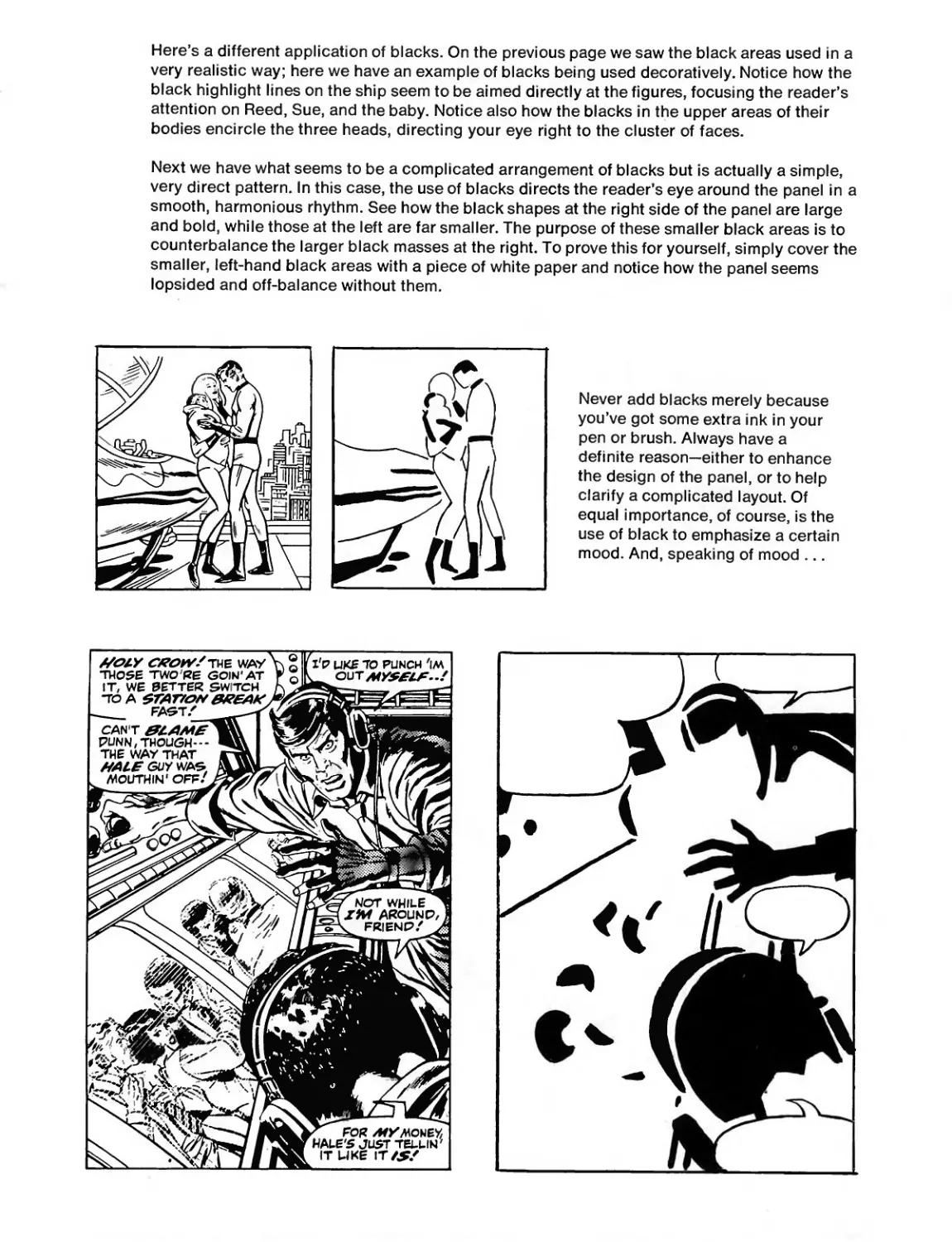
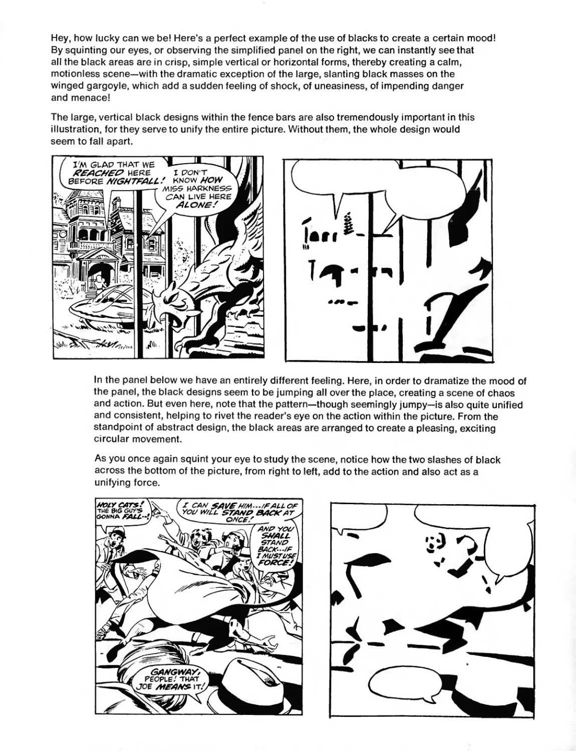
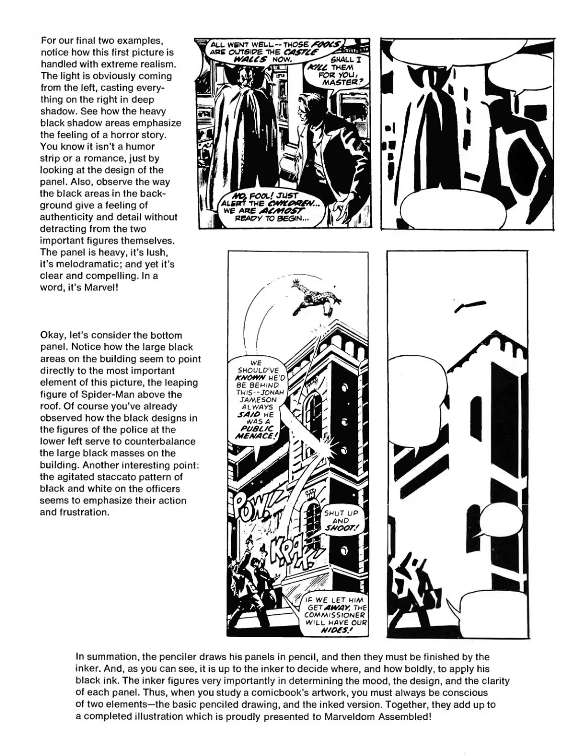
/
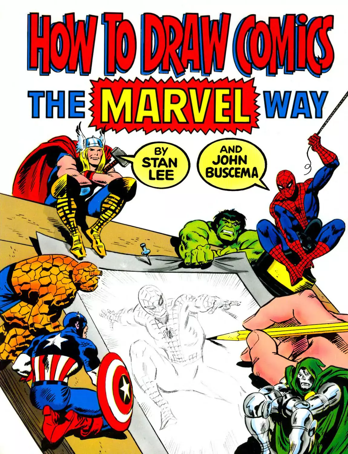


Text
ft© twsw
I girart
Stan Lee
John Buscema
A FIRESIDE BOOK
Published by Simon & Schuster, Inc.
NEW YORK
a Bchry Scan
Dedicated to John Buscema, the Michelangelo of the comics.
Stan Lee
Dedicated to Stan Lee, who knows talent when he sees it.
John Buscema
Oh well, you win some, you lose some!
Stan
But seriously, folks—
Dedicated to every wide-eyed guy or gal who has ever held a pencil,
pen, or crayon and dreamed of telling fantastic stories through pictures;
to everyone who’s ever thrilled to the sight of a dazzling drawing and
longed to be able to copy it, or better still, to create an original!
In short, to everyone and anyone who’s ever wanted to be—a comic-
book artist! You're our kind of people. We know just how you feel. You
see, we’ve been there ourselves!
CONTENTS
Preface .......................................... 8
One The Tools—and the Talk—of the Trade!.............. 11
Two The Secrets of—Form! Making an Object
Look Real...................................... 19
Three The Power of—Perspective!......................... 29
Four Let’s Study—The Figure!........................... 41
Five Let’s Draw the Figure!............................ 51
Six The Name of the Game is—Action!................... 59
Seven Foreshortening! The Knack of Drawing the
Figure in Perspective!.................................... 77
Eight Drawing the Human Head!........................... 87
Nine Composition! .................................... 109
Ten Draw Your Own Comicbook Page!.................... 125
Eleven The Comicbook Cover!............................. 137
Twelve The Art of Inking!............................... 145
Bibliography ................................... 158
Acknowledgments ................................ 160
PREFACE
I’ve been planning to write this book for years, but it took Big John Buscema to
light the fire and get the whole thing started. Here's how it happened.
You know how it is. You intend to paint the barn, or mow the lawn, tidy up your
room, or write a book—but you keep putting it off because there are a zillion other
things you’d rather do. Well, that’s the way it was with me. I’ve spent so many
years as editor, art director and writer of so many superhero yarns that I just
couldn’t bring myself to write the one book that I knew would have to be written
sooner or later—the one book that Marvel fans everywhere always ask for when-
ever I deliver one of my lilting little lectures on some campus or other. Namely,
the book you're now so gratefully grasping in your pencil-smudged little paws.
Why has it been so eagerly requested? Simple. You see, while there’s a veritable
plethora of “How to Draw’’ manuals gallantly glorifying any bookseller’s shelves,
up to now there’s been no book available to tell a budding young Buscema, or
Kirby, Colan or Kane how to draw comicbook superheroes, and—most importantly
—how to do it in the mildly magnificent Marvel style. Yep, I knew I’d have to write
it someday, and it all came together when Big John organized his comicbook
workshop.
Early in ’75 Johnny told me he was going to teach a course in drawing for the
comics. My curiosity aroused, I visited one of his classes and was absolutely
amazed at the quality and depth of his instruction. You know how rare it is to find
the foremost person in some field who can actually teach as well as perform.
Well, take it from me, I had certainly found him that day—and I was doubly
fortunate in that he was a longtime friend as well as a co-worker at Marvel Comics.
After viewing the success of his popular art course, I finally told Johnny that I felt
it was a shame only a comparative handful of students could learn what he had to
teach about comicbook artwork—a shame that so few were able to sit at the feet
of the master. Then I planted the seed. If he were to illustrate a book on the
subject, he could reach thousands of aspiring artists all at the same time.
Obviously, no one book can substitute for an entire art course, but at least we’d
be able to present a broad overview, illustrating the most important elements of
style, drama, and design that go into the making of a Marvel superhero feature.
Without looking up from his drawing board, he mumbled his usual monosyllabic
grunt, which long years of friendship had taught me to interpret as a note of
assent. Spurred on by his display of unbridled enthusiasm, I knew the project
could be delayed no longer. John Buscema would organize, prepare, and
illustrate our book—based on the highly successful course he teaches in his own
workshop—and I would do the writing and sneakily steal a disproportionate share
of the credit, as is my wont. So, here we are!
Okay, I won’t keep you from the good stuff any longer. Just remember one thing.
The pages that follow were created to give you an informed insight into the way
the most popular comicbook superhero strips are designed and illustrated.
They’ll bring you as many artistic tips, tricks, secrets, and suggestions as
possible. They’ll show you what we strive for in doing our drawings, and how we
go about achieving our unique objectives in art and design. We’ve tried to
condense our own long years of training, toil, and experience into this one valiant
little volume. And, in return, all we ask of you is—
Don’t tell our competition what you’ve learned!
Excelsior!
Stan Lee
New York 1977
THE TOOLS-
AND THE TALK- OF THE TRADE!
Since very few of us draw with just our fingernails, let’s start
off with what you’ll need. Then we’ve got to make sure we’re
all speaking the same language. This part’s the easiest.
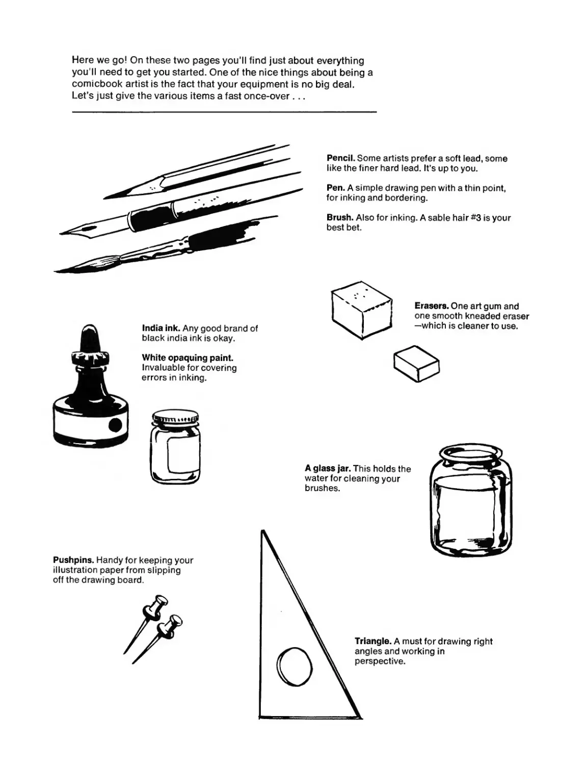
Here we go! On these two pages you’ll find just about everything
you'll need to get you started. One of the nice things about being a
comicbook artist is the fact that your equipment is no big deal.
Let’s just give the various items a fast once-over...
Pencil. Some artists prefer a soft lead, some
like the finer hard lead. It’s up to you.
Pen. A simple drawing pen with a thin point,
for inking and bordering.
Brush. Also for inking. A sable hair #3 is your
best bet.
India ink. Any good brand of
black India ink is okay.
White opaquing paint.
Invaluable for covering
errors in inking.
Pushpins. Handy for keeping your
illustration paper from slipping
off the drawing board.
Erasers. One art gum and
one smooth kneaded eraser
—which is cleaner to use.
Triangle. A must for drawing right
angles and working in
perspective.
A glass j*ar. This holds the
water for cleaning your
brushes.
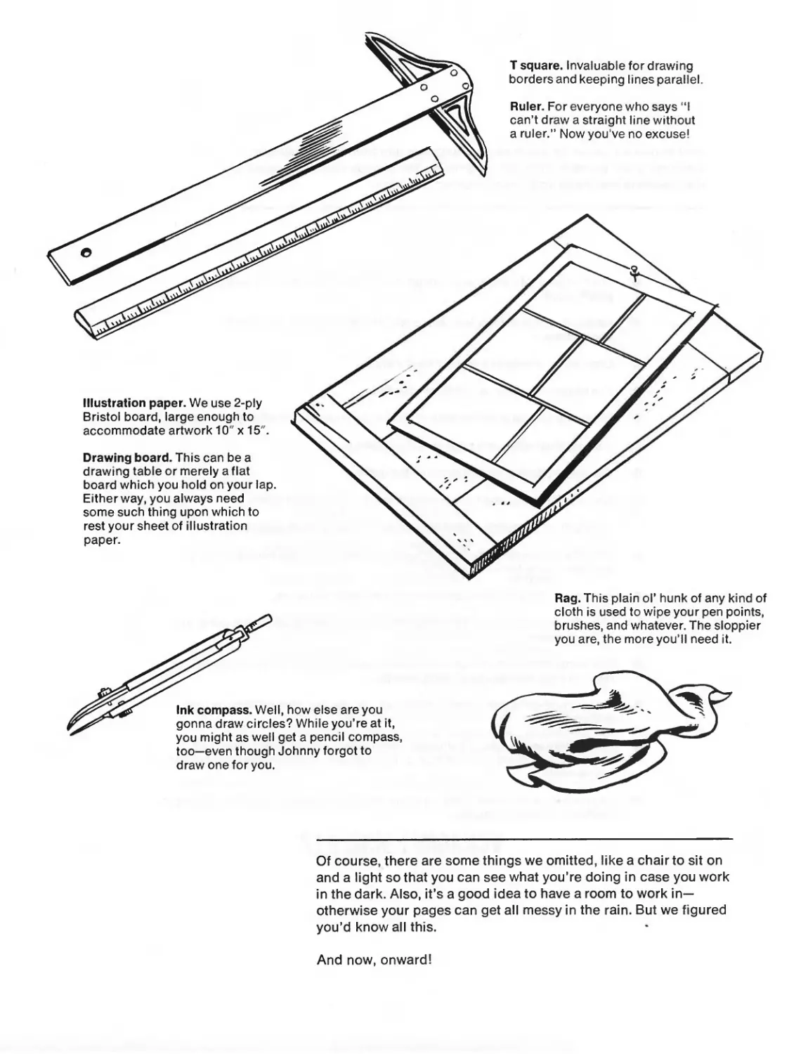
T square. Invaluable fordrawing
borders and keeping lines parallel.
Ruler. For everyone who says “I
can’t draw a straight line without
a ruler.” Now you’ve no excuse!
Illustration paper. We use 2-ply
Bristol board, large enough to
accommodate artwork 10" x 15'.
Drawing board. This can be a
drawing table or merely a flat
board which you hold on your lap.
Either way, you always need
some such thing upon which to
rest your sheet of illustration
paper.
Ink compass. Well, how else are you
gonna draw circles? While you’re at it,
you might as well get a pencil compass,
too—even though Johnny forgot to
draw one for you.
Rag. This plain оГ hunk of any kind of
cloth is used to wipe your pen points,
brushes, and whatever. The sloppier
you are, the more you’ll need it.
Of course, there are some things we omitted, like a chair to sit on
and a light so that you can see what you’re doing in case you work
in the dark. Also, it’s a good idea to have a room to work in-
otherwise your pages can get all messy in the rain. But we figured
you’d know all this.
And now, onward!
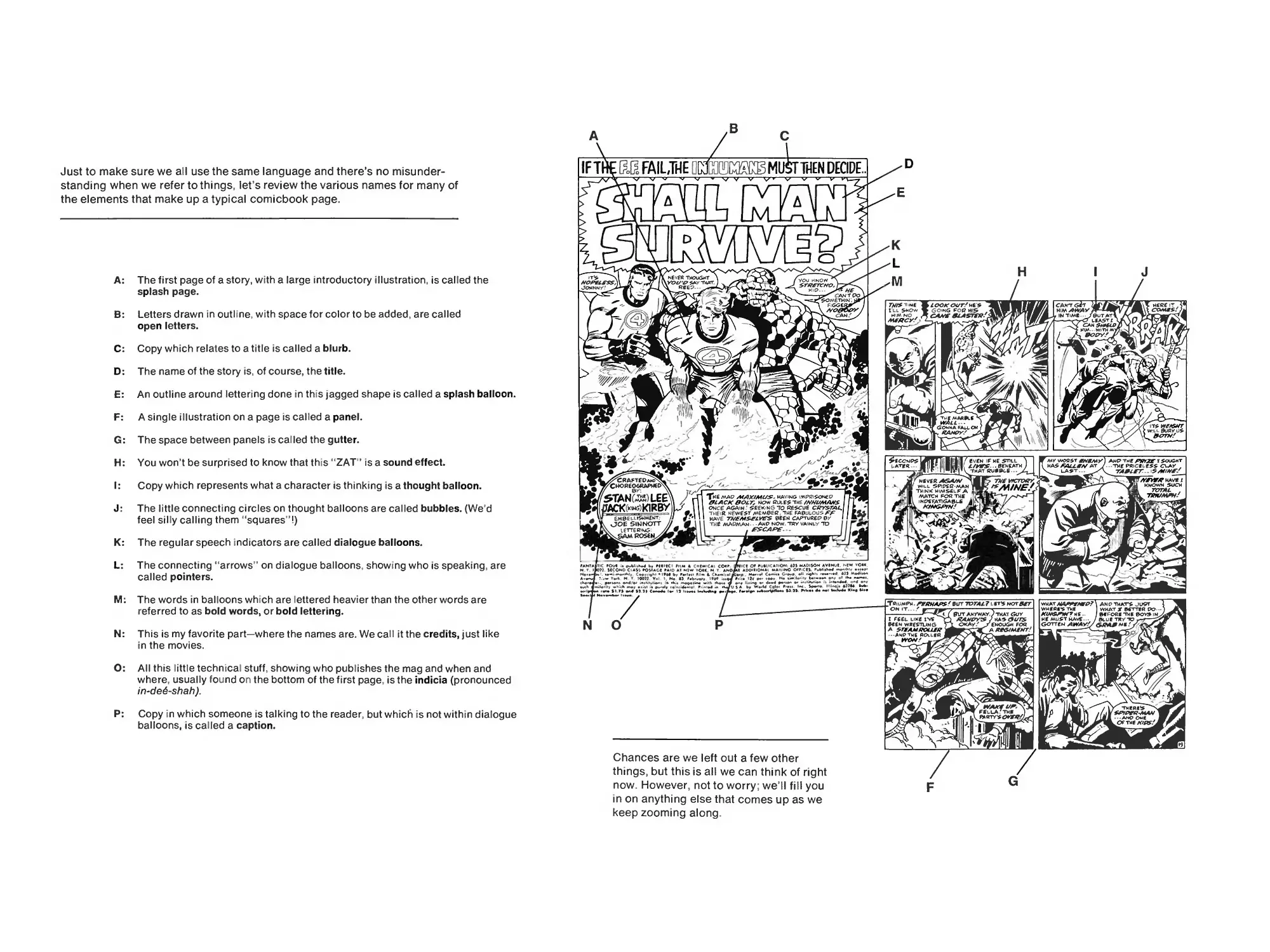
Just to make sure we all use the same language and there’s no misunder-
standing when we refer to things, let’s review the various names for many of
the elements that make up a typical comicbook page.
A: The first page of a story, with a large introductory illustration, is called the
splash page.
B: Letters drawn in outline, with space for color to be added, are called
open letters.
C: Copy which relates to a title is called a blurb.
D: The name of the story is, of course, the title.
E: An outline around lettering done in this jagged shape is called a splash balloon.
F: A single illustration on a page is called a panel.
G: The space between panels is called the gutter.
H: You won’t be surprised to know that this “ZAT" is a sound effect.
I: Copy which represents what a character is thinking is a thought balloon.
J: The little connecting circles on thought balloons are called bubbles. (We’d
feel silly calling them “squares"!)
K: The regular speech indicators are called dialogue balloons.
L: The connecting “arrows" on dialogue balloons, showing who is speaking, are
called pointers.
M: The words in balloons which are lettered heavier than the other words are
referred to as bold words, or bold lettering.
N: This is my favorite part—where the names are. We call it the credits, just like
in the movies.
O: All this little technical stuff, showing who publishes the mag and when and
where, usually found on the bottom of the first page, is the indicia (pronounced
in-de6~shah).
P: Copy in which someone is talking to the reader, but which is not within dialogue
balloons, is called a caption.
D
THEN DECIDE
HERE IT ,
к
N
them*s
ANO---- й
OF THE AZOF/
its wetsxr
wll BUSY US
Zrzw/
YOU KNOW
snwrwp
HE
FcGG
0OTAT
BORYf
HOPELESS
JOHNNY?
CRAFTEDamo
CHOREOGRAPHED
ч ooe Sinnott
teTTERKG:
SAM ROSEN
NEVER THOUGHT
YOU'R SAtf THAT.
REEP-.
CANTOO
somethin;
The map aiAX/mus. having imprisokp
0LACK8OLT, NOW GiXES Tm£ ZV//Z44</XVS
ONCt AGA’N' SEEKING TO RESCUE CRYSTAL,
TMEiR NEWEST MEMBER THE FABULOUS ZX
HAVE THEMSELVES BEEN GAPTuREC* ВУ
TME MAPMAN* • - AHP NOW. TRY VAINLY TO
2 MCQNbClAH »O$lAGt FA<D Af NiW Y©« N Y Al
. Cw><gM a Lr F««l»<l А СК»«* «
-w N Y 100П Vol I. No »> »♦♦♦
ict 09 rueiKATlOH MAOISON AVlNUt. MW *©«
AOO*«lONAl MAKING CNfiCtS F***-»*»4 M*A<hlr
Chances are we left out a few other
things, but this is all we can think of right
now. However, not to worry; we’ll fill you
in on anything else that comes up as we
keep zooming along.
м
WW AWAY
IN TIME...
LEAST [
CAM $H*LP
him.. with*
MV WORST ENEMY J AnP the PRfXE T SOUGHT
MAS PALL AS AT ...THE PRICELESS CLAY ,
LAST... %4/ZZT..i5/Y//V/'./
ЛУИГЛГ have x
KNOWN SUCH
\ ANP THAT’S JU9T
WMf Ri*S THE
ME MUST HAVE ____....
GOTTEN XIMMXVAPR/ Ml
what x better po-
BEFORE THE BOX» IN
BLUE ТЖУ-ТО
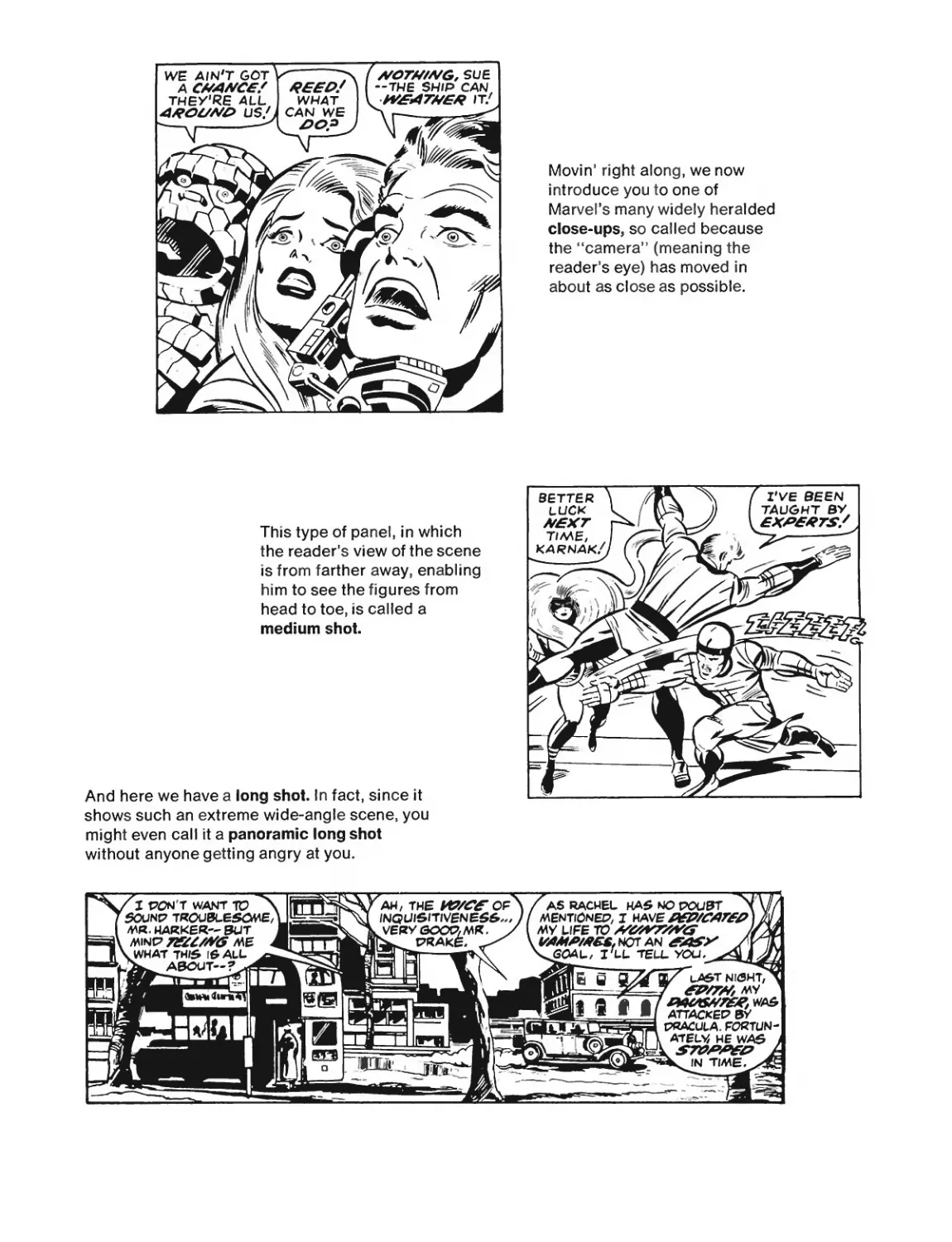
Movin’ right along, we now
introduce you to one of
Marvel’s many widely heralded
close-ups, so called because
the “camera” (meaning the
reader’s eye) has moved in
about as close as possible.
This type of panel, in which
the reader’s view of the scene
is from farther away, enabling
him to see the figures from
head to toe, is called a
medium shot
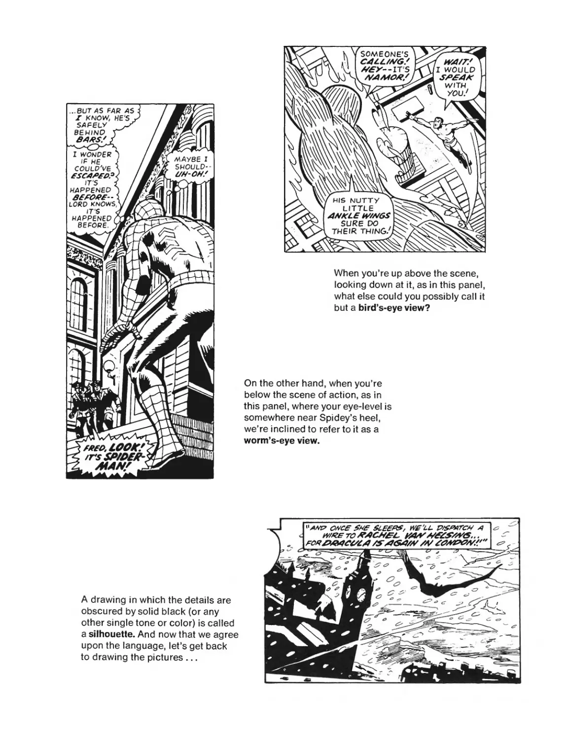
And here we have a long shot In fact, since it
shows such an extreme wide-angle scene, you
might even call it a panoramic long shot
without anyone getting angry at you.
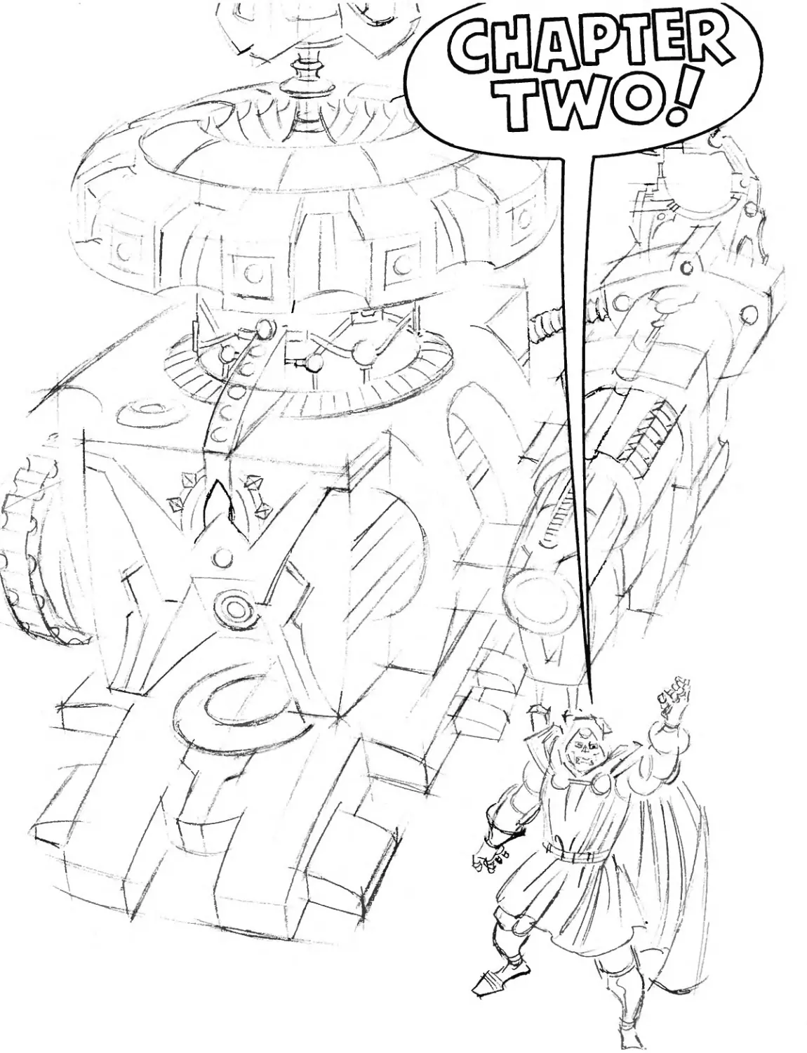
When you’re up above the scene,
looking down at it, as in this panel,
what else could you possibly call it
but a bird’s-eye view?
On the other hand, when you’re
below the scene of action, as in
this panel, where your eye-level is
somewhere near Spidey’s heel,
we’re inclined to refer to it as a
worm’s-eye view.
A drawing in which the details are
obscured by solid black (or any
other single tone or color) is called
a silhouette. And now that we agree
upon the language, let’s get back
to drawing the pictures ...
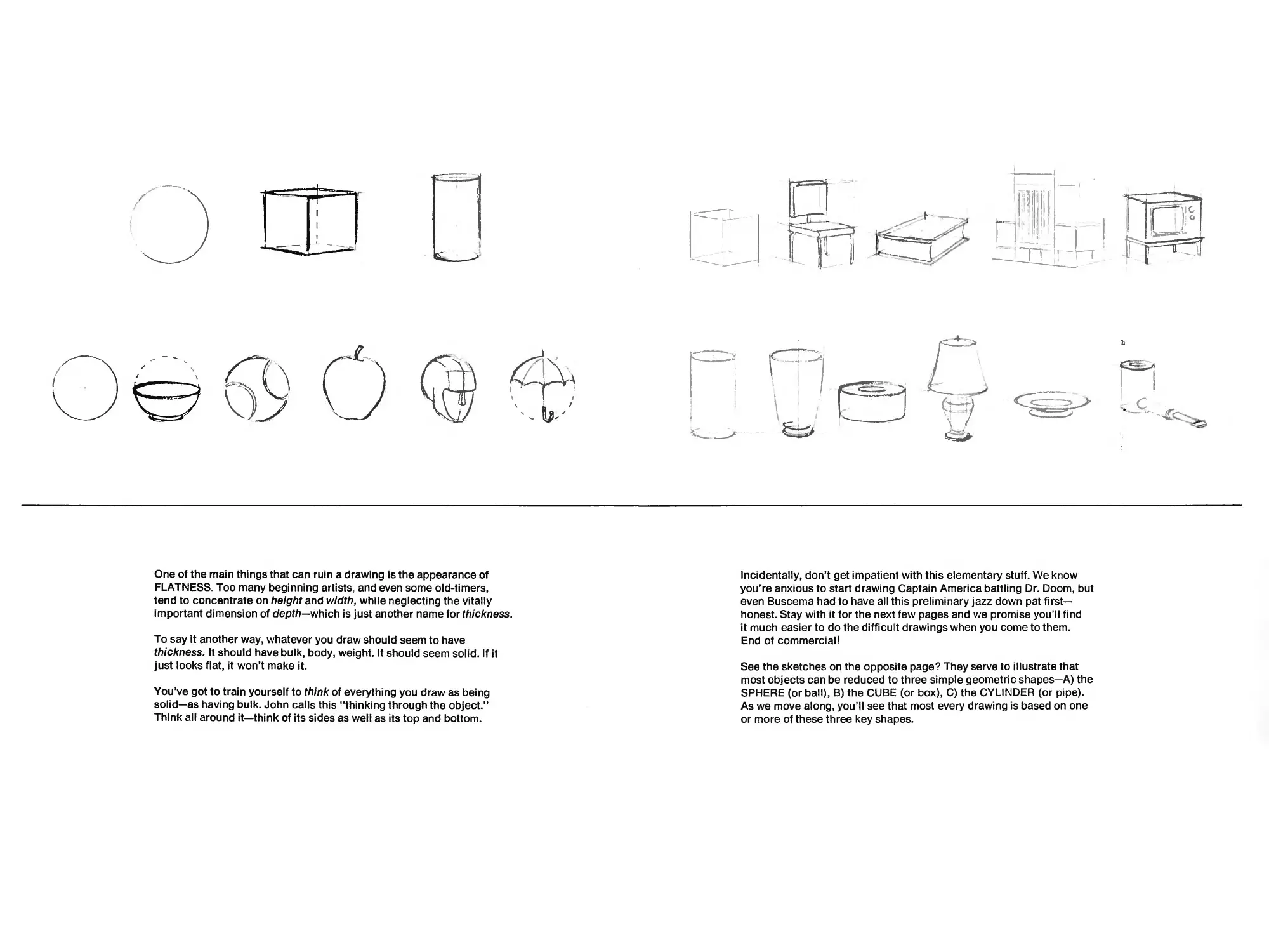
THE SECRETS OF- FORM!
MAKING AN OBJECT LOOK REAL.
Anyone, even you or I, can draw some sort of circle or square. But how do
we make it look like the real thing? How do we make a reader feel as if he
can just reach out and touch it? How do we stop it from just lying there,
flat and one-dimensional, on the page? How do we give it length (pretty
easy), width (not hard), and depth (this is the tough one)? In short, how do
we give it the proper form?
Now that we’ve bothered to ask, let’s see how Big John can help us find
the answers ...
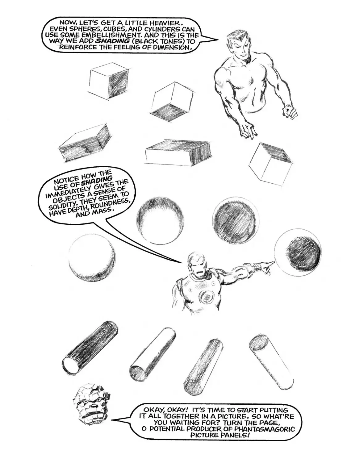
One of the main things that can ruin a drawing is the appearance of
FLATNESS. Too many beginning artists, and even some old-timers,
tend to concentrate on height and width, while neglecting the vitally
important dimension of depth—which is just another name for thickness.
To say it another way, whatever you draw should seem to have
thickness. It should have bulk, body, weight. It should seem solid. If it
just looks flat, it won’t make it.
You’ve got to train yourself to think of everything you draw as being
solid—as having bulk. John calls this “thinking through the object.”
Think all around it—think of its sides as well as its top and bottom.
Incidentally, don’t get impatient with this elementary stuff. We know
you’re anxious to start drawing Captain America battling Dr. Doom, but
even Buscema had to have all this preliminary jazz down pat first-
honest. Stay with it for the next few pages and we promise you’ll find
it much easier to do the difficult drawings when you come to them.
End of commercial!
See the sketches on the opposite page? They serve to illustrate that
most objects can be reduced to three simple geometric shapes—A) the
SPHERE (or ball), B) the CUBE (or box), C) the CYLINDER (or pipe).
As we move along, you’ll see that most every drawing is based on one
or more of these three key shapes.
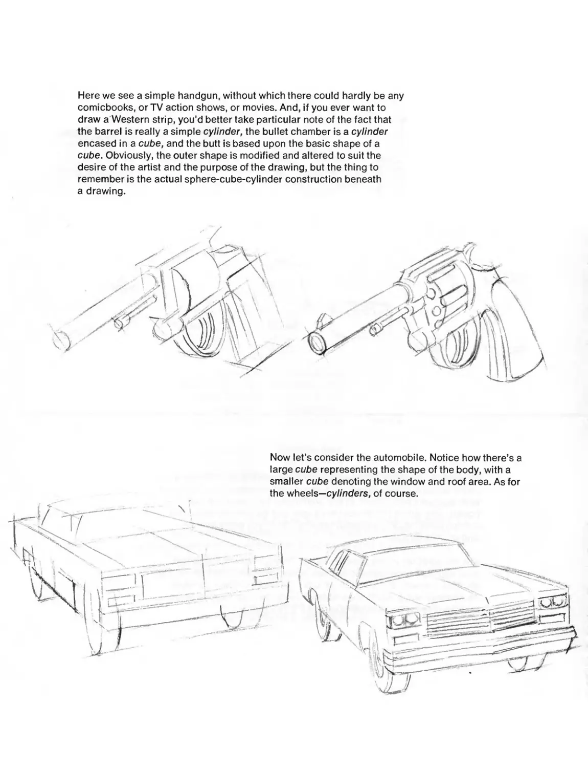
Here we see a simple handgun, without which there could hardly be any
comicbooks, or TV action shows, or movies. And, if you ever want to
draw a Western strip, you’d better take particular note of the fact that
the barrel is really a simple cylinder, the bullet chamber is a cylinder
encased in a cube, and the butt is based upon the basic shape of a
cube. Obviously, the outer shape is modified and altered to suit the
desire of the artist and the purpose of the drawing, but the thing to
remember is the actual sphere-cube-cylinder construction beneath
a drawing.
Now let’s consider the automobile. Notice how there’s a
large cube representing the shape of the body, with a
smaller cube denoting the window and roof area. As for
the wheels—cylinders, of course.
I >
1
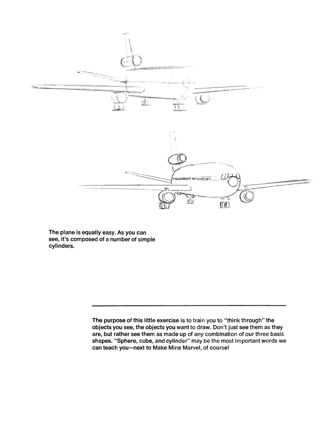
The plane is equally easy. As you can
see, it's composed of a number of simple
cylinders.
The purpose of this little exercise is to train you to “think through" the
objects you see, the objects you want to draw. Don’t just see them as they
are, but rather see them as made up of any combination of our three basic
shapes. “Sphere, cube, and cylinder” may be the most important words we
can teach you—next to Make Mine Marvel, of course!
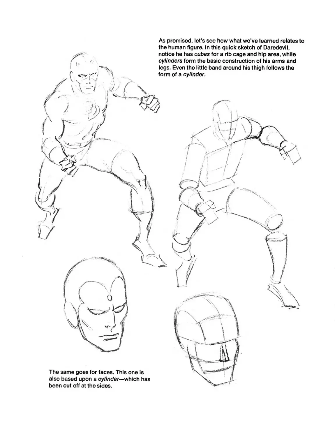
As promised, let's see how what we've learned relates to
the human figure. In this quick sketch of Daredevil,
notice he has cubes for a rib cage and hip area, while
cylinders form the basic construction of his arms and
legs. Even the little band around his thigh follows the
form of a cylinder.
The same goes for faces. This one is
also based upon a cylinder--which has
been cut off at the sides.
I
I
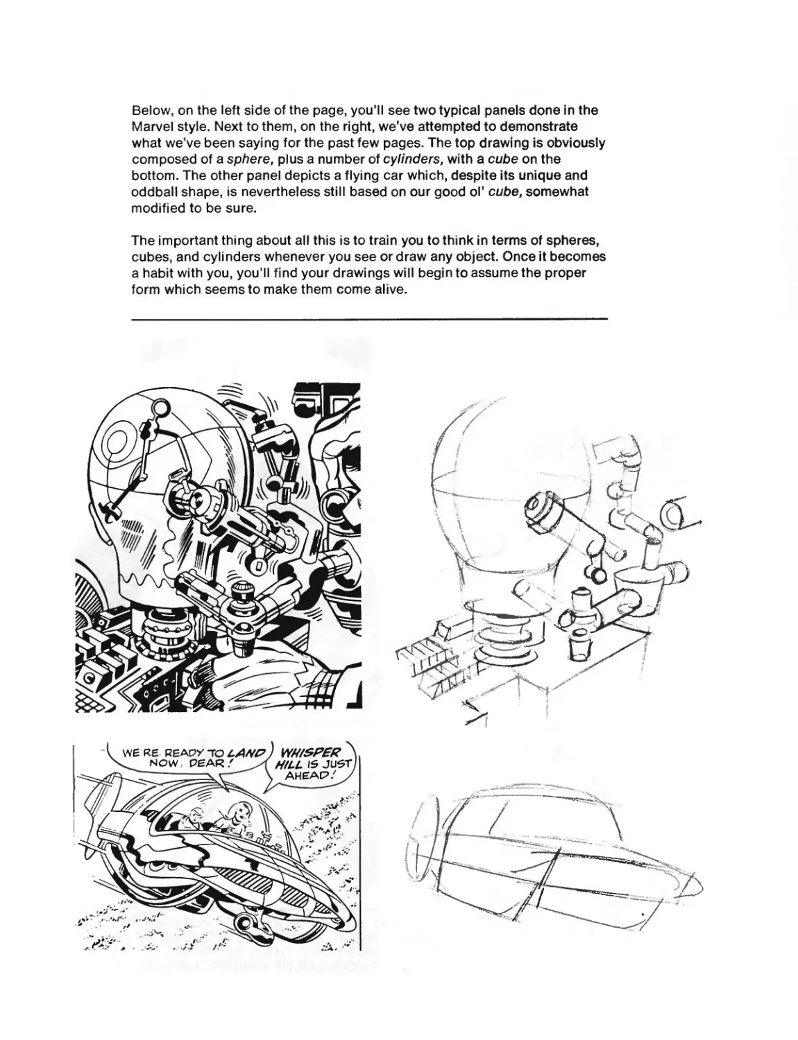
Below, on the left side of the page, you’ll see two typical panels done in the
Marvel style. Next to them, on the right, we’ve attempted to demonstrate
what we’ve been saying for the past few pages. The top drawing is obviously
composed of a sphere, plus a number of cylinders, with a cube on the
bottom. The other panel depicts a flying car which, despite its unique and
oddball shape, is nevertheless still based on our good ol’ cube, somewhat
modified to be sure.
The important thing about all this is to train you to think in terms of spheres,
cubes, and cylinders whenever you see or draw any object. Once it becomes
a habit with you, you’ll find your drawings will begin to assume the proper
form which seems to make them come alive.
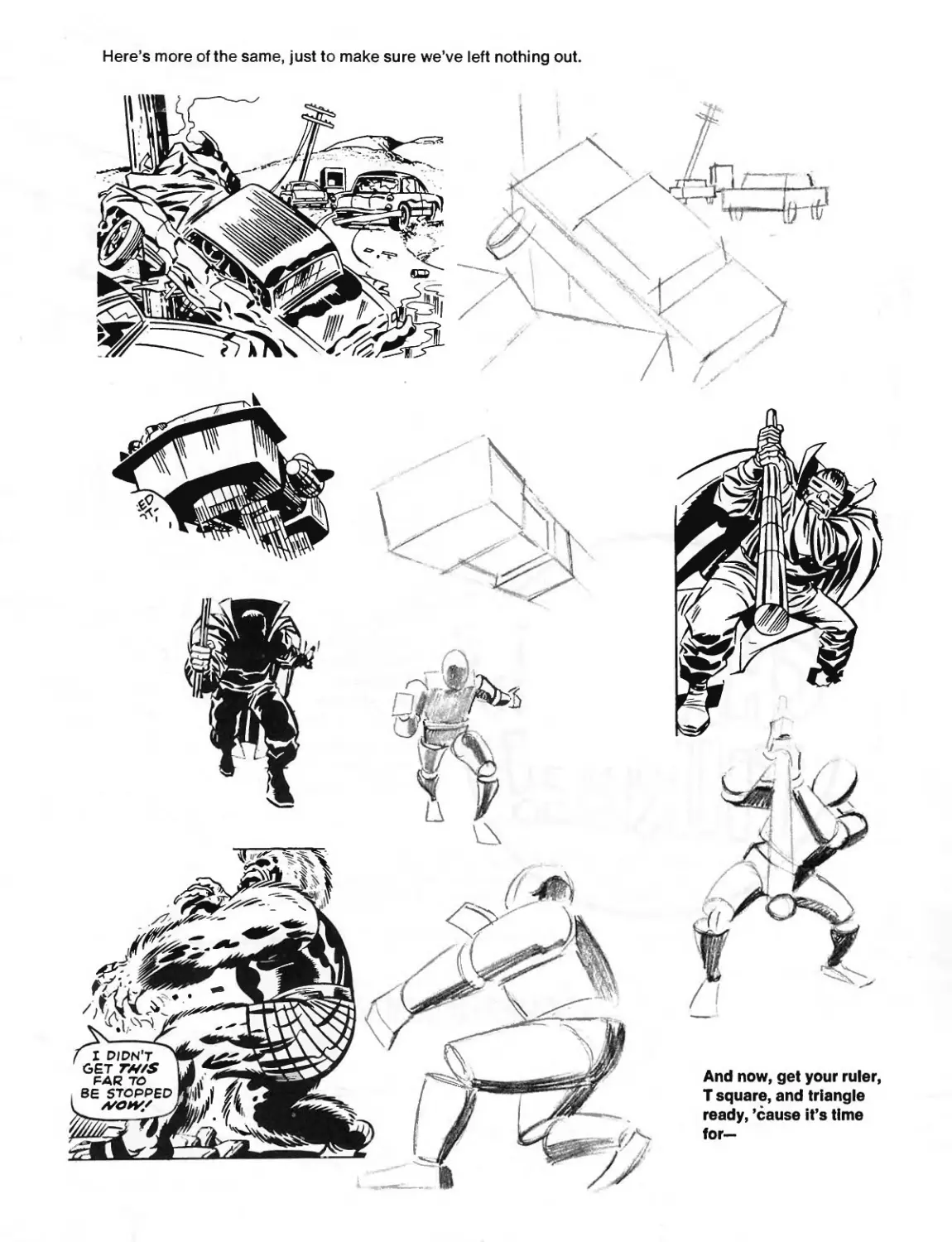
Here’s more of the same, just to make sure we’ve left nothing out.
THE POWER OF- PERSPECTIVE!
Just as FORM is all-important in making an object look real, so is
PERSPECTIVE vitally necessary in making a scene look accurate—in
making things appear to be correctly placed in the foreground,
background, and all the places in between.
It isn’t an easy subject, but you’ve got to master it in order to draw a comic
strip—and we promise to make it as simple and as clear as we can. (And,
if it’s any consolation, it’s just as tough for us to explain as it is for you
to learn!)
So, since we’re all in this thing together, let’s go!
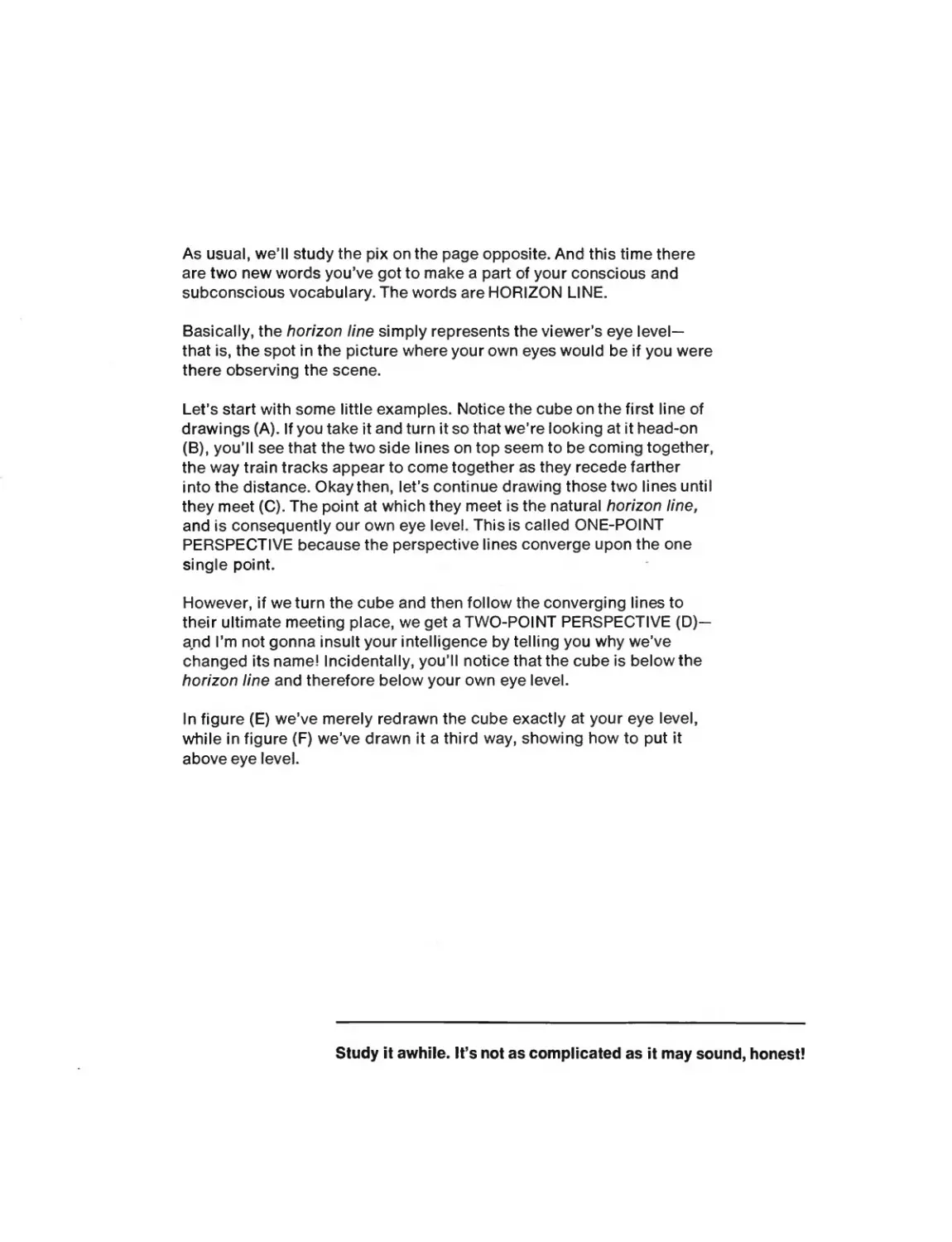
As usual, we’ll study the pix on the page opposite. And this time there
are two new words you’ve got to make a part of your conscious and
subconscious vocabulary. The words are HORIZON LINE.
Basically, the horizon line simply represents the viewer’s eye level—
that is, the spot in the picture where your own eyes would be if you were
there observing the scene.
Let’s start with some little examples. Notice the cube on the first line of
drawings (A). If you take it and turn it so that we’re looking at it head-on
(B), you’ll see that the two side lines on top seem to be coming together,
the way train tracks appear to come together as they recede farther
into the distance. Okay then, let’s continue drawing those two lines until
they meet (C). The point at which they meet is the natural horizon line,
and is consequently our own eye level. This is called ONE-POINT
PERSPECTIVE because the perspective lines converge upon the one
single point.
However, if weturn the cube and then follow the converging lines to
their ultimate meeting place, we get a TWO-POINT PERSPECTIVE (D)—
and I’m not gonna insult your intelligence by telling you why we’ve
changed its name! Incidentally, you’ll notice that the cube is below the
horizon line and therefore below your own eye level.
In figure (E) we’ve merely redrawn the cube exactly at your eye level,
while in figure (F) we’ve drawn it a third way, showing how to put it
above eye level.
Study it awhile. It’s not as complicated as it may sound, honest!
Е
F
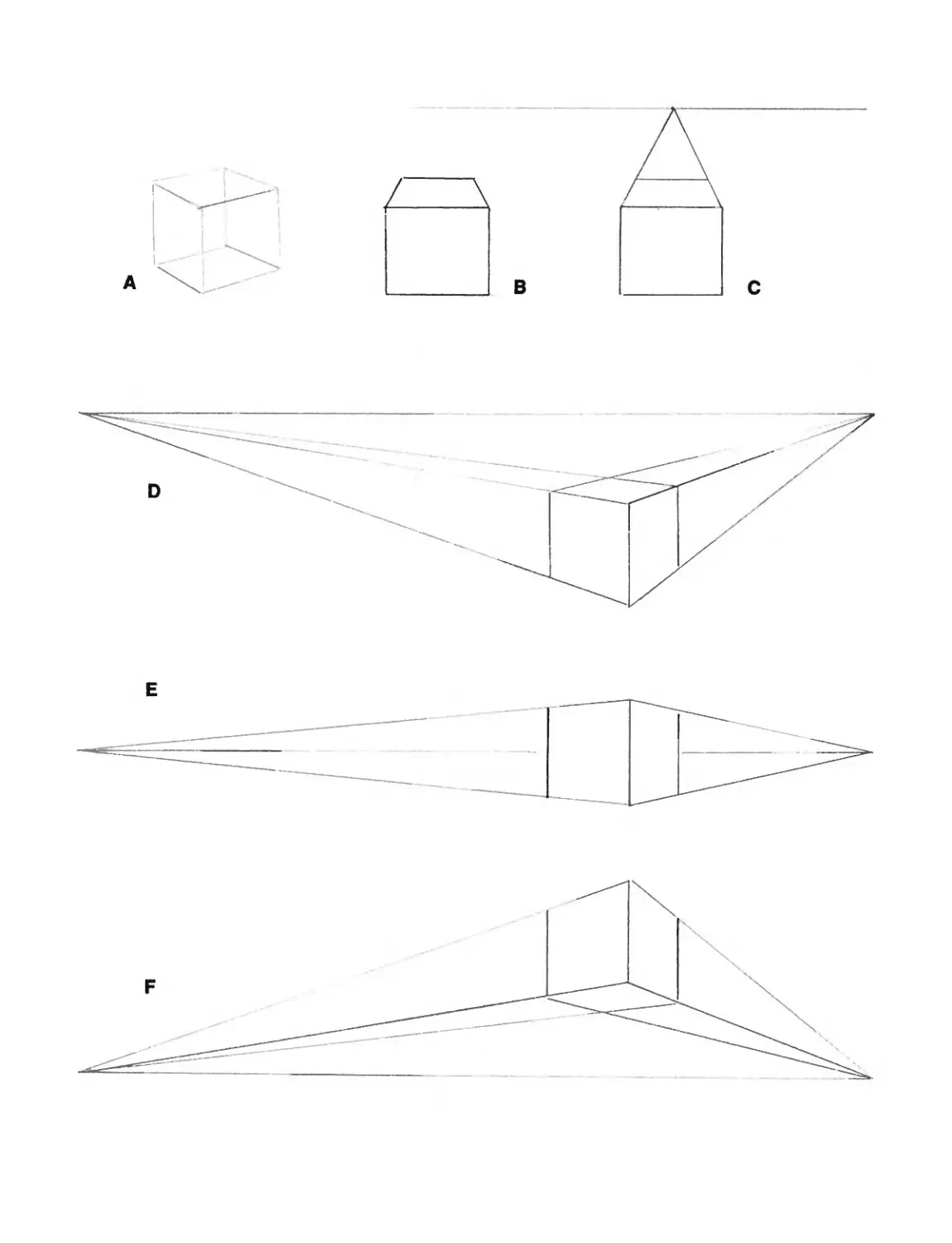
Here, just because Johnny hates to let his ruler goto waste, he’s given you a
couple more examples showing how the principles of perspective apply to
any street scene.
In this first drawing, despite the size of the scene
and the number of buildings, you’ll notice that
everything converges towards one point; therefore
it’s a ONE-POINT PERSPECTIVE.
have an undeniable example of—TA DAAAA—
a TWO-POINT PERSPECTIVE. And there’s
more to come ...
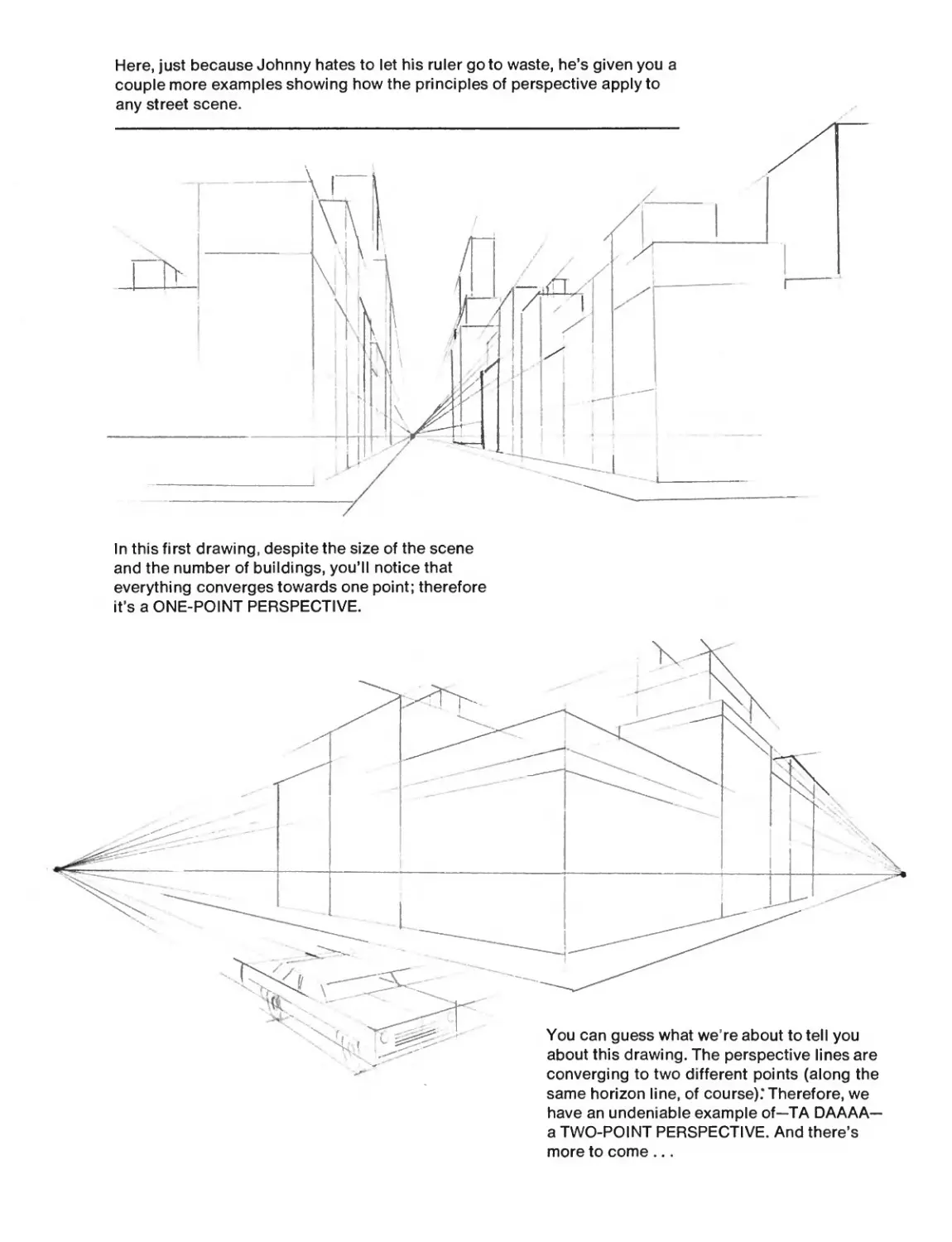
X WELL, IT HAP
/ TO HAPPEN. THESE X.
/ TWO PICS OFFER you \
EXAMPLES OF SCENES \
CONTAINI NG THREE-POINT 1
PERSPECTIVE- CAN YOU FINO
THE THREE VANISHING POINTS?
OOPS, WE FORGOT TO MENTION--
THE POINT AT WHICH THE CON-
VERGING LINES COME TOGETHER
ANP FINALLY MEET IS CALLED,
. NATURALLY ENOUGH.THE у
X VANISHING POINT- BETTER/
X. LATE THAN NEVER .' У
^SPIDER-MAN HATH FORGOTTEN
Z TO TELLTHEE--THE THIRD VANISH- X
ING POINT ON YON TOP ILLUSTRATION DOTH \
NOT GO TO THE HORIZON. WHILST THE FIRST '
AND SECOND VANISHING POINTS DO GO TO THE
HORIZON, THE THIRD ONE RISES FAR ABOVE,
AND IS BUT AN ARBITRARY POINT; JUST
AS THE THIRD ONE IN THIS LOWER i
i PANEL POTH FALL BELOW THE /
X HORIZON IN AN EQUALLY ARBI- У
X^_ TRARY MANNER. SO BE IT/
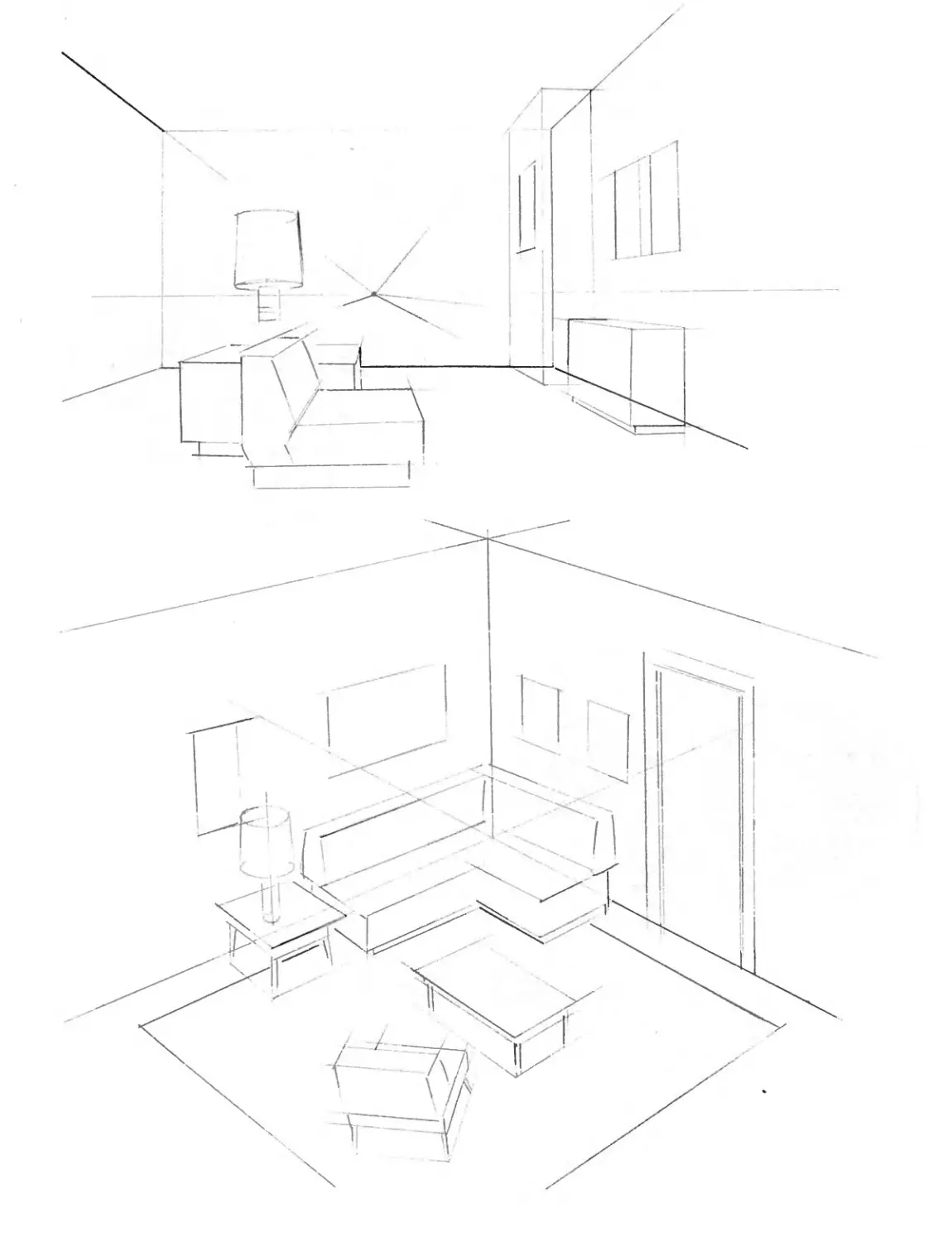
Let’s say you want to draw the inside of a room. Sounds simple,
huh? But what about the furniture? You want it to look natural, to
look as if it belongs, and most important of all, to look as if some of
the pieces aren’t floating in space. They have to seem accurate
and realistic in relation to each other. Well, that’s what perspective
is all about.
In the two illustrations on the facing page, notice how John makes
use of his eye level (horizon line) and his vanishing points in order
to have everything in the correct perspective. No matter where the
viewer’s eye level may be, everything falls into place pleasingly
because the perspective is correct.
And, did you notice the way the chair at the bottom of the lower
pic is angled (turned) differently than the other pieces of furniture,
so that it goes to different vanishing points? This gives us a third
and fourth vanishing point on the same horizon line.
If it seems awfully complicated to you, don’t worry. Johnny had to
explain it to me about a half-dozen times—and I’m still wrestling
with most of it! Anyway, let’s go to the next page and tackle a
problem or two ...
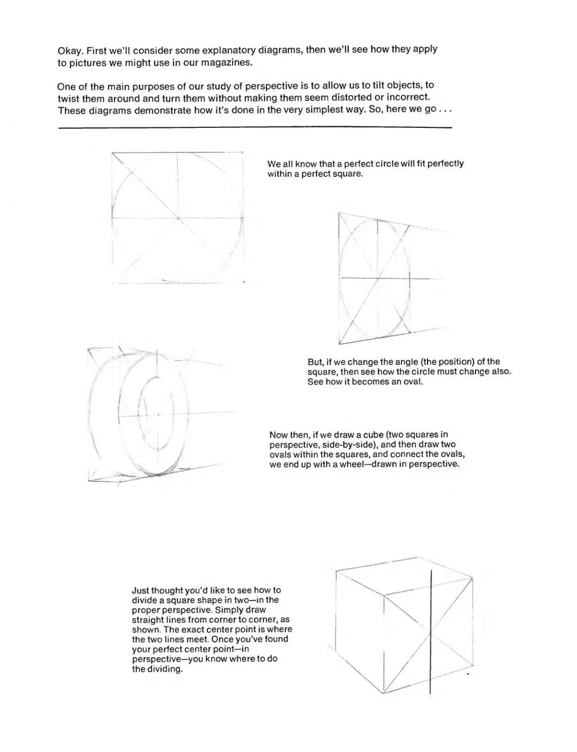
Okay. First we’ll consider some explanatory diagrams, then we’ll see how they apply
to pictures we might use in our magazines.
One of the main purposes of our study of perspective is to allow us to tilt objects, to
twist them around and turn them without making them seem distorted or incorrect.
These diagrams demonstrate how it’s done in the very simplest way. So, here we go...
We all know that a perfect circle will fit perfectly
within a perfect square.
But, if we change the angle (the position) of the
square, then see how the circle must change also.
See how it becomes an oval.
Now then, if we draw a cube (two squares in
perspective, side-by-side), and then draw two
ovals within the squares, and connect the ovals,
we end up with a wheel—drawn in perspective.
Just thought you’d like to see how to
divide a square shape in two—in the
proper perspective. Simply draw
straight lines from corner to corner, as
shown. The exact center point is where
the two lines meet. Once you’ve found
your perfect center point—in
perspective—you know where to do
the dividing.
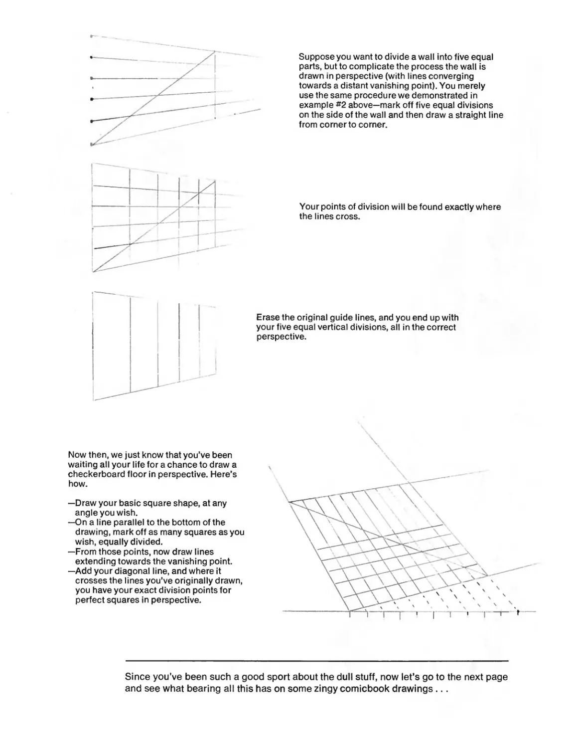
Suppose you want to divide a wall into five equal
parts, but to complicate the process the wall is
drawn in perspective (with linesconverging
towards a distant vanishing point). You merely
use the same procedure we demonstrated in
example #2 above—mark off five equal divisions
on the side of the wall and then draw a straight line
from corner to corner.
Your points of division will be found exactly where
the lines cross.
Erase the original guide lines, and you end up with
your five equal vertical divisions, all in the correct
perspective.
Now then, we just know that you’ve been
waiting all your life for a chance to draw a
checkerboard floor in perspective. Here’s
how.
—Draw your basic square shape, at any
angle you wish.
—On a line parallel to the bottom of the
drawing, mark off as many squares as you
wish, equally divided.
—From those points, now draw lines
extending towards the vanishing point.
—Add your diagonal line, and where it
crosses the lines you’ve originally drawn,
you have your exact division points for
perfect squares in perspective.
Since you’ve been such a good sport about the dull stuff, now let’s go to the next page
and see what bearing all this has on some zingy comicbook drawings...
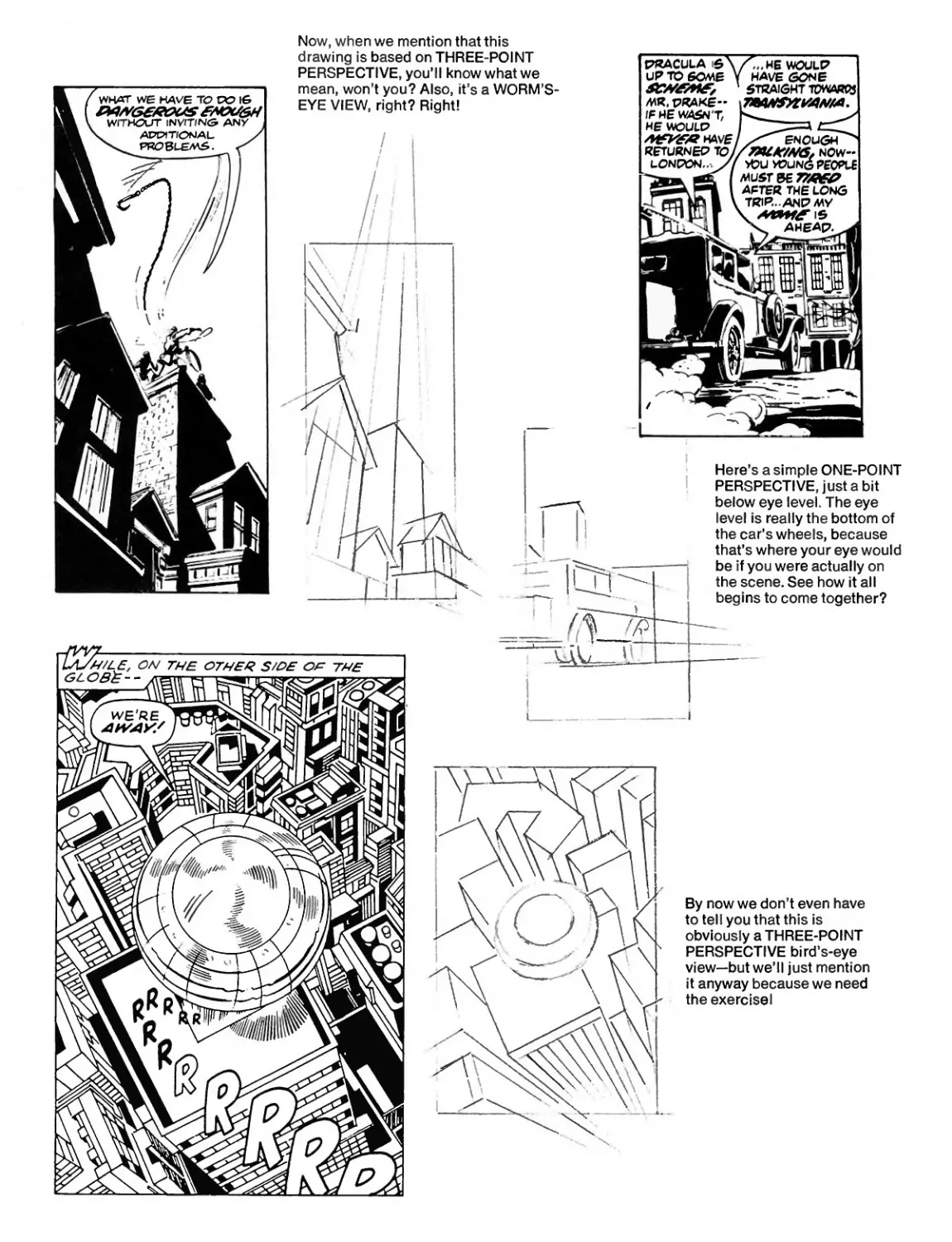
Now, when we mention that this
drawing is based on THREE-POINT
PERSPECTIVE, you’ll know what we
mean, won’t you? Also, it’s a WORM’S-
EYE VIEW, right? Right!
Here’s a simple ONE-POINT
PERSPECTIVE, just a bit
below eye level. The eye
level is really the bottom of
the car’s wheels, because
that’s where your eye would
be if you were actually on
the scene. See how it all
begins to come together?
now we don’t even have
to tel I у ou that this is
obviously a THREE-POINT
PERSPECTIVE bird’s-eye
view—but we’ll just mention
it anyway because we need
the exercisel
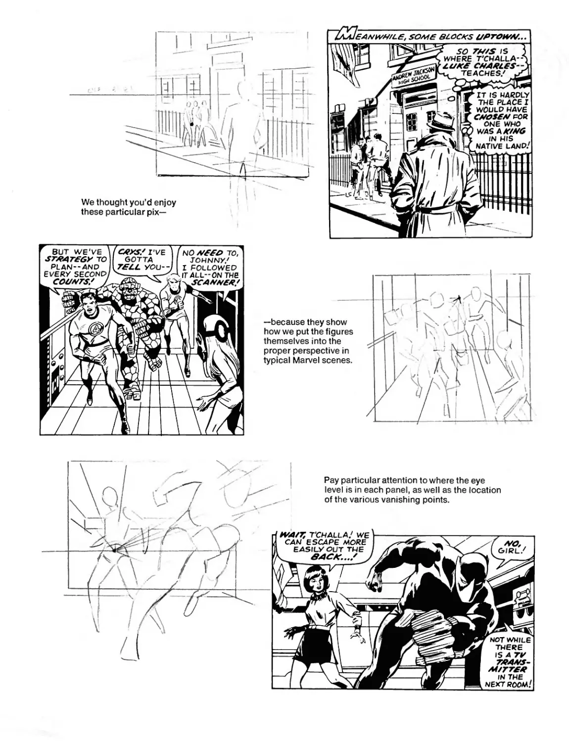
\Ne thought you’d enjoy
these particular pix—
—because they show
how we put the figures
themselves into the
proper perspective in
typical Marvel scenes.
о
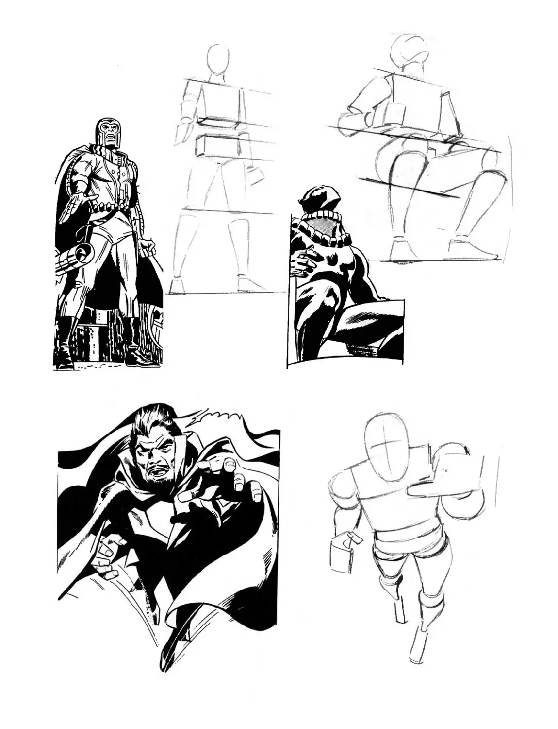
LET S STUDY- THE FIGURE!
This is it, gang! This is what you’ve been waiting for! The
preceding sections gave the basics you need—the cereals
and vegetables. But here’s where you get to the main course
—and the dazzling desserts!
• There might be something more important than figure drawing in
comicbook artwork, but we sure don’t know what it is! Everything is
based on how you draw the characters: the heroes, villains, and the
never-ending hordes of supporting stars. Superhero comicbooks are
the stories of people, period! And we’re going to try to teach you
everything you ought to know about drawing those people and drawing
them as dramatically and heroically as possible.
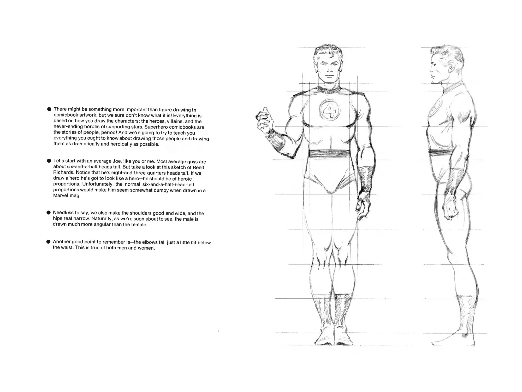
• Let’s start with an average Joe, like you or me. Most average guys are
about six-and-a-half heads tall. But take a look at this sketch of Reed
Richards. Notice that he’s eight-and-three-quarters heads tall. If we
draw a hero he’s got to look like a hero—he should be of heroic
proportions. Unfortunately, the normal six-and-a-half-head-tall
proportions would make him seem somewhat dumpy when drawn in a
Marvel mag.
• Needless to say, we also make the shoulders good and wide, and the
hips real narrow. Naturally, as we’re soon about to see, the male is
drawn much more angular than the female.
• Another good point to remember is—the elbows fall just a little bit below
the waist. This is true of both men and women.
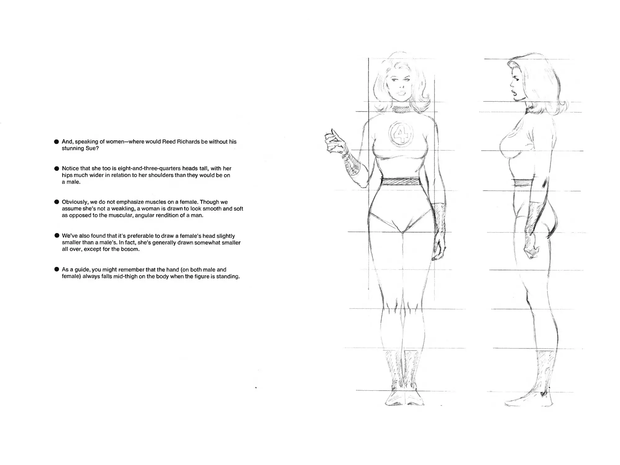
• And, speaking of women—where would Reed Richards be without his
stunning Sue?
• Notice that she too is eight-and-three-quarters heads tall, with her
hips much wider in relation to her shoulders than they would be on
a male.
• Obviously, we do not emphasize muscles on a female. Though we
assume she’s not a weakling, a woman is drawn to look smooth and soft
as opposed to the muscular, angular rendition of a man.
• We’ve also found that it’s preferable to draw a female’s head slightly
smaller than a male’s. In fact, she’s generally drawn somewhat smaller
all over, except for the bosom.
• As a guide, you might remember that the hand (on both male and
female) always falls mid-thigh on the body when the figure is standing.
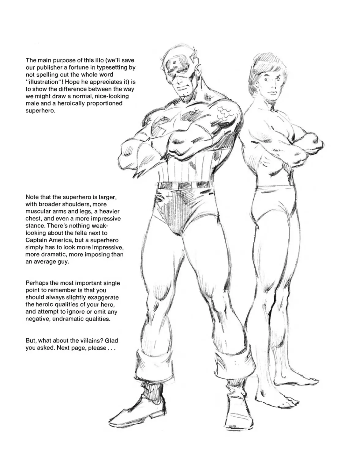
The main purpose of this illo (we’ll save
our publisher a fortune in typesetting by
not spelling out the whole word
“illustration”! Hope he appreciates it) is
to show the difference between the way
we might draw a normal, nice-looking
male and a heroically proportioned
superhero.
Note that the superhero is larger,
with broader shoulders, more
muscular arms and legs, a heavier
chest, and even a more impressive
stance. There’s nothing weak-
looking about the fella next to
Captain America, but a superhero
simply has to look more impressive,
more dramatic, more imposing than
an average guy.
Perhaps the most important single
point to remember is that you
should always slightly exaggerate
the heroic qualities of your hero,
and attempt to ignore or omit any
negative, undramatic qualities.
J
A
But, what about the villains? Glad
you asked. Next page, please...
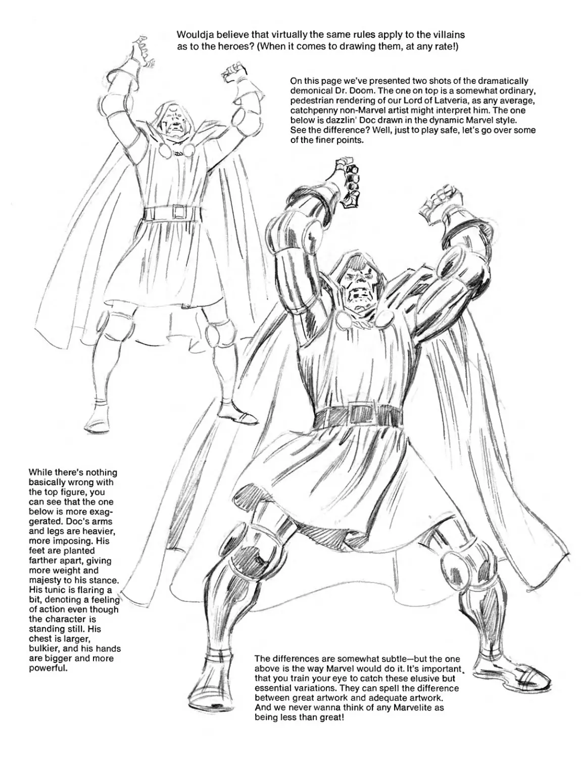
Wouldja believe that virtually the same rules apply to the villains
as to the heroes? (When it comes to drawing them, at any rate!)
The differences are somewhat subtle—but the one
above is the way Marvel would do it. It’s important
that you train your eye to catch these elusive but
essential variations. They can spell the difference
between great artwork and adequate artwork.
And we never wanna think of any Marvelite as
While there’s nothing
basically wrong with
the top figure, you
can see that the one
below is more exag-
gerated. Doc’s arms
and legs are heavier,
more imposing. His
feet are planted
farther apart, giving
more weight and
majesty to his stance.
His tunic is flaring a ,
bit, denoting a feeling
of action even though
the character is
standing still. His
chest is larger,
bulkier, and his hands
are bigger and more
powerful.
On this page we’ve presented two shots of the dramatically
demonical Dr. Doom. The one on top is a somewhat ordinary,
pedestrian rendering of our Lord of Latveria, as any average,
catchpenny non-Marvel artist might interpret him. The one
below is dazzlin' Doc drawn in the dynamic Marvel style.
See the difference? Well, just to play safe, let’s go over some
of the finer points.
being less than great!
want
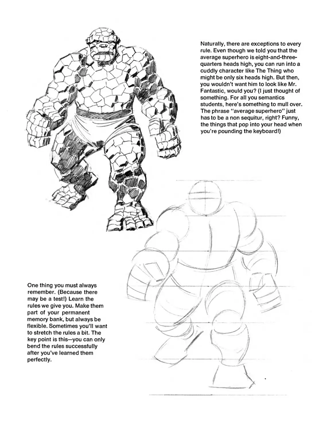
Naturally, there are exceptions to every
rule. Even though we told you that the
average superhero is eight-and-three-
quarters heads high, you can run into a
cuddly character like The Thing who
might be only six heads high. But then,
you wouldn’t want him to look like Mr.
Fantastic, would you? (I just thought of
something. For all you semantics
students, here’s something to mull over.
The phrase “average superhero’’ just
has to be a non sequitur, right? Funny,
the things that pop into your head when
you’re pounding the keyboard!)
One thing you must always
remember. (Because there
may be a test!) Learn the
rules we give you. Make them
part of your permanent
memory bank, but always be
flexible. Sometimes you’ll
to stretch the rules a bit. The
key point is this—you can only
bend the rules successfully
after you’ve learned them
perfectly.
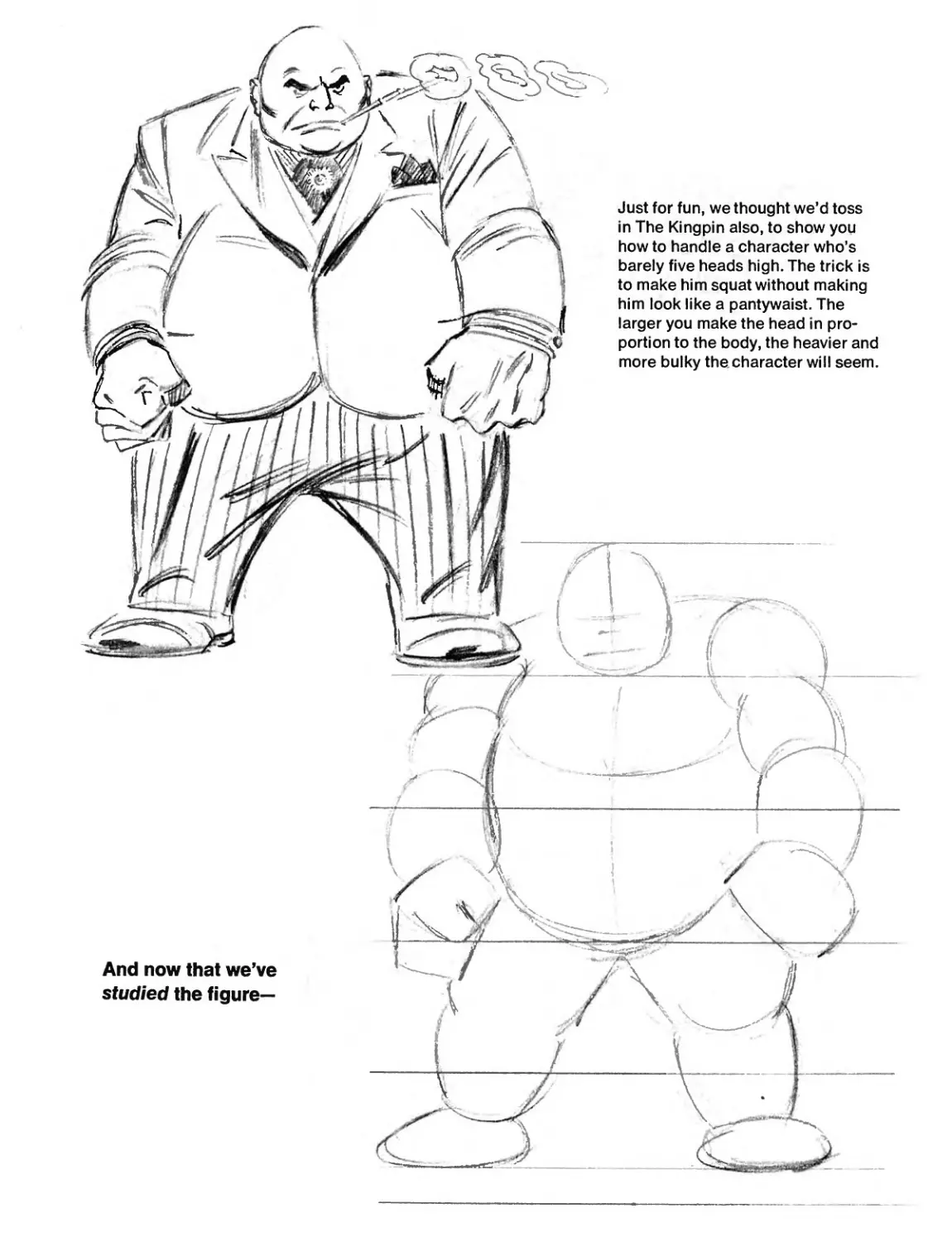
Just for fun, we thought we’d toss
in The Kingpin also, to show you
how to handle a character who’s
barely five heads high. The trick is
to make him squat without making
him look like a pantywaist. The
larger you make the head in pro-
portion to the body, the heavier and
more bulky the character will seem.
And now that we’ve
studied the figure—
7
LET’S DRAW THE FIGURE!
This part is dynamite! So let’s not waste a second—!
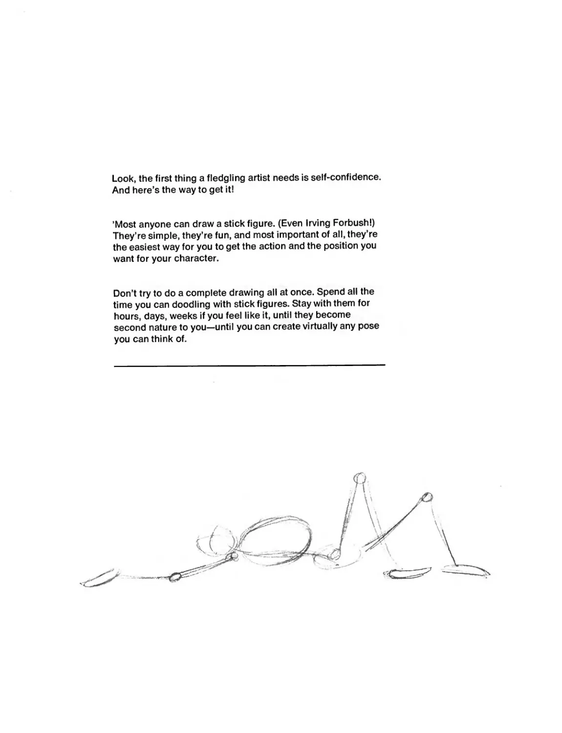
Look, the first thing a fledgling artist needs is self-confidence.
And here’s the way to get it!
’Most anyone can draw a stick figure. (Even Irving Forbush!)
They’re simple, they’re fun, and most important of all, they’re
the easiest way for you to get the action and the position you
want for your character.
Don’t try to do a complete drawing all at once. Spend all the
time you can doodling with stick figures. Stay with them for
hours, days, weeks if you feel like it, until they become
second nature to you—until you can create virtually any pose
you can think of.
Л
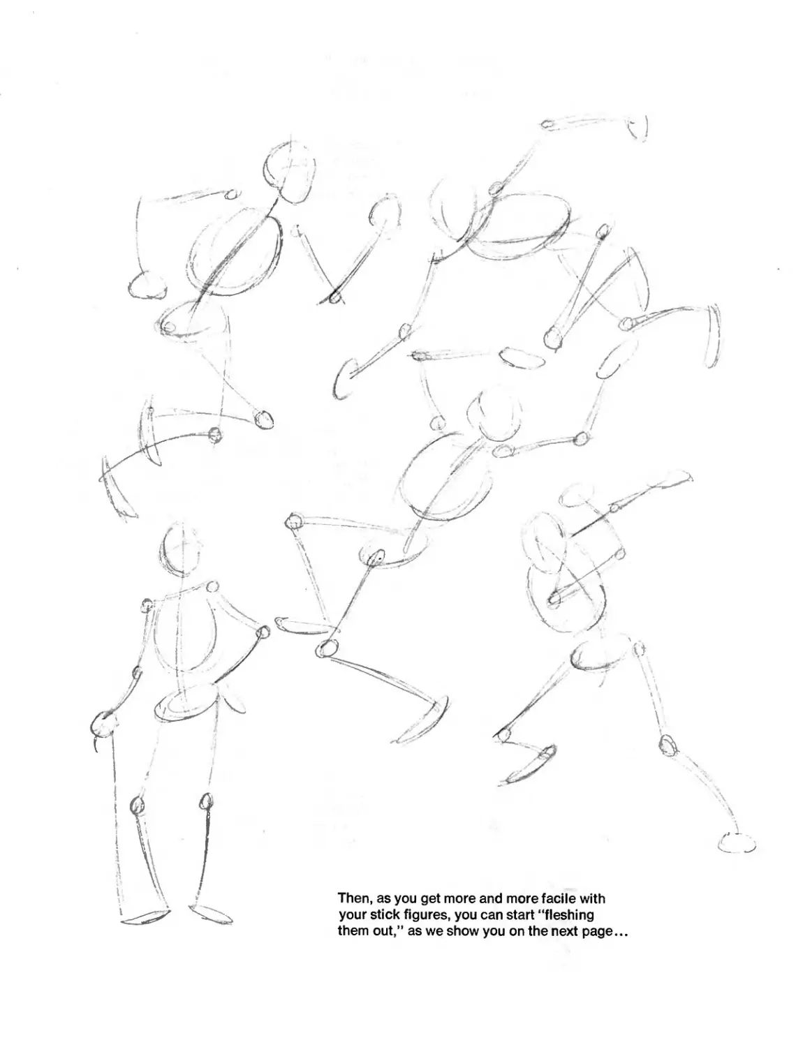
Then, as you get more and more facile with
your stick figures, you can start “fleshing
them out,” as we show you on the next page
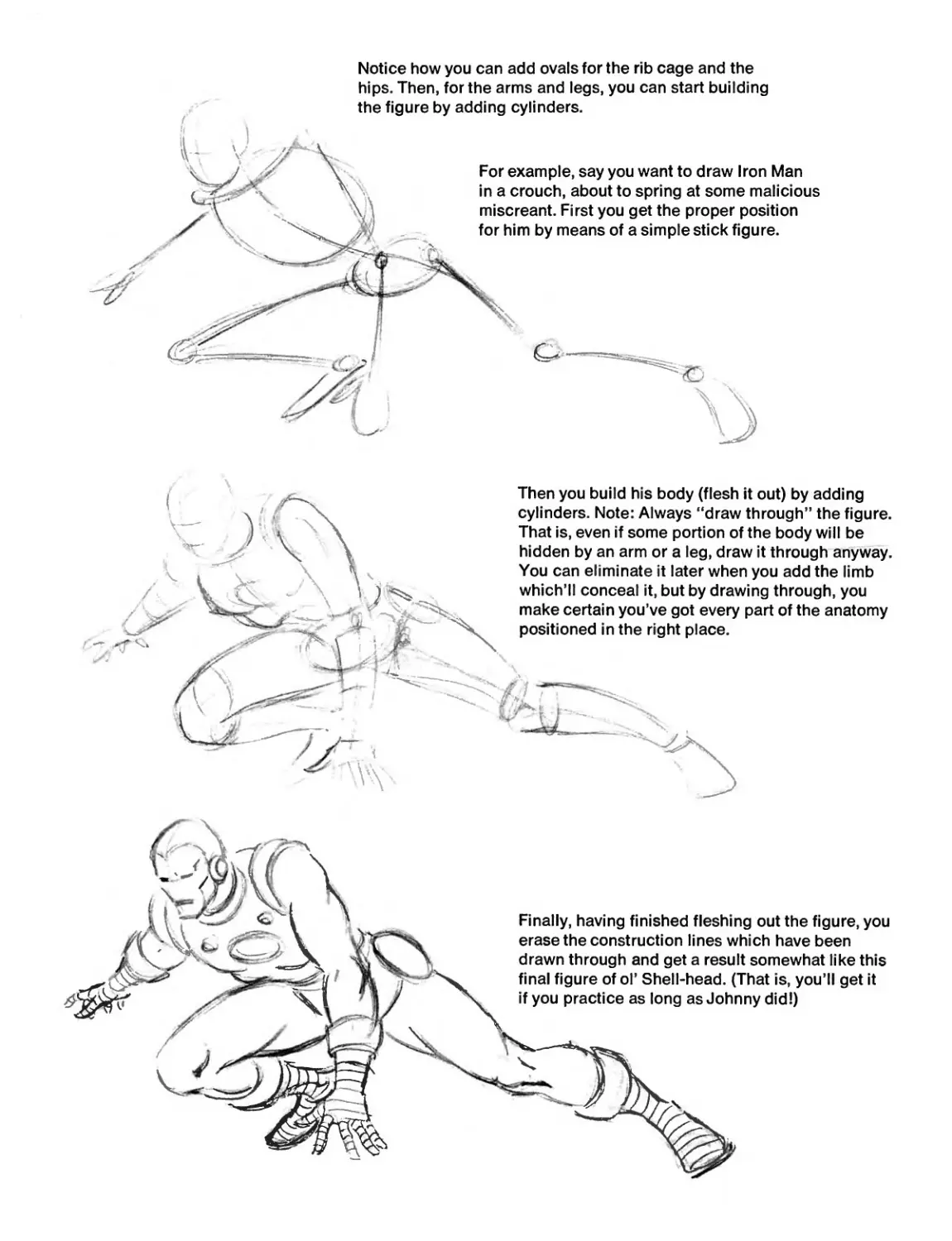
Notice how you can add ovals for the rib cage and the
hips. Then, for the arms and legs, you can start building
the figure by adding cylinders.
Then you build his body (flesh it out) by adding
cylinders. Note: Always “draw through” the figure.
That is, even if some portion of the body will be
hidden by an arm or a leg, draw it through anyway.
You can eliminate it later when you add the limb
which’ll conceal it, but by drawing through, you
make certain you’ve got every part of the anatomy
positioned in the right place.
Finally, having finished fleshing out the figure, you
erase the construction lines which have been
drawn through and get a result somewhat like this
final figure of ol’ Shell-head. (That is, you’ll
if you practice as long as Johnny did!)
get it
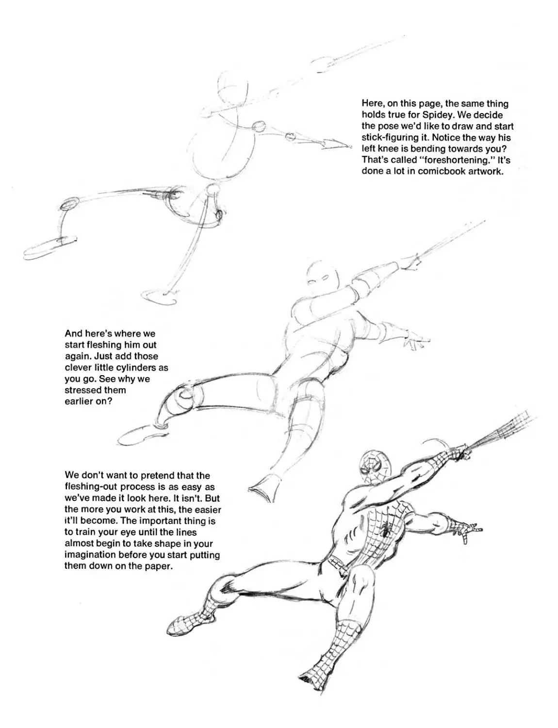
And here s where we
start fleshing him out
again. Just add those
clever little cylinders as
you go. See why we
stressed them
earlier on?
We don’t want to pretend that the
fleshing-out process is as easy as
we’ve made it look here. It isn’t. But
the more you work at this, the easier
it’ll become. The important thing is
to train your eye until the lines
almost begin to take shape in your
imagination before you start putting
them down on the paper.
Here, on this page, the same thing
holds true for Spidey. We decide
the pose we’d like to draw and start
stick-figuring it. Notice the way his
left knee is bending towards you?
That’s called “foreshortening.” It’s
done a lot in comicbook artwork.
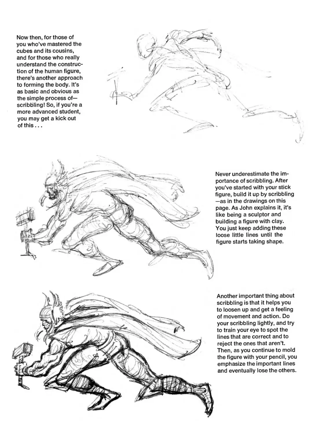
Now then, for those of
you who’ve mastered the
cubes and its cousins,
and for those who really
understand the construc-
tion of the human figure,
there’s another approach
to forming the body. It’s
as basic and obvious as
the simple process of—
scribbling! So, if you’re a
more advanced student,
you may get a kick out
of this...
и
Never underestimate the im-
portance of scribbling. After
you’ve started with your stick
figure, build it up by scribbling
—as in the drawings on this
page. As John explains it, it’s
like being a sculptor and
building a figure with clay.
You just keep adding these
loose little lines until the
figure starts taking shape.
Another important thing about
scribbling is that it helps you
to loosen up and get a feeling
of movement and action. Do
your scribbling lightly, and try
to train your eye to spot the
lines that are correct and to
reject the ones that aren’t.
Then, as you continue to mold
the figure with your pencil, you
emphasize the important lines
and eventually lose the others.
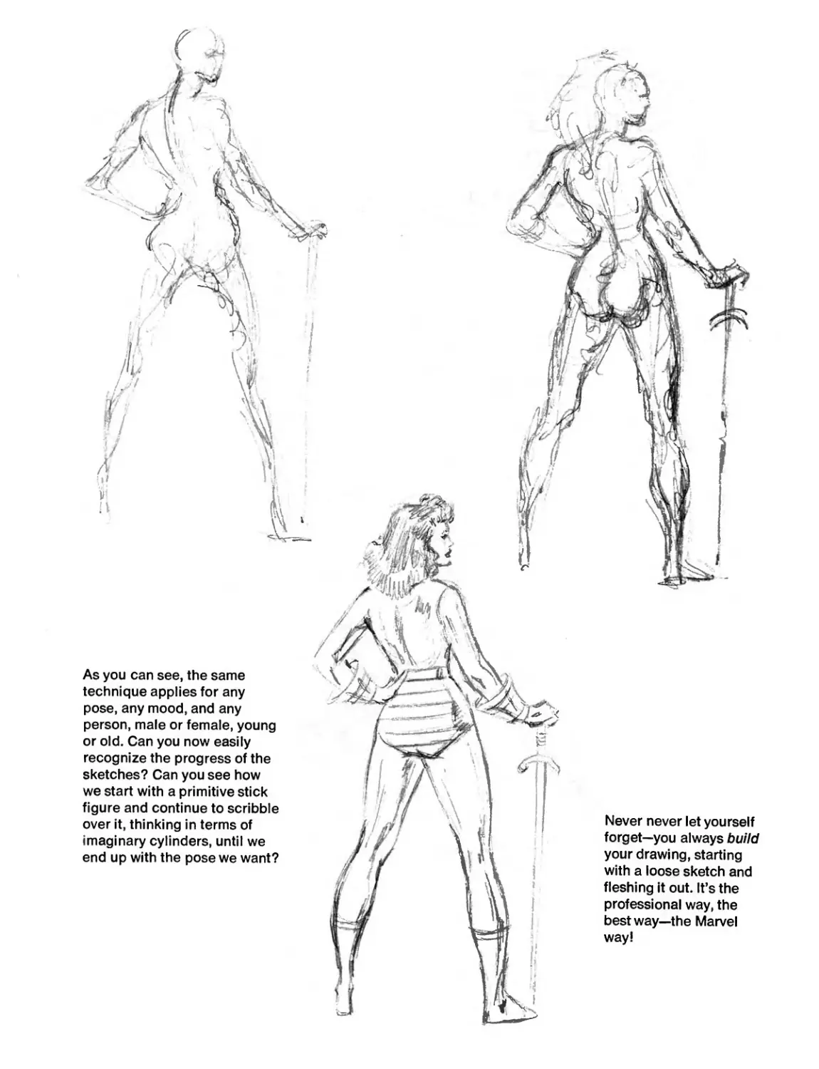
As you can see, the same
technique applies for any
pose, any mood, and any
person, male or female, young
or old. Can you now easily
recognize the progress of the
sketches? Can you see how
we start with a primitive stick
figure and continue to scribble
over it, thinking in terms of
imaginary cylinders, until we
end up with the pose we want?
THE NAME OF THE GAME IS- ACTION!
Action! A Marvel specialty! A Marvel Trademark! Sharpen
your pencil, pilgrim—here’s where we separate the men
from the boys!
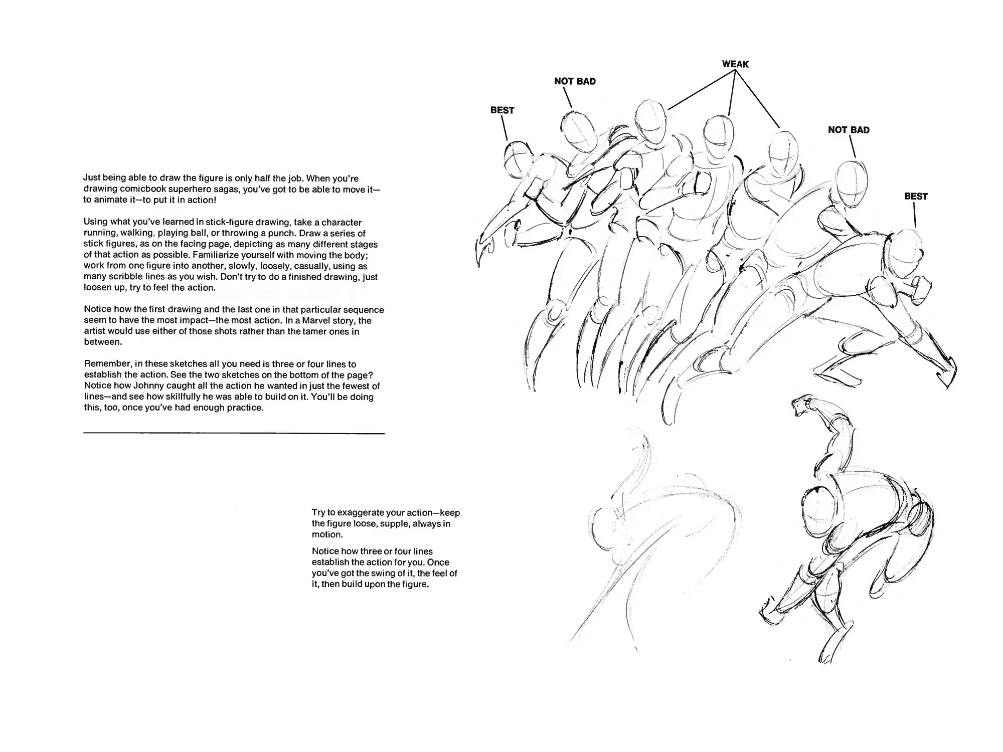
Just being able to draw the figure is only half the job. When you’re
drawing comicbook superhero sagas, you’ve got to be able to move it—
to animate it—to put it in action!
Using what you’ve learned in stick-figure drawing, take a character
running, walking, playing ball, or throwing a punch. Draw a series of
stick figures, as on the facing page, depicting as many different stages
of that action as possible. Familiarize yourself with moving the body;
work from one figure into another, slowly, loosely, casually, using as
many scribble lines as you wish. Don’t try to do a finished drawing, just
loosen up, try to feel the action.
Notice how the first drawing and the last one in that particular sequence
seem to have the most impact—the most action. In a Marvel story, the
artist would use either of those shots rather than the tamer ones in
between.
Remember, in these sketches all you need is three or four lines to
establish the action. See the two sketches on the bottom of the page?
Notice how Johnny caught all the action he wanted in just the fewest of
lines—and see how skillfully he was able to build on it. You’ll be doing
this, too, once you’ve had enough practice.
Try to exaggerate your action—keep
the figure loose, supple, always in
motion.
Notice how three or four lines
establish the action for you. Once
you’ve got the swing of it, the feel of
it, then build upon the figure.
WEAK
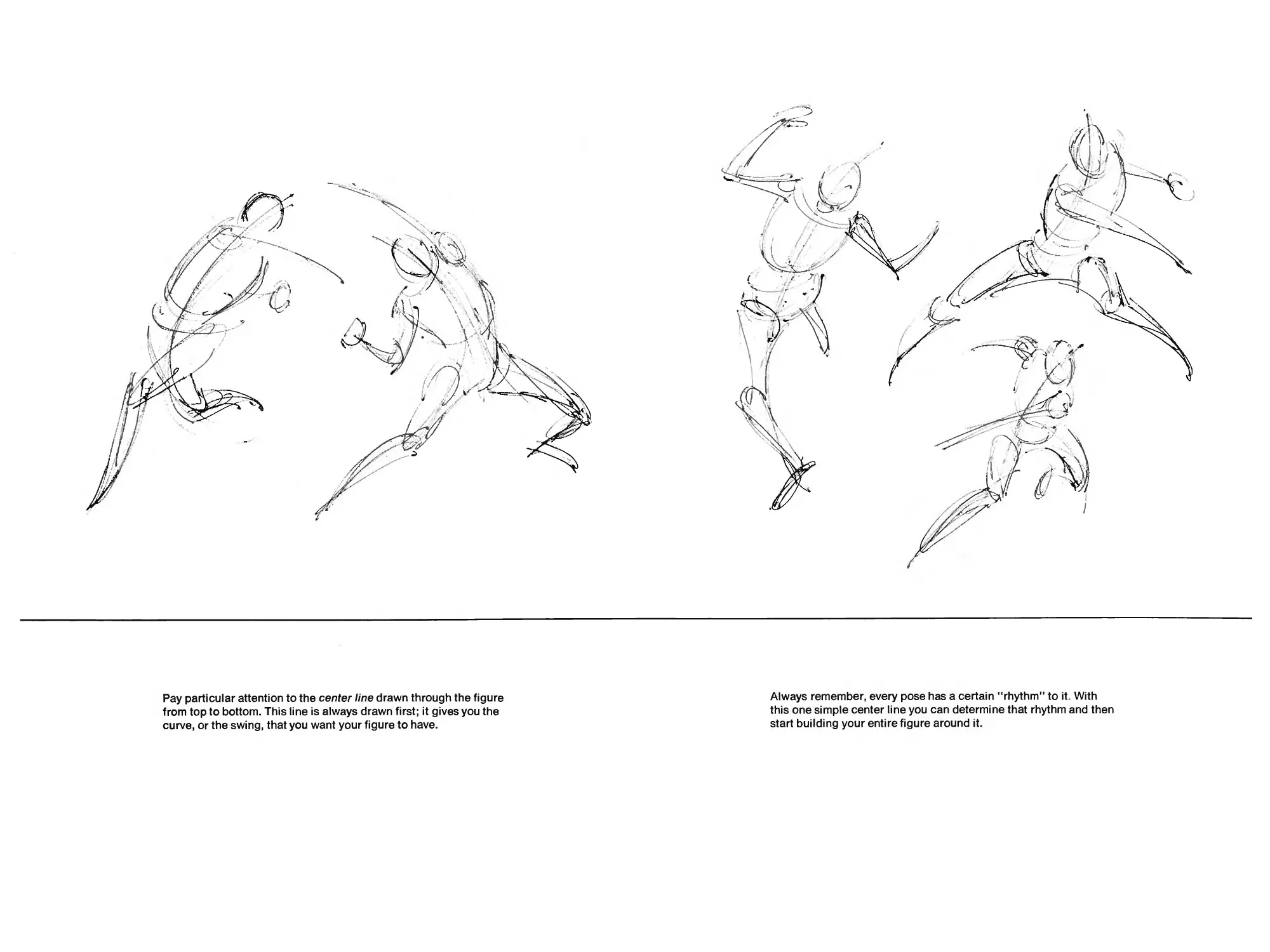
Pay particular attention to the center line drawn through the figure
from top to bottom. This line is always drawn first; it gives you the
curve, or the swing, that you want your figure to have.
Always remember, every pose has a certain “rhythm” to it. With
this one simple center line you can determine that rhythm and then
start building your entire figure around it.
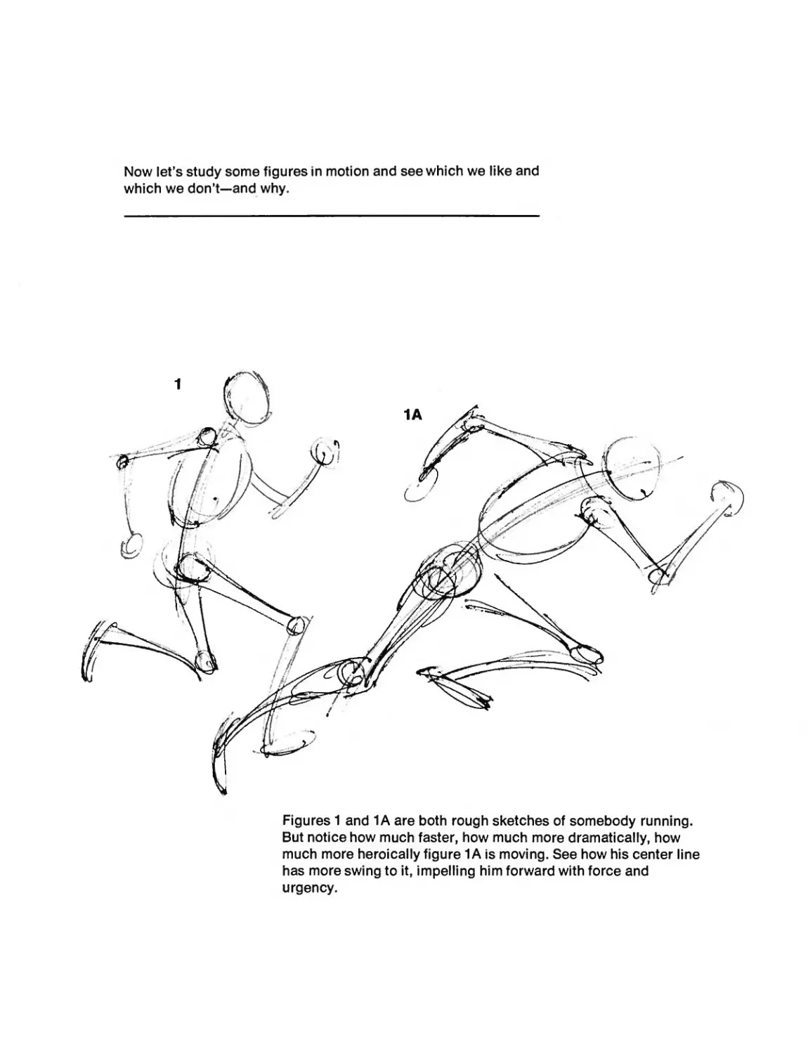
Now let’s study some figures in motion and see which we like and
which we don’t—and why.
Figures 1 and 1A are both rough sketches of somebody running.
But notice how much faster, how much more dramatically, how
much more heroically figure 1A is moving. See how his center line
has more swing to it, impelling him forward with force and
urgency.
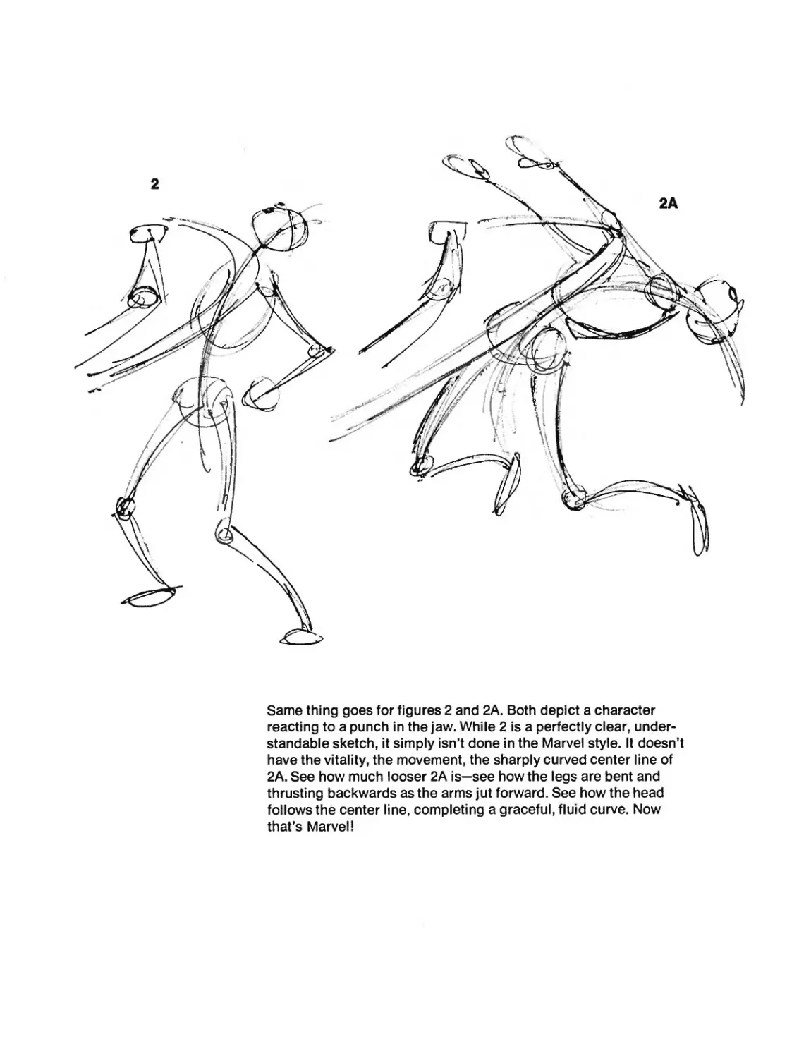
Same thing goes for figures 2 and 2A. Both depict a character
reacting to a punch in the jaw. While 2 is a perfectly clear, under-
standable sketch, it simply isn’t done in the Marvel style. It doesn’t
have the vitality, the movement, the sharply curved center line of
2A. See how much looser 2A is—see how the legs are bent and
thrusting backwards as the arms jut forward. See how the head
follows the center line, completing a graceful, fluid curve. Now
that’s Marvel!
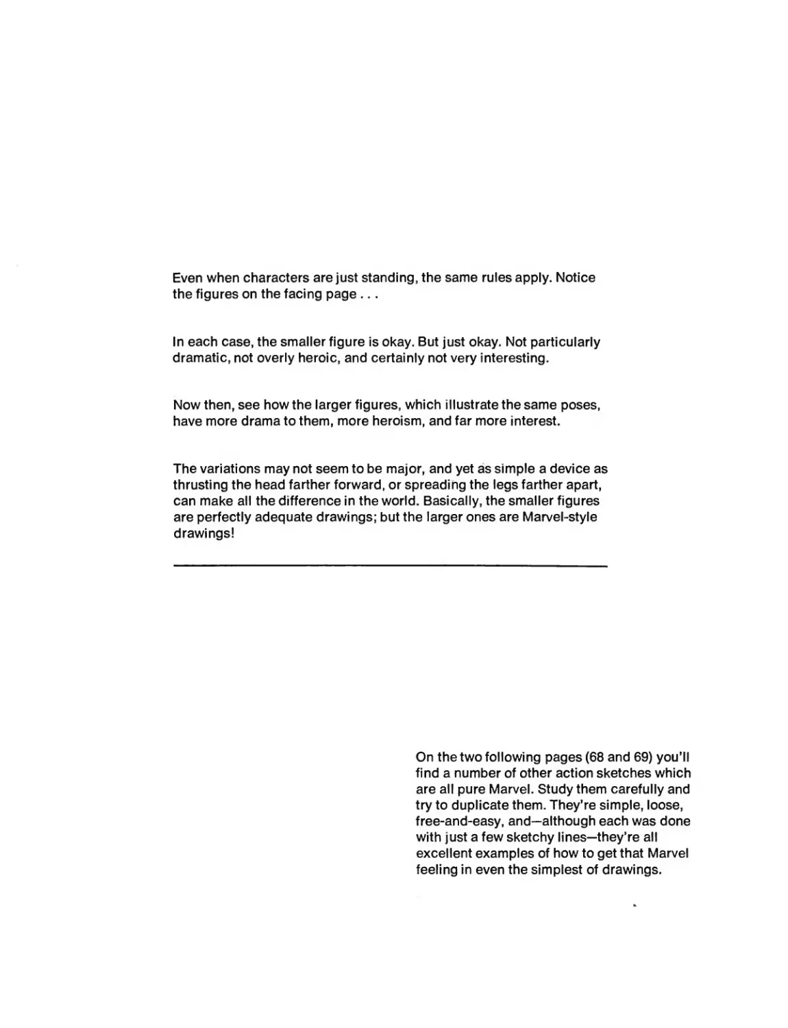
Even when characters are just standing, the same rules apply. Notice
the figures on the facing page...
In each case, the smaller figure is okay. But just okay. Not particularly
dramatic, not overly heroic, and certainly not very interesting.
Now then, see how the larger figures, which illustrate the same poses,
have more drama to them, more heroism, and far more interest.
The variations may not seem to be major, and yet as simple a device as
thrusting the head farther forward, or spreading the legs farther apart,
can make all the difference in the world. Basically, the smaller figures
are perfectly adequate drawings; but the larger ones are Marvel-style
drawings!
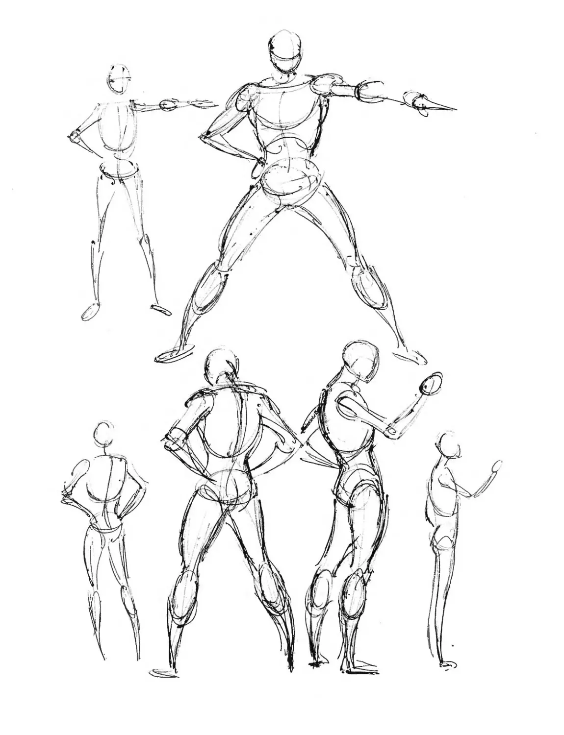
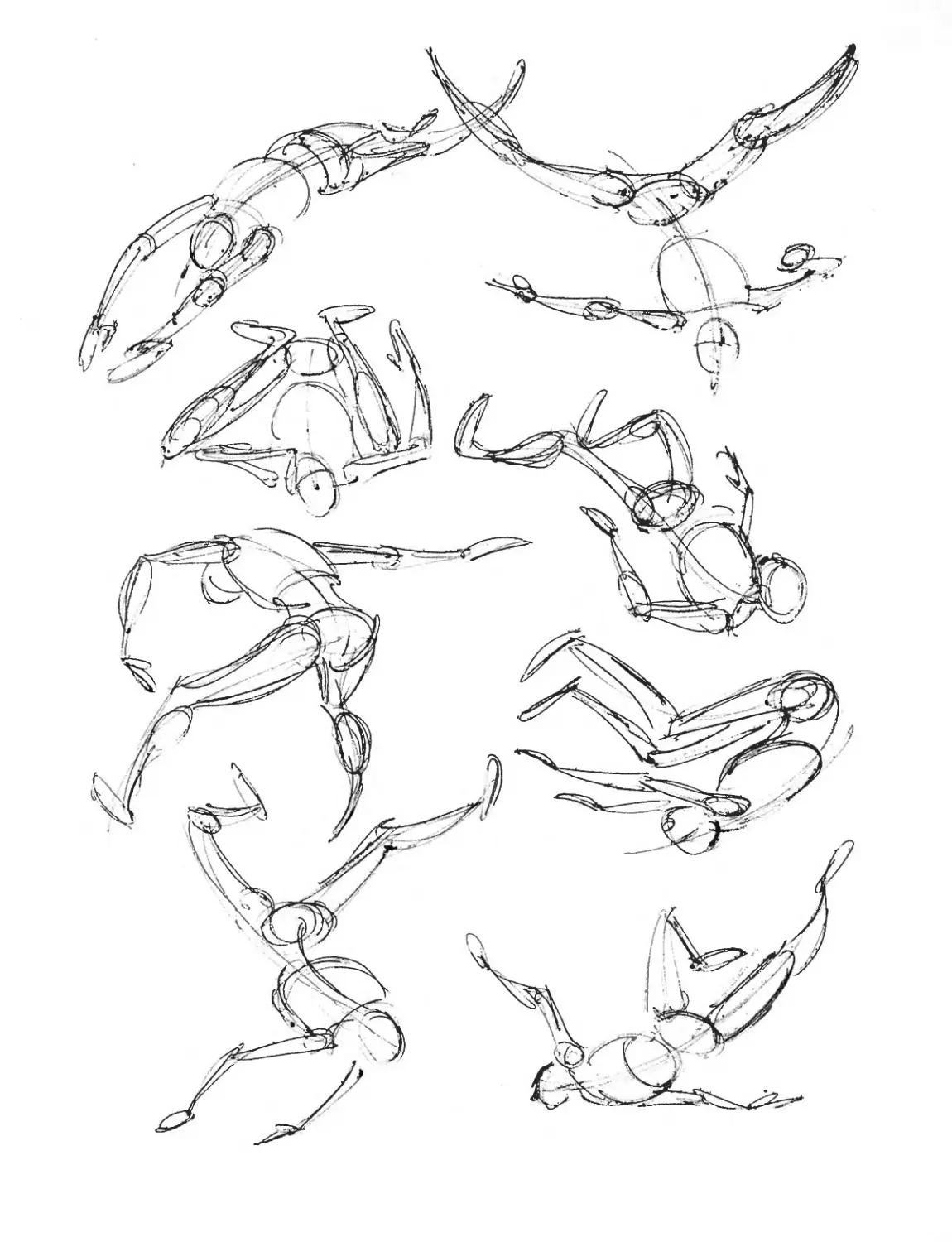
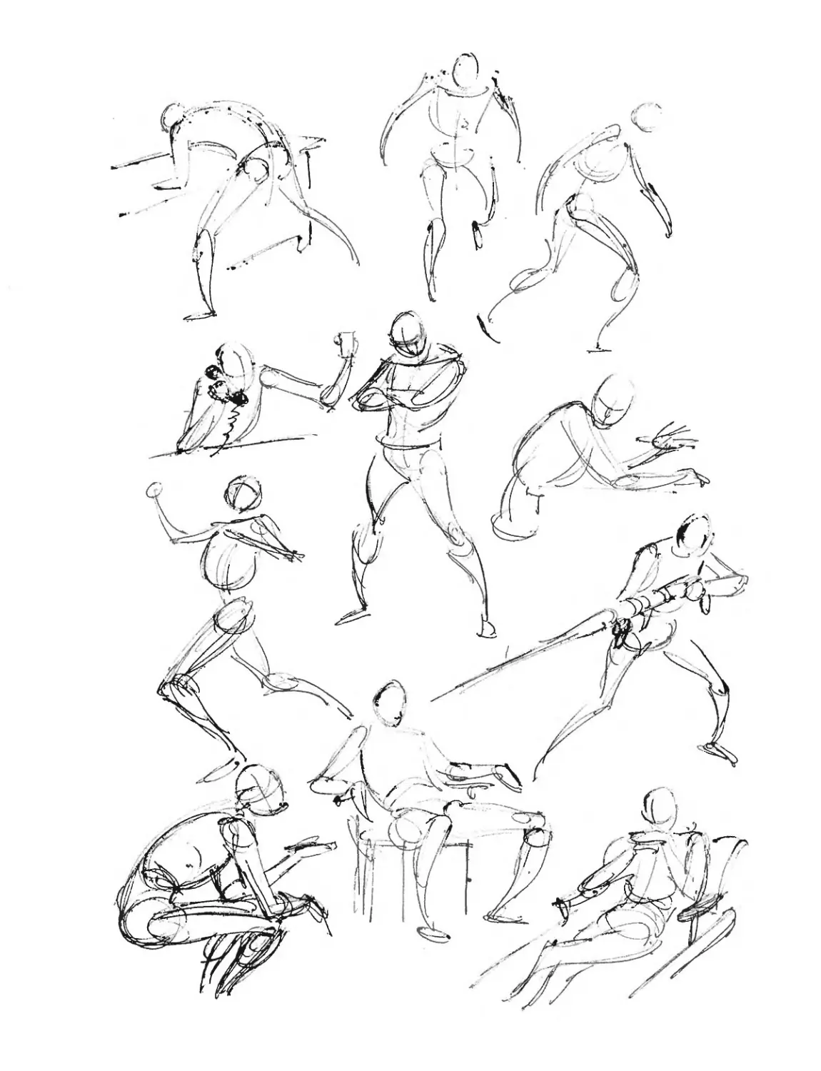
On the two following pages (68 and 69) you’ll
find a number of other action sketches which
are all pure Marvel. Study them carefully and
try to duplicate them. They’re simple, loose,
free-and-easy, and—although each was done
with just a few sketchy lines—they’re all
excellent examples of how to get that Marvel
feeling in even the simplest of drawings.
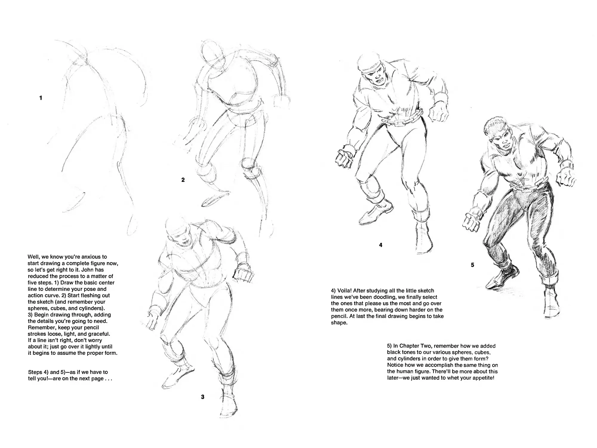
Well, we know you’re anxious to
start drawing a complete figure now,
so let’s get right to it. John has
reduced the process to a matter of
five steps. 1) Draw the basic center
line to determine your pose and
action curve. 2) Start fleshing out
the sketch (and remember your
spheres, cubes, and cylinders).
3) Begin drawing through, adding
the details you’re going to need.
Remember, keep your pencil
strokes loose, light, and graceful.
If a line isn’t right, don’t worry
about it; just go over it lightly until
it begins to assume the proper form.
Steps 4) and 5)—as if we have to
tell you!—are on the next page...
4) Voila! After studying all the little sketch
lines we’ve been doodling, we finally select
the ones that please us the most and go over
them once more, bearing down harder on the
pencil. At last the final drawing begins to take
shape.
5) In Chapter Two, remember how we added
black tones to our various spheres, cubes,
and cylinders in order to give them form?
Notice how we accomplish the same thing on
the human figure. There’ll be more about this
later—we just wanted to whet your appetite!
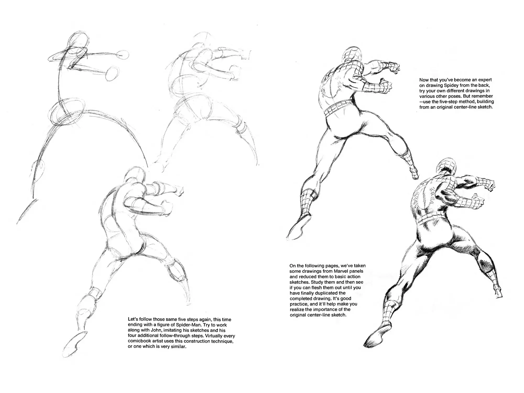
Let’s follow those same five steps again, this time
ending with a figure of Spider-Man. Try to work
along with John, imitating his sketches and his
four additional follow-through steps. Virtually every
comicbook artist uses this construction technique,
or one which is very similar.
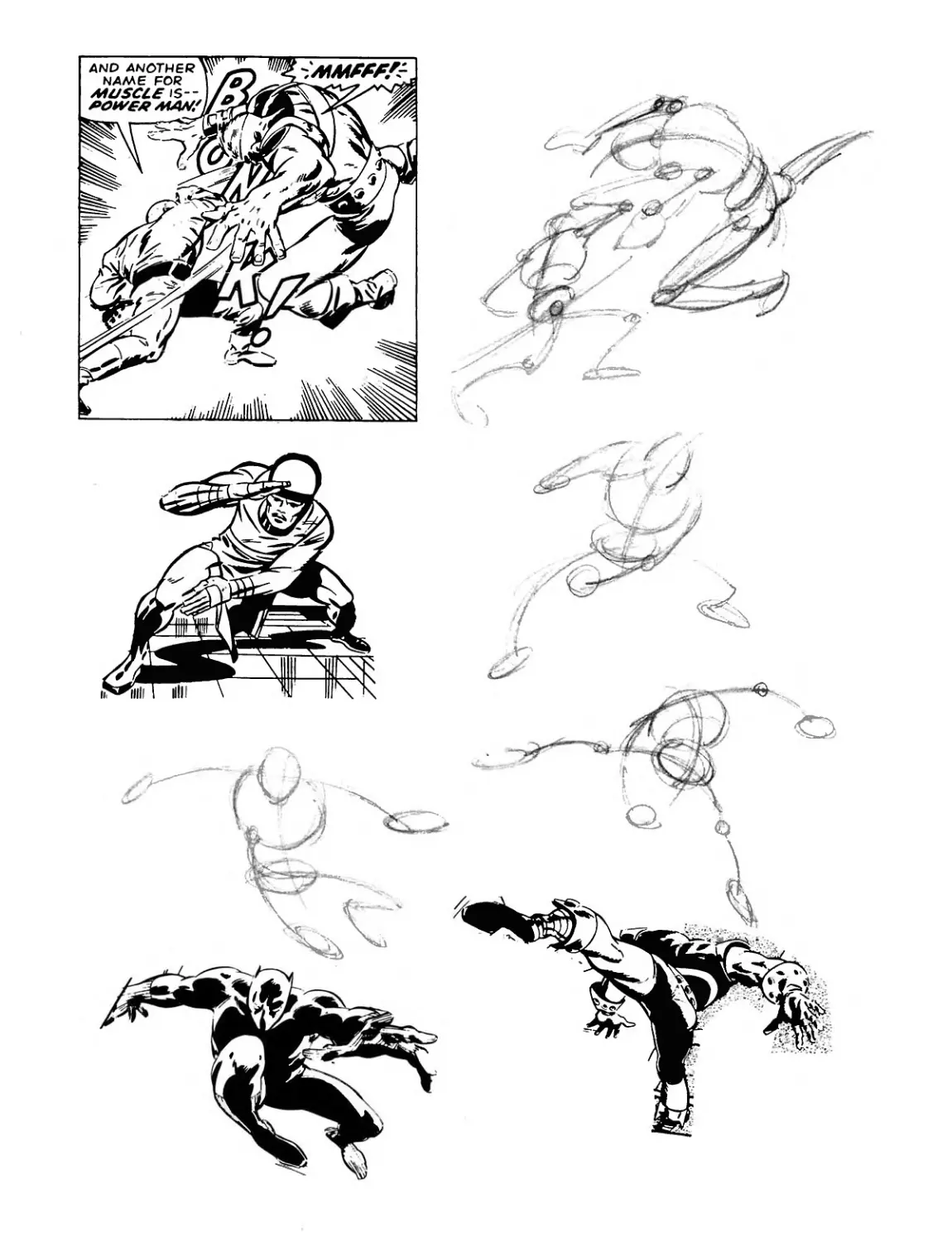
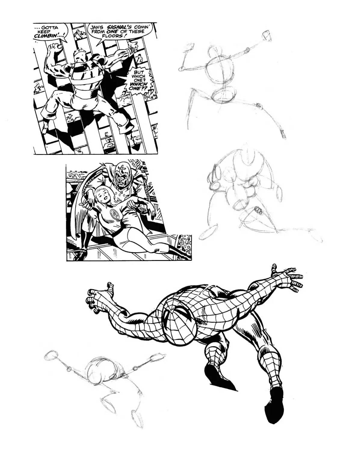
On the following pages, we’ve taken
some drawings from Marvel panels
and reduced them to basic action
sketches. Study them and then see
if you can flesh them out until you
have finally duplicated the
completed drawing. It’s good
practice, and it’ll help make you
realize the importance of the
original center-line sketch.
Now that you’ve become an expert
on drawing Spidey from the back,
try your own different drawings in
various other poses. But remember
—use the five-step method, building
from an original center-line sketch.
Вит
which
.one ч
>
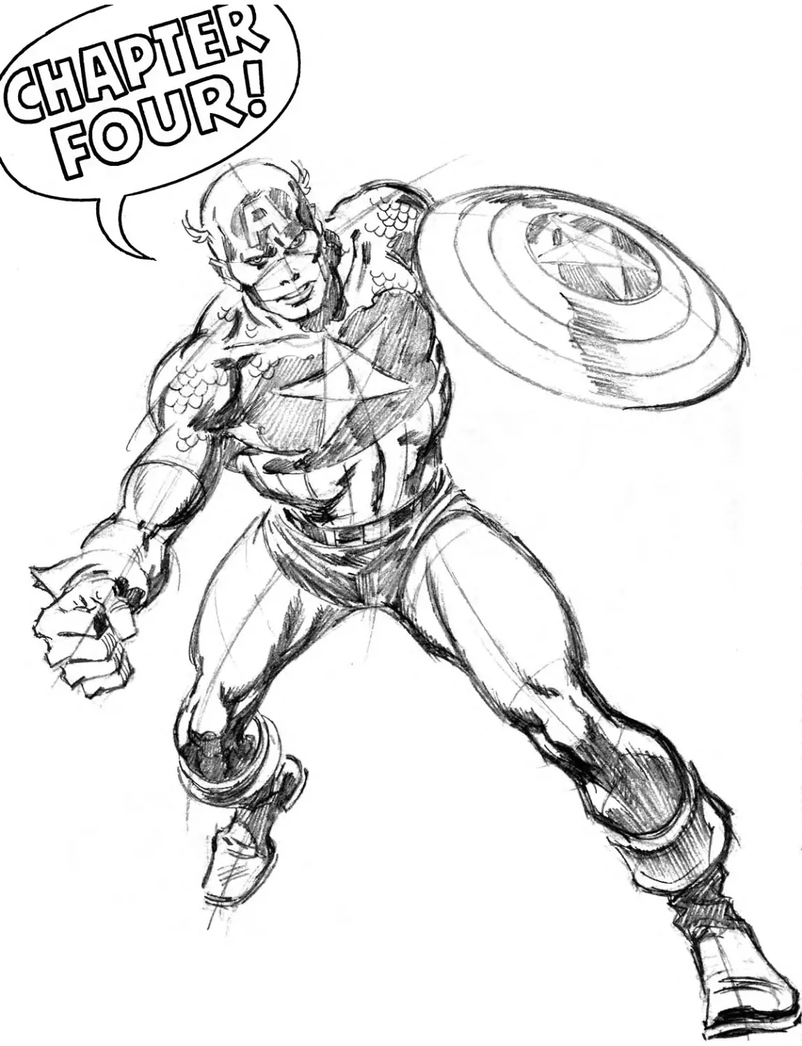
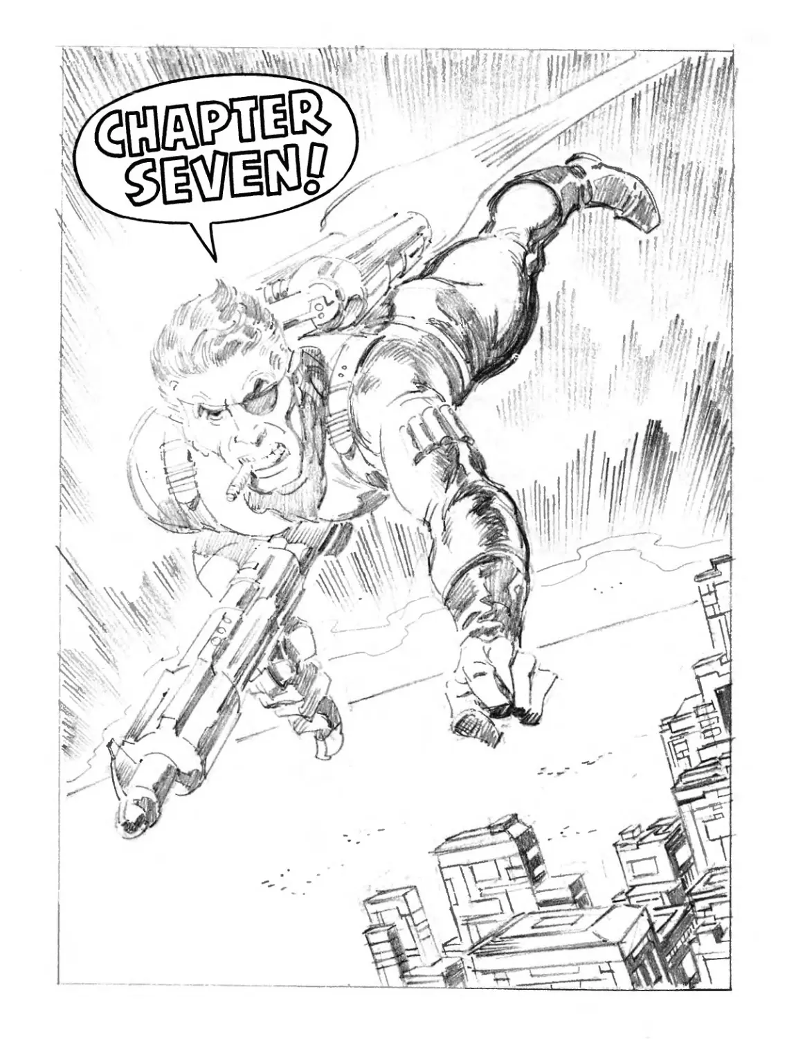
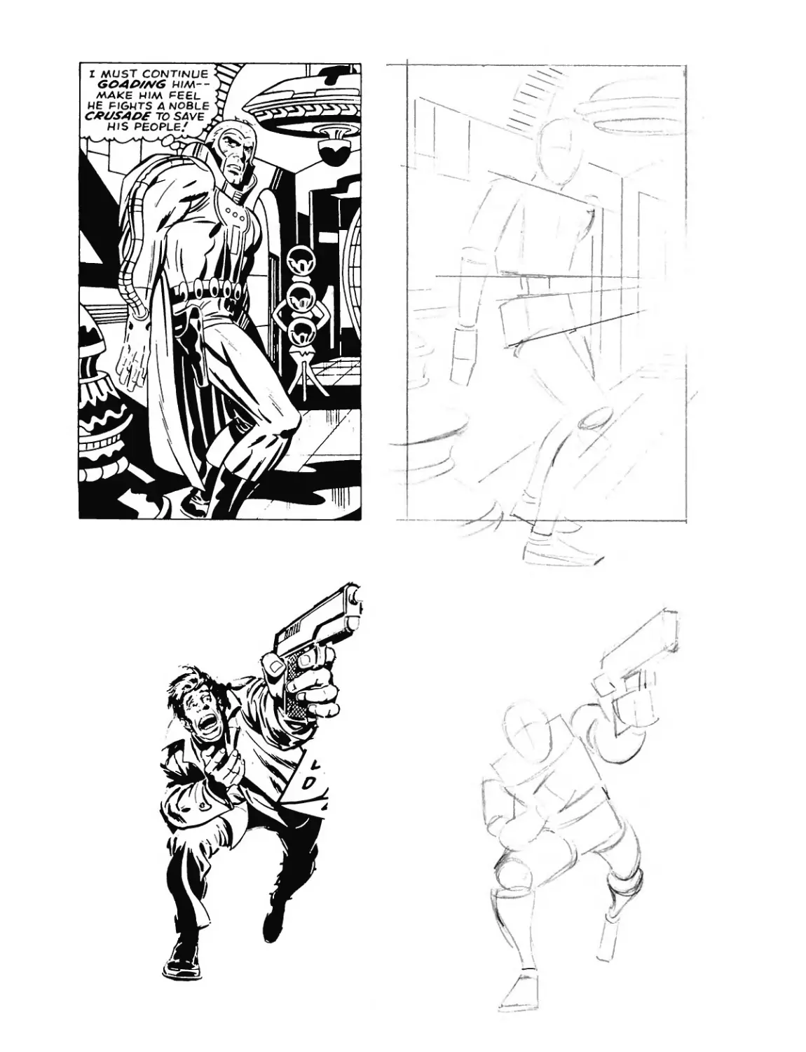
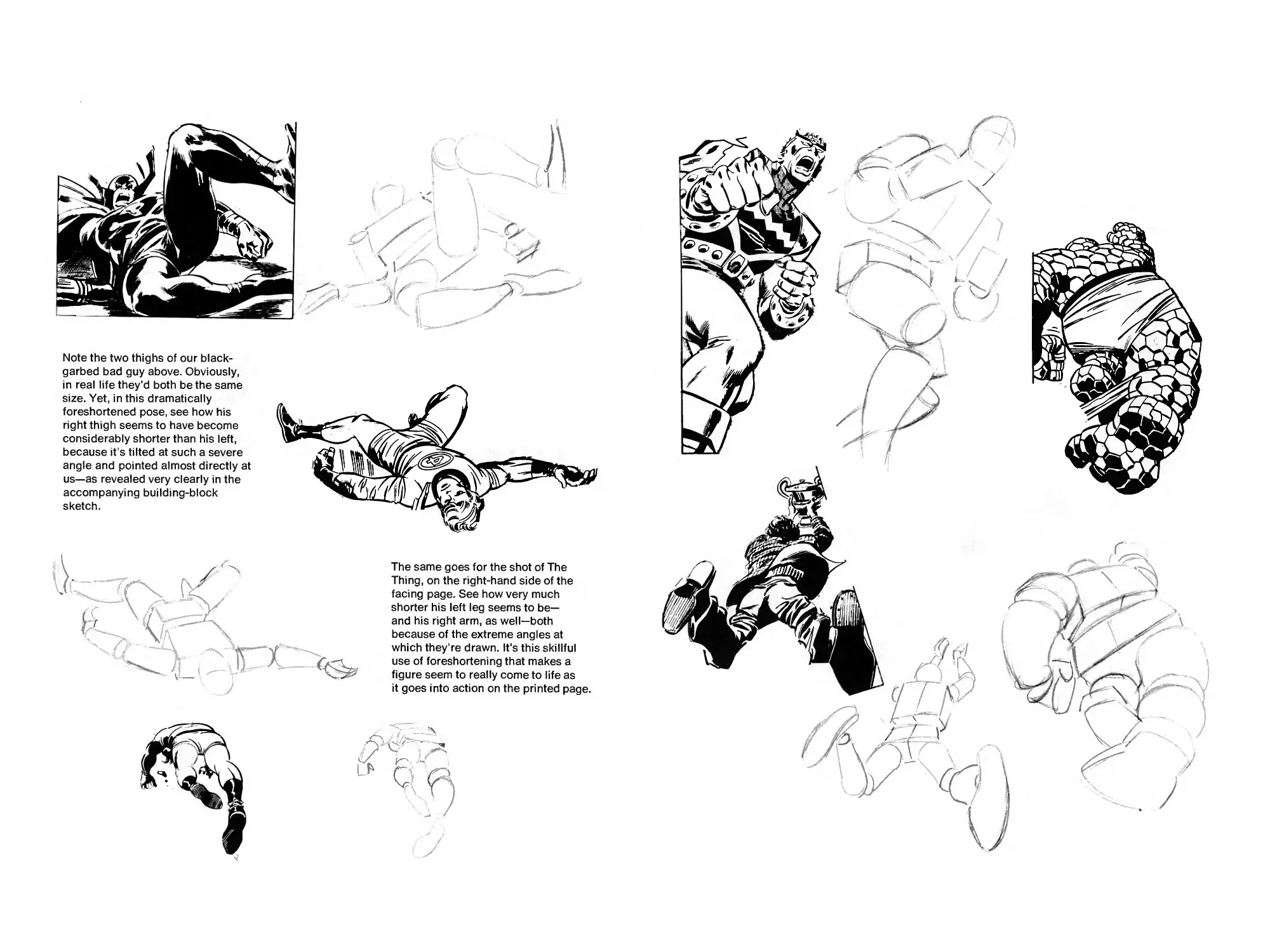
FORESHORTENING!
THE KNACK OF DRAWING THE FIGURE
IN PERSPECTIVE!
This chapter’s a short one— but it’s vitally important. Take your time with it
and make sure you thoroughly understand all the main points. Without a
knowledge of foreshortening, all your figures could end up looking like
they were drawn on pyramids by the ancient Egyptians!
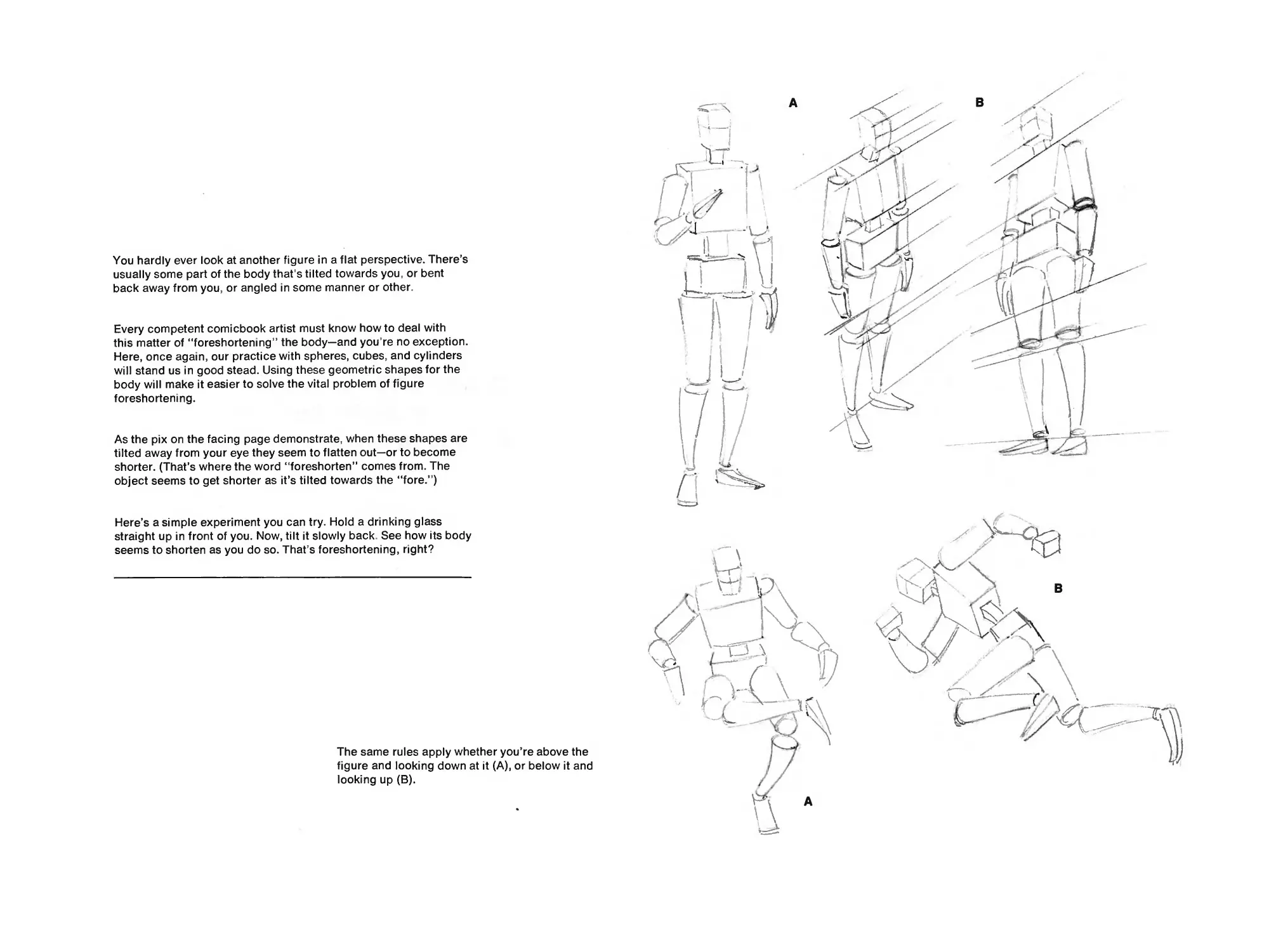
You hardly ever look at another figure in a flat perspective. There’s
usually some part of the body that’s tilted towards you, or bent
back away from you, or angled in some manner or other.
Every competent comicbook artist must know how to deal with
this matter of “foreshortening” the body—and you re no exception.
Here, once again, our practice with spheres, cubes, and cylinders
will stand us in good stead. Using these geometric shapes for the
body will make it easier to solve the vital problem of figure
foreshortening.
As the pix on the facing page demonstrate, when these shapes are
tilted away from your eye they seem to flatten out—or to become
shorter. (That’s where the word “foreshorten” comes from. The
object seems to get shorter as it’s tilted towards the “fore/)
Here’s a simple experiment you can try. Hold a drinking glass
straight up in front of you. Now, tilt it slowly back. See how its body
seems to shorten as you do so. That’s foreshortening, right?
The same rules apply whether you’re above the
figure and looking down at it (A), or below it and
looking up (B).
A
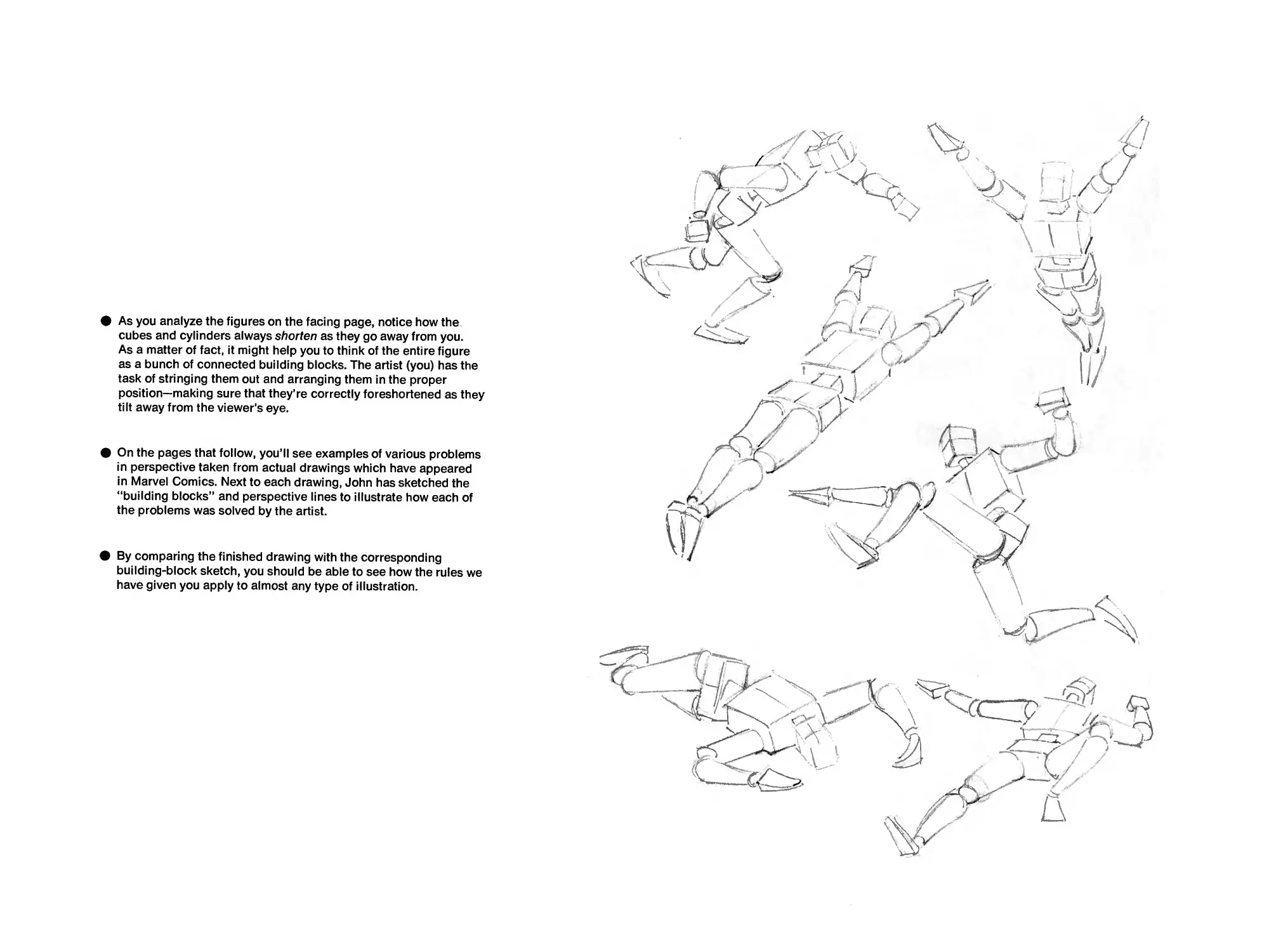
• As you analyze the figures on the facing page, notice how the
cubes and cylinders always shorten as they go away from you.
As a matter of fact, it might help you to think of the entire figure
as a bunch of connected building blocks. The artist (you) has the
task of stringing them out and arranging them in the proper
position—making sure that they’re correctly foreshortened as they
tilt away from the viewer’s eye.
• On the pages that follow, you’ll see examples of various problems
in perspective taken from actual drawings which have appeared
in Marvel Comics. Next to each drawing, John has sketched the
“building blocks” and perspective lines to illustrate how each of
the problems was solved by the artist.
• By comparing the finished drawing with the corresponding
building-block sketch, you should be able to see how the rules we
have given you apply to almost any type of illustration.
Note the two thighs of our black-
garbed bad guy above. Obviously,
in real life they’d both be the same
size. Yet, in this dramatically
foreshortened pose, see how his
right thigh seems to have become
considerably shorter than his left,
because it s tilted at such a severe
angle and pointed almost directly at
us—as revealed very clearly in the
accompanying building-block
sketch.
The same goes for the shot of The
Thing, on the right-hand side of the
facing page. See how very much
shorter his left leg seems to be—
and his right arm, as well—both
because of the extreme angles at
which they’re drawn. It’s this skillful
use of foreshortening that makes a
figure seem to really come to life as
it goes into action on the printed page.
DRAWING THE HUMAN HEAD!
Or even the inhuman head— we’re not prejudiced!
Most everyone can draw faces and heads of some sort—even if the
head is just a simple circle with two dots for eyes and a straight line for
the mouth. (Sometimes if you omit the nose in such a sketch no one will
even miss it!)
However, the time hath come for us to study heads drawn in the
Marvel manner. And, since we have to begin somewhere, let’s examine
the sketches on these pages.
Notice that the head drawn in profile should generally fit into a square
(as shown), with the nose and part of the chin protruding.
Also note that the eyes usually come midway in the skull, between the
top of the dome and the bottom of the chin.
If you divide the skull into four even quarters, from top to bottom, the
nose will usually be in the second quarter up from the chin—with the
ears falling in about the same level.
As you can also see, in the full view the head isn’t a perfect oval because
the jaw has a slope which makes the bottom of the skull considerably
narrower than the top.
Keep these drawings which depict the skull in different angles, and
use them as guides for the exercises that follow. Once you’re familiar
with this underlying construction you’ll be able to tackle practically any
type of head imaginable. If you’re still not convinced, let’s go to the
next page...
For starters, let’s draw a typical hero-type head. Since everything is easier
when you’ve got a few rules to follow, here are some tips you ought to
remember:
The head is generally five eyes wide.
There is one eye’s distance between the two eyes.
To determine the width of the mouth, draw an equilateral triangle,
starting at the top (bridge) of the nose. The triangle goes down,
touching the nostrils at the outside of the nose, right? Of course!
Well, the width of the mouth is determined by where the two lines
cross the mouth line! The same shortcut applies to the chin.
Simply start your triangle underneath the nose, through the lower
lip (where it starts to turn up) and, when it touches the bottom of
the head—Eureka! That’s the width of the chin!
At this stage, keep your faces simple. Notice there are no extra
lines in the forehead or around the nose or chin.
Keep the nose somewhat small and make the chin strong and firm.
Give the hair body and thickness. Don’t just let it lie flat on the head.
Keep the mouth simple. Notice the curve of the upper lip—and just
a small simple line for the lower lip.
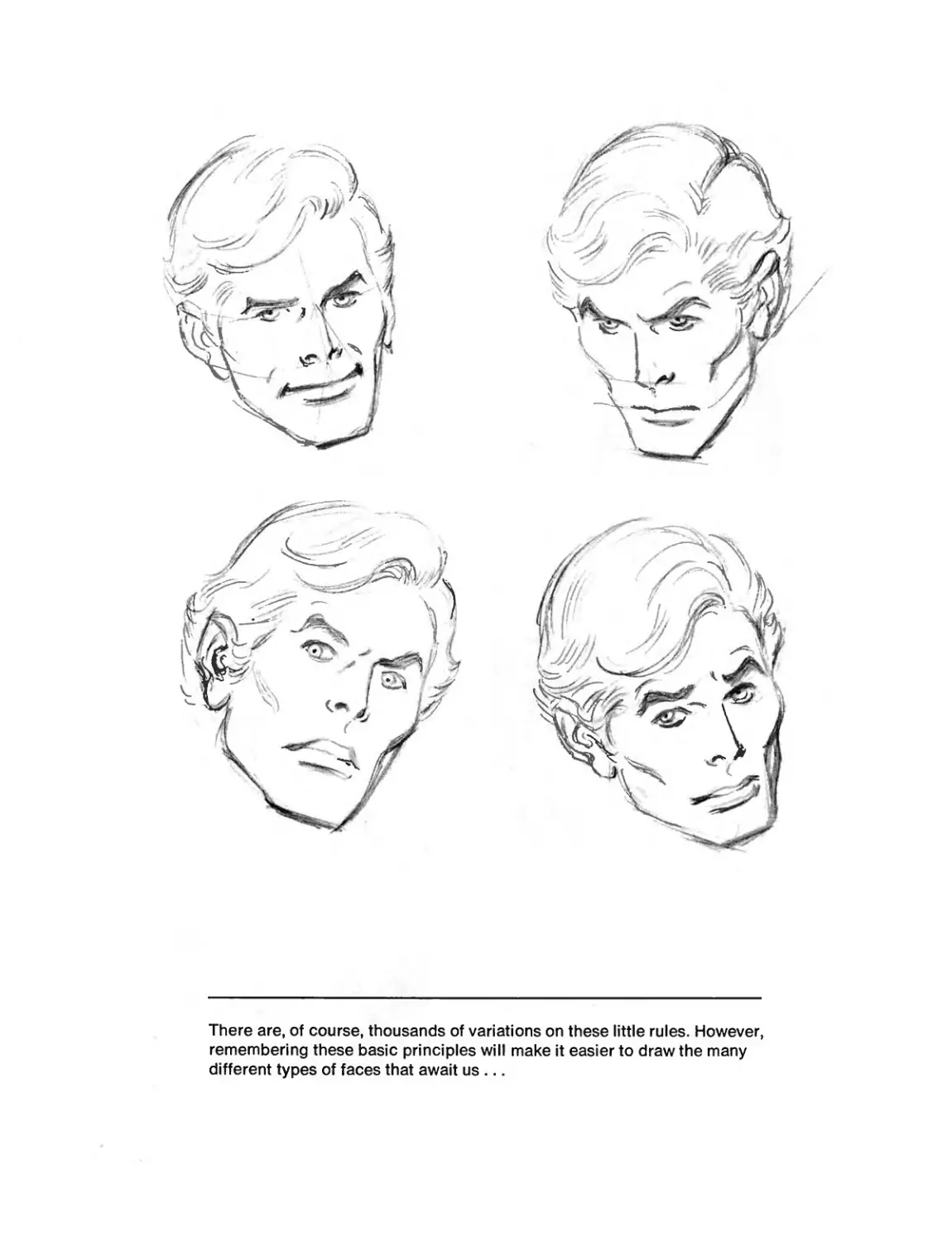
There are, of course, thousands of variations on these little rules. However,
remembering these basic principles will make it easier to draw the many
different types of faces that await us...
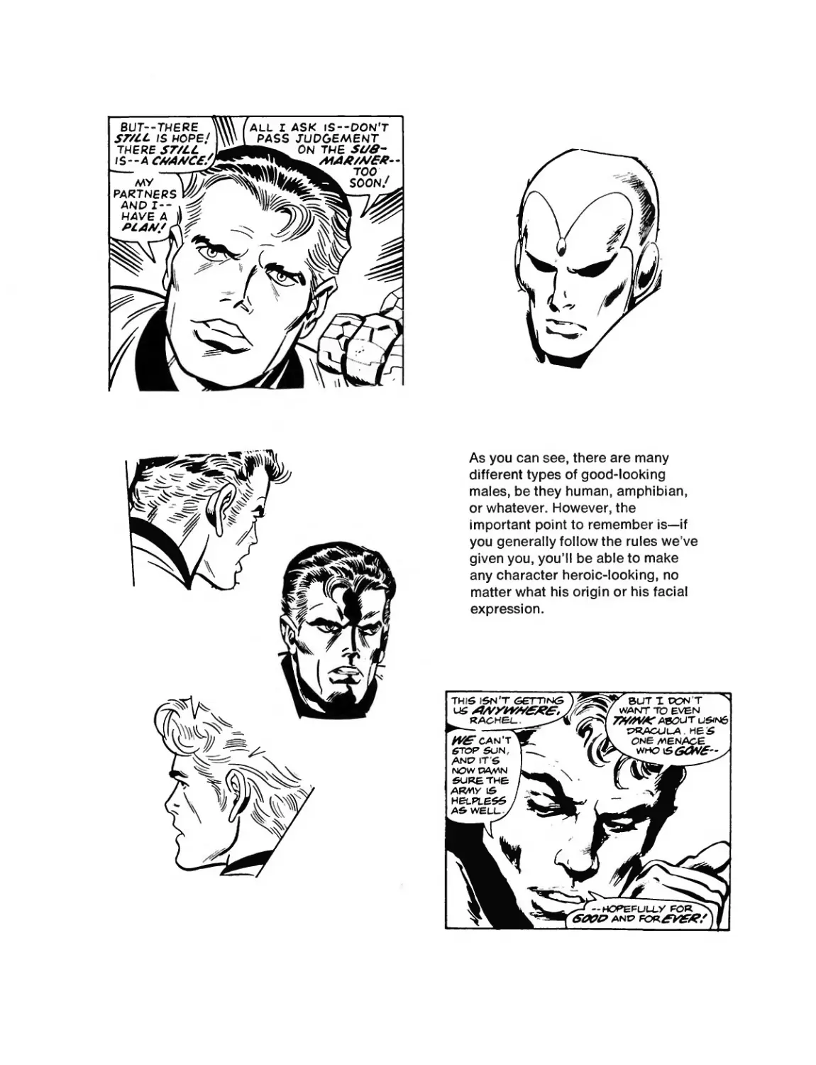
As you can see, there are many
different types of good-looking
males, be they human, amphibian,
or whatever. However, the
important point to remember is—if
you generally follow the rules we ve
given you, you’ll be able to make
any character heroic-looking, no
matter what his origin or his facial
expression.
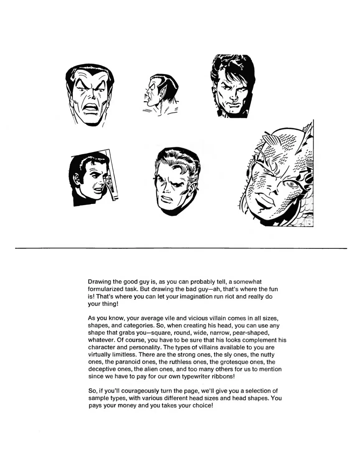
Drawing the good guy is, as you can probably tell, a somewhat
formularized task. But drawing the bad guy—ah, that’s where the fun
is! That’s where you can let your imagination run riot and really do
your thing!
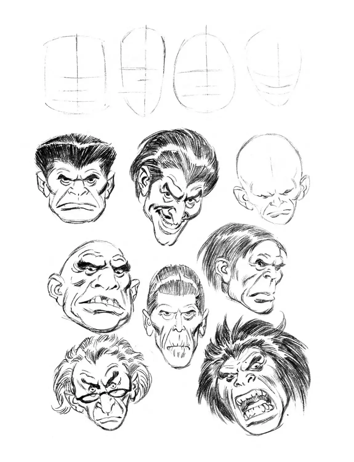
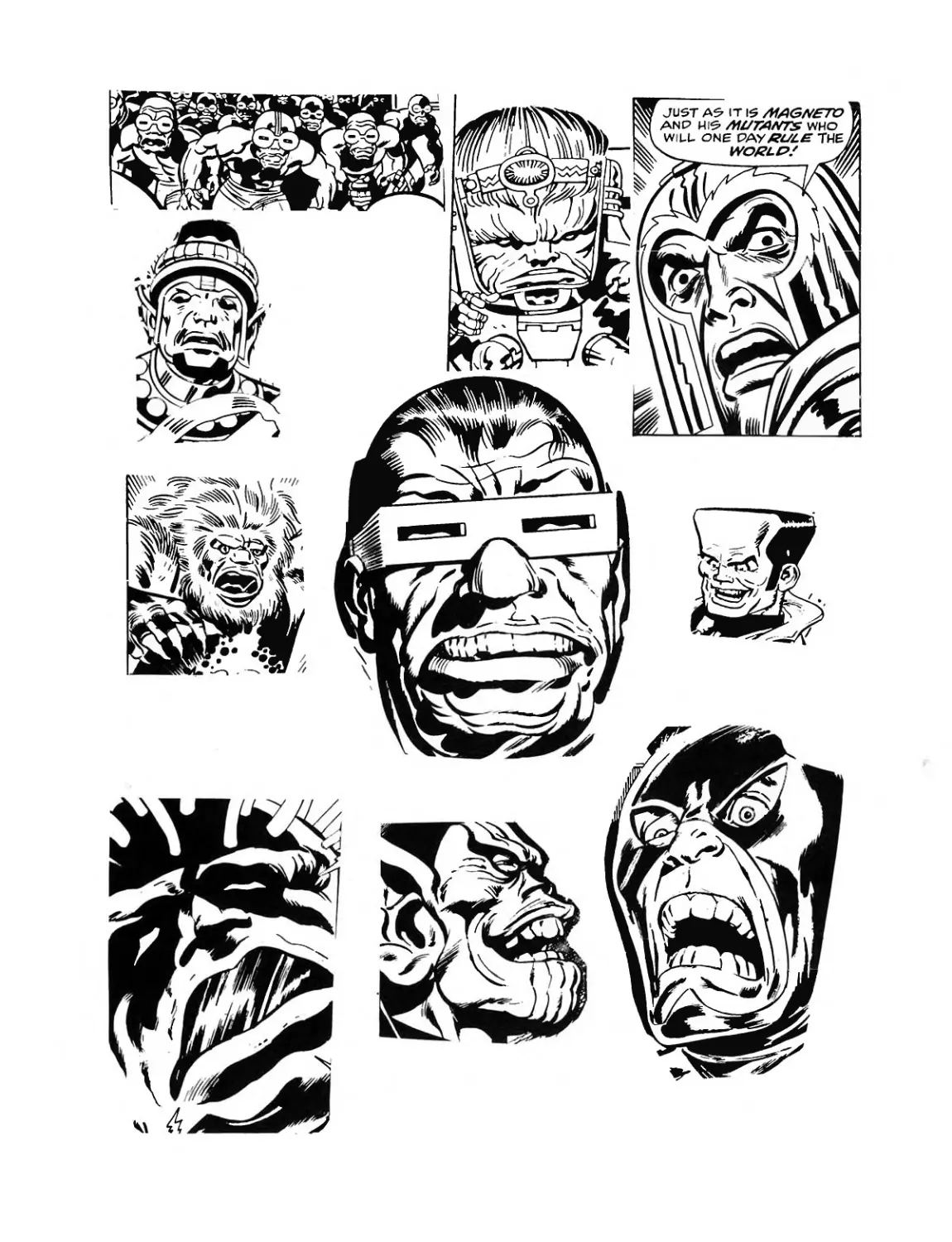
As you know, your average vile and vicious villain comes in all sizes,
shapes, and categories. So, when creating his head, you can use any
shape that grabs you—square, round, wide, narrow, pear-shaped,
whatever. Of course, you have to be sure that his looks complement his
character and personality. The types of villains available to you are
virtually limitless. There are the strong ones, the sly ones, the nutty
ones, the paranoid ones, the ruthless ones, the grotesque ones, the
deceptive ones, the alien ones, and too many others for us to mention
since we have to pay for our own typewriter ribbons!
So, if you’ll courageously turn the page, we’ll give you a selection of
sample types, with various different head sizes and head shapes. You
pays your money and you takes your choice!
Now we come to almost everybody’s favorite part—drawing the face of a
pretty girl—and few people are as well-qualified as Big John himself to give
you all the info you need. Not only is John one of the all-time greats in the
field of superhero strips, but he also is almost without peer when it comes
to portraying beautiful females. And, if you need any further proof, read on...
NOTE: We’re going to devote quite a bit of space to this section, because
the semblance of a beautiful heroine is usually more difficult to produce
than a drawing of a hero.
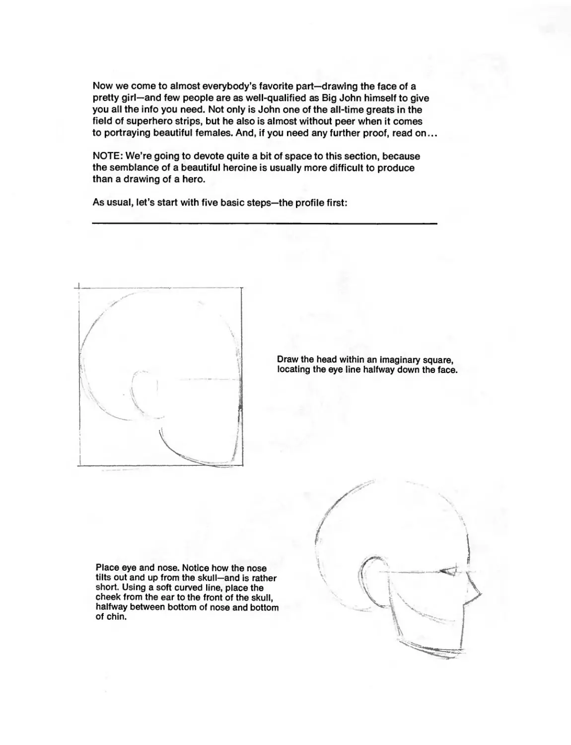
As usual, let’s start with five basic steps—the profile first:
1'
4 *
Draw the head within an imaginary square,
locating the eye line halfway down the face.
Place eye and nose. Notice how the nose
tilts out and up from the skull—and is rather
short. Using a soft curved line, place the
cheek from the ear to the front of the skull,
halfway between bottom of nose and bottom
of chin.
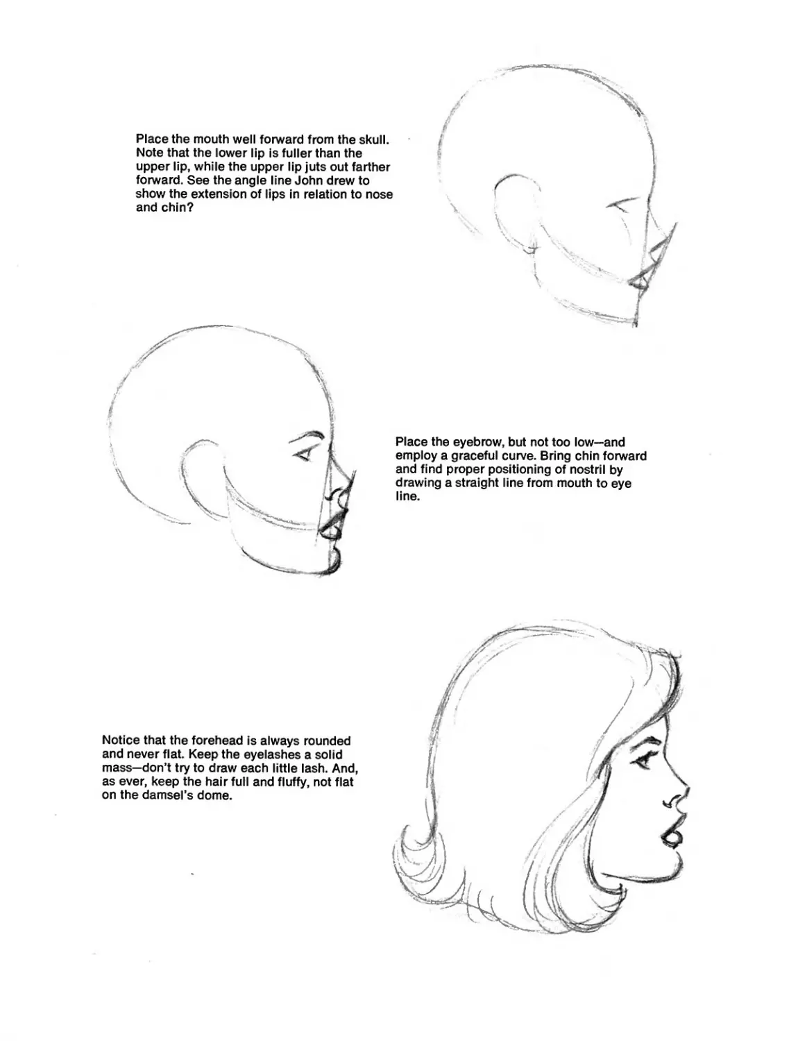
Place the mouth well forward from the skull.
Note that the lower lip is fuller than the
upper lip, while the upper lip juts out farther
forward. See the angle line John drew to
show the extension of lips in relation to nose
and chin?
Place the eyebrow, but not too low—and
employ a graceful curve. Bring chin forward
and find proper positioning of nostril by
drawing a straight line from mouth to eye
line.
Notice that the forehead is always rounded
and never flat. Keep the eyelashes a solid
mass—don’t try to draw each little lash. And,
as ever, keep the hair full and fluffy, not flat
on the damsel’s dome.
Tell you what. We’ll operate on the honor system. John and I will take your
word for the fact that you’ve been faithfully practicing drawing the female
profile. We’ll assume that you’ve got it down pat now and are ready to tackle
the front-view drawing. See how we trust you?
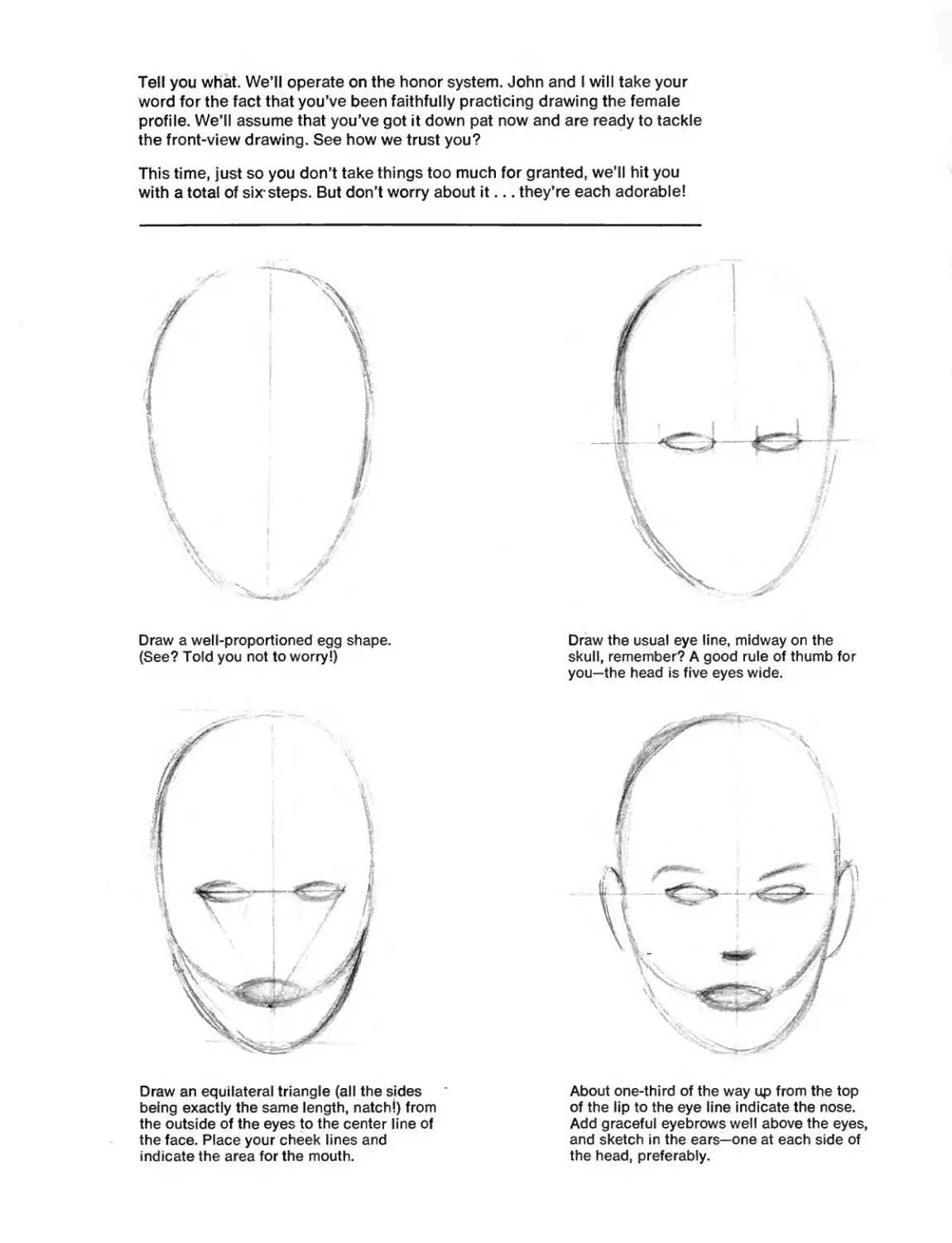
This time, just so you don’t take things too much for granted, we’ll hit you
with a total of six-steps. But don’t worry about it... they’re each adorable!
Draw a well-proportioned egg shape.
(See? Told you not to worry!)
Draw the usual eye line, midway on the
skull, remember? A good rule of thumb for
you—the head is five eyes wide.
Draw an equilateral triangle (all the sides
being exactly the same length, natch!) from
the outside of the eyes to the center line of
the face. Place your cheek lines and
indicate the area for the mouth.
About one-third of the way up from the top
of the lip to the eye line indicate the nose.
Add graceful eyebrows well above the eyes,
and sketch in the ears—one at each side of
the head, preferably.
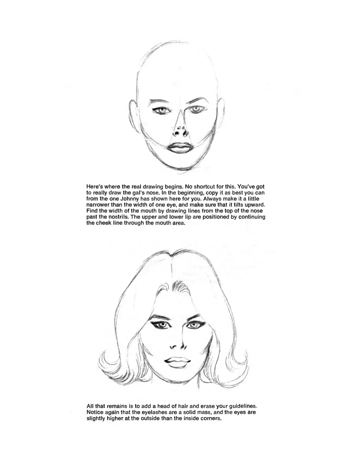
Here’s where the real drawing begins. No shortcut for this. You’ve got
to really draw the gal’s nose. In the beginning, copy it as best you can
from the one Johnny has shown here for you. Always make it a little
narrower than the width of one eye, and make sure that it tilts upward.
Find the width of the mouth by drawing lines from the top of the nose
past the nostrils. The upper and lower lip are positioned by continuing
the cheek line through the mouth area.
All that remains is to add a head of hair and erase your guidelines.
Notice again that the eyelashes are a solid mass, and the eyes are
slightly higher at the outside than the inside corners.
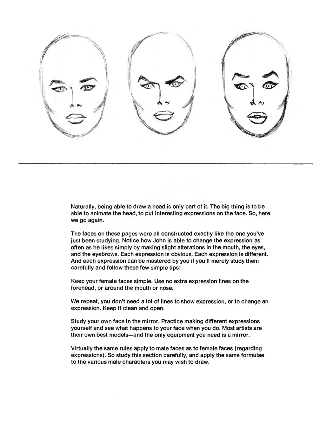
Naturally, being able to draw a head is only part of it. The big thing is to be
able to animate the head, to put interesting expressions on the face. So, here
we go again.
The faces on these pages were all constructed exactly like the one you've
just been studying. Notice how John is able to change the expression as
often as he likes simply by making slight alterations in the mouth, the eyes,
and the eyebrows. Each expression is obvious. Each expression is different.
And each expression can be mastered by you if you'll merely study them
carefully and follow these few simple tips:
Keep your female faces simple. Use no extra expression lines on the
forehead, or around the mouth or nose.
We repeat, you don't need a lot of lines to show expression, or to change an
expression. Keep it clean and open.
Study your own face in the mirror. Practice making different expressions
yourself and see what happens to your face when you do. Most artists are
their own best models—and the only equipment you need is a mirror.
Virtually the same rules apply to male faces as to female faces (regarding
expressions). So study this section carefully, and apply the same formulae
to the various male characters you may wish to draw.
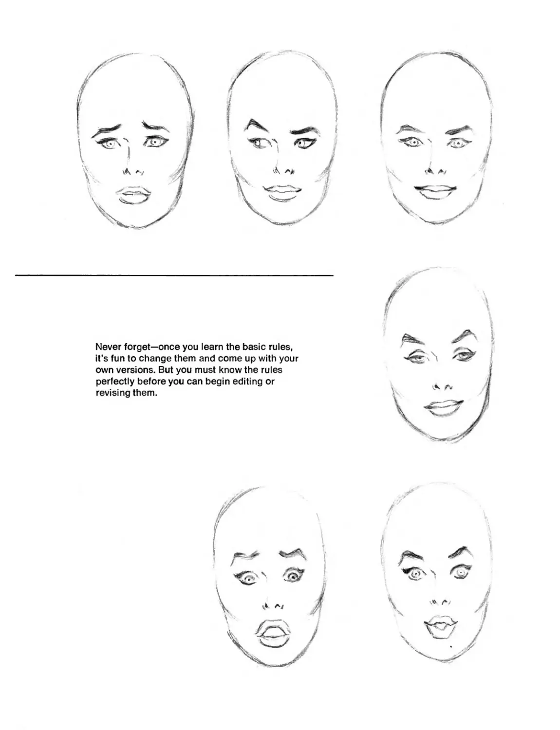
Never forget—once you learn the basic rules,
H’s fun to change them and come up with your
own versions. But you must know the rules
perfectly before you can begin editing or
revising them.
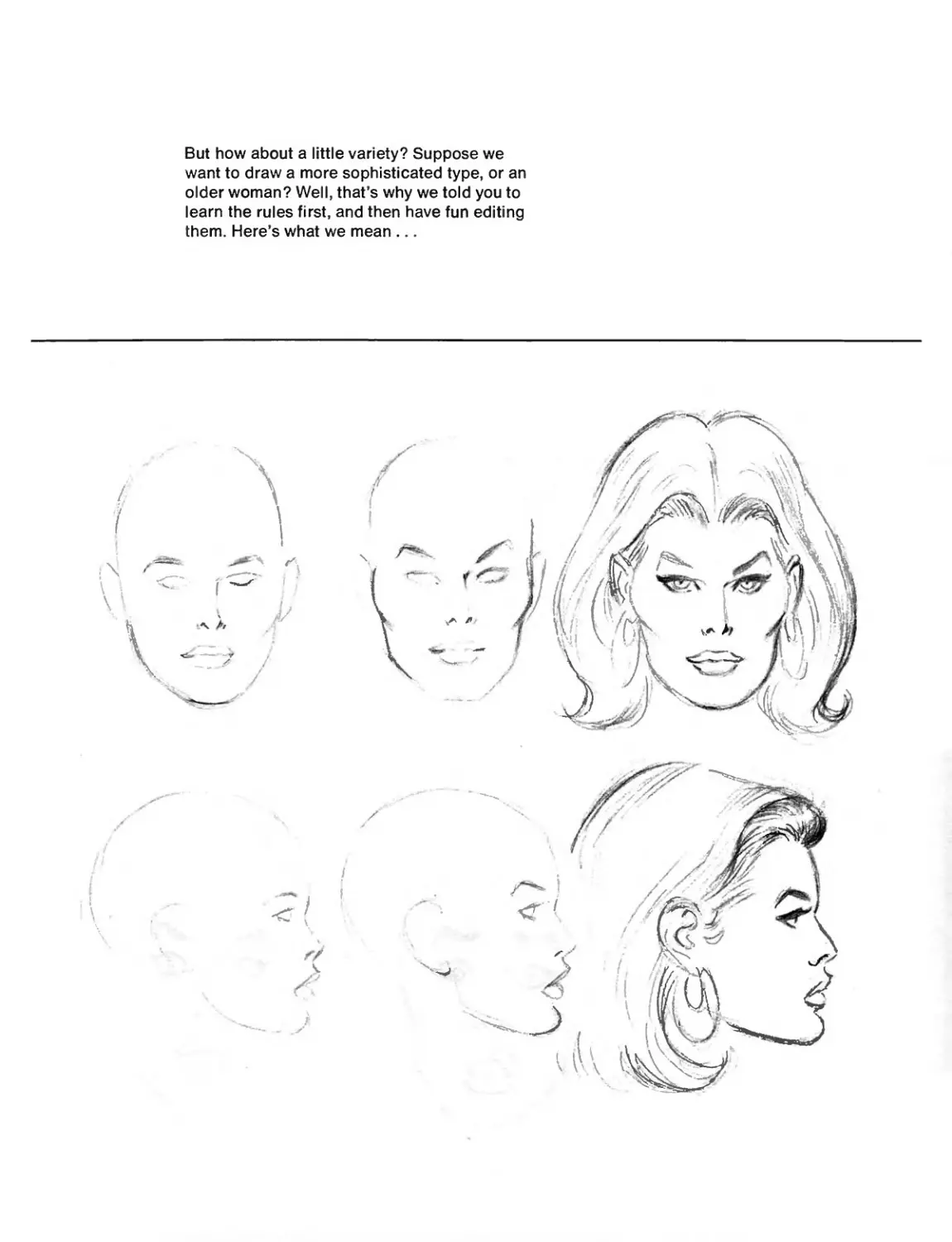
But how about a little variety? Suppose we
want to draw a more sophisticated type, or an
older woman? Well, that’s why we told you to
learn the rules first, and then have fun editing
them. Here’s what we mean ...
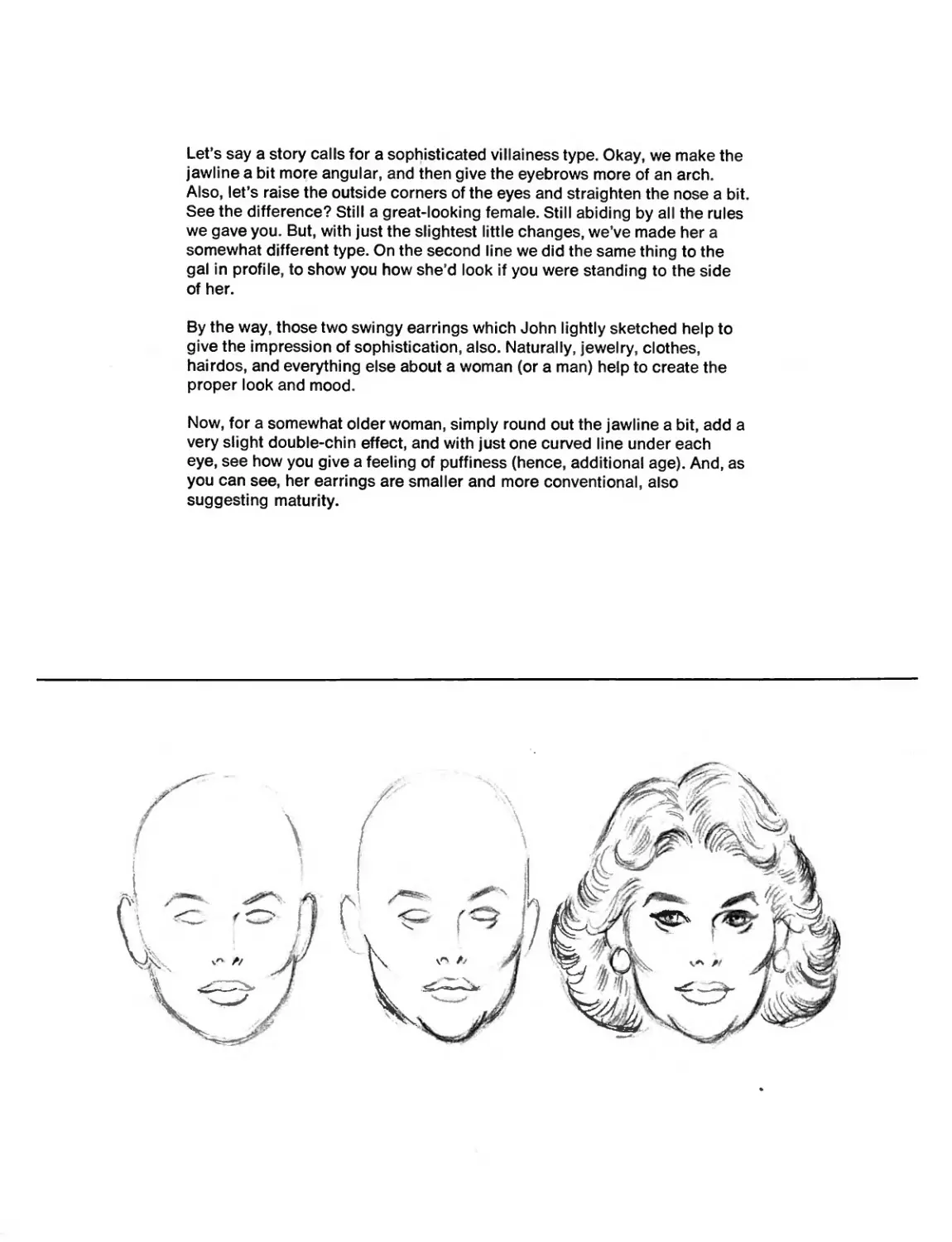
Let’s say a story calls for a sophisticated villainess type. Okay, we make the
jawline a bit more angular, and then give the eyebrows more of an arch.
Also, let’s raise the outside corners of the eyes and straighten the nose a bit.
See the difference? Still a great-looking female. Still abiding by all the rules
we gave you. But, with just the slightest little changes, we’ve made her a
somewhat different type. On the second line we did the same thing to the
gal in profile, to show you how she’d look if you were standing to the side
of her.
By the way, those two swingy earrings which John lightly sketched help to
give the impression of sophistication, also. Naturally, jewelry, clothes,
hairdos, and everything else about a woman (or a man) help to create the
proper look and mood.
Now, for a somewhat older woman, simply round out the jawline a bit, add a
very slight double-chin effect, and with just one curved line under each
eye, see how you give a feeling of puffiness (hence, additional age). And, as
you can see, her earrings are smaller and more conventional, also
suggesting maturity.
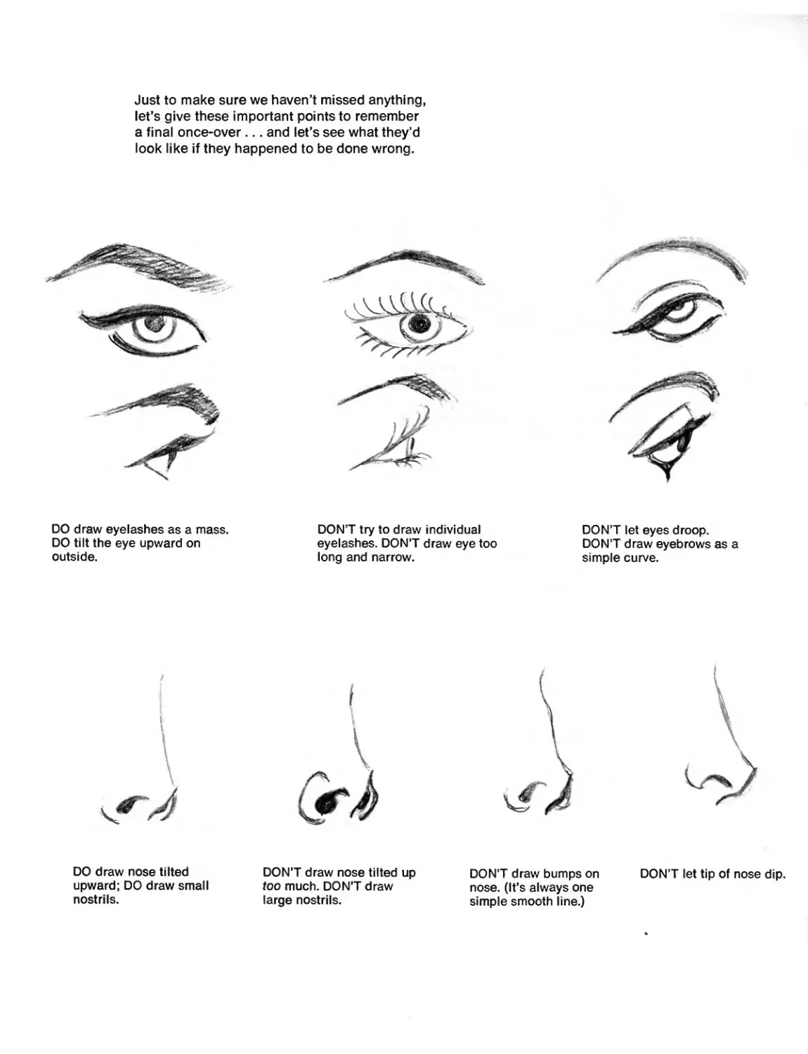
Just to make sure we haven’t missed anything,
let’s give these important points to remember
a final once-over... and let’s see what they’d
look like if they happened to be done wrong.
DO draw eyelashes as a mass.
DO tilt the eye upward on
outside.
DON’T try to draw individual
eyelashes. DON’T draw eye too
long and narrow.
DON’T let eyes droop.
DON’T draw eyebrows as a
simple curve.
DO draw nose tilted
upward; DO draw small
nostrils.
DON’T draw nose tilted up
too much. DON’T draw
large nostrils.
DON’T draw bumps on
nose. (It’s always one
simple smooth line.)
DON’T let tip of nose dip.
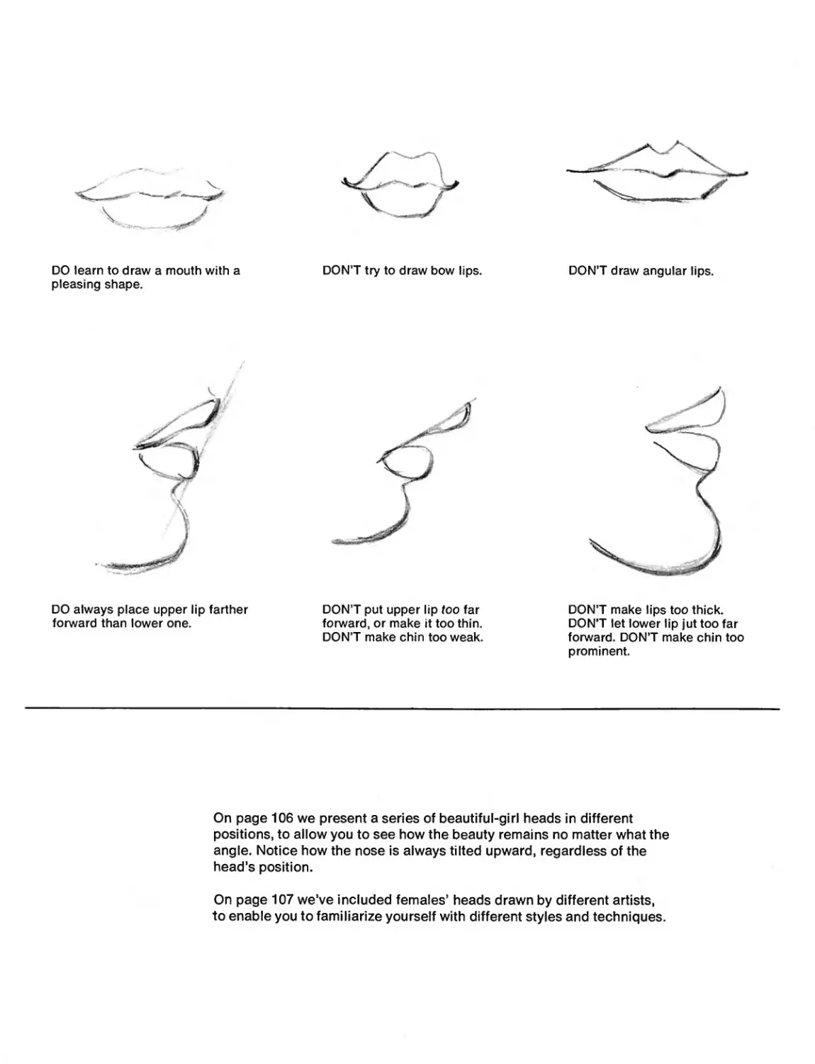
DO learn to draw a mouth with a
pleasing shape.
DON’T try to draw bow lips.
DON’T draw angular lips.
DO always place upper lip farther
forward than lower one.
DON’T put upper lip too far
forward, or make it too thin.
DON’T make chin too weak.
DON’T make lips too thick.
DON’T let lower lip jut too far
forward. DON’T make chin too
prominent.
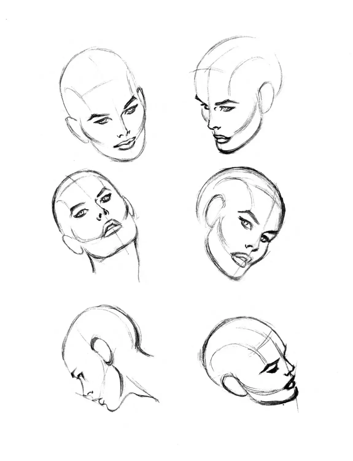
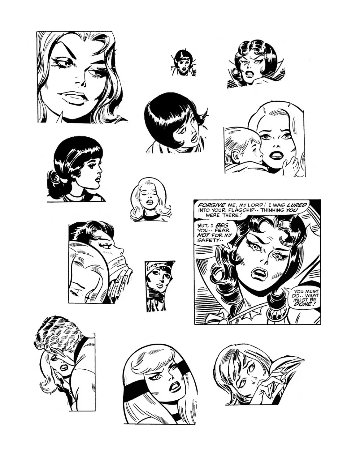
On page 106 we present a series of beautiful-girl heads in different
positions, to allow you to see how the beauty remains no matter what the
angle. Notice how the nose is always tilted upward, regardless of the
head’s position.
On page 107 we’ve included females’ heads drawn by different artists,
to enable you to familiarize yourself with different styles and techniques.
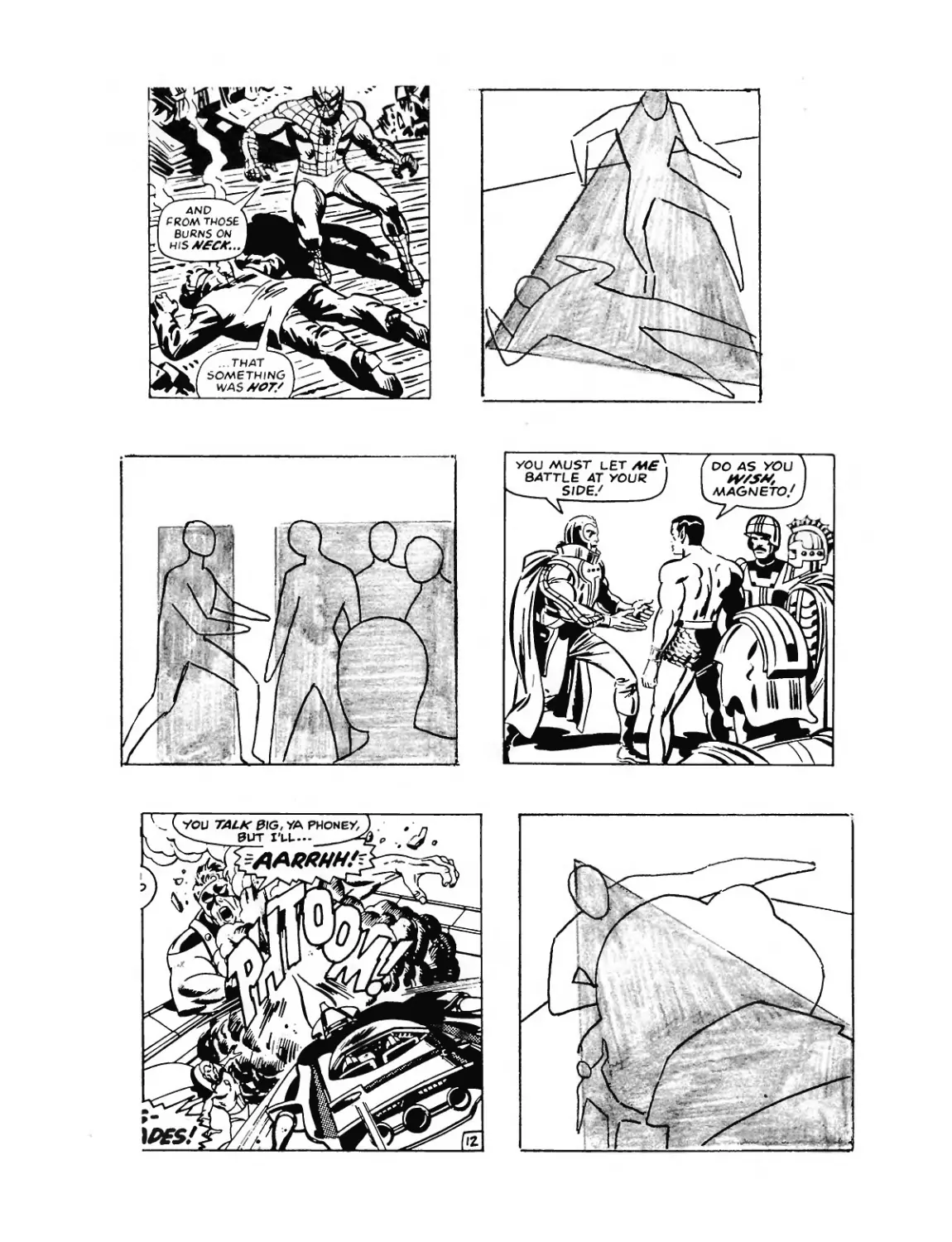
COMPOSITION!
Putting the picture together!
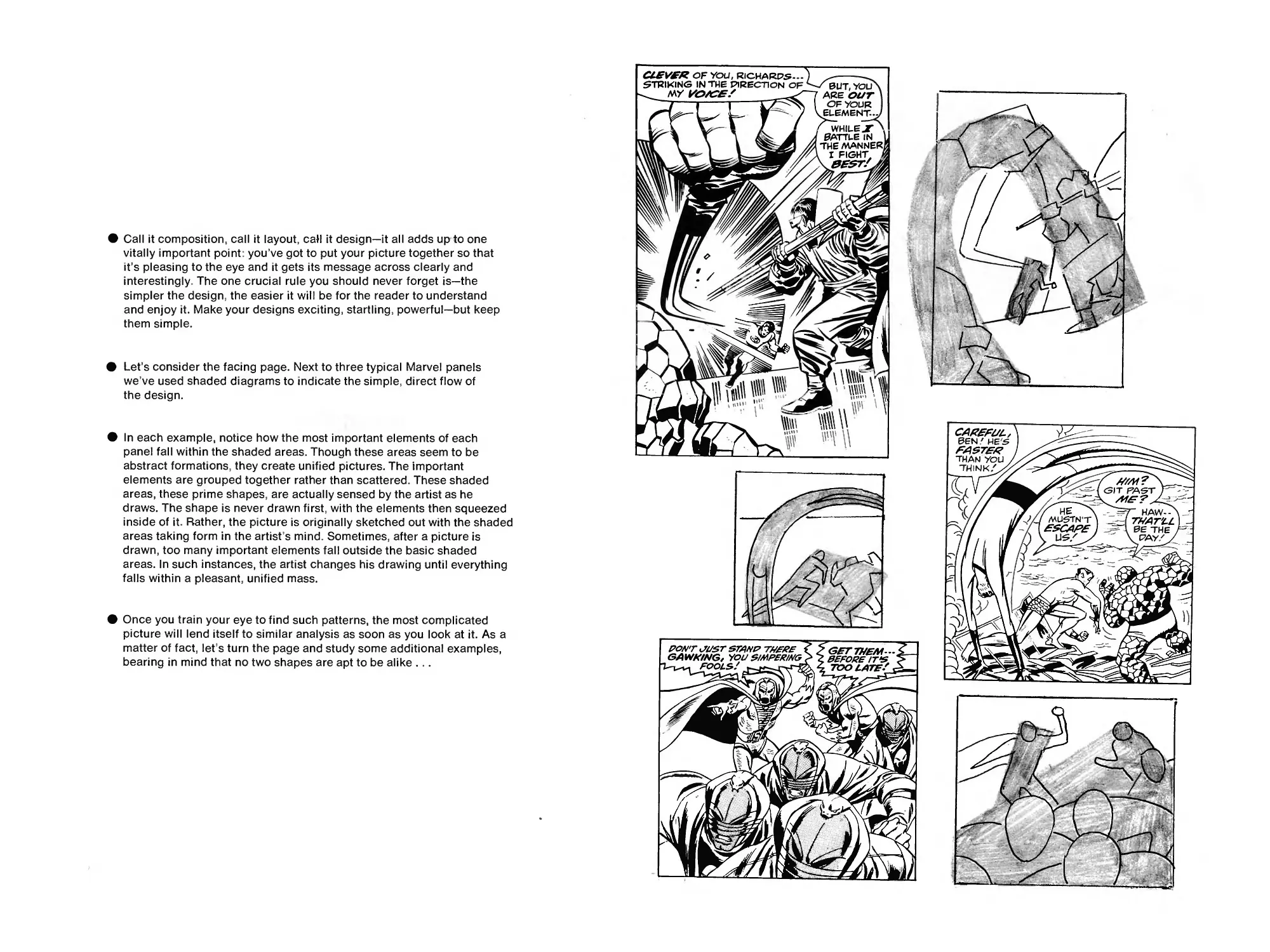
• Call it composition, call it layout, call it design—it all adds up to one
vitally important point: you’ve got to put your picture together so that
it’s pleasing to the eye and it gets its message across clearly and
interestingly. The one crucial rule you should never forget is—the
simpler the design, the easier it will be for the reader to understand
and enjoy it. Make your designs exciting, startling, powerful—but keep
them simple.
• Let’s consider the facing page. Next to three typical Marvel panels
we’ve used shaded diagrams to indicate the simple, direct flow of
the design.
• In each example, notice how the most important elements of each
panel fall within the shaded areas. Though these areas seem to be
abstract formations, they create unified pictures. The important
elements are grouped together rather than scattered. These shaded
areas, these prime shapes, are actually sensed by the artist as he
draws. The shape is never drawn first, with the elements then squeezed
inside of it. Rather, the picture is originally sketched out with the shaded
areas taking form in the artist s mind. Sometimes, after a picture is
drawn, too many important elements fall outside the basic shaded
areas. In such instances, the artist changes his drawing until everything
falls within a pleasant, unified mass.
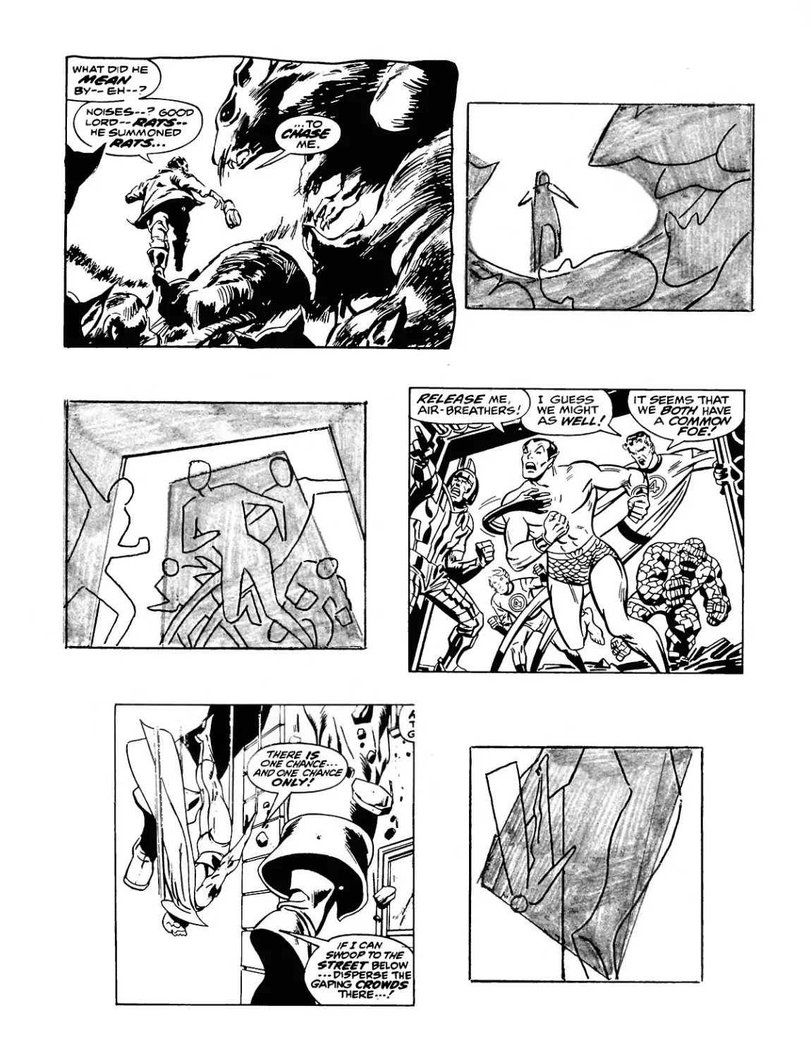
• Once you train your eye to find such patterns, the most complicated
picture will lend itself to similar analysis as soon as you look at it. As a
matter of fact, let s turn the page and study some additional examples,
bearing in mind that no two shapes are apt to be alike ...
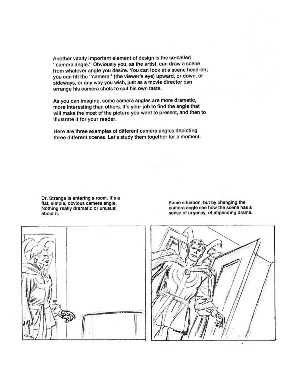
Another vitally important element of design is the so-called
“camera angle.’’ Obviously you, as the artist, can draw a scene
from whatever angle you desire. You can look at a scene head-on;
you can tilt the “camera’’ (the viewer’s eye) upward, or down, or
sideways, or any way you wish, just as a movie director can
arrange his camera shots to suit his own taste.
As you can imagine, some camera angles are more dramatic,
more interesting than others. It’s your job to find the angle that
will make the most of the picture you want to present, and then to
illustrate it for your reader.
Here are three examples of different camera angles depicting
three different scenes. Let’s study them together for a moment.
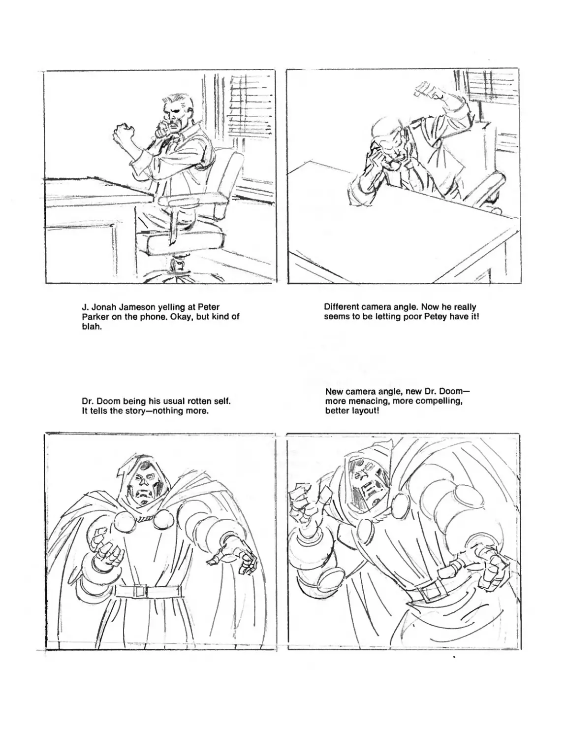
Dr. Strange is entering a room. It's a
flat, simple, obvious camera angle.
Nothing really dramatic or unusual
about it.
Same situation, but by changing the
camera angle see how the scene has a
sense of urgency, of impending drama.
J. Jonah Jameson yelling at Peter
Parker on the phone. Okay, but kind of
blah.
Different camera angle. Now he really
seems to be letting poor Petey have it!
Dr. Doom being his usual rotten self.
It tells the story—nothing more.
New camera angle, new Dr. Doom-
more menacing, more compelling,
better layout!
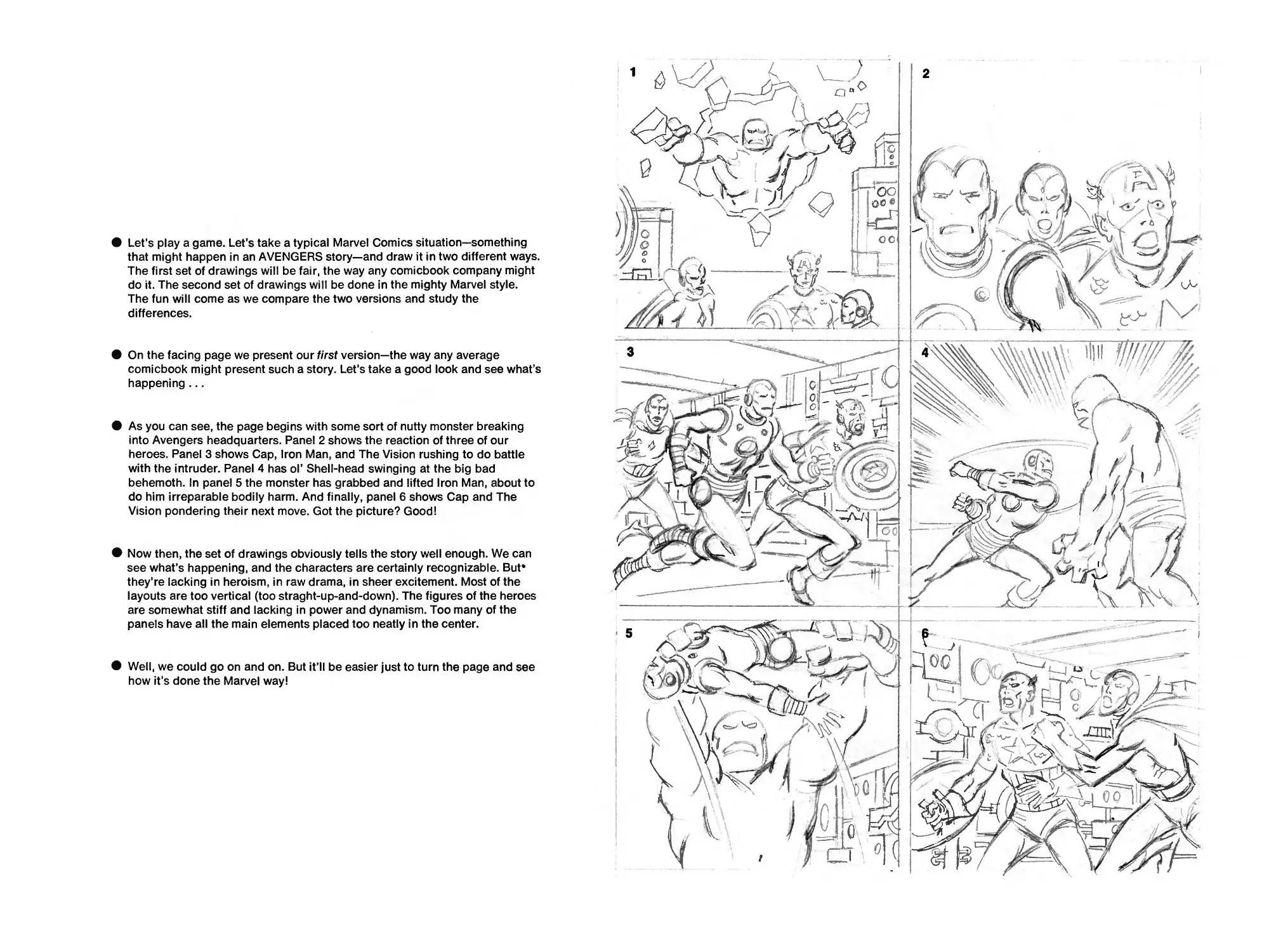
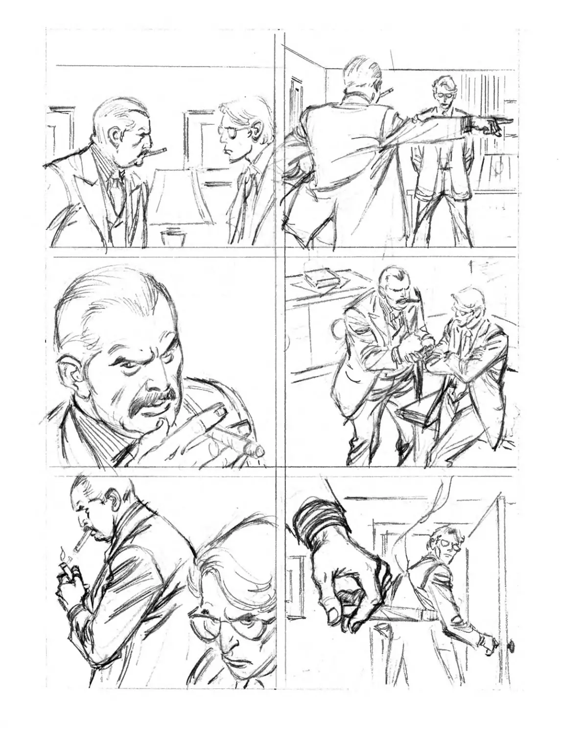
• Let’s play a game. Let's take a typical Marvel Comics situation—something
that might happen in an AVENGERS story—and draw it in two different ways.
The first set of drawings will be fair, the way any comicbook company might
do it. The second set of drawings will be done in the mighty Marvel style.
The fun will come as we compare the two versions and study the
differences.
• On the facing page we present our first version—the way any average
comicbook might present such a story. Let’s take a good look and see what’s
happening...
• As you can see, the page begins with some sort of nutty monster breaking
into Avengers headquarters. Panel 2 shows the reaction of three of our
heroes. Panel 3 shows Cap, Iron Man, and The Vision rushing to do battle
with the intruder. Panel 4 has ol’ Shell-head swinging at the big bad
behemoth. In panel 5 the monster has grabbed and lifted Iron Man, about to
do him irreparable bodily harm. And finally, panel 6 shows Cap and The
Vision pondering their next move. Got the picture? Good!
• Now then, the set of drawings obviously tells the story well enough. We can
see what’s happening, and the characters are certainly recognizable. But*
they're lacking in heroism, in raw drama, in sheer excitement. Most of the
layouts are too vertical (too straght-up-and-down). The figures of the heroes
are somewhat stiff and lacking in power and dynamism. Too many of the
panels have all the main elements placed too neatly in the center.
• Well, we could go on and on. But it’ll be easier just to turn the page and see
how it's done the Marvel way!
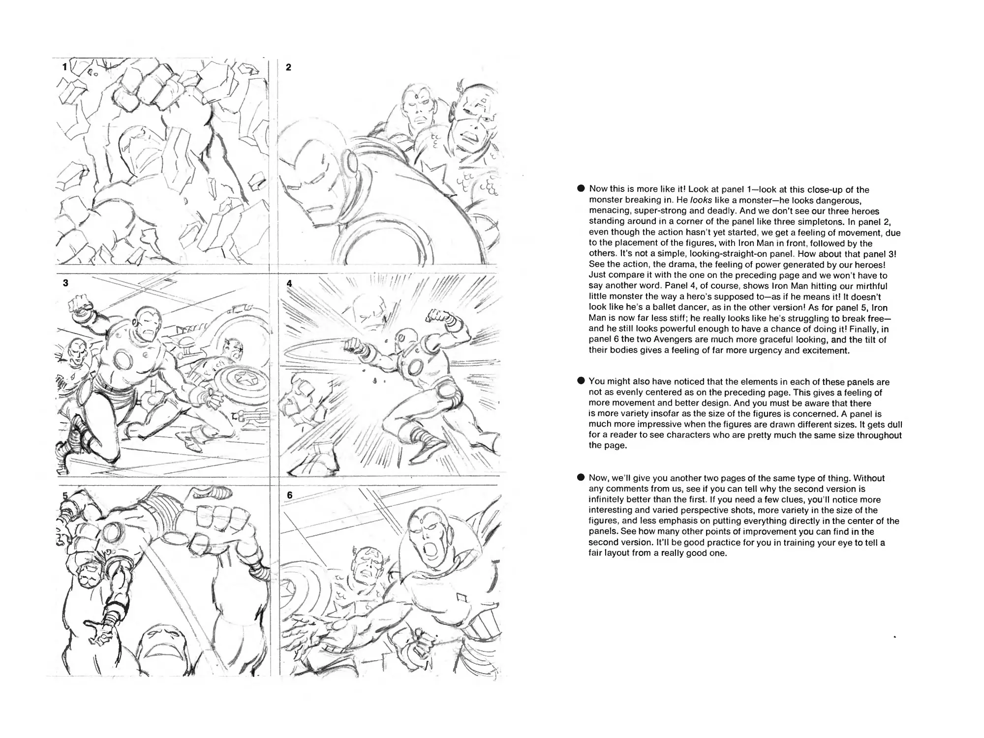
Now this is more like it! Look at panel 1—look at this close-up of the
monster breaking in. He looks like a monster—he looks dangerous,
menacing, super-strong and deadly. And we don’t see our three heroes
standing around in a corner of the panel like three simpletons. In panel 2,
even though the action hasn t yet started, we get a feeling of movement, due
to the placement of the figures, with Iron Man in front, followed by the
others. It’s not a simple, looking-straight-on panel. How about that panel 3!
See the action, the drama, the feeling of power generated by our heroes!
Just compare it with the one on the preceding page and we won t have to
say another word. Panel 4, of course, shows Iron Man hitting our mirthful
little monster the way a hero's supposed to—as if he means it! It doesn’t
look like he s a ballet dancer, as in the other version! As for panel 5, Iron
Man is now far less stiff; he really looks like he's struggling to break free—
and he still looks powerful enough to have a chance of doing it! Finally, in
panel 6 the two Avengers are much more graceful looking, and the tilt of
their bodies gives a feeling of far more urgency and excitement.
You might also have noticed that the elements in each of these panels are
not as evenly centered as on the preceding page. This gives a feeling of
more movement and better design. And you must be aware that there
is more variety insofar as the size of the figures is concerned. A panel is
much more impressive when the figures are drawn different sizes. It gets dull
for a reader to see characters who are pretty much the same size throughout
the page.
Now, we II give you another two pages of the same type of thing. Without
any comments from us, see if you can tell why the second version is
infinitely better than the first. If you need a few clues, you II notice more
interesting and varied perspective shots, more variety in the size of the
figures, and less emphasis on putting everything directly in the center of the
panels. See how many other points of improvement you can find in the
second version. It’ll be good practice for you in training your eye to tell a
fair layout from a really good one.
/Ia&
DRAW YOUR OWN
COMICBOOK PAGE!
If we can do it— so can you!
As far as we know, this is the first time this technique has ever been offered
to anyone outside the halcyon halls of Marvel! On the pages that follow,
we're going to show you, step by step, exactly how a page might be penciled
for a comicbook.
Actually, the page you’re about to study was originally done for a strip
called CAPTAIN BRITAIN, published by Marvel Comics for distribution and
sale in Great Britain. The artist was given a plot description rather than a
complete script containing dialogue. Therefore, we won’t concern ourselves
with captions or dialogue balloons, but merely with drawing the panels
according to the plot.
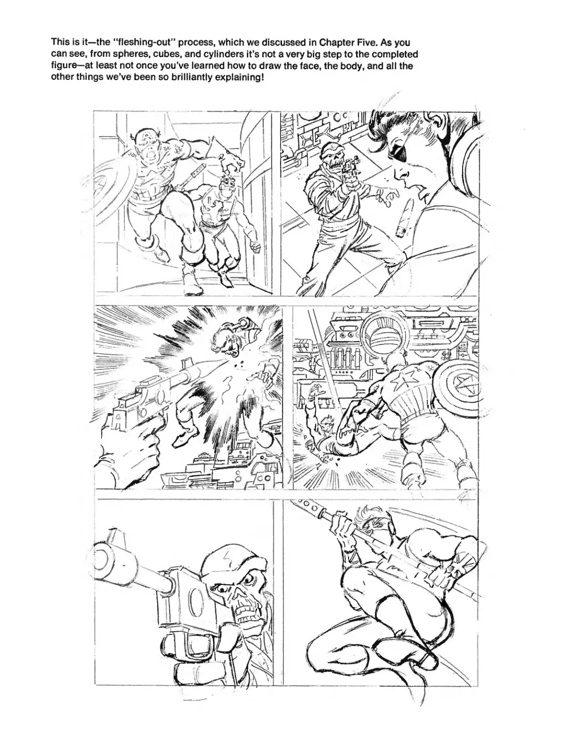
Now, here's what we have to draw. In panel 1, Captain America, followed by
Captain Britain, races down a corridor on a rescue mission. Panel 2 depicts
the villainous Red Skull aiming a gun at his enemy, Nick Fury, who hovers
above him, held aloft by twin jet-packs, which he wears on his back. Fury
reacts in surprise as he hears his name called by Captain America. Panel 3
is a shot of the Skull firing point-blank at poor ol’ Fury! In panel 4, Fury
drops to the floor as Cap rushes to help him. Panel 5 shows the Skull about
to zap the star-spangled Avenger. And we wrap it up with panel 6, in which
Captain Britain, holding his unique armored staff, charges to the rescue.
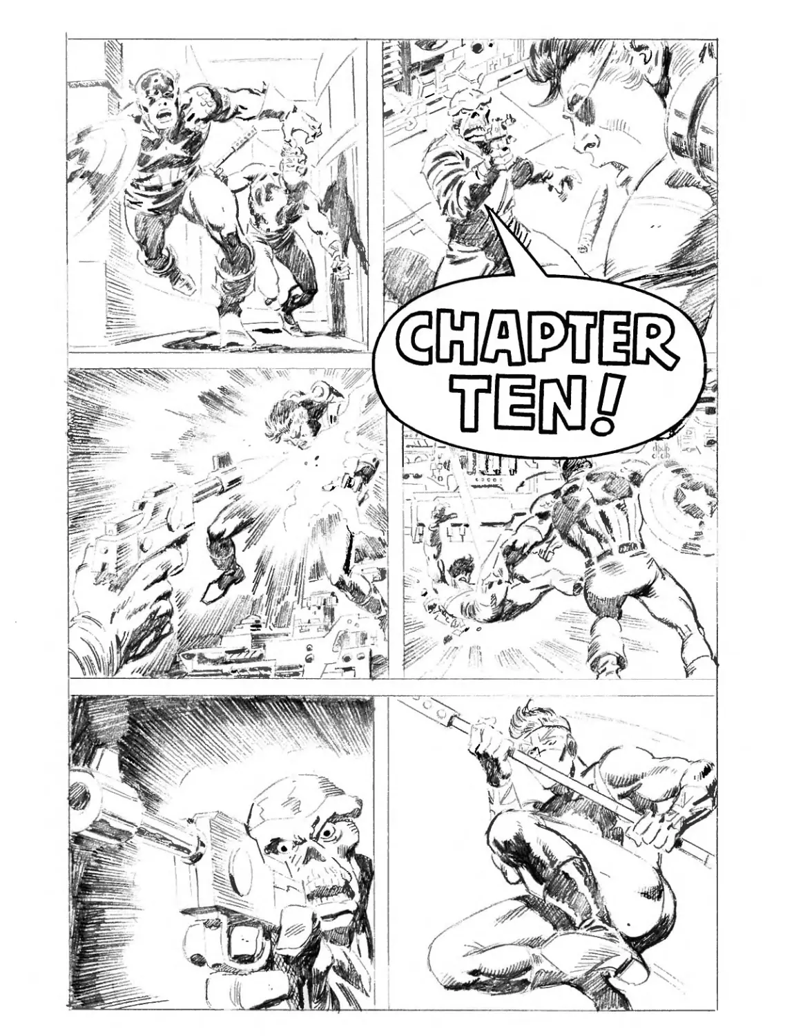
Although you’ve already seen the finished product on the chapter head on
page 124, the important thing for you now is to see just how the whole thing
was put together. But before you breathlessly turn the page, remember to
always lay out the entire page before you finish any individual drawing.
Also, always draw the entire figure in each panel, even if it won’t all show
in the final artwork.
This is the first draft, done purely for layout
and action—just to position the characters.
Basically, it consists of a set of stick figures,
giving the artist an idea of what his page may
look like and how the action will flow from
panel to panel.
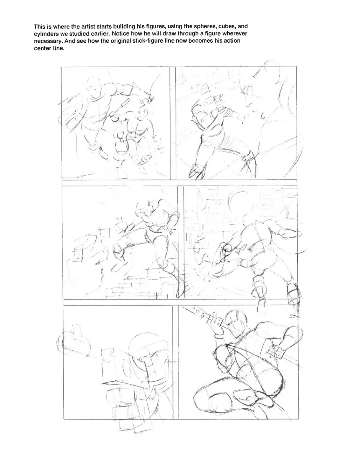
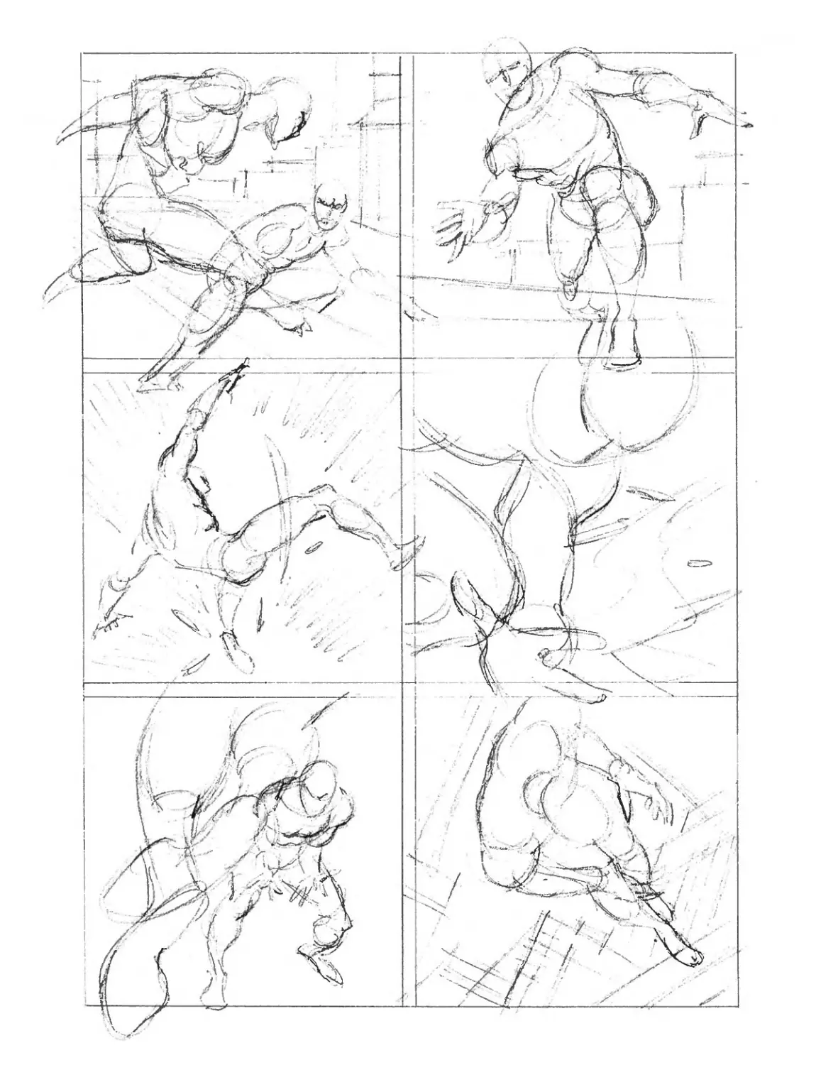
This is where the artist starts building his figures, using the spheres, cubes, and
cylinders we studied earlier. Notice how he will draw through a figure wherever
necessary. And see how the original stick-figure line now becomes his action
center line.
/
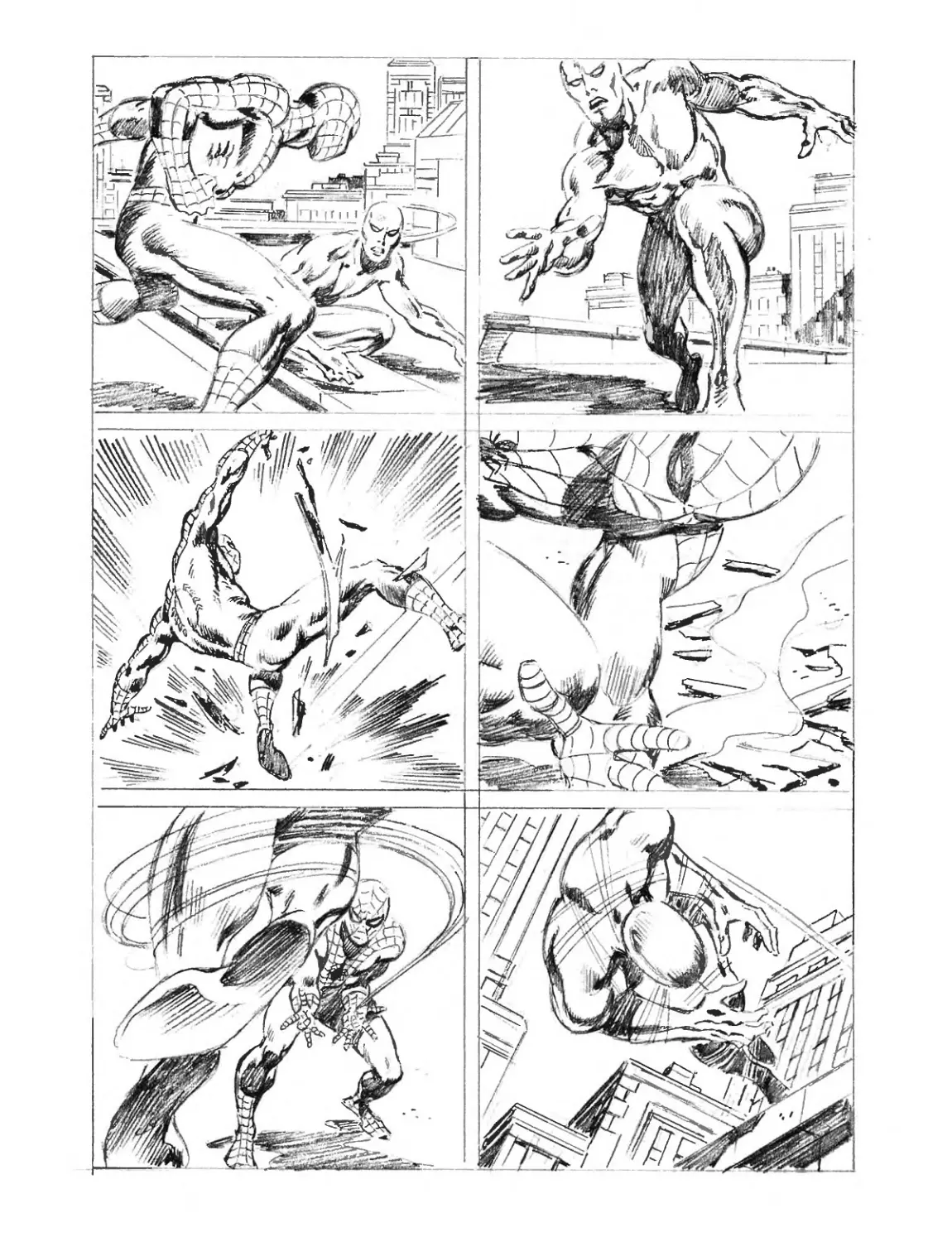
This is it—the “fleshing-out” process, which we discussed in Chapter Five. As you
can see, from spheres, cubes, and cylinders it’s not a very big step to the completed
figure—at least not once you’ve learned how to draw the face, the body, and all the
other things we’ve been so brilliantly explaining!
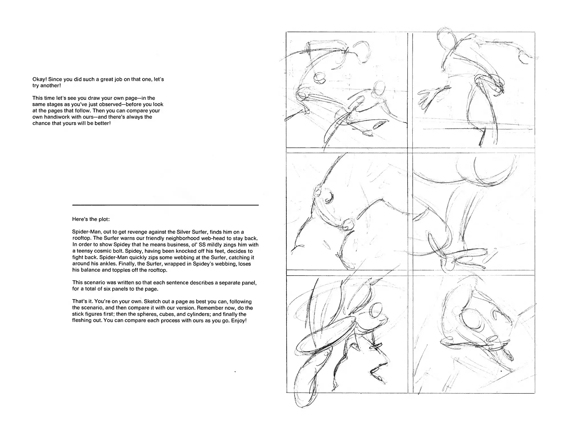
Okay! Since you did such a great job on that one, let’s
try another!
This time let’s see you draw your own page—in the
same stages as you’ve just observed—before you look
at the pages that follow. Then you can compare your
own handiwork with ours—and there’s always the
chance that yours will be better!
Here’s the plot:
Spider-Man, out to get revenge against the Silver Surfer, finds him on a
rooftop. The Surfer warns our friendly neighborhood web-head to stay back.
In order to show Spidey that he means business, ol’ SS mildly zings him with
a teensy cosmic bolt. Spidey, having been knocked off his feet, decides to
fight back. Spider-Man quickly zips some webbing at the Surfer, catching it
around his ankles. Finally, the Surfer, wrapped in Spidey’s webbing, loses
his balance and topples off the rooftop.
This scenario was written so that each sentence describes a separate panel,
for a total of six panels to the page.
That’s it. You’re on your own. Sketch out a page as best you can, following
the scenario, and then compare it with our version. Remember now, do the
stick figures first; then the spheres, cubes, and cylinders; and finally the
fleshing out. You can compare each process with ours as you go. Enjoy!
• How did you do? Better than you expected, eh? If so, congratulations.
If not, don’t worry about it. Try some more, making up the situations
yourself. That’s the way most of the pros in the comicbook field got
their start, by creating and drawing their own stories and strips, and
then using them as samples to show the editor at a comicbook
publishing company.
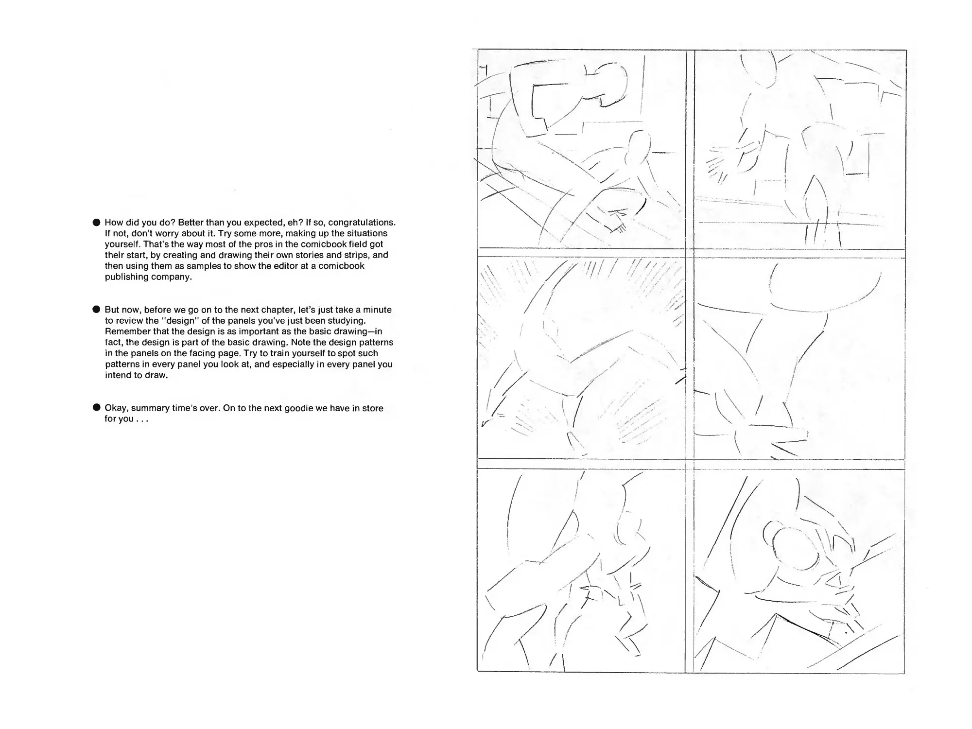
* But now, before we go on to the next chapter, let’s just take a minute
to review the “design” of the panels you’ve just been studying.
Remember that the design is as important as the basic drawing—in
fact, the design is part of the basic drawing. Note the design patterns
in the panels on the facing page. Try to train yourself to spot such
patterns in every panel you look at, and especially in every panel you
intend to draw.
• Okay, summary time’s over. On to the next goodie we have in store
for you ...
©1977 MARVEL^COMICS GROUP
THE COMICBOOK COVER!
Without which you cannot tell a book by!
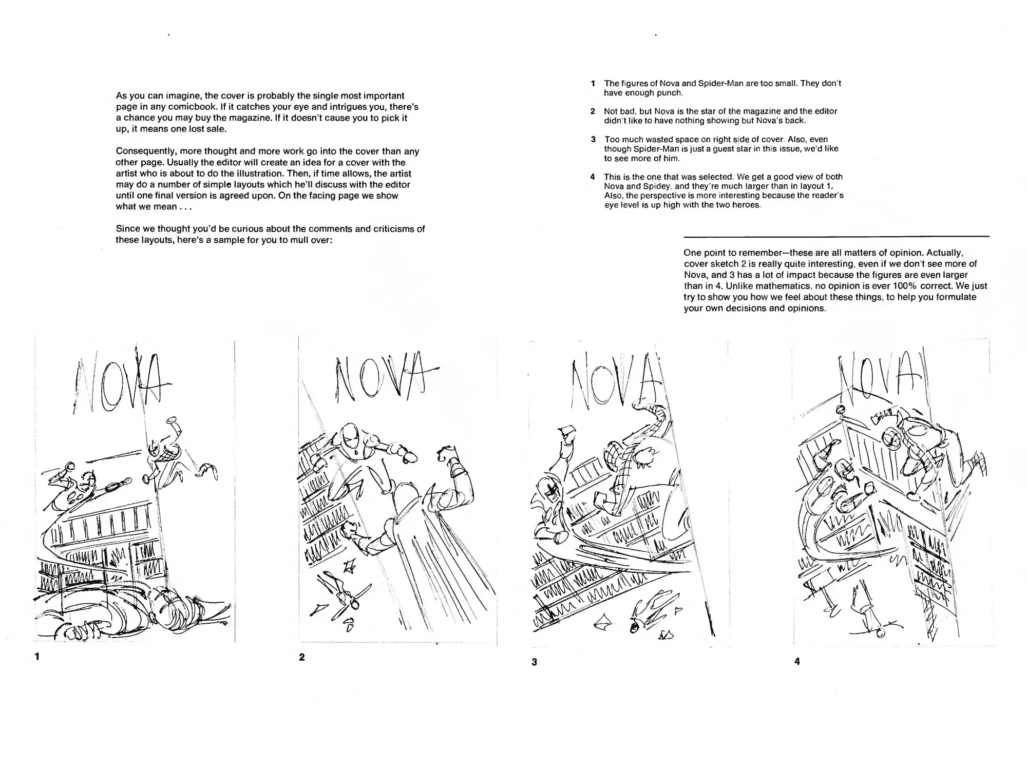
As you can imagine, the cover is probably the single most important
page in any comicbook. If it catches your eye and intrigues you, there’s
a chance you may buy the magazine. If it doesn’t cause you to pick it
up, it means one lost sale.
Consequently, more thought and more work go into the cover than any
other page. Usually the editor will create an idea for a cover with the
artist who is about to do the illustration. Then, if time allows, the artist
may do a number of simple layouts which he’ll discuss with the editor
until one final version is agreed upon. On the facing page we show
what we mean ...
Since we thought you’d be curious about the comments and criticisms of
these layouts, here’s a sample for you to mull over:
1
2
1 The figures of Nova and Spider-Man are too small. They don’t
have enough punch.
2 Not bad, but Nova is the star of the magazine and the editor
didn’t like to have nothing showing but Nova’s back.
3 Too much wasted space on right side of cover. Also, even
though Spider-Man is just a guest star in this issue, we’d like
to see more of him.
4 This is the one that was selected. We get a good view of both
Nova and Spidey, and they re much larger than in layout 1.
Also, the perspective is more interesting because the reader s
eye level is up high with the two heroes.
One point to remember—these are all matters of opinion. Actually,
cover sketch 2 is really quite interesting, even if we don t see more of
Nova, and 3 has a lot of impact because the figures are even larger
than in 4. Unlike mathematics, no opinion is ever 100% correct. We just
try to show you how we feel about these things, to help you formulate
your own decisions and opinions.
3
4
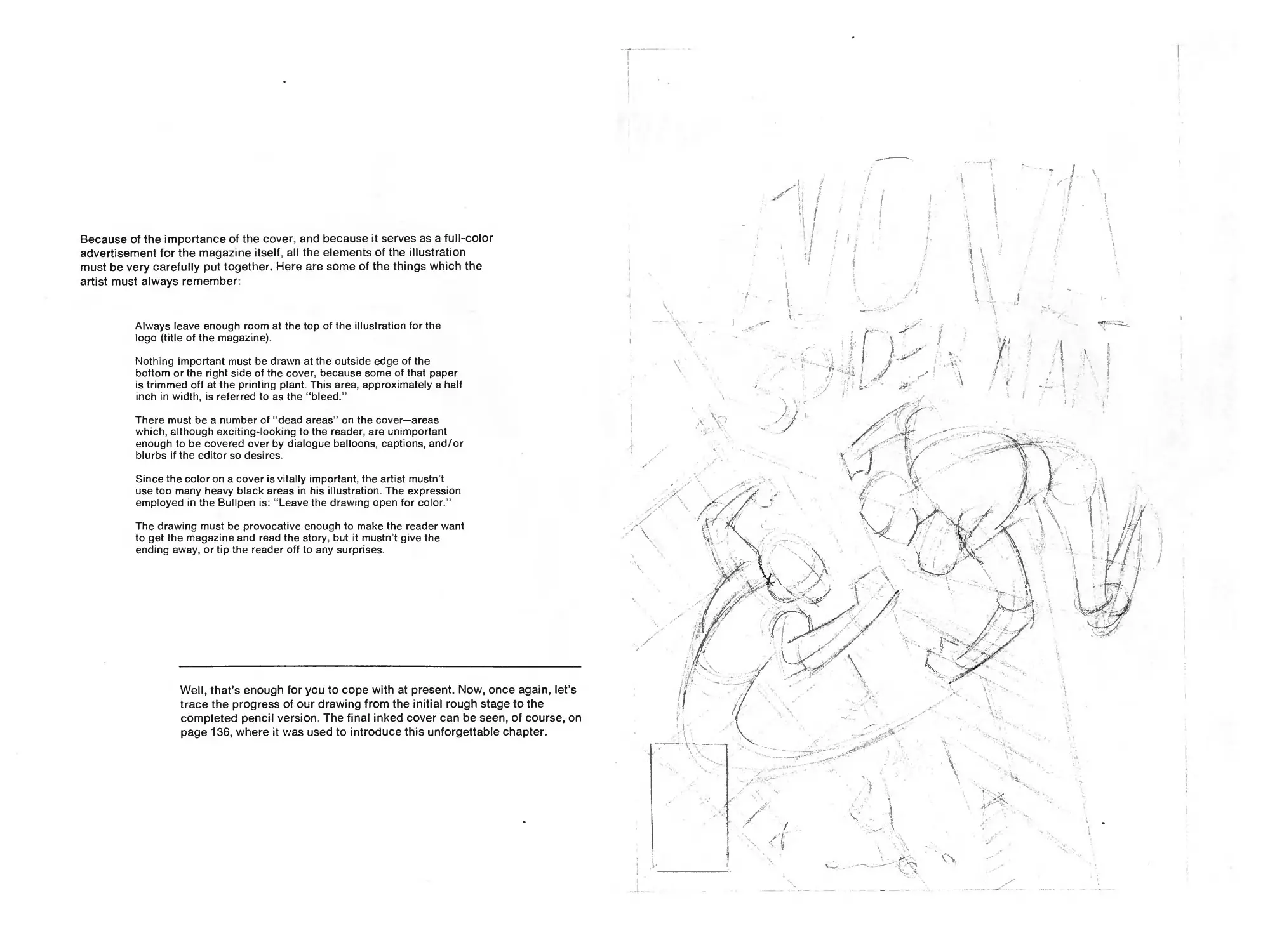
Because of the importance of the cover, and because it serves as a full-color
advertisement for the magazine itself, all the elements of the illustration
must be very carefully put together. Here are some of the things which the
artist must always remember:
Always leave enough room at the top of the illustration for the
logo (title of the magazine).
Nothing important must be drawn at the outside edge of the
bottom or the right side of the cover, because some of that paper
is trimmed off at the printing plant. This area, approximately a half
inch in width, is referred to as the “bleed.”
There must be a number of “dead areas ’ on the cover—areas
which, although exciting-looking to the reader, are unimportant
enough to be covered over by dialogue balloons, captions, and/or
blurbs if the editor so desires.
Since the color on a cover is vitally important, the artist mustn’t
use too many heavy black areas in his illustration. The expression
employed in the Bullpen is: “Leave the drawing open for color.”
The drawing must be provocative enough to make the reader want
to get the magazine and read the story, but it mustn’t give the
ending away, or tip the reader off to any surprises.
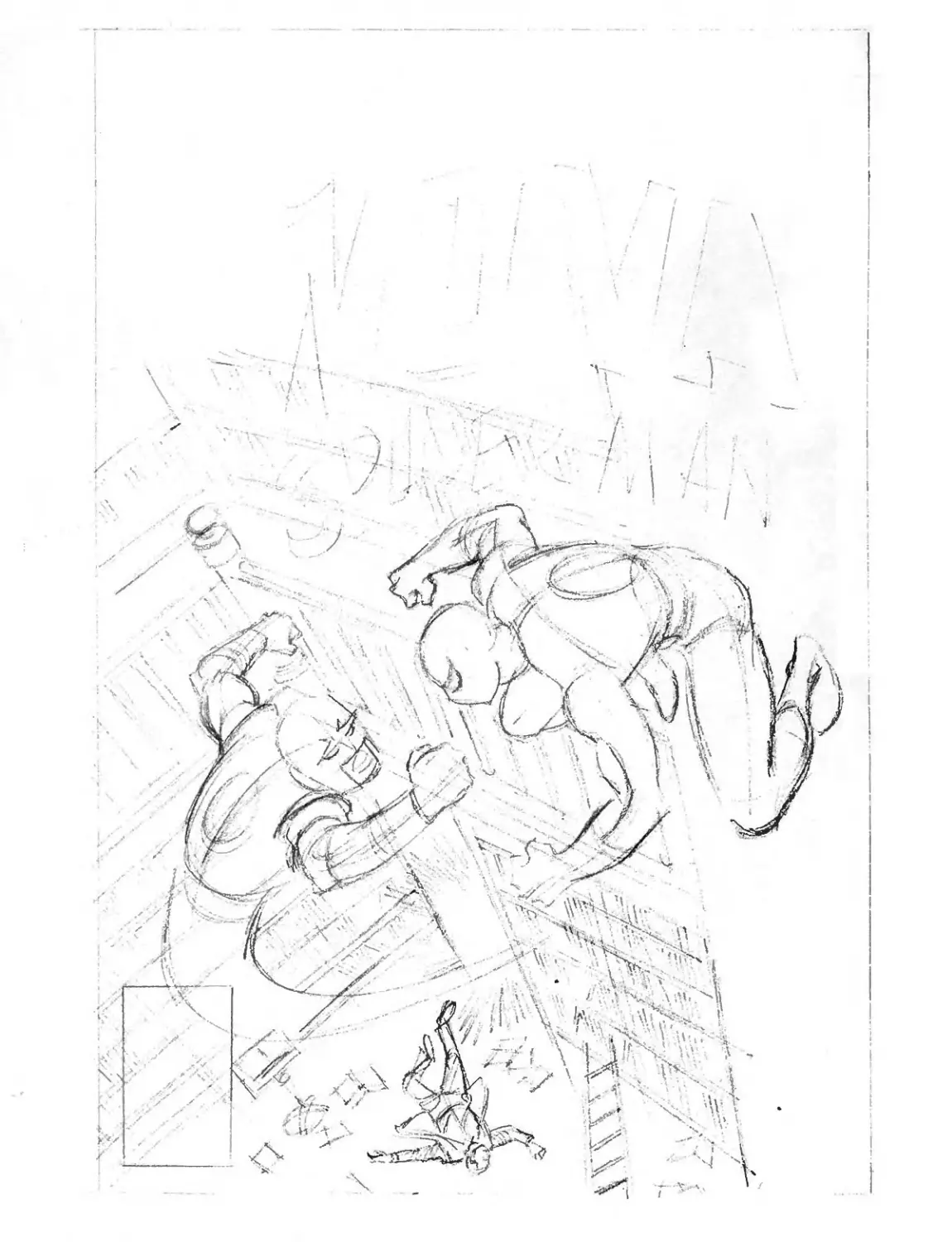
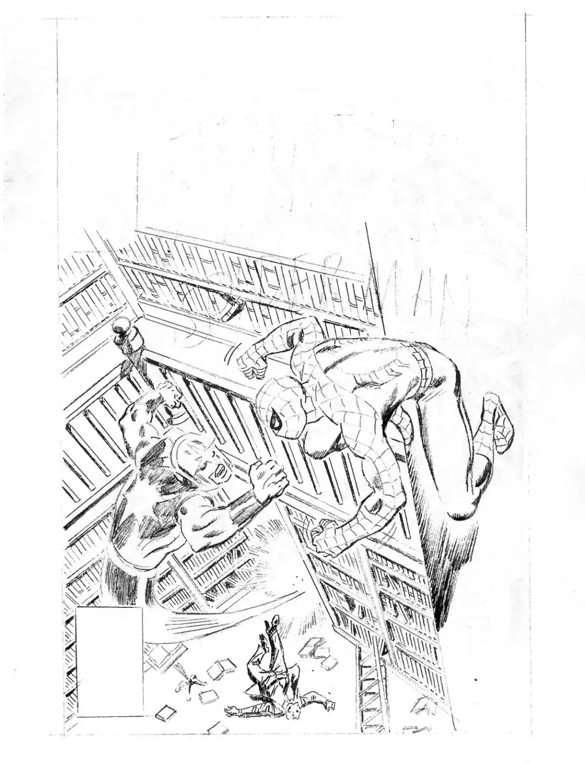
Well, that’s enough for you to cope with at present. Now, once again, let’s
trace the progress of our drawing from the initial rough stage to the
completed pencil version. The final inked cover can be seen, of course, on
page 136, where it was used to introduce this unforgettable chapter.
I
i
I
f
I
f
*
THE ART OF INKING!
No matter how beautifully a page may be drawn in pencil, it cannot be
printed in a comicbook unless black india ink is applied to the original
pencil drawing. That means someone has to trace over the initial penciled
artwork with either a paintbrush or drawing pen, transforming each
illustration into a carefully “inked” final product.
However, always remember that an inker is not merely a person who
traces a penciled drawing. The inker has to be an artist himself. (Or
herself. No chauvinists we!) A gifted inker can make mediocre penciling
look great; while a mediocre inker can make great penciling look dull!
Inking is vitally important. The more you know about it, the better. And
here’s where we begin ...
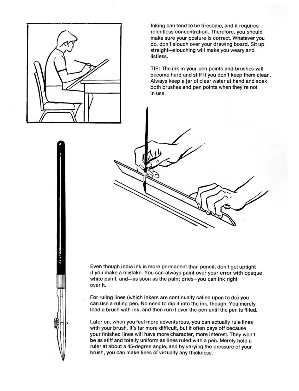
TIP: The ink in your pen points and brushes will
become hard and stiff if you don’t keep them clean.
Always keep a jar of clear water at hand and soak
both brushes and pen points when they’re not
in use.
For ruling lines (which inkers are continually called upon to do) you
can use a ruling pen. No need to dip it into the ink, though. You merely
load a brush with ink, and then run it over the pen until the pen is filled.
Even though india ink is more permanent than pencil, don’t get uptight
if you make a mistake. You can always paint over your error with opaque
white paint, and—as soon as the paint dries—you can ink right
over it.
Inking can tend to be tiresome, and it requires
relentless concentration. Therefore, you should
make sure your posture is correct. Whatever you
do, don’t slouch over your drawing board. Sit up
straight—slouching will make you weary and
listless.
Later on, when you feel more adventurous, you can actually rule lines
with your brush. It’s far more difficult, but it often pays off because
your finished lines will have more character, more interest. They won’t
be as stiff and totally uniform as lines ruled with a pen. Merely hold a
ruler at about a 45-degree angle, and by varying the pressure of your
brush, you can make lines of virtually any thickness.
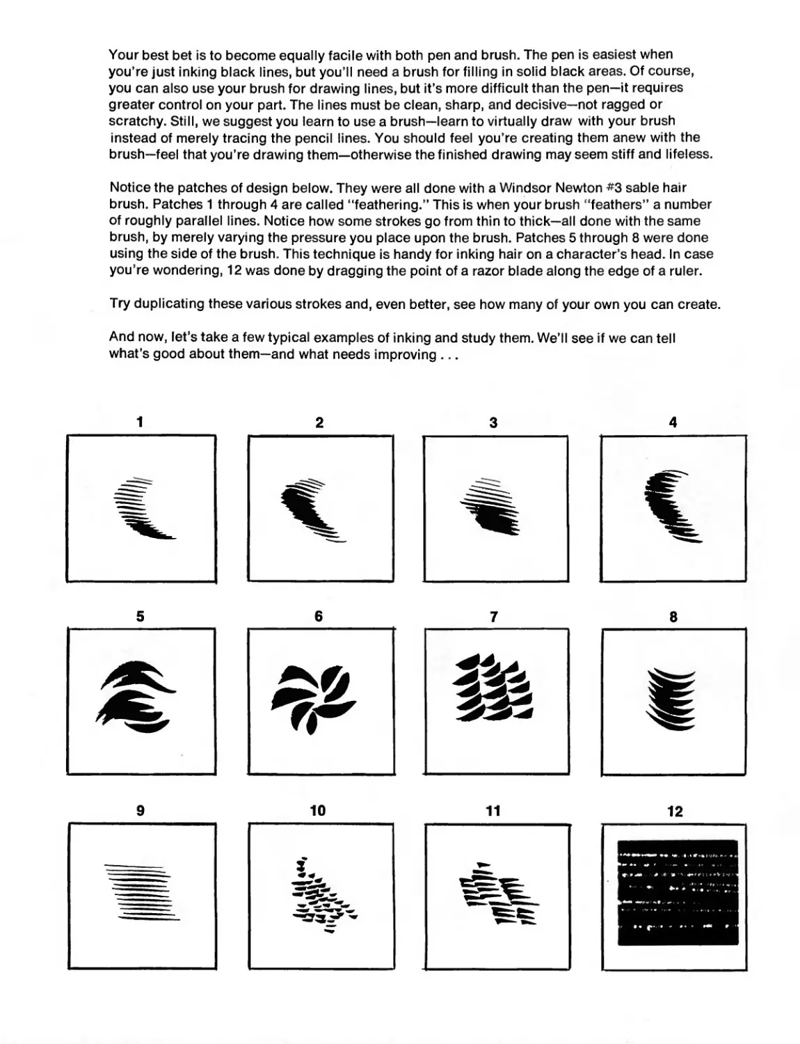
Your best bet is to become equally facile with both pen and brush. The pen is easiest when
you’re just inking black lines, but you’ll need a brush for filling in solid black areas. Of course,
you can also use your brush for drawing lines, but it’s more difficult than the pen—it requires
greater control on your part. The lines must be clean, sharp, and decisive—not ragged or
scratchy. Still, we suggest you learn to use a brush—learn to virtually draw with your brush
instead of merely tracing the pencil lines. You should feel you’re creating them anew with the
brush—feel that you’re drawing them—otherwise the finished drawing may seem stiff and lifeless.
Notice the patches of design below. They were all done with a Windsor Newton #3 sable hair
brush. Patches 1 through 4 are called “feathering.” This is when your brush “feathers” a number
of roughly parallel lines. Notice how some strokes go from thin to thick—all done with the same
brush, by merely varying the pressure you place upon the brush. Patches 5 through 8 were done
using the side of the brush. This technique is handy for inking hair on a character’s head. In case
you’re wondering, 12 was done by dragging the point of a razor blade along the edge of a ruler.
Try duplicating these various strokes and, even better, see how many of your own you can create.
And now, let’s take a few typical examples of inking and study them. We’ll see if we can tell
what’s good about them—and what needs improving ...
2
4
5
6
8
10 11
9
12
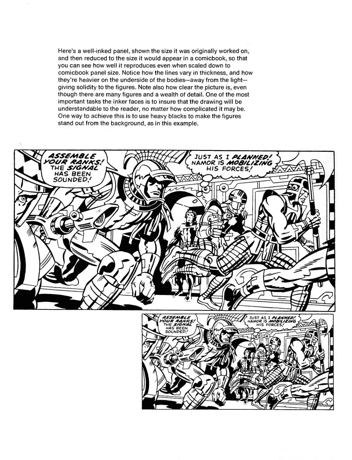
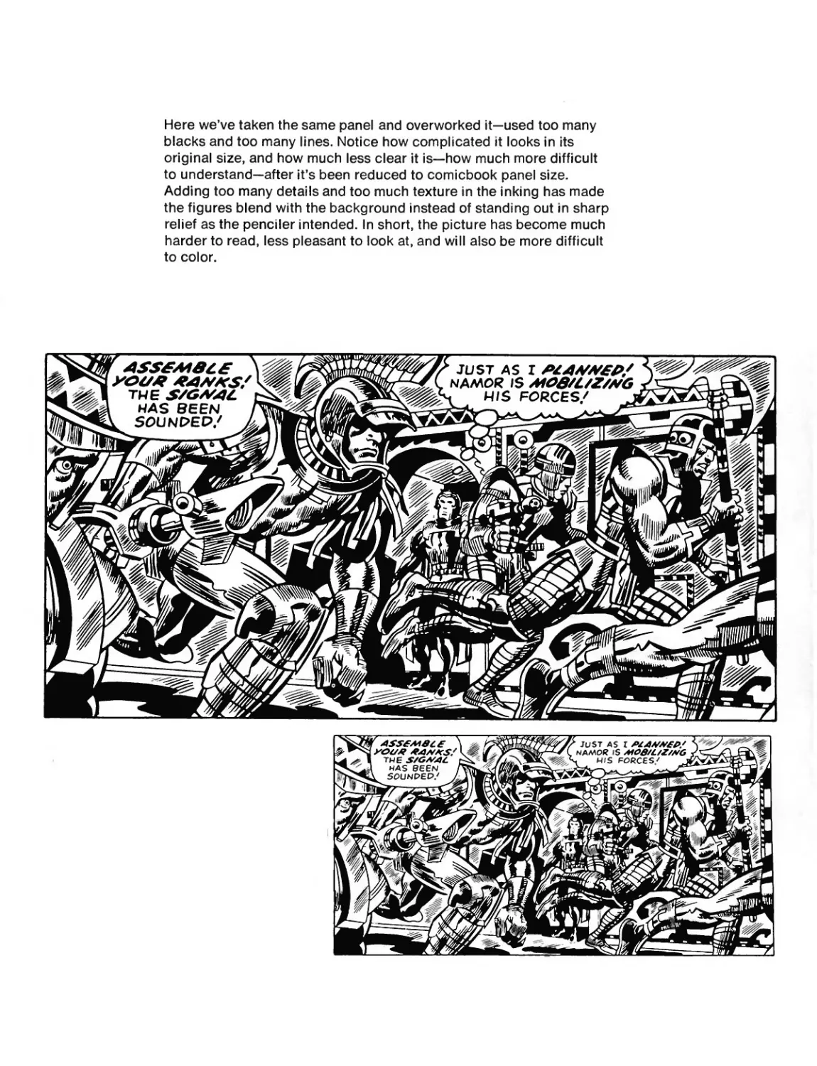
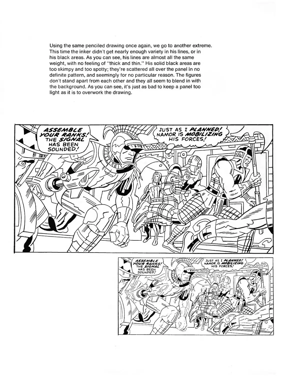
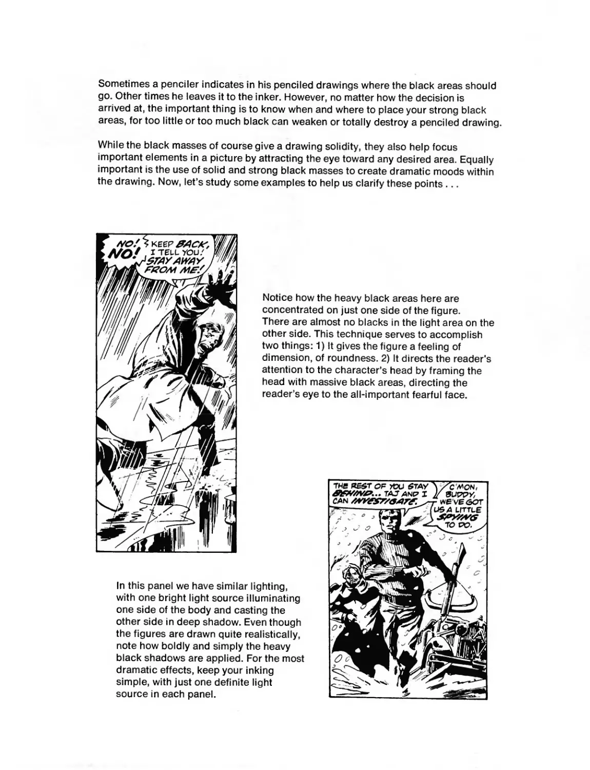
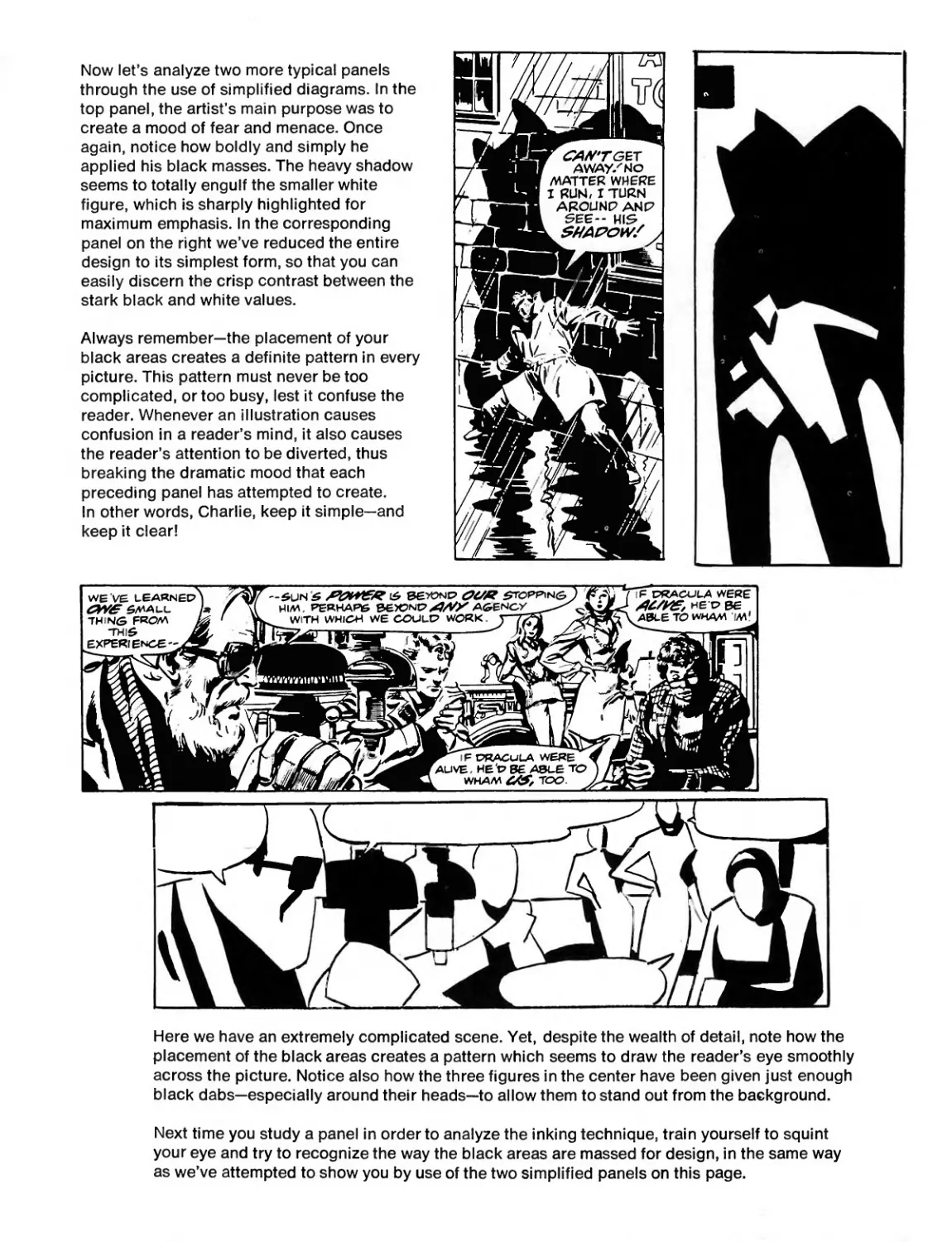
Here’s a well-inked panel, shown the size it was originally worked on,
and then reduced to the size it would appear in a comicbook, so that
you can see how well it reproduces even when scaled down to
comicbook panel size. Notice how the lines vary in thickness, and how
they’re heavier on the underside of the bodies—away from the light-
giving solidity to the figures. Note also how clear the picture is, even
though there are many figures and a wealth of detail. One of the most
important tasks the inker faces is to insure that the drawing will be
understandable to the reader, no matter how complicated it may be.
One way to achieve this is to use heavy blacks to make the figures
stand out from the background, as in this example.
Here we’ve taken the same panel and overworked it—used too many
blacks and too many lines. Notice how complicated it looks in its
original size, and how much less clear it is—how much more difficult
to understand—after it’s been reduced to comicbook panel size.
Adding too many details and too much texture in the inking has made
the figures blend with the background instead of standing out in sharp
relief as the penciler intended. In short, the picture has become much
harder to read, less pleasant to look at, and will also be more difficult
to color.
Using the same penciled drawing once again, we go to another extreme.
This time the inker didn t get nearly enough variety in his lines, or in
his black areas. As you can see, his lines are almost all the same
weight, with no feeling of “thick and thin.” His solid black areas are
too skimpy and too spotty; they’re scattered all over the panel in no
definite pattern, and seemingly for no particular reason. The figures
don’t stand apart from each other and they all seem to blend in with
the background. As you can see, it’s just as bad to keep a panel too
light as it is to overwork the drawing.
Sometimes a penciler indicates in his penciled drawings where the black areas should
go. Other times he leaves it to the inker. However, no matter how the decision is
arrived at, the important thing is to know when and where to place your strong black
areas, for too little or too much black can weaken or totally destroy a penciled drawing.
While the black masses of course give a drawing solidity, they also help focus
important elements in a picture by attracting the eye toward any desired area. Equally
important is the use of solid and strong black masses to create dramatic moods within
the drawing. Now, let’s study some examples to help us clarify these points ...
Notice how the heavy black areas here are
concentrated on just one side of the figure.
There are almost no blacks in the light area on the
other side. This technique serves to accomplish
two things: 1) It gives the figure a feeling of
dimension, of roundness. 2) It directs the reader’s
attention to the character’s head by framing the
head with massive black areas, directing the
reader’s eye to the all-important fearful face.
In this panel we have similar lighting,
with one bright light source illuminating
one side of the body and casting the
other side in deep shadow. Even though
the figures are drawn quite realistically,
note how boldly and simply the heavy
black shadows are applied. For the most
dramatic effects, keep your inking
simple, with just one definite light
source in each panel.
Now let’s analyze two more typical panels
through the use of simplified diagrams. In the
top panel, the artist’s main purpose was to
create a mood of fear and menace. Once
again, notice how boldly and simply he
applied his black masses. The heavy shadow
seems to totally engulf the smaller white
figure, which is sharply highlighted for
maximum emphasis. In the corresponding
panel on the right we’ve reduced the entire
design to its simplest form, so that you can
easily discern the crisp contrast between the
stark black and white values.
Always remember—the placement of your
black areas creates a definite pattern in every
picture. This pattern must never be too
complicated, or too busy, lest it confuse the
reader. Whenever an illustration causes
confusion in a reader’s mind, it also causes
the reader’s attention to be diverted, thus
breaking the dramatic mood that each
preceding panel has attempted to create.
In other words, Charlie, keep it simple—and
keep it clear!
Here we have an extremely complicated scene. Yet, despite the wealth of detail, note how the
placement of the black areas creates a pattern which seems to draw the reader’s eye smoothly
across the picture. Notice also how the three figures in the center have been given just enough
black dabs—especially around their heads—to allow them to stand out from the background.
Next time you study a panel in order to analyze the inking technique, train yourself to squint
your eye and try to recognize the way the black areas are massed for design, in the same way
as we’ve attempted to show you by use of the two simplified panels on this page.
Here’s a different application of blacks. On the previous page we saw the black areas used in a
very realistic way; here we have an example of blacks being used decoratively. Notice how the
black highlight lines on the ship seem to be aimed directly at the figures, focusing the reader’s
attention on Reed, Sue, and the baby. Notice also how the blacks in the upper areas of their
bodies encircle the three heads, directing your eye right to the cluster of faces.
Next we have what seems to be a complicated arrangement of blacks but is actually a simple,
very direct pattern. In this case, the use of blacks directs the reader’s eye around the panel in a
smooth, harmonious rhythm. See how the black shapes at the right side of the panel are large
and bold, while those at the left are far smaller. The purpose of these smaller black areas is to
counterbalance the larger black masses at the right. To prove this for yourself, simply cover the
smaller, left-hand black areas with a piece of white paper and notice how the panel seems
lopsided and off-balance without them.
Never add blacks merely because
you’ve got some extra ink in your
pen or brush. Always have a
definite reason—either to enhance
the design of the panel, or to help
clarify a complicated layout. Of
equal importance, of course, is the
use of black to emphasize a certain
mood. And, speaking of mood ...
Hey, how lucky can we be! Here’s a perfect example of the use of blacks to create a certain mood!
By squinting our eyes, or observing the simplified panel on the right, we can instantly see that
all the black areas are in crisp, simple vertical or horizontal forms, thereby creating a calm,
motionless scene—with the dramatic exception of the large, slanting black masses on the
winged gargoyle, which add a sudden feeling of shock, of uneasiness, of impending danger
and menace!
The large, vertical black designs within the fence bars are also tremendously important in this
illustration, for they serve to unify the entire picture. Without them, the whole design would
seem to fall apart.
In the panel below we have an entirely different feeling. Here, in order to dramatize the mood of
the panel, the black designs seem to be jumping all over the place, creating a scene of chaos
and action. But even here, note that the pattern—though seemingly jumpy—is also quite unified
and consistent, helping to rivet the reader’s eye on the action within the picture. From the
standpoint of abstract design, the black areas are arranged to create a pleasing, exciting
circular movement.
As you once again squint your eye to study the scene, notice how the two slashes of black
across the bottom of the picture, from right to left, add to the action and also act as a
unifying force.
For our final two examples,
notice how this first picture is
handled with extreme realism.
The light is obviously coming
from the left, casting every-
thing on the right in deep
shadow. See how the heavy
black shadow areas emphasize
the feeling of a horror story.
You know it isn’t a humor
strip or a romance, just by
looking at the design of the
panel. Also, observe the way
the black areas in the back-
ground give a feeling of
authenticity and detail without
detracting from the two
important figures themselves.
The panel is heavy, it’s lush,
it’s melodramatic; and yet it’s
clear and compelling. In a
word, it’s Marvel!
Okay, let’s consider the bottom
panel. Notice how the large black
areas on the building seem to point
directly to the most important
element of this picture, the leaping
figure of Spider-Man above the
roof. Of course you’ve already
observed how the black designs in
the figures of the police at the
lower left serve to counterbalance
the large black masses on the
building. Another interesting point:
the agitated staccato pattern of
black and white on the officers
seems to emphasize their action
and frustration.
In summation, the penciler draws his panels in pencil, and then they must be finished by the
inker. And, as you can see, it is up to the inker to decide where, and how boldly, to apply his
black ink. The inker figures very importantly in determining the mood, the design, and the clarity
of each panel. Thus, when you study a comicbook’s artwork, you must always be conscious
of two elements—the basic penciled drawing, and the inked version. Together, they add up to
a completed illustration which is proudly presented to Marveldom Assembled!
Well, that wraps it up for now, gang. Naturally, we’ve only been able to
scratch the surface of this fascinating, almost limitless subject.
However, we hope that in these all-too-brief pages we’ve been able to
give you a valuable and informative overview of what it takes to draw for
the comicbooks. All anyone can really do is point the way—give you a
few tips, a few suggestions. The hard work, alas, must be done by you.
And yet, the beautiful thing about being a comicbook artist—even about
striving to be one—is that you have to love it in order to want to do it.
Nobody gets into this field because someone else advised it, or because
it seemed like a practical thing to do. No, being a comicbook illustrator
is being engaged in a labor of love, and when you really enjoy what
you’re doing, that’s almost reward enough.
At any rate, we’ve told you all we can—at least for now, in this, the
first volume of its type ever published. You’ve gained some insight into
what’s required of the comicbook artist, and you’ve learned the types
of things you must master in order to make the grade. The rest is up
to you.
One last word before we turn you loose to unleash your talent upon a
breathlessly waiting world. To be a great singer, you’ve got to sing.
To be a great pianist, you’ve got to play piano. And to be a great artist
(and Marvel isn’t interested in any other kind), you’ve got to draw!
Draw! Draw! Wherever you go, whatever you do, whenever you have a
spare minute—draw! Sketch everything you see around you; sketch
your friends, your enemies, relatives, strangers, anyone and everyone.
Become as facile with a pencil, pen, or brush as you are with a knife
and fork. The more you draw, the better you’ll be. And we want you to
be—the best!
Excelsior!
BIBLIOGRAPHY
Suggested books to study for more detailed instruction
on the various subjects touched upon in this volume.
Anatomy Books
Bridgeman, George, Bridgeman’s Guide to Drawing from Life (Sterling).
-------г Bridgeman’s Life Drawing (Dover).
Hogarth, Burne, Drawing the Human Head (Watson-Guptill).
-------, Dynamic Anatomy (Watson-Guptill).
Vanderpoel, John, The Human Figure (Dover).
Books on Composition
Fabri, Ralph, Artist’s Guide to Composition (Watson-Guptill).
Graham, Donald W., Composing Pictures (Van Nostrand Reinhold).
Watson, Ernest, Composition in Landscape and Still Life (Watson-
Guptill).
Perspective
Cole, Rex, Perspective for Artists (Dover).
Animal Drawing
Hamm, Jack, How to Draw Animals (Grosset & Dunlap).
Laidman, Hugh, Animals: Howto Draw Them (Dutton).
Mood and Philosophy Behind Comics
Lee, Stan, Bring on the Bad Guys (Simon and Schuster).
-------1 Origins of Marvel Comics (Simon and Schuster).
-------, Son of Origins of Marvel Comics (Simon and Schuster).
-------, The Superhero Women (Simon and Schuster).
ACKNOWLEDGMENTS
The illustrations used in this book were drawn by the following artists,
who are among the greatest and most respected names in the
comicbook field. We thank them, one and all.
(In alphabetical order)
Pencilers:
Neal Adams
Ross Andru
John Buscema
Gene Colan
Jack Kirby
John Romita
Inkers:
Mike Esposito
Frank Giacoia
Jim Mooney
Tony Mortellaro
Tom Palmer
Paul Reinman
Joe Sinnott
George Tuska
John Verpoorten
Al Weiss
опачшоо
PANDEMONIOUS PUFFERY
FROM THE PUBLISHER...
Stan Lee, the Mighty Man from Marvel
active and adventuresome artist behind the Silver Surfer, Conaru
the Barbarian, the Mighty Thor and Spider-Man, have collabo-
rated on this comics compendium: an encyclopedia of informa-
tion for creatingyour own superhero comic strips. Using artwork
from Marvel comics as primary examples, Buscema graphically
illustrates the hitherto mysterious methods of comic art. Stan
Lee s pithy prose gives able assistance and advice to the appren-
tice artist. Bursting with Buscema’s magnificent illustrations
and Lee
Way belongs in the library of every kid who has ever wanted to
illustrate his or her own comic strip.
Bchry Scan
780671"530778