/


Text
MAY 2024
*THE STUFF THAT SURROUNDS YOU
UK £10.00
US $16.99
AT €16.00
AUS $16.99
CDN $17.99
DKK 129.95
FR €16.50
DE €14.90
ITA €14.50
LUX €19.90
SGP $28.50
ES €14.00
CHF 20.00
AED 95.00
MAY 2024
A GOLDEN AGE OF DESIGN
Milan Preview Ingo Maurer | Faye Toogood for Poltrona Frau | Venice Biennale | Milan pizza map | Watches | Outdoor furniture
301
MAY
136
150
168
200
Soft touch
Faye Toogood designs a covetable,
squashable range for Poltrona Frau
Double vision
Atelier Biagetti’s eye-catching
collection for luxury label MCM
Master mind
Fresh perspectives on the great
architect Louis Khan
World view
Molteni & C celebrates 90 years of
far-reaching design with a new book
ARCHITECTURE
132
ATELIER BIAGETTI’S ‘CLEPSYDRA’ PORTABLE LANTERN
AND ‘CHATTY’ SOFA FOR MCM, SEE PAGE 150
MILAN PREVIEW
087
092
094
103
172
186
Starting blocks
The Design Week debuts of a trio
of emerging design studios
206
Perfect slices
We ask Milan’s design greats to share
their favourite pizzeria in town
219
Screen time
Google’s interactive installation offers
a physical engagement with colour
Bench marks
Shining a spotlight on some star
attractions at this year’s Salone
Other world
A Japanese video game developer’s HQ
takes building design to the next level
Earthly powers
An Australian beach house harnesses
the aesthetic strengths of baked earth
Tube lines
A Polish plastic piping distributor
goes full circle for its new head office
Tour de force
How a Frank Lloyd Wright island
residence was built against the odds
Metal winner
Albert Frey’s Aluminaire House finds
a new home in Palm Springs
ART
142
Show stoppers
Three must-see artists at the
60th Venice Biennale
∑
025
MAY
190
Mixed emotions
American artist Mickalene Thomas’
latest exhibition is a labour of love
BEAUTY
126
Inner glow
Neuroscientific beauty brand
Neuraé’s search for happy skin
DESIGN
096
Design for life
A new book retraces Marc Newson’s
four decade-long creative career
128
At home with...
Barnaba Fornasetti gives us an intimate
design tour of his Milan residence
158
254
JEWELLERY
214
178
272
274
240
Work it out
Utilitarian menswear that does the job
273
Newspaper
Super-high heels, snake-like jewellery
and surrealist sculptures
INTERIORS
226
032
∑
Shadow play
Outdoor designs get into the limelight
WallpaperSTORE*
Our curated marketplace
Stockists
What you want and where to get it
TRANSPORT
148
Round trip
Volvo’s circular museum in Gothenburg
TRAVEL
180
194
FRONT OF BOOK
063
Subscribe and save
Save up to 25% for a limited time
RESOURCES
Fresh talent
A crisp spring asparagus salad
FASHION
Love match
Van Cleef & Arpels’ timeless appeal
MEDIA
Trail blazer
Ingo Maurer finds a new lease of life
ENTERTAINING
Classical orders
A Roman villa fit for an emperor
Elgin marvel
A monumental winery in Arizona
Stay and play
The Aman Group’s new hotel brand
WATCHES
262
Darkest hours
Exquisite monochrome timepieces
to wear day and night
Wallpaper.com
@wallpapermag
EDITORIAL
Editor-in-Chief
Bill Prince
Executive Editor
Bridget Downing
Global Design Director
Rosa Bertoli
Architecture & Environment Director
Ellie Stathaki
US Director
Michael Reynolds
Entertaining Director
Melina Keays
Director of Digital Content
Charlotte Gunn
Fashion & Creative Director
Jason Hughes
Fashion Features Editor
Jack Moss
Lifestyle & Shopping Editor
Caragh McKay
Arts & Culture
Watches & Jewellery Editor
Hannah Silver
Head of Interiors
Olly Mason
Beauty & Grooming Editor
Hannah Tindle
Transport & Technology Editor
Jonathan Bell
Travel Editor
Sofia de la Cruz
Photography Editor
Sophie Gladstone
Producer
Tracy Gilbert
Production Editor
Anne Soward
Designer
Alice Whittick
Senior Sub Editor
Léa Teuscher
Editorial Executive
Tianna Williams
Contributing Editors
Tilly Macalister-Smith, Pei-Ru Keh, Lauren Ho (Travel), Mary Cleary (Beauty), Marco Sammicheli, Nick Vinson, Dal Chodha, Amah-Rose Abrams,
Nick Compton, Deyan Sudjic, Ekow Eshun, Emma O’Kelly, Maria Cristina Didero, Hugo Macdonald, Bodil Blain, Suzanne Trocmé
Milan Editor Laura May Todd • Paris Editor Amy Serafin • Japan Editor Jens H Jensen • China Editor Yoko Choy
Singapore Editor Daven Wu • Australia Editor Elias Redstone • Latin America Editor Pablo León de la Barra • Buenos Aires Editor Mariana Rapoport
PUBLISHING & MARKETING
Publisher
Lloyd Lindo
Business Director
Kelly Gray
Advertising
Digital Advertising Director
Ilaria Favia
Account Manager
Poppy Tracey
Watches & Jewellery
Advertising Director
Vicki Morris
Advertising Business Manager
Amanda Asigno
Bespoke
Bespoke Director
Sarah-Jane Molony
Advertising Executive
Tom Santini
Bespoke Art Editor
Gabriela Sprunt
Bespoke Producers
Sebastian Jordahn,
Anya Hassett
International Advertising Offices
GERMANY/AUSTRIA
Advertising Manager
Peter Wolfram
Tel: 49.89 9611 6800
THAILAND
Advertising Manager
Christopher Stephen Marsh
Tel: 66.2 204 2699
Senior Vice President –
Women’s, Homes
and Country
Hillary Kerr
ITALY
CEO, Cesanamedia
Paolo Cesana
SWITZERLAND
Advertising Manager
Neil Sartori
Tel: 41.79 880 96 35
SINGAPORE
Advertising Manager
Tim Howat
Tel: 65.6823 6822
Group Head of Production
Mark Constance
FRANCE
Advertising Manager
Magali Riboud
Tel: 33.6 12 59 28 36
INDIA
Advertising Manager
Rachna Gulati
Tel: 91.98111 91702
CHINA
Advertising Manager
Maggie Li
Tel: 86.10 6952 1122
UAE
Advertising Manager
Mamta Pillai
Tel: 971.5035 62723
Fashion Executive
Giovanna Riccomi
Design Executive
Marcella Biggi
Commercial Executive
Paolo Mongeri
Tel: 39.02 844 0441
Digital Project Manager
Diyana Shomari
Corporate
USA
Advertising Manager
Matt Carroll
Tel: 1.312 420 0663
CFO, Cesanamedia
Cristiana Catizone
Bespoke Art Director
Olmo R Roces
Bespoke Editor
Simon Mills
Senior Production Manager
Matt Eglinton
Ad Production Manager
Chris Gozzett
Digital Editions Producer
Sebastian Hue
Head of Future International
and Bookazines
Tim Mathers
International Business
Development Manager
Jennifer Smith
Head of Print Licensing
Rachel Shaw
licensing@futurenet.com
Endorsement Sales Director
Efi Mandrides
Managing Director
Malcolm Young
Future plc is a public
company quoted on the
London Stock Exchange
(symbol: FUTR)
www.futureplc.com
Jon Steinberg
Non-Executive Chairman Richard Huntingford
Penny Ladkin-Brand
Tel +44 (0)1225 442 244
Editorial Complaints We work hard to achieve
the highest standards of editorial content, and
we are committed to complying with the Editors’
Code of Practice as enforced by IPSO. If you have
a complaint about our editorial content, you can
email the editors at contact@wallpaper.com or
write to: Wallpaper*, 121-141 Westbourne Terrace,
London W2 6JR. Please provide details of the
material you are complaining about and explain
your complaint by reference to the Editors’ Code.
We will endeavour to acknowledge your complaint
within five working days and we aim to correct
substantial errors as soon as possible. We are committed to only using magazine paper
that is derived from responsibly managed, certified forestry and chlorine-free manufacture.
The paper in this magazine was sourced and produced from sustainable managed forests,
conforming to strict environmental and socioeconomic standards. ISSN 1364-4475. All
contents © 2024 Future Publishing Limited or published under licence. All rights reserved.
No part of this magazine may be used, stored, transmitted or reproduced in any way
without the prior written permission of the publisher. Future Publishing Limited (company
number 2008885) is registered in England and Wales. Registered office: Quay House, The
Ambury, Bath BA1 1UA. All prices and credits are accurate at time of going to press but are
subject to change. Future cannot accept any responsibility for errors or inaccuracies in
such information, or for unsolicited submissions. For full terms and conditions, see www.
futureplc.com/terms-conditions. Printed by Walstead Roche. Distributed by Marketforce.
Subscriptions
Order online at Wallpaper.com
Manage your subscription at
mymagazine.co.uk
World Headquarters
121-141 Westbourne Terrace
London W2 6JR
United Kingdom
contact@wallpaper.com
CONTRIBUTORS
MARINA CASHDAN
Writer
A creative director and expert in brand
strategy by trade, the New York-based
Cashdan writes about arts and culture for
leading publications. This month for us,
she visited Louis Kahn’s Yale Center for
British Art in New Haven, Connecticut
(page 168) – a real privilege, she says: ‘George
Knight of Knight Architecture, who is
leading the restoration of Kahn’s building,
gave us a tour of the space mid-renovation.
Seeing the building as-is, without museum
pieces inside, was a magical experience.’
LAURA MAY TODD
Milan editor
Our new Milan editor, Todd is a BritishCanadian journalist who relocated from
London to the Italian design capital
in late 2016. Before starting her new role,
she visited the Ingo Maurer HQ in Germany
(page 158). ‘I was able to witness how the
brand’s sculptural pleated paper lamps are
produced, and watched as the team broke
and reassembled porcelain tableware for the
‘Porca Miseria!’ chandelier,’ says Todd, who is
soon to publish a book on Italian interiors.
HUGO MAPELLI
Photographer
From his studio in Paris, Mapelli delights
in combining historical processes with
contemporary tools to create graphic and
colourful images, such as the ones in this
issue’s high jewellery shoot (page 214).
‘I wanted to offer a different way of showing
jewellery pieces, and I just love combining
photography and photograms,’ he explains.
‘A photogram records the slightest
interaction between the surface of the
object, the light and the paper.’
NICOLA NERI
Photographer
An Italian stylist based in London, Neri
worked on our main fashion story this
month (page 240). ‘We had a very simple
studio setting with a chair, but it’s always
fascinating to see how people will interact
differently with the same objects and space,’
he says. ‘I also had a great time chatting with
every talent. I think it’s important for the
cast to feel at ease in the studio as they then
tend to relax in front of the camera and
it’s easier to capture an honest moment.’
OLLY MASON
Head of interiors
Wallpaper’s head of interiors, Mason is
also the co-curator (with global design
director Rosa Bertoli) of our ‘Class of ’24’
exhibition in Milan. For this issue, she
focused on outdoor furniture (page 226),
photographed by Luke Evans. ‘Shooting
with Luke is always a beautiful exploration,’
says Mason. Their concept, based on a
solar eclipse, took them to ‘otherworldly
dimensions of creativity – playing with
obscuration, lightness and dark, and
contrast through texture and softness.’
046
∑
ASHOK SINHA
Photographer
An architectural and fine art photographer,
Sinha fell in love with architecture while
photographing Oscar Niemeyer’s Niterói
Contemporary Art Museum. This month, he
captured an island house designed by Frank
Lloyd Wright (page 206), and even got
treated to a boat tour. ‘Owner Joe Massaro
took us on his boat to show us a natural
stone cropping that had an uncanny likeness
to the profile of George Washington’s face.’
Sinha is working on a documentary based
on his book Gas and Glamour.
WRITER: LÉA TEUSCHER
EDITOR’S LETTER
Newsstand cover
Photography:
Beppe Brancato
Creative direction:
Nick Vinson
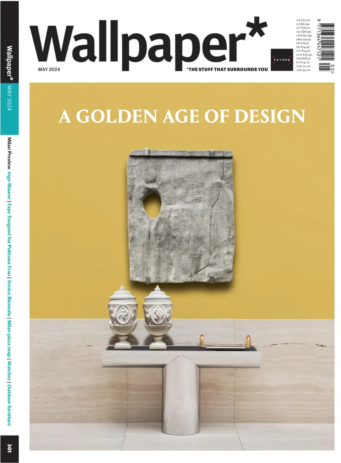
‘Pilotis’ console, by
Rodolfo Dordoni, for
Minotti. Pair of 18th
century urn-shaped
vases (Walter Padovani).
Bas-Relief I (2023), by
Sergio Roger (Spazio
Nuovo). Fruit platter
(1937), by Jean Puiforcat.
Travertino Romano
Classico panels in matte
finish, by Marsotto,
see page 254
054
∑
A new age of design
Welcome to Wallpaper* issue 301. Our tricentenary successfully navigated, it feels a
no less auspicious moment to be ushering in a new age of design – just in time to celebrate
Salone del Mobile. Why a new age? Because a younger generation at the apex of
forward-thinking furniture companies – Giulia Molteni and Maria Porro, for instance,
or Carola Bestetti at Living Divani and Eleonore Cavalli at Visionnaire – has resulted in
a broader scope being offered to designers commissioned to create work for the leading
brands. With this deeper pool of references comes a slew of fresh ideas on how to live,
work and play that reflect a wide spectrum of cultural, societal and environmental
shifts. In the same questing spirit, we profile a few of those whose work embodies where
design is (or should be) going: whether that’s Atelier Biagetti’s concept of nomadism,
recast in its collaboration with MCM as a new idea of home that embraces technology,
or Faye Toogood, whose repurposing of folk references for Poltrona Frau breaks with
the contemporary concept of the ‘luxury furniture designer’.
As well as documenting those currently disrupting the established houses, we examine
the roles of three emerging design studios in exploring new ways of working in furniture
and design, whether through collaboration, performance or the repurposing of industrial
materials and processes. We also revisit the lives and careers of two pioneering figures in
the design world – Ingo Maurer and Louis Kahn, the latter being recognised at Salone.
And we feature two ‘revivals’: one the simulacrum of an unbuilt, site-specific Frank Lloyd
Wright house, the other a rebuild of a novel aluminium-clad home that has moved from
New York to its present resting place in Palm Springs. And capturing the spirit of the
present, we bring you a working wardrobe that, well, works, read the runes around outdoor
furniture, and feature nine watches united in their dramatic use of dark hues.
Finally, and by way of a hello, it gives me great pleasure to be rejoining Wallpaper* as
Editor-in-Chief. I’d like to thank Sarah Douglas for handing on a title in such spectacular
health – testament to her seven years of exemplary stewardship. The eagle-eyed among
you will notice some further changes to the editorial masthead. These new positions are
richly deserved; harbingers, too, of a new age for Wallpaper* as it heads towards its
quadricentennial. Enjoy the issue.
Bill Prince, Editor-in-Chief
Limited-edition cover
Photography:
Julia Sellman
A ‘Karat Blau’ pendant
lamp, by pioneering
brand Ingo Maurer,
which is looking forward
to a new age under the
guidance of lighting firm
Foscarini, see page 158
NEWSPAPER
Photography: Neil Godwin at Future Studios for Wallpaper*
Wallpaper’s hot pick of the latest global goings-on
SHEER GENIUS
Hermès’ diaphanous attire for S/S24 is a
clear winner for sultry summer days
Above, jacket, £2,600; shirt, £2,100;
top, £580, all by Hermès, hermes.com
FASHION: KRIS BERGFELDT WRITER: JACK MOSS
Hot and heady summer days inspired
Véronique Nichanian’s latest Hermès
menswear collection, which was infused
with a mood of languid sensuality, as
if her man for the season was traipsing
back home after a day on the beach.
When she first presented the collection
on a fittingly sweltering Paris day last
June, its gossamer layers – gauzy
tailoring, sheer chequered shirting and
scoop-neck vest tops – almost appeared
misted from ocean spray. Nichanian’s
design philosophy centres on a desire
to make clothes that are as much a
pleasure to wear as they are to look at,
and she describes this season’s offering
as ‘soft and sweet as a summer breeze’,
making for a seductive array of
diaphanous layers that will provide
solace in even the warmest weather.
∑
063
Photography: Neil Godwin at Future Studios for Wallpaper*
A new furniture collection
that’s no waste of space
Scrap stars
Above, Patricia Urquiola’s ‘Alder’ collection
for Mater comes in a choice of four colours
WRITER: ROSA BERTOLI
Made from Matek, Patricia Urquiola’s
‘Alder’ collection for Mater makes its
debut during this year’s Salone. The new
material uses waste from a variety of
sources, including coffee beans and
sawdust, which is then bound with
plastic waste before being press-moulded
to make furniture. Urquiola created four
designs, including two lounge tables
with oval and square tops, a side table,
and a stool, available in four colours.
The pieces are made by shaping Matek
around a (94 per cent recycled) steel
frame, and each can be disassembled
and its components upcycled.
The ‘Alder’ collection is on view from 15-19
April at Via Bartolomeo Eustachi 51, Milan,
patriciaurquiola.com, materdesign.com
∑
065
An aesthetically-pleasing record
player for digital devotees
Turn style
Above, the Light Touch turntable playing
The Collective album by Kim Gordon
066
∑
A new turntable offers a return to the
physicality now lacking in the way we
consume music digitally. Designed by
John Tree and aluminium specialist Alex
Rasmussen, of Neal Feay, the Light
Touch turntable features sleek, minimal
forms in dusty pink, CNC-cut, polished
and anodised aluminium. An essential
element of the design is an optical
needle that doesn’t touch the record as
it plays, with an automated arm that
places itself over its surface. ‘I still
wanted to provide the visual enjoyment
of watching the record turn as the arm
moves across the album,’ says Tree.
The Light Touch turntable will be on show
from 15-21 April at Blond Laboratory, Via
Palermo 11, Milan, johntree.net, nealfeay.com
PHOTOGRAPHY: ROWAN CORR WRITER: ROSA BERTOLI
Photography: Neil Godwin at Future Studios for Wallpaper*
A jewellery collection’s snake-like
silhouettes and graphic shapes
Curve appeal
Above, ‘Electric Bolt’ white gold earrings
with diamonds and clear sapphires,
£19,800, by Fernando Jorge
WRITER: HANNAH SILVER
Brazilian-born designer Fernando Jorge
draws on his heritage, and subsequent
time spent studying at Central Saint
Martins in London, for his distinctive
jewellery aesthetic. Since the launch of
his eponymous brand in 2010, Jorge has
imbued cool and contemporary designs
with both a fluid sense of movement and
a sensuality, reflected in their curving
forms and snake-like silhouettes. His
jewellery is steadfastly sculptural,
whether it encompasses gold teased
into graphic shapes or precious metals
tracing the outline of the body, looping
around the curves of a wrist or finger.
Here, pear-shaped stones on a zigzag
of white gold bring a dynamism to
diamonds. Tantalisingly oversized,
they are made to gracefully graze
the shoulders. fernandojorge.co.uk
∑
069
A Scandinavian guesthouse offers a
sleek setting amid a wild landscape
Shore thing
Above, Vipp Cold Hawaii is a two-storey
guesthouse in Denmark’s Thy National Park
070
∑
Set among the windswept dunes and
wild heaths of Denmark’s oldest national
park, Vipp’s latest bookable guesthouse
epitomises the Scandinavian lifestyle
brand’s minimalist design philosophy.
Located in the village of Vangså, along
a stretch of shoreline that surfers have
dubbed ‘Cold Hawaii’, the guesthouse,
designed by architecture studio Hahn
Lavsen, is striking in its simplicity,
constructed from a sleek palette of
oak and Douglas fir, bricks, stainless
steel and vast swathes of glass. Vipp’s
freestanding V3 kitchen, in anodised
aluminium, is a natural focal point,
encouraging guests to stand around it
and stare at the breathtaking panoramic
views, while a bush-hammered stone
fireplace adds warmth and character
to the space. vipp.com/en/guesthouses
WRITER: SOFIA DE LA CRUZ
A show celebrates the whimsical
world of a celebrated artistic duo
Planet organic
Above, Claude’s Choupatte amid
François-Xavier’s sheep sculptures
WRITER: HANNAH SILVER
A must-see at the Venice Biennale
this year is a comprehensive exhibition
gathering the work of artist duo
Les Lalanne. One of the most dynamic
art couples of the 20th century, Claude
and François-Xavier Lalanne’s surreal
take on naturalism – entitled ‘Planète
Lalanne’ and presented by Ben Brown
Fine Arts – will be on show at the
Palazzo Rota Ivancich. The exhibition
will include highlights such as Sauterelle
Bar, the unique Lit Hibou et 2 Tables de
Chevet bed, and Choupatte, the veined
cabbage perched on chicken feet.
Works, meanwhile, have been placed
in accordance with the late duo’s desire
to create fantastical liveable worlds.
‘Planète Lalanne’ will be show from
17 April-3 November at Palazzo Rota
Ivancich, Venice, benbrownfinearts.com
∑
073
Tall order
Above, shoes, £630, by Santoni,
santonishoes.com
074
∑
These gravity-defying pumps by
Santoni feature a sculpted heel with
a near-impossible slant that gives the
effect the wearer is in constant forward
motion, while a V-cut silhouette,
narrowing to a knifepoint at the toe,
is designed to carve and elongate the
ankle. Held in place with the slimmest
of straps – the buckle delicately etched
with the ‘Santoni’ emblem – they are
nonetheless engineered with the
same ergonomic precision that the
Italian shoemaker is built on. Founded
in 1975 by Andrea and Rosa Santoni
in the Le Marche region of Italy, a
part of the country synonymous with
shoemaking, Santoni now employs
more than 700 artisans, each working
by hand to create the house’s growing
library of men’s and women’s shoes.
FASHION: KRIS BERGFELDT WRITER: JACK MOSS
Photography: Neil Godwin at Future Studios for Wallpaper*
Architectural rigour defines a pair
of gravity-defying shapely heels
A Japanese-inspired cocktail
bar shows hidden talent
Raw beauty
Above, the sensual interiors of Ama,
a raw bar on Fraser Street, Vancouver
PHOTOGRAPHY: EMA PETER WRITER: SOFIA DE LA CRUZ
To reach Ama, a new Japanese-inspired
cocktail and raw bar in Vancouver, one
must first locate it. Bathed in orange
light, its subtle signage can be hard to
spot, but once found, guests are ushered
through a discreet orange metal door,
up a large staircase and into a space
that could easily be a set backdrop for
Blade Runner 2049. Designed by Canadian
studio &Daughters, with branding
by Glasfurd & Walker, the moodily-lit
interiors are dominated by polished
black granite surfaces, backlit shelves
and textured plastered walls with
semi-transparent golden mirrors, while
the menu offers up inventive cocktails
infused with Japanese flavours, such
as jasmine and yuzu, as well as meltin-the-mouth, predominantly raw
seafood dishes. @ama.rawbar
∑
077
Free spirit
Above, bags, price on request,
by Chanel, chanel.com
078
∑
With its recognisable quilted exterior
and chain strap, Chanel’s ‘2.55’ bag
remains a trophy in the fashion house’s
glimmering roster of accessories eight
decades after it was launched, and it has
been endlessly riffed upon since – such
as in the ‘11.12’, pictured here and first
introduced by Karl Lagerfeld in the
1980s. Together, the ‘2.55’ and the ‘11.12’
capture the liberatory spirit of the
house, one continued under current
creative director Virginie Viard whose
collections invoke the unencumbered
spirit of Coco Chanel’s early collections.
For S/S24, Viard looked to the French
Riviera town of Hyères and its modernist
Villa Noailles – known for its thriving
artistic milieu in the 1920s – for a
collection which she described as ‘an
ode to liberty and movement’.
FASHION: KRIS BERGFELDT WRITER: JACK MOSS
Photography: Neil Godwin at Future Studios for Wallpaper*
The timeless style of Coco Chanel
continues in the current collection
Designers exercise their powers to
reimagine the Technogym bench
Gym class
Above, Gustavo Martini’s reimagining
of a Technogym home gym bench
WRITER: ROSA BERTOLI
To celebrate its 40th anniversary,
Technogym is launching a special
exhibition, presenting its home gym
bench as seen through the eyes of
40 creatives. Unveiled at Milan Design
Week, ‘Design to Move’, conceived and
led by Giulio Cappellini, features a
plethora of creative visions and aesthetic
approaches that transform the look
of the brand’s exercise equipment.
Contributors includes Antonio Citterio,
Nendo, Patricia Urquiola, Rolf Sachs,
Gustavo Martini and Elena Salmistraro,
and the project aims at highlighting
the relationship between design and
wellness, something that has been at the
core of Technogym since its inception.
‘Design to Move’ will be on show from
16-21 April at Technogym, Via Durini 1,
Milan, technogym.com
∑
081
India Mahdavi creates tiles of
the unexpected for a new brand
Mass appeal
Above, ‘Mycelium’ tiles, designed by India
Mahdavi, for Alternative Artefacts Danto
082
∑
For more than 130 years, Danto, one
of Japan’s oldest mass producers of
tiles, has manufactured its wares on the
island of Awajishima. During this year’s
Salone del Mobile in Milan, it launches
a new brand, Alternative Artefacts
Danto, overseen by Teruhiro Yanagihara
Studio. The brand’s debut collections
include a collaboration with IranianFrench designer India Mahdavi, who
imagined a series of tiles with textural
surfaces that gently reflect the irregular
beauty of the natural world, despite
the mass production processes that
bring them to life. Among her offering is
‘Mycelium’, whose crystal-like surfaces
evoke an uneven beauty that is more
commonly found in the handcrafted.
The tiles will be on view from 16-21 April at
Via C Correnti 14, Milan, aa-danto.com
PHOTOGRAPHY: MITSUGU UEHARA WRITER: DANIELLE DEMETRIOU
Hublot’s latest Big Bang iteration is
heavenly hued and silky smooth
Blue velvet
Above, Big Bang Integrated Time Only Indigo
Ceramic watch, £17,100, by Hublot, hublot.com
084
∑
With its oversized proportions, exposed
screws and porthole-inspired outer
ring, Hublot’s Big Bang has become one
of the world’s most recognisable watch
designs. Originally released in 2005, it
celebrated a distinctive juxtaposition of
materials, such as titanium, rubber and
carbon, a design philosophy the Swiss
brand has continued to embrace. Since
then, the watch has been rethought
in multiple iterations, in a range of
colours, materials and technical
methodologies. Now, Hublot builds on
this textural exploration with the launch
of a Big Bang Integrated Time Only
watch in a rich indigo-blue ceramic,
available in a limited-edition run of 200.
Ultra-tough and virtually scratchproof,
the ceramic becomes silky smooth
once satin-finished and polished.
PHOTOGRAPHY: IVONA CHRZASTEK WRITER: HANNAH SILVER
Salone del Mobile
Right, Nuova’s new furniture
collection includes this
low-slung coffee table,
manufactured with marble
from Marsotto in Verona
Starting
blocks
Milan Design Week is
always a hotbed of new
talent and this year is
no different. Wallpaper*
caught up with three
emerging studios that are
staging solo shows for the
first time to find out who
is behind them, and what
we can expect from their
debut presentations
Photography: AOW
NUOVA
Since 2018, the Californian design studio
Nuova has been working behind closed doors
for some of the biggest names in luxury and
tech. With their upcoming Milan Design Week
exhibition, founders Rodrigo Caula and
Enrico Pietra plan to make their public debut
— and take visitors on a journey back to 1971.
WRITER: LAURA MAY TODD
‘We want to bring time travel to the
world,’ announces Rodrigo Caula, who
alongside Enrico Pietra makes up Venice
Beach-based design studio Nuova. It’s a
bold statement, but according to Caula,
the pair claim to have some experience
with the phenomenon: a residency at
artist Andrea Zittel’s A-Z West in
Joshua Tree transported them back to
the 1970s. ‘It’s an alignment of every
sense in one moment,’ Caula clarifies.
‘If you can curate everything to be
period-correct – from the music to the
scent to the food – you can travel in time.’
Caula and Pietra avow to recreate
that moment with their Milan Design
Week presentation, an immersive
performance that will induce visitors to
time travel back to 1971 — and introduce
them to their first furniture collection.
The pair first met at ECAL in
Switzerland. Pietra hails from Italy and
Caula from Canada, but following a few
years working at ECAL, and Tesla and
Yeezy respectively, they settled in
Venice Beach and founded Nuova. At
first, they developed new products and
researched novel materials behind the
scenes for luxury and technology brands.
But, in 2022, they launched their first
public-facing project, Aeir, a fragrance
company they describe as ‘the world’s
first carbon-negative luxury brand’.
In fact, the pair will call upon their
knowledge of fragrances for the multisensory Design Week performance.
Guests will enter into a period-correct
waiting room, where they will wait to be
ushered into the Sala, which recreates a
living room in California in the 1970s.
Once inside, they will have four minutes
to ‘time travel’ within the space,
furnished with Nuova’s first furniture
collection, including blown glass lamps
produced in Murano and a modular
sofa upholstered in Torri Lana textiles
in Bergamo. Nuova will also bring their
powers of dimension-shifting to Capsule
Plaza, where it has been tapped by
Rimowa to construct a ‘Time Travel
Café’ within Spazio Maiocchi.
‘In the future, we’ll want to travel
back to 1990 Tokyo,’ ponders Pietra.
‘For us, that would be a dream.’
Nuova @Via Stampa is on show from 13-21
April at Via Stampa 8, Milan, nuova.us
∑
087
Salone del Mobile
Photography: Kim Jeemin
Right, featuring new and
used pieces of aluminium
formwork, Niceworkshop’s
collection includes chairs
and a table made up of
slender metal profiles held
together by large bolts
NICEWORKSHOP
Founded by Hyunseog Oh, the Seoul-based
Niceworkshop caught the design world’s
attention with its inaugural collection
dedicated to the humble bolt. Now, with its first
solo showing at Capsule Plaza, the studio aims
to disrupt the life cycle of industrial materials
with an exploration into aluminium formwork.
According to Niceworkshop founder
Hyunseog Oh, a stint on construction
sites early in his career first piqued
his interest in industrial materials.
Following his graduation from the
interior architecture programme at
Soongsil University in Seoul, he worked
at a design firm, where, he says, he
‘learned about making furniture, but
was also doing some construction work’.
When the time came to produce his first
collection, he naturally drew on that
experience. That series, ‘Bolt’, utilised
long threaded screws as the primary
structural element of a bench, chair
and side table, which he described at
the time as the transformation of an
industrial material into a sculpture.
The collection caught the attention
of luxury luggage brand Rimowa, who
‘reached out to work on an exhibition
together’, says Oh, referring to the 2022
‘As Seen By’ show. That collaboration
led to the ‘Jigae’ system. Using the same
parts that make up a Rimowa suitcase,
Niceworkshop devised a modern version
of a traditional Korean backpack, a
Y-shaped structure made of wood and
straw used for carrying large quantities.
‘That was a big event for us,’ says Oh of
the exhibition, which travelled to Paris,
Berlin and Seoul. ‘After that, we were
able to work on some great projects.’
Three years later, Niceworkshop
is presenting a new series that delves
deeper into the use and reuse of
industrial materials as part of the design
platform Capsule Plaza on Milan’s Corso
Como. Named ‘Al-Form’, the project is
based on the recontextualisation of
aluminium formwork, an ephemeral
industrial material, for domestic use.
‘Aluminium formwork is used to
create cast-in-place concrete structures
for architectural framing,’ says Oh.
‘They make a wall or column using the
form, pour the concrete into it and
remove it once it is set.’ For the project,
Niceworkshop has partnered with
the Korean company Format, which
repurposes material waste from
construction sites into consumer goods.
Though aluminium formwork can be
used several times, after a certain point
the repeated exposure to concrete
degrades the metal and the formwork is
disposed of. ‘We’re focusing on the life
cycle of the product,’ Oh adds.
The collection includes a lounge
chair, dining chair, table and bench.
‘There are two different types of
textures,’ Hyunseog explains. ‘We use
both the used version and a few new,
so there is a contrast.’ Where concrete
has worn down the aluminium after
repeated uses, the formwork has taken
on the patina of timber or even natural
stone. Like the ‘Bolt’ series, ‘Al-Form’
highlights the beauty of industrial
materials, giving a second life to what
would have once been waste.
‘Al-Form’ is on show from 16-21 April
at Capsule Plaza, Corso Como 10,
Milan, niceworkshop.net
∑
089
Salone del Mobile
OBJECTS ARE BY
Jenny D Pham and Phil America, the duo
behind Milan-based studio Objects Are By, are
introducing a novel idea to the design process.
They’re asking: what if you let an artist, an actor
or a chef moonlight as a product designer?
‘If you’re a musician, nobody ever wants
to see you make a clothing line,’ says
artist Phil America, explaining the
concept behind his and partner Jenny D
Pham’s new design brand, Objects Are
By. ‘But every creative, at some point,
wants to break out of their box –
to try new things and experiment.’
It was from this desire to freely shift
between mediums that Objects Are By
was born. The brand’s premise is simple:
working as curators, Objects Are By
pairs a creative person with an artisan
or manufacturer to realise an object
within the domestic realm. ‘What
would happen if you bridged these
worlds?’ asks America. ‘I think a lot of
people want to do that, but we wanted
to lean into the unknown a lot more.’
America and Pham founded Objects
Are By in Milan in 2022, as an adjunct
to their own flourishing careers. Pham
is a successful brand consultant who
previously worked for Versace and
Adidas Originals, and America is an
artist who has shown his paintings,
photography and installations in
galleries and museums across the
globe. The pair met and fell in love in
California, where America was living
and where Pham – who was born in
Munich but grew up in LA – would
travel often for work. When Pham
took on her role at Versace in 2020,
they relocated to Milan.
The idea for the project came about
when the couple were faced with
designing their own space. ‘We started
renovating our home nearly a year ago
and began to ask ourselves which objects
represented us,’ says Pham. ‘We were
filling our space with a lot of Italian
designers and we thought it would be
fun to make something ourselves – and
bring our creative friends along in the
process.’ The first collection, which
Pham and America designed themselves,
was a homage to the Milan subway
system. The series of vessels, trays and
carafes mimicked the forms and yellow,
red and green colour scheme of the
metro, designed by Franco Albini and
Franca Helg in 1964. Their second, in
collaboration with artist Elena Flores,
features a set of jacquard blankets
woven with AI-generated images.
The latest collection was produced
in collaboration with digital artist
Babybrusher, who is known for his
graffiti-inspired airbrush paintings.
The artist’s vibrant illustration of flames
and dragons will be digitally printed on
to a ceramic dinnerware produced in
Vietnam. ‘After sampling porcelain in
China, Germany, Italy and Vietnam,
we chose Vietnam,’ explains America.
‘It was the best quality and most
sustainable we could find. The pieces
will be produced with reused water
and will be free from animal products,
unlike most bone china.’
Moving forward, Pham and America
stress that they’re not interested in
treating Objects Are By like a
conventional brand. ‘Our mission is to
foster creative freedom,’ reflects
America. ‘Most creatives can’t sit still,’
adds Pham. ‘They’re always going to
make something, no matter what.’ ∂
Viewing by appointment only,
objectsareby.com
Left, made in Vietnam
with reused water, Objects
Are By’s latest tableware
collection features flames
and dragon motifs by
digital artist Babybrusher
090
∑
7
1
24
6
25
8
2
5
3
9
4
10
12
11
15
14
17
13
16
18
23
20
19
092
∑
Perfect
slices
Salone del Mobile
Our map of Milan’s best pizza spots, as chosen by the
city’s design greats, will leave you hungry for more
ART DIRECTION: OLMO R ROCES ARTWORK: ALBY BAILEY WRITER: ROSA BERTOLI
22
21
N
MILAN, ITALY
1 : 23,0oo
Our obsession with Milanese pizza spots
started during Salone del Mobile last year,
while looking for a recommendation for a
quick bite. So we asked around, and realised
the city’s design community is extremely
opinionated on pizza: in a matter of hours,
we had several suggestions, from thin crust
to Neapolitan-style, from gourmet toppings
to casual neighbourhood joints. This year,
we decided to gather our Milanese friends’
tips into a map of Milan’s most desirable
pizza spots, so that we won’t be caught
unprepared when hunger strikes. Creative
directors, designers, curators and more
jumped at the opportunity to share pizza
tips (some sharing multiple suggestions), and
the results are dotted on this map, so that
wherever we are in Milan, we can be sure to
get our fi x. Putting this map together has
given us a fascinating insight into our friends’
ways with pizza. The Milanese’s favourite?
Undoubtedly, the Margherita, a classic
often served with a twist – whether it’s
Piero Lissoni or Patricia Urquiola’s buffalo
mozzarella topping, or Alberto Biagetti’s
ricotta-filled crust. Head to Wallpaper.com
to see what else they are ordering, and
what makes these pizzerias special to them.
01. La Coccinella, Piazza Tito Minniti 8
Carola Bestetti, CEO, Living Divani
02. Crazy Pizza, Via Varese 1
Roberto Gavazzi, CEO, Boffi De Padova
03. Vecchia Arena, Piazza Lega Lombarda 1
Marva Griffin, founder, SaloneSatellite
04. Denis Milano Moscova, Via Statuto 16
Piero Lissoni, architect and creative director;
Giulia Molteni, chief marketing officer, Molteni & C
05. Dry, Via Solferino 33
Caterina and Raffaele Fabrizio, CEOs, Dedar;
Piero Lissoni, architect and creative director;
Patricia Urquiola, creative director, Cassina
06. Savô, Via Gustavo Fara 10
Guglielmo Poletti, designer; Andrea Trimarchi
and Simone Farresin, designers, Formafantasma
07. Pizza Big, Viale Brianza 30
Frederik De Wachter and Alberto Artesani,
designers, DWA
08. Geppo, Via Giovanni Battista
Morgagni 37
Valentina Ciuffi, curator, Studio Vedèt & Alcova
09. One Way Della Speranza, Via Lecco 7
Andrea Caputo, architect
10. Maruzzella, Piazza Oberdan 3
Maria Cristina Didero, curator and author;
Michela Pelizzari, design consultant, PS
11. Pizza Crosta, Via Felice Bellotti 13
Barbara Corti, CCO, Flos
12. Hostaria Terza Carbonaia,
Via degli Scipioni 3
Letizia Caramia & Morten Thuesen,
designers, Older
13. Le Specialità, Via Pietro Calvi 29
Cristina Celestino, designer; Laura Baldassari
and Alberto Biagetti, designers, Atelier Biagetti;
Valentina Ciuffi, curator, Studio Vedèt
14. La Baia, Via Benvenuto Cellini 3
Stefano Boeri, architect and president,
Triennale Milano
15. A Santa Lucia, Via S Pietro all’Orto 3
Giulio Cappellini, art director, Cappellini
16. Original Pizza OK, Piazza S Stefano 12
Paolo Mongeri, commercial director, Cesanamedia
17. Piz, Via Torino 34
Marco Sammicheli, curator, Triennale Milano,
and director, Museo del Design Italiano
18. Confine, Piazza Guglielmo Massaia
Annalisa Rosso, design consultant, Mr Lawrence
19. I Capatosta, Alzaia Naviglio Grande 56
Laura Baldassari and Alberto Biagetti,
designers, Atelier Biagetti
20. Linfa, Via Bergognone 24
Eleonore Cavalli, art director, Visionnaire
21. Pizzeria Oceania, Via Giovanni Briosi 10
Federica Biasi, designer; Arianna Lelli Mami
and Chiara di Pinto, designers, Studiopepe
22. Gennaro Rapido, Via Vigilio Inama 17
Cara Judd and Davide Gramatica, designers,
Cara\Davide; Anniina Koivu, curator
23. Marghe, Via Cadore 26
Federica Sala, curator and design consultant
24. Il Mercato Centrale Milano, Via
Sammartini/Piazza Quattro Novembre
Maria Porro, president, Salone del Mobile
25. Spontini, Via Gaspare Spontini 4
Nicolas Bellavance-Lecompte, founder,
Carwan Gallery and Nomad
Google’s interactive exhibition for Milan Design Week highlights
how colour influences our perception of the world
WRITER: ADRIAN MADLENER
094
∑
Photography: courtesy of
Johannes Girardoni
SCREEN TIME
Salone del Mobile
Left, a collaboration
between Google Design
Studio and Chromasonic,
the exhibition comprises
21 ethereal spaces,
with responsive light
and audio displays
T
here’s no denying that colour informs
how we understand our surroundings.
It can evoke emotion and, according
to Google Design Studio, it can also
be expressed through sound, taste, smell
and touch, as much as visual perception.
The studio is mounting its third
interactive Milan Design Week exhibition,
‘Making Sense of Color’, in collaboration
with the LA-based art and research lab
Chromasonic. The installation activates
all the senses as visitors move through
21 ethereal spaces, eventually reaching a
series of rooms that more tangibly
demonstrate how certain tones relate to
specific sensations and are harnessed in the
brand’s ever-evolving suite of products –
phones, tablets and smart home devices.
‘Colour resonates with vibrancy,
embodying energy,’ says Ivy Ross, vice
president of hardware product design at
Google. ‘Colour has both biological and
psychological influence on us. Right now,
we are going through a lot of emotion as
a society, so understanding the power of
these natural forces, and its different
properties, seems as relevant as ever.’
Chromasonic has created well-received
immersive light and sound installations –
such as Satellite One in Venice, California –
with the aim of promoting wellbeing. Ross
and her team chose to collaborate with the
practice because of its ability to make colour
more experiential and physically engaging.
The art and research lab has implemented
its proprietary Chromasonic Refrequencing
technology. ‘Light waves are converted to
sound waves, and sound waves are converted
into light waves, in real time; in essence,
making light audible and sound visible,’ says
practice co-founder Harriet Girardoni. ‘Light
and sound travel as one, and it accentuates
our awareness of our presence within it and
of others as they pass through, appearing
and dissolving within and between the array
of the installation’s spaces.’
By merging the immateriality of light
with the materiality of sound, this formula
expands natural perception. Visitors can
experience a deeper sense of presence within
the synaesthetic environment. ‘Colour can
evoke memory, inspire desire, and captivate
us with a feeling of awe,’ adds fellow cofounder Johannes Girardoni. ‘We spatialise
colour and sound to create shifting
experiences of physical space. It is a means
of intentional placemaking.’
For many design industry visitors making
their way around an ever-exhausting Milan
Design Week and Salone del Mobile, the
Google installation offers rest, relaxation
and contemplation. ‘We do believe this year’s
exhibit will provide guests with the kind of
respite that leaves them feeling refreshed
and revitalised,’ says Ross. ‘We started using
Salone to share our thought leadership in
design and what inspires us. We love to create
experiences that are presented to the design
professional and the general public.’ ∂
‘Making Sense of Color’ is on show from
15-21 April at Garage 21, Via Archimede 26,
Milan, store.google.com, chromasonic.com
Design
A weighty new tome celebrates the genius of creative
polymath Marc Newson, chronicling evolution, experimentation
and innovation in a career spanning four decades
WRITER: JONATHAN BELL
Above, the crystal-clear
base of Newson’s ‘Atmos
568’ clock, designed for
Jaeger-LeCoultre, makes
the movement appear
as if it were magically
hovering inside the case
Photography: Daniel Mayer/Philippe Joner
Opposite, the riveted
‘Lockheed Lounge’ chair,
which Newson named after
the American company
famous for its World
War II fighter planes
Marc Newson is that rare beast, a rock
star of a designer who has infused a diverse
catalogue of objects with a unique sense of
personality, using an approach that is both
instantly identifiable yet often unexpected.
You know it’s a Newson, somehow. Ever since
his earliest furniture projects, the lively,
neo-pop aluminium furniture that spliced
postmodern playfulness with 1990s bling
and the nascent digital sampling culture, his
work has taken flight, often in very literal
ways. Thrillingly, 40 years of his process,
experimentation and innovation is presented
in a handsome new XXL volume, Marc
Newson: 84-24, written by Alison Castle
and published by Taschen.
As Castle notes, Newson is largely selftaught, parlaying early learning experiences
in the jewellery workshop at Sydney College
of the Arts into ever larger pieces as he
continues to seek out new ways of making
the forms he conjures up in his head. In
the beginning, this led to a strange
hybridisation of method and intent, with
industrial-looking pieces, like the aluminium
‘LC1’ lounger from 1984, belying their labourintensive, highly crafted construction.
The extent of this labour put early
Newson pieces squarely in the realm of
design art, a newly emerged category that
raised the stakes – and the budgets – of the
modern furniture scene. The ‘Lockheed
Lounge’ chair (1988) was the apotheosis of
this phase, with its sibling, the ‘Embryo’
chair (1988), representing the moment his
aesthetic was transferred into a more
production-friendly and reproduceable form.
As Newson’s status grew, collaborations
with furniture makers enabled his designs to
become more widely available. Cappellini,
Moroso and B&B Italia have all produced his
distinctive designs, often existing alongside
Marc Newson Editions that have a more
bespoke and crafted finish. The book also »
∑
097
Photography: Finn Karstens/courtesy of Louis Vuitton
Design
charts the creation of Ikepod, the watch
brand developed with Oliver Ike. Newson
oversaw six influential watch models
between 1996-2008, before taking this
knowledge to Apple, at the invitation of his
friend and frequent collaborator Jony Ive, to
work on the Apple Watch. Since 2019, he
has been in partnership with Ive in the
creative agency LoveFrom.
Newson’s interests in technology and
transportation are also made abundantly
clear, as he got the opportunity to work
closely with the manufacturers he admired
the most, designing everything from
cameras and surfboards to airlines and
bicycles. Along the way there have been
several notable collaborations with
publishers Taschen, like the mighty Lunar
Rock edition of Norman Mailer’s MoonFire:
The Epic Journey of Apollo 11, inspired by the
design of the Eagle lunar module.
Inevitably, Newson’s mastery of multiple
disciplines has resulted in the ultimate in
ostentatious commissions, the superyacht,
with two examples – one finished, one
nearing completion – featured in 84-24.
The book provides a rare insight into Solaris
and Nausicaä, built by Lloyd Werft and »
Above, the Nausicaä
superyacht, commissioned
by a Japanese art collector
and entrepreneur who
gave Newson complete
freedom to dictate the
layout and design
Right, the ‘Cabinet of
Curiosities’, Newson’s
reimagining of Louis
Vuitton’s travel trunk
featured cube-like
partitions, upholstered
in leather and suede
∑
099
Design
Above left, the brightly
coloured ‘Stavros’ bottle
opener was designed
for Alessi in the 1990s
using a computer,
a first for Newson
Above right, Newson’s
weighty ‘Hourglass’,
which comes in 10-minute
and 60-minute versions,
features stainless-steel
balls plated in nickel, black
nickel, copper or gold
100
∑
Lürssen respectively. Such projects satisfy
the designer’s appreciation of craftsmanship
and technology in a way unlike any other.
‘It’s architecture built by watchmakers.
It really is that level,’ says Newson.
84-24 covers four decades of evolution,
chronicling an oeuvre that demonstrates a
love for all things mechanical and futuristic
coupled with an appreciation for softer
forms and materials, often struck through
with bold pops of colour. From the 1990s
onwards, the consistency and quality that
Newson has brought to every project has
given everything a timeless feel, not mired
in passing aesthetic fads or materials trends.
This is evident throughout the book.
Although only the first few projects are
presented chronologically, the rest are
arranged by genre. However, the visual index
at the back of the book sets out the Newson
portfolio in date order. Despite working
across a number of fast-moving technological
sectors, using new materials and processes as
they become available, you would be hardpressed to categorise any of them as being
representative of a particular decade.
The term ‘retro-futuristic’ is often abused,
thrown about as shorthand for design that
embodies a nostalgic, almost conservative,
vision of tomorrow. Many of Newson’s most
notable projects have been strictly
conceptual, such as the Kelvin 40 aircraft
(2004) and Ford 021C concept car (1999).
Each is timeless in form and entirely credible,
although on a purely practical level they
could never have been made to work as massproduced objects at the time. In lesser hands,
such a brief would result in something
cartoonish and instantly dateable, yet both
still appear box-fresh and believable.
Taschen’s mighty format does justice
to Newson’s tireless attention to detail, and
Castle’s bold claim that Newson ‘needs
no introduction’ is most probably correct.
For collectors of design and chroniclers of
culture, 84-24 is an essential catalogue
raisonné of one of the most extraordinary
careers in the history of design. ∂
‘Marc Newson Works 84-24’, £150; ‘Marc Newson
Works 84-24: Art Edition’ (edition of 100, in
leather box with signed print), price on request,
both published by Taschen, taschen.com
Photography: courtesy of Alessi/HG Timepiece
‘The book chronicles an oeuvre that demonstrates a
love for all things mechanical and futuristic coupled with
an appreciation for softer forms and materials’
Salone del Mobile
Bench marks
For our Salone preview, we hunted down a few head-turners making an appearance
at the 62nd edition of Milan’s annual trade fair, on show from 16-21 April
‘ORIGATA’ BENCH
by Nao Tamura, for Porro
ART DIRECTION: OLMO R ROCES WRITER: LÉA TEUSCHER
One of Porro’s newest collaborators is the
award-winning Brooklyn-based Japanese
designer Nao Tamura. Her ‘Origata’ bench
for the Italian company is inspired by the
process of making kimonos (a craft close
to home for Tamura, whose grandmother
founded a clothing line in the 1940s). To
create the traditional garment, a rectangular
piece of fabric is cut in straight lines and
then sewn together with little to no waste
– a method replicated in the making of this
bench, with a sheet of aluminium carefully
cut and assembled to waste as little metal
as possible. Tamura’s creations often focus
on the concept of simplification, but span
a variety of scales, and include a toilet
block for the Nippon Foundation’s renowned
Tokyo Toilet project. Her bright red
triangular public convenience in Shibuya is
also inspired by the traditional Japanese
method of gift wrapping, from which this
bench takes its name. porro.com
∑
103
Salone del Mobile
‘SIONA’ BAR CABINET
by Matteo Cibic, for Visionnaire
104
∑
Since its debut in 2004, Bologna-based brand
Visionnaire has put its stamp on the world
of luxury interiors with a wealth of opulent
designs. Among its roster of talented designers
is Matteo Cibic, a Vicenza-based artist
known for his whimsical, anthropomorphic
creations, including a crowd of ‘weird little
deskfriends’ in glass and ceramics and the
interiors of El Coq, his local Michelin-starred
restaurant. For Visionnaire, he has created
the ‘Siona’ bar cabinet, a meticulously
designed piece that draws inspiration from
‘the avant-garde aesthetic of 1970s Italian
automotive design’. Boasting bold, rounded
edges evoking the era’s emphasis on fluidity
and innovation, ‘Siona’ features a textured
square brass base that not only provides
visual contrast, but also ‘symbolises a
harmonious blend of strength and refinement,
mirroring the engineering mastery found
in iconic automobiles of the era’.
visionnaire-home.com
Salone del Mobile
‘CORNARO’ ARMCHAIR
Photography: Luca Merli
by Carlo Scarpa, for Cassina
In the late 1960s and 1970s, the influential
Italian architect and designer Carlo Scarpa
produced a series of furniture designs for the
Simon Gavina company. A handful of these
creations have been reissued in the last few
years by Cassina, as part of its star-studded
iMaestri collection. This year, they are joined
by Scarpa’s 1973 ‘Cornaro’ armchair, available
in beech with a glossy lacquer finish, or in
ash with a matte lacquer finish, in a carefully
curated selection of colours developed for
each type of wood. Scarpa was influenced
by the materials, landscape and history of
his native Venice, as well as that of Japan,
and this armchair combines both interests:
named after a historic Venetian family, it
also nods to the Japanese minimalism that
Scarpa admired, with its sculptural wooden
frame. Preserving the aesthetic of the original
model, the reissue comes with updated
proportions, including a more ample seat.
cassina.com
∑
107
Salone del Mobile
‘LAUREN’ CHAIR
by Antonio Citterio, for Flexform
108
∑
The northern Italian town of Meda is both
the birthplace of leading designer Antonio
Citterio and furniture giant Flexform. For
the past 50 years, they have been working
together to produce pieces such as the
innovative ‘Groundpiece’ sofa (see W*265),
and among their latest creations is the
‘Lauren’ folding chair. ‘This is an outdoor
piece that has been reinterpreted for the
indoors, thanks to the use of materials like
cowhide and cord,’ says Citterio. ‘It is
a nomadic object that embodies the appeal
of exploration, of moving from place to
place.’ Every detail has been carefully thought
through: its structure is made of solid handturned wood; the elegant armrest, seat and
backrest are clad in cowhide; the metal parts,
including the feet, were custom-designed.
A particularly charming element can only be
spotted from the back: the backrest features
a unique row of large cross-stitches that hold
the leather panel together. flexform.it
Salone del Mobile
‘HALFSQUARE’
BEDSIDE TABLE
by Giacomo Moor, for Living Divani
Since founding his studio in 2009, Milanese
with drawers that slot into light metal
designer and Wallpaper* Award winner
frames, built with triangular vertical uprights.
Giacomo Moor has been exploring the
The shape is reflected in the drawer fronts,
creative possibilities offered by working
their slanted sides creating hidden handles.
with wood and collaborating with Italy’s
There are two different heights, allowing
leading craftspeople. Having created ‘Railway’, for different configurations. The steel frames
a series of minimalist metal and wood
are lacquered with epoxy powder coating,
sideboards, for Living Divani last year, Moor
either burnished or in a gunmetal grey
has now turned his attention to a similarly
colour, while the cabinets and drawers are
pared-back bedside table design. The
clad in Canaletto walnut or Striped Grey
‘Halfsquare’ tables alternate open shelves
veneer. livingdivani.it
∑
111
Salone del Mobile
‘ERNEST’ SOFA
by Jean-Marie Massaud, for Poliform
112
∑
French designer Jean-Marie Massaud is
known for his sought-after creations that
manage to be both clean and contemporary,
but also extremely comfortable. The latest
result of his prolific long-term collaboration
with Brianza-based company Poliform is
the ‘Ernest’ sofa, a low-lying modular piece
with a wooden structure covered in coldfoamed expanded polyurethane. With no
visible feet, the sofa appears to float above
the ground, just like Massaud’s previous
‘Westside’ sofa for the brand (one of the
designer’s five sofa designs for Poliform).
Its upholstered modules can be placed side
by side to create the most diverse
configurations, while its slightly concave
seat cushions are particularly inviting and
soften what is a very simple and geometric
design. The key, Massaud has said, lies in
harmonious proportions and the ability to
stand the test of time, qualities the ‘Ernest’
sofa has in spades. poliform.it
Salone del Mobile
LIZ COLLECTION
by Silvia Musetti, for Giorgetti
The Giorgetti style is all about products
with personality. A case in point is the
curvy, fun bunch that is the Liz collection
by Silvia Musetti, a Milan-based artist and
designer. ‘It stems from the intention to
create harmonious and soft objects that
enhance the concept of ‘insert’,’ says Musetti
of her debut designs for Giorgetti. ‘The
various elements that make up the bench,
console and valet fit into each other giving
a sense of continuity and visual balance;
the cylinder is the trait d’union of the
collection.’ Two columns of different heights,
in walnut and leather, form the valet; its
onyx top can be backlit by an optional, footactivated sensor. Meanwhile, the bench and
console combine two cylinders in Canaletto
walnut, fabric and leather with great details,
such as a perfectly proportioned pill-shaped
seat cushion and leather mat, and the
handy trinket bowls formed at the top of
the cylinders. giorgettimeda.com
∑
115
Salone del Mobile
‘OMOI’ ARMCHAIR
by Naoto Fukasawa, for B&B Italia
116
∑
Encapsulating simplicity and elegance, the
designs of Naoto Fukasawa include numerous
chairs and armchairs. All manage to have
a tactile element to them, and transform
any space with their friendly presence.
Having already created the sinuous ‘Harbor’
(2017), the minimalist ‘Ayana’ (2020), and the
butterfly-inspired ‘Grande Papilio’ (2009)
armchairs for B&B Italia, the Japanese
designer and his team this year looked to
northern Europe for inspiration. Influenced
by the Scandinavian designs of the 1950s,
the ‘Omoi’ chair is characterised by sober,
sculptural lines featuring welcoming
curves and solid oak legs. This is ‘a chair
with the charm of a living creature, like
an animal that makes people feel at home
just by being there,’ says Fukasawa. ‘It is a
multi-purpose chair that is valuable even
just for its presence. It is like a dog or a cat
lying in the living room, regardless of the
situation or location.’ bebitalia.com
Salone del Mobile
‘VENUS’ CONSOLE
by Armani Casa
The Armani Casa aesthetic focuses on
‘simple lines and perfect proportions,
enriched by precious materials and refined
finishes’. Its new ‘Venus’ console shares the
minimalist glamour of the brand’s previous
designs, but adds a new, softer dimension
to the category, with its fine lines and curves.
Its thin profile brings out the precision of
the shapes and colours, while the artisanal
details recall the poetic forms seen in the
art of high jewellery. It also refers to the
allure of art deco and the style of the
1930s-1940s, which often inspires Armani’s
furniture and fashion creations. ‘Venus’ is
made of lacquered wood using a complicated
artisanal process. It comprises a wooden
base lacquered in pale satin gold, which
supports a long oval-shaped top lacquered
with gold leaf and protected by a piece of
glass. Carefully applied with a brush, the
gold leaf enhances the natural colours and
creates a distinctive effect. armani.com
∑
119
Salone del Mobile
‘ALBERESE XL’ SOFA
by Piero Lissoni, for De Padova
120
∑
When Piero Lissoni first designed the
‘Alberese’ family of sofas and seats in 2020,
he was aiming for a design ‘born from many
reflections and then frozen in its essence’,
which would be ‘comfortable and elegant
at the same time’. This search for harmony
of shapes and functionality has seen the
leading Italian designer revisit his creation
for De Padova with a new version. ‘The
‘Alberese XL’ is the latest addition to the
family as the sofa model takes on new
shapes,’ says Lissoni. ‘There are more ridges
and slopes to allow people to create the
layout that best fits their tastes.’ Providing
space for welcoming inclined armrests and
comfortable seats, where one can relax, read
and be together, the ‘Alberese XL’ alternates
changes in depth, curved elements and
cushions with a defined front and to create
a new domestic landscape. Its platform-like
base runs throughout, linking the various
elements together. depadova.com
Salone del Mobile
‘LOOM’ TABLE
by Hannes Peer, for Baxter
Architect and designer Hannes Peer is
known for his eclectic style and visual
curiosity, both of which have helped him
gain a large following on social media. His
‘Loom’ table, for Italian manufacturer Baxter,
stands out thanks to its unique lacquered
rosewood base, a sequence of architectural
volumes stacked on adjustable metallic legs,
that gracefully rises to support the glass
tabletop. The intricate base creates a dance
of light and shadow, with the tabletop
serving as both a filter and enhancer.
According to Baxter, the design ‘pays homage
to the fusion of material, form and function
characteristic of Brazilian midcentury design’,
and simultaneously ‘draws inspiration from
American kinetic art, delving into visual
perception and movement to captivate the
observer’s imagination.’ The complex wooden
base also recalls the jaw-dropping designs
of Italian polymath Carlo Mollino, who has
been a great influence on Peer. baxter.com
∑
123
Salone del Mobile
‘F-AFFAIRE’ SOFA
by Fendi Casa
124
∑
Tasked with modernising Fendi’s fur line in
1965, Karl Lagerfeld drew a new interlocking
‘FF’ logo on a piece of paper in just a few
seconds (the letters stand for ‘fun furs’).
It instantly became a symbol of the fashionforward brand around the world, featuring
on everything from trainers to belt buckles.
More recently, it also inspired Peter Mabeo’s
‘Efo’ coffee table (which is being reintroduced
this year in a palladium and light grey
version) and the new ‘F-Affaire’ sofa,
which turns the double Fs into the threedimensional elements of a modular system
comprising a corner piece, central piece,
ottoman and chaise longue. The giant
F-shaped upholstered pieces neatly interlock,
and can be combined at will to fit any space.
We particularly like the micro bouclé and
white shearling version, but the sofa will be
available in any of the colour and material
options offered by Fendi Casa’s exhaustive
textile collection. fendicasa.com
Beauty
T
he skin and the brain have a constant
dialogue through our nervous
system. Based on this, Christine and
Philippe d’Ornano (the brother and sister
duo at the helm of Parisian beauty house
Sisley) have been working on a secret project
for just over ten years. And, this month,
the results of their work have been revealed
with the launch of Neuraé, a new skincare
brand backed by neuroscience.
‘We became interested in the relationship
between neuroscience and skincare when our
scientists at Sisley suggested researching how
the brain communicates with the skin,’ says
Christine d’Ornano. ‘Being sad, tired,
tense or stressed affects our skin, having an
impact on wrinkles, firmness and radiance.’
Neuraé products have thus been developed
to harness the power of inner emotions
and improve well-being – which, in turn,
produces positive effects on the outside.
By 2020, the first test formulas were
ready. ‘Neuraé was entirely dependent on
the results of these tests; it had to be backed
by data,’ says d’Ornano. The Sisley research
laboratories identified four key messengers:
beta-endorphin, the pleasure hormone;
cortisol, the stress trigger; GABA, the
relaxation agent; and CGRP, the pain
communicator, finalising a range of
products containing 97 per cent natural
ingredients that work in tandem.
The Harmonie serum forms the
foundation of a Neuraé routine, which is
then followed by one of three creams:
Énergie has been designed to improve
firmness, Joie to revive glow, and Sérénité
to soften lines. Finally, travel-sized roll-on
mood boosters, crafted with ‘neuro perfume’
oils and semi-precious stones in the tips,
allow for small interludes of self-care
throughout the day. ∂ neuraeparis.com
New beauty brand Neuraé
uses its patent-pending
NA3 technology to create
a range of neuroscientific
products that offer moodand skin-boosting benefits
INNER GLOW
Neuroscientific beauty brand Neuraé taps into the power
of positive emotions to give you happy skin
PHOTOGRAPHY: NEIL GODWIN AT FUTURE STUDIOS FOR WALLPAPER* WRITER: HANNAH TINDLE
∑
127
Q&A
At home with
We talk about creativity, collecting records, cooking and
cats with the Fornasetti artistic director, who gives us
an intimate tour of the weird, whimsical and wonderful
treasures dotted around his home and studio in Milan
For more than half a century, the Fornasetti brand
has embodied artistic brilliance, seamlessly fusing its
distinct visuals with boundless creativity. Gracing
furniture, plates, candles and carpets, the instantly
recognisable Fornasetti style eschews frivolity while
maintaining both a distinctive decorative aesthetic
and a sense of humour. ‘Imagination, fantasy and
creativity are perpetual sources of nourishment for
the soul and the spirit. It is a responsibility for those
endowed with these gifts to share them generously,’
once said Piero Fornasetti, who founded the brand
in 1940. His legacy is now carried on by his son
Barnaba, the company’s artistic director since 1988.
The brand’s philosophy, which centres on merging
functionality with artistic flair, finds embodiment
in Casa Fornasetti, a historic 19th-century home in
Milan’s Città Studi quarter. It’s a location the global
design community knows well, thanks to the legendary
parties held here annually to mark the end of Salone
del Mobile. Originally a family abode, it was turned
into an artistic sanctuary under Piero’s influence, and
today, under the direction of Barnaba, it serves as both
private residence and the hub of the brand’s creative
endeavours. Barnaba’s touch has turned it into a true
manifesto of Fornasetti aesthetics – and his own.
Preserving memory is paramount for Barnaba,
something that is evident in the meticulously curated
archive, housing 13,000 drawings and objects.
Casa Fornasetti, with its whimsical allure, stands
as a living testament to this original Italian story,
and carries on its founder’s perpetual exploration
of creativity and design. »
Photographs shot on Barnaba Fornasetti’s iPhone
INTERVIEW: MARIA CRISTINA DIDERO
02.
01.
01. The green living room,
with a Jacopo Foggini
chandelier illuminating a
custom-made ‘Città Che
Si Rispecchia’ wardrobe.
02. Fornasetti’s ‘Cocktail’
wallpaper by Cole & Son is
paired with a ‘Moro’ vase
by Piero Fornasetti and the
brand’s panettone boxes in
one of the reception rooms.
03. Barnaba Fornasetti’s
office, with a ‘Cavallucci
Marini e Pesci’ table by Gio
Ponti and Piero Fornasetti,
and Fornasetti cushions.
04. A corner of the studio,
with a Gio Ponti ceramic,
Fornasetti vases and tray,
and a framed artwork by
Carlo Dell’Acqua, who
broke up and reassembled
the fragments of a
Fornasetti plate from the
series ‘Tema e Variazioni’.
05. Fornasetti’s ‘Acrobati’
curtains hang above a Gio
Ponti desk in the studio,
with an obelisk by Barnaba
Fornasetti and a ceramic
cat by Piero Fornasetti.
03.
04.
05.
∑
129
02.
01.
04.
03.
01. A Fornasetti ‘Van Eyck’
mirror in the green living
room. Instead of the central
mirror is a miniature
painting by Stefania Fersini,
made in 2016, representing
the reflection of this room.
The glass table lamp was
made by Barnaba Fornasetti
in the 1990s. 02. The studio,
packed with samples
and prototypes, and a
moodboard covering the
doors of the cabinet. On
the wall is an early painting
by Barnaba Fornasetti.
03. The hallway is lined with
the brand’s ‘Gerusalemme’
wallpaper, a black-and-white
illustration of Jerusalem
designed by Piero Fornasetti
especially for the house.
Above the doorway is a
‘Medusa’ wall vase made by
Piero Fornasetti in the 1970s.
04. A living room shelf
displaying souvenirs and
small Fornasetti objects
and the miniature screen
of the ‘Stanza Metafisica’.
On the left is a Fornasetti
lamp from the early 2000s
Q&A
Can you tell us about your home?
Over the years, through all its changes, it has
become the manifesto par excellence of Fornasetti’s
aesthetics, its imaginative capacity and creativity.
The house where I live represents more than a
century of real, social, familial and creative life.
It is a daily memory, without nostalgia, which
brings me the joy of doing what you see today,
represented by the Fornasetti brand.
What do you like to collect?
I have been collecting records since I was a child.
And many small objects, too, not necessarily of
value. But often it’s so difficult to dust them all that
you end up collecting various types of mites.
Where is your favourite place at home?
I love all the rooms. Which one I’m using most
depends on my mood or my state of mind, the
weather, the light, whether I’m eating, or listening
to music, or reading, or working.
Is there an item that you particularly treasure?
A wall lamp made of real shells from the late 1950s.
I helped my mother thread the shells and I remember
how many arguments I had with my father while
she was threading hundreds of small shells.
How would you describe your neighbourhood?
Città Studi is an interesting area because it developed
according to an urban plan of a university city,
following a design that I would define as serviceoriented and on a human scale. And that is still
quite intact. It’s still possible to read the urban plan
linked to the various university faculties. In other
areas of town, it’s rare to find a neighbourhood so
well preserved in its original plan.
What was the last item that you lost?
I have lost my wallet with documents and credit
cards more than once. Sometimes people give it
back to me, but only once with money, which
I gave to the kind lady who found it.
If Wallpaper* came for dinner, what would
you choose to cook for us?
I’m not very good at cooking, but my guests say
my risotto alla Milanese is excellent. I cook other
variations on this theme. I have a friend, Hugh
Findletar, a Jamaican who cooks very well and often
works with me. He creates glass pieces in collaboration
with Murano glassblowers – perhaps there’s a
relationship between cooking and glass firing?
What is your favourite indulgence and why?
When did you last indulge?
One indulgence is to change the small installations
that I make around the home. This allows me to
develop my creativity. My home is a place where the
eye can imagine surreal worlds, even if my messy
garden is where my brain indulges more. The
garden is a large canvas where you can play with
the colours of nature and learn slowness. It takes
time to see the ideas you create come to life.
What is your favourite place, anywhere in
the world? And why do you love it?
I love the sea since I love swimming, especially in
Greece, where it’s still possible to find islands with few
people and deserted beaches reachable only by sea.
I believe that true luxury is a beach without people,
where you can only hear the sound of the sea.
What’s the last thing you bought?
Secondhand records of various musical genres,
as well as a gift for the woman I love.
What is inspiring you right now?
First of all, the biggest inspiration I have ever had
comes from my father’s archive. This is the source of
inspiration par excellence. In this archive, you can
find thousands of images, and not only Fornasetti
images, but from everywhere and everyone. My
father used to say, ‘I don’t limit myself and nothing is
too esoteric to be used as inspiration. I want to free
my inspiration from the limitations of the usual...’
What role does humour play in your work?
Humour has always had a playful and subversive role
at Fornasetti. Sometimes I would like to be more
provocative, but the dynamics of the market do not
allow me such freedom, and by adapting to them,
I live this contradiction typical of creative people.
What do you do to relax?
When I am swimming, I get the best ideas,
but gardening relaxes me a lot, too, and so does
spending time with my cats.
What’s at the top of your to-do list?
I would be interested in collaborating with architects,
on creating external decorations in architecture.
How do you switch off? Do you switch off?
Yes, when I go to sleep at night listening to
some music or making love.
Ten years from now, you’ll be…
As happy as I am right now. ∂
∑
131
Architecture
This page and opposite, the
new HQ for a video game
developer, Monospinal features
disparate interiors that were
chosen to reference specific
game settings and worlds from
the company’s arsenal
Other world
Newspaper
A Japanese design studio fulfils its quest to take the Tokyo HQ
of a video game developer to the next level
PHOTOGRAPHY: KOICHI TORIMURA WRITER: ELLIE STATHAKI
B
orn as a symbolic manifestation of its
users’ world and values, Monospinal,
the HQ of a successful Japanese
gaming company, was conceived by Tokyobased studio Makoto Yamaguchi Design
to house the firm’s core creative hub in the
Japanese capital’s Taito-ku ward.
The building’s distinctive vertical
sawtooth outline, which gives it its striking
spine-like appearance, makes a bold visual
statement that sits well with Japan’s
renowned animation aesthetics, but it gives
little away of its internal goings-on. It
was Yamaguchi’s blend of conceptual and
practical architectural thinking that
led to this final form. ‘The diagonal walls
are designed to deflect noise from the
elevated train tracks nearby and to softly
invite light and wind into the building,’
he says. ‘That, and the fact that each layer
is separated by a horizontal line, though
each layer appears to overlap, guided the
design development.’
The architect goes on to explain that
he sought to avoid the harsh vertical lines
that tall buildings are often associated
with, using the layers to soften the
structure’s profile and taking a leaf from
the country’s rich architectural heritage.
‘It’s the same as the traditional Japanese
wooden, multiple-tower structures that have
been in use for more than 1,400 years.’
Each of the upward-slanted walls of the
steel frame structure (which includes some
vertical aluminium elements and was
designed with the support of engineering
firm Arup) corresponds to a floor in the
building, of which there are eight above
ground and one underground. The building’s
lower levels feature higher ceilings and more
discreet openings, revealing little of what
goes on behind the façades. The higher a »
∑
133
Architecture
Left, upward-slanted
walls control light,
ventilation and acoustics
into the building, as well
as giving it its striking
spine-like appearance
The building can easily
blend with the skies
beyond, or look like
‘a huge 3D computer
graphic image’ when
lit in certain ways
floor is located, the more the spaces open
outwards to vistas, while a sheltered terrace
on each floor ensures that there’s outside
space available at every turn.
Levels two and three, which sit parallel
with the adjacent train line, contain areas
that require less natural light and benefit
from seclusion, such as an auditorium and
sound studios. Meanwhile, the fifth floor,
where views start to open up towards the
cityscape, is a designated communal space
for employees to rest, socialise and exchange
ideas; it includes a dining room, lounge
and gym. Further up, the seventh floor is
reserved for executive and VIP use.
The seemingly disparate styles and
furniture elements that punctuate
134
∑
Monospinal, from its monochromatically
minimalist surfaces to its medieval-style
chandeliers and contemporary Italian sofas
and tables, are not as arbitrary as they may
appear to be at first glance. Each element
was chosen to reference specific video-game
settings and worlds, nodding to different
time periods and territories from the
company’s arsenal. At the same time, the
skin’s grey, subtly-textured exterior surface
can easily blend with the skies beyond,
or look like ‘a huge 3D computer graphic
image’ when lit in certain ways.
Monospinal balances the tightrope
between offering a rich environment, full of
character distilled from its users’ identity,
while remaining effortlessly poised, relatively
discreet, and even slightly mysterious to
the outside world. ‘The building has become
a landscape. The landscape here means that
the building does not emit any information
about its use or function. It is completely
silent,’ says Yamaguchi, highlighting that
just as nature operates in a seamless
and organic way, buildings can also be part
of that ecosystem, blending into a context.
‘Sometimes people who see this building
won’t even know that it is a building,’ he
continues. ‘Depending on the season and
the time of day, the viewer may be surprised
at how the building glows, or might even
overlook it. I am happy that we were able
to realise our wish of becoming such a
presence.’ ∂ ymgci.net
Salone del Mobile
Soft touch
Faye Toogood tinkers with shape, attitude, expression and
perfection in her new furniture collection for Poltrona Frau
PHOTOGRAPHY: FEDERICO CLAVARINO WRITER: ROSA BERTOLI
This page, Faye Toogood
photographed at her
studio in Camden, in north
London, in February 2024
Opposite, maquettes made
by Studio Toogood of the
‘Squash’ armchair, footstool
and rug, which are formed
from painted cardboard
and clay, on a ‘Squash’ rug
∑
137
Salone del Mobile
Above, details of the ‘Squash’
long mirror and armchair
F
aye Toogood’s first visit to Poltrona Frau’s HQ in
Tolentino left a lasting impression on the British
designer, not only for the company’s rigorous
approach to craftsmanship, but also for its incredible
history. ‘They have this beautiful museum, where they
keep an archive of the heritage pieces,’ she says. ‘I was
blown away by some of the 1970s designs, which were
really courageous in their form, approach and attitude.’
The Italian furniture brand will unveil a new
collaboration with Toogood during this year’s Salone
del Mobile in Milan. Comprising furniture and interior
accessories, the collaboration is part of Poltrona Frau’s
Imagine collection, and marks Toogood’s debut in
leather and upholstered forms. ‘We’ve dedicated this
collection to the concept of imagination, a notion
close to our hearts,’ says Poltrona Frau CEO, Nicola
Coropulis. ‘Imagination serves as the driving force in
our domain, breathing life into the non-existent,
transcending mere logic, and fostering the birth of
fresh ideas and perspectives.’ In a bid to exemplify this
ethos, Toogood set herself the challenge to bring some
of that earlier 1970s attitude back, ‘but also to add the
female softness that I felt lacked from their collections.
A lot of them felt quite angular and masculine in the
traditional sense; fewer curves, less expression.’
Expression is a distinctive trait of Toogood’s. Her
work is sculptural with soft edges, inspired by threedimensional artworks and informed by nature, with
a nod to ancient artefacts and folk. And Toogood’s
exploration of the company’s archives, paired with her
own universe, resulted in what she describes as ‘English
folk with Italian horsepower’. She says, ‘Visiting the
Poltrona Frau manufacturing facilities felt like walking
into an Italian sports car factory.’ It’s a parallel that is
not too far off, given that Poltrona Frau also works on
the interiors of Ferrari sports cars. ‘And here I am, this
English girl, who designed a lot of wooden chairs and
has this slightly more folksy attitude.’ And yet it was
precisely in folk art that she found some similarities
between her and Poltrona Frau’s worlds, with many
English folk pieces being made of leather, a narrative
that bridged the gap between their heritages.
The collection features mirrors (in sizes ranging
from freestanding to pocket), which were informed by
old English folk leather mirrors, and a rug referencing
an early folk game. ‘I wanted to bring this naivety and
folksy element to the collection,’ she says. But the hero
piece so far is, undoubtedly, the ‘Squash’ armchair. Says
Coropulis, ‘To me, this piece encapsulates everything
that characterises Toogood’s refined and visionary art;
an exuberant creation that transcends time, seemingly
belonging to a future era that defies definition. It
effortlessly evokes feelings of comfort, innovation and
creativity, all ensconced in a cocoon of leather,
epitomising the essence of a Poltrona Frau armchair.’
The chair is defined by voluptuous forms erupting
from a rigid yet curved structure. Toogood’s first
upholstered piece, it offered an opportunity for her
to tinker with Poltrona Frau’s illustrious leather
craftsmanship. ‘They allowed me to be expressive, »
∑
139
‘Somehow, the
attitude of the red
combined with
the shape just felt
right. Maybe I just
wanted to disturb the
politeness of it all’
and to let myself loose in the factory,’ she says.
‘I wanted to create something really comfortable,
that retained all the sculptural nature of my own work
but had a softness about it. I wanted to achieve that
squashy feel that I saw a lot in early 1970s Poltrona Frau
designs.’ Meanwhile, the collection’s colour offering
includes a bold red hue, a shade at odds with Toogood’s
earthier palettes. ‘Somehow, the attitude of the red
combined with the shape just felt right. Maybe I just
wanted to disturb the politeness of it all.’
She also tried to push her sculptural approach for a
result that is expressive, rather than rigorous. ‘With the
prototype, they wanted to clean up the design – if the
leather was wrinkling a bit, they wanted to fix that,’ she
recalls. ‘But I didn’t want the leather to be perfect. I
wanted to give the feeling that you can sink into it, for
it to look like it’s already been sat on, like it’s already
had a life. To me, this is the beauty of this material.’
Having started her career as a magazine editor and
stylist, Toogood founded her design studio in 2008,
experimenting with a variety of creative disciplines,
140
∑
Above, the ‘Squash’ armchair,
long mirror, rug and footstool
from furniture to fashion. ‘Faye is one of the most
captivating figures in the contemporary creative
world, distinguished by her curious, multidisciplinary
approach to the art of design,’ says Coropulis. ‘And
it was precisely this expansive perspective that
resonated with our vision at Poltrona Frau.’
Toogood feels this collection might offer a turning
point for her practice. ‘I’m at an interesting moment
in my career where I’m neither emerging nor fully
part of the establishment. I’d say I’m in a sort of limbo,’
she says. ‘And once you have a heavyweight Italian
manufacturing company come to you, as a designer
who essentially didn’t train, who is female, who works
in fashion and art, that does feel like I potentially
pushed down a barrier. The world doesn’t necessarily
need more chairs, but if I’m going to do something,
then I hope that it will be to help push down barriers
for others that are coming up behind me.’ ∂
Faye Toogood’s collaboration with Poltrona Frau will
be on show from 16-21 April at Via Manzoni 30, Milan,
fayetoogood.com, poltronafrau.com
Art
SHOW
STOPPERS
We highlight three must-see artists representing
their country at the 60th Venice Biennale
WRITER: HANNAH SILVER
Left, Lineage
Frost 2, 2023, by
Tesfaye Urgessa
Tesfaye Urgessa, Ethiopia
As the selected artist for the first-ever
Ethiopian Pavilion at a Venice Art Biennale,
Tesfaye Urgessa’s commission comes with
more than the average amount of pressure.
Urgessa, however, is taking it in his stride,
appreciating the timing of the project, which
coincides with a personal and professional
full circle. After beginning his career in
Ethiopia, studying under painter Tadesse
Mesfin, he enrolled in the Staatlichen
Akademie in Stuttgart, a move which saw
him hone a style that juxtaposes Western
and African references. He has since
returned to his hometown, Addis Ababa.
‘It was when I went to Germany that I
decided to become an artist,’ says Urgessa.
‘I was influenced by the situation and what
was happening around me, but also by the art
and the artists. I felt free to take [from this].’
It marked the beginning of his distinctive
aesthetic, marrying Ethiopian symbols and
motifs with vivid outlines inspired by
German neo-expressionism, in work which
imbues the domestic routines of the
quotidian with a spirituality. ‘My influence
is the day-to-day life, there is always
that aspect,’ he adds. ‘You see a kind of
ritual, but you’re not exactly sure what
kind. It’s one of the core parts of my
painting right now, to give that majesty,
[with subjects] sitting very straight.’
Urgessa borrows from traditional
figurative paintings to consider identity
politics and race, although he says,
‘I don’t have any patience to give it
some kind of direction. I wouldn’t say,
this painting is going to be about race,
but it’s just that those things affect me,
especially when I was in Germany.
I would have conversations about this
stuff with my friends, it happened to
them, it happens to me. And that takes
some part in the painting process,
because I collect images in my head
throughout the day. Those images that
affected me the most tend to come out
on the surface of my painting. The race
and identity question isn’t something
to deny. It just naturally comes out.’
saatchiyates.com/artists/tesfaye-urgessa
∑
Courtesy of Tesfaye Urgessa and Saatchi Yates
Credits
≤
143
Art
¬
John Akomfrah’s immersive and visual
works consider migration and diasporic
communities through the media of film.
Now, in new work for the Venice Biennale,
commissioned and managed by the British
Council, Akomfrah is dissecting a historical
narrative through an auditory lens, putting
sound at the centre of his new piece, Listening
All Night To The Rain. ‘I’d got to a point where
I thought a lot of what I want to say involves
trying to pull people into positions of
listening,’ he says. ‘It’s about acknowledging
connections with other species, and each
other. We’re cautioned to listen to rising
water levels, CO2 emissions – there are a lot
of voices begging to be listened to. It felt like
a good moment to just bring up some of the
past. [The work] is both looking ahead to the
things that we are definitely interested in
the present, but a lot of it is also to do with
the immediate past and the things we haven’t
really paid attention to, [and] sometimes
they are related. There’s much to hear.’
Akomfrah will be revisiting his distinctive
multi-layered style in the new work, with an
installation composed of eight intersecting
and overlapping screens emphasising the
power in sound and listening, both as a tool
for activism and for their ability to prompt
an emotional connection. ‘The sense of
recall that the sonic affords you feels much
more connected to the past in some way,’ he
adds. ‘Images can feel slightly disembodied,
unconnected to the moment of origination,
whereas the sonic somehow feels as if it’s still
attached in some weird way to that moment.’
The vast proportions of Akomfrah’s
intersecting multi-screen installation had
to be reconsidered to work with the spatial
requirements of the British Pavilion’s 19th
century neoclassical building. ‘Every time
you venture into a new space, you’re deciding
on the form it will take. You become aware
that you’re going to have to renegotiate.
I think the forms we come up with for the
Pavilion, with its emphasis on repetition
and doublings, miniaturising the screens,
all of that will make a difference. No space
[in Venice] is that big, but that’s cool.’
lissongallery.com/artists/john-akomfrah
© Smoking Dogs Films. Courtesy of Smoking Dogs Films and Lisson Gallery
Below, a still from John
Akomfrah’s three-screen
film installation Vertigo
Sea, 2015, which explores
issues of slavery, conflict,
migration and ecology in
relationship to the sea
John Akomfrah, Great Britain
∑
145
Art
Above, Keyhole, 2023,
by Kapwani Kiwanga, on
show at MOCA, Toronto, is
based on the raised-bed
‘keyhole’ garden designs
found in Lesotho and
other African countries
146
∑
Kapwani Kiwanga, Canada
Paris-based, Canadian artist Kapwani
Kiwanga draws on her anthropological
training for pieces that criss-cross a
multitude of mediums. From performance
and embroidery to sculpture and installation,
her work considers the political implications
of material, from the impact of the
agricultural revolution to the consequences
of alien species crossing continents.
‘I think the starting point is just being
curious,’ says Kiwanga on what unites her
diverse body of work. ‘I happen to have
had the privilege of being in institutions
where they teach you different skills, how
to understand and interact with the archive
in different discourses. But then, at the
same time, I wouldn’t want [my work] to
be so exclusive that you would need to have
that background to be able to access it.
And so very early on, when I was studying,
I knew that academia was probably not
going to be the place where I would end
up putting all of my energy, because I did
want to have that broad reach.’
Kiwanga has drawn on this multitude
of references for her sculpture installation
for the Canadian Pavilion, which was
commissioned by the National Gallery
of Canada. The work considers questions
of inherent value through the lens of the
history of commerce, an issue she has
considered in the past, observing first-hand
how fracking transformed sand from a
valueless raw material to a highly prized
commodity. ‘There’s always this question
of value in a more philosophical sense,’
she says, ‘Which is really the crux of the
question. When one thinks about how a
plant or an elephant can have an economic
value in one context, but has a much more
integrated, social, cultural, spiritual role
in another context, then those questions
of regimes of value are of interest.’ ∂
goodman-gallery.com/artists/kapwani-kiwanga
Photography: Laura Findlay. © Kapwani Kiwanga/ADAGP, Paris
µ
Transport
This page and opposite,
taking inspiration from
the Swedish landscape,
World of Volvo features
a floor-to-ceiling glass
façade, which floods it
with natural light, and
a supporting structure
of glulam beams and
cross-laminated timber
ROUND TRIP
A circular museum in Gothenburg, designed by Henning Larsen, takes visitors on a
journey through the past, present and future of Swedish car manufacturer Volvo
Photography: Philip Liljenberg
WRITER: JONATHAN BELL
Gothenburg is Volvo Town. The Swedish
manufacturer was founded here in 1927 to
build cars and trucks. The latter business
was hived off at the turn of the century, with
the car-making division passing through
Ford ownership to eventually arrive in the
portfolio of Chinese conglomerate Geely.
This history was once found at the Volvo
Museum, a glassy box located 10km outside
Gothenburg on Hisingen Island. That closed
last December in preparation for the opening
of World of Volvo, designed by Danish firm
Henning Larsen. A circular building
covering 22,000 sq m, World of Volvo is
highly visible from the E6 highway that runs
north-south through Sweden and Norway.
Intended as a focal point for conferences,
exhibitions and performances, as well as a
place to house the company’s collection of
cars and concepts, World of Volvo is more
brand hub than traditional museum.
Around 4,500 sq m of display space is given
over to the Volvo collection, focusing on
the company’s pioneering work in safety
and detailing its design journey.
Martin Stenberg Ringnér, associate
design director at Henning Larsen,
describes the project as a true expression of
Scandinavian design. ‘The building conveys
that Volvo is a means to a higher end: the
open access to nature, people or places.’
The sophisticated wooden structure
was developed digitally to maximise the
dimensions and structural stability. ‘It
enabled us to have much larger spans than
what is normally feasible,’ Stenberg Ringnér
continues. ‘The largest is approximately
55m without any structural support.’
The building’s cross-laminated timber
components were produced locally, with
other wooden elements sourced and
manufactured in Austria. The display area,
meanwhile, represents ongoing shifts in
vehicle design and use, with the open spaces
allowing for maximum flexibility. ‘It was
important for us to design a building where
the products were showcased in a futureproofed setting,’ says Stenberg Ringnér,
who, as a Swedish native, makes strong
associations between Swedish culture and
Volvo. ‘Growing up, it was the chosen family
car, and I have nice memories of driving
holidays – in that sense, Volvo to me is about
adventures, about going to places.’
He also cites the building’s evocation of
the Swedish concept of allemansrätten, the
right to roam so long as you respect nature
and others. ‘Our goal was to give form to
this essential part of the Swedish spirit.’ ∂
worldofvolvo.com, henninglarsen.com
∑
149
Double vision
Luxury label MCM’s Milan Design Week debut features a
boundary-blurring collection by Milanese studio Atelier Biagetti
PHOTOGRAPHY: FEDERICO CIAMEI WRITER: CRISTINA PIOTTI
150
∑
Salone del Mobile
This page, Atelier Biagetti’s
cat, Birba, on a ‘Tatamu’
sofa, photographed in the
designers’ studio in Milan
Opposite, the duo’s ‘Chatty’
sofa is inspired both by
urban graffiti culture and the
generative forms of AI
Salone del Mobile
H
ailing from Emilia-Romagna, a
corner of Italy devoted to the fabled
director Federico Fellini, Alberto
Biagetti and Laura Baldassari, of Atelier
Biagetti, understand the seriousness of irony.
During this year’s Salone del Mobile, they
will prove this with their Wearable Casa
Collection for luxury label MCM, curated
by Maria Cristina Didero, and on view in
the 17th-century Palazzo Cusani.
The brand, explains Sung-Joo Kim,
MCM’s chairman and chief visionary officer,
decided to take part in Milan Design Week
for the first time, and not solely because it’s
the most cutting-edge design event in the
world and a real indicator of emerging
consumer lifestyle. The reason, she adds,
also has to do with MCM’s origins. ‘It’s a
German-born luxury fashion brand founded
in 1976, when Munich was a global cultural
and creative epicentre,’ says Kim. ‘Milan
Design Week is the best, most timely event
to present MCM’s current vision of a
‘digital nomad’ lifestyle, and to activate it
as a significant concept: dwelling in the
online/offline and metaverse worlds by
the current and future generations.’
The title, Wearable Casa Collection,
raised some important questions for
Atelier Biagetti. ‘There’s much talk about
the multiverse, rather than a domestic
dimension from the past: today, everything
happens in multiple places, even at the same
time, and we have imagined a home that can
even exist outside of this planet, in a digital
dimension.’ As a result, the six pieces are
portable and multifunctional – they have
been distilled from the wonderful chaos, as
they define it, that governs Atelier Biagetti’s
creative process. ‘We decided to present a
panorama of objects that reflect how we live
today,’ says Baldassari. ‘Home is no longer
the four walls where you go to sleep, but
rather a broad concept that begins with the
places you inhabit, the people you meet, the
family you choose, and the city where you
live.’ Kim agrees: ‘Atelier Biagetti is far from
a classic design studio. Most of its projects
deal with surprising performances,
unpredictable videos, uncommon objects,
which we really feel close to at MCM.’
Each piece in the collection, the designers
explain, has very specific DNA. They
consider the poetics, material, meaning,
history and values of the brand. Madness
is a must, too. ‘Our objects are similar to
Frankenstein, which is why they can convey
emotions.’ Take the ‘Chatty’ sofa, which
spells out the word ‘casa’. Not only is it
inspired by urban graffiti culture, but
also by the generative forms of artificial
intelligence, ‘which has created an
interesting aesthetic and therefore a style –
this style belongs to no one, but belongs to
everyone, like graffiti art,’ says Biagetti. Part
of the sofa’s make-up is also the concept of
journey, which is represented by a simple
travel neck pillow disguised as a cushion.
For their ‘Magic Gilet’, they were inspired
by Nicolas de Larmessin’s 18th-century
drawings Les Costumes Grotesques, in which
each figure is depicted in the accoutrement
of their particular trade or occupation, with
clothing made from tools from that trade.
‘Professions are constantly evolving, so the
approach had to be that of a multifunctional
object,’ says Baldassari. ‘It can be worn, and
is obviously a tribute to MCM’s history, but
when hung on the wall, it functions as a
storage system.’ The result echoes Dorothee
Becker’s ‘Uten.Silo II’ organiser. ‘Collecting
the objects that belong to your life and your
desires tells the story of the lives of those
who live in the space,’ says Baldassari.
Completely different is the vision behind
‘Tatamu’, a daybed designed with MCM’s
origins as a German company with a South
Korean connection in mind. ‘We were
stimulated by MCM’s strong ethos to
design a bridge object, a daybed that also »
Atelier Biagetti’s Alberto Biagetti (left) and
Laura Baldassari (this picture) with their
‘Mind Teaser’ infinite chair, comprising
a series of reconfigurable Tetris-like
elements upholstered in silver fabric
Salone del Mobile
Above, the ‘Tatamu’ sofa
is a Bauhaus-inspired
daybed/tatami mat that
reflects MCM’s links to
South Korea (the German
company was relaunched
in 2006 by the Seoulbased Sungjoo Group)
Left, the ‘Clepsydra’
portable lantern comes
with a rattan explorer
hat that can be either
worn or placed on the
LED light to modulate
temperature and colour
functions as a tatami mat. It represents a
space without boundaries, and its shapes
and colours pay homage to the Bauhaus.’
The collection also comprises ‘Planet’
spheres with bag handles, mirrors or lights,
Tetris-like seating, and a portable lantern.
These designs, Kim explains, define how
we will live, physically and digitally. ‘The
‘Chatty’ sofa is both conversational and
connected to our devices, while ‘Tatamu’
mixes culture and future elegance. Lanterns
become hats, bags are mirrors, lighting is
transportable. Home furnishings can travel
with us to be used in more than one way,
with self-style and self expression.’
At Palazzo Cusani, the project exists
on two levels – reality and metaverse – and
Atelier Biagetti immerses itself in both
dimensions. ‘As in Walt Disney’s Fantasia,
the objects go insane and tell stories about
themselves and their imaginations,’ says
Biagetti. ‘In our exhibition, the two worlds
coexist and are inhabited simultaneously,’
continues Baldassari. ‘They have the same
significance, and the objects are called
upon to perform different functions in the
metaverse. We liked to give the objects a
double possibility, while allowing anyone
in the world to access the exhibition.’ ∂
MCM Wearable Casa will be on show from 15-21
April at Palazzo Cusani, Via Brera 13-15, Milan,
atelierbiagetti.com, mcmworldwide.com
Wallpaper* Bespoke
Natural beauty
Cindy Chao interweaves a sculptural sensibility,
organic inspirations and a bold colour palette
for her vivacious jewellery collections
PHOTOGRAPHY: ADRIEN DUBOST SET DESIGN: LISA JAHOVIC WRITER: HANNAH SILVER
This page, ‘Feather’ brooch
in pink titanium, part of
the White Label collection
Opposite, ‘Maple Leaves’
earrings, part of the
Four Seasons collection;
‘Castle’ rings, part of the
Castle collection, all by
Cindy Chao The Art Jewel
Marrying traditional techniques with a rainbow of bold colours and
fluid forms, Cindy Chao draws on her family’s architectural and
artistic backgrounds to imbue her jewellery with a vibrant sculptural
sensibility. ‘I have always seen jewellery as miniature pieces of
architecture and sculpture,’ says the Taiwanese designer. ‘Organic
structures, lighting, space and engineering all work together to
bring out a unique vitality for each piece. They can be appreciated
from different angles with infinite delight.’
Chao pays tribute to the work of her sculptor father with the
naturalistic nature of her jewels. His philosophy – to bring a vivacity
and realism to materials – is reflected in her undulating forms, in the
leaves appearing to tremble on the vine and in carefully considered
colours. ‘I am particularly sensitive and specific with the colour
arrangements to create visual impact,’ she says. ‘In my recent works,
I apply the kind of colour-stacking techniques used in oil painting
to render new three-dimensional colour aesthetics in my titanium
structures. It’s quite similar to architecture – the art of arranging
colours, light and shade in a space governed by its structure. I also
match the colour of the metal base with the gemstones.’
Chao is led by the essence of the pieces in her design process,
starting with a wax sculpture creation of how she envisions
the final product, rather than the more traditional initial sketches.
This creates a 3D guide for the craftspeople who are going to
make her pieces, and they are then better able to understand the
spatial and structural requirements, in order to bring them to life.
This way of working means that Chao’s designs are beautiful from
every angle. In her ‘Feather’ brooch, more than 1,700 gemstones,
including yellow and white diamonds, rubies, rhodolites, orange
sapphires, colour-change sapphires and purple garnets, appear to
float as one glistening body, the thin titanium setting of the leaf
barely visible in a feat of engineering that Chao first debuted in
2020. Elsewhere, this ethereality is offset by bold lines and a dual
structure, as demonstrated in the ‘Maple Leaves’ earrings, where
diamonds appear to hang, suspended, in the air.
The architectural side of Chao’s heritage (her grandfather was
a noted architect) is seen most clearly in the graphic Castle collection
of rings, which intertwine the clean lines of medieval architecture
with the powerful status that rings were imbued with in Roman
times, signalling great authority in meticulous hues.
‘In my art jewels, iconic natural motifs are reinterpreted with
gemstones that act as my paintbrush and colour palettes. Gemstones
are my pigments and are arranged precisely to create a natural
colour gradation,’ says Chao. ‘My father taught me various sculpting
skills and techniques, and I eventually developed my own unique
style and applied it to my jewellery wax sculpting. But most of all,
I learned the importance of taking into account each angle,
form and expression of what I observe, and transforming those
observations into lifelike creations.’ cindychao.com
∑
Design Icon
A view of the Ingo Maurer
showroom in Munich, with
the ‘Flying Disc’ ceiling
lamp at the centre
Lighting pioneer Ingo Maurer’s portfolio of poetically whimsical
designs is given a new lease of life, thanks to a recent acquisition
PHOTOGRAPHY: JULIA SELLMAN WRITER: LAURA MAY TODD
∑
159
Design Icon
hat happens to a cult of
personality when that personality is gone?
German lighting brand Ingo Maurer was
forced to reckon with this question after
its 87-year-old founder and namesake
passed away in 2019. When Foscarini, the
Veneto-based lighting brand headed up by
Carlo Urbinati, purchased 90 per cent of
the business in 2022, it began a new chapter
for the Munich-based company, which
for so long had been defined by Maurer’s
larger-than-life persona.
Born into a family of fishermen on
southern Germany’s Reichenau Island in
Lake Constance, Maurer studied graphic
design in Munich before spending several
years in the US as a freelance designer. He
returned to Germany in 1963 and founded
his company three years later. His first
design was appropriately foundational: a
conventional lightbulb set within a handblown lightbulb-shaped glass dome. He
called it ‘Bulb’, and in 1969, it became part
of the permanent design collection at
MoMA in New York, kickstarting a long
career that became more weird and
wonderful as the years went on.
‘He invented in such a creative way,’ says
Urbinati. ‘Nobody has ever matched it.’ He
uses the example of Maurer’s 1984 ‘YaYaHo’
system, a low-voltage illuminated wire that
can be strung with interchangeable elements.
Maurer supposedly came up with the idea
after observing local street lights while in
Haiti over New Year. ‘Now you can find
about him – yes, I understand your point,
tension wire lighting in every catalogue. But
but we’re going with the other option.’ The
he invented it. And it still feels very new.’
arrangement, though challenging, worked
Maurer’s work was poetic, whimsical,
well for the company while Maurer was still
even funny. His 2018 ‘Luzy’ pendant lamp,
around. He may have always had the final
for instance, resembles a disembodied hand
say, but his approach fostered a culture of
slipped into a blue washing-up glove with
experimentation. When the design team
a naked bulb affixed to a finger, while one
was pushed to develop their own independent
of his best known works, the 1970s ‘Uchiwa’
ideas and processes, it forced them to
wall lamp, was inspired by his frequent
innovate. When two of Maurer’s designers,
travels. The simple Japanese bamboo fan
Dagmar Mombach and Hagen Sczech, were
is backlit and hung like a sconce, diffusing
toying with the idea of working with textiles,
golden light instead of air.
Maurer urged them to look at paper instead
But, as is often the case with visionaries,
for its superior ability to transmit light.
working with him could be a challenge. ‘I
‘He put the designers in a room for an entire
once made a drawing of the hierarchy at Ingo year to push the idea technically forward,’
Maurer,’ says Axel Schmid, Ingo Maurer’s
Schmid recalls. ‘At the end, the pair opened
head of product and project design. ‘I made a
the doors and said, “This is everything
dot for Ingo, a dot for Jenny [Lau, Maurer’s
that’s possible with paper”.’
wife, who helped run the company until she
Their research would go on to become
died in 2014] and then a horizontal line
a cornerstone of the company’s portfolio
underneath that represented everyone else.’
from the late 1990s onwards. Maurer had
Urbinati puts it more bluntly: ‘Every time, already designed lamps in paper before –
it was the same story. Ingo would come back
such as the crinkly, wide-brimmed 1980
from Egypt or New York and throw some
‘Lampampe’ – but Mombach and Sczech
objects or technology on the table – things
treated the material in an entirely novel
that probably had nothing to do with
way. Using artisan-made paper imported
lighting – and explain why he was fascinated
from Japan, they discovered that, if it were
with them, then leave immediately for
repeatedly crumpled and flattened, the sheet
another trip. When he returned months later, would eventually take on the consistency
he would select from three or four different
of a textile while retaining its strength. They
prototypes. He’d ask the designer which they were then able to manipulate the material
liked best and listen to their explanation.
like it was fabric. The sculpture-like ‘Kokoro’
Then he would say – and this says a lot
(1998), ‘Poul Poul’ (1998), ‘Yoruba Rose’ »
Above left, ‘Poul Poul’ LED table lamp, ‘Wo-Tum-Bu’ floor lamps and ‘Kokoro’ table lamp. Above right, sketches and photographs
of designs, including the ‘Oh Man, it’s a Ray!’ chandelier (top left) and ‘Reality’ lamp (bottom)
∑
161
162
∑
Design Icon
Opposite, ‘Nuunu’ floor lamp (top) and ‘Max’ floor lamp (bottom). Above, ‘Lucellino’ table lamp on a desk in the design studio
Design Icon
(2017), and ‘Babadul’ (2017), as well as several
other lamps, are all composed of elegantly
draped paper finished with a plissé texture
reminiscent of an Issey Miyake garment.
Maurer worked right up until his death.
A few months later, the pandemic hit.
The company was, understandably, thrown
into unknown territory. Not only had the
make-up of its organisation dramatically
altered, so had the rest of the world. ‘It was
a huge change for us. We were all working
closely together like a family and suddenly
everything switched,’ remembers Schmid.
‘So when the company was sold [by Maurer’s
daughters Sarah Utermöhlen and Claude
Maurer], it wasn’t a surprise.’ What was a
surprise for many, however, was the buyer.
Foscarini was founded in 1981 to produce
Murano glass lighting for the contract
sector. In the late 1980s, the brand shifted
to producing for the consumer market,
bringing respected designers like Rodolfo
Dordoni and Ferruccio Laviani into the fold.
Foscarini’s lights are sophisticated and
minimal – worlds away from the tongue-incheek masterpieces that Maurer became
known for. So what interest did the straightlaced Foscarini have in a brand like Ingo
Maurer? For Urbinati, it was personal.
‘I used to run into Ingo all around the
world,’ recalls Urbinati, who was a designer
at Foscarini before taking over the company
with his business partner Alessandro »
Above, the ‘Ringelpiez’
(right and left) is available
as a wall, suspension
and table lamp and can
be used with a ‘Frivoloso’
lampshade (left). The
‘Left Balance’ lamp is the
LED version of Maurer’s
2016 ‘Ru Ku Ku’ lamp
Right, ‘Yoruba Rose’,
which is available as
a table or floor lamp
(see page 274)
Design Icon
Left, the ‘Zettel’z’
chandelier, which comes
with some blank sheets
of paper, designed to be
used for your own
messages or sketches
Vecchiato in 1988. ‘At different fairs and
in New York – his apartment was only 50m
away from our showroom.’ Urbinati even
admits that he attempted to acquire the
business in the early 1990s. ‘I knew its
distribution wasn’t that strong and I thought
it would be beneficial,’ he says. ‘But Maurer
wasn’t interested in money.’
Urbinati stresses that, even now, his
decision to purchase Ingo Maurer was not
solely financial. ‘Ingo is someone I’ve
admired my entire professional life,’ he says.
‘And the alternative was that the company
might disappear.’ Since taking over, Urbinati
has set about organising the shambolic
structure and making sense of the company’s
vast array of creations, starting with its
166
∑
catalogue. ‘It wasn’t really a catalogue,’ he
says. ‘It was more like an artist’s portfolio.’
Foscarini’s directives have included
conducting a broad audit of Ingo Maurer’s
processes, standardising its technology
(international and European lighting
regulations have changed drastically over the
decades), developing new products with the
design team, and introducing the brand to
a wider international audience. ‘The legacy
and the heritage of what Ingo has left us is
so rich,’ he says. ‘Our goal is to respect it and
enhance it. Not to change or translate it.’
That mission brought them to the
2023 Salone del Mobile in Milan, where, in
addition to Ingo Maurer’s usual booth at
Euroluce, the company staged a Fuorisalone
exhibition at Caselli 11-12, a contemporary
gallery housed in a pair of 19th-century
toll booths flanking the Porta Nuova city
gate. This year, it’s planning to pop up at
Base Milano in the Tortona district, where
it will install a series of surreal illuminated
sculptures across the building’s façade.
While the brand will save new launches for
the next Euroluce in 2025, it hopes to convert
a new, younger cohort of Ingo Maurer
admirers. ‘There are a generation of people
who don’t know anything about Ingo
Maurer,’ marvels Urbinati. As a longtime
devotee himself, however, he is clear that this
is not an issue at home. ‘All three of my sons
grew up under Ingo Maurer’s lights.’ ∂
ingo-maurer.com
Master mind
The legacy of modernist architect Louis Kahn lives on to inspire a
new generation, thanks to collaborations with family and fans
WRITER: MARINA CASHDAN
Salone del Mobile
Photography: View Pictures/courtesy of University of Pennsylvania Archives/courtesy of Bob Wharton
K
nown for his use of light, material
and geometric shapes, the work of
Estonian-born American architect
Louis Kahn was little recognised through
much of his early career, but would become
much-admired later in life and after his
death in 1974. It resulted in a rare, for its
time, global output and a series of acclaimed
masterpieces, such as the Salk Institute for
Biological Studies, Kimbell Art Museum,
National Assembly in Bangladesh, Phillips
Exeter Academy library and dining hall,
and Yale University Art Gallery.
Kahn deftly combined modernity with
monumentality, taking inspiration from the
centuries-old structures of Greece and Egypt.
His skilful use of concrete, wood, steel
and glass drew on the natural imperfections
and idiosyncrasies of each material, and he
created a dazzling choreography between
light and shadow within his buildings in a
way that few architects can achieve.
At this year’s Salone de Mobile in Milan,
Kahn’s legacy, along with rarely-seen-before
aspects of his work, will be honoured in two
ways: with the release of an exact facsimile
of one of his personal notebooks, a project
initiated by Kahn’s eldest daughter, Sue
Ann; and also with the announcement of a
partnership with Form Portfolios, who are
working with the Kahn estate to celebrate
and preserve his legacy, and to manage his
designs and posthumous projects.
The Last Notebook, published by Lars
Müller, offers a very personal insight into
Kahn’s mind. The reproduction of the
architect’s final notebook, it shows his early
sketches of Four Freedoms Park on Roosevelt
Island in New York City, drawings of
interiors and furniture, notes to himself, and
a draft for an acceptance speech. ‘My dream
for this book is that it not be a very
precious thing, but something where you can
see him as a person and not some kind of
architectural idol that’s on a pedestal,’ says
Sue Ann Kahn. ‘And then I hope you are
inspired to use the blank pages to make your
own drawings, write your own thoughts.’
Meanwhile, Rhode Island-based studio
Form Portfolios will be shedding light on
Kahn’s furniture and interiors practice,
which created a holistic experience ranging
from the form and detail of the building
itself to built-in shelving, desks and tables,
lighting fixtures, chairs and more, all
designed by Kahn in his signature style. ‘Our
principal mission is to perpetuate the legacy
of Louis Kahn. He is widely known for his
architecture, yet he was also an artist and
designer. So today, we’re telling an entirely
new chapter of his legacy for the very first
time,’ says Mark Masiello, the founder and
CEO of Form Portfolios, which will be
launching a line of furniture and lighting in
collaboration with the Kahn estate and
brand partners over the coming year.
It is an apt time to be bringing this iconic
and ever-present architect to the forefront. »
Above, a sketch by Louis Kahn of the Kimbell Art Museum in Fort Worth, Texas
Below, Kahn photographed in the auditorium of the Kimbell Art Museum in 1972
Opposite, the National Assembly in Dhaka, Bangladesh, completed in 1982
∑
169
Salone del Mobile
This picture, the Salk Institute for
Biological Studies in San Diego,
California, completed in 1965
Below, pages from Kahn’s final
notebook showing sketches for a
sunken court entrance at the Yale
Center for British Art in Connecticut
His Yale Center for British Art (his final
building) and Yale University Art Gallery
(one of his first commissions) sit just across
the street from one another in New Haven,
Connecticut. They are currently undergoing
and completing, respectively, conservation
renovations (the former led by local
practice Knight Architecture and the latter
by New York firm Ennead Architects).
Italian architect Carlo Scarpa said of
Kahn on his death: ‘The ‘master’ is the one
who expresses new things in a way that other
people can understand … The great modern
architects are no longer with us. The last one,
Louis Kahn, went away ... it’s an irreplaceable
loss.’ Scarpa, like many architects, was a deep
admirer of the work of Kahn, whose templelike buildings, while not prolific in numbers,
were rich in architectural significance. And
we celebrate that even 50 years later. ∂
‘The Last Notebook’, CHF40 (€41), edited by
Sue Ann Kahn, published by Lars Müller, larsmueller-publishers.com, formportfolios.com
170
∑
Photography: Education Images/courtesy of University of Pennsylvania Archives
‘My dream for this book is that it allows you to see Louis Kahn as a person
and not some kind of architectural icon that’s on a pedestal’
172
∑
EARTHLY
POWERS
Architecture
An experimental Australian beach house breaks
new ground in material composition, using baked
earth for warmth, texture and tonality
PHOTOGRAPHY: TREVOR MEIN WRITER: ELLIE STATHAKI
This beach retreat uses warm,
earthy tones that reflect the
local landscape. The yellow
canopies are by Shade Factor,
while the timber shutters,
designed by John Wardle, allow
light in whether open or closed
B
Top and above, strategically-placed openings
allow for illuminating changes throughout
the day, from sunrise to sunset, while a quirky
wooden birdhouse perches on the roof
174
∑
reaking through the ground in ragged,
abstract shapes, as if it’s emerging
from the earth, this house began life as
a question. Is there an alternative to building
with timber that is just as nature-friendly
but also accessible and ubiquitous? For
architect John Wardle, who has headed up
his namesake studio in Melbourne for more
than 30 years, the answer was baked earth.
‘We’re always curious about developing
materials, and terracotta has universal
qualities,’ says Wardle. ‘Our research shows
it has good environmental credentials. It’s
also practical and we’ve engaged with
specialists to develop it. Terracotta has these
beautiful qualities of warmth, texture and
tonality that resonated with us. So we landed
on baked earth – or the anglicised, and
now Australianised, ‘burnt earth’, a playful
term that became the house’s name.’
The Burnt Earth beach house, set on
craggy cliffs in Anglesea, on Victoria’s Great
Ocean Road, is Wardle’s family retreat
and was conceived as an experiment. As well
as its environmental credentials, the architect
also chose to use terracotta for its democratic
qualities. ‘It’s recognised in both hemispheres,
and is made of the most rudimentary raw
matter,’ he says. ‘It has countless applications
– from objects of beauty and function to
building materials. It’s an amazing base
that almost suggests social equity.’
Wardle and his team worked on this
project with a third-generation Victoriabased family brick company. The same
makers also contributed to the studio’s
Phoenix Central Park, a performing arts
venue and gallery, created in collaboration
with architects Durbach Block Jaggers, which
opened in Chippendale in Sydney in 2019.
There, too, a textured brick exterior largely
defines the building, albeit in a grey-white
hue as opposed to the beach house’s warm
terracotta tones. For Burnt Earth, the team
spent many months developing the right
brick for the specific context. The aim
was to recreate the tonality and feel of the
nearby cliffside, drawing from the landscape
to craft a home that feels intensely of its
place. The colour tones chosen also reflect
the wider, surrounding land.
‘Experimenting with composition and
finish was a fascinating process,’ says Wardle,
who used the project to develop applications
and treatments. ‘These bricks come out of
a massive extruding machine and are torn by
Architecture
Below, terracotta floor and
wall tiles in the main living
spaces are made by Cotto
Manetti, which has been
producing tiles since 1780
hand, so every piece is unique. Any excess
is then put back into the process – it’s close
to a zero-waste product at the manufacturing
stage. A glaze was then applied to the raw
material before a single firing, and the various
glazes reacted in different ways – some
glazes absorbed into the clay while others
responded in a liquified manner.’
The terracotta floor and wall tiles found
in the main living spaces and bathrooms
come from Italy and are made by Cotto
Manetti, ‘possibly the oldest company of
its kind in Tuscany,’ flags Wardle. ‘For
generations, Manetti has replaced broken
roof and floor tiles at Florence’s Duomo and
Uffizi gallery. I have an enduring friendship
with Federico Manetti that has spanned
many of our larger projects, including the
recently completed 477 Pitt Street office
redevelopment in Sydney.’
The architect happens to have a weakness
for flea markets and, no matter where he
is in the world, likes to spend a Sunday
morning scouring them for treasures. He is
a passionate collector of objects, from floor
tiles to pots and artwork, many pieces of
which are displayed in his Melbourne home
(see W*252). That residence was built, rebuilt
and tweaked over the years, but once the
beach house project began, Wardle’s desire
for experimentation and entire focus turned
to Burnt Earth. His collection followed, too,
and is now proudly displayed everywhere
on bespoke shelving and cabinetry.
More items were created especially for
the house, such as the indoor and outdoor
dining tables – the latter features a darker
gradient colouring and was inspired by
Can Lis, the house that Danish architect
Jørn Utzon built in 1972 for his wife Lis
and himself near Portopetro in Mallorca.
Wardle worked with longtime friend
and collaborator, industrial designer and
ceramicist Simon Lloyd, on this outdoor
table, and there is also a quirky, angular
birdhouse on the tip of the house’s sloped
roof, created by former ballet dancer-turnedwoodworker Vivienne Wong. Meanwhile,
Wardle also designed a triangular fireplace
in the garden, which he hopes everyone will
congregate around (the beach house is used
by the architect, his wife, their three adult
children and their growing families). More
bespoke products and furniture are planned
for the residence, such as a terracotta
letterbox and garden sculptures. »
Credits
‘The bricks come out of a massive extruding machine
and are torn by hand, so every piece is unique’
Architecture
Above, a window seat, featuring textiles by
Portuguese brand Burel and cushions by Alta
Interiors, looks out over the outdoor fireplace
Below, the bedroom features a bed made by
Vivienne Wong, a chair by Gay Hawkes, a quilt by
Spacecraft and a painting by Christine Healy
176
∑
How light interacted with the project was
carefully planned throughout, with the home
having a moody quality to it – this brightens
considerably towards the strategically-placed
openings and changes throughout the day
as different windows become illuminated.
Wardle’s 2018 Venice Architecture Biennale
entry, ‘Somewhere Other’, was a cross
between a portal and a telescope, and there
are parallels between this and his approach
with Burnt Earth. Wardle wanted to
orchestrate the plan around a series of
viewing apertures, each looking out to aspects
of the landscape and ocean, establishing
a connection between the building and its
context. Above it all, the roof spans
diagonally, almost twisting through space.
Wardle enjoys a challenge, and his
instinctive layering of objects and meanings
within a single project enriches rather than
complicates the whole. ‘I’ve made a career
out of resolving complexity that is entirely
of my own making,’ he said recently.
Today, he laughs, ‘There are back stories and
architectural narratives woven into the
house, but they don’t overwhelm the playful
elements. These are often experiments that
haven’t turned out as anticipated, which
can be serendipitous.’ ∂ wardle.studio
Entertaining
Left, ‘Fjerdingstad’
silver-plated tray, £2,650,
by Christofle. ‘Prism’
glassware, from £135 for
set of four, all by L’Objet.
‘Jam’ vase, €275, by
Michael Kvium, for Raawii.
‘Terra’ plate in Iron, £35;
‘Terra’ platter in Indigo,
£265, both by L’Objet.
‘Talisman’ dinner forks,
£295 each; knives, £330
each, all by Christofle.
‘Etruscan’ pitcher, €185,
by Mentze Ottenstein,
for Audo Copenhagen.
‘Lemongrass’ fabric in
Antracite, £168 per m,
by Formafantasma, for
Rubelli. ‘Amoir Libre’
fabric in Aubergine,
£202 per m, by Dedar
For stockists, see
page 273
FRESH
TALENT
Salad days are here again as we
toss up some winning flavours
With spring well under way, and summer
beckoning on the horizon, our thoughts
turn to embracing the season’s most vibrant
ingredients, which is perfectly embodied
by this asparagus, gorgonzola and hazelnut
salad. The freshest, A-grade asparagus is
delicious served raw, and offers a subtly
sweet, grassy flavour with underlying nutty
notes. Finely slice some asparagus spears
and toss them in a little olive oil with freshly
squeezed lemon juice, crisp radish slices and
brightly-hued salad leaves. Dot with chunks
of gorgonzola and scatter with chopped
toasted hazelnuts for a palate-rousing dish.
And a spring feast such as this deserves to be
served on some suitably striking tableware,
such as L’Objet’s eyecatching ‘Terra’ range,
which is handcrafted and glazed in the
brand’s Portuguese atelier with finishes that
bear the idiosyncrasies of their namesake
materials, including leather, iron (pictured
here), stone and seafoam. ∂
PHOTOGRAPHY: NEIL GODWIN AT FUTURE STUDIOS FOR WALLPAPER* ENTERTAINING: MELINA KEAYS INTERIORS: OLLY MASON
∑
179
Elgin marvel
A striking tasting room, in the rolling grasslands of southern
Arizona, sets the scene for a corking vineyard experience
PHOTOGRAPHY: DAN RYAN WRITER: SOFIA DE LA CRUZ
180
∑
Travel
The tasting room at the Los
Milics winery, designed by
Chen + Suchart Studio, is set
among vines at the foothills of
Arizona’s Mustang Mountains
Right, a series of
monolithic, steel-clad
panels lead the way
to, and surround,
the tasting room to
create a deliberately
choreographed view
of the landscape
L
ike a modern-day Stonehenge, the
weathered-steel panels that surround
the tasting room at the Los Milics
winery, set among the rolling grasslands of
southern Arizona, dominate the expansive
horizon, their beauty ever-shifting according
to the season. The sculptural structure
offers a testament to the region’s evolving
identity as a top-tier wine destination,
and is designed to work in harmony with
the stunning natural landscape and elevate
the wine-tasting experience.
The Los Milics vineyard was set up in
2018 in Elgin, at the foot of the Mustang
Mountains, by entrepreneurs Pavle Milic
and Mo Garfinkle, who first connected at
FnB, a highly acclaimed, award-winning
Scottsdale restaurant that is co-owned
by Milic. What initially began as a modest
wine label soon blossomed into the expansive
vineyard that exists today, with the pair
cultivating an impressive selection of grape
varieties, including Petit Verdot, Grenache,
Tempranillo, Petit Manseng, Vermentino
and Montepulciano. Milic and Garfinkle
then enlisted Chen + Suchart Studio – a local
architectural firm known for its minimalist
approach – to design a tasting room.
‘Its location within this unspoiled
landscape served as a constant reminder of
our duty to design something that enhances
rather than detracts from its surroundings,’
say Thamarit Suchart and Patricia Szu-Ping
Chen Suchart, the husband-and-wife duo
behind Chen + Suchart. ‘In our collaborative
process, one typically initiates a concept
for the other to refine. Initially, the design
leaned too heavily towards a conventional
building. Through iterative dialogue, we
reimagined the structure as an abstract form
harmonising with the natural terrain.’
The steel panels line the entranceway
to the tasting room itself, a 3,400 sq ft glass
box which offers indoor and outdoor seating,
the latter on a sheltered patio. Here, over a »
∑
183
Travel
This picture and below,
the tasting room’s
minimalist backdrop
allows visitors to drink
in the glorious
views while sampling
the vineyard’s produce
glass of wine, you can far-reaching views
across the vines to the Mustang Mountains,
whose domed top is known locally as ‘The
Biscuit’. The decor is a blend of modern
and rustic, courtesy of the Sucharts and
interior designer Vivian Ullman, and
highlights include a lengthy bar for wine
sampling, a glass-walled nook, and a smallplates menu overseen by Spanish-born
chef Ana Borrajo, who creates tapas-style
dishes with an Arizonan twist.
‘The tasting room offers distinct zones
to cater to different experiences,’ say the
Sucharts. The main room is an airy open
space with multiple configuration options,
great for public tasting sessions and large
private events, and there is also a smaller
private tasting room. The minimalist
interior palette, meanwhile, allows the
natural landscape to be the star, with walnut
detailing and dark tones softening the space.
Also in the pipeline are nine lodges,
or ‘casitas’, for overnight guests. Scheduled
to open later this month, they will offer the
dedicated oenophile the opportunity to
wake up amid the Arizona vines. ∂
losmilicsvineyards.com, chensuchartstudio.com
184
∑
Architecture
Located in Gliwice, in Upper
Silesia, the distinctive new
head office for Gambit, a piping
system distributor, was designed
to express the Polish company’s
function through its form
TUBE
LINES
A Katowice-based architecture studio is firing
on all cylinders as it creates a whimsical head
office for a Polish plastic piping distributor
PHOTOGRAPHY: JULIUSZ SOKOŁOWSKI WRITER: MICHAEL WEBB
∑
187
Architecture
Left, echoing the PVC piping
that Gambit distributes, a
metal fabrication company
created a series of aluminium
tubes, which were welded
together and riveted to a frame
I
nventive architecture can be found in
the most unheralded locations. If you
are heading west out of the historic
Polish city of Krakow, and happen to
find yourself in the industrial city of Gliwice,
you should check out a building that is
disguised as a stack of pipes, with a profile
that evokes an ancient Egyptian tomb.
It was commissioned by Gambit Systems,
which distributes the heavy-duty plastic
piping of Swiss firm Georg Fischer. The
company wanted a distinctive head office
and warehouse, strategically located close
to several major highways, and this was the
brief it set to architecture studio KWK
Promes, in the nearby city of Katowice.
Robert Konieczny, who founded KWK
in 1999, describes himself as a conceptualist,
looking for a defining idea at the start of
every project. ‘We take a path, stick to it, and
reject all unnecessary elements,’ he writes
in a just-published monograph comprising
19 of his firm’s buildings. ‘Every step of the
design must have an explanation,’ he says.
‘The power of logic can sometimes lead to
fresh, even surprising solutions.’
Konieczny’s bold approach has produced
auto-friendly homes that allow you to drive
a non-polluting car inside; a house with a
grassy floor that opens up to a garden on
188
∑
every side; and a project in Saudi Arabia
in which a glass cylinder frames desert
views, and which is protected by a shade
that rotates with the sun. In the Czech city
of Ostrava, KWK transformed a ruined
slaughterhouse into the Plato Contemporary
Art Gallery, inserting massive pivoting
doors to fill gaps in the masonry and open
the interior to public view. It is one of seven
finalists up for the 2024 EUmies Prize.
Gambit respects the modest scale of
houses that border its industrial zone of
warehouses and mineshafts (an area recalling
the years when Silesia was a centre of coal
production). The building comprises three
sections: a double-height storage block
linked to a two-storey office/showroom by a
low workshop in which orders are prepared
for shipment. The offices have the profile of a
mastaba, a truncated pyramid of mud blocks
in which the nobility of ancient Egypt were
buried. Artists Christo and Jeanne-Claude
proposed a huge mastaba of multicoloured
oil drums for Abu Dhabi in 1977, and realised
the concept in London in 2018. Here, it plays
off the pitched slate roofs of neighbouring
houses and produces a shape that appears
to shift subtly as you move around it.
KWK’s initial concept was to envelope the
reinforced concrete building with lengths
of the piping that Gambit distributes:
a solution that would be simple, fast and
cost-effective. The client could supply
the elements from its own inventory and
use its expertise to assemble them. The
result: architecture parlante, a building
that advertises the product it sells. Robert
Venturi, Denise Scott Brown and Steven
Izenour would have called it a ‘duck’ (a
building that expresses its function through
its form, a concept they first established in
their book Learning from Las Vegas in 1972),
in contrast to the painted sheds that most
industrial firms settle for. However, KWK
quickly realised that the PVC piping,
designed for use underground, was too heavy,
flammable and vulnerable to UV rays to be
acceptable as a cladding material.
Instead, it invited a metal fabrication
company to shape thin, inexpensive
aluminium sheeting into sections of tubing,
ranging in length from 50-150cm. The
shorter sections would cover the end walls,
while the longer ones would be welded
together and riveted to a frame along the
sides and sloping roof. It was hard to achieve
the level of precision required for a perfect
fit, working on a very tight budget, but the
builders rose to the challenge. To provide
good insulation for the work spaces and
unheated storage areas, the side walls include
a layer of glass as a waterproof membrane
and a thick layer of insulation between the
pipes and the concrete. The office block
incorporates a ground-floor showroom and
upstairs meeting rooms that open onto a
central roof terrace. Geothermal wells and
a heat pump cover most power needs, even
in the frigid winters of Silesia.
By using a commonplace element in such
an expressive way, KWK has elevated the
humble metal tube in one fell swoop. And, as
Konieczny acknowledges, the idea just came
to him as he walked through the warehouse
with its shelves of stacked pipes. ∂
‘Robert Konieczny, KWK Promes: Buildings +
Ideas’, £50, by Robert Konieczny, edited by Philip
Jodidio, is available from Images Publishing,
imagespublishing.com, kwkpromes.pl
Art
This page, This is Where
I Came In, 2006, by
Mickalene Thomas
Opposite, Thomas
photographed in her
New York studio in March
Mixed emotions
An epic new touring show by artist Mickalene Thomas wrestles with notions
of Black beauty, female empowerment, complexity and love
PORTRAIT: JASON SCHMIDT WRITER: HANNAH SILVER
A
‘I think I make all my work from a place
of love, joy, leisure and celebration, and
a desire to see positive images’
192
∑
merican artist Mickalene Thomas
sensually subverts Black female
representation throughout history
in works that draw on an eclectic roster of
references. Now, her major new touring
exhibition, ‘Mickalene Thomas: All About
Love’, featuring more than 80 works created
over the last 20 years, nods to Thomas’ desire
to imbue the sensual and sensitive figures
she portrays with a joyful positivity, with a
title referencing feminist author bell hooks’
canonic text of the same title.
‘I am constantly drawing inspiration
from representations of intergenerational
female empowerment, autobiography,
memory and the tenets of Black feminist
theoretical writings,’ says Thomas. ‘Authors
and academics such as Kimberlé Crenshaw
and Patricia Hill Collins have always
provided supportive context for my work,
in particular, and of course, bell hooks.’
These broad references are reflected in the
multidisciplinary nature of the works
themselves, which utilise a mix of materials
in her distinctive collage style. ‘Collage is
such an intricate means of discovery and
exploration of all my ideas,’ she says. ‘It’s a
way to learn and unlearn within my own
process, and a way to anchor and make sense
of my compositions. I enjoy rebuilding and
the essential peeling back of layers to get to
the core of my ideas. Collage does this for me.’
Featured works include large-scale
pieces in acrylic and rhinestones, the latter
symbolising the complexity of femininity
for Thomas. Their sheer physicality, and
the powerful self-possession of the subject,
challenge the viewer to engage with the
Black woman who stands boldly in front of
her domestic environment. ‘I have always
had larger-than-life visions for my work.
I want the viewer to walk into the work and
not be able to divert their gaze. These
domestic environments mostly come from
my childhood, modelled after my mother’s
home from the 1970s. Everything from
the placement of lamps to the textures on
the sofas that my models sit on are meant to
evoke a narrative and a shared womanly
experience that is recalled as a child.’
Works on show here intertwine these
references to her childhood with an early
desire to assert herself, expressed in the
recreation of the Wrestling series, originally
exhibited at LA’s Vielmetter gallery in 2007.
Self-portraits, but also about womanhood
more generally, they capture animal-printclad female wrestlers mid-struggle, expressing
the tension between aggression and affection
in her characteristic joyful clash of patterns.
‘The images were born out of a desire to
assert myself and stake a claim in the white
male-dominated industry,’ says Thomas.
This exploration of intimacy can be traced
back to earlier works on display, including in
2003’s triptych Lounging, Standing, Looking.
Marking the beginning of her career, Thomas
photographed her mother while a student
Art
© Mickalene Thomas
Monet’s Salle a Manger
Jaune, 2012 (this page);
May 1975 Redux, 2022
(opposite, above); Resist
#11: A Price to Pay, 2023
(opposite, below), all
by Mickalene Thomas
at Yale School of Art. ‘I was asked to
photograph someone I had a complicated
relationship with,’ she says. ‘It started with
how I saw myself in my mother as a young
queer that idealised her sensuality and
beauty. [This work] allowed me to understand
the dynamic histories of mother and child.’
Painting and photography join Thomas’
main techniques of silkscreen and collage at
the show, with her signature layering evident
in works such as Portrait of Maya No. 10 (2017),
which stands at an imposing 8ft tall. Other
mediums, such as video collages, include
2016’s Angelitos Negros, a tribute to Eartha
Kitt, who sang songs that lamented the
absence of Black angels in art history.
Lack of representation is an issue Thomas
addresses throughout, most notably in her
seductive recontextualising of Black female
erotica. ‘By repurposing these images,
I wanted to celebrate female sexuality by
placing these women at the forefront. These
images have inspired my long exploration of
Jet magazine’s beauties of the week. This
exhibition expands on my existing series of
collages that reference the status of Jet
calendars within the history of African
American art while challenging society’s
traditional notions of beauty, erotica and
sensuality.’ By pairing these references
with reconstructions of Henri Matisse and
Édouard Manet’s figurative 19th-century
paintings, Thomas challenges long-upheld
oppressive Western narratives.
Ultimately, Thomas’ work celebrates
Black women, with the figures Amazonian in
their strength and independence. ‘I’ll always
come back to the place of love. I think I make
all my work from a place of love, joy, leisure
and celebration, and a desire to see positive
images. That’s still true even with the more
complicated images I’ve made about the
civil rights movement of the present day,
about Black Lives Matter and brutality
against Black bodies. There’s a desire in those
to survive and make change and be heard,
to have a voice and be understood.’ ∂
‘Mickalene Thomas: All About Love’ is on show
from 25 May-29 September 2024 at The Broad,
LA, thebroad.org, from 20 October 202412 January 2025 at the Barnes Foundation,
Philadelphia, barnesfoundation.org, and
from 11 February-5 May 2025 at the Hayward
Gallery, London, southbankcentre.co.uk
Travel
This page and opposite,
Janu Tokyo’s 4,000 sq m
fitness and wellness centre
features a 25m lap pool,
lounge pool, two spas and
a hydrotherapy area
STAY AND PLAY
Take a dip into Janu, the Aman Group’s sociable new sibling brand
WRITER: JENS H JENSEN
∑
195
Travel
Right, Janu Tokyo offers
eight dining options, including
Chinese restaurant Hu Jing,
which serves Cantonese
specialities, such as roast
duck and dim sum
T
en years after the Aman Group’s
first urban resort opened in Tokyo
in 2014, the city has welcomed
the inaugural hotel of the group’s
new standalone brand Janu. ‘It has been a
decade since we opened Aman Tokyo, so
launching the first Janu hotel in the same
city is a full circle moment,’ says Vladislav
Doronin, the group’s chairman and CEO.
He is a big fan of the city. ‘Tokyo holds a
special place in my heart – its incredible
cuisine, attentive service and culture make
it one of the best cities in the world.’
With inbound visitor numbers back to
pre-Covid levels and a loyal local Aman
following, it makes sense that the group has
chosen to unveil a new direction in Japan’s
capital. But how are the two hotels different?
‘Aman means ‘peace’ in Sanskrit, while Janu
means ‘soul’. If Aman is a sanctuary, then
Janu is about connection,’ says Doronin.
And, indeed, while Aman properties are
generally designed to keep interaction with
other guests to a minimum, Janu, instead,
appears to foster sociability, with its spacious,
open dining options. Take, for instance, the
151-seater Janu Mercato, an all-day option
featuring counters serving freshly made
pasta, locally caught seafood, and European
charcuterie and cheese, or the 132-seater
Janu Grill. But there are also more intimate
dining options, such as Sumi, a contemporary
interpretation of a traditional sumibiyaki
restaurant, or sushi restaurant Iigura, where
there are only ten table seats and seven
counter seats, one of which is partly hidden
from other diners, allowing Doronin to
dine unobserved when he’s in town.
The 4,000 sq m fitness and social
wellness centre also invites interaction
between guests. A 340 sq m gym includes
Outrace and Skill X circuits, along with five
smaller studios offering classes in spinning,
boxing, golf, yoga and more – the idea
being that individuals signing up will meet
and mingle with other guests and form
new connections. The large lounge pool,
adjacent to the 25m heated lap pool, acts as
a gathering point, or for a more intimate
experience, there are two types of spa,
banya and hammam, offering saunas and
hot and cold plunge pools.
All the interiors – from the reception,
restaurants and pools to the 122 guest rooms
– have been designed by one of Aman’s
long-time collaborators Jean-Michel Gathy.
‘It was important to me to work with
Jean-Michel on this project, as I needed an
architect who understands Aman’s DNA,’
says Doronin. Having designed an extensive
range of hotels for Aman, including Aman
New York and Aman Venice, Gathy’s fluency
in the brand’s design language no doubt
made him an easy choice for Doronin.
‘We have been involved in this project for five
years,’ says Gathy. ‘The brief was to create a
new product that combines the unique DNA
of Aman with a touch of youthfulness, energy
and vibrancy.’ There is a spaciousness to the
design that feels very similar to Aman yet
a bit more fun, as is evident in the oversized
bracket lamps in the lobby or the vivid red
(you won’t find red in any Aman retreat)
lacquered ceiling in its Hu Jing restaurant.
The eclectic artworks displayed throughout
the premises (including several around the
pools) also help to spice up the interiors.
The guest rooms, however, do maintain
that signature Aman calmness and serenity »
∑
197
Travel
This picture and below,
all the interior spaces,
from the lobby reception
to the pools, were designed
by Jean-Michel Gathy
‘The brief was to create a new product that combines the
unique DNA of Aman with a touch of energy and vibrancy’
in their muted colour palette and understated
references to Japanese design, with standout
details coming in the form of the partly
unfinished grey plaster walls and shoji screeninspired room dividers. The rooms – which
all come with floor-to-ceiling windows that
flood them with natural light – are among the
largest in Tokyo, with the smallest measuring
a generous 55 sq m, while the capacious Janu
Suite reaches a total size of 519 sq m.
Janu Tokyo occupies the 13 lower floors
of a high-rise block, designed by Pelli Clarke
& Partners, in the new Azabudai Hills city-ina-city development. The complex covers an
area of more than eight hectares comprising
offices, residences (including 91 Amanbranded flats at the top of the Mori JP Tower,
also designed by Pelli Clarke & Partners and
currently Japan’s highest building at 330m),
the British School in Tokyo, galleries, and
more than 150 retail and dining options. Janu
is the only hotel in the development, making
it the perfect location for visitors looking
to explore this new must-visit Tokyo
destination. ∂ janu.com, @janutokyo
198
∑
Salone del Mobile
Newspaper
The first collaboration
between Jean Nouvel and
Molteni & C, the ‘Less’ tables
were designed by the French
architect for his Fondation
Cartier project in 1994. The
slender steel tables mirror
the diaphanous, grid-like
façade of the building
World view
Molteni & C celebrates its 90th anniversary with the publication of a book retracing
the Brianza-based furniture maker’s star-studded history and global reach
PHOTOGRAPHY: JEFF BURTON WRITER: ROSA BERTOLI
∑
201
Salone del Mobile
A
Below, a truck at Molteni & C’s
HQ in Giussano, Lombardy,
where its factory, showrooms,
pavilion, restaurant and
museum are located
new book, published by Rizzoli,
celebrates the world of Molteni & C,
as the Italian furniture company
marks its 90th anniversary this year.
Titled Molteni Mondo. An Italian Design Story,
it features photography by Jeff Burton
and artistic direction by Zurich’s Studio
Achermann, and is edited by Spencer Bailey,
with further contributions from Jean Nouvel,
Jacques Herzog and Molteni & C creative
director Vincent Van Duysen, among others.
The 400-page tome salutes the many forces
that contribute to the brand’s narrative,
from the global designers behind its
contemporary collections to the richness
of its archives and the quality produced
by its manufacturing facilities.
‘This book is almost cinematic in its
presentation of an unprecedented and
authoritative look at the past, present and
future of the company,’ says Giulia Molteni,
chief marketing officer of Molteni Group.
‘It traces the identity, relationships with
architects and designers, history, symbols
and distinctive features of this company,
founded in 1934 by my grandparents Angelo
and Giuseppina Molteni, and today an
independent global industrial group and
leader in high-end furniture.’
The universe of Molteni & C is unravelled
through Burton’s photography, capturing
the puzzle of parts that contribute to
making the company what it is today. The
book opens with a section dedicated to the
Molteni family, gathered at the company’s
Giussano HQ and photographed as if they
were on a Hollywood movie set. Posing
alongside the company’s CEO Marco
Piscitelli are two generations of Molteni,
representing the force that drives the
company forward. Molteni Group president
Carlo Molteni is also captured riding a red
bicycle around the industrial compound,
against a backdrop of the distinctive brick
factory towers and the white Molteni trucks.
The book offers an extensive look at the
spaces that are key to the company’s
industrial and cultural history, from the Ron
Gilad-designed cube that hosts the museum
(W*255) to Vincent Van Duysen’s pavilion,
the most recent addition to the complex
(W*284). But Burton also offers viewers a »
Jeff Burton hones in on the textures and light pervading the workspaces,
so much so that you feel you are right there, where the magic happens
∑
203
Salone del Mobile
glimpse into the company’s factories, guided
in 2016, has helped put together this
by some of its historical collaborators and
publication. ‘We want to show the world
detailing every aspect of the manufacturing.
of Molteni & C, which is unique,’ he says.
He hones in on materials and processes, as
‘It’s amazing to be part of its 90-year
well as the textures and light pervading the
history, steeped in excellence, heritage and
workspaces, so much so that you feel you are
outstanding craftsmanship. The book is
right there, where the magic happens.
meant to be a mirror and a journey down
Part of the book is dedicated to the
memory lane, a testament to what the
brand’s creative collaborations, and features
company and the family stand for, from the
portraits of the designers, such as Michael
masters behind the brand’s heritage, all the
Anastassiades (see W*258), Yabu Pushelberg
way through the talent and craftsmanship
and Tobia Scarpa, who have contributed to
of artisans and personnel, to today.’
the company’s design identity. Concluding
A celebration of Molteni’s contribution
the book is a chapter dedicated to the work of to the Italian and global furniture landscape,
Gio Ponti, of which Molteni & C is the only
the book is visually arresting, mixing design
contemporary manufacturer through a
history with a showcase of the industry’s
collaboration with the architect’s foundation. key players. ‘It’s a story that recognises
‘We bring together designers’ ideas,
human talent as the greatest form of capital,
tradition and innovation, art and technology not only the added value of an innovative
– pushing ourselves to think ahead,’ says
company, but its highest and most lasting
Giulia Molteni. ‘We exist to promote an art
challenge,’ says Giulia Molteni. ‘At the centre
of living that is high quality and better for
is the representation of a world of objects
people and the planet. To do so, we give
and thoughts, ambitions and imperfections,
people the possibility to experience, belong,
rooted in the desire to cultivate a deep
and live moments that inspire authentic
knowing of how to do and how to be.’ ∂
‘Molteni Mondo. An Italian Design Story’,
and creative self-expression.’
edited by Spencer Bailey, published by
Van Duysen, who has worked closely with
Rizzoli, rizzoliusa.com, molteni.it
the family since becoming creative director
204
∑
Clockwise from top
left, a 3D-printed model
of Ron Gilad with a
‘Teatro’ chair by Aldo
Rossi and Luca Meda
for Molteni & C, part of
an installation by Gilad,
conceived as a ‘theatre
of the absurd’; Jacques
Herzog in his studio in
Basel, Switzerland, sitting
on a ‘Porta Volta’ chair
by Herzog & de Meuron
for Molteni & C; Michael
Anastassiades with his
‘Half A Square’ table for
Molteni & C; Patricia
Urquiola at Molteni & C’s
Giussano HQ
In Residence
Believed to be the largest
home Frank Lloyd Wright ever
designed, Massaro House, on
an island in Lake Mahopac,
is a five-minute boat ride from
the mainland or a 15-minute
helicopter ride from Manhattan
Credits
Based on original drawings by Frank Lloyd Wright, the cantilevering Massaro House,
located on a private island in New York’s Hudson Valley, is now open to visitors
PHOTOGRAPHY: ASHOK SINHA WRITER: CRAIG KELLOGG
CREDITS
∑
207
Credits
In Residence
Right, the cantilevered section
houses an elongated room with
banquettes and a double-sided
fireplace that links with a large
terrace overlooking the lake
oe Massaro’s personal charm and
determination should not be
underestimated. Many before him had tried
and failed to realise Frank Lloyd Wright’s
proposal for a 5,000 sq ft residence on Petra
Island, a heart-shaped private islet on Lake
Mahopac, in New York’s Hudson Valley.
Massaro, who grew up down the road
in Elmsford, paints himself as an unlikely
champion for the build. He was not born
into a design family. After school, his parents
discouraged him from joining their service
station as an auto mechanic. Instead, he
fabricated forced-air ducts for industrial
buildings and crossed paths with the eminent
US architect IM Pei on one big sheet metal
job in the 1980s. That was, however, still
leagues away from the architectural milieu
of Frank Lloyd Wright – the godfather of
modern house design, who was born in
Wisconsin in 1867 and died more than six
decades ago. Wright was already an éminence
grise in the 1940s when a wealthy builder first
ferried him by boat to Petra, 11 uninhabited
acres forested with trees. Even today, touring
the island requires a reservation since it has
neither roads on it nor a bridge to it.
Wright was enchanted by the prospect
of building there. His proposal was bold,
futuristic and made the most of its site, the
home’s living room boasting water views akin
to being on a cruise ship. But construction
would prove prohibitively expensive, plus
the scheme also flouted mandatory setbacks
from the water. In defeat, Wright completed
only a modest 1,100 sq ft cabin on the island,
farther from shore, in 1951.
A succession of subsequent owners applied
for regulatory approval for the unbuilt
mansion. At one point, seeking money from
investors, someone invited Massaro himself
to a picnic on the island – by then he had
taken over his uncle’s sheet metal business,
which flourished. He brought homemade
chilli for the hotdogs, but declined to buy in.
The project would change hands once
more before Massaro offered to purchase
the island outright. He recounts the day he
piloted his WaveRunner to the Wrightdesigned dock, where he taped up a clear
plastic sandwich bag containing notepaper »
Credits
J
∑
209
Credits
In Residence
Right, walls studded with
local granite rocks are meant
to resemble Wright’s ‘desert
masonry’, used in the
building of the architect’s
winter home, Taliesin West
with his phone number scrawled onto it,
trying to get in touch with the owner to
make an offer. Guard dogs chased him off
so fast that he left his roll of tape behind.
Massaro secured the title to the island
in 1995 in trade for another lakefront house
he owned on Mahopac plus some cash.
As owner, he spent weekends in the Wrightdesigned cabin and tackled small repairs.
Years passed before he even thought about
trying to build the mansion: ‘A normal person
wouldn’t do it!’ Finally allowing himself to
dream, he went for it, committing to Wright’s
original vision as if the master were still alive.
Building it proved, predictably, a tricky ride.
Massaro had to fight to place the building
astride the forbidden waterline, exactly as
Wright had proposed. ‘I’m not big with rules,
especially if they don’t make any sense,’ he
says. The precise location for the home’s
footprint was easy to pinpoint thanks to
structural clefts still clearly visible in the
native stone outcroppings – and also
delineated in five scale drawings that Wright
prepared during his lifetime. The Frank Lloyd
Wright Foundation helped with producing
fresh renderings for Massaro to explain the
vision, and to charm the local authorities into
granting an exception – and the exception
was granted. ‘People feel comfortable with
me,’ he says, with his trademark warmth.
Massaro also needed construction plans.
He explored working with the Wright
Foundation on the build, but eventually
he went ahead independently, enlisting
Illinois-based architect Thomas Heinz, an
authority on Wright, to prepare some
detailed construction drawings. Heinz had
already tackled two dozen Wright-related
projects at that point. Perhaps most notable
among these is the 1912-1914 Frank Lloyd
Wright Room, from the Francis W Little
House in Minnesota, which was meticulously
salvaged for reinstallation at New York’s
Metropolitan Museum of Art.
Then there were the logistical obstacles
in planning building work on the island.
Visitors who book a 90-minute Petra Island
tour today meet at the private boat dock »
‘Practical hurdles around construction
on the site cannot be overstated. The crew
had to wait for the lake to freeze over in
winter so that an excavator could drive
across the ice to the island from shore’
∑
211
In Residence
Left and below, the site’s stone
outcrops are incorporated
into the interior, such as in the
kitchen and guest shower room,
while 26 triangular skylights
flood the house with light
on the mainland, and the transfer feels pretty
straightforward. But practical hurdles around
construction on the site cannot be overstated.
The crew had to wait for the lake to freeze
over in winter so an excavator could drive
across the ice to the island from shore.
Heinz notes that the original drawings
for the mansion did not call out dimensions.
Fortunately, they were precisely drawn to
scale and could be measured. All the wooden
windows are bespoke. As at the Wright cabin
across the lawn, and as found in many other
projects by the architect, the mansion floors
are red concrete. And following the example
of Fallingwater (a private residence in
212
∑
southwestern Pennsylvania designed by
Wright in 1935 and considered one of his
greatest masterpieces), the spectacular native
rock outcrop here bursts through the foyer’s
polished floor, just as Wright intended.
It was challenging to conform to the
modern energy-conservation codes that
Wright could never have anticipated. Heinz
says he had to use the latest state-of-theart technology available, such as halogen
spotlights, when construction began,
finally, in the early 2000s. Perhaps a few
other details of the mansion wither under
close inspection. The ‘desert masonry’
technique used in the cabin – and seen
also on a larger scale all over Taliesin West
(Wright’s winter home and studio in the
desert at Scottsdale, Arizona, designed in
1937) – could not be replicated precisely for
the new structural concrete walls. They got
laminated with a sprinkling of stone. ‘I think
the rocks are too far apart, but that was up
to Joe,’ says Heinz. Recalling Wright’s austere,
suited and often caped figure, as seen in
period photos, a visitor might be surprised to
hear Heinz mention the master’s flexibility
and deference to owners’ preferences: ‘He
would do whatever pleased his client.’ ∂
Massaro House, Petra Island, NY, is open to visitors
by appointment only, wrightoverwater.com
Above, ‘Matrimonio’ white and rose gold necklace with sapphires, lapis lazuli and diamonds
Jacket, £990; jeans, £790; shoes, £750, all by Stella McCartney
Opposite, ‘Fagot’ yellow gold bracelet with coral, 1968, part of the Heritage collection
Top, £800; jeans, £410, both by Proenza Schouler
High Jewellery
LOVE MATCH
A union of the archival and the au courant shows off the timelessness
of Van Cleef & Arpels’ high jewellery collections
PHOTOGRAPHY: HUGO MAPELLI JEWELLERY: HANNAH SILVER FASHION: JASON HUGHES
∑
215
High Jewellery
Above, ‘Matrimonio’ necklace, see previous page
Opposite, ‘Solerose’ white, yellow and rose gold clip with sapphires and diamonds.
‘Ludo’ rose gold bracelet with rubies, coral and diamonds
Shirt, £510; jeans, £635, both by Jacob Cohën
All jewellery, price on request, by Van Cleef & Arpels
For stockists, see page 273
H
igh jewellery, undercut with a rich
heritage, is given a modern twist
when styled with denim. Here, Van
Cleef & Arpels jewels, both archival
and current, ably demonstrate the timeless
outcome in a marriage of the old and new.
It is a coupling that Van Cleef & Arpels
cultivates with its Heritage collection.
Composed of almost 200 pieces that have
been sourced at auctions or through private
collectors, the pieces, dating from between
1920-1990, are meticulously examined
and authenticated before being accepted.
The Van Cleef & Arpels team, meanwhile,
constantly on the lookout for archival pieces
to join the collection, frequent trade fairs
and auctions in an ongoing bid to find
216
∑
historical jewels that offer a taste of the
stylistic codes of every decade, from the
striking lines of the art deco period through
to the whimsicality of the 1950s and the
bohemianism of the 1960s and 1970s.
This enduring historical legacy is
especially evident when paired with the
modern jewellery created today, which
faithfully references this rich archive while
looking resolutely forward. The timelessness
of both the heritage and contemporary
pieces is offset by the casual cool of denim;
worn oversized, its loose proportions are a
relaxed foil for the bold lines of the jewellery.
A ‘Fagot’ bracelet from 1968 borrows from
the bright colours prevalent in the 1970s,
with the preference at the time for Indian
jewellery design inspiring the colourful
stones and chunky coral links. Elsewhere,
modern pieces continue to nod to the
archives. The ‘Ludo’ bracelet, part of the
current collection, echoes the modernist
lines of 1930s jewellery design, with its
hexagonal and geometrical form taking
inspiration from couture of the time, its
cinched-in silhouette reminiscent of a belt.
A play on proportion is also reflected in
the oversized ‘Solerose’ clip and striking
‘Matrimonio’ necklace, in a look back to the
symmetrical focus that began to emerge in
the 1980s. A contrast to the preceding
decade’s free-flowing forms, here a rainbow
of precious stones takes centre stage in a
swirl of sapphires and diamonds. ∂
Model: Meg Dmitruk at
Women Management
Casting: Ikki Casting
at WSM
Hair: Chiao Chenet at
Bryant Artists
Make-up: Sohphea
Yen using Manasi 7
Manicure: Romane
Martini at The Wall
Group using Manicurist
Photography assistants:
Valentine Lequet,
Mariana Roman
Fashion assistant:
Kris Bergfeldt
Architecture
Metal winner
A midcentury sensation by Albert Frey returns in a blaze
of glory to the architect’s home town of Palm Springs
Photography: Guillaume Goureau, courtesy of Palm Springs Art Museum
WRITER: MICHAEL WEBB
A gleaming cube of
ribbed aluminium, cut
away at top and bottom,
Aluminaire House was
designed in 1931 for an
architectural exhibition.
The prefabricated house
was built in less than
ten days and dismantled
in just six hours
∑
219
Architecture
Right, Frey was inspired
by Le Corbusier to line his
rooms with fabrics, all of
which disappeared, but
the architects were able
to reconstruct his palette
of five soft tones using
custom-mixed paints
Below, the original
aluminium cladding
panels had become
decrepit and in need
of refabrication.
Today the house has
a pristine appearance
that belies its age
T
he Swiss architect Albert Frey spent
64 years in Palm Springs, helping to
transform a desert retreat for movie
stars into an expansive city that preserves
its rich legacy of midcentury modernism. He
designed the airport, city hall, stations for
ski lifts, housing and much else. The second
of the houses he built for himself is perched
on a mountainside and now overlooks his
first American work: the Aluminaire show
house, newly transported from New York to
a site adjoining the Palm Springs Art Museum.
A gleaming cube of ribbed aluminium,
Aluminaire House was designed in 1931 for
the Architectural League of New York’s
annual exhibition. Frey’s partner, A Lawrence
Kocher, was editor of Architectural Record
magazine and used his influence to secure
donations of materials. Erected in ten days,
Aluminaire created a sensation as America’s
first all-metal, prefabricated house, and was
widely publicised. Architect Wallace Harrison
bought it for $1,000 and had it disassembled
and transported to his Long Island estate
to serve as a guest house. After a few years,
it was moved again, left to decay, and then
threatened with demolition by a new owner.
In 1986, the architectural partnership
of Frances Campani and Jon Michael
Schwarting helped to relocate Aluminaire to
the New York Institute of Technology’s Long
Island campus, where it was re-erected by
students. When the campus closed in 2004,
the two architects established a foundation
to store the parts and eventually to supervise
its reconstruction in Palm Springs.
It is a tribute to their dedication and skill
that the steel and aluminium frame of the
house and its windows have survived intact.
Frey intended it to be a demonstration of
new materials and serve as a model for
affordable, mass-produced housing. That’s a
goal that architects have striven to achieve
for more than a century, but their efforts
have rarely progressed beyond the prototype
stage. Buckminster Fuller spent 20 years
refining the Dymaxion House, but his dream
of producing it on an aircraft production
line went unrealised (the sole survivor is on
display at the Henry Ford Museum in
Michigan). Charles and Ray Eames built
their house and studio from a steel frame
and off-the-shelf parts, but it remains a
hugely influential one-off. »
∑
221
Architecture
‘The interior has the intricacy of a cabinet and the
exuberance of a Sonia Delaunay canvas’
Above, the house, which is listed by Architectural Record as one of the most important
buildings completed worldwide in the past 125 years, now forms part of the permanent
collection at the Palm Springs Art Museum
Frey spent the year of 1928 in the Paris office
of his compatriot, Le Corbusier, working on
several important projects. There’s a hint of
the Villa Savoye in the Aluminaire, with its
recessed entry, slender pilotis and upper-level
terrace. But, in contrast to that masterpiece
designed for a bourgeois family, Frey has
created a modest machine for living that
sits lightly on the land – much like his later
desert houses. The original aluminium
cladding panels had become decrepit and
needed to be refabricated, so the house has
a pristine appearance that belies its age. To
meet California’s tough seismic code, and
222
∑
to withstand summer temperatures of
up to 50 degrees, Campani and Schwarting
concealed steel straps and thick layers of
insulation behind a new lining of Douglas
fir plywood, and tucked an air conditioning
unit into the dumb waiter shaft.
The interior has the intricacy of a cabinet
and the exuberance of a Sonia Delaunay
canvas. Frey was inspired by Corbusier to
line his rooms with fabrics, all of which have
since disappeared, but the architects were
able to reconstruct his palette of five soft
tones on the walls and pale blue ceilings.
To celebrate the house’s arrival in Palm
Springs, the art museum is presenting an
exhibition tracing the architect’s career.
Frey stayed active to the end of his life (he
died in 1998 at the age of 95), often getting
up at dawn to swim laps before heading to
work. He said that the mountains of Palm
Springs reminded him of Switzerland, so
he would, no doubt, have been pleased
to learn that his modest masterpiece has
ended up in his adopted home. ∂
‘Albert Frey: Inventive Modernist’ is on show
until 3 June at the Palm Springs Art Museum,
and you can also book tours of Aluminaire
House through the museum, psmuseum.org
MAY IS ALL ABOUT...
STRONG SILHOUETTES
p226
NATURAL WONDERS
Outdoor furniture gets its moment in the sun
p240
FACTORY LINES
An industrial aesthetic works for us
p254
RENAISSANCE TOUR
Exploring the modern Roman villa
p262
DARK STARS
Pitch-perfect timepieces
p274
WALLPAPERSTORE*
Shop online from our curated selection
∑
225
Space
This page, ‘Batten’
armchair with cushions,
£1,820, by Thinkk Studio,
for Tectona
Opposite, ‘Trail’
dining table,
price on request, by
Giuseppe Bavuso,
for Lapalma
Outdoor furnishings for long summer days in the shade
Photography LUK E EVA NS Interiors OLLY M ASON
∑
227
Space
This page, ‘Ile Club’ outdoor sofa, price on request, by Piero Lissoni, for Living Divani
Opposite, above, ‘Ketch’ armchair, €4,800, by Jean-Marie Massaud, for Poliform.
Below, ‘Timbur’ outdoor bench, £1,576, by Gudmundur Ludvik, for Carl Hansen & Søn
∑
229
Space
This page, ‘Tulum’ armchair, price on request, by Eugeni Quitllet, for Vondom
Opposite, ‘Allaperto Bistrò’ dining chair, £828, by Matteo Thun and Antonio Rodriguez, for Ethimo
∑
231
This page, ‘Objects Half Dome’ floor lamp, £2,132, by Naoto Fukasawa, for Kettal
Opposite, ‘Tobi-Ishi’ outdoor coffee table, £3,876, by Edward Barber and Jay Osgerby, for B&B Italia
232
∑
Space
Space
∑
235
Space
This page, ‘Ceramic’ table in Bordeaux, £769, by Muller Van Severen, for Hay
Opposite, above, ‘Cirql Nu’ armchair with central base, €1,415, by Werner Aisslinger, for Dedon.
Below, ‘Meriggio’ outdoor sofa, from £7,731, by Antonio Citterio, for Flexform
∑
237
Space
Digi tech: Rees Thompson
Lighting assistant: Amar Gill
Interiors assistant:
Archie Thomson
This page, ‘Lademadera’ lounge chair, price on request, by Francesco Meda and David Quincoces, for Gandia Blasco
Opposite, ‘Thorvald’ outdoor chair, £265, by Space Copenhagen, for &Tradition
For stockists, see page 273
WORK IT
OUT
We put a utilitarian aesthetic in the hot seat
Photography LUCA STR A NO Fashion NICOLA NER I
240
∑
Fashion
Above, Mason wears jacket, £2,350, jumper, £1,250; shirt, £520; shorts, £850, all by
Givenchy. Belt, price on request, by Magliano. Socks, £16, by Pantherella
Opposite, Tom wears jumpsuit, £3,490, by Zegna.
Tank top, £305; shirt, £415; tie, £110, all by Margaret Howell
‘Roquebrune’ chair in Cognac, from £1,416, by Eileen Gray, from Aram
Oscar wears vest, price on request, by Our Legacy. Jacket, £2,000; shirt,
£650, both by Fendi. Trousers, £389, by Ten C
‘CH23’ chair, £906, by Hans J Wegner, for Carl Hansen & Søn, from Aram
242
∑
Fashion
Yertai wears shirt, £380; jeans, £325, both by Jacob Cohën.
Belt, £460, by Celine Homme
‘64 Counter’ stool, £589, by Alvar Aalto, for Artek, from Aram
Zackaria wears jacket, £1,150, by Moncler. Shirt, price on request, by
Per Gotesson x Armand Basi. Trousers, £695, by Lemaire
‘64 Counter’ stool, £589, by Alvar Aalto, for Artek, from Aram
244
∑
Fashion
Rea wears jacket, £4,150; shoes, £1,060, both by Miu Miu. Shirt, £470, by Kiko Kostadinov.
Trousers, £335, by CP Company. Belt, £475; buckle, £390, both by Hermès.
Necklace, £550, by Matilda Little. Socks, £16, by Pantherella
‘CH23’ chair, £906, by Hans J Wegner, for Carl Hansen & Søn, from Aram
Mason wears vest, £2,050; shirt, £750; jeans, £845, all by Prada
246
∑
Fashion
Oscar wears jacket, £2,250; shirt, £740; trousers, £1,150, all by Celine Homme.
Tank top, £305; tie, £110, both by Margaret Howell
‘64 Counter’ stool, £589, by Alvar Aalto, for Artek, from Aram
Zakaria wears jumper, £1,650; trousers, price on request, both by Loewe
‘Roquebrune’ chair in Cognac, from £1,416, by Eileen Gray, from Aram
248
∑
Fashion
Rea wears jacket, £895, by Loewe. Polo shirt, £40, by Fila. Shirt (underneath), £870,
by Miu Miu. Trousers, £770, by Magliano. Sandals, £635, by JW Anderson
Zakaria wears jacket, £415; trousers, £315, both by Stone Island. Shirt, £795;
vest, £145, both by Lemaire. Belt, price on request, by Magliano
‘CH23’ chair, £906, by Hans J Wegner, for Carl Hansen & Søn, from Aram
250
∑
Fashion
Yertai wears jacket, £5,000, by Dior.
Trousers, price on request, by Jordanluca
Fashion
Tom wears jacket, £284; trousers, £260, both by Paul & Shark
‘Roquebrune’ chair in Cognac, from £1,416, by Eileen Gray, from Aram
Models: Tom Davison
and Milo Boaten-Rolfe at
Xdirectn, Oscar Young
at Premier, Rea at
Milk Management, Zakaria
Dau at PRM, Mason
Marchetti and Yertai
Abdibekov at Next London
Les Beiges Summer
Spirit and Hydra Beauty
Micro Serum Lip
Casting: Miro Raynov
Fashion assistant:
Hope Palmer
Hair: Kanae Kikuchi at
Haco+ using Instant Icon
Make-up/grooming:
Jo Banach using Chanel
Interiors: Olly Mason
Photography
assistants: Domizia
Salusest, Farid Ghimas
Hair assistants: Takuro
Watanabe, Rio Shimmaki
Interiors assistant:
Archie Thomson
Milo wears jacket, price on request, by Wooyoungmi. Shirt, £360; trousers, £560,
both by Martine Rose. Brooch, £1,980, by Mairi Millar
‘CH23’ chair, £906, by Hans J Wegner, for Carl Hansen & Søn, from Aram
For stockists, see page 273
∑
253
CLASSICAL ORDERS
A fusion of ancient Roman influences and contemporary
subversions forms the domus of our dreams
Photography BEPPE BR A NCATO Creative direction NICK V INSON
254
∑
Space
This page, ‘Ipe Tondo’ side
table, by James Irvine, for
Marsotto Edizioni.
Antinoos linen bust (2023),
by Sergio Roger (Robilant +
Voena). Untitled (1962-65),
by Franca Maranò (Richard
Saltoun & Galleria Gracis).
‘Zensational’ sofa, by
Ludovica + Roberto Palomba,
for Versace Home
Opposite, Chromatic
(2020), by Sophie Rowley.
‘Eros’ table, by Angelo
Mangiarotti, for Agapecasa.
Shape (1967), by Carlo Zauli
(Nilufar Gallery). Prophet
(1961), by Mirko Basaldella;
Maschera Per Non Sentire
(1961), by Corrado Cagli
(both Brun Fine Art)
Set backdrop (throughout),
Travertino Romano
Classico panels in matte
finish, by Marsotto
Space
‘Ipe Tondo’ side table, by
James Irvine, for Marsotto
Edizioni. ‘Moka’ chairs,
by Mario Asnago and
Claudio Vender, for Flexform.
‘LessLess Color’ cabinet,
by Jean Nouvel, for UniFor.
Bas-Relief II (2023), by
Sergio Roger (Spazio Nuovo).
‘Pleasure Dome’, by
Glenn Sestig Architects
and Van Den Weghe,
for Wallpaper* Handmade
2015. Untitled (1962-65),
by Franca Maranò
(Richard Saltoun & Galleria
Gracis). Female head (17th
century); head of Emperor
Caracalla (early 20th
century); bust of an athlete
(early 20th century)
(all Brun Fine Art).
‘Pagoda Piantana’ floor lamp,
by Ignazio Gardella,
for Tato Italia
Space
Above, ‘Pippa’ pearwood console, by Rena Dumas, for Hermès.
Untitled (1976), by Franca Maranò (Richard Saltoun & Galleria Gracis).
Head of a young man (late 18th century) (Brun Fine Art). Bladder water containers,
by Formafantasma, from Giustini/Stagetti
Opposite, ‘Noctambule’ floor lamp, by Konstantin Grcic, for Flos. Single hide chairs, by
Anne Holtrop, for At.Kollektive, from Studio Anne Holtrop. Untitled (1976), by Franca Maranò
(Richard Saltoun & Galleria Gracis). ‘Scala’ coffee table, by Stéphane Parmentier, for Giobagnara.
‘Triangoli’ centrepiece, by David/Nicolas, for Editions Milano. ‘Ipe Quadro’ side table, by James Irvine,
for Marsotto Edizioni. ‘Diversi’ tumblers, by Carlo Moretti, from Abask
∑
259
Space
Hypnosis (2023), by
Sophie Rowley. Clyde
blanket, by Connolly. ‘La
Grande Muraglia’ sofa, by
Mario Bellini, for Neutra.
‘Kyoto’ tables, by Gianfranco
Frattini, for Poltrona Frau.
Marble foot (19th century)
(Brun Fine Art). ‘Diversi’
tumblers, by Carlo Moretti,
from Abask. Oval profile
(18th century); female
bust (early 19th century)
(both Brun Fine Art)
For stockists, see page 273
Interiors production:
Najah El-Jamil Sadi
Watches
Serpenti Seduttori
watch, £11,100, by
Bulgari, bulgari.com
Photography assistant: Pablo Gallegos
Striking timepieces for those who love an inky palette
Photography ROWA N COR R Watches H A NNA H SILVER
∑
263
Watches
This page, Aquaracer
Professional 200 Date watch,
£4,200, by TAG Heuer,
tagheuer.com
Opposite, Code 11.59
self-winding chronograph,
£43,200, by Audemars Piguet,
audemarspiguet.com
Credits
∑
243
265
This page, 25H watch,
£1,220, by Gucci, gucci.com
266
∑
Opposite, Speedmaster
Moonwatch Professional
watch, £7,200, by Omega,
omegawatches.com
Watches
Watches
This page, Star Legacy
Moonphase & Date watch,
£3,980, by Montblanc,
montblanc.com
Opposite, BR 05 Skeleton
Black Lum watch, £8,500, by
Bell & Ross, bellross.com
∑
269
This page, Black Bay
watch, £4,420, by Tudor,
tudorwatch.com
270
∑
Opposite, Mademoiselle
Privé Bouton Gabrielle
watch, price on request, by
Chanel, chanel.com
Watches
Architecture
Design
Art & Culture
Travel
Entertaining
Beauty & Grooming
Transport
Technology
Fashion
Watches & Jewellery
Subscribe and save
Save up to 25% for a limited time
12 issues a year for £102/€176/$200
Visit subscribe.wallpaper.com/D27V
Offer closes 31 May 2024. For full terms and conditions, visit magazinesdirect.com/terms
Stockists
&Tradition
andtradition.com
Abask
abask.com
Agapecasa
agapecasa.it
Aram
aram.co.uk
Armand Basi
armandbasi.com
Audo Copenhagen
audocph.com
B&B Italia
bebitalia.com
Brun Fine Art
brunfineart.com
Carl Hansen & Søn
carlhansen.com
Celine Homme
celine.com
Chanel
chanel.com
Christofle
christofle.com
Connolly
connollyengland.com
CP Company
cpcompany.com
Jacob Cohën
jacobcohen.com
Miu Miu
miumiu.com
Sacai
sacai.jp
Dedar
dedar.com
Jordanluca
jordanluca.com
Molteni & C
molteni.it
Santoni
santonishoes.com
Dedon
dedon.de
JW Anderson
jwanderson.com
Moncler
moncler.com
Sophie Rowley
sophierowley.com
Dior
dior.com
Kettal
kettal.com
Neutra
neutradesign.it
Spazio Nuovo
spazionuovo.it
Editions Milano
editionsmilano.com
Kiko Kostadinov
kikokostadinov.com
Nilufar Gallery
nilufar.com
Stella McCartney
stellamccartney.com
Ethimo
ethimo.com
Lapalma
lapalma.it
Our Legacy
ourlegacy.com
Stone Island
stoneisland.com
Expormim
expormim.com
Lemaire
lemaire.fr
Pantherella
pantherella.com
Studio Anne Holtrop
anneholtrop.nl
Fendi
fendi.com
Living Divani
livingdivani.it
Paul & Shark
paulandshark.com
Tato Italia
tatoitalia.com
Fila
fila.com
L’Objet
l-objet.com
Per Gotesson x Armand Basi
armandbasi.com
Tectona
tectona.net
Flexform
flexform.com
Loewe
loewe.com
Poliform
poliform.it
Ten C
tenc.com
Flos
flos.com
Magliano
magliano.website
Poltrona Frau
poltronafrau.com
UniFor
unifor.it
Galleria Gracis
galleriagracis.com
Mairi Miller
mairimiller.com
Prada
prada.com
Van Cleef & Arpels
vancleefarpels.com
Gandia Blasco
gandiablasco.com
Margaret Howell
margarethowell.co.uk
Proenza Schouler
proenzaschouler.com
Van Den Weghe
vandenweghe.be
Giobagnara
giobagnara.com
Marsotto
marsotto.com
Puiforcat
puiforcat.com
Versace Home
versace.com
Giustini/Stagetti
giustinistagetti.com
Marsotto Edizioni
edizioni.marsotto.com
Raawii
raawii.eu
Vondom
vondom.com
Givenchy
givenchy.com
Martine Rose
martine-rose.com
Richard Saltoun
richardsaltoun.com
Walter Padovani
walterpadovani.com
Hay
hay.dk
Matilda Little
matildalittle.com
Robilant + Voena
robilantvoena.com
Wooyoungmi
wooyoungmi.com
Hermès
hermes.com
Minotti
minotti.com
Rubelli
rubelli.com
Zegna
zegna.com
∑
273
WallpaperSTORE*
WallpaperSTORE* brings you the best design, lifestyle products and tech, all chosen
by the Wallpaper* team of editors and tastemakers from the most exciting creatives
and brands. Visit Wallpaper.com to access the best objects that money can buy
‘Yoruba Rose’ lamp
by Ingo Maurer
This month, we celebrate the lighting design icon
that is Ingo Maurer (see page 158), whose love
for experimentation and exploration resulted in
a portfolio of poetic, whimsical, even funny
creations that have stood the test of time. Maurer
died in 2019, but his legacy lives on as the brand
has since been acquired by Foscarini, meaning
that weird and wonderful creations like the
‘Yoruba Rose’ lamp are still available to purchase.
Featuring a lampshade made from Japanese
paper specially treated to give it the consistency
of a textile, then formed into a circular rose-like
shape, the lamp emits a soft, warm glow that
adds an ambient touch to any space.
‘Yoruba Rose’ lamp, £1,115, by Ingo Maurer,
from And Light, andlight.co.uk
274
∑
PHOTOGRAPHY: JULIA SELLMAN