/


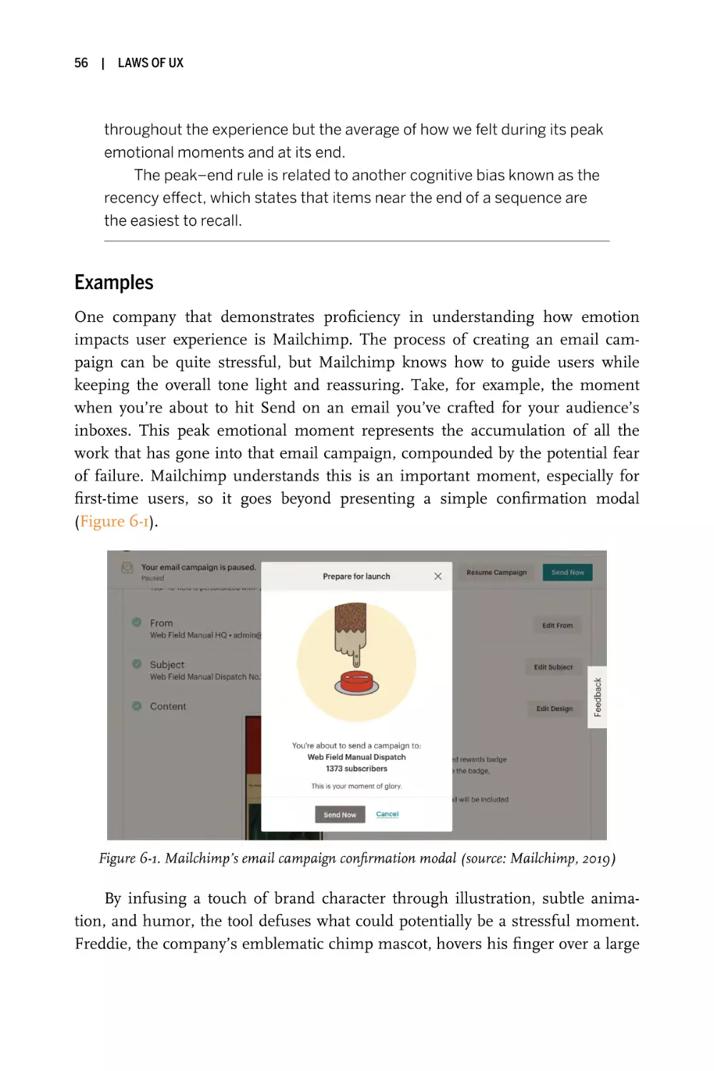


Text
Laws of UX
Using Psychology to Design Better Products & Services
Jon Yablonski
Laws of UX
Using Psychology to Design
Better Products & Services
Jon Yablonski
Laws of UX
by Jon Yablonski
Copyright © 2020 Jon Yablonski. All rights reserved.
Printed in the United States of America.
Published by O’Reilly Media, Inc., 1005 Gravenstein Highway North, Sebastopol, CA 95472.
O’Reilly books may be purchased for educational, business, or sales promotional use. Online
editions are also available for most titles (https://oreilly.com). For more information, contact our
corporate/institutional sales department: 800-998-9938 or corporate@oreilly.com.
Acquisitions Editor: Jessica Haberman
Indexer: Ellen Troutman-Zaig
Development Editor: Angela Rufino
Interior Designer: Monica Kamsvaag
Production Editor: Kristen Brown
Cover Designer: Randy Comer
Copyeditor: Rachel Head
Illustrator: Rebecca Demarest
Proofreader: Arthur Johnson
May 2020:
First Edition
Revision History for the First Edition
2020-04-21:
First Release
See https://oreilly.com/catalog/errata.csp?isbn=9781492055310 for release details.
The O’Reilly logo is a registered trademark of O’Reilly Media, Inc. Laws of UX, the cover image,
and related trade dress are trademarks of O’Reilly Media, Inc.
The views expressed in this work are those of the author, and do not represent the publisher’s
views. While the publisher and the author have used good faith efforts to ensure that the information and instructions contained in this work are accurate, the publisher and the author disclaim all responsibility for errors or omissions, including without limitation responsibility for
damages resulting from the use of or reliance on this work. Use of the information and instructions contained in this work is at your own risk. If any code samples or other technology this
work contains or describes is subject to open source licenses or the intellectual property rights
of others, it is your responsibility to ensure that your use thereof complies with such licenses
and/or rights.
978-1-492-05531-0
[LSI]
Contents
|
Preface
v
1
|
Jakob’s Law
2
|
Fitts’s Law
13
3
|
Hick’s Law
23
4
|
Miller’s Law
35
5
|
Postel’s Law
43
6
|
Peak–End Rule
7
|
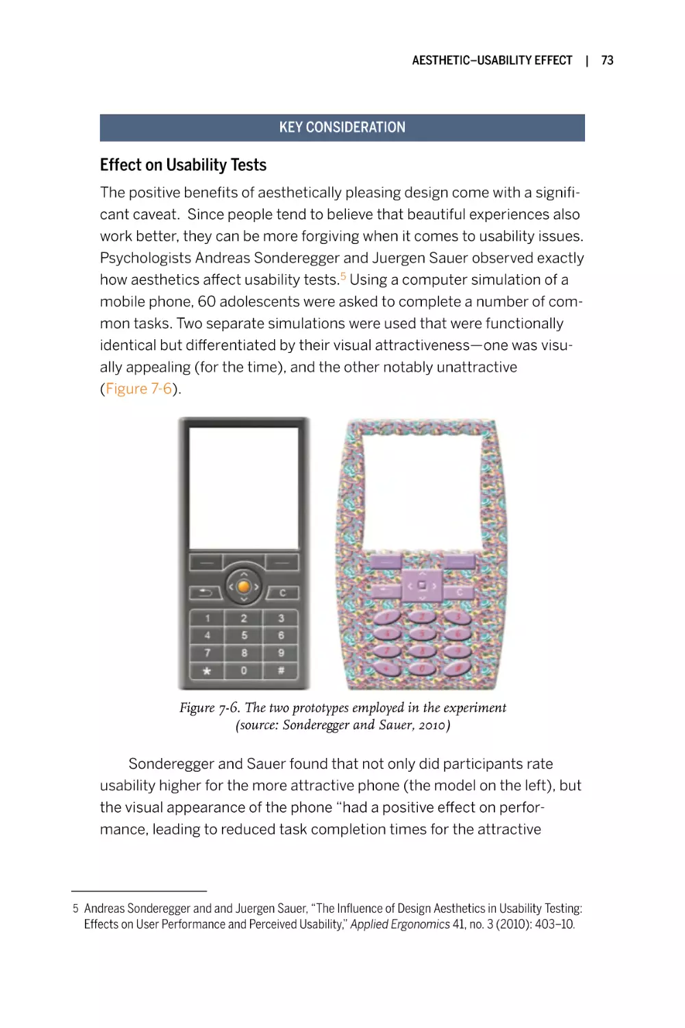
Aesthetic–Usability Effect
8
|
von Restorff Effect
9
|
Tesler’s Law
10
|
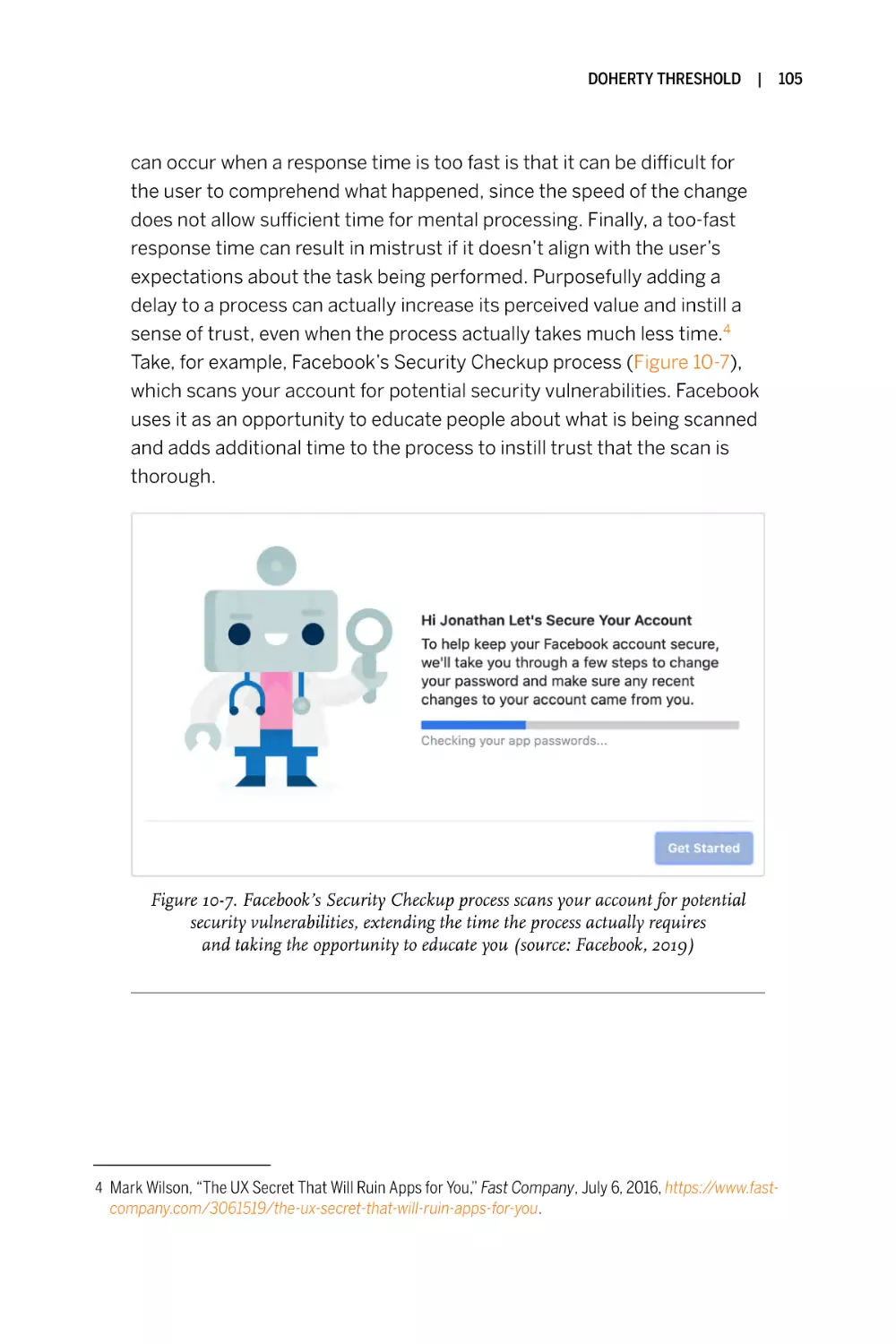
Doherty Threshold
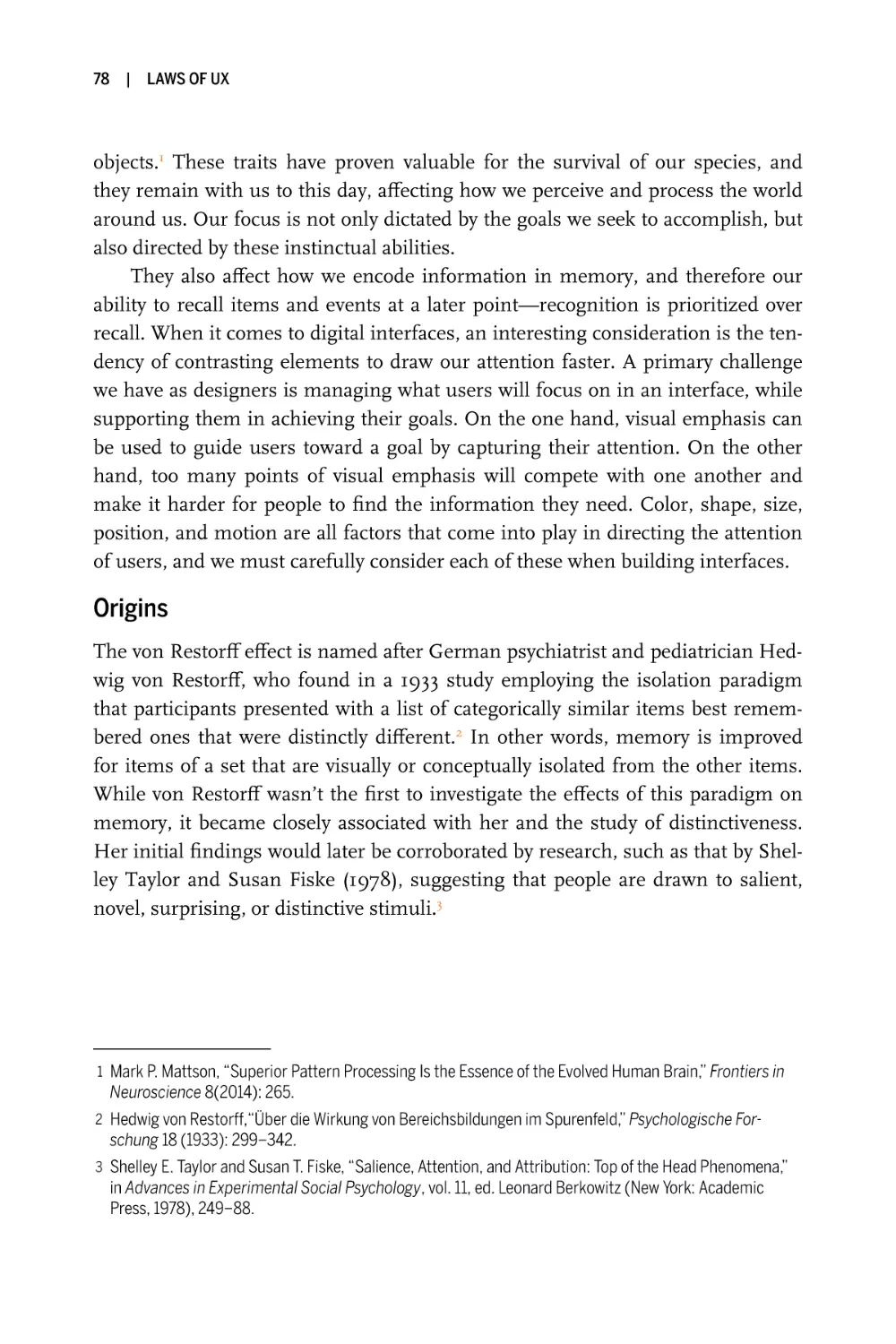
11
|
With Power Comes Responsibility
12
|
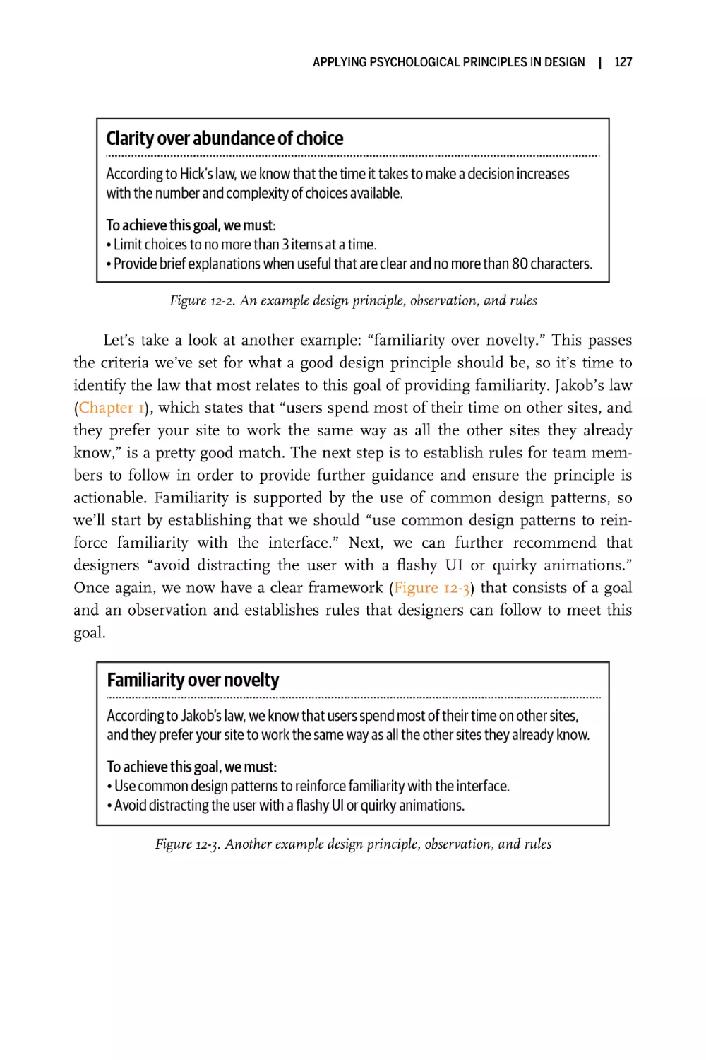
Applying Psychological Principles in Design
|
Index
1
53
65
77
87
97
107
121
129
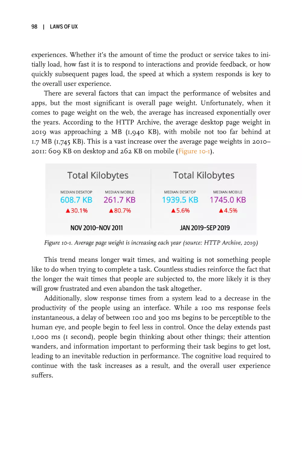
iii
Preface
This book had its origins in what felt at the time like the most arduous point of
my design career, while I was working on a very challenging client project. From
the beginning, there were several indications that it would be an exciting albeit
difficult project: a relatively short timeline and a somewhat unfamiliar space, but
a well-known brand and the chance to help design something that’d be seen by
many across the world. These have always been my favorite kinds of projects
because they are the ones that offer the most opportunity to learn and grow,
which I’ve always striven to do. But this project was somewhat unique in one
specific way: I was being asked to justify a number of design decisions to project
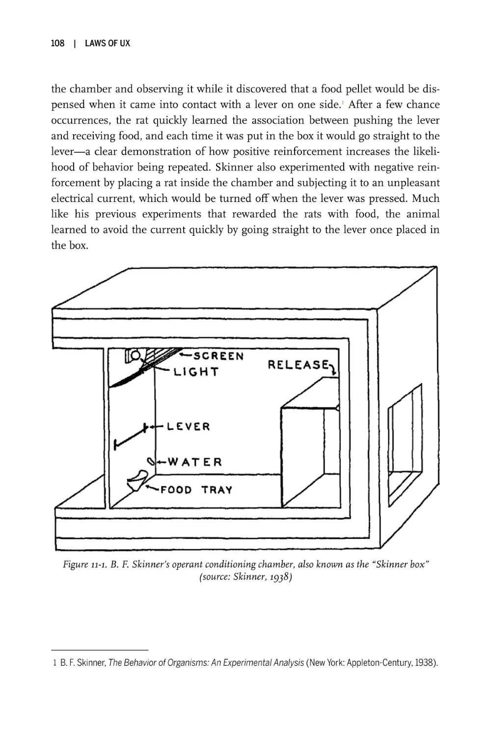
stakeholders, without any data to support them. Normally, when you have quantitative or qualitative data available to draw upon, this a pretty straightforward
task—but in this case the data wasn’t available, so the process of justifying the
decisions would have to be a little different. How do you validate initial designs
without any proof that there is a need to change the existing designs to begin
with? As you can imagine, design reviews quickly became a matter of subjectivity
and personal bias, resulting in designs that were more difficult to validate.
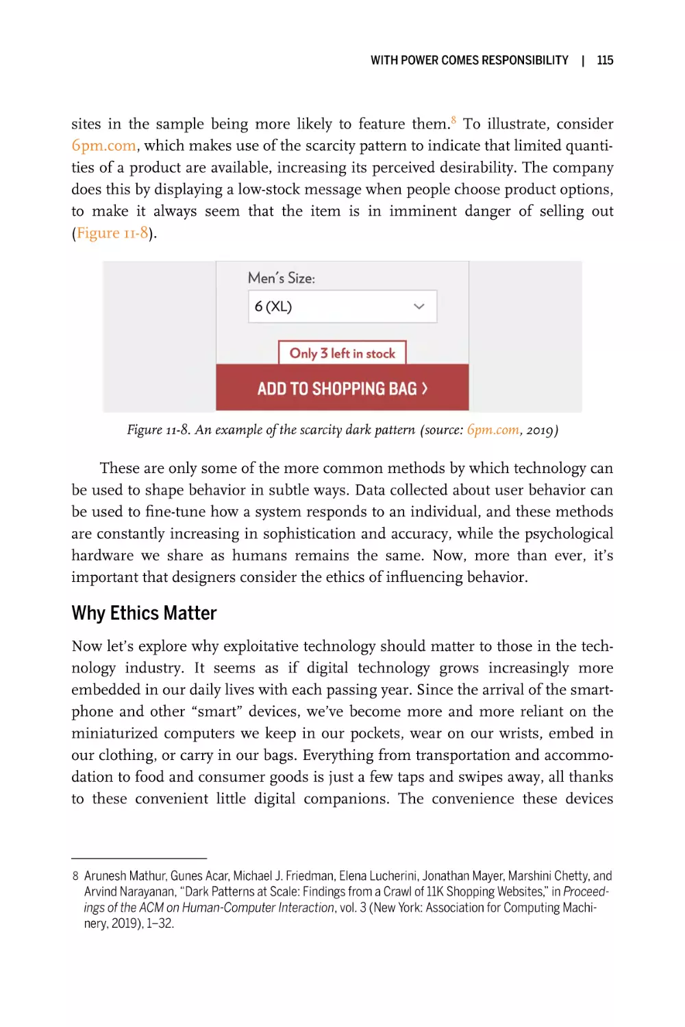
Then it occurred to me: psychology, which provides a deeper understanding
of the human mind, could be helpful in these circumstances. I quickly became
immersed in the rich and expansive field of behavioral and cognitive psychology,
and found myself reading through countless research papers and articles in order
to find empirical evidence that supported the design decisions I was making.
This research became quite useful in convincing project stakeholders to move in
the proposed design direction, and I felt as if I had found a treasure trove of
knowledge that would ultimately make me a better designer. There was only one
problem: finding good reference material online quickly turned into an exhausting task. Searches led me to a vast array of academic papers, scientific research,
and the occasional article in the popular press—none of which felt directly
v
vi
|
Preface
relatable to my work as a designer. I was looking for a designer-friendly resource
that just wasn’t available online, or at least not in the form I wanted it. Eventually
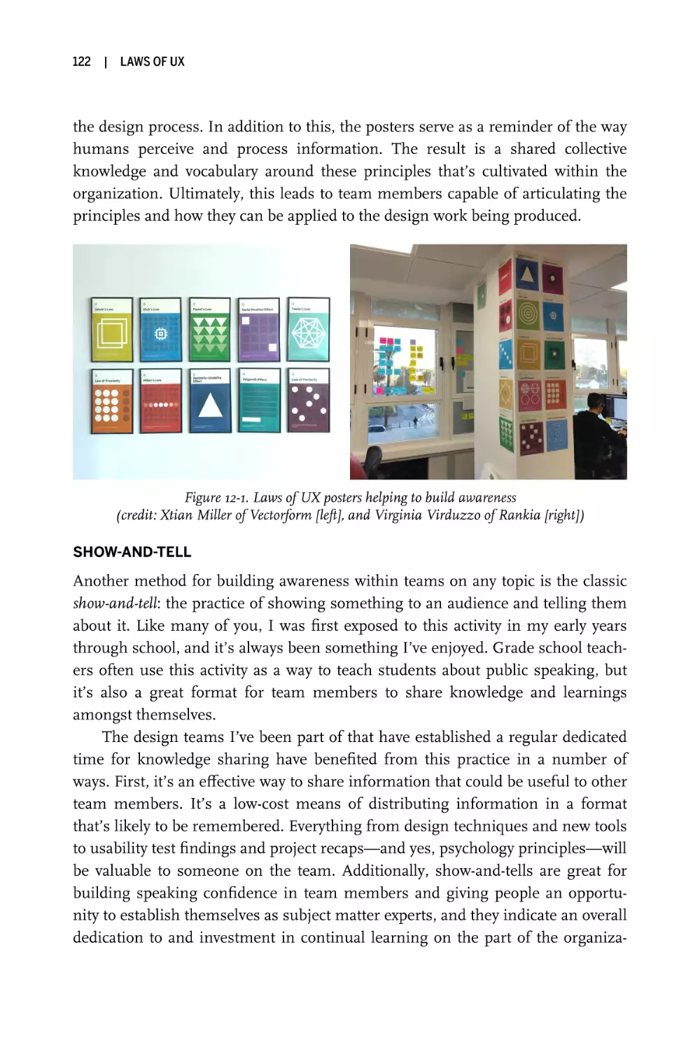
I decided to dive in and produce the resource I was looking for myself, resulting
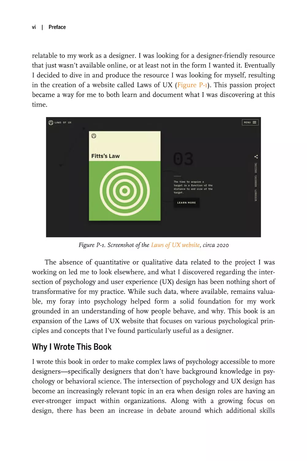
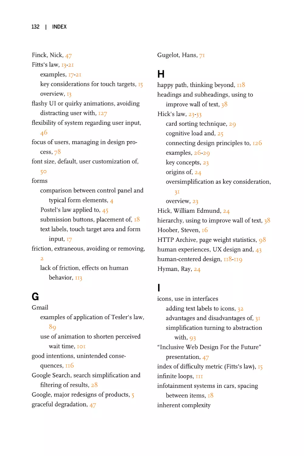
in the creation of a website called Laws of UX (Figure P-1). This passion project
became a way for me to both learn and document what I was discovering at this
time.
Figure P-1. Screenshot of the Laws of UX website, circa 2020
The absence of quantitative or qualitative data related to the project I was
working on led me to look elsewhere, and what I discovered regarding the intersection of psychology and user experience (UX) design has been nothing short of
transformative for my practice. While such data, where available, remains valuable, my foray into psychology helped form a solid foundation for my work
grounded in an understanding of how people behave, and why. This book is an
expansion of the Laws of UX website that focuses on various psychological principles and concepts that I’ve found particularly useful as a designer.
Why I Wrote This Book
I wrote this book in order to make complex laws of psychology accessible to more
designers—specifically designers that don’t have background knowledge in psychology or behavioral science. The intersection of psychology and UX design has
become an increasingly relevant topic in an era when design roles are having an
ever-stronger impact within organizations. Along with a growing focus on
design, there has been an increase in debate around which additional skills
Preface
|
vii
designers should learn, if any, to increase their value and contribution. Should
designers code, write, or understand business? These skills are all valuable, but
perhaps not essential. However, I would argue that every designer should learn
the fundamentals of psychology.
As humans, we have an underlying “blueprint” for how we perceive and process the world around us, and the study of psychology helps us decipher this
blueprint. Designers can use this knowledge to build more intuitive, humancentered products and experiences. Instead of forcing users to adapt to the
design of a product or experience, we can use some key principles from psychology as a guide for designing in a way that is adapted to people. This is the fundamental basis of human-centered design, and it is the foundation of this book.
But knowing where to start can be a challenge. Which principles from psychology are useful? What are some examples of these principles at work? There’s
an endless list of laws and theories that occupy this space, but there are a few that
I’ve found particularly helpful and widely applicable. In this book, I explore these
concepts and present some examples of how they are effectively leveraged by
products and experiences we interact with every day.
Who This Book Is For
This book is for anyone that wishes to improve their design craft, learn more
about the intersection of psychology and design, or simply explore why people
react to good design the way they do. It’s aimed at designers who want to have a
better understanding of psychology and how it impacts and overlaps with the
work we do. It’s for professional and aspiring designers alike: anyone who seeks
to understand how the overall user experience is affected by an understanding of
human perception and mental processes. While the book is specifically focused
on digital design as opposed to the more traditional mediums of graphic or
industrial design, the information it contains is broadly applicable to anyone
responsible for shaping user experience. I should also mention that it isn’t
intended to be a comprehensive resource, but rather an accessible introduction to
the psychology fundamentals that have a direct influence on design and how people process and interact with the interfaces we create. It’s full of examples and
intended to be easily read and referenced by designers who wish to incorporate
this information into their daily work.
This book will also be relevant to anyone that seeks to understand the business value of good design and why good design is transformative for businesses
and organizations. The field of UX design has grown and expanded into new
viii
|
Preface
areas thanks to the increase in investment by companies looking to gain a competitive advantage. With this new interest has come the expectation that products
and services should be well designed, and simply having a website or mobile
application is no longer enough. Companies must ensure their websites and
applications, and any other digital experiences they offer, are helpful, effective,
and well designed. In order to achieve this, designers can, I believe, use psychology as a guide, enabling them to design for how people actually perceive, process,
and interact not only with digital interfaces but also with the world.
What’s in This Book
Chapter 1, Jakob’s Law
Users spend most of their time on other sites, and they prefer your site to
work the same way as all the other sites they already know.
Chapter 2, Fitts’s Law
The time to acquire a target is a function of the distance to and size of the
target.
Chapter 3, Hick’s Law
The time it takes to make a decision increases with the number and complexity of choices available.
Chapter 4, Miller’s Law
The average person can keep only 7 (± 2) items in their working memory.
Chapter 5, Postel’s Law
Be conservative in what you do, be liberal in what you accept from others.
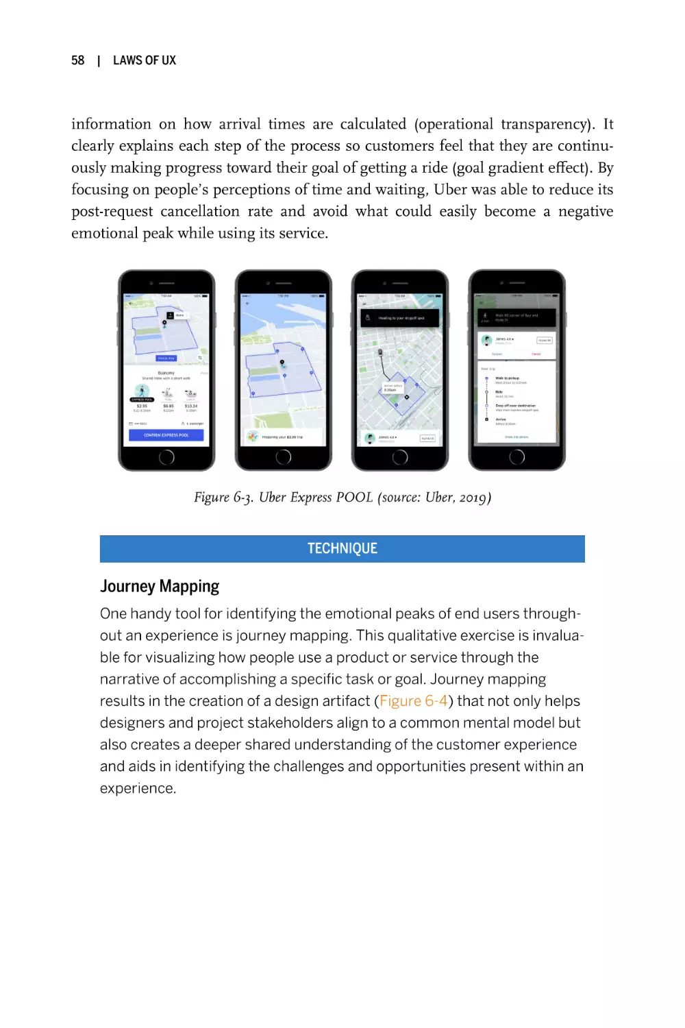
Chapter 6, Peak–End Rule
People judge an experience largely based on how they felt at its peak and at
its end, rather than on the total sum or average of every moment of the
experience.
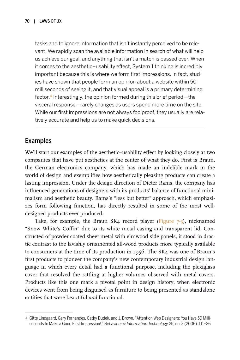
Chapter 7, Aesthetic–Usability Effect
Users often perceive aesthetically pleasing design as design that’s more
usable.
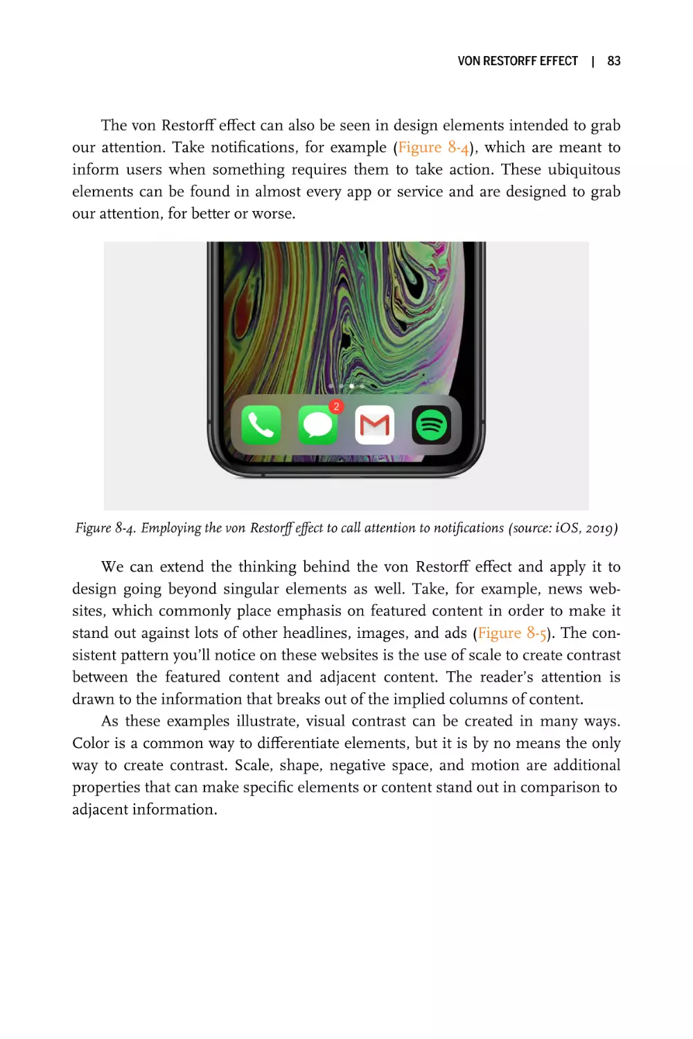
Chapter 8, von Restorff Effect
When multiple similar objects are present, the one that differs from the
rest is most likely to be remembered.
Preface
|
ix
Chapter 9, Tesler’s Law
Tesler’s law, also known as the law of conservation and complexity, states
that for any system there is a certain amount of complexity that cannot be
reduced.
Chapter 10, Doherty Threshold
Productivity soars when a computer and its users interact at a pace (<400
ms) that ensures that neither has to wait on the other.
Chapter 11, With Power Comes Responsibility
Here, we take a closer look at the implications of using psychology to create
more intuitive products and experiences.
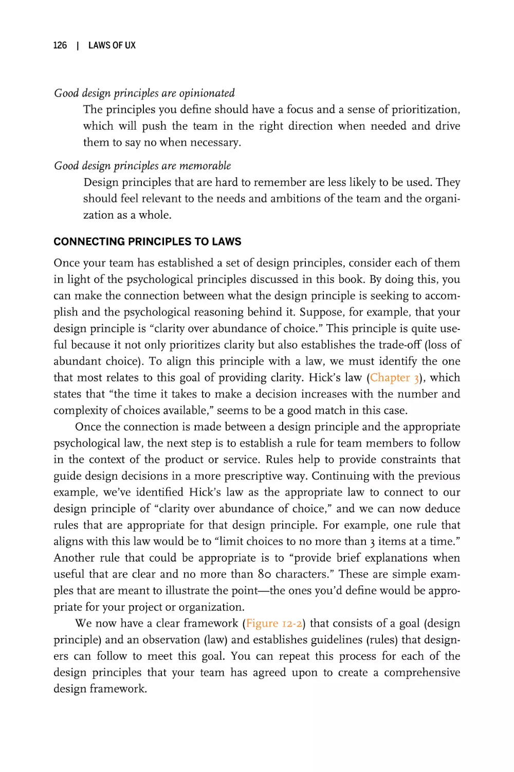
Chapter 12, Applying Psychological Principles in Design
This chapter considers ways designers can internalize and apply the psychological principles we’ve looked at in this book and then articulate them
through principles that relate back to the goals and priorities of their team.
O’Reilly Online Learning
For more than 40 years, O’Reilly Media has provided technology and business training, knowledge, and insight to
help companies succeed.
Our unique network of experts and innovators share their knowledge and
expertise through books, articles, and our online learning platform. O’Reilly’s
online learning platform gives you on-demand access to live training courses, indepth learning paths, interactive coding environments, and a vast collection of
text and video from O’Reilly and 200+ other publishers. For more information,
visit https://oreilly.com.
How to Contact Us
Please address comments and questions concerning this book to the publisher:
O’Reilly Media, Inc.
1005 Gravenstein Highway North
Sebastopol, CA 95472
800-998-9938 (in the United States or Canada)
707-829-0515 (international or local)
x
|
Preface
We have a web page for this book, where we list errata, examples, and any
additional information. You can access this page at https://oreil.ly/laws-of-UX.
Email bookquestions@oreilly.com to comment or ask technical questions
about this book.
For news and more information about our books and courses, see our website at https://oreilly.com.
Find us on Facebook: http://facebook.com/oreilly
Follow us on Twitter: http://twitter.com/oreillymedia
Watch us on YouTube: http://youtube.com/oreillymedia
Acknowledgments
First and foremost, I must acknowledge and thank my wife Kristen, whose love
and support have been both endless and critical in so many ways—without her
this book would not have been possible. Thanks also to my mom, the strongest
person I know and the one who encouraged, supported, and enabled me to follow my dreams to begin with, and to James Rollins, a man I’m forever grateful to
have in my life and the lives of my family. I’d like to also acknowledge all of my
design colleagues who helped with the book in some way or another: in no particular order, Jonathan Patterson and Ross Legacy for always-on-point design advice
and feedback; Xtian Miller for the encouragement, feedback, and words of wisdom; and Jim and Lindsey Rampton, Dave Thackery, Mark Michael Koscierzynski, Amy Stoddard, Boris Crowther, Trevor Anulewicz, Clemens Conrad, and
countless others for the support and encouragement. I also owe a debt of gratitude to all the individuals involved in the project that inspired this book, who
therefore directly influenced its creation. I’d like to thank Jessica Haberman, who
saw the potential in me to become an author and encouraged me to begin the
endeavor of writing this book. And finally, I owe Angela Rufino a great deal of
gratitude for all the advice, patience, and feedback throughout the process.
|
1
Jakob’s Law
Users spend most of their time on other sites, and they prefer your site to
work the same way as all the other sites they already know.
Key Takeaways
• Users will transfer expectations they have built around one familiar
product to another that appears similar.
• By leveraging existing mental models, we can create superior user
experiences in which the users can focus on their tasks rather
than on learning new models.
• When making changes, minimize discord by empowering users to
continue using a familiar version for a limited time.
Overview
There is something incredibly valuable to be found in familiarity. Familiarity
helps the people interacting with a digital product or service know immediately
how to use it, from interacting with the navigation to finding the content they
need to processing the layout and visual cues on the page in order to understand
the choices available to them. The cumulative effect of mental effort saved
ensures a lower cognitive load. In other words, the less mental energy users have
to spend learning an interface, the more they can dedicate to achieving their
objectives. The easier we make it for people to achieve their goals, the more likely
they are to do so successfully.
1
2
|
LAWS OF UX
As designers, it is our objective to ensure people successfully achieve their
goals when using the interfaces we’ve built by eliminating as much friction as
possible. Not all friction is bad—in fact, sometimes it is even necessary. But
when there is an opportunity to remove or avoid extraneous friction, or friction
that doesn’t provide value or service a purpose, then we should do so. One of the
primary ways designers can remove friction is by leveraging common design patterns and conventions in strategic areas such as page structure, workflows, navigation, and placement of expected elements such as search. When we do this, we
ensure people can immediately be productive instead of first having to learn how
a website or app works. In this chapter, we’ll take a look at some examples of how
this design principle can be achieved—but first, let’s look at its origins.
Origins
Jakob’s law (also known as “Jakob’s law of the internet user experience”) was put
forth in 2000 by usability expert Jakob Nielsen, who described the tendency for
users to develop an expectation of design conventions based on their cumulative
experience from other websites.1 This observation, which Nielsen describes as a
law of human nature, encourages designers to follow common design conventions, enabling users to focus more on the site’s content, message, or product. In
contrast, uncommon conventions can lead to people becoming frustrated, confused, and more likely to abandon their tasks and leave because the interface
does not match up with their understanding of how things should work.
The cumulative experience that Nielsen refers to is helpful for people when
visiting a new website or using a new product because it informs their understanding of how things work and what’s possible. This underlying factor is perhaps one of the most important in user experience, and it is directly related to a
psychological concept known as mental models.
1 Jakob Nielsen, “End of Web Design,” Nielsen Norman Group, July 22, 2000, https://www.nngroup.com/
articles/end-of-web-design.
JAKOB’S LAW
PSYCHOLOGY CONCEPT
Mental Models
A mental model is what we think we know about a system, especially
about how it works. Whether it’s a digital system such as a website or a
physical system such as a checkout line in a retail store, we form a model
of how a system works, and then we apply that model to new situations
where the system is similar. In other words, we use the knowledge we
already have from past experiences when interacting with something
new.
Mental models are valuable for designers because we can match our
designs to our users’ mental models to improve their experience by enabling them to easily transfer their knowledge from one product or experience to another, without the need to first take the time to understand
how the new system works. Good user experiences are made possible
when the design of a product or service is in alignment with the user’s
mental model. The task of shrinking the gap between our own mental
models and those of the users is one of the biggest challenges we face,
and to achieve this goal we use a variety of methods: user interviews,
personas, journey maps, empathy maps, and more. The point of these
various methods is to gain a deeper insight into not only the goals and
objectives of our users but also users’ preexisting mental models and
how all of these factors apply to the product or experience we are
designing.
|
3
4
|
LAWS OF UX
Examples
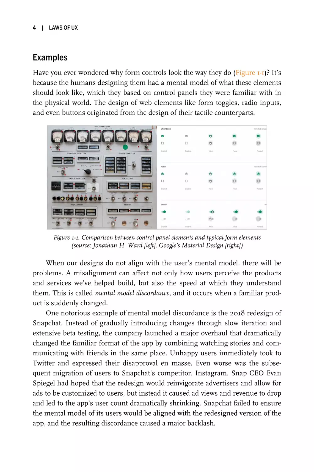
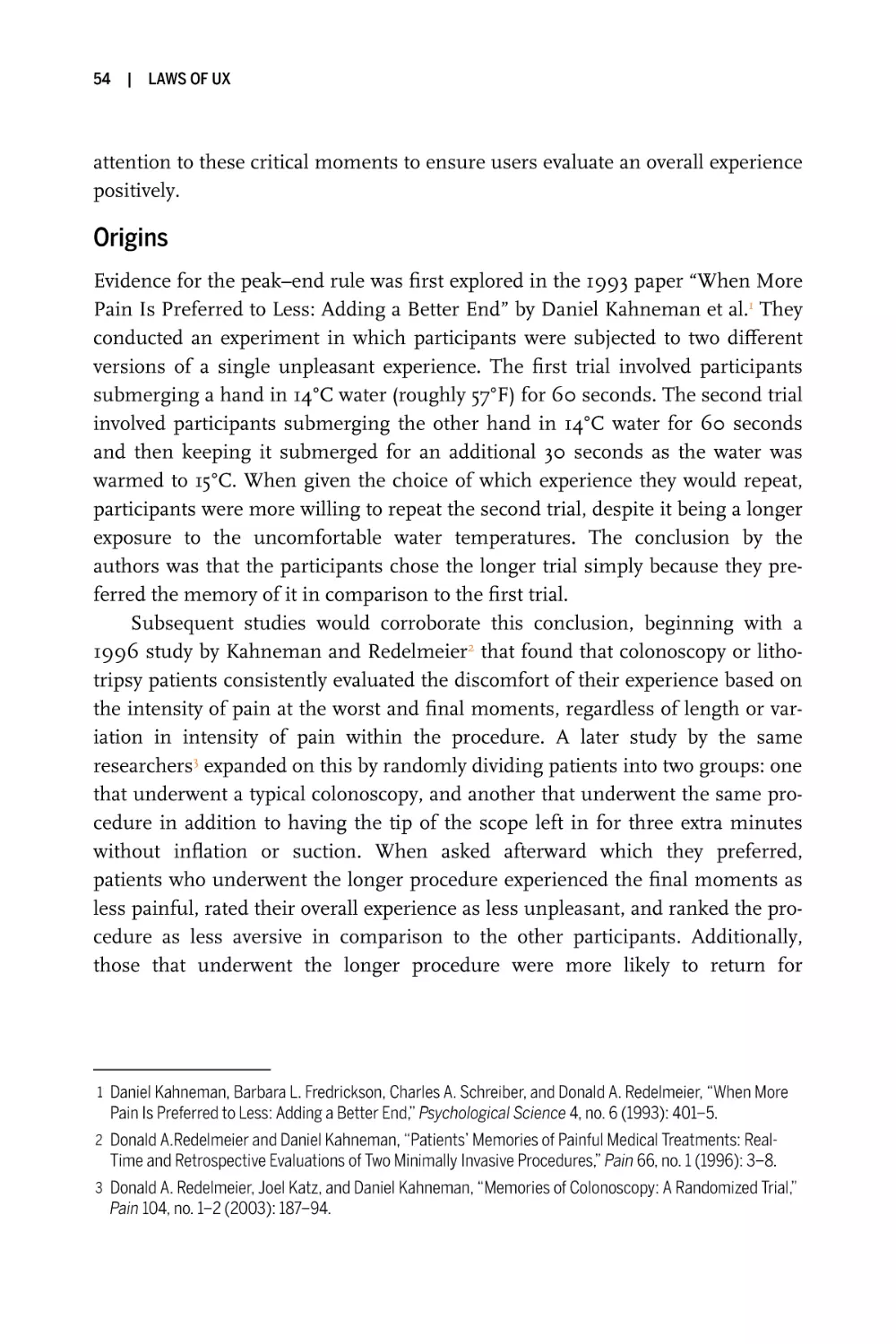
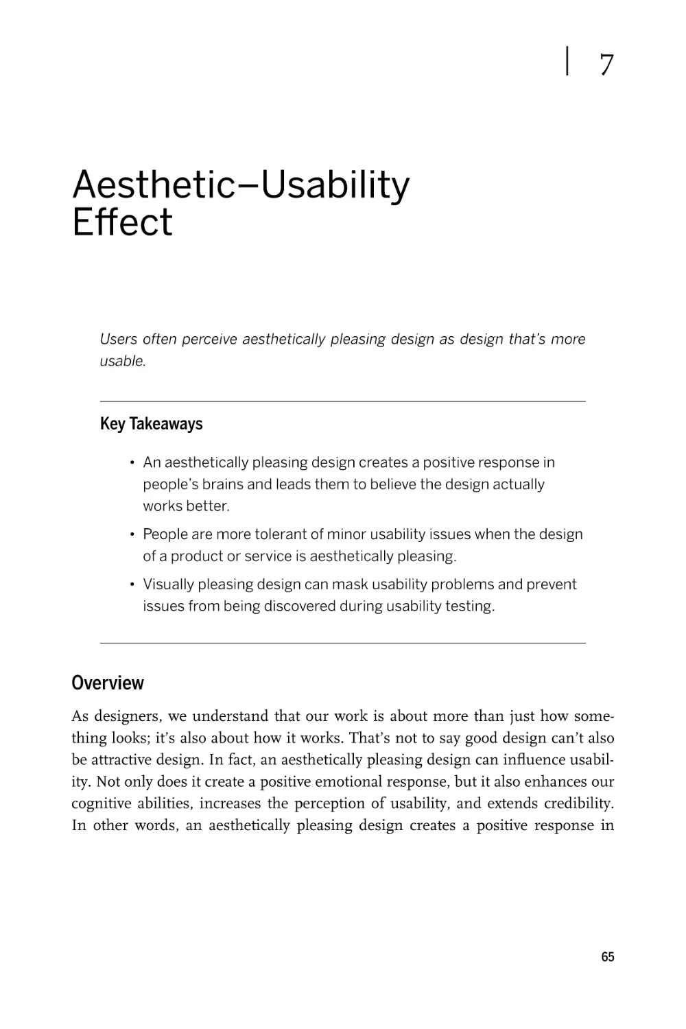
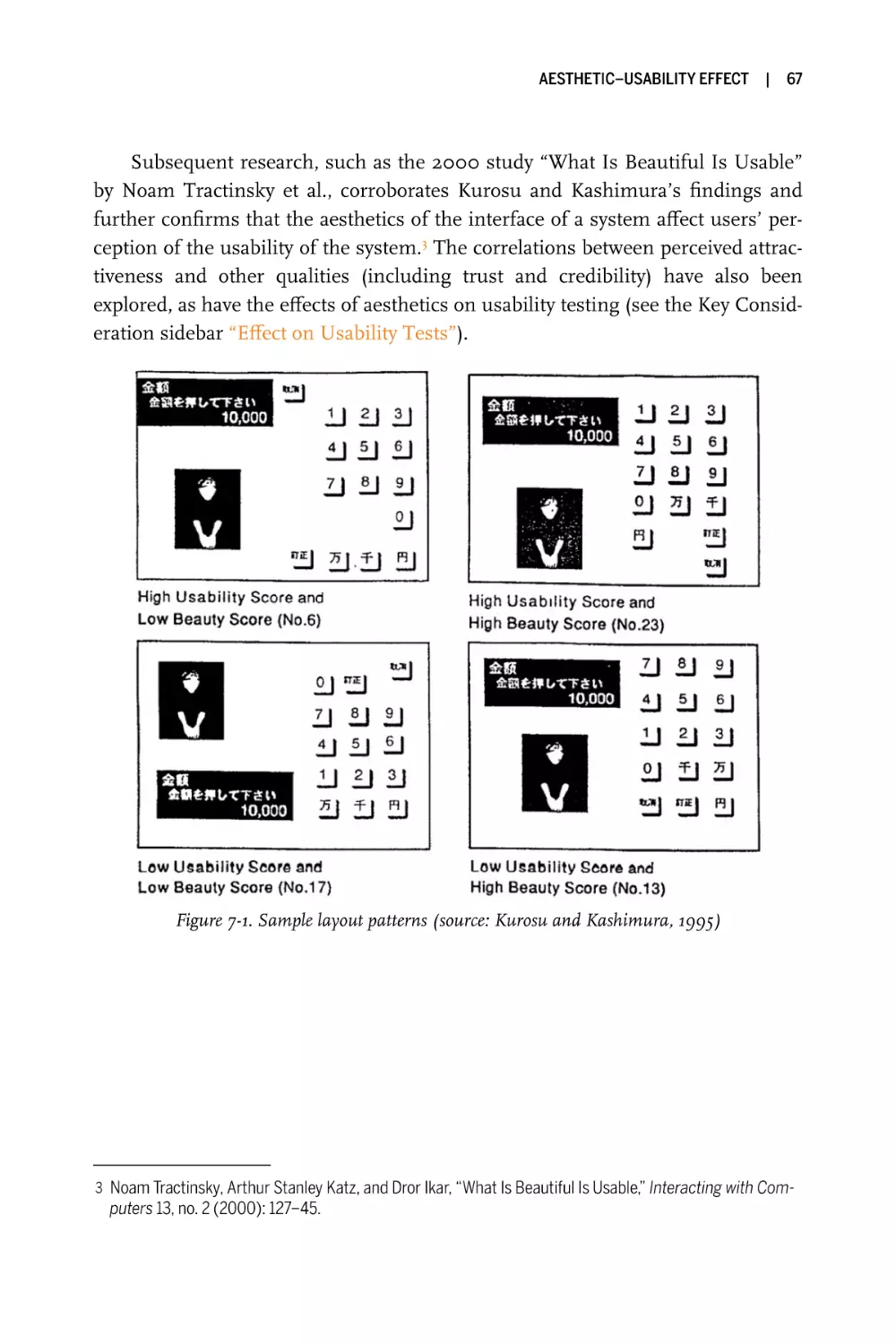
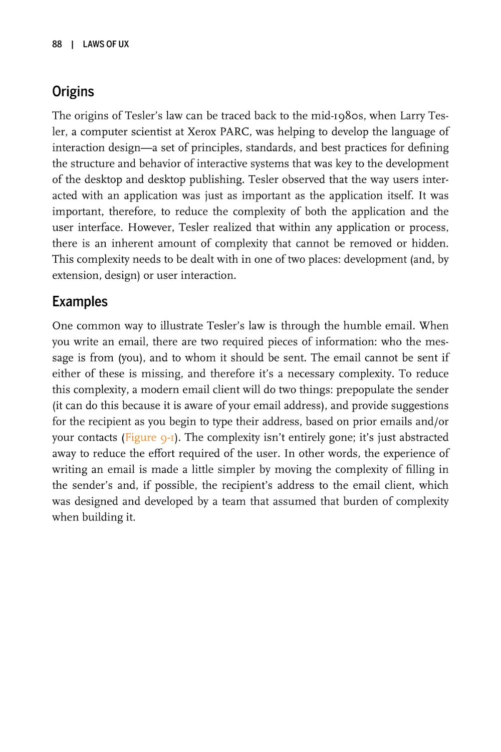
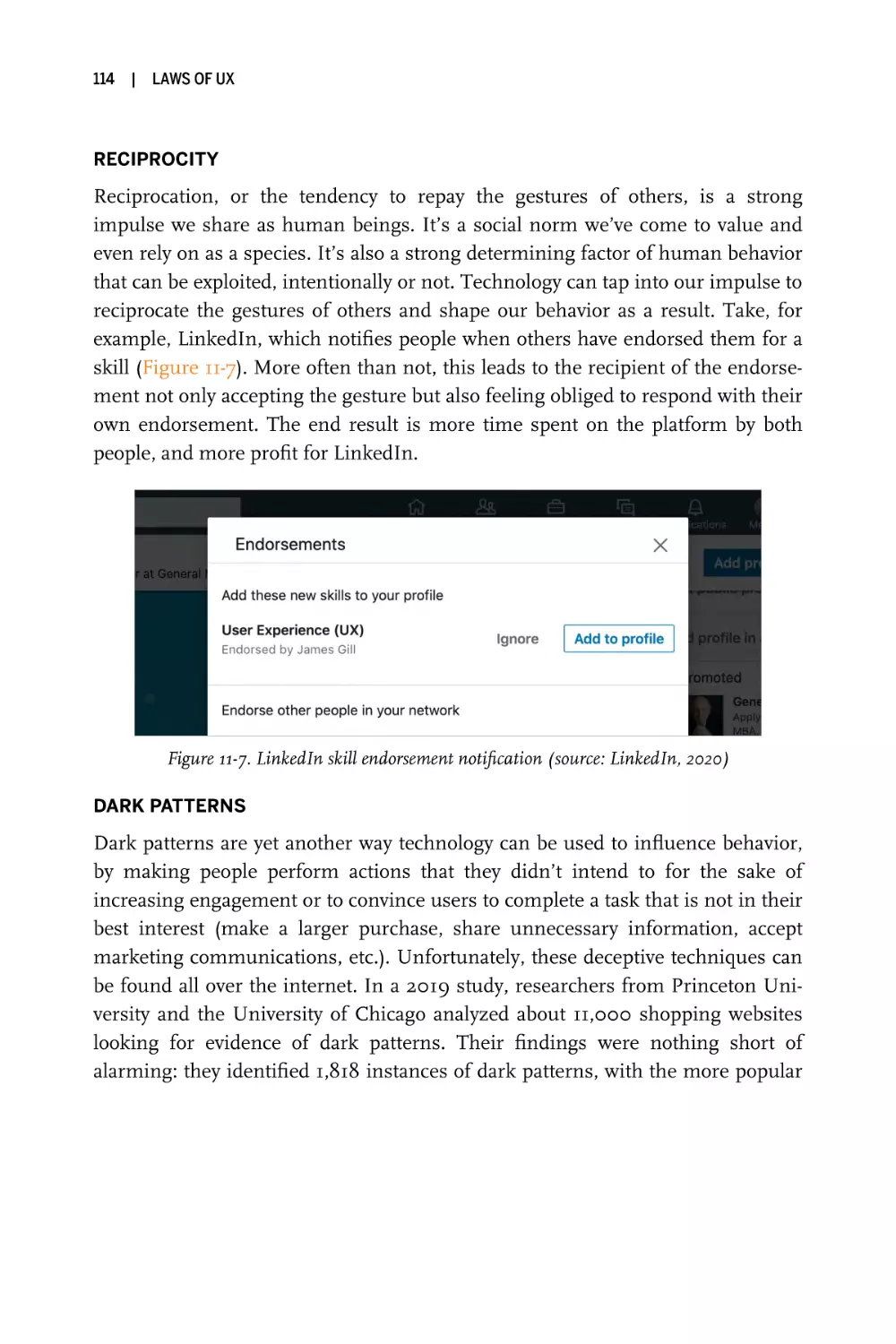
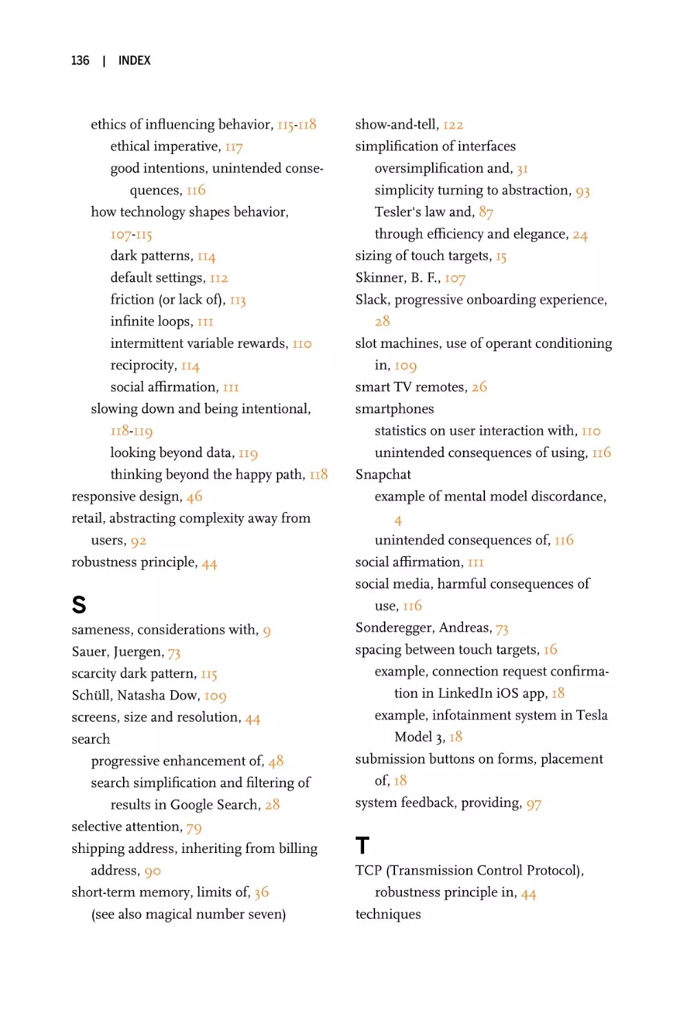
Have you ever wondered why form controls look the way they do (Figure 1-1)? It’s
because the humans designing them had a mental model of what these elements
should look like, which they based on control panels they were familiar with in
the physical world. The design of web elements like form toggles, radio inputs,
and even buttons originated from the design of their tactile counterparts.
Figure 1-1. Comparison between control panel elements and typical form elements
(source: Jonathan H. Ward [left], Google’s Material Design [right])
When our designs do not align with the user’s mental model, there will be
problems. A misalignment can affect not only how users perceive the products
and services we’ve helped build, but also the speed at which they understand
them. This is called mental model discordance, and it occurs when a familiar product is suddenly changed.
One notorious example of mental model discordance is the 2018 redesign of
Snapchat. Instead of gradually introducing changes through slow iteration and
extensive beta testing, the company launched a major overhaul that dramatically
changed the familiar format of the app by combining watching stories and communicating with friends in the same place. Unhappy users immediately took to
Twitter and expressed their disapproval en masse. Even worse was the subsequent migration of users to Snapchat’s competitor, Instagram. Snap CEO Evan
Spiegel had hoped that the redesign would reinvigorate advertisers and allow for
ads to be customized to users, but instead it caused ad views and revenue to drop
and led to the app’s user count dramatically shrinking. Snapchat failed to ensure
the mental model of its users would be aligned with the redesigned version of the
app, and the resulting discordance caused a major backlash.
JAKOB’S LAW
|
5
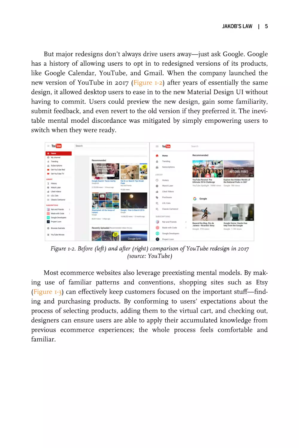
But major redesigns don’t always drive users away—just ask Google. Google
has a history of allowing users to opt in to redesigned versions of its products,
like Google Calendar, YouTube, and Gmail. When the company launched the
new version of YouTube in 2017 (Figure 1-2) after years of essentially the same
design, it allowed desktop users to ease in to the new Material Design UI without
having to commit. Users could preview the new design, gain some familiarity,
submit feedback, and even revert to the old version if they preferred it. The inevitable mental model discordance was mitigated by simply empowering users to
switch when they were ready.
Figure 1-2. Before (left) and after (right) comparison of YouTube redesign in 2017
(source: YouTube)
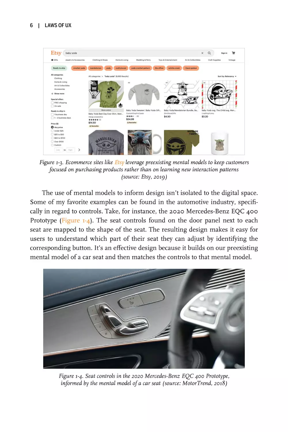
Most ecommerce websites also leverage preexisting mental models. By making use of familiar patterns and conventions, shopping sites such as Etsy
(Figure 1-3) can effectively keep customers focused on the important stuff—finding and purchasing products. By conforming to users’ expectations about the
process of selecting products, adding them to the virtual cart, and checking out,
designers can ensure users are able to apply their accumulated knowledge from
previous ecommerce experiences; the whole process feels comfortable and
familiar.
6
|
LAWS OF UX
Figure 1-3. Ecommerce sites like Etsy leverage preexisting mental models to keep customers
focused on purchasing products rather than on learning new interaction patterns
(source: Etsy, 2019)
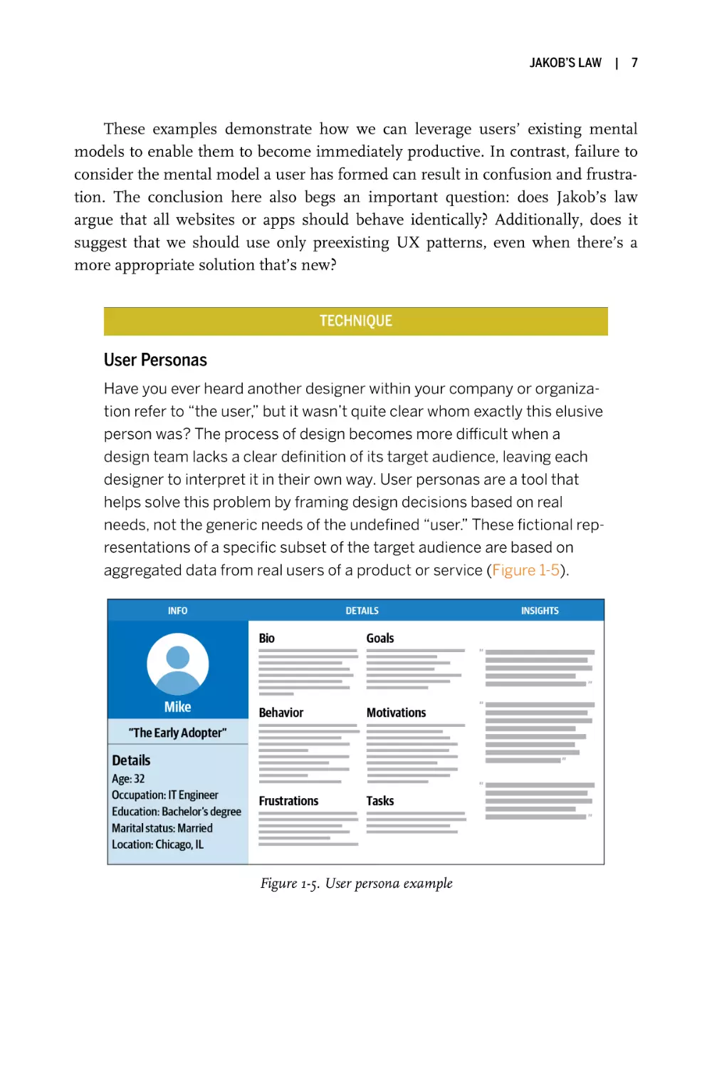
The use of mental models to inform design isn’t isolated to the digital space.
Some of my favorite examples can be found in the automotive industry, specifically in regard to controls. Take, for instance, the 2020 Mercedes-Benz EQC 400
Prototype (Figure 1-4). The seat controls found on the door panel next to each
seat are mapped to the shape of the seat. The resulting design makes it easy for
users to understand which part of their seat they can adjust by identifying the
corresponding button. It’s an effective design because it builds on our preexisting
mental model of a car seat and then matches the controls to that mental model.
Figure 1-4. Seat controls in the 2020 Mercedes-Benz EQC 400 Prototype,
informed by the mental model of a car seat (source: MotorTrend, 2018)
JAKOB’S LAW
|
7
These examples demonstrate how we can leverage users’ existing mental
models to enable them to become immediately productive. In contrast, failure to
consider the mental model a user has formed can result in confusion and frustration. The conclusion here also begs an important question: does Jakob’s law
argue that all websites or apps should behave identically? Additionally, does it
suggest that we should use only preexisting UX patterns, even when there’s a
more appropriate solution that’s new?
TECHNIQUE
User Personas
Have you ever heard another designer within your company or organization refer to “the user,” but it wasn’t quite clear whom exactly this elusive
person was? The process of design becomes more difficult when a
design team lacks a clear definition of its target audience, leaving each
designer to interpret it in their own way. User personas are a tool that
helps solve this problem by framing design decisions based on real
needs, not the generic needs of the undefined “user.” These fictional representations of a specific subset of the target audience are based on
aggregated data from real users of a product or service (Figure 1-5).
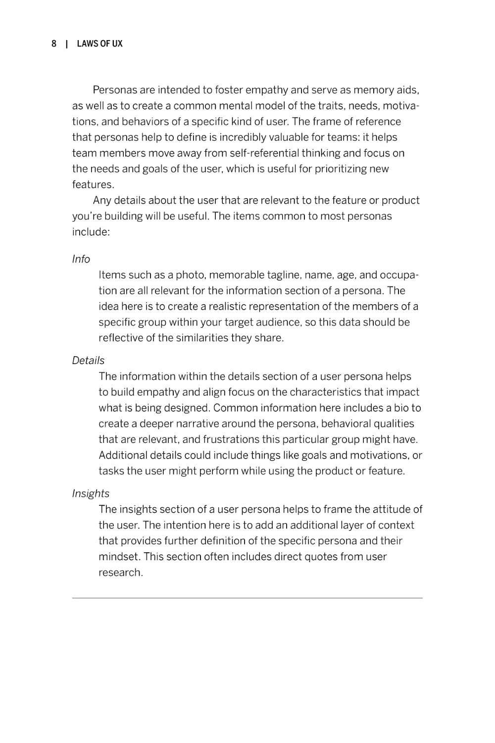
Figure 1-5. User persona example
8
|
LAWS OF UX
Personas are intended to foster empathy and serve as memory aids,
as well as to create a common mental model of the traits, needs, motivations, and behaviors of a specific kind of user. The frame of reference
that personas help to define is incredibly valuable for teams: it helps
team members move away from self-referential thinking and focus on
the needs and goals of the user, which is useful for prioritizing new
features.
Any details about the user that are relevant to the feature or product
you’re building will be useful. The items common to most personas
include:
Info
Items such as a photo, memorable tagline, name, age, and occupation are all relevant for the information section of a persona. The
idea here is to create a realistic representation of the members of a
specific group within your target audience, so this data should be
reflective of the similarities they share.
Details
The information within the details section of a user persona helps
to build empathy and align focus on the characteristics that impact
what is being designed. Common information here includes a bio to
create a deeper narrative around the persona, behavioral qualities
that are relevant, and frustrations this particular group might have.
Additional details could include things like goals and motivations, or
tasks the user might perform while using the product or feature.
Insights
The insights section of a user persona helps to frame the attitude of
the user. The intention here is to add an additional layer of context
that provides further definition of the specific persona and their
mindset. This section often includes direct quotes from user
research.
JAKOB’S LAW
KEY CONSIDERATION
Sameness
I know what you’re thinking: if all websites or apps followed the same
design conventions, that would make everything quite boring. This is a
completely valid concern, especially given the ubiquity of specific conventions that can be observed today. This pervasive sameness can be
attributed to a few factors: the popularity of frameworks to speed up
development, the maturity of digital platforms and resulting standards,
clients’ desire to emulate their competition, and just plain lack of creativity. While much of this sameness is purely based on design trends, there
is a good reason we see patterns with some conventions, such as the
placement of search, navigation in the footer, and multistep checkout
flows.
Let’s take a moment to consider the alternative: imagine that each
and every website or app that you used was completely different in every
regard, from the layout and navigation down to the styling and common
conventions like the location of the search feature. Considering what
we’ve learned about mental models, this would mean that users could no
longer rely on their previous experiences to guide them. Their ability to
be instantly productive in achieving the goal they wanted to accomplish
would be immediately thwarted because they would first have to learn
how to use the website or app. It is no stretch of the imagination to see
that this would not be an ideal situation, and conventions would eventually emerge out of pure necessity.
That’s not to say that creating something entirely new is never
appropriate—there’s certainly a time and a place for innovation. But
designers must determine the best approach by taking into consideration user needs and context, in addition to any technical constraints,
before reaching for something unique, and they must take care not to
sacrifice usability.
|
9
10
|
LAWS OF UX
Conclusion
Jakob’s law isn’t advocating for sameness in the sense that every product and
experience should be identical. Instead, it is a guiding principle that reminds
designers that people leverage previous experience to help them in understanding new experiences. It is a not-so-subtle suggestion that (when appropriate)
designers should consider common conventions that are built around existing
mental models to ensure users can immediately be productive instead of first
needing to learn how a website or app works. Designing in a way that conforms
to expectations allows users to apply their knowledge from previous experiences,
and the resulting familiarity ensures they can stay focused on the important
stuff—finding the information they need, purchasing a product, etc.
The best piece of advice I can give in regard to Jakob’s law is to always begin
with common patterns and conventions, and only depart from them when it
makes sense to. If you can make a compelling argument for making something
different to improve the core user experience, that’s a good sign that it’s worth
exploring. If you go the unconventional route, be sure to test your design with
users to ensure they understand how it works.
|
2
Fitts’s Law
The time to acquire a target is a function of the distance to and size
of the target.
Key Takeaways
• Touch targets should be large enough for users to accurately
select them.
• Touch targets should have ample spacing between them.
• Touch targets should be placed in areas of an interface that allow
them to be easily acquired.
Overview
Usability is a key aspect of good design. It implies ease of use, which means the
interface should be easy for users to understand and navigate. Interaction should
be painless and straightforward, requiring minimal effort. The time it takes for
users to move to and engage with an interactive object is a critical metric. It’s
important that designers size and position interactive objects appropriately to
ensure they are easily selectable and meet user expectations with regard to the
selectable region—a challenge compounded by the differing precision of the
range of input methods available today (mouse, finger, etc.).
To aid in this endeavor we can apply Fitts’s law, which states that the time it
takes for a user to engage with an object is relative to its size and the distance to
it. In other words, as the size of an object increases, the time to select it goes
13
14
|
LAWS OF UX
down. Additionally, the time to select an object decreases as the distance that a
user must move to select it decreases. The opposite is true as well: the smaller
and further away an object is, the more time it takes to accurately select it. This
rather obvious concept has far-reaching implications, which we’ll unpack in this
chapter. We’ll also take a look at some supporting examples.
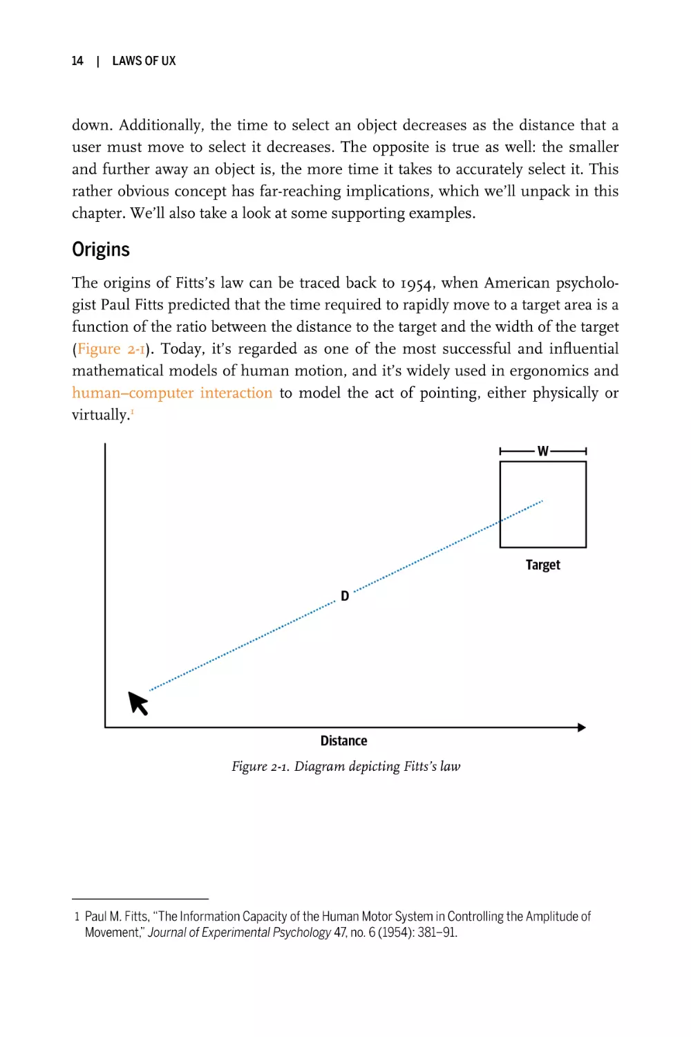
Origins
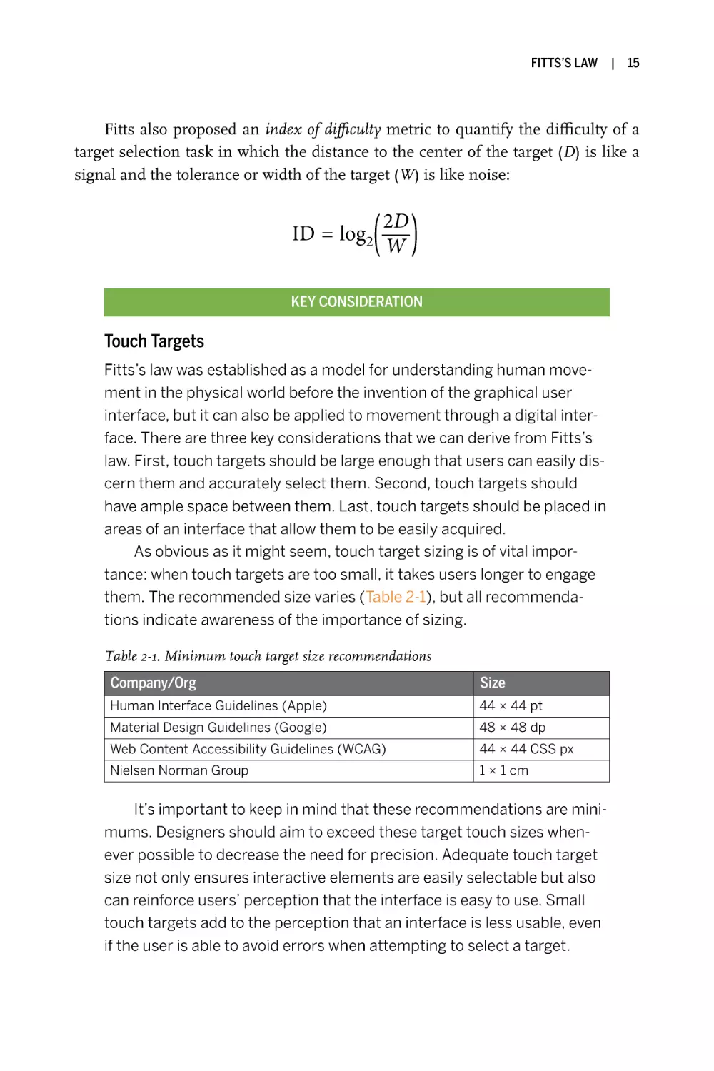
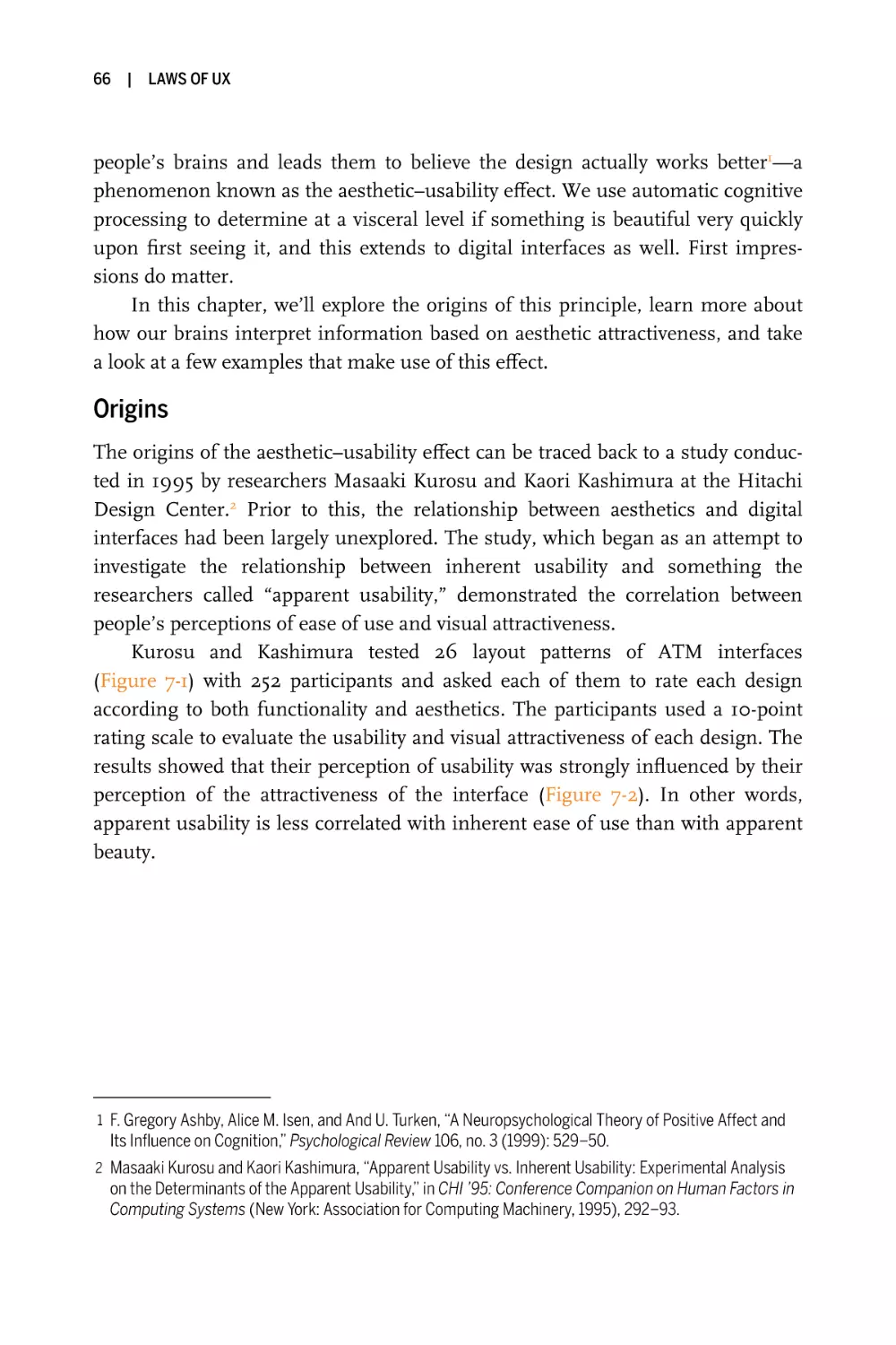
The origins of Fitts’s law can be traced back to 1954, when American psychologist Paul Fitts predicted that the time required to rapidly move to a target area is a
function of the ratio between the distance to the target and the width of the target
(Figure 2-1). Today, it’s regarded as one of the most successful and influential
mathematical models of human motion, and it’s widely used in ergonomics and
human–computer interaction to model the act of pointing, either physically or
virtually.1
Figure 2-1. Diagram depicting Fitts’s law
1 Paul M. Fitts, “The Information Capacity of the Human Motor System in Controlling the Amplitude of
Movement,” Journal of Experimental Psychology 47, no. 6 (1954): 381–91.
FITTS’S LAW
|
15
Fitts also proposed an index of difficulty metric to quantify the difficulty of a
target selection task in which the distance to the center of the target (D) is like a
signal and the tolerance or width of the target (W) is like noise:
ID = log2
2D
W
KEY CONSIDERATION
Touch Targets
Fitts’s law was established as a model for understanding human movement in the physical world before the invention of the graphical user
interface, but it can also be applied to movement through a digital interface. There are three key considerations that we can derive from Fitts’s
law. First, touch targets should be large enough that users can easily discern them and accurately select them. Second, touch targets should
have ample space between them. Last, touch targets should be placed in
areas of an interface that allow them to be easily acquired.
As obvious as it might seem, touch target sizing is of vital importance: when touch targets are too small, it takes users longer to engage
them. The recommended size varies (Table 2-1), but all recommendations indicate awareness of the importance of sizing.
Table 2-1. Minimum touch target size recommendations
Company/Org
Size
Human Interface Guidelines (Apple)
44 × 44 pt
Material Design Guidelines (Google)
48 × 48 dp
Web Content Accessibility Guidelines (WCAG)
44 × 44 CSS px
Nielsen Norman Group
1 × 1 cm
It’s important to keep in mind that these recommendations are minimums. Designers should aim to exceed these target touch sizes whenever possible to decrease the need for precision. Adequate touch target
size not only ensures interactive elements are easily selectable but also
can reinforce users’ perception that the interface is easy to use. Small
touch targets add to the perception that an interface is less usable, even
if the user is able to avoid errors when attempting to select a target.
16
|
LAWS OF UX
Another consideration that affects the usability of interactive elements is the spacing between them. When the space between elements
is too small, the likelihood of touch target errors increases. MIT Touch
Lab conducted a study that showed that the average adult human’s finger pad is 10–14 mm and the average fingertip is 8–10 mm.2 It’s inevitable that a user will partially touch outside touch targets at least some of
the time—and if additional touch targets are too close they might be
accidentally selected, causing frustration and decreasing the user’s perception of the interface’s usability. To mitigate the false activation that
can happen when targets are too close, Google’s Material Design guidelines recommend that “touch targets should be separated by 8 dp
[density-independent pixels] of space or more to ensure balanced information density and usability.”
In addition to sizing and spacing, the position of touch targets is key
to how easily selectable they are. Placing touch targets in areas of the
screen that are harder to reach will in turn make them harder to select.
What isn’t always obvious is where exactly these hard-to-reach areas of a
screen are, as it changes depending on the context of the user, the device
used, etc. Take smartphones, for instance, which come in a range of form
factors and which people hold in a variety of ways depending on the task
and availability of both hands. Some areas of the screen can become difficult to reach when holding the device in one hand and using the thumb
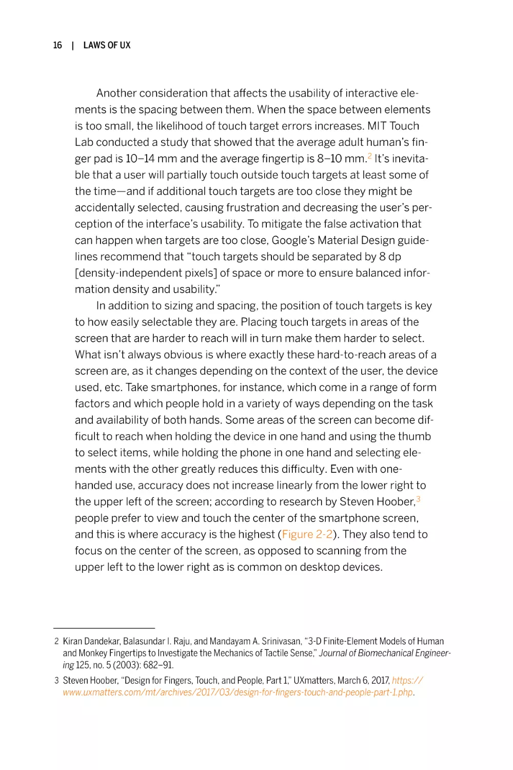
to select items, while holding the phone in one hand and selecting elements with the other greatly reduces this difficulty. Even with onehanded use, accuracy does not increase linearly from the lower right to
the upper left of the screen; according to research by Steven Hoober,3
people prefer to view and touch the center of the smartphone screen,
and this is where accuracy is the highest (Figure 2-2). They also tend to
focus on the center of the screen, as opposed to scanning from the
upper left to the lower right as is common on desktop devices.
2 Kiran Dandekar, Balasundar I. Raju, and Mandayam A. Srinivasan, “3-D Finite-Element Models of Human
and Monkey Fingertips to Investigate the Mechanics of Tactile Sense,” Journal of Biomechanical Engineering 125, no. 5 (2003): 682–91.
3 Steven Hoober, “Design for Fingers, Touch, and People, Part 1,” UXmatters, March 6, 2017, https://
www.uxmatters.com/mt/archives/2017/03/design-for-fingers-touch-and-people-part-1.php.
FITTS’S LAW
|
17
Figure 2-2. Smartphone touch accuracy
(illustration based on research by Steven Hoober)
Examples
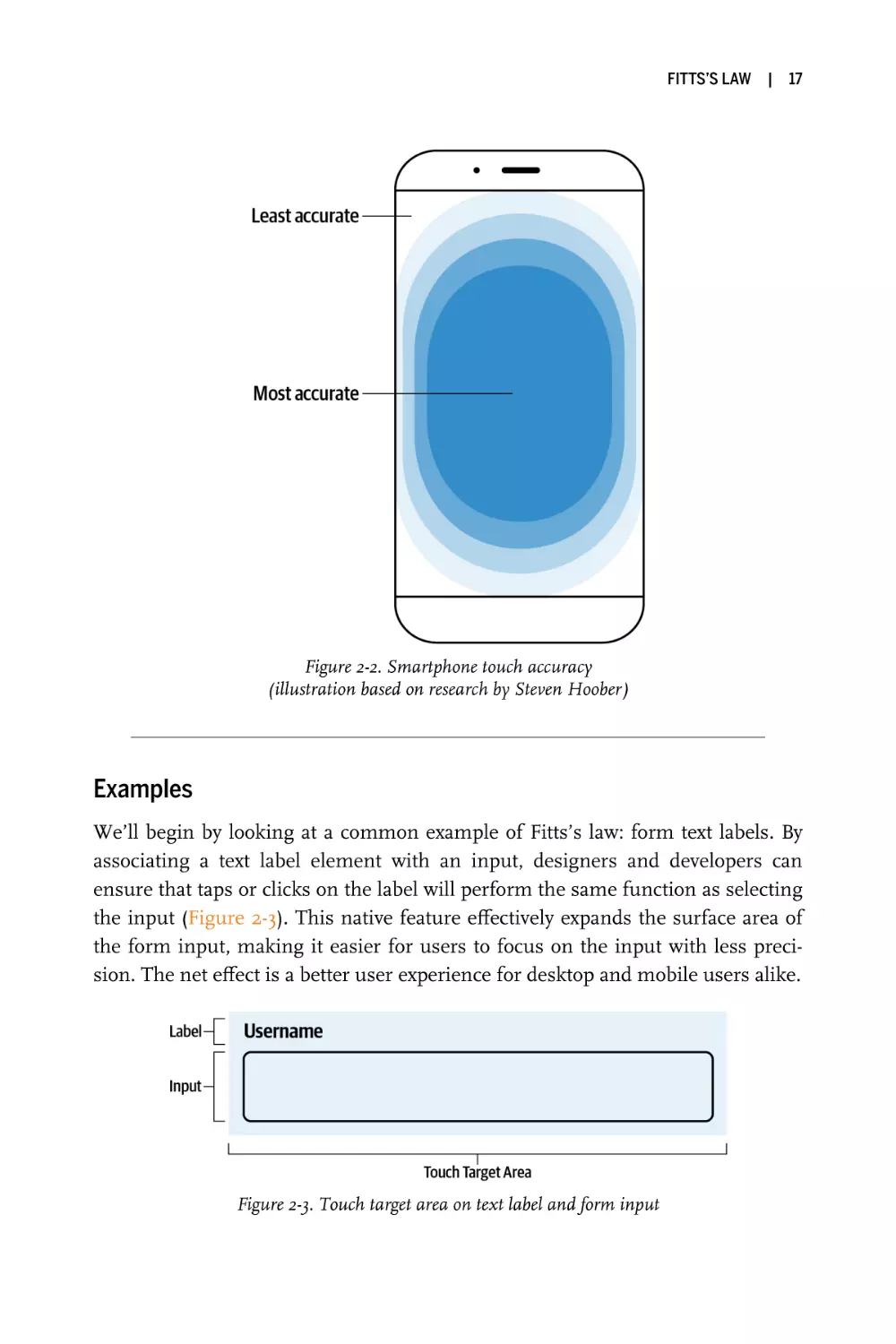
We’ll begin by looking at a common example of Fitts’s law: form text labels. By
associating a text label element with an input, designers and developers can
ensure that taps or clicks on the label will perform the same function as selecting
the input (Figure 2-3). This native feature effectively expands the surface area of
the form input, making it easier for users to focus on the input with less precision. The net effect is a better user experience for desktop and mobile users alike.
Figure 2-3. Touch target area on text label and form input
18
|
LAWS OF UX
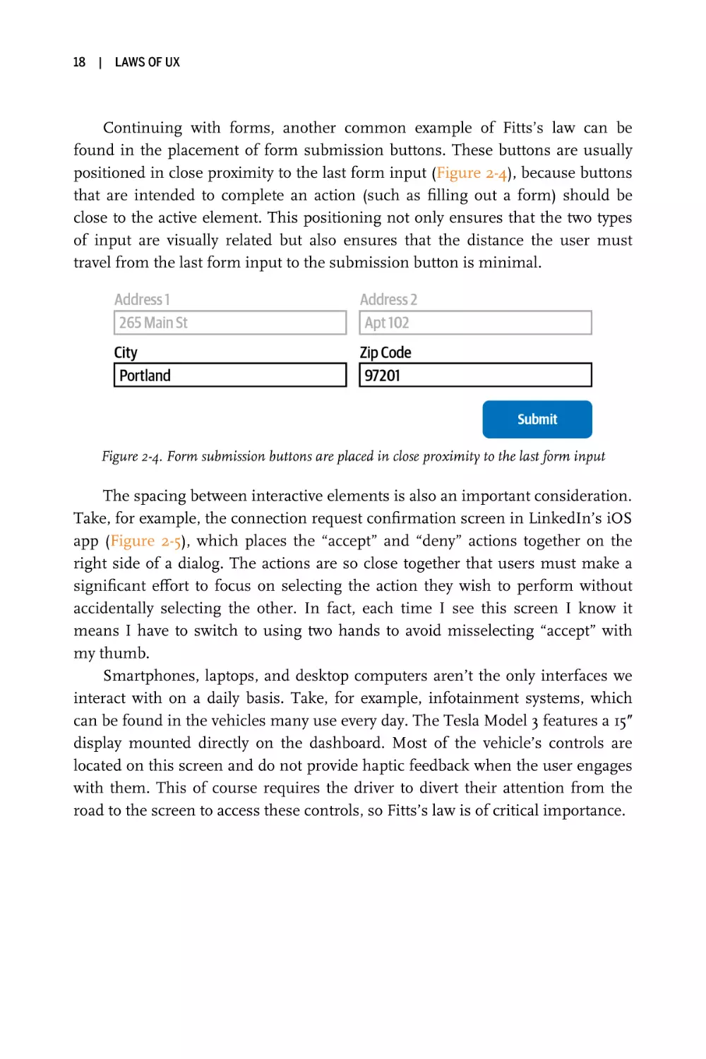
Continuing with forms, another common example of Fitts’s law can be
found in the placement of form submission buttons. These buttons are usually
positioned in close proximity to the last form input (Figure 2-4), because buttons
that are intended to complete an action (such as filling out a form) should be
close to the active element. This positioning not only ensures that the two types
of input are visually related but also ensures that the distance the user must
travel from the last form input to the submission button is minimal.
Figure 2-4. Form submission buttons are placed in close proximity to the last form input
The spacing between interactive elements is also an important consideration.
Take, for example, the connection request confirmation screen in LinkedIn’s iOS
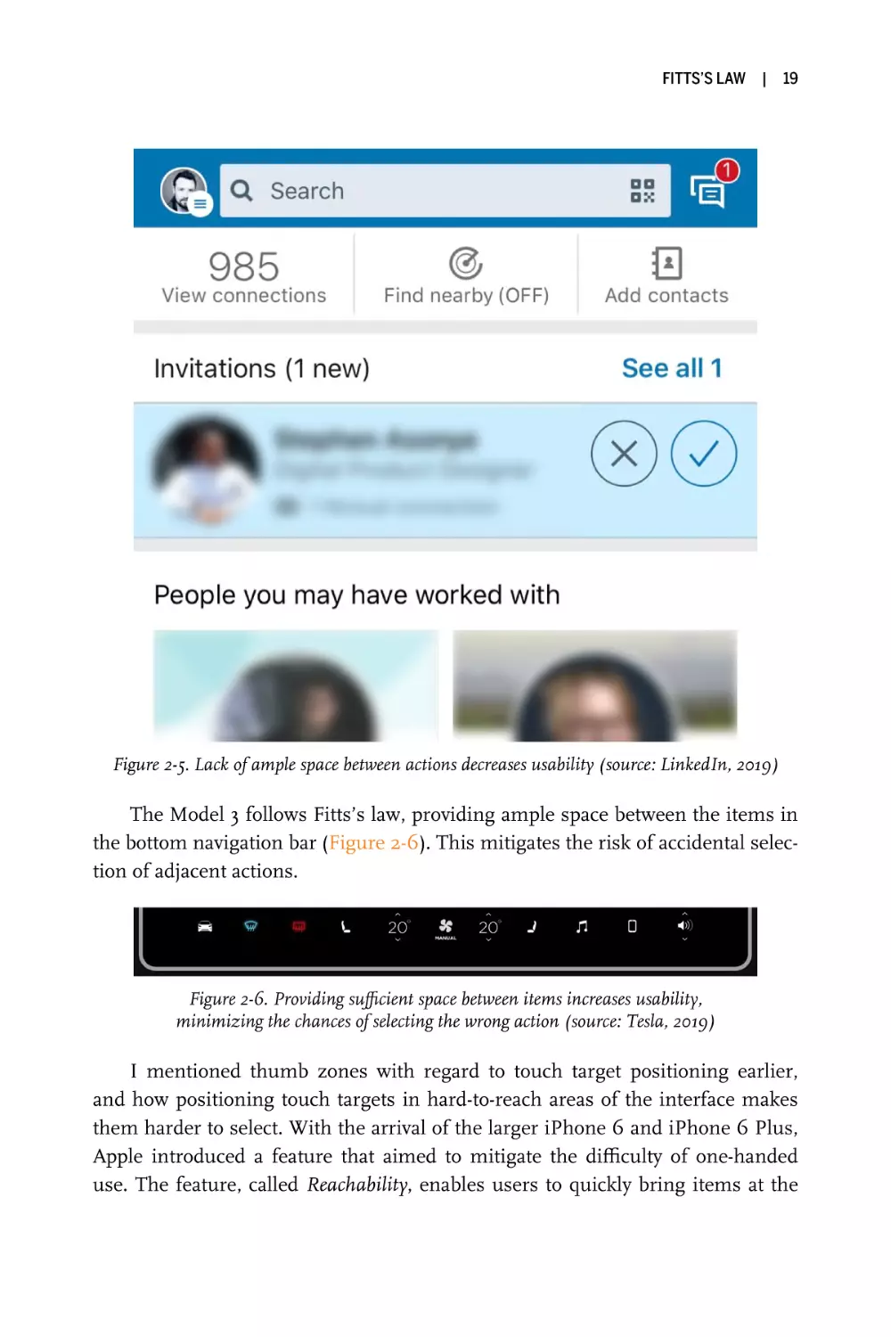
app (Figure 2-5), which places the “accept” and “deny” actions together on the
right side of a dialog. The actions are so close together that users must make a
significant effort to focus on selecting the action they wish to perform without
accidentally selecting the other. In fact, each time I see this screen I know it
means I have to switch to using two hands to avoid misselecting “accept” with
my thumb.
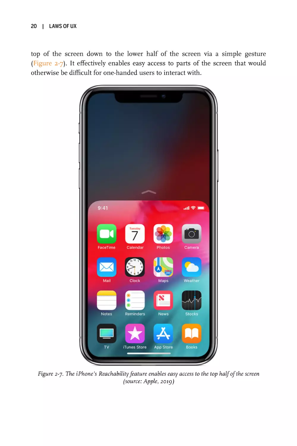
Smartphones, laptops, and desktop computers aren’t the only interfaces we
interact with on a daily basis. Take, for example, infotainment systems, which
can be found in the vehicles many use every day. The Tesla Model 3 features a 15ʺ
display mounted directly on the dashboard. Most of the vehicle’s controls are
located on this screen and do not provide haptic feedback when the user engages
with them. This of course requires the driver to divert their attention from the
road to the screen to access these controls, so Fitts’s law is of critical importance.
FITTS’S LAW
|
19
Figure 2-5. Lack of ample space between actions decreases usability (source: LinkedIn, 2019)
The Model 3 follows Fitts’s law, providing ample space between the items in
the bottom navigation bar (Figure 2-6). This mitigates the risk of accidental selection of adjacent actions.
Figure 2-6. Providing sufficient space between items increases usability,
minimizing the chances of selecting the wrong action (source: Tesla, 2019)
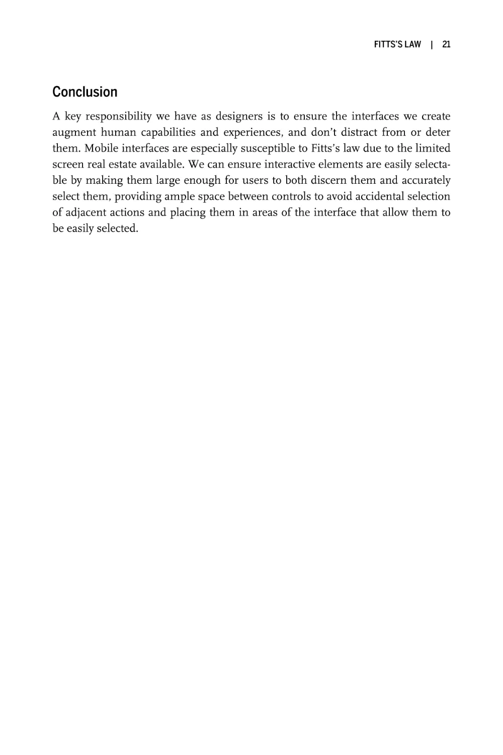
I mentioned thumb zones with regard to touch target positioning earlier,
and how positioning touch targets in hard-to-reach areas of the interface makes
them harder to select. With the arrival of the larger iPhone 6 and iPhone 6 Plus,
Apple introduced a feature that aimed to mitigate the difficulty of one-handed
use. The feature, called Reachability, enables users to quickly bring items at the
20
|
LAWS OF UX
top of the screen down to the lower half of the screen via a simple gesture
(Figure 2-7). It effectively enables easy access to parts of the screen that would
otherwise be difficult for one-handed users to interact with.
Figure 2-7. The iPhone’s Reachability feature enables easy access to the top half of the screen
(source: Apple, 2019)
FITTS’S LAW
|
21
Conclusion
A key responsibility we have as designers is to ensure the interfaces we create
augment human capabilities and experiences, and don’t distract from or deter
them. Mobile interfaces are especially susceptible to Fitts’s law due to the limited
screen real estate available. We can ensure interactive elements are easily selectable by making them large enough for users to both discern them and accurately
select them, providing ample space between controls to avoid accidental selection
of adjacent actions and placing them in areas of the interface that allow them to
be easily selected.
|
3
Hick’s Law
The time it takes to make a decision increases with the number and complexity of choices available.
Key Takeaways
• Minimize choices when response times are critical to increase
decision time.
• Break complex tasks into smaller steps in order to decrease cognitive load.
• Avoid overwhelming users by highlighting recommended options.
• Use progressive onboarding to minimize cognitive load for new
users.
• Be careful not to simplify to the point of abstraction.
Overview
One of the primary functions we have as designers is to synthesize information
and present it in a way that doesn’t overwhelm the people who use the products
and services we design. We do this because we understand, almost instinctively,
that redundancy and excessiveness create confusion. This confusion is problematic when it comes to creating products and services that feel intuitive. Instead
we should enable people to quickly and easily accomplish their goals. We risk
causing confusion when we don’t completely understand the goals and constraints of the people using the product or service. Ultimately, our objective is to
23
24
|
LAWS OF UX
understand what the user seeks to accomplish so that we can reduce or eliminate
anything that doesn’t contribute to them successfully achieving their goal(s). We
in essence strive to simplify complexity through efficiency and elegance.
What is neither efficient nor elegant is when an interface provides too many
options. This is a clear indication that those who created the product or service do
not entirely understand the needs of the user. Complexity extends beyond just
the user interface; it can be applied to processes as well. The absence of a distinctive and clear call to action, unclear information architecture, unnecessary steps,
too many choices or too much information—all of these can be obstacles to users
seeking to perform a specific task.
This observation directly relates to Hick’s law, which predicts that the time it
takes to make a decision increases with the number and complexity of choices
available. Not only is this principle fundamental to decision making, but it’s critical to how people perceive and process the user interfaces we create. We’ll look at
some examples of how this principle relates to design, but first let’s look at its
origins.
Origins
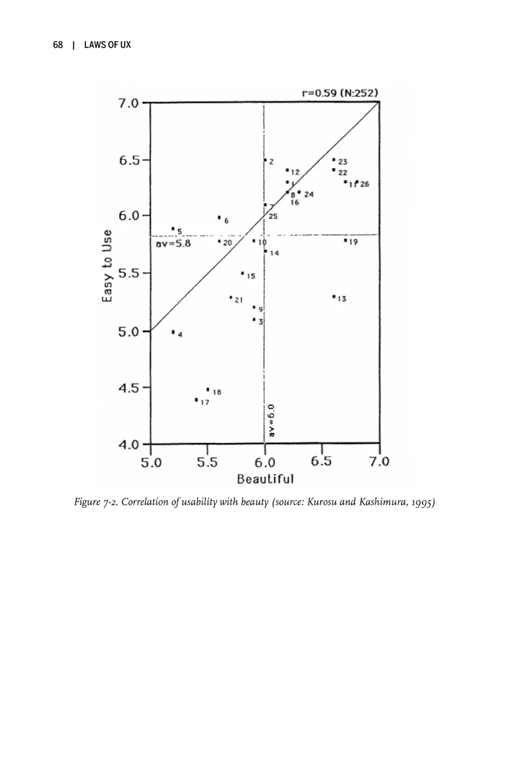
Hick’s law was formulated in 1952 by psychologists William Edmund Hick and
Ray Hyman, who were examining the relationship between the number of stimuli present and an individual’s reaction time to any given stimulus. What they
found was that increasing the number of choices available logarithmically increases decision time. In other words, people take longer to make a decision when
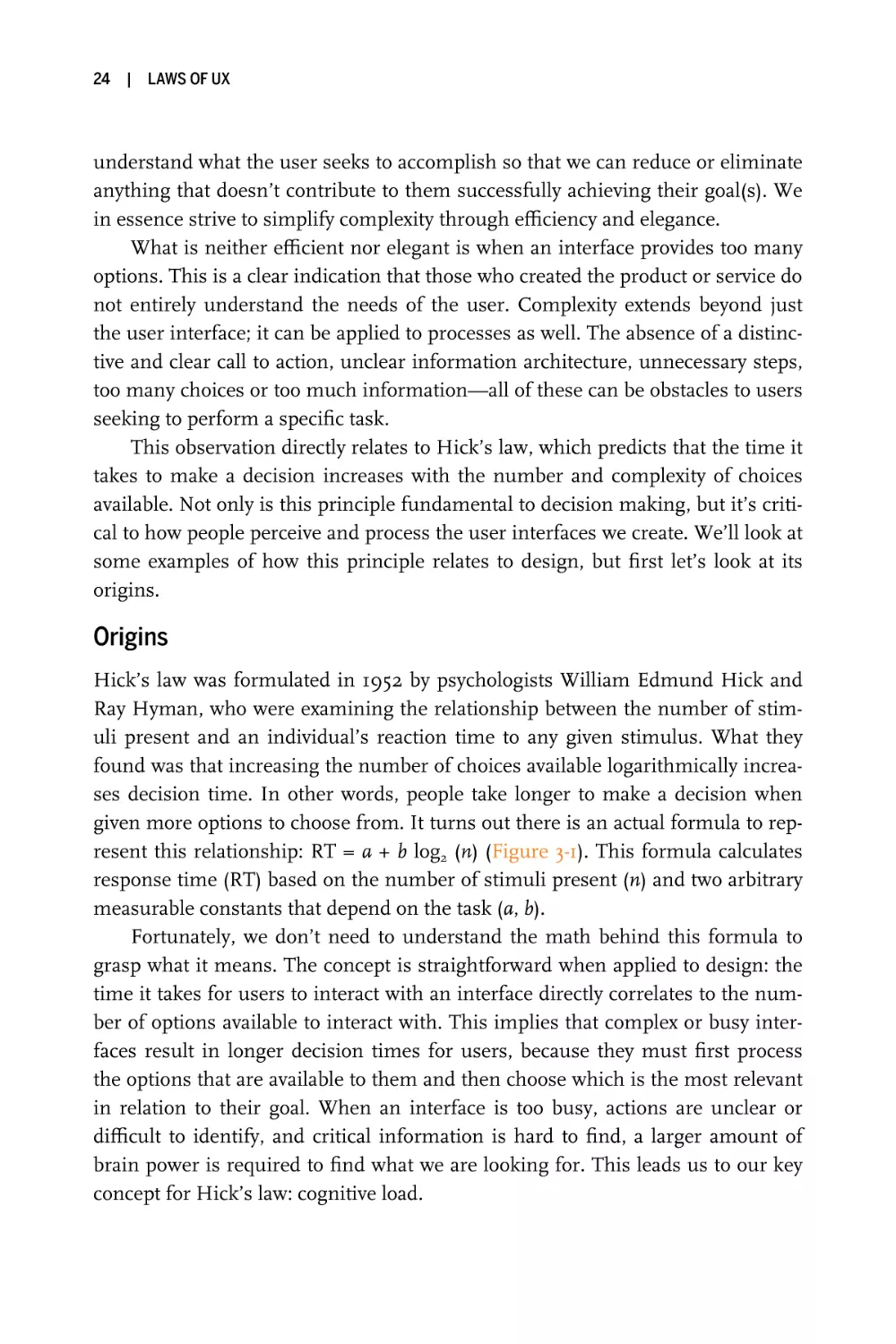
given more options to choose from. It turns out there is an actual formula to represent this relationship: RT = a + b log2 (n) (Figure 3-1). This formula calculates
response time (RT) based on the number of stimuli present (n) and two arbitrary
measurable constants that depend on the task (a, b).
Fortunately, we don’t need to understand the math behind this formula to
grasp what it means. The concept is straightforward when applied to design: the
time it takes for users to interact with an interface directly correlates to the number of options available to interact with. This implies that complex or busy interfaces result in longer decision times for users, because they must first process
the options that are available to them and then choose which is the most relevant
in relation to their goal. When an interface is too busy, actions are unclear or
difficult to identify, and critical information is hard to find, a larger amount of
brain power is required to find what we are looking for. This leads us to our key
concept for Hick’s law: cognitive load.
HICK’S LAW
Figure 3-1. Diagram representing Hick’s law
PSYCHOLOGY CONCEPT
Cognitive Load
When engaging with a digital product or service, a user must first learn
how it works and then determine how to find the information they are
looking for. Understanding how to use the navigation (or sometimes even
finding it), processing the page layout, interacting with UI elements, and
entering information into forms all require mental resources. While this
learning process is happening, the user must also maintain focus on
what they intended to do in the first place. Depending on how easy an
interface is to use, the latter can be quite a challenge. The amount of
mental resources needed to understand and interact with an interface is
known as cognitive load.
You can think of it like memory in a phone or laptop: run too many
apps and the battery begins to drain and the device slows down, or worst
of all, it crashes. The amount of processing power available determines
performance, and this depends on memory—a finite resource.
Our brains work similarly: when the amount of information coming in
exceeds the space we have available, we struggle mentally to keep up—
tasks become more difficult, details are missed, and we begin to feel
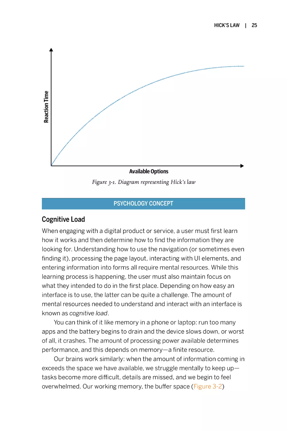
overwhelmed. Our working memory, the buffer space (Figure 3-2)
|
25
26
|
LAWS OF UX
available for storing information relevant to the current task, has a specific number of slots in which to store information. If the tasks at hand
require more space than is available, we begin to lose information from
our working memory to accommodate this new information.
Figure 3-2. Working memory buffer illustration
This becomes problematic when the information lost is critical to the
task that someone wishes to perform or is related to the information
they want to find. Tasks will become more difficult and users might start
to feel overwhelmed, ultimately leading to frustration or even task abandonment—both symptoms of a bad user experience.
Examples
Now that we have an understanding of Hick’s law and cognitive load, let’s take a
look at some examples that demonstrate this principle. There are examples of
Hick’s law in action everywhere, but we’ll start with a common one: remote
controls.
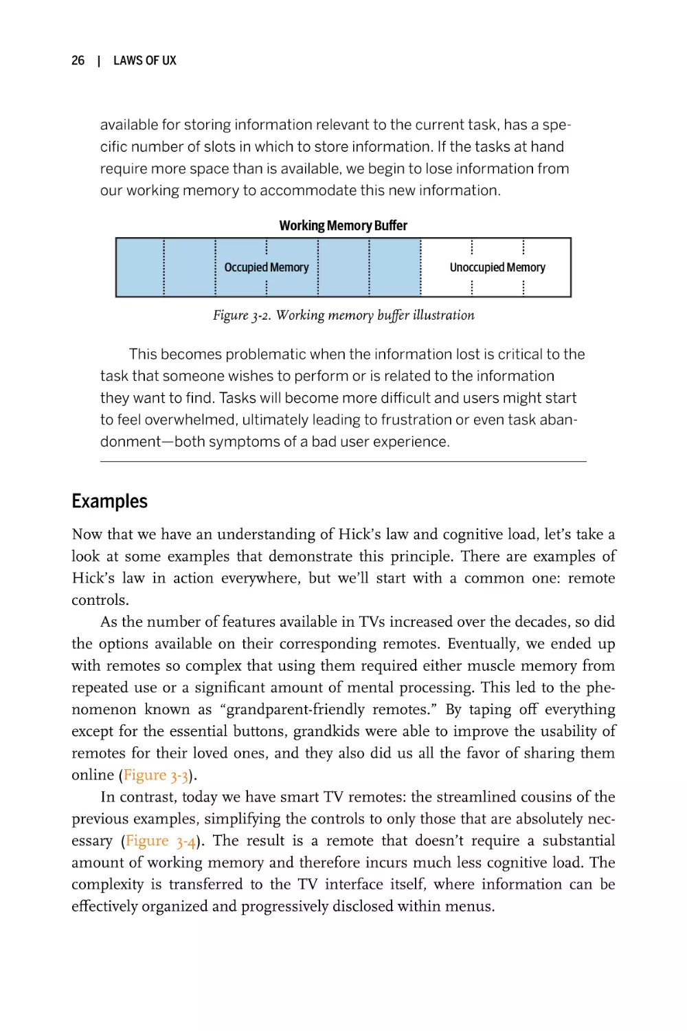
As the number of features available in TVs increased over the decades, so did
the options available on their corresponding remotes. Eventually, we ended up
with remotes so complex that using them required either muscle memory from
repeated use or a significant amount of mental processing. This led to the phenomenon known as “grandparent-friendly remotes.” By taping off everything
except for the essential buttons, grandkids were able to improve the usability of
remotes for their loved ones, and they also did us all the favor of sharing them
online (Figure 3-3).
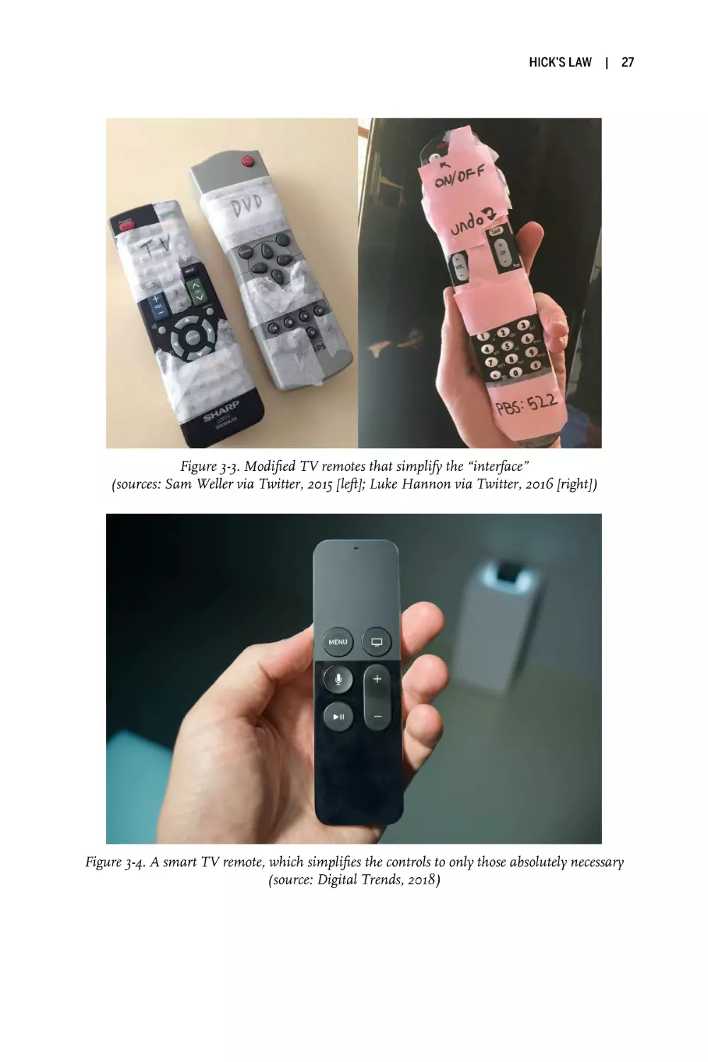
In contrast, today we have smart TV remotes: the streamlined cousins of the
previous examples, simplifying the controls to only those that are absolutely necessary (Figure 3-4). The result is a remote that doesn’t require a substantial
amount of working memory and therefore incurs much less cognitive load. The
complexity is transferred to the TV interface itself, where information can be
effectively organized and progressively disclosed within menus.
HICK’S LAW
|
27
Figure 3-3. Modified TV remotes that simplify the “interface”
(sources: Sam Weller via Twitter, 2015 [left]; Luke Hannon via Twitter, 2016 [right])
Figure 3-4. A smart TV remote, which simplifies the controls to only those absolutely necessary
(source: Digital Trends, 2018)
28
|
LAWS OF UX
Now that we’ve seen some examples of Hick’s law at work in the physical
world, let’s shift our focus to the digital. As we’ve seen already, the number of
choices available can have a direct impact on the time it takes to make a decision.
We can ensure better user experiences by providing the right choices at the right
time rather than presenting all the possible choices all the time. An excellent
example of this can be found with Google Search, which provides the varying
means of filtering results by type (all, images, videos, news, etc.) only after you’ve
begun your search (Figure 3-5). This helps to keep people focused on the more
meaningful task at hand, rather than their being overwhelmed with decisions at
the outset.
Figure 3-5. Google simplifies the initial task of searching (left) and provides the ability to filter
results only after the search has begun (right) (source: Google, 2020)
Let’s take a look at another example of Hick’s law. Onboarding is a crucial
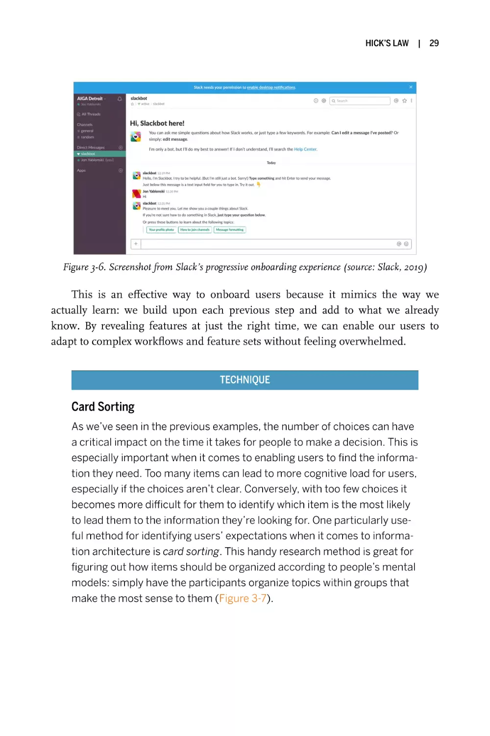
but risky process for new users, and few nail it as well as Slack (Figure 3-6).
Instead of dropping users into a fully featured app after subjecting them to a few
onboarding slides, a bot (Slackbot) is used to engage users and prompt them to
learn about the messaging features in a risk-free way. To prevent new users from
feeling overwhelmed, Slack hides all features except for the messaging input.
Once users have learned how to message with Slackbot, they are progressively
introduced to additional features.
HICK’S LAW
|
29
Figure 3-6. Screenshot from Slack’s progressive onboarding experience (source: Slack, 2019)
This is an effective way to onboard users because it mimics the way we
actually learn: we build upon each previous step and add to what we already
know. By revealing features at just the right time, we can enable our users to
adapt to complex workflows and feature sets without feeling overwhelmed.
TECHNIQUE
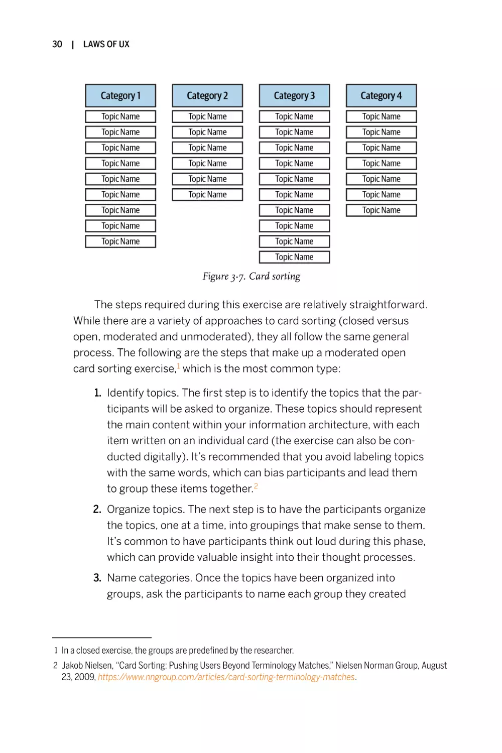
Card Sorting
As we’ve seen in the previous examples, the number of choices can have
a critical impact on the time it takes for people to make a decision. This is
especially important when it comes to enabling users to find the information they need. Too many items can lead to more cognitive load for users,
especially if the choices aren’t clear. Conversely, with too few choices it
becomes more difficult for them to identify which item is the most likely
to lead them to the information they’re looking for. One particularly useful method for identifying users’ expectations when it comes to information architecture is card sorting. This handy research method is great for
figuring out how items should be organized according to people’s mental
models: simply have the participants organize topics within groups that
make the most sense to them (Figure 3-7).
30
| LAWS OF UX
Figure 3-7. Card sorting
The steps required during this exercise are relatively straightforward.
While there are a variety of approaches to card sorting (closed versus
open, moderated and unmoderated), they all follow the same general
process. The following are the steps that make up a moderated open
card sorting exercise,1 which is the most common type:
1. Identify topics. The first step is to identify the topics that the participants will be asked to organize. These topics should represent
the main content within your information architecture, with each
item written on an individual card (the exercise can also be conducted digitally). It’s recommended that you avoid labeling topics
with the same words, which can bias participants and lead them
to group these items together.2
2. Organize topics. The next step is to have the participants organize
the topics, one at a time, into groupings that make sense to them.
It’s common to have participants think out loud during this phase,
which can provide valuable insight into their thought processes.
3. Name categories. Once the topics have been organized into
groups, ask the participants to name each group they created
1 In a closed exercise, the groups are predefined by the researcher.
2 Jakob Nielsen, “Card Sorting: Pushing Users Beyond Terminology Matches,” Nielsen Norman Group, August
23, 2009, https://www.nngroup.com/articles/card-sorting-terminology-matches.
HICK’S LAW
based on the term they think best describes it. This step is particularly valuable because it reveals what each participant’s mental
model is and will be helpful when determining what to eventually
label categories within your information architecture.
4. Debrief participants (optional). The optional but recommended
final step during an open card sorting exercise is to ask the participants to explain their rationale for each of the groupings they created. This enables you to uncover why each participant made the
decisions they did, identify any difficulties they experienced, and
gather their thoughts on any topics that might have remained
unsorted.
KEY CONSIDERATION
Oversimplification
As we’ve seen, simplifying an interface or process helps to reduce the
cognitive load for users and increases the likelihood that they’ll complete
their task and achieve their goal. But it’s also important to consider when
simplification can negatively affect the user experience—more specifically, when we simplify to the point of abstraction, and it’s no longer clear
what actions are available, what the next steps are, or where to find specific information.
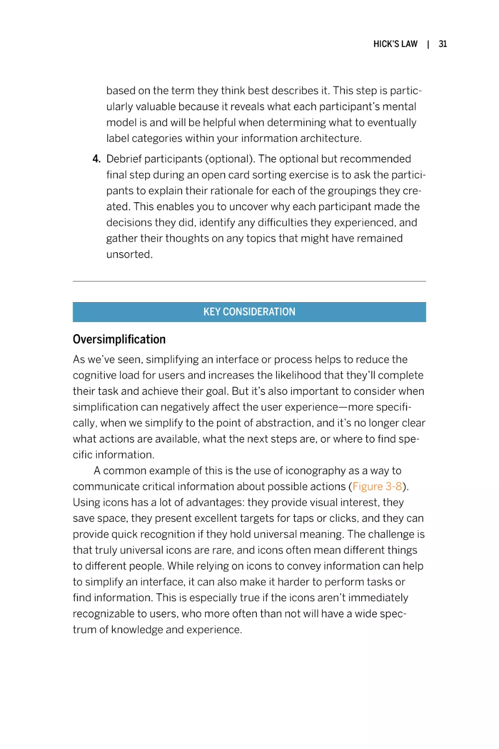
A common example of this is the use of iconography as a way to
communicate critical information about possible actions (Figure 3-8).
Using icons has a lot of advantages: they provide visual interest, they
save space, they present excellent targets for taps or clicks, and they can
provide quick recognition if they hold universal meaning. The challenge is
that truly universal icons are rare, and icons often mean different things
to different people. While relying on icons to convey information can help
to simplify an interface, it can also make it harder to perform tasks or
find information. This is especially true if the icons aren’t immediately
recognizable to users, who more often than not will have a wide spectrum of knowledge and experience.
|
31
32
|
LAWS OF UX
Figure 3-8. Screenshot of the app bar from Facebook’s iOS app
(source: Facebook, 2019)
Another complicating factor is that similar icons may be used to represent different actions or information, sometimes in complete opposition, from one product or service to another. There is no icon
standardization body that regulates what icons can be used where in
websites or apps, which means how they are used is left to the discretion
of the designers and their teams. We know that an icon can represent different things to different people, but what about when the same icon represents different actions? Since there is no standardization, the
functionality attached to an icon can vary from one digital experience to
another. Take, for example, the “heart” and “star” icons: they typically
indicate the ability to favorite, like, bookmark, or rate an item, but they
may sometimes simply indicate a featured item. Not only does the
meaning and functionality of these two icons vary across different products and services, but they also often compete with each other. This
obviously results in confusion and an increase in the cognitive load on
users, because the icons’ meaning is hard to interpret precisely.
Adding contextual clues helps users to identify the options that are
open to them and the relevance of the information available to the tasks
they wish to perform. In the case of iconography, studies have shown
that simply adding text labels to accompany icons will provide clarity and
aid users with both discovery and recognition. This practice is even more
critical when using icons for important elements such as navigation
(Figure 3-9). The addition of text labels effectively reduces the abstraction of the icons alone by including additional information to help convey
meaning and increase usability.
HICK’S LAW
|
33
Figure 3-9. Text labels accompany icons in the navigation on the Twitter web app
(source: Twitter, 2019)
Conclusion
Hick’s law is a key concept in user experience design because it’s an underlying
factor in everything we do. When an interface is too busy, actions are unclear or
difficult to identify, and critical information is hard to find, a higher cognitive
load is placed on users. Simplifying an interface or process helps to reduce the
mental strain, but we must be sure to add contextual clues to help users identify
the options available and determine the relevance of the information available to
the tasks they wish to perform. It’s important to remember that each user has a
goal, whether it’s to buy a product, understand something, or simply learn more
about the content. I find the process of reduction, or eliminating any element
that isn’t helping the user achieve their goal, a critical part of the design process.
The less they have to think about what they need to do to reach their goal, the
more likely it is they will achieve it.
We touched on the role of memory in user experience design with cognitive
load. Next up, we’ll further explore memory and its importance with Miller’s law.
|
4
Miller’s Law
The average person can keep only 7 (± 2) items in their working memory.
Key Takeaways
• Don’t use the “magical number seven” to justify unnecessary
design limitations.
• Organize content into smaller chunks to help users process,
understand, and memorize easily.
• Remember that short-term memory capacity will vary per individual, based on their prior knowledge and situational context.
Overview
It’s likely that many designers will have heard of Miller’s law, but there is also a
high probability that their understanding of it is inaccurate. This commonly misunderstood heuristic has frequently been cited as justification for design decisions such as “the number of navigation items must be limited to no more than
seven” and so forth. While there is value in limiting the number of options available to users (see Chapter 3), it is misleading and inaccurate to attribute such
dogma to Miller’s law. In this chapter, we’ll explore the origins of Miller’s “magical number seven” and the real value Miller’s law has to provide UX designers.
35
36
|
LAWS OF UX
Origins
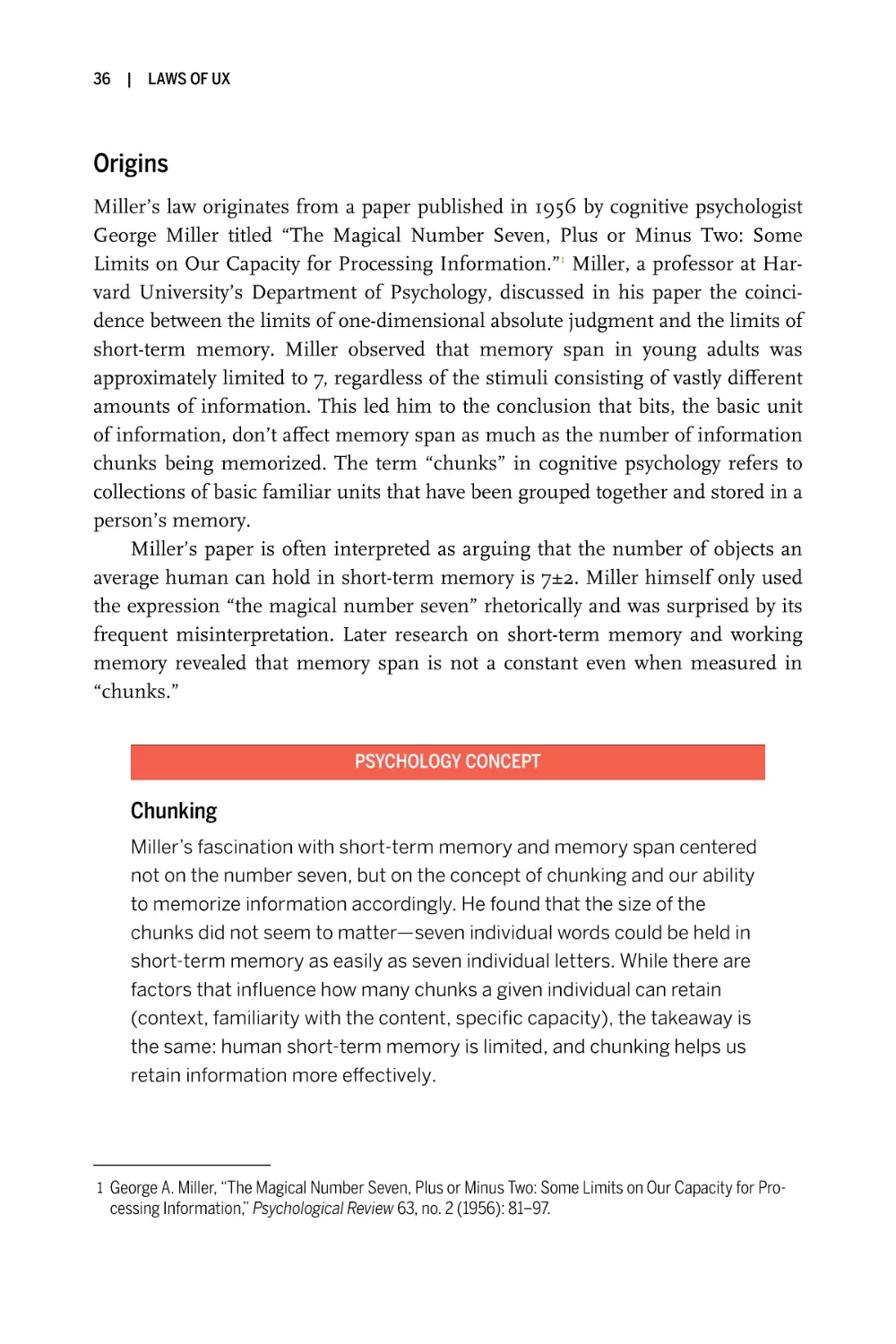
Miller’s law originates from a paper published in 1956 by cognitive psychologist
George Miller titled “The Magical Number Seven, Plus or Minus Two: Some
Limits on Our Capacity for Processing Information.”1 Miller, a professor at Harvard University’s Department of Psychology, discussed in his paper the coincidence between the limits of one-dimensional absolute judgment and the limits of
short-term memory. Miller observed that memory span in young adults was
approximately limited to 7, regardless of the stimuli consisting of vastly different
amounts of information. This led him to the conclusion that bits, the basic unit
of information, don’t affect memory span as much as the number of information
chunks being memorized. The term “chunks” in cognitive psychology refers to
collections of basic familiar units that have been grouped together and stored in a
person’s memory.
Miller’s paper is often interpreted as arguing that the number of objects an
average human can hold in short-term memory is 7±2. Miller himself only used
the expression “the magical number seven” rhetorically and was surprised by its
frequent misinterpretation. Later research on short-term memory and working
memory revealed that memory span is not a constant even when measured in
“chunks.”
PSYCHOLOGY CONCEPT
Chunking
Miller’s fascination with short-term memory and memory span centered
not on the number seven, but on the concept of chunking and our ability
to memorize information accordingly. He found that the size of the
chunks did not seem to matter—seven individual words could be held in
short-term memory as easily as seven individual letters. While there are
factors that influence how many chunks a given individual can retain
(context, familiarity with the content, specific capacity), the takeaway is
the same: human short-term memory is limited, and chunking helps us
retain information more effectively.
1 George A. Miller, “The Magical Number Seven, Plus or Minus Two: Some Limits on Our Capacity for Pro-
cessing Information,” Psychological Review 63, no. 2 (1956): 81–97.
MILLER’S LAW
|
37
When applied to UX design, chunking informs an incredibly valuable
approach to content. When we chunk content in design, we are effectively making it easier to comprehend. Users can then scan the content,
identify the information that aligns with their goal(s), and consume that
information to achieve their goal(s) more quickly. By structuring content
into visually distinct groups with a clear hierarchy, we can align the information we present with how people evaluate and process digital content.
Next, we’ll take a look at a few ways this can be achieved.
Examples
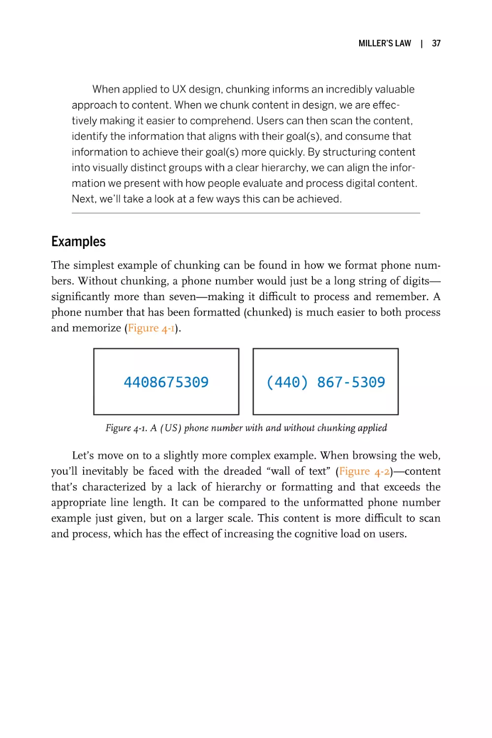
The simplest example of chunking can be found in how we format phone numbers. Without chunking, a phone number would just be a long string of digits—
significantly more than seven—making it difficult to process and remember. A
phone number that has been formatted (chunked) is much easier to both process
and memorize (Figure 4-1).
Figure 4-1. A (US) phone number with and without chunking applied
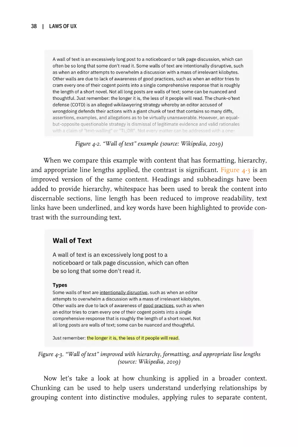
Let’s move on to a slightly more complex example. When browsing the web,
you’ll inevitably be faced with the dreaded “wall of text” (Figure 4-2)—content
that’s characterized by a lack of hierarchy or formatting and that exceeds the
appropriate line length. It can be compared to the unformatted phone number
example just given, but on a larger scale. This content is more difficult to scan
and process, which has the effect of increasing the cognitive load on users.
38
|
LAWS OF UX
Figure 4-2. “Wall of text” example (source: Wikipedia, 2019)
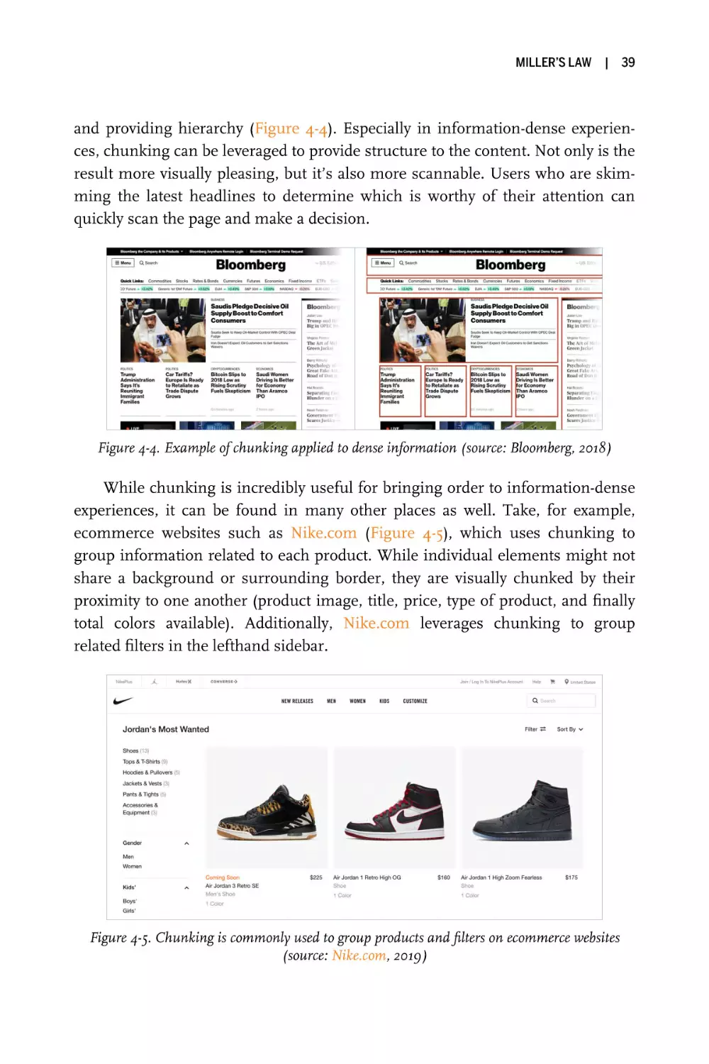
When we compare this example with content that has formatting, hierarchy,
and appropriate line lengths applied, the contrast is significant. Figure 4-3 is an
improved version of the same content. Headings and subheadings have been
added to provide hierarchy, whitespace has been used to break the content into
discernable sections, line length has been reduced to improve readability, text
links have been underlined, and key words have been highlighted to provide contrast with the surrounding text.
Figure 4-3. “Wall of text” improved with hierarchy, formatting, and appropriate line lengths
(source: Wikipedia, 2019)
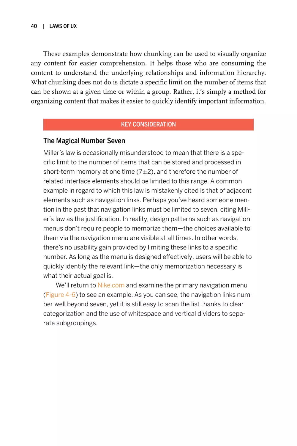
Now let’s take a look at how chunking is applied in a broader context.
Chunking can be used to help users understand underlying relationships by
grouping content into distinctive modules, applying rules to separate content,
MILLER’S LAW
|
39
and providing hierarchy (Figure 4-4). Especially in information-dense experiences, chunking can be leveraged to provide structure to the content. Not only is the
result more visually pleasing, but it’s also more scannable. Users who are skimming the latest headlines to determine which is worthy of their attention can
quickly scan the page and make a decision.
Figure 4-4. Example of chunking applied to dense information (source: Bloomberg, 2018)
While chunking is incredibly useful for bringing order to information-dense
experiences, it can be found in many other places as well. Take, for example,
ecommerce websites such as Nike.com (Figure 4-5), which uses chunking to
group information related to each product. While individual elements might not
share a background or surrounding border, they are visually chunked by their
proximity to one another (product image, title, price, type of product, and finally
total colors available). Additionally, Nike.com leverages chunking to group
related filters in the lefthand sidebar.
Figure 4-5. Chunking is commonly used to group products and filters on ecommerce websites
(source: Nike.com, 2019)
40
|
LAWS OF UX
These examples demonstrate how chunking can be used to visually organize
any content for easier comprehension. It helps those who are consuming the
content to understand the underlying relationships and information hierarchy.
What chunking does not do is dictate a specific limit on the number of items that
can be shown at a given time or within a group. Rather, it’s simply a method for
organizing content that makes it easier to quickly identify important information.
KEY CONSIDERATION
The Magical Number Seven
Miller’s law is occasionally misunderstood to mean that there is a specific limit to the number of items that can be stored and processed in
short-term memory at one time (7±2), and therefore the number of
related interface elements should be limited to this range. A common
example in regard to which this law is mistakenly cited is that of adjacent
elements such as navigation links. Perhaps you’ve heard someone mention in the past that navigation links must be limited to seven, citing Miller’s law as the justification. In reality, design patterns such as navigation
menus don’t require people to memorize them—the choices available to
them via the navigation menu are visible at all times. In other words,
there’s no usability gain provided by limiting these links to a specific
number. As long as the menu is designed effectively, users will be able to
quickly identify the relevant link—the only memorization necessary is
what their actual goal is.
We’ll return to Nike.com and examine the primary navigation menu
(Figure 4-6) to see an example. As you can see, the navigation links number well beyond seven, yet it is still easy to scan the list thanks to clear
categorization and the use of whitespace and vertical dividers to separate subgroupings.
MILLER’S LAW
|
41
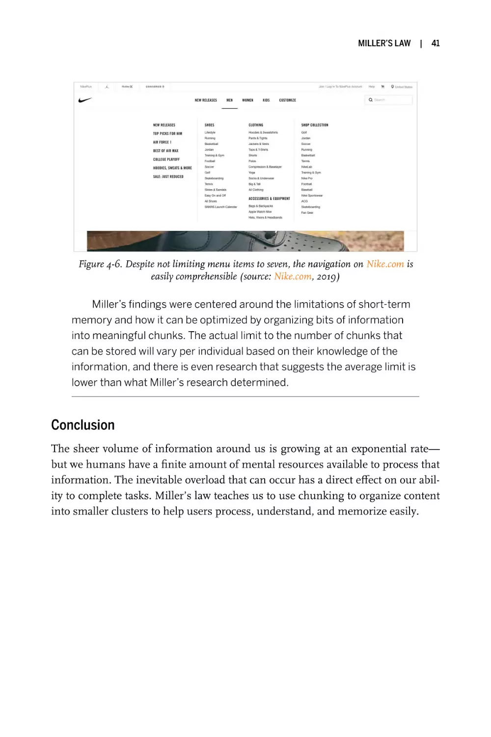
Figure 4-6. Despite not limiting menu items to seven, the navigation on Nike.com is
easily comprehensible (source: Nike.com, 2019)
Miller’s findings were centered around the limitations of short-term
memory and how it can be optimized by organizing bits of information
into meaningful chunks. The actual limit to the number of chunks that
can be stored will vary per individual based on their knowledge of the
information, and there is even research that suggests the average limit is
lower than what Miller’s research determined.
Conclusion
The sheer volume of information around us is growing at an exponential rate—
but we humans have a finite amount of mental resources available to process that
information. The inevitable overload that can occur has a direct effect on our ability to complete tasks. Miller’s law teaches us to use chunking to organize content
into smaller clusters to help users process, understand, and memorize easily.
|
5
Postel’s Law
Be conservative in what you do, be liberal in what you accept from others.
Key Takeaways
• Be empathetic to, flexible about, and tolerant of any of the various
actions the user could take or any input they might provide.
• Anticipate virtually anything in terms of input, access, and capability while providing a reliable and accessible interface.
• The more we can anticipate and plan for in design, the more resilient the design will be.
• Accept variable input from users, translating that input to meet
your requirements, defining boundaries for input, and providing
clear feedback to the user.
Overview
Designing good user experiences means designing good human experiences.
People don’t behave like machines: we are sometimes inconsistent, frequently
distracted, occasionally error-prone, and usually driven by emotion. We expect
the products and services we interact with to intuitively understand us and be forgiving. We expect to feel in control at all times, and we’re generally annoyed
when asked to provide more information than is necessary. At the same time, the
devices and software we use vary greatly in terms of feature support, capabilities,
and form factors. To be capable of meeting users’ expectations, the products and
43
44
|
LAWS OF UX
services designers build must be robust and adaptable. Postel’s law, also known
as the robustness principle, gives us a guiding principle for designing humancentric experiences that account for both scale and complexity.
The first half of Postel’s law states that you should “be conservative in what
you do.” In the context of design this can be interpreted as stipulating that the
output of our efforts, whether that’s an interface or a comprehensive system,
should be reliable and accessible. These are important characteristics of a digital
product or service, because not only must the interface be easy to use, but it must
be easy to use for the largest spectrum of users possible. This means that anyone,
regardless of device size, feature support, input mechanism, assistive technology,
or even connection speed, should be served something that works.
The second half of the principle states that you should “be liberal in what you
accept from others.” In the context of design, this can be taken to mean the
acceptance of input from users via any input mechanism and in a variety of possible formats. It applies to data entered into a form via mouse and keyboard (or
perhaps keyboard only), assistive technology, touch and gesture input from
mobile users, and even voice input in all its variations of language, dialect, and
nomenclature. It applies to screens of any size and resolution, from a watch
interface all the way up to a TV. It encompasses differences in network bandwidth, connection strength, and any other possible variation.
In this chapter, we’ll take a close look at some examples of Postel’s law in
action and how designers can leverage this principle to design products and services that adapt to how people actually are.
Origins
Jon Postel was an American computer scientist who made significant contributions to the underlying protocols that would come to form the internet. One of
these contributions was an early implementation of the Transmission Control
Protocol (TCP), the foundation on which data is sent and received over a network. In this specification Postel introduced what he called the robustness principle, which stated that “TCP implementations will follow a general principle of
robustness: be conservative in what you do, be liberal in what you accept from
others.”1 The idea was that programs that send data (either to other machines or
to different programs on the same machine) should conform to specifications,
1 Jon Postel, “RFC 793: Transmission Control Protocol,” September 1981, https://www.rfc-editor.org/rfc/
rfc793.
POSTEL’S LAW
|
45
while programs that receive data should be robust enough to accept and parse
nonconformant input, as long as the meaning is clear.
Postel’s principle was originally intended to be a guideline for network engineering, specifically in regard to the transfer of data across computer networks.
The fault tolerance introduced by the robustness principle helped to ensure
nodes on the early internet could communicate reliably, but its influence extends
beyond just computer network engineering—software architecture has also been
influenced by this principle. Take, for example, declarative languages such as
HTML and CSS. Their loose error handling means that problems like authoring
mistakes or lack of browser support for specific features are handled gracefully
by the browser. If the browser doesn’t understand something, it simply ignores
it and moves on. This has lent an amazing amount of flexibility to these languages—flexibility that led to their dominance on the internet stage.
The philosophy outlined in Postel’s law can also be applied to user experience design and how we deal with user input and system output. As I mentioned
earlier, designing good user experiences means designing good human experiences. Since humans and computers communicate and process information in fundamentally different ways, it’s the responsibility of design to bridge the
communication gap. Let’s take a look at some examples to see how this can be
done.
Examples
Postel’s law describes an approach to design that’s more akin to the philosophy
of human–computer interaction: we should anticipate virtually anything in terms
of input, access, and capability while providing a reliable and accessible interface.
There are countless examples that demonstrate this philosophical approach, but
we’ll begin with one that is ubiquitous in the digital world: input forms. Forms
have long been a primary means for people to provide information to systems in
the digital space. In essence, they are the medium through which humans and
systems interact: a product or service requires information, and the user provides
that information by way of form elements that are submitted for processing.
Using Postel’s law as a guide in regard to forms, the first consideration is to
be conservative in how much information you ask people to provide. The more
fields you require users to fill out, the more cognitive energy and effort you’re
asking of them, which can lead to a deterioration in the quality of the decisions
made (commonly referred to as decision fatigue) and reduce the likelihood that
they’ll complete the form. By asking only for what’s absolutely necessary and not
46
|
LAWS OF UX
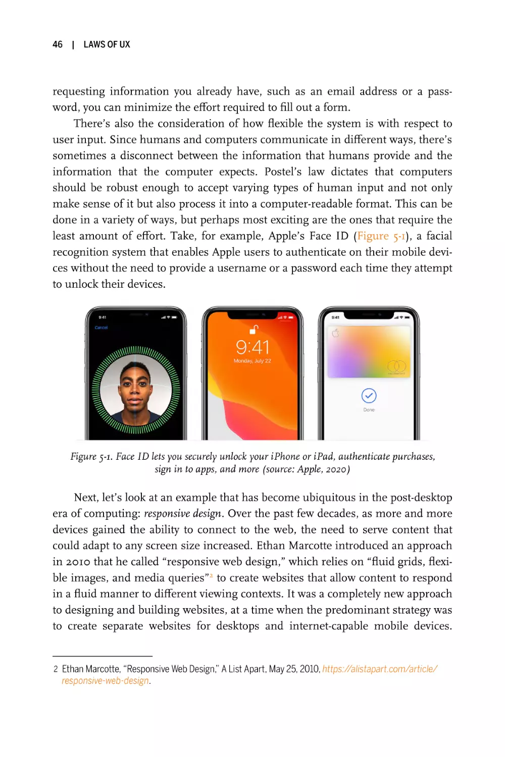
requesting information you already have, such as an email address or a password, you can minimize the effort required to fill out a form.
There’s also the consideration of how flexible the system is with respect to
user input. Since humans and computers communicate in different ways, there’s
sometimes a disconnect between the information that humans provide and the
information that the computer expects. Postel’s law dictates that computers
should be robust enough to accept varying types of human input and not only
make sense of it but also process it into a computer-readable format. This can be
done in a variety of ways, but perhaps most exciting are the ones that require the
least amount of effort. Take, for example, Apple’s Face ID (Figure 5-1), a facial
recognition system that enables Apple users to authenticate on their mobile devices without the need to provide a username or a password each time they attempt
to unlock their devices.
Figure 5-1. Face ID lets you securely unlock your iPhone or iPad, authenticate purchases,
sign in to apps, and more (source: Apple, 2020)
Next, let’s look at an example that has become ubiquitous in the post-desktop
era of computing: responsive design. Over the past few decades, as more and more
devices gained the ability to connect to the web, the need to serve content that
could adapt to any screen size increased. Ethan Marcotte introduced an approach
in 2010 that he called “responsive web design,” which relies on “fluid grids, flexible images, and media queries”2 to create websites that allow content to respond
in a fluid manner to different viewing contexts. It was a completely new approach
to designing and building websites, at a time when the predominant strategy was
to create separate websites for desktops and internet-capable mobile devices.
2 Ethan Marcotte, “Responsive Web Design,” A List Apart, May 25, 2010, https://alistapart.com/article/
responsive-web-design.
POSTEL’S LAW
|
47
Responsive web design pushed designers beyond creating device-specific experiences and toward an approach that embraced the fluid nature of the web. The
growing capability of Cascading Style Sheets (CSS) enabled designers to define
how content could flexibly adapt to any viewing context, be it an internet-capable
smartwatch, smartphone, gaming console, laptop, desktop computer, or TV
(Figure 5-2). Today responsive web design is the de facto standard when creating
web experiences, and it embodies the philosophy of accepting a broad spectrum
of input while providing output that is reliably adaptable and not quarantined to
specific dimensions or devices.
Figure 5-2. Responsive web design embraces the fluid nature of the web
Progressive enhancement, which describes a strategy for web design focusing
on content and gradual layering of styling and interaction, can also be considered
an example of Postel’s law. First introduced by Steve Champeon and Nick Finck
at SXSW in 2003 in a presentation titled “Inclusive Web Design For the Future”,
this strategy emphasizes access to the basic content and functionality for all
users, regardless of browser feature support, device features and capabilities, or
internet connection speed. Additional style and interaction layers are progressively added as feature support and capabilities are detected, ensuring that people
with newer browsers, more advanced devices, or faster connections receive a
more enhanced experience without obscuring the core content. It’s an approach
that stands in contrast to a previous strategy known as “graceful degradation,”
which places emphasis on fault tolerance and focuses first on the more advanced
software and hardware while providing a fallback for others.
48
|
LAWS OF UX
Progressive enhancement’s strength centers around its ability to liberally
accept any range of browser feature support, any level of device capability support, and any connection speed and to conservatively layer enhancements while
preserving the core content, thus enabling universal access for everyone. Take,
for example, a simple search box, which provides the ability for anyone to select it
and enter a search query but is enhanced to support voice input for devices that
support voice recognition (Figure 5-3). Everyone will get a default search box initially, and it will be usable by everyone, including those using assistive technology such as screen readers. If voice recognition support is detected, a layer of
functional enhancement is added by allowing the user to select the microphone
icon to invoke a voice assistant that will transcribe speech to text, thereby extending the input methods of the search box without taking away from its core
functionality.
Figure 5-3. A progressively enhanced search component that provides a search box by default,
and then voice support for devices that support voice recognition
Examples of Postel’s law aren’t limited to interfaces—they can also be found
in our processes. Take, for example, design systems, which are collections of
reusable components and patterns guided by standards that define how they are
used. The goal of a design system is to enable these components and patterns to
be assembled to build any number of applications and to provide a framework for
ensuring the extensibility of designs. These tools have proven incredibly valuable,
enabling companies to scale design in a consistent manner across the organization (Figure 5-4). To create an effective design system, organizations must be liberal in terms of what is accepted: everything from design, content, and code to
strategy, opinions, and criticism may be provided by a diverse team of contributors. In contrast, the output of the design system is conservative: guidelines,
components, patterns, and principles must all be clear and purposeful.
POSTEL’S LAW
|
49
Figure 5-4. Design systems have enabled design to scale in a manageable and consistent manner
within a number of well-known companies—pictured here, from left to right, are Carbon Design
System by IBM, Lightning Design System by Salesforce, and Polaris by Shopify
(source: IBM, Salesforce, Shopify, 2020)
KEY CONSIDERATION
Design Resiliency
The input that users provide to a system is variable and may span a wide
spectrum. Therefore, to ensure a better user experience, we should
design systems that are liberal in their acceptance of input. However, this
also means there is an increased opportunity for things to go wrong, or to
at least result in a less than ideal user experience. The more we can
anticipate and plan for in design, the more resilient the design will be.
Take, for example, the topic of internationalization. The same text
string can span different lengths, depending on the language. Many
designers plan only for their native language, while not accounting for
text expansion in other languages that could result in a considerable
increase in length. English, a very compact language, contains words that
can expand up to 300% when translated into a less compact language
such as Italian (Figure 5-5). Text orientation can also vary per region of
the world—from left-to-right in many Western countries to right-to-left or
even vertical in others. By designing with these variations in mind, we can
create more robust designs that can adapt to varying text string lengths
and text orientations.
50
| LAWS OF UX
Figure 5-5. Text expansion from English (left) to Italian (right) (source: w3.org)
Another example is the default font size, which the user can customize both on mobile devices and in browsers. The purpose of this feature is
to give the user control over the display, typically by increasing the size of
all text throughout an application or website and thereby improving its
accessibility. However, this can cause problems in designs that don’t
account for the possibility of the text size increasing—specifically, how it
affects layout and the space available for text. Adaptable designs
account for this feature and have a graceful response. Take, for example,
Amazon, which does a great job of responding to font size customization
in its website header navigation (Figure 5-6). The design accounts for the
possibility of minimum font size customization by organizing the quick
links below the search bar by importance and removing the links of lesser
importance as the font size increases.
Figure 5-6. Amazon.com adapting to minimum font size customization
(source: Amazon, 2019)
POSTEL’S LAW
|
51
Conclusion
Postel’s law can help us bridge the gap between human and machine. By designing systems that liberally accept variable human input and translate it into a
structured, machine-friendly output, we transfer this burden away from users
and therefore ensure a more human user experience. This allows us to build the
products and services that are robust and adaptable to fit the needs of growing
scale and complexity. While it also means there is an increased opportunity for
things to go wrong, we can anticipate and plan for this in design and thus ensure
our work is more resilient.
|
6
Peak–End Rule
People judge an experience largely based on how they felt at its peak and
at its end, rather than on the total sum or average of every moment of the
experience.
Key Takeaways
• Pay close attention to the most intense points and the final
moments (the “end”) of the user journey.
• Identify the moments when your product is most helpful, valuable,
or entertaining and design to delight the end user.
• Remember that people recall negative experiences more vividly
than positive ones.
Overview
An interesting thing happens when we recollect a past event. Instead of considering the entire duration of the experience, we tend to focus on an emotional peak
and on the end, regardless of whether those moments were positive or negative.
In other words, we remember each of our life experiences as a series of representative snapshots rather than a comprehensive timeline of events. Our feelings
during the most emotionally intense moments and at the end are averaged in our
minds and heavily influence how we assess the overall experience to determine
whether we’d be willing to do it again or recommend it to others. This observation, known as the peak–end rule, strongly suggests we should pay close
53
54
|
LAWS OF UX
attention to these critical moments to ensure users evaluate an overall experience
positively.
Origins
Evidence for the peak–end rule was first explored in the 1993 paper “When More
Pain Is Preferred to Less: Adding a Better End” by Daniel Kahneman et al.1 They
conducted an experiment in which participants were subjected to two different
versions of a single unpleasant experience. The first trial involved participants
submerging a hand in 14°C water (roughly 57°F) for 60 seconds. The second trial
involved participants submerging the other hand in 14°C water for 60 seconds
and then keeping it submerged for an additional 30 seconds as the water was
warmed to 15°C. When given the choice of which experience they would repeat,
participants were more willing to repeat the second trial, despite it being a longer
exposure to the uncomfortable water temperatures. The conclusion by the
authors was that the participants chose the longer trial simply because they preferred the memory of it in comparison to the first trial.
Subsequent studies would corroborate this conclusion, beginning with a
1996 study by Kahneman and Redelmeier2 that found that colonoscopy or lithotripsy patients consistently evaluated the discomfort of their experience based on
the intensity of pain at the worst and final moments, regardless of length or variation in intensity of pain within the procedure. A later study by the same
researchers3 expanded on this by randomly dividing patients into two groups: one
that underwent a typical colonoscopy, and another that underwent the same procedure in addition to having the tip of the scope left in for three extra minutes
without inflation or suction. When asked afterward which they preferred,
patients who underwent the longer procedure experienced the final moments as
less painful, rated their overall experience as less unpleasant, and ranked the procedure as less aversive in comparison to the other participants. Additionally,
those that underwent the longer procedure were more likely to return for
1 Daniel Kahneman, Barbara L. Fredrickson, Charles A. Schreiber, and Donald A. Redelmeier, “When More
Pain Is Preferred to Less: Adding a Better End,” Psychological Science 4, no. 6 (1993): 401–5.
2 Donald A.Redelmeier and Daniel Kahneman, “Patients’ Memories of Painful Medical Treatments: Real-
Time and Retrospective Evaluations of Two Minimally Invasive Procedures,” Pain 66, no. 1 (1996): 3–8.
3 Donald A. Redelmeier, Joel Katz, and Daniel Kahneman, “Memories of Colonoscopy: A Randomized Trial,”
Pain 104, no. 1–2 (2003): 187–94.
PEAK–END RULE
|
55
subsequent procedures—a result of these participants judging the experience
positively because of the less painful end.
PSYCHOLOGY CONCEPT
Cognitive Biases
To understand the peak–end rule, it is helpful to have an understanding
of cognitive biases. The topic warrants an entire book of its own, but here
I’ll just give a brief introduction in the context of the peak–end rule.
Cognitive biases are systematic errors of thinking or rationality in
judgment that influence our perception of the world and our decisionmaking ability. First introduced by Amos Tversky and Daniel Kahneman
in 1972,4 these mental shortcuts increase our efficiency by enabling us to
make quick decisions without the need to thoroughly analyze a situation.
Instead of constantly becoming paralyzed by the process of mental
examination every time we must make a decision, we can rely on these
unconscious automatic responses to help expedite things, engaging in
heavier mental processing only when necessary. However, cognitive biases can also distort our thinking and perception, ultimately leading to
inaccurate judgment and poor decisions.
Perhaps you’ve tried to have a logical discussion about a polarizing
hot-button issue with someone else, only to discover it was incredibly difficult. The underlying reason for this can quite often be attributed to the
fact that we attempt to preserve our existing beliefs by paying attention
to information that confirms those beliefs and discounting information
that challenges them. This is known as confirmation bias: a bias of belief
in which people tend to seek out, interpret, and recall information in a
way that confirms their preconceived notions and ideas. This is but one
of many common biases humans are susceptible to on a daily basis.
The peak–end rule, also a cognitive bias, is known as a memory bias
because it impairs the recall of a memory. We remember intensely emotional events more than less emotional events, and this has an effect on
how we perceive an experience: we recall not the sum of how we felt
4 Daniel Kahneman and Amos Tversky, “Subjective Probability: A Judgment of Representativeness,” Cognitive
Psychology 3, no. 3 (1972): 430–54.
56
|
LAWS OF UX
throughout the experience but the average of how we felt during its peak
emotional moments and at its end.
The peak–end rule is related to another cognitive bias known as the
recency effect, which states that items near the end of a sequence are
the easiest to recall.
Examples
One company that demonstrates proficiency in understanding how emotion
impacts user experience is Mailchimp. The process of creating an email campaign can be quite stressful, but Mailchimp knows how to guide users while
keeping the overall tone light and reassuring. Take, for example, the moment
when you’re about to hit Send on an email you’ve crafted for your audience’s
inboxes. This peak emotional moment represents the accumulation of all the
work that has gone into that email campaign, compounded by the potential fear
of failure. Mailchimp understands this is an important moment, especially for
first-time users, so it goes beyond presenting a simple confirmation modal
(Figure 6-1).
Figure 6-1. Mailchimp’s email campaign confirmation modal (source: Mailchimp, 2019)
By infusing a touch of brand character through illustration, subtle animation, and humor, the tool defuses what could potentially be a stressful moment.
Freddie, the company’s emblematic chimp mascot, hovers his finger over a large
PEAK–END RULE
|
57
red button as if to imply he is eagerly awaiting your permission. The longer you
wait, the more nervous Freddie seems to get, which is evident through the beads
of sweat that appear on his hand and subtle shaking.
Mailchimp’s artful capitalization on key moments doesn’t end there. Once
an email campaign is sent, the user is redirected to a confirmation screen
(Figure 6-2) providing details pertaining to the campaign. There’s also an Easter
egg on this screen that validates the user’s hard work: Freddie gives them a high
five, as if to reassure them of a job well done. These details reinforce the feeling
of accomplishment and enhance the experience, creating positive mental snapshots for people that use this service.
Figure 6-2. Mailchimp’s “email sent” screen (source: Mailchimp, 2019)
Positive events aren’t the only things that have an impact on how people feel
about a product or service. Negative events also provide emotional peaks and can
contribute to a user’s lasting impression of an experience. Take, for example,
wait times, which can have a profound effect on how people perceive a product or
service. Ride-sharing company Uber realized that waiting was an unavoidable
part of its business model and sought to reduce this pain point by focusing on
three concepts related to wait time: idleness aversion, operational transparency,
and the goal gradient effect.5 Uber Express POOL customers (Figure 6-3) are presented with an animation that helps to keep them not only informed but also
entertained (idleness aversion). The app provides an estimated time of arrival and
5 Priya Kamat and Candice Hogan, “How Uber Leverages Applied Behavioral Science at Scale,” Uber Engi-
neering (blog), January 28, 2019, https://eng.uber.com/applied-behavioral-science-at-scale.
58
|
LAWS OF UX
information on how arrival times are calculated (operational transparency). It
clearly explains each step of the process so customers feel that they are continuously making progress toward their goal of getting a ride (goal gradient effect). By
focusing on people’s perceptions of time and waiting, Uber was able to reduce its
post-request cancellation rate and avoid what could easily become a negative
emotional peak while using its service.
Figure 6-3. Uber Express POOL (source: Uber, 2019)
TECHNIQUE
Journey Mapping
One handy tool for identifying the emotional peaks of end users throughout an experience is journey mapping. This qualitative exercise is invaluable for visualizing how people use a product or service through the
narrative of accomplishing a specific task or goal. Journey mapping
results in the creation of a design artifact (Figure 6-4) that not only helps
designers and project stakeholders align to a common mental model but
also creates a deeper shared understanding of the customer experience
and aids in identifying the challenges and opportunities present within an
experience.
PEAK–END RULE
Figure 6-4. Example journey map
Like all design exercises, journey maps can and should be tailored to
the purposes and goals of the project. That being said, they’ll usually
contain some key information:
Lens
The lens of a journey map establishes the perspective of the person
the experience represents. It usually will contain the persona of the
end user, which should be predefined based on research on the target audience of the product or service (see Chapter 1). The lens
should capture the specific scenario that the journey map is
focused on. This scenario may be real, or it can be anticipated in
the case of a product or service that hasn’t been launched yet.
Finally, the lens usually describes the expectations of the persona
in that scenario. For example, Jane (persona) is using a ride-share
service app to order a ride (scenario) that she expects to arrive at
her exact location in 10 minutes or less (expectation).
|
59
60
|
LAWS OF UX
Experience
The next part of a journey map is the experience section, which
illustrates the actions, mindset, and emotions of the end user mapped across a timeline. Starting from the top, the experience is first
organized into high-level phases. Next are the actions, which define
the steps that the end user must take within each phase to accomplish their task or goal. Following the actions is information pertaining to the mindset of the end user during the experience. This can
vary based on what insights the journey map is aiming to uncover;
it’s essentially a contextual layer of information that provides a
deeper view into what the customer is thinking during each phase.
Typical information captured within this layer includes general
thoughts, pain points, questions, or motivations that originate from
research and user interviews. Finally, there’s the emotional layer,
which is usually represented as a continuous line mapped across
the entire experience and which captures the emotional state of the
persona during the experience. This layer is especially significant
with regard to the peak–end rule, because it captures the emotional peaks of the customer.
Insights
The last part of a journey map is the insights section, which identifies the important takeaways that surface within the experience.
This section usually contains a list of possible opportunities to
improve the overall experience. It also typically contains a list of
metrics associated with improving the experience, and details on
the internal ownership of these metrics. Going back to our rideshare example, providing real-time information on the location of
the vehicle after the ride is ordered can help reduce the pain point
of waiting (opportunity). That feature will need to be designed and
developed by the product team (internal ownership) and can be
monitored according to post-ride ratings (metric).
PEAK–END RULE
KEY CONSIDERATION
Negative Peaks
It is inevitable that at some point in the lifespan of a product or service
something will go wrong. There might be a server failure that has a ripple
effect and leads to service outages, or a bug might open up a security
vulnerability, or a design decision might be made that fails to consider all
customers and leads to some unintended consequences. All of these
types of situations can have an emotional effect on the people that use
your product and may ultimately inform their overall impression of the
experience.
Such setbacks can also be opportunities, however, if the right fallbacks are in place. Take, for example, the all-too-common 404 error
page. When a web page can’t be found, users may become frustrated,
creating a negative impression. But some companies use this as an
opportunity to create a rapport with their customers and enforce their
brand personality by leveraging some good old-fashioned humor
(Figure 6-5).
Figure 6-5. Various 404 pages that use humor and brand personality
(sources [clockwise from top left]: Mailchimp, Ueno, Pixar, and GitHub, 2019)
|
61
62
|
LAWS OF UX
Conclusion
Our memories are rarely a perfectly accurate record of events. How users recall
an experience will determine how likely they are to use a product or service again
or recommend it to others. Since we judge past experiences based not on how we
felt throughout the whole duration of the event but on the average of how we felt
at the peak emotional moments and at the end, it is vital that these moments
make a lasting good impression. By paying close attention to these key moments
of an experience, we can ensure users recollect the experience as a whole
positively.
|
7
Aesthetic–Usability
Effect
Users often perceive aesthetically pleasing design as design that’s more
usable.
Key Takeaways
• An aesthetically pleasing design creates a positive response in
people’s brains and leads them to believe the design actually
works better.
• People are more tolerant of minor usability issues when the design
of a product or service is aesthetically pleasing.
• Visually pleasing design can mask usability problems and prevent
issues from being discovered during usability testing.
Overview
As designers, we understand that our work is about more than just how something looks; it’s also about how it works. That’s not to say good design can’t also
be attractive design. In fact, an aesthetically pleasing design can influence usability. Not only does it create a positive emotional response, but it also enhances our
cognitive abilities, increases the perception of usability, and extends credibility.
In other words, an aesthetically pleasing design creates a positive response in
65
66
|
LAWS OF UX
people’s brains and leads them to believe the design actually works better1—a
phenomenon known as the aesthetic–usability effect. We use automatic cognitive
processing to determine at a visceral level if something is beautiful very quickly
upon first seeing it, and this extends to digital interfaces as well. First impressions do matter.
In this chapter, we’ll explore the origins of this principle, learn more about
how our brains interpret information based on aesthetic attractiveness, and take
a look at a few examples that make use of this effect.
Origins
The origins of the aesthetic–usability effect can be traced back to a study conducted in 1995 by researchers Masaaki Kurosu and Kaori Kashimura at the Hitachi
Design Center.2 Prior to this, the relationship between aesthetics and digital
interfaces had been largely unexplored. The study, which began as an attempt to
investigate the relationship between inherent usability and something the
researchers called “apparent usability,” demonstrated the correlation between
people’s perceptions of ease of use and visual attractiveness.
Kurosu and Kashimura tested 26 layout patterns of ATM interfaces
(Figure 7-1) with 252 participants and asked each of them to rate each design
according to both functionality and aesthetics. The participants used a 10-point
rating scale to evaluate the usability and visual attractiveness of each design. The
results showed that their perception of usability was strongly influenced by their
perception of the attractiveness of the interface (Figure 7-2). In other words,
apparent usability is less correlated with inherent ease of use than with apparent
beauty.
1 F. Gregory Ashby, Alice M. Isen, and And U. Turken, “A Neuropsychological Theory of Positive Affect and
Its Influence on Cognition,” Psychological Review 106, no. 3 (1999): 529–50.
2 Masaaki Kurosu and Kaori Kashimura, “Apparent Usability vs. Inherent Usability: Experimental Analysis
on the Determinants of the Apparent Usability,” in CHI ’95: Conference Companion on Human Factors in
Computing Systems (New York: Association for Computing Machinery, 1995), 292–93.
AESTHETIC–USABILITY EFFECT
|
67
Subsequent research, such as the 2000 study “What Is Beautiful Is Usable”
by Noam Tractinsky et al., corroborates Kurosu and Kashimura’s findings and
further confirms that the aesthetics of the interface of a system affect users’ perception of the usability of the system.3 The correlations between perceived attractiveness and other qualities (including trust and credibility) have also been
explored, as have the effects of aesthetics on usability testing (see the Key Consideration sidebar “Effect on Usability Tests”).
Figure 7-1. Sample layout patterns (source: Kurosu and Kashimura, 1995)
3 Noam Tractinsky, Arthur Stanley Katz, and Dror Ikar, “What Is Beautiful Is Usable,” Interacting with Com-
puters 13, no. 2 (2000): 127–45.
68
|
LAWS OF UX
Figure 7-2. Correlation of usability with beauty (source: Kurosu and Kashimura, 1995)
AESTHETIC–USABILITY EFFECT
PSYCHOLOGY CONCEPT
Automatic Cognitive Processing
Contrary to what we’ve been taught not to do, people do in fact judge
books by their covers. This isn’t actually a bad thing, though—in fact, it’s
necessary. Automatic cognitive processing is helpful because it enables
us to react quickly. Carefully processing every object around us would be
slow, inefficient, and in some circumstances dangerous, so we begin to
mentally process information and form an opinion based on past experiences before directing our conscious attention toward what we’re perceiving. This automatic and involuntary mode of thinking stands in
contrast to the slower and more deliberate mode of thinking that follows,
and it’s exactly what psychologist and economist Daniel Kahneman
explores in his 2015 book Thinking, Fast and Slow (Farrar, Straus and
Giroux). This psychodrama with two characters, System 1 and System 2,
details the relationship between the two forms of cognitive processing
and how it influences our decision making.
System 1 operates impulsively and involves little or no psychological
effort. It is quick, and there is no sense of voluntary control. This mode of
thinking is among the innate abilities we share with other animals, and it
enables us to recognize objects, identify danger, direct our attention,
avoid loss, and quickly react based on experience or prolonged practice.
System 1 is the system that runs automatically and generates information (intuitions, feelings, intentions, or impressions) for System 2.
System 2 operates more slowly and requires mental effort. It is the
system called upon when System 1 runs into difficulty, and it provides
support in the form of more detailed and specific processing, with the
goal of solving the problem at hand. This is the system of thinking that
we use for complex problem solving that requires attention. Focus,
research, searching memory, mathematical operations (beyond simple
arithmetic), and situational awareness are all things that involve this
mode of thinking.
The interaction of these two systems centers around minimizing
effort and optimizing performance. System 1 handles most of what we
think and do, and System 2 takes over when necessary. The implications
of this when it comes to digital products and experiences are monumental. We rely on System 1 to quickly identify information relevant to our
|
69
70
|
LAWS OF UX
tasks and to ignore information that isn’t instantly perceived to be relevant. We rapidly scan the available information in search of what will help
us achieve our goal, and anything that isn’t a match is passed over. When
it comes to the aesthetic–usability effect, System 1 thinking is incredibly
important because this is where we form first impressions. In fact, studies have shown that people form an opinion about a website within 50
milliseconds of seeing it, and that visual appeal is a primary determining
factor.4 Interestingly, the opinion formed during this brief period—the
visceral response—rarely changes as users spend more time on the site.
While our first impressions are not always foolproof, they usually are relatively accurate and help us to make quick decisions.
Examples
We’ll start our examples of the aesthetic–usability effect by looking closely at two
companies that have put aesthetics at the center of what they do. First is Braun,
the German electronics company, which has made an indelible mark in the
world of design and exemplifies how aesthetically pleasing products can create a
lasting impression. Under the design direction of Dieter Rams, the company has
influenced generations of designers with its products’ balance of functional minimalism and aesthetic beauty. Rams’s “less but better” approach, which emphasizes form following function, has directly resulted in some of the most welldesigned products ever produced.
Take, for example, the Braun SK4 record player (Figure 7-3), nicknamed
“Snow White’s Coffin” due to its white metal casing and transparent lid. Constructed of powder-coated sheet metal with elmwood side panels, it stood in drastic contrast to the lavishly ornamented all-wood products more typically available
to consumers at the time of its production in 1956. The SK4 was one of Braun’s
first products to pioneer the company’s new contemporary industrial design language in which every detail had a functional purpose, including the plexiglass
cover that resolved the rattling at higher volumes observed with metal covers.
Products like this one mark a pivotal point in design history, when electronic
devices went from being disguised as furniture to being presented as standalone
entities that were beautiful and functional.
4 Gitte Lindgaard, Gary Fernandes, Cathy Dudek, and J. Brown, “Attention Web Designers: You Have 50 Milli-
seconds to Make a Good First Impression!,” Behaviour & Information Technology 25, no. 2 (2006): 111–26.
AESTHETIC–USABILITY EFFECT
|
71
Figure 7-3. Braun SK4 record player, designed by Hans Gugelot and Dieter Rams
(source: Museum of Modern Art)
Now let’s take a look at another example of a brand that in many ways continues Braun’s legacy of functional minimalism balanced by refined aesthetics:
Apple. The influence of Braun’s design philosophy on Apple’s products is quite
apparent. Devices such as the iPod, iPhone, and iMac echo the beautifully minimal aesthetic of Braun’s product lines while focusing on ease of use (Figure 7-4).
Apple’s attention to aesthetics extends beyond industrial design—the brand
is well known for creating interfaces that are both elegant and easy to use
(Figure 7-5). In fact, its reputation in this regard has become a competitive advantage and helped to usher in a new era in which good design is fundamental to
successful businesses. The attention to detail in everything the company creates
has directly contributed to Apple becoming one of the most beloved brands in the
world. That’s not to say that its products’ interfaces don’t have any usability
issues, but people are much more likely to overlook these issues due to the pleasing aesthetic that’s at the core of the design—the aesthetic–usability effect at
work.
72 |
LAWS OF UX
Figure 7-4. Apple iPod (top left), Apple iPhone (top middle), Apple iMac (top right),
Braun T3 pocket radio (bottom left), Braun ET44 calculator (bottom middle),
and Braun LE1 loudspeaker (bottom right)
Figure 7-5. Screenshot of various Apple interface designs (source: Apple, 2019)
AESTHETIC–USABILITY EFFECT
KEY CONSIDERATION
Effect on Usability Tests
The positive benefits of aesthetically pleasing design come with a significant caveat. Since people tend to believe that beautiful experiences also
work better, they can be more forgiving when it comes to usability issues.
Psychologists Andreas Sonderegger and Juergen Sauer observed exactly
how aesthetics affect usability tests.5 Using a computer simulation of a
mobile phone, 60 adolescents were asked to complete a number of common tasks. Two separate simulations were used that were functionally
identical but differentiated by their visual attractiveness—one was visually appealing (for the time), and the other notably unattractive
(Figure 7-6).
Figure 7-6. The two prototypes employed in the experiment
(source: Sonderegger and Sauer, 2010)
Sonderegger and Sauer found that not only did participants rate
usability higher for the more attractive phone (the model on the left), but
the visual appearance of the phone “had a positive effect on performance, leading to reduced task completion times for the attractive
5 Andreas Sonderegger and and Juergen Sauer, “The Influence of Design Aesthetics in Usability Testing:
Effects on User Performance and Perceived Usability,” Applied Ergonomics 41, no. 3 (2010): 403–10.
|
73
74
|
LAWS OF UX
model.” What this study implies is that perceived aesthetic quality has
the potential to mask usability issues to an extent. This effect applies
even when the device isn’t actually easier to use, and it could be problematic when it comes to usability tests, where identifying issues is
critical.
Keeping in mind the potential of aesthetics to influence perceived
usability, it is important that we mitigate this influence by listening to
what users say when evaluating the usability of an experience and, more
importantly, watching what they do. Asking questions that lead participants to look beyond aesthetics can help to uncover usability issues and
counter the effects that visual attractiveness can have on usability test
results.
Conclusion
Aesthetically pleasing design can influence usability by creating a positive emotional response, which in turn enhances people’s cognitive abilities. When this
happens, users tend to believe the design actually works better and are more
likely to overlook minor usability issues. While this might seem like a good
thing, it can actually mask usability problems and prevent issues from being discovered during usability testing.
|
8
von Restorff Effect
When multiple similar objects are present, the one that differs from the
rest is most likely to be remembered.
Key Takeaways
• Make important information or key actions visually distinctive.
• Use restraint when placing emphasis on visual elements to avoid
them competing with one another and to ensure salient items
don’t get mistakenly identified as ads.
• Don’t exclude those with a color vision deficiency or low vision by
relying exclusively on color to communicate contrast.
• Carefully consider users with motion sensitivity when using
motion to communicate contrast.
Overview
Thousands of years of evolution have given humans an incredibly sophisticated
system of vision and cognitive processing. We can identify objects in fractions of
a second, we possess superior pattern processing capabilities in comparison to
other living things, and we have an innate ability to spot small differences in
77
78
|
LAWS OF UX
objects.1 These traits have proven valuable for the survival of our species, and
they remain with us to this day, affecting how we perceive and process the world
around us. Our focus is not only dictated by the goals we seek to accomplish, but
also directed by these instinctual abilities.
They also affect how we encode information in memory, and therefore our
ability to recall items and events at a later point—recognition is prioritized over
recall. When it comes to digital interfaces, an interesting consideration is the tendency of contrasting elements to draw our attention faster. A primary challenge
we have as designers is managing what users will focus on in an interface, while
supporting them in achieving their goals. On the one hand, visual emphasis can
be used to guide users toward a goal by capturing their attention. On the other
hand, too many points of visual emphasis will compete with one another and
make it harder for people to find the information they need. Color, shape, size,
position, and motion are all factors that come into play in directing the attention
of users, and we must carefully consider each of these when building interfaces.
Origins
The von Restorff effect is named after German psychiatrist and pediatrician Hedwig von Restorff, who found in a 1933 study employing the isolation paradigm
that participants presented with a list of categorically similar items best remembered ones that were distinctly different.2 In other words, memory is improved
for items of a set that are visually or conceptually isolated from the other items.
While von Restorff wasn’t the first to investigate the effects of this paradigm on
memory, it became closely associated with her and the study of distinctiveness.
Her initial findings would later be corroborated by research, such as that by Shelley Taylor and Susan Fiske (1978), suggesting that people are drawn to salient,
novel, surprising, or distinctive stimuli.3
1 Mark P. Mattson, “Superior Pattern Processing Is the Essence of the Evolved Human Brain,” Frontiers in
Neuroscience 8(2014): 265.
2 Hedwig von Restorff,“Über die Wirkung von Bereichsbildungen im Spurenfeld,” Psychologische For-
schung 18 (1933): 299–342.
3 Shelley E. Taylor and Susan T. Fiske, “Salience, Attention, and Attribution: Top of the Head Phenomena,”
in Advances in Experimental Social Psychology, vol. 11, ed. Leonard Berkowitz (New York: Academic
Press, 1978), 249–88.
VON RESTORFF EFFECT
|
79
PSYCHOLOGY CONCEPT
Selective Attention, Banner Blindness, and Change Blindness
Simply put, humans live in a world of distraction. Every day, at any given
moment, we are subjected to a plethora of sensory information. While
driving, at work, when attending a social event or simply shopping online,
most people have a multitude of signals competing for their attention.
Objects within our field of view might be visible, but we don’t always
see them. The reason for this is because attention plays a fundamental
role in how we perceive the world around us. In order to maintain focus
on information that is important or relevant to the task at hand, we often
filter out information that isn’t relevant. In other words, our ability to
focus on the things around us is limited in terms of capacity and duration, so we focus on relevant information to the detriment of nonrelevant
information. It’s a survival instinct known in cognitive psychology as
selective attention, and it’s critical not only to how we humans perceive
the world around us but also to how we process sensory information in
critical moments that could mean the difference between life and death.
Like we saw in Chapter 4 regarding Miller’s law and the capacity of
short-term memory, attention is also a limited resource. Though there
are different ways of conceptualizing memory and attention, there is
broad agreement in the psychological community that working memory
is closely related to attention.4 The implications of this with regard to digital products and services is significant, since the interfaces people interact with must guide their attention, prevent them from being
overwhelmed or distracted, and help them in finding the relevant information or action.
One example of selective attention that is common in digital interfaces is the user behavior known as banner blindness. Banner blindness
describes the tendency for people to ignore elements that they perceive
to be advertisements, and it is a strong and robust phenomenon that’s
been documented across three decades.5 When you consider banner
4 Klaus Oberauer, “Working Memory and Attention—A Conceptual Analysis and Review,” Journal of Cognition
2, no. 1 (2019): 36.
5 Kara Pernice, “Banner Blindness Revisited: Users Dodge Ads on Mobile and Desktop,” Nielsen Norman
Group, April 22, 2018, https://www.nngroup.com/articles/banner-blindness-old-and-new-findings.
80
|
LAWS OF UX
blindness in the context of our limited capacity for attention, it makes
sense that we’d ignore anything that we don’t typically find helpful (e.g.,
digital ads). Instead, people are more likely to search for items that help
them achieve their goals—especially design patterns such as navigation,
search bars, headlines, links, and buttons (as Jakob’s law dictates, they
will also instinctively look for these items in common locations). Even
legitimate content elements may be ignored if they remotely resemble
ads or are placed in close proximity to them. Therefore, it’s good to be
aware of when visually differentiating content could inadvertently lead to
it being mistaken for an ad.
Related to banner blindness is change blindness, which describes
the tendency for people to fail to notice significant changes when they
lack strong enough visual cues, or when their attention is focused elsewhere. Since our attention is a limited resource, we often ignore information we deem irrelevant in order to complete tasks efficiently. Because
our attention is focused on what appears to be most salient, we may
overlook even major differences introduced elsewhere. If it’s important
that the user be aware of certain changes to the interface of a product or
service, we should take care to ensure that their attention is drawn to the
elements in question.
Examples
As you can imagine, examples of the von Restorff effect can be found in every
digital product and service, some of which make use of it more effectively than
others. The need to make specific elements or content visually distinct is fundamental in design. When this technique is used sparingly and strategically, the
contrast that it affords not only helps draw attention but also directs people to the
most valuable information.
A common example of this visual phenomenon can be found in the design
of interactive elements such as buttons, text links, and the like. The visual differentiation of these elements can help draw people’s attention and inform them of
the actions available to them, guiding users in completing tasks and preventing
them from taking actions they didn’t intend to. To demonstrate, take a look at the
example in Figure 8-1, which depicts two versions of a confirmation modal: one
with buttons that are visually indistinct from one another, and another with
emphasis placed on the most important button. The lack of visual contrast in the
VON RESTORFF EFFECT
|
81
modal on the left could easily lead to people accidentally selecting the wrong
action. By placing a visual emphasis on the destructive action, the version on the
right will not only help guide users who want to delete their accounts to the correct option but will also help those who don’t intend to delete their accounts
avoid accidentally selecting this option. For extra safety, there is also a warning
icon included in the header of the modal on the right to help draw attention and
communicate the importance of the content within the modal.
Figure 8-1. Example of how contrast can be used to draw attention to important actions
and help users avoid accidentally selecting the wrong option
Let’s take the button example a step further and look at an interface that
moves beyond the simple use of color to create contrast. The floating action button (FAB), a design pattern introduced by Google’s Material Design (Figure 8-2),
“performs the primary, or most common, action on a screen.” By providing
guidelines around the design of this element, its placement on the screen, and
what actions it should perform, Google ensures its consistency across various
products and services. As a result, it has become a familiar pattern that people
recognize and that therefore helps to guide their experience (so this is also an
example of Jakob’s law in action).
82
|
LAWS OF UX
Figure 8-2. Examples of the floating action button from Material Design
(sources: Gmail and Google Calendar, 2019)
Another common example of the von Restorff effect can be found in pricing
tables. Subscription plans are available for most of the services we use, and often
companies will emphasize one option over the others. To achieve this emphasis,
designers frequently differentiate the option they want to call out by adding visual cues. Take, for example, Dropbox, which places emphasis on the “advanced”
option (Figure 8-3) through the use of color (an accent color is applied to the “Try
free” button), shape (the card appears slightly larger due to the “Best value” element at the top), and position (placing the card in the center of the display).
Figure 8-3. An example of the von Restorff effect in a pricing table (source: Dropbox, 2019)
VON RESTORFF EFFECT
|
83
The von Restorff effect can also be seen in design elements intended to grab
our attention. Take notifications, for example (Figure 8-4), which are meant to
inform users when something requires them to take action. These ubiquitous
elements can be found in almost every app or service and are designed to grab
our attention, for better or worse.
Figure 8-4. Employing the von Restorff effect to call attention to notifications (source: iOS, 2019)
We can extend the thinking behind the von Restorff effect and apply it to
design going beyond singular elements as well. Take, for example, news websites, which commonly place emphasis on featured content in order to make it
stand out against lots of other headlines, images, and ads (Figure 8-5). The consistent pattern you’ll notice on these websites is the use of scale to create contrast
between the featured content and adjacent content. The reader’s attention is
drawn to the information that breaks out of the implied columns of content.
As these examples illustrate, visual contrast can be created in many ways.
Color is a common way to differentiate elements, but it is by no means the only
way to create contrast. Scale, shape, negative space, and motion are additional
properties that can make specific elements or content stand out in comparison to
adjacent information.
84
|
LAWS OF UX
Figure 8-5. News websites often use scale to emphasize featured headlines (sources [clockwise from
top left]: Bloomberg, ProPublica, the New York Times, and the Boston Globe, 2019)
KEY CONSIDERATION
Moderation and Accessibility
There are some important things to consider when it comes to applying
the von Restorff effect in design. The first is when and how often contrast
should be created—this effect should be used with intention, and not
overused. The only thing worse than no contrast is way too much, which
can not only dilute the power of the elements or content that you
intended to stand out but also visually overwhelm people. It’s wise to use
restraint when placing emphasis on visual elements to ensure they don’t
compete with each other.
The importance of moderation is even clearer when we take into
account factors such as banner blindness and change blindness. If the
visual emphasis on content causes it to be mistakenly identified as an
advertisement, then it’s likely to be ignored. Additionally, if too many
items are emphasized, people are less likely to notice important information or changes when they occur: they may either be distracted or automatically tune out the “noise.”
The next consideration is accessibility. It’s crucial to have an awareness of which visual properties you are using to create contrast and how
they affect different people. Take, for example, people with color vision
deficiency, who are unable to distinguish certain shades of color (or, in
VON RESTORFF EFFECT
|
85
some cases, see any color). For these users, relying solely on color to
communicate visual contrast is problematic and will result in a less than
ideal user experience. Further, vision impairments such as cataracts can
affect how people perceive detail and difference, causing them to miss
subtle differentiations between elements. In addition to these considerations, it’s important that we ensure sufficient color contrast exists
between foreground and background elements to help those who have
trouble seeing specific colors or have an impairment that results in low
vision.
Contrast is also sometimes provided through the use of motion, but
it’s important to consider how this might affect users with a vestibular
disorder, or with any disease, damage, or injury to the system connected
to the inner ear and brain that processes the sensory information
involved with controlling balance and eye movements. Take, for example,
those with benign paroxysmal positional vertigo (BPPV) or labyrinthitis,
in whom motion can trigger dizziness, nausea, headaches, or worse. In
addition, motion can affect those with epilepsy and migraine sensitivities. We must carefully consider when and how we use motion in our
designs to ensure users with motion sensitivity aren’t negatively
affected.
Conclusion
The von Restorff effect is a powerful guideline for how to use contrast to direct
people’s attention to the most relevant content. It can help to inform our design
decisions when we want to place emphasis on critical or important actions or
information, and help to ensure that users of our products and services can
quickly identify what they need to achieve their goals. Contrast can also become
problematic when not used with restraint. When designers differentiate elements
visually, the effect is to draw the user’s attention. If too many elements are visually competing with each other, their power is diluted and they no longer stand
out amongst the other elements. Additionally, we must be aware of how visual
properties we use to create contrast are perceived by those with vision deficiencies and how they might affect people with motion sensitivities.
|
9
Tesler’s Law
Tesler’s law, also known as the law of conservation of complexity, states
that for any system there is a certain amount of complexity that cannot be
reduced.
Key Takeaways
• All processes have a core of complexity that cannot be designed
away and therefore must be assumed by either the system or the
user.
• Ensure as much as possible of the burden is lifted from users by
dealing with inherent complexity during design and development.
• Take care not to simplify interfaces to the point of abstraction.
Overview
Who should bear the burden of complexity within an application or a process—
the user, or the designers and developers? This is a fundamental question when
considering the design of user interfaces and, more broadly, how humans interact with technology. A key objective for designers is to reduce complexity for the
people that use the products and services we help to build, yet there is some
inherent complexity in every process. Inevitably we reach a point at which complexity cannot be reduced any further but only transferred from one place to
another. At this point, it finds its way either into the user interface or into the
processes and workflows of designers and developers.
87
88
| LAWS OF UX
Origins
The origins of Tesler’s law can be traced back to the mid-1980s, when Larry Tesler, a computer scientist at Xerox PARC, was helping to develop the language of
interaction design—a set of principles, standards, and best practices for defining
the structure and behavior of interactive systems that was key to the development
of the desktop and desktop publishing. Tesler observed that the way users interacted with an application was just as important as the application itself. It was
important, therefore, to reduce the complexity of both the application and the
user interface. However, Tesler realized that within any application or process,
there is an inherent amount of complexity that cannot be removed or hidden.
This complexity needs to be dealt with in one of two places: development (and, by
extension, design) or user interaction.
Examples
One common way to illustrate Tesler’s law is through the humble email. When
you write an email, there are two required pieces of information: who the message is from (you), and to whom it should be sent. The email cannot be sent if
either of these is missing, and therefore it’s a necessary complexity. To reduce
this complexity, a modern email client will do two things: prepopulate the sender
(it can do this because it is aware of your email address), and provide suggestions
for the recipient as you begin to type their address, based on prior emails and/or
your contacts (Figure 9-1). The complexity isn’t entirely gone; it’s just abstracted
away to reduce the effort required of the user. In other words, the experience of
writing an email is made a little simpler by moving the complexity of filling in
the sender’s and, if possible, the recipient’s address to the email client, which
was designed and developed by a team that assumed that burden of complexity
when building it.
TESLER’S LAW
|
89
Figure 9-1. Modern email clients reduce complexity by populating the “from” line
and suggesting the “to” line based on prior emails (source: Gmail, 2019)
Taking that a step further, Gmail now leverages artificial intelligence (AI)
within your emails through a feature called Smart Compose (Figure 9-2). This
intelligent feature can scan what you’ve typed and use that content to suggest
words and phrases to finish your sentences, thus saving you additional typing
and time. It should be noted that Smart Compose is not the first time-saving feature introduced to Gmail by way of AI—there’s also Smart Reply, which scans an
email for context and suggests several relevant quick reply options.
90
|
LAWS OF UX
Figure 9-2. Example of Gmail’s Smart Compose feature (source: Gmail, 2019)
Another place that Tesler’s law can commonly be observed is in the ubiquitous checkout process found on online shopping sites. Purchasing items online
requires customers to provide lots of repetitive information, including billing and
shipping details. To simplify this process for customers, it is common to see
online stores enable users to have their shipping address inherit the information
from their billing address (Figure 9-3). This option simplifies the checkout process for customers in many cases, because it prevents them from having to enter
duplicate information for shipping. The resulting experience for customers has
been effectively simplified, while the complexity required to enable the feature
has shifted to the designers and developers responsible for implementing it up
front.
Simplifying the checkout process even further are services such as Apple Pay
(Figure 9-4), which makes paying for items both online and in person even easier for customers. Once they’ve set up an account, people using Apple Pay or
similar payment services can purchase items simply by selecting the option during checkout and verifying the details of their purchase—no need to enter any
additional information. The customer experience thus becomes significantly less
TESLER’S LAW
|
91
complex, with the complexity again shifted to the designers and developers
responsible for the service.
Figure 9-3. The ability to inherit a shipping address from billing details within an ecommerce
checkout simplifies the process and removes the need to type redundant information
Figure 9-4. Apple Pay makes the checkout process as easy as selecting the payment option
and verifying your purchase (source: Apple, 2019)
92
|
LAWS OF UX
Retail is an area where you can find many innovative ways to abstract complexity away from users. Take, for example, Amazon’s Go stores (Figure 9-5),
which provide a checkout-free shopping experience. First appearing as an experiment in downtown Seattle, they are now popping up in major metropolitan areas
all over the United States. With the Amazon Go app installed on their smartphone, a customer can simply check in with the app, grab what they need, and
walk out, without ever needing to wait in line, scan their items, or even pay in the
store. A little later, the customer receives a receipt, and their Amazon account is
charged.
Figure 9-5. The first Amazon Go store in Seattle
(source: Wikipedia, 2019; photographer, Brianc333a)
The dizzying array of technology involved in a checkout-free shopping experience like that found in Amazon Go stores is nothing short of astounding.
Advanced technology like machine learning, computer vision, and AI must be
deeply integrated to allow for people to simply walk into the store, grab the items
they wish to purchase, and then walk out. While the friction of shopping is drastically reduced for customers, the complexity that comes along with it must be
absorbed by the designers and developers responsible for ensuring it all works.
TESLER’S LAW
|
KEY CONSIDERATION
When Simplicity Turns to Abstraction
An important goal for designers is to eliminate unnecessary complexity
for the users of the products and services they design—to become elegant simplifiers. After all, good user experiences are often those that feel
easy and intuitive, and where obstructions that might deter people from
achieving their goals are removed. But there is a balance that must be
struck when striving for simplicity, and it’s important not to take it too
far. When an interface has been simplified to the point of abstraction,
there is no longer enough information available for users to make
informed decisions. In other words, the amount of visual information presented has been reduced in order to make the interface seem less complex, but this has led to a lack of sufficient cues to help guide people
through a process or to the information they need.
Take, for example, iconography. Icons can help simplify an interface
by providing an alternative way to communicate visual information that
takes up less space than text labels, but they can also lead to ambiguity
(Figure 9-6). This is especially true when icons are not accompanied by
text labels and are therefore left to interpretation. With a few exceptions,
icons seldom hold universal meaning—they can mean different things to
different people. To add to the ambiguity, icons that are associated with
certain actions don’t always perform the same action from one interface
to the next. When iconography is used and does not convey clear meaning or perform a consistent action, it becomes visual noise and an obstacle to completing tasks.
Figure 9-6. Iconography can sometimes mean different things to different people
93
94
|
LAWS OF UX
Conclusion
Tesler’s law is important for designers to be aware of because it relates to a fundamental challenge we face throughout our work: how we manage complexity.
We must first acknowledge that with any process there will be a necessary
amount of complexity that cannot be removed, no matter how simplified the process becomes as a result of the design process. Everything from a humble email
to a highly sophisticated checkout process will have inherent complexity that
must be managed. As designers, we have a responsibility to remove inherent
complexity from our interfaces, or else we ship that complexity to our users. This
can result in confusion, frustration, and a bad user experience. Where possible,
designers and developers should handle complexity, while taking care not to
oversimplify to the point of abstraction.
|
10
Doherty Threshold
Productivity soars when a computer and its users interact at a pace
(<400 ms) that ensures that neither has to wait on the other.
Key Takeaways
• Provide system feedback within 400 ms in order to keep users’
attention and increase productivity.
• Use perceived performance to improve response time and reduce
the perception of waiting.
• Animation is one way to visually engage people while loading or
processing is happening in the background.
• Progress bars help make wait times tolerable, regardless of their
accuracy.
• Purposefully adding a delay to a process can actually increase its
perceived value and instill a sense of trust, even when the process
itself actually takes much less time.
Overview
One of the features that is critical to good user experiences is performance. Emotions can quickly turn to frustration and leave a negative lasting impact when
users who are trying to achieve a task are met with slow processing, lack of feedback, or excessive load times. Often overlooked as more a technical best practice,
speed should be considered an essential design feature that is core to good user
97
98
|
LAWS OF UX
experiences. Whether it’s the amount of time the product or service takes to initially load, how fast it is to respond to interactions and provide feedback, or how
quickly subsequent pages load, the speed at which a system responds is key to
the overall user experience.
There are several factors that can impact the performance of websites and
apps, but the most significant is overall page weight. Unfortunately, when it
comes to page weight on the web, the average has increased exponentially over
the years. According to the HTTP Archive, the average desktop page weight in
2019 was approaching 2 MB (1,940 KB), with mobile not too far behind at
1.7 MB (1,745 KB). This is a vast increase over the average page weights in 2010–
2011: 609 KB on desktop and 262 KB on mobile (Figure 10-1).
Figure 10-1. Average page weight is increasing each year (source: HTTP Archive, 2019)
This trend means longer wait times, and waiting is not something people
like to do when trying to complete a task. Countless studies reinforce the fact that
the longer the wait times that people are subjected to, the more likely it is they
will grow frustrated and even abandon the task altogether.
Additionally, slow response times from a system lead to a decrease in the
productivity of the people using an interface. While a 100 ms response feels
instantaneous, a delay of between 100 and 300 ms begins to be perceptible to the
human eye, and people begin to feel less in control. Once the delay extends past
1,000 ms (1 second), people begin thinking about other things; their attention
wanders, and information important to performing their task begins to get lost,
leading to an inevitable reduction in performance. The cognitive load required to
continue with the task increases as a result, and the overall user experience
suffers.
DOHERTY THRESHOLD
|
99
Origins
In the early days of desktop computing, 2 seconds was considered an acceptable
threshold for response time from a computer when performing a task. The reason for this widely accepted standard was that it provided time for the user to
think about their next task. Then, in 1982, a paper published by two IBM employees challenged this previous standard by stating that “productivity increases in
more than direct proportion to a decrease in response time” when the threshold
is under 400 ms.1 The authors of the study claimed that “when a computer and
its users interact at a pace that ensures that neither has to wait on the other, productivity soars, the cost of the work done on the computer tumbles, employees
get more satisfaction from their work, and its quality tends to improve.” It set a
new standard that would come to be known as the Doherty threshold, based on
Doherty’s observation that computer response times have a disproportionate
impact on productivity.
Examples
In some cases the amount of time required for processing is longer than what is
prescribed by the Doherty threshold (>400 ms), and there simply isn’t much that
can be done about it. But that doesn’t mean we can’t provide feedback to users in
a timely fashion while the necessary processing is happening in the background.
This technique helps to create the perception that a website or an app is performing faster than it actually is.
One common example used by platforms such as Facebook (Figure 10-2) is
the presentation of a skeleton screen when content is loading. This technique
makes the site appear to load faster by instantly displaying placeholder blocks in
the areas where content will eventually appear. The blocks are progressively
replaced with actual text and images once they are loaded. This reduces the
impression of waiting, which increases the perception of speed and responsiveness even if the content is loading slowly. Additionally, skeleton screens prevent
the jarring and disorienting experience of content jumping around as adjacent
material loads by reserving space for each item up front.
1 Walter J. Doherty and Ahrvind J. Thadani, “The Economic Value of Rapid Response Time,” IBM technical
report GE20-0752-0, November 1982, http://www.utsa.edu/mind/von_restorff_translation.htm.
100
|
LAWS OF UX
Figure 10-2. Facebook’s skeleton screen helps the site appear to load faster
(source: Facebook.com, 2019)
Another way to optimize load times is known as the “blur up” technique.
This approach focuses specifically on images, which are often the main contributor to excessively long load times in both web and native applications. It works by
first loading an extremely small version of an image and scaling it up in the
space where the larger image will eventually be loaded. A Gaussian blur is
applied to eliminate any obvious pixelation and noise as a result of scaling up the
low-resolution image (Figure 10-3). Once the larger version of the image is loaded
in the background, it is placed behind the low-resolution version and revealed by
fading out the top image. Not only does this technique ensure faster load times
by prioritizing performance over content, but it also allocates room for full-sized
images up front to prevent page jumping once the high-resolution version of the
image is fully loaded.
DOHERTY THRESHOLD
|
101
Figure 10-3. Medium uses the “blur up” technique to enable faster page loading
(source: Medium.com, 2019)
Animation is yet another way to visually engage people while loading or processing is happening in the background. A common example is “percent-done
progress indicators,” also known as progress bars. Research has shown that simply seeing a progress bar can make wait times seem more tolerable, regardless of
its accuracy.2 This simple UI pattern is effective for several reasons:
• It reassures people that their action is being processed.
• It provides visual interest while they wait.
• It reduces the perception of waiting by shifting focus to the animation of
the progress bar as opposed to the actual process of waiting.
While we can’t always circumvent the need for processing and the subsequent waiting, we can increase the user’s willingness to wait by providing visual
feedback.
2 Brad A. Myers, “The Importance of Percent-Done Progress Indicators for Computer–Human Interfaces,”
in CHI ’85: Proceedings of the SIGCHI Conference on Human Factors in Computing Systems (New York:
Association for Computing Machinery, 1985), 11–17.
102
|
LAWS OF UX
An example of animation being used to reduce the uncertainty and frustration associated with wait times can be found in Google’s famous email client,
Gmail (Figure 10-4). The loading screen uses an animated version of its logo in
combination with a simple progress bar while the app loads. The effect of this
simple yet distinctive animation creates the perception of a shorter wait time and
improves the overall user experience by reassuring people that the app is loading.
Figure 10-4. Gmail uses a simple yet distinctive animation to shorten the perceived wait time
(source: Gmail, 2020)
Ten seconds is the commonly recognized limit for keeping the user’s attention focused on the task at hand—anything exceeding this limit, and they’ll want
to perform other tasks while waiting.3 When wait times must extend beyond the
maximum of 10 seconds, progress bars are still helpful but should be augmented
with an estimation of the time remaining until completion and a description of
the task that is currently being performed. This additional information helps give
users an idea of how much time they have to wait until the task is finished and
frees them up to do other tasks in the meantime. Take, for example, Apple’s
installation screen (Figure 10-5), which is displayed when an update is underway.
3 Robert B. Miller, “Response Time in Man-Computer Conversational Transactions” in Proceedings of the
December 9-11, 1968, Fall Joint Computer Conference, Part I, vol. 33 (New York: Association for Computing Machinery, 1968), 267–77.
DOHERTY THRESHOLD
|
103
Figure 10-5. Apple provides an estimated time to completion along with a progress bar
during updates (source: Apple macOS, 2019)
Another clever technique for improving perceived performance is the optimistic UI. It works by optimistically providing feedback that an action was successful while it is being processed, as opposed to providing feedback only once
the action has been completed. For example, Instagram displays comments on
photos before they are actually posted (Figure 10-6). This makes the app’s
response time seem faster than it actually is: it immediately provides visual feedback that assumes the comment will be successfully posted, and only displays an
error afterward in the event that the action isn’t successful. The required processing still happens in the background, but the user’s perception of the app’s performance is improved.
104
|
LAWS OF UX
Figure 10-6. Instagram optimistically displays comments on photos before they are actually
posted to improve perceived performance (source: Instagram, 2019)
KEY CONSIDERATION
When Response Times Are Too Fast
Most issues around response times boil down to them being too slow. It
might seem counterintuitive, but it’s important to also consider when
response times might be too fast. When the system responds more
quickly than the user expects it to, a few problems can occur. First, a
change that happens a little too fast may be completely missed—this is
especially true when the change is not the result of an action taken by
the user but something that happens automatically. Another issue that
DOHERTY THRESHOLD
|
105
can occur when a response time is too fast is that it can be difficult for
the user to comprehend what happened, since the speed of the change
does not allow sufficient time for mental processing. Finally, a too-fast
response time can result in mistrust if it doesn’t align with the user’s
expectations about the task being performed. Purposefully adding a
delay to a process can actually increase its perceived value and instill a
sense of trust, even when the process actually takes much less time.4
Take, for example, Facebook’s Security Checkup process (Figure 10-7),
which scans your account for potential security vulnerabilities. Facebook
uses it as an opportunity to educate people about what is being scanned
and adds additional time to the process to instill trust that the scan is
thorough.
Figure 10-7. Facebook’s Security Checkup process scans your account for potential
security vulnerabilities, extending the time the process actually requires
and taking the opportunity to educate you (source: Facebook, 2019)
4 Mark Wilson, “The UX Secret That Will Ruin Apps for You,” Fast Company, July 6, 2016, https://www.fast-
company.com/3061519/the-ux-secret-that-will-ruin-apps-for-you.
106
|
LAWS OF UX
Conclusion
Performance is not just a technical consideration for our development colleagues
—it is an essential design feature. As designers, it is our responsibility to help
ensure the people who use our products and services can achieve their tasks as
quickly and efficiently as possible. To this end, it’s important that we provide the
appropriate feedback, leverage perceived performance, and use progress bars to
reduce the overall sense of waiting.
|
11
With Power Comes
Responsibility
In the previous chapters, we looked at how to leverage psychology to build more
intuitive, human-centered products and experiences. We identified and explored
some key principles from psychology that can be used as a guide for designing
for how people actually are, instead of forcing them to conform to technology.
This knowledge can be quite powerful for designers, but with power comes
responsibility. While there’s nothing inherently wrong with leveraging the
insights from behavioral and cognitive psychology to help create better designs,
it’s critical that we consider how products and services have the potential to
undermine the goals and objectives of the people using them, why accountability
is critical for those creating those products and services, and how we can slow
down and be more intentional.
How Technology Shapes Behavior
The first step in making more responsible design decisions is to acknowledge
and understand the ways in which the human mind is susceptible to persuasive
technology and how behavior can be shaped. There are a number of studies that
provide a glimpse into the fundamentals of behavior shaping, but perhaps none
are as influential or foundational as those conducted by American psychologist,
behaviorist, author, inventor, and social philosopher B. F. Skinner. Through a
process he called “operant conditioning,” Skinner studied how behaviors could
be learned and modified by creating an association between a particular behavior
and a consequence. Using a laboratory apparatus that came to be named after
him (Figure 11-1), Skinner studied how the behavior of animals could be shaped
by teaching them to perform desired actions in response to specific stimuli in an
isolated environment. His earliest experiments involved placing a hungry rat into
107
108
|
LAWS OF UX
the chamber and observing it while it discovered that a food pellet would be dispensed when it came into contact with a lever on one side.1 After a few chance
occurrences, the rat quickly learned the association between pushing the lever
and receiving food, and each time it was put in the box it would go straight to the
lever—a clear demonstration of how positive reinforcement increases the likelihood of behavior being repeated. Skinner also experimented with negative reinforcement by placing a rat inside the chamber and subjecting it to an unpleasant
electrical current, which would be turned off when the lever was pressed. Much
like his previous experiments that rewarded the rats with food, the animal
learned to avoid the current quickly by going straight to the lever once placed in
the box.
Figure 11-1. B. F. Skinner’s operant conditioning chamber, also known as the “Skinner box”
(source: Skinner, 1938)
1 B. F. Skinner, The Behavior of Organisms: An Experimental Analysis (New York: Appleton-Century, 1938).
WITH POWER COMES RESPONSIBILITY
|
109
Skinner later discovered that different patterns of reinforcement affected the
speed and frequency at which the animals would perform the desired behavior.2
For example, rats that were rewarded with food each time they pressed the lever
would press it only when they became hungry, and rats that were rewarded too
infrequently would stop pressing the lever altogether. By contrast, rats that were
rewarded with food in unpredictable patterns would repeatedly press the lever
and continue doing so without reinforcement for the longest time. In other
words, the rats’ behavior could most effectively be shaped by reinforcing it at variable times, as opposed to every time or not frequently enough. Too much or too
little reinforcement led to the animals losing interest, but random reinforcement
led to impulsive, repeated behavior.
Fast-forward to today, and it’s clear that Skinner’s research has been applied
beyond the isolated box that bears his name. It can also be observed with human
subjects in casinos around the world, where you’ll find slot machines that have
perfected operant conditioning. These machines are an excellent modern-day
example of the Skinner box: gamblers pay to pull a lever, occasionally being
rewarded for doing so. In her book Addiction by Design,3 cultural anthropologist
Natasha Dow Schüll explores the world of machine-aided gambling and
describes how slot machines are designed to mesmerize people into a state of
“continuous productivity” in order to extract maximum value through a continual
feedback loop. Additionally, their activity is often recorded into a data system that
creates a risk profile for each player, informing the casino observers how much
they can lose and still feel satisfied. When a player approaches their algorithmically calculated “pain point,” casinos often dispatch a “luck ambassador” to supplement the holding power of the slot machine by dispensing meal coupons,
show tickets, gambling vouchers, and other incentives. It’s a stimulus-response
loop that’s optimized to keep people in front of the machines, repeatedly pulling
the levers and spending money—all while being tracked in order to maximize
time on device.
Digital products and services have also been known to employ various methods with the goal of shaping human behavior, and we can see examples in many
of the apps we use every day. Everything from keeping you on a site for as long as
possible to nudging you to make a purchase or tempting you to share content is
2 C. B. Ferster and B. F. Skinner, Schedules of Reinforcement (New York: Appleton-Century-Crofts, 1957).
3 Natasha Dow Schüll, Addiction by Design: Machine Gambling in Las Vegas (Princeton, NJ: Princeton Uni-
versity Press, 2012).
110
|
LAWS OF UX
behavior that can be shaped through reinforcement at the right time. Let’s take a
closer look at some of the more common methods technology employs to shape
behavior, whether intentionally or unintentionally.
INTERMITTENT VARIABLE REWARDS
Skinner demonstrated that random reinforcement on a variable schedule is the
most effective way to influence behavior. Digital platforms can also shape behavior through the use of variable rewards, and this can be observed each time we
check our phones for notifications, scroll through a feed, or pull to refresh. The
results are similar to what Skinner observed in his lab: studies show that the
average person interacts with their smartphone over 2,500 times a day and some
up to 5,400 times, amounting to 2–4 hours each day.4 Let’s look at a specific
example that demonstrates variable rewards: pull to refresh (Figure 11-2). This
common interaction pattern is used by many mobile apps to enable the loading
of new content by swiping down on the screen when at the top of a content feed.
It doesn’t take a stretch of the imagination to see the similarities between this
and a slot machine—not only in the physical interaction, but also in the variable
“reward” it generates.
Figure 11-2. Pull-to-refresh example on Twitter (source: Twitter, 2020)
4 Michael Winnick, “Putting a Finger on Our Phone Obsession,” dscout, June 16, 2016, https://
blog.dscout.com/mobile-touches.
WITH POWER COMES RESPONSIBILITY
|
111
INFINITE LOOPS
Infinite loops like autoplay videos (Figure 11-3) and infinite scrolling feeds are
designed to maximize time on site by removing friction. Without the need for the
user to make a conscious decision to load more content or play that next video,
companies can ensure that passive consumption on their sites or apps continues
uninterrupted. Ads are typically interspersed with the looping content, so more
time on site means more ads viewed—a model that is significantly more effective
in generating revenue than displaying static ads.
Figure 11-3. YouTube autoplays the next video (source: YouTube, 2019)
SOCIAL AFFIRMATION
We humans are inherently social creatures. The drive to fulfill our core needs for
a sense of self-worth and integrity extends to our lives on social media,5 where we
seek social rewards (Figure 11-4). Each “like” or positive comment we receive on
content we post online temporarily satisfies our desire for approval and belonging. Such social affirmation delivers a side dish of dopamine, the chemical produced by our brains that plays a key role in motivating behavior.
5 Catalina L. Toma and Jeffrey T. Hancock, “Self-Affirmation Underlies Facebook Use,” Personality and
Social Psychology Bulletin 39, no. 3 (2013): 321–31.
112
|
LAWS OF UX
Figure 11-4. Facebook’s “like” button, first introduced in 2009 and now
a ubiquitous feature in social media (source: Facebook, 2020)
DEFAULTS
Default settings matter when it comes to choice architecture because most people never change them. These settings therefore have incredible power to steer
decisions, even when people are unaware of what’s being decided for them. For
example, a 2011 study found that Facebook’s default privacy settings (Figure 11-5)
matched users’ expectations only 37% of the time, leading to their content and
personal information being visible to more people than they expected.6
Figure 11-5. Facebook’s privacy settings (source: Facebook, 2020)
6 Yabing Liu, Krishna P. Gummadi, Balachander Krishnamurthy, and Alan Mislove, “Analyzing Facebook Pri-
vacy Settings: User Expectations vs. Reality,” in IMC ’11: Proceedings of the 2011 ACM SIGCOMM Internet
Measurement Conference (New York: Association for Computing Machinery, 2011), 61–70.
WITH POWER COMES RESPONSIBILITY
|
113
Despite these potential mismatches, studies suggest that default options
often lead people to rationalize their acceptance and reject alternatives.7
(LACK OF) FRICTION
Another way to shape behavior with digital products and services is to remove as
much friction as possible—especially friction around actions you want people to
take. In other words, the easier and more convenient you make an action, the
more likely people will be to perform that action and form a habit around it.
Take, for example, Amazon Dash buttons (Figure 11-6), small electronic devices
that enabled customers to order frequently used products simply by pressing a
button, without even visiting the Amazon website or app. The physical buttons
have since been deprecated in favor of digital-only versions, but this example
illustrates just how far companies will go to shape behavior by attempting to
remove as many obstacles as possible.
Figure 11-6. An example of Amazon’s now-deprecated Dash button (source: Amazon, 2019)
7 Isaac Dinner, Eric Johnson, Daniel Goldstein, and Kaiya Liu, “Partitioning Default Effects: Why People
Choose Not to Choose,” Journal of Experimental Psychology: Applied 17, no. 4 (2011): 332–41.
114
|
LAWS OF UX
RECIPROCITY
Reciprocation, or the tendency to repay the gestures of others, is a strong
impulse we share as human beings. It’s a social norm we’ve come to value and
even rely on as a species. It’s also a strong determining factor of human behavior
that can be exploited, intentionally or not. Technology can tap into our impulse to
reciprocate the gestures of others and shape our behavior as a result. Take, for
example, LinkedIn, which notifies people when others have endorsed them for a
skill (Figure 11-7). More often than not, this leads to the recipient of the endorsement not only accepting the gesture but also feeling obliged to respond with their
own endorsement. The end result is more time spent on the platform by both
people, and more profit for LinkedIn.
Figure 11-7. LinkedIn skill endorsement notification (source: LinkedIn, 2020)
DARK PATTERNS
Dark patterns are yet another way technology can be used to influence behavior,
by making people perform actions that they didn’t intend to for the sake of
increasing engagement or to convince users to complete a task that is not in their
best interest (make a larger purchase, share unnecessary information, accept
marketing communications, etc.). Unfortunately, these deceptive techniques can
be found all over the internet. In a 2019 study, researchers from Princeton University and the University of Chicago analyzed about 11,000 shopping websites
looking for evidence of dark patterns. Their findings were nothing short of
alarming: they identified 1,818 instances of dark patterns, with the more popular
WITH POWER COMES RESPONSIBILITY
|
115
sites in the sample being more likely to feature them.8 To illustrate, consider
6pm.com, which makes use of the scarcity pattern to indicate that limited quantities of a product are available, increasing its perceived desirability. The company
does this by displaying a low-stock message when people choose product options,
to make it always seem that the item is in imminent danger of selling out
(Figure 11-8).
Figure 11-8. An example of the scarcity dark pattern (source: 6pm.com, 2019)
These are only some of the more common methods by which technology can
be used to shape behavior in subtle ways. Data collected about user behavior can
be used to fine-tune how a system responds to an individual, and these methods
are constantly increasing in sophistication and accuracy, while the psychological
hardware we share as humans remains the same. Now, more than ever, it’s
important that designers consider the ethics of influencing behavior.
Why Ethics Matter
Now let’s explore why exploitative technology should matter to those in the technology industry. It seems as if digital technology grows increasingly more
embedded in our daily lives with each passing year. Since the arrival of the smartphone and other “smart” devices, we’ve become more and more reliant on the
miniaturized computers we keep in our pockets, wear on our wrists, embed in
our clothing, or carry in our bags. Everything from transportation and accommodation to food and consumer goods is just a few taps and swipes away, all thanks
to these convenient little digital companions. The convenience these devices
8 Arunesh Mathur, Gunes Acar, Michael J. Friedman, Elena Lucherini, Jonathan Mayer, Marshini Chetty, and
Arvind Narayanan, “Dark Patterns at Scale: Findings from a Crawl of 11K Shopping Websites,” in Proceedings of the ACM on Human-Computer Interaction, vol. 3 (New York: Association for Computing Machinery, 2019), 1–32.
116
|
LAWS OF UX
bring us is liberating and empowering, but it is not without consequence. Sometimes companies with the best of intentions create technology that ultimately
produces unintended results.
GOOD INTENTIONS, UNINTENDED CONSEQUENCES
Companies seldom set out to create harmful products and services. When Facebook introduced the “like” button in 2009, they probably didn’t intend for it to
become such an addictive feedback mechanism, providing a small dopamine hit
of social affirmation to users who found themselves returning to the app time
and time again to measure their self-worth. They probably also didn’t intend for
people to spend so many hours mindlessly scrolling through their news feeds
once infinite scrolling was introduced. Snapchat probably didn’t intend for its filters to change how many see themselves or present themselves to others, or to
drive some to pursue cosmetic surgery in an effort to recreate the look provided
by the filters in the app. They surely didn’t intend for their disappearing videos to
be used for sexual harassment or to become a haven for sexual predators. Sadly, I
could fill a whole chapter with examples like these—but I think you get the point.
It’s hard to imagine any of these companies intended the negative consequences
that resulted from the services they provided or features they introduced. And yet
those consequences did occur, and the harm created by these examples and
countless others is not excusable just because it was unintended by the creators.
Things have moved so fast in the technology industry that we haven’t always
had time to see the things that have been broken in the process. Now the
research is starting to catch up and enlighten us about the lasting effects of “progress.” It appears that the mere presence of our smartphones reduces our available cognitive capacity, even when the devices are turned off.9 Additionally,
links have been made between social media use and its disturbing effects on
some of society’s most vulnerable: increases in depression and loneliness
in young adults10 and a rise in suicide-related outcomes or deaths among
9 Adrian Ward, Kristen Duke, Ayelet Gneezy, and Maarten Bos, “Brain Drain: The Mere Presence of One’s
Own Smartphone Reduces Available Cognitive Capacity,” Journal of the Association for Consumer
Research 2, no. 2 (2017): 140–54.
10 Melissa Hunt, Rachel Marx, Courtney Lipson, and Jordyn Young, “No More FOMO: Limiting Social Media
Decreases Loneliness and Depression,” Journal of Social and Clinical Psychology 37, no. 10 (2018):
751–68.
WITH POWER COMES RESPONSIBILITY
|
117
adolescents.11 Unfortunate side effects like these continue to surface as researchers take a closer look at the ways in which technology is impacting people’s lives
and society as a whole.
THE ETHICAL IMPERATIVE
Human vulnerabilities often get exploited on digital platforms that lose sight of
the human problems that they once sought to solve. The same technology that
enables us to so easily purchase, connect, or consume can also distract us, affect
our behavior, and impact the relationships we have with others around us. Psychology and its application in user experience design plays a critical role in all of
this: behavior design is useful for keeping people “hooked,” but at what cost?
When did “daily active users” or “time on site” become a more meaningful metric than whether a product is actually helping people achieve their goals or facilitating meaningful connections?
Ethics must be an integral part of the design process, because without this
check and balance, there may be no one advocating for the end user within the
companies and organizations creating technology. The commercial imperatives
to increase time on site, streamline the consumption of media and advertising, or
extract valuable data don’t match up with human objectives of accomplishing a
task, staying connected with friends or family, and so on. In other words, the corporate goals of the business and the human goals of the end user are seldom
aligned, and more often than not designers are a conduit between them. If
behavior can be shaped by technology, who holds the companies that build technology to account for the decisions they make?
It’s time that designers confront this tension and accept that it’s our responsibility to create products and experiences that support and align with the goals
and well-being of users. In other words, we should build technology that augments the human experience rather than replacing it with virtual interaction and
rewards. The first step in making ethical design decisions is to acknowledge how
the human mind can be exploited. We must then take accountability for the technology we help to create and ensure it respects people’s time, attention, and overall digital well-being. No longer is “moving fast and breaking things” an
acceptable means of building technology—instead, we must slow down and be
11 Jean Twenge, Thomas Joiner, Megan Rogers, and Gabrielle Martin, “Increases in Depressive Symptoms,
Suicide-Related Outcomes, and Suicide Rates Among U.S. Adolescents After 2010 and Links to Increased
New Media Screen Time,” Clinical Psychological Science 6, no. 1 (2018): 3–17.
118
|
LAWS OF UX
intentional with the technology we create, and consider how it’s impacting people’s lives.
Slow Down and Be Intentional
To ensure we are building products and services that support the goals of the
people using them, it’s imperative that ethics are integrated into the design process. The following are a few common approaches to ensuring the human part of
“human-centered design” remains at the forefront.
THINK BEYOND THE HAPPY PATH
Scenarios provide a frame of reference for designers—they’re essential to defining critical features and functionality that must be available when a person uses a
product or service. Unfortunately, teams that move fast and break things tend to
focus exclusively on the idealized scenarios that provide the path of least resistance. These “happy paths” are by their very nature devoid of use cases for when
things go wrong outside of simple technical errors. Technology that scales
without considering scenarios that stray from the happy path become ticking
time bombs that leave the people existing outside these idealized scenarios
vulnerable.
A better approach is to change the definition of the minimum viable product
(MVP) to focus on nonideal scenarios first, as opposed to the path of least resistance. By placing edge cases at the center of our thinking, we can ensure that
we’re creating more resilient products and services that consider the most vulnerable cases by default.
DIVERSIFY TEAMS AND THINKING
Homogeneous teams often have difficulty identifying blind spots that exist outside their own shared life experiences. This inevitably leads to less-resilient products and services, which can have disastrous results when things go wrong. To
avoid the pitfalls of homogeneous thinking, there are a number of things that
teams responsible for building technology can do. First, they can ensure they’re
as diverse as possible—a team comprising different genders, races, ages, and
backgrounds brings a broader spectrum of human experience into the design
process from the outset. It’s also important to ensure the personas derived from
target audience research aren’t exclusively focused on the user segments considered essential for an MVP—the more diverse the audience you design for, the
more likely it is that you’ll catch blind spots before they become bigger problems.
WITH POWER COMES RESPONSIBILITY
|
119
LOOK BEYOND DATA
Quantitative data tells us lots of useful things, such as how quickly people are
performing tasks, what they are looking at, and how they are interacting with the
system. What this data doesn’t tell us is why users are behaving a certain way or
how the product is impacting their lives. It’s critical to consider other metrics in
order to gain insight into the why, and to do that we must both listen and be
receptive to our users. This means getting out from behind a screen, talking with
them, and then using this qualitative research to inform how we evolve the
design in an impactful way.
Technology has the ability to significantly affect people’s lives, and it’s crucial
that we ensure that impact is positive. It’s our responsibility to create products
and experiences that support and align with the goals and well-being of users.
We can make ethical design decisions by acknowledging how the human mind
can be exploited and take accountability for our work by thinking beyond the
happy path scenarios, building more diverse teams, and talking with users to
gain qualitative feedback on how the products and experiences we build affect
their lives.
|
12
Applying Psychological
Principles in Design
The wealth of knowledge afforded to designers by behavioral and cognitive psychology research provides an invaluable foundation for creating human-centered
user experiences. Much like an architect with an intimate knowledge of how people experience space will create better buildings, designers with an understanding of how humans behave will create better designs. The challenge becomes
how to build that intimate knowledge and make it part of the design process. In
this chapter, we’ll explore some ways designers can internalize and apply the psychological principles we’ve looked at in this book and then articulate them
through design principles that relate back to the goals and priorities of their
teams.
Building Awareness
Building awareness is perhaps the most obvious but effective way for designers
to internalize and apply the psychological concepts covered in this book. The following are a few strategies I’ve seen implemented within teams to do this.
VISIBILITY
The first and easiest way to internalize the principles discussed in this book is to
make them visible in your working space. Since launching my Laws of UX
project, I’ve received countless photos from teams that have printed out each of
the posters available on the website and put them up on the walls for everyone to
see (Figure 12-1). It makes me incredibly proud to see my work on office walls all
around the world, but I also realize it serves a functional purpose: building
awareness. By being constantly visible to the teams, these posters help to remind
them of the various psychological principles that can help guide decisions during
121
122
|
LAWS OF UX
the design process. In addition to this, the posters serve as a reminder of the way
humans perceive and process information. The result is a shared collective
knowledge and vocabulary around these principles that’s cultivated within the
organization. Ultimately, this leads to team members capable of articulating the
principles and how they can be applied to the design work being produced.
Figure 12-1. Laws of UX posters helping to build awareness
(credit: Xtian Miller of Vectorform [left], and Virginia Virduzzo of Rankia [right])
SHOW-AND-TELL
Another method for building awareness within teams on any topic is the classic
show-and-tell: the practice of showing something to an audience and telling them
about it. Like many of you, I was first exposed to this activity in my early years
through school, and it’s always been something I’ve enjoyed. Grade school teachers often use this activity as a way to teach students about public speaking, but
it’s also a great format for team members to share knowledge and learnings
amongst themselves.
The design teams I’ve been part of that have established a regular dedicated
time for knowledge sharing have benefited from this practice in a number of
ways. First, it’s an effective way to share information that could be useful to other
team members. It’s a low-cost means of distributing information in a format
that’s likely to be remembered. Everything from design techniques and new tools
to usability test findings and project recaps—and yes, psychology principles—will
be valuable to someone on the team. Additionally, show-and-tells are great for
building speaking confidence in team members and giving people an opportunity to establish themselves as subject matter experts, and they indicate an overall
dedication to and investment in continual learning on the part of the organiza-
APPLYING PSYCHOLOGICAL PRINCIPLES IN DESIGN
|
123
tion. It’s about creating a culture of dialogue and knowledge building within the
team, which I’ve found means a lot to team members, myself included.
While simply building awareness might not firmly embed these principles
into the design process of an entire team, it definitely can help influence design
decisions. Next up, we’ll take a look at how these principles can be made instrumental to the design process within a team, and how to further embed them into
decision making.
Design Principles
As design teams grow, the number of design decisions that must be made on a
daily basis will increase proportionally. More often than not, this responsibility
will land on design leadership, who must shoulder it alongside their numerous
other responsibilities. Once the team reaches a certain threshold and the volume
of design decisions to be made exceeds what it’s possible for leadership to manage, the output of the team will slow down and become blocked. Another scenario could be that design decisions are made by individual team members
without approval, and therefore without the assurance that they meet the standard of quality, objectives, or overall design vision of the team. In other words,
design gatekeepers can become an obstacle to consistency and scalability. To add
to this problem, the priorities and values of the team can become less clear,
resulting in individual team members defining what good design looks like to
them, not necessarily to the overall team. I’ve seen this happen firsthand, and as
you might imagine, it’s problematic, because the definition of “good design”
within the team becomes a moving target. The result is less consistent output
from the team overall. The output of the team will inevitably suffer as a result of
inconsistency and lack of a clear vision.
One of the most effective ways we can ensure consistent decision making
within the design process is by establishing design principles: a set of guidelines
that represent the priorities and goals of a design team and serve as a foundation
for reasoning for decision making. They help to frame how a team approaches
problems and what it values. As a team grows and the amount of decisions to be
made increases proportionally, design principles can serve as a North Star: guiding values that embody what good design looks like for the team. Gatekeepers are
no longer a bottleneck, as the team has a shared understanding of what a successful design solution looks like in the context of these shared values and goals.
Design decisions become quicker and more consistent, and the team has a common mindset and overall design vision. When done correctly, the ultimate
124
|
LAWS OF UX
impact this has on a team is profound and has the potential to influence the
entire organization.
Next, we’ll take a look at how you can begin to define your team’s guiding
values and resulting design principles in order to ultimately connect these to
foundational psychological principles.
DEFINING YOUR PRINCIPLES
There are a variety of methods you can use to define a set of design principles
that reflect your team’s goals and priorities. While a comprehensive look at the
various ways to enable team collaboration and orchestrate workshops is outside
the scope of this book, it’s worth giving some context. The following is a common process for defining a team’s guiding design principles:
1. Identify the team
Defining design principles is commonly done during a workshop or series
of workshop activities, so the first step is to identify the team members who
will participate. A common approach is to keep things open to anyone who
wishes to contribute—especially those whose work will be directly affected
by the principles. It may also be a good idea to open the process to design
leadership and stakeholders outside of the immediate team, as they will
bring a different perspective that’s also valuable. The more people you can
get involved, the easier it will be to ensure widespread adoption.
2. Align and define
Once the team is identified, it’s time to carve out some time and kick
things off by first aligning on success criteria. This means not only creating
a shared understanding of design principles and the purpose they serve,
but also defining the goals of the exercise—for example, defining what criteria each design principle must meet to be valuable for the team.
3. Diverge
The next step is commonly centered around idea generation. Each team
member is asked to brainstorm as many design principles as they can for a
defined amount of time (say, 10–15 minutes), writing each idea on a separate sticky note. By the end of this exercise, each participant should have a
stack of ideas.
4. Converge
After divergence comes convergence, so the next step is to bring all those
ideas together and identify themes. Participants are usually asked during
APPLYING PSYCHOLOGICAL PRINCIPLES IN DESIGN
|
125
this phase to share their ideas with the group and to organize those ideas
according to themes that surface during the exercise, with the help of a
facilitator. After all the participants have shared their ideas, they are asked
to vote on the themes they feel are the most appropriate for the team and
the organization. A common exercise for this is “dot voting,” where each
person receives a finite number of adhesive dots (usually 5–10) that they
use to vote. The themes they choose to vote on are entirely up to them, and
they can even use multiple dots on a single theme if they feel particularly
strongly about it.
5. Refine and apply
The next step will vary per team, but it’s common to first undergo a refinement stage and then identify how the principles can be applied. Themes
should be consolidated where possible and then articulated clearly. Next,
it’s a good idea to identify where and how these principles can be applied
within the team and the organization as a whole.
6. Circulate and advocate
The final step is to share the principles and advocate for their adoption. Circulation can come in many forms: posters, desktop wallpapers, notebooks,
and shared team documentation are all common mediums. The goal here
is to make them readily accessible and visible to all members of the design
team. Additionally, it’s critical that team members who participated in the
workshop advocate for these principles both within and outside the team.
BEST PRACTICES
Design principles are valuable only when they can effectively provide guidance
and frame decision making. The following are a few best practices to help ensure
the design principles your team adopts are useful:
Good design principles aren’t truisms
Good design principles are direct, clear, and actionable, not bland and obvious. Truisms can’t help with decision making because they are too vague
and lack a clear stance (for example, “design should be intuitive”).
Good design principles solve real questions
You’ll want to make sure the principles you define can clearly resolve real
questions and drive design decisions. Be careful, though—you don’t want
them to become too scenario-specific.
126
|
LAWS OF UX
Good design principles are opinionated
The principles you define should have a focus and a sense of prioritization,
which will push the team in the right direction when needed and drive
them to say no when necessary.
Good design principles are memorable
Design principles that are hard to remember are less likely to be used. They
should feel relevant to the needs and ambitions of the team and the organization as a whole.
CONNECTING PRINCIPLES TO LAWS
Once your team has established a set of design principles, consider each of them
in light of the psychological principles discussed in this book. By doing this, you
can make the connection between what the design principle is seeking to accomplish and the psychological reasoning behind it. Suppose, for example, that your
design principle is “clarity over abundance of choice.” This principle is quite useful because it not only prioritizes clarity but also establishes the trade-off (loss of
abundant choice). To align this principle with a law, we must identify the one
that most relates to this goal of providing clarity. Hick’s law (Chapter 3), which
states that “the time it takes to make a decision increases with the number and
complexity of choices available,” seems to be a good match in this case.
Once the connection is made between a design principle and the appropriate
psychological law, the next step is to establish a rule for team members to follow
in the context of the product or service. Rules help to provide constraints that
guide design decisions in a more prescriptive way. Continuing with the previous
example, we’ve identified Hick’s law as the appropriate law to connect to our
design principle of “clarity over abundance of choice,” and we can now deduce
rules that are appropriate for that design principle. For example, one rule that
aligns with this law would be to “limit choices to no more than 3 items at a time.”
Another rule that could be appropriate is to “provide brief explanations when
useful that are clear and no more than 80 characters.” These are simple examples that are meant to illustrate the point—the ones you’d define would be appropriate for your project or organization.
We now have a clear framework (Figure 12-2) that consists of a goal (design
principle) and an observation (law) and establishes guidelines (rules) that designers can follow to meet this goal. You can repeat this process for each of the
design principles that your team has agreed upon to create a comprehensive
design framework.
APPLYING PSYCHOLOGICAL PRINCIPLES IN DESIGN
|
127
Figure 12-2. An example design principle, observation, and rules
Let’s take a look at another example: “familiarity over novelty.” This passes
the criteria we’ve set for what a good design principle should be, so it’s time to
identify the law that most relates to this goal of providing familiarity. Jakob’s law
(Chapter 1), which states that “users spend most of their time on other sites, and
they prefer your site to work the same way as all the other sites they already
know,” is a pretty good match. The next step is to establish rules for team members to follow in order to provide further guidance and ensure the principle is
actionable. Familiarity is supported by the use of common design patterns, so
we’ll start by establishing that we should “use common design patterns to reinforce familiarity with the interface.” Next, we can further recommend that
designers “avoid distracting the user with a flashy UI or quirky animations.”
Once again, we now have a clear framework (Figure 12-3) that consists of a goal
and an observation and establishes rules that designers can follow to meet this
goal.
Figure 12-3. Another example design principle, observation, and rules
128
|
LAWS OF UX
Conclusion
The most effective way to leverage psychology in the design process is to embed
it into everyday decision making. In this chapter, we explored a few ways designers can internalize and apply the psychological principles we’ve looked at in this
book and then articulate them through design principles that relate back to their
team’s goals and priorities. We started by looking at how you can build awareness through making these principles visible in your working space. Next, we
looked at a simple method for cultivating a culture of dialogue and knowledge
building within the team through the classic show-and-tell format. Last, we
explored the value and benefits of design principles, how to establish design principles, and how to make the connection between what each principle is seeking
to accomplish and the psychological reasoning behind it. You can do this by
establishing the goal, the psychological observation that supports this goal, and
finally the means by which it will be applied through design. Once this process is
complete, your team will have a clear road map that not only lays out its shared
values through a set of clear design guidelines but also provides both the psychological validation to support these guidelines and an agreed-upon set of rules that
help ensure the team can consistently meet them.
Index
A
avoiding distracting users with, 127
engaging people during loading or pro-
abstraction, interfaces simplified to, 93
cessing, 97, 101
acceptance of varied input from users, 44
accessibility, considerations in von Restorff
Apple interface designs, aesthetic–usability
effect examples, 71
effect, 84
addictive behavior, 109
Apple macOS, estimated time to completion and progress bar in updates, 102
Facebook's like button reinforcing, 116
advertisements
Apple Pay, simplification of checkout process, 90
interspersed in looping content, 111
tendency for people to ignore, 79
aesthetic–usability effect, 65-74
Apple’s Face ID, 46
attention
automatic cognitive processing and, 69
memory and, 79
examples, 70-73
recognized limit on response time for
keeping user's attention, 102
key concepts, 65
selective, 79
key consideration, effect on usability
wandering during long wait times, 98
tests, 73
origins of, 66-67
automatic cognitive processing, 69
overview, 65
automotive industry, use of mental models
to inform design, 6
Amazon Go stores, Tesler's law example,
awareness, building, 121-123
92
using show-and-tell, 122
Amazon.com
using visibility, 121
adapting to minimum font size customization, 50
Dash buttons, shaping behavior by
removing friction, 113
animation
B
banner blindness, 79
importance of moderation and, 84
129
130
|
INDEX
beauty, correlation with usability, 67
(see also aesthetic–usability effect)
behavior (human)
ethics of influencing, 115-118
ethical imperative, 117
good intentions, unintended consequences, 116
how technology shapes, 107-115
dark patterns, 114
default settings, 112
friction (or lack of), 113
infinite loops, 111
change blindness, 80
importance of moderation and, 84
checkout process in online shopping sites,
application of Tesler's law, 90
choices (abundant), prioritizing clarity
over, 126
chunking, 36
applied to UX design, 37
examples, 37-40
short-term memory limitations and, 41
clarity over abundance of choice (design
principle), 126
intermittent variable rewards, 110
cognitive biases, 55
reciprocity, 114
cognitive load, 25
social affirmation, 111
increase from long wait times, 98
behaviorism, 107
lowering, 1
benign paroxysmal positional vertigo
presenting too many or too few options,
(BPPV), 85
29
best practices for design principles, 125
cognitive processing, automatic, 69
bias
color vision deficiencies, 77
cognitive bias, 55
confirmation bias, 55
billing address, inheriting shipping
address from, 90
blur up technique, use in optimizing load
time, 100
Braun SK4 record player, aesthetic–usability effect example, 70
browser feature support, progressive
enhancement and, 48
accessibility and, 84
complexity
abstracting away from users, oversimplification and, 93
burden of, who should bear, 87
law of conservation of, 87
(see also Tesler's law)
simplification through efficiency and
elegance, 24
confirmation bias, 55
content, flexible adaptation to viewing con-
C
text, 47
card sorting, 29
approaches to, 30
steps in moderated card sorting exercise, 30
Champeon, Steve, 47
contextual clues to help identify options, 32
CSS (Cascading Style Sheets), 47
INDEX
D
|
131
use of dark patterns by shopping sites,
114
dark patterns, use by technology to shape
human behavior, 114
email
examples of application of Tesler's law,
data, looking beyond, 119
88
decision fatigue, 45
Gmail's use of animation to shorten
decision making, 24
perceived wait time, 102
(see also Hick's law)
declarative languages, loose error han-
emotionally intense moments, 53
identifying for end users with journey
dling, 45
mapping, 58
default settings, human behavior and, 112
delay, adding to a process, 97
error handling, loose, 45
dense information, chunking applied to,
ethics, importance in technology, 115-118
ethical imperative in design, 117
39
good intentions, unintended conse-
design principles, 123-128
quences, 116
best practices, 125
connecting principles to laws, 126
Etsy, leveraging preexisting mental models, 5
defining, steps in process, 124
design resiliency, 49
design systems, Postel's law applied to, 48
F
diversifying teams and thinking in design,
Face ID (Apple), 46
Facebook
118
Doherty threshold, 97-106
examples, 99-104
key concepts, 97
key consideration, response times that
are too fast, 104
origins of, 99
overview, 97
Doherty, Walter J., 99
Dropbox, von Restorff effect example, 82
default privacy settings, 112
like button, good intentions with unintended consequences, 116
presentation of skeleton screen during
content loading, 99
Security Checkup process, extending
time for, 105
social affirmation with like buttons and
comments, 111
familiarity
E
familiarity over novelty, design princi-
ecommerce websites
chunking products and filters on, 39
leveraging preexisting mental models, 5
Tesler's law in checkout process, 90
ple, 127
value of, 1
fault tolerance
graceful degradation and, 47
robustness principle and, 45
132
|
INDEX
Finck, Nick, 47
Fitts's law, 13-21
Gugelot, Hans, 71
examples, 17-21
H
key considerations for touch targets, 15
happy path, thinking beyond, 118
overview, 13
headings and subheadings, using to
flashy UI or quirky animations, avoiding
distracting user with, 127
improve wall of text, 38
Hick's law, 23-33
flexibility of system regarding user input,
card sorting technique, 29
46
cognitive load and, 25
focus of users, managing in design pro-
connecting design principles to, 126
cess, 78
examples, 26-29
font size, default, user customization of,
key concepts, 23
50
origins of, 24
forms
oversimplification as key consideration,
comparison between control panel and
31
typical form elements, 4
overview, 23
Postel's law applied to, 45
Hick, William Edmund, 24
submission buttons, placement of, 18
hierarchy, using to improve wall of text, 38
text labels, touch target area and form
Hoober, Steven, 16
input, 17
friction, extraneous, avoiding or removing,
2
HTTP Archive, page weight statistics, 98
human experiences, UX design and, 43
human-centered design, 118-119
lack of friction, effects on human
Hyman, Ray, 24
behavior, 113
I
G
icons, use in interfaces
Gmail
adding text labels to icons, 32
examples of application of Tesler's law,
89
use of animation to shorten perceived
wait time, 101
good intentions, unintended consequences, 116
Google Search, search simplification and
filtering of results, 28
Google, major redesigns of products, 5
graceful degradation, 47
advantages and disadvantages of, 31
simplification turning to abstraction
with, 93
“Inclusive Web Design For the Future”
presentation, 47
index of difficulty metric (Fitts's law), 15
infinite loops, 111
infotainment systems in cars, spacing
between items, 18
inherent complexity
INDEX
dealing with in design and development, 87
|
133
Kashimura, Kaori, 66
key considerations
inability to reduce further, 87
design resiliency, 49
innovation in design, user needs and, 9
magical number seven, 40
input from users, variety of possible mech-
moderation and accessibility, 84
anisms and formats, 44
negative peaks, 61
Instagram
oversimplification, 31
Snapchat customers moving to, 4
response times, too fast, 104
use of optimistic UI, 103
sameness, 9
interaction, painless and straightforward,
simplicity turning to abstraction, 93
13
for touch targets, 15
intermittent variable rewards, 110
usability tests, effects of aesthetically
internationalization, design resiliency and,
49
pleasing design, 73
Kurosu, Masaaki, 66
iPhone 6 and iPhone 6 Plus, Reachability
feature, 19
isolation effect, 78
(see also von Restorff effect)
L
labyrinthitis, 85
law of conservation of complexity (see Tesler's law)
J
Laws of UX posters, using to build aware-
Jakob's law, 1-10
connecting design principles to, 127
examples, 4-7
ness, 121
LinkedIn
skill endorsements, shaping reciprocity
key concepts, 1
mental models and, 3
behavior, 114
spacing between items in connection
origins of, 2
overview, 1
questioning use of only preexisting UX
patterns, 7
confirmation screen, 18
load time, user experience and, 98
optimizations for load time, 99
sameness, key consideration with, 9
M
user personas technique and, 7
magical number seven, 35
journey mapping, 58
components of, 59
K
Kahneman, Daniel, 55, 69
Kahneman, Daniel et al., 54
key considerations with, 40
origins of, 36
Mailchimp, peak–end rule example, 56
Marcotte, Ethan, 46
Medium, use of blur up technique to optimize load time, 100
134
|
INDEX
memory (human), 35
attention and, 79
negative peaks, 61
news websites, use of von Restorff effect,
encoding of information in, 78
improvement by visually isolating
items, 78
83
Nielsen, Jakob, 2
notifications, use of von Restorff effect in,
limits of short-term memory, 36
memory bias, peak–end rule as, 55
memory, performance and, 25
mental health, adverse effects of social
media on, 116
83
novelty, preferring familiarity over, 127
O
onboarding, progressive onboarding exam-
mental model discordance, 4
mental models, 2
ple, 28
operant conditioning, 107
(see also Jakob's law)
perfected in slot machines, 109
about, 2
optimistic UI, 103
comparison between control panel and
options, too many in an interface, 24
typical form elements, 4
oversimplification
leveraging preexisting mental models, 1
negative effects on user experience, 31
organization of items through card sort-
simplifying to point of abstraction, 23
ing, 29
Miller's law, 35-41
chunking concept, 36
examples of chunking, 37-40
P
page weight, factor in website and app performance, 98
key concepts, 35
pattern processing capabilities (human), 77
magical number seven and, 40
payment services, Tesler's law examples,
origins of, 36
overview, 35
90
peak–end rule, 53-62
Miller, George, 36
cognitive biases and, 55
MIT Touch Lab study, 16
examples, 56-58
moderation, consideration in von Restorff
identifying emotional peaks of users
effect, 84
motion, use to communicate contrast, 77
considerations for user problems with,
85
through journey mapping, 58
key concepts, 53
key consideration, negative peaks, 61
origins of, 54
overview, 53
N
performance (system), critical importance
navigation menus, magical number seven
and, 40
to good user experience, 97
personas (see user personas technique)
INDEX
position of touch targets, 16
reachability zones in iPhone 6, 19
135
selective attention, banner blindness,
phone numbers, chunking in format of, 37
Postel's law, 43-51
|
and change blindness, 79
Q
examples, 45-49
qualitative data, 119
key concepts, 43
quantitative data, 119
key consideration, design resiliency, 49
origins of, 44
overview, 43
R
Rams, Dieter, 70
Postel, Jonathan Bruce (Jon), 44
Reachability feature (Apple iPhone), 19
power and responsibility, 107
recency effect, 56
(see also responsible design)
Princeton University, study on use of dark
patterns, 114
productivity
negative effects of slow system
response times on, 98
relation to response time, 99
progress bars, 97
advantages of using, 101
progressive enhancement, 47
psychological principles, applying in
design, 121-128
building awareness, 121-123
using show-and-tell, 122
using visibility, 121
design principles, 123-128
reciprocity, 114
recognition, prioritization over recall, 78
Redelmeier, Donald A., 54
redundancy and excessiveness, confusion
from, 23
reinforcement
in Skinner's behaviorism, 107
intermittent variable rewards, 110
reliability and accessibility in interfaces
and systems, 44
remote controls, Hick's law example, 26
smart TV remotes, 26
resiliency (design), 49
response times
calculation of response time (RT) in
Hick's law, 24
best practices, 125
considerations in Doherty threshold, 97
connecting to laws, 126
minimizing when critical to increase
defining your principles, 124
psychology concepts
automatic cognitive processing, 69
chunking, 36
cognitive biases, 55
cognitive load, 25
mental models, 3
decision time, 23
relation of user productivity to, in Doherty threshold, 99
too fast, 104
responsibility, power and, 107
(see also responsible design)
responsible design
diversifying teams and thinking, 118
136
| INDEX
ethics of influencing behavior, 115-118
ethical imperative, 117
show-and-tell, 122
simplification of interfaces
good intentions, unintended conse-
oversimplification and, 31
quences, 116
simplicity turning to abstraction, 93
how technology shapes behavior,
Tesler's law and, 87
107-115
through efficiency and elegance, 24
dark patterns, 114
sizing of touch targets, 15
default settings, 112
Skinner, B. F., 107
friction (or lack of), 113
Slack, progressive onboarding experience,
infinite loops, 111
intermittent variable rewards, 110
28
slot machines, use of operant conditioning
reciprocity, 114
social affirmation, 111
slowing down and being intentional,
in, 109
smart TV remotes, 26
smartphones
118-119
statistics on user interaction with, 110
looking beyond data, 119
unintended consequences of using, 116
thinking beyond the happy path, 118
Snapchat
example of mental model discordance,
responsive design, 46
4
retail, abstracting complexity away from
unintended consequences of, 116
users, 92
robustness principle, 44
social affirmation, 111
social media, harmful consequences of
S
use, 116
sameness, considerations with, 9
Sonderegger, Andreas, 73
Sauer, Juergen, 73
spacing between touch targets, 16
example, connection request confirma-
scarcity dark pattern, 115
tion in LinkedIn iOS app, 18
Schüll, Natasha Dow, 109
example, infotainment system in Tesla
screens, size and resolution, 44
Model 3, 18
search
progressive enhancement of, 48
submission buttons on forms, placement
of, 18
search simplification and filtering of
results in Google Search, 28
selective attention, 79
shipping address, inheriting from billing
address, 90
short-term memory, limits of, 36
(see also magical number seven)
system feedback, providing, 97
T
TCP (Transmission Control Protocol),
robustness principle in, 44
techniques
INDEX
card sorting, 29
vestibular disorder, motion and, 85
user personas, 7
visceral response to a website, 70
behavior; responsible design)
telephone numbers, chunking in format
visibility, 121
vision and cognitive processing, 77
vision deficiencies, 77
of, 37
importance of accessibility in von
Tesler's law, 87-94
examples, 88-92
Restorff effect, 85
visual emphasis
origins of, 88
advantages and disadvantages of, 78
overview, 87
Tesler, Larry, 88
importance of moderation in, 84
von Restorff effect, 77-85
text labels in forms, touch target area and
examples, 80-83
form input, 17
key concepts, 77
text, wall of, 37
key considerations, moderation and
Thadani, Ahrvind J., 99
accessibility, 84
touch targets
origins of, 78
considerations with, 13
overview, 77
key considerations in Fitts's law, 15
selective attention, banner blindness,
minimum size recommendations, 15
Tractinsky, Katz, and Ikar (2000), 67
137
V
journey mapping, 58
technology, influence on behavior (see
|
and change blindness, 79
von Restorff, Hedwig, 78
Tversky, Amos, 55
Twitter, example of intermittent variable
rewards on, 110
W
wait times and waiting, negative effects of
longer waits, 98
U
wall of text, 37
Uber Express POOL, peak–end rule exam-
whitespace, using to improve wall of text,
ple, 57
University of Chicago, study on use of dark
38
why, gaining insight into, 119
patterns, 114
usability, 65
(see also aesthetic–usability effect)
influence of aesthetically pleasing
design on, 65, 73
user personas technique, 7
example user persona, 8
Y
YouTube
autoplays, 111
interface redesign, 5
About the Author
Jon Yablonski is a multidisciplinary designer, speaker,
writer, and digital creator based in Detroit. His passion
lies at the intersection of user experience design and
frontend web development, and he often merges these two
disciplines into a hybrid approach for digital problemsolving. When he’s not creating journey maps and prototypes, Jon is building helpful resources such as Laws of UX,
Humane by Design, and the Web Field Manual. He’s currently working to define
the next generation of in-vehicle interactive experiences as a senior product
designer at General Motors.
There’s much more
where this came from.
Experience books, videos, live online
training courses, and more from O’Reilly
and our 200+ partners—all in one place.
©2019 O’Reilly Media, Inc. O’Reilly is a registered trademark of O’Reilly Media, Inc. | 175
Learn more at oreilly.com/online-learning