/


Text
Color Correction
and Enh ancetnent
with Adobe@
Photoshop@
r
.
.
.
t
Master precision color control and
artstic color enhancement techniques
for scanned and digital photographs
0.
\-
\
\1icheiie Pfl''Ili1'lS
Amherst Media
Color Correction
and Enhancelllent
1Vitb Adobe Photoshop
Michelle Perkins
AMHERST MEDIA, INC. . BUffALO, NY
ACKNOWLEDGMENTS
Many people helped in the creation of this book-my great thanks go out to them all. Of special note for their pho-
tographic contributions are Jeff Hawkins, Jeff Smith, Deborah Lynn Ferro, Rick Ferro, Jamie Rae Conley, and Paul
Grant (most of whom are also the authors of excellent books, as noted on page 127-8). Additional thanks also go
out to Barbara Lynch-Johnt for her invaluable editorial assistance on this and many other projects.
Finally, an extra-big thank you to my husband Paul for his limitless patience-and for dragging me away from the
computer when it was definitely much too late to write another word.
Copyright @ 2004 by Michelle Perkins
All rights reserved.
Photographs by: Jamie Rae Conley (115), Rick Ferro (30, 36, 103), Deborah Lynn Ferro (116), Paul Grant
(34), Jeff Hawkins (53, 54, 56,74,78,97,102), and Jeff Smith (48, 51, 52,63,64,65,68,73,108). AU
other photographs by the author.
Pront cover photograph by: Rick Ferro @ 2004.
Back cover photographs by: Jeff Smith @ 2004.
Published by:
Amherst Media, Inc.
P.O. Box 586
Buffalo, N.Y. 14226
Fax: 716-874-4508
www.AmherstMedia.com
Publisher: Craig Alesse
Assistant Editor: Barbara A. Lynch- Johnt
ISBN: 1-58428-123-5
Library of Congress Card Catalog Number: 2003103033
Printed in Korea.
10 9 8 7 6 5 4 3 2 ]
No part of this publication may be reproduced, stored, or transmitted in any form or by any means,
electronic, mechanical, photocopied, recorded or otherwise, without prior written consent from the publisher.
Notice of Disclaimer: The information contained in this book is based on the author's experience and opinions.
The author and publisher will not be held liable for the use or misuse of the information in this book.
Table of Contents
INTRODUCTION. . . . . . . . . . . . . . . . . . . . . . . . . . . . . . . . . . . . . . . . .7
What You Need to Know . . . . . . . . . . . . . . . . . . . . . . . . . . . . . . . . . . .8
Getting Started ..........................................8
I. THE DIGITAL FILE .......................................9
Scanning ...............................................9
Bracketing ...........................................9
Cleaning ...........................................10
Resolution ......................................... .10
Evaluate the Scan. . . . . . . . . . . . . . . . . . . . . . . . . . . . . . . . . . . . .10
Professional Scanning. . . . . . . . . . . . . . . . . . . . . . . . . . . . . . . . . .10
Digital Capture ........................................ .10
White Balance ...................................... .11
Exposure .......................................... .11
Lost Causes ........................................... .12
2. COLOR PERCEPTION ................................. .14
Familiarity ............................................ .14
Subjectivity ........................................... .16
Color Vision .......................................... .16
Visual Phenomena ...................................... .17
Chromatic Adaptation ................................ .17
Chromatic Induction. . . . . . . . . . . . . . . . . . . . . . . . . . . . . . . . . .18
Reflective vs. Luminous Sources. . . . . . . . . . . . . . . . . . . . . . . . . . . . .19
Color Viewing Area . . . . . . . . . . . . . . . . . . . . . . . . . . . . . . . . . . . . . .19
3. THE BASICS OF COLOR . . . . . . . . . . . . . . . . . . . . . . . . . . . . . . . .20
Primary Colors . . . . . . . . . . . . . . . . . . . . . . . . . . . . . . . . . . . . . . . . . .20
Subuactive Primaries ................................. .20
Additive Primaries ................................... .20
Complementary Colors .................................. .21
4 DIGITAL COLOR ..................................... .22
Color Modes and Channels ............................... .22
RGB ............................................. .23
CMYK . . . . . . . . . . . . . . . . . . . . . . . . . . . . . . . . . . . . . . . . . . . . .25
TABLE OF CONTENTS 3
Grayscale ...........................................27
Duotone .......................................... .27
Indexed Color . . . . . . . . . . . . . . . . . . . . . . . . . . . . . . . . . . . . . . .28
Lab Color ......................................... .29
5. IMAGE PREFLIGHT ................................... .30
Eyedropper Tool ....................................... .31
Color Sampler Tool . . . . . . . . . . . . . . . . . . . . . . . . . . . . . . . . . . .33
Shadows and Highlights. . . . . . . . . . . . . . . . . . . . . . . . . . . . . . . . . . .34
Exceptions . . . . . . . . . . . . . . . . . . . . . . . . . . . . . . . . . . . . . . . . . .35
Neutrals . . . . . . . . . . . . . . . . . . . . . . . . . . . . . . . . . . . . . . . . . . . . . . .36
Whites. . . . . . . . . . . . . . . . . . . . . . . . . . . . . . . . . . . . . . . . . . . . .36
Grays . . . . . . . . . . . . . . . . . . . . . . . . . . . . . . . . . . . . . . . . . . . . . .37
Skin Tones. . . . . . . . . . . . . . . . . . . . . . . . . . . . . . . . . . . . . . . . . . . . .38
Setting Your Color Goals. . . . . . . . . . . . . . . . . . . . . . . . . . . . . . . . . .40
6. AUTOMATED TOOLS ..................................42
Auto Levels ........................................... .42
Auto Contrast ......................................... .43
Auto Color ........................................... .43
Auto Color Correction Options . . . . . . . . . . . . . . . . . . . . . . . . . . . . .44
So Why Should I Care About These Tools? ....................46
7. SIMPLE TOOLS. . . . . . . . . . . . . . . . . . . . . . . . . . . . . . . . . . . . . . .47
Brightness/Contrast. . . . . . . . . . . . . . . . . . . . . . . . . . . . . . . . . . . . . .47
Equalize . . . . . . . . . . . . . . . . . . . . . . . . . . . . . . . . . . . . . . . . . . . . . . .48
Variations . . . . . . . . . . . . . . . . . . . . . . . . . . . . . . . . . . . . . . . . . . . . . .48
Color Balance ........... _ . . . . . . . . . . . . . . . . . . . . . . . . . . . . . .50
Selective Color. . . . . . . . . . . . . . . . . . . . . . . . . . . . . . . . . . . . . . . . . .52
Hue/Saturation . . . . . . . . . . . . . . . . . . . . . . . . . . . . . . . . . . . . . . . . .53
Desaturate ............................................ .56
Invert . . . . . . . . . . . . . . . . . . . . . . . . . . . . . . . . . . . . . . . . . . . . . . . . .57
Posterize ............................................. .58
Gradient Map. . . . . . . . . . . . . . . . . . . . . . . . . . . . . . . . . _ . . . . . . . . .59
8. LEVELS . . . . . . . . . . . . . . . . . . . . . . . . . . . . . . . . . . . . . . . . . . . . . .60
Linear vs. Nonlinear Transitions . . . . . . . . . . . . . . . . . . . . . . . . . . . . .60
The Dialog Box .. . . . . . . . . . . . . . . . . . . . . . . . . . . . . . . . . . . . . . . .61
Histogram ......................................... .61
Sliders ............................................ .61
Channels .......................................... .61
Previe\v ........................................... .62
Eyedroppers. . . . . . . . . . . . . . . . . . . . . . . . . . . . . . . . . . . . . . . . .62
Options ...........,.....,........,..."....,...... ,62
Auto ............................................. .62
Save and Load. . . . . . . . . . . . . . . . . . . . . . . . . . . . . . . . . . . . . . .62
Input Levels . . . . . . . . . . . . . . . . . . . . . . . . . . . . . . . . . . . . . . . . .62
Output Levels ...................................... .62
Tonal Values. . . . . . . . . . . . . . . . . . . . . . . . . . . . . . . . . . . . . . . . . . . .62
Revealing Contrast . . . . . . . . . . . . . . . . . . . . . . . . . . . . . . . . . . . .64
Sliders ............................................... .65
Improving Contrast. . . . . . . . . . . . . . . . . . . . . . . . . . . . . . . . . . .65
Adjusting the Midtones ............................... .66
Eyedroppers . . . . . . . . . . . . . . . . . . . . . . . . . . . . . . . . . . . . . . . . . . . .68
Channels ............................................. .69
4 COLOR CORRECTION AND ENHANCEMENT WITH ADOBE PHOTOsHOP
9. CURVES . . . . . . . . . . . . . . . . . . . . . . . . . . . . . . . . . . . . . . . . . . . . .71
The Dialog Box .. . . . . . . . . . . . . . . . . . . . . . . . . . . . . . . . . . . . . . . .71
Curve. . . . . . . . . . . . . . . . . . . . . . . . . . . . . . . . . . . . . . . . . . . . . .71
Tonal Gradient. . . . . . . . . . . . . . . . . . . . . . . . . . . . . . . . . . . . . . .71
Channels ...........................................72
Input and Output ....................................72
Edit or Draw Curves ..................................72
Resize the Dialog Box .................................72
Preview ........................................... .72
Eyedroppers . . . . . . . . . . . . . . . . . . . . . . . . . . . . . . . . . . . . . . . . .72
Options. . . . . . . . . . . . . . . . . . . . . . . . . . . . . . . . . . . . . . . . . . . .72
Auto ............................................. .72
Smooth. . . . . . . . . . . . . . . . . . . . . . . . . . . . . . . . . . . . . . . . . . . .72
Save and Load .......................................72
Editing Curves . . . . . . . . . . . . . . . . . . . . . . . . . . . . . . . . . . . . . . . . . .73
Smoothness and Steepness '" . . . . . . . . . . . . . . . . . . . . . . . . . . .73
Adjusting the Midtones ................................74
Adjusting the Contrast . . . . . . . . . . . . . . . . . . . . . . . . . . . . . . . . .75
Eyedroppers . . . . . . . . . . . . . . . . . . . . . . . . . . . . . . . . . . . . . . . . . . . .76
Channels ............................................. .76
10. MAKING COLOR CORRECTIONS .......................77
Global vs. Local Changes. . . . . . . . . . . . . . . . . . . . . . . . . . . . . . . . . .77
Practical Example: A Bridal Portrait ..........................77
Preflight. . . . . . . . . . . . . . . . . . . . . . . . . . . . . . . . . . . . . . . . . . . .77
Global Corrections . . . . . . . . . . . . . . . . . . . . . . . . . . . . . . . . . . . .77
Second Image Evaluation . . . . . . . . . . . . . . . . . . . . . . . . . . . . . . .78
More Global Corrections . . . . . . . . . . . . . . . . . . . . . . . . . . . . . . .80
Local Corrections with the History Brush ................. .80
Practical Example: Hazy Background . . . . . . . . . . . . . . . . . . . . . . . . .82
Preflight . . . . . . . . . . . . . . . . . . . . . . . . . . . . . . . . . . . . . . . . . . . .82
Local Corrections with Adjustment Layers . . . . . . . . . . . . . . . . . .82
Second Image Evaluation . . . . . . . . . . . . . . . . . . . . . . . . . . . . . . .84
Practical Example: Faded Photo . . . . . . . . . . . . . . . . . . . . . . . . . . . . .84
Preflight . . . . . . . . . . . . . . . . . . . . . . . . . . . . . . . . . . . . . . . . . . . .84
Global Corrections. . . . . . . . . . . . . . . . . . . . . . . . . . . . . . . . . . . .85
Second Image Evaluation . . . . . . . . . . . . . . . . . . . . . . . . . . . . . . .87
Local Corrections with the History Brush ................. .87
Practical Example: Poor White Balance ...................... .88
Preflight . . . . . . . . . . . . . . . . . . . . . . . . . . . . . . . . . . . . . . . . . . . .88
Global Corrections with Curves . . . . . . . . . . . . . . . . . . . . . . . . . .88
Second Image Evaluation . . . . . . . . . . . . . . . . . . . . . . . . . . . . . . .89
Local Corrections with Adjustment Layers . . . . . . . . . . . . . . . . . .89
Practical Example: Underexposure. . . . . . . . . . . . . . . . . . . . . . . . . . .90
Preflight. . . . . . . . . . . . . . . . . . . . . . . . . . . . . . . . . . . . . . . . . . . .90
Global and Local Changes with Layer Modes. . . . . . . . . . . . . . . .90
Second Image Evaluation. . . . . . . . . . . . . . . . . . . . . . . . . . . . . . .92
Global Corrections with Auto Color and Curves ............ .92
11. COLOR ENHANCEMENTS ............................. .94
Toning .............................................. .94
Hue/Saturation Method .............................. .94
Calculations/Channel Method. . . . . . . . . . . . . . . . . . . . . . . . . . .95
Duotone Method. . . . . . . . . . . . . . . . . . . . . . . . . . . . . . . . . . . . .97
Simulating Black & White Infrared. . . . . . . . . . . . . . . . . . . . . . . . . . .99
TABLE OF CONTENTS 5
Technique ......................................... .99
Final Touches . . . . . . . . . . . . . . . . . . . . . . . . . . . . . . . . . . . . . . .100
Variations . . . . . . . . . . . . . . . . . . . . . . . . . . . . . . . . . . . . . . . . . .102
Handcoloring . . . . . . . . . . . . . . . . . . . . . . . . . . . . . . . . . . . . . . . . . .102
Handcoloring with Color Layers ........................103
Handcoloring with the Hue/Saturation Mode. . . . . . . . . . . . . .105
Desaturating with Layers ..............................106
Digital Cross-Processing . . . . . . . . . . . . . . . . . . . . . . . . . . . . . . . . . .107
Technique .........................................108
Variations. . . . . . . . . . . . . . . . . . . . . . . . . . . . . . . . . . . . . . . . . .110
12. CONVERTING IMAGES TO BLACK & WHITE. .. . . . ... .. .. .111
Color Correction .. . . . . . . . . . . . . . . . . . . . . . . . . . . . . . . . . . . . . .111
Image Selection ....................................... .111
Black & White Images in Color Modes ..................... .112
Converting Directly to Grayscale .......................... .112
Conversion Using the Lab Color Mode. . . . . . . . . . . . . . . . . . . . . .115
Conversion Using the Desaturation Method ................. .116
Channel Mixer Method ................................. .117
13. PREPARING IMAGES FOR OUTPUT. . . . . . . . . . . . . . . . . . . . . .119
Internet ............................................. .119
Indexed Color Mode .. . . . . . . . . . . . . . . . . . . . . . . . . . . . . . . .119
File Format ....................................... .120
Save for Web ...................................... .120
Printing Photos at Home or at a Lab. . . . . . . . . . . . . . . . . . . . . . . .120
Home Printing. . . . . . . . . . . . . . . . . . . . . . . . . . . . . . . . . . . . . .120
Lab Printing. . . . . . . . . . . . . . . . . . . . . . . . . . . . . . . . . . . . . . . .121
Offset Printing. . . . . . . . . . . . . . . . . . . . . . . . . . . . . . . . . . . . . . . . .122
Additional Resources ................................... .124
Index. . . . . . . . . . . . . . . . . . . . . . . . . . . . . . . . . . . . . . . . . . . . . . . .125
6 OLOR CORRECTION AND ENHANCEMENT WITH ADOBE PHOTOsHOP
THERE IS VIRTUALLY
NO PHOTO SO HOPELESS
THAT YOU CAN'T MAKE IT
LOOK A LOT BETTER.
Introduction
However you create your photos, chances are good that at least some of
them don't come out looking quite as you imagined. You may have got-
ten the exposure wrong, you might have had to shoot under fluorescent
light, or you may just feel the color in your image doesn't capture the
essence of the scene as you saw it. Back when images were mostly made
on film (and stayed on film or paper their whole lives), off-color images
went back to the photo lab for correction. With adjustments in printing
(or duplication, in the case of slides), lab technicians could do a pretty
good job of fixing minor problems. Of course, "pretty good" could still
be disappointing, and most people just learned to live with that. After
all, short of buying your own color lab, what was the alternative?
With digital came the answer: the potential for complete control
over your photographs via a "color lab" in your computer. Of course, as
with all new freedoms, this one came hand-in-hand with a lot ofrespon-
sibility and a number of new headaches. Even if your film images looked
good in the prints, they might not look so great once you scanned them
for your web site. Or your images might look great on Screen but awful
when you made prints of them. You may even have old photos that used
to look perfect, but have become discolored over time-and now you)re
in charge of fixing them.
The good news is that there is virtually no photo so hopeless that
you can't make it look a lot better in Photoshop, and there is virtually
no way of using a photo for which you can't help it look its best. If you
have a reasonably good image to start with, chances are very good that
you can make it look perfect. The bad news? Accomplishing these trans-
formations requires some work-you'll need to master a number of dig-
ital tools. You'll also need to learn some basic color theory. Most of all,
you'll need to practice. The most challenging aspect of color correction
and enhancement is the fact that it is very subjective. It also requires you
INTRODUCTION 7
to be a bit of a strategist, carefully evaluating the changes that need to
be made and developing a plan of action. Rarely will the same strategy
work equally well on two different photos. Each image will need to be
tweaked and fiddled with on its own, taking into account its own unique
characteristics.
Once you've done this, you'll never need to settle again. Your
images will have more impact-and better yet, they'll have exactly the
impact you want. Once you're in control, you'll probably find making
new photos a lot more fun as well, since you can rest assured that you'll
be able to create end products that look just right.
o WHAT YOU NEED TO KNOW
This book is designed for readers who already have at least a basic
knowledge of Photos hop. To use the techniques, you should know how
to open and save documents, create and use layers, make selections, etc.
If you are new to Photoshop, completing the very effective tour and
training manual on the CD that is packaged with the software will be
immensely helpful. There are also a number of Photoshop manuals on
the market-including my own Beginner)s Guide to Adobe" Photoshop@
(Amherst Media, 2003), which provides a quick way to get up to speed.
o GETTING STARTED
There are numerous versions of Photoshop in use today. This book is
specifically tailored for Photoshop 7, but can be used successfully with
other versions of the software-especially if you are already at least rea-
sonably familiar with using Photoshop. If you are using a much earlier
version of the program and are serious about making digital imaging a
component of your business or art, it's time to consider upgrading. The
additions to recent versions make the software well worth the invest-
ment. For a detailed description of the full features, visit the Adobe web
site at <www.adobe.com> (this is also the place to check for free down-
loads to make your software run its best).
8 COLOR CORRECTION AND ENHANCEMENT WITH ADOBE PHOTOsHOP
ONCE YOU'YE DONE THIS,
YOU'll NEYER NEED
TO SETTLE AGAIN.
QUICK TIPS
While its generally easier to darken
an image than lighten one. this does
not mean you can expect good results
from a photo with blown-out high-
lights. For more on this topic. see page
12
1. The Digital File
One thing certainly hasn't been changed by the "digital revolution" in
photography: starting with a good original always makes things a lot
easier. In the days of film, this meant starting (whenever possible) with
a well-exposed, unblemished negative or transparency. In digital, it
means (again, whenever possible) starting with a scan or digital capture
that doesn't exhibit obvious flaws. The better the image you start with,
the less work you'll have to do to make it look great.
Obviously, the digital retouching work we are attempting is some-
times undertaken precisely because the image is damaged, poorly
exposed, or unsatisfactory in some way. Even in these cases, however,
there are some things we can do to help ensure that we achieve the max-
imum results with the minimum of effort.
o SCANNING
Even if you now shoot completely digitally, chances are pretty good that
you'll still need to work with traditional media from time to time-after
all, there are still decades worth of film-based images out there to con-
tend with. When scanning an image, there are a number of quality issues
to keep in mind. Ail of these can help to reduce the time you'll later
need to spend retouching.
Bracketing. If you bracketed the shot (took several frames at differ-
ent exposures), you can use this to your advantage. When you have the
choice between two images to scan, you'll get better results using a
frame that is slightly overexposed (light) rather than one that is slightly
underexposed (dark). While you can lighten images in Photoshop, the
lightened shadow areas tend to have color shifts and an increased
appearance of grain. Darkening images results in a more seamless
appearance. So, if aU other things are equal in two &ames, scan the
lighter of the two.
THE DIGITAL FILE 9
Cleaning. Using a dust-free cloth to remove fingerprints and dust
particles from both the image and the scanner bed (with flatbed scan-
ners) is a big time-saver. The few seconds it takes to wipe down both
surfaces can literally save you hours of painstaking retouching work with
the Stamp tool or Healing Brush.
Resolution. Once you've selected and prepared your image for
scanning, you'll need to decide on the final size and resolution needed
in the scan. This is not the time to guess-you don't want to waste your
time carefully perfecting your image only to find that the resolution is
too low.
If you are unsure of the needed resolution for an image you plan to
have professionally printed, check with the lab or printer for their
requirements. If you plan to print the image yourself, check the manu-
al that came with your printer for its resolution recommendations.
Don't forget to take into account any enlargement from the original
print or transparency-larger output will also require a larger scan. If
you plan to use your image on-screen only (say, on your web site), you
can set the resolution to 72dpi.
If your image has multiple destinations (maybe you want to make a
few prints and also e-mail a copy to someone), scan for the highest
needed resolution and size. You can reduce the size in Photoshop quite
effectively to create the smaller image from the final version of the larg-
er file.
Evaluate the Scan. Once you've cleaned the image and scanned it
at the desired settings, take a few minutes to look it over and evaluate
the results. If you think another cleaning or some adjustment to the
scanner software would help create a more accurate result, then take a
few moments to scan the image again-it will take less time than strug-
gling with a not-quite-right scan.
Professional Scanning. For really significant enlargements (say,
more than 11" x14"), consider having your print or transparency
scanned professionally. Digital service providers offer scans created on
professional equipment (like drum scanners). These provide sharper and
larger digital files than can be created on even higher-end consumer
scanners. The prices on these services have dropped considerably over
the past few years, so high quality scans of this type are increasingly
accessible and affordable.
o DIGITAL CAPTURE
Digital capture, by eliminating the time and effort needed for scanning,
has streamlined digital imaging and truly transformed computers into
darkrooms. It's also meant that photographers are increasingly respon-
sible for controlling and fine-tuning the color in their images. As with
scanning, though, there are some things you can do to make your life
eaSIer.
10 OLOR CORRECTION AND ENHANCEMENT WITH ADOBE PHOTOSHOP
PHOTOGRAPHERS ARE
INCREASINGLY RESPONSIBLE
FOR CONTROLLING AND FINE-TUNING
THE COLOR IN THEIR IMAGES.
-
1111111111111111111111 '1I1IIiI\!r
II
II
n
1 ...., -, ,.
I
The white-balance setting you
choose on your d¥Jital camera can
greatly affect the color of. your
images. In the photo on the left, the
auto setting was used. In the center
photo, the dayl¥Jht setting was used.
In the photo on the r¥Jht, the tung-
sten setting was employed.
White Balance. Many people rely on the auto white balance in their
digital cameras to create accurate color rendition-and digital cameras
are pretty sophisticated, so often this works just fine. However, scenes
or subjects with a preponderance of one color (say, a red apple on a red
backdrop) can trick the auto white balance. Use your LCD or monitor
to carefully evaluate the color in these cases.
If color is critical, set the white balance manually to match the light
source under which you are shooting. Many cameras also allow you to
customize the white balance based on a highlight in your scene-if you
do this, don't forget to change the custom setting as the lighting con-
ditions change.
If you have the luxury of experimenting (like with a still life subject),
tryout different white balance settings to see if one provides more accu-
rate color. Keep in mind, the setting that provides the most pleasing
color may not be the one that matches the lighting.
Remember, with enough time and skill, you can correct just about
any color problem in Photoshop-but you'll save yourself some time if
you eliminate obvious color problems before you create the image.
f
I II . ""'--
1II1"lIlillllliiiii'I"
1II1I1II11I'lIIlIiiiii:u"I'
II
II
II
..
I.
II
II
..,.....
,
-
.., -. ,.
II .,.1
,
-
t r
, -,
. J
III
Exposure. When creating exposures with your digital camera, you
should work as you would with slide film and expose for the highlights.
One of the notorious problems in digital photography is blown-out
highlights. These areas of no-detail white just look bad and rob your
image of the texture it should have. AIso, once detail is lost in the high-
lights, it's a daunting and time-consuming task to try to re-create it in
Photoshop-and the results may never look quite as good as the real
thing.
THE DIGITAL FILE 11
Blown-out highlights can be tricky to avoid entirely, but you can up
your odds by asking subjects (if possible) not to wear white and by
exposing for the highlights. In the image review mode, many cameras
also allow you to display an image histogram that is very helpful in
determining the overall tonal range of the image. (To learn how to eval-
uate histograms, see chapter 8.) Some cameras also offer a display in this
mode that indicates areas of pure white with no detail (either by out-
lining the areas or making them blink in the display). By taking advan-
tage of these tools, you can often identifY and correct problems with the
highlights before you even get the image to your computer.
.. .. -_.-... --. -
"- .. ..... -- ..-....
-' .
-- "
........ ..
-- '" ...
... 4>.
"
:
.. '-- ...
....
- "'"
ot\
.;.4 1.
.
-.:0. -. .. ""
.. .\
, . ...
Blown-out h¥Jhl¥Jhts, such as on the swan's back in the photo on the left, result in ugly white areas with no detail.
Compare this with the photo on the r¥Jht, which was exposed for the shadows and retains the delicate feather detail
across the swan)s entire body. In h¥Jh-contrast l¥Jhting situations, metering for the shadows has trade-offs, howev-
er. As you can see here, the shadows and the bird)s head are somewhat darker than would probab y be desired in
the final image-but since all the areas contain detail, the exposure can easily be balanced in Photoshop. This will
be much easier than trying to restore the lost detail to the feathers in the image on the left.
o lOST CAUSES
Is any image ever really a lost cause? The answer to that depends less on
what Phoroshop can do than on how much patience you have. If your
image is reasonably well exposed, chances are you can make it look per-
fect. If it is seriously over- or underexposed, you can probably make it
look a lot better-but it will take a bit more time. Images with overall
color problems due to processing errors can often be fixed up quite eas-
ily; ones with blotchy drips from spilled chemicals can almost always be
helped-but serious patience may be required. Even if an image is in
really sad shape, it's almost always worth a try-particularly in cases
where it's not possible to reshoot, as with old family photos.
Whether or not you can "successfully" correct the color in a partic-
ular image also depends on your definition of "success" for that image.
In some cases, really tricky images can inspire unique color solutions
that take the image in a totally different direction than you planned.
12 OLOR CORRECTION AND ENHANCEMENT WITH ADOBE PHOTOSHOP
Even photos that have serious problems can almost always be reborn as
stylized, abstract, or artistic images. Often, a maddening color problem
virtually disappears when you present the image as a sepia-toned photo-
graph. Applying a filter or using an extreme contrast setting may also
transform a frustrating image into an appealing one.
Ultimately, your options are only as limited as your creativity and
your patience-so don't count any image a lost cause before you've fully
explored all of the possibilities.
.
....
.
....
.
...
The birthday boy in the photo is now in his thirties and the 110 negative is long lost. The print (top left) had expo-
sure problems to begin with (the image is very overexposed on the r¥Jht) and is now getting pretty faded. By mak-
ing some basic color adjustments (middle and r¥Jht), the photo was improved a lot in just a few minutes.
...
...
-
...
.
.
.
. .
.
. .
.
..
Cropping the image helped, but more work was needed to bring the girl on the r¥Jht into balance with the expo-
sure on the other subjects. A v¥Jnette was also added to disguise some of the background and to eliminate the need
to spend any time on its color. As you look through the images from left to r¥Jht, you can see how the color improves.
... . ...
. .
. . .
.
,
L.
..
..
..
,. .
.
. .
. .
. .
.
. .
There is no reason you can)t present a color image as a black & white or sepia one (left and center); this often even
helps to reduce visual clutter and keep the focus on the people. Conversely, you can use over-the-top color (r¥Jht)
and/or apply filters to create a pop-art, watercolor, or other style of image-the choice is entirely yours.
THE DIGITAL FILE 13
2. Color Perception
The good news is: millions of years of visual adaptation have made
humans excellent interpreters of color. The bad news is: millions of years
of visual adaptation have made humans excellent interpreters of color.
o FAMILIARITY
As people who see color all around us every day, colors are something
that appeal and communicate to us. We are also very demanding about
color for the same reason-we know how things are supposed to look,
and when they don't look that way we notice it immediately. Even if we
don't know what the problem is or how to fix it, we still see it.
Unfamiliar colors or ones that we know are variable (foliage can
range from a yellow-green to a blue-green and look acceptable to most
"
'\
..
FACING PAGE: Which of these photos
shows the ((correct)) color of the
tulips? Does any of them? When
presented with three choices like this,
most people pick the middle one.
Here, the top photo happens to be the
or¥Jinal-but does it even matter?
For a botany textbook, it probably
does. For a greeting card, probably
not.
"
,
When skin tones are off, we usually notice them r¥Jht away. Here, the or¥Jinal image is in the center. Adding (left)
or decreasing (r¥Jht) the cyan in the image by a very tiny amount really changes our perception of the skins tones
dramatically.
14 COLOR CORRECTION AND ENHANCEMENT WITH ADOBE PHOTOSHOP
J 'i , II
. I I
I \11 .
I \
I.
.
,
t "
I , ' ,
; _ \1 ,-
\ \ -f'j. (.'
.
I
, ... .
..
oJ
I \
to ." \ I .-
.. .....
.
\.
\ I
\ il
, ...
\ ' I -
:. , . ,
" '"
. I \
' . \., '+ , .
.. . ':.k , ..
'tI I .
I" 'I
... .
I
..
. .'
f . '"
.. ..,
. . ,
\
"I
"
\
I \ I \
-
'1\ ., r \.
.. \
I \ .
.
,
. . "
" .\ ., \ .
.. I \, (
V .. , \ ' .
. .
, ) I
c... ... . \
..
J
': .
f -,. ... \ r \,
.
0. .
..
....
01
...
COLOR PERCEPTION 15
people) sometimes cut us some slack. This isn't always the case, though.
Imagine you were making a foliage photo of a plant for a botany text-
book-then accurate color would be very important.
Familiar colors, however-like the yellow of a banana, the red of a
fire truck, the color of a favorite sweater-are especially jarring when
they just aren't right. What's more, the most familiar colors of all also
happen to be the most varied and subtle ones-human skin tones.
o SUBJECTIVITY
Want more good news? Color is extremely subjective. As it happens, this
is not just a matter of whether you like blue better than purple-it's a
fact of biology. Our eyes actively work to preserve the appearance of
object colors in changing light, to enhance color differences between
objects and their surroundings, and to inform our perception of color
using our memories of what objects look like.
While this is a marvelous thing in terms of survival (differentiating
poisonous berries from those that are safe to eat, seeing the green snake
hiding in the foliage up ahead, etc.), it has an obvious drawback for peo-
ple concerned with reproducing colors accurately.
Before we get too far into our look at how these phenomena man-
ifest themselves, however, let's take a minute to review some basic biol-
ogy and get to the root of things.
o COLOR VISION
Did you know that it's not really our eyes that see? Sure, our eyes detect
light-which is very nifty-but until they send the information about
what they've received to our brains, we don't actually know whether
that thing blocking our path is a car, a cat, or a canoe.
;,.
>--0--< .
>--0--<
>--0--< .
>--0--< .
>--0--< ,.
>--0--< ,.
)-0-( :-
. ,.
--. :-
.-!.o ..
--.. .
iris
optic nerve
ciliary
muscle
retina
pupil -lens
iris
16 OlOR CORRECTION AND ENHANCEMENT WITH ADOBE PHOTOsHOP
The retina contains two kinds of
l¥Jht receptors: rods and cones. Rods
are activated in low-l¥Jht situa-
tions and have no color sensitivity.
Cones are stimulated by la1lJe
amounts of l¥Jht and are sel1sitive
to color.
i
.
photo receptors
rod
. cone
: > pigment cells
horizontal cell
bipolar cell
ganglion cell
The figure to the r¥Jht is called a
scintillation grid. Look at it
stra¥Jht on (not from an angle)
and let your eyes drift over it slowly.
While this is obvious y a static
image, you should notice that the
white dots seem to "scintillate, ))
blinking between white and black,
especial y at the periphery of your
gaze. While there is controversy over
exact y what causes this effect (a
phenomenon called lateral inhibi-
tion seems to be involved), it)s a
good example of how your brain
sometimes interprets the data in
ways that don)t mesh strictly with
reality.
The retina, located in the back of the eyeball, contains two types of
light-sensitive devices: the rods and the cones. The rods work only in
low-light situations and are not sensitive to color. The cones work in sit-
uations with more light and are sensitive to color. These color-sensing
cells in our eyes see all wavelengths of light at once (they can't see just
red wavelengths, for instance) and send the data out to the brain. The
brain then has the task of sorting out all the data into a meaningful,
usable form.
o VISUAL PHENOMENA
Chromatic Adaptation. Evolution has decided for us that as the brain
sorts through the data it receives from the eyes, it should try to stan-
dardize it in order to give us the best possible information by which to
survive. As neurobiologist Semir Zecki of University College, London,
noted in a recent study on color perception, "Color constancy is the
most important property of the color system." If you think about it,
color would certainly be a poor way of categorizing and labeling objects
if the perceived colors kept shifting under different conditions.
The phenomenon by which the consistency is created is called chro-
matic adaptation. As a result of it, blue objects always look blue-
whether we see them under fluorescent, natural, or incandescent light.
Chromatic adaptation occurs because we do not determine the color of
an object in isolation-our perception of one color is intrinsically linked
to our perception of the colors that surround it. In the warm light of
sunset, a yellow lemon may reflect more red wavelengths of light and
appear orange, but the surrounding leaves will also reflect more red
light. As a result, the brain compares the two and cancels out the
increased levels of red.
COLOR PERCEPTION 17
You can experiment with this by turning on a household incandes-
cent light in a room that has previously been lit only by the sun. At first,
the light from the bulb will look pretty orange. But gradually, your eyes
will compensate for this and it will begin to look white.
Chromatic Induction. As noted above, we do not consider colors
in isolation. While this is usually helpful to us, it can sometimes cause
confusion. As our brains work to help us differentiate colors, identical
colors sometimes look different when viewed in contrast with different
surrounding colors. This can make colors seem brighter or darker than
they actually are, causing them appear to be tinged with the comple-
18 OLOR CORRECTION AND ENHANCEMENT WITH ADOBE PHOTOsHOP
Believe it or not, the small green
squares in the center of the dia-
gram are the identical color and
shade. lOu can prove it to yourself
by covering up the colors that sur-
round them. This effect is a result
of chromatic induction.
Here)s another example of the way
that colors affect each other. The
colors in the diagram on the r¥Jht
look a bit pale when compared to
the colors in the diagram on the
left. The on y difference between
them, however, is that the colors on
the left are surrounded by black.
Looking at the inset boxes in the top
part of each half of this diagram,
the colors look pretty much the same.
It)s not until you follow the lines
down to the bottom of the diagram
to the stacked rectangles that you
realize how different they are. This
is another example of chromatic
induction.
THIS CAN lEAD US TO THINK
THAT THERE IS MORE HIGHLIGHT DETAIL
THAN THERE ACTUALLY IS.
mentary hue of the surrounding area (see page 21 for more on comple-
mentary colors).
o REFLECTED VS. LUMINOUS SOURCES
When you are looking at a print, chromatic adaptation presents no
problem. Since your eyes are already balanced to the ambient light,
color shifts in the print (which just reflects this light) will be perfectly
obvious. Unfortunately, the same is not true with luminous sources,
such as your computer monitor.
When we look at a source of light, our eyes are constantly calibrat-
ing to it. That means that the longer you stare at your image on the
monitor, the more neutralized the image becomes. This can make you
think it's okay when it's not. When it comes to judging exposure (par-
ticularly highlights), you also need to be aware that the luminous mon-
itor makes our pupils close down. This can lead us to think that there is
more highlight detail than there actually is.
Because what we see with our eyes is so subjective, it will be impor-
tant for you to learn to use and rely on the objectivity of the Eyedropper
tool. The use of this tool is presented on pages 31-34.
o COlOR VIEWING AREA
Your eyes will adapt to your monitor no matter what you do, but tak-
ing control of your viewing environment can help to manage the situa-
tion. First, you can accurately color balance your monitor using any of
the multitude of hardware and software devices designed for this task
(see pages 121-22 for more on this topic). Once this is done, select a
neutral gray for your computer's desktop pattern. Because the color of
the environment around the monitor can cast color reflections onto it,
create a viewing environment that is as neutral and constant as possible.
Place your computer in a room with white or gray walls and position it
so that there is no glare on the screen. Wear dark, neutral-colored cloth-
ing when working on color-sensitive projects. Additionally, you'll need
to keep the light levels (and types) in the room constant throughout the
day, and from day to day.
COLOR PERCEPTION 19
3. The Basics of Color
o PRIMARY COLORS
If you ever took an art class (or even played around with watercolors as
a kid), you probably know that combining two or more colors creates
new colors. For example, combining blue paint and yellow paint makes
green paint. In fact, almost all colors are actually combinations of some
other colors. The exceptions (the very few colors you can't create by
combining others) are called the primary colors. The primary colors are
divided into two sets: additive and subtractive.
Subtractive Primaries. The subtractive primary colors are red,
green, and blue (RGB). When combined at full strength, the subtrac-
tive primary colors yield white. When the colors are all absent ("sub-
tracted"), the result is black. This set of colors, the one we will be using
most often in this book, is the set used to create color on your monitor,
digital camera, television, etc.
Additive Primaries. The additive primary colors are cyan, magen-
ta, and yellow. This set of primary colors is used in printing, where inks
reflect back light that hits the paper on which a color image or color text
appears. When combined at full strength ("added"), the additive pri-
mary colors yield black (at least theoretically-see pages 25 and 27 for
YELLOW
M'
CYAN
20 COLOR CORRECTION AND ENHANCEMENT WITH ADOBE PHOTOsHOP
The RGB and CMY color models.
As you can see by looking at the cen-
ter of each grouping, the presence of
all colors yields white when using
the RGB set of primary colors) and
black when using the CMY pri-
mary colors.
The color wheel shows both RGB
and CMY colors. Colors directly
across the wheel from each other are
considered complementary.
more information on this topic). When the colors are all absent ("sub-
tracted"), the result is white.
o COMPLEMENTARY COLORS
As shown below, the primary colors are often represented on a color
wheel. The colors that are directly across the wheel from each other are
considered complementary. This means that when they are combined in
equal amounts, the result is neutral gray. This neutralizing effect of
complementary colors is used to great advantage in photography-
think oflight-balancing filters, for example. What color filter neutralizes
the yellow cast of incandescent lighting? It's blue, the complement of
yellow.
Things work just the same way in color correction with Photoshop.
Let's consider an example. Imagine, again, you have an image that was
taken under incandescent light and seems too yellow. How will you fix
that? Well, you could try removing yellow-and it might work. But if
you think of the color wheel and complementary colors, you'll know
that you can also try adding blue. In many cases, this will yield much
better results.
If you make a mental note of this chart (or have it on hand for ref-
erence), you'll have at your fingertips one of the most important
resources for color correction.
Y E L LOW
MAGENTA
GREEN
CYAN
THE BASICS OF COLOR 21
4. Digital Color
o COLOR MODES AND CHANNELS
In digital imaging, the set of primary colors that are used to create all
the other colors in your image is collectively referred to as the color
model (or in Photoshop as the color mode). You can set the color mode
of your image by going to Image> Mode and picking from the list.
The individual colors within the set are called channels. For exam-
ple, if your image is in the RGB mode (the most commonly used mode
in Photoshop), then all of the colors in that image are made up of some
combination of red (R), green (G), and blue (B). If your image is in the
CMYK mode, then all of the colors in that image are made up of some
combination of cyan (C), magenta (M), yellow (Y), and black (repre-
sented by the letter K). Thus an RGB image has three channels, while a
CMYK image has four channels. Other color modes have other num-
bers of channels, too.
Filte.- View Windo
Adjustments
Du p lie ate ...
Apply Image...
(a leu I ati 0 n s...
Image Size...
(anvas Size...
Bitlll a p
G.-ayscale
Duotone
Indexed (olor...
RGB (010.-
(MYK (0101.
Lab (0101.
Multichannel
t I . .
The color mode of an image determines the set of colors that will be used in
creating the colors within it.
22 COLOR CORRECTION AND ENHANCEMENT WITH ADOBE PHOTOSHOP
THE INDIVIDUAL COlORS
WITHIN THE SET
ARE CALLED CHANNELS.
.
'r
.-
....
.,
\
\
. --.....
\-
'\
Monitors, scanners, and d¥Jital
cameras are all RGB devices. This
is because they create or display
images either by receiving or trans-
mitting l¥Jht.
- .-
Each color mode has its own specific assets and applications. Let's
look at the most commonly used color modes and their uses.
RGB. Human eyes, scanners, digital cameras, and monitors-
devices that receive or transmit light-all capture or display color using
this model. RGB is also the default mode in Photoshop, and the mode
in which digital images (whether scanned or captured on a digital cam-
era) normally begin their life.
In the RGB mode, an intensity value ranging from 0 to 255 for each
color (R, G, and B) is assigned to each pixel in the image. When all three
values are set to 0, the resulting color in the image will be black. When
all three values are set to 255, the resulting color in the image will be
pure white-the reason that this set of primary colors is called additive
(see page 25 to contrast with the subtractive CMYK set). When all three
colors are set identically to an intermediate value (for example
R=100/G=100/B=100), the resulting color in the image will be a
shade of neutral gray.
By combining unequal values of R, G, and B, you can create about
16.7 million other colors. Because of this, RGB is described as having a
wide gamut, a term used to describe the total range of colors (or the
tonal range) that can be produced. As you'll quickly learn when you
begin working with digital images, however, the RGB gamut, wide as it
may be, is still not as wide as the gamut of the human eye. As a result,
subtle colors that your eyes can distinguish in a scene may render as a
single tone in RGB. While this doesn't normally present a tremendous
problem, it's a deficiency in color range that we pretty much just have
to learn to make the most of.
DIGITAL COLOR 23
"
It
q.
"
I
.
I
.
/.
I.
,.
'-
Ita
-
I-
.,..
..
. -- ,.......
--
..
..(
A full-color image (above) contains three grayscale channels in the RGB
mode-one for each color. The amount of an individual color is reflected
by the tonal variation ifrom light to dark) in the grayscale. As noted on
page 20, RGB is a subtractive model, meaning that when all colors are at
their maximum intensity of 255, the result is white. Therefore, in each
channel, the lighter the area in the channel, the more of that color there is
in the area. For an example of this, look at the orange area of the butter-
fly)s wing. In this area, the red channel is very l¥Jht, meaning there is a lot
of red there. The green channel is also somewhat l¥Jht, meaning there is also
some green. The blue channel, however, is nearly black, revealing that there
is very little blue in this area. To compare this with the CMYK color model,
see page 25.
For this book, we will be working almost exclusively in the RGB
mode. This is because it is the easiest to learn and offers the most
options (most Photoshop features work in other color modes, but all
work in RGB).
Depending on how you want to use your images later, you can con-
vert to the desired mode. To change the color mode of an image, go to
24 COLOR CORRECTION AND ENHANCEMENT WITH ADOBE PHOTOsHOP
....
. .. ',"
." I
."
..
..
..
.
....,
.' ....
.., I
.
."
..
..
.
.'"
.' .. ",'
,'" I
.
."
..
..
..
ADDITIONAL INKS ARE OFTEN ADDED
TO INK JET PRINTERS TO HELP ENHANCE
THE COLOR RENDITION.
Image>Mode and select the desired color mode from the list. For the
Internet (e-mailing images or using them on a web site) and home or
lab printing of photographs, however, RGB is usually the mode that will
be required for the final output of the images.
CMYK. The subtractive color mode (so named because the total
absence of all colors produces white) is used for process-color print-
ing-the type of printing that is used to create magazines, books,
posters, packing labels, and other items. CMYK is the color space used
when the color in the final image is to be created by reflecting light off
the image, as in printed matter.
In the CMYK mode, a value ranging from 0% to 100% for each
color (C, M, Y, and K) is assigned to each pixel in the image. When all
the values are set to 0%, the resulting color in the image will be white.
For information on creating pure black in the CMYK mode, read on-
the story gets a little more tricky.
If you own a color inkjet printer, you'll notice that the colors of ink
it uses to print are cyan (C), magenta (M), yellow (Y), and black (K). If
you own a more sophisticated inkjet printer, it may have additional red
and blue inks as well. Why is this?
Well, the answer is that the CMYK color gamut is smaller than the
RGB gamut-meaning fewer colors can be produced. In fact, you'll
notice in the right-hand illustration at the bottom of page 20 that the
actual set of subtractive colors are just C, M, and Y. This is because inks
just aren't as spectrally pure as light waves. While, theoretically, a color
of C=100%/M=100%jY=100% should produce pure black, in the real
world it tends to produce a murky off-black. To solve the problem,
black ink (referred to by its last letter, since "B" could be mistaken for
indicating blue) was added to the equation-increasing the gamut and
yielding the CMYK color mode.
For the same reason, additional inks are often added to inkjet print-
ers to help enhance the color rendition. Red and blue are common addi-
tions since intense shades of these colors are notoriously difficult to ren-
On the left, a "black)) created using only cyan, magenta, and yellow
(C=100%/M=100%/ =100%). On the r¥Jht, a much better black is creat-
ed with the addition ofa black ink (C=70%/M=60%/Y=20%/K=100%).
DIGITAL COLOR 25
,
I,
I
I
o
',""
," ..
4'
'"
I
-.
.,
......
' . -
,..,
t ' .. ,,'
. " I
,. '.
'-
'-
... L
\'a
.. ....
." ... "
-- .. (,
.! . ,
I,
.
..
\
A full-color image (above) contains four grayscale channels in the CMYK
mode-one for each color. The amount of an individual color is reflected
by the tonal variation (from l¥Jht to dark) in the grayscale. As noted on
page 20, CMYK is an additive model, meaning that when all colors are at
their maximum intensity of 100%, the result is black. Therefore, in each
channel, the darker the area in the channel, the more of that color there is
in the area. For an example of this, look at the orange area of the butter-
fly)s wing. In this area, the magenta and yellow channels are very dark,
meaning there is a lot of magenta and yellow there. The cyan and black
channels, however, are quite l¥Jht, meaning there is little of those colors in
this area.
der with the basic four inks. Many high-end art books, advertisements,
and packagings, where color is absolutely critical or signature colors
must be matched perfecrJy (think of Coca-Cola's trademark red), also
employ six-ink printing.
As noted previously, the RGB gamut is narrower than the gamut of
the human eye-but the CMYK gamut is even narrower than that. As a
result, subrJe colors that you see in your on -screen image in the RGB
26 COLOR CORRECTION AND ENHANCEMENT WITH ADOBE PHOTOsHOP
.
,',"
11-- ,,'
.. ,
..
\.
1L
QUICK TIPS
When you work in a color mode other
than RGB-whether its Grayscale or
CMYK-the image you are seeing on
screen is still RGB Why? Because your
monitor is an RGB device-it emits
red. green. and blue light waves in dif-
ferent combinations to create the col.
ors you see. When you are working on
a non-RGB image on screen, what you
are seeing is an estimated preview.
Therefore. expect to do some experi-
menting when outputting in these color
modes See chapter 13 for more on this
topic.
mode may suddenly disappear when you convert the image to CMYK.
This is an especially notorious problem with bright reds and blues,
which are diffICult to render in CMYK.
Grayscale. The Grayscale color mode consists of only one chan-
nel-black. Like the channels in CMYK, the tonal variations of this
channel are measured in terms of percentages from 0% to 100%, with 0%
being white and 100% being black. Generally, the only reason to con-
vert an image to the Grayscale mode is in order to print it using only
black ink. This is common in newspaper printing, for example, and in
some books, magazines, and newsletters where the budget does not
allow for process-color printing.
It may seem logical, whatever the intended output, to use the
Grayscale mode to print or display all black & white photos-but this is
definitely not the case. The reason comes back to gamuts.
If you think about it, with a single ink varying from 0% to 100%, you
can create a whopping 100 tones-a far cry from the 16.7 million in the
RGB mode. And, in practice, the news is usually worse than that, since
creating a continuous tone on a printing press (without ugly areas of
bare paper or pure black ink) usually requires you to set the maximum
highlight brightness in the 2-5% range, and the maximum shadow dark-
ness in the 95-98% range. Therefore, you may only have 90 tones with
which to render your image.
When you have the option to present your image with multiple
channels (be it on-screen in RGB, or in print with CMYK or duotone
printing [see below]), you'U get better results. To stay in a multi-chan-
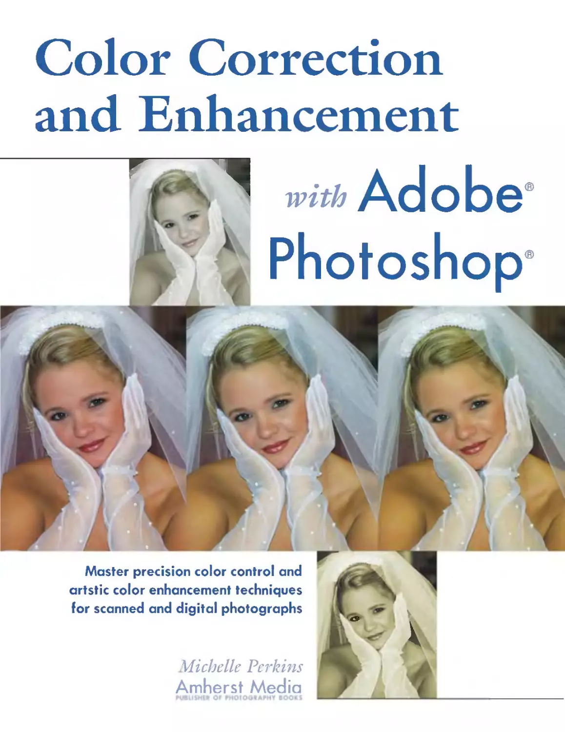
nel mode and create a black & white image from a color one, see chap-
ter 12, which provides step-by-step instructions.
..
I
;.
..
Although sometimes a necessity, black & white images printed with a sin-
gle ink (left) lack the depth of tone that can be achieved by printing them
with four inks (r¥Jht).
Duotone. The Duotone color mode, as the name implies, is nor-
mally used to create an image that will be printed with two inks-usu-
ally black plus another non-CMYK color (see page 97). This can be
done in order to add the visual appeal of color without the cost of four-
color printing. It is also used in some art photography books to create
high quality, neutral-toned renditions of black & white photographs.
DIGITAL COLOR 27
As you would guess, adding a second channel to the image means
that the Duotone mode offers a wider gamut than the Grayscale mode.
From the Duotone mode, you can also select to make Tri-Tone (three-
ink) and Quad-Tone (four-ink) images that employ non-CMYK inks
and further expand the color/tonal gamut.
In order to convert to the Duotone mode, your image must first be
converted to the Grayscale mode.
Indexed Color. The Indexed Color mode allows you to limit the
total palette of colors used in your image, reducing the file size while
retaining visual quality. On web pages, where quick upload times for
images is often much more important than color fidelity, this is a very
useful format. It is also commonly used when preparing images for
other on-screen uses, like multimedia presentations.
At most, the Indexed Color mode allows you to use 256 colors. If
a color in the original image does not appear in this range of colors, the
program chooses the closest one or simulates the missing color using
the available ones.
I
'1
-
,. ,
\(,
.../
(
. 1iII' untitled folder :PJ8
I 2 ilelllS, 970.5 MB evelleble
....... Dete Modified I Size I Kind .
I
ulterfly/lNDDCllf Today,7:54AM 812K pholo1hope TIFF file
I utterfly/RGB.lif Today, 7:53 AM 2.2MB pholo1hope TIFF file l-
.
A color image in either the RGB or CMY]( mode (left) offers a relatively
wide gamut that permits the subtle rendition of colors. The image on the
r¥Jht was switched to the Indexed Color mode and set to 100 colors. As you
can see in the screen shot above, this reduced the file size from 2.2MB to
812]( -which would make it s¥Jnificantly quicker to download or view on-
line. There is definitely a reduction in visible quality) but depending on the
use of the image) it m¥Jht not be objectionable. If256 colors had been used,
the quality reduction would have been almost unnoticeable, but the file
would have been sl¥Jhtly lar,ger.
28 COLOR CORRECTION AND ENHANCEMENT WITH ADOBE PHOTOsHOP
THE INDEXED COLOR MODE
ALLOWS YOU TO LIMIT
THE TOTAL PALETTE OF COLORS USED.
A diagram of the Lab Color model.
The black-to-white gradient rod
that runs through the center repre-
sents the l¥Jhtness (or '7/') channel.
The A channel (red-green opposi-
tion) and B channel (blue-yellow
opposition) intersect the l¥Jhtness
channel and constitute the la1l1est
color gamut in Photoshop.
You can also use fewer than 256 colors, reducing the file size and
image quality in the process. The trade-off between load time and image
rendition is a subjective one. After all, you don't want people to leave
your web site because they are tired of waiting for images to load, but
you also don't want them to think your images (or products, or family
photos) look terrible when they do appear.
To convert to the Indexed Color mode, your image must be in
either the RGB or Grayscale mode. Only limited image editing is avail-
able in this mode, so it's best to complete any needed image adjust-
ments or enhancements in RGB, then convert to Indexed Color.
Lab Color. AIthough written as "Lab," this color mode has noth-
ing to do with laboratories and is properly pronounced "L-A-B."
Outside of Photoshop, it is more often noted as "l*a*b" or CIELAB
(for the Comission International de l'Eclairage, an international color
standards organization). The name of the color space is actually sort of
an acronym for the components used to make up colors in this mode: L
(lightness), A (the arbitrary notation for the red-green opposition chan-
nel), and B (another arbitrary notation-this time for the blue-yellow
opposition channel).
As you may already have guessed, this mode is a little less intuitive
than the ones discussed so far-but keep in mind two facts. First, Lab
Color lets you keep color and contrast separate. In CMYK or RGB,
every color channel affects both (color and contrast); in Lab, the L
channel affects lightness (and thus contrast), while the A and B channels
affect only color. Second, the Lab Color mode has the largest gamut in
Photoshop-containing all the colors in both CMYK and RGB.
...---...
-
A
DIGITAL COLOR 29
5. Image Preflight
The natural tendency when beginning to color correct an image is to
open it and start pressing buttons, clicking and dragging, etc. Doing
this, however, is sort of like taking
a picture without bothering to
compose it-only once in a blue
moon will you happen to achieve
the best results. (But playing with
Photoshop is fun, so go ahead and
hit buttons for a few minutes if
you need to-just be prepared to
revert to the original image when
you're ready to get serious.)
As with most things, develop-
ing a good plan of action before
diving into an activity will mini-
mize frustration and enhance suc-
cess. Therefore, when you scan or
open an image and notice that it
needs to be color corrected (or if
you open it because it needs color
help), you'll need to figure out
exactly what the problem is.
At first, it will probably seem
like this process, which we'll call
preflight, takes a long time. As you
do it more and more, though,
you'U find that it actually becomes
second nature. With a bit of ex-
perience, you'll be able to run
..
Begin by analyzing your photo. Are the darkest areas dark enough? Are the
l¥Jhtest area l¥Jht enough? Here) they seem to be fine-the darkest area (the
shadow near the bride)s shoulder at the r¥Jht edge of the frame) is dark and
rich) while the h¥Jhl¥Jhts (the white accents on her gloves) gown and veil)
are clean and white. Photo by Rick Ferro.
30 COLOR CORRECTION AND ENHANCEMENT WITH ADOBE PHOTOSHOP
YOU MAY WANT TO RETURN TO THIS
PREFUGHTING CONCEPT THROUGHOUT
THE COlOR CORRECTION PROCESS.
through the preflight process for most images (at least ones without
serious color or exposure problems) in a matter of seconds.
With images that require intensive color help, you may also want to
return to this preflighting concept periodically throughout the color
correction process. This will help you ensure that your improvements
are taking the image in the right direction, aid in identifYing what work
still needs to be done to achieve your goals, and sometimes reveal sec-
ondary problems that went unnoticed in the first preflight.
o EYEDROPPER TOOL
Once you've opened your image in Photoshop, you have two valuable
tools at your disposal for evaluating it: your eyes and the Eyedropper
tool. Your eyes provide more subjective results, while the Eyedropper
tool provides results that are totally objective.
In chapter 2, we examined how the eye-or actually, the brain-
treats color subjectively and can sometimes fool us into thinking things
look different than they actually do. This makes the objectivity of the
Eyedropper tool especially valuable when you are trying to closely ana-
lyze colors.
The Eyedropper tool samples colors, allowing you to see the color
value of pixels (displayed in the Info palette) as you evaluate an image.
Let's look at an example.
1. Open an RGB image in Photoshop and select the Eyedropper tool
from the tool bar.
2. In the Options bar at the top of the screen, set the sample size to
"3 by 3 Average." This allows you to read the average value of
three pixels within the area you click on in the next step. This aver-
aged reading provides a better sense of the tone and color of the
area than reading a single pixel.
III! [ZE] I Sample Size: [3 by 3 Average
I J
3. Next, verifY that the Info palette is visible on your screen. If it's
not, go to Window> Info.
r.; :::::::::::::::::::::::::::..::::::::::::::::::::::::::::::::::::::::::::::::::::::::: f=i :::
I Navigator "I Info 1.
R C
Jt G Jt M
B V
K
.... X I (J w
V H
IMAGE PREFLIGHT 31
4. With the Eyedropper tool still active, move your cursor over your
image and watch the Info palette. You'll notice that the RGB and
CMYK values change as you move the cursor over different areas of
the frame.
Or¥Jinal image with sample areas
h¥Jhl¥Jhted.
3
o
r.; .. r:;"'"' .. .. r.; ._00_. ." ... -.. .- .- .. r:;-
Navigator 'I Info c. Navigator Info . .
([] c: 81 C : 72 C : 3
G : 11 ? M: 74 ? ? M: 73 ? ? M: 4
? B: 26 V: S8 V : ex V: 12X
K: 79X K : ex K : ex
+. X: 0.e6e I C W: +. x : 3.e60 I C W: +. X: 1.620 I r:; W:
V: 1.620 H : V: 2.740 H : V : 2.060 H :
Info palette reading for sample 1 Info palette reading for sample 2 Info palette reading for sample 3
When you move the Eyedropper over a very dark area of your image
(see sample area 1, above), you'll see that Info palette shows low RGB
values. As you'll recall from chapter 4, this is because RGB is a subtrac-
tive color model, meaning that the absence of all colors yields black-
so the lower the RGB values, the darker the color.
Under CMYK in the Info palette, the numbers are quite high. This
is because CMYK is an additive color model, meaning that the presence
of all colors yields black (refer to page 20 for more on this). So, the
higher the CMYK values, the darker the color.
Continuing to look at the Info palette reading for sample 1, notice
that the blue value (under RGB) and the cyan values (under CMYK)
both have slightly higher values than the other channels. This tells you
that there is a bit of a bluish cast in this shadow area-very typical of
shadows created in natural light under a blue sky. It's nor a problem in
this case, but if this were a portrait where you wanted a very warm look,
32 COLOR CORRECTION AND ENHANCEMENT WITH ADOBE PHOTOS HOP
it might be an issue you'd choose to address. We'll cover techniques you
could use to do this in later chapters.
Speaking of blue, take a look at the Info palette readings for sample
area 2. Here, the red and blue (or cyan and magenta) readings are both
high, yielding a purply-blue color on the petals of the violet.
Finally, in the Info palette for sample area 3, you can see that the
RGB readings are very high and the CMYK readings are very low. Even
if you didn't have a photo to show you what this was a reading of, the
values alone would tell you that this is a very light area. Looking at the
yellow channel in the CMYK reading, you could also tell that it has a
slight yellow cast (the yellow reading is significantly higher than the
cyan and magenta readings).
Color Sampler Tool. In the toolbar, if you click and hold on the
Eyedropper tool icon, you'll be able to select the Color Sampler tool.
This tool allows you to place color-sample reference points on your
image and refer to them as you work-even if you close and reopen the
image (but don't worry, they don't print).
Once the tool is selected, simply set the sample size to "3 by 3
Average" in the Options bar (see page 31). Then, move your cursor
over the image and click to create sample points. You can have up to
four sample points per image.
Ii
.
R: 131 C 54X
.? G: 196 .? M ex
B: 65 V 99X
K ex
-+. X: 4.U!I I r.:r W: {>
V: 13.975 H:
<>t
Info palette showing color informa-
tion for the current sample area
(cursor position) at the top of the
palette) and information for three
markers (numbered 1-3) at the
bottom of the palette.
Color Sampler markers in place on the image.
Adding Color Sampler markers will expand your Info palette, as
seen to the left. For each marker you add, a corresponding numbered
color reading will appear. As you work, you can refer to these to ensure
that you are creating just the tones you want, or that changes you make
to improve the color in one area don't have a negative effect on the
color in another area.
If you'd like to move a sample point, just choose the Color Sampler
tool again, and click and drag the marker to a new area of the image. To
delete a marker, use the Color Sampler tool to drag the marker out of
the window, or press Opt/ AIt and click on the marker. To remove all
IMAGE PREFLIGHT 33
the markers, click on Clear in the Color Sampler tool Options bar at the
top of the screen. You can also hide the markers by going to View>
Extras (repeat the process to make the markers visible again).
o SHADOWS AND HIGHLIGHTS
One common problem that can make both black & white and color
photos look less than perfect is the absence of a deep rich, black and a
bright, sparkling white. For most images (see the exceptions noted on
page 35), achieving a pleasing sense of the overall color requires the use
of the full range of possible tones from black (or very near black) to
white (or very near white). Our eyes adjust to see this full range of col-
ors in almost every scene we view around us, so if a photo lacks it we
immediately feel that the image looks flat or dull.
So, ask yourself: Are the darkest areas in this photo dark enough?
Are the lightest areas in this photo light enough? Keep in mind, some
images may have one problem or the other, some may have both and
some may have no problem at all in this area. If you are looking at an
image that was scanned from a print, slide, or negative, keep in mind
that the scanning process can sometimes negatively affect the tonal
range of the image, so even if your original was good, you should still
evaluate the black point and white point of your scan.
\
,
A
,
,
..
...
,I
')..
, \
\
" -
r
-
"',
P'
". !J..
rr.;.: ".':-:" .'" :,:":, :.':,:.:" ":,: ,::' '''' _,: :".".,:,: ," -"',
Navigator .
.
c:
M:
.? Y:
K:
9
7
ax
e
C : 7e
.? M: 64
Y : 63
K: 64
+. X: 0.989 I f.! W:
Y: 3.050 H :
X: 2.828
-to Y: 3.980
If.!
W:
H:
34 COLOR CORRECTION AND ENHANCEMENT WITH ADOBE PHOTOSHOP
In this image) the contrast is pretty
bad-the photograph looks flat and
muddy. Looking at the bottom left
Info palette, you can see that the
RGB values of a sample taken on
the highlight area (the bright
mushroom stem) are not quite h¥Jh
enough. While getting a pure white
reading of R=255/G=255/B=255
m¥Jht not be desirable (we)d like
some detail), values around 250
across the board would create a
more brilliant h¥Jhl¥Jht. Looking
at the bottom r¥Jht Info palette, you
can see that the RGB values of a
sample taken on an area of deep
shadow are not quite low enough.
Readings well under 10 across the
board would create a nice deep
shadow. Photo by Paul Grant.
In this image) the contrast is much
better. Looking at the bottom left
Info palette, you can see that the
RGB values of a sample taken on
the same h¥Jhl¥Jht area are now all
over 250-creating a br¥Jht h¥Jh-
l¥Jht that still has some detail.
Looking at the bottom r¥Jht Info
palette, you can see that the RGB
values for the sample area of deep
shadow are now at 5 for a deep,
rich shadow.
"
\ I, "
"" \' , ,
,
\
<;. ., ,\
.. .
.
I
... ')...
....
, .\
........ '\
r
-
"' ,
f
I
"T.i "
II Navigator 'I Info c.
([J) c: 75
G" 5 ? M: 68
)£ B 5 V: 67
K ; 88
-h X: 0.999 I p W:
V: 3.220 H:
".
.
c: 1
? ? M: 0
V: 1
K : 0
-h X: 2.847 I r; W:
V: 4.180 H:
Keep in mind we are only analyzing the image at this point, nor
adjusting it. So make notes (mental or otherwise) on your findings, but
don't worry about correcting any possible problems just yet-there are
still other variables to consider, and your future findings may impact
how you decide to deal with any possible problems you've identified at
this point.
Exceptions. There are, or course, some exceptions. If you've taken
a very high key photograph (a marshmallow in a snowbank), there may
well not be any deep, dark tones. In very low key images (a black cat in
a coal bin), there may not be any areas of pure white. Keep in mind
however, that such instance are very rare. For even most high-key
images, there are some areas that are naturally dark-even if it's just the
color of the subject's eyes. In most low key photos, it is desirable to have
some very light highlights to show the shape and texture of the subject.
Again, ask yourself: Are the darkest areas in this photo dark enough? Are
the lightest areas in this photo light enough?
There may also be instances where, for creative reasons, you choose
not to use the full range of tones in your image-in that case, you can
move on to the next category of analysis.
IMAGE PREFLIGHT 35
o NEUTRALS
If windows are the eyes to the soul of a person, neutral tones are often
the key to learning what's going on under the skin of a digital image. If
the neutral tones have a color cast, chances are that the rest of the image
does too.
Whites. A good place to start is with the whites. Keep in mind, the
whites you evaluate should be areas of pure (or very close to pure)
white-like a catchlight, a cloud, a white bridal gown, etc. AIthough we
often refer to the "whites" of the eyes or to people's teeth being white,
they rarely are.
Once you've identified an area to evaluate, examine it closely for any
slight shifts in color-what looks at first glance to be white often turns
out on closer inspection to be faintly yellow, or blue, or pink.
Your eyes can deceive you, though. As was discussed in chapter 2,
human eyes adjust quickly to neutralize overall color casts (a great adap-
tation for survival, but a frustrating one for color correction). Even if
you're pretty sure there's no color cast in your white area, it won't hurt
to evaluate it more carefully.
Select the Eyedropper tool and move it around in that area, looking
at the readings in the Info palette. The closer the R, G, and B readings
each are to 255, the closer the color in the area is to pure white. If one
or more of the readings seems to consistently fall more than a few points
below 255, the white area probably has at least a small color cast.
Bear in mind that a small color cast may be fine-this is a subjective
decision that is yours to make. For example, if white clouds on a blue
.
.
.
.
..
.
.
..
..,
.
e
:\.
..'\.
.. .
r:; "
. .
C 4 C 1
.x M 2 ? M 1
Y I Y 1
K 0 K 0
+. x: 3.287 I r:r W: +. x: 3.600 I r.:r W:
Y: 3.873 H: Y: 3.813 H:
On the left, the Eyedropper readings on the white gown showed blues that
were consistently h¥Jh. By reducing the blue in relation to the other colors)
the image became better color balanced. Photo by Rick Ferro.
36 COLOR CORRECTION AND ENHANCEMENT WITH ADOBE PHOTOSHOP
HUMAN EYES ADJUST QUICKLY
TO NEUTRALIZE
OVERALL COLOR CASTS.
. : _: m_:, -; -::.': .:.::;; :;.;': '; ;.,: ;;U:; .:.;;.;;.;:.;u;:;:;u...1ii
.
c: 35
M: 29
? Y: 21
K : 0
X: 4.756
-t. Y: 3.400
In
W:
H:
Eyedropper readings of varzous
areas of the cement in the grain silo
showed a strong blue cast.
:I
.
C 43
? .? M 33
y 31
K 0
+. x: 4.756 r W:
y : 3.400 H:
By reducing the blue, the image
became better color balanced-and
the ship looks much more green)
which was its actual color.
sky have a slight bluish cast, that may not be objectionable. (But if that
bluish cast is symptomatic of a cast that runs through your whole image
and makes your portrait subject look blue, that could be a big problem
indeed. )
Grays. Like whites, grays that should be neutral in tone (not bluish
gray or reddish gray) can reveal overall color casts. Here, the selection
of an area to evaluate is much more subjective, though. Paved streets (in
most areas) tend to be a reasonably neutral gray. Sometimes clothes and
other fabrics are neutral gray (and this can be either light or dark).
Shadows on white walls or backdrops are also fairly neutral gray areas.
"",
,- -
. "
"
.",4"
.
"",..t,;,
II
I"
.... .
1
'"'
- 1.,1 , I ,
--I
I, t \1
I ,
.
"
.-....4.
"...,..,..:
flIP""
.....,.,.. .
rIA
II
....
-
.
nn
.,... ., .
.
, I
--I
.
IMAGE PREFLIGHT 37
If there are areas in your photo that you know should be neutral
gray (or close to it), use the Eyedropper tool and the Info palette to
evaluate how close they actually are to neutral. In this evaluation, the
R/GjB values can be any value (depending on how light or dark the
gray area is), but the individual readings should be close to equal. If one
of the readings is different than the other two, you know there's a prob-
lem. If all of the readings are vastly different, then you have a bigger
problem.
As you use the Eyedropper tool to evaluate your image (assuming
you are working on photographs), it pays to move the tool around a bit
in the area you are analyzing and look at the overall values and relation-
ships between the R, G, and B channels. Tonal values within even seem-
ingly uniform areas can vary to surprising degrees. Concern yourself
with overall patterns (i.e., "The values all seem too low in this area," or
"It looks like the red is always a lot higher than the other colors.").
o SKIN TONES
As humans, we are accustomed to seeing human skin tones all around
us every day. Therefore, we all notice it pretty quickly when a skin tone
just doesn't look right. We notice problems especially quickly in photos
of people we know personally or see on a regular basis. Yet, from time
to time, we all see images of people who unintentionally look jaundiced,
or seasick, or like they've spent too much time in the sun.
There are a few reasons for this. First, skin tones vary widely from
person to person, and can change dramatically depending on the light-
ing, activity level, exposure to sun, and even the person's emotional
state. Second, skin tones are also finely detailed and feature hundreds of
",
.r.i
I
..
.;
J
-....
,
,\
....
.... '.....
....
"
,.,. t"
....
-
..,.
...
, .
\ .," ' '.
. Jr
-;: .,
I . -.!..
', ,,' r-
J
-
«
, --r.
-
,
.
:--
,
,,.
,.
. .
..
..
. ...
....
_. ...C'"- ......1tI".. I . .
_-J
When it comes to skin tones) even subtle differences can be readily appar-
ent. Here) the image on r¥Jht is much warmer than the one on the left-
but it)s more noticeable in the skin tones than on the tricycle.
38 COLOR CORRECTION AND ENHANCEMENT WITH ADOBE PHOTOSHOP
WE ALL NOTICE IT PRETTY QUICKLY
WHEN A SKIN TONE
JUST DOESN'T LOOK RIGHT.
.
"
,
==
l
J
L
,
, -
-i. -
"'" I "\,
-.
1
..."
;.
!
...
,
,
,
,
=
t
.
'....
"
,
-4..
..
"'I
\
"
....
'It
,
-..
....
..
. ,
Some of the skin tones here are obviously wrong-but are any of them just r¥Jht? Getting skin tones to look just
r¥Jht is one of the more challenging problems you)ll face when color correcting your images.
shades of color rather than a few unified tones. Third, even subtle prob-
lems can be very obvious to viewers. While you can get away with the
grass being a little off-color, it's harder for viewers to overlook skin
tones that miss the mark.
Because our eyes "help" us by trying to neutralize the subtle color
casts that can make our subjects look bad, it is especially important to
use the Eyedropper tool when looking at skin tones. Unfortunately,
there is no standard by which to judge "correct" color because there is
no "correct" color. The following guidelines may, however, be a help-
ful point of departure.
In all cases, you should use your Eyedropper tool to evaluate a
median tone on the skin (not a highlight or a shadow). Avoid areas that
tend to be pinker (like cheeks, lips, or fingertips) or where there may be
IMAGE PREFLIGHT 39
...
-
,
;-
; .
I , -- '
, , , 'i
..... ....
" 0',
.
,.
"- 1
\
of'
I<' . .
.
.' ,
.
'.
"
,'" '
. ,\,
, ' .-.
light shadows (eyelids, under eyes, knees, under chin, etc.). Good areas
may be the forehead or jaw area, shins, forearms, etc. Try to avoid areas
where the subject is noticeably tanned (unless the tan is all-over and
even). The face is the first thing that most people look at in a portrait,
so that's a good place to start.
For fair skinned people in daylight (or daylight-balanced light
sources), a good starting point would be in the neighborhood of
R=200/G=170/B=150. For darker skinned people in daylight, a good
starting point would be in the neighborhood ofR=170/G=IlO/B=80.
Keep in mind, these number are only for reference. If you take
Eyedropper readings off your subject's face and find that the green and
blue values are pretty much in line with those listed above but the red
is somewhat higher, think about your subject. Is the person's skin actu-
ally a little redder than average? Was he or she blushing or flushed? Was
the light warmer than daylight (maybe the photo was taken under the
rosy light of sunset)? If so, the color might be right on. If not, consid-
er making an adjustment to the skin tones part of your strategy.
Also, these numbers should be considered proportionately in rela-
tion to each other-not as absolute values. Therefore, if your subject's
skin-tone readings seem to be more like R=190/G=160/B=140, that's
probably just fine, since all of the colors are just proportionately a bit
darker.
Finally, in all cases, expect the color readings as you move into dark-
er or more shadowed areas of the skin to become proportionately more
blue.
o SETTING YOUR COLOR GOALS
Now that you've examined your image carefully, and hopefully made a
few notes on things you'd like to see changed, it's time to set your goals
for the image. This might seem obvious-you want it to look "right,"
40 OLOR CORRECTION AND ENHANCEMENT WITH ADOBE PHOTOsHOP
.
..... .
.
" . '"
, .
From cool (left)) to warm (center))
to sl¥Jhtly yellow (r¥Jht)) everyone
has their own ideas about how skin
tones should look.
right? Determining what is "right," however, requires you to make an
important decision: should the color match the subject or scene as it
was, or should the color be changed to enhance the scene or subject?
In some cases, this decision is made for you. If your image shows a
product where the color needs to be correctly reflected, any "enhance-
ments" won't be appreciated. In most other cases, there will be some
creative leeway-and often improvements will make the image much
more desirable.
Some of the choices you can make to enhance the color in your
images will produce subtle (but much appreciated) results. For example,
most women will appreciate the evening-out effect of making their skin
tones slightly lighter than they actually are, especially when this helps to
open up shadows and conceal texture. (In fashion magazines, you'll see
the skin tones are often extremely light for this reason). The skin should
not, however, look too pink. For portraits of children and babies, on the
other hand, people tend to prefer a look that is slightly lighter and more
rosy than in a grown-up portrait.
When you have lots of creative freedom, there is no end to the array
of special color effects that can be added as enhancements-cross pro-
cessing, toning, black & white infrared, handcoloring, and other effects
are all easy to duplicate using Photoshop instead of traditional materi-
als. These techniques are covered in chapter 11.
Whether strict realism or a more creative interpretation is your goal,
it helps to have this end in mind to structure your work and set a defi-
nite end point for the image.
,
All of these images are acceptable renditions of the same portrait. Which one you like best (and which the viewer
will like best) is a subjective decision. Photograph by Jeff Hawkins.
IMAGE PREFLIGHT 41
6. Automated Tools
Photoshop includes several automated tools for use in adjusting the
color correction of your images. While these actually work pretty well in
some cases, in almost no case will they be the end-all, be-all solution for
an image. Using the automated tools is sort of like taking a picture on
a camera without manual aperture, shutter speed, or focus settings.
Under perfect conditions, you might get a good shot. The other 99 per-
cent of the time, you'll probably be disappointed.
Still, these tools can be useful for those very few images where they
happen to work perfectly. They may also fit the bill in cases where you
just want a no-fuss way to make the color look better and don't really
care if it looks perfect (for e-mailing a birthday snapshot to Aunt Jane,
for example).
At the end of this chapter, I'll suggest an additional use for these
tools that may add value to them even tor those of us interested in more
controlled color adjustments.
o AUTO LEVELS
To use the Auto Levels, open an image in Photoshop (to see the most
dramatic effect, choose one that doesn't already look perfect), and go
to Image>Adjustments>Auto Levels. That's it-the change will happen
automatically.
The Auto Levels tool basically functions by setting the lightest pix-
els in each color channel to white, and the darkest pixels in each color
channel to black. Intermediate pixels are then distributed proportion-
ately between these two extremes. Because the Auto Levels tool treats
each color channel individually, this process can eliminate color casts,
but it can also introduce them.
You can expect the best results from Auto Levels when you use an
average image (not very light or very dark) that needs a modest adjust-
42 I....OLOR CORRECTION AND ENHANCEMENT WITH ADOBE PHOTOSHOP
THIS PROCESS CAN ELIMINATE
COlOR CASTS, BUT IT CAN ALSO
INTRODUCE THEM.
Sometimes the Auto Levels tool
yields success, turning an image
that just lacks contrast (left) into a
rnuch better rendition of the scene
(r¥Jht).
,.
'"
.
...:
'\
J ..'
"
,
"-
....
-
.....
"
... -- .......
..
r . "- r . "-
... ... ...
"A' .), "A""
l.' 1 ., ( .. {
4. , 4, . -"
.. .. ..
Smnetirnes the Auto Levels tool makes a bad situation (left) eJJen J1'orse (center) by introducing an Imappealing
color cast. Using the Auto Contrast tool instead of the Auto Levelsgets us around the color cast (right). However,
while the color here is better (it)s not pink, anyway), there's still a lot of room for improvement.
mcnt in ovcrall contrast. This tool is not suitable to imagcs that nced
scrious color or contrast correction.
o AUTO CONTRAST
Unlikc Auto Lcvels, thc Auto Contrast tool (Image>Adjustmcnts>Auto
Contrast) works on all of the color channels collectively. Thcrcfore, it
docs not corrcct or introducc color casts to an imagc. The Auro
Contrast tool simply maps the lightest pixels to white and thc darkcst
pixels to black, incrcasing thc contrast of the image.
o AUTO COLOR
Thc Auto Color (Imagc>Adjustmcnts>Auro Color) is thc most sophis-
ticatcd of thc ti.I1ly automatcd tools in Photoshop. Rather than working
\vith thc channels, it searches thc actual image. Through this process, it
idcntitles and corrccts thc highlights and shadows and ncurralizcs thc
midtoncs.
AUTOMATED TOOLS 43
o AUTO COLOR CORRECTION OPTIONS
If you like using the auto functions but want to tailor the results a bit
more, you may find it useful to use custom settings in the Auto Color
Correction Options box. (Ifthese settings seem complicated right now,
don't worry. They are complicated; but they are also not critical at this
point, so don't worry if things aren't crystal clear.)
To open the Auto Color Correction dialog box, go to Image>
Adjustments> Levels and click on the Options button at the bottom
right of the dialog box. The window seen below (here, with the default
settings) will appear.
Under AIgorithms, you have three choices for defining how you
want Photoshop to adjust the overall tonal range of your images. En-
hance Monochromatic Contrast preserves overall color relationships
while enhancing contrast. Enhance Per Channel Contrast maximizes the
tonal range in each channel for a more dramatic increase in contrast, but
increases the potential for introducing color casts. Find Dark and Light
Colors identifies the average darkest and lightest colors in an image and
uses them to maximize contrast.
Clicking on the Snap Neutral Midtones will cause Photoshop to
look for a nearly-neutral color somewhere in your image and make that
color neutral, adjusting the other tones in the image accordingly.
Moving down in the box, you'll see settings for clipping. In order
to increase the contrast of the image using the auto tools, the black and
white pixels in -an image are clipped-that is, Photoshop ignores a small
percentage of either extreme when determining where to set the black
Auto Color Correction Options
- Algoloithms [( OK J]
o Enhance Monochromatic Contrast
@ Enhance Pel. Channel Contl.ast ( Cancel j
o Find DiU.k & light Colol"s
o Snap Neutral Midtones
- Tal.get Colol.s & Clipping
Shadows: . Clip: )0050 I .iD
Midtones:
Highlights: D Clip: )0050 I iD
o Save as defaults
44 COLOR CORRECTION AND ENHANCEMENT WITH ADOBE PHOTOsHOP
The Auto Color Correction Options
dialog box is accessed by hitting the
Options button in the Levels dialog
box.
point (an:.l of d.lrkest tone) and white point (are.l of liglm:st tone) in .m
in1.1ge. This ensures that thc eh.mges n1.1de to the eontr.lst arc b.\scd on
n:prescnr.lth'c tone rather than extremc pixel \'.llucs. A \ .\lue bct\\'l:cn
0.5% .md I % is recommended.
\Vhen preparing images t()r print only (not tix \ iewing on a screen),
profession.ll color technicians t pic.\I1 set the highlights .md sh.ldows to
match the output c.\p.\bilities of the de\'ice th.lt \\ ill be used to prim
them. This is where the SI1.1dO\\ .1I1d Highlights settings in the di.llog
box come into pl.1y. Setting these tones .lCCLIrately .1Ilows you to t.lke full
ad\'.mtagc of the .l\'.lilahlc print.lblc tones, \\ hile .l\'oiding the cre.uion of
extremely light whites .md d.1rk bl.1cks that can't be printed .md, there-
tixe, don't imprm'C the in1.1ge det.lil. To c).pel iment \\ ith setting dittcr-
cnt sl1.1dow or highlight \,;llllcs, click on the color swatch next to the
tone you w.mt to change. fhis will bring lip the Color Picker, .dlo\\'ing
\'Oll to select thc desired tone.
To set our customi/ed selections t()!" lIse lw Allto Ln'e1s, Auto
Contrast, .md Auto Color, click on the S.l\'C a<; Dct:llIlts box at the lower
Ictt corner, then hit OK.
-
\ '
"
, . ,
...
,
"- ! it
...
""1y
\. I I
I
I) , \ I
{ I
, I
.,. l
I , \
' I
..,; ), , J'
1 '\, ,iI
, \ t ,
\' ' . .
oJ
I I .
\ :'
. ".
.. V
I
t, , ( J ' , \ , " '\
\ ;
,
· r, ( r, , .... J
'\ ,
...
I
\.
,
, I
"
f'h
, }
'\ .
. \
, '\
[ \
, "
f\
.. ,
t
4 \ \
\
bnalles dcstilu"d fin' print should hmJe pl'illtablc b(lfhli,lfhts that are not pll1'C white 171is e1lSUrfS tlmt there /pill be
no arms of barc paj1tT sboJl'iJ(fJ tbruu....fJb ill tbe ima....lfe (left). H-'llcn the bigbli.Hbts are not controlled (l'ight) , the
result can be an ItfJ(V 1'Clldcrill,lJ ofll'hite with no details.
AUTOMATED TOOLS 45
o SO WHY SHOULD I CARE ABOUT THESE TOOLS?
The auto tools almost never offer a complete imaging solution when it
comes to color and contrast enhancement. They do, however, have one
pretty useful function. As you'll recall from chapter 2, when we look at
luminous light sources (like a computer monitor) our eyes are constant-
ly balancing the color and contrast of the image for us.
Most people who work on digital images have had a least a few pho-
tos that they thought looked great on screen but then looked flat or had
a color cast in print. Using the Eyedropper tool is a good way to com-
bat this. Using the auto tools can be another way.
For example, if you're looking at an image on your screen and
thinking it looks pretty good, take a second and run the Auto Color,
Auto Contrast, or Auto Levels. In a lot of cases, the change will make
you see the image in a different way. It may not produce a finalized
result, but if you see that adding contrast really helps the image, you can
hit Edit>Undo and then increase the contrast exactly as you'd like using
a more precise tool. If you run Auto Color and notice that-hey!-the
skin tones suddenly look a lot better, you'll know that your "looks pret-
ty good" image still needs some work.
Used in this diagnostic function, you'll find that the auto tools will
prove much more useful for identifYing color problems than they ever
do for actually solving them.
46 -::OLOR CORRECTION AND ENHANCEMENT WITH ADOBE PHOTOsHOP
IN A lOT OF CASES, THE CHANGE
Will MAKE YOU SEE THE IMAGE
IN A DIFFERENT WAY.
KEEP YOUR EYES OPEN FOR
A PREVIEW CHECKBOX,
AND MAKE SURE IT IS CHECKED.
7. Simple Tools
If you want a middle-ground solution for an image-one that gives you
some control, bur is still pretty intuitive-Photoshop offers a wide vari-
ety of simple color correction/enhancement tools that can be reason-
ably useful. Some of these are helpful for just about any images, but oth-
ers will be tools you'll pull out only on special occasions.
As you use each of these tools, keep your eyes open for a Preview
checkbox, and make sure it is checked. This will allow you to see the
changes you are making as you make them.
o BRIGHTNESS/CONTRAST
The Brightness/Contrast command (Image>Adjustments>Brightness/
Contrast) lets you make simple adjustments in the overall tonal range of
,. ..
,
l - "
l
,
"
-
. ,
'.
. . '1' !'
..' ..:
.... - ..
. <;
'1'"
.. < .
..:.,.- '
;
Brlghtness/Contrllst
BriGhtness: EJ [I OK
I C..ncel I
Contrast: EJ 9 Preview
- -
IIf'lghtness/Contrast -
BriGhtness: ED [I OK
I C..ncel I
Contr..st: @D 8 Preview
Co
Using the Br¥Jhtness/Contrast tool is a simple matter of dragging the slid-
ers-to the r¥Jht to increase contrast and/or br¥Jhtness and to the left to
decrease them.
SIMPLE TOOLS 47
the image. Unlike the Levels and Curves tools, Brightness/Contrast
does not work with individual channels. Another difference is that the
changes in contrast are applied to the entire image uniformly, which can
result in a loss of detail-you need to use this tool judiciously or you're
almost sure to wind up with blocked up (no-detail) shadows and blown-
our (no-detail) highlights.
Using the tool is a simple matter of dragging the sliders-to the
right to increase contrast and/or brightness, and to the left to decrease
them. When you are satisfied, hit OK to apply the changes.
o EQUALIZE
When you apply the Equalize tool (Image>Adjustments>Equalize),
Photoshop finds the brightest and darkest tones in the image. It makes
the brightest one white and the darkest one black, then evenly redistrib-
utes the rest of the pixels in between. The results range from pretty
good to totally awful-but it might be worth a try for some images
where only very small changes are needed. Adobe suggests it may be
useful for an initial correction to scans that look a little darker and flat-
ter than the original image.
,.
.. . \.
- . ,.
.. , \ i .,/
., ,
..
.. , .. ,
. "
:
J
" I
r
=
.t
---
t
Or¥Jinal image (left) and image after equalization (r¥Jht). Photo by Jeff
Smith.
o VARIATIONS
This tool is one of the most intuitive color-correction tools in Pho-
toshop. Using it, you can easily correct many color-balance problems in
your photographs. Because it allows you to make your own judgments
about how an image should look, it is much more flexible than the auto
tools (Auto Contrast, Auto Levels, and Auto Color), yet almost as easy
to use.
To use Variations, go to Image>Adjustments> Variations. Doing this
will open a dialog box like the one shown on the facing page. Normally,
48 OlOR CORRECTION AND ENHANCEMENT WITH ADOBE PHOTOSHOP
THE RESULTS RANGE
FROM PRETTY GOOD
TO TOTAllY AWFUL.
aria fORO \larraIfons I
o Shadows OK pr-- 1... o Shadows OK I I
to 4!' ".dton.. 0,
I o IIghllghts (.fI'rt t .. Mldtones I
o Hlllhllllhts CanUI
t- t t- O Saturation load_ o Saturation J
.... Cow.. Lolld_
J. '- '.' F". Cow..
5.... , , 'J. I
e Show Oloolnll 5...._
.. I [O'j Show Olpolnll
I .'1
... ... ''":<0 .....
, . - J . ..
,.
I ..... .... ,
"'. -:" . .. -:" .. .
-,
o;,.J : ,. ""
..... ..... '.- , -
'. ,. '.-
I ' .
... ... "'":<0 '
L ,II. .. >I. :
. .
HeIr_ r_ _. .... L , .- JiooIw.Y... ....
II!.' I ... I -----, I . (IIlI"9"'-:" -.
0 II
"- ...
..... .....' ..... to II
....... , '- .... '-
II
..'1 '- ,
... ... ... ... J
. . - .. .. "
. . "
.." t r. .. r ", .. - CUi<.
-.' 1 I!"'"""""'"
..
to ..... ....
... ... '... , . '"", ..
.. ..- ..- '. , ..
t1ori!' 8 to .,
The Variations dialog box shows numerous previews of
possible image changes-More Green, More Blue,
Darker, etc. By clicking on one or more of these previews)
you can change your or¥Jinal image as you like. The
efftct of this change is displayed immediately in the
current-pick version of the image.
By moving the slider in the upper r¥Jht of the dialog box)
you can adjust how great a difference you)ll make with
each change you apply. Here, the slider was set to Coarse.
As you can see, the changes are much more dramatic
than in the dialog box shown on the left, where the slid-
er was set to the midpoint.
you should begin with the Midtones radio button selected. This will
allow you to make corrections to the tones that make up the bulk of the
image. If you like, you can then select the Highlights, Shadows, or
Saturation buttons and experiment with their respective effects on your
photograph.
Near the top of the box, there is a slider that runs trom Fine to
Coarse. This allows you to control how great a difference you'll make
with each change you apply. Start with this set at the midpoint. As you
apply changes, you may find that you want to make increasingly fine
adjustments. In this case, simply move the slider to the left.
At the top left of the dialog box, your original image appears. This
is a handy reference. If you ever decide that the changes you have made
aren't helping, you can dick on this image to start over.
Next to the original image, the current pick appears. The current
pick also appears in the center of the color-balance samples (the cluster
of seven images), and in the middle of the lighter/darker examples (the
SIMPLE TOOLS 49
, .t , 4.
<
.
1\
, "
.
,
.....
..
..
Using the Variations tool, blue and
green were added to the image and
the photograph was made a little
l¥Jhter. This made a b¥J improve-
ment throughout the frame-in the
skin tones, rock, and foliage.
This image is a bit too dark and a
little too red. Notice how the little
boy)s skin looks like he)s been out in
the sun much too long. Also, the
rock the boy is seated on looks pink
and the foliage in the background
is a bit brown.
stack of three images). The current pick shows the results and is updat-
ed with every adjustment.
To begin making changes, simply click on the preview image that
you think looks best (perhaps "More Green" or "Lighter"). This will TO BEGIN MAKING CHANGES,
automatically update the current-pick preview, so you can see the CLICK ON THE PREVIEW IMAGE THAT
results. You can apply as many changes as you like by clicking on one YOU THINK LOOKS BEST.
preview image after another. For some basic guidance on how to adjust
the color balance in your images, consult the chart below.
IMAGE IS:
too blue
too green
too red
too cyan
too magenta
too yellow
CLICK ON:
more yellow
more magenta
more cyan. more green
more magenta. more red
more green. more yellow
more blue
o COLOR BALANCE
Used for making general corrections to an image, the Color Balance
command (Image>Adjustments>Color Balance) allows you to change
the overall mix of colors. Using the sliders in the Color Balance dia-
log box, you can adjust three pair of complementary-color balances:
cyan-red, magenta-green, and yellow-blue. Do these pairings of colors
50 ':::OLOR CORRECTION AND ENHANCEMENT WITH ADOBE PHOTOS HOP
THE COLOR BALANCE TOOL ALLOWS
YOU TO CONFINE YOUR CHANGES
TO THE HIGHLIGHTS, MID TONES,
OR SHADOWS.
'(
.
f>-
"
\"-
\'
Calor .......!!
C.tor....4IInt..
c."r ....4IInt
c.,......1< DD
c."r"..C" I ..
I COI........,ffi::JELJO
(v.n _ ..... Ia Prw¥II!W
u. r. ... (iree-.
I ..
I (..nett' I
IaPrevll!W
(yen .....
u. r. ..
...-
,",uo
.....lIaw
......I!
....
I Ylt:low
'DIM!&.lanc:t!!
Ion. BMIInc.
a SIN'OWJ . Mellone' O....hUIIds
Ii! Prue.--. 1.......0111)'
o 5h.d ..Mdbtnes 0 H,IIIIOIIb
&I Presem I..lImlnof,Ky
ABOVE: The Color Balance tool is
useful for correcting color casts. In
the photo and screen shot on the left,
the image is a bit pink. Adjusting
the sliders produced a better color
balance (r¥Jht photo and screen
shot). Photo by Jeff Smith. RIGHT:
The sliders in the Color Balance
dialog box move between comple-
mentary colors-the colors opposite
each other on the color wheel.
YELLOW
sound familiar? They should-the color sliders move between comple-
mentary colors (see the diagram above if you need a quick review).
Adding yellow reduces the appearance of blue (and vice versa); adding
green reduces the appearance of magenta (and vice versa); adding red
reduces the appearance of cyan (and vice versa). In the example at the
top of the page, the image looked a little too red and very slightly too
magenta. To compensate, the cyan-red slider was moved toward cyan
(reducing red), and the magenta-green slider was moved toward green
(reducing magenta).
As you saw in the Variations command, the Color Balance tool
allows you to confine your changes to the highlights, midtones, or shad-
ows. This can be useful if, for example, the color balance looks great
SIMPLE TOOLS 51
everywhere except in some shadow areas that look a little too blue
(something that often occurs when images are taken under a blue sky.
In most cases, you will want to check (activate) the Preserve Lumin-
osity box. This preserves the luminosity (the lightness or darkness of the
tonal values) as you make changes in the color, preventing your image
from looking darker or lighter when you've finished the change.
o SELECTIVE COLOR
With the Selective Color tool (Image>Adjustments>Selective Color),
your control over your image grows by leaps and bounds! Rather than
applying changes universally to the entire image, this tool allows you to
apply it selectively to one color. In the Selective Color dialog box, you'll
find a pull-down Colors menu that allows you to select reds, yellows,
greens, cyans, blues, magentas, whites, neutrals, or blacks.
Once you've selected the color that you want to adjust, it's a simple
matter to click and drag on the sliders beneath the color menu and
observe the changes as they happen. When you are satisfied, just hit OK
to apply the adjustment.
This method works best when you want to make a subtle adjust-
ment-this isn't the method to use when you want to change one color
to another, for example.
,
,
4
,
...
\ \
Selective Color
Colors: I .RedS : 1 - [I OK I
Cyan: I Cancel 1
CO
M"venta: (0-. I Load_ I
I Save.. I
Yellow: (0-.
el'revtew
Blacl<: (0-.
Method: e Relative 0 Absolute
The greens in the
image above
seemed like they
could use a little
boost. The first step
was to open the
Selective Color
dialog box (left).
52 COLOR CORRECTION AND ENHANCEMENT WITH ADOBE PHOTOSHOP
.
"
,
SelectIve Color
fI OK
I Cancel
I Load..
I Save..
e Preview
Black: (0..
In the Selective Color dialog box,
you can select the color you want to
adjust.
.
..\.
,
...
Selective Color
Colors: ' _Greens : 1 - OK .
Cyan: I*' 1 -. I Cancel 1
CO.
M"venta: 1-92 1 "- I Load_ I
'Q I Save_ I
Yellow: I.JOOI
CO e PrevIew
Blacl<: (0-.
Method: eRelative QAbsolute
After selecting
green from the
Colors menu) the
sliders were adjust-
ed until the colors
seemed more
vibrant. Photo by
Jeff Smith.
D¥Jital images sometimes exhibit a
bluish cast in the whites (left). The
Selective Color tool works well to
eliminate this (r¥Jht). Photo by Jeff
Hawkins.
Keep in mind, as well, that the entries m the Colors pull-down
menu are plural for a reason (blues, reds, etc.). This means that any
changes you make will apply to all instances of that color within the
frame. So, if you change the tone of your subject's red shirt, you'll also
change any red tones in her lips, cheeks, nail polish, etc.-as well as any
reds that happen to be in the background. The areas of your image that
Photoshop identifies as "red" may include areas that seem more like
magenta or orange to you, as well. Therefore, you need to carefully eval-
uate each change to make sure that what benefits one aspect of the
image does not detract from another.
....
\
\ ,
'-
.J..
..'It
..
; fI
'.
The Selective Color tool works wonders in one specific instance. In
images shot on a digital camera, whites sometimes have a tendency to
drift off into blue. This is usually most obvious where lighter highlight
areas start to fade off into shadows. To correct the problem in one sim-
ple step, select white from the Colors pull-down menu and reduce the
cyan until the bluish cast is neutralized (don't go too far, though, or
your whites will exhibit a yellowish or pinkish cast that's even less
appealing!). If the light shadows still seem a little bluish, you can select
cyan or blue from the Colors pull-down menu and reduce the cyan slid-
er setting a bit-bur keep an eye on other blues in the frame as you do
this!
o HUE/SATURATION
As the name suggests, the Hue/Saturation tool (Image>Adjustments>
Hue/Saturation) allows you to adjust the hue (the color) and the satu-
ration (the purity or intensity) of all of the colors in an image or to select
Hue- illturiltlion
Edit:
rl l OK II
I Concol I
I L.od_. I
IL:J I So",,_. I
o Colorlle
Ea Prev ew
In the Hue/Saturation dialog box,
you can select color components from
the Edit pull-down menu. To per-
form universal changes on all the
colors, select Master.
Aec.ti ..
VI!I1IDWS .2
Grl!l!n'i .3
Cylln5 .01
B.u'!' .'5
Mil ljJentas .6
19 ne5 ':'
SIMPLE TOOLS 53
color components. You can select what aspects of an image you want to
change using the Edit pull-down menu at the top of the Hue/Sat-
uration dialog box. If you want to make universal adjustments to all the
colors in an image, select Master. A good place to start with this tool
is to make Master changes, since this makes it very easy to see exactly
what is happening.
As you move down the dialog box, you'll see three sliders. The top
slider adjusts the hue of the image (or image component). The middle
slider adjusts the saturation of that color. The bottom slider adjusts the
lightness (brightness or darkness) ofthe image or image component,
Below the slider, you'll see two gradient bars. These represent the
colors in their order on the color wheel (see page 51). The upper color
bar shows the color before the adjustment; the lower bar shows how the
adjustment affects all of the hues at full saturation. If you look at the
center screen shot at the bottom of this page, you'll see that the bottom
gradient bar has shifted, reflecting the color alteration made using the
hue slider at the top of the dialog box.
If you think back to the Selective Color tool, you'll recall that one
of its primary limitations was the fact that each of the colors to which
,
,
,
,
"
.'.r . ..r ..
. .
.( . .'t .(
i " l f ..
. ...
... .r: ..;;.-/- .. - f-
..
..
r n
Edl!: ) Mister " l ' 01< I
Hue: IL:J I I
Canc::el
5.rurmlon: IL:J I LoClCl... I
I I
UQtrtne..; 5ave_
I I I I o Colonz:e
QPreViI!W
. - ,
The first step is to open the Hue>
Saturation dialog box. Photo by
Jeff Hawkins.
Hu-='Se1;urotlon
Edit; I "",.ter I l Ok n
Hut!: @O I I
C..ncel
5al:uratlon: IL:J I Lo.d._ I
I I
tightness: 5.ve
- o CoIOfIZ!!!!
[II] Ea !'reVIew
. ,
With Master set in the Edit field,
the hue slider affects all of the tones
in the image.
54 COLOR CORRECTION AND ENHANCEMENT WITH ADOBE PHOTOSHOP
,
(
....
....r
v
...
J
).
.... .
l
-
. .
!
HueiSmuratJon . .
Edit; I M..tor - I I 01< I
Hue: IL:J
I Cance. I
S.turetion: 8.0 I l.oilld. I
I I
Ughlnlll!!I'Ii: IL:J Savl!_
CITJ o COlorize
GI Pro\'low
. .
Reducing the saturation creates an
image with more subdued render-
ings of each color.
PHOTOSHOP'S IDEA OF A COLOR
MIGHT NOT MATCH UP PERFECTlY
WITH YOURS.
you could make changes was defined by Photoshop-and Photoshop's
idea of a color might not match up perfectly with yours. When you
select a color component to edit using the Hue/Saturation tool, this is
not the case; you can set your own definition for the color (called the
range) and determine how tight or relaxed this definition will be (called
the falloff).
To do this, select any of the individual color components from the
Edit pull-down menu. Then, take a look at the gradient bars. You'll
notice that a new set of gray and white sliders has appeared between
them. These will be centered under the color you choose in the Edit
menu and determine how Photoshop will define your color. Changing
these is a simple matter of clicking and dragging.
To change the falloff, drag one or both of the white triangles (away
from the dark gray center for a longer falloff, or toward it for a quicker
one). To change the range, click and drag on either of the white bars
that flank the dark gray area at the center of the slider group. To move
the entire range, click and drag on the dark gray center. If you modifY
the adjustment slider so that it falls into a different color range, the
name shown under the Edit pull-down menu will change to reflect this.
So if you select blue from the Edit pull-down menu and move the slid-
er to the red part of the gradient bar, the name in the edit menu will
change to reds.
Huel5atural:lon
Edit: I Rods : 1 II OK n
tfu.: EJ I I
[.neel
5eturtltlon: I!:J I Lead_. I
I I
Ughtne!:lo: I!:J 5.ve
[U0 o <:O'O..UO
Dr/:J4F 4"\19" 63 _view
. - .
tu lS..turetion
Ed I: [ Rods : 1 - OK
tfue: I!:J
[.neel
SatuRtl:lon: EJ LOld_
UOl1tneu: EJ S.vt!_.
c:!r1IlI o Color1zl!
]15-'345- 15"\45" 63 l'I"ovlew
-.
On the left, the slider for the reds is set to its default. On the r¥Jht, the range
and falloff are narrowed.
You can also modifY the color component's range by choosing col-
ors from your image. To do this, open the Hue/Saturation dialog box
and select the color component you wish to edit from the Edit pull-
down menu. Just above the gradient bars, the Eyedropper tools will
become active.
Select the eyedropper "+" tool to add colors (as many as you want)
to the range, or use the eyedropper "-" tool to remove colors from the
range. This can help you to accurately select the exact color range where
you feel that some color work is needed.
One of the other really useful features of the Hue/Saturation com-
mand is activated by clicking on the Colorize box at the lower right cor-
ner of the dialog box. Doing this will allow you to create one-step sepia-
toned images-or images with any other tone you like.
SIMPLE TOOLS 55
,
.
....
.
{
'I
.
J
l
. "
'. >: v . ...."-
. " -
....- ..
-'1 ..
.....
HuelSllbJrlltion
[d t- J MIII tel 1 = I I 01( I
Hue: BI::J I I
Cancel
S.tu....tton; I!!:J I Loo _ I
LlGhl:nll!! :I: EJ I 5""e. I
CI:ill 6!1 Coloo1..
6!I""vtew
. .
I .
Creating a sepia-toned look takes a
matter of seconds with this tool.
Photo by Jeff Hawkins.
,
.
...
.
.
{
.'
.. 1.-
, .t\;';- -
.. - ......
'0.
."A
'I
..
J
.."..
-
....
.....el5alur.l:lon
Edit . Mute. = 1 II 01< I
Hull!!: I!!D I I
(.nte,.
Saturation: I!!:J I load_ I
I I
UOl'lltness: EJ S.w_
GTI &! (olonlll!!
6!1 PreView
[ :
You can create any tone you like
and adjust its intensit.:v to best suit
your zmage.
To use the Colorize feature, just click to activate the box. When you
do this, the Edit pull-down menu will be grayed out-this is because the
setting of the hue slider will now determine the color of the image.
Sliding it to the left or right, you can select any tone at all for your
image. To increase or decrease the intensity of that tone, adjust the sat-
uration slider. The lightness slider can be used to lighten or darken the
image overall.
You may find that there are a few effects with the Colorize feature
that you use time and again. For these, set the sliders once, then click
Save and name the effect as you like. When you want to apply the same
effect next time, open the Hue/Saturation dialog box and click Load.
Find the file you saved and select it. This will immediately duplicate
your original settings. This can be very useful for tasks where images
need to match precisely-for example, all the sepia-toned images in a
wedding album, or all the ghosted background images on a web site.
o DESATURATE
The Desaturate command (Image>Adjustmenrs>Desaturate) converts a
color image to a grayscale image without changing the color mode. In
56 COLOR CORRECTION AND ENHANCEMENT WITH ADOBE PHOTOSHOP
e/s.tu....t.On
Edtt" I MI15ter " I [] I 01< I
Hull!!: I
I cancel
i.fur.bon: I loaO_ I
E!D I I
bghtness: 5..,e_
UTI !ifCoIOo1..
. . !if....vt.w
r .
. .
Ghosted images for contemporary
layouts and web pages can be creat-
ed by increasing the lightness.
IF YOU CAN lEAVE YOUR BLACK &
WHITE IMAGES IN A FUll-COlOR
MODE THEY Will LOOK BETTER_
an RGB image, for example, it assigns equal red, green, and blue values
to each pixel to make it appear grayscale, but it does not change the
lightness or darkness of each pixel. This has the same effect as setting the
saturation to -100 in the Hue/Saturation dialog box.
For many applications, this is a good way to create a black & white
image from a color one. One exception occurs when a single-ink output
is required (black & white printing for newspapers, etc.), in which case
the image would be converted to black & white by switching to the
Grayscale color mode. For more on this topic, see chapter 12.
If you can leave your black & white images in a full-color mode,
however, they will look better. As noted in chapter 4, this is because
multichannel modes can represent more tones than a single-channel
mode like Grayscale. You can see the difference in the example below.
"-
The photo on the left was switched to the Grayscale mode and printed with
one ink. The photo on the r¥Jht was converted to a black & white image
using the Desaturate command and printed with fOur inks.
When Y04 convert images to black & white using the Desaturate
command, you may find that they tend to print a little warm-they
might have more of a sepia look than a neutral black & white appear-
ance. You can solve the problem by using one of the previously
described tools (or the Levels or Curves tools, discussed in the follow-
ing chapters) to very slightly increase the blue or cyan, or very slightly
reduce the red or magenta_
o INVERT
The Invert command (Image>Adjustments>Invert) is something you'll
probably use very rarely. It evaluates every tone and color in an image,
then switches it to its opposite-blues become yellow, blacks become
white, etc. The resulting image is a negative of the original. On black &
white originals, the results are pretty predictable; with color images,
SIMPLE TOOLS 57
you'll probably find that the results are a bit more surprising. For occa-
sions where you can exercise complete creative control, it's a color idea
to keep in mind.
..
On the left, the or¥Jinal photo shows the normal coloration of the flower. On
the right, the colors are inversedfellows are blue) greens are pink, etc.
o POSTERIZE
Posterization (Image>Adjustments>Posterize) is a term used to describe
the reduction of the full range of gray tones in a black & white image
to pure black and white only. The resulting images have a very strong
graphic quality, but very little detail. This command works best when
applied to an image in the Grayscale mode. Image selection is also
important when deciding whether or not to use this tool. In most por-
traits, for example, you'll want the subject's skin tone to be one of the
lighter things in the frame so it will render as white-jet-black skin with
white highlights just isn't a very flattering look.
When you access the Posterize function, a dialog box like the one
shown to the right will appear. In this box, the single control option is
the number of levels. Setting this at 2 will produce an image that is
Posterize
Levels: D [I OK IJ
I Cancel I
Preview
The dialog box for the Posterize
command.
: c'
..
q, \.
'I .'1
r ,
j-
.J "
\ ' ,
Posterization with two levels.
Posterization with three levels.
58 COLOR CORRECTION AND ENHANCEMENT WITH ADOBE PHOTOSHOP
\
Posterization with four levels.
' , j
..-c: .. <-
I : j "
, ,.
, ,
Gradient Mlp
Gradle-ntUled'orGraysc::e'e:Ml pplng --, II
I
OK
Clneel
Ea Pre\l'II!W
Gradient Option,
DDithor
D Rf:verll!
Gradient Map dialog box.
Grodlont Editor
I Pre..n -- @ I I OK
Yjf"
IAlilL L
I I
.
....m.: I fonground to D.lCl:ground I
I Gr.dlonlT o: I Solid = I
Smoltho.,I: ..
I Stap.
OpedCy: c:::::J:!J .. lOCftUDII:O-. r 0.'." ]
(Olor: location: 0-.
Gradient Editor dialog box.
The turtle shown above underwent
some drastic color changes thanks to
the Gradient Map function.
made of only of black and white. Above that, the higher the setting, the
more gray tones will be introduced.
o GRADIENT MAP
The Gradient Map command (Image>Adjustments>Gradient Map) uses
a preexisting gradient to map color data over the equivalent grayscale
range of your image. The dark tones in your image will be replaced by
the color at one end of the gradient, while the light tones will be
replaced by the color at the other end. The midtones will be replaced by
the gradations in between.
To apply the effect, you simply select a gradient from the pull-down
menu in the Gradient Map dialog box (the default setting is a gradient
from the current foreground color to the current background color),
and watch what happens.
If you like, you can check the Dither box to add random noise that
helps smooth the appearance of the gradient and reduce banding
effects. Clicking Reverse switches the direction of the gradient (the
black point will map to the color on the gradient that white had origi-
nally been mapped to and vice versa).
To edit the gradient, click within the gradient preview box to open
the Gradient Editor. For tips on creating new gradients within the
Gradient Editor, consult any basic Photoshop manual.
-J It
." .
. '- .
. .
J t '
...........
»
.....'v,. :.
.. '
"If' .
- I'
,( :
, "- "I
--, .
.
-...--
U
-.......-.
..........
- --
.
"
- ,1'''J;f
....
-""',. ..
. . J ,1. C I ".,
t · ,0. '..' .
",:" ,,, :
'I\ .. . \','1,;, "
"... , C)
. ...... - .
.... . "'-
----
.
-.
t ......
.)
..
L
--- ,. "'
\ ." "
.......
. "':'- ,"4
-
,
,fl...
a' · ·
..
.
"
.
.
SIMPLE TOOLS 59
8. Levels
The tools covered in the previous two chapters offer quick and easy
solutions to some color problems. However, for serious color work,
they just don't offer the kind of control you need to render your sub-
ject and scene with precision. To be capable of truly high-end imaging,
you need to master the two most commonly used color tools in
Photoshop: Levels and Curves. While Curves is the preferred tool for
most professionals, offering extremely nuanced control, Levels is a bit
more intuitive and easy to handle. In addition, understanding Levels
will help you transition into using Curves.
o LINEAR VS. NONLINEAR TRANSFORMS
The other color-correction tools we've examined so far-such as the
Brightness/Contrast, Variations, etc.-employ linear transforms, mean-
ing that changes are applied that affect each brightness value by the
same absolute amount. That means that any change applied to the mid-
tones would apply identically to the highlights and the shadows, too.
When these tools are used carefully, this can work perfectly fine.
However, they make it all too easy to damage your image by overly
compressing the highlights and the shadows-which results in the loss
of detail in these areas. And what are you supposed to do if you want to
make the midtones of your image brighter without messing up your
perfectly good shadows or your fmely detailed highlights?
The solution to this problem is to use Levels and Curves, which
employ nonlinear transforms. This means that you can make changes to
just the midtones without affecting the shadows. Or, you can make
changes to the highlights without impacting the midtones. You can also
do this on the image as a whole, or in individual color channels. The
result is a much-expanded level of control.
60 OlOR CORRECTION AND ENHANCEMENT WITH ADOBE PHOTOsHOP
THE AUTO TOOLS MAKE IT EASY TO
OVERLY COMPRESS THE HIGHLIGHTS
AND THE SHADOW.
The Levels dialog box.
o THE DIALOG BOX
Below, you'll find an overview of the features of the Levels dialog box.
Don't worry if the individual elements seem a little abstract-later in the
chapter we'll look at some practical examples that will make everything
clear.
Histogram. When you open the Levels dialog box (Image>Adjust-
ments> Levels), the first thing you'll probably notice is a jagged black
shape in a white window (labeled 1 in the diagram below). This is called
a histogram, and it is a graphic representation of the tonal values in an
image. This histogram is one of the most valuable features of the Levels
tool, since it gives you a totally objective way to evaluate the tonal bal-
ance m an Image.
Levels
Channel: ( RG8 <ID I J
@ Input Levels: D 11.00 11 255 I
I
.....
[I OK J]
Cancel ]
Load... ]
Save ... ]
Auto ]
,.Q,. Options... ]
@ I"'I?I?I
,.Q,. @ Preview
<D
.....
<ID A
Output Levels: D 1 255 I
Q)
Sliders. Just under the histogram, you'll see three sliders. At the left
is the black shadow slider (2), which is positioned under the area of the
histogram that shows dark tones. In the center is the gray midtone slid-
er (3), positioned under the area of the histogram that shows (you
guessed it) the midtones. On the right is the white highlight slider (4),
positioned under the highlight area of the histogram. The taller the his-
togram is in each area, the more of the tones in the image full into that
tonal range. By clicking and dragging on these sliders, you can change
the tonal range and contrast of your image (see page 65 for further
details on this process).
Channels. At the top of the Levels dialog box is the Channel pull-
down menu (5).The selections in this menu will correspond with the
color mode of your image. Using the sliders, you can choose to make
changes to the composite image (all of the channels [R,G, and B] at the
same time), or to individual channels (R, G, or B)-something that can
be useful for correcting small, overall color casts. For a refresher on
channels and color modes, see chapter 4.
LEVELS 61
Preview. Make sure that this box (labeled 6 on the previous page)
is checked as you work on your image so that you'll instantly be able to
see the results of the changes you are making.
Eyedroppers. There are three eyedroppers (7) at the bottom right
of the Levels dialog box. From left to right, these are the Set Black
Point eyedropper, the Set Gray Point eyedropper, and the Set White
Point eyedropper. To use these, select the desired eyedropper and click
on the area of the image you want set to the matching tonal point. This
will be covered in greater detail later in the chapter.
Options. The Options button (8) gives you access to the Auto
Color Correction Options settings. See page 44 for more on this topic.
Auto. Clicking this button (9) accomplishes the same thing as hit-
ting Image>Adjustments>Auto Levels. See page 42 for more on this
topic.
Save and Load. The Save (10) and Load (11) buttons allow you to
make changes to the Levels, then save them for later use (say, for later
images in a sequence that will all need the exact same correction). To
access the settings for a second image, open that image and go to
Image>Adjustments>Levels, click the Load button, and identifY the
previously saved settings.
Input Levels. The Input Levels (12) show numerically the full
range of tones in the image. Each box corresponds to one of the sliders
under the histogram. In the RGB color mode, the left box will read 0
(zero) for pure black (R=O/G=O/B=O) and corresponds to the black
slider. The box on the right will read 255 for pure white (R=255/
G=255/B=255) and corresponds to the white slider. The middle box
corresponds to the midtone slider and will be set to 1.0. If you move
the sliders, you will notice that the values change in the Input Levels
boxes. This will be covered in greater detail later in this chapter.
Output Levels. The Output Levels (13) allow you to control the
extent of the tonal range in the final image, normally to ensure that it
does not exceed the capabilities of an output device. For more on this
topic, see page 27.
o TONAL VALUES
Probably the most useful component of the Levels dialog box is the his-
togram. Using this graphic representation of the tones in your image,
it's easy to get a good idea of where there might be problems. Let's look
at a couple of examples using the Levels tool to evaluate an image. The
images on the facing page are each paired with a screen shot of their
Levels dialog box. The histogram for each is boxed in red. As you can
see, the histograms are very different for these images.
If you look at the portrait of the young woman, you'll notice that
the tones in the image are almost all white or very light. Now, look at
the screen shot below that image. In this example, the histogram is very
62 COLOR CORRECTION AND ENHANCEMENT WITH ADOBE PHOTOSHOP
IF YOU MOVE THE SLIDERS, YOU WILL
NOTICE THAT THE VALUES CHANGE IN
THE INPUT LEVELS BOXES.
----
......... .- .
- .
.
.
. .
. .
. .
ro .. .
.
. .
\
. ,
levels
- Channel: I RGB I J- - OK I]
InputLevels: 11.00 11255 1 I Cancel I
JI I load... I
I Save... I
I Auto I
I Options... I
.a. .t:
Output levels: 1255 1 [Z]Z[Z]
... o Preview
These images are paired with a
screen shot of their Levels dialog
box. As you can see) the histograms
are very different for these images.
Photographs by Jeff Smith.
.
.
.
.
levels
,..-- Channel : I RGB I 1-
Input levels: 1,.00 11255 1
OK J]
I Cancel J
I load_. I
I Save._ I
I Auto I
I Options... I
[Z]Z[Z]
-
...
...
Output levels: 1255 1
.a.
...
o Preview
taU near the highlight end of the histogram. That tells us that most of
the tones in this image are pretty bright. Notice the height of the histo-
gram over the midtone slider-pretty low. This tells us that very few of
the tones in the image fall into this category. Now, look at the histogram
above the black slider. As you can see, there's nothing there; none of the
tones in this image are pure black. Just by evaluating the histogram, you
can see one quality of this image that might need attention.
If you look at the second image, you'll see that quite the opposite is
true. The histogram in the region of the black slider is very high, and
LEVELS 63
quite a few tones also fall into the midtone category. Looking at the his-
togram over the white slider, you can see that a very small number of
tones in the image (the bright stars in the background) extend up to this
brightness. Even if you didn't have the image to look at, you could tell
just by looking at the histograms that this is an image with predomi-
nantly dark tones, that some tones are a bit lighter, and that a very small
amount of the image is made up of very light tones.
In most images, you'll see that the data is more evenly distributed
across the entire range of the histogram, as seen in the photo below and
the screen shot to the right of it.
.
1
- .
-
-
-
.
. _ w
."'i
r
'P.
.
..
..
.. "'-
"='"
....
,
II'
'"
,
..
.
.;a
Before we go on to making corrections with the Levels command,
let's look at a few more examples of how the histograms can help you
diagnose image problems-even if you don't end up using the Levels to
fix them.
Revealing Contrast. The overall tonal range and contrast of an
image is sometimes easier to evaluate objectively using the Levels his-
togram. In the example in the center (facing page), the low contrast of
the photograph is obvious in the histogram, which shows that the tonal
range of the image does not extend as much as it could into either the
black or the white range. In some cases (as discussed on page 27), this
may be done intentionally to match the image to the printable range of
an output device. Unless this is the case, you'd probably want to con-
sider strategies for improving the contrast of such an image.
In the photograph and screen shot on the right, you see the oppo-
site scenario-here the contrast is so high that the highlights are com-
pletely blown out and the shadows are completely blocked up (neither
have detail). If you look at the histogram, you can see this represented
64 COLOR CORRECTION AND ENHANCEMENT WITH ADOBE PHOTOsHOP
Llvels
o..nne': 1 RGB I - II 01( I
Inputlevel : 11.oo 11255 I I Cancel I
I Lo."_ I
I Save_ I
I Auto I
. - I Options.. I
Output Levo's: 1255 I 1/1)'1)'1
. 1 Iii! Preview
In most images, you)ll see that the
data is more evenly distributed
across the entire range of the his-
togram. Compare this image and
histogram with the ones on the pre-
vious page. Photograph by Jeff
Smith.
.....
...
ABOVE: Or¥Jinal portrait by Jeff
Smith. CENTER (TOP AND BOTTOM): A
low-contrast version of the photo
and its histogram. RIGHT (TOP AND
BOTTOM): A h¥Jh contrast version of
the photo and its histogram.
,
...
- ll!vels -
I - " - II OK II
I I , I Cane.. I
I Load_ I
[ Save_ I
[ Auto I
- - .. I Options I
0uIPuILe""lo: 125S I 1/1;'1;'1
- 1 [>'Ifrewew
- - - - -
Levels
f o" ' I _ ' I - II OK II
Inpuuevelo: II.OO 11255 1 I (ance. I
I L - I Laad_ I
---1 I Seve_ I
I Auto I
- - .. I OPllans_ I
I Outpul LevelS: 1= I 1/1;'1;'1
- 1 [>'I PrevIew
graphically. The histogram has spikes in both the black and white ranges
and doesn't taper off smoothly at the extreme edges of the histogram.
This indicates that there are large areas of extremely dark black and
extremely bright white-probably not what you want to see in most
Images.
o SLIDERS
As was previously noted, beneath the histograms are the Levels sliders.
On the left is the black shadow slider, located under the area of the his-
togram that shows dark tones. In the center is the gray midtone slider,
which appears under the area of the histogram that shows the midtones.
On the right is the white highlight slider, found under the highlight area
of the histogram. These sliders can be clicked and dragged to change
the tonal balance of the image.
Improving Contrast. Let's look at an example. Above, we saw an
image that was lacking in contrast. As we noticed, the histogram showed
that the image data did not extend out to the deep shadow range (over
the black slider) or the bright highlight area (over the white slider). As
demonstrated in the images on the next page, a simple fix for this would
be to drag the shadow slider to the left until it is just under the edge of
the far-left histogram data. This will set the tones in that range (the
LEVELS 65
....
)...
"'
..
...
o:.ft'1!ls
01....1: 1 _ 0 1 - II OK I
I.PIIIU""I", 125S I [ Canc:tl I
iL.i I LnIO_ I
I 5....._ I
I Auto I
... .. .,. I OptIG.S_ I
Out"ut Lov.ls: 1= I 1;'1.11.11
.. 1 [;iI......"'.w
L V-=I!;
OK
C..c.1
LnIO_
I I 5....._
I Auto
+ I IJI>lIn.s
o.tP.Ilft'1!I", 1255 I [ I'" 1.11.1
I>J Provtew
darkest tones in the image) to black. Then, drag the white slider to the
right until it is just under the edge of the far-right histogram data. This
will set the tones in that range (the lightest tones in the image) to white.
You can see this change demonstrated in the center screen shot above.
The result of these steps will be an increase in the contrast of the
image-but at a bit of a cost. To see the price paid, click OK to apply
the changes made to the sliders. Then return to Image>Adjustments>
Levels to reopen the dialog box. When you do so, you will see that the
histogram tor the image now extends rrom pure black to pure white (see
the screen shot on the right). However, while moving the sliders to
increase the contrast forced the data to fill the entire tonal range, it also
caused little gaps to appear in the histogram. Looking at the histogram,
you can see that for some tones, there is no image data (there's a gap in
the histogram). This means that the transition between some tones in
the image may not be perfectly smooth. When this occurs, evaluate the
image carefully and use your judgment as to whether the results are per-
ceptible. If they are, you can always go to Edit>Undo-and try a differ-
ent tool (such as the Curves, as discussed in chapter 9) for improving
contrast.
Adjusting the Midtones. For many photos, a simple adjustment to
the midtones can make a big improvement. This is very easy to do in the
66 COLOR CORRECTION AND ENHANCEMENT WITH ADOBE PHOTOsHOP'
"
"
""
I
ttV-=':J
- OIonn.l: l _ e I - I OK I
InPlIIl....Is: D 11.00 1]255 I I (illnce. I
G C -
( L....d_ I
I 5",,"_ ]
I - ]
.IIIII I (lptln.s_ ]
... ... ..
llulput L....Is: D ]255 1 1;'1.11.11
... .l.J I>J Provt.w
LEFT (TOP AND BOTTOM): The photo-
graph lacks contrast, as revealed by
the histogram. CENTER (TOP AND
BOTTOM): Moving the shadow and
h¥Jhl¥Jht sliders in under the his-
togram data improves the contrast.
RIGHT (TOP AND BOTTOM): As a result
of this change, the image has better
contrast-but note the small gaps
in the histogram.
\
Levels
Channel: , RGB I
Input Levels: EJ 11.00 11 255 I
.&
Output Levels: EJ 1 255 1
.&
Levels dialog box. To brighten the midtones in an image, go to Image>
Adjustments>Levels. Then, click on the midtone slider and drag it
toward the black point slider. This may seem counterintuitive-would-
n't you want to drag it toward the highlight to brighten the image?
Nope. Remember, the slider you are moving defines the midtone point.
When you move it toward the shadow slider, you shift the tones in the
image so that more of them are lighter than the midtone (i.e., more of
A
[I OK
, Cancel I
, Load... I
I 5 ave... I
I Auto I
, Options.._ J
0Z[l]
e Preview
,
....
- - - - -= Levels = -- - -- II
- Channel: ' RGB J - OK J)
InpUtLevels:EJ 11.23 11255 1 , Cancel J
I I. ".
, Load... I
I 5 ave... I
, Auto I
, Options.._ J
.& .& A
Output Levels: EJ 1 255 1 0Z[l]
.& e Preview
The image on the left is a little dark. Moving the midtone slider to the left sl¥Jhtly br¥Jhtens the mid tones (r¥Jht).
Notice that the midtone reading in the Input Levels reflects this change) going from 1.00 to 1.23.
A
LEVELS 67
the histogram lays between the midtone slider and the white point slid-
er than between the midtone slider and the black point slider). To dark-
en the midtones in an image, simply move the midtone slider toward the
white point slider.
o EYEDROPPERS
The eyedroppers provide a quick way to remove color casts and set the
overall tonal range of your image. To use them, open an image and go
to Image>Adjustments>Levels. You can use one, two, or all three of the
eyedroppers, depending on your needs.
#" " "
0 0 0
J1 ..J'1
. . .
...
I
"
Lev!!I,
lnd! -
-- , - " ' OK
I _._" ii::J 1"'J - : Cancel
load_
I Sevil_
I Aula
A A gl I Opliono..
CUlpUI Levels: I!:::J 1255 I llLJ
A ..II 611 Preview
c- Chonne': 1 RGII I I I
Ii: i
A A .. I Optlonl_ I
I. oUIPulLeve.s:1!:::J 1255 I 1 / 1 .1 1 .1 1
- 1 1 611 PrevIew
I I
OK I
Canc:e. I
LGad... I
Saw.._ I
Auto I
"
r---------_
levels
r Channel: 1 11611 ] - I OK D
InpulLevOIO:!O I Cancel I
I I load_ I
I 5.\111_. I
I Auto I
A A .. I IJptlono_ I
OUlpul Levell: !O IZIZIZ
... .J. 61IPrevtew
lEFT: Or¥Jinal photo (by Jeff Smith) and corresponding Levels dialog box. CENTER: Setting the black point with the
Set- Black-Point eyedropper (note the change in the histogram). RIGHT: Setting the white point with the Set- White-
Point eyedropper.
To use the Set Black Point eyedropper, simply click on its icon at the
lower right of the dialog box (see page 62). Your cursor will then turn
into an eyedropper. Move the eyedropper over the image and click on
an area of the image that you want to become pure black. Assuming you
have the Preview box checked (at the lower right corner of the dialog
box), the image will change instantly to reflect the change. Don't worry
if it doesn't look right-you can click again and again until you get it
right. Be careful with this tool; you can easily create ugly, blocked-up
areas of black with no derail.
68 COLOR CORRECTION AND ENHANCEMENT WITH ADOBE PHOTOsHOP
#"
.J1
-
.
'"
Levels
I Channol: I RGII I - II OK
InpullovOI.'!O II.OO 11255 I I Cancel I
I L08d.N I
I leve... I
I Auto I
1 - - I Option... I
outpullovolo: I!=:J 1255 I 1;'f7j /1
1- l 6if Provlow
You follow the same procedure to use the Set White Point eyedrop-
per, clicking on an area of the image that you want to be pure white. If
there's not a clear choice (light a bright specular highlight), click around
on the image until you find the best choice. Be careful to avoid creating
ugly areas of pure white highlight with no detail. You'll probably also
see the overall color change with each click, because the colors in the
image shift as the clicked-on area is neutralized to pure white.
Whether or not you will want to use the Set Gray Point eyedropper
will depend on the image. If there is no pure gray tone in the image,
clicking with this tool wilJ cause some big color shifts (remember, this
eyedropper sets the gray point,
not just a midtone point). In this
image, the buttons on the young
man's jacket are a neutral gray, so
clicking on a darker area of the
surface of one button provided a
good result and neutralized a
slightly pink color cast.
The eyedroppers won't provide
a solution to every problem but
can be a very useful tool when
applied selectively. Keep in mind,
you can always hit Cancel (or go
to Edit> Undo) if you decide
you're not improving the look of
the image.
3JuJ .
*"
a
..11
-
.
...
l.vels
Chonne': 1 RGII ; I II OK II
InpulLevelo: I!=:J [!!J 1255 I I Cant.. I
........,I I laid. I
, Slva_ I
, Auto I
- - , OpU..n'. I
OUtpull.volO: I!=:J 1 2 5'5 I 1;'1/1/1
- l GJ Preview
I
o CHANNELS
As we saw on page 61, the
Channels pull-down menu at the
top of the Levels dialog box allows
you to work on the image as a
whole (the composite channel) or
on individual channels one at a
time. This can be very useful for
making overall color changes to
an image in order to boost the contrast and/or remove a color cast. The
basic procedure is easy to accomplish and can be adjusted visually to suit
the individual image.
To begin, open an image in the RGB color mode. Keep in mind that
you'll be able to see the changes most clearly if you work with an image
that doesn't look perfect already (see next page). You may also need to
adjust your manipulations of the channels if your original image has a
preponderance of tones in one color. As with all color corrections, your
critical eye must be the final judge of success.
LEFT: Setting the gray point with the Set Gray Point eyedropper. RIGHT:
Adjusting the mid tone slider to sl¥Jhtly br¥Jhten the midtones completes the
correction, yielding an image with much better color and contrast.
LEVELS 69
After going to Image>Adjust-
ments> Levels, pull down on the
Channels menu at the top of the
box and select the red channel.
Move the highlight slider to the
left until it is just under the edge
of the data in the histogram.
Then, move the shadow slider to
the right until it is just under the
edge of the image data in the his-
togram. Repeat this process for
each channel (see the screen shots
under each of the images to the
right). As you make each change,
don't worry if the colors seem to
shift in unpleasant ways; you can
only see the final effect when
you've completed the last change
on the last channel.
When you have completed
this process, your image (in most
cases) should be better color bal-
anced and have better contrast.
Evaluate your image carefully,
however, to ensure that the high-
lights are not blown out (lacking
detail) and the shadows are not
blocked up (lacking detail)-
unless you intend the image to
look that way. If the color in your
image doesn't look right, you may
also want to try making adjust-
ments to the mid tone sliders in
one or more of the individual
color channels.
In the next chapter, you'll
learn about an even more power-
fill color-correction tool, and the
one prderred by most profession-
als: the Curves.
Adjustinlf the sliders in each chwn-
nel can eliminate color casts while
increasing contrast.
4
-i Imi: 1L
::- ......'.lb.!I
-. .
....;.
! ...._'"
:.
,I\..
. .
....-: :.....= .:;...
-
.=..
r"-l
....
.:.';
... ....
'y
",'
110......
,
....
,
/'
.....
Leve.ls
Channel: ( RGII I I I OK
'n pullevel"[O _ I ' Cancel
I , I load_
I s...._
[ Auhl
I: _.-: · : :
.
P_- - in
..
II
I
, . t
-c- '"..;.......... \ I
-
,I\..
!J "-.'
:.. .,
_" .r t:. .
"'....: ;.....=-.::... ...
.' :.: - - I
-- ' -. -
.............. .. .... 1
,; 1"""'" ...,. ...
. ........
Jr.. .. '" ".. ..
..
'; ." III/
".
-$<
... ....
I
I
....,
I
r- Channel: ( Groen I -
InpUIleveI5.D (1.110 I
OK
Can(eI
It!..d_
Save_
AuIO
I OpIIon5_ I
..
..
A
OUIpuuevels:[O I= I 1""1-'1-'1
..!. Ia"'-I-
I
70 OlOR CORRECTION AND ENHANCEMENT WITH ADOBE PHOTOsHOP
p :j -lm t j I- - .,. ,
--,...
-t l , :.." .,
II!
........: ... ..
,. : ..: .
4.. :-": I
fly
1
-....
";;: 1 'I
Jr.. ."".114"" :'t'.......
,.
III'
""" 5
- Cho"nal: IAod I -
InpUILnel5:D II.IIO I
L ift -
II'
L
_ .ca.
Output UY1!:15': [0 JiSil
-
I
...
'I
-
....
... .....
I
.....
OK
ClftC.'
LDllld_
S"""_
Aut.
I Opllon._ I
1""1-'1-'1
1. Ia Ptnt_
." -- -in nllt' -
=. ..-:::=, .
... .......-
. ..r -:r... ...
-.
J
l'
,'}
---........ .
;I -..........Q t,
.: "'" 1J .. ..
I." .......". ..."" --'
.. .
"
I
I
I
- Channol: 1 Blue I
InpulLevels:!D (UIO 11204 I
LJ
... _ .a.
OubIutLevl!tl:[O I25S I
_i.a.... I .... \ to.
j .....-
.::::: -.. .
I -: .
1.:$ . ..
" n
.
_.' III
..:::.. -.
:'0.-
.... ,...
-- '"
. '"
I .....
.... ...:
OK
C..neel
Load_
s"""_
Auhl
I Opllono_ I
1""1-'1-'1
}. Ia PrevIew
9. Curves
What is it that makes the Curves the choice of professional image edi-
tors for adjusting color? The answer is simple: control. As you've seen
in the previous chapter, the Levels tool is quite powerful but allows you
only three points of control per channel (the shadow, midtone, and
highlight sliders). The Curves tool, on the other hand, allows you to
establish up to fourteen points of control-although using more than
five is pretty rare. As you can imagine, this allows you to make much
finer adjustments and to manipulate your images in ways that are impos-
sible with any of Photoshop's
other tools.
The Curves dialog box.
CUives
@ Channel: [ RG8
. .
.............................................................. ....................
. .
. .
. .
. .
. .
i <D i
. .
. .
. .
. .
. .
. .
. .
.....u................................... .........................................
. .
. .
. .
. .
. .
. .
. .
. .
. .
-_JTt--
<1. 1 .
Input:
@
Output:
I Cancel
@I Load...
Save...
[ Smooth
@ [
I Options... J
INI..' I (2) 1'" I J'I J'I
@@
I J
OK
Auto
@8 Preview
<L>
)]
J
J
J
]
)
o THE DIALOG BOX
Many of the features of the
Curves dialog box are identical to
those in the Levels dialog box.
For these (noted below) you can
refer back to the descriptions in
the previous chapter.
Curve. The diagonal line run-
ning through the central area of
the dialog box (1) is called the
curve. It might seem odd to call a
straight line a curve, but as you'll
see, it is the bends you apply to
this line that will change and
enhance the color in your image.
Tonal Gradient. The gradient
bars at the bottom and left of the
curve (2) represent the tones con-
CURVES 71
trolled by the proximate area of the curve. In the RGB mode, as seen
on the previous page, the dark tones are controlled by the lower part of
the curve. The light tones are controlled by the upper part of the curve.
As you move from the bottom left to the top right, therefore, the tones
controlled by the curve transition from pure black, through the mid-
tones, to pure white at the top right-hand corner. If, for some reason,
you'd like to reverse this, click on the black and white arrows in the cen-
ter of the bottom gradient bar.
Channels. As in the Levels dialog box, the Channels pull-down
menu (3) allows you to access the individual color channels for the
Image.
Input and Output. For each point you add to adjust the curve,
you'll see an input and output reading in the boxes at the bottom of the
dialog box (4). These readings show the current value for the cursor
position as you place and move points.
Edit or Draw Curves. To change the tones in your images using
the Curves tool, you will generally want to click and drag on the curve
line (5) to change its position. If you prefer to draw the curve manual-
ly using your cursor, click on the pencil icon at the lower right of the
dialog box (6), then manually draw a curve over part or all ofrhe exist-
ing curve in the center of the dialog box. You'll need a steady hand to
accomplish this.
Resize the Dialog Box. Because you may want to make very fine
adjustments to the points that create the bends in your curve,
Photoshop allows you to enlarge the dialog box by clicking on a box at
the lower right corner of the dialog box (7).
Preview. Make sure that this box (8) is checked as you work on your
image so that you'll instantly be able to see the results of the changes
you are making.
Eyedroppers. The three eyedroppers (9) function the same as with
the Levels tool. See pages 68-69 for more on this topic.
Options. The Options button (10) gives you access to the Auto
Color Correction Options settings. See page 44 for more on this topic.
Auto. Clicking this button (11) provides an automated correction
of the image.
Smooth. If you choose to draw a curve manually, the Smooth but-
ton (12) will become active. Clicking on it will smooth the curve you
draw, providing a more seamless transition between the various tones in
the image.
Save and Load. The Save (13) and Load (14) buttons allow you to
make settings to the Curves, then save them for later use. To access the
saved settings for a second image, open that image and go to Image>
Adjustments>Curves, click the Load button, and identifY the previous-
ly saved settings.
72 ,-OlOR CORRECTION AND ENHANCEMENT WITH ADOBE PHOTOsHOP
YOU WILL GENERALLY WANT TO CLICK
AND DRAG ON THE CURVE LINE TO
CHANGE ITS POSITION.
o EDITING CURVES
Unlike the Levels tool, the dialog box for the Curves tool will look the
same every time you open it. Since it will not, therefore, provide any
information about the tonal balance of the image, it is especially impor-
tant that you've already determined your goals for the image before you
begin manipulating the curves. For a review of this preflight process, see
chapter 5.
Smoothness and Steepness. There are two important ideas to keep
in mind as you begin to work with the Curves tool. First, the smoother
you keep the curve itself, the better your results will look. You can cre-
ate sharp bends and tight turns, but these will change the tonalities in
ways that are not realistic and are generally not aesthetically pleasing.
-
.. -
\.
"'1'
--
I
j),-,"' -
. Ii ... .
,.,.
..
"
I 4
.. . .11'
. I
'\ v ' l
f' ,,"';'It i
. . .:" .1
(/J ' . .
\' '" " .
a :- " " ,.-
\ ... , -. ..
..
1
L
> .
........
c::::!:J 01_...1. ( -' 0 ' c::::!:J
I I
II:
Smo th I 'lirotllotb
1'11. I
1-....-1 JI I ......- 1
rzIZIZI , rzIZIZI
\..;1
s- e-
Ii'iJ I.PIII:' l:I
I _.<
eo....
........
(b...e.: ! ...
0 1
CboIlMlet ( ..-.a
0 '
c::::!:J
I {_If.. I
l "mOllU.
r o,o.nLl
!ZIZILJ
e.....ow
RZI
..-
......,IUJ
OIII:put' [iiJ
L-
lEFT: Or¥Jinal photo by Jeff Smith. The screen shot below it shows the unedited stra¥Jht-line curve. CENTER: When
you adjust the curve in ways that produce sharp turns (although this is certainly an extreme example), the results
will not look natural. RIGHT: Shallow, smooth bends in the curve line should be the goal, since these produce the
smoothest transitions between the tones in the image.
Second, when you make the curve more steep than the 45° angle at
which it starts, the result will be an increase in contrast. When you make
the curve flatter or more shallow, the result will be a decrease in con-
trast. As you edit a single curve, making one area more steep (more con-
CURVES 73
trasty) will often result in other areas becoming more shallow (less con-
trasty), so you'll need to evaluate the curve and the image carefully to
ensure you are happy with w atever trade-offs there may be.
Adjusting the Midtones. Let's begin by looking at one of the most
basic changes: an adjustment to the midtones of an image. In the screen
shot under the bridal portrait below (left) you can see the original
straight line of the curve. By clicking on the midpoint of the line and
dragging it down, the midtones in the image are made darker (center
image and screen shot). Conversely, by clicking on the midpoint ofthe
line and dragging it up, the midtones in the image are made lighter
(right image and screen shot).
,
.
"1.,
.
.
.'
4o. J
CUI"YtI
('INti
CUI'Vt'J
o.lInltL I IIKiG
' 1
CD
I
I ".-;'-=--1
ChAnne-I: ! .....
- I
CD
Ch.n"iIfI: 1 RGI
0 ' -
DD
I r ,!!!! .CI'I'I
I QpttClO!li... I
I 'lftll th
'Iomooth
I
OIrtIO"I_ I
0ZILJ
I C)ptilllln...... I
0ZILJ
ILIZIZI
61........
8__
8-
4__
blPII!::
0I1Ip1l1:
IiiILJ
Inp.;
......I:
IJ
I....'
o.....,
IiT.a
lEFT: Or¥Jinal image by Jeff Hawkins. The screen shot below it shows the .unedited stra¥Jht-line curve. CENTER:
Pulling down on the center of the RGB composite curve (from its or¥Jinal position at point A to its new position
at point B) darkens the midtones. Looking at the gradient bar next to the arrows) you can see this change in tonal-
ity. RIGHT: Pulling up on the center of the RGB composite curve (from its or¥Jinal position at point A to its new
position at point B) l¥Jhtens the midtones. Looking at the gradient bar next to the arrows, you can see this change
in tonality.
Even without looking at the photo, carefully evaluating the curve
itself could tell you what to expect in rerms of tonal changes in the
image. Looking at the center screen shot above, you can see that the
74 rOlOR CORRECTION AND ENHANCEMENT WITH ADOBE PHOTOsHOP
QUICK TIPS
If you'd like to adlust the contrest
or brightness of your image without
affecting the colors. try switching the
image to the Lab Color mode (Image>
Mode>lab Colorl In the Channels
palette. click on the Lightness channel
to activate i'- Your on-screen image
will appear black & white since this
channel canlains no color data With
the lightness channel active, use what-
ever tools you like to adjust the bright-
ness or contrast of the image To
review the effects, click bock on the
lab composite channel in the Channels
palette. When you are satisfied with
your changes. go to Image>fv\ode>
RGB to return to the RGB mode
To increase the contrast in the
midtones) click on the center of the
curve line (left screen shot)) then
click and drag down on the line
about halfway between the mid-
point and the shadow (the bottom
left end of the line) (r¥Jht screen
shot) .
black point (the lower left point of the curve) has remained unchanged.
The three-quarter tones (the tones that are darker than the midtone but
lighter than the black point) are slightly darker. They are also, as the
more shallow angle of the line reveals, slightly lower in contrast than in
the original image. In such an instance, if you had very important areas
of detail in the shadows, you'd want to double check them to make sure
no desirable detail was compromised. The quarter tones (the tones that
are lighter than the midtone but darker than the white point) are also
very slightly darker, but they have experienced a slight increase in con-
trast (the line is a bit steeper than before the change). Again, you'd want
to check the detail in these areas to ensure it was not compromised.
Here, the white point, like the black point, was not changed.
Adjusting the Contrast. Increasing contrast in the midtones is
often a good way to add contrast to an image without blowing out the
highlights or blocking up the shadows. Creating an S-curve is the way
to accomplish this.
Begin by clicking on the center of the curve to create an anchor
point. If you want to adjust (darken or lighten) the midtones, you can
drag up or down on this point (as seen on the previous page).
Then, click on the curve line about halfway between the midpoint
anchor you just created and the shadow point (the bottom left point in
,
,
-
','
:.
.
:0
MOl
ChMlJlt!. r...
0 1
01
CbilnDtl" I "-'
c::::!:J
'limooth
I ClplJon _ I
ILIZIZI
1iI_
1121
l c::E:J
5maonl
I
I
I 1.......- I
0ZILJ
&1-...
..
11Ip 1..@!]
-""@!I
1121
CURVES 75
the line). Drag this point slowly down toward the bottom of the box.
As you do this, the upper half of the curve will mirror the bend in the
bottom half. As a result, as you darken the three-quarter tones, the
quarter tones will become progressively lighter. The greatest point of
change will be at the midpoint anchor, so the great increase of contrast
will be in the midtones.
Again, looking at the resulting curve tells the tale. In the screen shot
to the right, you can see that the new curve (red) is now steeper in the
center than the original was (gray). From the three-quarter-tone area to
the shadow and from the quarter-tone area to the highlight, however,
the curve is now slightly more shallow, meaning that the contrast in
these areas has been reduced.
Should you want to reduce the contrast in an image, follow the
same procedure but pull up on the second anchor point (the one
between the midpoint and the shadow). This will make the middle of
the curve more shallow (less steep), but will to some degree increase the
contrast of the highlight and shadow tones-so watch out for problems
in those areas.
o EYEDROPPERS
Once you've learned to harness the power of the Curves tool, you'll
rarely find that the eyedroppers serve as the best solution to color cor-
rection. However, they can be very useful when used in combination
with other color correction tools. For example, scanned images of low-
key subjects or scenes (those where the tones are primarily very dark)
often lack a solid black point. A quick fix is to use the Set Black Point
eyedropper to set this, then use the Curves tool to adjust the rest of the
tones in the image to your satisfaction. Sometimes, using the Set White
Point eyedropper on an off-color image that has an area that should be
pure white can help to instantly neutralize a color cast. At the worst, if
the result isn't what you want, you can just hit Cancel and try again!
o CHANNELS
Using the Curves tool to correct color in individual channels follows the
same concepts discussed above. It is probably the most-used method of
color correction and will be discussed in detail throughout the rest of
the book.
You now understand the basics of the Curves tool, but read on to
gain a better knowledge (and to use it more effectively to perfect your
. , )
Images. .
76 OlOR CORRECTION AND ENHANCEMENT WITH ADOBE PHOTOsHOP
rves
Chilnllet f RGi
CD
[]!!g
Smooth
I "" ."'- I
1/11'11'1
8.....-
.-
I"IIC
o",wlle-@!]
IlL!
I
Curve for sl¥Jht increase in the con-
trast of the midtones (red) overly-
ing the or¥Jinal tonal curve (gray).
10. Making Color Corrections
o GLOBAL VS. lOCAL CHANGES
SO far, the changes we've examined have been
applied globally (to the image as a whole).
This is often a good starting point, since even
problems that seem to be just in one area are
often tied to more subtle problems across the
entire image. In many cases, however, both
global and local changes will be needed (or
desired) to create an image that matches your
goals. In this section we'll look at a few ways
of using the tools you've studied in previous
chapters to apply global and local changes in
concert with each other.
..
o PRACTICAL EXAMPLE: A BRIDAL PORTRAIT
Preflight. The image to the left is a beautiful
bridal portrait, but it could look even better
with a few adjustments to the color. First of
all, the midtones seem a little dark-particu-
larly in the skin tones of this blond bride. The
overall image also seems like it could use a lit-
tle more contrast. Turning to the whites in
the image, the bride's dress just isn't quite
white-a fact that seems to be the result of
the overall yellow color cast in the portrait.
Global Corrections. The first thing to
tackle is the overall brightness of the image.
Using the Curves, an anchor point was creat-
ed in the center of the curve line and dragged
.
I'
( j \ \
Photo by Jeff Hawkins.
MAKING COLOR CORRECTIONS 77
t
, \
f I
\
,j
CIoNo.
CIoNo.
Ohll n ...' j __
0 1
(III....I. j ....
0 '
c::::::!:J
c::::::!:J
Q!!g
r.:s;:)
,....01
c::::s::J
, "",....-1
0ZILJ
8-
IIZI
tf.
Q!!g
\.....
I ........- I
I2IZIZJ
8_
.....
-""
...1It:
_lit:
slightly upward (see center screen shot above). This worked to bright-
en the midtones.
Then, a second anchor point was added in the three-quarter tone
range of the curve line. Dragging down on this helped increase the con-
trast. Next, an additional anchor point was added in the quarter tone
range and pulled up very slightly to further enhance the contrast and
brightness there.
Having tackled (at least initially) the brightness and contrast issue,
the remaining issue was the overall yellow cast. If you refer back to the
color wheel on page 51, you'll see that blue is the complement ofyel-
low (meaning blue cancels out yellow and vice versa). Therefore, the
blue channel was selected from the Channels pull-down menu at the top
of the dialog box (see right screen shot above). Pulling up on the cen-
ter of the curve line for the blue channel increased the blue (especially
in the midtones, as you can see in the screen shot) and effectively killed
the yellow color cast.
Second Image Evaluation. Having made some good progress with
the image, it's time to step back and reevaluate it. Of the original objec-
tives, what has been accomplished? What needs to be done? Now is also
78 COLOR CORRECTION AND ENHANCEMENT WITH ADOBE PHOTOsHOP
\
.
.
"\
\,
,j
"
(b....I: 1 ....
- ,
4._
.....
...._
\
c::::::!:J
,
C5Z)
'1...0.
c::B!:J
''''''--I
0lIZJ
8-...
IIZI
I!i
lEFT: The or¥Jinal image and unal-
tered curve. CENTER: The midtones
in the image were br¥Jhtened by
pulling up sl¥Jhtly on the center 'of
the curve. RIGHT: The blue channel
was selected, and the curve was
pulled up sl¥Jhtly to eliminate the
yellow color cast in the image.
L!!'ftlti
OI.nnel: l _ . I -
. I
InJlullenls: I!:::J 11.110 11255 I 1 I
I I
I
I
I
C..rel I
I
I
I
m:
Le.d_
s...._
_.
-
I OJII.on>_ 1
-
OUtpulleve'o: I!:::J 1255 I I J' I J' I J' I
}. e I'mnew
ABOVE: Looking at the histogram
for the image in progress, you can
see that none of the tones in the
image reach down to the black
point or even the very dark shadows.
RIGHT: Readings taken with the Eye-
dropper tool show that the green
channel is a little weak, creating a
magenta color cast.
a good time to examine the image using the Eyedropper tool (if you
haven't done so already).
In this case, the image is definitely on the right track. The contrast
seems better (although there may be some room for improvement). The
yellow cast is much improved, but has it gone too far? The whites actu-
ally look a little bit magenta now-that's worth further investigation. A
closer look with the Eyedropper tool (and maybe a peek at the image
histograms) is in order.
Looking first at the histogram in the Levels dialog box (below left),
you can see that most of the tones in the image fall in the midtone to
highlight range, which makes sense since there are a lot of light colors.
Notice, however, that the histogram ends part of the way down into the
shadow range and doesn't reach the black point. That's probably why
the image still seems a tiny bit flat.
Next, let's turn to the Eyedropper tool readings (below). A visual
inspection of the image suggested it was a little too magenta. The read-
ings in the Info palette confirm this (see chapter 5 for a review of the
use of this palette). As suggested on page 40, a good starting point for
Caucasian skin tones is in the range ofR=200/G=170jB=150 (with the
numbers increasing or decreasing equally throughout the three colors
depending on how lighr or dark the skin is). Here, the green and blue
channels are almost identical, revealing a slight lack of green. This lack
0 ch 10-OO3.tif@84.6-.(RGB) 08
, 12. I .i . I .
-
-
..+
-
p '"
I "''''9Itor '1 Into " c
tr R 178 C. 291
Jt G 126 Jt M: 53%
B 111 Y: :!<IX
1(: 5X
+. )( 2.514 r W:
y- 2.4QQ H
-
'1 R 189 1#2 R: 187
Jt G 136 Jt G: 138
B 137 B' 136
#3 R . 184
1- Jt G. I
B 124
I-
r;
8463" I Doc: 169M/16.9M 1.1 I II I lei.
MAKING COLOR CORRECTIONS 79
r, \ \ ,
.
\ , .
"
I t ,t
I I
\ -t \ \
_ 11
. <. .
'J t. ..
O.nlll".. 1 1MiB
""'. Curves
----
0 ] c:::!:J (honnel: I Green I
OK
I
Cem:e'
I [!!!g
LOld_
I 1oIllDOt.. Savt!_
I S",..U,
1-....-1
IZJ.ZI.Z] I Auto
QPrfti4!W I OI>11on.._ I
Input: @!] E2] I;t I J' 1 .1' 1
Ii'llI Output:
PreVie""
1.-
_<:
of green is allowing green's complementary color, magenta, to become
a little bit too prominent.
More Global Corrections. Having noted that the green channel
was too strong in the in-progress image, it was a simple matter to return
to Image>Adjustments>Curves and make a small refinement. With the
Curves dialog box open (left image and screen shot above), the green
channel was selected from the Channels pull-down menu. Pulling up
very slightly on the curve enhanced the green and reduced the magen-
ta color cast (center image and screen shot).
The other problem noted in the second review of the image was that
the tones did not extend down into the deep shadow range. To correct
this, the Set Black Point Eyedropper was selected and clicked on the
black area at the very center of the bride's eye (zooming in tightly
helped make sure this was done accurately). The result is an improve-
ment in contrast that completes our global changes to the image (right
image ).
Local Corrections with the History Brush. While the skin tones
look a lot better now and the flower color looks good, the color of the
flowers also had a certain appeal when the skin tones were a little bit too
80 COLOR CORRECTION AND ENHANCEMENT WITH ADOBE PHOTOSHOP
lEFT (TOP AND BOTTOM): After the
initial corrections to the curves, the
image seemed a little too magenta,
so the Curves dialog box was re-
opened. CENTER (TOP AND BOTTOM):
Selecting the green channel and
pulling it up sl¥Jhtly corrected the
magenta color cast. ABOVE: The Set
Black Point eyedropper was clicked
on the very center of the bride)s eye,
improving the contrast.
I
¥.'
r
The History Brush Source icon was
set to a previous state in the History
palette.
Iii
.
pink. AIthough this change would definitely be considered an optional
one, the same process can be used in any situation where getting one
area of color looking right seems to compromise another area of color.
In this case, we'll use the History Brush to "paint" the data from
the earlier version of the image onto the current version. To use the
History Brush, locate the History palette on your screen (Window>
History). In the palette (shown to the left), click once to activate the
history state onto which you want to paint (probably the bottom one in
the list-the most recent version of the image).
Then, click to activate the History Brush Source icon for the state
£rom which you want to paint. (This is the brush with the arrow and
dotted line around it. Its default position is next to the original image
state at the top of the palette above the double line.)
Select the History Brush from the toolbar and choose a soft brush,
tailoring the size to the area you want to paint. Finally, click and drag
over the area you want to paint, applying the data £rom the source state
to the selected state. In this case, the purply pink of a previous incarna-
tion of the flowers was painted back onto them.
When you've finished your local corrections, you can evaluate the
image one last time and decide if there are any additional enhancements
...
...
.
-
\
,
"
,
\t
,
...
y
,
.. ,
.
.. .
.
\ I 1\ \. ,
lEFT: Image before color correction. RIGHT: Image after color correction.
MAKING COlOR CORRECTIONS 81
you'd like to make. Perhaps you'll want to add a vignette or use a filter
to create a painterly effect. Don't be afraid to zoom in close and study
the colors.
o PRACTICAL EXAMPLE: HAZY BACKGROUND
Preflight. Here's a pretty common problem: part of the image seems to
look good (here, the foreground), bur the rest ofthe image (here, the
background) looks, well, not so good. The water and trees behind these
cows are totally flat and dull. Before deciding not to make any global
changes, though, it's a good idea to take a look at the image histogram
by opening the Levels dialog box.
\ II Iq.
..
. .
"I..
I
;\
--.
\. ..
...
t
Opening up the Levels dialog box and looking at the histogram
(above right) seemed to confirm the above analysis. There was a pretty
good distribution of tones, and the problems with the image might be
isolated to the background. Still, it never hurts to reevaluate the fore-
ground after making the needed corrections to the background.
Local Corrections with Adjustment Layers. Adjustment layers
are really a wonderful tool for color correction. First, because they iso-
late the changes on a separate layer, they make it easy to adjust the
intensity of the change by increasing or decreasing the opacity of the
layer. Second, when you make your color changes on an adjustment
layer, the settings you choose are retained so that you can go back and
tweak them at any time. Finally, adjustment layers work very well for
making local changes, since you can limit the changes to a selected area
and make sure that the updated image data blends seamlessly with the
unaltered image data.
In this case, since only the background of the image needed to be
adjusted, it was selected using the Mag c Wand (perfect for selecting the
water since it's all one color) and the Marquee tool (used to select the
areas above the water). The Lasso tool was used to clean up the selec-
tion, which was then feathered two pixels (Select>Feather). This helped
to ensure that the selected area would blend well with the underlying
82 COLOR CORRECTION AND ENHANCEMENT WITH ADOBE PHOTOSHOP
Levels
; I
OK
Cancel
Load_
5.ve...
Auto
I Option._ I
1.1'1 "1"1
Outputl'Y''':
G3 PreV1e-w
LEFT: The or¥Jinal image. ABOVE:
The histogram for the or¥Jinal
tmage.
I Normal
Lock: I -. + iii I
.8.1Q1 .j IL l bad:grOUnd
I, B.1d:QrPWHf ....
:JJ
The new adjustment layer is h¥Jh-
l¥Jhted here at the top of the Layers
palette. To reopen and adjust the
tool used on the layer (Curves,
Levels, etc.) double cljck on the
black and white circle icon just to
the left of the chain icon.
Cunei
o..MK L ...
0 1
tt_
I ..
........
r:::E:J
I r '5molClttll
I Opt.an, H I
ILIZIZI
fa"""'-
ABOVE: The initial change to the
curve. RIGHT: The change in the
tmage.
Curvet
Dlannel: I Blue
: 1
Input'@!]
OuIpUI:@!]
OK
Cancel
L..,,_
5iBW'_.
( moQtlll
I Allt. I
I Cptlo.._ I
IQU] ' / 1 / 1 " 1
Previow
Q
ABOVE: The second change to the
curve. RIGHT: The change in the
tmage.
image after it was corrected. At this point, the selection was saved
(Select>Save Selection) so that it could not be accidentally deactivated
and lost. If you decide to save any selections during the process of edit-
ing an image, be sure to go to the Channels menu and delete the new
alpha channels this creates before outputting the image.
With the selection still active, a new adjustment layer was created by
going to Layer>New Adjustment Layer>Curves. (If you'd prefer to use
any other of the color correction tools, you can select something other
than Curves from the pull-down menu.)
Creating this new adjustment layer automatically opens the Curves
dialog box, but now it will work only on the selected area of your image.
Since the background area needed to be darker, an anchor point was
created at the center of the curve line and pulled down. To add the
needed contrast to the background area, a second anchor point was
added in the three-quarter tone area of the line and pulled down.
,
."
._ , ..
t\
'"::- .....
"
--
,-
-
--..
,
.
"
..
"
.....
The background area still seemed like it could blend a little better
with the foreground; it still seemed hazy. To correct for this, the Curves
dialog box was reopened and the blue channel selected. Pulling down
on the center of this curve helped the color balance in the background.
r
\ ; I .
I.
"'-
t\
. '4'\
,-
..
--.....
.
"
..
"
.-
MAKING COLOR CORRECTIONS 83
Second Image Evaluation. The image looked a lot more balanced
after the changes made to the adjustment layer. Therefore, it was time
to take a last look at the image as a whole and decide if any additional
changes were needed.
The only nagging concern seems to be that the shadow areas on the
cows don't have the best detail. It's hard to see their eyes. This was a
factor of the original exposure; in the bright sunlight, it was a choice
between blowing out the highlights or blocking up the shadows. Still
the detail that did make it into the shadows could be enhanced slightly
by using the Dodge tool.
That done, the image is complete-and shows a big improvement
over the original.
r
'I
I
,
\
'-'
- - f
,
..
,
...
\,
. '
I .
I I \\. I>
\
. ''"''l .... .-- -
-f
,
..
\ ..
...
..
.... (
o PRACTICAL EXAMPLE: FADED PHOTO
Preflight. We probably all have old family photos that are faded and yel-
lowed. Sometimes, the fading is part of the appeal of the image, but
more often some color enhancement can help to bring our details that
are on the path to being lost forever.
The image on the facing page was made in 1908. It's a contact print
made on photo-postcard paper. The note on the back says, "We shot
84 COLOR CORRECTION AND ENHANCEMENT WITH ADOBE PHOTOSHOP
TOP: The or¥Jinal image. BOTTOM:
The corrected image.
"
..
..
thrce turtles this morning goin l sic] to have them for tomorrow din-
ner-).H." All in all, a pretty interesting image (although not so good
for thc turtlcs).
Thc image has somc obvious problems that need to bc addressed.
First and foremost is the fadcd color. We'll restore this image to black
& white, bur if you'd prefer to add a scpia tone to your restored image,
turn to chapter 11. The contrast is the second issuc that nceds to be
addressed. Finally, the imagc isn't as sharp as it could bc.
Global Corrections. Since the problems with this image seem to
span thc entire framc, most of the corrections that are nccded will prob-
ably be global.
With black & white imagcs like this one, eliminating the color cast
can bc done in one step. Simply go to Image>Adjustments>Dcsarurate.
,
,
..
-
1
-
..
LEFT: Or¥Jinal image. RIGHT: The yellow color cast was eliminated from this mzage by going to Image>
Adjustments> Desaturate.
LEFT: The Levels histogram reveals
the poor contrast in the image.
RIGHT: After correction to the con-
trast, the Levels histogram shows a
more full range of tones in the
zmage.
Thc ncxt stcp was to address the lack of contrast and the fading in
the image. Turning to the histogram in the Levels dialog box rcvealed
the ddinitc lack of contrast (below left). By adjusting the shadow and
highlight slidcrs for each channel individually (see page 70 for more
dctailed instructions on this proccss), the contrast was improved dra-
matically. Even if you couldn't see the imagc (next page), you could rec-
ognize the improvement from the new histogram alonc (below right).
The rangc of toncs now spans thc full range from highlight to shadow.
U:V4US
Chon".': 1 RGII = 1 - II OK II
II1PutLl!vels: 12S5 I I CanC11 I
I I load... I
I Sevl._ I
I Auto I
... I OIII'on._ I
Output Levels: ro 1255 I 1 )" 1/1 / 1
I
... G3 Preview
Levels
r- (honno': 1 RG6 = 1 - II OK II
Input lovo": ro 1..00 1125' I I Cancel I
.. ",jl j,j II j 'i I LDad... I
I 541Vt_ I
JI.,lllllllil llllllllllhllll. 111111I1111f[1111111111 I Auto I
. -----.,.-- [ Opl'on._ J
Output Levels: ro 1255 I 1 )" 1/1 / 1
. 1 G3 Pmiow
-
MAKING COlOR CORRECTIONS 85
".'
I
....
. .
- ; -- - "
-;.,. -,.....
"
....
'" .....
....
.-
...
,.....
"f..-,'
.-
:>...
',?-
f
..-I{
I " ..J
f' '9,
.
.- - ",'
A
.
f.
LEFT: Desatumted illtalfe. RIGHT: Desatumted illtalfe after CIJ11tmst correctio1/ wit!J the Lel'cls tool.
\Nith the contrast .ldjusted, it was time to turn to sharpness. Really,
the correction to the contrast helped to improve the apparent sharpness
of the image, but there was still some room t()r imprm'Cment. There-
f())T, the Unsharp Mask tilter was applied (filter>SIl.lrpen>Unsharp
Mask).
\Nith thi filter, it i generally better to apply two or more \'er ! light
passes of slurpening than one big one. You should also be sure to \'iew
your inuge at 100% on the screen when nuking changes to the slurp-
ness. \Nhen you \'iew your image at smaller percent<lges, the effects of
the tilter may not .lppear as dranutic and you could end up m'ersharp-
ening your image-which is ne\'Cr .lttracti\'C. The settings shown in the
dialog box on the left (below) were actually applied twice to the inl.lge
to achie\'C the slurpening seen in the photo to the right (below). To do
this, make your ettings once in the dialog box .md .lpply them. Then
hit /Opt + f to reapply the s.lIne tIlter with the same settings.
Un5hilrp Ma5k t.. ....r<> ,, 1. , -
......... " . A
I OK " , '.
. .. '\ -t.
I Cancel 4 . :. ,. "'J . . ",h
,..'. r - ... '\.)1 _
Preview ';t.." "" -, ..... "'"
.; "'.
.Jo .
- .1',
....,\ Y
.:I
I
100"
.!/
t
- \
f' ... .1
..
.- -
- . --r I
J
)' ,,:,-t
Amount: DD
Radlu5: @;O plxel5
'C
Threshold: D levels
C.
, ,
LEFT: Settilllf the sliders iu the Um!Jarp !vim!.' dialt 1f box. RIGHT: The reJultilllf slml'pC1led i1Ila.lfe.
86 COLOR CORRECTION AND ENHANCEMENT WITH ADOBE PHOTOSHOP
( 11-.1..11
aonnne i:l _
: I
OK
Input: [!!!]
OutPIlt:
cancel
lond_
S.ve
Ls lll oot" I
I Auto I
I OptIon.... I
B...J
1 / 1 / 1 / 1
&! PreVIew
BOOJtilllf the contraJt UJZUlT the
CUrJ'es tool.
'\
y
ABOVE: The ortfTillal imaBe. RIGHT:
The reJtored imape.
When you apply the Unsharp Mask tllrer to scanned images (espc-
cially ones with any kind of surtace damage), you will likely see somc
white or black specks and spots that were barely visible before suddenly
leap into tocus. Usually, these can be eliminated using the Clone Stamp
tool. Alternately, you could use the History Brush to restore them to
their pre-sharpened appearance.
Second Image Evaluation. The image is looking a lot better, and
all the issues that were initiallv noted have been addressed. The correc-
tions could ddinitely stop here-but let's be a little more picky than
that. The one area that still seems like it could use a bit of improvement
is the left side of the ti-ame, where the two men are holding the ropes
from the tent. It's possible that there just wasn't much contrast in this
area when it was originally printed-but photographers in 1908 didn't
have access to Photoshop.
Local Corrections with the History Brush. To make the COrI-cC-
tion to only the area on the left of the image, a selection could have
been used to isolate the area.
However, it was actually more expedient to boost the contrast
t"(x the entire image by opening the Curves tool and creating a shallow
S-shaped curve in the composite channel (left). Once this curve was
applied, the previous (less contrast T) state was selected in the History
palette, and the History Brush Source icon was activated in the more
contrasty Curves history state.
Atter selecting the History Brush and choosing a medium-sized,
sott brush, the opacity setting t<>r the tool was adjusted to 50%. Then,
the more contrasty data fi-om the history brush source was simply paint-
ed onto the areas of the image that needed a boost. Using this method
made it easy to precisely control the extent and placement of the
increase in contrast.
MAKING COLOR CORRECTIONS 87
J /4 r Ill- \ " ,. Or¥Jinal image.
..
"
111
I)' \
. ..
\
" \ .
II. .
-- J
-
, \.
-
"- ro ...
'. I ( 1 m .\" \' ... \\\\\\1
\
-, .,
.
....
r --- ...
....- --
.... G
r,
.
..
.---...... .1 . I
----
'-
.
o PRACTICAL EXAMPLE: POOR WHITE BALANCE
Preflight. Well, the auto white balance on the digital camera certainly
didn't pcrfi:mn as expected in this shot (above), but by the time it \Vas
adjusted the moment had passed. fortunately, the exposure was good
and tlxing the very bluc color cast-a color problem that .lftccts all of
the colors in the image-will only take a fcn' steps in Photoshop.
Global Corrections with Curves. As it happens, the roads on the
carpet should actually be neutral gray-a very convenient aspect of this
image. Therefore, the tlrst step is to open the Curves dialog box
(Image>Adjustments>Curves) and select the Set Gray Point eyedrop-
0 J. r VIE \" \
........ (I)'
, .
. \
. \
II. ==
- --
t
- . ,
,
',- .""
,.
r,
,.
..
..
"
- - ...,
'
...
"
'"'
l_
-0.
.
J
I
\
\
" ...
m .. ... \\\\\\
.,
,
'.
........
----
-
G
'....
88 COLOR CORRECTION AND ENHANCEMENT WITH ADOBE PHOTOSHOP
Image after adjustment with eye-
dropperJ in the CUrJJeJ dialolJ bo.'\.".
.....
,...
I
\
\
- - -
. . ,
.
4 "
"
The boyJ s face was selected using the
Lasso tool.
Feilther Selection
Feilther Rildius: pixels
I
OK
Cancel I
The selection was then feathered by
two pixels.
Newlayt'r
Nomo: I 'o<
D c.raupwtth Ptft'IDU!o layt!r
(o'... lo No.o : ]
1)1 OK I
Uode: r Nonn..
0 1 OpO<lIy. '.
If you like, you can select a name
for the new adjustment layer in the
New Layer dialog box.
per. After clicking on a medium-toned" area in one of the roads to neu-
tralize the blue cast, the Set Black Point eyedropper was also used to
click on one of the shadowed areas of the cars to help the contrast a bit.
Second Image Evaluation. With the eyedropper corrections com-
pleted, things were looking up for this looking-up image. However,
while the colors on the background looked much better, the adjust-
ments are probably a little bit too harsh on the little boy's skin tones.
His face looks a bit too yellow and has a tiny bit more contrast than is
really needed.
Local Corrections with Adjustment Layers. To begin, the boy's
face was selected using the Lasso tool. Then, this selection was feathered
by two pixels (Select>Feather). This helped the adjustments made to
this selected area to blend seamlessly with the areas around them. At this
point, the selection was saved (just in case) by going to Select>Save
Selection and naming the new channel.
To apply an adjustment layer to the selected area, go to Layer>New
Adjustment Layer and select the tool you want to use from the pull-
down menu. In this case, Curves was selected. Doing this opens up the
New Layer dialog box, where you can enter a name for the new layer.
For complicated jobs where you may be using several adjustment layers,
naming each one can make it a lot easier to navigate in your Layers
palette and reduce the risk of making adjustments to the wrong layer.
Mter the name of the layer was entered, the Curves dialog box
appeared, and adjustments were made to the blue channel (increasing it
in the midtones to reduce the yellow cast), the red channel (reducing it
Curves Curves
Cha..el: l lllue 0 1 OK Cho..ol: I Rod : I IlK
Cancel Clncel
loed. Lo.d_
Save_ Save_.
I Smaotll (s moa"' J
I Auto I Auto I
I \»tI0.5__ I [ Optlo.o_ J
I.Put: 1 J" 1 .l 1 ;' 1 I.put: 821 1 J" 1 .l 1 ;' 1
Output: OUtPut:
&I Prev,ew 61J Preview
ABOVE: Pulling up on the blue curve
reduced the yellow cast in the boyJ s
face because blue is the complement
of yellow. TOP RIGHT: A sl¥Jht red
cast still remained, so the red curve
was pulled down very sl¥Jhtly. RIGHT:
Finally, a very shallow S-curve was
created in the curve for the compos-
ite channel to very sl¥Jhtly reduce
the contrast.
CUrve!
CIIa..el: I 11GB 0 1 IlK
ffi Clncel
Lo.d_
Save_.
fSmoatlll
I Auto I
[ Optlo.o_ J
I. put: I!!!] BJ 1 J" 1.l1 ;' 1
OUtput: !!ill G3 Proview
MAKING COLOR CORRECTIONS 89
\'Cry slightly), and to the composite channel (creating a shallow inversed
S cun'C to reduce the contrast slightly).
\Vhen this was completed, the boy's t:lCe looked a lot better-bur
the correction seemed to have taken things a little bit too t:lr. That's the
great thing abour using adjustment layers though. To reduce the dtect
of the adjustment, you can simply reduce the opacity of the adjustment
layer in the Layers palette. In this case, setting the layer opacity to 80%
seemed to do the trick, creating a less yellow and contrasty tone bur still
lea\'ing the skin tones looking warm .111d vibrant.
J,......--
,'"
,
\
\
\
liD'" 'B f.
\
--""'"- \
, .
.. \
.... " \
...
, - -
. ,
to' ' .
n
tJ
' . " ,.
.-
"
"
\-
.
J ...
f""'
I
I
\
,,/
,...
m ro '. \\,\\
..' ,',"'"
I.. ,
.. "
"
...
_.. -
... - ...
(\
...
..
,
.
. \... '
--....-.....-.
II
-
--
-
..
o PRACTICAL EXAMPLE: UNDEREXPOSURE
Preflight. When shooting this photo of the stern of a beached ship (bc-
ing page), the exposure was metered t<)r the sky in order to keep detail
in this very light area. In this particular situation, this was an easy expo-
sure decision because the ship, while a little dark, did not lose det.lil and
it wa clear that the O\'Crall exposure could be balanced atter the t:lCt
using Photoshop.
That .lid, the challenge with this image was to keep the detail in the
sky while lightening the underexposed stern of the ship and making it
more the t<>cal point. The contrast on the ship was also a little low, so
that issue also needed to be addressed in the adjustments. finally, the
paint on the lower part of the stern was actLwlly red, a detail that is so
subdued due to the underexposure tl1.1t it is almost invisible.
Global and Local Changes with Layer Modes. Sometimes, dupli-
cating the background layer and making adjustments to the mode of the
90 COLOR CORRECTION AND ENHANCEMENT WITH ADOBE PHOTOSHOP
,,,.
l..,ers "1 .
s
o
[No......1 J OpKity:
Lock: I u + I M I ----;; 1100" I' 1
19!(g lgcU""SI
1.[ r BKl(qrt>tlJd
The opacity of the adjustmeut layer
was set to 80%.
t
rr""" r \ \\
. !IT \
I.
f I
\ ..
'-" ..
...,;
...
.; '-
.... .
.
....
---
.
....
TOP: The original imalfe. lEFT: The
corrected i1JtaJfe.
I '\ J "
.. .. , \\
J \ \
--.-
.. ..
, , t
.... ). ...... 4. ....
....
....... ... -
.... - " ......... .... ,
I . .
lEFT: Or¥Jinal image. CENTER: The background layer was duplicated and, at the top of the Layers palette) the mode
of the overlying layer was set to the Overlay mode. RIGHT: Here, the overlying layer was set to the Soft L¥Jht mode,
which preserved more of details in the shadow areas, since it did not increase the contrast so dramatically.
overlying layer can make a big change in your image. The mode of the
layer affects the way that the data in the layer interacts with the data on
the underlying layer. This is usually not the last step you'll want to make
when correcting an image, but it can sometimes be a useful intermedi-
ate step.
In this case, the Overlay mode and the Soft Light mode both looked
pretty good, but the Soft Light mode seemed to preserve a little more
An overvzew of the layer modes,
describing the degree and type of
interaction that occurs between the
layer set to this mode and the
underlying layer.
NORMAl-No change takes place
DISSOLvE-Pixels scatter based on their
transparency
MUlTIPLy-The mathematical value of the
top layer is multiplied by that of the
bottom loyer(s}
SCREEN- The mathematical value of the top
layer is added to that of the bottom
layerlsl.
OVERLAY-LIght areas jfi the top layer are
"screened N (see above}, dark layers
are "multiplied" Isee above)
SOFT LIGHT-Based on the overlying loyer,
treats black as burning and white as
dodging
HARD LIGHT-Very similar to the Overlay
mode.
COLOR DODGE-Similar 10 both Screen and
Lighten tends to lighten images
COLOR BURN-Like Color Dodge. but dark-
ens images
DARKEN-Chooses the darkest values of the
affected pixels
LIGHTEN-Chooses the lightest values of the
affected pixels
DIFFERENCE-Displays the difference
between the top and bottom pixels
based on their hue and brightness.
EXClUSION-Inverts colors in the underlying
area based on the lighter areas in Ihe
layer above.
HUE-Alters the color of the layer without
affecting the brightness or saturation
SATURATION-Saturation of the upper layer
replaces thai of the lower level
COLOR-Colors of upper level replace col-
ors of lower level. while brightness
remains constant
LUMINOSITy-Retains underlying layer
color and saturation while basing
brightness on the upper layer.
MAKING COLOR CORRECTIONS 91
detail on the ship since it did not
increase the contrast quite as
much. Although the image is
moving in the right direction, the
ship is still much too dark, so
more adjustment is needed.
"
Since this adjustment needed
to exclude the sky, the Magic
Wand was used to select the sky,
then the selection was inversed
(Select> Inverse). The selection
was then feathered by two pixels
(Select> Feather). The selected
area was copied and pasted to a
new layer. To lighten the image,
the mode of this new layer was set to Screen. To reduce the effect slight-
ly, the opacity of the layer was set to 90%.
To refine the exposure ofthe ship a bit more, with the ship layer still
active the Curves were accessed and the composite curve was pulled up
slightly in the center to lighten the midtones.
Second Image Evaluation. With this change made, the overall
exposure balance was looking a lot better. However, the image could
still use a little brightening, and it could probably be very slightly
warmer. Since the exposure on the ship and foreground was now pret-
ty well balanced, these changes could be made on a global scale-
although it was still important to keep an eye on those light areas in the
sky to make sure they did not become too light or lose detail.
Global Corrections with Auto Color and Curves. Sometimes the
Auto Color function happens to work very well-as it did in this case,
enhancing the overall contrast and removing most of the cool color cast.
.! '.,.- \
. ... ,6,.
..... - ....' """"t,
. , , .l.
- --
I. j
It IV,., \
""'"
.
...
r
.
I
\
.
""
-'-..", A,
. , -. "', ""\ .
'''' '
. '.........."
,'- .
""-
'\
'-..
'- .:
..
. (. j {
v '
I ,. J
\
(
\
--.. ...
.: ...... .'.
::' 'Ii
, -
1,Yt., r; {
· · J
I
, ................ ,
,.......
.....
, .
\
\\"
( , I
'.
" ; ,.
,
I -4;
(. .
. .
92 COLOR CORREOION AND ENHANCEMENT WITH ADOBE PHOTOSHOP
Paths
: J Opacity: I22E:E]
lock: 1 0 ';1 + il l -----;; hoo" I-I
r I'J
'.1,1
LEFT: Image with the ship copied to a
new layer and the new layer mode
set to Screen. ABOVE: The Layers
palette with the new layer mode set
to Screen and the layer opacity set to
90%.
lEFT: Image after application of
Auto Colors tool. RIGHT: Image with
the blue channel reduced in the
midtones via the Curves tool.
I
..
,
--
'"' f:
.. '
.......
......
""'- .......... - " I
......
ABOVE: The or¥Jinal image. RIGHT:
The corrected image.
If you wanted -a cooler look, this could be the end point in your correc-
tions to the image. To create a warmer look (as seen in the bottom right
photo below), the Curves tool was opened and the blue channel pulled
down very slightly.
The final aspect of this image that was noted for correction was the
red paint on the bottom parr of the hull of the ship. Mter using the Eye-
dropper tool to select a foreground color from one of the small areas of
dark red that were still visible on the wood, the Brush tool was select-
ed. Then, a new layer was created and set to the color mode, allowing
the red color to be painted onto the wood without obscuring its tex-
ture. Setting the opacity of the brush to about 50% and working with
streaky strokes helped ensure that the effect looked natural, as did
reducing the opacity of the layer to about 60% before flattening the
image.
.---
I
I
\
\./
.....
,
J
....
. ... -.......
. .
........' . \,
,.-- . :;. .. '.. ,,
: : ,
. "'f
," ...., '" J
'" '..
":..... ,
....... -""
--
, ,
f "
. '.; f
ft:
4,
It
.,
. I
.
\
. .. I
,) '\",
,I
"< ......
,'( r
,
- .
MAKING COLOR CORRECTIONS 93
11. Color Enhancements
In quite a lot of cases, the look
you are seeking in your image may
have very little to do with how the
scene or subject actually looked.
The creative changes you can
make to color are only as limited
as your imagination, but the fol-
lowing sections provide instruc-
tions for creating some commonly
used color effects.
'"
-- . I i -- I
...;" j
J ... f
" 'I I .1/
\1
I
l
. 1 . ,
':I
o TONING
Toning an image adds overall
color. This effect is normally used
with black & white images, but
your imagination is the only limit. The most commonly added tone is
probably sepia (a brownish tone), but don't stop there-you can add
any tone you like with Photoshop. Tryout as many colors as you feel
like before deciding on the best one, keeping in mind that you can
adjust the intensity of the effect precisely to your liking. Some interest-
ing looks are demonstrated on the following pages.
lEFT: The or¥Jinal image for the Hue/Saturation method. RIGHT: The image
with a sepia tone added.
Hue/Saturation Method
1. Begin with a digital image in the RGB mode.
2. Open the Hue/Saturation dialog box (Image>Adjustments>
Hue/Saturation). Click on the Colorize box and be sure to activate
the Preview box, as well.
3. Adjust the sliders to create whatever color (hue) and intensity of
color (saturation) you like. Adjusting the lightness slider will adjust
9.4 COLOR CORRECTION AND ENHANCEMENT WITH ADOBE PHOTOSHoP
Hue/')aturatlOn
Ed.! I MAster x ; 1 - CEJ
Hue: .
. 0 I Cancl"l I
Saturation: U. I load_ I
0
Llghtnl"ss: rcJ I S""I"._ I
J:. .
- e ColoriJe
I " I I " I e Prl"vll"w
Setting the Hue/Saturation dialog
box to create a sepia tone.
THE FOLLOWING TECHNIQUE
CREATES A MORE REFINED
TONING EFFECT.
the overall lightness of the image, which you can also do as you see
fit. For the example shown on the facing page (top right), the hue
was set to 23 and the saturation to 18. This creates a sepia effect.
Adding a blue cast creates another nice look. To do this, follow
steps 1-3 as above (remembering to click on the Colorize box),
but set the sliders to hue=223, saturation=1O, and lightness=O.
Hue/Saturation
Edit: 1 Master x- , I -
[I OK
Hue: Elm , I I
. . .<>. Cancel
Saturation: , I Load... I
. .<>. ,
Lightness: I!:J , I Save... I
. ..!:.
Colorize
Preview
I ,
"
I'
..-
-
I '11\ , ". j
.' ( I
I I ..
, ,
. I
lEFT: Setting the Hue/Saturation dialog box to create a blue tone. RIGHT:
The image with a blue tone.
Calculations/Channel Method
The following technique creates a more refined sepia (or other) toning
effect.
1. Begin with a black & white image in the RGB mode.
2. Create a new layer (Layer>New>Layer) and set its mode to Color.
3. Click on the foreground color swatch to activate the Color Picker
and select the color you want to use as the «tone."
4. Fill the new layer with the selected color (the foreground color).
5. Go to Image>Calculations and use the settings shown below
(right). For Source 1, set the Layer to Merged and the Channel to
Gray. For Source 2, set the Layer to Layer 1 and the Channel to
Gray. Set the Blending to Normal and the Opacity to 100%. For
Result, select New Channel.
- C..lc:ul..tlons
[ , " ' "m_ : I Ok I
LGy r: [ -rr1 " can(@1 I
(hGnn l: I Grooy : I D Inv " g......Ylew
,
[ Source 2: I portrGIUII : I
L'lYer: I LGyer I : I
ChGnnel: I Grooy : I D Inve"
[ ..... ''' ' m. : I
OpOCIty: ..
D Mook_
- -
Ruull I New Chonnel : I
lEFT: The or¥Jinal image for the calculations/channel method. RIGHT: The
settings to make in the Calculations dialog box.
COLOR ENHANCEMENL 95
6. Go to Select>Load Selection. The highlight areas of the image will
be selected.
Load Selection
Source OK I]
Document: I portrait tl' = 1 I Cancel I
Chilnnel: I Alpha 1 : I
o Invert
Operation
New Selection
( Add to Selection
SlIbtract from Selectloll
(, Inter5ect with SelectIon
7. Go to Image>Adjustments>Levels. In the dialog box that appears
(below left) move the black slider to the right until it is under the
left edge of the data in the histogram (below right). Move the
highlight slider slightly to the left.
Levels
Ch.nn.l: Alph.. I II I
OK
InputLevols:ID I c.ncel I
I loed_ I
I Save_ I
I Auto I
b .. I Opllono_ I
Output Levol.: 10 rzDL]
.. ..l 6'1 Prevlo..
Levll!lti
Channel: Alpha'
OK
Input levels: @[]
I
c.ncel
.
..
Output Levelti: 12505 I
loed_
S.ve_
Auto
I Opllono_ I
IZ[]l]
1 6'1 Pro"'o..
8. In the Channels palette, click on the composite RGB channel. Then
(with the selection still active) go to Image> Adjustments>
Desaturate.
9. Flatten the image (Layer>Flatten Image).
'"
.
C'
C
X-
RGB
Red
XI
)(2
'"
Green
..
..
Blue
)(3
Alpha 1
)(4 ..
.....
..;
ABOVE: The Channels palette for
this image with the new channel
visible. RIGHT: The final image.
96 COLOR CORRECTION AND ENHANCEMENT WITH ADOBE PHOTOSHOP
lEFT: The Load Selection dialog box.
RIGHT: The resulting selection of the
h¥Jhl¥Jht areas of the image.
The Levels dialog box before adjust-
ment (left) and after (r¥Jht).
Or¥Jinal black & white image by
Jeff Hawkins.
Duotone Method
Duotone printing is a process in which only two inks are used. Typically,
this involves the use of black ink plus one colored ink. When applied to
photos, creating a duotone image results in a toned look.
1. Begin with a digital image in the Grayscale mode.
2. Change the image mode of the photograph to Duotone
(Image> Mode> Duotone).
3. When you switch to the Duotone mode, a Duotone Options dialog
box will appear. From the Type pull-down menu, select Duotone.
Once you've done this, you can move down the dialog box and
select the two colors of ink that you want to use, and how you
want to apply them.
4. To select a tone (an ink) for your image, just click on the bottom
color swatch box (indicated in the image below by the red arrow).
This will bring up the Custom Colors dialog box.
Dllotone Options
Type: ( Duotone I
Ink 1: [ZJ. 1 81ack
'"' [ZJ k' ONE124CVC
Ink3:DD I
IIIk4:DD I
OK
I Cancel I
Load_. I
Save_. I
Preview
I Overprint Colors... I
Custom Colors
8ook: ( PANTONE Coated I
.
PANTONE 469 eve
D NY""'£' 'Tn r\. ....
Key"'= 470
PANTON[ 471 eve O..C
S6..M
PANTONE 472 eYe
C}.f.. Y
PANTONE 473 eYe , J4..K
Typo . key .......... to
PANTONE 474 eYe select it in the color 1st
PANTONE 475 e\le @']
[I OK 11
I Cancel I
Picker I
5. In the Custom Colors dialog box (above), use the slider (indicated
by the red arrow) to pick the approximate color you want. You can
then scroll up and down through the individual colors (blue
COLOR ENHANCEMENTS 97
arrow). Click on the color you want. The preview is immediate, so
you can tryout a lot of options before making a final decision.
(The pull-down menu at the top of the box is labeled "Book" and
allows you to select from different systems of color inks used by
professional printers. Unless you are going to be printing this
image with a professional printer, don't worry about this setting. If
you are, consult with your printer on how he recommends you set
up the image.) Once you have selected the color you like, hit OK.
6. In the Duotone Options dialog box (previous page), you'll see a
small curves box to the left of the color swatch next to each ink.
Clicking on this will open up the Duotone Curve dialog box
(below), which will allow you to precisely control how the duotone
appears. To lighten the effect, draw the center of the curve down.
To darken it, draw the center of the curve up. To change how the
second color is applied to the highlights or the shadows, move the
ends of the line.
Duotone CUlVe
/
/
/ -
1/ - -
-- _. - k'::: -, --
/
- - /
- /
/
;; - I- -- _. f-
O: .. 60:c:J.. [I OK n
5: c:J.. 70: c:J.. I Cancel I
to: c:J.. 80: c:J.. I I
II II, Load... ,
20:L-J-. 9O:L-J-.
30: c:J.. 95: c:J.. I Save... I
40: c:J.. tOO: ..
50: ..
7. When you are satisfied, hit OK. This will return you to the Duo-
tone Options palette. Hit OK again, and your duo tone setup is
complete. If you will be printing this image yourself, you may want
to experiment with printing images in the Duotone mode. If you
98 COLOR CORRECTION AND ENHANCEMENT WITH ADOBE PHOTOSHOP
....
The or¥Jinal image shown as ren-
dered in the Duotone mode with
black plus purple (left), black plus
goldenrod (center), and black plus
royal blue (r¥Jht).
L
't
.. .
.!"..4.-
-
-Ii"
"
,
"
C ....
\' ....
"
. I
.
... .. .,
" "
.,-
.. -
---
,""'"
".
..
W'
ilL _ __
- .
,
.
,.'
__ ..J.:L.
Or¥Jinal color image.
LEFT: The Layers palette with the
duplicated layer renamed. RIGHT:
The Channel Mixer dialog box
with adjustments set for the black
channel.
are not happy with the results, you can always switch the image to
RGB (Image>Mode>RGB).
o SIMULATING BLACK & WHITE INFRARED
Black & white infrared film is sensitive to infrared radiation as well as the
full spectrum of visible light. Because infrared waves are not absorbed
or reflected in the same quantities as visible light, infrared images appear
much different than regular black & white photographs. Foliage and
skin record as white on infrared film because they reflect infrared waves
efficiently, as do clouds. Blue skies record as very dark, since the light
from them is mostly absorbed by the use of a red or opaque filter. Very
light objects are often surrounded with a diffuse glow (halation), which
is one of the hallmarks of infrared photographs. Additionally, infrared
film has a very grainy look that softens detail and provides an overall tex-
ture. If you've ever shot infrared film, you know that it must be loaded
into your camera in total darkness, and that rating the film speed cor-
rectly is a problem. It is usually recommended that you bracket at least
+ stop, +1 stop and - stop, -1 stop for each shot. Even then, the
results can be unpredictable, since you simply can't see how much
infrared radiation is present when you are shooting. Simulating the look
of infrared in Photoshop is remarkably easy.
Technique
1. To begin, select a color image (you must start with a color image
for the technique to work). A good candidate to start with is a
photograph taken outdoors of green grass and trees. Set the image
mode to RGB (Image>Mode>RGB).
2. Duplicate the background layer (Layer>Duplicate Layer) and name
this layer "channel layer. "
3. With the new, duplicated layer activated, activate the Channel
Mixer (Image>Adjustments>Channel Mixer).
4. Click the Monochrome box at the lower left of the box. This will
set the output channel to black. Next, set the red slider to
-70%, the green slider to +200% and the blue slider to -30%. You
should see the infrared effect begin to appear (see next page).
r.;
'I L yers
r Normal
Iii
Channels ,,\P aths ""
J Opacity: 1100" III
O"mnerMixer
Output Channel: I Black ; I roKI1
Source Channels I Cancel I
Red: @D% I Load_ I
. A ,
Green: % I Save_ I
. , A
Blue: 1-30 I '" 611 Preview
. L> .
Constant: D'"
. A
611 Monochrome
LOCk: 0 ill 0 /I 0 + 0 II
1'# t j ch nnell Yer
1.1 1 BKI((JI'{ItJh(/
fa'"
.....
COLOR ENHANCEMENTS 99
.
,. 1
. . 1'
-:- . : l
.. ..
.' \
... .
... .,
....., -... .."""'c....
. .:
p
Layers
r RGB
r Red
! IGr n
X2
X-
.,.....
....
, ..
XI
.;:-.
:0-
.
.
.
- ,
-- ....
'-
Blue
X3 ...
-
- .
..
G .
,;. ......
r
I:C-
. ,..
.. -
..
Iiir
LEFT: The infrared effect begins to
appear after step 4. CENTER: Select-
ing the green channel (step 5).
RIGHT: Adding a glow to the green
channel with the Gaussian Blur
Filter. The intensity of this can be
reduced by going to Edit>Fade.
.:a...
,
.
"
...:,
-" '4
f
- ...
. ..
'" -
.. .... .
.... -
.,. .:--..... ..
"\
:-"
. .
t
.... ,,
.......
.... .
"-
.- ""'.,.
· t' ,'1'
- ......... ,. -I.."t
'f, . ..--It I-
. po< r -'I .
5. With the "channel layer" still activated, switch from the Layers
palette to the Channels palette (View>Channels). Select the green
channel.
6. Next we'll give the image its characteristic infrared glow. With the
green channel still activated, go to Filter>Blur>Gaussian Blur and
select a blur of 5.0 pixels.
7. This will destroy all focus in the image, so after applying the blur,
go to Edit>Fade Gaussian Blur and reduce the effect to about
25-35%, depending on your preference.
8. You can now flatten the image (Layer>Flatten Image), and convert
it to Grayscale (Image>Mode>Grayscale) if you wish.
9. The final touch (which may be applied to whatever degree
you like, or not at all) is to add an increased appearance of grain.
To do this, go to Filter>Noise>Add Noise. Choose Gaussian from
the buttons at the bottom of the box. If you did not choose to
convert the image to Grayscale and are working in RGB, click the
Monochromatic button at the bottom of the box.
Final Touches
The dead giveaway that this is not actually infrared may be the fact that
the sky is white instead of near-black. If you'd like to create a more
"classic" infrared sky, fo]]ow these steps:
1. Convert the image to Grayscale (Image> Mode> Grayscale).
2. Select the sky area carefully.
3. Save the selection as a new channel (Select>Save Selection).
4. In the Channels palette, double click on the AIpha 1 channel. Click
OK in the dialog box (the settings won't matter).
100 COLOR CORRECTION AND ENHANCEMENT WITH ADOBE PHOTOSHOP
/II
Gaussian Blur
OK
( Cancel I
G1f Preview
...
IB 100" EJ
Radius: I I pixels
.c.
Add Noise
"
I
(
OK
Cancel I
G1f Preview
'.c.
IB 100" EJ
Amount: I I
- Distribution -
o Uniform
<!:' Gaussian
Monochromatic
Adding noise gives the image the
grainy look that is characteristic of
infrared.
TOP LEFT: The or¥Jinal color image.
TOP RIGHT: For comparison, the color
image converted directly to Gray-
scale. BOTTOM LEFT: The color image
converted to d¥Jital infrared (note
the white fOliage and characteristic
glow). BOTTOM RIGHT: The same d¥J-
ital infrared image with the addi-
tion of infrared)s characteristic
black sky.
f..
.
i!
--
..
-
\
..
":,..
.. ..
--.
"\
....-
..
.
II> ..
-'
..
< ,.-
"--
\
. 'lit _'
. .
\
..
-.'
.' .' ' 1
- .
.
, .
,
,. - ..
I.
...
'1
..
,_: ';' ": ',,
1
. j
.- -- 1
- ...
....... , ..
.,.' :.;... J ,
.....
-
'.
"" &.(:-
1,.
....,.
....
- ....
'.,' ..,J ..__
..'
.c...
.
"
'\
. "
....
..
. '".. - .,";..
. -..r-o:.. f- . '
- 'IttE ,- . J..
'--.,: 1''- .,; . ..
-i "
."..
,
, I
,
I.
:--
".
17" --
".L
-
........
.
I
\'
.. ......
tI,
......,...
'E
-;
.. f --.
... .,
--. . \;
...
..
,. .. ......
..
'......tft < .
'r
.,
.
.'. J
",. .
, \.
- .IM-- 'l.tr
-..
... '1
.
.. -
.
"..
w.
. . :rr
. .... .;
",.'
tift:
--::.- -'. "f
..
-
.......
.t
..::
..
'.!
&.(:.
......
- .
"..
- t{ ....
. \ . ....
::w. 1i r
' 1"
J 41 -'"
'\
.. ..,..
" PJ
,.
r.
...
..
to
-.
"
...
...
,
.
"
. ',.
-
,,,. .
--
:. ..
('.;;-0 t ." ,
". "'¥-
,. J',
" .
5. Deactivate the selection in the channel by clicking on it with the
Marquee tool.
6. Apply a Gaussian blur to the channel (Filter>Blur>Gaussian Blur).
Two to five pixels will be sufficient.
7. Return to the background image in the Layers palette.
8. Load the new selection (Selection>Load Selection).
9. Since there is no detail to preserve, filJ the area with whatever shade
of gray you like using the Fill command (Edit>Fill), Brush tool, or
any other means you wish.
10. To add clouds, use the cloud filter (Filter>Render>Clouds).
11. Adjust the brightness and contrast of the clouds (Image>
Adjustments>Brightness/Contrast) until satisfied.
COLOR ENHANCEMENTS 101
12. Add the same amount of grain (Filter>Noise>Add Noise) as you
did to the rest of the image. (Note: Even if you added none, care
fully add enough at this point to make the newly created sky
match up with the grain in the rest of the photograph).
Variations
Depending on the tones and colors in the image you select, you may
need to adjust the settings in the Channel Mixer (step four) to optimize
the effect. If you want to maintain the original brightness of the image,
make sure that the percentage values for the three sliders total +100.
For images without many green tones (below left), you may find it
helpful to tweak the Curves before applying the Channel Mixer. A
straight conversion with the Channel Mixer made the skin tones too
dark in this case. To compensate, the image was lightened by pulling
down on the center of the composite curve (Image>Adjustments>
Curves), and the curve for the red channel was pulled down to give the
image a green/blue cast (below center). After applying the Channel
Mixer and playing with the settings a bit, the results were much better.
The rest of the previously discussed procedure was then followed from
step five without any need for alteration (below right).
, I
,.
i v.
\
.
.uf
J
.
LEFT: Or¥Jinal photograph by feffHawkins. CENTER: Photograph adjusted to enhance the results of the conversion to
d¥Jital infrared. RIGHT: The final image in its d¥Jital infrared incarnation.
o HANDCOlORING
Handcoloring black & white photos (or color ones for that matter) is
usually a.ccomplished with a variety of artistic media-oil paints, pencils,
etc. If you've ever actually colored an image by hand, you know how
much time it takes-and also how small mistakes can have you desper-
ately trying to remove colors with various solvents and bleaches.
102 COLOR CORRECTION AND ENHANCEMENT WITH ADOBE PHOTOSHOP
Setting the new layer to the color
mode.
With Photoshop, the process is remarkably easy-and if you goof or
change your mind you can just hit Edit> Undo (or use the History
palette to backtrack if you didn't notice the problem right away). For
those of you who never got the hang of cbloring, you can create selec-
tions or masks to help you stay inside the lines. You can also tryout lots
of different looks and experiment freely with colors before deciding
what works best.
Like most tasks, handcoloring in Photoshop can be accomplished in
several ways: the use of layers in the color mode, the use of the Hue/
Saturation command, or by using the Eraser tool on de saturated layers.
We'll begin working simply with color layers, since this is the most intu-
itive method.
Handcoloring with Color Layers
1. Begin with an image in the RGB color mode (Image>Mode>RGB).
The image must be in a color mode or you will not be able to add
color to it. If you want to add handcolored effects to the color
image, proceed to step two. For the more traditional look of hand-
coloring on black & white, go to Image>Adjustments>Desaturate
to create a black & white image in the RGB color mode.
:1
C"
,
.,....
,
(-
LEFT: Or¥Jinal photograph by Rick Ferro. RIGHT: Photograph converted to
Grayscale.
2. Create a new layer (Layer>New>Layer) and set it to the color
mode.
New Layer
Name: I Layer 1 I
o Group With PrevIous La yer (
Color: I DNone J
Mode: I Color J Opacity: ..
o (No neutral color eXists for Color mode.)
OK I)
Cancel J
COLOR ENHANCEMENTS 103
3. Double click on the foreground color swatch to activate the Color
Picker. Select the color you want and hit OK to select it as the new
foreground color. This is the color your painting tools will apply.
You may switch it as often as you like.
4. With your color selected, return to the new layer you created in
your image. Click on this layer in the Layers palette to activate it,
and make sure that it is set to the Color mode.
5. Select the Brush tool and whatever size/hardness brush you like,
and begin painting. Because you have set the layer mode to color,
the color you apply with the brush will allow the detail of the
underlying photo to show through.
6. If you're a little sloppy, use the Eraser tool (set to 100% in the
options menu) to remove the color from anywhere you didn't
mean to put it. Using the Zoom tool to move in tight on these
areas will help you work as precisely as possible.
7. If you want to add more than one color, you may wish to use more
than one layer, all set to the Color mode.
8. When you've completed your "handcoloring," the image may be
either completely or partially colored. With everything done, you
can flatten the image and save it as you like.
.
\.
...
.r
,
I
"
" ,-
'---
/
./" ,
"
The final image can feature handpainted tones that are realistic or fan-
tastic) subtle or intense-it)s up to you!
104 COLOR CORRECTION AND ENHANCEMENT WITH ADOBE PHOTOsHOP
(0 .rPlU r
,...ct rwe.nultcl niDI""
CEJ
. I e.",.. I
I a..to.. I
«It@]. 0"0
o,'I!:]... 0.0
oo.l!:]... 0'0
o..1!:] c ...
0...1!:] .. ...
oo.[] "' ...
"' ...
[ Color ; J Op c;,ty: 1 100" I - I
-
Lock: 1 0 .f + ill 1 Fill: h oo" ' - I
D"""
, I r BKkQl"t>UIId
9,
TOP: Selecting a color from the
Color Picker. RIGHT: Activating the
layer you want to paint on.
If you make any mistakes (like the
pink on the bride)s glove and the
strap of her dress)) you can touch
them up using the Eraser tool.
l
. .
,;" ,/' . \ ,
. ".
r,
",
p;J
Selecting the area to which color is
to be added.
,,*W r
I c::E:J
rc;nUil
f1Mme: l"'e/ .t.ur.t1.n I
o Group Wlttt PrevIous l er
eo.or: 1 D Nono ; I
Modo: 1 Norm.'
; I Op.<.ty. ..
Hue/Saturation
Edit: I Master x- ; 1 I
OK
Hue: ,
. .. I Cancel I
Saturation: DI IlOalJ_ I
..
lIghtne«: ECJ I Save_ I
.J:. .
I " I <: 1 '! I Colorize
PreVIew
TOP: Creating a new Hue/ Sat-
uration adjustment layer. ABOVE:
Adjusting the Hue/Saturation set-
tings.
Handcoloring with the Hue/Saturation Mode
This method is, perhaps, a little trickier than the one previously de-
scribed because it relies on your ability to make accurate selections using
the Marquee and Magic Wand tools. It works best when applying solid
colors to a large area of the image. In this case, it is demonstrated on
the stairs.
1. Begin with a black & white image in the RGB color mode
(Image>Mode>RGB). The image must be in a color mode or you
will not be able to add color to it.
2. Carefully select the area of the photograph to which you will add
color.
3. Feather the selection (Select>Feather). For most purposes, feather-
ing by two pixels will create a natural-looking transition between
the selected and unselected areas. For softer transitions (say, to add
a soft pink on someone's cheeks), you may need to feather the
selection considerably more.
4. With the selection made, create a new adjustment layer to adjust
the Hue/Saturation (Layer>New Adjustment Layer>Hue/
Saturation) .
5. Clicking OK in the New Layer dialog box will open the Hue/
Saturation dialog box.
6. Click the Colorize button at the lower right of the box.
7. Move the hue, saturation, and lightness sliders until you achieve the
desired coloration. The hue slider moves from red, to greens, to
blues as you go from left to right. The saturation slider decreases
saturation when moved to the left and increases saturation when
moved to the right. To darken, slide the lightness control to the
left; to lighten, slide it to the right.
8. When you have adjusted the coloration to your satisfaction, click
OK.
..
....
The d¥Jitally handcolored
image now features purple
stairs, a departure from
the or¥Jinal image.
I
\
.'
::::-
COLOR ENHANCEMENTS 105
9. Since you have applied this operation on an adjustment layer, you
can adjust the layer mode and opacity from within the Layers
palette. Double clicking on the layer will re-open the Hue/Satur-
ation dialog box if you decide you need to make a change. If you
feel the texture seems reduced after applying this technique, go to
Layer>Layer Style>Blending Options and move the black slider
under This Layer a bit to the right.
Desaturating with Layers
Here's a quick way to add a handcolored look in seconds-or, with a lit-
tle refinement, to avoid having to select colors to handcolor with. This
technique works only if you are starting with a color image.
1. Begin with a color image in the RGB or CMYK mode.
2. Duplicate the background layer by dragging it onto the duplication
icon at the bottom of the Layers palette.
3. Desaturate the background copy by going to Image>Adjust-
ments>Desaturate. The image will turn black & white-but by
reducing the opacity of the desaturated layer you can aJlow the col-
,
.
..
,-
- _If: I Gray ; I
TIft layer: 21 25S
fiJ
layer: 0 25S
....
....
Adjusting the layer blending.
fa
.
Paths
J Opacity: 1 100" I . I
Lock: 1 0 ...1'1+ Ii I Fill: 1 100" 1 - '
:- !r:.r D8adc,round copy
' II
Duplicating the background layer.
.
,..
..
Reducing the opacity of the desaturated layer lets the underlying color show through. From left to r¥Jht, the layer
opacity was set to 80%, 60%, and 40%.
,
Erasing the desaturated layer also lets the underlying color show through. Here, the opacity of the Eraser tool was
set to (from left to r¥Jht) 20%, 40%, and 60%.
106 COLOR CORRECTION AND ENHANCEMENT WITH ADOBE PHOTOsHOP
For a very desaturated look) the
opacity of the desaturated layer was
set to 90% and select accent areas
were erased (to reveal the under-
lying color) with the Eraser tool set
to 50% opacity.
ors from the underlying photo to show through as much or as little
as you like.
4. To create the look of a black & white handcolored image, set the
opacity of the de saturated layer to 100% and use the Eraser tool to
reveal the underlying photo. Adjust the opacity of the Eraser to
allow as much color to show through as you like.
5. If you make a mistake and erase an area you meant to leave black &
white, you can use the History Brush to paint the black & white
back on from the desaturated history state.
6. For a very soft, desaturated look, set the opacity of the desaturated
layer to about 90% (just enough to let colors show through faintly)
and use the Eraser tool (set to about 50%) to erase areas where you
want an accent of stronger color to appear.
.. .
\\
"
. -",
,
....
""
"-
'----
..
"
o DIGITAL CROSS-PROCESSING
Cross processing means developing film in chemistry other than that
which it was designed to be processed in (most often E-6 film processed
in C-41 chemistry, or C-41 film processed in E-6 chemistry). The
process creates interesting (and somewhat unpredictable) color shifts
that vary with the film, its exposure, the chemistry, and the development
process.
The following process simulates the cross processed look of Kodak
VHC, with pinkish-yellow highlights and bluish shadows.
COLOR ENHANCEMENTS 107
."'::;- r
--
I
I c.onc 1 I
....
"'m : Icu",.. I
D r.roup Wltlt Prmous r
Color: I D Non J
.....::.
.. ..
Mod : 1 Norm.1
I OpO<lty: ".
LEFT: Or¥Jinal image by Jeff Smith.
ABOVE: Creating a new Curves ad-
justment layer.
--
..1 l
,.. -
Technique
1. Begin with an image in the RGB mode. This image should have
good contrast and be color balanced accurately. With portraits,
you'll have the best results with skin tones that are quite light.
Images with lighter tones overall also tend to work better than
darker images.
2. Create a new adjustment layer set to Curves. To do this, go to
Layer>New Adjustment Layer>Curves.
3. When you click OK in the dialog box for the adjustment layer, the
Curves dialog box will appear. Select the blue channel from the
pull-down menu at the top of the box. Move the highlight point
down as shown below. You can fine-tune this setting (and all the
following ones) as you like. Here, it was set to Input: 255, Output:
190. Click in the center of the curve to add a point in the mid-
tones. Pull this up slightly to make a shallow curve (here, the point
I Chilnnel: 1 Blue
Curves HI
I ----, OK I
I Cllncel I
LOlld_ I
SilYe_ I
Smooth
Auto
I Optionos_ I
..
1 1 ;r 1 .J' 1
9 PrevIew
J
-
.. -
--
I Input 1255 I
Output 1190 I
108 COLOR CORRECTION AND ENHANCEMENT WITH ADOBE PHOTOSHOP
LEFT: Adjusting the blue channel in
the adjustment layer. RIGHT: In the
image, a yellow cast appears in the
h¥Jhl¥Jht areas.
LEFT: Adjusting the green channel
in the adjustment layer. RIGHT: In
the image, a peachy cast appears in
the midtones.
LEFT: Adjusting the red channel in
the adjustment layer. RIGHT: In the
image, a bluish cast appears in the
shadows.
was set to Input: 105, Output: 106). When you have completed
this step, you should notice a yellow cast in the highlights.
4. Under Channel (at the top of the box), select green. Here, we will
also reduce the highlight point, although somewhat less (in this
example it was set to Input: 255, Output: 219). Again, click in the
center of the curve and pull up slightly on the line until you start
to see a nice, peachy cast in the midtones. In this example, the
midtone point was placed at Input: 123, Output: 122.
Curves 12]
ChAnnel: I (ireen
: I n OK , ,f
I Cancel J I
I LOlld_ I
I SlIYe_ J
Smooth
Auto
I Optlons_ ]
1 / 1 / 1 / 1
Ea Preview
...
""'----
Input: 112] 1
Output: 11221
5. Under Channel (at the top of the box), select red. Here, we will
leave the highlight point untouched but add two adjustment points
in the midtones, as shown below. With these points, create a curve
that is steep in the highlights but levels out in the shadows. In this
case, the top point was set at Input: 191, Output: 159, and the
bottom point was set at Input: 70, Output: 46. This operation will
add a bluish color cast in the shadows.
Curves
I!I
[I ""
OK .. .
I Cilncel I
LOild_
SllYe_
(S mooth l
I Auto
I Optlons_ I
1 / 1 / 1 / 1
Ea Preview
...
Chilnnel: r Red
0 1
-
Input: [!!!]
Output: 11591
BlJ
6. Finally, go to the composite (RGB) channel in the Channel pull-
down menu at the top of the box. Here, you can adjust the con-
trast and lightness. You will probably want to boost both of these
using a curve similar to the one shown on the next page. Here,
COLOR ENHANCEMENTS 109
three points were added in the mid/quarter tone areas. The top
was set at Input: 182, Output, 209; the middle one was set at
Input: 121, Output: 139, and the bottom point was set at Input:
64, Output: 48.
7. If you like, you can now flatten and save your image. It's always a
good idea, however, to save an unflattened version of your image in
case you want to make changes in the future.
Variations
There's no reason why this should be the only effect you try with color
shifts and the look of cross-processing. Photoshop puts quick tools at
your fingertips for creating images you could only dream of producing
in the darkroom. Try using the Channel Mixer to create some wild
effects, or employ the Hue/Saturation controls for interesting color
shifts.
un'...
Chenne.: I RGII
; 1
./
...-
Input IE]
OUlput:
OIl
Cline..
Lo.d_
S.WI_
[ 'm..'h )
I .....to I
I Op UOnl_ I
[Z[Z[2]
6! I'nvIIIW
Enhancing the contrast of the
image using the Curves.
-
...
,..
"- to.-:.
--=. ..
. "....
-
- \
'...
II
...
--
j..
....
",
ABOVE: The or¥Jinal image. lEFT:
The d¥Jitally "cross-processed))
tmage.
J ...--
.
.
!
... I
y ..... -j
\
.J .
--
110 '::OLOR CORRECTION AND ENHANCEMENT WITH ADOBE PHOTOSHOP
12. Converting Images
to Black & White
When you print a color negative on black & white paper you'll usually
notice an objectionable loss of contrast. This can be bumped up using a
higher contrast paper (or contrast filters with multi-contrast paper).
Much the same thing will happen if you convert a color image to
Grayscale in Photoshop using the Image> Mode>Grayscale command.
Using this command will cause Photoshop to mix all of the original
color channels into the one monochrome channel.
fl p" Fortunately, even if the Gray-
"'II scale color mode is the final desti-
....- nation of your image, there are
111 ' ..; ; I ,I some things that you can do to
; ! I!" I. make the transition as graceful as
II I possible.
II
J
I I
I I
I! I ;
'" I
....
,I
I ,I
,
.
1
!'
II
.'
When color images with poor contrast and color balance (left) are convert-
ed to Grayscale, the result is a flat black & white image (r¥Jht).
..
111 .,.. "
I I
., -
. ' i i I rJH I . I I ii
I I'
I II_I; :. .H'
. I. I
I - II I'
.... III .... III
-,
.
-
. , . ,
Taking the time to color correct the image (left) before converting to black
& white will result in crisper tones and more pleasing contrast (right).
o COlOR CORRECTION
With any conversion to black &
white, you'll have the best results
if the image is good to begin
with-accurately color balanced,
with good contrast and detail in
the highlights and shadows. It
may seem odd that color correc-
tion would come into play when
creating black & white images,
but it's an important step.
. IMAGE SELECTION
You'll be happiest when you select
photos to "transform" that have a
strong design and don't rely pri-
CONVERTING IMAGES TO BLACK & WHITE 111
marily on color for their impact. Obviously, this is not always possible
(say, if your color photo is to be used in a newspaper and color isn't an
option). In this event, using the techniques described will be especially
important for creating the best possible results.
o BLACK & WHITE IMAGES IN COlOR MODES
Don't overlook the possibility of presenting your black & white image
in a color mode. For images to be used on the Internet (whether on a
web page or as e-mail attachments), using the RGB mode will make
your images look much better. In color printing, you can print a
Grayscale image in your color brochure-but why? Using the four inks
available in the CMYK process will always provide richer, more pleasing
results.
o CONVERTING DIRECTlY TO GRAYSCALE
Once you have color corrected your image and have achieved a good
tonal range and contrast, you are ready to convert the image to black &
white. In this process, your final product will be an image in the
Grayscale mode-just what you'll need for single-ink printing in a news-
paper, newsletter, etc.
1. Go to Image>Mode>Grayscale to make the initial conversion. The
results should be quite good, but you should still take the time to
evaluate whether some small adjustments could improve the results.
2. Start evaluating the image by looking at the Levels. In the example
below, the image and histogram look pretty good. The histogram
extends just about from edge to edge in the window, indicating
that the image contains a full range of tones (horn white to black).
lEFT: The image converted to Gray-
scale. RIGHT: The histogram for the
zmage.
\
,.., II'
. .
"' .
...
I 11 ; I .. I 'it
I
11_1 Ij"II
-'-C'I l-
II
\ .t 11H
11
,
-::'1
".,.
,
,
Levels
- Channel: Gray
Input Levels: [0 11.00 11 255 I
..
.&
OK
Cencel
Loed_
Seve_
Auto
Options... J
.::.. ILIlJL]
9 Preview
Output Levels: [0 1 255 I
..
3. However, without the colors, the image still looks a little gloomy.
Brightening the midtones will hequently help the appearance of a
black & white image. You can do this while you have the Levels
112 COLOR CORRECTION AND ENHANCEMENT WITH ADOBE PHOTOSHOP
dialog box open, by simply moving the center slider (the gray trian-
gle) slightly to the left.
If "
I II'
.l.... -
..
. I J If
d: nl I I
'I II'
I . ..
III IIU
I.t
,
I
ABOVE (lEFT AND RIGHT): The mid-
tone slider is moved sl¥Jhtly to the
left to br¥Jhten the midtones.
Curvl!5
Ch.nn l: GriIY
OK
C..not.'
laBd._
s..,.,_
I Smoo.h
I .....0
I Op llon._ I
1/1)"1)"1
InllUt:
OUqJut:
B1]
1IJ...........w
Levels
(hannel: Gray
InputLevels: 12"7 I
Output Levels: 1255 I
4. Depending on your taste, you may still want to bump up
the contrast a bit. You can do this in a few ways, with varying
degrees of control. The easiest way is to go to Image>Adjust-
ments>Brightness/Contrast. By dragging the contrast slider to the
right, you can increase the contrast. However, the contrast function
applies an identical change to every pixel in the image
(if you set it to + 1 0, that change will apply universally to the
shadows, highlights, and midtones). This doesn't give you much
control.
5. A better way to adjust contrast is to use the Curves, where you can
be much more specific about where and how you build contrast.
To begin, open the Curves dialog box by going to Image>
Adjustments>Curves. You'll now notice that, instead of multiple
channels, the image has only one channel-gray.
CUI'VI!I {!J 6. If you are happy with the mid-
tones in the image (the middle
grays don't look too dark or
too light), you can nail these
down by placing a point in the
center of the curves line with-
out moving it up or down. (As
you make your changes to the
contrast, you can always adjust
this, but it's a good place to
start. )
7. To increase the contrast in the
image, dick on the line about
halfway between the midtone
and white point and pull
...
Ch.nn l: GriIY
OK
C."cel
LG.d_
s__
SmDoth I
I Aalto I
I Op 'lon._ ]
Input:
1)"1)"1 )"1
I£U]
GI'...........w
Output:
LEFT: Putting an anchor in the center of the curves line nails down the mid-
tone value. RIGHT: Pulling down on the lower part of the curve causes the
upper part of the curve to move up. Remember, where you make the line
steeper, you are increasing the contrast. Where it becomes more shallow, you
are reducing the contrast.
OK I
I (ilncel J
I load_ I
I Save_ I
I Auto I
I Optlons_ I
ILJLIL]
G! Preview
I
CONVERTING IMAGES TO BLACK & WHITE 113
down slightly. You'll see that the midpoint stays in place, while
lighter tones move toward even lighter, and the darker tones
move toward even darker (use the gradient bar at the left of the
grid as your guide). This yields the increase in contrast. (If you
want to reduce contrast for some reason, you can do just the oppo-
site, pulling the darker tones toward lighter and the lighter tones
toward darker.)
In the large image below you can see the results of applying the
curve shown on the previous page. The contrast is much better. When
applying curves to improve contrast, try to keep the curve itself as
smooth as possible to achieve the most natural results. You can add as
many points as you like, but usually two or three will be all that are
needed. AIso, keep an eye on the brightest highlights and darkest shad-
ows to ensure that detail is not lost in these areas.
11- "
. "
"'\ P .
. '" -
. -
. ]i I I!
II ...
' -
I
. I I . .
f · . . I r
I: Ir,
,.
,.. 1111
, J
-,
I .........
-- I
\ ....
.-........
1
..
ABOVE: The Grayscale image after
- I sl¥Jht adjustment using the Curves.
..
.'\, - lEFT: For comparison, the image
... .
f I I . IiI converted to Grayscale without any
I lit I( I'
... refinements in the Curves.
'! .!t"
.... III
114 COLOR CORRECTION AND ENHANCEMENT WITH ADOBE PHOTOSHOP
KEEP AN EYE ON THE BRIGHTEST
HIGHLIGHTS AND DARKEST SHADOWS
TO ENSURE THAT DETAil IS NOT LOST.
....
)
t
..
Or¥Jinal photograph by Jamie Rae
Conley.
c.
..
'-
ABOVE: Or¥Jinal image converted
to the Grayscale mode. RIGHT: The
same image converted to black &
white using the Lab Color mode
method-a much better result!
. CONVERSION USING THE lAB COLOR MODE
Converting a color image to black & white using this method produces
a crisp image with very little grain and deep blacks.
1. Open an RGB image. If there are any layers in the image, flatten
them.
2. Go to Image> Mode> Lab Color.
3. In the Channels palette (Window>Channels), click on the
Lightness channel to change your image to black & white.
4. Drag the "a" channel into the trash can at the bottom of the
palette (leaving this in place isn't a problem, but it will create an
unneeded alpha channel).
..
t
)(-
)(1
t
r.-
" lIghtn.ss
)(1
I
I
)(2
AIp/I 2
)(2
)(3
b
O :1I 0
lEFT: Selecting the L¥Jhtness channel in the Channels palette. RIGHT: After
throwing the "aJ) channel in the trash, your Channels palette should look
like this.
5. Go to Image>Mode>Grayscale, then Image>Mode>RGB. (You
cannot convert directly to RGB from Lab Color.)
6. If you like, you can still review the histogram in the Levels dialog
box to ensure the tones are represented in the best way possible.
-
,.
-
-'''-
.... ."
)
..
..
.,
"
CONVERTING IMAGES TO BLACK & WHITE 115
o CONVERSION USING THE DESATURATION METHOD
As discussed in chapter 11, going to Image>Adjustments>Desaturate is
a quick way to convert a color image to black & white. However, it
results in slightly more grain than the Lab color method and produces
slightly flatter results. It's still a useful operation, since you can apply the
change to a layer (unlike with the Lab method). For more on this, see
page 106. For comparison, examples using the various conversion tech-
niques are shown below.
... . l - :'Jf\
l'.' .:...,. \..8..,.
...
Q '-.-
-;t... 0:.. \ . .
'0
,
I
-'
tiR :.
, "....""'..,-.-. \....J.. .
\
,
.
.
lEFT: The or¥Jinal image by Deborah Lynn Ferro. CENTER: The image after being desaturated. RIGHT: Desaturating
a duplicate background layer lets you create handcolored effects.
:-' -. :'Jf\
. .' .... t .1 8. '.
::..
\ ... . 'r .
AIOJ
.
1
l
116 COLOR CORRECTION AND ENHANCEMENT WITH ADOBE PHOTOsHOP
lEFT: The image converted directly
to the Grayscale mode. RIGHT: The
image converted using the Lab
Color mode method.
lEFT: The original image. RIGHT:
The image converted directly to the
Grayscale mode.
. CHANNEL MIXER METHOD
What you really want from your color to black & white conversions is a
crisp, classic image with nice contrast-much like the scene would have
looked had you actually shot it on panchromatic black & white film
with a red, orange, or yellow filter. These fIlters, used to compensate for
panchromatic film's strong sensitivity to blue light, help to produce bet-
ter overall contrast and record the scene more as the eye sees it. Starting
with a correctly balanced color image will help a lot, but the conversion
can also be further enhanced in just a few seconds.
J
..
1. This technique will be most dramatic with images that have a
strong blue area (such as a blue sky). This is because this is specifi-
cally where the "filtration" that will be applied makes the most dif-
ference. The technique will be more subtle when applied to other
images. If you look at the color corrected starting image (above
left) and the same image converted directly to the Grayscale mode
using Image>Mode>Grayscale (above right), you can see that the
sky is particularly lacking in contrast.
2. Instead of converting to Grayscale directly, better results will be
achieved by using the Channel Mixer to convert the image. To do
this, open the Channel Mixer by going to Image>Adjustments>
Channel Mixer (below). In the dialog box, click the Monochrome
box at the lower left corner. This will change the output channel
to gray.
Channel Mixer 'i
Output channe (1 Gray I) [I OK I)
r- Source Channels I Cancel I
Red: /Doo I Load... I
. ..!.. .
Green: /Doo I Save... I
. A .
Blue: 1+1001 0 0 Preview
. . A .
Constant: /Doo
. ..!.. .
(e Monochrome )
CONVERTING IMAGES TO BLACK & WHITE 117
3. Adjusting the balance of the color channels for the new mono-
chrome image is as easy as moving the sliders. Since our goal is to
make the blue tones darker (the effect of.a red, orange, or yellow
filter), you can start by moving the blue slider down to 0%. Then,
raise the red and green sliders until their combined percentages
equal 100%. You may need to adjust the blue down even further to
get the look you want. However, to maintain the overall light-
ness/darkness of the image, make sure that all three source chan-
nels add up to 100%. In the image below, you can see they are:
Red=70%, Green=60% and Blue=-30% (70+60-30=100).
Chilnnel Mixer
-'
Output Chilnnel: I Gray
Source Channels
OK I]
I Cilncel J
LOild._ I
SilVe... I
)
Red:
e ,:
.A
Green:
ee
.
.A
Blue:
1-30 I ee
o
G1f Preview
.
.
.A
Constilnt:
EJee
o
.6.
[3 Monochrome
4. The resulting image (below) is significantly better than the straight
conversion to Grayscale. It could still use a little overall refinement
to the contrast, but the blues in the image are a much better repre-
sentation of the actual scene. To finish the conversion, a simple
refinement could be made using the Curves.
r
'\
, . I .
--
_!:>
-
"
. -
118 COLOR CORRECTION AND ENHANCEMENT WITH ADOBE PHOTOSHOP
.a
.
.....
lEFT: The image converted to black
& white using the Channel Mixer
method. ABOVE: The image convert-
ed directly to Grayscale.
THE DESIRE FOR EXCEllENT COlOR
NEEDS TO BE BALANCED WITH THE
NECESSITY OF MINIMIZING FILE SIZES.
13. Preparing Images
for Output
Now that you've learned the tools you need to create the color you
want in your images, you'll be ready to put those images to work-and
that almost always means sending them to different devices. Whether
you're posting images to your web site or submitting them for the cover
of a magazine, you'll want to ensure that the colors you've worked care-
fully to create are viewed and rendered as accurately as possible. While
a full discussion of the complicated subject of color management falls
outside the scope of this book, the following ideas will get you started.
Additional resources are suggested on page 124.
o INTERNET
When preparing images for Internet viewing (such as on a web site) or
transmission (such as for an e-mail attachment), the desire for excellent
color needs to be balanced with the necessity of minimizing file sizes.
Mter all, it won't matter how great the color is if visitors to your web
site get tired of waiting for your images to load and move on before see-
ing them. There are a few strategies for reducing file size that can be
employed to whatever degree you see fit.
Indexed Color Mode. As discussed on pages 28-29, the Indexed
Color mode allows you to limit the total palette of colors used in your
image, reducing the file size while retaining visual quality. At most, the
Indexed Color mode allows you to use 256 colors, but you can also use
fewer than 256 colors, reducing the file size and image quality in the
process. The trade-off between load time and image rendition is a sub-
jective one. To convert to the Indexed Color mode, your image must
be in either the RGB or Grayscale mode. Experiment with the settings
and your resulting file sizes using Indexed Color; you may find a very
happy medium between great color rendition and load time-especially
in situations where extreme color fidelity is not required.
PREPARING IMAGES FOR OUTPUT 119
File Format. Saving your file in the JPG or GIF format can reduce
the file size and the load time, generally without severely impacting the
look of the image. You can simply select this file format when you save
your image, or you can optimize the image for JPG or GIF using the
Save for Web tool in Photoshop.
Save for Web. When you use the Save for Web feature in Photo-
shop (File>Save for Web), you can instantly preview your optimized
image side-by-side with the original image in the dialog box as you
adjust a number of size-reducing settings. You can also check the
approximate load time for your image for viewers with a 28.8K dial-up
connection (since you always want to optimize for the slowest average
connection speed). The settings you choose will depend on your own
preferences, but you may be surprised at how much you can reduce your
file sizes while maintaining very acceptable quality.
,.... r"w..
I I I
....
. I (....., I
I _. I
. - I ....... II $
l':i -
1iI__ g
cooc_ .... .
. c ,.- .
....... "\.....,..... ... --,
- ..
..-........
.19 . I III ........... ...-n .... IJ[EJ
o PRINTING PHOTOS AT HOME OR AT A lAB
Whether you want to collect your photos in an album or frame them for
display, creating prints from your digital files introduces a whole new set
of color variables: printers, inks, papers, etc.
Home Printing. When you want to create prints on your home
printer, the place to start is your owner's manual (that little booklet that
came in the box and probably got filed away unread or even unopened).
In this, you'll find the manufacturer's instructions for preparing image
files to be printed. This wilJ include information on the needed resolu-
tion, what color mode the images should be in (usually RGB), and
details on color settings.
For successful results, you'll probably need to make a few prints on
the kind of paper you plan to use regularly. Switching papers (or ink car-
120 COLOR CORRECTION AND ENHANCEMENT WITH ADOBE PHOTOSHOP
The Save for Web tool in Photoshop
helps you optimize your images to
maximize their quality and mini-
mize their load time.
Most photo-quality ink-jet printer
software allows you to adjust the
color output using very intuitive
sliders. Check your printer)s manu-
al fir information on the custom
settings available.
tidges) can throw things off, so try to reduce the variables by keeping
these as constant as possible. Begin by printing an image and evaluating
it under daylight. Ifit looks good, save or note the settings you used and
use them for future prints. If the print doesn't look good, identifY the
problem (say, a blue cast) and adjust the printer's settings using the on-
screen printer software. Print again, evaluate, and continue tweaking the
printer's settings until you are happy with the results-then note or save
the settings you used. As the printer ages and you change cartridges,
you may need to update these settings.
Media Type: I Photo Quality Ink... I
Color
Color
IU 0 Billct
Color Management
@) Color Controls Gamma r
o PhotoEnhance4
o ColorSync
o No Color Adjustment
Print Quality: I Fine - 360dpl I
MOde:
I Automatic
I
II.tlcroWellVe
G1f High Speed
o Flip Horizontal
o Finest Detail
G1f Edge Smoothing
Brightness
Contrast
Saturation
@:J
@:J
c::::=:(if:=
-6
. . .
o ==Q==
@:J
o Cyan
. Magenta
o Yellow
I1J I Save Settings... I I Cllncel I
OK
Lab Printing. Sending your digital files to an on-line lab (www.
Snapfish.com is a popular consumer site) or taking them to your local
photo lab is a convenient way to create true photographic prints. Many
department stores and club stores now offer this service as well. In addi-
tion to their superior appearance and archival quality, the prices for lab-
made prints are actually less than you'd pay to make the same prints at
home.
As with home printing, you'll need to start with a test print. Prepare
one image and have it printed by the lab you want to use (a 4"x6"
should be about twenty to thirty cents, so this won't break the bank).
When you get the print back, open the image file on your screen and
compare the print to it. In most cases, you'll probably be pretty satisfied
that the two match reasonably well (and your print may look even bet-
ter than you expect).
If you are not happy with the results, the only part of the process
you can control is the image file and the way it appears on screen. This
would be the time, then, to recalibrate your monitor using any of the
numerous products available for this process. Software products, which
provide an on-screen visual system of calibration, work quite well and
are inexpensive. Hardware products (featuring a colorimeter that actu-
ally attaches to the surface of your monitor and reads the color that it
PREPARING IMAGES FOR OUTPUT 121
produces) are quite a bit more expensive but provide the most accurate
results. Based on these calibrated settings, an ICC color profile can be
imbedded in your image file, helping to ensure that its color will repro-
duce correctly when you send it to the lab.
o OFFSET PRINTING
Images that are printed in books, magazines, and in other products cre-
ated on a printing press must be converted to the CMYK mode. While
the mechanics of this seem simple-just go to Image>Mode>CMYK,
right? Unfortunately, it isn't at all simple to get good results.
Here is the key problem: in addition to creating colors differently,
different devices have a greater or lesser overall ability to produce colors
at all. For example, our eyes see a wide range of
colors, but film captures only a fraction of what
the eye sees, monitors display only a fraction of
those colors, and printers and presses produce
even fewer.
Let us take as an example the difference be-
tween colors produced on a monitor and those
produced on a printing press. A monitor produces
color through its pixels, each of which contain
three phosphors (one red, one blue, one green-
thus RGB). By varying the brightness of these
phosphors, all the colors from black (all phospho-
rs off) to white (all phosphors on) are produced. A
printing press produces colors by applying layers
of semitransparent inks over each other. The fours
inks normally used are cyan, magenta, yellow, and
black-thus CMYK ("K" being the printer's
abbreviation for black). By varying the concentra-
tion of the inks, colors are produced.
When an image moves from a monitor (RGB)
to a printer (CMYK), the colors must be convert-
ed-and this in and of itself is no problem. The
real problem is that the printer simply can't pro-
duce as many colors as the monitor. For example,
the white in a printed image cannot be the same as
the white you see on your monitor-it can only be
as white as the paper on which the image is print-
ed. The black achieved when printing will also
never be the same as the black on your monitor.
Bright blues and reds are also notoriously prob-
lematic in this transformation, but bright colors in
general can pose problems. Because these colors can't be reproduced,
they have to be changed into other colors that can.
\
Images with saturated color can be difficult to render in
CMYK. With careful attention, however, you can achieve
good results.
122 COLOR CORRECTION AND ENHANCEMENT WITH ADOBE PHOTOsHOP
DON'T BE FRUSTRATED
IF YOU HAVE TROUBLE GETTING
JUST THE RESULTS YOU WANT
While some images will make the transition from RGB to CMYK
with very little or no visible change, others will suddenly look awful-
and subtle tones that once created delicate detail may disappear leaving
flat, ugly areas in your image.
When you encounter such an image, you'll have another set of pre-
flight questions to ask yourself: What areas of detail are important?
Would I be willing to reduce the contrast or saturation in this area to
keep the detail? Would I be willing to sacrifice a little bit of local color
fidelity to achieve a better overall image? Once you've answered these
questions, you can use the same tools and strategies seen throughout
this book to begin addressing your concerns and making the needed
adjustments.
Don't be frustrated if you have trouble getting just the results you
want-preparing images for press is a specialty that people spend years
learning to do well. That said, until you get the hang of it and feel con-
fident that you can consistently anticipate the final results, it pays to
work closely with your professional printer. Ask for the expert advice of
their staff and discuss low-cost color proofing options that will help you
identifY problems before you've paid for a whole press run of postcards,
brochures, etc.
If you are submitting your images to a publisher, be sure to ask if
they even want you to do the RGB to CMYK conversion yourself. They
may prefer to delegate this task to their own designers or professional
digital imagers, who are experienced with the unique qualities of the
publication's paper stock and the preferences of their printer.
PREPARING IMAGES FOR OUTPUT 123
Additional Resources
o GETTING STARTED
Perkins, Michelle. Beginner)s Guide to AdobC"
Photoshop. Amherst Media, 2004.
o PRE-PRESS IMAGING
Margulis, Dan. Professional Photoshop. John Wiley &
Sons, 2002.
Rogondino, Michael and Pat. Process Color Manual:
24,000 CMYK Combinations for Des¥Jn) Pre-
Press and Printing. Chronicle Books LLC,
2000.
Williams, Robin and Sandy Cohen. The Non-
Des¥Jner)s Scan and Print Book. Peachpit Press,
1999.
o DIGITAL PHOTO RETOUCHING
Audleman, AI. Photographer)s Guide to the D¥Jital
Portrait: Start to Finish with AdobC" Photoshop.
Amherst Media, 2004.
Drafahl, Jack and Sue. Photo Salvage with AdobC"
Photoshop. Amherst Media, 2003.
Ferro, Rick and Deborah. Wedding Photography
with AdobC" Photoshop. Amherst Media, 2003.
Hamilton, Maurice. The D¥Jital Darkroom Guide
with AdobC" Photoshop. Amherst Media, 2004.
Lute, Gwen. Photo Retouching with AdobC"
Photoshop. Amherst Media, 2003.
Montizambert, Dave. Professional D¥Jital
Photography: Techniques for L¥Jhting, Shooting,
and Image Editing. Amherst Media, 2003.
Perkins, Michelle and Paul Grant. Traditional
Photographic Effects with AdobC" Photoshop.
Amherst Media, 2004.
o PROFESSIONAL DIGITAL PHOTOGRAPHY
Coates, Bob. Professional Strategies and Techniques
fir D¥Jital Photographers. Amherst Media, 2004.
Hawkins, Jeff and Kathleen. D¥Jital Photography fir
Children)s and Family Portraiture. Amherst
Media, 2004.
Hawkins, Jeff and Kathleen. Professional Techniques
for D¥Jital Wedding Photography) 2nd Edition.
Amherst Media, 2003.
Smith, Jeff. Professional D¥Jital Portrait
Photography. Amherst Media, 2003.
o WEB-SITE IMAGING
Berryhill, Gene. Des¥Jning Web Site Images: A
Practical Guide. Delmar Learning, 1999.
Rose, Paul and Jean Holland-Rose. Web Site Des¥Jn
for Professional Photographers. Amherst Media,
2003.
124 COLOR CORRECTION AND ENHANCEMENT WITH ADOBE PHOTOSHOP
A
Additive primary colors, 20-21
Adjustment layers, 82-83, 89-90
Ambient light, 19
Auto Color, 43, 92
Auto Color Correction Options,
44-45
Auto Contrast, 43
Auto Levels, 42-43
B
Backlit image, 90-93
Black & white images
converting color to, 111-18
printing with multiple inks,
27
Black point, setting, 80
Bracketing, 9-10
Bridal portrait, 77-82
Brightness/Contrast, 47-48
C
Channel Mixer, 117-18
Channels, 22-29
Cleaning images, 10
CMYK color mode, 25-27
conversion to, 122-23
Color Balance, 50-52
Color cast, eliminating, 78, 85,
88-90
Colorimeter, 121-22
Color modes, 22-29
changing, 24-25
Color perception, 14-19
subjectivity, 16
vision, 16
Color Sampler tool, 33-34
Co mission International
d'Eclairage, 29
Complementary colors, 21
Contrast,
adjusting with Curves, 75-76,
77-78,87
adjusting with Levels, 65-66,
85
evaluating with Levels,
64-65
Cross-processing, 107-10
Curves, 71-76
auto, 72
channels, 72, 76
contrast, adjusting with,
75-76
curve line, 71
dialog box, 71-72
editing curves, 73-76
editing vs. drawing, 72
Index
Curves (cont) d)
eyedroppers, 72, 76, 88
input and output, 72
midtones, adjusting with,
74-75
options, 44, 72
preview, 72
resizing dialog box, 72
saving and loading, 72
smoothing, 72
smoothness of, 73-74
steepness of, 73-74
tonal gradient, 71-72
D
Desaturate, 56-57
converting to black & white
with, 116
Digital cameras, 10-12
exposure, 11-12
white balance, 11
Duotone mode, 27-28
E
Equalize, 48
Evaluating images, see
Preflighting images
Exposure, correcting, 77-82
Eyedropper tool, 31-34
INDEX 125
F
Faded photographs, 84-87
G
Gamut, 23, 25, 29
Global changes, 77
Goals, setting, 40-41
Gradient Map, 59
Grayscale mode, 27
converting to black & white
with, 112-14
H
Handcoloring, 93, 102-7
Hazy background, 82-84
Highlights,
blown-out, 9, 11-12
detail in, 19
evaluating, 34-35
maximum brightness,
27
History Brush, 80-82, 87
Hue/Saturation, 53-56
Indexed color mode, 28-29, 119
Info palette, 32-37
Infrared, simulating, 99-102
Internet, images for,
file format, 120
Indexed color mode, 28, 119
Save for Web, 120
Invert, 57-58
L
Lab color mode, 29
adjusting contrast in, 75
converting to black & white
with, 115
Layer modes, 90-92
Levels, 60-69
channels, 61, 69-70
contrast, adjusting with,
65-66
Levels (cont)d)
contrast, evaluating with,
64-65
dialog box, 61-62
eyedroppers, 62, 68-69
histogram, 61, 62-65
input levels, 62
midtones, adjusting with,
66-67
options, 62
output levels, 62
preview, 62
saving and loading, 62
sliders, 61
tonal range, evaluating with,
64-65
Linear transforms, 60
Local changes, 77
Lost causes, 12-13
M
Monitors,
calibrating, 121-22
RGB output, 27
viewing area, 19
N
Neutral tones, evaluating, 36-38,
88
Nonlinear transforms, 60
o
Outputting images, 119-23
p
Posterize, 58-59
Preflighting images, 30-41
goals, setting, 40-41
grays, 37-38
neutral tones, 36-38
shadows and highlights,
34-35
skin tones, 38-40
whites, 36-37
126 COLOR CORRECTION AND ENHANCEMENT WITH ADOBE PHOTOSHOP
Primary colors, 20-21
Printing, 120-23
home, 120-21
lab, 121-22
offset, 122-23
R
Reflected vs. luminous sources,
19
RGB color mode, 23-25
Resolution, 10
S
Save for Web, 120
Scanning, 9-10
Selective Color, 52-53
Sepia toning, see Toning
Shadows
evaluating, 34-35
maximum darkness, 27
Sharpening, 86-87
Skin tones, 14, 16,38-40, 79-80
Subtractive primary colors, 21
T
Tonal range, adjusting, 64-69,
76,80
Toning, 94-99
U
Unsharp Mask, 86-87
V
Variations, 48-50
Viewing area, 19
Visual Phenomena, 17-19
chromatic adaptation, 17-19
chromatic induction, 18-19
W
Warming an image, 93
Web sites, images for, see
Internet, images for