/


Text
GD
USA
GD
USA
GRAPHIC DESIGN USA
61ST ANNUAL
P RINT
DE S IGN
S URV E Y
SPONSORED BY
BIL L E RU D
JUNE 2024
D IG I TAL
D E S IGN
AWA R DS
SPONSORED BY
R O B E RT
H A LF
www.gdusa.com
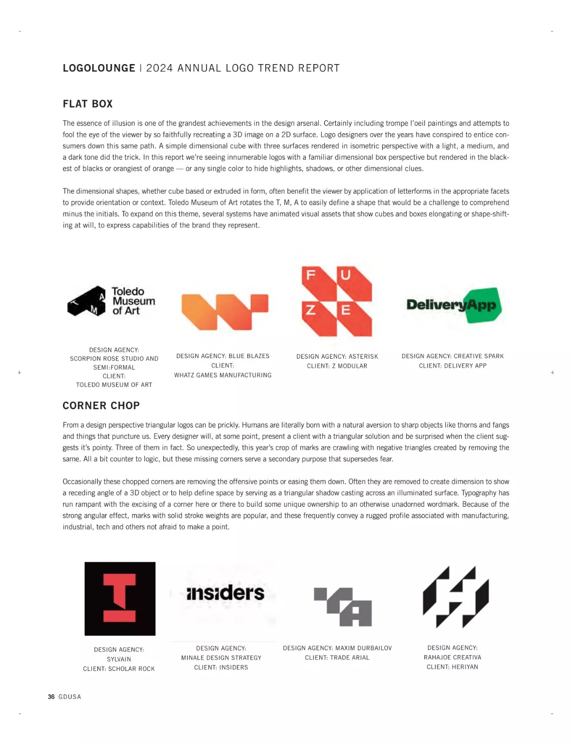
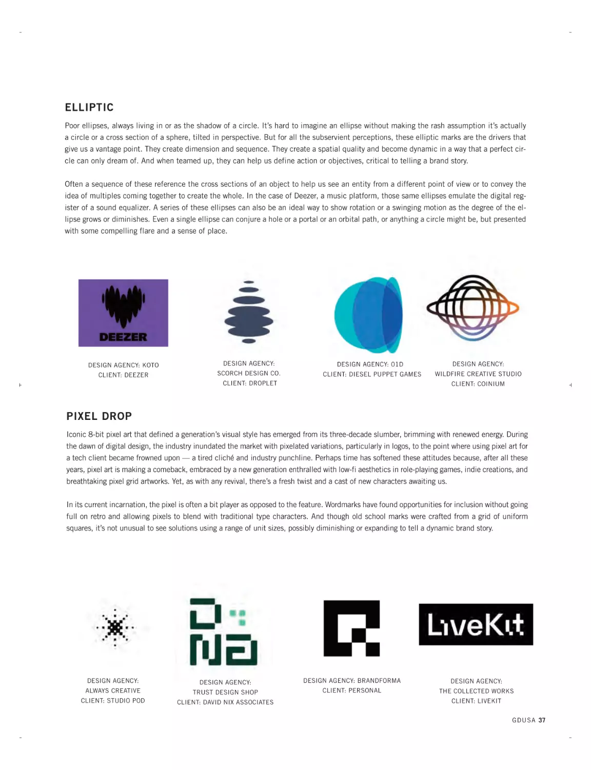
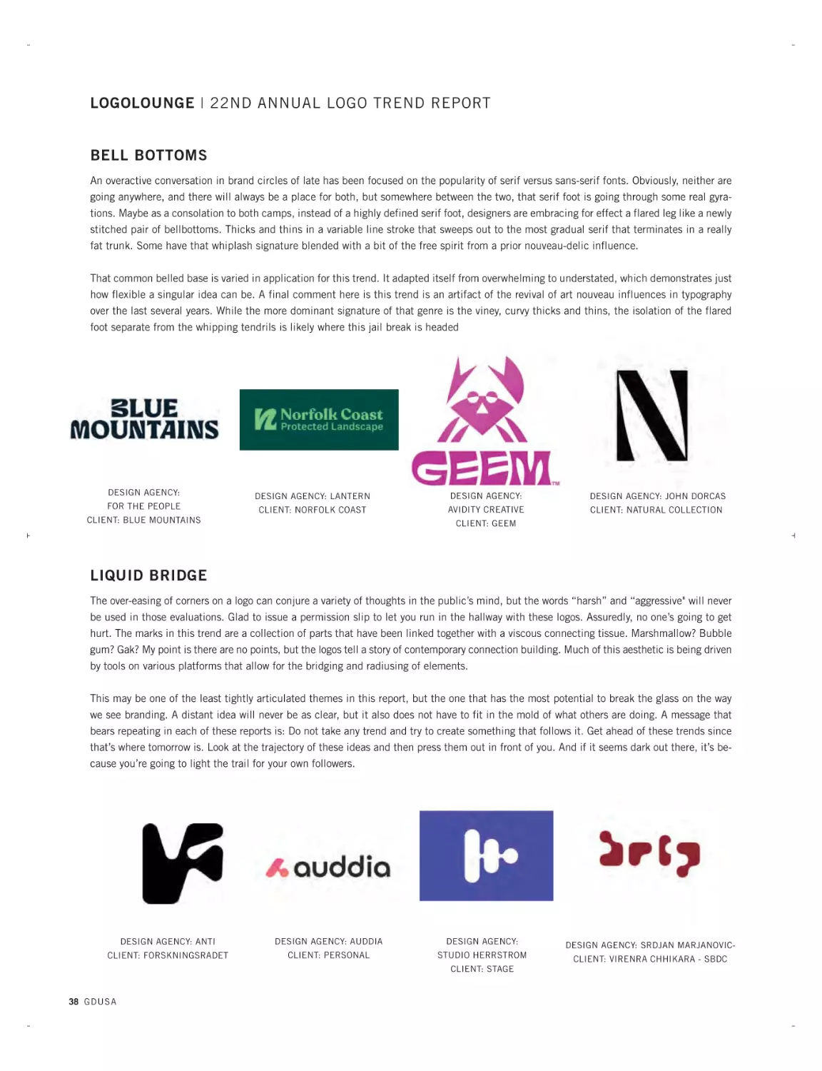
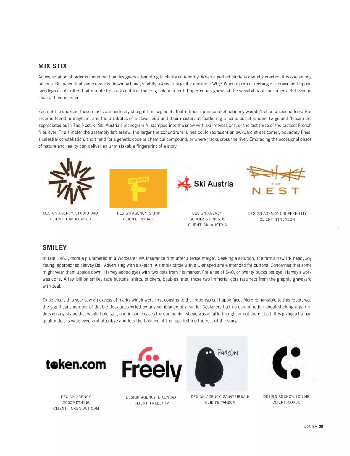
LOGOLOUNGE
TREND REPORT
JU N E 2024
BILLERUD-Sterling Premium-JUNE2024-IFC_Layout 1 6/19/24 2:08 PM Page 1
BILLERUD-Sterling Premium-JUNE2024-IFC_Layout 1 6/19/24 2:10 PM Page 2
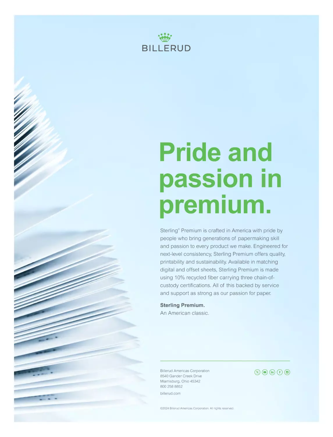
Pride and
passion in
premium.
Sterling® Premium is crafted in America with pride by
people who bring generations of papermaking skill
and passion to every product we make. Engineered for
next-level consistency, Sterling Premium offers quality,
printability and sustainability. Available in matching
digital and offset sheets, Sterling Premium is made
using 10% recycled fiber carrying three chain-ofcustody certifications. All of this backed by service
and support as strong as our passion for paper.
Sterling Premium.
An American classic.
Billerud Americas Corporation
8540 Gander Creek Drive
Miamisburg, Ohio 45342
800 258 8852
billerud.com
©2024 Billerud Americas Corporation. All rights reserved.
JUNE 2024 PUBLETTER-GK.qxp_feb news play 6/19/24 10:30 AM Page 2
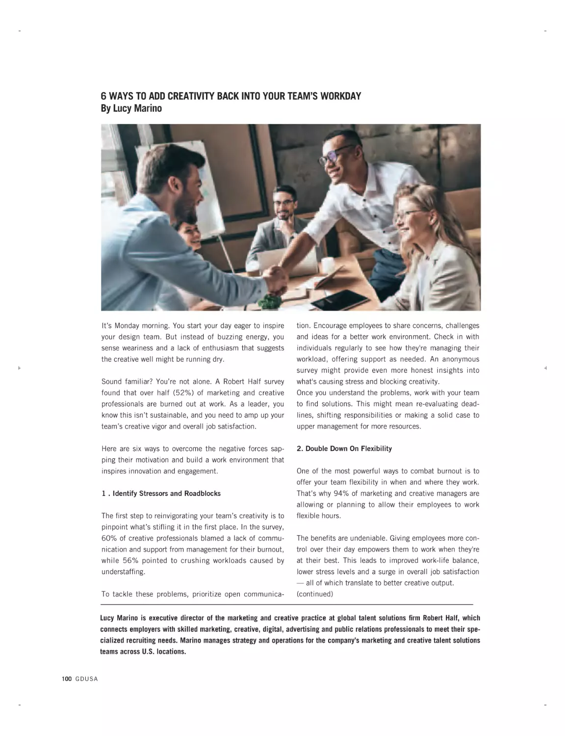
LETTER FROM THE EDITORS | TWO THINGS CAN BE TRUE AT THE SAME TIME
2024 cliches can be tiresome. My candidate for most overused:
“Is the juice worth the squeeze?” Second place is any phrase
with the word “Weaponization” in it. And given the election
matchup foisted on us, an honorable mention goes to the ever
popular “choice between the lesser of two evils.”
But even the most annoying cliche can be revealing and here is an example — “Two
things can be true at the same time” — that I am leaning upon to help make sense of
a seeming inconsistency in our June 2024 edition: first, online design is showing dazzling exponential growth and carrying our GDUSA Digital Design Awards along with it
while, second, GDUSA readers participating in our 61st annual print survey adamantly
and obdurately assert their belief in the power — and the future — of print.
GORDON KAYE AND SASHA KAYE-WALSH
ARE EDITORS AT GDUSA
Comments, suggestions and letters
can be sent to editorial@ gdusa.com.
This year’s digital design showcase is the story of a medium’s sheer potency to reach, engage and communicate. Our awards competition, formerly known as ‘web design,’ was
broadened last year to include not only websites, but also social media and email marketing, digital ads and publications, video and animation, UX and UI design, and more.
Thousands of entries were receive this year — more than twice that of two years ago —
and only a select handful are featured today. The trajectory is steep but no credit to us.
Rather, it reflects the fact that digital communication, and those who create and produce
it, are in a virtuous cycle: burgeoning demand, richer tools, more stable technologies and
infrastructure, and an increasingly sophisticated appreciation for how sound graphic design principals contribute to ultimate success.
Meanwhile, our traditional print and paper reader survey has a somewhat different story
to tell. Reduced to its essence, the poll finds that print remains crucial in how professional graphic designers earn a living — fully 96% work in print as part of their mix and
62% of projects have a print component. And it reaffirms that print and paper remain
relevant because they have classic strengths and inherent qualities that can forge a
human connection and an intimacy often missing from modern life. The message: print
has authenticity and impact because it feels real and present.
In the face of these editorial features running in tandem — and the possibly conflicting
tales they tell — I find comfort in the “two things can be true” mantra. And I am reminded
of a few wise utterances captured by our poll. One such comment: “In marketing and advertising, all channels are additive; they do not replace each other.” A second: “When it
comes to media decisions and creative solutions that work, the design mind thinks about
‘AND’ rather than ‘OR’.” And yet a third: “We are at a point where digital and print are
synchronizing.” Possible future cliches, but right now they feel fresh and meaningful.
READING THE TEA LEAVES
Though I haven’t left much room, I would be remiss not to note Bill Gardner’s annual
LogoLounge trend report or his graciousness in allowing us to publish it for the 22nd
straight year. The incomparable Mr. Gardner is heading toward half a million logos compiled and reviewed through LogoLounge.com, an endless source of information and inspiration. More than ever, he commands attention with a sweeping overview of the past
year’s logo designs — the context and culture from which they arise — the patterns he
gleans — and the sagacity he shares along the way. The changing role ofthe logo? The
impact of AI and technology? The rise of stickers? The softening of edges? The meaning of ‘Corner Chop’ and ‘Pixel Drop’? The answers are all here and more.
And, yes, the juice is worth the squeeze.
— GK
feb24ads.qxp_aug 22 ads 2/10/24 12:13 PM Page 5
JUNE 2024 TOC - STAFFBOX-GK.qxp_SEPT 07 TOC/Staff 6/19/24 11:05 AM Page 4
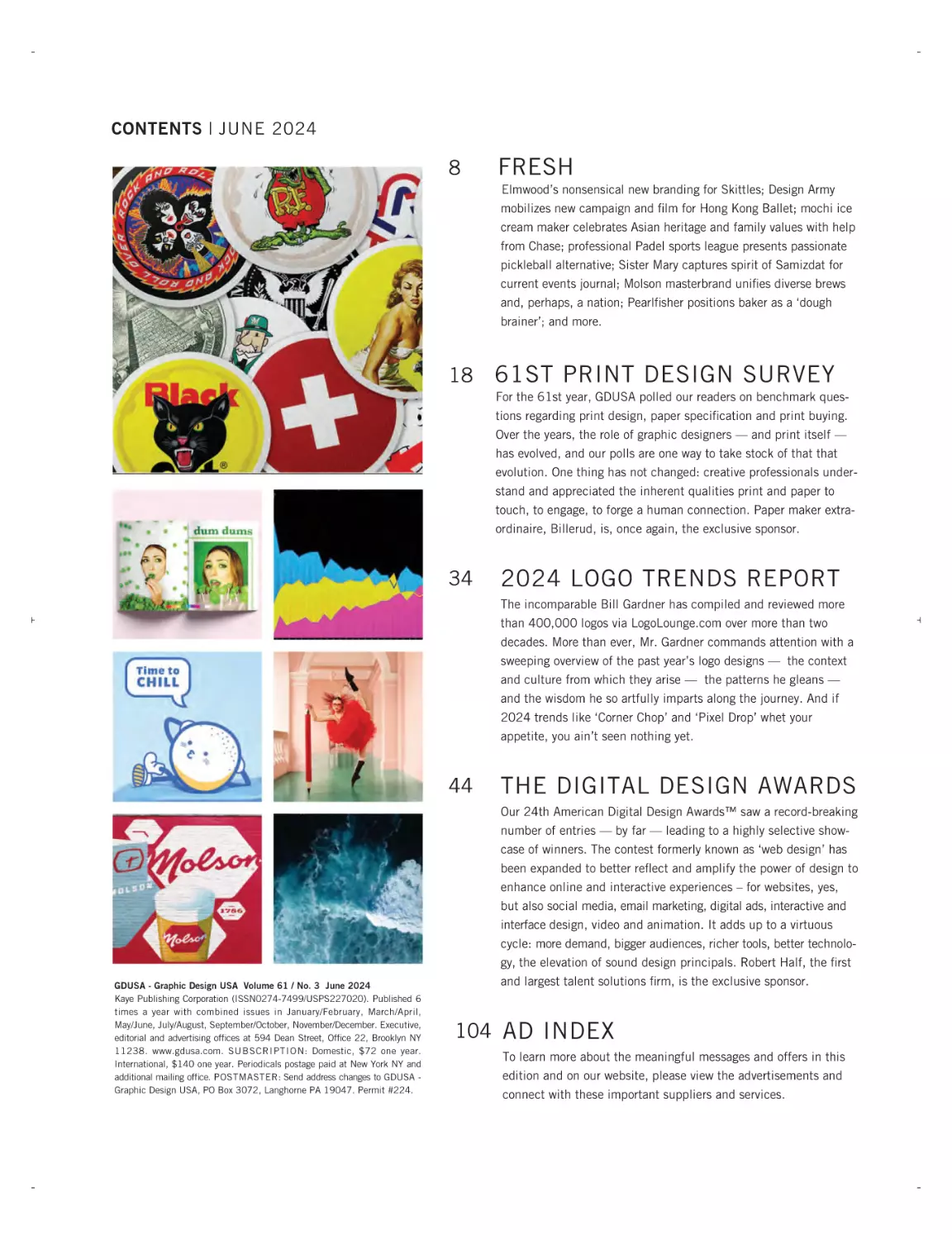
CONTENTS | JUNE 2024
8
FRESH
Elmwood’s nonsensical new branding for Skittles; Design Army
mobilizes new campaign and film for Hong Kong Ballet; mochi ice
cream maker celebrates Asian heritage and family values with help
from Chase; professional Padel sports league presents passionate
pickleball alternative; Sister Mary captures spirit of Samizdat for
current events journal; Molson masterbrand unifies diverse brews
and, perhaps, a nation; Pearlfisher positions baker as a ‘dough
brainer’; and more.
18
61ST PRINT DESIGN SURVEY
For the 61st year, GDUSA polled our readers on benchmark questions regarding print design, paper specification and print buying.
Over the years, the role of graphic designers — and print itself —
has evolved, and our polls are one way to take stock of that that
evolution. One thing has not changed: creative professionals understand and appreciated the inherent qualities print and paper to
touch, to engage, to forge a human connection. Paper maker extraordinaire, Billerud, is, once again, the exclusive sponsor.
34
2024 LOGO TRENDS REPORT
The incomparable Bill Gardner has compiled and reviewed more
than 400,000 logos via LogoLounge.com over more than two
decades. More than ever, Mr. Gardner commands attention with a
sweeping overview of the past year’s logo designs — the context
and culture from which they arise — the patterns he gleans —
and the wisdom he so artfully imparts along the journey. And if
2024 trends like ‘Corner Chop’ and ‘Pixel Drop’ whet your
appetite, you ain’t seen nothing yet.
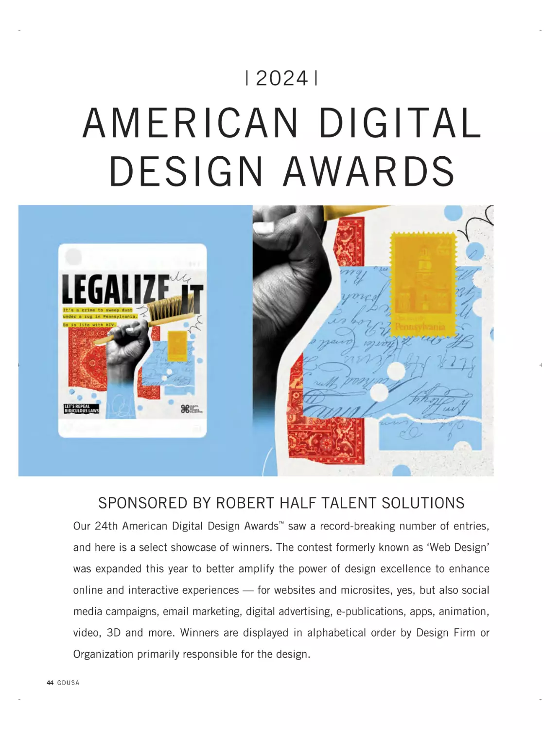
44
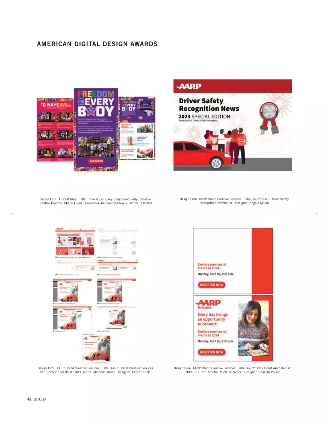
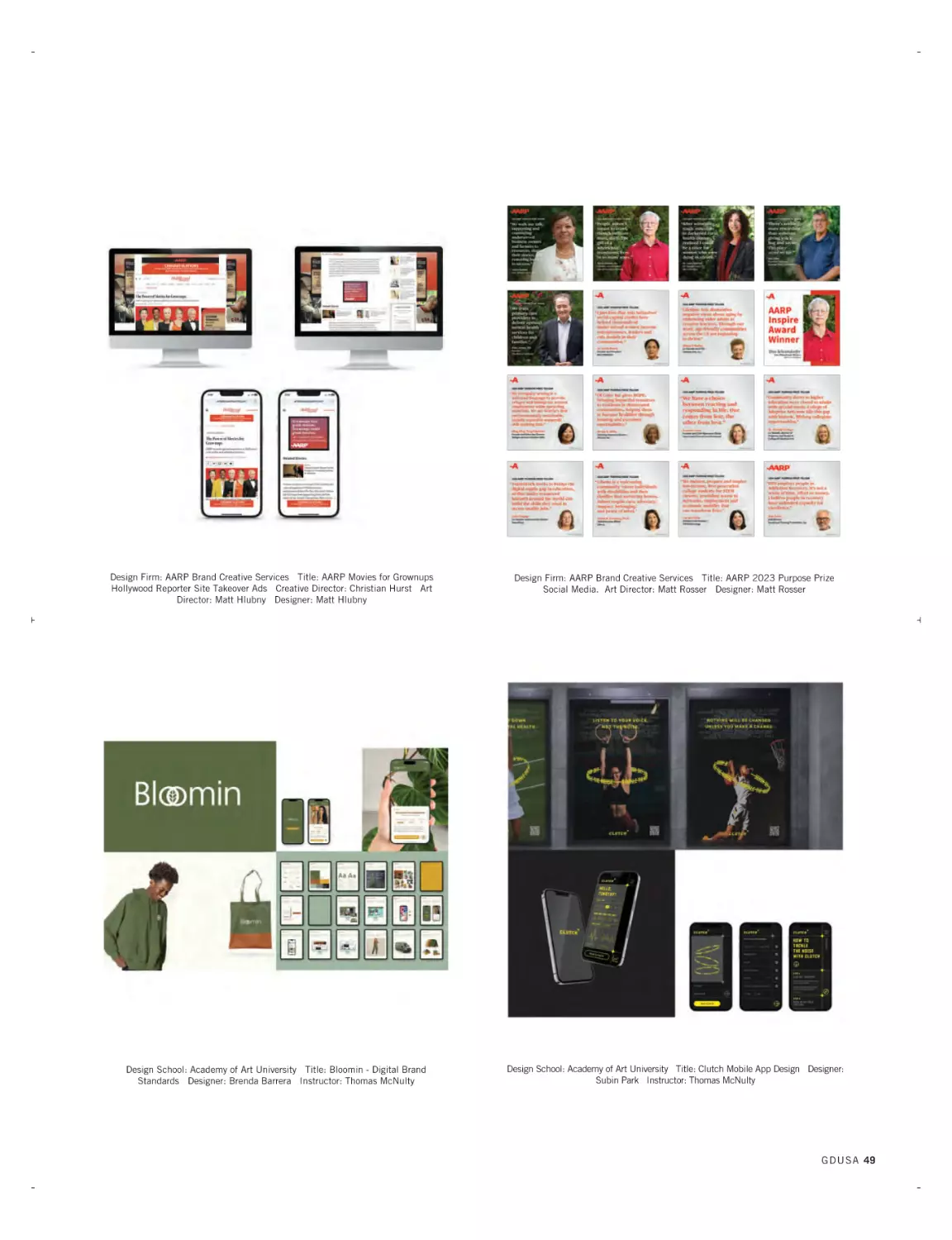
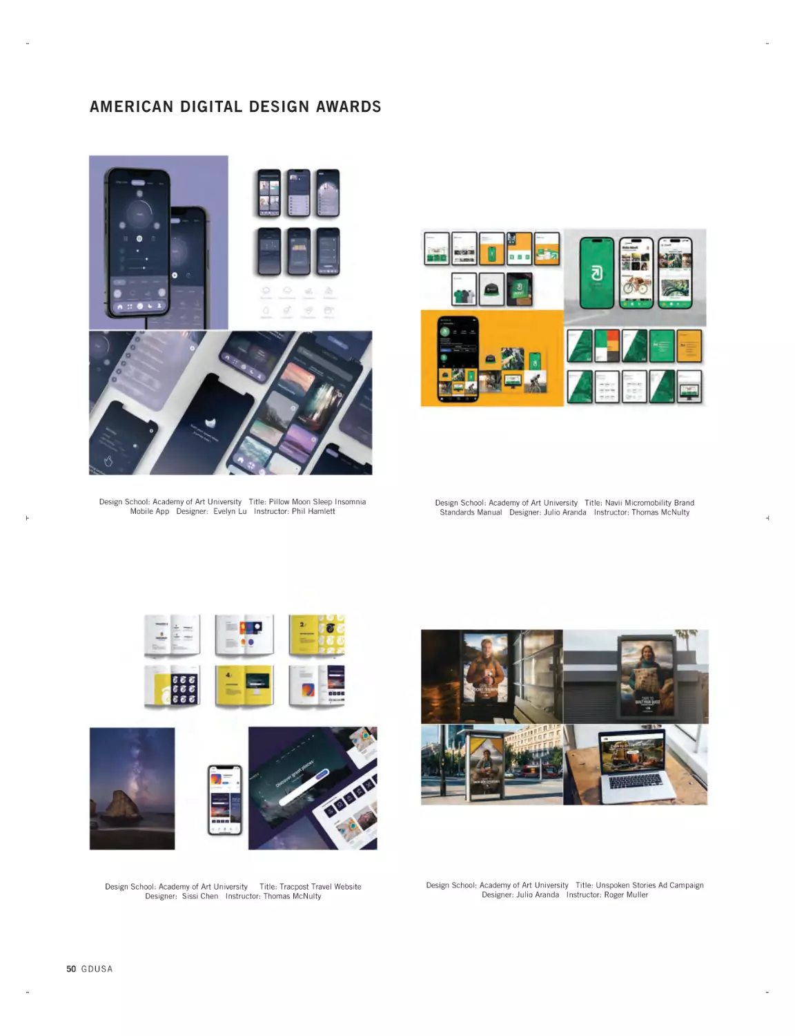
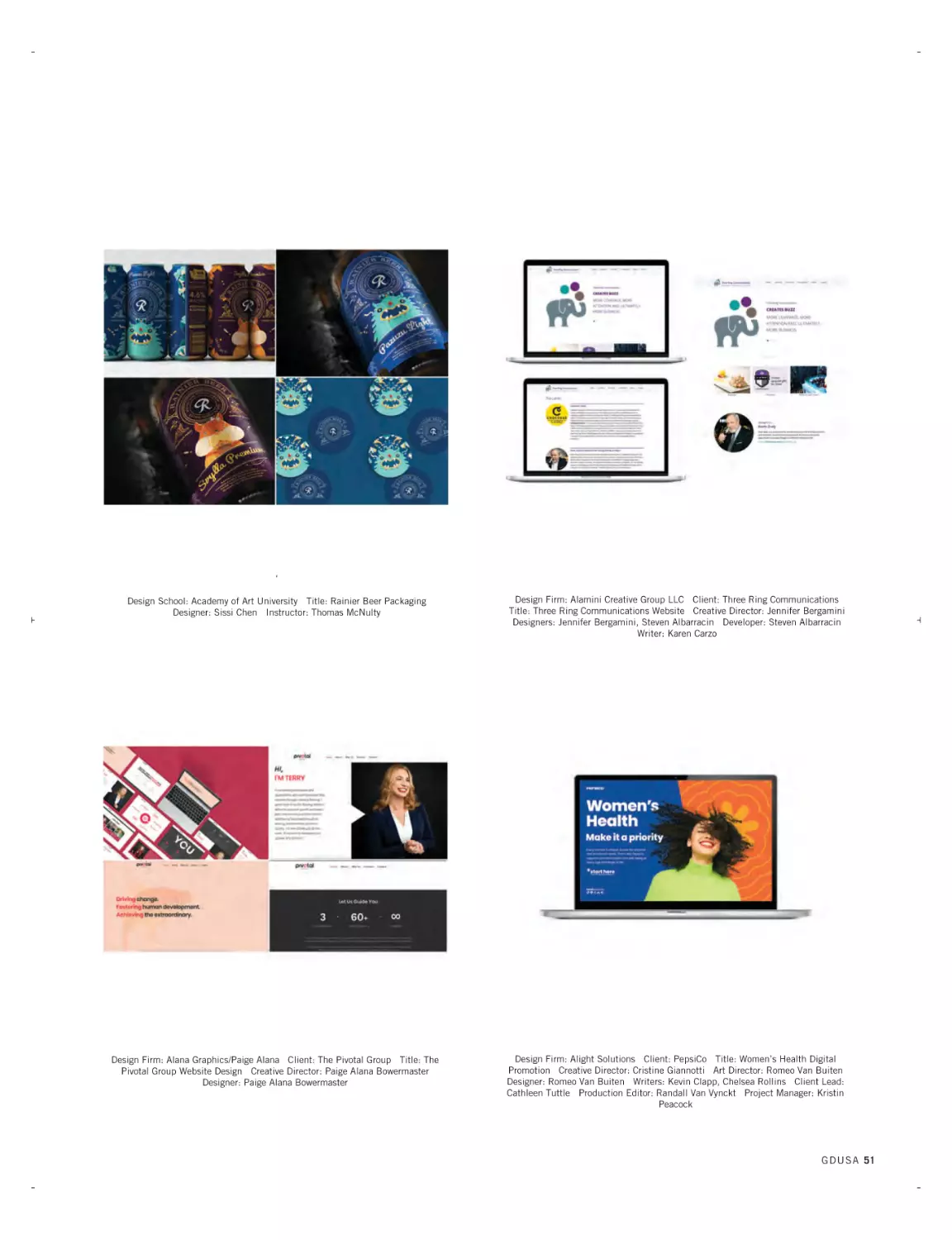
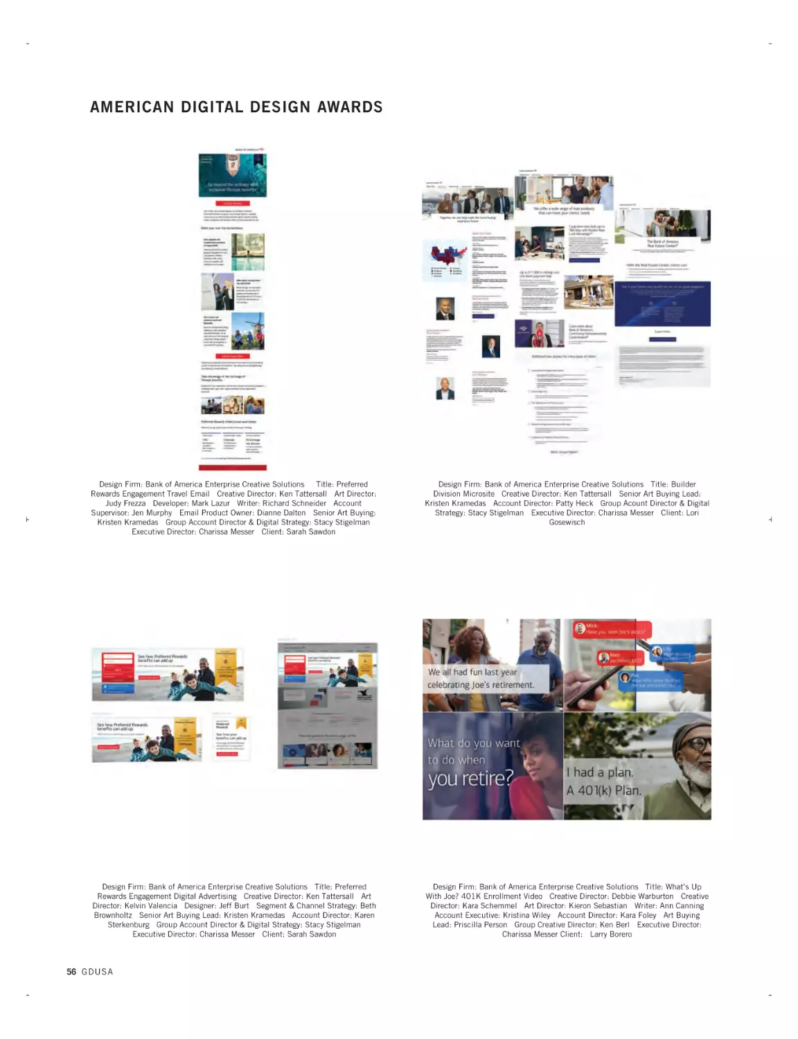
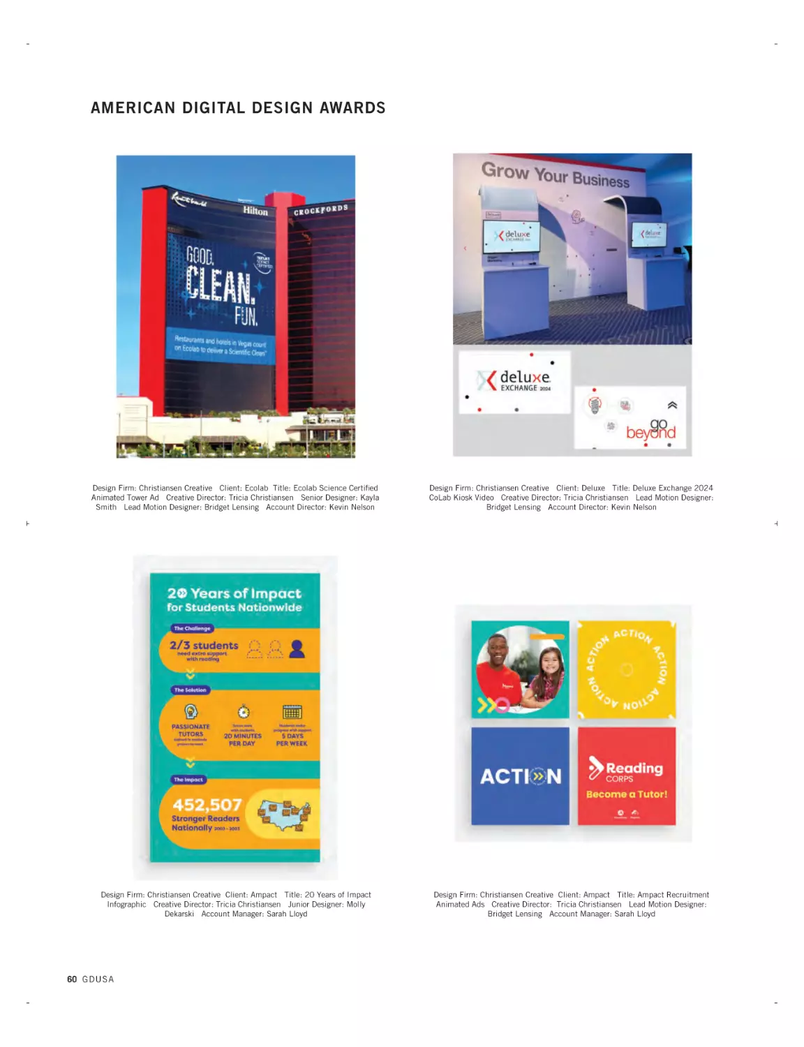
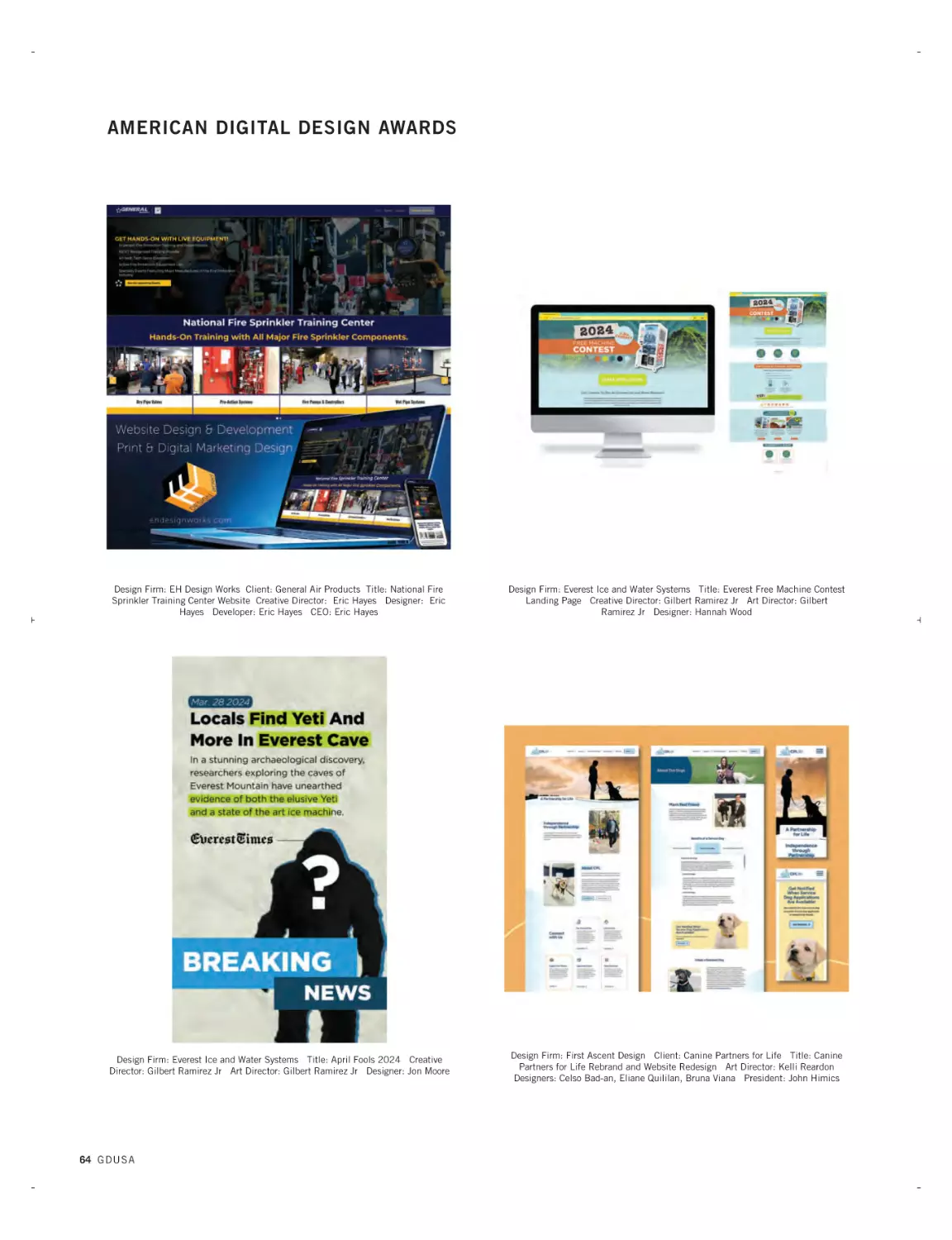
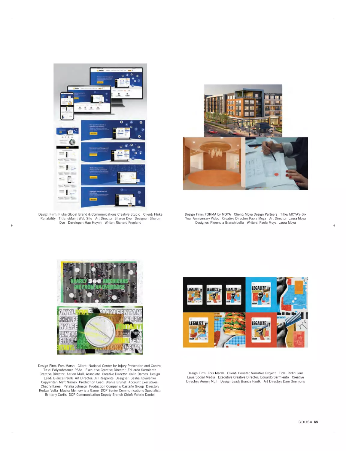
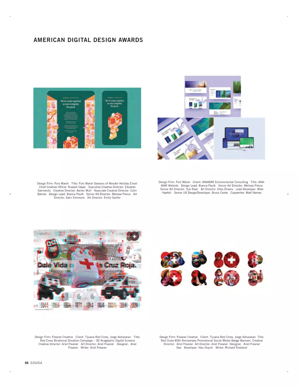
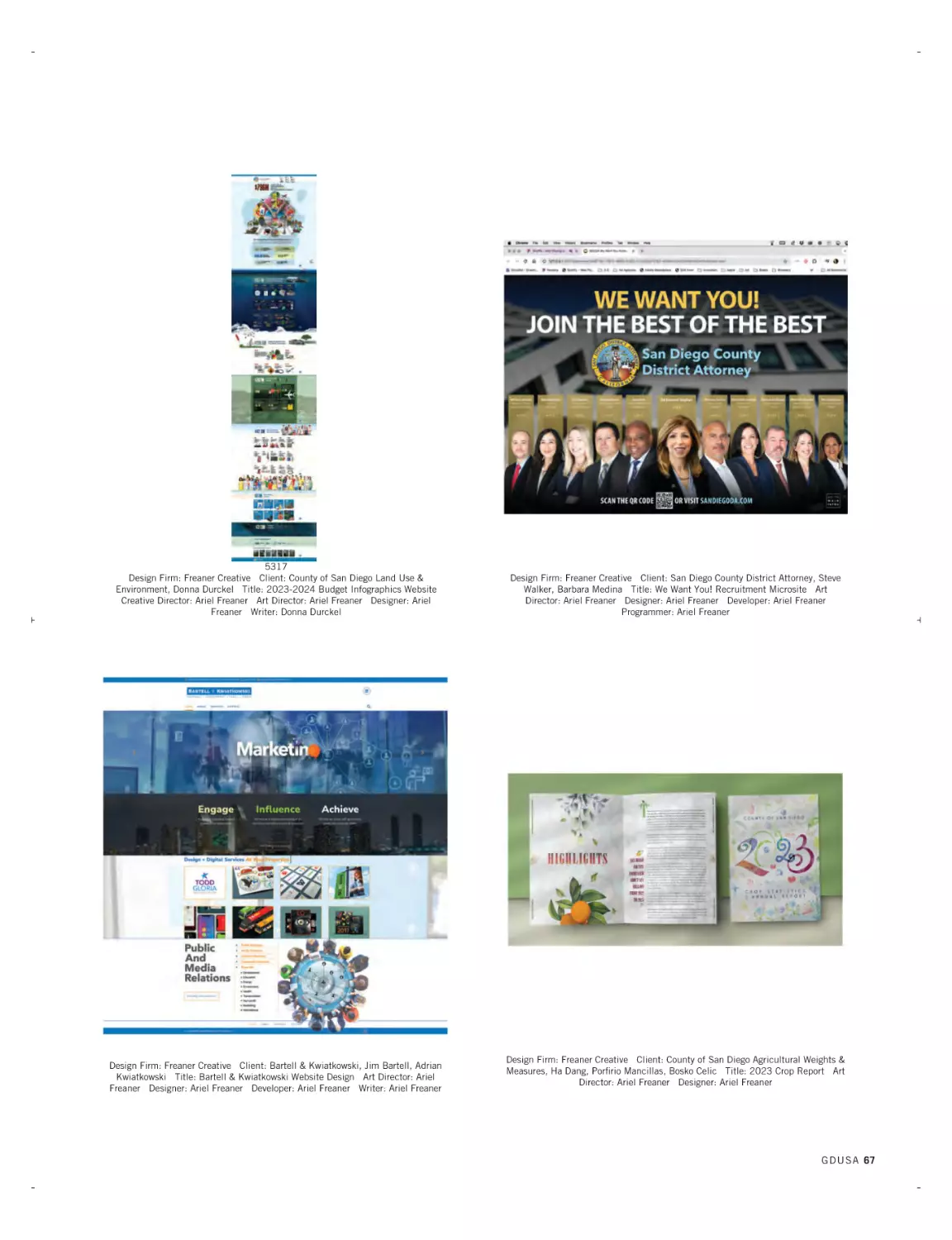
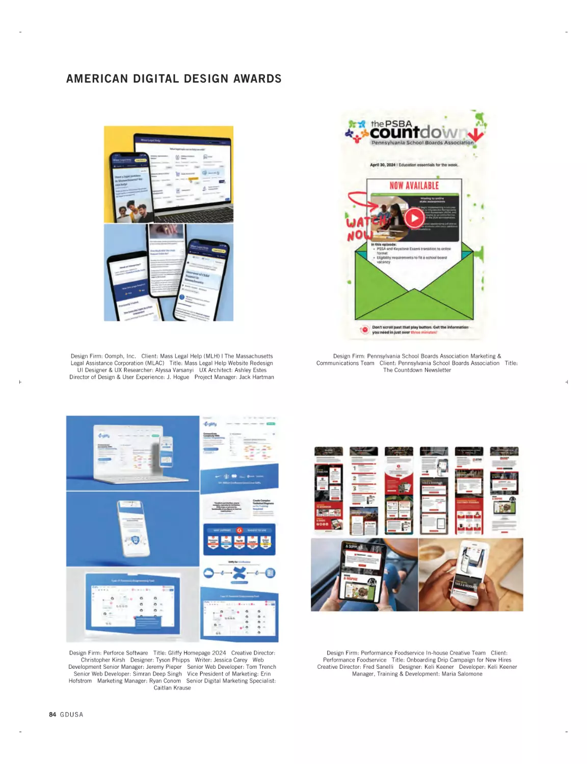
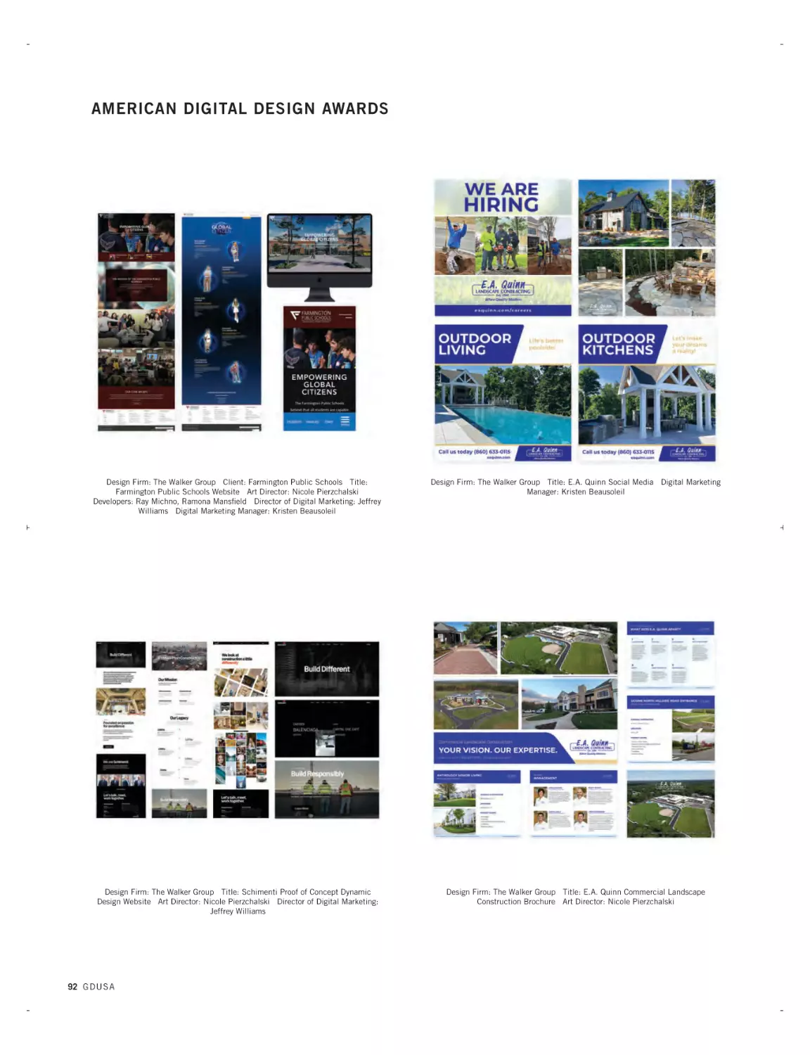
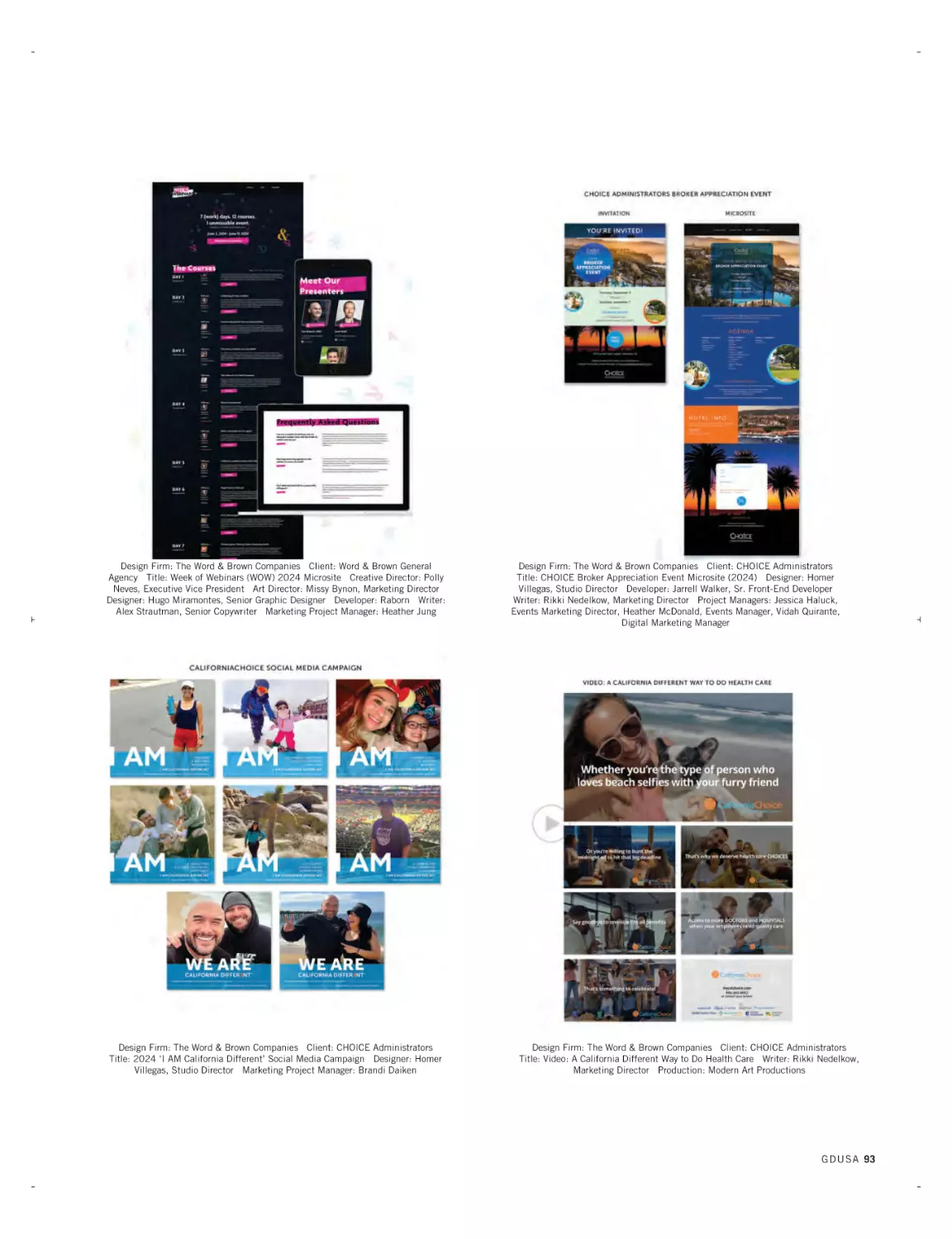
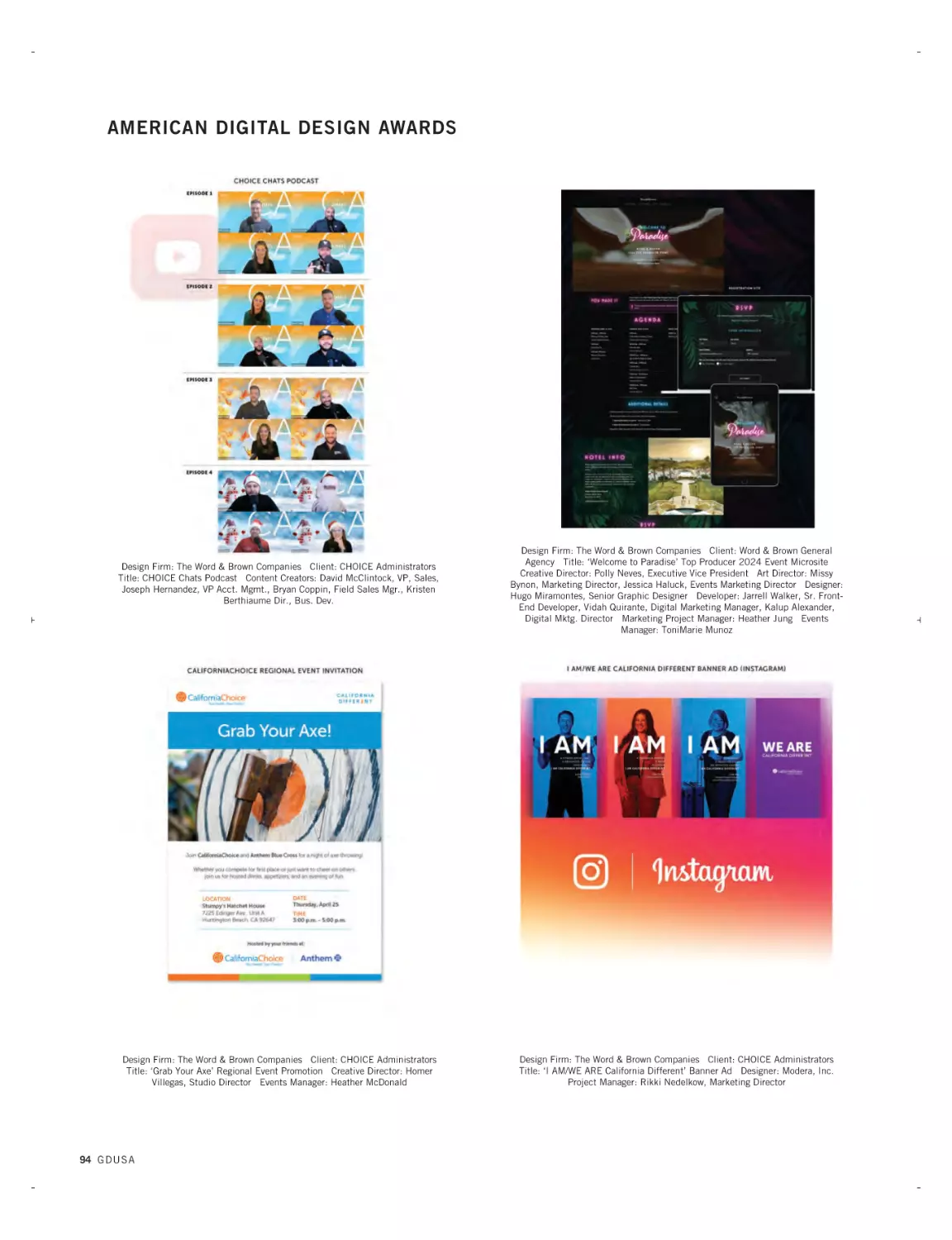
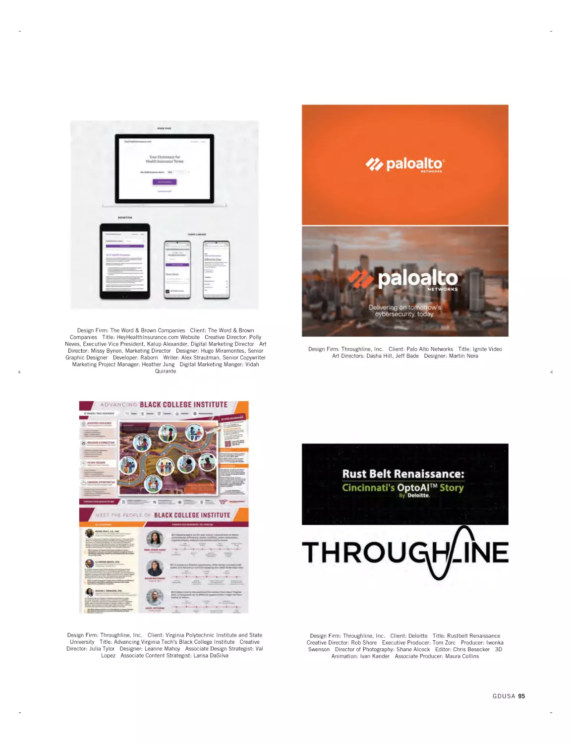
THE DIGITAL DESIGN AWARDS
Our 24th American Digital Design Awards™ saw a record-breaking
number of entries — by far — leading to a highly selective showcase of winners. The contest formerly known as ‘web design’ has
been expanded to better reflect and amplify the power of design to
enhance online and interactive experiences – for websites, yes,
but also social media, email marketing, digital ads, interactive and
interface design, video and animation. It adds up to a virtuous
cycle: more demand, bigger audiences, richer tools, better technology, the elevation of sound design principals. Robert Half, the first
GDUSA - Graphic Design USA Volume 61 / No. 3 June 2024
Kaye Publishing Corporation (ISSN0274-7499/USPS227020). Published 6
times a year with combined issues in January/February, March/April,
May/June, July/August, September/October, November/December. Executive,
editorial and advertising offices at 594 Dean Street, Office 22, Brooklyn NY
11238. www.gdusa.com. SUBSCRIPTION: Domestic, $72 one year.
International, $140 one year. Periodicals postage paid at New York NY and
additional mailing office. POSTMASTER: Send address changes to GDUSA Graphic Design USA, PO Box 3072, Langhorne PA 19047. Permit #224.
and largest talent solutions firm, is the exclusive sponsor.
104 AD INDEX
To learn more about the meaningful messages and offers in this
edition and on our website, please view the advertisements and
connect with these important suppliers and services.
Cougar® is noted as the premium paper of choice for conveying emotion
and creating memorable experiences. With three luxurious finishes, two colors,
matching envelopes, an extensive digital offering and a vast array of sizes
and weights, Cougar is a powerful way to bring your project to life.
Request your copy of the new
Cougar Paper Trails series.
bit.ly/3tJmmh8
JUNE 2024 TOC - STAFFBOX-GK.qxp_SEPT 07 TOC/Staff 6/19/24 11:06 AM Page 6
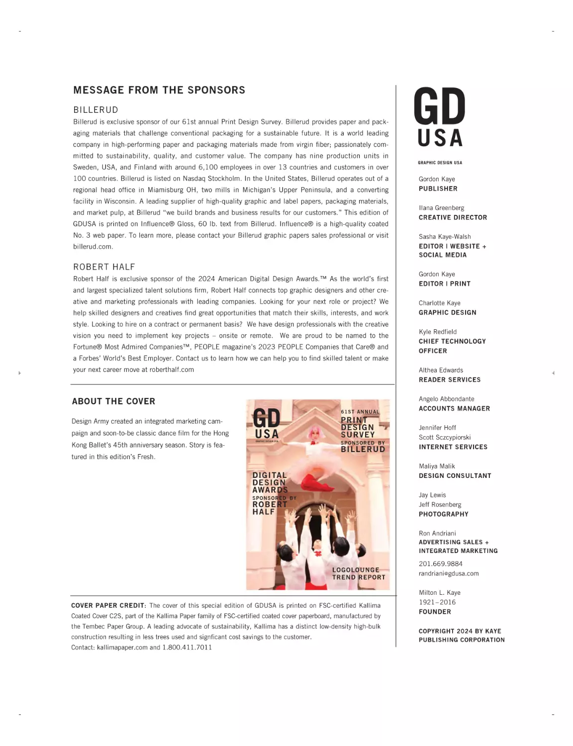
MESSAGE FROM THE SPONSORS
BILLERUD
Billerud is exclusive sponsor of our 61st annual Print Design Survey. Billerud provides paper and packaging materials that challenge conventional packaging for a sustainable future. It is a world leading
company in high-performing paper and packaging materials made from virgin fiber; passionately com-
GD
USA
mitted to sustainability, quality, and customer value. The company has nine production units in
Sweden, USA, and Finland with around 6,100 employees in over 13 countries and customers in over
100 countries. Billerud is listed on Nasdaq Stockholm. In the United States, Billerud operates out of a
regional head office in Miamisburg OH, two mills in Michigan’s Upper Peninsula, and a converting
GRAPHIC DESIGN USA
Gordon Kaye
PUBLISHER
facility in Wisconsin. A leading supplier of high-quality graphic and label papers, packaging materials,
and market pulp, at Billerud “we build brands and business results for our customers.” This edition of
Ilana Greenberg
CREATIVE DIRECTOR
GDUSA is printed on Influence® Gloss, 60 lb. text from Billerud. Influence® is a high-quality coated
No. 3 web paper. To learn more, please contact your Billerud graphic papers sales professional or visit
billerud.com.
Sasha Kaye-Walsh
EDITOR | WEBSITE +
SOCIAL MEDIA
ROBERT HALF
Robert Half is exclusive sponsor of the 2024 American Digital Design Awards.™ As the world’s first
Gordon Kaye
EDITOR | PRINT
and largest specialized talent solutions firm, Robert Half connects top graphic designers and other creative and marketing professionals with leading companies. Looking for your next role or project? We
help skilled designers and creatives find great opportunities that match their skills, interests, and work
Charlotte Kaye
GRAPHIC DESIGN
style. Looking to hire on a contract or permanent basis? We have design professionals with the creative
vision you need to implement key projects – onsite or remote. We are proud to be named to the
Fortune® Most Admired Companies™, PEOPLE magazine’s 2023 PEOPLE Companies that Care® and
Kyle Redfield
CHIEF TECHNOLOGY
OFFICER
a Forbes’ World’s Best Employer. Contact us to learn how we can help you to find skilled talent or make
your next career move at roberthalf.com
Althea Edwards
READER SERVICES
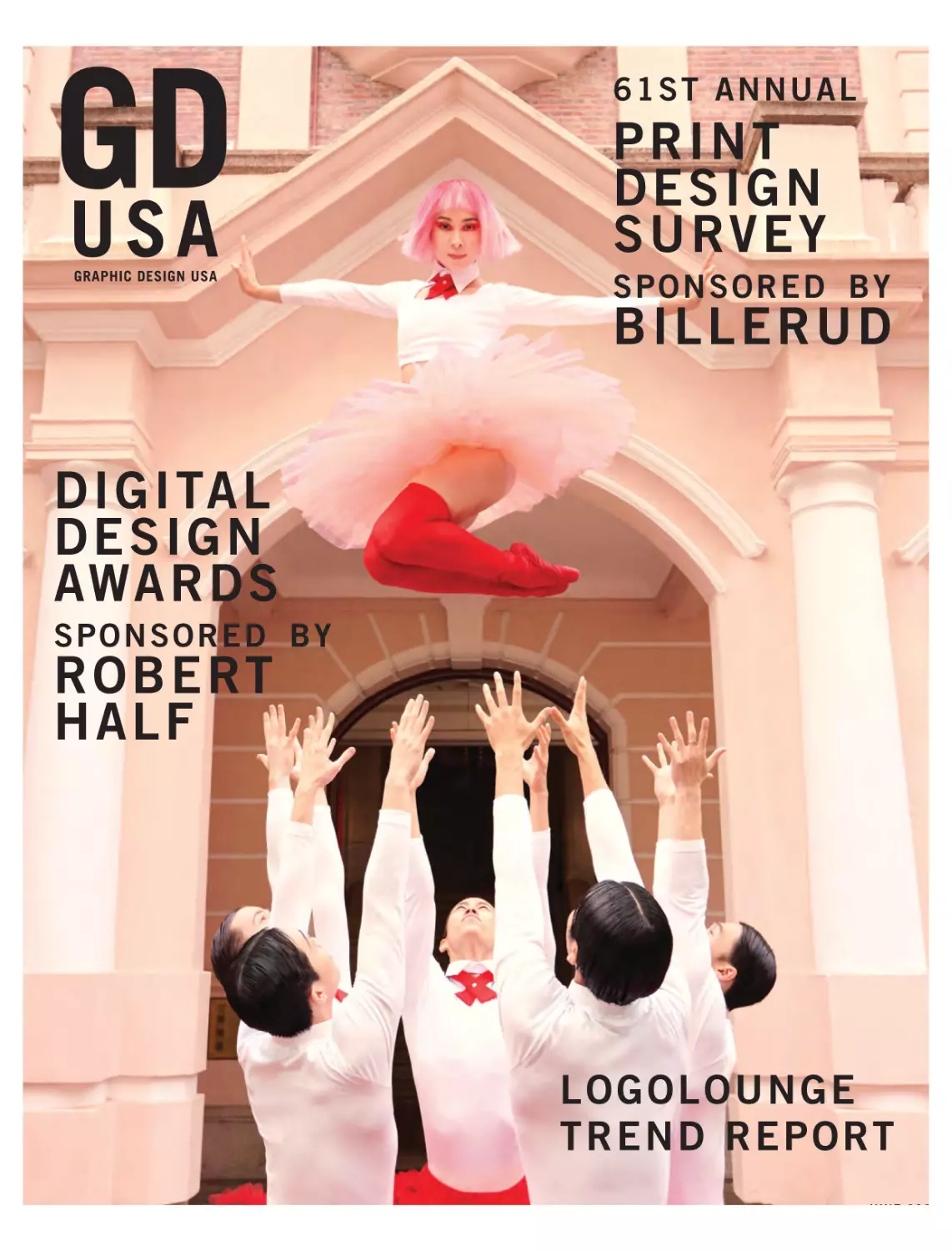
ABOUT THE COVER
Angelo Abbondante
ACCOUNTS MANAGER
Design Army created an integrated marketing campaign and soon-to-be classic dance film for the Hong
Kong Ballet’s 45th anniversary season. Story is fea-
GD
USA
GRAPHIC DESIGN USA
61ST ANNUAL
PRINT
DESIGN
SURVEY
SPONSORED BY
BILLERUD
Jennifer Hoff
Scott Sczcypiorski
INTERNET SERVICES
tured in this edition’s Fresh.
Maliya Malik
DESIGN CONSULTANT
DIGITAL
DESIGN
AWARDS
Jay Lewis
Jeff Rosenberg
PHOTOGRAPHY
SPONSORED BY
ROBERT
HALF
Ron Andriani
ADVERTISING SALES +
INTEGRATED MARKETING
LOGOLOUNGE
TREND REPORT
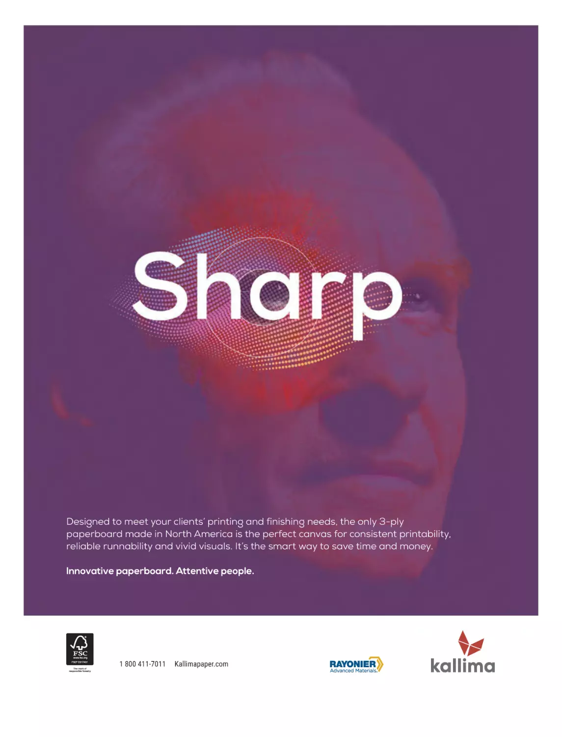
COVER PAPER CREDIT: The cover of this special edition of GDUSA is printed on FSC-certified Kallima
Coated Cover C2S, part of the Kallima Paper family of FSC-certified coated cover paperboard, manufactured by
the Tembec Paper Group. A leading advocate of sustainability, Kallima has a distinct low-density high-bulk
construction resulting in less trees used and signficant cost savings to the customer.
Contact: kallimapaper.com and 1.800.411.7011
201.669.9884
randriani@ gdusa.com
Milton L. Kaye
1921– 2016
FOUNDER
COPYRIGHT 2024 BY KAYE
PUBLISHING CORPORATION
JUNE2024FRESHimpo-GK (1).qxp_feb news play 6/19/24 1:52 PM Page 10
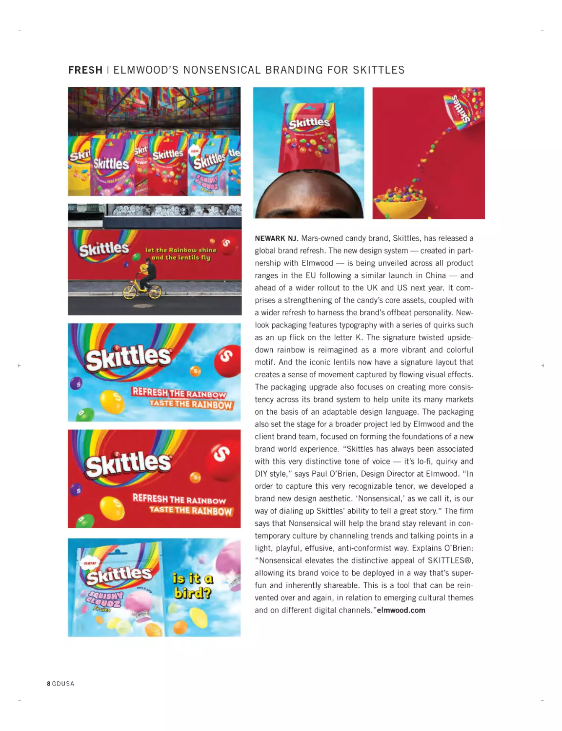
FRESH | ELMWOOD’S NONSENSICAL BRANDING FOR SKITTLES
NEWARK NJ. Mars-owned candy brand, Skittles, has released a
global brand refresh. The new design system — created in partnership with Elmwood — is being unveiled across all product
ranges in the EU following a similar launch in China — and
ahead of a wider rollout to the UK and US next year. It comprises a strengthening of the candy’s core assets, coupled with
a wider refresh to harness the brand’s offbeat personality. Newlook packaging features typography with a series of quirks such
as an up flick on the letter K. The signature twisted upsidedown rainbow is reimagined as a more vibrant and colorful
motif. And the iconic lentils now have a signature layout that
creates a sense of movement captured by flowing visual effects.
The packaging upgrade also focuses on creating more consistency across its brand system to help unite its many markets
on the basis of an adaptable design language. The packaging
also set the stage for a broader project led by Elmwood and the
client brand team, focused on forming the foundations of a new
brand world experience. “Skittles has always been associated
with this very distinctive tone of voice — it’s lo-fi, quirky and
DIY style,” says Paul O’Brien, Design Director at Elmwood. “In
order to capture this very recognizable tenor, we developed a
brand new design aesthetic. ‘Nonsensical,’ as we call it, is our
way of dialing up Skittles’ ability to tell a great story.” The firm
says that Nonsensical will help the brand stay relevant in contemporary culture by channeling trends and talking points in a
light, playful, effusive, anti-conformist way. Explains O’Brien:
“Nonsensical elevates the distinctive appeal of SKITTLES®,
allowing its brand voice to be deployed in a way that’s superfun and inherently shareable. This is a tool that can be reinvented over and again, in relation to emerging cultural themes
and on different digital channels.”elmwood.com
8 GD U S A
of r d he
pr the esig La
th ogr Sy ne tes
dir at s am. racu rs a t D
de ect pan Th se re th es
ar sign ion a b eir p Uni e n ign
e a , , e ro o ve ew T
al
lik we dit ad rtf rsi e
o
s
o
b
t
e
r
t
. V d ria an lio y c e ent
vp
iew esi l d ge s re om dit
a.
gn es o
sy
pr mu ion
t
f
i
h
a
g
s
r.e
e i nd n, ki ese nic to
mp a pa lls nt a th
du
re dve cka inc div tion e le
/c
ss rt g lud er s ga
m
ive isi ing in se de cy
d2
co ng. de g b pr sig
02
lle No sig ra oje n
3
n
ct
ion two n, U din cts
of po I/U g, a
wo rtf X rt
rk oli
he os
re
:
Hi
O re t
u
NE
TA W
PR LE
EV N
T
IE
W
feb24ads.qxp_aug 22 ads 2/10/24 12:16 PM Page 21
SCHOOL OF DESIGN
admissu@syr.edu
315.443.2769
vpa.syr.edu/cmd2023
@su_commdesign
JUNE2024FRESHimpo-GK (1).qxp_feb news play 6/19/24 1:53 PM Page 12
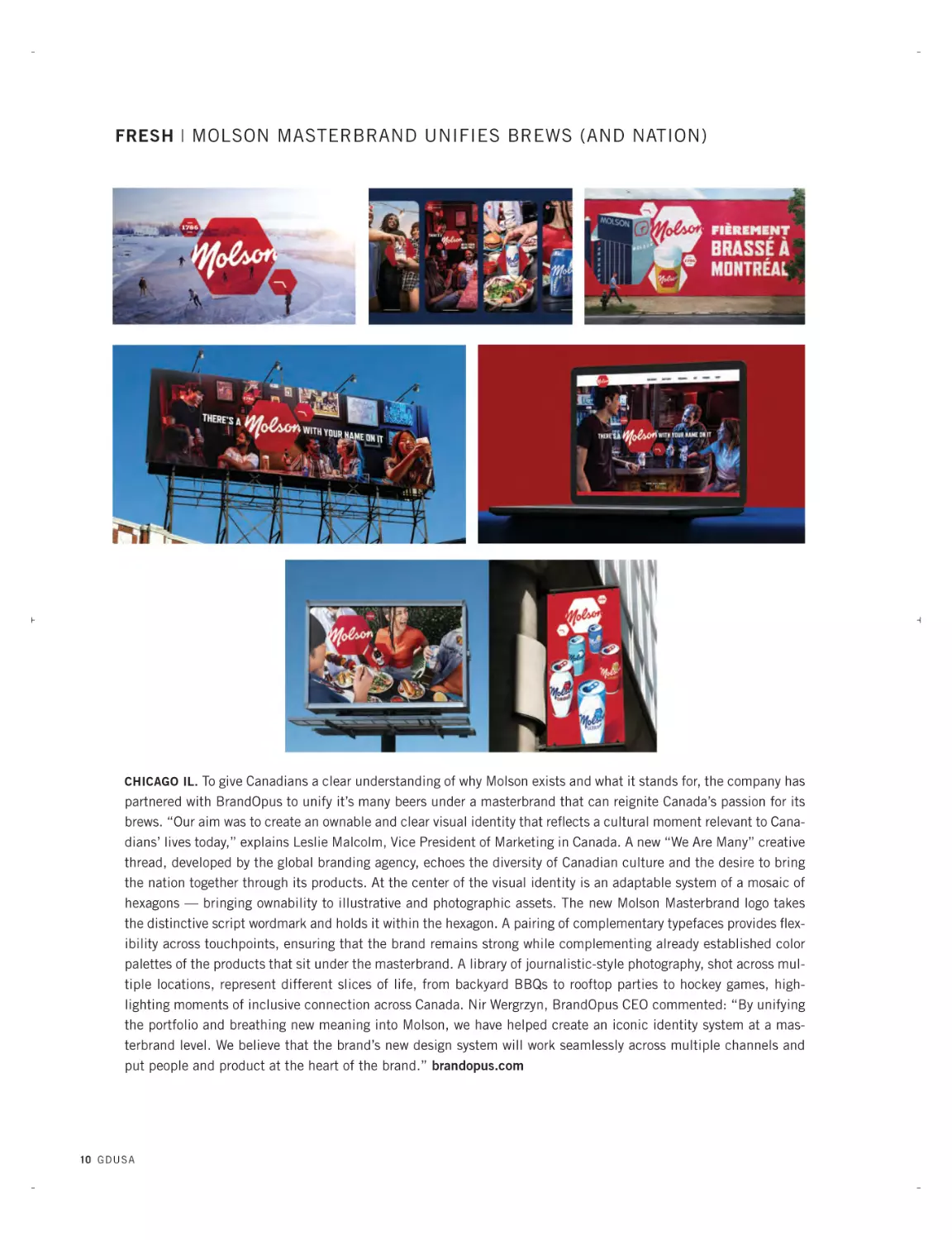
FRESH | MOLSON MASTERBRAND UNIFIES BREWS (AND NATION)
CHICAGO IL. To give Canadians a clear understanding of why Molson exists and what it stands for, the company has
partnered with BrandOpus to unify it’s many beers under a masterbrand that can reignite Canada’s passion for its
brews. “Our aim was to create an ownable and clear visual identity that reflects a cultural moment relevant to Canadians’ lives today,” explains Leslie Malcolm, Vice President of Marketing in Canada. A new “We Are Many” creative
thread, developed by the global branding agency, echoes the diversity of Canadian culture and the desire to bring
the nation together through its products. At the center of the visual identity is an adaptable system of a mosaic of
hexagons — bringing ownability to illustrative and photographic assets. The new Molson Masterbrand logo takes
the distinctive script wordmark and holds it within the hexagon. A pairing of complementary typefaces provides flexibility across touchpoints, ensuring that the brand remains strong while complementing already established color
palettes of the products that sit under the masterbrand. A library of journalistic-style photography, shot across multiple locations, represent different slices of life, from backyard BBQs to rooftop parties to hockey games, highlighting moments of inclusive connection across Canada. Nir Wergrzyn, BrandOpus CEO commented: “By unifying
the portfolio and breathing new meaning into Molson, we have helped create an iconic identity system at a masterbrand level. We believe that the brand’s new design system will work seamlessly across multiple channels and
put people and product at the heart of the brand.” brandopus.com
10 G D U S A
feb24ads.qxp_aug 22 ads 2/10/24 12:15 PM Page 17
MATCHING
TALENT WITH
SUCCESS
®
NATIONWIDE
The Great Resignation has left companies scrambling for talented
designers and creatives searching for fulfilling projects. That's where
Artisan Talent comes in. We're a boutique creative staffing agency here
to make things easier for you - whether you’re hiring talent or finding
work. From small agencies to major corporations, our team is in the
business of connecting people. That’s what makes us Artisan.
TOP PL ACED TITLES
Art Director
Product Designer
Senior Designer
Brand Designer
Digital Designer
Visual Designer
Copywriter
Graphic Designer
UI/UX Designer
ARTISANTALENT.COM
JUNE2024FRESHimpo-GK (1).qxp_feb news play 6/19/24 1:54 PM Page 14
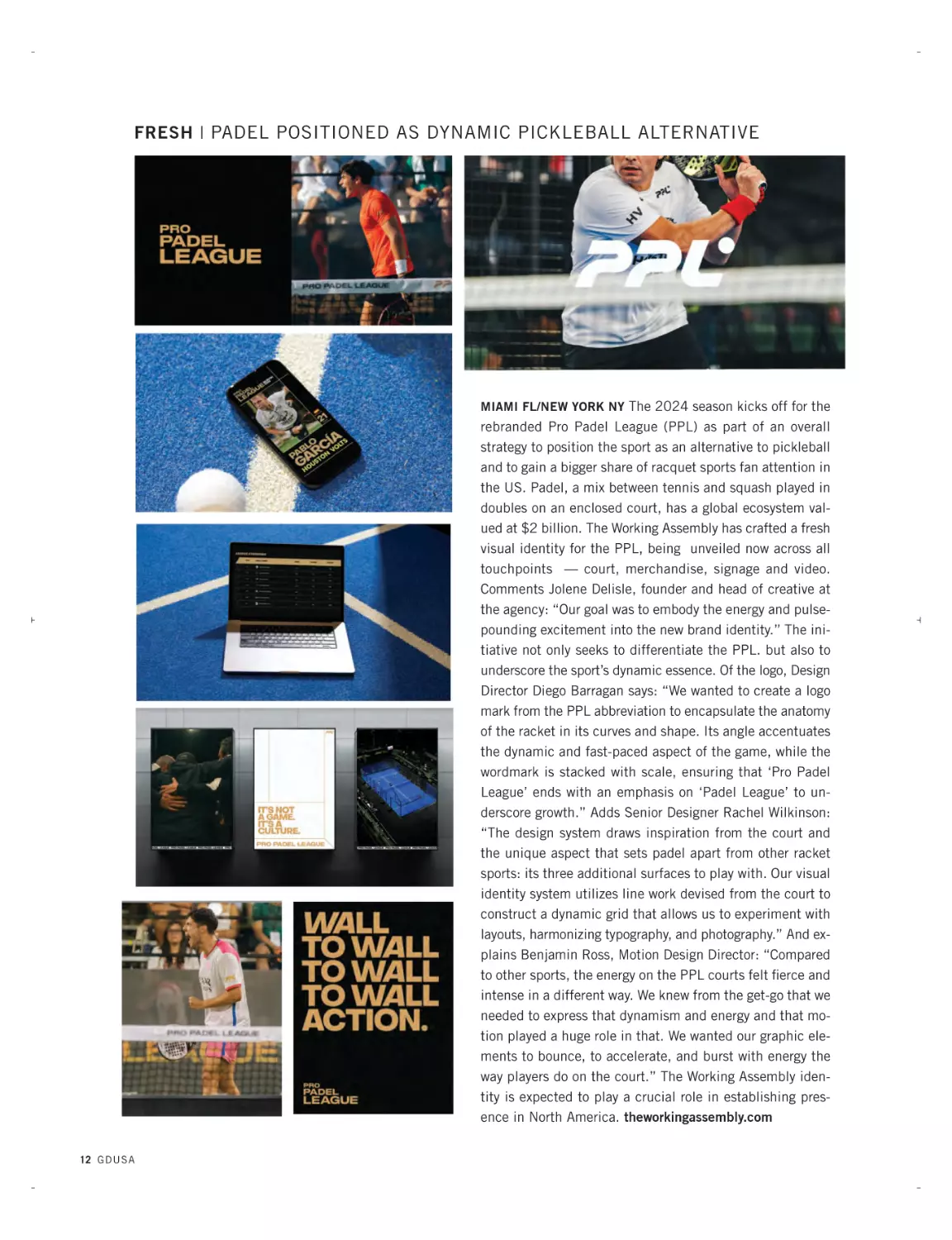
FRESH | PADEL POSITIONED AS DYNAMIC PICKLEBALL ALTERNATIVE
MIAMI FL/NEW YORK NY The 2024 season kicks off for the
rebranded Pro Padel League (PPL) as part of an overall
strategy to position the sport as an alternative to pickleball
and to gain a bigger share of racquet sports fan attention in
the US. Padel, a mix between tennis and squash played in
doubles on an enclosed court, has a global ecosystem valued at $2 billion. The Working Assembly has crafted a fresh
visual identity for the PPL, being unveiled now across all
touchpoints — court, merchandise, signage and video.
Comments Jolene Delisle, founder and head of creative at
the agency: “Our goal was to embody the energy and pulsepounding excitement into the new brand identity.” The initiative not only seeks to differentiate the PPL. but also to
underscore the sport’s dynamic essence. Of the logo, Design
Director Diego Barragan says: “We wanted to create a logo
mark from the PPL abbreviation to encapsulate the anatomy
of the racket in its curves and shape. Its angle accentuates
the dynamic and fast-paced aspect of the game, while the
wordmark is stacked with scale, ensuring that ‘Pro Padel
League’ ends with an emphasis on ‘Padel League’ to underscore growth.” Adds Senior Designer Rachel Wilkinson:
“The design system draws inspiration from the court and
the unique aspect that sets padel apart from other racket
sports: its three additional surfaces to play with. Our visual
identity system utilizes line work devised from the court to
construct a dynamic grid that allows us to experiment with
layouts, harmonizing typography, and photography.” And explains Benjamin Ross, Motion Design Director: “Compared
to other sports, the energy on the PPL courts felt fierce and
intense in a different way. We knew from the get-go that we
needed to express that dynamism and energy and that motion played a huge role in that. We wanted our graphic elements to bounce, to accelerate, and burst with energy the
way players do on the court.” The Working Assembly identity is expected to play a crucial role in establishing presence in North America. theworkingassembly.com
12 G D U S A
JUNE2024FRESHimpo-GK (1).qxp_feb news play 6/19/24 1:54 PM Page 15
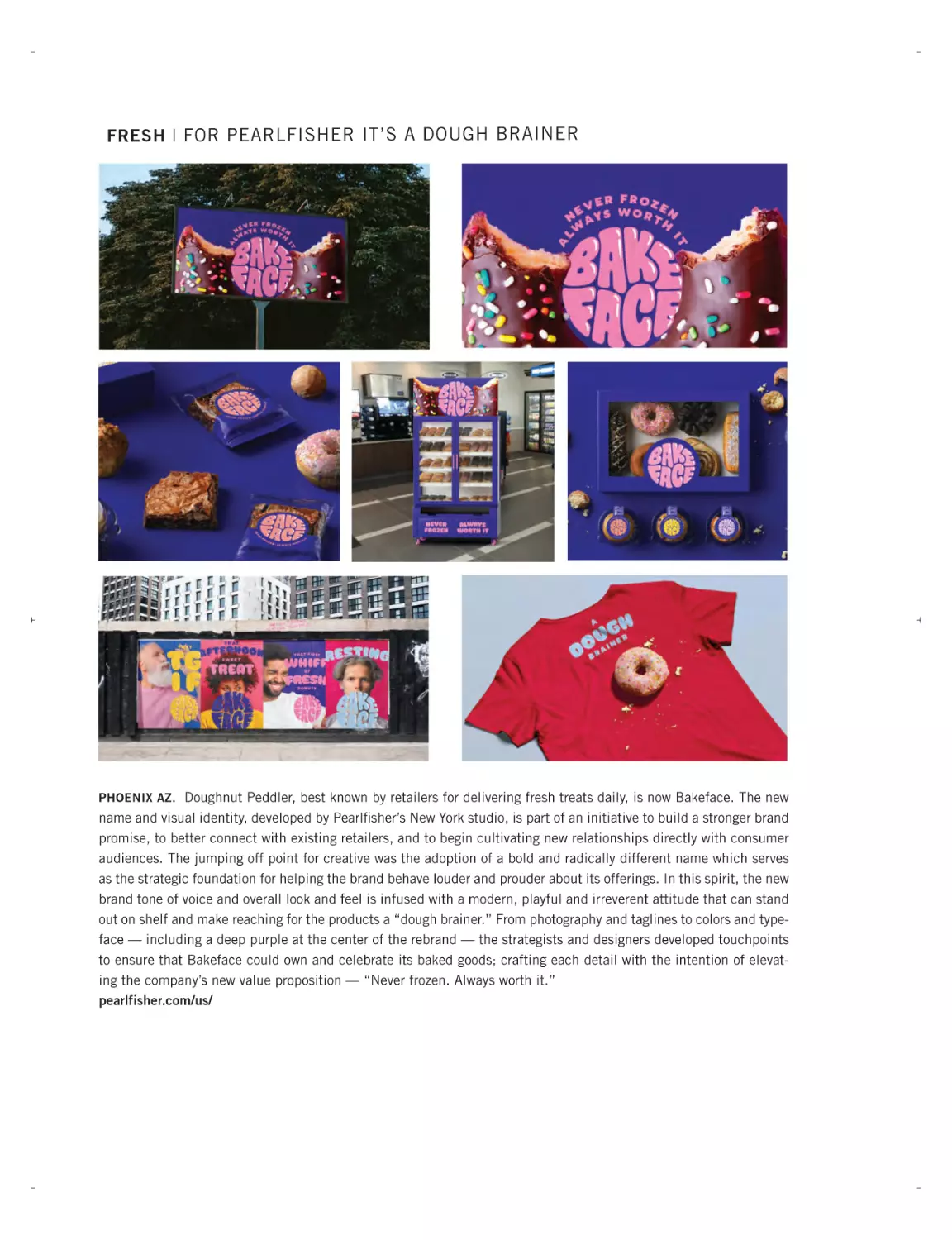
FRESH | FOR PEARLFISHER IT’S A DOUGH BRAINER
PHOENIX AZ. Doughnut Peddler, best known by retailers for delivering fresh treats daily, is now Bakeface. The new
name and visual identity, developed by Pearlfisher’s New York studio, is part of an initiative to build a stronger brand
promise, to better connect with existing retailers, and to begin cultivating new relationships directly with consumer
audiences. The jumping off point for creative was the adoption of a bold and radically different name which serves
as the strategic foundation for helping the brand behave louder and prouder about its offerings. In this spirit, the new
brand tone of voice and overall look and feel is infused with a modern, playful and irreverent attitude that can stand
out on shelf and make reaching for the products a “dough brainer.” From photography and taglines to colors and typeface — including a deep purple at the center of the rebrand — the strategists and designers developed touchpoints
to ensure that Bakeface could own and celebrate its baked goods; crafting each detail with the intention of elevating the company’s new value proposition — “Never frozen. Always worth it.”
pearlfisher.com/us/
JUNE2024FRESHimpo-GK (1).qxp_feb news play 6/19/24 1:54 PM Page 16
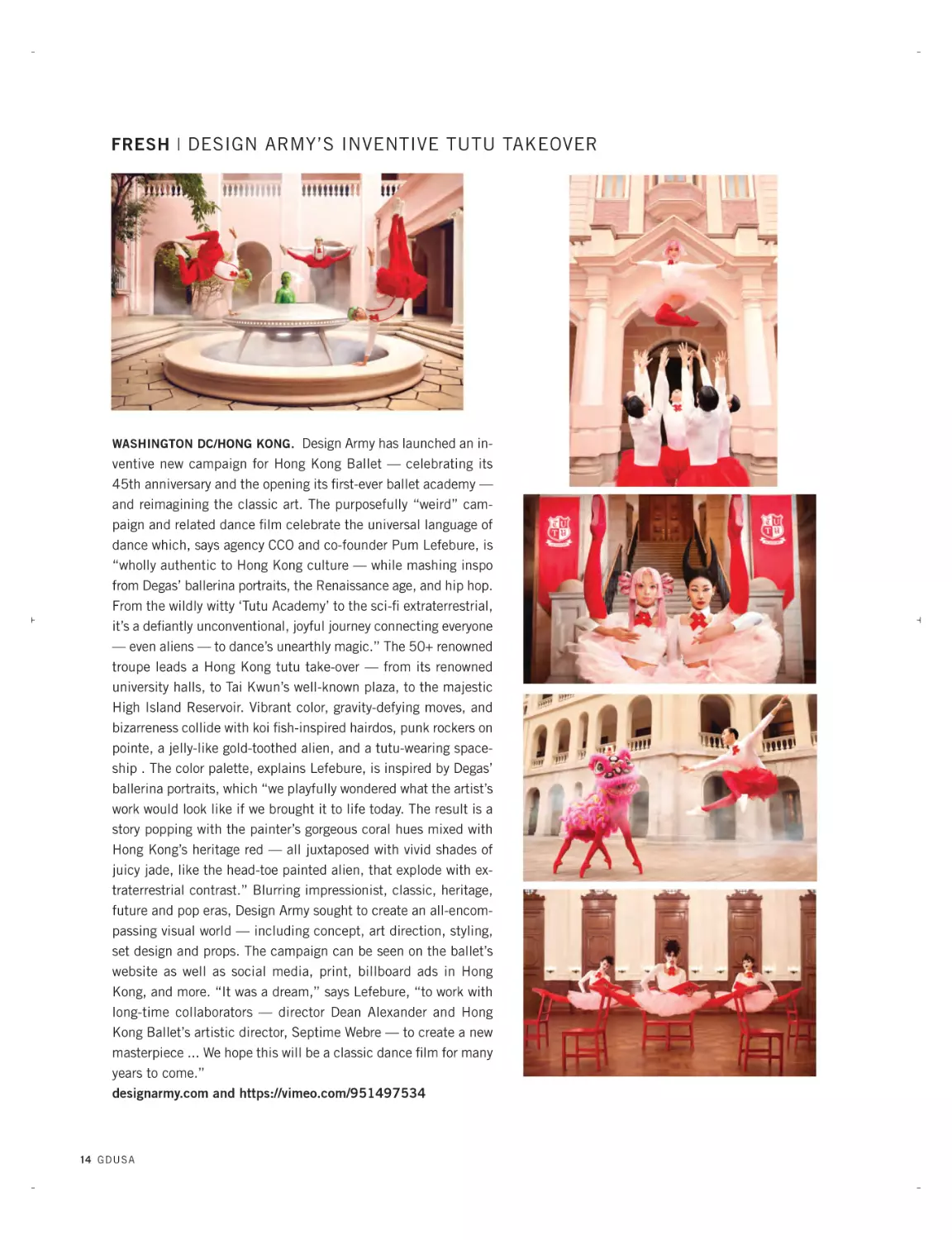
FRESH | DESIGN ARMY’S INVENTIVE TUTU TAKEOVER
WASHINGTON DC/HONG KONG. Design Army has launched an in-
ventive new campaign for Hong Kong Ballet — celebrating its
45th anniversary and the opening its first-ever ballet academy —
and reimagining the classic art. The purposefully “weird” campaign and related dance film celebrate the universal language of
dance which, says agency CCO and co-founder Pum Lefebure, is
“wholly authentic to Hong Kong culture — while mashing inspo
from Degas’ ballerina portraits, the Renaissance age, and hip hop.
From the wildly witty ‘Tutu Academy’ to the sci-fi extraterrestrial,
it’s a defiantly unconventional, joyful journey connecting everyone
— even aliens — to dance’s unearthly magic.” The 50+ renowned
troupe leads a Hong Kong tutu take-over — from its renowned
university halls, to Tai Kwun’s well-known plaza, to the majestic
High Island Reservoir. Vibrant color, gravity-defying moves, and
bizarreness collide with koi fish-inspired hairdos, punk rockers on
pointe, a jelly-like gold-toothed alien, and a tutu-wearing spaceship . The color palette, explains Lefebure, is inspired by Degas’
ballerina portraits, which “we playfully wondered what the artist’s
work would look like if we brought it to life today. The result is a
story popping with the painter’s gorgeous coral hues mixed with
Hong Kong’s heritage red — all juxtaposed with vivid shades of
juicy jade, like the head-toe painted alien, that explode with extraterrestrial contrast.” Blurring impressionist, classic, heritage,
future and pop eras, Design Army sought to create an all-encompassing visual world — including concept, art direction, styling,
set design and props. The campaign can be seen on the ballet’s
website as well as social media, print, billboard ads in Hong
Kong, and more. “It was a dream,” says Lefebure, “to work with
long-time collaborators — director Dean Alexander and Hong
Kong Ballet’s artistic director, Septime Webre — to create a new
masterpiece ... We hope this will be a classic dance film for many
years to come.”
designarmy.com and https://vimeo.com/951497534
14 G D U S A
JUNE2024FRESHimpo-GK (1).qxp_feb news play 6/19/24 1:54 PM Page 17
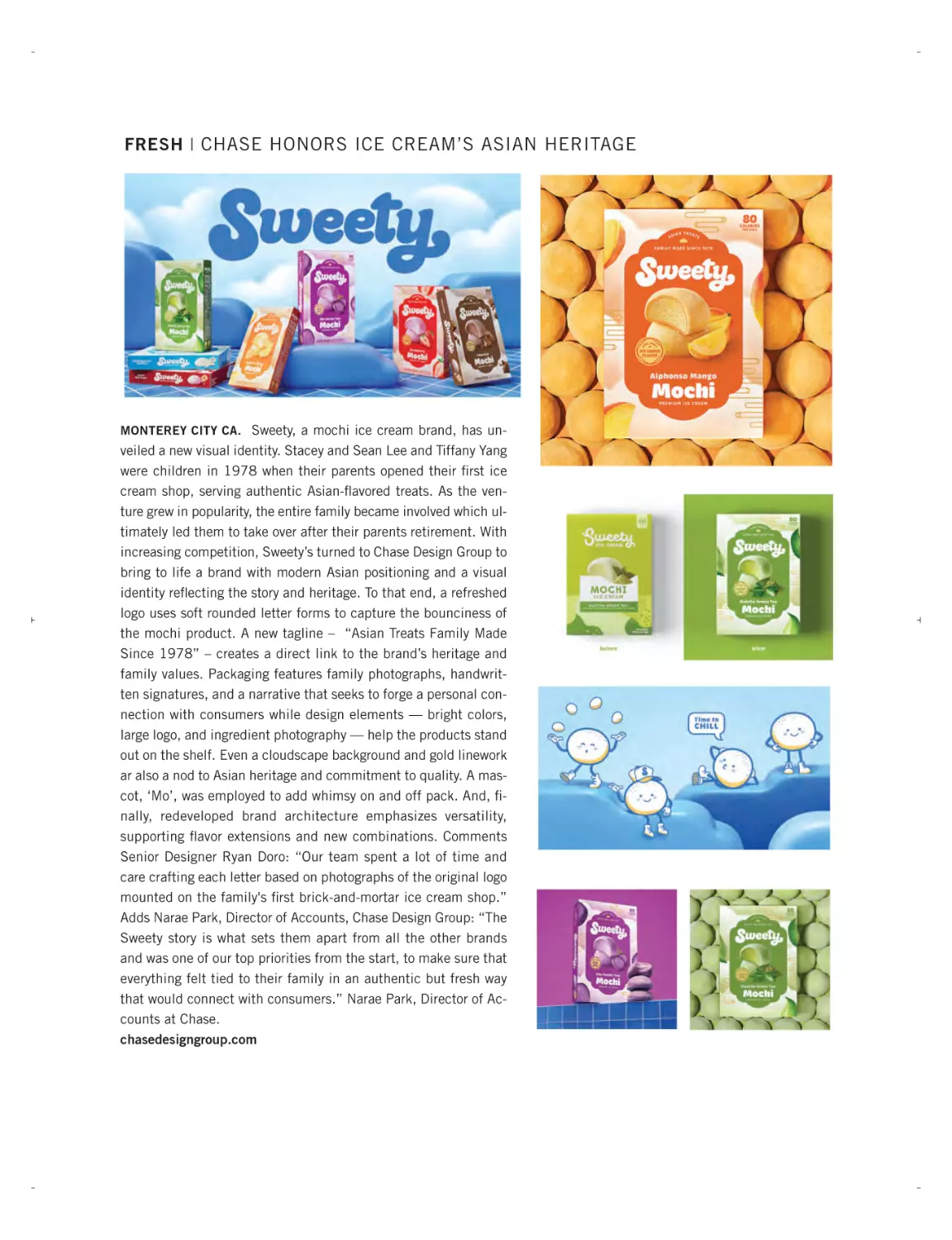
FRESH | CHASE HONORS ICE CREAM’S ASIAN HERITAGE
MONTEREY CITY CA. Sweety, a mochi ice cream brand, has un-
veiled a new visual identity. Stacey and Sean Lee and Tiffany Yang
were children in 1978 when their parents opened their first ice
cream shop, serving authentic Asian-flavored treats. As the venture grew in popularity, the entire family became involved which ultimately led them to take over after their parents retirement. With
increasing competition, Sweety’s turned to Chase Design Group to
bring to life a brand with modern Asian positioning and a visual
identity reflecting the story and heritage. To that end, a refreshed
logo uses soft rounded letter forms to capture the bounciness of
the mochi product. A new tagline – “Asian Treats Family Made
Since 1978” – creates a direct link to the brand’s heritage and
family values. Packaging features family photographs, handwritten signatures, and a narrative that seeks to forge a personal connection with consumers while design elements — bright colors,
large logo, and ingredient photography — help the products stand
out on the shelf. Even a cloudscape background and gold linework
ar also a nod to Asian heritage and commitment to quality. A mascot, ‘Mo’, was employed to add whimsy on and off pack. And, finally, redeveloped brand architecture emphasizes versatility,
supporting flavor extensions and new combinations. Comments
Senior Designer Ryan Doro: “Our team spent a lot of time and
care crafting each letter based on photographs of the original logo
mounted on the family's first brick-and-mortar ice cream shop.”
Adds Narae Park, Director of Accounts, Chase Design Group: “The
Sweety story is what sets them apart from all the other brands
and was one of our top priorities from the start, to make sure that
everything felt tied to their family in an authentic but fresh way
that would connect with consumers.” Narae Park, Director of Accounts at Chase.
chasedesigngroup.com
JUNE2024FRESHimpo-GK (1).qxp_feb news play 6/19/24 1:54 PM Page 18
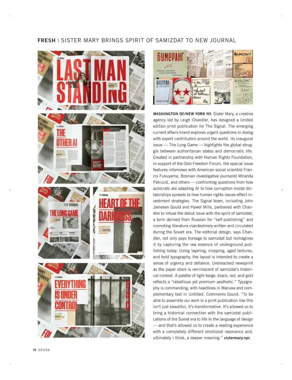
FRESH | SISTER MARY BRINGS SPIRIT OF SAMIZDAT TO NEW JOURNAL
WASHINGTON DC/NEW YORK NY. Sister Mary, a creative
agency led by Leigh Chandler, has designed a limited
edition print publication for The Signal. The emerging
current affairs brand explores urgent questions in dialog
with expert contributors around the world. Its inaugural
issue — The Long Game — highlights the global struggle between authoritarian states and democratic life.
Created in partnership with Human Rights Foundation,
in support of the Oslo Freedom Forum, the special issue
features interviews with American social scientist Francis Fukuyama, Bosnian investigative journalist Miranda
Patrucić, and others — confronting questions from how
autocrats are adapting AI to how corruption inside dictatorships spreads to how human rights issues effect investment strategies. The Signal team, including John
Jamesen Gould and Hywel Mills, partnered with Chandler to infuse the debut issue with the spirit of samizdat,
a term derived from Russian for “self-publishing” and
connoting literature clandestinely written and circulated
during the Soviet era. The editorial design, says Chandler, not only pays homage to samizdat but reimagines
it by capturing the raw essence of underground publishing today. Using layering, cropping, aged textures,
and bold typography, the layout is intended to create a
sense of urgency and defiance. Unbleached newsprint
as the paper stock is reminiscent of samizdat’s historical context. A palette of light beige, black, red, and gold
reflects a “rebellious yet premium aesthetic.” Typography is commanding, with headlines in Manuka and complementary text in Untitled. Comments Gould: “To be
able to assemble our work in a print publication like this
isn't just beautiful, it’s transformative. It’s allowed us to
bring a historical connection with the samizdat publications of the Soviet era to life in the language of design
— and that’s allowed us to create a reading experience
with a completely different emotional resonance and,
ultimately I think, a deeper meaning.” sistermary.nyc
16 GDUSA
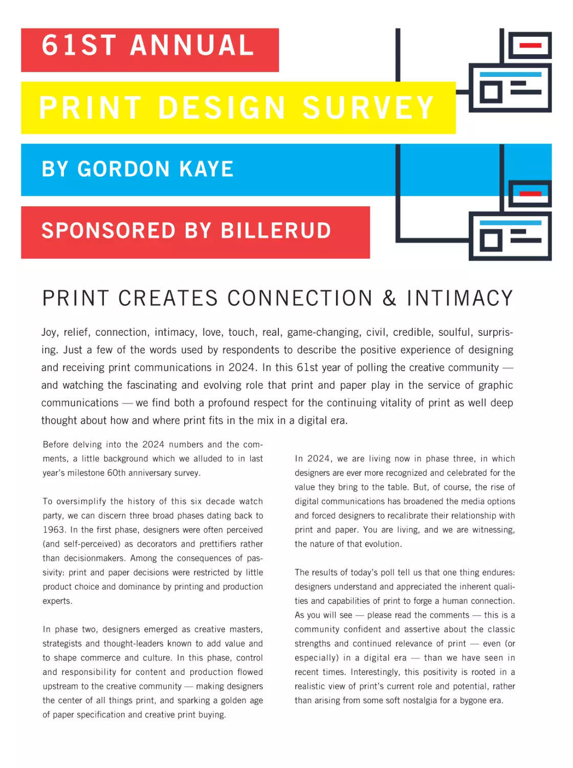
61ST ANNUAL
PR I N T D E S IGN SURVEY
BY GORDON KAYE
SPONSORED BY BILLERUD
PRINT CREATES CONNECTION & INTIMACY
Joy, relief, connection, intimacy, love, touch, real, game-changing, civil, credible, soulful, surprising. Just a few of the words used by respondents to describe the positive experience of designing
and receiving print communications in 2024. In this 61st year of polling the creative community —
and watching the fascinating and evolving role that print and paper play in the service of graphic
communications — we find both a profound respect for the continuing vitality of print as well deep
thought about how and where print fits in the mix in a digital era.
Before delving into the 2024 numbers and the comments, a little background which we alluded to in last
In 2024, we are living now in phase three, in which
year’s milestone 60th anniversary survey.
designers are ever more recognized and celebrated for the
value they bring to the table. But, of course, the rise of
To oversimplify the history of this six decade watch
digital communications has broadened the media options
party, we can discern three broad phases dating back to
and forced designers to recalibrate their relationship with
1963. In the first phase, designers were often perceived
print and paper. You are living, and we are witnessing,
(and self-perceived) as decorators and prettifiers rather
the nature of that evolution.
than decisionmakers. Among the consequences of passivity: print and paper decisions were restricted by little
The results of today’s poll tell us that one thing endures:
product choice and dominance by printing and production
designers understand and appreciated the inherent quali-
experts.
ties and capabilities of print to forge a human connection.
As you will see — please read the comments — this is a
In phase two, designers emerged as creative masters,
community confident and assertive about the classic
strategists and thought-leaders known to add value and
strengths and continued relevance of print — even (or
to shape commerce and culture. In this phase, control
especially) in a digital era — than we have seen in
and responsibility for content and production flowed
recent times. Interestingly, this positivity is rooted in a
upstream to the creative community — making designers
realistic view of print’s current role and potential, rather
the center of all things print, and sparking a golden age
than arising from some soft nostalgia for a bygone era.
of paper specification and creative print buying.
18 G D USA
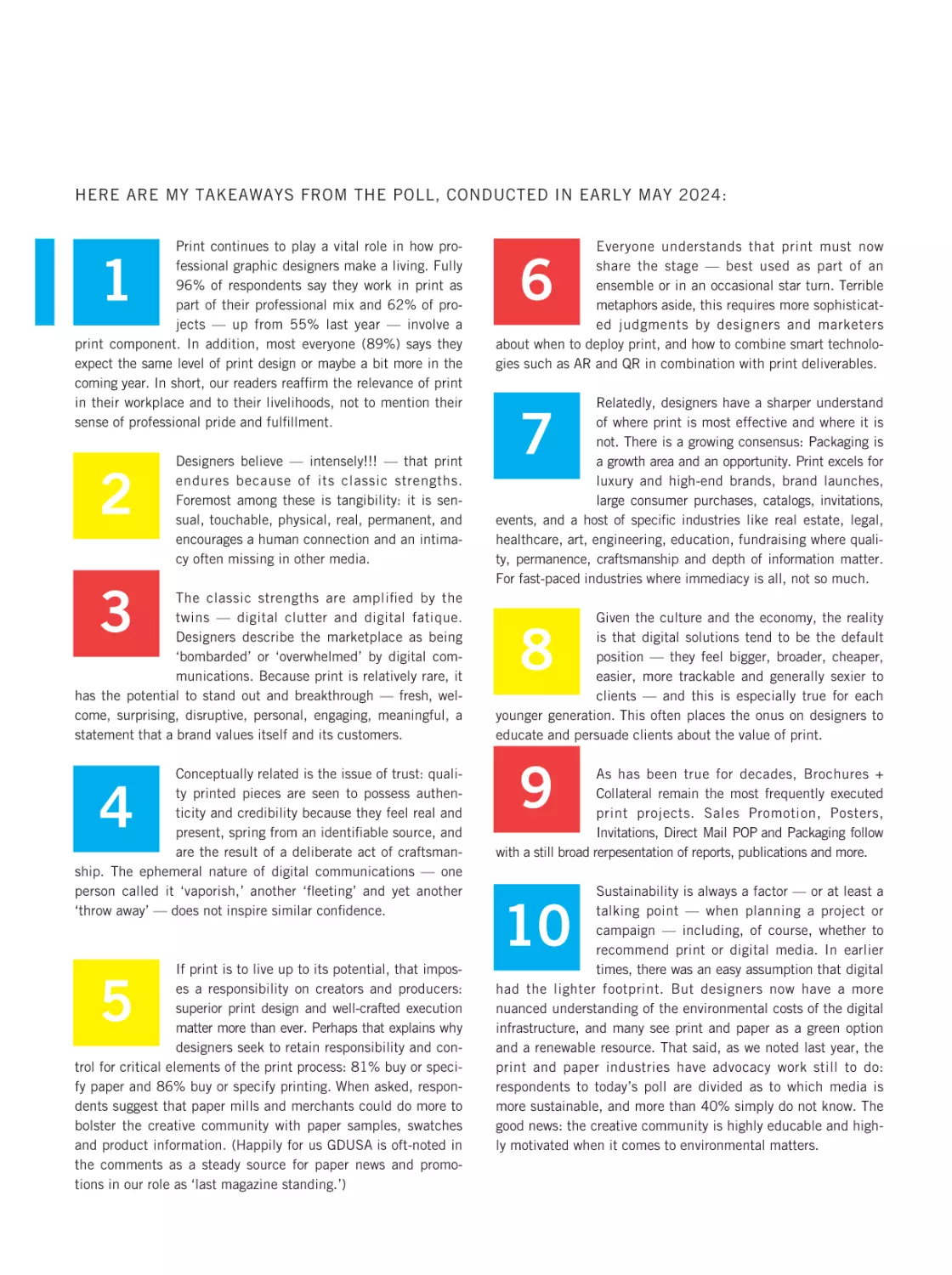
HERE ARE MY TAKEAWAYS FROM THE POLL, CONDUCTED IN EARLY MAY 2024:
Print continues to play a vital role in how professional graphic designers make a living. Fully
96% of respondents say they work in print as
part of their professional mix and 62% of projects — up from 55% last year — involve a
print component. In addition, most everyone (89%) says they
expect the same level of print design or maybe a bit more in the
coming year. In short, our readers reaffirm the relevance of print
in their workplace and to their livelihoods, not to mention their
sense of professional pride and fulfillment.
1
2
Designers believe — intensely!!! — that print
endures because of its classic strengths.
Foremost among these is tangibility: it is sensual, touchable, physical, real, permanent, and
encourages a human connection and an intimacy often missing in other media.
3
The classic strengths are amplified by the
twins — digital clutter and digital fatique.
Designers describe the marketplace as being
‘bombarded’ or ‘overwhelmed’ by digital communications. Because print is relatively rare, it
has the potential to stand out and breakthrough — fresh, welcome, surprising, disruptive, personal, engaging, meaningful, a
statement that a brand values itself and its customers.
Conceptually related is the issue of trust: quality printed pieces are seen to possess authenticity and credibility because they feel real and
present, spring from an identifiable source, and
are the result of a deliberate act of craftsmanship. The ephemeral nature of digital communications — one
person called it ‘vaporish,’ another ‘fleeting’ and yet another
‘throw away’ — does not inspire similar confidence.
4
If print is to live up to its potential, that imposes a responsibility on creators and producers:
superior print design and well-crafted execution
matter more than ever. Perhaps that explains why
designers seek to retain responsibility and control for critical elements of the print process: 81% buy or specify paper and 86% buy or specify printing. When asked, respondents suggest that paper mills and merchants could do more to
bolster the creative community with paper samples, swatches
and product information. (Happily for us GDUSA is oft-noted in
the comments as a steady source for paper news and promotions in our role as ‘last magazine standing.’)
5
Everyone understands that print must now
share the stage — best used as part of an
ensemble or in an occasional star turn. Terrible
metaphors aside, this requires more sophisticated judgments by designers and marketers
about when to deploy print, and how to combine smart technologies such as AR and QR in combination with print deliverables.
6
Relatedly, designers have a sharper understand
of where print is most effective and where it is
not. There is a growing consensus: Packaging is
a growth area and an opportunity. Print excels for
luxury and high-end brands, brand launches,
large consumer purchases, catalogs, invitations,
events, and a host of specific industries like real estate, legal,
healthcare, art, engineering, education, fundraising where quality, permanence, craftsmanship and depth of information matter.
For fast-paced industries where immediacy is all, not so much.
7
Given the culture and the economy, the reality
is that digital solutions tend to be the default
position — they feel bigger, broader, cheaper,
easier, more trackable and generally sexier to
clients — and this is especially true for each
younger generation. This often places the onus on designers to
educate and persuade clients about the value of print.
8
9
As has been true for decades, Brochures +
Collateral remain the most frequently executed
print projects. Sales Promotion, Posters,
Invitations, Direct Mail POP and Packaging follow
with a still broad rerpesentation of reports, publications and more.
Sustainability is always a factor — or at least a
talking point — when planning a project or
campaign — including, of course, whether to
recommend print or digital media. In earlier
times, there was an easy assumption that digital
had the lighter footprint. But designers now have a more
nuanced understanding of the environmental costs of the digital
infrastructure, and many see print and paper as a green option
and a renewable resource. That said, as we noted last year, the
print and paper industries have advocacy work still to do:
respondents to today’s poll are divided as to which media is
more sustainable, and more than 40% simply do not know. The
good news: the creative community is highly educable and highly motivated when it comes to environmental matters.
10
G D U SA 19
JUNE 2024 BILLERUD-SponsorMessage-GK.qxp_feb news play 6/19/24 1:14 PM Page 10
A MESSAGE FROM THE SPONSOR | BILLERUD
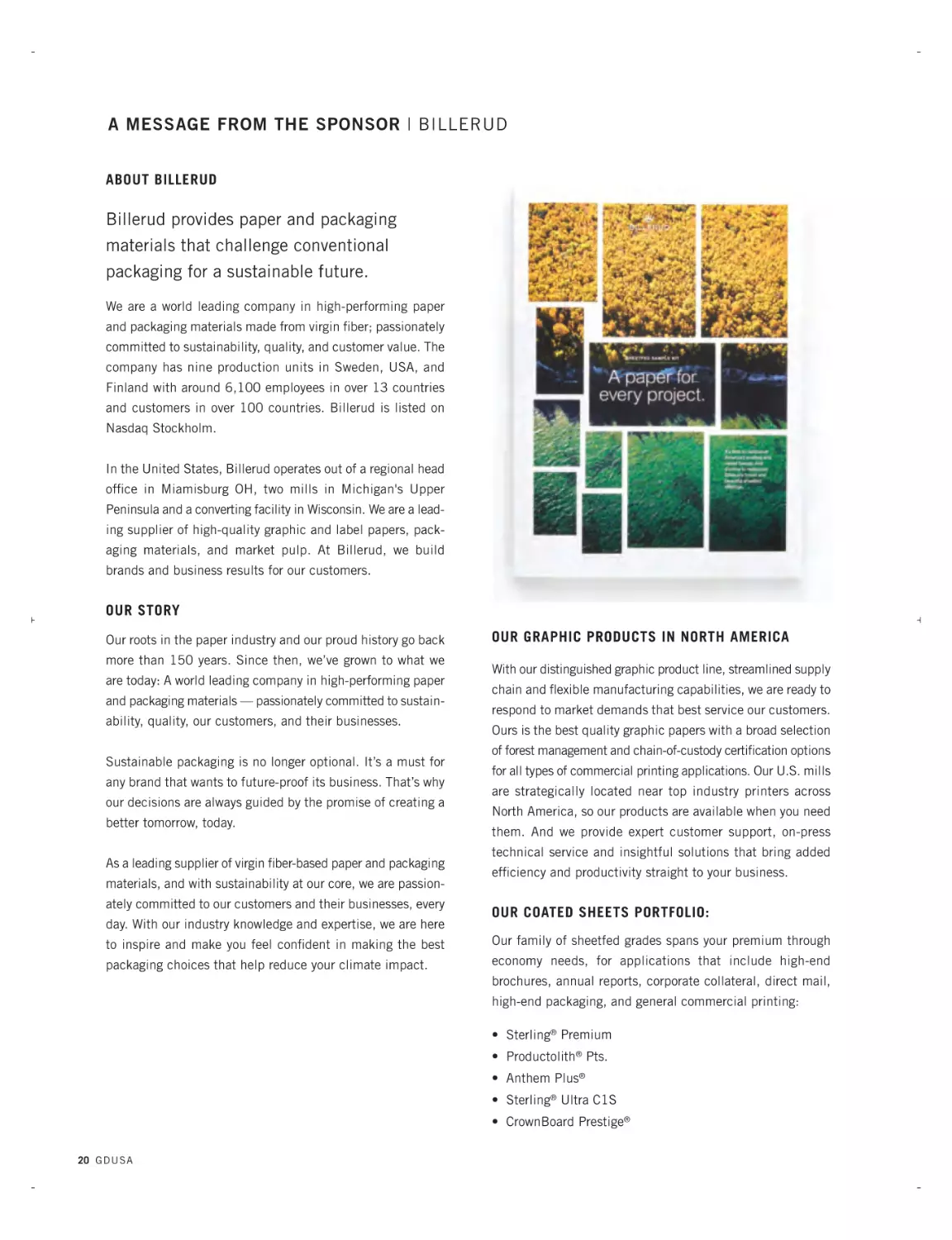
ABOUT BILLERUD
Billerud provides paper and packaging
materials that challenge conventional
packaging for a sustainable future.
We are a world leading company in high-performing paper
and packaging materials made from virgin fiber; passionately
committed to sustainability, quality, and customer value. The
company has nine production units in Sweden, USA, and
Finland with around 6,100 employees in over 13 countries
and customers in over 100 countries. Billerud is listed on
Nasdaq Stockholm.
In the United States, Billerud operates out of a regional head
office in Miamisburg OH, two mills in Michigan's Upper
Peninsula and a converting facility in Wisconsin. We are a leading supplier of high-quality graphic and label papers, packaging materials, and market pulp. At Billerud, we build
brands and business results for our customers.
OUR STORY
Our roots in the paper industry and our proud history go back
more than 150 years. Since then, we’ve grown to what we
are today: A world leading company in high-performing paper
and packaging materials — passionately committed to sustainability, quality, our customers, and their businesses.
Sustainable packaging is no longer optional. It’s a must for
any brand that wants to future-proof its business. That’s why
our decisions are always guided by the promise of creating a
better tomorrow, today.
As a leading supplier of virgin fiber-based paper and packaging
materials, and with sustainability at our core, we are passionately committed to our customers and their businesses, every
day. With our industry knowledge and expertise, we are here
OUR GRAPHIC PRODUCTS IN NORTH AMERICA
With our distinguished graphic product line, streamlined supply
chain and flexible manufacturing capabilities, we are ready to
respond to market demands that best service our customers.
Ours is the best quality graphic papers with a broad selection
of forest management and chain-of-custody certification options
for all types of commercial printing applications. Our U.S. mills
are strategically located near top industry printers across
North America, so our products are available when you need
them. And we provide expert customer support, on-press
technical service and insightful solutions that bring added
efficiency and productivity straight to your business.
OUR COATED SHEETS PORTFOLIO:
to inspire and make you feel confident in making the best
Our family of sheetfed grades spans your premium through
packaging choices that help reduce your climate impact.
economy needs, for applications that include high-end
brochures, annual reports, corporate collateral, direct mail,
high-end packaging, and general commercial printing:
• Sterling® Premium
• Productolith® Pts.
• Anthem Plus®
• Sterling® Ultra C1S
• CrownBoard Prestige®
20 G D U S A
JUNE 2024 BILLERUD-SponsorMessage-GK.qxp_feb news play 6/19/24 1:14 PM Page 11
OUR COATED DIGITAL & INKJET PORTFOLIO:
We have been a leader in manufacturing digital papers since
digital printing technology first emerged more than two decades
ago, offering specialized expertise, dedicated production
capacity and a portfolio of products to meet the needs of the
various applications of digital and inkjet printing:
• Sterling® Premium Digital™
• Productolith Pts. Digital®
• Blazer Digital®
• TrueJet® Book
• Sterling® Ultra EX
• Sterling® Points EX
• Influence® EX
OUR COATED WEB PORTFOLIO:
We make it easy for coated web paper customers to do business
with us, with breadth and quality of web products that are
second to none:
• Sterling® Ultra
• ArborWeb Plus®
• Influence®
• ArborWeb®
• Liberty®
• New Era® Matte
To learn more, please contact your Billerud graphic
papers sales professional or visit billerud.com.
THIS EDITION OF GDUSA IS PRINTED ON
INFLUENCE ® GLOSS, 60 LB. TEXT FROM BILLERUD
G D U SA 21
BILLERUDGraphicPapers-JUNE2024_Layout 1 6/19/24 2:12 PM Page 1
BILLERUDGraphicPapers-JUNE2024_Layout 1 6/19/24 2:12 PM Page 2
Billerud. The first choice
for graphic and label papers,
packaging materials and
market pulp.
Our name means quality and commitment,
sustainability and integrity. With products
designed to build brands and business for
our customers.
To learn more, visit us at billerud.com.
Billerud Americas Corporation
8540 Gander Creek Drive
Miamisburg, Ohio 45342
800 258 8852
billerud.com
©2024 Billerud Americas Corporation. All rights reserved.
JUNE 2024 PRINT SURVEY-GK.qxp_SEPT 07 People 6/19/24 1:44 PM Page 28
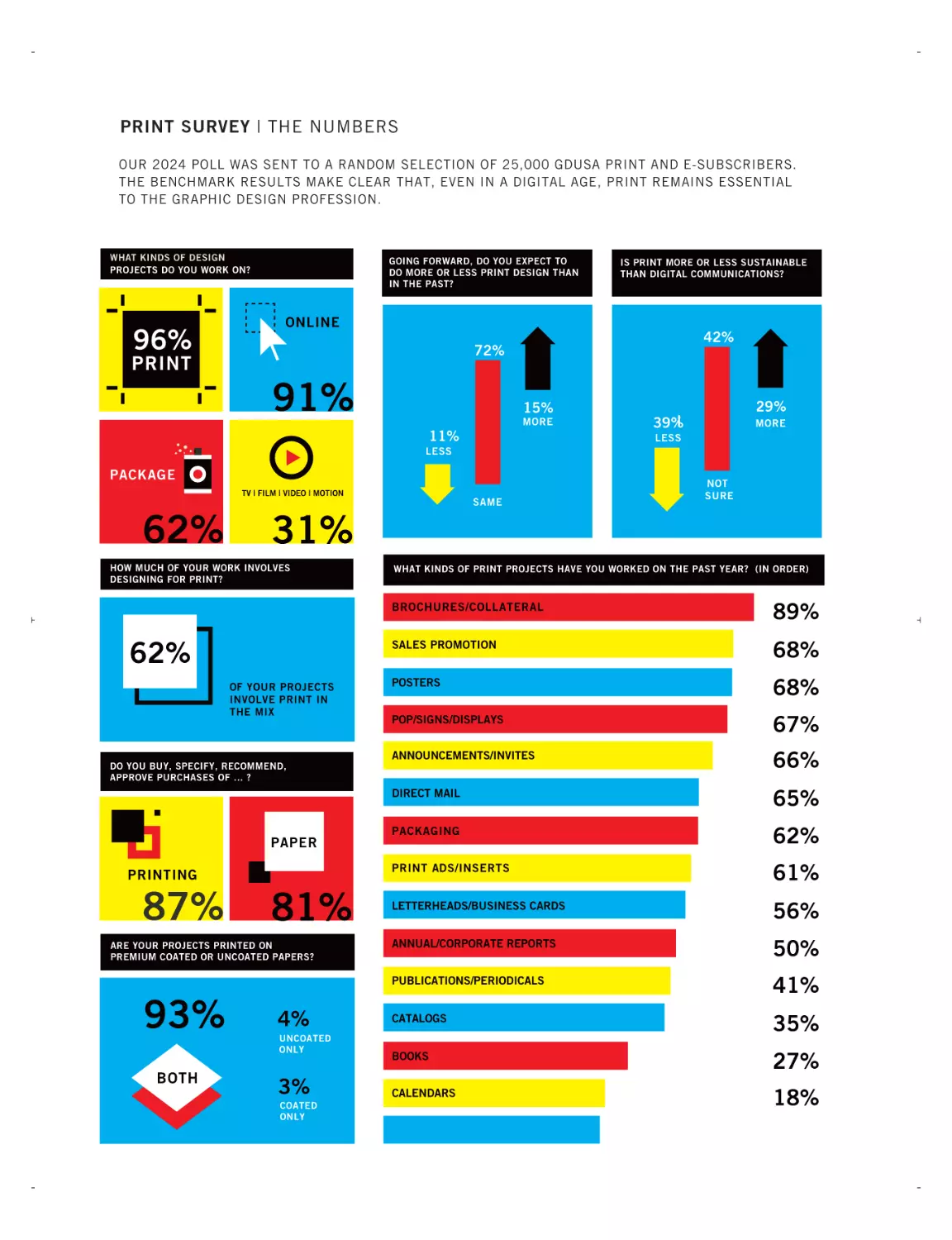
PRINT SURVEY | THE NUMBERS
OUR 2024 POLL WAS SENT TO A RANDOM SELECTION OF 25,000 GDUSA PRINT AND E-SUBSCRIBERS.
THE BENCHMARK RESULTS MAKE CLEAR THAT, EVEN IN A DIGITAL AGE, PRINT REMAINS ESSENTIAL
TO THE GRAPHIC DESIGN PROFESSION.
WHAT KINDS OF DESIGN
PROJECTS DO YOU WORK ON?
96%
PRINT
GOING FORWARD, DO YOU EXPECT TO
DO MORE OR LESS PRINT DESIGN THAN
IN THE PAST?
IS PRINT MORE OR LESS SUSTAINABLE
THAN DIGITAL COMMUNICATIONS?
ONLINE
42%
72%
91%
15%
MORE
11%
29%
39%
MORE
LESS
LESS
PACKAGE
TV | FILM | VIDEO | MOTION
62%
31%
HOW MUCH OF YOUR WORK INVOLVES
DESIGNING FOR PRINT?
62%
OF YOUR PROJECTS
INVOLVE PRINT IN
THE MIX
DO YOU BUY, SPECIFY, RECOMMEND,
APPROVE PURCHASES OF ... ?
PAPER
PRINTING
87%
81%
ARE YOUR PROJECTS PRINTED ON
PREMIUM COATED OR UNCOATED PAPERS?
93%
BOTH
SAME
4%
UNCOATED
ONLY
3%
COATED
ONLY
NOT
SURE
WHAT KINDS OF PRINT PROJECTS HAVE YOU WORKED ON THE PAST YEAR? (IN ORDER)
BROCHURES/COLLATERAL
89%
SALES PROMOTION
68%
POSTERS
68%
POP/SIGNS/DISPLAYS
67%
ANNOUNCEMENTS/INVITES
66%
DIRECT MAIL
65%
PACKAGING
62%
PRINT ADS/INSERTS
61%
LETTERHEADS/BUSINESS CARDS
56%
ANNUAL/CORPORATE REPORTS
50%
PUBLICATIONS/PERIODICALS
41%
CATALOGS
35%
BOOKS
27%
CALENDARS
18%
JUNE 2024 PRINT SURVEY-GK.qxp_SEPT 07 People 6/19/24 1:44 PM Page 29
PRINT SURVEY | SELECT COMMENTS
IS PRINT IMPORTANT IN YOUR PROFESSIONAL LIFE?
From the start of my career til now, the world has taken a dramatic shift to digital, generally speaking. And yet, I've never felt a
large shift away from print in design. Being involved in a wide
variety of project types, the work tends to roll out to a wide variety
of applications naturally. I have yet to work with clients who have
decided to leave print behind to rely only on digital projects. Just
about everyone, spanning multiple generations, run their business
with print in mind. I appreciate the fact that they continue to
value things like paper stock, special finishes, sustainability, etc.
Even a younger generation of business owners seem to enjoy
handing people something physical as part of their brand experience versus just having an online presence.
In our industry, ideas and execution are the key to our industry,
the brand touch-points are important for delivering the messaging
and dependent upon the audience and where and how used. The
traditional strengths of print are all relevant and serve as a tangible resource to have and hold.
Invariably every client I have worked for comes around to realize
they need print in their communication mix. There is still something about holding information in your hand and not needing any
power source to access it.
There will always be a need for printing, no matter how far the
digital world progresses. There are certain aspects/benefits to having something printed that a digital version will never be able to
reproduce. I’ve found that many clients prefer a physical, printed
copy—and it’s not just the older clients who aren’t great with
technology. Being able to print and knowing everything that it
entails adds an extra layer of credibility and professionalism to
you as a designer.
For me, print is still essential in my professional life. I get the
advantages of digital but a constant bombardment of banners,
emails, etc. makes me blind and I begin dismissing the contents
because it feels less than. With print, it commands my attention
due to it interacting with tactile sensibilities, a break for my eyes
to see something in a practical dimension and it feels more personal.
As a designer and an educator, there's a certain intimacy that is
missed in digital. It is abundantly clear in seeing my students,
and even my children interact with printed items, sometimes at a
loss for what to do. We need more print if we are keep the soul of
design alive.
Print is still very important. Clients ALWAYS comment on the feel
and quality of the printed material. Digital is throw-away/scrollaway and cheap printing feels cheap immediately. Higher quality
materials, finishes, etc. have lasting impact.
I push myself hard to make sure my print work is at the highest
level possible. It's because it's more personal to me. When I wake
up in the middle of the night, it's the print work that's got me
thinking and rethinking fonts and colors and presentation.
“PRINT IS WHAT IS REAL”
Print and design go hand in hand. Great design can be come lousy
of the wrong paper is used. Great paper can help bad design.
Tactile experiences are more immersive and nothing beats a postcard or direct mail piece with a coupon. Special promotions delivered by print with in-store specials bring you in store instead of
shopping online. Online email blasts can be easily overlooked and
discarded, or lost after a glance. With print, you have innate
longevity.
I started my career as a printing press operator, went to college for
graphic design because of print, and landed in a digital world.
While digital media has certainly changed the landscape of marketing and communication, print media continues to offer unique
advantages that can make it a valuable part of a comprehensive
media strategy. Print materials are physical, allowing for a tactile
experience that digital media cannot replicate. This tangibility can
create a stronger emotional connection with the audience. Highquality print materials can enhance the perceived value of a
brand. A well-designed and printed piece can convey professionalism and attention to detail.
“PRINT CAN SURPRISE, DELIGHT AND
MAKE A MEMORABLE IMPRESSION”
Print design still matters. From my experience, people are tired of
digital everything. ROI is higher on print compared to digital. The
numbers back it up. Uninformed people are the ones still pushing
for digital. Yes, working partially for the prison sector, print is still
a major option. Brought up as a printer with letterpress, litho and
the digital process, I’m a big advocate of print.
G D U SA 25
JUNE 2024 PRINT SURVEY-GK.qxp_SEPT 07 People 6/19/24 1:44 PM Page 30
PRINT SURVEY | SELECT COMMENTS
CONTINUED
IS PRINT IMPORTANT IN YOUR PROFESSIONAL LIFE?
PRINT is what is real. DIGITAL is a vaporish spirit, devoid of permanence.
Tactile response can be a huge game changer. People shop
online, but receive a physical product - that experience will always
matter. Since COVID has faded, people are out experiencing
events and finding more ways to be a part of their local community. Signage, print ads, posters; even giveaway items like apparel,
pins, koozies and the like play a huge role in engaging with people.
“TACTILE RESPONSE CAN BE A HUGE
GAME CHANGER”
While digital platforms have gained significant prominence, print
remains important in both my professional work and personal life.
Print offers a tactile experience that digital media cannot replicate,
allowing for a deeper connection with information. Additionally,
print provides a sense of permanence, as physical copies can be
stored and accessed reliably over time. The credibility associated
with print materials also persists, as they are often regarded as
more trustworthy and authoritative. Despite the convenience of
digital alternatives, the traditional strengths of print, such as
touch, permanence, and credibility, continue to hold value, making it relevant and significant even in today’s digital age.
I am officially a print designer, but a lot of my work is turning digital to save money. Just the high priority projects are still being
printed. But that makes the paper choice and printing style even
more important.
Print design is very important. Even though you can get most
things digitally now, there is still something special about seeing
something in print. Especially when it comes to invitations or publications for example. To feel something in your hands, relay a
feeling through touch, turn the pages and read. You just can't get
that experience through something digitally.
Even more today with electronic communication all delivered by
slick tech devices, touch, portability, connection and credibility
are critical to setting clients and their messages apart from all
others. Print is a far more powerful way to communicate uniquely
and distinctively.
Print design still adds a tangible value to products and services
that one simply cannot experience through digital means, and
therefore it will always be important on some level.
I consider myself a print designer first. While our firm does a lot of
digital design, print is still important to us.
Digital is like a date who ghosts you. Sites go down and disappear; content, likewise. Print is with you for the long haul.
Print is still important as the older generations are not as digitally
experienced as younger generations. Print is much easier for them
to navigate and understand than digital.
Print design is critical in my professional life as that is my area of
expertise but I have seen a steady decline in the actual printing of
the final pieces. Most are now provided as pdfs that is now offered
to people to download and print on their own. But in general people still like to have them especially for events like meetings to jot
down notes. Not sure how much longer that will exist though as
each generation is adapting more and more to a digital world.
While digital media is convenient and dynamic, I feel that the tactile experience of holding a printed product — the feel, sight, and
smell — should never be undervalued. As more people immerse
themselves in a digital world, print can surprise, delight, and
make a memorable impression in a white noise-filled world.
Today's audiences are bombarded with digital communication.
Print is breaking through in a more strategic way.
Print is not dead. Our internal creative services team has projects
that are print heavy still. We have partially transitioned to digital
but a good 60+% of our collateral remains print. Since we also
design collateral for the multiple trade shows we hold as well as
26 G D U S A
JUNE 2024 PRINT SURVEY-GK.qxp_SEPT 07 People 6/19/24 1:44 PM Page 31
exhibit at, that won't change anytime soon.Yes, print is still
important - in fact we have seen a return to having physical
handouts/ brochures.
Holding marketing material in one's hands does still matter, and
it may matter more than ever in our growing digital world. I am
seeing more effective returns on direct mail as the mailbox
becomes less cluttered (outside of the political mailing timeframe). Packaging continues to be the #1 way to sell a product
even through on-line avenues where one can blow up a digital
image of the package. I do believe printed material does have a
great perception of credibility and likeliness for brand permanence.
Without a doubt, I understand and retain Information delivered in
print better than information delivered digitally. Plus, I appreciate the tactile nature of print and the design possibilities
Print design in not obsolete in any way, it has simply become a
part of a bigger picture. People digest communication in different
ways. Some skim, some headline, some read it all. Some read
print, some read screens. As it should always be. Print is digested, then saved or recycled. Digital is almost always skimmed,
then forgotten and replaced. Humans need to return to the
LONGER ATTENTION SPANS that enjoying print requires of us.
I work with the designers for our company. We do everything from
our own biz cards, letterhead, catalogs for products, break out
segment catalogs, invites, fun Zine handout to promote different
papers and calendars and notebooks and wrapping paper. I work
for the paper merchant as the specifier who meets with designers
as well. Print is always evolvoing as customers needs change.
All designers love print.
Much of my work is now sold as greeting cards, posters, and
Giclee prints. Other work is printed transit so much of my product is not delivered as digital imagery.
I will always need the tactile side of print. Touch, feel, hold. I
buy things that are packaged beautifully even though I may not
need the product. I’m very visually tied to aesthetics. If form has
function, it’s a bonus. In my opinion print will never die. A handwritten thank you note sent via USPS has more intention and is
more relational (to me) than an email.
“PRINT MARKETING IS EVOLVING INTO
BEING THE COOL KID ON THE BLOCK.”
Print’s qualities still matter. I design the alumni magazine of my
institution, which is distributed 3x a year. This issue was focused
on AI, so the font of the magazine was predominantly white vs. a
typical photo — in order to make the cover more engaging,
instead of printing on uncoated paper, we used soft touch AQ
coating, and accented the masthead and logo with a clear foil to
have a contrast in textures. For the annual holiday card, I
designed an architectural piece that was embossed white on
white with the simplified lines of a historic building, and did a
small spot color to give it an accent. Whenever possible, I love to
incorporate texture into print, to enhance the tactile experience.
Reading print material is a different experience than digital. I
work with all ages and younger customers want and are more
comfortable with digital and older people want print materials
because of the experience.
“EVEN MORE TODAY... TOUCH, PORTABILITY, CONNECTION AND CREDIBILITY
ARE CRITICAL.”
As a print designer for over 25 years, print will always have an
importance in my professional life! I fully understand why design
has shifted to the digital space, but I think there can still be a
place for print in this world. With seeing so many ads on devices,
I think it’s exciting to hold the actual product in the real world….
whether it be an annual report, book or just packaging. And print
does that for us!
Yes, print design is very important in my professional life as a
book designer. All the traditional strengths come into play, touch,
G D U SA 27
JUNE 2024 PRINT SURVEY-GK.qxp_SEPT 07 People 6/19/24 1:44 PM Page 32
PRINT SURVEY | SELECT COMMENTS
CONTINUED
IS PRINT IMPORTANT IN YOUR PROFESSIONAL LIFE?
permanence, portability, connection, and credibility. They still
endure and they still matter.
It is a relief to get a printed communication after being overwhelmed on screen day after day.
“AS LONG AS WE REMAIN CIVILIZED
HUMANS THE TACTILE EXPERIENCE
WILL ENDURE.”
All of it matters. The more we surround ourselves with the digital
world, the more it has become something in the background. We
have grown so used to it that we take it for granted now and are
searching out physical media in response in order to get human
connection. Additionally, digital media is scrutinized as being
fake, manipulated, altered, or untruthful. Which by default
makes physical media and print more solid, truthful, OFFICIAL.
Its tangible in a way that the digital world isn't.
The downfall of print is that it's less trackable in a marketing setting. But the beauty of a well crafted and designed print piece
can't be denied.
I am an OG print designer but do alllll kinds of design projects
now. But, have discovered newer, younger designers don't have
much print expereince...so I guess, that's good for us oldies, that
we can bring that to the design table. Print will always be important to me. Not every client feels this way, but love it when they
do!!
authority and credibility. Print materials can be carried anywhere
without the need for internet access, making them accessible in
areas with limited connectivity. Print design can foster a deeper
connection with the audience by appealing to their senses and
emotions. Print can work synergistically with digital in marketing
campaigns.
Print marketing took a big hit but has evolved into the cool kid on
the block through digital printing and pairing with digital marketing (e.g., AR). Printed pieces are a refreshing alternative to wornout digital marketing.
As long as we remain civilized humans, the tactile experience
will endure.
I design private-brand packaging for a grocery chain. I generally
don't specify substrates. The suppliers do that, and of course, it's
all about preserving what's in the package for transport and shelf
life. Personally, I still love a good book, and you never need batteries.
For the right situation, and the right audience, print is important.
However, those moments and occasions are becoming much
fewer with clients scaling back on budgets that typically fund
those targeted experiences.
Yes, the tactile quality and joy of being off-screen matter.
Yes, print design is important in my life. Much of my work is
designing packaging displays for trade shows, etc.
“HAPTICS, THE SCIENCE OF COMMUNICATING THROUGH TOUCH, IS MORE
MEANINGFUL NOW THAN EVER...”
Print continues to be relevant. While digital media offers various
advantages, such as interactivity and real-time updates, print has
its unique strengths. Interaction with printed materials creates a
connection that digital media cannot. Paper texture and weight,
or the finish of the paper can leave a lasting impression and
28 G D U S A
Yes even though we may print less these days most people still
like having their info on a printed piece.
I've been in the industry since before digital was a thing. I feared
that print materials would die a slow death but it hasn't happened. People want to have and to hold marketing materials. It
certainly is different but it still matters and is important. Print is
JUNE 2024 PRINT SURVEY-GK.qxp_SEPT 07 People 6/19/24 1:44 PM Page 33
here; digital is fleeting.
Most of our print work has gone to digital print on demand, so
budget friendly, high-performing papers for digital print are more
what we look for rather than high-quality high-end papers.
I work designing billboards. Static/print ads are very important.
It's the one medium you can't turn off.
Paper matters! Color, feel, ability to accurate represent your message.
Print matters most in my work on packaging, but has mostly been
phased out of other client requests in favor of digital.
To me print is very relevant and I focus a lot on choosing materi
als that are sustainable and environmentally friendly.
“HOPING FOR MORE SUSTAINABLE AND
TRULY RECYCLABLE SOLUTIONS.”
Paper (touch) is absent from digital communication. Adding back
or including print/paper is more rare and therefore even more
impactful than ever.
Print still matters. I see its use reserved for special situations,
when a project needs to make an extra splash or requires a
personal touch.
I believe print will always be needed and it is my preference for
marketing materials.
All brands and their innovations in paper and other substrates are
always welcome. I’ve also spent a lot of time over the past 17
years with a dietary supplements products client, working to get
them out of plastic bottles and into paperboard containers and
stand-up pouches, hoping for ever more sustainable and truly
recyclable solutions.
Print products create a competitive advantage in a local market.
Not everyone can publish, and not everyone can bundle digital
with print.
“PAPER MATTERS! COLOR, FEEL, ABILITY TO ACCURATELY REPRESENT YOUR
MESSAGE.”
I feel like print is still very relevant. In my personal life, it is very
much. However, for my job, I’m not called on as often as I once
was to produce print materials. That probably differs from job/
industry to job/industry.amount of different things during the year.
I believe all print in front of customers is effective. Haptics, the
science and technology of transmitting and understanding information through touch, is more meaningful now than ever to be
noticed.
Our audience is mainly older financial real estate people who still
prefer something they can look at. The connection is still needed
despite the availability of a digital edition as well.
“DIGITAL IS LIKE A DATE WHO GHOSTS
YOU. PRINT, ON THE OTHER HAND, IS
IN IT FOR THE LONG HAUL.”
The lasting printed item will have a higher chance of being read
than an email in your inbox - [click>delete]
Having bought printing and prepared graphics for printing across
all techniques for 50 years, I’m hopeful that uncoated textured
stocks will endure and gain variety, too.
Print’s strengths will always matter to me. And I never stop
impressing all that on my clients.
G D U SA 29
JUNE 2024 PRINT SURVEY-GK.qxp_SEPT 07 People 6/19/24 1:44 PM Page 34
PRINT SURVEY | SELECT COMMENTS
HOW AND WHERE IS PRINT AN ESPECIALLY EFFECTIVE SOLUTION?
******
I feel we are at a point where digital and print are synchronizing.
There is rarely a project we create that doesn't involve both digital and print on some level.
In marketing/advertising, all channels and mediums are additive;
they do not replace each other.
Print is an experience, if done properly. Think about an unboxing
of an iPhone, and the care that goes into that design and the
response from the user. Rubbing your fingers across a blind
embossed print run, or simply reusing a Michael Beirut Mohawk
Mills ream wrapper because, well, why not?
Higher end industries request and need more print. They have
the resources to print and quality print enhances the brand.
The packaging design and luxury markets relies heavily on quality design and printing.
“HIGHER END INDUSTRIES WANT AND
NEED MORE PRINT.”
Any shopping avenue sees results when using a combination of
print and digital. Bath and Body Works and Victoria’s Secret still
have an edge with direct mail and coupons. Print is always better
for in-depth observational and technical matters. With print, you
have the choice on when to ‘digest’ the information.
Packaging is where it is necessary and matters most for my
client's brands and products. Working in higher education, parents of college bound students, prospective students, and current students all respond incredibly well to print products. While
young people are digital natives, they are more starved than other
generations for physical media. They are looking for those touches, for mail, for physical media to experience since digital has
become their entire lives.
Where an audience needs detailed information, there is a need
for print.
Print relevance exists when launching/introducing a brand or ser30 G D U S A
vice to a captivated audience. The message and brand position
hold value as a good first impression if executed properly.
We love the opportunity to use premium printing for business
cards and branding projects. Print is less used now and, as such,
I think it has become more impactful.
One time pieces like a proposal can be digital. We reserve printing for when we can go the extra mile and do something really
special or precious.
Print seems to work well with advertising as many clients who
buy into digital ads also sometimes elect to buy glossy inserts
which are placed within our print publication but are also used
as handouts for the clients. The area where print is least effective is day-to-day news items. The online site is much more timely and provides up-to-date information.
Print is important for a product to be well reviewed, such as a
piece quietly used for raising donations. That may be an alumni
magazine, development gift, museum publication, etc. Print is
tactile and creates a human response. Digital simply can't do
that as well.
Print relevance exists when launching/introducing a brand or service to a captivated audience. The message and brand position
hold value as a good first impression if executed properly.
Late 30s is the start for the search/appreciation for quality materials as a delta, and the want for lasting information and experiences with printed materials. Younger don't seem to care much
unless the subject matter is very relevant.
This depends on the communication media and the market. I
suppose you could generalize and say that young audiences resonate with online communications and the older set by printed
materials, but that is an oversimplification.
Many companies have print needs and their budget dictates what
that will be year to year. We are the graphic design support for a
number of companies and a few print brokers. We always look
JUNE 2024 PRINT SURVEY-GK.qxp_SEPT 07 People 6/19/24 1:44 PM Page 35
forward to seeing the projects we work on, in print.
We deal with a lot of groups that have a lot of info coming at them
so often something printed may be easier to locate than a digital
file. Older audiences also appreciate having items printed more
over our younger audiences that prefer mobile.
Print products create a competitive advantage in a local market.
Not everyone can publish, and not everyone can bundle digital
with print.
Print is very effective for annual reports, newsletters, direct mail,
and event programs. Especially effective and welcome: books,
magazines, invitations; announcements, etc.
Food packaging, menus, posters and signage are important print
deliverables.
Print is crucial in higher education, books projects, food
labels/packaging, trade show graphics.
The use of print is serious in the legal world. It’s in your hands
testifies to that fact. Besides it’s colorful and informative.
I feel as though packaging continues to get more and more interesting, as new brands find sustainability and eco-friendliness
more important than ever. I also continue to a resurgence of
things like unique business cards, brand kits, and promotional
materials being used again as part of the overall brand experience.
I work as a designer for "distinguished events" such as galas and
other big fundraising parties. There will always be a need for physical signs, banners, invitations, floor-clings, back-drops, namebadges, etc.
Print is effective for audiences over 45 due to many factors
including exposure since childhoods and, I hate to admit, physical
factors that make digital communications a bit more problematic
such as screen overload and eye strain. In the long term, I wonder
if audiences 40 and younger will feel the over use of all things
digital and yearn for more physical experiences.
Print communication seems preferred in the nonprofit world, especially when an organization is soliciting donations. Donors seem to
feel more comfortable/willing to give if they receive a printed ask
vs. digital.
Yes, print is very important. My main clients are restaurants which
still depend on print. An attractive menu in a patron's hand has
no electronic rival.
Direct mailers and packaging will always need printing so I don’t
see that going anywhere. But programs and agendas are switching
over quickly to online only.
“ALL CHANNELS AND MEDIUMS ARE
ADDITIVE; THEY DO NOT REPLACE EACH
OTHER.”
Print is still highly welcomed. Older Generations relate and are
more comfortable with print than digital.
PRINT is best for selling things that are real and have substance.
It may not be as effective as Digital in selling experiences.
Services of creating the packaging and promotional materials for a
brand seem very effective in supporting any digital imagery that is
created to sell a product.
“WE ARE AT A POINT WHERE DIGITAL
AND PRINT ARE SYNCHRONIZING.”
Our organization also produces multiple publications and the
feedback we've received from our members/customers is that our
readers still prefer print.
Print design remains EXTREMELY effective in local news, arts,
and media publications. As long as these organizations can
receive enough advertising dollars to run in this ever more comG D U SA 31
JUNE 2024 PRINT SURVEY-GK.qxp_SEPT 07 People 6/19/24 1:44 PM Page 36
PRINT SURVEY | SELECT COMMENTS
CONTINUED
DO YOU SEE PACKAGE DESIGN AS A GROWTH AREA WITHIN PRINT?
petitive digital landscape, they're MUCH needed. Important local
news and events NEED print media to get the word out.
The growth is in designing more eco-friendly packaging and
labelling options, with paper replacing plastic
We print for colleges and many local businesses and print is
going strong!
Thanks to Instagram, everything comes in a beautiful package
and product design is important!
For creative solutions and the design mind, the way of thinking is
always AND rather than OR.
As more products are introduced to market daily and to capture
target audiences, its packaging needs to resonate with them,
capture their attention and imagination. It could be a prime
growth opportunity for graphic designers especially as some markets decrease other forms of print communication.
Know your age demographic and end user. Boomers prefer print.
Environmental advocates prefer digital.
Invitations and certain marketing materials should be printed.
As advertisers shift to digital advertising, marketing, and social
media, packaging still has need of physical print and production
where other industries do not. Up from 20%, packaging design
now is approximately 50% of the print design that we do at our
agency, followed by brochures & booklets. And yes, our agency
would like easier access to more options for textured package
printing and label stocks.
Working in nonprofit, we are trying to appeal for support and
sending physical tangible things is an important way to show the
direct tie from support to transformed lives.
Smartly designed packaging that doesn't fill the recycling or
trash bin has always been a large part of our business. It continues to be a growth area.
It depends on the client. Doing a lot of government/city work
where they still will send out direct mailers to targeted audiences
about upcoming changes to say for example, their bus route.
******
PACKAGE DESIGN AS A GROWTH AREA
Package design is one of our design strengths, and the ability to
specify paper and form is crucial to presenting a spectacular
product. This area will only grow, as there are new products are
introduced and redesigns on current products to keep up with
consumer sentiment and preferences (sustainability).
Packaging is the final salesperson for your product — it reassures the buyer that their purchase was wise and desirable. The
proper packaging is your best chance at getting the customer to
purchase again.
I do see this as a growth opportunity. With all of the online shopping being delivered in brown cardboard boxes, a brand's ‘in-person’ chance to elevate/define the user's experience is when the
customer is opening or unwrapping the product.
Any field where designers are able to push the boundaries is
going to be a great area of opportunity.
Yes! The OOBE (out-of-box experience) is an integral part of
product experience these days. If you want an example of OOBE
taken to its fullest extent, buy an Apple product. "It's like
Christmas," a family member said to me after unboxing a computer. Even peripherals and accessories get the same treatment.
32 G D U S A
There is a distinct opportunity for graphic designers to take the
lead on not only improving packaging design imagery for a better
customer experience but to work with paper companies/printers
to create more economical and eco-friendly options. I teach a
retail and packaging design course at Point Park University and
it is an exciting time to educate students about how they can
affect change in the industry.
JUNE 2024 PRINT SURVEY-GK.qxp_SEPT 07 People 6/19/24 1:44 PM Page 37
There is always growth, given the right product and design. I'm
almost wondering if packaging design has less of a focus nowadays, with moves to smaller, more environmentally friendly
options.
I think it is entirely possible for packaging to grow as an opportunity. Consumers are increasingly buying online and the ease of
having things shipped to your door step has only increased. This
provides an opportunity for a designer to create an experience
and advertise brands through packaging.
In terms of a tactile 3-D experience, I welcome the opportunity
to design and produce packaging to engage participation in
events and raise intrigue as well as excitement to getting something physical in the mail or in-person at an event. Since I've
worked in various fields/industries, packaging has been a part of
my job in some places more than others. I encourage other
designers to get involved in packaging projects as a way to think
of design systems beyond the flat, 2-D: create movement; choreograph the message to keep the viewer engaged and wanting to
learn more.
“THE OUT-OF-BOX EXPERIENCE IS AN
INTEGRAL PART OF THE EXPERIENCE”
People still like shopping and even when purchasing online,
packaging design and labels are still a necessity.
Packaging design for deliveries, speciality products - I’ve
received from Apple, Mont Blanc, even Amazon the anticipation
and product reveal is all part of the drama.
Packaging must be carefully designed and used to prevent waste.
Recyclable and recycled are a plus.
Package design is one of our design strengths, and the ability to
specify paper and form is crucial to presenting a spectacular
product. This area will only grow, as there are new products are
introduced and redesigns on current products to keep up with
consumer sentiment and preferences (sustainability).
Any field where designers are able to push the boundaries is
going to be a great area of opportunity.
As the number of packaged brands continues to grow, the churn
as they come and go, and more and more offer more varieties
and get more shelf space (physical and virtual), it stands to reason more paper will be needed.
I’m encouraged by more and more marketers and designers
choosing paper containers over plastic.
Package design is one of my favorite things to do, so much creative opportunity with different materials, dimensions, and styles
available.
Packaging aesthetics is huge. Maybe artists can focus on how to
design package that is super artistic, attractive and reusable.
One example: wine labels are beautifully designed and are enjoyable to see and feel.
I can see where it makes sense. You have to have a package to
sell your product. You also have to have brochures and instructions to go with it.
“THE GROWTH IS IN DESIGNING ECOFRIENDLY PACKAGING AND LABELLING,
WITH PAPER REPLACING PLASTICS”
I don't think this trend will last overall. Package design in general is often ignorant about sustainability and emphasizes
inks/coatings that render the paper content unrecyclable.
Educating clients away from wasteful trends and offering less
harmful packaging options while keeping the design quality high
is a growth opportunity for designers.
I am not doing more packaging per se, but I am producing a fair
amount of stickers, coasters, bookmarks, retail items.
G D U SA 33
June 2024LOGOimpo-SFK.qxp_feb news play 6/19/24 1:39 PM Page 38
2024 ANNUAL
LOGOLOUNGE TREND REPORT
DECODING THE SHADOWS OF LOGOS TO COME
BY BILL GARDNER, FOUNDER + PRESIDENT, LOGOLOUNGE.COM
As I ponder the logo selections we reviewed this year, I try to read the tea leaves, if you
will, to see where we’re headed. It’s not a straight path by any means. In fact, I’d liken
it to a scavenger hunt where designers are searching for clues in various places, picking
up hints along the way.
They’re looking for direction because the idea of a tra-
Beyond gradients, there’s this trend where basic icons
ditional logo has changed dramatically in recent years.
and letterforms are continuously morphing into different
Where the logo was once the centerpiece of a visual
iterations. Imagine a single mark rendered in an endless
brand, it’s not uncommon to see it take a back seat to
array of 3D, 2D, and every other dimension of materials
other elements in the graphic family.
and texture. Either AI is getting a real workout here or
some conscious thought is going into these — the pos-
For instance, in recent years we’ve seen more inventive
sibilities are endless.
visual experimentation in wordmarks than logos. Some
companies don’t see the value in having a separate
There’s also this shift from highly mechanical forms
mark to define who they are. If you can read the name,
with sharp edges shifting to the other end of the spec-
why have a logo?
trum, creating soft, pillow-like shapes. It’s like they’re
being pumped full of air, as the forms round out and
Oftentimes, the logos themselves are secondary to the
expand. Or we’re literally bending the lines and the
context surrounding them — patterns, textures, anima-
loose, elegant curves in these transitions are what we
tion, color, etc. The background noise becomes more
might term “nouveaudelic.” I have a sneaking suspicion
identifiable than the mark itself. We understand the as-
that AI is creeping into the equation here and I don’t
sociated graphics help users identify the brand more
know where we’ll land with this trend.
quickly, but at the same time, it’s a reality we need to
get on board with. After all, our objective is the client’s
And with so many brands primarily living online, a plen-
objective, and if achieving resonance and loyalty is de-
titude of logos are now entirely RGB — these elements
pendent on alternate visual elements, so be it.
will never be printed on a poster or t-shirt. Designers
are pushing technology to an extreme and it works be-
Gradients are still a big deal and animation is literally
cause that is what consumers recognize and have come
moving and blending these gradients together to create
to expect. For many, physical application is now the tail
this static haziness of forms and colors. Traditional lin-
and not the dog.
ear gradients have morphed into more organic blending
of three or four or even more colors.
We’ve seen a universal adoption of Japan’s cuteness
culture, “Kawaii,” in which logos are taking on human
34 G D U S A
June 2024LOGOimpo-SFK.qxp_feb news play 6/19/24 1:39 PM Page 39
characteristics and literally smiling at us. Putting a face
on it adds an innocent, friendly quality that helps peo-
The designers leading the change are like a band leader
ple feel good about buying these products. It’s every-
in a parade — they only need to be a few steps ahead,
where. And some brands are more subtle — just a
because if they get too far out front, the band can’t see
couple of dots represent the eyes, and serve the same
them and they won’t know where to go.
purpose, turning the logo into a character.
They are stepping just outside the comfort zone to be
Stickers have become so ubiquitous that they’ve be-
ahead of others, but avoiding solutions that are com-
come a digital element to share a sentiment or feeling
pletely outlandish. Accept the gravity of what already
without necessarily showing a logo. If it is a logo, it’s
exists and orbit around it as opposed to letting go of
probably tipped jauntily to give the appearance of a
gravity and flying off into space never to be seen again.
sticker.
I’m endlessly fascinated by the logo trends I see each
The lowercase letter ‘g’ had a great year. It’s become
year — not just here, but from every significant brand
the letter of choice for designers, as they manipulate
update occurring worldwide. The constant evolution and
the little ascender to create a personality. If you’ve got
experimentation will continue to push and pull logo de-
a ‘g’ to work with, you’re golden this year.
sign into new dimensions and I can’t wait to see where
we go next.
A strengthening phenomenon we’re seeing is little clusters of four-pointed stars, scaled at different sizes, re-
As ever, this report is an observation on the logo design
ferred to as “dazzle.” That little shape is the closet
industry and isn’t meant as a guide for best practices.
we’ve come to represent AI. In the past, we’ve seen
Trends are trajectories that evolve and modify over time,
more literal approaches like a lightbulb inside the mind
not a passing fad. Use these ideas to expand your de-
or a computer chip, or an asterisk. It’s likely to continue
sign acumen while pushing your own design to the next
evolving as we learn more about AI and its capabilities.
level, and keep the trajectory moving to the next iteration.
The really exceptional designers are doing a lot of experimentation and there are some bold clients looking
ABOUT LOGOLOUNGE.COM
for that next thing and allowing themselves to be the
Thousands of designers use LogoLounge every day as a
catalyst for the new look. They’re breaking away from
Gallery, Portfolio, Network, and Source of Inspiration. Lo-
what’s become expected because at a certain point we
goLounge members gain access to better than 400,000 ex-
reach saturation. Our propensity for snow blindness to
ceptional logos from which to find inspiration. They’re
certain aesthetics is cycling so quickly that many
contextualized and searchable, making it easier to find a path
clients are clamoring for fresh brand paint before the
that leads to your next desig destination. Learn more at lo-
first layer is dry.
golounge.com/join
G D U SA 35
June 2024LOGOimpo-SFK.qxp_feb news play 6/19/24 1:39 PM Page 40
LOGOLOUNGE | 2024 ANNUAL LOGO TREND REPORT
FLAT BOX
The essence of illusion is one of the grandest achievements in the design arsenal. Certainly including trompe l’oeil paintings and attempts to
fool the eye of the viewer by so faithfully recreating a 3D image on a 2D surface. Logo designers over the years have conspired to entice consumers down this same path. A simple dimensional cube with three surfaces rendered in isometric perspective with a light, a medium, and
a dark tone did the trick. In this report we’re seeing innumerable logos with a familiar dimensional box perspective but rendered in the blackest of blacks or orangiest of orange — or any single color to hide highlights, shadows, or other dimensional clues.
The dimensional shapes, whether cube based or extruded in form, often benefit the viewer by application of letterforms in the appropriate facets
to provide orientation or context. Toledo Museum of Art rotates the T, M, A to easily define a shape that would be a challenge to comprehend
minus the initials. To expand on this theme, several systems have animated visual assets that show cubes and boxes elongating or shape-shifting at will, to express capabilities of the brand they represent.
DESIGN AGENCY:
SCORPION ROSE STUDIO AND
SEMI:FORMAL
CLIENT:
TOLEDO MUSEUM OF ART
DESIGN AGENCY: BLUE BLAZES
DESIGN AGENCY: ASTERISK
DESIGN AGENCY: CREATIVE SPARK
CLIENT:
CLIENT: Z MODULAR
CLIENT: DELIVERY APP
WHATZ GAMES MANUFACTURING
CORNER CHOP
From a design perspective triangular logos can be prickly. Humans are literally born with a natural aversion to sharp objects like thorns and fangs
and things that puncture us. Every designer will, at some point, present a client with a triangular solution and be surprised when the client suggests it’s pointy. Three of them in fact. So unexpectedly, this year’s crop of marks are crawling with negative triangles created by removing the
same. All a bit counter to logic, but these missing corners serve a secondary purpose that supersedes fear.
Occasionally these chopped corners are removing the offensive points or easing them down. Often they are removed to create dimension to show
a receding angle of a 3D object or to help define space by serving as a triangular shadow casting across an illuminated surface. Typography has
run rampant with the excising of a corner here or there to build some unique ownership to an otherwise unadorned wordmark. Because of the
strong angular effect, marks with solid stroke weights are popular, and these frequently convey a rugged profile associated with manufacturing,
industrial, tech and others not afraid to make a point.
36 G D U S A
DESIGN AGENCY:
DESIGN AGENCY:
DESIGN AGENCY: MAXIM DURBAILOV
DESIGN AGENCY:
SYLVAIN
MINALE DESIGN STRATEGY
CLIENT: TRADE ARIAL
RAHAJOE CREATIVA
CLIENT: SCHOLAR ROCK
CLIENT: INSIDERS
CLIENT: HERIYAN
June 2024LOGOimpo-SFK.qxp_feb news play 6/19/24 1:39 PM Page 41
ELLIPTIC
Poor ellipses, always living in or as the shadow of a circle. It’s hard to imagine an ellipse without making the rash assumption it’s actually
a circle or a cross section of a sphere, tilted in perspective. But for all the subservient perceptions, these elliptic marks are the drivers that
give us a vantage point. They create dimension and sequence. They create a spatial quality and become dynamic in a way that a perfect circle can only dream of. And when teamed up, they can help us define action or objectives, critical to telling a brand story.
Often a sequence of these reference the cross sections of an object to help us see an entity from a different point of view or to convey the
idea of multiples coming together to create the whole. In the case of Deezer, a music platform, those same ellipses emulate the digital register of a sound equalizer. A series of these ellipses can also be an ideal way to show rotation or a swinging motion as the degree of the ellipse grows or diminishes. Even a single ellipse can conjure a hole or a portal or an orbital path, or anything a circle might be, but presented
with some compelling flare and a sense of place.
DESIGN AGENCY: KOTO
DESIGN AGENCY:
CLIENT: DEEZER
SCORCH DESIGN CO.
DESIGN AGENCY:
DESIGN AGENCY: 01D
CLIENT: DIESEL PUPPET GAMES
WILDFIRE CREATIVE STUDIO
CLIENT: DROPLET
CLIENT: COINIUM
PIXEL DROP
Iconic 8-bit pixel art that defined a generation’s visual style has emerged from its three-decade slumber, brimming with renewed energy. During
the dawn of digital design, the industry inundated the market with pixelated variations, particularly in logos, to the point where using pixel art for
a tech client became frowned upon — a tired cliché and industry punchline. Perhaps time has softened these attitudes because, after all these
years, pixel art is making a comeback, embraced by a new generation enthralled with low-fi aesthetics in role-playing games, indie creations, and
breathtaking pixel grid artworks. Yet, as with any revival, there’s a fresh twist and a cast of new characters awaiting us.
In its current incarnation, the pixel is often a bit player as opposed to the feature. Wordmarks have found opportunities for inclusion without going
full on retro and allowing pixels to blend with traditional type characters. And though old school marks were crafted from a grid of uniform
squares, it’s not unusual to see solutions using a range of unit sizes, possibly diminishing or expanding to tell a dynamic brand story.
DESIGN AGENCY:
DESIGN AGENCY:
DESIGN AGENCY: BRANDFORMA
DESIGN AGENCY:
ALWAYS CREATIVE
TRUST DESIGN SHOP
CLIENT: PERSONAL
THE COLLECTED WORKS
CLIENT: STUDIO POD
CLIENT: DAVID NIX ASSOCIATES
CLIENT: LIVEKIT
G D U SA 37
June 2024LOGOimpo-SFK.qxp_feb news play 6/19/24 1:39 PM Page 42
LOGOLOUNGE | 22ND ANNUAL LOGO TREND REPORT
BELL BOTTOMS
An overactive conversation in brand circles of late has been focused on the popularity of serif versus sans-serif fonts. Obviously, neither are
going anywhere, and there will always be a place for both, but somewhere between the two, that serif foot is going through some real gyrations. Maybe as a consolation to both camps, instead of a highly defined serif foot, designers are embracing for effect a flared leg like a newly
stitched pair of bellbottoms. Thicks and thins in a variable line stroke that sweeps out to the most gradual serif that terminates in a really
fat trunk. Some have that whiplash signature blended with a bit of the free spirit from a prior nouveau-delic influence.
That common belled base is varied in application for this trend. It adapted itself from overwhelming to understated, which demonstrates just
how flexible a singular idea can be. A final comment here is this trend is an artifact of the revival of art nouveau influences in typography
over the last several years. While the more dominant signature of that genre is the viney, curvy thicks and thins, the isolation of the flared
foot separate from the whipping tendrils is likely where this jail break is headed
DESIGN AGENCY:
DESIGN AGENCY: LANTERN
DESIGN AGENCY:
DESIGN AGENCY: JOHN DORCAS
FOR THE PEOPLE
CLIENT: NORFOLK COAST
AVIDITY CREATIVE
CLIENT: NATURAL COLLECTION
CLIENT: BLUE MOUNTAINS
CLIENT: GEEM
LIQUID BRIDGE
The over-easing of corners on a logo can conjure a variety of thoughts in the public’s mind, but the words “harsh” and “aggressive" will never
be used in those evaluations. Glad to issue a permission slip to let you run in the hallway with these logos. Assuredly, no one’s going to get
hurt. The marks in this trend are a collection of parts that have been linked together with a viscous connecting tissue. Marshmallow? Bubble
gum? Gak? My point is there are no points, but the logos tell a story of contemporary connection building. Much of this aesthetic is being driven
by tools on various platforms that allow for the bridging and radiusing of elements.
This may be one of the least tightly articulated themes in this report, but the one that has the most potential to break the glass on the way
we see branding. A distant idea will never be as clear, but it also does not have to fit in the mold of what others are doing. A message that
bears repeating in each of these reports is: Do not take any trend and try to create something that follows it. Get ahead of these trends since
that’s where tomorrow is. Look at the trajectory of these ideas and then press them out in front of you. And if it seems dark out there, it’s because you’re going to light the trail for your own followers.
DESIGN AGENCY: ANTI
DESIGN AGENCY: AUDDIA
DESIGN AGENCY:
DESIGN AGENCY: SRDJAN MARJANOVIC-
CLIENT: FORSKNINGSRADET
CLIENT: PERSONAL
STUDIO HERRSTROM
CLIENT: VIRENRA CHHIKARA - SBDC
CLIENT: STAGE
38 G D U S A
June 2024LOGOimpo-SFK.qxp_feb news play 6/19/24 1:39 PM Page 43
MIX STIX
An expectation of order is incumbent on designers attempting to clarify an identity. When a perfect circle is digitally created, it is one among
billions. But when that same circle is drawn by hand, slightly askew, it begs the question: Why? When a perfect rectangle is drawn and tipped
two degrees off kilter, that minute tip sticks out like the long pole in a tent. Imperfection gnaws at the sensibility of consumers. But even in
chaos, there is order.
Each of the sticks in these marks are perfectly straight-line segments that if lined up in parallel harmony wouldn’t elicit a second look. But
order is found in mayhem, and the attributes of a clever bird and their mastery at feathering a home out of random twigs and flotsam are
appreciated as in The Nest, or Ski Austria’s monogram A, stamped into the snow with ski impressions, or the last three of the tastiest French
fries ever. The simpler the assembly left askew, the larger the conundrum. Lines could represent an awkward street corner, boundary lines,
a celestial constellation, shorthand for a genetic code or chemical compound, or where tracks cross the river. Embracing the occasional chaos
of nature and reality can deliver an unmistakable fingerprint of a story.
DESIGN AGENCY: STUDIO DAD
DESIGN AGENCY: SKINN
DESIGN AGENCY:
DESIGN AGENCY: COOPERBILITY
CLIENT: TUMBLEWEED
CLIENT: FRYDATE
SCHOLZ & FRIENDS
CLIENT: STRENSON
CLIENT: SKI AUSTRIA
SMILEY
In late 1963, morale plummeted at a Worcester MA insurance firm after a tense merger. Seeking a solution, the firm’s new PR head, Joy
Young, approached Harvey Ball Advertising with a sketch: A simple circle with a U-shaped smile intended for buttons. Concerned that some
might wear them upside down, Harvey added eyes with two dots from his marker. For a fee of $40, or twenty bucks per eye, Harvey’s work
was done. A few billion smiley face buttons, shirts, stickers, baubles later, those two immortal dots resurrect from the graphic graveyard
with zeal.
To be clear, this year saw an excess of marks which were first cousins to the trope-typical happy face. More remarkable to this report was
the significant number of double dots unescorted by any semblance of a smile. Designers had no compunction about sticking a pair of
dots on any shape that would hold still, and in some cases the companion shape was an afterthought or not there at all. It is giving a human
quality that is wide eyed and attentive and lets the balance of the logo tell me the rest of the story.
DESIGN AGENCY:
DESIGN AGENCY: DIXONBAXI
DESIGN AGENCY: SAINT URBAIN
DESIGN AGENCY: BONDIR
20SOMETHING
CLIENT: FREELY TV
CLIENT: PANZON
CLIENT: CORSO
CLIENT: TOKEN DOT COM
G D U SA 39
June 2024LOGOimpo-SFK.qxp_feb news play 6/19/24 1:39 PM Page 44
LOGOLOUNGE | 22ND ANNUAL LOGO TREND REPORT
STICKERS
Saul, at a weight of 231 pounds, officially entered the Guinness Book of World Records a number of years ago, and at last check, the record still
holds, but now it’s at 400 pounds plus. The team at Sticker Giant started Saul the sticker ball with a handful of excess stickers a number of
years ago, and they’ve continued to lather this enormous ball of diecut sticky sentiments like feeding a binge-crazed champion. This industry
has grown so rapidly and is so fragmented; there are very few solid annual production numbers, and the eyes of experts glaze over in attempts
to offer metrics beyond speculation of “billions and billions.”
Making the evolutionary jump from stickers to logos seems like a natural jump for a generation using this currency to express opinions, quips,
and affinities. Some of these sport shadows or dimensional artifacts, and others merely have that exterior trim zone that we’d see on many sport
mascot marks. Badge-style logos fit this trend as well, but tipping the mark randomly out of level and being a bit loose with the application assures you’ll fit in. Crafting an identity based on this premise serves to open discourse for a market already comfortable with expressing themselves without a word being spoken.
DESIGN AGENCY:
DESIGN AGENCY:
DESIGN AGENCY:
DESIGN AGENCY:
DRAGON ROUGE
ROGUE ANT DESIGN
RICKABAUGH GRAPHICS
RAYMOND BURGER ILLUSTRATION
CLIENT: AFTER LIFE
CLIENT: BACKCOUNTRY WANDERER
CLIENT: MILWAUKEE AREA
CLIENT: NORD DENTAL
TECHNICAL COLLEGE
POINTERS
Picture those early arrows drawn in the caves of Lascaux, or used as a graphic device in Egyptian hieroglyphs, or the ones the Romans carved
into stone to direct legions across their empire. Now scrub all of that from your mind and be astonished to discover the first use of an arrow
as a graphic symbol didn’t happen until the 18th century. Up until that time we used a pointing finger called a manicule if we wanted to
graphically tell someone where to go. Fortunately, the first arrow indicating the flow of a river on a map caught on or we might be pointing
out the hidden pointy hand in the FedEx logo.
But despite a two-century head start, this year there have been a torrent of arrows. Ultimately the symbol lost its fletching, the official name
for those feathers on the end of it. The shaft has become critical in describing the pathway with an appropriate right turn, left turn or even
the occasional hairpin. In many of these, the designer is defining a letterform with the shaft as in the mark for Tangent, a digital user experience leader. Combining a monogram with an upward and forward arrow helps demonstrate trajectory, but if the only message we have is
our growth plan, the messaging can feel a bit thin.
DESIGN AGENCY: BEDOW
DESIGN AGENCY: STUDIO ZUR
DESIGN AGENCY: PETER SIMPSON
DESIGN AGENCY:
CLIENT: ATRIUM
STRASSEN
CREATIVE
JEROEN VAN EERDEN
CLIENT: KICKBASE
CLIENT: ROCHESTER DOWNTOWN
CLIENT: PERSONAL
DEVELOPMENT COMMITEE (W/
TRUTH COLLECTIVE)
40 G D U S A
June 2024LOGOimpo-SFK.qxp_feb news play 6/19/24 1:39 PM Page 45
CENTER POINT
There’s something about the asterisk that speaks to my heart. It’s packed with symbolism, it’s flexible, and a quick read which makes it an ideal
candidate for logo design. Unfortunately, it has become so ubiquitously utilized that it’s also vying for repeat offender citations. Mimicking a
little asterisk karma but layering in its own special sauce are a series of Vs and arrows rotated around a common point. The number of elements
vary in these iterations, but they all have a common goal, a focus, a core objective, and any other analogy conjured up in the design brief.
Where an asterisk can become weighty at the center with converging strokes, this solution allows the designer to open up negative space. Carving a wider channel between elements or rounding off arrow points can create a double impact of a symbol inside of a symbol. I’m especially
drawn to the design for Atrium by Bedow. By rotating the top of the letter A in Atrium They have created the square atrium central to the client’s
architecture which is further enhanced by an animation on the client’s site.
DESIGN AGENCY: TANGENT
DESIGN AGENCY: FOXDUCK
DESIGN AGENCY: MYKOLA STRILETC
DESIGN AGENCY: DAAKE
CLIENT: PERSONAL
CLIENT:KEYSET
CLIENT: PERSONAL
CLIENT: AVERTA
BALANCE ACT
Balance is a fundamental design skill, and in this trend set, the marks look like a team of acrobats contorting into the most delicate arrangements. They're solid but teetering just enough to make anyone but a Jenga aficionado hold their breath. If these were a set of blocks there
is always a keystone that will drop the tower when extracted and one other element that manages to defy gravity. The negative area on these
logos carve out very angular counters with enough weight that they read equally well positive or reversed out of a field.
There’s a sturdy weight to these logos that firmly parks them in the durable stall. It's this heft that makes them work, quashing any fears
that the companies they represent are fragile. Fans of fat marks rejoice at this resurgence of strength. Take note of the blend of curvilinear
and non-curvilinear geometry, like in the Webflow mark. This mix of hard and soft elements showcases a collaborative essence of grace and
skill, all while defying gravity. It’s a handsome solution that displays just enough vulnerability to keep it from appearing too full of itself.
.
DESIGN AGENCY:
MARC BLANES STUDIO
CLIENT: PORTIO
DESIGN AGENCY:
STUDIO SUDAR LTD
CLIENT: KOS TRANSPORATION
DESIGN AGENCY:
BAILLAT STUDIO
CLIENT: PERSONAL BRANDING
DESIGN AGENCY:
FOR DIFFERENT
CLIENT: ATLAS
G D U SA 41
June 2024LOGOimpo-SFK.qxp_feb news play 6/19/24 1:39 PM Page 46
LOGOLOUNGE | 22ND ANNUAL LOGO TREND REPORT
PASSAGES
“Passages” is the chosen name for this trend because many of the logos look like you could actually tunnel in or journey through them. But
let's not get too philosophical here. It’s obvious that a journey isn’t always about distance. Some of these logos might symbolize a journey
through time, culture, stories, music, or even a mental trip — yours or someone else’s. The diversity of these marks highlights the inventive
nature of fellow designers. Each story told with these is determined by the external shape. A star, a keyhole, a letterform or an arched doorway each set the stage for the journey.
Typically these logos are constructed using line or solid fields of graduating color with a reductive concentric progression that signifies passage. A clue to the passage whether an exit to the mark is evident. There is often an aperture at the distant end, but the passage may be
upward bound or a twisting and turning tumble to an unknown outcome. So, the real question is: Are you coming or going through that portal, or are you just standing there, pretending to be deep?
DESIGN AGENCY: YORGO&CO.
DESIGN AGENCY: STANISLAV
DESIGN AGENCY: KHAIRUL ISLAM
DESIGN AGENCY:
CLIENT: L’ARCHE
CLIENT: TELEPORT SYSTEM
CLIENT: PERSONAL
ATLAS MINOR DESIGN STUDIO
CLIENT: UNDIVIDED
RADAR SWEEP
Looking for the influence of any trend in this report can take you on an unexpected journey. Studying this gradual rotation gradient that
is appearing as a new way of indicating motion or change, it brings to mind the sweeping arm of a radar and the latent path that trails it
on a display screen. No good submarine movie would ever leave out the sonar blip on the audio track or the drama of the arm dialing around
to show an incoming torpedo. Maybe these marks are a designer’s desire to bank on that drama or maybe this is just a fresh take on introducing a nuance to gradient fields.
Dark to light transitions help to demonstrate a passage of time or space. They build a sense of dimension and identify a light source. They
display motion while remaining static or certainly open the possibility of animation for part of a brand story. Note the importance of the
hard dividing line with the spatial appearance of a wall rising up from the mark. Gradients still carry limitations, but for the client that
lives primarily in a digital environment they have become the signal of a brand not held back by the constraints of mortal design.
DESIGN AGENCY: MODE
DESIGN AGENCY: VADIM CARAZAN
DESIGN AGENCY: BRAM NAUS
DESIGN AGENCY: BRANDFORMA
CLIENT: LOWE’S
CLIENT: PERSONAL
CLIENT: ONE80
CLIENT: PERSONAL
42 G D U S A
June 2024LOGOimpo-SFK.qxp_feb news play 6/19/24 1:39 PM Page 47
NOVA STAR
We are on the brink of a new era of symbolic language, scrambling to develop visual signs for communication. Stars, chips, circuitry — these
all have an immediate fringe connection to AI technology, giving them a foothold, but they still rely on legacy symbolism. A bit reminiscent
of a few years prior when designers were scrambling to attach symbols to blockchain and cryptocurrency. The real challenge is finding symbols derived from the technology’s outcome. In short, the AI symbol game is still in play.
The leading contender is the four-pointed star, commonly known as a “dazzle.” This trend was first noted several years ago, even before AI
became mainstream. Stars hint at a magical or mystical quality, a shorthand for, “Trust us, you wouldn’t get it if we explained.” The use of
a trio of stars seems to be gaining traction both as an interface icon and in logos, but the dazzle star has yet to settle into a final form. That
little four-pointed star is also a shape in flux as demonstrated by the logos included here. AI may need to wrestle to take majority ownership.
Currently it’s in service with a myriad of meanings and on track to be the designer’s building block of the decade.
DESIGN AGENCY:
DESIGN AGENCY: JON KAY DESIGN
DESIGN AGENCY:
DESIGN FIRM: VADIM CARAZAN
DESIGN ETIQUETTE
CLIENT: SYSTEM ERA SOFTWORKS
SCORCH DESIGN CO.
CLIENT: COVESTA
CLIENT: SCHEDULE SCOUT
CLIENT: LITTLE SPROUTS
MORE ABOUT LOGOLOUNGE.COM
Thousands of designers use LogoLounge every day as a Gallery, Portfolio, Network, and Source of Inspiration.
LogoLounge members gain access to better than 400,000 exceptional logos from which to find inspiration.
They’re contextualized and searchable, making it easier to find a path that leads to your next design destination.
Learn more at logolounge.com/join
G D U SA 43
2024digitalawards.qxp_SEPT 07 People 6/19/24 3:25 PM Page 48
| 2024 |
AMERICAN DIGITAL
DESIGN AWARDS
SPONSORED BY ROBERT HALF TALENT SOLUTIONS
Our 24th American Digital Design Awards™ saw a record-breaking number of entries,
and here is a select showcase of winners. The contest formerly known as ‘Web Design’
was expanded this year to better amplify the power of design excellence to enhance
online and interactive experiences — for websites and microsites, yes, but also social
media campaigns, email marketing, digital advertising, e-publications, apps, animation,
video, 3D and more. Winners are displayed in alphabetical order by Design Firm or
Organization primarily responsible for the design.
44 G D U S A
2024digitalawards.qxp_SEPT 07 People 6/19/24 3:25 PM Page 49
FIRMS REPRESENTED
1HQ Brand Agency
Futura Dept
RAS Communications
1440 Media/August Moon
GAF
Ratkaj Designs
5 by 5 Design
Gauger + Associates
Rogue Penguin Ltd
80east Design
General Mills, Inc.
RUNWAY
A Great Idea
Google YouTube Music Design Team
Saga Education
AARP Brand Creative Services
High Level Marketing
SCAD - Savannah College of Art &
Academy of Art University
Hui-yu (May) Ho
Design
Alamini Creative Group LLC
Ideas On Purpose
School of Visual Arts, Design BFA
Alana Graphics/Paige Alana
Jacksonville State University
Seafoam Media
Alight Solutions
James Grady and Clay Hopper
Sessions College For Professional
Alloy Digital
Jenn Stucker Design
Design
Alyssa Ray Design
Jiaheng Wu Design
Shannon Charvat
American Geophysical Union
Jingyang Shi
SOVRN
Anda Creative
JMS Marketing
Spohn Design
Azibo
Junjie Yin
Steers Studios
Bailey Brand Consulting
Keenan
Street Level Studio
Bank of America Enterprise Creative
Kennesaw State University
Studio 165+
Solutions
KUDOS Design Collaboratory
SVA Masters in Branding
BERNINA of America
Lasell University
Swimmer Integrated Marketing
BFM Group Inc.
Laura Becker
The Creative Pack
Big Idea Advertising
Leibowitz
The Grove Creative
BTC Marketing
Lentini Design & Marketing, Inc.
The Indelible
Caliber Group
Lewis Communications
The Walker Group
Central Garden & Pet
LION AGENCY
The Word & Brown Companies
CF Napa Brand Design
Manual Labor Studio
Throughline, Inc.
Christiansen Creative
MAUGEDESIGN, LLC
TreacyDesign/TFX
Ciampa Creative
MD Anderson Cancer Center
Triad Brand Marketing
Cohesity
ME Design Studio
Two Designers Walk Into a Bar
CSB (Cornerstone Strategic Branding)
Meng Lan
University of Cincinnati Campus
DailyMail.com/Jinha Kang
Milwaukee Bucks
Services
Dave Wang Design
Minds on Design Lab
University of Pittsburgh Health
DËBRAIN LLC + Cox Ideabar
Miskowski Design LLC
Sciences
Decker Design, Inc.
Notion LLC
View Source
EH Design Works
Oomph Inc
Visible Logic
Everest Ice and Water Systems
Pennsylvania School Boards
We The Cool Studios
First Ascent Design
Association
West 7th Design Studio
Fluke Corporation
Perforce Software
Xiuzhe (Maggie) Lang
FORMA by MOYA
Performance Foodservice
Yendo
Fors Marsh
QM Design Group
Yimeng Sun
Freaner Creative
Rad Source Technologies
Ziwan Li
G D U SA 45
2024digitalawards.qxp_SEPT 07 People 6/19/24 3:25 PM Page 50
AMERICAN DIGITAL DESIGN AWARDS
\
Design Firm: 1HQ Brand Agency Client: Bling2o Title: Bling2o Sunglasses
Launch Campaign Creative Director: Kate Rascoe Designers: Marina Goba, Kyle
Thomas Account Director: Hillary Hoch Photographer: Jordan Bree Stylist:
@styled.byAshley
Design Firm: 1HQ Brand Agency Client: NTC Marketing and Libby’s Title:
Libby’s Website Design Creative Director: Cat Losi Designers: Marina Goba, Jess
Campos Developerx: Nicole Guzman, GooseWorks
Design Firm: 1440 Media LLC/August Moon Title: Illustrating Impartiality: 1140
Media’s Visual Strategy in the Social Sphere Designer: August Moon Social
Media Manager: August Moon
Design Firm: 5 by 5 Design Client: Northwest Minnesota Foundation Title:
MyPath MN Website Designer: Wendy Ruyle Developer: Jennifer Strumbel
Writer: Diana Lillicrap Project Manager: Diana Lillicrap
46 G D U S A
2024digitalawards.qxp_SEPT 07 People 6/19/24 3:25 PM Page 51
Design Firm: 80east Design Title: Palindrome Days 2024 Social Media Creative
Director: Trevor Messersmith Designer: Trevor Messersmith
Design Firm: A Great Idea Client: Public Works Partners Title: Public Works
Partners Website Creative Director: Shane Lukas Designer: Shane Lukas
Design Firm: 80east Design Title: Year of the Dragon Social Media Creative
Director: Trevor Messersmith Illustrator: Trevor Messersmith
Design Firm: A Great Idea Title: A Great Idea Website Creative Director: Shane
Lukas Designer: Shane Lukas
G D U SA 47
2024digitalawards.qxp_SEPT 07 People 6/19/24 3:25 PM Page 52
AMERICAN DIGITAL DESIGN AWARDS
Design Firm: A Great Idea Title: Pride Is For Every Body Community Initiative
Creative Director: Shane Lukas Developer: Muhammed Awais Writer: J Martel
Design Firm: AARP Brand Creative Services Title: AARP Brand Creative Services
Self-Service Tool BHM Art Director: Michelle Moser Designer: Debra Hinkle
48 G D U S A
Design Firm: AARP Brand Creative Services Title: AARP 2023 Driver Safety
Recognition Newsletter Designer: Angela Melito
Design Firm: AARP Brand Creative Services Title: AARP State Event Animated Ad
300x250 Art Director: Michelle Moser Designer: Shakera Parker
2024digitalawards.qxp_SEPT 07 People 6/19/24 3:25 PM Page 53
Design Firm: AARP Brand Creative Services Title: AARP Movies for Grownups
Hollywood Reporter Site Takeover Ads Creative Director: Christian Hurst Art
Director: Matt Hlubny Designer: Matt Hlubny
Design School: Academy of Art University Title: Bloomin - Digital Brand
Standards Designer: Brenda Barrera Instructor: Thomas McNulty
Design Firm: AARP Brand Creative Services Title: AARP 2023 Purpose Prize
Social Media. Art Director: Matt Rosser Designer: Matt Rosser
Design School: Academy of Art University Title: Clutch Mobile App Design Designer:
Subin Park Instructor: Thomas McNulty
G D U SA 49
2024digitalawards.qxp_SEPT 07 People 6/19/24 3:25 PM Page 54
AMERICAN DIGITAL DESIGN AWARDS
Design School: Academy of Art University Title: Pillow Moon Sleep Insomnia
Mobile App Designer: Evelyn Lu Instructor: Phil Hamlett
Design School: Academy of Art University Title: Navii Micromobility Brand
Standards Manual Designer: Julio Aranda Instructor: Thomas McNulty
Design School: Academy of Art University
Title: Tracpost Travel Website
Designer: Sissi Chen Instructor: Thomas McNulty
Design School: Academy of Art University Title: Unspoken Stories Ad Campaign
Designer: Julio Aranda Instructor: Roger Muller
50 G D U S A
2024digitalawards.qxp_SEPT 07 People 6/19/24 3:25 PM Page 55
‘
Design School: Academy of Art University Title: Rainier Beer Packaging
Designer: Sissi Chen Instructor: Thomas McNulty
Design Firm: Alamini Creative Group LLC Client: Three Ring Communications
Title: Three Ring Communications Website Creative Director: Jennifer Bergamini
Designers: Jennifer Bergamini, Steven Albarracin Developer: Steven Albarracin
Writer: Karen Carzo
Design Firm: Alana Graphics/Paige Alana Client: The Pivotal Group Title: The
Pivotal Group Website Design Creative Director: Paige Alana Bowermaster
Designer: Paige Alana Bowermaster
Design Firm: Alight Solutions Client: PepsiCo Title: Women’s Health Digital
Promotion Creative Director: Cristine Giannotti Art Director: Romeo Van Buiten
Designer: Romeo Van Buiten Writers: Kevin Clapp, Chelsea Rollins Client Lead:
Cathleen Tuttle Production Editor: Randall Van Vynckt Project Manager: Kristin
Peacock
G D U SA 51
2024digitalawards.qxp_SEPT 07 People 6/19/24 3:25 PM Page 56
AMERICAN DIGITAL DESIGN AWARDS
Design Firm: Alight Solutions Client: Hewlett Packard Enterprise (HPE) Title:
Condition Management Toolkits Creative Director: Cristine Giannotti Art
Director: Romeo Van Buiten Designer: Romeo Van Buiten Additional
Contributors: Stephanie Hall, Teri Burt, Audra Davison, Laura DeSanto Wagner,
Christin Moorehead, Julie Norman, Tasha O’Berski, Ellen Rech, Cathleen Tuttle
Design Firm: Alight Solutions Client: Evercore Title: Evercore Benefits Website
Creative Director: Jeannette Prestia Developer: Dan Tosto Writer: Angela Santos
Project Manager: Kymm Brown Proofreader: Lisa Wagner
Design Firm: Alight Solutions Client: PepsiCo Title: Recruitment Video
Creative Director: Cristine Giannotti Art Director: Michael Spencer Michael
Spencer Developer: Michael Spencer Writers: Kevin Clapp, Chelsea Rollins
Client Lead: Cathleen Tuttle Production Editor: Randall Van Vynckt Project
Manager: Kristin Peacock
Design Firm: Alloy Digital Client: Solairus Aviation Title: Solairus Owner’s App
UX Designer: Sean Walsh Contract UX Designer: Lisa Clark Account
Manager/Project Manager: Lauren Wyatt Technical Director: Andrew Parsons
Contract Software Engineer: Jonathan Madison QA Engineer: Luis Marquez Data
Engineer: Alex Destino Videographer: Tucker Hess Productions
52 G D U S A
2024digitalawards.qxp_SEPT 07 People 6/19/24 3:25 PM Page 57
Design Firm: Alyssa Ray Design Title: Chicken Wire Empire Concert Poster
Creative Director: Alyssa Ray Art Director: Alyssa Ray Designer: Alyssa Ray
Design Firm: American Geophysical Union Title: 2022 AGU Digital Annual
Report Creative Director: Elizabeth Bagley Designer: Henry Pereira 3D Artist:
John Pope
Design Firm: Anda Creative Client: ASPEQ Heating Group Title: Indeeco
Website Design Creative Director: Miranda Summers Art Director: Amanda
Potts Designer: Rachel Risenhoover
Design Firm: Azibo Title: Azibo Property Owner Campaign Creative Director:
Julie Froelich Designers: Rachel Foy, Julie Froelich Developer: Devin Pfromm
Writers: Gemma Smith, Michael Macon
G D U SA 53
2024digitalawards.qxp_SEPT 07 People 6/19/24 3:25 PM Page 58
AMERICAN DIGITAL DESIGN AWARDS
Design Firm: Bailey Brand Consulting Client: Cornerstone Building Brands Title:
Cornerstone Building Brands Website Redesign
Design Firm: Bank of America Enterprise Creative Solutions Title: Healthcare
Revenue Cycle Exchange Landing Page Creative Director: Debbie Warburton Art
Director: Will Jacomme Writer: Al Andrien Executive Director: Charissa Messer
Group Group Creative Director: Steve Strohm Client: Kelly Rose
Design Firm: Bank of America Enterprise Creative Solutions Title: Beginning of
the Year Tax Planning Social Post Creative Director: Debbie Warburton Creative
Director: Kara Schemmel Executive Director: Charissa Messer Group Creative
Director: Ken Berl Client: Nicole Atterberry
Design Firm: Bank of America Enterprise Creative Solutions Title: Dealer
Financial Services Banner Ads Creative Director: Debbie Warburton Art Director:
Jessenia John Designer: Dan Hutchinson Executive Director: Charissa Messer
Client: Kelly Rose
54 G D U S A
2024digitalawards.qxp_SEPT 07 People 6/19/24 3:25 PM Page 59
Design Firm: Bank of America Enterprise Creative Solutions
Title: Diversity,
Equity and Inclusion In The Investment Management Industry Social Post
Creative Director: Debbie Warburton Creative Director: Kara Schemmel Art
Director: Jessina John Executive Director: Charissa Messer Group Creative
Director: Ken Berl Client: Nicole Atterberry
Design Firm: Bank of America Enterprise Creative Solutions Title: Small Business
Debit Email Creative Director: Steve Strohm Developer: Mark Lazur Executive
Director: Charissa Messer Account Director: Doug Reppa Group Account Director
& Digital Strategy: Stacy Stigelman Client: Lisa Price
Design Firm: Bank of America Enterprise Creative Solutions Title: CashPro
Service Video Creative Director: Debbie Warburton Art Director: Kieron
Sebastian Designer: Gideon Newell Account Supervisor: Deanna Czojor
Executive Director: Charissa Messer Client: Megan Petrik
Design Firm: Bank of America Enterprise Creative Solutions Title: Open Account
Automation Bank of America Linkedin Post Creative Director: Debbie Warburton
Art Director: Dan Hutchison Group Creative Director: Steve Strohm Senior Art
Buying Lead: Elise Daher Account Director: Joanna Matarese Executive
Director: Charissa Messer Client: Kyle Jordan
G D U SA 55
2024digitalawards.qxp_SEPT 07 People 6/19/24 3:25 PM Page 60
AMERICAN DIGITAL DESIGN AWARDS
Design Firm: Bank of America Enterprise Creative Solutions
Title: Preferred
Rewards Engagement Travel Email Creative Director: Ken Tattersall Art Director:
Judy Frezza Developer: Mark Lazur Writer: Richard Schneider Account
Supervisor: Jen Murphy Email Product Owner: Dianne Dalton Senior Art Buying:
Kristen Kramedas Group Account Director & Digital Strategy: Stacy Stigelman
Executive Director: Charissa Messer Client: Sarah Sawdon
Design Firm: Bank of America Enterprise Creative Solutions Title: Builder
Division Microsite Creative Director: Ken Tattersall Senior Art Buying Lead:
Kristen Kramedas Account Director: Patty Heck Group Acount Director & Digital
Strategy: Stacy Stigelman Executive Director: Charissa Messer Client: Lori
Gosewisch
Design Firm: Bank of America Enterprise Creative Solutions Title: Preferred
Rewards Engagement Digital Advertising Creative Director: Ken Tattersall Art
Director: Kelvin Valencia Designer: Jeff Burt Segment & Channel Strategy: Beth
Brownholtz Senior Art Buying Lead: Kristen Kramedas Account Director: Karen
Sterkenburg Group Account Director & Digital Strategy: Stacy Stigelman
Executive Director: Charissa Messer Client: Sarah Sawdon
Design Firm: Bank of America Enterprise Creative Solutions Title: What’s Up
With Joe? 401K Enrollment Video Creative Director: Debbie Warburton Creative
Director: Kara Schemmel Art Director: Kieron Sebastian Writer: Ann Canning
Account Executive: Kristina Wiley Account Director: Kara Foley Art Buying
Lead: Priscilla Person Group Creative Director: Ken Berl Executive Director:
Charissa Messer Client: Larry Borero
56 G D U S A
2024digitalawards.qxp_SEPT 07 People 6/19/24 3:25 PM Page 61
Design Firm: Bank of America Enterprise Creative Solutions Title: Bank of
America Customized Cash $200 Bonus Offer Email Creative Director: Steve
Strohm Art Director: Judy Frezza Developer: Mark Lazur Programmer: Angela
Gatangi Writer: Kris Stone Account Supervisor: Charles Flicker Email Product
Owner: Dianne Dalton Group Account Director & Digital Strategy: Stacy
Stigelman Executive Director: Charissa Messer Client: Amy Grubb
Design Firm: BERNINA of America Title: Spring Sale Digital Advertising and
Promotion Art Director: Timothy Schmoll Designer: Courtney Bousman
VP Marketing: Michaelynn Rose
Design Firm: BFM Group Inc. Title: BFM Earth Day Social Media Art
Art Director: Briana Nguyen Designer: Briana Nguyen
Design Firm: BFM Group Inc. Client: STL Design & Build Title: Spring Deck
Sale Campaign Art Director: Marlena Neal Designer: Marlena Neal
Video Designer: Blake Estes
G D U SA 57
2024digitalawards.qxp_SEPT 07 People 6/19/24 3:25 PM Page 62
AMERICAN DIGITAL DESIGN AWARDS
Design Firm: BFM Group Inc. Client: Baker Pool & Spa Title: Baker Pool & Spa
Website Design Designer: Verne Hoge Developer: Verne Hoge Programmer:
Verne Hoge
Design Firm: BFM Group Inc. Client: Baker Pool & Spa Title: March Madness
Sale Art Director: Sarah Abendroth Designer: Sarah Abendroth
Design Firm: Big Idea Advertising Client: St. Maarten Tourist Bureau Title: St.
Maarten Rebranding Case Creative Director: Pablo Pedro Agency President:
Steve Defontes VP of Strategy: Grace Capuzzo
Design Firm: BTC Marketing Client: The Montgomery School Title: Report of
Annual Giving 2022-23 Creative Director: Georgette Klotz Art Director: Marina
Eyl
58 G D U S A
2024digitalawards.qxp_SEPT 07 People 6/19/24 3:25 PM Page 63
Design Firm: Caliber Group Client: Sun Corridor, Inc. Title: Thrive in Tucson
Website Creative Director: Kerry Stratford Art Director: Jason Findley Designer:
Jerus King Developer: Jerus King Programmer: Jesus King Writer: Laura Shaw
Client/Content: Laura Shaw
Design Firm: Central Garden & Pet Title: Pennington.com Rebrand Design
Art Director: Colleen Clark Content Specialist: Bailey Higgins
Design Firm: Central Garden & Pet Title: Amdro Amazon Storefront Design
Designer: Sabrina Crarey
Design Firm: CF Napa Brand Design Client: Shafer Vineyards Title: Shafer
Vineyards Website Design & Programming Creative Director: CF Napa Brand
Design Designer: CF Napa Brand Design Programmer: CF Napa Brand Design
G D U SA 59
2024digitalawards.qxp_SEPT 07 People 6/19/24 3:25 PM Page 64
AMERICAN DIGITAL DESIGN AWARDS
Design Firm: Christiansen Creative Client: Ecolab Title: Ecolab Science Certified
Animated Tower Ad Creative Director: Tricia Christiansen Senior Designer: Kayla
Smith Lead Motion Designer: Bridget Lensing Account Director: Kevin Nelson
Design Firm: Christiansen Creative Client: Deluxe Title: Deluxe Exchange 2024
CoLab Kiosk Video Creative Director: Tricia Christiansen Lead Motion Designer:
Bridget Lensing Account Director: Kevin Nelson
Design Firm: Christiansen Creative Client: Ampact Title: 20 Years of Impact
Infographic Creative Director: Tricia Christiansen Junior Designer: Molly
Dekarski Account Manager: Sarah Lloyd
Design Firm: Christiansen Creative Client: Ampact Title: Ampact Recruitment
Animated Ads Creative Director: Tricia Christiansen Lead Motion Designer:
Bridget Lensing Account Manager: Sarah Lloyd
60 G D U S A
2024digitalawards.qxp_SEPT 07 People 6/19/24 3:25 PM Page 65
Design Firm: Ciampa Creative LLC Client: Camp Harbor View Title: 2022
Annual Report Microsite Design Creative Director: Renessa Ciampa Designer:
Amelia Oon Developer: Pathfinder Studios Writer: Maggie Evans Project
Manager: Nina Earley
Design Firm: Cohesity Title: Cohesity Gaia Virtual Event Platform Creative
Director: Janmarie Wright Art Director: Tonya Zenin Designers: Shianne
Zimmerman, Emily Morrow Writer: Jackie Sandoval Project Manager: Katie
O’Brien Event Management: Andrea Watkins, Ruby Wang Product Managers:
Marc Mombourquette, Megan LaFlamme Social Media: Lisa Marcyes, Hannah
Inman Web: Cheryl Marquez, Alice Vickers
Design Firm: Cohesity Title: Cohesity Website Redesign Art Director: Tonya
Zenin Designer: Tonya Zenin Developer: Jayesh Magare Programmer: Jayesh
Magare Writers: Jackie Sandoval, Cheryl Sternman Rule Senior Director, Web
Marketing: Brian Paulson Project Manager: Elaina Smith Production Manager:
Yasser Arafat Web Marketing Managers: Cheryl Marquez, Elaina Smith
Design Firm: Cohesity Title: AWS Re:Invent LED Animation Art Director: Tonya
Zenin Designer: Tonya Zenin Writer: Jackie Sandoval Senior Director, Product
Marketing: Jared Ruckle Customer Marketing Manager: Jenn Wong
G D U SA 61
2024digitalawards.qxp_SEPT 07 People 6/19/24 3:25 PM Page 66
AMERICAN DIGITAL DESIGN AWARDS
Design Firm: Cohesity and Bright Blue Day Client: Cohesity Title: AWS
Re:Invent Out of Home Media Art Director: Tonya Zenin Designer: Tonya Zenin
Writer: Jackie Sandoval Project Manager: Katie O’Brien Design Agency: Bright
Blue Day
Design Firm: CSB (Cornerstone Strategic Branding) Client: BKLYN Body Title:
BKLYN Body Skincare Brand Website and Social Media Creative Director: Sarah
Sansom Designer: Jenny Slife Developer: Moti Perpinal Photography: David
O’Neil
62 G D U S A
Design Firm: Cohesity and Signal Factory Client: Cohesity Title: Cohesity Gaia
Video Creative Director: Janmarie Wright Art Director: Tonya Zenin Designer:
Tonya Zenin Writers: Jackie Sandoval, Cheryl Sternman Rule Engineeering: Greg
Statton Product Management: Marc Mombourquette, Jared Ruckle Design
Agency: Signal Factory
Design Firm: DailyMail.com/Jinha Kang Title: How H5N1 Has Spread Around
World Infographic Art Director: Jinha Kang Designer: Jinha Kang Developer:
Jinha Kang
2024digitalawards.qxp_SEPT 07 People 6/19/24 3:25 PM Page 67
Design Firm: Dave Wang Design Client: Sheltera AI Title: Sheltera AI Website
Design Creative Director: Dave Wang Designer: Dave Wang Developer: Ryan
Shannon, Step 5 Creative Programmer: Ryan Shannon, Step 5 Creative Writer:
Glenn Estersohn, Estersohn Incorporated Creative Consultant: Patrick Welsh
Design Firm: DËBRAIN LLC + Cox Ideabar Client: North Atlantic Salmon Fund
Title: Let’s Undo This Website Creative Director: Jorge Sarmiento Art Director:
Edwin Santamaria Designers: Simone Thompson, Rodrigo Mendoza Developers:
Eduardo Moratalla, Ivan Melendez, Andres Beltran Programmers: Cristian Otero,
Jonathan Ayala, Ricardo Álvarez, Oseas Guzman Writers: Laura Steele, Marcela
Sikora, Mary O’Keefe Creative Assistance: Carolina Betancourt, Seth Hammer
Design Firm: Decker Design Client: Farrell Fritz, P.C. Title: Farrell Fritz Law
Firm Website Creative Director: Lynda Decker Designer: Ryan Breeser
Developer: MANYFOLD Programmer: MANYFOLD Writer: Deborah Scaringi
Marketing Team: Lee Peretz, Maya Martins
Design Firm: Decker Design Client: Yetter Coleman LLP Title: Yetter Coleman
Law Firm Website Creative Director: Lynda Decker Designer: Ryan Breeser
Developer: MANYFOLD Programmer: MANYFOLD Writers: Yetter Coleman, Peter
Darling
G D U SA 63
2024digitalawards.qxp_SEPT 07 People 6/19/24 3:25 PM Page 68
AMERICAN DIGITAL DESIGN AWARDS
Design Firm: EH Design Works Client: General Air Products Title: National Fire
Sprinkler Training Center Website Creative Director: Eric Hayes Designer: Eric
Hayes Developer: Eric Hayes CEO: Eric Hayes
Design Firm: Everest Ice and Water Systems Title: Everest Free Machine Contest
Landing Page Creative Director: Gilbert Ramirez Jr Art Director: Gilbert
Ramirez Jr Designer: Hannah Wood
Design Firm: Everest Ice and Water Systems Title: April Fools 2024 Creative
Director: Gilbert Ramirez Jr Art Director: Gilbert Ramirez Jr Designer: Jon Moore
Design Firm: First Ascent Design Client: Canine Partners for Life Title: Canine
Partners for Life Rebrand and Website Redesign Art Director: Kelli Reardon
Designers: Celso Bad-an, Eliane Quililan, Bruna Viana President: John Himics
64 G D U S A
2024digitalawards.qxp_SEPT 07 People 6/19/24 3:25 PM Page 69
Design Firm: Fluke Global Brand & Communications Creative Studio Client: Fluke
Reliability Title: eMaint Web Site Art Director: Sharon Dye Designer: Sharon
Dye Developer: Hau Huynh Writer: Richard Freeland
Design Firm: Fors Marsh Client: National Center for Injury Prevention and Control
Title: Polysubstance PSAs Executive Creative Director: Eduardo Sarmiento
Creative Director: Aerien Mull, Associate Creative Director: Colin Barnes Design
Lead: Bianca Paulk Art Director: Jill Responte Designer: Sasha Kovalenko
Copywriter: Matt Namey Production Lead: Bronie Brunet Account Executives:
Chad Villareal, Petalia Johnson Production Company: Castaño Group Director:
Kedgar Volta Music: Memory is a Game DOP Senior Communications Specialist:
Brittany Curtis DOP Communication Deputy Branch Chief: Valerie Daniel
Design Firm: FORMA by MOYA Client: Moya Design Partners Title: MOYA’s Six
Year Anniversary Video Creative Director: Paola Moya Art Director: Laura Moya
Designer: Florencia Branchicella Writers: Paola Moya, Laura Moya
Design Firm: Fors Marsh Client: Counter Narrative Project Title: Ridiculous
Laws Social Media Executive Creative Director: Eduardo Sarmiento Creative
Director: Aerien Mull Design Lead: Bianca Paulk Art Director: Dani Simmons
G D U SA 65
2024digitalawards.qxp_SEPT 07 People 6/19/24 3:25 PM Page 70
AMERICAN DIGITAL DESIGN AWARDS
Design Firm: Fors Marsh Title: Fors Marsh Seasons of Wonder Holiday Email
Chief Creative Officer: Russell Hayer Executive Creative Director: Eduardo
Sarmiento Creative Director: Aerien Mull Associate Creative Director: Colin
Barnes Design Lead: Bianca Paulk Senior Art Director: Melissa Pierce Art
Director: Dani Simmons Art Director: Emily Spitler
Design Firm: Fors Marsh Client: ANAMAR Environmental Consulting Title: ANAMAR Website Design Lead: Bianca Paulk Senior Art Director: Melissa Pierce
Senior Art Director: Sue Raaz Art Director: Drea Olivera Lead Developer: Mike
Haefeli Senior UX Design/Developer: Bruce Cooke Copywriter: Matt Namey
Design Firm: Freaner Creative Client: Tijuana Red Cross, Jorge Astiazaran Title:
Red Cross Binational Donation Campaign - 3D Anaglyphic Digital Screens
Creative Director: Ariel Freaner Art Director: Ariel Freaner Designer: Ariel
Freaner Writer: Ariel Freaner
Design Firm: Freaner Creative Client: Tijuana Red Cross, Jorge Astiazaran Title:
Red Cross 80th Anniversary Promotional Social Media Badge Banners Creative
Director: Ariel Freaner Art Director: Ariel Freaner Designer: Ariel Freaner
Dye Developer: Hau Huynh Writer: Richard Freeland
66 G D U S A
2024digitalawards.qxp_SEPT 07 People 6/19/24 3:25 PM Page 71
5317
Design Firm: Freaner Creative Client: County of San Diego Land Use &
Environment, Donna Durckel Title: 2023-2024 Budget Infographics Website
Creative Director: Ariel Freaner Art Director: Ariel Freaner Designer: Ariel
Freaner Writer: Donna Durckel
Design Firm: Freaner Creative Client: Bartell & Kwiatkowski, Jim Bartell, Adrian
Kwiatkowski Title: Bartell & Kwiatkowski Website Design Art Director: Ariel
Freaner Designer: Ariel Freaner Developer: Ariel Freaner Writer: Ariel Freaner
Design Firm: Freaner Creative Client: San Diego County District Attorney, Steve
Walker, Barbara Medina Title: We Want You! Recruitment Microsite Art
Director: Ariel Freaner Designer: Ariel Freaner Developer: Ariel Freaner
Programmer: Ariel Freaner
Design Firm: Freaner Creative Client: County of San Diego Agricultural Weights &
Measures, Ha Dang, Porfirio Mancillas, Bosko Celic Title: 2023 Crop Report Art
Director: Ariel Freaner Designer: Ariel Freaner
G D U SA 67
2024digitalawards.qxp_SEPT 07 People 6/19/24 3:25 PM Page 72
AMERICAN DIGITAL DESIGN AWARDS
Design Firm: Freaner Creative Client: Ask The HOA, Adrian Kwiatkowski Title:
Ask The HOA Landing Page Creative Director: Ariel Freaner Art Director: Ariel
Freaner Designer: Ariel Freaner Developer: Ariel Freaner Programmer: Ariel
Freaner Writer: Adrian Kwiatkowski
Design Firm: Freaner Creative Client: Deputy Sheriffs’ Association of San Diego
County Title: Silver Star Magazine Landing Page Creative Director: Ariel Freaner
Designer: Ariel Freaner Developer: Ariel Freaner Programmer: Ariel Freaner
Design Firm: Futura Dept Title: Close To Me UX/UI Design Creative Director:
Yuhui Qi Designer: Jinyun Li
Design Firm: GAF Creative Services Client: GAF Title: QuickMeasure Animation
Creative Director: Don Miller Art Directors: Don Miller, David Shin Designer:
David Shin Writer: Karen Goulart Animator: Charles Diamond Account
Manager: Jennifer Belthoff GAF Product Managers: Vishal Laddha, Shari Toumey
68 G D U S A
2024digitalawards.qxp_SEPT 07 People 6/19/24 3:25 PM Page 73
Design Firm: GAF Creative Services Client: GAF Title: CARE Recruitment Video
Editor: Mike Lewis Videographer: Marcus Thompson Producers: Ashley Scifo,
Marla Christiansen
Design Firm: GAF Digital Marketing Client: GAF Title: Parts of A Roof
Homeowner Education Website Designer: Erin DeGrand Developer: Brianna
Marosy Writer: Karen Goulart Project Manager: Lawrence Foppiano Content
Author: Matt Neilan SEO: Cristal Xavier-Cohen UX/UI Design: Jacqueline
O'Connor, Monica Yang Graphic Design: Richard Kwon
Design Firm: GAF Digital Marketing Client: GAF Title: Commercial Homepage
Designer: Erin DeGrand Developer: Brianna Marosy Project Manager: Lawrence
Foppiano Content Author: Matt Neilan SEO: Cristal Xavier-Cohen Video Editing
and Production: Marcus Thompson, Marla Christiansen, Ashely Rentas Digital
Marketing VP: Dan Barcus
Design Firm: GAF Media and Email Marketing Client: GAF Title: Busines
Services Tips & Tricks Email Programmer: Christopher Gazzo Writer: Karen
Goulart Designers: Christopher Gazzo, Jenna MacNeill, David Shin, Antoinette
Prioletti Product Manager: Leonora Gordon Integrated Marketing Manager:
Alison Dahlhaus Automation Marketing Manager: Chip Chaffee Product
Managers: Gretchen Scheufele, Shari Toumey Retoucher: Richard Toonkel
G D U SA 69
2024digitalawards.qxp_SEPT 07 People 6/19/24 3:25 PM Page 74
AMERICAN DIGITAL DESIGN AWARDS
Design Firm: GAF Media and Email Marketing Client: GAF Title: Business
Services GIF Advertisement Designer: Jenna MacNeill Writer: Karen Goulart
Project Manager: Alison Dahlhaus Integrated Marketing Manager: Alison
Dahlhaus Product Managers: Shari Tourmey, Gretchen Scheufele, Vishal Laddha
Managers: Shari Tourmey, Gretchen Scheufele, Vishal Laddha
Design Firm: Gauger + Associates Client: Billings Ranch Title: AYO Social
Media Creative Director: David Gauger Art Directors: Lori Murphy, Jessica
Riano, Jenna Pile
Design Firm: Gauger + Associates Client: Haven Development Title: Haven
Development Website Creative Director: David Gauger Art Director: Jenna Pile
Developer: Matthew Jimenez
Design Firm: Gauger + Associates Client: Thaiwala Title: Thaiwala Splash Video
Creative Director: David Gauger Art Director: Lori Murphy
70 G D U S A
2024digitalawards.qxp_SEPT 07 People 6/19/24 3:25 PM Page 75
Design Firm: Gauger + Associates Client: Triad Development Title: Lagoon
Valley Visitors Center Video Creative Director: David Gauger Art Director: Rob
Keil Videographer: Rory Earnshaw Animation: WHA Architects
Design Firm: General Mills, Inc. Title: Qué Rica Vida
Design Firm: Gauger + Associates Client: Shea Homes Title: Rooftops Logo
Creative Director: David Gauger Art Directors: Lori Murphy, Jenna Pile
Design Firm: Google YouTube Music Design Team Client: Google YouTube Music
Title: Google YouTube Music Recap 2023 Creative Director: Gabriela Namie Art
Director: Minkwan Kim Designer: Mike Brand Programmer: Ayshaw Khan
Writer: Colleen Clark
G D U SA 71
2024digitalawards.qxp_SEPT 07 People 6/19/24 3:25 PM Page 76
AMERICAN DIGITAL DESIGN AWARDS
Design Firm: High Level Marketing Client: McWane Science Center Title:
McWane Science Center Website Creative Director: Courtney Holt Designer:
Bailey Scott, Cheyenne Sawaya Director of Project Management: Lindsey Cochran
Quality Assurance: Jessica Seale Head of Website Development: Steve Sartino
Design Firm: High Level Marketing Client: University of Alabama at Birmingham
Title: UAB Cardiovascular Facebook Ads Designer: Blair Beard Director of Paid
Media: Alex Berk
72 G D U S A
Design Firm: High Level Marketing Client: Royal Restoration Title: Royal
Restoration Display Ads Designer: Blair Beard Senior Project Manager: Christine
Bessert Paid Media Specialist: Jared Gamer
Design Firm: High Level Marketing Client: Addo Wellness Institute Title: Addo
Wellness Institute Website Creative Director: Courtney Holt Designer: Makayla
Wright Writer: Cheyenne Sawaya Graphic Designer: Akim Alcazaren Project
Manager: Lauren Merian Quality Assurance Associate: Jessica Seale Director of
Project Management: Lindsey Cochran Head of Website Development and
Support: Steve Sartino
2024digitalawards.qxp_SEPT 07 People 6/19/24 3:25 PM Page 77
Design Firm: High Level Marketing Client: FreeHeatPump.com Title:
FreeHeatPump Website Creative Director: Courtney Holt Designer: Maribeth
Thomas Writer: Cheyenne Sawaya Lead Project Manager: Rachel Mahan
Quality Assurance Associate: Jessica Seale Director of Project Management:
Lindsey Cochran Head of Website Development and Support: Steve Sartino
Design Firm: Hui-yu (May) Ho Client: Médecins Sans Frontières Taiwan Title:
MSF TW Donation Experience Design Designer: Hui-yu Ho
Design Firm: High Level Marketing Client: Red Rock Realty Group Title: Red
Rock Realty Group Website Creative Director: Courtney Holt Designer: Bailey
Scott Writer: Erica Soroka Designer: Ally Fiets Project Manager: Lauren Merian
Quality Assurance: Jessica Seale Director of Project Management: Lindsey
Cochran Head of Website Development and Support: Steve Sartino
Design Firm: Ideas On Purpose Title: Brand New Brand! Microsite Design
Creative Director and Designer: Darren Namaye Developers: Joe Maller, Codrin
Pavel Project Manager: Ava Giaquinto
G D U SA 73
2024digitalawards.qxp_SEPT 07 People 6/19/24 3:25 PM Page 78
AMERICAN DIGITAL DESIGN AWARDS
Design School: Jacksonville State University Title: Taskit Spatial Computing App
Designer: Abdul Bashiru Yussif Professor: Jamie Runnels
Design Firm: James Grady and Clay Hopper Client: Boston University Title:
Random Actor Software Tool Creative Director: James Grady, Clay Hopper
Designers: Paolo Scoppola, Jacqueline Mang Developers: Paolo Scoppola,
Byeong Heon Ahn Program: College of Fine Arts, Boston University; BU Spark! |
Faculty of Computing & Data Sciences; Shipley Center, Boston University Digital
Learning & Innovation
Design Firm: Jenn Stucker Design Client: Bowling Green State University Title:
In The Round 2023 Social Media Creative Director: Jenn Stucker Bird graphics:
Jessie Walton
Design Firm: Jiaheng Wu Design Title: Borealis Promotional Video Designers:
Jiaheng Wu, He Zhu, Xiaojing Li Programmer: Jiaheng Wu
74 G D U S A
2024digitalawards.qxp_SEPT 07 People 6/19/24 3:26 PM Page 79
Design Firm: Jingyang Shi Client: GIG&GO Children Center Title: GIG&GO
Children Center Toy Show 2023 Poster Creative Director: Jingyang Shi
Designer: Jingyang Shi
Design Firm: JMS Marketing Client: Amusement Expo International Title:
Amusement Expo International 2024 Sizzle Reel Creative Director: Jean Marie
Saidler Art Director: Brad Norlin Designer: Tim Clifford
Design Firm: Junjie Yin Title: Retrofuturism Robots Designer: Junjie Yin
Design Firm: Keenan Title: Keenan Website Redesign Creative Director: Chris
Keating Art Director: Robin Artiga Developer: Sharad Sangal Programmer: Alex
Artiga Writer: Kevin Knopf
G D U SA 75
2024digitalawards.qxp_SEPT 07 People 6/19/24 3:26 PM Page 80
AMERICAN DIGITAL DESIGN AWARDS
Design School: Kennesaw State University Title: Waffle House Kiosk & Phone
App Design Creative Director: Baileigh Krause Art Director: Baileigh Krause
Designer: Baileigh Krause Associate Professor of Graphic Communications:
Kristine Kim
Design School: Kennesaw State University Title: Dunkin' Self Service Kiosk &
Phone App Design Creative Director: Spencer Wilcox Art Director: Spencer
Wilcox Designer: Spencer Wilcox Associate Professor of Graphic
Communications: Kristine Kim
Design School: Kennesaw State University Title: Honey Bun Bakery Phone App
Design Creative Director: Erica King Art Director: Erica King Designer: Erica
King Associate Professor of Graphic Communications: Kristine Kim
Design School: Kennesaw State University Title: Shawna-X Phone App Design
Creative Director: Vivan Higgins Art Director: Vivan Higgins Designer: Vivan
Higgins Associate Professor of Graphic Communications: Kristine Kim
76 G D U S A
2024digitalawards.qxp_SEPT 07 People 6/19/24 3:26 PM Page 81
Design School: Kennesaw State University Title: Traveler's Public Health Website
Creative Director: Amelia Neerings Art Director: Amelia Neerings Designer:
Amelia Neerings Associate Professor of Graphic Communications: Kristine Kim
Design Firm: KUDOS Design Collaboratory Client: The One Club For Creativity
Title: 2024 Young Ones Competition Entry Creative Director: John Kudos
Designers: Huiqi Fay Qiu, Owen Febiandi Project Manager: Amanda Knott
Animator: Imam Fadilah Animator: Reza Risnaldi
Design Firm: KUDOS Design Collaboratory Client: Downtown Brooklyn
Partnership Title: Downtown Brooklyn Partnership Website Creative Director:
John Kudos Designers: Jamus Marquette, Owen Febiandi Developers: Chris
Manlapid, Arif Widipratomo Project Manager: Jess Mackta
Design Firm: KUDOS Design Collaboratory Client: The National Museum of Asian
Art Title: Connecting Stories Interactive Creative Director: John Kudos Art
Director: Ashley Wu Designers: Fay Qiu, Owen Febiandi, Putu Yogiswara,
Muhammad Syamil Haqqoni Developer: Chris Manlapid 3D Creative Director:
Robert de Saint Phalle Project Manager: Jess Mackta Engineer: Joe Baker A/V
Fabricator: Thomas Miller, Donald Sweetman
G D U SA 77
2024digitalawards.qxp_SEPT 07 People 6/19/24 3:26 PM Page 82
AMERICAN DIGITAL DESIGN AWARDS
Design Firm: KUDOS Design Collaboratory Client: Gene Shinozaki Title:
Soramimi Visualizer Art Director: Kiki Katahira Project Manager: Owen Febiandi
Animators: Imam Fadilah, Muhammad Syamil Haqqoni, Putu Yogiswara
Design School: Lasell University Title: Helluyism Senior Practicum Project
Designer: Huy Le Writer: Huy Le
Design Firm: Laura Becker Title: Be The Flame Athleisure Project Designer:
Laura Becker
Design Firm: Leibowitz Client: TritonPoint Wealth, Dynasty Financial Partners
Title: TritonPoint Wealth Website Design Creative Director: Ivan Caro Art
Director: Yichan Wang Designers: Maddie Coyte, Yinan Chen Developer: Olena
Radiuk Writers: Connor Martin, Wentworth Financial Communications Account
Manager: Kelly Orosz
78 G D U S A
2024digitalawards.qxp_SEPT 07 People 6/19/24 3:26 PM Page 83
Design Firm: Leibowitz Title: Leibowitz Holiday Email Creative Director: Ivan
Caro Art Director: Yichan Wang Designer: Yinan Chen Developer: Jon-Michael
Cubano Programmer: Olena Radiuk Writer: Ally Jago Account Manager: Kelly
Orosz Visual Designer: Maddie Coyte Producer: John Staton
Design Firm: Leibowitz Client: Tweedy, Brown Title: Tweedy, Brown Website
Design Creative Director: Jason Wheeler, Ivan Caro Art Director: Yichan Wang
Designer: Sangmi Lim Developer: Olena Radiuk Writers: Kim Danyluk, Kevin
Windorf Executive Creative Director: Paul Leibowitz Account Manager: Debbie
Haber
Design Firm: Lentini Design & Marketing, Inc. Title: Tower Cancer Research
Foundation Website Redesign & Build Creative Director: Hilary Lentini Art
Director: Hilary Lentini Designers: Hilary Lentini, Leanna Hanson Developers:
Keith Hollingshead, Hilary Lentini Programmers: Hilary Lentini, Alissa Gouveia,
Keith Hollingshead
Design Firm: Lewis Communications Client: Abeka Title: Abeka 'Pencils Down'
Interactive Blog Creative Director: Deanna Chisholm Designer: Rachel Carney
Developer: Brooke Nemchak Writer: Kristen Erickson
G D U SA 79
2024digitalawards.qxp_SEPT 07 People 6/19/24 3:26 PM Page 84
AMERICAN DIGITAL DESIGN AWARDS
Design Firm: Lewis Communications Client: Grizzly Title: Grizzly 'Happy
Holidays' Motion Graphics Creative Director: Robert Froedge Writer: Bart
Foreman
Design Firm: Lewis Communications Client: High Five Healthcare Title: High
Five Healthcare Paper Monster Creative Director: Ryan Gernenz Designers:
Geoff Johnson, Rachel Carney Project Manager: Amanda Knott Animator: Imam
Fadilah
Design Firm: Lewis Communications Client: High Five Healthcare Title: High
Five Healthcare Tradeshow Digital Wall Creative Director: Ryan Gernenz
Designer: Geoff Johnson Project Manager: Amanda Knott
Design Firm: Lewis Communications Title: Lewis Communications Christmas
Social Post Creative Director: Tom Johnson Designer: Andy Stewart
80 G D U S A
2024digitalawards.qxp_SEPT 07 People 6/19/24 3:26 PM Page 85
Design Firm: LION AGENCY Client: Bizbrain Technologies Title: Bizbrain
Corporate Campaign Creative Director: Adrian Novello Art Director: Andrea
Cancian Designer: Andrea Cancian Writer: Jose Batalla
Design Firm: Manual Labor Studio Client: Grand Central Terminal Title:
Delivering Everyday Grand Creative Director: Samantha Choi Cadley Art Director:
Kjersti Jorgenson Designer: Kayla Park Developer: Anddy Ferreira Marketing
Partner: Sound Color Story Marketing Partner: MTA
Design Firm: MAUGEDESIGN, LLC Client: Author, Carole Maugé-Lewis Title:
So! You Want To Become A Graphic Designer Ebook Creative Director: Carole
Maugé-Lewis Art Director: Carole Maugé-Lewis Designer: Carole Maugé-Lewis
Writer: Carole Maugé-Lewis
Design Firm: MD Anderson Cancer Center Client: MD Anderson Cancer Center Internal Communications Title: MD Anderson Listens Learns Acts Creative
Director: Elisa Cisneros Art Director: Jasmine Raziuddin Designer: Stephanie
Schaffler, Michelle Yelton Executive Director: Laura Harvey
G D U SA 81
2024digitalawards.qxp_SEPT 07 People 6/19/24 3:26 PM Page 86
AMERICAN DIGITAL DESIGN AWARDS
Design Firm: ME Design Studio Title: The Botanical Garden Calendar Designer:
Michele Evola
Design Firm: Meng Lan Title: Way to Drive: Navigating Foreign Roads Safely
Designer: Meng Lan
Design Firm: Milwaukee Bucks Client: National Basketball Association Title:
2023-24 Milwaukee Bucks NBA All-Star Campaign Creative Director: Adrienne
Berlin Art Director: Alexa Lesinski Designers: Chris Vitek, Bree Vouga
Developer: Jacie Jermier Writer: Mallory Steinberg Motion Graphic Design:
Alyssa Conell
Design Firm: Minds on Design Lab Client: WeRobotics Title: WeRobotics
Website Design Art Director: Michelle Perreault Designer: Valerie Diaz de Arce
Developer: Seth Giammanco Programmer: Adam Chlan Strategy: Seth
Giammanco
82 G D U S A
2024digitalawards.qxp_SEPT 07 People 6/19/24 3:26 PM Page 87
Design Firm: Miskowski Design LLC Client: Pearson Studios Title: Pearson
Studios Website Design Creative Director: Justin Miskowski Designers: Justin
Miskowski, Jess Spataro
Design Firm: Notion LLC Client: Notion Title: Expertise, Culture and People
Social Media Creative Director: Stephanie Ely Art Director: Emily Nenninger
Designer: Janet Tran Writers: Luke Carroll, Isabella Schoonover Content
Strategy: Ruko Senseney Account Executive: Tricia Williams
Design Firm: Notion LLC Client: Prescryptive Health Title: myPrescryptive
Customer Experience Video Creative Director: John Senseney Art Director:
Justin Grillo Designer: Logan Shaw Writer: Luke Carroll Director of Video: Kurt
Ehlmann Account Manager: Sarah Jones
Design Firm: Oomph Inc Client: David Yokum | The Policy Lab Title: The Lab
Manual UI Design Designer: Rachel Hart Developer: Jonathan Westman Writer:
David Yokum
G D U SA 83
2024digitalawards.qxp_SEPT 07 People 6/19/24 3:26 PM Page 88
AMERICAN DIGITAL DESIGN AWARDS
Design Firm: Oomph, Inc. Client: Mass Legal Help (MLH) | The Massachusetts
Legal Assistance Corporation (MLAC) Title: Mass Legal Help Website Redesign
UI Designer & UX Researcher: Alyssa Varsanyi UX Architect: Ashley Estes
Director of Design & User Experience: J. Hogue Project Manager: Jack Hartman
Design Firm: Pennsylvania School Boards Association Marketing &
Communications Team Client: Pennsylvania School Boards Association Title:
The Countdown Newsletter
Design Firm: Perforce Software Title: Gliffy Homepage 2024 Creative Director:
Christopher Kirsh Designer: Tyson Phipps Writer: Jessica Carey Web
Development Senior Manager: Jeremy Pieper Senior Web Developer: Tom Trench
Senior Web Developer: Simran Deep Singh Vice President of Marketing: Erin
Hofstrom Marketing Manager: Ryan Conom Senior Digital Marketing Specialist:
Caitlan Krause
Design Firm: Performance Foodservice In-house Creative Team Client:
Performance Foodservice Title: Onboarding Drip Campaign for New Hires
Creative Director: Fred Sanelli Designer: Keli Keener Developer: Keli Keener
Manager, Training & Development: Maria Salomone
84 G D U S A
2024digitalawards.qxp_SEPT 07 People 6/19/24 3:26 PM Page 89
Design Firm: QM Design Group Client: Kelli Alexander/Planet Kelli Title: Planet
Kelli Website Creative Director: Hillary Broadwater Art Director: Hillary
Broadwater Designer: Hillary Broadwater Developer: WSI Internet Consulting
Digital Marketing Consultant: Alison Lindemann
Design Firm: Rad Source Technologies Title: Rad Source NDT Marketing
Collateral Designer: Brandon Georges
Design Firm: Rad Source Technologies Title: MJBizCon Banner 2023 Creative
Director: Tim Brady Art Director: Chris Leone
Design Firm: Rad Source Technologies Title: MJBizCon 2023 T-shirt Designs
Designer: Brandon Georges
G D U SA 85
2024digitalawards.qxp_SEPT 07 People 6/19/24 3:26 PM Page 90
AMERICAN DIGITAL DESIGN AWARDS
Design Firm: RAS Communications Client: PlayThinks Title: PlayThinks.org
Website Redesigns Creative Director: Russell A. Schultz Intern: Brianna
Wielebnicki
Design Firm: Rogue Penguin Ltd Title: The Data Storyteller’s Handbook
Designer: Kat Greenbrook Writer: Kat Greenbrook
86 G D U S A
Design Firm: Ratkaj Designs Client: Renaissance Learning Title: Summer
Student & Family Engagement Resources for Educators Creative Director:
Rochelle Ratkaj Moser Designer: Allison Cheatwood Writers: Joan Grossman,
Renaissance Team Design Direction: Stacy Reader, Victoria Whitmarsh
Design Firm: RUNWAY Title: RUNWAY Magazine Creative Director: Jamica El
Art Director: Megan Totah Designer: Megan Totah Writers: Jamica El, Sarah Joy
Chung, Dana Fitchett Collage Art: Eduardo Taylor
2024digitalawards.qxp_SEPT 07 People 6/19/24 3:26 PM Page 91
Design Firm: Saga Education Title: Saga Change the Equation Motion Graphic
Creative Director: Rob Adams Writer: Jeannie Smith Senior
Designer/Typographer: Nathaniel West Director, Product Marketing C. Nikole
Saulsberry Photographer: Joan Ford
Design School: Savannah College of Art & Design (SCAD) Title: You Do You
Student Project Creative Director: Vidisha Shah Designer: Vidisha Shah
Developer: Vidisha Shah Writer: Vidisha Shah Prof. Holly Quarzo
Design School: Savannah College of Art & Design (SCAD) Title: Dream Factories
Creative Director: Xinyue Gu Art Director: Xinyue Gu Designer: Xinyue Gu
Design School: School of Visual Arts, Design BFA Title: Animedi App Design for
Bronx Zoo Creative Director: Dong Hyun Kim Art Director: Dong Hyun Kim
Designer: Dong Hyun Kim Developer: Dong Hyun Kim Programmer: Dong Hyun
Kim Writer: Dong Hyun Kim Instructors: Livia Ito, Chatdalin Sinthorn
G D U SA 87
2024digitalawards.qxp_SEPT 07 People 6/19/24 3:26 PM Page 92
AMERICAN DIGITAL DESIGN AWARDS
Design School: School of Visual Arts, Design BFA Title: Forbes Magazine for
Pigment & Color UI/UX Creative Director: Dong Hyun Kim Art Director: Dong
Hyun Kim Designer: Dong Hyun Kim Developer: Dong Hyun Kim Programmer:
Dong Hyun Kim Writer: Dong Hyun Kim Instructors: Livia Ito, Chatdalin
Sinthorn, Eric Baker
Design Firm: Seafoam Media Client: Alton & Southern Railway Title: Alton &
Southern Railway Website Creative Director: Jason Kanzler Art Director: Jason
Kanzler Designer: Jason Kanzler Developer: Jason Kanzler Programmer: Jason
Kanzler Writer: Allie Wolf Photography: Jerry Hill
Design School: Sessions College For Professional Design Title: Student Showcase
Video Creative Director: Ethan Herr Art Director: Zane Vella Designer: Patricio
Sarzosa Curator: Lauren Hernandez Students: Thomas Outman, Catherine
Spurgeon, Patience Mosbrucker, Tara Fletcher-Gibbs, Alejandra Quesada, Thomas
Wilson, Prince Maduekwe, Lance Whitford, Kurt Balcom, Alexander Fitzgerald,
Thomas Newhall, Marcus Wilkerson, Phyllis Lavoy, William Flowers, Karen Sorano,
Kristin Weidermann, Erica Baker, Mickey Jordan, Robert Castro, John Olson,
Brandi Kambalov, Elizabeth Eyre, Tamara Lance, Lori Wyre, Becky Allen, Andrea
Lares, Brett Yokota
Design Firm: Shannon Charvat Title: Mirage The Conceptual Art Magazine
(Volume 2, Issue 1) 'Candy Series Portraits' Designer: Shannon Charvat
Photographer : Shannon Charvat
88 G D U S A
2024digitalawards.qxp_SEPT 07 People 6/19/24 3:26 PM Page 93
Design Firm: SOVRN Client: Headframe Spirits Title: Headframe Spirits Website
Creative Director: Philip McLain Art Director: Philip McLain Designer: Philip
McLain Developer: Sam Preston Programmer: Sam Preston Writers: Cameron
Snyder, Philip McLain, Courtney McKee Video: Gabe Sweeney
Design Firm: Spohn Design Client: Aitutaki Lagoon Private Island Resort Title:
360° Virtual Tour Creative Director: Ron Spohn Art Director: Ron Spohn
Designer: Ron Spohn Developer: Ron Spohn
Design Firm: Steers Studios Client: Guill Tool & Engineering Co. Inc Title: Guill
Digital Ad Designer: Jeanne Steers Writer: Alex White
Design Firm: Street Level Studio Client: Canon Solutions America Title:
Production Print Solutions Online Ads Creative Director: Brian Fuller Designers:
Chris Gach, Ellie Collins
G D U SA 89
2024digitalawards.qxp_SEPT 07 People 6/19/24 3:26 PM Page 94
AMERICAN DIGITAL DESIGN AWARDS
Design Firm: Street Level Studio Client: Canon Solutions America Title:
Production Print Solutions eNewsletters Creative Director: Brian Fuller
Designer: Chris Gach Developer: Kent Brubaker Programmer: Madison Drain
Design Firm: Studio 165+ Client: Muncie Action Plan Title: Building Better
Neighborhoods: Celebrating Success Creative Director: Shantanu Suman
Designers: Charlotte Pollock, Makinzee Williams, Maddy Burton, Christiane
Habeshy, Adi Patton, Olivia McCauley
Design Firm: SVA Masters in Branding Title: SVA Masters in Branding Website
Creative Director: Amelia Nash, Emily Weiland Designers: Amelia Nash, Emily
Weiland Developer: Bryant Smith
Design Firm: Swimmer Integrated Marketing Client: OLC Education & Conference
Center Title: A Day in the Life Social Media Video Creative Director: Debra
Nemeth Video Creator: Veronica Gavryushenko
90 G D U S A
2024digitalawards.qxp_SEPT 07 People 6/19/24 3:26 PM Page 95
Design Firm: Swimmer Integrated Marketing Client: OLC Education & Conference
Center Title: Medical Events Interviews Creative Director: Debra Nemeth
Designer: Debra Nemeth Writer: Veronica Gavryushenko Video Assembly: Eder
Estrada
Design Firm: The Creative Pack Client: SK Food Brands Title: Social Kitchens
Retail Website Creative Director: Danielle Kidney Designers: Heather Storie,
Paola IP, Emma Tung, Casey Chui, Joshua Manalang Developer: Bistro Studio
Programmer: Bistro Studio Photography: Heather Winters
Design Firm: The Grove Creative Client: Atmos Labs Title: Planet Atmos Website
Creative Director: Grisson Davis Art Director: Katelyn Murray Designer: Emma
Adams Developer: Brad Messenger Senior Designer: Will Guthrie
Design Firm: The Indelible Client: EdgeCore Digital Infrastructure Title:
EdgeCore Digital Infrastructure Social Campaign Creative Director: Thom Wolfe
Writer: Matt Herlihy Type Animation: Mike Czerniuk
G D U SA 91
2024digitalawards.qxp_SEPT 07 People 6/19/24 3:26 PM Page 96
AMERICAN DIGITAL DESIGN AWARDS
Design Firm: The Walker Group Client: Farmington Public Schools Title:
Farmington Public Schools Website Art Director: Nicole Pierzchalski
Developers: Ray Michno, Ramona Mansfield Director of Digital Marketing: Jeffrey
Williams Digital Marketing Manager: Kristen Beausoleil
Design Firm: The Walker Group Title: E.A. Quinn Social Media Digital Marketing
Manager: Kristen Beausoleil
Design Firm: The Walker Group Title: Schimenti Proof of Concept Dynamic
Design Website Art Director: Nicole Pierzchalski Director of Digital Marketing:
Jeffrey Williams
Design Firm: The Walker Group Title: E.A. Quinn Commercial Landscape
Construction Brochure Art Director: Nicole Pierzchalski
92 G D U S A
2024digitalawards.qxp_SEPT 07 People 6/19/24 3:26 PM Page 97
Design Firm: The Word & Brown Companies Client: Word & Brown General
Agency Title: Week of Webinars (WOW) 2024 Microsite Creative Director: Polly
Neves, Executive Vice President Art Director: Missy Bynon, Marketing Director
Designer: Hugo Miramontes, Senior Graphic Designer Developer: Raborn Writer:
Alex Strautman, Senior Copywriter Marketing Project Manager: Heather Jung
Design Firm: The Word & Brown Companies Client: CHOICE Administrators
Title: 2024 ‘I AM California Different’ Social Media Campaign Designer: Homer
Villegas, Studio Director Marketing Project Manager: Brandi Daiken
Design Firm: The Word & Brown Companies Client: CHOICE Administrators
Title: CHOICE Broker Appreciation Event Microsite (2024) Designer: Homer
Villegas, Studio Director Developer: Jarrell Walker, Sr. Front-End Developer
Writer: Rikki Nedelkow, Marketing Director Project Managers: Jessica Haluck,
Events Marketing Director, Heather McDonald, Events Manager, Vidah Quirante,
Digital Marketing Manager
Design Firm: The Word & Brown Companies Client: CHOICE Administrators
Title: Video: A California Different Way to Do Health Care Writer: Rikki Nedelkow,
Marketing Director Production: Modern Art Productions
G D U SA 93
2024digitalawards.qxp_SEPT 07 People 6/19/24 3:26 PM Page 98
AMERICAN DIGITAL DESIGN AWARDS
Design Firm: The Word & Brown Companies Client: CHOICE Administrators
Title: CHOICE Chats Podcast Content Creators: David McClintock, VP, Sales,
Joseph Hernandez, VP Acct. Mgmt., Bryan Coppin, Field Sales Mgr., Kristen
Berthiaume Dir., Bus. Dev.
Design Firm: The Word & Brown Companies Client: CHOICE Administrators
Title: ‘Grab Your Axe’ Regional Event Promotion Creative Director: Homer
Villegas, Studio Director Events Manager: Heather McDonald
94 G D U S A
Design Firm: The Word & Brown Companies Client: Word & Brown General
Agency Title: ‘Welcome to Paradise’ Top Producer 2024 Event Microsite
Creative Director: Polly Neves, Executive Vice President Art Director: Missy
Bynon, Marketing Director, Jessica Haluck, Events Marketing Director Designer:
Hugo Miramontes, Senior Graphic Designer Developer: Jarrell Walker, Sr. FrontEnd Developer, Vidah Quirante, Digital Marketing Manager, Kalup Alexander,
Digital Mktg. Director Marketing Project Manager: Heather Jung Events
Manager: ToniMarie Munoz
Design Firm: The Word & Brown Companies Client: CHOICE Administrators
Title: ‘I AM/WE ARE California Different’ Banner Ad Designer: Modera, Inc.
Project Manager: Rikki Nedelkow, Marketing Director
2024digitalawards.qxp_SEPT 07 People 6/19/24 3:26 PM Page 99
Design Firm: The Word & Brown Companies Client: The Word & Brown
Companies Title: HeyHealthInsurance.com Website Creative Director: Polly
Neves, Executive Vice President, Kalup Alexander, Digital Marketing Director Art
Director: Missy Bynon, Marketing Director Designer: Hugo Miramontes, Senior
Graphic Designer Developer: Raborn Writer: Alex Strautman, Senior Copywriter
Marketing Project Manager: Heather Jung Digital Marketing Manger: Vidah
Quirante
Design Firm: Throughline, Inc. Client: Palo Alto Networks Title: Ignite Video
Art Directors: Dasha Hill, Jeff Bade Designer: Martin Nera
Design Firm: Throughline, Inc. Client: Virginia Polytechnic Institute and State
University Title: Advancing Virginia Tech's Black College Institute Creative
Director: Julia Tylor Designer: Leanne Mahoy Associate Design Strategist: Val
Lopez Associate Content Strategist: Larisa DaSilva
Design Firm: Throughline, Inc. Client: Deloitte Title: Rustbelt Renaissance
Creative Director: Rob Shore Executive Producer: Tom Zorc Producer: Iwonka
Swenson Director of Photography: Shane Alcock Editor: Chris Besecker 3D
Animation: Ivan Kander Associate Producer: Maura Collins
G D U SA 95
2024digitalawards.qxp_SEPT 07 People 6/19/24 3:26 PM Page 100
AMERICAN DIGITAL DESIGN AWARDS
Design Firm: TreacyDesign/TFX Client: Treacyfaces.com Title: Treacyfaces
Eclipses Everything Creative Director: Joe Treacy Art Director: Joe Treacy
Designer: Joe Treacy Developer: Joe Treacy Programmer: Joe Treacy Writer:
Joe Treacy
Design Firm: Triad Brand Marketing Client: French Color & Fragrance Co. Title:
French Color & Fragrance Website Creative Director: Christina Laios Art
Director: Jacob Goclano
Design Firm: Two Designers Walk Into a Bar Title: Two Designers Walk Into a Bar
Podcast Creative Directors: Elliot Strunk, Todd Coats Art Director: Elliot Strunk,
Todd Coats Designer: Elliot Strunk, Todd Coats Developers: Elliot Strunk, Todd
Coats Programmer: Elliot Strunk Writers: Elliot Strunk, Todd Coats Producer:
Evergreen Podcasts
Design Firm: University of Cincinnati Campus Services Department Title: Campus
Services 2023-24 Year In Review Animation and Video Creative Director:
Makayla Boyd Art Director: Makayla Boyd Designer: Makayla Boyd Video
Editor, Cinematographer, and Photographer: Makayla Boyd
96 G D U S A
2024digitalawards.qxp_SEPT 07 People 6/19/24 3:26 PM Page 101
Design Firm: University of Cincinnati Campus Services Marketing Title: University
of Cincinnati Steps Artwork Creative Directors: Jill Siry, Cathy Barnes Designers:
Drew Hammond, Jason Thomas
Design Firm: University of Pittsburgh Health Sciences Strategic Communications
Client: University of Pittsburgh Title: The Explorers Creative Director: RJ
Thompson Designer: RJ Thompson Developer: RJ Thompson Writer: Roberta
Zeff Writing & Proofreading: Nicole Matthews
Design Firm: View Source Client: First Street Foundation Title: First Street
Website Design Creative Director: Andrew Rutledge Art Director: Eddy Tsao
Designer: Annie Chen Developer: Jen Hung Programmer: Klaus Chin Writer:
Maggie Tarasovitch
Design Firm: Visible Logic Client: Gorham Savings Bank Maine Marathon, Half
Marathon, and Relay Title: Maine Marathon Enewsletter Creative Director: Emily
Brackett Designer: DeAnne Curran, Maya Klein
G D U SA 97
2024digitalawards.qxp_SEPT 07 People 6/19/24 3:26 PM Page 102
AMERICAN DIGITAL DESIGN AWARDS
Design Firm: We The Cool Studios Client: Pop Pop Cards Title: Magic Pop Cards
Creative Director: Amor Diaz Art Director: Adri Torres Designer: Adri Torres
Design Firm: West 7th Design Studio Client: Conviso Inc. Title: Conviso UI/UX
and Website Design Creative Director: Antoine Thomas Art Director: Wilton
Corprew Designer: Wilton Corprew
Design Firm: Xiuzhe (Maggie) Lang Title: Instagram Posts For Pet Mobility
Designer: Xiuzhe (Maggie) Lang Writer: MTG Creative Group
Design Firm: Yendo Title: Yendo Social Media Creative Director:Minji Sung
Designer: Minji Sung
98 G D U S A
2024digitalawards.qxp_SEPT 07 People 6/19/24 3:26 PM Page 103
Design Firm: Yimeng Sun Title: Unveil The Fantasy Animation Creative Director:
Yimeng Sun Art Director: Yimeng Sun Designer: Yimeng Sun
Design Firm: Ziwan Li Title: Balhae Story Art Director: Ziwan Li Designer:
Ziwan Li
G D U SA 99
JUNE 2024 ROBERTHALF-MARINO - GK.qxp_SEPT 07 Dave Willmer 6/19/24 3:37 PM Page 108
6 WAYS TO ADD CREATIVITY BACK INTO YOUR TEAM’S WORKDAY
By Lucy Marino
It’s Monday morning. You start your day eager to inspire
tion. Encourage employees to share concerns, challenges
your design team. But instead of buzzing energy, you
and ideas for a better work environment. Check in with
sense weariness and a lack of enthusiasm that suggests
individuals regularly to see how they're managing their
the creative well might be running dry.
workload, offering support as needed. An anonymous
survey might provide even more honest insights into
Sound familiar? You’re not alone. A Robert Half survey
what's causing stress and blocking creativity.
found that over half (52%) of marketing and creative
Once you understand the problems, work with your team
professionals are burned out at work. As a leader, you
to find solutions. This might mean re-evaluating dead-
know this isn’t sustainable, and you need to amp up your
lines, shifting responsibilities or making a solid case to
team’s creative vigor and overall job satisfaction.
upper management for more resources.
Here are six ways to overcome the negative forces sap-
2. Double Down On Flexibility
ping their motivation and build a work environment that
inspires innovation and engagement.
One of the most powerful ways to combat burnout is to
offer your team flexibility in when and where they work.
1 . Identify Stressors and Roadblocks
That’s why 94% of marketing and creative managers are
allowing or planning to allow their employees to work
The first step to reinvigorating your team’s creativity is to
flexible hours.
pinpoint what’s stifling it in the first place. In the survey,
60% of creative professionals blamed a lack of commu-
The benefits are undeniable. Giving employees more con-
nication and support from management for their burnout,
trol over their day empowers them to work when they're
while 56% pointed to crushing workloads caused by
at their best. This leads to improved work-life balance,
understaffing.
lower stress levels and a surge in overall job satisfaction
— all of which translate to better creative output.
To tackle these problems, prioritize open communica-
(continued)
Lucy Marino is executive director of the marketing and creative practice at global talent solutions firm Robert Half, which
connects employers with skilled marketing, creative, digital, advertising and public relations professionals to meet their specialized recruiting needs. Marino manages strategy and operations for the company’s marketing and creative talent solutions
teams across U.S. locations.
100 G D U S A
feb24ads.qxp_aug 22 ads 2/10/24 12:13 PM Page 5
JUNE 2024 ROBERTHALF-MARINO - GK.qxp_SEPT 07 Dave Willmer 6/19/24 3:37 PM Page 109
Flexible work arrangements go beyond just remote or hybrid
5. Provide Opportunities For Growth
schedules. Other options include:
Investing in your team's professional development is not
● Focus Fridays — Dedicate one day a week (like a Friday)
only a smart retention strategy (95% of marketing and cre-
for individual work with minimal meetings. This uninterrupt-
ative managers are currently expanding their professional
ed time allows workers to give complex creative projects
development offerings), but it's also a powerful way to foster
their full attention.
creativity and innovation.
● Asynchronous Communication — This simply means communicating in a way where you don't expect an immediate
Tailored training is vital. Offer workshops on the latest
answer (think email or messages in Slack or Teams). It's
design software, creative techniques or even leadership
perfect for non-urgent tasks, letting people respond when it
skills. Encourage attendance at industry events where
suits their schedule and preventing unnecessary distrac-
employees can network, discover trends and come back
tions
bursting with ideas. And if you want to commit to making
● Compressed Workweeks — How about giving your team
professional development a team value, try offering mentor-
the option to work extended hours over fewer days? This can
ship opportunities for people to learn from each other.
give them extra-long weekends, which are ideal for recharging their batteries.
Finally, lead by example. By prioritizing your own professional development and sharing what you learn with your
3. Power Up Your Brainstorming
team, you'll demonstrate your commitment to growth and
potentially inspire others to follow suit.
Brainstorming is the lifeblood of any creative team, but
sometimes these sessions fizzle out, leaving everyone deflat-
6. Focus On Retention: Keeping The Talent You Have
ed. To get those ideas flowing, try these strategies:
Working outside their usual roles gives team members excit● Set A Clear Target. Begin every session with a defined
ing challenges and pushes them to apply their skills in new
goal. This keeps everyone focused and helps ensure you're
and unexpected ways. Here's how to make it happen:
working toward a tangible outcome.
● Create A No Judgment Zone. Promote an atmosphere
● Start Small. Look for smaller-scale projects where a
where every idea is welcome, no matter how unexpected.
graphic designer might work with marketing on a campaign,
This builds trust and encourages risk-taking, which is
or a copywriter could help the product team with naming.
essential for creative breakthroughs.
● Focus on Skills. Pair people up based on what they can
● Get Hands-On. Make it interactive. Use role-playing,
learn from each other. This creates mentorship opportuni-
sketching or quick prototypes to keep people engaged.
ties and helps knowledge spread organically.
Small groups also boost participation and prevent anyone
● Celebrate the Wins. Did a cross-departmental project lead
from feeling overlooked.
to a fresh idea? Let the whole company know, highlighting
the benefits of the collaboration.
4. Make Appreciation Routine
To tackle burnout and boost creativity, focus on more than
Recognition is essential for keeping your team loyal and
just reducing workloads (though that often helps). Simple
fired up. Make appreciation a habit, offering everything
adjustments to how, when and where your team works can
from a quick thank-you to praise in meetings or even formal
inspire them to rediscover their passion, bringing renewed
awards and bonuses. The key is to get specific — highlight
energy to their daily tasks.
the skills, ideas or behaviors that made a difference. And
don't forget to celebrate those big project wins together —
The result? Happier employees, satisfied clients and a
recognizing team successes builds a sense of shared
healthier bottom line.less of innovation, and, most crucially,
achievement and reminds everyone that they're part of
tuned in to the needs of the people who will drive your
something special.
future growth.
gdusaadfullpage_Layout
6/9/20
AM
1 115
august23ads.qxp_Layout
8/16/239:32
3:13
PMPage
Page
oct23ads.qxp_aug 22 ads1110/17/23
6:54
91
VISIT OUR WEBSITE FOR
DAILY DESIGN NEWS
PEOPLE
PROJECTS
IDEAS
WWW.GDUSA.COM
EVENTS
PRODUCTS
JUNE 2024 AD INDEX-Updated-GK.qxp_SEPT 07 Dave Willmer 6/19/24 3:23 PM Page 108
ADVERTISER INDEX
To request free product information from companies featured in this issue contact the
advertisers directly as provided below or within their advertisements.
GDUSA PRINT AND DIGITAL MAGAZINES
Academy of Art University
academyart.edu
7
Full Sail University
hub.fullsail.edu
Artisan
artisantalent.com
11
Billerud/Sterling Premium
billerud.com
IFC
Kallima
kallimapaper.com
Northwestern University
sps.northwestern.edu/info/information-design.php
Billerud/Graphic and Label Papers
billerud.com
22
Domtar
paper.domtar.com
5
Kallima
kallimapaper.com
1.800.411.7011
IBC
Robert Half Talent Solutions
roberthalf.com/salary-guide
SCAD
scad.edu/visit
Sylvamo
acccentopaque.com
Syracuse University
School of Design
admissu@syr.edu
vpa.syr.edu/cmd2024
GDUSA WEBSITE RUN-OF-SITE
Domtar
paper.domtar.com/paper-matters-ss24/
Sessions College
sessions.edu
Syracuse University School of Design
vpa.syr.edu/cmd2024
GDUSA DESIGN SCHOOLS MICROSITE
3
(gdusa.com/top-design-schools/2024-gdusa-top-designschools)
17
Auburn University
cadc.auburn.edu/graphicdesign
BC
9
Bowling Green State Unversity
bgsu.edu/arts-and-sciences/school-of-art/
Drexel University
drexel.edu/westpha
Pantone
pantone.com/pantone-formula-guide
USC Roski
roski.usc/the-mfa.design-degree-program/
(www.gdusa.com)
Academy of Art University
academyart.edu
Artisan
artisantalent.com
The University of Southern Mississippi
usm.edu/undergraduate programs/art.php
The University of Texas at Austin
designcreativetech@utexas.edu
VCFA
Billerud
billerud.com
104 G D U S A
vcfa.edu
KALLIMA-JUNE2024_Layout 1 6/19/24 2:21 PM Page 1
Designed to meet your clients’ printing and finishing needs, the only 3-ply
paperboard made in North America is the perfect canvas for consistent printability,
reliable runnability and vivid visuals. It’s the smart way to save time and money.
Innovative paperboard. Attentive people.
1 800 411-7011
Kallimapaper.com
Turns out you
can have it all
with Accent® Opaque
Explore finishes, basis weights
and project inspiration at
accentopaque.com
Exceptional performance
Smooth printing surface,
97 brightness and excellent opacity
Sustainably made
Certifications and chain of custody
documentation from FSC® and SFI®
Priced right
Up to 25% less than comparable
uncoated sheets on the market
With so many sizes, weights
and finishes, where you put your
Accent is entirely up to you.
Scan to
Learn More
©2024 Sylvamo Corporation. All rights reserved. Accent, Sylvamo and the Sylvamo logo are registered trademarks
of Sylvamo Corporation. FSC and the FSC logo are trademarks of Forest Stewardship Council. SFI marks are registered marks owned by
Sustainable Forestry Initiative Inc. All other trademarks are the property of their respective owners and are hereby acknowledged.
05-GDUSA-05-2024.indd 1
11/13/23 8:53 AM